Money/Credit/Debt

Highlights We continue to recommend overweighting Mexican local fixed-income markets, the peso and sovereign credit relative to their respective EM benchmarks. A new trade: Sell Mexican CDS / buy Brazilian and South African CDS. Continue holding the long MXN / short ZAR position. We have a lower conviction view that Mexican equities will outperform the EM benchmark. Feature Since the election of Andrés Manuel López Obrador – or AMLO, as he is commonly known – as President, investors have been worrying about Mexico’s fiscal policy and public debt sustainability. Specifically, investors have expressed concern over the debt dynamics of state-owned petroleum company Pemex and its impact on the country’s public debt. While these concerns are not groundless, on balance we find the risk-reward profile of Mexico’s sovereign credit and local currency bonds superior relative to their respective EM peers. Fiscal Sustainability: A Comparative Analysis We discussed debt sustainability in Brazil and South Africa in two of our recent reports, and concluded that their public debt dynamics are unsustainable without drastic fiscal reforms. However, a closer look at debt sustainability in Mexico reveals a different picture. Chart 1Public Debt Burden Including SOE Debt
Public Debt Burden Including SOE Debt
Public Debt Burden Including SOE Debt
Mexico’s public debt level including the debt of state-owned enterprises is lower than those in Brazil and South Africa (Chart 1). Notably, Mexico’s public debt-to-GDP ratio has been flat over the past three years. Importantly, as detailed below, the two primary conditions for public debt sustainability – the level of government borrowing costs and the primary fiscal balance - are far superior in Mexico relative to Brazil and South Africa. Government borrowing costs in local currency terms are only slightly above nominal GDP in Mexico. Brazil and South Africa score much worse on this measure (Chart 2). The primary fiscal balance in Mexico is much better than in Brazil and South Africa (Chart 3). In fact, Mexico is targeting a primary surplus of 1% for 2019. Chart 2Local Borrowing Costs Versus Nominal GDP
Local Borrowing Costs Versus Nominal GDP
Local Borrowing Costs Versus Nominal GDP
Chart 3Primary Fiscal Balances
Primary Fiscal Balances
Primary Fiscal Balances
Even with potential pension reforms, Brazil will continue to run primary deficits for the next few years. As we discussed in our recent report on Brazil, the government’s submitted draft on social security reforms will save only BRL190 billion over the next four years, or 0.7% of GDP per year. The current primary deficit is 1.5% of GDP. Unless nominal GDP growth and government revenue growth shoot up, the primary deficit will not be eliminated in the next four years. Unlike Brazil and South Africa, the growth of public sector debt in Mexico is not outpacing nominal GDP growth (Chart 4). Critically, the latter point is also true in Mexico if one includes state-owned enterprises’ debt. Brazil and South Africa sovereign spreads are currently only 40 and 85 basis points above those in Mexico, respectively. The spread will widen further in favor of Mexico, given the latter’s superior fundamentals (Chart 5). In terms of local currency bonds, real yields in Mexico are also on par with Brazil but are well above those in South Africa (Chart 6). Hence, Mexican local bonds offer relative value versus many of their EM peers. Chart 4Public Debt and GDP Growth
Public Debt and GDP Growth
Public Debt and GDP Growth
Chart 5Sell Mexican CDS / Long South African and Brazilian CDS
Sell Mexican CDS / Long South African and Brazilian CDS
Sell Mexican CDS / Long South African and Brazilian CDS
Nominal local currency bond yields in Mexico are about 200 basis points above the EM GBI benchmark domestic bond yield index (Chart 7). This is great value. Clearly, Mexico’s fiscal worries are overblown relative to those in Brazil and South Africa. Besides, relative valuations of sovereign credit and local bonds adjusted for relative fundamentals warrant outperformance in Mexico versus the other two markets as well as against the respective EM benchmarks in the months ahead. Chart 6Real Bond Yields: Decent Value In Mexico
Real Bond Yields: Decent Value In Mexico
Real Bond Yields: Decent Value In Mexico
Chart 7Nominal Bond Yields: Great Value In Mexico
Nominal Bond Yields: Great Value In Mexico
Nominal Bond Yields: Great Value In Mexico
In addition, AMLO’s administration has proven to be committed to fiscal austerity. Last month, the Ministry of Finance reinforced this notion by announcing a reduction in public spending on social programs in order to balance the loss of fiscal revenue from decreasing oil revenues and lower GDP estimates. Mexico’s fiscal worries are overblown relative to those in Brazil and South Africa. Besides, relative valuations of sovereign credit and local bonds adjusted for relative fundamentals warrant outperformance in Mexico versus the other two markets as well as against the respective EM benchmarks in the months ahead. We view the primary fiscal target of 1% for 2019 as aggressive and potentially unattainable due to a shortfall in revenues. However, these actions prove that AMLO’s administration is not intending to run a large fiscal deficit to finance populist spending programs, as investors had feared. Adding Pemex To Public Finances Pemex’s financial position and the government budget’s reliance on oil revenues are an Achilles’ heel for Mexico’s public finances. Therefore, we have incorporated Pemex into the budget. The resulting fiscal deterioration is not calamitous. Specifically, international credit agencies estimate that Pemex needs an additional $13 billion to $20 billion in capital expenditures per year in order to maintain current operations and replenish reserves. This is in addition to its debt service obligations in the coming years, as shown in Table 1. Table 1Pemex Debt Servicing
Mexico: The Best Value In EM Fixed Income
Mexico: The Best Value In EM Fixed Income
We have the following considerations on this issue: First, this year the government announced $5.7 billion of financing for Pemex in the form of direct investment, tax breaks, deductions for drilling and exploration costs and revenue recovered from oil theft. In addition, the government will also do a one-time transfer of $6.8 billion from its $15.4 billion budget stabilization fund in order to finance Pemex’s debt payments due by the end of this year. While Congress must first approve the use of these funds, odds are that the bill will pass as AMLO’s party holds a majority. That would bring total capital injection into Pemex to $12.5 billion for the year, almost enough to finance the company’s capital spending this year. Second, in order to revive operations at Pemex in the medium to long term, the government must maintain this level of investment on an annual basis. Essentially, AMLO’s administration will inevitably have to sacrifice part of the $29 billion in net oil transfers it receives every year to finance the oil company and prevent further downgrades to its credit rating. How large is this required Pemex financing as a share of the public budget? We performed a simulation including into the public budget all of Pemex’s payments and all its receipts from the government. While the overall fiscal position deteriorates, it is not unsustainable. The primary and overall deficits would widen to 1.9% and 4.4% of GDP, respectively, if the government eliminates all transfers to Pemex and if the company stops all payments to the government budget, including direct transfers and indirect oil taxes1 (Table 2, Scenario 1). Table 2Mexico: Pemex And Government Budget
Mexico: The Best Value In EM Fixed Income
Mexico: The Best Value In EM Fixed Income
In such a scenario, Pemex would gain $ 29 billion each year to invest in exploration and production. Pemex is the largest fiscal challenge for Mexico. Yet, even including Pemex debt and required financing, the nation’s fiscal accounts are not worrisome. Chart 8Mexico's Budget Balance Adjusted For Financing To Pemex
Mexico's Budget Balance Adjusted For Financing To Pemex
Mexico's Budget Balance Adjusted For Financing To Pemex
Third, provided Pemex’s capital spending needs could be met by half of this $29 billion, the government could provide the company just half of this amount (Table 2, Scenario 3). In this scenario, the oil company will have sufficient funds to invest. Meanwhile, the government’s primary and overall fiscal deficit will deteriorate only moderately to 0.7% and 3.2% of GDP, respectively (Chart 8 and Table 2). Finally, the importance of oil revenues – both directly from Pemex and via indirect taxation on the oil industry – have already declined as a share of total fiscal revenues – from 40% in 2012 to 18.3% currently (Chart 9). In short, Mexico’s budget is less reliant on oil revenues. If economic growth picks up, non-oil revenues will improve. Consequently, the government’s fiscal position will improve, giving it more maneuvering room to deal with Pemex. Bottom Line: Pemex is the largest fiscal challenge for Mexico. Yet, even including Pemex debt and required financing, the nation’s fiscal accounts are not worrisome. Cyclical Economic Conditions The Mexican economy is slowing and inflationary pressures are subsiding. Narrow money (M1) and retail sales growth are decelerating (Chart 10, top panel) Capital spending is contracting and non-oil exports will be in a soft spot over the next six months, according the U.S. manufacturing ISM new orders-to-inventory ratio (Chart 10, bottom panel). Core inflation is at 3.55% and is heading south. Chart 9Dependence On Oil Revenues Has Declined A Lot
Dependence On Oil Revenues Has Declined A Lot
Dependence On Oil Revenues Has Declined A Lot
Chart 10Mexico: Cyclical Conditions
Mexico: Cyclical Conditions
Mexico: Cyclical Conditions
Barring major turmoil in EM currency markets that weighs on the peso, weakening growth and disinflation will lead the domestic fixed-income market to discount rate cuts. Mexico’s central bank is very hawkish and will be slow to ease policy. Yet, such a policy stance warrants a bullish view on domestic bonds. The basis is that the longer they delay rate cuts, the more they will need to cut in the future. Investment Strategy We have been recommending an overweight position in Mexico in EM local currency and sovereign credit portfolios, and are reiterating these strategies. Relative value investors should consider this trade: Sell Mexico CDS / buy Brazilian and South African CDS. The Mexican sovereign credit market has made a major bottom versus the EM benchmark and the path of least resistance is now up (Chart 11). EM local currency bond portfolios should continue overweighting Mexico while underweighting Brazil and South Africa (Chart 12). Chart 11Sovereign Excess Returns: A Relative Bull Market In Mexico
Sovereign Excess Returns: A Relative Bull Market In Mexico
Sovereign Excess Returns: A Relative Bull Market In Mexico
Chart 12Total Return on Local Currency Bonds in Dollar Terms
Total Return on Local Currency Bonds in Dollar Terms
Total Return on Local Currency Bonds in Dollar Terms
Similarly, among EM currencies, we favor the Mexican peso because it is cheap (Chart 13). Specifically, we continue to hold the long MXN / short ZAR position; investors who are not yet in this trade should consider entering it now. Chart 13The Mexican Peso Is Cheap
The Mexican Peso Is Cheap
The Mexican Peso Is Cheap
Finally, in the EM equity universe, we are overweight Mexican stocks, but our conviction level is lower than in the case of fixed-income markets. The basis is that AMLO’s policies intend to weaken oligopolies and monopolies and undermine their pricing power. These policies are very positive for fixed-income markets and the exchange rate in the long run, as they entail lower inflation resulting from a more competitive environment. Yet, they could hurt profits of incumbent monopolies and oligopolies. This is why we recommend equity investors focus on Mexican small-caps. That said, from a macro perspective, resulting disinflation and lower local rates are also positive for equity multiples. Hence, the Mexican stock market will also likely outperform the EM benchmark in common currency terms. Arthur Budaghyan Chief Emerging Markets Strategist arthurb@bcaresearch.com Juan Egaña, Research Associate juane@bcaresearch.com Footnotes 1 Indirect oil taxation includes different taxes for the oil fund for stabilization and development, such as rights on drilling and exploration, import and export duties on oil and gas and financing for oil and gas research.
Highlights Corporate Debt In Theory: Conventional theory holds that high levels of corporate debt pose a risk to the economy because they make the corporate sector more vulnerable to exogenous economic shocks. Corporate Debt In Practice: The conventional theory is contradicted by empirical evidence that links rapid private debt growth to negative economic outcomes, but shows no relationship between high debt levels and slow economic growth. The empirical evidence also links measures of credit market sentiment – such as corporate bond spreads – to future economic outcomes. We present an alternative theory of the corporate credit cycle that better aligns with the observed empirical results. The Current Risk: At present, the corporate debt measures that have historically been linked to weaker economic growth paint a fairly benign picture. We see no immediate risk to the U.S. economy from elevated corporate debt. Feature In our interactions with clients we are often asked whether corporate debt poses a risk to the U.S. economy. It’s easy to see why, U.S. nonfinancial corporate debt as a percent of GDP is higher than at any time since 1936 (Chart 1). Chart 1U.S. Corporate Debt: Highest Since 1936!
U.S. Corporate Debt: Highest Since 1936!
U.S. Corporate Debt: Highest Since 1936!
This Special Report investigates the issue by looking at what recent academic theory and empirical evidence have to say about the relationship between corporate debt and economic growth. We then apply that evidence to today’s corporate debt situation to assess the economy’s current level of risk. We should note that this report focuses on potential risks stemming from the amount of outstanding debt, how quickly it is growing and how it is valued in financial markets. In a follow-up report, we will consider whether the ownership structure of the corporate bond market imparts additional risks to the economy and financial system. The Risk From Corporate Debt In Theory Conventional economic theory tells us that we should be concerned about elevated private sector debt because high debt makes the economy more vulnerable in the face of future shocks. Case in point, here is how the Federal Reserve’s Financial Stability Report describes the mechanism through which private sector debt impacts the economy: Excessive borrowing by businesses and households leaves them more vulnerable to distress if their incomes decline or the assets they own fall in value. In the event of such shocks, businesses and households with high debt burdens may need to cut back spending sharply, affecting the overall level of economic activity.1 This theory raises a few issues that we will consider in the remainder of this report: The theory suggests that the absolute amount of private sector debt matters more than its rate of growth. The theory suggests that elevated debt leads to a more severe economic downturn, but doesn’t necessarily cause the downturn. In other words, high debt simply makes the economy more vulnerable to exogenous shocks. The theory suggests that household debt and corporate debt are equally important. The Empirical Record Level Versus Growth While conventional theory implies that the crucial variable to monitor is the level of private sector debt, recent empirical evidence challenges this view. For example, a 2017 Bank of England paper considered a sample of 130 recessions across 26 countries and found that the rate of private debt growth matters much more.2 Please note that in the remainder of this report we define “debt growth” as the 3-year change in the debt-to-GDP ratio. Specifically, the researchers found a statistically and economically significant link between the severity of the recession – defined as the drawdown in per capita GDP – and the 3-year change in private debt-to-GDP that immediately preceded the downturn. They found no similar relationship using the level of private debt-to-GDP. In fact, the researchers found that the level of private debt to GDP only helped explain the severity of the recession when it was interacted with the rate of private debt growth. To quote from the paper: It appears that the level of credit before a recession matters for the severity of the downturn only when it is accompanied by a credit boom. By contrast, periods of fast credit growth appear to be associated with more severe recessions whether or not the level of credit is elevated.3 These findings suggest that the conventional theory presented above – that high debt levels make the private sector more vulnerable to exogenous shocks – is not the principle mechanism at work. We need an alternative theory to explain why the rate of debt growth is the more important variable to monitor. We discuss a possible alternative theory in the section titled “Toward A Better Theory” below. But for now, let’s consider the current state of the U.S. economy in light of the Bank of England’s findings. Chart 2 shows that the level of U.S. private sector debt-to-GDP is elevated compared to history. In fact, using data beginning in 1955, it was only higher in the run-up to the 2008 financial crisis. However, the second panel of Chart 2 shows that private sector debt growth is only 2.5%, a far cry from what was seen prior to the last three recessions. Chart 2Recession Watch: Private Debt Growth And Inflation
Recession Watch: Private Debt Growth And Inflation
Recession Watch: Private Debt Growth And Inflation
We don’t mean to imply that a recession cannot occur with low private debt growth, but the track record of post-WWII U.S. recessions shows that every single one was preceded either by elevated private debt growth – 8% or above – or high inflation. At present, the U.S. economy shows very little risk on either front. Household Debt Versus Corporate Debt So far we’ve looked at private sector debt in total, i.e. we have combined household debt and nonfinancial corporate debt. This arguably masks the true instability in the U.S. economy, which is concentrated in the corporate sector. Chart 3 shows that low overall private sector debt growth of 2.5% is split between relatively quick corporate debt growth of 4.2% and household debt that is contracting at a rate of 1.8%. If we ignore the household sector’s persistent deleveraging, we see that current corporate debt growth of 4.2% is not that far below the peaks of 6.9%, 7.9% and 8% seen prior to each of the last three recessions. Chart 3U.S. Private Debt Growth Is Driven By Corporate Sector
U.S. Private Debt Growth Is Driven By Corporate Sector
U.S. Private Debt Growth Is Driven By Corporate Sector
This raises two interesting questions. First, are corporate debt and household debt equally de-stabilizing for the economy? And relatedly, when tracking the U.S. economy should we focus on overall private sector debt, or should we monitor household and corporate sector debt individually? The track record of post-WWII U.S. recessions shows that every single one was preceded either by elevated private debt growth or high inflation. On the first question, we can turn back to the Bank of England paper. That paper presented the results from several regressions where the researchers looked at household debt growth and corporate debt growth individually. The results showed that elevated household debt growth and elevated corporate debt growth were both associated with more severe recessions, and with roughly equal coefficients. In the words of the researchers: Rapid credit growth continues to be an important predictor of the severity of a recession whether we look at lending to non-financial companies or to households, suggesting that the role of lending to businesses should not be ignored. Interestingly, this result stands in contrast to some other recent empirical work. Most notably, a 2016 paper by Atif Mian, Amir Sufi and Emil Verner (MSV). That paper looked at a panel of 30 countries between 1960 and 2012 and found that while higher household debt growth is associated with lower subsequent GDP growth, no such correlation is found with corporate debt.4 MSV summarize their basic result as follows: There is a significant negative correlation between changes in private debt and future output growth. Moreover, this negative correlation is entirely driven by the growth in household debt. The magnitude of the negative correlation is large, with a one standard deviation increase in the change in household debt to GDP ratio (6.2 percentage points) associated with a 2.1 percentage point lower growth rate during the subsequent three years. The main difference between the MSV methodology and that used by the Bank of England is that the MSV paper looks at GDP growth unconditional on whether there is a recession. In contrast, the Bank of England paper looks only at recessionary periods. A look back at past U.S. recessions makes us reluctant to ignore corporate debt growth completely. Table 1 lists every post-WWII U.S. recession, showing the peak-to-trough drawdown in GDP as a measure of the recession’s severity along with prior peaks in private debt growth, household debt growth, corporate debt growth and inflation. Table 1A History Of Post-WWII U.S. Recessions
The Risk From U.S. Corporate Debt: Theory And Evidence
The Risk From U.S. Corporate Debt: Theory And Evidence
Table 1 confirms what we already stated above, that every post-WWII U.S. recession has been preceded by either rapid private sector debt growth or high inflation. If we dig deeper and look at the breakdown between household debt growth and corporate debt growth we find that there have only been two recessions where peak corporate debt growth exceeded peak household debt growth. Current corporate debt growth of 4.2% is not that far below the peaks of 6.9%, 7.9% and 8% seen prior to each of the last three recessions. The first such recession occurred in 1973-75, but that recession was clearly driven by high inflation. Both household and corporate debt growth were quite low during that period. The second example is the 2001 recession. Private debt growth was elevated prior to the 2001 recession, and more heavily concentrated in the corporate sector. However, it’s important to note that the 2001 recession was also the mildest post-WWII U.S. recession. Main Takeaways We draw several conclusions from our review of the empirical research: First, we should pay attention to the rate of growth in private debt-to-GDP and downplay the level of private debt-to-GDP. The latter has very little predictive power on its own. Second, a U.S. recession is unlikely to occur in the absence of elevated private sector debt growth (above ~8%) or high inflation. At the moment, neither factor suggests that the U.S. economy is on the cusp of a downturn. Third, we should not ignore corporate debt growth. However, the MSV research suggests it might be less economically important than household debt growth. Further, the Bank of England paper shows that the severity of any future downturn is equally sensitive to both household and corporate debt, suggesting that it is reasonable to combine the two and use overall private sector debt growth as our key metric when assessing risks to the economy. Finally, the empirical research suggests that the theory of how corporate debt relates to the economy that was presented in the first section of this report is at best incomplete. That theory cannot explain why the rate of debt growth is associated with weaker economic activity, but the level of debt is not. Fortunately, some recent research proposes a few alternative theories that better align with the empirical results. These theories also suggest a few other measures of corporate credit risk that are important for investors to monitor. Looking Beyond Debt Growth So far we have focused on the difference between the level of corporate debt and the rate of corporate debt growth, but recent empirical research has also linked several other measures of ebullient credit market sentiment to future slow-downs in economic activity. Assessing Credit Market Sentiment For example, a 2016 paper by David Lopez-Salido, Jeremy Stein and Egon Zakrajsek (LSZ) shows, using U.S. data from 1929 to 2013, that “when corporate bond spreads are narrow relative to their historical norms and when the share of high-yield bond issuance in total corporate bond issuance is elevated, this forecasts a substantial slowing of growth in real GDP, business investment, and employment over the subsequent few years. Thus buoyant credit-market sentiment today is associated with a significant weakening of real economic outcomes over a medium-term horizon.”5 Before getting into the possible reason for this finding, let’s quickly look at how the U.S. economy stacks up with regard to credit market sentiment. First, the spread between Baa-rated corporate bonds and the 10-year U.S. Treasury yield – the spread measure used in the LSZ paper – is slightly above its historical average, and does not look stretched compared to history (Chart 4). Chart 4U.S. Credit Spreads Aren't Stretched
U.S. Credit Spreads Aren't Stretched
U.S. Credit Spreads Aren't Stretched
Second, even a more conventional spread measure like the average option-adjusted spread from the Bloomberg Barclays Investment Grade Corporate Bond index remains fairly wide (Chart 5). Chart 5Junk Share Of New Issuance Is Falling
Junk Share Of New Issuance Is Falling
Junk Share Of New Issuance Is Falling
Third, the high-yield share of new corporate bond issuance was elevated early in the recovery, especially compared to last cycle, but has declined in recent years (Chart 5, panel 2). Relatedly, the par value of outstanding junk debt as a proportion of the total par value of corporate debt has been falling since 2015 (Chart 5, bottom panel). Does Elevated Credit Market Sentiment Cause Slower Economic Growth? Of course, the empirical finding that tight credit spreads predict slower economic growth could simply reflect the fact that credit spreads respond to swings in the economic data. If our goal is to forecast economic growth, then this would suggest that we don’t need to pay much attention to credit spreads, because they are simply reflecting swings in the economy rather than causing them. However, the empirical evidence increasingly suggests that there is a causal mechanism at play. To test this, the LSZ paper employs a two-step regression procedure. In the first step, researchers model the future change in credit spreads based on the lagged level of credit spreads and the junk share of new issuance. In the second step, they use the fitted value from the first regression to predict changes in economic activity. The fact that the fitted value is significantly related to changes in economic activity implies that there is some predictable mean reversion in credit market sentiment, unrelated to economic fundamentals, that actually exerts an influence on future economic growth. LSZ suggest the following causal mechanism: Heightened levels of sentiment in credit markets today portend bad news for future economic activity. This is because mean reversion implies that when sentiment is unusually positive today, it is likely to deteriorate in the future. Moreover, a sentiment-driven widening of credit spreads amounts to a reduction in the supply of credit, especially to lower credit-quality firms. It is this reduction in credit supply that exerts a negative influence on economic activity. It follows from this analysis that if we could show that corporate bond spreads are tight relative to their “economic fair value”, then the economy would be at even greater risk from a mean reversion in credit market sentiment. While it’s difficult to identify a true “fair value” for credit spreads, Simon Gilchrist and Egon Zakrajsek (GZ) have calculated an Excess Bond Premium that measures the excess spread available in a sample of corporate bonds after removing a bottom-up estimate of expected default losses.6 Expected default losses are estimated using the Merton model and each firm’s market value of equity and face value of debt.7 Using this new measure, GZ find that “over the past four decades, the predictive power of credit spreads for economic downturns is due entirely to the Excess Bond Premium”. This stunning result is the most compelling evidence yet that swings in credit market sentiment actually cause shifts in economic activity, rather than simply reflect them. Looking at the GZ Excess Bond Premium today, we see that while it had been negative for most of the current cycle, it recently ticked above zero and has yet to recover (Chart 6). For the time being, there is no evidence of excessively optimistic credit market sentiment. Chart 6U.S. Credit Spreads Are High Relative To Fundamentals
U.S. Credit Spreads Are High Relative To Fundamentals
U.S. Credit Spreads Are High Relative To Fundamentals
Toward A Better Theory So far we’ve seen that rapid debt growth is a better predictor of future economic weakness than high debt levels. We’ve also seen evidence that optimistic credit market sentiment (tight credit spreads, especially relative to fundamentals, and an elevated junk share of new issuance) forecasts, and likely causes, future economic weakness. Clearly, we need a better theory for why corporate debt matters for the economy than the one provided by the Federal Reserve in the first section of this report. In our view, the theory that most closely aligns with the empirical data is Nicola Gennaioli and Andrei Shleifer’s theory of Diagnostic Expectations, as detailed in their 2018 book A Crisis Of Beliefs.8 In the book, the author’s demonstrate how investors systematically overreact to new economic information. A tendency that makes forecast errors highly predictable. For example, Chart 7 shows that forecasts for what the Baa/Treasury spread will be in one year’s time are tightly linked with today’s actual spread. This means that investors inevitably expect too much future spread widening when spreads are high, and too much future tightening when spreads are low. Chart 7Forecast Errors Are Predictable
Forecast Errors Are Predictable
Forecast Errors Are Predictable
Gennaioli and Shleifer integrate this systematic behavioral bias into a model that, from our perspective, better aligns with the empirical data on the relationship between corporate debt and the real economy. According to Gennaioli and Shleifer: Good economic news […] makes right-tail outcomes representative. This leads investors to both overestimate average future conditions and to neglect the unrepresentative downside risk, causing overexpansion of both leverage and real investment. When good news stops coming, investors revise their expectations down, even without adverse shocks. These revisions cause credit spreads to revert, the lenders to perform poorly, and economic and financial conditions to deteriorate, leading to deleveraging and cuts in real investment. A severe crisis occurs if arriving news is sufficiently bad as to render left-tail outcomes representative and hence overstated. This theory would seem to explain all of the key empirical findings. Investors form their expectations based on an overreaction to recent news. During an economic recovery this causes credit spreads to tighten and debt to grow rapidly. Eventually, investors realize that expectations have become unrealistically optimistic, credit spreads mean-revert and debt growth plunges. Crucially, in this model a severe economic shock is not required for credit spreads to mean-revert, only a lack of further good news to confirm investor over-optimism. Based on this theory, if we are concerned about the impact of corporate debt on the real economy we should predominantly track measures of credit market sentiment and the rate of debt growth. The theory helps reveal why the level of corporate debt has little informational value. Concluding Thoughts Conventional theory tells us that high corporate debt levels could pose a risk to the economy because they make the corporate sector more vulnerable in the face of exogenous economic shocks. However, empirical evidence suggests that this theory is of little practical value. A better theory is one where investors and corporate managers overreact to positive economic news, leading to overvaluation in credit markets and rapid debt growth. Then, when sentiment is revealed to be overly optimistic, it leads to a mean-reversion in credit spreads and a tightening of credit supply that actually causes a period of weaker economic growth. Investors inevitably expect too much future spread widening when spreads are high, and too much future tightening when spreads are low. It follows from this theory that if we are concerned about the impact of corporate debt on the real economy we should predominantly track debt growth and measures of credit market sentiment such as credit spreads and the junk share of new issuance. The U.S. economy currently looks quite stable by these measures. Overall private sector debt growth is only 2.5%. Historically, it has been above 8% prior to recessions that weren’t caused by high inflation. The GZ Excess Bond Premium also shows that credit market sentiment is not currently stretched relative to fundamentals. Ryan Swift, U.S. Bond Strategist rswift@bcaresearch.com Footnotes 1 https://www.federalreserve.gov/publications/files/financial-stability-report-201811.pdf 2 https://www.bankofengland.co.uk/working-paper/2017/down-in-the-slumps-t… 3 Please note that the Bank of England paper uses the term “credit” in place of “debt”. In this report we use both terms interchangeably. 4 https://chicagounbound.uchicago.edu/cgi/viewcontent.cgi?article=1050&co… 5 https://www.nber.org/papers/w21879 6 https://www.federalreserve.gov/econresdata/notes/feds-notes/2016/recession-risk-and-the-excess-bond-premium-20160408.html 7 Merton, Robert C., “On The Pricing Of Corporate Debt: The Risk Structure of Interest Rates”, The Journal of Finance, Vol. 29, No. 2, May 1974. 8 Nicola Gennaioli and Andrei Shleifer, A Crisis Of Beliefs: Investor Psychology And Financial Fragility, Princeton University Press, 2018.
Highlights Solid credit growth numbers from China last week suggest an emerging window for pro-cylical currency trades. However, since 2009, these currency pairs have tended to work in real time rather than with a lag. Continued muted currency action over the next few weeks will be cause for concern. Our favorite currency pairs to play U.S. dollar downside for now are the SEK, NOK and GBP. With the Aussie dollar close to the epicenter of Chinese stimulus, data down under is increasingly stabilizing. Place a limit buy on AUD/USD at 0.70. Improving global growth will eventually put downward pressure on the broad trade-weighted U.S. dollar. Meanwhile, the risk-reward profile for safe-haven currencies has been greatly augmented in this low-volatility environment. Rising net short positioning on the yen and swiss franc is making them attractive from a contrarian standpoint. Feature The unambiguous message from incoming data is that we are entering a reflationary window. Our report last week highlighted the fact that the Chinese economy is in a bottoming process.1 Since then, data out of China has come out much stronger than expected. Export growth in March surged from -21% to 14%, new yuan-denominated loans came in at 1.7 trillion RMB versus 886 billion RMB the previous month, and industrial production in March grew at 8.5% on an annual basis – the strongest print since July 2014. Retail sales were also stronger and house prices are re-inflating, suggesting construction activity will pick up steam. Historically, March data is a cleaner print compared to prior months since it evades nuances from the Chinese lunar new year. As such, these numbers are consistent with a re-acceleration in domestic demand in the Chinese economy in the coming months. As we embrace confirmation that the Chinese economy has bottomed, it will be important to monitor if this cycle plays out like those in the past. Since 2009, the evolution of the Chinese credit cycle has been an important driver of pro-cyclical currency trades. However, in recent years there appears to have been diminishing returns to these trades. Continued lack of more pronounced strength in the Australian, New Zealand, and Canadian dollar exchange rates in light of solid hard data out of China will be genuine reason for concern. Our general assessment is that while the credit impulse in China has clearly bottomed, the magnitude of the rise is unlikely to be what we saw in 2015-2016. Given this backdrop, not all pro-cyclical currency pairs are going to benefit equally. We are long the SEK, NOK, and GBP and recommend adding AUD to the list of pro-cyclical favorites. Paradoxically, the risk-reward profile for safe-haven currencies has also been greatly augmented in this low-volatility environment, but it is still too early to begin putting on currency hedges. Pro-Cyclical Trades Need Broad Dollar Weakness Chart I-1 highlights the fact that pro-cyclical currencies have had diverging performances over the evolution of the business cycle since 2009.
Chart I-1
The aftermath of the global financial crisis was most bullish for commodity currencies, with the AUD, CAD, NOK, and NZD rising around 20%-30% versus the U.S. dollar. The DXY index was roughly flat during this period, but the broad trade-weighted dollar did weaken. The biggest driver back then was rising commodity prices, driven by Chinese demand and a revaluation of these currency pairs from deeply oversold levels. The weakest currencies were the euro and yen. Chart I-2New Lows In Currency Volatility
New Lows In Currency Volatility
New Lows In Currency Volatility
The second phase of the business cycle upswing occurred from July 2012 to February 2014, using the global Purchasing Managers’ Index from J.P. Morgan. During this phase, the best-performing currency pairs were the euro and swiss franc, and the worst was the Japanese yen. Commodity currencies fared poorly back then. The driver then was monetary policy, with European Central Bank Governor Mario Draghi’s “whatever it takes” put and the launch of “Abenomics.” Notably, the 4% weakness in the DXY did not help pro-cyclical currencies much, given commodity prices had peaked. From February 2016 to December 2017, the upswing was driven again by Chinese stimulus. Commodity prices rallied and the dollar did weaken significantly, which helped pro-cyclical currencies. However, the returns were modest compared to 2009-2010 episode. The yen was flat during the period. Finally, NOK, SEK and NZD have been winners throughout all three business cycle upswings. This time around, more evidence will need to emerge that the broad trade-weighted U.S. dollar has peaked for pro-cyclical currencies to outperform. For now, the calm in developed currency markets seems very eerie, given the flow of incoming economic data. We have highlighted in recent bulletins that most currency pairs have been narrowly trading towards the apex of very tight wedge formations, which has severely dampened volatility (Chart I-2). In the post-Bretton Woods world, it has been very rare for periods of extended currency stability to persist. We eventually expect the U.S. dollar to weaken, but we will need to closely monitor the forces that have so far been keeping a bid under it. Liquidity, Global Growth And The Dollar Most measures of relative trends still favor the dollar. The April Markit manufacturing PMI releases this week showed that while both Japan and the euro area remain in contraction territory, the U.S. reading of 52.4 puts it solidly above the rest of the world. It is true that the momentum of this leadership has been rolling over recently, but historically such growth divergences between the U.S. and the rest of the world have generated anywhere from 10%-15% rallies in the greenback over a period of six months (Chart I-3). So far, the DXY dollar index is up 1% for the year. Repatriation flows have had a non-neglible influence on the broad trade-weighted dollar. Meanwhile, even though the Federal Reserve has paused hiking interest rates, relative policy trends still favor the greenback. The interest rate gap between the U.S. and the rest of the world pins the broad trade-weighted dollar index at 128, or 7% above current levels (Chart I-4). And even today, unless the Fed moves toward outright rate cuts, the dovish shift by other central banks around the world remains an immediate tailwind for the U.S. dollar. It will be important for yield curves to steepen globally as confirmation that other central banks are getting ahead of the curve, which should be a headwind for the dollar. Chart I-3U.S. Growth Leadership ##br##Is Rolling Over
U.S. Growth Leadership Is Rolling Over
U.S. Growth Leadership Is Rolling Over
Chart I-4Interest Rate Differentials Still Favor The Dollar
Interest Rate Differentials Still Favor The Dollar
Interest Rate Differentials Still Favor The Dollar
Internationally, dollar liquidity will need to increase significantly for the greenback to meaningfully weaken. The Fed’s tapering of asset purchases has been a net drain on dollar liquidity, despite a widening U.S. current account deficit. This is expected to end by September, but has already triggered a severe contraction in the U.S. monetary base. Our preferred measure of international liquidity is foreign central bank reserves deposited at the Fed, and this is still contracting at its worst pace in over 40 years (Chart I-5). At a minimum, an end to the balance sheet runoff will steer growth in the U.S. monetary base from deeply negative to zero. A rising external profit environment will be needed for an increase in foreign central bank reserves. Finally, data from the U.S. Treasury International Capital (TIC) system show that on a rolling 12-month basis, the U.S. continues to repatriate back a net of about $400 billion in assets, or close to 2% of GDP. Repatriation flows have had a non-neglible influence on the broad trade-weighted dollar (Chart I-6). Unless these flows roll over and begin to weaken, it will make it very difficult for the greenback to depreciate. Chart I-5International Dollar Liquidity Remains Tight
International Dollar Liquidity Remains Tight
International Dollar Liquidity Remains Tight
Chart I-6Repatriation Flows Still Favor The Dollar
Repatriation Flows Still Favor The Dollar
Repatriation Flows Still Favor The Dollar
Chart I-7Watch The Gold-To-Bond Ratio
Watch The Gold-To-Bond Ratio
Watch The Gold-To-Bond Ratio
The bottom line is that pro-cyclical currencies will need broad dollar weakness to outperform. Our favorite indicator for gauging ultimate downside in the dollar is the gold-to-bond ratio (Chart I-7). Any sign that the balance of forces are moving away from the U.S. dollar will favor a breakout in the gold-to-bond ratio. For now, our favorite currency pairs to play U.S. dollar downside are the SEK, NOK, and GBP. What About Safe Havens? During bull markets, countries that have negative interest rates are subject to powerful outflows from carry trades. The impact of these outflows are difficult to measure, but it is fair to assume that periods of low hedging costs (which tend to correspond to periods of lower volatility) can be powerful catalysts. As markets get volatile and these trades get unwound, unhedged trades become victim to short-covering flows.
Chart I-8
With many yield curves around the world flattening, the danger is that the frequency of this short-covering implicitly rises, since long bond returns are falling short of spot rates. One winner as volatility starts to rise is the yen (Chart I-8). Investors should consider initiating small short USD/JPY and USD/CHF positions in the coming weeks as a portfolio hedge. Back in late 2016, global growth was soft, the yen was very cheap and everyone was short the currency on the back of a dovish shift by the Bank of Japan. Having recently introduced yield curve control (YCC), the market was grappling with the dovish implications for the currency, arguably the most significant change in monetary policy by any central bank at the time in several years. Given that backdrop, the yen strengthened by circa 10% from December 2016 to mid-2017, even as equity markets remained resilient. When the equity market drawdown finally arrived in early 2018, it carried the final legs of the yen rally. Dollar weakness was a significant reason for yen strength given global growth was accelerating, a negative for the counter-cyclical dollar. But with a net international investment position of almost 60% of GDP, and yearly income receipts of almost 4% of GDP, any volatility in markets could lead to powerful repatriation flows back to Japan. Chart I-9The Consumption Tax Hike Will Hurt Japanese Growth
The Consumption Tax Hike Will Hurt Japanese Growth
The Consumption Tax Hike Will Hurt Japanese Growth
We expect the BoJ to remain on hold at next week’s policy meeting, but the incentive for the central bank to act preemptively this time around is getting stronger. The starting point is that the consumption tax hike, scheduled for October this year, will be disastrous for the economy. Since the late 1990s, every time the consumption tax has been hiked, the economy has slumped by an average of over 1.3% in subsequent quarters. For an economy with a potential growth rate of just 0.5-1%, this is a highly unpalatable outcome (Chart I-9). More importantly, similar to past episodes, the consumption tax is being hiked at a time when the economy is slowing. This week’s data show that exports continued to contract for the month of March. Machine tool orders, a good proxy for Japanese machinery sales, are still falling by almost 30% year-on-year. The Japanese PMI remains below the 50 boom/bust line, even though it has ticked marginally higher in April. Both household and business confidence are falling. The Economy Watcher’s Survey is currently at 44.8, well below the 50 boom/bust line and the lowest reading since 2016. In its April regional outlook, the BoJ downgraded most of the prefectures in Japan, with only Hokkaido receiving an upgrade in the aftermath of the earthquake. As domestic deflationary pressures intensify, this should nudge the BoJ towards more stimulus. This also raises the probability that the government defers the consumption tax hike. However, the yen could benefit from any short-covering rallies in the interim. We expect the BoJ to remain on hold at next week’s policy meeting, but the incentive for the central bank to act preemptively this time around is getting stronger. Bottom Line: The risk-reward profile for safe-haven currencies has been greatly augmented in this low-volatility environment. The rise in net short positioning on the yen and Swiss franc is becoming attractive from a contrarian standpoint. Investors should consider initiating short USD/JPY and short USD/CHF positions in the coming weeks as a hedge. Place A Limit-Buy On AUD/USD At 0.70 Data out of Australia are showing tentative signs of a bottom. This week’s important jobs report showed that the economy added 25,700 jobs, more than double the consensus forecast. Importantly, this was driven by full-time jobs, with a net gain of 48,300. And despite the participation rate ticking higher, unemployment stayed near a six-year low at 5%. Admittedly, the most recent Reserve Bank of Australia minutes showed there was discussion about rate cuts, but this could change if the economy begins to benefit from an acceleration in Chinese growth. Outright short AUD bets are at risk from either upside surprises in global growth or simply the forces of mean reversion. For more than two decades, the Australian dollar has tended to be mostly driven by external conditions, especially the commodity cycle. But for the first time in several years, domestic factors have joined in to exert powerful downward pressure on the currency. The Australian Prudential Regulation Authority (APRA) succeeded in its mission to deflate the overvalued housing market, and with house prices deflating by over 5% year-on-year, Australia may already be far along its adjustment path, especially vis-à-vis its antipodean counterpart (Chart I-10). In terms of currency performance, a lot of the bad news already appears priced in to the Australian dollar, which is down 12% from its 2018 peak and 35% from its 2011 peak. This suggests outright short AUD bets are at risk from either upside surprises in global growth or simply the forces of mean reversion (Chart I-11). We are already long the Aussie dollar versus the kiwi and suggest placing a limit-buy on AUD/USD at 0.7. Chart I-10The Aussie Housing Market Has Already Adjusted
The Aussie Housing Market Has Already Adjusted
The Aussie Housing Market Has Already Adjusted
Chart I-11Chinese Growth Will Benefit The Aussie Dollar
Chinese Growth Will Benefit The Aussie Dollar
Chinese Growth Will Benefit The Aussie Dollar
Chart I-12LNG Exports Will Benefit The Aussie Dollar
LNG Exports Will Benefit The Aussie Dollar
LNG Exports Will Benefit The Aussie Dollar
Finally, the AUD/USD cross will benefit from rising terms-of-trade. Iron ore prices are already surging, reflecting supply-related issues but also rising demand in China. Meanwhile, Beijing’s clear environmental push has lifted the share of liquefied natural gas in Australia’s export mix (Chart I-12). Given that eliminating pollution is a strategic goal in China, this will be a multi-year tailwind. As the market becomes more liberalized and long-term contracts are revised to reflect higher spot prices, the Aussie dollar will get a boost. Chester Ntonifor, Foreign Exchange Strategist chestern@bcaresearch.com Footnotes 1 Please see Foreign Exchange Strategy Weekly Report, titled “Reading The Tea Leaves From China,” dated April 12, 2019, available at fes.bcaresearch.com Currencies U.S. Dollar Chart II-1USD Technicals 1
USD Technicals 1
USD Technicals 1
Chart II-2USD Technicals 2
USD Technicals 2
USD Technicals 2
Recent data in the U.S. suggest a slower pace of growth: The preliminary U. of Mich. consumer sentiment index fell to 96.9 in April. The NY empire state manufacturing index surprised to the upside, coming in at 10.1 in April. Industrial production contracted by 0.1% month-on-month in March. Trade balance came in at a lower-than-expected deficit of $49.4B in February. Retail sales increased by 1.6% month-on-month in March. Preliminary April Markit composite PMI fell to 52.8; manufacturing component and services component fell to 52.4 and 52.9, respectively. DXY index edged up by 0.35% this week. The Fed’s Beige Book was released on Wednesday, summarizing that economic activity expanded at a slight-to-moderate pace in March and early April, with some states showing more signs of relative strength. The Book suggests that going forward, a similarly muted pace of growth should be anticipated for the coming months. Report Links: Not Out Of The Woods Yet - April 5, 2019 Tug OF War, With Gold As Umpire - March 29, 2019 Into A Transition Phase - March 8, 2019 The Euro Chart II-3EUR Technicals 1
EUR Technicals 1
EUR Technicals 1
Chart II-4EUR Technicals 2
EUR Technicals 2
EUR Technicals 2
Recent data in the euro area remain soft: Industrial production came in at -0.3% year-on-year in February, outperforming expectations. April ZEW economic sentiment index improved to 4.5 in euro area. The German ZEW current conditions component fell to 5.5, while sentiment improved to 3.1 nonetheless. The current account balance fell to €26.8B, while trade balance increased to €19.5B in February. March headline inflation and core inflation were unchanged at 1.4% and 0.8% year-on-year, respectively. The euro area April composite PMI fell to 51.3; the services component fell to 52.5; the manufacturing component increased to 47.5. German composite PMI increased to 52.1; manufacturing and services components increased to 44.5 and 55.6, respectively. French composite PMI increased to 50; manufacturing component fell to 49.6; services component increased to 50.5. EUR/USD fell by 0.34% this week. As the Chinese economy bottoms, this should benefit European exports and the euro. Report Links: Reading The Tea Leaves From China - April 12, 2019 Into A Transition Phase - March 8, 2019 A Contrarian Bet On The Euro - March 1, 2019 The Yen Chart II-5JPY Technicals 1
JPY Technicals 1
JPY Technicals 1
Chart II-6JPY Technicals 2
JPY Technicals 2
JPY Technicals 2
Recent data in Japan have been neutral: The adjusted trade balance decreased, coming in at a ¥177.8 billion deficit in March. Exports contracted by 2.4% year-on-year, while imports grew by 1.1% year-on-year. Industrial production fell by 1.1% year-on-year in February. The preliminary Nikkei manufacturing PMI improved to 49.5 in April. USD/JPY has been trading flat this week. During the most recent IMF meeting, global finance chiefs have warned that global growth uncertainties remain at a high level. With currency volatility at record lows, any flight to safety could support safe-haven currencies like the yen. Report Links: Tug OF War, With Gold As Umpire - March 29, 2019 A Trader’s Guide To The Yen - March 15, 2019 Balance Of Payments Across The G10 - February 15, 2019 British Pound Chart II-7GBP Technicals 1
GBP Technicals 1
GBP Technicals 1
Chart II-8GBP Technicals 2
GBP Technicals 2
GBP Technicals 2
Recent data in the U.K. have been mostly positive: Rightmove house price index slightly improved to -0.1% year-on-year in April. On the labor market front, 179K jobs were created in February; ILO unemployment rate was unchanged at 3.9%; average weekly earnings came in line at 3.5% year-on-year. On the inflation front, headline inflation and core inflation were unchanged at 1.9% and 1.8% year-on-year, respectively, underperforming expectations. Retail sales came in at 6.7% year-on-year in March, surprising to the upside. GBP/USD fell by 0.5% this week. With Brexit being kicked down the road, the volatility of sterling has dropped, and attention is moving towards U.K. fundamentals. Economic surprises in the U.K. relative to both the U.S. and euro area are soaring. This will put a bid under sterling. Report Links: Not Out Of The Woods Yet - April 5, 2019 A Trader’s Guide To The Yen - March 15, 2019 Balance Of Payments Across The G10 - February 15, 2019 Australian Dollar Chart II-9AUD Technicals 1
AUD Technicals 1
AUD Technicals 1
Chart II-10AUD Technicals 2
AUD Technicals 2
AUD Technicals 2
The labor market in Australia remains robust: Westpac leading index increased by 0.19% month-on-month in March. 25.7K jobs were created in total in March, with 48.3K new full-time jobs and a loss of 22.6K part-time jobs. The participation rate increased to 65.7% in March, slightly higher than expected which nudged the unemployment rate to 5%, in line with expectations. AUD/USD appreciated by 0.7% this week, now approaching 0.72. The RBA published its meeting minutes on Tuesday. The minutes stated that the Australian dollar is still near its recent lower end. However, the strength in commodity prices and improving trade terms are supporting the currency. Report Links: Not Out Of The Woods Yet - April 5, 2019 Into A Transition Phase - March 8, 2019 Balance Of Payments Across The G10 - February 15, 2019 New Zealand Dollar Chart II-11NZD Technicals 1
NZD Technicals 1
NZD Technicals 1
Chart II-12NZD Technicals 2
NZD Technicals 2
NZD Technicals 2
Recent data in New Zealand are slowing: Q1 inflation fell to 1.5% year-on-year, underperforming expectations. NZD/USD fell by 0.8% this week. The relative underperformance of New Zealand growth could further weaken the Kiwi on a cyclical basis. Our long AUD/NZD position is now 1.6% in the money. Report Links: Not Out Of The Woods Yet - April 5, 2019 Balance Of Payments Across The G10 - February 15, 2019 A Simple Attractiveness Ranking For Currencies - February 8, 2019 Canadian Dollar Chart II-13CAD Technicals 1
CAD Technicals 1
CAD Technicals 1
Chart II-14CAD Technicals 2
CAD Technicals 2
CAD Technicals 2
Recent data in Canada have been mostly positive: The Teranet/National Bank HPI fell to 1.5% year-on-year in March. Existing home sales in March grew by 0.9% month-on-month, higher than the previous reading of -9.1% while still lower than the expected 2%. Trade balance came in at a smaller deficit of 2.9 billion CAD. Headline inflation and core inflation climbed to 1.9% and 1.6% year-on-year respectively. The ADP number of new jobs created fell to 13.2K in March. Retail sales increased by 0.8% month-on-month in February, outperforming expectations. USD/CAD fell by 0.3% this week. The spring 2019 BoC Business Outlook Survey was released on Monday. It’s worth mentioning that the Business Outlook Survey Indicator fell from a strongly positive level in the winter survey to slightly negative, implying the softening in recent business sentiment. Report Links: A Shifting Landscape For Petrocurrencies - March 22, 2019 Into A Transition Phase - March 8, 2019 Balance Of Payments Across The G10 - February 15, 2019 Swiss Franc Chart II-15CHF Technicals 1
CHF Technicals 1
CHF Technicals 1
Chart II-16CHF Technicals 2
CHF Technicals 2
CHF Technicals 2
Recent data in Switzerland have been positive: Producer and import prices came in at -0.2% year-on-year in March, higher than the previous reading of -0.7%. Trade balance increased to a surplus of 3.2 billion CHF in March. Exports increased to 21 billion CHF, and imports increased to 17.9 billion CHF. Swiss watch exports increased by 4.4% year-on-year in March. USD/CHF rose by 1% this week. The global growth stabilization and improving sentiment in the euro area are offsetting the attractiveness of the safe-haven franc. We are long EUR/CHF for a 1% profit. Report Links: Balance Of Payments Across The G10 - February 15, 2019 A Simple Attractiveness Ranking For Currencies - February 8, 2019 Waiting For A Real Deal - December 7, 2018 Norwegian Krone Chart II-17NOK Technicals 1
NOK Technicals 1
NOK Technicals 1
Chart II-18NOK Technicals 2
NOK Technicals 2
NOK Technicals 2
There is little data from Norway this week: Trade balance in March fell to 13.9 billion NOK. USD/NOK fell after the spike overnight, returning flat this week. The Norwegian krone is still trading at around one sigma band below its fair value, while the economic activity is improving with rising oil prices. Our long NOK/SEK position is now at a 3.6% profit. Report Links: A Shifting Landscape For Petrocurrencies - March 22, 2019 Balance Of Payments Across The G10 - February 15, 2019 A Simple Attractiveness Ranking For Currencies - February 8, 2019 Swedish Krona Chart II-19SEK Technicals 1
SEK Technicals 1
SEK Technicals 1
Chart II-20SEK Technicals 2
SEK Technicals 2
SEK Technicals 2
Recent data in Sweden have been negative: The unemployment rate increased to 6.7% in March. USD/SEK appreciated by 0.2% this week. Like the Norwegian krone, the Swedish krona is undervalued, trading at a large discount to its fair value. We remain overweight the SEK, which will benefit from a bottoming in global growth. Report Links: Balance Of Payments Across The G10 - February 15, 2019 A Simple Attractiveness Ranking For Currencies - February 8, 2019 Global Liquidity Trends Support The Dollar, But... - January 25, 2019 Trades & Forecasts Forecast Summary Core Portfolio Tactical Trades Closed Trades
Highlights Chinese credit origination surpassed expectations in March. Credit growth is now clearly trending higher, and the latest data suggest that economic activity is rebounding. This bodes well for global growth. The conventional wisdom is that China’s releveraging efforts represent “short-term gain for long-term pain.” We disagree. For the most part, Chinese releveraging is inevitable, desirable, and sustainable. Credit growth is inevitable because rising debt is necessary for transforming the country’s copious savings into fixed-asset investment. It is desirable for ensuring that GDP growth stays close to trend. It is broadly sustainable because the interest rate at which the government and much of the private sector are able to borrow is well below the economy’s growth rate. In fact, under a plausible set of assumptions, faster credit growth in China could lead to a lower debt-to-GDP ratio. Stronger global growth later this year should weaken the U.S. dollar. We are closing our long DXY trade for a carry-adjusted gain of 16.4% and exiting our long USD/CNY trade for a loss of 3.1%. We are also taking profits on our short AUD/CAD, short EUR/CAD, and short EUR/RUB trades of 1.6%, 3.9%, and 8.6%, respectively, and initiating two new currency trades: short USD/RUB and long EUR/JPY. The combination of a weaker dollar and faster Chinese growth should benefit EM and European stocks. Gold hit our limit buy order of $1275/ounce and we are now long the yellow metal. Feature A Blockbuster Month For Chinese Credit Growth After turning cautious for about six months, we moved back to being bullish on global equities in late December. We also sold our put on the EEM ETF on January 3rd for a gain of 104% in anticipation of a wave of Chinese credit stimulus. Credit growth blew past expectations in January, but surprised on the downside in February. This made the March release particularly important. In the end, the March data did not disappoint those who were hoping for a solid reading. New CNY loans rose by RMB 1690 billion, above Bloomberg consensus estimates of RMB 1250 billion. Our adjusted aggregate financing measure, which excludes a number of items such as equity financing but includes local government bond issuance, rose by 12.3% year-over-year, up from 11.6% in February (Chart 1). China’s credit impulse leads the import component of its manufacturing PMI (Chart 2). The credit impulse bottomed in November 2018, which should feed into higher imports over the coming months. This week’s release of better-than-expected data on industrial production, retail sales, and housing activity all suggest that the rebound in Chinese growth is already afoot. Chart 1Chinese Credit Growth Is Rebounding...
Chinese Credit Growth Is Rebounding...
Chinese Credit Growth Is Rebounding...
Chart 2...Which Should Bode Well For Global Exports To China
...Which Should Bode Well For Global Exports To China
...Which Should Bode Well For Global Exports To China
Short-Term Gain For Long-Term Pain? At times like these, the bears are always ready with their standby argument: Sure, China may be stimulating, but all that credit growth will just make the debt bubble even bigger. Once the bubble bursts, there will be hell to pay. Long-term investors should steer clear of any growth-sensitive assets. It is a seductive argument. But it is wrong. Chinese releveraging is: 1) inevitable; 2) desirable; and 3) sustainable. The fundamental macroeconomic problem that China faces is that it consumes too little of what it produces. 1. Chinese Debt Growth Is Inevitable The fundamental macroeconomic problem that China faces is that it consumes too little of what it produces. The result is a national savings rate of 45%, by far the highest of any major economy (Chart 3). Chart 3China Still Saving A Lot
China Still Saving A Lot
China Still Saving A Lot
Chart 4From Exporting Savings To Investing Domestically And Building Up Debt
From Exporting Savings To Investing Domestically And Building Up Debt
From Exporting Savings To Investing Domestically And Building Up Debt
There was a time when China was able to export a large part of its excess production. Its current account surplus reached nearly 10% of GDP in 2007. As its economy has grown in relation to the rest of the world, running massive trade surpluses has become more difficult. This is especially true today, when the country is being targeted by the Trump administration and much of the international community for alleged unfair trade practices. As China’s ability to churn out large current account surpluses declined, the government moved to Plan B: propping up growth by recycling the country’s copious savings into fixed-asset investment. This process saw households park their savings in banks and other financial institutions which, in turn, lent the money out to companies and local governments in order to finance various investment projects. Not surprisingly, debt levels exploded higher (Chart 4). As China’s population ages and more workers leave the labor force, savings will decline. However, this is likely to be a slow process. In the meantime, further debt growth is inevitable. 2. Chinese Debt Growth Is Desirable In an ideal world, Chinese households would consume more of their incomes, leaving only enough savings to finance high-quality private and public investment projects. That is not the world we are living in. In a far-from-ideal world, we need to think about second-best solutions. Yes, a sizable share of Chinese investment spending goes towards projects of dubious value. Yet, the same could have been said about Japan’s fabled “bridges to nowhere.” One may regard the construction of a seldom-used bridge as a misallocation of capital. But what is the counterfactual? If the bridge had not been built, would the workers have found productive work? If not, then there also would have been a misallocation of capital – human capital – which is arguably a much more serious problem. In any case, keep in mind that the rate of return on private investment depends on the state of the economy. If an economy is suffering from chronic lack of demand, only the most worthwhile projects will be undertaken. As the economic outlook improves, the set of viable projects will expand. It is only when all excess private-sector savings have been depleted, and interest rates are rising, that public spending starts to crowd out private investment. 3. Chinese Debt Growth Is Sustainable Even if one accepts the proposition that China needs continued debt growth to maintain full employment, is it still possible that all this additional debt will push the economy into a full-blown debt crisis? Most self-professed “serious-minded” observers would say yes. But then again, many of these same observers were predicting that Japan was heading for a debt crisis when government debt reached 100% of GDP in the late 1990s. Today, Japan’s government debt-to-GDP ratio stands at about 240% of GDP, and yet interest rates remain at rock-bottom levels. China will avoid a debt crisis for the same reason Japan has been able to avoid one. Much of China’s debt stock is composed of state-owned enterprise, local government, and other forms of quasi-public sector debt. Credit policy in China is often indistinguishable from fiscal policy. Given the abundant supply of savings in the economy, most of this debt can be internally financed at fairly low interest rates. The standard equation for government debt dynamics says that the change in the debt-to-GDP ratio, D/Y, can be expressed as:1
Image
G - T is the primary budget deficit, r is the borrowing rate, and g is the growth rate of the economy (it is irrelevant whether r and g are defined in nominal or real terms, as long as they are both expressed the same way). China will avoid a debt crisis for the same reason Japan has been able to avoid one. The Chinese 10-year government bond yield is currently four percentage points below projected GDP growth over the next decade, which is one of the biggest gaps among the major economies (Chart 5). Arithmetically, this means that China can have as large a primary fiscal deficit as it wants. As long as r remains below g, the debt-to-GDP ratio will converge to a stable level. Chart 6 shows this point analytically.
Chart 5
Chart 6
In fact, it is possible that a permanently larger budget deficit could lead to a decline in the equilibrium debt-to-GDP ratio. How could that be? The answer is revealed by the equation above. If the debt-to-GDP ratio is fairly high to begin with and an increase in the primary budget deficit leads to higher inflation (and hence, lower real rates and/or faster nominal GDP growth), this could more than fully counteract the increase in the deficit. Chart 7Stronger Growth Coincided With Accelerating Inflation And Lower Real Rates
Stronger Growth Coincided With Accelerating Inflation And Lower Real Rates
Stronger Growth Coincided With Accelerating Inflation And Lower Real Rates
This is not just a theoretical curiosity. Historically, Chinese inflation has risen while real rates have fallen whenever GDP growth has accelerated (Chart 7). Given China’s high debt levels, even a modest amount of additional inflation could put significant downward pressure on the debt-to-GDP ratio.2 Of course, all this is predicated on the assumption that faster credit growth will not cause interest rates to rise above the growth rate of the economy. For the portion of China’s debt stock that is either directly or indirectly backstopped by the central government, this seems like a safe assumption. After all, if credit/fiscal stimulus is simply being undertaken in response to inadequate demand, there is no need for policymakers to hike rates. Things get trickier when we look at private debt. In the past, the government has encouraged state-owned banks to roll over souring loans for fear that a wave of defaults would undermine the economy and endanger social stability. More recently, however, policymakers have been backing away from this strategy due to the well-founded view that it encourages moral hazard. Faster growth in China in the second half of this year will lift Chinese imports. This will be welcome news for the rest of the world. We expect the authorities to continue taking steps to instill market discipline by allowing failing firms to, well, fail. Realistically, however, the transition to a full market-based economy will take quite a bit of time. In the interim, the government will keep cutting taxes and increasing on-budget spending in order to ensure that any decline in employment among failing firms is offset by employment growth elsewhere. In such an environment, neither a debt crisis nor a deep economic slowdown appear likely. Investment Conclusions Faster growth in China in the second half of this year will lift Chinese imports. This will be welcome news for the rest of the world.
Chart 8
Chart 9Germany Welcomes The Upturn In Chinese Credit Growth
Germany Welcomes The Upturn In Chinese Credit Growth
Germany Welcomes The Upturn In Chinese Credit Growth
While the U.S. will benefit from a revival in Chinese growth, Europe will gain even more (Chart 8). Germany, in particular, should see a pronounced acceleration in growth. China’s credit impulse leads Chinese automobile spending which, in turn, reliably leads euro area automobile exports, as well as overall exports (Chart 9). The recent rebound in the expectations component of the German ZEW index, as well as in the manufacturing output component of the April flash PMI, suggests that green shoots are starting to sprout (Chart 10). Italy should also benefit from the steep drop in bond yields since last October (Chart 11). Italian industrial production strongly surprised to the upside in February, suggesting that the euro area’s third biggest economy may have finally turned the corner. Chart 10Tentative Green Shoots Out Of Germany
Tentative Green Shoots Out Of Germany
Tentative Green Shoots Out Of Germany
Chart 11Italy: The Drop In Bond Yields Should Boost The Economy
Italy: The Drop In Bond Yields Should Boost The Economy
Italy: The Drop In Bond Yields Should Boost The Economy
The ECB will not hike rates this year even if growth shifts into higher gear, but the market will probably price in a bit more monetary tightening in 2020 and 2021. This should help lift the euro. We recommend that investors position themselves for this by going long EUR/JPY. Relatedly, we are closing our short EUR/CAD trade for a gain of 3.9%. The U.S. dollar tends to be a countercyclical currency, meaning that it moves in the opposite direction of the global business cycle (Chart 12). This countercyclicality stems from the fact that the U.S. is more geared towards services than manufacturing compared with most other economies (Chart 13). As such, when global growth accelerates, capital tends to flow from the U.S. to the rest of the world, translating into more demand for foreign currency and less demand for dollars. Chart 12The Dollar Is A Countercyclical Currency
The Dollar Is A Countercyclical Currency
The Dollar Is A Countercyclical Currency
Chart 13The U.S. Is A Low-Beta Play On Global Growth
The U.S. Is A Low-Beta Play On Global Growth
The U.S. Is A Low-Beta Play On Global Growth
A “patient” Fed and the prospect of stronger global growth in the second half of this year are bearish for the dollar. As such, we are closing our long DXY trade for a carry-adjusted gain of 16.4% and exiting our long USD/CNY trade for a loss of 3.1%. We are also closing our short AUD/CAD trade for a gain of 1.6%. Faster Chinese growth will boost metal prices, which is bullish for the Aussie dollar. Lastly, we are switching our short EUR/RUB trade (which is currently up 8.6%) into a short USD/RUB trade. A weaker greenback and stronger global growth will be manna from heaven for international stocks, especially when priced in U.S. dollars. Investors should prepare to move European and EM equities to overweight within a global equity portfolio during the coming weeks. A “patient” Fed and the prospect of stronger global growth in the second half of this year are bearish for the dollar. We are less keen on upgrading Japanese equities. While Japanese exporters will benefit from stronger Chinese growth, the domestic economy will be weighed down by the upcoming hike in the sales tax, which is slated to take place in October. Moreover, the yen is likely to experience headwinds as global bond yields rise in relation to JGB yields. Investors contemplating buying Japanese stocks should hedge any currency risk. Finally, the price of gold fell to $1275/ounce earlier this week, triggering our buy order. With the Fed on pause, the U.S. economy starting to overheat, and the dollar likely to trend lower, bullion could shine over the coming months. Peter Berezin, Chief Global Strategist Global Investment Strategy peterb@bcaresearch.com Footnotes 1 Please see Global Investment Strategy Weekly Report, “Is There Really Too Much Government Debt In The World?” dated February 22, 2019, for a fuller discussion of this debt sustainability equation.
Image
Strategy & Market Trends MacroQuant Model And Current Subjective Scores
Chart 14
Tactical Trades Strategic Recommendations Closed Trades
Highlights In China, “helicopter” money and the socialist put are positive for growth in the medium term but will prove harmful for the economy over the long run. In the socialist put scenario, a buy-and-hold strategy is inappropriate for Chinese stocks. The enormous amount of money supply in China is “the sword of Damocles” on the yuan’s exchange rate. A new equity trade: Short Chinese banks / long U.S. banks. Take profits on our short Chinese property developers / long U.S. homebuilders equity position. Feature Last week’s China credit and money data affirmed that Chinese banks have engaged in another round of massive credit and money injection into the economy. In the first quarter alone, aggregate credit rose by RMB 8.5 trillion (US$1.3 trillion). Aggregate credit growth accelerated to 11.6%, well above first-quarter nominal GDP growth of 8% (Chart I-1). This is in spite of numerous pledges by many of China’s top policymakers that they have no plans to resort to “floodgate irrigation” style stimulus, and that credit/money growth will be kept on par with nominal GDP growth. Our credit and fiscal spending impulse has spiked up, pointing to a potential improvement in economic data in the months ahead (Chart I-2). Chart I-1China: No Deleveraging At All
China: No Deleveraging At All
China: No Deleveraging At All
What’s more, there is anecdotal evidence of a revival of housing demand in March, and that property developers have once again commenced bidding up land prices in certain parts of the country. Chart I-2China: Leading Economic Indicators
China: Leading Economic Indicators
China: Leading Economic Indicators
Regarding investment strategy, two weeks ago we put a stop-buy limit on the MSCI EM stock index at 1125. If this index breaks above this level we will turn tactically positive on EM risk assets. There is anecdotal evidence of a revival of housing demand in March, and that property developers have once again commenced bidding up land prices in certain parts of the country. Below are the pros and cons of upgrading the EM outlook at the current juncture. Pros The credit impulse in China leads both the mainland’s business cycle and the global manufacturing cycle by an average of nine months. Given its bottom was in December 2018, the trough in the mainland business and global industrial cycles should have been around August 2019 (Chart I-3). Chart I-3Global Manufacturing PMI Has Not Led Global Stocks
Global Manufacturing PMI Has Not Led Global Stocks
Global Manufacturing PMI Has Not Led Global Stocks
Our assessment has been that the bottom in EM equities that occurred in late December 2018 was too early. Our basis has been that the Chinese and global manufacturing cycles were not likely to bottom before August 2019, according to their previous relationship with China’s credit and fiscal spending impulse. Consequently, we have been expecting China-related plays in financial markets to experience a setback before a more sustainable buying opportunity emerged. However, as China’s credit recovery is now gaining momentum and infrastructure spending financed by local government special bonds is accelerating, the window of downside risk for share prices is narrowing. There have been no recent major stimulus measures directed at China’s property market, but it appears banks have substantially boosted mortgage loan origination and their financing of property developers by loosening lending standards. Easy financing for both homebuyers and property developers makes a revival in real estate more likely. The property market and construction activity are critical to the mainland’s business cycle. If green shoots in the property market multiply, the odds of an overall growth recovery will rise substantially. Finally, if the EM equity index breaks above our stop-buy limit, it would clear an important technical resistance level, confirming the sustainability of this rally (Chart I-4). Cons EM corporate profit growth is contracting in U.S. dollar terms, and the pace of contraction will deepen into the end of this year. This assessment is based on the previous decline in China’s credit impulse. The latter suggests a bottom in EM EPS in December 2019 (Chart I-5). It is still unclear whether EM share prices can ignore this profit contraction and advance through the entire year without major bumps. Chart I-4EM Stocks Are Facing Technical Resistance
EM Stocks Are Facing Technical Resistance
EM Stocks Are Facing Technical Resistance
Chart I-5EM Profits Will Continue Contracting
EM Profits Will Continue Contracting
EM Profits Will Continue Contracting
As of March, Chinese domestic smartphone sales (Chart I-6), as well as Korean, Japanese, Singaporean and Taiwanese exports to the mainland, are all still shrinking at double-digit rates from a year ago (Chart I-7). Chart I-6China: Consumer Spending In March Was Still Weak
China: Consumer Spending In March Was Still Weak
China: Consumer Spending In March Was Still Weak
Chart I-7Exports To China Contracted At A Double-Digit Rate In March
Exports To China Contracted At A Double-Digit Rate In March
Exports To China Contracted At A Double-Digit Rate In March
Our indicators for marginal propensity to consume for Chinese households and companies remain in a downtrend as of March (Chart I-8). An upturn in these indicators is needed to validate that the fiscal and credit stimulus is accompanied by a greater multiplier effect. Chart I-8China: Marginal Propensity To Spend By Consumers And Enterprises
China: Marginal Propensity To Spend By Consumers And Enterprises
China: Marginal Propensity To Spend By Consumers And Enterprises
Chart I-9Low Vol Precedes A ##br##Regime Shift
Low Vol Precedes A Regime Shift
Low Vol Precedes A Regime Shift
Finally, financial markets’ aggregate volatility is extremely low (Chart I-9). This is especially true for the currency markets (Chart I-10, top panel). Typically, this is a sign of both complacency and a forthcoming major regime shift in financial markets. Chart I-10The Dollar Is Poised To Break Out Or Break Down
The Dollar Is Poised To Break Out Or Break Down
The Dollar Is Poised To Break Out Or Break Down
We would be much more comfortable upgrading the EM outlook if the broad trade-weighted U.S. dollar broke down, corroborating the improvement in global/EM growth. So far, the greenback has been moving sideways along its 200-day moving average (Chart I-10, bottom panel). If the dollar breaks out, it would confirm the negative outlook for EM. Investors should closely watch foreign exchange markets and adjust their investment strategy accordingly. “Helicopter” Money Forever = A Socialist Put China’s forthcoming recovery is good news for financial markets. Nonetheless, the long-term outlook for the Chinese economy is deteriorating because the credit and money, as well as property bubbles, will keep expanding. First, China holds the world record with respect to corporate sector leverage (Chart I-11). Second, households in China are more leveraged than those in the U.S. (Chart I-12). Given that borrowing costs for households are higher in China than in the U.S., interest payments take up a larger share of Chinese households’ disposable income. Chart I-11Corporate Sector Leverage: China Holds The World Record
Corporate Sector Leverage: China Holds The World Record
Corporate Sector Leverage: China Holds The World Record
Chart I-12Chinese Households Are More Leveraged Than Americans
Chinese Households Are More Leveraged Than Americans
Chinese Households Are More Leveraged Than Americans
Third, contrary to popular belief, banks do not channel savings/deposits into credit. They create deposits/money supply when they lend to or buy assets from non-banks. Money supply is the sum of deposits and cash in circulation. Financial markets’ aggregate volatility is extremely low. This is especially true for the currency markets. In a nutshell, credit and money excesses in China are not natural outcomes of the nation’s high savings rate but are the result of reckless credit origination by China’s commercial banks. We have elaborated on this point in a series of reports we have written on credit, money and savings.1 When commercial banks originate a loan, they create new money and new purchasing power “out of thin air.” Nobody needs to save for a bank to make a loan or buy assets. Consequently, new purchasing power for goods and services boosts demand in the real economy and inflates asset prices. Chinese banks have literally been dropping “helicopter” money over the past 10 years. Since January 2009 – the onset of the country’s massive credit binge – banks have created 165 trillion yuan ($25 trillion) of new broad money, based on our measure of M3 broad money. This is triple of the $8.3 trillion broad money supply created in the U.S., the euro area and Japan combined during the same period (Chart I-13, top panel). Chart I-13Helicopter Money In China
Helicopter Money In China
Helicopter Money In China
China’s broad (M3) money supply now stands at 220 trillion yuan, equivalent to $32.5 trillion. What’s astonishing is that Chinese broad money is larger than the sum of broad money in both the U.S. and the euro area (i.e. all outstanding U.S. dollars and euros in the world combined) (Chart I-13, bottom panel). Yet China’s nominal GDP is only 38% of U.S. and euro area’s GDP combined. Credit and money excesses in China are not natural outcomes of the nation’s high savings rate but are the result of reckless credit origination by China’s commercial banks. In a market-based economy, the constraints on banks doing “helicopter” money are bank shareholders, regulators and central banks. Bank shareholders are the primary and largest losers from credit booms because they are highly exposed to non-performing loans. That is why they should be the first to cut credit flows to the economy when they sense non-payments on loans could rise. In China, neither bank shareholders nor bank regulators or the People’s Bank of China have prevented banks from expanding credit/money. Moreover, the authorities have not forced banks to acknowledge non-performing loans. This scenario – whereby banks expand credit without taking responsibility for collecting the loans – only occurs in a socialist system. This is the ultimate socialist put. China’s Potential Growth Roadmaps We have been arguing for several years that China is facing a historic choice between: (1) Moving toward a more market-based economic system that entails making creditors and borrowers take responsibility for their lending/borrowing and investment decisions. If lenders and borrowers are made explicitly accountable for their business/financial decisions, then credit flows will decelerate considerably, bankruptcies will mushroom and a period of deleveraging will be inevitable. However, the quality of capital allocation will improve, enhancing the country’s productivity and potential growth in the long run (Chart I-14).
Chart I-14
This is a scenario of medium-term pain, long-term gain. The recent ramp-up in credit growth does not suggest the authorities are willing to embrace this option. Chart I-15China: Structural Growth Tailwinds Have Dissipated
China: Structural Growth Tailwinds Have Dissipated
China: Structural Growth Tailwinds Have Dissipated
(2) “Helicopter money” and a socialist put scenario entails lower potential GDP growth and rising inflation. If China continues opting to keep the socialist put in place, its potential growth rate – which is equivalent to the sum of growth rates in productivity and the labor force – will drop significantly. In the long run, this socialist put discourages innovation and breeds capital misallocation, reducing productivity growth. In fact, the industrialization ratio is 85% – not 60% as many contend(Chart I-15, top panel). Further, China’s labor force growth has stalled and will be mildly negative in the years to come (Chart I-15, bottom panel). Together, these circumstances point to a slower potential growth rate. Meanwhile, recurring stimulus via “helicopter” money will create mini-cycles around a falling potential growth rate (Chart I-16). Below we discuss the investment strategy this scenario entails.
Chart I-16
Implications Of The Socialist Put For The Currency… Slowing productivity and rampant money/purchasing power creation ultimately lead to rising inflation. Higher inflation and low interest rates - required to sustain an ever-rising debt burden - are a recipe for currency depreciation. Chinese households and businesses are eager to diversify their copious and mushrooming renminbi deposits into foreign currencies and assets. The PBoC’s foreign exchange reserves of $3 trillion are equal to only 10% of the amount of yuan deposits and cash in circulation. Foreign exchange reserves’ coverage of local currency money supply is much higher in many other EM countries, including Brazil and Russia (Chart I-17). Chart I-17China's FX Reserves Cover Less Local Currency Deposits Than Peers
China's FX Reserves Cover Less Local Currency Deposits Than Peers
China's FX Reserves Cover Less Local Currency Deposits Than Peers
The enormous amount of money supply/deposits in China is “the sword of Damocles” on the yuan’s exchange rate in the long run. It is therefore inconceivable that China can fully open its capital account in the foreseeable future. On the contrary, capital account restrictions will be further tightened. Plus, the current account will become much more regulated so that there is no leakage of capital via trade transactions – such as over-invoicing of imports or under-invoicing of exports. The inability to repatriate capital when needed and structural RMB depreciation are the key risks to long-term investors in China’s onshore capital markets. …And Chinese Stocks In the socialist put scenario, a buy-and-hold strategy is inappropriate for Chinese stocks: Investors should attempt to play the resultant mini-cycles (Chart I-16). In reality, however, economic and especially financial market mini-cycles are not symmetric, and investors can make money only if they time them properly. In fact, this decade Chinese share prices – both in absolute terms and relative to global stocks – have experience wild swings (Chart I-18). Chart I-18Chinese Stocks Are Following Mini-Cycles
Chinese Stocks Are Following Mini-Cycles
Chinese Stocks Are Following Mini-Cycles
Concerning the current outlook for Chinese investable stocks, our take is as follows: On absolute performance, we will turn positive on Chinese share prices if our stop-buy on EM equities is triggered, as per our discussion above. As for their relative performance within EM and global equity portfolios, simply because the stimulus originates in China does not warrant an overweight position in Chinese stocks. The primary losers from credit bubbles are banks and other financial companies. The basis is that they will carry the burden of potential rising non-performing loans unless the government bails them out by purchasing bad assets at par. The latter has not been the case so far this decade. Hence, an underweight position in Chinese banks/financials is currently warranted. Furthermore, the large debtors in the non-financial corporate sector should also be underweighted. When a company increases its debt but its new investments produce little net new cash flow, its equity value declines. It is difficult to find so many high-return investment projects, especially in a slowing economy. Therefore, another round of considerable capital misallocation is currently underway, and shareholders of the companies that are undertaking these investments will end up losing. In a socialist system, shareholders typically do not make money. They lose money. This is the rationale to underweight Chinese stocks within both EM and global equity portfolios. Yet, there is a caveat: This framework may not be pertinent to the two largest companies in the Chinese investable equity index Ali-Baba and Tencent - each of which accounts for 13% of the index. These two companies score well on the above issues but face different non-macro hazards including regulatory, business model and other risks. Weighing the pros and cons, we recommend maintaining a market weight allocation in Chinese equities within an EM equity portfolio. This is the view of BCA’s Emerging Markets Strategy team, which differs from the recommendations of other BCA services that are currently advocating an overweight position in Chinese stocks within a global equity portfolio. A New Trade: Short Chinese Bank / Long U.S. Bank Stocks Chinese banks’ equity value will erode as they once again expand their balance sheets aggressively, as per our discussion above. Chinese banks’ EPS have been and will continue to be diluted by the need to raise more capital. U.S. banks are better capitalized, and their asset quality is much better. Since the 2007-08 credit crisis, they have been much more prudent in expanding their balance sheets. U.S. bank stocks have underperformed the S&P 500 index since August 2018 because of falling U.S. interest rate expectations. The odds are high that U.S. bond yields are bottoming and will rise considerably – because the drag from China’s slowdown on the global economy is diminishing. This will help U.S. bank stocks. Although Chinese bank stocks optically appear undervalued, they are “cheap” for a reason. The fact that they have been “cheap” since 2011 and have failed to re-rate confirms that they suffer from chronic problems that have not been addressed yet (Chart I-19). Finally, their relative performance is facing a major resistance level, and will likely relapse (Chart I-20). Chart I-19Chinese Banks Are Cheap##br## For A Reason
Chinese Banks Are Cheap For A Reason
Chinese Banks Are Cheap For A Reason
Chart I-20A New Trade: Short Chinese Banks / Long U.S. Banks
A New Trade: Short Chinese Banks / Long U.S. Banks
A New Trade: Short Chinese Banks / Long U.S. Banks
Take Profits On Short Chinese Property Developers / Long U.S. Homebuilders Position “Helicopter” money might be temporary positive for mainland property developers. In the meantime, share prices of U.S. homebuilders will be hurt due to rising U.S. bond yields. We are closing this position to protect profits. This recommendation has produced a 90% gain since its initiation on March 6, 2012. Arthur Budaghyan Chief Emerging Markets Strategist arthurb@bcaresearch.com Footnotes 1 Please see Emerging Markets Strategy Special Report "Misconceptions About China's Credit Excesses," dated October 26, 2016 and Emerging Markets Strategy Special Report "The True Meaning Of China's Great 'Savings' Wall," dated December 20, 2017, available at ems.bcaresearch.com Equity Recommendations Fixed-Income, Credit And Currency Recommendations
Dear Client, This Special Report is the full transcript and slides of a keynote presentation I recently gave to the Sovereign Investor Institute in London titled: 'The Biggest Risks To The Global Economy Are…' The short presentation pulls together several concepts and observations which identify the ‘weak links’ in the global economy. Therefore, the presentation should serve as a useful summary of the global economy’s current vulnerabilities. The report then explains how each of the risks translates into a European investment context. I hope you find it insightful. Best regards, Dhaval Joshi, Chief European Investment Strategist
Image
Feature Full Transcript And Slides
Image
Good morning Thank you for inviting me to give today’s keynote presentation under the title: ‘The Biggest Risks To The Global Economy Are…’ (Slide 1). I will not discuss all the risks out there, but the four risks that I will present are the ones that I think are the most significant. And the biggest of these four risks I will leave to the end. So let’s begin. Risk 1 is China’s Credit Cycle (Slide 2). You can see this very clearly in this slide (Slide 3) which shows the short-term accelerations and decelerations in credit within the world’s three largest economies – Europe, the United States, and China. In essence, it is showing how much new credit was created in the last six months compared with the preceding six months. Was it more credit creation or was it less, and how much more or less? Everything is in dollars to allow a fair comparison.
Image
Image
Now look at the red line. The red line is China. Just ten years ago, China’s credit cycle was irrelevant. It simply didn’t matter. But after the GFC, China’s short-term credit expansions and contractions suddenly became as large as those in Europe and the U.S. More recently, China’s cycle is dwarfing the others, so now it is the European and the U.S. credit cycles that are irrelevant! This means that whenever China’s short-term credit cycle turns down, as it did in late 2015, early 2017, and 2018, the global economy feels a chill. The point is that this short-term cycle is a near-perfect oscillator. Down-oscillations will occur every eighteen months or so, and any of them has the potential to turn nasty. Though we are currently in an up-oscillation, the next down-oscillation is due later this year. And I predict that it will pose a big risk to the global economy. Risk 2 is Trade Imbalances (Slide 4). This slide (Slide 5) has a mischievous title ‘Where President Trump Is Right About Europe’. The red line shows where the president is absolutely right: Europe is running a massive – a record-high – trade surplus with the United States. It is an undeniable fact. But the president is wrong about the underlying cause. The underlying cause is not unfair trade practices or tariffs, the underlying cause is the other line, the blue line, which shows the divergent monetary policies of the ECB and the Fed.
Image
Image
The trade imbalance and monetary policy divergence are moving together tick for tick, and the transmission mechanism is of course the exchange rate. The divergent monetary policies have depressed the euro, and a depressed euro obviously makes German cars cheaper for American consumers. That is the reason that the president is seeing so many BMWs driving down Fifth Avenue! My point is that these record-high imbalances are being used to justify economic nationalism – retaliatory tariffs, restricted trade, and potentially all-out trade wars. Alternatively, this chart suggests that the imbalances would correct with large-scale movements of exchange rates. But to me, either of these options poses a big risk to the global economy. Risk 3 Is Technological Disruption (Slide 6). To understand why, I want to introduce you to a concept known as Moravec’s Paradox (Slide 7). A professor of robotics, Hans Moravec, noticed something odd. He realized that things that we find very hard are actually very easy for AI. Things like complex mathematics, speaking multiple languages, or advance pattern recognition. Typically, as few people have these skills, they are well-paid skills.
Image
Image
Whereas things that we find very easy are incredibly difficult for AI. Things like human movement and recognizing, and responding to, emotional signals. Typically, as everybody has these skills, they are low-paid skills. Moravec’s Paradox means that the current wave of technological progress is much more disruptive than previous waves. The steam engine destroyed low-paid jobs, forcing workers up the income ladder. But the current wave of technology, led by AI, is destroying well-paid jobs forcing workers down the income ladder.
Image
You can see it in the data. While job creation in most major economies is on the face of it very strong, just look at what type of jobs are being created (Slide 8). Food delivery, bar work, care work and social work. Now you’ll agree that this is not highly paid work with career prospects! In essence, the current wave of technology is revealing a huge misallocation of capital. You might have invested huge amounts of time and money in say, becoming a linguist. Only to find that AI can translate languages much better than you – and your employment opportunities are limited to lower-income work. Well that misallocation of capital is very disruptive. In my opinion, it’s one of the main reasons why even though economies are growing and unemployment is very low, people don’t feel good. Making them susceptible to simplistic fixes such as ‘take back control’ and economic nationalism. My point is that the current wave of AI-led job disruption has much further to run, and the populist backlash will remain a big risk to the global economy. But now I want to turn to what I believe is the biggest risk of all. Risk 4 Is Higher Bond Yields (Slide 9). Most people believe that economic downturns cause financial market downturns. But the truth is the complete opposite: the causality almost always runs the other way! In the vast majority of cases, it is financial market imbalances and mispricing that cause economic downturns and crises. Take the last three economic downturns – in 2001, in 2008 and in 2011. They all had their roots in financial mispricing – the dot com bubble, the U.S. mortgage market, and euro area sovereign debt. Likewise for the Great Depression in the 30s, Japan’s recession in the early 90s. I could go on. You get the point… What is the financial vulnerability today that could cause an economic downturn? (Slide 10) The answer is that the very rich valuation of equities and other risk-assets is highly sensitive to bond yields. Which means that substantially higher bond yields pose a very big risk to the global economy.
Image
Image
You see, at very low bond yields, the bond price can no longer go up much but it can go down massively (Slide 11). The latest advances in financial theory now conclusively show that this unattractive ‘negative’ asymmetry is what defines ‘risk’ for investors. The crucial point is that at low bond yields, bonds become as risky, or more risky, than equities (Slide 12). And this necessarily means that equities no longer need to deliver a superior return, a risk-premium, over the low bond yield (Slide 13). As bond yields decline this means equity valuations get an exponential boost because both components of the equity’s required return – the risk-free component and the risk-premium component – are collapsing simultaneously (Slide 14).
Image
Image
Image
Image
But if bond yields rise substantially, the process would go into vicious reverse and equity valuations would fall off a cliff. Other risk-assets too, and bear in mind that if we include real estate – as we should – global risk-assets are worth $400 trillion, five times the size of the global economy! Our research shows that the point of vulnerability is if the global 10-year bond yield approaches 2 percent, which is about 50 basis points above where it stands right now. And that, to me, is by far the biggest risk to the global economy.
Image
So to summarise, the biggest risks to the global economy are: China’s credit cycle; trade imbalances and technological disruption and their associated populist backlash; and the biggest risk is higher bond yields (Slide 15). In the near future I think alarm bells should start to ring if China’s credit cycle has tipped into a down-oscillation and/or the global 10-year bond yield is 50 bps higher. Don’t worry, the alarm bells are not ringing right now but they might be later this year. Finally, given the title you gave me, this presentation has necessarily focussed on the key risks. But I don’t want you to get too negative. I also have another presentation called ‘The Biggest Positives For The Global Economy Are…’ And for balance, I hope you invite me to present that next time! Thank you. How Do The Risks Translate Into A European Investment Context? Risk 1: China’s Credit Cycle, is highly relevant to European investors, for two reasons. First, the European economy is very open, meaning that exports make a substantial contribution to GDP growth. This is especially true in Europe’s engine economy, Germany, but it is also important for other major economies like Sweden. And it is evidenced in large trade surpluses as, for example, illustrated in Slide 5. Therefore, whenever China’s credit cycle enters a down-oscillation, as it did last year, Germany cannot escape the nasty chill coming through its all-important net export channel. Second, the European equity market is over-exposed to global growth sensitive sectors and companies – specifically, Industrials, Materials, and Financials. These sectors tend to have a very high operational gearing to global growth. Meaning that a small change in global growth has a disproportionate effect on these companies’ profits and share price performance. The upshot is that in a credit cycle up-oscillation, Europe’s global-growth sensitive stock markets and sectors benefit from a sharp burst of outperformance. The opposite applies in a credit cycle down-oscillation. It follows that if China’s credit cycle is due to tip into a down-oscillation later this year, it would be time to close our successful relative overweighting to European equities and to the global growth sensitive cyclical sectors. Risk 2: Trade Imbalances, is also highly relevant to European investors, for the obvious reason that European economies – especially Germany – are running huge trade surpluses. This puts these economies squarely in the cross-hairs of a retaliatory salvo involving tariffs, trade barriers, or worse, an all-out trade war. Clearly, Europe’s ‘exporting champions’ are the most vulnerable to this risk. The issue is important for the exchange rate too. We showed conclusively that Europe’s trade imbalance is the consequence of the depressed euro. It follows that another way to correct this imbalance is via a stronger euro. In this sense, the fundamentals imply euro upside from here. Risk 3: Technological Disruption, manifests through disruption in the jobs market, the lack of feel good, and the ensuing backlash leading to populism and nationalism. This is particularly relevant to Europe because its collection of nations, each with its own political processes, provides more scope for a political tail-event. A lull in the major political-event cycle is a good thing for Europe. In this regard, the upcoming EU parliamentary elections is not a big risk given the EU parliament’s inability, by itself, to drive policy. The risk increases approaching a meaningful political event, and this includes the date of Brexit. Therefore, this risk is likely to rise somewhat towards the end of the year. Risk 4: Higher Bond Yields, is clearly very relevant to Europe because many of the core euro area bond yields are at their lower bound. This means that the negative asymmetry of returns has its maximum impact on, for example, German bunds. It follows that German bunds are a sell in the near-term. Nevertheless, the upside to yields is ultimately limited given the aforementioned vulnerability of risk-asset valuations to higher bond yields. Therefore, the better long-term strategy is to short German bunds relative to U.S. T-bonds. Finally, a 50 basis points rise in 10-year yields from current levels would be a trigger to flip to underweight European equities. Fractal Trading System* Crude oil is at a technical reversal level. The best way to play this is on a hedged basis versus metals: short WTI, long LMEX. Set the profit target at 5 percent with a symmetrical stop-loss. In other trades, we are pleased to report long AUD/CNY achieved its profit target at which it was closed. This leaves five open positions. For any investment, excessive trend following and groupthink can reach a natural point of instability, at which point the established trend is highly likely to break down with or without an external catalyst. An early warning sign is the investment’s fractal dimension approaching its natural lower bound. Encouragingly, this trigger has consistently identified countertrend moves of various magnitudes across all asset classes.
Short WTI / Long LMEX
Short WTI / Long LMEX
The post-June 9, 2016 fractal trading model rules are: When the fractal dimension approaches the lower limit after an investment has been in an established trend it is a potential trigger for a liquidity-triggered trend reversal. Therefore, open a countertrend position. The profit target is a one-third reversal of the preceding 13-week move. Apply a symmetrical stop-loss. Close the position at the profit target or stop-loss. Otherwise close the position after 13 weeks. Use the position size multiple to control risk. The position size will be smaller for more risky positions. * For more details please see the European Investment Strategy Special Report “Fractals, Liquidity & A Trading Model,” dated December 11, 2014, available at eis.bcaresearch.com Dhaval Joshi, Chief European Investment Strategist dhaval@bcaresearch.com Fractal Trading Model Recommendations Asset Allocation Equity Regional and Country Allocation Equity Sector Allocation Bond and Interest Rate Allocation Currency and Other Allocation Closed Fractal Trades Trades Closed Trades Asset Performance Currency & Bond Equity Sector Country Equity Indicators Bond Yields Chart I-1Indicators To Watch - Bond Yields
Indicators To Watch - Bond Yields
Indicators To Watch - Bond Yields
Indicators To Watch - Bond Yields
Indicators To Watch - Bond Yields
Indicators To Watch - Bond Yields
Indicators To Watch - Bond Yields
Indicators To Watch - Bond Yields
Indicators To Watch - Bond Yields
Indicators To Watch - Bond Yields
Indicators To Watch - Bond Yields
Indicators To Watch - Bond Yields
Interest Rate Indicators To Watch - Interest Rate Expectations
Indicators To Watch - Interest Rate Expectations
Indicators To Watch - Interest Rate Expectations
Indicators To Watch - Interest Rate Expectations
Indicators To Watch - Interest Rate Expectations
Indicators To Watch - Interest Rate Expectations
Indicators To Watch - Interest Rate Expectations
Indicators To Watch - Interest Rate Expectations
Indicators To Watch - Interest Rate Expectations
Indicators To Watch - Interest Rate Expectations
Indicators To Watch - Interest Rate Expectations
Indicators To Watch - Interest Rate Expectations
Highlights BCA’s China Investment Strategy team recommended that investors upgrade Chinese stocks to overweight (both investable and domestic) in a Special Alert last week. Investors had a legitimate macro fundamental basis to go overweight Chinese stocks as of February 15, but we hesitated to shift our stance due to several still-present risks and out of concern that the sheer magnitude of the spike in credit could cause a regulatory response that would constrain credit growth in future months. The March credit data has confirmed that Chinese policymakers have chosen to prioritize growth for now, but we are unconvinced that a shift back to controlling leverage is out of the question over the coming year. Investors should continue to monitor this and several other risks noted below. Despite having already rallied significantly this year, Chinese investable and domestic stocks have the potential to earn double-digit relative returns (12-15%) in an optimistic scenario in US$ terms versus global stocks over the coming year. Conservatively, we expect high single-digit relative returns (6-8%). Feature BCA’s China Investment Strategy team recommended that investors upgrade Chinese stocks to overweight (both investable and domestic) in a Special Alert last week.1 In this week’s report we address several issues concerning the outlook for the economy and for Chinese stocks in a Q&A format where we answer the questions of a hypothetical, representative investor. In particular, we will discuss how much relative equity upside investors can expect over the coming year, whether the recent pace of credit growth significantly increases the chance of another credit overshoot, and when investors should expect to see a pickup in actual economic activity. Q: First, a question about timing. Why did it take so long to recommend upgrading Chinese stocks? Haven’t Chinese equities been forecasting an economic recovery for several months? A: Prior to the release of the January total social financing data on February 15, investors had no legitimate macro fundamental basis to go overweight Chinese stocks and were instead responding to a relatively less important factor for the economy – the Sino/U.S. trade war. We placed Chinese stocks on upgrade watch in late-February, and waited for confirmation that the spike in credit was not a one-off surge to be reversed by policymakers dead set against “flood irrigation-style” stimulus. As investors are surely aware, no two economic or financial market cycles are exactly alike. This is particularly true in the case of China; its economy experienced a major structural shift a decade ago, and economic and financial market oscillations since then have been highly disparate. As part of our ongoing search to identify tools that reliably predict the Chinese economy, we presented detailed evidence in a November 2017 Special Report2 that suggested monetary conditions, money, and credit growth have been among the most reliable predictors of Chinese “investment-relevant economic activity” (Chart 1). Chinese activity, in turn, has reliably led investable equity earnings growth, and we have therefore followed this framework closely when judging the economic outlook and the attendant implications for investment strategy. Chart 1Monetary Conditions, Money, And Credit Growth Reliably Lead Chinese Economic Activity
Monetary Conditions, Money, And Credit Growth Reliably Lead Chinese Economic Activity
Monetary Conditions, Money, And Credit Growth Reliably Lead Chinese Economic Activity
Given that financial markets typically lead turning points in economic activity, many market participants have incorrectly suggested that the bottom in Chinese stocks in late-October reflected prescient expectations of a durable re-acceleration in Chinese credit growth. Rather, a detailed examination of the events of the past year highlights that the opposite is true: global investors, the most influential “buyer” of Chinese investable stocks, materially lagged or ignored important developments in leading economic indicators and focused instead on a relatively less important factor for the economy – the Sino/U.S. trade war. Two important pieces of evidence support this point: We prominently discussed the risk that a trade war would pose to China’s economy in the first-half of 2018,3 but we underscored numerous times that this risk was on top of an ongoing and much more concerning slowdown in leading indicators for China’s industrial sector. By June of last year our leading indicator for the Li Keqiang index had been in a downtrend for 16 months straight (Chart 2), and yet investors only sold Chinese investable stocks once President Trump began imposing tariffs against Chinese exports to the U.S. We placed Chinese stocks on downgrade watch at the end of March 2018,4 well in advance of the selloff versus global stocks, and deftly triggered the downgrade on June 20.5 Relative to the global benchmark, November 2018 represented the largest month of relative performance for Chinese investable stocks. At that time, there was zero credible evidence to suggest that a credit upturn was underway; in fact, money and credit growth weakened on a sequential basis for most of Q4. It is true that monetary policy eased significantly following the imposition of U.S. tariffs in June, but given the extent of the decline in interbank rates, this would have led to a bottom in relative performance in July or August if investors were willing to assume that China’s monetary transmission mechanism would work without impairment. November 2nd marks the clear inflection point for Chinese investable stocks and our BCA Market-Based China Growth Indicator (Chart 3), and in our view this proves beyond a doubt that investors have been solely focused on trade: on that day, news broke that President Trump wanted to make a deal with Xi Jinping at the G20 meeting in Argentina later that month, and had instructed aides to begin “drafting terms”.6 Chart 2Until Tariffs Arrived, Investors Completely Ignored The Decline In Leading Indicators
Until Tariffs Arrived, Investors Completely Ignored The Decline In Leading Indicators
Until Tariffs Arrived, Investors Completely Ignored The Decline In Leading Indicators
Chart 3It Was News Of A Trade Deal That Caused A Bottom In China-Related Assets
It Was News Of A Trade Deal That Caused A Bottom In China-Related Assets
It Was News Of A Trade Deal That Caused A Bottom In China-Related Assets
Besides recommending a tactical overweight stance on December 5,7 we generally failed to forecast and position for a meaningful détante in the trade war, and we acknowledge that this contributed to a period of missed potential outperformance. But our research suggests that a trade deal would have been irrelevant had the drivers of China’s relevant economic activity continued to deteriorate, and investors had no concrete signs to suggest otherwise prior to the release of the January total social financing data on February 15 (Chart 4). We conservatively forecast high single-digit relative returns versus global stocks, on the order of 6-8%. There is even more upside potential in an optimistic scenario. Chart 4Before February 15, There was No Basis To Confidently Project An Upturn In Credit
Before February 15, There was No Basis To Confidently Project An Upturn In Credit
Before February 15, There was No Basis To Confidently Project An Upturn In Credit
Starting on February 15, investors did have a legitimate macro fundamental basis to go overweight Chinese stocks. We responded to the January data by placing Chinese stocks on upgrade watch,8 but we hesitated to move to an outright cyclical overweight at that time due to several still-present risks (discussed below) and out of concern that the sheer magnitude of the spike in credit could cause a regulatory response, discreet or otherwise, that would constrain credit growth in future months. The public spat between Premier Li Keqiang and the PBOC over whether the January credit spike represented “flood irrigation-style” stimulus and the disappointing February credit data were both emblematic of these concerns, but ultimately the March credit data has confirmed that a significant credit expansion is underway. This has indeed raised the odds of a major credit overshoot, although we reiterate below why policymakers are likely to remain reluctant to allow one to occur. Q: Chinese investable stocks have already rallied 22% year-to-date in US$ terms; domestic stocks are up 37%. How much further upside can investors realistically expect? A: In an optimistic scenario, Chinese investable and domestic stocks have the potential to earn double-digit relative returns (12-15%) in US$ terms versus global stocks over the coming year. Conservatively, we expect high single-digit relative returns (6-8%). Chart 5 presents our earnings recession model for the MSCI China index. The recent improvement in credit, forward earnings momentum, and the new export orders component of the official manufacturing PMI have already caused the model probability to peak. The dotted line shows that the odds of a contraction in earnings over the coming year are set to fall very sharply if credit even just continues on a moderate expansion path, and assuming that the current values of the remaining model predictors stay constant. Chart 6 shows that while there has been an earnings “response” to the ongoing economic slowdown in China, the response has so far been less intense than what might be expected. While this raises a near-term risk for Chinese stocks if Q1 & Q2 earnings disappoint (see below), it also implies that the level of 12-month trailing earnings may not trend lower over the coming year. Chart 5The Odds Of An Earnings Decline Over The Next Year Have Peaked And Will Fall Further
The Odds Of An Earnings Decline Over The Next Year Have Peaked And Will Fall Further
The Odds Of An Earnings Decline Over The Next Year Have Peaked And Will Fall Further
Chart 6The 'Response' Of Earnings To A Slowing Economy Has Been Less Intense Than Expected
The 'Response' Of Earnings To A Slowing Economy Has Been Less Intense Than Expected
The 'Response' Of Earnings To A Slowing Economy Has Been Less Intense Than Expected
If Chinese earnings are largely stable over the next year, we think it is reasonable to expect that investable Chinese stock prices will re-approach or fully return to their early-2018 high. We noted in our March 27 Weekly Report that China’s potential to command a higher multiple than global stocks is probably capped barring a major structural improvement in earnings growth,9 but Chart 7 highlights that Chinese stocks were still cheaper than their global counterparts at their peak early last year. Chart 7Even At Their 2018 High, Chinese Stocks Were Cheaper Than Global Stocks
Even At Their 2018 High, Chinese Stocks Were Cheaper Than Global Stocks
Even At Their 2018 High, Chinese Stocks Were Cheaper Than Global Stocks
It is true that the multiple expansion that occurred for Chinese stocks in 2016 and 2017 was quite large, but in our view this was due to the index addition and growth of technology companies with potential structural growth stories (such as the “BAT” stocks) rather than due to a significant decline in the risk premium assigned to Chinese stocks. These firms are still present in the investable index, and we have no reason to believe that investors over the coming year will perceive their structural earnings potential to be any different than was the case early last year, which suggests that a forward P/E ratio of 14 to 14½ is again achievable. Domestic equities do not directly benefit from the “BAT effect”, but their realized earnings growth has been somewhat superior than the investable index over the past few years. In effect, we have no strong reasons to argue against a return of both domestic and investable forward multiples back to levels seen in early-2018. Chart 8 highlights that a return to these levels would imply a relative price return of about 12% for investable stocks and 14-15% for domestic stocks, in US$ terms. Several risks (highlighted below) underscore the possibility that Chinese stocks will trend higher but not fully return to their early-2018 levels over the coming year. Given this, we conservatively forecast high single-digit relative returns versus global stocks, on the order of 6-8%. As a final point, for investors focused on A-shares, we should note that our domestic equity call is based on the MSCI China A Onshore index, not the CSI 300 or the FTSE/Xinhua A50 index. While the former very closely tracks the latter two, Chart 9 highlights that the CSI 300 and the A50 have rebounded closer to their early-2018 highs than the MSCI China A Onshore index, suggesting that there is somewhat less upside potential for the former than the latter. Chart 8There Is Meaningful Further Upside Potential For Chinese Stocks Vs. Global
There Is Meaningful Further Upside Potential For Chinese Stocks Vs. Global
There Is Meaningful Further Upside Potential For Chinese Stocks Vs. Global
Chart 9A-Shares: Favor MSCI Indexes Over The CSI300 And The A50
A-Shares: Favor MSCI Indexes Over The CSI300 And The A50
A-Shares: Favor MSCI Indexes Over The CSI300 And The A50
Q: What specific trades would you recommend as a result of your change in stance towards Chinese stocks? A: We are making five changes to our trade book, four of which are directly linked to our upgrade recommendation. In addition, we are closing another trade related to iron ore, given that prices have risen to a multi-year high. We are opening the following new trades in response to our recommendation to upgrade Chinese stocks: Open long MSCI China Index / short MSCI All Country World Index (US$) Open long MSCI China A Onshore Index / short MSCI All Country World Index (US$) Open long MSCI China Growth Index / short MSCI All Country World Index (US$) Regarding the latter trade, we noted in a previous report that value stocks have been responsible for more of the rally in China’s investable market versus the global average than their growth peers, and Chart 10 highlights that a long China growth / short broad market trade is strongly correlated with China’s relative performance trend versus global stocks. This means that a long MSCI China Growth Index / short MSCI All Country World Index trade represents a higher octane version of our long MSCI China Index position, which we offer as a riskier trade for investors seeking maximum upside potential in response to a cyclical recovery in China’s economy. Chart 10China Growth: A High Octane Version Of The MSCI China Index
China Growth: A High Octane Version Of The MSCI China Index
China Growth: A High Octane Version Of The MSCI China Index
In addition to these new trades, we are closing the following two existing positions in our trade book: Long MSCI China Low-Beta Sectors / short MSCI China trade, initiated on June 27, 2018 and closed at a modest loss of 0.7% Long September 2019 iron ore futures / short September 2019 steel rebar futures trade initiated on October 17, 2018 and closed at a substantial gain of 22% We initiated our low-beta sectors position soon after we downgraded Chinese stocks in June of last year, which acted as a defensive trade for investors to play while waiting out a selloff in Chinese relative performance. The profit from the trade peaked at approximately 11% in early-October, but has since given back most of its gains. Lastly, we are closing our iron ore / steel rebar pair trade to lock in a healthy profit from the position. An improvement in Chinese economic growth would typically be bullish for iron ore prices, but they have recently surged to a multi-year high in response to supply restrictions. This implies that stronger demand over the coming 6-12 months may not necessarily be positive for prices if it is accompanied by easier supply-side conditions. Q: What are the risks facing Chinese relative equity performance over the coming year? A: A collapse in the trade talks or an underwhelming deal, a lagged and series decline in earnings per share, a sharp slowdown in credit growth after a trade deal is signed, and a meaningful lag between the upturn in credit and an improvement in Chinese “hard data”. There are four non-trivial risks to a bullish relative stance towards Chinese stocks over the coming year. In general, these scenarios pose a risk to the magnitude of an uptrend in Chinese relative performance, but in some cases could prevent Chinese relative performance from trending higher over the coming year (and thus bear monitoring). There are still four non-trivial risks to a bullish relative stance towards Chinese stocks over the coming year. The trade deal between the U.S. and China falls through or substantially underwhelms. Despite signs continuing to point to the likelihood of a deal, a meaningful breakdown in trade talks or an underwhelming deal clearly have the potential to derail an uptrend in Chinese relative performance given that global investors have (incorrectly) treated the conflict as the primary risk factor facing the Chinese economy. A full resumption of the trade war would definitely cause Chinese stocks to actively underperform until evidence presented itself that the inevitable policy response is stabilizing economic activity. An underwhelming deal would probably weigh on the magnitude of China’s outperformance, but would probably not constitute a threat on its own to an uptrend in relative performance unless the “deal” did not result in a significant removal of tariffs (which, to us, is the point of China participating in the negotiations in the first place). Chinese earnings per share decline significantly from current levels. We noted in Chart 6 on page 6 that the earnings “response” to the ongoing economic slowdown in China has been less intense than we expected. Our earnings recession model suggests that the odds of a contraction in earnings over the coming 12 months has fallen meaningfully, but that does not rule out further near-term weakness stemming from the slowdown in activity that has already occurred. Chart 11Any Further Weakness In EPS Growth Should Be Temporary
Any Further Weakness In EPS Growth Should Be Temporary
Any Further Weakness In EPS Growth Should Be Temporary
We noted earlier that Chinese economic and financial market oscillations have been highly disparate since 2010 (when the economy experienced a clear structural shift), and as such we are unable to confidently predict the magnitude of a decline in EPS in response to a given amount of weakness in China’s old economy. For now, the meaningful uptick in net earnings revisions as well as the stabilization in forward EPS momentum (Chart 11) suggests that any further weakness in EPS growth will be temporary, but a larger or more prolonged decline should be acknowledged as a serious risk to our stance. Chinese credit growth slows meaningfully after a U.S./China trade deal is signed. To the extent that Chinese policymakers are still serious about preventing significant further leveraging, it is possible that the recent pace of credit growth will slow following the signing of a trade deal. This could occur because of a shift to tighter monetary policy, or due to the use of informal “administrative controls” to limit the pace of further lending. Chart 12 highlights that the pace of credit growth in the first quarter, if sustained, would actually imply a credit overshoot; our recommendation to upgrade Chinese stocks was based on the assumption of a moderate credit expansion, and thus we would not be surprised (or worried) if the pace of credit growth slows somewhat. However, a more meaningful slowdown, particularly if coupled with signals from policymakers that a much slower pace of growth is desired, could pose a risk to our stance. A recovery in China’s “hard data”, i.e. its coincident activity measures, meaningfully lags the pickup in credit growth. The March credit data has made us sufficiently confident that a rebound in Chinese investment-relevant economic activity is forthcoming, but it is difficult to pinpoint exactly when the data will bottom and whether further near-term weakness is likely. On the latter point, we noted in our April 3 Weekly Report that coincident economic activity sharply converged in January and February with our leading indicator for China’s economy (shown in Chart 1 on page 2), as most if not all of the previously beneficial tariff front-running effect washed out of the data.10 This implies that future changes in activity measures are now more likely to reflect actual changes in underlying economic circumstances, but a lagged response may still occur and could weigh on investor sentiment towards Chinese stocks over the coming few months. Q: What is your best estimate as to when investors can expect to see a pickup in China’s “hard” economic data? A: China’s activity data is likely to bottom between now and the middle of the year, implying that activity will pickup in 2H2019. Chart 13 presents an average correlation profile of our BCA Li Keqiang leading indicator and its main credit component (adjusted total social financing, “TSF”, as a share of GDP) with four activity measures: 1) the Bloomberg Li Keqiang index, 2) nominal manufacturing output, 3) nominal total import growth in US$, and 4) nominal total import growth in RMB. Values to the left of the zero line show that the leading indicator / TSF as a share of GDP tend to lead the four activity measures, with the x-axis values showing by how many months. Chart 12Q1 Credit Growth, If Sustained, Would Lead To An Overshoot
Q1 Credit Growth, If Sustained, Would Lead To An Overshoot
Q1 Credit Growth, If Sustained, Would Lead To An Overshoot
Chart 13Our Indicators Tend To Lead Actual Economic Activity By 4-6 Months
Our Indicators Tend To Lead Actual Economic Activity By 4-6 Months
Our Indicators Tend To Lead Actual Economic Activity By 4-6 Months
China’s activity data is likely to bottom between now and the middle of the year. The chart suggests that our predictors tend to lead actual economic activity by 4-6 months on average, depending on the predictor and the activity measure in question. Our LKI leading indicator technically bottomed in June of last year, although the rise has since been narrowly-based and it has retreated since October. TSF as a share of GDP clearly bottomed in December, which implies that China’s activity data is likely to bottom between now and the middle of the year. This is consistent with our view that the global economy will improve in the second half of the year, as well as our recommendation to overweight Chinese stocks on a cyclical basis. The risk, as noted above, is that investors react negatively to any further weakness in China’s measures of economic activity before they durably bottom. Q: Final question – In your list of potential risks facing Chinese relative equity performance, you cited the issue of whether policymakers are serious about preventing significant further leveraging. It seems as if they are stepping away from that. Will they, and is this fundamentally justified? A: For now, Chinese policymakers have chosen to prioritize growth, out of fear that the economy will decelerate significantly and possibly spiral out of control. But we are unconvinced that a shift back to controlling leverage is out of the question over the coming year. Policymakers have good economic reasons to try and shift China’s economy away from extremely high rates of investment towards more consumption, and they are likely to see the act of restraining credit growth as furthering this goal. Arguably, this is one of the most important questions facing global investors over both cyclical and secular time horizons, and it is likely to feature prominently in our research over the coming year. The question of the sustainable growth rate of China’s debt is a controversial one, even among BCA strategists. While it is by no means a conclusive answer, we tackled the question in our October 31 Weekly Report,11 and came down on the side that China’s policymakers have good economic reasons to try and shift China’s economy away from extremely high rates of investment towards more consumption. To the extent that attempts to restrain credit growth further this goal, our sense is that it is more wisdom than folly. We noted three key points in our October report: First, while there is a strong empirical cross-country relationship between average rates of investment over the past half-century and the level of real per capita GDP today, that relationship also shows that China’s current rate of investment is nearly off the scale and thus probably cannot be sustained. Second, in 2014, based on the definition of the data from the Penn World Table (GDP share of gross capital formation at current purchasing power parity), China had maintained its investment share above 30% for 12 years. At first blush, there appears to be some precedent suggesting that China’s outsized investment run can go on for longer: among the 80 countries with data available since 1950, 14 of them have experienced a longer continuous run of investment as a share of GDP. However, Chart 14 shows that most of these concurrent experiences occurred in the 1960s and 1970s, when global exports as a share of GDP were rising from a very low base. This implies that historical examples of outsized investment runs have largely reflected export-driven catch-up stories, which bodes poorly for China’s ability to continue to invest at its recent massive scale given that global exports to GDP appear to have peaked. Chart 14High And Sustained Rates Of Investment Have Been Driven By Exports
High And Sustained Rates Of Investment Have Been Driven By Exports
High And Sustained Rates Of Investment Have Been Driven By Exports
Third, the historical relationship between investment and real per capita GDP captures the potential gains of profitable and rational investment (the accumulation of a “useful” stock of capital). But an unfortunate reality facing savers is that while one can certainly choose to save or invest, one cannot necessarily choose the accompanying rate of return. If China invests heavily at very low or negative rates of return, the idea that continued heavy investment will lead China out of the middle-income trap is very likely wrong. On the third point, there is good evidence to suggest that the marginal gains from investment in China have been falling. The private sector debt-to-GDP ratio features prominently in the case against profitable investment in China: despite a massive rise in investment and debt from 2002-2007, the ratio barely rose, because this debt was used to accumulate capital that verifiably delivered nominal GDP growth (Chart 15). Yet following 2010 the ratio rose sharply, implying that the returns from the investment that has taken place over the past decade have been (at least so far) considerably lower than those of the prior decade. Also, we noted in our August 29 Special Report that state-owned enterprises (SOEs) have accounted for a sizeable portion of the private sector leveraging that occurred after 2010,12 and that the marginal net return on borrowed funds for SOEs has become negative (Chart 16). A gap between the cost/return on borrowed funds strongly implies that the investment channeled through SOEs over the past several years does not represent, on balance, the accumulation of useful capital. Chart 15A Rise In Debt-To-GDP Inherently Implies That Investment Is Increasingly Unproductive
A Rise In Debt-To-GDP Inherently Implies That Investment Is Increasingly Unproductive
A Rise In Debt-To-GDP Inherently Implies That Investment Is Increasingly Unproductive
Chart 16Strong Evidence Against Productive SOE Investment
Strong Evidence Against Productive SOE Investment
Strong Evidence Against Productive SOE Investment
We believe that Chinese policymakers now understand the risks posed with extremely high and prolonged rates of investment. Whereas most modern central banks characterize their monetary policy decisions within the context of a trade-off between growth and inflation, Chinese policymakers now appear to face a trade-off between growth and leveraging. For now, they have chosen growth, out of fear that the economy will decelerate significantly and possibly spiral out of control. But we are unconvinced that a shift back to controlling leverage is out of the question over the coming year, particularly after a trade deal has been signed with the U.S. As noted above, this is a non-trivial risk to our recommendation to overweight Chinese stocks over the coming year, and thus bears monitoring To be continued! Jonathan LaBerge, CFA, Vice President Special Reports jonathanl@bcaresearch.com Footnotes 1 Please see China Investment Strategy Special Alert, “Upgade Chinese Stocks To Overweight”, dated April 12, 2019, available at cis.bcaresearch.com. 2 Please see China Investment Strategy Special Report, “The Data Lab: Testing The Predictability Of China’s Business Cycle”, dated November 30, 2017, available at cis.bcaresearch.com. 3 Please see China Investment Strategy Weekly Reports, “The Question That Won’t Go Away”, dated April 18, 2018, “China: A Low-Conviction Overweight”, dated May 2, 2018, “The Three Pillars Of China’s Economy”, dated May 16, 2018, and “A Shaky Ladder”, dated June 13, 2018, available at cis.bcaresearch.com. 4 Please see China Investment Strategy Weekly Report, “Chinese Stocks: Trade Frictions Make For A Tenuous Overweight”, dated March 28, 2018, available at cis.bcaresearch.com. 5 Please see China Investment Strategy Special Report, “Downgrade Chinese Stocks To Neutral”, dated June 20, 2018, available at cis.bcaresearch.com. 6 Please see “Trump Said To Ask Cabinet To Draft Possible Trade Deal With Xi”, Bloomberg News, November 2, 2018. 7 Please see China Investment Strategy Weekly Report, “2019 Key Views: Four Themes For China In The Coming Year”, dated December 5, 2018, available at cis.bcaresearch.com. 8 Please see China Investment Strategy Weekly Report, “Dealing With A (Largely) False Narrative”, dated February 27, 2019, available at cis.bcaresearch.com. 9 Please see China Investment Strategy Weekly Report, “Ready, Aim, But Don’t Fire (Yet)”, dated March 27, 2019, available at cis.bcaresearch.com. 10 Please see China Investment Strategy Weekly Report, “China Macro and Market Review”, dated April 3, 2019, available at cis.bcaresearch.com. 11 Please see China Investment Strategy Weekly Report, “Is China Making A Policy Mistake?”, dated October 31, 2018, available at cis.bcaresearch.com. 12 Please see China Investment Strategy Special Report “Chinese Policymakers: Facing A Trade-Off Between Growth And Leveraging”, dated August 29, 2018, available at cis.bcaresearch.com. Cyclical Investment Stance Equity Sector Recommendations
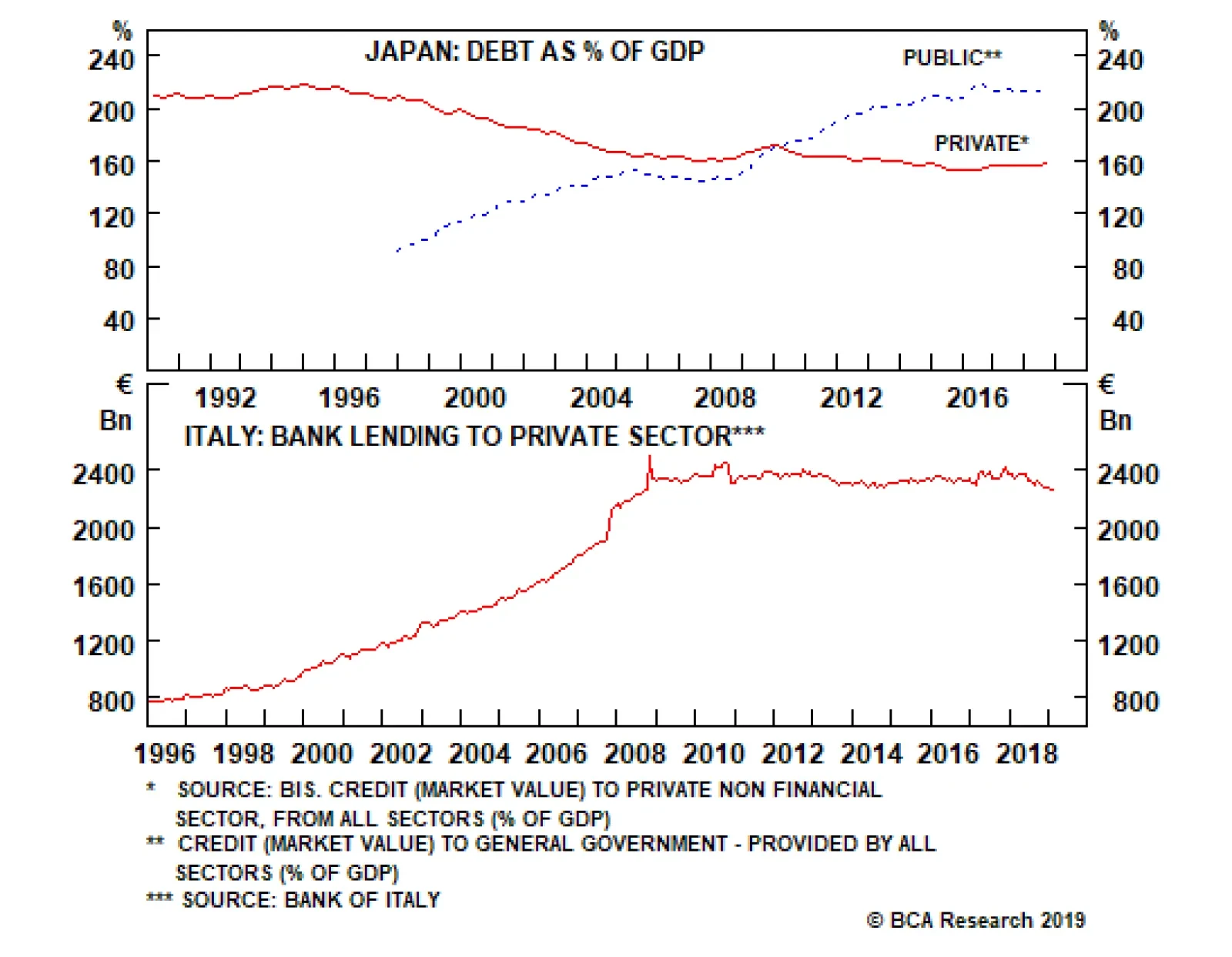
Welcome to Italy! After the 2008 global financial crisis, Italian banks’ balance sheets were left unrepaired and undercapitalized. For an individual bank whose solvency is impaired, the right thing to do is shrink its loan book relative to its equity…
Feature For a decade, mainstream economics has prescribed remedies for sluggish growth in the euro area on the basis of three articles of blind faith. First, that the ailment arises from structural impediments to growth; second, that in response to an ailing economy, ultra-loose monetary policy is always and everywhere effective; and third, that ‘Keynesian’ government stimuluses are at best a necessary evil and at worst a recipe for disaster. As a result, European policymakers have expended much time and energy attempting structural reforms, experimenting with ultra-loose monetary policy, while shirking government borrowing and spending. But have policymakers misdiagnosed the ailment? Chart of the WeekItaly’s Private Sector Is Paying Back Debt
Italy's Private Sector Is Paying Back Debt
Italy's Private Sector Is Paying Back Debt
Why The Focus On Public Deficits And Debt Might Be Misplaced We frown upon government deficits. They are associated with crowding out and misallocation of resources. But when the private sector is running a financial surplus, the exact opposite is true. Government borrowing and spending causes no crowding out because the government is simply utilising the private sector’s surplus savings and debt repayments. And importantly, this deficit spending prevents a deflationary shrinkage of the broad money supply. Most people are aware of the size of government deficits. Few people are aware of the size of private sector surpluses; and the leakage from the national income stream that they create. By not making this connection, people might believe that government deficits are profligate. But if the private sector as a whole has a financial surplus, it makes sense for the government to borrow to support economic growth. In a similar vein, an economy’s debt sustainability depends on its total indebtedness, not on its public indebtedness or its private indebtedness in isolation. Debt becomes unsustainable when the marginal extra euro of debt results in misallocation of resources and mal-investment. At this point, the extra debt adds nothing to growth or, worse, it subtracts from growth. This is also the point at which lenders tend to be unwilling to provide the marginal loan. Therefore, debt reaches its sustainable limit when the economy has exhausted all productive uses for it. Deficit spending can prevent a deflationary shrinkage of the broad money supply. It does not matter whether these productive uses are funded with private debt or with public debt. For example, successful economies require investment in high-quality healthcare and education. Some economies fund this with private debt, while others fund it with public debt. This means that if productive private indebtedness is low, there is more scope for productive public indebtedness. Many people believe that Italy has one of the world’s most indebted economies. But this belief is wrong. Although Italy’s public indebtedness is high, Italy’s private indebtedness is one of the lowest in the world, making Italy’s total indebtedness less than that of France and the U.K., and broadly equal to that of the U.S. (Chart I-2-I-5). Crucially, Italy’s extremely low private indebtedness means that it could afford relatively high public indebtedness before reaching the limit of debt sustainability. Chart I-2Italy: Total Debt = 250% Of GDP
Italy: Total Debt = 250% Of GDP
Italy: Total Debt = 250% Of GDP
Chart I-3France: Total Debt = 315% Of GDP
France: Total Debt = 315% Of GDP
France: Total Debt = 315% Of GDP
Chart I-4U.K.: Total Debt = 280% Of GDP
U.K.: Total Debt = 280% Of GDP
U.K.: Total Debt = 280% Of GDP
Chart I-5U.S: Total Debt = 250% Of GDP
U.S: Total Debt = 250% Of GDP
U.S: Total Debt = 250% Of GDP
Italy And Japan: Compare And Contrast In a normal world, the task of ensuring that private sector savings are borrowed and spent falls on the banks, which take in the savings and debt repayments and lend them out to others in the private sector who can make the best use of the funds. But if a dysfunctional banking system fails this task, the savings generated by the private sector will find no borrowers. The unrecycled funds become a leakage from the national income stream generating a persistent deflationary headwind for the economy. Welcome to Italy! Since 2008, the stock of loans to Italian households and firms has been stagnant while in real terms it has fallen (Chart of the Week). The upshot is that the real money supply has shrunk despite low private sector indebtedness, low interest rates and massive injections of ECB liquidity into the banking system. Japan’s public sector levering has been counterbalancing its private sector de-levering. After the 2008 global financial crisis Italian banks’ balance sheets were left unrepaired and undercapitalized. For an individual bank whose solvency is impaired, the right thing to do is shrink its loan book relative to its equity capital. But when the entire banking system is doing this simultaneously, the economy falls into a massive fallacy of composition: what is right for an individual bank becomes very deflationary when all banks are doing it together. Under these circumstances, an agent outside the fallacy of composition – namely, the government – must counter this deflationary headwind by borrowing and spending the un-recycled private sector savings. Welcome to Japan! The Japanese government has been doing precisely this for the past 25 years. Many people fret about the Japanese government’s persistent deficits and its ballooning public debt. What these people do not realise is that these persistent deficits are simply counterbalancing private sector de-levering. Hence, Japan’s all-important total (public plus private) indebtedness as a share of GDP has not been rising (Chart I-6). In Italy, the banking system has been dysfunctional for over a decade, preventing the private sector from borrowing (Chart I-7). Under these circumstances, the Italian government could borrow the private sector’s excess savings and debt repayments and put them to highly productive use, just like in Japan. Chart I-6Japan’s Persistent Deficits Have Been Counterbalancing Private Sector De-levering
Japan's Persistent Deficits Have Been Counterbalancing Private Sector De-levering
Japan's Persistent Deficits Have Been Counterbalancing Private Sector De-levering
Chart I-7The Italian Banking System Has Been Dysfunctional
The Italian Banking System Has Been Dysfunctional
The Italian Banking System Has Been Dysfunctional
Japan and Italy have quite similar demographics, but there is also a big difference. Despite the Japanese government’s persistent deficit and ballooning debt, the 10-year Japanese government bond seems not the slightest bit concerned and is yielding zero. Whereas in Italy, where the government finances are close to structural balance, the merest hint of a Keynesian stimulus sent the 10-year BTP yield rocketing towards 4 percent. Why? The answer is that Italy does not have its own central bank. The Japanese government bond yield is a direct function of the BoJ’s expected monetary policy. But the Italian BTP yield has two components: the ECB’s expected monetary policy plus a risk-premium for currency redenomination in the event that Italy left the euro. Italy’s problem is that even if modest deficit spending was the right policy, it would take time to prove. Meanwhile, bond vigilantes shoot first and ask questions later. The euro debt crisis was essentially a fear of currency redenomination which resulted from bond vigilantes running amok. When bond markets refuse to lend to sovereigns at a rational interest rate, maturing debt has to be refinanced at a penalising interest rate, causing an undeserved deterioration in the government’s finances. Thereby, the fear of redenomination could become a self-fulfilling prophecy. In Italy, the banking system has been dysfunctional for over a decade. The bottom line is that every economy has its own ‘tipping-point’ interest rate, at which its debt financing can flip from stability to instability. But we believe this interest rate is low everywhere. Modern Monetary Theory Simplified Modern Monetary Theory (MMT) is a hot topic of the moment. Our view is that its breakthrough is to establish the ‘appropriate’ public sector deficits in the context of private sector surpluses, and it simplifies to this question: In highly indebted economies, what is the interest rate needed to keep total (public plus private) indebtedness as a share of GDP stable, and prevent a deflationary shrinkage of the broad money supply? The answer differs slightly from economy to economy because private sector indebtedness is modestly rising in some places, stable in a few, while declining in others (Chart I-8). But crucially, at a global level, total indebtedness is stabilising with the global bond yield within a historically depressed sideways channel (Chart I-9). Chart I-8Private Sector Indebtedness Is Not Rising As A Whole
Private Sector Indebtedness Is Not Rising As A Whole
Private Sector Indebtedness Is Not Rising As A Whole
Chart I-9The Global Long Bond Yield Has Been In A Sideways Channel
The Global Long Bond Yield Has Been In A Sideways Channel
The Global Long Bond Yield Has Been In A Sideways Channel
Admittedly, the global bond yield is now at the bottom of this channel. This means that from a tactical perspective, we can expect 10-year yields to go up about 50 bps before hitting the top of the channel. However, from a structural perspective, the interest rate needed to stabilise total indebtedness as a share of GDP now appears to be extremely low. And this means that structurally low bond yields are here to stay. Finally, I am excited to report that two of the main commentators on MMT – Richard Koo and Stephanie Kelton – are keynote speakers at our annual conference on September 26-27 in New York City. Suffice to say it will be an event not to be missed! Fractal Trading System* There are no new trades this week, leaving five open positions. For any investment, excessive trend following and groupthink can reach a natural point of instability, at which point the established trend is highly likely to break down with or without an external catalyst. An early warning sign is the investment’s fractal dimension approaching its natural lower bound. Encouragingly, this trigger has consistently identified countertrend moves of various magnitudes across all asset classes. Chart I-10
Short the 10-Year OAT
Short the 10-Year OAT
The post-June 9, 2016 fractal trading model rules are: When the fractal dimension approaches the lower limit after an investment has been in an established trend it is a potential trigger for a liquidity-triggered trend reversal. Therefore, open a countertrend position. The profit target is a one-third reversal of the preceding 13-week move. Apply a symmetrical stop-loss. Close the position at the profit target or stop-loss. Otherwise close the position after 13 weeks. Use the position size multiple to control risk. The position size will be smaller for more risky positions. * For more details please see the European Investment Strategy Special Report “Fractals, Liquidity & A Trading Model,” dated December 11, 2014, available at eis.bcaresearch.com Dhaval Joshi, Chief European Investment Strategist dhaval@bcaresearch.com Fractal Trading System Recommendations Asset Allocation Equity Regional and Country Allocation Equity Sector Allocation Bond and Interest Rate Allocation Currency and Other Allocation Closed Fractal Trades Trades Closed Trades Asset Performance Currency & Bond Equity Sector Country Equity Indicators Bond Yields Chart II-1Indicators To Watch - Bond Yields
Indicators To Watch - Bond Yields
Indicators To Watch - Bond Yields
Chart II-2Indicators To Watch - Bond Yields
Indicators To Watch - Bond Yields
Indicators To Watch - Bond Yields
Chart II-3Indicators To Watch - Bond Yields
Indicators To Watch - Bond Yields
Indicators To Watch - Bond Yields
Chart II-4Indicators To Watch - Bond Yields
Indicators To Watch - Bond Yields
Indicators To Watch - Bond Yields
Interest Rate Chart II-5Indicators To Watch - Interest Rate Expectations
Indicators To Watch - Interest Rate Expectations
Indicators To Watch - Interest Rate Expectations
Chart II-6Indicators To Watch - Interest Rate Expectations
Indicators To Watch - Interest Rate Expectations
Indicators To Watch - Interest Rate Expectations
Chart II-7Indicators To Watch - Interest Rate Expectations
Indicators To Watch - Interest Rate Expectations
Indicators To Watch - Interest Rate Expectations
Chart II-8Indicators To Watch - Interest Rate Expectations
Indicators To Watch - Interest Rate Expectations
Indicators To Watch - Interest Rate Expectations