Money/Credit/Debt

Highlights The lack of dollar liquidity has been a tailwind behind the dollar bull market. Going forward, an end to a contraction in the Federal Reserve’s balance sheet should help stem the global shortage of dollars. Outside of a few basket cases, there remains scant evidence that the shortage of dollars has begun to trigger widespread negative feedback loops, symptomatic of a funding crisis. If the global economy picks up steam, a deterioration in the U.S. current account and rising FX reserves will improve the dollar liquidity situation. A trade war remains the key risk to this view. For the remainder of the year, portfolio managers should focus on relative value trades on the crosses rather than outright dollar bets. The European Central Bank’s resumption of quantitative easing could be paradoxically bullish for the euro beyond the near term. For now, stay short the euro versus a basket of petro-currencies. Feature At the center of the global financial architecture is the U.S. dollar and the Federal Reserve. The process behind the creation of dollars is a simple one, which goes as follows: In order to stimulate the U.S. economy, the authorities pursue macroeconomic policies that tend to weaken the dollar, such as lowering rates and/or running a wider fiscal deficit. The central bank helps finance this fiscal deficit via expanding the monetary base (seignorage). The drop in rates causes the yield curve to steepen. This incentivizes banks to lend, which in turn boosts U.S. money supply. As the economy recovers, and demand for imports (machinery, commodities, consumer goods) rises, the current account deficit widens. As a reserve currency, the U.S. trade deficit is settled in dollars. This leads to a flow of greenbacks outside U.S. borders. Wary of losing competitiveness via a rising exchange rate, other central banks will purchase these dollars from the private sector in exchange for local currency. The rise in foreign exchange reserves can be reinvested back into Treasurys and held in custody at the Fed, meaning that the current account deficit (or capital account surplus) finances the budget deficit. Call this an exorbitant privilege. The key question is whether dollar liquidity will ease over the near term or the shortage will intensify. A few factors suggest the former. The sum of the Fed’s custody holdings together with the U.S. monetary base constitutes the root of global dollar liquidity. Each time this measure has severely contracted, the reduction in dollars has triggered a blowup somewhere, typically among other countries running twin deficits (Chart I-1). For example, since the Global Financial Crisis, a fall in the growth of this measure below the critical zero line coincided with the European debt crisis, China’s slowdown, and more recently slowing global trade and a manufacturing recession. Importantly, the slowdown in global trade preceded escalation in trade tensions between the U.S. and China, meaning other endogenous factors were also at play. Lack of dollar liquidity was perhaps a factor. Chart I-1A Liquidity Squeeze Of Dollars
A Liquidity Squeeze Of Dollars
A Liquidity Squeeze Of Dollars
Chart I-2The U.S. Budget Deficit Needs To Be Financed
The U.S. Budget Deficit Needs To Be Financed
The U.S. Budget Deficit Needs To Be Financed
In the past, the Fed was quick to correct the situation: most episodes when the U.S. current account deficit was shrinking, the domestic economy was on the cusp of a slowdown or recession. This time around, easy fiscal policy and a trade-hawkish President have allowed the Fed to ignore the liquidity crisis happening outside the U.S. Key to this is that the lines are now blurred between how much of the trade slowdown is tariff escalation, and how much is due to endogenous factors. As a result, the Fed no longer felt obliged to intervene for markets outside the U.S., especially if the U.S. domestic economy was faring well. A shrinking U.S. current account deficit is incompatible with a resolution to the dollar crisis, especially as the greenback remains the global reserve currency (Chart I-2). On the surface, this is dollar bullish. Meanwhile, our geopolitical strategists contend that the trade war is just a symptom of a much larger battle for hegemonic supremacy, which will last for many years to come. However, the key question is whether dollar liquidity will ease over the near term or the shortage will intensify. A few factors suggest the former. Balance Sheet, Current Account And Foreign Debt Chart I-3The Contraction In Custody Holdings Is Over
The Contraction In Custody Holdings Is Over
The Contraction In Custody Holdings Is Over
The Fed’s tapering of asset purchases has been a net drain on global dollar liquidity. But that is slated to change. The Fed’s balance sheet peaked a nudge above US$4.5 trillion in early 2015 and has been falling since. This has triggered a severe contraction in the U.S. monetary base, and severely curtailed commercial banks’ excess reserves. The Federal Reserve’s custody holdings argue that this was a huge drag on international dollar liquidity, even worse than during the 2008 crisis (Chart I-3). The good news is that the Fed has ended the tapering of its balance sheet and has started cutting rates. This combination will improve dollar's liquidity going forward. Meanwhile, balance-of-payment dynamics are heading in the wrong direction. Over the next five years, the U.S. Congressional Budget Office (CBO) estimates that the U.S. budget deficit will swell to 4.8% of GDP. Assuming the current account deficit widens a bit and then stabilizes, this will pin the twin deficits at around 8% of GDP. This assumes no recession, which would have the potential to swell the deficit even further. Part of these deficits will need to be funded through money printing. One difference between now and the past is that over the last several years, the dollar has become expensive. The narrowing of the U.S. current account balance might therefore be over. The U.S. saw its twin deficits swell to almost 13% of GDP following the financial crisis. However, then the dollar was cheap and commodity currencies were overvalued, following a natural resource bust. One way to solve an overvaluation problem is to increase the supply of dollars. Dollar liquidity shortages tend to be vicious because they trigger negative feedback loops. As the velocity of international U.S. dollars rises, offshore dollar rates begin to rise, lifting the cost of capital for borrowing countries. Debt repayment replaces capital spending. Yet there is little evidence that a dollar shortage has been triggering this sort of negative feedback loop. U.S. dollar funding to external entities is growing by circa 4% a year and has slowed to a crawl among both developed and emerging markets (Chart I-4). Historically, this slowdown has been symptomatic of a funding crisis in EM. Yet this time around, there have been other forces at play: The growth in euro- and yen-denominated debt is exploding, which mirrors the gradual shift in the allocation of FX reserves away from dollars into other currencies. The growth in euro- and yen-denominated debt is exploding (Chart I-5). This is much smaller in outstanding amounts than U.S.-denominated debt, but mirrors the gradual shift in the allocation of FX reserves away from dollars into other currencies. If the U.S. has started to weaponize the U.S. dollar, foreign entities may have no other choice than to rally into other currency blocs, which may eventually entail the Chinese yuan. Chart I-4Growth In The Dollar Short Position Has Eased
Growth In The Dollar Short Position Has Eased
Growth In The Dollar Short Position Has Eased
Chart I-5Lots Of Yen And Euro Debt ##br##Issuance
Lots Of Yen And Euro Debt Issuance
Lots Of Yen And Euro Debt Issuance
The fall in the use of dollars gradually redistributes the “exhorbitant priviledge” of the U.S. currency. This alleviates the need for the U.S. to run a wider current account deficit (President Trump’s goal). This means lower growth in foreign exchange reserves could become the norm rather than the exception (Chart I-6). Historically, current account imbalances have been a major source of currency crises, meaning the system could actually be more stable. Chart I-6The Drop In FX Reserves Is Not Precarious
The Drop In FX Reserves Is Not Precarious
The Drop In FX Reserves Is Not Precarious
The performance of some emerging market currency pairs will determine if the so-called funding crisis stays benign or becomes more malignant. Despite a deeper liquidity shortage than during the 2015-2016 crisis, most EM currency pairs are still trading within well-defined wedges and/or above critical thresholds (Chart I-7). Meanwhile, EM volatility remains much subdued – not symptomatic of a funding crisis (Chart I-8). Chart I-7EM Currency Pairs Remain Outside The Danger Zone
EM Currencies Pairs Remain Outside The Danger Zone
EM Currencies Pairs Remain Outside The Danger Zone
Chart I-8EM FX Volatility##br## Is Low
EM FX Volatility Is Low
EM FX Volatility Is Low
Bottom Line: One way to track if a dollar-funding crisis is becoming more acute is through the convenience yield, or cross-currency basis swap.1 This measures the difference in yield between an actual Treasury and a synthetic one trading in the offshore market. On this basis, it remains well below the panic levels observed in 2008, 2011 and 2015-2016, suggesting the dollar shortage is not as acute as back then (Chart I-9). Chart I-9The Convenience Yield For The Dollar Remains Low
The Convenience Yield For The Dollar Remains Low
The Convenience Yield For The Dollar Remains Low
The ECB Bazooka Chart I-10Relative R-Star* In The Eurozone Could Rebound
Relative R-Star* In The Eurozone Could Rebound
Relative R-Star* In The Eurozone Could Rebound
The ECB provided the stimulus the market wanted: they cut rates 10 basis points, offered a tiered system for their marginal deposit facility, and are starting an open-ended QE program at €20 billion a month in November. Yet the euro bounced. Our bias is that European rates were already well below equilibrium compared to the U.S., and the ECB’s dovish shift will help further lift the euro area’s growth potential (Chart I-10). If a central bank eases financing conditions at a time when growth is hitting a nadir, it is hardly bearish for the currency. Since the introduction of the euro, most of the economic imbalances from the region have stemmed from the standard contradiction of a common currency regime. This has been that interest rates have always been too low for one nation, while expensive for others. As such, the euro has typically been caught in a tug-of-war between a rising equilibrium rate of interest for one country, but a very low neutral rate for others.2 In the early 2000s, Spanish and Irish long-term rates were too low, and the reverse was true for Germany. The result was a massive boom in Spanish real estate, the accumulation of debt and buildup of major imbalances. Once bond vigilantes started punishing the periphery for their sins after the Great Recession, Germany found itself with rates that were too low relative to its newly reformed economy, while the periphery deflated. Capital spending in the peripheral countries has been rising faster than in core Europe, suggesting the spread between the cost of capital in these countries and the return on capital remains wide. The good news is this has not been the case for a few months now: 10-year government bond yields in France, Spain and even Portugal now sit at -24 basis points, 22 basis points and 24 basis points respectively, much below the neutral rate. This is severely easing financial conditions across the entire euro zone (Chart I-11). Chart I-11The Common-Currency Dilemma Solved
The Common-Currency Dilemma Solved
The Common-Currency Dilemma Solved
There has been a reason behind the collapse in spreads, aside from a dovish ECB. Labor market reforms in Mediterranean Europe have seen unit labor costs in Greece, Ireland, Portugal and Spain collectively contract by almost 10%. This has effectively eliminated the competitiveness gap that had accumulated over the past two decades (Chart I-12). Italy remains saddled with a rigid and less productive workforce, but overall adjustments have still come a long way to closing a key fissure plaguing the common-currency area. The result is in the numbers. Capital spending in the peripheral countries has been rising faster than in core Europe, suggesting the spread between the cost of capital in these countries and the return on capital remains wide (Chart I-13). More rapid capital spending in the periphery is a key channel to close the productivity gap between member nations and lift the neutral rate of interest for the entire euro zone. Chart I-12The Competitiveness Gap Has Closed
The Competitiveness Gap Has Closed
The Competitiveness Gap Has Closed
Chart I-13The Cost Of Capital Is Low In The Periphery
The Cost Of Capital Is Low In The Periphery
The Cost Of Capital Is Low In The Periphery
The euro tends to be largely driven by pro-cyclical flows. Fortunately for investors, European equities, especially those in the periphery, remain unloved, given they are trading at some of the cheapest cyclically adjusted price-to-earnings multiples in the developed world. Analysts began revising up their earnings estimates for euro zone equities earlier this year. If they are right, this tends to firmly lead the euro by about nine to 12 months (Chart I-14). Meanwhile, European bonds in hedged terms still remain very attractive (Table I-1). Chart I-14The Euro Might Soon Pop
The Euro Might Soon Pop
The Euro Might Soon Pop
Table I-1Bond Markets Across The Developed World
Is The World Short Of Dollars?
Is The World Short Of Dollars?
A key barometer to watch will be the performance of European banks. So far, they have avoided falling below the critical death zone (Chart I-15). We are awaiting further evidence that the global growth environment is becoming less precarious to place outright long euro bets. Stay tuned. Chart I-15Watch Eurozone Banks
Watch Eurozone Banks
Watch Eurozone Banks
Chester Ntonifor, Foreign Exchange Strategist chestern@bcaresearch.com Footnotes 1 Arvind Krishnamurthy and Hanno Lustig, “Mind the Gap in Sovereign Debt Markets: The U.S. Treasury basis and the Dollar Risk Factor,” Stanford University, August 29, 2019. 2 Please see Foreign Exchange Strategy Weekly Report, titled “EUR/USD And The Neutral Rate of Interest,” dated June 14, 2019, available at fes.bcaresearch.com. Currencies U.S. Dollar Chart II-1USD Technicals 1
USD Technicals 1
USD Technicals 1
Chart II-2USD Technicals 2
USD Technicals 2
USD Technicals 2
Recent data in U.S. have been mostly positive: Starting with labor market, nominal average hourly earnings were little changed at 3.2% year-on-year in August, however real average hourly earnings yearly growth increased from 1.3% to 1.5% year-on-year. The unemployment rate was unchanged at 3.7%. Nonfarm payrolls increased by 130,000 in August, below expectations of 158,000. NFIB small business optimism index fell from 104.7 to 103.1 in August. Both headline and core PPI increased by 1.8% and 2.3% year-on-year in August. While headline inflation somewhat slowed to 1.7% year-on-year in August, core inflation came in strong at 2.4% year-on-year. DXY index appreciated initially by 0.6% post ECB, then soon plunged, ending -0.2% this week. BLS reported a large increase in temporary positions in the federal government, reflecting the preparation for the 2020 Census. Notable job gains also occurred in health care and finance, while mining lost jobs. During a Q&A session in Zurich last Friday, Powell noted that the outlook remains a favorable one despite global trade risks. The most likely scenario for the U.S. is continued moderate growth. Report Links: Preserving Capital During Riot Points - September 6, 2019 Has The Currency Landscape Shifted? - August 16, 2019 USD/CNY And Market Turbulence - August 9, 2019 The Euro Chart II-3EUR Technicals 1
EUR Technicals 1
EUR Technicals 1
Chart II-4EUR Technicals 2
EUR Technicals 2
EUR Technicals 2
Recent data in the euro area have been mostly negative: GDP growth increased to 1.2% year-on-year in Q2, from a downwardly-revised 1.1% in the previous quarter. Sentix confidence came in at -11.1 in September, remaining in negative territory but higher than expected. Industrial production contracted by 2% year-on-year in July. EUR/USD fell by 0.9% post ECB meeting, followed by a quick rebound, gaining 0.3% in total this week. Mario Draghi’s last meeting as governor delivered another “bazooka.” The deposit facility rate was cut by 10 bps to a new low of -0.5%, and the ECB will restart QE at €20 billion monthly in November. It will also introduce a two-tiered system for interest rates. Report Links: Battle Of The Central Banks - June 21, 2019 EUR/USD And The Neutral Rate Of Interest - June 14, 2019 Take Out Some Insurance - May 3, 2019 Japanese Yen Chart II-5JPY Technicals 1
JPY Technicals 1
JPY Technicals 1
Chart II-6JPY Technicals 2
JPY Technicals 2
JPY Technicals 2
Recent data in Japan have been negative: Average cash earnings contracted by 0.3% year-on-year in July. Annualized GDP growth slowed from 1.8% to 1.3% quarter-on-quarter in Q2. The adjusted BoP current account balance narrowed to ¥1.65 trillion in July. The BoP trade balance shifted to a deficit of ¥74.5 billion. While the ECO watchers current index rebounded to 42.8 in August, the outlook component dropped to 39.1, the lowest since 2014. Preliminary machine tool orders kept contracting by 37.1% year-on-year in August. Core machinery orders yearly growth fell from 12.5% to 0.3% in July. PPI decreased by 0.9% year-on-year in August. USD/JPY increased by 1% this week. The outlook for Japan remains worrisome in anticipation of the scheduled consumption tax hike next month. Besides that, the relationship between Japan and South Korea is in the worst state in decades. Tourist arrivals between the two neighbors are both deteriorating. However, the BoJ remains out of policy bullets. This puts a floor under the safe-haven yen, until the BoJ acts. Report Links: Has The Currency Landscape Shifted? - August 16, 2019 Portfolio Tweaks Into Thin Summer Trading - July 5, 2019 Battle Of The Central Banks - June 21, 2019 British Pound Chart II-7GBP Technicals 1
GBP Technicals 1
GBP Technicals 1
Chart II-8GBP Technicals 2
GBP Technicals 2
GBP Technicals 2
Recent data in U.K. have been slightly improving: Manufacturing production grew by 0.3% month-on-month in July. On a year-on-year basis, it contracted by 0.6%, an improvement from the previous -1.4%. Industrial production contracted by 0.9% year-on-year in July, higher than the consensus of -1.1%. Total trade deficit (including EU) slightly increased to £0.22 billion in July. Trade deficit (non-EU) widened to £1.93 billion. ILO unemployment rate fell to 3.8% in July. Average earnings growth increased to 4% year-on-year in July. GBP/USD increased by 0.4% this week. We believe that the probability of a no-deal Brexit remains low, but for the time being, we are standing aside while waiting for the chaos to settle. Next week we will be publishing an update on the U.K. economy. Stay tuned. Report Links: Battle Of The Central Banks - June 21, 2019 A Contrarian View On The Australian Dollar - May 24, 2019 Take Out Some Insurance - May 3, 2019 Australian Dollar Chart II-9AUD Technicals 1
AUD Technicals 1
AUD Technicals 1
Chart II-10AUD Technicals 2
AUD Technicals 2
AUD Technicals 2
Recent data in Australia have been mixed: Home loans grew by 4.2% month-on-month in July, up from 0.4% in the previous month. Westpac consumer confidence fell by 1.7% month-on-month in September. National Australia Bank (NAB) business confidence fell from 4 to 1 in August. AUD/USD appreciated by 0.5% this week. Investor and consumer sentiment remain depressed amid global trade worries and the diminishing returns from Chinese stimulus. However, we are seeing tentative signs of recovery as the housing sector stabilizes. We maintain a positive view on the Australian dollar. Report Links: A Contrarian View On The Australian Dollar - May 24, 2019 Beware Of Diminishing Marginal Returns - April 19, 2019 Not Out Of The Woods Yet - April 5, 2019 New Zealand Dollar Chart II-11NZD Technicals 1
NZD Technicals 1
NZD Technicals 1
Chart II-12NZD Technicals 2
NZD Technicals 2
NZD Technicals 2
Recent data in New Zealand have been neutral: Net migration increased by 5100 in July. Manufacturing sales contracted by 2.7% quarter-on-quarter in Q2. The New Zealand dollar has been more or less flat against the U.S. dollar this week, but fell by 0.5% against the Australian dollar. China granted several U.S. products a one-year exemption from tariffs this week. While the good news regarding a potential U.S.-China trade deal could benefit pro-cyclical currencies, we believe the kiwi will underperform at the crosses. Report Links: USD/CNY And Market Turbulence - August 9, 2019 Where To Next For The U.S. Dollar? - June 7, 2019 Not Out Of The Woods Yet - April 5, 2019 Canadian Dollar Chart II-13CAD Technicals 1
CAD Technicals 1
CAD Technicals 1
Chart II-14CAD Technicals 2
CAD Technicals 2
CAD Technicals 2
Recent data in Canada have been solid: In August, 81,100 jobs were added, the unemployment rate was unchanged at 5.7%, and average hourly wages grew by 3.8% year-on-year. Ivey PMI increased to 60.6 in August, from the previous 54.2 in July. Bloomberg Nanos confidence was little changed at 56.5 for the past week. Housing starts increased by 226,600 in August. Building permits grew by 3% month-on-month in July. New house price index fell by 0.4% year-on-year in July. USD/CAD increased by 0.2% this week. While the oil prices and robust job numbers could benefit the Canadian dollar in the near term, a rising exchange rate, and increasing interest rate differentials might tighten financial conditions, and thus limit the upside of the loonie. Report Links: Preserving Capital During Riot Points - September 6, 2019 Portfolio Tweaks Into Thin Summer Trading - July 5, 2019 On Gold, Oil And Cryptocurrencies - June 28, 2019 Swiss Franc Chart II-15CHF Technicals 1
CHF Technicals 1
CHF Technicals 1
Chart II-16CHF Technicals 2
CHF Technicals 2
CHF Technicals 2
There is scant data from Switzerland this week: Producer and import prices contracted by 1.9% year-on-year in August. Unemployment rate was unchanged at 2.3% in August. USD/CHF has been flat this week. Last Friday, during the Q&A session in Zurich, SNB chairman Jordan emphasized that as a small open economy, Switzerland is heavily impacted by global economic developments, notably what is happening in the U.S., Europe, and China. The recent slowdown has weighed on the Swiss economy. More importantly, Jordan noted that price stability remains an important mandate for the Swiss people and the bank. Further policy adjustments, besides interest rates, might be necessary to stimulate the economy. The ECB policy meeting this week has also put more pressure on SNB to further ease monetary policy. Report Links: What To Do About The Swiss Franc? - May 17, 2019 Beware Of Diminishing Marginal Returns - April 19, 2019 Balance Of Payments Across The G10 - February 15, 2019 Norwegian Krone Chart II-17NOK Technicals 1
NOK Technicals 1
NOK Technicals 1
Chart II-18NOK Technicals 2
NOK Technicals 2
NOK Technicals 2
Recent data in Norway have been neutral: Manufacturing output grew by 1% in July. Headline and core inflation both slowed to 1.6% and 2.1% year-on-year in August. USD/NOK fell by 0.4% this week, as oil prices continued to rally. Prince Abdulaziz Bin Salman was appointed as the new Energy Minister of Kingdom of Saudi Arabia (KSA), and he is committed to oil production control. Moreover, the possible good news over a U.S.-China trade deal is likely to revive oil demand, thus lifting Norwegian krone. Report Links: Portfolio Tweaks Into Thin Summer Trading - July 5, 2019 On Gold, Oil And Cryptocurrencies - June 28, 2019 Currency Complacency Amid A Global Dovish Shift - April 26, 2019 Swedish Krona Chart II-19SEK Technicals 1
SEK Technicals 1
SEK Technicals 1
Chart II-20SEK Technicals 2
SEK Technicals 2
SEK Technicals 2
Recent data in Sweden have been mostly negative: Household consumption increased by 2.8% year-on-year in July. Headline inflation slowed from 1.7% to 1.4% year-on-year in August. Core inflation also slowed to 1.6% year-on-year, from the previous 1.7%. USD/SEK fell by 0.4% this week. Last week, the Riksbank kept interest rates on hold, and said that they are still planning to raise interest rates but at a slower pace. The slowdown in inflation this week might further delay their plan for a rate hike. Report Links: Where To Next For The U.S. Dollar? - June 7, 2019 Balance Of Payments Across The G10 - February 15, 2019 A Simple Attractiveness Ranking For Currencies - February 8, 2019 Trades & Forecasts Forecast Summary Core Portfolio Tactical Trades Limit Orders Closed Trades
Highlights On a national level, China’s foreign currency debt does not seem excessive. Nevertheless, foreign currency debt is concentrated in the weakest sectors: property developers, banks and non-bank financial companies. The authorities can resort to FX swaps to smooth China’s currency depreciation. This will assure there is no currency turmoil. Yet, these FX swaps transactions will only defer downward pressure on the local currency, but will not eliminate it. Feature Chart I-1China's Aggregate FX Debt
China's Aggregate FX Debt
China's Aggregate FX Debt
China’s foreign debt has increased dramatically over the past 10 years, from $390 billion to $1.83 trillion currently (Chart I-1). With the RMB’s recent depreciation, the pressure on Chinese debtors to service foreign currency debt is rising. In this week's report, we gauge the size of the nation’s foreign currency debt, assess its vulnerability and discuss how policymakers will manage potential downside risks to the exchange rate. Quantifying The Size Of External Debt The State Administration of Foreign Exchange (SAFE) currently reports foreign currency denominated liabilities amounting to $1.97 trillion. This includes debts of general (central and local) government, the central bank, commercial banks and other enterprises. However, SAFE does not record foreign currency debt of offshore subsidiaries of Chinese companies. For example, if a subsidiary of a Chinese company in Hong Kong issued bonds denominated in foreign currency, this amount will not be captured in SAFE’s data. To get a more complete picture of China’s total foreign currency debt, we included the foreign debt of offshore subsidiaries to the SAFE figure. Also, we exclude banks' foreign currency deposits from foreign debt. Table I-1 is a comprehensive profile of China’s foreign currency debt. Table I-1Who Owes FX Debt In China
China’s Foreign Debt, And A Secret Weapon
China’s Foreign Debt, And A Secret Weapon
The key takeaways are as follows: China’s aggregate foreign currency debt is $1.83 trillion, or 13% of GDP. Public sector foreign currency debt stands at $263 billion, or 0.2% of GDP. Such a low number suggests one should not worry about the government’s foreign currency indebtedness. Companies’ and banks’ foreign indebtedness as of the end of March 2019 amounted to $436 billion and $1.3 trillion, respectively, totaling $1.7 trillion (or 12.5% of GDP) (Chart I-2A and I-2B). Chart I-2AFX Debt Of Companies And Banks
FX Debt Of Companies And Banks
FX Debt Of Companies And Banks
Chart I-2BFX Debt Of Companies And Banks
FX Debt Of Companies And Banks
FX Debt Of Companies And Banks
For banks, we deducted foreign currency deposits from the SAFE numbers – in other words, banks’ foreign currency debt excludes their foreign currency deposits. For instance, a mainland bank operating in Hong Kong has a large number of Hong Kong dollar deposits, yet the latter does not really constitute a foreign currency debt, as it is an inherent part of banking operations and is counterbalanced by Hong Kong dollar assets. A foreign borrowing binge by banks and companies began in 2009, paused in 2015 and took off again in 2016. Overseas financing regulation was loosened in September 2015. The idea was to facilitate foreign currency borrowing so that the proceeds would offset the rampant capital outflows during that period and stabilize the exchange rate. This relaxation of regulation contributed to the overseas borrowing binge, especially short-term debt, which does not require approval from SAFE. The fact that U.S. dollar rates have been below mainland RMB interest rates have enticed foreign currency borrowing by mainland entities over this decade. In addition, the authorities’ deleveraging campaign since late 2016 constrained domestic credit creation relative to the boom of the previous years and drove enterprises to seek capital overseas. For companies, foreign debt constitutes 5% of their aggregate debt (Chart I-3). As to banks, foreign debt is equal to 3% of non-deposit liabilities (Chart I-4). Chart I-3Companies Reliance On FX Debt Has Risen But Remains Low
Companies Reliance On FX Debt Has Risen But Remains Low
Companies Reliance On FX Debt Has Risen But Remains Low
Chart I-4Banks Reliance On FX Debt Is Low
Banks Reliance On FX Debt Is Low
Banks Reliance On FX Debt Is Low
The currency of China’s aggregate foreign debt is mostly USD (85% of total) and HK$ (10% of total). Provided the latter is pegged to the greenback – something we do not expect to change anytime soon – the overwhelming portion of foreign currency debt is de facto in U.S. dollars. Companies’ and banks’ foreign indebtedness as of the end of March 2019 amounted to $436 billion and $1.3 trillion, respectively, totaling $1.7 trillion (or 12.5% of GDP). Bottom Line: While small as a share of total debt, the absolute size of foreign currency debt held by Chinese companies and banks is not trivial. Meaningful currency depreciation poses risks for industries where foreign currency debt is concentrated. Vulnerability Assessment We examine China’s vulnerability stemming from foreign currency debt on the national level as well as on the level of both banks and enterprises. National Level On the national level, China’s foreign currency debt does not seem problematic. Total foreign currency debt accounts for 70% of exports and 58% of foreign currency reserves at the central bank (Chart I-5). These ratios are lower than those of many other EM countries. Foreign debt service obligations (FDSOs) are the sum of interest payments and amortization of all types of external debt over the next 12 months. China’s current FDSOs stand at 11% relative to its exports of goods and services, and at 24% relative to the central bank’s foreign exchange reserves (Chart I-6). These numbers are also somewhat lower than in other emerging countries. Chart I-5Macro Metrics For Foreign Debt
Macro Metrics For Foreign Debt
Macro Metrics For Foreign Debt
Chart I-6Foreign Debt Service Obligations
Foreign Debt Service Obligations
Foreign Debt Service Obligations
Chart I-7Foreign Funding Requirements
Foreign Funding Requirements
Foreign Funding Requirements
Exports are a country’s foreign currency earnings (cash flow) that can be used to service foreign exchange-denominated debt. Central banks’ foreign exchange reserves are a stock of liquid foreign currency assets that can be used by the central bank to plug the gap in the balance of payments, if needed. Foreign funding requirements (FFRs) are calculated as the current account deficit plus FDSOs in the next 12 months. FFRs measure the amount of net foreign capital inflows required in the next 12 months for a country to cover any potential shortfall in its current account balance, as well as to service and repay its foreign currency debt coming due (both principal and interest). Chart I-7 illustrates the Chinese mainland’s FFRs over the next 12 months exceed the current account surplus by $600 billion. The fact that U.S. dollar rates have been below mainland RMB interest rates have enticed foreign currency borrowing by mainland entities over this decade. The yuan has depreciated by 12% since April 2018. This has raised foreign debt burdens relative to GDP as well as made debt servicing more expensive. Please refer to Box I-1 that elaborates why currency depreciation is more damaging than a rise in interest rates for debtors with foreign currency borrowing. Box I-1
China’s Foreign Debt, And A Secret Weapon
China’s Foreign Debt, And A Secret Weapon
Companies And Banks Table I-3 illustrates the industry composition of non-government external debt. This also includes foreign debt of offshore subsidiaries. Table I-3
China’s Foreign Debt, And A Secret Weapon
China’s Foreign Debt, And A Secret Weapon
Non-policy banks have the highest amount of outstanding private external debt, at $367 billion, followed by real estate companies at $240 billion and financial service companies at $172 billion. Overall, foreign currency debt is concentrated in the weakest links of the Chinese economy: First, revenues and cash flows of property developers, banks and non-bank finance companies are predominantly in yuan. Hence, RMB currency depreciation reduces their cash flow in U.S. dollar terms, hurting their ability to service foreign debt. The yuan has depreciated by 12% since April 2018. This has raised foreign debt burdens relative to GDP as well as made debt servicing more expensive. Second, debt stress recedes in economic upswings and rises in economic downturns. The reason is that companies’ cash flows shrink in downturns and grow in economic expansions. Property developers, banks and non-bank finance companies are not only the largest foreign currency debtors in China, but also have the weakest profit/cash flow outlooks. Chart I-8Chinese Real Estate: Starts Outpacing Completions
Chinese Real Estate: Starts Outpacing Completions
Chinese Real Estate: Starts Outpacing Completions
Property developers’ cash flow positions will deteriorate further as the lack of policy stimulus for real estate in this cycle will constrain housing demand. Chart I-8 illustrates property developers have had many starts, but few completions and generally weak sales. This is due to the fact that they use starts to raise cash through pre-sales (down payments). Once they have raised the cash, they slow the pace of construction, as demand as well as their own cash positions are weak. As to banks and non-bank financial companies, their total assets skyrocketed until the 2016 deleveraging campaign kicked in. Since then, their asset growth has been relatively tame. This along with rising non-performing loans is hurting their profits, and consequently their debt-servicing ability. Third, for non-policy banks, short-term debt is very high at $234 billion. The same measure for property developers and non-bank finance companies is $31 billion and $33 billion, respectively. Finally, companies and banks in aggregate will be confronted with $438 billion of U.S. dollar debt maturing over the coming two years. In particular, real estate companies and financial services companies are faced with repayment pressures of $99 billion and $79 billion, respectively. Risks From Currency Hedging Prior the RMB breaking below the important 7 CNY/USD technical level, it was safe to assume that there was no pressure to hedge currency risks by debtors with FX debt. Odds are that following the breaching of this technical level and in anticipation of further devaluation, many of these debtors have begun hedging their foreign currency exposure. In turn, demand to hedge currency risk for $1.3 trillion foreign currency debt by companies and non-policy banks could exert further downward pressure on the exchange rate. Do the authorities have the tools to avoid self-feeding currency depreciation? A Secret Defense Weapon: FX Swaps Chart I-9Few FX Reserves Compared With RMB Money Supply
Few FX Reserves Compared With RMB Money Supply
Few FX Reserves Compared With RMB Money Supply
China’s central bank has about $3 trillion of foreign exchange (FX) reserves that can be used to intervene in the spot market. However, the authorities are very reluctant to use these reserves. One of the primary reasons is that these FX reserves are equal to only 12% of broad money supply and RMB deposits (Chart I-9). These are very low numbers in comparison with other countries. In addition, when a central bank sells its international reserves and buys local currency, the banking system’s liquidity/excess reserves at the central bank shrink, leading to higher interbank rates. Hence, defending the currency with FX reserves comes at the expense of tighter liquidity. This is unacceptable for Chinese policymakers because the economy remains very weak and extremely reliant on credit to grow. The good news is that the authorities have another tool – FX swaps – and are likely already using it to defend the yuan. Other EM countries have used FX swaps to defend their currencies as well, most notably Brazil in 2014-‘15. Media reports on several occasions have speculated that Chinese state banks sold U.S. dollars in the forward foreign exchange market in a bid to defend the forward rate and thus influence the spot market. We suspect this may be true, even though there is no available information on the amount and counterparties of FX swaps. What are the mechanisms and implications of FX swap interventions? In a FX swap transaction, a bank (the central bank or a state-owned bank) sells U.S. dollars to a company in the forward market. There is no flow of dollars or yuan in the spot market. If by the maturity date of the FX swap, the RMB depreciates more than what was implied by forwards on the date of the transaction, the bank suffers a loss. Otherwise, the bank makes a profit. The bad news is that a lot of FX debt is concentrated in the most vulnerable segments of the Chinese economy. In a nutshell, the authorities (state banks or the central bank) could hypothetically support the yuan by selling unlimited amounts of dollars in the forward market. Unlike the sale of U.S. dollars from the People’s Bank of China’s FX reserves, this would entail neither a depletion of foreign currency reserves nor a withdrawal of yuan liquidity. Chart I-10Large Bank Stocks Have Broken Down
Large Bank Stocks Have Broken Down
Large Bank Stocks Have Broken Down
These interventions are positive as they smooth the exchange rate trend and rule out a sharp tumble in the currency value. However, this strategy still has several shortcomings: (1) These FX swap operations can lead to large losses at state-owned banks. Barring the Ministry of Finance or the PBoC writing a check to these state banks to cover these losses, the latter will dampen banks’ earnings. Consequently, their share prices will slump (Chart I-10). (2) These FX swaps transactions only delay demand for dollars in the spot market and thereby defer downward pressure on the local currency, but they do not eliminate it forever. Conclusions The bad news is that a lot of FX debt is concentrated in the most vulnerable segments of the Chinese economy: property developers, banks and finance companies. They have little FX revenues so they are exposed to RMB depreciation. Given the exchange rate has broken below the psychological level of 7 CNY/USD (Chart I-11), odds are they will try to hedge their currency risk by buying U.S. dollars in the forward market. This will heighten depreciation pressure on the yuan. Chart I-11RMB And Its Volatility
RMB And Its Volatility
RMB And Its Volatility
The good news is that the authorities have a tool to smooth the currency depreciation via FX swaps. This will assure there is no currency turmoil in China, even if demand for dollars escalates. The costs of defending will be losses at large state-owned banks. Yet, those losses can ultimately be borne by the central government, which has little debt (20% of GDP). Downward pressure on the RMB will persist because of: Large demand for dollars from companies and banks with large FX debt levels as they attempt to hedge their FX risks; Weak economic activity, U.S. import tariffs and deflationary pressures - warranting currency depreciation; Potentially large demand for dollars from resident capital outflows. Lin Xiang, Research Analyst linx@bcaresearch.com Arthur Budaghyan Chief Emerging Markets Strategist arthurb@bcaresearch.com Footnotes
Feature BCA Research (aka The Bank Credit Analyst) published its first report in 1949, a remarkable 70 years ago. This probably makes us the longest-running independent investment research firm in the world. As we age, it is normal to occasionally reflect on how the world has changed over the course of our lives. It is an interesting exercise in the case of BCA. We need to start with a little history. The Bank Credit Analyst began life as a small-circulation newsletter produced by Hamilton Bolton, a Montreal-based money manager. He had been sending out investment commentary to his clients for some time and was encouraged to start catering to a wider audience. Bolton was a visionary because he was one of the few market analysts at that time to understand the importance of money and credit in driving economic and market cycles. In those days, banks were the dominant financial intermediary, so an analysis of flows through the banking system provided accurate and leading signals about economic and market trends. That is why he named his new service “The Bank Credit Analyst”. Bolton developed a series of monetary-based indicators that allowed him to make some great market calls. He passed away in 1967, but his valuable contribution to financial research was acknowledged in 1987 when the CFA Institute posthumously awarded him the prestigious “Outstanding Contribution to Investment Research Award”.1 Hamilton Bolton was a product of his times in that his worldview was influenced heavily by having lived through the Great Depression. Like many of his generation, he had a strong aversion to excessive debt growth, and was highly sensitive to any buildup of financial imbalances that could tip the economy back into a severe downturn. In fact, widespread fears of renewed depression did not really fade until the late 1950s. That psychology helps explain why policymakers were complicit in allowing inflation to take hold in the 1960s because there is a common tendency to fight the last war. As long as depression/deflation is seen as the primary threat, then there will be complacency about inflation risks. Does This Sound Familiar? Let’s look at some of the conditions that existed in 1949, when The Bank Credit Analyst started publication. The U.S. long-term Treasury yield had been capped at 2.5% since April 1942. At the request of the Treasury Department, the Fed had given up control of the money supply by buying whatever bonds were needed to keep yields below 2.5%, in order to support the financing of war-inflated budget deficits. The level of federal debt was down from its wartime peak of 106% of GDP, but was still at a historically high 77.5%. The European and Japanese economies were in a complete mess, having been devastated during the war. As already noted, fears of renewed deflation and depression were prevalent. Inflation was tame with the U.S. personal consumption deflator declining by 0.8% in 1949 and rising by only 1.2% in 1950. There was considerable geopolitical upheaval. Most notably, the Cold War intensified as Russia extended its control over East Europe and other countries. Mao Zedong founded the People’s Republic of China in October 1949 after his communist forces defeated the Kuomintang led by Chiang Kai-shek. There were serious border clashes between North and South Korea in August 1949, a prelude to the North’s invasion in June 1950. It does not require a huge stretch of the imagination to see some parallels with the current environment. We currently are having (or have had): Massive central bank purchases of government debt (i.e. quantitative easing) and the explicit pegging of bond yields by the Bank of Japan. A huge increase in government debt levels, albeit not because of war-related spending. In a remarkable coincidence, U.S. federal debt reached 77.8% of GDP in fiscal 2018, almost exactly the same level as in 1949. The European and Japanese economies are moribund. However, unlike in 1949, this reflects structural forces, not war-related devastation. There are widespread fears about the long-run economic growth outlook, well captured by the secular stagnation thesis, promoted by Larry Summers. Central bankers are concerned that inflation is too low. Geopolitical concerns abound. These include U.S.-China tensions, Brexit, Korea (again), rising populism and Russia’s more aggressive stance on the world stage. In the end, the fears of 70 years ago that the world might slip back into depression proved unfounded. The 1950s and 1960s, for the most part, turned out to be golden decades for consumers, businesses and equity investors. Unfortunately, this does not mean that we can look forward to a repeat experience in the decades ahead, because we must now turn to the major differences between the present and the past. The Past Worked Out Just Fine The conditions for an economic boom in the 1950s and 1960s could hardly have been better. The U.S. armed forces employed more than 12 million men and women at the end of WWII, 7.6 million of whom were stationed overseas. After the war, these people were desperate to get back to a normal life, with civilian jobs, marriage and children. The inevitable result was a population boom and a surge in growth as pent-up demand for housing and consumer goods was unleashed. It was all aided by the 1944 G.I. Bill that provided low-cost mortgages and many other benefits. The improvement in economic growth boosted government tax receipts and, coupled with a drop in defense spending, this kept fiscal finances in check. During the 1950s and 1960s, the federal deficit averaged less than 1% of GDP and debt had fallen to less than 30% of GDP by 1969. This occurred despite a surge in federal infrastructure spending, helped by the Federal Highway Act of 1956 that authorized the construction of an interstate highway system. Meanwhile, the economy did not appear to be impeded by tax rates that were far above current levels. The reconstruction of the European economies was a monumental task that was beyond the financing capabilities of those shattered countries. However, between 1948 and 1951, the U.S. European Recovery Program (The Marshall Plan) transferred $100 billion in 2018 dollars to aid the recovery effort and this helped Europe get back on its feet. There also was a huge amount of U.S. aid to support the rebuilding of Japan. Economic growth in Japan averaged almost 9% a year in the 1950s and more than 10% in the 1960s. In Germany, the comparable figures were 7.7% and 4.2%. The growth of the world economy also was boosted by steady reductions in tariffs during the 1950s and 60s. The most notable was the Kennedy Round of 1964-67 that achieved a 38% weighted average drop in tariffs. Protectionism was in strong retreat in the decades after WWII. Finally, a word on the markets. At the end of 1949, the S&P 500 was trading at seven times trailing earnings while the dividend yield was at 6¾%. The market’s earnings yield of 14% compared to a 2.2% yield on 30-year Treasuries. In other words, stocks were incredibly cheap. Moreover, when the 1951 Treasury-Federal Reserve Accord ended the bond peg, yields inevitably rose steadily over the subsequent years, making bonds a poor investment. In the 1950s, U.S. equities delivered real compound returns of 16.6% a year compared to -3.3% for 30-year bonds. In the 1960s, the annualized real returns were a still-respectable 5.3% for stocks and -1.4% for bonds. In sum, the two decades after the launch of the BCA were a very favorable time and it was largely due to a very depressed starting point. However, the current environment is very different to that of 70 years ago. It’s a Different Picture Now Perhaps the most important difference with the past is the demographic outlook. In contrast to the post-WWII baby boom, the U.S. and most other developed economies face bleak population dynamics. Almost all developed economies – and many emerging ones – have seen the birth rate drop below replacement levels with the result that population growth has slowed dramatically. In many cases, populations are in actual decline – especially in the important working-age segment. That deprives economic growth of its main driver. The annual potential growth of U.S. real GDP averaged 4% in the 1950s and 4.3% in the 1960s. Potential growth in the next decade will average only 1.8% a year, according to the Congressional Budget Office (CBO). And it will be even lower in Europe and Japan. As far as pent-up demand is concerned, the picture also is very different. While the consumer industry works hard to develop new must-have goods and services, the reality is that demand is satiated for a lot of products. For example, in 2017, there were 259 million registered private and commercial autos and trucks in the U.S. compared to only 225 million licensed drivers. In 1950, the number of licensed drivers (62 million) far exceeded the number of registered vehicles (48 million). And it is hard to believe that the ownership penetration of most consumer durables has much upside. Turning to government finances, the current environment of bloated deficits and debt significantly constrains the room for fiscal stimulus. Yes, there is constant talk of the need for more infrastructure spending, but this has proven very difficult to implement without offsetting cuts in other spending or measures to boost revenues. The U.S. is saddled with unprecedented peacetime fiscal deficits and the CBO projects that federal debt will approach 100% of GDP within ten years, even without factoring in another recession. The comparison between the free trade era of the 1950s and 60s and the current situation speaks for itself. It is unclear at this stage just how far the move toward protectionism will go, but one thing seems clear. The rush toward globalization that followed the breakup of the Soviet Union and the entry of China into the global trading system is in retreat. This shows up not only in rising tariffs, but also in declining cross-border direct investment flows and increased antipathy to large-scale international migration. The irony is that the developed world needs more immigration to offset the weak growth in resident populations. What about the markets? The stock market certainly is not cheap, the way it was 70 years ago, with the S&P 500 trading at more than 18 times trailing operating earnings. Low interest rates are providing support, but future returns are likely to be in low single figures in a world where economic growth is moderate and there is little scope for profit margins and/or multiples to expand. Prospects for bonds do look somewhat similar to the situation in the early 1950s. Then, there was only one way for yields to go once the Fed’s peg ended. Today, yields will only fall sustainably if the economy sinks into a protracted downturn. We will get another recession in the next few years and yields could certainly hit new lows at that point. But the resulting policy response – both fiscal and monetary – seems almost certain to lead to higher inflation down the road. That would not bode well for the bond outlook, as was the case between the second half of the 1960s and the early 1980s. Concluding Thoughts Hamilton Bolton was fortunate to launch his new investment service ahead of a powerful economic revival and an almost two-decade bull market in stocks. He did not live long enough to witness the inflation upturn and volatile economic environment of the 1970s and 1980s, but BCA’s monetary focus allowed it to prosper during that period. Under the leadership of Tony Boeckh, the company’s then owner and Editor-in-Chief, BCA was strident in warning investors about the buildup of inflationary pressures and the dangers this posed for markets. During this time, BCA also developed the concept of the Debt Supercycle which helped investors understand the complex forces driving policy and the economic/market cycles. If Bolton was alive today, he would be horrified at the state of the world. He would not be able to understand how investors could be so complacent in the face of record government deficits and debt and by what he would regard as the reckless behavior of central banks. At the same time, he would be able to identify with the renewed focus on weak growth and deflation risks. The bottom line is that he would be advising investors to be extremely cautious. Investors currently are semi-obsessed with the timing of the next recession as that would be the signal to significantly downgrade risk assets. The official BCA stance is that a recession is not imminent and this creates a window for stocks to outperform. This matters for those investors who need to be concerned with relative performance. It is painful to sit on the sidelines if markets keep rising and you underperform your peers. However, for those more concerned with absolute performance, and that was true of most investors in Bolton’s time, the upside potential currently seems unattractive relative to the downside risks. Unfortunately, economists have a poor track record of forecasting recessions and bear markets thus often come as a complete surprise. Yes, low interest rates provide a floor under stocks, with the dividend yield comfortably above the 10-year Treasury yield. But rates are low for a reason: the economy and thus corporate earnings face major downside risks. Against this background, I would tend to side with what I imagine Bolton would say: this is a time to focus on capital preservation rather than taking risks to maximize returns. Let me try to end on a more positive note. As noted earlier, the long-term outlook turned out much better than Bolton probably anticipated 70 years ago. What could make that true this time around? Some things cannot be changed, at least over the next decade: adverse demographic trends, high ownership of consumer goods, and high levels of government debt. Geopolitical developments could go either way – for the better or worse – so I will make no predictions there. The one savior would be a marked revival in productivity because, ultimately, that is the only real source of rising living standards. Technology is changing rapidly and there are lots of exciting innovations. But to make a significant and lasting difference it will require more than developments such as autonomous vehicles or 3-D printing. We will need a new General Purpose Technology (GPT) that has a profound impact on the way economies and societies are structured. Previous examples include the steam engine, electricity and of course the internet. Perhaps Artificial Intelligence will do the trick, but that does not seem likely to be a near-term cure. Chart 1Then (1949) And Now (2019)
Then (1949) And Now (2019)
Then (1949) And Now (2019)
In closing, we can be sure of one thing. The world changed in ways Hamilton Bolton could not have conceived and that also will be true for us today. BCA will endeavor to evolve with the times as it has done over the past 70 years and we look forward to keep helping our clients prosper in a complex and ever-changing world. 1949 – A Very Momentous Year Hamilton Bolton launches The Bank Credit Analyst The Peoples Republic of China, the Federal Republic of Germany and the German Democratic Republic (East Germany) are founded Indonesia gains independence from the Netherlands The civil war in Greece ends NATO is established The Geneva Convention is agreed The Soviet Union detonates its first atomic bomb Apartheid becomes official policy in South Africa Alfred Jones creates the first hedge fund The first non-stop circumnavigation of the world by an aircraft occurs The first commercial jet airliner, the De Havilland Comet, has its maiden flight EDSAC – the first practicable stored-program computer runs its first program at Cambridge University Products introduced that year included Lego, the 45 rpm record, the first Porsche car and the Xerox photocopier. George Orwell’s dystopian novel 1984 is published People born include Ivana Trump, Jeremy Corbyn, Benjamin Netanyahu, Meryl Streep and Bruce Springsteen 2019 – Not So Much Chaotic politics in the U.K., Italy and many other countries Trade wars Martin H. Barnes, Senior Vice President Economic Advisor mbarnes@bcaresearch.com Footnotes 1 Previously known as the Nicholas Molodovsky Award
Highlights Our cyclical view is unchanged, … : Despite the evident risks from escalating trade tensions, soft global economic data, and widespread recession concerns, we expect the expansion and the bull markets in spread product and equities will remain intact. … as fiscal largesse has provided the U.S. economy with ample cushion: Per the IMF’s estimates, the fiscal stimulus package centered on the Tax Cuts and Jobs Act of 2017 amounted to about 70 basis points (“bps”) of fiscal thrust in 2018 and another 40 bps in 2019. But how is Congress’ unprecedented experiment shaping up beyond 2019?: The first-order impact of the tax cuts on government revenues is straightforward. The ultimate net effect turns on how lower taxes alter the course of corporate investment and work force participation. The CBO’s latest projections have the federal deficit widening by an additional $1 trillion over the next decade: Supply-side benefits from the 2017 Act have underwhelmed so far, and the fate of the federal budget depends on lawmakers’ restraint. We are long-run bearish on Treasuries and the dollar. Feature The fundamental backdrop remains mixed in the United States and the rest of the world. Global trade has slowed, and the world is experiencing a sharp manufacturing slowdown. The consensus of BCA researchers expects that manufacturing will soon find a footing, and the global economy will revive, helped along by easier monetary policy. A fiscal pick-me-up is long overdue, and would be especially welcome, but we are not holding our breath, especially when Japan finally seems prepared to impose its repeatedly-postponed VAT increase. Opinion within BCA is notably split, and the glass-half-full and glass-half-empty camps remain far apart. The mixed tone of the macro data offers something for bulls and bears, and contributed to the sharp single-day moves that characterized August’s equity action. Although the S&P 500 moved at least 1% in half of its sessions, however, it was down less than 2% for the month through Thursday. After slipping from its 3,000 perch amidst a 5% decline across August’s first three sessions on renewed trade hostilities, it traded in a narrow range between 2,825 and 2,945 the rest of the way (Chart 1). Chart 1Big Daily Swings, But A Tight Monthly Range
The Longer Run
The Longer Run
The Fed is caught in a loop of responding to inorganic shocks. It tightened policy in 2018 while nervously looking over its shoulder at a sizable injection of procyclical fiscal stimulus that wound up exerting less overheating pressure than it had feared. Now it finds itself uncomfortably drawn into the vortex of the trade war, cutting rates to keep the expansion from being snuffed out prematurely by self-inflicted wounds. Various Fed officials seem to be chafing under the burden of serving as a bulwark against the drag from the tariff fights. As Chair Powell admonished in his Jackson Hole address, “[M]onetary policy … cannot provide a settled rulebook for international trade.” Like it or not, the Fed is stuck cleaning up other policymakers’ messes. Jackson Hole would normally have brought down the curtain on any meaningful market news until after Labor Day. But Bill Dudley, the head of the New York Fed from 2009 to 2018, had other ideas. He argued in a Bloomberg opinion column that the Fed should refuse to abet foolhardy trade policy with rate cuts that offset its ill effects. He went on to posit that it is within the Fed’s remit to set policy with an eye toward influencing the outcome of the 2020 presidential election. Dudley’s grenade enlivened a slow news day and had the effect of unifying the economics community in condemnation of his polemic. The Fed swiftly distanced itself from the comments, reiterating that its “decisions are guided solely by its congressional mandate,” and that “political considerations play absolutely no role.” It is hard to know what Dr. Dudley intended to accomplish, but he ensured that we will be at BCA’s 40th Annual Investment Conference bright and early on Friday, September 27th when he kicks off its second day. Initial Estimates Soon after the 2017 Tax Cuts and Jobs Act was passed, the Congressional Budget Office (“CBO”) assessed how its provisions would affect the U.S. economy. Although calculating the components involves myriad complex estimates, the budget equation is quite simple: Budget Surplus/(Deficit) = Revenues – Outlays. Cutting taxes clearly reduces revenues, and the reductions in individual tax rates, partially offset by limits on deductions, were estimated to cost the federal government roughly $300 billion over the next decade. The 10-year tab for lower corporate rates, and immediate expensing of business investments through 2022, was estimated to run about $1 trillion. Relief from some spending constraints brought the total estimated cost to $1.7 trillion. A trillion here, and a trillion there, and pretty soon you’re talking real money. Though the Act was sure to worsen the deficit, it contained provisions meant to encourage investment and labor supply. Corporate tax cuts and the full immediate expensing of investments in software and eligible equipment were expected to permanently increase the nation’s capital stock, thereby boosting the trend pace of productivity growth. A reduced individual income tax burden was expected to encourage more people to enter the workforce and incumbents to work longer hours. Ultimately, the CBO projected that the Act would boost the level of real potential GDP by 0.7%, on average, through 2029. Six Quarters On It follows that people might work more if they are able to keep more of what they earn, but the data since individual income tax rates were reduced at the beginning of 2018 are inconclusive. The labor force participation rate has been treading water for several years (Chart 2, solid line), as it battles against the drag from baby boomer aging (Chart 2, dashed line). Prime-age labor force participation has risen very slowly off of its 2015 bottom, and has spent 2019 unwinding its gains from late last year (Chart 3). Average weekly hours worked remain locked in the narrow range that has prevailed since 2012 (Chart 4). Though it is difficult to isolate the drivers of participation gains, the part rate’s erratic 2018-9 course suggests that the Act has not yet had a discernible work force impact. Chart 2The Baby Boomers Have Become A Demographic Headwind
The Baby Boomers Have Become A Demographic Headwind
The Baby Boomers Have Become A Demographic Headwind
Chart 3Labor Supply ##br##Gains ...
Labor Supply Gains ...
Labor Supply Gains ...
Chart 4... Have Yet To Materialize
... Have Yet To Materialize
... Have Yet To Materialize
Residential investment, which lost some tax subsidies via the Act’s limits on mortgage interest and state and local tax deductions, has declined in every quarter since it was passed, and we back it out of fixed investment to assess the Act’s impact on corporate investment. As with labor supply, the record so far is mixed. Fixed investment (ex-residential investment) built on its 4Q17 acceleration over the first three quarters of 2018 only to slide in the three subsequent quarters (Chart 5). Publicly traded corporations have proven more eager to share their cash windfall with shareholders than they have been to invest it. Chart 5Investment Stimulus? What Investment Stimulus?
Investment Stimulus? What Investment Stimulus?
Investment Stimulus? What Investment Stimulus?
Looking Ahead – Activity Effects We accept that lower individual income tax rates make work more attractive. People respond to incentives, and more after-tax pay, all else equal, should encourage some discouraged workers to rejoin the labor market and push some of the currently employed to want to work more. The changes are modest, though, with take-home pay increasing $324, or 2%, for someone earning $20,000, and $1,299, or 3%, for someone earning $50,000 (Table 1). We see the Act as having no more than a modest marginal effect on labor supply, though it should help boost consumption until households begin to factor in seemingly inevitable future tax hikes. Table 1Take-Home Pay Is Up, But Not By Much
The Longer Run
The Longer Run
If the 2017 Act really is going to boost the potential trend rate of growth, it will have to do so by pushing the rate of productivity growth higher.1 Workers are able to produce more in a given block of time when they’re endowed with more and better tools, and new tools require investment. If fixed investment doesn’t accelerate, there’s no reason to expect that productivity will (Chart 6). The capex outlook from the NFIB survey and the various Fed regional manufacturing surveys is iffy, and BCA has previously noted how an aging population and a shift to more capital-light businesses may restrain investment. Chart 6Investment Drives Productivity
Investment Drives Productivity
Investment Drives Productivity
It will not be an easy matter to boost productivity by boosting capex, though some of businesses’ after-tax cash will likely find its way to investment. To help the process along, Congress incorporated a familiar provision: accelerated depreciation. Accelerated depreciation’s empirical record as an investment catalyst is hardly clear (Box), and we don’t find its theoretical basis terribly compelling. We think the Act’s trend growth impacts are more likely to disappoint the CBO’s expectations than exceed them. Investment confronts demographic headwinds, too. Pushing trend growth higher will not be easy. Box - An Anodyne Prescription A celebrated provision of the Act allows for the immediate expensing of qualified investments until 2022. Accelerated depreciation programs, which allow for more rapid expensing of investments in property, equipment and other depreciable assets in an attempt to stimulate investment, are a stock measure in lawmakers’ stimulus toolkit, but their effectiveness is hardly assured. For one thing, they’re not new, and businesses may have built up an immunity to them, as they have been a continuous feature of the tax code since 1981. The immediate expensing allowed under the 2017 Act is a form of bonus depreciation, which was initially introduced in the wake of the September 11th attacks. It has remained in place for all but one subsequent year, and though investment peaked during the other stretch that provided for immediate write-offs (September 2010 - December 2011), we are skeptical that it will materially increase the size of the capital stock going forward. Accelerated depreciation schemes encourage investment via the time value of money. They do not increase the depreciation benefit provided by a particular investment, they simply speed up its recognition. Savvy businesses may adjust the timing of their investments to take advantage of temporary bonus periods, but they will not necessarily invest more.2 With rock-bottom interest rates squeezing the time value of money, it’s possible that bonus depreciation’s impact may be especially muted this time. Looking Ahead – The Budget Deficit The CBO’s updated projections through 2029, released two weeks ago, call for the budget shortfall to widen by $800 billion more than previously estimated in January. Despite a downward revision of over $1 trillion in projected interest expense, additional spending has weakened the deficit outlook. It appears that elected officials simply can’t help themselves. In a climate in which neither Congress nor voters evince any desire to rein in the deficit, it seems foolishly naïve to assume that future sessions of Congress will abide by built-in expenditure limits like sunset provisions and spending caps. Although the CBO projects that federal revenues will rise across its 10-year forecasting horizon, they will not do so fast enough to keep up with outlays swollen by interest payments on the growing pile of Treasuries (Chart 7). The CBO sees debt as a share of GDP rising to 95% by 2029, within reach of the all-time high recorded after World War II (Chart 8). Financial markets don’t care now, and we don’t think they will any time in the near future, but the CBO’s baseline projections, which assume future Congresses abide by their stated commitments, probably represent an optimistic scenario. We are more inclined to expect the alternative scenarios, in which sunset provisions are ignored, and pre-set spending caps are set aside, to come to pass. Chart 7A Widening Budget Gap ...
A Widening Budget Gap ...
A Widening Budget Gap ...
Chart 8... Leads To An Increased Debt Burden
... Leads To An Increased Debt Burden
... Leads To An Increased Debt Burden
Investment Implications Chart 9The Dollar's Long-Run Direction Is Down
The Dollar's Long-Run Direction Is Down
The Dollar's Long-Run Direction Is Down
Treasury yields are currently within sight of their July 2016 Brexit-inspired lows, and may well revisit them. Negative yields are a common feature well out the maturity curve in core Europe and Japan. A sustained move higher is not in the cards in the near term, and though we do expect yields to rise as the global economy gains some traction later this year, we do not foresee a disruptive move higher even over the next couple of years. The very long-term outlook for Treasuries is lousy, however, and the dollar also faces secular pressures (Chart 9). The U.S. is not likely to turn into Japan, but the next decade’s returns will likely pale beside those earned since 1982. We are congenitally optimistic about humanity, and Americans seem to have a particular knack for pulling rabbits out of hats. We do not see the U.S. turning into Argentina, Greece or even Japan. The debt burden will weigh on potential growth down the road, however, as debt service will limit Congress’ ability to deploy countercyclical adjustments and longer-term investments, and debt issuance will eventually crimp private entities’ access to capital. All of these factors will limit potential economic growth and contribute to softening returns on equity and credit. We continue to foresee tepid returns over the next ten years relative to the returns investors have grown accustomed to over the last four decades, and we would much rather borrow at current rates for the next 20 or 30 years than lend at them. Doug Peta, CFA Chief U.S. Investment Strategist dougp@bcaresearch.com Footnotes 1 Economic growth is the sum of growth in productivity and growth in the size of the labor force. Since the Act does not bear on immigration or birthrates, productivity represents its best shot at moving the growth needle. 2 Congressional Research Service Report RL31852, The Section 179 and Section 168(k) Expensing Allowances: Current Law and Economic Effects, by Gary Guenther, May 1, 2018.
Highlights It will be impossible for China to undertake even mild deleveraging and simultaneously accelerate household income growth. All deposits in the banking system have been created by banks “out of thin air” and have not been engendered by household savings. Contrary to widespread beliefs, mainland households are highly leveraged. Cyclically, high equity valuations, crowded investor positioning and the delayed cyclical recovery in the Chinese economy pose downside risks to consumer stocks. Structurally, real income growth per capita is contingent on productivity growth. The latter will slow in China but remain relatively elevated. Overall, investors should consider buying Chinese consumer plays on weakness. Feature Deliberations about China’s successful rebalancing often boils down to whether one believes that consumers will be able to offset the slowdown in investment and exports and keep overall real GDP growth close to current levels. The narrative typically presumes that Chinese households are not spending enough and can boost their spending counteracting the ongoing slowdowns in capital spending as well as in exports. This conjecture is fallible. Chart I-1The Myth Of Deficient Consumer Demand In China
The Myth Of Deficient Consumer Demand In China
The Myth Of Deficient Consumer Demand In China
Consumer spending in China has in fact been booming over the past 20 years – it has been growing at a compounded annual growth rate (CAGR) of 10% in real terms since 1998 (Chart I-1, top panel). Hence, the imbalance in China has not been sluggish consumer spending. Rather, capital expenditure has been too strong for too long (Chart I-1, bottom panel). Healthy rebalancing entails a slowdown in investment spending – not an acceleration in household demand. Hence, the market relevant question is: Can the growth rate of household expenditure accelerate above 10% CAGR in real terms as capital spending and exports decelerate? Our hunch is that this is unlikely. As the authorities attempt to contain credit and investment excesses and trade war-induced relocation of manufacturers out of China gathers steam, the pertinent question is whether the slowdown in household expenditures in real terms will be mild (from the current 10% pace to 7.5-9% CAGR), medium (6-7.5%) or material (below 6%). In our opinion, the medium scenario has the highest odds of playing out. There are many positives about the vitality of Chinese consumers and we do not mean to downplay them. Nevertheless, many of these positives are well known, and the objective of our report is to reveal misconceptions about this segment. Deleveraging And Consumers If and when deleveraging does transpire in China, the household income growth rate will decelerate, resulting in weaker spending growth. It will be impossible for the mainland economy to undertake even mild deleveraging and simultaneously accelerate household income growth. Chart I-2Capital Spending Is Much More Important Than Exports
Capital Spending Is Much More Important Than Exports
Capital Spending Is Much More Important Than Exports
Our focus for this report is on a slowdown in credit and capital spending rather than exports. The basis is that the latter in general, and shipments to the U.S. in particular, have a much smaller impact than investment expenditures (Chart I-2). In turn, capital spending is mostly financed by credit. It is crucial to understand the significance of credit in driving national and household income growth in China since 2008. Currently, 2.5 yuan of new credit is needed to generate one yuan of GDP growth. This certifies that the mainland economy has become addicted to credit. As we have argued in depth in past reports, commercial banks do not intermediate savings into credit, but rather create new money/credit “out of thin air” when they lend to or buy securities from non-banks. This entails that output and income growth would have been much weaker had banks not provided credit equal to RMB 19 trillion over the past 12 months. For instance, a company affiliated with the provincial government has borrowed money from banks to build three bridges over the past 10 years, accumulating a lot of debt in the process. Ostensibly, operating these bridges does not generate enough cash flow to service its debt – a common occurrence in China. With the three bridges completed, the company would then apply for a new loan to build a fourth bridge. Should banks lend additional money to construct it? Notwithstanding this hypothetical company’s low creditworthiness, if banks provide additional financing, the credit bubble will become larger, and the issue of overcapacity will intensify. On the other hand, household income and spending growth will remain robust. If banks do not finance the construction of the fourth bridge, labor income growth in the province – employees of this company and its suppliers – will slump. Thus, if for whatever reason banks are unable or unwilling to extend as much in new credit as last year, output and income growth in this province will decelerate, all else equal. Given credit has been playing an enormous role in driving China’s economic growth over the past 10 years, it will be almost impossible to slow down credit without a downshift in household income growth. This example and analysis is not meant to suggest that bank credit origination is the sole growth driver in China. Theoretically, GDP can expand even with bank credit/money contracting. According to the quantity theory of money: Nominal GDP = Money Supply x Velocity of Money This means nominal GDP can grow even when the supply of money/credit is shrinking. For this to happen, the velocity of money should rise faster than the pace of decline in the supply of money/credit. From a practical perspective, this requires enterprises and consumers to increase the turnover (velocity) of their bank deposits and cash on hand (money supply). We have deliberated in past reports that the velocity of money and the savings rate are inversely related: A rising velocity of money entails a declining savings rate, and vice versa. Going back to our example of bridge construction, the relevant question is: Will companies and households in that province increase their spending (i.e., reduce their savings rate) if banks do not finance the construction of the fourth bridge? The realistic answer is not likely. If the fourth bridge does not receive financing, weaker income growth in that province – due to employment redundancies among construction companies and their suppliers – would lead to slower spending growth. Faced with slowing demand growth, other enterprises and households would likely turn cautious and increase their savings rates – i.e., reduce the velocity of money supply. In short, reduced credit origination will mostly likely generate slower household income growth and, consequently, spending. Chart I-3China: No Deleveraging So Far
China: No Deleveraging So Far
China: No Deleveraging So Far
Broadly speaking, household income growth has not yet downshifted because deleveraging in China has not started. Chart I-3 illustrates that aggregate domestic credit – including public sector, enterprises and households – continues to grow above 10% and well above nominal GDP growth. In fact, credit growth has exceeded nominal GDP growth since 2008. This is local currency credit and does not include foreign currency debt, but the latter is small at 14.5% of GDP (or about US$ 2 trillion). To us, deleveraging implies credit growth that is no greater than nominal GDP growth – i.e., a flat or declining credit-to-GDP ratio for at least several years. If China is serious about deleveraging and curbing its money/credit bubble, the pace of credit expansion should decline to or below nominal GDP growth – which is presently 8%. If and when this occurs it will dampen household income and spending growth. Bottom Line: Chinese household income and spending will inevitably slow if money/credit growth slumps, given the Chinese economy’s excessive reliance on new credit origination over the past 10 years. Do Households Have A Savings Or Debt Glut? What about households’ enormous savings in China? Why wouldn’t households reduce their savings and boost spending? When referring to household savings, most allude to bank deposits. But in conventional economic theory – and according to the way household savings are statistically calculated at a national level – savings actually have no relation to bank deposits. Chart I-4No Empirical Evidence That Deposits = Savings
No Empirical Evidence That Deposits = Savings
No Empirical Evidence That Deposits = Savings
Chart I-4 illustrates that in China, the annual change in household deposits is not equal to household savings (Chart I-4, top panel). Similarly, the annual rise in all deposits (based on central bank data) is vastly different from annual national savings (as defined by conventional macroeconomics and calculated by the National Bureau of Statistics) (Chart I-4, bottom panel). Bank deposits are a monetary concept that we will refer to as “money savings.” Deposits are created by banks “out of thin air,” as illustrated in our past reports.Meanwhile, the term “savings” in conventional macroeconomics denotes goods and services that are produced but not consumed, which is a real economic (not monetary) variable. Not surprisingly, there is no relationship between these “real savings” and “money savings,” as illustrated in Chart I-4. To illustrate that household “savings” (as defined by conventional macroeconomics) are not related to money supply/deposits, let us go back to the example of the company building bridges in China. When the company wire transfers a salary of RMB 1,000 to an employee, the amount of money supply in the banking system does not change. Suppose this employee decides to save 100% of her income this month. Will the supply of money increase or decrease? The answer is that it will not change: the deposit will remain at her bank account. Alternatively, if she decides to spend all RMB 1,000 (100% of her income), the supply of money also will not change – deposits will be transferred to other banks where her suppliers have their accounts. If she cashes out her deposit and puts it under her mattress, the amount of bank deposits will decline, but cash in circulation will rise by the same amount. Provided money supply is equal to the sum of all bank deposits and cash in circulation, the amount of money supply will not change. The only way the supply of money will decline is if she pays down her loan to a bank. Conversely, the supply of money only rises when banks originate loans or buy assets from non-banks. In short, saving/not spending does not alter the amount of money supply. Rather, broad money supply is equal to the cumulative net money creation “out of thin air” primarily by commercial banks and less so by the central bank over the course of their history. This has nothing to do with household and national “savings.” The latter stand for goods and services produced but not consumed. We have discussed what “savings” mean in conventional economics in past reports. Chart I-5Chinese Households Are More Leveraged Than U.S. Ones
Chinese Households Are More Leveraged Than U.S. Ones
Chinese Households Are More Leveraged Than U.S. Ones
Critically, Chinese households presently carry more debt as a share of their disposable income than American households (Chart I-5). This chart compares household debt to disposable income using official data from both China and the U.S. In the case of China, we add Peer-to-Peer (P2P) credit to consumer credit data published by the People’s Bank of China to calculate household debt. The argument by many commentators that consumers in China are not highly leveraged is grounded on the comparison of their debt to GDP. However, in all countries, household debt is assessed versus disposable income – not GDP. The income available to households to service their debt is their disposable income – not GDP. It is correct that Chinese households’ assets have surged in the past two decades as they have purchased significant amounts of real estate, and property prices have skyrocketed. A survey by China Economic Trend Institute holds that property accounts for 66% of household assets in China. To assess creditworthiness, investors should not rely on debtors’ asset values. If debtors are en masse forced to sell their assets to service debt, equity prices would tumble well beforehand. Rather, creditworthiness should be assessed based on recurring cash flow (income) available to debtors to service their debt. One should not be surprised as to why real estate prices are very high in China. Money and credit have been surging – have grown four-fold – over the past 10 years (Chart I-6) and are still expanding at close to a 10% pace. In particular, household debt is still growing at a whopping 15.5% annually (Chart I-7). If and as money/credit growth downshifts, property prices will deflate. Chart I-6Helicopter Money In China
Helicopter Money In China
Helicopter Money In China
Chart I-7Household Credit Is Expanding Twice As Fast As Income Growth
Household Credit Is Expanding Twice As Fast As Income Growth
Household Credit Is Expanding Twice As Fast As Income Growth
Importantly, housing affordability is low and households’ ability to service their mortgages is troubling. Chart I-8 exhibits the nationwide house price-to-income ratio for China and the U.S. In the Middle Kingdom, it is currently about 7.2, while in the U.S. the ratio has never been above 4. It only approached 4 at the peak of the housing bubble in 2006. Chart I-8House Prices Are Very Expensive In China
House Prices Are Very Expensive In China
House Prices Are Very Expensive In China
Chart I-
In turn, Table I-1 illustrates mortgage interest-only payments as a share of household disposable income. The national average is 25.5%. These are very high ratios, suggesting an average new home buyer will have to allocate about a quarter of her or his household income just to pay the interest on a mortgage. These averages do not divulge enormous variations among households. High-income and rich households probably do not have much debt, and debt sustainability is not an issue for them. This also implies that there are many low-income households for whom the interest payments on mortgages absorb more than 25% of their disposable income. Bottom Line: All deposits in the banking system have been created by banks “out of thin air” and have not been engendered by household savings. Contrary to widespread beliefs, mainland households have a lot of debt, and the latter is still expanding faster than nominal disposable income growth (Chart I-7 above). Positives And The Cyclical Outlook This section lists some positives for household incomes and spending, while also highlighting inherent risks: In the long run, per-capita real income growth in any country is equal to productivity growth. Productivity in China is still booming, justifying high real income growth. The question is whether such buoyant productivity growth can be sustained at a high level to justify robust real-income per-capita growth. Typically, easy money breeds complacency, misallocation of capital and ultimately lower productivity growth. Can China sustain productivity growth of 6% to assure a similar growth rate in real income per capita if the nation continues to experience easy money and a misallocation of capital? Forecasting productivity is not easy; only time will tell. Chart I-9Nominal Household Income, Wages And Salaries
Nominal Household Income, Wages And Salaries
Nominal Household Income, Wages And Salaries
Per capita aggregate income as well as both wages and salaries are still expanding briskly – by about 8.5% in nominal terms from a year ago (Chart I-9). This is a formidable growth rate and entails vigorous spending power. The cyclical and long-term concern is whether the current rate of income growth is sustainable. So far there has been few redundancies, despite the fact that corporate revenue and profits have slumped. There is anecdotal evidence that the authorities are actively discouraging dismissals among both state-owned and private enterprises. If layoffs are avoided in this cycle, it will imply that the full pain of the slowdown is absorbed by shareholders. As a result, wages and salaries will rise as a share of GDP, causing a profit margin squeeze for companies. Will private shareholders be willing to invest in the future? Over the past year, authorities have targeted the stimulus at consumers by cutting personal income taxes. However, this has not boosted consumption: First, the individual taxpayers’ base was very small; only one quarter of total employment (or 16% of the population) was paying personal income taxes before the most recent cut. Second, personal income tax savings have amounted to less than 2% of disposable income. Finally, the savings from tax cuts are unevenly distributed across households. High-income families will probably get higher tax savings than lower-income ones, whereas the propensity to spend is higher for the latter than the former. Household deposit expansion has accelerated at the expense of enterprises (Chart I-10). This confirms that companies have not slowed the payments to employees (wage bill). Consequently, households have firepower which can be unleashed at any time. However, there are presently no signs of a growing appetite to spend. Quite the contrary, our proxy for household marginal propensity to spend is falling (Chart I-11). Chart I-10Households Are Hoarding Money, Not Spending
Households Are Hoarding Money, Not Spending
Households Are Hoarding Money, Not Spending
Chart I-11Household Marginal Propensity To Spend Is Still Falling
Household Marginal Propensity To Spend Is Still Falling
Household Marginal Propensity To Spend Is Still Falling
Non-discretionary consumer spending has remained very robust. In contrast, discretionary spending has been extremely weak and shows no signs of recovery (Chart I-12). Finally, the impulses of non-government credit, broad money and household credit are weak (Chart I-13). Without these improving substantially and households’ marginal propensity to spend rising, it is difficult to expect a meaningful recovery in consumption. Chart I-12Discretionary Spending Is Sluggish
Discretionary Spending Is Sluggish
Discretionary Spending Is Sluggish
Chart I-13Credit/Money Impulses Are Much Weaker Than In Previous Stimulus
Credit/Money Impulses Are Much Weaker Than In Previous Stimulus
Credit/Money Impulses Are Much Weaker Than In Previous Stimulus
Bottom Line: A cyclical recovery in consumer spending hinges on another round of major credit and fiscal stimulus as well as improvement in households’ willingness to spend. Structurally, real income growth is contingent on China’s ability to sustain high productivity growth. Investment Implications If and as capital spending and exports growth slow further, the pace of expansion in consumer expenditure will also moderate. In such a scenario, overall economic growth in China will inevitably downshift. Structurally, Chinese consumer spending will slow from the torrid pace of 10% CAGR of the past 10 years to around 6-7.5% CAGR in real terms. This is a formidable growth rate, and warrants a bullish stance on the consumer sector. We identified Chinese consumers as a major investment theme for the current decade in our 2010 report titled How To Play EM This Decade? 1 In that report, we recommended selling commodities and sectors exposed to Chinese construction and instead favoring consumer plays, especially in the health care and tech sectors. This structural theme has played out well and has further to go. Chinese household spending on health care, education and other high-value services will rise as income per capita expands, albeit at a slower rate than before. Chart I-14 demonstrates that Chinese imports of medical and pharmaceutical products are surging, even though overall imports are currently contracting. Domestically, profit margins are expanding within the medical and pharmaceuticals industries but stagnating for the overall industrial sector (Chart I-15). Chart I-14Surging Demand For Medical Products/Goods
Surging Demand For Medical Products/Goods
Surging Demand For Medical Products/Goods
Chart I-15Continue Favoring Companies In Health Care/Medical Space
Continue Favoring Companies In Health Care/Medical Space
Continue Favoring Companies In Health Care/Medical Space
All that said, a bullish growth story does not always translate into strong equity returns. Charts I-16A and I-16B reveal that share prices of Chinese investible consumer sub-sectors have had mixed performance. With the exception of Alibaba and Tencent, a few of consumer equity sub-sectors have generated strong equity returns. Chart I-16AChinese Consumer Stocks: Mixed Performance
Chinese Consumer Stocks: Mixed Performance
Chinese Consumer Stocks: Mixed Performance
Chart I-16BChinese Consumer Stocks: Mixed Performance
Chinese Consumer Stocks: Mixed Performance
Chinese Consumer Stocks: Mixed Performance
Such poor equity performance given strong headline consumption growth has often been due to bottom-up problems such as profit margins squeeze, overexpansion, over-indebtedness, equity dilution, quality of management and other issues.
Chart I-
Apart from company specific risks, investors should also consider valuations. Buying good companies in great industries at very high equity multiples will probably produce meager returns. Table I-2 shows the trailing P/E ratio for various consumer sub-sectors. The majority of them trade at a trailing P/E ratio of above 20 and in some cases above 30. Besides, China’s consumer story has been well known for some time, and many portfolios are overweight China consumer plays. Consequently, investor positioning adds to near-term risks. Cyclically, high equity valuations, crowded investor positioning and the delayed cyclical recovery in the Chinese economy pose downside risks to consumer stocks as well. However, such a selloff will create conditions for selectively investing in reasonably valued high quality companies. Arthur Budaghyan Chief Emerging Markets Strategist arthurb@bcaresearch.com Lin Xiang, Research Analyst linx@bcaresearch.com Footnotes 1 Please see Emerging Markets Strategy Special Report, “How To Play Emerging Market Growth In The Coming Decade”, dated June 10, 2010, available at ems.bcaresearch.com Equities Recommendations Currencies, Credit And Fixed-Income Recommendations
One of the reasons we have turned cautious on the equity market on a cyclical horizon has been the debt excesses of the non-financial corporate sector. On June 10 Weekly Report we showed using flow of funds data that non-financial business debt hit all-time highs as a percentage of output as the U.S. debt never got purged; it just moved around from the financial and household sectors to the non-financial business and government sectors (please refer to Chart A in the Appendix). Subsequently, on July 15 using stock market reported data we showed that net debt-to-EBITDA for the non-financial corporate ex-tech sector was also in uncharted territory and posited that such balance sheet degrading would bring equities back to earth (please refer to Charts B & C in the Appendix). Today, we show Bloomberg calculated data series on the S&P 500 ex-financials: net debt has been rising north of a 20%/annum pace, while balance sheet cash & cash equivalents growth has been in a standstill (middle panel, side chart).
What To Make Of The Non-financial Corporate Debt-Cash Interplay?
What To Make Of The Non-financial Corporate Debt-Cash Interplay?
Where have corporates funneled all this debt accumulation? As Chart D in the Appendix shows – which was taken from our June 24 Weekly Report, $5tn in buybacks since the GFC nearly equal the $5tn the non-financial corporate sector has raised in debt. The bottom panel of the chart on the side depicts this backdrop in a slightly different way. Adding it all up, there are high odds that the debt-saddled non-financial corporate sector might collapse under its own weight (net debt shown inverted, top panel, side chart). Bottom Line: We remain cautious on the broad equity market on a cyclical 3-12 month time horizon. Appendix Chart A
Appendix Chart A
Appendix Chart A
Appendix Chart B
Appendix Chart B
Appendix Chart B
Appendix Chart C
Appendix Chart C
Appendix Chart C
Appendix Chart D
Appendix Chart D
Appendix Chart D
Highlights China’s infrastructure investment growth rate could rebound moderately from its current nominal 3% pace, but will remain well below the double-digit rate it has registered for most of the past decade. A lack of funding for local governments and their financing vehicles will somewhat cap the upside in infrastructure fixed-asset investment (FAI) in the next six to nine months. Special bond issuance will be insufficient to ensuring a major recovery in infrastructure spending. Investors should tread cautiously on infrastructure plays in financial markets. Feature Chart I-1Chinese Infrastructure Investment: Double-Digit Growth Again?
Chinese Infrastructure Investment: Double-Digit Growth Again?
Chinese Infrastructure Investment: Double-Digit Growth Again?
Nominal infrastructure investment growth in China has slowed from over 15% in 2017 to 3% currently (Chart I-1). This is the weakest growth rate since 2005 excluding the late 2011-early 2012 period. Over the past decade, each time the Chinese economy experienced a considerable slowdown, infrastructure construction was ramped up to revive growth. Infrastructure spending growth skyrocketed in 2009 and was also boosted in 2012. In 2015-2016, it was not allowed to decelerate with the issuance of nearly RMB 2 trillion of special infrastructure bonds. This time the government has also reacted. Since mid-2018, the Chinese authorities have dramatically raised local governments’ special bonds balance limits, prompted local governments to front-load their issuance this year, and also encouraged the private sector to participate in public-private partnership (PPP) infrastructure projects. Will Chinese infrastructure FAI growth accelerate over the next six to nine months from its current nominal 3% pace to double digits? The short answer is no.
Chart I-2
We believe Chinese infrastructure investment growth could rebound moderately in the next six to nine months, but will still remain below the double-digit growth seen in the past and well below the 18% average growth of the past 15 years. For purposes of this report, the composition of “infrastructure” includes three categories – (1) Transport, Storage and Postal Service, (2) Water Conservancy, Environment & Utility Management, and (3) Electricity, Gas & Water Production and Supply. Chart I-2 presents the breakdown of the nominal infrastructure FAI by category. Funding Constraint Preceding both the 2011-2012 and 2018 infrastructure investment slumps, the Chinese central government increased its scrutiny on local government debt and tightened funding conditions for infrastructure projects. As a result, all three categories of infrastructure spending experienced a sharp deceleration (Chart I-3). Overall, financing and qualitative limitations that Beijing imposes on local government infrastructure spending hold the key to the outlook. We believe Chinese infrastructure investment growth could rebound moderately in the next six to nine months, but will still remain below the double-digit growth seen in the past and well below the 18% average growth of the past 15 years. Looking forward, without a considerable recovery in available financing, there will be no meaningful rebound in Chinese infrastructure investment and construction activity. For now, we are not very optimistic on financing. Chart I-4 shows the breakdown of the major funding sources of Chinese infrastructure investment. All of them are likely to face considerable funding constraints over the next six to nine months. Chart I-3Chinese Infrastructure Investment Growth Has Decelerated Across The Board
Chinese Infrastructure Investment Growth Has Decelerated Across The Board
Chinese Infrastructure Investment Growth Has Decelerated Across The Board
Chart I-4
1. Self-Raised Funds Self-raised funds contribute nearly 60% of overall infrastructure funding. They include net local government special bond issuance, PPP financing and government-managed funds’ (GMFs) revenues excluding proceeds from special bond issuance. A. Local government special bond issuance, which is exclusively used to fund infrastructure projects, has been the major source of financing for local governments in the past 12 months. The authorities significantly boosted net local government bond issuance to RMB 1.2 trillion in the first six months of this year from only RMB 361 billion in the same period in 2018. However, the amount of special bond issuance in the second half of this year will unlikely be significant enough to boost infrastructure FAI greatly. First, the central government has not only set a limit on the aggregate local government special bond balance, but it also set limits for each of the 31 provinces/provincial-level cities.1 In the past three years, nearly all provinces did not use up their special bond issuance quotas. This resulted in an outstanding aggregate amount of special bonds of only about 85% of the limit.2 In both 2017 and 2018, local governments were left with RMB 1.1 trillion special bond issuance quota unused for that year. Second, based on the limit on outstanding amount special bonds set by the central government for the end of 2019, local governments could issue another RMB 0.8-1 trillion of special bonds in the second half of this year. In comparison, in 2018, the issuance was heavily concentrated in the second half of the year with RMB 1.6 trillion. Our estimate shows there will be only RMB 400-600 billion increase in net total special bond issuance in 2019 versus 2018.3 This will translate into a merely 2-3% growth in Chinese infrastructure investment. Third, net local government special bond issuance made up only 15% of overall infrastructure FAI over the past 12 months. Hence, there is still a huge financing gap to be filled (Chart I-5). B. Public-private partnerships (PPP) are unlikely to meet the financing shortage either. PPPs have become an important financing model for Chinese local governments to fund infrastructure investments since 2014. Nevertheless, to control rising local government debt risks, the central government has tightened regulations on PPP projects since early last year. A series of tightened rules have resulted in a sharp deceleration in both PPP investment and overall infrastructure investment growth. Consequently, PPPs contributions to total infrastructure FAI have plunged from over 30% in 2017 to 10% currently (Chart I-6). Chart I-5Special Bond Issuance Accounted For Only 15% Of Infrastructure FAI
Special Bond Issuance Accounted For Only 15% Of Infrastructure FAI
Special Bond Issuance Accounted For Only 15% Of Infrastructure FAI
Chart I-6Public-Private Partnerships: Too Small To Meet The Financing Shortage
Public-Private Partnerships: Too Small To Meet The Financing Shortage
Public-Private Partnerships: Too Small To Meet The Financing Shortage
So far, the rules on PPP projects on local governments remain tight. In March, the central government tightened its rule on local government participation in PPP projects. The new rule states that, if a local government has already spent more than 5% of its overall general expenditures on PPP projects excluding sewage and waste disposal PPP projects, it will not be allowed to invest in any new PPP projects. Before March, the threshold was over 10%. In early July, the National Development and Reform Commission (NDRC) demanded all PPP projects undertake a thorough feasibility study. The NDRC emphasized that PPP projects that do not follow standard procedures will not be allowed. Chart I-7Government-Managed Funds: Headwinds From Falling Land Sales
Government-Managed Funds: Headwinds From Falling Land Sales
Government-Managed Funds: Headwinds From Falling Land Sales
C. Government-managed funds (GMF) excluding special bond issuance accounts, which contribute about 15% of overall infrastructure financing, are also facing constraints. According to the country’s Budget Law, the GMF budget refers to the budget for revenues and expenditures of the funds raised for specific developmental objectives. In brief, GMFs constitute de-facto off-balance-sheet government revenues and spending. Land sales by local governments are one major revenue source for GMFs. Contracting property floor space sold is likely to depress real estate developers’ land purchases, further reducing local governments’ revenues from selling land (Chart I-7). This will curb local governments’ ability to finance their infrastructure projects through GMFs. 2. Domestic Loans Domestic loans contribute to about 15% of overall infrastructure financing. Infrastructure projects are generally long term in nature. Presently, the impulse of non-household medium- and long-term (MLT) lending has stabilized but has not yet improved (Chart I-8). While not all of MLT loans are used for infrastructure, sluggish MLT lending reflects commercial banks’ reluctance to finance infrastructure projects. We believe a decelerating economy, mounting local government debt, and often-low returns on infrastructure projects will continue to constrain loan funding of infrastructure projects from both banks and the private sector. 3. General Government Budget The general government budget (which includes central and local governments) accounts for about 15% of overall infrastructure financing. The general budget is also facing headwinds from declining revenue due to recent tax cuts and lower corporate profit growth (Chart I-9). Chart I-8Sluggish Medium/Long-Term Bank Lending
Sluggish Medium/Long-Term Bank Lending
Sluggish Medium/Long-Term Bank Lending
Chart I-9Government General Budget: Large Deficit
Government General Budget: Large Deficit
Government General Budget: Large Deficit
Bottom Line: Funding constraints will likely linger, making any recovery in Chinese infrastructure investment growth moderate over the next six to nine months. Local government special bonds will not be a game-changer. Their net issuance accounted for only 15% of overall infrastructure FAI over the past 12 months. While local governments could issue another RMB 0.8-1 trillion of special bonds in the second half of 2019, it would be well below the RMB 1.4 trillion of special bond issuance that was rolled out in the second half of 2018. FAI In Transportation: In Nominal Terms… The transportation sector accounts for about 31% of total Chinese infrastructure investment. It includes railway, highway, urban public transit, air and water transport. Table I-1 shows the 13th five-year (2016-2020) transportation investment plan released by the government in February 2017,4 which excludes urban public transit.
Chart I-
The authorities planned to invest RMB 15 trillion in the transportation sector over the five-year period between 2016 and 2020, with highways accounting for over half of the investment, followed by railways (23%), air transportation (4.3%) and water transportation (3.3%). The table also shows our calculation of the realized investment amount in these four sub-sectors for the period of January 2016 to June 2019. Local government special bonds will not be a game-changer. Their net issuance accounted for only 15% of overall infrastructure FAI over the past 12 months. Table I-1 suggests the remaining FAI for the transportation sector for the July 2019 to December 2020 period will be considerably smaller than the FAI amount over the past 18 months. This entails a major drag on infrastructure investment at least over the next 18 months. It is important to emphasize that this is conditional on the central planners in Beijing sticking to their five-year plan for infrastructure FAI. As of now, there has been no announcement of revisions to these five-year FAI targets. Bottom Line: China has already completed the overwhelming majority of its planned transportation FAI for 2016-2020. Consequently, without revisions to the targets and budgets by central planners in Beijing, transportation investment will likely contract year-on-year over the next 18 months. …And Real Terms Table I-2 summarizes the 2020 targets for major Chinese infrastructure development (urban rail transit, railway, highway and airport) in real terms.
Chart I-
Chart I-10Transportation 2020 Targets: Not Far Away
Transportation 2020 Targets: Not Far Away
Transportation 2020 Targets: Not Far Away
In real terms, the annual growth of transportation infrastructure will likely be 4.2% in both 2019 and 2020. We illustrated in the previous section that the five-year budget plan had been front-loaded, leaving a very small budget for transportation investment over the next 18 months. This may suggest that without considerably exceeding the budget, transportation infrastructure will fail to achieve the 4.2% annual growth in real terms both this year and next. In brief, more funding should be dispatched/allowed by the central planners in Beijing for infrastructure FAI not to shrink. Second, urban rail transit, high-speed railways, highways and airports will reach their respective 2020 targets, while non-high-speed railway construction will likely be a little bit off its 2020 target. Third, based on the 2020 targets, urban rail transit will enjoy very fast growth over the next one and a half years. Fourth, the growth of high-speed railways and highways will be very low, at around 1-2% in real terms (Chart I-10). Finally, while the number of airports will increase at a faster pace, their contribution to overall infrastructure investment will remain insignificant as they only account for about 1.4% of overall infrastructure investment. Bottom Line: In real terms, transport infrastructure growth will likely be only about 4% over the next six to nine months. Future Infrastructure Investment Focus Urban rail transit, environmental management and public utility management will likely be the major driving forces for Chinese infrastructure investment over the next 18 months. Urban rail transit line length will likely register fast growth of around 10% over the next six to nine months. As the central government enforces increasingly stringent rules on environmental protection, investment in environmental management will likely experience continued growth acceleration (Chart I-11). China has already completed the overwhelming majority of its planned transportation FAI for 2016-2020. Consequently, without revisions to the targets and budgets by central planners in Beijing, transportation investment will likely contract year-on-year over the next 18 months. Meanwhile, as the country’s urbanization continues and more townships and city suburbs become urbanized,5 public utility management investment will also grow moderately. Public utility management investment, contributing a massive 45% of overall infrastructure investment, includes sewer systems, sewer treatment facilities, waste treatment and disposal, streetlights, city roads construction, parks, bridges and tunnels in the city. Investment Implications Investors should not hold their breath expecting a major upswing in infrastructure FAI and a major rally in related financial markets. Chinese steel demand is sensitive to construction of railways and urban rail transit lines (Chart I-12, top panel). In turn, mainland cement demand is dependent on highway construction (Chart I-12, bottom panel). Chart I-11Environment Management: Will Continue Booming
Environment Management: Will Continue Booming
Environment Management: Will Continue Booming
Chart I-12Chinese Infrastructure Spending Will Moderately Boost Steel & Cement Demand...
Chinese Infrastructure Spending Will Moderately Boost Steel & Cement Demand...
Chinese Infrastructure Spending Will Moderately Boost Steel & Cement Demand...
Chart I-13...And Steel & Cement Prices At The Margin
...And Steel & Cement Prices At The Margin
...And Steel & Cement Prices At The Margin
The infrastructure sector accounts for about 10-15% of total Chinese steel use, and about 30-40% of Chinese cement consumption. Nevertheless, given that we believe Chinese infrastructure spending will only have a moderate recovery, the positive effect on steel and cement prices will be muted as well (Chart I-13). The same holds true for spending on industrial machinery, equipment, chemicals and various materials. Notably, risks to this baseline scenario of a muted recovery are to the downside because of the lack of funding. Barring a substantial increase in the special bond issuance quota this year or a major credit binge, infrastructure FAI growth could in fact stall. Ellen JingYuan He, Associate Vice President ellenj@bcaresearch.com Footnotes 1 Please note that the central government only set the special bond balance limit (not the quota) for local governments. The often-cited “quota” in the news is derived by calculating the difference between the current limit and the previous year’s limit. The “quota” used in this report is the difference between the current special bond balance limit and the actual special bond balance of the previous year end. 2 At the end of 2018, Chinese special bond balance was RMB 7.4 trillion, only 85.8% of the special bond balance limit of RMB 8.6 trillion. This ratio was 84.6% in 2017 and 85.5% in 2016. On average, the ratio was 85.3% in the past three years. 3 Given that the central government is aiming to somewhat stimulate infrastructure spending by increasing special bond issuance, we assume special bond balance at the end of 2019 to reach 88%-90% of the limit (RMB 10.8 trillion) that it has set for 2019. This will be higher than the 85% average of the past three years. In turn, this means that the special bond balance at the end of this year will likely be RMB 9.5-9.7 trillion. Since the balance at the end of last year was RMB 7.4 trillion, this results that net special bond issuance will be around RMB 2.1-2.3 trillion in 2019. Given the net special bond issuance last year was RMB 1.7 trillion, it follows that there will only be a RMB 400-600 billion increase in total special bond issuance in 2019 versus 2018. 4 Please see www.gov.cn/xinwen/2017-02/28/content_5171576.htm, published February 28, 2017, by the Chinese central government website. 5 Please see Emerging Markets Strategy/China Investment Strategy Special Report “Industrialization-Driven Urbanization In China Is Losing Steam,” dated January 2, 2019, available on ems.bcaresearch.com
Highlights The global manufacturing cycle has averaged about three years in length (peak-to-peak). We are near the bottom of the current cycle, which should set the stage for a recovery phase lasting around 18 months. The global economy will start to slow in 2021, culminating in a recession in 2022. The long-term global disinflationary cycle is drawing to a close. Investors should remain bullish on risk assets for the next two years, but expect subpar returns over a longer-term horizon. Feature The Wheels Are Turning BCA Research has a long and proud history of analyzing economic and financial market cycles. Three types of cycles, in particular, have proven to be important to investors: Short-term manufacturing cycles lasting roughly three years. Medium-term business cycles affecting the entire economy. Long-term supercycles that can span decades. These often involve significant economic, social and political changes. What Really Caused The Global Manufacturing Downturn? The latest global manufacturing downturn has been widely attributed to the escalation of the trade war, the Chinese deleveraging campaign, and the end of the “sugar rush” from the Trump tax cuts. We have no doubt that all these factors exacerbated the downturn. However, it is not clear whether they caused it. As Chart 1 illustrates, the Chinese deleveraging campaign began in late 2016, more than a year before the global manufacturing sector peaked. The trade war only heated up in the spring of last year, after manufacturing activity had already begun to roll over. The jury is still out on the extent to which U.S. corporate tax cuts spurred capital spending, as opposed to being funnelled into retained earnings and share buybacks. Regardless, the fact that capex has weakened less in the U.S. than abroad over the past 18 months suggests that the fading impact from U.S. tax cuts was not the main culprit (Chart 2). Chart 1Chinese Credit Growth Deceleration Preceded The Global Manufacturing Slowdown
Chinese Credit Growth Deceleration Preceded The Global Manufacturing Slowdown
Chinese Credit Growth Deceleration Preceded The Global Manufacturing Slowdown
Chart 2The Capex Slowdown Has Been Less Severe In The U.S.
The Capex Slowdown Has Been Less Severe In The U.S.
The Capex Slowdown Has Been Less Severe In The U.S.
A Predictable Cycle Chart 3The Global Manufacturing Cycle Has Likely Reached A Bottom
The Global Manufacturing Cycle Has Likely Reached A Bottom
The Global Manufacturing Cycle Has Likely Reached A Bottom
Lost in the discussion over the cause of the slowdown is that global manufacturing activity follows a fairly predictable three-year growth cycle: up for the first 18 months, down for the second 18 months (Chart 3). This is not an immutable law of nature, but it is a handy rule of thumb. The last growth cycle began in the late spring of 2016 and reached a crescendo in December 2017 (based on the global manufacturing PMI). For now, the global manufacturing sector remains in the doldrums, with this week’s worse-than-expected Markit PMI readings for both the U.S. and the euro area being prime examples. However, if history is any guide, activity should begin to rebound over the coming months. Global manufacturing activity follows a fairly predictable three-year growth cycle. The large improvement in the Philly Fed manufacturing PMI – arguably the most important of all the regional Fed manufacturing surveys1 – in July, strong U.S. core capital goods orders, as well as the slight uptick in Korean exports on a month-over-month basis, are positive signs in that regard. The same goes for the sales outlook of two manufacturing bellwether companies which reported earnings this week: United Technologies and Texas Instruments. The former manufactures Otis elevators, Carrier air conditioning/HVAC, and Pratt & Whitney jet engines. The latter’s components are widely used throughout the global semiconductor industry. Chart 4 shows that the semiconductor cycle closely tracks the overall manufacturing cycle. Chart 4Semiconductor And Manufacturing Cycles Tend To Overlap
Semiconductor And Manufacturing Cycles Tend To Overlap
Semiconductor And Manufacturing Cycles Tend To Overlap
Cycles And Feedback Loops What drives the short-term manufacturing cycle? The answer is the same thing that drives all cycles: The existence of self-limiting feedback loops. In the case of the manufacturing cycle, the feedback loop is fairly straightforward to describe. A pickup in manufacturing sales boosts profits and creates new jobs. This causes consumer and business confidence to rise. Improving confidence leads to more sales, which generates even higher confidence. If that were all there was to the story, this virtuous cycle would never end. This is where the “self-limiting” part comes in. Most manufactured goods are durable goods, meaning that they retain value for some time after they are purchased. When spending on, say, automobiles or computers rises to a high level for an extended period of time, a glut will form, requiring a period of lower production. This, in turn, will generate a negative feedback loop where falling sales lead to lower confidence and so forth. The glut will eventually shrink. Once enough pent-up demand has accumulated, a new upcycle will begin. The Role Of Finance Banks and other financial institutions play a critical role in both perpetuating, and ultimately short-circuiting, the feedback loop described above. Business lending tends to ebb and flow with capital spending (Chart 5). It is not so much that one causes the other. It is better to think of the two as locked in a self-reinforcing tango: Faster output growth leads to more lending, and more lending leads to faster output growth. Chart 5The Ebb And Flow Of Lending And Capex Go Hand In Hand
The Ebb And Flow Of Lending And Capex Go Hand In Hand
The Ebb And Flow Of Lending And Capex Go Hand In Hand
The amount of time it takes for the music to end, and for the dancers to part ways, varies from episode to episode. If both lenders and borrowers are feeling skittish, the party may never reach a fever pitch. While that may sound like a bad thing, it has the redeeming feature that imbalances never get a chance to reach critical levels. This brings us to today: Unlike in the pre-financial crisis period, when banks held Chuck Prince’s view that “as long as the music is playing, you’ve got to get up and dance,” lenders are more circumspect. This is a critical reason why we think the next U.S. recession is not imminent. Private-Sector Imbalances Remain Low In The United States Despite this being the longest U.S. expansion on record, the ratio of private debt-to-GDP is still well below where it was at the start of the decade (Chart 6). Chart 6U.S. Private Sector Leverage Remains Below Its Previous Peak
U.S. Private Sector Leverage Remains Below Its Previous Peak
U.S. Private Sector Leverage Remains Below Its Previous Peak
Granted, corporate debt levels have scaled new highs. However, thanks to low interest rates, interest coverage ratios remain above their post-1980 average. This is true for the economy as a whole, as well as for the broad equity market (Chart 7). Chart 7AInterest Coverage Ratios Are Not Particularly Stretched In Most Equity Sectors (I)
Interest Coverage Ratios Are Not Particularly Stretched In Most Equity Sectors (I)
Interest Coverage Ratios Are Not Particularly Stretched In Most Equity Sectors (I)
Chart 7BInterest Coverage Ratios Are Not Particularly Stretched In Most Equity Sectors (II)
Interest Coverage Ratios Are Not Particularly Stretched In Most Equity Sectors (II)
Interest Coverage Ratios Are Not Particularly Stretched In Most Equity Sectors (II)
Spending on business equipment, new homes, and consumer durables also remains restrained. This explains why the average age of the U.S. capital stock has increased sharply since the Great Recession (Chart 8). Chart 8The Capital Stock Is Aging
The Capital Stock Is Aging
The Capital Stock Is Aging
Public-Sector Imbalances On The Rise, But Not Yet At Critical Levels Chart 9The Private Sector Is Not Living Beyond Its Means The Way It Was Before The Last Two Recessions
The Private Sector Is Not Living Beyond Its Means The Way It Was Before The Last Two Recessions
The Private Sector Is Not Living Beyond Its Means The Way It Was Before The Last Two Recessions
The one area where clear imbalances in the U.S. are present is in public finances. The tentative deal between the Trump Administration and Congress to raise spending caps and increase the debt ceiling ensures that fiscal policy will stay accommodative for the foreseeable future. Unfortunately, the cost of this fiscal largesse is a budget deficit that is set to swell to $1 trillion (4.5% of GDP) in FY2020, up from $586 billion (3.2% of GDP) in FY2016. Financing this deficit over the next few years is unlikely to pose serious challenges because the private sector remains an ample source of savings (Chart 9). However, once this reservoir of savings starts to recede, bond yields could rise sharply. Chinese Imbalances: How Much Of A Concern? Economic and financial imbalances are more pronounced abroad. In China, fixed investment spending has averaged 44% of GDP over the past decade. Debt levels have soared over this period. That said, much of this debt-financed investment should be regarded as a form of stimulus for an economy that suffers from a chronic shortfall of consumption. So far this year, the decline in Chinese private-sector fixed-asset investment has been counterbalanced by an increase in infrastructure spending (Chart 10). As in the U.S. and many other economies, abundant Chinese savings have allowed interest rates to stay low, thereby ensuring that borrowers are able to tap credit at favorable terms. We expect the Chinese authorities to continue stimulating their economy. Unlike in early 2017, credit growth is only modestly above trend nominal GDP growth (Chart 11). In addition, a stronger economy would give the Chinese government more leverage over trade negotiations. Chart 10China: Declining Private-Sector Investment Counterbalanced By Increasing Infrastructure Spending
China: Declining Private-Sector Investment Counterbalanced By Increasing Infrastructure Spending
China: Declining Private-Sector Investment Counterbalanced By Increasing Infrastructure Spending
Chart 11China: The Deleveraging Campaign Has Been Put On The Backburner
China: The Deleveraging Campaign Has Been Put On The Backburner
China: The Deleveraging Campaign Has Been Put On The Backburner
A Turn In The Long-Term Inflationary Cycle? While the unemployment rate has returned to pre-recession levels in many economies, the scars from the Great Recession still remain. Nowhere is this more manifest than in the hypersensitivity that central banks have displayed towards bad economic news. Just as central bankers in the 1960s were fixated on avoiding the mass unemployment that accompanied the Great Depression, today’s central bankers are laser-focused on propping up demand at all costs. The new conventional wisdom is that the Phillips curve is dead. Chart 12 casts doubt on this assertion: It shows that the relationship between wage growth and various measures of labor market slack still seems very much alive and well. Chart 12A Tighter U.S. Labor Market Has Been Translating Into Stronger Wage Growth...
A Tighter U.S. Labor Market Has Been Translating Into Stronger Wage Growth...
A Tighter U.S. Labor Market Has Been Translating Into Stronger Wage Growth...
Chart 13...But No Imminent Threat Of A Wage-Price Inflationary Spiral
...But No Imminent Threat Of A Wage-Price Inflationary Spiral
...But No Imminent Threat Of A Wage-Price Inflationary Spiral
Admittedly, faster wage growth has failed to push up inflation. However, this may be simply because productivity growth has sped up. In the U.S., unit labor cost inflation has actually decelerated sharply since late 2017 (Chart 13). If wage growth continues to grind higher, firms will have no choice but to start raising prices. This could set the stage for an upleg in the longer-term inflationary cycle. Structural Forces: Not So Deflationary Anymore Once inflation starts to move higher, a number of structural forces could help it along. The period of hyperglobalization, which began with the collapse of the Soviet Union and the integration of China into the global economy, is over. The ratio of global trade-to-GDP has been flat for over a decade (Chart 14). Chart 14Globalization Has Peaked
Globalization Has Peaked
Globalization Has Peaked
Demographic trends are shifting from deflationary to inflationary. Now that baby boomers are starting to retire, they will begin running down their savings. Chart 15 shows that ratio of workers-to-consumers globally has begun to fall after a four-decade ascent. Chart 15The Worker-To-Consumer Ratio Has Started Shrinking Globally
The Worker-To-Consumer Ratio Has Started Shrinking Globally
The Worker-To-Consumer Ratio Has Started Shrinking Globally
As more people retire, aggregate savings will fall. The shortage of savings will put upward pressure on the neutral rate of interest. If central banks drag their feet in raising policy rates in response to an increase in the neutral rate, monetary policy will end up being too stimulative. As economies overheat, inflation will pick up. The political winds are also blowing in the direction of higher inflation. Populism is on the rise. Whether it be right-wing populism or left-wing populism, the result is usually bloated budget deficits, compromised central bank independence, and productivity-reducing policies. Stagflation may once again rear its head. Investment Conclusions The path to higher interest rates is paved with lower rates, meaning that the longer a central bank keeps rates below their neutral level, the more economies will overheat, and the larger the eventual inflation overshoot will be. We expect the Fed to cut rates by 25 basis points next week, with another cut possible in September. The ECB and most other central banks are also in easing mode. The good news is that inflation is a notoriously lagging indicator (Chart 16). It will probably take at least a year for clear evidence of overheating to emerge in the U.S., and even longer abroad. The bad news is that once inflation breaks out, it could do so quite dramatically. The market is not prepared for this (Chart 17).
Chart 16
Chart 17
Investors should maintain a bullish stance towards risk assets for the next 12-to-18 months, before starting to scale back exposure. Not only are central banks becoming more dovish, but the global manufacturing cycle is about to turn up. Stronger global growth will lead to a weaker U.S. dollar (Chart 18). EM and European stocks will start to outperform U.S. stocks (Chart 19). Cyclicals will trump defensives. Chart 18The Dollar Is A Countercyclical Currency
The Dollar Is A Countercyclical Currency
The Dollar Is A Countercyclical Currency
Chart 19EM And Euro Area Equities Outperform When Global Growth Improves
EM And Euro Area Equities Outperform When Global Growth Improves
EM And Euro Area Equities Outperform When Global Growth Improves
As global yield curves steepen anew, bank stocks will power higher. U.S. small caps, with their relatively high weighting in regional banks, will outperform their large cap brethren (Chart 20). Chart 20Big Has Crushed Small
Big Has Crushed Small
Big Has Crushed Small
Peter Berezin, Chief Global Strategist Global Investment Strategy peterb@bcaresearch.com Footnotes 1 The manufacturing segment in the region covered by the Philadelphia Fed is representative of the national manufacturing sector and hence tracks the ISM manufacturing index better than the other regional Fed surveys. Strategy & Market Trends MacroQuant Model And Current Subjective Scores
Chart 21
Tactical Trades Strategic Recommendations Closed Trades
Highlights Global inflation will slow further, allowing central banks to ease policy. Liquidity indicators will have more upside as monetary policy will remain accommodative. Widening fiscal deficits, easing Chinese credit trends and rising U.S. consumer real income levels, all will allow improved liquidity to boost global growth in the second half of 2019. Important indicators are already flashing an increase in global growth. Yields have upside; keep a below-benchmark duration within bond portfolios. Commodity plays will perform well. The 12-month outlook for stocks remains positive, but they will churn over the coming six months. Equities will nonetheless outperform bonds. Favor cyclicals over defensives and international equities over the U.S. Feature Treasury yields are stuck near 2%, yet the S&P 500 is flirting with all-time highs. Investors are worried about global growth, still hoping that central banks will step in. The fears are well-placed: manufacturing has not stabilized, Asian trade is contracting, and the U.S. real estate sector is in the doldrums. Other concerns include the threat of U.S. President Donald Trump re-igniting the trade war and the U.S. corporate sector’s growing debt load. The positive news is that global inflation will remain low for the next 12 months or so. Without prices accelerating upward, global policymakers will continue to ease monetary and fiscal conditions. Consequently, nascent improvements in global liquidity conditions will blossom and growth will rebound in the second half of the year. Increased growth creates a paradox. At current levels, it is bearish for bonds and bullish for commodities. However, stock valuations will be undermined by higher bond yields, especially because earnings should experience additional downside this year. Consequently, the S&P 500 will churn sideways for the coming three to six months before taking off. In the meantime, stocks should outperform bonds. Blessed By Low Inflation The best news for the global economy is that inflation will stay low. Our U.S. Bond Investment Strategy colleagues recently showed that when the private sector does not quickly build large debt loads, rising inflation prompts all the post-war recessions.1 Today, the private sector’s debt vulnerability is limited. Nonfinancial private-sector leverage has only expanded by 2.1 percentage points of GDP since its trough four years ago (Chart I-1). In particular, after a drop from 134% to 106%, the household sector's debt-to-disposable income ratio has flat-lined for the past three years. Meanwhile, household debt-servicing costs as a percentage of after-tax income are at multi-generational lows. Even in the corporate sector, excesses are smaller than they appear. Despite accumulating US$5 trillion in credit since 2009, the nonfinancial corporate sector’s debt-to-asset ratio remains below its historical average of 22.4%. This sector is also generating free cash flows equal to 2.1% of GDP. Prior to recessions, the corporate sector consumed cash instead of generating it.2 Chart I-1No Excessive Debt Built-Up In The U.S.
No Excessive Debt Built-Up In The U.S.
No Excessive Debt Built-Up In The U.S.
In this context, we are optimists because inflation is set to slow, leaving policymakers around the world a window to maintain generous monetary conditions and support growth. At the global level, we currently see a paucity of inflation. Among advanced economies, average core inflation is only 1.5%. Moreover, only 15% of these nations are experiencing rates of underlying inflation above the critical 2% level (Chart I-2). Chart I-2Global Inflation Will Stay Tame
Global Inflation Will Stay Tame
Global Inflation Will Stay Tame
Going forward, risks are skewed toward a deceleration in prices. Inflation is the most lagging economic variable. Thus, the recent global economic slowdown will continue to exert downward pressure on prices. Singapore, a country highly dependent on trade, is an excellent barometer for global cyclical sectors. In the second quarter of 2019, Singapore’s annual GDP growth declined to 0.1%, its lowest level since the Great Financial Crisis. Historically, this has presaged a marked deceleration in global core CPI (Chart I-2, bottom panel). The weakness in global inflation also will translate into lower U.S. underlying inflation. U.S. import prices (excluding oil) are contracting by 1.4% on an annual basis. Despite U.S. tariffs, import prices from China are also shrinking by 1.5%, the deepest retrenchment since the deflationary scare of 2016. This will weigh on the price of U.S. goods. U.S. activity suggests imported disinflation will spill over into overall core CPI. Since 2009, the changes in the ISM manufacturing index and the annual performance of transport stocks relative to utilities have led core inflation (Chart I-3). Based on these relationships, core CPI should slow markedly. Pipeline inflation measures suggest this is a fait accompli. Core crude producer prices are melting, signaling lower inflation excluding food and energy. Chart I-3Deflationary Forces In The U.S. As Well
Deflationary Forces In The U.S. As Well
Deflationary Forces In The U.S. As Well
Finally, there is only a slim chance that inflation will exceed 2.5% in the coming year, according to the St. Louis Fed’s Price Pressure Measure (Chart I-4, top panel). Import prices point toward lower goods prices, while core service CPI is quickly slowing and medical care CPI remains close to 2%, which is near record lows (Chart I-4, second panel). Meanwhile, shelter CPI shows little upward momentum (Chart I-4, third panel). Finally, the rebound in productivity growth to 2.4% is also limiting the inflationary impact of rising wages: unit labor costs are contracting at a 0.8% annual rate, despite a 3.1% year-over-year expansion in average hourly earnings (Chart I-4, bottom panel). Chart I-4Details Of U.S. CPI
Details Of U.S. CPI
Details Of U.S. CPI
Evidence, therefore, points to inflation slowing down in advanced economies, even in the more robust U.S. Opening The Liquidity Spigots The lack of inflation allows central banks to ease policy in response to the slowdown in global growth. The Fed is set to trim rates by 25 basis points next week and again later this year. The ECB just telegraphed a rate cut and potentially a resumption of its QE program for September. The Reserve Bank of Australia has chopped rates twice this year, and the Reserve Bank of New Zealand, one time. Meanwhile, the People’s Bank of China has slashed the reserve requirement ratio (RRR) by 3.5% in the past 15 months. The Fed’s interest rate cuts are crucial for U.S. growth and emerging market liquidity conditions. Money moved into EM economies as interest rate markets priced in ever-deeper U.S. rate cuts after the Federal Open Market Committee’s dovish pivot this winter. As a result, EM currencies stabilized, allowing EM central banks to ease policy to support their sagging domestic economies. The Bank of India, the Bank of Indonesia, the Bank of Korea, the South African Reserve Bank, the Bank of Russia, Bank Negara Malaysia, and the Turkish Central Bank have all cut rates. Central banks in Brazil and Mexico are expected to follow suit. Global policy easing should solidify an improvement in many global liquidity indicators and thus, support global growth in the next year: M2 growth in the U.S. bottomed last November. Concurrently, the growth of money of zero maturity in excess of credit has improved since late last year. This sends a positive signal for BCA’s Global Nowcast, BCA’s Global LEIs, and global and Asian export prices (Chart I-5). Chart I-5More Excess Money, More Activity
More Excess Money, More Activity
More Excess Money, More Activity
Our U.S. Financial Liquidity Index continues to accelerate, corroborating the message about global growth conditions from our excess-money indicator (Chart I-6). Chart I-6Improving Global Liquidity Conditions
Improving Global Liquidity Conditions
Improving Global Liquidity Conditions
Emerging Markets’ M1 is turning up, albeit at a depressed level. This improvement will likely morph into a recovery as EM and DM central banks ease policy. EM M1 has excellent leading properties on EM activity and profits. Gold, a traditional reflation gauge, has broken out as real rates remain depressed. Finally, TED spreads, both on a spot and a three-month forward basis, have tumbled to near all-time lows (Chart I-7). Plentiful global liquidity narrows these spreads. Moreover, their tightness indicates that there is minimal stress in the financial system. Also, TED spreads were more elevated and getting wider before previous recessions, during the euro area crisis and even during the 2015-16 slowdown. Chart I-7No Stress In TED Spreads
No Stress In TED Spreads
No Stress In TED Spreads
Low inflation allows monetary authorities to nurture an improvement in liquidity, which would raise the odds that the cycle should soon bottom. Global Growth Indicators In addition to a supportive liquidity environment, important developments point toward a meaningful global growth pick in the second half of the year. At first glance, data continues to deteriorate. Aggregate capital goods orders in the U.S., Japan, and Germany are contracting at a 7.3% annual pace, the flash PMI numbers released this week were poor and the U.S. LEI shrunk last month on a sequential basis and only increased 1.6% year-on-year. However, these data points miss crucial undercurrents. Governments normally loosen fiscal policy – as measured by the changes in cyclically-adjusted primary balances – after a recession has begun. This time, governments are already expanding deficits. In the euro area, the fiscal thrust is moving from -0.3% of GDP to 0.4% of GDP, a 0.7% of GDP boost to growth compared to last year. In China, fiscal deficits are deepening. In response to large tax cuts and expanding subsidies to various sectors, Beijing’s official budget hole has grown from 3.7% of GDP in 2017 to 4.9% this year. Broader measures, which include provincial and local governments, and off-balance-sheet entities, recorded a deficit of 11% this year. In Japan, the government is implementing fiscal offsets as large, if not larger, than the upcoming VAT increase. Even in the U.S., fiscal policy will probably ease. The Congressional Budget Office tabulates a fiscal drag of 0.5% of GDP in 2020 because of the 2011 Budget Control Act. However, the national debt was set to hit its ceiling soon. In response, the GOP and the Democrats have agreed to a proposed funding measure that will ultimately boost spending by US$50 billion more than the previously tabulated fiscal retrenchment (Chart I-8).
Chart I-8
Chinese credit policy is also increasingly supportive of global growth. Adjustments to the RRR normally take approximately 12 months to affect China’s adjusted total social financing (TSF) (Chart I-9, top panel). Changes to the RRR also lead global industrial activity, albeit more loosely, by 18 months (Chart I-9, second panel). This last relationship exists because soon after the TSF expands, Chinese economic agents use the proceeds to invest or spend on durable goods. This process boosts Chinese imports and lifts global economic activity (Chart I-9, bottom panel). Moreover, as we argued last month, we expect China’s reflationary efforts to continue for the rest of the year.3 Chart I-9The Impact Of The Chinese Stimulus Is Only Starting To Be Felt
The Impact Of The Chinese Stimulus Is Only Starting To Be Felt
The Impact Of The Chinese Stimulus Is Only Starting To Be Felt
China’s stimulus is showing early signs of working, despite regulatory constraints on the banking sector. Construction and installation spending by Chinese real estate firms troughed in June 2018 and are growing at a 5.4% annual pace. The growth of equipment purchases is a stunning 22%, near its highest yearly rate in three years. Additionally, China’s intake of steel and cement is surging. These developments normally materialize ahead of rebounds in the PMI or the Li-Keqiang index. Even the outlook for China’s auto sales may be improving. Vehicle sales in China fell by 15.8% in May. In June, they remained soft despite heavy discounts by auto manufacturers. However, vehicle inventories are falling, indicating that auto production is poised to pick up. Importantly, real income levels for U.S. consumers are on the rise. Real average hourly earnings are growing by 1.8% year-on-year, the highest in this cycle. This is a dividend from the recent uptick in productivity (Chart I-10). Mounting productivity both puts a lid on inflation and enhances real incomes. Chart I-10Productivity Is The Name Of The Game
Productivity Is The Name Of The Game
Productivity Is The Name Of The Game
Additional developments warrant optimism over global growth: The performance of EM carry trades funded in yen is rebounding. Historically, this has been a reliable leading indicator of global industrial activity (Chart I-11, top panel). As carry traders buy EM currencies and sell the yen, they borrow funds from an economy replete with excess liquidity and savings (Japan) and inject them where they are needed to finance investment and consumption (the EM). In the process, they bid up EM currencies and inject liquidity in those countries, supporting growth conditions globally. Chart I-11Positive Signs For Growth
Positive Signs For Growth
Positive Signs For Growth
The annual performance of the sectors most sensitive to global growth conditions – global semi, industrials and materials stocks – is bottoming relative to the broader market. Normally, this happens ahead of troughs in BCA’s Global Nowcast (Chart I-11, middle panel). European luxury stocks are performing strongly, which also usually precedes rebounds in global economic activity (Chart I-11, bottom panel). Shipping costs are moving up. The Baltic Dry Index, a measure of the cost of shipping commodities, has surged by 270% since February 2019 to its highest level since 2013. Some have argued this gauge overstates the economy’s potential strength. However, the Harpex index, a measure of the cost of shipping containers, has risen by 30% in the same period. This concurrence of moves suggests that the Baltic Dry is probably correct about the direction of growth, but might be overstating the size of the rebound. Our composite momentum indicator for ethylene and propylene – two chemicals that enter into the production of pretty much everything that makes the modern economy work – is forming a bullish price divergence (Chart I-12). The price of these chemicals normally rises when global growth accelerates. Chart I-12Chemical Technicals Point To A Rebound
Chemical Technicals Point To A Rebound
Chemical Technicals Point To A Rebound
Bottom Line: Global growth should be buoyed by several indicators, specifically a low inflation environment, an easing in both monetary and fiscal policy, a positive outlook for already improving global liquidity conditions, a healthy U.S. consumer, and the lagged impact of China’s stimulus. Investment Implications: Strong Crosscurrents For Stocks Bonds At this juncture, bonds may be the easier asset class to call; a below-benchmark duration is appropriate for fixed-income portfolios. Pessimism towards global growth is most evident in the prices of safe-haven assets. According to the CFTC, asset managers’ net-long positions in all forms of listed Treasurys contracts are hovering near all-time highs. This makes bonds vulnerable to positive economic surprises. The long-term interest rate component of the ZEW survey corroborates this message. Expectations for global long-term interest rates are near record lows. If a recession is avoided, then readings this low offer a powerful contrarian signal for bonds (Chart I-13). Chart I-13Bonds: A Contrarian Bet
Bonds: A Contrarian Bet
Bonds: A Contrarian Bet
A potential uptick in growth would confirm this bond-bearish setup. The improvement in Chinese TSF and the strength in European luxury goods makers point towards higher yields (Chart I-14). Bond prices would also suffer if the average price of ethylene and propylene can heed the bullish signal from its momentum oscillator. Moreover, in the post-war era, on average Treasury yields typically bottomed 12 months ahead of inflation. Chart I-14Cyclical Dynamics Point To Higher Yields
Cyclical Dynamics Point To Higher Yields
Cyclical Dynamics Point To Higher Yields
Given that bonds are expensive, there is a greater likelihood that positioning and cyclical forces will push up yields. Our bond valuation model shows that Treasurys are expensive and various estimates of global term premia have never been this negative. This reflects the belief that policy rates will stay low forever. However, if global growth picks up, then the Fed is highly unlikely to cut rates over the coming 12 months by the 90 basis points currently discounted by the OIS curve. Moreover, stimulating at this point in the cycle increases the risk of generating inflation down the road. Accelerating inflation would ultimately force global central banks to boost rates in the next three to five years by much more than expected, warranting higher term premia around the world. Therefore, we expect inflation expectations and term premia – but not real rates – to drive up yields, at least until global central banks abandon their dovish biases. Commodities Commodities and related assets are attractive. A measure of growth sentiment based on futures positioning in stocks, oil, copper, the Australian dollar and the Canadian dollar relative to bets on Treasury of all maturities and the dollar index shows that investors have not moved into commodity plays (Chart I-15). Moreover, traders who manage money on behalf of clients are also massively short copper, one of the most growth-sensitive commodities (Chart I-16). Chart I-15Investors Are Not Positioned For A Rebound In Growth
Investors Are Not Positioned For A Rebound In Growth
Investors Are Not Positioned For A Rebound In Growth
Chart I-16Copper Is An Attractive Bet For A Growth Rebound
Copper Is An Attractive Bet For A Growth Rebound
Copper Is An Attractive Bet For A Growth Rebound
The six-month outlook is particularly positive for the Australian dollar. The RBA has already moved aggressively to ease policy and the purging of excesses in the Australian economy is well advanced. Property borrowing for investments has collapsed by 35%, housing activity has contracted by 22%, and building permits have fallen by 20%. However, the Australian labor market remains robust and early indicators of real estate activity in major cities are stabilizing. External forces are also positive for the AUD. Strong steel prices, which have contributed to the rally in iron ore, coupled with quickly growing Australian LNG exports, will boost the terms of trade for the AUD. Moreover, the rebound in Chinese TSF, which we expect to gather momentum, creates another tailwind (Chart I-17, top panel). What’s more, rising ethylene and propylene prices, as well as rallying stock prices of European luxury goods makers, are strong supports for commodity currencies (Chart I-17, second and third panel). Chart I-17The AUD Looks Increasingly Interesting
The AUD Looks Increasingly Interesting
The AUD Looks Increasingly Interesting
Silver is another attractive play. Last month, we argued that easy global policy would create an important support for gold.4 Since then, silver has broken out of a downward sloping trend line in place since 2016. Unlike gold, silver is still trading near very depressed levels (Chart I-18). Moreover, according to net speculative positions, gold is overbought on a tactical basis and ripe for a pullback, whereas silver is not nearly as popular with speculators. Our optimistic stance on global growth is congruent with an outperformance of silver relative to gold. Silver has more industrial uses than gold and the gold-to-silver ratio generally falls when manufacturing activity perks up. Chart I-18Silver To Shine Brighter Than Gold
Silver To Shine Brighter Than Gold
Silver To Shine Brighter Than Gold
Equities The window to own stocks remains open. Stocks have more upside on a 9- to 12-month basis, but are set to churn over the coming three to six months. The risk of sharp but temporary corrections is elevated. Stocks rarely enter a bear market if a recession is far away. Stock prices perform well in the 12 months prior to the last half-year before a recession begins (Table I-1). If we expect growth to pick up over the next 6 to 12 months and policy to remain easy, then a recession will not occur before late 2021/early 2022.
Chart I-
The improvement in our global liquidity indicators also supports a period of strong equity performance ahead (Chart I-19). Moreover, the 2-year/fed funds rate yield curve is inverted. Since the 1980s, after such inversions, the median 12-month return for the S&P 500 has been 14%. Stripping out recessionary episodes, the median returns would have been 18.6%, 13.1%, and 9.9%, over 12, 6 and 3 months, respectively (Table I-2). Chart I-19Liquidity Will Put A Floor Under Stock Prices
Liquidity Will Put A Floor Under Stock Prices
Liquidity Will Put A Floor Under Stock Prices
Chart I-
Technically, stocks are also on a strong footing. The equal-weight S&P 500 has broken out, indicating robust breadth. Our composite sentiment indicator for U.S. equities is not flagging any euphoria among market participants (Chart I-20). BCA’s Monetary, Technical and Intermediate Indicators show one should own stocks. Chart I-20BCA's Indicators Favor Stocks
BCA's Indicators Favor Stocks
BCA's Indicators Favor Stocks
Nevertheless, important negatives for stocks also exist. The rally in equities has been fueled by hope, as our U.S. Equity Strategy team has highlighted. Since December 2018, the rally has been driven by multiples expansion (Chart I-21). Meanwhile, Section II’s debate shows that Anastasios’s earnings models all point to low earnings growth later this year. The weakness in core crude producer price inflation will weigh on margins and corporate profits (Chart I-22). It will therefore become increasingly difficult to justify widening P/E ratios. Furthermore, the S&P 500 has moved well ahead of the performance implied by earnings estimates revisions (Chart I-23).5 Chart I-21Multiples Inflation
Multiples Inflation
Multiples Inflation
Chart I-22Profits Still Face Near-Term Hurdles
Profits Still Face Near-Term Hurdles
Profits Still Face Near-Term Hurdles
Chart I-23EPS Revisions And Stock Prices Have Dissociated
EPS Revisions And Stock Prices Have Dissociated
EPS Revisions And Stock Prices Have Dissociated
From a valuation perspective, the S&P’s price-to-book, price-to-sales, or cyclically adjusted P/E ratio, all are demanding by historical standards, but justifiable if Treasurys only offer a 2% yield. This rally based on hope is vulnerable to our expectations of higher yields. Only once earnings rebound, which will pull down multiples in a benign fashion, can stocks resume their uptrend. U.S. stocks will probably churn for the rest of the year. The media made much of the S&P 500 hitting new highs in September last year and this month, but the U.S. benchmark is only 3.5% above its January 2018 peak. U.S. stocks have been very volatile, but have gone nowhere for 18 months; this pattern should hold. We are overweight stocks relative to bonds given that we recommend maintaining a below-benchmark duration for fixed-income portfolios. At 1.9%, the S&P 500 dividend yield is in line with the yield to maturity of 10-year Treasurys, while the wide equity risk premium suggests that stocks are a bargain compared to bonds. Also, the stock-to-bond ratio performs well when global industrial activity rebounds (Chart I-24). Chart I-24If Growth Helps Chemical Prices, It Will Help Stocks Outperform Bonds...
If Growth Helps Chemical Prices, It Will Help Stocks Outperform Bonds...
If Growth Helps Chemical Prices, It Will Help Stocks Outperform Bonds...
Cyclical stocks will likely outperform defensive equities on rebounding global growth. The bullish configuration in the price of chemicals is consistent with a period of outperformance for cyclical equities (Chart I-25). Cyclicals also perform well when yields are moving higher, especially when central banks remain accommodative. A positive view on commodities fits within this pattern. Chart I-25...And Cyclicals Outperform Defensives
...And Cyclicals Outperform Defensives
...And Cyclicals Outperform Defensives
European stocks are better placed than their U.S. counterparts in the coming six to nine months. European stocks outperform U.S. ones when the Chinese TSF moves up (Chart I-26), reflecting their higher sensitivity to the global business cycle. Additionally, European equities are trading at a large discount. The forward P/E and price-to-book of an equally weighted average of European stocks stand at 14.4 and 2.1 respectively, versus 20.7 and 4.1 for the U.S. Chart I-26Look Into Upgrading Europe At The Expense Of The U.S.
Look Into Upgrading Europe At The Expense Of The U.S.
Look Into Upgrading Europe At The Expense Of The U.S.
Loan volumes will benefit from the large easing in European financial conditions resulting from the 166-basis-point drop in peripheral yields this year, with BTP yields falling to a near three years low following the ECB’s dovish tilt. This will remove some of the negative impact of soft net interest margins on bank profits. European banks could be an attractive trade. Finally, global auto stocks are trading at their lowest levels relative to the global equity benchmark since the beginning of the 2000s (Chart I-27). Moreover, global auto stocks trade at 44% discount to the broad market on a 12-month forward P/E basis, the largest handicap since 2009. This sector should perform well in the next year based on purged global auto inventories, robust consumer real income, falling interest rates and rebounding global growth. Chart I-27Autos Are A Contrarian Play
Autos Are A Contrarian Play
Autos Are A Contrarian Play
Mathieu Savary Vice President The Bank Credit Analyst July 25, 2019 Next Report: August 29, 2019 II. What Goes On Between Those Walls? BCA’s Diverging Views In The Open BCA takes pride in its independence. Strategists publish what they really believe, informed by their framework and analysis. Occasionally, this independence results in strongly diverging views and we currently are in one of those times. Within BCA, two views on the cyclical (six to 12-months) outlook for assets have emerged. One camp expects global growth to rebound in the second half of the year. Along with accelerating growth, they anticipate stock prices and risk assets to remain firm, cyclical equities to outperform defensive ones, safe-haven yields to move up, and the dollar to weaken. Meanwhile, another group foresees a further deterioration in activity or a delayed recovery, additional downside in stocks and risk assets, outperformance of defensives relative to cyclicals, low safe-haven yields, and a generally stronger dollar. For the sake of transparency, we have asked representatives of each camp to make their case in a round-table discussion, allowing our clients to decide for themselves which view is more appealing to them. Global Investment Strategy’s Peter Berezin, U.S. Investment Strategy’s Doug Peta, and Global Fixed Income Strategy’s Rob Robis take the mantle for the bullish camp. U.S. Equity Strategy’s Anastasios Avgeriou, Emerging Market Strategy’s Arthur Budaghyan, and European Investment Strategy’s Dhaval Joshi represent the bearish group.6 The round-table discussion below focuses on the cyclical outlook. For longer investment horizons, most strategists agree that a recession is highly likely by 2022. Moreover, on a long-term basis, valuations in both risk assets and safe-haven bonds are very demanding. In this context, a significant back up in yields could hammer risk assets. The BCA Round Table Mathieu Savary: Yield curve inversions have often been harbingers of recessions. Anastasios, you are amongst those investors troubled by this inversion. Do you not worry that this episode might prove similar to 1998, when the curve only inverted temporarily and did not foreshadow a recession? Moreover, how do you account for the highly variable time lags between the inversion of the yield curve and the occurrence of a recession? Anastasios Avgeriou: The yield curve inverts at or near the peak of the business cycle and it eventually forewarns of upcoming recessions. This past December, parts of the yield curve inverted and now, BCA’s U.S. Equity Strategy service is heeding the signal from this simple indicator, especially given that the SPX has subsequently made all-time highs as our research predicted.2 The yield curve inversion forecasts a Fed rate cut, and it has never been wrong on that front. It served well investors that heeded the message in June of 1998 as the market soon thereafter fell 20% in a heartbeat. If investors got out at the 1998 peak near 1200 and forwent about 350 points of gains until the March 2000 SPX cycle peak, they still benefited if they held tight as the market ultimately troughed near 777 in October 2002 (Chart II-1). Chart II-1 (ANASTASIOS)The 1998 Episode Revisited
The 1998 Episode Revisited
The 1998 Episode Revisited
With regard to timing the previous seven recessions using the yield curve, if we accept that mid-1998 is the starting point of the inversion, it took 33 months before the recession commenced. Last cycle, the recession began 24 months after the inversion. Consequently, December 2020 is the earliest possible onset of recession and September 2021, the latest. Our forecast calls for SPX EPS to fall 20% in 2021 to $140 with the multiple dropping between 13.5x and 16.5x for an SPX end-2020 target range of 1,890-2,310.3 In other words we are not willing to play a 100-200 point advance for a potential 1,000 point drawdown. The risk/reward tradeoff is to the downside, and we choose to sit this one out. Mathieu: Rob, you take a much more sanguine view of the current curve inversion. Why? Rob Robis: While the four most dangerous words in investing are “this time is different,” this time really does appear to be different. Never before have negative term premia on longer-term Treasury yields and a curve inversion coexisted (Chart II-2). Longer-term Treasury yields have therefore been pushed down to extremely low levels by factors beyond just expectations of a lower fed funds rate. The negative Treasury term premium is distorting the economic message of the U.S. yield curve inversion. Chart II-2 (ROB)Negative Term Premium Distorting The Economic Message Of An Inverted Yield Curve
Negative Term Premium Distorting The Economic Message Of An Inverted Yield Curve
Negative Term Premium Distorting The Economic Message Of An Inverted Yield Curve
Term premia are depressed everywhere, as seen in German, Japanese and other yields, reflecting the intense demand for safe assets like government bonds during a period of heightened uncertainty. Global bond markets may also be discounting a higher probability of the ECB restarting its Asset Purchase Program, as term premia typically fall sharply when central banks embark on quantitative easing. This has global spillovers. Prior to previous recessions, U.S. Treasury curve inversions occurred when the Fed was running an unequivocally tight monetary policy. That is not the case today. The real fed funds rate still is not above the Fed’s estimate of the neutral real rate, a.k.a. “r-star,” which was the necessary ingredient for all previous Treasury curve inversions since 1960 (Chart II-3). Chart II-3 (ROB)Fed Policy Is Not Tight Enough For Sustained Curve Inversion
Fed Policy Is Not Tight Enough For Sustained Curve Inversion
Fed Policy Is Not Tight Enough For Sustained Curve Inversion
Mathieu: The level of policy accommodation will most likely determine whether Anastasios or Rob is proven right. Peter, you have been steadfastly arguing that policy, in the U.S. at least, remains easy. Can you elaborate why? Peter Berezin: Remember that the neutral rate of interest is the rate that equalizes the level of aggregate demand with the economy’s supply-side potential. Loose fiscal policy and fading deleveraging headwinds are boosting demand in the United States. So is rising wage growth, especially at the bottom of the income distribution. Given that the U.S. does not currently suffer from any major imbalances, I believe that the economy can tolerate higher rates without significant ill-effects. In other words, monetary policy is currently quite easy. Of course, we cannot observe the neutral rate directly. Like a black hole, one can only detect it based on the effect that it has on its surroundings. Housing is by far the most interest rate-sensitive sector of the economy. If history is any guide, the recent decline in mortgage rates will boost housing activity in the remainder of the year (Chart II-4). If that relationship breaks down, as it did during the Great Recession, it would suggest that the neutral rate is quite low. Chart II-4 (PETER)Declining Mortgage Rates Bode Well For Housing
Declining Mortgage Rates Bode Well For Housing
Declining Mortgage Rates Bode Well For Housing
Given that mortgage underwriting standards have been quite strong and the homeowner vacancy is presently very low, our guess is that housing will hold up well. We should know better in the next few months. Mathieu: Dhaval, you do not agree. Why do you think global rates are not accommodative? Dhaval Joshi: Actually, I think that global rates are accommodative, but that the global bond yield can rise by just 70 bps before conditions become perilously un-accommodative. Here’s where I disagree with Peter: for me, the danger doesn’t come from economics, it comes from the mathematics of ultra-low bond yields. The unprecedented and experimental panacea of our era has been ‘universal QE’ – which has led to ultra-low bond yields everywhere. But what is not understood is that when bond yields reach and remain close to their lower bound, weird things happen to the financial markets. I refer you to other reports for the details, but in a nutshell, the proximity of the lower bound to yields increases the risk of owning supposedly ‘safe’ bonds to the risk of owning so-called ‘risk-assets’. The result is that the valuation of risk-assets rises exponentially (Chart II-5). Because when the riskiness of the asset-classes converges, investors price risk-assets to deliver the same ultra-low nominal return as bonds.4
Chart II-5
Comparisons with previous economic cycles miss the current danger. The post-2000 policy easing distorted the global economy by engineering a credit boom – so the subsequent danger emanated from the most credit-sensitive sectors in the economy such as mortgage lending. In contrast, the post-2008 ‘universal QE’ has severely distorted the valuation relationship between bonds and global risk-assets – so this is where the current danger lies. Higher bond yields can suddenly undermine the valuation support of global risk-assets whose $400 trillion worth dwarfs the global economy by five to one. Where is this tipping point? It is when the global 10-year yield – defined as the average of the U.S., euro area,5 and China – approaches 2.5%. Through the past five years, the inability of this yield to remain above 2.5% confirms the hyper-sensitivity of financial conditions to this tipping point (Chart II-6). Right now, I agree that bond yields are accommodative. But the scope for yields to move higher is quite limited. Chart II-6 (DHAVAL)Since 2015, the Global Long Bond Yield Has Struggled To Surpass 2.5 Percent
Since 2015, the Global Long Bond Yield Has Struggled To Surpass 2.5 Percent
Since 2015, the Global Long Bond Yield Has Struggled To Surpass 2.5 Percent
Mathieu: Monetary policy is important to the outlook, but so is the global manufacturing cycle. The global growth slowdown has been concentrated in the manufacturing sector, tradeable goods in particular. Across advanced economies, the service and consumer sectors have been surprisingly resilient, but this will not last if the industrial sector decelerates further. Arthur, you still do not anticipate any major improvement in global trade and industrial production. Can you elaborate why? Arthur Budaghyan: To properly assess the economic outlook, one needs to understand what has caused the ongoing global trade/manufacturing downturn. One thing we know for certain: It originated in China, not the U.S. Chart II-7illustrates that Korean, Japanese, Taiwanese and Singaporean exports to China have been shrinking at an annual rate of 10%, while their shipments to the U.S. have been growing. China’s aggregate imports have also been contracting. This entails that from the perspective of the rest of the world, China has been and remains in recession. Chart II-7 (ARTHUR)Global Trade Is Down Due To China Not U.S.
Global Trade Is Down Due To China Not U.S.
Global Trade Is Down Due To China Not U.S.
U.S. manufacturing is the least exposed to China, which is the main reason why it has been the last shoe to drop. Hence, the U.S. has lagged in this downturn, and one should not be looking to the U.S. for clues about a potential global recovery. We need to gauge what will turn Chinese demand around. In this regard, the rising credit and fiscal spending impulse is positive, but it has so far failed to kick start a recovery (Chart II-8). The key reason has been a declining marginal propensity to spend among households and companies. Notably, the marginal propensity to spend of mainland companies leads industrial metals prices by a few months, and it currently continues to point south (Chart II-8, bottom panel). Chart II-8 (ARTHUR)Stimulus Versus Marginal Propensity To Spend
Stimulus Versus Marginal Propensity To Spend
Stimulus Versus Marginal Propensity To Spend
The lack of willingness among Chinese consumers and enterprises to spend is due to several factors: (1) the U.S.-China confrontation; (2) high levels of indebtedness among both enterprises and households (Chart II-9); (3) ongoing regulatory scrutiny over banks and shadow banking as well as local government debt; and (4) a lack of outright government subsidies for purchases of autos and housing. Chart II-9 (ARTHUR)Chinese Households Are Leveraged Than U.S. Ones
Chinese Households Are Leveraged Than U.S. Ones
Chinese Households Are Leveraged Than U.S. Ones
On the whole, the falling marginal propensity to spend will all but ensure that any recovery in mainland household and corporate spending is delayed. Mathieu: Meanwhile, Peter, you have a much more optimistic stance. Why do you differ so profoundly with Arthur’s view? Peter: China’s deleveraging campaign began more than a year before global manufacturing peaked. I have no doubt that slower Chinese credit growth weighed on global capex, but we should not lose sight of the fact there are natural ebbs and flows at work. Most manufactured goods retain some value for a while after they are purchased. If spending on, say, consumer durable goods or business equipment rises to a high level for an extended period, a glut will form, requiring a period of lower production. These demand cycles typically last about three years; roughly 18 months on the way up, 18 months on the way down (Chart II-10). The last downleg in the global manufacturing cycle began in early 2018, so if history is any guide, we are nearing a trough. The fact that U.S. manufacturing output rose in both May and June, followed by this week’s sharp rebound in the July Philly Fed Manufacturing survey, supports this view. Chart II-10 (PETER)The Global Manufacturing Cycle Has Likely Reached A Bottom
The Global Manufacturing Cycle Has Likely Reached A Bottom
The Global Manufacturing Cycle Has Likely Reached A Bottom
Of course, extraneous forces could complicate matters. If trade tensions ratchet higher, this would weaken my bullish thesis. Nevertheless, with China stimulating its economy again, it would probably take a severe trade war to push the global economy into recession. Mathieu: Dhaval, you are not as negative as Arthur, but nonetheless expect a slowdown in the second half of the year. What is your rationale? Dhaval: To be clear, I am not forecasting a recession or major downturn – unless, as per my previous answer, the global 10-year bond yield approaches 2.5% and triggers a severe dislocation in global risk-assets. In fact, many people get the relationship between recession and financial market dislocation back-to-front: they think that the recession causes the financial market dislocation when, in most cases, the financial market dislocation causes the recession! Nevertheless, I do believe that European and global growth is entering a regular down-oscillation based on the following compelling evidence: 1. From a low last summer, quarter-on-quarter GDP growth rates in the developed economies have already rebounded to the upper end of multi-year ranges. 2. Short-term credit impulses in Europe, the U.S., and China are entering down-oscillations (Chart II-11). Chart II-11 (DHAVAL)Short-Term Impulses Rebounded... But Are Now Rolling Over
Short-Term Impulses Rebounded... But Are Now Rolling Over
Short-Term Impulses Rebounded... But Are Now Rolling Over
3. The best current activity indicators, specifically the ZEW economic sentiment indicators, have rolled over. 4. The outperformance of industrials – the equity sector most exposed to global growth – has also rolled over. Why expect a down-oscillation? Because it is the rate of decline in the bond yield that drove the rebound in growth after its low last summer. Furthermore, it is impossible for the rate of decline in the bond yield to keep increasing, or even stay where it is. Counterintuitively, if bond yields decline, but at a reduced pace, the effect is to slow economic growth. Mathieu: A positive and a negative view of the world logically result in bifurcated outlooks for interest rates and the dollar. Rob, how do you see U.S., German, and Japanese yields evolving over the coming 12 months? Rob: If global growth rebounds, U.S. Treasury yields will have far more upside than Bund or JGB yields. Inflation expectations should recover faster in the U.S., with the Fed taking inflationary risks by cutting rates with a 3.7% unemployment rate and core CPI inflation at 2.1%. The Fed is also likely to disappoint by delivering fewer rate cuts than are currently discounted by markets (90bps over the next 12 months). Treasury yields can therefore increase more than German and Japanese yields, with the ECB and BoJ more likely to deliver the modest rate cuts currently discounted in their yield curves (Chart II-12). Chart II-12 (ROB)U.S. Treasuries Will Underperform Bunds & JGBs
U.S. Treasuries Will Underperform Bunds & JGBs
U.S. Treasuries Will Underperform Bunds & JGBs
Japanese yields will remain mired at or below zero over the next 6-12 months, as wage growth and core inflation remain too anemic for the BoJ to alter its 0% target on 10-year JGB yields. German yields have a bit more potential to rise if European growth begins to recover, but will lag any move higher in Treasury yields. That means that the Treasury-Bund and Treasury-JGB spreads will move higher over the next year. Negative German and Japanese yields may look completely unappetizing compared to +2% U.S. Treasury yields, but this handicap vanishes when all three yields are expressed in U.S. dollar terms. Hedging a 10-year German Bund or JGB into higher-yielding U.S. dollars creates yields that are 50-60bps higher than a 10-year U.S. Treasury. It is abundantly clear that German and Japanese bonds will outperform Treasuries over the next year if global growth recovers. Mathieu: Peter, your positive view on global growth means that the Fed will cut rates less than what is currently priced into the OIS curve. So why do you expect the dollar to weaken in the second half of 2019? Peter: What the Fed does affects interest rate differentials, but just as important is what other central banks do. The ECB is not going to raise rates over the next 12 months. However, if euro area growth surprises on the upside later this year, investors will begin to question the need for the ECB to keep policy rates in negative territory until mid-2024. The market’s expectation of where policy rates will be five years out tends to correlate well with today’s exchange rate. By that measure, there is scope for interest rate differentials to narrow against the U.S. dollar (Chart II-13). Chart II-13A (PETER)Interest Rate Expectations Against The U.S. Should Narrow (II)
Interest Rate Expectations Against The U.S. Should Narrow (I)
Interest Rate Expectations Against The U.S. Should Narrow (I)
Chart II-13B (PETER)Interest Rate Expectations Against The U.S. Should Narrow (I)
Interest Rate Expectations Against The U.S. Should Narrow (II)
Interest Rate Expectations Against The U.S. Should Narrow (II)
Keep in mind that the U.S. dollar is a countercyclical currency, meaning that it moves in the opposite direction of global growth (Chart II-14). This countercyclicality stems from the fact that the U.S. economy is more geared towards services than manufacturing compared with the rest of the world. Chart II-14 (PETER)The Dollar Is A Countercyclical Currency
The Dollar Is A Countercyclical Currency
The Dollar Is A Countercyclical Currency
As such, when global growth accelerates, capital tends to flow from the U.S. to the rest of the world, translating into more demand for foreign currency and less demand for dollars. If global growth picks up in the remainder of the year, as I expect, the dollar will weaken. Mathieu: Arthur, as you are significantly more negative on growth than either Rob or Peter, how do you see the dollar and global yields evolving over the coming six to 12 months? Arthur: I am positive on the trade-weighted U.S. dollar for the following reasons: The U.S. dollar is a countercyclical currency – it exhibits a negative correlation with the global business cycle. Persistent weakness in the global economy emanating from China/EM is positive for the dollar because the U.S. economy is the major economic block least exposed to a China/EM slowdown. Meanwhile, the greenback is only loosely correlated with U.S. interest rates. Thereby, the argument that lower U.S. rates will drive the value of the U.S. currency much lower is overemphasized. The Federal Reserve will cut rates by more than what is currently priced into the market only in a scenario of a complete collapse in global growth. Yet this scenario would be dollar bullish. In this case, the dollar’s strong inverse relationship with global growth will outweigh its weak positive relationship with interest rates. Contrary to consensus views, the U.S. dollar is not very expensive. According to unit labor costs based on the real effective exchange rate – the best currency valuation measure – the greenback is only one standard deviation above its fair value. Often, financial markets tend to overshoot to 1.5 or 2 standard deviations below or above their historical mean before reversing their trend. One of the oft-cited headwinds facing the dollar is positioning, yet there is a major discrepancy between positioning in DM and EM currencies versus the U.S. dollar. In aggregate, investors – asset managers and leveraged funds – have neutral exposure to DM currencies, but they are very long liquid EM exchange rates such as the BRL, MXN, ZAR and RUB versus the greenback. The dollar strength will occur mostly versus EM and commodities currencies. In other words, the euro, other European currencies and the yen will outperform EM exchange rates. I have less conviction on global bond yields. While global growth will disappoint, yields have already fallen a lot and the U.S. economy is currently not weak enough to justify around 90 basis points of rate cuts over the next 12 months. Mathieu: Before we move on to investment recommendations, Anastasios, you have done a lot of interesting work on the outlook for U.S. profits. What is the message of your analysis? Anastasios: While markets cheered the trade truce following the recent G-20 meeting, no tariff rollback was agreed. Since the tariff rate on $200bn of Chinese imports went up from 10% to 25% on May 10, odds are high that manufacturing will remain in the doldrums. This will likely continue to weigh on profits for the remainder of the year. Profit growth should weaken further in the coming six months. Periods of falling manufacturing PMIs result in larger negative earnings growth surprises as market forecasters rarely anticipate the full breadth and depth of slowdowns. Absent profit growth, equity markets lack the necessary ‘oxygen’ for a durable high-quality rally. Until global growth momentum turns, investors should fade rallies. Our four-factor SPX EPS growth model is flirting with the contraction zone. In addition, our corporate pricing power proxy and Goldman Sachs’ Current Activity Indicator both send a distress signal for SPX profits (Chart II-15). Chart II-15 (ANASTASIOS)Gravitational Pull
Gravitational Pull
Gravitational Pull
Already, more than half of the S&P 500 GICS1 sectors’ profits are estimated to have contracted in Q2, and three sectors could see declining revenues on a year-over-year basis, according to I/B/E/S data. Q3 depicts an equally grim profit picture that will also spill over to Q4. Adding it all up, profits will underwhelm into year-end. Mathieu: Doug, you do not share Anastasios’s anxiety. What offsets do you foresee? Moreover, you are not concerned by the U.S. corporate balance sheets. Can you share why? Doug Peta: As it relates to earnings, we foresee offsets from a revival in the rest of the world. Increasingly accommodative global monetary policy and reviving Chinese growth will give global ex-U.S. economies a boost. That inflection may go largely unnoticed in U.S. GDP, but it will help the S&P 500, as U.S.-based multinationals’ earnings benefit from increased overseas demand and a weaker dollar. When it comes to corporate balance sheets, shifting some of the funding burden to debt from equity when interest rates are at generational lows is a no-brainer. Even so, non-financial corporates have not added all that much leverage (Chart II-16). Low interest rates, wide profit margins and conservative capex have left them with ample free cash flow to service their obligations (Chart II-17). Chart II-16 (DOUG)Corporations Have Not Added Much Leverage ...
Corporations Have Not Added Much Leverage ...
Corporations Have Not Added Much Leverage ...
Chart II-17 (DOUG)...Though They Have Ample Cash Flow To Service It
...Though They Have Ample Cash Flow To Service It
...Though They Have Ample Cash Flow To Service It
Every single viable corporate entity with an effective federal tax rate above 21% became a better credit when the top marginal rate was cut from 35% to 21%. Every such corporation now has more net income with which to service debt, and will have that income unless the tax code is revised. You can’t see it in EBITDA multiples, but it will show up in reduced defaults. Mathieu: The last, and most important question. What are each of your main investment recommendations to capitalize on the economic trends you anticipate over the coming 6-12 months? Let’s start with the pessimists: Arthur: First, the rally in global cyclicals and China plays since December has been premature and is at risk of unwinding as global growth and cyclical profits disappoint. Historical evidence suggests that global share prices have not led but have actually been coincident with the global manufacturing PMI (Chart II-18). The recent divergence is unprecedented. Chart II-18 (ARTHUR)Global Stocks Historically Did Not Lead PMIs
Global Stocks Historically Did Not Lead PMIs
Global Stocks Historically Did Not Lead PMIs
Second, EM risk assets and currencies remain vulnerable. EM and Chinese earnings per share are shrinking. The leading indicators signal that the rate of contraction will deepen, at least the end of this year (Chart II-19). Asset allocators should continue underweighting EM versus DM equities. Chart II-19 (ARTHUR)China And EM Profits Are Contracting
China And EM Profits Are Contracting
China And EM Profits Are Contracting
Finally, my strongest-conviction, market-neutral trade is to short EM or Chinese banks and go long U.S. banks. The latter are much healthier than EM/Chinese ones, as we discussed in our recent report.6 Anastasios: The U.S. Equity Strategy team is shifting away from a cyclical and toward a more defensive portfolio bent. Our highest conviction view is to overweight mega caps versus small caps. Small caps are saddled with debt and are suffering a margin squeeze. Moreover, approximately 600 constituents of the Russell 2000 have no forward profits. Only one S&P 500 company has negative forward EPS. Given that both the S&P and the Russell omit these figures from the forward P/E calculation, this is masking the small cap expensiveness. When adjusted for this discrepancy, small caps are trading at a hefty premium versus large caps (Chart II-20). Chart II-20 (ANASTASIOS)Continue To Avoid Small Caps
Continue To Avoid Small Caps
Continue To Avoid Small Caps
We have also upgraded the S&P managed health care and the S&P hypermarkets groups. If the economic slowdown persists into early 2020, both of these defensive subgroups will fare well. In mid-April, we lifted the S&P managed health care group to an above benchmark allocation and posited that the selloff in this group was overdone as the odds of “Medicare For All” becoming law were slim. Moreover, a tight labor market along with melting medical cost inflation would boost the industry’s margins and profits (Chart II-21). Chart II-21 (ANASTASIOS)Buy Hypermarkets
Buy Hypermarkets
Buy Hypermarkets
This week, we upgraded the defensive S&P hypermarkets index to overweight arguing that the souring macro landscape coupled with a firming industry demand outlook will support relative share prices (Chart II-22). Chart II-22 (ANASTASIOS)Stick With Managed Health Care
Stick With Managed Health Care
Stick With Managed Health Care
Dhaval: To be fair, I am not a pessimist. Provided the global bond yield stays well below 2.5 percent, the support to risk-asset valuations will prevent a major dislocation. But in a growth down-oscillation, the big game in town will be sector rotation into pro-defensive investment plays, especially into those defensives that have underperformed (Chart II-23). Chart II-23 (DHAVAL)Switch Out Of Growth-Sensitives Into Healthcare
Switch Out Of Growth-Sensitives Into Healthcare
Switch Out Of Growth-Sensitives Into Healthcare
On this basis: Overweight Healthcare versus Industrials. Overweight the Eurostoxx 50 versus the Shanghai Composite and the Nikkei 225. Overweight U.S. T-bonds versus German bunds. Overweight the JPY in a portfolio of G10 currencies. Mathieu: And now, the optimists: Doug: So What? is the overriding question that guides all of BCA’s research: What is the practical investment application of this macro observation? But Why Now? is a critical corollary for anyone allocating investment capital: Why is the imbalance you’ve observed about to become a problem? As Herbert Stein said, “If something cannot go on forever, it will stop.” Imbalances matter, but Dornbusch’s Law counsels patience in repositioning portfolios on their account: “Crises take longer to arrive than you can possibly imagine, but when they do come, they happen faster than you can possibly imagine.” Look at Chart II-24, which shows a vast white sky (bull markets) with intermittent clusters of gray (recessions) and light red (bear markets) clouds. Market inflections are severe, but uncommon. When the default condition of an economy is to grow, and equity prices to rise, it is not enough for an investor to identify an imbalance, s/he also has to identify why it’s on the cusp of reversing. Right now, as it relates to the U.S., there aren’t meaningful imbalances in either markets or the real economy. Chart II-24 (DOUG)Recessions And Bear Markets Travel Together
Recessions And Bear Markets Travel Together
Recessions And Bear Markets Travel Together
Even if we had perfect knowledge that a recession would arrive in 18 months, now would be way too early to sell. The S&P 500 has historically peaked an average of six months before the onset of a recession, and it has delivered juicy returns in the year preceding that peak (Table II-1). Bull markets tend to sprint to the finish line (Chart II-25). If this one is like its predecessors, an investor risks significant relative underperformance if s/he fails to participate in its go-go latter stages.
Chart II-
Chart II-25
We are bullish on the outlook for the next six to twelve months, and recommend overweighting equities and spread product in balanced U.S. portfolios while significantly underweighting Treasuries. Peter: I agree with Doug. Equity bear markets seldom occur outside of recessions and recessions rarely occur when monetary policy is accommodative. Policy is currently easy, and will get even more stimulative if the Fed and several other central banks cut rates. Global equities are not super cheap, but they are not particularly expensive either. They currently trade at about 15-times forward earnings. Given the ultra-low level of global bond yields, this generates an equity risk premium (ERP) that is well above its historical average (Chart II-26). One should favor stocks over bonds when the ERP is high. Chart II-26A (PETER)Equity Risk Premia Remain Elevated (II)
Equity Risk Premia Remain Elevated (I)
Equity Risk Premia Remain Elevated (I)
Chart II-26B (PETER)Equity Risk Premia Remain Elevated (I)
Equity Risk Premia Remain Elevated (II)
Equity Risk Premia Remain Elevated (II)
The ERP is especially elevated outside the United States. This is partly because non-U.S. stocks trade at a meager 13-times forward earnings, but it also reflects the fact that bond yields are lower overseas. As global growth accelerates, the dollar will weaken. Equity sectors and regions with a more cyclical bent will benefit (Chart II-27). We expect to upgrade EM and European stocks later this summer. Chart II-27 (PETER)EM And Euro Area Equities Outperform When Global Growth Improves
EM And Euro Area Equities Outperform When Global Growth Improves
EM And Euro Area Equities Outperform When Global Growth Improves
A softer dollar will also benefit gold. Bullion will get a further boost early next decade when inflation begins to accelerate. We went long gold on April 17, 2019 and continue to believe in this trade. Rob: For fixed income investors, the most obvious way to play a combination of monetary easing and recovering global growth is to overweight corporate debt versus government bonds (Chart II-28). Chart II-28 (ROB)Best Bond Bets: Overweight Global Corporates & Inflation-Linked Bonds
Best Bond Bets: Overweight Global Corporates & Inflation-Linked Bonds
Best Bond Bets: Overweight Global Corporates & Inflation-Linked Bonds
Within the U.S., corporate bond valuations look more attractive in high-yield over investment grade. Assuming a benign outlook for default risk in a reaccelerating U.S. economy, with the Fed easing, going for the carry in high-yield looks interesting. Emerging market credit should also do well if we see a bit of U.S. dollar weakness and additional stimulus measures in China. European corporates, however, may end up being the big winner if the ECB chooses to restart its Asset Purchase Program and ramps up its buying of European company debt. There are fewer restrictions for the ECB to buy corporates compared to the self-imposed limits on government bond purchases. The ECB would be entering a political minefield if it chose to buy more Italian debt and less German debt, but nobody would mind if the ECB helped finance European companies by buying their bonds. If one expects reflation to be successful, a below-benchmark stance on portfolio duration also makes sense given the current depressed level of government bond yields worldwide. Yields are more likely to grind upward than spike higher, and will be led first by increasing inflation expectations. Inflation-linked bonds should feature prominently in fixed income portfolios, especially in the U.S. where TIPS will outperform nominal yielding Treasuries. Mathieu: Thank you very much to all of you. Below is a comparative summary of the main arguments and investment recommendations of each camp. Anastasios Avgeriou U.S. Equity Strategist Peter Berezin Chief Global Strategist Arthur Budaghyan Chief Emerging Markets Strategist Dhaval Joshi Chief European Investment Strategist Doug Peta Chief U.S. Investment Strategist Robert Robis Chief Fixed Income Strategist Mathieu Savary The Bank Credit Analyst Summary Of Views And Recommendations The Bulls…
Image
…And The Bears
Image
III. Indicators And Reference Charts The S&P 500 has limited cyclical downside for now, however, the short-term outlook is more troublesome. U.S. stocks are hovering near all-time highs, but they are not showing much conviction. Positive catalysts have moved into the rearview mirror now that a flurry of central banks have also cut rates, that it is certain that the Fed will cut rates next week, and that the ECB will follow in September. A volatile churning pattern will likely prevail over the coming three months. Our Revealed Preference Indicator (RPI) points to short-term risks. The RPI combines the idea of market momentum with valuation and policy measures. It provides a powerful bullish signal if positive market momentum lines up with constructive readings from the policy and valuation measures. Conversely, if strong market momentum is not supported by valuation and policy, investors should lean against the market trend. A pick-up in global growth is needed to help earnings, which would cheapen valuations enough to clear the short-term clouds hanging over the stock market. The cyclical outlook is brighter than the tactical one. Our Willingness-to-Pay (WTP) indicator for the U.S. and Japan continues to improve. However, it is slightly deteriorating in Europe. The WTP indicator tracks flows, and thus provide information on what investors are actually doing, as opposed to sentiment indexes that track how investors are feeling. In aggregate, the WTP currently suggests that investors are still inclined to add to their stock holdings. Hence, we expect global investors will continue to buy the dips, creating a floor under stock prices in the process. Our Monetary Indicator continues to move deeper into stimulative territory, supporting our cyclically constructive equity view. Global central banks are easing policy in unison, creating very accommodative liquidity conditions. The BCA Composite Valuation Indicator, an amalgamation of 11 measures, is in overvalued territory. However, it is not elevated enough to negate the positive message from our Monetary Indicator, especially as our Composite Technical Indicator continues to move further above its 9-month moving average. These dynamics confirm that equities have more cyclical upside and that dips should be bought. According to our model, 10-year Treasurys are now as expensive as at any point over the past five years. Moreover, our technical indicator is increasingly overbought while the CRB Raw Industrials is oversold, a combination that often heralds the end of bond rallies. Various rate-of-change measures for bond prices are flashing extremely overbought conditions as well. Additionally, duration surveys, positioning data, and sentiment measures are all showing that investors expect nothing but low yields. Considering this technical backdrop, BCA’s economic view implies that yields are likely to have bottomed earlier this month. On a PPP basis, the U.S. dollar remains very expensive. Additionally, our Composite Technical Indicator has formed a negative divergence with prices. The dollar’s recent strength could set it up for a substantial decline. If the dollar’s Technical Indicator falls below zero, the momentum-continuation behavior of the greenback will kick in. The USD would suffer markedly were this to happen. Monitor these developments closely. EQUITIES: Chart III-1U.S. Equity Indicators
U.S. Equity Indicators
U.S. Equity Indicators
Chart III-2Willingness To Pay For Risk
Willingness To Pay For Risk
Willingness To Pay For Risk
Chart III-3U.S. Equity Sentiment Indicators
U.S. Equity Sentiment Indicators
U.S. Equity Sentiment Indicators
Chart III-4Revealed Preference Indicator
Revealed Preference Indicator
Revealed Preference Indicator
Chart III-5U.S. Stock Market Valuation
U.S. Stock Market Valuation
U.S. Stock Market Valuation
Chart III-6U.S. Earnings
U.S. Earnings
U.S. Earnings
Chart III-7Global Stock Market And Earnings: Relative Performance
Global Stock Market And Earnings: Relative Performance
Global Stock Market And Earnings: Relative Performance
Chart III-8Global Stock Market And Earnings: Relative Performance
Global Stock Market And Earnings: Relative Performance
Global Stock Market And Earnings: Relative Performance
FIXED INCOME: Chart III-9U.S. Treasurys And Valuations
U.S. Treasurys And Valuations
U.S. Treasurys And Valuations
Chart III-10Yield Curve Slopes
Yield Curve Slopes
Yield Curve Slopes
Chart III-11Selected U.S. Bond Yields
Selected U.S. Bond Yields
Selected U.S. Bond Yields
Chart III-1210-Year Treasury Yield Components
10-Year Treasury Yield Components
10-Year Treasury Yield Components
Chart III-13U.S. Corporate Bonds And Health Monitor
U.S. Corporate Bonds And Health Monitor
U.S. Corporate Bonds And Health Monitor
Chart III-14Global Bonds: Developed Markets
Global Bonds: Developed Markets
Global Bonds: Developed Markets
Chart III-15Global Bonds: Emerging Markets
Global Bonds: Emerging Markets
Global Bonds: Emerging Markets
CURRENCIES: Chart III-16U.S. Dollar And PPP
U.S. Dollar And PPP
U.S. Dollar And PPP
Chart III-17U.S. Dollar And Indicator
U.S. Dollar And Indicator
U.S. Dollar And Indicator
Chart III-18U.S. Dollar Fundamentals
U.S. Dollar Fundamentals
U.S. Dollar Fundamentals
Chart III-19Japanese Yen Technicals
Japanese Yen Technicals
Japanese Yen Technicals
Chart III-20Euro Technicals
Euro Technicals
Euro Technicals
Chart III-21Euro/Yen Technicals
Euro/Yen Technicals
Euro/Yen Technicals
Chart III-22Euro/Pound Technicals
Euro/Pound Technicals
Euro/Pound Technicals
COMMODITIES: Chart III-23Broad Commodity Indicators
Broad Commodity Indicators
Broad Commodity Indicators
Chart III-24Commodity Prices
Commodity Prices
Commodity Prices
Chart III-25Commodity Prices
Commodity Prices
Commodity Prices
Chart III-26Commodity Sentiment
Commodity Sentiment
Commodity Sentiment
Chart III-27Speculative Positioning
Speculative Positioning
Speculative Positioning
ECONOMY: Chart III-28U.S. And Global Macro Backdrop
U.S. And Global Macro Backdrop
U.S. And Global Macro Backdrop
Chart III-29U.S. Macro Snapshot
U.S. Macro Snapshot
U.S. Macro Snapshot
Chart III-30U.S. Growth Outlook
U.S. Growth Outlook
U.S. Growth Outlook
Chart III-31U.S. Cyclical Spending
U.S. Cyclical Spending
U.S. Cyclical Spending
Chart III-32U.S. Labor Market
U.S. Labor Market
U.S. Labor Market
Chart III-33U.S. Consumption
U.S. Consumption
U.S. Consumption
Chart III-34U.S. Housing
U.S. Housing
U.S. Housing
Chart III-35U.S. Debt And Deleveraging
U.S. Debt And Deleveraging
U.S. Debt And Deleveraging
Chart III-36U.S. Financial Conditions
U.S. Financial Conditions
U.S. Financial Conditions
Chart III-37Global Economic Snapshot: Europe
Global Economic Snapshot: Europe
Global Economic Snapshot: Europe
Chart III-38Global Economic Snapshot: China
Global Economic Snapshot: China
Global Economic Snapshot: China
Mathieu Savary Vice President The Bank Credit Analyst Footnotes 1 Please see U.S. Bond Strategy Special Report, “The Risk From U.S. Corporate Debt: Theory And Evidence,” dated April 23, 2019, available at usbs.bcaresearch.com 2 The biggest concern with debt sustainability is the distribution of the debt. Aggregate ratios are currently flattered by the low debt loads and high cash holdings as well as cash generation power of the tech sector. Nonetheless, the low level of aggregate debt accumulation by the entire private sector, including households, points to a limited cyclical vulnerability to the economy created by leverage. However, this also means that a more-severe-than-usual default wave is likely to materialize outside the tech sector once a recession emerges. 3 Please see The Bank Credit Analyst Monthly Report “July 2019,” dated June 27, 2019, available at bca.bcaresearch.com 4 Please see The Bank Credit Analyst Monthly Report “July 2019,” dated June 27, 2019, available at bca.bcaresearch.com 5 Please see U.S. Equity Strategy Weekly Report, “Divorced From Reality,” dated July 15, 2019, available at uses.bcaresearch.com 6 To be fair to each individual involved, this is simplifying their views. Even within each camp, the negativity or positivity ranges on a spectrum, as you will be able to tell from the debate itself. 7 Please see BCA U.S. Equity Strategy Weekly Report, “Signal Vs. Noise,” dated December 17, 2018, available at uses.bcaresearch.com. 8 Please see BCA U.S. Equity Strategy Weekly Report, “A Recession Thought Experiment,” dated June 10, 2019, available at uses.bcaresearch.com. 9 Please see the European Investment Strategy Weekly Report “Risk: The Great Misunderstanding Of Finance,” October 25, 2018 available at eis.bcaresearch.com. 10 France is a good proxy for the euro area. 11 Please see Emerging Markets Strategy Weekly Report, “On Chinese Banks And Brazil,” available at ems.bcaresearch.com. EQUITIES:FIXED INCOME:CURRENCIES:COMMODITIES:ECONOMY:
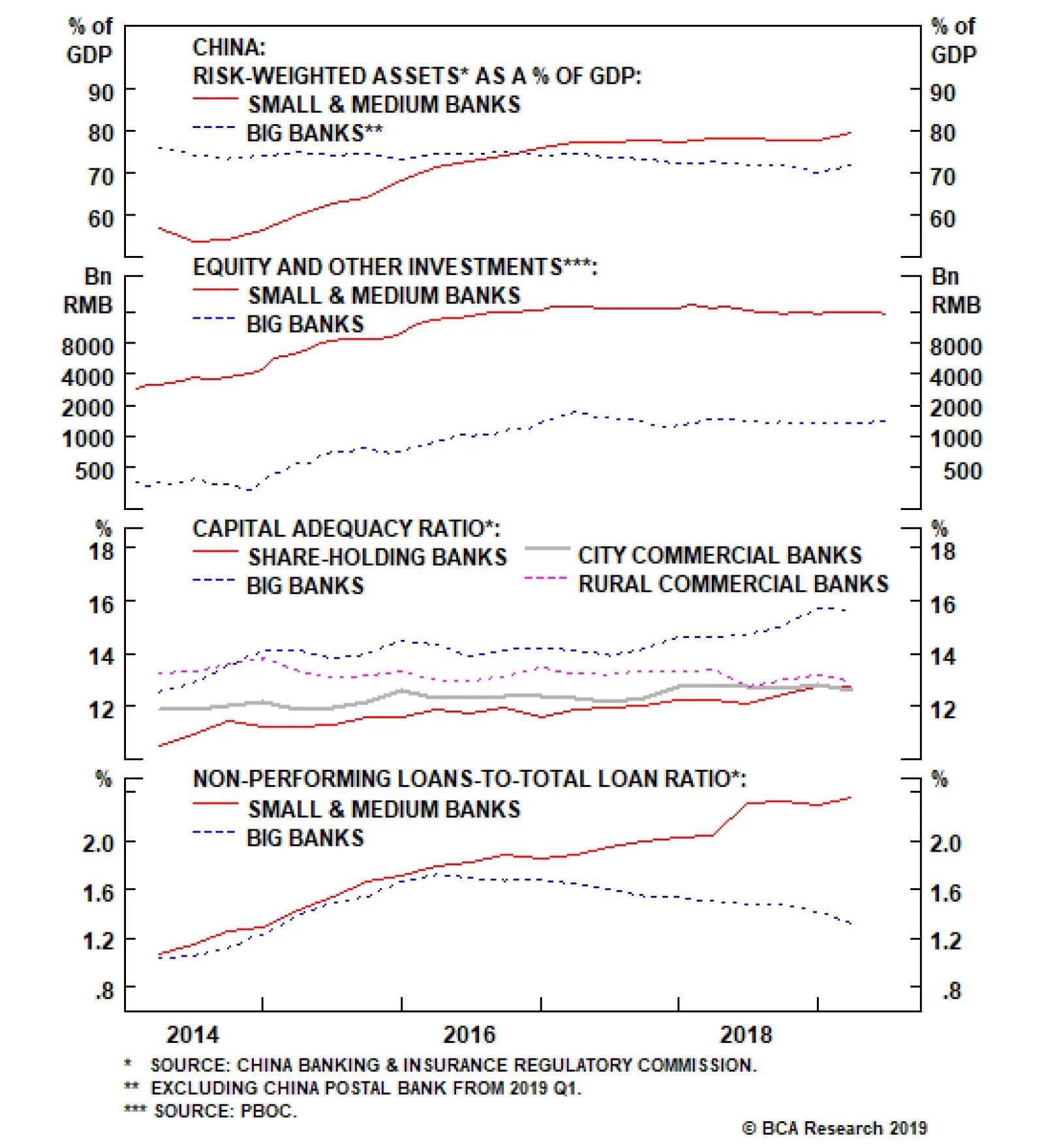
There has so far been no deleveraging among SMBs. Large banks’ RWAs-to-nominal GDP ratio has been in decline since 2014, but the same ratio for SMBs has not dropped at all. The first panel of the chart above corroborates that the credit boom between 2015…