Gov Sovereigns/Treasurys

Highlights Our short EM equity index recommendation has reached our target and we are booking profits on this trade. The halt to economic activity will produce a global recession that will be worse than the one that took place in late 2008. We continue to recommend short positions in a basket of EM currencies versus the US dollar. In EM fixed-income markets, the duration of the ongoing selloff has been short, and large losses will trigger more outflows ensuring further carnage. Stay defensive for now. Russia is unlikely to make a deal with Saudi Arabia to restrain oil output for now. Feature The global economy is experiencing a sudden, jarring halt. The only comparison for such a sudden stop is the one that occurred in the fall of 2008, following Lehman’s bankruptcy. In our opinion, the global economic impact of the current sudden stop is shaping up to be worse than the one that occurred in 2008. That said, we are taking profits on our short position in EM equities. This position – recommended on January 30, 2020 – has produced a 30% gain. EM share prices have reached the long-term support that acted as the ultimate floor during the bear markets in 1997-‘98, 2001-‘02, 2007-‘08 and 2015. Our decision to take profits reflects investment discipline. The MSCI EM stock index in US dollar terms has reached our target. In addition, this decision is consistent with two important indicators that we follow and respect: 1. EM stocks have become meaningfully cheap. Chart I-1 illustrates that our cyclically-adjusted P/E (CAPE) ratio for EM equities is about one standard deviation below its fair value – the same level when the EM equity market bottomed in 1998, 2008 and 2015. Chart I-1EM Equities Are Cheap According To The Cyclically-Adjusted P/E Ratio
EM Equities Are Cheap According To The Cyclically-Adjusted P/E Ratio
EM Equities Are Cheap According To The Cyclically-Adjusted P/E Ratio
For this EM CAPE ratio to reach 1.5 standard deviations below its fair value – the level that is consistent with EM’s 2001-02 lows – EM share prices need to drop another 15%. 2. In term of the next technical support, EM share prices have reached the long-term support that acted as the ultimate floor during the bear markets in 1997-‘98, 2001-‘02, 2007-‘08 and 2015 (Chart I-2). Chart I-2EM Share Prices Are At Their Long-Term Support
EM Share Prices Are At Their Long-Term Support
EM Share Prices Are At Their Long-Term Support
While share prices are likely to undershoot, it is risky to bet on a further decline amid current extremely elevated uncertainty and market volatility. The Global Downturn Will Be Worse Than In Late 2008 Odds are that the current global downturn is shaping up to be worse than the one that occurred in late 2008. From a global business cycle perspective, the current sudden halt is beginning from a weaker starting point. Global trade growth was positive back in August-September 2008 – just prior to the Lehman bankruptcy – despite the ongoing US recession (Chart I-3A). In comparison, global trade was shrinking in December 2019, before the COVID-19 outbreak (Chart I-3B). Chart I-3AGlobal Trade Growth Was Positive In September 2008…
Global Trade Growth Was Positive In September 2008...
Global Trade Growth Was Positive In September 2008...
Chart I-3B…But Was Negative In December 2019
...But Was Negative In December 2019
...But Was Negative In December 2019
This is because growth in EM and Chinese economies was still very robust in the middle of 2008. Moreover, the economies of EM and China were structurally very healthy and were anchored by solid fundamentals. Still, the blow to confidence emanating from the crash in global financial markets and plunge in US domestic demand in the fall of 2008 produced major shockwaves in EM/Chinese financial markets. Provided the ongoing negative confidence shock and lingering uncertainty persist, odds are that the risk premium will initially overshoot before settling down. Consistently, risk markets will undershoot in the interim. This is in contrast with current cyclical growth conditions and structural economic health, both of which are very poor in EM/China going into this sudden stop. In China, economic growth in January-February 2020 was much worse than at the trough of the Lehman crisis in the fourth quarter of 2008. Chart I-4 reveals that industrial production, auto sales and retail sales volumes all contracted in January-February 2020 from a year ago. The same variables held up much better in the fourth quarter of 2008 (Chart I-4). Business activity in China is recovering in March, but from very low levels. Reports and evidence from the ground suggest that many companies are operating well below their ordinary capacity – the level of economic activity remains well below March 2019 levels. US real GDP, consumer spending and capital expenditure shrunk by 4%, 2.5% and 17% at the trough of 2008 recession (Chart I-5). Odds are that these variables will plunge by an even greater magnitude in the coming months as the US reinforces lockdowns and public health safety measures. Chart I-4China Business Cycle Was Much Stronger In Q4 2008 Than Now
China Business Cycle Was Much Stronger In Q4 2008 Than Now
China Business Cycle Was Much Stronger In Q4 2008 Than Now
Chart I-5US Growth At Trough Of 2008 Recession
US Growth At Trough Of 2008 Recession
US Growth At Trough Of 2008 Recession
Chart I-6US Small Caps: Overlay Of 2008 And 2020
US Small Caps: Overlay Of 2008 And 2020
US Small Caps: Overlay Of 2008 And 2020
About 50% of consumer spending in the US is attributed to people over 55 years of age. Provided COVID-19’s fatality rate is high among the elderly, odds are this cohort will not risk going out and spending. How bad will domestic demand in the US be? It is impossible to forecast with any certainty, but our sense is that it will plunge by more than it did in the late 2008-early-2009 period, i.e., by more than 4% (Chart I-5, bottom panel). Interestingly, the crash in US small-cap stocks resembles the one that occurred in the wake of the Lehman bankruptcy (Chart I-6). If US small-cap stocks follow their Q4 2008 - Q1 2009 trajectory, potential declines from current levels will be in the 10%-18% range. Bottom Line: The current halt in economic activity and impending global recession will be worse than the one that took place in late 2008. Reasons Not To Jump Into The Water…Yet Even though EM equities have become cheap and oversold and we are booking profits on our short position in EM stocks, conditions for a sustainable rally do not exist yet: So long as EM corporate US dollar bond yields are rising, EM share prices will remain under selling pressure (Chart I-7). Corporate bond yields are shown inverted in this chart. Chart I-7EM Stocks Fall When EM Corporate Bond Yields Rise
EM Stocks Fall When EM Corporate Bond Yields Rise
EM Stocks Fall When EM Corporate Bond Yields Rise
Chart I-8Chinese And Emerging Asian Corporate Bond Yields Are Spiking
Chinese And Emerging Asian Corporate Bond Yields Are Spiking
Chinese And Emerging Asian Corporate Bond Yields Are Spiking
The selloff in both global and EM credit markets began only a few weeks ago from very overbought levels. Many investors have probably not yet trimmed their positions. Hence, EM sovereign and corporate credit spreads and yields will likely rise further as liquidation in the global and EM credit markets persists. Consistently, bond yields for Chinese offshore corporates as well as emerging Asian high-yield and investment-grade corporates are rising (Chart I-8). EM local currency bond yields have also spiked recently as rapidly depreciating EM currencies have triggered an exodus of foreign investors. Rising local currency bond yields are not conducive for EM share prices (Chart I-9). Chart I-9EM Equities Drop When EM Local Bond Yields Rise
EM Equities Drop When EM Local Bond Yields Rise
EM Equities Drop When EM Local Bond Yields Rise
EM ex-China currencies correlate with commodities prices (Chart I-10). Both industrial commodities and oil prices have broken down and have further downside. The path of least resistance for oil prices is down, given anemic global demand and our expectation that Russia and Saudi Arabia will not reach any oil production cutting agreement for several months (please refer to our discussion on this topic below). Finally, our Risk-On/Safe-Haven currency ratio1 is in free fall and will likely reach its 2015 lows before troughing (Chart I-11). This ratio tightly correlates with EM share prices, and the latter remains vulnerable to further downside as long as this ratio is falling. Chart I-10EM Currencies Move In Tandem With Commodities Prices
EM Currencies Move In Tandem With Commodities Prices
EM Currencies Move In Tandem With Commodities Prices
Chart I-11More Downside In Risk-On/ Safe-Haven Currency Ratio
More Downside In Risk-On/ Safe-Haven Currency Ratio
More Downside In Risk-On/ Safe-Haven Currency Ratio
Bottom Line: Although we are taking profits on the short EM equity position, we continue to recommend short positions in a basket of EM currencies – BRL, CLP, ZAR, IDR, PHP and KRW – versus the US dollar. Liquidation in EM fixed-income markets has been sharp, but the duration has been short –only a few weeks. Large losses will trigger more outflows from EM fixed-income markets. Stay defensive for now. What We Do Know And What We Cannot Know Amid such extreme uncertainty, it is critical for investors to distinguish between what we know and what we cannot know. What we cannot know: With regards to COVID-19: The speed of its spread, the ultimate number of victims it claims and – finally – its impact on consumer and business confidence and psyche. Related to lockdowns: Their duration in key economies. These questions will largely determine this year’s economic growth trajectory: Will it be V-, U-, W-, or L-shaped? Unfortunately, no one knows the answers to the above questions to have any certainty in projecting this year’s global growth. The key factor that gives Russia an advantage over Saudi Arabia in terms of its ability to deal with a negative terms-of-trade shock is not only its better fiscal position but also its ability to depreciate its currency. What we do know: Authorities in all countries will stimulate aggressively so long as financial markets are rioting. Nonetheless, these stimulus measures will not boost growth immediately. With entire countries locked down and plunging consumer and business confidence, stimulus will not have much impact on growth in the near term. In brief, all policy stimulus will boost growth only when worries about the pandemic subside and the economy begins to function again. Both are not imminent. Hence, we are looking at an air pocket with respect to near-term global economic growth. As we argued in our March 11 report titled, Unraveling Of The Policy Put, the pre-coronavirus financial market paradigm – where stocks and credit markets were priced to perfection because of the notion that policymakers would not allow asset prices to drop – has unravelled. In recent weeks, policymakers around the world have announced plans to deploy massive amounts of stimulus, yet the reaction of financial markets has been underwhelming. The reason is two-fold: Both demand shrinkage and production shutdowns have just started, and they will run their due course regardless of announced policy stimulus measures. Equity and credit markets were priced for perfection before this selloff, and investors are in the process of recalibrating risk premiums. Provided the ongoing negative confidence shock and lingering uncertainty persist, odds are that the risk premium will initially overshoot before settling down. Consistently, risk markets will undershoot in the interim. Bottom Line: DM’s domestic demand downturn is still in its initial phase, and there is little foresight in terms of the pandemic’s evolution. These are natural forces, and any stimulus policymakers enact are unlikely to preclude them from occurring. Reflecting the economic contraction and heightened uncertainty, the selloff in risk assets will likely continue for now. Do Not Bet On An Early Resuscitation Of OPEC 2.0 As we argued in our March 11 report, Russia is unlikely to make a deal with Saudi Arabia to restrain oil output in the immediate term. Russia may agree to restart negotiations, but it will not agree to reverse its position for some time. Both nations will be increasing crude output (Chart I-12). As a result, a full-fledged oil market share war is underway. Consistently, crude prices have experienced a structural breakdown (Chart I-13). Chart I-12The Largest Oil Producers Are Ramping Up Output
The Largest Oil Producers Are Ramping Up Output
The Largest Oil Producers Are Ramping Up Output
Chart I-13Structural Breakdown In Oil Prices
Structural Breakdown In Oil Prices
Structural Breakdown In Oil Prices
The key factor that gives Russia an advantage over Saudi Arabia in terms of its ability to deal with a negative terms-of-trade shock is not only its better fiscal position but also its ability to depreciate its currency. Russia has a flexible exchange rate, which will allow the currency to depreciate in order to soften the blow from lower oil prices on the real economy and fiscal accounts. The Russian economy and financial system have learned to operate with recurring major currency depreciations. Saudi Arabia has been running a fixed exchange rate regime since 1986 and cannot use currency depreciation to mitigate the negative terms-of-trade shock on its end. Even though Russia’s fiscal budget break-even oil price is much lower than that of Saudi Arabia’s, it is not the most important variable to consider in this confrontation. The fiscal situation in both Russia and Saudi Arabia will not be a major problem for now. Both governments can issue local currency and US dollar bonds, and there will be sufficient demand for these bonds from foreign and local investors. This is especially true with DM interest rates sitting at the zero-negative territory. Falling oil prices and downward pressure on exchange rates will trigger capital outflows in both countries. Russia has learned to live with persistent capital flight. In the meantime, capital outflows will stress Saudi Arabia’s financial system and, eventually, its real economy. This is in fact the country’s key vulnerability. We will be publishing a Special Report on Saudi Arabia in the coming weeks. Bottom Line: Do not expect a quick recovery in oil prices. Arthur Budaghyan Chief Emerging Markets Strategist arthurb@bcaresearch.com Footnotes 1 Average of CAD, AUD, NZD, BRL, RUB, CLP, MXN & ZAR total return indices relative to average of CHF & JPY total returns. Equities Recommendations Currencies, Credit And Fixed-Income Recommendations
Highlights Policy Responses: The COVID-19 pandemic has become a full-blown global crisis and recession. Governments and central bankers worldwide are now responding with aggressive monetary easing and fiscal stimulus. Markets will not respond positively to such stimulus, however, until there is some visibility on the true depth, and duration, of the economic downturn. Fixed Income Strategy: With a global recession now a certainty, bond yields will remain under downward pressure and credit spreads should widen further. Given how far yields have already fallen, we recommend emphasizing country and credit allocation in global bond portfolios, while keeping overall duration exposure around benchmark levels. Model Portfolio Changes: Following up on our tactical changes last week, we continue to recommend overweighting government debt versus spread product. Specifically, overweighting US & Canadian government bonds versus Japan and core Europe, and underweighting US high-yield and all euro area and EM credit. Feature In stunning fashion, the sudden stop in the global economy due to the COVID-19 pandemic has triggered a rapid return to crisis-era monetary and fiscal policies. The battle has now shifted to trying to fill the massive hole in global private sector demand left by efforts to contain the spread of the virus. It is unlikely that lower interest rates and more quantitative easing can mitigate the negative growth effects from travel bans, closing of bars and restaurants, and full scale lockdowns of cities. Fiscal policy, combined with efforts to boost market liquidity and ease the coming collapse of cash flows for the majority of global businesses, are the only plausible options remaining. It is unlikely that lower interest rates and more quantitative easing can mitigate the negative growth effects from travel bans, closing of bars and restaurants, and full scale lockdowns of cities. While the speed of these dramatic policy moves is unprecedented, the reason for them is obvious. Plunging equities and surging corporate bond credit spreads are signaling a global recession, but one of uncertain depth and duration given the uncertainties surrounding the spread of COVID-19 (Chart of the Week). Chart of the WeekCan Crisis-Era Monetary Policies Be Effective During A Pandemic?
Can Crisis-Era Monetary Policies Be Effective During A Pandemic?
Can Crisis-Era Monetary Policies Be Effective During A Pandemic?
Chart 2Risk Assets Will Not Bottom Until New COVID-19 Cases Ex-China Peak
Risk Assets Will Not Bottom Until New COVID-19 Cases Ex-China Peak
Risk Assets Will Not Bottom Until New COVID-19 Cases Ex-China Peak
The ability for policymakers to calibrate stimulus measures is pure guesswork at this point. The same thing goes for investors who see zero visibility on global growth, with the full extent of the virus yet to be felt in large economies like the United States and Germany – even as new cases in China, where the epidemic began, approach zero. The response from central bankers has been swift and bold – rapid rate cuts, increased liquidity programs for bank funding and increased asset purchases. The fact that global financial markets have remained volatile, even after what is a clear coordinated effort from policymakers, highlights how the unique threats to growth from the COVID-19 pandemic may be beyond fighting with traditional demand-side stimulus measures. We continue to recommend a cautious near-term investment stance, particular with regards to corporate bond exposure, until there is clear evidence that the growth rate of new COVID-19 cases outside China has peaked (Chart 2). Policymakers Throw The Kitchen Sink At The Problem The market moves and policy announcements have come fast and furious this past week, from virtually all major economies. We summarize some of the moves below: United States The Fed cut rates by -100bps in a Sunday night emergency move, taking the funds rate back to the effective lower bound of 0% - 0.25%. Importantly, Fed Chair Powell made it clear at his press conference that negative rates are not on the table, suggesting that we may have seen the last of the rate cuts for this cycle. A new round of quantitative easing (QE) was also announced, with purchases of $500 billion of Treasury securities and $200 billion of agency MBS that will occur in the “coming months”; Powell hinted that those amounts could be increased, if necessary (Chart 3). The MBS purchases are a clear effort to help bring down mortgage rates, which have not declined anywhere near as rapidly as US Treasury yields during the market rout (bottom panel). The Fed also cut the discount window rate – the rate at which banks can borrow from the Fed for periods of up to 90 days – by -150bps, bringing it down to 0.25%. The Fed said it is “encouraging banks to use their capital and liquidity buffers” – essentially telling banks to hold less cash for regulatory purposes. The Fed also reduced the rate on its US dollar swap lines with other central banks. The new rate is OIS +25bps. Coming on top of the massive increase in existing repo lines last week, the Fed is attempting to ensure that banks, both in the US and globally, that need USD funding have more liquidity available to support lending. Already, there are signs of worsening liquidity in the bank funding markets, like widening FRA-OIS spreads, but also evidence of illiquidity in financial markets like wide bid-ask spreads on longer-maturity US Treasuries and the growing basis between high-yield bonds and equivalent credit default swaps (Chart 4). Chart 3A Return To Fed QE
A Return To Fed QE
A Return To Fed QE
Chart 4Market Liquidity Issues Forced The Fed's Hand
Market Liquidity Issues Forced The Fed's Hand
Market Liquidity Issues Forced The Fed's Hand
Turning to fiscal policy, the full response of the Trump administration is still being formed, but a major $850bn spending package has been proposed that would provide tax relief for American households and businesses while also including a $50bn bailout of the US airline industry. This comes on top of previously announced plans to offer free testing for the virus, paid sick leave, business tax credits and a temporary suspension of student loan interest payments. Chart 5The ECB Has Limited Policy Options
The ECB Has Limited Policy Options
The ECB Has Limited Policy Options
Euro Area The European Central Bank (ECB) unexpectedly made no changes to policy interest rates last week. It opted instead to increase asset purchases by €120bn until the end of 2020 (both for government bonds and investment grade corporates), while introducing more long-term refinancing operations (LTROs) to “provide a bridge” to the targeted LTRO (TLTRO-3) that is set to begin in June. The terms of TLTRO-3 were improved, as well; banks that accessed the liquidity to maintain existing lending could do so at a rate up to -25bps below the current ECB deposit rate of -0.5%, for up to 50% of the existing stock of bank loans. The ECB obviously had to do something, given the coordinated nature of the global monetary policy response to COVID-19. Yet the decisions taken show that the ECB is much more limited in its ability to ease policy further, with interest rates already negative, asset purchases approaching self-imposed country limits and, most worryingly, inflation expectations falling to fresh lows (Chart 5). The bigger responses to date have come on the fiscal front, with stimulus packages proposed by France (€45bn), Italy (€25bn), Spain (€3bn) and the European Commission (€37bn). The biggest news, however, came from Germany which has offered affected businesses tax breaks and cheap loans through the state development bank, KfW – the latter with an planned upper limit of €550bn (and with the German government assuming a greater share of risk on those new KfW loans). The German government has also vaguely promised to temporarily suspend its so-called “debt brake” to allow deficit financing of virus-related stimulus programs, if necessary. Other Countries The Bank of England cut interest rates by -50bps last week, while also lowering capital requirements for UK banks by allowing use of counter-cyclical buffers for lending. On the fiscal side, a £30bn package was introduced last week that included a tax cut for retailers, cash grants to small business, sick pay for those with COVID-19 and extended unemployment benefits. The Bank of Japan held an emergency meeting this past Sunday night, announcing no changes in policy rates but doubling the size of its ETF purchase program to $56 billion a year to $112 billion, while also increasing purchases of corporate bonds and commercial paper. The central bank also announced a new program of 0% interest loans to increase lending to businesses hurt by the virus. The Bank of Canada delivered an emergency -50bps cut in its policy rate last Friday, coming soon after the -50bp reduction from the previous week. The central bank also introduced operations to boost the liquidity of Canadian financial markets. The Canadian government also announced a fiscal package of up to C$20bn, including increased money for the state business funding agencies. The Reserve Bank of Australia did not cut its Cash Rate last week, which was already at a record-low 0.5%. It did, however, signal that it would begin a quantitative easing program for the first time, and introduce Fed-like repo operations, to provide more liquidity to the economy and local financial markets. The Australian government has also announced A$17bn of fiscal stimulus. Fiscal packages have also been introduced in New Zealand (where the Reserve Bank of New Zealand just cut its policy rate by -75bps), Sweden, Switzerland, Norway, and South Korea. To date, China has leaned more on monetary and liquidity measures – lowering interest rates and cutting reserve requirements – rather than a big fiscal stimulus package. Will all these policy measures be enough to offset the hit to global growth from COVID-19 and help stabilize financial markets? It is certainly a good start, particularly in countries with low government and deficit levels that have the fiscal space for even more stimulus, like Germany, Australia and Canada (Chart 6). Given these competing forces of global recession and monetary policy exhaustion on one side, but with increasingly more expansive fiscal policy on the other, we recommend a neutral (at benchmark) stance on overall global duration exposure on both a tactical and strategic basis. The ability to calibrate the necessary policy response is impossible to assess without knowing the full impact of COVID-19 pandemic on the global economy – including the size of related job losses and corporate defaults/bankruptcies. Policymakers are likely to listen to the combined message of financial markets – equity prices, credit spreads and government bond yields. The low level of yields and flat yield curves, despite near-0% policy rates across the developed world (Chart 7), suggests that investors see monetary policy as “tapped out”, leaving fiscal stimulus as the only way to fight the economic war against COVID-19. Chart 6At Global ZIRP, The Policy Focus Shifts To Fiscal
At Global ZIRP, The Policy Focus Shifts To Fiscal
At Global ZIRP, The Policy Focus Shifts To Fiscal
Chart 7Are Bond Yields Discounting A Global Liquidity Trap?
Are Bond Yields Discounting A Global Liquidity Trap?
Are Bond Yields Discounting A Global Liquidity Trap?
Given these competing forces of global recession and monetary policy exhaustion on one side, but with increasingly more expansive fiscal policy on the other, we recommend a neutral (at benchmark) stance on overall global duration exposure on both a tactical and strategic basis. Bottom Line: The COVID-19 pandemic has become a full-blown global crisis and recession. Governments and central bankers worldwide are now responding with aggressive monetary easing and fiscal stimulus. Markets will not respond positively to such stimulus, however, until there is some visibility on the true depth, and duration, of the economic downturn. Corporate Bonds In The US & Europe – Stay Tactically Defensive Chart 8This Crisis Is Different Than 2008
This Crisis Is Different Than 2008
This Crisis Is Different Than 2008
The COVID-19 global market rout has generated levels of market volatility not seen since the 2008 Global Financial Crisis. The US VIX index of option-implied equity volatility spiked to a high of 84, while the equivalent German VDAX measure reached a shocking high of 93. Equity valuations in both the US and Europe remain much higher on a forward price/earnings ratio basis compared to the troughs seen in 2008, even after the COVID-19 bear market. Yet even though volatility has returned to crisis-era extremes, and corporate credit has sold off hard in both the US and Europe, credit spreads remain well below the 2008 highs (Chart 8). Nonetheless, the credit selloff seen over the past few weeks has still been intense. Both investment grade and high-yield spreads have blown out, and across all credit tiers in both the US (Chart 9) and euro area (Chart 10). Even the highest-rated segments of the corporate bond universe have seen spreads explode, with AAA-rated investment grade spreads having doubled in both the US and Europe. Chart 9Broad-Based Spread Widening For Both Investment Grade...
Broad-Based Spread Widening For Both Investment Grade...
Broad-Based Spread Widening For Both Investment Grade...
Chart 10...And High-Yield
...And High-Yield
...And High-Yield
With the COVID-19 pandemic tipping the global economy into recession, it is not clear that the spread widening seen to date has been enough to compensate for the typical surge in downgrades and defaults seen during recessions – even though spreads do look wide on a duration-adjusted basis. With the COVID-19 pandemic tipping the global economy into recession, it is not clear that the spread widening seen to date has been enough to compensate for the typical surge in downgrades and defaults seen during recessions – even though spreads do look wide on a duration-adjusted basis. One of our favorite metrics to value corporate bonds is to look at option-adjusted spreads, adjusted for interest rate duration risk. We call this the 12-month breakeven spread, as it measures the amount of spread widening over one year that would leave corporate bond returns equal to those of duration-matched US Treasuries. We then look at the percentile rankings of those breakeven spreads versus their history as one indicator of corporate bond value. Chart 11US Corporates Look Cheaper On A Duration-Adjusted Basis
US Corporates Look Cheaper On A Duration-Adjusted Basis
US Corporates Look Cheaper On A Duration-Adjusted Basis
For the US, the 12-month breakeven spreads for the overall Bloomberg Barclays investment grade and high-yield indices are in the 82nd and 97th percentiles, respectively (Chart 11). This suggests that the latest credit selloff has made corporate debt quite cheap, although only looking through the prism of spread risk rather than potential default losses. Another of our preferred valuation metrics for high-yield debt is the duration-adjusted spread, or the high-yield index option-adjusted spread minus default losses. We then look at that default-adjusted spread versus its long-run average (+250bps) as a measure of high-yield value. To assess the current level of spreads, we use a one-year ahead forecast of the expected default rate using our own macro model. Over the past 12 months, the high-yield default rate was 4.5% and our macro model is currently calling for a rise to 6.2%. That estimate, however, does not yet include the certain hit to corporate profits from the COVID-19 recession. By way of comparison, the default rate peaked at 11.2% during the 2001/02 default cycle and at 14.6% during the 2008 financial crisis. In Chart 12, we show the historical default rate, our macro model for the default rate, and the history of the default-adjusted spread. We also show what the default-adjusted spread would look like in four different scenarios for the default rate over the next 12 months: 6%, 9%, 11% and 15%. The placement of these numbers in the bottom panel of Chart 12 indicates where the Default-Adjusted Spread will be if each scenario is realized. Chart 12US High-Yield Is Not Cheap On A Default-Adjusted Basis
US High-Yield Is Not Cheap On A Default-Adjusted Basis
US High-Yield Is Not Cheap On A Default-Adjusted Basis
Right now, our expectation is that there will be a virus driven US recession, but it will be shorter in magnitude than past recessions; this suggests a peak default rate closer to 9%. Such a scenario would still be consistent with a positive default-adjusted spread and likely positive excess returns for US high-yield relative to US Treasuries on a 12-month horizon. However, if a default rate similar to that seen during past recessions (11% or 15%) is realized, that would lead to a negative default-adjusted spread. Adding up both pieces of our valuation framework suggests that, while US high-yield spreads offer value on a duration-adjusted basis, spreads do not compensate enough for potential default losses if the US recession lasts longer than we expect. Thus, we recommend a tactical underweight position in US high-yield until we see better visibility on the severity, and duration, of the US recession. Adding up both pieces of our valuation framework suggests that, while US high-yield spreads offer value on a duration-adjusted basis, spreads do not compensate enough for potential default losses if the US recession lasts longer than we expect. As for euro area corporates, spreads for both investment grade and high-yield do look relatively wide on a breakeven spread basis, although less so than US credit (Chart 13). However, with the World Health Organization declaring Europe as the new epicenter of the COVID-19 pandemic, the harsh containment measures seen in Italy, Germany, France and elsewhere – coming from a starting point of weak overall economic growth – suggest that euro area spreads need to be wider to fully reflect downgrade and default risks. Chart 13Euro Area Corporates Look A Bit Cheaper On A Duration-Adjusted Basis
Euro Area Corporates Look A Bit Cheaper On A Duration-Adjusted Basis
Euro Area Corporates Look A Bit Cheaper On A Duration-Adjusted Basis
We recommend a tactical underweight allocation to both euro area corporate debt and Italian sovereign debt, as spreads have room to reprice wider to reflect a deeper recession (Chart 14). Chart 14Stay Underweight Euro Area Spread Product
Stay Underweight Euro Area Spread Product
Stay Underweight Euro Area Spread Product
Bottom Line: Corporate bond spreads on both sides of the Atlantic discount a sharp economic slowdown, but the odds of a deeper recession – and more spread widening - are greater in Europe relative to the US. A Quick Note On Recent Changes To Our Model Bond Portfolio In last week’s report, we made several adjustments to our model bond portfolio recommended allocations on a tactical (0-6 months) basis.1 Specifically, we downgraded our overall recommended exposure to global spread product to underweight, while increasing the overall allocation to government debt to overweight. The specific changes made to the model bond portfolio are presented in tables on pages 14 & 15. Within the country allocation of the government bond side of the portfolio, we upgraded US and Canada (markets more sensitive to changes in global bond yields, and with central banks that still had room to ease policy) to overweight, while downgrading core Europe to underweight and Japan to maximum underweight (both markets less sensitive to global yields and with no room to cut rates). On the credit side of the portfolio, we downgraded US high-yield to underweight (with a 0% allocation to Caa-rated debt), while also downgrading euro area investment grade and high-yield debt to underweight. We also lowered allocations to emerging market USD denominated debt, both sovereign and corporate, to underweight. We left the allocation to US investment grade debt at neutral, as the other reductions left our overall spread product allocation at the desired level (35% versus the 43% spread product weighting in our custom benchmark portfolio index). In terms of the specific weightings, the portfolio is now +11% overweight US fixed income versus the benchmark, coming most through US Treasury exposure. The portfolio is now -7% underweight euro area versus the benchmark, equally thorough government bond and corporate debt exposure. The portfolio is now also has a -7% weight in Japan versus the benchmark, entirely from government bonds. Note that these weightings represent a tactical allocation only, as we are recommending a defensive stance on spread product exposure given the near-term uncertainties over COVID-19 and global growth. On a strategic (6-12 months) horizon, however, we are neutral overall spread product exposure versus government bonds. Corporate bond spreads already discount a sharp economic slowdown and some increase in defaults. However, the rapid shift to aggressive monetary and fiscal easing by global policymakers to combat the virus will likely limit the duration and, potentially, the severity of the global slowdown currently discounted in wide credit spreads. Robert Robis, CFA Chief Fixed Income Strategist rrobis@bcaresearch.com Footnotes 1 Please see BCA Global Fixed Income Strategy Weekly Report, "The Train Is Empty", dated March 10, 2020, available at gfis.bcarsearch.com. Recommendations The GFIS Recommended Portfolio Vs. The Custom Benchmark Index
Panicked Policymakers Move To A Wartime Footing
Panicked Policymakers Move To A Wartime Footing
Duration Regional Allocation Spread Product Tactical Trades Yields & Returns Global Bond Yields Historical Returns
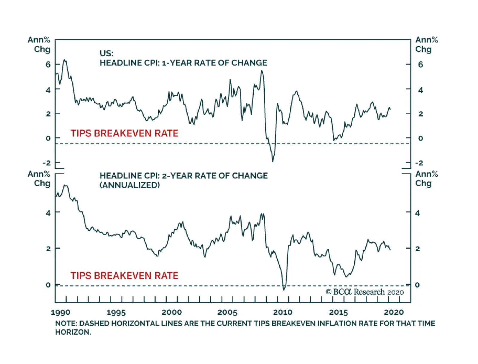
Yesterday, BCA Research’s US Bond Strategy service recommended investors with horizons of 1-year or longer buy TIPS versus equivalent-maturity nominal Treasuries. The COVID-induced global demand shock and the OPEC-induced oil supply shock have taken…
Highlights Duration: We are not prepared to say that bond yields have troughed, even with the fed funds rate now back to the zero bound. Investors should keep portfolio duration close to benchmark. We do not rule out longer-maturity Treasury yields falling to 0% during the next couple of months, but negative bond yields in the US are not possible. TIPS: Current low TIPS breakeven inflation rates signal a rare buying opportunity. Though price swings will be volatile for the next few months, investors with horizons of 1-year or longer would be well advised to go long TIPS versus equivalent-maturity nominal Treasuries. Corporate Bonds: Corporate spreads are widening rapidly but still don’t offer above-average compensation if we adjust for likely future default scenarios. We will wait for a better entry point before recommending a shift back to overweight. Feature Does The Fed’s Bazooka Signal The Bottom In Yields? Chart 1Back To The Zero-Lower-Bound
Back To The Zero-Lower-Bound
Back To The Zero-Lower-Bound
In response to liquidity stresses witnessed in Treasury and MBS markets last week, the Fed decided to move this month’s FOMC meeting up to Sunday afternoon. It then took the opportunity to roll out a massive amount of easing. First the facts: The Fed cut the policy rate by 100 bps, back to the effective lower bound of 0% - 0.25%. Chair Powell also made it clear at his press conference that negative rates are not on the table. The Fed announced purchases of at least $500 billion of Treasury securities and $200 billion of agency MBS that will occur in the “coming months.” The Fed cut the discount window rate – the rate at which banks can borrow from the Fed for periods of up to 90 days – by 150 bps, bringing it down to 0.25%. The Fed said it is “encouraging banks to use their capital and liquidity buffers” (more on this below). The Fed also reduced the rate on its US dollar swap lines with other central banks. The new rate is OIS + 25 bps. The first major question for bond investors is whether this move will mark the bottom in yields (Chart 1). We aren’t so sure. As we write this on Monday morning the 2-year yield is 0.35%, down 14 bps from Friday’s close and the 10-year yield is 0.79%, down 15 bps from Friday. Obviously, further rate cuts won’t be the catalyst for lower bond yields, but investors can still push long-dated yields down if they start to price-in a longer period of time at the zero bound. In contrast, long-dated bond yields will only move up if we start to price-in an eventual economic recovery and exit from zero-bound rate policy. The fact that S&P futures went limit down immediately after the Fed’s big announcement suggests we aren’t at that point yet. Further rate cuts won’t be the catalyst for lower bond yields, but investors can still push long-dated yields down if they start to price-in a longer period of time at the zero bound. In last week’s report we introduced four criteria to monitor to decide when to call the trough in bond yields.1 Even with the Fed’s move back to zero, these four factors remain the most important things to watch. First, we want to see signs that the COVID-19 pandemic is becoming contained. That is, we want to see the daily number of new cases fall close to zero. We are still far away from that point (Chart 2), but evidence from China shows that containment is possible if the rest of the world follows a similar roadmap. Second, we want to see evidence of improving global growth, particularly in China. We showed last week how the Global and Chinese Manufacturing PMIs plunged in February. Since then, higher frequency global growth indicators – such as the performance of cyclical equities over defensives and the CRB Raw Industrials index – have not recovered at all (Chart 3). With very few new COVID cases in China and a large amount of stimulus on the way, we expect Chinese growth indicators to rebound in the coming months. Chart 2Tracking ##br##COVID-19
Tracking COVID-19
Tracking COVID-19
Chart 3Waiting For A Stronger Global Growth & Weaker US Growth
Waiting For A Stronger Global Growth & Weaker US Growth
Waiting For A Stronger Global Growth & Weaker US Growth
Third, we want to see some bad economic data coming out of the US. As of today, the US Economic Surprise Index is a robust +74 and last week’s initial jobless claims and Consumer Sentiment releases were healthy (Chart 3, bottom 2 panels). We know the weak economic data are coming, but they haven’t arrived yet. Until they do, there is an elevated risk of another downleg in bond yields. We expect the time to call the bottom in bond yields will be when the US data are very weak and the Global and Chinese data are improving. Investors will use the global rebound as a roadmap for the US and start to push yields higher. Finally, we would like to see signals from some technical trading rules that have good track records of calling bottoms in bond yields. The technical rules we examined last week are all based on identifying periods when bond market sentiment is extremely bullish and when bond yield momentum hooks up. Chart 4Technical Trading Rules
Technical Trading Rules
Technical Trading Rules
So far, none of the technical rules we identified have been triggered. Our Composite Technical Indicator remains in deeply “overbought” territory (Chart 4), but to generate a sell signal we also need one of our momentum measures to turn positive (Chart 4, bottom 3 panels). This hasn’t happened yet. All in all, none of our four criteria have been met. We are therefore inclined to think that it is too soon to call the bottom in bond yields. Investors should keep portfolio duration close to benchmark. Negative Yields In The US? We think it’s entirely possible that the 10-year Treasury yield could fall as low as 0% during the next couple of months. With the front-end of the curve already pinned at zero, any further market panic will be disproportionately felt at the long-end, and another spate of bad news could easily push the 10-year yield down to 0%. However, if the 10-year yield were to fall to 0%, we would declare that the trough in yields. In other words, negative bond yields will not occur in the US. Why is this the case? We can think of the 10-year Treasury yield as the market’s expected average fed funds rate for the next decade.2 That being the case, the 10-year yield would only turn negative if the market believed that the Federal Reserve was willing to take the policy rate below zero. On Sunday, Chair Powell was adamant that negative interest rates won’t be considered. He said that any further easing would take the form of forward guidance and asset purchases. The strongest form of that would involve caps on intermediate- and/or long-maturity bond yields. Please note that Powell didn’t mention yield caps specifically on Sunday, this is our inference based on past Fed communications. But the main point is that negative bond yields are a policy choice, one that the Federal Reserve is not inclined to make any time soon. It’s highly notable that no country without a negative policy rate has seen negative bond yields further out the curve. One result of the Fed’s “lower for longer” bias is that, coming out of the current crisis, we would expect the equity market to bottom and corporate bond spreads to peak before Treasury yields move higher. Another factor that will weigh on how low long-end Treasury yields fall is whether the market thinks that the Fed views its recent rate cut as an “emergency measure” that will be quickly reversed when the COVID crisis passes, or as a more long-lasting policy change. The Fed was deliberately vague on this question in its statement, saying that it will maintain the current fed funds rate “until it is confident that the economy has weathered recent events and is on track to achieve its maximum employment and price stability goals.” The Fed was deliberately vague precisely because it doesn’t know how quickly it will tighten policy. But given that the result of this year’s Strategic Review will likely be an explicit targeting of above-2% inflation, we can be fairly certain that the Fed will be slow to remove accommodation. We continue to view inflation expectations and financial conditions as the two most important indicators to track to determine the pace of eventual tightening.3 One result of the Fed’s “lower for longer” bias is that, coming out of the current crisis, we would expect the equity market to bottom and corporate bond spreads to peak before Treasury yields move higher. Bottom Line: We are not prepared to say that bond yields have troughed, even with the fed funds rate now back to the zero bound. So far, none of the four triggers we will use to call the bottom in yields have sent a signal. In fact, we do not rule out longer-maturity Treasury yields falling to 0% during the next couple of months, but negative bond yields in the US are not possible. The Fed’s Emergency Liquidity Measures Chart 5A Lack Of Liquidity
A Lack Of Liquidity
A Lack Of Liquidity
On Sunday, Fed Chair Powell said that the reason for moving the FOMC meeting forward was because of worrying signs of deteriorating liquidity in Treasury and Agency MBS markets. Specifically, many observed that the spreads between short-term financing rates (both secured and unsecured) and the risk-free OIS curve jumped last week (Chart 5). Also, mortgage rates didn’t follow Treasury yields lower (Chart 5, bottom panel) and bid/ask spreads widened in the Treasury market. Diagnosing The Problem Our assessment of last week’s liquidity problems is that they arose because, in this post Dodd-Frank/Basel III world, dealer banks are still not sure how to respond during periods of stress. Last week, a lot of nonfinancial firms tapped their revolving credit lines in an attempt to weather the upcoming downturn. This caused an outflow of cash from the banking system. With banks now holding less cash than they were comfortable with, the price of cash in money markets (repo, LIBOR, etc…) started to spike. Because repo is a commonly used tool for financing Treasury trades, the knock-on effect of a spike in the repo rate is a loss of liquidity in the Treasury market. But are banks really short of cash? We got a small taste of the confusion around this issue when repo rates spiked last September. The Fed assumed that it had plenty of room to shrink its balance sheet and drain cash from the banking system because the banks were operating with large liquidity buffers, in excess of what was mandated by regulations like the Liquidity Coverage Ratio (LCR). However, it turned out that banks wanted to hold much more cash than was required by the LCR, in large part because they worried about the Fed’s periodic stress tests, the criteria of which can change over time. The Fed’s Solutions Fortunately, the Fed has taken a lot of aggressive action to help mitigate these problems. First, it announced a large quantity of repo operations last week, then followed that up by announcing direct Treasury and MBS purchases on Sunday. The Fed also lowered the discount window rate to a mere 0.25%, and is encouraging banks to tap that facility if necessary. But, in our view, perhaps the most important measure the Fed announced is simply that policymakers will encourage banks to “use their capital and liquidity buffers”. The fact of the matter is that banks are carrying large amounts of cash but have been hesitant to deploy it because they are worried about regulatory backlash from the Fed. If the Fed can effectively assure banks that it won’t be aggressively enforcing any regulatory action against them for the foreseeable future, then there is already a lot of liquidity in the system waiting to be deployed. Though we expect the Fed’s measures will have a significant positive impact on market liquidity, it will be important to monitor money market spreads going forward. The Fed has still not taken the extreme step of re-launching its crisis-era commercial paper facility and lending directly to nonfinancial corporates. This would be a likely next step if liquidity conditions continue to deteriorate. A Rare Opportunity In TIPS Together, the COVID-induced global demand shock and the OPEC-induced oil supply shock have taken TIPS breakeven inflation rates down to extraordinarily low levels. As of Friday’s close, the 10-year TIPS breakeven inflation rate was a mere 0.92%, the 5-year rate was 0.56% and the 1-year rate was an absurd -0.49%. In fact, both the 1-year and 2-year breakeven rates were negative! For buy and hold investors, this presents an outstanding opportunity to buy TIPS and short the equivalent-maturity nominal bond. For example, a buy and hold investor will make money by going long TIPS and short nominals as long as headline CPI inflation averages above 0.56% per year for the next five years or above 0.92% per year for the next decade (Chart 6). The fact that the 1-year and 2-year breakeven rates are negative is an even greater mispricing because TIPS come with embedded deflation floors. That is, TIPS principal is adjusted higher by the rate of headline CPI inflation but it is never adjusted lower if headline CPI inflation turns negative. The deflation floor means that a negative 1-year or 2-year TIPS breakeven inflation rate represents risk-free profit for anyone who can commit capital for the entire 1-year or 2-year investment horizon. A buy and hold investor will make money by going long TIPS and short nominals as long as headline CPI inflation averages above 0.56% per year for the next five years or above 0.92% per year for the next decade. But abstracting from deflation floors, is it even realistic to expect negative headline CPI during the next 12 months? Even in a worst-case scenario, it is difficult to imagine. First, let’s assume that the Brent crude oil price falls to $20 during the next month and then stays there. The second panel of Chart 7 shows that this would cause year-over-year Energy CPI to hit -20% before recovering. Second, let’s assume that core CPI follows the path implied by our Pipeline Inflation Pressure Gauge, falling from its current 2.4% to 1.8% for the next 12 months (Chart 7, panel 4). Third, let’s assume that year-over-year food inflation collapses all the way to 0% (Chart 7, panel 3). Chart 6TIPS Breakeven Inflation Rates Are Too Low
TIPS Breakeven Inflation Rates Are Too Low
TIPS Breakeven Inflation Rates Are Too Low
Chart 7Worst-Case Scenario For CPI
Worst-Case Scenario For CPI
Worst-Case Scenario For CPI
This worst-case scenario would result in 12-month headline CPI of +0.09% for the next 12 months (Chart 7, bottom panel). Now, core CPI inflation did fall below 1% during the last recession, an occurrence that would certainly lead to headline CPI deflation if it happened again. However, shelter makes up 42% of core CPI. Without a significant slowdown in the housing market, such a large decline in core inflation is unlikely. Bottom Line: Current low TIPS breakeven inflation rates signal a rare buying opportunity. Though price swings will be volatile for the next few months, investors with horizons of 1-year or longer would be well advised to go long TIPS versus equivalent-maturity nominal Treasuries. Corporate Bond Spreads:Too Soon To Buy Corporate bond spreads have widened dramatically during the past few weeks. Within the investment grade space, the overall index spread and the average spread excluding the energy sector have both broken above their 2016 peaks. The investment grade energy spread is still 56 bps below its 2016 peak (Chart 8A). In high-yield, the overall index spread is still 112 bps below its 2016 peak. The energy spread is 23 bps below its 2016 peak and the ex-energy spread is 112 bps below its 2016 peak (Chart 8B). Chart 8AInvestment Grade Corporate Bond Spreads
Investment Grade Corporate Bond Spreads
Investment Grade Corporate Bond Spreads
Chart 8BHigh-Yield Corporate Bond Spreads
High-Yield Corporate Bond Spreads
High-Yield Corporate Bond Spreads
Obviously, spreads are widening quickly and value is returning to the sector. This raises the important question of: When will it be a good idea to step in and buy? To answer this question we need to view current spread levels relative to the magnitude of the upcoming economic shock. During the past 12 months, the speculative-grade corporate default rate was 4.5% and our macro model already anticipates a rise to 6.2%. This would bring the default rate above the 5.8% peak seen in 2017, but is probably still too low of an estimate given that the upcoming corporate profit hit is not yet reflected in our model (Chart 9). Gross leverage – the ratio of total debt to pre-tax profits – enters our default rate model with a roughly six month lag, meaning that we wouldn’t expect any current hit to profits to impact the default rate for another six months. For further context, we note that the default rate peaked at 11.2% during the 2001/02 default cycle and at 14.6% during the 2008 financial crisis. Chart 9An Above-Average Default-Adjusted Spread Signals A Buying Opportunity
An Above-Average Default-Adjusted Spread Signals A Buying Opportunity
An Above-Average Default-Adjusted Spread Signals A Buying Opportunity
The bottom panel of Chart 9 shows our High-Yield Default-Adjusted Spread. This is a measure of the excess spread in the high-yield index after subtracting ex-post default losses. Its historical average is around 250 bps. We shocked our Default-Adjusted Spread to see what it would be in four different scenarios for the default rate: 6%, 9%, 11% and 15%. The placement of these numbers in the bottom panel of Chart 9 indicates where the Default-Adjusted Spread will be if each scenario is realized. For example, if the default rate comes in at 6% for the next 12 months then the Default-Adjusted Spread will be +347 bps, above its historical average. If the default rate is 9% during the next 12 months the Default-Adjusted Spread will still be positive, at +108 bps, but will be below historical average. A default rate similar to what was seen during past recessions (11% or 15%) would lead to a negative Default-Adjusted Spread. Right now, our best estimate of a short-lived recession would suggest a peak default rate of somewhere between 6% and 9%, probably closer to 9%. Such a scenario would be consistent with a positive Default-Adjusted Spread and likely positive excess returns for corporate bonds (both investment grade and high-yield) relative to Treasuries on a 12-month horizon. However, we also note that periods of spread widening usually culminate with our Default-Adjusted Spread measure well above its historical average. This was the case in 2016, 2009 and 2002. As of now, this sort of attractive valuation will only be achieved if the default rate is 6% or lower during the next 12 months, a forecast that seems overly optimistic. The bottom line is that we are inclined to wait for a more attractive entry point before recommending a shift back to an overweight allocation to corporate bonds versus Treasuries. Though it is probably too late for investors with long time horizons (12 months or more) to sell. Ryan Swift US Bond Strategist rswift@bcaresearch.com Footnotes 1 Please see US Bond Strategy Weekly Report, “When And Where Will Bond Yields Trough?”, dated March 10, 2020, available at usbs.bcaresearch.com 2 Technically, the 10-year yield is equal to 10-year rate expectations plus a term premium to compensate investors for locking up funds for 10 years instead of rolling over a series of overnight investments. The term premium is difficult to estimate in practice, but it is likely to be quite close to zero at present. 3 For further details on why investors should focus on these two measures to assess the pace of eventual policy tightening please see US Bond Strategy / Global Fixed Income Strategy Special Report, “The Fed In 2020”, dated December 17, 2019, available at usbs.bcaresearch.com Fixed Income Sector Performance Recommended Portfolio Specification
Highlights The S&P 500 is in a bear market, and a recession appears to be inevitable, … : The longest bull market in S&P 500 history succumbed last week to the Saudi-Russia oil war, the relentless drumbeat of spreading COVID-19 disruptions and the realization that it will take even worse market conditions to prompt a meaningful fiscal response. … but it is BCA’s view that the recession will be short, if sharp: Although our conviction level is low, and our view is subject to change as more information becomes available, we expect that the recession is much more likely to produce a V-bottom than a U-bottom. Pent-up demand will be unleashed once the coronavirus runs its course, stoked by monetary and fiscal stimulus initiatives around the world. Are central banks out of bullets?: We are not yet ready to embrace the most provocative idea that came up at our monthly View Meeting last week, but the question highlights the uncertainty that currently pervades markets. First, do no harm: What should an investor do now? Watch and wait. It is too early to re-risk a portfolio, but safe-haven assets are awfully overbought. Cash is worth its weight in gold right now, and those who have it should remember that they call the shots. Feature The S&P 500 entered a bear market last Thursday, bringing down the curtain on the longest US equity bull market in recorded history at just under 11 years.1 We are duly chastened by the misplaced bravado we expressed in last week’s report, which crumbled under the force of the ensuing weekend’s oil market hostilities between Saudi Arabia and Russia. We see the plunge in oil prices, and the looming spike in oil-patch defaults, bankruptcies and layoffs, as the straw that broke the camel’s back, ensuring a 2020 recession. Now that it has slid so far, we expect that the S&P 500 will generate double-digit returns over the next twelve months, but we do not believe that investors should be in any rush to buy. Wild oscillations are a sign of an unhealthy market, and stocks don’t establish a durable bottom while they are still experiencing daily spasms. The Fundamental Take (For What It’s Worth) We nonetheless believe that the recession will be fairly brief, even if it is sharp. The global economy was clearly turning around before the virus emerged, and the US economy was as fit as a fiddle. Data releases across February were decidedly positive, on balance, and the year-to-date data, as incorporated in the Atlanta Fed’s GDPNow model, pointed to robust first quarter growth in an economy that was firing on all cylinders (Chart 1). We continue to believe that most of the demand that goes missing across the first and the second quarters will not be lost for good, but will simply be deferred to the second half of this year and the beginning of next year. The coronavirus has brought an end to the expansion, but the US economy was in rude health before it was infected, and we expect it will make a full and swift recovery. Chart 1The First Quarter Had Been Shaping Up Really Well
March Sadness
March Sadness
Chart 2Old Faithful
Old Faithful
Old Faithful
That pent-up demand will be goosed by abundant monetary and fiscal stimulus. We expect that China and the US will take the lead, and will have the most impact on global aggregate demand, but that policymakers in other major economies will also lend a hand. Central banks in Australia, Canada and England have all cut rates in the last two weeks, and British policymakers took the boldest step, pairing last week’s rate cut with an immediate 30-billion-pound infusion of emergency spending, and a pledge to spend 600 billion pounds on infrastructure upgrades between now and 2025.2 Australia announced a plan to inject fiscal stimulus equivalent to about 1% of GDP Thursday morning, and Germany’s ruling party indicated a willingness to run a budget deficit to combat the virus.3 Our China Investment Strategy team notes that the Chinese authorities are already supporting domestic demand via aid to threatened businesses and out-of-work individuals, and are poised to open the infrastructure taps (Chart 2). Global aggregate demand is also set to receive a boost from the oil plunge, although it will arrive with a lag. Energy sector layoffs and the tightening in monetary conditions from wider bond spreads and marginally tighter bank lending standards will exert an immediate drag on activity. Once that drag fades, however, the positive supply-shock effects will take hold, helping households stretch their paychecks and non-energy businesses expand their profit margins. Although the effect of falling oil prices is mixed for the US now that fracking has made it a heavyweight oil producer, more economies are oil importers than exporters, and global growth is inversely related to oil price moves. We are keenly aware that markets are paying no attention whatsoever to economic data releases right now. They are backward-looking, after all, and fundamentals are not the driving force behind current market moves anyway. The data are useful, however, for evaluating the fundamental backdrop once the non-stop selling abates, as it eventually will. When it becomes important to take the measure of the economy and where it’s headed, investors will be able to make a more informed judgment if they have a good read on how the economy was doing before it was exposed to the virus (Chart 3). Chart 3Layoffs Are Coming, But They Hadn't Started By Early March
Layoffs Are Coming, But They Hadn't Started By Early March
Layoffs Are Coming, But They Hadn't Started By Early March
Investment Strategy The near-term equity view was cautious when we held our View Meeting Wednesday morning before the open. No one thought investors should be in any hurry to buy, and while not everyone shared the bleakest S&P 500 downside estimate of 2,400 (well within sight now), no one suggested that the index had already bottomed. One participant made the case for a negative 10-year Treasury yield, but we still have little appetite for Treasuries as a house. We expect the 10-year yield will be higher in twelve months than it is now, if perhaps only modestly. We like equities' 12-month prospects, but they may have to decline some more before Congress joins hands and puts a floor under them. For anyone expecting US fiscal stimulus to bail out the markets, our geopolitical team sounded a note of caution. A recession is kryptonite for incumbent presidential candidates, and the more the virus squeezes the economy, the greater the Democrats’ chances of capturing the White House and the Senate. Our Geopolitical Strategy service fully expects that Democrats will eventually agree to a sizable spending package, but only after allowing the situation to deteriorate some more. As long as they don’t look like they’re putting party concerns ahead of the nation’s welfare, they can dent the president’s re-election prospects by waiting to throw a lifeline to the economy and financial markets. The administration’s initial proposal, as alluded to in the president’s prime-time Oval Office address on Wednesday night, fell way short of what the market sought. Its small-bore items seemed woefully inadequate to stem the tide, and raised the unsettling prospect that the fiscal cavalry might fail to ride to the rescue because the administration didn’t think it needed to be summoned. The good news for markets is that governments get an almost unlimited number of do-overs.4 The first iteration’s failure ensures that the second will be more ambitious, and if that fails, the third iteration will be even bigger. Thank You, Sir, May I Have Another? News of disruptions to economic activity, and daily life, in the United States piled up last week. Colleges closed their gates en masse for what remains of the academic year; concerts and music festivals were cancelled; the NCAA basketball tournament was initially closed to fans, then cancelled altogether; and all of the major North American professional sports leagues have suspended their seasons. In many instances, city and state ordinances banning mass gatherings forced sports franchises’ and concert promoters’ hands. The relentless drumbeat of bad news did markets no favors, and it surely did not help business or consumer confidence as broadcasters, hotels, restaurants, bartenders, taxi drivers and arena staff totted up their lost income. Today’s pain may be tomorrow’s gain, however. While draconian measures weigh on peoples’ spirits and crimp economic activity in the immediate term, they increase the chances of limiting the virus’ spread and mitigating its ultimate effect. As our Global Investment Strategy colleagues have pointed out, there is a trade-off between health and growth. Bulking up health safeguards unfortunately involves some growth sacrifices. Are Central Banks Out Of Bullets? Chart 4If At First You Don't Succeed, ...
If At First You Don't Succeed, ...
If At First You Don't Succeed, ...
The most provocative line of argument in last week’s firm-wide discussion was the idea that the coronavirus is a bit of a red herring, and that the true driver of the global market selloff is the failure of the policy put. That’s to say that the efficacy of, and the belief in, central banks’ ability to shore up markets and the economy has crumbled. So far, this round of emergency rate cuts has failed to stem the flow of red on Bloomberg terminals and television screens (Chart 4). Spending plans have underwhelmed as well, with British, Australian and Japanese equities all fizzling following the announcement of fiscal stimulus measures. The end of markets’ monetary policy era would mark a major inflection point, if not a full-on regime change. We are hesitant to make such a sweeping declaration now, however. As one of our colleagues put it in making the case for further declines in rates, the golden rule of investing is never to lean against a primary trend. Positioning for an end to central banks’ influence on markets would mean going against 33 years of history that began with the Fed’s post-Black Monday statement affirming its “readiness to serve as a source of liquidity to support the economic and financial system.” Central bankers are neither omniscient nor omnipotent, but there’s a reason why You can’t fight the Fed became a cherished truism. It affects the real economy when it turns its policy dials. If monetary stimulus is aligned with fiscal stimulus, as it just might be next week, it can make for a potent cocktail. A devotee of the Austrian School of Economics may grind his or her teeth to dust over the endless intervention in markets, but the results are popular with the public and elected officials, and we can expect that they’ll continue over most professional investors’ relevant timeframes. Public officials will let go of the Debt Supercycle controls only when they’re pried out of their cold, dead hands. What Now? It feels like it was a month ago, but just last week we were of the view that a correction was more likely than a bear market. As we wrote then: We remain constructive on risk assets because we think the selling has gotten overdone. There may well be more of it, and the S&P 500 could reach its 2,708.92 bear-market level before we can publish again next Monday, but we will be buying it in our own account all the way there. Compounding our embarrassment and regret, we actually did buy shares in a SIFI bank on Tuesday as they approached their tangible book value. Markets were unimpressed with the initial monetary salvo, but there's more where that came from (and some fiscal artillery, too). We have learned our lesson and will wait before committing any more capital. We have also learned our lesson about “overdone selling.” Despite the dramatic gap between the S&P 500 and its 200-day moving average (Chart 5), every single sale over the last three weeks has proven to be a good one. Cutting one’s losses is a deservedly celebrated portfolio management rule, and we cannot object to any client who wants to take some exposure off the table. Chart 5The Equity Selloff Has Become Extreme
The Equity Selloff Has Become Extreme
The Equity Selloff Has Become Extreme
We have little love for the havens that have already spiked, like gold, Treasuries, utilities and makers and sellers of hand sanitizer, disinfectant wipes and surgical masks. Insurance in the form of index puts is bracingly expensive. Our preferred way of taking advantage of the massive market disruption (Chart 6 and Table 1) is to write out-of-the money puts on individual stocks at strike prices where we’d be happy to own them. With the VIX in the 50s, much less the 60s or 70s, an investor writing puts 10% out of the money on a range of S&P 500 constituents5 can get paid double-digit annualized returns in exchange for agreeing to get hit down 10% between now and March 20th or April 17th. Chart 6Selling Insurance Looks More Appealing Than Buying It Right Now
Selling Insurance Looks More Appealing Than Buying It Right Now
Selling Insurance Looks More Appealing Than Buying It Right Now
Table 1One Week, Two Historic Declines
March Sadness
March Sadness
We recognize that not every investor has discretion to write puts, and it is not something to be done lightly in any event. The compensation is so high because it is a contractual agreement to buy stock in a relentlessly falling market. (Options only confer a right to transact for their buyers; they’re an iron-clad obligation to transact for their sellers.) Our species’ cognitive biases being what they are, however, we like the strapped-to-the-mast feature of writing puts because it commits an investor to following through on a course of action s/he decided upon before price declines had a chance to shake his/her resolve. It is one thing to have said that one would buy a 35-dollar stock if it ever got to 18, and quite another to follow through now that it’s gone from 35 to 21 in short order. Doug Peta, CFA Chief US Investment Strategist dougp@bcaresearch.com Footnotes 1 The bull market began on March 10, 2009, at 676.53, and ended February 19, 2020, at 3,386.15. Its 400% advance was achieved at an annualized rate of 15.8%. 2 Nominal 4Q19 UK GDP was about 560 billion pounds. 3 Believe it or not, this is kind of a big deal for Berlin. 4 As we were going to press, it looked as if House Democrats and the administration were nearing agreement on a package to protect vulnerable workers and small businesses, while the combined private- and public-sector efforts outlined in the Rose Garden suggested that the US might be capable of stemming the spread of the virus soon. 5 Type [ticker]-F8-PUT into Bloomberg for the full menu of maturities and strike prices for any given stock. The annualized return for writing the put is equal to the option premium divided by the strike price, multiplied by (360/the number of days until expiration). For near-month contracts, if the premium is around 1% of the strike, the annualized return on the notional capital committed is 10%.
Feature “People have been asking me whether this is the time to buy. My answer is more nuanced: it’s probably a time to buy.” Howard Marks, Oaktree Capital, Monthly Memo March 2020 Markets have moved dramatically since we published our Monthly Portfolio Update on March 2. Global stocks have fallen by 27% since then. The 10-year US Treasury yield fell from 1.2% to 0.4% before rebounding to 0.8%. And there have been some strange market moves: the US dollar fell then rebounded, and the classic safe haven, gold, has fallen by 7%. Investors are struggling with how to think about this environment, and how to position. Chart 1Risk Assets Should Bottom When New Ex-China Cases Peak
Risk Assets Should Bottom When New Ex-China Cases Peak
Risk Assets Should Bottom When New Ex-China Cases Peak
Table 1US Healthcare Is Top Quality
A Time To Buy, Or A Time To Panic?
A Time To Buy, Or A Time To Panic?
Our view has not greatly changed. We still believe that risk assets will bottom around the time when global COVID-19 cases peak. They showed signs of a rebound when cases in China peaked on February 13. And they started their recent crash when ex-China cases began to accelerate dramatically (Chart 1). It is likely – and well anticipated – that there will be a sharp rises in cases in the US (and probably the UK and Canada too) over the coming two or three weeks. It is wrong to think, though, that the US is particularly badly prepared for this. The US has a high standard of healthcare, with many more intensive-care beds per person than other developed countries (Table 1) – though it is worrying that some 20% of the US population is uninsured. We see two possibilities for how the pandemic will pan out in coming weeks: The US is the last big cluster and new cases peak there in early April. This causes a two-quarter recession. But if COVID-19 turns out to be seasonal (it has not spread much in hot countries such as Singapore, or in the southern hemisphere where it is now summer – Chart 2) and by April and May it peters out. US consumers stop going out for a while (the professional hockey, basketball, and soccer seasons have been put on hold) and so demand falls. Typically, stocks fall by 25-30% in a recession of this type (Table 2) – and so this is already close to being discounted. There are no longer-term impacts, and soon the world economy is getting back close to normal. Chart 2Will Hot Weather End The Pandemic?
A Time To Buy, Or A Time To Panic?
A Time To Buy, Or A Time To Panic?
Table 2Peak-To-Trough Falls In Equities In Bear Markets
A Time To Buy, Or A Time To Panic?
A Time To Buy, Or A Time To Panic?
The pandemic continues for months. Governments are able to slow contagion via social distancing in order to spread out the pressure on their health services over a longer period. But ultimately one-half to two-thirds of the world’s population gets the disease and the death rate among those people is 0.7% (the rate in Korea, which extensively tested for the virus and has a good medical system). This means worldwide deaths of about 20 million, disproportionately concentrated among the over-70-year-olds and those with chronic illnesses (Chart 3). The disease could spread to poor countries, such as India and Africa, where healthcare services would not be able to cope. The global economy would slow significantly, causing a severe recession. There would be second-round effects: for example, a blow-up in the US corporate credit markets, where debt is already high as a percentage of GDP (Chart 4), which could cause banks to drastically tighten lending conditions. This could cause problems with foreign-currency EM borrowers. It could trigger another euro zone crisis, as banks in southern Europe prove unable to cope with rising defaults. In this scenario, the peak-to-trough decline in global equities could be 40-50%. Chart 3COVID-19 Mostly Kills Old And Sick People
A Time To Buy, Or A Time To Panic?
A Time To Buy, Or A Time To Panic?
Chart 4US Corporate Debt Is A Vulnerability
US Corporate Debt Is A Vulnerability
US Corporate Debt Is A Vulnerability
In our last Monthly, we talked about the usefulness of a Bayesian approach in this sort of uncertain environment. We ascribed a “prior” probability of 10-20% for the latter scenario. The probability has now risen, to perhaps 25%. Chart 5Close To Capitulation
Close To Capitulation
Close To Capitulation
But the potential upside from Scenario 1) is considerable. Central banks around the world are throwing everything at the problem. Countries from the UK and Italy, to Japan and Australia have rolled out big fiscal packages this week. The key now is what will the US do. How positively would markets react if the US in coming days scripted a coordinated announcement, with the Fed cutting rates to zero, and the White House and Congress agreeing an $800 billion fiscal package. The Fed is likely to do this – indeed the market is pricing in the Fed Funds Rate at zero by the next FOMC meeting on March 18. The dynamics of fiscal stimulus are more complicated – the Democrats don’t want to give President Trump a boost that will help his election prospects, but they don’t want to be seen to be obstructive in a time of emergency either.1 So what should investors do? We have been tempted in recent days to lower our Overweight recommendation on equities, which has evidently proved wrong, to Neutral. But we fear it is too late to do this, particularly with equities having fallen by 15% over the past two days. There is probably still some downside. We would now look for signs of a bottoming-out, most notably the peak in new COVID-19 cases outside China, but also evidence of capitulation by investors (Chart 5). Moreover, we would pay attention to potential upside surprises (in addition to a Fed/White House/Congress joint package, maybe a making-up between Russia and Saudi Arabia on oil production cuts). In the meantime, when markets move as violently as they have, often the baby gets thrown out with the bathwater. There are many individual securities, in both debt and equity markets, that look very attractively valued now. For example, we see a lot of attraction in high-dividend-yield stocks, which might appeal to investors who no longer see the point of investing in government bonds, where the upside – even in a severe recession – is likely to be very limited. Table 3 shows a screening of large-cap stocks in developed markets with a dividend yield of more than 10%, taken from BCA Research’s ETS quants screening service. While many of these are in the Energy sector (where the price/book ratio is now below the lows of 2008 and 2015 – Chart 6), quality names among European Financials and Asia Industrials are also prominent. Table 3Stocks With Dividend Yield Above 10%
A Time To Buy, Or A Time To Panic?
A Time To Buy, Or A Time To Panic?
Chart 6Energy Sector Valuation At Record Low
Energy Sector Valuation At Record Low
Energy Sector Valuation At Record Low
For investors who want to remain risk-off, we would not recommend government bonds as a hedge. It is notable that the Swiss 10-year government bond yield has not fallen in the recent melt-down. They are simply at their theoretical lower bound. German Bunds must be close. The Fed has been clear that it will not cut policy rates below zero, which means that the lower limit for US Treasurys is probably around 0% too. Even in the severest recession, therefore, the upside for Treasurys is limited to 9% (Table 4). This means returns are likely to be very asymmetrical since, in a rebound in risk appetite, yields could rise sharply. Table 4Little Upside From Government Bonds
A Time To Buy, Or A Time To Panic?
A Time To Buy, Or A Time To Panic?
We prefer cash as a hedge. This gives investors dry powder for use when they do want to reenter risk assets. We have been recommending gold, and it will probably continue to serve as a safe haven in the event of our most pessimistic scenario happening. But it looks very overbought in the short term (Chart 7) – as demonstrated by the way that it has recently been correcting even on days when equities fall. TIPS offer a better hedge than nominal bonds, given how low inflation expectations have fallen – the 5-year/5-year forwards now point to CPI inflation in 2025-2030 averaging 1.5% (Chart 8). This implies – highly unrealistically – that the Fed will miss its 2% PCE inflation target by 1 percentage point a year over that period. Chart 7Gold Is Overbought
Gold Is Overbought
Gold Is Overbought
Chart 8Inflation Expectations Unrealistically Low
Inflation Expectations Unrealistically Low
Inflation Expectations Unrealistically Low
Garry Evans, Senior Vice President Chief Global Asset Allocation Strategist garry@bcaresearch.com Footnotes 1 Please see Geopolitical Strategy, Weekly Report, "GeoRisk Update: Leap Year, Or Steep Year?" available at gps.bcaresearch.com.
On a happy personal note, I will be away on paternity leave for a short time, reacquainting myself with nappies. As such, there will be no Weekly Reports for the next two weeks, but you will receive two excellent Special Reports penned by my colleagues. Given the ongoing turbulence in the financial markets I will also send out short Alerts as and when necessary. Highlights After the worst three-day rout for stocks versus bonds in living memory, six-month investors have fully capitulated, and the markets are now priced for a technical recession. If the recession can be limited to two quarters, stocks are more likely to outperform long-dated bonds by 12 percent than to underperform by a further 12 percent. Tactical trade: overweight S&P500 versus German 30-year bund, currency hedged, setting a 12 percent profit target with symmetrical stop-loss. The closer that a bond yield gets to the -1 percent lower bound, the more limited becomes the possibility for a further yield decline. Overweight positive yielding bonds versus negative yielding bonds, currency hedged. The most attractive structural pair is overweight the US 30-year T-bond versus the German 30-year bund. Feature Chart of the WeekWidow Makers: Shorting Bonds In Japan, Switzerland... And Now The US
Widow Makers: Shorting Bonds In Japan, Switzerland... And Now The US
Widow Makers: Shorting Bonds In Japan, Switzerland... And Now The US
A Recession Is Now Fully Priced Financial markets have fully priced a downturn when the time horizon of investors that have fully capitulated = the length of the downturn. A week can be a long time in the financial markets. Seven days ago, the markets were not priced for a global recession. Then came the worst three-day rout for stocks versus bonds in living memory, in which stocks underperformed long-dated bonds by 25 percent (Chart I-2).1 Chart I-2The Worst 3-Day Rout: Stocks Underperformed Bonds By 25 Percent
The Worst 3-Day Rout: Stocks Underperformed Bonds By 25 Percent
The Worst 3-Day Rout: Stocks Underperformed Bonds By 25 Percent
The upshot is that investors with six-month horizons have now fully capitulated, meaning the markets are now fully priced for a technical recession (Chart I-3) – defined as a downturn lasting two straight quarters. But the markets are not priced for a more prolonged downturn lasting longer than two quarters. Raising the question: can the downturn be limited to the first half of the year? Chart I-3Six-Month Investors Have Capitulated, Meaning A Recession Is Fully Priced
Six-Month Investors Have Capitulated, Meaning A Recession Is Fully Priced
Six-Month Investors Have Capitulated, Meaning A Recession Is Fully Priced
The pessimistic case is that the coronavirus can neither be contained nor normalised by the summer. Or that even if its direct impact ebbs, there might be second-round effects. A major credit default from, say, a distressed airline or other travel-dependent company could trigger aftershocks in the financial system. Moreover, the recent collapse in the oil price injects new uncertainty into the energy patch as well as into geopolitics. The optimistic case is that large segments of the economy are set to receive a 2009 type triple-boost: from a sharp deceleration in bond yields; from a sharp deceleration in the oil price; and from government spending and/or tax cuts – creating a potent cocktail of stimulants for the second half of this year. Investors with six-month horizons have now fully capitulated. Balancing the pessimistic and optimistic cases, we assess that the downturn can be limited to two quarters – albeit this cannot be our highest conviction view, as we are not experts in epidemiology or immunology. Nevertheless, if this assumption holds, there is now a higher probability that stocks outperform long-dated bonds by 12 percent than that they underperform by a further 12 percent. This three-month tactical trade has a slight twist. It is best expressed as: overweight US stocks versus European bonds (currency hedged). This is because core European bond yields are close to their lower limit, meaning that core European bond prices are close to their mathematical upper limit. All of which brings us to a much higher conviction recommendation. The ‘Widow Maker’ Is Back First the widow maker came to Japan, next to Switzerland, then to the rest of Northern Europe. Now the widow maker has come to America. In the financial lexicon, ‘widow maker’ refers to the fatal strategy of shorting high-quality government bonds in an era when yields have been grinding inexorably lower. Any investment manager who has dared to bet that government bond yields would rise, whether starting from 3 percent, 2 percent, or even 1 percent, and whether in Japan, Switzerland, or even the US – has ended up being carried out of their job in a box, feet first (Chart of the Week). Except that in Switzerland over the past year, the widow maker trade has not been as fatal as it used to be. While the 5-year yield in the US has collapsed by 200 bps, in Switzerland it has edged down by just 20 bps (Chart I-4). Put another way, shorting the US 5-year T-bond has cost 11 percent, but shorting the Swiss 5-year bond has been relatively painless (Chart I-5). Chart I-4Swiss Bond Yields Cannot Fall Much...
Swiss Bond Yields Cannot Fall Much...
Swiss Bond Yields Cannot Fall Much...
Chart I-5...Meaning Swiss Bond Prices Cannot Rise
...Meaning Swiss Bond Prices Cannot Rise
...Meaning Swiss Bond Prices Cannot Rise
The simple reason is that Swiss government bond yields are now very close to their lower bound. The Lower Bound To Bond Yields Is Around -1 Percent The practical lower bound to the policy interest rate is -1 percent, because -1 percent counterbalances the storage cost of holding physical cash and/or other stores of value.2 Imagine the policy rate fell to well below -1 percent. If banks passed this deeply negative rate to their depositors, it would be logical for the bank depositors to flee wholesale into cheaper-to-hold physical cash. This deposit flight would kill the banking system. But if the banks didn’t pass the deeply negative policy rate to their depositors, it would wipe out the banks’ net interest margin – the gap between rates on loans and deposits. This inability to make profits would also kill the banking system. At deeply negative interest rates, bank deposits would flee. Could policymakers just abolish physical cash, forcing us all into ‘digital cash’ with unlimited negative interest rates? No, because that would just push us into other stores of value: for example, gold, or ‘decentralised’ cryptocurrencies. The common objections to cryptocurrencies are that their susceptibility to volatility and fraud makes them a poor store of value. But both objections are also true for gold. Yet who has ever argued that gold cannot be a store of value just because it is volatile and can be stolen (Chart I-6)! Chart I-6Gold Is A Store Of Value Despite Its Volatility
Gold Is A Store Of Value Despite Its Volatility
Gold Is A Store Of Value Despite Its Volatility
The lower bound to the policy rate at around -1 percent also sets the lower bound of the bond yield, because a bond yield is just the expected average policy rate over the bond’s lifetime. For completeness, we should mention one technical exception. If bond investors price in the possibility of being repaid in a different and more valuable currency, the bond yield will carry a further redenomination discount as an offset for the potential currency gain. This is relevant to euro area bonds because there remains the remote possibility of euro disintegration. Therefore, bonds which carry the small possibility of a currency redenomination gain – notably, German bunds – possess a small additional discount on their yields. But in jurisdictions where no currency redenomination is possible, such as Switzerland or Sweden, the practical lower bound to bond yields is around -1 percent. Overweight Positive Yielding Bonds Versus Negative Yielding Bonds Switzerland teaches us that the closer that a bond yield gets to the -1 percent lower bound, the more limited becomes the possibility for a further yield decline (price gain), whereas the possibility for a yield increase (price loss) stays unlimited. Making such bonds a ‘lose-lose’ proposition. The convergence in bond yields has much further to go. Therefore, our high conviction recommendation is to short negative yielding bonds in relative terms. In other words, overweight positive yielding bonds versus negative yielding bonds. And currency hedge the position – as, right now, the cost of currency hedging is low. The recommendation is applicable for both tactical (3-month) and structural (2-year plus) investment horizons, and it is applicable for all bond maturities: 5-year, 10-year, and 30-year. Given where yields now stand, the most attractive structural pair is overweight the US 30-year T-bond versus the German 30-year bund (Chart I-7 and Chart I-8). Chart I-7Expect Yields To Converge At 10-Year Maturities...
Expect Yields To Converge At 10-Year Maturities...
Expect Yields To Converge At 10-Year Maturities...
Chart I-8...And At Ultra-Long ##br##Maturities
...And At Ultra-Long Maturities
...And At Ultra-Long Maturities
Our structural overweight to a 50:50 combination of U.S. T-bonds and Italian BTPs versus a 50:50 combination of German Bunds and Spanish Bonos at 30-year bond maturities is up by 7 percent in just nine months. But the convergence in yields has much further to go (Chart I-9). Chart I-9Overweight Positive Yielding Bonds Versus Negative Yielding Bonds
Overweight Positive Yielding Bonds Versus Negative Yielding Bonds
Overweight Positive Yielding Bonds Versus Negative Yielding Bonds
Fractal Trading System* As discussed, this week’s recommended trade is to overweight stocks versus long-dated bonds expressed as overweight S&P500 versus German 30-year bund. The profit target is 12 percent with a symmetrical stop-loss. In a turbulent week for financial markets, overweight Poland versus Portugal achieved its profit target, short US utilities versus oil and gas and short EUR/CHF hit their stop-losses, and short palladium versus nickel moved comfortably into profit. The rolling 1-year win ratio now stands at 62 percent. Chart I-10Poland Vs. Portugal
Poland Vs. Portugal
Poland Vs. Portugal
When the fractal dimension approaches the lower limit after an investment has been in an established trend it is a potential trigger for a liquidity-triggered trend reversal. Therefore, open a countertrend position. The profit target is a one-third reversal of the preceding 13-week move. Apply a symmetrical stop-loss. Close the position at the profit target or stop-loss. Otherwise close the position after 13 weeks. * For more details please see the European Investment Strategy Special Report “Fractals, Liquidity & A Trading Model,” dated December 11, 2014, available at eis.bcaresearch.com. Dhaval Joshi Chief European Investment Strategist dhaval@bcaresearch.com Footnotes 1 MSCI All-Country World Index (in dollars) versus US 30-year T-bond. 2 The cost of holding physical cash or gold is the cost of its safe storage. Fractal Trading Model
The Widow Maker Is Back... And A Recession Is Fully Priced
The Widow Maker Is Back... And A Recession Is Fully Priced
The Widow Maker Is Back... And A Recession Is Fully Priced
The Widow Maker Is Back... And A Recession Is Fully Priced
Cyclical Recommendations Structural Recommendations
The Widow Maker Is Back... And A Recession Is Fully Priced
The Widow Maker Is Back... And A Recession Is Fully Priced
The Widow Maker Is Back... And A Recession Is Fully Priced
The Widow Maker Is Back... And A Recession Is Fully Priced
The Widow Maker Is Back... And A Recession Is Fully Priced
The Widow Maker Is Back... And A Recession Is Fully Priced
The Widow Maker Is Back... And A Recession Is Fully Priced
The Widow Maker Is Back... And A Recession Is Fully Priced
Trades Closed Trades Asset Performance Currency & Bond Equity Sector Country Equity Indicators Bond Yields Chart II-1Indicators To Watch - Bond Yields
Indicators To Watch - Bond Yields
Indicators To Watch - Bond Yields
Chart II-2Indicators To Watch - Bond Yields
Indicators To Watch - Bond Yields
Indicators To Watch - Bond Yields
Chart II-3Indicators To Watch - Bond Yields
Indicators To Watch - Bond Yields
Indicators To Watch - Bond Yields
Chart II-4Indicators To Watch - Bond Yields
Indicators To Watch - Bond Yields
Indicators To Watch - Bond Yields
Interest Rate Chart II-5Indicators To Watch - Interest Rate Expectations
Indicators To Watch - Interest Rate Expectations
Indicators To Watch - Interest Rate Expectations
Chart II-6Indicators To Watch - Interest Rate Expectations
Indicators To Watch - Interest Rate Expectations
Indicators To Watch - Interest Rate Expectations
Chart II-7Indicators To Watch - Interest Rate Expectations
Indicators To Watch - Interest Rate Expectations
Indicators To Watch - Interest Rate Expectations
Chart II-8Indicators To Watch - Interest Rate Expectations
Indicators To Watch - Interest Rate Expectations
Indicators To Watch - Interest Rate Expectations
Highlights Bear markets occur in phases, and their narrative can mutate. What began as a selloff caused by the coronavirus outbreak could well mutate into an oil crash-led selloff, and then mutate again into a selloff due to policy omnipotence, or something else. We are reiterating our short positions in the EM equity index and a basket of EM currencies versus the US dollar as well as our defensive positioning in EM domestic bonds and credit markets. We are taking profits on our long gold/short oil and copper trade. Oil prices may stabilize, but risks are still skewed to the downside. We are also booking gains on our long Russian domestic bonds/short oil position. Feature Chart I-1A Record Low Currency VOL Is Followed By Major Market Disturbances
A Record Low Currency VOL Is Followed By Major Market Disturbances
A Record Low Currency VOL Is Followed By Major Market Disturbances
Global financial markets are witnessing the unwinding of the policy put. For the past several years, the consensus in the global investment community was that risk assets could not go down because of policy puts from the Federal Reserve, the US Treasury and President Trump, the European Central Bank and the Chinese authorities. Similarly, crude oil prices had been supported by OPEC 2.0’s put from December 2016 until recently. The latest panic and broad-based liquidation of risk assets has been due not only to fear and uncertainty related to the rapid escalation in COVID-19 cases around the world, but also to investor realization that these policy puts are ineffectual. The Fed’s 50-basis-point intra-meeting rate cut proved incapable of stabilizing global risk assets. Investors have begun to doubt the efficacy of policy puts and have thrown in the proverbial towel. Crucially, the high-speed and intensity of the selloff was due to widespread complacency and overbought conditions in risk assets. In our January 23 report, we quoted Bob Prince, co-CIO of Bridgewater, who stated in Davos that “…we have probably seen the end of the boom-bust cycle.” This comment was consistent with prevalent complacency in global financial markets, reflected in very tight credit spreads worldwide, high US equity multiples and record-low implied volatility in various asset classes. In the same January 23 report, we wrote: “Any time an influential person has made a similar declaration in the past, it marked a major turning point in financial markets. Remarkably, implied volatility for the US dollar has plummeted to a record low, as it has for EM currencies and a wide range of equity markets. Chart I-1 illustrates the implied volatility for EM currencies and the US dollar. Such low levels of implied currency market volatility historically preceded major moves in currency markets and often led to a material selloff in broad EM financial markets.” In that same report , we recommended going long implied EM currency volatility. Since then JP Morgan’s EM currency volatility has risen from 6% to 10%. What began as a selloff caused by the coronavirus outbreak could well mutate into an oil crash-led selloff, and then mutate again into a selloff due to policy omnipotence, or something else. Consistent with this thesis, we reinstated our short EM equity index recommendation in the following week’s report – on January 30. The MSCI EM stock index is down 11% since then. Our target is 800, which is 18% below current levels (Chart I-2, top panel). Chart I-2EM Stocks: A Breakdown In The Making
EM Stocks: A Breakdown In The Making
EM Stocks: A Breakdown In The Making
Market Narratives Mutate Chart I-3VIX Surge In Early 2018 Was A Trigger Not Cause Of Selloff
VIX Surge In Early 2018 Was A Trigger Not Cause Of Selloff
VIX Surge In Early 2018 Was A Trigger Not Cause Of Selloff
Narratives of all large market moves are always expounded in retrospect. Only after a selloff is well-advanced do investors and commentators come up with reasons for it and build a plausible narrative describing it. Critically, bear markets occur in phases, and their narrative can evolve. What began as a selloff caused by the coronavirus outbreak could well mutate into an oil crash-led selloff, and then mutate again into a selloff due to policy omnipotence, or something else. For example, the early 2018 selloff in global equities and industrial commodities was at the time attributed to the spike in US equity volatility (Chart I-3, top and middle panels). In retrospect, January 2018 marked a major top in the global business cycle (Chart I-3, bottom line). Hence, the true reason for the late-January 2018 top in global stocks and industrial commodities was a downturn in global manufacturing and trade and not the surge in the VIX. The key question investors are currently wrestling with is the following: How deep will this selloff be, and how long will it last? Our view is that the selloff in EM and global risk assets is not yet over. As such, we are reiterating our short positions in the EM equity index and a basket of EM currencies versus the US dollar, as well as our defensive positioning in EM domestic bonds and credit markets. Gauging The Downside There is no doubt that global growth will be affected by the spread of COVID-19 and the precautionary measures taken by the authorities, companies and households around the world to contain the outbreak. Further, growth visibility is extremely low, and that uncertainty is raising the risk premiums that investors demand. The latter is weighing on risk assets in general and global share prices in particular. Presently, precise forecasts for GDP growth and a potential trajectory of COVID-19 cases are not credible, and hence cannot be relied upon to formulate a sound investment strategy. If the current bloodbath in risk assets persists, a market bottom could be reached well before bad economic data are released or COVID-19 infection cases peak. Given the uncertainty related to both the global growth trajectory and the Covid-19 epidemic, the only way for investors to gauge a market bottom is to continuously examine valuations, technicals and market internals. With respect to valuations and technicals, we have the following observations: The EM equity index seems to breaking below its major support lines. If this breakdowns transpires, there is an air pocket until the index reaches its next technical support, which is 18% below its current level (please refer to the top panel of Chart I-2 on page 3). If the EM MSCI equity index drops to this support range, it would be trading at 11 times its trailing earnings (please refer to the bottom panel of Chart I-2 on page 3). At those levels, the EM equity index would be discounting a lot of bad news, making it immune to dismal economic data and general uncertainty. For the S&P 500, if the current defense line – which held been during 2011, 2015 and 2018 selloffs – is violated, the next long-term technical support is around 2400-2500 (Chart I-4). Inflows to EM fixed-income funds were enormous in 2019. Meanwhile, EM corporate and sovereign spreads have broken out (Chart I-5). Provided this selloff commenced from very overbought and expensive levels, the odds are that liquidation forces will not abate right now and that the selloff in EM fixed income has further to go. Chart I-4S&P 500: Where Technical Support Lies?
S&P 500: Where Technical Support Lies?
S&P 500: Where Technical Support Lies?
Chart I-5EM Sovereign And Corporate Spreads Have Broken Out
EM Sovereign And Corporate Spreads Have Broken Out
EM Sovereign And Corporate Spreads Have Broken Out
In a nutshell, we suspect that EM local currency bonds and credit markets received a lot of inflows from European investors in recent years because yields were negative across European fixed-income markets. A weak euro was a boon for European investors investing in EM. That, however, is reversing. Since the recent sharp appreciation in the euro and the nosedive in EM currencies, EM financial market returns in euros have collapsed. This will likely prompt an exodus of European investors from EM financial markets. Chart I-6A Major Breakdown In This Cyclical Indicator
A Major Breakdown In This Cyclical Indicator
A Major Breakdown In This Cyclical Indicator
Even though the EM equity index is not expensive or overbought, rising EM USD and local currency bond yields herald lower share prices, as we discussed at length in last week’s report. Our Risk-On/Safe-Haven currency ratio1 has plummeted below its major technical support and the next level is significantly lower. In other words, this indicator is also in an air pocket (Chart I-6). Given it is extremely well-correlated with EM share prices, the latter will not bottom until this indicator stabilizes. Technical configurations of high-beta and cyclical segments of the global equity universe are consistent with failed breakouts. Such a profile is typically not followed by a correction, but by a major drawdown. These include the European aggregate equity index, the Nikkei, global industrials and US high-beta stocks (Chart I-7). Chart I-7AFailed Breakouts Are Often Followed By Large Drawdowns
Failed Breakouts Are Often Followed By Large Drawdowns
Failed Breakouts Are Often Followed By Large Drawdowns
Chart I-7BFailed Breakouts Are Often Followed By Large Drawdowns
Failed Breakouts Are Often Followed By Large Drawdowns
Failed Breakouts Are Often Followed By Large Drawdowns
Chart I-8The Global Stocks-To-Bonds Ratio Is Back To 2011 Levels
The Global Stocks-To-Bonds Ratio Is Back To 2011 Levels
The Global Stocks-To-Bonds Ratio Is Back To 2011 Levels
Finally, the global stock-to-bond ratio has decisively broken below the upward sloping channel that has been in place since 2009 (Chart I-8). Typically, when a market or ratio experiences such a major breakdown, the recovery does not occur quickly and is unlikely to be V-shaped. In short, the structural breakdown in the global stocks-to-bond ratio suggests that global share prices will likely stay under downward pressure for some time. Bottom Line: Odds are that risk assets remain in a liquidation phase and investors should avoid catching a falling knife. The odds are also high that EM share prices in US dollar terms have another 18% downside. We reckon at those levels – where the MSCI EM equity index is around 800 – it would be safe to start accumulating EM equities, even if the global growth outlook remains mired in uncertainty. For now, we recommend playing EM on the short side. What To Do With Oil Plays Despite periodic spikes in crude prices over the past few years, we have held our conviction that oil is in a structural bear market. We doubted the sustainability of the OPEC 2.0 arrangement, arguing that Russia would not cooperate with Saudi Arabia in the long term. Russia did cooperate much longer than we had expected, temporarily supporting oil prices. Ultimately, Russian President Vladimir Putin abandoned the cartel late last week, and the Saudis have hit back with massive price discounts amid large output increases. Consequently, oil prices have crashed and are presently oversold (Chart I-9). Given the uncertainty related to both the global growth trajectory and the Covid-19 epidemic, the only way for investors to gauge a market bottom is to continuously examine valuations, technicals and market internals. However, there will be no rapprochement between the Saudis and the Russians for some time. Given the drop in demand amid sharp increases in supply, crude oil prices may well slide further. Since July 11, 2019, we have been recommending a long gold/short oil and copper trade (Chart I-10). This position has generated a large 40% gain. Today, we are taking profits on this trade. Instead, we are replacing it with a new position: long gold/short copper. Chart I-9A Long-Term Profile Of Oil Prices
A Long-Term Profile Of Oil Prices
A Long-Term Profile Of Oil Prices
Chart I-10Book Profits On Long Gold / Short Oil And Copper Trade
Book Profits On Long Gold / Short Oil And Copper Trade
Book Profits On Long Gold / Short Oil And Copper Trade
Among oil plays, we have been overweight Mexico and Russia within EM, both in fixed income and equity universes. That said, for absolute return investors, we have not been recommending unhedged long positions in either Mexico or Russia because of our expectation of a drop in oil prices and the ensuing broad-based EM selloff. Regarding Russia, for investors who were looking to gain exposure to local currency bonds, we have been recommending that they hedge this position by shorting oil since November 14, 2019. This recommendation has paid off well, and we are closing this position with a 26% gain. We will be looking to buy Russian local bonds unhedged in the weeks ahead. Chart I-11Relative Performance Of Russian And Mexican Domestic Bonds Is Facing Near-Term Headwinds
Relative Performance Of Russian And Mexican Domestic Bonds Is Facing Near-Term Headwinds
Relative Performance Of Russian And Mexican Domestic Bonds Is Facing Near-Term Headwinds
In Mexico, we have also been reluctant to recommend naked exposure to local currency or US dollar bonds because of our bearish view on oil and the risk of large outflows from EM that would hurt the peso. Indeed, the oil crash and outflows from EM have led to a plunge in the Mexican currency. Instead, in Mexico we have been recommending betting on yield curve steepening. The proposition has been that short rates are anchored by a disinflationary backdrop and tight fiscal policy in Mexico while the long end of the curve could sell off in a scenario of capital outflows from EM. As with Russia, we are monitoring Mexican markets and are looking to recommend buying domestic bonds without hedging the currency risk in the weeks or months ahead. Bottom Line: We are taking profits on our long gold/short oil and copper trade. Oil prices may stabilize, but risks are still skewed to the downside. In the near term, the relative performance of Mexican and Russian stocks and local currency bonds versus their respective EM benchmarks could be undermined by capital outflows from EM in general and these countries in particular (Chart I-11). Nevertheless, both nations’ macro fundamentals remain benign, and their fixed-income and equity markets will outperform their EM peers in the medium term. Arthur Budaghyan Chief Emerging Markets Strategist arthurb@bcaresearch.com Footnotes 1 Calculated as ratio of equal-weighted average of total return indices of cad, aud, nzd, brl, idr, mxn, rub, clp & zar relative to average of jpy & chf total returns (including carry); rebased to 100 at January 2000. Equities Recommendations Currencies, Credit And Fixed-Income Recommendations
Highlights Uncertainty & Yields: Global bond yields, driven to all-time lows as investors seek safety amid rioting markets, now discount a multi-year period of very weak global growth and inflation. Bond Portfolio Strategy: Maintain overall neutral portfolio duration exposure with so much bad news already priced into yields. Downgrade overall global spread product exposure to underweight versus governments on a tactical (0-3 months) basis given intense uncertainties on COVID-19 and oil markets. Model Bond Portfolio Changes – Governments: Upgrade countries that are more responsive to changes in the level of overall global bond yields and with room to cut interest rates (the US & Canada) to overweight, while downgrading sovereign debt with a lower “global yield beta” and less policy flexibility (Germany, France, Japan) to underweight. Model Bond Portfolio Changes – Credit: Downgrade US high-yield, euro area corporates and emerging market USD sovereigns & corporates to underweight. Feature Chart of the WeekOn The Verge Of Global ZIRP
On The Verge Of Global ZIRP
On The Verge Of Global ZIRP
The title of this report is a quote from a worried BCA client this morning, discussing his daily commute into Manhattan from the New York suburbs. We can think of no better analogy for the mood of investors in the current market panic. After having enjoyed a decade of riding the gravy train of recession-free growth and robust returns on risk assets, all underwritten by accommodative monetary policies, worries about a deflationary bust following the boom have intensified. The global spread of COVID-19, the ebbs and flows of the US presidential election and, now, a stunning collapse in oil prices – markets have simply been unable to process the investment implications of these unpredictable events all at once. At times of such stress, the obvious thing to do is to stand aside and hedge portfolios while awaiting better visibility on the uncertainties. At times of such stress, the obvious thing to do is to stand aside and hedge portfolios while awaiting better visibility on the uncertainties. It is clear that global government bonds have been a preferred hedge, with yields collapsing to record lows worldwide. While most of the market attention has been on the breathtaking fall in US yields that has pushed the entire Treasury curve below 1% as the market has moved to discount a swift move to a 0% fed funds rate. New lows were also hit yesterday in countries that had been lagging the Treasury rally: the 10-year German bund reached -0.85% yesterday, while the 10-year UK Gilt fell to an intraday all-time low of 0.08% with some shorter-maturity Gilt yields actually dipping into negative territory (Chart of the Week). The common driver of yesterday’s yield declines was the 25% plunge in global oil prices after the weekend collapse of the OPEC 2.0 alliance between Russia and Saudi Arabia. The inflation expectations component of global bond yields fell accordingly, continuing the correlation with energy prices seen over the past decade. Yet the real component of global bond yields has also been falling, with markets increasingly pricing in an extended period of weak growth and negative real interest rates – especially in the US. Collapsing US Treasury Yields Discount A Recession, Not A Financial Crisis Chart 2Re-opening Old Wounds
Re-opening Old Wounds
Re-opening Old Wounds
While this latest plunge in US equity markets has been both rapid and powerful, the damage only takes us back to levels on the S&P 500 last seen as recently as January 2019 (Chart 2). The turmoil, however, has reopened old wounds in markets that had suffered their own crises over the past decade, with European bank stocks hitting new all-time lows and credit spreads on US high-yield Energy bonds and Italian sovereign debt (versus Germany) sharply blowing out. The backdrop remains treacherous and global equity markets will likely remain under pressure until the number of new COVID-19 cases peaks outside of China (especially in the US). If there is one silver lining amidst the market carnage, it is that there appears to be few signs of 2008-style systemic financial stress. If there is one silver lining amidst the market carnage, it is that there appears to be few signs of 2008-style systemic financial stress. Bank funding indicators like Libor-OIS spreads and bank debt spreads have widened a bit over the past week but remain at very subdued levels (Chart 3). This is in sharp contrast to classic risk aversion indicators like the price of gold and the value of the Japanese yen versus the Australian dollar, which are closing in on the highs seen during the 2008 global financial crisis and 2012 European debt crisis. Chart 3A Growth Downturn, Not A Systemic Crisis
A Growth Downturn, Not A Systemic Crisis
A Growth Downturn, Not A Systemic Crisis
We interpret this as investors being far more worried about a deep global recession than another major financial crisis. That is also confirmed in the pricing of US Treasury yields, especially when looking at the real yield. Chart 4Does The UST Market Think R* Is Negative?
Does The UST Market Think R* Is Negative?
Does The UST Market Think R* Is Negative?
Chart 5Another Convexity-Fueled Bond Rally
Another Convexity-Fueled Bond Rally
Another Convexity-Fueled Bond Rally
The entire TIPS yield curve is now negative for the first time, even with the real fed funds rate below the Fed’s estimate of the “r*” neutral real rate (Chart 4). The combination of low and falling inflation expectations, and plunging real yields, indicates that the Treasury market now believes that the neutral real funds rate is not 0.8%, as suggested by the Fed’s estimate of r*, but is somewhere well below 0%. With the fed funds rate now down to 0.75% after last week’s intermeeting 50bps cut, the Treasury market is not only pricing the Fed quickly returning to the zero lower bound on the funds rate, but staying trapped at zero for a very long time. The Treasury market is not only pricing the Fed quickly returning to the zero lower bound on the funds rate, but staying trapped at zero for a very long time. Yet that may be too literal an interpretation of the incredible collapse of US Treasury yields. The power of negative convexity is also at work, driving intense demand for long-duration bonds that puts additional downward pressure on yields. Large owners of US mortgage backed securities (MBS) like the big commercial banks have seen the duration of their MBS holdings collapse as yields have fallen. The result is that banks are forced to buy huge amounts of Treasuries (or receive US dollar interest rate swaps) to hedge their duration exposure of negative convexity MBS, hyper-charging the fall in Treasury yields – perhaps over $1 trillion worth of buying, by some estimates.1 This is a similar dynamic to what occurred last summer in Europe, when sharply falling bond yields triggered convexity-related demand for duration from large asset-liability managers like pension funds, further fueling the decline in bond yields (Chart 5). Yet even allowing that some of the Treasury yield decline has been driven by a mechanical demand for duration, a 10-year US Treasury yield of 0.56% clearly discounts expectations of a US recession, as well – which appears justified by the recent performance of some critical US economic data. In Charts 6 & 7, we show a “cycle-on-cycle” analysis of some key US financial and indicators and how they behave before and after the start of the past five US recessions. The charts are set up so the vertical line represents the start of the recession, and we line up the data for the current business cycle as if the latest data point represents the start of a recession. Done this way, we can see if the current data is evolving in a similar fashion to past US economic downturns. Chart 6The US Business Cycle Looks Toppy
The US Business Cycle Looks Toppy
The US Business Cycle Looks Toppy
Chart 7COVID-19 Will Likely Trigger A Confidence-Driven US Recession
COVID-19 Will Likely Trigger A Confidence-Driven US Recession
COVID-19 Will Likely Trigger A Confidence-Driven US Recession
The charts show that the current flat 10-year/3-month US Treasury curve and steady decline in corporate profit growth are both accurately following the path entering past US recessions. Other indicators like the NFIB Small Business confidence survey, the Conference Board’s leading economic indicator and consumer confidence series typically peak between 12-18 months prior to the start of a recession, but appear to be only be peaking now. The same argument goes for initial jobless claims, which are usually rising for several months heading into a recession but remain surprisingly steady of late – a condition that seems unlikely to continue as more companies suffer virus-related hits to their sales and profits and begin to shed labor. Net-net, these reliable cyclical US data suggest that the Treasury market is right to be pricing in elevated recession risk – especially with US cases of COVID-19 starting to increase more rapidly and US financial conditions having tightened sharply in the latest market rout. Bottom Line: Global bond yields, driven to all-time lows as investors seek safety amid rioting markets, now discount a multi-year period of very weak global growth and inflation – most notably in the US. Allocation Changes To Our Model Bond Portfolio The stunning fall in global bond yields has already gone a long way. Yet it is very difficult to forecast a bottom in yields, even with central banks easing monetary policy to try and boost confidence, before there is evidence that the global COVID-19 outbreak is being contained (i.e. a decreasing total number of confirmed cases). By the same token, corporate bonds (and equities) will continue to be under selling pressure until the worst of the viral outbreak has passed. We raised our recommended overall global duration stance to neutral last week – a move that was more tactical in nature as a near-term hedge to our strategic overweight corporate bond allocations in our Model Bond Portfolio amid growing market volatility. Yet with the new stresses coming from the collapse in oil prices and increasing spread of COVID-19 in the US and Europe, we are moving to a much more cautious near-term stance on global credit. Yet with the new stresses coming from the collapse in oil prices and increasing spread of COVID-19 in the US and Europe, we are moving to a much more cautious near-term stance on global credit. This week, we are making the following additional changes to our model bond portfolio to reflect the growing odds of a global recession: Downgrade global corporates to underweight versus global governments Maintain a neutral overall portfolio duration, but favor countries within the government bond allocation that are more highly correlated to changes in to the overall level of global bond yields. Chart 8Favor Higher-Beta Bond Markets With Room To Cut Rates
Favor Higher-Beta Bond Markets With Room To Cut Rates
Favor Higher-Beta Bond Markets With Room To Cut Rates
Given how far yields have declined already, we think raising allocations to “high yield beta” countries that can still cut interest rates, at the expense of reduced weightings toward low beta countries that have limited scope to ease policy, offers a better risk/reward profile than simply raising duration exposure across the board. Such a nuanced argument is less applicable to global corporates, where elevated market volatility, poor investor risk appetite and deteriorating global growth momentum all argue for continued near-term underperformance of corporates versus government bonds. Specifically, we are making the following changes to our recommended allocations, presented with a brief rationale for each move: Upgrade US Treasuries and Canadian government bonds to overweight: Both Treasuries and Canadian bonds are higher beta markets, as we define by a regression of monthly yield changes to changes in the yield of the overall Bloomberg Barclays Global Treasury index (Chart 8). The Fed cut 50bps last week as an emergency measure and has 75bps to go before reaching the zero bound, which the market now expects by mid-year. Additional bond bullish moves after reaching the zero bound, like aggressive forward guidance, restarting quantitative easing and even anchoring Treasury yields in a BoJ-like form of yield curve control, are all possible if the US enters a recession. Meanwhile, the Bank of Canada (BoC) followed the Fed’s cut with a 50bp easing the next day and signaled that additional rate cuts are likely to prevent a plunge in Canadian consumer confidence. The collapsing oil price likely seals the deal for additional rate cuts by the BoC in the next few months. Downgrade Japanese government bonds to maximum underweight: Japanese government bonds (JGBs) are the most defensive low-beta market in model bond portfolio universe, thanks to the Bank of Japan’s Yield Curve Control policy that anchors the 10yr JGB yield around 0%. This makes JGBs the best candidate for a maximum underweight stance when global bond yields are not expected to rise in the near term, as we expect. Downgrade Germany and France to Underweight: The ECB meets this week and will be under pressure to ease policy given recent moves by other major central banks. A -10bps rate cut is expected, which may happen to counteract the recent increase in the euro versus the US dollar, but there is also possibility that ECB will increase and/or extend the size and scope of its current Asset Purchase Program. Given the ECB’s lack of overall monetary policy flexibility, and low level of inflation expectations, we see limited scope for the lower-beta German and French government bonds to outperform their global peers. Remain overweight UK and Australia: While both Australian government bonds and UK Gilts have a “median” yield beta in our model bond portfolio universe, both deserve moderate overweights as there is still the potential for rate cuts in both countries. The Reserve Bank of Australia (RBA) cut the Cash Rate by -25bps last week and they are still open to cut further to boost a sluggish economy hurt by wildfires and weak export demand from China. The RBA will stay more dovish for longer until we will see clear signs of a rebound of the Chinese economy from the COVID-19 outbreak. The Bank of England (BoE) will likely cut its policy rate later this month, or even before the next scheduled policy meeting, as COVID-19 is starting to spread through the UK. Downgrade US High-Yield To Underweight: US junk bonds had already taken a hit during the global market selloff in recent weeks, but the collapse in oil prices pummeled the market given the high weighting of US shale producers in the index (Chart 9). With additional weakness in oil prices likely as Russia and Saudi Arabia are now in a full-fledged price war, US high-yield will come under additional spread widening pressure focused on the weaker Caa-rated segment that contains most of the energy names. We recommend a zero weight in the Caa-rated US junk bonds, within an overall underweight allocation to the entire asset class. Downgrade euro area investment grade and high-yield corporates to underweight: COVID-19 is now spreading faster in Germany and France, after leaving Italy in a full-blown national crisis. The export-oriented economies of the euro area were already vulnerable to a global growth slowdown, but now domestic growth weakness raises the odds of a full-blown recession – not a good environment to own corporate bonds, especially with the euro now appreciating. Downgrade emerging market (EM) USD-denominated sovereigns and corporates to underweight: EM debt remains a levered play on global growth, so the increased odds of a global recession are a problem for the asset class – even with sharply lower interest rates and early signs of a softening in the US dollar (Chart 10). Chart 9Downgrade US Junk Bonds To Underweight
Downgrade US Junk Bonds To Underweight
Downgrade US Junk Bonds To Underweight
Chart 10Still Not Much Broad-Based Weakness In The USD
Still Not Much Broad-Based Weakness In The USD
Still Not Much Broad-Based Weakness In The USD
We will present the new specific model bond portfolio weightings, along with a discussion of the risk management implications of these changes, in next week’s report. Bottom Line: Maintain overall neutral portfolio duration exposure with so much bad news already priced into yields. Downgrade overall global spread product exposure to underweight versus governments on a tactical (0-3 months) basis given intense uncertainties on COVID-19 and oil markets. Upgrade high-beta countries with room to cut interest rates (the US & Canada) to overweight, while downgrading lower-beta countries with less policy flexibility (Germany, France, Japan) to underweight. Downgrade US high-yield, euro area corporates and emerging market USD sovereigns & corporates to underweight. Robert Robis, CFA Chief Fixed Income Strategist rrobis@bcaresearch.com Ray Park, CFA Research Analyst ray@bcaresearch.com Footnotes 1https://www.wsj.com/articles/fear-isnt-the-only-driver-of-the-treasury-rally-banks-need-to-hedge-their-mortgages-1158347080 Recommendations Regional Allocation Spread Product Tactical Trades Yields & Returns Global Bond Yields Historical Returns
Highlights Duration: It is too soon to call the bottom in bond yields. To help make that call we will be looking for when: daily new COVID-19 infections reach zero, global growth indicators improve, US economic indicators worsen, technical indicators signal a reversal. Fed: Low inflation expectations mean that the Fed is unconstrained when it comes to easing policy. Rate cuts will continue until either the funds rate reaches zero, or financial markets signal that enough stimulus has been delivered. Spread Product: Investors with 12-month investment horizons should neutralize allocations to spread product versus Treasuries, including high-yield where the recent oil supply shock will weigh heavily on returns. Investors should also downgrade exposure to MBS with the goal of re-deploying into corporate credit once the current risk-off episode runs its course. Feature Risk off sentiment prevailed in financial markets again last week, as COVID-19 continues to spread throughout the world. Most recently, the city of Milan has been placed under quarantine and New York state has declared a state of emergency. It is difficult to have much certainty about the virus’ ultimate economic impact, but the prospect of US recession looms larger and larger. In bond markets, the 10-year Treasury yield has fallen to 0.54% and the yield curve is pricing-in 91 bps of Fed rate cuts over the next 12 months (Chart 1). If those expectations are met, it would bring the funds rate down to 0.18%, only slightly above the zero-lower-bound. Chart 1Market Priced For A Return To The Zero-Lower-Bound
Market Priced For A Return To The Zero-Lower-Bound
Market Priced For A Return To The Zero-Lower-Bound
On the bright side, there is ample evidence that global economic growth was trending up before the virus struck in late January, and we remain confident that a large amount of pent-up demand will be unleashed once its impact fades. However, we have no clarity on how much longer COVID-19 might weigh on growth. For this reason, we recommend a much more defensive US bond portfolio allocation, even for investors with 12-month horizons. Specifically, investors should keep portfolio duration close to benchmark and reduce spread product allocations to neutral. The market is sending the message that more rate cuts are needed. We will be quick to re-initiate a below-benchmark duration recommendation when we think that bond yields are close to bottoming. In the below section titled “How To Call The Bottom In Yields”, we discuss the factors that will help us make that decision. A State Of Monetary Policy Emergency The Fed took quick action last week, delivering an inter-meeting 50 basis point rate cut as the stock market tumbled on Tuesday morning. Alas, the market is sending the message that those 50 bps won’t be enough. Fed funds futures are pricing-in another 82 bps of easing by the end of next week’s FOMC meeting, followed by further cuts in April (Table 1). Table 1Expectations Priced Into The Fed Funds Futures Curve
When And Where Will Bond Yields Trough?
When And Where Will Bond Yields Trough?
Of course, easier monetary policy is not the solution to what ails the global economy. At his press conference last week, Fed Chair Powell justified the emergency cut by saying that it will help “avoid a tightening of financial conditions which can weigh on activity, and it will help boost household and business confidence.” This is a fair assessment of what monetary policy can hope to accomplish in the current environment. At most, monetary policy can limit the damage in financial markets, which is a worthwhile goal given the strong historical correlation between financial conditions and economic growth (Chart 2). Chart 2Fed Must Do Its Best To Support Financial Conditions
Fed Must Do Its Best To Support Financial Conditions
Fed Must Do Its Best To Support Financial Conditions
What’s more, with inflation expectations at very low levels – as we go to press the 10-year TIPS breakeven inflation rate is a mere 1.03% – there is no reason for the Fed to resist easing policy, even if the expected benefits from easing are small. Chart 3Markets Demand More Easing
Markets Demand More Easing
Markets Demand More Easing
From our perch, the only possible reason for the Fed to refrain from cutting rates quickly all the way back to zero would be to preserve some monetary policy ammunition for when it is needed most. The Fed probably doesn’t see things this way. In conventional economic models it is the level of interest rates that influences economic activity. Therefore, the way to get the most bang for your stimulus buck is to cut rates to zero as quickly as possible. However, if monetary policy is primarily influencing the economy via its impact on financial conditions and investor sentiment, as Chair Powell claimed, then it would be advisable to only deliver rate cuts when financial conditions are tightening rapidly. That is, don’t cut rates if the stock market is rebounding, save your ammo for when equities are in free fall and panic is widespread. We can’t know for certain what the Fed will do between now and the next FOMC meeting. But we can say that, with inflation pressures low, there are no constraints against cutting rates back to the zero bound. The safest takeaway for bond investors is to assume that rate cuts will continue until either (i) the fed funds rate hits zero or (ii) we see signs that the markets and economy are no longer calling for further stimulus. Those signs would be (Chart 3): Yield curve steepening, particularly at the short end. Stocks outperforming bonds. A rising gold price. A falling US dollar. Bottom Line: More rate cuts are coming, and they won’t stop until either the fed funds rate hits zero or financial markets signal that sufficient stimulus has been delivered. We can’t be certain whether that will occur with more or less than the 91 bps of rate cuts that are currently priced for the next 12 months. As such, we recommend keeping portfolio duration close to benchmark. How To Call The Bottom In Yields The US economy is on the cusp of entering a downturn of uncertain duration that will likely be followed by a rapid recovery. Given that outlook, the next big call to make is: When will bond yields put in a bottom? We identify four catalysts that we will monitor to make that call. 1. Virus Panic Abates This is the most important catalyst that could lead us to re-initiate a below-benchmark duration recommendation. The pattern of past viral outbreaks is that bond yields tend to fall until the number of daily new cases reaches zero. This is precisely what happened during the 2003 SARS epidemic (Chart 4A). As for COVID-19, the number of daily new cases looked like it was approaching zero a few weeks ago, but then reversed course as the virus moved on from China to the rest of the world (Chart 4B). One ray of hope is that the number of new cases in China is approaching zero. This suggests that it will also be possible for other countries to contain the virus, but right now it is unclear how long that will take. Chart 4AYields Will Bottom When New Cases Reach Zero
Yields Will Bottom When New Cases Reach Zero
Yields Will Bottom When New Cases Reach Zero
Chart 4BNew COVID-19 Cases Still ##br##Rising
New COVID-19 Cases Still Rising
New COVID-19 Cases Still Rising
In sum, we will keep tracking the global daily number of new cases and will shift to a below-benchmark duration recommendation as it approaches zero. 2. Global Economic Data Improve (Especially China) Chart 5Waiting For A Global Growth Rebound
Waiting For A Global Growth Rebound
Waiting For A Global Growth Rebound
China is where the COVID-19 outbreak started and it is also where we are now seeing the impact in the economic data. The Global Manufacturing PMI dropped from 50.4 to 47.2 in February, due in large part to the plunge in China’s index from 51.1 to 40.3 (Chart 5). In order to call the bottom in US bond yields we will need to see evidence that China can come out the other side of the economic downturn. This means seeing an improvement in the Chinese and Global Manufacturing PMIs. We would also like to see improvement in other global growth indicators such as the CRB Raw Industrials index (Chart 5, panel 2) and the relative performance of cyclical versus defensive equity sectors (Chart 5, bottom panel). Aggressive Chinese stimulus (both monetary and fiscal) might help speed this process along. China’s credit impulse is on the rise (Chart 5, panel 2), and our China Investment Strategy service observed that recently announced policy initiatives related to infrastructure, housing and the automobile sector resemble those that led to a V-shaped Chinese economic recovery in 2016.1 We will be inclined to shift back to below-benchmark portfolio duration when the Global Manufacturing PMI, CRB Raw Industrials index and the relative performance of cyclical versus defensive equities move higher. 3. The US Economic Data Worsen Chart 6Waiting For Weaker US Data
Waiting For Weaker US Data
Waiting For Weaker US Data
While the Global and Chinese economic data are currently in the doldrums, we still haven’t seen COVID’s impact on the US economy. The US ISM Manufacturing PMI is in expansionary territory and the Services PMI is at a healthy 57.3 (Chart 6). Meanwhile, US employment growth has averaged +200k during the past 12 months (Chart 6, panel 2) and the US Economic Surprise Index is above 60 (Chart 6, bottom panel)! Until the US economic data take a hit, another downleg in US bond yields is likely. Looking ahead, if the Global and Chinese economic data are improving as the US data are weakening, financial markets will extrapolate from the Chinese experience and start to price-in an eventual US recovery. Therefore, bond yields will probably start to move higher while the US economic data are still weak. For this reason, one catalyst for us to re-initiate below-benchmark portfolio duration will be when the US economic data weaken. 4. Technical Signals Table 2The 3-Month Golden Rule
When And Where Will Bond Yields Trough?
When And Where Will Bond Yields Trough?
We don’t recommend relying on technical trading rules when forming a 12-month investment view, but technical signals can help add discipline to investment strategies, especially when calling tops and bottoms. One framework with a decent track record is our Golden Rule of Bond Investing applied to a shorter 3-month investment horizon.2 While this 3-month rule doesn’t work as well as when it is applied to a 12-month horizon, we still find that if you correctly predict whether the Fed will deliver a hawkish or dovish surprise relative to market expectations during the next three months, you will make the right duration call 63% of the time (Table 2). The 3-month Golden Rule worked better for dovish surprises than for hawkish surprises in our sample but delivered solid results in both cases. The median 3-month excess Treasury index return versus cash was -1.09% (annualized) when there was a hawkish Fed surprise, compared to +2.56% (annualized) when there was a dovish Fed surprise. For context, the median annualized 3-month excess Treasury index return versus cash during our sample period was +1.79%. Until the US economic data take a hit, another downleg in US bond yields is likely. The overnight index swap curve is currently priced for 94 bps of rate cuts during the next three months, which would essentially take the funds rate back to the zero bound. As of now, we cannot rule out this possibility and are therefore not inclined to look for higher yields during the next 3 months. Momentum, Positioning & Sentiment Other technical signals can also help call tops and bottoms in bond yields. One such signal comes from our Composite Technical Indicator, an indicator that is based on yield changes, investor sentiment surveys and positioning in bond futures markets. Right now, the indicator is sending a strong “overbought” signal with a reading below -1 (Chart 7). Chart 7Technical Treasury Signals
Technical Treasury Signals
Technical Treasury Signals
In isolation, an overbought signal from our Composite Technical Indicator is not a strong reason to call for higher yields. We found that, historically, a reading below -1 from our indicator precedes a 3-month move higher in the 10-year Treasury yield only 53% of the time (Table 3). Table 3Technical Treasury Indicator Performance (1995 – Present)
When And Where Will Bond Yields Trough?
When And Where Will Bond Yields Trough?
One reason for the Composite Technical Indicator’s mediocre performance is that, even at low levels, the market can always become more overbought. But we can partially control for this by combining the overbought signal from our indicator with simple momentum measures that might signal a trend reversal. For example, a reading below -1 from our Composite Technical Indicator combined with a 1-week increase in the 10-year yield precedes a higher 10-year yield during the next three months 58% of the time. If we wait for a 2-week increase in the 10-year yield the rule’s success rate rises to 60%, and it rises to 71% if we wait for the 10-year yield to break above its 4-week moving average. At present, our Composite Technical Indicator shows that Treasuries are extremely overbought, but momentum measures are sending no signals about an imminent trend change (Chart 7, bottom 3 panels). Bottom Line: It is too soon to call the bottom in bond yields. To help make that call we will be looking for when: daily new COVID-19 infections reach zero, global growth indicators improve, US economic indicators worsen, technical indicators signal a reversal. Some Quick Notes On TIPS, MBS And Spread Product Allocations Along with raising recommended portfolio duration to benchmark on a 12-month horizon, we also recommend neutralizing exposure to spread product in US bond portfolios. This includes reducing exposure to high-yield corporate bonds. High-yield remains attractively valued but will continue to sell off as long as risk-off market sentiment prevails. The looming oil price war will also weigh heavily on the sector, which is highly exposed to the US shale energy space. Once again using the SARS epidemic as a comparable, we see that – like Treasury yields – junk excess returns bottomed when the number of daily new cases approached zero (Chart 8). We could still be relatively far from this point, so taking risk off the table makes sense. New all-time lows in Treasury yields will drag mortgage rates lower and lead to a spike in refinancing activity. We also recommend moving MBS allocations to underweight. New all-time lows in Treasury yields will drag mortgage rates lower and lead to a spike in refinancing activity. This spike is not yet fully reflected in MBS spreads, which remain relatively tight (Chart 9) Chart 8Too Soon To Call For Peak Junk Spreads
Too Soon To Call For Peak Junk Spreads
Too Soon To Call For Peak Junk Spreads
Chart 9Downgrade MBS
Downgrade MBS
Downgrade MBS
. Going forward, even after the economic fallout from COVID-19 has passed and it is time to increase exposure to spread product, we will likely continue to recommend an underweight allocation to MBS because better opportunities will be available in investment grade and high-yield corporate bonds where spreads will be much more attractive. On TIPS, last weekend’s oil supply shock – combined with the demand shock from COVID-19 – will conspire to keep long-maturity TIPS breakeven inflation rates well below their “fundamental fair value” for some time yet. But for investors with longer time horizons we see exceptional value in TIPS relative to nominal Treasuries. Even before yesterday’s big drop in oil, the 10-year TIPS breakeven inflation rate was 52 bps cheap relative to the fair value reading from our Adaptive Expectations Model (Chart 10).3 Chart 10TIPS Offer A Ton Of Long-Run Value
TIPS Offer A Ton Of Long-Run Value
TIPS Offer A Ton Of Long-Run Value
Investors with 12-month investment horizons should continue to favor TIPS over nominal Treasuries, but those with shorter horizons may be advised to stand aside and wait for the daily number of new COVID-19 cases to reach zero before re-initiating the position. Ryan Swift US Bond Strategist rswift@bcaresearch.com Footnotes 1 Please see China Investment Strategy Weekly Report, “China: Back To Its Old Economic Playbook?”, dated February 26, 2020, available at cis.bcaresearch.com 2 For more details on our Golden Rule of Bond Investing please see US Bond Strategy Special Report, “The Golden Rule of Bond Investing", dated July 24, 2018, available at usbs.bcaresearch.com 3 For more details on our Adaptive Expectations Model please see US Bond Strategy Weekly Report, “How Are Inflation Expectations Adapting?”, dated February 11, 2020, available at usbs.bcaresearch.com Fixed Income Sector Performance Recommended Portfolio Specification