Gov Sovereigns/Treasurys

Highlights The global economy will contract at its fastest pace since the early 1930s, but will not slump into a depression. Easy monetary conditions, an extremely expansive fiscal policy, and solid bank and household balance sheets are crucial to the economic outlook. Risk assets remain attractive. The dollar and bonds will soon move from bull to bear markets. The credit market offers some attractive opportunities. Stocks are vulnerable to short-term profit-taking, but the cyclical outlook remains bright. Favor energy and consumer discretionary equities. Feature What a difference a month makes. US and global equities have rallied by 31.4% and 28.3% from their March lows, respectively. Last month we recommended investors shift the weighting of their portfolios to stocks over bonds. April’s dramatic turnaround has not altered our positive view of equities on a 12- to 24-month basis, especially relative to government bonds. However, the probability of near-term profit taking is significant. The spectacular dislocation in the oil market also has grabbed headlines. This was a capitulation event. Hence, assets linked to oil are now cyclically attractive, even if they remain volatile in the coming weeks. It is time to buy energy equities, especially firms with solid balance sheets and proven dividend records. Under the IMF’s base case, the resulting output loss will total $9 trillion. Finally, the Federal Reserve’s large liquidity injections have dulled the dollar’s strength. While the USD still has some upside risk in the near term, investors should continue to transfer capital into foreign currencies. A weaker dollar will be the catalyst to lift Treasury yields and will contribute to the outperformance of energy stocks. Dismal Growth Versus Vigorous Policy Responses Chart I-1Consumer Spending Is In Freefall
Consumer Spending Is In Freefall
Consumer Spending Is In Freefall
The economic lockdowns and the collapse in consumer confidence continue to take their toll on the US and global economies (Chart I-1). The eventual end of the shelter-at-home orders and the progressive re-opening of the economy will halt this trend. The rapid monetary and fiscal easing worldwide will allow growth to recover smartly in the second half of the year, but only after authorities loosen extreme social distancing measures. The Economy Is In Freefall… First-quarter US growth is already as weak as it was at the depth of the recession that followed the Great Financial Crisis. The second quarter will be even more anemic. Our Live-Trackers for both the US and global economies either continue to collapse or have flat-lined at rock-bottom levels (Chart I-2). US industrial production is falling at a 21% quarterly annualized rate and the weakness in the PMI manufacturing survey warns that the worst is yet to come. In March, retail sales contracted by 8.7% compared with February, which was the poorest reading on record, and year-on-year comparisons will only deteriorate further. Annual GDP growth could fall below -11% next quarter with both the industrial and consumer sectors in shock, according to the New York Fed Weekly Economic Index (Chart I-3). Chart I-2No Hope From The Live Trackers
May 2020
May 2020
Chart I-3Real GDP Growth Is Melting
Real GDP Growth Is Melting
Real GDP Growth Is Melting
The IMF expects the recession to eclipse the post GFC-slump, in both advanced and emerging economies. Its most recent World Economic Outlook describes base-case 2020 growth of -5.9%, -7.5%, and -1.0% in the US, Eurozone and emerging markets, respectively. This compares with -2.5%, -4.5% and 2.8% each in 2009. If a second wave of infections forces renewed lockdowns in the fall, then 2020 growth could be 5.12% and 4.49% lower than baseline in developed markets and emerging markets, respectively. Under the IMF’s base case, the resulting output loss will total $9 trillion in the coming 3 years (Chart I-4). Chart I-4An Enormous Output Gap Is Forming
May 2020
May 2020
Chart I-5Disinflation Build-Up
Disinflation Build-Up
Disinflation Build-Up
An output gap of the magnitude depicted by the IMF will dampen inflation for the next 12 to 24 months. In addition to the shortfall in aggregate demand, imploding economic confidence and the lag effect of the Fed’s monetary tightening in 2018 will pull down the velocity of money even further. This combination will reduce US inflation to 1.5% or lower (Chart I-5, top panel). The Price Paid component of both the Philly Fed and Empire State Manufacturing Surveys already captures this impact. The return of producer price deflation in China guarantees that weak US import prices will add to domestic deflationary pressures (Chart I-5 third panel). The recent strength in the dollar will only amplify imported deflation (Chart I-5, bottom panel). A deflationary shock is an immediate problem for businesses and creates a huge risk for household incomes because it exacerbates the already violent contraction in aggregate demand. In the coming months, the weakest nominal GDP growth since the Great Depression will depress profits. BCA Research’s US Equity Strategy team expects S&P 500 operating earnings per share to drop from $162 in 2019 to no further than $104 in 2020.1 The profits of small businesses will suffer even more. Cash flow shortfalls will also cause corporate defaults to spike because many firms will not be able to service their debt (Chart I-6). Currently, 86% of the job losses since the onset of the COVID-19 crisis are temporary. However, if corporate bankruptcies spike too fast and too high, then these job losses will become permanent and household incomes will not recover quickly. A sharp but brief recession would turn into a long depression. Chart I-6Defaults Can Only Rise
Defaults Can Only Rise
Defaults Can Only Rise
…But The Liquidity Crisis Will Not Morph Into A Solvency Crisis… In response to the aggregate demand shock caused by COVID-19, global central banks are supporting lending. These policies are an essential ingredient to flatten the default curve and minimize the permanent hit to employment and household income. The US Fed is acting as the central banker to the world. The US Fed is acting as the central banker to the world. Its new quantitative easing program has already added $1.36 trillion in excess reserves this quarter. Moreover, the Fed’s decision to loosen supplementary liquidity ratios and capital adequacy ratios allows the interbank and offshore markets to normalize. Meanwhile, the Fed’s swap lines with global central banks have surged by $432 billion since the crisis began. Its FIMA facility also permits central banks to pledge Treasurys as collateral to receive US dollars. These two programs let global central banks provide dollar funding to the private sector outside the US. Chart I-7Easing Liquidity Stress
Easing Liquidity Stress
Easing Liquidity Stress
The Fed is also supporting the credit market directly. The $250 billion Secondary Market Corporate Facility, the $500 billion Primary Market Corporate Facility and the $600 billion Main Street New Loan and Expanded Loan Facilities, all mean that firms with a credit rating above Baa or a debt-to-EBITDA ratio below 4x can still get funding. Together with the $100 billion Term-Asset-backed Securities Loan Facility, these measures will prevent a liquidity crisis from morphing into a solvency crisis in which healthier borrowers cannot roll over their debt. Such a crisis would magnify the inevitable increase in defaults manyfold. The market is already reflecting the impact of the Fed’s programs. Corporate spreads for credit tiers affected by the Fed’s support are narrowing (Chart I-7). Spreads reflective of liquidity conditions, such as the FRA-OIS gap, the Commercial paper-OIS spread and cross-currency basis-swap spreads, have also begun to normalize. The narrowing of bank CDS spreads demonstrates that unlike the GFC, the current crisis does not threaten the viability of major commercial banks (Chart I-7, bottom panel). Other central banks are doing their share. The Bank of Canada is buying provincial debt to ensure that the authorities directly tasked with managing the pandemic have the ability to do so. The European Central Bank has enacted a QE program of at least EUR1.1 trillion and enlarged the TLTRO facility while decreasing its interest rate, which cheapens the cost of financing for commercial banks. Moreover, the ECB has also eased liquidity and capital adequacy ratios for commercial banks. Last week, it announced that it would also accept junk bonds as collateral, as long as these bonds were rated as investment grade prior to April 7, 2020. …And Governments Are Pulling Levers… Chart I-8Record Fiscal Easing
May 2020
May 2020
Governments, too, are ensuring that private-sector default rates do not spike uncontrollably and doom the economy to a repeat of the 1930s. Policymakers in the G-10 and China have announced larger stimulus packages than the programs implemented in the wake of the GFC (Chart I-8). The US’s programs already total $2.89 trillion or 13% of 2020 GDP. Germany is abandoning fiscal discipline and has declared stimulus measures totaling 12% of GDP. Italy’s package is more modest at 3% of GDP. Even powerhouse China is not taking chances. In addition to a larger fiscal package than in 2008, the reserve requirement ratio stands at 9.5%, the lowest level in 13 years, and the People’s Bank of China cut the rate of interest on excess reserves by 37 basis points to 0.35% (Chart I-9). The last cut to the IOER was in November 2008 and was of 27 basis points. This interest rate easing preceded a CNY4 trillion increase in the stock of credit, which played a major role in the global recovery that began in 2009. Hence, the recent IOER reduction, in light of the decline in loan prime rates and MLF rates, suggests that China is getting ready to boost its economy by as much as in 2008. Chart I-9China Is Pressing On The Gas Pedal
China Is Pressing On The Gas Pedal
China Is Pressing On The Gas Pedal
Among the advanced economies, loan guarantees supplement growing deficits. So far, this protection totals at least $1.3 trillion. While guarantees do not directly boost the income and spending of the private sector, they address the risk of an uncontrolled spike in defaults. Therefore, they minimize the odds that rocketing temporary layoffs will morph into permanent unemployment. Section II, written by BCA’s Jonathan Laberge, addresses the question of fiscal policy and whether the packages announced so far are large enough to fill the hole created by COVID-19. While a deep recession is unavoidable, governments will provide more stimulus if activity does not soon stabilize. … While Banks And Household Balance Sheets Compare Favorably To 2008 Banks and the household sector, the largest agent in the private sector, entered 2020 on stronger footing than prior to the GFC. Otherwise, all the fiscal and monetary easing in the world would do little to support the global economy. If banks were as weak as when they entered the GFC, then monetary stimulus would have remained trapped in the banking system in the form of excess reserves. Both in the US and in the euro area, banks now possess higher capital adequacy ratios than in 2008 (Chart I-10). Moreover, as BCA Research’s US Investment Strategy service has demonstrated, the large cash holdings and low loan-to-deposit ratio of the US banking system reinforces its strength (Chart I-11).2 Thus, banks are unlikely to tighten credit standards for as long as they did after the GFC. Broad money expansion should outpace the post-GFC experience, as the surge in US M2 growth to a post-war record of 16% indicates. Chart I-10Banks Have More Capital Than In 2008…
May 2020
May 2020
Chart I-11...And Have More Cash And Secure Funding
...And Have More Cash And Secure Funding
...And Have More Cash And Secure Funding
Consumers are also in better shape than in 2008. Last December, US household debt stood at 99.7% of disposable income compared with a peak of 136% in 2008. More importantly, financial obligations represented only 15.1% of disposable income, a near-record low. Limited financial obligations suggest that consumer bankruptcies should remain manageable as long as governments help households weather the current period of temporary unemployment (Chart I-12). Meanwhile, household indebtedness in Spain and Ireland has collapsed from 137% to 94% and from 183% to 85% of disposable income, respectively. Italy, despite its structural economic weakness, always sported a low private-sector debt load. A precautionary rise in the savings rate is unavoidable, but it will not match the magnitude of the increase that followed the GFC. The economy will recover quicker than it did following the GFC. The deep recession engulfing the world should not evolve into a prolonged depression because banks and household balance sheets are in a better state than in 2008. While the recovery will be chaotic, the velocity of money will not remain as depressed for as long as it stayed after 2008, which will allow nominal GDP to recover faster than after the GFC. Banks and households will be quicker to lend and borrow from each other than they were after the GFC. Consequently, the collapse in the consumption of durable goods (e.g. cars) has created pent-up demand, but not a permanent downshift in the demand curve (Chart I-13). Chart I-12Robust Household Finances
Robust Household Finances
Robust Household Finances
Chart I-13Households' Pent-Up Demand
Households' Pent-Up Demand
Households' Pent-Up Demand
Bottom Line: The global economy is on track to suffer its worst contraction since the 1930s. However, the combination of aggressive monetary and fiscal stimulus will prevent a rising wave of defaults from swelling to a crippling tsunami that permanently curtails household income. Given that banks and households have stronger balance sheets than in 2008, when governments ease lockdowns, the economy will recover quicker than it did following the GFC. The evolution of any second wave of infection is the crucial risk to this view. The IMF’s forecast indicates that growth will suffer substantial downside relative to its baseline scenario if the second wave is strong and forces renewed lockdowns. In this scenario, the current package of stimulus must be augmented to avoid a depression-like outcome. A big problem for forecasters, is that we do not have a good sense of how the second wave of infections will evolve. Moreover, the ability to test the population and engage in contact tracing will determine how aggressive lockdowns will be. Therefore, we currently have very little visibility to handicap the odds of each path. Investment Implications Low inflation for the next 18 months will allow monetary conditions to stay extremely accommodative. Growth will recover in the second half of 2020, so the window to own risk assets remains fully open as long as we can avoid a second wave of complete lockdowns. The Dollar’s Last Hurrah The US dollar has become dangerously expensive. According to a simple model, the dollar trades at a premium to its purchasing-parity equilibrium against major currencies, which is comparable to 1985 or 2002 when it attained its most recent cyclical tops (Chart I-14). The dollar may not trade as richly against our Behavioral Effective Exchange Rate model, but this fair value estimate has rolled over (Chart I-14, bottom panel). A peak in global policy uncertainty may be the key to timing the start of the dollar’s decline. Policy will prompt downside risk created by the dollar’s overvaluation. The US twin deficit, which is the sum of the fiscal and current account deficits, is set to explode because Washington will expand the fiscal gap by 15~20% of GDP while the private sector will not increase its savings rate at the same pace. If US real interest rates are high and rising, then foreign investors will snap up US liabilities and finance the twin deficit. If real rates are low and falling, then foreigners will demand a much cheapened dollar (which would embed higher long-term expected returns) to buy US liabilities (Chart I-15). Chart I-14The Dollar Is Pricey
The Dollar Is Pricey
The Dollar Is Pricey
Chart I-15Bulging Twin Deficits Are A Worry
Bulging Twin Deficits Are A Worry
Bulging Twin Deficits Are A Worry
Real interest rates probably will not climb, hence the twin deficit will become an insurmountable burden for the dollar. The Fed has not hit its symmetric 2% inflation target since the GFC and will not do so in the next one to two years. As a result, the Fed will not lift nominal interest rates until inflation expectations, currently at 1.14%, return to the 2.3% to 2.5% zone consistent with investors believing that the Fed is achieving its mandate. Thus, real interest rates will decline, which will drag down the USD. Relative money supply trends also point to a weaker dollar in the coming 12 months (Chart I-16). The Fed is easing policy more aggressively than other central banks and US banks are better capitalized than European or Japanese ones. Therefore, US money supply growth should continue to outpace foreign money supply. The inevitable slippage of dollars out of the US economy, especially if the current account deficit widens, will boost the supply of dollars globally relative to other currencies. Without any real interest rate advantage, the USD will lose value against other currencies. China’s policy easing is also negative for the dollar. China’s large-scale stimulus will allow the global industrial cycle to recover smartly in the second half of 2020, especially if the increase in pent-up demand fuels realized demand in the fall. The US economy’s closed nature and low exposure to both trade and manufacturing will weigh on US internal rates of return relative to the rest of the world, and invite outflows (Chart I-17). This selling will accentuate downward pressure created by the aforementioned balance of payments and policy dynamics. Chart I-16Money Supply Trends Will Hurt The Dollar
Money Supply Trends Will Hurt The Dollar
Money Supply Trends Will Hurt The Dollar
Chart I-17The Dollar Is A Countercyclical Currency
The Dollar Is A Countercyclical Currency
The Dollar Is A Countercyclical Currency
The dollar is also vulnerable from a technical perspective. A record share of currencies is more than one-standard deviation oversold against the USD (Chart I-18). According to the Institute of International Finance (IIF), outflows from EM economies have already eclipsed their 2008 records, and the underperformance of DM assets suggests that portfolio managers have aggressively abandoned non-USD assets. These developments imply that investors who wanted to move money back into the US have already done so. Chart I-18The Dollar Is Becoming Overbought
The Dollar Is Becoming Overbought
The Dollar Is Becoming Overbought
Chart I-19The Dollar Is A Momentum Currency
May 2020
May 2020
Investors should move funds out of the dollar, but not aggressively. The outlook for the dollar in the next year or two is poor, but the USD’s most important tailwind is intact: the global economy will recover, but for the time being, it remains in freefall. Moreover, among the G-10 currencies, the dollar responds most positively to the momentum factor (Chart I-19), which remains another tailwind. The greenback will remain volatile in the coming weeks. EM currencies offer a particularly tricky dilemma. They have cheapened to levels where historically they offer very compelling long-term returns (Chart I-20). However, EM firms have large amounts of dollar-denominated debt. The fall in EM FX and collapse in domestic cash flows will likely cause some large-scale bankruptcies. If a large, famous EM company defaults, then the headline risk would probably trigger a broad-based selling of EM currencies. For now, our Emerging Market Strategy service recommends that, within the EM FX space, investors favor the currencies with the lowest funding needs, such as the RUB, KRW and THB.3 Chart I-20EM FX Is Decisively Cheap
EM FX Is Decisively Cheap
EM FX Is Decisively Cheap
For tactical investors, a peak in global policy uncertainty may be the key to timing the start of the dollar’s decline (Chart I-21). This implies that if a second wave of infections force severe lockdowns, the dollar rally may not be done. Chart I-21Uncertainty Must Recede For The Dollar To Weaken
Uncertainty Must Recede For The Dollar To Weaken
Uncertainty Must Recede For The Dollar To Weaken
Fixed Income Government bonds have not yet depreciated and the exact timing of a price decline remains uncertain. However, Treasurys and Bunds offer an increasingly poor cyclical risk-reward ratio. Bond valuations continue to deteriorate. Our time-tested BCA Bond Valuation model shows that G-10 bonds, in general, and US Treasurys, in particular, are at their most expensive levels since December 2008 and March 1985, two periods that preceded major increases in yields (Chart I-22). Buy inflation-protected securities at the expense of nominal bonds. Liquidity conditions also represent a threat for safe-haven bonds. The wave of liquidity unleashed by global central banks is meeting record fiscal thrust. Thus, not only is the supply of government bonds increasing, but a larger proportion of the money injected by central banks will actually make its way into the real economy than after 2008. Record-low yields are vulnerable because the increase in the global money supply should prevent nominal GDP growth from slumping permanently as in the 1930s and after the GFC. Additionally, the sharp escalation in liquid assets on the balance sheets of commercial banks also creates an additional risk for bond prices (Chart I-23). Chart I-22Bonds Are Furiously Expensive
Bonds Are Furiously Expensive
Bonds Are Furiously Expensive
Chart I-23Liquidity Injections Point To Higher Yields
Liquidity Injections Point To Higher Yields
Liquidity Injections Point To Higher Yields
QE also threatens government fixed income. After the GFC, real interest rates fell because investors understood that US short rates would remain at zero for a long time. Yet, 10-year Treasury yields rose sharply in 2009 as inflation breakevens increased more than the decline in TIPS yields. This pattern repeated itself following each QE wave (Chart I-24). In essence, if the Fed provides enough liquidity to allow markets to function well, then the chance of cyclical deflation decreases, which warrants higher inflation expectations. A lower dollar will be fundamental to the rise in inflation breakeven and yields. A soft dollar will confirm that the Fed is providing enough liquidity to satiate dollar demand and it will favor risk-taking around the world. Moreover, it will boost commodity prices and help realize inflation increases down the line. Chart I-24QE Lifts Breakevens And Yields
QE Lifts Breakevens And Yields
QE Lifts Breakevens And Yields
Technical considerations also point to the end of the bond bull market, at least for the next 12 to 18 months. Investors remain bullish toward bonds, which is a contrarian signal. Our Composite Momentum Indicator has reached levels last achieved at the end of 2008, which suggested at that time that bond-buying was long in the tooth. Chart I-25Inflation Will Drive US/German Spreads
Inflation Will Drive US/German Spreads
Inflation Will Drive US/German Spreads
In this context, investors with a cyclical investment horizon should consider bringing duration below benchmark. In the short term, this position still carries significant risks because the outlook for yields depends on the dollar. Another dollar spike caused by renewed lockdowns would also pin yields near current levels for longer. A lower-risk version of this bet would be to buy inflation-protected securities at the expense of nominal bonds, a position recommended by our US Bond Strategy service.4 Investors should be careful when betting that US yields will further converge toward German ones. The 10-year yield spread between US Treasurys and German Bunds has quickly narrowed, falling by 170 basis points from a high of 279 basis points in November 2018. Despite this sharp contraction, the spread remains elevated by historical standards. So far, the declining yield gap reflects the fall in policy rates in the US relative to Europe. Given that both the Fed and the ECB are at the lower bounds of their policy rates, short-rate differentials are unlikely to compress further. Instead, inflation differentials between the US and Europe must decline (Chart I-25). The inflation gap between the US and Europe probably will not narrow significantly this year. The IMF forecasts that Europe’s economy will underperform the US. Therefore, slack in Europe will expand faster than in the US. Moreover, monetary and fiscal support in the US is more aggressive than in Europe. Consequently, a weaker dollar, which will increase US inflation expectations relative to Europe, will put upward pressure on the US/German 10-year spread. However, if the European fiscal policy response starts to match the size of the US stimulus, then the spread between the US and Germany would narrow further. Ample liquidity also continues to underpin equity prices. Finally, for credit investors, our US Bond Strategy service recommends buying securities with abnormally large spreads and which the various Fed programs target. These include agency CMBS, consumer ABS, municipal bonds, and corporates rated Ba and above.5 Equities Chart I-26Investors Are Not Exuberant About Stocks
Investors Are Not Exuberant About Stocks
Investors Are Not Exuberant About Stocks
Despite some short-term risks, we continue to favor equities on a 12- to 18-month investment horizon in an environment where a second wave of lockdowns can be avoided. Stock valuations have deteriorated, but they remain broadly attractive (see page 2 of Section III). While multiples are not particularly cheap, the equity risk premium remains very high. Alternatively, the expected growth rate of long-term earnings embedded in stock prices continues to hover at the bottom of its post-war distribution (Chart I-26). In other words, stocks are attractive because bond yields are low. Ample liquidity also continues to underpin equity prices. Our US Financial Liquidity Index points to rising S&P 500 returns in the coming months (Chart I-27). The Fed’s surging liquidity injections, which foreign central banks are mimicking, will only accentuate this backdrop. Moreover, in times of crisis, inflation expectations correlate positively with stock prices because “bad deflation” represents an existential threat to profitability.6 QE lifts inflation expectations, therefore, its bearish impact on bond prices should not translate into a fall in stock prices. Chart I-27Ample Liquidity For The S&P 500
Ample Liquidity For The S&P 500
Ample Liquidity For The S&P 500
Chart I-28Valuation And Monetary Condition Offset COVID-19
Valuation And Monetary Condition Offset COVID-19
Valuation And Monetary Condition Offset COVID-19
The combined valuation and liquidity backdrop are accommodative enough for stocks to persevere higher, despite the immense economic shock generated by COVID-19. The readings of our BCA Valuation and Monetary Indicator are even more accommodative for stocks than they were in Q1 2009, which marked the beginning of a 340% bull market (Chart I-28). Moreover, trend growth may have been less negatively affected by COVID-19 than it was by the GFC. Consequently, our US Equity Strategy service uses the historical pattern of profit rebounds subsequent to recessions to anticipate 2021 S&P 500 earnings per share of $162.1 Technicals remain supportive for stocks on a cyclical basis. Sentiment and momentum continue to be depressed, which could explain the resilience of stocks. Indeed, our Composite Momentum Indicator based on both the 13-week rate of change of the S&P 500 and traders’ sentiment lingers at the bottom of its historical distribution (Chart I-29). Moreover, the percentage of stocks above their 30-week moving average or at 52-week highs suggests that the average stock is still oversold (Chart I-30). Chart I-29Cyclical Momentum Is Not A Risk Yet
Cyclical Momentum Is Not A Risk Yet
Cyclical Momentum Is Not A Risk Yet
Chart I-30The Median Stock Remains Oversold
The Median Stock Remains Oversold
The Median Stock Remains Oversold
The problem for equity indices is that some sectors, such as tech, are very overbought on a near-term basis, which could invite profit-taking among the names that account for a disproportionate share of the index. If these sectors correct meaningfully, then the whole index would fall even if the median stocks barely vacillate. Nonetheless, all the forces listed in Section I suggest that the correction will not develop into a new down leg for the market. Energy stocks offer an attractive opportunity for investors, a view shared by our US Equity Strategy colleagues.1 The energy sector trades at its largest discount to the broad market on record and a weaker dollar normally lifts its relative performance (Chart I-31). Moreover, energy stocks have modestly outperformed the market since its March 23 bottom, despite the abyss into which oil prices tumbled. A pair trade is also available to investors. Healthcare and tech stocks have rallied in parabolic fashion relative to energy stocks. Oil may have capitulated on April 20 when the WTI May contract hit $-40/bbl. Storage capacity is essentially maxed out, but the Kingdom of Saudi Arabia is set to restrict production from 12.3 million b/d to 8.5 million b/d, which will contribute generously to the 10 million bpd cut agreed by OPEC+. Countries such as Canada are also curtailing output, a move repeated among many oil producers. US shale firms, which have become marginal producers of oil, are also paring down their production. Shale producers are not done cutting, judging by both the decline in horizontal rig counts and WTI trading below most marginal costs (Chart I-32). The oil market will move away from its surplus position when the global economy restarts. Chart I-31An Opportunity In Energy
An Opportunity In Energy
An Opportunity In Energy
Chart I-32Shale Production Will Fall Much Further
Shale Production Will Fall Much Further
Shale Production Will Fall Much Further
The slope of the oil curve confirms that the outlook for energy stocks is improving. On April 20, Brent and WTI hit their deepest contango on record, a development accentuated by the reflexive relationship between major oil ETFs and the price of the commodity itself. The structure of those ETFs was amended on April 21st, allowing a break in this reflexive relationship. The oil curve is again steepening, which after such a large contango often results in higher crude prices (Chart I-33). Meanwhile, net earnings revisions for the energy sector have become very depressed. Relative to the broad market, revisions are also weak but turning up. In this context, rising oil prices can easily lift energy stocks relative to the broad market. Chart I-33A Decreasing Contango Would Boost Oil Stocks
A Decreasing Contango Would Boost Oil Stocks
A Decreasing Contango Would Boost Oil Stocks
Chart I-34Parabolic Moves Are Rarely Durable
Parabolic Moves Are Rarely Durable
Parabolic Moves Are Rarely Durable
A pair trade is also available to investors. Healthcare and tech stocks have rallied in parabolic fashion relative to energy stocks (Chart I-34). We constructed a global sector ranking based on the bottom-up valuation scores from BCA Research’s Equity Trading Strategy service. Based on this metric, energy stocks are attractively valued, while tech and healthcare are not (Chart I-35). A rebound in oil prices should prompt some portfolio rebalancing in favor of the energy sector. Chart I-35A Bottom-Up Ranking For Sectors Valuations
May 2020
May 2020
Finally, our US Equity Sector Strategy service also recommends investors overweight consumer discretionary stocks. This sector will benefit because robust household balance sheets will allow consumers to take advantage of low interest rates when the global economy recovers.7 Mathieu Savary Vice President The Bank Credit Analyst April 30, 2020 Next Report: May 28, 2020 II. The Global COVID-19 Fiscal Response: Is It Enough? In this Special Report we explore in detail the fiscal response amongst advanced economies, with the goal of judging whether the response is large enough to prevent an “L-shaped” recession. The crisis remains in its early days and new information about the size and character of the response, as well as the magnitude of the economic shock, continues to emerge on a near-daily basis. As such, our conclusions may change over the coming weeks in line with incoming data. Even when narrowly-defined, the announced (or likely) fiscal response of the US, China, and Germany is quite large and appears to be adequate to prevent the direct and indirect effects of the lockdowns from causing an “L-shaped” event. This is not the case, however, in other euro area economies (France, Italy, and Spain), or in emerging markets. Our analysis also suggests that the global fiscal response will need to increase if the global economy faces a W-shaped shock caused by another round of aggressive containment measures later this year. This underscores the importance of ensuring that the “Great Lockdown” succeeds at reducing the spread of the disease to a point that does not necessitate widespread renewed restrictions on economic activity. The global economic expansion that began in 2009 has come to an abrupt end due to the COVID-19 pandemic. Aggressive containment measures necessary to control the spread of the disease and prevent the collapse in health care systems around the world have caused a large and sudden stop in global economic activity, which has prompted unprecedented responses from governments around the world. In this Special Report we explore in detail the fiscal response amongst advanced economies, with the goal of judging whether the response is large enough to prevent an “L-shaped” recession (characterized by a very prolonged return to trend growth). The crisis remains in its early days and new information about the size and character of the response, as well as the magnitude of the economic shock, continues to emerge on a near-daily basis. As such, our conclusions may change over the coming weeks in line with incoming data. But for now, we (tentatively) conclude that the fiscal response appears to be adequate to prevent the direct and indirect effects of the lockdowns from causing an “L-shaped” event. However, there are two important caveats. First, while Germany has provided among the strongest fiscal responses globally, measures in France, Italy, and Spain are still lacking and must be stepped up. Second, the announced fiscal measures will not be sufficient if the global economy faces a W-shaped shock caused by another round of aggressive containment measures later this year – more will have to be done. For policymakers, this underscores the importance of ensuring that the “Great Lockdown” succeeds at reducing the spread of the disease to a point that does not necessitate widespread renewed restrictions on economic activity. In this regard, the gradual re-opening of several US states by early-May, while positive for economic activity in the short-run, is a non-trivial risk to the US and global economic outlooks over the coming 6-12 months. This risk must be closely watched by investors. The Global Fiscal Response: Comparing Across Countries And Across Measures The flurry of policy announcements from national governments over the past six weeks has led to a great degree of confusion about the size and disposition of the global COVID-19 fiscal response. Our analysis is based heavily on the IMF’s tracking of these measures, albeit with a few adjustments. We also rely on analysis from Bruegel, a prominent European macroeconomic think-tank, as well as our own Geopolitical Strategy team and a variety of news reports. Chart II-1 presents the IMF’s estimate of the total fiscal response to the crisis across major countries, as of April 23rd, broken down into “above-the-line” and “below-the-line” measures. Above-the-line measures are those that directly impact government budget balances (direct fiscal spending and revenue measures, usually tax deferrals), whereas below-the-line measures typically involve balance sheet measures to backstop businesses through capital injections and loan guarantees. Chart II-1The Global Fiscal Response Is Huge When Including All Measures
May 2020
May 2020
Chart II-1 makes it clear that the fiscal response of advanced economies is enormous when including both above- and below-the-line measures. By this metric, the response of most developed economies is on the order of 10% of GDP, and well above 30% in the case of Italy and Germany. However, using the sum of above- and below-the-line measures to gauge the fiscal response of any country may not be the ideal approach, given that below-the-line measures are contingent either on the triggering of certain conditions or on the provision of credit to households and firms from the financial system. Below-the-line measures also likely increase the liability position of the private sector, thus raising the odds of negative second-round effects. Instead, Chart II-2 compares the countries shown in Chart 1 based only on the IMF’s estimate of above-the-line measures, and with a 4% downward adjustment to Japan’s reported spending to account for previously announced measures.8 The chart shows that countries fall into roughly three categories in terms of the magnitude of their above-the-line response: in excess of 4% of GDP (Australia, the US, Japan, Canada, and Germany), 2-3% (the UK, Brazil, and China), and sub-2% (all other countries shown in the chart, including Spain, Italy, and France). Chart II-2The Picture Changes When Excluding Below-The-Line Measures
May 2020
May 2020
Analysis by Bruegel provides somewhat different estimates of the global COVID-19 fiscal response for select European countries as well as the US (Table II-1). Bruegel breaks down discretionary fiscal measures that have been announced into three categories: those involving an immediate fiscal impulse (new spending and foregone revenues), those related to deferred payments, and other liquidity provisions and guarantees. Bruegel distinguishes between the first and second categories because of their differing impact on government budget balances. Deferrals improve the liquidity positions of individuals and companies but do not cancel their obligations, meaning that they result only in a temporary deterioration in budget balances. Table II-1The Type Of Fiscal Response Varies Significantly Across Countries
May 2020
May 2020
Table II-1 highlights that Bruegel’s estimates of the sum of above- and below-the-line measures are similar to the IMF’s estimates for the US, the UK, and Spain, but are smaller for Italy and larger for France and Germany (particularly the latter). These differences underscore the extreme uncertainty facing investors, who have to contend not only with varying estimates of the magnitude of government policies but also a torrent of news concerning the evolution of the pandemic itself. Chart II-3 presents our best current estimate of the above-the-line fiscal response of several countries (the measure we deem to be most likely to result in an immediate fiscal impulse), by excluding loans, guarantees, and non-specified revenue deferrals to the best of our ability.9 Chart II-3 is based on a combination of data from the IMF, Bruegel analysis, and BCA estimates and news analysis. Chart II-3When Narrowly Defined, Several Countries Are Responding Forcefully, But Many Countries Are Not
May 2020
May 2020
Overall, investors can draw the following conclusions from Charts II-1 – II-3 and Table II-1: When measured as the total of above- and below-the-line measures, nearly all large developed market countries have responded with sizeable measures. Emerging market economies are the clear laggards. Excluding below-the-line measures and using our approach, Australia, the US, China, Germany, Japan, and Canada appear to be spending the most relative to the size of their economies. While Japan’s “headline” fiscal number was inflated by including previously-announced spending, it is still decently-sized after adjustment. Outside of Germany, the rest of Europe appears to be providing a middling or poor above-the-line fiscal response. The UK appears to be providing between 4-5% of GDP as a fiscal impulse, whereas the fiscal response in Italy, Spain, and France looks more like that of emerging markets than of advanced economies. Measuring The Stimulus Against The Shock Despite the substantial amount of new information over the past six weeks concerning the evolution of the pandemic and the attendant policy response, it remains extremely difficult to judge what the balance between shock and stimulus will be and what that means for the profile of growth. Nonetheless, below we present a framework that investors can use to approach the question, and that can be updated as new information emerges concerning the impact of the shutdowns and the extent of the response. Our approach involves analyzing four specific questions: What is the size of the initial shock? What are the likely second-round effects on growth? What is the likely multiplier on fiscal spending? Will the composition of fiscal spending alter its effectiveness? The Size Of The Initial Shock Chart II-4 presents the OECD’s estimates of the initial impact of partial or complete shutdowns on economic activity in several countries. The OECD first used a sectoral approach to estimating the impact on activity while lockdowns are in effect, assuming a 100% shutdown for manufacturing of transportation equipment and other personal services, a 50% decline in activity for construction and professional services, and a 75% decline for retail trade, wholesale trade, hotels, restaurants, and air travel. Chart II-4 illustrates the total impact of this approach for key developed and emerging economies. Chart II-4Annual GDP Will Be 1.5%-2.5% Lower For Each Month Lockdowns Are In Effect
May 2020
May 2020
The OECD’s approach provides a credible estimate of the impact of aggressive containment policies, and implies that annual real GDP is likely to be 1.5-2.5% lower for major countries for each month that lockdown policies are in effect. This implies that output in major economies is likely to fall 3.5% - 6% for the year from the initial shock alone, assuming an aggressive 10-week lockdown followed by a complete return to normal. Estimating Potential Second Round Effects Chart II-5 presents projections from the Bank for International Settlements on the spillover and spillback potential of a 5% initial shock to the level of global GDP from the COVID-19 pandemic (equivalent to a 20% impact on an annualized basis). Chart II-5Additional Lockdown Events Are A Greater Risk Than First Wave After-Effects
May 2020
May 2020
The chart shows that the cumulative impact of the initial shock rises to 7-8% by the end of this year for the US, euro area, and emerging markets, and 6% for other advanced economies. These estimates account for both domestic second round effects of the initial shock, as well as the reverberating impact of the shock on global trade. Chart II-5 also shows the devastating effect that a second wave of COVID-19 emerging in the second half of the year would have after including spillover and spillback effects, assuming that only partial lockdowns would be required. In this scenario, the level of GDP would be 10-12% lower at the end of the year depending on the region, suggesting that investors should be more concerned about the possibility of additional lockdown events than they should be about the after-effects of the first wave of infections (more on this below). Will Fiscal Multipliers Be High Or Low? When examining the academic literature on fiscal multipliers, the first impression is that multipliers are likely to be extremely large in the current environment. Tables II-2 and II-3 present a range of academic multiplier estimates aggregated by the IMF, categorized by the stage of the business cycle and whether the zero lower bound is in effect. Table II-2Fiscal Multipliers Are Much Larger During Recessions Than Expansions
May 2020
May 2020
Table II-3Models Suggest The Multiplier Is Quite High At The Zero Lower Bound
May 2020
May 2020
The tables tell a clear story: multipliers are typically meaningfully larger during recessions than during expansions, and extremely large when the zero lower bound (ZLB) is in effect. However, there are at least two reasons to expect that the fiscal multiplier during this crisis will not be as large as Tables II-2 and II-3 suggest. First, it is obviously the case that the multiplier will be low while full or even partial lockdowns are in effect, as consumers will not have the ability to fully act in response to stimulative measures. This will be partially offset by a burst of spending once lockdowns are removed, but the empirical multiplier estimates during recessions shown in Table II-2 have not been measured during a period when constraints to spending have been in effect, and we suspect that this will have at least somewhat of a dampening effect on the efficacy of fiscal spending relative to previous recessions (even once regulations concerning store closures are removed). Second, Table II-3 likely overestimates the multiplier at the ZLB. These estimates have been based on models rather than empirical analysis, and appear to be in reference to the prevention of large subsequent declines in output following an initial shock. The modeled finding of a large multiplier at the ZLB occurs because increased deficit spending will not lead to higher policy rates in a scenario where the neutral rate has fallen below zero. But it seems difficult to believe that the fiscal multiplier during ZLB episodes, defined as the impact of fiscal spending on the path of output relative to the initial shock (not relative to a counterfactual additional shock), is larger than the highest empirical estimates of the multiplier during recessions. The only circumstance in which we can envision this being the case is an environment where long-term bond yields are capped and remain at zero, alongside short-term interest rates, as the economy improves. The IMF has provided a simple rule of thumb approach to estimating the fiscal multiplier for a given country. The IMF’s approach involves first estimating the multiplier under normal circumstances based on a series of key structural characteristics that have been shown to influence the economy’s response to fiscal shocks. Then, the “normal” multiplier is adjusted higher or lower depending on the stage of the business cycle, and whether monetary policy is constrained by the ZLB. For the US, the IMF’s approach suggests that a multiplier range of 1.1 – 1.6 is reasonable, assuming the highest cyclical adjustment but no ZLB adjustment (see Box II-1 for a description of the calculation). Given the unprecedented nature of this crisis, we are inclined to use the low end of this range (1.1) as a conservative assumption when judging whether fiscal responses to the crisis are sufficient. For investors, this means that governments should be aiming, at a minimum, for fiscal packages that are roughly 90% of the size of the expected shock of their economies, using our US fiscal multiplier assumption as a guide. Box II-1 The “Bucket” Approach To Estimating Fiscal Multipliers The IMF “bucket” approach to estimating fiscal multiplier involves determining the multiplier that is likely to apply to a given country during “normal” circumstances, based on a set of structural characteristics associated with larger multipliers. This “normal” multiplier is then adjusted based on the following formula: M = MNT * (1+Cycle) * (1+Mon) Where M is the final multiplier estimate, MNT is the “normal times” multiplier derived from structural characteristics, Cycle is the cyclical factor ranging from −0.4 to +0.6, and Mon is the monetary policy stance factor ranging from 0 to 0.3. The Cycle factor is higher the more a country’s output gap is negative, and the Mon factor is higher the closer the economy is to the zero lower bound. Table II-B1 applies the IMF’s approach to the US, using the same structural score as the IMF presented in the note that described the approach. The table highlights that the approach suggests a US fiscal multiplier range of 1.1 – 1.6 given the maximum cycle adjustment proscribed by the rule, which we feel is reasonable given the unprecedented rise in US unemployment. We make no adjustment to the range for the zero lower bound. Table II-B1A Multiplier Estimate Of 1.1 – 1.6 Seems Reasonable For The US
May 2020
May 2020
The Composition Of The Response: Helping Or Hurting? The last of our four questions deals with the issue of composition and whether the form of a country’s fiscal response is likely to alter its effectiveness. We implicitly addressed the first element of composition, whether measures are above-the-line or below-the-line, by comparing Charts II-1 - II-3 on pages 28-31. Our view is that above-the-line measures are far more important than below-the-line measures, as the former provides direct income and liquidity support. Below-the-line measures are also important, as they are likely to help reduce business failure and household bankruptcies. The fiscal multiplier on these measures has to be above zero, but it is likely to be much lower than that of an above-the-line response. The second element of composition concerns the appropriate distribution of aid among households, businesses, and local governments. On this particular question, it remains extremely challenging to analyze the issue on a global basis, owing to a frequent lack of an explicit breakdown of fiscal measures by recipient. Chart II-6Much Of The US Fiscal Response Is Going To Households And Small Businesses
May 2020
May 2020
For now, we limit our distributional analysis to the US, and hope to expand our approach to other countries in future research. Chart II-6 presents a breakdown of the US fiscal response by recipient, which informs the following observations. Households: Chart II-6 highlights that US households will receive approximately $600 billion as part of the CARES Act, roughly half of which will occur through direct payments (i.e. “stimulus checks”) and another 40% from expanded unemployment benefits. In cases where the federal household response has been criticized by members of the public as inadequate, it has often been compared to income support programs of other countries. The Canada Emergency Response Benefit (“CERB”) is a good example of a program that seems, at first blush, to be superior: it provides $2,000 CAD in direct payments to individuals for a 4 week period, for up to 16 weeks (i.e. a maximum of $8,000 CAD), which seems better than a $1,200 USD stimulus check. However, Table II-4 highlights that this comparison is mostly spurious. First, the CERB is not universal, in that it is only available to those who have stopped or will stop working due to COVID-19. At a projected cost of $35 billion CAD, the CERB program represents 1.5% of Canadian GDP. By comparison, $600 billion USD in overall household support represents 2.75% of US GDP; this number drops to 1.75% when only considering support to those who have lost their jobs, but this is still higher as a share of the economy than in Canada. Moreover, there is little question that Congress is prepared to pass more stimulus for additional weeks of required assistance. The discrepancy between the perception and reality of US household sector support appears to be rooted in the speed of payments. Speed is the one area where Canada’s household sector response appears to have legitimately outperformed the US; CERB payments are received by applicants within three business days for those registered for electronic payment, and in some cases they are received the following day. By contrast, it has taken some time for US States to start paying out the additional $600 USD per week in expanded unemployment benefits, but as of the middle of last week nearly all states had started making these payments. Table II-4US Household Relief Is Just As Generous As Seemingly Better Programs
May 2020
May 2020
Firms: On April 16th the Small Business Administration announced that the Paycheck Protection Program (“PPP”) had expended its initial budget of $350 billion. While additional funds of $320 billion have subsequently been approved (plus $60 billion in small business emergency loans and grants), the run on PPP funds was, to some investors, an implicit sign that the CARES Act was inadequately structured. However, the fact that the initial funds ran out in mid-April simply reflects the reality that social distancing measures had been in place for 3-4 weeks by the time that the program began taking applications. Table II-5 highlights that $350 billion was large enough to replace nearly 90% of lost small business income for one month, assuming that overall small business revenue has fallen by 50% and that small businesses account for 44% of total GDP. The Table also shows that a combined total of $730 billion is enough to replace almost 80% of lost small business income for 10 weeks, given these assumptions. With loan forgiveness at least partially tied to small businesses retaining employees on payroll for an 8-week period, the PPP is also essentially an indirect form of household income support. Table II-5Help For Small Businesses Will Replace A Significant Amount Of Lost Income
May 2020
May 2020
Chart II-7Persistent State & Local Austerity Must Be Avoided This Time
Persistent State & Local Austerity Must Be Avoided This Time
Persistent State & Local Austerity Must Be Avoided This Time
State & Local Governments: The magnitude of support for state & local (S&L) governments appears to be the least-well designed element of the US fiscal response. The CARES Act provides for $170 billion in support to S&L, which at first blush seems large as it is approximately 25% of S&L current receipts in Q4 2019 (i.e. it stands to cover a 25% loss in revenue for one quarter). However, this does not account for the significant reported increase in S&L costs to combat the pandemic, nor does it provide S&L governments with any revenue certainty beyond June 30th when most of the assistance from CARES must be spent. Unlike households or firms, who also face significant uncertainty, nearly all US states are subject to balanced budget requirements, which prevent them from spending more than they collect in revenue. When faced even with projected revenue losses in the second half of this year and into 2021, states are likely to aggressively and immediately cut costs in order to avoid budgetary shortfalls. Chart II-7 highlights that S&L austerity was a significant element of the persistent drag on real GDP growth from overall government expenditure and investment in the first 3-4 years of the post-GFC economic expansion. A repeat of this episode would significantly raise the odds of an “L-type” recession (and thus should certainly be avoided). This is why Congress is moving to pass larger state and local aid. Our Geopolitical Strategy team argues that neither President Trump nor Senate Majority Leader Mitch McConnell will prevent the additional financial assistance that US states will require, despite their rhetoric about states going bankrupt.10 A near-term, temporary standoff may occur, but Washington will almost certainly act to provide at least additional short-term funding if state employment starts to fall due to budget pressure. So while we recognize that the state & local component of the US fiscal response is currently lacking, it does not seem likely to represent a serious threat to an eventual economic recovery in the US. Putting It All Together: Will It Be Enough? Chart II-8 reproduces Chart II-3 with an assumed fiscal multiplier of 1.1, and with shaded regions denoting the likely initial and total impact on GDP from aggressive containment measures (based on the OECD and BIS’ estimates). Based on our analysis of the US fiscal response, we make no adjustments for the composition of the measures beyond defining the fiscal response on a narrow basis (i.e. excluding loans, guarantees, and non-specified revenue deferrals). The chart highlights that the narrowly-defined fiscal response of three key economies driving global demand, the US, China, and Germany, is either at the upper end or above the total impact range. Thus, for now, we tentatively conclude that the fiscal response that has or will happen appears to be adequate to prevent the direct and indirect effects of the lockdowns from causing an “L-shaped” event, especially since Chart II-8 explicitly excludes below-the-line measures. However, there are two important caveats to this conclusion. First, Chart II-8 makes it clear that measures in France, Italy, and Spain are still lacking and must be stepped up. Italy and France have provided a substantial below-the-line response, but it is far from clear that a debt-based response or one that only temporarily improves access to cash for households and businesses will be enough to prevent a prolonged fallout from the sudden stop in economic activity and income. Chart II-8Several Important Countries Seem To Be Doing Enough, But More Is Needed In Europe Ex-Germany
May 2020
May 2020
Second, our analysis suggests that the announced fiscal measures will not be sufficient if the global economy faces a W-shaped shock caused by another round of aggressive containment measures later this year or if these measures remain in place at half-strength for many months. This underscores how sensitive the adequacy of announced fiscal measures are to the amount of time economies remain under full or partial lockdown. As such, it is crucial for investors to have some sense of when advanced economies may be able to sustainably end aggressive containment measures. When Can The Lockdowns Sustainably End? Several countries and US states have already announced some reductions in their restrictions, but the question of how comprehensive these measures can be without risking a second period of prolonged stay-at-home orders looms large. Table II-6 presents two different methods of estimating sustainable lockdown end dates for several advanced economies. First, we use the “70-day rule” that appears to have succeeded in ending the outbreak in Wuhan, calculated from the first day that either school or work closures took effect in each country.11 Second, using a linear trend from the peak 5-day moving average of confirmed cases and fatalities, we calculate when confirmed cases and fatalities may reach zero. Table II-6By Re-Opening Soon, The US May Be Risking A Damaging Second Wave
May 2020
May 2020
The table highlights that these methods generally prescribe a reopening date of May 31st or earlier, with a few exceptions. The UK’s confirmed case count and fatality trends are still too shallow to suggest an end of May re-opening, as is the case in Canada. In the case of Sweden, no projections can truly be made based on the 70-day rule because closures never formally occurred. But the most problematic point highlighted in Table II-6 is that US newly confirmed cases are only currently projected to fall to zero as of February 2021. Chart II-9 highlights that while new cases per capita in New York state are much higher than in the rest of the country, they are declining whereas they have yet to clearly peak elsewhere. Cross-country case comparisons can be problematic due to differences in testing, but with several US states having already begun the gradual re-opening process, this underscores that US policymakers may be allowing a dangerous rise in the odds of a secondary infection wave. Chart II-9No Clear Downtrend Yet Outside Of New York State
May 2020
May 2020
Investment Conclusions Our core conclusion that an “L-shaped” global recession is likely to be avoided is generally bullish for equities on a 12-month horizon. However, uncertainty remains extremely elevated, and the recent rise in stock prices in the US (and globally) has been at least partially based on the expectation that lockdowns will sustainably end soon, which at least in the case of the US appears to be a premature conclusion given the current lack of large-scale virus testing capacity. As such, we are less optimistic towards risky assets tactically, and would recommend a neutral stance over a 0-3 month horizon. As noted above, our cross-country comparison of narrowly-defined fiscal measures suggested that euro area countries (excluding Germany) will likely have to do more in order to prevent a long period of below-trend growth. In the case of highly-indebted countries like Italy, this raises the additional question of whether a significantly increased debt-to-GDP ratio stemming from an aggressive fiscal impulse will cause another euro area sovereign debt crisis similar to what occurred from 2010-2014. Chart II-10Italy's Debt Sustainability Hurdle Is Lower Than It Used To Be
Italy's Debt Sustainability Hurdle Is Lower Than It Used To Be
Italy's Debt Sustainability Hurdle Is Lower Than It Used To Be
Government debts are sustainable as long as interest rates remain below economic growth, and from this vantage point Italy should spend as much as needed in order to ensure that nominal growth remains above current long-term government bond yields. Chart II-10 highlights that, despite a widening spread versus German bunds, Italian 10-year yields are much lower today than they were during the worst of the euro area crisis, meaning that the debt sustainability hurdle is technically lower. However, we have also noted in previous reports that high-debt countries often face multiple government debt equilibria; if global investors become fearful that that high-debt countries may not be able to repay their obligations without defaulting or devaluing, then a self-fulfilling prophecy will occur via sharply higher interest rates (Chart II-11). Chart II-11Multiple Equilibria In Debt Markets Are Possible Without A Lender Of Last Resort
May 2020
May 2020
Chart II-12Italy's Structural Budget Balance Has Improved
Italy's Structural Budget Balance Has Improved
Italy's Structural Budget Balance Has Improved
For now, we view the risk of a renewed Italian debt crisis from significantly increased spending related to COVID-19 as minimal, and it is certainly lower than the status quo as the latter risks causing a sharp gap between nominal growth and bond yields like what occurred from 2010 – 2014. First, Chart II-12 highlights that Italy has succeeded in somewhat reducing its structural balance, which averaged -4% for many years prior to the euro area crisis. Assuming an adequate global response to the crisis and that economic recovery ensues, it is not clear why global bond investors would be concerned that Italian structural deficits would persistently widen. Second, the ECB is purchasing Italian government bonds as part of its new Pandemic Emergency Purchase Program, which will help cap the level of Italian yields. Chart II-13Italy's Debt Service Ratio Won't Go Up Much, If Yields Are Unchanged
Italy's Debt Service Ratio Won't Go Up Much, If Yields Are Unchanged
Italy's Debt Service Ratio Won't Go Up Much, If Yields Are Unchanged
Third, Chart II-13 shows what will occur to Italy’s government debt service ratio (general government net interest payments as a percent of GDP) in a scenario where Italy’s gross debt to GDP rises a full 20 percentage points and the ratio of net interest payments to debt remains unchanged. The chart shows that while debt service will rise, it will still be lower than at any point prior to 2015. So not only should Italy spend significantly more to combat the severely damaging nature of the pandemic, we would expect that Italian spreads would fall, not rise, in such an outcome. Jonathan LaBerge, CFA Vice President Special Reports III. Indicators And Reference Charts Last month, we took a more positive stance on equities as both our valuation and monetary indicators had moved decisively into accommodative territory. While the global economy was set to weaken violently, the easing in our indicators suggested that stocks offered an adequate risk/reward ratio to take some risk. This judgment was correct. On a cyclical basis, the same factors that made us willing buyers of stocks remain broadly in place. Stocks are not as cheap as they were in late March, but monetary conditions have only eased further. Moreover, we are starting to get more clarity as to the re-opening of most Western economies because new reported cases of COVID-19 are peaking. Finally, the VIX has declined substantially but is nowhere near levels warning of an imminent risk to stocks and sentiment is still subdued. Tactically, equities are becoming somewhat overbought. However, this impression is mostly driven by the rebound in tech stocks and the strong performance posted by the healthcare sector. The median stock remains quite oversold. In this context, if the S&P 500 were to correct, we would not anticipate this correction to morph into a new down leg in the bear market that would result in new lows below the levels reached on March 23. For now, the most attractive strategy to take advantage of the supportive backdrop for stocks is to buy equities relative to bonds. In contrast to global bourses, government bonds are still massively overbought and trading at their largest premium to fair value since Q4 2008 and late 1985. Additionally, the vast sums of both monetary and fiscal stimulus injected in the economy should lift inflation expectations and thus, bond yields. Real yields will likely remain at very low levels for an extended period of time as short rates are unlikely to rise anytime soon. The yield curve is therefore slated to steepen further. The dollar has stabilized since we last published but it has not meaningfully depreciated. On the one hand, the threat of an exploding twin deficit and a Fed working hard to address the dollar shortage and keep real rates in negative territory are very bearish for the dollar. But on the other hand, free-falling global growth and spiking policy uncertainty are highly bullish for the Greenback. A stalemate was thus the most likely outcome. However, we are getting closer to a rebound in growth in Q3, which means that the balance of forces will become an increasingly potent headwind for the expensive dollar. Thus, it remains appropriate to use rallies in the dollar to offload this currency. Finally, commodities continue to linger near their lows, creating a mirror image to the dollar. They are still very oversold and sentiment has greatly deteriorated, except for gold. Thus, if as we expect, the dollar will soon begin to soften, then commodities will appreciate in tandem. The move in oil prices was particularly dramatic this month. The oil curve is in deep contango and oil producers from Saudi Arabia to the US shale patch have begun cutting output. Therefore, oil is set to rally meaningfully as the global economy re-opens for business. The large balance sheet expansion by the Fed and other global central banks will only fuel that fire. EQUITIES: Chart III-1US Equity Indicators
US Equity Indicators
US Equity Indicators
Chart III-2Willingness To Pay For Risk
Willingness To Pay For Risk
Willingness To Pay For Risk
Chart III-3US Equity Sentiment Indicators
US Equity Sentiment Indicators
US Equity Sentiment Indicators
Chart III-4Revealed Preference Indicator
Revealed Preference Indicator
Revealed Preference Indicator
Chart III-5US Stock Market Valuation
US Stock Market Valuation
US Stock Market Valuation
Chart III-6US Earnings
US Earnings
US Earnings
Chart III-7Global Stock Market And Earnings: Relative Performance
Global Stock Market And Earnings: Relative Performance
Global Stock Market And Earnings: Relative Performance
Chart III-8Global Stock Market And Earnings: Relative Performance
Global Stock Market And Earnings: Relative Performance
Global Stock Market And Earnings: Relative Performance
FIXED INCOME: Chart III-9US Treasurys And Valuations
US Treasurys And Valuations
US Treasurys And Valuations
Chart III-10Yield Curve Slopes
Yield Curve Slopes
Yield Curve Slopes
Chart III-11Selected US Bond Yields
Selected US Bond Yields
Selected US Bond Yields
Chart III-1210-Year Treasury Yield Components
10-Year Treasury Yield Components
10-Year Treasury Yield Components
Chart III-13US Corporate Bonds And Health Monitor
US Corporate Bonds And Health Monitor
US Corporate Bonds And Health Monitor
Chart III-14Global Bonds: Developed Markets
Global Bonds: Developed Markets
Global Bonds: Developed Markets
Chart III-15Global Bonds: Emerging Markets
Global Bonds: Emerging Markets
Global Bonds: Emerging Markets
CURRENCIES: Chart III-16US Dollar And PPP
US Dollar And PPP
US Dollar And PPP
Chart III-17US Dollar And Indicator
US Dollar And Indicator
US Dollar And Indicator
Chart III-18US Dollar Fundamentals
US Dollar Fundamentals
US Dollar Fundamentals
Chart III-19Japanese Yen Technicals
Japanese Yen Technicals
Japanese Yen Technicals
Chart III-20Euro Technicals
Euro Technicals
Euro Technicals
Chart III-21Euro/Yen Technicals
Euro/Yen Technicals
Euro/Yen Technicals
Chart III-22Euro/Pound Technicals
Euro/Pound Technicals
Euro/Pound Technicals
COMMODITIES: Chart III-23Broad Commodity Indicators
Broad Commodity Indicators
Broad Commodity Indicators
Chart III-24Commodity Prices
Commodity Prices
Commodity Prices
Chart III-25Commodity Prices
Commodity Prices
Commodity Prices
Chart III-26Commodity Sentiment
Commodity Sentiment
Commodity Sentiment
Chart III-27Speculative Positioning
Speculative Positioning
Speculative Positioning
ECONOMY: Chart III-28US And Global Macro Backdrop
US And Global Macro Backdrop
US And Global Macro Backdrop
Chart III-29US Macro Snapshot
US Macro Snapshot
US Macro Snapshot
Chart III-30US Growth Outlook
US Growth Outlook
US Growth Outlook
Chart III-31US Cyclical Spending
US Cyclical Spending
US Cyclical Spending
Chart III-32US Labor Market
US Labor Market
US Labor Market
Chart III-33US Consumption
US Consumption
US Consumption
Chart III-34US Housing
US Housing
US Housing
Chart III-35US Debt And Deleveraging
US Debt And Deleveraging
US Debt And Deleveraging
Chart III-36US Financial Conditions
US Financial Conditions
US Financial Conditions
Chart III-37Global Economic Snapshot: Europe
Global Economic Snapshot: Europe
Global Economic Snapshot: Europe
Chart III-38Global Economic Snapshot: China
Global Economic Snapshot: China
Global Economic Snapshot: China
Mathieu Savary Vice President The Bank Credit Analyst Footnotes 1 Please see US Equity Strategy Weekly Report "Gauging Fair Value," dated April 27, 2020, available at uses.bcaresearch.com 2 Please see US Investment Strategy Special Report "How Vulnerable Are US Banks? Part 1: A 50-Year Bottom-Up Case Study," dated March 30, 2020 and US Investment Strategy Special Report "How Vulnerable Are US Banks? Part 2: It’s Complicated," dated April 6, 2020 available at usis.bcaresearch.com 3 Please see Emerging Markets Strategy Weekly Report "EM Domestic Bonds And Currencies," dated April 23, 2020, available at ems.bcaresearch.com 4 Please see US Bond Strategy Weekly Report "Buying Opportunities & Worst-Case Scenarios," dated March 17, 2020 and US Bond Strategy Weekly Report "Life At The Zero Bound," dated March 24, 2020 available at usbs.bcaresearch.com 5 Please see US Bond Strategy Weekly Report "Is The Bottom Already In?" dated April 21, 2020 and US Bond Strategy Special Report "Alphabet Soup: A Summary Of The Fed's Anti-Virus Measures," dated April 14, 2020 available at usbs.bcaresearch.com 6 “Bad deflation” reflects poor demand, which constrains corporate pricing power. “Good deflation” reflects productivity growth. Good deflation?? does not automatically extend to declining real profits and it is not linked with falling stock prices. The Roaring Twenties are an example of when “good deflation” resulted in a surging stock market. 7 Please see US Equity Strategy Weekly Report "Fight Central Banks At Your Own Peril," dated April 14, 2020, available at uses.bcaresearch.com 8 Skeptical economists call Japan’s largest-ever stimulus package ‘puffed-up’, Keita Nakamura, The Japan Times, April 8, 2020. 9 Please note that Chart II-3 differs somewhat from a chart that has been frequently shown by our Geopolitical Strategy service. Both charts are accurate; they simply employ different definitions of the fiscal response to the pandemic. 10 Indeed, McConnell has already walked back his comments that states should consider bankruptcy. President Trump is constrained by the election, as are Senate Republicans, and the House Democrats control the purse strings. Hence more state and local funding is forthcoming. At best for the Republicans, there may be provisions to ensure it goes to the COVID-19 crisis rather than states’ unfunded pension obligations. See Geopolitical Strategy, “Drowning In Oil (GeoRisk Update),” April 24, 2020, www.bcaresearch.com. 11 School and work closure dates have been sources from the Oxford COVID-19 Government Response Tracker.
Highlights The six-month increase in European bank credit flows amounts to an underwhelming $70 billion, compared to a record high $660 billion in the US and $550 billion in China. Underweight European domestic cyclicals versus their peers in the US and China. Specifically, underweight euro area banks versus US banks. Overweight equities on a long-term (2 years plus) horizon. The mid-single digit return that equities are offering makes them attractive versus ultra-low yielding bonds. But remain neutral equities on a 1-year horizon, until it becomes clear that we can prevent a second wave of the pandemic. Fractal trade: long bitcoin cash, short ethereum. Feature Chart I-1Bank Credit 6-Month Flow Up $70 Bn ##br##In The Euro Area…
Bank Credit 6-Month Flow Up $70 Bn In The Euro Area...
Bank Credit 6-Month Flow Up $70 Bn In The Euro Area...
Chart I-2…But Up $700 Bn ##br##In The US
...But Up $700 Bn In The US
...But Up $700 Bn In The US
Governments and central banks are dishing out an alphabet soup of stimulus. The question is: how much is reaching those that need it? Our preferred approach to assessing monetary stimulus is to focus on the evolution of bank credit flows and bond yields over a six-month period. Bank Credit Flows Have Surged In The US And China, Not In Europe On our preferred assessment, Europe’s monetary stimulus is underwhelming compared with that in the US and China. The six-month increase in US bank credit flows, at $660 billion, is the highest in a decade and not far from the highest ever. In China, the equivalent six-month increase is $550 billion. But in the euro area, the six-month increase in bank credit flows amounts to an underwhelming $70 billion (Charts I-1 - Chart I-4). Chart I-3Bank Credit 6-Month Flow Up $550 Bn In China…
Bank Credit 6-Month Flow Up $550 Bn In China...
Bank Credit 6-Month Flow Up $550 Bn In China...
Chart I-4...And Up ##br##Globally
...And Up Globally
...And Up Globally
Admittedly, US firms are drawing on pre-arranged bank credit lines rather than taking out new loans. Furthermore, the link between bank credit flows and final demand might be compromised during the current economic shutdown. For example, if firms are borrowing to pay workers who are not producing any output, then the transmission of a credit flow acceleration to a GDP acceleration would be weakened. Europe’s monetary stimulus is underwhelming compared with that in the US and China. Nevertheless, some bank credit flows will still reach the real economy. And the US and China are creating more bank credit flows than Europe. Focus On The Deceleration Of The Bond Yield Turning to the bond yield, it is important to focus not on its level, and not on its decline. Instead, it is important to focus on its deceleration. The focus on the deceleration of the bond yield sounds counterintuitive, but it results from a fundamental accounting identity. The next two paragraphs may seem somewhat technical but read them carefully, as they are important for understanding the transmission of stimulus. GDP is a flow. It measures the flow of goods and services produced in a quarter. Hence, GDP receives a contribution from the flow of credit. The flow of credit, in turn, is established by the level of bond yields. When we talk about stimulating the economy, we mean boosting the GDP growth rate from, say, -1 percent to +1 percent, which is an acceleration of GDP. This acceleration in the GDP flow must come from an acceleration in the flow of credit. This acceleration in the flow of credit, in turn, must come from a deceleration of bond yields. In other words, the bond yield decline in the most recent period must be greater than the decline in the previous period. Banks tend to perform better after bond yields have decelerated. The good news is that in the US and China, bond yields have decelerated; the bad news is that in Europe, they have not. Over the past six months, the 10-year bond yield has decelerated by 40 bps in the US and by 65 bps in China. Yet in France, despite the coronavirus crisis, the 10-year bond yield has accelerated by 60 bps (Charts I-5 - Chart I-8).1 Chart I-5The Bond Yield Has Accelerated ##br##In The Euro Area...
The Bond Yield Has Accelerated In The Euro Area... CHART B
The Bond Yield Has Accelerated In The Euro Area... CHART B
Chart I-6...Decelerated ##br##In The US...
...Decelerated In The US...
...Decelerated In The US...
Chart I-7...Decelerated In China...
...Decelerated In China...
...Decelerated In China...
Chart I-8...And Decelerated Globally
...And Decelerated Globally
...And Decelerated Globally
European bond yields are struggling to decelerate because of their proximity to the lower bound to bond yields, at around -1 percent. The inability to decelerate the bond yield constrains the monetary stimulus that Europe can apply compared to the US and China, whose bond yields are much further from the lower bound constraint. Compared to Europe, the US and China have much stronger decelerations in their bond yields and much stronger accelerations in their bank credit flows. This suggests underweighting European domestic cyclicals versus their peers in the US and China. Specifically, banks tend to perform better after bond yields have decelerated; and they tend to perform worse after bond yields have accelerated. On this basis, underweight euro area banks versus US banks (Chart I-9). Chart I-9Banks Perform Better After Bond Yields Have Decelerated, Worse After Bond Yields Have Accelerated
Banks Perform Better After Bond Yields Have Decelerated, Worse After Bond Yields Have Accelerated
Banks Perform Better After Bond Yields Have Decelerated, Worse After Bond Yields Have Accelerated
Long-Term Asset Allocation Is Straightforward, Shorter-Term Is Not The level of the bond yield, or of so-called ‘financial conditions’, does not drive the short-term oscillations in credit flows. To repeat, it is the acceleration and deceleration of the bond yield that matters. Yet when it comes to the long-term valuation of assets, the level of the bond yield does matter, and when the bond yield is ultra-low it matters enormously. An ultra-low bond yield justifies a much lower prospective return on competing long-duration assets, like equities. The reason is that when bond yields approach their lower bound, bond prices can no longer rise, they can only fall. This higher riskiness of bonds justifies an abnormally low (or zero) ‘risk premium’ on equities. In this world of ultra-low numbers – for both bond yields and equity risk premiums – the low to mid-single digit long-term return that equities are offering makes them attractive versus bonds (Chart I-10). Chart I-10Equities Are Offering Mid-Single Digit Long-Term Returns
Equities Are Offering Mid-Single Digit Long-Term Returns
Equities Are Offering Mid-Single Digit Long-Term Returns
But this long-term valuation argument only works for those with long-term investment horizons. What does long-term mean? There is no clear dividing line, but we would define long-term as two years at the very minimum. For a one-year investment horizon, the much more important question is: what will happen to 12-month forward earnings (profits)? In the stock market recessions of 2008-09 and 2015-16, the stock market reached its low just before forward earnings reached their low. Assuming the same holds true in 2020-21, we must establish whether forward earnings are close to their low or not. In 2008-09, world forward earnings collapsed by 45 percent. In the current recession, which is putatively worse, world forward earnings are down by less than 20 percent to date. To have already reached the cycle low in forward earnings with only half the decline of 2008, the current recession needs to be much shorter than the 2008-09 episode (Chart I-11 and Chart I-12). Chart I-11In The Global Financial Crisis, Forward Earnings Collapsed By 45 Percent
In The Global Financial Crisis, Forward Earnings Collapsed By 45 Percent
In The Global Financial Crisis, Forward Earnings Collapsed By 45 Percent
Chart I-12In The Current Crisis, Forward Earnings Are Down 20 Percent. Is That Enough?
In The Current Crisis, Forward Earnings Are Down 20 Percent. Is That Enough?
In The Current Crisis, Forward Earnings Are Down 20 Percent. Is That Enough?
Whether this turns out to be the case or not hinges on the pandemic and our response to it. A controlled easing of lockdowns will boost growth as more of the economy comes back to life. But too rapid an easing of lockdowns will unleash a second wave of the pandemic, requiring a second wave of economic shutdowns, a double dip recession and a new low in the stock market. Hence, if you have a long-term (2-year plus) investment horizon, the choice between equities and bonds is very straightforward: overweight equities. On this long-term horizon, German and Swedish equities are especially attractive versus negative-yielding bonds. On a 1-year investment horizon, the key question is: can we avoid a second wave of the pandemic? But if you have a 1-year investment horizon, the choice is less straightforward, because it hinges on whether we can avoid a second wave of the pandemic or not. Until it becomes clear that governments will not reopen economies too quickly, remain neutral equities on the 1-year horizon. Fractal Trading System* This week’s recommended trade is a pair-trade within the cryptocurrency asset-class. Long bitcoin cash / short ethereum. Set the profit target at 21 percent with a symmetrical stop-loss. The 12-month rolling win ratio now stands at 61 percent. Chart I-13Bitcoin Cash Vs. Ethereum
Bitcoin Cash Vs. Ethereum
Bitcoin Cash Vs. Ethereum
When the fractal dimension approaches the lower limit after an investment has been in an established trend it is a potential trigger for a liquidity-triggered trend reversal. Therefore, open a countertrend position. The profit target is a one-third reversal of the preceding 13-week move. Apply a symmetrical stop-loss. Close the position at the profit target or stop-loss. Otherwise close the position after 13 weeks. * For more details please see the European Investment Strategy Special Report “Fractals, Liquidity & A Trading Model,” dated December 11, 2014, available at eis.bcaresearch.com. Dhaval Joshi Chief European Investment Strategist dhaval@bcaresearch.com Footnotes 1 In the US, the 10-year bond yield has declined by 120 bps in the past six months compared with 80 bps in the preceding six months, which equals a deceleration of 40 bps; in China, the 10-year bond yield has declined by 73 bps in the past six months compared with 18 bps in the preceding six months, which equals a deceleration of 65 bps; but in France, the 10-year bond yield has increased by 12 bps in the past six months compared with a 48 bps decline in the preceding six months, which equals an acceleration of 60 bps. Fractal Trading System Cyclical Recommendations Structural Recommendations Closed Fractal Trades Trades Closed Trades Asset Performance Currency & Bond Equity Sector Country Equity Indicators Bond Yields Chart II-1Indicators To Watch - Bond Yields
Indicators To Watch - Bond Yields
Indicators To Watch - Bond Yields
Chart II-2Indicators To Watch - Bond Yields
Indicators To Watch - Bond Yields
Indicators To Watch - Bond Yields
Chart II-3Indicators To Watch - Bond Yields
Indicators To Watch - Bond Yields
Indicators To Watch - Bond Yields
Chart II-4Indicators To Watch - Bond Yields
Indicators To Watch - Bond Yields
Indicators To Watch - Bond Yields
Interest Rate Chart II-5Indicators To Watch - Interest Rate Expectations
Indicators To Watch - Interest Rate Expectations
Indicators To Watch - Interest Rate Expectations
Chart II-6Indicators To Watch - Interest Rate Expectations
Indicators To Watch - Interest Rate Expectations
Indicators To Watch - Interest Rate Expectations
Chart II-7Indicators To Watch - Interest Rate Expectations
Indicators To Watch - Interest Rate Expectations
Indicators To Watch - Interest Rate Expectations
Chart II-8Indicators To Watch - Interest Rate Expectations
Indicators To Watch - Interest Rate Expectations
Indicators To Watch - Interest Rate Expectations
Highlights Yesterday we published a Special Report titled EM: Foreign Currency Debt Strains. We are upgrading our stance on EM local currency bonds from negative to neutral. Before upgrading to a bullish stance, we would first need to upgrade our stance on EM currencies. We recommend receiving long-term swap rates in Russia, Mexico, Colombia, China and India. EM central banks’ swap lines with the Fed could be used to fend off short-term speculative attacks on EM currencies. Nevertheless, they cannot prevent EM exchange rates from depreciation when fundamental pressures warrant weaker EM currencies. For the rampant expansion of US money supply to produce a lasting greenback depreciation, US dollars should be recycled abroad. This is not yet occurring. Domestic Bonds: A New Normal Chart I-1Performance Of EM Domestic Bonds In The Last Decade
Performance Of EM Domestic Bonds In The Last Decade
Performance Of EM Domestic Bonds In The Last Decade
In recent years, our strategy has favored the US dollar and, by extension, US Treasurys over EM domestic bonds. Chart I-1 demonstrates that the EM GBI local currency bond total return index in US dollar terms is at the same level as it was in 2011, and has massively underperformed 5-year US Treasurys. We are now upgrading our stance on EM local currency bonds from negative to neutral. Consistently, we recommend investors seek longer duration in EM domestic bonds while remaining cautious on the majority of EM currencies. Before upgrading to a bullish stance on EM local bonds, we would first need to upgrade our stance on EM currencies. Still, long-term investors who can tolerate volatility should begin accumulating EM local bonds on any further currency weakness. Our upgrade is based on the following reasons: First, there has been a fundamental shift in EM central banks’ policies. In past global downturns, many EM central banks hiked interest rates to defend their currencies. Presently, they are cutting rates aggressively despite large currency depreciation. This is the right policy action to fight the epic deflationary shock that EM economies are presently facing. There has been a fundamental shift in EM central banks’ policies. They are cutting rates aggressively despite large currency depreciation. Historically, EM local bond yields were often negatively correlated with exchange rates (Chart I-2, top panel). Similarly, when EM currencies began plunging two months ago, EM local bond yields initially spiked. However, following the brief spike, bond yields have begun dropping, even though EM currencies have not rallied (Chart I-2, bottom panel). This represents a new normal, which we discussed in detail in our October 24 report. Overall, even if EM currencies continue to depreciate, EM domestic bond yields will drop as they price in lower EM policy rates. Second, the monetary policy transmission mechanism in many EMs was broken before the COVID-19 outbreak. Even though central banks in many developing countries were reducing their policy rates before the pandemic, commercial banks’ corresponding lending rates were not dropping much (Chart I-3, top panel). Chart II-2EM Local Bond Yields And EM Currencies
EM Local Bond Yields And EM Currencies
EM Local Bond Yields And EM Currencies
Chart I-3EM ex-China: Monetary Transmission Has Been Impaired
EM ex-China: Monetary Transmission Has Been Impaired
EM ex-China: Monetary Transmission Has Been Impaired
Further, core inflation rates were at all time lows and prime lending rates in real terms were extremely high (Chart I-3, middle panels). Consequently, bank loan growth was slowing preceding the pandemic (Chart I-3, bottom panel). The reason was banks’ poor financial health. Saddled with a lot of NPLs, banks had been seeking wide interest rate margins to generate profit and recapitalize themselves. With the outburst of the pandemic and the sudden stop in domestic and global economic activity, EM banks’ willingness to lend has all but evaporated. Chart I-4 reveals EM ex-China bank stocks have plunged, despite considerable monetary policy easing in EM, which historically was bullish for bank share prices. This upholds the fact that the monetary policy transmission mechanism in EM is broken. Mounting bad loans due to the pandemic will only reinforce these dynamics. Swap lines with the Fed cannot prevent EM exchange rates from depreciation when fundamental pressures – global and domestic recessions – warrant weaker EM currencies. In brief, EM lower policy rates will not be transmitted to lower borrowing costs for companies and households anytime soon. Loan growth and domestic demand will remain in an air pocket for some time. Consequently, EM policy rates will have to drop much lower to have a meaningful impact on growth. Third, there is value in EM local yields. The yield differential between EM GBI local currency bonds and 5-year US Treasurys shot up back to 500 basis points, the upper end of its historical range (Chart I-5). Chart I-4EM ex-China: Bank Stocks Plunged Despite Rate Cuts
EM ex-China: Bank Stocks Plunged Despite Rate Cuts
EM ex-China: Bank Stocks Plunged Despite Rate Cuts
Chart I-5The EM Vs. US Yield Differential Is Attractive
The EM Vs. US Yield Differential Is Attractive
The EM Vs. US Yield Differential Is Attractive
Bottom Line: Odds favor further declines in EM local currency bond yields. Fixed-income investors should augment their duration exposure. We express this view by recommending receiving swap rates in the following markets: Russia, Mexico, Colombia, India and China. This is in addition to our existing receiver positions in Korean and Malaysian swap rates. For more detail, please refer to the Investment Recommendations section on page 8. Nevertheless, absolute-return investors should be cognizant of further EM currency depreciation. EM Currencies: At Mercy Of Global Growth Chart I-6EM Currencies Correlate With Commodities Prices
EM Currencies Correlate With Commodities Prices
EM Currencies Correlate With Commodities Prices
The key driver of EM currencies has been and remains global growth. The latter will remain very depressed for some time, warranting patience before turning bullish on EM exchange rates. We have long argued that EM exchange rates are driven not by US interest rates but by global growth. Industrial metals prices offer a reasonable pulse on global growth. Chart I-6 illustrates their tight correlation with EM currencies. Even though the S&P 500 has rebounded sharply in recent weeks, there are no signs of a meaningful improvement in industrial metals prices. Various raw materials prices in China are also sliding (Chart I-7). In a separate section below we lay out the case as to why there is more downside in iron ore and steel as well as coal prices in China. Finally, the ADXY – the emerging Asia currency index against the US dollar – has broken down below its 2008, 2016 and 2018-19 lows (Chart I-8). This is a very bearish technical profile, suggesting more downside ahead. This fits with our fundamental assessment that a recovery in global economic activity is not yet imminent. Chart I-7China: Commodities Prices Are Sliding
China: Commodities Prices Are Sliding
China: Commodities Prices Are Sliding
Chart I-8A Breakdown In Emerging Asian Currencies
A Breakdown In Emerging Asian Currencies
A Breakdown In Emerging Asian Currencies
What About The Fed’s Swap Lines? A pertinent question is whether EM central banks’ foreign currency reserves and the Federal Reserve’s swap lines with several of its EM counterparts are sufficient to prop up EM currencies prior to a pickup in global growth. The short answer is as follows: These swap lines will likely limit the downside but cannot preclude further depreciation. With the exception of Turkey and South Africa, virtually all mainstream EM banks have large foreign currency reserves. On top of this, several of them – Brazil, Mexico, South Korea and Singapore– have recently obtained access to Fed swap lines. Their own foreign exchange reserves and the swap lines with the Fed give them an option to defend their currencies from depreciation if they choose to do so. However, selling US dollars by EM central banks is not without cost. When central banks sell their FX reserves or dollars obtained from the Fed via swap lines, they withdraw local currency liquidity from the system. As a result, banking system liquidity shrinks, pushing up interbank rates. This is equivalent to hiking interest rates. The Fed’s outright money printing is the sole reason to buy EM risk assets and currencies at the moment. Yet, EM fundamentals – namely, its growth outlook – remain downbeat. Hence, the cost of defending the exchange rate by using FX reserves is both liquidity and credit tightening. In such a case, the currency could stabilize but the economy will take a beating. Since the currency depreciation was itself due to economic weakness, such a policy will in and of itself be self-defeating. The basis is that escalating domestic economic weakness will re-assert its dampening effect on the currency. Of course, EM central banks can offset such tightening by injecting new liquidity. However, this could also backfire and lead to renewed currency depreciation. Bottom Line: EM central banks’ swap lines with the Fed are primarily intended to instill confidence among investors in financial markets. They could be used to fend off short-term speculative attacks on EM currencies. Nevertheless, they cannot prevent EM exchange rates from depreciation when fundamental pressures – global and domestic recessions – warrant weaker EM currencies. What About The Fed’s Money Printing? Chart I-9The Fed Is Aggressively Printing Money
The Fed Is Aggressively Printing Money
The Fed Is Aggressively Printing Money
The Fed is printing money and monetising not only public debt but also substantial amounts of private debt. This will ultimately be very bearish for the US dollar. Chart I-9 illustrates that the Fed is printing money much more aggressively than during its quantitative easing (QE) policies post 2008. The key difference between the Fed’s liquidity provisions now and during its previous QEs is as follows: When the Fed purchases securities from or lends to commercial banks, it creates new reserves (banking system liquidity) but it does not create money supply. Banks’ reserves at the Fed are not a part of broad money supply. This was generally the case during previous QEs when the Fed was buying bonds mostly – but not exclusively – from banks, therefore increasing reserves without raising money supply by much. When the Fed lends to or purchases securities from non-banks, it creates both excess reserves for the banking system and money supply (deposits at banks) out of thin air. The fact that US money supply (M2) growth is now much stronger than during the 2010s QEs suggests the recent surge in US money supply is due to the Fed’s asset purchases from and lending to non-banks, which creates money/deposits outright. The rampant expansion of US money supply will eventually lead to the greenback’s depreciation. However, for the US dollar to depreciate against EM currencies, the following two conditions should be satisfied: 1. US imports should expand, reviving global growth, i.e., the US should send dollars to the rest of the world by buying goods and services. This is not yet happening as domestic demand in America has plunged and any demand recovery in the next three to six months will be tame and muted. 2. US investors should channel US dollars to EM to purchase EM financial assets. In recent weeks, foreign flows have been returning to EM due to the considerable improvement in EM asset valuations. However, the sustainability of these capital flows into EM remains questionable. The main reasons are two-fold: (A) there is huge uncertainty on how efficiently EM countries will be able handle the economic and health repercussions of the pandemic; and (B) global growth remains weak and, as we discussed above, it has historically been the main driver of EM risk assets and currencies. Bottom Line: The Fed’s outright money printing is the sole reason to buy EM risk assets and currencies at the moment. Yet, EM fundamentals – namely, its growth outlook – remain downbeat. Overall, we recommend investors to stay put on EM risk assets and currencies in the near-term. Investment Recommendations Chart I-10China: Bet On Lower Long-Term Yields
China: Bet On Lower Long-Term Yields
China: Bet On Lower Long-Term Yields
We have been recommending receiving rates in a few markets such as Korea and Malaysia. Now, we are widening this universe to include Russia, Mexico, Colombia, China, and India. In China, the long end of the yield curve offers value (Chart I-10, top panel). The People’s Bank of China has brought down short rates dramatically but the long end has so far lagged (Chart I-10, bottom panel). We recommend investors receive 10-year swap rates. Fixed-income investors could also bet on yield curve flattening. The recovery in China will be tame and the PBoC will keep interest rates lower for longer. Consequently, long-dated swap rates will gravitate toward short rates. We are closing three fixed-income trades: In Mexico, we are booking profits on our trade of receiving 2-year / paying 10-year swap rates – a bet on a steeper yield curve. This position has generated a 152 basis-point gain since its initiation on April 12, 2018. In Colombia, our bet on yield curve flattening has produced a loss of 28 basis points since January 17, 2019. We are closing it. In Chile, we are closing our long 3-year bonds / short 3-year inflation-linked bonds position. This trade has returned 2.0% since we recommended it on October 3, 2019. For dedicated EM domestic bond portfolios, our overweights are Russia, Mexico, Peru, Colombia, Korea, Malaysia, Thailand, India, China, Pakistan and Ukraine. Our underweights are South Africa, Turkey, Brazil, Indonesia and the Philippines. The remaining markets warrant a neutral allocation. Regarding EM currencies, we continue to recommend shorting a basket of the following currencies versus the US dollar: BRL, CLP, ZAR, IDR, PHP and KRW. Arthur Budaghyan Chief Emerging Markets Strategist arthurb@bcaresearch.com Chinese Steel, Iron Ore And Coal Markets: Heading South Chart II-1Steel, Iron Ore And Coal Prices: More Downside Ahead?
Steel, Iron Ore And Coal Prices: More Downside Ahead?
Steel, Iron Ore And Coal Prices: More Downside Ahead?
Odds are that iron ore, steel and coal prices will all continue heading south (Chart II-1). Lower prices will harm both Chinese and global producers of these commodities. Steel And Iron Ore The oversupplied conditions in the Chinese steel market will become even more aggravated over the next three to six months. First, Chinese output of steel products has not contracted even though demand plunged in the first three months of the year, creating oversupply. Despite falling steel prices and the demand breakdown resulting from the COVID-19 outbreak, Chinese crude steel output still grew at 1.5% and its steel products output only declined 0.6% between January and March from a year ago (Chart II-2). Chart II-2Steel Products Output In China: Still No Contraction
Steel Products Output In China: Still No Contraction
Steel Products Output In China: Still No Contraction
The profit margin of Chinese steel producers has compressed but not enough to herald a sizable cut in mainland steel production. Despite oversupply, Chinese steel producers are reluctant to curtail output to prevent layoffs. This year, there will be 62 million tons of new steel production capacity while 82 million tons of obsolete capacity will be shut down. As the capacity-utilization rate (CUR) of the new advanced production capacity will be much higher than the CUR on those soon-to-be-removed capacities in previous years, this will help lift steel output. Second, Chinese steel demand has plummeted, and any revival will be mild and gradual over the next three to six months. Construction accounts for about 55% of Chinese steel demand, with about 35% coming from the property market and 20% from infrastructure. Additionally, the automobile industry contributes about 10% of demand. All three sectors are currently in deep contraction (Chart II-3). Looking ahead, we expect that the demand for steel from property construction and automobile production will revive only gradually. Overall, it will continue contracting on a year-on-year basis, albeit at a diminishing rate than now. While we projected a 6-8% rise in Chinese infrastructure investment for this year, most of that will be back-loaded to the second half of the year. In addition, modest and gradual steel demand increases from this source will not be able to offset the loss of demand from the property and automobile sectors. The oversupplied conditions in the Chinese steel market will become even more aggravated over the next three to six months. Reflecting the disparity between weak demand and resilient supply, steel inventories in the hands of producers and traders are surging, which also warrants much lower prices (Chart II-4). Chart II-3Deep Contraction In Steel Demand From Major Users
Deep Contraction In Steel Demand From Major Users
Deep Contraction In Steel Demand From Major Users
Chart II-4Significant Build-Up In Steel Inventories
Significant Build-Up In Steel Inventories
Significant Build-Up In Steel Inventories
Chart II-5Chinese Iron Ore Imports Will Likely Decline In 2020
Chinese Iron Ore Imports Will Likely Decline In 2020
Chinese Iron Ore Imports Will Likely Decline In 2020
Regarding iron ore, mushrooming steel inventories in China and lower steel prices will eventually lead to steel output cutbacks in the country. This will be compounded by shrinking steel production outside of China, dampening global demand for iron ore. Besides, in China, scrap steel prices have fallen more sharply than iron ore prices have. This makes the use of scrap steel more appealing than iron ore in steel production. Chinese iron ore imports will likely drop this year (Chart II-5). Finally, the global output of iron ore is likely to increase in 2020. The top three producers (Vale, Rio Tinto and BHP) have all set their 2020 guidelines above their 2019 production levels. This will further weigh on iron ore prices. Coal Although Chinese coal prices will also face downward pressure, we believe that the downside will be much less than that for steel and iron ore prices. Coal prices have already declined nearly 27% from their 2019 peak. They recently declined below 500 RMB per ton – the lower end of a range that the government generally tries to maintain. Prices had not dropped below this level since September 2016. In the near term, prices could go down by another 5-10%, given that record-high domestic coal production and imports have overwhelmed the market (Chart II-6). Coal prices have already declined nearly 27% from their 2019 peak. They recently declined below 500 RMB per ton – the lower end of a range that the government generally tries to maintain. However, there are emerging supportive forces. China Coal Transport & Distribution Association (CCTD), the nation’s leading industry group, on April 18, called on the industry to slash production (of both thermal and coking coal) in May by 10%. It also proposed that the government should restrict imports. The CCTD stated that about 42% of the producers are losing money at current coal prices. The government had demanded producers make similar cuts for a much longer time duration in 2016, which pushed coal to sky-high prices. The outlook for a revival in the consumption of electricity and, thereby, in the demand for coal is more certain than it is for steel and iron ore. About 60% of Chinese coal is used to generate thermal power. Finally, odds are rising that the government will temporarily impose restrictions on coal imports as it did last December – when coal imports to China fell by 70% as a result. Investment Implications Companies and countries producing these commodities will be hurt by the reduction of Chinese purchases. These include, but are not limited to, producers in Indonesia, Australia, Brazil and South Africa. Iron ore and coal make up 10% of total exports in Brazil, 6% in South Africa, 18% in Indonesia and 32% in Australia. Investors should avoid global steel and mining stocks (Chart II-7). Chart II-6Chinese Coal Output And Imports Are At Record Highs
Chinese Coal Output And Imports Are At Record Highs
Chinese Coal Output And Imports Are At Record Highs
Chart II-7Avoid Global Steel And Mining Stocks For Now
Avoid Global Steel And Mining Stocks For Now
Avoid Global Steel And Mining Stocks For Now
We continue to recommend shorting BRL, ZAR and IDR versus the US dollar. Ellen JingYuan He Associate Vice President ellenj@bcaresearch.com Footnotes Equities Recommendations Currencies, Credit And Fixed-Income Recommendations
Highlights The Chinese economy is recovering at a slower rate than the equity market has priced in. There is a high likelihood of negative revisions to Q2 EPS estimates and an elevated risk of a near-term price correction in Chinese stocks. We expect a meaningful pickup in credit growth in H1 to improve domestic demand gain tractions in H2. This supports our overweight stance on Chinese stocks in the next 6-12 months, in both absolute and relative terms. There is still a strong probability that the yield curve will flatten, and the 10-year government bond yield may even dip below 2% in the wake of disappointing economic data in Q2. But our baseline scenario suggests the 10-year government bond yield should bottom no later than Q3 of this year. Feature This week’s report addresses pressing concerns from clients in China’s post-Covid-19 environment. China’s economy contracted by 6.8% in Q1, the largest GDP growth slump since 1976. Furthermore, the IMF’s baseline scenario projects a 3% contraction in global economic growth in 2020, with the Chinese economy growing at a mere 1.2%.1 This dim annual growth outlook means that the contraction in China’s economy will likely extend to Q2, dragging down corporate profit growth. In our April 1st report2 we recommended that investors maintain a neutral stance on Chinese stocks in the next three months due to uncertainties surrounding the pandemic, the oversized passive outperformance in Chinese stocks, and heightened risks for further risk-asset selloffs. On a 6- to 12-month horizon, however, we have a higher conviction that Chinese stocks will outperform global benchmarks. Our view is based on a decisive shift by policymakers to a “whatever it takes” approach to boost the economy. We believe that the speed of China’s economic recovery in the second half of 2020 will outpace other major economies. Q: China’s economy is recovering ahead of other major economies. Why did you recently downgrade your tactical call on Chinese equities from overweight to neutral relative to global stocks? A: China’s economy is recovering, but it is recovering at a slower rate than the equity market has fully priced in (Chart 1A and 1B). We believe the likelihood of negative revisions to Q2 EPS estimates is high, and the risk of a near-term price correction in Chinese stocks remains elevated. Chart 1AElevated Chinese Equity Outperformance Relative To Global Stocks
Elevated Chinese Equity Outperformance Relative To Global Stocks
Elevated Chinese Equity Outperformance Relative To Global Stocks
Chart 1BChinese Stocks Largely Ignored Weakness In Domestic Economy
Chinese Stocks Largely Ignored Weakness In Domestic Economy
Chinese Stocks Largely Ignored Weakness In Domestic Economy
The lackluster March data suggests that the pace of China’s economic recovery in April and even May will likely disappoint, weighing on the growth prospects for Q2’s corporate earnings (Chart 2). Chart 2EPS Growth Estimates Likely To Capitulate In Q2
EPS Growth Estimates Likely To Capitulate In Q2
EPS Growth Estimates Likely To Capitulate In Q2
The work resumption rate in China’s 36 provinces jumped sharply between mid-February and mid-March. However, since that time, the resumption rate among large enterprises has hovered around 80% of normal capacity (Chart 3). Chart 3Work Resumption Hardly Improved Since Mid-March
Three Questions Following The Coronacrisis
Three Questions Following The Coronacrisis
The flattening of the work resumption rate curve is due to a lack of strong recovery in demand. Chart 4So Far No Strong Recovery In Domestic Demand
So Far No Strong Recovery In Domestic Demand
So Far No Strong Recovery In Domestic Demand
The flattening of the resumption rate curve is due to a lack of strong recovery in demand. Although there was a surge in Chinese imports in crude oil and raw materials, the increase was the result of China taking advantage of low commodity prices. This surge cannot be sustained without a pickup in domestic demand. The March bounce back in domestic demand from the manufacturing, construction, and household sectors has all been lackluster (Chart 4). External demand, which growth remained in contraction through March, will likely worsen in Q2 (Chart 5). Exports shrunk by 6.6% in March, up from a deep contraction of 17.2% in January-February. Export orders can take more than a month to be processed, therefore, March’s data reflects pent-up orders from the first two months of the year. The US and European economies started their lockdowns in March, so Chinese exports will only feel the full impact of the collapse in demand from its trading partners in April and May. The work resumption rate will advance only if the momentum in domestic demand recovery increases to fully offset the collapse in external demand. The current 83% rate of work resumption implies that industrial output growth in April will remain in contraction on a year-over-year basis (Chart 6). Chart 5External Demand Will Worsen In Q2
External Demand Will Worsen In Q2
External Demand Will Worsen In Q2
Chart 6Will Q2 Industrial Output Growth Remain In Contraction?
Will Q2 Industrial Output Growth Remain In Contraction?
Will Q2 Industrial Output Growth Remain In Contraction?
Although we maintain a constructive outlook on Chinese risk assets in the next 6 to 12 months, the short-term picture remains volatile in view of the emerging economic data. As such, we recommend investors to maintain short-term hedges for risk asset positions. Q: China’s policy response to mitigate the economic blow from COVID-19 has been noticeably smaller than programs rolled out in key developed economies, especially the US. Why do you think such measured stimulus from China warrants an overweight stance on Chinese stocks in the next 6-12 months relative to global benchmarks? A: It is true that the size of existing Chinese stimulus, as a percentage of the Chinese economy, is smaller than that has been announced in the US. But this is due to a different approach China is taking in stimulating its economy. In addition, both the recent policy rhetoric and PBoC actions suggest a large credit expansion is in the works. This will likely overcompensate the damage on China’s aggregate economy, and generate an outperformance in both Chinese economic growth and returns on Chinese risk assets in the next 6 to 12 months. China’s policy responses have an overarching focus on stimulating new demand and investment, which is a different approach from the programs offered by its Western counterparts. In the US, the combination of fiscal and monetary stimulus amounts to 11% of GDP as of April 16, with almost all policy support targeted at keeping companies and individuals afloat. In comparison, China’s policy response accounts for a mere 1.2% of its GDP.3 However, this direct comparison understates the enormous firepower in the Chinese stimulus toolkit, specifically a credit boom. As noted in our February 26 report,4 China has largely resorted to its “old economic playbook” by generating a huge credit wave to ride out the economic turmoil. Our prediction of the policy shift towards a significant escalation in stimulus was confirmed at the March 27 Politburo meeting. Moreover, the April 17 Politburo meeting reinforced a “whatever it takes” policy shift with direct calls on more forceful central bank policy actions, a first since the global financial crisis in 2008.5 Since 2008, the overnight repo rate’s breaking into the IORR-IOER corridor has been a reliable indicator leading to impressive credit upcycles. The PBoC’s recent aggressive easing measures have pushed down the interbank repo rate below the central bank’s interest rate on required reserves (IORR). The price for interbank borrowing is now near the lower range of the rate corridor, between the IORR and the interest rate on excess reserves (IOER). Since 2008, the overnight repo rate’s breaking into the IORR-IOER corridor has been a reliable indicator leading to impressive credit upcycles (Chart 7). Such credit super cycles, in turn, have led to both economic booms and an outperformance in Chinese stocks. Chart 7Another Credit Super Cycle Is In The Works
Another Credit Super Cycle Is In The Works
Another Credit Super Cycle Is In The Works
Chart 8Financial Conditions Were Extremely Tight In 2011-2014
Financial Conditions Were Extremely Tight In 2011-2014
Financial Conditions Were Extremely Tight In 2011-2014
The 2012-2015 cycle was an exception to the relationship between the overnight interbank repo rate, credit growth and Chinese stock performance. A steep pickup in credit growth in 2012 coincided with a leap in the overnight interbank repo rate, and the credit boom did not help boost demand in the real economy or improve Chinese stock performance. This is because corporate borrowing was severely curtailed by high lending rates during a four-year monetary tightening cycle from 2011 to 2014 (Chart 8). The credit boom during that cycle was largely driven by explosive growth in short-term shadow-bank lending and wealth management products (WMP), and did not channel into the real economy.6 We do not think such an extreme phenomena will replay under the current circumstances. Monetary stance will likely remain tremendously accommodative through the end of the year to facilitate a continuous rollout of medium- to long-term bank loans and local government bonds. Chinese financial institutions’ “animal spirits” may have been unleashed. But under the scrutiny of the Macro-Prudential Assessment Framework and the New Asset Management Rules,7 the "animal spirits" are unlikely to run up enough risks to prompt the PBoC to prematurely tighten liquidity conditions in the interbank market. Marginal propensity in China is pro-cyclical, which tends to lag credit cycles by 6 months. Chart 9Marginal Propensity In China Is Pro-Cyclical
Marginal Propensity In China Is Pro-Cyclical
Marginal Propensity In China Is Pro-Cyclical
Both corporate and household marginal propensity, a measure of the willingness to spend, will pick up as well. Marginal propensity is pro-cyclical, which tends to lag credit cycles by 6 months (Chart 9). In other words, when interest rates are low and credit growth improves, corporates and households tend to spend more. The meaningful expansion in credit growth, which started in Q1 and will sustain in the coming two to three quarters, will help corporate and household spending gain tractions in H2. This constructive view on Chinese stimulus and economic recovery supports our overweight stance on Chinese stocks in the next 6-12 months, in both absolute and relative terms. Q: The yield curve in Chinese government bonds has steepened following PBoC’s aggressive monetary easing announcements. Has the Chinese 10-year bond yield bottomed? A: No, we do not think the 10-year bond yield has bottomed. There is probability the 10-year government bond yield may briefly dip below 2% in Q2. However, barring a multi-year global economic recession, we think the 10-year government bond yield will bottom no later than Q3 this year. Chart 10A Wide Gap Between The Long and Short
A Wide Gap Between The Long and Short
A Wide Gap Between The Long and Short
The short end of the yield curve dropped disproportionally compared with the long end, following the PBoC’s announcement to place its first IOER cut since 2008 (Chart 10). This led to a rapid steepening in the yield curve. While our view supports a flattening of the yield curve in Q2 and even a 50bps drop in the 10-year government bond yield, we think that the capitulation will be brief. In order for the 10-year government bond yield to remain below 2% for an extended period of time, the market needs to believe one or more of the following will happen: The pandemic will cause a multi-year global economic recession, preventing the PBoC from normalizing its policy stance in the foreseeable future. The duration and depth of the economic impact from the pandemic are still moving targets. Our baseline scenario suggests that the Chinese economic recovery will pick up momentum in H2 this year. The PBoC will not normalize its policy stance even when the economy has stabilized. The PBoC has a track record as a reactive central bank rather than a proactive one. Still, during each of the past three economic and credit cycles, the PBoC has started to normalize its interest rate on average nine months following a bottom in the business cycle (Chart 11). The tightening of interest rate even applied to the prolonged economic downturn and deep deflationary cycle in 2015/16 (Chart 12). Chart 11The 'Old Faithful' PBoC Policy Normalization Pattern
The 'Old Faithful' PBoC Policy Normalization Pattern
The 'Old Faithful' PBoC Policy Normalization Pattern
Chart 12Policy Normalized Even After A Long Economic Downturn
Policy Normalized Even After A Long Economic Downturn
Policy Normalized Even After A Long Economic Downturn
Chart 132008 Or 2015?
2008 Or 2015?
2008 Or 2015?
How the yield curve has historically behaved also depended on the market’s expectations on the speed of the economic recovery, and the timing of the subsequent monetary policy normalization. The yield curved spiked in the wake of substantial monetary easing and pickup in credit growth, in both 2008 and 2015 (Chart 13). While in 2008 the yield curve moved in lockstep with the 3-month SHIBOR with a perfect reverse correlation, in the 2015/16 cycle the yield curve spiked initially but quickly flattened. The long end of the yield curve capitulated as soon as the market realized the economic slowdown was a prolonged one. The 10-year government bond yield, after trending sideways in early 2016, only truly bottomed after the nominal output growth troughed in Q1 2016 (Chart 13, bottom panel). Will the yield curve behave like in 2008, or more like in 2015 in this cycle? We think it will be somewhere in between. The current economic cycle bottomed in Q1, but the economy is only recovering slowly and we expect a U-shaped economic recovery rather than a 2008-style V-shaped one. At the same time, our baseline scenario does not suggest the current environment will evolve into a 4-year deflationary cycle as in the 2012-2016 period. Therefore, we expect the low interest rate environment to endure for another two to three quarters before the PBoC starts to reverse its policy stance back to the pre-COVID-19 range. As such, the yield on 10-year government bonds will fall, possibly by as much as 50bps, when the economic data disappoint in Q2 and more rate cuts are forthcoming. But it will bottom when the economic recovery starts to gain traction in H22020 and the market starts to price in a subsequent monetary policy normalization. When growth slows and debt rises sharply, the PBoC will need to join its western counterparts to permanently maintain an ultra-low interest rate policy to accommodate its high debt level. We acknowledge the fact that China’s potential output growth is trending down (Chart 14). But it has been trending downwards since 2011. A structurally slowing rate of economic growth has not prevented the PBoC from cyclically raising its policy rate. Hence, unless we see evidence that the pandemic is meaningfully lowering China’s potential growth on par with growth rates in the DMs, our baseline scenario does not support a structural ultra-low interest rate environment in China. China’s debt-to-GDP ratio will most likely rise substantially this year, given that the credit impulse will gain momentum and GDP will grow very modestly. However, this rapid rise in the debt-to-GDP ratio will most likely not be sustained beyond this year. Even if we assume that credit impulse will account for 40% of GDP in 2020 (the same magnitude as in 2008/09), a sharp reversal in the output gap in 2021, as predicted by IMF,8 will flatten the debt-to-GDP ratio curve (Chart 15). Moreover, following every credit super cycle in the past, Chinese authorities have put a brake on the debt-to-GDP ratio. Chart 14China's Potential Growth Is Likely To Trend Lower...
China's Potential Growth Is Likely To Trend Lower...
China's Potential Growth Is Likely To Trend Lower...
Chart 15...But Has Not Stopped PBoC From Flattening The Debt Curve
...But Has Not Stopped PBoC From Flattening The Debt Curve
...But Has Not Stopped PBoC From Flattening The Debt Curve
All in all, while we see a high possibility for the 10-year government bond yield to fall in Q2, the decline will be limited in terms of duration. Jing Sima China Strategist jings@bcaresearch.com Footnotes 1IMF World Economic Outlook, April 2020 2Please see China Investment Strategy Weekly Report "Investing During A Global Pandemic," dated April 1, 2020, available at cis.bcaresearch.com 3IMF, Policy Responses To COVID-19 https://www.imf.org/en/Topics/imf-and-covid19/Policy-Responses-to-COVID-19#U 4Please see China Investment Strategy Weekly Report "China: Back To Its Old Economic Playbook?" dated February 26, 2020, available at cis.bcaresearch.com 5“Stable monetary policy must become more flexible” and “use RRR reductions, lower interest rates, re-lending and other measures to preserve adequate liquidity and guide the loan prime rate downwards.” Statements from Xi Jinping, April 17, 2020 Politburo Meeting. http://www.gov.cn/xinwen/2020-04/17/content_5503621.htm 6 Bankers’ acceptances - short-term debt instruments guaranteed by commercial banks - swelled by 887% between end-2008 and 2012. The outstanding amount of WMPs jumped from 1.7 trillion RMB in 2009 to more than 9 trillion RMB by H12013. In contrast, the amount of RMB-denominated bank loans increased by only 67% during the same period. 7The Macro-Prudential Assessment Framework and the New Asset Management Rules were implemented in 2016 and 2018, respectively. They are designed to create additional restrictions to curb shadow-bank lending and broaden the PBoC’s oversight on banks’ WMP holdings. 8The April IMF World Economic Outlook predicts a 1.2% Chinese GDP growth in 2020 and a 9.2% GDP growth in 2021. Cyclical Investment Stance Equity Sector Recommendations
Highlights Social distancing makes it impossible to do jobs that require close personal interaction, yet these are the very job sectors that have kept jobs growth alive in recent decades. If social distancing persists, then AI will penetrate these job sectors too. Aggregate wage inflation is set to collapse – not just temporarily, but structurally. Structurally overweight US T-bonds versus the core European bonds in Germany, France, Netherlands, Switzerland and Sweden. Structurally overweight big technology, structurally underweight banks. Structurally overweight S&P 500 versus Euro Stoxx 50. Fractal trade: long Australian 30-year bond versus US 30-year T-bond. Feature Social distancing will feature large in our lives for the foreseeable future, and it carries a profound consequence. Social distancing really means physical distancing. And physical distancing diminishes the ways that we can interact with other humans – through the qualities of empathy, sympathy, the ability to recognise and respond to emotional cues, and to express ourselves through complex movements. You cannot hug someone on Facetime. Social distancing makes it impossible to do jobs that require close personal interaction. From an economic perspective, social distancing makes it impossible to do jobs that require close personal interaction. It follows that in the recent bloodbath of job losses, the biggest casualties have been in employment sectors that rely on this close personal interaction: food services and drinking places (waitresses, bartenders, and baristas), ambulatory healthcare services, hotels, and social assistance (Table I-1). Table I-1Social Distancing Is Destroying Jobs That Require Close Personal Interaction
Social Distancing Is Good For Robots, Bad For Humans
Social Distancing Is Good For Robots, Bad For Humans
A profound consequence arises because these are the very sectors that have kept jobs growth alive in recent decades (Table I-2). Millions of new jobs that rely on close personal interaction have more than offset the structural job destruction in manufacturing and finance. As well as being export-proof, jobs that require this close personal interaction have been ‘artificial intelligence (AI) proof’. That is, until now. Table I-2Jobs That Require Close Personal Interaction Have Been The Engine Of Jobs Growth
Social Distancing Is Good For Robots, Bad For Humans
Social Distancing Is Good For Robots, Bad For Humans
One UK doctor told the New York Times “we’re basically witnessing 10 years of change in one week”. Before the virus, online consultations made up only 1 percent of doctors’ appointments. But now, three in four UK patients are seeing their doctor remotely. Moravec’s Paradox + Social Distancing = A Very Tough Jobs Market Regular readers will know that one of our mega-themes is the far-reaching societal and economic implications of Moravec’s Paradox. Named after the professor of robotics, Hans Moravec, the paradox points out that: For AI the hard things are easy, but the easy things are hard. By the hard things, we mean things that require ‘narrow-frame pattern recognition’ within a defined body of knowledge. For example, playing chess, translating languages, diagnosing medical conditions, and analysing legal problems. We find these tasks hard, but AI finds them effortless. By the easy things, we mean our social skills: empathy, sympathy, the ability to recognise and respond to emotional cues, and to express ourselves through complex movements. To us, all these things are second nature, but AI finds them very hard to replicate. The reason, it turns out, is that the higher brain that enables us to learn and play chess and solve similar abstract problems evolved relatively recently. Whereas the ancient lower brain that enables complex movement and the associated giving and receiving of emotional signals took much longer to evolve. As AI is just reverse engineering the human brain, AI has found it easy to replicate the less-evolved higher brain functions, but very difficult to replicate the skills that emanate from the deeply evolved lower brain. Millions of new jobs that rely on close personal interaction have more than offset the structural job destruction in manufacturing and finance. The far-reaching societal and economic implication is that we have misunderstood and mispriced what is difficult and what is easy. By reverse engineering the brain, AI is correcting this mispricing. So far, AI has been most disruptive to high-paying jobs requiring abstract problem-solving skills, such as in finance. AI has been less disruptive to jobs requiring close personal interaction (Table I-3). But if social distancing persists, then AI will disrupt those jobs too, especially during a recession. Table I-3New Jobs That Require Close Personal Interaction Have Offset Lost Jobs In Manufacturing And Finance
Social Distancing Is Good For Robots, Bad For Humans
Social Distancing Is Good For Robots, Bad For Humans
Labour Market Disruption Intensifies During A Recession To paraphrase Ernest Hemingway, industries adopt labour-saving technologies gradually then suddenly. And the suddenly tends to be during a recession. This is because once an industry has already shed many workers, it is easier to restructure the industry with a new labour-saving technology that reduces labour input permanently. At the start of the Great Depression a substantial part of the US automobile industry was still based on skilled craftsmanship. These smaller, less productive craft-production plants were the ones that shut down permanently, while plants that had adopted labour-saving mass production had the competitive advantage that enabled them to survive. The result was a major restructuring of the auto productive structure. Likewise, until the late 1990s, the ‘typing pool’ was a ubiquitous feature of the office environment. But once the 2000 downturn arrived, these typing jobs became extinct to be replaced by the wholesale roll-out of Microsoft Word. After the 2008-09 recession, UK economic power became focussed in a few large firms that could access the finance to ensure their survival. As small firms went by the wayside, job growth came disproportionately from self-employment and the ‘gig economy’. In this case, the labour market disruption hurt productivity as an army of freelancers ended up doing their own sales, marketing and accounts in which they had no specialism (Chart I-1 and Chart I-2). Chart I-1The 1990s UK Recovery Produced No Increase In Self-Employment...
The 1990s UK Recovery Produced No Increase In Self-Employment...
The 1990s UK Recovery Produced No Increase In Self-Employment...
Chart I-2...But The 2010s UK Recovery Produced A Huge Increase In Self-Employment
...But The 2010s UK Recovery Produced A Huge Increase In Self-Employment
...But The 2010s UK Recovery Produced A Huge Increase In Self-Employment
The point is that all recessions produce major structural changes in the labour market and the current recession will be no different. If social distancing persists, it will nullify the social skill advantage that humans have over AI. Therefore, one structural change will be that AI disrupts the more ‘human’ job sectors that have so far escaped its penetration. All recessions produce major structural changes in the labour market. To repeat, labour market disruption arrives suddenly. Within the space of a few weeks, most UK patients have switched to receiving their medical care online or by telephone. Admittedly, the patients are still ‘seeing’ a human doctor, but the question and answer consultations are a classic example of narrow-frame pattern recognition. Meaning that it would be a small step to upgrade the human doctor to the superior diagnosis from AI. And if AI can produce a superior diagnosis to your human doctor, why can’t AI also produce a a superior legal analysis to your human lawyer? The Investment Implications Even when the labour market seemed to be humming and unemployment rates were at multi-decade lows, aggregate wage inflation was anaemic (Chart I-3 and Chart I-4). A major reason was the hollowing out of high paying jobs and substitution with low paying jobs. Now that unemployment rates are surging, and AI is penetrating even more job sectors, aggregate wage inflation is set to collapse – not just temporarily, but structurally. Chart I-3Unemployment Rates Have Been At Multi-Decade Lows...
Unemployment Rates Have Been At Multi-Decade Lows...
Unemployment Rates Have Been At Multi-Decade Lows...
Chart I-4...But Wage Inflation Has Been ##br##Anaemic
...But Wage Inflation Has Been Anaemic
...But Wage Inflation Has Been Anaemic
This leads to the following investment implications: 1. All bond yields will gravitate to their lower bound, so any bond yield that can go lower will go lower. 2. It follows that bond investors should continue to overweight US T-bonds versus the core European bonds in Germany, France, Netherlands, Switzerland and Sweden (Chart I-5). Chart I-5Any Bond Yield That Can Go Lower Will Go Lower
Any Bond Yield That Can Go Lower Will Go Lower
Any Bond Yield That Can Go Lower Will Go Lower
3. Underweight banks structurally. Depressed and flattening yield curves combined with shrinking demand for private credit constitutes a strong headwind. Banks are now underperforming in both up markets and in down markets (Chart I-6). Chart I-6Banks Are Underperforming In Both Up Markets And Down Markets
Banks Are Underperforming In Both Up Markets And Down Markets
Banks Are Underperforming In Both Up Markets And Down Markets
4. Overweight technology structurally. As AI penetrates even more job sectors, the superstar companies of big tech will continue to thrive. The duopoly of Apple and Google are designing proximity-tracking apps for every smartphone in the world. Big tech is laying down the law to governments, and there is not even a hint of antitrust suits. Tech is now outperforming in both up markets and in down markets (Chart I-7). Chart I-7Tech Is Outperforming In Both Up Markets And Down Markets
Tech Is Outperforming In Both Up Markets And Down Markets
Tech Is Outperforming In Both Up Markets And Down Markets
5. Finally, if big tech outperforms banks, the sector composition of the S&P 500 versus the Euro Stoxx 50 makes it inevitable that the US equity market will structurally outperform the euro area equity market (Chart I-8). Chart I-8If Big Tech Outperforms Banks, The S&P 500 Must Outperform The Euro Stoxx 50
If Big Tech Outperforms Banks, The S&P 500 Must Outperform The Euro Stoxx 50
If Big Tech Outperforms Banks, The S&P 500 Must Outperform The Euro Stoxx 50
Fractal Trading System* The steep decline in the US 30-year T-bond yield means that it has crossed below the Australian 30-year bond yield for the first time in recent history. Resulting from this dynamic, this week’s recommended trade is long the Australian 30-year bond versus the US 30-year T-bond. Set the profit target at 9 percent with a symmetrical stop-loss. Chart I-930-Year Govt. Bonds: Australia Vs. US
30-Year Govt. Bonds: Australia Vs. US
30-Year Govt. Bonds: Australia Vs. US
In other trades, long IBEX versus Euro Stoxx 600 hit its 3 percent stop-loss, while long nickel versus copper is half way to its 11 percent profit target. The rolling 12-month win ratio now stands at 63 percent. When the fractal dimension approaches the lower limit after an investment has been in an established trend it is a potential trigger for a liquidity-triggered trend reversal. Therefore, open a countertrend position. The profit target is a one-third reversal of the preceding 13-week move. Apply a symmetrical stop-loss. Close the position at the profit target or stop-loss. Otherwise close the position after 13 weeks. * For more details please see the European Investment Strategy Special Report “Fractals, Liquidity & A Trading Model,” dated December 11, 2014, available at eis.bcaresearch.com. Dhaval Joshi Chief European Investment Strategist dhaval@bcaresearch.com Fractal Trading System Cyclical Recommendations Structural Recommendations Closed Fractal Trades Trades Closed Trades Asset Performance Currency & Bond Equity Sector Country Equity Indicators Bond Yields Chart II-1Indicators To Watch - Bond Yields
Indicators To Watch - Bond Yields
Indicators To Watch - Bond Yields
Chart II-2Indicators To Watch - Bond Yields
Indicators To Watch - Bond Yields
Indicators To Watch - Bond Yields
Chart II-3Indicators To Watch - Bond Yields
Indicators To Watch - Bond Yields
Indicators To Watch - Bond Yields
Chart II-4Indicators To Watch - Bond Yields
Indicators To Watch - Bond Yields
Indicators To Watch - Bond Yields
Interest Rate Chart II-5Indicators To Watch - Interest Rate Expectations
Indicators To Watch - Interest Rate Expectations
Indicators To Watch - Interest Rate Expectations
Chart II-6Indicators To Watch - Interest Rate Expectations
Indicators To Watch - Interest Rate Expectations
Indicators To Watch - Interest Rate Expectations
Chart II-7Indicators To Watch - Interest Rate Expectations
Indicators To Watch - Interest Rate Expectations
Indicators To Watch - Interest Rate Expectations
Chart II-8Indicators To Watch - Interest Rate Expectations
Indicators To Watch - Interest Rate Expectations
Indicators To Watch - Interest Rate Expectations
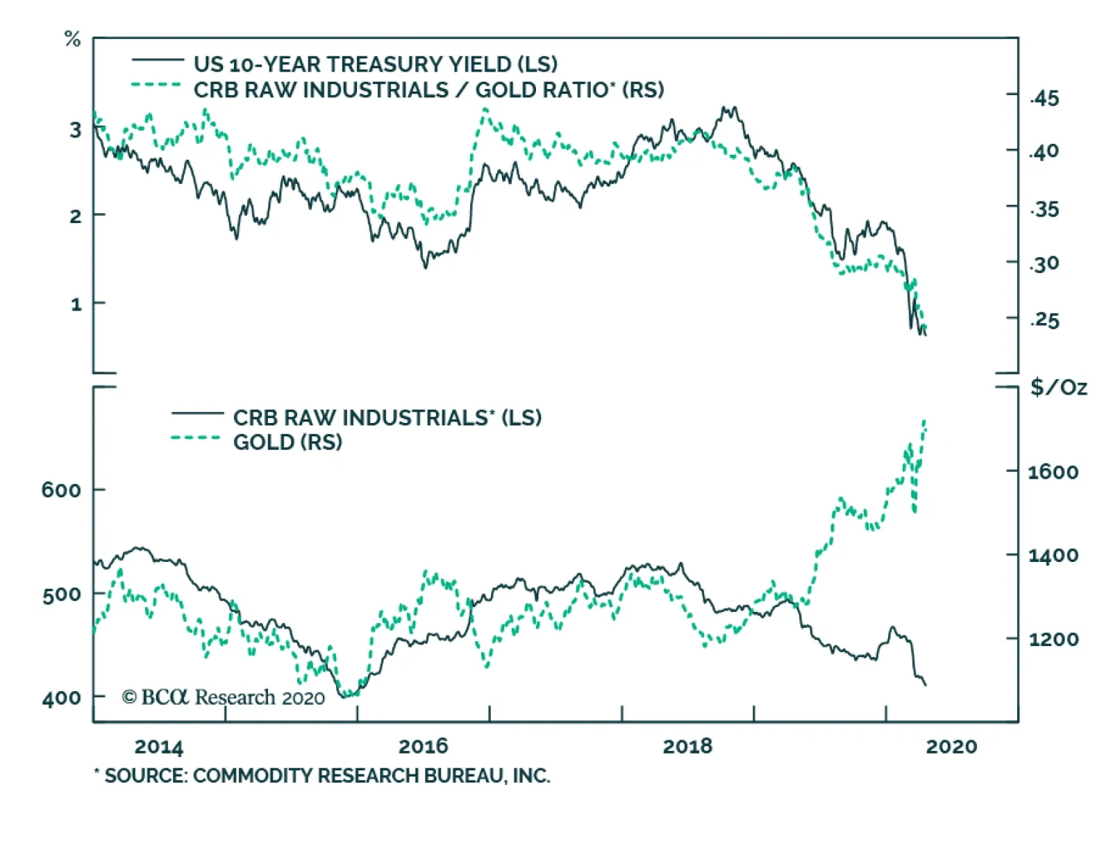
Yesterday. BCA Research's US Bond Strategy service's analysis concluded that it is premature to call the bottom in Treasury yields. We are seeing the bad US economic data, which raises the possibility that we are close to the trough in US economic growth.…
Highlights Q1/2020 Performance Breakdown: Our recommended model bond portfolio underperformed the custom benchmark by -40bps during the first quarter of the year – a number that would have been far worse if not for the changes in exposures for duration (increased) and spread product (decreased) made in early March. Winners & Losers: Underperformance was concentrated in sovereign debt, US Treasuries in particular (-94bps), as yields plummeted. This detracted from the outperformance in spread product (+51bps) led by US investment grade corporates (+34bps) and emerging markets (+20bps). Scenario Analysis For The Next Six Months: Given the ongoing uncertainty over when the COVID-19 pandemic and economy-crushing global lockdown will end, we are sticking close to benchmark on overall duration and spread product exposure. Instead, we recommend focusing more on country allocation and spread product relative value to generate outperformance, favoring markets where there is direct involvement from central banks. Feature Global bond markets were roiled in the first quarter of 2020 by the economic fallout from the COVID-19 pandemic. Government bond yields crashed to all-time lows while volatility reached extremes across both sovereign debt and credit. The quick, coordinated policy response from global monetary and fiscal authorities – which includes unprecedented levels of direct central bank asset purchases, both in terms of size and the breadth across markets and counties - has helped stabilize global credit spreads and risk assets, more generally. The outlook remains highly uncertain, however, with many governments worldwide looking to reopen their collapsed economies, risking the potential resurgence of a virus still lacking effective treatment or a vaccine. We are focusing more on relative value between counties and sectors. In this report, we review the performance of the BCA Research Global Fixed Income Strategy (GFIS) model bond portfolio during the eventful first quarter of 2020. We also present our updated recommended positioning for the portfolio for the next six months. The main takeaway there is that we are focusing more on relative value between counties and sectors while staying close to benchmark on both overall global duration and spread product exposure versus government bonds (Table 1). Table 1GFIS Model Bond Portfolio Recommended Positioning For The Next Six Months
GFIS Model Bond Portfolio Q1/2020 Performance Review & Current Allocations: Traversing The Turmoil
GFIS Model Bond Portfolio Q1/2020 Performance Review & Current Allocations: Traversing The Turmoil
Chart 1Q1/2020 Performance: Lagging, But It Could Have Been Much Worse
Q1/2020 Performance: Lagging, But It Could Have Been Much Worse
Q1/2020 Performance: Lagging, But It Could Have Been Much Worse
As a reminder to existing readers (and to new clients), the model portfolio is a part of our service that complements the usual macro analysis of global fixed income markets. The portfolio is how we communicate our opinion on the relative attractiveness between government bond and spread product sectors. This is done by applying actual percentage weightings to each of our recommendations within a fully invested hypothetical bond portfolio. Q1/2020 Model Portfolio Performance Breakdown: A Missed Rally In Sovereigns, Outperformance In Credit The total return for the GFIS model portfolio (hedged into US dollars) in the first quarter was -0.1%, underperforming the custom benchmark index by -40bps (Chart 1).1 That relative underperformance came from the government bond side of the portfolio, while our spread product allocation outperformed the benchmark. US Treasuries underperformed the most (-91bps) with losses concentrated in the +10 year maturity bucket. (Table 2). After US Treasuries, euro area high-yield corporates were the second worst performer, underperforming the benchmark by -10bps. Outperformance in spread product was driven by US investment grade industrials (+22bps) and EM credit (+20bps). Table 2GFIS Model Bond Portfolio Q1/2020 Overall Return Attribution
GFIS Model Bond Portfolio Q1/2020 Performance Review & Current Allocations: Traversing The Turmoil
GFIS Model Bond Portfolio Q1/2020 Performance Review & Current Allocations: Traversing The Turmoil
The potential losses to our model portfolio were greatly mitigated by changes in positioning during the quarter. Our decision to raise overall global duration exposure to neutral at the beginning of March helped shield the portfolio as yields plummeted.2 We followed this by upgrading sovereign debt in the US and Canada, both higher-beta countries, to overweight while moving to an underweight stance on US high-yield debt, euro area investment-grade and high-yield debt, and emerging market (EM) USD-denominated sovereign and corporate debt.3 In an environment of rampant uncertainty, these allocation changes helped prevent catastrophic losses in the model portfolio that had previously been positioned for a pickup in global growth. The potential losses to our model portfolio were greatly mitigated by changes in positioning during the quarter. In terms of the specific breakdown between the government bond and spread product allocations in our model portfolio, the former generated -91bps of underperformance versus our custom benchmark index while the latter outperformed by +51bps. The bar charts showing the total and relative returns for each individual government bond market and spread product sector are presented in Charts 2 and 3. Chart 2GFIS Model Bond Portfolio Q1/2020 Government Bond Performance Attribution
GFIS Model Bond Portfolio Q1/2020 Performance Review & Current Allocations: Traversing The Turmoil
GFIS Model Bond Portfolio Q1/2020 Performance Review & Current Allocations: Traversing The Turmoil
Chart 3GFIS Model Bond Portfolio Q1/2020 Spread Product Performance Attribution By Sector
GFIS Model Bond Portfolio Q1/2020 Performance Review & Current Allocations: Traversing The Turmoil
GFIS Model Bond Portfolio Q1/2020 Performance Review & Current Allocations: Traversing The Turmoil
The most significant movers were: Biggest Outperformers Overweight US investment grade industrials (+22bps) Underweight euro area investment grade corporate bonds (+16bps) Underweight EM USD-denominated corporates (+12bps) Overweight US investment grade financials (+10bps) Underweight Japanese government bonds with maturity greater than 10 years (+8bps) Biggest Underperformers Underweight US government bonds with maturity greater than 10 years (-36bps) Underweight US government bonds with maturity of 3-5 years (-17bps) Underweight US government bonds with maturity of 5-7 years (-16bps) Underweight US government bonds with maturity of 1-3 years (-13bps) Underweight US government bonds with maturity of 7-10 years (-12bps) Chart 4 presents the ranked benchmark index returns of the individual countries and spread product sectors in the GFIS model bond portfolio for Q1/2020. The returns are hedged into US dollars (we do not take active currency risk in this portfolio) and are adjusted to reflect duration differences between each country/sector and the overall custom benchmark index for the model portfolio. We have also color-coded the bars in each chart to reflect our recommended investment stance for each market during Q1/2020 (red for underweight, dark green for overweight, gray for neutral).4 Ideally, we would look to see more green bars on the left side of the chart where market returns are highest, and more red bars on the right side of the chart were returns are lowest. Predictably, government debt performed the best in Q1/2020 as global bond yields fell and monetary authorities raced to support economies and inject liquidity. UK, US, and Canadian government debt delivered the best returns this quarter. While we started the year neutral or underweight those assets, we moved to an overweight allocation in March, which helped salvage some returns. Also worth noting is that Australian government debt, where we have maintained a structural overweight stance, was one of the top performing markets during the first quarter. The deepest losses were sustained in EM USD-denominated sovereign and corporate debt, and euro area high-yield. Although it seems a distant memory at this point, we did start this quarter on an optimistic note and expected spreads on these products to narrow as global growth picked up. However, we were able to shield our portfolio against excessive losses in these products by moving to an underweight stance in March once the severity of the COVID-19 global economic shock become apparent. Bottom Line: Our recommended model bond portfolio underperformed the custom benchmark index during the first quarter of the year. The underperformance was concentrated in government bonds, which rallied on the back of the global pandemic. However, the portfolio outperformed the benchmark in spread products, where the combination of massive fiscal/monetary easing and direct central bank asset purchases have brought credit spreads under control. Future Drivers Of Portfolio Returns Typically, in these quarterly performance reviews of our model bond portfolio, we attempt to make return forecasts for the portfolio based off scenario analysis and quantitative predictions of various fixed income asset classes. In the current unprecedented economic and financial market environment, however, we are reluctant to rely on model coefficients and correlations to estimate expected returns. Instead, in this report, we will focus on discussing the logic behind our current model portfolio positioning and how those allocations should expect to contribute to the overall portfolio performance over the next six months. Looking ahead, the performance of the model bond portfolio will be driven by three main factors: Our recommended overweight stance on US spread product that is backstopped by the Fed—US investment grade corporates, Agency CMBS, and Ba-rated high-yield; Our recommended overweight stance on relatively higher-yielding sovereigns like the US and Italy; Our recommended underweight stance on EM USD-denominated corporates and sovereigns, where the specter of defaults and liquidity crunches looms. In terms of specific weightings in the GFIS model bond portfolio, we have moderated our stance on global spread product since our previous review of the portfolio.5 While the monetary liquidity backdrop is highly bullish, with central banks aggressively buying bonds and keeping policy rates at the zero lower bound, it is still unclear if and when economies will be able to successfully reopen and put an end to the COVID-19 recession. We are now recommending only a small relative overweight of two percentage points for spread product versus the benchmark index (Chart 5), leaving room to add more should the news on the virus and global growth take a turn for the better. Chart 5Overall Portfolio Allocation: Slightly Overweight Credit
GFIS Model Bond Portfolio Q1/2020 Performance Review & Current Allocations: Traversing The Turmoil
GFIS Model Bond Portfolio Q1/2020 Performance Review & Current Allocations: Traversing The Turmoil
We also remain neutral on overall portfolio duration exposure. Our Global Duration Indicator, which contains growth data like our global leading economic indicator and the global ZEW expectations index, has plunged and is signaling bond yields will stay depressed over the next six months (Chart 6). Yet at the same time, yields in most countries have been unable to hit new lows after the panic-driven bond rally in late February and early March, even as global oil prices have collapsed and inflation expectations remain depressed, suggesting that yields already discount a lot of bad news. Chart 6Our Duration Indicator Is Signaling Government Bond Yields Will Stay Low
Our Duration Indicator Is Signaling Government Bond Yields Will Stay Low
Our Duration Indicator Is Signaling Government Bond Yields Will Stay Low
We do not see much value in taking a big directional bet on yields through overall duration exposure at the present time. We also think it is far too early to contemplate reducing duration – even with many global equity and credit markets having rallied sharply off the lows – given the persistent uncertainty over the timing of a recovery in global growth. Thus, we are maintaining a neutral overall portfolio exposure (Chart 7). Chart 7Overall Portfolio Duration: At Benchmark
Overall Portfolio Duration: At Benchmark
Overall Portfolio Duration: At Benchmark
Chart 8Country Allocation: Favor Those With Higher Betas To Global Yields
Country Allocation: Favor Those With Higher Betas To Global Yields
Country Allocation: Favor Those With Higher Betas To Global Yields
Within the government bond side of the model bond portfolio, we recommend focusing more on country allocation to generate outperformance. That means concentrating exposures in relatively higher yielding markets like the US, Canada and peripheral Europe while maintaining underweights in core Europe and Japan, where yields have relatively little room to fall. That allocation also lines up with the sensitivity of each market to changes in the overall level of global bond yields, i.e. the yield beta (Chart 8). By favoring those higher beta markets, the model portfolio would still benefit from a renewed leg down in global bond yields, while still maintaining an overall neutral level of portfolio duration. By favoring those higher beta markets, the model portfolio would still benefit from a renewed leg down in global bond yields. Turning to spread product allocations, we recommend focusing more on policymaker responses to the COVID-19 recession rather than the downturn itself. Yes, the earlier widening of global high-yield spreads is forecasting a sharp plunge in global growth and rising unemployment rates (Chart 9, top panel). At the same time, the now double-digit year-over-year growth in global central bank balance sheets - a measure that has led global high-yield bond excess returns by one year in the years after the Global Financial Crisis (bottom panel) – is pointing to a period of improved global corporate bond market performance over the next 6-12 months. Chart 9Global Corporate Performance Should Benefit From Global QE
Global Corporate Performance Should Benefit From Global QE
Global Corporate Performance Should Benefit From Global QE
In other words, we are focusing on global QE rather than global recession, while maintaining a modest recommended overall weighting on global spread product. Chart 10Credit Allocation: Buy What The Central Banks Are Buying
Credit Allocation: Buy What The Central Banks Are Buying
Credit Allocation: Buy What The Central Banks Are Buying
That allocation could be larger, but we suggest picking the lowest hanging fruit in the credit universe rather than going for the highest beta credit markets. That means concentrating spread product allocations on the parts of global credit markets where central banks are directly buying (Chart 10). We are focusing on global QE rather than global recession, while maintaining a modest recommended overall weighting on global spread product. In the US, that means overweighting US investment grade corporate bonds (particularly those with maturities of less than five years), US Ba-rated high-yield that the Fed is now allowed to hold in its corporate bond buying program, and euro area investment grade corporate bonds (excluding bank debt) that the ECB is also buying in its increased bond purchase programs. Chart 11Stay Underweight EM Credit
Stay Underweight EM Credit
Stay Underweight EM Credit
One new change we are making this week is upgrading US agency commercial mortgage-backed securities (CMBS) to overweight, funding by a reduction in US agency residential mortgage-backed securities (MBS) to underweight. While the Fed is still buying agency MBS debt in its new QE programs, MBS spreads have already compressed substantially and are now exposed to potential refinancing risk as eligible US homeowners look to take advantage of the recent plunge in US mortgage rates. We prefer to increase the allocation to agency CMBS, which the Fed can now buy within its expanded QE programs and which offer more attractive spreads than agency MBS (middle panel). One part of the spread product universe where we continue to recommend an underweight stance is USD-denominated EM corporate and sovereign debt. The time to buy those markets will be when the US dollar has clearly peaked and global growth has clearly bottomed. Neither of those conditions is in place now, with the price momentum in both the EM currency index and the trade-weighted US dollar still tilted towards a stronger greenback. That backdrop is unlikely to change in the next few months, suggesting a defensive stance on EM credit is still warranted (Chart 11). A defensive stance on EM credit is still warranted. Model bond portfolio yield and tracking error considerations The selective global government bond and credit portfolio we have just outlined does not come without a cost. While we are currently overweight countries with higher-yielding government bonds, our underweight positions on riskier spread product like EM debt and lower-rated US junk bonds bring the yield of our model portfolio down to 1.8%, –15bps below the yield of the model portfolio benchmark index (Chart 12). We feel that is an acceptable level of “negative carry” given the still heightened levels of uncertainty over global growth. This leads us to focus more on relative value between countries and sectors to generate outperformance that we expect to offset the impact of underweighting the highest yielding credit markets. Chart 12Portfolio Yield: Moderately Below Benchmark
Portfolio Yield: Moderately Below Benchmark
Portfolio Yield: Moderately Below Benchmark
Chart 13Portfolio Volatility: Currently High, But Expected To Fall
Portfolio Volatility: Currently High, But Expected To Fall
Portfolio Volatility: Currently High, But Expected To Fall
Finally, turning to the risk budget of the model portfolio, we are aiming for a “moderate” overall tracking error, or the gap between the portfolio’s volatility and that of the benchmark index. However, given our pro-risk positioning in the first two months of 2020, combined with the extreme volatility in markets during the first quarter, the realized portfolio tracking error blew through our self-imposed ceiling of 100bps (Chart 13). We expect this to settle down in the coming months as the recent changes in our positioning start to be reflected in the trailing volatility of our portfolio. Bottom Line: Given the ongoing uncertainty over when the COVID-19 pandemic and economy-crushing global lockdown will end, we are sticking close to benchmark on overall duration and spread product exposure. Instead, we recommend focusing more on country allocation and spread product relative value to generate outperformance, favoring markets where there is direct involvement from central banks. Robert Robis, CFA Chief Fixed Income Strategist rrobis@bcaresearch.com Shakti Sharma Research Associate shaktis@bcaresearch.com Footnotes 1 The GFIS model bond portfolio custom benchmark index is the Bloomberg Barclays Global Aggregate Index, but with allocations to global high-yield corporate debt replacing very high quality spread product (i.e. AA-rated). We believe this to be more indicative of the typical internal benchmark used by global multi-sector fixed income managers. 2 Please see BCA Global Fixed Income Strategy Weekly Report, "What Bond Investors Should Do After The 'Great Correction'", dated March 3 2020, available at gfis.bcaresearch.com. 3 Please see BCA Global Fixed Income Strategy Weekly Report, "The Train Is Empty", dated March 10, 2020, available at gfis.bcaresearch.com. 4 Note that sectors where we made changes to our recommended weightings during Q1/2020 will have multiple colors in the respective bars in Chart 4. 5 Please see BCA Research Global Fixed Income Strategy Weekly Report, "2019 GFIS Model Bond Portfolio Performance Review: Praise Credit & Blame Duration", dated January 14, 2020, available at gfis.bcaresearch.com. Recommendations The GFIS Recommended Portfolio Vs. The Custom Benchmark Index
GFIS Model Bond Portfolio Q1/2020 Performance Review & Current Allocations: Traversing The Turmoil
GFIS Model Bond Portfolio Q1/2020 Performance Review & Current Allocations: Traversing The Turmoil
Duration Regional Allocation Spread Product Tactical Trades Yields & Returns Global Bond Yields Historical Returns
Highlights Risk assets have rallied thanks to a healthy dose of economic stimulus and mounting evidence that the number of new COVID-19 cases has peaked. Unfortunately, the odds of a second wave of infections remain high. In the absence of a vaccine or effective treatment, only mass testing can keep the virus at bay. Such testing will become available, but probably not for a few more months. Meanwhile, the global economy remains depressed. As earnings estimates are revised lower, stocks could give up some of their recent gains. Despite the fact that the supply of goods and services has fallen sharply during this recession, the overall effect has been deflationary. Deflationary pressures should subside later this year as demand picks up, commodity prices rise, and the US dollar weakens. Looking several years out, deglobalization and the increasing politicization of central banking could lead to accelerating inflation. Long-term investors should maintain a structurally below-benchmark duration stance in fixed-income portfolios, and position for steeper yield curves. Now What? Imagine being chased through the woods by an angry bear. You manage to climb a tree, getting high enough so that the bear cannot reach you. You breathe a sigh of relief. You are out of harm's way. Or so you think. You look down, and the bear is waiting for you at the base of the tree. You have no weapons. You feel cold and hungry. It is getting dark. This is the state the world finds itself in today. We have climbed up the tree. The number of new infections has peaked in Italy and Spain, the first large European countries hit by the virus. Hospital admissions in New York are falling. This, combined with a generous dose of economic stimulus, has allowed stocks to rally by 28% from their March 23 intraday lows. Yet, we have neither a vaccine nor a cure for the virus (although as we go to press, unconfirmed news reports suggest that Gilead’s drug, remdesivir, has had success in treating patients at a Chicago hospital). Chart 1Widespread Social Distancing Dampened The Spread Of All Flus And Colds
Still Stuck In The Tree
Still Stuck In The Tree
COVID-19 is part of the coronavirus family, which includes four members that are responsible for up to 30% of common colds (most other colds are caused by rhino-viruses). Social distancing has driven the number of cold and influenza-like cases in the US to very low levels (Chart 1). But does anyone really think that the common cold or flu will be permanently eradicated because of recent measures? If not, what will prevent COVID-19, which is no less contagious than these other illnesses, from resurfacing? In short, the bear is still there, waiting for us to reopen the economy. A Deep Recession As we wait, the economic damage continues to mount. The IMF’s baseline scenario foresees the global economy contracting by 3% in 2020, with advanced economies shrinking by 6.1%. This is far deeper than during the 2008/09 financial crisis (Chart 2). The IMF’s projections assume that the pandemic subsides in the second half of 2020, allowing containment measures to be relaxed. If the pandemic were to last longer than that, global output would fall by an additional 3% in 2020 relative to the Fund’s already bleak baseline. A second outbreak next year would push global GDP almost 5% below the IMF’s baseline in 2021, while the combination of a longer outbreak this year and a second outbreak next year would cause the level of output to fall 8% below the 2021 baseline (Chart 3). Chart 2Severe Damage To The Global Economy This Year
Severe Damage To The Global Economy This Year
Severe Damage To The Global Economy This Year
Chart 3Downside Risks To The IMF's Projections
Still Stuck In The Tree
Still Stuck In The Tree
The Ties That Bind The sudden stop in economic activity has led to a dramatic surge in unemployment. US initial unemployment claims have risen by a cumulative 22 million over the past four weeks. The true scale of layoffs is probably higher than that, given that some state websites have been unable to handle the flood of insurance applications. Chart 4Only About One-Third Of Those Who Lose Their Jobs Apply For Benefits
Still Stuck In The Tree
Still Stuck In The Tree
Historically, only about one-third of those laid off have applied for benefits (Chart 4). While the take-up rate will be higher this time – the CARES Act increases weekly unemployment compensation, while expanding eligibility to self-employed workers – it is still reasonable to assume that the claims data do not capture how much of the workforce has been laid idle. The one piece of good news is that at least so far, temporarily laid-off workers account for the vast majority of the increase in unemployment. This is encouraging because it implies that in most cases, the ties that bind workers to firms have not been permanently severed. In this respect, the recovery in employment following this recession may end up resembling that of another “man-made” recession: the 1982 downturn (Chart 5). Back then, policymakers felt that a recession was a price worth paying to quash inflation. Once inflation fell, central banks were able to cut rates, allowing economic activity to recover. Today, the hope is that by shutting down all nonessential businesses, the virus will be quashed, and life will return to normal. Chart 5Comparing The 1982 Recession Versus Today: Employment Edition
Comparing The 1982 Recession Versus Today: Employment Edition
Comparing The 1982 Recession Versus Today: Employment Edition
Exit Plans It remains to be seen whether vanquishing the virus will be as straightforward as vanquishing inflation was in the early 1980s. As we noted last week, in the absence of a vaccine or an effective treatment, our best hope is that mass testing will allow businesses to reopen.1 The technology for such tests already exists; it just has yet to become available on a large enough scale. Just like during the Second World War, the production of weapons necessary to fight the virus will grow at an exponential pace (Chart 6). Chart 6Now Let's Do The Same For Test Kits
Still Stuck In The Tree
Still Stuck In The Tree
Near-Term Pressures On Risk Assets Exponential change is a difficult concept for the human mind to grasp. What seems painfully slow at first can quickly become unfathomably fast later on. The apocryphal story about the origins of the game of chess comes to mind.2 This puts investors in a bit of a quandary. Growth is likely to recover in the latter half of 2020 as COVID-19 testing becomes pervasive and the effects of fiscal and monetary stimulus make their way through the economy. But, the near-term picture could be soured by news stories of continued acute shortages of medical supplies and delays in providing financial assistance to hard-hit households and businesses, not to mention dire corporate earnings performance. The one piece of good news is that at least so far, temporarily laid-off workers account for the vast majority of the increase in unemployment. Indeed, bottom-up analyst earnings estimates still have further to fall. The Wall Street consensus expects S&P 500 companies to earn $142 per share this year and $174 in 2021. Our US equity strategists are projecting only $100 and $140 in EPS, respectively. Stock prices and earnings estimates generally travel together (Chart 7). On balance, we continue to favor global equities over bonds on a 12-month horizon, owing to the fact that the cyclically-adjusted earnings yield is quite a bit higher than the bond yield (Chart 8). However, we have less conviction about the near-term (3-month) direction of stocks, and would recommend that investors maintain above-average cash levels for now which can be deployed on any major selloff. Chart 7Negative Earnings Revisions Will Weigh On Stocks In The Near Term
Negative Earnings Revisions Will Weigh On Stocks In The Near Term
Negative Earnings Revisions Will Weigh On Stocks In The Near Term
Chart 8Favor Equities Over Bonds Over A 12-Month Horizon
Favor Equities Over Bonds Over A 12-Month Horizon
Favor Equities Over Bonds Over A 12-Month Horizon
Inflation And Supply Shocks: A Keynesian Paradox? One of the distinguishing features of this recession is that it has involved a simultaneous supply shock and a demand shock. Businesses have had to curb supply in order to allow workers to stay at home, while workers have reduced spending out of fear of going to stores or other venues where they could inadvertently contract the virus. Worries about job losses have further dented demand. There is no question about what happens to output when both demand and supply decline: output falls. In contrast, the impact on the price level depends on which shock dominates (Chart 9). Chart 9Inflation And Supply Shocks
Still Stuck In The Tree
Still Stuck In The Tree
As Appendix 1 illustrates with a set of simple numerical examples, in theory, a negative supply shock spread evenly across all sectors of the economy should cause the price level to rise. This is because unemployed workers, who are no longer contributing to output, will still end up consuming some goods and services by tapping into their savings, taking on new debt, or by receiving income transfers from the government. In the current situation, however, the supply shock has not been spread evenly throughout the economy. Some businesses have been completely shuttered, while others deemed essential have been allowed to operate. As the appendix shows, in such cases, the drop in aggregate demand is likely to be larger than if all sectors were equally impacted. In fact, it is possible for a supply shock to trigger a demand shock that is larger than the supply shock itself, leading to a perverse situation where a decline in supply results in a surfeit of output. A recent paper by Guerrieri, Lorenzoni, Straub, and Werning argues that the current pandemic represents such a “Keynesian supply shock.”3 Intuitively, such perverse supply shocks can arise if workers are cut off from purchasing many of the goods that they would normally buy. When the menu of available goods shrinks, even workers who are still employed could end up saving much of their income. Deflationary For Now All this implies that the pandemic is likely to be deflationary until more businesses reopen. The data seem to bear this out. The US core consumer price index fell by 0.1% month-over-month in March on a seasonally adjusted basis, led by steep declines in airfares and hotel lodging prices. High-frequency indicators, as well as the prices paid components of various purchasing manager indices, suggest that deflationary pressures have persisted into April (Chart 10). Chart 10Deflation Reigns For Now
Deflation Reigns For Now
Deflation Reigns For Now
Shelter inflation was reasonably firm in March but should soften over the coming months. A number of major apartment operators have announced rent freezes. In addition, the lagged effects from a stronger dollar and lower energy prices will contribute to lower goods inflation, while higher unemployment will hold back service inflation. Inflation Should Bounce Back In 2021 The discussion of Keynesian supply shocks suggests that aggregate demand will increase faster than supply as more sectors of the economy reopen. This should ease deflationary pressures. In addition, a rebound in global growth starting in the second half of 2020 will prompt a recovery in commodity prices. The forward oil curve is predicting that Brent and WTI crude prices will rise by 42% and 79%, respectively, over the next 12 months (Chart 11). Inflation expectations and oil prices tend to move closely together (Chart 12). Chart 11H2 2020 Rebound In Growth Will Lift Oil Prices
H2 2020 Rebound In Growth Will Lift Oil Prices
H2 2020 Rebound In Growth Will Lift Oil Prices
Chart 12Inflation Expectations And Oil Prices Tend To Move Closely Together
Inflation Expectations And Oil Prices Tend To Move Closely Together
Inflation Expectations And Oil Prices Tend To Move Closely Together
As a countercyclical currency, the US dollar will weaken over the next 12-to-18 months as global growth rebounds, providing an additional reflationary impulse (Chart 13). Falling unemployment will also eat into labor market slack, helping to support wages. Chart 13Stronger Global Growth In The Back Half Of The Year Will Weaken The Dollar, Putting Upward Pressure On US Inflation
Stronger Global Growth In The Back Half Of The Year Will Weaken The Dollar, Putting Upward Pressure On US Inflation
Stronger Global Growth In The Back Half Of The Year Will Weaken The Dollar, Putting Upward Pressure On US Inflation
The Structural Outlook For Inflation… And Bond Yields Looking further out, the outlook for inflation will depend on whether the structural forces that have suppressed the rise in consumer prices over the past few decades intensify or abate. On the one hand, it is possible that the pandemic will cast a pall over consumer and business sentiment for years to come. If households and firms restrain spending, this would exacerbate deflationary pressures. Likewise, if governments tighten fiscal policy in order to pay off the debts incurred during the pandemic, this could weigh on growth. On the other hand, high government debt levels may increase the political pressure on central banks to keep rates low, even once the labor market recovers. This could eventually lead to economic overheating in two-to-three years. Chart 14Global Trade Was Already Stagnating
Global Trade Was Already Stagnating
Global Trade Was Already Stagnating
A partial roll back in globalization could also cause consumer prices to rise. Global trade was already stagnant even before the trade war flared up (Chart 14). The pandemic may further inflame nationalist sentiment. Against the backdrop of high unemployment, Donald Trump is likely to campaign as a “war president,” relentlessly chiding Joe Biden for having too cozy a relationship with China. On balance, we suspect that inflation will rise more than expected over the long haul. This is not a particularly high bar to clear. Investors currently expect US inflation to average only 1.2% over the next decade based on TIPS breakevens. Market-based inflation expectations are even more subdued in most other advanced economies. If inflation does surprise to the upside, long-term bond yields are likely to increase by more than expected. Investors should maintain a structurally below-benchmark duration stance in fixed-income portfolios, and position for steeper yield curves. APPENDIX 1: Keynesian Supply Shocks Suppose there are two sectors, A and B. The economy consists of 2,000 workers, with each sector employing 1,000 workers. To keep things simple, assume that workers in each sector evenly split their consumption between the two sectors. Thus, a worker in sector A spends as much on goods from sector A as from sector B, and vice versa. Also assume that each worker, if employed, produces $1,000 of goods and receives a salary of $1,000 for his or her efforts. With this in mind, let us consider three scenarios: Scenario 1: Both Sectors Are Open For Business In this scenario, $1 million of good A and $1 million of good B are produced and supplied to the market. Since each of the 2,000 workers spends $500 on good A and $500 on good B, a total of $1 million of both goods are demanded. Aggregate demand equals aggregate supply.
Still Stuck In The Tree
Still Stuck In The Tree
Scenario 2: Partial Closure Of Both Sectors Suppose that half the workers in both sectors are laid off. While the unemployed workers do not earn any income, they still spend half as much as they used to by tapping into their savings ($250 on good A and $250 on good B for each unemployed worker). Each employed worker continues to spend $500 on good A and $500 on good B. Now there is $500,000 in total of each good produced, but $750,000 of each good demanded. Aggregate demand exceeds supply.
Still Stuck In The Tree
Still Stuck In The Tree
Scenario 3: Sector A, Deemed The Essential Sector, Remains Completely Open, While B Is Closed In this case, all sector A workers are still employed, earning $1,000 each. Since good B is no longer available for purchase, sector A workers increase spending on good A by 20% (from $500 to $600 per worker). Workers in sector B are all unemployed. However, they continue to tap into their savings. Rather than spending $250 on good A as they did in scenario 2, they increase their expenditures on good A by 20% (from $250 to $300). A total of $900,000 of good A is now demanded ($600*1,000+$300*1,000), which is less than the $1 million of good A supplied. Aggregate supply now exceeds demand for the part of the economy that is still open. The chart and table below summarize the results. The key insight is that a 50% shock to the entire economy curbs aggregate demand less than a 100% shock to half the economy. This implies that demand is likely to grow faster than supply as mass testing allows more of the economy to reopen.
Still Stuck In The Tree
Still Stuck In The Tree
Still Stuck In The Tree
Still Stuck In The Tree
Peter Berezin Chief Global Strategist peterb@bcaresearch.com Footnotes 1 Please see Global Investment Strategy Weekly Report, “Testing Times,” dated April 9, 2020. 2 In one account, the King of India was so impressed when the game of chess was demonstrated to him that he offered its inventor any reward he desired. After thinking for a while, the inventor said “Your Highness, please give me one grain of rice for the first square on the chessboard, two grains for the next square, four grains for the one after that, doubling the number of grains until the 64th square.” Stunned that the inventor would ask for such a puny reward, the King quickly agreed. A week later, the King’s treasurer informed His Highness that he would need to give the inventor 18 quintillion grains of rice, which is more than enough rice to cover the entire planet’s surface. “Holy Ganges, what have I done?” the King exclaimed, before having the inventor executed. 3 Veronica Guerrieri, Guido Lorenzoni, Ludwig Straub, and Iván Werning, “Macroeconomic Implications of COVID-19: Can Negative Supply Shocks Cause Demand Shortages?” NBER Working Paper No. 26918 (April 2020). Global Investment Strategy View Matrix
Still Stuck In The Tree
Still Stuck In The Tree
Current MacroQuant Model Scores
Still Stuck In The Tree
Still Stuck In The Tree
Highlights Europe’s dirty little secret: Euro area debt is already mutualised. Investment implication: Overweight Italian BTPs, underweight German bunds, and overweight the euro on a structural (2-year plus) horizon. ESM plus ECB plus OMT equals a compromise solution to fund stimulus at a mutualised euro area interest rate. Investment implication: Overweight Italian BTPs, underweight German bunds on a cyclical (6-12 month) horizon. Spain’s high early peak in morbidity means that it has taken its pain upfront, at least compared to other countries. Investment implication: upgrade Spain’s IBEX to a tactical overweight – and remove it from the cyclical underweight basket. Feature Chart of the WeekThe Underperformances Of China, Italy And Spain Were A Mirror-Image Of Their Covid-19 Morbidity Curves
The Underperformances Of China, Italy And Spain Were A Mirror-Image Of Their Covid-19 Morbidity Curves
The Underperformances Of China, Italy And Spain Were A Mirror-Image Of Their Covid-19 Morbidity Curves
More About Morbidity Curves Most analyses of the pandemic tend to focus on the grim daily mortality statistics. Yet the key to the pandemic’s evolution is not its mortality rate, but rather its morbidity (severe illness) rate. This is because, without a vaccine, the total area underneath the morbidity curve is fixed. The cumulative number of people who will fall severely ill is pre-determined at the outset (Figures 1-3). Figure I-1The Area Under The Morbidity Curve Is Fixed, A High First Peak Means A Low Second Peak
Will Europe Unite Or Split?
Will Europe Unite Or Split?
Figure I-2A Low First Peak Means An Extended First Peak…
Will Europe Unite Or Split?
Will Europe Unite Or Split?
Figure I-3…Or A High Second Peak
Will Europe Unite Or Split?
Will Europe Unite Or Split?
Very optimistically assuming a Covid-19 morbidity rate of 1 percent, and that 65 percent of the population must get infected to exhaust the pandemic, we know that Covid-19 will ultimately make 0.65 percent of the population severely ill. Absent a vaccine, this number is set in stone. But the number of deaths is not set in stone. It depends on the availability of emergency medical treatment for those that are severely ill. For Covid-19 this means access to ventilation in an intensive care unit (ICU). Yet even the best equipped countries only have ICUs for 0.03 percent of the population. Therefore, the emergency treatment must be rationed either by supply or by demand. Without a Covid-19 vaccine, we cannot change the cumulative number of people who will become severely ill. Rationing by supply means that we must deny emergency treatment to the severely ill – not just Covid-19 patients but victims of, say, heart attacks or car crashes. Accept more deaths. Rationing by demand means that we must flatten the demand (morbidity) curve so that demand is always satisfied by the limited ICU supply. During the pandemics of 1918-19 and 1957, countries could ration emergency medical treatment by supply. Not in 2020. In an era of universal healthcare, everybody is entitled to, and expects to get, emergency medical care. Which means we must ration emergency medical treatment by demand. As such, we must analyse the 2020 response differently to the responses in 1918-19 and 1957. To repeat, without a vaccine, we cannot change the area under the morbidity curve. There is no way of escaping this truth. A low first peak requires a very elongated peak or a high second peak (Chart I-2). Conversely, countries that have suffered a high first peak will need a shorter peak and small (or no) second peak. Chart I-2Japan's Early Stabilisation Was A False Dawn
Japan's Early Stabilisation Was A False Dawn
Japan's Early Stabilisation Was A False Dawn
Turning to an equity market implication, the underperformances of highly cyclical and domestically exposed Spain and Italy have closely tracked their morbidity curves (Chart I-1). Given that both countries have suffered very high first peaks in morbidity, the strong implication is that they have taken their pain upfront – at least compared to other countries. In the case of Spain, the market is also technically oversold (see Fractal Trading System). Investment implication: upgrade Spain’s IBEX to a tactical overweight – and remove it from the cyclical underweight basket. How Europe Could Unite Europe is dithering on its fiscal response to the pandemic. Specifically, Germany and the Netherlands are pushing back against the concept of mutualised euro area debt in the form of ‘corona-bonds’. But a pandemic is an act of nature, an indiscriminate exogenous shock. What is the point of the economic and monetary union if Italy must fund its response to an act of nature at the Italian 10-year yield of 1.5 percent rather than the euro area 10-year yield of 0 percent? (Chart I-3 and Chart I-4) Chart I-3To Fight An Act Of Nature Why Should Italy Borrow At A Higher Rate...
To Fight An Act Of Nature Why Should Italy Borrow At A Higher Rate...
To Fight An Act Of Nature Why Should Italy Borrow At A Higher Rate...
Chart I-4...When It Could Borrow At A Lower Mutualised Rate?
...When It Could Borrow At A Lower Mutualised Rate?
...When It Could Borrow At A Lower Mutualised Rate?
The good news is there is a compromise solution to fund stimulus at a mutualised interest rate. It uses the euro area’s €500 billion bailout fund, the European Stability Mechanism (ESM). But the compromise solution carries two problems which need mitigation. First, ESM credit lines come with conditionality. Italy would rightly balk if it were shackled like Greece, Portugal, and Ireland were after the euro debt crisis. Luckily, the ESM is likely to regard the current ‘act of nature’ crisis very differently to the debt crisis and impose only minimum and appropriate conditionality – for example, that credit lines should be used for healthcare and social welfare spending. Second, ESM credit lines come with a stigma. Taking fright that Italy is tapping the ESM, the bond market might drive up the yields on Italian BTPs. If this pushed up Italy’s overall funding rate, it would defeat the purpose of using the ESM in the first place. ESM plus ECB plus OMT equals a compromise solution to borrow at a mutualised interest rate. The hope is that the bond market, realising that Italy is using the bailout facility to counter an act of nature, would not drive up BTP yields. But if it did, the ECB could counter this by buying BTPs. One option would be to use its Outright Monetary Transactions (OMT) facility. Set up during the euro debt crisis, the OMT’s specific function is to counter bond market attacks when they are not justified by the economic fundamentals. In other words, to prevent a liquidity crisis escalating into a solvency crisis. Thereby, ESM plus ECB plus OMT equals a compromise solution to fund stimulus at a mutualised euro area interest rate. Investment implication: Overweight Italian BTPs, underweight German bunds on a cyclical (6-12 month) horizon. Europe’s Dirty Little Secret Outwardly, Germany and the Netherlands are reluctant to go down the slippery slope to mutualised euro area debt. But here’s the dirty little secret they don’t want you to know. Euro area debt is already mutualised. The stealth mutualisation has happened via the Target2 banking imbalance which now stands at €1.5 trillion. This imbalance is an accounting identity showing that Italy is owed ‘German euros’ via its large quantity of bank deposits in German banks while Germany is symmetrically owed ‘Italian euros’ via its large effective holding of Italian government bonds. The imbalance is irrelevant if a German euro equals an Italian euro. But if Italy defaulted on its bonds – by repaying them in a reinstated and devalued lira – then Target2 means that Germany must pick up the bill (Chart I-5). Chart I-5Target2 Means That If Italy Defaults, Germany Picks Up The Bill
Will Europe Unite Or Split?
Will Europe Unite Or Split?
The Target2 imbalance is the result of the ECB’s QE program, in which the central bank has bought hundreds of billions of Italian bonds. If Italy repaid those bonds in a devalued lira, then the ECB would become insolvent, and the central bank’s remaining shareholders would have to plug the hole. The biggest shareholder would be Germany. Could Germany force Italy to repay its bonds in euros? No. According to a legal principle called ‘lex monetae’ Italy can repay its debt in its sovereign currency, whatever that is. Meanwhile, because of the fragility of the Italian banking system, the Italians who sold the bonds to the ECB deposited the cash in German banks. Legally, these depositors must be paid back in whatever is the German currency. Euro area debt is already mutualised. If euro area debt is already mutualised, why do policymakers continue to pretend that it isn’t? There are three reasons. First no policymaker would want to publicise that Germany is now on the hook if Italy left the euro. Second, no policymaker would want to publicise that the ECB has put Germany in this position (Chart I-6). Chart I-6ECB QE Has Created The Target2 Imbalance
ECB QE Has Created The Target2 Imbalance
ECB QE Has Created The Target2 Imbalance
Third, and most important, policymakers would point out that the mutualisation of debt only happens if the euro breaks up. They would argue that because the euro is irreversible, the debt is not mutualised. In fact, their argument is completely back to front. The truth is: Because euro area debt is now mutualised, the euro has become irreversible. Investment implication: Overweight Italian BTPs, underweight German bunds, and overweight the euro on a structural (2-year plus) horizon. Fractal Trading System* As already discussed, this week’s recommended trade is long Spain’s IBEX 35 versus the Euro Stoxx 600. The profit target is 3 percent with a symmetrical stop-loss. Meanwhile our other trade, long Australia versus New Zealand has moved into a 2 percent profit. The rolling 12-month win ratio now stands at 66 percent. Chart I-7IBEX 35 Vs. EUROSTOXX 600
IBEX 35 Vs. EUROSTOXX 600
IBEX 35 Vs. EUROSTOXX 600
When the fractal dimension approaches the lower limit after an investment has been in an established trend it is a potential trigger for a liquidity-triggered trend reversal. Therefore, open a countertrend position. The profit target is a one-third reversal of the preceding 13-week move. Apply a symmetrical stop-loss. Close the position at the profit target or stop-loss. Otherwise close the position after 13 weeks. * For more details please see the European Investment Strategy Special Report “Fractals, Liquidity & A Trading Model,” dated December 11, 2014, available at eis.bcaresearch.com. Dhaval Joshi Chief European Investment Strategist dhaval@bcaresearch.com Fractal Trading System Cyclical Recommendations Structural Recommendations Closed Fractal Trades Trades Closed Trades Asset Performance Currency & Bond Equity Sector Country Equity Indicators Bond Yields Chart II-1Indicators To Watch - Bond Yields
Indicators To Watch - Bond Yields
Indicators To Watch - Bond Yields
Chart II-2Indicators To Watch - Bond Yields
Indicators To Watch - Bond Yields
Indicators To Watch - Bond Yields
Chart II-3Indicators To Watch - Bond Yields
Indicators To Watch - Bond Yields
Indicators To Watch - Bond Yields
Chart II-4Indicators To Watch - Bond Yields
Indicators To Watch - Bond Yields
Indicators To Watch - Bond Yields
Interest Rate Chart II-5Indicators To Watch - Interest Rate Expectations
Indicators To Watch - Interest Rate Expectations
Indicators To Watch - Interest Rate Expectations
Chart II-6Indicators To Watch - Interest Rate Expectations
Indicators To Watch - Interest Rate Expectations
Indicators To Watch - Interest Rate Expectations
Chart II-7Indicators To Watch - Interest Rate Expectations
Indicators To Watch - Interest Rate Expectations
Indicators To Watch - Interest Rate Expectations
Chart II-8Indicators To Watch - Interest Rate Expectations
Indicators To Watch - Interest Rate Expectations
Indicators To Watch - Interest Rate Expectations
Highlights Please note that we are publishing an analysis on Vietnam below. The unprecedented depth of this recession entails that many businesses will likely be operating below their break-evens for a while, even after the confinement measures are eased. Consequently, the process of bottoming in this bear market will be drawn out, and share prices will gyrate substantially in the interim. Elevated foreign currency debt levels among some EM corporations, plunging revenues and local currency depreciation combine for a perfect storm in EM corporate credit. Continue underweighting EM stocks and credit within global equity and credit portfolios, respectively. Take profits on the long EM currency volatility trade. Feature If history is any guide, the speed of the rebound in global equities is more consistent with a bear market rally than the beginning of a new bull market. Typically, for a new durable bull market to emerge after a vicious bear market, a consolidation period or a base-building phase is needed. As of now, share prices have not formed such a base. Playing bear market rallies is all about timing, in which fundamental analysis is not useful. Rebounds die as abruptly as they begin. Hence, it is all about chasing momentum on either side. The unprecedented depth of this recession heralds that many businesses will likely be operating below their break-evens for a while, even after the confinement measures are eased. We closed our absolute short position in EM equities on March 19 but we have continued shorting EM currencies versus the US dollar. Even though EM share prices have become cheap based on their cyclically-adjusted P/E ratio (Chart I-1), valuation is not a good timing tool. This is especially true for this structural valuation indicator. Chart I-1EM Equities Are As Cheap As In Previous Bottoms
EM Equities Are As Cheap As In Previous Bottoms EM Equities Are Cheap According To The Cyclically-Adjusted P/E Ratio
EM Equities Are As Cheap As In Previous Bottoms EM Equities Are Cheap According To The Cyclically-Adjusted P/E Ratio
Why The Rebound? After the massive selloff, investor sentiment on risk assets in general, and cyclicals specifically, has become very depressed. In particular: Sentiment of traders and investment advisors on US stocks has plummeted (Chart I-2). That said, net long positions in US equity futures are still above their 2016 and 2011 lows, as we noted last week. Traders’ sentiment on cyclical currencies such as the CAD and AUD as well as on copper and oil has dropped to their previous lows (Chart I-3). Chart I-2Investor Sentiment On US Equities Is Poor
Investor Sentiment On US Equities Is Poor
Investor Sentiment On US Equities Is Poor
Chart I-3Investor Sentiment On Copper And Oil Is Depressed
Investor Sentiment On Copper And Oil Are Depressed
Investor Sentiment On Copper And Oil Are Depressed
Consistently, net long positions of investors in both copper and oil have been trimmed substantially (Chart I-4A and I-4B). Chart I-4AInvestors’ Net Long Positions In Copper...
Investors Net Long Positions In Copper...
Investors Net Long Positions In Copper...
Chart I-4B…And Oil
...And Oil
...And Oil
On the whole, it should not be surprising that after having become very oversold, risk assets rebounded in the past two weeks. Nevertheless, depressed investor sentiment is a necessary but not sufficient condition for a major bear market bottom. As illustrated in Chart I-3, sentiment on oil and copper was extremely depressed in late 2014. Yet with the exception of brief rebounds, both oil and copper prices continued to plunge for about a year before bottoming in January 2016. The necessary and sufficient condition for a durable bottom in global cyclical assets is an improvement in global demand. Chart I-5The S&P 500 And VIX In The Last Two Bear Markets
The S&P 500 And VIX In The Last Two Bear Markets
The S&P 500 And VIX In The Last Two Bear Markets
Given the US and Europe are still in strict confinement and the Chinese economy remains quite weak (please see our more detailed discussion on this below), the global recession is still deepening. Further, while the enormous amounts of stimulus injected by policymakers is certainly positive, it is not yet clear whether these efforts are sufficient to entirely offset the collapse in the level of economic activity and its second round effects. Nevertheless, the Federal Reserve and the European Central Bank have probably contained the acute phase of the financial market crisis by buying financial assets and providing credit to the real economy. Odds are that the VIX and other volatility measures will not retest their recent highs. However, this does not mean that risk assets cannot retest their lows or make fresh ones. For example, in the previous 2001-2002 and 2008 bear markets, the S&P 500 re-tested its low in early 2003 and made a deeper trough in early 2009 even though the VIX drifted lower (Chart I-5). Finally, as we discuss below, a unique feature of this recession makes it unlikely that a definite equity market bottom has been established so quickly. How This Recession Is Distinct From an investor viewpoint, this global recession stands out from others in a particularly distinct way: In an average recession, nominal output levels do not contract. In the US, since 1960 it was only during 2008 that the level of nominal GDP contracted (Chart I-6). Presently, we are experiencing the gravest collapse in nominal output/sales since the 1930s – much worse than what transpired in 2008. Chart I-6US Nominal GDP And Corporate Profits Growth
US Nominal GDP And Corporate Profits Growth
US Nominal GDP And Corporate Profits Growth
When a company’s sales shrink, a critical threshold for sustainability is the level of its revenues relative to its break-even point. The latter is the level of sales where total revenue is equal to total cost – i.e., where profits are nil. Break-even points have ramifications for share prices and the shape of a potential recovery. In an average recession, break-even points for the majority of companies are not breached – i.e., they remain profitable. As a result, a moderate and sequential revival in sales boosts profits, often exponentially. Share prices react positively to even modest sequential growth. Besides, when profits are expanding, managers and owners of these businesses are often quick to augment their capital spending and hiring. A marginal and sequential recovery from this very low point is not sufficient to produce a durable bull market for stocks or corporate credit. When a company’s sales drop below its break-even level, a moderate sequential recovery in sales could be insufficient to make the company profitable. In such a case, the share price may not rally vigorously unless they had priced in a much worse outcome – i.e., a bankruptcy. Crucially, a moderate sequential revival in activity may not lead to more capital spending and hiring. Given US and global nominal GDP are presently contracting at an unprecedented double-digit pace, the revenue of a majority of companies has fallen below costs – i.e., they are presently operating below their break-evens (experiencing losses). This makes this recession distinct from others. On the whole, the loosening of confinement measures and the resumption of business operations may not be sufficient reasons to turn bullish on equities. So long as a company operates below its break-even, its share price may not rally much in response to marginal sequential growth. In short, the pace of recovery will be crucial. Yet, there is considerable uncertainty with respect to these dynamics. Such uncertainty also warrants a high equity risk premium. A U-shaped recovery is most likely, but the latter assumes that many companies will be operating with losses for some time. Consequently, odds are that the process of bottoming in this bear market will be drawn out, and share prices will gyrate substantially in the interim. Taking Pulse Of The Global Economy In our March 19 report, we argued that this global recession is much worse than the one in 2008. High-frequency data are confirming our view: The weekly US economic index from the New York Fed has plunged more than it did in 2008 (Chart I-7). Capital spending plans have been shelved around the world. Odds are many businesses will be operating below their break-evens even after confinement measures are eased. Therefore, they will not rush to invest in new capacity and equipment, or rush to hire. China is a case in point. Commodities prices on the mainland remain in a downtrend, despite the resumption of business activity (Chart I-8). This is a sign of lingering weakness in construction/capital spending. Chart I-7An Unprecedented Plunge In Economic Activity
An Unprecedented Plunge In Economic Activity
An Unprecedented Plunge In Economic Activity
Chart I-8Commodities Prices In China Are Drifting Lower
Commodities Prices In China Are Drifting Lower
Commodities Prices In China Are Drifting Lower
The world’s oil consumption is presently probably down by more than 35%. According to INRIX, US car traffic last week was 47% below its level in late February before the confinement measures were introduced. Plus, airline travel has literally ground to a halt worldwide. In China’s major cities, traffic during rush hour is re-approaching its pre-pandemic levels. However, automobile congestion data from TomTom shows that in the afternoons and evenings, traffic remains well below where it was before the lockdown. This reveals that people go to work, spend most of their time at the office, and then quickly return home. They do not go out during lunch time or in the evenings. Hence, we infer that China’s service sector remains in recession. Chart I-9EM ex-China, Korea And Taiwan: Nominal Growth Was Very Weak Before The Pandemic
EM ex-China, Korea And Taiwan: Nominal Growth Was Very Weak Before The Pandemic
EM ex-China, Korea And Taiwan: Nominal Growth Was Very Weak Before The Pandemic
The Chinese manufacturing and service PMI indexes registered 51 and 47 respectively in March, revealing that their economic recoveries are very subdued. As per our discussion above, we suspect revenues for many businesses in February dropped below break-even levels. The fact that only about a half of both manufacturing and service sector companies said their March activity improved from February is rather underwhelming. EM ex-China, Korea and Taiwan nominal GDP and core consumer price inflation were at very low levels before the pandemic (Chart I-9). The ongoing plunge in economic activity will produce the worst nominal output recession for many developing economies. Consequently, corporate profits of companies exposed to domestic demand will crash in local currency terms. Bottom Line: The unprecedented depth of this recession heralds that many businesses will likely be operating below their break-evens for a while, even after the confinement measures are eased. Thus, a marginal and sequential recovery from this very low point is not sufficient to produce a durable bull market for stocks or corporate credit. Credit Markets Hold The Key Solvency concerns for companies become acute and doubt about their debt sustainability persist when their revenues drop below their break-evens. Thus, a marginal improvement in revenue – as lockdowns worldwide are relaxed – may not suffice to produce a material tightening in EM corporate credit spreads. Playing bear market rallies is all about timing, in which fundamental analysis is not useful. Rebounds die as abruptly as they begin. Interestingly, equity markets often take their cues from credit markets. Chart I-10 demonstrates that EM US dollar corporate bond yields (inverted on the chart) correlate with equity prices. This chart unambiguously expounds that what matters for EM share prices is not US Treasurys yields but rather their own borrowing costs in US dollars. Chart I-10EM US Dollar Corporate Bond Yields And Stock Prices
EM US Dollar Corporate Bond Yields And Stock Prices
EM US Dollar Corporate Bond Yields And Stock Prices
Presently, there are no substantive signs that US dollar borrowing costs for EM companies or sovereigns are declining. Chart I-11 illustrates that investment and high-yield corporate bond yields for aggregate EM and emerging Asia remain elevated. Remarkably, bank bond yields in overall EM and emerging Asia have not eased much (Chart I-12). The latter is crucial as banks’ external high borrowing costs will dampen their appetite to originate credit domestically. Chart I-11EM US Dollar Corporate Bond Yields
EM US Dollar Corporate Bond Yields
EM US Dollar Corporate Bond Yields
Chart I-12EM Banks US Dollar Bond Yields
EM Banks US Dollar Bond Yields
EM Banks US Dollar Bond Yields
Chart I-13EM Credit Spreads, Currencies And Commodities
EM Credit Spreads, Currencies And Commodities
EM Credit Spreads, Currencies And Commodities
In turn, the direction of EM corporate and sovereign credit spreads is contingent on EM exchange rates and commodities prices, as demonstrated in Chart I-13. Credit spreads are shown inverted in both panels of this chart. We remain negative on both EM currencies and commodities prices, and argue for a cautious approach to EM credit markets. Bottom Line: Elevated foreign currency debt levels among some EM corporations, plunging revenues and local currency depreciation combine for a perfect storm in EM corporate credit. To make matters worse, this asset class as well as EM sovereign credit were extremely overbought before this selloff. Therefore, there could be more outflows from these markets as adverse fundamentals persist. Investment Strategy And Positions We continue to recommend underweighting EM stocks and credit versus their DM counterparts. Importantly, the EM equity index has been underperforming the global equity benchmark in the recent rebound (Chart I-14). Aggressive policy stimulus in the US and Europe have improved investor sentiment towards their credit and equity markets. Yet, the Chinese stimulus has so far been less aggressive than in the past. This will weigh on the growth outlook for emerging Asia and Latin America. The outlook for oil prices is currently a coin toss. Price volatility will remain enormous and it is not worth betting on either the long or short side of crude. Apart from oil, industrial metal prices remain at risk due to subdued demand from China. In general, this is consistent with lower EM currencies (Chart I-15). Chart I-14Continue Underweighting EM Stocks Versus The Global Benchmark
Continue Underweighting EM Stocks Versus The Global Benchmark
Continue Underweighting EM Stocks Versus The Global Benchmark
Chart I-15EM Currencies Correlate With Industrial Metals Prices
EM Currencies Correlate With Industrial Metals Prices
EM Currencies Correlate With Industrial Metals Prices
Chart I-16Book Profits On Long EM Currency Volatility Trade
Book Profits On Long EM Currency Volatility Trade
Book Profits On Long EM Currency Volatility Trade
In accordance with our discussion above that the most acute phase of this crisis might be over, we are booking profits on our long EM currency volatility trade. We recommended this trade on January 23, 2020 and the JP Morgan EM currency implied volatility measure has risen from 6% to 12% (Chart I-16). While EM currencies could still sell off, we doubt this volatility measure will make a new high. Arthur Budaghyan Chief Emerging Markets Strategist arthurb@bcaresearch.com Vietnamese Stocks: Stay Overweight Like many EM bourses, Vietnamese stocks have plunged 35% over the past two months in US dollar terms. How should investors now position themselves with regard to Vietnamese equities, in both absolute and relative terms? In absolute terms, there are near-term risks to Vietnamese equities: Vietnam’s economy is highly dependent on exports, which amount to more than 100% of the country’s GDP. The deepening global recession entails that overseas demand for Vietnamese exports will be decimated. Chart II-1 illustrates how share prices often swing along with export cycles. Customers from the US and EU, which together account for 40% of Vietnamese exports, have been cancelling their orders. In addition, the number of visitor arrivals has already dropped significantly, and tourism revenue – which amounts to about 14% of GDP – will continue to contract (Chart II-2). Chart II-1Vietnamese Stocks: Risks Are External
Vietnamese Stocks: Risks Are External
Vietnamese Stocks: Risks Are External
Chart II-2Tourism Has Crashed
Tourism Has Crashed
Tourism Has Crashed
Nevertheless, we expect Vietnamese stocks to outperform the EM benchmark, in USD terms, both cyclically and structurally. First, Vietnam has solid macro fundamentals. The country’s annualized trade surplus has ballooned, reaching $12 billion in March (Chart II-3). Even as exports contract, the current account balance is unlikely to turn negative. Notably, Vietnam imports many of the materials required to produce its exported goods. As such, its imports will shrink along with its exports, which will support its current account balance. Meanwhile, the year-on-year growth of domestic nominal retail sales of goods has slowed down, but remains at 8% as of March, which is quite remarkable (Chart II-4). Chart II-3Vietnam Has Large Trade Surplus
Vietnam Has Large Trade Surplus
Vietnam Has Large Trade Surplus
Chart II-4Consumer Spending To Slow But Not Contract
Consumer Spending To Slow But Not Contract
Consumer Spending To Slow But Not Contract
Second, the government has announced a sizable policy stimulus package. On March 16, the State Bank of Vietnam cut its policy rate by 50bps, from 4% to 3.5%, and its refinancing rate by 100bps, from 6% to 5%. On April 3, Vietnam's Ministry of Finance passed a fiscal stimulus package worth VND180 trillion (equal to US$7.64 billion, or 2.9% of its GDP). Third, Vietnam has contained the COVID-19 outbreak better than many other countries. With aggressive testing and isolation, the country has so far limited the infection rate to only three out of one million citizens, and reported zero deaths. This reduces the probability that Vietnam will be forced to adopt severe confinement measures that would derail its economy. This nation’s success also contrasts with the difficulties that many emerging and frontier economies are having in their struggle with COVID-19 containment. We continue to overweight Vietnamese stocks relative to EM due to healthy fundamentals, attractive valuations, a large current account balance and a successful economic and health response to the COVID-19 outbreak. Fourth, the country remains quite competitive in global trade. For some time, multinational companies have been moving their supply chains to Vietnam in order to take advantage of its cheap and productive labor, inexpensive land and supportive government policies. As a result, Vietnamese exports have been outpacing those of China across many industries (Chart II-5). Given the geopolitical confrontation between the US and China is likely to persist over many years, more manufacturing will shift from China to Vietnam. Investment Recommendations In absolute terms, we believe Vietnamese stocks are still at risk. Stock prices falling to their 2016 low is possible over the coming weeks and months, which corresponds to a 10-15% downslide from current levels (Chart II-6, top panel). Chart II-5Vietnam Continues Gaining Export Market Share
Vietnam Continues Gaining Export Market Share
Vietnam Continues Gaining Export Market Share
Chart II-6Vietnamese Stocks: Absolute & Relative Performance
Vietnamese Stocks: Absolute & Relative Performance
Vietnamese Stocks: Absolute & Relative Performance
Relative to the EM equity benchmark, however, we continue overweighting Vietnam equities, both cyclically and structurally. Technically, this bourse’s relative performance has declined to a major support line and it could be bottoming at current levels (Chart II-6, bottom panel). Ellen JingYuan He Associate Vice President ellenj@bcaresearch.com Footnotes Equities Recommendations Currencies, Credit And Fixed-Income Recommendations