Global
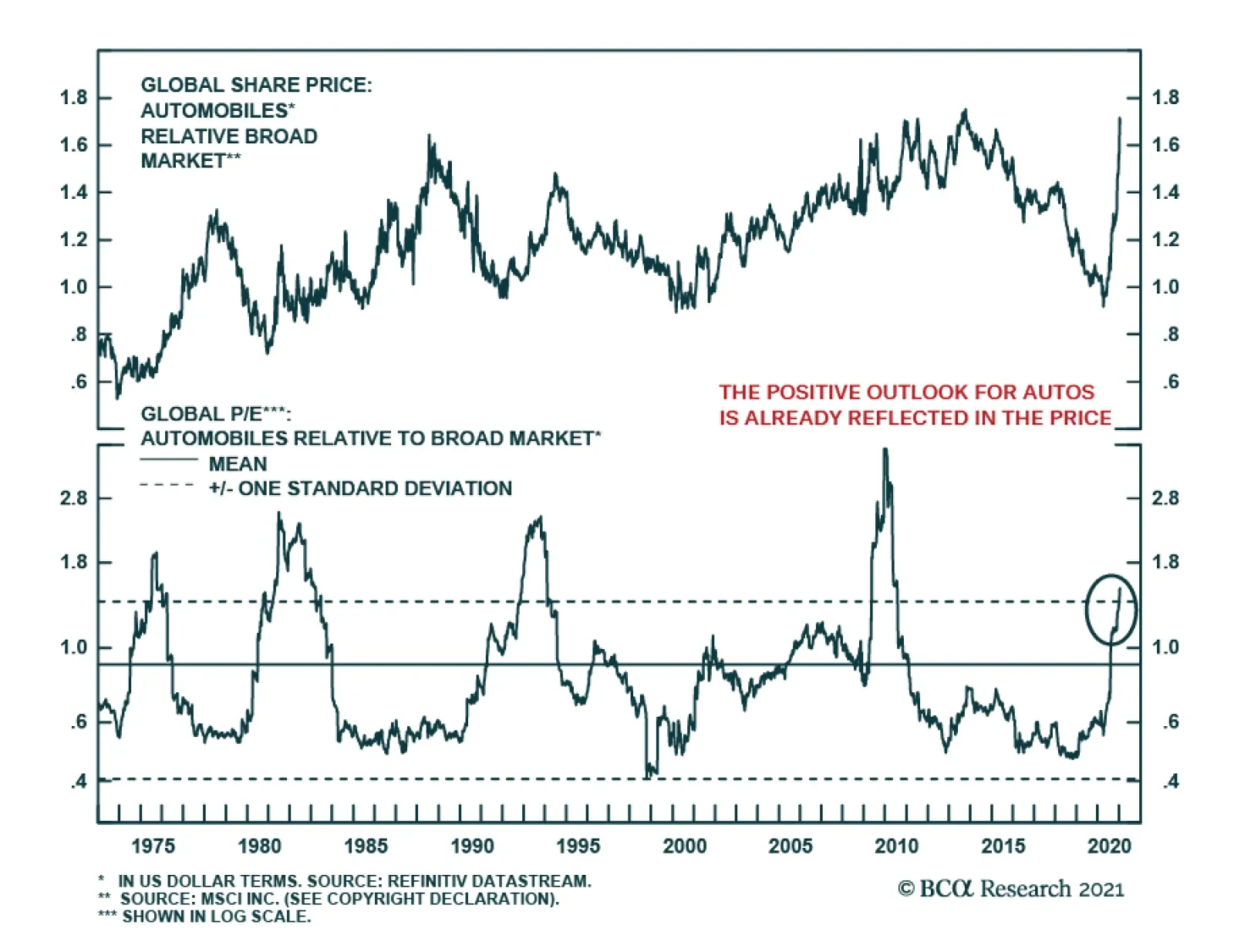
As we expected back in June, global automotive stocks revved up and have been on a rip since H2, following a multi-year period of underperformance. After participating in this rally, we now believe that prices have gotten ahead of themselves and it is time to…
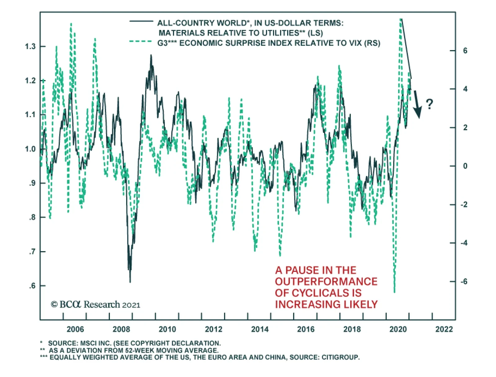
Buying cyclical equities at the expense of defensives has been all the rage over the past nine months. This trend has been supported by ample liquidity conditions, supportive fiscal policy, improving economic surprises and falling volatility (as measured by…
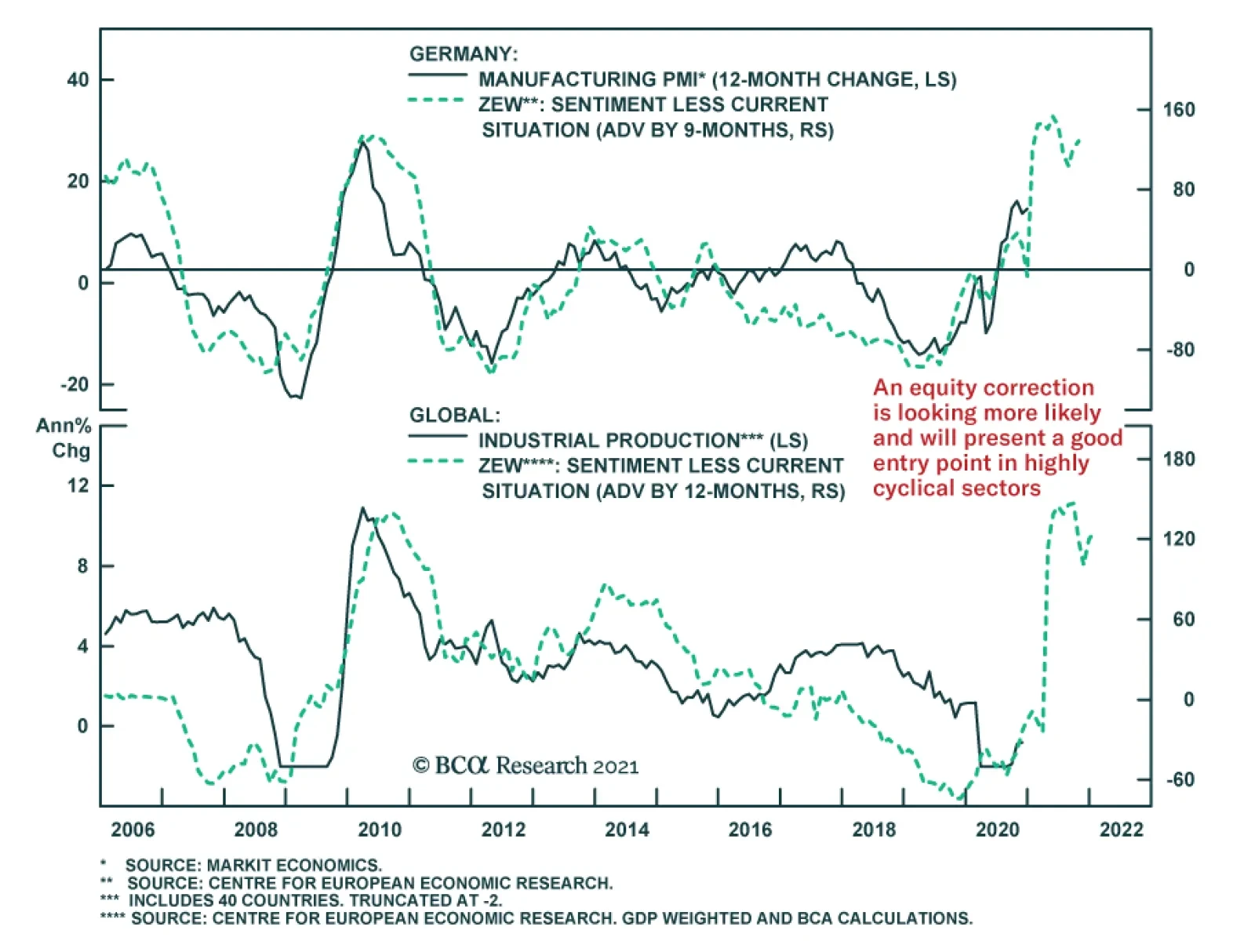
The ZEW survey of German investor sentiment was somewhat mixed this month. The current situation index remained broadly unchanged at a depressed level of -66.4, while the expectations component surged another 6.8 points to 61.8, beating the consensus of a…

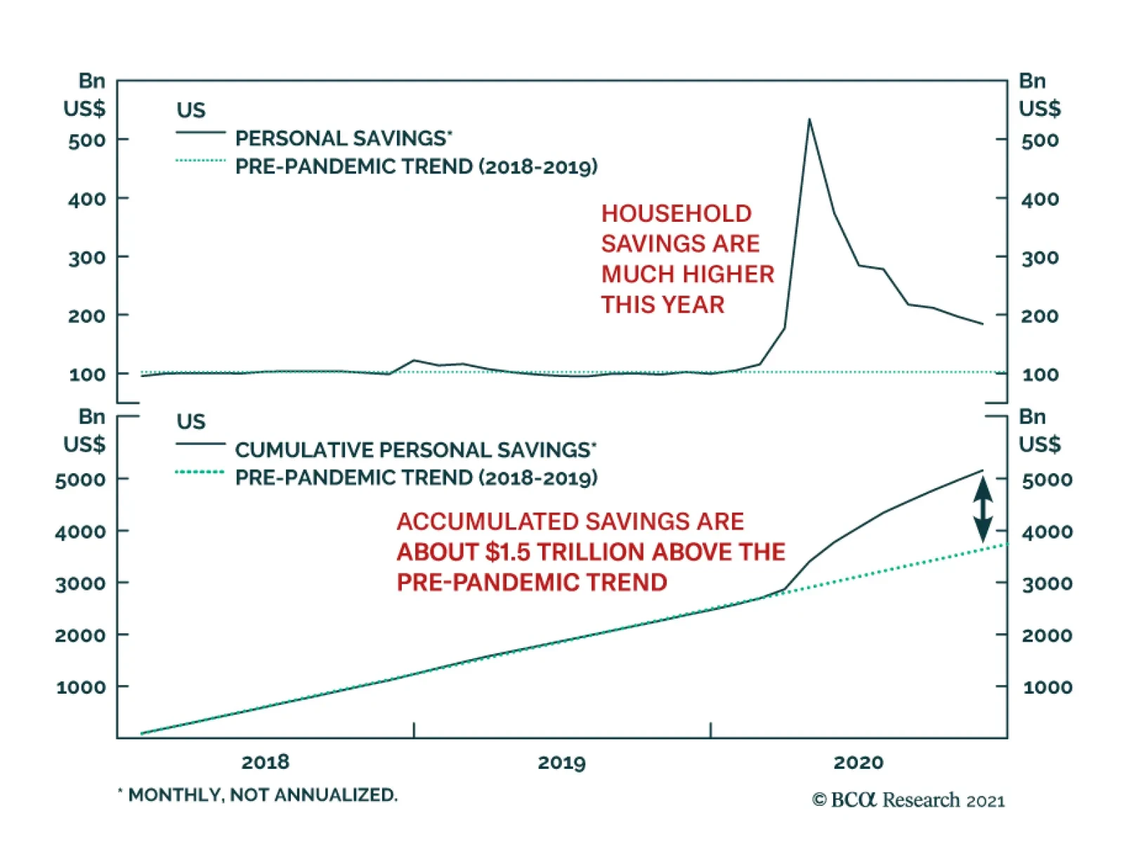
Highlights Even though bonds have cheapened relative to stocks, the equity risk premium remains elevated. The end of the pandemic and supportive fiscal and monetary policies should buoy economic activity in the second half of the year, lifting corporate earnings in the process. Some critics charge that low interest rates and QE have exacerbated wealth and income inequality. The evidence suggests the opposite: Rising inequality since the early 1980s has depressed aggregate demand, forcing central banks to loosen monetary policy. The tide of inequality may be turning, however. Ongoing fiscal and monetary stimulus, increasingly aggressive income distribution policies, heightened anti-trust enforcement, and waning globalization could all shift the balance of power from capital back to labor. Investors should overweight global equities for now but prepare for a more stagflationary environment later this decade. Market Overview We continue to favor global equities over bonds on a 12-month horizon. While bonds have cheapened relative to stocks, the global equity risk premium is still quite wide by historic standards (Chart 1). The distribution of vaccines over the coming months should pave the way for a strong rebound in economic activity in the second half of 2021. This will lift corporate earnings. The macro policy mix will also remain supportive. Thanks to the combination of increased fiscal transfers and subdued spending last year, US households have accumulated $1.5 trillion in savings – equivalent to 10% of annual consumption – over and above the pre-pandemic trend (Chart 2). Chart 1Equity Risk Premia Remain Elevated
Equity Risk Premia Remain Elevated
Equity Risk Premia Remain Elevated
Chart 2Households Have Accumulated Lots Of Savings, Which Should Help Propel Future Spending
Households Have Accumulated Lots Of Savings, Which Should Help Propel Future Spending
Households Have Accumulated Lots Of Savings, Which Should Help Propel Future Spending
US household balance sheets are set to improve further. Congress passed a $900 billion stimulus bill in December, which provides direct support to households, unemployed workers, and small businesses. On Thursday, President-elect Joe Biden unveiled an additional $1.9 trillion relief package. Biden’s plan calls for making direct payments of $1400 to most Americans, bringing the total to $2000 after the $600 in direct payments in December’s deal is included. President Trump had earlier called for stimulus payments of $2000 per person, a number the Democrats quickly seized on. Biden’s plan would also extend emergency unemployment benefits to the end of September, boost funding for schools, raise the child tax credit, and increase spending on Covid testing and the vaccine rollout. Unlike the December deal, it would also provide $350 billion in assistance to state and local governments. We expect at least $1 trillion of Biden’s proposal to be enacted into law. A trillion here, a trillion there, and pretty soon you are talking big money. Admittedly, taxes are also likely to rise. During the election campaign, Joe Biden pledged to lift the corporate income tax rate from 21% to 28%, bringing it halfway back to the 35% rate that prevailed in 2017. He also promised to introduce a minimum 15% tax on the income that companies report in their financial statements to shareholders, raise taxes on overseas profits, and boost payroll taxes on households with annual earnings in excess of $400,000. If carried out, these measures would reduce S&P 500 earnings-per-share by 9%-to-10%. Given the slim majority that Democrats maintain in the Senate, it is unlikely that taxes will rise as much as Joe Biden’s tax plan calls for. Nevertheless, a tax hit to EPS of around 5% starting in 2022 looks probable. On the positive side, the additional spending will goose the economy, so that the net effect of the tax increase on corporate profits should be fairly small. Meanwhile, monetary policy will remain exceptionally accommodative. The Fed is unlikely to hike rates until late 2023 or early 2024. It will take even longer for policy rates to rise in the other major economies. Our bond strategists think that the Fed will start tapering QE only about six months before the first rate hike. Hence, for the time being, ongoing bond buying will limit the upside to yields. We see the US 10-year Treasury yield rising to 1.5% by the end of this year, only modestly higher than market expectations of 1.36%. Rising Inequality: The Dark Side Of QE? Chart 3Inequality Has Risen Across Major Developed Economies
Inequality Has Risen Across Major Developed Economies
Inequality Has Risen Across Major Developed Economies
One often-heard objection to QE is that it has exacerbated inequality by pushing up equity prices without doing much to help the real economy. Some even contend that QE has hurt the middle class by depriving savers of a critical source of interest income. It is certainly true that inequality has risen sharply over the past 40 years, especially in the US (Chart 3). It is also true that the bulk of equity wealth is held by the very rich. According to Fed data, the wealthiest top 1% own half of all stocks (Chart 4). However, QE has pushed up not only equity prices. Falling bond yields have also pushed up home prices. Unlike stocks, housing wealth is broadly held across the population. Moreover, monetary policy operates through other channels. Lower interest rates tend to weaken a country’s currency, boosting competitiveness in the process. Lower rates also encourage investment. Again, real estate figures heavily here. Chart 5 shows that there is a very strong correlation between mortgage yields and housing starts. And while lower interest rates do penalize savers, the middle class is not the main victim. Interest receipts represent a much larger share of total income for ultra-wealthy individuals than for everyone else (Chart 6). Chart 4The Rich Hold The Bulk Of Equities
Inequality Led To QE, Not The Other Way Around
Inequality Led To QE, Not The Other Way Around
Chart 5Strong Correlation Between Mortgage Rates And Housing Activity
Strong Correlation Between Mortgage Rates And Housing Activity
Strong Correlation Between Mortgage Rates And Housing Activity
Chart 6Interest Represents A Bigger Share Of Overall Income At The Top Of The Income Distribution
Inequality Led To QE, Not The Other Way Around
Inequality Led To QE, Not The Other Way Around
Far from exacerbating income inequality, a recent IMF research paper argued that easier monetary policy may dampen inequality by boosting employment and wage growth. Chart 7 shows that labor’s share of GDP has tended to rise whenever the labor market tightened. Chart 7Rising Labor Share Of Income Occurring Alongside Labor Market Tightening
Rising Labor Share Of Income Occurring Alongside Labor Market Tightening
Rising Labor Share Of Income Occurring Alongside Labor Market Tightening
Inequality Paved The Way To QE Chart 8The Rich Save More Than The Poor
Inequality Led To QE, Not The Other Way Around
Inequality Led To QE, Not The Other Way Around
Rather than QE exacerbating inequality, a more plausible story is that rising inequality led to QE. The rich tend to save more than the poor (Chart 8). Consistent with estimates by the IMF, we find that the shift in income towards the rich has depressed US aggregate demand by about 3% of GDP since the late 1970s (Chart 9). A standard Taylor Rule equation suggests that real interest rates would need to be 1.5-to-3 percentage points lower to offset a 3% loss in demand.1 That’s a lot! Thus, not only have the rich benefited directly from receiving a bigger share of the economic pie, they have also benefited indirectly from the fact that falling interest rates have pushed up the value of their assets. Chart 9Rising Inequality Has Depressed Consumption By 3% Of GDP Since The Early 1980s
Rising Inequality Has Depressed Consumption By 3% Of GDP Since The Early 1980s
Rising Inequality Has Depressed Consumption By 3% Of GDP Since The Early 1980s
For a while, lower rates allowed poorer households to take on more debt, thus masking the impact of rising income inequality on consumption. However, after the housing bubble burst, households were forced to retrench and start living within their means. The resulting collapse in spending pushed interest rates towards zero and forced the Fed to undertake one QE program after another. It Is Not About Education Many of the popular explanations for rising inequality have focused on the widening gap between well-educated and less well-educated workers. While there is evidence that the demand for skilled workers increased in the 1980s and 1990s, Beaudry, Green, and Sand have shown that it has declined since then. Together with a rising supply of college-educated workers, softer demand for skilled workers compressed the so-called “skill premium.” So why has inequality increased? One can get a sense of the answer by looking at Chart 10. It shows that almost all the increase in US real incomes has occurred not just near the top of the income distribution, but at the very very top – people in the highest 0.1% of income earners. These are not university professors. These are hedge fund managers and corporate chieftains, with a sprinkling of celebrities (Chart 11). Chart 10The (Really) Rich Got Richer
Inequality Led To QE, Not The Other Way Around
Inequality Led To QE, Not The Other Way Around
Chart 11Who Are The Top Income Earners?
Inequality Led To QE, Not The Other Way Around
Inequality Led To QE, Not The Other Way Around
Superstars In his seminal paper entitled “The Economics of Superstars,” Sherwin Rosen argued that technological trends have facilitated the rise of winner-take-all markets. The classic example is that of stage actors. A century ago, tens of thousands of actors could eke out a living performing at the local theater. Today, a small number of superstars dominate the entertainment industry, while countless others work odd jobs, waiting in vain for their chance for stardom. A similar argument applies to professional athletes. The applicability of the superstar model to other classes of workers is more debatable. How much of the income of star hedge fund managers reflects their unique skills and how much of it reflects a “heads I win, tails you lose” approach to investing client money? Similarly, do CEOs get paid what they do because there is no one else who can do the same job with less pay? Or is it because CEOs can effectively set their own compensation, subject to an “outrage constraint” from shareholders and the broader public — a constraint that has loosened in recent decades due to rising stock prices and a shift in public attention away from class issues towards the debilitating distraction of identity politics? The Rise Of Monopoly Capitalism Where the superstar model may be more relevant is at the firm level. Standard economics textbooks treat profit as a return on capital. This implies that when the after-tax rate of return on capital goes up, firms should respond by increasing investment spending in order to further boost profits. In practice, this has not occurred. For example, the Trump Administration promised that corporate tax cuts would produce an investment boom. Yet, outside of the energy sector – which benefited from an unrelated recovery in crude oil prices – US corporate capex grew more slowly between Q4 of 2016 and Q4 of 2019 than it did over the preceding three years (Chart 12). Why did the textbook economic relationship between investment and the rate of return on capital break down? The answer is that the textbook approach ignores what has become an increasingly important source of corporate profits: monopoly power. Chart 12No Evidence That Trump Corporate Tax Cuts Boosted Investment
Inequality Led To QE, Not The Other Way Around
Inequality Led To QE, Not The Other Way Around
Chart 13A Winner-Take-All Economy
A Winner-Take-All Economy
A Winner-Take-All Economy
A recent study by Grullon, Larkin, and Michaely finds that market concentration has increased in 75% of all US industries since 1997. Furman and Orszag have shown that the dispersion in the rate of return on capital across firms has widened sharply since the early 1990s. In the last year of their analysis, firms at the 90th percentile of profitability had a rate of return on capital that was five times higher than the median firm, a massive increase from the historic average of two times (Chart 13). The rise of monopoly power has been most evident in the tech sector. Over the past 25 years, rising tech profit margins have contributed more to tech share outperformance than rising sales (Chart 14). Chart 14Decomposing Tech Outperformance
Decomposing Tech Outperformance
Decomposing Tech Outperformance
Tech companies are particularly susceptible to network effects: The more people who use a particular tech platform, the more attractive it is for others to use it. Facebook is a classic example. Tech companies also benefit significantly from scale economies. Once a piece of software has been written, creating additional copies costs almost nothing. Even in the hardware realm, the marginal cost of producing an additional chip is tiny compared to the fixed cost of designing it. All of this creates a winner-take-all environment where success begets further success. Monopolies And The Neutral Rate Unlike firms in a perfectly competitive industry, monopolistic firms have to contend with the fact that higher output tends to depress selling prices, thus leading to lower profit margins. As such, rising market power may simultaneously increase profits while reducing investment spending. This may be deflationary in two ways: First, lower investment will reduce aggregate demand. Second, greater market power will shift income towards wealthy owners of capital, who tend to save more than regular workers. An increase in savings relative to investment, in turn, will depress the neutral rate of interest. An Inflection Point For Inequality? After rising for the past four decades, inequality may be set to decline. Central banks are keen to allow economies to overheat. A feedback loop could emerge where overheated economies push up labor’s share of income, leading to more spending and even higher wages. Fiscal policy is likely to amplify this feedback loop. As we discussed last week, loose monetary policy is allowing governments to pursue expansionary fiscal policies. Fiscal stimulus raises the neutral rate of interest, making it easier for central banks to keep policy rates below their equilibrium level. Government policy is also moving in a more redistributive direction. Tax rates on high-income earnings will rise over the next few years, which will support new spending initiatives. Minimum wages are also heading higher. It is worth noting that Florida voters, despite handing the state to President Trump in November, voted 61%-to-39% to raise the state minimum wage from $8.56 an hour to $15 by 2026. Joe Biden also reaffirmed today his pledge to hike the federal minimum wage to $15 from its current level of $7.25. In addition, there is bipartisan support for strengthening anti-trust policies. On the left, Senator Elizabeth Warren has stated that “Today’s big tech companies have too much power – too much power over our economy, our society, and our democracy.” Increasingly, Republicans agree with this sentiment. According to a Pew Research study conducted last June, more than half of conservative Republicans favor increasing government regulation of tech companies (Chart 15). This number has probably gone up following last week’s coordinated effort by the largest tech companies to banish Parler, a Twitter-style app popular with conservatives, from the internet. Chart 15Conservatives Favor Increased Government Regulation Of Big Tech Companies
Inequality Led To QE, Not The Other Way Around
Inequality Led To QE, Not The Other Way Around
Meanwhile, globalization is on the back foot. After rising significantly, the ratio of global trade-to-output has been flat for over a decade (Chart 16). As competition from foreign workers abates, working-class wages in advanced economies could rise. Chart 16Globalization Plateaued More Than A Decade Ago
Globalization Plateaued More Than A Decade Ago
Globalization Plateaued More Than A Decade Ago
Long-Term Investment Implications What is good for Main Street is usually good for Wall Street. For the past 70 years, the S&P 500 has generally moved in sync with the ISM manufacturing index (Chart 17). The same pattern holds globally. Chart 18 shows that the stock-to-bond ratio has correlated closely with the global manufacturing PMI. Chart 17Strong Correlation Between Economic Growth And Stocks
Strong Correlation Between Economic Growth And Stocks
Strong Correlation Between Economic Growth And Stocks
Cyclical fluctuations can disguise important structural trends, however. US productivity has doubled since 1980, but real median wages have increased by only 20% (Chart 19). The bulk of productivity gains have flowed to upper-income earners and owners of capital. Hence, corporate profits rose, while inflation and interest rates declined. Chart 18Stocks Rarely Underperform Bonds When The Global Economy Is Strengthening
Stocks Rarely Underperform Bonds When The Global Economy Is Strengthening
Stocks Rarely Underperform Bonds When The Global Economy Is Strengthening
Chart 19Real Median Wages Failed To Keep Up With Productivity
Real Median Wages Failed To Keep Up With Productivity
Real Median Wages Failed To Keep Up With Productivity
If we are approaching an inflection point for inequality, we may also be approaching an inflection point for profit margins and bond yields. To be sure, with unemployment still elevated, wage growth and inflation are not about to take off anytime soon. However, investors should prepare for a more inflationary – and ultimately, stagflationary – environment in the second half of the decade. This calls for reducing duration risk in fixed-income portfolios, favoring TIPS over nominal bonds, and owning inflation hedges such as gold and farmland. It also calls for maintaining a bias towards value over growth stocks, as the former usually outperform when inflation and commodity prices are on the upswing (Chart 20). Peter Berezin Chief Global Strategist peterb@bcaresearch.com Chart 20Value Stocks Usually Outperform When Commodity Prices Are On The Upswing
Value Stocks Usually Outperform When Commodity Prices Are On The Upswing
Value Stocks Usually Outperform When Commodity Prices Are On The Upswing
Footnotes 1 One can specify different parameters to weight the inflation and capacity utilization segments of a Taylor rule equation so that they are equally-weighted, meaning there is a coefficient of 0.5 on the gap between the year-over-year percent change in headline PCE and the Fed's 2% target and a coefficient of 0.5 on the output gap term. Previous Fed Chair and incoming Treasury Secretary Janet Yellen preferred an alternative specification where there was a coefficient of 1 on the output gap term so that the equation is as follows: RT= 2 + PT + 0.5(PT- 2) + 1.0YT, where R is the federal funds rate; P is headline PCE as expressed as a year-over-year percent change; and Y is the output gap (as approximated using the unemployment gap and Okun's law). For further discussion, please see Janet L. Yellen, "The Economic Outlook and Monetary Policy," April 11, 2012. Global Investment Strategy View Matrix
Inequality Led To QE, Not The Other Way Around
Inequality Led To QE, Not The Other Way Around
Special Trade Recommendations
Inequality Led To QE, Not The Other Way Around
Inequality Led To QE, Not The Other Way Around
Current MacroQuant Model Scores
Inequality Led To QE, Not The Other Way Around
Inequality Led To QE, Not The Other Way Around
Highlights Strong/weak productivity growth leads to secular bull/bear markets in both equities and the currency. We illustrate why and how robust productivity gains can engender a virtuous self-reinforcing cycle that can run for many years. Detecting productivity for macro strategists is akin to doctors diagnosing a patient – it entails more art than science. Inflation, the real trade balance, and company profit margins constitute a litmus test for assessing productivity growth. Feature By far, the most critical variable determining long-term economic growth is a country’s productivity. This report presents why productivity matters for investors and examines how to gauge productivity growth given it is practically impossible to measure accurately. We use the framework presented in this report to analyze long-term trends in individual EM economies. In a follow-up piece, we will present a practical application of this framework by ranking developing economies according to their productivity and long-term growth potential. This report does not discuss what is needed to boost productivity because the policy prescriptions are well known and are widely available in economic literature. That said, we have outlined some of these in Box 1. BOX 1 The Basic Formula For Long-Term Growth For any economy, the potential growth rate is what can be achieved and sustained in the very long run. It can be expressed as follows: Potential (real) growth rate = productivity growth + labor force growth Given that we can use demographic data to approximate the number of people entering and exiting the labor force for each year over the next 18 years, the labor force growth variable can be easily estimated. Hence, the key unknown in the above formula is productivity growth. In a developing economy, it is difficult to measure productivity accurately (Chart 1). That is why when analyzing the long-term outlook, we first assess whether the country has effectively implemented the structural reforms needed to achieve faster productivity growth – some of which are listed below. We combine these observations with symptoms associated with either strong or weak productivity growth in order to assess an economy’s potential growth trajectory. Chart 1Productivity Growth Estimates For EM/China
Productivity Growth Estimates For EM/China
Productivity Growth Estimates For EM/China
Recommended policies to raise productivity growth typically include: building hard and soft infrastructure, improving education and training, investing in new technologies and equipment, promoting entrepreneurship and formation of new businesses, promoting competition, augmenting R&D spending, importing foreign “know how,” and fostering industry clusters that specialize in certain products or processes. Why Does Productivity Matter For Investors? Following are the investment implications of productivity growth: 1. Productivity is the sole driver of growing prosperity, which is reflected in rising per capita real incomes (Chart 2). Productivity = output per employee per hour = (real GDP or output) / (number of employees x number of hours worked) Rising productivity creates more income that is shared between employees and shareholders. If productivity rises by 5% and hourly wages increase by 2.5% in a year, unit labor costs will drop by 2.5%. In such a case, the 5% increase in productivity is shared equally between shareholders and employees. A lack of productivity gains and resulting stagnant income for both employees and business owners might lead to rising socio-political tensions and ultimately to political instability. 2. Strong productivity gains allow an economy to grow faster without experiencing high inflation (Chart 3). The upshot is reduced cyclicality in economic activity, i.e., business cycles are characterized by longer expansions and shallow and less frequent downturns. Equity investors will thus likely pay higher equity multiples due to the reduced cyclicality of corporate profits. Chart 2Productivity Is Ultimately Reflected In Rising Real Income Per Capita
Productivity Is Ultimately Reflected In Rising Real Income Per Capita
Productivity Is Ultimately Reflected In Rising Real Income Per Capita
Chart 3China: Strong Productivity Growth Has Kept A Lid On Inflation
China: Strong Productivity Growth Has Kept A Lid On Inflation
China: Strong Productivity Growth Has Kept A Lid On Inflation
The rationale is that robust productivity advances allow the economy to expand with low inflation with no need for monetary tightening. The relationship between productivity and inflation is discussed in detail below. A structurally low inflation environment allows policymakers to promptly deploy large monetary and fiscal stimulus when faced with economic downturns. In addition, low interest rates are also associated with higher equity valuations. On the contrary, a lack of productivity growth makes business cycles short-lived. Inflation will rise faster during a business cycle expansion in an economy with low productivity growth. In turn, interest rates will rise more rapidly in those economies, short-circuiting the expansion. Equity investors will be reluctant to pay high multiples for companies operating in such environments. 3. On a microeconomic level, high productivity gains are typically associated with higher profit margins and vice versa (Chart 4). Shareholders assign higher equity multiples to enterprises with higher profit margins and return on capital. Chart 4Faster Productivity Growth = Wider Corporate Profit Margins
Faster Productivity Growth = Wider Corporate Profit Margins
Faster Productivity Growth = Wider Corporate Profit Margins
Besides, wider profit margins allow companies to tolerate higher real interest rates. High real interest rates attract foreign fixed-income capital supporting the nation’s exchange rate. Given that labor costs make up a large share of costs in many companies, unit labor costs are a critical determinant of corporate profitability. Meanwhile, selling prices, sales as well as input prices are often beyond management control. Therefore, raising productivity (output per hour of an employee) is one of the few ways to lift corporate profitability and, by extension, return on capital. Unit labor costs = (wage per person per hour) / productivity 4. Rapid productivity advances allow companies to become more competitive without currency depreciation (Chart 5and Chart 6). Exchange rates of countries that achieve faster productivity growth typically appreciate in the long run. Chart 5Switzerland: High Productivity Has Sustained Competitiveness/Export Volumes Despite Currency Appreciation
Switzerland: High Productivity Has Sustained Competitiveness/Export Volumes Despite Currency Appreciation
Switzerland: High Productivity Has Sustained Competitiveness/Export Volumes Despite Currency Appreciation
Chart 6China and Vietnam: Rising Export Market Share Reflects Productivity Gains
China and Vietnam: Rising Export Market Share Reflects Productivity Gains
China and Vietnam: Rising Export Market Share Reflects Productivity Gains
Enterprises with higher productivity can drop their selling prices with limited impact on their profitability. By doing so, they can undercut their competitors and gain market share. Hence, solid productivity gains also entail a competitive currency, eliminating the need for central banks to hike interest rates in order to defend the exchange rate. 5. High indebtedness – in both public and private sectors – is easier to manage amid brisk productivity gains because the latter generate strong economic growth and relatively low nominal interest rates. Robust income gains among businesses and households, as well as for the government via taxation, enable indebted agents to service higher debt loads. Besides, nominal GDP growth above nominal interest rates arithmetically implies a drop in the public debt-to-GDP ratio. In brief, the economy could “grow into its debt” with robust productivity gains. In sum, strong/weak productivity growth leads to secular bull/bear markets in both equities and the currency. Rapid Productivity Gains Lead To A Virtuous Circle The following illustrates how robust productivity gains can engender a virtuous self-reinforcing cycle that can run for many years. Fast productivity gains allow for either fast wage or rapid corporate profit growth or a combination of the two. As income per capita rises, consumer spending grows and capital owners are willing to invest. New investments create new jobs and income and could also boost future productivity if substantial capital misallocation is dodged. The economy expands at a rapid rate, but inflation and, thereby, interest rates remain capped because the economy’s productive capacity grows in line with demand. Strong income and profit growth as well as stable borrowing costs lead to more credit demand from both households and businesses. Bank and non-bank credit expand but rapid household income gains and healthy enterprise profitability as well as growing government tax revenues support the private or public sectors’ debt servicing capacity. Robust economic growth, elevated real interest rates and high profitability attract foreign capital and foreign inflows lead to currency appreciation. Yet, such currency appreciation should not undermine the competitiveness of local producers – both exporters and those competing with imported goods. As discussed above, sizable productivity gains could reduce unit labor costs and allow domestic companies to drop their prices, sustaining their market shares in both export markets and domestically. Consequently, the trade balance does not deteriorate structurally despite a rapid expansion in domestic demand. Healthy balance of payments support the currency, i.e., the central bank does not need to hike interest rates or draw down reserves to defend the exchange rate. Finally, rapid corporate profit and household income growth as well as reasonably low nominal interest rates sustain high asset (equity and property) valuations for longer. Such a virtuous circle can persist until something breaks or major excesses – for example, capital misallocation, credit or property bubbles – emerge and then unravel. Meager Productivity Gains Lead To A Vicious Circle The following demonstrates how stagnant productivity can set in motion a vicious self-reinforcing circle. With no productivity gains, a business cycle recovery will likely lead to higher inflation sooner than later. The latter will short circuit the economic expansion as the central bank is forced to hike interest rates. If the central bank does not hike interest rates despite rising inflation, real (inflation-adjusted) interest rates will fall and could become negative. Low real rates are bearish for the currency. Either the central bank will be forced eventually to hike interest rates substantially or the exchange rate will continue depreciating. There are two reasons why low real interest rates are negative for the exchange rate: (1) low real borrowing costs will encourage more borrowing, spending, and investment. Such very strong domestic demand in the context of limited domestic productive capacity will lead to a ballooning trade deficit; and/or (2) low real interest rates will discourage foreign fixed-income capital inflows and weigh on the currency. With no productivity gains, any increase in wages will lead to rising unit labor costs and shrinking profit margins; corporate profitability and return on capital will plunge. The sole way to protect profitability amid rising unit labor costs is to raise selling prices. The latter could spur a wage-inflation spiral. Rising unit labor costs and resulting shrinking corporate profit margins leave domestic producers no room to reduce their selling prices to compete in export markets and with imports. The result is less exports, less import substitution and a deteriorating trade balance. In such a case, the only way to restore the competitiveness of domestic producers is to devalue the exchange rate. Declining or low returns on capital will discourage business investment, in general, and foreign direct investment (FDI) in particular with negative ramifications for future productivity. A worsening trade balance as well as diminishing foreign equity and FDI inflows also entail currency depreciation. This feeds into inflation and leads inevitably to monetary policy tightening. Such tightening prompts weaker growth, lower profitability and more foreign capital outflows. This vicious circle can persist until a major regime shift occurs: a dramatically devalued currency that stays very cheap or corporate restructuring and structural reforms that lead to higher productivity. Commodity Prices And Productivity A critical question to address regarding productivity in commodity producing countries is the issue of rising and falling commodity prices. Higher commodity prices lead to improved prosperity and vice versa. Does this mean that high commodity prices should be treated as productivity improvements? There is some ambiguity in regard to this but our preference is not to treat fluctuations in commodity prices as changes in the nation’s structural productivity. Let us consider the examples of Nigeria, which produces and exports oil, and Vietnam, which manufactures and ships smartphones in large quantities. Let us assume that smartphone exports are as important to Vietnam in generating income per capita as oil exports are to Nigeria. A doubling in oil prices amid flat oil export volumes would generate windfall oil revenues which would lift Nigeria’s income per capita. If smartphone prices remain constant but smartphone production and shipments (volumes) double, income per capita in Vietnam would rise as much as in Nigeria.1 The difference between these two scenarios in Nigeria and Vietnam is as follows: Nigeria would be made richer due to the price increases: it would be producing and exporting the same number of barrels of oil but a doubling in crude prices would augment income per capita in Nigeria. The problem is that Nigeria does not control oil prices. If oil prices decline, the nation’s income per capita would also drop substantially. Hence, there would have been no genuine (structural) productivity gains and Nigeria’s prosperity would be at the mercy of the global oil market. In the case of Vietnam, its productivity will have risen as it has succeeded in producing twice as many smartphones as it did last year. The country has built capacity, acquired technology and developed human skills to double smartphone production. This increased capacity, technology acquisition and skills cannot be taken away from Vietnam. This is a case of genuine productivity advancement. In fact, Vietnam could build on these skills and start producing other, more value-added goods. What if Nigeria doubled its oil output and export volume due to more investment and new technologies (as the US succeeded in doing with shale oil)? This scenario would qualify as genuine productivity gains. At any oil price scenario, Nigeria’s oil export revenues would double. The sole caveat is that the new oil production should have reasonably low breakevens, i.e., oil production should be viable even if oil prices decline. The same caveat is applicable to Vietnam. The difference between Nigeria (oil) and Vietnam (smartphones) is that commodities prices are much more volatile than manufactured goods prices. Bottom Line: In commodity producing countries, rising commodities prices have the same effect on income per capita as productivity gains. However, per capita income gains originating from higher commodities prices are reversable, i.e., not sustainable in the very long run. Consequently, higher commodity prices should not be treated as structural productivity gains. By contrast, productivity advancements – like Vietnam doubling its capacity to produce smartphones or Nigeria doubling its oil production volume – are non-reversable, i.e., they cannot be taken away. Hence, these constitute genuine productivity gains. Detecting Productivity Is Akin To Doctors Diagnosing A Patient Even in advanced countries, productivity is hard to measure accurately. Hence, any measure of productivity in developing economies should be used with a grain of salt. How do we carry out long-term analysis of developing economies when the key variable – productivity growth – is hard to measure? How do we make projections about productivity growth going forward? We see structural macro analysis as analogous to the work of doctors. When diagnosing a patient, doctors cannot necessarily observe what is happening in the patient’s body. Doctors conduct various tests and then analyze those results in the context of the symptoms. Putting it all together, they make a diagnosis and prescribe the necessary treatment. Similar to the manner in which doctors rely on symptoms and medical tests to determine where there is sufficient evidence of a disease, macro strategists do not see what is really occurring in their “patient’s” body, i.e., economies. Data for macro strategists is akin to medical tests for doctors. In developing countries, the quantity of economic data available to macro strategists is limited and of poor quality. Therefore, observing symptoms of economies under consideration and interpreting them correctly is crucial to the job of macro strategists for emerging economies. As they can count less on hard data and instead rely more on symptoms, their analysis is more of an art than a science. Symptoms Associated With Productivity: How To Detect Productivity At a country level, robust productivity gains are ceteris paribus typically associated with: A structurally improving real trade balance (exports minus import volumes), which is not due to a cheapened currency or a relapse in domestic demand but is due to domestic producers achieving the following: Becoming more competitive and gaining market share in global trade Succeeding in import substitution (imported products are crowded out by locally produced ones) Low inflation during an extended period of business cycle expansion Corporate profit margins expanding simultaneously with higher wages amid low inflation. A lack of productivity gains are ceteris paribus normally attendant with: A structurally deteriorating real trade balance as: Domestic producers lose market share in global exports Domestic producers lose market share to importers in local markets Rising inflation amid a moderate recovery in domestic demand Lingering downward pressure on corporate profit margins i.e., a modest rise in wage growth leads to a drop in corporate profit margins. On the whole, inflation, the real trade balance, and company profit margins constitute a litmus test for assessing productivity growth. A widening real trade deficit is a form of hidden inflationary pressure and a sign of lackluster productivity growth. The rationale is as follows: In a closed economy, when expanding demand outpaces the productive capacity of that economy, i.e., productivity gains do not keep up with thriving domestic demand, inflation will rise considerably. In short, rising inflation will be a symptom of paltry productivity gains. In an open economy, when domestic demand outpaces the productive capacity of that economy, inflation might not rise as demand could be satisfied by imports of foreign goods and services. In such a scenario, even though the trade balance will deteriorate, the currency might stay firm for a while because of foreign capital inflows or rising export (commodities) prices. As a result, inflation will stay low for some time. Eventually, when tailwinds from foreign capital inflows or high export prices cease, the currency will nosedive. Importers will have to raise prices in local currency causing a spike in inflation. Why would foreign capital inflows halt? Lackluster productivity gains amidst solid wage increases would cause a corporate profit margin squeeze and profitability will plummet. As a result, both FDI and equity inflows will dry up and the currency will depreciate. The latter will push up inflation considerably. In a nutshell, in an open economy poor productivity growth might not necessarily lead to high inflation where domestic demand can be satisfied by imports. In these cases, we can say that a widening real trade deficit is a form of hidden inflation. The only exception is when the real trade balance deteriorates due to imports of capital goods and/or new technologies that will be used to build new productive capacity. In such a case, a ballooning trade deficit should not be viewed as a form of hidden inflation and poor productivity growth. If consumer goods dominate imports, this would signify low chances of sizable productivity gains in a given country. If capital goods dominate imports, there are higher odds of future productivity gains. If these imported equipment and technologies are properly utilized, they will make the nation productive and competitive in the coming years. Higher productivity stemming from imports of these capital goods/new technologies, i.e., enlarged capacity to produce goods and services at lower costs, will cap inflation as well as expand exports and result in significant import substitution. A Checklist For Detecting Productivity Diagram 1 presents macro signposts that can be used to diagnose whether an economy is experiencing strong or weak productivity growth (these do not include traditional metrices such as education, R&D spending, strong governance, soft- and hard-infrastructure, etc.): Diagram 1A Checklist For Detecting Productivity
A Primer On Productivity
A Primer On Productivity
Arthur Budaghyan Chief Emerging Markets Strategist arthurb@bcaresearch.com Footnotes 1 We assume here that all inputs for smartphones are produced domestically, in Vietnam. This is not a realistic assumption, but we use it only to illustrate a macro point about productivity.
Much of the cyclical outlook for yields hinges on the outlook for inflation. For now, global core CPI continues to linger toward its nadir. However, important indicators suggest that it is set to trend higher in the coming quarters. One of the most…
The economic recovery so far seems impervious to any shock, with the various global manufacturing indicators holding up well. Along with accommodative policy, the resilience of the economy remains a crucial ingredient to the powerful rally in stocks.…
According to BCA Research’s Global Investment Strategy service, fiscal stimulus helped avert the cascade of business failures that normally accompany recessions. Despite a tick up in bankruptcies among large companies shortly after the pandemic began, 16%…
Highlights Further fiscal easing is likely in the US now that the Democrats are set to take control of the US Senate following Tuesday’s runoff elections in Georgia. With the end of the pandemic in sight, a growing chorus of commentators, including none other than Larry Summers, are sounding the alarm over fears that fiscal policy could end up being too stimulative. In the short term, the risk that economies will overheat due to excessive fiscal support is low. There is still too much labor market slack, the bulk of any stimulus checks will be saved, and the short-run Phillips curve remains quite flat. Looking beyond the next two years, fiscal policy could indeed turn out to be inflationary. Political populism is rising. Central banks, fearful of the zero lower-bound constraint on interest rates, want higher inflation. Falling interest rates have also made it easier for governments to run larger budget deficits. We estimate that the US can run a primary budget deficit that is more than 2% of GDP larger than at the start of 2019, while still achieving a stable debt-to-GDP ratio. The “fiscal envelope” has increased significantly in other major economies as well. Ironically, in a world where interest rates are below the trend growth in GDP, a higher debt-to-GDP ratio permits larger budget deficits. Investors should remain overweight stocks relative to bonds over a cyclical 12-month horizon, favoring “value stocks” which will benefit more from steeper yield curves and the dismantling of lockdown measures. Financial markets will face a period of extreme turbulence in a couple of years once inflation begins to accelerate. A Race Against Time The past few weeks have seen a race between the virus, which continues to infect people at an alarming rate, and efforts to vaccinate the most vulnerable members of society. So far, the virus has the upper hand. Chart 1Tracking The Progress In Global Vaccination Rates
Fiscal Stimulus: How Much Is Too Much?
Fiscal Stimulus: How Much Is Too Much?
The “UK strain” has become more prevalent around the world.1 By some estimates it is 70% more contagious than the original virus that emerged in Wuhan, China. Another, potentially even more dangerous strain, has surfaced in South Africa and has spread to South America. The early evidence suggests that the recently approved vaccines will be effective in fighting the UK strain. Unfortunately, there is not enough data to judge whether this is also true for the South African strain. Right now, only 0.2% of the world’s population has been inoculated, but that number will rise rapidly over the coming months (Chart 1). Assuming that existing vaccines are effective against the myriad virus strains, the infection rate should fall precipitously by the middle of the year. Georgia Runoffs Will Lead To Even More Stimulus Governments eased fiscal policy significantly last year in response to the unfolding crisis (Chart 2). At the worst point of the pandemic in April, US real disposable income was up 14% year-over-year (Chart 3). Transfers to households fell sharply following the expiration of the CARES Act, but are set to rise again thanks to the recently completed stimulus deal. Chart 2Fiscal Policy In 2020: Governments Eased Significantly In Response To The Unfolding Crisis
Fiscal Stimulus: How Much Is Too Much?
Fiscal Stimulus: How Much Is Too Much?
The victory by both Democratic candidates in the Georgia Senate runoff races on Tuesday moves the political configuration in Washington even further towards fiscal easing. Having gained control of the Senate, the Democrats will now be able to use the “reconciliation process” to pass a budget that boosts spending on health care, education, infrastructure, and the environment. Granted, reconciliation requires that any extra spending be offset by additional revenue measures over a 10-year budgetary horizon. Thus, corporate taxes will probably rise. Nevertheless, the combination of more spending and higher corporate taxes will still produce a net boost to aggregate demand. This is partly because any revenue measures are likely to be backloaded. It is also because raising corporate taxes will not reduce investment by very much. The experience from the Trump tax cuts revealed that the main consequence of lowering corporate tax rates was to lower corporate tax receipts. The touted boost to corporate investment from lower taxes never materialized. In fact, outside of the energy sector – which benefited from an unrelated recovery in crude oil prices – US corporate capex grew more slowly between Q4 of 2016 and Q4 of 2019 than it did over the preceding three years (Chart 4). Chart 3Personal Income Jumped Early On In The Pandemic
Personal Income Jumped Early On In The Pandemic
Personal Income Jumped Early On In The Pandemic
Chart 4No Evidence That Trump Corporate Tax Cuts Boosted Investment
Fiscal Stimulus: How Much Is Too Much?
Fiscal Stimulus: How Much Is Too Much?
For stock market investors, the prospect of higher taxes will take some of the bloom off the rose from additional fiscal stimulus. That said, the impact will vary considerably across equity sectors. Cyclical stocks such as industrials and materials will benefit from stimulus-induced economic growth. Banks will also gain because stronger growth will suppress loan losses, while leading to steeper yield curves, thus raising net interest margins in the process. Value stocks have more exposure to banks and deep cyclicals, and hence we remain positive on them. Small caps also have more exposure to these sectors, but are starting to look increasingly pricey. Stimulus: How Much Is Enough? Chart 5Commercial Bankruptcies Are Well Contained
Fiscal Stimulus: How Much Is Too Much?
Fiscal Stimulus: How Much Is Too Much?
Fiscal stimulus helped avert the cascade of business failures that normally accompany recessions. Despite a tick up in bankruptcies among large companies shortly after the pandemic began, 16% fewer companies filed for bankruptcy in the first 11 months of 2020 compared to the same period in 2019 (Chart 5). Overall bankruptcy filings, which include personal bankruptcies, have fallen to a 35-year low according to Epiq AACER. The pipeline for bankruptcies also looks fairly narrow. Junk bond prices have been rebounding and consumer loan delinquency rates have been trending down (Table 1). Table 1Personal Loan Delinquencies Have Also Been Trending Lower
Fiscal Stimulus: How Much Is Too Much?
Fiscal Stimulus: How Much Is Too Much?
Generous fiscal transfers have allowed households to accumulate plenty of savings, which should help propel future spending. Chart 6 shows that accumulated US household savings are about $1.5 trillion above their pre-pandemic trend. We estimate that the combination of increased savings, rising home prices, and a surging stock market pushed up household net worth by $8 trillion in Q4 alone, leaving it 11% above Q4 2019 levels. In comparison, household net worth fell by over 15% during the Great Recession. Chart 6Households Have Accumulated Lots Of Savings, Which Should Help Propel Future Spending
Households Have Accumulated Lots Of Savings, Which Should Help Propel Future Spending
Households Have Accumulated Lots Of Savings, Which Should Help Propel Future Spending
Little Risk Of Near-Term Fiscal Overheat With the prospect of a vaccine-led economic recovery in sight, a growing chorus of commentators are sounding the alarm over fears that fiscal policy could end up being too stimulative. In an interview with Bloomberg Television, Larry Summers contended that President Trump’s attempt to increase the size of stimulus checks from $600 per person to $2000 was “a serious mistake” that risked overheating the economy. Summers argued for a more streamlined approach that prioritized aid to state and local governments and increased funding for Covid testing and vaccine deployment. Despite Larry’s admonition, we see little risk that loose fiscal policy will cause any major economy to overheat in the near term, even if the Senate does enact more stimulus. For one thing, recent stimulus proposals have emphasized direct transfers to households. Unlike most other types of spending, across-the-board stimulus checks will go mainly into savings. The New York Fed has estimated that less than 30% of the direct stimulus payments in the CARES Act were used for consumption, with 36% saved and 35% used to pay down debt. Consistent with past experience, households expect to spend only about one-third of the forthcoming stimulus checks according to CivicScience, a market research firm (Chart 7). Chart 7How Will Americans Spend Their Second Stimulus Check?
Fiscal Stimulus: How Much Is Too Much?
Fiscal Stimulus: How Much Is Too Much?
Chart 8Employment-To-Population Ratios Remain Well Below Pre-Pandemic Levels
Employment-To-Population Ratios Remain Well Below Pre-Pandemic Levels
Employment-To-Population Ratios Remain Well Below Pre-Pandemic Levels
Moreover, there is still plenty of labor market slack. Chart 8 shows the employment-to-population ratio for prime-aged workers remains well below pre-pandemic levels across the OECD. In a best-case scenario, it will take a couple more years for employment levels to return to normal. Long-term inflation expectations are also well anchored, implying that the short-run Phillips curve is quite flat. In simple English, this means that a temporary burst of stimulus is unlikely to trigger an inflationary price-wage spiral. Some decline in budget deficits is also likely after the pandemic ends. The Hutchins Center at Brookings expects the fiscal package passed by the US Congress in December to boost GDP by 7% in the first quarter. However, it expects the four-quarter moving average in the fiscal contribution to growth to turn negative in the third quarter, and stay that way right through 2022 (Chart 9). Likewise, in its most recent forecasts, the IMF projected a negative fiscal impulse in the major advanced economies in 2021-22 (Chart 10). Chart 9Budget Deficits Set To Decline, But Remain High By Historic Standards (Part I)
Fiscal Stimulus: How Much Is Too Much?
Fiscal Stimulus: How Much Is Too Much?
Chart 10Budget Deficits Set To Decline, But Remain High By Historic Standards (Part II)
Fiscal Stimulus: How Much Is Too Much?
Fiscal Stimulus: How Much Is Too Much?
Long-Term Fiscal Picture Is More Inflationary Granted, a negative fiscal impulse simply means that the structural budget deficit is declining over time. In absolute terms, the IMF expects budget deficits to remain quite large by historic standards, even if they do come down from their pandemic peak. Remember, it is the level of the budget deficit that helps determine the level of demand throughout the economy. Economies overheat when the level of aggregate demand exceeds the level of aggregate supply. If private-sector demand recovers more quickly than budget deficits come down, overall demand will rise. As such, it is certainly possible that excessively easy fiscal policy will contribute to an inflationary overshoot once labor market slack has been fully absorbed in two-to-three years. Politically, such an overshoot seems quite plausible. Populism is rising both on the left and the right. It is noteworthy that the Republican candidates in Tuesday’s runoff Senate races supported President Trump’s call for boosting the size of stimulus checks. The same goes for Senators Lindsey Graham of South Carolina and Marco Rubio of Florida. Rubio is widely considered an early front-runner for the 2024 Republican presidential nomination. Economically, the case for bigger budget deficits has also become more appealing. Real interest rates are negative across the major economies. Low interest rates allow governments to take on more debt without having to make large interest payments. Indeed, the Japanese government today receives more interest than it pays by virtue of the fact that more than half of its debt was issued at negative rates. Persistent worries about the zero lower-bound constraint also encourage central banks to pursue policies that could fuel inflation, such as refraining from tightening monetary policy in response to looser fiscal policy. The current level of policy rates gives central banks almost no scope to cut rates in response to an adverse economic shock. If inflation were to rise, central banks would be able to bring real rates even further into negative territory should economic conditions warrant it. The Paradox Of Debt Sustainability When r Is Less Than g One might think that today’s high debt-to-GDP ratios would force governments to slash deficits to keep debt from spiraling out of control. However, things are not so straightforward in a world of ultra-low interest rates. As Appendix A shows, the primary budget balance that is consistent with a stable debt-to-GDP ratio can be expressed as:
Fiscal Stimulus: How Much Is Too Much?
Fiscal Stimulus: How Much Is Too Much?
Where p is the primary budget balance (the difference between tax receipts and non-interest spending, expressed as a share of GDP), r is the real interest rate, and g is the growth rate of the economy. Notice that when r is less than g, a higher debt-to-GDP ratio corresponds to a larger primary budget deficit (i.e., a more negative p). In other words, by taking on more debt, governments would not only be able to raise spending or cut taxes, but they would also have enough money left over to pay the additional interest on the debt. And they could do all this without putting the debt-to-GDP ratio on an unsustainable upward trajectory. Chart 11More Space For Bigger Budget Deficits In The US...
More Space For Bigger Budget Deficits In The US...
More Space For Bigger Budget Deficits In The US...
What sort of funky magic allows this to happen? The answer is that even a small percentage increase in debt will correspond to a large increase in the absolute stock of debt when debt levels are elevated to begin with. If interest rates are low, most of the additional debt can go into financing a larger primary deficit instead of higher interest payments. One can see this point with a simple example. Suppose that initially, debt is 50, GDP is 100, and hence the debt-to-GDP ratio is 50%. Let us also assume that the primary deficit is 1% of GDP, the interest rate is 2%, and GDP grows at 4%. Next year, debt will be 50+50*0.02+1=52 while GDP will be 100*1.04=104. Hence, the debt-to-GDP ratio will remain 52/104=50%. Now rerun the same example but assume that debt is initially equal to 100, implying an initial debt-to-GDP ratio of 100%. In that case, it is simple to verify that the debt-to-GDP ratio would fall to 103/104≈99% the following year if the primary deficit remained at 1% of GDP. The primary deficit would have to rise to 2% of GDP to keep the debt-to-GDP stable – double what it was in the first example. The level of the US primary budget deficit that is consistent with a stable debt-to-GDP ratio has risen from 0.8% of GDP at the start of 2019 to 3.1% today if one uses the Congressional Budget Office’s estimate of trend growth and the 10-year TIPs yield as a proxy for the real interest rate (Chart 11). A similar trend is visible abroad (Chart 12). Chart 12... As Well As In Other Major Economies
Fiscal Stimulus: How Much Is Too Much?
Fiscal Stimulus: How Much Is Too Much?
Investment Conclusions Thanks to the drop in interest rates, governments today have more scope to run larger budget deficits than they did in the past. This suggests that the sort of fiscal tightening that impeded the recovery following the Great Recession is unlikely to reoccur. The combination of above-trend growth and continued low rates will buoy equities in 2021. Investors should remain overweight stocks relative to bonds over a cyclical 12-month horizon, favoring “value stocks” which will benefit both from steeper yield curves and the dismantling of lockdown measures. Financial markets will face a period of extreme turbulence in a couple of years as unemployment approaches pre-pandemic levels and central banks begin to contemplate raising interest rates. A higher debt burden allows for a larger budget deficit when r is less than g, but requires a bigger budget surplus when r rises above g. If debt-saddled governments are unable or unwilling to tighten fiscal policy, they may end up applying political pressure on central banks to keep rates artificially low in order to suppress interest payments. As such, excessively easy monetary policy could trigger a bout of inflation. With that in mind, investors should maintain below-benchmark duration exposure in fixed-income portfolios, favor inflation protected-securities over nominal bonds, and hold other inflation hedges such as gold and farmland. Cryptocurrencies could potentially serve as an inflation hedge, but given the recent run up in bitcoin prices, we would avoid this area of the market for the time being. Appendix AThe Arithmetic Of Debt Sustainability
Fiscal Stimulus: How Much Is Too Much?
Fiscal Stimulus: How Much Is Too Much?
Peter Berezin Chief Global Strategist peterb@bcaresearch.com Footnotes 1 A number of SARS-CoV-2 variants are circulating globally. The WHO reported this week that the UK variant of Covid-19 has spread to 40 other countries. Initial research suggests that the UK strain is more transmissible, but is characterized by unchanged disease severity compared to the original virus. The South African strain is also believed to be more contagious and was detected in six other countries. Some have raised concerns about the high number of mutations found in the South African variant. Research is ongoing to determine the potential consequences of the emerging variants on the speed of transmission, disease severity, ability to evade detection, and the efficacy of current treatments and vaccines. Please see Antony Sguazzin, “South Africa Virus Strain More Transmissible, Not More Severe,” Bloomberg, January 7, 2021; Gabriele Steinhauser, “The New Covid-19 Strain in South Africa: What We Know,” The Wall Street Journal, January 6, 2021; “Weekly epidemiological update - 5 January 2021,” World Health Organization; and “Emerging SARS-CoV-2 Variants,” Centers for Disease Control and Prevention, updated January 3, 2021. Global Investment Strategy View Matrix
Fiscal Stimulus: How Much Is Too Much?
Fiscal Stimulus: How Much Is Too Much?
Special Trade Recommendations
Fiscal Stimulus: How Much Is Too Much?
Fiscal Stimulus: How Much Is Too Much?
Current MacroQuant Model Scores
Fiscal Stimulus: How Much Is Too Much?
Fiscal Stimulus: How Much Is Too Much?
Next week, we will focus on the following key items: In the US; the NFIB survey for December and the Empire State survey for January on Tuesday and Friday, respectively: Both these business surveys will provide important clues regarding how companies…