Global

Highlights We find that the factors that are most important in making allocation decisions will depend on whether diversification takes place across countries or across sectors. In line with the academic literature, we find that there are larger potential diversification benefits from diversifying across sectors than across countries. However, investors who choose to diversify across countries should not focus on sector composition since country effects are a larger driver of return for countries. Likewise, most sector performance is explained by sector effects and not country composition. Thus, investors who diversify across sectors should mainly base their decisions on sector dynamics. Sector composition is relatively more important in countries like Canada or Australia whose composition is substantially different from the global portfolio. Meanwhile, country composition is relatively more important in sectors like I.T. or Materials whose composition is substantially different from the global portfolio. Most of the country effects cannot be explained by currency movements. This means that country-specific factors will drive country performance even for investors who hedge their currency exposure. Feature Suppose you are building your global equity portfolio from scratch. You must decide how much to allocate to the US, the euro area, Japan, China, etc. Which factors do you prioritize to make your decision? Should you focus on the economic outlook for each country? Or should you instead focus on making sector calls, and base your country selection on sector composition? How much does currency exposure affect returns? What if you are not diversifying across countries but instead across sectors? In this report we attempt to answer these questions by quantitatively deconstructing the different drivers of global equity performance. Specifically, we calculate the “pure” country and “pure” sector effects in a global portfolio – i.e., the variation of returns purely attributable to countries and the variation of returns purely attributable to sectors. We then use the insight of our analysis to investigate the following three questions: How does sector composition contribute to country relative performance? How does country composition contribute to sector relative performance? How much of the country effect is currency exposure? The report is structured as follows: We start with our Methodology section which explains the data used, our estimation method, as well as an explanation on how to interpret our estimates and a discussion on the limitations of our analysis. In the next section we show our Estimation Results of country and sector effects in the global portfolio. We then use these results to answer the Three Questions on Global Equity Allocation we mentioned above. We summarize our conclusions in our Investment Implications section. Finally, please see the Appendix for supplementary material. In addition, we will be releasing another report over the next few weeks taking this same approach but looking at an Emerging Markets portfolio instead of a global portfolio. Methodology Data We begin by obtaining total return indices from MSCI for 10 sectors in 10 different geographical areas. Our indices are USD- denominated and are evaluated from the perspective of a USD-based investor. We define our sample period from August 2000 to January 2021. We then exclude the indices which do not have enough history or where trading has halted. This leaves us with 94 different sector indices that we use for our estimation. Table 1 shows which sectors we can use for each geographical area. We also exclude the real estate sector from our calculations as it does not have enough back data. Table 1Sample Of Indices For Country And Sector Effect Estimation
What Drives Performance? The Effect Of Countries And Sectors In A Global Equity Portfolio
What Drives Performance? The Effect Of Countries And Sectors In A Global Equity Portfolio
Estimation To estimate sector and country effects, we follow the Weighted Least Squares (WLS) regression approach of Phyltaktis & Xia & Heston & Rouwenhorts.1 The return of a sector index in a country can be decomposed into four components: A common return for equities (α), a country effect (β), a sector effect (γ), and an error term (ε) . For example, the return of Canada’s information technology (I.T.) sector can be decomposed into a common return for equities, a country effect for Canada, a sector effect for I.T., and an error term:
What Drives Performance? The Effect Of Countries And Sectors In A Global Equity Portfolio
What Drives Performance? The Effect Of Countries And Sectors In A Global Equity Portfolio
We can generalize this model by defining a dummy Ci that equals to 1 if the index belongs to Country i, and 0 otherwise, and a dummy Sjthat equals to 1 if the index belongs to sector j and 0 otherwise:
What Drives Performance? The Effect Of Countries And Sectors In A Global Equity Portfolio
What Drives Performance? The Effect Of Countries And Sectors In A Global Equity Portfolio
We use the above framework to estimate the individual effects. We calculate the different country (β) and sector (γ) effects using a Weighted Least Squares regression – using the market cap weight of each index in the global portfolio as a weight when minimizing the errors. Each time we perform the regression, we obtain the country and sector effects for a single month. Thus, we repeat our WLS regression for every month where we have data, to obtain time series of country and sector effects. Constraints Because every index belongs to exactly one sector and one country, we have a perfect multicollinearity problem. To solve this issue, we set the following restrictions:
What Drives Performance? The Effect Of Countries And Sectors In A Global Equity Portfolio
What Drives Performance? The Effect Of Countries And Sectors In A Global Equity Portfolio
Where wi represents the weight of country i at time t - 1 in the global stock market and vj represents the weight of sector j at time t - 1 in the global stock market. In essence, this adjustment means that on a market-cap weighted basis, all country effects net out to zero in the global portfolio (and the same for all sector effects). Interpretation Chart 1Interpretation And Limitations Of Our Analysis
Interpretation And Limitations Of Our Analysis
Interpretation And Limitations Of Our Analysis
How should one interpret the different coefficients? By construction, the common return to equities (α) ends up being equal to the return of the benchmark – i.e., the market-weighted global portfolio (Chart 1, panel 1). The pure country effects (β) can be interpreted as the return from a country relative to the benchmark once we have neutralized the effect of sector composition. The pure sector effects (γ) can be interpreted as the return from a sector relative to the benchmark once we have neutralized the effect of country composition. Limitations Our approach has the following limitations: It assumes that all indices have an equal exposure to the common return of equities. It assumes homogenous sectors across countries. We know this is not the case: The industry composition of sectors is different across countries. For example, the tech sector in the US has a much higher weighting to the Hardware & Equipment industry than the tech sector in the euro area, which has a relatively higher weighting in the Semiconductor industry (Chart 1, panels 2 and 3). It rules out the existence of interaction effects between variables. While it is a well established fact that style exposure (i.e., momentum, value, etc) is a significant contributor to returns of equities,2 our analysis ignores these factors. Estimation Results Sector Effects We can breakup our sample into two periods: The first period starts from the beginning of our sample in 2000, to the end of the Global Financial Crisis in March 2009. Over this cycle, Materials, Energy and Consumer Staples had the best cumulative pure sector effect (Chart 2A). Meanwhile, I.T., Communication Services, and Financials had the worst effect. The second period starts in March 2009 and ends in the present. During this period, I.T. and Consumer Discretionary had the best cumulative pure sector effect, with Industrials a distant third (Chart 2B). On the other hand, the biggest losers were Communication Services,3 Utilities, and Energy. Chart 2APure Sector Effects (Sept 2009 – Mar 2009)
Pure Sector Effects (Sept 2009 to Mar 2009)
Pure Sector Effects (Sept 2009 to Mar 2009)
Chart 2BPure Sector Effects (Mar 2009 – Jan 2021)
Pure Sector Effects (Mar 2009 to Jan 2021)
Pure Sector Effects (Mar 2009 to Jan 2021)
Country Effects Once again we divide our sample intotwo periods. In the pre-GFC period the countries with the best pure country effect were China, Australia, and EM ex-China (Chart 3A). Meanwhile the UK, the US, and Japan had the worst effects. Post-GFC, the US, Sweden, and Australia had the most positive country effects, while the euro area, Emerging Markets ex-China, and Japan had the most negative ones (Chart 3B). Chart 3APure Country Effects (Sept 2000 – Mar 2009)
Pure Country Effects (Sept 2000 - Mar 2009)
Pure Country Effects (Sept 2000 - Mar 2009)
Chart 3BPure Country Effects (Mar 2009 – Jan 2021)
Pure Country Effects (Mar 2009 to Jan 2021)
Pure Country Effects (Mar 2009 to Jan 2021)
Sector Vs. Country Effects Chart 4Country Versus Sector Effects
Country Versus Sector Effects
Country Versus Sector Effects
Which effect accounts for a greater amount of variation? To answer this question, we look at the market-weighted volatility of sector effects and country effects in the global portfolio. Chart 4 shows our results. In line with the academic literature,4 we find that sector-specific variation was generally higher than country-level variation in the global portfolio over the past two decades. Why is this the case? Previous work on sector and country effects has suggested that greater financial market integration across countries has reduced the country-level variability relative to sector-level variability. Indeed, studies using data that extends prior to 2000 have found that country effects variability used to dominate up to the beginning of the 1990s.5 This implies that equity allocators obtain greater diversification benefits from diversifying across sectors versus diversifying across countries. Three Questions On Global Equity Allocation 1. How does sector composition contribute to country performance? Does the fact that sector effects are larger than country effects mean that one should pay more attention to sectors than to countries? Not quite. The magnitude of country or sector effects only tells you the magnitude of variation across each aspect – and hence the potential for diversification benefits. It does not tell you what drives performance once you have chosen a particular method of diversification. So which aspect should you care about the most if you are diversifying across countries? We can use our estimates of sector and country effects to assess how much of the performance of a country can be attributed to its pure country effect and how much can be attributed to its sector composition. To perform this attribution analysis, we rearrange our original formula. As an example, suppose we are trying to decompose the return of Canadian equities over the global benchmark. We use the following approach:
What Drives Performance? The Effect Of Countries And Sectors In A Global Equity Portfolio
What Drives Performance? The Effect Of Countries And Sectors In A Global Equity Portfolio
In other words, the return of Canadian equities over the benchmark is a function of three things: Pure Country Effect: The premium/discount from holding Canadian equities. Sector Composition Effect: The effect of the unique sector composition of the Canadian equity market. If the sector composition is identical to the global benchmark, then the effect of sector composition is equal to zero. Residual Effect: The performance that is not explained by either the country effect or the sector composition. This could be either estimation error, the effect of the missing the Real Estate sector, idiosyncratic company factors, or industry composition differences between the sectors of the country and those in the global benchmark. Table 2 decomposes the performance of various countries relative to the global benchmark into these three elements over different time frames (Sep 2000 - Mar 2009, Apr 2009 - Mar 2020, and Apr 2020 - Jan 2021). From these tables we can make the following observations: Table 2Decomposition Of Country Relative Returns
What Drives Performance? The Effect Of Countries And Sectors In A Global Equity Portfolio
What Drives Performance? The Effect Of Countries And Sectors In A Global Equity Portfolio
Chart 5Pure Country And Sector Composition Effects In Country Relative Returns
Pure Country And Sector Composition Effects In Country Relative Returns
Pure Country And Sector Composition Effects In Country Relative Returns
The US outperformance during the 2010s was mostly a US-specific story and not a tech-overweight story. The benefits of sector composition only contributed 0.5% per month (annualized) versus 2.4% from the pure US effect. We can confirm this insight by looking at the performance of the individual US sectors against the performance of global sectors. Apart from Energy, every single US sector outperformed its global counterpart over this period (Chart 5, top panel). Japan had the most favorable sector composition during the 2010s, thanks to its large underweight in Energy and overweight in Consumer Discretionary and Industrials (Chart 5, middle panel). However, this was not enough to prevent Japanese equities from underperforming the global benchmark, as the Japanese pure country effect subtracted almost 5% of returns per month on an annualized basis. For some countries like Canada and Australia, the effect of sectors composition was relatively more significant. Generally, these countries had a sector composition that was very different from the global benchmark (Chart 5, bottom panel).6 2. How does country composition contribute to sector performance? What about if you choose to diversify across sectors? Much like country indices are influenced by their sector composition, sector indices are also influenced by their country composition. But how much does country composition affect performance? We can use a similar framework to the one applied in our previous question. Suppose we are trying to decompose the return of global Energy equities over the global benchmark. We use the following approach:
What Drives Performance? The Effect Of Countries And Sectors In A Global Equity Portfolio
What Drives Performance? The Effect Of Countries And Sectors In A Global Equity Portfolio
In other words, the return of global Energy equities over the benchmark is a function of three things: Pure Sector Effect: The premium/discount from holding equities in the Energy sector. Country Composition Effect: The effect of the unique country composition of the Energy sector. If the country composition is identical to the global benchmark, then the effect of country composition is equal to zero. Residual Effect: The performance that is not explained by either the country effect or the sector composition. This could be either estimation error, the effect of missing countries, or idiosyncratic company factors. Table 3 decomposes the performance of various sectors relative to the benchmark. From these tables we can make the following observations: Table 3Decomposition Of Sector Relative Returns
What Drives Performance? The Effect Of Countries And Sectors In A Global Equity Portfolio
What Drives Performance? The Effect Of Countries And Sectors In A Global Equity Portfolio
Chart 6Pure Sector And Country Composition Effects In Sector Relative Returns
Pure Sector And Country Composition Effects In Sector Relative Returns
Pure Sector And Country Composition Effects In Sector Relative Returns
The outperformance of the Health Care sector during the 2010s was mostly a US story. The large overweight to the US gave this sector the most favorable composition during the 2010s. We can confirm this by looking at the performance of global ex-US Health Care stocks, which underperformed by 20% since the end of the Great Financial Crisis (Chart 6, top panel). However, country composition was generally small in its overall effect to sector performance. Much as it was the case for countries, sectors like Health Care or Materials whose country composition was very different from the global portfolio tended to be more influenced by country composition (Chart 6, bottom panel).7 3. How much of the country effect is currency exposure? One explanation as to what might drive country effects is simply foreign-currency variation. For example, in a USD-based portfolio, all UK equities will be influenced by movements of GBP/USD. But exactly how much does currency exposure influence country-specific variation? Determining this is critical for equity allocators since currency exposure can be hedged through currency futures. We attempt to answer this question using a regression approach.8 Since currencies are expressed in relative terms, we look at the pure country effect of each region relative to the US: i.e., the outperformance/underperformance of countries relative to the US that is purely a function of country effects. After, we then regress these relative country effects versus the corresponding currency (for example we regress the relative country effect of the UK to the US with GBP/USD). From the regression we can obtain the coefficient of variation, which is the percentage of country effect variance explained by the currency. Chart 7 shows the results for each country. From this chart we can make the following observations: Currency effects were generally stronger in more cyclical markets. Meanwhile, currency effects explained almost none of the country-specific returns of Japanese or Chinese equities.9 In line with the academic literature, we find that most of the country-specific variation is not attributable to currency movements. This means that country-specific effect will still be a major driver of returns even for investors who hedge their currency exposure. If currencies can’t explain the bulk of country-specific variation, then what does? While the answer to this question is outside of the scope of this report, our hypothesis is that the answer lies in a combination of macroeconomic, political, and sentiment factors that are particular to each country. Thus, there is great value in country-specific analysis when allocating across the equity markets of different countries. Chart 7Currency Exposure Explains At Most A Third Of The Country Effect
What Drives Performance? The Effect Of Countries And Sectors In A Global Equity Portfolio
What Drives Performance? The Effect Of Countries And Sectors In A Global Equity Portfolio
Investment Implications In line with the academic literature, in this report we found that sector effects tend to be larger than country effects in the global portfolio. This means that there are larger diversification benefits from diversifying across sectors than across countries. However, for various reasons such as benchmarking constraints or index availability, we recognize that it is not always possible to choose how to diversify your equity portfolio. In this case, it is important to determine what drives performance when each method of diversification is used. We find that the main driver of outperformance or underperformance will depend on the choice of diversification. Country performance is mostly driven by country specific factors. Thus, making country allocation decisions based mainly on sector preferences will lead to the wrong conclusions. Instead, investors who diversify across countries should focus first and foremost on country-level analysis. Likewise, sector outperformance is mostly driven by sector-specific factors, which means that investors diversifying across sectors should focus mostly on sector-level analysis. This does not mean that composition is completely irrelevant. In countries like Canada, Switzerland, and Australia, whose sector weights are considerably different from the global benchmark, sector composition can have a substantial effect on relative performance. On the other hand, sectors like I.T. and Materials will also be influenced by their country weightings. Finally, we found that currency exposure can at most explain about one third of country-specific variation. This means that for investors who diversify across countries, country-specific factors will still be the biggest drivers of returns even if they hedge their currency. Appendix Appendix Chart 1 (I)Pure Country And Sector Composition Effects For Country Indices
What Drives Performance? The Effect Of Countries And Sectors In A Global Equity Portfolio
What Drives Performance? The Effect Of Countries And Sectors In A Global Equity Portfolio
Appendix Chart 1 (II)Pure Country And Sector Composition Effects For Country Indices
What Drives Performance? The Effect Of Countries And Sectors In A Global Equity Portfolio
What Drives Performance? The Effect Of Countries And Sectors In A Global Equity Portfolio
Appendix Chart 2 (I)Pure Sector And Country Composition Effects For Global Sector Indices
What Drives Performance? The Effect Of Countries And Sectors In A Global Equity Portfolio
What Drives Performance? The Effect Of Countries And Sectors In A Global Equity Portfolio
Appendix Chart 2 (II)Pure Sector And Country Composition Effects For Global Sector Indices
What Drives Performance? The Effect Of Countries And Sectors In A Global Equity Portfolio
What Drives Performance? The Effect Of Countries And Sectors In A Global Equity Portfolio
Juan Correa Ossa, CFA Associate Editor juanc@bcaresearch.com Footnotes 1 For more details please see Kate Phylaktis & Lichuan Xia, “The Changing Role of Industry and Country Effects in the Global Equity Market,” The European Journal of Finance, 2-8, 627-648, 2006, and Steven L. Heston and K. Geert Rouwenhorst, “Does Industrial Structure Explain the Benefits of International Diversification?,” Journal of Financial Economics, 36-, 3-27, 1994. 2 Please see Geert Bekaert, Robert J Hodrick, and Xioyan Zhang, “International Stock Return Comovements,” The Journal of Finance, 64-6, 259-2626, 2009. 3 Be advised that the Communication Services sector substantially changed its industry composition in late 2018. This is not necessarily a problem since our regression is cross-sectional and not across time. However, it is notable that the pure sector effect of the Communication Services sector started to trend up following the change. 4 Please see “Country and Industrial Effects In Global Equity Returns,” Norges Bank Discission Note, 2019. 5 Please see “Country and Industrial Effects In Global Equity Returns,” Norges Bank Discission Note, 2019. 6 Please see the Appendix for more details on how sector composition influenced relative country performance. 7 Please see the Appendix for more details on how country composition influenced relative sector performance. 8 This approach is based on the methodology of Heston and Rouwenhorts. For details, please see Steven L. Heston and K. Geert Rouwenhorst, “Does Industrial Structure Explain the Benefits of International Diversification?,” Journal of Financial Economics, 36-1, 3-27, 1994. 9 Up until 2017, all stocks in the MSCI China investable index used to be HKD-denominated or USD-denominated. Since HKD volatility is very low it makes sense that currency effects are relatively low over our whole sample. However, Since 2017, MSCI has began to include A-shares (CNY denominated), which means that our analysis might not be representative of the current state of the index.
Highlights With the vaccination campaign in full gear and plenty of fiscal support in the pipeline, investors have swung from worrying that the US economy will grow too slowly to worrying that it will grow too fast. Thanks to the latest stimulus bill, US households will have $2 trillion in excess savings at their disposal by April. This money will seep into the economy as lockdown measures end. There is still scope for US interest rate expectations to rise beyond 2023. However, the Fed is unlikely to raise rates in the next two years even if the economy does begin to overheat. This should keep rate expectations at the short end of the curve well anchored near zero, allowing the curve to further steepen. Investors should continue to overweight equities on a 12-month horizon. Historically, stocks have been able to shrug off rising bond yields, provided borrowing costs did not rise so high as to tip the economy into recession. A faster start to the vaccination campaign in the US and accommodative fiscal policy should support the dollar over the next few months. Nevertheless, the greenback will still decline modestly over a 12-month horizon. Too Hot For Comfort? With the vaccination campaign in full gear and plenty of fiscal support in the pipeline, investors have swung from worrying that the US economy will grow too slowly to worrying that it will grow too fast. Chart 1 illustrates these concerns in a nutshell. Point A on the aggregate demand schedule corresponds to a situation where the economy is operating below capacity and interest rates are stuck at zero. An outward shift in the demand curve from AD1 to AD2 would eliminate the output gap without necessitating higher interest rates (Point B). Such an outcome would be good news for equity investors because it would lead to more output and increased corporate profits without any tightening in monetary policy. Chart 1Where Will Fiscal And Monetary Policy Take Us?
When Good News Becomes Bad News In One Chart
When Good News Becomes Bad News In One Chart
If the demand curve were to shift further out to AD3, however, the Fed might be forced to take away the punch bowl. The result would be higher interest rates rather than higher output (Point C). This would be bad news for equity investors. Two Questions Analyzing the current debate about where bond yields are going through the lens of this simple chart, two questions arise: How likely is the US economy to run out of excess capacity over the next few quarters? How would the Fed respond to evidence that the US economy is overheating? On the first question, the honest answer is that no one knows. According to the Congressional Budget Office, the output gap stood at 3% of GDP in the fourth quarter of 2020. The true number is probably closer to 5% of GDP since the CBO implausibly assumes that GDP was 1% above potential prior to the pandemic. As of February, payroll employment was down 5.3% from its pre-pandemic level, suggesting that there is still a fair amount of slack in the economy. Employment had fallen even more among low-income workers, women, and certain ethnic minority groups – an important consideration given the Fed’s heightened focus on “inclusive growth” (Chart 2). Chart 2Some Have Suffered More Job Losses Than Others
When Good News Becomes Bad News In One Chart
When Good News Becomes Bad News In One Chart
Slack Will Shrink Chart 3Lower Spending And Higher Income Led To Mounting Excess Savings
Lower Spending And Higher Income Led To Mounting Excess Savings
Lower Spending And Higher Income Led To Mounting Excess Savings
US households were sitting on around $1.7 trillion in excess savings as of the end of January. Households generated about two-thirds of those excess savings by cutting back on spending during the pandemic, with the remaining one-third stemming from increased transfer payments (Chart 3). We estimate that the stimulus bill that President Biden signed into law earlier today will boost household savings by an additional $300 billion, bringing the stock of excess savings to $2 trillion by April. As lockdown measures ease, it is reasonable to assume that households will spend a portion of this cash cushion. Unlike President Trump’s Tax Cuts and Jobs Act, Biden’s American Rescue Plan Act will raise the incomes of the poor much more than the rich (Chart 4). Since the poor tend to spend a greater share of each dollar of disposable income than the rich, aggregate demand could rise meaningfully. Chart 4Biden’s Package Will Boost The Income Of The Poor
When Good News Becomes Bad News In One Chart
When Good News Becomes Bad News In One Chart
Meanwhile, the supply side of the economy could face a temporary setback. Under the legislation, about 40% of jobless workers will receive more income from extended unemployment benefits than they did from working. While these additional benefits will expire in early September, they could temporarily curtail labor supply at a time when firms are trying to step up the pace of hiring. Putting it all together, there is a high probability that the US economy will heat up this summer, stoking fears of higher inflation. Door C, D, Or E? For investors, how the Fed reacts to any potential overheating will be critical. If the market prices in an earlier liftoff date for the fed funds rate, the economy will move towards Point C. However, there is another possibility: Rather than fretting about an overheated economy, the Fed could welcome it, stressing its commitment to maintain very easy monetary policy. In that case, the economy would find itself closer to Point D. In fact, Point D could turn out to be a waystation to Point E. An overheated economy could lift inflation. In the absence of any rate hikes, real interest rates would fall. Lower real rates would further stoke spending, causing the aggregate demand curve to shift to AD4. What point will the US end up reaching? As we discuss below, our guess is “eventually Point C,” but with a temporary detour towards Points D/E. The Long-Term Case For C Chart 5Real Yields Have Recovered But Are Still Low
Real Yields Have Recovered But Are Still Low
Real Yields Have Recovered But Are Still Low
The 5-year/5-year forward US TIPS yield currently stands at 0.18%. This is well above the trough of -0.84% reached last August, but still below the average of 0.7% that prevailed in 2017-19 (Chart 5). One can make a case that real bond yields will eventually rise above where they were before the pandemic. Even though the US budget deficit will decline next year due to the expiration of most stimulus measures, fiscal policy will remain looser than it was for most of the post-GFC period. Notably, BCA’s geopolitical strategists expect Congress to pass a $4 trillion 10-year infrastructure bill by this fall, only half of which will be financed through tax hikes. They also anticipate increased spending on health care and other social programs. Chronically easier fiscal policy will lift the neutral rate of interest. Recall that the neutral rate – also known as the “equilibrium rate” – is simply the interest rate that equalizes aggregate demand with aggregate supply. To the extent that looser fiscal policy raises aggregate demand, a higher interest rate will be necessary to bring aggregate demand back down so that it matches aggregate supply. Temporary Detour Towards D/E That journey to higher real bond yields is likely to be prolonged, however. As noted above, the Fed has no desire to validate market expectations of tighter monetary policy anytime soon. Chart 6 shows that yields rarely rise significantly when the Fed is on hold. Chart 6Treasurys Tend To Underperform When The Fed Delivers Hawkish Surprises
When Good News Becomes Bad News In One Chart
When Good News Becomes Bad News In One Chart
Currently, investors expect the Fed to start hiking rates in November 2022, with a second rate hike delivered in May 2023, and a third in November 2023 (Chart 7). This is considerably more hawkish than the Fed’s own forecast from December, which called for no rate hikes until at least 2024. Chart 7The Market Expects Liftoff In Late 2022
The Market Expects Liftoff in Late 2022
The Market Expects Liftoff in Late 2022
While the Fed is likely to bring forward its dots during this month’s FOMC meeting, our US bond strategists still expect the revised dots to signal a later liftoff than what the market is pricing in. On balance, we expect the 10-year Treasury yield to finish the year at about 1.7% – broadly in line with market expectations – but to rise more than expected over a longer-term horizon of 2-to-5 years. Is Inflation A Short-Term Or Long-Term Risk? A sizeable gap has opened up between US 5-year and 10-year inflation breakevens (Chart 8). Investors believe that inflation will accelerate over the next few years but then settle down to a lower level by the middle of the decade. We think the opposite is more likely to transpire. Economies can often operate above potential for a while before inflation expectations become unmoored. For example, in the 1960s, the unemployment rate spent over two years below NAIRU before inflation finally burst onto the scene. However, as the sixties also revealed, when inflation does rise, it can rise quickly. Core CPI inflation doubled within the span of nine months in 1966. Inflation continued rising all the way to 6% in 1969 (Chart 9). Chart 8Breakeven Curve Inversion
Breakeven Curve Inversion
Breakeven Curve Inversion
Chart 9Inflation Started Accelerating Quickly Only When Unemployment Reached Very Low Levels In The 1960s
When Good News Becomes Bad News In One Chart
When Good News Becomes Bad News In One Chart
As we discussed in February, there are numerous similarities between the present environment and the mid-1960s. This suggests that inflation could surprise significantly to the upside in the middle of the decade, even if it is slow to get off the ground over the next few years. Remain Overweight Stocks Over A 12-Month Horizon Stocks usually rise when growth is strong and monetary policy is accommodative (Chart 10). While bond yields in the US and most other economies will trend higher, they will remain below their equilibrium level for at least the next two years. Chart 10Stocks Do Well When The Economy Does Well
Stocks Do Well When The Economy Does Well
Stocks Do Well When The Economy Does Well
In fact, fiscal largesse may have boosted the US neutral rate of interest by more than bond yields have risen, implying that monetary policy has become more, not less, stimulative over the past few months. Historically, stocks have been able to shrug off rising bond yields, provided borrowing costs did not rise so high as to tip the economy into recession (Chart 11 and Table 1). Chart 11What Happens To Equities When Treasury Yields Rise?
What Happens To Equities When Treasury Yields Rise?
What Happens To Equities When Treasury Yields Rise?
Table 1As Long As Bond Yields Don't Rise Into Restrictive Territory, Stocks Will Recover
When Good News Becomes Bad News In One Chart
When Good News Becomes Bad News In One Chart
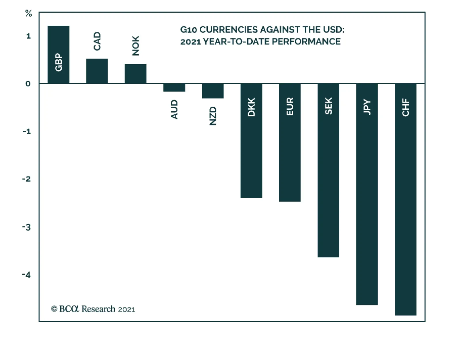
Mixed Picture For The US Dollar The OECD estimates that GDP in the rest of the world will receive a modest lift from US fiscal stimulus (Chart 12). Nevertheless, the US economy will be the primary beneficiary. This has important implications for the direction of the dollar. Chart 12The Benefits Of US Fiscal Stimulus Will Spill Over To Other Countries
When Good News Becomes Bad News In One Chart
When Good News Becomes Bad News In One Chart
The dollar is normally a countercyclical currency, meaning that it tends to move in the opposite direction of the global business cycle. One key reason for this is that the US economy, with its relatively small manufacturing base and large service sector, is less cyclical than most other economies. Thus, when global growth rises, the US often lags behind. The pattern has been different this year, however. Chart 13 shows that growth expectations have risen more in the US than abroad. This is partly because US fiscal policy has been more stimulative than elsewhere. In addition, the US has been faster out of the gate in vaccinating its population (Chart 14). Chart 13US Growth Outperformance Could Be A Near-Term Tailwind For The Dollar
US Growth Outperformance Could Be A Near-Term Tailwind For The Dollar
US Growth Outperformance Could Be A Near-Term Tailwind For The Dollar
US growth outperformance should support the greenback over the next few months. Nevertheless, we are not ready to abandon our bearish 12-month dollar view. For one thing, growth revisions should shift back in favor of other developed economies later this year as they catch up to the US in their vaccination campaigns. The prospect of negative fiscal thrust in 2022 due to the expiration of various stimulus measures will also weigh on the US growth outlook. Lastly, the Fed’s reticence to signal a tighter monetary stance will prevent US 2-year real yields – which are already quite low compared to other developed markets – from rising very much (Chart 15). We have found that shorter-dated yields help explain currency movements better than longer-dated yields. Chart 14US Is Among The Vaccination Leaders
US Is Among The Vaccination Leaders
US Is Among The Vaccination Leaders
Chart 15Real Rate Differentials Are A Headwind For The Dollar
Real Rate Differentials Are A Headwind For The Dollar
Real Rate Differentials Are A Headwind For The Dollar
A modestly softer dollar should, in turn, support cyclical equity sectors and value stocks over the next 12 months. Peter Berezin Chief Global Strategist pberezin@bcaresearch.com Global Investment Strategy View Matrix
When Good News Becomes Bad News In One Chart
When Good News Becomes Bad News In One Chart
Special Trade Recommendations
When Good News Becomes Bad News In One Chart
When Good News Becomes Bad News In One Chart
Current MacroQuant Model Scores
When Good News Becomes Bad News In One Chart
When Good News Becomes Bad News In One Chart
Highlights The miserable performance of commodities as an asset class post-GFC (since 2010) has disincentivized investment in oil and metals, which means growth in supply will lag demand going forward (Chart of the Week). Energy: Bullish. OPEC 2.0’s massive spare capacity supports its production-management strategy, and will keep crude-oil forward curves in backwardation. Base Metals: Bullish. With supply growth flat to negative year-on-year (y/y), copper and aluminium will post physical deficits as demand ex-China recovers. This will keep their forward curves backwardated as well. Precious Metals: Bullish. We expect the Fed’s ultra-accommodative policy to keep US real rates low, and return the USD to a bear market. This will be bullish for gold. Ags/Softs: Neutral. Ag markets remain balanced, punctuated by periodic weather-related rallies. A weaker USD also will be bullish for grains. In line with our expectation for stronger prices, continued backwardation in industrial commodities and a weaker USD, we are getting long the iShares GSCI Commodity Dynamic Roll Strategy ETF (COMT) at tonight’s close. This will broaden our exposure to commodities as an asset class. Risks due to COVID-19 persistence and a higher USD demand remain. The balance of risk, however, is to the upside. Feature Commodities as an asset class performed miserably post-Global Financial Crisis (GFC), as the Chart of the Week demonstrates. Partly this is due to the erratic-but-ultimately-accommodative monetary policies globally coming out of the GFC, which went into hyperdrive during the COVID-19 pandemic and supercharged demand for financial assets. During this period, industrial commodities suffered from periodic surpluses resulting from overproduction set off by high prices at the beginning of the 2000s when China set off a global commodity super-cycle. In the post-GFC world, producers brought commodities to market almost oblivious to the state of demand. This over-investment on the supply side led to market-share wars in oil and bulks like iron ore, which were ruinous to producers. Endogenous factors were not the only source of under-performance for commodities post-GFC. Stop-and-go fiscal stimulus in EM markets, which made base metals demand difficult to forecast; massive crop harvests and carry-over stocks year after year; highly erratic trade policy that distorted the flow of ags and manufactured products with out-of-the-blue tariffs, and a once-in-a-century pandemic that wiped out ~ 10% of global oil demand, all contributed to weak and volatile market conditions. Chart of the WeekCommodities As An Asset Class Performed Miserably Post-GFC
The Case For A Strategic Allocation To Commodities As An Asset Class
The Case For A Strategic Allocation To Commodities As An Asset Class
Commodity producers, too, incentivized investors to seek greener pastures over this period, owing to their inability to earn returns in excess of their cost of capital, let alone anything even close to the returns available in the tech-heavy growth sector of equities markets. Producers’ difficulties have been compounded by the growing importance of ESG investing (Environmental, Social, and Governance), which, over time will increase the cost of producing commodities compliant with consumers’ and investors’ stated preferences for sustainable and equitable business practices. Investors, as is their wont, made it perfectly clear they have no interest investing in firms that cannot produce commodities profitably in line with ESG goals. There are too many opportunities elsewhere to invest in firms that can deliver goods and services profitably, regardless of how important commodities might be to the global economy. Industrial commodity markets, particularly oil and metals, now are under-resourced on the supply side, just as demand ex-China recovers in the wake of massive fiscal and monetary stimulus – with more on the way in the US. The Return Of Commodity-Index Investing For investors in long-only commodity-index instruments that provided a source of uncorrelated returns at the turn of the 21st century, the post-GFC period was long and painful. However, the balance of risks in these instruments – given the underlying fundamentals in the largest sectors of the asset class – is decidedly to the upside. Returns from long-only commodity indexes are derived from price appreciation of the index, so-called roll-yields, and the return on collateral used to post margin to support futures and exchange-cleared swaps comprising the index.1 In the industrial commodities, price gains have come from tightening markets – i.e., demand levels exceed supply levels, pushing prices higher. In oil, OPEC 2.0’s production-management strategy has been remarkably successful in reducing the supply overhang that has plagued markets on and off for the entire post-GFC period (Chart 2). Chart 2Oil Demand Will Exceed Supply Per OPEC 2.0 Strategy
Oil Demand Will Exceed Supply Per OPEC 2.0 Strategy
Oil Demand Will Exceed Supply Per OPEC 2.0 Strategy
On the metals side, production growth has flattened in copper (Chart 3) and aluminum (Chart 4) as demand ex-China starts to recover. We expect physical deficits this year and next. Chart 3Copper's Physical Deficits Will Keep Futures Bacwardated
Copper's Physical Deficits Will Keep Futures Bacwardated
Copper's Physical Deficits Will Keep Futures Bacwardated
Chart 4Flat To Backwardated Aluminum Forwards Expected
Flat To Backwardated Aluminum Forwards Expected
Flat To Backwardated Aluminum Forwards Expected
In the case of copper, this will extend a two-year stretch of zero supply growth that has forced inventories to draw globally. Prices have rallied sharply on the back of these deficits, but will have to be sustained at these levels – and go higher – to spark investment in new supply necessary to support a revival of global economic growth; the buildout of renewable generation and new grids, and consumer-driven electric vehicles (EVs) demand. The only market that we are not bullish on due to tightening fundamentals is ags. While global grain and soybean inventories are falling (Chart 5), it’s a mixed picture. Global bean stocks are down (Chart 6), as are corn stocks (Chart 7). Wheat stocks are moving higher (Chart 8), while rice stocks remain roughly flat y/y (Chart 9). Chart 5Global Grain Balances Tightening Slightly
Global Grain Balances Tightening Slightly
Global Grain Balances Tightening Slightly
Chart 6Global Bean Stocks Are Falling...
Global Bean Stocks Are Falling...
Global Bean Stocks Are Falling...
Chart 7...As Are Corn's Fundamentals
...As Are Corn's Fundamentals
...As Are Corn's Fundamentals
Chart 8Global Wheat Stocks Are Rising...
Global Wheat Stocks Are Rising...
Global Wheat Stocks Are Rising...
Chart 9...While Rice Stocks Remain Balances
...While Rice Stocks Remain Balances
...While Rice Stocks Remain Balances
Roll Yields From Industrial Commodities In addition to supply-demand fundamentals being supportive of industrial commodities’ price levels, we continue to expect a weakening of the USD, which will provide a strong tailwind to commodity price levels particularly gold, which we model primarily as a function of financial variables including the dollar and US real rates (Chart 10). A weaker USD also will be supportive of oil price levels, which have been in a long-term equilibrium with the dollar since 2000, when oil became a random-walking commodity (Chart 11).2 Metals also will get a lift from a weaker USD (Chart 12), as will ags (Chart 13), which remain balanced and well-supplied. This overall support to demand from the weaker dollar will, all else equal, put pressure on inventories and force them lower. Chart 10Weaker USD Will Boost Gold...
Weaker USD Will Boost Gold...
Weaker USD Will Boost Gold...
Chart 11...Provide Oil A Tailwind...
...Provide Oil A Tailwind...
...Provide Oil A Tailwind...
Chart 12...Lift Metals...
...Lift Metals...
...Lift Metals...
Chart 13...And Ags
...And Ags
...And Ags
This is particularly important for commodity-index investing, since falling inventories lead to backwardated forward curves, which are the principal source of roll yields in long-only index products.3 For long-only commodity index investors, the periods when commodities outperformed equities were characterized by backwardated forward curves, and, typically but not always, rising prices. Of the two factors driving commodity returns, backwardation is the most persistent and long-lived. Price increases (and decreases) often result from shocks. The market responds to a shock, finds a new level, and then oscillates randomly around it. Investment Implications We believe we are entering a period that will be characterized by tighter supply-demand balances for industrial commodities. The result of this will be lower inventories for oil and base metals, which will keep price levels well bid and forward curves flat to backwardated. A weaker USD will support industrial commodities, gold and ag prices. These are ideal conditions for long-only commodity-index investors. While there are numerous vehicles available to investors to express this view, we believe a dynamic portfolio approach – which chooses exposure for individual index components based on their backwardation – is best suited to current market conditions, given that we expect these markets to be in asynchronous bull markets over the next couple of years.4 At the close of business tonight, we will be getting long the iShares GSCI Commodity Dynamic Roll Strategy ETF (COMT), in order to broaden our exposure to commodities as an asset class. This index is maintained by S&P Dow Jones Indices.5 Separately, in a housekeeping note, we were stopped out of our tactical nickel position with a loss of 15.8%, following a sudden sell-off Friday. Based on reporting from forbes.com, China’s Tsingshan Holding Group took the market by surprise with its news release that it is producing “a battery-grade form of nickel from low-grade saprolite ore, a technical breakthrough which threatens to flood the nickel market.”6 We will continue to evaluate this development vis-à-vis re-entering our tactical nickel position in the near term. Robert P. Ryan Chief Commodity & Energy Strategist rryan@bcaresearch.com Footnotes 1 Roll yield refers to the gain from a commodity spread trade. A useful way to understand this is to imagine a market in which the forward curve is flat, i.e., the prompt futures contract for delivery next month is trading at the same price as a deferred futures contract specifying delivery in the following month. Assume an investor buys the prompt contract and the holds this position until it has to be either liquidated or rolled forward and its price has gone up, while the deferred contract’s price is unchanged. The investor can sell the prompt contract and use those proceeds to buy the deferred contract, which is still trading unchanged. The investor can either buy more of the contract with the proceeds from this trade, or invest it elsewhere. The gain from this transaction is referred to as the “roll yield.” In a backwardated market – this process can be repeated (buying at a low price and selling at a higher price as the futures contract rolls up the curve and gets closer to delivery), which is an ongoing source of yield. Of course prompt prices can fall below where the deferred contract was purchased, resulting in a loss, but typically the roll yield in a backwardated market is persistent. The opposite holds for contango market, which results in negative returns for investors buying, holding, and rolling futures seeking to earn roll yields. These spread trades are the commodity markets’ analog to the curve-steepeners and curve-flatteners in fixed income markets (e.g., the 2s-10s spread in U.S. Treasuries). 2 Please see Helyette Geman, (2007), "Mean Reversion versus Random Walk in Oil and Natural Gas Prices,“ in Advances in Mathematical Finance, Birkhäuser, Boston. 3 Please see Commodities As An Asset Class V. 3.0, a Special Report we published 21 August 2014. It is available at ces.bcaresearch.com. 4 We develop this thesis in last week’s Special Report entitled Industrial Commodities Super-Cycle Or Bull Market?, which is available at ces.bcaresearch.com. 5 Please see S&P GSCI Dynamic Roll, particularly its Methodology, which was published by S&P Global in January 2021. 6 Please see Nickel Price Falls By 16% But That Might Not Help EV Makers published by forbec.com 8 March 2021. Investment Views and Themes Recommendations Strategic Recommendations Tactical Trades Commodity Prices and Plays Reference Table Trades Closed in Summary of Closed Trades
Higher Inflation On The Way
Higher Inflation On The Way
Please note that we will be presenting a webcast on Thursday March 11 at 10:00 AM EST for the Americas and EMEA regions and on March 12 at 9:00 HKT/12:00 AEDT for APAC clients. We will be discussing macro themes and investment strategies. Highlights EMs (ex-China, Korea and Taiwan) are better positioned to handle higher US bond yields today than they were in 2013. Yet better does not mean they will be unscathed. The combination of rising US bond yields and a firming US currency will suffocate EM risk assets in the near-term. A neutral allocation is warranted in EM stocks and credit markets within global equity and credit portfolios, respectively. Feature Ever since the US elections concluded in January with a Blue Sweep, we have been warning that rising US bond yields could trigger a setback in global markets in general, and in EM markets in particular. EM equities, currencies and fixed-income markets have recently experienced a correction (Chart 1). The question now is: Is the market rout over? Or is there more to come? We are inclined to believe that the correction is not over. Rising US Treasury yields have been the culprit of the shakeout in global growth stocks, EM equities, as well as EM currencies. Therefore, taking a stance on US bond yields and on the US dollar is critical for assessing the outlook for EM financial markets. Odds are that the selloff in US long-term bonds and the rebound in the US dollar are not yet over because: Positioning and sentiment on US long-dated Treasuries is neutral, as illustrated in Chart 2. Chart 1Rising US Real Yields Have Caused A Shakeout In EM
Rising US Real Yields Have Caused A Shakeout In EM
Rising US Real Yields Have Caused A Shakeout In EM
Chart 2Investor Sentiment And Positioning In US Treasurys Are Neutral
Investor Sentiment And Positioning In US Treasurys Are Neutral
Investor Sentiment And Positioning In US Treasurys Are Neutral
Typically, US bond yields do not reverse their ascent until investor sentiment becomes downbeat and bond portfolios are of materially short duration. These conditions for a top in bond yields are not yet present. US government bond yields would have been much higher if it were not for the Federal Reserve and US commercial banks’ massive bond-buying spree. The Fed has bought $2.8 trillion and US commercial banks have purchased about $300 billion of Treasurys in the past 12 months (Chart 3). One of the main motives for commercial banks to buy US Treasurys has been the SLR relief initiative which commenced on April 1, 2020.1 This SLR relief is due to terminate on March 31, 2021. Unless it is extended, commercial banks will drastically curtail their net government bond purchases. This will exert upward pressure on Treasury yields. Regarding the greenback, investor sentiment remains quite bearish (Chart 4). From a contrarian perspective, this heralds further strength in the US dollar. Chart 3Surging Purchases Of US Treasurys By The Fed And Commercial Banks
Surging Purchases Of US Treasurys By The Fed And Commercial Banks
Surging Purchases Of US Treasurys By The Fed And Commercial Banks
Chart 4Investors Are Still Bearish On The US Dollar
Investors Are Still Bearish On The US Dollar
Investors Are Still Bearish On The US Dollar
From a cyclical perspective, US growth will be stronger relative to its potential, and vis-à-vis other DMs, EMs and China. Growth differentials moving in favor of the US foreshadows near-term strengthening of the dollar. Structurally, the bearish case for the US currency hinges on both the Federal Reserve falling behind the inflation curve and ballooning US twin deficits. In our view, this will ultimately be the case. Hence, the long-term outlook for the US dollar remains troublesome. That said, twin deficits alone are insufficient to produce a continuous currency depreciation. The twin deficits must also be accompanied with low/falling real interest rates – in order to generate sufficient conditions for currency depreciation. As long as US real rates continue rising, the dollar’s rebound will be extended. The USD/EUR exchange rate has been correlated with the 10-year real yield differential and this relationship will persist (Chart 5). Bottom Line: US government bonds will continue selling off. Rising bond yields (including rising real yields) will support the dollar in the near-term. The combination of rising US bond yields and a firming US currency will cause global macro volatility to rise (Chart 6). This will suffocate EM risk assets and EM currencies. Chart 5US Real Yields (TIPS) Will Continue Driving The US Dollar
US Real Yields (TIPS) Will Continue Driving The US Dollar
US Real Yields (TIPS) Will Continue Driving The US Dollar
Chart 6Aggregate Financial Market Volatility: Higher Lows
Aggregate Financial Market Volatility: Higher Lows
Aggregate Financial Market Volatility: Higher Lows
Impact On EM: 2013 Versus Now Are we entering another Taper Tantrum episode as in the spring of 2013 when many EMs were devastated? There are both similarities and differences between the current period of rising US bond yields and the 2013 episode. Similarities: Today, as in early 2013, investor sentiment on EM is very bullish and investors are long EM (Chart 7). Chart 7Investor Sentiment On EM Stocks Was At A Record High In January
Investor Sentiment On EM Stocks Was At A Record High In January
Investor Sentiment On EM Stocks Was At A Record High In January
In early 2013, as is the case today, EM local currency bond yields were very low and EM credit spreads were too tight. When US Treasury yields spiked in the spring of 2013, EM assets tanked. Many commentators blamed it on the Fed. We disagree with that interpretation. Remarkably, the rise in US TIPS yields in 2013 had little impact on equity indices such as the S&P 500 and Nasdaq, or on US corporate spreads (Chart 8). The correction in the US equity market lasted about a week. Yet, EM equities, fixed income markets and currencies experienced a prolonged slump, and in many cases, a bear market. There is no basis to believe that the Fed’s policy and US bond yields are more important to EM than they are to US credit and equity markets. The core rationale for the EM bear market in 2013 was poor domestic fundamentals. The Fed’s tapering was the trigger, not the cause. Differences: The key difference between the current episode and the 2013 Taper Tantrum is EM macro fundamentals. Specifically: EM economies (ex-China, Korea and Taiwan) entered 2013 with booming bank loans and strong domestic demand as well as high inflation (Chart 9). Chart 8US Markets Were Not Hit By The Taper Tantrum In 2013
US Markets Were Not Hit By The Taper Tantrum In 2013
US Markets Were Not Hit By The Taper Tantrum In 2013
Chart 9EM (ex-China, Korea And Taiwan): 2013 Vs Now
EM (ex-China, Korea and Taiwan): 2013 Vs Now
EM (ex-China, Korea and Taiwan): 2013 Vs Now
Chart 10EM (ex-China, Korea And Taiwan): 2013 Vs Now
EM (ex-China, Korea and Taiwan): 2013 Vs Now
EM (ex-China, Korea and Taiwan): 2013 Vs Now
Presently, EM bank credit is subdued, domestic demand is dismal, and inflation is tame. Besides, EMs (ex-China, Korea and Taiwan) had a very large trade deficits in 2013 and were financing them via foreign borrowing, which was roaring prior to 2013 (Chart 10). Presently, their trade balances are in surplus and foreign indebtedness has not increased in recent years. Bottom Line: In 2013, EM economies (ex-China, Korea and Taiwan) were overheating and were addicted to foreign funding. These were the reasons why EM currencies and fixed income markets teetered when US bond yields spiked in 2013. Presently, the majority of EM economies (ex-China, Korea and Taiwan) have different types of malaises: domestic bank loan origination is too timid, consumer spending and capital expenditures are moribund, inflation is low and fiscal policy is tight. Consequently, EMs (ex-China, Korea and Taiwan) are better positioned to handle higher US bond yields today than they were back in 2013. Yet better does not mean they will be unscathed. Investment Strategy Equities: The key variable to watch to assess the vulnerability of both US and EM equity markets is their respective corporate bond yields. Historically, rising corporate bond yields (shown inverted in both panels of Chart 11) heralds lower share prices. Chart 11Rising Corporate Bond Yields Are Bad For Share Prices
Rising Corporate Bond Yields Are Bad For Share Prices
Rising Corporate Bond Yields Are Bad For Share Prices
Given that both EM and US corporate credit spreads are too tight, they are unlikely to narrow further to offset rising US Treasury yields. Instead, EM and US corporate bond yields are likely to rise with US Treasury yields. This will trigger more weakness in share prices. Besides, rising EM local currency government bond yields also point towards more downside in EM equities (yields are shown inverted on the chart) (Chart 12). Chart 12Rising EM Local Currency Bond Yields Heralds Weaker Equity Prices
Rising EM Local Currency Bond Yields Heralds Weaker Equity Prices
Rising EM Local Currency Bond Yields Heralds Weaker Equity Prices
Concerning equity style, global growth stocks have peaked versus global value stocks. In the EM equity space, we have less conviction on growth versus value. As to regional allocation in a global equity portfolio, we continue recommending a neutral allocation to EM, underweighting US and overweighting Europe and Japan. Commodities: Investors’ net long positions in commodities are very elevated (Chart 13). As US bond yields rise and the US dollar continues rebounding, there will be a de-risking in the commodities space resulting in a pullback in commodities prices. Currencies: We continue shorting a basket of EM currencies – including BRL, CLP, ZAR, TRY and KRW versus the euro, CHF and JPY. Several EM currencies have failed to break above their technical resistance levels, suggesting that a pullback could be non-trivial (Chart 14). Chart 13Investors Are Record Long Commodities
Investors Are Record Long Commodities
Investors Are Record Long Commodities
Chart 14Asian Currencies Hit Technical Resistances
Asian Currencies Hit Technical Resistances
Asian Currencies Hit Technical Resistances
In central Europe, we are closing the long CZK/short USD trade with a 3.8% gain. Continue holding the long CZK/short PLN and HUF position. Local fixed income markets: EM local bond yields have risen in response to rising US treasury real yields and the setback in EM currencies. This might persist in the near-term, but we continue to recommend receiving 10-year swap rates in selected countries where inflation risks are low and monetary and fiscal policies are tight. These countries include Mexico, Colombia, Russia, China, India and Malaysia. A further rise in their swap rates would represent an overshoot and hence, should not be chased. EM currencies are more vulnerable to a selloff than local rates are. We continue to wait for a better entry point in currencies to recommend buying cash domestic bonds instead of receiving swap rates. EM Credit: A neutral allocation to EM sovereign and corporate bonds is warranted in a global credit portfolio. Our sovereign credit overweights are Mexico, Russia, Malaysia, Peru, Colombia, the Philippines and Indonesia, while our sovereign credit underweights are Brazil, South Africa and Turkey. Arthur Budaghyan Chief Emerging Markets Strategist arthurb@bcaresearch.com Footnotes 1 The Supplementary Leverage Ratio (SLR) is equivalent to Basel III Tier-1 leverage ratio and varies from 3-5% for US banks. Under the relief program last April, the Fed allowed US banks to exclude holdings of US Treasury Bonds and cash kept in reserves at the Fed from their assets when calculating this ratio. The SLR relief is planned to end March 31, 2021. Equities Recommendations Currencies, Credit And Fixed-Income Recommendations
The DXY index bottomed a nudge below the 90 level and is gaining momentum in March. Three reasons have catalyzed the rally in the greenback. First, the dollar was very much oversold, with net speculative positioning heavily short and sentiment close to a…
Highlights The recent backup in bond yields could cause stocks to fall further in the near term. However, history suggests that as long as yields remain low in absolute terms, as they are now, equities will recover. Market angst that the Fed is about to turn more hawkish is unwarranted. Central banks around the world have both the tools and the inclination to keep bond yields from rising excessively. Despite the jump in bond yields, the forward earnings yield is 540 basis points above the real bond yield in the US. Outside the US, the forward earnings yield is 615 basis points above the real bond yield. In 2000, the earnings yield was below the real bond yield. Just as value stocks began to outperform growth stocks in mid-2000, the end of the pandemic will herald a similar period of value-oriented outperformance. Commodity producers and banks will lead the way. Some Parallels Between Today And 2000… Stock prices have buckled in recent weeks, raising concerns that global bourses are at risk of a major crash, just like they were in early 2000. There are certainly some notable similarities between 2000 and the present: In both cases, the preceding rise in stock prices was fueled by the Federal Reserve’s desire to prevent an exogenous shock from causing a major recession (Chart 1). Last year, the shock was the pandemic. In 1998, it was the collapse of Long-Term Capital Management (LTCM). The Connecticut-based hedge fund imploded shortly after Russia defaulted on its debt, leading to a gut-wrenching 22% decline in the S&P 500. The brewing crisis prompted the Fed to cut rates by a total of 75 basis points. Spurred on by fears of Y2K, the Fed also injected vast amounts of liquidity into the financial system. Tech stocks led the market higher both in the late 1990s and last year. The NASDAQ Composite rose 68% between its intra-day low in October 1998 and March 2000. In 2020, the NASDAQ outperformed the S&P 500 by 24% and returned 44% overall. Chart 1The NASDAQ's 1999 Surge Followed The 1998 “Insurance Cuts” And Coincided With The Fed’s Balance-Sheet Expansion
The NASDAQ's 1999 Surge Followed The 1998 "Insurance Cuts" And Coincided With The Fed's Balance-Sheet Expansion
The NASDAQ's 1999 Surge Followed The 1998 "Insurance Cuts" And Coincided With The Fed's Balance-Sheet Expansion
Chart 2Low-Priced Stocks Have Been The Winners In The First Quarter
Shades Of 2000
Shades Of 2000
The speculative mania in the 1990s spread from large-cap tech stocks to small-cap companies. We saw the same pattern earlier this year, with prices and trading volumes exploding among smaller, low-priced stocks (Chart 2). As was the case in the late 1990s, retail investors – this time armed with “stimmy” checks and access to zero-commission trading accounts – plowed into the market. Chart 3Some Pockets Of Bullish Equity Sentiment
Shades Of 2000
Shades Of 2000
Chart 4Some Pockets Of Bullish Equity Sentiment
Shades Of 2000
Shades Of 2000
Bullish equity investor sentiment was rampant at the peak of the stock market in 2000. Although not quite to the same extent as back then, most measures of investor sentiment turned bullish prior to the recent selloff (Chart 3). Like most investors, analysts were wildly optimistic on stocks in the late 1990s (Chart 4). Long-term earnings growth projections are very optimistic today, a potentially ominous signal given that (unlike in the late 1990s), productivity growth is now more anemic. Rising stock prices in the late 1990s allowed corporate insiders to cash in their options, while enabling new companies to go public. Recently, we have seen a flurry of companies list their shares, in some cases through dubious SPAC vehicles (Chart 5). Valuations reached nosebleed levels in 2000. While the forward P/E ratio on the S&P 500 is somewhat below its 2000 peak, other valuation measures such as price-to-sales, Tobin’s Q, and enterprise value-to-EBITDA are above where they were in 2000 (Chart 6). Chart 5Renewed Interest In Listing Stocks
Shades Of 2000
Shades Of 2000
Chart 6Stretched Valuations, Then And Now
Shades Of 2000
Shades Of 2000
… But One Important Difference Despite the parallels between today and 2000, there is an important difference: The Federal Reserve. Having cut rates in 1998, the Fed reversed course in mid-1999, eventually taking the fed funds rate up to 6.5% in May 2000. The yield curve inverted in February of that year, shortly after the 10-year yield reached a high of 6.79%. Chart 7What Happens To Equities When Treasury Yields Rise?
Shades Of 2000
Shades Of 2000
Bond yields have risen briskly over the past six months. However, they remain very low in absolute terms. While rising yields can produce a temporary stock market correction, they need to move into restrictive territory in order to trigger a recession and an accompanying bear market in equities. Chart 7 highlights some research that Garry Evans and BCA’s Global Asset Allocation team recently produced. It shows eight episodes since 1990 of a sharp rise in the 10-year Treasury yield. On every occasion (except in 1993-94, when the Fed unexpectedly raised rates in February 1994), equities performed strongly while rates were rising (Table 1). Today, the forward earnings yield on the S&P 500 is 540 basis points above the real yield. In 2000, the real bond yield was higher than the earnings yield (Chart 8). The gap between earnings yields and real bond yields is even greater outside the US, where valuations are generally more attractive. By the same token, the S&P 500 dividend yield was well below the bond yield in 2000. Today, they are roughly the same. Even if one were to pessimistically assume that US companies are unable to raise nominal dividend payments at all for the next decade, the S&P 500 would need to fall by 21% in real terms for equities to underperform bonds. Many other stock markets would have to decline by more than that (Chart 9). Table 1As Long As Bond Yields Don't Rise Into Restrictive Territory, Stocks Will Recover
Shades Of 2000
Shades Of 2000
Chart 8Relative To Bonds, Stocks Are More Favorably Valued Now Than in 2000
Relative Valuations Favor Equities
Relative Valuations Favor Equities
Chart 9Stocks Would Need To Fall A Lot For Equities To Underperform Bonds
Stocks Would Need To Fall A Lot For Equities To Underperform Bonds
Stocks Would Need To Fall A Lot For Equities To Underperform Bonds
Central Banks Will Lean Against Rising Bond Yields Stocks sold off earlier today on the perception that Jay Powell had failed to push back forcefully against the recent increase in bond yields. We think this angst is unwarranted. As Powell noted, most of the rise in bond yields reflected economic optimism. If yields were to continue rising in the absence of further economic improvements, the Fed would dial up the rhetoric, stressing its ability to buy bonds in unlimited quantities in order to support the economy. Despite all the fiscal stimulus, the unemployment rate remains elevated – perhaps as high as 10% according to some Fed measures. The prime-age employment-to-population ratio is four percentage points below where it was before the pandemic (Chart 10). Moreover, many stimulus measures will expire towards the end of the year. With the prospect of a “fiscal cliff” in 2022, we expect the Fed to want to tread carefully in withdrawing monetary support. What would really rattle investors is if long-term inflation expectations were to rise above the Fed’s comfort zone. However, considering the 5-year/5-year forward inflation breakevens are still below where they were in 2012-13, this is not an imminent risk (Chart 11). Chart 10The Fed Will Remain Accommodative To Aid The Labor Market Recovery
The Fed Will Remain Accommodative To Aid The Labor Market Recovery
The Fed Will Remain Accommodative To Aid The Labor Market Recovery
Chart 11Inflation Expectations Have Recovered But Are Still Low
Shades Of 2000
Shades Of 2000
Like the Fed, the ECB wants to keep financial conditions highly accommodative. On Tuesday, ECB Executive Board member Fabio Panetta, echoing comments made by other senior ECB officials, said that higher yields were “unwelcome and must be resisted.” He noted that “We are already seeing undesirable contagion from rising US yields into the euro area yield curve,” adding that the ECB “should not hesitate” to increase the pace of bond purchases. The ECB’s threat is credible. Already, its purchases have deviated significantly from its capital key, revealing Frankfurt’s willingness to act where and when it is needed. In the same spirit, the Reserve Bank of Australia boosted its government bond purchases earlier this week after the 10-year yield backed up from 0.7% last October to over 1.9% late last week. The RBA also reaffirmed its intent to maintain the current 3-year Yield Curve Control target at 0.1%, stating that “The Board will not increase the cash rate until actual inflation is sustainably within the 2-to-3 percent target range. For this to occur, wages growth will have to be materially higher than it is currently. This will require significant gains in employment and a return to a tight labour market. The Board does not expect these conditions to be met until 2024 at the earliest.” The RBA’s determination to keep bond yields down is noteworthy given that the neutral rate of interest is higher in Australia than in most other developed economies.1 If the RBA does not intend to raise rates for the next three years, it may take even longer for other central banks to take away the punch bowl. Will Value Stocks Begin To Outperform As They Did Starting In Mid-2000? There is another potential parallel with 2000 that is worth mentioning. This was the year that the outperformance of growth stocks came to a halt and value stocks began to shine. In fact, outside of the tech sector, the S&P 500 did not peak until May 2001 (Chart 12). Value continued to outperform right through to 2007. Since February 12th of this year, the price of the highly liquid Vanguard Growth ETF (VUG, market cap of $143 billion) has fallen by 8.9% while the price of the Vanguard Value ETF (VTV, market cap of $97 billion) has risen 0.5%. Despite the nascent outperformance of value names, they still remain relatively cheap. According to a simple valuation measure that combines price-to-earnings, price-to-book, and dividend yields, value stocks are more than three standard deviations cheap relative to growth stocks – a bigger valuation gap than seen at the height of the dotcom bubble (Chart 13). Chart 12The Non-Tech Portion Of The Stock Market Peaked More Than A Year After The Tech Bubble Burst
The Non-Tech Portion Of The Stock Market Peaked More Than A Year After The Tech Bubble Burst
The Non-Tech Portion Of The Stock Market Peaked More Than A Year After The Tech Bubble Burst
Chart 13The Tech Bust Of 2000 Also Marked The Start Of A Multi-Year Outperformance By Value
The Tech Bust Of 2000 Also Marked The Start Of A Multi-Year Outperformance By Value
The Tech Bust Of 2000 Also Marked The Start Of A Multi-Year Outperformance By Value
The Outlook For Commodity Stocks And Bank Shares Commodity producers are overrepresented in value indices. Strong global growth against a backdrop of tight supply should heat up the commodity complex over the next 12-to-18 months. Chart 14 shows that capital investment in the oil and gas sector has fallen by more than 50% since 2014. BCA’s Commodity & Energy Strategy service, led by Robert Ryan, expects crude oil demand to outstrip supply over the remainder of this year (Chart 15). Chart 14Oil + Gas Capex Collapses In COVID-19’s Wake
Shades Of 2000
Shades Of 2000
Chart 15Crude Oil Demand To Outstrip Supply Over The Remainder Of This Year
Shades Of 2000
Shades Of 2000
A physical deficit in the metals markets – particularly for copper and aluminum – should also persist this year (Charts 16A & 16B). While the boom in electric vehicle (EV) production represents a long-term threat to oil, it is manna from heaven for many metals. A battery-powered EV can contain more than 180 pounds of copper compared with 50 pounds for conventional autos. By 2030, the demand from EVs alone should amount to close to 4mm tonnes of copper per year, a big slug of demand in a market that consumes about 26mm tonnes per year. Chart 16ACopper Will Be In Physical Deficit...
Copper Will Be In Physical Deficit...
Copper Will Be In Physical Deficit...
Chart 16B...As Will Aluminum
...As Will Aluminum
...As Will Aluminum
Ongoing strong demand for metals from China should also buoy metals prices. While trend GDP growth in China has slowed, the economy is much bigger than it was in the 2000s. China’s annual aggregate consumption of metals is five times as high as it was back then. The incremental increase in China’s metal consumption, as measured by the volume of commodities consumed, is also double what it was 20 years ago (Chart 17). As we discussed in our report To Deleverage Its Economy, China Needs MORE Debt, the Chinese government has no choice but to continue to recycle persistently elevated household savings into commodity-intensive capital investment. This will ensure ample commodity demand from China for years to come. Chart 17China Keeps Buying More And More Commodities
Chinese Consumption Of Most Metals Continues To Rise China Keeps Buying More And More Commodities
Chinese Consumption Of Most Metals Continues To Rise China Keeps Buying More And More Commodities
Chart 18Credit Growth Has Been Recovering
Credit Growth Has Been Recovering
Credit Growth Has Been Recovering
Along with commodity producers, financials helped propel value indices during the 2000s. While credit growth is unlikely to revert to its pre-GFC days, it has been trending higher in both the US and Europe (Chart 18). Analysts are starting to take note of improving bank earnings prospects. EPS estimates for banks are rising more quickly than for tech companies on both sides of the Atlantic (Chart 19). Not only is the “E” in the P/E ratio for banks likely to rise, the ratio itself will increase. Currently, US and European banks are trading at 14 and 10-times forward earnings, respectively, a huge discount to the broad market in general, and tech stocks in particular (Chart 20). Chart 19EPS Estimates For Banks Are Rising More Quickly Than For Tech Companies (I)
EPS Estimates For Banks Are Rising More Quickly Than For Tech Companies (I)
EPS Estimates For Banks Are Rising More Quickly Than For Tech Companies (I)
Chart 19EPS Estimates For Banks Are Rising More Quickly Than For Tech Companies (II)
EPS Estimates For Banks Are Rising More Quickly Than For Tech Companies (II)
EPS Estimates For Banks Are Rising More Quickly Than For Tech Companies (II)
Chart 20Banks Are Cheap
Banks Are Cheap
Banks Are Cheap
Bottom Line: Despite near-term uncertainty, investors should overweight stocks on a 12-month horizon, while pivoting away from last year’s winners (growth stocks) towards last year’s losers (value stocks). Peter Berezin Chief Global Strategist pberezin@bcaresearch.com Footnotes 1 According to RBA’s estimates, the neutral rate of interest in Australia is at the high end of developed market estimates. Specifically, Australia’s R-star is higher than the average of the US and euro area R-stars and is slightly lower than the average of the Canadian and UK neutral rates. Global Investment Strategy View Matrix
Shades Of 2000
Shades Of 2000
Special Trade Recommendations
Shades Of 2000
Shades Of 2000
Current MacroQuant Model Scores
Shades Of 2000
Shades Of 2000
Highlights We use a correlation-hedge approach to manage emerging market (EM) currency exposure for global investors with nine different home currencies. For USD-based investors, EM debt volatility is driven by the EM spot exchange rate vs. USD. Hedged EM debt has better absolute and risk-adjusted returns than US Treasurys. Investing in EM equities, on the other hand, makes sense only when the expected absolute return is positive on a sustained basis. During these episodes, hedging is not necessary. If USD-based investors choose to manage EM currency exposure directly, then a 12-month momentum-based dynamic hedging strategy could add value in terms of risk-adjusted returns for both EM stocks and bonds. USD-based investors could also diversify the source of funding by selling closely correlated DM currencies using an overlay of currency forwards. For non-USD-based investors, EM currency volatility is low and there is no need to fully hedge EM exposure. Domestic bonds have very low volatility, therefore these investors should avoid EM debt if their objective is to maximize risk-adjusted returns. To enhance returns, unhedged EM equities are a much better choice than EM debt. Currency overlay, in line with our long-held view on the total portfolio approach, should be managed at the total fund level. Feature How to manage EM currency exposure when investing in EM local currency debt and equities has been a frequently asked question since our reports on managing developed market (DM) currency exposure when investing in DM equities 1,2 and government bonds.3 According to the BIS Triennial Central Bank Survey, EM currency exchange markets have evolved rapidly since 2001. The daily turnover reached 1.65 trillion dollars in April 2019, which is about 25% of the global currency daily turnover.4 While it is becoming increasingly easy to trade EM currencies, compared with DM currencies it is still more costly and operationally more challenging to hedge EM currency exposure, especially the currencies with non-deliverable forwards (NDFs) that require collateral management. In this report, we identify the return and volatility drivers of EM local currency government bonds (represented by JP Morgan’s GBI-EM Global Diversified Local Currency Index) and EM equities (represented by MSCI’s EM Net Return Index). We briefly touch on a momentum-based dynamic hedging strategy to hedge EM exposure directly for USD-based investors. Our main focus is to test a correlation-hedge approach, both static and dynamic, for nine home currencies: the US dollar (USD), the euro (EUR), the Japanese yen (JPY), the British pound (GBP), the Canadian dollar (CAD), the Australian dollar (AUD), the New Zealand dollar (NZD), the Swedish krona (SEK), and the Norwegian krone (NOK). We want to determine if a USD-based investor’s return/risk profile would be improved when investing in EM assets by using unfunded overlays of DM currency forwards. Finally, we present solutions for non-USD investors, which vary based on the correlations between the home currencies and the EM currency aggregates. Part 1: The USD Perspective 1.1 EM Asset Return Drivers In general, unhedged USD returns for US investors from investing in foreign assets can be decomposed into three parts as shown in the following equation (1): (1+Rd) = (1+Rh) (1+Rc) (1+Rs) ..…..(1) Where, Rd is the unhedged return in USD. Rh is the hedged return in USD using currency forwards. Rc is the carry return resulting from the short-term rate differential between a foreign country and the US. Rs is the spot exchange rate return of a foreign currency vs. the USD (quoted as how many USD per 1 unit of foreign currency). Chart 1A and Chart 1B show the return decompositions of JP Morgan’s (JPM) EM local currency government bonds and MSCI’s EM equities based on equation (1). Chart 1AEM Local Debt USD Return Decomposition
EM Local Debt USD Return Decomposition
EM Local Debt USD Return Decomposition
Chart 1BEM Equities USD Return Decomposition
EM Equities USD Return Decomposition
EM Equities USD Return Decomposition
Hedging reduces both the volatility and returns for both EM local currency bonds and equities; however, the return and volatility reductions are more significant in bonds than in stocks (panel 1 in Chart 1A and Chart 1B). EM currency aggregate indexes implied from JPM and MSCI are different because of the different country compositions. The currency component has been very volatile for both indexes and has generated negative returns during the 18 years from January 2003 to January 2021 (panel 3 in Chart 1A and Chart 1B). The carry component from JPM is sharply higher than that from MSCI, which is also the result of different country compositions (panel 2, Chart 1A and Chart 1B). The carry components from both indexes have very low volatility with positive returns over the 18-year period. Many EM countries had much higher interest rates than the US, therefore a US investor had to be exposed to EM currencies to capture this carry gain. Thus, from a return-enhancing perspective, an investor should hedge only if he/she expects the EM currency spot exchange rate to depreciate more than the implied carry (panel 3, Chart 1A and Chart 1B). The answer may be different from a volatility-reducing perspective, especially for EM debt where currency volatility dominates bond volatility. We plot the return-risk profiles of EM local currency bonds and equities (hedged and unhedged) in Charts 2A, 2B and 2C to show how they behave in different environments compared to US equities, US Treasurys and hedged non-US global government bonds. Table 1 further lists the detailed statistics of all the above-mentioned assets, in addition to the spot currency and carry components implied from JPM’s EM local currency bond index and MSCI’s EM index, ranked by risk-adjusted return. The entire 18-year period (Chart 2A) is also separated into the period with steadily rising EM currencies (1/2003 – 7/2008, Chart 2B) and the period with declining EM currencies (8/2008-1/2021, Chart 2C). Chart 2AUSD Asset Return-Risk Profile For The Entire Period (1/2003-1/2021)
Managing EM Currency Exposure: A Correlation-Hedge Approach
Managing EM Currency Exposure: A Correlation-Hedge Approach
Chart 2BUSD Asset Return-Risk Profile When EM Currencies Were Strong (1/2003-7/2008)
Managing EM Currency Exposure: A Correlation-Hedge Approach
Managing EM Currency Exposure: A Correlation-Hedge Approach
Chart 2CUSD Asset Return-Risk Profile When EM Currencies Were Weak (8/2008-1/2021)
Managing EM Currency Exposure: A Correlation-Hedge Approach
Managing EM Currency Exposure: A Correlation-Hedge Approach
Both EM debt and equities had impressive unhedged returns in the period from January 2003 to July 2008 when the EM currency index rose steadily against the USD. Even on a hedged basis, EM bonds still delivered better absolute returns (5.1%) than US Treasurys (4.3%) with lower volatility. In terms of EM equities, although hedged return of 22.8% significantly outpaced US equities (9.7%), the volatility of EM equities (16.8%) was much higher than US equities (9.8%). Interestingly, in the period with declining EM FX from August 2008 to January 2021, hedged EM equities (5.6%) significantly underperformed US equities (11.5%) with comparable volatility, but hedged EM bonds (4.2%) outperformed US Treasurys (3.6%) with comparable volatility, despite the negative carry. It is easy to make the case for EM equities: US investors should not touch EM equities unless they are convinced that EM is entering a sustainably strong absolute return period. There is no need to hedge the currency exposure because the risk reduction is relatively small. In the case of EM local currency debt, the three components of total returns in USD based on equation (1) have distinct characteristics as follows: First, the carry component generated an annualized return of 3.4% with only 0.7% volatility in the entire period, making it the best performer among all the assets in terms of risk-adjusted return, as shown in Table 1. Table 1USD Asset Return-Risk Profile In Different Time Periods
Managing EM Currency Exposure: A Correlation-Hedge Approach
Managing EM Currency Exposure: A Correlation-Hedge Approach
Chart 3What Drives The Hedged Return Of EM Local Debt?
What Drives The Hedged Return Of EM Local Debt?
What Drives The Hedged Return Of EM Local Debt?
Second, the hedged return or the EM duration return (i.e. the compensation for a US investor to take on EM interest rate and term premia risks), had a better return/risk profile than US Treasurys in terms of both absolute return and risk-adjusted return, regardless of whether the EM currency index rose or fell against the USD. From January 2003 to January 2021, hedged EM debt returned 4.5% with a volatility of 4.1%, giving a 1.1 return per unit of risk, while US Treasurys returned 3.8% with a volatility of 4.3%, resulting in a 0.9 return per unit of risk. This component is mainly driven by the direction of government bonds in the developed markets as shown in Chart 3. Third, from January 2003 to January 2021, the JPM-implied EM currency had the worst return/risk profile with an annualized loss of 1.7% and annualized volatility of 9.1% (Table 1). However, this component was also the most regime-dependent. Between January 2003 and July 2008 it registered an annualized gain of 7.0% and an annualized volatility of 6.2%, in contrast with the annualized loss of 5.2% and annualized volatility of 9.9% from August 2008 to January 2021. Historically, the EM currency as an aggregate, no matter how the aggregate is calculated, closely correlates to commodities as shown in Chart 4. This is because many EM countries are either commodity producers or have significant trading exposure to China, the dominant player influencing commodity prices as shown in Chart 5. Chart 4EM FX Largely Driven By Commodities
EM FX Largely Driven By Commodities
EM FX Largely Driven By Commodities
Chart 5The Commodities-China Link
The Commodities-China Link
The Commodities-China Link
It is a challenge to build a systematic EM currency model due to the complex nature of EM economies. BCA’s FX Strategy team is working on EM currency models by applying the same approach they used for their DM models. BCA’s EMS Strategy team takes a more discretionary approach to forecasting currencies. Below we will explore two options: one for investors who choose to manage an EM FX hedging program directly and another for investors who cannot manage a direct EM currency hedging program but want to improve their return-risk profile in EM assets. 1.2 Momentum-Based Dynamic Hedging Of EM Currencies Price momentum is a useful tool for dynamic hedging as shown in our previous work on DM currency exposure management. A simple rule of hedging back to the home currency when the 12-month price momentum of a foreign currency turns negative adds value for investors with several DM home currencies. Given that the USD is a strong momentum currency, it makes sense to test if a simple 12-month price momentum rule for the EM FX aggregate vs. USD adds any value. The results are encouraging as shown in Chart 6A and Chart 6B and Chart 7A and Chart 7B. Chart 6AMomentum-Based Dynamic Hedging For EM Bonds
Momentum-Based Dynamic Hedging For EM Bonds
Momentum-Based Dynamic Hedging For EM Bonds
Chart 6BMomentum-Based Dynamic Hedging For EM Stocks
Momentum-Based Dynamic Hedging For EM Stocks
Momentum-Based Dynamic Hedging For EM Stocks
In the case of EM local debt, dynamic hedging reduced volatility to 8.4% from an unhedged volatility of 11.7%, while only trimming return slightly compared with the unhedged index (Charts 6A, 7A). For EM equities, dynamic hedging cut volatility to 18.6% from the unhedged volatility of 21.1%, while increasing the return by 25 bps, compared to the unhedged index. (Charts 6B, 7B). Chart 7AEM Local Debt Return-Risk Profiles: Static Hedging* Vs. Dynamic Hedging**
Managing EM Currency Exposure: A Correlation-Hedge Approach
Managing EM Currency Exposure: A Correlation-Hedge Approach
Chart 7BEM Equities Return-Risk Profiles: Static Hedging* Vs. Dynamic Hedging**
Managing EM Currency Exposure: A Correlation-Hedge Approach
Managing EM Currency Exposure: A Correlation-Hedge Approach
These results are directionally encouraging, but this method still requires hedging all EM currencies. The approach may operationally challenge investors who are not equipped to manage EM currency overlays. Bottom Line: Using only price momentum to hedge EM currency aggregates could improve the return-risk profile of both EM debt and equities, even though the improvements would be limited. This is encouraging for our eventual systematic approach for direct EM currency hedging. 1.3 Correlation Hedge Using DM Currencies EM FX is closely correlated with DM commodity currencies, such as the NOK, CAD, AUD, and NZD. As shown in Charts 8A and 8B, even the euro has an average correlation greater than 60% with EM currency aggregates. Only the JPY has an unstable correlation with the EM currencies of less than 25%, while the GBP also has a relative lower correlation. Chart 8AJPM-Implied EM FX* Correlation** With DM FX
JPM-Implied EM FX* Correlation** With DM FX
JPM-Implied EM FX* Correlation** With DM FX
Chart 8BMSCI-Implied EM FX* Correlation** With DM FX
MSCI-Implied EM FX* Correlation** With DM FX
MSCI-Implied EM FX* Correlation** With DM FX
Therefore, a USD-based investor, instead of hedging out EM currency exposure directly, should be able to eliminate part of EM currency volatility by selling lower-yielding DM currencies. This move would diversify his/her source of funding from USD to other DM currencies with high correlations with EM currencies. To test the effect on the return-risk profile, we use an unfunded overlay of 1-month DM currency forwards and rebalance monthly. To begin, we test a static correlation hedge where each of the eight DM currencies is sold individually. Then we test a dynamic correlation hedge where each one is dynamically sold based on the BCA Forex Strategy Team’s Intermediate-Term Timing Model (ITTM), which uses the same indicators described in our DM currency hedging report. To avoid subjective selection bias among the currencies, we also test an equally- weighted basket of eight currencies (AUD, NZD, JPY, GBP, EUR, CAD, NOK, and SEK) for dynamic hedging and an equally- weighted basket of five currencies (GBP, EUR, CAD, NOK, and SEK) for static hedging. The AUD, NZD, and JPY were excluded in the static hedging basket because in general, AUD and NZD had very high carries and JPY had an unstable correlation with EM currencies. The combined results are shown in Chart 9A and Chart 9B. Additionally, Table 2A and Table 2B list the return-risk profiles together with the fully hedged and unhedged EM indexes for equities and local debt. Chart 9AStatic Correlation Hedge For US Investors
Static Correlation Hedge For US Investors
Static Correlation Hedge For US Investors
Chart 9BDynamic Correlation Hedge For US Investors
Dynamic Correlation Hedge For US Investors
Dynamic Correlation Hedge For US Investors
Table 2AEM Debt Funding Source Diversification For USD-Based Investors (2/2003-1/2021)
Managing EM Currency Exposure: A Correlation-Hedge Approach
Managing EM Currency Exposure: A Correlation-Hedge Approach
Table 2BEM Equity Funding Source Diversification For USD-Based Investors (2/2003-1/2021)
Managing EM Currency Exposure: A Correlation-Hedge Approach
Managing EM Currency Exposure: A Correlation-Hedge Approach
For US investors investing in EM local currency bonds, the best risk-adjusted return of 1.08 would come from fully hedging all the EM currencies as shown in Table 2A. Fully-hedged EM debt has the lowest volatility (4.12%), but also the lowest return (4.45%). To achieve a comparable return of unhedged EM debt (6.18%) without incurring the same high volatility (11.71%), however, a USD-based investor could either statically sell the five DM currencies or dynamically sell the eight DM currencies. The resulting risk-adjusted return of 0.8 would still be comparable to US Treasurys as shown in Table 1. US investors investing in EM equities may improve their return-risk profile by funding their positions in DM currencies. If the aim is to maximize risk-adjusted returns, then the choice would be to fund the position by selling the basket of equally weighted five DM currencies using currency forwards (i.e. using a static correlation hedge). In this way, they would achieve a comparable volatility (16.25%) as if all the EM currencies were fully hedged to USD (16.29%), while also achieving a higher return (12.29%) than when all the EM currencies were not hedged (11.71%). The return per unit of risk of 0.76 would be the highest among all the cases as shown in Table 2B and be on par with US equities as shown in Table 1. If investors prefer even higher returns without significantly higher volatility, then dynamically selling an equally weighted basket of eight currencies would achieve an annualized return of 13.03% with a higher volatility of 18.71%, resulting in a risk-adjusted return of 0.7. Bottom Line: USD-based asset allocators should use the hedged EM debt index and the unhedged EM equities index as benchmarks to measure the performance of their asset-class managers. The EM currency exposure should be managed in a currency overlay at the total fund level by either statically or dynamically selling DM currencies using a correlation hedge, depending on the return-risk preferences. Part 2: Non-USD-Perspective Six out of the eight non-USD DM currencies have strong positive correlations with EM currencies as shown in Chart 8A and Chart 8B. Therefore, non-USD investors investing in EM assets should naturally experience less spot-currency volatility (Chart 10A and Chart 10B). Consequently, they do not need to hedge EM currency exposure from a volatility perspective. But what about return enhancement? Should they consider an allocation to EM assets in place of domestic assets? If they do, would the correlation-hedge approach used by USD-based investors benefit them too? Chart 10ADM Currency Per Unit Of EM Currency
DM Currency Per Unit Of EM Currency
DM Currency Per Unit Of EM Currency
Chart 10BDM Currency Per Unit Of EM Currency
DM Currency Per Unit Of EM Currency
DM Currency Per Unit Of EM Currency
To find answers to those questions, we compare the return-risk profiles of domestic assets, unhedged EM assets, and correlation-hedged EM assets in Table 3A and Table 3B. For the correlation-hedged results for non-USD investors, we simply use the results for the US investors converted into the non-USD home currencies at spot exchange rates. This way, the return enhancements from the correlation-hedged EM assets compared to the unhedged EM assets would be similar for all nine currencies. Chart 3AEM-Debt* For Non USD-Based Investors
Managing EM Currency Exposure: A Correlation-Hedge Approach
Managing EM Currency Exposure: A Correlation-Hedge Approach
Table 3BEM-Stocks* For Non USD-Based Investors
Managing EM Currency Exposure: A Correlation-Hedge Approach
Managing EM Currency Exposure: A Correlation-Hedge Approach
We find that non-USD investors would do better to avoid local-currency EM debt if their objective is to maximize risk-adjusted returns because domestic government bonds had unbeatably low volatility, resulting in the highest risk-adjusted returns, as shown in Table 3A. But domestic government bonds had lower returns than unhedged EM bonds for all but AUD- and NZD-based investors. To further enhance the return-risk profile, non-USD investors could follow their US counterparts by dynamically diversifying their funding sources, then converting their USD returns into their home currency at spot exchange rates (i.e. not hedging the USD exposure). GBP- and JPY-based investors would benefit the most from a dynamic correlation hedge with higher returns and lower volatility compared with the unhedged case. In the case of EM equities, other than SEK- and NZD-based investors, unhedged EM equities have higher returns on an absolute and risk-adjusted basis compared with domestic equities, with GBP-, JPY- and euro-based investors benefiting the most (Table 3B). Even though NOK-based investors increased their returns by only 1% by putting funds into unhedged EM equities, they enjoy lower volatility than in domestic equities. Unlike the case for EM debt where a static correlation hedge did not improve over an unhedged case, both static and dynamic correlation hedges improve the return/risk profiles relative to the unhedged case, and the dynamic hedge outperforms the static hedge in each country. While domestic equities underperform domestic government bonds in terms of risk-adjusted returns, EM equities outperform EM local currency debt when a dynamic correlation hedge is applied. Even in the unhedged case, EM equities are still a much better choice than EM debt (Chart 11). To evaluate how this could impact an asset allocation, we replace home equity with EM equities in a 60/40 home equity/Treasury portfolio. In this extreme exercise, six of the eight non-USD-based portfolios could generate better return/risk profiles, with only the NZD- and SEK-based portfolios worse off (Chart 12). Chart 11Risk-Adjusted Return: Stocks Minus Bonds
Managing EM Currency Exposure: A Correlation-Hedge Approach
Managing EM Currency Exposure: A Correlation-Hedge Approach
Chart 12Asset Allocation Implications*
Managing EM Currency Exposure: A Correlation-Hedge Approach
Managing EM Currency Exposure: A Correlation-Hedge Approach
Bottom Line: Non-USD-based investors should avoid EM local debt if their objective is to maximize their risk-adjusted returns. For the purposes of return enhancement, EM equities are a much better choice than EM debt for all investors with the exception of those based in New Zealand and Sweden. Xiaoli Tang Associate Vice President xiaolit@bcaresearch.com Footnotes 1,2Please see Global Asset Allocation Special Reports, “Currency Hedging: Dynamic Or Static? - A Practical Guide For Global Equity Investors,” dated September 29, 2017; and "Currency Hedging: Dynamic Or Static? - A Practical Guide For Global Equity Investors (Part II)," dated October 13, 2017. 3 Please see Global Asset Allocation Special Reports, “Why Invest In Foreign Government Bonds?” dated March 12, 2018. 4 Please see "Triennial Central Bank Survey Foreign exchange turnover in April 2019," Bank for International Settlements, dated 16 September 2019.
Highlights OPEC 2.0’s production-management strategy and physical supply deficits in base metals will keep growth in demand above that of supply into 2022 (Chart of the Week). Over the next decade, markets will have to reconcile sustaining oil and gas supplies during the low-carbon transition and incentivizing investment in metals used in renewable energy grids. Electric vehicle sales will rise, particularly in China, which has built a commanding position in global EV supply chains. This supports China’s goal of reducing dependence on imported oil, but increases supply-chain concentration risk ex-China. Investors will expect sustainable returns from energy and metals producers and lower CO2 emissions. Otherwise, capital markets will remain parsimonious and investment will be delayed. This will increase price volatility. The investment required to transition to renewables almost surely will result in higher oil and metals prices. If this transition increases CO2, GHGs and atmospheric particulates, producers will confront more regulation and higher costs. Differing supply-demand drivers in oil and metals will result in separate, asynchronous bull markets for each, not a global commodity super-cycle. Successful technology work-arounds – e.g., carbon capture, use and storage – would keep oil and gas competitive, provided the sector can attract funding. Feature Happy families are all alike; every unhappy family is unhappy in its own way. Leo Tolstoy, Anna Karenina Every commodity market is different in its own way. Over the short term – to the end of 2022 – oil and base metals will appear to be in the early stages of a commodity super-cycle. But, upon closer examination, it is apparent the fundamental drivers for each are, and will remain, different. These markets are entering asynchronous bull markets driven by different fundamentals. The key driver of these cycles is the demand side: Oil demand will rise slightly or remain flat to declining over the next decade, while base metals demand will be rising as a function of actual spending on renewables and EVs. This means the supply side in oil and metals will have entirely different demand expectations to plan for when allocating capex going forward. Chart of the WeekDemand Will Recover Faster Than Supply
Demand Will Recover Faster Than Supply
Demand Will Recover Faster Than Supply
Chart 2OPEC 2.0 Production Management Keeps Level Of Demand Above Supply
OPEC 2.0 Production Management Keeps Level Of Demand Above Supply
OPEC 2.0 Production Management Keeps Level Of Demand Above Supply
Oil markets will be in physical deficits this year and next by design over the next couple of years, with the level of supply maintained below that of demand. This is the result of a deliberate strategy by OPEC 2.0, the producer coalition formed in late 2016 following the disastrous market-share war launched by the old OPEC cartel in 2014 (Chart 2).1 Metals markets – particularly copper and aluminum, which are critical for the transition to renewable generation – likely will be in physical deficits this year and next as well, with the level of demand above that of supply. Copper demand was exceptionally strong in the wake of a construction boom in China last year, which drew inventories from around the world (Chart 3).2 Aluminum demand in China also moved higher last year and likely will continue this year (Chart 4). We expect the global recovery this year ex-China to pick up the slack resulting from a slowdown in China in 2H21, which will keep these markets tight. Chart 3Copper Will Be In Physical Deficit...
Copper Will Be In Physical Deficit...
Copper Will Be In Physical Deficit...
Chart 4...As Will Aluminum
...As Will Aluminum
...As Will Aluminum
As the decade progresses, oil and base metals fundamentals will continue to diverge, becoming increasingly different it their own ways. Asynchronous Bull Markets: Oil First Oil demand’s rate of growth will slow as the decade progresses, but we believe OPEC 2.0’s production management strategy will continue to keep supply at a level that supports a Brent crude oil price range that accommodates both Saudi and Russian goals. Saudi Arabia’s preferred price range for Brent crude oil is, we believe, in a range of $70-$75/bbl, which allows the Kingdom to fund its diversification away from oil exports as the dominant source of GDP growth. Russia's goal is to keep price incentives for US shale producers at a minimum. Its ideal price range is between $50-$55/bbl. Neither the Kingdom of Saudi Arabia (KSA) nor Russia benefits from launching another internecine price war. Both states have endured repeated policy-induced shocks – e.g., the imposition of sanctions on Iranian crude oil exports in 2018, which was followed by waivers to Iran’s eight largest importers just before this export ban went into effect, then removed the waivers – and the pandemic demand shock this past year. Neither do they benefit from pushing Brent prices too far above $75/bbl over the next couple of years, given the fragile state of the global economy. Besides putting a dent in demand, it also would incentivize US shale production, which can ramp quickly, or encourage EV sales. This could even encourage a push to find alternatives in a market where supply chains for battery materials – chiefly cobalt and graphite – and copper are dominated by China. OPEC 2.0’s preferred range likely will be widened out to $65-$80/bbl for Brent by 2025. Given the trajectory we expect for global demand – global demand returns to pre-COVID-19 levels in 2023 – OPEC 2.0 should be able to continue with its strategy until 2024-25, making use of its spare capacity and low-cost production (Chart 5). Our demand estimates are driven by GDP estimates from the World Bank and the IMF, and we assume, at least until 2025, OPEC 2.0 will maintain its level of supply just below the level required to completely offset demand, to keep inventories from registering another round of unintended growth. This will, per the OPEC 2.0 strategy we believe is in place, keep the forward Brent curve – and by extension the WTI and other benchmark forward curves – in backwardation, which will limit the level at which producers outside the coalition can hedge forward revenues. We do not believe OPEC 2.0 wants to aggressively invest in increasing crude-oil production capacity, given the diversification goals of its core producers – i.e., those states capable of actually maintaining current production levels and increasing them if needs be.3 Chart 5OPEC 2.0 Will Match Production To Consumption
OPEC 2.0 Will Match Production To Consumption
OPEC 2.0 Will Match Production To Consumption
Beyond 2025 and out to 2030, the supply side of the oil market becomes more cloudy. We believe core-OPEC 2.0 will be able to source capital without significant constraint, unlike the US shale producers at present. However, core-OPEC 2.0 alone cannot keep the market balanced out of its production alone, nor does it wish to launch 20- to 30-year projects when it becomes more uncertain by the year how much oil and gas is going to be needed by the market once renewables kick into high gear. OPEC 2.0 will need the US shales to increase production, along with Canada, Brazil and the North Sea, once it has exhausted its spare capacity and low-cost production that is readily available. At that point, availability of capital becomes critical, particularly following the capex reductions in the wake of the OPEC market-share war from 2014-16, the Trump waivers, and the short-lived market-share war launched by Russia in March 2020, following the breakdown of OPEC 2.0 negotiations last year to extend production cuts. The International Energy Forum (IEF), a transnational study group headquartered in Riyadh comprised of representatives from energy producer and consumer states, released a report in December showing global oil and gas capex fell 34% y/y in 2020 (Chart 6), and likely will fall another 20% in 2021 to ~ $200 billion (Chart 7). By 2030, the IEF estimates an additional $225 billion will be required in capex -- in addition to its previous estimate of close to $300 billion by then -- “to stave off a crisis.” If capital remains scarce, oil-price volatility will increase as supply growth contracts and prices move higher. At that point, prices will not be moving sharply higher per OPEC 2.0's production-management strategy. Chart 6Oil + Gas Capex Collapses In COVID-19’s Wake
Industrial Commodities Super-Cycle Or Bull Market?
Industrial Commodities Super-Cycle Or Bull Market?
Chart 7Global Oil + Gas Capex Will Require A Sharp Boost By 2030
Industrial Commodities Super-Cycle Or Bull Market?
Industrial Commodities Super-Cycle Or Bull Market?
Base Metals’ Decade Spending on renewable energy last year was ~ $700 billion, according to the IEA.4 This could go to $3.4 trillion by 2030, of which $2.7 trillion could be spent on solar and wind power.5 The growth in solar and wind will require sharply higher volumes of tradeable metals important to investors, i.e., aluminum, copper, and nickel (Charts 8 & 9). Chart 8Solar Investment Will Soar…
Solar Investment Will Soar
Solar Investment Will Soar
Chart 9…Along With Investment In Wind Energy
Wind Investment Will Soar
Wind Investment Will Soar
Aluminum and copper will account for ~ 85% and 11% of solar inputs respectively; iron will account for close to 85% of wind inputs (mostly the towers), with copper making up more than 4%; nickel will account for almost 60% of inputs into new geothermal renewable generation, according to the World Bank.6 The other big slug of base metals demand comes from EVs. A battery-powered EV can contain more than 180 pounds of copper vs up to 50 pounds for conventional autos. By 2030, the demand from EVs alone would amount to close to 4mm tons of copper per year, if demand for these vehicles grows in line with the IEA’s aspirational goals (44mm units/yr). Even if that growth is delayed, this still is a significant share of total demand in a market that consumes ~ 26mm tons/yr. Nickel demand also will surge if EV demand grows in line with IEA projections. By 2040, nickel-intensive battery technology could lift demand by close to 300%, to 2.6mm tons, according to Roskill Information Services. By 2050, nickel demand could increase by as much as 3.7mm tons (Chart 10).7 Chart 10Nickel Demand Could Rise Parabolically
Nickel Demand Could Rise Parabolically
Nickel Demand Could Rise Parabolically
Bull Markets, But Not A Super-Cycle … Yet It is true oil and base metals markets are tight, and likely will get tighter over the next couple of years. As the global economy recovers from the COVID-19 pandemic, demand for these commodities will rise, and supply will be constrained. However, it is important to note the supply-side constraints are idiosyncratic – different in their own ways: Oil supply will remain tight as a consequence of OPEC 2.0’s production-management strategy. Base metals – particularly copper and aluminum – will be tight owing to actual supply constraints in the face of strong demand. Over the course of the next decade, we will see asynchronous bull markets for each, not a global commodity super-cycle. Oil will behave like a commodity in its sunset phase, regardless of whether that is true: Firms in the industry are turning toward renewables and away from oil (e.g., Shell and BP). Base metals, because of their criticality to renewables and EVs, will behave like a commodities in their early-growth phase. The evolution of base metals demand as renewables and EV demand increases is difficult to estimate without solid metrics re spending, output goals and timelines. Of course, higher metals output will require higher capex to meet increasing demand for renewable energy and EVs. Just how much output will have to rise is completely unclear: Governments have yet to fully specify their goals or the budgets that will be supporting renewables demand. Whether EV demand meets the IEA’s aspirational goals is anyone’s guess, particularly as the concentration risk in the EV battery supply chain remains acute. The Biden administration appears poised to direct significant investment to reducing US exposure to battery supply chains’ concentration risks – e.g., ~ 80% of EV batteries supply chains are controlled by China – and other exposures.8 Oil output will require higher capex to maintain production to the point where it can meet declining demand. Successful technology work-arounds – e.g., carbon capture, use and storage – would keep oil and gas competitive, provided they attract funding. Bottom Line: The investment required to transition to renewables almost surely will result in higher oil and metals prices. If this transition increases CO2, GHGs and atmospheric particulates, producers will confront more regulation and higher costs. We remain bullish and retain our exposure to oil and base metals. While our recommendations are meant to be strategic, managing these exposures will require tactical agility. Robert P. Ryan Chief Commodity & Energy Strategist rryan@bcaresearch.com Footnotes 1 Please see Oil Markets Steady, Despite Weather; Brent Forecast Back At $65/bbl For 2021, published 18 February 2021, for additional discussion of OPEC 2.0’s production-management strategy. It is available at ces.bcaresearch.com. 2 Please see Copper Surge Welcomes Metal Ox Year, which we published 11 February 2021. 3 These core producers, in our estimation, are KSA, Russia, Kazakhstan, Kuwait and the UAE. Others like Nigeria, Iraq and Libya are capable of increasing production, but their output is volatile. The other member states either are managing to a flat or declining profile. 4 Please see World Energy Investment 2020 (p. 8), published by the IEA in 27 May 2020. 5 Please see $3.40 Trillion to be Invested Globally in Renewable Energy by 2030, Finds Frost & Sullivan. 6 Please see our 26 November 2020 report entitled Renewables, China's FYP Underpin Metals Demand for further discussion. 7 Please see Nickel's Decade-Long Rally Is Underway, which we published last week. It is available at ces.bcaresearch.com. 8 Please see Nickel, cobalt price: 10 charts show China’s grip on battery supply chain to last decades published by mining.com 26 February 2021. Investment Views and Themes Strategic Recommendations Tactical Trades Commodity Prices and Plays Reference Table Summary of Closed Trades
Higher Inflation On The Way
Higher Inflation On The Way
Cyclical currencies, captured by a basket of the CAD, AUD, NZD, BRL, MXN, and RUB have fared well since the beginning of the year, outperforming their defensive peers. A ratio of these “risk-on” currencies versus the JPY and CHF is up 2.43% year-to-date. …
The February ISM survey shows manufacturing activity picking up in the US. The headline index rebounded to a three-year high of 60.8 from 58.7, surprising expectations of a more moderate 0.2 point increase. The improvement was broad-based, with all…