Global

Highlights Cryptocurrencies have a long march ahead to be able to displace fiat currencies. While cryptocurrencies are improving tremendously as a medium of exchange, they lag fiat as a store of value and a unit of account. Contrary to popular belief, fiat money has outperformed anti-fiat assets over time as a store of value. Many central banks will replicate the advantages and success of bitcoin through the issuance of central bank digital currencies (CBDCs). Cryptocurrencies are unlikely to disappear anytime soon and can be wonderful speculative investments. However, conservative investors should stick with gold and silver. Feature Chart I-1Spectacular Returns From Cryptocurrencies
Spectacular Returns From Cryptocurrencies
Spectacular Returns From Cryptocurrencies
The rise in the prices of various cryptocurrencies1 has taken many investors by surprise. $1000 invested in bitcoin at the start of 2012 is worth around $10 million today. If you were lucky enough to get in on the first day of trading, when it was worth a fraction of a cent, your initial $1000 investment will be worth around $60 billion today. Meanwhile, many other cryptocurrencies are also sporting legendary returns, not even replicable in the most obscure corners of the options market (Chart I-1). There is some merit to cryptocurrencies, or more specifically, blockchain technology that is the bedrock of their invention. In this decentralized, peer-to-peer system, the need for an intermediary to validate transactions and arbitrate disputes is eliminated. This can greatly reduce transaction costs, especially when compared to banking/legal fees. The autonomy and anonymity that comes with their use is also a desirable feature. For example, anti-fiat enthusiasts welcome the fact that the creation, distribution, and use of cryptocurrencies is outside the purview of central banks. As this asset class continues to garner popularity and capture the imagination of investors, the implications run the gamut from potential future returns (or losses) to the impact on other asset classes. For currency investors, the key question is whether any of these seemingly attractive features have a sizeable impact on the value and use of other developed market currencies. In short, will cryptocurrencies displace fiat? To answer this question, we have to start from the very basic definition of what money is. Is Bitcoin Money? The three basic functions of money are a store of value, unit of account and a medium of exchange. On at least two of these three basic functions, bitcoin fails. Bitcoin has been improving as a medium of exchange. The ability to swap fiat currency into bitcoins and back is fairly easy. More importantly, more and more merchants are accepting bitcoin as a form of payment. Globally, the turnover of cryptocurrencies is about $200 billion or roughly 3% of overall foreign exchange turnover. This is higher than daily trading in the Mexican peso, the New Zealand dollar, and the Swedish krona, an impressive feat (Chart I-2). This is also evidenced by the rise in the market capitalization of cryptocurrencies, to around $2 trillion today (Chart I-3). Chart I-2An Improving Medium Of Exchange
Will Cryptocurrencies Displace Fiat?
Will Cryptocurrencies Displace Fiat?
Chart I-3Gold Versus Cryptocurrencies
Gold Versus Cryptocurrencies
Gold Versus Cryptocurrencies
However, as Peter Berezin, our Chief Global Strategist has pointed out, this does not necessarily trump the use of fiat money.2 The Visa network, for example, handles over 5,000 times more transactions a second than the bitcoin mempool (the pool of unconfirmed transactions). Meanwhile, if one were to take a vacation in exotic places like Manila or Mumbai, what medium of exchange will one hold? Cryptocurrency, gold or the US dollar? Experience tells us you will be much better off holding greenbacks or even gold. Bitcoin is certainly not a store of value. The drawdown in cryptocurrency prices has been around 80% a year or 40%-50% over three months. This is much more volatile than currencies such as the Turkish lira or Argentinian peso, from countries fraught with political instability and economic fragility (Chart I-4). It appears that the lack of central bank oversight is a vice and not a virtue. Stability in a currency allows for confidence in savings, future purchases, and investment decisions. A monetary system based on cryptocurrencies deprives citizens of this basic tenet. Chart I-4Bitcoin Is A Poor Store Of Value
Bitcoin Is A Poor Store Of Value
Bitcoin Is A Poor Store Of Value
Bitcoin’s inherent volatility also makes it unsuitable as a unit of account. Prices quoted in bitcoin units will need to be revised daily. Although not a parallel comparison, this is reminiscent of hyperinflationary Zimbabwe, where retail store prices were adjusted several times a day to reflect the rapid depreciation in the currency. This is hardly a monetary regime suitable for the developed world, or any other economy for that matter. In a nutshell, cryptocurrencies do not yet satisfy the basic functions of money. Yes, they are portable, divisible, fungible and in limited supply. However, they have yet to gain wider acceptance, and are not a store of value nor a unit of account. As such, they remain speculative investments rather than money. The Demise Of Fiat Is Exaggerated Even if bitcoin is not money, the question remains whether it should be held in currency portfolios as insurance against fiat money debasement. After all, central bank quantitative easing since the global financial crisis has benefited other monetary assets such as gold and silver. Should investors also accumulate cryptocurrencies? The answer will depend on the type of investor. Dedicated currency investors need not worry about bitcoin. As a starting point, the US dollar very much remains the reserve currency today. About 60% of global reserve allocation is in USD. This position has often been challenged over the last few decades but has never been threatened (Chart I-5). This puts cryptocurrencies a long way from the starting line. Chart I-5The US Dollar Remains King
The US Dollar Remains King
The US Dollar Remains King
It is worth noting that over time, fiat assets have done much better than anti-fiat alternatives. Using Bank of England data from the 19th century, we can see that over time, government bonds did much better than gold, or even stocks and real estate (Chart I-6). The reason is that most currencies provide a yield, while cryptocurrencies and gold do not. Chart I-6Fiat Versus Anti-Fiat Assets
Fiat Versus Anti-Fiat Assets
Fiat Versus Anti-Fiat Assets
Chart I-7The DXY Has Faced Strong Resistance At 100
The DXY Has Faced Strong Resistance At 100
The DXY Has Faced Strong Resistance At 100
If one is worried about the path of the US dollar (like us), there are many other established fiat currencies to choose from. Since 2015, global allocation of FX Reserves to US dollars has fallen from almost 66% to around 60% today. The rotation has favored other currencies such as the Japanese yen, Chinese yuan and even gold (Chart I-7). From a longer-term perspective, this will place a durable floor under developed market currencies. Cryptocurrencies Versus Gold The degree to which cryptocurrencies can benefit from a shift away from dollars will depend on whether private investors or central banks drive the outflows. Central banks have a natural imperative to defend fiat currencies, since these are the very tools they use to implement monetary policy. As such, when diversifying out of dollars, their choice is other fiat currencies or gold, the latter having been a monetary standard for centuries. Private investors, some wanting to cut the cord to a centralized monetary system, may chose cryptocurrencies. Since the peak in the DXY index in 2020, both gold and US Treasuries are down significantly, while bitcoin has catapulted to new highs (Chart I-8). This has occurred because of a change in leadership, where the biggest sellers of US Treasuries have not been official concerns, but private investors (Chart I-9). Foreign central banks still dominate the holding of US Treasuries, to the tune of 60% versus 40% for private investors (bottom panel). But the bulk of outflows has been coming from private investors. Chart I-8Bitcoin Thrives When Mainstream Havens Are Rolling Over
Bitcoin Thrives When Mainstream Havens Are Rolling Over
Bitcoin Thrives When Mainstream Havens Are Rolling Over
Chart I-9A Treasury Liquidation From ##br##Private Investors
A Treasury Liquidation From Private Investors
A Treasury Liquidation From Private Investors
Central banks (the biggest holders of US Treasuries) tend to have stronger hands. This is because central banks are ideological while private investors can be swayed by momentum. For example, China and Russia have a geopolitical imperative to diversify out of dollars. As a result, Russia now has almost 25% of its foreign exchange reserves in gold and China almost 4%. A conservative investor looking to diversify out of fiat currency should naturally choose gold, which is backed by strong buyers. For more speculative investors, a simple rule of thumb could work: Buy cryptocurrencies when they drop 50% and sell when they overtake their previous highs. As we showed in Chart I-3, cryptocurrencies drop at least 40%-50% every year or so, providing ample opportunity to accumulate long positions. It is worth noting that my colleagues have a different approach. Dhaval Joshi, who heads our Counterpoint product, suggests holding cryptocurrencies in inverse proportion to their relative volatility to gold. In other words, given that bitcoin is three times more volatile than gold, your anti-fiat portfolio should have a 25% allocation to cryptocurrencies.3 Peter Berezin, our Chief Global Strategist, will not touch bitcoin. We tend to agree that cryptocurrencies could be a playable mania but would not recommend this asset class for the longer term. Central Bank Digital Currencies One argument for why cryptocurrencies may not survive over the longer term is that there is a natural limit to how much widespread acceptance they will achieve before central banks start clamping down on them. The first reason will be due to the loss in seigniorage revenue for central banks. Between 2009 and 2019, the US and China generated about $140bn a year in seigniorage revenue (Chart I-10). These are non-negligible sums, which the rapid proliferation of cryptocurrencies threaten. Moreover, as the turnover in cryptocurrencies overtakes global trading in various domestic currencies, many countries are moving to ban bitcoin transactions (Table I-1). Chart I-10Seigniorage Revenue Is Significant
Will Cryptocurrencies Displace Fiat?
Will Cryptocurrencies Displace Fiat?
Table 1A Rising List Of Cryptocurrency Bans
Will Cryptocurrencies Displace Fiat?
Will Cryptocurrencies Displace Fiat?
Second, the use of cryptocurrencies can encourage the proliferation of illegal activities. This is a well-known flaw, and something governments will push back against. Meanwhile, many central banks are moving to establish their own digital currencies. Some of these could be based off the same blockchain technology that underpins bitcoin. This will provide many of the advantages of using a cryptocurrency without some of the known pitfalls. Map I-1 highlights that most G10 central banks have a digital currency plan. Map I-1Many Central Banks Are Planning A Digital Currency
Will Cryptocurrencies Displace Fiat?
Will Cryptocurrencies Displace Fiat?
Some advocates for bitcoin point to its limited supply (21 million coins) as evidence for monetary prudence. Even the gold standard had more flexibility, since gold mining expanded about 2% a year. Yet that still proved to be extremely deflationary. A monetary standard that includes both paper currency and CBDCs provides the flexibility that central bankers need to smooth out economic cycles. A bitcoin-based standard will take us back to the middle ages. Once CDBCs become mainstream, the need for alternative cryptocurrencies will not disappear but fall greatly. This will also happen as the number of cryptocurrencies being created will likely balloon, given the very impressive price rallies in recent years. The IPO of Coinbase, an exchange for trading cryptocurrencies, may have heralded the peak in sentiment. Investment Conclusions The dollar faces many headwinds over the next 12 months. A rebound in global growth that begins to favor non-US economies will benefit pro-cyclical currencies. The Federal Reserve’s liquidity injections have assuaged the dollar shortage that held markets hostage last year. Interest rates are now moving against the dollar. Meanwhile, the greenback is expensive (Chart I-11), with a negative balance of payments backdrop. Chart I-11The US Dollar Is Expensive
Will Cryptocurrencies Displace Fiat?
Will Cryptocurrencies Displace Fiat?
Chart I-12Hold Precious Metals
Will Cryptocurrencies Displace Fiat?
Will Cryptocurrencies Displace Fiat?
Our favorite vehicles to play against coming weakness in the dollar have been the Scandinavian currencies, precious metals and commodity currencies. Within the precious metals sphere, we like both gold and silver but are short the gold/silver ratio as a hedged trade with little downside and much upside (Chart I-12). In particular, precious metals benefit from reserve diversification out of US dollars. In this light, cryptocurrencies could have intermittent rallies. However, given the regulatory and structural issues they face, we will not be holders for the long term. Chester Ntonifor Foreign Exchange Strategist chestern@bcaresearch.com Footnotes 1 We use bitcoin and cryptocurrencies interchangeably in this text. We do acknowledge that there are various other cryptocurrencies and these are shown in Chart 1. 2 Please see Global Investment Strategy Special Report, "Bitcoin: A Solution In Search Of A Problem," dated February 26, 2021. 3 Please see Counterpoint Strategy Special Report, "Why Cryptocurrencies Are Here To Stay And Bitcoin Is Worth $120,000," dated April 8, 2021. Currencies U.S. Dollar Chart II-1USD Technicals 1
USD Technicals 1
USD Technicals 1
Chart II-2USD Technicals 2
USD Technicals 2
USD Technicals 2
March housing starts came in at 1.7 million, versus expectations of 1.6 million. This was a 19.4% month-on-month rise. Building permits were equally strong at 1.8 million for the month of March. The University of Michigan sentiment indicator rose to 86.5 in April from 84.9. The jump in the current conditions component from 93 to 97.2 was noteworthy. Initial jobless claims continue to decline, coming in at 547K for the week of April 17. Existing home sales remained strong at 6 million, even though they fell 3.7% month-on-month. The DXY Index fell by 0.3% this week. Speculators pared back a bit of their bullish positioning on the dollar. The overhang of a risk-off event continues to anchor dollar bulls, but interest rate differentials are now moving against the greenback. Report Links: Arbitrating Between Dollar Bulls And Bears - March 19, 2021 The Dollar Bull Case Will Soon Fade - March 5, 2021 Are Rising Bond Yields Bullish For The Dollar? - February 19, 2021 The Euro Chart II-3EUR Technicals 1
EUR Technicals 1
EUR Technicals 1
Chart II-4EUR Technicals 2
EUR Technicals 2
EUR Technicals 2
Recent euro area data have been mixed. The trade balance came in at €18.4 billion in February, versus €24.2 billion the previous month. This supported a current account balance of €25.9 billion. Construction output fell 5.8% year-on-year in February. Consumer confidence came in at -8.1 in April, versus -10.8 in March. The euro rose by 0.3% this week. The ECB kept monetary policy on hold this week, leaving the deposit facility rate at -0.5% and the marginal lending facility at 0.25%. This garnered little market reaction. With a few euro area countries under lockdown, this was the correct stance. Covid-19 will continue to dictate the near-term path of policy and the euro, but we remain bullish longer term. Report Links: Relative Growth, The Euro, And The Loonie - April 16, 2021 Portfolio And Model Review - February 5, 2021 On Japanese Inflation And The Yen - January 29, 2021 Japanese Yen Chart II-5JPY Technicals 1
JPY Technicals 1
JPY Technicals 1
Chart II-6JPY Technicals 2
JPY Technicals 2
JPY Technicals 2
Recent data from Japan have been robust. Exports surged 16.1% year-on-year in March. Imports were also robust at +5.7% year-on-year. This boosted the trade balance to ¥298 billion. Tokyo condominiums for sale are rising 45% year-on-year. Supermarket sales rose 1.3% year-on-year in March. This is a tentative but positive sign of a consumption recovery. The Japanese yen rose 0.6% this week. The yen has been the best performing currency this week, a sign that sentiment was overly bearish and the currency was much oversold. Our intermediate-term indicator remains at bombed-out levels and speculators are still short the yen. This provides further upside for this defensive currency. As a portfolio hedge, we are short EUR/JPY. Report Links: The Dollar Bull Case Will Soon Fade - March 5, 2021 On Japanese Inflation And The Yen - January 29, 2021 The Dollar Conundrum And Protection - November 6, 2020 British Pound Chart II-7GBP Technicals 1
GBP Technicals 1
GBP Technicals 1
Chart II-8GBP Technicals 2
GBP Technicals 2
GBP Technicals 2
There was an avalanche of positive data from the UK this week. Rightmove house prices came in at 5.1% year on year in April. The labor report was mixed. While the UK lost 73 thousand jobs in February, this was below expectations of a 145 thousand loss. Core CPI came in at 1.1% in March. The RPI index came in at 1.5% year-on-year, in line with expectations. The CBI business optimism survey came in at 38 in April, versus -22 the previous month. Cable rose by 0.4% this week. The UK economy continues to benefit from its strong vaccination campaign. With the prospect of the rest of the world catching up, this trade is now long in the tooth. In short, we are neutral the pound in the short term, but remain bullish longer-term. Report Links: Portfolio And Model Review - February 5, 2021 The Dollar Conundrum And Protection - November 6, 2020 Revisiting Our High-Conviction Trades - September 11, 2020 Australian Dollar Chart II-9AUD Technicals 1
AUD Technicals 1
AUD Technicals 1
Chart II-10AUD Technicals 2
AUD Technicals 2
AUD Technicals 2
There was scant data out of Australia this week. The NAB business confidence index came in at 17 in Q1 versus 14 the prior quarter. The Australian dollar fell by 0.6% against the US dollar this week. The Aussie came out of the Covid-19 crisis as one of the best performing currencies, so some measure of consolidation is to be expected. Our intermediate-term indicator continues to blast downward, while sentiment towards the Aussie remains quite elevated. However, we believe that this will be a healthy consolidation in what could prove to be a multi-year bull market in the Australian dollar. Report Links: The Dollar Bull Case Will Soon Fade - March 5, 2021 Portfolio And Model Review - February 5, 2021 Australia: Regime Change For Bond Yields & The Currency? - January 20, 2021 New Zealand Dollar Chart II-11NZD Technicals 1
NZD Technicals 1
NZD Technicals 1
Chart II-12NZD Technicals 2
NZD Technicals 2
NZD Technicals 2
There was scant data out of New Zealand this week. CPI came in at 1.5% in Q1, in line with expectations. The Kiwi fell by 0.2% against the US dollar this week. Like Australia, New Zealand has managed the Covid-19 crisis quite well and the new travel bubble between the two countries will help lift economic activity. From a technical perspective however, room for further consolidation in the Kiwi remains. Our intermediate-term indicator continues to drift lower, while speculators are slightly long the cross. In our models, the Kiwi also appears overvalued. We were long AUD/NZD but were stopped out this week for modest profits. We will look to reestablish the trade. Report Links: Portfolio And Model Review - February 5, 2021 Currencies And The Value-Versus-Growth Debate - July 10, 2020 Updating Our Balance Of Payments Monitor - November 29, 2019 Canadian Dollar Chart II-13CAD Technicals 1
CAD Technicals 1
CAD Technicals 1
Chart II-14CAD Technicals 2
CAD Technicals 2
CAD Technicals 2
The recent data out of Canada has been quite strong. Foreigners continue to flock into Canadian capital markets, to the tune of C$8.5bn in February. Housing starts came in at 335 thousand in March, the highest since the 70s. The Teranet house price index rose 10.8% year-on-year in March. The CPI release for March was better than expected. Headline was at 2.2%, the core median was at 2.1% and the trimmed mean came in at 2.2%. The Canadian dollar rose by 0.3% this week. The Bank of Canada kept rates on hold, but trimmed asset purchases. This follows a very generous budget from the Liberal party earlier this week. The loonie loved the news and Canadian government bonds sold off. We remain bullish CAD/USD on valuation grounds, spillovers from US fiscal stimulus and a constructive oil backdrop. Report Links: Relative Growth, The Euro, And The Loonie - April 16, 2021 Will The Canadian Recovery Lead Or Lag The Global Cycle? - February 12, 2021 Currencies And The Value-Versus-Growth Debate - July 10, 2020 Swiss Franc Chart II-15CHF Technicals 1
CHF Technicals 1
CHF Technicals 1
Chart II-16CHF Technicals 2
CHF Technicals 2
CHF Technicals 2
The recent data out of Switzerland has been quite strong. Producer and import prices fell by 0.2% year-on-year in March. This is a tremendous improvement from the previous 1.1% drop. M3 money supply continues to expand at a robust 5.6% clip. Exports rose 4.5% month-on-month in March. Watch exports surged 37% year-on-year. The Swiss franc rose 0.5% this week. The Swiss franc is the second best performing currency this week after the yen. With US interest rates stabilizing, the rationale for CHF carry trades is slowly fading. Our intermediate-term indicator shows the franc at bombed-out levels, and speculators are still short. This provides some margin for further upside. We are long EUR/CHF, but with very tight stops. Report Links: Portfolio And Model Review - February 5, 2021 The Dollar Conundrum And Protection - November 6, 2020 On The DXY Breakout, Euro, And Swiss Franc - February 21, 2020 Norwegian Krone Chart II-17NOK Technicals 1
NOK Technicals 1
NOK Technicals 1
Chart II-18NOK Technicals 2
NOK Technicals 2
NOK Technicals 2
There was scant data out of Norway this week. Industrial confidence came in at 8.2 in Q1, versus a prior reading of 3.1. The Norwegian krone was flat against the US dollar this week. Norway is setting the tone in terms of what monetary policy and sovereign wealth management could look like for many countries in the coming years. First, the Norges Bank announced they would be testing digital currency solutions over the coming two years. This is the way forward for central banks. Second, the sovereign wealth fund, the biggest in the world, is using its influence to effect policy changes towards the environment. Should the returns from its investments pay off in the years ahead, this could generate powerful repatriation flows for Norway. We are strategically bullish the NOK. Report Links: Portfolio And Model Review - February 5, 2021 Revisiting Our High-Conviction Trades - September 11, 2020 A New Paradigm For Petrocurrencies - April 10, 2020 Swedish Krona Chart II-19SEK Technicals 1
SEK Technicals 1
SEK Technicals 1
Chart II-20SEK Technicals 2
SEK Technicals 2
SEK Technicals 2
There was no data out of Sweden this week. The Swedish krona rose by 0.2% this week. Swedish 2-year real rates recently punched above US levels, suggesting downward pressure on the krona should soon be abating. Our intermediate-term indicator suggests weakness in the krona is mostly done, while the currency appears cheap in most of our models. The handicap for Sweden is successfully dealing with the pandemic, after having a model that stood apart from what other countries were following. Over the longer-term, we are bullish SEK, just like the NOK, against both the euro and the dollar. Report Links: Revisiting Our High-Conviction Trades - September 11, 2020 Updating Our Balance Of Payments Monitor - November 29, 2019 Where To Next For The US Dollar? - June 7, 2019 Trades & Forecasts Forecast Summary Core Portfolio Tactical Trades Limit Orders Closed Trades
Highlights Higher copper prices will follow in the wake of China's surge in steel demand, which lifted Shanghai steel futures to an all-time high just under 5,200 RMB/MT earlier this month, as building and infrastructure projects are completed this year (Chart of the Week). Copper will register physical deficits this year and next, which will pull inventories even lower and will push demand for copper scrap up in China and globally. High and rising copper prices could prompt government officials to release some of China's massive state holdings of copper – believed to total some 2mm MT – if the current round of market jawboning fails to restrain demand and price increases. Strong steel margins and another round of environmental restraints on mills are boosting demand for high-grade iron ore (65% Fe), which hit a record high of just under $223/MT earlier this week. Benchmark iron ore prices (62% Fe) traded at 10-year highs this week, just a touch below $190/MT. We are lifting our copper price forecast for December 2021 to $5.00/lb from $4.50/lb. In addition, we are getting long 2022 CME/COMEX copper vs short 2023 CME/COMEX copper at tonight's close, expecting steeper backwardation. Feature Government-mandated reductions of up to 30% in steel mill operations for the rest of the year in China's Tangshan steel hub to reduce pollution will tighten an already-tight market responding to a construction and infrastructure boom (Chart 2). This boom triggered a surge in steel prices, and, perforce, in iron ore prices (Chart 3). As it has in the past, this sets the stage for the next leg of copper's bull run. Chart of the WeekSurging Steel Presages Stronger Copper Prices
Surging Steel Presages Stronger Copper Prices
Surging Steel Presages Stronger Copper Prices
In our modeling, we have found a strong relationship between steel prices, particularly for reinforcing bar (rebar), and copper prices, as can be seen in the Chart of the Week. Steel goes into building and infrastructure projects at the front end (in the concrete that is reinforced by steel and in rolled coil products), and then copper goes into the completed project (in the form of wires or pipes). Chart 2Copper Bull Market Will Continue
Copper Bull Market Will Continue
Copper Bull Market Will Continue
In addition to the building and construction boom, continued gains in manufacturing will provide a tailwind for copper prices, which will be augmented by the global recovery in activity 2H21. Chart 4 shows the relationship between nominal GDP levels and copper prices. What's important here is economic growth in Asia (including China) and ex-Asia is, unsurprisingly, cointegrated with copper prices – i.e., economic growth and industrial commodities share a long-term equilibrium, which explains their co-movement. Chart 3Steel Boom Lifts Iron Ore Prices
Steel Boom Lifts Iron Ore Prices
Steel Boom Lifts Iron Ore Prices
Media reports tend to focus on the effects of Chinese government spending as a share of GDP – e.g., total social financing relative to GDP – to the exclusion of the economic, particularly when trying to explain commodity price movements. To the extent the Chinese government is successful in further expanding the private sector – on the goods and services sides – organic economic growth will become even more important in explaining Chinese commodity demand. Chart 4Global Economic Grwoth Will Boost Copper Prices
Global Economic Grwoth Will Boost Copper Prices
Global Economic Grwoth Will Boost Copper Prices
In our copper modeling, we find copper prices to be cointegrated with nominal Chinese GDP, EM Asian GDP and EM ex-Asian GDP, along with steel and iron ore prices, which, from a pure economics point of view, is what would be expected. On the other hand, there is no cointegration – i.e., no economic co-movement or a shared trend – between these industrial commodity prices and total social financing as a percent of nominal China GDP. These models allow us to avoid spurious relationships, which offer no help in explaining or forecasting these copper prices. Chart 5Iron Ore, Copper Demand Will Lift With The "Green Energy" Buildout
Copper Headed Higher On Surge In Steel Prices
Copper Headed Higher On Surge In Steel Prices
Chart 6Renewables Dominate Incremental New Generation
Copper Headed Higher On Surge In Steel Prices
Copper Headed Higher On Surge In Steel Prices
Longer term, as we have written in past research reports, the transition to a low-carbon energy mix favoring distributed renewable electricity generation, more resilient grids and electric vehicles (EVs) will be a major source of demand growth for bulks like iron ore and steel, and base metals, particularly copper (Chart 5).1 Already, renewable generation represents the highest-growth segment of incremental power generation being added to the global grid (Chart 6). Copper Supply Growth Requires Higher Prices Copper supply will have a difficult time accommodating demand in the short term (to end-2022) when, for the most part, the buildout in renewables and EVs will only be getting started. This means that over the medium (to end-2025) and the long terms (2050) significant new supply will have to be developed to meet demand. In the short term, the supply side of refined copper – particularly the semi-refined form of the metal smelters purify into a useable input for manufactured products (condensates) – is running extremely low, as can be seen in the longer-term collapse of Treatment Charges and Refining Charges (TC/RC) at Chinese smelters (Chart 7). At ~ $22/MT last week, these charges were the lowest since the benchmark TC/RC index tracking these charges in China was launched in 2013, according to reuters.com.2 Chart 7Copper TCRCs Fall As Supplies Fall, Pushing Prices Higher
Copper TCRCs Fall As Supplies Fall, Pushing Prices Higher
Copper TCRCs Fall As Supplies Fall, Pushing Prices Higher
The copper supply story also can be seen in Chart 8, which converts annual supply and demand into balances, which will be mediated by the storage market. The International Copper Study Group (ICSG) estimates mine output again registered flat year-on-year growth last year, while refined copper supplies were up a scant 1.5% y/y. Chart 8Physical Deficits Will Draw Copper Stocks...
Physical Deficits Will Draw Copper Stocks...
Physical Deficits Will Draw Copper Stocks...
Consumption was up 2.2%, according to the ICSG's estimates, which expects a physical deficit this year of 456k MT, after adjusting for Chinese bonded warehouse stocks. This will mark the fourth year in a row the copper market has been in a physical deficit, which, since 2017, has averaged 414k MT. The net result of this means inventories will once again be relied on to fill in supply gaps, and global stockpiles, which are down ~25% y/y, and will continue to fall (Chart 9). With mining capex weak and copper ore quality falling, higher prices will be required to incentivize significant new investment in production (Chart 10). However, the lead time on these projects is five years in the best of circumstances, which means miners have to get projects sanctioned with final investment decisions made in the near future (Chart 11). Chart 9...Which After Four Years Of Physical Deficits Are Low
...Which After Four Years Of Physical Deficits Are Low
...Which After Four Years Of Physical Deficits Are Low
Chart 10Higher Copper Prices Required To Reverse Weak Capex, Falling Ore Quality
Higher Copper Prices Required To Reverse Weak Capex, Falling Ore Quality
Higher Copper Prices Required To Reverse Weak Capex, Falling Ore Quality
Chart 11Falling Lead Times To Bring New Mines Online, But Time Is Short
Copper Headed Higher On Surge In Steel Prices
Copper Headed Higher On Surge In Steel Prices
Investment Implications Our focus on copper is driven by the simple fact that it spans all renewable technologies and will be critical for EVs as well, particularly if there is widespread adoption of this technology (Chart 12). We continue to expect copper supply challenges across the short-, medium- and long-term investment horizons. To cover the short term, we recommended going long December 2021 copper on 10 September 2020, and this position is up 39.2%. To cover the longer term, we are long the S&P Global GSCI commodity index and the iShares GSCI Commodity Dynamic Roll Strategy ETF (COMT), recommended 7 December 2017 and 12 March 2021 , respectively, which are down 2.3% and 0.8%. Chart 12Widespread EV Uptake Will Create All New Copper Demand
Copper Headed Higher On Surge In Steel Prices
Copper Headed Higher On Surge In Steel Prices
At tonight's close, we will cover the medium-term opportunity of the copper supply-demand story developed above by getting long the 2022 CME/COMEX copper futures strip and short 2023 CME/COMEX copper futures strip, given our expectation the continued tightening of the market will force inventories to draw, leading to a steeper backwardation in the copper forward curve. The principal risks to our short-, medium- and long-term positions above are a global failure to contain the COVID-19 pandemic, which, we believe is a short-term risk. Second among the risks to these positions is a large release of strategic copper concentrate reserves held by China's State Reserve Bureau (aka, the State Bureau of Minerial Reserves). In the case of the latter risk, the actual holdings of the Bureau are unknown, but are believed to be in the neighborhood of 2mm MT.3 Bottom Line: We remain bullish industrial commodities, particularly copper. Robert P. Ryan Chief Commodity & Energy Strategist rryan@bcaresearch.com Commodities Round-Up Energy: Bullish Texas is expected to add 10 GW of utility-scale solar power by the end of 2022, according to the US EIA. Texas entered the solar market in a big way in 2020, installing 2.5 GW of capacity. The EIA expects The Great State to add ~ 5GW per year in the next two years, which would take total solar capacity to just under 15 GW. Roughly 30% of this new capacity is expected to be built in the Permian Basin, home to the most prolific oil field in the US. By comparison, the leading producer of solar power in the US, California, will add 3.2 GW of new solar capacity, according to the EIA (Chart 13). To end-2022, roughly one-third of total new solar generation in the will be added in Texas, which already is the leading wind-powered generator in the country. Wind availability is highest during the nighttime hours, while solar is most abundant during the mid-day period. Precious Metals: Bullish Palladium prices, trading ~ $2,876/oz on Wednesday, surpassed their previous record of $2,875.50/oz set in February 2020 and are closing in on $3,000/oz, as supply expectations continue to be lowered by Russian metals producer Nornickel, the largest palladium producer in the world (Chart 14). Earlier this week, the company updated earlier guidance and now expects mine output to be down as much as 20% this year in its copper, nickel and palladium operations, due to flooding in its mines. Palladium is used as a catalyst in gasoline-powered automobiles, sales of which are expected to rebound as the world emerges from COVID-19-induced demand destruction and a computer-chip shortage that has limited new automobile supply. In addition, production of platinum-group metals (PGMs) is being hampered by unreliable power supply in South Africa, which has forced the national utility suppling most of the state's power (> 90%) to revert to load-shedding schemes to conserve power. We remain long palladium, after recommending a long position in the metal 23 April 2020; the position is up 35.6%. Chart 13
Copper Headed Higher On Surge In Steel Prices
Copper Headed Higher On Surge In Steel Prices
Chart 14
Palladium Prices
Palladium Prices
Footnotes 1 Please see, e.g., Renewables, China's FYP Underpin Metals Demand, which we published 26 November 2020. It is available at ces.bcaresearch.com. 2 Please see RPT-COLUMN-Copper smelter terms at rock bottom as mine squeeze hits: Andy Home published by reuters.com 14 April 2021. The report notes direct transactions between miners and smelters were reported as low as $10/MT, in a sign of just how tight the physical supply side of the copper market is at present. 3 Please see Column: Supercycle or China cycle? Funds wait for Dr Copper's call, published by reuters.com 20 April 2021. Investment Views and Themes Recommendations Strategic Recommendations Tactical Trades Commodity Prices and Plays Reference Table Trades Closed in 2021 Summary of Closed Trades
Higher Inflation On The Way
Higher Inflation On The Way
Highlights If fully implemented, President Biden’s Made in America Tax Plan would reduce S&P 500 earnings by about 8%. We expect some of the proposed tax measures to be watered down, resulting in a 5% decline in earnings. Investors are likely to shrug off the near-term impact of higher taxes, given strong economic growth and continued support from accommodative monetary policy. Looking further out, however, we see four reasons why US tax rates are likely to keep rising, eventually reaching levels that hurt stock prices: First, the effective US corporate tax rate is still very low; second, the failure of President Trump’s tax cuts to boost investment spending will make it easier eventually to fully reverse them; third, rising bond yields will make it more expedient to fund spending with higher taxes rather than increased borrowing; and fourth, and most importantly, the political winds are shifting in favor of higher taxes on corporations and the wealthy. The Democrats have been moving leftward on economic matters for some time. For their part, conservative Republicans are starting to ask themselves why they should support tax cuts for a growing list of “woke” companies that seemingly hate them. The US corporate sector is at risk of being left without a party to defend its interests. Thus, while the near-term outlook for stocks is still bright, the long-term outlook is growing increasingly dim. The Biden Tax Plan On March 31st, President Biden unveiled the American Jobs Plan. The plan proposes $2.25 trillion in new federal spending, spread out over eight years, on public infrastructure and other areas. As outlined in the Made In America Tax Plan, the Biden Administration will seek to raise $2 trillion in tax revenue over the next 15 years in order to fund the new spending package. The three most important provisions in the tax plan are: Raising the domestic corporate income tax rate from 21% to 28%. This would bring the tax rate halfway back to where it was prior to the Trump tax cuts (35%). Taking into account the global distribution of corporate profits and other factors, such a tax hike would reduce S&P 500 earnings by about 4%. Increasing the minimum tax on the foreign profits of US companies. The Biden administration proposes doubling the minimum tax rate on Global Intangible Low-Taxed Income (GILTI) from 10.5% to 21%. It also plans to eliminate the Foreign-Derived Intangible Income deduction (FDII). These two measures would reduce S&P 500 earnings by about another 3.5%. A 15% minimum tax on “book income” (i.e., the earnings that companies report to shareholders). The tax applies to corporations with annual profits in excess of $2 billion. The Treasury department estimates that 45 companies will be liable for this tax. It would cut S&P 500 earnings by a further 0.5%. Taken together, these provisions would reduce S&P 500 earnings by about 8%. In practice, we think the impact will be closer to 5%. The Biden plan includes a variety of tax credits, focusing on areas such as clean energy and R&D, which should offset some of the tax increases. The ultimate corporate tax rate is also likely to fall short of 28%. West Virginia Senator Joe Manchin, the critical swing voter, has already said he would prefer to cap it at 25%. What Has Been Priced In? Chart 1Companies That Stand To Lose The Most From Higher Taxes Have Fared Well
Companies That Stand To Lose The Most From Higher Taxes Have Fared Well
Companies That Stand To Lose The Most From Higher Taxes Have Fared Well
Our reading of the data suggests that very little of the impact from higher taxes has been baked into either analyst earnings estimates or market expectations. Chart 1 displays the performance of Goldman‘s “Formerly High Tax” and “Formerly Low Tax” equity baskets. The formerly high-taxed companies gained the most from Trump’s tax cuts and presumably would lose the most if the tax cuts were rolled back. Yet, they have outperformed their low-taxed peers since the Georgia runoff election, which handed the Senate to the Democrats. Likewise, earnings estimates have not reacted to the prospect of higher taxes. This is not surprising. Chart 2 shows that analysts did not adjust their earnings estimates until shortly after President Trump signed the Tax Cuts and Jobs Act into law on December 22, 2017. Similar to what happened back then, analysts appear to be waiting for the details of the ultimate tax package before changing their estimates. Chart 2Analysts Have Not Adjusted Their Earnings Estimates To Reflect The Likelihood Of Higher Taxes
Analysts Have Not Adjusted Their Earnings Estimates To Reflect The Likelihood Of Higher Taxes
Analysts Have Not Adjusted Their Earnings Estimates To Reflect The Likelihood Of Higher Taxes
For Now, Business Cycle Dynamics Are More Important Than Taxes While the failure of the investment community to price in higher taxes represents a headwind to stocks, we would characterize it as a modest headwind. IBES estimates still point to earnings growth of 15% for S&P 500 companies in 2022. It would take an unrealistically large tax hit to keep corporate profits from rising next year. The IMF’s latest economic projections, released a few weeks ago, foresee US real GDP growing by 3.5% in 2022, one full percentage point faster than the Fund expected in January (Table 1). Given the strong correlation between equity returns and economic growth, the equity bull market will likely survive a tax increase (Chart 3). Table 1Growth Remains Robust
Taxing Woke Capital
Taxing Woke Capital
Chart 3Stocks Usually Outperform Bonds When Economic Growth Is Strong
Stocks Usually Outperform Bonds When Economic Growth Is Strong
Stocks Usually Outperform Bonds When Economic Growth Is Strong
Of course, some stocks could still feel the pinch from higher taxes. The tech sector is especially vulnerable, given that it currently enjoys one of the lowest effective tax rates in the S&P 500 (Chart 4). Tech companies have also been very adept at shifting income from intangible assets such as patents to offshore tax havens, which is likely to put them in the crosshairs of the soon-to-be bulked up IRS.1 We currently favor value over growth stocks. The likelihood that higher taxes will have a disproportionately negative effect on growth sectors such as tech only reinforces this view. Chart 4Tech Is Vulnerable To Higher Taxes
Taxing Woke Capital
Taxing Woke Capital
Higher Taxes: Start Of A Long-Term Trend? While we are not too worried about the near-term impact of higher taxes on equity prices, we are more concerned about the longer-term consequences. As we discuss below, not only is Biden likely to raise personal income and capital gains taxes to fund future spending initiatives such as the forthcoming American Families Plan, but the pressure to keep raising business taxes will persist well beyond his administration. There are four reasons for this: Reason #1: The effective US corporate tax rate is still very low Chart 5Corporate Tax Revenues Are Low
Corporate Tax Revenues Are Low
Corporate Tax Revenues Are Low
In April 2018, four months after the Tax Cuts and Jobs Act came into effect, the Congressional Budget Office projected that US corporations would pay $276 billion in corporate taxes in 2019. In the end, they paid only $230 billion.2 US corporate income tax receipts stood at only 1% of GDP in 2018-19, half of what they were in 2013-17 (Chart 5). During Ronald Reagan’s second term in office, US corporations faced an effective tax rate of around 30%. Today, it is less than 15% (Chart 6). As a share of GDP, the US government collects less corporate tax revenue than almost all other OECD economies (Chart 7). Chart 6The Economy-Wide Effective Corporate Tax Rate Has Been Shrinking For More Than Three Decades
The Economy-Wide Effective Corporate Tax Rate Has Been Shrinking For More Than Three Decades
The Economy-Wide Effective Corporate Tax Rate Has Been Shrinking For More Than Three Decades
Chart 7US Corporate Taxation Is Not High
Taxing Woke Capital
Taxing Woke Capital
Chart 8Trump Was Unlucky To Be Singled Out By The IRS
Taxing Woke Capital
Taxing Woke Capital
Moreover, the US government often does not even bother to even collect the money that is owed to it. Audits of corporations with more than $20 billion in assets are down 50% since 2011. Audits of individuals with annual income above $1 million are down 80% (Chart 8). In his testimony to the US Senate this week Chuck Rettig, IRS Commissioner, estimated that tax evasion costs the government $1 trillion per year. Reason #2: The failure of Trump’s tax cuts to boost investment spending will make it easier to eventually fully reverse them If the Trump tax cuts had raised investment spending, it would be easier to overlook the negative effect that they had on the budget deficit. The evidence, however, suggests that lower corporate taxes did very little to spur capex. Chart 9 shows that capital spending barely increased as a share of GDP in the two years following the passage of the Tax Cuts and Jobs Act. According to the International Monetary Fund, only one-fifth of the tax cuts were used to finance capital investment and R&D spending.3 Along the same lines, Hanlon, Hoopes, and Slemrod found that fewer than a quarter of S&P 500 companies discussed plans to increase capex in response to lower taxes during their conference calls.4 Chart 9Trump's Tax Cuts Did Little To Spur Investment
Trump's Tax Cuts Did Little To Spur Investment
Trump's Tax Cuts Did Little To Spur Investment
Chart 10Business Equipment And IP Do Not Last Long
Business Equipment And IP Do Not Last Long
Business Equipment And IP Do Not Last Long
Why did corporate investment fail to rise much? One answer is that a tax on profits is not the same thing as a tax on capital investment. As Appendix 1 explains, lower corporate taxes are unlikely to have much of an effect on debt-financed capital spending when interest costs are tax deductible. Unlike long-lived assets such as homes, most of the corporate capital stock is fairly short-lived (Chart 10). The demand for business equipment and software depends more on the outlook for aggregate demand than on the cost of capital. Finally, as we explained in a report entitled Inequality Led To QE, Not The Other Way Around, the majority of corporate profits these days can be attributed to monopolistic power of one form or another. Standard economic theory suggests that taxing monopoly rents will not reduce output or investment. Reason #3: Rising bond yields will make it more expedient to fund spending with higher taxes rather than increased borrowing With interest rates still at exceptionally low levels, there is no immediate need to raise taxes to finance increased government spending. This is especially true for infrastructure spending, which can reasonably be expected to boost economic growth (and hence tax receipts) over the long haul. Chart 11US Interest Payments Will Skyrocket Under The Status Quo
US Interest Payments Will Skyrocket Under The Status Quo
US Interest Payments Will Skyrocket Under The Status Quo
If interest rates were to rise, however, governments would likely find it advantageous to increase taxes rather than face spiralling debt-servicing costs. Public debt levels are very high in the US and in most other economies, so any increase in interest rates would siphon funds from social programs towards bondholders. This would not be popular with voters. The Congressional Budget Office estimates that federal government interest payments will swell rapidly over the coming decades if measures are not taken to rein in budget deficits (Chart 11). As we discuss next, these measures are likely to take the form of higher taxes rather than spending cuts. Reason #4: The political winds are shifting in favor of higher taxes on corporations and the wealthy Democrats have been moving leftward for some time. In 2001, 50% of Democrats said that “government should do more to solve our country’s problems.” Today, that number is 83% (Chart 12). Chart 12Democrats Want More Government
Taxing Woke Capital
Taxing Woke Capital
Chart 13Big Ticket Social And Health Care Spending To Keep Rising
Big Ticket Social And Health Care Spending To Keep Rising
Big Ticket Social And Health Care Spending To Keep Rising
While Republicans continue to show a preference for small government, this may not last. Medicare and Social Security consume over 40% of all federal non-interest spending. Outlays on both programs (Medicare in particular) are set to grow rapidly over the coming years (Chart 13). To the extent that the political preferences of older Americans lean Republican, this could make the GOP more inclined to support higher taxes in order to sustain benefits to the elderly. The fact that corporations and the rich increasingly favor socially liberal policies is leading conservative Republicans to ask why they should continue to support tax cuts for people and companies that seemingly hate them. Whereas Joe Biden won the richest US counties by 20 percentage points last November, Trump saw his support rise in the poorest counties (Chart 14). Reflecting this trend, the share of Republicans who expressed “hardly any confidence in Corporate America” rose from 19% in February 2018 to 30% in March 2021 (Chart 15). Chart 14Democrats Have Made Serious Inroads Among The Better-Off
Taxing Woke Capital
Taxing Woke Capital
Chart 15Republicans Growing More Skeptical Of Corporate CEOs
Taxing Woke Capital
Taxing Woke Capital
More than twice as many Republicans now favor raising corporate taxes as lowering them (Chart 16). Nationally, 73% of Americans are dissatisfied with the influence that corporations have over the nation, a 25-point jump from 2001 (Chart 17). Chart 16More Americans Want To Soak The Rich
Taxing Woke Capital
Taxing Woke Capital
Chart 17Souring Attitudes Toward Big Corporations
Taxing Woke Capital
Taxing Woke Capital
Given the shift in public opinion, it is not too surprising that the Republican response to Biden‘s tax plan was decidedly “low energy”. After a perfunctory condemnation of the plan, Republican leaders quickly pivoted to attacking “woke” corporations. Addressing the corporate reaction to Georgia’s new election law, Senate Republican Leader Mitch McConnell declared “We are witnessing a coordinated campaign by powerful and wealthy people to mislead and bully the American people.” He went on to say, “From election law to environmentalism to radical social agendas to the Second Amendment, parts of the private sector keep dabbling in behaving like a woke parallel government. Corporations will invite serious consequences if they become a vehicle for far-left mobs to hijack our country from outside the constitutional order.” If current trends continue, as we suspect they will, the US corporate sector will be left without a party to defend its interests. Thus, while the near-term outlook for stocks is still bright, the long-term outlook is growing increasingly dim. Peter Berezin Chief Global Strategist pberezin@bcaresearch.com Appendix 1: When Do Higher Taxes On Corporate Profits Reduce Investment? Suppose a company is considering whether to purchase a piece of machinery for $1000. Let us assume that the company faces an external rate of return, r, of 8%. That is to say, it can borrow and lend at 8%. The accompanying table illustrates how the firm’s profits will vary depending on its internal rate of return (the return on investment that the machine will generate). Let us start with the case where the company finances the purchase of the machine by issuing new debt. For now, assume that the internal rate of return is 10% and that the machine can be used indefinitely (i.e., it never depreciates). In this case, the machine will generate $100 in operating income per year. After subtracting the $80 in interest expense, the company will be left with $20 in pre-tax income (Example A). Suppose the company faces an income tax of 20% and interest is fully tax deductible. Then, the company will pay a tax of $20*0.2=$4, leaving it with $16 in after-tax profits (Example B). Notice that while the tax reduced the company’s after-tax profit, it did not extinguish the incentive to purchase the machine in the first place. After all, while $20 is better than $16, $16 is still better than zero. Thus, in this simple example, we see that when the purchase of capital equipment is financed through debt and interest payments are fully tax deductible, the imposition of a profit tax will not affect the ultimate decision of whether to invest or not. Things change when interest is not tax deductible. In this case, the internal rate of return must rise to r/(1-t) to make the company indifferent between buying the machine or not. In the example above, this means the internal rate of return must increase to 8%/(1-0.2)=10%. Then, the company will make an operating profit of $100, pay $20 in tax on that profit, and after paying $80 in interest, end up breaking even (Example C). The calculus in deciding whether to invest in new capital equipment is similar for equity financing as it is for debt financing when interest payments are not tax deductible. The best way to think about equity financing is to ask how much the market price of the machine will be after the company purchases it. If there is no tax and the internal rate of return is 10%, the market price will be $100/0.08=$1250 (Example D). Since the company can buy the machine for $1000, it makes sense to buy it. If the owner of the machine has to pay a profit tax of 20% on the stream of income that it generates, its market value will only be $80/0.08=$1000 (Example E). At this point, the company is indifferent about whether to purchase the machine or not. How do things change when we abandon the assumption that the machine lasts forever? The main difference is that the decision of whether to buy the machine becomes less sensitive to changes in the cost of capital. For example, suppose the machine only lasts one year. To make it worthwhile for the company to purchase that machine, the revenue that it generates in that one year must rise dramatically (Example F). This makes the decision to purchase the machine much less dependent on the interest rate and more dependent on business cycle considerations, especially the outlook for aggregate demand. Appendix Table 1
Taxing Woke Capital
Taxing Woke Capital
Footnotes 1 Jed Graham, “Biden's Tax Plan: What It Means For Amazon, Google, Facebook, Apple, Microsoft,” Investor’s Business Daily (April 8, 2021). 2 “The Accuracy of CBO’s Baseline Estimates for Fiscal Year 2019,” Congressional Budget Office (December 2019). 3 Emanuel Kopp, Daniel Leigh, Susanna Mursula, and Suchanan Tambunlertchai, “U.S. Investment Since the Tax Cuts and Jobs Act of 2017,” IMF Working Paper (May 31, 2019). 4 Michelle Hanlon, Jeffrey L. Hoopes, and Joel Slemrod, “Tax Reform Made Me Do It!” NBER Working Paper 25283 (November 2018). Global Investment Strategy View Matrix
Taxing Woke Capital
Taxing Woke Capital
Special Trade Recommendations
Taxing Woke Capital
Taxing Woke Capital
Current MacroQuant Model Scores
Taxing Woke Capital
Taxing Woke Capital
According to BCA Research’s Counterpoint service, over the next few years, a deflationary shock is a near-certainty even if we do not know its precise nature or its precise timing. Hence, investors must incorporate such deflationary outcomes into their…
Highlights Stronger global growth in the wake of continued and expected fiscal and monetary stimulus, and progress against COVID-19 are boosting oil demand assumptions by the major data suppliers for this year. We lifted our 2021 global demand estimate by 640k b/d to 98.25mm b/d, and assume OPEC 2.0 will make the necessary adjustments to keep Brent prices closer to $60/bbl than not, so as not to disrupt a fragile recovery. We are maintaining our 2022 and 2023 Brent forecasts at $65/bbl and $75/bbl. Commodity markets are ignoring the rising odds of armed conflict involving the US, Russia and China and their clients and allies. Russia has massed troops on Ukraine’s border and warned the US not to interfere. China has massed warships off the coast of the Philippines, and continues its incursions in Taiwan’s air-defense zone, keeping US forces on alert. Intentional or accidental engagement would spike oil prices. Two-way price risk abounds. In addition to the risk of armed hostilities, faster distribution of vaccines would accelerate recovery and boost prices above our forecasts. Downside risk of a resurgence in COVID-19-induced lockdowns remains, as rising death and hospitalization rates in Brazil, India and Europe attest (Chart of the Week). Feature Oil-demand estimates – ours included – are reviving in the wake of measurable progress in combating the COVID-19 pandemic in major economies, and an abundance of fiscal and monetary stimulus, particularly out of the US.1 On the back of higher IMF GDP projections, we lifted our 2021 global demand estimate by 640k b/d to 98.25mm b/d in this month’s balances. In our modeling, we assume OPEC 2.0 will make the necessary adjustments to keep Brent prices closer to $60/bbl than not, so as not to disrupt a fragile recovery. In an unusual turn of events, the early stages of the recovery in oil demand will be led by DM markets, which we proxy using OECD oil consumption (Chart 2). Thereafter, EM economies, re-take the growth lead next year and into 2023. Chart of the WeekCOVID-19 Deaths, Hospitalizations Threaten Global Recovery
Upside Oil Price Risks Are Increasing
Upside Oil Price Risks Are Increasing
Chart 2DM Demand Surges This Year
DM Demand Surges This Year
DM Demand Surges This Year
Absorbing OPEC 2.0 Spare Capacity We continue to model OPEC 2.0, the producer coalition led by the Kingdom of Saudi Arabia (KSA) and Russia, as the dominant producer in the market. The growth we are expecting this year will absorb a significant share of OPEC 2.0’s spare capacity, most of which – ~ 6mm b/d of the ~ 8mm b/d – is to be found in KSA (Chart 3). The core producers’ spare capacity allows them to meet recovering demand faster than the US shale producers can mobilize rigs and crews and get new supply into gathering lines and on to main lines. We model the US shale producers as a price-taking cohort, who will produce whatever the market allows them to produce. After falling to 9.22mm b/d in 2020, we expect US production to recover to 9.56mm b/d this year, 10.65mm b/d in 2022, and 11.18mm in 2023 (Chart 4). Lower 48 production growth in the US will be led by the shales, which will account for ~ 80% of total US output each year. Chart 3Core OPEC 2.0 Spare Capacity Will Respond First To Higher Demand
Core OPEC 2.0 Spare Capacity Will Respond First To Higher Demand
Core OPEC 2.0 Spare Capacity Will Respond First To Higher Demand
Chart 4Shale Is The Marginal Barrel In The Price Taking Cohort
Shale Is The Marginal Barrel In The Price Taking Cohort
Shale Is The Marginal Barrel In The Price Taking Cohort
OPEC 2.0’s dominant position on the supply side allows it to capture economic rents before non-coalition producers, which will remain a disincentive to them until the spare capacity is exhausted. Thereafter, the price-taking cohort likely will fund much of its E+P activities out of retained earnings, given their limited ability to attract capital. Equity investors will continue to demand dividends that can be maintained and grown, or return of capital via share buybacks. This will restrain production growth to those firms that are profitable. We expect the OPEC 2.0 coalition’s production discipline will keep supply levels just below demand so that inventories continue to fall, just as they have done during the COVID-19 pandemic, despite the demand destruction it caused (Chart 5). These modeling assumptions lead us to continue to expect supply and demand will continue to move toward balance into 2023 (Table 1). Chart 5Supply-Demand Balances in 2021
Supply-Demand Balances in 2021
Supply-Demand Balances in 2021
Table 1BCA Global Oil Supply - Demand Balances (MMb/d, Base Case Balances)
Upside Oil Price Risks Are Increasing
Upside Oil Price Risks Are Increasing
We continue to expect this balancing to induce persistent physical deficits, which will keep inventories falling into 2023 (Chart 6). As inventories are drawn, OPEC 2.0’s dominant-producer position will allow it to will keep the Brent and WTI forward curves backwardated (Chart 7).2 We are maintaining our 2022 and 2023 Brent forecasts at $65/bbl and $75/bbl (Chart 8). Chart 6OPEC 2.0 Policy Continues To Keep Supply Below Demand...
OPEC 2.0 Policy Continues To Keep Supply Below Demand...
OPEC 2.0 Policy Continues To Keep Supply Below Demand...
Chart 7OECD Inventories Fall to 2023
OECD Inventories Fall to 2023
OECD Inventories Fall to 2023
Chart 8Brent Forecasts Rise As Global Economy Recovers
Brent Forecasts Rise As Global Economy Recovers
Brent Forecasts Rise As Global Economy Recovers
Two-Way Price Risk Abounds Risks to our views abound on the upside and the downside. To the upside, the example of the UK and the US in mobilizing its distribution of vaccines is instructive. Both states got off to a rough start, particularly the US, which did not seem to have a strategy in place as recently as January. After the US kicked its procurement and distribution into high gear its vaccination rates soared and now appear to be on track to deliver a “normal” Fourth of July holiday in the US. The UK has begun its reopening this week. Both states are expected to achieve herd immunity in 3Q21.3 The EU, which mishandled its procurement and distribution likely benefits from lessons learned in the UK and US and achieves herd immunity in 4Q21, according to McKinsey’s research. Any acceleration in this timetable likely would lead to stronger growth and higher oil prices. The next big task for the global community will be making vaccines available to EM economies, particularly those in which the pandemic is accelerating and providing the ideal setting for mutations and the spread of variants that could become difficult to contain. The risk of a resurgence in large-scale COVID-19-induced lockdowns remains, as rising death and hospitalization rates in Brazil, India and Europe attest. Cry Havoc The other big upside risk we see is armed conflict involving the US, Russia, China and their clients and allies. Commodity markets are ignoring these risks at present. Even though they do not rise to the level of war, the odds of kinetic engagement – planes being shot down or ships engaging in battle in the South China Sea – are rising on a daily basis. This is not unexpected, as our colleagues in BCA Research’s Geopolitical Strategy pointed out recently.4 Indeed, our GPS service, led by Matt Gertken, warned the Biden administration would be tested in this manner by Russia and China from the get-go. Russia has massed troops on Ukraine’s border and warned the US not to interfere. China has massed warships off the coast of the Philippines, and continues its incursions in Taiwan’s air-defense zone, keeping US forces on alert. Political dialogue between the US and Russia and the US and China is increasingly vitriolic, with no sign of any leavening in the near future. Intentional or accidental engagement could let slip the dogs of war and spike oil prices briefly. Finally, OPEC 2.0 is going to have to accommodate the “official” return of Iran as a bona fide oil exporter, if, as we expect, it is able to reinstate its nuclear deal – i.e., the Joint Comprehensive Plan of Action (JCPOA) – with Western states, which was abrogated by then-President Donald Trump in 2018. This may prove difficult, given our view that the oil-price collapse of 2014-16 was the result of the Saudis engineering a market-share war to tank prices, in an effort to deny Iran $100+ per-barrel prices that had prevailed between end-2010 and mid-2014. OPEC 2.0, particularly KSA, has not publicly involved itself in the US-Iran negotiations. However, it is worthwhile recalling that following the disastrous market-share war launched in 2014, KSA and the rest of OPEC 2.0 did accommodate Iran’s return to markets post-JCPOA. Robert P. Ryan Chief Commodity & Energy Strategist rryan@bcaresearch.com Ashwin Shyam Research Associate Commodity & Energy Strategy ashwin.shyam@bcaresearch.com Commodities Round-Up Energy: Bullish Brent and WTI prices rallied sharply following the release of the EIA’s Weekly Petroleum Status Report showing a 9.1mm-barrel decline in US crude and product stocks for the week ended 9 April 2021. This was led by a huge draw in commercial crude and distillate inventories (5.9mm barrels and 2.1mm barrels, respectively). These draws came on the back of generally bullish global demand upgrades by the major data services (EIA, IEA and OPEC) over the past week. These assessments were supported by EIA data showing refined-product demand – i.e., “product supplied” – jumped 1.1mm b/d for the week ended 9 April. With vaccine distributions picking up steam, despite setbacks on the Johnson & Johnson jab, the storage draws and improved demand appear to have catalyze the move higher. Continued weakness in the USD also provided a tailwind, as did falling real interest rates in the US. Base Metals: Bullish Nickel prices fell earlier this week, as China’s official Xinhua news agency reported that Chinese Premier, Li Keqiang stressed the need to strengthen raw materials’ market regulation, amidst rising commodities prices, which been pressuring corporate financial performance (Chart 9). This statement came after China’s top economic advisor, Liu He also called for authorities to track commodities prices last week. Nickel prices fell by around $500/ ton earlier this week on this news, and were trading at $16,114.5/MT on the London Metals exchange as of Tuesday’s close. Other base metals were not affected by this news. Precious Metals: Bullish The US dollar and 10-year treasury yields fell after March US inflation data was released earlier this week. US consumer prices rose by the most in nearly nine years. The demand for an inflation hedge, coupled with the falling US dollar and treasury yields, which reduce the opportunity cost of purchasing gold, caused gold prices to rise (Chart 10). This uncertainty, coupled with the increasing inflationary pressures due to the US fiscal stimulus will increase demand for gold. Spot COMEX gold prices were trading at $1,746.20/oz as of Tuesday’s close. Ags/Softs: Neutral The USDA reported ending stocks of corn in the US stood at 1.35 billion bushels, well below market estimates of 1.39 billion and the 1.50 billion-bushel estimate by the Department last month, according to agriculture.com’s tally. Global corn stocks ended at 283.9mm MT vs a market estimate of 284.5mm MT and a Department estimate of 287.6mm MT. Chart 9Base Metals Are Being Bullish
Base Metals Are Being Bullish
Base Metals Are Being Bullish
Chart 10Gold Prices To Rise
Gold Prices To Rise
Gold Prices To Rise
Footnotes 1 Please see US-Russia Pipeline Standoff Could Push LNG Prices Higher, which we published on 8 April 2021 re the IMF’s latest forecast for global growth. Briefly, the Fund raised its growth expectations for this year and next to 6% and 4.4%, respectively, nearly a full percentage-point increase versus its January forecast update for 2021 2 A backwardated forward curve – prompt prices trading in excess of deferred prices – is the market’s way of signaling tightness. It means refiners of crude oil value crude availability right now over availability a year from now. This is exactly the same dynamic that drives an investor to pay $1 today for a dollar bill delivered tomorrow than for that same dollar bill delivered a year from now (that might only fetch 98 cents today, e.g.). 3 Please see When will the COVID-19 pandemic end?, published 26 March 2021 by McKinsey & Co. 4 Please see The Arsenal Of Democracy, a prescient analysis published 2 April 2021 by BCA’s Geopolitical Strategy. The report notes the Biden administration “still faces early stress-tests on China/Taiwan, Russia, Iran, and even North Korea. Game theory helps explain why financial markets cannot ignore the 60% chance of a crisis in the Taiwan Strait. A full-fledged war is still low-probability, but Taiwan remains the world’s preeminent geopolitical risk.” Investment Views and Themes Recommendations Strategic Recommendations Tactical Trades Commodity Prices and Plays Reference Table Trades Closed in 2021 Summary of Closed Trades
Higher Inflation On The Way
Higher Inflation On The Way
Highlights On a timeframe of a few years, a net deflationary shock is a near-certainty even if we do not know its precise nature or its precise timing. Hence, investors must build such a deflationary shock or shocks into their long-term investment strategy. Specifically: The 10-year T-bond yield will ultimately reach zero, and the 30-year T-bond yield will ultimately reach 0.5 percent. For patient investors, this presents a mouth-watering 100 percent return on the long-duration T-bond. The structural bull market in equities will continue until T-bond yields reach their ultimate low. Patient equity investors should steer towards ‘growth’ sectors that will surge on the ultimate low in T-bond yields. Fractal trade shortlist: Taiwan versus China, Netherlands versus China, and Sweden versus Finland. Feature Chart I-1For Long-Term Investors, A Shock Is A Near-Certainty
How To Predict Shocks
How To Predict Shocks
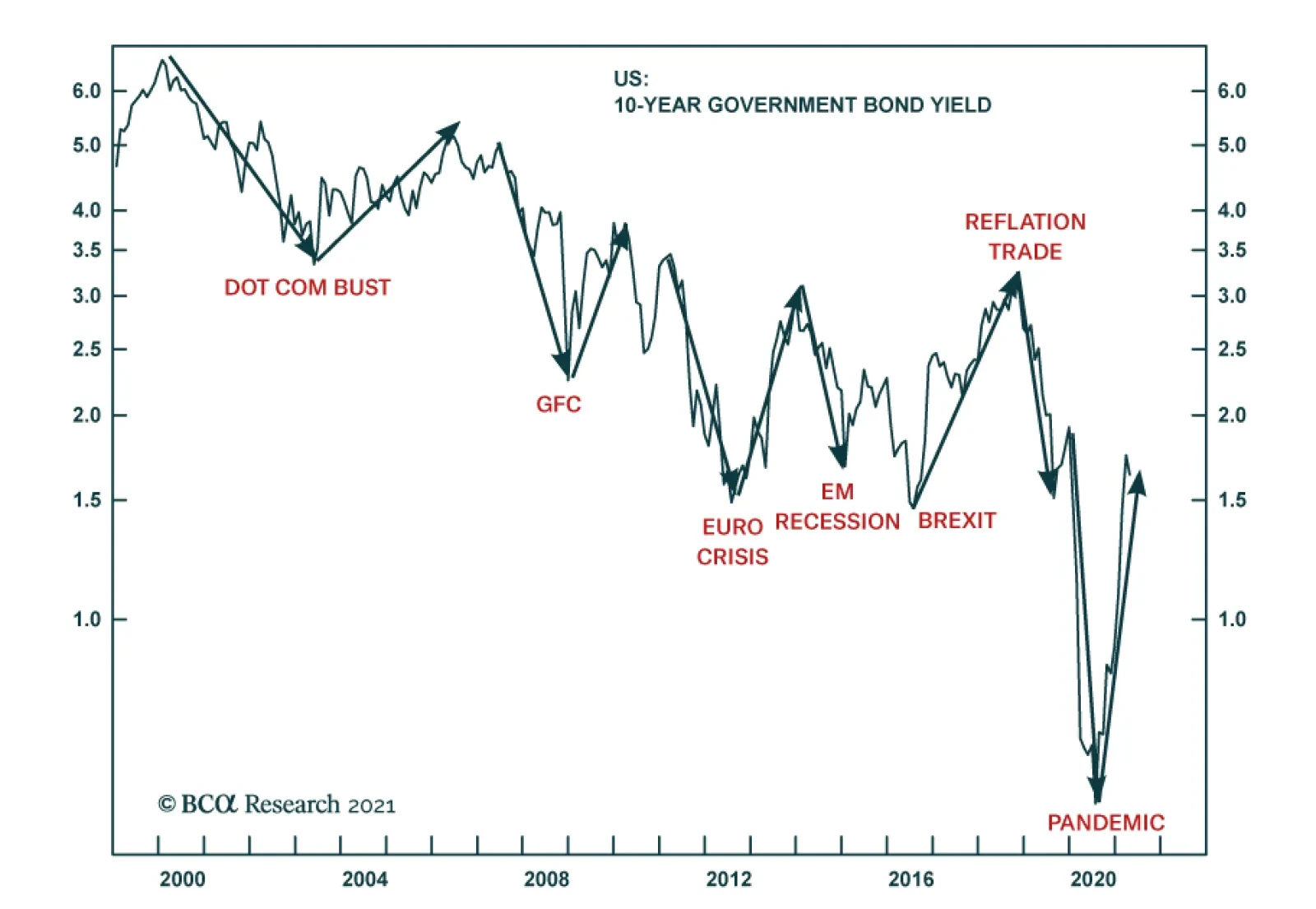
Predicting shocks is easy. The precise nature and timing of shocks is not predictable, but the statistical distribution of shocks is highly predictable. This means that the longer our investment timeframe, the more certain we are of encountering at least one shock – even if we cannot predict its precise nature or timing. Many economists and strategists blame their forecasting errors on shocks, such as the pandemic, which they point out are ‘unforecastable.’ Absent the shocks, they argue, their predictions of the economy and the markets would have turned out right. This is a valid excuse for short-term forecasting errors, but it is not a valid excuse for long-term forecasting errors. On a long-term horizon, encountering a major shock, or several major shocks, is a near-certainty. Hence, economists and strategists who are not incorporating the well-defined statistical distribution of shocks into their long-term investment forecasts and strategies are making a mistake. Individual Shocks Are Not Predictable In the 21 years of this century so far, there have been five shocks whose economic/financial consequences have been felt worldwide: the dot com bust (2000); the global financial crisis (2007/8); the euro debt crisis (2011/12); the emerging markets recession (2014/15); and the global pandemic (2020). To these we can add two wide-reaching political shocks: the Brexit vote (2016); and Donald Trump’s shock victory in the US presidential election (2016). In total, this constitutes seven shocks, four economic/financial, two political, and one natural (Chart I-2). Chart I-2The Seven Global Shocks Of The Century (So Far)
The Seven Global Shocks Of The Century (So Far)
The Seven Global Shocks Of The Century (So Far)
Some people argue that economic/financial shocks are predictable, because they arise from vulnerabilities in the economy or financial markets, which should be easy to spot. Unfortunately, though such vulnerabilities are obvious in hindsight, the greatest economic minds cannot see them in real time. The greatest economic minds cannot see economic vulnerabilities. Infamously, on the eve of the global financial crisis, Ben Bernanke was insisting that “there’s not much indication that subprime mortgage issues have spread into the broader mortgage market.” Equally infamously, on the eve of the euro debt crisis, Mario Draghi was asking “what makes you think that the ECB must become lender of last resort to governments to keep the eurozone together?” (Chart I-3 and Chart I-4) Chart I-3Bernanke Couldn't See The GFC
Bernanke Couldn't See The GFC
Bernanke Couldn't See The GFC
Chart I-4Draghi Couldn't See The Euro Debt Crisis
Draghi Couldn't See The Euro Debt Crisis
Draghi Couldn't See The Euro Debt Crisis
Which begs the question, what is the current vulnerability that today’s great economic minds cannot see? As we have documented many times, most recently in The Rational Bubble Is Turning Irrational, the current vulnerability is the exponential relationship between rising bond yields and the risk premiums on equities and other risk-assets (Chart I-5 and Chart I-6). Meaning that $500 trillion of risk-assets are vulnerable to any substantial further rise in bond yields. Chart I-5A 1.5 Percent Decline In The Bond Yield Had A Smaller Impact On The Earnings Yield When The Bond Yield Started At 4 Percent...
A 1.5 Percent Decline In The Bond Yield Had A Smaller Impact On The Earnings Yield When The Bond Yield Started At 4 Percent...
A 1.5 Percent Decline In The Bond Yield Had A Smaller Impact On The Earnings Yield When The Bond Yield Started At 4 Percent...
Chart I-6...Than When The Bond Yield Started ##br##At 3 Percent
...Than When The Bond Yield Started At 3 Percent
...Than When The Bond Yield Started At 3 Percent
The second type of shock – political shocks – should be predictable as they mostly arise from well-defined events such as elections and referenda, which an army of political experts analyses ad nauseam. Yet the greatest political minds could not see Brexit or President Trump coming. Indeed, even ‘Team Brexit’ didn’t see Brexit coming, because it had no plan on how to implement Brexit once the vote was won. The third type of shocks – natural shocks – are clearly unpredictable as individual events. Nobody knows when the next major pandemic, earthquake, volcano eruption, tsunami, solar flare, or asteroid strike is going happen. Yet, to repeat, while the precise nature and timing of shocks is not predictable, the statistical distribution of shocks is highly predictable. The Statistical Distribution Of Shocks Is Highly Predictable The good news is that shocks follow well-defined statistical ‘power laws’ which allow us to accurately forecast how many shocks to expect in any long timeframe. The 7 shocks experienced through the past 21 years equates to a shock every three years on average, or 3.33 shocks in any 10-year period. The expected wait to the next shock is three years. The next few paragraphs delve into some necessary mathematics, but don’t worry, you don’t need to understand the maths to appreciate the key takeaways. If the past 21 years is representative, we propose that the number of shocks in any 10-year period follows a so-called Poisson distribution with parameter 3.33. From this distribution, it follows that the probability of going through a 5-year period without a shock is just 19 percent, and the probability of going through a 10-year period without a shock is a negligible 4 percent (Chart of the Week). The result is that if you are a long-term investor, then encountering a shock is a near-certainty and should be built into your investment strategy. How can we test our assumption that the number of shocks follows a Poisson distribution? The maths tells us that if the number of shocks follows a Poisson distribution with parameter 3.33, then the ‘waiting time’ between shocks follows a so-called Exponential distribution also with parameter 3.33. On this basis, 63 percent of the waits between shocks should be up to three years, 23 percent should be four to six years, and 14 percent should be over six years. Now we can compare this expected distribution with the actual distribution of waits between the 7 shocks encountered so far in this century. We find that the theory lines up closely with the practice, validating our assumption of a Poisson distribution (Chart I-7 and Chart I-8). Chart I-7The Theoretical Waiting Time Between Shocks…
How To Predict Shocks
How To Predict Shocks
Chart II-8…Is Close To The Actual Waiting Time Between Shocks
How To Predict Shocks
How To Predict Shocks
To repeat the key takeaways, on a long-term timeframe, encountering at least one shock is a near-certainty, and the expected wait to the next shock is three years. A Shock Is A Near-Certainty, And It Will End Up Deflationary Nevertheless, there remains a pressing question: Will the next shock(s) be deflationary or reflationary? It turns out that all shocks end up with both deflationary and reflationary components: either a deflationary impulse followed by a reflationary backlash or, as we highlighted in The Road To Inflation Ends At Deflation, a reflationary impulse followed by a deflationary backlash. But the crucial point is that the deflationary component will swamp the reflationary component. In the seven shocks of this century so far, six have been deflationary impulses with a weaker reflationary backlash; and one – the reflation trade of 2017-18 – was a reflationary impulse with a stronger deflationary backlash. It is our high conviction view that in the next shock(s), the deflationary component will continue to hold the upper hand (Chart I-9). Chart I-9Each Shock Has A Deflationary And Reflationary Component... But The Deflationary Component Tends To Dominate
Each Shock Has A Deflationary And Reflationary Component... But The Deflationary Component Tends To Dominate
Each Shock Has A Deflationary And Reflationary Component... But The Deflationary Component Tends To Dominate
The simple reason is that as financial asset prices, real estate prices, and debt servicing costs get addicted to ever lower bond yields, the economy and financial markets cannot tolerate bond yields reaching previous tightening highs and, just like all addicts, need a new extreme loosening to feel any stimulus. This means that when the next shock comes – as it surely will – it will require lower lows and lower highs in the bond yield cycle. Let’s sum up. On a timeframe of a few years, a shock is a near-certainty even if we do not know its precise nature – economic/financial, political, or natural – or its precise timing. Furthermore, the shock will be net deflationary. Hence, investors must build such a deflationary shock or shocks into their long-term investment strategy. Specifically: The 10-year T-bond yield will eventually reach zero, and the 30-year T-bond yield will ultimately reach 0.5 percent. For patient investors, this constitutes a mouth-watering 100 percent return on the long-duration T-bond. The 10-year T-bond yield will eventually reach zero. The structural bull market in equities will continue until T-bond yields reach their ultimate low. Patient equity investors should tilt towards ‘growth’ sectors that will surge on the ultimate low in T-bond yields. Candidates For Countertrend Reversals This week we have noticed an unusual decoupling among the tech-heavy markets of Taiwan, Netherlands, and China (Chart I-10). Chart I-10An Unusual Decoupling Between Tech-Heavy Netherlands And China
An Unusual Decoupling Between Tech-Heavy Netherlands And China
An Unusual Decoupling Between Tech-Heavy Netherlands And China
Among these three markets, the strong short-term outperformance of both Taiwan and Netherlands are due to supply bottlenecks in the semiconductor sector that have boosted Taiwan Semiconductor Manufacturing and ASML, but we expect these bottlenecks ultimately to resolve. On this basis and combined with extremely fragile 130-day fractal structures, Taiwan versus China and Netherlands versus China are vulnerable to reversals (Chart I-11 and Chart I-12). Chart I-11Underweight Taiwan Versus China
Underweight Taiwan Versus China
Underweight Taiwan Versus China
Chart I-12Underweight Netherlands Versus China
Underweight Netherlands Versus China
Underweight Netherlands Versus China
Our first recommended trade is to underweight Netherlands versus China, setting a profit target and symmetrical stop-loss at 5 percent. Another outperformance that looks fragile on its 130-day fractal structure is Sweden versus Finland, driven by industrials and financials versus energy and materials (Chart I-13). Chart I-13Underweight Sweden Versus Finland
Underweight Sweden Versus Finland
Underweight Sweden Versus Finland
Our second recommended trade is to underweight Sweden versus Finland, setting a profit target and symmetrical stop-loss at 4.7 percent. Dhaval Joshi Chief Strategist dhaval@bcaresearch.com Fractal Trading System Fractal Trades 6-Month Recommendations Structural Recommendations Closed Fractal Trades Asset Performance Equity Market Performance Indicators To Watch - Bond Yields Chart II-1Indicators To Watch - Bond Yields - ##br##Euro Area
Indicators To Watch - Bond Yields - Euro Area
Indicators To Watch - Bond Yields - Euro Area
Chart II-2Indicators To Watch - Bond Yields - ##br##Europe Ex Euro Area
Indicators To Watch - Bond Yields - Europe Ex Euro Area
Indicators To Watch - Bond Yields - Europe Ex Euro Area
Chart II-3Indicators To Watch - Bond Yields - ##br##Asia
Indicators To Watch - Bond Yields - Asia
Indicators To Watch - Bond Yields - Asia
Chart II-4Indicators To Watch - Bond Yields - ##br##Other Developed
Indicators To Watch - Bond Yields - Other Developed
Indicators To Watch - Bond Yields - Other Developed
Indicators To Watch - Interest Rate Expectations Chart II-5Indicators To Watch - Interest Rate Expectations
Indicators To Watch - Interest Rate Expectations
Indicators To Watch - Interest Rate Expectations
Chart II-6Indicators To Watch - Interest Rate Expectations
Indicators To Watch - Interest Rate Expectations
Indicators To Watch - Interest Rate Expectations
Chart II-7Indicators To Watch - Interest Rate Expectations
Indicators To Watch - Interest Rate Expectations
Indicators To Watch - Interest Rate Expectations
Chart II-8Indicators To Watch - Interest Rate Expectations
Indicators To Watch - Interest Rate Expectations
Indicators To Watch - Interest Rate Expectations
Highlights Private-sector savings exploded during the pandemic, swelling the already large global savings glut. Reluctant to sit on excess cash, households shifted some of their funds into the stock market. With corporate buybacks outpacing new share issuance, stock prices had nowhere to go but up. Falling bond yields further supercharged equity valuations. Despite the run-up in stocks, the global equity risk premium – measured as the forward equity earnings yield minus the real bond yield – still stands at about 6%, similar to where it was in late-2009. Using a simple example, we show why investors should hold more stock than the standard 60/40 rule suggests when bond yields are still this low. While bond yields will rise further over the coming years, it is likely to be a slow process. Investors should remain bullish on stocks over a 12-month horizon, favouring non-US equities over their US peers. Did A Surfeit Of Savings Lead To A Shortage Of Assets? Real interest rates have fallen dramatically since the early 1980s (Chart 1). Economic theory posits that lower real rates discourage savings while encouraging spending. Yet, as Chart 2 shows, with the exception of the late-1990s and the mid-2000s – two periods when spending was buoyed first by the dotcom bubble and then by the housing bubble – the US private sector has run a large financial surplus; that is to say, it has consistently spent less than it earned. Private-sector financial balances in most other economies have followed a similar trend. Chart 1Real Bond Yields Have Been Trending Lower Since The 1980s
Real Bond Yields Have Been Trending Lower Since The 1980s
Real Bond Yields Have Been Trending Lower Since The 1980s
Chart 2The Private Sector Has Been Mostly Running Surpluses
The Private Sector Has Been Mostly Running Surpluses (I)
The Private Sector Has Been Mostly Running Surpluses (I)
Ben Bernanke famously cited chronic private-sector financial surpluses as evidence of a “global savings glut.” The concept of a savings glut is closely related to the concept of demand-side secular stagnation, an idea popularized by Larry Summers prior to his heel-turn towards stimulus skeptic. When the private sector is unable to find enough worthy investment projects to make use of all available savings, the economy will struggle to attain full employment, even in the presence of very low interest rates. The concept of a savings glut is also related to another, less well known, concept: a safe asset shortage. If the private sector earns more than it spends, it must, by definition, accumulate assets. In principle, governments can satiate the demand for safe assets by issuing more bonds. In practice, governments have often been reluctant to run persistently large budget deficits for fear that this could undermine their credibility. Faced with a shortage of safe assets, the private sector has stepped in to fill the void, often with disastrous consequences. Most notably, in the lead-up to the Global Financial Crisis, banks sliced and diced portfolios of risky mortgages with the goal of creating safe assets that could be sold into the market. Most financial crashes occur when investors conclude that the assets they once thought were safe are not so safe after all. This was precisely what happened to mortgage-backed securities during the 2008 mortgage meltdown. The exact same pattern repeated itself two years later when investors finally came around to the seemingly obvious conclusion that Greek government bonds were not as safe as say, German bunds. The Safe Asset Shortage In A Post-Pandemic World This brings us to the present day. After falling from 7% of GDP in 2009 to 3% of GDP in the lead-up to the pandemic, the global private-sector financial balance surged to 11% of GDP in 2020. The IMF expects the global private-sector balance to average 9% of GDP in 2021 before trending lower over the coming years. Arithmetically, the private-sector financial balance must equal the sum of the fiscal deficit and the current account balance.1 By running large budget deficits during the pandemic, governments endowed the private sector with income they otherwise would not have had. This income consisted of transfers (stimulus checks, expanded unemployment benefits, business subsidies, etc.) as well as income generated from direct government spending on goods and services. As of the end of March, we estimate that US households had accumulated about $2.2 trillion (10.5% of GDP) in savings over and above what they would have had in the absence of the pandemic. About 40% of those “excess savings” stemmed from fiscal policy with the remainder reflecting decreased consumption (Chart 3). Chart 3Lower Spending And Higher Income Have Led To Mounting Savings
Savings Gluts, Asset Shortages, And The 60/40 Split
Savings Gluts, Asset Shortages, And The 60/40 Split
Chart 4Government Largesse Boosted Savings And Fattened Bank Deposits
Government Largesse Boosted Savings And Fattened Bank Deposits
Government Largesse Boosted Savings And Fattened Bank Deposits
As the private sector’s financial balance increased, so did its asset holdings. Unlike in normal fiscal expansions where governments fund budget deficits by selling debt to the public, this time around, governments largely sold the debt to central banks. The money that governments received from central banks in return was then pumped into the economy, leading to a surge in bank deposits (Chart 4). The Nature Of Stock Market “Flows” What happened to the money after it reached people’s bank accounts? A popular narrative is that some of it flowed into the stock market. While this description is technically true, it is somewhat misleading in that it conveys the false impression that there was a net inflow of money into stocks. The reality is more nuanced. When I buy some stock, I gain some shares but lose some cash. Conversely, whoever sold me the stock gains some cash and loses some shares. In aggregate, there is no change in either the number of shares or the amount of cash that investors hold. What does change is the value of the shares in relation to the cash that investors hold. My purchase must lift the share price by enough to persuade someone else to part with their shares. If the seller does not want to hold the additional cash, he or she may try to place an order to purchase a different stock that appears more attractively priced. This game of hot potato will only end when the value of the stock market rises by enough that all investors are happy with how much stock they own in relation to how much cash they hold. Rethinking The 60/40 Split The standard investment mantra is that investors should hold 60% of their portfolios in stock and the rest in cash, bonds, and other financial assets. The discussion above casts doubt on this simple rule of thumb. Suppose that Melanie holds $600 in stock and $400 in cash, and that cash earns a real interest rate of 2%. Let us also assume that Melanie requires a 4% equity risk premium. Hence, the equity earnings yield must be 6% (i.e., her $600 in stock must correspond to $36 in earnings).2 Now let us suppose that the central bank cuts the policy rate, so that the real interest rate falls to zero. In order to maintain a 4% equity risk premium, the earnings yield must decline to 4%, which implies that the value of the stock must rise to $900 ($36/0.04=$900). Thus, we have gone from a position where Melanie holds 60% of her portfolio in stock to one where she holds about 69% ($900/$1300) in stock. In other words, even though the equity risk premium did not change at all, the desired ratio of stock-to-cash rose from $600/$400=1.5 to $900/$400=2.25. Let us continue the thought experiment and imagine a scenario where the government sends Melanie and everyone else a stimulus check of $100. Now she has $500 in cash and $900 in stock. If she wants to maintain a stock-to-cash ratio of 2.25, she would need to use some of her cash to buy stock. However, since everyone else is also looking to purchase stock with their stimulus checks, before Melanie has a chance to enter a buy order, she finds that the stock in her portfolio has appreciated to $1125. Since $1125/$500 is equal to 2.25, Melanie cancels her buy order, content with the knowledge that she holds as much stock as she wants. Notice that in this simple example, neither interest rate cuts nor stimulus checks did anything to boost corporate profits. All that happened is that stock prices rose, causing the equity earnings yield to first fall from 6% to 4% after the central bank cut rates, and then fall again from 4% to 3.2% ($36/$1125) after the stimulus checks were sent out. If all of this sounds a bit familiar, it should. The sequence of events described above is precisely what has happened over the past 12 months. And not just to stock prices. As interest rates fell and cash balances swelled, other risky assets such as cryptocurrencies went to the proverbial moon. Is The Party Over? Given that fiscal stimulus has peaked and interest rates cannot be cut any further in the major economies, are stocks set to fall? Not necessarily! The amount of stock that investors choose to hold in relation to their cash balances is a function of animal spirits. While US consumer confidence rebounded in March to the highest level in a year, it still remains well below pre-pandemic levels (Chart 5). The percentage of households in The Conference Board’s survey who expect stock prices to rise over the next 12 months is still around its long-term average (Chart 6). Chart 5Stocks Could Rise Further As Confidence Recovers
Stocks Could Rise Further As Confidence Recovers
Stocks Could Rise Further As Confidence Recovers
Chart 6The Percentage Of Households Who Expect Stock Prices To Rise Over The Next 12 Months Is Still Around Its Long-Term Average
The Percentage Of Households Who Expect Stock Prices To Rise Over The Next 12 Months Is Still Around Its Long-Term Average
The Percentage Of Households Who Expect Stock Prices To Rise Over The Next 12 Months Is Still Around Its Long-Term Average
Fortunately, the US is on target to provide a vaccine shot to everyone who wants one by the end of April.3 As the economy continues to reopen, confidence will rise further. Rising confidence, in turn, may prompt investors to increase their equity holdings. Our US equity strategists expect share buybacks to exceed share issuance over the next 12 months. Thus, the value of equity portfolios will only be able to rise if share prices go up. Outside the US and the UK and a few other smaller economies, the vaccination campaign has gotten off to a rocky start. However, the pace of inoculations is set to accelerate rapidly in the second quarter, which should pave the way to faster global growth. Global equities usually outperform bonds when growth is on the upswing (Chart 7). Chart 7Stocks Usually Outperform Bonds When Economic Growth Is Strong
Stocks Usually Outperform Bonds When Economic Growth Is Strong
Stocks Usually Outperform Bonds When Economic Growth Is Strong
While equity allocations have risen, they are below the level reached in 2000 (Chart 8). Back then, the global equity earnings yield was on par with the real bond yield. Today, the earnings yield is about six percentage points above the bond yield, a similar gap to what prevailed in late-2009 (Chart 9). Chart 8Stock Allocations Have Rebounded, But Remain Below Their 2000 Peak
Stock Allocations Have Rebounded, But Remain Below Their 2000 Peak
Stock Allocations Have Rebounded, But Remain Below Their 2000 Peak
Chart 9The Equity Risk Premium Is At Levels Similar To Late-2009
The Equity Risk Premium Is At Levels Similar To Late-2009
The Equity Risk Premium Is At Levels Similar To Late-2009
Granted, today’s high equity risk premium largely reflects the exceptionally low level of bond yields. If bond yields were to move up, the equity risk premium would shrink. While we do think that bond yields will rise by more than expected in the long run, the path to higher yields is likely to be a slow one. Rate expectations 2-to-3 years out tend to move closely in line with the 10-year yield (Chart 10). Already, there is a large gap between market expectations and the Fed dots. Whereas the market expects the Fed to start lifting rates late next year, the median Fed “dot” continues to signal no rate hike at least until 2024 (Chart 11). It is unlikely that market expectations will shift towards an even more aggressive path of rate tightening unless the Fed’s dovish rhetoric turns hawkish. As we discussed in our recently published Second Quarter Strategy Outlook, we do not expect this to happen anytime soon. Thus, with monetary policy still very loose, stocks can continue to grind higher. Chart 10Bond Yields Are Unlikely To Rise Much Unless The Market Lifts Its Estimate Of Where The Fed Funds Rate Will Be 2-To-3 Years Out
Bond Yields Are Unlikely To Rise Much Unless The Market Lifts Its Estimate Of Where The Fed Funds Rate Will Be 2-To-3 Years Out
Bond Yields Are Unlikely To Rise Much Unless The Market Lifts Its Estimate Of Where The Fed Funds Rate Will Be 2-To-3 Years Out
Chart 11A Wide Gap Has Opened Up Between Market Expectations And The Fed Dots
A Wide Gap Has Opened Up Between Market Expectations And The Fed Dots
A Wide Gap Has Opened Up Between Market Expectations And The Fed Dots
Regionally, we favour stock markets outside the US. Not only will overseas markets benefit from a rotation in growth from the US to the rest of the world in the second half of this year, but US corporate tax rates are almost certain to rise. We will be exploring the tax issue over the coming weeks. Peter Berezin Chief Global Strategist pberezin@bcaresearch.com Footnotes 1 Just as the private-sector financial balance is the difference between what the private sector earns and spends, the fiscal balance is the difference between what the government earns and spends. If the fiscal balance is negative, the government runs a deficit. If the fiscal balance is positive, the government runs a surplus. Thus, added together, the private-sector financial balance and the fiscal balance simply equals the difference between what the country as a whole earns and spends which, by definition, is equal to the current account balance. One can also see this point by rewriting the equation Y=C+I+G+X-M as (Y-T)-(C+I)=(G-T)+(X-M) where T is tax revenue, Y-T is private-sector earnings, C+I is what the private sector spends on consumption and capital goods, G-T is the fiscal deficit, and X-M is the current account balance, broadly defined to include not only the trade balance but also net income from abroad. 2 The relative attractiveness of stocks can also be inferred by subtracting the real bond yield from the earnings yield on stocks in order to get an implied equity risk premium (ERP). It is necessary to subtract the real bond yield, rather than the nominal bond yield, from the earnings yield because the earnings yield provides an estimate of the real total expected return to shareholders. For further discussion on this, please see Appendix A of the Global Investment Strategy Special Report, “TINA To The Rescue?” dated August 23, 2019. 3 Mia Sato, “The US is about to reach a surprise milestone: too many vaccines, not enough takers,” MIT Technology Review, March 22, 2021. Global Investment Strategy View Matrix
Savings Gluts, Asset Shortages, And The 60/40 Split
Savings Gluts, Asset Shortages, And The 60/40 Split
Special Trade Recommendations
Savings Gluts, Asset Shortages, And The 60/40 Split
Savings Gluts, Asset Shortages, And The 60/40 Split
Current MacroQuant Model Scores
Savings Gluts, Asset Shortages, And The 60/40 Split
Savings Gluts, Asset Shortages, And The 60/40 Split
Highlights The Biden Administration's $2.25 trillion infrastructure plan rolled out yesterday will, at the margin, boost global demand for energy and base metals more than expected later this year and next. Global GDP growth estimates – and the boost supplied by US stimulus – once again will have to be adjusted higher (Chart of the Week). Energy and metals fundamentals continue to tighten. OPEC 2.0's so-far-successful production management strategy will keep the level of supply just below demand, which will keep Brent crude oil on either side of $60/bbl. Base-metals output will struggle to meet higher demand from the ongoing buildout of renewables infrastructure and growing electric-vehicle sales. Of late, concerns that speculative positioning suggests prices will head lower – or, at other times, higher – are entirely misplaced: Spec positioning conveys no information on price levels or direction. Energy and metals prices, on the other hand, do convey useful information on spec positioning, demonstrating specs do not lead the news or prices, they follow them. Short-term headwinds caused by halting recoveries and renewed lockdowns – particularly in the EU – will fade in 2H21 as vaccines roll out, if the experience of the UK and US are any guide. Continued USD strength, however, would remain a headwind. Feature If the Biden administration is successful in getting its $2.25 trillion infrastructure-spending bill through Congress, the US will join the rest of the world in the race to re-build – in some cases, build anew – its long-neglected bridges, roads, schools, communications and high-speed transportation networks, and, critically, its electric-power grid. There's a lot of game left to play on this, but our Geopolitical Strategy group is giving this bill an 80% of passage later this year, after all the wrangling and log-rolling in Congress is done. In and of itself, the infrastructure-directed spending coming out of Biden's plan will be a catalyst for higher US industrial commodity demand – energy, metals and bulks. In addition, it will support the lift in the demand boost coming out of higher GDP growth globally, which will be pushed higher by US fiscal spending, as the Chart of the Week shows. Of note is the extremely robust growth expected in India, China and the US, which are among the largest consumers of industrial commodities globally. Overall growth in the G20 and globally will be expansive in 2022 as well. Chart of the WeekBiden's $2.25 Trillion Infrastructure Bill Will Boost Global Commodity Demand
Fundamentals Support Oil, Bulks, And Metals
Fundamentals Support Oil, Bulks, And Metals
Higher GDP growth translates directly into higher demand for commodities, all else equal, as can be seen in the relationship between EM and DM GDP, supply and inventories and Brent crude oil prices in Chart 2. While we have reduced our Brent forecast for this year to $60/bbl on the back of renewed demand-side weakness in the EU due to problems in acquiring and distributing COVID-19 vaccines, we expect this to be reversed next year and into 2025, with prices trading between $60-$80/bbl (Chart 3). OPEC 2.0, the oil-producer coalition led by the Kingdom of Saudi Arabia (KSA) and Russia, has done an excellent job of keeping the level of oil supply below demand over the course of the pandemic, which we expect to continue to the end of 2025.1 Chart 2Higher GDP Growth Presages Higher Commodity Demand
Higher GDP Growth Presages Higher Commodity Demand
Higher GDP Growth Presages Higher Commodity Demand
Chart 3Brent Crude Oil Prices Will Average - / bbl to 2025
Brent Crude Oil Prices Will Average $60 - $80 / bbl to 2025
Brent Crude Oil Prices Will Average $60 - $80 / bbl to 2025
As the Biden plan makes its way through Congress, markets will get a better idea of how much diesel fuel, copper, steel, iron ore, etc., will be required in the US alone. What is important to note here that the US is just moving to the starting line, whereas other economies like China and the EU already have begun their investment cycles in renewables and EVs. At present, key markets already are tight, particularly copper (Chart 4) and aluminum (Chart 5). In both markets, we expect physical deficits this year and next, which inclines us to believe the metals leg of this renewables buildout is just beginning – higher prices will be required to incentivize the development of new supply.2 Chart 4Copper Will Post Physical Deficit...
Copper Will Post Physical Deficit...
Copper Will Post Physical Deficit...
Chart 5...As Will Aluminum
...As Will Aluminum
...As Will Aluminum
This is particularly important in copper, where growth in mining output of ore has been flat for the past two years. Copper is the one metal that spans all renewables technologies, and is a bellwether commodity for global growth. We expect copper to trade to $4.50/lb (up ~ $0.50/lb vs spot) on the COMEX in 4Q21 on the back of increasing demand and tight supplies – i.e., falling mining supply and refined copper output growth (Chart 6). Worth noting also is steel rebar and hot-rolled coil prices traded at record highs this week on Chinese futures markets. Stronger steel markets continue to support iron ore prices, although the latter is trading off its recent highs and likely will move lower toward the end of the year as Brazilian supply returns to the market.3 We use steel prices as a leading indicator for copper prices – steel leads copper prices by ~ 9 months. This makes sense when one considers steel is consumed early in infrastructure and construction projects, while copper consumption occurs later as airports and houses are fitted with copper for electric, plumbing and communications applications. Chart 6Copper Ore Output Flat
Copper Ore Output Flat
Copper Ore Output Flat
Does Speculative Positioning Matter? Of late, media pundits and analysts have cited an unwinding of speculative positions in oil and metals markets following sharp run-ups in net long positions as a harbinger of weaker prices in the near future (Chart 7).4 At other times, speculation has been invoked as a reason for price surges – e.g., when oil rocketed toward $150/bbl in mid-2008, which was followed by a price collapse at the start of the Global Financial Crisis (GFC).5 Brunetti et al note, "The role of speculators in financial markets has been the source of considerable interest and controversy in recent years. Concern about speculative trading also finds support in theory where noise traders, speculative bubbles, and herding can drive prices away from fundamental values and destabilize markets." (p. 1545) Chart 7Speculative Positioning Lower In Brent Than WTI
Speculatives Positioning Lower in Brent Than WTI
Speculatives Positioning Lower in Brent Than WTI
We recently re-tested earlier findings in our research, which found that knowledge of how specs are positioned – either on the long or the short side of the market – conveys no information on the level of prices or the change that should be expected given that knowledge. However, knowledge of the price level does convey useful information on how speculators are positioned in futures markets.6 In cointegrating regressions of speculative positions in crude oil, natural gas and copper futures on price levels for these commodities, we find the level of prices to be a statistically significant determinant of spec positions. We find no such relationship using spec positions as an explanatory variable for prices.7 On the other hand, Chart 2 above is an example of statistically significant relationships for Brent and WTI price as a function of supply-demand fundamentals displaying coefficients of determination (r-squares) of close to 90% in the post-GFC period (2010 to now). This supports our earlier findings regarding spec behavior: They follow prices, they don't lead them.8 We are not dismissive of speculation. It plays a critical role in markets, by providing the liquidity that enables commodity producers and consumers to hedge their price exposures, and to investors seeking to diversify their portfolios with commodity exposures that are uncorrelated to their equity and bond holdings. Short-Term Headwinds Likely Dissipate COVID-19 remains the largest risk to markets generally, commodities in particular. The mishandling of vaccine rollouts in the EU has pushed back our assumption for demand recovery deeper into 2H21, but it has not derailed it. We expect COVID-related deaths and hospitalizations to fall in the EU as they have in the UK and the US following the widespread distribution of vaccines, which should occur in the near future as Brussels organizes its pandemic response (Chart 8). Making vaccines available for other states in dire straits will follow, which will allow the global re-opening to progress as lockdowns are lifted (Chart 9). Chart 8EU Vaccination Rollouts Will Boost Global Economic Recovery
Fundamentals Support Oil, Bulks, And Metals
Fundamentals Support Oil, Bulks, And Metals
Chart 9Global Re-Opening Has Slowed, But Will Resume In 2H21
Fundamentals Support Oil, Bulks, And Metals
Fundamentals Support Oil, Bulks, And Metals
The other big risk we see to commodities is persistent USD strength (Chart 10). The dollar has rallied for the better part of 2021, largely on the back of improving US economic prospects relative to other states, and success in its vaccination efforts. The resumption of the USD's bear market may have to wait until the rest of the world catches up with America's public-health response to the pandemic, and the global economy ex-US and -China enters a stronger expansionary mode. Bottom Line: We remain bullish industrial commodities expecting demand to improve as the EU rolls out vaccines and begins to make progress in arresting the pandemic and removing lockdowns. Global fiscal and monetary policy, which likely will be bolstered by a massive round of US infrastructure spending beginning in 4Q21 will catalyze demand growth for oil and base metals. This will prompt another round of GDP revisions to the upside. The dollar remains a headwind for now, but we expect it to return to a bear market in 2H21. Chart 10The USD's Evolution Remains Important
The USD's Evolution Remains Important
The USD's Evolution Remains Important
Robert P. Ryan Chief Commodity & Energy Strategist rryan@bcaresearch.com Ashwin Shyam Research Associate Commodity & Energy Strategy ashwin.shyam@bcaresearch.com Commodities Round-Up Energy: Bullish Going into the April 1 meeting of OPEC 2.0 today, we are not expecting any increase in production. OPEC earlier this week noted demand had softened, mostly due to the slow recovery from the COVID-19 pandemic in the EU, which, based on their previous policy decisions, suggests the producer coalition will not be increasing production. The coalition led by KSA and Russia will have to address Iran's return as a major exporter to China this year, which appears to have been importing ~ 1mm b/d of Iranian crude this month (Chart 11). This puts Iran in direct competition with KSA as a major exporter to China, in defiance of the US re-imposition of sanctions against Iranian exports. China and Iran over the weekend signed a 25-year trade pact that also could include military provisions, which could, over time, alter the balance of power in the Persian Gulf if Chinese military assets – naval and land warfare – deploy to Iran under their agreement. Details of the deal are sparse, as The Guardian noted in its recent coverage. Among other things, government officials in Tehran have come under withering criticism for entering the deal, which they contend was signed with a "politically bankrupt regime." The Guardian also noted US President Joe Biden " is prepared to make a new offer to Iran this week whereby he will lift some sanctions in return for Iran taking specific limited steps to come back into compliance with the nuclear agreement, including reducing the level to which it enriches uranium," in the wake of the signing of this deal. Base Metals: Bullish Copper fell this week, initially on an inventory build, and has now settled right under the $4/lb mark, as investors await details on the US infrastructure bill unveiled in Pittsburgh, PA, on Wednesday. According to mining.com, a major chunk of the proposed bill will be devoted to investments in infrastructure, which will be metals-intensive. Precious Metals: Bullish Gold fell further this week, as US treasury yields rose, buoyed by the increased US vaccine efforts and President Biden’s proposed spending plans (Chart 12). USD strength also worked against the yellow metal, which has been steadily declining since the beginning of this year. COMEX gold fell below the $1,700/oz mark for the third time this month and settled at $1,683.90/oz on Tuesday. Chart 11
Sporadic Producers Will Be Accomodated
Sporadic Producers Will Be Accomodated
Chart 12
Gold Trading Lower On The Back of A Strong Dollar
Gold Trading Lower On The Back of A Strong Dollar
Footnotes 1 Please see Five-Year Brent Forecast Update: Expect Price Range of $60 - $80/bbl, which we published 25 March 2021. It is available at ces.bcaresearch.com. 2 Please see Industrial Commodities Super-Cycle Or Bull Market?, which we published 4 March 2021 for additional discussion, particularly regarding the need for additional capex in energy and metals markets. 3 Please see UPDATE 1-Strong industrial activity, profit lift China steel futures, published by reuters.com 29 March 2021. 4 See, e.g., Column: Frothy oil market deflates as virus fears return published 23 March 2021. 5 Brunetti, Celso, Bahattin Büyüksahin, and Jeffrey H. Harris (2016), " Speculators, Prices, and Market Volatility," Journal of Financial and Quantitative Analysis, 51:5, pp. 1545-74, for further discussion. 6 Please see Specs Back Up The Truck For Oil, which we published 26 April 2018, and Feedback Loop: Spec Positioning & Oil Price Volatility published 10 May 2018. Both are available at ces.bcaresearch.com. 7 We group money managers (registered commodity trading advisors, commodity pool operators and unregistered funds) and swap dealers (banks and trading companies providing liquidity to hedgers and speculators) together to test these relationships. 8 In our earlier research, we also noted our results generally were supported in the academic literature. See, e.g., Fattouh, Bassam, Lutz Kilian and Lavan Mahadeva (2012), "The Role of Speculation in Oil Markets: What Have We Learned So Far?" published by The Oxford Institute For Energy Studies. Investment Views and Themes Strategic Recommendations Commodity Prices and Plays Reference Table Summary of Closed Trades
Higher Inflation On The Way
Higher Inflation On The Way
Feature The global macro landscape over the next six months or so will be characterized by a booming US economy and decelerating growth in China. Financial markets will move accordingly. US Treasury yields will remain under upward pressure, the US dollar will rebound, commodities prices will experience a setback and EM equities will continue underperforming DM stocks. The upcoming US economic boom is a well-known narrative and does not require much elaboration. China’s slowdown, on the other hand, is a matter of debate among investors and commentators. We have been arguing that macro policy tightening and a resumption of regulatory clampdowns on the financial system and property market are bound to result in a growth deceleration in China. There are already leading indicators that point to an impending growth slowdown: Chart 1China Is Set To Decelerate
China Is Set To Decelerate
China Is Set To Decelerate
The latest datapoint for domestic orders from the PBOC’s survey of 5000 industrial enterprises has relapsed in Q1. It leads A-share companies EPS growth by six months (Chart 1, top panel). The message is that industrial companies’ profit growth will once again slow in H2 2021. The recent setback in Chinese A-shares is evidence that markets are already beginning to price in a profit deceleration in H2. The bottom panel of Chart 1 indicates that banks’ claims on enterprises and households have rolled over and will continue downshifting. This is consistent with easing bank loan approvals and reflects policymakers’ guidance for banks. In Charts 3, 4, 6, 7, 8, 9, 10, 11 and 13 below, we illustrate more indicators and evidence of a forthcoming peak in the Chinese business cycle in general and commodities prices in particular. Weakening growth in China will hurt EM stocks and currencies more than those in DM, as many emerging economies are exposed to industrial commodities that are much more sensitive to demand in China versus trends in the US. Also, many Asian economies export more to China than they do to the US and Europe. Besides, the growth outlook in EM (ex-China, Korea and Taiwan) remains sub-par, especially relative to the US and DM more broadly. The reasons for this are slower vaccination rates and by extension economic reopening, a lack of fiscal stimulus and unhealthy banking systems. Notably, Chart 39 below demonstrates that EM bank stocks are breaking down relative to DM bank stocks. This potential breakdown reflects the state of EM fundamentals relative to those of DM. This week we recommend a new trade: short EM banks / long DM banks. In the US, the feature story will be the brisk pace of its reopening, an economic boom and intensifying inflationary pressures. So long as US bond yields continue rising, the US dollar will be supported. The next downleg in the greenback will occur when inflation rises but the Fed explicitly refuses to tackle it. Odds are that we are several months away from that. Hence, rising US bond yields will prop up the US dollar for now. The rebound in the US dollar and rising US bond yields will weigh on EM fixed income. The bottom panel of Chart 30 below illustrates that EM credit spreads negatively correlate with commodity prices. All in all, EM credit spreads will likely widen. Together with ascending US Treasury yields, this means higher EM sovereign and corporate dollar bond yields. The latter have always been associated with lower EM share prices (Chart 2, top panel). Chart 2Rising Corporate Bond Yields Are A Threat To Stocks
Rising Corporate Bond Yields Are A Threat To Stocks
Rising Corporate Bond Yields Are A Threat To Stocks
Strategy: As a tactical strategy (three to six months), last week we recommended downgrading the allocation to EM within global equity and credit portfolios from neutral to underweight. We also recommended shorting a basket of the following EM currencies versus the US dollar for the next several months: HUF, PLN, PHP, TRY, CLP, ZAR, KRW, BRL and THB. Strategic portfolios should maintain neutral allocations to EM equities, credit, local bonds and currencies. Arthur Budaghyan Chief Emerging Markets Strategist arthurb@bcaresearch.com Chinese Share Prices Point To A Top In Commodities Prices The recent underperformance of Chinese onshore cyclical stocks relative to defensive stocks heralds a slowdown in growth and has historically been a good indicator for raw materials prices. Consistently, the latest pullback in share prices of materials companies included in the MSCI China Investable Index also signals a drop in industrial metals prices. Chart 3Chinese Share Prices Point To A Top In Commodities Prices
Chinese Share Prices Point To A Top In Commodities Prices
Chinese Share Prices Point To A Top In Commodities Prices
Chart 4Chinese Share Prices Point To A Top In Commodities Prices
Chinese Share Prices Point To A Top In Commodities Prices
Chinese Share Prices Point To A Top In Commodities Prices
Commodities: New Secular Bull Market Or A Trading Range? Various Chinese liquidity and money measures have historically led the CRB Raw Materials Price Index and presently signal a relapse in commodities. The 200-year chart showing raw materials (excluding oil and gold) prices in real (inflation-adjusted) terms suggests that commodities prices have not undershot their long-term time-trend (Chart 5). We do not argue for a continuation of a structural bear market in commodities, but a medium-term setback is likely in the next three to six months. Chart 5Commodities: New Secular Bull Market Or A Trading Range?
Commodities: New Secular Bull Market Or A Trading Range?
Commodities: New Secular Bull Market Or A Trading Range?
Chart 6Commodities: New Secular Bull Market Or A Trading Range?
Commodities: New Secular Bull Market Or A Trading Range?
Commodities: New Secular Bull Market Or A Trading Range?
Chart 7Commodities: New Secular Bull Market Or A Trading Range?
Commodities: New Secular Bull Market Or A Trading Range?
Commodities: New Secular Bull Market Or A Trading Range?
EM Share Prices Are Beginning To Price A Profit Slowdown In H2 2021 The rally in EM share prices last year has priced the ongoing profit recovery. However, the apex in Chinese money/credit measures entails an EM profit slowdown in H2 this year (Chart 8). Besides, the considerable pullback in Chinese cyclicals-to-defensive stock prices implies further drawdown in EM share prices. Chart 8EM Share Prices Are Beginning To Price A Profit Slowdown In H2 2021
EM Share Prices Are Beginning To Price A Profit Slowdown In H2 2021
EM Share Prices Are Beginning To Price A Profit Slowdown In H2 2021
Chart 9EM Share Prices Are Beginning To Price A Profit Slowdown In H2 2021
EM Share Prices Are Beginning To Price A Profit Slowdown In H2 2021
EM Share Prices Are Beginning To Price A Profit Slowdown In H2 2021
The Chinese Economy: Shifting Into Low Gear In China, liquidity and money measures portend a peak business cycle. Excluding TMT companies, Chinese investable stocks have failed to break above their trading range of the past ten years. Notably, the slowdown is not limited to the old economy. The Caixin New Economy Index has dropped to its early 2019 level. Chart 10The Chinese Economy: Shifting Into Low Gear
The Chinese Economy: Shifting Into Low Gear
The Chinese Economy: Shifting Into Low Gear
Chart 11The Chinese Economy: Shifting Into Low Gear
The Chinese Economy: Shifting Into Low Gear
The Chinese Economy: Shifting Into Low Gear
Chart 12The Chinese Economy: Shifting Into Low Gear
The Chinese Economy: Shifting Into Low Gear
The Chinese Economy: Shifting Into Low Gear
Chart 13The Chinese Economy: Shifting Into Low Gear
The Chinese Economy: Shifting Into Low Gear
The Chinese Economy: Shifting Into Low Gear
Peak Growth And Equity Sentiment We have been showing Chart 14 for the past several months. The record high sentiment on EM equities in January preceded with an apex in EM share prices in February. This measure of sentiment is not yet low enough to expect a bottom in EM stocks. Chart 15 shows a similar indicator for euro area equities. Will it play out in the euro area as it did with EM? Chart 14Peak Growth And Equity Sentiment
Peak Growth And Equity Sentiment
Peak Growth And Equity Sentiment
Chart 15Peak Growth And Equity Sentiment
Peak Growth And Equity Sentiment
Peak Growth And Equity Sentiment
Booming IPOs And Secondary Issues = Peak Investor Sentiment The numbers of IPOs and secondary issuances have risen to a record high in China and EM. Often, this development is consistent with peak investor sentiment that coincides with some sort of top in share prices. Chart 16Booming IPOs And Secondary Issues = Peak Investor Sentiment
Booming IPOs And Secondary Issues = Peak Investor Sentiment
Booming IPOs And Secondary Issues = Peak Investor Sentiment
Chart 17Booming IPOs And Secondary Issues = Peak Investor Sentiment
Booming IPOs And Secondary Issues = Peak Investor Sentiment
Booming IPOs And Secondary Issues = Peak Investor Sentiment
Chart 18Booming IPOs And Secondary Issues = Peak Investor Sentiment
Booming IPOs And Secondary Issues = Peak Investor Sentiment
Booming IPOs And Secondary Issues = Peak Investor Sentiment
Equity Risk Premium: EM Equities Are Not Cheaper Than European And Japanese Equities Equity earnings yield minus interest rates (a proxy for equity risk premium) in EM is similar to that of the US. Hence, adjusted for local interest rates, EM stocks are not cheap. In fact, European and Japanese stocks are cheaper than EM stocks. Chart 19Equity Risk Premium: EM Equities Are Not Cheaper Than European And Japanese Equities
Equity Risk Premium: EM Equities Are Not Cheaper Than European And Japanese Equities
Equity Risk Premium: EM Equities Are Not Cheaper Than European And Japanese Equities
Chart 20Equity Risk Premium: EM Equities Are Not Cheaper Than European And Japanese Equities
Equity Risk Premium: EM Equities Are Not Cheaper Than European And Japanese Equities
Equity Risk Premium: EM Equities Are Not Cheaper Than European And Japanese Equities
A US Dollar Rebound = EM Setback Both EM equity recent selloffs and relative underperformance versus DM occur alongside US dollar strength. Besides, EM equity relative performance often moves counter to US stocks relative performance against the global benchmark (Chart 23). Finally, emerging Asian stocks’ relative performance versus the global index has hit a major technical resistance. The path of least resistance is, for now, on the downside. Chart 21A US Dollar Rebound = EM Setback
A US Dollar Rebound = EM Setback
A US Dollar Rebound = EM Setback
Chart 22A US Dollar Rebound = EM Setback
A US Dollar Rebound = EM Setback
A US Dollar Rebound = EM Setback
Chart 23A US Dollar Rebound = EM Setback
A US Dollar Rebound = EM Setback
A US Dollar Rebound = EM Setback
Chart 24A US Dollar Rebound = EM Setback
A US Dollar Rebound = EM Setback
A US Dollar Rebound = EM Setback
EM Stocks Have Formed A Medium-Term Top The EM overall equity benchmark (shown in Chart 20) as well as EM ex-TMT stocks, EM (ex-China, Korea and Taiwan) share prices, EM small caps and the EM equal-weighted index have so far failed to break out. The forthcoming slowdown in China, rising US Treasury yields, the US dollar rebound and poor fundamentals in EM (ex-China, Korea and Taiwan) are consistent with these technical patterns and warrant caution for now. Chart 25EM Stocks Have Formed A Medium-Term Top
EM Stocks Have Formed A Medium-Term Top
EM Stocks Have Formed A Medium-Term Top
Chart 26EM Stocks Have Formed A Medium-Term Top
EM Stocks Have Formed A Medium-Term Top
EM Stocks Have Formed A Medium-Term Top
Chart 27EM Stocks Have Formed A Medium-Term Top
EM Stocks Have Formed A Medium-Term Top
EM Stocks Have Formed A Medium-Term Top
Chart 28EM Stocks Have Formed A Medium-Term Top
EM Stocks Have Formed A Medium-Term Top
EM Stocks Have Formed A Medium-Term Top
Rising US Treasury Yields Are A Bad Omen For EM Fixed-Income Investor sentiment on US Treasurys is neutral, as is JP Morgan’s duration survey. Major market moves do not halt when sentiment is neutral but rather persist until sentiment becomes extreme. This and the economic boom and rising inflationary pressures in the US are the basis for higher US bond yields. The latter will push up both EM local currency and US dollar bond yields. In turn, a relapse in commodities prices will lead to a widening EM credit spread. Chart 29Rising US Treasury Yields Are A Bad Omen For EM Fixed-Income
Rising US Treasury Yields Are A Bad Omen For EM Fixed-Income
Rising US Treasury Yields Are A Bad Omen For EM Fixed-Income
The US Dollar Rebound Is In The Making The US dollar will continue its rebound as the US economic growth outpaces others and US yields rise relative to their peers. In turn, a rollover in commodities prices is a harbinger of EM currency weakness. Chart 30The US Dollar Rebound Is In The Making
The US Dollar Rebound Is In The Making
The US Dollar Rebound Is In The Making
Chart 31The US Dollar Rebound Is In The Making
The US Dollar Rebound Is In The Making
The US Dollar Rebound Is In The Making
Chart 32The US Dollar Rebound Is In The Making
The US Dollar Rebound Is In The Making
The US Dollar Rebound Is In The Making
Chart 33The US Dollar Rebound Is In The Making
The US Dollar Rebound Is In The Making
The US Dollar Rebound Is In The Making
A Strong Dollar Will Redistribute Inflation From The US To The Rest Of the World US import prices are rising in US dollar terms but not enough to offset exporters’ currency appreciation of the past 12 months. In fact, export prices in local currency terms have been tame in China and Korea. The greenback might appreciate in the near term to redistribute inflationary pressures from the US to the rest of the world, where the risk remains deflation/disinflation. Chart 34A Strong Dollar Will Redistribute Inflation From The US To The Rest Of the World
A Strong Dollar Will Redistribute Inflation From The US To The Rest Of the World
A Strong Dollar Will Redistribute Inflation From The US To The Rest Of the World
Chart 35A Strong Dollar Will Redistribute Inflation From The US To The Rest Of the World
A Strong Dollar Will Redistribute Inflation From The US To The Rest Of the World
A Strong Dollar Will Redistribute Inflation From The US To The Rest Of the World
EMs’ Poor Fundamentals In recent weeks, Brazil and Russia have hiked their policy rates. However, core consumer price inflation in both countries remains well behaved. Both economies are sluggish. In short, economic growth and inflation did not herald higher policy rates. Higher borrowing costs will jeopardize growth in these and other EM economies. Critically, the breakdown in EM relative to DM bank share prices (Chart 39) is a sign of poor health of EM banks and their inability to finance the economic recovery. Chart 36EMs' Poor Fundamentals
EMs' Poor Fundamentals
EMs' Poor Fundamentals
Chart 37EMs' Poor Fundamentals
EMs' Poor Fundamentals
EMs' Poor Fundamentals
Chart 38EMs' Poor Fundamentals
EMs' Poor Fundamentals
EMs' Poor Fundamentals
Investment Ideas A few of our investment recommendations outside our main strategy are: (1) long Chinese A-shares / short investable stocks; (2) long global value / short Chinese investable value stocks; (3) long global industrials / short global materials; (4) short a basket of EM currencies versus the US dollar or go long EM currency volatility. This week we are adding a new recommendation: short EM banks / long DM banks (Chart 39). Chart 39Investment Ideas
Investment Ideas
Investment Ideas
Chart 40Investment Ideas
Investment Ideas
Investment Ideas
Chart 41Investment Ideas
Investment Ideas
Investment Ideas
Footnotes Equities Recommendations
Growth Divergence: Booming US, Slowing China
Growth Divergence: Booming US, Slowing China
Currencies, Credit And Fixed-Income Recommendations
The BCA Research Global Asset Allocation (GAA) Forum will take place online on May 18th. We have put together a great lineup of speakers to discuss issues of importance to CIOs and asset allocators. These include the latest thinking on portfolio construction, factor investing, alternatives, and ESG. Our keynote speaker will be Keith Ambachtsheer, founder of KPA Advisory and author of many books on investment management including "The Future of Pension Management: Integrating Design, Governance and Investing" (2016). His presentation will be followed by a panel discussion of top CIOs including Maxime Aucoin of CDPQ, James Davis of OPTrust, and Catherine Ulozas of the Drexel University Endowment. The event is complimentary for all GAA subscribers, who can see a full agenda and register here. Others can sign up here. We hope you can join us on May 18th for what should be a stimulating and informative day of ideas and discussion. Highlights Recommended Allocation
Quarterly Portfolio Outlook: What Higher Rates Mean For Asset Allocation
Quarterly Portfolio Outlook: What Higher Rates Mean For Asset Allocation
Global growth will rebound later this year, fueled by an end of lockdowns and generous fiscal stimulus. Despite that, central banks will not move towards tightening until 2023 at the earliest. This remains a very positive environment for risk assets like equities, though the upside is inevitably limited given stretched valuations. We continue to recommend a risk-on position, with overweights in equities and higher-risk corporate bonds. It is unlikely that long-term rates will rise much further over the coming months. But there is a risk that they could, and so we become more wary on interest-sensitive assets. Accordingly, we cut our overweight on the IT sector to neutral, and go overweight Financials. We continue to prefer cyclical sectors, and stay overweight Industrials and Energy. Chinese growth is slowing and so we cut our recommendation on Chinese equities to underweight. Some Emerging Markets will suffer from tighter US financial conditions, so we would be selective in our positions in both EM equity and debt. We stay firmly underweight government bonds, and recommend an underweight on duration, and favor linkers. Within alternatives, we raise Private Equity to overweight. The return to normality will give PE funds a wider range of opportunities, and allow them to pick up distressed assets at attractive valuations. Overview What Higher Rates Mean For Asset Allocation The past few months have seen a sharp rise in long-term interest rates everywhere (Chart 1). These have reflected better growth prospects, but also a greater appreciation of the risk of inflation over the next few years (Chart 2). Our main message in this Quarterly Portfolio Outlook is that we do not expect long-term rates to rise much further over the coming months, but that there is a risk that they could. This would be unlikely to undermine the positive case for risk assets overall, but it would affect asset allocation towards interest-rate sensitive assets such as growth stocks and Emerging Markets, and could have an impact on the US dollar. Chart 1Rates Are Rising Everywhere
Rates Are Rising Everywhere
Rates Are Rising Everywhere
Chart 2...Because Of Both Growth And Inflation Expectations
Quarterly Portfolio Outlook: What Higher Rates Mean For Asset Allocation
Quarterly Portfolio Outlook: What Higher Rates Mean For Asset Allocation
We accordingly keep our recommendation for an overweight on equities and riskier corporate credit on the 12-month investment horizon, but are tweaking some of our other allocation recommendations. The macro environment for the rest of the year continues to look favorable. Pent-up consumer demand will be released once lockdowns end. In the US, this should be mid-July by when, at the current rate, the US will have vaccinated enough people to achieve herd immunity (Chart 3). Excess household savings in the major developed economies have reached almost $3 trillion (Chart 4). At least a part of that will be spent when consumers can go out for entertainment and travel again. Chart 3US On Track To Hit Herd Immunity By July
US On Track To Hit Herd Immunity By July
US On Track To Hit Herd Immunity By July
Chart 4Global Excess Savings Total Trillion
Global Excess Savings Total $3 Trillion
Global Excess Savings Total $3 Trillion
Fiscal stimulus remains generous, especially in the US after the passing of the $1.9 trillion package in March (with another $2 trillion dedicated towards infrastructure spending likely to be approved within the next six months). The OECD estimates that the recent US stimulus alone will boost US GDP growth by almost 3 percentage points in the first full year and have a significant knock-on effect on other economies (Chart 5). Central banks, too, remain wary of the uneven and fragile nature of the recovery and so will not move towards tightening in the next 12 months. The Fed is not signalling a rate hike before 2024 – and it is likely to be the first major central bank to raise rates. In this environment, it is not surprising that long-term rates have risen. We showed in March’s Monthly Portfolio Update that, since 1990, equities have almost always performed strongly when rates are rising. This is likely to continue unless there is either (1) an inflation scare, or (2) the Fed turns more hawkish than the market believes is appropriate. Inflation could spike temporarily over the coming months, which might spook markets (see What Our Clients Are Asking on page 9 for more discussion of this). But sustained inflation is improbable until the labor market recovers to a level where significant wage increases come through (Chart 6). This is unlikely before 2023 at the earliest. Chart 5US Fiscal Stimulus Will Help Everyone
Quarterly Portfolio Outlook: What Higher Rates Mean For Asset Allocation
Quarterly Portfolio Outlook: What Higher Rates Mean For Asset Allocation
Chart 6Labor Market Still Well Away From Full Employment
Labor Market Still Well Away From Full Employment
Labor Market Still Well Away From Full Employment
BCA Research’s fixed-income strategists do not see the US 10-year Treasury yield rising much above 1.8% this year.1 Inflation expectations should settle down around the current level (shown in Chart 2, panel 2) which is consistent with the Fed achieving its 2% PCE inflation target on average over the cycle. Treasury yields are largely driven by whether the Fed turns out to be more or less hawkish than the market expects (Chart 7). The market is already pricing in the first Fed rate hike in Q3 2022 (Chart 8). We think it unlikely that the market will start to price in an earlier hike than that. Chart 7The Fed Unlikely To Hike Ahead Of What Market Expects...
The Fed Unlikely To Hike Ahead Of What Market Expects...
The Fed Unlikely To Hike Ahead Of What Market Expects...
Chart 8...Since This Is As Early As Q3 2022
...Since This Is As Early As Q3 2021
...Since This Is As Early As Q3 2021
How much would a further rise in rates hurt the economy and stock market? Rates are still well below a level that would trigger problems. First, long-term rates are considerably below trend nominal GDP growth, which is around 3.5% (Chart 9). Second, short-term real rates are well below r* – hard though that is to measure at the moment given the volatility of the economy in the past 12 months (Chart 10). Finally, one of the best indicators of economic pressure is a decline in cyclical sectors (consumer spending on durables, corporate capex, and residential investment) as a percentage of GDP (Chart 11). This is because these are the most interest-rate sensitive parts of the economy. But, at the moment, consumers are so cashed up they do not need to borrow to spend. The same is true of corporates, which raised huge amounts of cash last year. The only potential problem is real estate, buoyed last year by low rates which are now reversing (Chart 12). But mortgage rates are still very low and this is not a big enough sector to derail the broader economy. Chart 9Long-Term Rates Well Below Damaging Levels...
Long-Term Rates Well Below Damaging Levels...
Long-Term Rates Well Below Damaging Levels...
Chart 10...Such As The R-Star
Fed Still Below Neutral ...Such As The R-Star
Fed Still Below Neutral ...Such As The R-Star
Chart 11Interest-Rate Sensitive Sectors Are Robust...
Interest-Rate Sensitive Sectors Are Robust...
Interest-Rate Sensitive Sectors Are Robust...
Chart 12...With The Possible Exception Of Housing
...With The Possible Exception Of Housing
...With The Possible Exception Of Housing
Chart 13Debt Levels Are High In Emerging Markets...
Debt Levels Are High In Emerging Markets...
Debt Levels Are High In Emerging Markets...
Chart 14...Which Makes Them Vulnerable To Tightening Financial Conditions
...Which Makes Them Vulnerable To Tightening Financial Conditions
...Which Makes Them Vulnerable To Tightening Financial Conditions
This sanguine view may not apply to Emerging Markets, however. Given the amount of foreign-currency debt they have built up in the past decade (Chart 13), they are very sensitive to US financial conditions, particularly a rise in rates and an appreciation of the US dollar (Chart 14). Accordingly, we have become more cautious on the outlook for both EM equity and debt over the next 6-12 months. Garry Evans, Senior Vice President Chief Global Asset Allocation Strategist garry@bcaresearch.com What Our Clients Are Asking What will happen to inflation? How can we tell if it is trending up? Chart 15Watch The Trimmed Mean Inflation Measure
Watch The Trimmed Mean Inflation Measure
Watch The Trimmed Mean Inflation Measure
How much inflation rises will be a key driver of asset performance over the next 12-18 months. Too much inflation will push up long-term rates and undermine the case for risk assets. But the picture is likely to be complicated. US inflation will rise sharply in year-on-year terms in March and April because of the base effect (comparison with the worst period of the pandemic in 2020), pricier gasoline, rising import prices due to the weaker dollar, and supply-chain bottlenecks that are pushing up manufacturing costs. Core PCE inflation could get close to 2.5% year-on-year (Chart 15, panel 1). In the second half, too, an end to lockdowns could push up service-sector inflation – which has unsurprisingly been weak in the past nine months – as consumers rush out to restaurants and on vacation (panel 3). The Fed has signalled that it will view these as temporary effects. But they may spook the market for a while. Next year, however, it would be surprising to see strong underlying inflation unless employment makes a miraculous recovery. Payrolls would have to increase by 420,000 a month to get back to “maximum employment” by end-2022.2 Absent that, wage growth is likely to stay muted. Conventional inflation gauges may not be very useful at indicating underlying inflation pressures, in a world where consumers switch their spending depending on what is currently allowed under pandemic regulations. The Dallas Fed’s Trimmed Mean Inflation indicator (which excludes the 31% of the 178 items in the consumer basket with the highest price rises each month, and the 24% with the lowest) may be the best true measure. Research shows that historically it has been closer to trend headline PCE inflation in the long run than the core inflation measure, and predicts future inflation better (panel 4). Currently it is at 1.6% year-on-year and trending down. Investors should focus on this measure to see whether rising inflation is becoming a risk. How can investors best protect against rising inflation? In May 2019 we released a report describing how to best to hedge against inflation.3 In that report, we analyzed every period of rising inflation dating back to the 1970s. Our conclusions were the following: The level of inflation will determine how rising inflation affects assets. When inflation goes from 1% to 2%, the macro environment is entirely different from when it goes from 5% to 6%. Thus, inflation hedging should not be thought of as a static exercise but a dynamic one (Table 1). Table 1Winners During Different Inflationary Regimes
Quarterly Portfolio Outlook: What Higher Rates Mean For Asset Allocation
Quarterly Portfolio Outlook: What Higher Rates Mean For Asset Allocation
As long as the annual inflation rate is below about 3%, equities tend to be the best performing asset during high inflation periods, surpassing even commodities. This is because monetary policy tends to stay accommodative and cost pressures remain benign for most companies. However, as inflation passes this threshold, things start to change. Central banks start to become restrictive as they seek to curb inflation. This rise in policy rates starts to choke off the bull market. Meanwhile cost pressures become more significant and, as a result, equities begin to suffer. It is at this time when commodities – particularly oil and industrial metals – and US TIPS become a much better asset to hold. Finally, if the central bank fails to quash inflation, inflation expectations become unanchored, creating a toxic cocktail of rising prices and poor growth. During such periods, the best strategy is to hold the most defensive securities in each asset class, such as Health Care or Utilities within the equity market, or gold within commodities. Can the shift to renewables drive a new commodities supercycle? Chart 16The Shift To Renewables Is Likely To Be A Tailwind For Metal Prices...
The Shift To Renewables Is Likely To Be A Tailwind For Metal Prices...
The Shift To Renewables Is Likely To Be A Tailwind For Metal Prices...
The rise in commodity prices in H2 2020 has made investors ask whether we are on the verge of a new commodities “supercycle” (Chart 16). Our Commodity & Energy strategists argue that the fundamental drivers of each commodities segment differ. Here we focus on industrial metals – particularly those pertaining to renewable energy and transport electrification. Prices of metals used in electric vehicles (EVs) have risen by an average 53% since July 2020, reflecting strong demand that is outstripping supply (Chart 16). In the short-term, metals markets are likely to be in deficit, especially as demand recovers after the pandemic. Modelling longer-term demand is tricky since it relies on assumptions for the emergence of new technologies, metals’ efficiency, recycling rates, and the share of renewables. A study by the Institute for Sustainable Futures showed that, in the most positive scenarios, demand for some metals will exceed available resources and reserves (Table 2).4 The most pessimistic scenarios – which, for example, assume no major electrification of the transport system – show demand at approximately half of available resources. It is likely that demand will lay somewhere between those scenarios. Table 2...As Future Demand Exceeds Supply
Quarterly Portfolio Outlook: What Higher Rates Mean For Asset Allocation
Quarterly Portfolio Outlook: What Higher Rates Mean For Asset Allocation
Supply is concentrated in a handful of countries: For example, the DR Congo is responsible for more than 65% of cobalt production and 50% of the world’s reserves;5 Australia supplies almost 50% of the world’s lithium and has 22% of its reserves.6 Production bottlenecks could therefore put significant upside pressures on prices. Factoring in supply/demand dynamics, as well as an assessment of future technological advancements, we conclude that industrial metals might be posed for a bull market over the upcoming years. How can we add alpha in the bond bear market? Chart 17Government Bond Yield Sensitivities To USTs
Government Bond Yield Sensitivities To USTs
Government Bond Yield Sensitivities To USTs
For a portfolio benchmarked to the global Treasury index, one way to add alpha is through country allocation. BCA’s Fixed Income Strategy recommends overweighting low yield-beta countries (Germany, France, and Japan) and underweighting high yield-beta countries (Canada, Australia, and the UK).7 The yield beta is defined as the sensitivity of a country’s yield change to changes in the US 10-year Treasury yield, as shown in Chart 17. BCA’s view is that the Fed will be the first major central bank to lift interest rate, therefore investors' underweights should be concentrated in the US Treasury index. It’s worth noting, however, that yield beta is influenced by many factors, and can change over time. When applying this approach, it’s important to pay attention to key factors in each country, especially those that are critical to central bank policy decisions (Table 3). Table 3A Watch List For Bond Investors
Quarterly Portfolio Outlook: What Higher Rates Mean For Asset Allocation
Quarterly Portfolio Outlook: What Higher Rates Mean For Asset Allocation
Global Economy Chart 18US Growth Already Looks Strong...
US Growth Already Looks Strong...
US Growth Already Looks Strong...
Overview: Growth continues to recover from the pandemic, although the pace varies. Manufacturing has rebounded strongly, as consumers spend their fiscal handouts on computer and household equipment, but services remain very weak, especially in Europe and Japan. Successful vaccination programs and the end of lockdowns in many countries should lead to strong growth in H2, as consumers spend their accumulated savings and companies increase capex to meet this demand. Perhaps the biggest risk to growth is premature tightening in China, but the authorities there are very aware of this risk and so it is unlikely to drag much on global growth. US: Although the big upside surprises to economic growth are over (Chart 18, panel 1), the US continues to expand more strongly than other major economies, due to its relatively limited lockdowns and large fiscal stimulus (which last year and this combined reached 25% of GDP, with another $2 trillion package in the works). Fed NowCasts suggest that Q1 GDP will come in at around 5-6% quarter-on-quarter annualized, with the OECD’s full-year GDP growth forecast as high as 6.5%. Nonetheless, there is still some way to go: Consumer expenditure and capex remain weak by historical standards, and new jobless claims in March still averaged 727,000 a week. Euro Area: More stringent pandemic regulations and slow vaccine rollout mean that the European service sector has been slow to recover. The services PMI in March was still only 48.4, though manufacturing has rebounded strongly to 64.2 (Chart 19, panel 1). Fiscal stimulus is also much smaller than in the US, with the EUR750 billion approved in December to be spent mostly on infrastructure over a period of years. Growth should rebound in H2 if lockdowns end and the vaccination program accelerates. But the OECD forecasts full-year GDP growth of only 3.9%. Chart 19...But Chinese Growth Has Probably Peaked
...But Chinese Growth Has Probably Peaked
...But Chinese Growth Has Probably Peaked
Japan has seen the weakest rebound among the major economies, slightly puzzlingly so given its heavy weight in manufacturing and large exposure to the Chinese economy. Industrial production still shrank 3% year-on-year in February (Chart 19, panel 2), exports were down 4.5% YoY in February, and the manufacturing PMI is barely above 50. The main culprit remains domestic consumption, with confidence very weak and wages still declining, leading to a 2.4% YoY decline in retail sales in January. The OECD full-year GDP growth forecast is just 2.4%. Emerging Markets: The Chinese authorities have been moderately tightening policy for six months and this is starting to impact growth. Both the manufacturing and services PMIs have peaked, though they remain above 50 (panel 3). The policy tightening is likely to be only moderate and so growth this year should not slow drastically. Nonetheless, there remains the risk of a policy mistake. Elsewhere, many EM central banks are struggling with the dilemma of whether to cut rates to boost growth, or raise rates to defend a weakening currency. Real policy rates range from over 2% in Indonesia to below -2% in Brazil and the Philippines. This will add to volatility in the EM universe. Interest Rates: Policy rates in developed economies will not rise any time soon. The Fed is signalling no rise until 2024 (although the futures are now pricing in the first hike in Q3 2022). Other major central banks are likely to wait even longer. A crucial question is whether long-term rates will rise further, after the jump in the US 10-year Treasury yield to a high of 1.73%, from 0.92% at the start of the year. We see only limited upside in yields over the next nine months, as underlying inflation pressures should remain weak and central banks will remain highly reluctant to bring forward the pace of monetary policy normalization. Global Equities Chart 20Has The Equity Market Priced In All The Earnings Growth?
Has The Equity Market Priced In All The Earnings Growth?
Has The Equity Market Priced In All The Earnings Growth?
The global equities index eked out a 4% gain in Q1 2021, completely driven by a rebound in the profit outlook, since the forward PE multiple slightly contracted by 4%. Forward EPS has now recovered to the pre-pandemic level, while both the index level and PE multiple are 52% and 43% higher than at the end of March 2020 (Chart 20). While BCA’s global earnings model points to nearly 20% earnings growth over the next 12 months and analysts are still revising up earnings forecasts, the key question in our mind is whether the equity market has priced in all the earnings growth. Equity valuations are still not cheap by historical standards despite the small contraction in PEs in Q1. In addition, the VIX index has come down to 19.6, right at its historical average since January 1990, and profit margins in both EM and DM have come under pressure. As an asset class, however, stocks are still attractively valued compared to bonds (panel 5). Given our long-held approach of taking risk where risk will most likely be rewarded, we remain overweight equities versus bonds at the asset-class level, but we are taking some risk off the table in our country and sector allocations by downgrading China to underweight (from overweight) and upgrading the UK to overweight (from neutral), and by taking profits in our Tech overweight and upgrading Financials to overweight (see next two pages). To sum up, we are overweight the US and UK, underweight Japan, the euro area, and China, while neutral on Canada, Australia, and non-China EM. Sector-wise, we are overweight Industrials, Financials, Energy, and Health Care; underweight Consumer Staples, Utilities, and Real Estate; and neutral on Tech, Consumer Discretionary, Communication Services, and Materials. Country Allocation: Downgrade China To Underweight From Overweight Chart 21China Is Risking Overtightening
China Is Risking Overtightening
China Is Risking Overtightening
We started to separate the overall EM into China and Other EM in the January Monthly Portfolio Update this year. We initiated China with an Overweight and “Other EM” with a Neutral weighting in the global equity portfolio. The key rationale was that Chinese growth would remain strong in H1 2021 due to its earlier stimulus, while some EM countries would benefit from Chinese growth but others were still suffering from structural issues. In Q1, China underperformed the global benchmark by 4.5%, while the other EM markets underperformed slightly. China’s National People’s Congress (NPC) indicated that Chinese policymakers will gradually pull back policy support this year. BCA’s China Investment Strategists think that fiscal thrust will be neutral in 2021 while credit expansion will be at a lower rate compared to 2020. The Chinese economy should remain strong in H1 but will slow to a benign and managed growth rate afterwards. Therefore, the risk of policy overtightening is not trivial and could threaten China’s economic growth and corporate profit outlook. The outperformance of Chinese stocks since the end of 2019 has been largely driven by multiple expansion (Chart 21, panel 1), but the slowdown in the credit impulse implies that the recent underperformance of Chinese equities has not run its course because multiple contraction will likely have to catch up and will therefore put more downward pressure on price (panels 2 and 3). We remain neutral on the non-China EM countries, implying an underweight for the overall EM universe. We use the proceeds to fund an upgrade of the UK to Overweight from Neutral because the UK index is comprised largely of globally exposed companies and because we have upgraded GBP to overweight (see page 21). Sector Allocation: Upgrade Financials To Overweight By Downgrading Tech To Neutral Chart 22Financials And Tech: Trading Places
Financials And Tech: Trading Places
Financials And Tech: Trading Places
One year ago, we upgraded Tech to overweight and downgraded Financials to neutral given our views on the impact of the pandemic and interest rates.8 This position has netted out an alpha of 1123 basis points in one year. BCA Research’s House View now calls for somewhat higher global interest rates and steeper yield curves (especially in the US) over the next 9-12 months. Accordingly, we are downgrading Tech to neutral and upgrading Financials to overweight. Financials have outperformed the broad market by about 20% since September 2020 after global yields bottomed in July 2020. We do not expect yields to rise significantly from the current level, nor do we expect Tech earnings growth to slow significantly (Chart 22, panel 5). So why do we make such shift between Financials and Tech? There are three key reasons: First, the Tech sector is a long-duration asset with high sensitivity to changes in the discount rate. In contrast, Financials’ earnings benefit from steepening yield curves. If history is any guide, we should see more aggressive analyst earnings revisions going forward in favor of Financials (Chart 22, panel 3). Second, the performance of Financials relative to Tech has been on a long-term structural downtrend since the Global Financial Crisis. A countertrend rebound to the neutral zone from the currently very oversold level would imply further upside (Chart 22, panel 1). Last, Financials are trading at an extremely large discount to the Tech sector (Chart 22, panel 2). In an environment where overall equity valuations are stretched by historical standards, it is prudent to rotate into an extremely cheap sector from an extremely expensive sector. Government Bonds Chart 23Policy Mix Is Bond-Bearish
Policy Mix Is Bond-Bearish
Policy Mix Is Bond-Bearish
Maintain Below-Benchmark Duration. Global bond yields have climbed sharply in Q1, supported by strong economic growth, mostly smooth rollout of vaccination and the Biden Administration’s very stimulative fiscal package of USD1.9 trillion. The US stimulus package changes the trajectory of the 2021 US fiscal impulse from a $0.8 trillion contraction to a $0.3 trillion expansion, according to estimates from the US Committee for a Responsible Federal Budget. Going forward, the path of least resistance for global yields is still up, though the upside will be limited given the resolve of central banks to maintain accommodative monetary policies (Chart 23). Chart 24Stay Long TIPS
Stay Long TIPS
Stay Long TIPS
Still Favor Linkers Vs. Nominal Bonds. Our overweight position in inflation-linked bonds relative to nominal bonds has panned out well so far this year, as has our positioning for a flattening inflation-protection curve. Even though inflation expectations have run up quickly, the 5 year-5 year forward inflation breakeven rate is still below 2.3-2.5%, the range that is consistent with core PCE reaching the Fed’s 2% target in a sustainable fashion (Chart 24). The US TIPS 5/10-year curve is inverted already, but our fixed income strategists are still reluctant to exit the curve-flattening position for two key reasons: 1) The Fed has indicated that it will tolerate core PCE overshooting the 2% target because it will try to hit the target from above rather than from below; and 2) the short end of the inflation expectation curve is more sensitive to actual inflation than the long end. There are signs (core producer prices, prices paid in the ISM manufacturing survey, and NFIB reported prices are all rising) that core PCE will reach 2% in the next 12 months. Corporate Bonds Chart 25High-Yield Offers Best Value In Fixed Income
Quarterly Portfolio Outlook: What Higher Rates Mean For Asset Allocation
Quarterly Portfolio Outlook: What Higher Rates Mean For Asset Allocation
Since the beginning of the year, investment-grade bonds have outperformed duration-matched Treasurys by 62 basis points, while high-yield bonds have outperformed duration-marched Treasurys by 232 basis points. In the current reflationary environment, we believe that the best strategy within fixed-income portfolios is to overweight low-duration assets and maximize credit exposure where the spread makes a large portion of the yield. Thus, we remain overweight high-yield bonds. We believe that high yield offers much better value than higher quality credits. Currently spreads for high-yield bonds are in the middle of their historical distribution – a stark contrast from their investment-grade counterparts, which are trading at very expensive levels (Chart 25, panel 1). Moreover, the reopening of the economy should help the more cyclical sectors of the bond market, where the lower credit qualities are concentrated. But could a rise in yields start hurting sub-investment-grade companies and increase their borrowing costs? We do not think this is likely for now. Most of the bonds in the US high-yield index mature in more than three years, which means that high-risk corporates will not have to finance themselves with higher rates yet (Chart 25, panel 2). On the other hand, we remain underweight investment-grade credit. Not only are these bonds expensive, but they offer very little upside in any scenario. On the one hand, these bonds should underperform further if raise continue to rise – a result of their high duration. On the other hand, if a severe recession were to hit, spreads would most likely widen, which will also result in underperformance. Commodities Chart 26Limited Upside For Oil From Here
Limited Upside For Oil From Here
Limited Upside For Oil From Here
Energy (Overweight): Despite the recent mid-March selloff, which was most likely triggered by profit taking, oil prices are still up 25% since the beginning of the year. This happened on the back of the restoration of some economic activity, the OPEC 2.0 coalition maintaining production discipline and therefore keeping supply in check, and the recovery in crude demand drawing down inventory. However, earlier forecasts of the 2021 oil demand recovery were a bit too optimistic amid continuing pandemic uncertainty. There is now, therefore, only limited upside for the oil price, at least this year. Our Commodity & Energy strategists expect the Brent crude price to average $65/bbl this year (Chart 26, panels 1 & 2). Industrial Metals (Neutral): We have previously highlighted that Chinese restocking activity in 2020 was a big factor behind the rally in industrial metals prices. As this eases, and Chinese growth slows, commodity prices might correct somewhat in the short term. However, fundamental changes in demand for alternative energy makes us ask whether we are now entering a new commodities “supercycle” for certain metals (for more analysis of this, see What Our Clients Are Asking on page 11). If history is any guide, however, the commodities bear market may have a little longer to run. Historically, commodity bear cycles lasted 17 years on average and we are only 10 years into this one (panel 3). On balance, therefore, we remain neutral on industrial metals for now. Precious Metals (Neutral): After peaking last August, the gold price has continued to tumble, down almost 19% since and 11% since the beginning of the year. We have been wary of the metal’s lofty valuation – the real price of gold remains near a historical high. The recent rise in real rates put more downside pressure on gold. However, the pullback in prices should provide investors who see gold as a long-term inflation hedge and do not buy the metal with a view to strong absolute performance over the next 12 months, with an attractive entry point. We maintain a slight overweight position to hedge against inflation and unexpected tail risks (panel 4). Currencies US Dollar Chart 27Vaccinations will help USD and GBP in 2021
Vaccinations will help USD and GBP in 2021
Vaccinations will help USD and GBP in 2021
While we still believe that the dollar is in a major bear market, the current environment could see a significant dollar countertrend. Thanks to its gargantuan fiscal stimulus as well as its relatively fast vaccination campaign, the US is likely to grow faster than the rest of the world during 2021 (Chart 27, panel 1). This dynamic should put further upward pressure on US real rates relative to the rest of the world, helping the dollar in the process. To hedge this risk, we are upgrading the US dollar from underweight to neutral in our currency portfolio. Euro The euro should experience a temporary pullback. Economic activity in Europe, particularly in the service sector is lagging the US – a consequence of Europe’s slow vaccination campaign. This sluggishness in economic activity will translate into a worse real rate differential vis-a-vis the US, dragging the euro lower in the process. Thus, we are downgrading the euro from overweight to neutral. British Pound One currency that might perform well in this environment is the British pound. Consumer spending in the UK was particularly hard hit during the pandemic, since such a high share of it is geared towards social activities like restaurants and hotels (Chart 27, panel 2). However, thanks to Britain’s successful vaccination campaign, UK consumption is likely to experience a sharp snapback. As growth expectations improve, real rates should grind higher vis-à-vis the rest of the world, pushing the pound higher. Moreover, valuations for this currency are attractive: The pound currently trades at a 10% discount to purchasing power parity fair value. As a result, we are upgrading the GBP from neutral to overweight. Alternatives Chart 28Turning More Positive On Private Equity
Turning More Positive On Private Equity
Turning More Positive On Private Equity
Return Enhancers: In last October’s Quarterly Outlook, we advised investors to prepare for new opportunities in Private Equity (PE) as fund managers look to deploy record high dry power. A gradual return to normality is likely to provide PE funds with a wider range of opportunities, while still allowing them to pick up distressed assets at attractive valuations. This is illustrated by the annualized quarterly returns of PE funds in Q2 and Q3 2020, which reached 43% and 56% respectively. PE funds raised in recession and early-cycle years tend to have a higher median net IRR than those raised in the latter stages of bull markets. This suggests that returns from the 2020 and 2021 vintages should be strong. In recent years, capital flows have increasingly gone to the longer established and larger funds, which tend to have better access to the most attractive deals and therefore record the strongest returns. This trend is likely to continue. Given the time it takes to shift allocations in private assets, we increase our recommended allocation in PE to overweight. Inflation Hedges: It is not clear that inflation will come roaring back in the next couple of years. But what is certain is that market participants are concerned about this risk, which should give a boost to inflation-hedge assets. Given this backdrop, we continue to favor commodity futures (Chart 28, panel 2). In other circumstances, real estate would also have been a beneficiary in this environment. But the slowdown in commercial real estate, as many corporate tenants review whether they need expensive city-center space, makes us remain cautious on real estate. Volatility Dampeners: We continue to favor farmland and timberland over structured products, particularly mortgage-backed securities (MBS). Farmland offers attractive yields and should continue to provide the best portfolio protection in the event of any market distress (Chart 28, panel 3). Risks To Our View The main risks to our central view are to the downside. Because global equities have risen by 55% over the past 12 months, and with the forward PE of the MSCI ACWI index at 19.5x (Chart 29), the room for price appreciation over the next 12 months is inevitably limited. There are several things that could undermine the economic recovery and equity bull market. The COVID-19 pandemic remains the greatest unknown. The vaccination rollout has been very uneven (Chart 30). New strains, especially the one first identified in Brazil, are highly contagious and people who previously had COVID-19 do not seem to have immunity against them. Behavior once COVID cases decline is also hard to predict. Will people be happy again to fly, attend events in large stadiums, and socialize in crowded bars, or will many remain wary for years? This would undermine the case for a strong rebound in consumption. Chart 29Is Perfection Priced In?
Is Perfection Priced In?
Is Perfection Priced In?
Chart 30Vaccination Has Been Spotty Vaccination Has Been Spotty
Vaccination Has Been Spotty Vaccination Has Been Spotty
Vaccination Has Been Spotty Vaccination Has Been Spotty
Chart 31China Slowing Again?
China Slowing Again?
China Slowing Again?
As often, a slowdown in China is a risk. The authorities there have signalled a pullback in stimulus, and the credit impulse has begun to slow (Chart 31). Our China strategists think the authorities will be careful not to tighten too drastically (with the fiscal thrust expected to be neutral this year), and that growth will slow only to a benign and moderate rate in the second half.9 But there is a lot of room for policy error. Finally, inflation. As we argue elsewhere in this Quarterly, it will inevitably pick up for technical reasons in March and April, and then again in late 2021 as renewed consumer demand for services (especially travel and entertainment) pushes up prices. The Fed has emphasized that these phenomena are temporary and that underlying inflation will not emerge until the economy returns to full employment. But the market might get spooked for a while when inflation jumps, pushing up long-term interest rates and triggering an equity market correction. Footnotes 1 Please see US Bond Strategy Report, “The Fed Looks Backward While Markets Look Forward,” dated March 23, 2021. 2 Please see US Bond Strategy Report, “The Fed Looks Backward While Markets Look Forward,” dated March 23, 2021, 3 Please see Global Asset Allocation Special Report, “Investors’ Guide To Inflation Hedging: How To Invest When Inflation Rises,” dated May 22, 2019. 4 Dominish, E., Florin, N. and Teske, S., 2019, Responsible Minerals Sourcing for Renewable Energy. Report prepared for Earthworks by the Institute for Sustainable Futures, University of Technology Sydney. The optimistic scenario is referred to as “total metals demand” scenario, which assumed current materials intensity and market share continues into the future without recycling or efficiency improvements. This study is based on 2018 production levels and therefore expansion of future production may vary results. 5US Geological Survey, Mineral Commodity Summaries 2021. 6 Chile is estimated to have the largest reserve of lithium. 7 Please see Global Fixed Income Strategy Report, “Harder, Better, Faster, Stronger,” dated March 16, 2021. 8 Please see Global Asset Allocation, “Quarterly Portfolio Outlook: Playing The Optionality,” dated April 1, 2020. 9 Please see China Investment Strategy Report, “National People’s Congress Sets Tone For 2021 Growth,” dated March 17, 2021. GAA Asset Allocation