Global
At present, we are stuck in an environment where aggressively easy monetary policy and low bond yields are the sole supports for risky assets. In turn, falling bond yields are stoking concerns about the economy, which results in the perceived need for ever…
There’s an interesting self-fulfilling prophesy that can take hold when the yield curve inverts. Investors interpret the inversion as a signal of weaker economic growth ahead. They then bid up long-dated bond prices causing the curve to invert even more. This…

Highlights Duration: Global manufacturing growth will rebound near the end of this year. Much like in 2016, this will result in higher global bond yields on a 12-month horizon. Investors should keep portfolio duration close to benchmark for now, but be prepared to shift to below-benchmark when our global growth indicators show signs of improvement. Country Allocation: Countries with yield curves furthest away from the effective lower bound also have the most cyclical bond markets. At present, this means that U.S. and Canadian bond markets will perform best if global growth continues to weaken. They will also perform worst in the event of an economic turnaround. Japanese bonds will perform best in a bond bear market, with German debt a close second. Relative Value In Global Government Debt: Changes in the level and shape of global yield curves have altered the relative value opportunities in the global government bond space. We find that the most positive carry (including both yield income and rolldown) in global government bond markets is earned in 30-year German, Japanese and Australian bonds, and in 10-year U.K. and Japanese bonds. Feature Reflexivity Chart 1A Brief Inversion
A Brief Inversion
A Brief Inversion
The decline in global bond yields has been unrelenting, and it took on a life of its own last week when the U.S. 2-year/10-year slope briefly inverted (Chart 1). After the inversion, the 30-year U.S. Treasury yield broke below 2% and the 10-year yield broke below 1.50%. The average yield on the 7-10 year Global Treasury Index closed at 0.49% last Thursday, just above its all-time low of 0.48% (Chart 1, bottom panel). There’s an interesting self-fulfilling prophesy that can take hold when the yield curve inverts. Investors interpret the inversion as a signal of weaker economic growth ahead. They then bid up long-dated bond prices causing the curve to invert even more. This sort of circular reasoning can cause bond yields to disconnect from the trends in global economic data, often severely. While recession fears have benefited government bonds, risky assets – equities and corporate bonds – have experienced relatively minor pain. The S&P 500’s recent sell-off pales in comparison to the one seen late last year (Chart 2). Meanwhile, corporate bond spreads remain well below early-2019 peaks. Risky assets have clearly benefited from the drop in bond yields, as markets price-in a future where central banks ease monetary policy in response to weaker economic growth, and where that easing is sufficient to keep equities and credit well supported. Chart 2Low Yields Support Risk Assets I
Low Yields Support Risk Assets I
Low Yields Support Risk Assets I
Chart 3Low Yields Support Risk Assets II
Low Yields Support Risk Assets II
Low Yields Support Risk Assets II
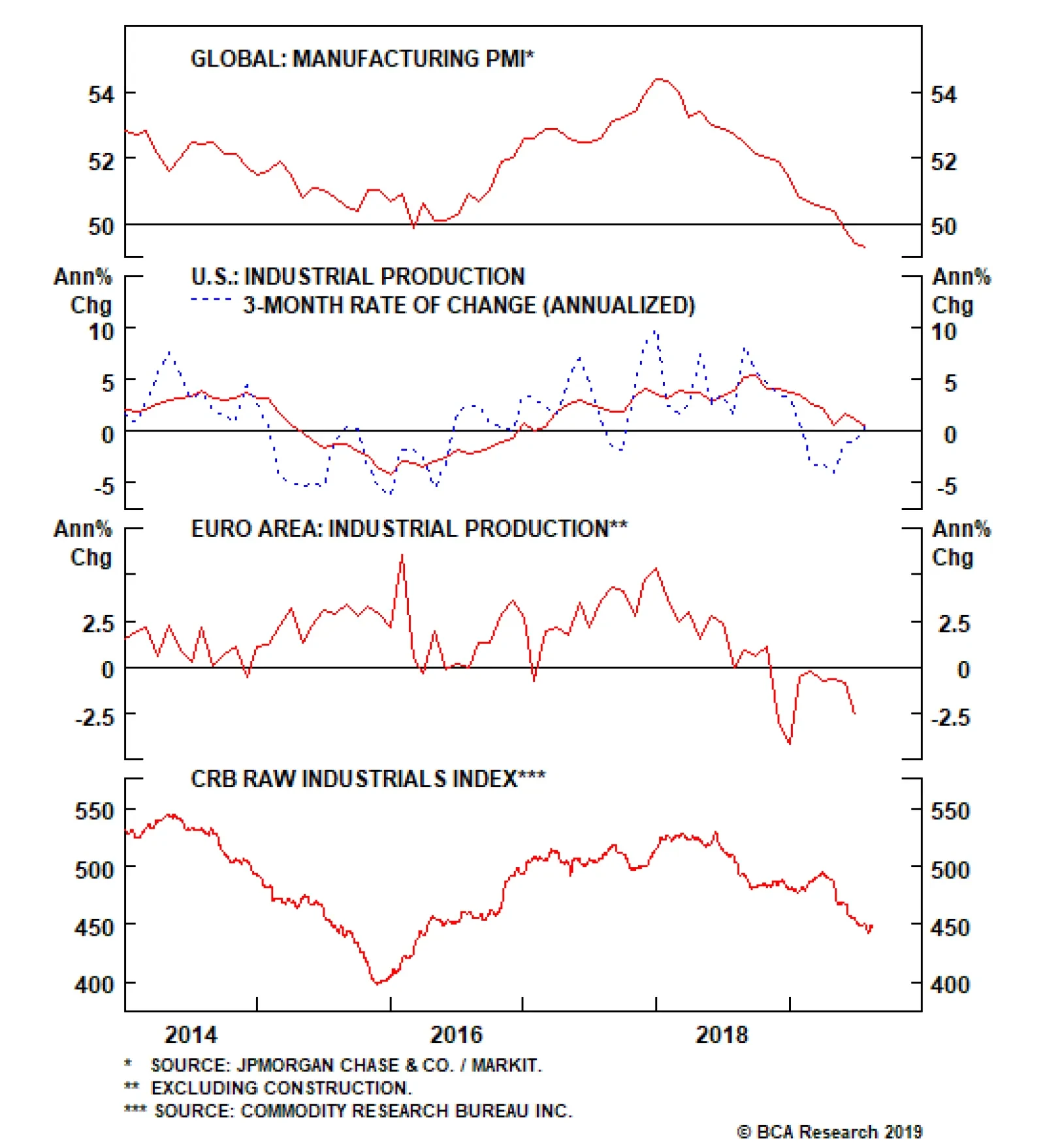
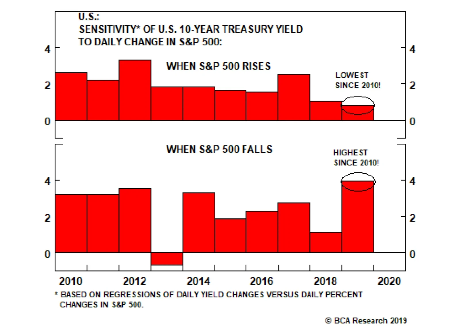
Further evidence of this dynamic is presented in Chart 3. The chart shows the sensitivity of daily changes in the U.S. 10-year Treasury yield to changes in the S&P 500 for each year since 2010. The sample is split into days when the S&P 500 rose and when it fell. For example, in 2010 the sensitivity on “up days” was 2.6, meaning that on days when the S&P 500 rose, the 10-year yield rose 2.6 basis points for every 1% increase in the S&P 500. Similarly, the sensitivity in 2010 on “down days” was 3.2. This means that the 10-year yield fell 3.2 bps for every 1% drop in the equity index. The main takeaway from Chart 3 is how dramatically the sensitivities have shifted in 2019. The yield sensitivity on “up days” has fallen sharply – down to 0.8. This means that yields barely rise on days when equities move up. Meanwhile, the sensitivity on “down days” has shot higher, to just under 4. This means that yields fall a lot on days when equities sell off. The perception of easier monetary policy has been the main support for risk assets this year. The logical interpretation of these trends is that the perception of easier monetary policy has been the main support for risk assets this year. Global Growth Needed At present, we are stuck in an environment where aggressively easy monetary policy and low bond yields are the sole supports for risky assets. In turn, falling bond yields are stoking concerns about the economy, leading to even easier monetary policy. Only one thing can bust us out of this pattern, and that’s a resurgence of global manufacturing growth. Unfortunately, there is little evidence that this is taking place (Chart 4). The Global Manufacturing PMI is now down to 49.3, below the 2016 trough of 49.9 (Chart 4, top panel). U.S. Industrial Production growth remains weak, but is showing signs of stabilization above the 2016 trough (Chart 4, panel 2). European Industrial Production, on the other hand, continues to contract (Chart 4, panel 3). The downtrend in our favorite real-time indicator of global manufacturing – the CRB Raw Industrials index – remains unbroken (Chart 4, bottom panel). However, even though evidence of a turnaround in global manufacturing is scant, we expect a rebound near the end of this year, for the following reasons: Global financial conditions have eased this year, the result of aggressive central bank stimulus. Financial conditions are easier now than they were in 2018, and much easier than they were prior to the 2015/16 global growth slowdown (Chart 5, top panel). China has started to ease credit conditions in response to U.S. tariffs and the slowdown in growth. So far, stimulus has been tepid relative to 2015/16 levels, but it should ramp up in the coming months.1 Many large important segments of the global economy remain unaffected by the global manufacturing slowdown. The U.S. consumer continues to spend: Core retail sales are growing at a robust 5% year-over-year rate, and consumer sentiment remains elevated (Chart 5, panels 2 & 3). Even in the Eurozone, the service sector has not experienced the same pain as manufacturing (Chart 5, bottom panel). Fiscal policy will remain a tailwind for economic growth this year and next. Last week, there were even rumors of increased fiscal thrust from Germany if the growth slowdown persists.2 Strong inflation readings only increased market worries that the Fed might not be as accommodative as necessary. On the whole, we expect that the above 4 factors will lead to a rebound in global manufacturing growth near the end of this year. Much like in 2016, this will result in higher global bond yields on a 12-month horizon, but the global growth indicators shown in Chart 4 will need to rebound first. Chart 4Global Growth Indicators
Global Growth Indicators
Global Growth Indicators
Chart 5Catalysts For Economic Recovery
Catalysts For Economic Recovery
Catalysts For Economic Recovery
Inflation Puts Pressure On Powell Chart 6Strong Inflation Could Complicate The Fed's Message
Strong Inflation Could Complicate The Fed's Message
Strong Inflation Could Complicate The Fed's Message
Strong U.S. inflation prints during the past two months add an interesting wrinkle to the macro landscape. Core U.S. inflation grew at an annualized rate of 3.55% in July, following an annualized rate of 3.59% in June (Chart 6). However, these strong inflation readings only increased market worries that the Fed might not be as accommodative as necessary. This exacerbated the flattening of the yield curve and sent long-dated TIPS breakeven inflation rates lower. Our sense is that the Fed is chiefly concerned with re-anchoring inflation expectations (Chart 6, bottom panel). This probably means that another rate cut is coming in September, and that Chairman Powell will do his best to sound accommodative in his Jackson Hole address on Friday. However, recent strong inflation data could prompt Powell to sound more hawkish than the market would like, causing yield curves to flatten and risky assets to fall. Bottom Line: Global manufacturing growth will rebound near the end of this year. Much like in 2016, this will result in higher global bond yields on a 12-month horizon. Investors should keep portfolio duration close to benchmark for now, but be prepared to shift to below-benchmark when our global growth indicators show signs of improvement. Country Allocation & The Zero Lower Bound Perhaps the most straightforward way to think about country allocation within a portfolio of developed market government bonds is to classify the different markets as either “high beta” or “low beta”. Chart 7 shows the trailing 3-year sensitivity of major countries’ 7-10 year bond yields relative to the global 7-10 year yield.3 The U.S. and Canada have the highest betas, followed by the U.K. and Australia. Germany has a beta close to one, and Japan’s beta is the lowest. Chart 7Global Yield Beta
Global Yield Beta
Global Yield Beta
In other words, if global growth falters and global bond yields decline, U.S. and Canadian bond markets should perform best, followed by the U.K. and Australia. German bonds should perform in line with the global index, and Japanese bonds should underperform the global benchmark. What makes this approach to portfolio allocation even better is that the calculation of trailing betas is not really necessary. A very similar ordering of countries – from “high beta” to “low beta” – is achieved by simply ranking the markets from highest yielding to lowest yielding. High yielding countries, like the U.S. and Canada, have the most room to ease monetary policy in response to a negative growth shock. This means that yields in those countries will respond most to global growth fluctuations. On the other hand, the entire Japanese yield curve is already pinned near the effective lower bound. Even in the event of a negative growth shock, there is little scope for easier Japanese monetary policy, and JGB yields will be relatively unaffected. Chart 8High Beta Countries Are Most Sensitive To Economic Growth
High Beta Countries Are Most Sensitive To Economic Growth
High Beta Countries Are Most Sensitive To Economic Growth
It’s interesting to note in Chart 7 that while German yields are actually below JGB yields, bunds remain somewhat less defensive than the Japanese market. This is because the German term structure has only recently moved to the effective lower bound, and investors likely still retain some hope that an improvement in global growth could lead to European policy tightening at some point in the future. This belief is largely absent in Japan, where the term structure has been pinned at the lower bound for many years. Chart 8 provides some further evidence of the split between “high beta” and “low beta” bond markets. It shows that the bond markets with the highest yields are also the most sensitive to trends in global growth, as proxied by the Global Manufacturing PMI. U.S. bond yields are highly correlated with the Global PMI, while Japanese bond yields are hardly correlated at all. It follows that if the slowdown in global growth continues and all nations’ yield curves converge to Japanese levels, then the overall economic sensitivity of global bond yields will decline. Bottom Line: Countries with yield curves furthest away from the effective lower bound also have the most cyclical bond markets. At present, this means that U.S. and Canadian bond markets will perform best if global growth continues to weaken. They will also perform worst in the event of an economic turnaround. Japanese bonds will perform best in a bond bear market, with German debt a close second. Looking For Positive Carry Yield curves have undergone dramatic shifts in recent months, in terms of both level and shape. Not only have curves for the major government bond markets shifted down since the beginning of the year, they also now exhibit varying degrees of a ‘U’ shape (Charts 9A-9F). With that in mind, in this week’s report we look for the best “positive carry” opportunities in global government bond markets. Yield curves for the major government bond markets have shifted down since the beginning of the year, they also now exhibit varying degrees of a ‘U’ shape. We use the term carry to mean the expected return from a given bond assuming an unchanged yield curve. This is essentially the combination of yield income (i.e. coupon return) and the price impact of rolling down (or up) the yield curve. For the purposes of this report, we assume a 12-month investment horizon and incorporate the impact of currency hedging into each security’s yield income.
Chart 9
Chart 9
Chart 9
Chart 9
Chart 9
Chart 9
Rolldown ‘U’ shaped yield curves mean that bonds near the base of the ‘U’ currently suffer from negative rolldown, while the rolldown for long maturities is often highly positive. Table 1 shows that rolldown is currently negative for all 2-year bonds, but especially for U.S. and Canadian debt. The U.S. and Canada have the highest policy rates within developed markets, so it’s not surprising that the front-end of their yield curves are also the most steeply inverted. In other words, their yield curves are pricing-in that they have more room to cut rates than other countries. Table 112-Month Rolldown* (%) For A Long Position In Government Bonds
Where's The Positive Carry In Bond Markets?
Where's The Positive Carry In Bond Markets?
In general, rolldown is relatively modest for most 5-year and 7-year maturities. The exceptions being German 5-year debt and Aussie 7-year debt, which benefit from 31 bps and 45 bps of positive rolldown, respectively. As mentioned above, rolldown is currently very positive for long maturity debt. In fact, a 10-year U.K. bond offers a whopping 85 bps of rolldown on a 12-month horizon. Yield Income & Overall Carry As mentioned above, rolldown is only one part of a bond’s carry. The other is the yield an investor earns over the course of the investment horizon – the yield income. Because we assume that investors hedge the currency impact of their bond positions, this yield income also depends on the native currency of the investor. Therefore, we show yield income and overall carry below from the perspective of investors in each of the major currency blocs (USD, EUR, JPY, GBP, CAD, AUD). USD Investors Being the global high yielder, USD investors benefit the most from currency hedging. That is, USD investors earn a lot of additional income on their currency hedges, making non-U.S. bonds look more attractive. Unsurprisingly, carry is most positive at the long-end of yield curves (Tables 2 & 3). Table 2In USD: 12-Month Yield Income* (%) For A Long Position In Government Bonds
Where's The Positive Carry In Bond Markets?
Where's The Positive Carry In Bond Markets?
Table 3In USD: 12-Month Carry (%) For A Long Position In Government Bonds
Where's The Positive Carry In Bond Markets?
Where's The Positive Carry In Bond Markets?
EUR Investors The polar opposite of USD investors, EUR-based investors give up a lot of return through currency hedging. This makes the potential for positive carry much less. In any case, the best positive carry opportunities still lie in German, Japanese and Australian 30-year bonds. U.K. and Japanese 10-year bonds are also attractive (Tables 4 & 5). Table 4In EUR: 12-Month Yield Income* (%) For A Long Position In Government Bonds
Where's The Positive Carry In Bond Markets?
Where's The Positive Carry In Bond Markets?
Table 5In EUR: 12-Month Carry (%) For A Long Position In Government Bonds
Where's The Positive Carry In Bond Markets?
Where's The Positive Carry In Bond Markets?
JPY Investors Yen-based investors currently have more opportunities to earn positive carry than those based in euros. But these opportunities remain confined to long-maturity debt. Once again, the standouts are Japanese, German and Australian 30-year bonds, and also U.K. and Japanese 10-year debt (Tables 6 & 7). Table 6In JPY: 12-Month Yield Income* (%) For A Long Position In Government Bonds
Where's The Positive Carry In Bond Markets?
Where's The Positive Carry In Bond Markets?
Table 7In JPY: 12-Month Carry (%) For A Long Position In Government Bonds
Where's The Positive Carry In Bond Markets?
Where's The Positive Carry In Bond Markets?
GBP Investors Currency hedges work more in favor of GBP than EUR or JPY. As a result, GBP-based investors see more opportunities to earn positive carry (Tables 8 & 9). Table 8In GBP: 12-Month Yield Income* (%) For A Long Position In Government Bonds
Where's The Positive Carry In Bond Markets?
Where's The Positive Carry In Bond Markets?
Table 9In GBP: 12-Month Carry (%) For A Long Position In Government Bonds
Where's The Positive Carry In Bond Markets?
Where's The Positive Carry In Bond Markets?
CAD Investors As with USD-based investors, CAD-based investors also benefit from currency hedging. All securities continue to offer positive carry when hedged into CAD (Tables 10 & 11). Table 10In CAD: 12-Month Yield Income* (%) For A Long Position In Government Bonds
Where's The Positive Carry In Bond Markets?
Where's The Positive Carry In Bond Markets?
Table 11In CAD: 12-Month Carry (%) For A Long Position In Government Bonds
Where's The Positive Carry In Bond Markets?
Where's The Positive Carry In Bond Markets?
AUD Investors AUD-based investors also see positive carry across the entire global bond space, after factoring-in the impact of currency hedging (Tables 12 & 13). Table 12In AUD: 12-Month Yield Income* (%) For A Long Position In Government Bond
Where's The Positive Carry In Bond Markets?
Where's The Positive Carry In Bond Markets?
Table 13In AUD: 12-Month Carry (%) For A Long Position In Government Bonds
Where's The Positive Carry In Bond Markets?
Where's The Positive Carry In Bond Markets?
Bottom Line: Changes in the level and shape of global yield curves have altered the relative value opportunities in the global government bond space. We find that the most positive carry (including both yield income and rolldown) in global government bond markets is earned in 30-year German, Japanese and Australian bonds, and in 10-year U.K. and Japanese bonds. Ryan Swift, U.S. Bond Strategist rswift@bcaresearch.com Footnotes 1 Please see U.S. Bond Strategy Weekly Report, “The Trump Interruption”, dated August 13, 2019, available at usbs.bcaresearch.com 2 https://www.bloomberg.com/news/articles/2019-08-16/germany-ready-to-raise-debt-if-recession-hits-spiegel-reports 3 We calculate betas using average yields from the Bloomberg Barclays Global Treasury Master index. Fixed Income Sector Performance Recommended Portfolio Specification
Highlights Disappointing economic data outside the U.S. and the inversion of the 2-year/10-year portion of the Treasury curve have overshadowed positive developments on the trade front. Global growth should improve later this year, spurred on by lower bond yields and fiscal stimulus in some countries. In contrast to the consensus view, we see flatter yield curves around the world as a “glass half full” story, mainly reflecting the shift to an ultra-dovish stance by most central banks. A variety of structural forces have dragged down term premia in fixed-income markets, thus making the purported recessionary signal from an inverted yield curve less prescient. Had the U.S. term premium in the mid-1990s been anywhere close to today’s levels, the yield curve would have surely inverted, causing yield curve-obsessed investors to miss out on the biggest equity bull market in history. The meltdown in bond yields is ending. Investors should favor stocks over bonds over the next 12-to-18 months. Feature Recession Risk Forces Trump’s Hand Risk assets remain caught in the crossfire of slowing global growth, flattening yield curves, and trade war uncertainty. Stocks received a short-lived boost on Tuesday from the Trump Administration’s decision to delay raising tariffs until December 15th on roughly 60% of the Chinese imports – including smartphones, laptops, and toys – which were slated to be taxed starting September 1st. The decision followed a phone call between U.S. and Chinese trade representatives that Trump described as “very productive.” Seemingly in contradiction to his earlier claim that China will end up bearing the full cost of the tariffs, President Trump admitted that “We're doing this for the Christmas season, just in case some of the tariffs would have an impact on U.S. customers.” The fact that the trade war is weighing on growth and the stock market has not been lost on Trump. The latest Bank of America Merrill Lynch Global Fund Manager Survey revealed that 34% of managers believed that a recession is likely within the next 12 months. This is the largest share in eight years. The trade war topped the list of “biggest tail risks” for the fifth month in a row. A net 22% of investors said they had taken out protection against a sharp drop in the stock market, the highest number since the survey began asking this question in 2008. The question is whether Trump’s half-hearted attempt to hold out an olive branch to the Chinese is too little, too late. The fact that the Chinese government indicated on Thursday that it will still go ahead and take “necessary countermeasures” suggests that Trump’s overture does not go far enough. More worryingly, the meltdown in bond yields and the stock market’s failure to hold Tuesday’s gains imply that many investors think that the trade war has already pushed the global economy past the breaking point. Industrial Activity Struggling To Find A Bottom It is not helping matters that industrial activity outside the U.S. remains in a slump. It was confirmed this week that the German economy contracted in the second quarter on the back of flagging export demand. The decline in the expectations component of the German ZEW survey in August to the lowest level since 2012 suggests that growth has remained weak in the third quarter. Chinese economic activity also disappointed in July. Industrial production growth slowed significantly. Retail sales decelerated, led by a relapse in automobile sales. A variety of political developments around the world have further undermined market confidence. The protests in Hong Kong have become increasingly violent, causing severe disruptions to air travel in the region. The risks of a hard Brexit are rising. Italy’s coalition government has collapsed. And in one of the biggest daily moves on record, the Argentine stock market fell by 48% in dollar terms on Monday after its current reform-minded president, Mauricio Macri, was trounced by his left-wing rival in primary elections. Will The U.S. Be Dragged Down? The U.S. economy has held up relatively well compared with the rest of the world. Retail sales rose by 0.7% in July, the fastest pace in four months, and more than twice what analysts were expecting. While industrial production was somewhat softer than expected, both the Philly and New York Fed manufacturing surveys surprised on the upside. The forward-looking new orders component increased in both surveys. With this week’s data in hand, the Atlanta Fed’s GDPNow model is forecasting that U.S. real GDP will rise by 2.2% in Q3. Real final domestic demand, which excludes the contribution from net exports and inventories, is set to grow by an even-healthier 3% (Chart 1).
Chart 1
Given the still reasonably firm U.S. data, why are so many pundits and market participants fretting about a recession? One key reason is that the yield curve has inverted. An inverted yield curve has historically been a reliable predictor of recessions (Chart 2). Chart 2The U.S. Yield Curve: Still Prescient?
The U.S. Yield Curve: Still Prescient?
The U.S. Yield Curve: Still Prescient?
Yield Curve Angst President Trump wasted little time on Wednesday sarcastically thanking “clueless” Jay Powell and the Federal Reserve for the “CRAZY INVERTED YIELD CURVE” (emphasis his). Trump and the investment community should relax a bit. In contrast to the consensus view, we see flatter yield curves around the world as a “glass half full” story, mainly reflecting the shift to an ultra-dovish stance by most central banks. Not only has the Fed turned more dovish, but other central banks have cranked up monetary stimulus. A Wall Street Journal story published earlier today quoted Olli Rehn, the current governor of the Finnish central bank and member of the ECB’s rate-setting committee, as saying that the ECB is looking to unveil a “significant and impactful policy package” in September, adding that “When you’re working with financial markets, it’s often better to overshoot than undershoot.”1 Since short-term rates in the euro area and in a number of other countries cannot fall much from current levels, the only way for the ECB to ease financial conditions is to signal that short-term rates will stay lower for longer and to buy up long-term bonds through large-scale asset purchase programs. This naturally leads to lower bond yields and flatter yield curves. Falling bond yields in Europe and around the world have, in turn, dragged down U.S. yields. Unlike in the past, term premia are negative across the major economies. This means that investors today can expect to earn more by rolling over a short-term government security than by buying a long-term government bond. In addition to central bank asset purchases, rising demand for bonds from institutional investors has depressed term premia. Desperate to match their long-duration liabilities with equally long-duration assets, insurance companies and pension funds have been forced to purchase bonds with low (and sometimes even negative) yields. Term premia have also come down as investors have grown accustomed to seeing bonds as a good hedge against equity risk in particular, and recession risk in general (Chart 3). Chart 3Owning Long-Term Bonds Is A Good Hedge Against Equity Risk
Owning Long-Term Bonds Is A Good Hedge Against Equity Risk
Owning Long-Term Bonds Is A Good Hedge Against Equity Risk
As such, one should take the purported recessionary signal from an inverted yield curve with a grain of salt. Today, the U.S. 10-year term premium stands at -1.2%. In late 1994, when the yield curve almost inverted, the term premium was 1.9%. Had the U.S. term premium in the mid-1990s been anywhere close to present levels, the yield curve would have surely inverted, causing yield curve-obsessed investors to miss out on the biggest equity bull market in history. TINA’s Siren Song For investors, the collapse in bond yields increasingly means that There Is No Alternative to equities. We will have much more to say about “TINA” in a forthcoming special report; but for now, suffice it to say that ultra-low bond yields have improved the relative attractiveness of stocks. The S&P 500 dividend yield is currently 2.03%, 51 bps above the yield on 10-year Treasury notes (Chart 4). To put things in perspective, even if S&P 500 companies did not increase cash dividends at all for the next ten years, the real value of the index would still have to fall by 28% (assuming 2% inflation) for bonds to outperform stocks. Chart 4S&P 500 Dividend Yield Is Above The Treasury Yield
S&P 500 Dividend Yield Is Above The Treasury Yield
S&P 500 Dividend Yield Is Above The Treasury Yield
All this means that global growth is probably close to a bottom. This, in turn, implies that the meltdown in bond yields is likely to end soon. Investors should favor stocks over bonds over the next 12-to-18 months. Chart 5 shows that the equity risk premium in the U.S. remains well above its historic norm. The equity risk premium is even higher outside the U.S., reflecting both the fact that valuations are cheaper abroad and that interest rates are generally lower. Chart 5AEquity Risk Premia Remain Well Above Their Historic Norms (I)
Equity Risk Premia Remain Well Above Their Historic Norms(I)
Equity Risk Premia Remain Well Above Their Historic Norms(I)
Chart 5BEquity Risk Premia Remain Well Above Their Historic Norms (II)
Equity Risk Premia Remain Well Above Their Historic Norms(II)
Equity Risk Premia Remain Well Above Their Historic Norms(II)
It is useful to contrast today’s high equity risk premia with the fact that global cash allocations in the latest BofA Merrill Lynch survey stood at 5.1% in August (1.5 standard deviations above their long-term average). Bond allocations were also 1.1 standard deviations above their long-term average. On the flipside, asset allocators were net 12% underweight stocks (1.7 standard deviations below their long-term average). In fact, aside from June of this year, this represents the biggest equity underweight since March 2009. Given this backdrop, stocks are likely to continue to climb the proverbial wall of worry. Investment Conclusions We argued in our August 2nd report that risk assets are likely to face some near-term pressure.2 That pressure has been realized. At this point, we would not be chasing stocks lower. Yes, global growth, at least outside the U.S., remains weak. Encouragingly, however, the slowdown has been largely confined to the manufacturing sector. Unlike in 2008, the service sector has remained fairly resilient (Chart 6). Even in Germany, the service PMI has actually risen since late last year. Chart 6AThe Service Sector Has Softened Much Less Than Manufacturing (I)
The Service Sector Has Softened Much Less Than Manufacturing (I)
The Service Sector Has Softened Much Less Than Manufacturing (I)
Chart 6BThe Service Sector Has Softened Much Less Than Manufacturing (II)
The Service Sector Has Softened Much Less Than Manufacturing (II)
The Service Sector Has Softened Much Less Than Manufacturing (II)
Global manufacturing cycles tend to last three years – 18 months up, 18 months down (Chart 7). The last downleg began in early 2018. Provided the trade war does not spiral out of control, we are due for another upturn in manufacturing activity. Chart 7The Global Manufacturing Cycle Has Likely Reached A Bottom
The Global Manufacturing Cycle Has Likely Reached A Bottom
The Global Manufacturing Cycle Has Likely Reached A Bottom
Chart 8Looser Fiscal Policy In The Euro Area
Looser Fiscal Policy In The Euro Area
Looser Fiscal Policy In The Euro Area
A bit more fiscal stimulus should help. Chinese credit growth came in much weaker-than-expected in July. With growth still soggy there, we expect the Chinese authorities to redouble stimulus efforts over the coming months. Fiscal policy in the euro area is also being loosened (Chart 8). Further easing is likely in Germany, where support for a German version of a “Green New Deal” is gaining traction. All this means that global growth is probably close to a bottom. This, in turn, implies that the meltdown in bond yields is likely to end soon. Investors should favor stocks over bonds over the next 12-to-18 months. We expect to upgrade EM and European equities during the next few months. Peter Berezin, Chief Global Strategist Global Investment Strategy peterb@bcaresearch.com 1 Tom Fairless, “ECB Has Big Bazooka Primed for September, Top Official Says,” The Wall Street Journal, August 15, 2019. 2 Please see Global Investment Strategy Weekly Report, “A One-Two Punch,” dated August 2, 2019. Strategy & Market Trends MacroQuant Model And Current Subjective Scores
Chart 9
Tactical Trades Strategic Recommendations Closed Trades
Highlights The failure of the dollar to break out amid one of the most bullish fundamental catalysts in months suggests that many opposing tectonic forces are at play. Our bias is that short-term and longer-term investors are caught in a tug-of-war. Longer-term headwinds are a deteriorating balance-of-payment backdrop. Shorter-term tailwinds are ebbing global growth. Traders who have become accustomed to buying the dollar as a safe haven should be cognizant that correlations could be shifting amid the fall in global bond yields. The yen and gold remain the currencies of choice in this environment. Despite economic headwinds, the BoJ has historically needed an external shock to act, suggesting the path towards additional stimulus will be lined with a stronger yen. Our bias is that USD/JPY could weaken to 100 in the next three-to-six months, especially if market volatility spikes further. If global growth eventually picks up, the yen will surely weaken on its crosses, but could still strengthen versus the dollar. The reversal in the EUR/GBP is worth monitoring. Aggressive investors can short the pair now for a trade. Feature Chart I-1A Worrisome Development
A Worrisome Development
A Worrisome Development
Consider the events over the last few weeks: U.S. President Donald Trump blindsided investors by firing a new salvo in the trade war. China retaliated by depreciating the RMB below the psychologically important 7 level. In Argentina, a heavy loss for reformist Mauricio Macri has sent the peso down almost 40% this year. Venezuela is now completely shut off from the U.S., given continued friction between the regime of incumbent Nicolás Maduro and Juan Guaidó. In Europe, Boris Johnson has all but assured us that he is taking the U.K. out of the EU, sending the pound to near post-referendum lows. And on the global economic front, July manufacturing data was dismal across the board. This is nudging the U.S. 10-year versus 2-year Treasury yield curve into inversion, adding to the recessionary indicators that have accumulated so far (Chart I-1). Both gold and the yen have bounced in sympathy with these developments, but the trade-weighted dollar (either using the DXY or the Federal Reserve’s broader measure) is up only circa 1% over the last month. Had a currency manager taken a one-month leave of absence, this setup would be incredibly perplexing upon return. Has the investment landscape changed, or are both traders and algorithmic platforms sitting on the sidelines given thin summer trading? More importantly, has the dollar lost its crown as a safe-haven currency? The answers to these questions are obviously very important for the cyclical view on the dollar. Is This Time Different? It is too early to tell if the dollar’s muted response is just the lagged effect of thin summer trading, or a signal towards much bigger opposing forces at play. What we can infer is that both short-term and longer-term investors are caught in a tug-of-war, currently in a stalemate. The short-term boost for the dollar comes from the fact that global growth is weak and the U.S. economy has the upper hand, given the smaller contribution from the manufacturing sector to GDP. Meanwhile, U.S. interest rates, while falling, remain among the most attractive in the developed world. Portfolio flows into the U.S. economy is the ultimate link between global growth and the dollar. The caveat is that these bullish factors are slowly ebbing. We have argued in past reports that global growth will soon bottom, if past correlations between monetary stimulus and economic growth hold. Meanwhile, the Federal Reserve is slated to become more dovish, which will remove an important tailwind for the dollar (Chart I-2). The latest comments from Olli Rehn, governor of the Finnish central bank and member of the ECB’s rate-setting committee, suggests that significant stimulus will be forthcoming in September. This should keep a bid under the DXY index. However, investors also understand that other governments are unlikely to sit pat and watch their trading partners wage a currency war. Political pressure towards lower rates is now as high as it has ever been (Chart I-3), a change from the past. Chart I-2The U.S. Yield Advantage Is Fading
The U.S. Yield Advantage Is Fading
The U.S. Yield Advantage Is Fading
Chart I-3Political Pressure To Cut Rates
Political Pressure To Cut Rates
Political Pressure To Cut Rates
But why has the dollar not strengthened more in the interim, given that bullish forces remain present? The answer lies in underlying portfolio flows into the U.S. economy, which is the ultimate link between global growth and the dollar. Everyone understands the standard feedback loop between global growth and the greenback. The U.S., being a relatively closed economy, sees outflows when global growth is improving. This is because capital tends to gravitate to higher-yielding currencies that are more levered to the manufacturing cycle. And during risk-off environments, that capital finds its way back home – the so-called “home-bias” – that boosts the dollar. This has been the story for most of the last two decades. However, things began to shift a few years ago. Following cascading crises (in Europe, Japan and even some commodity-producing countries, for example), interest rates outside the U.S. began to fall rapidly, and the U.S. bond market became one of the most attractive in yield terms. For example, at the onset of 2014, 10-year bond yields were at 4.4% in Australia while they were sitting at 3% in the U.S. Today, a 10-year Australian bond yields 0.9% while 10-year Treasurys are at 1.5%. The implication is that the U.S. dollar has now become an object of carry trades itself, as confirmed by current positioning data (Chart I-4). However, here comes the important crux. It is difficult for the dollar to act as both a safe-haven and a carry currency, because the forces that drive both move in opposite directions. For one, safe-haven assets tend to be lower-yielding, but also during episodes of capital flight, investors choose to repatriate capital to pay down debt, with creditor nations having the upper hand. And given that U.S. investors have already been repatriating close to $300 billion in assets over the past 12 months (in part because of better returns, but also because of the 2017 Trump tax cuts), the dollar’s safe-haven bid has partially evaporated. Traders who have been used to buying the dollar as a safe haven should be cognizant that correlations may have shifted amid the fall in global bond yields. Flows into the U.S. capital markets are instructive. What has been supporting capital flows into the U.S. are agency, corporate, and Treasury bond purchases, with foreign investors already stampeding out of U.S. equities at the fastest pace on record (Chart I-5). This is because the starting point for the U.S. is an equity market that is one of the most overvalued, dictating that subsequent returns will pale by historical comparison.
Chart I-4
Chart I-5Banks Have Been Supporting U.S. Inflows
Banks Have Been Supporting U.S. Inflows
Banks Have Been Supporting U.S. Inflows
Meanwhile, cracks are beginning to appear in the Treasury market, one of the last pillars of support for U.S. inflows. Foreign officials have already been exiting the U.S. bond market for both geopolitical and balance-of-payment concerns, but private purchases still remain robust. However, the latest data shows that net foreign private purchases of U.S. Treasury bonds have rolled over from about $220 billion dollars earlier this year to about $200 billion currently. Ebbs and flows in the U.S. Treasury market have historically had a great track record of capturing major turning points in the U.S. bond yields over the last decade (Chart I-6). To be sure, these flows are still positive, with June data robust, but they are rolling over. It is likely that July and August data will be stronger, given the drop in yields. However, long Treasurys and long dollar positions are some of the most crowded trades today. The bottom line is that if the dollar cannot rise under a bullish near-term backdrop, it is likely to fall hard when these fundamental forces evaporate. Monitoring the bond-to-gold ratio is a good way to gauge where the balance of forces are shifting, and the picture is not constructive for dollar bulls (Chart I-7). Meanwhile, currencies such as the Japanese yen or even the Swiss franc, which have been used to fund carry trades, remain ripe for further short-covering flows. Chart I-6What Happens When Bond Investors Flee?
What Happens When Bond Investors Flee?
What Happens When Bond Investors Flee?
Chart I-7Unsustainable Divergence
Unsustainable Divergence
Unsustainable Divergence
Bottom Line: Traders who have been used to buying the dollar as a safe haven should be cognizant that correlations may have shifted amid the fall in global bond yields. Stay Short USD/JPY Should the selloff in global risk assets persist, the yen will strengthen further. On the other hand, if global growth does eventually pick up, the yen could weaken on its crosses but strengthen vis-à-vis the dollar. This places short USD/JPY bets in an enviable “heads I win, tails I do not lose too much” position. Economic data from Japan over the past few weeks suggests the economy is not yet succumbing to pressures of weak external growth (Chart I-8). The services PMI remains relatively high compared to manufacturing, vehicles sales are accelerating at a 7% year-on-year pace and bank lending is still robust. The labor market also remains relatively tight, with Tokyo office vacancies hitting post-crisis lows. The preliminary print of second quarter GDP growth slowed to 1.8% from 2.2%, but this was entirely driven by the external sector. A return towards deflationary pressures will eventually force the Bank of Japan’s hand, but the yen will strengthen in the interim. What these developments suggest is that the hurdle for delaying the consumption tax is now extremely high. And since the late 1990s, every time Japan’s consumption tax has been hiked, the economy has slumped by an average of over 1.3% in subsequent quarters. A return towards deflationary pressures will eventually force the Bank of Japan’s hand, but the yen will strengthen in the interim. This is because the BoJ will need to come up with even more unconventional policies, something that requires time. Total annual asset purchases by the BoJ are currently running at about ¥22 trillion, while JGBs purchases are running below ¥20 trillion. This is a far cry from the central bank’s soft target of ¥80 trillion, and unlikely to change anytime soon, since JGB yields are trading near the floor of the central bank’s range (Chart I-9). Chart I-8Japan Is Fine For Now
Japan Is Fine For Now
Japan Is Fine For Now
Chart I-9The BoJ Is Out Of Bullets
The BoJ Is Out Of Bullets
The BoJ Is Out Of Bullets
It is important to remember why deflation is so pervasive in Japan, making the BoJ’s target of 2% a bit of a pipedream if it stands pat. The overarching theme for prices in Japan is a rapidly falling (and rapidly ageing) population, leading to deficient demand (Chart I-10). Meanwhile, domestically, an aging population (that tends to be the growing voting base), prefers falling prices. What is needed is to convince the younger generation to save less and consume more, but that is almost impossible when high debt levels lead to insecurity about the social safety net. Hence the reason for the consumption tax, which has historically been deflationary. Chart I-10Deflation Is Pervasive In Japan
Deflation Is Pervasive In Japan
Deflation Is Pervasive In Japan
On the other side of the coin, the importance of financial stability to the credit intermediation process has been a recurring theme among Japanese policymakers, with the health of the banking sector an important pillar. YCC and negative interest rates have been anathema for Japanese net interest margins and share prices (Chart I-11). This, together with QE, has pushed banks to search for yield down the credit spectrum. Any policy shift that is increasingly negative for banks could easily tip them over. This suggests the shock needed for either the BoJ or the government to act has to be “Lehman” like. The eventual bottom in global growth is a key risk to a long yen position. However, inflows into Japan could accelerate, given cheap equity valuations and improved corporate governance that has been raising the relative return on capital. The propensity of investors to hedge these purchases will dictate the yen’s path. The traditional negative relationship between the yen and the Nikkei still holds but has been weakening in recent years. Over the past few years, an offshoring of industrial production has been marginally eroding the benefit of a weak yen/strong Nikkei. If a company’s labor costs are no longer incurred in yen, then the translation effect for profits is reduced on currency weakness (Chart I-12). Chart I-11Japan: More Easing Will Kill Banks
Japan: More Easing Will Kill Banks
Japan: More Easing Will Kill Banks
Chart I-12The Nikkei And Yen Have Diverged
The Nikkei And Yen Have Diverged
The Nikkei And Yen Have Diverged
Bottom Line: Inflation expectations are falling to rock-bottom levels in Japan, at a time when the BoJ may be running out of policy bullets. Meanwhile, the margin of error for the BoJ is non-trivial, since a small external shock could tip the economy back into deflation. The BoJ will eventually act, but it may first require a riot point (Chart I-13). Remain short USD/JPY. Chart I-13What More Could The BoJ Do?
What More Could The BoJ Do?
What More Could The BoJ Do?
Housekeeping Chart I-14Look To Sell EUR/GBP
Look To Sell EUR/GBP
Look To Sell EUR/GBP
Tactical investors could try selling EUR/GBP for a trade ahead of our actual limit-sell at 0.95. The ever-shifting political landscape warrants tight stops, but despite all the noise, economic surprises in the euro area are rolling over relative to the U.K., which usually benefits the pound (Chart I-14). Finally, the Norges bank has chosen to remain on hold, though has begun to sound less hawkish. We remain long NOK/SEK but are ready to take profits on any sign a currency war is intensifying, or that oil prices are headed much lower. Chester Ntonifor, Foreign Exchange Strategist chestern@bcaresearch.com Currencies U.S. Dollar Chart II-1USD Technicals 1
USD Technicals 1
USD Technicals 1
Chart II-2USD Technicals 2
USD Technicals 2
USD Technicals 2
Recent data in the U.S. have been robust: Headline and core inflation both edged up 10 bps to 1.8% and 2.2% year-on-year respectively in July. Mortgage applications surged by 21.7%, reversing prior weakness in the MBA Purchase Index. NY Empire State manufacturing index increased to 4.8 in August; The Philly Fed manufacturing index fell to 16.8, still well above the consensus of 9.5. Retail sales jumped by 0.7% month-on-month in July, up from downwardly-revised 0.3% in June. Nonfarm productivity grew by 2.3% quarter-on-quarter in Q2; The unit labor costs went up 2.4% quarter-on-quarter. Real hourly earnings in July however, slowed to 1.3% year-on-year. Industrial production fell by 0.2% month-on-month in July. DXY index appreciated by 0.6% this week. Consumer prices rebounded in July, mostly driven by shelter, and medical care services. This marginally lowered the prospect for more aggressive rate cuts by the Federal Reserve. Report Links: USD/CNY And Market Turbulence - August 9, 2019 Focusing On the Trees But Missing The Forest - August 2, 2019 Global Growth And The Dollar - July 19, 2019 The Euro Chart II-3EUR Technicals 1
EUR Technicals 1
EUR Technicals 1
Chart II-4EUR Technicals 2
EUR Technicals 2
EUR Technicals 2
Recent data in the euro area continue to deteriorate: ZEW sentiment fell to -43.6 in August, the lowest since 2012. Preliminary GDP yearly growth was flat at 1.1% year-on-year in Q2, even though the German economy stagnated. Industrial production contracted by 2.6% year-on-year in June. Employment growth slowed to 1.1% year-on-year in Q2. EUR/USD fell by 0.9%, following the relatively soft data. However, if the world economy avoids recession, it will be tough for data to deteriorate meaningfully from current levels. We believe that manufacturing data will get a boost once global growth stabilizes. Meanwhile, the euro is currently trading at an attractive discount to its fair value. Report Links: Battle Of The Central Banks - June 21, 2019 EUR/USD And The Neutral Rate Of Interest - June 14, 2019 Take Out Some Insurance - May 3, 2019 Japanese Yen Chart II-5JPY Technicals 1
JPY Technicals 1
JPY Technicals 1
Chart II-6JPY Technicals 2
JPY Technicals 2
JPY Technicals 2
Recent data in Japan have been mixed: Producer prices contracted by 0.6% year-on-year in July. Core machinery orders increased by 12.5% year-on-year in June, while preliminary machine tool orders for July fell by 33% year-on-year, from -38% the prior month. Industrial production contracted by 3.8% year-on-year in June. Capacity utilization fell by 2.6% year-on-year in June. USD/JPY appreciated by 0.3% this week. Japanese data was notable healthier in June, suggesting that weakness in July was exacerbated by external factors. That said, long yen bets are in an enviable “heads I win, tails I do not lose too much” position, as posited in the front section of this bulletin. Report Links: Portfolio Tweaks Into Thin Summer Trading - July 5, 2019 Battle Of The Central Banks - June 21, 2019 Short USD/JPY: Heads I Win, Tails I Don’t Lose Too Much - May 31, 2019 British Pound Chart II-7GBP Technicals 1
GBP Technicals 1
GBP Technicals 1
Chart II-8GBP Technicals 2
GBP Technicals 2
GBP Technicals 2
There was a flurry of data out of the U.K. this week, most of which were firm: Preliminary GDP growth fell to 1.2% year-on-year in Q2, from the previous 1.8%. This was mostly driven by investment that contracted by 1.6%. This makes sense given Brexit uncertainties. Exports contracted by 3.3% quarter-on-quarter in Q2, but imports fell 12.9% quarter-on-quarter. The total trade balance increased to £1.78 billion in June. The unemployment rate nudged up to 3.9% in June, but the labor report was robust. Weekly earnings soared by 3.9%. Headline and core inflation moved up to 2.1% and 1.9% year-on-year respectively in July. Lastly, total retail sales increased by 3.3% year-on-year in July. GBP/USD has been flat this week. While GDP data was clearly negative, the drop in the pound is clearly improving the balance of payments backdrop for the U.K. Our bias is that the pound could soon rebound once the Brexit chaos settles. Short EUR/GBP at 0.95. Report Links: Battle Of The Central Banks - June 21, 2019 A Contrarian View On The Australian Dollar - May 24, 2019 Take Out Some Insurance - May 3, 2019 Australian Dollar Chart II-9AUD Technicals 1
AUD Technicals 1
AUD Technicals 1
Chart II-10AUD Technicals 2
AUD Technicals 2
AUD Technicals 2
Recent data in Australia have been positive: NAB business confidence edged up to 4 in July, from 2. Westpac consumer confidence also rebounded by 3.6% month-on-month in August. Consumer inflation expectations increased to 3.5% in August. The employment report was robust. The unemployment rate was unchanged at 5.2% in July; 34.5 thousand full-time jobs and 6.7 thousand part-time jobs were created; Participation rate was little changed at 66.1%. Wages remained at 2.3% year-on-year in Q2. AUD/USD fell by 0.4% this week. The Aussie is a very ripe candidate for mean reversion, once the appropriate catalysts fall in place. Net speculative positions on the Aussie dollar are very close to a bearish nadir. We continue to favor the Aussie dollar from a contrarian perspective. Report Links: A Contrarian View On The Australian Dollar - May 24, 2019 Beware Of Diminishing Marginal Returns - April 19, 2019 Not Out Of The Woods Yet - April 5, 2019 New Zealand Dollar Chart II-11NZD Technicals 1
NZD Technicals 1
NZD Technicals 1
Chart II-12NZD Technicals 2
NZD Technicals 2
NZD Technicals 2
There is scant data from New Zealand this week: Net migration to New Zealand fell to 3100 in June. House sales increased by 3.7% year-on-year in July. NZD/USD fell by 0.5% this week. We remain bearish on the kiwi due to decreasing net migration, and falling terms-of-trade. Remain long AUD/NZD as a strategic holding. Report Links: USD/CNY And Market Turbulence - August 9, 2019 Where To Next For The U.S. Dollar? - June 7, 2019 Not Out Of The Woods Yet - April 5, 2019 Canadian Dollar Chart II-13CAD Technicals 1
CAD Technicals 1
CAD Technicals 1
Chart II-14CAD Technicals 2
CAD Technicals 2
CAD Technicals 2
Recent data in Canada have been negative: Housing starts came in at 222K in July from 246K. Building permits decreased by 3.7% month-on-month in June; Existing home sales increased by 3.5% month-on-month in July. The labor report was poor. Unemployment increased to 5.7% in July. 11.6 thousand full-time jobs and 12.6 part-time jobs were lost in the month of July. Average hourly wages however, soared by 4.5% year-on-year in July, from the previous 3.6%. Bloomberg nanos confidence index fell to 57.8 over the past week. USD/CAD increased by 0.7% this week. A combination of robust wage growth, accommodative fiscal policy, and low interest rates, has supported the Canadian housing market in the summer. Moreover, energy prices should hook up which will benefit CAD. We remain positive on the loonie in the near-term. Report Links: Portfolio Tweaks Into Thin Summer Trading - July 5, 2019 On Gold, Oil And Cryptocurrencies - June 28, 2019 Currency Complacency Amid A Global Dovish Shift - April 26, 2019 Swiss Franc Chart II-15CHF Technicals 1
CHF Technicals 1
CHF Technicals 1
Chart II-16CHF Technicals 2
CHF Technicals 2
CHF Technicals 2
Recent data in Switzerland have been negative: Unemployment rate was stable at 2.3% in July. Producer and import prices contracted by 1.7% year-on-year in July. USD/CHF has been flat this week. The terms-of-trade in Switzerland soared to 128 in June from the previous 117 in May. We continue to favor the franc due to a positive current account, and its safe-haven allure. Report Links: What To Do About The Swiss Franc? - May 17, 2019 Beware Of Diminishing Marginal Returns - April 19, 2019 Balance Of Payments Across The G10 - February 15, 2019 Norwegian Krone Chart II-17NOK Technicals 1
NOK Technicals 1
NOK Technicals 1
Chart II-18NOK Technicals 2
NOK Technicals 2
NOK Technicals 2
Recent data in Norway have been mostly positive: Headline inflation was stable at 1.9% year-on-year in July, while core inflation fell slightly to 2.2% year-on-year in July. Producer prices contracted by 8.6% year-on-year in July. The trade balance widened to NOK 6.5 billion in July. USD/NOK increased by 1% this week. The Norges Bank kept interest rates unchanged yesterday at 1.25%, and said the policy outlook has become more uncertain amid rising global risks. The central bank guidance had been irrefutably hawkish prior to yesterday. The current dovish shift reflects more uncertainties in the global market and energy prices. Remain long NOK/SEK for now, while earning a positive carry. Report Links: Portfolio Tweaks Into Thin Summer Trading - July 5, 2019 On Gold, Oil And Cryptocurrencies - June 28, 2019 Currency Complacency Amid A Global Dovish Shift - April 26, 2019 Swedish Krona Chart II-19SEK Technicals 1
SEK Technicals 1
SEK Technicals 1
Chart II-20SEK Technicals 2
SEK Technicals 2
SEK Technicals 2
Recent data in Sweden have been mixed: Household consumption decreased by 0.3% year-on-year in June. Unemployment rate nudged up to 6.3% in July. Headline and core inflation both fell to 1.7% year-on-year in July. USD/SEK increased by 0.5% this week. The July inflation has been the lowest since early last year, mostly due to a slowdown in the prices of transport, recreation and culture, and durable goods. That said, disinflation is now a global phenomenon. We remain long SEK/NZD as a relative value trade. Report Links: Where To Next For The U.S. Dollar? - June 7, 2019 Balance Of Payments Across The G10 - February 15, 2019 A Simple Attractiveness Ranking For Currencies - February 8, 2019 Trades & Forecasts Forecast Summary Core Portfolio Tactical Trades Limit Orders Closed Trades
On Thursday, flash PMIs for August will come out in the U.S., the euro area, and Japan. Unlike in the U.S., European growth indicators have not been improving. The flash PMI will likely prove to be an important litmus test for global growth. Since bond yields…
While price levels have been hammered lower by trade policy uncertainty and global growth fears, the Brent and WTI forward curves remain backwardated. This normally indicates market tightness – i.e., refiners are willing to pay more for prompt-delivered crude…
Highlights The current global trade downtrend has primarily been due to a contraction in Chinese imports. The latter reflects weakness in China's domestic demand in general and capital spending in particular. The current global manufacturing and trade downturns will prove to be drawn out. Several important markets have already experienced technical breakdowns, and a few others are at risk of doing so. EM domestic bonds and EM credit markets could be the last shoe to drop in this EM selloff. Steel, iron ore and coal prices, will all deflate further due to supply outpacing demand in China. Feature In our report last week, we argued that the odds of a liquidation phase in EM are growing. This week’s report continues exploring this theme, offering additional rationale and evidence of a pending breakdown in EM. Trade Tariffs: The Wrong Focus? The media and many investors seem to be solely focused on the impact of U.S. tariffs against imports from China. Yet these tariffs have not been the primary cause of the ongoing global manufacturing and trade recessions. It appears that the headlines and many investors are looking at individual trees and ignoring the forest. Chart I-1Chinese Imports Are Worse Than Exports
Chinese Imports Are Worse Than Exports
Chinese Imports Are Worse Than Exports
Global trade contraction and China’s growth slump are not solely due to the trade tariffs imposed by the U.S. but rather stem from weakening domestic demand in China. Chart I-1 illustrates that Chinese aggregate exports are faring much better than imports. If the imposed tariffs were the main culprit behind both weakness in Chinese growth and global trade, mainland exports would have registered a far-greater hit by now than imports. However, they have not yet done so. This entails that U.S. tariffs have so far not had a substantial impact on Chinese and global manufacturing. The key point we would like to emphasize is that the current global trade downtrend has primarily been due to a contraction in Chinese imports. In turn, the accelerating decline in mainland imports is a reflection of relapsing domestic demand in China. The latter has been instigated by lethargic money/credit impulses owing to the government’s 2017-2018 deleveraging campaign and its reluctance to undertake an economy-wide irrigation type stimulus. What’s more, the recent RMB depreciation will likely intensify the Chinese import contraction already underway, as the same amount of yuan will buy less goods priced in U.S. dollars than before (Chart I-2). Given the majority of goods and commodities procured by mainland companies are priced in dollars, suppliers will receive fewer dollars, and their revenue derived from sales to and in China will continue to shrink (Chart I-3). Chart I-2RMB Depreciation Will Depress China's Purchases From Rest Of The World
RMB Depreciation Will Depress China's Purchases From Rest Of The World
RMB Depreciation Will Depress China's Purchases From Rest Of The World
Chart I-3China Is In A Recession From Perspective Of Its Suppliers
China Is In A Recession From Perspective Of Its Suppliers
China Is In A Recession From Perspective Of Its Suppliers
We do not deny that the trade war has prompted a deterioration in sentiment among Chinese businesses and consumers as well as multinational companies, which in turn has dented both their spending and global trade. We do not see these issues reversing anytime soon. If the imposed tariffs were the main culprit behind both weakness in Chinese growth and global trade, mainland exports would have registered a far-greater hit by now than imports. Chart I-4EM EPS Are Contracting
EM EPS Are Contracting
EM EPS Are Contracting
Even though U.S. President Donald Trump is flip-flopping on tariffs and their implementation, barring a major deal between the U.S. and China, business sentiment worldwide will not improve on a dime. In brief, delaying some import tariffs from September to December is unlikely to promote an imminent global trade recovery. The confrontation between the U.S. and China is profoundly not about trade: it is a geopolitical confrontation for global hegemony that will last years if not decades. Businesses in China and CEOs of multinational companies realize this, and they will not change their investment plans on Trump’s latest tweet delaying some tariffs. For now, we do not detect signs of an impending growth turnaround in China’s domestic demand and global trade. Therefore, China-related risk assets, commodities and global cyclicals are at risk of breaking down. Economic Rationale The global trade and manufacturing recession will linger for a while longer, and a recovery is not in the offing: The business cycle in EM/China continues to downshift. Consistently, corporate earnings are already or soon will be contracting in EM, China and the rest of emerging Asia (Chart I-4). EM corporate EPS contraction is broad-based (Chart I-5A and I-5B). The recent declines in oil and base metals prices entail earnings shrinkage for energy and materials companies (Chart I-5B, bottom two panels). Chart I-5AEM EPS Contraction Is Broad Based
EM EPS Contraction Is Broad Based
EM EPS Contraction Is Broad Based
Chart I-5BEM EPS Contraction Is Broad Based
EM EPS Contraction Is Broad Based
EM EPS Contraction Is Broad Based
China’s monetary and fiscal stimulus has not yet been sufficient to revive capital spending in general and construction activity in particular (Chart I-6). Chinese household spending is also exhibiting little signs of recovery (Chart I-7). Chart I-6China: Building Construction Is Dwindling
China: Building Construction Is Dwindling
China: Building Construction Is Dwindling
Chart I-7China: Consumer Spending Has Not Yet Recovered
China: Consumer Spending Has Not Yet Recovered
China: Consumer Spending Has Not Yet Recovered
Domestic demand continues to deteriorate, not only in China but also in other emerging economies, as we documented in our July 25 report. In EM ex-China, imports of capital goods and auto sales are contracting (Chart I-8). High-frequency freight data point to ongoing weakness in shipments in both the U.S. and China (Chart I-9). Chart I-8EM Ex-China: Domestic Demand Is Depressed
EM Ex-China: Domestic Demand Is Depressed
EM Ex-China: Domestic Demand Is Depressed
Bottom Line: The current global manufacturing and trade downturns will prove to be drawn out, and investors should be wary of betting on an impending recovery. This is BCA’s Emerging Markets Strategy view and is different from BCA’s house view which is anticipating an imminent global business cycle recovery. Chart I-9Global Freight Does Not Signal Recovery
Global Freight Does Not Signal Recovery
Global Freight Does Not Signal Recovery
Breakdown Watch Financial market segments sensitive to the global business cycle have been splintering at the edges. These cracks appear to be proliferating to the center and will render considerable damage to aggregate equity indexes. EM corporate EPS contraction is broad-based. We explained our rationale behind using long-term moving averages to identify significant breakouts and breakdowns in last week’s report. We also highlighted the numerous breakdowns that have already transpired. Today, we supplement the list: EM equity relative performance versus DM has fallen below its previous lows (Chart I-10, top panel). Crucially, emerging Asian stocks’ relative performance versus DM has clearly breached its 2015-2016 lows (Chart I-10, bottom panel). The KOSPI and Chinese H-share indexes have broken below their three-year moving averages (Chart I-11, top two panels). Chart I-10EM Equities Relative Performance Has Broken Down
EM Equities Relative Performance Has Broken Down
EM Equities Relative Performance Has Broken Down
Chinese bank stocks in particular have been responsible for dragging China’s H-share index lower (Chart I-11, bottom panel). In addition, Chinese small-cap stocks dropped below their December low, as have copper prices and our Risk-On versus Safe-Haven currency ratio1 (Chart I-12). Finally, German chemical and industrial share prices such as BASF, Siemens and ThyssenKrupp have decisively broken down (Chart I-13). Chart I-11Breakdowns In Korea And China...
Breakdowns In Korea And China...
Breakdowns In Korea And China...
Chart I-12...In Commodities Space As Well
bca.ems_wr_2019_08_15_s1_c12
bca.ems_wr_2019_08_15_s1_c12
Chart I-13German Manufacturing Stocks Are In Free Fall
German Manufacturing Stocks Are In Free Fall
German Manufacturing Stocks Are In Free Fall
This implies that Germany’s manufacturing slowdown is not limited to the auto sector but rather is pervasive. Besides, these companies are greatly exposed to China/EM demand, and their share prices simply reflect the ongoing slump in China/EM capital spending. There are several other market signals that are at a critical technical juncture, and their move lower will confirm our downbeat view on global growth and cyclical markets. In particular: The global stocks-to-U.S. Treasurys ratio has dropped to a critical technical line (Chart I-14, top panel). Failure to hold this defense line would signal considerable downside in global cyclical assets. Similarly, the Chinese stock-to-bond ratio – calculated using total returns of both the MSCI China All-Share index and domestic government bonds – has plunged. The path of least resistance for this ratio might be to the downside (Chart I-14, bottom panel). Given China is the epicenter of the global slowdown, this ratio is of vital importance. The lack of recovery in this ratio signifies lingering downside growth risks. Finally, global cyclical sectors’ relative performance versus defensive ones is sitting on its three-year moving average (Chart I-15). A move lower will qualify as a major breakdown and confirm the absence of a global manufacturing and trade recovery. Chart I-14Global Stocks-To-Bonds Ratio: Sitting On Edge
Global Stocks-To-Bonds Ratio: Sitting On Edge
Global Stocks-To-Bonds Ratio: Sitting On Edge
Chart I-15Global Cyclicals Versus Defensives: At A Critical Juncture
Global Cyclicals Versus Defensives: At A Critical Juncture
Global Cyclicals Versus Defensives: At A Critical Juncture
Bottom Line: Several important markets have already experienced technical breakdowns, and a few others are at risk of doing so. All in all, these provide us with confidence in maintaining our downbeat stance on EM risk assets and currencies. EM Bonds: The Last Shoe To Drop? Although EM share prices are back to their December lows, EM local currency and U.S. dollar bonds have done well this year, benefiting from the indiscriminate global bond market rally. However, there are limits to how far and for how long the performance of EM domestic and U.S. dollar bonds can diverge from EM stocks, currencies and commodities prices (Chart I-16). EM domestic bond yields have plunged close to the 2013 lows they touched prior to the Federal Reserve’s ‘Taper Tantrum’ selloff (Chart I-17, top panel). That said, on a total return basis in common currency terms, the GBI EM domestic bond index has not outperformed U.S. Treasurys, as shown in the bottom panel of Chart I-17. Chart I-16Which Way These Gaps Will Close?
Which Way These Gaps Will Close?
Which Way These Gaps Will Close?
Chart I-17EM Domestic Bonds: Poor Risk-Reward Profile
EM Domestic Bonds: Poor Risk-Reward Profile
EM Domestic Bonds: Poor Risk-Reward Profile
Looking forward, EM exchange rates remain critical to the returns of this asset class. With the GBI EM local currency bond index’s yield spread over five-year U.S. Treasurys at about 400 basis points, EM currencies have very little room to depreciate before foreign investors begin experiencing losses. We believe that further RMB depreciation, commodities prices deflation and EM exports contraction all bode ill for EM exchange rates. Consequently, we expect EM local bonds to underperform U.S. Treasurys of similar duration over the next several months. German chemical and industrial share prices such as BASF, Siemens and ThyssenKrupp have decisively broken down. Finally, the euro has begun rapid appreciation versus EM currencies. This will erode EM local bonds’ returns to European investors and trigger a period of outflows. Within this asset class, our overweights are Mexico, Russia, Central Europe, Chile, Korea and Thailand, while we continue to recommend underweight positions in the Philippines, Indonesia, Turkey, South Africa, Brazil, Argentina and Peru within an EM local currency bond portfolio. As to EM credit space (hard currency bonds), these markets are overbought, and investors positioning is heavy. EM currency depreciation and lower commodities prices typically herald widening spreads. Argentina has a large weight in the EM credit indexes, and the crash in Argentine markets could be a trigger for outflows from this asset class. Technically speaking, there are already several negative signposts. The excess returns on EM sovereign and corporate bonds seem to have rolled over, having failed to surpass their early 2018 highs (Chart I-18). Besides, EM sovereign CDS spreads are breaking out (Chart I-19, top panel). Chart I-18EM Credit Markets Is Toppy
EM Credit Markets Is Toppy
EM Credit Markets Is Toppy
Chart I-19EM Credit Space Is Entering Selloff
EM Credit Space Is Entering Selloff
EM Credit Space Is Entering Selloff
Finally, there are noticeable cracks in the emerging Asian corporate credit market. The price index of China’s high-yield property bonds – that account for a very large portion not only of the Chinese but also the emerging Asian corporate bond universes – has petered out at an important technical resistance level (Chart I-19, bottom panel). Further, the relative total return of emerging Asia’s investment-grade corporate bonds against their high-yield peers is correlated with Asia corporate spreads, and presently points to wider spreads (Chart I-20). The rationale is that periods when safer parts of the credit universe outperform the riskier ones are usually associated with widening credit spreads. China’s property market remains vulnerable as the central authorities in Beijing have not provided much housing-related stimulus in the current downtrend. Furthermore, companies in this space are overleveraged, generate poor cash flow and have limited access to credit. The euro has begun rapid appreciation versus EM currencies. This will erode EM local bonds’ returns to European investors and trigger a period of outflows. Overall, Chinese property developers will affect the EM credit space in two ways. First, their credit spreads will likely continue to shoot up, generating investor anxiety and outflows from this asset class. Second, reduced investment by debt-laden and cash-strapped property developers will inflict pain on industrial and materials companies in Asia and beyond. We discuss the outlook for steel, iron ore and coal, which are very exposed to Chinese construction, in the section below. Bottom Line: For asset allocators, we recommend underweighting EM sovereign and corporate credit versus U.S. investment grade, a strategy we have been advocating since August 16, 2017 (Chart I-21). For dedicated portfolios, the list of our overweights and underweights, as always, is presented at the end of the report (page 21). Chart I-20Emerging Asian Corporate Spreads Will Widen
Emerging Asian Corporate Spreads Will Widen
Emerging Asian Corporate Spreads Will Widen
Chart I-21Favor U.S. Investment Grade Versus EM Overall Credit
Favor U.S. Investment Grade Versus EM Overall Credit
Favor U.S. Investment Grade Versus EM Overall Credit
As for EM domestic bonds, we continue to recommend betting on yield declines in select countries without taking on currency risk. These include Korea, Chile, Mexico and Russia. We will warm up to this asset class in general when we alter our negative EM currency view. Arthur Budaghyan Chief Emerging Markets Strategist arthurb@bcaresearch.com Chinese Steel, Iron Ore And Coal Markets: Renewed Deflation Chart II-1Is Deflation In Steel And Coal Back?
Is Deflation In Steel And Coal Back?
Is Deflation In Steel And Coal Back?
Unlike 2015 when steel, iron ore and coal prices collapsed, in the current downturn they have so far held up reasonably well. They have begun falling only recently (Chart II-1). Even though we do not anticipate a 2015-type Armageddon in steel, iron ore and coal prices, they will deflate further due to supply outpacing demand in China. For both steel and coal, the pace of “de-capacity” reforms in China has diminished considerably, with declining shutdowns of inefficient capacity and rising advanced capacity, as we argued in a couple of reports last year. This has led to a faster growth in supply, while demand has been dwindling with weak economic growth. Lower steel, iron ore and coal prices will harm Chinese and global producers along with their respective countries.2 Steel And Iron Ore First, both crude steel and steel products output will likely grow at a pace of 5-7% (Chart II-2). As the 2016-2020 steel de-capacity target (150 million tons capacity reduction) was already achieved by the end of 2018, the scale of further shutdowns will be limited. In addition, collapsing graphite electrode prices reflect an increased supply of this material. This along with more availability of scrap steel will facilitate the continuing expansion of cleaner technology (electric furnace (EF)) steel capacity and their output in China. The newly added EF steel capacity is planned at about 21 million tons in 2019 (representing 1.8% of official aggregate steel production capacity), slightly lower than the 25 million tons in 2018. Second, we expect steel products demand to grow at 3-5%, slightly weaker than output. Construction accounts for about 55% of Chinese final steel demand, with about 35% stemming from the property market and 20% from infrastructure. The automotive sector contributes about 10% of final Chinese steel demand. All of these end markets are weak and do not yet show signs of revival (Chart II-3). Chart II-2Steel Production In China
Steel Production In China
Steel Production In China
Chart II-3No Recovery In Chinese Demand
No Recovery In Chinese Demand
No Recovery In Chinese Demand
Concerning iron ore price, we expect more downside than in steel. Supply disruptions among Brazilian and Australian producers were the main cause for the significant rally in iron ore prices this year. Evidence is that these producers have already resumed their output recovery. Current iron ore prices are still well above marginal production costs of major global iron ore producers. Besides, ongoing large currency depreciation in commodity producing countries will push down their marginal production costs in U.S. dollars terms. This will encourage further supply. As China has increased its use of scrap steel in its crude steel production, the country’s iron ore demand has not grown much. In fact, imports of this raw material have contracted (Chart II-4) As scrap steel prices are currently very low relative to the price of imported iron ore (Chart II-5), steel producers in China will continue to use scrap steel instead of iron ore. Chart II-4China's Imports Of Iron Ore Have Been Shrinking
China's Imports Of Iron Ore Have Been Shrinking
China's Imports Of Iron Ore Have Been Shrinking
Chart II-5Scrap Steel Is A Cheap Substitute For Iron Ore
Scrap Steel Is A Cheap Substitute For Iron Ore
Scrap Steel Is A Cheap Substitute For Iron Ore
Coal Chart II-6Coal Output Is Rising, But Beijing's Goal To Reduce Its Usage
Coal Output Is Rising, But Beijing's Goal To Reduce Its Usage
Coal Output Is Rising, But Beijing's Goal To Reduce Its Usage
Chinese coal prices will also be under downward pressure. First, coal output growth will likely slow but will still stand at 2-4% down from a current 6% level (Chart II-6, top panel). The government has set a production goal of 3900 million tons for 2020. Given last year’s output of 3680 million tons, this implies only a 2.9% annual growth rate this year and the next. Second, the demand for both thermal coal and coking coal will likely weaken. They account for 80% and 20% of total coal demand, respectively. About 60% of Chinese coal is used to generate thermal power. As the country continues to promote the use of clean energy, thermal power output growth will likely slow further. Increasing the nation’s reliance on clean energy is an imperative strategic objective for Beijing. Given that thermal coal still accounts for a whopping 70% of electricity production, China will maintain its effort on reducing coal in its energy mix (Chart II-6, bottom panel). In the same vein, the government will continue to replace coal with natural gas in home heating. Finally, Chinese coal import volumes are likely to decline as the nation is increasingly relying on its domestic sources. In particular, the strategic Menghua railway construction will be completed in October. It will be used to transport the commodity from large producers in the north to the coal-deficit provinces in the south. This will reduce the nation’s coal imports, as the transportation cost of shipping domestic coal to the southern power plants will become more competitive than imported coal. Macro And Investment Implications First, companies and economies producing these commodities will face deflationary pressures. These include - but are not limited to - Indonesia, Australia, Brazil and South Africa, as well as steel producers around the world. Second, the RMB depreciation will allow China to gain further market share in the global steel market. In fact, China’s share of global steel output has been rising (Chart II-7, top panel). The bottom panel of Chart II-7 shows that steel production in the world excluding China have actually come to a grinding halt at a time when mainland producers have enjoyed high output growth. Global steel stocks have broken down and global mining equities are heading into a breakdown (Chart II-8). Chart II-7China Has Been Gaining A Share In Global Steel Market
China Has Been Gaining A Share In Global Steel Market
China Has Been Gaining A Share In Global Steel Market
Chart II-8Breakdown In Steel And Mining Stocks
Breakdown In Steel And Mining Stocks
Breakdown In Steel And Mining Stocks
Finally, we remain bearish on commodities and other global growth sensitive currencies. In particular, we continue shorting the following basket of EM currencies against the U.S. dollar: ZAR, CLP, COP, IDR, MYR and KRW. Ellen JingYuan He, Associate Vice President ellenj@bcaresearch.com Footnotes 1 Average of CAD, AUD, NZD, BRL, CLP & ZAR total return (including carry) indices relative to average of JPY & CHF total returns. 2 This is BCA’s Emerging Markets Strategy view and is different from BCA’s house view. Equities Recommendations Currencies, Fixed-Income And Credit Recommendations
How important is the potential thawing of the Sino-U.S. trade war to oil markets? On a scale of 1 – 10, this goes up to 11 (Chart of the Week). Brent’s and WTI’s one-day rally of ~ 5% on Tuesday, followed by a 4.5% sell-off on Wednesday, is a testimony to the importance these markets place on the evolution of the Sino-U.S. trade war, and anything that suggests a change in the status quo.1 The rally was an almost-immediate response to the announcement the U.S. would delay until December 15 the imposition of tariffs on ~ $160 billion of $300 billion of goods that become effective September 1. The tariffs were announced August 1 by President Trump. Wednesday's sell-off was triggered by weak global economic data and building U.S. crude stocks. It also was a wake-up that nothing substantive was advanced to resolve the Sino-U.S. trade war. The rally indicates pent-up demand awaits a resolution of trade uncertainties. In this report, we introduce our new proprietary Nowcast model of EM commodity demand.2 We also look at the overall macro backdrop for commodity markets, which is largely supportive, with most of the world’s central banks moving to a recession-fighting mode.3 In addition, we could get a deal between the U.S. and China following the resumption of tariff negotiations in Washington come September, which allows some resumption of trade. We have little doubt markets would welcome such an outcome. However, we remain skeptical of the deeper issues separating the two sides – e.g., IP protection, an end to forced technology transfers – will be resolved in the near future. Highlights Energy: Overweight. Saudi Aramco held its first-ever investor call this week, disclosing it earned close to $50 billion in 1H19. Earnings were down ~ 12% in the period, according to the company, partly as a result of a 4% decline in realized prices for crude oil vs. 1H18. This is a relatively small decline vs. the 7% and 12% 1H19 y/y declines in Brent and WTI, over the same period, reflecting the Kingdom’s premier position as the largest exporter of medium and heavy crudes in the world. These streams are in short supply relative to the light-sweet crude being produced in the U.S. shales. Base Metals: Neutral. Copper also got a lift from renewed trade-talk hopes, rising 2.3% on the back of the unexpected trade news from the Trump administration earlier in the week. Many of the products exempted by the Office of the U.S. Trade Representative are electronics – cell phones, laptop computers, video game consoles, and computer monitors – which will marginally support copper prices, and Christmas retail sales. Copper held on to most of its gains Wednesday. Precious Metals: Neutral. Gold and silver sold off following the U.S. trade representative’s announcement, but recovered later in the trading day, and Wednesday. Gold continues to trade above $1,500/oz, while silver trades over $17/oz. We remain long both metals as portfolio hedges against policy risk. Ags/Softs: Underweight. With the exception of corn, grains and beans mostly rallied on the trade news, with soybeans ending the day up 1.2% Tuesday. Corn traded down 6.1% Monday and a further 5.0% Tuesday, following the USDA’s WASDE report, which indicated acres planted would fall by less than analysts estimated going into the Monday morning release of the department’s supply-demand estimates, according to agriculture.com. Feature Commodity markets are noted for their ability to cover a year’s worth of price movement in a matter of days. The past two weeks in the oil markets have not disappointed, as the Chart of the Week attests.
Chart 1
Despite the volatility introduced by exogenous policy shocks, we remain constructive on crude oil. The underlying resilience in the growth of EM economies, which drives commodity demand generally, is apparent in various gauges we’ve developed to track something close to current conditions in markets. In addition, as noted above, fiscal and monetary policy globally remains supportive of commodity demand. While growth may not match the halcyon pre-GFC days shown in the top panel of Chart 2, growth still is strong and, importantly for commodities, is coming off a higher base level.4 Broader indicators – e.g., global and country-specific LEIs – support our expectation for improved EM growth, which, ultimately is what drives commodity demand. We are compelled to note considerable uncertainty around the prospects for global growth – particularly for EM GDP growth – exists in markets and within BCA Research. Our Special Report on these divergent views elegantly presents these differences, and we highly recommend it to our readers. Fundamentally, we align with the bulls, who argue global growth can be expected to rebound this year, for reasons we cite above. The bears in BCA, which include our Emerging Market strategists, have a different view to ours, particularly on EM domestic demand. The bears expect a further deterioration in global economic activity or a delayed recovery. As a result, they expect additional downside in stocks and risk assets – including commodities – and outperformance of defensives relative to cyclicals, low safe-haven yields, and a generally stronger dollar.5 EM GDP Resilience Our BCA EM Commodity-Demand Nowcast model points to an underlying recovery in oil demand, despite the continued policy-induced volatility in prices (Chart 2). This model is a weighted index of our Global Commodity Factor (GCF), Global Industrial Activity (GIA) Index, and EM Import Volume (EMIV) models (Chart 3).6 Chart 2BCA EM Commodity-Demand Nowcast Suggests Oil Demand Rebounding
BCA EM Commodity-Demand Nowcast Suggests Oil Demand Rebounding
BCA EM Commodity-Demand Nowcast Suggests Oil Demand Rebounding
Chart 3BCA EM Commodity-Demand Nowcast Components
BCA EM Commodity-Demand Nowcast Components
BCA EM Commodity-Demand Nowcast Components
Chart 4Global Growth Poised To Resume
Global Growth Poised To Resume
Global Growth Poised To Resume
The GCF uses principal component analysis to distill the primary driver of 28 different commodity prices traded globally. The GIA index uses trade data, FX rates, manufacturing data and Chinese industrial activity statistics, which can be updated monthly. Lastly, the EMIV model is driven by EM import volumes reported with a two-month lag by the CPB in the Netherlands, which can be updated to current time using FX rates of economies highly sensitive to EM trade. Our BCA EM Commodity-Demand Nowcast is strongly correlated with y/y growth in nominal EM GDP and non-OECD oil consumption, as Chart 2 shows. This highlights the strong connection between EM GDP growth and oil demand growth. This also is critical to price formation – indeed, our Nowcast is highly correlated with crude oil prices, which explains why EM GDP is our principal demand variable in forecasting oil prices (Chart 2, bottom panel). Other, broader indicators – e.g., global and country-specific LEIs – support our expectation for improved EM growth, which, ultimately is what drives commodity demand (Chart 4). However, these can change as local economic activity changes.7 One important thing to note, however: While China’s nominal import volumes are weaker y/y, its volume of crude oil imports (Chart 4, top panel) are growing. Partly this is the result of strong refinery margins; but there is a risk too much product will be produced, which could saturate Asian refined-product markets.8 Bullish Crude Oil Term Structure While price levels have been hammered lower by trade policy uncertainty and weekly pivots in direction, the Brent and WTI forward curves remain backwardated (Chart 5). This normally indicates market tightness – i.e., refiners are willing to pay more for prompt-delivered crude than for deferred delivery. Crude oil markets continue to be buffeted by policy shocks – particularly in regard to the Sino-U.S. trade war. Chart 5Crude Oil Forwards Remain Backwardated
Crude Oil Forwards Remain Backwardated
Crude Oil Forwards Remain Backwardated
This is consistent with our reading of the underlying supply-demand dynamics of the crude market. It is important to note the backwardation in these forward curves weakened almost every month since the beginning of the year. This suggests demand slowed – the market is tight, but closer to balanced, and not in as large a supply deficit as it was expected earlier in the year. We expect OPEC 2.0 to continue to maintain production discipline, and for demand to turn up in 2H19.9 In addition, we continue to expect strong demand in 2H19 and in 2020 as we’ve noted above, given the supportive fiscal and monetary backdrop globally. Bottom Line: Crude oil markets continue to be buffeted by policy shocks – particularly in regard to the Sino-U.S. trade war. Despite these shocks, demand for crude is holding up, although it still is lower than what we expected previously – along with the EIA and IEA, we’ve been revising demand lower in our last three monthly Global Oil Balance assessments. Demand is now supported by monetary and fiscal policy easing globally. However, escalation in trade tensions could bring demand down again. Indeed, an escalation in Sino-U.S. trade tensions could push this to a lower equilibrium. It is important to point out our Nowcast is a coincident indicator, and that most of our series' last data points were observed in July, which is before the latest escalation in trade tensions. We could see a move down in some of our indicators next month. To be clear, we are not sounding an all-clear on the trade front, although we are seeing signs of recovery from relatively high base levels of EM GDP activity. Robert P. Ryan, Chief Commodity & Energy Strategist rryan@bcaresearch.com Hugo Bélanger, Senior Analyst Commodity & Energy Strategy HugoB@bcaresearch.com Footnotes 1 Please see USTR Announces Next Steps on Proposed 10 Percent Tariff on Imports from China, issued by the Office of the United States Trade Representative August 13, 2019. The USTR’s press release appears to be something of an olive branch, noting, “On May 17, 2019, USTR published a list of products imported from China that would be potentially subject to an additional 10 percent tariff. This new tariff will go into effect on September 1 as announced by President Trump on August 1.” This suggests the opening of a possible compromise ahead of trade talks set to resume next month. 2 As discussed below, our BCA EM Commodity-Demand Nowcast combines three of our proprietary models gauging EM commodity demand. Please see Getting Long Silver, To Hedge Exogenous Shocks, published by BCA Research’s Commodity & Energy Strategy August 8, 2019. It is available at ces.bcaresearch.com. 3 Our prior remains it is highly unlikely the PBOC or the Fed will let their economies weaken substantially without deploying additional monetary stimulus. In addition, we believe Chinese policymakers will hold off on major stimulus in the next couple of months to get thru National Day, which will allow them to deploy further fiscal stimulus after October and next year, in the event the trade war and currency war worsens. We also draw attention to the fact that, globally, central banks all are acting as if they’re already fighting a recession – last week, three central banks announced further easing (India, New Zealand, Thailand), following similar action by the Fed and Asian central banks (South Korea and Indonesia). A full-blown trade war between the U.S. and China would be tumultuous, but, after the dust settles, global supply chains would have to be rebuilt or augmented, as trading blocs centered on the respective antagonists regrouped and reorganized their trading relationships and supply lines. 4 Using World Bank quarterly GDP figures, we calculate Emerging and Developing markets’ GDP will be up close to 74% between 2007 and 2019, averaging $7.24 trillion in constant 2010 USD this year. 5 We urge our clients to read this Special Report, What Goes On Between Those Walls? BCA’s Diverging Views In The Open, published by BCA Research July 19, 2019. 6 The nowcasting index uses the weighted average of each component’s coefficient of determination that falls out of a regression against EM GDP growth. Our analysis indicates EM oil demand is driven by EM GDP growth. For additional information on the separate gauges, please see Getting Long Silver, To Hedge Exogenous Shocks, Expanded Sino – U.S. Trade War Could Be Bullish For Base Metals published by BCA Research’s Commodity & Energy Strategy August 8 and May 9, 2019. Both are available at ces.bcaresearch.com. 7 We note Indian economic activity is slowing due to strains on the shadow-banking system in that country. This bears watching, as India is the second largest EM economy we track in our oil-demand estimates. Please see India's passenger vehicle sales drop at steepest pace in nearly two decades, published by in.reuters.com August 13, 2019. Auto industry representatives are pushing for government support to address the sales downturn. S&P’s BSE index measuring the health of Indian banks is down 23% ytd. 8 Please see UPDATE 1-China's July crude oil imports rise as refiners ramp up output published by reuters.com August 8, 2019. 9 We are updating our supply-demand balances and prices forecasts for Brent and WTI next week. For our most recent forecast, please see Weak 1H19 Oil Demand Data Fuels Market Uncertainty published by BCA Research’s Commodity & Energy Strategy July 18, 2019. It is available at ces.bcaresearch.com. Investment Views and Themes Recommendations Strategic Recommendations Tactical Trades TRADE RECOMMENDATION PERFORMANCE IN 2019 Q2
Image
Commodity Prices and Plays Reference Table Trades Closed in 2019 Summary of Closed Trades
Image
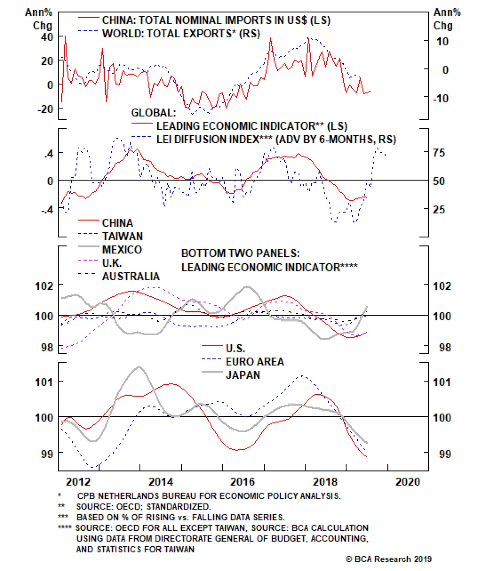
Right now, the steady drumbeat of weakening cyclical global growth indicators is fueling bullish bond sentiment, especially in the parts of the world most exposed to global trade like Europe. Looking ahead, however, we may get the first test of Negative…