Global

Feature Recommended Allocation
Monthly Portfolio Update: How To Position For The End Game
Monthly Portfolio Update: How To Position For The End Game
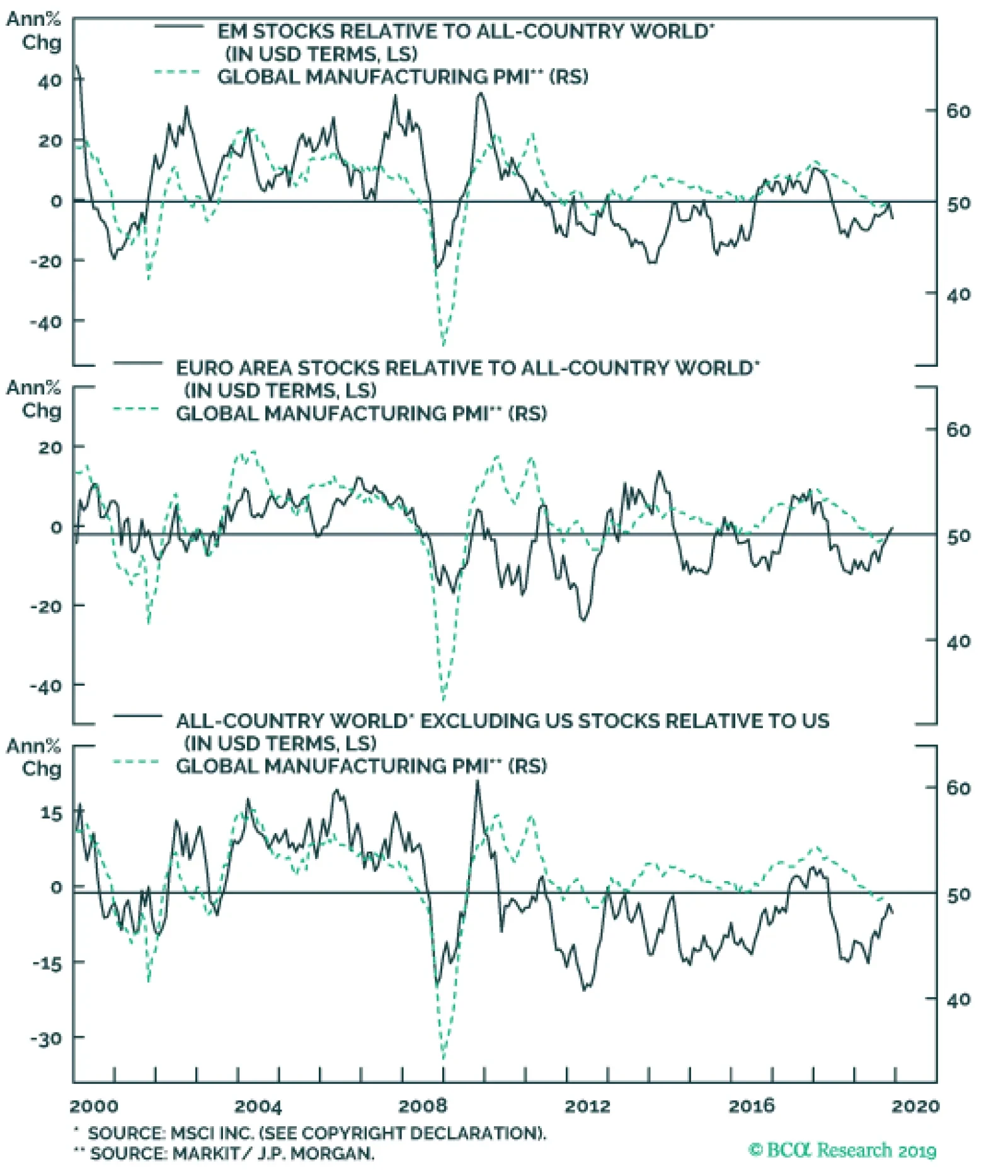
In late November, BCA Research published its 2020 Outlook titled Heading Into The End Game, an annual discussion between BCA’s managing editors and the firm’s longstanding clients Mr. and Ms X.1 We recommend GAA clients read that document for a full analysis of the macro and investment environment we expect in 2020. In this Monthly Portfolio Outlook, we focus on portfolio construction: how we would recommend positioning a global multi-asset portfolio for the 12-month investment horizon in light of that analysis. First, a brief summary of the BCA macro outlook. We believe the global manufacturing cycle is starting to bottom out, partly because of its usual periodicity of 18 months from peak to trough, and also because of easier financial conditions, and some moderate fiscal and credit stimulus from China (Chart 1). Central banks will remain dovish next year despite accelerating growth. The Fed, in particular, worries that inflation expectations have become unanchored (Chart 2) and, moreover, will be reluctant to raise rates ahead of the US presidential election. This environment implies a moderate rise in long-term interest rates, with the US 10-year Treasury yield rising to 2.2-2.5%. Chart 1Reasons To Expect A Rebound
Reasons To Expect A Rebound
Reasons To Expect A Rebound
Chart 2Unanchored Inflation Expectations Worry The Fed
Unanchored Inflation Expectations Worry The Fed
Unanchored Inflation Expectations Worry The Fed
For an asset allocator, this combination of an improving manufacturing cycle and easy monetary policy looks like a very positive environment for risk assets (Chart 3). We, therefore, remain overweight equities and underweight fixed income. We have discussed over the past few months the timing to turn more risk-on and pro-cyclical in our recommendations.2 Since we are increasingly confident about the probability of the manufacturing cycle turning up, this is the time to make that change. Consequently, the shifts we are recommending in our global portfolio, shown in the Recommended Allocation table and discussed in detail below, add to its beta (Chart 4). Chart 3A Positive Environment For Risk Assets
A Positive Environment For Risk Assets
A Positive Environment For Risk Assets
Chart 4Raising The Beta Of Our Portfolio
Raising The Beta Of Our Portfolio
Raising The Beta Of Our Portfolio
Chart 5Some Signs Of Risk-On Still Missing
Some Signs Of Risk-On Still Missing
Some Signs Of Risk-On Still Missing
Nonetheless, we still have some concerns. China’s stimulus (particularly credit growth) remains half-hearted compared to previous cyclical rebounds in 2012 and 2016. We expect a “phase one” ceasefire in the trade war. But even that is not certain, and it would not anyway solve the long-term structural disputes. To turn fully risk-on, we would want to see signs of a clear rebound in commodity prices and a depreciation of the US dollar, which have not yet happened (Chart 5). The 2020 Outlook proposed some milestones to monitor whether our scenario is playing out and whether we should turn more or less risk-on. We summarize these milestones in Table 1. Given these uncertainties, to hedge our pro-cyclical positioning we continue to recommend an overweight in cash, and we are instituting an overweight position in gold. Table 1Milestones For 2020
Monthly Portfolio Update: How To Position For The End Game
Monthly Portfolio Update: How To Position For The End Game
Chart 6Recessions Are Caused By Inflation Or Debt
Recessions Are Caused By Inflation Or Debt
Recessions Are Caused By Inflation Or Debt
How will this cycle end? All recessions in modern history have been caused either by a sharp rise in inflation, or by a debt-fueled asset bubble (Chart 6). The Fed will likely fall behind the curve at some point as, after further tightening in the labor market, inflation starts to pick up. How the Fed reacts to that will determine what triggers the recession. If – as is most likely – it lets inflation run, that could blow up an asset bubble (and it was the bursting of such bubbles which caused the 2000 and 2007 recessions); if it decides to tighten monetary policy to kill inflation, the recession would look more like those of the 1970s and 1980s. But it is hard to see either happening over the next 12-18 months. Equities: As part of our shift to a more pro-risk, pro-cyclical stance, we are cutting US equities to underweight, and raising the euro zone to overweight, and Emerging Markets and the UK to neutral. US equities have outperformed fairly consistently since the Global Financial Crisis (Chart 7) – except during the two periods of accelerating global growth, in 2012-13 (when Europe did better) and 2016-17 (when EM particularly outperformed). The US today is expensive, particularly in terms of price/sales, which looks more expensive than the P/E ratio because the profit margin is at a record high level (Chart 8). The upside for US stocks in 2020 is likely to be limited. In 2019 so far, US equities have risen by 29% despite earnings growth close to zero. Multiples expanded because the Fed turned dovish, but investors should not assume further multiple expansion in 2020. Our rough model for US EPS growth points to around 8% next year (sales in line with nominal GDP growth of 4%, margins expanding by a couple of points, plus 2% in share buybacks). Add a dividend yield of 2%, and US stocks might give a total return of 10% or so. Chart 7US Doesn't Always Outperform
US Doesn't Always Outperform
US Doesn't Always Outperform
Chart 8US Equities Are Expensive
US Equities Are Expensive
US Equities Are Expensive
To play the cyclical rebound, we prefer euro zone stocks over those in EM or Japan. Euro zone stocks have a higher weighting in sectors we like such as Financials and Industrials (Table 2). European banks, in particular, look attractively valued (Chart 9) and offer a dividend yield of 6%, something investors should find appealing in this low-yield world. EM is more closely linked to China and commodities prices, which are not yet sending strong positive signals. We worry about the excess of debt in EM (Chart 10), which remains a structural headwind: the IMF and World Bank put total external EM debt at $6.8 trillion (Chart 11). Table 2Equity Sector Composition
Monthly Portfolio Update: How To Position For The End Game
Monthly Portfolio Update: How To Position For The End Game
Chart 9Euro Zone Banks Are Especially Cheap
Euro Zone Banks Are Especially Cheap
Euro Zone Banks Are Especially Cheap
Chart 10EM Debt Remains A Headwind
EM Debt Remains A Headwind
EM Debt Remains A Headwind
Japan is another likely beneficiary of a cyclical recovery. But, before we turn positive, we want to see (1) signs of a stabilization of consumption after the recent tax rise (retail sales fell by 7% year-on-year in October), and (2) clarification of a worrying new investment law (which will require any investor which intends to “influence management” to get prior government approval before buying as little as a 1% stake in many sectors). For an asset allocator this combination of an improving manufacturing cycle and easy monetary policy looks very positive for risk assets. We raise the UK to neutral. The market has been a serial underperformer over the past few years, but this has been due to the weak pound and derating, rather than poor earnings growth (Chart 12). It now looks very cheap and, with the risk of a no-deal Brexit off the table, sterling should rebound further. The UK is notably overweight the sectors we like (Table 2). However, political risk makes us limit our recommendation to neutral. Although the Conservatives look likely to win a majority in this month’s general election, which will allow them to push through the negotiated Brexit deal, subsequent arguments over the future trade relationship with the EU will be divisive. Chart 116.8 Trillion In EM External Debt
$6.8 Trillion In EM External Debt
$6.8 Trillion In EM External Debt
Chart 12The UK Has Been Derated Since 2016
The UK Has Been Derated Since 2016
The UK Has Been Derated Since 2016
Fixed Income: We remain underweight government bonds. Stronger economic growth is likely to push up long-term rates (Chart 13). Nonetheless, the rise in yields should be limited. The Fed looks to be on hold for the next 12 months, but the futures market is not far away from that view: it has priced in only a 60% probability of one rate cut over that time. The gap between market expectations and what the Fed actually does is what our bond strategists call the “golden rule of bond investing”. US inflation is also likely to soften over the next few months due to the lagged effect of this year’s weaker growth and appreciating dollar. We do not expect the 10-year US Treasury to rise above 2.5% – the current FOMC estimate of the long-run equilibrium level of short-term rates (Chart 14). Chart 13Growth Will Push Up Rates...
Growth Will Push Up Rates...
Growth Will Push Up Rates...
Chart 14...But Only As Far As 2.5%
...But Only As Far As 2.5%
...But Only As Far As 2.5%
Within the fixed-income universe, we remain positive on corporate credit. But US investment-grade bond spreads are no longer attractive and so we downgrade them to neutral (Chart 15). Investors looking for high-quality bond exposure should prefer Agency MBS, which trade on an attractive spread relative to Aa- and A-rated corporate bonds. European IG should do better since spreads are not so close to historical lows, risk-free rates should rise less than in the US, and because the ECB is increasing its purchases of corporate bonds. Chart 15US IG Spreads Are Close To Historical Lows
Monthly Portfolio Update: How To Position For The End Game
Monthly Portfolio Update: How To Position For The End Game
Chart 16US Caa Bonds Have Some Catching Up To Do
The Puzzling Case Of Caa-Rated Junk Bonds US Caa Bonds Have Some Catching Up To Do
The Puzzling Case Of Caa-Rated Junk Bonds US Caa Bonds Have Some Catching Up To Do
We continue to like high-yield bonds, both in the US and Europe. But we would suggest moving down the credit curve and increasing the weight in Caa-rated bonds. These have underperformed this year (Chart 16), mainly because of technical factors such as their overweight in the energy sector and relatively smaller decline in duration.3 With a stronger economy and rising oil prices, they should catch up to their higher-rated HY peers in 2020. To play the cyclical rebound, we prefer euro zone stocks over those in EM or Japan. Currencies: Since the US dollar is a counter-cyclical currency (Chart 17), we would expect it to weaken against more cyclical currencies such as the euro, and commodity currencies such as the Australian dollar and Canadian dollar. But it should appreciate relative to the yen and Swiss franc, which are the most defensive major currencies. We expect EM currencies to continue to depreciate. Most emerging markets are experiencing disinflation (Chart 18), which will push central banks to cut rates and inject liquidity into the banking system. This will tend to weaken their currencies. Overall, we are neutral on the US dollar. Chart 17The Dollar Is A Counter-Cyclical Currency
The Dollar Is A Counter-Cyclical Currency
The Dollar Is A Counter-Cyclical Currency
Chart 18Disinflation Will Push EM Currencies Down Further
Disinflation Will Push EM Currencies Down Further
Disinflation Will Push EM Currencies Down Further
Commodities: Industrials metals prices are closely linked to Chinese stimulus (Chart 19). A moderate recovery in Chinese growth should be a positive, and so we raise our recommendation to neutral. But with question-marks still lingering over the strength of the rebound in the Chinese economy, we would not be more positive than that. Oil prices should see moderate upside over the next 12 months, with supply tight and demand growth recovering in line with the global economy. Our energy strategists forecast Brent crude to average $67 a barrel in 2020 (compared to a little over $60 today). Chart 19Metals Prices Depend On China
Metals Prices Depend On China
Metals Prices Depend On China
Chart 20Gold: Short-Term Negatives, But Remains A Good Hedge
Gold: Short-Term Negatives, But Remains A Good Hedge
Gold: Short-Term Negatives, But Remains A Good Hedge
Gold looks a little overbought in the short term, and less monetary stimulus and a rise in rates next year would be negative factors (Chart 20). Nonetheless, we see it as a good hedge against our positive economic view going awry, and against geopolitical risks. If central banks do decide to let economies run hot next year and ignore rising inflation, gold could do particularly well. We, therefore, raise our recommendation to overweight on a 12-month horizon. Garry Evans, Senior Vice President Chief Global Asset Allocation Strategist garry@bcaresearch.com Footnotes 1 Please see "Outlook 2020," dated November 22 2019, available at bcaresearch.com 2 Please see, for example, last month’s GAA Monthly Portfolio Update, “Looking For The Turning-Point,” dated November 1, 2019, available at gaa.bcaresearch.com 3 For a more detailed explanation, please see US Bond Strategy Weekly Report, “Caa-Rated Bonds: Warning Signs Or Buying Opportunity,” dated 26 November 2019, available at usbs.bcaresearch.com GAA Asset Allocation
Our decision to upgrade non-US equities stems from the conviction that global growth has turned the corner. Manufacturing has been at the heart of the global slowdown. Manufacturing cycles tend to last about three years – 18 months of weaker growth…
Highlights Investors should remain overweight global stocks relative to bonds over the next 12 months and begin shifting equity exposure towards non-US markets. Bond yields will rise next year as global growth picks up, while the dollar will sell off. The extent to which bond yields increase over the long term depends on whether inflation eventually stages a comeback. Today’s high debt levels could turn out to be deflationary if they curtail spending by overstretched households, firms, and governments. However, high debt levels could also prompt central banks to engineer higher inflation in order to reduce the real burden of debt obligations. Which of these two effects will win out depends on whether central banks are able to gain traction over the economy. This ultimately boils down to whether the neutral rate of interest is positive or negative in nominal terms. While there is little that policymakers can do to alter certain drivers of the neutral rate such as the trend rate of economic growth, they do have control over other drivers such as the stance of fiscal policy. Ironically, a structural shift towards easier fiscal policy could lead to a decline in government debt-to-GDP ratios if higher inflation, together with central bankers' reluctance to raise nominal rates, pushes real rates down far enough. This suggests that the endgame for today’s high debt levels is likely to be overheated economies and rising inflation. Stay Bullish On Stocks But Shift Towards Non-US Equities We returned to a cyclically bullish stance on global equities following the stock market selloff late last year, having temporarily moved to the sidelines in June 2018. We have remained overweight global equities throughout 2019. Two weeks ago, we increased our pro-cyclical bias by upgrading non-US stocks within our recommended equity allocation at the expense of their US peers. Our decision to upgrade non-US equities stems from the conviction that global growth has turned the corner. Manufacturing has been at the heart of the global slowdown. As we have often pointed out, manufacturing cycles tend to last about three years – 18 months of weaker growth followed by 18 months of stronger growth (Chart 1). The current slowdown began in the first half of 2018, and right on cue, the recent data has begun to improve. The global manufacturing PMI has moved off its lows, with significant gains seen in the new orders-to-inventories component. Global growth expectations in the ZEW survey have rebounded. US durable goods orders surprised on the upside in October. The regional Fed manufacturing surveys have also brightened, suggesting upside for the ISM next week (Chart 2). Chart 1A Fairly Regular Three-Year Manufacturing Cycle
A Fairly Regular Three-Year Manufacturing Cycle
A Fairly Regular Three-Year Manufacturing Cycle
Chart 2Some Manufacturing Green Shoots
Some Manufacturing Green Shoots
Some Manufacturing Green Shoots
Unlike in 2016, China has not allowed a major reacceleration in credit growth this year. Instead, fiscal policy has been loosened significantly. The official general government deficit has increased from around 3% of GDP in mid-2018 to 6.5% of GDP at present. The augmented budget deficit – which includes spending through local government financing vehicles and other off-balance sheet expenditures – is on track to reach nearly 13% of GDP in 2019. This is a bigger deficit than during the depths of the Great Recession (Chart 3). As a result of all this fiscal easing, the combined Chinese credit/fiscal impulse has continued to move up. It leads global growth by about nine months (Chart 4). Chart 3China Has Been Stimulating, Fiscally
China Has Been Stimulating, Fiscally
China Has Been Stimulating, Fiscally
Chart 4Chinese Stimulus Should Boost Global Growth
Chinese Stimulus Should Boost Global Growth
Chinese Stimulus Should Boost Global Growth
The dollar tends to weaken when global growth strengthens (Chart 5). The combination of stronger global growth and a softer dollar will disproportionately benefit cyclical equity sectors. Financials will also gain thanks to steeper yield curves (Chart 6). The sector weights of non-US stock markets tend to be more tilted towards deep cyclicals and financials. As a consequence, non-US stocks typically outperform when global growth picks up (Chart 7). Chart 5The Dollar Is A Countercyclical Currency
The Dollar Is A Countercyclical Currency
The Dollar Is A Countercyclical Currency
Chart 6Steeper Yield Curves Will Benefit Financials
Steeper Yield Curves Will Benefit Financials
Steeper Yield Curves Will Benefit Financials
In addition, valuations favor stocks outside the US. Non-US equities currently trade at 13.8-times forward earnings, compared to 18.1-times for the US. The valuation gap is even greater if one looks at price-to-book, price-to-sales, and other measures (Chart 8). Chart 7Non-US Equities Usually Outperform When Global Growth Improves
Non-US Equities Usually Outperform When Global Growth Improves
Non-US Equities Usually Outperform When Global Growth Improves
Chart 8US Stocks Are Relatively More Expensive
US Stocks Are Relatively More Expensive
US Stocks Are Relatively More Expensive
Trade War Remains A Key Risk The US-China trade war remains a key risk to our bullish equity view. President Trump continues to send conflicting signals about the status of the talks. He complained last week that Beijing is not “stepping up” in finalizing a phase 1 agreement, adding that China wants a deal “much more than I do.” This Wednesday he struck a more optimistic tone, saying that negotiators were in the “final throes” of deal. However, he made this statement on the same day that he decided to sign the Hong Kong Human Rights and Democracy Act into law, a decision that was bound to antagonize China. According to our BCA geopolitical team, Trump had little choice but to sign the bill. The Senate approved it unanimously, while the House voted for it 417-1. Failure to sign it would have resulted in an embarrassing veto by the Senate. The key point is that the new law does not force Trump to take any immediate actions against China. This suggests that the trade talks will continue. In fact, from China's point of view, Congress’ desire to pass a Hong Kong bill may provide a timely reminder that getting a deal done with Trump now may be preferable to waiting until after the election and potentially facing someone like Elizabeth Warren who is likely to make human rights a key element of any deal to roll back tariffs. Waiting For Inflation If global growth accelerates next year, history suggests that bond yields will rise (Chart 9). Looking further out, the extent to which bond yields will continue to increase depends on whether inflation ultimately stages a comeback. Right now, most of our forward-looking inflationary indicators remain well contained (Chart 10). However, this could change if falling unemployment eventually triggers a price-wage spiral. Chart 9Stronger Economic Growth Will Put Upward Pressure On Government Bond Yields
Stronger Economic Growth Will Put Upward Pressure On Government Bond Yields
Stronger Economic Growth Will Put Upward Pressure On Government Bond Yields
Chart 10An Inflation Breakout Is Not Imminent
An Inflation Breakout Is Not Imminent
An Inflation Breakout Is Not Imminent
Many investors are skeptical that such a price-wage spiral could ever emerge. They argue that automation, globalization, weak trade unions, and demographic changes make an inflationary outburst rather implausible. We have addressed these arguments in the past1 and will not delve into them in this report. Instead, we will focus on one argument that also gets a fair bit of attention, which is that high debt levels will prove to be deflationary. Are High Debt Levels Inflationary Or Deflationary? Total debt levels in developed economies are no lower today than they were during the Great Recession. While private debt has fallen, public debt has risen by roughly the same magnitude, leaving the overall debt-to-GDP ratio unchanged (Chart 11). Meanwhile, debt levels in emerging markets have risen substantially. A common rebuttal to any suggestion that inflation might rise over the medium-to-longer term is that high debt levels around the world will cause households, firms, and governments to pare back spending. While this may be true, it could also be argued that high debt levels could prompt central banks to engineer higher inflation in order to reduce the real burden of debt obligations. So which effect will win out? Given the choice, it is likely that most policymakers would opt for higher inflation. This is partly because high unemployment and fiscal austerity are politically toxic. It is also because falling prices make it very difficult to reduce real debt burdens. The experience of the Great Depression bears this out: Private debt declined by 25% in absolute terms between 1929 and 1933. However, due to the collapse in nominal GDP, the ratio of debt-to-GDP actually increased more in the first half of the 1930s than during the Roaring Twenties (Chart 12). Chart 11Global Debt Levels Remain High
Global Debt Levels Remain High
Global Debt Levels Remain High
Chart 12The Experience Of The Great Depression Shows Deleveraging Is Impossible Without Growth
The Debt Supercycle Endgame: Deflation Or Inflation?
The Debt Supercycle Endgame: Deflation Or Inflation?
Means, Motive And Opportunity Chart 13A Kinked Relationship: It Takes Time For Inflation To Break Out
The Debt Supercycle Endgame: Deflation Or Inflation?
The Debt Supercycle Endgame: Deflation Or Inflation?
There is a big difference between wanting to engineer higher inflation and being able to do so. The distinction between success and failure ultimately boils down to a seemingly technical question: Is the neutral rate of interest – the interest rate consistent with full employment and stable inflation – positive or negative in nominal terms? When the neutral rate is above zero, central banks can gain traction over the economy. Even if the neutral rate is only slightly positive, a zero rate would be enough to keep monetary policy in expansionary territory. When monetary policy is accommodative, the unemployment rate will tend to drop. Eventually the “kink” in the Phillips curve will be reached, resulting in higher inflation (Chart 13). In contrast, when the neutral rate is firmly below zero, monetary policy loses traction over the economy. Since there is a limit to how deeply negative policy rates can go before people decide to hold cash, the central bank could find itself out of ammunition. This could set off a vicious circle where high unemployment causes inflation to drift lower, leading to an increase in real rates. Rising real rates will then further curb spending, causing inflation to fall even more. Drivers Of The Neutral Rate Two of the more important determinants of the neutral rate of interest are the growth rate of the economy and the national savings rate. If either the savings rate rises or economic growth slows, the stock of fixed capital will tend to pile up in relation to GDP, leading to a higher capital-to-output ratio.2 As Chart 14 shows, this has already happened in Europe and Japan. An increase in the capital-to-GDP ratio will drag down the rate of return on capital. A lower interest rate will be necessary to ensure that the capital stock is fully utilized. Chart 14Capital Stock-To-Output Ratios Have Risen
The Debt Supercycle Endgame: Deflation Or Inflation?
The Debt Supercycle Endgame: Deflation Or Inflation?
Realistically, there is not much that policymakers can do to raise trend GDP growth. While looser immigration policy would allow for a faster expansion of labor force growth, this is politically contentious. Increasing productivity growth is also easier said than done. Fiscal Policy And The Neutral Rate In contrast, policymakers already have a ready-made mechanism for lowering the savings rate: fiscal policy. The fiscal balance is a component of national savings. If the government runs a larger budget deficit in order to finance tax cuts or higher transfer payments to households, national savings will decline and aggregate demand will rise. Is the endgame for today’s high debt levels deflation or inflation? The answer is inflation. Since one can think of the neutral rate as the interest rate that brings aggregate demand in line with the economy’s supply-side potential, anything that raises demand will also lift the neutral rate. Once the neutral rate has risen above the zero bound, monetary policy will gain traction again. This implies that central banks should never run out of ammunition in countries whose governments can issue debt in their own currencies. While higher inflation stemming from fiscal stimulus will erode the real value of private sector debt obligations, won’t the impact on total debt be offset by the increase in public debt? Not necessarily. True, larger budget deficits will raise the stock of government debt. However, nominal GDP will also rise on account of higher inflation. Standard debt sustainability equations state that the government debt-to-GDP ratio could actually fall if higher inflation pushes real policy rates down far enough. As discussed in Box 1, such an outcome is quite likely when inflation accelerates in response to an overheated economy, but the central bank nevertheless refrains from raising nominal rates. The Final Verdict We are finally ready to answer the question posed in the title of this report: Is the endgame for today’s high debt levels deflation or inflation? The answer is inflation. People with a 30-year fixed rate mortgage will always favor inflation over deflation. And there are more voters who owe mortgage debt than own mortgage debt. Chart 15Germany's Competitive Advantage Over The Rest Of The Euro Area Is Deteriorating
Germany's Competitive Advantage Over The Rest Of The Euro Area Is Deteriorating
Germany's Competitive Advantage Over The Rest Of The Euro Area Is Deteriorating
Politics is moving in a more populist direction. Whether it is left-wing populism of the Elizabeth Warren/Jeremy Corbyn variety or right-wing populism of the Donald Trump/Matteo Salvini variety, the result is usually bigger budget deficits and higher inflation. Even in those countries where populism has been slow to take hold, there may be pragmatic reasons for loosening fiscal policy. For example, Germany’s trade surplus with the rest of the euro area has fallen in half since 2007, largely because German unit labor costs have increased more than elsewhere (Chart 15). As Germany loses its ability to ship excess production to the rest of the world, it may end up having to rely more on easier fiscal policy to bolster demand. Of course, the path to higher inflation is paved with interest rates that stay lower for much longer than the economy needs to reach full employment. This means we are entering a period where first the US economy, and then many other economies, will start to overheat, and yet central banks will still refrain from tightening monetary policy until inflation rises well above their comfort zones. Such an environment will be positive for stocks for as long as it lasts, even if it eventually produces a mighty hangover. Peter Berezin Chief Global Strategist peterb@bcaresearch.com Box 1 When Does A Large Budget Deficit Lead To A Lower Government Debt-to-GDP Ratio?
The Debt Supercycle Endgame: Deflation Or Inflation?
The Debt Supercycle Endgame: Deflation Or Inflation?
Footnotes 1 Please see Global Investment Strategy Special Report, “1970s-Style Inflation: Could It Happen Again? (Part 2),” dated August 24, 2018. 2 This point can be seen through the lens of the widely used Solow growth model. In steady state, the desired level of investment in the model is given by the formula: I=(a/r)(n+g+d)Y where a denotes the output elasticity of capital, r is the real rate of interest, n is labor force growth, g is productivity growth, d is the depreciation rate, and Y is GDP. Savings is assumed to be a constant fraction of income, S=sY. Equating savings with investment yields: r=(a/s)(n+g+d). A decrease in the growth rate of the economy (n+g) shifts the investment schedule downward, leading to a lower equilibrium rate of interest. This initially makes investing in fixed capital more attractive than buying bonds. Over time, however, the marginal return on capital will fall as the capital stock expands in relation to GDP. Strategy & Market Trends MacroQuant Model And Current Subjective Scores
The Debt Supercycle Endgame: Deflation Or Inflation?
The Debt Supercycle Endgame: Deflation Or Inflation?
Strategic Recommendations Closed Trades
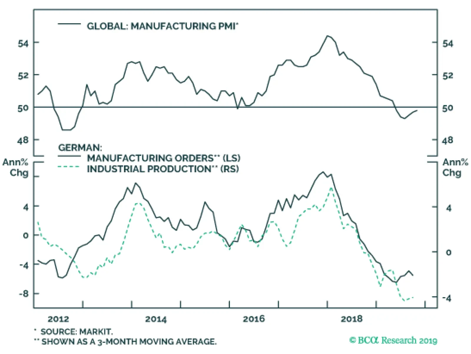
Next week, the global manufacturing PMI for November will be updated on Monday, providing the most up to date reading on the state of the world’s industrial sector. The small recovery in the PMI must continue, otherwise, our thesis of an economic recovery…
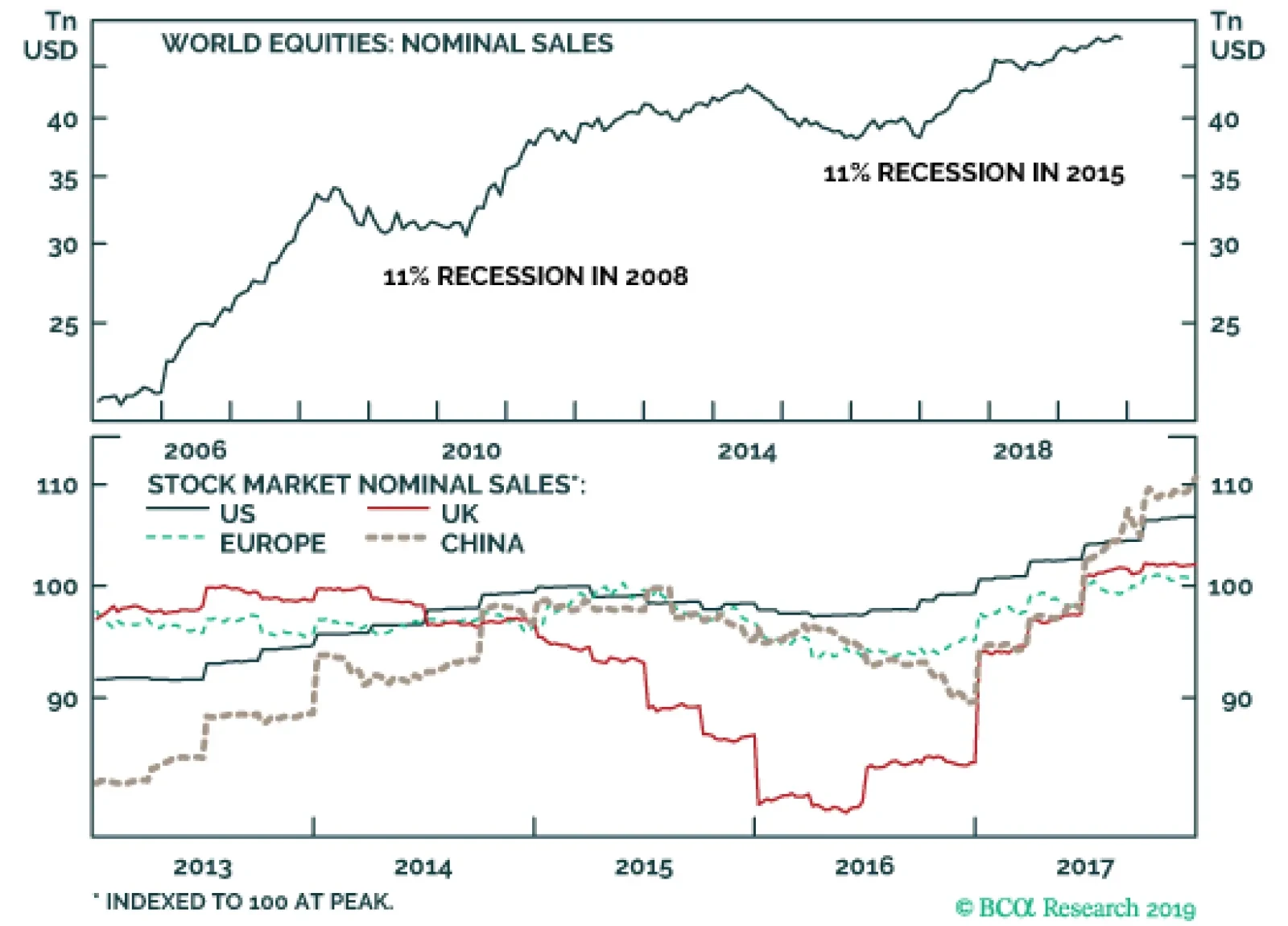
In 2015, the nominal sales of globally-listed companies shrank by -11.3 percent, marginally worse than the -11.0 contraction suffered during the Great Recession of 2008. But because few people are aware of the depth of this latter sales recession, we are…
An analysis on Brazil is available below. Feature Chart I-1Poor Performance By EM Stocks, Currencies And Commodities
bca.ems_wr_2019_11_28_s1_c1
bca.ems_wr_2019_11_28_s1_c1
I had the pleasure of meeting again with a long-term BCA client Ms. Mea last week during my trip to Europe. Ms. Mea and I meet on a semi-annual basis, where she has the opportunity to query my analysis and view. In our latest meeting, she was more perplexed than usual by the global macro developments and financial market dynamics. Ms. Mea: All the seemingly positive news on the trade front is pushing up global share prices. In fact, a substantial portion -if not all -of the global equity price gains have occurred on days when there has been positive news surrounding the US-China trade negotiations. Given EM financial markets were the most damaged by the trade war, one would have thought that EM markets would outperform in a rally stemming from progress in negotiations. Yet this has not occurred. EM currencies have failed to advance (a number of currencies are in fact breaking down), EM sovereign credit spreads are widening and the relative performance of EM vs. DM share prices has relapsed (Chart I-1). What is causing this disconnect? Answer: The disconnect is due to a somewhat false narrative that the global trade and manufacturing recession as well as the EM/China slowdown were primarily caused by the US-China trade confrontation. The principal reason behind the global manufacturing and trade recession has been a deceleration in Chinese domestic demand. The latter can only partially be attributed to the US-China trade tariffs and tensions. Chart I-2 illustrates that mainland exports are not contracting while imports excluding processing trade1 are down 5% from a year ago. This implies that China’s growth slump has not been due to a contraction in its exports but rather due to weakness in its domestic demand. The principal reason behind the global manufacturing and trade recession has been a deceleration in Chinese domestic demand. The basis as to why mainland exports have held up so well is because Chinese exporters have been re-routing their shipments to the US via other countries such as Vietnam and Taiwan. Critically, the key force driving EM currencies and risk assets has been Chinese imports (Chart I-3). Mainland imports continue to shrink, with no recovery in sight. This is the reason why EM risk assets and currencies have performed so poorly, even amid the global risk-on environment. Chart I-2Chinese Imports Are Worse Than Exports
Chinese Imports Are Worse Than Exports
Chinese Imports Are Worse Than Exports
Chart I-3China Imports Drive EM Currencies
bca.ems_wr_2019_11_28_s1_c3
bca.ems_wr_2019_11_28_s1_c3
Ms. Mea: Are you implying that a ceasefire in the trade war will not help Chinese growth rebound, and in turn support EM economies? The “Phase One” agreement and possible reductions in US tariffs on imports from China may help the Middle Kingdom’s exports, but not its imports. Crucially, the Chinese authorities will likely be reluctant to augment their credit and fiscal stimulus if there is a “Phase One” deal with the US. Absent greater stimulus, China’s domestic demand is unlikely to stage a swift recovery. In the case of a “Phase One” agreement, a mild improvement in business confidence in China and worldwide is likely, but a major upswing is doubtful. The basis is that business people around the world have witnessed the struggles faced by the US and China in their negotiations. They will likely doubt the ability of both nations to reach a structural resolution – and rightly so. Investors should realize that the Chinese economy does not depend on exports to the US nearly as much as is commonly believed. Importantly, global investors are miscalculating China’s negotiating strategy and tactics. We put much greater odds than many other investors on the possibility that China will continue to drag out the negotiations without signing the “Phase One” agreement. This could easily derail the global equity rally. Investors should realize that the Chinese economy does not depend on exports to the US nearly as much as is commonly believed. China’s shipments to the US have been around 3.3% of GDP, even before the trade war began. The value-added to the economy/income generated from China’s exports to the US is less than 3% of its GDP. In contrast, capital spending accounts for the largest share (42%) of China’s GDP. In turn, investment outlays are driven by the credit cycle and fiscal spending, rather than by exports. Chart I-4China: Stimulus And Business Cycle
bca.ems_wr_2019_11_28_s1_c4
bca.ems_wr_2019_11_28_s1_c4
Ms. Mea: Turning to stimulus in China, the authorities have been easing for about a year. By now, the cumulative effect of this stimulus should have begun to revive the mainland’s domestic demand. Why do you still think China’s business cycle has not reached a bottom? Answer: Indeed, our credit and fiscal spending impulse has been rising since January. Based on its historical relationship with business cycle variables – it leads those variables by roughly nine months – China’s growth should have troughed in August or September (Chart I-4). However, the time lags between the credit and fiscal spending impulse and economic cycle are not constant as can be seen in Chart I-4. On average, the lag has been nine months but has also varied from zero (at the trough in early 2009) to 18 months (at the peak in 2016-‘17). Relationships in economics – as opposed to those in hard sciences – are not constant and stable. Rather, correlations and time lags between variables vary substantially over time. In addition, the magnitude of stimulus is not the only variable that should be taken into account. The potential multiplier effect is also significant. One way to proxy the multiplier effect is via the marginal propensity to spend by households and companies. In our opinion, the prime cause behind households’ and businesses’ reluctance to spend is the weak property market. Our proxies for Chinese marginal propensity to spend by companies and households have been falling (Chart I-5). This entails that households and businesses in China remain downbeat, which caps their expenditures, in turn offsetting the positive impact of stimulus. In our opinion, the prime cause behind households’ and businesses’ reluctance to spend is the weak property market. Without rapidly rising property prices and construction volumes, boosting sentiment and growth will prove challenging. We discussed the current conditions and outlook of China’s property market in last week’s report. Construction is the single largest sector of the mainland economy, and it is in recession: floor area started and under construction are all shrinking (Chart I-6). Chart I-5China: A Weak Multiplier Effect
China: A Weak Multiplier Effect
China: A Weak Multiplier Effect
Chart I-6China Construction Is In Recession
China Construction Is In Recession
China Construction Is In Recession
It is difficult to envision an improvement in manufacturing and a rebound in demand for commodities/materials and industrial goods without a recovery in construction. Notably, Chart I-6 displays the most comprehensive data on construction, as it encompasses all residential and non-residential construction by property developers and all other entities. Ms. Mea: Why are some global business cycle indicators turning up if, as you argue, the global manufacturing slowdown originated from Chinese domestic demand and the latter has not yet turned around? Answer: At any point of the business cycle, it is possible to find data that point both up and down. Our ongoing comprehensive review of global business cycle data leads us to conclude that the improvement is evident only in a few circumstances, and is not broad-based. In particular: In China and the rest of EM, there is no domestic demand recovery at the moment. China and EM ex-China capital goods imports are shrinking (Chart I-7). Chinese consumer spending is also sluggish (Chart I-8). The rise in China’s manufacturing Caixin PMI over the past several months is an aberration. Chart I-7EM/China Capex Is Very Weak
EM/China Capex Is Very Weak
EM/China Capex Is Very Weak
Chart I-8No Recovery For Chinese Consumers
No Recovery For Chinese Consumers
No Recovery For Chinese Consumers
In EM ex-China, Korea and Taiwan, narrow and broad money growth are underwhelming (Chart I-9). These developments signify that EM policy rate cuts have not yet boosted money/credit and domestic demand. We elaborated on this in more detail in our recent report. The basis for such poor transmission is banking-system health in many developing countries. Banks remain saddled with non-performing loans (NPLs). The need to boost provisions and fears of more NPLs continues to make banks reluctant to lend. Besides, real (inflation-adjusted) lending rates are high, discouraging credit demand. In the US and euro area, consumption – outside of autos – as well as money and credit growth have never slowed in this cycle. The slowdown has largely been due to exports and the auto sector. The latter may be bottoming in the euro area (Chart I-10). This might be behind the improvement in some business surveys in Europe. Chart I-9EM Ex-China: Money Growth Is At Record Low
EM Ex-China: Money Growth Is At Record Low
EM Ex-China: Money Growth Is At Record Low
Chart I-10Euro Area’s Auto Sales: Is The Worst Over?
Euro Area’s Auto Sales: Is The Worst Over?
Euro Area’s Auto Sales: Is The Worst Over?
European business survey data are mixed, but the weakest segment - manufacturing – remains lackluster. In particular, Germany’s IFO index for business expectations and current conditions in manufacturing have not improved (Chart I-11, top panel). Similarly, the Swiss KOF economic barometer remains downbeat (Chart I-11, top panel). The only improvement is in Belgian business confidence, and a mild pickup in the euro area manufacturing PMI (Chart I-11, bottom panel). Chart I-11European Manufacturing And Business Confidence
European Manufacturing And Business Confidence
European Manufacturing And Business Confidence
In the US, shipping and carload data are rather grim. They are not corroborating the marginal improvement in the US manufacturing PMI. Overall, at this point there are no signs that domestic demand is recovering in China and the rest of EM, which have been the epicenter of the slowdown. The improvement is limited to some data in the US and Europe. Consistently, US and European share prices have been surging, while EM equities have dramatically underperformed. Ms. Mea: What about lower interest rates driving multiples expansion in both DM and EM equities? Answer: Concerning multiples expansion, our general framework is as follows: So long as corporate profits do not contract, lower interest rates will likely lead to equity multiples expansion. However, when corporate earnings shrink, the latter overwhelms the positive effect of a lower discount rate on multiples, and share prices drop along with lower interest rates. DM corporate profits are flirting with contraction, but are not yet contracting meaningfully. Hence, it is sensible that US and European stocks have experienced multiples expansion. In contrast, EM corporate earnings are shrinking at a rate of 10% from a year ago as illustrated in Chart I-12. The basis for an EM profit recession is the downturn in Chinese domestic demand and consequently imports. EM per-share earnings correlate much better with Chinese imports (Chart I-13, top panel) than US ones (Chart I-13, bottom panel). Chart I-12EM Profits And Share Prices
EM Profits And Share Prices
EM Profits And Share Prices
Chart I-13EM EPS Is Driven By China Not The US
EM EPS Is Driven By China Not The US
EM EPS Is Driven By China Not The US
In fact, we have documented numerous times in our reports that EM currencies and share prices correlate well with China’s business cycle/global trade/commodities prices, more so than with US bond yields. This does not mean that EM share prices are insensitive to interest rates. They are indeed sensitive to their own borrowing costs, but not to US Treasury yields. Chart I-14 demonstrates that EM share prices move in tandem with inverted EM sovereign US dollar bond yields and EM local currency bond yields. Similarly, emerging Asian share prices correlate with inverted high-yield Asian US dollar corporate bond yields (Chart I-14, bottom panel). Chart I-14EM Share Prices And EM Bond Yields
EM Share Prices And EM Bond Yields
EM Share Prices And EM Bond Yields
Chart I-15Chinese Bond Yields Herald Relapse In EM Stocks And Currencies
bca.ems_wr_2019_11_28_s1_c15
bca.ems_wr_2019_11_28_s1_c15
In short, EM share prices typically sell off when EM borrowing costs rise – regardless if it is driven by mounting US Treasury yields or widening credit spreads. Looking forward, exchange rates hold the key. A relapse in EM currencies will push up both the US dollar and local currency bond yields in many EMs. That will in turn warrant a setback in EM share prices. Ms. Mea: What about the correlation between EM performance and Chinese local rates? Answer: This is an essential relationship. Chart I-15 demonstrates that EM share prices and currencies have a strong positive correlation with local interest rates in China. The rationale is that all of them are driven by China’s business cycle. Relapsing interest rates in China are presently sending a bearish signal for EM risk assets and currencies. Ms. Mea: What does all this mean for investment strategy? A few weeks ago, you wrote that if the MSCI EM equity US dollar index breaks above 1075, you would reverse your recommended strategy. How does this square with your fundamental analysis that is still downbeat? Answer: My fundamental analysis on EM/China has not changed: I do not believe in the sustainability of this EM rebound in general, and EM outperformance versus DM in particular. The key risk to my strategy on EM stems from the US and Europe. It is possible that US and European share prices continue to rally. EM share prices typically sell off when EM borrowing costs rise – regardless if it is driven by mounting US Treasury yields or widening credit spreads. Notably, the high-beta segments of the US equity market and the overall Euro Stoxx 600 index are flirting with major breakouts (Chart I-16A and I-16B). If these breakouts transpire, the up-leg in US and European share prices will be long-lasting. This will also drag EM share prices higher in absolute terms. This is why I have placed a buy stop on the EM equity index. Chart I-16AUS High-Beta Stocks
High-Beta Stocks
High-Beta Stocks
Chart I-16BEuropean Equities: At A Critical Juncture
European Equities: At A Critical Juncture
European Equities: At A Critical Juncture
That said, I have a strong conviction that EM will continue to underperform DM, even in such a scenario. Hence, I continue to recommend underweighting EM versus DM in both global equity and credit portfolios. As we have recently written in detail, the global macro backdrop and financial market dynamics in such a scenario will resemble 2012-2014, when EM currencies depreciated, commodities prices fell and EM share prices massively underperformed DM ones (Chart I-17). Further, I am not arguing that the current global trade and manufacturing downtrends will persist indefinitely. The odds are that the global business cycle, including China’s, will bottom sometime next year. The point is that EM share prices have decoupled from fundamentals – namely corporate earnings growth – since January. The point is that EM share prices have decoupled from fundamentals – namely corporate earnings growth – since January (please refer to Chart I-12 on page 8). This is an unprecedented historical gap, making EM stocks, currencies and credit markets vulnerable to continued disappointments in EM corporate profitability. Ms. Mea: What market signals give you confidence in poor EM performance going forward? Answer: Even though the S&P 500 has broken to new highs, multiple segments of EM financial markets have posted extremely disappointing performance. These include: Small-cap stocks in EM overall and emerging Asia as well as the EM equal-weighted equity index have struggled to rally (Chart I-18). Chart I-17EM Underperformed During 2012-14 Bull Market
bca.ems_wr_2019_11_28_s1_c17
bca.ems_wr_2019_11_28_s1_c17
Chart I-18Various EM Equity Indexes: Failure To Rally Is A Bad Omen
Various EM Equity Indexes: Failure To Rally Is A Bad Omen
Various EM Equity Indexes: Failure To Rally Is A Bad Omen
Various Chinese equity indexes – onshore and offshore, small and large – have failed to advance and continue to underperform the global equity index. EM ex-China currencies and industrial commodities prices have remained subdued (please refer to Chart I-1 on page 1). Ms. Mea: Would you mind reminding me of your country allocation across various EM asset classes such as equities, credit, currencies and fixed-income? Answer: Within an EM equity portfolio, our overweights are Mexico, Russia, central Europe, Korea and Thailand. Our equity underweights are Indonesia, the Philippines, Turkey, South Africa and Colombia. We continue recommending to short an EM currency basket including ZAR, CLP, COP, IDR, MYR, PHP and KRW. Today, we add the BRL to our short list (please refer to the section below on Brazil). As to the country allocation within EM local currency bonds and sovereign credit portfolios, investors can refer to our asset allocation tables below that are published at the end of each week’s report and are available on our web site. Arthur Budaghyan Chief Emerging Markets Strategist arthurb@bcaresearch.com Brazil: Deflationary Pressures Warrant A Weaker BRL The Brazilian real is breaking below its previous support. We recommend shorting the BRL against the US dollar. The primary macro risk in Brazil is not inflation but rather mounting deflationary pressures. Inflation has fallen to very low levels, to the bottom of the central bank’s target range (Chart II-1). Deflation or low inflation is dangerous when there are high debt levels. The Brazilian government is heavily indebted. With nominal GDP growth still below government borrowing costs and a primary budget balance at -1.3% of GDP, the public debt trajectory remains unsustainable as we discussed in previous reports (Chart II-2). Chart II-1Brazil: Undershooting Inflation Target
Brazil: Undershooting Inflation Target
Brazil: Undershooting Inflation Target
Chart II-2Public Debt Dynamics Are Still Not Sustainable
Public Debt Dynamics Are Still Not Sustainable
Public Debt Dynamics Are Still Not Sustainable
The cyclical profile of the economy is very weak as shown in Chart II-3. Tight fiscal policy and a drawdown of foreign exchange reserves have caused money growth to slow. That in turn entails a poor outlook for the economy, which will reinforce the deflationary trend. Accordingly, Brazil needs to reflate its economy to boost nominal GDP, which is the only scenario where the nation escapes a public debt trap. Yet, fiscal policy is straightjacketed by the spending cap rule, which stipulates that government spending can only grow at the previous year’s IPCA inflation rate. Federal government spending is set to grow only at the low nominal rate of 3.4% in 2020. Hence, monetary policy is the sole tool available for policymakers to reflate. Both bond yields and bank lending rates remain elevated in real terms. This hampers any recovery in the business cycle. Notably, the marginal propensity to spend by companies and consumers is declining, foreshadowing weaker economic activity ahead (Chart II-4). Chart II-3Brazil: The Economy Is Weak
Brazil: The Economy Is Weak
Brazil: The Economy Is Weak
Chart II-4Brazil: Propensity To Spend Is Declining
Brazil: Propensity To Spend Is Declining
Brazil: Propensity To Spend Is Declining
The central bank is determined to reduce interest rates further. As such, they cannot control the exchange rate. Indeed, the Impossible Trinity thesis states that in an economy with an open capital account (like in Brazil), the authorities cannot control both interest and exchange rates simultaneously. Minister of Economy Paulo Guedes stated in recent days that tight fiscal and easy monetary policies are consistent with a lower currency value. Brazilian policymakers are open to the idea of a weaker exchange rate and will not defend the real. Their currency market interventions are intended to smooth volatility in the exchange rate but not preclude depreciation. In fact, currency depreciation is another option to boost nominal growth that the nation desperately needs. Brazilian policymakers are open to the idea of a weaker exchange rate and will not defend the real. Their currency market interventions are intended to smooth volatility in the exchange rate but not preclude depreciation. Commodities prices remain an important driver of the Brazilian real (Chart II-5). These have failed to rebound amid the risk-on regime in global financial markets. This suggests that the path of least resistance for commodities prices is down, which is bad news for the real. Brazil’s current account deficit is widening and has reached 3% of GDP (Chart II-6). Notably, not only are export prices deflating but export volumes are also shrinking (Chart II-6, bottom panel). Chart II-5BRL And Commodities Prices
BRL And Commodities Prices
BRL And Commodities Prices
Chart II-6Widening Current Account Deficit
Widening Current Account Deficit
Widening Current Account Deficit
Chart II-7The BRL Is Not Cheap
The BRL Is Not Cheap
The BRL Is Not Cheap
Meanwhile, the nation’s foreign debt obligations – the sum of short-term claims, interest payments and amortization over the next 12 months – are at $190 billion, all-time highs. As the real depreciates, foreign currency debtors (companies and banks) will rush to acquire dollars or hedge their dollar liabilities. This will reinforce the weakening trend in the currency. Finally, the Brazilian real is not cheap - it is close to fair value (Chart II-7). Hence, valuation will not prevent currency depreciation. Bottom Line: We are initiating a short BRL / long US dollar trade. Investors should remain neutral on Brazil within EM equity, local bonds and sovereign credit portfolios. Investors with long-term horizon should consider the following strategy: long the Bovespa, short the real. This is a bet that Brazil will succeed in reflating the economy at the detriment of the currency. Arthur Budaghyan Chief Emerging Markets Strategist arthurb@bcaresearch.com Andrija Vesic Research Analyst andrijav@bcaresearch.com Footnotes 1 Processing trade includes imports of goods that undergo further processing before being re-exported. Equities Recommendations Currencies, Credit And Fixed-Income Recommendations
The Hidden Sales Recession Of 2015 In 2015, the nominal sales of global listed companies shrank by -11.3 percent, marginally worse than the -11.0 contraction suffered during the Great Recession of 2008. But because few people are aware of the depth of this latter sales recession, we are calling it the ‘hidden sales recession of 2015’ (Feature Chart). Chart I-1The Hidden Sales Recession Of 2015
The Hidden Sales Recession Of 2015
The Hidden Sales Recession Of 2015
Significantly, all of the major stock markets suffered sales recessions in 2015, even when their domestic economies were expanding healthily (Chart I-2). Which starkly illustrates that the performance of stock markets often has little, or no, connection with the performance of their domestic economies. Chart I-2All The Major Stock Markets Suffered Sales Recessions In 2015
All The Major Stock Markets Suffered Sales Recessions In 2015
All The Major Stock Markets Suffered Sales Recessions In 2015
The euro area and UK economies grew strongly in 2015, yet the nominal sales of listed European companies contracted by -7 percent. Meanwhile, the sales of listed companies in the US shrank -3 percent, and in China by -10 percent. However, among the major stock markets, the worst pain was felt by the UK stock market where total nominal sales plunged -20 percent (Charts 3-5). Chart I-3US Listed Companies' Sales Shrank 3 Percent Despite A Growing Economy
US Listed Companies' Sales Shrank 3 Percent Despite A Growing Economy
US Listed Companies' Sales Shrank 3 Percent Despite A Growing Economy
Chart I-4European Listed Companies' Sales Shrank 7 Percent Despite A Growing Economy
European Listed Companies' Sales Shrank 7 Percent Despite A Growing Economy
European Listed Companies' Sales Shrank 7 Percent Despite A Growing Economy
Chart I-5UK Listed Companies' Sales Shrank 20 Percent Despite A Growing Economy
UK Listed Companies' Sales Shrank 20 Percent Despite A Growing Economy
UK Listed Companies' Sales Shrank 20 Percent Despite A Growing Economy
The particularly sharp contraction in UK stock market sales, with their heavy exposure to the oil and resource sectors, points to the cause of the sales recession of 2015: the interrelated weakness in emerging markets, oil and other commodity prices, and a surging dollar. What Caused The Hidden Sales Recession Of 2015? In 2015, Chinese policymakers started tightening policy to lean against a putative credit bubble. This exacerbated a slowdown in Chinese growth that was already underway. In turn, China’s slowdown set off a domino effect in other emerging economies which relied on China as a major export market. Meanwhile, the Federal Reserve signalled its intention to exit its extended period of zero interest rate policy, arguing that extraordinarily easy monetary policy was no longer appropriate for a US economy that had returned to normality. On the other sides of the Atlantic and Pacific though, the ECB and the BoJ were moving monetary policy in the opposite direction, obsessed by the persistent undershoot of inflation relative to the two percent target. This combination of tighter monetary policy in the US combined with looser policy in the euro area and Japan precipitated a surge in the value of the dollar. The surging dollar worsened China’s problems. With the yuan pegged to the dollar, the stronger dollar hurt the competitiveness of Chinese companies. But when China loosened the peg in August 2015, it just unleashed another problem: capital outflows. The price of WTI plunged from a $107 peak in mid-2014 to just $27 in early 2016. Crucially, the synchronized slowdown across emerging economies hit the demand for commodities, catalysing a collapse in prices across the whole commodity complex. The price of WTI plunged from a $107 peak in mid-2014 to just $27 in early 2016 (Chart I-6); metal markets also suffered, the copper price fell from $7000 to $4500; as did agricultural commodities like soybeans whose prices almost halved. This collapse in commodity prices simply added further pressure on emerging economies that are major commodity producers, like Brazil. Chart I-6The Sales Recession Of 2015 Was About A Collapse In Prices In Key Sectors Of The Economy
The Sales Recession Of 2015 Was About A Collapse In Prices In Key Sectors Of The Economy
The Sales Recession Of 2015 Was About A Collapse In Prices In Key Sectors Of The Economy
In turn, the problems in the emerging economies and commodity complex set off other negative feedback loops that further hurt prices. For the significant portion of emerging market debt that is denominated in dollars, a stronger dollar meant a greater debt burden and danger of default. At the same time, the collapse in the oil price endangered the financial viability of the heavily indebted US shale oil producers and thereby their corporate bonds. To summarise, the stock market sales recession of 2015 was partly about a slowdown in sales volumes. But it was more about a collapse in the prices in certain key sectors of the economy, namely oil, materials, and industrials. And as nominal sales are the product of sales volumes and prices, the nominal sales of listed companies suffered as sharp a recession in 2015 as in 2008. Why Does The Hidden Sales Recession Of 2015 Matter Today? The experience of 2015 painfully illustrates that the nominal sales of the dominant companies in a stock market may have little, or no, connection with their domestic economy, or indeed with conventional measures of the global economy. The reason is that the stock market, which by definition only includes publicly listed companies, has different sector skews compared with the whole economy. This is particularly true for those European stock markets where sector skews make them over exposed to the oil, materials, and industrial sectors, whose output prices can show wild swings that swamp the impact of sales volumes. The years 2010-11 and 2017-18 witnessed a strong catch-up in listed companies’ nominal sales. But after this snapback phase, nominal sales revert to a more moderate trend-like rate of growth. Chart I-7After A Sales Recession, There Is A Snapback
After A Sales Recession, There Is A Snapback
After A Sales Recession, There Is A Snapback
There is another important message for today. After a sharp contraction in nominal sales caused by either volumes or prices plunging, as in 2008 and 2015, the first part of the recovery from overly-depressed levels tends to be the sharpest. This sharp snapback phase tends to last no more than two years. So the years 2010-11 and 2017-18 witnessed a strong catch-up in listed companies’ nominal sales. But after this snapback phase, nominal sales revert to a more moderate trend-like rate of growth (Chart I-7). Clearly, the sharp snapback phase is most powerful for the most beaten-up sectors during the nominal sales recession, such as energy and materials. For such ‘value cyclicals’, nominal sales growth tends to outperform that of the aggregate stock market in the snapback, and then underperform once the snapback is over (Chart I-8 and Chart I-9). Chart I-8Energy Outperforms In The Snapback, Then Underperforms
Energy Outperforms In The Snapback, Then Underperforms
Energy Outperforms In The Snapback, Then Underperforms
Chart I-9Materials Outperform In The Snapback, Then Underperform
Materials Outperform In The Snapback, Then Underperform
Materials Outperform In The Snapback, Then Underperform
Chart I-10Healthcare Underperforms In The Snapback, Then Outperforms
Healthcare Underperforms In The Snapback, Then Outperforms
Healthcare Underperforms In The Snapback, Then Outperforms
The corollary is that the sectors that did not suffer much during the sales recession, such as healthcare do not have a snapback phase. Hence, for such a ‘growth defensive’, nominal sales strongly underperform the aggregate market during the two year snapback, and then outperform once the snapback is over (Chart I-10). Let’s conclude with some brief investment thoughts. First, for mainstream stock markets, nominal sales and earnings can grow in 2020, but the growth rate will not be as strong as in the snapback phase of 2017-18. Without any support from lower bond yields and the associated multiple expansion for stocks, this means that stock markets are likely to deliver low single digit returns. Second, value cyclicals such as energy and materials outperformed in the snapback phase from 2017 to mid-2019, but now appear to be rolling over into an underperformance phase. Structurally underweight energy and materials. For mainstream stock markets, nominal sales and earnings can grow in 2020, but the growth rate will not be as strong as in the snapback phase of 2017-18. Third, a growth defensive such as healthcare underperformed sharply in the snapback phase, but now appears to be back in an outperformance phase. Stay structurally overweight healthcare. Dhaval Joshi Chief European Investment Strategist dhaval@bcaresearch.com
Highlights Global High-Yield: The widening of US Caa-rated high-yield spreads is narrowly focused in Energy-related companies. The conditions for a spillover into the broader junk bond market (tight monetary policy, tightening lending standards & deteriorating corporate health) are not currently in place. Stay overweight high-yield in both the US and euro area, where Caa-rated spreads have also widened. Australia: A sluggish economy and soggy inflation, with little evidence of an imminent turnaround, imply that the Reserve Bank of Australia may not be done with its rate cutting cycle. Maintain an overweight stance on Australian sovereign debt relative to global benchmarks. Feature There’s Nothing To “Caa” Here The clouds of pessimism on global growth, and financial markets, continue to slowly dissipate. The global manufacturing PMI has clearly bottomed, our rising global leading economic indicator is signaling more upside for the first half of 2020, equity markets worldwide are grinding higher, volatility is subdued, while corporate credit spreads in the US and Europe remain generally tight. Yet within the corporate bond market, a peculiar dynamic has emerged. We do not see a reason to extrapolate the weakness in lower-rated US junk bonds into a broader macro issue for the corporate bond market, and the US economy. The option-adjusted spread (OAS) for the overall Bloomberg Barclays US high-yield (HY) index now sits at 376bps. While this spread is relatively narrow from a longer-term perspective, investors may have become more discerning about credit risk. Lower-rated HY has dramatically underperformed higher-rated HY debt of late, with the US Caa-rated OAS now sitting at 985bps compared to Ba-rated spreads of 196bps (Chart of the Week). The divergence across credit tiers is unprecedented, in that Caa spreads are widening while Ba spreads are narrowing – typically, spreads move in tandem directionally, both in bull and bear markets for US junk bonds. The widening of US Caa-rated junk bond spreads has started to raise concerns that this is a “canary in the coal mine” signaling future financial stress among US corporate borrowers. Yet the same dynamic is occurring in euro area HY, with Caa-rated and Ba-rated spreads tracking the US on an almost tick-for-tick basis. In a report published yesterday, our colleagues at BCA Research US Bond Strategy investigated the history of Caa spread widenings dating back to 1996.1 They noted that Caa spread widening has typically been a good predictor of one-year-ahead negative excess returns for the overall US junk bond index. However, there has never been a period like today where Caa spreads have widened while overall HY spreads have remained stable. Chart of the WeekSome Odd Divergences In Global Credit
Some Odd Divergences In Global Credit
Some Odd Divergences In Global Credit
We do not see a reason to extrapolate the weakness in lower-rated US junk bonds into a broader macro issue for the corporate bond market, and the US economy, for two main reasons: Chart 2Lower Energy Prices Hurt Lower Rated US HY
Lower Energy Prices Hurt Lower Rated US HY
Lower Energy Prices Hurt Lower Rated US HY
1) The widening is focused on Energy related debt The widening of US Caa-rated spreads in 2019 has occurred alongside a parallel increase in the spreads of Energy-related companies in the US junk bond universe (Chart 2). A similar trend played out during the 2014/15 HY bear phase, which was triggered by the collapse of world oil prices that ravaged the US shale oil industry which dominated the lower-rated tiers of the junk bond market. In 2019, oil prices have declined, although not as dramatically, and HY Energy spreads have widened but to nowhere near the levels seen five years ago. More importantly, non-Energy junk spreads remain very subdued and stable, unlike the case in 2014/15 (bottom panel). When looking at the 2019 year-to-date excess returns for the Bloomberg Barclays US HY index, it is clear that the overall negative returns for the Caa-rated bucket have been driven by the lagging performance of Energy names (Chart 3). The rest of the market has generally been delivering solid excess returns. Chart 3Contribution To 2019 YTD US HY Excess Returns*
The Lowdown On Low-Rated High-Yield
The Lowdown On Low-Rated High-Yield
2) The widening has not been confirmed by signals from other reliable credit cycle indicators We believe that, from a top-down macro perspective, corporate credit performance in the US is influenced by three main factors: the state of US corporate health, the stance of the Fed’s monetary policy and the trend in lending standards for US banks. We have dubbed this our “Credit Checklist”, and we present a version of that checklist for US high-yield in Chart 4. Chart 4Conditions Not In Place For A Broad US HY Selloff
Conditions Not In Place For A Broad US HY Selloff
Conditions Not In Place For A Broad US HY Selloff
Our “bottom-up” US HY Corporate Health Monitor (CHM) aggregates, for a sample set of US HY issuers, published financial ratios that are typically used to determine the creditworthiness of borrowers – measures like interest coverage, operating margins and leverage. The US HY CHM is currently at a “neutral” reading (2nd panel), unlike past periods where Caa-rated spreads widened sharply: during the early 2000s telecom bust, the 2008 Financial Crisis and the 2014/15 collapse in oil prices. The readings for the three components of our US HY Credit Checklist are all at neutral levels, suggesting that there is no fundamental underpinning at the moment for a sustained increase in US HY spreads. Yet another reason why the latest widening of Caa-rated spreads looks unusual. Turning to measures of the stance of US monetary policy, we look at both the slope of the US Treasury curve (2-year vs 10-year) and the gap between the real fed funds rate and the New York Fed’s estimate of the neutral “r-star” rate. Prior to the early 2000s and 2008 blowout in Caa spreads, the Fed had pushed the real funds rate into restrictive territory above r-star, and the Treasury curve subsequently inverted. That was not the case during the 2014/15 Caa widening, as the Fed was only beginning to transition away from its QE/zero-rate era at that time. Currently, the real funds rate is right at r-star, and the Treasury curve is very flat but not inverted, indicating a broadly neutral monetary policy stance. Finally, we look at data from the Fed’s Senior Loan Officer Survey to evaluate lending standards for US banks. On that front, the latest reading on standards for commercial and industrial loans showed a very modest tightening in the third quarter of 2019, but the overall level remains broadly neutral – unlike the sharp tightening of conditions seen in the early 2000s and 2008 (and the modest tightening in 2014/15). The readings for the three components of our US HY Credit Checklist are all at neutral levels, suggesting that there is no fundamental underpinning at the moment for a sustained increase in US HY spreads. Yet another reason why the latest widening of Caa-rated spreads looks unusual, rather than a sign of future stress in US credit markets. We even see a similar dynamic at work in the euro area. In Chart 5, we present a Credit Checklist for euro area HY, using the same indicators that go into our US HY Credit Checklist. The readings here are even more positive for corporate credit performance than in the US. Our euro area bottom-up HY CHM is showing no deterioration of euro area corporate health, the real ECB policy rate is well below the estimate of r-star, the German yield curve is not inverted and the ECB’s survey of euro area bank lending standards showed a modest easing in the third quarter. Just like in the US, the fundamental backdrop does not argue for a sustained period of euro area HY spread widening, making the latest move higher in euro area Caa spreads as unusual as the move in US Caa. We cannot even blame lower oil prices for the spread widening, as Energy represents only a tiny fraction of the euro area HY market, compared to the large weighting of Energy borrowers in the US junk bond universe. Chart 5Conditions Not In Place For A Broad European HY Selloff
Conditions Not In Place For A Broad European HY Selloff
Conditions Not In Place For A Broad European HY Selloff
We suspect that the correlation between US and euro area HY spreads, by credit tier, has more to do with the increased correlation of trading within global credit markets. Or perhaps it is a sign of investors staying cautious and staying up in quality, even within the riskier HY market. Whatever the reason, we see little fundamental reason to expect the widening of Caa-rated spreads to leak into the broader high-yield market. In fact, if oil prices begin to move higher again, as our commodity strategists are expecting for 2020, that might create a tactical buying opportunity in Caa-rated junk bonds in both the US and euro area. In the meantime, we see no reason to change our recommended overweight stance on US and euro area HY corporate bonds, even with the widening of lower-rated spreads. Bottom Line: The recent widening of US Caa-rated high-yield spreads is narrowly focused in Energy-related companies. The conditions for a spillover into the broader junk bond market (tight monetary policy, tightening lending standards & deteriorating corporate health) are not currently in place. Stay overweight high-yield in both the US and euro area, where Caa-rated spreads have also widened. Australia: The RBA May Not Be Done Yet The rally in Australian government bonds has been driven by the dovish policy response from the Reserve Bank of Australia (RBA) to weak economic growth and tepid inflation – a backdrop that is showing little sign of reversing quickly. We have maintained a recommended overweight investment stance on Australian government bonds since December 19, 2017. Since then, the yield on Bloomberg Barclays Australian Treasury index has declined by -140bps, sharply outperforming bonds in the other developed markets and ending Australia’s long-time status as a “high-yielding” developed economy bond market (Chart 6). The rally in Australian government bonds has been driven by the dovish policy response from the Reserve Bank of Australia (RBA) to weak economic growth and tepid inflation – a backdrop that is showing little sign of reversing quickly. The central bank has already cut interest rates by 75bps this year, taking the Cash Rate down to a record low of 0.75%. At the November 5th monetary policy meeting, the RBA held off on additional easing but still delivered what was perceived by the market to be a dovish surprise, emphasizing persistently below-target inflation and potential downside risks stemming from the housing market. The door was kept wide open for further rate cuts, if necessary. RBA Governor Philip Lowe has even discussed the possibility that the RBA may have to cut rates to the zero bound and start buying assets via quantitative easing to try and restore inflation back to the midpoint of the RBA’s 2-3% target band. Chart 6Australian Bonds Have Outperformed Sharply
Australian Bonds Have Outperformed Sharply
Australian Bonds Have Outperformed Sharply
The RBA’s dovishness is justified, given sluggish economic growth and tepid inflation. Real GDP growth slowed sharply in the first half of 2019 to a meager 1.4% on a year-over-year basis (Chart 7). Consumer sentiment and business confidence remain depressed, having both declined since the start of the year. The former is being hit by weak house prices and sub-par income growth, while the latter is suffering under the weight of weaker demand from Australia’s most important trade partner, China. In addition, persistent drought conditions in much of the country have pushed up food prices and brought down incomes related to the farming sector. Chart 7Sluggish Australian Domestic Demand
Sluggish Australian Domestic Demand
Sluggish Australian Domestic Demand
Chart 8From Boom To Bust In Australian Housing
From Boom To Bust In Australian Housing
From Boom To Bust In Australian Housing
A bellwether for the Australian economy, the housing market, has not fared much better (Chart 8). Building approvals for new dwelling units have fallen almost 20% since September of last year, while house prices in the major cities have been contracting since the fourth quarter of 2017. Responding to easy financial conditions in Australia and the rest of the world, the standard variable mortgage rate has now fallen to a 60-year low. It remains to be seen how quickly the housing market will turn around and when that, in turn, will lift dwelling investment, but the RBA cuts in 2019 should give a bit of a lift to Australian housing in 2020. As in other developed markets, trade uncertainty and fears of a recession have made Australian firms more hesitant to invest. Real private business investment is now falling in year-over-year terms, even with the boost to the terms of trade (and corporate profits) from the increase in prices for Australia’s most important commodities seen in 2019 (Chart 9). That impact may be starting to fade, however. The price for iron ore – a major Australian commodity export – has already fallen 28% from the 2019 peak. In addition, Chinese iron ore imports from Australia are contracting in year-over-terms, even with Chinese growth starting to show signs of stabilization in response to stimulus measures implemented earlier this year. Those is an ominous signal for Australian growth, given the massive swing in net exports seen this year. Chart 9Terms Of Trade Turning Negative For Australian Capex
Terms Of Trade Turning Negative For Australian Capex
Terms Of Trade Turning Negative For Australian Capex
Chart 10An Unsustainable Lift From Net Exports
An Unsustainable Lift From Net Exports
An Unsustainable Lift From Net Exports
Driven by the persistent depreciation of the Australian dollar, and supportive terms of trade, the Australian trade balance has reached its highest value as a percent of nominal GDP (3.7%) since 1959, when quarterly data began (Chart 10). The surge has come almost entirely from the export side, occurring alongside the boost to commodity prices that was concentrated in iron ore, and looks both unsustainable and unrepeatable on a rate-of-change basis. Slowing Australian economic momentum has also impacted the labor market. Employment growth is slowing and the unemployment rate has ticked up to 5.3% from a cyclical low of 5% in February 2019 (Chart 11). The so-called “underemployment rate”, is a much higher 8.5%, indicating that there is still ample slack in the Australian labor market as workers are working fewer hours than they wish (and are hence, “underemployed”). The underemployment rate is negatively correlated to wage growth, suggesting that the modest upturn in the latter seen since the end of 2016 is likely to cool off (bottom panel). Chart 11Some Softening In The Australian Labor Market
Some Softening In The Australian Labor Market
Some Softening In The Australian Labor Market
Chart 12Australian Inflation Remains Subdued
Australian Inflation Remains Subdued
Australian Inflation Remains Subdued
The RBA has already warned that wage growth expectations may have become anchored at a lower level given the anemic growth over the past several years. That mirrors the trend seen in overall price inflation. Headline CPI inflation was only 1.6% in the third quarter of 2019, as was the “trimmed mean” CPI inflation rate that is favored by the RBA. Both are below the bottom end of the RBA’s target range of 2-3%, as are survey-based expectations of short-term inflation (Chart 12). The previously mentioned drought conditions have put some upward pressure on overall inflation via grocery food prices, but that is expected to be transitory. With depressed house prices and ongoing issues with spare capacity in the labor market, longer-term market-based inflation expectations, captured by the 5-year/5-year forward CPI swap rate, have dipped below the 2% level. The combination of weakening growth and soggy inflation poses a problem for the RBA, as it tries to use monetary policy tools to reverse those trends at a time when Australian banks have seen an unprecedented level of scrutiny of their lending practices. Australian banks have been under the harsh political spotlight after the government’s Royal Commission on misconduct in the financial industry released its findings back in February of this year. Many banks were exposed for serious violations, including money laundering and “improperly” selling financial products to households. Several top bank executives lost their jobs as a result, with the overall industry duly chastised and humbled. Australian banks remain well capitalized, following the path of most developed market banks in response to the Basel III reforms, while non-performing loans remain modest. Yet the risk moving forward is that Australian banks become more prudent in their lending practices after the public “flogging” they received this year, which may impair the transmission mechanism from low RBA policy rates to increased loan growth - and, eventually, faster economic activity. Already, private credit growth has slowed sharply, with the sharpest declines coming for housing and business lending (Chart 13). Investment implications for Australian bonds In the case of Australia, however, the underlying economy and inflation trends still point to a possibility that the RBA will have to ease again sometime in the next few months – a move that is unlikely to be matched in the other major developed markets. This likely means that Australian government bonds can continue to outperform in 2020. Despite signs that the global economy is starting to bottom out after the 2019 downturn, the momentum in Australian economic growth and inflation remains tepid. This suggests that Australian sovereign debt is likely to continue outperforming global peers on a relative basis over the next 6-12 months. Our RBA Monitor continues to signal that more interest rate cuts from the RBA are needed. Yet the Australian Overnight Index Swap (OIS) curve now discounts only 19bps of rate cuts over the next year (Chart 14). This mirrors the trend seen in other developed interest rate markets, as investors have shifted to pricing out the dovish policy expectations as global growth starts to improve. Chart 13Weakening Loan Demand, But No Credit Crunch
Weakening Loan Demand, But No Credit Crunch
Weakening Loan Demand, But No Credit Crunch
Chart 14Stay Overweight Australian Government Bonds
Stay Overweight Australian Government Bonds
Stay Overweight Australian Government Bonds
In the case of Australia, however, the underlying economy and inflation trends still point to a possibility that the RBA will have to ease again sometime in the next few months – a move that is unlikely to be matched in the other major developed markets. This likely means that Australian government bonds can continue to outperform in 2020. We advise staying strategically overweight Australian government bonds in global fixed income portfolios. Bottom Line: A sluggish economy and soggy inflation, with little evidence of an imminent turnaround, imply that the Reserve Bank of Australia may not be done with its rate cutting cycle. Maintain an overweight stance on Australian sovereign debt relative to global benchmarks. Robert Robis, CFA Chief Fixed Income Strategist rrobis@bcaresearch.com Shakti Sharma Research Associate ShaktiS@bcaresearch.com Footnotes 1 Please see BCA Research US Bond Strategy Weekly Report, “Caa-Rated Bonds: Warning Sign Or Buying Opportunity?”, dated November 26, 2019, available at usbs.bcaresearch.com. Recommendations The GFIS Recommended Portfolio Vs. The Custom Benchmark Index
The Lowdown On Low-Rated High-Yield
The Lowdown On Low-Rated High-Yield
Duration Regional Allocation Spread Product Tactical Trades Yields & Returns Global Bond Yields Historical Returns
Global borrowing rates will rise, but only to a limited extent. Rightly or not, major central banks are terrified by the prospect of the Japanification of their economies. Practically speaking, this means that they want inflation expectations to move back up…
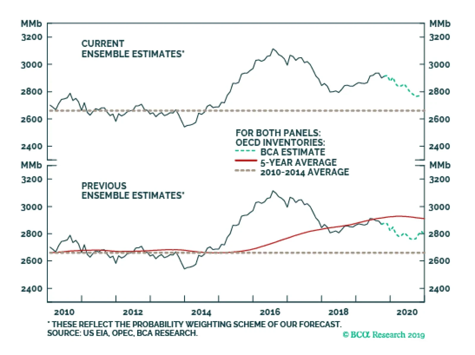
Global growth expectations for oil demand are diverging sharply in the lead-up to OPEC 2.0’s December 5 meeting in Vienna. At the low end, the US EIA expects 2019 growth of 760k b/d this year, a sharply lower estimate than OPEC or the IEA projections. We…