Money/Credit/Debt

Highlights The CAD and AUD have tactical upside; however, this may well prove to be the last hurrah before some serious declines play out. This time domestic – not global – factors will drive the CAD and AUD lower. Canada and Australia are hitting the end game for their respective debt supercycles as rising U.S. rates will lift the global cost of capital. Canadian and Australian house prices and debt loads are too elevated; a reversal of these excesses is likely to push these two countries toward liquidity traps. These liquidity traps will cause the R-star in Canada and Australia to fall, lagging well behind the U.S. Canada and Australia are uncompetitive, suggesting external demand will not come to their respective rescue, at least not until after the CAD and AUD have fallen significantly. The CAD may fall first, but the AUD has more downside ultimately; not only is Australia even less competitive than Canada, but the Aussie is also more expensive than the Loonie. Feature The Canadian and Australian dollars are in the process of rebounding. This is not surprising. By the end of 2018, both these currencies were deeply oversold, and the recent easing in global financial conditions, helped by the Federal Reserve’s pause, is fueling their rebound (Chart 1). Moreover, pessimism toward China has hit an extreme, yet Sino-U.S. trade relations seem on the cusp of improving and Chinese policymakers are increasingly trying to manage the downside in the Chinese economy. This setup is normally supportive for the Canadian and Australian dollars (Chart 2). Chart 1Financial Conditions Point To A Tactical Rebound In The AUD And The CAD...
Financial Conditions Point To A Tactical Rebound In The AUD And The CAD...
Financial Conditions Point To A Tactical Rebound In The AUD And The CAD...
Chart 2...So Does Chinese Reflation
...So Does Chinese Reflation
...So Does Chinese Reflation
While we have been recommending that our more tactically minded clients play this rally,1 the longer-term outlook for the CAD and AUD remains poor. These countries are getting closer to the end of their respective debt supercycles. Consequently, the CAD and AUD need to trade at much larger discounts to fair value in order to be attractive. Way Too Much Debt Canada and Australia have become victims of their own success. Canada and Australia have seen real estate prices rise for more than two decades. At first, rising prices reflected solid valuations, growing populations and rising prosperity. However, things changed around the Great Financial Crisis. During this traumatic event, the Bank of Canada and the Reserve Bank of Australia both dropped interest rates by 4.25%. Since both countries’ banking sectors escaped the crisis unscathed, and households did not experience similar losses of wealth as those in the U.S., Ireland or Spain, credit growth remained strong. A real estate bubble became the natural consequence of this easy monetary policy. Banks pushed credit to households, and households – impressed by the solid performance of real estate prices, attracted by low interest rates, and enamored with the dream of easy riches – willingly took on mortgages and piled into the property market. A feedback loop ensued, whereby rising collateral values made credit even easier to access, fomenting further house price gains and even-easier credit conditions. Today, we stand at the end of this process. Vancouver and Toronto in Canada, and Sydney and Melbourne in Australia are some of the most expensive real estate markets in world in terms of price-to-income ratios, when one controls for population density (Chart 3). This has created major systemic risks for both countries.
Chart 3
Few would care about the systemic risk created by elevated house prices if debt loads were small. However, in both countries, household indebtedness makes Americans circa 2007 look like a frugal bunch. In Canada, household debt has now reached 176% of disposable income, or 100% of GDP, while in Australia, the same ratios are 189% and 121%, respectively. This is well above the levels that prevailed in the U.S. in 2007 (Chart 4). Mortgage debt alone represents 108% and 140% of disposable income in Canada and Australia, respectively. Moreover, Canadian and Australian households also spend 14.5% and 15.6% of their incomes servicing debt, which also compares unfavorably with the U.S. in 2007. Chart 4ACanadians And Australians Make Americans Look Frugal
Canadians And Australians Make Americans Look Frugal (1)
Canadians And Australians Make Americans Look Frugal (1)
Chart 4BCanadians And Australians Make Americans Look Frugal
Canadians And Australians Make Americans Look Frugal (2)
Canadians And Australians Make Americans Look Frugal (2)
Canadian and Australian households thus seem close to having reached their maximum debt loads. Moreover, measures taken in Canada and Australia to limit foreign money inflows and constrain bank lending are beginning to bite. In both countries, real estate transactions are slowing, with property sales declining by 20% and 8% in Canada and Australia, respectively. House prices too are being hit. House prices in Vancouver and Toronto peaked by 2018, and in Sydney and Melbourne in 2017. Residential construction is likely to be the first victim. Real estate inventories in both these countries have been rising, courtesy of the frenetic pace of housing starts going on for decades. Today, residential investment represents 7% of GDP in Canada and 5% of GDP in Australia (Chart 5). Thus, slowing real estate activity could curtail Canadian and Australian GDP by 2% if we move back to the real estate environment that prevailed in the mid-1990s. This would also imply large hits to employment as construction, real estate and finance have created 336-thousand and 250-thousand jobs in Canada and Australia since 2009, respectively. Chart 5AA Decline In Construction Activity Would Be A Vicious Hit To Canada And Australia (1)
A Decline In Construction Activity Would Be A Vicious Hit To Canada And Australia (1)
A Decline In Construction Activity Would Be A Vicious Hit To Canada And Australia (1)
Chart 5BA Decline In Construction Activity Would Be A Vicious Hit To Canada And Australia (2)
A Decline In Construction Activity Would Be A Vicious Hit To Canada And Australia (2)
A Decline In Construction Activity Would Be A Vicious Hit To Canada And Australia (2)
Consumption too is likely to suffer. Without a growing wealth effect and with declining equity in their houses, Canadian and Australian households are likely to curtail consumption – consumption that has contributed 60% and 30% of Canada’s and Australia’s cumulative GDP growth since 2009. Already, we are seeing slowing Canadian and Australian retail sales – right behind drops in housing activity. The biggest and most dangerous risk is that Canada and Australia teeter on the verge of falling into a liquidity trap, like the U.S. after 2007. As Chart 6 illustrates, propelled by households binging on cheap money in the form of mortgages, Canadian and Australian banks have managed to maintain higher levels of return on equity after the financial crisis. This robust profitability will decline if non-performing loans, which so far remain low, grow in response to weakening house prices and fragile household financial health (Chart 7). Chart 6Canadian And Australian Banks Remain Profitable...
Canadian And Australian Banks Remain Profitable...
Canadian And Australian Banks Remain Profitable...
Chart 7...As Long As NPLs Do Not Rise
...As Long As NPLs Do Not Rise
...As Long As NPLs Do Not Rise
Rising NPLs and declining RoEs tend to limit the willingness of banks to lend. Just as crucially, the poor health of households and falling real estate prices is likely to also limit demand for credit. This combination was behind the sharp decline in the U.S. money multiplier in 2008. No matter how much reserves the Federal Reserve would inject in commercial banks via QE programs, broader money would not respond. A similar fate is likely to ensue in Canada and Australia (Chart 8). The velocity of money is also likely to fall if households are not willing to take on debt anymore and instead focus on rebuilding their financial buffers. Chart 8Canada And Australia Have Avoided A Liquidity Trap... So Far
Canada And Australia Have Avoided A Liquidity Trap... So Far
Canada And Australia Have Avoided A Liquidity Trap... So Far
The consequence of this monetary constipation will be much lower interest rates. When an economy enters a liquidity trap, as was the case in the U.S. after 2007, in Japan since the 1990s, or in Europe after 2010, the neutral real rate of interest, the so-called R-star, falls to zero or even lower. Essentially, no matter how low interest rates fall, they cannot equilibrate the demand and supply for savings. Everyone wants to save, no one wants to borrow, and banks are unwilling to lend. This fate looks increasingly likely for both Canada and Australia over the coming two years. Bottom Line: The Canadian and Australian real estate markets have enjoyed incredible runs for more than two decades. Now, not only are real estate prices in these two nations very expensive, households have been left with prodigious debt loads. As real estate activity slows, residential construction will suffer, but most importantly, these two countries are likely to teeter toward becoming liquidity traps as banks curtail lending and households curtail borrowing. This will result in structurally lagging interest rates. Why Now? Betting on the end of the Canadian and Australian housing bubbles has so far been mugs games. Why is the situation different now? Because the U.S. economy is stronger. Until now, very low global interest rates have kept the Canadian and Australian housing bubbles afloat, but rising U.S. interest rates are now putting upward pressure on mortgage rates in both Canada and Australia (Chart 9). This simply reflects the fact that U.S. rates represent the ultimate opportunity cost of investing outside the international reserve currency, the U.S. dollar. After years of household deleveraging, the U.S. seems to be able to handle higher rates. However, because Canadian and Australian balance sheets are much weaker, their tolerance for higher rates is substantially lower. Chart 9Higher U.S. Rates Threaten Canadian And Australian Households
Higher U.S. Rates Threaten Canadian And Australian Households
Higher U.S. Rates Threaten Canadian And Australian Households
BCA sees further upside for U.S. rates and thus for the global cost of capital. In other words, we do not anticipate the Fed’s pause to last beyond June. The following reasons underpin this view: The U.S. labor market is increasingly inflationary. The employment-to-population ratio for prime-age workers continues to rise, which historically has boosted labor costs (Chart 10). The New York City Fed Underlying Inflation Gauge points toward higher core inflation (Chart 11). Moreover, Ryan Swift argues in BCA’s U.S. Bond Strategy that an unfavorable base effect will dissipate after February, further reinforcing the upside risk to inflation.2 Being the only component of our Fed Monitor moving toward “easy money required” territory, the tightening in U.S. financial conditions last year was the lynchpin behind the Fed’s pause. The other components of the Fed Monitor have not deteriorated significantly, and they still argue in favor of further rate hikes (Chart 12). Thus, if the recent easing in financial conditions can persist, the Fed will hike again this year.
Chart 10
Chart 11Budding U.S. Inflationary Pressures
Budding U.S. Inflationary Pressures
Budding U.S. Inflationary Pressures
Chart 12The Fed Is Pausing Because Of Tightening Financial Conditions, Not The Economy
The Fed Is Pausing Because Of Tightening Financial Conditions, Not The Economy
The Fed Is Pausing Because Of Tightening Financial Conditions, Not The Economy
Finally, U.S. productivity is set to pick up over the coming two years. Since a rising capital stock boosts productivity, the recent strength in capex augurs well (Chart 13). Moreover, the demand deficit created by the deleveraging of U.S. households has weighed on productivity. As U.S. credit growth picks up, so will productivity. This is important as rising productivity lifts the neutral rate, and thus creates more room for the Fed to lift interest rates. Chart 13Upside For U.S. Productivity Equals Upside For U.S. Rates
Upside For U.S. Productivity Equals Upside For U.S. Rates
Upside For U.S. Productivity Equals Upside For U.S. Rates
Ultimately, all these factors point to higher U.S. rates. As such, it suggests that Canadian mortgage rates, and to a lesser extent Australian ones as well, will experience upward pressure – exactly at the time when households in these two countries are most vulnerable to higher rates. Bottom Line: Higher U.S. rates are the main reason why we expect the Canadian and Australian housing markets and economies to buckle now, finally heeding the call of doomsayers. Higher U.S. rates lift the global cost of capital. While U.S. households are in robust shape and therefore better able to handle higher rates, the same cannot be said about Canadian and Australian households. Can the External Sector Come To The Rescue? This is unlikely. After years of commodity booms and strong domestic demand supported by rising household wealth, the Canadian and Australian manufacturing sectors have been greatly diminished. Much capacity has vanished, and it will be difficult to replace the lost output from falling domestic demand by exports of manufactured goods. The Australian and especially the Canadian corporate sectors are also already heavily indebted, and thus, it could take quite some time before capacity is expanded. Complicating the situation, Canada and Australia are not competitive exporters anymore. As the top panel of Chart 14 shows, since 1980, U.S. unit labor costs have risen by 156%, but they have risen by 183% in Canada and by a stunning 282% in Australia. Productivity trends paint a similar, albeit less dramatic picture. Since 1980, U.S. labor productivity has risen 22% versus its trading partners; in Canada it has declined by 20%, and in Australia, by 5%. Consequently, both Canadian and Australia labor will have to cheapen. Historically, the mechanism through which labor costs decline is higher unemployment, which forces a painful adjustment in wages. These adjustments are likely to force both interest rates and currencies lower. Chart 14Canada And Australia Are Uncompetitive
Canada And Australia Are Uncompetitive
Canada And Australia Are Uncompetitive
Could China come to the rescue? Via higher commodity prices, both Canada and Australia have been major beneficiaries of the Chinese economic boom. However, while China today is trying to contain its economic deceleration, Chinese policymakers remain fixated on controlling credit growth. This means that China is unlikely to go on another debt binge similar to what transpired in 2009 or in 2015-‘16. As a result, the recent uptick in commodity prices is unlikely to last long. More fundamentally, China is not only trying to move away from its debt-led growth model: It is also trying to move away from its investment-led growth model. This means that the commodity intensiveness of the Chinese economy is likely to decline. China’s emphasis on controlling air pollution will strengthen this trend. As Chart 15 illustrates, when the share of Capex as a percentage of Chinese GDP declines, so does the labor participation rate of Canada and Australia relative to the U.S. This decline in relative participation rates is associated with falling CAD and AUD values versus the U.S. dollar, a consequence of falling growth potential and interest rates. Chart 15AChanging Chinese Growth Model Points To Falling Canadian And Australian Participation Rates (1)
Changing Chinese Growth Model Points To Falling Canadian And Australian Participation Rates (1)
Changing Chinese Growth Model Points To Falling Canadian And Australian Participation Rates (1)
Chart 15BChanging Chinese Growth Model Points To Falling Canadian And Australian Participation Rates (2)
Changing Chinese Growth Model Points To Falling Canadian And Australian Participation Rates (2)
Changing Chinese Growth Model Points To Falling Canadian And Australian Participation Rates (2)
Bottom Line: Canada’s and Australia’s lack of manufacturing capacity, poor competitiveness, and China moving away from its investment-led growth model suggest that a deflationary environment will ultimately develop in these two nations, at least relative to the U.S. Moreover, the structurally negative outlook on consumption, debt growth and employment suggests that Canadian and Australian neutral rates are likely to fall relative to the U.S. These economic forces point to deeper lows this cycle in the CAD and AUD against the USD. Investment Implications Based on this economic backdrop, both the Canadian and Australian dollar could suffer significant downside in the coming years as their fair value is likely to fall, dragged by interest rates that will lag those in the U.S. However, if an asset is cheap enough, it may nonetheless be an attractive buy. The CAD and AUD do not fall into that camp. Today, the CAD trades in line with our long-term fair-value model, implying that if its fair value falls, the CAD provides zero insulation and will therefore also have to decline. The AUD is in an even worst spot as it currently trades above its fair value (Chart 16). Additionally, the Australian current account deficit is larger than Canada’s. Chart 16The CAD And AUD Are Not Cheap Enough To Compensate For Secular Risks
The CAD And AUD Are Not Cheap Enough To Compensate For Secular Risks
The CAD And AUD Are Not Cheap Enough To Compensate For Secular Risks
In terms of timing, the Loonie could start weakening before the Aussie. The Canadian housing bubble is likely to collapse first as Canadian mortgage rates are more tightly linked to U.S. ones than Australian rates are. Moreover, the Canadian economy seems even more levered to rising real estate prices than that of Australia. However, a collapse in Vancouver and Toronto housing prices will promptly catalyze similar weaknesses in Sydney and Melbourne. Thus, while the CAD may be the first to take the great plunge, the AUD will not be far behind. Ultimately, the AUD will suffer the greatest decline. Obviously, the more onerous pricing of the AUD contributes to this assessment, but so does the greater lack of competitiveness in Australia than in Canada. Australia is likely to endure deeper deflationary pressures as its labor costs need greater adjustments. Furthermore, Australia already suffers from a larger degree of underutilized labor than Canada. Since the currency – not wages – is likely to withstand the bulk of the competiveness adjustment, this implies that the AUD has more work to do than the CAD. The more expensive valuations of Australian assets also handicap the Aussie versus the Loonie. Australian real estate is pricier than Canadian property, and Australian stocks are more expensive (Chart 17). This means that Australians could end up with deeper holes in their balance sheets than Canadians, and that Australia has scope to witness greater outflows of capital than Canada. Chart 17Canadian Financial Assets Are Cheaper Than Australian Ones...
Canadian Financial Assets Are Cheaper Than Australian Ones...
Canadian Financial Assets Are Cheaper Than Australian Ones...
Where Australia shines relative to Canada is in terms of the ability of fiscal authorities to respond to an economic slowdown. Canadian public debt stands at 90% of GDP versus 41% of GDP in Australia. Canada’s cyclically-adjusted primary deficit is already deteriorating, while Australia’s is improving (Chart 18). This means that the Australian governments have deeper pockets and a greater capacity to support domestic demand than Canada’s. This could cushion the deflationary impact in Australia relative to Canada. That being said, the Japanese, Spanish or U.S. experiences argue that once a real estate bubble bursts, fiscal spending can cushion some of the pain, but it cannot eradicate the problem – at least not until banks are recapitalized and the private sector is once again ready to borrow, something that takes years of balance-sheet rebuilding. Chart 18...But Australia Has More Fiscal Space
...But Australia Has More Fiscal Space
...But Australia Has More Fiscal Space
Bottom Line: Both the CAD and AUD are likely to experience substantial downside over the coming years. The CAD and AUD are not cheap enough to compensate for a BoC and RBA that will greatly lag the Fed. While the CAD may weaken first, the AUD will suffer more long-term downside. The Aussie is more expensive, Australia is less competitive than Canada, and it could suffer greater outflows of capital. Continue to underweight Australian and Canadian assets in global portfolios as the AUD and CAD will drag their performance down. Remain short AUD/CAD on a structural basis. Mathieu Savary, Vice President Foreign Exchange Strategy mathieu@bcaresearch.com Footnotes 1 Please see Foreign Exchange Strategy Weekly Report, titled “Global Liquidity Trends Support The Dollar, But…”, dated January 25, 2019, 2018, available at fes.bcaresearch.com 2 Please see U.S. Bond Strategy Weekly Report, “Buy Corporate Credit”, dated January 15, 2019, available at usbs.bcaresearch.com Trades & Forecasts Forecast Summary Core Portfolio Tactical Trades Closed Trades
Highlights Our leading indicator for China’s “old economy” remains weak, and the beneficial trade front-running effect that has supported some of China’s macro data over the past year is beginning to wane. Our "earnings recession" model for Chinese investable stocks suggests that a trade deal alone is not enough to prevent a contraction in earnings growth over the coming year. A meaningful rebound in credit relative to GDP would also be required, one that would retrace roughly 50% of the decline that has occurred since late-2017. An overweight cyclical stance (i.e. over a 6-12 month period) towards Chinese stocks versus their global peers remains premature. The equity market is conceptually supported until the beginning of March if trade talks continue to make progress, but will face (potentially severe) headwinds thereafter until credit durably accelerates at some point in the second half of the year. Feature China’s macro data remains at the forefront of investor attention, and December’s updates did not provide market participants with much comfort. Our leading indicator for China’s “old economy” deteriorated anew in December after a shallow three-month rise (Chart 1), driven by a currency-driven retracement in monetary conditions, as well as slowing growth in both M3 and adjusted total social financing (TSF). The flow of adjusted TSF relative to GDP technically ticked higher in December, but only because of a material slowdown in nominal GDP growth from 9.6% in Q3 to 8.1% in Q4 (Chart 2). This decline in nominal GDP means that it has retraced 70% of its rise from 2015 to 2017. Chart 1A Relapse In Our Leading Indicator For China's Old Economy
A Relapse In Our Leading Indicator For China's Old Economy
A Relapse In Our Leading Indicator For China's Old Economy
Chart 2A 70% Retracement In Chinese Nominal GDP Growth
A 70% Retracement In Chinese Nominal GDP Growth
A 70% Retracement In Chinese Nominal GDP Growth
On the housing front, sales volume growth ticked slightly higher but remains negative (and well below the pace of construction growth), and pledged supplementary lending from the PBOC, a factor that we have identified as a core driver of China’s housing market since 2015,1 decelerated further. Finally, December’s trade data was uniformly negative, with import and export growth decelerating 6-7 percentage points even on a smoothed basis, depending on whether measured in U.S. dollars or local currency. Revisiting The Measurement Of China’s “Old Economy” One notable exception to the weak data was the Bloomberg Li Keqiang index (LKI) itself, which rose from 8.4 in November to 9.3 in December. Our alternative LKI rose to exactly the same level, closing the gap with Bloomberg’s measure that had existed earlier this year (Chart 3). Chart 3Our Coincident Measures Of The Old Economy Are Trending Higher...
Our Coincident Measures Of The Old Economy Are Trending Higher...
Our Coincident Measures Of The Old Economy Are Trending Higher...
In fact, the LKI has been providing a different message than our LKI leading indicator for several months, and the apparent uptrend in the series raises the question of whether the Chinese economy is actually strengthening rather than weakening. With high conviction, our answer to this question is no. As we have highlighted in previous reports, our view is that the gap can be explained by the (anomalous and only temporary) positive impact that the trade war has had on economic activity since March last year, as Chinese exporters rushed to front-load the production and shipment of goods to the U.S. in advance of the imposition of tariffs. Panel 1 of Chart 4 makes this point explicitly, by showing the percentile rank of the two most cyclical components of the LKI. From 2010 to early-2018, electricity production and railway freight volume moved closely together, with the former leading the latter somewhat from 2017 to early-2018. While the trade war-driven bounce in electricity production has since rolled off, railway cargo volume remains elevated and is only now rolling over. December’s extremely poor trade data suggests that a material further decline is likely in Q1 of this year. Chart 4...Because Of A (Temporarily) Beneficial Trade War Effect
...Because Of A (Temporarily) Beneficial Trade War Effect
...Because Of A (Temporarily) Beneficial Trade War Effect
Panel 2 shows that bank lending, the third component of the LKI, has begun to pick up over the past few months. However, this reflects, at least in part, the goal of policymakers to shrink the size of shadow banking in the economy and reorient the provision of credit back to traditional financial institutions (Chart 5). A sustainable rise in bank loan growth that overwhelms a shrinking shadow banking sector will almost certainly show up in our preferred measure of aggregate credit growth (adjusted total social financing), which for now remains in a clear downtrend. From a bigger picture perspective, it is worth revisiting why we focus on the LKI at all. Our use of the index to represent China’s investment-relevant economic activity dates back to a November 2017 Special Report,2 in which we noted that it correlated well with China’s nominal import growth and led the growth in earnings for the MSCI China index ex-technology. Real GDP growth, by contrast, has shown barely any cyclicality over the past four years in the face of large changes in Chinese import growth and the prices of China-related assets (Chart 6). This underscores that aggregate Chinese real GDP is not, by and large, investment-relevant. Chart 5A Stunning Collapse In Shadow Banking Activity
A Stunning Collapse In Shadow Banking Activity
A Stunning Collapse In Shadow Banking Activity
Chart 6Chinese Real GDP Growth Is Not Relevant For Investors
Chinese Real GDP Growth Is Not Relevant For Investors
Chinese Real GDP Growth Is Not Relevant For Investors
What can we infer about the trend in China’s old economy if the LKI is combined with other closely correlated measures of investment-relevant economic activity? Panel 1 of Chart 7 answers this question by presenting the standardized LKI alongside standardized nominal import growth and nominal manufacturing output, the measure of Chinese coincident activity preferred by BCA’s Emerging Markets Strategy service. Panel 2 of the chart shows an equally-weighted average of all three measures alongside our leading indicator for the LKI. We note four key observations from Chart 7: Chart 7China's Investment-Relevant Economic Activity Is Trending Lower
China's Investment-Relevant Economic Activity Is Trending Lower
China's Investment-Relevant Economic Activity Is Trending Lower
Since 2010, the primary trend in the LKI, nominal import growth, and nominal manufacturing output has been the same The modest uptrend in the LKI since early-2018 is not corroborated by imports or manufacturing output Economic activity in China has been stronger over the past year than our leading indicator would have suggested, even after abstracting from the anomalous uptrend in the LKI The gap between our leading indicator and China’s actual economic activity is now beginning to close. These observations support the conclusion that we reached when analyzing the components of the LKI itself: a temporary boost from trade front-running has masked an underlying slowdown over the past year. But this boost has now begun to wane, implying that actual activity will continue to slow in the coming months. Is A Trade Deal Enough To Prevent An Earnings Contraction? While most global investors would acknowledge that China’s domestic economy is slowing, the performance of China-related assets over the past year highlights that the market views the trade war with the U.S. as being at least equally important as slowing Chinese money & credit growth. Chart 8 highlights that our market-based China growth indicator did not break down until the second quarter of 2018, when the threat of tariffs from the Trump administration became a reality. The indicator’s prior resilience was in contrast to a steady deterioration in our LKI leading indicator, which peaked at the beginning of 2017. Chart 8Investors Are Largely Focused On The U.S./China Trade War
Investors Are Largely Focused On The U.S./China Trade War
Investors Are Largely Focused On The U.S./China Trade War
The surge in the indicator since early-December underscores that investor expectations of a trade deal with the U.S. have materially improved sentiment about China’s growth profile, despite the fact that Chinese money & credit growth have yet to meaningfully improve. Given that our geopolitical strategy team assigns odds as high as 45% of a framework deal emerging by the March 1 deadline,3 how can investors gauge the net impact of an improving external outlook and still-weak domestic demand? Chart 9 illustrates one method of approaching this question, using a model of Chinese investable earnings growth that we introduced in our January 16 Special Report.4 The model is designed to predict the likelihood of a serious investable earnings contraction over the coming 12-months, and includes data on credit, trade, and forward earnings momentum as predictors. The chart shows what would have to happen to the flow of adjusted total social financing as a share of GDP in a trade deal scenario, calibrated in a way that the odds of a major earnings contraction fall to 33% (the highest historical reading of the model that did not correspond to a major earnings decline). Chart 9A Trade Deal Is Not Enough To Avoid An Earnings Recession In China
A Trade Deal Is Not Enough To Avoid An Earnings Recession In China
A Trade Deal Is Not Enough To Avoid An Earnings Recession In China
The chart shows that a meaningful rebound in credit flow to GDP would be required, one that would retrace roughly 50% of the decline that has occurred since late-2017. In short, our analysis shows that a trade deal alone is likely not enough to prevent a contraction in Chinese earnings growth over the coming year. Importantly, Chart 10 shows what this would imply for the volume of credit that would need to be created over the coming several months in order for the scenario shown in Chart 9 to come to pass (assuming an 8% growth rate in nominal GDP). The chart highlights that China would need to create approximately RMB 26 trillion in new credit over the coming 12 months (nearly US$ 4 trillion at current exchange rates), which would exceed the prior high set in late-2017 by a non-trivial amount. While this goal looks on its way to being achieved based on a 6-month annualized rate of change (panel 2), this largely reflects a one-month surge in local government bond issuance in September. Over the past 3-months, the annualized pace of credit creation has fallen well below the RMB 26 trillion mark, implying that either traditional credit growth, shadow credit, or local government bond issuance will have to pick up significantly over the coming several months in order for the domestic demand situation to stabilize. We expect this to occur, but it has not occurred yet. Chart 10China Needs To Create 26 Trillion RMB In Credit In 2019
China Needs To Create 26 Trillion RMB In Credit In 2019
China Needs To Create 26 Trillion RMB In Credit In 2019
Investment Conclusions The key conclusion of our analysis above is that an overweight cyclical stance (i.e. over a 6-12 month period) towards Chinese stocks versus their global peers remains premature. We noted in our December 5 weekly report that a tactical (0-3 month) overweight was probably warranted due to the prospect of a framework trade deal with the U.S. on March 1, but Chart 9 makes it clear that an improving external demand outlook is not a sufficient basis to expect that Chinese stocks will avoid an earnings recession. In this regard, investors should conceptualize the absence of a significant pickup in the volume of credit as a “gap” in a bridge representing the market support for Chinese stocks over the course of the calendar year (Chart 11). Assuming leaks from the negotiations continue and are consistent with the agreement of a framework deal, the market is conceptually supported until the beginning of March. However, following March 1, a gap in support emerges until credit durably accelerates at some point in the second half of the year.
Chart 11
In our view, investors who go long Chinese stocks today with a 6-12 month time horizon are betting not only on the success of trade negotiations, but that this gap will close by the time that a deal is announced. This is a risky gamble given the still-relevant desire of policymakers to avoid another major credit overshoot, and as such our cyclical recommendation remains unchanged: wait. Jonathan LaBerge, CFA, Vice President Special Reports jonathanl@bcaresearch.com Footnotes 1 Please see China Investment Strategy Special Report “China's Property Market: Where Will It Go From Here?”, dated September 13, 2018, available at cis.bcaresearch.com. 2 Please see China Investment Strategy Special Report “The Data Lab: Testing The Predictability Of China's Business Cycle”, dated November 30, 2017, available at cis.bcaresearch.com. 3 Please see Geopolitical Strategy and China Investment Strategy Special Report “Is China Already Isolated?”, dated January 23, 2019, available at cis.bcaresearch.com. 4 Please see China Investment Strategy Special Report “Six Questions About Chinese Stocks”, dated January 16, 2019, available at cis.bcaresearch.com. Cyclical Investment Stance Equity Sector Recommendations
Highlights Excess dollar liquidity is still deteriorating. The U.S. economy’s robustness suggests this trend will continue. Elevated EM-dollar debt and declining dollar liquidity point to lower global growth and a stronger dollar. Despite these cyclical forces, a tactical dollar correction is unfolding. Slowdowns do not evolve in straight lines, and deep investor pessimism is setting the stage for a temporary bout of positive surprises. DXY could correct to 93, EUR/USD could rebound to 1.17-1.18, and USD/CAD could fall to 1.27. Buy NOK/SEK. Feature Investment legend Stanley Druckenmiller often refers to the primacy of liquidity trends when making investment decisions. BCA is highly sympathetic to this view, as our DNA is rooted in the analysis of global liquidity trends. Under this lens, a peculiar trend has caught our attention: U.S. commercial and industrial (C&I) loans are currently accelerating, and easing lending standards point to further gains (Chart I-1). This is in sharp contrast with the 2015-2016 market riots and subsequent slowdown – an episode where banks tightened lending standards and loan growth decelerated sharply. While this represents a good omen for the U.S. economy, it is a dangerous evolution for the rest of the world. Chart I-1Resilient Corporate Sector Credit Growth
Resilient Corporate Sector Credit Growth
Resilient Corporate Sector Credit Growth
Growing credit is good for the U.S. because it points to robust domestic demand. However, it is problematic for the rest of the world for two reasons. First, if U.S. credit growth is more robust today than in 2016, it also implies that the Federal Reserve is unlikely to pause its rate-hike campaign as much as it did back then. Thus, U.S. rates, the key determinant of the global cost of capital, may have additional upside as interest rate markets anticipate a year-long pause. This is not yet a problem for the U.S. economy, but it is one for rest of the world, which is exhibiting poorer growth trends. Second, U.S. credit growth is already outpacing the expansion of U.S. money supply by 7%, pointing towards a decline in dollar liquidity available for international financial markets. The reduction in the Fed’s balance sheet will contribute to a continuation of this trend. The fall in the amount of dollars available for the international financial system creates a brake on growth. Over the past 10 years, each time money supply growth fell below the loan uptake of the U.S. corporate sector, our Global Industrial Activity Nowcast, BCA’s Global Leading Economic Indicator, Korean exports, and global export prices all deteriorated considerably (Chart I-2). Chart I-2Deteriorating Excess Liquidity Hurts Global Growth
Deteriorating Excess Liquidity Hurts Global Growth
Deteriorating Excess Liquidity Hurts Global Growth
The large dollar debt of emerging markets lies behind this relationship. If less dollars are available outside the U.S. financial system, EM borrowers have to bid more for these greenbacks, raising their cost of capital. Additionally, borrowers are likely to hoard any dollars they access in order to repay their liabilities instead of using these greenbacks to finance economic transactions. As Chart I-3 shows this problem is particularly acute today: relative to EM GDP and various measures of U.S. money supply, EM dollar debt stands at record highs, highlighting deep vulnerabilities if liquidity conditions deteriorate. Chart I-3The Sensitivity To Dollar Liquidity Stems From The Large Stock Of Dollar Debt
The Sensitivity To Dollar Liquidity Stems From The Large Stock Of Dollar Debt
The Sensitivity To Dollar Liquidity Stems From The Large Stock Of Dollar Debt
The problem extends beyond the capacity of the U.S. economy to generate deposits in excess of non-bank liabilities. Despite a meaningful slowdown in non-U.S. industrial production, official reserves are contracting relative to global industrial activity (Chart I-4). This further suggests that the global economy is experiencing some form of liquidity crunch, where the growth of monetary aggregates is insufficient to support economic activity. This is a deflationary environment. Chart I-4High-Powered Money Lagging Sagging Activity
High-Powered Money Lagging Sagging Activity
High-Powered Money Lagging Sagging Activity
Another factor is at play: We have often argued in these pages that carry trades are a key component of global liquidity, as they allocate funds from economies where savings are excessive (i.e. borrowing in funding currencies) to economies that need those savings to generate growth (i.e. carry currencies).1 This is why the performance of high-octane carry trades is often a very reliable leading indicator of global economic activity. However, as Chart I-5 demonstrates, EM carry trades funded in yen continue to perform execrably, a poor signal for global liquidity and growth. Chart I-5Underperforming Carry Trades Add To The Global Liquidity Woes
Underperforming Carry Trades Add To The Global Liquidity Woes
Underperforming Carry Trades Add To The Global Liquidity Woes
The impact of the deterioration in dollar liquidity, in FX reserves growth and in carry trade liquidity is evident in EM monetary aggregates. EM M1 growth has sharply decelerated. Since decelerating EM money supply presages weaker growth, it also points to stronger counter cyclical currencies like the dollar and the yen, especially against the very growth-sensitive commodity currencies (Chart I-6). The dollar bull market is unlikely to be over this year. Chart I-6Ominious Signal From EM Money Supply
Ominious Signal From EM Money Supply
Ominious Signal From EM Money Supply
This risk is reinforced by the tight inverse correlation between the dollar and U.S. commercial banks’ liquidity. When U.S. banks curtail their holdings of securities, a key source of dollar liquidity in international markets, a dollar rally follows (Chart I-7). Not only does last year’s fall in securities in bank assets point to a firming greenback, but if banks also expand their loan books they will also further curtail their securities holdings. Chart I-7Contracting Liquidity On U.S. Commercial Banks Balance Sheets Support The Dollar
Contracting Liquidity On U.S. Commercial Banks Balance Sheets Support The Dollar
Contracting Liquidity On U.S. Commercial Banks Balance Sheets Support The Dollar
The much-higher real rates offered by U.S. Treasurys relative to other DM bonds magnifies these dollar positive trends (Chart I-8). Hence, not only will global growth and money quantity considerations prove tailwinds for the greenback, but so will more well-known drivers of exchange rates. Chart I-8Real Rates Differentials Still Favor The Dollar
Real Rates Differentials Still Favor The Dollar
Real Rates Differentials Still Favor The Dollar
Bottom Line: The deterioration in global liquidity conditions continues to argue in favor of the dollar. Since U.S. credit growth is still managing to accelerate, the Fed is unlikely to pause on the rate-hike front for too long, implying that excess dollars will further vanish from the international financial system. Consequently, global monetary conditions will tighten again, and global growth has not hit its nadir this cycle. On a 9 to 12 month basis, the dollar will benefit in this environment, especially against cyclical commodity currencies. How Fast Can Investors Price In Bad News? Due to the tightening in global liquidity conditions, global growth has suffered. However, the global and U.S. stock-to-bond ratios, two financial market metrics finely tuned to global economic gyrations, have already fallen in line with our Global Economic and Financial Diffusion Index that tallies the improvement and deterioration among more than 100 key global variables (Chart I-9). This implies that asset prices already reflect much of the deterioration in the economic outlook. Chart I-9The Global Economy Is Soft, But Financial Markets Already Reflect This Reality
The Global Economy Is Soft, But Financial Markets Already Reflect This Reality
The Global Economy Is Soft, But Financial Markets Already Reflect This Reality
The problem for bears is that economic cycles rarely play out in a straight line. Now that asset prices are incorporating poor expectations, any positive surprises, even if modest, could lift asset prices. And there is room for improvement in global economic surprises (Chart I-10), particularly as Sino-U.S. trade relations are improving, global financial conditions are easing and China is trying to manage its slowdown. In fact, China’s fiscal and monetary stimulus already points to a rebound in growth-sensitive currencies, and to a correction in the dollar (Chart I-11). Chart I-10Scope For A Rebound In Economic Surprises
Scope For A Rebound In Economic Surprises
Scope For A Rebound In Economic Surprises
Chart I-11Chinese Reflation Points To A Dollar Correction, Even If Only A Small One
Chinese Reflation Points To A Dollar Correction, Even If Only A Small One
Chinese Reflation Points To A Dollar Correction, Even If Only A Small One
EM breadth confirms this message. Chart I-12 shows that the breadth of EM equities has not been this poor since early 2009. However, it has begun to rebound. Rebounds in EM breadth from such levels are historically associated with a weaker dollar, stronger commodity currencies and a weaker yen. Chart I-12Deep Oversold Conditions In EM Stocks Further Support The Case For A Dollar Correction
Deep Oversold Conditions In EM Stocks Further Support The Case For A Dollar Correction
Deep Oversold Conditions In EM Stocks Further Support The Case For A Dollar Correction
Flows paint a similar picture. Global investors tend to buy Japanese bonds when global growth conditions deteriorate. Foreigners buying of Japanese fixed-income products now stands near record levels – something normally witnessed when credit spreads widen. However, positive economic surprises and the recent easing in global financial conditions suggest that these flows will reverse. When they do, the dollar will suffer (Chart I-13) and very pro-cyclical pairs like AUD/JPY will appreciate, even if only temporarily. Chart I-13Elevated Flows Into Japanese Bonds Suggest Overdone Pessimism, And Scope For A Dollar Correction
Elevated Flows Into Japanese Bonds Suggest Overdone Pessimism, And Scope For A Dollar Correction
Elevated Flows Into Japanese Bonds Suggest Overdone Pessimism, And Scope For A Dollar Correction
It’s not just the commodity currencies that have upside: so does the euro. German bunds’ hedged yields have been rising relative to the U.S., which in recent years has often led to a rally in EUR/USD (Chart I-14). Chart I-14European Hedged Yields Imply A Euro Rebound
European Hedged Yields Imply A Euro Rebound
European Hedged Yields Imply A Euro Rebound
How deep will this dollar down leg be? Our Intermediate-Term Timing Model suggests that the greenback’s weakness is likely to be limited. The dollar already trades below our fair-value estimate, but during corrective episodes it tends to trough at a 5% discount, implying that the DXY at 93 is a buy (Chart I-15). The euro, the dollar’s mirror image, could rebound to a roughly 5% overvaluation, implying that a countertrend move to 1.17-1.18 is also likely. Finally, the CAD may be able to rebound to USD/CAD 1.27. Chart I-15Gauging The Extent Of The Countertrend Moves
Gauging The Extent Of The Countertrend Moves
Gauging The Extent Of The Countertrend Moves
At these levels, we would expect the countertrend moves to end. Ultimately, the aforementioned deterioration in global liquidity conditions means that positive surprises are likely to be transitory phenomena. Moreover, we doubt that Chinese stimulus, a key catalyst for a weaker dollar, will be very deep. Ultimately, our view remains that China is only trying to prevent a collapse of its economy and Beijing is extremely reluctant to stimulate enough to generate yet another boom – something needed to genuinely boost global growth if the Fed resumes its tightening campaign. Finally, while a trade deal between China and the U.S. is likely, investors should not get overly exuberant on its ramifications. Disagreements over intellectual property transfers will not be resolved anytime soon, and China remains the U.S.’s largest geopolitical challenger. Bottom Line: Global liquidity conditions may have deteriorated, suggesting a trough in global growth is not yet in the cards, but slowdowns do not evolve in straight lines. This means that oversold risk assets are likely to respond well to positive economic surprises. As a result, the countercyclical dollar will correct, probably to 93. The commodity currency complex should be the main beneficiary of this move, with downside in USD/CAD to 1.27. The euro could rebound toward 1.17-1.18. Buy NOK/SEK In June 29th, we closed our long NOK/SEK trade, expecting corrective action in this cross. A serious selloff ensued, and we are now buying this pair again.2 First, NOK/SEK is very sensitive to oil prices (Chart I-16), and BCA’s Commodity and Energy service anticipates a rebound in oil prices this year on the back of tightening supply conditions. Chart I-16BCA's Oil View Points To A NOK/SEK Rebound
BCA's Oil View Points To A NOK/SEK Rebound
BCA's Oil View Points To A NOK/SEK Rebound
Second, the Norwegian economy is outperforming Sweden’s. As Chart I-17 shows, the Norwegian LEI continues to rise relative to Sweden’s, which historically implies a much stronger NOK/SEK. Beyond the LEIs, Norway’s PMIs and economic surprises have not only rebounded, but are also outpacing Sweden’s equivalent metrics. The Norwegian consumer is also participating in the good times. The three-month moving average of employment growth, retail sales and consumer confidence are stronger in Norway than in Sweden. Chart I-17Norwegian Growth Is Superior To Sweden's
Norwegian Growth Is Superior To Sweden's
Norwegian Growth Is Superior To Sweden's
Third, after a long period of underperformance, Norwegian core inflation stands above that of Sweden, pointing to a potentially more hawkish Norges Bank than Riksbank. Fourth, NOK/SEK trades at a 5% discount to its fair value implied by our Intermediate-Term Timing model. Historically, a rebound in this cross follows such discounts Chart I-18). Chart I-18The ITTM Highlights An Attractive Entry Point To Buy NOK/SEK
The ITTM Highlights An Attractive Entry Point To Buy NOK/SEK
The ITTM Highlights An Attractive Entry Point To Buy NOK/SEK
Finally, NOK/SEK is at a technically attractive spot. Our momentum oscillator shows deeply oversold conditions in the pair (Chart I-19). However, momentum has begun to roll over, suggesting that a reversal of those oversold conditions is starting. Moreover, the uptrend that began in the first quarter of 2016 has been confirmed. Had NOK/SEK not rebounded from where it did, that uptrend would have been seriously challenged, with potential greater downside ahead. Chart I-19Favorable Technical Setup To Buy NOK/SEK
Favorable Technical Setup To Buy NOK/SEK
Favorable Technical Setup To Buy NOK/SEK
Bottom Line: We are re-opening our long NOK/SEK trade. We avoided the serious correction in this pair at the end of last year, but rebounding oil prices, an outperforming Norwegian economy, a potentially more-hawkish Norges Bank, a favorable valuation backdrop and positive technical developments argue in favor of buying this cross. Set a stop at 1.037 and a target at 1.120. Mathieu Savary, Vice President Foreign Exchange Strategy mathieu@bcaresearch.com Footnotes 1 Please see Foreign Exchange Strategy Weekly Report, titled "Canaries In the Coal Mine Alert: EM/JPY Carry Trades", dated December 1, 2017, and Foreign Exchange Strategy Weekly Report, titled "Canaries In The Coal Mine Alert 2: More On EM Carry Trades And Global Growth", dated December 15, 2017. Both are available at fes.bcaresearch.com 2 Please see Foreign Exchange Strategy Weekly Report, titled "What Is Good For China Doesn’t Always Help The World", dated June 29, 2018, available at fes.bcaresearch.com Currencies U.S. Dollar Chart II-1USD Technicals 1
USD Technicals 1
USD Technicals 1
Chart II-2USD Technicals 2
USD Technicals 2
USD Technicals 2
Recent data in the U.S. has been mixed: Capacity utilization outperformed expectations, coming in at 78.7%. However, the Michigan Consumer Sentiment Index surprised to the downside, coming in at 90.7. Finally, existing home sales month-on-month grow also surprised negatively, coming in at 4.99 million. DXY has risen 0.2% this week. While we believe that DXY could experience some weakness in the next couple of months, we remain bullish on the DXY on a cyclical basis, as the strength in the U.S. economy will prompt the Fed to deliver more rate hikes than expected by market participants. Moreover, the sharp focus of Chinese policymakers on limiting indebtedness should continue to put downward pressure on global growth, helping the dollar in the process. Report Links: So Donald Trump Cares About Stocks, Eh? - January 9, 2019 Waiting For A Real Deal - December 7, 2018 2019 Key Views: The Xs And The Currency Market - December 7, 2018 The Euro Chart II-3EUR Technicals 1
EUR Technicals 1
EUR Technicals 1
Chart II-4EUR Technicals 2
EUR Technicals 2
EUR Technicals 2
Recent data in the euro has been negative: Both headline and core inflation came in line with expectations, coming in at 1.6% and 1% respectively. However, Markit Services PMI underperformed expectations, coming in at 50.8. Moreover, the Markit Manufacturing PMI also surprised negatively, coming in at 50.7. EUR/USD fell 0.4% this week. Thursday, ECB President Mario Draghi highlighted that downside risks to the European economy are building up. Overall, we agree with his assessment, and thus remain bearish on the euro on a cyclical basis. We believe that the Fed will eventually raise rates more than the market expects, widening the rate differentials between Europe and the U.S, which will hurt EUR/USD. Report Links: 2019 Key Views: The Xs And The Currency Market - December 7, 2018 Six Questions From The Road - November 16, 2018 Evaluating The ECB’s Options In December - November 6, 2018 The Yen Chart II-5JPY Technicals 1
JPY Technicals 1
JPY Technicals 1
Chart II-6JPY Technicals 2
JPY Technicals 2
JPY Technicals 2
Recent data in Japan has been negative: Import growth underperformed expectations, coming in at 1.9%. Moreover, driven by weak shipments to China, export growth also surprised to the downside, coming in at a 3.8% contraction. USD/JPY fell 0.1% this week. We remain bearish on the yen on a short-term basis, as the recent easing in global financial conditions and the improvement in sentiment towards risk assets will likely weigh on safe havens like the yen. Moreover, we believe that bond yields will start rising again. In light of the positive relationship between yields and USD/JPY, we remain bullish on this cross. Report Links: Yen Fireworks - January 4, 2019 2019 Key Views: The Xs And The Currency Market - December 7, 2018 Updating Our Intermediate Timing Models - November 2, 2018 British Pound Chart II-7GBP Technicals 1
GBP Technicals 1
GBP Technicals 1
Chart II-8GBP Technicals 2
GBP Technicals 2
GBP Technicals 2
Recent data in the U.K. has been mixed: Retail sales yearly growth and retail sales excluding fuel yearly growth underperformed expectations, coming in at 3% and 2.6%, respectively. Moreover, the claimant count change also surprised to the downside, coming in at 20.8 thousand. However, average hourly earnings growth also outperformed, coming in at 3.4%. GBP/USD has rose 1.5% this week, lifted by motion by MPs to delay the implementation of Article 50, and news that Jeremy Corbyn may be moving more clearly in favor of a new referendum if Labour takes hold of Westminster. We are closing our short EUR/GBP trade today, after reaching our target of 0.87. At this point, we think that plenty of good news have been discounted by the pound. While it is true that GBP could go up on the back of positive political developments, we believe that the risk reward ratio of selling EUR/GBP is not as attractive anymore, especially if EUR/USD can rebound. That being said, we remain bullish on cable on a long-term basis due to its cheap valuation. Report Links: Deadlock In Westminster - January 18, 019 Six Questions From The Road - November 16, 2018 Updating Our Intermediate Timing Models - November 2, 2018 Australian Dollar Chart II-9AUD Technicals 1
AUD Technicals 1
AUD Technicals 1
Chart II-10AUD Technicals 2
AUD Technicals 2
AUD Technicals 2
Recent data in the Australia has been mixed: The participation rate surprised to the downside, coming in at 65.6%. However, the unemployment rate surprised positively, coming in at 5%. Moreover, the change in employment also outperformed expectations, coming in at 21.6 thousand, however, this improvement was driven by part-time positions, not full-time ones. AUD/USD has fallen by 1% this week. We remain bearish on the AUD versus the USD on a cyclical basis given that we expect that Chinese authorities will remain reluctant to over-stimulate their economy while global dollar liquidity deteriorates. Thus, in light of the tight economic links between Australia and Chinese industrial activity, the Australian economy is likely to suffer, dragging the AUD down in the process. Report Links: Waiting For A Real Deal - December 7, 2018 Updating Our Intermediate Timing Models - November 2, 2018 Policy Divergences Are Still The Name Of The Game - August 14, 2018 New Zealand Dollar Chart II-11NZD Technicals 1
NZD Technicals 1
NZD Technicals 1
Chart II-12NZD Technicals 2
NZD Technicals 2
NZD Technicals 2
Recent data in New Zealand has been mixed: The Q4 New Zealand inflation on a year–over-year basis remains at 1.9%, slightly surprised to the upside. December business NZ PMI has increased to 55.1. December credit card spending year over year growth dropped to 4.5%. NZD/USD appreciated by 0.3% this week. On a structural basis, we are negative on the kiwi. The new government is looking to lower immigration, and implement an unemployment mandate. Both of these developments would likely lower the neutral rate of interest for the RBNZ, which would imply a lower NZD/USD. Report Links: Updating Our Intermediate Timing Models - November 2, 2018 Clashing Forces: The Fed And EM Financial Conditions - October 19, 2018 In Fall, Leaves Turn Red, The Dollar Turns Green - October 12, 2018 Canadian Dollar Chart II-13CAD Technicals 1
CAD Technicals 1
CAD Technicals 1
Chart II-14CAD Technicals 2
CAD Technicals 2
CAD Technicals 2
Recent data in Canada has been mixed: Consumer price index year over year growth in December surprised to the upside, coming in at 2.0%. Core inflation year over year measure also increased to 1.7%, from the previous 1.5%. Retail sales in November month on month growth is lower than expected, dropping to -0.9% from the previous 0.2% in October. Year-on-year growth hit levels not seen since 2012. USD/CAD is now trading above 1.3354, after a small rebound by 0.5% this week following weak data releases. We are bearish on Canadian dollar in the long run, but are bullish on a tactical basis. Financial condition will stay easy, as suggested by Stephen S. Poloz’s interview with Bloomberg this Wednesday. Given the recent trade tensions, housing market and oil price plunge, there is less urgency for BoC to push for higher rate at this moment. Report Links: Updating Our Intermediate Timing Models - November 2, 2018 Clashing Forces: The Fed And EM Financial Conditions - October 19, 2018 Updating Our Long-Term FX Fair Value Models - June 22, 2018 Swiss Franc Chart II-15CHF Technicals 1
CHF Technicals 1
CHF Technicals 1
Chart II-16CHF Technicals 2
CHF Technicals 2
CHF Technicals 2
EUR/CHF has fallen 0.3% this week. We are bullish on this cross, given that the surge of the franc against the euro has caused a significant slowdown in Swiss inflation. The strong relationship between inflation and the currency means that any additional currency strength could severely impair the central bank’s objective of achieving 2% inflation. The SNB is very well aware of this developments, which means that it will likely intervene in the currency market in order to put a floor on EUR/CHF. Report Links: Waiting For A Real Deal - December 7, 2018 Updating Our Intermediate Timing Models - November 2, 2018 Updating Our Long-Term FX Fair Value Models - June 22, 2018 Norwegian Krone Chart II-17NOK Technicals 1
NOK Technicals 1
NOK Technicals 1
Chart II-18NOK Technicals 2
NOK Technicals 2
NOK Technicals 2
Norges Bank kept the key interest rate unchanged at 0.75%. Overall, we remain bullish on USD/NOK on a cyclical basis, given that this cross is very sensitive to real rate differentials. We expect the Fed to continue hiking rates this year at a faster pace than the Norges Bank, a development which will widen rate differentials and provide a tailwind for USD/NOK. That being said, we are positive on NOK/SEK. Not only is this cross attractive from a technical perspective, but also the expected rise in oil prices should help the Norwegian economy outperform the Swedish one. Report Links: Waiting For A Real Deal - December 7, 2018 Updating Our Intermediate Timing Models - November 2, 2018 Clashing Forces: The Fed And EM Financial Conditions - October 19, 2018 Swedish Krona Chart II-19SEK Technicals 1
SEK Technicals 1
SEK Technicals 1
Chart II-20SEK Technicals 2
SEK Technicals 2
SEK Technicals 2
USD/SEK has risen by 0.6% this week. We are bullish on the krona on a long-term basis, as we believe that the Riksbank’s monetary policy is too accommodative considering the strong inflationary pressures brewing in the Scandinavian country. The cyclical outlook for the SEK remains poor, as the krona displays the highest sensitivity to the dollar’s strength of any G10 currencies. Report Links: Updating Our Intermediate Timing Models - November 2, 2018 Updating Our Long-Term FX Fair Value Models - June 22, 2018 Updating Our Intermediate Timing Models - May 18, 2018 Trades & Forecasts Forecast Summary Core Portfolio Tactical Trades Closed Trades
Dear Client, I will be meeting clients in Europe next week. Instead of our usual weekly bulletin, I will be sending you a Special Report discussing how “The Most Important Trend In The World” – a trend that has been around for thousands of years and accounts for all of the economic growth the world has ever experienced – has recently reversed, and what this means for your investment decisions. This is one report you will not want to miss. Best regards, Peter Berezin, Chief Global Strategist Highlights China’s debt problem is a symptom of a deeper ailment: The country’s excessively high saving rate. While the authorities are taking steps to boost consumption, this is likely to be a drawn-out process. In the meantime, the economy will have to continue recycling savings into fixed-asset investment. Now that credit growth has fallen close to nominal GDP growth, the need to further suppress credit growth has abated. The 6-month credit impulse is already moving higher, and the 12-month impulse should follow suit by the middle of the year. As Chinese growth bottoms out this summer, global growth will start to reaccelerate. This will help boost global cyclical stocks as well as EM shares. Feature Global Growth Worries Weigh On Risk Sentiment Global growth is clearly slowing (Chart 1). Our tactical MacroQuant model, which did an exemplary job of flagging the Q4 selloff in stocks, is flashing amber again, after having turned more constructive in late December (Chart 2). Chart 1Growth Is Slowing
Growth Is Slowing
Growth Is Slowing
Chart 2
As we discussed last week, the world economy should stabilize by mid-year, paving the way for global equities to rise further from current levels.1 Until then, volatility will remain elevated. Many factors will influence the trajectory of global growth over next 12 months, but perhaps none more important than what happens to China. In this week’s report, we focus on one of the most critical problems facing the Chinese economy – a problem that surprisingly gets very little attention from market participants. China’s Savings Problem Saving is usually considered a virtue. At the individual level, that is certainly true. However, at the economy-wide level, saving can be a vice if it leads to a shortfall of spending, resulting in higher unemployment. This is precisely the problem that China confronts today. Simply put, the country consumes too little of what it produces. The result is a national saving rate of 45% of GDP, higher than any other major economy in the world (Chart 3). Chart 3China Saves A Lot
China Saves A Lot
China Saves A Lot
The reasons for China’s high saving rate are long and varied. Just as the Great Depression instilled a sense of thrift among Americans who came of age in the 1930s, memories of the abject poverty that many older Chinese citizens endured during the Cultural Revolution have restrained the desire to spend needlessly. While the younger generation is more willing to live it up, it also faces severe constraints to spending more. The labor market remains challenging, even for those with a university degree. Sky-high property prices require young people to save a large fraction of their incomes in order to have any hope of owning a home. Looking out, there is little reason to expect China’s saving rate to fall rapidly. While the number of people entering retirement is steadily increasing, the share of the population in their prime savings years – ages 30-to-59 – has yet to peak (Chart 4). Chart 4China: Share Of Population In Its High Savings Years Has Yet To Peak
China: Share Of Population In Its High Savings Years Has Yet To Peak
China: Share Of Population In Its High Savings Years Has Yet To Peak
In addition, an increasingly skewed male-female sex ratio has created an "arms race" of sorts among Chinese bachelors hoping to accumulate enough wealth to find a bride. One academic study concluded that this factor accounts for half of the increase in the household saving rate since the late-1970s.2 Unfortunately, China’s gender imbalance is only likely to worsen, given that the ratio of men between the ages of 25-and-39 and women between the ages of 20-and-34 – a proxy for gender imbalances in the marriage market – is projected to rise from 1.06 in 2011 to 1.34 by the middle of the next decade (Chart 5). Chart 5Not Enough Chinese Brides
Not Enough Chinese Brides
Not Enough Chinese Brides
What To Do With Excess Savings? By definition, a country’s savings are either recycled into domestic investment or exported abroad via a current account surplus. The latter strategy served China well in the years leading up to the Great Recession, when the country’s current account surplus reached a whopping 10% of GDP (Chart 6). Just like Germany today, China was able to export its excess production with the help of a highly undervalued currency. Chart 6China: No Longer Exporting Savings Abroad
China: No Longer Exporting Savings Abroad
China: No Longer Exporting Savings Abroad
Unfortunately for China, as its economy has grown in relation to the rest of the world, running massive trade surpluses has become more difficult. This is especially true today, when the country is being singled out by the Trump administration and much of the international community for alleged unfair trade practices. As China’s ability to churn out large current account surpluses declined, the government moved to Plan B: propping up growth by recycling the country’s copious savings into fixed-asset investment (see Box 1). This process saw households park their savings in banks and other financial institutions which, in turn, lent the money out to companies and local governments in order to finance various investment projects. Not surprisingly, debt levels exploded (Chart 7). Chart 7China: From Exporting Savings To Investing Domestically (And Building Up Debt)
China: From Exporting Savings To Investing Domestically (And Building Up Debt)
China: From Exporting Savings To Investing Domestically (And Building Up Debt)
This strategy was feasible when China did not have a lot of debt and needed more factories, housing, and public infrastructure. But those days are long gone. The rate of return on assets among state-owned enterprises has now fallen below their borrowing costs (Chart 8). Our EM team estimates that 15%-to-20% of apartments in China are sitting vacant.3 Chart 8Rate Of Return On Assets Below Borrowing Costs For Chinese SOEs
Rate Of Return On Assets Below Borrowing Costs For Chinese SOEs
Rate Of Return On Assets Below Borrowing Costs For Chinese SOEs
How To Boost Consumption There is only one long-term solution to China’s excess savings problem: Tackle it head-on by taking steps to increase consumption. The good news is that there is some scope to do so. The Chinese income tax structure is fairly regressive. Poor households face an effective income tax rate exceeding 40%. This is well above OECD norms (Chart 9). A more progressive tax system would boost spending among poorer households. It would also curb inequality, which has increased sharply since the 1980s (Chart 10). The saving rate among the richest 10% of Chinese earners is close to 50%. Policies that shift income from the rich to the poor would reduce overall household savings.
Chart 9
Chart 10China: Inequality Has Risen In The Past Two Decades
China: Inequality Has Risen In The Past Two Decades
China: Inequality Has Risen In The Past Two Decades
As a share of GDP, public-sector spending in China on education, health care, and pensions is close to half of the OECD average (Chart 11). If the government were to finance the increase in social spending by running larger budget deficits, this would help reduce overall national savings both by increasing the budget deficit and by discouraging precautionary household savings. Unlike in most countries, the poor in China are net savers, largely because they cannot rely on a publicly-funded social safety net (Chart 12).
Chart 11
Chart 12
Recent tax changes, including an increase in the threshold at which income begins to be taxed and an expansion of deductions for childhood education, medical costs, and home loan interest and rent, are steps in the right direction. More Financial Repression? Over a longer-term horizon, the Chinese authorities are also likely to step up efforts to discourage savings by driving down real interest rates into negative territory. Since nominal interest rates are already low in China, the only way to reduce real rates is to raise inflation. The added benefit of higher inflation is that it would boost nominal GDP growth, thus putting downward pressure on the debt-to-GDP ratio. The catch is that negative real rates could destabilize the currency, fueling capital outflows. Negative real rates could also inflate asset bubbles, especially in the property market. The only way to square the circle is to tighten administrative controls, such as those relating to property speculation and capital flows, in order to preserve the benefits of negative real rates, while attenuating the costs. This suggests that hopes that the RMB will become an international reserve currency anytime soon are likely to be dashed. China Will Continue To Back Off From Its Deleveraging Campaign Realistically, the measures to boost consumption listed above will take time to implement. In the meantime, China’s economy continues to slow. Not only does a weaker economy endanger domestic stability, it also puts the Chinese government in a weaker negotiating position with the Trump administration over trade matters. This suggests that the government will continue to ease off its deleveraging campaign at least until growth recovers. Granted, one could have said the same thing last year. That is correct, but here is the thing: last year, credit growth was running at a much faster pace than today. Total social financing increased by only 11% year-over-year in December, not much higher than trend nominal GDP growth. On all three occasions over the past ten years when credit growth has fallen back towards nominal GDP growth, the government has allowed credit growth to accelerate (Chart 13). Chart 13China: Credit Growth Versus GDP Growth
China: Credit Growth Versus GDP Growth
China: Credit Growth Versus GDP Growth
We do not expect growth to surge this time around. However, if monthly credit growth simply stabilizes at current levels, the credit impulse, which is just the change in credit growth, will turn positive. Chart 14 shows that the 6-month impulse is already moving higher. The 12-month impulse is still trending down, but if credit growth remains constant at its current pace, it will start hooking up this summer (Chart 15). Chart 14Rebound In Chinese 6-Month Credit Impulse Bodes Well For Metals
Rebound In Chinese 6-Month Credit Impulse Bodes Well For Metals
Rebound In Chinese 6-Month Credit Impulse Bodes Well For Metals
Chart 15The 12-Month Credit Impulse Will Turn Up If Monthly Credit Growth Even Merely Stabilizes
The 12-Month Credit Impulse Will Turn Up If Monthly Credit Growth Even Merely Stabilizes
The 12-Month Credit Impulse Will Turn Up If Monthly Credit Growth Even Merely Stabilizes
Importantly, the Li Keqiang index, a broad real-time measure of economic growth in China, is highly correlated with the 12-month credit impulse. As Chinese growth bottoms out this summer, global growth will start to reaccelerate. This will help boost global cyclical stocks as well as EM shares. My colleague, Arthur Budaghyan, BCA’s chief emerging markets strategist, remains bearish on EM equities in both relative and absolute terms. While this publication does not have a strong view on the relative performance of EM versus DM shares, we do expect EM stocks to rise in absolute terms over the remainder of the year. Accordingly, we sold our March-2019 EEM put on January 3rd for a gain of 104%, and are now outright long the ETF as one of our recommended trades. Peter Berezin, Chief Global Strategist Global Investment Strategy peterb@bcaresearch.com BOX 1 Do Banks Create Money Out Of “Thin Air”? Strictly speaking, banks can create deposits by issuing new loans without the need for economic savings (which economists define as the difference between what an economy produces and consumes). In that sense, banks can create money out of “thin air.” However, this does not mean, as is sometimes claimed, that economic savings are irrelevant to credit creation or that there is no effective limit on the volume of loans that banks can originate. Even if one ignores the presence of legal capital requirements, the public must still be willing to hold whatever deposits banks create. Just like the number of apples a society wishes to consume is simultaneously determined by the number of apples farmers wish to produce and the number of apples people wish to eat (with the price of apples equilibrating supply and demand), the answer to the question of whether loans create deposits or deposits create loans is always “both.” The aggregate volume of deposits that people wish to hold depends, among other things, on the level and distribution of net worth across society, as well as the rate of return that bank deposits offer compared to competing financial instruments (including cash, which pays nothing). A country’s net worth tends to be closely correlated with the value of its capital stock. Both are mainly determined by accumulated economic savings. Real interest rates are also largely determined by economic savings, especially at the global level, where rates adjust to ensure that world savings equals investment. The distribution of savings also matters. When some people wish to spend more than they earn, while others wish to do the opposite, debt levels will rise. The same is true for individual sectors of the economy. If there are some sectors that save a lot (such as households in China) and other sectors that borrow a lot (Chinese state-owned companies and local governments), debt levels will go up. Debt levels will also rise when people purchase assets using credit. Fresh economic savings are not necessary to finance the purchase of existing assets, but with the exception of undeveloped land and natural resources, economic savings are needed to create those assets (such as when a home is constructed or a factory is built). In China, a perfect trifecta of sky-high property prices, a high and uneven distribution of savings throughout the economy, and a financial sector that has been willing to intermediate savings without much regard for credit quality, have all contributed to the elevated debt levels we see today. Footnotes 1 Please see Global Investment Strategy Weekly Report, "Patient Jay," dated January 18, 2019. 2 Shang-Jin Wei and Xiao Zhang, "The Competitive Saving Motive: Evidence From Rising Sex Ratios And Savings Rates In China," Journal of Political Economy, Vol. 119, No. 3, 2011. 3 Please see Emerging Markets Strategy Special Report, “China Real Estate: A Never-Bursting Bubble?” dated April 6, 2018. Strategy & Market Trends MacroQuant Model And Current Subjective Scores
Chart 16
Tactical Trades Strategic Recommendations Closed Trades
Highlights Buy the pound as soon as the U.K. parliament coalesces a majority around an action plan to counter a no-deal Brexit. For equity investors the best play is a FTSE Small Company Index ETF and/or U.K. REITS. Beaten-down banks, industrials and materials can continue their recent countertrend outperformances. This necessarily means that the cyclical-heavy Eurostoxx50 can continue its recent countertrend outperformance versus the S&P500. Go overweight industrials versus utilities as a tactical trade. Feature Chart of the WeekWere It Not For Brexit, U.K. Interest Rates Would be 1 Percent Higher
Were It Not For Brexit, U.K. Interest Rates Would be 1 Percent Higher
Were It Not For Brexit, U.K. Interest Rates Would be 1 Percent Higher
Please join me for a webcast today at 10.00 AM EST (3.00 PM GMT, 4.00 PM CET, 11.00 PM HKT) when I will be elaborating on some of the ideas in this report as well as other major investment themes. For those of you who cannot participate live, the webcast will also be available as a playback. Were it not for the psychodrama called Brexit, the pound would be trading at $1.50 rather than at $1.28. We can say this with utmost confidence because ‘cable’ is very closely tracking the difference in 2-year interest rates in the U.K. versus the U.S. Absent the Brexit shenanigans, U.K. interest rates would be around 1 percent closer to those in the U.S., implying that pound/dollar would be around 15 percent higher ( Chart I-2 and Chart I-3 ). Chart I-2Absent The Brexit Discount On U.K. Interest Rates...
Absent The Brexit Discount On U.K. Interest Rates...
Absent The Brexit Discount On U.K. Interest Rates...
Chart I-3...The Pound Would Be At $1.50
The Pound Would Be At $1.50
The Pound Would Be At $1.50
Explaining Brexit’s Impact On U.K. Interest Rates And The Pound The difference in U.K. versus U.S. interest rates usually tracks the difference in their inflation rates, in effect equalizing real interest rates in the two economies. But the Brexit referendum in 2016 forced the Bank of England into an ‘emergency monetary policy’ mode, whereby interest rates were left depressed relative to the inflation fundamentals, and U.K. real interest rates collapsed. Applying the BoE’s pre-Brexit reaction function to the current inflation dynamics, U.K. interest rates – and therefore the pound – would be in a completely different ballpark. After all, U.K. and U.S. core inflation rates and unemployment rates are virtually identical ( Chart of the Week ). It follows that the pound’s trajectory will be higher in any negotiated Brexit – or indeed ‘no Brexit’ – which avoids a complete and overnight no-deal divorce. The simple reason is that a transition period lasting several years that continues to give the U.K. access to the EU single market will allow the BoE to revert to its pre-Brexit monetary policy reaction function. But any workable alternative to a no-deal Brexit must satisfy two conditions: the way forward must be acceptable to the EU27; and it must command a majority in the U.K. parliament. From the perspective of investors, what this way forward turns out to be – Common Market 2.0, permanent customs union, second referendum, or general election – does not really matter. What matters is that a parliamentary majority exists for a course of action that avoids no-deal. The investment strategy is to buy the pound as soon as the U.K. parliament coalesces a majority around an action plan to counter a no-deal Brexit . In this event, do not buy the FTSE100. Whenever the pound strengthens, the weaker translation of the FTSE100 companies’ dollar-denominated earnings tends to weigh down this large-cap index. A better play is the FTSE250 mid-cap index ( Chart I-4 ), but for equity investors t he best play is a FTSE Small Company Index ETF and/or U.K. REITS ( Chart I-5 ). Chart I-4A Negotiated Brexit Would Favour The FTSE250...
A Negotiated Brexit Would Favour The FTSE250...
A Negotiated Brexit Would Favour The FTSE250...
Chart I-5...And U.K. Small Companies
...And U.K. Small Companies
...And U.K. Small Companies
Europeans Are Celebrating Lower Oil Europeans will be celebrating the near halving of the crude oil price from its $86 high just three months ago. The simple reason is that Europeans are net importers of energy, and the amount of energy they consume tends to be price inelastic. After all, Europeans have to do the school run and stay warm in winter, irrespective of the oil price. Hence, when energy prices soar as they did for most of 2018, it squeezes European real spending. Conversely, when energy prices plunge as they have more recently, it boosts real spending ( Chart I-6 ). A second transmission mechanism is via credit creation: higher inflation, through its implication for tighter monetary policy, lifts bond yields and depresses credit impulses; lower inflation does the opposite, it depresses bond yields and lifts credit impulses. The upshot is that higher oil weighed on European growth in 2018 while lower oil should boost growth in early 2019. Chart I-6Inflation Is Likely To Plunge, Boosting Real Incomes
Inflation Is Likely To Plunge, Boosting Real Incomes
Inflation Is Likely To Plunge, Boosting Real Incomes
Compelling proof comes from the oscillations in the euro area economy. For several years, these growth oscillations have perfectly and inversely tracked oscillations in the oil price ( Chart I-7 ). The economic implication is that the recent collapse in energy prices should engineer some sort of growth rebound in the euro area. The investment implication is that such a growth rebound will support the classically cyclical equity sectors – banks, industrials and materials – because of their very high operational leverage to economic growth. Chart I-7Euro Area Growth Oscillations Inversely Track Oil Price Oscillations
Euro Area Growth Oscillations Inversely Track Oil Price Oscillations
Euro Area Growth Oscillations Inversely Track Oil Price Oscillations
Profit is a small number created from the difference between two large numbers: sales minus the cost of generating those sales. But the dominant cost – the wage bill – tends to be quite sticky. Hence, if a company’s sales are highly sensitive to the economy, the power of operational leverage means that a small change in GDP can have a dramatically large proportional impact on profit. This is a simple principle, but it turns out to be an excellent explanation for the Eurostoxx50 earnings per share (eps) cycle. Because the index is dominated by the classically economic-sensitive sectors, Eurostoxx50 eps growth has a very high operational leverage to changes in euro area GDP growth, potentially as high as 50 times over short periods such as six months ( Chart I-8 ). In contrast the less cyclical S&P500 has an operational leverage to economic growth of less than 10 ( Chart I-9 ). Chart I-8Eurostoxx50 Profits Growth Is Highly Geared To Economic Growth
Eurostoxx50 Profits Growth Is Highly Geared To Economic Growth
Eurostoxx50 Profits Growth Is Highly Geared To Economic Growth
Chart I-9S&P500 Profits Growth Is Less Geared To Economic Growth
S&P500 Profits Growth Is Less Geared To Economic Growth
S&P500 Profits Growth Is Less Geared To Economic Growth
On the expectation that euro area growth will rebound modestly in early 2019, the beaten-down banks, industrials and materials can continue their recent countertrend outperformances. And this necessarily means that the cyclical-heavy Eurostoxx50 can continue its recent countertrend outperformance versus the S&P500. Explaining The ‘Unexplainable’ Moves In Markets During the recent Christmas holiday period, financial markets experienced sharp moves with no explainable catalyst. Such reversals leave many strategists and analysts scratching their heads in bewilderment, wondering: what was the catalyst for that reversal? The answer is there was no fundamental catalyst; the market reversed because liquidity dried up . But to explain why liquidity dried up and markets ‘unexplainably’ reversed, we first need to understand what creates market liquidity in the first place. Market liquidity is the ability to convert cash into an investment quickly and in volume without affecting its price. But for an investor to convert a large amount of cash into an investment without affecting its price, another investor must be willing to do the exact opposite – convert a large amount of the investment into cash at the given price. Therefore, market liquidity comes from a disagreement about the attractiveness of an investment at that given price. Investors disagree about the attractiveness of an investment at a given price because investors with different time horizons interpret the same facts and information very differently. Hence, a market remains stable when it possesses investors with many different time horizons. The reason is that when a day-trader experiences a ‘six-sigma’ price move, an investor with a longer investment horizon, for example 65 days, will step in and stabilize the market. The longer-term investor will do so because, within his investment horizon, the day-trader’s six-sigma price move is not unusual. As long as another investor has a longer trading horizon than the investor experiencing an extreme event, the market will stabilize itself. Therefore, the market’s liquidity and stability are maximized when its participants possess a variation of investment horizons, say, both the 1 day horizon and the 65 day horizon. The corollary is that the market’s liquidity and stability disappear when its participants no longer possesses this healthy variation in horizons. In technical terms, this occurs when the market’s 65-day fractal dimension collapses to its lower bound. Without a shadow of a doubt, this is what happened to the S&P500 on Christmas Eve and triggered a 5 percent market rebound on Boxing Day ( Chart I-10 ). And this is now what is happening to the relative performance of industrials versus utilities, which is also in the process of a similar liquidity-triggered rebound ( Chart I-11 ). Chart I-10A Liquidity Shortage Triggered A Sharp Rebound In The S&P500
A Liquidity Shortage Triggered A Sharp Rebound In The S&P500
A Liquidity Shortage Triggered A Sharp Rebound In The S&P500
Chart I-11Expect A Liquidity-Triggered Rebound In Industrials Versus Utilities
Expect A Liquidity-Triggered Rebound In Industrials Versus Utilities
Expect A Liquidity-Triggered Rebound In Industrials Versus Utilities
Fractal Trading System* This week we note that the strong rally in the Indian rupee versus the Pakistan rupee has reached a point where an imminent liquidity shortage could trigger a countertrend move. Go short the Indian rupee versus the Pakistan rupee with a profit target of 3 percent, and a symmetrical stop-loss. For any investment, excessive trend following and groupthink can reach a natural point of instability, at which point the established trend is highly likely to break down with or without an external catalyst. An early warning sign is the investment’s fractal dimension approaching its natural lower bound. Encouragingly, this trigger has consistently identified countertrend moves of various magnitudes across all asset classes. Chart I-12
Short Indian rupee versus Pakistan rupee
Short Indian rupee versus Pakistan rupee
The post-June 9, 2016 fractal trading model rules are: When the fractal dimension approaches the lower limit after an investment has been in an established trend it is a potential trigger for a liquidity-triggered trend reversal. Therefore, open a countertrend position. The profit target is a one-third reversal of the preceding 13-week move. Apply a symmetrical stop-loss. Close the position at the profit target or stop-loss. Otherwise close the position after 13 weeks. Use the position size multiple to control risk. The position size will be smaller for more risky positions. * For more details please see the European Investment Strategy Special Report “Fractals, Liquidity & A Trading Model,” dated December 11, 2014, available at eis.bcaresearch.com Dhaval Joshi , Senior Vice President Chief European Investment Strategist dhaval@bcaresearch.com Fractal Trading System Recommendations Asset Allocation Equity Regional and Country Allocation Equity Sector Allocation Bond and Interest Rate Allocation Currency and Other Allocation Closed Fractal Trades Trades Closed Trades Asset Performance Currency & Bond Equity Sector Country Equity Indicators Bond Yields Chart II-1Indicators To Watch - Bond Yields
Indicators To Watch - Bond Yields
Indicators To Watch - Bond Yields
Chart II-2Indicators To Watch - Bond Yields
Indicators To Watch - Bond Yields
Indicators To Watch - Bond Yields
Chart II-3Indicators To Watch - Bond Yields
Indicators To Watch - Bond Yields
Indicators To Watch - Bond Yields
Chart II-4Indicators To Watch - Bond Yields
Indicators To Watch - Bond Yields
Indicators To Watch - Bond Yields
Interest Rate Chart II-5Indicators To Watch - Interest Rate Expectations
Indicators To Watch - Interest Rate Expectations
Indicators To Watch - Interest Rate Expectations
Chart II-6Indicators To Watch - Interest Rate Expectations
Indicators To Watch - Interest Rate Expectations
Indicators To Watch - Interest Rate Expectations
Chart II-7Indicators To Watch - Interest Rate Expectations
Indicators To Watch - Interest Rate Expectations
Indicators To Watch - Interest Rate Expectations
Chart II-8Indicators To Watch - Interest Rate Expectations
Indicators To Watch - Interest Rate Expectations
Indicators To Watch - Interest Rate Expectations
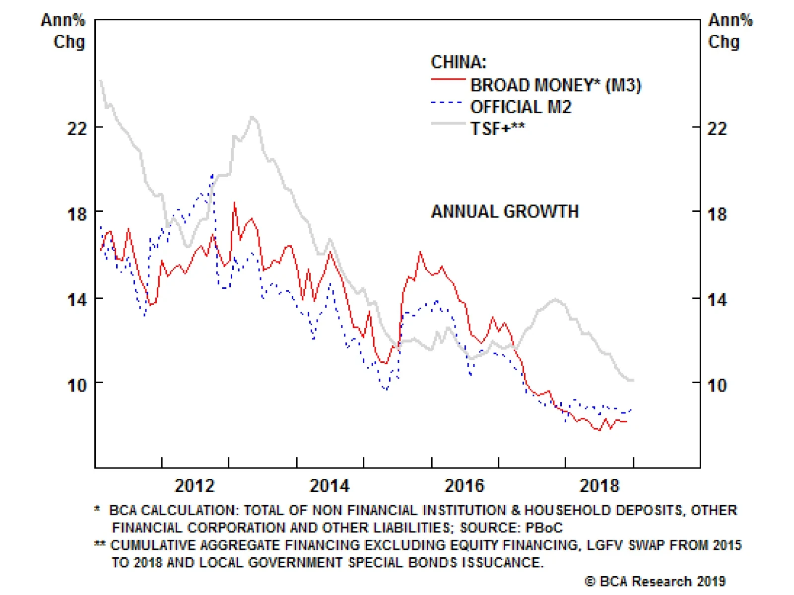
The annual rate of change in China’s total social financing adjusted for local government special bonds issuance continues to decelerate, growing at 10%. Consequently, the 12-month credit impulse is still deteriorating. An imminent end to China’s cyclical…
This is the second of a two-part Special Report on the structural changes that have occurred as a result of the Great Recession and financial crisis. We look at three issues: asset correlation, the safety of the financial system, and the level of global debt. First, correlations among financial assets shifted dramatically during the financial crisis and the after-effects lingered for years. Some believe that the underlying level of correlation among risk assets has shifted permanently higher for two main reasons: (1) trading factors such as the increased use of exchange-traded funds and algorithms; and (2) the risk-on/risk-off environment in which trading has become more binary in nature, due to the sharp rise in policy uncertainty, risk aversion and risk premiums in the aftermath of the Great Recession. We have sympathy for the second explanation. The equity risk premium (ERP) was forced higher on a sustained basis by the financial crisis, driven by fears that the advanced economies had entered a ‘secular stagnation’. Elevated correlation among risk assets was a result of a higher-than-normal ERP. The ERP should decline as fears of secular stagnation fade, leading to a lower average level of risk asset correlation than has been the case over the last decade. Second, regulators have been working hard to ensure that the financial crisis never happens again. But is the financial system really any safer today? Undoubtedly, banks have improved balance sheet and funding resilience, and have significantly reduced their involvement in complex financial activities. The propensity for contagion among banks has diminished and there has been a dramatic decline in the volume of complex structured credit securities. The bad news is that the level of global debt has increased at an alarming pace. The third part of this report highlights that elevated levels of debt could cause instability in the global financial system. Choking debt levels boost the vulnerability to negative shocks. The number and probability of potential shocks appear to have increased since 2007, including extreme weather events, sovereign debt crises, large-scale migration, populism, water crises and cyber & data attacks. The lack of a fiscal buffer in most countries means that it will be difficult or impossible to provide any fiscal relief in the event of a negative shock. Moreover, the end of the Debt Supercycle means that the monetary and fiscal authorities will find it difficult to encourage the private sector to spend more in most cases. For EM, deleveraging has not even started and more financial fireworks seem inevitable in the context of a strong dollar and rising global yields. China may avoid a crisis, but the adjustment to a less credit-driven economy is already proving to be a painful process. The Great Recession and Financial Crisis cast a long shadow that will affect economies, policy and financial markets for years to come. Rather than reviewing the roots of the crisis, the first of our two-part series examined the areas where we believe structural change has occurred related to the economy or financial markets. We covered the changing structure of the corporate bond market, the inflation outlook, central bank policymaking and equilibrium bond yields. We highlighted that the financial crisis transformed the corporate bond market in several ways that heighten the risk for quality spreads in the next downturn. We made the case that the prolonged inflation undershoot is sowing the seeds of an overshoot in the coming years, in part related to central bank policymakers that are doomed to fight the last war. Finally, we argued that the forces behind the structural and cyclical bull market in bonds reached an inflection point in 2016/2017. In Part II, we examine the theory that the financial crisis has permanently lifted market correlations among risk assets. Next, we look at whether regulatory changes implemented as a result of the financial crisis have made the global financial system safer. Finally, we highlight the implications of the continued rise in global leverage over the past decade in the context of BCA’s Debt Supercycle theme. The bottom line is that the global financial system still faces substantial risks, despite a more highly regulated banking system. (1) Are Risk Asset Correlations Permanently Higher? Correlations among financial assets shifted dramatically during the financial crisis and the after-effects lingered for years. For example, risk assets became more highly correlated, suggesting little differentiation within or across asset classes. Chart II-1 presents a proxy for U.S. equity market correlations, using a sample of current S&P 100 companies. The average correlation was depressed in the 1990s and 2000s relative to the 1980s. It spiked in 2007 and fluctuated at extremely high levels for several years, before moving erratically lower. It has jumped recently and is roughly in the middle of the post-1980s range. Chart II-1Two Factors Driving Correlation
bca.bca_mp_2019_01_01_s2_c1
bca.bca_mp_2019_01_01_s2_c1
Correlations will undoubtedly ebb and flow in the coming years and will spike again in the next recession. But a key question is whether correlations will oscillate around a higher average level than in the 1990s and 2000s. The consensus seems to believe that the underlying level of correlation among risk assets has indeed shifted higher on a structural basis for two main reasons: Market Structure Changes: Many investors point to trading factors such as the increased use of index products (exchange-traded funds for example), and high-frequency/algorithmic trading as likely culprits. Macro “theme” investing has reportedly become more popular and is often implemented through algorithms. The result is an increase in stock market volatility and a tendency for risk-asset prices to move up and down based on momentum because they are all being traded as a group. These factors would likely be evident today even if the financial crisis never happened, but the popularity of algorithm trading may have been encouraged by the fact that the macro backdrop was so uncertain for years after Lehman collapsed. Risk On/Off Trading Environment: Trading has become more binary in nature, due to the sharp rise in policy uncertainty, risk aversion and risk premiums in the aftermath of the Great Recession. Even after the recession ended, the headwinds to growth were formidable and many felt that the sustainability of the recovery hinged largely on the success or failure of unorthodox monetary policies. The general feeling was that either the policies would “work”, the output gap would gradually close and risk assets would perform well, or it would fail and risk assets would be dragged down by a return to recession. Thus, markets traded on an extreme “risk-on/risk-off” basis, as sentiment swung wildly with each new piece of economic and earnings data. While the market structure thesis has merit on the surface, the impact should only be short term in nature. It is difficult to see how a change in the intra-day microstructure of the market could have such a fundamental, wide-ranging and permanent impact on market prices. Previous research suggests that any impact on market correlation beyond the very short term is likely to be small. For the sake of brevity, we won’t present the evidence here, but instead refer readers to two BCA Special Reports.1 The risk on/off trading environment thesis is a more plausible explanation. However, we find it more useful to think about it in terms of the equity risk premium (ERP). A higher ERP causes investors to revalue cash flows from all firms, which, in turn, causes structural shifts in the correlation among stocks. A lower ERP results in less homogenization of the present value of future cash flows, and raises the effect of differentiation among business models. A rise in the ERP could occur for different reasons, but the most obvious are an increase in the perceived riskiness of firms, a shift in investor risk aversion, or both. Shifts in the ERP are sometimes structural in nature, but there is also a strong cyclical element in that persistent equity declines historically have had the effect of temporarily raising the ERP and correlations. A simple model based on the ERP and volatility explains a lot of the historical variation in equity correlation, including the elevated levels observed in the years after 2007 (Chart II-2).2 The shift lower in correlations after 2012 reflects both a lower equity risk premium and a dramatic decline in downside volatility. Chart II-2Simple Model Explains Correlation
Simple Model Explains Correlation
Simple Model Explains Correlation
It is tempting to believe that the lingering shell-shock related to the financial crisis means that the underlying equity risk premium has shifted permanently higher. The ERP is still elevated by historical standards, but this is more reflective of extraordinarily low bond yields than an elevated forward earnings yield. Investors evidently believe that the U.S. and other developed economies are stuck in a “secular stagnation”, which will require low interest rates for many years just to keep economic growth near its trend pace. In other words, the equilibrium interest rate, or R-star, is still very low. The ERP and correlations among risk assets will undoubtedly spike again in the next recession. Nonetheless, in the absence of recession, we expect fears regarding secular stagnation to fade further. If the advanced economies hold up as short-term interest rates and bond yields rise, then concerns that R-star is extremely low will dissipate and expectations regarding equilibrium bond yields will shift higher. The ERP will move lower as bond yields, rather than the earnings yield, do most of the adjustment. The underlying correlations among risk asset prices should correspondingly recede. This includes correlations among a wide variety of risk assets, such as corporate bonds and commodities. While this describes our base case outlook, there is a non-trivial risk that the next recession arrives soon and is deep. This would underscore the view that R-star is indeed very low and the economy needs constant monetary stimulus just to keep it out of recession (i.e. the secular stagnation thesis). The ERP and correlations would stay elevated on average in that scenario. What About The Stock/Bond Correlation? Chart II-3 shows the rolling correlation between monthly changes in the 10-year Treasury bond yield and the S&P 500. The correlation was generally negative between the late-1960s and the early-2000s. Bond yields tended to rise whenever the S&P 500 was falling. Over the past two decades, however, bond yields have generally declined when the stock market has swooned. Chart II-3Structural Shifts In The Stock/Bond Correlation
Structural Shifts In The Stock/Bond Correlation
Structural Shifts In The Stock/Bond Correlation
Inflation expectations can help explain the shift in stock/bond correlation. Expectations became unmoored after 1970, which meant that inflationary shocks became the primary driver of bond yields. Strong growth became associated with rising inflation and inflation expectations, and the view that central banks had fallen behind the curve. Bond yields surged as markets discounted aggressive tightening designed to choke off inflation. And, given that inflation lags the cycle and had a lot of persistence, central banks were not in a position to ease policy at the first hint of a growth slowdown. This was obviously a poor backdrop for stocks. When inflation expectations became well anchored again around the late 1990s, investors no longer feared that central banks would have to aggressively stomp on growth whenever actual inflation edged higher. Central banks also had more latitude to react quickly by cutting rates at the first sign of slower economic growth. Fluctuations in growth became the primary driver of bond yields, allowing stock prices to rise and fall along with yields. The correlation has therefore been positive most of the time since 2003. Bottom Line: A negative correlation between stocks and bond yields reared its ugly head in the last quarter of 2018. The equity correction reflected several factors, but the previous surge in bond yields and hawkish Fed comments appeared to spook markets. Investors became nervous that the fed funds rate had already entered restrictive territory, at a time when the global economy was cooling off. We expect more of these episodes as the Fed normalizes short-term interest rates over the next couple of years. Nonetheless, we see no evidence that inflation expectations have become unmoored. This implies that the stock-bond correlation will generally be positive most of the time over the medium term. In addition, the average level of correlation among risk assets has probably not been permanently raised, although spikes during recessions or growth scares will inevitably occur. (2) Is The Global Financial System Really Safer Today? The roots of the great financial crisis and recession involved a global banking and shadow banking system that encouraged leverage and risk-taking in ways that were hard for investors and regulators to assess. Complex and opaque financial instruments helped to hide risk, at a time when regulators were “asleep at the switch”. In many countries, credit grew at a much faster pace than GDP and capital buffers were dangerously low. Banking sector compensation skewed the system toward short-term gains over long-term sustainable returns. Lax lending standards and a heavy reliance on short-term wholesale markets to fund trading and lending activity contributed to cascading defaults and a complete seizure in parts of the money and fixed income markets. A vital question is whether the financial system is any less vulnerable today to contagion and seizure. The short answer is that the financial system is better prepared for a shock, but the problem is that the number of potential sources of instability have increased since 2007. Since the financial crisis, regulators have been working hard to ensure that the financial crisis never happens again. Reforms have come under four key headings: Capital: Regulators raised the minimum capital requirement for banks, added a buffer requirement, and implemented a surcharge on systemically important banks. Liquidity: Regulators implemented a Liquidity Coverage Ratio (LCR) and a Net Stable Funding Ratio (NSFR) in order to ensure that banks have sufficient short-term funds to avoid liquidity shortages and bank runs.3 Risk Management: Banks are being forced to develop systems to better monitor risk, and are subject to periodic stress tests. Resolution Planning: Banks have also been asked to detail options for resolution that, hopefully, should reduce systemic risk should a major financial institution become insolvent. Global systemically-important banks, in particular, will require sufficient loss-absorbing capacity. A major study by the Bank for International Settlements,4 along with other recent studies, found that systemic risk in the global financial system has diminished markedly as a result of the new regulations. On the whole, banks have improved balance sheet and funding resilience, and have significantly reduced their involvement in complex financial activities. Lending standards have tightened almost across the board relative to pre-crisis levels, particularly for residential mortgages. Additional capital and liquid assets provide a much wider buffer today against adverse shocks, allowing most banks to pass recent stress tests (Chart II-4). Financial institutions have generally re-positioned toward retail and commercial banking and wealth management, and away from more complex and capital-intensive activities (Chart II-5). The median share of trading assets in total assets for individual G-SIBs has declined from around 20% to 12% over 2009-16.
Chart II-4
Chart II-5
Moreover, the propensity for contagion among banks has diminished. The BIS notes that assessing all the complex interactions in the global financial system is extremely difficult. Nonetheless, a positive sign is that banks are focusing more on their home markets since the crisis, and that direct connections between banks through lending and derivatives exposures have declined. The BIS highlights that aggregate foreign bank claims have declined by 16% since the crisis, driven particularly by banks from the advanced economies most affected by the crisis, especially from some European countries (Chart II-6). It is also positive that European banks have made some headway in diminishing over-capacity, although problems still exist in Italy. Finally, and importantly, there has been a distinct shift toward more stable sources of funding, such as deposits, away from fickle wholesale markets (Charts II-7 and II-8). Chart II-6Less Cross Border Lending (Until Recently)
Less Cross Border Lending (Until Recently)
Less Cross Border Lending (Until Recently)
Chart II-7
Chart II-8
Outside of banking, many other regulatory changes have been implemented to make the system safer. One important example is that rules were adjusted to reduce the risk of runs on money market funds. What About Shadow Banking? Of course, more could be done to further indemnify the financial system. Concentration in the global banking system has not diminished, and it appears that the problem of “too big to fail” has not been solved. And then there is the shadow banking sector, which played a major role in the financial crisis by providing banks a way of moving risk to off-balance sheet entities and securities, and thereby hiding the inherent risks. Shadow banking is defined as credit provision that occurs outside of the banking system, but involves the key features of bank lending including leverage, and liquidity and maturity transformation. Complex structured credit securities, such as Collateralized Debt Obligations, allowed this type of transformation to mushroom in ways that were difficult for regulators and investors to understand. A recent study by the Group of Thirty5 concluded that securitization has dropped to a small fraction of its pre-crisis level, and that growing non-bank credit intermediation since the Great Recession has primarily been in forms that do not appear to raise financial stability concerns. Much of the credit creation has been in non-financial corporate bonds, which is a more stable and less risky form of credit extension than bank lending. Other types of lending have increased, such as corporate credit to pension funds and insurance companies, but this does not involve maturity transformation, according to the Group of Thirty. There has been a dramatic decline in the volume of complex structured credit securities such as collateralized debt obligations, asset-backed commercial paper, and structured investment vehicles since 2007 (Chart II-9). While the situation must be monitored, the Group of Thirty study concludes that the financial system in the advanced economies appears to be less vulnerable to bouts of self-reinforcing forced selling, such as occurred during the 2008 crisis. Chart II-9Less Private-Sector Securitization
Less Private-Sector Securitization
Less Private-Sector Securitization
One exception is the U.S. leveraged loan market, which has swelled to $1.13 trillion and about half has been pooled into Collateralized Loan Obligations. As with U.S. high-yield bonds, the situation is fine as long as profitability remains favorable. But in the next recession, lax lending standards today will contribute to painful losses in leveraged loans. The Bad News That’s the good news. The bad news is that, while the financial system might have become less complex and opaque, the level of debt has increased at an alarming rate in both the private and public sectors in many countries. Elevated levels of debt could cause instability in the global financial system, especially as global bond yields return to more normal levels by historical standards. We discuss other pressure points such as Emerging Markets and China in the next section, although the latter deserves a few comments before we leave the subject of shadow banking. The Group of Thirty notes that 30% of Chinese credit is provided by a broad array of poorly regulated shadow banking entities and activities, including trust funds, wealth management products, and “entrusted loans.” Links between these entities and banks are unclear, and sometimes involve informal commitments to provide credit or liquidity support. The study takes some comfort that most of Chinese debt takes place between Chinese domestic state-owned banks and state-owned companies or local government financing vehicles. Foreign investors have limited involvement, thus reducing potential direct contagion outside of China in the event of a financial event. Still, the potential for contagion internationally via global sentiment and/or the economic fallout is high. The other bad news is that, while regulators in the advanced economies have managed to improve the ability of financial institutions to weather shocks, potential risks to the financial system have increased in number and in probability of occurrence. The Global Risk Institute (GRI) recently published a detailed comparison of potential shocks today relative to 2007.7 The report sees twice the number of risks versus 2007 that are identified as “current” (i.e. could occur at any time) and of “high impact”. The most pressing risks today include extreme weather events, asset bubbles, sovereign debt crises, large-scale involuntary migration, water crises and cyber & data attacks. Any of these could trigger a broad financial crisis if the shock is sufficiently intense, despite improved regulation. The GRI study also eventuates how the risks will evolve over the next 11 years. Readers should see the study for details, but it is interesting that the experts foresee cyber dependency rising to the top of the risk pile by 2030. The increase is driven by the importance of data ownership, the increasing role of algorithms and control systems, and the $1.2 trillion projected cost of cyber, data and infrastructure attacks. Our computer systems are not prepared for the advances of technology, such as quantum computing. Climate change moves to the number two risk spot in its base-case outlook. Space limitations precluded a discussion of the rise of populism in this report, but the GRI sees the political tensions related to income inequality as the number three threat to the global financial system by 2030. Bottom Line: Regulators have managed to substantially reduce the amount of hidden risk and the potential for contagion between financial institutions and across countries since 2007. Banks have a larger buffer against stocks. Unfortunately, the number and probability of potential shocks to the financial system appear to have increased since 2007. (3) Implications Of The Global Debt Overhang The End of the Debt Supercycle is a key BCA theme influencing our macro view of the economic and market outlook for the coming years. For several decades, the willingness of both lenders and borrowers to embrace credit was a lubricant for economic growth and rising asset prices and, importantly, underpinned the effectiveness of monetary policy. During times of economic and/or financial stress, it was relatively easy for the Federal Reserve and other central banks to improve the situation by engineering a new credit up-cycle. However, since the 2007-09 meltdown, even zero (or negative) policy rates have been unable to trigger a strong revival in private credit growth in the major developed economies, except in a few cases. The end of the Debt Supercycle has severely impaired the key transmission channel between changes in monetary policy and economic activity. The combination of high debt burdens and economic uncertainty has curbed borrowers’ appetite for credit while increased regulatory pressures and those same uncertainties have made lenders less willing to extend loans. This has severely eroded the effectiveness of lower interest in boosting credit demand and supply, forcing central banks to rely increasingly on manipulating asset prices and exchange rates. On a positive note, the plunge in interest rates has lowered debt servicing costs to historically low levels. Yet, it is the level, rather than the cost, of debt that seems to have been an impediment to the credit cycle, contributing to a lethargic economic expansion. The Bank for International Settlements (BIS) publishes an excellent dataset of credit trends across a broad swath of developing and emerging economies. Some broad conclusions come from an examination of the data (Charts II-10 and II-11):7 Chart II-10Advanced Economies: Some Deleveraging
Advanced Economies: Some Deleveraging
Advanced Economies: Some Deleveraging
Chart II-11EM: Deleveraging Has Not Even Started
EM: Deleveraging Has Not Even Started
EM: Deleveraging Has Not Even Started
Private debt growth has only recently accelerated for the advanced economies as a whole. There are only a handful of developed economies where private debt-to-GDP ratios have moved up meaningfully in the past few years. These are countries that avoided a real estate/banking bust and where property prices have continued to rise (e.g. Canada and Australia). The high level of real estate prices and household debt currently is a major source of concern to the authorities in those few countries. Even where some significant consumer deleveraging has occurred (e.g. the U.S., Spain and Ireland), debt-to-income ratios remain very high by historical standards. In many cases, a stabilization or decline in private debt burdens has been offset by a continued rise in public debt, keeping overall leverage close to peak levels. This is a key legacy of the financial crisis; many governments were forced to offset the loss of demand from private sector deleveraging by running larger and persistent budget deficits. Weak private demand accounts for close to 50% of the rise in public debt on average according to the IMF. Global debt of all types (public and private) has soared from 207% of GDP in 2007 to 246% today. The Debt Supercycle did not end everywhere at the same time. It peaked in Japan more than 20 years ago and has not yet reached a decisive bottom. The 2007-09 meltdown marked the turning point for the U.S. and Europe, but it has not even started in the emerging world. The financial crisis accelerated the accumulation of debt in the latter as investors shifted capital away from the struggling advanced economies to (seemingly less risky) emerging markets. Both EM private- and public-sector debt ratios have continued to move up at an alarming pace. The lesson from Japan is that deleveraging cycles following the bursting of a major credit bubble can last a very long time indeed. One key area where there has been significant deleveraging is the U.S. household sector (Chart II-12). The ratio of household debt to income has fallen below its long-term trend, suggesting that the deleveraging process is well advanced. However, one could argue that the ratio will undershoot the trend for an extended period in a mirror image of the previous overshoot. Or, it may be that the trend has changed; it could now be flat or even down. Chart II-12U.S. Household Deleveraging...
U.S. Household Deleveraging...
U.S. Household Deleveraging...
What is clear is that U.S. attitudes toward saving and spending have changed dramatically since the Great Financial Crisis (GFC) (Chart II-13). Like the Great Depression of the 1930s that turned more than one generation off of debt, the 2008/09 crisis appears to have been a watershed event that marked a structural shift in U.S. consumer attitudes toward credit-financed spending. The Debt Supercycle is over for this sector. Chart II-13...As Attitudes To Debt Change
...As Attitudes To Debt Change
...As Attitudes To Debt Change
Developing Countries: Debt And Economic Fundamentals BCA’s long-held caution on emerging economies and markets is rooted in concern about deteriorating fundamentals. Trade wars and a tightening Fed are negative for EM assets, but the main headwinds facing this asset class are structural. Excessive debt is a ticking time bomb for many of these countries. EM dollar-denominated debt is now as high as it was in the late 1990s as a share of both GDP and exports (Chart II-14). Moreover, the declining long-term growth potential for emerging economies as a group makes it more difficult for them to service the debt. The structural downtrend in EM labor force and productivity growth underscores that trend GDP growth has collapsed over the past three decades (Chart II-14, bottom panel). Chart II-14EM: High Debt And Slow Growth...
EM: High Debt And Slow Growth...
EM: High Debt And Slow Growth...
The 2019 Key Views8 report from our Emerging Markets Strategy team highlights that excessive capital inflows over the past decade have contributed to over-investment and mal-investment. Much of the borrowing was used to fund unprofitable projects, as highlighted by the plunge in productivity growth, profit margins and return on assets in the EM space relative to pre-Lehman levels (Chart II-15) Decelerating global growth in 2018 has exposed these poor fundamentals. Chart II-15...Along With Deteriorating Profitability
...Along With Deteriorating Profitability
...Along With Deteriorating Profitability
As we highlighted in the BCA Outlook 2019, emerging financial markets may enjoy a rally in the second half of 2019 on the back of Chinese policy stimulus. However, this will only represent a ‘sugar high’. The debt overhang in emerging market economies is unlikely to end benignly because a painful period of corporate restructuring, bank recapitalization and structural reforms are required in order to boost productivity and thereby improve these countries’ ability to service their debt mountains. China’s Debt Problem Space limitations preclude a full discussion of the complex debt situation in China and the risks it poses for the global financial system. Waves of stimulus have caused total debt to soar from 140% of GDP in 2008 to 260% of GDP at present (Chart II-16). Since most of the new credit has been used to finance fixed-asset investment, China has ended up with a severe overcapacity problem. The rate of return on assets in the state-owned corporate sector has fallen below borrowing costs (Chart II-17). Chinese banks are currently being told that they must lend more money to support the economy, while ensuring that their loans do not sour. This has become an impossible feat. Chart II-16China's Overinvestment...
China's Overinvestment...
China's Overinvestment...
Chart II-17Has Undermined The Return On Assets
Has Undermined The Return On Assets
Has Undermined The Return On Assets
The previous section highlighted that much of the debt has been created in the opaque shadow banking system, where vast amounts of hidden risk have likely accumulated. Whether or not the central government is willing and/or able to cover a wave of defaults and recapitalize the banking system in the event of a negative shock is hotly debated, both within and outside of BCA. But even if a financial crisis can be avoided, bringing an end to the unsustainable credit boom will undoubtedly have significant consequences for the Chinese economy and the emerging economies that trade with it. Interest Costs To Rise Globally, many are concerned about rising interest costs as interest rates normalize over the coming years. In Appendix Charts II-19 to II-21, we provide interest-cost simulations for selected government, corporate and household sectors under three interest-rate scenarios. The good news is that the starting point for interest rates is still low, and that it takes years for the stock of outstanding debt to adjust to higher market rates. Even if rates rise by another 100 basis points, interest burdens will increase but will generally remain low by historical standards. It would take a surge of 300 basis points across the yield curve to really ‘move the needle’ in terms of interest expense. This does not imply that the global debt situation is sustainable or that a financial crisis can be easily avoided. The next economic downturn will probably not be the direct result of rising interest costs. Nonetheless, elevated government, household and/or corporate leverage has several important long-term negative implications: Limits To Counter-Cyclical Fiscal Policy: Government indebtedness will limit the use of counter-cyclical fiscal policy during the next economic downturn. Chart II-18 highlights that structural budget deficits and government debt levels are higher today compared to previous years that preceded recessions. The risk is especially high for emerging economies and some advanced economies (such as Italy) where investors will be unwilling to lend at a reasonable rate due to default fears. Even in countries where the market still appears willing to lend to the government at a low interest rate, political constraints may limit the room to maneuver as voters and fiscally-conservative politicians revolt against a surge in budget deficits. This will almost certainly be the case in the U.S., where the 2018 tax cuts mean that the federal budget deficit is likely to be around 6% of GDP in the coming years even in the absence of recession. A recession would push it close to a whopping 10%. Even in countries where fiscal stimulus is possible, the end of the Debt Supercycle means that the monetary and fiscal authorities will find it difficult to encourage the private sector to spend and take on more debt.
Chart II-18
Growth Headwinds: The debt situation condemns the global economy to a slower pace of trend growth in part because of weaker capital spending. From one perspective this is a good thing, because spending financed by the excessive use of credit is unsustainable. Still, deleveraging has much further to go at the global level, which means that spending will have to be constrained relative to income growth. The IMF estimates that deleveraging in the private sector for the advanced economies is only a third of historical precedents at this point in the cycle. The IMF also found that debt overhangs have historically been associated with lower GDP growth even in the absence of a financial crisis. Sooner or later, overleveraged sectors have to retrench. Vulnerability To Negative Shocks: If adjustment is postponed, debt reaches levels that make the economy highly vulnerable to negative shocks as defaults rise and lenders demand a higher return or withdraw funding altogether. IMF work shows that economic downturns are more costly in terms of lost GDP when it is driven or accompanied by a financial crisis. This is particularly the case for emerging markets. Bottom Line: Although credit growth has been subdued in most major advanced economies, there has been little deleveraging overall and debt-to-GDP is still rising at the global level. Elevated debt levels are far from benign, even if it appears to be easily financed at the moment. It acts as dead weight on economic activity and makes the world economy vulnerable to negative shocks. It steals growth from the future and, in the event of such a shock, the lack of a fiscal buffer in most countries means that it will be difficult or impossible to provide fiscal relief. The end of the Debt Supercycle means that the monetary and fiscal authorities will find it difficult to encourage the private sector to spend in most cases. For EM, deleveraging has not even started and more financial fireworks seem inevitable in the context of a strong dollar and rising global yields. China may avoid a crisis, but the adjustment to a less credit-driven economy is already proving to be a painful process. Mark McClellan Senior Vice President The Bank Credit Analyst APPENDIX Chart II-19Corporate Interest Cost Scenarios
Corporate Interest Interest Cost Scenarios
Corporate Interest Interest Cost Scenarios
Chart II-20Government Interest Cost Scenarios
Government Interest Cost Scenarios
Government Interest Cost Scenarios
Chart II-21U.S. Household Sector Interest Cost Scenarios
U.S. Household Sector Interest Cost Scenarios
U.S. Household Sector Interest Cost Scenarios
1 Please see BCA U.S. Investment Strategy Special Report "The Bane Of Investors’ Existence: Why Is Correlation High And When Will It Fall?" dated January 4, 2012, available at usis.bcaresearch.com. Also see BCA Global ETF Strategy Special Report "The Passive Menace," dated September 13, 2017, available at etf.bcaresearch.com 2 We use only below average returns in the calculation of volatility (downside volatility) because we are more concerned with the risk of equity market declines for the purposes of this model. 3 The LCR requires a large bank to hold enough high-quality liquid assets to cover the net cash outflows the bank would expect to occur over a 30-day stress scenario. The NSFR complements the LCR by requiring an amount of stable funding that is tailored to the liquidity risk of a bank’s assets and liabilities, based on a one-year time horizon. 4 Structural Changes in Banking After the Crisis. CGFS Papers No.60. Bank for International Settlements, January 2018. 5 Shadow Banking and Capital Markets Risks and Opportunities. Group of Thirty. Washington, D.C., November 2016. 6 Back to the Future: 2007 to 2030. Are New Financial Risks Foreshadowing a Systemic Risk Event? Global Risk Institute. 7 For more details on public and private debt trends, please see BCA Special Report "The End Of The Debt Supercycle: An Update," dated May 11, 2016, available at bca.bcaresearch.com 8 Please see BCA Emerging Markets Strategy Weekly Report "2019 Key Views: Will The EM Lost Decade End With A Bang Or A Whimper?" dated December 6, 2018, available at ems.bcaresearch.com
Highlights Investors ran for cover in December as they succumbed to a litany of worries regarding the outlook. The key question is whether the pessimism is overdone or an extended equity bear market is underway. Our outlook for the U.S. and global economies has not changed since we published our 2019 Outlook. There are some tentative signs that the two U.S. weak spots, housing and capital spending, are bottoming out. However, our global leading economic indicators continue to herald a soft first half of 2019 outside of the U.S. The dollar thus has more upside in the near term. The political risks facing investors have not diminished either. In particular, we expect turbulence related to the U.S./China trade war to extend well beyond the 3-month “truce” period. The returns to stocks, corporate bonds and commodities historically have not been particularly attractive on average when the U.S. yield curve is this flat. Nonetheless, the risk/reward balance has improved enough as prices fell over the past month to justify upgrading equities in the advanced economies back to overweight. Move to a neutral level of cash, and keep bonds underweight on a 6-12 month investment horizon. The upgrade to stocks in the developed markets does not carry over to emerging markets. The backdrop will remain hostile to EM assets until China pulls out the big policy stimulus guns and the dollar peaks. Stay clear of EM assets and neutral on base metals for now, but be prepared to upgrade sometime in 2019. Global government bonds could rally a little more in the near term if the risk-off phase continues. Nonetheless, with little chance of any more rate hikes discounted in the U.S. yield curve, the risks for U.S. and global yields are tilted to the upside. Bond investors with a 6-12 month horizon should ride out the near-term volatility with a short-duration position. Oil prices have overshot to the downside. Supply is adjusting and, given robust energy demand in 2019, we still expect prices to rise to $82. Feature Investors ran for cover in December as they succumbed to concerns regarding the U.S./China trade war, corporate leverage, global growth, rising U.S. interest rates and the shift toward quantitative tightening. Some equity indexes, such as the Russell 2000, reached bear market territory, having lost more than 20%. Losses have been even worse outside the U.S. Earnings revisions have plunged into the “net downgrade” zone. Implied volatility has spiked and corporate bond spreads are surging (Chart I-1). The key question is whether the pessimism is overdone or an extended equity bear market is underway. Chart I-1A Flight To Quality
A Flight To Quality
A Flight To Quality
We laid out our economic view in detail in the BCA Outlook 2019 report, published in late November. Not enough has changed on the global economic front in the three weeks since then that would justify such a violent shift in investor sentiment. That said, our favorite global leading economic indicators continue to erode (Chart I-2). The only ray of hope is that the diffusion index constructed from our Global Leading Economic Indicator appears to have bottomed. Nonetheless, the actual LEI will keep falling until the diffusion index shifts into positive territory. Chart I-2Global Leading Indicators Still Weak
Global Leading Indicators Still Weak Global Leading Indicators Flashing Red
Global Leading Indicators Still Weak Global Leading Indicators Flashing Red
For China, a key source of investor angst, the latest retail sales and industrial production reports reinforced that economic momentum continues to recede. We will not be convinced that growth is bottoming until we see an upturn in our credit impulse indicator (Chart I-3). Its continued decline in November suggests that the outlook for emerging market assets and commodity prices is poor for at least the next quarter. Global industrial output appears headed for a mild contraction. The manufacturing troubles are centered in the emerging Asian economies, but Europe and Japan are also feeling the negative effects. Chart I-3China: No Bottom Yet
China: No Bottom Yet
China: No Bottom Yet
In the U.S., November’s bounce in housing starts and permits is a hopeful sign that the soft patch in this sector is ending. However, it is not clear how the devastating wildfires on the west coast have affected the housing data (Chart I-4). The downdraft in capital goods orders may also be drawing to a close, based on the latest reading from the Fed’s survey of capital spending intentions. The U.S. leading economic indicator dipped slightly in November, but remains consistent with above-trend real GDP growth in the months ahead. Chart I-4U.S.: Some Hopeful Signs
U.S.: Some Hopeful Signs
U.S.: Some Hopeful Signs
The bottom line is that our outlook for growth has not been significantly altered. We see little risk of a U.S. recession in 2019. The global economy continues to weaken, but we expect enough policy stimulus out of China to stabilize growth in that economy in the second half of the year. We highlighted in the BCA Outlook 2019 that, while the risks appeared elevated, we would consider shifting back to overweight in stocks if they cheapened sufficiently. Valuation has indeed improved in recent weeks and sentiment has turned more cautious. Global growth will likely continue to decelerate in the first half of 2019, but markets have largely discounted this outcome. In other words, the shift toward pessimism in financial markets appears overdone. The fact that the Fed has signaled a move away from regular quarter-point rate hikes adds to our confidence in playing what will likely be the last upleg in risk assets in this cycle. Fed: Rate Hikes No Longer On Autopilot The Fed lifted rates by a quarter point in December and signaled that any additional tightening will be data-dependent. The FOMC also trimmed the expected peak in the funds rate and its estimate of the long-run, or neutral, level. Policymakers were likely swayed by some disappointing U.S. economic data, the pullback in core PCE inflation, and the sharp tightening in financial conditions (Chart I-5). Chart I-5Financial Conditions Have Tightened
Financial Conditions Have Tightened
Financial Conditions Have Tightened
Monetary conditions are not tight by historical yardsticks, such as the level of real interest rates. The problem is that investors fear that the neutral level of the fed funds rate, the so-called R-star, remains very depressed. If true, it could mean that the Fed is already outright restrictive, which would signal that the monetary backdrop has turned hostile for risk assets. The OIS curve signals that the consensus believes that the Fed is pretty much done the tightening cycle (Chart I-6) Chart I-6Investors Believe The Fed Is Done!
Investors Believe The Fed Is Done!
Investors Believe The Fed Is Done!
We believe that R-star is higher than the current policy setting and is rising, as the growth headwinds related to the Great Financial Crisis fade with the passage of time. The problem is that nobody knows the level of the neutral rate. Thus, we need to watch for signs that the fed funds rate has surpassed that level, such as an inverted yield curve. The 10-year/3-month T-bill spread is still in positive territory, but barely so. Meanwhile, our R-star indicator is also flashing yellow as it sits on the zero line (Chart I-7). It is a composite of monetary indicators that in the past have been useful in signaling that monetary policy had become outright restrictive, leading to slower growth and trouble for risk assets. The lead time of this indicator relative to economic activity and risk asset prices has been quite variable historically, but a breakdown below zero would send a powerful bearish signal for risk assets if confirmed by an inverted yield curve. Chart I-7Worrying Signs Of Tight Money
Worrying Signs Of Tight Money
Worrying Signs Of Tight Money
The Implications Of Four Fed Scenarios It is not surprising that investors are struggling with a number of different possible scenarios on how the R-star/Fed policy nexus will play out. We can perhaps boil down discussion of the Fed and the implications for financial markets to a matrix of four main outcomes, based on combinations related to the level of R-Star (high or low) and the pace of Fed rate hikes in 2019 (pause or continue increasing rates by 25 basis points per quarter). Policy Mistake #1: R-star is still very low, but policymakers do not realize this and the FOMC continues to tighten into restrictive territory in 2019. By definition, the economy begins to suffer in this scenario, inflation and inflation expectations decline and long-bond yields are flat-to-lower. The yield curve inverts. However, current real rates are still so low that the fed funds rate cannot be very far above R-Star, which means it would represent only a small policy mistake. As long as the Fed recognizes the economic slowdown early enough and truncates the rate hike cycle, then there is a good chance that a recession would be avoided. Investors would initially fear a recession, however, which means that risk assets would be hit hard in absolute terms and relative to bonds and cash until recession fears fade. The direction of the dollar is perhaps trickiest part because there are so many potential cross currents. To keep things simple we will assume that global growth follows our base-case view and remains lackluster in the first half of 2019, followed by a modest re-acceleration. We believe the dollar would likely rally a little as the Fed continues tightening, but then would fall back as the FOMC is forced to turn dovish in the face of a U.S. growth scare. Policy Mistake #2: R-Star is high and rising but the Fed fails to hike rates fast enough to keep up. The economy accelerates in this scenario because monetary policy remains stimulative through 2019, at a time when the 2018 fiscal stimulus will still be providing a demand tailwind. Core PCE inflation moves above 2% and long-term inflation expectations shift up, signaling to investors that the Fed has fallen behind the inflation curve. Risk assets rip for a while and the yield curve bear-steepens as the 10-year Treasury yield moves gradually higher at first. Belatedly, the FOMC realizes it has underestimated the neutral rate and signals a hawkish policy shift. A 50-basis point rate hike at one FOMC meeting causes risk assets to buckle on the back of surging Treasury yields. The yield curve begins to bear-flatten. Eventually the curve inverts and the economy enters recession. The dollar weakens at first because higher inflation lowers U.S. real interest rates relative to the rest of the world. Global growth prospects would initially get a boost from the acceleration in U.S. growth, which is also dollar-bearish. However, in the end the dollar would likely rise as global financial markets turn risk-off. Fed Gets It Right (1): R-star is high and rising. The Fed continues to tighten in line with the increase in the neutral rate. Treasurys sell off hard and the yield curve shifts higher, but remains fairly flat (parallel shift). The curve could mildly invert temporarily, but market worries about a recession eventually recede as economic momentum remains robust, allowing the curve to subsequently trade in the 0-50 basis point range. As discussed below, risk assets tend to outperform Treasurys and cash when the yield curve is in this range, but not by much. The Treasury market would suffer significant losses. This is the most dollar-bullish of the four scenarios, given our global growth view (tepid) and the fact that the market is not even priced for a full quarter-point rate hike in 2019. Fed Gets It Right (2): R-Star is actually still quite low, but the Fed correctly sees recent economic data disappointments and the tightening in financial conditions as signs that policy is close to neutral. The Fed pauses the rate hike cycle, followed by a slower and more data-dependent pace of tightening. The yield curve stays fairly flat and flirts with inversion as investors try to figure out if the Fed has overdone it. Risk assets are volatile and deliver little return over cash. Treasurys rally a bit as the chance of any further rate hikes is priced out of the market, but the rally is limited unless the economy falls into recession (which is not part of this scenario because we are assuming the Fed “gets it right”). The dollar fluctuates, but delivers no real trend since U.S. yield differentials versus the rest of the world do not change much. As we go to press, financial markets are moving in a way that is consistent the Policy Mistake #1; the consensus appears to believe that the Fed has already lifted the fed funds rate too far, causing financial conditions to tighten. But if U.S. real GDP growth remains above-trend as we expect, then the market view could eventually transition to a belief in Mistake #2; the Fed falls behind the inflation curve. The curve would re-steepen and risk assets could have one last hurrah before the Fed gets hawkish again and the 2020 recession arrives. The transition from Mistake #1 to Mistake #2 is essentially our base-case outlook. Nonetheless, obviously the risks around this central scenario are high, especially given how late it is in the U.S. economic and policy cycle. Asset Returns And The Yield Curve Our 2018 late-cycle investing theme focussed on historical asset return and policy dynamics after the U.S. unemployment rate fell below the full-employment level in past cycles. We found that risk assets tend to run into trouble once the U.S. S&P 500 operating margin peaks. As we highlighted in the BCA Outlook 2019, our margin proxies are still not heralding that a peak is at hand. Given the recent investor obsession with the U.S. yield curve, this month we look at historical asset returns at different levels of the 10-year/3-month T-bill yield curve slope: Phase I, when the slope is above 50 basis points; Phase II, when the curve is between 0 and 50 basis points; and Phase III, when the curve is inverted (Table I-1). The data are presented as (not annualized) monthly average returns. It may be surprising that risk asset returns are for the most part positive even in when the curve is inverted. However, keep in mind that we are focussing on the curve, not on recession periods. The curve can be inverted for a long time before the subsequent recession occurs. Risk asset returns often remain positive during this period. The broad conclusions are as follows: Unsurprisingly, risk assets perform their best, in absolute terms and relative to government bonds and cash, in Phase I when the yield curve is steep. Returns tend to deteriorate as the curve flattens. This includes equities, corporate bonds and commodities. Small caps underperform large caps when the curve is between 0 and 50 basis points, but the reverse is true when the curve is flatter or steeper than that range. The ratio of cyclical stocks to defensives has not revealed a consistent pattern with respect to the yield curve, although this may reflect the short historical period available. Value stocks shine versus growth when the curve is inverted. Hedge fund and private equity returns have not varied greatly across the three yield curve environments. Structured product, such as CMBS and ABS, have enjoyed their best performance when the curve is inverted. Timberland and Farmland have also rewarded investors during Phase III. We suspected that asset returns when the curve is in the 0-50 basis point range would vary importantly with the direction of the curve. In Table I-I we split Phase II into two parts: when the curve is steepening after being inverted, and when the curve is flattening after being steep. In other words, when the consensus is either transitioning from quite bullish to very bearish, or vice-versa.
Chart I-
Risk assets such as equities (U.S. and Global) and U.S. investment-grade corporate bonds indeed perform much better in absolute terms when the curve is flat but is steepening rather than flattening. The same is true for U.S. structured product. In terms of excess returns relative to government issues, both U.S. IG and HY corporates have tended to underperform when the curve is in the 0-50 basis point range. Surprisingly, the underperformance is worse when the curve is steepening than when it is flattening. This appears to reflect an anomalous period in early 2006 when the curve was flattening but corporate bonds enjoyed strong excess returns. Emerging market equities show very strong returns in all three curve phases. This reflects the inclusion of the pre-2000 period in the mean calculations, a time when EM equities were much less correlated with U.S. financial conditions. EM equity returns have been significantly lower on average since 2000 when the curve is in the 0-50 basis point range (and especially when the curve is flattening) The bottom line is that risk assets can still reward investors with positive returns during periods when the yield curve is flat. However, it is a dangerous time, especially when the global economy is up to its eyeballs in debt. This month’s Special Report beginning on page 17 argues that, although regulation has made the global financial system more resilient to shocks compared to the pre-Lehman years, the number of potentially destabilizing shocks has increased. Moreover, the trade war and Brexit risks make the investment backdrop all the more precarious. No Quick End To The Trade War The honeymoon following the trade ceasefire between the U.S. and China, agreed at the G20 summit in early December, did not last long. The arrest of the chief financial officer of Chinese telecom maker Huawei and continuing hawkish tweets from the U.S. president dampened hopes that a trade agreement can be negotiated by March. Even news that China intended to cut tariffs on U.S. auto imports did not help much. We highlighted in the BCA Outlook 2019 that negotiations will prove to be protracted and testy. It will take a lot more than some token market-opening action on the part of China to placate the U.S. Our geopolitical team emphasizes that “trade war” is a misnomer for a broader strategic conflict that is centered on the military-industrial balance rather than the trade balance.1 For example, while China is rapidly catching up to the U.S. in research and development spending, it is only spending about half as much as the U.S. relative to its overall economy (Chart I-8). While the U.S. can accept China’s eventually surpassing it in economic output, it cannot accept China’s technological superiority. This would translate into military and strategic supremacy over time. Chart I-8R&D Expenditure By Country
R&D Expenditure By Country
R&D Expenditure By Country
U.S. demands will also be hard for China to swallow. Most importantly, the U.S. is requesting that China rein in its hacking and spying, shift its direct investment to less tech-sensitive sectors, adjust its “Made in China” targets to allow for more foreign competition, and lower foreign investment equity restrictions. These stumbling blocks will make it difficult to strike a deal on trade. We continue to believe that a final trade deal between the U.S. and China will not arrive in the 90-day timeframe of the ceasefire. Thus, global risk assets will be subject to swings in sentiment regarding the likelihood of a trade deal well beyond March. Meanwhile, as previously discussed, Chinese policy stimulus has not yet become aggressive enough to spark animal spirits in the private sector. The Chinese authorities are proceeding cautiously so as to avoid adding significantly to private- and public-sector’s debt mountain. This month’s Special Report also discusses the risks that the surge in debt over the past decade poses for the global financial system, including escalating risk in China’s shadow banking system. Brexit Pain Continues Politics surrounding the torturous Brexit process will also remain a source of volatility for global markets in 2019. Prime Minister May survived a leadership challenge, but this is hardly confidence-inspiring. The question is whether any deal can get through Westminster. The votes appear to be in place for the softest of soft Brexits, the so-called Norway+ option, if May convinces the Labour Party to break ranks. Such a deal would entail Common Market access, but at the cost of having to essentially pay for full EU membership with no ability to influence the regulatory policies that London would have to abide by. The alternative is to call for a new election (which may usher the even less pro-Brexit Labour Party into power), or to delay Brexit for a more substantive period of time, or simply to buckle under the pressure and call for a second referendum. We disagree that the failure of the Tories to endorse May’s proposed agreement means that the “no deal Brexit,” or the “Brexit cliff,” is nigh. Such an outcome is in nobody’s interest and both May and the EU can offer delays to ensure that it does not happen. Whatever happens, one thing is clear; the median voter is turning forcefully towards Bremain (Chart I-9). It will soon become untenable to delay the second referendum. The bottom line is that, while a soft Brexit is the most likely outcome, the path from here to the end result will be punishing. We do not recommend Brexit-related bets on the pound, despite the fact that it is cheap. Chart I-9A Shift Toward Bremain
A Shift Toward Bremain
A Shift Toward Bremain
2019: A Tale Of Two Halves For EM, Commodities And The Dollar One of our key themes in the BCA Outlook 2019 is that the growth divergence between China and the U.S. will persist at least for the first half of 2019. The result will be weak EM asset prices and currencies, little upside for base metals and a strong U.S. dollar. We expect the Chinese authorities will do enough to stabilize growth by mid-year, providing the impetus for a playable bounce in EM and commodity prices in the second half of 2019, coinciding with a peak in the U.S. dollar. Nonetheless, the dollar still has some upside potential in broad trade-weighted terms in the first half of 2019. Our Central Bank Monitors continue to show a greater need for policy tightening in the U.S. than in the rest of the major countries. The dollar has usually strengthened when this has been the case historically. In particular, the ECB’s Central Bank Monitor has slipped back into “easy money required” territory, reflecting moderating economic momentum and still-depressed consumer price inflation (Chart I-10). Chart I-10Our CB Monitors Support A Stronger Dollar
Our CB Monitors Support A Stronger Dollar
Our CB Monitors Support A Stronger Dollar
The ECB announced the well-anticipated end of its asset purchase program in December. The central bank will now focus on forward guidance as its main policy tool outside of setting short-term interest rates. Lending via targeted LTROs will also be considered under certain circumstances. Policymakers retained the latest forward guidance after the December MPC meeting, that rates are on hold “through the summer of 2019”. The latest reading from our ECB Monitor suggests that the central bank could be on hold for longer than that. We expect Eurozone growth to improve somewhat through the year, but we still believe that interest rate differentials will move further in favor of the dollar relative to the euro and the other major currencies. Periods of slow global growth also tend to favor the greenback. The bottom line is that, while a correction is possible in the very near term, investors with at least a six-month horizon should remain long the dollar. Investment Conclusions: Our outlook for the U.S. and global economies has not changed since we published our 2019 Outlook. The risks facing investors have not diminished either, especially given the precarious nature of late-cycle investing and the uncertainty regarding the neutral level of the fed funds rate. Historically, the returns to stocks, corporate bonds and commodities have not been particularly attractive on average when the yield curve is this flat. Nonetheless, we believe that the risk/reward balance has improved enough as prices fell over the past month to justify upgrading equities in the advanced economies to overweight. Move to a neutral level of cash, and keep bonds underweight on a 6-12 month investment horizon. Despite our more positive view on equities, we remain cautious on credit. Spreads have widened recently to more attractive levels, but we remain concerned about the high leverage of U.S. corporates, whose debt/assets ratio is on average higher now than in 2009. Signs of strain are already showing in the junk bond market, with new issuance having largely dried up since early December. If this continues, borrowers may struggle to refinance maturing debt in early 2019. Credit is an asset class that is likely to perform particularly poorly in the next recession. Our upgrade to stocks in the advanced markets does not carry over to emerging markets. The backdrop will remain hostile to EM assets until China pulls out the big policy stimulus guns and the dollar peaks. Stay clear of EM assets and neutral on base metals for now. Global government bonds could rally a little more in the near term if the risk-off phase continues. Nonetheless, with little chance of any more rate hikes discounted in the U.S. yield curve, the risks for U.S. and global yields are tilted to the upside. Bond investors with a 6-12 month horizon should ride out the near-term volatility with a short-duration position. Oil markets are still in the process of re-adjusting to an extraordinary policy reversal by the Trump Administration on its Iranian oil-export sanctions in November, as last-minute waivers were granted to Iran’s largest oil importers. We believe that oil prices have overshot to the downside. Following OPEC 2.0’s decision to cut 1.2mm b/d of production to re-balance markets in the first half of the year, we continue to expect prices to recover on the back of solid global energy demand. Canada also mandated energy firms to trim production. Our energy experts expect oil prices to reach $82/bbl in 2019. We also like gold as long as the fed funds rate remains below its neutral level. Mark McClellan Senior Vice President The Bank Credit Analyst December 21, 2018 Next Report: January 31, 2019 II. (Part II) The Long Shadow Of The Financial Crisis This is the second of a two-part Special Report on the structural changes that have occurred as a result of the Great Recession and financial crisis. We look at three issues: asset correlation, the safety of the financial system, and the level of global debt. First, correlations among financial assets shifted dramatically during the financial crisis and the after-effects lingered for years. Some believe that the underlying level of correlation among risk assets has shifted permanently higher for two main reasons: (1) trading factors such as the increased use of exchange-traded funds and algorithms; and (2) the risk-on/risk-off environment in which trading has become more binary in nature, due to the sharp rise in policy uncertainty, risk aversion and risk premiums in the aftermath of the Great Recession. We have sympathy for the second explanation. The equity risk premium (ERP) was forced higher on a sustained basis by the financial crisis, driven by fears that the advanced economies had entered a ‘secular stagnation’. Elevated correlation among risk assets was a result of a higher-than-normal ERP. The ERP should decline as fears of secular stagnation fade, leading to a lower average level of risk asset correlation than has been the case over the last decade. Second, regulators have been working hard to ensure that the financial crisis never happens again. But is the financial system really any safer today? Undoubtedly, banks have improved balance sheet and funding resilience, and have significantly reduced their involvement in complex financial activities. The propensity for contagion among banks has diminished and there has been a dramatic decline in the volume of complex structured credit securities. The bad news is that the level of global debt has increased at an alarming pace. The third part of this report highlights that elevated levels of debt could cause instability in the global financial system. Choking debt levels boost the vulnerability to negative shocks. The number and probability of potential shocks appear to have increased since 2007, including extreme weather events, sovereign debt crises, large-scale migration, populism, water crises and cyber & data attacks. The lack of a fiscal buffer in most countries means that it will be difficult or impossible to provide any fiscal relief in the event of a negative shock. Moreover, the end of the Debt Supercycle means that the monetary and fiscal authorities will find it difficult to encourage the private sector to spend more in most cases. For EM, deleveraging has not even started and more financial fireworks seem inevitable in the context of a strong dollar and rising global yields. China may avoid a crisis, but the adjustment to a less credit-driven economy is already proving to be a painful process. The Great Recession and Financial Crisis cast a long shadow that will affect economies, policy and financial markets for years to come. Rather than reviewing the roots of the crisis, the first of our two-part series examined the areas where we believe structural change has occurred related to the economy or financial markets. We covered the changing structure of the corporate bond market, the inflation outlook, central bank policymaking and equilibrium bond yields. We highlighted that the financial crisis transformed the corporate bond market in several ways that heighten the risk for quality spreads in the next downturn. We made the case that the prolonged inflation undershoot is sowing the seeds of an overshoot in the coming years, in part related to central bank policymakers that are doomed to fight the last war. Finally, we argued that the forces behind the structural and cyclical bull market in bonds reached an inflection point in 2016/2017. In Part II, we examine the theory that the financial crisis has permanently lifted market correlations among risk assets. Next, we look at whether regulatory changes implemented as a result of the financial crisis have made the global financial system safer. Finally, we highlight the implications of the continued rise in global leverage over the past decade in the context of BCA’s Debt Supercycle theme. The bottom line is that the global financial system still faces substantial risks, despite a more highly regulated banking system. (1) Are Risk Asset Correlations Permanently Higher? Correlations among financial assets shifted dramatically during the financial crisis and the after-effects lingered for years. For example, risk assets became more highly correlated, suggesting little differentiation within or across asset classes. Chart II-1 presents a proxy for U.S. equity market correlations, using a sample of current S&P 100 companies. The average correlation was depressed in the 1990s and 2000s relative to the 1980s. It spiked in 2007 and fluctuated at extremely high levels for several years, before moving erratically lower. It has jumped recently and is roughly in the middle of the post-1980s range. Chart II-1Two Factors Driving Correlation
bca.bca_mp_2019_01_01_s2_c1
bca.bca_mp_2019_01_01_s2_c1
Correlations will undoubtedly ebb and flow in the coming years and will spike again in the next recession. But a key question is whether correlations will oscillate around a higher average level than in the 1990s and 2000s. The consensus seems to believe that the underlying level of correlation among risk assets has indeed shifted higher on a structural basis for two main reasons: Market Structure Changes: Many investors point to trading factors such as the increased use of index products (exchange-traded funds for example), and high-frequency/algorithmic trading as likely culprits. Macro “theme” investing has reportedly become more popular and is often implemented through algorithms. The result is an increase in stock market volatility and a tendency for risk-asset prices to move up and down based on momentum because they are all being traded as a group. These factors would likely be evident today even if the financial crisis never happened, but the popularity of algorithm trading may have been encouraged by the fact that the macro backdrop was so uncertain for years after Lehman collapsed. Risk On/Off Trading Environment: Trading has become more binary in nature, due to the sharp rise in policy uncertainty, risk aversion and risk premiums in the aftermath of the Great Recession. Even after the recession ended, the headwinds to growth were formidable and many felt that the sustainability of the recovery hinged largely on the success or failure of unorthodox monetary policies. The general feeling was that either the policies would “work”, the output gap would gradually close and risk assets would perform well, or it would fail and risk assets would be dragged down by a return to recession. Thus, markets traded on an extreme “risk-on/risk-off” basis, as sentiment swung wildly with each new piece of economic and earnings data. While the market structure thesis has merit on the surface, the impact should only be short term in nature. It is difficult to see how a change in the intra-day microstructure of the market could have such a fundamental, wide-ranging and permanent impact on market prices. Previous research suggests that any impact on market correlation beyond the very short term is likely to be small. For the sake of brevity, we won’t present the evidence here, but instead refer readers to two BCA Special Reports.2 The risk on/off trading environment thesis is a more plausible explanation. However, we find it more useful to think about it in terms of the equity risk premium (ERP). A higher ERP causes investors to revalue cash flows from all firms, which, in turn, causes structural shifts in the correlation among stocks. A lower ERP results in less homogenization of the present value of future cash flows, and raises the effect of differentiation among business models. A rise in the ERP could occur for different reasons, but the most obvious are an increase in the perceived riskiness of firms, a shift in investor risk aversion, or both. Shifts in the ERP are sometimes structural in nature, but there is also a strong cyclical element in that persistent equity declines historically have had the effect of temporarily raising the ERP and correlations. A simple model based on the ERP and volatility explains a lot of the historical variation in equity correlation, including the elevated levels observed in the years after 2007 (Chart II-2).3 The shift lower in correlations after 2012 reflects both a lower equity risk premium and a dramatic decline in downside volatility. Chart II-2Simple Model Explains Correlation
Simple Model Explains Correlation
Simple Model Explains Correlation
It is tempting to believe that the lingering shell-shock related to the financial crisis means that the underlying equity risk premium has shifted permanently higher. The ERP is still elevated by historical standards, but this is more reflective of extraordinarily low bond yields than an elevated forward earnings yield. Investors evidently believe that the U.S. and other developed economies are stuck in a “secular stagnation”, which will require low interest rates for many years just to keep economic growth near its trend pace. In other words, the equilibrium interest rate, or R-star, is still very low. The ERP and correlations among risk assets will undoubtedly spike again in the next recession. Nonetheless, in the absence of recession, we expect fears regarding secular stagnation to fade further. If the advanced economies hold up as short-term interest rates and bond yields rise, then concerns that R-star is extremely low will dissipate and expectations regarding equilibrium bond yields will shift higher. The ERP will move lower as bond yields, rather than the earnings yield, do most of the adjustment. The underlying correlations among risk asset prices should correspondingly recede. This includes correlations among a wide variety of risk assets, such as corporate bonds and commodities. While this describes our base case outlook, there is a non-trivial risk that the next recession arrives soon and is deep. This would underscore the view that R-star is indeed very low and the economy needs constant monetary stimulus just to keep it out of recession (i.e. the secular stagnation thesis). The ERP and correlations would stay elevated on average in that scenario. What About The Stock/Bond Correlation? Chart II-3 shows the rolling correlation between monthly changes in the 10-year Treasury bond yield and the S&P 500. The correlation was generally negative between the late-1960s and the early-2000s. Bond yields tended to rise whenever the S&P 500 was falling. Over the past two decades, however, bond yields have generally declined when the stock market has swooned. Chart II-3Structural Shifts In The Stock/Bond Correlation
Structural Shifts In The Stock/Bond Correlation
Structural Shifts In The Stock/Bond Correlation
Inflation expectations can help explain the shift in stock/bond correlation. Expectations became unmoored after 1970, which meant that inflationary shocks became the primary driver of bond yields. Strong growth became associated with rising inflation and inflation expectations, and the view that central banks had fallen behind the curve. Bond yields surged as markets discounted aggressive tightening designed to choke off inflation. And, given that inflation lags the cycle and had a lot of persistence, central banks were not in a position to ease policy at the first hint of a growth slowdown. This was obviously a poor backdrop for stocks. When inflation expectations became well anchored again around the late 1990s, investors no longer feared that central banks would have to aggressively stomp on growth whenever actual inflation edged higher. Central banks also had more latitude to react quickly by cutting rates at the first sign of slower economic growth. Fluctuations in growth became the primary driver of bond yields, allowing stock prices to rise and fall along with yields. The correlation has therefore been positive most of the time since 2003. Bottom Line: A negative correlation between stocks and bond yields reared its ugly head in the last quarter of 2018. The equity correction reflected several factors, but the previous surge in bond yields and hawkish Fed comments appeared to spook markets. Investors became nervous that the fed funds rate had already entered restrictive territory, at a time when the global economy was cooling off. We expect more of these episodes as the Fed normalizes short-term interest rates over the next couple of years. Nonetheless, we see no evidence that inflation expectations have become unmoored. This implies that the stock-bond correlation will generally be positive most of the time over the medium term. In addition, the average level of correlation among risk assets has probably not been permanently raised, although spikes during recessions or growth scares will inevitably occur. (2) Is The Global Financial System Really Safer Today? The roots of the great financial crisis and recession involved a global banking and shadow banking system that encouraged leverage and risk-taking in ways that were hard for investors and regulators to assess. Complex and opaque financial instruments helped to hide risk, at a time when regulators were “asleep at the switch”. In many countries, credit grew at a much faster pace than GDP and capital buffers were dangerously low. Banking sector compensation skewed the system toward short-term gains over long-term sustainable returns. Lax lending standards and a heavy reliance on short-term wholesale markets to fund trading and lending activity contributed to cascading defaults and a complete seizure in parts of the money and fixed income markets. A vital question is whether the financial system is any less vulnerable today to contagion and seizure. The short answer is that the financial system is better prepared for a shock, but the problem is that the number of potential sources of instability have increased since 2007. Since the financial crisis, regulators have been working hard to ensure that the financial crisis never happens again. Reforms have come under four key headings: Capital: Regulators raised the minimum capital requirement for banks, added a buffer requirement, and implemented a surcharge on systemically important banks. Liquidity: Regulators implemented a Liquidity Coverage Ratio (LCR) and a Net Stable Funding Ratio (NSFR) in order to ensure that banks have sufficient short-term funds to avoid liquidity shortages and bank runs.4 Risk Management: Banks are being forced to develop systems to better monitor risk, and are subject to periodic stress tests. Resolution Planning: Banks have also been asked to detail options for resolution that, hopefully, should reduce systemic risk should a major financial institution become insolvent. Global systemically-important banks, in particular, will require sufficient loss-absorbing capacity. A major study by the Bank for International Settlements,5 along with other recent studies, found that systemic risk in the global financial system has diminished markedly as a result of the new regulations. On the whole, banks have improved balance sheet and funding resilience, and have significantly reduced their involvement in complex financial activities. Lending standards have tightened almost across the board relative to pre-crisis levels, particularly for residential mortgages. Additional capital and liquid assets provide a much wider buffer today against adverse shocks, allowing most banks to pass recent stress tests (Chart II-4). Financial institutions have generally re-positioned toward retail and commercial banking and wealth management, and away from more complex and capital-intensive activities (Chart II-5). The median share of trading assets in total assets for individual G-SIBs has declined from around 20% to 12% over 2009-16.
Chart II-4
Chart II-5
Moreover, the propensity for contagion among banks has diminished. The BIS notes that assessing all the complex interactions in the global financial system is extremely difficult. Nonetheless, a positive sign is that banks are focusing more on their home markets since the crisis, and that direct connections between banks through lending and derivatives exposures have declined. The BIS highlights that aggregate foreign bank claims have declined by 16% since the crisis, driven particularly by banks from the advanced economies most affected by the crisis, especially from some European countries (Chart II-6). It is also positive that European banks have made some headway in diminishing over-capacity, although problems still exist in Italy. Finally, and importantly, there has been a distinct shift toward more stable sources of funding, such as deposits, away from fickle wholesale markets (Charts II-7 and II-8). Chart II-6Less Cross Border Lending (Until Recently)
Less Cross Border Lending (Until Recently)
Less Cross Border Lending (Until Recently)
Chart II-7
Chart II-8
Outside of banking, many other regulatory changes have been implemented to make the system safer. One important example is that rules were adjusted to reduce the risk of runs on money market funds. What About Shadow Banking? Of course, more could be done to further indemnify the financial system. Concentration in the global banking system has not diminished, and it appears that the problem of “too big to fail” has not been solved. And then there is the shadow banking sector, which played a major role in the financial crisis by providing banks a way of moving risk to off-balance sheet entities and securities, and thereby hiding the inherent risks. Shadow banking is defined as credit provision that occurs outside of the banking system, but involves the key features of bank lending including leverage, and liquidity and maturity transformation. Complex structured credit securities, such as Collateralized Debt Obligations, allowed this type of transformation to mushroom in ways that were difficult for regulators and investors to understand. A recent study by the Group of Thirty6 concluded that securitization has dropped to a small fraction of its pre-crisis level, and that growing non-bank credit intermediation since the Great Recession has primarily been in forms that do not appear to raise financial stability concerns. Much of the credit creation has been in non-financial corporate bonds, which is a more stable and less risky form of credit extension than bank lending. Other types of lending have increased, such as corporate credit to pension funds and insurance companies, but this does not involve maturity transformation, according to the Group of Thirty. There has been a dramatic decline in the volume of complex structured credit securities such as collateralized debt obligations, asset-backed commercial paper, and structured investment vehicles since 2007 (Chart II-9). While the situation must be monitored, the Group of Thirty study concludes that the financial system in the advanced economies appears to be less vulnerable to bouts of self-reinforcing forced selling, such as occurred during the 2008 crisis. Chart II-9Less Private-Sector Securitization
Less Private-Sector Securitization
Less Private-Sector Securitization
One exception is the U.S. leveraged loan market, which has swelled to $1.13 trillion and about half has been pooled into Collateralized Loan Obligations. As with U.S. high-yield bonds, the situation is fine as long as profitability remains favorable. But in the next recession, lax lending standards today will contribute to painful losses in leveraged loans. The Bad News That’s the good news. The bad news is that, while the financial system might have become less complex and opaque, the level of debt has increased at an alarming rate in both the private and public sectors in many countries. Elevated levels of debt could cause instability in the global financial system, especially as global bond yields return to more normal levels by historical standards. We discuss other pressure points such as Emerging Markets and China in the next section, although the latter deserves a few comments before we leave the subject of shadow banking. The Group of Thirty notes that 30% of Chinese credit is provided by a broad array of poorly regulated shadow banking entities and activities, including trust funds, wealth management products, and “entrusted loans.” Links between these entities and banks are unclear, and sometimes involve informal commitments to provide credit or liquidity support. The study takes some comfort that most of Chinese debt takes place between Chinese domestic state-owned banks and state-owned companies or local government financing vehicles. Foreign investors have limited involvement, thus reducing potential direct contagion outside of China in the event of a financial event. Still, the potential for contagion internationally via global sentiment and/or the economic fallout is high. The other bad news is that, while regulators in the advanced economies have managed to improve the ability of financial institutions to weather shocks, potential risks to the financial system have increased in number and in probability of occurrence. The Global Risk Institute (GRI) recently published a detailed comparison of potential shocks today relative to 2007.7 The report sees twice the number of risks versus 2007 that are identified as “current” (i.e. could occur at any time) and of “high impact”. The most pressing risks today include extreme weather events, asset bubbles, sovereign debt crises, large-scale involuntary migration, water crises and cyber & data attacks. Any of these could trigger a broad financial crisis if the shock is sufficiently intense, despite improved regulation. The GRI study also eventuates how the risks will evolve over the next 11 years. Readers should see the study for details, but it is interesting that the experts foresee cyber dependency rising to the top of the risk pile by 2030. The increase is driven by the importance of data ownership, the increasing role of algorithms and control systems, and the $1.2 trillion projected cost of cyber, data and infrastructure attacks. Our computer systems are not prepared for the advances of technology, such as quantum computing. Climate change moves to the number two risk spot in its base-case outlook. Space limitations precluded a discussion of the rise of populism in this report, but the GRI sees the political tensions related to income inequality as the number three threat to the global financial system by 2030. Bottom Line: Regulators have managed to substantially reduce the amount of hidden risk and the potential for contagion between financial institutions and across countries since 2007. Banks have a larger buffer against stocks. Unfortunately, the number and probability of potential shocks to the financial system appear to have increased since 2007. (3) Implications Of The Global Debt Overhang The End of the Debt Supercycle is a key BCA theme influencing our macro view of the economic and market outlook for the coming years. For several decades, the willingness of both lenders and borrowers to embrace credit was a lubricant for economic growth and rising asset prices and, importantly, underpinned the effectiveness of monetary policy. During times of economic and/or financial stress, it was relatively easy for the Federal Reserve and other central banks to improve the situation by engineering a new credit up-cycle. However, since the 2007-09 meltdown, even zero (or negative) policy rates have been unable to trigger a strong revival in private credit growth in the major developed economies, except in a few cases. The end of the Debt Supercycle has severely impaired the key transmission channel between changes in monetary policy and economic activity. The combination of high debt burdens and economic uncertainty has curbed borrowers’ appetite for credit while increased regulatory pressures and those same uncertainties have made lenders less willing to extend loans. This has severely eroded the effectiveness of lower interest in boosting credit demand and supply, forcing central banks to rely increasingly on manipulating asset prices and exchange rates. On a positive note, the plunge in interest rates has lowered debt servicing costs to historically low levels. Yet, it is the level, rather than the cost, of debt that seems to have been an impediment to the credit cycle, contributing to a lethargic economic expansion. The Bank for International Settlements (BIS) publishes an excellent dataset of credit trends across a broad swath of developing and emerging economies. Some broad conclusions come from an examination of the data (Charts II-10 and II-11):8 Chart II-10Advanced Economies: Some Deleveraging
Advanced Economies: Some Deleveraging
Advanced Economies: Some Deleveraging
Chart II-11EM: Deleveraging Has Not Even Started
EM: Deleveraging Has Not Even Started
EM: Deleveraging Has Not Even Started
Private debt growth has only recently accelerated for the advanced economies as a whole. There are only a handful of developed economies where private debt-to-GDP ratios have moved up meaningfully in the past few years. These are countries that avoided a real estate/banking bust and where property prices have continued to rise (e.g. Canada and Australia). The high level of real estate prices and household debt currently is a major source of concern to the authorities in those few countries. Even where some significant consumer deleveraging has occurred (e.g. the U.S., Spain and Ireland), debt-to-income ratios remain very high by historical standards. In many cases, a stabilization or decline in private debt burdens has been offset by a continued rise in public debt, keeping overall leverage close to peak levels. This is a key legacy of the financial crisis; many governments were forced to offset the loss of demand from private sector deleveraging by running larger and persistent budget deficits. Weak private demand accounts for close to 50% of the rise in public debt on average according to the IMF. Global debt of all types (public and private) has soared from 207% of GDP in 2007 to 246% today. The Debt Supercycle did not end everywhere at the same time. It peaked in Japan more than 20 years ago and has not yet reached a decisive bottom. The 2007-09 meltdown marked the turning point for the U.S. and Europe, but it has not even started in the emerging world. The financial crisis accelerated the accumulation of debt in the latter as investors shifted capital away from the struggling advanced economies to (seemingly less risky) emerging markets. Both EM private- and public-sector debt ratios have continued to move up at an alarming pace. The lesson from Japan is that deleveraging cycles following the bursting of a major credit bubble can last a very long time indeed. One key area where there has been significant deleveraging is the U.S. household sector (Chart II-12). The ratio of household debt to income has fallen below its long-term trend, suggesting that the deleveraging process is well advanced. However, one could argue that the ratio will undershoot the trend for an extended period in a mirror image of the previous overshoot. Or, it may be that the trend has changed; it could now be flat or even down. Chart II-12U.S. Household Deleveraging...
U.S. Household Deleveraging...
U.S. Household Deleveraging...
What is clear is that U.S. attitudes toward saving and spending have changed dramatically since the Great Financial Crisis (GFC) (Chart II-13). Like the Great Depression of the 1930s that turned more than one generation off of debt, the 2008/09 crisis appears to have been a watershed event that marked a structural shift in U.S. consumer attitudes toward credit-financed spending. The Debt Supercycle is over for this sector. Chart II-13...As Attitudes To Debt Change
...As Attitudes To Debt Change
...As Attitudes To Debt Change
Developing Countries: Debt And Economic Fundamentals BCA’s long-held caution on emerging economies and markets is rooted in concern about deteriorating fundamentals. Trade wars and a tightening Fed are negative for EM assets, but the main headwinds facing this asset class are structural. Excessive debt is a ticking time bomb for many of these countries. EM dollar-denominated debt is now as high as it was in the late 1990s as a share of both GDP and exports (Chart II-14). Moreover, the declining long-term growth potential for emerging economies as a group makes it more difficult for them to service the debt. The structural downtrend in EM labor force and productivity growth underscores that trend GDP growth has collapsed over the past three decades (Chart II-14, bottom panel). Chart II-14EM: High Debt And Slow Growth...
EM: High Debt And Slow Growth...
EM: High Debt And Slow Growth...
The 2019 Key Views9 report from our Emerging Markets Strategy team highlights that excessive capital inflows over the past decade have contributed to over-investment and mal-investment. Much of the borrowing was used to fund unprofitable projects, as highlighted by the plunge in productivity growth, profit margins and return on assets in the EM space relative to pre-Lehman levels (Chart II-15) Decelerating global growth in 2018 has exposed these poor fundamentals. Chart II-15...Along With Deteriorating Profitability
...Along With Deteriorating Profitability
...Along With Deteriorating Profitability
As we highlighted in the BCA Outlook 2019, emerging financial markets may enjoy a rally in the second half of 2019 on the back of Chinese policy stimulus. However, this will only represent a ‘sugar high’. The debt overhang in emerging market economies is unlikely to end benignly because a painful period of corporate restructuring, bank recapitalization and structural reforms are required in order to boost productivity and thereby improve these countries’ ability to service their debt mountains. China’s Debt Problem Space limitations preclude a full discussion of the complex debt situation in China and the risks it poses for the global financial system. Waves of stimulus have caused total debt to soar from 140% of GDP in 2008 to 260% of GDP at present (Chart II-16). Since most of the new credit has been used to finance fixed-asset investment, China has ended up with a severe overcapacity problem. The rate of return on assets in the state-owned corporate sector has fallen below borrowing costs (Chart II-17). Chinese banks are currently being told that they must lend more money to support the economy, while ensuring that their loans do not sour. This has become an impossible feat. Chart II-16China's Overinvestment...
China's Overinvestment...
China's Overinvestment...
Chart II-17Has Undermined The Return On Assets
Has Undermined The Return On Assets
Has Undermined The Return On Assets
The previous section highlighted that much of the debt has been created in the opaque shadow banking system, where vast amounts of hidden risk have likely accumulated. Whether or not the central government is willing and/or able to cover a wave of defaults and recapitalize the banking system in the event of a negative shock is hotly debated, both within and outside of BCA. But even if a financial crisis can be avoided, bringing an end to the unsustainable credit boom will undoubtedly have significant consequences for the Chinese economy and the emerging economies that trade with it. Interest Costs To Rise Globally, many are concerned about rising interest costs as interest rates normalize over the coming years. In Appendix Charts II-19 to II-21, we provide interest-cost simulations for selected government, corporate and household sectors under three interest-rate scenarios. The good news is that the starting point for interest rates is still low, and that it takes years for the stock of outstanding debt to adjust to higher market rates. Even if rates rise by another 100 basis points, interest burdens will increase but will generally remain low by historical standards. It would take a surge of 300 basis points across the yield curve to really ‘move the needle’ in terms of interest expense. This does not imply that the global debt situation is sustainable or that a financial crisis can be easily avoided. The next economic downturn will probably not be the direct result of rising interest costs. Nonetheless, elevated government, household and/or corporate leverage has several important long-term negative implications: Limits To Counter-Cyclical Fiscal Policy: Government indebtedness will limit the use of counter-cyclical fiscal policy during the next economic downturn. Chart II-18 highlights that structural budget deficits and government debt levels are higher today compared to previous years that preceded recessions. The risk is especially high for emerging economies and some advanced economies (such as Italy) where investors will be unwilling to lend at a reasonable rate due to default fears. Even in countries where the market still appears willing to lend to the government at a low interest rate, political constraints may limit the room to maneuver as voters and fiscally-conservative politicians revolt against a surge in budget deficits. This will almost certainly be the case in the U.S., where the 2018 tax cuts mean that the federal budget deficit is likely to be around 6% of GDP in the coming years even in the absence of recession. A recession would push it close to a whopping 10%. Even in countries where fiscal stimulus is possible, the end of the Debt Supercycle means that the monetary and fiscal authorities will find it difficult to encourage the private sector to spend and take on more debt.
Chart II-18
Growth Headwinds: The debt situation condemns the global economy to a slower pace of trend growth in part because of weaker capital spending. From one perspective this is a good thing, because spending financed by the excessive use of credit is unsustainable. Still, deleveraging has much further to go at the global level, which means that spending will have to be constrained relative to income growth. The IMF estimates that deleveraging in the private sector for the advanced economies is only a third of historical precedents at this point in the cycle. The IMF also found that debt overhangs have historically been associated with lower GDP growth even in the absence of a financial crisis. Sooner or later, overleveraged sectors have to retrench. Vulnerability To Negative Shocks: If adjustment is postponed, debt reaches levels that make the economy highly vulnerable to negative shocks as defaults rise and lenders demand a higher return or withdraw funding altogether. IMF work shows that economic downturns are more costly in terms of lost GDP when it is driven or accompanied by a financial crisis. This is particularly the case for emerging markets. Bottom Line: Although credit growth has been subdued in most major advanced economies, there has been little deleveraging overall and debt-to-GDP is still rising at the global level. Elevated debt levels are far from benign, even if it appears to be easily financed at the moment. It acts as dead weight on economic activity and makes the world economy vulnerable to negative shocks. It steals growth from the future and, in the event of such a shock, the lack of a fiscal buffer in most countries means that it will be difficult or impossible to provide fiscal relief. The end of the Debt Supercycle means that the monetary and fiscal authorities will find it difficult to encourage the private sector to spend in most cases. For EM, deleveraging has not even started and more financial fireworks seem inevitable in the context of a strong dollar and rising global yields. China may avoid a crisis, but the adjustment to a less credit-driven economy is already proving to be a painful process. Mark McClellan Senior Vice President The Bank Credit Analyst APPENDIX Chart II-19Corporate Interest Cost Scenarios
Corporate Interest Interest Cost Scenarios
Corporate Interest Interest Cost Scenarios
Chart II-20Government Interest Cost Scenarios
Government Interest Cost Scenarios
Government Interest Cost Scenarios
Chart II-21U.S. Household Sector Interest Cost Scenarios
U.S. Household Sector Interest Cost Scenarios
U.S. Household Sector Interest Cost Scenarios
III. Indicators And Reference Charts Our tactical upgrade of equities to overweight this month goes against most of our proprietary indicators. Our Willingness-to-Pay (WTP) indicators for the U.S., Japan and Europe are all heading lower. The WTP indicators track flows, and thus provide information on what investors are actually doing, as opposed to sentiment indexes that track how investors are feeling. Investors are clearly moving funds away from the equity market at the moment. Our Revealed Preference Indicator (RPI) for stocks continues to issue a ‘sell’ signal. The RPI combines the idea of market momentum with valuation and policy measures. It provides a powerful bullish signal if positive market momentum lines up with constructive signals from the policy and valuation measures. Conversely, if constructive market momentum is not supported by valuation and policy, investors should lean against the market trend. Momentum remains out of sync with valuation and policy, supporting the view that caution is still warranted. The U.S. net earnings revisions ratio has dropped into negative territory. The earnings surprises index has also declined, although it remains above 60%. Finally, our Composite Technical Equity Indicator has broken below the zero line and its 9-month exponential moving average, sending a negative technical signal. On the positive side, our Monetary Indicator has hooked up, although it is still in negative territory for equities. From a contrary perspective, the fact that equity sentiment has turned bearish is positive for stocks. In fact, this is the main reason why we upgraded stocks this month. While it is late in the U.S. economic expansion and the Fed is tightening, sentiment regarding U.S. and global growth has become overly pessimistic. Thus, we are playing a late-cycle bounce in stocks. For bonds, the term premium moved further into negative territory in December, which is unsustainable from a long-term perspective. Long-term inflation expectations are also too low to be consistent with the Fed meeting its 2% target over the medium term. These facts suggest that bond yields have not peaked for the cycle, although at the moment they have not yet worked off oversold conditions according to our technical indicator. The U.S. dollar is overbought and very expensive on a PPP basis. Nonetheless, we believe it will become more expensive in the first half of 2019, before its structural downtrend resumes in broad trade-weighted terms. EQUITIES: Chart III-1U.S. Equity Indicators
U.S. Equity Indicators
U.S. Equity Indicators
Chart III-2Willingness To Pay For Risk
Willingness To Pay For Risk
Willingness To Pay For Risk
Chart III-3U.S. Equity Sentiment Indicators
U.S. Equity Sentiment Indicators
U.S. Equity Sentiment Indicators
Chart III-4Revealed Preference Indicator
Revealed Preference Indicator
Revealed Preference Indicator
Chart III-5U.S. Stock Market Valuation
U.S. Stock Market Valuation
U.S. Stock Market Valuation
Chart III-6U.S. Earnings
U.S. Earnings
U.S. Earnings
Chart III-7Global Stock Market And Earnings: Relative Performance
Global Stock Market And Earnings: Relative Performance
Global Stock Market And Earnings: Relative Performance
Chart III-8Global Stock Market And Earnings: Relative Performance
Global Stock Market And Earnings: Relative Performance
Global Stock Market And Earnings: Relative Performance
FIXED INCOME: Chart III-9U.S. Treasurys And Valuations
U.S. Treasurys And Valuations
U.S. Treasurys And Valuations
Chart III-10Yield Curve Slopes
Yield Curve Slopes
Yield Curve Slopes
Chart III-11Selected U.S. Bond Yields
Selected U.S. Bond Yields
Selected U.S. Bond Yields
Chart III-1210-Year Treasury Yield Components
10-Year Treasury Yield Components
10-Year Treasury Yield Components
Chart III-13U.S. Corporate Bonds And Health Monitor
U.S. Corporate Bonds And Health Monitor
U.S. Corporate Bonds And Health Monitor
Chart III-14Global Bonds: Developed Markets
Global Bonds: Developed Markets
Global Bonds: Developed Markets
Chart III-15Global Bonds: Emerging Markets
Global Bonds: Emerging Markets
Global Bonds: Emerging Markets
CURRENCIES: Chart III-16U.S. Dollar And PPP
U.S. Dollar And PPP
U.S. Dollar And PPP
Chart III-17U.S. Dollar And Indicator
U.S. Dollar And Indicator
U.S. Dollar And Indicator
Chart III-18U.S. Dollar Fundamentals
U.S. Dollar Fundamentals
U.S. Dollar Fundamentals
Chart III-19Japanese Yen Technicals
Japanese Yen Technicals
Japanese Yen Technicals
Chart III-20Euro Technicals
Euro Technicals
Euro Technicals
Chart III-21Euro/Yen Technicals
Euro/Yen Technicals
Euro/Yen Technicals
Chart III-22Euro/Pound Technicals
Euro/Pound Technicals
Euro/Pound Technicals
COMMODITIES: Chart III-23Broad Commodity Indicators
Broad Commodity Indicators
Broad Commodity Indicators
Chart III-24Commodity Prices
Commodity Prices
Commodity Prices
Chart III-25Commodity Prices
Commodity Prices
Commodity Prices
Chart III-26Commodity Sentiment
Commodity Sentiment
Commodity Sentiment
Chart III-27Speculative Positioning
Speculative Positioning
Speculative Positioning
ECONOMY: Chart III-28U.S. And Global Macro Backdrop
U.S. And Global Macro Backdrop
U.S. And Global Macro Backdrop
Chart III-29U.S. Macro Snapshot
U.S. Macro Snapshot
U.S. Macro Snapshot
Chart III-30U.S. Growth Outlook
U.S. Growth Outlook
U.S. Growth Outlook
Chart III-31U.S. Cyclical Spending
U.S. Cyclical Spending
U.S. Cyclical Spending
Chart III-32U.S. Labor Market
U.S. Labor Market
U.S. Labor Market
Chart III-33U.S. Consumption
U.S. Consumption
U.S. Consumption
Chart III-34U.S. Housing
U.S. Housing
U.S. Housing
Chart III-35U.S. Debt And Deleveraging
U.S. Debt And Deleveraging
U.S. Debt And Deleveraging
Chart III-36U.S. Financial Conditions
U.S. Financial Conditions
U.S. Financial Conditions
Chart III-37Global Economic Snapshot: Europe
Global Economic Snapshot: Europe
Global Economic Snapshot: Europe
Chart III-38Global Economic Snapshot: China
Global Economic Snapshot: China
Global Economic Snapshot: China
Mark McClellan Senior Vice President The Bank Credit Analyst 1 For more details, please see BCA Geopolitical Strategy Special Report "U.S.-China: The Tech War And Reform Agenda," dated December 12, 2018, available at gps.bcaresearch.com 2 Please see BCA U.S. Investment Strategy Special Report "The Bane Of Investors’ Existence: Why Is Correlation High And When Will It Fall?" dated January 4, 2012, available at usis.bcaresearch.com. Also see BCA Global ETF Strategy Special Report "The Passive Menace," dated September 13, 2017, available at etf.bcaresearch.com 3 We use only below average returns in the calculation of volatility (downside volatility) because we are more concerned with the risk of equity market declines for the purposes of this model. 4 The LCR requires a large bank to hold enough high-quality liquid assets to cover the net cash outflows the bank would expect to occur over a 30-day stress scenario. The NSFR complements the LCR by requiring an amount of stable funding that is tailored to the liquidity risk of a bank’s assets and liabilities, based on a one-year time horizon. 5 Structural Changes in Banking After the Crisis. CGFS Papers No.60. Bank for International Settlements, January 2018. 6 Shadow Banking and Capital Markets Risks and Opportunities. Group of Thirty. Washington, D.C., November 2016. 7 Back to the Future: 2007 to 2030. Are New Financial Risks Foreshadowing a Systemic Risk Event? Global Risk Institute. 8 For more details on public and private debt trends, please see BCA Special Report "The End Of The Debt Supercycle: An Update," dated May 11, 2016, available at bca.bcaresearch.com 9 Please see BCA Emerging Markets Strategy Weekly Report "2019 Key Views: Will The EM Lost Decade End With A Bang Or A Whimper?" dated December 6, 2018, available at ems.bcaresearch.com EQUITIES:FIXED INCOME:CURRENCIES:COMMODITIES:ECONOMY:
Highlights Dear Clients, This is the final publication for the year, in which we recap some of the key developments in 2018. We will resume our regular publishing schedule on January 2, 2019 with a Special Report on urbanization/industrialization. The China Investment Strategy team wishes you a very happy holiday season and a prosperous New Year! Best regards, Jonathan LaBerge, CFA, Vice President Special Reports The evidence over the past year raises the odds that China’s economy has entered a multi-year period of frequent mini-cycles. A mini-cycle world would be a difficult one for investors to navigate, particularly if the boom and bust phases are asymmetrical in length or magnitude. There is no magic wand to quickly transform China into a services-oriented economy, and it is not clear that the gains in tertiary sector GDP since 2010 are sustainable. A slow transition would raise deep questions about China’s growth model over the coming 2-3 years, and would create a major dilemma for policymakers. Chinese stocks are considerably cheaper than they were a year ago, yet they may be cheap for a reason (even over the very long term). On a risk-adjusted basis, we do not find the value proposition to be compelling, meaning that our recommended multi-year allocation to Chinese stocks is neutral barring even lower prices or tangible evidence of successful structural reforms. Feature Following the publication of our special year end Outlook report for 2019,1 BCA's China Investment Strategy service recently expanded on our global view by outlining our three key themes for China over the coming year.2 As a year-end tradition, we dedicate this week's report to recapping some important developments of the past year and their longer-term implications. Mini-Cycles, And The Policy Trade-Off Between Growth And Leveraging Over the past year we have described the progression of Chinese growth as part of an economic “mini-cycle”, one that actually began in early-2014 (we have focused on the expansion period of the cycle that started in mid-2015). While this is the first clear mini-cycle in China after a prolonged period of slowing activity that followed the enormous stimulus of 2008/2009, many investors and market participants have speculated about whether these types of events will become more prevalent in the future. In a March 2017 BCA Special Report,3 my colleague Arthur Budaghyan speculated about the potential for such cycles within the context of a falling primary growth trend. Arthur’s argument was that cyclical growth could hold up in China over the coming few years only if the government allows credit growth to continue booming, but that this would entail creeping socialism/statism that would cripple the country’s productivity and thus its potential growth. In fact, the experience of the past three years suggests that mini-cycles may occur over the coming few years even if policymakers do try to prevent a falling primary growth trend. Chart 1 shows that the slowdown in domestic demand that investors only began to price in the middle of this year has clearly been caused by a slowing in money & credit growth (as represented by our leading indicator), which in turn strongly appears to have occurred because of monetary tightening that began at the end of 2016 (panel 2). This tightening has been closely linked to the government’s attempt to de-risk the financial sector. Chart 1Tighter Monetary Policy Caused The Recent Mini-Cycle Slowdown
Tighter Monetary Policy Caused The Recent Mini-Cycle Slowdown
Tighter Monetary Policy Caused The Recent Mini-Cycle Slowdown
In addition, we presented evidence in our August 29 Special Report suggesting that Chinese state-owned enterprises (SOEs) now have a negative net return on borrowed funds (Chart 2), underscoring that Chinese authorities now face a policy trade-off between growth and leveraging.4 The inference is that investors can expect more of these episodes so long as policymakers stay committed to reforming the financial sector, a policy that appears to remain a strong priority of the Xi government. Chart 2SOEs Now Have A Negative Net Return On Borrowed Funds
SOEs Now Have A Negative Net Return On Borrowed Funds
SOEs Now Have A Negative Net Return On Borrowed Funds
Chart 3 presents three stylized scenarios as a possible multi-year roadmap for investors faced with a “mini-cycle world”. Scenario 1 represents the pessimistic case articulated by Arthur, a set of frequent cycles occurring against the backdrop of a falling primary (or potential growth) trend. Scenarios 2 and 3 represent possible outcomes emerging from successful structural reform: in scenario 2 the downtrend in potential growth is arrested and the primary growth trend becomes flat, whereas scenario 3 depicts the optimistic case, where reform initiatives unleash productivity gains that result in a net increase in potential growth. In both scenarios 2 and 3, the frequency of economic cycles is reduced to be more akin to that of typical business cycles in the developed world, ending the more rapid mini-cycle phase that preceded the success of the reforms. Chart 3A Potential Roadmap For Investors Living In A "Mini-Cycle World"
A Potential Roadmap For Investors Living In A "Mini-Cycle World"
A Potential Roadmap For Investors Living In A "Mini-Cycle World"
For an investor primarily concerned with cyclical asset allocation, one response to Chart 3 might be that any of the scenarios are acceptable because there is money to be made in each case by shifting one’s investment stance in advance of key inflection points. However, as Arthur alluded to in last year’s report, the cycles depicted in Chart 3 are highly stylized and will not repeat themselves over regular, predictable intervals. In addition, even in scenarios 2 and 3, the higher frequency of oscillations depicted in the chart prior to the positive impact of structural reforms means that a mini-cycle world will be a difficult one for investors to navigate, particularly if the boom and bust phases are asymmetrical in length or magnitude. From a longer-term perspective, Chart 3 clearly outlines two key questions that investors should be asking themselves about China if we truly have entered a multi-year period of frequent mini-cycles: Is there tangible evidence of a falling primary growth trend in China, and can this be detected ex-ante rather than ex-post? What are the markers for successful structural reform, and how can progress be tracked in real-time? These are of course difficult questions to answer, and our thoughts are likely to evolve as more evidence presents itself. However, for now, we note the following: Chart 4 presents some evidence of declining potential growth in China, or more precisely a decline in the natural rate of interest. The chart shows that the rise in the weighted average lending rate since late-2016 was relatively minor compared with levels that have prevailed over the past decade, and yet it is clear that it succeeded in materially slowing the investment-driven sectors of China’s economy. Chart 4There Is Some Evidence That China's Natural Rate Of Interest Has Declined
There Is Some Evidence That China's Natural Rate Of Interest Has Declined
There Is Some Evidence That China's Natural Rate Of Interest Has Declined
We also presented some evidence in our November 21 Weekly Report showing that China’s monetary policy transmission mechanism is impaired.5 Chart 5 shows that the recent decline in interbank repo rates implies that average lending rates are set to decline materially over the coming months; measuring the strength of the reaction in the old economy to this decline will provide investors with another crucial observation about the responsiveness of the economy to interest rates. Chart 5More Information On The Responsiveness Of The Economy To Interest Rates Will Soon Emerge
More Information On The Responsiveness Of The Economy To Interest Rates Will Soon Emerge
More Information On The Responsiveness Of The Economy To Interest Rates Will Soon Emerge
Concerning potential signposts of successful structural reform, signs that the government is about to undertake a big-bang cleanup and reorganization of China’s SOEs, one that involves the large-scale transfer of bad SOE debts to the public sector, would obviously be the primary event for investors to watch for. We assume that this will not occur over the coming few years barring a major crisis. At the firm level, non-trivial deleveraging, privatization/incorporation, material capital injection/withdrawal, material divestment of non-core fixed assets and (to a lesser degree) reduction in the wage bill relative to the industry have all shown themselves to be significantly related to the odds of a “zombie” firm returning to a healthy financial state.6 Even quiet signs that SOEs may be going through this process would be a positive indication of the potential for reform. At the macro level, our signposts of successful structural reform would be indications that SOE return on assets is set to rise back above borrowing costs (because of a material rise in the former, not a significant decline in the latter), tangible evidence of passive deleveraging (debt to nominal GDP falling because of a sustained rise in the latter), and a structural rise in the presence of private firms in China’s economy. Chart 6 shows that, at least in the case of the latter, progress appears elusive. Chart 6The Size Of The Private Sector In China Is Now Moving In The Wrong Direction
The Size Of The Private Sector In China Is Now Moving In The Wrong Direction
The Size Of The Private Sector In China Is Now Moving In The Wrong Direction
Over the shorter-term, global investors are strongly focused on whether we are about to enter another mini-cycle upswing, a view that we have recently argued against. We presented our base case view for 2019 in our December 5 Weekly Report2, which is that growth will modestly firm in the second half of 2019 and will provide a somewhat stronger demand backdrop for commodities and emerging economies that sell goods to China. But we underscore that the character of the improvement is likely to be materially different than what occurred in 2016, implying that investors betting on substantial returns from China-related financial assets next year are likely to be disappointed. Transitioning To A Services-Oriented Economy: There Is No Magic Wand Part of the structural reform agenda articulated by Xi Jinping involves transitioning China's economy towards the tertiary sector (services). Services activity, in general, tends to have higher added value than manufacturing, construction, and raw material extraction, and it is hoped that a more services-oriented economy will increase China’s per capita GDP and help the country escape the middle-income trap. Chinese policymakers have been very clear about their intention to promote this shift and have emphasized their need to do so quickly, but have not been very clear about how they plan to do so. Admittedly, there is some evidence to suggest that this trend has already begun: Chart 7 shows that tertiary industry GDP has risen as a share of overall GDP by about 7.5 percentage points since 2010, tertiary industry electricity consumption as a share of total is rising steadily, and the market capitalization of information and communication technology-related sectors has risen in China’s domestic and investable equity market (sharply in the case of the latter).7 Chart 7Some Signs Of A Move Towards Services...
Some Signs Of A Move Towards Services...
Some Signs Of A Move Towards Services...
However, BCA’s China Investment Strategy service has been and remains quite skeptical about the likely pace of this transition, which raises deep questions about China’s growth model over the coming 2-3 years: Chart 8 breaks down the increase in tertiary industry GDP as a share of total from 2010 – 2017 into individual sectors.8 The chart shows that finance-related sectors (financial intermediation, leasing & business services, and real estate) accounted for nearly half of the increase in services GDP over the period. It seems difficult to expect that this trend will continue in an environment where the government is trying to contain financial sector risk.
Chart 8
Chart 8 shows that tech-related sectors accounted for the second largest increase in tertiary industry GDP over the period, which is not surprising given the data shown in panel 3 of Chart 7. However, there are three problems with assuming that China’s tech sector will expand at a very rapid pace from current levels. First, Chart 9 makes it clear that the incubation period for China’s largest two technology companies by market capitalization was quite long. Alibaba and Tencent were both formed nearly 20 years ago, and only recently gained significant traction. Second, neither of these firms appears to have succeeded because of Chinese industrial policy, underscoring the importance of dynamic, competitive, private markets in driving innovation. Third, other successful examples of “breakthrough” state support for industries show that the process is not a rapid one. In the U.S. between 1978 and 1992, the U.S. Department of Energy invested in the Eastern Gas Shale Program, which contributed somewhat to the development of fracking technology used in shale oil & gas production today. Chart 10 shows how long it took for this program to bear fruit: gas production began to trend higher 12 years after the end of the program, whereas it took nearly two decades for oil production to begin to move higher. And even in this case, the role of private industry in commercializing the technology was overwhelmingly dominant. Chart 9The Incubation Period Of China's Major Tech Success Stories Was Quite Long
The Incubation Period Of China's Major Tech Success Stories Was Quite Long
The Incubation Period Of China's Major Tech Success Stories Was Quite Long
Chart 10The Dividends From State-Assisted R&D Can Take A Long Time To Occur
The Dividends From State-Assisted R&D Can Take A Long Time To Occur
The Dividends From State-Assisted R&D Can Take A Long Time To Occur
It is encouraging to see that education spending in China has increased as a share of GDP over the past several years, as services activity typically requires a highly educated workforce as an input. But China’s post-secondary educational attainment (defined here as the share of 25-34 year olds with tertiary education) appears to be too low to make a meaningful leap over the next 2-3 years (Chart 11). We acknowledge that China’s educational achievement ranks quite highly relative to the world, and this speaks to the high quality of skilled labor in China. However, for now, China’s attainment rate appears to be too low for the country to rapidly shift to services.
Chart 11
Finally, Chart 12 shows that while tertiary industry electricity consumption is rising as a share of total, it remains small compared with secondary industry consumption. This underscores that China’s shift to a truly-services oriented economy is something that will take a considerable amount of time. What does a slow transition from secondary to tertiary industry mean for investors? To us, it either raises the risk that: Chart 12A Long Way To Go
A Long Way To Go
A Long Way To Go
policymakers will have to rely on China’s old growth model for longer than they intend, or that Chinese growth will slow considerably more over the coming few years than investors currently expect. In the first case, policymakers may be on a collision course with the reality of poor financial health among SOEs, which as we noted earlier already have a negative net return from leveraging. In the second case, the threat is clear: China’s contribution to global growth could decline sharply, with potentially severe consequences for China-related financial assets. Cheap(er) Chinese Stocks: A Great Long-Term Buying Opportunity? We have received several questions from clients over the past few months asking whether they have been presented with a great long-term buying opportunity for Chinese stocks, even if cyclical economic conditions are set to weaken from current levels. Chart 13In The U.S., Valuation Predicts Long-Term Returns Quite Successfully
In The U.S., Valuation Predicts Long-Term Returns Quite Successfully
In The U.S., Valuation Predicts Long-Term Returns Quite Successfully
This is a valid line of inquiry. Over a 6-12 month time horizon, valuation rarely drives asset returns, and we recently argued against the view that valuation could act as an overwhelming rally catalyst for Chinese stocks in 2019. However, we agree that valuation should be increasingly considered as one’s time horizon expands. Chart 13 shows that valuation has been a powerful predictor of 10-year future performance for the U.S. equity market, and Chart 14 shows that the forward P/E ratio for both domestic and investable Chinese stocks has certainly improved over the past several months. In relative terms, Chinese stocks are not as cheap as they have ever been, but haven’t usually been cheaper (at least over the past decade). This is particularly true for the A-share market (Chart 15). Chart 14Chinese Stocks Are Now Considerably Cheaper Than A Year Ago...
Chinese Stocks Are Now Considerably Cheaper Than A Year Ago...
Chinese Stocks Are Now Considerably Cheaper Than A Year Ago...
Chart 15...Although They Have Been Cheaper In Relative Terms
...Although They Have Been Cheaper In Relative Terms
...Although They Have Been Cheaper In Relative Terms
We struggle to answer the question, because while valuation usually predicts future returns quite well, deviations from this relationship can exist. Chart 13 shows that material differences between the actual and predicted 10-year returns existed during the 1970s/early-1980s and as well during the late-1990s, and would have as well in 2008/2009 had the valuation extremes of the late-1990s not lined up so well with the timing of the global financial crisis a decade later. In short, cheap stocks can be cheap for a reason, and the structural issues that we noted above certainly highlight the potential for the next 10-years of Chinese equity market performance to be anomalous relative to what would normally be implied by current valuation. For now, the best answer we can provide is that Chinese stocks are a great long-term buy for investors who do not share our structural concerns. On a risk-adjusted basis, we do not find the value proposition to be compelling, meaning that our recommended multi-year allocation to Chinese stocks is neutral. But we will be watching closely over the coming few years for signs of successful structural reform as detailed above, and we are likely to upgrade our structural recommendation on any material progress, particularly if that progress involves a cyclical deterioration in the economy that further cheapens equities. Stay tuned! Jonathan LaBerge, CFA, Vice President Special Reports jonathanl@bcaresearch.com Footnotes 1 Pease see The Bank Credit Analyst “OUTLOOK 2019: Late-Cycle Turbulence”, dated November 27, 2018, available at cis.bcaresearch.com. 2 Pease see China Investment Strategy Weekly Report “2019 Key Views: Four Themes For China In The Coming Year”, dated December 5, 2018, available at cis.bcaresearch.com. 3 Pease see China Investment Strategy Special Report “The Great Debate: Does China Have Too Much Debt Or Too Much Savings? ”, dated March 23, 2017, available at cis.bcaresearch.com. 4 Pease see China Investment Strategy Special Report “Chinese Policymakers: Facing A Trade-Off Between Growth And Leveraging”, dated August 29, 2018, available at cis.bcaresearch.com. 5 Pease see China Investment Strategy Weekly Report “Trade Is Not China’s Only Problem”, dated November 21, 2018, available at cis.bcaresearch.com. 6 IMF Working Paper WP/17/266 “Resolving China’s Zombies: Tackling Debt and Raising Productivity” 7 Note that we have included the consumer discretionary sector in Chart 8 owing to the recent GICS sector changes that have included e-commerce providers such as Alibaba in the discretionary sector. 8 Note that 2016 is the most recent data point for healthcare & social security, education, scientific research & technology services, public management & social organizations, and miscellaneous others. However, their change from 2010 – 2017 reflects almost all of the change in the sum of these categories from 2010 – 2017. Cyclical Investment Stance Equity Sector Recommendations
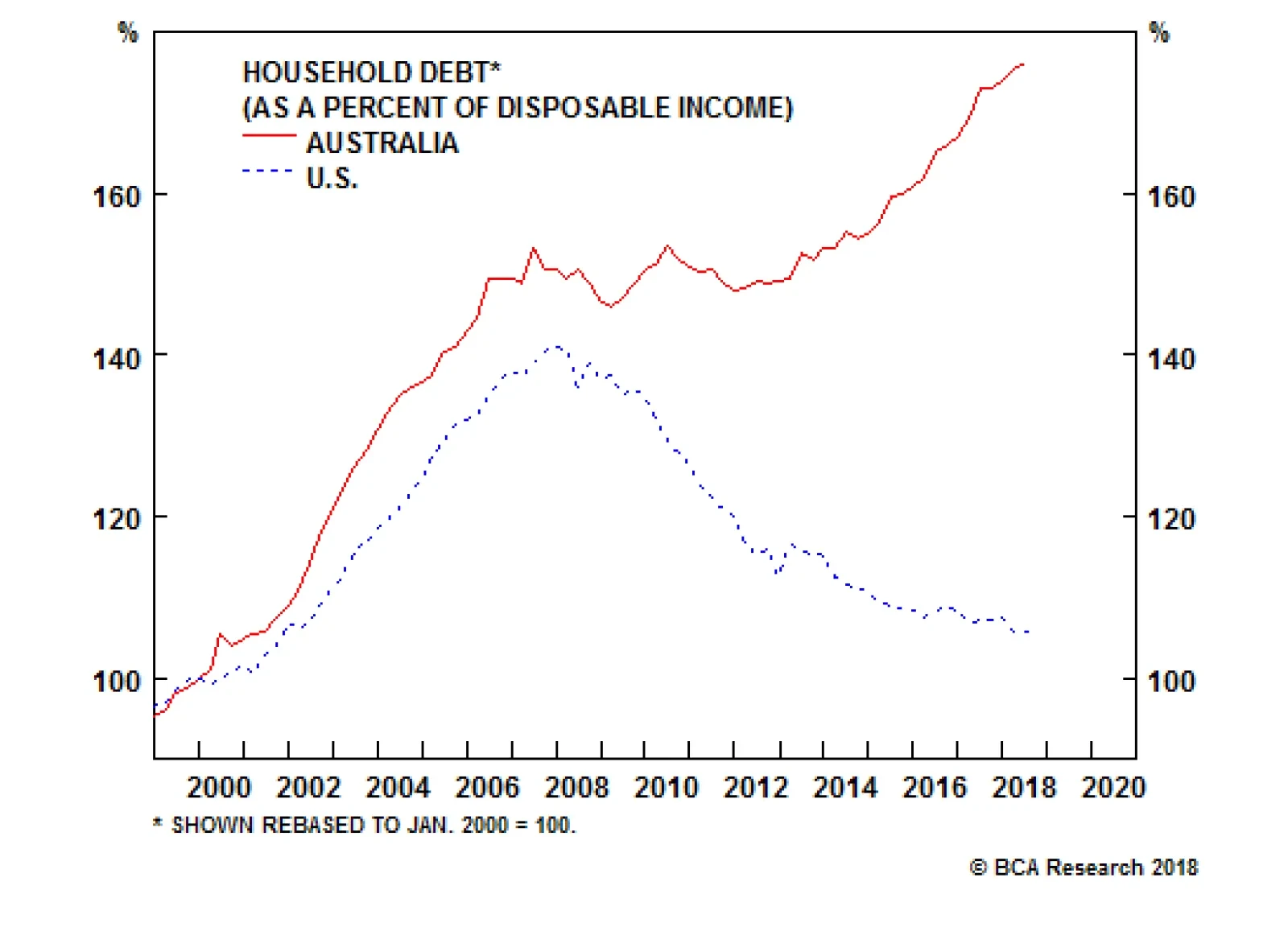
As we have previously wrote in these pages, the primary role of central banks is to ensure price stability. That objective is achieved by cooling economic activity by raising interest rates, which weighs on various cyclical sectors in the economy. Given…