Gov Sovereigns/Treasurys

Highlights Bond Market Performance: Government bonds in the developed economies are currently trapped in ranges, consolidating the sharp upward moves seen in the first quarter of 2021. This is only a pause in the broader cyclical uptrend, however, with central banks under increasing pressure to turn less dovish amid surging inflation and tightening labor markets. Oversold USTs: Technical indicators of yield/price momentum and investor sentiment/positioning suggest that US Treasuries are oversold. Working off this condition can take another 2-3 months, based on an analysis of past oversold episodes. Beyond that, higher yields loom with the Fed starting to prepare the markets for a taper in 2022. Stay underweight Treasuries in global bond portfolios on a cyclical basis. RBA Checklist: Only one of the five components of our “RBA Checklist” – designed to measure the pressures that would force the Reserve Bank of Australia to turn less dovish – is flashing such a signal. We are upgrading our recommended allocation for Australian government bonds to overweight on a tactical (0-6 months) investment horizon. Feature Dear Client, Next week, in lieu of our regularly weekly report, I will be hosting a webcast on Tuesday, June 15 where I will discuss the outlook for global fixed income markets in the second half of 2021. Following that, we will be jointly publishing our bi-annual Global Central Bank Monitor Chartbook with our colleagues at BCA Research Foreign Exchange Strategy on Friday, June 18th. We will return to our regular publishing schedule on Tuesday, June 29th. Best Regards, Rob Robis Chart of the WeekA Tale Of Two Quarters
A Summer Nap For Global Bond Yields
A Summer Nap For Global Bond Yields
The performance of government bond markets in the developed world so far in 2021 has been a tale of two quarters. In Q1, yields were rising steadily on the back of upside surprises in global growth and emerging signs of the biggest inflation upturn seen in nearly a generation. The Bloomberg Barclays Global Treasury index delivered a total return of -2.7% (hedged into US dollars) during the quarter, with no country escaping losses (Chart of the Week). The biggest declines were seen in the UK (-7.5%) the US (-4.3%), with the smallest losses occurring in Japan (-0.3%) and Italy (-0.7%). Chart 2Lower Vol Means High Yielders Outperform Low Yielders
Lower Vol Means High Yielders Outperform Low Yielders
Lower Vol Means High Yielders Outperform Low Yielders
Q2 has been a different story, however. Yields have retreated somewhat from the year-to-date peaks seen at the end of Q1, leading to positive returns so far in Q2 in the UK (+0.8), the US (+1.2%) and Australia (+1.1%). The laggards are the low yielding euro area markets, most notably Italy (-0.7%) and France (-0.9%), that have seen yields move higher on the back of accelerating European growth. The Q2 returns look very much like a carry-driven market, with higher-yielding markets outperforming lower-yielding ones. That trend can persist if the current backdrop of low market volatility persists (Chart 2), although this calm will eventually be broken by a shift towards less dovish monetary policies. Some countries will make that shift at a faster pace than others, leading to relative value opportunities for bond investors in the latter half of 2021. This week, we discuss one such opportunity – Australia versus the US. US Treasuries: Oversold & Trendless – For Now After reaching a 2021 intraday high of 1.77% back on March 30, the benchmark 10-year US Treasury yield has traded in a narrow 15bp range between 1.55% and 1.70%. From a fundamental perspective, US yields are lacking direction because inflation expectations have already made a major upward adjustment to the more inflationary backdrop, but real yields have remained depressed by the continued dovish messaging from the Fed – for now - with regards to the timing of tapering or future rate hikes. From a technical perspective, however, the sideways pattern for US Treasury yields is also consistent for a market that trying to work off an oversold condition. Most of the technical indicators for the US Treasury market that we monitor regularly were at or close to the most bearish/oversold extremes seen since 2000 (Chart 3): Chart 3US Treasuries Are Working Off An Oversold Condition
US Treasuries Are Working Off An Oversold Condition
US Treasuries Are Working Off An Oversold Condition
The 10-year Treasury yield is 39bps above its 200-day moving average, but that gap was as high as 84bps on March 19; The 26-week total return of the 10-year Treasury is -4.7%, after reaching a low of -8.8% on March 19; The JP Morgan client survey of bond managers and traders shows some of the largest underweight duration positioning in the 19-year history of the series; The Market Vane index of sentiment for Treasuries is in the bottom half of the range that has prevailed since 2000; The CFTC data on positioning in 10-year Treasury futures is the only one of our indicators that is not signaling an oversold market, with a small net long position of +3% (scaled by open interest). The overall message of these indicators suggests that price momentum and positioning reached such a bearish extreme by mid-March that some pullback in Treasury yields was inevitable. However, a look back at past periods when Treasuries became heavily oversold since the turn of the century shows that the duration and magnitude of such a pullback is highly variable – anywhere from two months to ten months. The main determining factors are the trends in economic growth and inflation in the US, and the Fed’s expected policy response to both. To show this, we conducted a simple study, updating work we first presented in a 2018 report.1 We looked at “oversold episodes” since 2000, which began when the 10-year Treasury yield was trading at least 50bps above its 200-day moving average. We then defined the end of the oversold episode as simply the point when the 10-year Treasury yield subsequently converged back to its 200-day moving average. We then looked at the length of the episode (in days), and the change in bond yields, for each oversold episode. There were nine such episodes since the year 2000, not counting the current one which has not yet ended. In Table 1, we rank the episodes by the number of days it took to complete each one, based on our simple moving average rule. We also show the change in both the 10-year Treasury yield and its 200-day moving average during each episode, to show how the convergence between the two unfolds. Table 1A Look At Prior Episodes Of An Oversold Treasury Market
A Summer Nap For Global Bond Yields
A Summer Nap For Global Bond Yields
To describe the US economic backdrop during each episode, we looked at the change in the ISM manufacturing index and core PCE inflation during those oversold periods. We also show changes in two important determinants of the level of Treasury yields: inflation expectations using 10-year TIPS breakeven rates, and Fed rate hike expectations using our 12-month Fed discounter which measures the expected change in interest rates - one year ahead - priced into the US overnight index swap (OIS) curve. At the bottom of the table, we show the average for all nine oversold episodes, as well as the averages for the episodes were the ISM was rising and where core PCE inflation was rising. Chart 4US Treasury Market Oversold Episodes: 2003-2007
US Treasury Market Oversold Episodes: 2003-2007
US Treasury Market Oversold Episodes: 2003-2007
There are a few messages gleaned from the results in Table 1: The longest correction of an oversold Treasury market since 2000 took place between February 2018 and December 2018, when 305 days passed before the 10-year yield fell back to its 200-day moving average; The shortest correction was between June 2007 and August 2007, where only 52 days elapsed; Treasury yields typically decline during oversold periods, with two notable exceptions: 2018 and 2013/14, which were also the two longest episodes; During all of the oversold periods, markets reduced the amount of expected Fed tightening by an average of 26bps. However, that was entirely concentrated in four of the nine episodes - including three of the four shortest episodes – and is typically associated with a decline in inflation expectations. Growth momentum appears to be a bigger factor than inflation momentum in determining the length of an oversold episode, with longer episodes typically occurring alongside a rising ISM index, and vice versa. The notable exception was the longest episode in 2018, where the ISM declined by six points, although the bulk of that decline occurred in a single month at the end of the period (November 2018). For the more visually oriented, we present the time series for all the data in Table 1, shaded for the oversold periods, in Chart 4 (for the 2003-2007 period), Chart 5 (2008-2012), Chart 6 (2013-2017) and Chart 7 (2018 to today). We’ve added one additional variable – our Fed Monitor, designed to signal the need for tighter or looser US monetary policy – in the bottom panel of each of those charts. Chart 5US Treasury Market Oversold Episodes: 2008-2012
US Treasury Market Oversold Episodes: 2008-2012
US Treasury Market Oversold Episodes: 2008-2012
Chart 6US Treasury Market Oversold Episodes: 2013-2017
US Treasury Market Oversold Episodes: 2013-2017
US Treasury Market Oversold Episodes: 2013-2017
Chart 7US Treasury Market Oversold Episodes: 2018 To Today
US Treasury Market Oversold Episodes: 2018 To Today
US Treasury Market Oversold Episodes: 2018 To Today
What does this look back tell us about looking ahead? The current episode, at only 105 days old, is still 62 days “younger” than the average oversold period, and 76 days “younger” than the average period where core inflation was rising. This would put the end of the current episode sometime in August. The ISM is essentially unchanged over the current episode so far, making it difficult to draw conclusions based on growth momentum – although the longest episode in 2018 shows that yields can trade sideways for a long time, even in the absence of a big slowing of growth, if the Fed is in a rate hiking cycle. However, the current episode differs dramatically from others in this analysis on two critical fronts. Core inflation has surged 1.6 percentage points since the oversold period began in February, far more than any other episode, while the gap between a rapidly increasing Fed Monitor and a flat 12-month Fed Discounter is also unique among post-2000 oversold periods. In other words, the Treasury market is still vulnerable to a repricing of Fed tightening expectations, especially with positioning and sentiment measures like the Market Vane survey and net futures positioning not yet at fully bearish extremes. Bottom Line: The current oversold condition in the US Treasury market can take another 2-3 months to unwind, based on an analysis of past oversold episodes. Beyond that, higher yields loom with the Fed starting to prepare the markets for a taper in 2022. Stay underweight Treasuries in global bond portfolios on a cyclical basis. RBA Checklist Update: No Case For A Hawkish Turn Yet Australia has been one of the top performing government bond markets within the developed economies, as discussed earlier. This performance has occurred even with strong acceleration of both Australian economic momentum and market-based inflation expectations (Chart 8). Despite our RBA Monitor flashing pressure on the RBA to tighten, and the Australian OIS curve already discounting 48bps of rate hikes over the next two years, Australian bond yields have remained very well behaved during the “calm” second quarter for global fixed income. Chart 8RBA Policies Limiting Rise In Bond Yields
RBA Policies Limiting Rise In Bond Yields
RBA Policies Limiting Rise In Bond Yields
Chart 9RBA Stimulus Takes Many Forms
RBA Stimulus Takes Many Forms
RBA Stimulus Takes Many Forms
The continued dovish messaging from the Reserve Bank of Australia (RBA) is the main reason for the solid Australia bond performance. The central bank is signaling no imminent shift in its combination of 0.1% nominal policy rates, deeply negative real rates, yield curve control on 3-year bonds and quantitative easing on longer-maturity bonds (Chart 9). Other central banks are starting to inch towards reining in the massive monetary accommodation of the past year. Could the RBA be next? In a Special Report published back in January of this year, we outlined a list of variables to watch to determine when the Reserve Bank of Australia (RBA) could be expected to turn less dovish.2 This checklist would also inform our country allocation view on Australian government bonds, which has remained neutral. A quick update on the latest readings from the RBA Checklist shows little pressure on the RBA to begin preparing markets for tighter monetary policy. 1. The vaccination process goes quickly and smoothly We are NOT placing a checkmark next to this part of our RBA Checklist. Australia has weathered COVID-19 far better than most other Western countries in terms of actual cases and deaths, but the vaccine rollout Down Under has been underwhelming. Only 16% of the population has received at least one vaccine jab, while a mere 2% is fully vaccinated. These are numbers that are more comparable to pandemic-ravaged emerging market countries like India and Brazil where access to vaccines is an issue (Chart 10). Chart 10A Slow Vaccine Rollout Down Under
A Summer Nap For Global Bond Yields
A Summer Nap For Global Bond Yields
The slow vaccine rollout is less worrisome in light of the Australian government having secured enough vaccine doses to inoculate the entire population, and with the domestic economy facing limited remaining COVID-19 restrictions. The issue has been distribution and that is now occurring at a quickening pace. Until a much greater share of the population is vaccinated, however, Australia will continue to maintain aggressive COVID-related international travel restrictions – the government just announced that borders will remain shut until mid-2022 - that will be a major drag on the economically-important tourism sector. 2. Private sector demand accelerates alongside fiscal stimulus (✔) We ARE placing a checkmark next to this part of our RBA Checklist. Australia’s fiscal stimulus in response to the pandemic was one of the largest in the developed world. The stimulus was heavily focused on wage subsidies and income support measures like the JobSeeker program, which expired back in March. As the expensive stimulus programs are unwound, it is critical that the domestic economy can stand on its own without support. On that front, the news is good. Australia’s economy grew by 1.8% during Q1/2021, lifting the level of real GDP above the pre-pandemic peak (Chart 11). Both consumer spending and business investment posted solid growth during the quarter, fueled by surging confidence with the NAB business outlook measure hitting a record high in May (bottom panel). As a sign that the domestic economy is benefitting from a return to pre-pandemic habits, Q1 saw a 15% increase in spending in hotels, cafes and restaurants. That strength looked to extend into the Q2, with retail sales rising 1.1% in April, suggesting that Australian domestic demand is enjoying strong upward momentum. Chart 11A Confidence-Led Recovery In Domestic Demand
A Confidence-Led Recovery In Domestic Demand
A Confidence-Led Recovery In Domestic Demand
Chart 12China Is A Drag On Australian Exports
China Is A Drag On Australian Exports
China Is A Drag On Australian Exports
3. China reins in policy stimulus by less than expected We are NOT placing a checkmark next to this part of our RBA Checklist. China is by far Australia’s largest trading partner, so Chinese demand is always an important contributor to Australian economic growth. This is why we included a China element in our RBA Checklist. Specifically, we deemed the outcome that would potentially turn the RBA more hawkish would be Chinese policymakers pulling back monetary and fiscal stimulus by less than expected in 2021 after the big policy support in 2020. The combined fiscal and credit impulse for China has already slowed by 9% of GDP since December 2020, signaling a meaningful cooling of Chinese growth in the latter half of 2021 that should weigh on demand for imports from Australia (Chart 12). However, Chinese import demand has already been severely impacted because of worsening China-Australia political tensions, which has led Beijing to impose restrictions on Australian imports for a variety of products, include coal, wine, beef, barley and cotton. The result is that there has been no growth in Australian total exports to China over the past year – an outcome that was flattered by the surge in iron ore prices - which has weighed on overall Australian export growth. Given this weak starting point for Chinese demand for Australian goods, the sharp reduction in the China stimulus is, on the margin, a factor that will not force the RBA to turn less dovish sooner than expected. 4. Inflation, both realized and expected, returns to the RBA’s 2-3% target We are NOT placing a checkmark next to this part of our RBA Checklist. Australian inflation remains well below the RBA’s 2-3% target range, with the headline CPI and the less volatile trimmed mean CPI both expanding at only a 1.1% annual rate in Q1/2021 (Chart 13). The RBA is forecasting a brief boost to both measures in Q2, before settling back below 2% to the end of 2022. Chart 13No Bond-Bearish RBA Policy Shift Without More Inflation
No Bond-Bearish RBA Policy Shift Without More Inflation
No Bond-Bearish RBA Policy Shift Without More Inflation
Chart 14Diminishing Financial Stability Risks From Housing
Diminishing Financial Stability Risks From Housing
Diminishing Financial Stability Risks From Housing
The RBA’s message on the inflation outlook has been very consistent. A sustainable move of realized inflation back to the 2-3% target range – that would prompt a normalization of monetary policy – cannot occur without a significant tightening of labor markets that drives wage growth back to 3% from the Q1/2021 reading of 1.5%. The RBA currently does not expect that outcome to occur before 2024. The RBA believes that the full employment NAIRU is between 4-4.5%, well below the OECD’s latest estimate of 5.4%. Given the sharp drop in Australian unemployment already seen over the past few quarters, there is the potential for an upside surprise in the wage data that could lead the RBA to change its policy bias. The central bank would need to see a few quarters of such wage surprises, however, before altering its forward guidance on the timing of future rate hikes. 5. House price inflation begins to accelerate We are NOT placing a checkmark next to this part of our RBA Checklist. Given Australia’s past history with periods of surging home values, signs that housing markets were overheating could prompt the RBA to consider tighten monetary policy. The annual growth of median house prices has dipped from +8% in Q1 2020 to +4% in Q4 2020, despite robust housing demand as evidenced by the 40% growth in building approvals. At the same time, housing valuations have become less stretched with the ratio of median home prices to median household incomes falling -9% from the 2017 peak according to data from the OECD (Chart 14). The RBA remains sensitive to the potential financial stability risks from overvalued housing. The latest trends in the house price data, however, suggest that the central bank does not yet to have the use the blunt tool of tighter monetary policy to cool off an overheated housing market. Chart 15Upgrade Australia To Overweight (Vs. USTs)
Upgrade Australia To Overweight (Vs. USTs)
Upgrade Australia To Overweight (Vs. USTs)
In sum, the majority of items in our RBA Checklist are signaling no immediate pressure on the central bank to tighten policy. The first 25bp rate hike is not discounted in the Australian OIS curve until April 2023, a little ahead of RBA guidance but still consistent with a very dovish policy bias. The inflation data, in our view, will be the critical factor that could prompt the markets to pull forward expected monetary tightening, leading to a surge in Australian bond yields. With the RBA already expecting a surge in inflation in the Q2/2020 data, the central bank would likely want to see at least a couple of more quarterly inflation prints – both for the CPI and wage price index - before signaling a more hawkish policy shift. Thus, the RBA will likely stay dovish over the latter half of 2021 Therefore, we are moving to an overweight recommended stance on Australian government bonds on a tactical (0-6 months) basis. In our model bond portfolio on pages 16-17, we are “funding” that shift to an above-benchmark weighting in Australia out of US Treasury exposure. Given our view that the Fed will soon begin to signal a 2022 taper of its asset purchases, relative policy dovishness should lead Australian government bonds to outperform US Treasuries in the latter half of this year. In addition, Australian bonds have a lower yield beta to changes in US Treasury yields, relative to the high beta to changes in non-US developed market yields (Chart 15), making allocations out of the US into Australia attractive from a risk management perspective in a global bond portfolio. Bottom Line: Only one of the five components of our “RBA Checklist” – designed to measure the pressures that would force the Reserve Bank of Australia to turn less dovish – is flashing such a signal. We are upgrading our recommended allocation to Australian government bonds to overweight on a tactical investment horizon. Robert Robis, CFA Chief Fixed Income Strategist rrobis@bcaresearch.com Footnotes 1 See BCA Research Global Fixed Income Strategy Report, "Bond Markets Are Suffering Withdrawal Symptoms", dated March 20, 2018. 2 See BCA Research Global Fixed Income Strategy/Foreign Exchange Strategy Special Report, "Australia: Regime Change For Bond Yields & The Currency?", dated January 20, 2021. Recommendations The GFIS Recommended Portfolio Vs. The Custom Benchmark Index
A Summer Nap For Global Bond Yields
A Summer Nap For Global Bond Yields
Duration Regional Allocation Spread Product Tactical Trades Yields & Returns Global Bond Yields Historical Returns
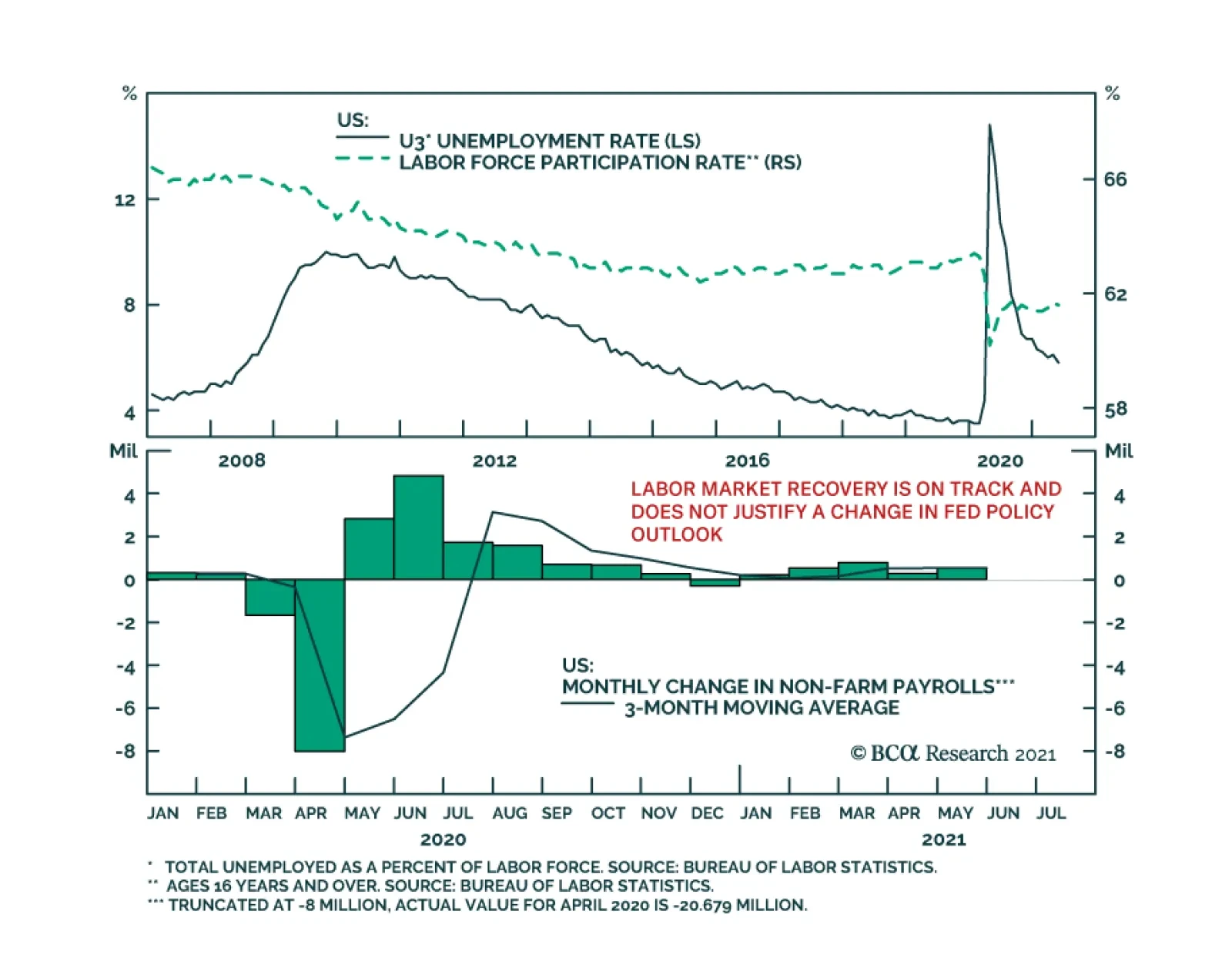
Highlights Chart 1Tracking Nonfarm Payrolls
Tracking Nonfarm Payrolls
Tracking Nonfarm Payrolls
With 12-month PCE inflation already above the Fed’s 2% target, it is progress toward the Fed’s “maximum employment” goal that will determine both the timing of Fed liftoff and whether bond yields rise or fall. On that note, the bond market is currently priced for Fed liftoff in early 2023. We also calculate that average monthly nonfarm payroll growth of between 378k and 462k is required to meet the Fed’s “maximum employment” goal by the end of 2022, in time for an early-2023 rate hike. It follows from this analysis that any monthly employment print above +462k should be considered bond-bearish and any print below +378k should be considered bond-bullish (Chart 1). In that light, May’s +559k print is bond-bearish, and we anticipate further bond-bearish employment reports in the coming months as COVID fears fade and people return to a labor market that is already awash with demand. Investors should maintain below-benchmark portfolio duration in US bond portfolios and also continue to favor spread product over duration-matched Treasuries. Feature Table 1Recommended Portfolio Specification
It’s All About Employment
It’s All About Employment
Table 2Fixed Income Sector Performance
It’s All About Employment
It’s All About Employment
Investment Grade: Neutral Chart 2Investment Grade Market Overview
Investment Grade Market Overview
Investment Grade Market Overview
Investment grade corporate bonds outperformed the duration-equivalent Treasury index by 47 basis points in May, bringing year-to-date excess returns up to +159 bps. The combination of above-trend economic growth and accommodative monetary policy supports positive excess returns for spread product versus Treasuries. At 142 bps, the 2/10 Treasury slope is very steep and the 5-year/5-year forward TIPS breakeven inflation rate sits at 2.27% - almost, but not quite, within the 2.3% to 2.5% range that the Fed considers “well anchored”.1 The message from these two indicators is that the Fed is not yet ready for monetary conditions to turn restrictive. Despite the positive macro back-drop, investment grade corporate valuations are extremely tight. The investment grade corporate index’s 12-month breakeven spread is almost at its lowest since 1995 (Chart 2). Though we retain a positive view of spread product as a whole, tight valuations cause us to recommend only a neutral allocation to investment grade corporates. We prefer high-yield corporates, municipal bonds and USD-denominated Emerging Market Sovereigns. Last week, the Fed announced that it will wind down its corporate bond portfolio over the coming months. The corporate bond purchase facility has not been operational since December 2020, meaning that the corporate bond market has been functioning without an explicit Fed back-stop for all of 2021. The portfolio itself is also quite small compared to the size of the corporate bond market. As a result, we anticipate no material impact on spreads. Table 3ACorporate Sector Relative Valuation And Recommended Allocation*
It’s All About Employment
It’s All About Employment
Table 3BCorporate Sector Risk Vs. Reward*
It’s All About Employment
It’s All About Employment
High-Yield: Overweight Chart 3High-Yield Market Overview
High-Yield Market Overview
High-Yield Market Overview
High-Yield outperformed the duration-equivalent Treasury index by 8 basis points in May, bringing year-to-date excess returns up to +343 bps. In a recent report, we looked at the default expectations that are currently priced into the junk index and considered whether they are likely to be met.2 If we demand an excess spread of 100 bps and assume a 40% recovery rate on defaulted debt, then the High-Yield index embeds an expected default rate of 3.3% (Chart 3). Using a model of the speculative grade default rate that is based on gross corporate leverage (pre-tax profits over total debt) and C&I lending standards, we can estimate a likely default rate for the next 12 months using assumptions for profit and debt growth. The median FOMC forecast of 6.5% real GDP growth in 2021 is consistent with 31% corporate profit growth. We also assume that last year’s corporate debt binge will moderate in 2021. According to our model, 30% profit growth and 2% debt growth is consistent with a default rate of 3.4%, very close to what is priced into junk spreads. Given that the large amount of fiscal stimulus coming down the pike makes the Fed’s 6.5% real GDP growth forecast look conservative, and the fact that the combination of strong economic growth and accommodative monetary policy could easily cause valuations to overshoot in the near-term, we are inclined to maintain an overweight allocation to High-Yield bonds. MBS: Underweight Chart 4MBS Market Overview
MBS Market Overview
MBS Market Overview
Mortgage-Backed Securities underperformed the duration-equivalent Treasury index by 36 basis points in May, dragging year-to-date excess returns down to -9 bps. The nominal spread between conventional 30-year MBS and equivalent-duration Treasuries widened 7 bps in May. The spread remains wide compared to recent history, but it is still tight compared to the pace of mortgage refinancings (Chart 4). The conventional 30-year MBS option-adjusted spread (OAS) currently sits at 24 bps. This is considerably below the 51 bps offered by Aa-rated corporate bonds and the 27 bps offered by Agency CMBS. It is only slightly more than the 18 bps offered by Aaa-rated consumer ABS. All in all, value in MBS is not appealing compared to other similarly risky sectors. In a recent report, we looked at MBS performance and valuation across the coupon stack.3 We noted that the higher convexity of high-coupon MBS makes them likely to outperform lower-coupon MBS in a rising yield environment. Higher coupon MBS also have greater OAS than lower coupons. This makes the high-coupon MBS more likely to outperform in a flat bond yield environment as well. Given our view that bond yields will be flat-to-higher during the next 6-12 months, we recommend favoring high coupons over low coupons within an overall underweight allocation to Agency MBS. Government-Related: Neutral Chart 5Government-Related Market Overview
Government-Related Market Overview
Government-Related Market Overview
The Government-Related index outperformed the duration-equivalent Treasury index by 15 basis points in May, bringing year-to-date excess returns up to +87 bps (Chart 5). Sovereign debt outperformed duration-equivalent Treasuries by 32 bps in May, bringing year-to-date excess returns up to +53 bps. Foreign Agencies outperformed the Treasury benchmark by 2 bps on the month, bringing year-to-date excess returns up to +37 bps. Local Authority bonds outperformed by 30 bps in May, bringing year-to-date excess returns up to +360 bps. Domestic Agency bonds and Supranationals both outperformed by 8 bps, bringing year-to-date excess returns up to +27 bps and +24 bps, respectively. We recently took a detailed look at USD-denominated Emerging Market (EM) Sovereign valuation.4 We found that, on an equivalent-duration basis, EM Sovereigns offer a spread advantage over investment grade US corporates. Attractive countries include: Qatar, UAE, Saudi Arabia, Indonesia, Mexico, Russia and Colombia. We prefer US corporates over EM Sovereigns in the high-yield space where there is still some value left in US corporate spreads and where the EM space is dominated by distressed credits like Turkey and Argentina. Municipal Bonds: Overweight Chart 6Municipal Market Overview
Municipal Market Overview
Municipal Market Overview
Municipal bonds underperformed the duration-equivalent Treasury index by 21 basis points in May, dragging year-to-date excess returns down to +286 bps (before adjusting for the tax advantage). We took a detailed look at municipal bond performance and valuation in a recent report and came to the following conclusions.5 First, the economic and policy back-drop is favorable for municipal bond performance. The recently enacted American Rescue Plan includes $350 billion of funding for state & local governments, a bailout that comes after state & local government revenues already exceeded expenditures in 2020 (Chart 6). President Biden has also proposed increasing income tax rates. However, there may not be time to pass these tax hikes before the 2022 midterm elections. Second, Aaa-rated municipal bonds look expensive relative to Treasuries (top panel). Muni investors should move down in quality to pick up additional yield. Third, General Obligation (GO) and Revenue munis offer better value than investment grade corporates with the same credit rating and duration, particularly at the long-end of the curve. Revenue munis in the 12-17 year maturity bucket offer a before-tax yield pick-up versus corporates. GO munis offer a breakeven tax rate of just 7% (panel 2). Fourth, taxable munis offer a yield advantage over investment grade corporates that investors should take advantage of (panel 3). Finally, high-yield muni spreads are reasonably attractive relative to high-yield corporates, offering a breakeven tax rate of 22% (panel 4). But despite the attractive spread, we recommend only a neutral allocation to high-yield munis versus high-yield corporates as the deep negative convexity of high-yield munis makes them prone to extension risk if bond yields gap higher. Treasury Curve: Buy 5-Year Bullet Versus 2/30 Barbell Chart 7Treasury Yield Curve Overview
Treasury Yield Curve Overview
Treasury Yield Curve Overview
Treasury yields fell in May, with the 5-10 year part of the curve benefiting the most. The 7-year yield fell 8 bps in May while the 5-year and 10-year yields both fell 7 bps. Yield declines were smaller for shorter (< 5-year) and longer (> 10-year) maturities. The 2/10 Treasury slope flattened 5 bps to end the month at 144 bps. The 5/30 Treasury slope steepened 3 bps to end the month at 147 bps (Chart 7). We recently changed our recommended yield curve position from a 5 over 2/10 butterfly to a 5 over 2/30 butterfly.6 In making the switch we noted that the slope of the Treasury curve has behaved differently since bond yields peaked in early April. Prior to April, the rise in bond yields was concentrated at the very long-end (10-year +) of the curve. During the past two months, the belly of the curve (5-7 years) has seen more volatility. We conclude that we are now close enough to an expected Fed liftoff date that further significant increases in yields will be met with a flatter curve beyond the 5-year maturity point and that the 5-year and 7-year notes are likely to benefit the most if bond yields dip. We also observe an exceptional yield pick-up of +33 bps in the 5-year bullet over a duration-matched 2/30 barbell. Given our view that bond yields will be flat-to-higher during the next 6-12 months, we recommend buying the 5-year bullet over a duration-matched 2/30 barbell to take advantage of the strong positive carry in a flat yield environment, and as a hedge against our below-benchmark portfolio duration stance. TIPS: Neutral Chart 8TIPS Market Overview
TIPS Market Overview
TIPS Market Overview
TIPS outperformed the duration-equivalent nominal Treasury index by 86 basis points in May, bringing year-to-date excess returns up to +484 bps. The 10-year and 5-year/5-year forward TIPS breakeven inflation rates rose 1 bp and 2 bps on the month, respectively. At 2.42%, the 10-year TIPS breakeven inflation rate is near the top-end of the 2.3% to 2.5% range that is consistent with inflation expectations being well anchored around the Fed’s target (Chart 8). Meanwhile, at 2.27%, the 5-year/5-year forward TIPS breakeven inflation rate is just below the target band (panel 3). With long-maturity breakevens already consistent (or close to consistent) with the Fed’s target, they have limited upside going forward. The Fed has so far welcomed rising TIPS breakeven inflation rates, but it will have an increasing incentive to lean against them if they continue to move up. We also think that the market has priced-in an overly aggressive inflation outlook at the front-end of the curve. The 1-year and 2-year CPI swap rates stand at 3.76% and 3.12%, respectively. There is a good chance that these lofty inflation expectations will not be confirmed by the actual data. With all that in mind, investors should maintain a neutral allocation to TIPS versus nominal Treasuries and also a neutral posture towards the inflation curve (panel 4). The inflation curve could steepen somewhat in the near-term if short-maturity inflation expectations moderate, but we expect the curve to remain inverted for a long time yet. An inverted inflation curve is more consistent with the Fed’s Average Inflation Target than a positively sloped one, and it should be considered the natural state of affairs moving forward. ABS: Overweight Chart 9ABS Market Overview
ABS Market Overview
ABS Market Overview
Asset-Backed Securities outperformed the duration-equivalent Treasury index by 13 basis points in May, bringing year-to-date excess returns up to +33 bps. Aaa-rated ABS outperformed by 13 bps on the month, bringing year-to-date excess returns up to +26 bps. Non-Aaa ABS outperformed by 12 bps on the month, bringing year-to-date excess returns up to +70 bps. The stimulus from last year’s CARES act led to a significant increase in household savings when individual checks were mailed in April 2020. This excess savings has still not been spent and, already, the most recent round of stimulus checks is pushing the savings rate higher again (Chart 9). The extraordinarily large stock of household savings means that the collateral quality of consumer ABS is also extraordinarily high. Indeed, many households have been using their windfalls to pay down consumer debt (bottom panel). Investors should remain overweight consumer ABS and should also take advantage of the high quality of household balance sheets by moving down the quality spectrum. Non-Agency CMBS: Neutral Chart 10CMBS Market Overview
CMBS Market Overview
CMBS Market Overview
Non-Agency Commercial Mortgage-Backed Securities outperformed the duration-equivalent Treasury index by 41 basis points in May, bringing year-to-date excess returns up to +163 bps. Aaa Non-Agency CMBS outperformed Treasuries by 27 bps in May, bringing year-to-date excess returns up to +78 bps. Non-Aaa Non-Agency CMBS outperformed by 84 bps, bringing year-to-date excess returns up to +453 bps (Chart 10). Though returns have been strong and spreads remain attractive, particularly for lower-rated CMBS, we continue to recommend only a neutral allocation to the sector because of the structurally challenging environment for commercial real estate. Even with the economic recovery well underway, commercial real estate loan demand continues to weaken and banks are not making lending standards more accommodative (panels 3 & 4). Agency CMBS: Overweight Agency CMBS outperformed the duration-equivalent Treasury index by 37 basis points in May, bringing year-to-date excess returns up to +125 bps. The average index option-adjusted spread tightened 7 bps on the month and it currently sits at 27 bps (bottom panel). Though Agency CMBS spreads have completely recovered their pre-COVID levels, they still look attractive compared to other similarly risky spread products. Stay overweight. Appendix A: Butterfly Strategy Valuations The following tables present the current read-outs from our butterfly spread models. We use these models to identify opportunities to take duration-neutral positions across the Treasury curve. The following two Special Reports explain the models in more detail: US Bond Strategy Special Report, “Bullets, Barbells And Butterflies”, dated July 25, 2017, available at usbs.bcaresearch.com US Bond Strategy Special Report, “More Bullets, Barbells And Butterflies”, dated May 15, 2018, available at usbs.bcaresearch.com Table 4 shows the raw residuals from each model. A positive value indicates that the bullet is cheap relative to the duration-matched barbell. A negative value indicates that the barbell is cheap relative to the bullet. Table 4Butterfly Strategy Valuation: Raw Residuals In Basis Points (As Of May 28TH, 2021)
It’s All About Employment
It’s All About Employment
Table 5 scales the raw residuals in Table 4 by their historical means and standard deviations. This facilitates comparison between the different butterfly spreads. Table 5Butterfly Strategy Valuation: Standardized Residuals (As Of May 28TH, 2021)
It’s All About Employment
It’s All About Employment
Table 6 flips the models on their heads. It shows the change in the slope between the two barbell maturities that must be realized during the next six months to make returns between the bullet and barbell equal. For example, a reading of 57 bps in the 5 over 2/10 cell means that we would only expect the 5-year to outperform the 2/10 if the 2/10 slope steepens by more than 57 bps during the next six months. Otherwise, we would expect the 2/10 barbell to outperform the 5-year bullet. Table 6Discounted Slope Change During Next 6 Months (BPs)
It’s All About Employment
It’s All About Employment
Appendix B: Excess Return Bond Map The Excess Return Bond Map is used to assess the relative risk/reward trade-off between different sectors of the US bond market. It is a purely computational exercise and does not impose any macroeconomic view. The Map’s vertical axis shows 12-month expected excess returns. These are proxied by each sector’s option-adjusted spread. Sectors plotting further toward the top of the Map have higher expected returns and vice-versa. Our novel risk measure called the “Risk Of Losing 100 bps” is shown on the Map’s horizontal axis. To calculate it, we first compute the spread widening required on a 12-month horizon for each sector to lose 100 bps or more relative to a duration-matched position in Treasury securities. Then, we divide that amount of spread widening by each sector’s historical spread volatility. The end result is the number of standard deviations of 12-month spread widening required for each sector to lose 100 bps or more versus a position in Treasuries. Lower risk sectors plot further to the right of the Map, and higher risk sectors plot further to the left. Chart 11Excess Return Bond Map (As Of May 28TH, 2021)
It’s All About Employment
It’s All About Employment
Ryan Swift US Bond Strategist rswift@bcaresearch.com Footnotes 1 For further discussion of how we assess the state of monetary policy vis-à-vis spread product please see US Bond Strategy Weekly Report, “Lower For Longer, Then Faster Than You Think”, dated May 25, 2021. 2 Please see US Bond Strategy Weekly Report, “That Uneasy Feeling”, dated March 30, 2021. 3 Please see US Bond Strategy Weekly Report, “A New Conundrum”, dated April 20, 2021. 4 Please see US Bond Strategy Weekly Report, “Searching For Value In Spread Product”, dated January 26, 2021. 5 Please see US Bond Strategy Weekly Report, “Making Money In Municipal Bonds”, dated April 27, 2021. 6 Please see US Bond Strategy Weekly Report, “Entering A New Yield Curve Regime”, dated May 11, 2021.
Friday’s US employment report was another miss. Nonfarm payroll employment increased by 559 thousand in May, below the anticipated 675 thousand. Moreover, the labor force participation rate ticked down to 61.6% from 61.7%. Thus, the 0.3 percentage point…
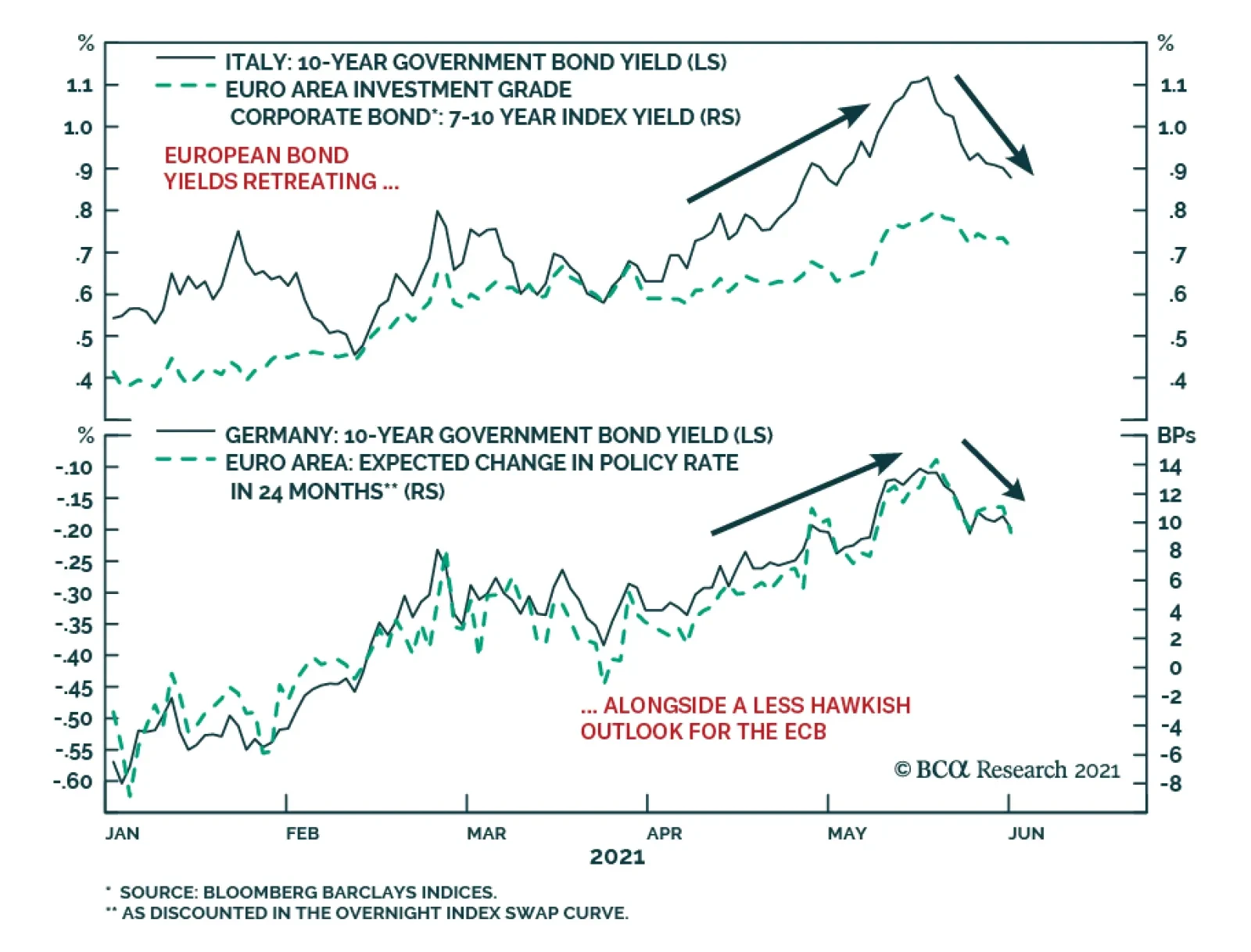
European bond markets have calmed down after a rough couple of months that saw the benchmark 10-year German bund yield rise from a low of -0.39% on March 25 to a high of -0.11% on May 19. Yields on riskier European debt saw even bigger increases over that…
Highlights The Fed: The Fed will formally discuss tapering plans over the course of this summer and fall and announce the slowing of asset purchases before the end of 2021. Its labor market objectives will also be achieved in time to lift rates in 2022. Non-US Developed Markets: The central banks outside the US most likely to deliver tapering and/or outright rate hikes over the next 1-2 years are those facing housing bubbles – the Bank of Canada and Reserve Bank of New Zealand. The ECB will do nothing on rates while adjusting asset purchase programs to preserve the size of its balance sheet, while the Reserve Bank of Australia will also sit on their hands for longer. Bond Strategy Recommendations: Investors should maintain below-benchmark portfolio duration in US-only and global fixed income portfolios. Global bond investors should also favor exposure in markets where central banks will be more dovish than expected (core Europe, Australia), while limiting exposure to markets where hawkish surprises are more likely (the US, Canada, New Zealand). Feature The recovery from the 2020 COVID recession is now well underway and many investors are getting antsy about when central bankers might respond by removing monetary policy accommodation. Some central banks appear more eager than others. Both the Bank of Canada and Bank of England, for instance, have already started to reduce their rates of bond buying. Meanwhile, the US Federal Reserve is only just now starting to talk about the timing of its own tapering. This Special Report lays out a timeline for what central bank actions we should expect during the next two years. The first section focuses exclusively on the US Federal Reserve and the second section incorporates likely announcements from other central banks. Based on a comparison of our expected central bank timeline with current market prices, we conclude that investors should maintain below-benchmark portfolio duration in US-only and global fixed income portfolios. Global bond investors should also favor government bonds in countries where central banks are likely to be less hawkish than markets expect (core Europe, Australia) versus bonds from countries where hawkish surprises are more likely (US, Canada, New Zealand and, potentially, the UK and Sweden). The Federal Reserve’s Timeline Chart 1 shows our anticipated timeline for when the Federal Reserve will make specific policy announcements between now and the start of 2024. Chart 1The Federal Reserve’s Timeline
A Central Bank Timeline For The Next Two Years
A Central Bank Timeline For The Next Two Years
First, over the course of this summer, the Fed will initiate discussions about when to taper its asset purchases. Then, asset purchase tapering will be announced at the December 2021 FOMC meeting with purchases set to decline as of the beginning of 2022. We expect that net Fed purchases will fall to zero by the end of Q3 2022. That is, by that time the Fed will no longer be adding to its securities holdings. Rather, it will keep the size of its balance sheet constant. Then, with its balance sheet no longer growing, the Fed will begin the process of lifting interest rates. We expect the first rate hike to occur at the December 2022 FOMC meeting. Finally, some time after the fed funds rate is well above the zero bound, the Fed will try to reduce the size of its securities portfolio. How do we arrive at this timeline? Table 1A Checklist For Liftoff
A Central Bank Timeline For The Next Two Years
A Central Bank Timeline For The Next Two Years
We start with the Fed’s forward guidance about the timing of the first rate hike (Table 1). The Fed has told us that it will lift rates off the zero bound once (i) PCE inflation is above 2%, (ii) the labor market is at “maximum employment” and (iii) inflation is expected to remain above 2% for some time. The first item on the Fed’s liftoff checklist has already been met and the third item logically follows from the other two. That is, if inflation is above 2% and the labor market is at “maximum employment” then the Fed will certainly expect inflation to remain high. This means that the second item on the Fed’s checklist is the most critical for assessing the timing of liftoff. In assessing the US labor market’s progress toward “maximum employment” we first have to define what “maximum employment” means. Based on the Fed’s communications, we infer that “maximum employment” means an unemployment rate between 3.5% and 4.5% - a range consistent with the Fed’s NAIRU estimates – and a labor force participation rate that has recovered back to pre-pandemic levels (Chart 2). Table 2 presents the average monthly growth in nonfarm payrolls that is required to reach that definition of maximum employment by specific future dates. For example, we calculate that average monthly payroll growth of 698k to 830k will cause the labor market to reach maximum employment by the end of this year. Average monthly payroll growth of 412k to 493k is required to hit the Fed’s target by the end of 2022. Chart 2Defining "Maximum Employment"
Defining "Maximum Employment"
Defining "Maximum Employment"
Table 2Average Monthly Nonfarm Payroll Growth Required To Reach Maximum Employment By The Given Date
A Central Bank Timeline For The Next Two Years
A Central Bank Timeline For The Next Two Years
The most recent issue of the Bank Credit Analyst posits several reasons why US employment growth will pick up steam in the coming months.1 We agree with this view and note that indicators of labor demand such as job openings, the NFIB “jobs hard to get” survey and the Conference Board’s “jobs plentiful” survey also point to accelerating employment gains.2 All told, we think that average monthly payroll growth of 412k to 493k is eminently achievable (Chart 3). This means that the Fed will hit its three liftoff criteria in time to hike rates before the end of 2022. Chart 3Max Employment By The End of 2022
Max Employment By The End of 2022
Max Employment By The End of 2022
Working backwards from the expected liftoff date, the Fed has said that it needs to see “substantial progress” toward the criteria listed in Table 1 before it will taper its pace of asset purchases. The definition of “substantial progress” remains somewhat unclear, but a few recent Fed communications provide some clues. First, Fed Chair Jay Powell said that he wants to see a “string of months” like the strong March employment report before it will be appropriate to reduce the pace of asset purchases. The question of how many months constitutes a “string” remains unclear, but it certainly seems plausible that we could see two or three more strong employment reports over the course of the summer. Other Fed Governors appear to agree with this timeline. Governor Randal Quarles: If my expectations about economic growth, employment, and inflation over the coming months are borne out, however, and especially if they come in stronger than I expect, then, as noted in the minutes of the last FOMC meeting, it will become important for the FOMC to begin discussing our plans to adjust the pace of asset purchases at upcoming meetings.3 Fed Vice-Chair Richard Clarida: I myself think that the pace of labor market improvement will pick up. […] It may well be the time that – there will come a time in upcoming meetings we’ll be at the point where we can begin to discuss scaling back the pace of asset purchases …4 Fed Governor Christopher Waller: The May and June jobs report[s] may reveal that April was an outlier, but we need to see that first before we start thinking about adjusting our policy stance.5 Our takeaway from these comments is that two or three more strong employment reports, say 500k or higher, would be sufficient for the Fed to more formally discuss tapering plans. Further, several Fed Governors seem to agree with our forecast that nonfarm payroll growth will accelerate in the coming months. With that in mind, it seems reasonable to expect that the Fed will discuss tapering plans over the course of the summer and fall, and that it will have seen sufficient labor market gains to announce a formal plan before the end of this year. Assuming that a tapering announcement occurs before the end of this year and that asset purchases actually start declining as of Jan 1st 2022, we estimate that the tapering process will conclude by the end of Q3 2022. That is, the Fed will hold the size of its balance sheet constant as of that date. Chart 4Balance Sheet Growth Will End Before The First Rate Hike
Balance Sheet Growth Will End Before The First Rate Hike
Balance Sheet Growth Will End Before The First Rate Hike
At the very least, the Fed will certainly bring its net purchases to zero before it lifts rates. This is because it would be incoherent for the Fed to be tightening policy through its interest rate actions while it eases policy with its balance sheet strategy. Indeed, this is the roadmap that the Fed followed leading up to the 2015 rate hike cycle (Chart 4). Finally, we note that the Fed will try to reduce the size of its balance sheet only after the process of rate hikes is well underway. This will be consistent with the last tightening cycle when the Fed waited until the funds rate was 1.5% before it pared the size of its securities portfolio (Chart 4). We also want to stress that the Fed will only try to reduce the size of its balance sheet. In fact, we doubt that this process will get very far. The main reason for our skepticism is that there is an ongoing structural issue in the Treasury market where the supply of securities keeps growing while stricter regulations make it more costly for primary dealers to intermediate trades.6 In this environment, there are strong odds that Treasury market liquidity will evaporate whenever there is a significant shock to financial markets. When that happens, the Fed will be forced to support Treasury market liquidity through large-scale purchases, as was the case during last March’s market turmoil (Chart 5). In essence, the likelihood of future shocks that will necessitate Fed intervention in the Treasury market makes it unlikely that the Fed will make much progress reducing the size of its balance sheet. Chart 5Fed Had To Support Treasury Market In March 2020
Fed Had To Support Treasury Market In March 2020
Fed Had To Support Treasury Market In March 2020
Market Expectations And Investment Implications We can get a sense of how our Fed timeline compares to consensus expectations by looking at the New York Fed’s Surveys of Market Participants and Primary Dealers (Tables 3A & 3B). Respondents to these surveys expect tapering to start in early 2022, in line with our expectations, though they generally see it taking longer for net purchases to fall to zero. Respondents also expect a later Fed liftoff date than we do and don’t see the Fed trying to reduce the size of its balance sheet until well after rate hikes have begun. Table 3ASurvey of Market Participants Expected Fed Timeline
A Central Bank Timeline For The Next Two Years
A Central Bank Timeline For The Next Two Years
Table 3BSurvey Of Primary Dealers Expected Fed Timeline
A Central Bank Timeline For The Next Two Years
A Central Bank Timeline For The Next Two Years
But more important for investors than survey results is what is currently priced into the yield curve. In that regard, the overnight index swap curve is priced for Fed liftoff in February 2023 and a total of 75 bps of rate hikes by the end of 2023 (Chart 6). We expect rate hikes to start earlier and proceed more quickly than that, and therefore recommend running below-benchmark duration in US bond portfolios. Chart 6Market Rate Expectations
Market Rate Expectations
Market Rate Expectations
The Timelines For Other Central Banks Policymakers outside the US are facing many of the same issues that the Fed is – rapidly recovering economies coming out of the pandemic, inflation overshoots, and surging asset prices. However, not every central bank will respond at the same time, or same pace, as the Fed. In Charts 7a and 7b, we show additional timelines for two of the most important non-Fed central banks: the European Central Bank (ECB) and the BoE. We see the likely dates and policy decisions playing out as follows. Chart 7AThe ECB’s Timeline
A Central Bank Timeline For The Next Two Years
A Central Bank Timeline For The Next Two Years
Chart 7BThe Bank Of England’s Timeline
A Central Bank Timeline For The Next Two Years
A Central Bank Timeline For The Next Two Years
European Central Bank For the ECB, the timing of its upcoming inflation strategy review is the most critical element. That report is due to be delivered in the latter half of this year, most likely in September or October (no firm release date has been announced by the ECB). It is highly unlikely that any meaningful policy changes will be implemented before that strategic review is completed. Some ECB officials have hinted that a move to a Fed-like interpretation of the ECB inflation target, tolerating overshoots of the target to make up for past undershoots, could result from the strategy review. The more likely option will be a move to an inflation target range, perhaps a 1-3% tolerance band, that offers more policy flexibility than the current target of just below 2%. This will potentially “move the goalposts” for the ECB in a way that will make monetary tightening even less likely compared to previous cycles. Looking at past ECB tightening episodes dating back to the central bank’s inception in 1998, it is clear that a majority of countries within the euro area must be seeing inflation that is high enough, with unemployment low enough, before any policy tightening can take place. Chart 8 illustrates this point, by showing “breadth” measures for unemployment and inflation across the euro area.7 Chart 8The ECB Usually Tightens When Growth AND Inflation Are Broad Based
The ECB Usually Tightens When Growth AND Inflation Are Broad Based
The ECB Usually Tightens When Growth AND Inflation Are Broad Based
Specifically, the chart shows the percentage of euro area countries with an unemployment rate below the OECD’s estimate of full employment (second panel), the percentage of euro area countries with headline inflation higher than one year earlier (third panel) and the percentage of euro area countries with headline inflation above the ECB’s 2% target (bottom panel). We compare those breadth measures to the actual path of policy interest rates and the size of the ECB’s balance sheet (top panel). The conclusion from the chart is that the euro area is still a long way from having the sort of broad-based rise in inflation or fall in unemployment necessary to trigger a reduction in the size of its balance sheet or actual interest rate hikes. Chart 9The ECB Is Under No Pressure To Tighten Pre-Emptively
The ECB Is Under No Pressure To Tighten Pre-Emptively
The ECB Is Under No Pressure To Tighten Pre-Emptively
Nonetheless, our expectation is that the ECB will want to begin preparing the markets for the end of the Pandemic Emergency Purchase Program (PEPP) - which has been buying government bonds since March 2020 in a less constrained fashion than previous asset purchase programs - shortly after the inflation strategy review is concluded. Much of the euro area economy is already showing signs of rapid recovery from pandemic induced lockdowns, amid an accelerating pace of vaccinations. On top of that, the Next Generation European Union (NGEU) recovery fund is set to begin distributing funds in the final quarter of 2021, providing a meaningful lift to government investment and expected growth in 2022. It will be difficult for the ECB to justify the need for an “emergency” program like the PEPP to continue against such a growth backdrop, especially with euro area inflation no longer at the depressed levels seen in 2020. We expect the ECB to begin preparing the market for the end of PEPP heading into the December 2021 ECB policy meeting, when it will be announced that the program will not be renewed when it expires in March 2022 (Chart 9). As always for such major policy announcements, the ECB will wish to do so when there is a new set of economic forecasts used to justify any changes. This is why December – the first meeting after the strategic review is completed that will also have new forecasts – is the earliest realistic date for an announcement on the PEPP. The communication around the PEPP announcement will need to be delicate, as the PEPP has significantly increased the ECB’s footprint in European bond markets. The share of government bonds owned by the ECB has increased by anywhere from five to ten percentage points since the PEPP began (Chart 10). We expect the ECB will be forced to expand its existing Public Sector Purchase Program (PSPP) to make up for the eventual disappearance of the PEPP. This means that the PEPP will be effectively “rolled into” the PSPP, to limit the damage from a likely post-PEPP surge in bond yields in the more fragile markets like Italy, Spain and even Greece – especially with the euro now trading close to pre-2008 highs on a trade-weighted basis (Chart 11). Chart 10The PEPP Can Expire, But Cannot Disappear
A Central Bank Timeline For The Next Two Years
A Central Bank Timeline For The Next Two Years
Chart 11ECB Must Avoid A 'PEPP Taper Tantrum'
ECB Must Avoid A 'PEPP Taper Tantrum'
ECB Must Avoid A 'PEPP Taper Tantrum'
There is a chance that the ECB will want to avoid any “PEPP taper tantrum” in Peripheral European yields (and spreads versus Germany) by making an announcement on PEPP expiry and PSPP expansion at the same meeting. If that happens, we suspect it would happen in December of this year rather than sometime in the first quarter of 2022. Beyond that, the ECB will likely seek to keep financial conditions as accommodative as possible by keeping policy interest rates unchanged well into 2023, with an actual rate hike not likely until mid-2024 at the earliest. The ECB could deliver a more modest form of “tightening” before then by letting some of the cheap bank funding programs (TLTROs) expire. Although we suspect that even those programs will need to be renewed, perhaps at less attractive financing terms, to prevent an unwanted tightening of credit conditions in the euro area banking system. Bank Of England Chart 12BoE Forecasts Are Conservative
BoE Forecasts Are Conservative
BoE Forecasts Are Conservative
Having already announced a tapering of the pace of its bond buying in early May, the BoE is likely to continue along that path over the next year. We expect the BoE, like the ECB, to make any future taper announcements when new sets of economic forecasts are published in Monetary Policy Reports. Thus, the next taper announcements are expected in August 2021, November 2021 and February 2022, with a full tapering down to zero net purchases (new buying only replacing maturing bonds) by May 2022 at the latest. The first rate hike will occur between 6-12 months after the end of tapering, possibly as early as November 2022 but, more likely in our view, sometime closer to mid-2023. The most recent set of BoE economic forecasts calls for headline UK CPI inflation to rise to 2.3% in 2022 before settling down to 2% in 2023 and 1.9% in 2024 (Chart 12). This would be a mild inflation outcome by recent UK standards during what will certainly be a period of strong post-pandemic growth over the next 12-18 months. Longer-term inflation expectations, both survey-based and extracted from CPI swaps and inflation-linked Gilts, are priced for a bigger inflation upturn above 3%. The BoE has been one of the least active central banks in the developed world since the 2008 financial crisis. The BoE main policy rate, the Bank Rate, has been no higher than 0.75% since then, even with the BoE threatening to lift rates to higher levels many times under the leadership of former Governor Mark Carney when inflation was overshooting the bank’s 2% target. Of course, the Brexit uncertainty since mid-2016 effectively tied the hands of the central bank and prevented any possible policy tightening. Now that Brexit has actually happened, however, the BoE has more flexibility to respond to developments with UK economic growth and inflation, as needed. A possible path for the UK Cash Rate was laid out in a recent speech by BoE Monetary Policy Committee (MPC) member Gertjan Vlieghe.8 He triggered a selloff across the Gilt market with his comment that a BoE rate hike could occur as early as Q2 2022 – with the Bank Rate rising to 1.25% from the current 0.1% by 2024 - under more optimistic scenarios for UK growth and employment. His base case, however, was that the coming uptick in UK inflation will prove to be temporary, but that a move towards full employment will make the first hike more likely toward the end of 2022 with modest rate increases in 2023 and 2024 that will take the Bank Rate to 0.75% (Chart 13). Chart 13Gilts Are Vulnerable To A Hawkish Surprise
Gilts Are Vulnerable To A Hawkish Surprise
Gilts Are Vulnerable To A Hawkish Surprise
Vlighe’s base case scenario on growth and interest rates is in line with the BoE’s current forecasts that call for spare capacity in the UK economy to be fully eliminated by mid-2022, with rate hikes to begin in mid-2023. That is broadly in line with our projected BoE timeline and with current pricing in the UK OIS curve, although we see risks tilted towards faster growth and inflation – and the BoE moving more aggressively than projected – over the next 12-18 months. Other Major Developed Market Central Banks Looking beyond the “Big Three” of the Fed, ECB and BoE, central bank timelines have become increasingly dependent on a single factor – the strength of domestic housing markets. House prices are booming in Canada, New Zealand and Sweden, with valuation measures like the ratio of median house prices to median incomes soaring to historical extremes according to the OECD (Chart 14). House prices are also climbing fast in the US and UK, but the valuation measures have not surpassed the peaks seen during the mid-2000s housing bubble. The housing boom has already motivated some central banks to respond by turning less dovish sooner than expected, even with unemployment rates still above pre-pandemic peaks (Chart 15).9 The BoC noted that soaring Canadian housing values motivated the taper announcement in April. The Reserve Bank of New Zealand (RBNZ) has come under political pressure over the growing unaffordability of New Zealand homes, with the government changing the central bank’s remit earlier this year to force the RBNZ to explicitly consider house price inflation when setting monetary policy. Chart 14Surging House Prices Can Turn Doves Into Hawks
Surging House Prices Can Turn Doves Into Hawks
Surging House Prices Can Turn Doves Into Hawks
Chart 15These CBs Could Turn More Hawkish Before Reaching Full Employment
These CBs Could Turn More Hawkish Before Reaching Full Employment
These CBs Could Turn More Hawkish Before Reaching Full Employment
We expect more tapering announcements from the BoC over the latter half of 2021, with a first rate hike likely sometime in the first quarter of 2022. We see the RBNZ moving aggressively, as well, tapering over the remainder of 2021 before lifting rates by the spring of 2022 at the latest. Sweden’s Riksbank will be the next central bank to turn more hawkish because of surging home values, although they will lag the pace of the BoC and RBNZ with Sweden only now beginning to emerge from lockdowns associated with a third wave of COVID-19 cases. Importantly, Australia – a country that has dealt with house price surges in the past – has seen house price valuations retreat over the past few years, even with the Reserve Bank of Australia (RBA) slashing policy rates to historic lows. The RBA also introduced yield curve control in 2020 to anchor the level of short-term bond yields, while also engaging in outright bond purchases to mitigate the rise in longer-term bond yields. With Australian inflation still remaining well below target in a year of rising global inflation, and with subdued labor costs likely to keep price pressures moderate over the next 12-18 months, we expect the RBA to move very slowly on both tapering and rate hikes. Finally, for completeness, we should note that we do not expect any policy changes from the Bank of Japan (BoJ) over the next two years, with inflation likely to remain far below the central bank’s 2% target. Non-US Investment Implications In Table 4, we show the timing of the first rate hike (i.e. “liftoff”), and the subsequent amount of total rate hikes to the end of 2024, as currently discounted in the OIS curves of the eight countries discussed in this report. We rank the countries in the table in order of liftoff dates, starting with the closest to today. Table 4The “Pecking Order” Of Central Bank Rate Hikes
A Central Bank Timeline For The Next Two Years
A Central Bank Timeline For The Next Two Years
The RBNZ is expected to hike first in May 2022, followed by the BoC (September 2022), the Fed (February 2023), the RBA (April 2023), the Riksbank (May 2023), the BoE (May 2023), the ECB (June 2023) and the BoJ (October 2025). The cumulative amount of rate hikes discounted to the end of 2024 rank similarly: more rate increases are expected in New Zealand (167bps), Canada (150bps), the US (137bps) and Australia (113bps); while fewer rate increases are expected in the Sweden (63bps), the UK (61bps), the euro area (31bps) and Japan (7bps). According to our various central bank timelines discussed in this report, we see the risks of a rate hike coming sooner than discounted by markets in the US, Canada and New Zealand. We see central banks moving slower than markets expect in the euro area and Australia, while we see Sweden and UK priced in line with our base case views (although we see risks tilted towards a more hawkish turn faster than expected in the latter two). The story is the same in terms of cumulative rate hikes discounted in OIS curves, with markets not pricing in enough rate hikes in New Zealand, Canada and the US – and, possibly, Sweden and the UK – while pricing too many hikes in Australia and the euro area. This leads us to recommend the following country allocations in a global government bond portfolio: Underweight the US, Canada and New Zealand Overweight Australia and core Europe (and Japan) Neutral Sweden and the UK, but with a bias to downgrade. Ryan Swift US Bond Strategist rswift@bcaresearch.com Robert Robis, CFA Chief Fixed Income Strategist rrobis@bcaresearch.com Footnotes 1 Please see The Bank Credit Analyst June 2021 Monthly Report, "Global House Prices: A New Threat For Policymakers", dated May 27, 2021. 2 Please see US Bond Strategy Weekly Report, “Lower For Longer, Then Faster Than You Think”, dated May 25, 2021. 3 https://www.federalreserve.gov/newsevents/speech/quarles20210526b.htm 4 https://ca.news.yahoo.com/federal-reserve-vice-chair-richard-clarida-yahoo-finance-transcript-may-2021-173007192.html 5 https://www.federalreserve.gov/newsevents/speech/waller20210513a.htm 6 For a longer discussion of Treasury market liquidity issues please see US Investment Strategy / US Bond Strategy Special Report, “Alphabet Soup 2: Shocked And Awed”, dated July 28, 2020. 7 For more details, please see Global Fixed Income Strategy Report, “ECB Outlook: Walking On Eggshells”, dated May 19, 2021. 8 The full speech can be found here: https://www.bankofengland.co.uk/speech/2021/may/gertjan-vlieghe-speech-hosted-by-the-department-of-economics-and-the-ipr 9 For more details on the global housing boom, see Global Fixed Income Strategy Special Report, “Global House Prices: A New Threat For Policymakers”, dated May 28, 2021. Fixed Income Sector Performance Recommended Portfolio Specification
Highlights House prices are rising rapidly across the developed markets, in response to the extraordinary monetary and fiscal policy stimulus implemented to fight the pandemic. Evidence points to the house price surge being driven by monetary policy that has left real interest rates far below equilibrium levels. Supply factors are a secondary cause of the house price boom. Financial stability risks stemming from rising house prices are less acute than the pre-2008 experience, as overall household leverage has grown more slowly during the pandemic and global banks are better capitalized. Rapidly rising house prices are forcing some central banks to turn less accommodative earlier than expected. The recent hawkish turns by the Bank of Canada and Reserve Bank of New Zealand may be canaries in the coal mine for other central banks – perhaps even the Fed – if house prices and household leverage start rising together. Feature The COVID-19 pandemic led to the sharpest economic recession since World War II, alongside an enormous rise in unemployment. Consensus expectations call for the output gap to be closed (or mostly closed) in most advanced economies by the end of this year, but it remains an open question how quickly these economies will be able to return to full employment amid potentially permanent shifts in demand for office space and goods sold at physical, “brick and mortar” retail locations. Despite this sizeable and swift economic shock, house price appreciation accelerated last year in the developed world. Chart 1 highlights that US house prices rose at an 18% annualized pace in the second half of 2020, whereas they accelerated at a high-single digit pace in developed markets ex-US (on a GDP-weighted basis). This, in conjunction with a sharp rise in the household sector credit-to-GDP ratio (Chart 2), has unnerved some investors while raising questions about the implications for monetary policy. Chart 1House Prices Are Surging Around The World
House Prices Are Surging Around The World
House Prices Are Surging Around The World
Chart 2Rising Fears About Deteriorating Household Balance Sheets
Rising Fears About Deteriorating Household Balance Sheets
Rising Fears About Deteriorating Household Balance Sheets
Before we discuss the investment implications of the global housing boom, however, we must first accurately determine the reasons why it is happening. The Work-From-Home Effect: Less Than Meets The Eye When analyzing the surprising behavior of the housing market last year, the working-from-home effect brought upon by the pandemic emerges as an obvious factor potentially explaining house price gains. Last year, following recommended or mandatory stay-at-home orders from governments, most office-based businesses rapidly shifted to work-from-home arrangements as an emergency response. However, in the month or two following the beginning of stay-at-home orders, several national US surveys found many office workers preferred the flexibility afforded by work-from-home arrangements. Many employers, correspondingly, found that the productivity of their employees did not suffer while working from home, or that it even improved. Several prominent corporations in the US have subsequently made some work-from-home options permanent, or even allowed employees to work from offices in a different city than they did prior to the pandemic. Newfound work-from-home options have undoubtedly created new demand for housing, and thus explained the surge in house prices seen over the past year in the minds of some investors. However, in our view, evidence from the US, the UK, and France suggests that the work-from-home effect better explains differences in price gains across housing types and within large metropolitan areas, rather than aggregate or national-level changes in house prices. Chart 3 provides some quantification of the impact of work-from-home policies by plotting US resident migration patterns by city. This data has been compiled by CBRE, and the impact of COVID is shown as the change in net move-ins from 2019 to 2020 per 1000 people. This helps control for the underlying migration pattern that existed in US cities prior to the pandemic. Chart 3Work From Home Policies Have Impacted Migration Trends…
Global House Prices: A New Threat For Policymakers
Global House Prices: A New Threat For Policymakers
The chart highlights that the negative migration impact from COVID has been mostly concentrated in New York City and the three most populous cities on the West Coast (by metro area): Los Angeles, San Francisco, and Seattle. And yet, Chart 4 highlights that house price inflation in these four cities has accelerated to a double-digit pace, only modestly below the national average. Chart 4...But Cities With Outward Migration Still Have Very Strong House Price Gains
...But Cities With Outward Migration Still Have Very Strong House Price Gains
...But Cities With Outward Migration Still Have Very Strong House Price Gains
The house price indexes shown in Chart 4 represent aggregate, metro area trends, and clearly some regions within these metro areas have experienced house price deceleration or outright deflation versus gains in areas outside the urban core. But Chart 5 highlights that house prices have declined in Manhattan basically in line with the change in net move-ins as a share of the population, underscoring that double-digit metro area-wide house price gains appear to be vastly disproportionate to changes in net migration. Similarly, Chart 6 highlights that rents decelerated in the US over the past year but remained in positive territory and grew at a 3.5% annualized rate from February to April. Chart 5In Manhattan, House Prices Have Tracked Net Migration
Global House Prices: A New Threat For Policymakers
Global House Prices: A New Threat For Policymakers
Chart 6Rent Costs Have Decelerated, But Have Not Contracted
Rent Costs Have Decelerated, But Have Not Contracted
Rent Costs Have Decelerated, But Have Not Contracted
Evidence from Paris and London also suggests that a work-from-home effect is insufficient to explain broad house price gains. Panel 1 of Chart 7 highlights that house prices in France have accelerated significantly, but that apartment prices have decelerated only fractionally in lockstep. Panel 2 shows that the acceleration in house prices does reflect a work-from-home effect, as prices have risen faster in inner Parisian suburbs. Panel 3, however, highlights that Parisian apartment prices, the dominant property type in the urban core, have decelerated modestly. Chart 8 highlights that house price gains have not even decelerated in greater London; they have been merely been modestly outstripped by gains in Outer South East (outside of the Outer Metropolitan Area). Chart 7In France, Parisian Apartment Prices Are Simply Lagging, Not Falling
In France, Parisian Apartment Prices Are Simply Lagging, Not Falling
In France, Parisian Apartment Prices Are Simply Lagging, Not Falling
Chart 8In The UK, Greater London Property Prices Are Accelerating
In The UK, Greater London Property Prices Are Accelerating
In The UK, Greater London Property Prices Are Accelerating
The Policy Effect: The Fundamental Driver Of The Housing Market Despite the broader location flexibility that work-from-home policies now provide to potential homeowners, it seems inconceivable that the housing market would have responded in the manner that it has over the past year given the size of the economic shock brought on by the pandemic without significant support from policy. Above-the-line fiscal measures to the pandemic have totaled in the double-digits in advanced economies (Chart 9), and monetary policy has contributed to easier financial conditions via rate cuts, asset purchases, and sizeable programs to support financial market liquidity. Chart 9There Has Been A Massive Fiscal Policy Response To The Crisis
Global House Prices: A New Threat For Policymakers
Global House Prices: A New Threat For Policymakers
In fact, Charts 10-13 present compelling evidence that fiscal and monetary policy have been the core drivers of significant house price gains over the past year. Charts 10 and 11 plot the above-the-line fiscal response of advanced economies against the year-over-year growth rate in house prices as well as its acceleration (the change in the year-over-year growth rate). The charts show a clearly positive relationship, with a stronger link between the pandemic fiscal response and the acceleration in house prices. Chart 10Differences In Last Year’s Fiscal Response…
June 2021
June 2021
Chart 11…Help Explain Differences In House Price Gains
June 2021
June 2021
Chart 12Pre-Pandemic Differences In The Monetary Policy Stance…
June 2021
June 2021
Chart 13…Do An Even Better Job Of Explaining 2020 House Price Gains
June 2021
June 2021
Charts 12 and 13 highlight the even stronger link between house prices and the pre-pandemic monetary policy stance in advanced economies, defined as the difference between each country’s 2-year government bond yield and its Taylor Rule-implied policy interest rate as of Q4 2019. We construct each country’s Taylor Rule using the original specification, with core consumer price inflation, a 2% inflation target, and real potential GDP growth as the definition of the real equilibrium interest rate. The charts make it clear that easy monetary policy strongly explains house price gains in 2020, particularly the year-over-year percent change rather than its acceleration. This makes sense, given that monetary policy was already quite easy in many countries at the onset of the pandemic – meaning that changes were less pronounced than they would have been had interest rates been higher. The explanation that emerges from Charts 10-13 is that historic fiscal easing, combined with an easy starting point for monetary policy – that became even easier last year – enabled demand from work-from-home policies to manifest during an extremely severe recession. We agree that work-from-home policies have shifted the geographic preferences of some home buyers and likely provided a new source of net demand from renters in urban cores purchasing homes in outlying areas. But we strongly doubt that the net effect of work-from-home policies in the midst of an extreme shock to economic activity would have caused the rise in house prices that we have observed, certainly not to this level, without major support from policy. This underscores that policy, and not the work-from-home effect, has and will likely remain the core driver of the global housing market. The Supply Effect: Mostly A Red Herring Chart 14Countries Fall Into Two Groups In Terms Of The Relative Trend In Real Residential Investment
Countries Fall Into Two Groups In Terms Of The Relative Trend In Real Residential Investment
Countries Fall Into Two Groups In Terms Of The Relative Trend In Real Residential Investment
One perennial question that emerges when analyzing the housing market, particularly in markets with outsized house price gains, is the impact of constrained supply. It is frequently argued that constrained supply is squeezing prices higher in many markets, and that the appropriate policy solution to extreme house price gains is to enable widespread housing construction – not to raise interest rates. We do not rule out the potential impact of constrained supply in certain cities or regional housing markets, and we have highlighted in previous research that a positive relationship does exist between population density in urban regions and median house price-to-income ratios.1 But as a broad explanation for supercharged house price gains, the supply argument appears to fall flat. Chart 14 presents the most standardized measure of cross-country housing supply available for several advanced economies, the trend in real residential investment relative to real GDP over time. These series are all rebased to 100 as of 1997, prior to the 2002-2007 US housing market boom. The chart makes it clear that advanced economies generally fall into two groups based on this metric: those that have seen declines in real residential investment relative to GDP, especially after the global financial crisis (panel 1), and those that have experienced either an uptrend in housing construction relative to output or have seen a flat trend (panel 2). If scarce housing supply was the core driver of outsized house price gains, then we would expect to see stronger gains in the countries shown in panel 1 and smaller gains in the countries shown in panel 2. In fact, mostly the opposite is true: Charts 15 and 16 highlight that the relationship between the level of these indexes today relative to their 1997 or 2005 levels is positively related to the magnitude of house price gains last year, suggesting that housing market supply has generally been responding to demand over the past decade. The US and possibly New Zealand stand as possible exceptions to the trend, suggesting that relatively scarce supply may be boosting prices even further in these markets beyond what fiscal and monetary policy would suggest. Chart 15Countries That Have Seen A Stronger Pace Of Residential Investment…
June 2021
June 2021
Chart 16…Have Experienced Stronger House Price Gains
June 2021
June 2021
Chart 17Is This Not Enough Supply, Or Too Much Demand?
Global House Prices: A New Threat For Policymakers
Global House Prices: A New Threat For Policymakers
As a final point about the inclination of investors to gravitate towards supply-side arguments related to the housing market, Chart 17 presents a simple thought experiment. The chart shows a simple housing supply-demand curve diagram, in a scenario where the demand curve for housing has shifted out more than the supply curve has (thus raising house prices). Is this a scenario in which supply is too tight? Or is it a case in which demand is too strong? In our view, the tight supply answer is reasonable in circumstances where the increase in demand is normal or otherwise sustainable. But Charts 10-13 clearly showed that housing demand is being boosted by easy policy, which in the case of some countries has occurred for years: interest rates have remained well below levels that macroeconomic theory would traditionally consider to be in equilibrium, and this has occurred alongside significant household sector leveraging (Chart 18). As such, in our view, investors should be more inclined to view the global housing market as generally being driven by demand-side rather than supply-side factors. This Is Not 2007/08 … Yet We highlighted in Chart 2 above that the household sector debt-to-GDP ratio increased sharply last year, which has raised some questions about debt sustainability among investors. For the most part, the rise in this ratio actually reflects denominator effects (namely a sharp contraction in nominal GDP) rather than a huge surge in household debt. Chart 19 shows BIS data for the annual growth in total household debt in developed economies was roughly stable last year, at least until Q3 (the most recent datapoint available from the BIS). Chart 18Low Interest Rtaes Have Fueled Household Leveraging
Low Interest Rtaes Have Fueled Household Leveraging
Low Interest Rtaes Have Fueled Household Leveraging
Chart 19Total Credit Growth Has Been Stable, But Mortgage Credit Growth Is Accelerating
Total Credit Growth Has Been Stable, But Mortgage Credit Growth Is Accelerating
Total Credit Growth Has Been Stable, But Mortgage Credit Growth Is Accelerating
Chart 20US Mortgage Growth Is Picking Up, As Repayments Slow Consumer Credit Growth
US Mortgage Growth Is Picking Up, As Repayments Slow Consumer Credit Growth
US Mortgage Growth Is Picking Up, As Repayments Slow Consumer Credit Growth
But Chart 19 shows the recent trend in total household debt, which masks diverging mortgage and non-mortgage debt trends. In the US, euro area, Canada, and Sweden, household mortgage debt has accelerated to varying degrees, underscoring that households have likely paid down non-mortgage debt with some of the savings that they have accumulated from a significant reduction in spending on services. Chart 20 shows this effect directly in the case of the US; mortgage debt growth accelerated by roughly 1.5 percentage points in the second half of the year, whereas consumer credit growth (made up of student loans, auto loans, credit cards, and other revolving credit) decelerated significantly. This aligns with data showing that US households have used some of their savings windfall to pay down their credit card balances. This changing mix within household debt - less higher-interest-rate consumer credit, more lower-interest-rate collateralized mortgage debt – could, on the margin, help mitigate financial stability risks from the housing boom by moderating overall debt service burdens. The starting point for the latter matters, though, in accurately assessing the risks from rising house prices and increased mortgage debt, particularly in countries where household debt levels are already high. According to data from the BIS, the US already has one of the lowest household debt service ratios (7.6%) among the developed economies (Chart 21).2 This compares favorably to the double-digit debt service ratios in the “higher-risk” countries like Canada (12.6%), Sweden (12.1%) and Norway (16.2%). On top of that, US commercial banks have become far more prudent with mortgage loan underwriting standards since the 2008 financial crisis. The New York Fed’s Household Debt and Credit report shows that an increasing majority of mortgage lending made by US banks since the 2008 crisis has been to those with very high FICO credit scores (Chart 22). This is in sharp contrast to the steady lending to “subprime” borrowers with poor credit scores that preceded the 2008 financial crisis. The median FICO score for new mortgage originations as of Q1 2021 was 788, compared to 707 in Q4 2006 at the peak of the mid-2000s US housing boom. Chart 21Diverging Trends In Global Household Debt Servicing Costs
Diverging Trends In Global Household Debt Servicing Costs
Diverging Trends In Global Household Debt Servicing Costs
Chart 22US Banks Have Become More Prudent With Mortgage Lending
US Banks Have Become More Prudent With Mortgage Lending
US Banks Have Become More Prudent With Mortgage Lending
US bank balance sheets are also now less directly exposed to a fall in housing values. Residential loans now represent only 10% of the assets on US bank balance sheets, compared to 20% at the peak of the last housing bubble (Chart 23). This puts the US in the “lower-risk” group of countries in Europe, the UK and Japan where mortgages are less than 20% of bank balance sheets. This compares favorably to the “higher risk” group of countries where residential loans are a far larger share of bank assets (Chart 24), like Canada (32%), New Zealand (49%), Sweden (45%) and Australia (40%). Chart 23Banks Have Limited Direct Exposure To Housing Here
Banks Have Limited Direct Exposure To Housing Here
Banks Have Limited Direct Exposure To Housing Here
Chart 24Banks Are Far More Exposed To Housing Here
Banks Are Far More Exposed To Housing Here
Banks Are Far More Exposed To Housing Here
Like nature, however, the financial ecosystem abhors a vacuum. “Non-bank” mortgage lenders have filled the void from traditional US banks reducing their lending to lower-quality borrowers, and they now represent around two-thirds of all US mortgage origination, a big leap from the 20% origination share in 2007. Non-bank lenders have also taken on growing shares of new mortgage origination in other countries like the UK, Canada and Australia. Chart 25Global Banks Can Withstand A Housing Shock
Global House Prices: A New Threat For Policymakers
Global House Prices: A New Threat For Policymakers
Non-bank lenders do not take deposits and typically fund themselves via shorter-term borrowings, which raises the potential for future instability if credit markets seize up. These lenders also, on average, service mortgages with a higher probability of default, so they are exposed to greater credit losses when house prices decline. However, the risk of a full-blown 2008-style commercial banking crisis, with individual depositors’ funds at risk from a bank failure, are reduced with a greater share of riskier mortgage lending conducted by non-bank entities. This is especially true with global commercial banks far better capitalized today, with double-digit Tier 1 capital ratios (Chart 25), thanks to regulatory changes made after the Global Financial Crisis. Net-net, we conclude that the overall financial stability implications of the current surge in house prices in the developed economies are relatively modest on average. The acceleration in mortgage growth has occurred alongside reductions in non-mortgage growth, at a time when banks are better able to withstand a shock from any sustained future downturn in house prices. However, if house prices continue to accelerate and new homebuyers are forced to take on ever increasing amounts of mortgage debt, financial stability issues could intensify in some countries. Services spending will recover in a vaccinated post-COVID world, as economies reopen and consumer confidence improves, which will likely end the trend of falling non-residential consumer debt offsetting rising mortgage debt in countries like the US and Canada. Overall levels of household debt could begin to rise again relative to incomes, building up future financial stability risks when central banks begin to normalize pandemic-related monetary policies – a process that has already started in some countries because of the housing boom. The Monetary Policy Implications Of Surging House Prices Rapidly appreciating house prices are becoming an area of concern for policymakers in countries like Canada and New Zealand, where the affordability of housing is becoming a political, as well as an economic, issue. In the case of New Zealand, the government has actually altered the remit of the Reserve Bank of New Zealand (RBNZ) to more explicitly factor in the impact of monetary policy on housing costs. The Bank of Canada announced in April that it would taper its pace of government debt purchases and signaled that its decision was based, at least in small part, on signs of speculative behavior in Canada’s housing market. Macroprudential measures like limiting loan-to-value ratios of new mortgage loans are a policy option that governments in those countries have already implemented to try and cool off housing demand. Yet while such measures can help alleviate demand-supply mismatches in certain cities and regions, the efficacy of such measures in sustainably slowing the ascent of house prices on a national scale is unclear. In the April 2021 IMF Global Financial Stability Report, researchers estimated that, for a broad group of countries, the implementation of a new macro-prudential measure designed to cool loan demand reduced national household debt/GDP ratios by a mere one percentage point, on average, over a period encompassing four years.3 If macroprudential measures are that ineffective in sustainably reducing demand for mortgage loans, then the burden of slowing house price appreciation will have to fall on the more blunt instruments of monetary policy. Importantly, surging house price inflation is not likely to give a boost to realized inflation measures – an important issue given the current backdrop of rapidly rising realized inflation rates in many countries. Housing costs do represent a significant portion of consumer price indices in many developed countries, ranging from 19% in New Zealand to 33% in the US (Chart 26), with the euro area being the outlier with housing having a mere 2% weighting in the headline inflation index. Chart 26A Limited Impact On Actual Inflation From Housing
June 2021
June 2021
Yet those so-called “housing” categories overwhelmingly measure only housing rental costs and not actual house prices. This is an important distinction because rents – which are often imputed measures like in the US and not even actual rental costs - are rising at a far slower pace than actual house prices in most countries, so the housing contribution to realized inflation is relatively modest. So the good news is that booming house prices will not worsen the acceleration of realized global inflation that has concerned investors and policymakers in 2021. Yet that does not mean that central bankers will not be forced to tighten policy to cool off red-hot housing demand that is clearly being fueled by persistently negative real interest rates. In Chart 27 and Chart 28, we show both nominal and real policy interest rates for the “lower risk” and “higher risk” country groupings that we described earlier. The real policy rates are nominal policy rates versus realized headline CPI inflation. The dotted lines in the charts represent the future path of rates discounted by markets. Specifically, the projection for nominal rates is taken from overnight index swap (OIS) forward curves, while the projection for real rates is calculated by subtracting the discounted path of inflation expectations extracted from CPI swap forwards. Chart 27Markets Discounting Negative Real Rates For The Next Decade
Markets Discounting Negative Real Rates For The Next Decade
Markets Discounting Negative Real Rates For The Next Decade
Chart 28Negative Real Rates Are Unsustainable During A Housing Bubble
Negative Real Rates Are Unsustainable During A Housing Bubble
Negative Real Rates Are Unsustainable During A Housing Bubble
There are two key takeaways from these charts: Real policy interest rates are at or very close to the most deeply negative levels seen since the 2008 financial crisis. Markets are discounting that real rates will be at or below 0% for most of the next decade. Admittedly, there is room for debate over what the equilibrium level of real interest rates (a.k.a. “r-star”) should be in the coming years. However, we deem it a major stretch to believe that real rates need to be persistently low or negative for the next ten years to support even trend growth across the developed economies. In our view, the current boom in housing demand and mortgage borrowing provides clear evidence that negative real rates are below equilibrium and, thus, are stimulating credit demand. Thus, the only way for a central bank to cool off housing demand will be to raise both nominal and, more importantly, real interest rates. Canada and New Zealand will be the “canaries in the coal mine” among developed market central banks for such a move. According to the latest Bank of Canada Financial Stability Review, nearly 22% of Canadian mortgages are highly levered, with a loan-to-value ratio greater than 450%, a greater share of such mortgages than during the 2016/17 housing boom (Chart 29). Canadian house prices have risen to such an extent that home prices in major cities like Toronto, Vancouver and Montreal are among the most expensive in North America.4 Stunningly, a recent Bloomberg Nanos opinion poll revealed that nearly 50% of Canadians would support Bank of Canada rate hikes to cool off the red-hot housing market (Chart 30). The central bank will be unable to resist the pressure to use monetary policy to slam on the brakes of the housing market – investors should expect more tapering and, eventually, rate hikes from the Bank of Canada over at least the next couple of years. Chart 29Canadians Are Leveraging Up To Buy Expensive Homes
Canadians Are Leveraging Up To Buy Expensive Homes
Canadians Are Leveraging Up To Buy Expensive Homes
Chart 3050% Of Canadians Want A Rate Hike To Cool Housing
June 2021
June 2021
In New Zealand, worsening housing affordability has reached a point where a 20% down payment on the median national house price is equal to 223% of median disposable income (Chart 31). This is forcing more first-time home buyers to take on levels of mortgage debt that the RBNZ deems highly risky (top panel). Like the Bank of Canada, the RBNZ will prove to be one of the most hawkish central banks in the developed world over the next couple of years as the central bank follows their newly-revised remit to try and cool off housing demand in New Zealand. Who is next? Housing values, measured by the ratio of median national house prices to median national household incomes, are rising in the US and UK but are still below the peaks of the mid-2000s housing bubble (Chart 32). Meanwhile, housing is becoming more expensive across the euro area, but not in a consistent manner, with valuations in Germany and Spain having increased far more than in France or Italy. Housing valuations have actually improved in Australia over the past couple of years on a price-to-income basis. The most likely candidates for a housing-related hawkish turn are in Scandinavia, with housing valuations in Sweden and Norway closing in on Canada/New Zealand levels. Chart 31New Zealand Housing Is Wildly Unaffordable
New Zealand Housing Is Wildly Unaffordable
New Zealand Housing Is Wildly Unaffordable
Chart 32Global House Price/Income Ratios Are Trending Higher
Global House Price/Income Ratios Are Trending Higher
Global House Price/Income Ratios Are Trending Higher
Investment Conclusions The current acceleration in global house prices is an inevitable outcome of the extraordinary monetary and fiscal easing implemented during the pandemic. Higher realized inflation is pushing real rates deeper into negative territory in many countries, fueling the demand for housing. Central banks in countries with more stretched housing valuations will be forced to turn more hawkish sooner than expected, leading to tapering and, eventually, rate hikes to cool housing demand. This has negative implications for government bond markets in countries where housing is more expensive and real yields remain too low, like Canada, New Zealand and Sweden (Chart 33). Investors should limit exposure to government bonds in those markets over the next 6-12 months. Chart 33Negative Real Yields & Expensive Housing Valuations – An Unsustainable Mix
June 2021
June 2021
Bond markets in countries where house prices are not rising rapidly enough to force policymakers to turn more hawkish more quickly – like core Europe, Australia and even Japan - are likely to be relative outperformers. The US and UK are “cuspy” bond markets, as housing valuations are becoming more expensive in those two countries but the Fed and Bank of England are not facing the same domestic political pressure to use monetary policy tools to fight the growing unaffordability of housing. That could change, though, if overall household leverage begins to rise alongside house price inflation as the US and UK economies emerge from the pandemic. Current pricing in OIS curves shows that markets expect the RBNZ and Bank of Canada to begin hiking rates in May 2022 and September 2022, respectively (Table 1). This is well ahead of expectations for “liftoff” from other developed markets central banks, including the Fed in April 2023. The cumulative amount of rate hikes following liftoff to the end of 2024 is highest in Canada, New Zealand, the US and Australia. Those are also countries with currencies that are trading at or above the purchasing power parity levels derived from our currency strategists’ valuation models. This highlights the difficult choice that central bankers facing housing bubbles must confront, as the rate hikes that will help cool off housing demand will lead to currency appreciation that could impact other parts of their economies like exports and manufacturing. Table 1Hawkish Central Banks Must Live With Currency Strength
Global House Prices: A New Threat For Policymakers
Global House Prices: A New Threat For Policymakers
Tracking the second-round economic consequences of eventual monetary policy actions to control excessive house price inflation, particularly in “higher risk” countries, is likely to be the subject of future Bank Credit Analyst / Global Fixed Income Strategy reports. Robert Robis, CFA Chief Fixed Income Strategist Jonathan LaBerge, CFA Vice President The Bank Credit Analyst Footnotes 1 Please see Global Investment Strategy "Canada: A (Probably) Happy Moment In An Otherwise Sad Story," dated July 14, 2017, available at gis.bcaresearch.com 2 Importantly, the BIS debt service ratios include the payment of both principal and interest, thus making it a true measure of debt service costs that includes repayment of borrowed funds – a critical issue in countries with high loan-to-value ratios for home mortgages. 3 Please see page 46 of Chapter 2 of the April 2021 IMF Global Financial Stability Report, which can be found here: https://www.imf.org/en/Publications/GFSR/Issues/2021/04/06/global-financial-stability-report-april-2021 4 “Vancouver, Toronto and Hamilton are the least affordable cities in North America: report”, CBC News, May 20, 2021
Highlights President Biden has called for the US intelligence community to investigate the origins of COVID-19 and one of Biden’s top diplomats has stated the obvious: the era of “engagement” with China is over. This clinches our long-held view that any Democratic president would be a hawk like President Trump. The US-China conflict – and global geopolitical risk – will revive and undermine global risk appetite. China faces a confluence of geopolitical and macroeconomic challenges, suggesting that its equity underperformance will continue. Domestic Chinese investors should stay long government bonds. Foreign investors should sell into the bond rally to reduce exposure to any future sanctions. The impending agreement of a global minimum corporate tax rate has limited concrete implications that are not already known but it symbolizes the return of Big Government in the western world. Our updated GeoRisk Indicators are available in the Appendix, as well as our monthly geopolitical calendar. Feature In our quarterly webcast, “Geopolitics And Bull Markets,” we argued that geopolitical themes matter to investors when they have a demonstrable relationship with the macroeconomic backdrop. When geopolitics and macro are synchronized, a simple yet powerful investment thesis can be discerned. The US war on terror, Russia’s resurgence, the EU debt crisis, and Brexit each provided cases in which a geopolitically informed macro view was both accessible and actionable at an early stage. Investors generally did well if they sold the relevant country’s currency and disfavored its equities on a relative basis. Chart 1China's Decade Of Troubles
China's Decade Of Troubles
China's Decade Of Troubles
Of course, the market takeaway is not always so clear. When geopolitics and macroeconomics are desynchronized, the trick is to determine which framework will prevail over the financial markets and for how long. Sometimes the market moves to its own rhythm. The goal is not to trade on geopolitics but rather to invest with geopolitics. One of our key views for this year – headwinds for China – is an example of synchronization. Two weeks ago we discussed China’s macroeconomic challenge. In this report we discuss China’s foreign policy challenge: geopolitical pressure from the US and its allies. In particular we address President Biden’s call for a deeper intelligence dive into the origins of COVID-19. The takeaway is negative for China’s currency and risk assets. The Great Recession dealt a painful blow to the Chinese version of the East Asian economic miracle. By 2015, China’s financial turmoil and currency devaluation should have convinced even bullish investors to keep their distance from Chinese stocks and the renminbi. If investors stuck with this bearish view despite the post-2016 rally, on fear of trade war, they were rewarded in 2018-19. Only with China’s containment of COVID-19 and large economic stimulus in 2020 has CNY-USD threatened to break out (Chart 1). We expect the renminbi to weaken anew, especially once the Fed begins to taper asset purchases. Our cyclical view is still bullish but US-China relations are unstable so we remain tactically defensive. Forget Biden’s China Review, He’s A Hawk Chinese financial markets face a host of challenges this year, despite the positive factors for China’s manufacturing sector amid the global recovery. At home these challenges consist of a structural economic slowdown, a withdrawal of policy stimulus, bearish sentiment among households, and an ongoing government crackdown on systemic risk. Abroad the Democratic Party’s return to power in Washington means that the US will bring more allies to bear in its attempt to curb China’s rise. This combination of factors presents a headwind for Chinese equities and a tailwind for government bonds (Chart 2). This is true at least until the government should hit its pain threshold and re-stimulate. Chart 2Global Investors Still Wary
Global Investors Still Wary
Global Investors Still Wary
New stimulus may not occur in 2022. The Communist Party’s leadership rotation merely requires economic stability, not rapid growth. While the central government has a record of stimulating when its pain threshold is hit, even under the economically hawkish President Xi Jinping, a financial market riot is usually part of this threshold. This implies near-term downside, particularly for global commodities and metals, which are also facing a Chinese regulatory backlash to deter speculation. In this context, President Biden’s call for a deeper US intelligence investigation into the origin of COVID-19 is an important confirming signal of the US’s hawkish turn toward China. Biden gave 90 days for the intelligence community to report back to him. We will not enter into the debate about COVID-19’s origins. From a geopolitical point of view it is a moot point. The facts of the virus origin may never be established. According to Biden’s statement, at least one US intelligence agency believes the “lab leak theory” is the most likely source of the virus (while two other agencies decided in favor of animal-to-human transmission). Meanwhile Chinese government spokespeople continue to push the theory that the virus originated at the US’s Fort Detrick in Maryland or at a US-affiliated global research center. What is certain is that the first major outbreak of a highly contagious disease occurred in Wuhan. Both sides are demanding greater transparency and will reject each other’s claims based on a lack of transparency. If the US intelligence report concludes that COVID originated from the Wuhan Institute of Virology, the Chinese government and media will reject the report. If the report exonerates the Wuhan laboratory, at least half of the US public will disbelieve it and it will not deter Biden from drawing a hard line on more macro-relevant policy disputes with China. The US’s hawkish bipartisan consensus on China took shape before COVID. Biden’s decision to order the fresh report introduces skepticism regarding the World Health Organization’s narrative, which was until now the mainstream media’s narrative. Previously this skepticism was ghettoized in US public discourse: indeed, until Biden’s announcement on May 26, the social media company Facebook suppressed claims that the virus came from a lab accident or human failure. Thus Biden’s action will ensure that a large swathe of the American public will always tend to support this theory regardless of the next report’s findings. At the same time Biden discontinued a State Department effort to prove the lab leak theory, which shows that it is not a foregone conclusion what his administration will decide. The good news is that even if the report concluded in favor of the lab leak, the Biden administration would remain highly unlikely to demand that China pay “reparations,” like the Trump administration demanded in 2020. This demand, if actualized, would be explosive. The bad news is that a future nationalist administration could conceivably use the investigation as a basis to demand reparations. Nationalism is a force to be reckoned with in both countries and the dispute over COVID’s origin will exacerbate it. Traditionally the presidents of both countries would tamp down nationalism or attempt to keep it harnessed. But in the post-Xi, post-Trump era it is harder to control. The death toll of COVID-19 will be a permanent source of popular grievance around the world and a wedge between the US and China (Chart 3). China’s international image suffered dramatically in 2020. So far in 2021 China has not regained any diplomatic ground. Chart 3Death Toll Of COVID-19
Biden Confirmed As A China Hawk (GeoRisk Update)
Biden Confirmed As A China Hawk (GeoRisk Update)
The US is repairing its image via a return to multilateralism while the Europeans have put their Comprehensive Agreement on Investment with China on hold due to a spat over sanctions arising from western accusations of genocide (a subject on which China pointedly answered that it did not need to be lectured by Europeans). Notably Biden’s Department of State also endorsed its predecessor’s accusation of genocide in Xinjiang. Any authoritative US intelligence review that solidifies doubts about the WHO’s initial investigation – even if it should not affirm the lab leak theory – would give Biden more ammunition in global opinion to form a democratic alliance to pressure China (for example, in Europe). An important factor that enables the US to remain hawkish on China is fiscal stimulus. While stimulus helps bring about economic recovery, it also lowers the bar to political confrontation (Chart 4). Countries with supercharged domestic demand do not have as much to fear from punitive trade measures. The Biden administration has not taken new punitive measures against China but it is clearly not worried about Chinese retaliation. Chart 4Large Fiscal Stimulus Lowers The Bar To Geopolitical Conflict
Biden Confirmed As A China Hawk (GeoRisk Update)
Biden Confirmed As A China Hawk (GeoRisk Update)
China’s stimulus is underrated in this chart (which excludes non-fiscal measures) but it is still true that China’s policy has been somewhat restrained and it will need to stimulate its economy again in response to any new punitive measures or any global loss of confidence. At least China is limited in its ability to tighten policy due to the threat of US pressure and western trade protectionism. Simultaneous with Biden’s announcement on COVID-19, his administration’s coordinator for Indo-Pacific affairs, Kurt Campbell, proclaimed in a speech that the era of “engagement” with China is officially over and the new paradigm is one of “competition.” By now Campbell is stating the obvious. But this tone is a change both from his tone while serving in President Obama’s Department of State and from his article in Foreign Affairs last year (when he was basically auditioning for his current role in the Biden administration).1 Campbell even said in his latest remarks that the Trump administration was right about the “direction” of China policy (though not the “execution”), which is candid. Campbell was speaking at Stanford University but his comments were obviously aimed for broader consumption. Investors no longer need to wait for the outcome of the Biden administration’s comprehensive review of policy toward China. The answer is known: the Biden administration’s hawkishness is confirmed. The Department of Defense report on China policy, due in June, is very unlikely to strike a more dovish posture than the president’s health policy. Now investors must worry about how rapidly tensions will escalate and put a drag on global sentiment. Bottom Line: US-China relations are unstable and pose an immediate threat to global risk appetite. The fundamental geopolitical assessment of US-China relations has been confirmed yet again. The US is seeking to constrain China’s rise because China is the only country capable of rivaling the US for supremacy in Asia and the world. Meanwhile China is rejecting liberalization in favor of economic self-sufficiency and maintaining an offensive foreign policy as it is wary of US containment and interference. Presidents Biden and Xi Jinping are still capable of stabilizing relations in the medium term but they are unlikely to substantially de-escalate tensions. And at the moment tensions are escalating. China’s Reaction: The Example Of Australia How will China respond to Biden’s new inquiry into COVID’s origins? Obviously Beijing will react negatively but we would not expect anything concrete to occur until the result of the inquiry is released in 90 days. China will be more constrained in its response to the US than it has been with Australia, which called for an international inquiry early last year, as the US is a superior power. Australia was the first to ban Chinese telecom company Huawei from its 5G network (back in 2018) and it was the first to call for a COVID probe. Relations between China and Australia have deteriorated steadily since then, but macro trends have clearly driven the Aussie dollar. The AUD-JPY exchange rate is a good measure for global risk appetite and it is wavering in recent weeks (Chart 5). Chart 5Australian Dollar Follows Macro Trends, Rallies Amid China Trade Spat
Australian Dollar Follows Macro Trends, Rallies Amid China Trade Spat
Australian Dollar Follows Macro Trends, Rallies Amid China Trade Spat
Tensions have also escalated due to China’s dependency on Australian commodity exports at a time of spiking commodity prices. This is a recurring theme going back to the Stern Hu affair. The COVID spat led China to impose a series of sanctions against Australian beef, barley, wine, and coal. But because China cannot replace Australian resources (at least, not in the short term), its punitive measures are limited. It faces rising producer prices as a result of its trade restrictions (Chart 6). This dependency is a bigger problem for China today than it was in previous cycles so China will try to diversify. Chart 6Constraints On China's Tarrifs On Australia
Constraints On China's Tarrifs On Australia
Constraints On China's Tarrifs On Australia
By contrast, China is not likely to impose sanctions on the US in response to Biden’s investigation, unless Biden attacks first. China’s imports from the US are booming and its currency is appreciating sharply. Despite Beijing’s efforts to keep the Phase One trade deal from collapsing, Biden is maintaining Trump’s tariffs and the US-China trade divorce is proceeding (Chart 7). Bilateral tariff rates are still 16-17 percentage points higher than they were in 2018, with US tariffs on China at 19% (versus 3% on the rest of the world) while Chinese tariffs on the US stand at 21% (versus 6% on the rest of the world). The Biden administration timed this week’s hawkish statements to coincide with the first meeting of US trade negotiators with China, which was a more civil affair. Both countries acknowledged that the relationship is important and trade needs to be continued. However, US Trade Representative Katherine Tai’s comments were not overly optimistic (she told Reuters that the relationship is “very, very challenging”). She has also been explicit about maintaining policy continuity with the Trump administration. We highly doubt that China’s share of US imports will ever surpass its pre-Trump peaks. The Biden administration has also refrained so far from loosening export controls on high-tech trade with China. This has caused a bull market in Taiwan while causing problems for Chinese semiconductor stocks’ relative performance (Chart 8). If Biden’s policy review does not lead to any relaxation of export controls on commercial items then it will mark a further escalation in tensions. Chart 7US Tarrifs Reduce China In Trade Deficit
US Tarrifs Reduce China In Trade Deficit
US Tarrifs Reduce China In Trade Deficit
Bottom Line: Until Presidents Biden and Xi stabilize relations at the top, the trade negotiations over implementing the Phase One trade deal – and any new Phase Two talks – cannot bring major positive surprises for financial markets. Chart 8US Export Controls Amid Chip Shortage
US Export Controls Amid Chip Shortage
US Export Controls Amid Chip Shortage
Congress Is More Hawkish Than Biden Biden’s ability to reduce frictions with China, should he seek to, will also be limited by Congress and public opinion. With the US deeply politically divided, and polarization at historically high levels, China has emerged as one of the few areas of agreement. The hawkish consensus is symbolized by new legislation such as the Strategic Competition Act, which is making its way through the Senate rapidly. Congress is also trying to boost US competitiveness through bills such as the Endless Frontier Act. These bills would subject China to scrutiny and potential punitive measures over a broad range of issues but most of all they would ignite US industrial policy , STEM education, and R&D, and diversify the US’s supply chains. We would highlight three key points with regard to the global impact of this legislation: Global supply chains are shifting regardless: This trend is fairly well established in tech, defense, and pharmaceuticals. It will continue unless we see a major policy reversal from China to try to court western powers and reduce frictions. The EU and India are less enthusiastic than the US and Australia about removing China from supply chains but they are not opposed. The EU Commission has recommended new defensive economic measures that cover supply chains in batteries, cloud services, hydrogen energy, pharmaceuticals, materials, and semiconductors. As mentioned, the EU is also hesitating to ratify the Comprehensive Agreement on Investment with China. Hence the EU is moving in the US’s direction independently of proposed US laws. After all, China’s rise up the tech value chain (and its decision to stop cutting back the size of its manufacturing sector) ultimately threatens the EU’s comparative advantage. The EU is also aligned with the US on democratic values and network security. India has taken a harder stance on China than usual, which marks an important break with the past. India’s decision to exclude Huawei from its 5G network is not final but it is likely to be at least partially implemented. A working group of democracies is forming regardless. The Strategic Competition Act calls for the creation of a working group of democracies but the truth is that this is already happening through more effective forums like the G7 and bilateral summits. Just as the implementation of the act would will ultimately depend on President Biden, so the willingness of other countries to adopt the recommendations of the working group would depend on their own executives. Allies have leeway as Biden will not use punitive measures against them: Any policy change from the EU, UK, India, and Australia will be independent of the US Congress passing the Strategic Competition Act. These countries will be self-directed. The US would have to devote diplomatic energy to maintaining a sustained effort by these states to counter China in the face of economic costs. This will be limited by the fact that the Biden administration will be very reluctant to impose punitive measures on allies to insist on their cooperation. The allies will set the pace of pressure on China rather than the United States. This gives the EU an important position, particularly Germany. And yet the trends in Germany suggest that the government will be more hawkish on China after the federal elections in September. Bottom Line: The Biden administration is unlikely to use punitive measures against allies so new US laws are less important than overall US diplomacy with each of the allies. Some allies will be less compliant with US policies given their need for trade with China. But so far there appears to be a common position taking shape even with the EU that is prejudicial to China’s involvement in key sectors of emerging technologies. If China does not respond by reducing its foreign policy assertiveness, then China’s economic growth will suffer. That drag would have to be offset by new supply chain construction in Southeast Asia and other countries. Investment Takeaways The foregoing highlights the international risks facing China even at a time when its trend growth is slowing (Chart 9) and its ongoing struggle with domestic financial imbalances is intensifying. China’s debt-service costs have risen sharply and Beijing is putting pressure on corporations and local governments to straighten out their finances (Chart 10), resulting in a wave of defaults. This backdrop is worrisome for investors until policymakers reassure them that government support will continue. Chart 9China's Growth Potential Slowing
China's Growth Potential Slowing
China's Growth Potential Slowing
Chart 10China's Leaders Struggle With Debt
China's Leaders Struggle With Debt
China's Leaders Struggle With Debt
China’s domestic stability is a key indicator of whether geopolitical risks could spiral out of control. In particular we think aggressive action in the Taiwan Strait is likely to be delayed as long as the Chinese economy and regime are stable. China has rattled sabers over the strait this year in a warning to the United States not to cross its red line (Chart 11). It is not yet clear how Biden’s policy continuity with the Trump administration will affect cross-strait stability. We see no basis yet for changing our view that there is a 60% chance of a market-negative geopolitical incident in 2021-22 and a 5% chance of full-scale war in the short run. Chart 11China PLA Flights Over Taiwan Strait
Biden Confirmed As A China Hawk (GeoRisk Update)
Biden Confirmed As A China Hawk (GeoRisk Update)
Putting all of the above together, we see substantial support for two key market-relevant geopolitical risks: Chinese domestic politics (including policy tightening) and persistent US-China tensions (including but not limited to the Taiwan Strait). We remain tactically defensive, a stance supported by several recent turns in global markets: The global stock-to-bond ratio has rolled over. China is a negative factor for global risk appetite (Chart 12). Global cyclical equities are no longer outperforming defensives. There is a stark divergence between Chinese cyclicals and global cyclicals stemming from the painful transition in China’s bloated industrial economy (Chart 13). Global large caps are catching a bid relative to small caps (Chart 14). Chart 12Global Stock-To-Bond Ratio Rolled Over
Global Stock-To-Bond Ratio Rolled Over
Global Stock-To-Bond Ratio Rolled Over
Chart 13Global Cyclicals-To-Defensives Pause
Biden Confirmed As A China Hawk (GeoRisk Update)
Biden Confirmed As A China Hawk (GeoRisk Update)
Chart 14Global Large Caps Catch A Bid Versus Small Caps
Global Large Caps Catch A Bid Versus Small Caps
Global Large Caps Catch A Bid Versus Small Caps
Cyclically the global economic recovery should continue as the pandemic wanes. China will eventually relax policy to prevent too abrupt of a slowdown. Therefore our strategic portfolio reflects our high-conviction view that the current global economic expansion will continue even as it faces hurdles from the secular rise in geopolitical risk, especially US-China cold war. Measurable geopolitical risk and policy uncertainty are likely to rebound sooner rather than later, with a negative impact on high-beta risk assets. Matt Gertken Vice President Geopolitical Strategy mattg@bcaresearch.com Coda: Global Minimum Tax Symbolizes Return Of Big Government On Thursday, the US Treasury Department released a proposal to set the global minimum corporate tax rate at 15%. The plan is to stop what Treasury Secretary Janet Yellen has referred to as a global “race to the bottom” and create the basis for a rehabilitation of government budgets damaged by pandemic-era stimulus. Although the newly proposed 15% rate is significantly below President Biden’s bid to raise the US Global Intangible Low-Taxed Income (GILTI) rate to 21% from 10.5%, it is the same rate as his proposed minimum tax on corporate book income. Biden is also raising the headline corporate tax rate from 21% to around 25% (or at highest 28%). Negotiators at the OECD were initially discussing a 12.5% global minimum rate. The finance ministers of both France and Germany – where the corporate income tax rates are 32.0% and 29.9%, respectively – both responded positively to the announcement. However, Ireland, which uses low corporate taxes as an economic development strategy, is obviously more comfortable with a minimum closer to its own 12.5% rate. Discussions are likely to occur when G7 finance ministers meet on June 4-5. Countries are hoping to establish a broad outline for the proposal by the G20 meeting in early July. It is highly likely that the OECD will come to an agreement. However, it is not a truly “global” minimum as there will still be tax havens. Compliance and enforcement will vary across countries. A close look at the domestic political capital of the relevant countries shows that while many countries have the raw parliamentary majorities necessary to raise taxes, most countries have substantial conservative contingents capable of preventing stiff corporate tax hikes (Table 1, in the Appendix). Our Geopolitical strategists highlight that the Biden administration’s compromise on the minimum rate reflects its pragmatism as well as emphasis on multilateralism. Any global deal will be non-binding but the two most important low-tax players are already committed to raising corporate rates well above this level: Biden’s plan is noted above, while the UK’s budget for March includes a jump in the business rate to 25% in April 2023 from the current 19%. Ireland and Hungary are the only outliers but they may eventually be forced to yield to such a large coalition of bigger economies (Chart 15). Chart 15Global Minimum Corporate Tax Impact Is Symbolic Rather Than Concrete
Biden Confirmed As A China Hawk (GeoRisk Update)
Biden Confirmed As A China Hawk (GeoRisk Update)
Thus a nominal minimum corporate tax rate is likely to be forged but it will not be truly global and it will not change the corporate rate for most countries. The reality of what companies pay will also depend on loopholes, tax havens, and the effective tax rate. Bottom Line: On a structural horizon, the global minimum corporate tax is significant for showing a paradigm shift in global macro policy: western governments are starting to raise taxes and revenue after decades of cutting taxes. The experiment with limited government has ended and Big Government is making a comeback. On a cyclical horizon, the US concession on global minimum tax is that the Biden administration aims to be pragmatic and “get things done.” Biden is also working with Republicans to pass bills covering some bipartisan aspects of his domestic agenda, such as trade, manufacturing, and China. The takeaway from a global point of view is that Biden may prove to be a compromiser rather than an ideologue, unlike his predecessors. Matt Gertken Vice President Geopolitical Strategy mattg@bcaresearch.com Roukaya Ibrahim Vice President Daily Insights RoukayaI@bcaresearch.com Footnotes 1 Kurt M. Campbell and Jake Sullivan, "Competition Without Catastrophe," Foreign Affairs, September/October 2019, foreignaffairs.com. Section II: Appendix Table 1OECD: Which Countries Are Willing And Able To Raise Corporate Tax Rates?
Biden Confirmed As A China Hawk (GeoRisk Update)
Biden Confirmed As A China Hawk (GeoRisk Update)
GeoRisk Indicator China
China: GeoRisk Indicator
China: GeoRisk Indicator
Russia
Russia: GeoRisk Indicator
Russia: GeoRisk Indicator
UK
UK: GeoRisk Indicator
UK: GeoRisk Indicator
Germany
Germany: GeoRisk Indicator
Germany: GeoRisk Indicator
France
France: GeoRisk Indicator
France: GeoRisk Indicator
Italy
Italy: GeoRisk Indicator
Italy: GeoRisk Indicator
Canada
Canada: GeoRisk Indicator
Canada: GeoRisk Indicator
Spain
Spain: GeoRisk Indicator
Spain: GeoRisk Indicator
Taiwan – Province Of China
Taiwan-Province of China: GeoRisk Indicator
Taiwan-Province of China: GeoRisk Indicator
Korea
Korea: GeoRisk Indicator
Korea: GeoRisk Indicator
Turkey
Turkey: GeoRisk Indicator
Turkey: GeoRisk Indicator
Brazil
Brazil: GeoRisk Indicator
Brazil: GeoRisk Indicator
Australia
Australia: GeoRisk Indicator
Australia: GeoRisk Indicator
Section III: Geopolitical Calendar
Highlights Domestic and foreign supply-side constraints are now exerting a significant effect on the US economy. Consumer prices may increase at a faster pace than we initially expected over the coming 3-4 months, but supply-side constraints are likely to wane later this year and thus do genuinely appear to be transitory. The idea that even a temporary period of high inflation could persist over the longer term has legitimate grounding in macro theory, and is explicitly recognized in the Fed’s inflation framework. But it would necessitate a very large increase in inflation expectations, which have yet to rise to abnormal levels. The baseline for inflation has shifted back closer to the Fed’s target, but deviations above or below target over the coming 12-18 months are likely to be driven by demand-side rather than supply-side factors. The Fed’s checklist for liftoff now entirely depends on employment, and there are compelling arguments in favor of outsized jobs growth in the second half of the year that would move forward the timing of the first rate hike. But the reality for investors is that there is tremendous uncertainty concerning the magnitude of these job gains, given the likelihood of some lasting changes to consumer behavior following the pandemic. Visibility about the employment consequences of these changes will remain very low until investors receive more information about likely urban office footprint and downtown commuter presence, the speed at which international travel will return, and to what degree any pandemic control measures remain in place in the second half of the year. For now, investors should remain cyclically overweight stocks versus bonds, short duration, and invested in other procyclical positions, with an eye to reassess the monetary policy and growth outlook in the late summer / early fall. Feature Chart I-1Investors Have Focused On The April Jobs And Inflation Data
Investors Have Focused On The April Jobs And Inflation Data
Investors Have Focused On The April Jobs And Inflation Data
Investors’ attention in May was focused squarely on two, ostensibly contradictory US data surprises: an extremely disappointing April jobs report, and a surge in consumer prices (Chart I-1). Abstracting from the typically lagging nature of consumer prices, a weak labor market is typically disinflationary / deflationary, not inflationary. But this is only to be expected in a typical environment where demand-side factors are predominantly driving the jobs market and the pricing decisions of firms, and the April data has made it clear that domestic and foreign supply-side constraints are now exerting a significant effect on the US economy, more forcefully than we initially thought. This warrants a further analysis of our prior view that supply-side effects would have a moderate effect on activity and prices this year, which we present below. A Deep Dive Into April’s Employment And Inflation Data Chart I-2 shows the difference between the April monthly gain in US jobs by industry compared with those of March. Almost all US industries saw a slower pace of jobs gains in April than March, but the slowdown was particularly acute in the professional & business services, transportation & warehousing, education & health services, construction, and manufacturing industries. By contrast, leisure & hospitality, the industry with the largest employment gap relative to pre-pandemic levels, saw a faster pace of April job gains relative to March. Chart I-2Breaking Down Disappointing April Payroll Gains
June 2021
June 2021
In our view, several facts from the April jobs report characterize the labor market as being in a transition towards a post-pandemic state, but also legitimately impacted by labor supply constraints at the low-skilled and blue-collar levels: Within professional & business services, almost all of the slowdown in monthly job gains occurred within temporary help services. Temp help services is a cyclical employment category over the longer-term, but over short periods of time it can also be negatively correlated with gains in full-time positions. April saw a large decline in the number of employed persons at work part time, suggesting that the slowdown in temp help may reflect a shift back to full-time work. Within transportation & warehousing, the slowdown in jobs was entirely attributed to the couriers and messengers subsector, which includes delivery services. In combination with the acceleration in jobs in the leisure & hospitality sector, this likely reflects a shift away from home food delivery towards in-person restaurant orders and the use of aggressive hiring tactics by restaurant owners (including advertisements of cash bonuses following 90 days of completed work, paid vacations, health insurance, and other perks). The slowdown in jobs growth in the construction & manufacturing industries is likely due to two, separate supply constraints: the negative impact of higher input costs such as lumber, semiconductors, and other raw materials, as well as the disincentivizing effects of supplementary unemployment benefits that appears to be limiting the willingness of lower-wage workers to return to work. Chart I-3April's Rise In Core CPI Was Extreme, Even After Removing Some Outliers
April's Rise In Core CPI Was Extreme, Even After Removing Some Outliers
April's Rise In Core CPI Was Extreme, Even After Removing Some Outliers
On the inflation front, Chart I-3 highlights that the April surge in core consumer prices did not just occur because of year-over-year base effects, but because of significant month-over-month increases in prices. Outsized gains in used car prices driven by the impact of the semiconductor shortage on new car production, as well as surging airline fares, did significantly contribute to April’s month-over-month gain, but the dotted line in the chart highlights that the monthly change would still have been extreme relative to history even if these components had increased instead at a 2% annual rate. Taken together, the April employment and inflation data, in conjunction with surveys of US firms as well as the trend in commodity prices, suggest that the labor market and consumer prices are being affected by four separate but related factors: An underlying demand effect, driven by extremely stimulative fiscal & monetary policy as well as economic reopening; A domestic labor shortage Coordination failures and bottlenecks impacting the production of key supply chain components and resource inputs Coordination failures and bottlenecks impacting the logistics of international trade Strong domestic aggregate demand is not likely to wane over the coming 6-12 months, which has been the basis for our view that inflation would rise to modestly above-target levels this year. Given this new evidence of their prominence and impact, it does seem likely that the remaining three supply-side factors will persist for a few more months, suggesting that core inflation may remain quite elevated over the near term. But several points underscore why it remains difficult to accept a view that supply-side factors will remain an important driver of employment and consumer price trends on a 1-year time horizon. Chart I-4Home Schooling Is Impacting The Labor Market
June 2021
June 2021
First, domestic labor shortages are occurring in the context of a gap of 8.2 million jobs relative to pre-pandemic levels, underscoring that substantial barriers to returning to work exist. The three most cited barriers are an unwillingness to return to employment for health reasons, an unwillingness to return to work because of supplementary unemployment insurance benefits that are in excess of regular income, and an inability to return to work due to childcare requirements. For example, Chart I-4 highlights that the labor force participation rate has declined the most for women with young children, whose children in many cases are being schooled online rather that in person. But all three of these factors are clearly linked to the pandemic, and are likely to be greatly reduced (or eliminated) in the fall once schools have reopened and income support has ended. Federal supplementary UI benefits are set to expire by labor day, and several US states have already opted out of the program – with benefits set to end in June or July.1 Second, global producers of important commodity inputs (such as lumber) significantly cut production last year under the expectation that the pandemic would greatly reduce spending, only to be whipsawed by a surge in demand stemming from a combination of working from home effects and a massive policy response. Chart I-5 highlights that US industrial production of wood products fell to -10% on a year-over-year basis last April, but that it has subsequently rebounded to a new high. Unlike other supply chain inputs, global semiconductor sales did not decline last April (in the face of enormous PC, tablet, and server/data center demand), but Chart I-6 highlights that DRAM prices, lumber prices, and prices of raw industrial goods may be peaking or have already peaked. Chart I-5Lumber Prices Are Soaring, In Part, Because Supply Was Cut Last Year
Lumber Prices Are Soaring, In Part, Because Supply Was Cut Last Year
Lumber Prices Are Soaring, In Part, Because Supply Was Cut Last Year
Chart I-6Costs of Key Inputs May Be Peaking (Or Have Peaked)
Costs of Key Inputs May Be Peaking (Or Have Peaked)
Costs of Key Inputs May Be Peaking (Or Have Peaked)
Chart I-7Logistical Issues, Which Will Be Resolved, Are Driving Shipping Costs
Logistical Issues, Which Will Be Resolved, Are Driving Shipping Costs
Logistical Issues, Which Will Be Resolved, Are Driving Shipping Costs
Third, while some market participants have attributed the enormous rise in global shipping costs entirely to the underlying demand effect that we noted above, Chart I-7 highlights that this is clearly not the case. The chart shows that the surge in loaded inbound container trade to the Los Angeles and Long Beach ports, to its strongest level since the inception of the data in the mid 1990s, could potentially explain a 75-100% year-over-year rise in shipping costs – less than half of the 250% surge that has occurred over the past 12 months. This strongly points to logistical issues such as the incorrect positioning of cargo containers amid pandemic-related port congestion (and other disruptions such as the temporary grounding of the Ever Given in the Suez canal) as the dominant driver of global shipping costs, which have likely pushed up US non-oil import prices by more than what would normally be implied by the decline in the US dollar (Chart I-8). Global shipping costs have yet to peak, but we expect that these logistical problems will likely be resolved sometime in Q3, or potentially over the summer. This view is underpinned by the fact that the number of global container ships arriving on time rose in March, the first month-over-month increase since June of last year.2 Chart I-8Rising Transport Costs Have Pushed Up US Import Prices
Rising Transport Costs Have Pushed Up US Import Prices
Rising Transport Costs Have Pushed Up US Import Prices
For investors, the key conclusion of this review is that while consumer prices may increase at a faster pace than we initially expected over the coming 3-4 months, supply-side factors are clearly driving outsized gains, and have likely or definite end points before the end of the year. As such, despite the surprising magnitude of these supply-side factors, they do genuinely appear to be transitory. The “Transitory” Debate Most investors would agree that 3-4 months of outsized consumer price increases would not be, in and of themselves, economically significant or investment relevant. But the question of whether even a temporary period of high inflation could persist over a 12-month or multi-year time horizon has become prominent in the marketplace, with some investors believing that it has high odds of fueling an already-established, demand-side narrative supporting higher prices in a way that becomes self-reinforcing among consumers and firms. Indeed, this view has a legitimate grounding in macro theory, and is explicitly recognized in the Fed’s inflation framework – which is called the expectations-augmented or Modern-Day Phillips Curve (“MDPC”). In anticipation of the coming debate about inflation and its causes, we thoroughly reviewed the MDPC in our January report.3 One crucial takeaway from the MDPC framework is that economic activity relative to its potential determines the degree to which inflation deviates from expectations of inflation, not the Fed’s inflation target. If, for example, inflation expectations are meaningfully below target, then the Fed would need to aim for an unemployment rate below its natural rate for some period of time in an attempt to re-anchor expectations closer to its target rate (based on the view that inflation expectations adapt to the actual inflation experience). This is essentially what occurred in the latter half of the last economic expansion, and is what motivated the Fed’s shift to its average inflation targeting regime. The Modern-Day Phillips Curve is “modern” because of the experience of inflation in the late 1960s and 1970s, where ever-rising expectations for inflation (alongside extremely easy monetary policy) became self-reinforcing and caused core PCE inflation to rise to high single-digit territory in the second half of the decade. Thus, the notion that elevated consumer prices over the short-term could increase actual inflation over the longer term via higher expectations – meaning that it would not be transitory – is plausible. Chart I-9The Fed's New Index Of Common Inflation Expectations (CIE)
The Fed's New Index Of Common Inflation Expectations (CIE)
The Fed's New Index Of Common Inflation Expectations (CIE)
Is it likely? In our view, while the odds have increased somewhat over the past month, the answer is no. Chart I-9 presents the Fed’s quarterly index of common inflation expectations (CIE), alongside a model designed to track movements in the index on a monthly frequency. While the Fed’s index includes over 21 inflation expectation indicators, our condensed model uses just six: the 10-year annualized rate of change in headline inflation, the 10-year annualized rate of change in the headline PCE deflator, 5-year/5-year forward and 10-year/10-year forward TIPS breakeven inflation rates, the 3-month moving average of long-term surveyed consumer expectations for inflation, and a proprietary measure of inflation expectations based on an adaptive expectations framework. Chart I-10 highlights that among these six series (shown standardized since mid 2004), three of them have risen quite significantly over the past year: long-dated TIPS breakeven inflation rates (5-5 and 10-10), and long-term consumer expectations for inflation. In our view, the latter series from the University of Michigan is one of the most important for investors to monitor over the coming year, as it is one of the few available measures of “main-street” inflation expectations with a long history. Chart I-10Important Drivers Of The CIE Index Have Risen, But From A Low Base
Important Drivers Of The CIE Index Have Risen, But From A Low Base
Important Drivers Of The CIE Index Have Risen, But From A Low Base
Chart I-11A Deeply Negative Output Gap Last Cycle Made Inflation Expectations Vulnerable To Shocks
A Deeply Negative Output Gap Last Cycle Made Inflation Expectations Vulnerable To Shocks
A Deeply Negative Output Gap Last Cycle Made Inflation Expectations Vulnerable To Shocks
But while the series in the top panel of Chart I-10 have risen sharply, they are rising from an extremely low base and are currently only fractionally above their average since 2004. As noted in our January report, inflation expectations fell significantly in 2014 first because they were highly vulnerable to shocks following a long period of a deeply negative output gap (Chart I-11), and second because they were catalyzed by a substantial US dollar / oil price shock that occurred in that year. We noted above that the odds of extreme near-term price changes ultimately becoming non-transitory have risen somewhat, and Chart I-12 highlights why. The chart presents the annual change in long-term consumer expectations of inflation alongside the annual change in 2-year government bond yields, and notes that the past three cases of a similar-sized spike in expectations were all ultimately met with either a significant rise in short-term interest rates or a major deflationary shock – neither of which we expect to occur over the coming year. Chart I-12Other Consumer Price Expectation Spikes Have Been Met By Rising Rates Or A Deflationary Shock
Other Consumer Price Expectation Spikes Have Been Met By Rising Rates Or A Deflationary Shock
Other Consumer Price Expectation Spikes Have Been Met By Rising Rates Or A Deflationary Shock
However, the fact that the rise in expectations clearly has a mean-reversion component to it, and that the supply-side factors driving month-over-month price increases are temporary in nature, argues against the idea that expectations will rise above the average that prevailed from 2002 – 2014. This suggests that while the baseline for inflation has moved back closer to the Fed’s target, deviations above or below target are likely to be driven by demand-side rather than supply-side factors. The Fed’s Checklist: Focus On Employment Table I-1The Fed’s Checklist For Liftoff
June 2021
June 2021
From an investment perspective, the outlook for inflation is important mostly because of its implications for Fed policy, and thus interest rates and equity valuation multiples. My colleague Ryan Swift, BCA’s US Bond Strategist, has presented the Fed’s checklist for liftoff in Table I-1. The Fed has been explicit that they will not raise interest rates until all three boxes are checked, regardless of what is occurring to inflation expectations or actual inflation. The first box in the list is essentially checked, as tomorrow’s April Personal Income and Outlays report will very likely confirm that the core PCE deflator rose in excess of 2% (the headline PCE deflator was already in excess of this in March). And the third criterion is essentially a derivative of the other two, barring the emergence of a significant deflationary shock at the time that the Fed would otherwise begin to raise rates. This means that investors should be entirely focused on labor market developments, and whether they are consistent with the Fed’s assessment of maximum employment. Table I-2 highlights the average monthly nonfarm payroll growth that will be required for the unemployment rate to reach 3.5-4.5%, the range of the Fed’s NAIRU estimates. The table underscores that large gains will be required for the Fed’s maximum employment criteria to be met by the end of this year or year-end 2022, on the order of 410-830k per month. Table I-2Calculating The Distance To Maximum Employment
June 2021
June 2021
But the nature of the pandemic and the factors that drove what is still an 8.2 million jobs gap underscore the extreme difficulty in forecasting what monthly job gains are likely to occur on average over the coming 12-18 months. From March to August of last year, monthly changes in nonfarm payrolls exceeded +/-1 million per month, with 20.7 million jobs lost in the month of April 2020 alone. Payroll gains averaged 3.8 million per month in the two months that followed, and if that pace were to be repeated this fall as schools reopen and supplementary unemployment benefits draw to a close in all states it would close 93% of the outstanding jobs gap. This implies that monthly job growth will follow a bimodal distribution over the coming year, with large gains in Q3/Q4 followed by a much more normal pace of jobs growth in Q1/Q2 2022. In our view, the outlook for Fed policy depends significantly on the magnitude of those outsized gains in employment this fall, and there are three main arguments favoring a larger pace of monthly job growth during this period. First, Table I-3 highlights that the jobs gap is most prominent in the leisure & hospitality, government, education & health services, and professional & business services industries, and several observations suggest that Q3/Q4 job gains in these sectors may be sizeable: Table I-3Breaking Down The Pandemic Employment Gap By Industry
June 2021
June 2021
70% of the government employment gap shown in Table I-3 can be attributed to education, as government employment also includes education employment at the state and local government level. Many of these jobs, along with those in the education & health services industry, are likely to recover in the fall as schools reopen across the country. As noted in our discussion of the April jobs data, the professional & business services industry includes the “administrative & support services” sector, which accounts for 85% of the overall job gap for the industry. These jobs have likely been impacted heavily by reduced office presence as well as business travel, and may recover further in the fall as many employees shift partially or fully away from working from home. Chart I-13Leisure & Hospitality Employment Is Closely Tracking Hotel Occupancy
Leisure & Hospitality Employment Is Closely Tracking Hotel Occupancy
Leisure & Hospitality Employment Is Closely Tracking Hotel Occupancy
Chart I-13 highlights that the year-over-year growth rates of leisure & hospitality employment and the US hotel occupancy rate are tracking each other quite closely, and that the latter is in a solid uptrend.4 While international travel is likely to remain muted this summer, the rebound in hotel occupancy suggests that Americans are choosing to travel domestically this year and that further gains in occupancy may occur over the coming months. Chart I-14 highlights the second argument in favor of a larger pace of monthly job growth in the second half of the year. The chart shows the clear relationship between reopening and the employment gap, with states that have fully reopened having substantially smaller gaps than states that have not. It is true that some states that have fully reopened are still experiencing a sizeable gap, but this is at least in part due to leisure & hospitality employment that is dependent on the travel patterns of consumers. For example, Nevada still has a 10% employment gap despite having fully reopened, clearly reflecting the impact of reduced tourism to Las Vegas. Thus, as all states move towards being fully reopened later this year, including large states such as New York and California, Chart I-14 suggests that the US jobs gap is likely to narrow significantly. Chart I-14US States That Have Reopened Have A Smaller Employment Gap
June 2021
June 2021
Chart I-15Real Output Per Worker Is Not Likely To Rise Further
Real Output Per Worker Is Not Likely To Rise Further
Real Output Per Worker Is Not Likely To Rise Further
Finally, Chart I-15 highlights that the 2020 recession is the only one in which real output per person rose sharply during the recession. It is true that productivity tends to rise over time and that it usually increases in the early phase of an economic recovery, but the rise in real output per worker last year clearly reflects the massive decline in employment and services spending that resulted from pandemic-related control measures and lockdowns. Our sense is that this sharp rise in real output per worker is not likely to be sustained following full reopening and the elimination of barriers to employment, and if real output per worker were to even modestly converge to its prior trend (the dotted line in Chart I-15) it would more than fully close the jobs gap shown in Table I-3 by the end of the year based on consensus growth forecasts for this year. Investment Conclusions Despite compelling arguments for outsized jobs growth in the second half of the year, the bottom line for investors is that there is tremendous uncertainty concerning its magnitude. It seems likely that there will be some lasting changes to consumer behavior following the pandemic, and visibility about the employment consequences of these changes will remain very low until investors receive more information about the likely urban office footprint and downtown commuter presence, the speed at which international travel will return, and the degree to which any pandemic control measures remain in place in the second half of the year. Given the Fed’s criteria for liftoff, developments that imply a pace of jobs recovery that is in line with or slower than the Fed’s unemployment rate projections will ensure that the monetary policy regime will remain supportive of risky asset prices over the coming year. If the employment gap closes rapidly in Q3/Q4, then investor expectations for the timing of the first rate hike will move sharply closer, which could act as a negative inflection point for stock prices. This is now more probable than it was a month ago, as Chart I-16 highlights that the OIS curve has shifted towards expectations of an initial rate hike at the end of next year or early 2023, from mid 2022 previously. Chart I-16Market Rate Hike Expectations Have Shifted Back To Late 2022 / Early 2023
Market Rate Hike Expectations Have Shifted Back To Late 2022 / Early 2023
Market Rate Hike Expectations Have Shifted Back To Late 2022 / Early 2023
Still, abstracting from knee-jerk market reactions, it is the pace of hikes and investor expectations for the terminal Fed funds rate that are the more important fundamental drivers of 10-year Treasury yields, and investors would need to see a very large revision to the latter in order for yields to rise to a point that would restrict economic activity or threaten equity market multiples. Such a revision is highly unlikely over the summer unless incoming evidence strongly suggests that the employment gap will be closed by the end of the year. As highlighted above, this may indeed occur later in the year, but probably not over the coming 3 months. For now, investors should remain cyclically overweight stocks versus bonds, short duration, and invested in other procyclical positions, with an eye to reassess the monetary policy and growth outlook in the late summer / early fall. Jonathan LaBerge, CFA Vice President The Bank Credit Analyst May 27, 2021 Next Report: June 24, 2021 II. Global House Prices: A New Threat For Policymakers House prices are rising rapidly across the developed markets, in response to the extraordinary monetary and fiscal policy stimulus implemented to fight the pandemic. Evidence points to the house price surge being driven by monetary policy that has left real interest rates far below equilibrium levels. Supply factors are a secondary cause of the house price boom. Financial stability risks stemming from rising house prices are less acute than the pre-2008 experience, as overall household leverage has grown more slowly during the pandemic and global banks are better capitalized. Rapidly rising house prices are forcing some central banks to turn less accommodative earlier than expected. The recent hawkish turns by the Bank of Canada and Reserve Bank of New Zealand may be canaries in the coal mine for other central banks – perhaps even the Fed – if house prices and household leverage start rising together. The COVID-19 pandemic led to the sharpest economic recession since World War II, alongside an enormous rise in unemployment. Consensus expectations call for the output gap to be closed (or mostly closed) in most advanced economies by the end of this year, but it remains an open question how quickly these economies will be able to return to full employment amid potentially permanent shifts in demand for office space and goods sold at physical, “brick and mortar” retail locations. Despite this sizeable and swift economic shock, house price appreciation accelerated last year in the developed world. Chart II-1 highlights that US house prices rose at an 18% annualized pace in the second half of 2020, whereas they accelerated at a high-single digit pace in developed markets ex-US (on a GDP-weighted basis). This, in conjunction with a sharp rise in the household sector credit-to-GDP ratio (Chart II-2), has unnerved some investors while raising questions about the implications for monetary policy. Chart II-1House Prices Are Surging Around The World
House Prices Are Surging Around The World
House Prices Are Surging Around The World
Chart II-2Rising Fears About Deteriorating Household Balance Sheets
Rising Fears About Deteriorating Household Balance Sheets
Rising Fears About Deteriorating Household Balance Sheets
Before we discuss the investment implications of the global housing boom, however, we must first accurately determine the reasons why it is happening. The Work-From-Home Effect: Less Than Meets The Eye When analyzing the surprising behavior of the housing market last year, the working-from-home effect brought upon by the pandemic emerges as an obvious factor potentially explaining house price gains. Last year, following recommended or mandatory stay-at-home orders from governments, most office-based businesses rapidly shifted to work-from-home arrangements as an emergency response. However, in the month or two following the beginning of stay-at-home orders, several national US surveys found many office workers preferred the flexibility afforded by work-from-home arrangements. Many employers, correspondingly, found that the productivity of their employees did not suffer while working from home, or that it even improved. Several prominent corporations in the US have subsequently made some work-from-home options permanent, or even allowed employees to work from offices in a different city than they did prior to the pandemic. Newfound work-from-home options have undoubtedly created new demand for housing, and thus explained the surge in house prices seen over the past year in the minds of some investors. However, in our view, evidence from the US, the UK, and France suggests that the work-from-home effect better explains differences in price gains across housing types and within large metropolitan areas, rather than aggregate or national-level changes in house prices. Chart II-3 provides some quantification of the impact of work-from-home policies by plotting US resident migration patterns by city. This data has been compiled by CBRE, and the impact of COVID is shown as the change in net move-ins from 2019 to 2020 per 1000 people. This helps control for the underlying migration pattern that existed in US cities prior to the pandemic. Chart II-3Work From Home Policies Have Impacted Migration Trends…
June 2021
June 2021
The chart highlights that the negative migration impact from COVID has been mostly concentrated in New York City and the three most populous cities on the West Coast (by metro area): Los Angeles, San Francisco, and Seattle. And yet, Chart II-4 highlights that house price inflation in these four cities has accelerated to a double-digit pace, only modestly below the national average. Chart II-4...But Cities With Outward Migration Still Have Very Strong House Price Gains
...But Cities With Outward Migration Still Have Very Strong House Price Gains
...But Cities With Outward Migration Still Have Very Strong House Price Gains
The house price indexes shown in Chart II-4 represent aggregate, metro area trends, and clearly some regions within these metro areas have experienced house price deceleration or outright deflation versus gains in areas outside the urban core. But Chart II-5 highlights that house prices have declined in Manhattan basically in line with the change in net move-ins as a share of the population, underscoring that double-digit metro area-wide house price gains appear to be vastly disproportionate to changes in net migration. Similarly, Chart II-6 highlights that rents decelerated in the US over the past year but remained in positive territory and grew at a 3.5% annualized rate from February to April. Chart II-5In Manhattan, House Prices Have Tracked Net Migration
June 2021
June 2021
Chart II-6Rent Costs Have Decelerated, But Have Not Contracted
Rent Costs Have Decelerated, But Have Not Contracted
Rent Costs Have Decelerated, But Have Not Contracted
Evidence from Paris and London also suggests that a work-from-home effect is insufficient to explain broad house price gains. Panel 1 of Chart II-7 highlights that house prices in France have accelerated significantly, but that apartment prices have decelerated only fractionally in lockstep. Panel 2 shows that the acceleration in house prices does reflect a work-from-home effect, as prices have risen faster in inner Parisian suburbs. Panel 3, however, highlights that Parisian apartment prices, the dominant property type in the urban core, have decelerated modestly. Chart II-8 highlights that house price gains have not even decelerated in greater London; they have been merely been modestly outstripped by gains in Outer South East (outside of the Outer Metropolitan Area). Chart II-7In France, Parisian Apartment Prices Are Simply Lagging, Not Falling
In France, Parisian Apartment Prices Are Simply Lagging, Not Falling
In France, Parisian Apartment Prices Are Simply Lagging, Not Falling
Chart II-8In The UK, Greater London Property Prices Are Accelerating
In The UK, Greater London Property Prices Are Accelerating
In The UK, Greater London Property Prices Are Accelerating
The Policy Effect: The Fundamental Driver Of The Housing Market Despite the broader location flexibility that work-from-home policies now provide to potential homeowners, it seems inconceivable that the housing market would have responded in the manner that it has over the past year given the size of the economic shock brought on by the pandemic without significant support from policy. Above-the-line fiscal measures to the pandemic have totaled in the double-digits in advanced economies (Chart II-9), and monetary policy has contributed to easier financial conditions via rate cuts, asset purchases, and sizeable programs to support financial market liquidity. Chart II-9There Has Been A Massive Fiscal Policy Response To The Crisis
June 2021
June 2021
In fact, Charts II-10-II-13 present compelling evidence that fiscal and monetary policy have been the core drivers of significant house price gains over the past year. Charts II-10 and II-11 plot the above-the-line fiscal response of advanced economies against the year-over-year growth rate in house prices as well as its acceleration (the change in the year-over-year growth rate). The charts show a clearly positive relationship, with a stronger link between the pandemic fiscal response and the acceleration in house prices. Chart II-10Differences In Last Year’s Fiscal Response…
June 2021
June 2021
Chart II-11…Help Explain Differences In House Price Gains
June 2021
June 2021
Chart II-12Pre-Pandemic Differences In The Monetary Policy Stance…
June 2021
June 2021
Chart II-13…Do An Even Better Job Of Explaining 2020 House Price Gains
June 2021
June 2021
Charts II-12 and II-13 highlight the even stronger link between house prices and the pre-pandemic monetary policy stance in advanced economies, defined as the difference between each country’s 2-year government bond yield and its Taylor Rule-implied policy interest rate as of Q4 2019. We construct each country’s Taylor Rule using the original specification, with core consumer price inflation, a 2% inflation target, and real potential GDP growth as the definition of the real equilibrium interest rate. The charts make it clear that easy monetary policy strongly explains house price gains in 2020, particularly the year-over-year percent change rather than its acceleration. This makes sense, given that monetary policy was already quite easy in many countries at the onset of the pandemic – meaning that changes were less pronounced than they would have been had interest rates been higher. The explanation that emerges from Charts II-10-II-13 is that historic fiscal easing, combined with an easy starting point for monetary policy – that became even easier last year – enabled demand from work-from-home policies to manifest during an extremely severe recession. We agree that work-from-home policies have shifted the geographic preferences of some home buyers and likely provided a new source of net demand from renters in urban cores purchasing homes in outlying areas. But we strongly doubt that the net effect of work-from-home policies in the midst of an extreme shock to economic activity would have caused the rise in house prices that we have observed, certainly not to this level, without major support from policy. This underscores that policy, and not the work-from-home effect, has and will likely remain the core driver of the global housing market. The Supply Effect: Mostly A Red Herring Chart II-14Countries Fall Into Two Groups In Terms Of The Relative Trend In Real Residential Investment
Countries Fall Into Two Groups In Terms Of The Relative Trend In Real Residential Investment
Countries Fall Into Two Groups In Terms Of The Relative Trend In Real Residential Investment
One perennial question that emerges when analyzing the housing market, particularly in markets with outsized house price gains, is the impact of constrained supply. It is frequently argued that constrained supply is squeezing prices higher in many markets, and that the appropriate policy solution to extreme house price gains is to enable widespread housing construction – not to raise interest rates. We do not rule out the potential impact of constrained supply in certain cities or regional housing markets, and we have highlighted in previous research that a positive relationship does exist between population density in urban regions and median house price-to-income ratios.5 But as a broad explanation for supercharged house price gains, the supply argument appears to fall flat. Chart II-14 presents the most standardized measure of cross-country housing supply available for several advanced economies, the trend in real residential investment relative to real GDP over time. These series are all rebased to 100 as of 1997, prior to the 2002-2007 US housing market boom. The chart makes it clear that advanced economies generally fall into two groups based on this metric: those that have seen declines in real residential investment relative to GDP, especially after the global financial crisis (panel 1), and those that have experienced either an uptrend in housing construction relative to output or have seen a flat trend (panel 2). If scarce housing supply was the core driver of outsized house price gains, then we would expect to see stronger gains in the countries shown in panel 1 and smaller gains in the countries shown in panel 2. In fact, mostly the opposite is true: Charts II-15 and II-16 highlight that the relationship between the level of these indexes today relative to their 1997 or 2005 levels is positively related to the magnitude of house price gains last year, suggesting that housing market supply has generally been responding to demand over the past decade. The US and possibly New Zealand stand as possible exceptions to the trend, suggesting that relatively scarce supply may be boosting prices even further in these markets beyond what fiscal and monetary policy would suggest. Chart II-15Countries That Have Seen A Stronger Pace Of Residential Investment…
June 2021
June 2021
Chart II-16…Have Experienced Stronger House Price Gains
June 2021
June 2021
Chart II-17Is This Not Enough Supply, Or Too Much Demand?
June 2021
June 2021
As a final point about the inclination of investors to gravitate towards supply-side arguments related to the housing market, Chart II-17 presents a simple thought experiment. The chart shows a simple housing supply-demand curve diagram, in a scenario where the demand curve for housing has shifted out more than the supply curve has (thus raising house prices). Is this a scenario in which supply is too tight? Or is it a case in which demand is too strong? In our view, the tight supply answer is reasonable in circumstances where the increase in demand is normal or otherwise sustainable. But Charts II-10-II-13 clearly showed that housing demand is being boosted by easy policy, which in the case of some countries has occurred for years: interest rates have remained well below levels that macroeconomic theory would traditionally consider to be in equilibrium, and this has occurred alongside significant household sector leveraging (Chart II-18). As such, in our view, investors should be more inclined to view the global housing market as generally being driven by demand-side rather than supply-side factors. This Is Not 2007/08 … Yet We highlighted in Chart II-2 above that the household sector debt-to-GDP ratio increased sharply last year, which has raised some questions about debt sustainability among investors. For the most part, the rise in this ratio actually reflects denominator effects (namely a sharp contraction in nominal GDP) rather than a huge surge in household debt. Chart II-19 shows BIS data for the annual growth in total household debt in developed economies was roughly stable last year, at least until Q3 (the most recent datapoint available from the BIS). Chart II-18Low Interest Rates Have Fueled Household Leveraging
Low Interest Rtaes Have Fueled Household Leveraging
Low Interest Rtaes Have Fueled Household Leveraging
Chart II-19Total Credit Growth Has Been Stable, But Mortgage Credit Growth Is Accelerating
Total Credit Growth Has Been Stable, But Mortgage Credit Growth Is Accelerating
Total Credit Growth Has Been Stable, But Mortgage Credit Growth Is Accelerating
Chart II-20US Mortgage Growth Is Picking Up, As Repayments Slow Consumer Credit Growth
US Mortgage Growth Is Picking Up, As Repayments Slow Consumer Credit Growth
US Mortgage Growth Is Picking Up, As Repayments Slow Consumer Credit Growth
But Chart II-19 shows the recent trend in total household debt, which masks diverging mortgage and non-mortgage debt trends. In the US, euro area, Canada, and Sweden, household mortgage debt has accelerated to varying degrees, underscoring that households have likely paid down non-mortgage debt with some of the savings that they have accumulated from a significant reduction in spending on services. Chart II-20 shows this effect directly in the case of the US; mortgage debt growth accelerated by roughly 1.5 percentage points in the second half of the year, whereas consumer credit growth (made up of student loans, auto loans, credit cards, and other revolving credit) decelerated significantly. This aligns with data showing that US households have used some of their savings windfall to pay down their credit card balances. This changing mix within household debt - less higher-interest-rate consumer credit, more lower-interest-rate collateralized mortgage debt – could, on the margin, help mitigate financial stability risks from the housing boom by moderating overall debt service burdens. The starting point for the latter matters, though, in accurately assessing the risks from rising house prices and increased mortgage debt, particularly in countries where household debt levels are already high. According to data from the BIS, the US already has one of the lowest household debt service ratios (7.6%) among the developed economies (Chart II-21).6 This compares favorably to the double-digit debt service ratios in the “higher-risk” countries like Canada (12.6%), Sweden (12.1%) and Norway (16.2%). On top of that, US commercial banks have become far more prudent with mortgage loan underwriting standards since the 2008 financial crisis. The New York Fed’s Household Debt and Credit report shows that an increasing majority of mortgage lending made by US banks since the 2008 crisis has been to those with very high FICO credit scores (Chart II-22). This is in sharp contrast to the steady lending to “subprime” borrowers with poor credit scores that preceded the 2008 financial crisis. The median FICO score for new mortgage originations as of Q1 2021 was 788, compared to 707 in Q4 2006 at the peak of the mid-2000s US housing boom. Chart II-21Diverging Trends In Global Household Debt Servicing Costs
Diverging Trends In Global Household Debt Servicing Costs
Diverging Trends In Global Household Debt Servicing Costs
Chart II-22US Banks Have Become More Prudent With Mortgage Lending
US Banks Have Become More Prudent With Mortgage Lending
US Banks Have Become More Prudent With Mortgage Lending
US bank balance sheets are also now less directly exposed to a fall in housing values. Residential loans now represent only 10% of the assets on US bank balance sheets, compared to 20% at the peak of the last housing bubble (Chart II-23). This puts the US in the “lower-risk” group of countries in Europe, the UK and Japan where mortgages are less than 20% of bank balance sheets. This compares favorably to the “higher risk” group of countries where residential loans are a far larger share of bank assets (Chart II-24), like Canada (32%), New Zealand (49%), Sweden (45%) and Australia (40%). Chart II-23Banks Have Limited Direct Exposure To Housing Here
Banks Have Limited Direct Exposure To Housing Here
Banks Have Limited Direct Exposure To Housing Here
Chart II-24Banks Are Far More Exposed To Housing Here
Banks Are Far More Exposed To Housing Here
Banks Are Far More Exposed To Housing Here
Like nature, however, the financial ecosystem abhors a vacuum. “Non-bank” mortgage lenders have filled the void from traditional US banks reducing their lending to lower-quality borrowers, and they now represent around two-thirds of all US mortgage origination, a big leap from the 20% origination share in 2007. Non-bank lenders have also taken on growing shares of new mortgage origination in other countries like the UK, Canada and Australia. Chart II-25Global Banks Can Withstand A Housing Shock
June 2021
June 2021
Non-bank lenders do not take deposits and typically fund themselves via shorter-term borrowings, which raises the potential for future instability if credit markets seize up. These lenders also, on average, service mortgages with a higher probability of default, so they are exposed to greater credit losses when house prices decline. However, the risk of a full-blown 2008-style commercial banking crisis, with individual depositors’ funds at risk from a bank failure, are reduced with a greater share of riskier mortgage lending conducted by non-bank entities. This is especially true with global commercial banks far better capitalized today, with double-digit Tier 1 capital ratios (Chart II-25), thanks to regulatory changes made after the Global Financial Crisis. Net-net, we conclude that the overall financial stability implications of the current surge in house prices in the developed economies are relatively modest on average. The acceleration in mortgage growth has occurred alongside reductions in non-mortgage growth, at a time when banks are better able to withstand a shock from any sustained future downturn in house prices. However, if house prices continue to accelerate and new homebuyers are forced to take on ever increasing amounts of mortgage debt, financial stability issues could intensify in some countries. Services spending will recover in a vaccinated post-COVID world, as economies reopen and consumer confidence improves, which will likely end the trend of falling non-residential consumer debt offsetting rising mortgage debt in countries like the US and Canada. Overall levels of household debt could begin to rise again relative to incomes, building up future financial stability risks when central banks begin to normalize pandemic-related monetary policies – a process that has already started in some countries because of the housing boom. The Monetary Policy Implications Of Surging House Prices Rapidly appreciating house prices are becoming an area of concern for policymakers in countries like Canada and New Zealand, where the affordability of housing is becoming a political, as well as an economic, issue. In the case of New Zealand, the government has actually altered the remit of the Reserve Bank of New Zealand (RBNZ) to more explicitly factor in the impact of monetary policy on housing costs. The Bank of Canada announced in April that it would taper its pace of government debt purchases and signaled that its decision was based, at least in small part, on signs of speculative behavior in Canada’s housing market. Macroprudential measures like limiting loan-to-value ratios of new mortgage loans are a policy option that governments in those countries have already implemented to try and cool off housing demand. Yet while such measures can help alleviate demand-supply mismatches in certain cities and regions, the efficacy of such measures in sustainably slowing the ascent of house prices on a national scale is unclear. In the April 2021 IMF Global Financial Stability Report, researchers estimated that, for a broad group of countries, the implementation of a new macro-prudential measure designed to cool loan demand reduced national household debt/GDP ratios by a mere one percentage point, on average, over a period encompassing four years.7 If macroprudential measures are that ineffective in sustainably reducing demand for mortgage loans, then the burden of slowing house price appreciation will have to fall on the more blunt instruments of monetary policy. Importantly, surging house price inflation is not likely to give a boost to realized inflation measures – an important issue given the current backdrop of rapidly rising realized inflation rates in many countries. Housing costs do represent a significant portion of consumer price indices in many developed countries, ranging from 19% in New Zealand to 33% in the US (Chart II-26), with the euro area being the outlier with housing having a mere 2% weighting in the headline inflation index. Chart II-26A Limited Impact On Actual Inflation From Housing
June 2021
June 2021
Yet those so-called “housing” categories overwhelmingly measure only housing rental costs and not actual house prices. This is an important distinction because rents – which are often imputed measures like in the US and not even actual rental costs - are rising at a far slower pace than actual house prices in most countries, so the housing contribution to realized inflation is relatively modest. So the good news is that booming house prices will not worsen the acceleration of realized global inflation that has concerned investors and policymakers in 2021. Yet that does not mean that central bankers will not be forced to tighten policy to cool off red-hot housing demand that is clearly being fueled by persistently negative real interest rates. In Chart II-27 and Chart II-28, we show both nominal and real policy interest rates for the “lower risk” and “higher risk” country groupings that we described earlier. The real policy rates are nominal policy rates versus realized headline CPI inflation. The dotted lines in the charts represent the future path of rates discounted by markets. Specifically, the projection for nominal rates is taken from overnight index swap (OIS) forward curves, while the projection for real rates is calculated by subtracting the discounted path of inflation expectations extracted from CPI swap forwards. Chart II-27Markets Discounting Negative Real Rates For The Next Decade
Markets Discounting Negative Real Rates For The Next Decade
Markets Discounting Negative Real Rates For The Next Decade
Chart II-28Negative Real Rates Are Unsustainable During A Housing Bubble
Negative Real Rates Are Unsustainable During A Housing Bubble
Negative Real Rates Are Unsustainable During A Housing Bubble
There are two key takeaways from these charts: Real policy interest rates are at or very close to the most deeply negative levels seen since the 2008 financial crisis. Markets are discounting that real rates will be at or below 0% for most of the next decade. Admittedly, there is room for debate over what the equilibrium level of real interest rates (a.k.a. “r-star”) should be in the coming years. However, we deem it a major stretch to believe that real rates need to be persistently low or negative for the next ten years to support even trend growth across the developed economies. In our view, the current boom in housing demand and mortgage borrowing provides clear evidence that negative real rates are below equilibrium and, thus, are stimulating credit demand. Thus, the only way for a central bank to cool off housing demand will be to raise both nominal and, more importantly, real interest rates. Canada and New Zealand will be the “canaries in the coal mine” among developed market central banks for such a move. According to the latest Bank of Canada Financial Stability Review, nearly 22% of Canadian mortgages are highly levered, with a loan-to-value ratio greater than 450%, a greater share of such mortgages than during the 2016/17 housing boom (Chart II-29). Canadian house prices have risen to such an extent that home prices in major cities like Toronto, Vancouver and Montreal are among the most expensive in North America.8 Stunningly, a recent Bloomberg Nanos opinion poll revealed that nearly 50% of Canadians would support Bank of Canada rate hikes to cool off the red-hot housing market (Chart II-30). The central bank will be unable to resist the pressure to use monetary policy to slam on the brakes of the housing market – investors should expect more tapering and, eventually, rate hikes from the Bank of Canada over at least the next couple of years. Chart II-29Canadians Are Leveraging Up To Buy Expensive Homes
Canadians Are Leveraging Up To Buy Expensive Homes
Canadians Are Leveraging Up To Buy Expensive Homes
Chart II-3050% Of Canadians Want A Rate Hike To Cool Housing
June 2021
June 2021
In New Zealand, worsening housing affordability has reached a point where a 20% down payment on the median national house price is equal to 223% of median disposable income (Chart II-31). This is forcing more first-time home buyers to take on levels of mortgage debt that the RBNZ deems highly risky (top panel). Like the Bank of Canada, the RBNZ will prove to be one of the most hawkish central banks in the developed world over the next couple of years as the central bank follows their newly-revised remit to try and cool off housing demand in New Zealand. Who is next? Housing values, measured by the ratio of median national house prices to median national household incomes, are rising in the US and UK but are still below the peaks of the mid-2000s housing bubble (Chart II-32). Meanwhile, housing is becoming more expensive across the euro area, but not in a consistent manner, with valuations in Germany and Spain having increased far more than in France or Italy. Housing valuations have actually improved in Australia over the past couple of years on a price-to-income basis. The most likely candidates for a housing-related hawkish turn are in Scandinavia, with housing valuations in Sweden and Norway closing in on Canada/New Zealand levels. Chart II-31New Zealand Housing Is Wildly Unaffordable
New Zealand Housing Is Wildly Unaffordable
New Zealand Housing Is Wildly Unaffordable
Chart II-32Global House Price/Income Ratios Are Trending Higher
Global House Price/Income Ratios Are Trending Higher
Global House Price/Income Ratios Are Trending Higher
Investment Conclusions The current acceleration in global house prices is an inevitable outcome of the extraordinary monetary and fiscal easing implemented during the pandemic. Higher realized inflation is pushing real rates deeper into negative territory in many countries, fueling the demand for housing. Central banks in countries with more stretched housing valuations will be forced to turn more hawkish sooner than expected, leading to tapering and, eventually, rate hikes to cool housing demand. This has negative implications for government bond markets in countries where housing is more expensive and real yields remain too low, like Canada, New Zealand and Sweden (Chart II-33). Investors should limit exposure to government bonds in those markets over the next 6-12 months. Chart II-33Negative Real Yields & Expensive Housing Valuations – An Unsustainable Mix
June 2021
June 2021
Bond markets in countries where house prices are not rising rapidly enough to force policymakers to turn more hawkish more quickly – like core Europe, Australia and even Japan - are likely to be relative outperformers. The US and UK are “cuspy” bond markets, as housing valuations are becoming more expensive in those two countries but the Fed and Bank of England are not facing the same domestic political pressure to use monetary policy tools to fight the growing unaffordability of housing. That could change, though, if overall household leverage begins to rise alongside house price inflation as the US and UK economies emerge from the pandemic. Current pricing in OIS curves shows that markets expect the RBNZ and Bank of Canada to begin hiking rates in May 2022 and September 2022, respectively (Table II-1). This is well ahead of expectations for “liftoff” from other developed markets central banks, including the Fed in April 2023. The cumulative amount of rate hikes following liftoff to the end of 2024 is highest in Canada, New Zealand, the US and Australia. Those are also countries with currencies that are trading at or above the purchasing power parity levels derived from our currency strategists’ valuation models. This highlights the difficult choice that central bankers facing housing bubbles must confront, as the rate hikes that will help cool off housing demand will lead to currency appreciation that could impact other parts of their economies like exports and manufacturing. Table II-1Hawkish Central Banks Must Live With Currency Strength
June 2021
June 2021
Tracking the second-round economic consequences of eventual monetary policy actions to control excessive house price inflation, particularly in “higher risk” countries, is likely to be the subject of future Bank Credit Analyst / Global Fixed Income Strategy reports. Jonathan LaBerge, CFA Vice President The Bank Credit Analyst Robert Robis, CFA Chief Fixed Income Strategist III. Indicators And Reference Charts BCA’s equity indicators highlight that the “easy” money from expectations of an eventual end to the pandemic have already been made. Our technical, valuation, and sentiment indicators are very extended, highlighting that investors should expect positive but more modest returns from stocks over the coming 6-12 months. Our monetary indicator has aggressively retreated from its high last year, reflecting a meaningful recovery in government bond yields since last August. The indicator remains above the boom/bust line, however, highlighting that monetary policy remains supportive for risky asset prices. Forward equity earnings already price in a complete earnings recovery, but for now there is no meaningful sign of waning forward earnings momentum. Net revisions remain positive, and positive earnings surprises have risen to their strongest levels on record. Within a global equity portfolio, there has been a modest tick up in global ex-US equity performance, led by European stocks. EM stocks had previously dragged down global ex-US performance, and they continue to languish. Japanese stocks have cratered in relative terms since the beginning of the year, seemingly driven by service sector underperformance resulting from a surge in COVID-19 cases since the beginning of March. While Japanese equity performance may stage a reversal over the coming 3 months as cases counts decline and progress continues on the vaccination front, we expect global ex-US performance to continue to be led by European stocks. The US 10-Year Treasury yield has traded sideways since mid-March, after having risen to levels that were extremely technically stretched. Despite this pause, our valuation index highlights that bonds are still expensive, and that yields could move higher over the cyclical investment horizon if employment growth in Q3/Q4 implies a faster return to maximum employment than currently projected by the Fed. We expect the rise to be more modest than our valuation index would imply, but we would still recommend a short duration stance within a fixed-income portfolio. Commodity prices, particularly copper, lumber, and agricultural commodities, have screamed higher over the past several months. This reflects bullish cyclical conditions, but also pandemic-induced supply shortages that are likely to wane later this year. Commodity prices are extremely technically stretched and sentiment is very bullish for most commodities, suggesting that a breather in commodity prices is likely at some point over the coming several months. US and global LEIs remain in a solid uptrend, and global manufacturing PMIs are strong. Our global LEI diffusion index has declined significantly, but this likely reflects the outsized impact of a few emerging market countries (whose vaccination progress is lagging). Strong leading and coincident indicators underscore that the global demand for goods is robust, and that output is below pre-pandemic levels in most economies because of very weak services spending. The latter will recover significantly later this year, as social distancing and other pandemic control measures disappear. EQUITIES: Chart III-1US Equity Indicators
US Equity Indicators
US Equity Indicators
Chart III-2Willingness To Pay For Risk
Willingness To Pay For Risk
Willingness To Pay For Risk
Chart III-3US Equity Sentiment Indicators
US Equity Sentiment Indicators
US Equity Sentiment Indicators
Chart III-4Revealed Preference Indicator
Revealed Preference Indicator
Revealed Preference Indicator
Chart III-5US Stock Market Valuation
US Stock Market Valuation
US Stock Market Valuation
Chart III-6US Earnings
US Earnings
US Earnings
Chart III-7Global Stock Market And Earnings: Relative Performance
Global Stock Market And Earnings: Relative Performance
Global Stock Market And Earnings: Relative Performance
Chart III-8Global Stock Market And Earnings: Relative Performance
Global Stock Market And Earnings: Relative Performance
Global Stock Market And Earnings: Relative Performance
FIXED INCOME: Chart III-9US Treasurys And Valuations
US Treasurys And Valuations
US Treasurys And Valuations
Chart III-10Yield Curve Slopes
Yield Curve Slopes
Yield Curve Slopes
Chart III-11Selected US Bond Yields
Selected US Bond Yields
Selected US Bond Yields
Chart III-1210-Year Treasury Yield Components
10-Year Treasury Yield Components
10-Year Treasury Yield Components
Chart III-13US Corporate Bonds And Health Monitor
US Corporate Bonds And Health Monitor
US Corporate Bonds And Health Monitor
Chart III-14Global Bonds: Developed Markets
Global Bonds: Developed Markets
Global Bonds: Developed Markets
Chart III-15Global Bonds: Emerging Markets
Global Bonds: Emerging Markets
Global Bonds: Emerging Markets
CURRENCIES: Chart III-16US Dollar And PPP
US Dollar And PPP
US Dollar And PPP
Chart III-17US Dollar And Indicator
US Dollar And Indicator
US Dollar And Indicator
Chart III-18US Dollar Fundamentals
US Dollar Fundamentals
US Dollar Fundamentals
Chart III-19Japanese Yen Technicals
Japanese Yen Technicals
Japanese Yen Technicals
Chart III-20Euro Technicals
Euro Technicals
Euro Technicals
Chart III-21Euro/Yen Technicals
Euro/Yen Technicals
Euro/Yen Technicals
Chart III-22Euro/Pound Technicals
Euro/Pound Technicals
Euro/Pound Technicals
COMMODITIES: Chart III-23Broad Commodity Indicators
Broad Commodity Indicators
Broad Commodity Indicators
Chart III-24Commodity Prices
Commodity Prices
Commodity Prices
Chart III-25Commodity Prices
Commodity Prices
Commodity Prices
Chart III-26Commodity Sentiment
Commodity Sentiment
Commodity Sentiment
Chart III-27Speculative Positioning
Speculative Positioning
Speculative Positioning
ECONOMY: Chart III-28US And Global Macro Backdrop
US And Global Macro Backdrop
US And Global Macro Backdrop
Chart III-29US Macro Snapshot
US Macro Snapshot
US Macro Snapshot
Chart III-30US Growth Outlook
US Growth Outlook
US Growth Outlook
Chart III-31US Cyclical Spending
US Cyclical Spending
US Cyclical Spending
Chart III-32US Labor Market
US Labor Market
US Labor Market
Chart III-33US Consumption
US Consumption
US Consumption
Chart III-34US Housing
US Housing
US Housing
Chart III-35US Debt And Deleveraging
US Debt And Deleveraging
US Debt And Deleveraging
Chart III-36US Financial Conditions
US Financial Conditions
US Financial Conditions
Chart III-37Global Economic Snapshot: Europe
Global Economic Snapshot: Europe
Global Economic Snapshot: Europe
Chart III-38Global Economic Snapshot: China
Global Economic Snapshot: China
Global Economic Snapshot: China
Jonathan LaBerge, CFA Vice President The Bank Credit Analyst Footnotes 1 The New York Times “Texas, Indiana and Oklahoma join states cutting off pandemic unemployment benefits,” May 18, 2021. 2 The Wall Street Journal, “Shipments Delayed: Ocean Carrier Shipping Times Surge in Supply-Chain Crunch,” May 18, 2021 3 Please see The Bank Credit Analyst "The Modern-Day Phillips Curve, Future Inflation, And What To Do About It," dated December 18, 2020, available at bca.bcaresearch.com 4 To eliminate the pandemic base effect for both series, we adjust the year-over-year growth rates in March and April of this year by comparing them to March and April 2019. 5 Please see Global Investment Strategy "Canada: A (Probably) Happy Moment In An Otherwise Sad Story," dated July 14, 2017, available at gis.bcaresearch.com 6 Importantly, the BIS debt service ratios include the payment of both principal and interest, thus making it a true measure of debt service costs that includes repayment of borrowed funds – a critical issue in countries with high loan-to-value ratios for home mortgages. 7 Please see page 46 of Chapter 2 of the April 2021 IMF Global Financial Stability Report, which can be found here: https://www.imf.org/en/Publications/GFSR/Issues/2021/04/06/global-finan… 8 “Vancouver, Toronto and Hamilton are the least affordable cities in North America: report”, CBC News, May 20, 2021
Highlights Monetary Policy: The Fed will not immediately change its policy stance in response to rising inflation and inflation expectations. Rather, it will follow its current forward guidance and only lift rates off zero once the labor market has reached “maximum employment”. However, once the first rate hike has occurred, the Fed will shift its focus toward inflation and inflation expectations. Duration: The overnight index swap curve is priced for a total of 77 bps of rate hikes by the end of 2023. We see strong odds that more hikes will be delivered and therefore continue to recommend a below-benchmark portfolio duration stance. Corporate Bonds: High and rising inflation expectations will eventually pose a risk to credit spreads, but only once the Fed tightens policy in response. For now, we remain overweight spread product versus Treasuries, though we maintain a preference for high-yield corporates, USD-denominated EM Sovereigns and municipal bonds over investment grade corporate bonds. Feature Recent inflationary trends are making the Fed’s job more difficult. Not only was April’s increase in core CPI the largest since 1981, but measures of long-term inflation expectations have also jumped. The 5-year/5-year TIPS breakeven inflation rate has quickly risen to levels that are consistent with the Fed’s 2% inflation target (Chart 1). What’s more, survey measures of inflation expectations have also moved up, in many cases to uncomfortably high levels (Chart 2). Chart 1Back To Target
Back To Target
Back To Target
Chart 2Inflation Expectations Have Jumped
Inflation Expectations Have Jumped
Inflation Expectations Have Jumped
All of this makes the Fed’s zero-lower-bound interest rate policy look increasingly untenable. Can the Fed really just sit on the sidelines as inflation and inflation expectations rise to above-target levels? Our expectation is that the Fed will ignore rising inflation until the labor market is fully recovered, but it may then need to move quickly to contain inflationary pressures. The result could very well be a rate hike cycle that takes a long time to start, but then proceeds at a rapid pace. The Fed’s Liftoff Criteria Are Different Than Its Criteria For Pace A crucial point about the Fed’s forward guidance is that the criteria that will determine the timing of the first rate hike are different than the criteria that will determine the post-liftoff pace of rate hikes. Liftoff Criteria Table 1A Checklist For Liftoff
Lower For Longer, Then Faster Than You Think
Lower For Longer, Then Faster Than You Think
For liftoff, the Fed has been very explicit that three conditions must be met before it will raise rates off the zero bound (Table 1). Of the three conditions listed in Table 1, the timing of when the labor market will reach “maximum employment” is the most uncertain. We have written extensively about how the Fed defines “maximum employment” and about the pace of employment growth that’s necessary to achieve that goal by specific future dates.1 To summarize, we calculate that average monthly nonfarm payroll growth of at least 698k is required to reach “maximum employment” by the end of this year and average monthly payroll growth of at least 412k is required to hit that target by the end of 2022 (Chart 3). Chart 3Employment Growth
Employment Growth
Employment Growth
Chart 4Labor Demand Is Strong
Labor Demand Is Strong
Labor Demand Is Strong
Our assessment is that “maximum employment” will be achieved in time for the Fed to lift rates in 2022, largely because employment growth must rise quickly in order to catch up with skyrocketing indicators of labor demand (Chart 4). The risk, of course, is that inflation continues to run hot as the Fed waits for its “maximum employment” condition to be met. If this occurs, we believe that the Fed will stick to its current forward guidance. It will ignore rising inflation until its liftoff criteria are met. Only then, will Fed policy turn toward containing inflation. Pace Criteria In a recent speech, Fed Vice-Chair Richard Clarida laid out three indicators that he will track to guide the pace of policy tightening post Fed liftoff.2 First, he pointed to inflation expectations. In particular, the Fed’s index of Common Inflation Expectations (CIE):3 Other things being equal, my desired pace of policy normalization post-liftoff to return inflation to 2 percent […] would be somewhat slower than otherwise if the CIE index is, at time of liftoff, below the pre-ELB level. [ELB = effective lower bound]. Chart 2 shows that the CIE index has already broken above its 2018 peak. It stands to reason that, all else equal, an elevated CIE index would speed up the post-liftoff pace of rate hikes. Chart 5Inflation Since August 2020
Inflation Since August 2020
Inflation Since August 2020
Second, Clarida noted that: Another factor I will consider in calibrating the pace of policy normalization post-liftoff is the average rate of PCE inflation since the new framework was adopted in August 2020. The annualized rate of change in core PCE since August 2020 is almost at the Fed’s 2% target already, and it will certainly rise to above-target levels when the April data are released, as was the case with core CPI (Chart 5). Finally, Clarida offered up a detailed Taylor-type monetary policy rule that he says he will consult once the conditions for liftoff are met: Consistent with our new framework, the relevant policy rule benchmark I will consult once the conditions for liftoff have been met is an inertial Taylor-type rule with a coefficient of zero on the unemployment gap, a coefficient of 1.5 on the gap between core PCE inflation and the 2 percent longer-run goal, and a neutral real policy rate equal to my SEP forecast of long-run r*. Chart 6Balanced Approach (Shortfalls) Rule* Recommendations
Lower For Longer, Then Faster Than You Think
Lower For Longer, Then Faster Than You Think
Chart 6 shows the results of a very similar policy rule using median FOMC estimates for r*, NAIRU and the path of inflation. We use a slightly more pessimistic forecast for the unemployment rate and assume that it reaches 4.5% by the end of 2022 and 4% by the end of 2023. Even with those conservative assumptions, the rule still recommends a policy rate of 1.5% by the end of 2022 and 2.65% by the end of 2023. This is not to say that the Fed will immediately lift rates to those levels once it is ready to hike, only that the Fed will have a strong incentive to pursue a rapid pace of rate hikes once it finally lifts rates off the zero bound. Investment Implications For investors, the bottom line is that the Fed will not immediately change its policy stance in response to rising inflation and inflation expectations. Rather, it will follow its current forward guidance and only lift rates off zero once the labor market has reached “maximum employment”. However, once the first rate hike has occurred, the Fed will shift its focus toward inflation and inflation expectations. If inflation and inflation expectations rise further, or even remain sticky near current levels, the Fed will lift rates more quickly than many anticipate. At present, the overnight index swap curve is priced for a total of 77 bps of rate hikes by the end of 2023. We see strong odds that more hikes will be delivered and therefore continue to recommend a below-benchmark portfolio duration stance. Is Inflation A Risk For Spread Product? Yes it is, but not just yet. In past reports, we’ve often pointed to 5-year/5-year forward TIPS breakeven inflation rates in a range between 2.3% and 2.5% as a reason to turn more cautious on spread product (see Chart 1), and the recent rise in inflation expectations certainly does set off some alarm bells. High inflation expectations pose a risk to credit spreads because of what they signal about the future course of Fed policy. If the Fed responds to high inflation expectations by tightening policy into restrictive territory, then economic growth and credit spreads are at risk. All this remains true, but the Fed’s willingness to ignore rising inflation expectations – at least until “maximum employment” and fed funds liftoff are achieved – gives spread product a little more runway than usual. One way to illustrate this dynamic is with the slope of the yield curve (Chart 7). Historically, corporate bond (both investment grade and junk) excess returns are strong at least until the 3-year/10-year Treasury slope flattens to below 50 bps (Table 2). Currently, the 3-year/10-year Treasury slope is well above 100 bps and has shown few signs of rolling over. If the Fed was still following its old forward-looking policy framework, then the yield curve would likely be much flatter today. That is, the curve would be pricing-in some policy tightening in response to high and rising inflation expectations. However, as discussed above, inflation expectations are not currently the Fed’s primary concern and they will only become the Fed’s primary concern once “maximum employment” has been achieved and the funds rate has been lifted off the zero bound. Chart 7Spread Product Returns Are Strong When The Curve Is Steep
Spread Product Returns Are Strong When The Curve Is Steep
Spread Product Returns Are Strong When The Curve Is Steep
Table 2Corporate Bond Performance In Different Phases Of The Cycle
Lower For Longer, Then Faster Than You Think
Lower For Longer, Then Faster Than You Think
All in all, we are concerned that, if inflation expectations remain elevated, the Fed may quickly ramp up its post-liftoff pace of rate hikes, sending credit spreads wider. But we are reluctant to position for that outcome when we are still many months away from Fed liftoff and the slope of the yield curve remains so steep. Chart 8Low Expected Returns In IG
Low Expected Returns in IG
Low Expected Returns in IG
Another factor to consider is that value in spread product is extremely tight. In fact, our measure of the 12-month breakeven spread for the quality-adjusted investment grade corporate bond index is almost at its most expensive level since 1995 (Chart 8). This doesn’t change our assessment of when restrictive Fed policy will cause spreads to widen, but it does reduce our return expectations in the interim. All else equal, since the rewards from being overweight spread product versus Treasuries are low, we will be quicker to reduce our recommended spread product allocation when our indicators start to point toward the end of the credit cycle. Though, at the very least, we will still want to see the 3-year/10-year Treasury slope start to flatten and approach 50 bps before we get too pessimistic on spread product. The bottom line is that high and rising inflation expectations will eventually pose a risk to credit spreads, but only once the Fed tightens policy in response. For now, we remain overweight spread product versus Treasuries, though we maintain a preference for high-yield corporates, USD-denominated EM Sovereigns and municipal bonds over investment grade corporate bonds. Ryan Swift US Bond Strategist rswift@bcaresearch.com Footnotes 1 Please see US Bond Strategy Weekly Report, “Overshoot Territory”, dated April 13, 2021. 2 https://www.federalreserve.gov/newsevents/speech/clarida20210113a.htm 3 The CIE is a composite measure of different market-based and survey-based indicators of inflation expectations. https://www.federalreserve.gov/econres/notes/feds-notes/index-of-common-inflation-expectations-20200902.htm Fixed Income Sector Performance Recommended Portfolio Specification
Dear client, In addition to this weekly report, we also sent you a Special Report on cryptocurrencies, authored by my colleagues Guy Russell and Matt Gertken. The conclusion is that government authorities are likely to lean against the proliferation of cryptocurrencies, something we suspected in our most recent report on the topic. Regards, Chester Highlights Net foreign inflows into US assets probably peaked in March. Meanwhile, there are strong reasons to believe outflows from US securities will accelerate in the coming months. As such, the 12-18-month outlook for the US dollar remains negative. Cryptocurrencies are correcting sharply amidst a crackdown in China, a risk we warned investors about in our Special Report last month. We are increasingly favoring the yen. Lower the limit-sell on USD/JPY to 109. Hold long CHF/NZD positions recommended last week. Feature Chart I-1Current Account Deficit = Capital Account Surplus
Current Account Deficit = Capital Account Surplus
Current Account Deficit = Capital Account Surplus
The US runs a sizeable trade deficit. As such, it must import capital to finance this deficit (Chart I-1). Over the last year, this has been driven by equity and agency bond purchases by foreigners. However, we might be at the apex of a shift, where foreign appetite for US securities starts a meaningful decline. Financing The US Deficit TIC data is usually a lagging indicator for FX markets, but still holds valuable insights into foreign appetite for US assets. On this front, the March data was particularly instructive: There were strong inflows into US Treasury notes and bonds, to the tune of almost $120 bn. This was the greatest driver of monthly inflows. This was also the largest monthly increase since the global financial crisis. Net inflows into US equities stood at $32.2 bn in March. This is on par with the three-month average, but a sharp deceleration from December inflows of $78.3 bn. Corporate bonds commanded particularly strong inflows in March to the tune of $43.1 bn. It appears that foreign private concerns swapped their agency bond purchases with corporate bonds. US residents repatriated $54.1 bn back home in March. Official concerns were big buyers of long-term US Treasury bonds, but this was offset by a large sale of US T-bills. Net foreign official purchases of overall US securities were just $6.5 bn. With the dollar down since March, it is a fair assumption that the strong inflows we saw since then have somewhat reversed. The question going forward is whether there has been a regime shift in US purchases, specifically the purchase of equities (and agency bonds). And if so, can the purchase of US Treasurys pick up the slack (Chart I-2). Foreign inflows into the US equity market tend to be driven by expected rates of return, either from an expected rerating of the multiple or from profit growth. A rerating of the US equity multiple, relative to the rest of the world, has inversely tracked interest rates (Chart I-3). This is due to the higher weighting of defensive sectors in the US equity market. Concurrently, we showed in a recent report that profit growth on an aggregate level also tends to move in sync with relative economic momentum.1 Chart I-2Equity Inflows Have Financed ##br##The US Deficit
Equity Inflows Have Financed The US Deficit
Equity Inflows Have Financed The US Deficit
Chart I-3Rising Bond Yields Would Curtail Equity Inflows
Rising Bond Yields Would Curtail Equity Inflows
Rising Bond Yields Would Curtail Equity Inflows
If growth is rotating away from the US, and global bond yields still have upside, this will curtail foreign appetite for US equities. This appears to be the story since March, as non-US bourses have outperformed (Chart I-4). Chart I-4ANon-US Markets Are Bottoming
Non-US Markets Are Bottoming
Non-US Markets Are Bottoming
Chart I-4BNon-US Markets Are Bottoming
Non-US Markets Are Bottoming
Non-US Markets Are Bottoming
In terms of fixed income flows, the rise in US bond yields towards a peak of circa 180bps in March undoubtedly triggered strong inflows into the US Treasury market. Since then, yields outside the US have been moving somewhat higher, especially in Germany. This should curtail bond inflows, and also fits with a growth rotation away from the US. While foreign central banks were net buyers of US Treasurys in March, the “other reportables” category from the CFTC data show a huge short position in US 10-year futures. Foreign central banks are usually grouped in this category. This will suggest the accumulation of Treasurys should reverse in the coming months (Chart I-5). Chart I-5Did Central Banks Hedge Their March Purchases?
Did Central Banks Hedge Their March Purchases?
Did Central Banks Hedge Their March Purchases?
A rotation of growth from the US towards other parts of the world would also make it more difficult to finance the US current account deficit. This is because it will compress real interest rate spreads between the US and the rest of the world. From a historical perspective, inflows into US Treasury assets only tend to accelerate when real rates in the US are at least 50-100 bps above that in other G10 economies (Chart I-6). That could explain why despite a positive Treasury-JGB spread of 165 basis points, Japanese investors were very much absent buyers in March (Chart I-7). Chart I-6Real Rate Differentials And Bond Capital Flows
Real Rate Differentials And Bond Capital Flows
Real Rate Differentials And Bond Capital Flows
Chart I-7The Big Boys Did Not Buy Much Treasurys In March
The Big Boys Did Not Buy Much Treasurys In March
The Big Boys Did Not Buy Much Treasurys In March
Critical to this view is the outlook for US inflation. On this front, we note the following: First, the output gap in the US should close faster than most other economies, at least according to the OECD (Chart I-8). Ceteris paribus, US inflation should outpace that in other countries in the near term and put downward pressure on real rates. Chart I-8The US Should Generate Higher Inflation
The US Should Generate Higher Inflation
The US Should Generate Higher Inflation
Fiscal spending has been more pronounced in the US compared to other countries, which will further fan the inflationary flames. The Fed is the only central bank in the G10 committed to an inflation overshoot. In a nutshell, there is compelling evidence to suggest US inflows peaked in March from both foreign equity and bond investors. Upside surprises in inflation are more likely in the US in the very near term compared to other economies, which will depress real rates. Meanwhile, higher global yields are also a negative for the US equity market. There Is No Alternative Chart I-9A Deep And Liquid Pool Of Treasurys
A Deep And Liquid Pool Of Treasurys
A Deep And Liquid Pool Of Treasurys
My colleague, Mathieu Savary, has made the case that there is no alternative to US Treasurys. The treasury market is the most liquid and the deepest safe haven pool in the capital market universe (Chart I-9). Ergo, a flight to safety will always bid up Treasurys, as we saw in March 2020. We do agree that Treasurys will continue to act as the world’s safe haven benchmark for now. However, that privilege is fraying at the edges, and it is the marginal changes that matter for dollar investors. Competition for safe haven assets continues to intensify as the narrative switches from 40 years of disinflationary forces to the rising prospect of an inflation overshoot. Inflation is anathema to fiat currencies, including the dollar. For investors, precious metals have been a preferred habitat for anti-fiat holdings. That said, cryptocurrencies are also rising in the ranks as an alternative. In our Special Report2 released a month ago, we suggested government regulation was a huge risk for cryptocurrencies. But more specifically, the degree to which cryptocurrencies can benefit from a shift away from dollars will depend on whether private investors or central banks drive the outflows. Since the peak in the DXY index in 2020, the biggest sellers of US Treasurys have been private investors. Cryptocurrencies benefited from this diversification. That has changed since March, which partly explains the big drawdown in crypto prices. In general, you always want to align yourself with strong buyers who are price indiscriminate. Foreign central banks (the biggest holders of US Treasurys) prefer gold as their anti-dollar asset. This puts an solid footing under gold prices, compared to cryptocurrencies or other anti-fiat assets. It is worth noting that competition between the dollar and gold often run in long cycles. In the 1970s, as inflation took hold in the US, the dollar depreciated and gold soared. In the 1980s, the dollar took off and gold fell sharply, as the Federal Reserve was able to bring down inflation. The 1990s were relatively disinflationary, which supported the dollar (Chart I-10). A whiff of rising inflation in the early 2000s hurt the dollar, while the 2010s were characterized by very low inflation, supporting the dollar. More recently, the dollar is weakening as inflationary trends accelerate faster in the US (Chart I-11). Chart I-10The Dollar And Inflation Move Opposite Ways (1)
The Dollar And Inflation Move Opposite Ways (1)
The Dollar And Inflation Move Opposite Ways (1)
Chart I-11The Dollar And Inflation Move Opposite Ways (2)
The Dollar And Inflation Move Opposite Ways (2)
The Dollar And Inflation Move Opposite Ways (2)
One of our favorite indicators for gauging ultimate downside in the dollar is the bond-to-gold ratio. The rationale is that the bond-to-gold ratio should capture investor preference at the margin for either US Treasurys or gold. This in turn has been a good measure of investor confidence in the greenback. On this basis, the bond-to-gold ratio (TLT-to-GLD ETF) is breaking down to fresh cycle lows (Chart I-12). This has historically pointed towards a lower US dollar. Chart I-12The Dollar And The Bond-To-Gold Ratio
The Dollar And The Bond-To-Gold Ratio
The Dollar And The Bond-To-Gold Ratio
Within precious metals, we like gold but love silver. As such, we are short the gold-to-silver ratio since an entry point of 68. Our bias is that initial support for this ratio is 60. Meanwhile, we also like platinum, and will go long versus palladium at current levels. A Few Other Indicators A few other market developments are pointing to a lower dollar in the coming months. The dollar tends to decline in the second half of the year. This has been true since the 1970s (Chart I-13). Importantly, even during the Paul Volcker years in the 80s when the dollar staged a meaningful rally, it often fell in the second half of the year. The winner in the second half of the year has usually been the Swiss franc and the Japanese yen (Chart I-14). Chart I-13The Dollar Usually Strengthens In H1
A Peak In US Inflows?
A Peak In US Inflows?
Chart I-14The Dollar Usually Weakens In H2
A Peak In US Inflows?
A Peak In US Inflows?
The OECD leading economic indicators still suggest US growth remains robust relative to the rest of the G10. However, our expectation is that this gap will decrease sharply in the second half of this year. That said, the current reading is a risk to our dollar bearish view (Chart I-15). Chart I-15US Exceptionalism Is A Risk For Dollar Bears
US Exceptionalism Is A Risk For Dollar Bears
US Exceptionalism Is A Risk For Dollar Bears
Lumber has started to underperform Dr. Copper. Lumber benefits from solid US housing activity, while copper is more tied to global growth and the emerging investment in green technology. As a counter-cyclical currency, the dollar also tends to underperform higher beta currencies when lumber is underperforming copper (Chart I-16). The copper-to-gold ratio has also bottomed, suggesting ample liquidity is now fueling growth (Chart I-17). We suggested last week that the velocity of money across countries was a key variable to watch in getting the dollar call right. So far, the collapse in money velocity is least acute in China, explaining the rise in the copper-to-gold ratio and the improvement in non-US yields compared to the US. Chart I-16Lumber/Copper Prices And The Dollar
Lumber/Copper Prices And The Dollar
Lumber/Copper Prices And The Dollar
Chart I-17Copper/Gold Prices And Bond Yields
Copper/Gold Prices And Bond Yields
Copper/Gold Prices And Bond Yields
In summary, many cyclical indicators still point to a lower dollar. The key risk to this view is an equity market correction, and/or persistent relative strength in US growth. Chester Ntonifor Foreign Exchange Strategist chestern@bcaresearch.com Footnotes 1 Please see Foreign Exchange Strategy Report, "Trading Currencies Using Equity Signals," dated May 7, 2021. 2 Please see Foreign Exchange Special Report, "Will Cryptocurrencies Displace Fiat," dated April 23, 2021. Trades & Forecasts Forecast Summary Core Portfolio Tactical Trades Limit Orders Closed Trades