Global
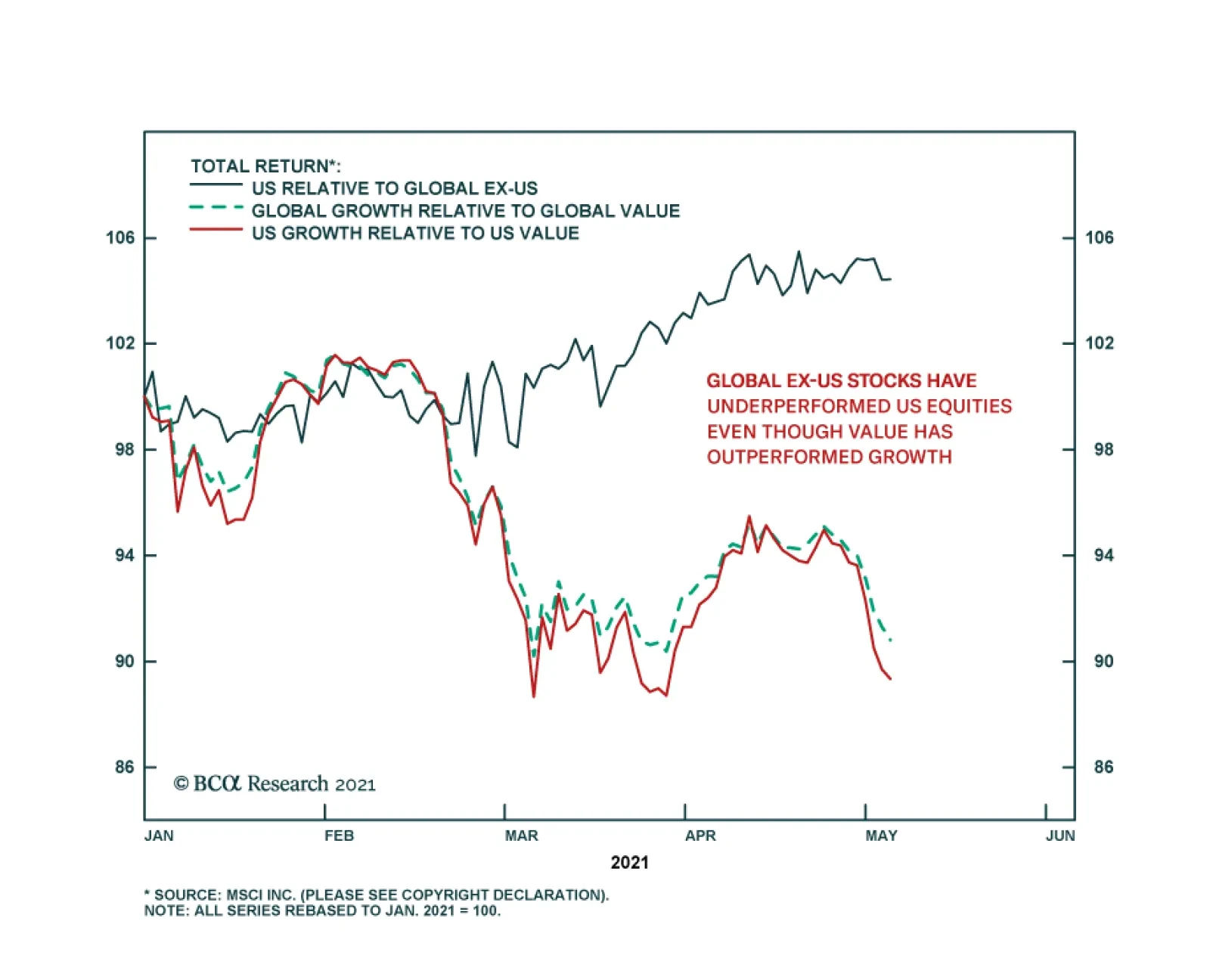
Conventional wisdom suggests that country allocation can be derived from style and sector exposure. For example, if you think that value is going to outperform growth then you should underweight the US versus the rest of the world given that the US has a…

Highlights The modern-day version of the Phillips curve posits that core inflation is determined by long-term inflation expectations and the amount of slack in the economy. In practice, using the Phillips curve to forecast inflation is complicated by uncertainty over: 1) the true size of the output gap; 2) the degree to which changes in the output gap affect inflation; and 3) the drivers of long-term inflation expectations. While economists should be humble in forecasting inflation trends, the bulk of the evidence suggests that core inflation will remain subdued for the next two-to-three years. However, when inflation eventually does begin to rise, it could happen faster and more forcefully than expected. For the time being, inertia in inflation expectations will allow the Fed and other central banks to maintain a highly accommodative monetary stance. This will keep a lid on bond yields, while fueling further gains in equity prices. Today’s goldilocks environment will give way to a period of stagflation in the second half of the decade, however. The Phillips Curve: Flat… For Now It has become fashionable to criticize the Phillips curve. The reason is understandable: Wild swings in the unemployment rate over the past few decades have failed to translate into meaningful changes in inflation. As we argue in this report, however, it is too early to write off the Phillips curve. Perhaps not today, perhaps not tomorrow, but at some point, it will come roaring back. Investors need to be on guard for when it happens. Conceptually, the modern-day version of the Phillips curve posits that core inflation is a function of long-term inflation expectations and the amount of slack in the economy. Mathematically, it can be written as:
Dissecting The Phillips Curve
Dissecting The Phillips Curve
Where πt is core inflation at time t, πe is expected long-term inflation, y is GDP, ȳ is the potential (or “full employment”) level of GDP, and α is a parameter specifying how sensitive inflation is to changes in the output gap, yt – ȳt. A positive output gap implies that output is above potential while a negative gap implies output is below potential. The equation reveals three sources of uncertainty about inflation: 1) the true size of the output gap; 2) the degree to which changes in the output gap affect inflation; and 3) the drivers of long-term inflation expectations. Let’s examine all three sources of uncertainty in order to gauge where the balance of risks to inflation lie over the coming months and years. 1. What Is The Current Size Of The Output Gap? Chart 1Prime-Age Employment-To-Population Ratios Remain Below Pre-Pandemic Levels
Prime-Age Employment-To-Population Ratios Remain Below Pre-Pandemic Levels
Prime-Age Employment-To-Population Ratios Remain Below Pre-Pandemic Levels
The short answer is that no one knows. The employment-to-population ratio in the OECD for workers between the ages of 25-to-54 was still more than two percentage points below pre-pandemic levels as of the end of last year (Chart 1). The labor market has tightened since then, especially in the US. However, even if US payrolls rise by 1 million in April as per Bloomberg consensus estimates, total employment would still be down 4.7% from January 2020. Admittedly, other data point to a much tighter labor market. US small businesses surveyed by the NFIB have been reporting grave difficulty in finding qualified workers (Chart 2). The job openings rate is at an all-time high, while the quits rate is near pre-pandemic levels (Chart 3). Chart 2US: Temporary Labor Shortage (I)
US: Temporary Labor Shortage (I)
US: Temporary Labor Shortage (I)
Chart 3US: Temporary Labor Shortage (II)
US: Temporary Labor Shortage (II)
US: Temporary Labor Shortage (II)
How does one square widespread stories of labor shortages with the fact that total employment remains depressed? A pessimistic interpretation is that the pandemic pushed up structural unemployment. We are skeptical of this thesis. A similar narrative was invoked shortly after the Great Recession to justify tighter fiscal policy and an early start to rate hikes. In the end, not only did the unemployment rate return to pre-GFC levels, but it dropped to a 50-year low. A more plausible explanation is that many service sector workers are currently reluctant to re-enter the labor market due to lingering fears about the pandemic, and in some cases, the need to remain home to look after young children studying remotely. In addition, generous unemployment benefits – which for more than half of US workers exceed their take-home pay – have reduced the incentive to work. Expanded unemployment benefits will expire in September. As the pandemic winds down and schools fully reopen, more workers will rejoin the labor force. Bottom Line: Temporary dislocations are curbing labor supply. However, the level of employment will probably not return to its pre-pandemic trend for another 12 months in the US. It will take even longer to get back to full employment in the euro area and Japan. 2. How Do Changes In The Output Gap Affect Inflation? The Phillips curve was reasonably steep between the mid-1960s and mid-1980s. As such, a falling output gap generally corresponded to rising inflation and vice versa. The result was a series of “clockwise spirals” in inflation-unemployment space, as illustrated in Charts 4A & 4B. Chart 4AThe Phillips Curve Was Steep In The 1960s-1980s
Dissecting The Phillips Curve
Dissecting The Phillips Curve
Chart 4BThe Phillips Curve Has Been Flat In Recent Decades
Dissecting The Phillips Curve
Dissecting The Phillips Curve
Starting in the 1990s, the Phillips curve flattened out. By the time of the Great Recession, the slope of the curve was indistinguishable from zero. Will the Phillips curve remain flat? Over the next two years, the answer is probably yes. However, looking beyond then, it is likely to re-steepen again. Chart 5 shows that the “wage version” of the Phillips curve never became very flat. Even after the mid-1980s, there was still a consistently strong negative correlation between wage growth and the unemployment rate. Chart 5The Wage Version Of The Phillips Curve Is Alive And Well
The Wage Version Of The Phillips Curve Is Alive And Well
The Wage Version Of The Phillips Curve Is Alive And Well
Chart 6Inflation Started Accelerating Quickly Only When Unemployment Reached Very Low Levels In The 1960s
Inflation Started Accelerating Quickly Only When Unemployment Reached Very Low Levels In The 1960s Inflation Started Accelerating Quickly Only When Unemployment Reached Very Low Levels In The 1960s
Inflation Started Accelerating Quickly Only When Unemployment Reached Very Low Levels In The 1960s Inflation Started Accelerating Quickly Only When Unemployment Reached Very Low Levels In The 1960s
Why, then, did stronger wage growth fail to translate into rising price inflation over the past three decades? To a large extent, the answer is that the Fed began to hike interest rates every time the labor market showed signs of overheating. Higher rates, in turn, led to asset busts. During the 1991 recession, it was the commercial real estate bust; in 2001, it was the dotcom bust; and in 2008, it was the housing bust. All three asset busts led to recessions and higher unemployment before wage growth could seep into inflation. What is different this time is that the Fed is a lot more patient. This means that the economy may eventually overheat to a degree not seen in recent history. How long will that take? Probably a few more years. Consider the case of the 1960s. The unemployment rate was at or below its full employment level for four straight years before inflation took off in 1966 (Chart 6). The shortage of workers spawned a major wage-price spiral. Workers demanded higher wages in response to rising prices, which forced firms to further lift prices in order to defend profit margins. Chart 7US Wage Barometers Disaggregated
US Wage Barometers Disaggregated
US Wage Barometers Disaggregated
The US is nowhere near that point now. While some measures of wage growth have accelerated, this mainly reflects a “composition bias” in the way wage indices are constructed. The pandemic led to significant job losses in low-wage sectors such as retail and hospitality, which skewed the calculation of average hourly wages and median weekly earnings to the upside. Cleaner measures of wage growth, such as the Employment Cost Index or the Atlanta Fed Wage Tracker, have been fairly stable over the course of the pandemic1 (Chart 7). Bottom Line: There is good reason to think that the Phillips curve is “kinked”, meaning that inflation might not rise much until the labor market has severely overheated. For now, no major economy is near the kink. 3. Will Long-Term Inflation Expectations Stay Well Anchored? One of the distinguishing features of the clockwise spirals in Chart 4 is that they trace out a series of “higher highs” and “higher lows” for inflation during the period between the mid-1960 and early-1980s. In essence, what happened back then was that inflation would rise, prompting the Fed to step on the brakes ever so gingerly. Inflation would then decline modestly, but not by enough to bring it back to its original level. The “stickiness” of inflation during that era highlights the importance of inflation expectations. In the context of the Phillips curve, a change in long-term inflation expectations could, at least theoretically, affect realized inflation independent of what happens to the output gap. In practice, however, the size of the output gap is likely to influence inflation expectations and vice versa. A persistently positive output gap will cause inflation to consistently exceed its long-term expected value. As Milton Friedman and Edmund Phelps pointed out more than four decades ago, this will eventually prompt businesses and the public to revise up their expectations of inflation. Unless the central bank lifts interest rates by enough, a rise in inflation expectations could spur people to increase spending in advance of higher prices. This could cause the economy to further overheat, leading to even higher inflation expectations. In other words, a positive output gap could lead to higher inflation expectations, and higher inflation expectations, in turn, could push aggregate demand even further above potential. Suppose that people jettison the expectation of a stable long-term inflation rate and adopt an “adaptive” approach whereby they assume that inflation this year simply will be what it was last year. This is equivalent to replacing πe in the Phillips curve equation with πt-1, yielding:
Dissecting The Phillips Curve
Dissecting The Phillips Curve
This is the “accelerationist” version of the Phillips curve. It says that the output gap determines the change in inflation rather than the level of inflation. With an accelerationist Phillips curve, inflation can increase without bound if the central bank tries to keep output above its potential level. The transition to an accelerationist Phillips curve appears to have happened in the 1970s. As my colleague Jonathan Laberge has argued, and as recent empirical work has emphasized, changes in inflation expectations generally have a larger impact on realized inflation than changes in the output gap. In particular, it is difficult to explain the Volcker disinflation solely based on the movement in the unemployment rate. Inflation continued to fall even after the unemployment rate peaked in December 1982. The surprising decline in inflation following the recession even prompted two young economists working at the Council of Economic Advisors, Paul Krugman and Larry Summers, to pen a memo entitled “The Inflation Timebomb?” in which they predicted a “significant reacceleration of inflation in the near future”. Chart 8Long-Term Inflation Expectations Remain Well Anchored Today
Long-Term Inflation Expectations Remain Well Anchored Today
Long-Term Inflation Expectations Remain Well Anchored Today
Why did inflation keep falling in the 1980s as the economy recovered? A plausible theory is that Paul Volcker’s appointment to Fed chair marked a “regime shift” in the conduct of monetary policy. No longer would the Fed stand idly by as inflation galloped higher. Even if it took double digit interest rates and a deep recession, the Fed would do what was needed to break the back of inflation. This allowed the accelerationist Phillips curve of the 1970s to transition to its modern-day version characterized by low and stable inflation expectations. What does all this mean for today? Both survey and market-based measures of long-term inflation expectations remain well anchored (Chart 8). Given that inflation expectations have been low and stable for the past few decades, it may take even more overheating than what occurred in the 1960s to unmoor them. Such an unmooring of inflation expectations is not impossible, however. The Fed seems eager to overheat the economy. Fiscal policy is likely to remain highly accommodative long after the pandemic restrictions ease. Meanwhile, as we discussed in an earlier report, many of the structural factors that have suppressed inflation could go into reverse. Bottom Line: Inflation expectations are likely to remain well anchored for the next two years. However, they could become unmoored later on if monetary and fiscal policy remain highly accommodative. Concluding Thoughts There is a lot of concern over inflation these days. We would fade these concerns, at least for the time being. The much-discussed spike in manufacturing input prices is nothing new. The exact same thing happened in 2008 and 2011 (Chart 9). Pundits who hyperventilated about soaring inflation were proven wrong back then and they are likely to be proven wrong again this year. Chart 9Wholesale Inflation Rose (Briefly) In 2008 And 2011 Too
Wholesale Inflation Rose (Briefly) In 2008 And 2011 Too
Wholesale Inflation Rose (Briefly) In 2008 And 2011 Too
Chart 10The Most Refined Measures Of Core Inflation Paint A Benign Picture
The Most Refined Measures Of Core Inflation Paint A Benign Picture
The Most Refined Measures Of Core Inflation Paint A Benign Picture
The pandemic distorted prices in all sorts of unprecedented ways. This means that looking at standard measures of core inflation may be misleading. It is much better to consider more refined measures of core inflation that go beyond simply stripping out the effects of volatile food and energy prices. Chart 10 shows that trimmed-mean inflation, median price inflation, and sticky price inflation all suggest that underlying inflation remains well contained. Continued low inflation will allow the Fed to maintain a highly accommodative monetary policy. This will keep a lid on bond yields, while fueling further gains in equity prices. When will it be time to worry? When the labor market starts to overheat to the point that a wage-price spiral erupts. As discussed above, that is not a near-term risk. However, such a spiral could occur in two-to-three years, setting the stage for a period of stagflation in the second half of the decade. Peter Berezin Chief Global Strategist pberezin@bcaresearch.com Footnotes 1 Unlike the widely followed average hourly wage series published every month in the payrolls report, the quarterly Employment Cost Index (ECI) does control for shifts in the weights of different industries in total employment. Thus, an increase in the relative number of low-paid hospitality workers would depress average hourly wages, but would not affect the ECI. Nevertheless, the ECI does not control for the possibility that the composition of the workforce within industries may change over time. The Atlanta Fed's Wage Tracker does overcome this bias because it uses the same sample of workers from one period to the next. Global Investment Strategy View Matrix
Dissecting The Phillips Curve
Dissecting The Phillips Curve
Special Trade Recommendations
Dissecting The Phillips Curve
Dissecting The Phillips Curve
Current MacroQuant Model Scores
Dissecting The Phillips Curve
Dissecting The Phillips Curve
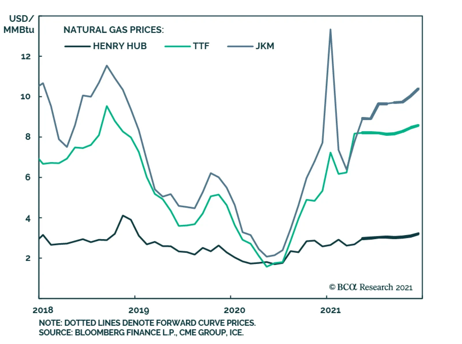
BCA Research’s Commodity & Energy Strategy service expects US natural gas prices to remain well supported this year. US LNG cargoes out of the US Gulf balanced demand coming from Asia and Europe this past winter, which was sharply colder than expected…
Highlights Massive slack in the US labour market means that the current uplift in US inflation is highly likely to fade by the end of the year. On a long-term horizon, investors should own US T-bonds. Equity investors should fade the reflation trade… …and rotate into the unloved defensive sectors such as healthcare, consumer staples, and personal products. These sector preferences imply an overweight to developed markets (DM) versus emerging markets (EM). On a 6+ month horizon, overweight US T-bonds versus German bunds. Fractal trade shortlist: France versus Japan; corn versus wheat; timber; and building materials. Feature Chart of the WeekMillions Of People Have Dropped Out Of The US Labour Market
Millions Of People Have Dropped Out Of The US Labour Market
Millions Of People Have Dropped Out Of The US Labour Market
The near 40 percent of Americans not in the labour market is the highest level in 50 years. Moreover, the exodus out of the labour market during the pandemic was on an unprecedented scale in the modern era. This means that we should treat the US unemployment rate with a huge dose of salt, because it does not include the millions of people that have dropped out of the labour market (Chart I-1). Even the headline 14 million plunge in the number of US unemployed is deceptive, because it is almost entirely due to the furloughed workers that have returned to their jobs (Chart I-2). Chart I-2Furloughed Workers Have Returned To Their Jobs...
Furloughed Workers Have Returned To Their Jobs...
Furloughed Workers Have Returned To Their Jobs...
Worryingly, the additional 2 million ‘permanent unemployed’ has barely budged from its pandemic peak and the number of economically inactive stands 5.5 million higher (Chart I-3). Meanwhile, population growth is increasing the potential labour force. In combination, underemployment in the US labour market amounts to around 10 million people. Chart I-3...But The Numbers Of Permanent Unemployed And Inactive Remain Elevated
...But The Numbers Of Permanent Unemployed And Inactive Remain Elevated
...But The Numbers Of Permanent Unemployed And Inactive Remain Elevated
To its credit, the Federal Reserve is acutely aware of this. Last week, Chair Jay Powell pointed out that: “We’re a long way from full employment, payroll jobs are 8.4 million below where they were in February of 2020…these were people who were working in February of 2020. They clearly want to work. So those people, they’re going to need help” Implicit is the Fed’s belief that the massive slack in the US labour market will keep structural inflation depressed. And that the coming increases in inflation will be short-lived. Travel And Hospitality Cannot Move The Inflation Needle Some people argue that pent-up demand for things that we couldn’t do under social restrictions – such as travel and eat out – will unleash a major inflation. The flaw in this argument is that these things account for a tiny part of the inflation basket. For example, airfares are weighted at a negligible 0.6 percent in the US consumer price index (CPI). Eating out at (full service) restaurants is weighted at just 3 percent. So, even if these prices were to surge, they would barely move the overall inflation needle. By far the biggest component in US inflation is rent of shelter, weighted at 33 percent in the CPI and 42 percent in the core CPI. By far the biggest component in US inflation is rent of shelter, weighted at 33 percent in the CPI and 42 percent in the core CPI. The lion’s share of rent of shelter is so-called ‘owner-equivalent rent’, weighted at 24 percent in the CPI and 30 percent in the core CPI.1 Owner-equivalent rent is the hypothetical cost that homeowners incur to consume their own home, obtained by surveying a sample of homeowners. In the US, this hypothetical cost tracks actual rents. So, we can say that the biggest driver of US inflation is rent inflation (Chart I-4). Chart I-4Owner-Equivalent Rent Inflation Tracks Actual Rent Inflation
Owner-Equivalent Rent Inflation Tracks Actual Rent Inflation
Owner-Equivalent Rent Inflation Tracks Actual Rent Inflation
Rent inflation has consistently outperformed the rest of the inflation basket. Hence, to get overall inflation to a persistent 2 percent, rent inflation must get to 3 percent and stay there – meaning a persistent 1.5 percent higher than it is now (Chart I-5). Chart I-5Core Inflation At 2 Percent Requires Rent Inflation At 3 Percent
Core Inflation At 2 Percent Requires Rent Inflation At 3 Percent
Core Inflation At 2 Percent Requires Rent Inflation At 3 Percent
What drives rent inflation? The answer is the permanent unemployment rate. This is because the ability to pay rent relies on the security of having a permanent job. Empirically, a one percent decline in the permanent unemployment rate lifts rent inflation by one percent (Chart I-6). Chart I-6A 1 Percent Decline In The Permanent Unemployment Rate Lifts Rent Inflation By 1 Percent
A 1 Percent Decline In The Permanent Unemployment Rate Lifts Rent Inflation By 1 Percent
A 1 Percent Decline In The Permanent Unemployment Rate Lifts Rent Inflation By 1 Percent
Pulling this together, the US permanent unemployment rate needs to fall by about 1.5 percent for core inflation to reach the Fed’s target persistently. Put another way, most of the additional 2 million permanent unemployed need to find work. Yet history teaches us that this will take a long time. The Post-Pandemic Productivity Boom Will Be Disinflationary When an industry sheds millions of jobs in a recession, it tends to substitute that labour input permanently with a new productivity-boosting technology or strategy. For example, after the Great Depression the smaller craft-based auto producers shut down permanently, while those that had adopted labour-saving mass production survived. The result was a major restructuring of the auto productive structure. Another example was the ‘typing pool’, a ubiquitous feature of office life until the late 1990s. After the dot com bust, the wholesale roll-out of Microsoft Word wiped out these typing jobs. It takes years for excess labour to get fully absorbed into a post-recession economy. Hence, the flip side of a post-recession productivity boom is that displaced workers need to re-skill, or even change career – requiring a long time for the excess labour to get absorbed into the restructured economy. After the dot com bust, it took four years. After the global financial crisis, it took six years (Chart I-7). Chart I-7How Long Does It Take To Absorb The Permanent Unemployed?
How Long Does It Take To Absorb The Permanent Unemployed?
How Long Does It Take To Absorb The Permanent Unemployed?
The post-pandemic experience will be no different. In fact, compared to a common-or-garden recession, the pandemic has accelerated wider-reaching changes to the way that we live, work, and interact. This means that it might take even longer for the economy to attain the central bank’s goal of ‘full employment.’ Again, to its credit, the Federal Reserve is acutely aware of this. As Jay Powell went on to say: “It’s going to be a different economy. We’ve been hearing a lot from companies looking at deploying better technology and perhaps fewer people, including in some of the services industries that have been employing a lot of people. It seems quite likely that a number of the people who had those service sector jobs will struggle to find the same job, and may need time to find work” In summary, elevated permanent unemployment will subdue rent inflation. And subdued rent inflation will constrain overall inflation once the current supply bottlenecks clear. On a long-term horizon, investors should own US T-bonds. Equity investors should fade the reflation trade, and rotate into the unloved defensive sectors such as healthcare, consumer staples, and personal products. These sector preferences imply an overweight to developed markets (DM) versus emerging markets (EM). US And European Inflation Will Converge US and European inflation rates are not measured on an apples-for-apples basis. European inflation excludes the largest component in the US inflation basket – owner-equivalent rent (OER). To repeat, OER is the hypothetical cost that homeowners incur to consume their own home. European statisticians do not like to include any hypothetical item in the inflation basket that does not have a market price. So, euro area inflation includes actual rents, but it excludes OER. On an apples-for-apples comparison, inflation rates in the US and the euro area have been near-identical for many years. This means that US core inflation has a 30 percent higher weighting to an item that has persistently inflated at well above 2 percent. If we strip out OER, then the core inflation rates in the US and the euro area have been near-identical for many years (Chart I-8).2 Chart I-8On An Apples-For-Apples Comparison, Inflation In The US And Euro Area Are Near-Identical
On An Apples-For-Apples Comparison, Inflation In The US And Euro Area Are Near-Identical
On An Apples-For-Apples Comparison, Inflation In The US And Euro Area Are Near-Identical
Alternatively, what if we include OER in euro area inflation? Despite European rent controls, actual rents have persistently outperformed core inflation. Hence, OER would likely outperform by even more. We can infer that including OER would have lifted euro area inflation very close to US inflation (Chart I-9). Chart I-9Omitting Owner-Equivalent Rent Has Depressed Euro Area Inflation
Omitting Owner-Equivalent Rent Has Depressed Euro Area Inflation
Omitting Owner-Equivalent Rent Has Depressed Euro Area Inflation
All of this may sound like a petty academic difference, but this petty academic difference has generated huge economic and political consequences. As OER has boosted inflation in the US versus Europe, US and euro area monetary policy have diverged much more than they should. Which means US and euro area bond yields have diverged much more than they should. Which has structurally weakened the euro. Which has spawned the near $200 billion trade surplus for the euro area versus the US. And all because of a petty academic difference! What happens next? If, as we expect, US shelter inflation remains depressed then the major difference between US and euro area inflation will vanish. Reinforcing this will be a catch-up in euro area growth as the delayed roll-out of vaccinations takes effect. On this basis, a stand-out opportunity on a 6+ month investment horizon is yield convergence between US T-bonds and German bunds. Overweight US T-bonds versus German bunds. Candidates For Countertrend Reversals Corn prices have surged on increased demand from China combined with supply shortages resulting from poor weather in Brazil. This has caused an odd divergence between corn and wheat prices, which is now susceptible to a sharp correction (Chart I-10). Chart I-10The Rally In Corn Versus Wheat Is Vulnerable To Reversal
The Rally In Corn Versus Wheat Is Vulnerable To Reversal
The Rally In Corn Versus Wheat Is Vulnerable To Reversal
Likewise, timber prices have boomed on the back of increased housebuilding demand combined with supply bottlenecks. But as these bottlenecks clear and/or higher bond yields cool demand, the sector is vulnerable to an aggressive reversal given its fragile fractal structure (Chart I-11). Chart I-11Timber Prices Are Vulnerable To Reversal
Timber Prices Are Vulnerable To Reversal
Timber Prices Are Vulnerable To Reversal
To play this, our first recommended trade is to short the Invesco Building and Construction ETF (PKB) versus the Healthcare SPDR (XLV), setting the profit target and symmetrical stop-loss at 15 percent (Chart I-12). Chart I-12Short Building And Construction (PKB) Versus Healthcare (XLV)
Short Building And Construction (PKB) Versus Healthcare (XLV)
Short Building And Construction (PKB) Versus Healthcare (XLV)
Finally, within stock markets, the recent divergence of France versus Japan is highly unusual given that the two markets have near-identical sector compositions. This divergence has taken France versus Japan to the top of its multi-year trading range (Chart I-13). Chart I-13Short France Versus Japan
Short France Versus Japan
Short France Versus Japan
Hence, our second recommended trade is to short France versus Japan (MSCI indexes), setting the profit target and symmetrical stop-loss at 4.8 percent. Dhaval Joshi Chief Strategist dhaval@bcaresearch.com Footnotes 1 The PCE has broadly similar weights as the CPI. 2 We have approximated the removal of OER by removing the whole shelter component. Fractal Trading System Fractal Trades 6-Month Recommendations Structural Recommendations Closed Fractal Trades Closed Trades Asset Performance Equity Market Performance Indicators To Watch - Bond Yields Chart II-1Indicators To Watch - Bond Yields - ##br##Euro Area
Indicators To Watch - Bond Yields - Euro Area
Indicators To Watch - Bond Yields - Euro Area
Chart II-2Indicators To Watch - Bond Yields - ##br##Europe Ex Euro Area
Indicators To Watch - Bond Yields - Europe Ex Euro Area
Indicators To Watch - Bond Yields - Europe Ex Euro Area
Chart II-3Indicators To Watch - Bond Yields - ##br##Asia
Indicators To Watch - Bond Yields - Asia
Indicators To Watch - Bond Yields - Asia
Chart II-4Indicators To Watch - Bond Yields - ##br##Other Developed
Indicators To Watch - Bond Yields - Other Developed
Indicators To Watch - Bond Yields - Other Developed
Indicators To Watch - Interest Rate Expectations Chart II-5Indicators To Watch - Interest Rate Expectations
Indicators To Watch - Interest Rate Expectations
Indicators To Watch - Interest Rate Expectations
Chart II-6Indicators To Watch - Interest Rate Expectations
Indicators To Watch - Interest Rate Expectations
Indicators To Watch - Interest Rate Expectations
Chart II-7Indicators To Watch - Interest Rate Expectations
Indicators To Watch - Interest Rate Expectations
Indicators To Watch - Interest Rate Expectations
Chart II-8Indicators To Watch - Interest Rate Expectations
Indicators To Watch - Interest Rate Expectations
Indicators To Watch - Interest Rate Expectations
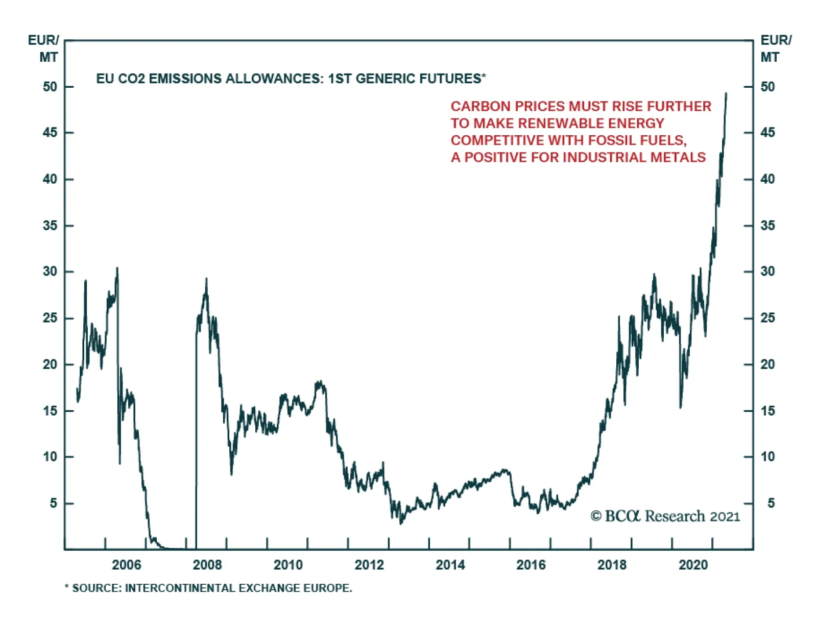
The benchmark EU Allowance (EUA) price for carbon breached EUR50/MT in intraday trading on Tuesday – the highest level since the market was launched in 2005. The nearly 50% rally so far this year in part reflects the impact of the European Union’s new target…
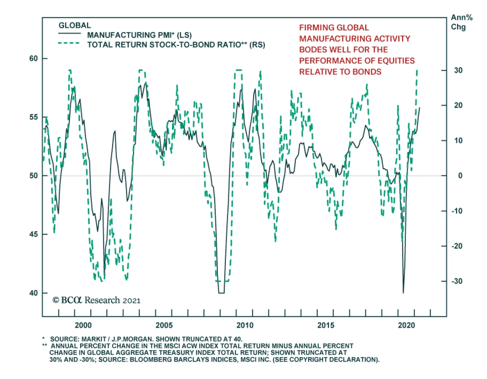
The global manufacturing recovery accelerated in April with the Global Markit PMI rising to a ten-year high of 55.8 from 55.0. The stronger headline number reflects improvements in all components of the index. Moreover, the recovery is geographically…
Dear Client, In addition to our regular report, this week we are sending a Special Report written by my colleague Lucas Laskey from BCA Research’s Equity Analyzer service titled “Is The Reopening Trade Closed?”. The report discusses the state of the reopening trade through the lens of Equity Analyzer's factor model. I hope you find the report insightful. Additionally, please join us next week on Friday, May 7, 2021 at 10am EDT as I moderate a debate between my colleagues Arthur Budaghyan, BCA Research’s Chief Emerging Market Strategist, and Robert Ryan, Chief Commodity & Energy Strategist. Titled “A Debate On Commodities,” Arthur and Bob will discuss the outlook for commodities, touching on the trajectory both DM and China/EM growth will follow, the path for the US dollar, and other cyclical and structural forces currently shaping commodity markets. During the webcast, Arthur and Bob will highlight the areas they disagree on and the reasons behind their differing views. Best regards, Peter Berezin Chief Global Strategist Highlights Bitcoin is on a collision course with ESG. ESG interests will win out. Widespread adoption of cryptocurrencies, if it were to happen, would erode the purchasing power of traditional money, while robbing governments of billions of dollars in seigniorage revenue. Governments have already begun to take steps to thwart such an outcome. Restrictions on the use of cryptocurrencies will only increase over the coming years. The rollout of Central Bank Digital Currencies (CBDCs) represents an existential threat not only to cryptos, but potentially to credit card companies and online payment processors such as PayPal, Square, Venmo, WeChat Pay, and Alipay. Shorting cryptocurrencies, meme stocks, or any other high-flying asset is risky business. Fortunately, there is a way to flip the usual risk-reward from going short on its head. Rather than facing unlimited losses and a maximum gain of only 100% of the initial position, we outline a shorting strategy that caps the loss at 100% but allows for unlimited gains. Bitcoin’s Questionable ESG Record Crypto critics have often blamed cryptocurrencies for facilitating illicit transactions and enlarging the world’s carbon footprint. There is some truth to both claims. Motivated to avoid detection, online scammers, smugglers, and terrorists have been drawn to cryptocurrencies. Cryptos have also been used to evade capital controls and conceal wealth from the tax authorities. On the environmental side, Bitcoin mining now consumes more energy than entire countries such as Sweden, Argentina, and Pakistan (Chart 1). Moreover, about 70% of Bitcoin mining currently takes place in China, mainly using electricity generated by burning coal. A lot of the remaining mining occurs in countries such as Russia and Iran with questionable governance records. Chart 1How Dare You, Bitcoin
How To Short Bitcoin, Or Anything Else, Without Losing Your Shorts
How To Short Bitcoin, Or Anything Else, Without Losing Your Shorts
Cryptos And Inequality One criticism of Bitcoin that is less frequently mentioned is its role in exacerbating wealth inequality. We are not just talking about the small number of “whales” who amassed huge fortunes by buying or mining Bitcoin shortly after it was created. If these whales sell their coins at today’s prices and the price of Bitcoin eventually crashes, those early investors will have ended up profiting at the expense of smaller investors who bought at the top. While such a transfer of income may be unsavory, it is not much different from what happens when someone sells a high-flying stock to the proverbial bagholder just as the stock is peaking. The more interesting question is what happens if Bitcoin prices do not crash. It might be tempting to think that in such a scenario, no one would be worse off. But that is incorrect. There would still be losers, and importantly, these losers would consist of people who never bought or sold Bitcoin in their lives. To see why, ask yourself who suffers from counterfeit currency. One possibility is shopkeepers who inadvertently accept counterfeit cash and find themselves stuck with worthless money. But even if the counterfeit money is never detected, there would still be losers: Fake money dilutes the value of genuine money, making everyone who holds the genuine money worse off. Crypto evangelists like to argue that cryptocurrencies offer protection against the “debasement of fiat money.” Ironically, the widespread adoption of cryptocurrencies could produce a self-fulfilling cycle that leads to just such an inflationary outcome. If enough people decide to swap fiat currencies for cryptos, the dollar and other fiat monies could become “hot potatoes.” The price of cryptos would rise in relation to dollars. Feeling more wealthy, crypto holders would spend some of their wealth on goods and services. As long as the economy is operating below potential, this would not be such a bad thing since increased spending would generate more output and employment. However, once the output gap disappears, more spending would result in higher inflation. The purchasing power of fiat currencies would decline. The Empire Strikes Back Will governments allow such a massive transfer of wealth from holders of fiat currencies to holders of crypto currencies to occur? It seems highly unlikely. In order to entice people to hold on to their fiat currency bank deposits, central banks would have to raise interest rates. Debt-strapped governments would not like that. Governments also generate significant revenue from their ability to print currency and then exchange it for goods and services. For the US, this “seigniorage revenue” is around $100 billion per year (Chart 2). No government will want to part with this revenue. A financial system where loans and deposits are denominated in cryptocurrencies would be highly unstable. Even if the supply of each individual cryptocurrency were capped, the rise and fall of competing cryptocurrencies could still result in large shifts in the aggregate cryptocurrency money supply. Moreover, wild swings in cryptocurrency prices, both versus fiat currencies and one another, could destroy any semblance of price stability. The value of bank loans made in Bitcoin or other cryptos would experience great fluctuations. Powerless to issue cryptocurrencies themselves, central banks would not be able to provide unlimited liquidity support to commercial banks as they do now. The situation would resemble the US in the late 19th century when myriad currencies competed with one another and the financial system veered from one crisis to another (Chart 3). Chart 2Governments Will Not Part With Seigniorage Revenue
Governments Will Not Part With Seigniorage Revenue
Governments Will Not Part With Seigniorage Revenue
Chart 3An Inelastic Money Supply Historically Led To More Banking Crises
How To Short Bitcoin, Or Anything Else, Without Losing Your Shorts
How To Short Bitcoin, Or Anything Else, Without Losing Your Shorts
What Is It Good For? One might argue that the ultimate aim of cryptocurrencies is not to displace fiat money. Okay, but if Bitcoin can never truly function as a medium of exchange or a unit of account, what exactly underpins its utility as a store of value? At least with gold, you get an extremely rare metal, forged in the collision of neutron stars billions of years ago, that has great aesthetic value. With cryptos, you get fairy dust. In past reports, we referred to Bitcoin as a “solution in search of a problem.” In retrospect, that characterization was much too charitable. Bitcoin is a problem in search of a problem. Whereas the Visa network can process over 20,000 transactions per second, the Bitcoin network can barely process five (Chart 4). Bitcoin transactions take 10 minutes-to-an hour to complete compared to just a few seconds for most debit or credit card transactions. The average fee for a Bitcoin transaction is around $30. This fee has been rising, not falling, over the past few years (Chart 5). Chart 4Bitcoin: The Speed Of Transactions, Or Lack Of It
Bitcoin: The Speed Of Transactions, Or Lack Of It
Bitcoin: The Speed Of Transactions, Or Lack Of It
Chart 5Bitcoin: The Cost Per Transaction Is Rising
Bitcoin: The Cost Per Transaction Is Rising
Bitcoin: The Cost Per Transaction Is Rising
Look Out Below Table 1A Growing List Of Cryptocurrency Bans
How To Short Bitcoin, Or Anything Else, Without Losing Your Shorts
How To Short Bitcoin, Or Anything Else, Without Losing Your Shorts
Cryptos are heading for a world of pain. ESG concerns will force companies to step back from their newfound infatuation with these magic beans. Meanwhile, governments will tighten the screws on cryptocurrencies while rolling out their own digital monies. As my colleague Chester Ntonifor pointed out last week, a growing list of countries have already moved to ban Bitcoin transactions (Table 1). In addition, most G10 central banks have outlined their own digital currency plans (Map 1). Not only will Central Bank Digital Currencies (CBDCs) squeeze out decentralised cryptocurrencies, they will also pose an existential risk to credit card companies and online payment processors such as PayPal, Square, Venmo, WeChat Pay, and Alipay. Map 1Many Central Banks Are Planning A Digital Currency
How To Short Bitcoin, Or Anything Else, Without Losing Your Shorts
How To Short Bitcoin, Or Anything Else, Without Losing Your Shorts
The Risk Of Shorting Bitcoin These days, there is no shortage of ways to short Bitcoin. Many cryptocurrency platforms permit short selling. In addition, one can bet against Bitcoin through the futures market. To the extent that the fortunes of companies such as Coinbase are tied to the crypto market, one can also express a short view on cryptos through listed equities. Yet, shorting cryptos is a risky strategy. Cryptocurrencies do not have any intrinsic value. What you think a Bitcoin is worth depends on what others think it is worth and vice versa. At present, the value of all Bitcoins that have ever been issued is about $1 trillion. Eighteen cryptocurrencies have valuations exceeding $10 billion (Table 2). The market capitalization of all cryptocurrencies in circulation stands at $2 trillion. In contrast, the value of all the gold that has ever been mined is around $10 trillion (Chart 6). It is certainly possible that euphoric investors will push up the value of cryptocurrencies to the point that they are collectively worth more than all the gold in the world. Table 2Close To 20 Cryptos Have A Market Cap In Excess Of US$10bn
How To Short Bitcoin, Or Anything Else, Without Losing Your Shorts
How To Short Bitcoin, Or Anything Else, Without Losing Your Shorts
Chart 6Gold Versus Cryptocurrencies
Gold Versus Cryptocurrencies
Gold Versus Cryptocurrencies
To guard against this risk, one needs a prudent strategy for shorting not just high-flying cryptocurrencies, but any security whose price can rise significantly. Luckily, such a strategy exists. How To Short Without Losing Your Shorts Clients sometimes ask me what I invest my money in. The answer is that most of my liquid wealth is held in publicly traded US small cap stocks. I have been investing in this space for over two decades (prior to joining Goldman, I even wrote a blog about it). I used my knowledge of stock picking to develop an early version of BCA’s Equity Analyzer. David Boucher and his team have since transformed it into a powerful, state-of-the-art stock selection service. Table 3Don’t Be Like Melvin
How To Short Bitcoin, Or Anything Else, Without Losing Your Shorts
How To Short Bitcoin, Or Anything Else, Without Losing Your Shorts
Shorting small cap stocks is risky business. To limit the risk, I have employed a strategy that flips the usual risk-reward from shorting on its head. Normally, when you short a stock, your gain is capped at 100% of the initial position whereas your potential loss is unlimited. With my shorting technique, your potential loss is capped at 100% while your potential gain is unlimited. To illustrate how the strategy works, let us consider shorting one particular overpriced “meme” stock that has been in the news a lot this year. I won’t single out the name of the company, other than to note that it begins with “G” and ends with “stop.” At the time of writing, this mystery stock was trading at $180 per share. Suppose you shorted 1,000 shares at that price. The basic idea is to then short 2% more shares if the price falls by 1% and cover 2% of your shares if the price rises by 1%. So, in this case, you would increase your short position to 1020 shares if the price were to fall to around $178 but cover 20 shares (leaving you with 980 shares short) if the price were to rise to $182. Table 3 shows the number of shares you would need to be short for any given price between $5 and $360. If the price of the shares were to fall to $10 (double what it was last August), the strategy would generate roughly $3,060,000 in profits.1 In contrast, if the price were to rise to $360 per share, the strategy would incur a loss of $90,000. Even if the price went to infinity, the most you would lose is $180,000. There are a number of challenges to implementing this strategy: 1) It requires frequent trading; 2) gap downs and gap ups in the price could meaningfully hurt the results; 3) it is not always possible to short a stock and even when it is, the borrowing costs could be high, etc. Nevertheless, as a “rule of thumb,” I have found this strategy to be extremely effective in mitigating risk. Peter Berezin Chief Global Strategist pberezin@bcaresearch.com Footnotes 1 Notice that the profit of $3,060,000 from going short 1,000 shares in the case where the price of the stock falls from $180 to $10 is equal to 17 times the initial short position of $180,000 (i.e., $3,060,000 divided by 180,000 is 17). This is exactly the same return that one would earn if one went long the stock and the price rose from $10 to $180. In this case, the profit would also be equal to 17 times the initial investment (i.e., $1,800,000-$100,000 divided by $100,000 is 17). Global Investment Strategy View Matrix
How To Short Bitcoin, Or Anything Else, Without Losing Your Shorts
How To Short Bitcoin, Or Anything Else, Without Losing Your Shorts
Special Trade Recommendations
How To Short Bitcoin, Or Anything Else, Without Losing Your Shorts
How To Short Bitcoin, Or Anything Else, Without Losing Your Shorts
Current MacroQuant Model Scores
How To Short Bitcoin, Or Anything Else, Without Losing Your Shorts
How To Short Bitcoin, Or Anything Else, Without Losing Your Shorts
Highlights Rising CO2 emissions on the back of stronger global energy growth this year will keep energy markets focused on expanding ESG risks in the buildout of renewable generation via metals mining (Chart of the Week). EM energy demand is expected to grow 3.4% this year vs. 2019 levels and will account for ~ 70% of global energy demand growth. Demand in DM economies will fall 3% this year vs 2019 levels. Overall, global demand is expected to recover all the ground lost to the COVID-19 pandemic, according to the IEA. Rising energy demand will be met by higher fossil-fuel use, with coal demand increasing by more than total renewables generation this year and accounting for more than half of global energy demand growth. Demand for renewable power will increase by 8,300 TWh (8%) this year, the largest y/y increase recorded by the IEA. As renewables generation is built out, demand for bulks (iron ore and steel) and base metals will increase.1 Building that new energy supply will contribute to rising CO2, particularly in the renewables' supply chains. Feature Energy demand will recover much of the ground lost to the COVID-19 pandemic last year, according to the IEA.2 Most of this is down to successful rollouts of vaccination programs in systemically important economies – e.g., China, the US and the UK – and the massive fiscal and monetary stimulus deployed to carry the global economy through the pandemic. The risk of further lockdowns and uncontrolled spread of variants of the virus remains high, but, at present, progress continues to be made and wider vaccine distribution can be expected. The IEA expects a global recovery in energy demand of 4.6% this year, which will put total demand at ~ 0.5% above 2019 levels. The global rebound will be led by EM economies, where demand is expected to grow 3.4% this year vs. 2019 levels and will account for ~ 70% of global energy demand growth. Energy demand in DM economies will fall 3% this year vs 2019 levels. Overall, global demand is expected to recover all the ground lost to the COVID-19 pandemic, according to the IEA. Chart of the WeekGlobal CO2 Emissions Will Rebound Post-COVID-19
Global CO2 Emissions Will Rebound Post-COVID-19
Global CO2 Emissions Will Rebound Post-COVID-19
Coal demand will lead the rebound in fossil-fuel use, which is expected to account for more than total renewables demand globally this year, covering more than half of global energy demand growth. This will push CO2 emissions up by 5% this year. Asia coal demand – led by China's and India's world-leading coal-plant buildout over the past 20 years – will account for 80% of world demand (Chart 2). Chart 2China, India Lead Coal-Fired Generation Buildout
China, India Lead Coal-Fired Generation Buildout
China, India Lead Coal-Fired Generation Buildout
Demand for renewable power will post its biggest year-on-year gain on record, increasing by 8,300 TWh (8%) this year. This increase comes at the back of roughly a decade of an increasing share of electricity from renewables globally (Chart 3). As renewables generation is built out, demand for bulks (iron ore and steel) and base metals will increase.3 Building that new energy supply will contribute to rising CO2, particularly in the renewables' supply chains. Chart 3Share of Electricity From Renewables Has Been Increasing
Share of Electricity From Renewables Has Been Increasing
Share of Electricity From Renewables Has Been Increasing
ESG Risks Increase With Renewables Buildout Governments have pledged to invest vast sums of money into the green energy transition, to reduce fossil fuels consumption and deforestation, thus curbing temperature increases. In addition, banks have pledged trillions will be made available to support the buildout of renewable technologies over the coming years. The World Bank, under the most ambitious scenarios considered (IEA ETP B2DS and IRENA REmap), projects that renewables, will make up approximately 90% of the installed electricity generation capacity up to 2050. This analysis excludes oil, biomass and tidal energy. (Chart 4). Building these renewable energy sources will be extremely mineral intensive (Chart 5). Chart 4Renewables Potential Is Huge …
Renewables ESG Risks Grow With Demand
Renewables ESG Risks Grow With Demand
While we have highlighted issues such as a lack of mining capex and decreasing ore grades in past research – both of which can be addressed by higher metals and minerals prices – the environmental, social and governance (ESG) risks posed by mining are equally important factors for investors, policymakers and mining companies to consider.4 The mining industry generally uses three principal sources of energy for its operations – diesel fuel (mostly in moving mined ore down the supply chain for processing), grid electricity and explosives. Of these three, diesel and electricity consumption contributes substantially to mining’s GHG emissions. In the mining stage, land clearing, drilling, blasting, crushing and hauling require a considerable amount of energy, and hence emit the highest amounts of greenhouse gases (GHGs). Chart 5… As Are Its Mineral Requirements
Renewables ESG Risks Grow With Demand
Renewables ESG Risks Grow With Demand
The Environmental Impact Of Mining Under the scenarios depicted in Chart 5, copper suppliers could be called on to produce approximately 21mm MT of the red metal annually between now and 2050, which is equivalent to a 7% annual increase of supplies vs. the 2017 reference year shown in the chart. Mining sufficient amounts of copper, a metal which is critical to the renewable energy buildout, both in terms of quantity and versatility, will test miners' and governments' ability to extract sufficient amounts of ore for further processing without massively damaging the environment or indigenous populations' habitats (Chart 6). Chart 6Copper Spans All Renewables Technologies
Renewables ESG Risks Grow With Demand
Renewables ESG Risks Grow With Demand
A recent risk analysis of 308 undeveloped copper orebodies found that for 180 of the orebodies – roughly equivalent to 570mm MT of copper – ore-grade risk was characterized as moderate-to-high risk.5 High risk implies a lower concentration of metal in the ore deposits. Mining in ore bodies with lower copper grades will be more energy intensive, and thus will emit more greenhouse gases. Table 1 is a risk matrix of the 40 mines that have the most amount of copper tonnage in this analysis: 27 of these mines displayed in the matrix have a medium-to-high grade risk. Table 1Mining Risk Matrix
Renewables ESG Risks Grow With Demand
Renewables ESG Risks Grow With Demand
Another analysis established a negative relationship between the ore-grade quality and energy consumption across mines for different metals and minerals.6 This paper found that, as ore grade depletes, the energy needed to extract it and send it along the supply chain for further processing is exponentially higher (Chart 7). Lastly, a recent examination found that in 2018, primary metals and mining accounted for approximately 10% of the total greenhouse gases. Using a case study of Chile, the world’s largest producer of the red metal, the researchers found that fuel consumption increased by 130% and electricity consumption per unit of mined copper increased by 32% from 2001 to 2017. This increase was primarily due to decreasing ore grades.7 As ore grades continue to fall, these exponential relationships likely will persist or become more significant. Chart 7Energy Use Rises As Ore Quality Falls
Renewables ESG Risks Grow With Demand
Renewables ESG Risks Grow With Demand
Bottom Line: While technology can improve extraction, it cannot reduce the minimum energy required for the mining process. This increased energy use will contribute to the total amount of CO2 and other GHGs emitted in the process of extracting the ores required to realize a low-carbon future. Trade-Off Between CO2 Emissions And Economic Development A recent Reuters analysis highlights the gap between EM and DM from the perspective of their renewable energy transition priorities.8 Of the 17 UN Sustainable Development Goals (SDGs), “Taking action to combat climate change” takes precedence over the rest for DM economies. This is largely because they have already dealt with other energy and income intensive SDGs such as improvements in healthcare and poverty reduction. The large scale of unmet energy demand in developing countries poses a huge challenge to controlling CO2 emissions. The populations of these countries are growing fast and are projected to continue increasing over the next three decades. Rising populations, make the issue of a "green-energy transition" extremely dynamic – i.e., not only do EM economies need to replace existing fossil fuels, but they also need to add enough extra zero-emission fuel sources to meet the growth in energy demand. Bottom Line: Coupled with the increased amount of energy required to mine the same amount of metal (due to lower ore grades), rising energy demand resulting from a burgeoning population in EM economies - which use fossil fuels to meet their primary needs - will require more metals to be mined for the renewable energy transition. This will further increase the amount of carbon dioxide and other greenhouse gas emissions from mine activity, and increase the risk to indigenous populations living close-by to the sources of this new metals supply. ESG risks will increase as a result, presenting greater challenges to attracting funding to these efforts. Ashwin Shyam Research Associate Commodity & Energy Strategy ashwin.shyam@bcaresearch.com Robert P. Ryan Chief Commodity & Energy Strategist rryan@bcaresearch.com Commodities Round-Up Energy: Bullish OPEC 2.0 was expected to stick with its decision to return ~ 2mm b/d of supply to the market at its ministerial meeting Wednesday. Markets remain wary of demand slowing as COVID-19-induced lockdowns persist and case counts increase globally. The production being returned to market includes 1mm b/d of voluntary cuts by Saudi Arabia, which could, if needs be, keep barrels off the market if demand weakens. Base Metals: Bullish Front-month COMEX copper is holding above $4.50/lb, after breaching its 11-year high earlier this week. The proximate cause of the initial lift above that level was news of a strike by Chilean port workers on Monday protesting restrictions on early pension-fund drawdowns, according to mining.com. After a slight breather, prices returned to trading north of $4.50/lb by mid-week. Last week, we raised our Dec21 COMEX copper price forecast to $5.00/lb from $4.50/lb. Separately, high-grade iron ore (65% Fe) hit record highs, while the benchmark grade (62% Fe) traded above $190/MT earlier in the week on the back of lower-than-expected production by major suppliers and USD weakness. Steel futures on the Shanghai Futures Exchange hit another record as well, as strong demand and threats of mandated reductions in Chinese steel output to reduce pollution loom (Chart 8). Precious Metals: Bullish Rising COVID cases, especially in India, Brazil and Japan are increasing gold’s safe-haven appeal (Chart 9). The US CFTC, in its Commitment of Traders (COT) report for the week ending April 20, stated that speculators raised their COMEX gold bullish positions. At the end of the two-day FOMC meeting, the Fed decided against lifting interest rates and withdrawing support for the US economy. However, officials sounded more optimistic about the economy than they did in March. The decision did not give any sign interest rates would be lifted, or asset purchases would be tapered against the backdrop of a steadily improving economy. Net, this could increase demand for gold, as inflationary pressures rise. As of Tuesday’s close, COMEX gold was trading at $1778/oz. Ags/Softs: Neutral Corn and bean futures settled down by mid-week after a sharp rally earlier. After rising to a new eight-year high just below $7/bushel due to cold weather in the US, and fears a lower harvest in Brazil will reduce global grain supplies, corn settled down to ~ $6.85/bu at mid-week trading. Beans traded above $15.50/bu earlier in the week, their highest since June 2014, and settled down to ~ $15.36/bu by mid-week. Attention remains focused on global supplies. The uptrend in grains and beans remains intact. Chart 8
OCTOBER HRC FUTURES HIT A HIGH ON THE SHFE
OCTOBER HRC FUTURES HIT A HIGH ON THE SHFE
Chart 9
Covid Uncertainty Could Push Up Gold Demand
Covid Uncertainty Could Push Up Gold Demand
Footnotes 1 Please see Renewables, China's FYP Underpin Metals Demand, published 26 November 2020, for further discussion. It is available at ces.bcaresearch.com. 2 Please see Global Energy Review 2021, the IEA's Flagship report for April 2021. 3 Please see Renewables, China's FYP Underpin Metals Demand, published 26 November 2020, for further discussion. It is available at ces.bcaresearch.com. 4 We discussed these capex issues in last week's research, Copper Headed Higher On Surge In Steel Prices, which is available at ces.bcaresearch.com. 5 Please see Valenta et al.’s ‘Re-thinking complex orebodies: Consequences for the future world supply of copper’ published in 2019 for this analysis. 6 Please see Calvo et. al.’s ‘Decreasing Ore Grades in Global Metallic Mining: A Theoretical Issue or a Global Reality?’ published in 2016 for this analysis. 7 Please see Azadi et. al.’s ‘Transparency on greenhouse gas emissions from mining to enable climate change mitigation’ published in 2020 for this analysis. 8 Please see John Kemp's Column: CO2 emission limits and economic development published 19 April 2021 by reuters.com. Investment Views and Themes Strategic Recommendations Tactical Trades Commodity Prices and Plays Reference Table Trades Closed in 2021 Summary of Closed Trades
Higher Inflation On The Way
Higher Inflation On The Way
Highlights Developed economies continue to transition towards a post-pandemic state. Europe has further to go, but it is lagging the US at a constant rate and is thus merely delayed – not on a different path. This ongoing transition is also reflected in the global macro data, which continues to surprise to the upside. Widespread optimism about the outlook for economic activity and earnings over the coming year has led some investors to ask whether an imminent peak in the rate of growth could be a potentially negative inflection point for richly valued risky asset prices. Using our global leading economic indicator as a guide, we find that a peak in growth momentum in and of itself is not likely to be enough of a catalyst for meaningful risky asset underperformance versus government bonds. A sizeable shock to sentiment would likely be required, causing either a very serious growth slowdown, outright fears of recession, or some other event that negatively impacts earnings growth or raises the equity risk premium (“ERP”). We can identify several candidates for such a shock, including the emergence of new, vaccine-resistant variants of COVID-19, the impact of higher taxes on earnings, overtightening in China, and a potentially hawkish shift in monetary policy in the developed world. But none of these risks individually appears to be likely enough to warrant reducing cyclical portfolio exposure. We continue to expect positive absolute single-digit returns from stocks over the coming 6-12 months, and would recommend that investors remain overweight stocks versus bonds in a multi-asset portfolio. We remain overweight global ex-US equities vs. the US, but expect that euro area stocks will have to do the heavy lifting, driven either by the underperformance of global technology stocks or the outperformance of euro area financials. Within a fixed-income portfolio, we recommend a modestly short duration stance, but do so primarily on a risk-adjusted basis. Feature Chart I-1Europe Is Behind The US, But On The Same Path
Europe Is Behind The US, But On The Same Path
Europe Is Behind The US, But On The Same Path
Over the past month, developed economies have continued to transition towards a post-pandemic state. While the number of new confirmed COVID-19 cases remains relatively high on a per capita basis in the US and Europe, there continues to be significant progress on the vaccination front in all Western advanced economies. Europe continues to lag the US and the UK in terms of the share of the population that has received at least one dose of vaccine, but Chart I-1 highlights that the gap has remained constant at approximately six weeks (to the US). Panel 2 of Chart I-1 highlights that the US and UK both experienced either falling or a stable number of new cases once the number of first doses reached current European levels; Israel required significant further gains in the breadth of vaccinations before it altered COVID-19’s transmission dynamics in that country, but this appears to have occurred because of a much higher pace of spread earlier this year. The negative impact on advanced economies from reduced services activity is strongly linked to pandemic control measures (such as stay-at-home orders, curfews, forced business closures, etc). We have argued that, outside of the US, the implementation and removal of these measures is being driven by the impact of the pandemic on the medical system, rather than the sheer number of new cases and deaths. Chart I-2 highlights that, based on this framework, Europe still has further to go – current per capita hospitalizations remain much higher in France and Italy than in the US, UK, or Canada. But the nature of the disease means that hospitalizations begin to fall even if case counts remain relatively stable, and fall rapidly once new cases trend lower. Given the steady gains that European countries are making in providing first vaccine doses to their populations, it seems likely that hospitalizations there will peak sometime in the coming four to six weeks. This underscores that Europe is not on a different path than that of the US, it is simply further behind in the process (and will ultimately catch up). The transition towards a post-pandemic state is also reflected in the global macro data, which continues to positively surprise in all three major economies (Chart I-3). In Europe, the April services PMI rose back above the 50 mark, April consumer confidence surprised to the upside, and February retail sales came in better than expected (Table I-1). In the US, the March services PMI was also very strong, the labor market continued to meaningfully improve, and several measures of inflation surprised to the upside. Chart I-2Euro Area Hospitalizations Remain High, But Will Soon Decline
Euro Area Hospitalizations Remain High, But Will Soon Decline
Euro Area Hospitalizations Remain High, But Will Soon Decline
Chart I-3The Macro Data Continues To Positively Surprise
The Macro Data Continues To Positively Surprise
The Macro Data Continues To Positively Surprise
Table I-1Services PMIs And The Labor Market Continue To Meaningfully Improve
May 2021
May 2021
Chart I-4China's Current Contribution To Global Demand Is Strong
China's Current Contribution To Global Demand Is Strong
China's Current Contribution To Global Demand Is Strong
In China, the recent tick higher in the surprise index likely reflects the recognition of some data series whose release was delayed due to the Chinese New Year, as well as significant base effects (compared with Q1 2020) in many data series recorded in year-over-year terms. On a quarter-over-quarter basis, Chinese economic activity decelerated last quarter to 0.6% from the upwardly revised 3.2% in Q4 2020 – which was below the anticipated 1.4% q/q. Still, Chinese RMB-denominated import growth closely matches (lagging) data on global exports to China (in US$ terms), with the former suggesting that China’s current contribution to global external demand remains strong (Chart I-4). This is also consistent with rising producer prices, which had fallen back into deflationary territory last year (panel 2). Peaking Growth Momentum: Should Investors Be Worried? The continued increase in the number of vaccine doses administered, positive data surprises, and bullish global growth forecasts for this year have understandably led to extremely optimistic investor sentiment. It has also naturally raised the question of “what could go wrong?”, with some investors pointing to an imminent peak in the rate of growth as a potentially negative inflection point for richly valued risky asset prices. Chart I-5 addresses this question by examining 12 episodes of waning growth momentum since 1990, defined as an identifiable peak in our global leading economic indicator. Panel 2 shows the 12-month rate of change in the relative performance of global equities versus a US$-hedged 7-10 year global Treasury index. Chart I-5Is Peaking Growth Momentum A Risk For Stocks?
Is Peaking Growth Momentum A Risk For Stocks?
Is Peaking Growth Momentum A Risk For Stocks?
At first blush, the chart does support the notion that a peak in growth momentum is generally negative for risky asset prices. The subsequent 12-month relative return from stocks versus bonds following a peak in the LEI has been negative in 8 out of the 12 episodes, suggesting that the risks of an equity correction are currently quite elevated. However, there is more to the story than this simple calculation implies (Table I-2). First, two of the twelve episodes saw the global LEI peak in the context of an eventual US recession, so it is not surprising that stocks underperformed bonds in those episodes. Second, out of the six non-recessionary episodes, only two of them involved significant underperformance, in 2002 and in 2015. Table I-2Peak Growth Momentum Is An Insufficient Catalyst For Equity Underperformance
May 2021
May 2021
US equities underperformed in the former case because of the persistently damaging impact of corporate excesses that built up during the dot-com bubble, and predominantly global ex-US equities underperformed bonds in the latter case because of a combination of the significant impact on global CAPEX from the 2014 dollar and oil price shock, as well as a major decline in global bond yields. In the four other non-recessionary examples of equity underperformance, stocks only modestly underperformed bonds, and often this occurred in the context of significant events: surprising Fed hawkishness in 1994, the Asian financial crisis in 1997, a major slowdown in China in 2013, and the combination of a domestically-driven Chinese economic slowdown coupled with the Sino/US trade war in 2017/2018. The key point for investors is that a peak in growth momentum is in and of itself not enough of a catalyst for meaningful risky asset underperformance versus government bonds. A sizeable shock to sentiment would likely be required, causing either a very serious growth slowdown, outright fears of recession, or some other event that negatively impacts earnings growth or raises the equity risk premium (“ERP”). What Else Could Go Wrong? There are four other plausible risks that we can identify to a bullish stance towards risky assets over the coming 6-12 months. We discuss each of these risks below. New COVID-19 Variants Chart I-6 highlights that bottom up analysts expect global earnings per share to be 12% higher than their pre-pandemic level in 12-months’ time. This expectation is driven by extraordinarily easy fiscal and monetary policy, but also the view that vaccination against COVID-19 will allow social distancing policies to end and services activity to fully recover. However, as India is clearly – and tragically – demonstrating at present, the emerging world is lagging in terms of vaccinating its population. India’s per capita case count has soared (Chart I-7), which is surprising given that the country’s COVID-19 infection rate has been significantly below that of more advanced economies over the past year. It is therefore likely that India’s case count explosion is due to new variants of the disease, and periodic outbreaks in less developed countries – as well as vaccine hesitancy in more developed economies – risks the emergence of even newer variants that may be partially or substantially vaccine-resistant. Chart I-6Earnings Expectations Already Price In A Normalization In Services Activity
Earnings Expectations Already Price In A Normalization In Services Activity
Earnings Expectations Already Price In A Normalization In Services Activity
Chart I-7India's COVID-19 Situation Is Tragic, And Concerning
India's COVID-19 Situation Is Tragic, And Concerning
India's COVID-19 Situation Is Tragic, And Concerning
New variants of COVID-19 may prove to be less deadly, but the economic impact of the pandemic has come mainly from its potential to collapse the medical system via high rates of serious illness requiring hospitalization, not strictly from its lethality. As such, potentially new vaccine-resistant variants of the disease resulting in similar or higher rates of hospitalization pose a risk to a bullish economic outlook. Taxation Both corporate and individual tax rates are set to rise in the US over the coming 12-18 months which, at first blush, could certainly qualify as a non-recessionary event that negatively impacts earnings or raises the ERP. Corporate taxes are set to rise first as part of the American Jobs Plan, which our political strategists have argued will probably take the Biden administration most of this year to pass. The plan involves a proposed increase in the domestic corporate income tax rate to 28% from 21%, a higher minimum tax on foreign profits, and a 15% minimum tax on “book income”. In addition, as part of the American Families Plan, Biden is proposing to increase the top marginal income tax rate for households earning $400,000 or more to 39.6% (from 37%), and to substantially increase the capital gains tax rate for those earning $1 million or more from a base rate of 20% to 39.6%. The 3.8% tax on investment income that funds Obamacare would be kept in place, which would bring the total capital gain tax rate to 43.4% for that income group. Peter Berezin, BCA’s Chief Global Strategist, made two points about higher corporate taxes in a recent report.1 First, he noted that the changes would likely result in an 8% decline in forward earnings if passed as currently proposed, but that various tax credits as well as opposition to a 28% corporate tax rate from Democratic Senator Joe Manchin would likely cap the impact at 5%. Second, he argued that the behavior of 12-month forward earnings and the performance of stocks that benefitted the most from President Trump’s corporate tax cuts suggest that very little impact from these changes has been priced in. Peter argued in his report that the effect of strong economic growth will likely offset the negative impact of higher taxes on earnings, and we are inclined to agree. Chart I-8 highlights that a 5% reduction in 12-month forward earnings would reduce the equity risk premium by roughly 20-25 basis points, which would not be disastrous on its own. Still, the fact that these changes have not been priced in means that corporate tax hikes could be a more meaningful driver of lower stock prices if the impact is ultimately larger than we currently expect or if the growth outlook suddenly shifts in a negative direction. In terms of changes to individual taxes, our sense is that the proposed increase in the capital gains tax rate is more significant than the modest proposed change to the top marginal income tax rate for higher-income households. For individuals earning $1 million or more, Chart I-9 highlights that the proposed change to the capital gains rate would bring it to the highest level seen since the late 1970s. Given the rich valuation of equities, it seems inconceivable that such a change would not trigger some short-term selling of equities to lock in long-term gains at lower tax rates. Chart I-8Higher Corporate Taxes Will Only Modestly Reduce the Equity Risk Premium
Higher Corporate Taxes Will Only Modestly Reduce the Equity Risk Premium
Higher Corporate Taxes Will Only Modestly Reduce the Equity Risk Premium
Chart I-9Biden's Capital Gains Tax Proposal Would Lead To Some Selling Of Stocks...
Biden's Capital Gains Tax Proposal Would Lead To Some Selling Of Stocks...
Biden's Capital Gains Tax Proposal Would Lead To Some Selling Of Stocks...
But like upcoming changes to corporate taxes, we see the potential for higher taxes on wealthy individuals as a risk to the equity market and not as a likely driver of stock prices over a cyclical time horizon. First, our political strategists see 50/50 odds that the American Families Plan will be passed this year, meaning that short-term tax avoidance selling may be postponed until 2022. In addition, Chart I-10 highlights that over the longer term, the relationship between the maximum capital gains tax rate and the ERP is weak or nonexistent. The chart highlights that the perception of a positive relationship rests entirely on the second half of the 1970s, when the maximum capital gains tax rate was between 30-40%. However, it seems clear from the chart that the stagflationary environment of that period was responsible for a high ERP, as the capital gains rate fell from 1977 to 1982 without any significant decline in risk premia. It took until the end of the 1982 recession and the beginning of the structural disinflationary period for the equity risk premium to decline, suggesting that there is effectively no relationship between the two (and therefore no reason to believe that higher capital gains taxes will lead to sustained declines in stock market multiples). Chart I-10…But The Effect Would Not Likely Last
May 2021
May 2021
Overtightening In China Chart I-11Leading Indicators Of China's Economy Are Pointing Down, Not Up
Leading Indicators Of China's Economy Are Pointing Down, Not Up
Leading Indicators Of China's Economy Are Pointing Down, Not Up
Even though Chart I-4 highlighted that Chinese import demand is currently strong, we expect China’s growth impulse to weaken in the second half of the year. Chart I-11 highlights that our leading indicator for China’s Li Keqiang index has done a good job of predicting Chinese import growth, and the indicator is now in a clear downtrend. Panel 2 presents the components of the indicator, and shows that all three are trending lower. Monetary conditions are potentially rebounding from extremely weak levels (due to past deflation and a rise in the RMB versus the US dollar and other Asian currencies), but money supply and credit measures are deteriorating. Leading indicators for China’s economy are deteriorating because Chinese policymakers have already tightened liquidity conditions in response to the country’s rebound from the pandemic and following a surge in the credit impulse. The 3-month repo rate returned to pre-pandemic levels in the second half of last year (Chart I-12), and consequently the private sector credit impulse (particularly that of corporate bond issuance) fell despite robust medium-to-long term loan growth. Chart I-12Chinese Interest Rates Have Already Returned To Pre-COVID Levels
Chinese Interest Rates Have Already Returned To Pre-COVID Levels
Chinese Interest Rates Have Already Returned To Pre-COVID Levels
We noted in our January report that China’s credit impulse has consistently followed a 3½-year cycle since 2010, and this year has been no different. This cycle is not exogenous or mystical; it has been caused by the repeated “oversteering” of activity by Chinese policymakers who frequently oscillate between the need to fight deflation and the strong desire to curb additional private sector leveraging. Our base case view is that policymakers will not accidentally overtighten the economy, and that the credit impulse will settle somewhere between late 2019 levels and the peak rate reached in the latter half of last year. But the risk of significant oversteering cannot be ruled out, and will likely remain a downcycle risk for investors for several years to come. A Hawkish Shift In Monetary Policy In Developed Markets Last week the Bank of Canada announced that it would taper its pace of government debt purchases from 4 billion to 3 billion CAD per week. The announcement was noteworthy for many investors, as it suggested that asset purchase reductions could also be announced by the Fed and other major central banks by the end of the second or third quarter. Many investors are sensitive to the tapering question because of what transpired during the “Taper Tantrum” episode of 2013. During an appearance before Congress in late May of that year, then Chair Ben Bernanke stated that the Fed could “step down” the pace of its asset purchases in the next few FOMC meetings if economic conditions continued to improve. The result was that 10-year Treasurys fell roughly 10% in total return terms over the subsequent three-month period. While stocks rallied in response to the growth-positive implications of the move, this occurred from a much higher ERP starting point than exists today. The risk, in the minds of some investors, is that tapering today could thus lead to a correction in stock prices. There are two counterpoints to this view. First, bonds have already sold off meaningfully over the past several months in response to a significant improvement in the economic outlook, and investors already expect the Fed to raise interest rates earlier than it is publicly forecasting. It is thus difficult to see how an announcement of tapering from the Fed would significantly alter the outlook for monetary policy over the coming 6-18 months. Chart I-13Another Taper Tantrum-Like Selloff Would Necessitate Higher Expectations For R-star
Another Taper Tantrum-Like Selloff Would Necessitate Higher Expectations For R-star
Another Taper Tantrum-Like Selloff Would Necessitate Higher Expectations For R-star
Second, it is notable that the “Taper Tantrum” began at yield levels at the front end of the curve that are roughly similar to what prevails today. 5-year/5-year forward bond yields stood at roughly 3% at the beginning of the “Tantrum”, compared with 2.3% today. Chart I-13 highlights how high forward bond yields would need to rise in order to generate another selloff of similar magnitude from 10-year Treasury yields (roughly 3.65%). In our view, a rise to this level over the coming year is essentially impossible without a major shift in investor expectations about the natural rate of interest. We highlighted the risk of such a shift in last month’s report,2 but for now it would likely necessitate hard evidence of little-to-no permanent damage to the labor market from the pandemic. This is not our base case view, but it will be an important possibility to monitor as the decisive end to social distancing and other pandemic control measures draws nearer. Investment Conclusions As noted above, there are several identifiable risks to a bullish outlook for risky assets, but none of these risks individually appear to be likely. Given this, we continue to expect positive absolute single-digit returns from stocks over the coming 6-12 months, and would recommend that investors remain overweight stocks versus bonds in a multi-asset portfolio. We favor value versus growth stocks, cyclical versus defensive sectors, and small versus large cap stocks, although there is more return potential over the coming year in value versus growth than the latter two positions. We also remain short the US dollar over a cyclical time horizon. Within a global equity portfolio, we remain overweight global ex-US equities vs the US, but this position has moved against us over the past two months. Chart I-14 highlights that global ex-US equities have given back all of their October – January gains versus US equities, most of which has occurred since late-February. The chart also highlights that all of this underperformance has been driven by emerging market stocks, as euro area equity performance has been mostly stable year-to-date. Chart I-15 highlights that EM underperformance has occurred both in the broadly-defined tech sector as well as when measured in ex-tech terms. To us, this suggests that EM stocks are responding to the deterioration in leading indicators for the Chinese economy that we noted above, which implies that they are not likely to lead global ex-US equity performance higher over the course of the year barring an imminent shift in Chinese policy. We continue to expect that euro area stocks will have to do the heavy lifting, driven either by the underperformance of global technology stocks or the outperformance of euro area financials – which are extremely cheap relative to US banks and have much further scope for earnings to normalize as the pandemic draws to a close. Chart I-14Emerging Markets Have Caused Global Ex-US Stocks To Underperform
Emerging Markets Have Caused Global Ex-US Stocks To Underperform
Emerging Markets Have Caused Global Ex-US Stocks To Underperform
Chart I-15EM's Underperformance Has Been Broad-Based
EM's Underperformance Has Been Broad-Based
EM's Underperformance Has Been Broad-Based
As a final point, investors should note that we are recommending a modestly short duration stance within a fixed-income portfolio, but that we make this recommendation primarily on a risk-adjusted basis. Chart I-16 highlights that Treasury market excess returns (relative to cash) have historically been driven by whether the Fed funds rate increases by more or less than what is currently priced into the market. Over the past 12 months, the Treasury index has very substantially underperformed cash without a hawkish surprise, and the rate path that is currently implied by the OIS curve is already more hawkish than the Fed is (for now) projecting. On this basis, a neutral duration stance could be justified, but we would still prefer a modestly short duration stance due to the risk of a potential increase in investor expectations for the neutral rate of interest late this year or in early 2022. Chart I-16Policy Rate Surprises Tend To Drive The Duration Call
Policy Rate Surprises Tend To Drive The Duration Call
Policy Rate Surprises Tend To Drive The Duration Call
Jonathan LaBerge, CFA Vice President The Bank Credit Analyst April 29, 2021 Next Report: May 27, 2021 II. In COVID’s Wake: Government Debt And The Path Of Interest Rates The US fiscal outlook has deteriorated substantially over the past two decades, as a consequence of the fiscal response to both the global financial crisis and the COVID-19 pandemic. US government debt-to-GDP is now nearly as high as it was at the end of the Second World War, and is projected by the US Congressional Budget Office (CBO) to explode higher over the coming 30 years. Some investors argue that extreme levels of government debt now virtually guarantee that interest rates will remain structurally low, and we test this claim alongside a scenario that limits the projected rise in the primary deficit. We find that US fiscal reform, when it eventually occurs, will likely be negative for health care stocks. We also note that even in a scenario where the US limits the size of its future primary budget deficit, net interest outlays will likely rise to elevated levels compared to history. A comparison with the Canadian experience in the 1990s suggests a structurally negative outlook for the US dollar, from an overvalued starting point. Finally, we note that the US fiscal outlook does not necessarily prevent an increase in interest rates over the coming few years in a scenario where investors raise their expectations for the neutral rate of interest, a possibility that we discussed in last month’s report. This scenario is not our base case view, but it is plausible and should actively be monitored by investors over the coming one to two years. For now, we do not expect that rising interest rates pose a risk to stocks over the coming 6-12 months. Investors should remain cyclically overweight equities within a multi-asset portfolio, and should maintain a below-benchmark level of duration on a risk-adjusted basis. In 2001, US government debt held by the public as a share of GDP stood at 31.5%, after having fallen roughly 16 percentage points from early 1993 levels. Today, as a result of both the global financial crisis and the COVID-19 pandemic, the debt to GDP ratio has risen to a whopping 100%, and is projected to rise meaningfully higher over the coming decades. In this report we review the long-term US fiscal outlook in the wake of the pandemic, with a focus on the implications for interest rates. Some investors argue that extreme levels of government debt now virtually guarantee that interest rates will remain structurally low, and we test this claim alongside a scenario that limits the projected rise in the primary deficit. We find that US fiscal reform, when it eventually occurs, will likely be negative for health care stocks, whose fundamental performance has outstripped that of the broad equity market since the mid-1990s (reflecting pricing power that stands to be curtailed through regulation). We also note that even in a scenario where the US limits the size of its future primary budget deficit, net interest outlays will likely rise to elevated levels compared to history. A comparison with the Canadian experience in the 1990s suggests a structurally negative outlook for the US dollar, from an overvalued starting point. Finally, we note that the US fiscal outlook does not necessarily prevent an increase in interest rates over the coming few years in the hypothetical scenario that we described in last month’s report,3 i.e., an environment where the narrative of secular stagnation is challenged and investor expectations for the neutral rate rise closer to trend rates of economic growth. This scenario is not our base case view, but it is plausible and should actively be monitored by investors over the coming one to two years. For now, investors should remain cyclically overweight equities within a multi-asset portfolio, and should maintain a below-benchmark level of duration on a risk-adjusted basis. Debt Sustainability, And The CBO’s Baseline Projection When analyzing the US fiscal outlook, the Congressional Budget Office’s Long-Term Budget Outlook report is typically the reference point for investors. The report provides annual projections for the budget deficit and the debt-to-GDP ratio for the next three decades, as well as a breakdown of the projected deficit into its primary (i.e., non-interest) and net interest components. Charts II-1 and II-2 present the most recent baseline projections from the CBO, which clearly present a dire long-term outlook. The deficit and debt-to-GDP ratio are projected to be relatively stable over the next decade, but explode higher over the subsequent 20 years. In 2051, the CBO’s baseline projects that the budget deficit will be roughly 13% of GDP, with net interest costs accounting for approximately two-thirds of the deficit. Chart II-1The CBO’s Fiscal Outlook Is Extremely Negative
The CBO's Fiscal Outlook Is Extremely Negative
The CBO's Fiscal Outlook Is Extremely Negative
Chart II-2In 2051, The CBO Projects A 13% Annual Budget Deficit
May 2021
May 2021
In order to understand what is driving the CBO’s dire long-term budget and debt forecast, it is important to review the government debt sustainability equation shown below. The equation highlights that the change in a government’s debt-to-GDP ratio is approximately equal to 1) the primary deficit plus 2) net interest costs as a share of GDP, the latter being defined as the product of last year’s debt-to-GDP ratio and the difference between the average interest rate on the debt and the rate of GDP growth. Δ Debt-To-GDP Ratio ≈ Primary Deficit As A % Of GDP4 + (r-g)*(Prior Period Debt-To-GDP Ratio) Where: r = Average interest rate on government debt and g = Nominal GDP growth The equation highlights that expectations of a persistently rising debt-to-GDP ratio must occur either because of expectations of a persistent primary deficit, or expectations that interest rates will persistently exceed the rate of economic growth (or some combination of the two). This underscores why debt sustainability analysis often focuses on the primary budget balance, as a country’s debt-to-GDP ratio will be stable if no primary deficit exists and interest costs are at or below the prevailing rate of economic growth. Chart II-3 illustrates the source of the CBO’s projected rise in debt-to-GDP beyond 2031, by presenting the two components of the debt sustainability equation alongside the projected annual change in the debt-to-GDP ratio. The chart makes it clear that while the CBO is forecasting a sizeable primary deficit to continue, it is projected to grow at a slower pace than the debt-to-GDP ratio itself. The increasing rate at which the debt-to-GDP ratio is projected to grow in the latter years of the CBO’s forecast period is clearly driven by the interest rate component, meaning that “r” is projected to be greater than “g”. Chart II-4 presents this point directly, by highlighting that the CBO is forecasting the average interest rate on government debt to exceed that of nominal GDP growth in 2038, and to continue to exceed growth (by an increasing amount) thereafter. Chart II-3Decomposing The CBO's Projected Change In The Debt-To-GDP Ratio
Decomposing The CBO's Projected Change In The Debt-To-GDP Ratio
Decomposing The CBO's Projected Change In The Debt-To-GDP Ratio
Chart II-4The CBO's Projections Rest, In Part, On Rates Eventually Exceeding Growth
The CBO's Projections Rest, In Part, On Rates Eventually Exceeding Growth
The CBO's Projections Rest, In Part, On Rates Eventually Exceeding Growth
Three Adjustments To The CBO’s Baseline We make three adjustments to the CBO’s baseline in order to assess how the US fiscal outlook shifts under an interest rate path that is different than that projected by the CBO. First, we adjust the CBO’s projected budget deficit over the coming few years based on deficit forecasts from our US Political Strategy service following the passage of the American Recovery Plan act.5 Chart II-5We Test The Effect Of An Initially Higher, But More Sustainable, Rate Path
We Test The Effect Of An Initially Higher, But More Sustainable, Rate Path
We Test The Effect Of An Initially Higher, But More Sustainable, Rate Path
Next, we adjust the interest component of the total budget deficit based on a new path for short- and long-term interest rates that models a scenario in which the neutral rate of interest rises to, but not above, GDP growth (Chart II-5). In last month’s report we outlined a scenario in which this could feasibly occur,3 and the hypothetical path for interest rates shown in Chart II-5 thus incorporates both the negative budgetary impact of an earlier rise in interest rates and the positive budgetary impact of “r” never rising above “g”. We explicitly exclude any crowding out effect on long-term interest rates, based on the view that term premia are likely to remain muted in a world of low potential economic growth, unless a fiscal crisis appears to be imminent (see Box II-1). Box II-1 Arguing Against The CBO’s Crowding Out Assumption The CBO’s projection that interest rates will ultimately rise above the rate of economic growth rests on the view that increased government spending will absorb savings that would otherwise finance private investment (a “crowding out” effect). We agree that crowding out can occur over the course of the business cycle, especially in a scenario where increased government spending pushes output above its potential (creating a cyclical acceleration in inflation and eventually an increase in interest rates). But the CBO is assuming that high government debt-to-GDP ratios will crowd out private investment on a structural basis, and on this basis we disagree. First, Chart Box II-1 highlights that there is essentially no empirical relationship across countries between a country’s debt-to-GDP ratio and its long-term government bond yield. Japan is a clear outlier in the chart, but including Japan implies that the relationship is negative, not positive. Chart Box II-1There Is No Empirical Relationship Between Debt-To-GDP And Interest Rates
May 2021
May 2021
In addition, given that central banks directly control interest rates at the short-end of the curve, a structural crowding out effect can only manifest itself in the form of an elevated term premium embedded in longer-term government bond yields. Our bet is that term premia are likely to stay low in a world of low falling nominal growth, as evidenced by the experience of the past decade.6 Finally, we model the impact of two changes, beginning in 2031, that would work towards reducing the primary deficit: an increase in average government revenue to 20% of GDP (its peak level reached in 2000), and a slower pace of increase on major health care program spending. Despite the fact that population aging will increase mandatory spending on social security and health care over the coming three decades, the CBO has highlighted that the majority of the increase in spending towards these programs is projected to occur due to rising health care costs per person (Chart II-6). We thus model the impact of medical care cost control by limiting the rise in net mandatory outlays on health care programs between 2021 and 2051 to roughly half of what the CBO baseline projects. This adjustment does not prevent mandatory spending on health care programs from rising, given the strong political challenges involved in limiting spending increases that are caused by an aging population. Chart II-6The US Structural Primary Balance Is Heavily Impacted By Medical Costs
May 2021
May 2021
Charts II-7 and II-8 illustrate how these three adjustments impact the long-term US fiscal outlook. Relative to the CBO’s baseline projections, the American Recovery Plan (ARP) budget deficit forecasts from our US Political Strategy service imply that the debt-to-GDP ratio will be approximately three to four percentage points higher over the very near term, and roughly ten points higher over the long term. Chart II-7Even With Higher Rates, The Fiscal Outlook Is Meaningfully Less Bad…
Even With Higher Rates, The Fiscal Outlook Is Meaningfully Less Bad...
Even With Higher Rates, The Fiscal Outlook Is Meaningfully Less Bad...
Relative to this new baseline, an increase in interest rates to, but not above, the projected rate of nominal economic growth increases the debt-to-GDP ratio by an additional ten percentage points (20 points higher versus the CBO’s baseline) in the middle of the forecast period, but it lowers the debt-to-GDP ratio over the longer run by eliminating the effect of outsized interest rates magnifying a persistent primary deficit. Still, the debt-to-GDP ratio is projected to rise to a whopping 207% of GDP by 2051 in this scenario, with a budget deficit in excess of 10% of GDP. The third adjustment shown in Charts II-7 and II-8 underscores the impact on the US fiscal outlook of actions aimed at reducing the primary deficit. Increases in government revenue and the prevention of rising health care costs per person results in the debt-to-GDP ratio that is 64 percentage points lower in 2051 than in our normalized interest rate scenario. The budget deficit in this scenario still increases to approximately 6% of GDP thirty years from today, but in this case most of the deficit is due to the net interest component rather than the primary deficit, meaning that the debt-to-GDP ratio would be increasing at a much slower rate if interest rates were no higher than the rate of economic growth. Chart II-8 highlights that net interest spending in this scenario would rise to 4.5% of GDP, which would be meaningfully higher than the prior high of roughly 3% in the late 1980s and early 1990s. Chart II-8...With Higher Taxes And Medical Cost Control
...With Higher Taxes And Medical Cost Control
...With Higher Taxes And Medical Cost Control
Chart II-9A Meaningful, But Not Unprecedented, Rise In Net Interest Outlays
A Meaningful, But Not Unprecedented, Rise In Net Interest Outlays
A Meaningful, But Not Unprecedented, Rise In Net Interest Outlays
But that is far from unprecedented or necessarily consistent with a fiscal crisis. Chart II-9 also shows that Canada’s public debt charges rose to 6.5% of GDP in the early 1990s without triggering a public debt crisis. It is true that Canada subsequently embarked on a painful fiscal consolidation program in order to reduce its public debt burden, but this, in part, occurred because of a cyclically-adjusted primary deficit of approximately 3% - twice as large as that projected for the US in 2051 in our adjusted scenario shown in Charts II-7 and II-8. Revenue And Health Care Cost Reform Our third adjustment to the CBO’s long-term budget outlook involved changes to revenue and health care cost control to reduce the US’ projected primary deficit. Are these adjustments achievable? In our view, the answer is yes: As noted above, our scenario modeled these changes taking place a decade from today, which allows for policymakers and stakeholders to have a substantial amount of time to act and adjust to these changes. On the revenue front, we noted above that US government revenue has reached 20% of GDP in the past, in the year 2000. Chart II-10 highlights that while raising taxes will likely reduce US competitiveness, the US maintains a sizeable tax advantage relative to other advanced economies, and that this was true prior to the tax cuts that took place under the Trump administration. On the health care cost front, Chart II-11 highlights that US healthcare expenditure is much larger as a share of GDP than other countries, which was not the case prior to the 1980s. Chart II-12 highlights that this cost difference is entirely due to inpatient (i.e., hospital) and outpatient (i.e., drug) costs. While it is not clear what form it will take, it seems likely that future reforms by policymakers to eliminate rising health care costs per person will occur and can be achieved. Chart II-10The US Government Can Afford To Raise Revenue
The US Government Can Afford To Raise Revenue
The US Government Can Afford To Raise Revenue
Chart II-11The US Spends Much More On Health Care Than Other Countries
The US Spends Much More On Health Care Than Other Countries
The US Spends Much More On Health Care Than Other Countries
Chart II-12The US Significantly Outspends The World On Hospital And Drug Costs
May 2021
May 2021
The key point for investors is not whether these changes should or should not occur, but whether there are any feasible scenarios in which spiraling government debt and interest payments are avoided without the Fed purposely maintaining monetary policy at levels persistently below the rate of economic growth – and thus risking major inflationary pressure. Our analysis above highlights that there are; the question is when policymakers will choose to act and in what form. A potential tipping point may be when US government spending on net interest as a % of GDP exceeds its prior high, which occurs in 2026 in the scenario modeled in Chart II-8. In a scenario where reforms fail to materialize or where financial markets force policymakers to act, a fiscal risk premium could certainly emerge in longer-term government bond yields, which could lead the Fed to maintain lower short-term interest rates than it otherwise would. But this scenario is only likely to emerge after interest rates converge towards rates of economic growth, as US government debt will remain highly serviceable for some time if "r" remains meaningfully lower than "g". Investment Conclusions There are three potential investment implications of our research. First, the fact that rising medical costs have such a significant impact on the CBO’s projections of the primary deficit implies that fiscal reform, when it eventually occurs, will be negative for US health care stocks. Chart II-13 highlights that US health care sector earnings have outperformed broad market earnings since the mid-1990s, and that the sector has consistently delivered an above-average return on equity. This historical performance likely reflects the sector’s pricing power, which stand to be curtailed through regulatory efforts in a world where rising health care costs per person collide with fiscal belt-tightening. Interestingly, Chart II-12 highlighted that US per capita spending on medical goods is not significantly higher than in other developed markets, suggesting that the health care equipment & supplies industry may fare better over a very long term time horizon than overall health care. Second, Charts II-7 and II-8 highlighted that even if the US does raise revenue as a share of GDP and limits excessive growth in medical costs, a primary deficit will still exist and net interest outlays will still rise to elevated levels compared to what has historically been the case. We noted that Canada experienced a higher public debt burden in the 1990s and did not suffer from a fiscal crisis, but Chart II-14 highlights that the fiscal situation did weigh on the Canadian dollar, which progressively traded 10-20% below its PPP-implied fair value level over the course of the 1990s. Thus, the implication is that eventual fiscal reform in the US may be structurally negative for the US dollar, from an overvalued starting point (panels 3 and 4 of Chart II-14). Chart II-13Eventual Fiscal Reform Will Likely Be Negative For Health Care Stocks
Eventual Fiscal Reform Will Likely Be Negative For Health Care Stocks
Eventual Fiscal Reform Will Likely Be Negative For Health Care Stocks
Chart II-14The US Fiscal Outlook, Even With Some Reforms, Is Dollar-Negative
The US Fiscal Outlook, Even With Some Reforms, Is Dollar-Negative
The US Fiscal Outlook, Even With Some Reforms, Is Dollar-Negative
Finally, our scenario analysis highlights that very elevated levels of government debt do not guarantee that interest rates will remain structurally low, especially over the next decade when the US primary deficit is projected to remain relatively stable. For investors focused on forecasting the direction of 10-year Treasury yields from the perspective of valuation, it should be noted that the next decade is the relevant projection period for the Fed funds rate, not what occurs to net interest outlays in the two decades that follow. Over the very long run, it is true that there may ultimately be very strong political pressure on the Fed to keep interest rates below the prevailing rate of economic growth, as policymakers in 2030 will be able to avoid a structural adjustment to the primary deficit of roughly 1.1-1.3% of GDP for every percentage point that average interest rates on government debt are below nominal GDP growth. However, we noted above that this pressure is unlikely to build before the second half of this decade even in a scenario where interest rates rise significantly over the coming few years, and it remains an open questions whether the Fed will acquiesce to this pressure given its strong potential to fuel excess private sector leveraging. Over the coming one to two years, the key conclusion is that the US fiscal outlook is not likely to prevent an increase in interest rates over the coming few years in the hypothetical scenario that we described in last month’s report, i.e., an environment where the narrative of secular stagnation is challenged and investor expectations for the neutral rate rise closer to trend rates of economic growth. This remains a risk to our overweight stance towards risky assets and is not our base case view. But it does highlight the importance of monitoring long-dated rate expectations over the coming year, and argues, on a risk-adjusted basis, for a below-neutral duration stance within a fixed-income portfolio. Jonathan LaBerge, CFA Vice President The Bank Credit Analyst III. Indicators And Reference Charts BCA’s equity indicators highlight that the “easy” money from expectations of an eventual end to the pandemic have already been made. Our technical, valuation, and sentiment indicators are very extended, highlighting that investors should expect positive but more modest returns from stocks over the coming 6-12 months. Our monetary indicator has aggressively retreated from its high last year, reflecting a meaningful recovery in government bond yields. The indicator remains above the boom/bust line, however, highlighting that monetary policy remains supportive for risky asset prices. Forward equity earnings already price in a complete earnings recovery, but for now there is no meaningful sign of waning forward earnings momentum. Net revisions remain positive, and positive earnings surprises have risen to their strongest levels on record. Within a global equity portfolio, EM stocks have dragged down global ex-US performance, likely in response to deteriorating leading indicators for the Chinese economy. This implies that they are not likely to lead global ex-US equity performance higher over the course of the year barring an imminent shift in Chinese policy. We continue to expect that euro area stocks will have to do the heavy lifting, driven either by the underperformance of global technology stocks or the outperformance of euro area financials – which are extremely cheap relative to US banks and have much further scope for earnings to normalize as the pandemic draws to a close. The US 10-Year Treasury yield has edged lower over the past month, after having risen to levels that were extremely technically stretched. Despite this pause, our valuation index highlights that bonds are still expensive, and that yields could move higher over the cyclical investment horizon. We expect the rise to be more modest than our valuation index would imply, but we would still recommend a modestly short duration stance within a fixed-income portfolio. Commodity prices, particularly copper, lumber, and agricultural commodities, are screaming higher. This reflects bullish cyclical conditions, but also pandemic-induced supply shortages that are likely to wane later this year. Commodity prices are technically extended and sentiment is extremely bullish for most commodities, suggesting that a breather in commodity prices is likely at some point over the coming several months. US and global LEIs remain in a solid uptrend, and global manufacturing PMIs are strong. Our global LEI diffusion index has declined significantly, but this likely reflects the outsized impact of a few emerging market countries (whose vaccination progress is lagging). Strong leading and coincident indicators underscore that the global demand for goods is robust, and that output is below pre-pandemic levels in most economies because of very weak services spending. The latter will recover significantly later this year, as social distancing and other pandemic control measures disappear. EQUITIES: Chart III-1US Equity Indicators
US Equity Indicators
US Equity Indicators
Chart III-2Willingness To Pay For Risk
Willingness To Pay For Risk
Willingness To Pay For Risk
Chart III-3US Equity Sentiment Indicators
US Equity Sentiment Indicators
US Equity Sentiment Indicators
Chart III-4Revealed Preference Indicator
Revealed Preference Indicator
Revealed Preference Indicator
Chart III-5US Stock Market Valuation
US Stock Market Valuation
US Stock Market Valuation
Chart III-6US Earnings
US Earnings
US Earnings
Chart III-7Global Stock Market And Earnings: Relative Performance
Global Stock Market And Earnings: Relative Performance
Global Stock Market And Earnings: Relative Performance
Chart III-8Global Stock Market And Earnings: Relative Performance
Global Stock Market And Earnings: Relative Performance
Global Stock Market And Earnings: Relative Performance
FIXED INCOME: Chart III-9US Treasurys And Valuations
US Treasurys And Valuations
US Treasurys And Valuations
Chart III-10Yield Curve Slopes
Yield Curve Slopes
Yield Curve Slopes
Chart III-11Selected US Bond Yields
Selected US Bond Yields
Selected US Bond Yields
Chart III-1210-Year Treasury Yield Components
10-Year Treasury Yield Components
10-Year Treasury Yield Components
Chart III-13US Corporate Bonds And Health Monitor
US Corporate Bonds And Health Monitor
US Corporate Bonds And Health Monitor
Chart III-14Global Bonds: Developed Markets
Global Bonds: Developed Markets
Global Bonds: Developed Markets
Chart III-15Global Bonds: Emerging Markets
Global Bonds: Emerging Markets
Global Bonds: Emerging Markets
CURRENCIES: Chart III-16US Dollar And PPP
US Dollar And PPP
US Dollar And PPP
Chart III-17US Dollar And Indicator
US Dollar And Indicator
US Dollar And Indicator
Chart III-18US Dollar Fundamentals
US Dollar Fundamentals
US Dollar Fundamentals
Chart III-19Japanese Yen Technicals
Japanese Yen Technicals
Japanese Yen Technicals
Chart III-20Euro Technicals
Euro Technicals
Euro Technicals
Chart III-21Euro/Yen Technicals
Euro/Yen Technicals
Euro/Yen Technicals
Chart III-22Euro/Pound Technicals
Euro/Pound Technicals
Euro/Pound Technicals
COMMODITIES: Chart III-23Broad Commodity Indicators
Broad Commodity Indicators
Broad Commodity Indicators
Chart III-24Commodity Prices
Commodity Prices
Commodity Prices
Chart III-25Commodity Prices
Commodity Prices
Commodity Prices
Chart III-26Commodity Sentiment
Commodity Sentiment
Commodity Sentiment
Chart III-27Speculative Positioning
Speculative Positioning
Speculative Positioning
ECONOMY: Chart III-28US And Global Macro Backdrop
US And Global Macro Backdrop
US And Global Macro Backdrop
Chart III-29US Macro Snapshot
US Macro Snapshot
US Macro Snapshot
Chart III-30US Growth Outlook
US Growth Outlook
US Growth Outlook
Chart III-31US Cyclical Spending
US Cyclical Spending
US Cyclical Spending
Chart III-32US Labor Market
US Labor Market
US Labor Market
Chart III-33US Consumption
US Consumption
US Consumption
Chart III-34US Housing
US Housing
US Housing
Chart III-35US Debt And Deleveraging
US Debt And Deleveraging
US Debt And Deleveraging
Chart III-36US Financial Conditions
US Financial Conditions
US Financial Conditions
Chart III-37Global Economic Snapshot: Europe
Global Economic Snapshot: Europe
Global Economic Snapshot: Europe
Chart III-38Global Economic Snapshot: China
Global Economic Snapshot: China
Global Economic Snapshot: China
Jonathan LaBerge, CFA Vice President The Bank Credit Analyst Footnotes 1 Please see Global Investment Strategy "Taxing Woke Capital," dated April 16, 2021, available at gis.bcaresearch.com 2 Please see The Bank Credit Analyst Special Report "R-star, And The Structural Risk To Stocks," dated March 31, 2021, available at bca.bcaresearch.com 3 Please see The Bank Credit Analyst Special Report "R-star, And The Structural Risk To Stocks," dated March 31, 2021, available at bca.bcaresearch.com 4 Presented in this fashion, a budget deficit (surplus) is recorded with a positive (negative) sign. 5 For more information, please see US Political Strategy report “Biden’s Pittsburgh Speech And Legislative Agenda,” dated April 1, 2021, available at usp.bcaresearch.com 6 Please see “Term premia: models and some stylised facts”, by Cohen, Hördahl, and Xia, BIS Quarterly Review, September 2008.
Highlights After staging a tentative rebound in the first three months of the year, the US dollar has resumed its weakening trend. We expect the greenback to drift lower over the next 12 months, as global growth momentum rotates from the US to the rest of the world, the Fed maintains its ultra-accommodative monetary stance, and the US struggles to finance its burgeoning trade deficit. China will provide adequate fiscal and monetary support for its economy, which will buoy commodity prices, the yuan, and other EM currencies. The Canadian dollar should strengthen as the Bank of Canada continues to shrink its balance sheet with the goal of lifting rates by the end of 2022. EUR/USD is on track to rise to 1.25 by year-end. The pound will strengthen against the euro. While the yen’s defensive nature will limit any gains in the currency, a cheap valuation and relatively high Japanese real rates will keep downside risks in check. Global Growth Momentum To Rotate From The US To The Rest Of The World Sizable upward revisions to US growth projections gave the US dollar a modest boost in the first quarter of 2021 (Chart 1). According to Bloomberg consensus estimates, US real GDP grew by 5.4% in the first quarter, spurred on by massive fiscal stimulus and a speedy vaccination rollout. In contrast, real GDP in the euro area, the UK, and Japan contracted (Table 1). Chart 1A Dovish Fed Kept The Dollar From Strengthening Much This Year Despite Strong US Growth Vis-À-Vis The Rest Of The World
A Dovish Fed Kept The Dollar From Strengthening Much This Year Despite Strong US Growth Vis-À-Vis The Rest Of The World
A Dovish Fed Kept The Dollar From Strengthening Much This Year Despite Strong US Growth Vis-À-Vis The Rest Of The World
Table 1Growth In Major Advanced Countries Is Expected To Start Catching Up To The US Later This Year
What’s Next For The Greenback?
What’s Next For The Greenback?
While economic momentum still favors the US in the second quarter, the gap with other countries will narrow dramatically. The US economy is on track to expand by 8.1% in the current quarter. Bloomberg consensus expects the euro area to grow by 7.4%, the UK by 17.4%, and Japan by 4.7%. Looking out to the third quarter, both the euro area and the UK are poised to grow faster than the US. Continental Europe, in particular, should see much stronger growth in the second half of 2021 following a sluggish start to the vaccine rollout. Enough Vaccines For All? The vaccination campaign has gotten off to a slow start in most emerging markets. The spread of more contagious Covid-19 variants has led to a surge in infections in some regions. Notably, India is reporting over 300,000 new cases a day. Matters should improve on the pandemic front for many developing economies later this year. Assuming that vaccine makers are able to achieve their production targets, the Duke University Global Health Innovation Center estimates that 12 billion vaccine doses will be produced in 2021. This would be enough to vaccinate 75% of the world’s population, close to most measures of “herd immunity.” China Will Maintain Ample Policy Support Chart 2Real Rate Differentials Moved In Favor Of The Dollar At The Long End Of The Curve In Q1, But Not At The Short End
Real Rate Differentials Moved In Favor Of The Dollar At The Long End Of The Curve In Q1, But Not At The Short End
Real Rate Differentials Moved In Favor Of The Dollar At The Long End Of The Curve In Q1, But Not At The Short End
Investor concerns that the Chinese authorities are about to reverse stimulus measures are overblown. Jing Sima, BCA’s chief China strategist, expects the general government budget deficit to average 8% of GDP in 2021, largely unchanged from 2020 levels. She sees credit growth falling from 15% in 2020 to 12% this year (in line with her estimate of nominal GDP growth). Given that China’s debt-to-GDP ratio stands at 270%, credit growth of 12% would leave the outstanding stock of credit roughly 33 trillion yuan (32% of GDP) higher at the end of 2021 compared to end-2020. That is a lot of new credit formation, all of which should buoy commodity prices, the yuan, and other EM currencies. Rate Differentials Remain Dollar Bearish Despite strong US growth, US 2-year real rates have continued to decline in relation to rates abroad. Long-term yield differentials did rise in favor of the US in the first three months of the year, giving the dollar a lift. However, long-term differentials have since reversed course, which helps account for the dollar’s renewed weakness (Chart 2). The Fed’s dovish stance explains why stronger growth has given so little support to the dollar. The 10-year Treasury yield generally tracks the expected Fed funds rate two-to-three years out (Chart 3). At present, the markets are as hawkish relative to the median Fed dot as they have ever been (Chart 4). Chart 3Bond Yields Are Unlikely To Rise Much Unless The Market Lifts Its Estimate Of Where The Fed Funds Rate Will Be 2-To-3 Years Out
Bond Yields Are Unlikely To Rise Much Unless The Market Lifts Its Estimate Of Where The Fed Funds Rate Will Be 2-To-3 Years Out
Bond Yields Are Unlikely To Rise Much Unless The Market Lifts Its Estimate Of Where The Fed Funds Rate Will Be 2-To-3 Years Out
Chart 4The Market Is Very Hawkish Relative To The Fed Dots
The Market Is Very Hawkish Relative To The Fed Dots
The Market Is Very Hawkish Relative To The Fed Dots
This doesn’t mean that market expectations cannot get more hawkish from here. However, for this to happen, the Fed would need to start aggressively talking up the prospect of tapering asset purchases and accelerating the timeline to hiking rates. This does not seem probable to us. Chart 5Prime-Age Employment Remains Well Below Pre-Pandemic Levels
Prime-Age Employment Remains Well Below Pre-Pandemic Levels
Prime-Age Employment Remains Well Below Pre-Pandemic Levels
The prime-age employment-to-population ratio is still 3.7 percentage points below pre-pandemic levels (Chart 5). Overall US employment is about 5% below where it was in January 2020. Among workers earning less than $20 per hour, employment is down more than 10% (Chart 6). While some firms have complained about a shortage of workers, this likely reflects the combination of generous unemployment benefits (which expire in September) and lingering fears about catching the virus from work (which will abate as more people are vaccinated). Just as was the case following the Great Recession – when market commentary was rife with talk about a permanent increase in “structural unemployment” – concerns that the pandemic has led to lasting labor market damage will prove to be largely unfounded. Chart 6US Employment Still Down About 5% From Its Pre-Pandemic Levels
What’s Next For The Greenback?
What’s Next For The Greenback?
The Dollar Faces Balance Of Payments Pressures The dollar is not a cheap currency. It is 13% overvalued based on Purchasing Power Parity exchange rates (Chart 7). One of the consequences of the dollar’s overvaluation has been a persistent trade deficit. As Chart 8 shows, the US trade deficit in goods and services has widened sharply since early 2020. Chart 7The Dollar Is Expensive Based On Its PPP Fair Value
The Dollar Is Expensive Based On Its PPP Fair Value
The Dollar Is Expensive Based On Its PPP Fair Value
Chart 8The Widening US Trade Deficit
The Widening US Trade Deficit
The Widening US Trade Deficit
Excessively large budget deficits drain national savings, leading to a larger current account deficit. Hence, the dollar has usually weakened whenever the government has eased fiscal policy beyond what was necessary to close the output gap (Chart 9). Foreigners have been net sellers of Treasurys this year. To a large extent, equity inflows have supported the dollar (Chart 10). However, if growth rotates from the US to the rest of the world, non-US stock markets are likely to outperform. This could cause foreign equity inflows into the US to turn into outflows. The dollar would then need to weaken to make US stocks more attractive in foreign-currency terms. Chart 9The Dollar Usually Weakens Whenever The Government Eases Fiscal Policy Beyond What Is Necessary To Close The Output Gap
The Dollar Usually Weakens Whenever The Government Eases Fiscal Policy Beyond What Is Necessary To Close The Output Gap
The Dollar Usually Weakens Whenever The Government Eases Fiscal Policy Beyond What Is Necessary To Close The Output Gap
Chart 10Equity Inflows Supported The Dollar This Year
Equity Inflows Supported The Dollar This Year
Equity Inflows Supported The Dollar This Year
Technicals Point To A Weaker Dollar For many investment decisions, being a contrarian is a smart strategy. This does not apply to trading the US dollar, however. The dollar is a high momentum currency (Chart 11). When it comes to the dollar, you want to be a trend follower. Chart 11The Dollar Is A High Momentum Currency
What’s Next For The Greenback?
What’s Next For The Greenback?
Chart 12 shows that a simple trading rule that bought the dollar index when it was trading above its moving average would have made money, whereas a rule that bought the index when it was below its moving average would have lost money. While trading rules using short-term moving averages work best, even long-term moving average rules yield profitable results. Chart 12ATrading The Dollar: Follow Momentum (I)
What’s Next For The Greenback?
What’s Next For The Greenback?
Chart 12BTrading The Dollar: Follow Momentum (II)
Trading The Dollar: Follow Momentum
Trading The Dollar: Follow Momentum
Today, the dollar is trading below all of its various moving averages, which points to further downside for the currency. The dollar’s momentum status extends to sentiment. In general, the dollar is more likely to strengthen when sentiment is already bullish. On the flipside, the dollar is more likely to weaken when sentiment is bearish. At present, dollar sentiment is bearish, which increases the odds of further dollar weakness (Chart 13). Chart 13ABeing A Contrarian Doesn’t Pay When It Comes To Trading The Dollar (I)
What’s Next For The Greenback?
What’s Next For The Greenback?
Chart 13BBeing A Contrarian Doesn't Pay When It Comes To Trading The Dollar (II)
Being A Contrarian Doesn't Pay When It Comes To Trading The Dollar
Being A Contrarian Doesn't Pay When It Comes To Trading The Dollar
Chart 14Seasonality In The FX, Bond, And Equity Markets
What’s Next For The Greenback?
What’s Next For The Greenback?
Finally, the dollar has tended to exhibit seasonal fluctuations. In general, the greenback has strengthened in the first half of the year and weakened in the second half (Chart 14). It is not entirely clear what explains this phenomenon, but it is worth noting that since 1985, almost all of the cumulative decline in Treasury yields has occurred in the back half of the year. Cyclical Currencies Are Most Likely To Strengthen Against The US Dollar Cyclical (i.e., high-beta) currencies will fare best against the US dollar over the next 12 months. In the EM space, strong global growth will benefit the Mexican peso, Chilean peso, Brazilian real, South African rand, Korean won, and the Indonesian rupiah. In the developed economy sphere, the Swedish krona, Norwegian krone, and Australian and Canadian dollars are poised to appreciate the most. We are particularly bullish on the loonie. The Bank of Canada announced on Wednesday that it will reduce the weekly pace of government bond purchases from C$4 billion to C$3 billion. Even before this announcement, the BoC’s balance sheet was shrinking following the decision to scale back repo operations and discontinue several other asset purchase programs. The BoC also indicated that it expects the Canadian economy to return to full employment in the second half of 2022, which should set the stage for the first rate hike by the end of next year. We expect EUR/USD to reach 1.25 by year-end. The British pound will strengthen to 1.50 against the dollar and 1.20 against the euro. Chart 15 shows that GBP/USD has closely tracked the rise and fall of global equities. Notably, the pound is 15% undervalued against the euro based on real 2-year interest rate differentials (Chart 16). Chart 15GBP/USD Has Closely Tracked Global Equities
GBP/USD Has Closely Tracked Global Equities
GBP/USD Has Closely Tracked Global Equities
Chart 16The Pound Is Undervalued Against The Euro Based On Real Short-Term Interest Rate Differentials
The Pound Is Undervalued Against The Euro Based On Real Short-Term Interest Rate Differentials
The Pound Is Undervalued Against The Euro Based On Real Short-Term Interest Rate Differentials
The Japanese yen is a highly defensive currency. Hence, stronger global growth will pose a headwind to the yen. Nevertheless, the yen is quite cheap, trading at a 20% discount to its Purchasing Power Parity exchange rate (Chart 17). Moreover, real yields are higher in Japan than they are in the other major economies, reflecting ongoing deflationary pressures (Chart 18). On balance, we expect the yen to move sideways against the US dollar over the next 12 months. Chart 17The Yen Is Quite Cheap
The Yen Is Quite Cheap
The Yen Is Quite Cheap
Chart 18Real Yields Are Higher In Japan Than In The Other Major Economies
Real Yields Are Higher In Japan Than In The Other Major Economies
Real Yields Are Higher In Japan Than In The Other Major Economies
Equity Implications Of A Weaker Dollar Cyclical stocks tend to outperform defensives when the dollar is weakening. To the extent that cyclicals are overrepresented in stock market indices outside the US, a weaker dollar favors non-US equities (Chart 19). Chart 19Cyclical Stocks Tend To Outperform Defensives When The Dollar Is Weakening
Cyclical Stocks Tend To Outperform Defensives When The Dollar Is Weakening
Cyclical Stocks Tend To Outperform Defensives When The Dollar Is Weakening
Chart 20Value Stocks Generally Do Best In A Weak Dollar Environment
Value Stocks Generally Do Best In A Weak Dollar Environment
Value Stocks Generally Do Best In A Weak Dollar Environment
Value stocks also tend to do best in a weak dollar environment (Chart 20). As such, we recommend that investors overweight cyclicals, non-US, and value stocks over the next 12 months. Peter Berezin Chief Global Strategist pberezin@bcaresearch.com Global Investment Strategy View Matrix
What’s Next For The Greenback?
What’s Next For The Greenback?
Special Trade Recommendations
What’s Next For The Greenback?
What’s Next For The Greenback?
Current MacroQuant Model Scores
What’s Next For The Greenback?
What’s Next For The Greenback?