Global
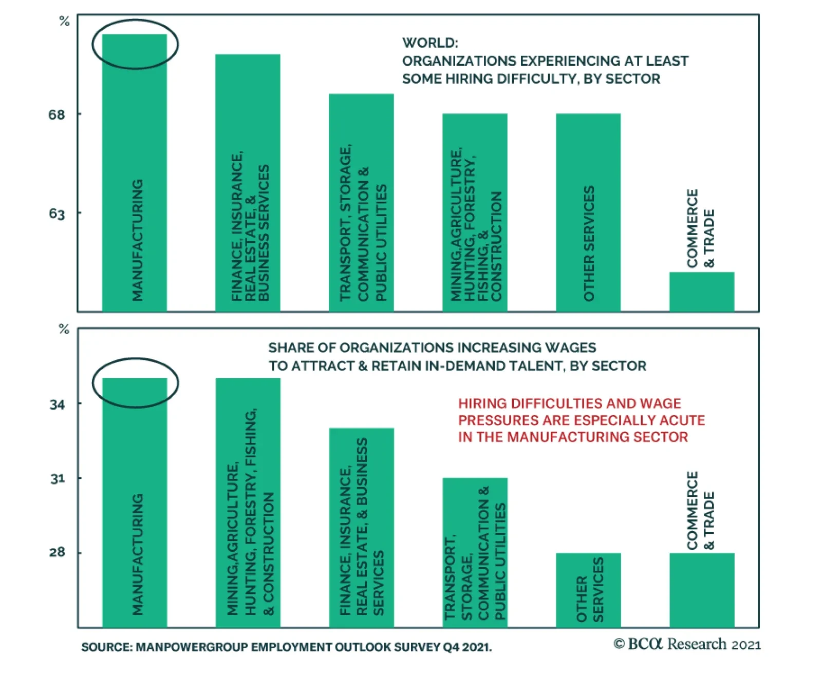
The results of ManpowerGroup's Q4 2021 global employment outlook survey - released earlier this week - provide further evidence that labor markets are tight globally. The share of global employers reporting difficulty filling roles rose to a 15-year high…

Highlights Stocks tend to perform worse when unemployment is low. Since 1950, the S&P 500 has risen at an annualized pace of 12% when the unemployment rate was above its historic average compared to 6% when the unemployment rate was below its average. Three reasons help explain this relationship: 1) The unemployment rate has historically been mean-reverting; 2) Low unemployment often leads to monetary tightening; and 3) Valuations are usually more stretched when unemployment is low. In the spring of 2020, stocks benefited from what turned out to be a very auspicious environment: A steady decline in the unemployment rate from very high levels, assisted by a massive dose of monetary and fiscal stimulus. Today, the situation is less clear-cut. The labor market has improved dramatically, while both monetary and fiscal policy are turning less accommodative. Nevertheless, the Fed is unlikely to hike rates for at least 12 months, and it will take much longer than that for monetary policy to turn restrictive. This suggests that we are still in the middle-to-late stages of a business cycle expansion that began following the Great Recession (and was only briefly interrupted by the pandemic). Historically, cyclical stocks have done well during this phase of the business cycle. To the extent that cyclicals are overrepresented in overseas indices, investors should favor non-US stock markets. Non-US stocks also trade at a substantial valuation discount to their US peers. A Surprising Relationship One of the best pieces of advice I received when I was starting my research career was to get to the punchline as soon as possible. As a strategist, you are not writing a detective novel where the answers are shrouded in mystery until the very end. You are providing conclusions to readers with supporting evidence. Chart 1Stocks Do Best When Unemployment Is High
Is Low Unemployment Good Or Bad For Stocks?
Is Low Unemployment Good Or Bad For Stocks?
With that in mind, let me answer the question posed in the title of this report: Is low unemployment good or bad for stocks? As Chart 1 shows, the answer is bad. The interesting issues are why it is bad and what this may mean for investors today. There are three key reasons why low unemployment has typically corresponded with paltry equity returns: The unemployment rate has historically been mean-reverting: Low unemployment is often followed by high unemployment. And, when the unemployment rate starts rising, it keeps rising. There has never been a case in the post-war era where the unemployment rate has risen by more than one-third of a percentage point without a recession occurring (Chart 2). Chart 2When Unemployment Starts Rising, It Usually Keeps Rising
When Unemployment Starts Rising, It Usually Keeps Rising
When Unemployment Starts Rising, It Usually Keeps Rising
Low unemployment often leads to monetary tightening: An economy can only grow at an above-trend pace if there is labor market slack. Once the slack runs out, growth is liable to weaken as supply-side constraints kick in. Worse yet, labor market overheating has historically prompted central banks to raise rates (Chart 3). Higher rates in the context of slowing growth is toxic for stocks. Valuations are usually more stretched when unemployment is low: During the post-war period, the S&P 500 has traded at an average Shiller P/E ratio of 22.5 when the unemployment rate was below its historic average compared to 16.3 when the unemployment rate was above its average. Implications For The Present Day Stocks fare best when unemployment is high but falling. In contrast, stocks fare the worst when unemployment is low and rising (Chart 4). My colleague Doug Peta, BCA’s Chief US Investment Strategist, reached a similar conclusion in his August report entitled Level Or Direction? Chart 3Low Unemployment Often Leads To Monetary Tightening
Low Unemployment Often Leads To Monetary Tightening
Low Unemployment Often Leads To Monetary Tightening
Chart 4Stocks Do Best When Unemployment Is Falling From High Levels
Is Low Unemployment Good Or Bad For Stocks?
Is Low Unemployment Good Or Bad For Stocks?
In the spring of 2020, stocks benefited from what turned out to be a very auspicious environment: A steady decline in the unemployment rate from very high levels, assisted by a massive dose of monetary and fiscal stimulus. Controversially at the time, this led us to argue that the pandemic could lead to much higher stock prices. Chart 5There Is Still Slack
There Is Still Slack
There Is Still Slack
Today, the situation is less clear-cut. On the one hand, the unemployment rate has fallen dramatically, while monetary and fiscal policy are turning less accommodative. This week, the ECB reduced the pace of net asset purchases under the PEPP. The Fed will start paring back asset purchases by the end of this year. Governments are also withdrawing fiscal policy support. In the US, emergency federal unemployment benefits expired, somewhat ironically, on Labor Day. On the other hand, the unemployment rate in most economies is still above pre-pandemic levels. In the US, the unemployment rate for prime-age workers is 1.7 percentage points higher than in February 2020, while the employment-to-population ratio is 2.4 points lower (Chart 5). The presence of labor market slack ensures that policy support will be withdrawn only gradually. Granted, core CPI inflation in the US is running above 4%. Standard Taylor Rule equations suggest that the Fed funds rate should be well above zero (Chart 6). That said, these equations use realized inflation, which may be misleading given that both market participants and Fed officials expect inflation to fall rapidly (Chart 7). Indeed, the widely followed 5-year/5-year forward TIPS breakeven rate is below the Fed’s comfort zone (Chart 8).1 With long-term inflation expectations still subdued, there is no urgency for the Fed to sound more hawkish. Chart 6What Rate Does The Taylor Rule Prescribe?
Is Low Unemployment Good Or Bad For Stocks?
Is Low Unemployment Good Or Bad For Stocks?
Chart 7Investors Expect Inflation To Fall Rapidly From Current Levels
Is Low Unemployment Good Or Bad For Stocks?
Is Low Unemployment Good Or Bad For Stocks?
Chart 8Long-Term Inflation Expectations Are Muted
Long-Term Inflation Expectations Are Muted
Long-Term Inflation Expectations Are Muted
Cyclical Stocks Usually Do Best In The Latter Innings Of The Business Cycle Expansion Monetary policy is unlikely to become restrictive in any major economy during the next 18 months, which should allow global growth to remain at an above-trend pace. Hence, it is too early to turn bearish on stocks. Nevertheless, given that the unemployment rate in most countries is closer to a trough than to a peak, it is reasonable to conclude that we are somewhere in the middle-to-late stages of a business cycle expansion that began following the Great Recession (and was only briefly interrupted by the pandemic). As Chart 9 shows, cyclical equity sectors, such as industrials, energy, and materials, typically do best in the latter innings of business cycle expansions. Such was the environment that prevailed in 2005-08, and such will be the environment that prevails over the coming quarters as the unemployment rate falls further, capital spending increases, and commodity prices rise further. Chart 9The Business Cycle And Equity Sectors
Is Low Unemployment Good Or Bad For Stocks?
Is Low Unemployment Good Or Bad For Stocks?
Increased government infrastructure spending should help cyclical sectors. The US Congress is set to pass a 10-year $500 billion package. The EU’s €750 billion Next Generation fund is finally up and running. Chinese local government infrastructure spending is poised to accelerate over the remainder of the year. Chart 10The Dollar Is A Countercyclical Currency
The Dollar Is A Countercyclical Currency
The Dollar Is A Countercyclical Currency
Chart 11Past Another Covid Wave
Is Low Unemployment Good Or Bad For Stocks?
Is Low Unemployment Good Or Bad For Stocks?
A weaker US dollar should also buoy cyclical stocks (Chart 10). As a countercyclical currency, the greenback usually weakens when global growth is strong. A cresting in the Delta variant wave should help jumpstart global growth over the coming months (Chart 11). Meanwhile, interest rate differentials have moved sharply against the US dollar, while the US trade deficit has widened noticeably (Charts 12A & B). Chart 12AInterest Rate Differentials Have Moved Against The Dollar
Interest Rate Differentials Have Moved Against The Dollar
Interest Rate Differentials Have Moved Against The Dollar
Chart 12BThe US Trade Deficit Has Widened Noticeably
The US Trade Deficit Has Widened Noticeably
The US Trade Deficit Has Widened Noticeably
Cyclical sectors are overrepresented outside the US (Table 1). Although not a classically cyclical sector, financials are also overrepresented in overseas indices. BCA’s global fixed-income strategists recommend a moderately underweight duration stance. As bond yields rise, bank shares should outperform (Chart 13). In contrast, tech stocks often lag in a rising yield environment. Table 1Cyclicals Are Overrepresented Outside The US
Is Low Unemployment Good Or Bad For Stocks?
Is Low Unemployment Good Or Bad For Stocks?
Chart 13Higher Rates: A Boon For Banks And A Bane For Tech
Higher Rates: A Boon For Banks And A Bane For Tech
Higher Rates: A Boon For Banks And A Bane For Tech
How Expensive Are Stocks? A high Shiller P/E predicts low future returns (Chart 14). Today, the Shiller P/E stands at 37 in the US. This is consistent with an expected 10-year total real return of close to zero for the S&P 500. Thus, the long-term outlook for US stocks is poor. We stress the words “long term.” As the bottom panel of Chart 14 shows, no matter what the starting point of valuations is, the average return over short-term horizons is very low relative to realized volatility. This is another way of saying that valuations provide a great deal of information about the long-term outlook for stocks, but little information about their near-term direction. Over horizons of about 12 months, the business cycle drives the stock market, as a simple comparison between purchasing manager indices and stock returns illustrates (Chart 15). Chart 14Valuation Is The Single Best Predictor Of Long-Term Equity Returns
Is Low Unemployment Good Or Bad For Stocks?
Is Low Unemployment Good Or Bad For Stocks?
Chart 15AThe Business Cycle Drives Cyclical Swings In Stocks
The Business Cycle Drives Cyclical Swings In Stocks
The Business Cycle Drives Cyclical Swings In Stocks
Chart 15BThe Business Cycle Drives Cyclical Swings In Stocks
The Business Cycle Drives Cyclical Swings In Stocks
The Business Cycle Drives Cyclical Swings In Stocks
Outside the US, the Shiller P/E stands at 20. In emerging markets, it is only 16 (Chart 16). This is significantly below US levels, implying that the long-term prospect for equities is much more attractive abroad. Thus, both medium-term cyclical factors and long-term valuation considerations favor non-US stocks. Peter Berezin Chief Global Strategist pberezin@bcaresearch.com Chart 16US Stocks Are Pricey
US Stocks Are Pricey
US Stocks Are Pricey
Footnotes 1 The Federal Reserve targets an average inflation rate of 2% for the personal consumption expenditures (PCE) index. The TIPS breakeven is based on the CPI index. Due to compositional differences between the two indices, CPI inflation has historically averaged 30-to-50 basis points higher than PCE inflation. This is why the Fed effectively targets a CPI inflation rate of about 2.3%-to-2.5%. Global Investment Strategy View Matrix
Is Low Unemployment Good Or Bad For Stocks?
Is Low Unemployment Good Or Bad For Stocks?
Special Trade Recommendations
Is Low Unemployment Good Or Bad For Stocks?
Is Low Unemployment Good Or Bad For Stocks?
Current MacroQuant Model Scores
Is Low Unemployment Good Or Bad For Stocks?
Is Low Unemployment Good Or Bad For Stocks?
Highlights The equity risk premium has turned negative for the first time since 2002. It follows that any significant rise in bond yields will cause risk-asset prices to collapse, quickly flipping any incipient inflationary shock into a deflationary shock. Shorting bonds yielding 2 percent is a ‘widow maker’ trade, as anybody who has tried this with a long list of government bonds has learned to their cost, the most recent being UK gilts. Hence, the next on the list for the ‘widow maker’ is shorting the US 30-year T-bond which is now yielding 2 percent. In fact, the US 30-year T-bond is a must-own structural investment. Fractal analysis: Medical equipment versus healthcare services. Feature Chart of the WeekThe Equity Risk Premium Turns Negative For The First Time Since 2002
The Equity Risk Premium Turns Negative For The First Time Since 2002
The Equity Risk Premium Turns Negative For The First Time Since 2002
Mainstream investments are now priced to deliver negative, zero, or at best, feeble long-term investment returns. Mainstream investments are now priced to deliver negative, zero, or at best, feeble long-term investment returns. For example, the US 10-year Treasury Inflation Protected Security (TIPS) and the UK 10-year index linked gilt are yielding -1.3 percent and -2.8 percent respectively. Meaning that anybody who buys and holds these bonds to redemption is guaranteed a deeply negative 10-year real return. Meanwhile, in nominal yield space, 10-year government bonds yield -0.35 percent in Germany and Switzerland, 0.7 percent in the UK, and 1.3 percent in the US. What about equities? Unlike a bond’s redemption yield, equities do not offer a guaranteed long-term return for buy-and-hold investors. So, some analysts assume that the equity market’s earnings yield is the proxy for this long-term return. According to these analysts, the US equity market’s earnings yield of 4.4 percent means that it will deliver a prospective long-term real return of 4.4 percent per annum. Compared to the 10-year TIPS real yield of -1.3 percent, they argue that this offers an excess return or ‘equity risk premium’ of a comfortable +5.7 percent. Therefore, claim these analysts, equities are reasonably valued, relative to bonds, and in absolute terms. But as we will now demonstrate, this analysis is deeply flawed. The Equity Risk Premium Has Turned Negative The equity market’s earnings yield is a valuation metric, so clearly there is some connection between it and the prospective return delivered by the equity market. Nevertheless, the crucial point to grasp is that: The equity market’s earnings yield does not equal its prospective return. Charts I-2 - I-3 should make this point crystal clear. As you can see, the earnings yield rarely equals the delivered prospective 10-year return, either real or nominal. When the earnings yield is elevated, the prospective return turns out higher. Conversely, when the earnings yield is depressed, as now, the prospective return turns out to be much lower. Chart I-2The Equity Market's Earnings Yield Does NOT Equal Its Prospective Return, Either In Real Terms...
The Equity Market's Earnings Yield Does NOT Equal Its Prospective Return, Either In Real Terms...
The Equity Market's Earnings Yield Does NOT Equal Its Prospective Return, Either In Real Terms...
Chart I-3...Or In Nominal ##br##Terms
...Or In Nominal Terms
...Or In Nominal Terms
Therefore, to take the current earnings yield of 4.4 percent and subtract the real bond yield of -1.3 percent to derive an equity risk premium of +5.7 percent is analytically flawed, just as it is analytically flawed to subtract apples from oranges. To derive the equity risk premium, the correct approach is first to translate the earnings yield into a prospective 10-year return based on the established mathematical relationship between these variables. Chart I-4 does this and shows that, based on a very tight mathematical relationship through the past thirty five years, an earnings yield of 4.4 percent translates into a prospective 10-year nominal return of just 1 percent. Chart I-4We Must Mathematically Map The Earnings Yield Into A Prospective Return...
We Must Mathematically Map The Earnings Yield Into A Prospective Return...
We Must Mathematically Map The Earnings Yield Into A Prospective Return...
Having translated the earnings yield into a prospective 10-year nominal return of 1 percent, we can now make an apples-for-apples comparison with the 10-year T-bond yield of 1.3 percent (Chart I-5). Chart I-5...And Only Then Subtract The Bond Yield
...And Only Then Subtract The Bond Yield
...And Only Then Subtract The Bond Yield
Derived correctly therefore, the equity risk premium has turned negative for the first time since 2002 (Chart of the Week). We deduce that the equity market is very richly valued both in absolute terms and relative to bonds. And crucially, that this rich valuation is contingent on bond yields remaining ultra-low, or going even lower. Shorting Bonds Yielding 2 Percent Is A ‘Widow Maker’ All of which brings us to one of the most pressing questions we get from clients. When a bond is offering a feeble yield, what is the point in owning it? Maybe the best people to answer are the casualties of the now infamous ‘widow maker’ trades. The original widow maker trade was the idea that the yield on the Japanese Government Bond (JGB), at 2 percent, was so feeble that there was no point in owning it. Furthermore, with massive Japanese fiscal stimulus coming down the pike, the ‘no-brainer’ investment strategy was not just to disown the JGBs, but to take an outright short position, as it seemed that the only direction that JGB yields could go was up. In fact, JGB yields did not go up, they continued to trend down. As feeble yields became even feebler, the owners of the short positions got carried out of their careers, feet first. Meanwhile, those investors who owned 30-year JGBs yielding a ‘feeble’ 2 percent in 2013 reaped returns of 75 percent, and even now, are sitting on handsome profits of 55 percent. Some people protest that Japan is an exceptional and isolated case, rather than a template for economies which will not repeat their putative policy-errors. Such protests have always struck us as factually wrong, blinkered, and even prejudiced. Nevertheless, let’s indulge these prejudices with a simple rejoinder – forget Japan, what about Switzerland, or the UK? (Chart I-6) Chart I-6Shorting Bonds Yielding 2 Percent Is A 'Widow Maker'
Shorting Bonds Yielding 2 Percent Is A 'Widow Maker'
Shorting Bonds Yielding 2 Percent Is A 'Widow Maker'
Just like the JGB widow maker, anybody who shorted UK gilts yielding 2 percent is nursing heavy losses. Meanwhile, those investors who owned 30-year UK gilts yielding a ‘feeble’ 2 percent in 2018 reaped returns of 40 percent, and even now are sitting on tidy profits of 30 percent. Just like the JGB widow maker, anybody who shorted UK gilts yielding 2 percent is nursing heavy losses. Bear in mind that a 30-year bond yielding a feeble 2 percent will deliver a cumulative return of more than 80 percent to redemption. And that if the feeble yield becomes even feebler, this return will get front-end loaded, creating widow makers for the short positions and spectacular gains for the long positions, as witnessed in JGBs and UK gilts. The 30-Year T-Bond Is A Must-Own Structural Investment The next candidate for the widow maker is shorting the US 30-year T-bond, which is yielding, you guessed it, 2 percent. Remember that while Japan may not be a great template for the US, the UK certainly is – because the US and UK have very similar economic, financial, political, social, and cultural structures. Until recently therefore, bond yields in the US and UK were moving in near-perfect lockstep (Chart I-7). Chart I-7The Difference Between US And UK Bond Yields Is Just That The UK Has Had One More Deflationary Shock
The Difference Between US And UK Bond Yields Is Just That The UK Has Had One More Deflationary Shock
The Difference Between US And UK Bond Yields Is Just That The UK Has Had One More Deflationary Shock
So, what happened? The one word answer is: Brexit. The recent difference between US and UK bond yields is simply that the UK has had one more deflationary shock than the US. Put the other way around, the US is just one deflationary shock away from a UK level of bond yields – meaning the 30-year yield not at 2 percent, but at 1 percent. But why can’t the next shock be an inflationary shock resulting in much higher yields? The simple answer is that the equity risk premium has turned negative for the first time since 2002. Moreover, as we pointed out in The Road To Inflation Ends At Deflation the extremely rich valuation of $300 trillion of global real estate is also highly contingent on ultra-low bond yields. It follows that any significant rise in bond yields will collapse the value of $500 trillion of risk-assets. In a $90 trillion global economy, this will quickly flip any incipient inflationary shock into a deflationary shock. Any significant rise in bond yields will collapse the value of $500 trillion of risk-assets. We conclude that the US 30-year T-bond is a must-own structural investment. Fractal Analysis Update As hospitals have rushed to clear their backlog of non-pandemic treatments and procedures, medical equipment stock prices have surged. This is particularly true for US medical equipment (ticker IHI) which, since June, is up by 25 percent versus US healthcare services (Iqvia, Veeva, or loosely proxied by ticker XHS). Given that the backlog of treatments will eventually clear, and that the intense rally is now extremely fragile on its 65-day fractal structure (Chart I-8), a recommended countertrend trade is to short US medical equipment versus healthcare services. Set the profit target and symmetrical stop-loss at 8.5 percent. Chart I-8The Intense Rally In Medical Equipment Stocks Has Become Fragile
The Intense Rally In Medical Equipment Stocks Has Become Fragile
The Intense Rally In Medical Equipment Stocks Has Become Fragile
Dhaval Joshi Chief Strategist dhaval@bcaresearch.com Fractal Trading System Fractal Trades 6-Month Recommendations Structural Recommendations Closed Fractal Trades Closed Trades Asset Performance Equity Market Performance Indicators To Watch - Bond Yields Chart II-1Indicators To Watch - Bond Yields ##br##- Euro Area
Indicators To Watch - Bond Yields - Euro Area
Indicators To Watch - Bond Yields - Euro Area
Chart II-2Indicators To Watch - Bond Yields ##br##- Europe Ex Euro Area
Indicators To Watch - Bond Yields - Europe Ex Euro Area
Indicators To Watch - Bond Yields - Europe Ex Euro Area
Chart II-3Indicators To Watch - Bond Yields ##br##- Asia
Indicators To Watch - Bond Yields - Asia
Indicators To Watch - Bond Yields - Asia
Chart II-4Indicators To Watch - Bond Yields ##br##- Other Developed
Indicators To Watch - Bond Yields - Other Developed
Indicators To Watch - Bond Yields - Other Developed
Indicators To Watch - Interest Rate Expectations Chart II-5Indicators To Watch - Interest Rate Expectations
Indicators To Watch - Interest Rate Expectations
Indicators To Watch - Interest Rate Expectations
Chart II-6Indicators To Watch - Interest Rate Expectations
Indicators To Watch - Interest Rate Expectations
Indicators To Watch - Interest Rate Expectations
Chart II-7Indicators To Watch - Interest Rate Expectations
Indicators To Watch - Interest Rate Expectations
Indicators To Watch - Interest Rate Expectations
Chart II-8Indicators To Watch - Interest Rate Expectations
Indicators To Watch - Interest Rate Expectations
Indicators To Watch - Interest Rate Expectations
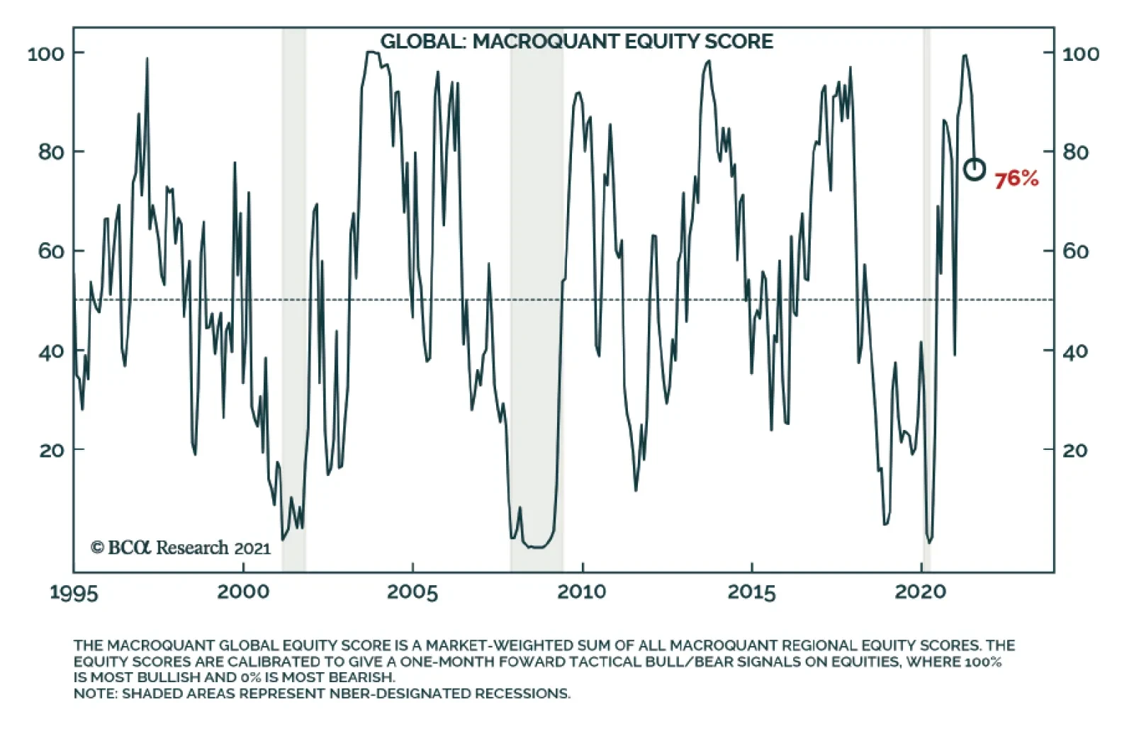
Our colleagues at BCA Research's Equity Analyzer team recently updated their MacroQuant model for equity investors. The model uses macroeconomic data to provide tactical investment recommendations and is calibrated to assist asset allocators in their decision…
According to BCA Research's Geopolitical Strategy service, Iran is now the most pressing geopolitical risk in the short term. The world today stands at a critical juncture with regard to Iran and the unfinished business of the US wars in the Middle East. …
Highlights A decline in the marginal propensity to spend out of both income and wealth over the past few decades generated a flood of excess savings. Facing a chronic shortfall of aggregate demand, central banks had no choice but to cut interest rates. This inflated asset prices. Looking out, the marginal propensity to spend should rise as household deleveraging pressures abate, retiring baby boomers shift from being savers to dissavers, and labor’s share of income increases. While rising bond yields will be a headwind to equities, continued above-trend global growth, upward earnings revisions, forthcoming Chinese fiscal stimulus, and a cresting in the number of new Delta variant cases all justify overweighting stocks on a 12-month horizon. A more cautious stance towards equities will be appropriate in two years’ time once stagflationary forces begin to assert themselves. The Keynesian Cross The “Keynesian Cross” is one of the first diagrams that students encounter in introductory macroeconomic courses (Chart 1). It simply plots Aggregate Expenditure (AE) versus output (Y). Chart 1The Keynesian Cross
Financial Markets Face The Keynesian Cross
Financial Markets Face The Keynesian Cross
Aggregate expenditure consists of personal consumption, capital investment, government expenditure, and net exports: (1)
Financial Markets Face The Keynesian Cross
Financial Markets Face The Keynesian Cross
If spending exceeds output, inventories will decline, causing firms to raise production. In contrast, if output exceeds spending, inventories will increase, prompting companies to cut production. Hence, the economy gravitates towards a level of output where inventories are stable; that is, where AE is equal to Y. Importantly, this level of production may or may not correspond to full employment. Introducing Asset Prices The Keynesian Cross model does not explicitly include asset prices. However, this can be easily rectified by postulating that spending depends on both income and wealth. For example, let us express consumption as: (2)
Financial Markets Face The Keynesian Cross
Financial Markets Face The Keynesian Cross
In this equation, α is the marginal propensity to consume out of wealth (i.e., how much consumption rises for every dollar increase in wealth, W) while β is the marginal propensity to consume out of income, Y.1 An increase in asset prices will boost wealth, leading to more consumption. A Simple But Illuminating Identity Consider the case where inventories are stable. Substituting equation (2) into equation (1) and then dividing by Y yields: (3)
Financial Markets Face The Keynesian Cross
Financial Markets Face The Keynesian Cross
The equation above is an identity. It does not say that a change in one term must lead to a change in another term in any causal sense of the word. All it says is that the terms on the right-hand side of the equation must add up to one. Suppose, for example, that α or β were to decline. If that were to happen, consumption would fall, leading to lower output. In order to restore output to its original level, either wealth would need to rise or some combination of investment, government spending, and net exports would need to increase. Upward Pressure On Savings There are at least three reasons to think that α and β have declined since the early 1980s: Chart 2US Household Debt Burdens Have Eased Significantly Over The Past Decade
US Household Debt Burdens Have Eased Significantly Over The Past Decade
US Household Debt Burdens Have Eased Significantly Over The Past Decade
Deleveraging: The need for households in economies such as the US to repair their balance sheets in the aftermath of the Global Financial Crisis put upward pressure on desired savings, leading to a decrease in β. The inability to use the equity in one’s home to finance consumption also lowered α. To this day, outstanding home equity line of credit (HELOC) balances in the US are a shadow of their former selves (Chart 2). Demographics: Savings vary over the life cycle. In general, savings are highest between the ages of 35 and 60 (Chart 3). The percentage of households in developed economies in their peak savings years began to increase in the late 1970s. While the trend has reversed in recent years, the ratio of workers-to-consumers in most countries (the so-called “support ratio”) remains elevated (Chart 4). Inequality: Higher income households save a greater share of their incomes than lower income households. As Atif Mian, Ludwig Straub, and Amir Sufi documented at last week’s Jackson Hole symposium, the rise in income inequality since 1980 has pushed up desired savings, thus lowering β in the process (Chart 5). Likewise, there is evidence that wealthier households tend to spend less of every additional dollar of wealth than poorer households.2 To the extent that wealth inequality has also increased since 1980, α has declined. Chart 3ASavings Peak Around Middle Age (I)
Savings Peak Around Middle Age (I)
Savings Peak Around Middle Age (I)
Chart 3BSavings Peak Around Middle Age (II)
Savings Peak Around Middle Age (II)
Savings Peak Around Middle Age (II)
Chart 4AIncreased Desired Savings Corresponded To A Rise In Support Ratios (I)
Increased Desired Savings Corresponded To A Rise In Support Ratios (I)
Increased Desired Savings Corresponded To A Rise In Support Ratios (I)
Chart 4BIncreased Desired Savings Corresponded To A Rise In Support Ratios (II)
Increased Desired Savings Corresponded To A Rise In Support Ratios (II)
Increased Desired Savings Corresponded To A Rise In Support Ratios (II)
Chart 5Income Inequality Has Skewed The Composition Of Savings
Financial Markets Face The Keynesian Cross
Financial Markets Face The Keynesian Cross
The Need For Policy Support The decline in α and β over the past few decades could have been offset by an increase in investment or net exports. Unfortunately, at least in the US, that never happened (Chart 6). The US trade deficit in goods and services stood at 3.9% of GDP in Q2 of 2021, the highest in 12 years. The non-petroleum trade deficit is at a record high. Investment spending also remains below the levels reached in the pre-GFC period. The shortfall in aggregate demand put pressure on policymakers to spur the economy. The results were somewhat mixed. Looking at the US, government spending on goods and services rose substantially during the Great Recession. However, spending then proceeded to fall to multi-decade lows as a share of GDP by 2019 (Chart 7). Transfer payments were also broadly stable as a share of GDP in the decade leading up to the pandemic. The Trump tax cuts reduced government revenue by around 1.7% of GDP. However, as we have noted in the past, the impact of the tax cuts on aggregate demand was fairly small. Chart 6US Private Sector Investment Remains Below Its Pre-GFC Peak While The Non-Petroleum Trade Deficit Is At A Record High
US Private Sector Investment Remains Below Its Pre-GFC Peak While The Non-Petroleum Trade Deficit Is At A Record High
US Private Sector Investment Remains Below Its Pre-GFC Peak While The Non-Petroleum Trade Deficit Is At A Record High
Chart 7Fiscal Policy Has Been More Reactive Than Proactive In The US
Fiscal Policy Has Been More Reactive Than Proactive In The US
Fiscal Policy Has Been More Reactive Than Proactive In The US
After surging during the pandemic, both direct government expenditure and transfer payments have come off their highs. Tax rates are also likely to rise for upper income earners and corporations. Nevertheless, with Congress set to pass a $550 billion infrastructure bill and a $3.5 trillion budget reconciliation bill, US fiscal policy will remain more stimulative over the next few years than it was in the pre-pandemic period. The same is likely to be true outside the US (Chart 8). Chart 8Fiscal Policy: Tighter But Not Tight
Financial Markets Face The Keynesian Cross
Financial Markets Face The Keynesian Cross
Central Banks To The Rescue This brings us to monetary policy. In the post-GFC period, lower interest rates helped keep capital investment from falling more than it would have otherwise. In addition, lower rates discouraged savings, thus supporting consumption. And, with other central banks also cutting rates, the decision by the Fed to maintain low rates prevented the dollar from strengthening excessively. Beyond the direct benefits to the economy, lower rates increased the prices of long-duration assets such as equities and homes. This raised W in the equations above. The resulting “wealth effect” stoked consumer spending, while also encouraging new investment (particularly in real estate). Excess Savings Should Diminish Looking out, there are a few reasons to think that α and β will begin trending higher, leading to more spending and less need for ultra-accommodative monetary policies: Chart 9Wealth Accumulation Through The Ages
Financial Markets Face The Keynesian Cross
Financial Markets Face The Keynesian Cross
Deleveraging pressures have abated. In the US, the ratio of household debt-to-disposable income has returned to pre-housing bubble levels. Debt-servicing costs are at a multi-decade low. Baby boomers are leaving the labor force. They hold over half of US household wealth, considerably more than younger generations (Chart 9). As baby boomers transition from being net savers to net dissavers, national savings will fall. Chart 10A Tight Labor Market Eventually Bolsters Wages
A Tight Labor Market Eventually Bolsters Wages
A Tight Labor Market Eventually Bolsters Wages
Governments are working to mitigate income inequality. Not only are redistributionist policies increasingly in vogue, but policymakers are trying to run economies hot. Historically, a tight labor market has curbed income inequality, while driving up workers’ share of overall income (Chart 10). Upside For Bond Yields, Both Near And Far Bond yields in the major economies likely hit a generational low last summer. Yields should rise over the coming years, first as slack diminishes, and later as structural forces reduce the amount of excess savings sloshing around the global economy. In the near term, a cresting of the Delta variant wave will prop up Treasury yields. While the number of new cases in the US continues to rise, the second derivative has turned for the better. A heat map shows that the weekly growth in new cases has slowed substantially in most US states (Chart 11). Chart 11The Delta Variant Wave Is Fading In The US
Financial Markets Face The Keynesian Cross
Financial Markets Face The Keynesian Cross
Globally, the Delta variant wave is abating (Chart 12). The transmission rate has clearly peaked within the G7 (Chart 13). The number of cases has begun to fall in recent hot spots such as Indonesia and Thailand. And, after rising above 100, the 7-day average of new cases in China has fallen back to 30. Chart 12The Delta Wave Is Cresting
Financial Markets Face The Keynesian Cross
Financial Markets Face The Keynesian Cross
Chart 13The Covid Transmission Rate Is Falling Again
The Covid Transmission Rate Is Falling Again
The Covid Transmission Rate Is Falling Again
The tapering of bond purchases by the major central banks should also lift yields. Canada began tapering this past April. BCA’s fixed-income experts expect the Fed to start paring back purchases by the end of this year, with the ECB and BoE following suit in early 2022. We do not expect bond markets to become unhinged. Central banks would strongly push back against an excessive rise in yields. Nevertheless, a move in the US 10-year Treasury yield to 1.8% by early next year seems reasonable. Stocks Can Withstand Rising Bond Yields… For Now Chart 14Equity Valuations and Real Bond Yields Have Tended To Move In Tandem
Equity Valuations and Real Bond Yields Have Tended To Move In Tandem
Equity Valuations and Real Bond Yields Have Tended To Move In Tandem
Equity valuations have broadly tracked real bond yields over the past few years (Chart 14). While higher yields will weigh on equity prices, there are a number of remaining tailwinds for stocks: Growth will remain above trend in the foreseeable future: Bloomberg consensus estimates foresee the global economy growing at an above-trend pace well into next year (Table 1). We agree with this assessment, and in fact, see upside risks to consensus growth forecasts. In particular, Chinese growth is likely to accelerate later this year as credit growth rebounds and fiscal spending increases. Local governments used less than 40% of their annual debt issuance quotas as of the end of July. Typically by that time of the year, they have used 70% of their quotas. Table 1Global Growth Will Remain Above Trend Well Into Next Year
Financial Markets Face The Keynesian Cross
Financial Markets Face The Keynesian Cross
Forward earnings estimates will continue to drift higher: Analysts are usually too optimistic. As a result, they normally have to cut estimates over the course of the calendar year. This year has been different (Chart 15). In early July, analysts expected S&P 500 companies to generate about $45 in EPS in Q2. In the end, they generated about $53. Earnings are projected to decline in absolute terms in Q3 and remain below Q2 levels until the second quarter of next year, when they are anticipated to grow by a meagre 3.5% year-over-year (Table 2). As earnings estimates move up, stock prices will rise, even if P/E multiples move sideways. Chart 15Unusually, Analysts Have Been Revising Earnings Estimates Higher This Year
Unusually, Analysts Have Been Revising Earnings Estimates Higher This Year
Unusually, Analysts Have Been Revising Earnings Estimates Higher This Year
Table 2US Earnings Estimates Have Upside
Financial Markets Face The Keynesian Cross
Financial Markets Face The Keynesian Cross
Rising inflation expectations will lift nominal bond yields more than real yields: Investors expect inflation to come down rapidly over the coming months (Chart 16). The 5-year/5-year forward TIPS breakeven inflation rate is below the Fed’s comfort zone of 2.3%-to-2.5% (Chart 17).3 We think that US inflation will fall fast enough over the next few quarters to allow the Federal Reserve to maintain a fairly accommodative monetary stance, but not as fast as markets are discounting. Chart 16Investors Expect Inflation To Fall Rapidly From Current Levels
Financial Markets Face The Keynesian Cross
Financial Markets Face The Keynesian Cross
The global equity risk premium remains elevated: We measure the equity risk premium (ERP) by subtracting the real 10-year bond yield from the forward earnings yield.4 Based on this measure, the global ERP stands at 634 bps (Chart 18). At the peak of the stock market boom in 2000, the global ERP was barely positive. Even in the US, where valuations are more stretched than abroad, the ERP stands at 574 bps. Remarkably, this is almost exactly where the ERP was in May 2008. An increase in the US 10-year Treasury yield to 1.8% by early next year – representing roughly a 50 basis-point increase from current levels in nominal terms and even less in real terms – would still leave US stocks attractively priced relative to bonds. Chart 17Below The Fed's Comfort Zone
Below The Fed's Comfort Zone
Below The Fed's Comfort Zone
In summary, investors should remain overweight global equities on a 12-month horizon. A more cautious stance towards stocks will be appropriate in two years’ time once stagflationary forces begin to assert themselves. Peter Berezin Chief Global Strategist pberezin@bcaresearch.com Chart 18The Global Equity Risk Premium Remains Elevated
The Global Equity Risk Premium Remains Elevated
The Global Equity Risk Premium Remains Elevated
Footnotes 1 Note that Gross Domestic Product should theoretically equal Gross Domestic Income. Thus, Y can denote either income or output. 2 For example, in a sample of five euro area economies, the European Central Bank found that the marginal propensity to consume out of wealth is higher for households at the lower end of the wealth distribution. 3 The Federal Reserve targets an average inflation rate of 2% for the personal consumption expenditures (PCE) index. The TIPS breakeven is based on the CPI index. Due to compositional differences between the two indices, CPI inflation has historically averaged 30-to-50 basis points higher than PCE inflation. This is why the Fed effectively targets a CPI inflation rate of about 2.3%-to-2.5%. 4 It is necessary to subtract the real bond yield, rather than the nominal bond yield, from the earnings yield because the earnings yield provides an estimate of the real total expected return to shareholders. For further discussion on this, please see Appendix A of the Global Investment Strategy Special Report, “TINA To The Rescue?” dated August 23, 2019. Global Investment Strategy View Matrix
Financial Markets Face The Keynesian Cross
Financial Markets Face The Keynesian Cross
Special Trade Recommendations
Financial Markets Face The Keynesian Cross
Financial Markets Face The Keynesian Cross
Current MacroQuant Model Scores
Financial Markets Face The Keynesian Cross
Financial Markets Face The Keynesian Cross
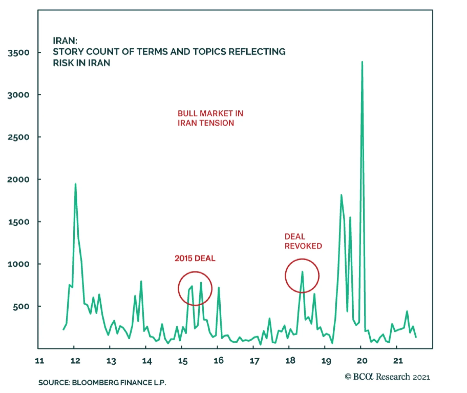
Highlights An Iran crisis is imminent. We still think a US-Iran détente is possible but our conviction is lower until Biden makes a successful show of force. Oil prices will be volatile. Fiscal drag is a risk to the cyclical global macro view. But developed markets are more fiscally proactive than they were after the global financial crisis. Elections will reinforce that, starting in Germany, Canada, and Japan. The Chinese and Russian spheres are still brimming with political and geopolitical risk. But China will ease monetary and fiscal policy on the margin over the coming 12 months. Afghanistan will not upset our outlook on the German and French elections, which is positive for the euro and European stocks. Feature Chart 1Bull Market In Iran Tensions
Biden's Show Of Force (GeoRisk Update)
Biden's Show Of Force (GeoRisk Update)
Iran is now the most pressing geopolitical risk in the short term (Chart 1). The Biden administration has been chastened by the messy withdrawal from Afghanistan and will be exceedingly reactive if it is provoked by foreign powers. Nuclear weapons improve regime survivability. Survival is what the Islamic Republic wants. Iran is surrounded by enemies in its region and under constant pressure from the United States. Hence Iran will never ultimately give up its nuclear program, as we have maintained. Chart 2Biden Unlikely To Lift Iran Sanctions Unilaterally
Biden's Show Of Force (GeoRisk Update)
Biden's Show Of Force (GeoRisk Update)
However, Supreme Leader Ali Khamenei could still agree to a deal in which the US reduces economic sanctions while Iran allows some restrictions on uranium enrichment for a limited period of time (the 2015 nuclear deal’s key provisions expire from 2023 through 2030). This would be a stopgap measure to delay the march into war. The problem is that rejoining the 2015 deal requires the US to ease sanctions first, since the US walked away from the deal in 2018. Iran would need domestic political cover to rejoin it. Biden has the executive authority to ease sanctions unilaterally but after Afghanistan he lacks the political capital to do so (Chart 2). So Biden cannot ease sanctions until Iran pares back its nuclear activities. But Iran has no reason to pare back if the US does not ease sanctions. Iran is now enriching some uranium to a purity of 60%. Israeli Defense Minister Benny Gantz says it will reach “nuclear breakout” capability – enough fissile material to build a bomb – within 10 weeks, i.e. mid-October. Anonymous officials from the Biden administration told the Associated Press it will be “months or less,” which could mean September, October, or November (Table 1). Table 1Iran Nearing "Breakout" Nuclear Capability
Biden's Show Of Force (GeoRisk Update)
Biden's Show Of Force (GeoRisk Update)
Meanwhile the new Iranian government of President Ebrahim Raisi, a hardliner who is tipped to take over as Supreme Leader once Ali Khamenei steps down, is implying that it will not rejoin negotiations until November. All of these timelines are blurry but the implication is that Iran will not resume talks until it has achieved nuclear breakout. Israel will continue its campaign of sabotage against the regime. It may be pressed to the point of launching air strikes, as it did against nuclear facilities in Iraq in 1981 and Syria in 2007 under what is known as the “Begin Doctrine.” Chart 3Israel Cannot Risk Losing US Security Guarantee
Biden's Show Of Force (GeoRisk Update)
Biden's Show Of Force (GeoRisk Update)
The constraint on Israel is that it cannot afford to lose America’s public support and defense alliance since it would find itself isolated and vulnerable in its region (Chart 3). But if Israeli intelligence concludes that the Iranians truly stand on the verge of achieving a deliverable nuclear weapon, the country will likely be driven to launch air strikes. Once the Iranians test and display a viable nuclear deterrent it will be too late. Four US presidents, including Biden, have declared that Iran will not be allowed to get nuclear weapons. Biden and the Democrats favor diplomacy, as Biden made clear in his bilateral summit with Israeli Prime Minister Naftali Bennett last week. But Biden also admitted that if diplomacy fails there are “other options.” The Israelis currently have a weak government but it is unified against a nuclear-armed Iran. At very least Bennett will underscore red lines to indicate that Israel’s vigilance has not declined despite hawkish Benjamin Netanyahu’s fall from power. Still, Iran may decide it has an historic opportunity to make a dash for the bomb if it thinks that the US will fail to support an Israeli attack. The US has lost leverage in negotiations since 2015. It no longer has troops stationed on Iran’s east and west flanks. It no longer has the same degree of Chinese and Russian cooperation. It is even more internally divided. Iran has no guarantee that the US will not undergo another paroxysm of nationalism in 2024 and try to attack it. The faction that opposed the deal all along is now in power and may believe it has the best chance in its lifetime to achieve nuclear breakout. The only reason a short-term deal is possible is because Khamenei may believe the Israelis will attack with full American support. He agreed to the 2015 deal. He also fears that the combination of economic sanctions and simmering social unrest will create a rift when he dies or passes the leadership to his successor. Iran has survived the Trump administration’s “maximum pressure” sanctions but it is still vulnerable (Chart 4). Chart 4Supreme Leader Focuses On Regime Survival
Supreme Leader Focuses On Regime Survival
Supreme Leader Focuses On Regime Survival
Moreover Biden is offering Khamenei a deal that does not require abandoning the nuclear program and does not prevent Iran from enhancing its missile capabilities. By taking the deal he might prevent his enemies from unifying, forestall immediate war, and pave the way for a smooth succession, while still pursuing the ultimate goal of nuclear weaponization. Bringing it all together, the world today stands at a critical juncture with regard to Iran and the unfinished business of the US wars in the Middle East. Unless the US and Israel stage a unified and convincing show of force, whether preemptively or in response to Iranian provocations, the Iranians will be justified in concluding that they have a once-in-a-generation opportunity to pursue the bomb. They could sneak past the global powers and obtain a nuclear deterrent and regime security, like North Korea did. This could easily precipitate a war. Biden will probably continue to be reactive rather than proactive. If the Iranians are silent then it will be clear that Khamenei still sees the value in a short-term deal. But if they continue their march toward nuclear breakout, as is the case as we go to press, then Biden will have to make a massive show of force. The goal would be to underscore the US’s red lines and drive Iran back to negotiating table. If Biden blinks, he will incentivize Iran to make a dash for the bomb. Either way a crisis is imminent. Israel will continue to use sabotage and underscore red lines while the Iranians will continue to escalate their attacks on Israel via militant proxies and attacks on tankers (Map 1). Map 1Secret War Escalates In Middle East
Biden's Show Of Force (GeoRisk Update)
Biden's Show Of Force (GeoRisk Update)
Bottom Line: After a crisis, either diplomacy will be restored, or the Middle East will be on a new war path. The war path points to a drastically different geopolitical backdrop for the global economy. If the US and Iran strike a short-term deal, Iranian oil will flow and the US will shift its strategic focus to pressuring China, which is negative for global growth and positive for the dollar. If the US and Iran start down the war path, oil supply disruptions will rise and the dollar will fall. Implications For Oil Prices And OPEC 2.0 The probability of a near-term conflict is clear from our decision tree, which remains the same as in June 2019 (Diagram 1). Diagram 1US-Iran Conflict: Critical Juncture In Our Decision Tree
Biden's Show Of Force (GeoRisk Update)
Biden's Show Of Force (GeoRisk Update)
Shows of force and an escalation in the secret war will cause temporary but possibly sharp spikes in oil prices in the short term. OPEC 2.0 remains intact so far this year, as expected. The likelihood that the global economic recovery will continue should encourage the Saudis, Russians, Emiratis and others to maintain production discipline to drain inventories and keep Brent crude prices above $60 per barrel. OPEC 2.0 is a weak link in oil prices, however, because Russians are less oil-dependent than the Gulf Arab states and do not need as high of oil prices for their government budget to break even (Chart 5). Periodically this dynamic leads the cartel to break down. None of the petro-states want to push oil prices up so high that they hasten the global green energy transition. Chart 5OPEC 2.0 Keeps Price Within Fiscal Breakeven Oil Price
Biden's Show Of Force (GeoRisk Update)
Biden's Show Of Force (GeoRisk Update)
Chart 6Oil Price Risks Lie To Upside Until US-Iran Deal Occurs
Oil Price Risks Lie To Upside Until US-Iran Deal Occurs
Oil Price Risks Lie To Upside Until US-Iran Deal Occurs
As long as OPEC 2.0 remains disciplined, average Brent crude oil prices will gradually rise to $80 barrels per day by the end of 2024, according to our Commodity & Energy Strategy (Chart 6). Imminent firefights will cause prices to spike at least temporarily when large amounts of capacity are taken offline. Global spare capacity is probably sufficient to handle one-off disruptions but an open-ended military conflict in the Persian Gulf or Strait of Hormuz would be a different story. After the next crisis, everything depends on whether the US and Israel establish a credible threat and thus restore diplomacy. Any US-Iran strategic détente would unleash Iranian production and could well motivate the Gulf Arabs to pump more oil and deny Iran market share. Bottom Line: Given that any US-Iran deal would also be short-term in nature, and may not even stabilize the region, some of the downside risks are fading at the moment. The US and China are also sucking in more commodities as they gear up for great power struggle. The geopolitical outlook is positive for oil prices in these respects. But OPEC 2.0 is the weak link in this expectation so we expect volatility. Global Fiscal Taps Will Stay Open Markets have wavered in recent months over softness in the global economic recovery, COVID-19 variants, and China’s policy tightening. The world faces a substantial fiscal drag in the coming years as government budgets correct from the giant deficits witnessed during the crisis. Nevertheless policymakers are still able to deliver some positive fiscal surprises on the margin. Developed markets have turned fiscally proactive over the past decade. They rejected austerity because it was seen as fueling populist political outcomes that threatened the established parties. Note that this change began with conservative governments (e.g. Japan, UK, US, Germany), implying that left-leaning governments will open the fiscal taps further whenever they come to power (e.g. Canada, the US, Italy, and likely Germany next). Chart 7Global Fiscal Taps Will Stay Open
Biden's Show Of Force (GeoRisk Update)
Biden's Show Of Force (GeoRisk Update)
Chart 7 updates the pandemic-era fiscal stimulus of major economies, with light-shaded bars highlighting new fiscal measures that are in development but have not yet been included in the IMF’s data set. The US remains at the top followed by Italy, which also saw populist electoral outcomes over the past decade. Chart 8US Fiscal Taps Open At Least Until 2023
US Fiscal Taps Open At Least Until 2023
US Fiscal Taps Open At Least Until 2023
The Biden administration is on the verge of passing a $550 billion bipartisan infrastructure bill. We maintain 80% subjective odds of passage – despite the messy pullout from Afghanistan. Assuming it passes, Democrats will proceed to their $3.5 trillion social welfare bill. This bill will inevitably be watered down – we expect a net deficit impact of around $1-$1.5 trillion for both bills – but it can pass via the partisan “budget reconciliation” process. We give 50% subjective odds today but will upgrade to 65% after infrastructure passes. The need to suspend the debt ceiling will raise volatility this fall but ultimately neither party has an interest in a national debt default. The US is expanding social spending even as geopolitical challenges prevent it from cutting defense spending, which might otherwise be expected after Afghanistan and Iraq. The US budget balance will contract after the crisis but then it will remain elevated, having taken a permanent step up as a result of populism. The impact should be a flat or falling dollar on a cyclical basis, even though we think geopolitical conflict will sustain the dollar as the leading reserve currency over the long run (Chart 8). So the dollar view remains neutral for now. Bottom Line: The US is facing a 5.9% contraction in the budget deficit in 2022 but the blow will be cushioned somewhat by two large spending bills, which will put budget deficits on a rising trajectory over the course of the decade. Big government is back. Developed Market Fiscal Moves (Outside The US) Chart 9German Opinion Favors New Left-Wing Coalition
Biden's Show Of Force (GeoRisk Update)
Biden's Show Of Force (GeoRisk Update)
Fiscal drag is also a risk for other developed markets – but here too a substantial shift away from prudence has taken place, which is likely to be signaled to investors by the outperformance of left-wing parties in Germany’s upcoming election. Germany is only scheduled to add EUR 2.4 billion to the 25.6 billion it will receive under the EU’s pandemic recovery fund, but Berlin is likely to bring positive fiscal surprises due to the federal election on September 26. Germany will likely see a left-wing coalition replace Chancellor Angela Merkel and her long-ruling Christian Democrats (Chart 9). The platforms of the different parties can be viewed in Table 2. Our GeoRisk Indicator for Germany confirms that political risk is elevated but in this case the risk brings upside to risk assets (Appendix). Table 2German Party Platforms
Biden's Show Of Force (GeoRisk Update)
Biden's Show Of Force (GeoRisk Update)
While we expected the Greens to perform better than they are in current polling, the point is the high probability of a shift to a new left-wing government. The Social Democrats are reviving under the leadership of Olaf Scholz (Chart 10). Tellingly, Scholz led the charge for Germany to loosen its fiscal belt back in 2019, prior to the global pandemic. Chart 10Germany: Online Markets Betting On Scholz
Biden's Show Of Force (GeoRisk Update)
Biden's Show Of Force (GeoRisk Update)
Chart 11Canada: Trudeau Takes A Calculated Risk
Biden's Show Of Force (GeoRisk Update)
Biden's Show Of Force (GeoRisk Update)
In June, the cabinet approved a draft 2022 budget plan supported by Scholz that would contain new borrowing worth EUR 99.7 bn ($119 billion). This amount is not included in the chart above but it should be seen as the minimum to be passed under the new government. If a left-wing coalition is formed, as we expect, the amount will be larger, given that both the Social Democrats and the Greens have been restrained by Merkel’s party. Canada turned fiscally proactive in 2015, when the institutional ruling party, the Liberals, outflanked the more progressive New Democrats by calling for budget deficits instead of a balanced budget. The Liberals saw a drop in support in 2019 but are now calling a snap election. Prime Minister Trudeau is not as popular in general opinion as he is in the news media but his party still leads the polls (Chart 11). The Conservatives are geographically isolated and, more importantly, are out of step with the median voter on the key issues (Table 3). Table 3Canada: Liberal Agenda Lines Up With Top Voter Priorities
Biden's Show Of Force (GeoRisk Update)
Biden's Show Of Force (GeoRisk Update)
Nevertheless it is a risky time to call an election – our GeoRisk Indicator for Canada is soaring (Appendix). Granting that the Liberals are very unlikely to fall from power, whatever their strength in parliament, the key point is that parliament already approved of CAD 100 billion in new spending over the coming three years. Any upside surprise would give Trudeau the ability to push for still more deficit spending, likely focused on climate change. Chart 12Japan: Suga Will Go, LDP Will Stimulate
Japan: Suga Will Go, LDP Will Stimulate
Japan: Suga Will Go, LDP Will Stimulate
Japanese politics are heating up ahead of the Liberal Democrats’ leadership election on September 29 and the general election, due by November 28. Prime Minister Yoshihide Suga’s sole purpose in life was to stand in for Shinzo Abe in overseeing the Tokyo Olympics. Now they are done and Suga will likely be axed – if he somehow survives the election, he will not last long after, as his approval rating is in freefall. The Liberal Democrats are still the only game in town. They will try to minimize the downside risks they face in the general election by passing a new stimulus package (Chart 12). Rumor has it that the new package will nominally be worth JPY 10-15 trillion, though we expect the party to go bigger, and LDP heavyweight Toshihiro Nikai has proposed a 30 trillion headline number. It is extremely unlikely that the election will cause a hung parliament or any political shift that jeopardizes passage of the bill. Abenomics remains the policy setting – and consumption tax hikes are no longer on the horizon to impede the second arrow of Abenomics: fiscal policy. Not all countries are projecting new spending. A stronger-than-expected showing by the Christian Democrats would result in gridlock in Germany. Meanwhile the UK may signal belt-tightening in October. Bottom Line: Germany, Canada, and Japan are likely to take some of the edge off of expected fiscal drag next year. Emerging Market Fiscal Moves (And China Regulatory Update) Among the emerging markets, Russia and China are notable in Chart 7 above for having such a small fiscal stimulus during this crisis. Russia has announced some fiscal measures ahead of the September 19 Duma election but they are small: $5.2 billion in social spending, $10 billion in strategic goals over three years, and a possible $6.8 billion increase in payments to pensioners. Fiscal austerity in Russia is one reason we expect domestic political risk to remain elevated and hence for President Putin to stoke conflicts in his near abroad (see our Russian risk indicator in the Appendix). There are plenty of signs that Belarussian tensions with the Baltic states and Poland can escalate in the near term, as can fighting in Ukraine in the wake of Biden’s new defense agreement and second package of military aid. China’s actual stimulus was much larger than shown in Chart 7 above because it mostly consisted of a surge in state-controlled bank lending. China is likely to ease monetary and fiscal policy on the margin over the coming 12 months to secure the recovery in time for the national party congress in 2022. But China’s regulatory crackdown will continue during that time and our GeoRisk Indicator clearly shows the uptick in risk this year (Appendix). Chart 13China Expands Unionization?
China Expands Unionization?
China Expands Unionization?
The regulatory crackdown is part of a cyclical consolidation of Xi Jinping’s power as well as a broader, secular trend of reasserting Communist Party and centralization in China. The latest developments underscore our view that investors should not play any technical rebound in Chinese equities. The increase in censorship of financial media is especially troubling. Just as the government struggles to deal with systemic financial problems (e.g. the failing property giant Evergrande, a possible “Lehman moment”), the lack of transparency and information asymmetry will get worse. The media is focusing on the government’s interventions into public morality, setting a “correct beauty standard” for entertainers and limiting kids to three hours of video games per week. But for investors what matters is that the regulatory crackdown is proceeding to the medical sector. High health costs (like high housing and education costs) are another target of the Xi administration in trying to increase popular support and legitimacy. Central government-mandated unionization in tech companies will hurt the tech sector without promoting social stability. Chinese unions do not operate like those in the West and are unlikely ever to do so. If they did, it would compound the preexisting structural problem of rising wages (Chart 13). Wages are forcing an economic transition onto Beijing, which raises systemic risks permanently across all sectors. Bottom Line: Political and geopolitical risk are still elevated in China and Russia. China will ease monetary and fiscal policy gradually over the coming year but the regulatory crackdown will persist at least until the 2022 political reshuffle. Afghanistan: The Refugee Fallout September 2021 will officially mark the beginning of Taliban’s second bout of power in Afghanistan. Will Afghanistan be the only country to spawn an outflux of refugees? Will the Taliban wresting power in Afghanistan trigger another refugee crisis for Europe? How is the rise of the Taliban likely to affect geopolitics in South Asia? Will Afghanistan Be The Last Major Country To Spawn Refugees? Absolutely not. We expect regime failures to affect the global economy over the next few years. The global growth engine functions asymmetrically and is powered only by a fistful of countries. As economic growth in poor countries fails to keep pace with that of top performers, institutional turmoil is bound to follow. This trend will only add to the growing problem of refugees that the world has seen in the post-WWII era. History suggests that the number of refugees in the world at any point in time is a function of economic prosperity (or the lack thereof) in poorer continents (Chart 14). For instance, the periods spanning 1980-90 and 2015-20 saw the world’s poorer continents lose their share in global GDP. Unsurprisingly these phases also saw a marked increase in the number of refugees. With the world’s poorer continents expected to lose share in global GDP again going forward, the number of refugees in the world will only rise. Chart 14Refugee Flows Rise When Growth Weak In Poor Continents
Biden's Show Of Force (GeoRisk Update)
Biden's Show Of Force (GeoRisk Update)
Citizens of Syria, Venezuela, Afghanistan, South Sudan, and Myanmar today account for two-thirds of all refugees globally. To start with, these five countries’ share in global GDP was low at 0.8% in the 1980s. Now their share in global GDP is set to fall to 0.2% over the next five years (Chart 15). Chart 15Refugee Exporters Hit All-Time Low In Global GDP Share
Biden's Show Of Force (GeoRisk Update)
Biden's Show Of Force (GeoRisk Update)
Per capita incomes in top refugee source countries tend to be very low. Whilst regime fractures appear to be the proximate cause of refugee outflux, an economic collapse is probably the root cause of the civil strife and waves of refugee movement seen out of the top refugee source countries. Another factor that could have a bearing is the rise of multipolarity. Shifting power structures in the global economy affect the stability of regimes with weak institutions. Instability in Afghanistan has been a direct result of the rise and the fall of the British and Russian empires. American imperial overreach is just the latest episode. If another Middle Eastern war erupts, the implications are obvious. But so too are the implications of US-China proxy wars in Southeast Asia or Russia-West proxy wars in eastern Europe. Bottom Line: With poorer continents’ economic prospects likely to remain weak and with multipolarity here to stay, the world’s refugee problem is here to stay too. Is A Repeat Of 2015 Refugee Crisis Likely In 2021? No. 2021 will not be a replica of 2015. This is owing to two key reasons. First, Afghanistan has long witnessed a steady outflow of refugees – especially at the end of the twentieth century but also throughout the US’s 20-year war there. The magnitude of the refugee problem in 2021 will be significantly smaller than that in 2015. Secondly, voters are now differentiating between immigrants and refugees with the latter entity gaining greater acceptance (Chart 16). Chart 16DM Attitudes Permissive Toward Refugees
Biden's Show Of Force (GeoRisk Update)
Biden's Show Of Force (GeoRisk Update)
Chart 17Refugees Will Not Change Game In German/French Elections
Biden's Show Of Force (GeoRisk Update)
Biden's Show Of Force (GeoRisk Update)
Concerns about refugees will gain some political traction but it will reinforce rather than upset the current trajectory in the most important upcoming elections, in Germany in September and France next April. True, these countries feature in the list of top countries to which Afghan refugees flee and will see some political backlash (Chart 17). But the outcome may be counterintuitive. In the German election, any boost to the far-right will underscore the likely underperformance of the ruling Christian Democrats. So the German elections will produce a left-wing surprise – and yet, even if the Greens won the chancellorship (the true surprise scenario, looking much less likely now), investors will cheer the pro-Europe and pro-fiscal result. The French election is overcrowded with right-wing candidates, both center-right and far-right, giving President Macron the ability to pivot to the left to reinforce his incumbent advantage next spring. Again, the euro and the equity market will rise on the status quo despite the political risk shown in our indicator (Appendix). Of course, immigration and refugees will cause shocks to European politics in future, especially as more regime failures in the third world take place to add to Afghanistan and Ethiopia. But in the short run they are likely to reinforce the fact that European politics are an oasis of stability given what is happening in the US, China, Brazil, and even Russia and India. Bottom Line: 2021 will not see a repeat of the 2015 refugee crisis. Ironically Afghan refugees could reinforce European integration in both German and French elections. The magnitude of the Afghan crisis is smaller than in the past and most Afghan refugees are likely to migrate to Pakistan and Iran (Chart 17). But more regime failures will ensure that the flow of people becomes a political risk again sometime in the future. What Does The Rise Of Taliban Mean For India? The Taliban first held power in Afghanistan from 1996-2001. This was one of the most fraught geopolitical periods in South Asia since the 1970s. Now optimists argue that Taliban 2.0 is different. Taliban leaders are engaging in discussions with an ex-president who was backed by America and making positive overtures towards India. So, will this time be different? It is worth noting that Taliban 2.0 will have to function within two major constraints. First, Afghanistan is deeply divided and diverse. Afghanistan’s national anthem refers to fourteen ethnic groups. Running a stable government is inherently challenging in this mountainous country. With Taliban being dominated by one ethnic group and with limited financial resources at hand, the Taliban will continue to use brute force to keep competing political groups at bay. Chart 18Taliban In Line With Afghanis On Sharia
Biden's Show Of Force (GeoRisk Update)
Biden's Show Of Force (GeoRisk Update)
At the same time, to maintain legitimacy and power, the Taliban will have to support aligned political groups operating in Afghanistan and neighboring Pakistan. Second, an overwhelming majority of Afghani citizens want Sharia law, i.e. a legal code based on Islamic scripture as the official law of the land (Chart 18). Hence if the Taliban enforces a Sharia-based legal system in Afghanistan then it will fall in line with what the broader population demands. It is against this backdrop that Taliban 2.0 is bound to have several similarities with the version that ruled from 1996-2001. Additionally, US withdrawal from Afghanistan will revive a range of latent terrorist movements in the region. This poses risks for outside countries, not least India, which has a long history of being targeted by Afghani terrorist groups. The US will remain engaged in counter-terrorism operations. To complicate matters, India’s North has an even more unfavorable view of Pakistan than the rest of India. With the northern voter’s importance rising, India’s administration may be forced to respond more aggressively to a terrorist event than would have been the case about a decade ago. It is also possible that terrorism will strike at China over time given its treatment of Uighur Muslims in Xinjiang. China’s economic footprint in Afghanistan could precipitate such a shift. Bottom Line: US withdrawal from Afghanistan is bound to add to geopolitical risks as latent terrorist forces will be activated. India has a long history of being targeted by Afghani terrorist movements. Incidentally, it will take time for transnational terrorism based in Afghanistan to mount successful attacks at the West once again, given that western intelligence services are more aware of the problem than they were in 2000. But non-state actors may regain the element of surprise over time, given that the western powers are increasingly focused on state-to-state struggle in a new era of great power competition. Matt Gertken Vice President Geopolitical Strategy mattg@bcaresearch.com Ritika Mankar, CFA Editor/Strategist ritika.mankar@bcaresearch.com Section II: GeoRisk Indicator China
China: GeoRisk Indicator
China: GeoRisk Indicator
Russia
Russia: GeoRisk Indicator
Russia: GeoRisk Indicator
United Kingdom
UK: GeoRisk Indicator
UK: GeoRisk Indicator
Germany
Germany: GeoRisk Indicator
Germany: GeoRisk Indicator
France
France: GeoRisk Indicator
France: GeoRisk Indicator
Italy
Italy: GeoRisk Indicator
Italy: GeoRisk Indicator
Canada
Canada: GeoRisk Indicator
Canada: GeoRisk Indicator
Spain
Spain: GeoRisk Indicator
Spain: GeoRisk Indicator
Taiwan
Taiwan: GeoRisk Indicator
Taiwan: GeoRisk Indicator
Korea
Korea: GeoRisk Indicator
Korea: GeoRisk Indicator
Turkey
Turkey: GeoRisk Indicator
Turkey: GeoRisk Indicator
Brazil
Brazil: GeoRisk Indicator
Brazil: GeoRisk Indicator
Australia
Australia: GeoRisk Indicator
Australia: GeoRisk Indicator
Section III: Geopolitical Calendar
Highlights Our willingness to spend money depends on which ‘mental account’ it occupies. Once windfall income enters our ‘savings mental account’, we will not spend it. Hence, the pandemic’s windfall income receipts will have no sustained impact on spending, or on inflation. This means that US monetary tightening will be later and shallower than the market is pricing. As we learn to live with the pandemic, the massive displacement in spending patterns is normalising. This means that the abnormally high spending on durable goods has a long way to fall. Hence, today we are recommending a new 6-month position: underweight consumer discretionary plays. One easy way of expressing this is to underweight XLY (US consumer discretionary) versus XLP (US consumer staples). Fractal analysis: The US dollar, and base metals versus precious metals. Feature Chart of the WeekNo Tsunami Of Spending Despite Excess Income
No Tsunami Of Spending Despite Excess Income
No Tsunami Of Spending Despite Excess Income
Many people claimed that the war chest of savings that global households accumulated during the pandemic would unleash a tsunami of spending. Well, it didn’t. For example, US consumer spending remains precisely on its pre-pandemic trend (Chart I-1 and Chart I-2). This, despite stimulus checks and other so-called ‘transfer payments’ which boosted aggregate household incomes by trillions of dollars. Indeed, paste over 2020, and you would be forgiven for thinking that there was no pandemic! Chart I-2No Tsunami Of Spending Despite Excess Income
No Tsunami Of Spending Despite Excess Income
No Tsunami Of Spending Despite Excess Income
Of course, households that lost their livelihoods during the pandemic, and thus became ‘liquidity constrained’, did spend the lifeline stimulus payments that they received. Yet in aggregate, households did not spend the excess income received during the pandemic. Moreover, the phenomenon is global – the savings rate in the UK has surged near identically to that in the US (Chart I-3). Chart I-3The Savings Rate Has Surged Everywhere
The Savings Rate Has Surged Everywhere
The Savings Rate Has Surged Everywhere
The excess income built up during the pandemic did not unleash a tsunami of spending. Neither will it unleash a tsunami of future spending. We can say this with high conviction because we have seen the same movie many times before. Previous tranches of stimulus and transfer payments that boosted incomes in 2004, 2008, and 2012 (though admittedly by less than in 2020) had no lasting impact on spending. Whether We Spend Or Save Money Depends On Which ‘Mental Account’ It Occupies Why do windfall income receipts not trigger a tsunami in spending? (Chart I-4) Chart I-4Stimulus Checks Had No Meaningful Impact On Spending
Stimulus Checks Had No Meaningful Impact On Spending
Stimulus Checks Had No Meaningful Impact On Spending
One putative answer comes from Milton Friedman’s Permanent Income Hypothesis. Contrary to the Keynesian belief that absolute income drives spending, Friedman postulated that income comprises a permanent (expected) component and a transitory (unexpected) component. And only the permanent income component drives spending. In the permanent income hypothesis, spending is the result of estimated permanent income rather than a transitory current component. Therefore, for households that are not liquidity constrained, a windfall receipt – like a stimulus payment – will not boost spending if it does not boost estimated permanent income. Nevertheless, this theory does require households to estimate their future permanent incomes, and it is debatable if households can do this. Stimulus and transfer payments that boosted incomes in 2004, 2008, 2012, and 2020 had no lasting impact on spending. We believe that a more real-world answer to how we deal with windfalls comes not from Economics but from the field of Psychology, and the theory known as Mental Accounting Bias. Mental accounting bias states that we segment our money into different accounts, which are sometimes physical, sometimes only mental, and that our willingness to spend money depends on which mental account it occupies. This contrasts with standard economic theory which assumes that money is perfectly fungible, so that a dollar in a current (checking) account is no different to a dollar in a savings account. In practice, money is not fungible, because we attach different emotions to our different mental accounts. A dollar in our current account we will gladly spend, but a dollar in our savings or investment accounts we will not spend. Hence, the moment we move the dollar from our current account into our savings or investment account, our willingness to spend it collapses. This explains why consumption trends have no connection with windfall income receipts once those income receipts end up in our savings mental account. Pulling all of this together, the war chest of savings accumulated during the pandemic is unlikely to change the overall trend in spending. More likely, it will be used to reduce household debt, and thereby constrain the broad money supply. In effect, part of the recent increase in public debt will just end up decreasing private debt, as happened in Japan during the 1990s (Chart I-5). Chart I-5In Japan, Public Debt Ended Up Paying Down Private Debt
In Japan, Public Debt Ended Up Paying Down Private Debt
In Japan, Public Debt Ended Up Paying Down Private Debt
With no permanent boost to spending, the pandemic’s windfall income receipts will have no sustained impact on inflation. As Spending Patterns Normalise, Consumer Discretionary Plays Are Vulnerable While consumer spending remains precisely on its pre-pandemic trend, the sub-components of this spending do not. Specifically, spending on durable goods stands way above its pre-pandemic trend, while spending on services languishes below trend (Chart I-6). Chart I-6The Pandemic Distorted Spending Patterns
The Pandemic Distorted Spending Patterns
The Pandemic Distorted Spending Patterns
This makes perfect sense. Pandemic restrictions on socialising, interacting, and movement meant that leisure, hospitality, in-person shopping, and travel services were unavailable. Therefore, consumers just shifted their firepower to items that could be enjoyed within the pandemic’s confines; namely, durable goods. But now that shift is reversing. In turn, these massive and unprecedented shifts in spending patterns explain the recent evolution of inflation. As booming demand for durable goods created supply bottlenecks, durables prices skyrocketed (Chart I-7). Chart I-7The Pandemic Distorted Prices
The Pandemic Distorted Prices
The Pandemic Distorted Prices
Remarkably though, the 10 percent spike in US durable good price through 2020-21 was the first increase in an otherwise persistently deflationary trend through this millennium (Chart I-8). As such, it was a huge aberration and as Jay Powell pointed out last week in Jackson Hole: Chart I-8The Increase In Durables Prices Was A Huge Aberration
The Increase In Durables Prices Was A Huge Aberration
The Increase In Durables Prices Was A Huge Aberration
“It seems unlikely that durables inflation will continue to contribute importantly over time to overall inflation.” Meanwhile, with services simply unavailable, their prices did not fall, given that the price of something that cannot be bought is a meaningless concept. Moreover, unlike for an unbought durable good, which adds to tomorrow’s supply, an unbought service such as a theatre ticket – whose consumption is time-sensitive – does not add to tomorrow’s supply. Hence, when unavailable services suddenly became available, the initial euphoric demand for limited supply caused these service prices also to surge. But excluding such short-lived euphoria in airfares, car hire, and lodging way from home, services prices remain well-contained. This reinforces our conclusion from the first section. The pandemic’s windfall income receipts will have no sustained impact on inflation. As Jay Powell went on to say: “We have much ground to cover to reach maximum employment, and time will tell whether we have reached 2 percent inflation on a sustainable basis.” All of which means that US monetary tightening will be later and shallower than the market is pricing. Another important investment conclusion is that as we learn to live with the pandemic, the massive displacement in spending patterns is normalising. This means that the abnormally high spending on durable goods has a long way to fall. The abnormally high spending on durables has a long way to fall. Given the very tight connection between spending on durables and the relative performance of the goods dominated consumer discretionary plays in the stock market, this will weigh on consumer discretionary sectors (Chart I-9). Chart I-9As Spending Patterns Normalise, Consumer Discretionary Plays Are Vulnerable
As Spending Patterns Normalise, Consumer Discretionary Plays Are Vulnerable
As Spending Patterns Normalise, Consumer Discretionary Plays Are Vulnerable
Hence, today we are recommending a new 6-month position: underweight consumer discretionary plays. One easy way of expressing this is to underweight XLY (US consumer discretionary) versus XLP (US consumer staples) (Chart I-10). Chart I-10Underweight XLY Versus XLP
Underweight XLY Versus XLP
Underweight XLY Versus XLP
Fractal Analysis Update Fractal analysis suggests that the dollar’s rally since late-Spring could meet near-term resistance, given the incipient fragility on its 65-day fractal structure (Chart I-11). Chart I-11The Dollar's Rally Could Meet Near-Term Resistance
The Dollar's Rally Could Meet Near-Term Resistance
The Dollar's Rally Could Meet Near-Term Resistance
A bigger vulnerability is for the strong and sustained rally in base metals versus precious metals, which is now extremely fragile on its 260-day fractal structure (Chart I-12). We are already successfully playing this through short tin versus platinum, but are adding a new expression: short aluminium versus gold. The profit target and symmetrical stop-loss are set at 13.5 percent. Chart I-12The Massive Rally In Base Metals Versus Precious Metals Is Vulnerable
The Massive Rally In Base Metals Versus Precious Metals Is Vulnerable
The Massive Rally In Base Metals Versus Precious Metals Is Vulnerable
Dhaval Joshi Chief Strategist dhaval@bcaresearch.com Fractal Trading System Fractal Trades 6-Month Recommendations Structural Recommendations Closed Fractal Trades Closed Trades Asset Performance Equity Market Performance Indicators To Watch - Bond Yields Chart II-1Indicators To Watch - Bond Yields ##br##- Euro Area
Indicators To Watch - Bond Yields - Euro Area
Indicators To Watch - Bond Yields - Euro Area
Chart II-2Indicators To Watch - Bond Yields ##br##- Europe Ex Euro Area
Indicators To Watch - Bond Yields - Europe Ex Euro Area
Indicators To Watch - Bond Yields - Europe Ex Euro Area
Chart II-3Indicators To Watch - Bond Yields ##br##- Asia
Indicators To Watch - Bond Yields - Asia
Indicators To Watch - Bond Yields - Asia
Chart II-4Indicators To Watch - Bond Yields ##br##- Other Developed
Indicators To Watch - Bond Yields - Other Developed
Indicators To Watch - Bond Yields - Other Developed
Indicators To Watch - Interest Rate Expectations Chart II-5Indicators To Watch - Interest Rate Expectations
Indicators To Watch - Interest Rate Expectations
Indicators To Watch - Interest Rate Expectations
Chart II-6Indicators To Watch - Interest Rate Expectations
Indicators To Watch - Interest Rate Expectations
Indicators To Watch - Interest Rate Expectations
Chart II-7Indicators To Watch - Interest Rate Expectations
Indicators To Watch - Interest Rate Expectations
Indicators To Watch - Interest Rate Expectations
Chart II-8Indicators To Watch - Interest Rate Expectations
Indicators To Watch - Interest Rate Expectations
Indicators To Watch - Interest Rate Expectations
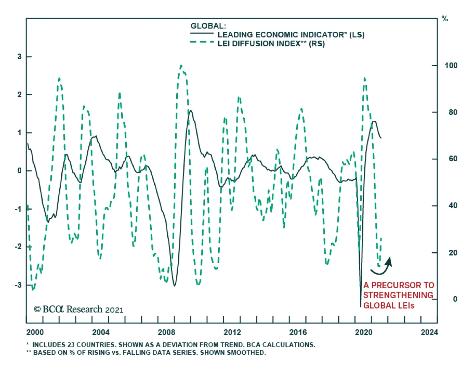
The current deceleration in economic growth (see The Numbers) reflects two main factors. First, lofty economic growth rates following the initial pandemic slump in economic activity were ultimately unsustainable after the sharp rebound from last year's deeply…
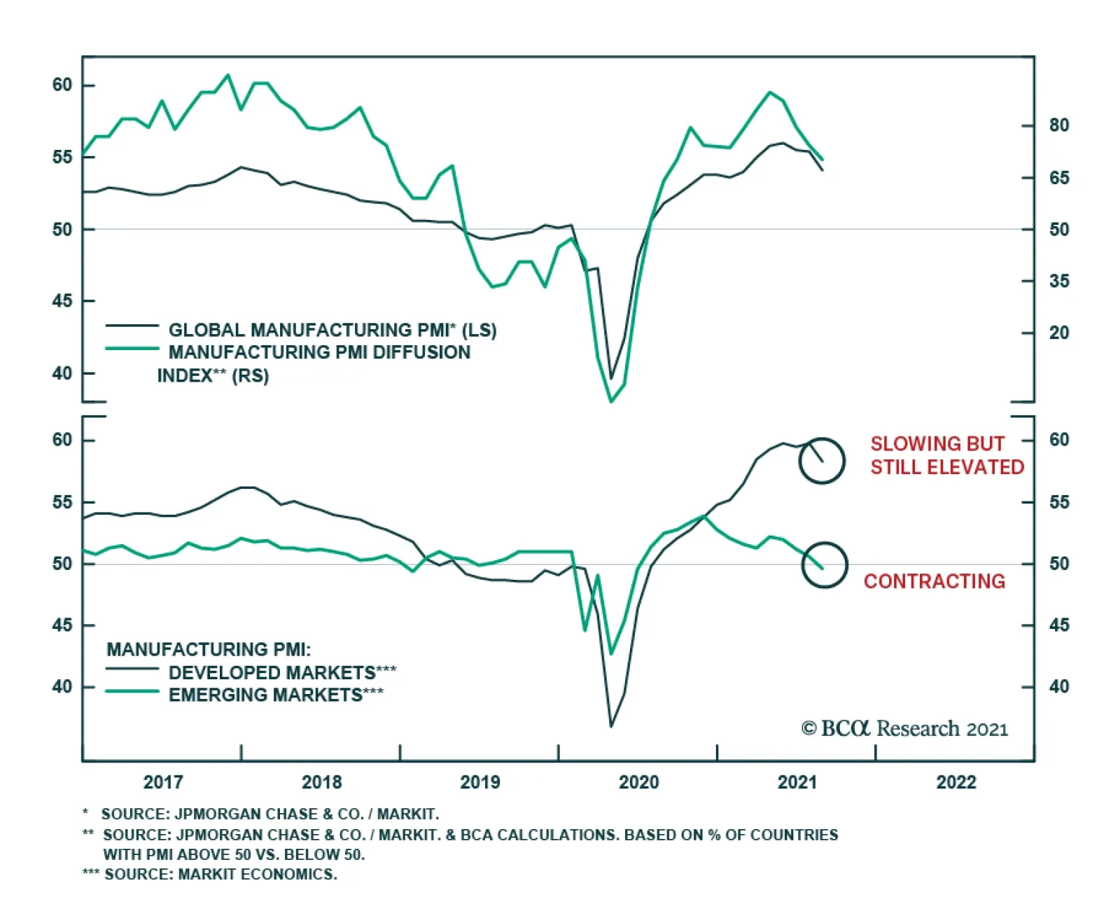
The global manufacturing PMI slipped 1.3 points to a six-month low of 54.1 in August. The deterioration was broad-based. Among the economies with available data, nearly a third contracted which is an increase from a fourth of the countries with PMIs below 50…