Global

In this report we examine the risk of stagflation by comparing the current environment to that of the late-1960s and 1970s. Today, investors cannot rule out the possibility of a stagflationary outcome, for four reasons: long-term household inflation expectations have risen significantly over the past year; fiscal policy has been expansionary; monetary policy will remain expansionary at the Fed’s projected terminal Fed funds rate; and component shortages and price increases linked to energy market and supply chain disruptions may persist or worsen over the coming year. However, the strong demand-pull inflationary dynamics that existed in the late-1960s were mostly absent in the lead-up to the pandemic, supply-chain issues are in part due to strong goods demand and supply disruptions that will eventually dissipate, and economic agents do not expect severe price pressures to persist beyond the pandemic. On balance, this points to a stagflationary outcome over the coming 6-24 months as a risk, but not a likely event. Investors should use the Misery Index, which is the sum of the unemployment rate and headline PCE inflation, as a real-time stagflation indicator. The Misery Index underscores that the US economy is unlikely to experience true stagflation unless the unemployment rate rises. A portfolio of the US dollar, the Swiss Franc, and industrial commodities may serve as a useful hedge for investors who are concerned about absolute return prospects in a world in which long-maturity bond yields are rising and risks of stagflationary dynamics are present. Chart II-1The Misery Index Reflects The Risk Of Stagflation
The Misery Index Reflects The Risk Of Stagflation
The Misery Index Reflects The Risk Of Stagflation
Over the past several weeks, concerns about a possible return to 1970s-style stagflation have re-emerged significantly in the minds of many investors. These investors have pointed toward similarities between the current environment and that of the 1970s, including shortages limiting output, a snarled global trade and logistical system, and rising energy prices. Chart II-1 highlights that the US “Misery Index” – the sum of the unemployment rate and headline PCE inflation – rose again over the past several months to high single-digit territory, after having fallen dramatically from April 2020 to February of this year. Panel 2 of Chart II-1 highlights that last year's rise in the Misery Index was driven almost entirely by the unemployment rate, whereas the current level is due to a combination of a modestly elevated unemployment rate and a pronounced acceleration in inflation. The headline PCE deflator has risen above 4%, a level that has not been reached since 1991 during the First Gulf War. In this report, we examine the risk of stagflation by comparing the current environment to that of the late 1960s and 1970s. We conclude that while investors cannot rule out the possibility of a stagflationary outcome, there are important differences that point toward a stagflation outcome over the coming 6-24 months as a risk, not a likely event. We conclude by highlighting assets that may produce absolute returns in a world in which long-maturity bond yields are rising and risks of stagflationary dynamics are present. Revisiting The 1960s And 70s Chart II-2The 1960s Laid The Groundwork For Elevated Inflation
The 1960s Laid The Groundwork For Elevated Inflation
The 1960s Laid The Groundwork For Elevated Inflation
The first step in judging the risk of a return to 1970s-style stagflation is to review, in a detailed way, what caused those conditions. Investors are well aware of the role that two separate energy price shocks played in raising prices and damaging output during this period, but they are less cognizant of the impact that a persistent period of above-trend output and significant labor market tightness had in setting up the conditions for sharply higher inflation. This focus of investors on energy prices partially reflects the fact that the Misery Index increased most visibly in the 1970s and that policymakers in the 1960s may not have realized how extensively economic output was running above its potential. With the benefit of hindsight, Chart II-2 illustrates the extent to which inflationary pressures built up in the 1960s, well before the first oil price shock in 1973. The chart shows that the unemployment rate was below NAIRU – the non-accelerating inflation rate of unemployment – for 70% of the time during the 1960s, and that inflation had already responded to this in the latter half of the decade. Annual headline PCE inflation was running just shy of 5% at the onset of the 1970 recession; it fell to 3% in the aftermath of the recession, but had already begun to reaccelerate in the first half of 1973. Following the 1973/1974 recession, inflation did decelerate significantly, falling from 11-12% to 5% in headline terms, and from 10% to 6% in core terms. But the pace of price appreciation did not fall below 5-6% in the second half of the 1970s, despite a significant and sustained rise in the unemployment rate above its natural rate. The 1975 to 1978 period is especially important for investors to understand, because it is arguably the clearest period of true stagflation in the 1970s. The fact that the Misery Index rose sharply during two major oil price shocks is not particularly surprising in and of itself, given the direct impact of energy prices on headline consumer prices; it is the fact that the index remained so elevated between these shocks, the result of persistently high inflation in the face of significant labor market slack, that is most relevant to investors. There are two reasons that both inflation and unemployment remained high during this period. First, labor market slack was sizeable during these years because the US economy was more energy-intensive in the 1970s than it is today. Chart II-3 highlights that goods-producing employment lagged overall employment growth from late 1973 to late 1977, underscoring that the rise in oil prices significantly impacted jobs growth in energy-intensive industries.
Chart II-3
Second, it is clear that the combination of demand-pull inflation in the late 1960s and the predominantly cost-push inflation of the 1970s led to expectations of persistent inflation among households and firms. The original Phillips Curve, as formulated by New Zealand economist William Phillips in the late 1950s, described a negative relationship between the unemployment rate and the pace of wage growth. Given the close correlation between wage and overall price growth at the time, the Phillips Curve was soon extended and generalized to describe an inverse relationship between labor market slack and overall price inflation. But the experience of the 1970s highlighted that inflation expectations are also an important determinant of inflation, a realization that gave birth to the expectations-augmented (i.e. “modern-day”) Phillips Curve (more on this below). The Stagflation Era Versus Today
Chart II-
Table II-1 presents a stagflation “threat matrix,” representing the Bank Credit Analyst service’s assessment of the various factors that could potentially contribute to a stagflationary environment today, relative to what occurred in the 1960s and 1970s. While we acknowledge that there are some similarities today to what occurred five decades ago, the most threatening factors have been present for a shorter period of time and appear to have a smaller magnitude than what occurred during the stagflationary era. In addition, key factors, such as the visibility available to policymakers and investors about household inflation expectations and the potential output of the economy, would appear to reduce significantly the risk of a stagflationary outcome today. We discuss each of the factors presented in Table II-1 below: Fiscal & Monetary Policy Chart II-4Government Spending Last Cycle Looked Nothing Like The 1960s
Government Spending Last Cycle Looked Nothing Like The 1960s
Government Spending Last Cycle Looked Nothing Like The 1960s
The persistently tight labor market that contributed to the inflationary buildup in the 1960s occurred as a result of easy fiscal and monetary policy. Chart II-4 highlights that the contribution to real GDP growth from government expenditure and investment was very elevated in the 1960s. Chart II-5 shows that a positive output gap in the late 1960s and the first half of the 1970s is well explained by the fact that 10-year US government bond yields were persistently below nominal GDP growth. The relationship between the stance of monetary policy and the output gap only meaningfully diverged in the latter half of the 1970s, during the true stagflationary era that we noted above. Chart II-5Easy Monetary Policy Juiced Aggregate Demand In The 60s And Early 70s
Easy Monetary Policy Juiced Aggregate Demand In The 60s And Early 70s
Easy Monetary Policy Juiced Aggregate Demand In The 60s And Early 70s
Chart II-6Monetary Policy Today Is Extremely Easy
Monetary Policy Today Is Extremely Easy
Monetary Policy Today Is Extremely Easy
Today, it is clear that the stance of fiscal policy has recently been extraordinarily easy, and 10-year US government bond yields have remained well below nominal GDP growth for the better part of the last decade. Relative to estimates of potential nominal GDP growth, 10-year Treasury yields are the lowest they have been since the 1970s (Chart II-6). Ostensibly, this supports concerns that policy might contribute to a stagflationary outcome. These concerns were raised by Larry Summers in March, when he described the Biden administration’s fiscal policy as the “least responsible” that the US has experienced in four decades and warned of the potential inflationary consequences of overheating the economy.1 But there are two important counterpoints to these concerns. First, easy fiscal policy this cycle has followed a period during the last economic cycle in which government spending contributed to the most sustained drag on economic activity since the 1950s. Unlike the 1960s, the unemployment rate has been below NAIRU for only a third of the time over the past decade. In addition, Chart II-7 highlights that fiscal thrust will turn to fiscal drag next year, underscoring the temporary nature of the massive burst in fiscal spending that has occurred in response to the pandemic. Under normal circumstances, the fiscal drag implied by Chart II-7 would substantially raise the risks of a recession next year, but we have noted in previous reports that a significant amount of excess savings remain to support spending and employment. The net impact of these two factors results in a reasonable expectation that the US economy will return to maximum employment next year, but this is a far cry from the 1960s when the unemployment rate was below its natural rate for 70% of the decade.
Chart II-7
Based on conventional measures, US monetary policy has been easy for a decade, but easy monetary policy did not begin to contribute positively to a rise in household sector credit growth last cycle until 2014/2015. This underscores that the natural rate of interest (“R-star”) did fall during the early phase of the last economic expansion. However, we argued in an April report that R-star was likely rising in the latter half of the last expansion,2 and we believe that the terminal Fed funds rate is likely higher than what the Fed is currently projecting, barring any additional negative policy shocks. Thus, while we do not believe that the duration of easy monetary policy over the past decade has laid the groundwork for a major rise in prices, it is now clearly positively contributing to aggregate demand and does risk a future overshoot in prices if long maturity bond yields remain well below the pace of economic growth for a sustained period of time. The Impact Of Shortages Chart II-8Gasoline Shortages Plagued The US Economy In The 1970s
Gasoline Shortages Plagued The US Economy In The 1970s
Gasoline Shortages Plagued The US Economy In The 1970s
Gasoline shortages occurred during the oil shocks of the 1970s and are a key similarity that some investors point toward when comparing the situation today with the stagflationary era. Chart II-8 highlights that the annual growth in real personal consumption expenditures on energy goods and services fell into negative territory on six occasions in the 1970s, although it was most pronounced during the two oil price shocks and their resulting recessions. Today, the impact of shortages appears to be broader than what occurred in the 1970s, but less impactful and not likely to be as long-lasting. Chart II-9 highlights that the OPEC oil embargo of 1973 raised the global oil bill by 2.4% of global GDP and permanently raised the price of oil. The global oil bill will only be fractionally above its pre-pandemic level in 2022, with oil prices at $80/bbl, and, while it is true that US gasoline prices have risen significantly, they are not higher than they were from 2011-2014 (Chart II-10). Chart II-9$80/bbl Oil Is Not Onerous
$80/bbl Oil Is Not Onerous
$80/bbl Oil Is Not Onerous
Chart II-10US Gasoline Prices Are High, But They Have Been Higher
US Gasoline Prices Are High, But They Have Been Higher
US Gasoline Prices Are High, But They Have Been Higher
It is certainly true that global shipping costs have skyrocketed and that this is contributing to the increase in US consumer prices. We estimate, however, that this increase in shipping costs as a share of GDP is no more than a quarter of the impact of the 1973 increase in oil prices, without the attendant negative effects on US goods-producing employment that occurred in the 1970s. If anything, surging shipping costs create an incentive to re-shore manufacturing production, which would contribute positively to US goods-producing employment. We also do not expect the rise in shipping costs to be meaningfully permanent, i.e., shipping costs may ultimately settle at a higher level than they were in late-2019, but at a much lower level than what prevails today. Chart II-11A Tight Labor Market Is Causing Wage Growth To Pick Up
A Tight Labor Market Is Causing Wage Growth To Pick Up
A Tight Labor Market Is Causing Wage Growth To Pick Up
Semiconductor and labor shortages would appear to represent a more salient threat of stagflation in the US, as the domestic production of motor vehicles cannot occur without key inputs and a tight labor market is already contributing to an acceleration in wage growth (Chart II-11). As we noted in Section 1 of our report, auto production significantly impacted growth in the third quarter. However, Chart II-12 highlights that, for now, the breadth of impact of these shortages appears to be limited: the production component of the ISM manufacturing index remains in expansionary territory, industrial production of durable manufacturing excluding motor vehicles and parts has not broken down, and both housing starts and building permits remain above pre-pandemic levels despite this year’s downtrend in permits. Chart II-12Shortages Do Not Yet Seem To Be Broad-Based
Shortages Do Not Yet Seem To Be Broad-Based
Shortages Do Not Yet Seem To Be Broad-Based
A physical shortage of components is a less relevant factor for the services side of the economy, which appears to have re-accelerated meaningfully in October. The services sector is more considerably impacted by shortages in the labor market, which seem to be linked to a still-low labor force participation rate. We noted in our September report that the decline in the participation rate has significantly overshot what would be implied by the ongoing pace of retirements. Chart II-13 highlights that this has occurred not just because of a significant retirement effect, but also because of the shadow labor force (people who want a job but are not currently looking for work) and family responsibilities. We expect that the recent expiry of expanded unemployment insurance benefits, a steady rise in the immunity of the US population, an abating Delta wave of COVID-19, and a likely upcoming reduction in school/classroom closures once the Pfizer/BioNTech vaccine is approved for school-age children will likely ease the labor shortage issue over the coming several months.
Chart II-13
Output Gap Uncertainty It remains a debate among economists why policymakers maintained such easy monetary policy in the 1960s and 1970s, but Chart II-14 highlights that uncertainty about the size of the output gap may have contributed to too-low interest rates. The chart shows the unemployment rate compared with today's estimate of NAIRU, alongside a simple proxy for policymakers’ real time estimate of the natural rate of employment: the cumulative average unemployment rate in the post-war environment. To the extent that policymakers used past averages of the unemployment rate as their guide for NAIRU, Chart II-14 highlights how they may have underestimated the degree to which output was running above its potential level in the 1960s, and would not have even concluded that output was above potential in the early 1970s. Chart II-14Policymakers Overestimated Labor Market Slack In The 60s And 70s
Policymakers Overestimated Labor Market Slack In The 60s And 70s
Policymakers Overestimated Labor Market Slack In The 60s And 70s
Chart II-15Policymakers Know That NAIRU Is Likely At Or Below 4%
Policymakers Know That NAIRU Is Likely At Or Below 4%
Policymakers Know That NAIRU Is Likely At Or Below 4%
Today, the environment is quite different, because the acceleration in wage growth at the tail end of the last expansion gives policymakers and investors a good estimate of where NAIRU is. Chart II-15 highlights that wage growth accelerated in 2018/2019 in response to a sub-4% unemployment rate, which is consistent with both the Fed’s NAIRU estimate of 3.5-4.5% and Fed Vice Chair Richard Clarida’s expressed view that a 3.8% unemployment rate likely constitutes maximum employment (barring any issues with the breadth and inclusivity of the labor market recovery). It is possible that the pandemic has structurally lowered potential output, which could mean that policymakers may no longer rely on the wage growth / unemployment relationship that existed in the latter phase of the last expansion. However, we do not find any credible arguments that would support the notion of a structurally lower level of potential output: the pandemic is likely to end at some point in the not-too-distant future, the negative impact of working-from-home policies on office properties and employment in central business districts is not sizeable,3 and productivity may have permanently increased in some industries because of the likely stickiness of a hybrid work culture. The Behavior Of Inflation Expectations Chart II-16Rising Long-Term Expectations Have Merely Normalized (For Now)
Rising Long-Term Expectations Have Merely Normalized (For Now)
Rising Long-Term Expectations Have Merely Normalized (For Now)
One parallel to the argument that policymakers may have underestimated the degree of labor market tightness in the 1960s and early 1970s is the fact that they did not yet understand that inflation expectations are an important determinant of actual inflation, nor were they able to monitor them even if they did. Most credible surveys of inflation expectations began in the 1980s, and policymakers in the 1960s and 1970s were guided by the original Phillips Curve that solely related inflation to unemployment. Today, policymakers have the experience of the stagflationary episode to serve as a warning not to allow inflation expectations to get out of control, and both policymakers and investors have reliable measures of inflation expectations for households and market-participants. Chart II-16 highlights that households expect significant inflation over the coming year, but also expect prices over the longer term to rise at a pace that is almost exactly in line with their average from 2000-2014. The Rudd Controversy: (Adaptive) Inflation Expectations Do Matter One potential criticism of the idea that inflation expectations are signaling a low risk of higher future inflation has emerged through arguments made by Jeremy Rudd, a Federal Reserve economist. In a recent paper, Rudd questioned the view that households’ and firms’ expectations of future inflation are a key determinant of actual inflation; he suggested instead that relatively stable inflation since the mid-1990s might reflect a situation in which inflation simply does not enter workers’ employment decisions and expectations are irrelevant. Rudd’s paper was primarily addressed to policymakers who view inflation dynamics in a highly quantitative light. A full response to the paper would be mostly academic and thus not especially relevant to investors; however, we would like to highlight three points related to the Rudd piece that we feel are important.4 First, we disagree with Rudd’s argument that the trend in inflation has not responded to changes in economic conditions since the mid-1990s. Chart II-17 highlights that while the magnitude of the relationship has shifted, the trend in inflation relative to a measure of long-term expectations based on prior actual inflation has mimicked that of the output gap. The fact that inflation was (ironically) too high during the early phase of the last economic cycle provides some support for Rudd’s inflation responsiveness view, although we would still point toward the Fed’s strong record of maintaining low and stable inflation, its active communication with the public in the years following the global financial crisis, and the fact that a recovery began and the output gap began to (slowly) close as the best explanation for the avoidance of deflation during that period. Second, we agree with Rudd’s point that regime shifts in inflation’s responsiveness to economic conditions can occur, and that adaptive measures of inflation expectations, and even surveys of inflation, may not capture such a shift in real time. Chart II-18 shows that the 2014-2016 period was a good example of this, when adaptive expectations as well as household survey measures of long-term inflation expectations both lagged the actual decline in inflation that was caused by a collapse in the price of oil. Chart II-17The Trend In Inflation Continues To Respond To Economic Conditions
The Trend In Inflation Continues To Respond To Economic Conditions
The Trend In Inflation Continues To Respond To Economic Conditions
Chart II-18Surveyed Inflation Expectations Can Lag, But This Time They Led
Surveyed Inflation Expectations Can Lag, But This Time They Led
Surveyed Inflation Expectations Can Lag, But This Time They Led
But Chart II-18 also shows that long-term household survey measures of inflation led the rise in actual inflation (and thus our adaptive expectations measure) last year, underscoring that these measures are likely more reliable indicators today of whether a major regime shift is occurring. As noted above, long-term expectations have risen significantly relative to what prevailed prior to the pandemic, but this has merely raised expectations from extraordinarily depressed levels back to the average that prevailed prior to (and immediately after) the global financial crisis. Therefore, household expectations are not yet at dangerous levels. Chart II-19Unit Labor Costs Modestly Lead Inflation, But Are Far From Extreme
Unit Labor Costs Modestly Lead Inflation, But Are Far From Extreme
Unit Labor Costs Modestly Lead Inflation, But Are Far From Extreme
Third, one of the core observations in Rudd’s paper is that unit labor cost (ULC) growth leads the trend in inflation, which he argued was evidence against the idea that expectations of future inflation are a key determinant of actual inflation. Chart II-19 highlights that Rudd is correct that ULC growth modestly leads inflation (especially core inflation), but we disagree with his conclusion that it argues against the importance of expectations. As we noted in Section 2 of our January 2021 Bank Credit Analyst,5 one crucial aspect of the expectations-augmented, or “modern-day” Phillips Curve is that, if inflation expectations are largely formed based on the experience of past inflation, then inflation is ultimately determined by three dimensions of the output gap: whether it is rising or falling, whether it is above or below zero, and how long it has been above or below zero. Our view is that ULC growth is fundamentally linked to slack in the labor market, which is directly incorporated in output gap measures. As we noted above, investors currently have a good estimate of the magnitude of the output/employment gap, meaning that it is possible to track the inflationary consequences of prevailing aggregate demand. As a final point about ULC growth, Chart II-19 highlights that while the five-year CAGR of unit labor costs is currently running at its strongest pace since the global financial crisis, investors should note that it remains well below the levels that prevailed in the late-1960s when persistently above-potential output laid the groundwork for a massive inflationary overshoot. Conclusions And Investment Strategy Our review of the 1960s and 1970s highlights that stagflation is a phenomenon in which supply-side shocks raise prices of key inputs to production, which lowers output and raises unemployment. Energy price shocks in the 1970s occurred after a long period of policy-driven above-trend growth in the 1960s, meaning that both demand-pull and cost-push inflation contributed to stagflation in the 1970s. Today, investors cannot rule out the possibility of a stagflationary outcome, for four reasons: long-term household inflation expectations have risen significantly over the past year; fiscal policy has been very expansionary; monetary policy will remain expansionary at the Fed’s projected terminal Fed funds rate; and component shortages and price increases linked to energy market and supply chain disruptions may persist or worsen over the coming year. Chart II-20It Is Not Stagflation If The Unemployment Rate Continues To Fall
It Is Not Stagflation If The Unemployment Rate Continues To Fall
It Is Not Stagflation If The Unemployment Rate Continues To Fall
However, the strong demand-pull inflationary dynamics that existed in the late-1960s were mostly absent in the lead-up to the pandemic, supply-chain issues are in part the result of strong goods demand and disruptions that are clearly linked to the pandemic (and thus will eventually dissipate), and long-term inflation expectations are behaving differently than short-term expectations, signaling that economic agents do not expect severe price pressures to persist beyond the pandemic. Policymakers also have more visibility about the magnitude of economic / labor market slack than they did during the stagflationary era and better tools to track inflation expectations. On balance, this points to a stagflationary outcome over the coming 6-24 months as a risk, but not as a likely event. Using the Misery Index as real-time stagflation indicator, investors should note that the US economy is not likely experiencing true stagflation unless the unemployment rate rises. Chart II-20 highlights that there is no evidence yet of a contraction in goods-producing or service-producing jobs. Even if goods-producing employment slows meaningfully over the coming few months as a result of component shortages, the unemployment rate is still likely to fall if services spending normalizes, as it would imply that the gap in services-producing employment, which is currently 20% of the level of pre-pandemic goods-producing employment, will continue to close. Investors have been focused on the issue of stagflation because its occurrence would imply a sharply negative correlation between stock prices and bond yields. This is not our base case view, but we have highlighted that months with negative returns from both stocks and long-maturity bonds tend to be associated with periods of monetary policy tightening (or in anticipation of such periods). As we discussed in Section 1 of our report, we do expect the Fed to raise interest rates next year. We do not see a rise in bond yields to levels implied by the Fed’s interest rates projections as being seriously threatening to economic activity, corporate earnings growth, or equity multiples. But the adjustment to higher long-maturity bond yields may unnerve equity investors for a time, implying temporary periods of a negative stock price / bond yield correlation. Table II-2 highlights that, since 1980, commodities, the US dollar, and the Swiss franc have typically earned positive returns during non-recessionary months in which stock and long-maturity bond returns are negative. While the dollar is not likely to perform well in a stagflationary scenario, Chart II-21 highlights that CHF-USD and industrial commodities performed quite well in the late-1970s. As such, a portfolio of these three assets might serve as a useful hedge for investors who are concerned about absolute return prospects in a world in which long-maturity bond yields are rising and risks of stagflationary dynamics are present.
Chart II-
Chart II-21The Swiss Franc and Raw Industrials Did Well During The Stagflationary Era
The Swiss Franc and Raw Industrials Did Well During The Stagflationary Era
The Swiss Franc and Raw Industrials Did Well During The Stagflationary Era
Jonathan LaBerge, CFA Vice President The Bank Credit Analyst Footnotes 1 “Summers Sees ‘Least Responsible’ Fiscal Policy in 40 Years,” Bloomberg News, March 20, 2021. 2 Please see The Bank Credit Analyst “R-star, And The Structural Risk To Stocks,” dated March 31, 2021, available at bca.bcaresearch.com 3 Please see The Bank Credit Analyst “Work From Home “Stickiness” And The Outlook For Monetary Policy,” dated June 24, 2021, available at bca.bcaresearch.com 4 Rudd, Jeremy B. (2021). “Why Do We Think That Inflation Expectations Matter for Inflation? (And Should We?),” Finance and Economics Discussion Series 2021-062. Washington: Board of Governors of the Federal Reserve System. 5 Please see The Bank Credit Analyst “The Modern-Day Phillips Curve, Future Inflation, And What To Do About It,” dated December 18, 2021, available at bca.bcaresearch.com
Highlights The circumstances of the pandemic improved in October, but data highlighting the economic consequences of the Delta wave grew more severe. US economic activity slowed meaningfully in the third quarter, driven by lower car sales and a slowdown in services spending. The imminent vaccination of school-aged children, and signs that services activity and spending are increasing, will likely raise labor force participation, boost education employment, and hasten the return of real services spending back to pre-pandemic levels. Investors have the right bond view, but the wrong reason. Investors believe that the Fed will be forced to raise interest rates earlier than it currently expects to prevent an out-of-control rise in prices, whereas it will likely do so because of a quicker return to maximum employment. Bond yields are likely to move higher over the coming year, but this will be driven by real yields, not inflation expectations. Once the Fed begins to raise interest rates, investors should be on the lookout for signs that market expectations for the real natural rate of interest, or “R-star,” are rising. The Fed’s terminal rate projection is well below nominal potential GDP growth, and a gap between these two measures no longer makes sense. Stocks are likely to generate mid-single digit returns next year, which will beat the returns offered by bonds and cash. But stocks will generate much lower returns compared with those enjoyed by investors over the past year. A benign rise in long-maturity bond yields argues for the outperformance of value versus growth stocks over the coming year. Cyclical stocks are now becoming stretched versus defensives on an equally-weighted basis; stay overweight for now, but a downgrade to neutral may be in the cards at some point next year. Feature Chart I-1The Waning Impact Of Delta
The Waning Impact Of Delta
The Waning Impact Of Delta
Over the past month, the focus of investors has shifted from day-to-day developments to the consequences of the Delta wave of the pandemic. Chart I-1 highlights that, while an estimate of the COVID-19 reproduction rates in advanced economies has recently inched higher, it remains below one and hospitalizations continue to trend lower in most major economies. UK hospitalizations have increased over the course of the month, but remain at a level that is a quarter of their January peak – despite an elevated pace of confirmed cases. In the US, both these cases and hospitalizations continue to fall, trends that are likely to be reinforced by the vaccination of children over the coming weeks. A 50-60% vaccination rate for school-aged children would increase the US vaccination rate by 4-5 percentage points. Vaccinating all children at this rate would increase the total vaccination rate by 7-8 percentage points. In combination with a meaningful level of natural immunity, the vaccination of children is likely to bring the US very close to, if not above, the non-accelerating hospitalization rate of immunity (or “NAHRI”).1 The Delta Hangover While the circumstances of the pandemic improved in October, the economic consequences grew more severe. US economic activity slowed meaningfully in the third quarter, as highlighted by yesterday’s advance release. Chart I-2 highlights that durable goods spending subtracted almost three percentage points from Q3 growth, and that most other components of GDP contributed less to growth in Q3 than in Q2.
Chart I-2
The significant slowdown in Q3 growth is disappointing, but several factors point toward the conclusion that it is not likely to be sustained: Chart I-3Services PMIs Are Pointing To A Stronger Q4
Services PMIs Are Pointing To A Stronger Q4
Services PMIs Are Pointing To A Stronger Q4
The Delta wave very likely impacted services spending, which we have highlighted is likely to drive overall consumption over the coming year. Given the ongoing impact of semiconductor shortages on the availability of new cars, it is not surprising that a slowdown in services spending resulted in a significant slowdown in overall growth. After having declined significantly in Q3, Chart I-3 highlights that the US, UK, French, and Japanese October flash services PMI rose anew, underscoring that recent services weakness have been closely linked to the Delta variant of COVID-19 (whose impact is now waning). Chart I-3 also highlights that the US services PMI is currently at a level that has been historically consistent with solid real PCE growth. Finally, while it is true that manufacturing PMIs are being supported by supplier deliveries components, the October output component of the US Markit manufacturing index remained in expansionary territory, as was the case in Germany, Japan, and the UK (despite month-over-month declines in these components). Chart I-4 highlights that Q3’s real GDP reading was highly anomalous relative to the pace of jobs growth in the quarter, based on the relationship between the two since the global financial crisis. In quarters in which real GDP growth was 1% or less than implied by the trendline shown in Chart I-4, real GDP accelerated in the subsequent quarter 80% of the time. In conjunction with a pickup in services activity in October, this suggests that growth will be meaningfully stronger in Q4.
Chart I-4
Chart I-5Global Growth Is Peaking, But A Major Downturn Is Unlikely
Global Growth Is Peaking, But A Major Downturn Is Unlikely
Global Growth Is Peaking, But A Major Downturn Is Unlikely
Chart I-5 shows our global Nowcast indicator, alongside our global LEI. Our Nowcast indicator is a high-frequency measure of economic activity that is designed to predict global industrial production. The chart shows that both the Nowcast and global LEI are declining, but that this decline is occurring from an extremely elevated level. The global economy is at an inflection point in terms of the pace of growth, but Chart I-5 still points to above-trend growth – and certainly not a major cyclical downturn. The expectation of a slowdown in growth in Q3 has significantly raised concerns about a possible return to 1970s-style stagflation in the minds of many investors. We address this topic in depth in this month’s Special Report, and conclude that, while investors cannot rule out the possibility of stagflation, there are important differences that point toward a stagflationary outcome over the coming 6-24 months as a risk, not a likely event. We note in our report that the risk of stagflation can be monitored in real time by tracking the Misery Index, which is the sum of headline PCE inflation and the unemployment rate. Currently, the Misery Index is elevated relative to the average of the past 30 years, but it is meaningfully lower than it was during the latter half of the 1970s. This also underscores that true stagflation is only likely to occur if the unemployment rate rises, which means that the economic and financial market outlook over the coming year is strongly tied to the pace of jobs growth (even more so than usual). Table I-1 presents an industry breakdown of the jobs gap relative to pre-pandemic levels, sorted by industries with the largest gap. The table highlights that leisure and hospitality, government, and education and health services jobs continue to account for two-thirds of the five million jobs gap, with the latter two largely reflecting the same effect: 60% of the government jobs gap is accounted for by state and local government education-related employment.
Chart I-
Chart I-6Leisure And Hospitality Employment Tracks The Hotel Occupancy Rate
Leisure And Hospitality Employment Tracks The Hotel Occupancy Rate
Leisure And Hospitality Employment Tracks The Hotel Occupancy Rate
US education employment has been impacted by school and classroom closures, which we noted above are likely to end once school-aged children are vaccinated against the disease. Chart I-6 highlights that leisure and hospitality employment is clearly predicted by the US hotel occupancy rate, which wobbled over the past few months as a result of the Delta wave of the pandemic. Correspondingly, monthly growth in leisure and hospitality employment slowed in August and September. Taken together, the imminent vaccination of school-aged children and signs that services activity and spending are increasing will likely raise labor force participation, boost education employment, and hasten the return of real services spending back to pre-pandemic levels. The Bond Market Outlook Chart I-7The Market Now Agrees With Us About The Timing Of Fed Rate Hikes...
The Market Now Agrees With Us About The Timing Of Fed Rate Hikes...
The Market Now Agrees With Us About The Timing Of Fed Rate Hikes...
A continued normalization of the labor market over the coming 6-12 months argues in favor of Fed rate hikes next year, which is a view that we have maintained for several months. Recently, investors have come to agree with us, by moving forward their expectations for the Fed funds rate (Chart I-7). However, Chart I-8 highlights that investors have the right view for the wrong reason. The chart highlights that US government bond yields have risen entirely due to inflation expectations and that real yields have fallen. This means that investors believe that the Fed will be forced to raise interest rates earlier than it currently expects to prevent an out-of-control rise in prices, whereas we believe that they will do so because of a return to maximum employment. The implication for investors is that bond yields are still likely to rise over the coming year, but that higher yields are likely to occur alongside falling inflation expectations. This trend underscores that common hedges against inflation, such as precious metals and the relative performance of TIPS, are likely to underperform over the coming year. We have noted in previous reports that the fair value for long-maturity government bond yields implied by the Fed’s interest rate projections is not likely threatening for equity multiples, and certainly not for economic activity. A September 2022 rate hike, coupled with a pace of three hikes per year and a 2.5% terminal Fed funds rate, implies that 10-year Treasury yields will rise to 2.15% over the coming year, which would be only modestly higher than the level that prevailed prior to the pandemic (Chart I-9). Chart I-8...But For The Wrong Reason
...But For The Wrong Reason
...But For The Wrong Reason
Chart I-9Higher Bond Yields Are Unlikely To Be Restrictive Next Year
Higher Bond Yields Are Unlikely To Be Restrictive Next Year
Higher Bond Yields Are Unlikely To Be Restrictive Next Year
However, once the Fed begins to raise interest rates, investors should be on the lookout for signs that market expectations for the real natural rate of interest, or “R-star,” are rising. The Fed’s terminal rate projection is well below nominal potential GDP growth, and, while a gap between these two measures made sense in the years following the global financial crisis, this no longer appears to be the case. Chart I-10 highlights that real household mortgage liabilities began to contract sharply in 2006, and did not turn positive on a year-over-year basis until the end of 2016. It is likely that R-star was falling or weak during this period, but the correlation between the two series clearly shifted in the latter phase of the last economic cycle. Chart I-11 emphasizes this point by highlighting that the household debt service ratio is now the lowest it has been since the 1970s, underscoring the capacity that US consumers have to withstand higher interest rates. Chart I-10R-star Fell Post-GFC, For A Time
R-star Fell Post-GFC, For A Time
R-star Fell Post-GFC, For A Time
Chart I-11Today, US Households Have A Lot Of Capacity To Tolerate Higher Rates
Today, US Households Have A Lot Of Capacity To Tolerate Higher Rates
Today, US Households Have A Lot Of Capacity To Tolerate Higher Rates
We doubt that investor expectations for the terminal rate will rise significantly before the Fed begins to normalize monetary policy, but it may happen. In addition, the Fed may begin raising interest rates next year as soon as late in the summer or early in the fall, which would locate the liftoff date within our 6-12 month investment time horizon. As such, our base case view is that a rise in interest rates over the coming year will not be threatening to the equity market, but this view may change at some point next year. Equities: Expect Modest Returns In 2022 A benign increase in long-maturity bond yields in 2022 suggests that equity multiples will neither contribute to, nor subtract from, equity returns. As such, return expectations for equities should be centered around expected earnings growth.
Chart I-
Table I-2 presents consensus estimates for nominal GDP growth, S&P 500 revenue growth, and earnings growth for 2022. The table highlights that expectations for revenue growth estimates appear to be reasonable, given that bottom-up analysts continue to expect an expansion in profit margins next year. Chart I-12 highlights that margins have already risen back above their pre-pandemic high, and that this is true for both tech and ex-tech sectors. Chart I-12US Profit Margins Have Already Risen To Record Levels
US Profit Margins Have Already Risen To Record Levels
US Profit Margins Have Already Risen To Record Levels
We doubt that further increases in profit margins will be sustained next year. It is possible that margins will actually decline – a view that was recently espoused by our US Equity Strategy service.2 Risks to profit margins underscore that stocks are likely to generate mid-single digit returns next year, which will beat the returns offered by bonds and cash. But stocks will generate much lower returns compared with those enjoyed by investors over the past year. Within the equity market, we remain of the view that even a benign rise in long-maturity bond yields argues for the outperformance of value versus growth stocks over the coming year. Chart I-13 highlights that the rolling one-year correlation between relative global growth versus value stock prices and the US 10-year Treasury yield has become increasingly negative over time, which bodes well for value. We also continue to recommend that investors favor small over large caps and cyclicals over defensives, although cyclical stocks are now becoming stretched versus defensives on an equally-weighted basis as they are closing in on their 2018 highs (Chart I-14). We think it is too early to position against cyclicals, but a downgrade to neutral may be in the cards at some point next year. Chart I-13Growth Will Underperform Value If Long-Maturity Bond Yields Rise
Growth Will Underperform Value If Long-Maturity Bond Yields Rise
Growth Will Underperform Value If Long-Maturity Bond Yields Rise
Chart I-14Cyclicals Are Starting To Look Stretched Versus Defensives
Cyclicals Are Starting To Look Stretched Versus Defensives
Cyclicals Are Starting To Look Stretched Versus Defensives
Investment Conclusions Next month’s report will feature BCA’s 2022 outlook, as well as a transcript of our recently held annual discussion with Mr. X and his daughter Ms. X (who joined his family office a couple of years ago). Our annual outlook will provide a detailed walkthrough of our views for the upcoming year, as well as answers to sobering questions raised by Mr. X and Ms. X about the longer-term outlook. For now, we recommend that investors stick with a pro-cyclical view, favoring the following assets: Global stocks over bonds A short-duration position within a government bond portfolio Speculative-grade corporate bonds within a credit portfolio Global ex-US stocks vs US, focused on DM ex-US Global value versus growth stocks Cyclicals versus defensives, and small versus large caps Major currencies versus the US dollar Jonathan LaBerge, CFA Vice President The Bank Credit Analyst October 29, 2021 Next Report: November 30, 2021 II. Gauging The Risk Of Stagflation In this report we examine the risk of stagflation by comparing the current environment to that of the late-1960s and 1970s. Today, investors cannot rule out the possibility of a stagflationary outcome, for four reasons: long-term household inflation expectations have risen significantly over the past year; fiscal policy has been expansionary; monetary policy will remain expansionary at the Fed’s projected terminal Fed funds rate; and component shortages and price increases linked to energy market and supply chain disruptions may persist or worsen over the coming year. However, the strong demand-pull inflationary dynamics that existed in the late-1960s were mostly absent in the lead-up to the pandemic, supply-chain issues are in part due to strong goods demand and supply disruptions that will eventually dissipate, and economic agents do not expect severe price pressures to persist beyond the pandemic. On balance, this points to a stagflationary outcome over the coming 6-24 months as a risk, but not a likely event. Investors should use the Misery Index, which is the sum of the unemployment rate and headline PCE inflation, as a real-time stagflation indicator. The Misery Index underscores that the US economy is unlikely to experience true stagflation unless the unemployment rate rises. A portfolio of the US dollar, the Swiss Franc, and industrial commodities may serve as a useful hedge for investors who are concerned about absolute return prospects in a world in which long-maturity bond yields are rising and risks of stagflationary dynamics are present. Chart II-1The Misery Index Reflects The Risk Of Stagflation
The Misery Index Reflects The Risk Of Stagflation
The Misery Index Reflects The Risk Of Stagflation
Over the past several weeks, concerns about a possible return to 1970s-style stagflation have re-emerged significantly in the minds of many investors. These investors have pointed toward similarities between the current environment and that of the 1970s, including shortages limiting output, a snarled global trade and logistical system, and rising energy prices. Chart II-1 highlights that the US “Misery Index” – the sum of the unemployment rate and headline PCE inflation – rose again over the past several months to high single-digit territory, after having fallen dramatically from April 2020 to February of this year. Panel 2 of Chart II-1 highlights that last year's rise in the Misery Index was driven almost entirely by the unemployment rate, whereas the current level is due to a combination of a modestly elevated unemployment rate and a pronounced acceleration in inflation. The headline PCE deflator has risen above 4%, a level that has not been reached since 1991 during the First Gulf War. In this report, we examine the risk of stagflation by comparing the current environment to that of the late 1960s and 1970s. We conclude that while investors cannot rule out the possibility of a stagflationary outcome, there are important differences that point toward a stagflation outcome over the coming 6-24 months as a risk, not a likely event. We conclude by highlighting assets that may produce absolute returns in a world in which long-maturity bond yields are rising and risks of stagflationary dynamics are present. Revisiting The 1960s And 70s Chart II-2The 1960s Laid The Groundwork For Elevated Inflation
The 1960s Laid The Groundwork For Elevated Inflation
The 1960s Laid The Groundwork For Elevated Inflation
The first step in judging the risk of a return to 1970s-style stagflation is to review, in a detailed way, what caused those conditions. Investors are well aware of the role that two separate energy price shocks played in raising prices and damaging output during this period, but they are less cognizant of the impact that a persistent period of above-trend output and significant labor market tightness had in setting up the conditions for sharply higher inflation. This focus of investors on energy prices partially reflects the fact that the Misery Index increased most visibly in the 1970s and that policymakers in the 1960s may not have realized how extensively economic output was running above its potential. With the benefit of hindsight, Chart II-2 illustrates the extent to which inflationary pressures built up in the 1960s, well before the first oil price shock in 1973. The chart shows that the unemployment rate was below NAIRU – the non-accelerating inflation rate of unemployment – for 70% of the time during the 1960s, and that inflation had already responded to this in the latter half of the decade. Annual headline PCE inflation was running just shy of 5% at the onset of the 1970 recession; it fell to 3% in the aftermath of the recession, but had already begun to reaccelerate in the first half of 1973. Following the 1973/1974 recession, inflation did decelerate significantly, falling from 11-12% to 5% in headline terms, and from 10% to 6% in core terms. But the pace of price appreciation did not fall below 5-6% in the second half of the 1970s, despite a significant and sustained rise in the unemployment rate above its natural rate. The 1975 to 1978 period is especially important for investors to understand, because it is arguably the clearest period of true stagflation in the 1970s. The fact that the Misery Index rose sharply during two major oil price shocks is not particularly surprising in and of itself, given the direct impact of energy prices on headline consumer prices; it is the fact that the index remained so elevated between these shocks, the result of persistently high inflation in the face of significant labor market slack, that is most relevant to investors. There are two reasons that both inflation and unemployment remained high during this period. First, labor market slack was sizeable during these years because the US economy was more energy-intensive in the 1970s than it is today. Chart II-3 highlights that goods-producing employment lagged overall employment growth from late 1973 to late 1977, underscoring that the rise in oil prices significantly impacted jobs growth in energy-intensive industries.
Chart II-3
Second, it is clear that the combination of demand-pull inflation in the late 1960s and the predominantly cost-push inflation of the 1970s led to expectations of persistent inflation among households and firms. The original Phillips Curve, as formulated by New Zealand economist William Phillips in the late 1950s, described a negative relationship between the unemployment rate and the pace of wage growth. Given the close correlation between wage and overall price growth at the time, the Phillips Curve was soon extended and generalized to describe an inverse relationship between labor market slack and overall price inflation. But the experience of the 1970s highlighted that inflation expectations are also an important determinant of inflation, a realization that gave birth to the expectations-augmented (i.e. “modern-day”) Phillips Curve (more on this below). The Stagflation Era Versus Today
Chart II-
Table II-1 presents a stagflation “threat matrix,” representing the Bank Credit Analyst service’s assessment of the various factors that could potentially contribute to a stagflationary environment today, relative to what occurred in the 1960s and 1970s. While we acknowledge that there are some similarities today to what occurred five decades ago, the most threatening factors have been present for a shorter period of time and appear to have a smaller magnitude than what occurred during the stagflationary era. In addition, key factors, such as the visibility available to policymakers and investors about household inflation expectations and the potential output of the economy, would appear to reduce significantly the risk of a stagflationary outcome today. We discuss each of the factors presented in Table II-1 below: Fiscal & Monetary Policy Chart II-4Government Spending Last Cycle Looked Nothing Like The 1960s
Government Spending Last Cycle Looked Nothing Like The 1960s
Government Spending Last Cycle Looked Nothing Like The 1960s
The persistently tight labor market that contributed to the inflationary buildup in the 1960s occurred as a result of easy fiscal and monetary policy. Chart II-4 highlights that the contribution to real GDP growth from government expenditure and investment was very elevated in the 1960s. Chart II-5 shows that a positive output gap in the late 1960s and the first half of the 1970s is well explained by the fact that 10-year US government bond yields were persistently below nominal GDP growth. The relationship between the stance of monetary policy and the output gap only meaningfully diverged in the latter half of the 1970s, during the true stagflationary era that we noted above. Chart II-5Easy Monetary Policy Juiced Aggregate Demand In The 60s And Early 70s
Easy Monetary Policy Juiced Aggregate Demand In The 60s And Early 70s
Easy Monetary Policy Juiced Aggregate Demand In The 60s And Early 70s
Chart II-6Monetary Policy Today Is Extremely Easy
Monetary Policy Today Is Extremely Easy
Monetary Policy Today Is Extremely Easy
Today, it is clear that the stance of fiscal policy has recently been extraordinarily easy, and 10-year US government bond yields have remained well below nominal GDP growth for the better part of the last decade. Relative to estimates of potential nominal GDP growth, 10-year Treasury yields are the lowest they have been since the 1970s (Chart II-6). Ostensibly, this supports concerns that policy might contribute to a stagflationary outcome. These concerns were raised by Larry Summers in March, when he described the Biden administration’s fiscal policy as the “least responsible” that the US has experienced in four decades and warned of the potential inflationary consequences of overheating the economy.3 But there are two important counterpoints to these concerns. First, easy fiscal policy this cycle has followed a period during the last economic cycle in which government spending contributed to the most sustained drag on economic activity since the 1950s. Unlike the 1960s, the unemployment rate has been below NAIRU for only a third of the time over the past decade. In addition, Chart II-7 highlights that fiscal thrust will turn to fiscal drag next year, underscoring the temporary nature of the massive burst in fiscal spending that has occurred in response to the pandemic. Under normal circumstances, the fiscal drag implied by Chart II-7 would substantially raise the risks of a recession next year, but we have noted in previous reports that a significant amount of excess savings remain to support spending and employment. The net impact of these two factors results in a reasonable expectation that the US economy will return to maximum employment next year, but this is a far cry from the 1960s when the unemployment rate was below its natural rate for 70% of the decade.
Chart II-7
Based on conventional measures, US monetary policy has been easy for a decade, but easy monetary policy did not begin to contribute positively to a rise in household sector credit growth last cycle until 2014/2015. This underscores that the natural rate of interest (“R-star”) did fall during the early phase of the last economic expansion. However, we argued in an April report that R-star was likely rising in the latter half of the last expansion,4 and we believe that the terminal Fed funds rate is likely higher than what the Fed is currently projecting, barring any additional negative policy shocks. Thus, while we do not believe that the duration of easy monetary policy over the past decade has laid the groundwork for a major rise in prices, it is now clearly positively contributing to aggregate demand and does risk a future overshoot in prices if long maturity bond yields remain well below the pace of economic growth for a sustained period of time. The Impact Of Shortages Chart II-8Gasoline Shortages Plagued The US Economy In The 1970s
Gasoline Shortages Plagued The US Economy In The 1970s
Gasoline Shortages Plagued The US Economy In The 1970s
Gasoline shortages occurred during the oil shocks of the 1970s and are a key similarity that some investors point toward when comparing the situation today with the stagflationary era. Chart II-8 highlights that the annual growth in real personal consumption expenditures on energy goods and services fell into negative territory on six occasions in the 1970s, although it was most pronounced during the two oil price shocks and their resulting recessions. Today, the impact of shortages appears to be broader than what occurred in the 1970s, but less impactful and not likely to be as long-lasting. Chart II-9 highlights that the OPEC oil embargo of 1973 raised the global oil bill by 2.4% of global GDP and permanently raised the price of oil. The global oil bill will only be fractionally above its pre-pandemic level in 2022, with oil prices at $80/bbl, and, while it is true that US gasoline prices have risen significantly, they are not higher than they were from 2011-2014 (Chart II-10). Chart II-9$80/bbl Oil Is Not Onerous
$80/bbl Oil Is Not Onerous
$80/bbl Oil Is Not Onerous
Chart II-10US Gasoline Prices Are High, But They Have Been Higher
US Gasoline Prices Are High, But They Have Been Higher
US Gasoline Prices Are High, But They Have Been Higher
It is certainly true that global shipping costs have skyrocketed and that this is contributing to the increase in US consumer prices. We estimate, however, that this increase in shipping costs as a share of GDP is no more than a quarter of the impact of the 1973 increase in oil prices, without the attendant negative effects on US goods-producing employment that occurred in the 1970s. If anything, surging shipping costs create an incentive to re-shore manufacturing production, which would contribute positively to US goods-producing employment. We also do not expect the rise in shipping costs to be meaningfully permanent, i.e., shipping costs may ultimately settle at a higher level than they were in late-2019, but at a much lower level than what prevails today. Chart II-11A Tight Labor Market Is Causing Wage Growth To Pick Up
A Tight Labor Market Is Causing Wage Growth To Pick Up
A Tight Labor Market Is Causing Wage Growth To Pick Up
Semiconductor and labor shortages would appear to represent a more salient threat of stagflation in the US, as the domestic production of motor vehicles cannot occur without key inputs and a tight labor market is already contributing to an acceleration in wage growth (Chart II-11). As we noted in Section 1 of our report, auto production significantly impacted growth in the third quarter. However, Chart II-12 highlights that, for now, the breadth of impact of these shortages appears to be limited: the production component of the ISM manufacturing index remains in expansionary territory, industrial production of durable manufacturing excluding motor vehicles and parts has not broken down, and both housing starts and building permits remain above pre-pandemic levels despite this year’s downtrend in permits. Chart II-12Shortages Do Not Yet Seem To Be Broad-Based
Shortages Do Not Yet Seem To Be Broad-Based
Shortages Do Not Yet Seem To Be Broad-Based
A physical shortage of components is a less relevant factor for the services side of the economy, which appears to have re-accelerated meaningfully in October. The services sector is more considerably impacted by shortages in the labor market, which seem to be linked to a still-low labor force participation rate. We noted in our September report that the decline in the participation rate has significantly overshot what would be implied by the ongoing pace of retirements. Chart II-13 highlights that this has occurred not just because of a significant retirement effect, but also because of the shadow labor force (people who want a job but are not currently looking for work) and family responsibilities. We expect that the recent expiry of expanded unemployment insurance benefits, a steady rise in the immunity of the US population, an abating Delta wave of COVID-19, and a likely upcoming reduction in school/classroom closures once the Pfizer/BioNTech vaccine is approved for school-age children will likely ease the labor shortage issue over the coming several months.
Chart II-13
Output Gap Uncertainty It remains a debate among economists why policymakers maintained such easy monetary policy in the 1960s and 1970s, but Chart II-14 highlights that uncertainty about the size of the output gap may have contributed to too-low interest rates. The chart shows the unemployment rate compared with today's estimate of NAIRU, alongside a simple proxy for policymakers’ real time estimate of the natural rate of employment: the cumulative average unemployment rate in the post-war environment. To the extent that policymakers used past averages of the unemployment rate as their guide for NAIRU, Chart II-14 highlights how they may have underestimated the degree to which output was running above its potential level in the 1960s, and would not have even concluded that output was above potential in the early 1970s. Chart II-14Policymakers Overestimated Labor Market Slack In The 60s And 70s
Policymakers Overestimated Labor Market Slack In The 60s And 70s
Policymakers Overestimated Labor Market Slack In The 60s And 70s
Chart II-15Policymakers Know That NAIRU Is Likely At Or Below 4%
Policymakers Know That NAIRU Is Likely At Or Below 4%
Policymakers Know That NAIRU Is Likely At Or Below 4%
Today, the environment is quite different, because the acceleration in wage growth at the tail end of the last expansion gives policymakers and investors a good estimate of where NAIRU is. Chart II-15 highlights that wage growth accelerated in 2018/2019 in response to a sub-4% unemployment rate, which is consistent with both the Fed’s NAIRU estimate of 3.5-4.5% and Fed Vice Chair Richard Clarida’s expressed view that a 3.8% unemployment rate likely constitutes maximum employment (barring any issues with the breadth and inclusivity of the labor market recovery). It is possible that the pandemic has structurally lowered potential output, which could mean that policymakers may no longer rely on the wage growth / unemployment relationship that existed in the latter phase of the last expansion. However, we do not find any credible arguments that would support the notion of a structurally lower level of potential output: the pandemic is likely to end at some point in the not-too-distant future, the negative impact of working-from-home policies on office properties and employment in central business districts is not sizeable,5 and productivity may have permanently increased in some industries because of the likely stickiness of a hybrid work culture. The Behavior Of Inflation Expectations Chart II-16Rising Long-Term Expectations Have Merely Normalized (For Now)
Rising Long-Term Expectations Have Merely Normalized (For Now)
Rising Long-Term Expectations Have Merely Normalized (For Now)
One parallel to the argument that policymakers may have underestimated the degree of labor market tightness in the 1960s and early 1970s is the fact that they did not yet understand that inflation expectations are an important determinant of actual inflation, nor were they able to monitor them even if they did. Most credible surveys of inflation expectations began in the 1980s, and policymakers in the 1960s and 1970s were guided by the original Phillips Curve that solely related inflation to unemployment. Today, policymakers have the experience of the stagflationary episode to serve as a warning not to allow inflation expectations to get out of control, and both policymakers and investors have reliable measures of inflation expectations for households and market-participants. Chart II-16 highlights that households expect significant inflation over the coming year, but also expect prices over the longer term to rise at a pace that is almost exactly in line with their average from 2000-2014. The Rudd Controversy: (Adaptive) Inflation Expectations Do Matter One potential criticism of the idea that inflation expectations are signaling a low risk of higher future inflation has emerged through arguments made by Jeremy Rudd, a Federal Reserve economist. In a recent paper, Rudd questioned the view that households’ and firms’ expectations of future inflation are a key determinant of actual inflation; he suggested instead that relatively stable inflation since the mid-1990s might reflect a situation in which inflation simply does not enter workers’ employment decisions and expectations are irrelevant. Rudd’s paper was primarily addressed to policymakers who view inflation dynamics in a highly quantitative light. A full response to the paper would be mostly academic and thus not especially relevant to investors; however, we would like to highlight three points related to the Rudd piece that we feel are important.6 First, we disagree with Rudd’s argument that the trend in inflation has not responded to changes in economic conditions since the mid-1990s. Chart II-17 highlights that while the magnitude of the relationship has shifted, the trend in inflation relative to a measure of long-term expectations based on prior actual inflation has mimicked that of the output gap. The fact that inflation was (ironically) too high during the early phase of the last economic cycle provides some support for Rudd’s inflation responsiveness view, although we would still point toward the Fed’s strong record of maintaining low and stable inflation, its active communication with the public in the years following the global financial crisis, and the fact that a recovery began and the output gap began to (slowly) close as the best explanation for the avoidance of deflation during that period. Second, we agree with Rudd’s point that regime shifts in inflation’s responsiveness to economic conditions can occur, and that adaptive measures of inflation expectations, and even surveys of inflation, may not capture such a shift in real time. Chart II-18 shows that the 2014-2016 period was a good example of this, when adaptive expectations as well as household survey measures of long-term inflation expectations both lagged the actual decline in inflation that was caused by a collapse in the price of oil. Chart II-17The Trend In Inflation Continues To Respond To Economic Conditions
The Trend In Inflation Continues To Respond To Economic Conditions
The Trend In Inflation Continues To Respond To Economic Conditions
Chart II-18Surveyed Inflation Expectations Can Lag, But This Time They Led
Surveyed Inflation Expectations Can Lag, But This Time They Led
Surveyed Inflation Expectations Can Lag, But This Time They Led
But Chart II-18 also shows that long-term household survey measures of inflation led the rise in actual inflation (and thus our adaptive expectations measure) last year, underscoring that these measures are likely more reliable indicators today of whether a major regime shift is occurring. As noted above, long-term expectations have risen significantly relative to what prevailed prior to the pandemic, but this has merely raised expectations from extraordinarily depressed levels back to the average that prevailed prior to (and immediately after) the global financial crisis. Therefore, household expectations are not yet at dangerous levels. Chart II-19Unit Labor Costs Modestly Lead Inflation, But Are Far From Extreme
Unit Labor Costs Modestly Lead Inflation, But Are Far From Extreme
Unit Labor Costs Modestly Lead Inflation, But Are Far From Extreme
Third, one of the core observations in Rudd’s paper is that unit labor cost (ULC) growth leads the trend in inflation, which he argued was evidence against the idea that expectations of future inflation are a key determinant of actual inflation. Chart II-19 highlights that Rudd is correct that ULC growth modestly leads inflation (especially core inflation), but we disagree with his conclusion that it argues against the importance of expectations. As we noted in Section 2 of our January 2021 Bank Credit Analyst,7 one crucial aspect of the expectations-augmented, or “modern-day” Phillips Curve is that, if inflation expectations are largely formed based on the experience of past inflation, then inflation is ultimately determined by three dimensions of the output gap: whether it is rising or falling, whether it is above or below zero, and how long it has been above or below zero. Our view is that ULC growth is fundamentally linked to slack in the labor market, which is directly incorporated in output gap measures. As we noted above, investors currently have a good estimate of the magnitude of the output/employment gap, meaning that it is possible to track the inflationary consequences of prevailing aggregate demand. As a final point about ULC growth, Chart II-19 highlights that while the five-year CAGR of unit labor costs is currently running at its strongest pace since the global financial crisis, investors should note that it remains well below the levels that prevailed in the late-1960s when persistently above-potential output laid the groundwork for a massive inflationary overshoot. Conclusions And Investment Strategy Our review of the 1960s and 1970s highlights that stagflation is a phenomenon in which supply-side shocks raise prices of key inputs to production, which lowers output and raises unemployment. Energy price shocks in the 1970s occurred after a long period of policy-driven above-trend growth in the 1960s, meaning that both demand-pull and cost-push inflation contributed to stagflation in the 1970s. Today, investors cannot rule out the possibility of a stagflationary outcome, for four reasons: long-term household inflation expectations have risen significantly over the past year; fiscal policy has been very expansionary; monetary policy will remain expansionary at the Fed’s projected terminal Fed funds rate; and component shortages and price increases linked to energy market and supply chain disruptions may persist or worsen over the coming year. Chart II-20It Is Not Stagflation If The Unemployment Rate Continues To Fall
It Is Not Stagflation If The Unemployment Rate Continues To Fall
It Is Not Stagflation If The Unemployment Rate Continues To Fall
However, the strong demand-pull inflationary dynamics that existed in the late-1960s were mostly absent in the lead-up to the pandemic, supply-chain issues are in part the result of strong goods demand and disruptions that are clearly linked to the pandemic (and thus will eventually dissipate), and long-term inflation expectations are behaving differently than short-term expectations, signaling that economic agents do not expect severe price pressures to persist beyond the pandemic. Policymakers also have more visibility about the magnitude of economic / labor market slack than they did during the stagflationary era and better tools to track inflation expectations. On balance, this points to a stagflationary outcome over the coming 6-24 months as a risk, but not as a likely event. Using the Misery Index as real-time stagflation indicator, investors should note that the US economy is not likely experiencing true stagflation unless the unemployment rate rises. Chart II-20 highlights that there is no evidence yet of a contraction in goods-producing or service-producing jobs. Even if goods-producing employment slows meaningfully over the coming few months as a result of component shortages, the unemployment rate is still likely to fall if services spending normalizes, as it would imply that the gap in services-producing employment, which is currently 20% of the level of pre-pandemic goods-producing employment, will continue to close. Investors have been focused on the issue of stagflation because its occurrence would imply a sharply negative correlation between stock prices and bond yields. This is not our base case view, but we have highlighted that months with negative returns from both stocks and long-maturity bonds tend to be associated with periods of monetary policy tightening (or in anticipation of such periods). As we discussed in Section 1 of our report, we do expect the Fed to raise interest rates next year. We do not see a rise in bond yields to levels implied by the Fed’s interest rates projections as being seriously threatening to economic activity, corporate earnings growth, or equity multiples. But the adjustment to higher long-maturity bond yields may unnerve equity investors for a time, implying temporary periods of a negative stock price / bond yield correlation. Table II-2 highlights that, since 1980, commodities, the US dollar, and the Swiss franc have typically earned positive returns during non-recessionary months in which stock and long-maturity bond returns are negative. While the dollar is not likely to perform well in a stagflationary scenario, Chart II-21 highlights that CHF-USD and industrial commodities performed quite well in the late-1970s. As such, a portfolio of these three assets might serve as a useful hedge for investors who are concerned about absolute return prospects in a world in which long-maturity bond yields are rising and risks of stagflationary dynamics are present.
Chart II-
Chart II-21The Swiss Franc and Raw Industrials Did Well During The Stagflationary Era
The Swiss Franc and Raw Industrials Did Well During The Stagflationary Era
The Swiss Franc and Raw Industrials Did Well During The Stagflationary Era
Jonathan LaBerge, CFA Vice President The Bank Credit Analyst III. Indicators And Reference Charts BCA’s equity indicators highlight that the “easy” money from expectations of an eventual end to the pandemic have already been made. Our technical, valuation, and sentiment indicators remain very extended, highlighting that investors should expect positive but modest returns from stocks over the coming 6-12 months. Our monetary indicator has retreated below the boom/bust line, although this mostly reflects the use of producer prices to deflate money growth. In nominal terms, the supply of money continues to grow. Still, the retreat in the indicator over the past year highlights that the monetary policy stance is likely to shift in a tighter direction over the coming year. Forward equity earnings are pricing in a substantial further rise in earnings per share. Net earnings revisions and net positive earnings surprises appear to have peaked, but there is not yet any meaningful sign of waning forward earnings. Bottom-up analyst earning expectations remain too high, but stocks are likely to be supported by robust revenue growth over the coming year. Within a global equity portfolio, we would continue to recommend that investors position for the underperformance of financial assets that are negatively correlated with long-maturity government bond yield. The US 10-Year Treasury yield remains above its 200-day moving average after failing to break meaningfully below it. 10-Year Treasury Yields remain below the fair value implied by a late-2022 rate hike scenario, underscoring that a move higher over the coming year is likely. However, most of the recent move higher in government bond yields has occurred due to rising inflation expectations, whereas the increase in yields over the coming year will likely occur in real terms. Commodity prices remain elevated, and our composite technical indicator highlights that they are still overbought. An eventual slowdown in US goods spending, coupled with eventual supply-chain normalization and the absence of a significant reflationary impulse from Chinese policy, may weigh on commodity prices at some point over the coming 6-12 months. US and global LEIs remain very elevated but have started to roll over. Our global LEI diffusion index has declined very significantly, but this likely reflects the outsized impact of a few emerging market countries (whose vaccination progress is still lagging). Still-strong leading and coincident indicators underscore that the global demand for goods is robust, and that output is below pre-pandemic levels in most economies because of very weak services spending. The latter will recover significantly at some point over the coming year, as social distancing and other pandemic control measures disappear. EQUITIES: Chart III-1US Equity Indicators
US Equity Indicators
US Equity Indicators
Chart III-2Willingness To Pay For Risk
Willingness To Pay For Risk
Willingness To Pay For Risk
Chart III-3US Equity Sentiment Indicators
US Equity Sentiment Indicators
US Equity Sentiment Indicators
Chart III-4US Stock Market Breadth
US Stock Market Breadth
US Stock Market Breadth
Chart III-5US Stock Market Valuation
US Stock Market Valuation
US Stock Market Valuation
Chart III-6US Earnings
US Earnings
US Earnings
Chart III-7Global Stock Market And Earnings: Relative Performance
Global Stock Market And Earnings: Relative Performance
Global Stock Market And Earnings: Relative Performance
Chart III-8Global Stock Market And Earnings: Relative Performance
Global Stock Market And Earnings: Relative Performance
Global Stock Market And Earnings: Relative Performance
FIXED INCOME: Chart III-9US Treasurys And Valuations
US Treasurys And Valuations
US Treasurys And Valuations
Chart III-10Yield Curve Slopes
Yield Curve Slopes
Yield Curve Slopes
Chart III-11Selected US Bond Yields
Selected US Bond Yields
Selected US Bond Yields
Chart III-1210-Year Treasury Yield Components
10-Year Treasury Yield Components
10-Year Treasury Yield Components
Chart III-13US Corporate Bonds And Health Monitor
US Corporate Bonds And Health Monitor
US Corporate Bonds And Health Monitor
Chart III-14Global Bonds: Developed Markets
Global Bonds: Developed Markets
Global Bonds: Developed Markets
Chart III-15Global Bonds: Emerging Markets
Global Bonds: Emerging Markets
Global Bonds: Emerging Markets
CURRENCIES: Chart III-16US Dollar And PPP
US Dollar And PPP
US Dollar And PPP
Chart III-17US Dollar And Indicator
US Dollar And Indicator
US Dollar And Indicator
Chart III-18US Dollar Fundamentals
US Dollar Fundamentals
US Dollar Fundamentals
Chart III-19Japanese Yen Technicals
Japanese Yen Technicals
Japanese Yen Technicals
Chart III-20Euro Technicals
Euro Technicals
Euro Technicals
Chart III-21Euro/Yen Technicals
Euro/Yen Technicals
Euro/Yen Technicals
Chart III-22Euro/Pound Technicals
Euro/Pound Technicals
Euro/Pound Technicals
COMMODITIES: Chart III-23Broad Commodity Indicators
Broad Commodity Indicators
Broad Commodity Indicators
Chart III-24Commodity Prices
Commodity Prices
Commodity Prices
Chart III-25Commodity Prices
Commodity Prices
Commodity Prices
Chart III-26Commodity Sentiment
Commodity Sentiment
Commodity Sentiment
Chart III-27Speculative Positioning
Speculative Positioning
Speculative Positioning
ECONOMY: Chart III-28US And Global Macro Backdrop
US And Global Macro Backdrop
US And Global Macro Backdrop
Chart III-29US Macro Snapshot
US Macro Snapshot
US Macro Snapshot
Chart III-30US Growth Outlook
US Growth Outlook
US Growth Outlook
Chart III-31US Cyclical Spending
US Cyclical Spending
US Cyclical Spending
Chart III-32US Labor Market
US Labor Market
US Labor Market
Chart III-33US Consumption
US Consumption
US Consumption
Chart III-34US Housing
US Housing
US Housing
Chart III-35US Debt And Deleveraging
US Debt And Deleveraging
US Debt And Deleveraging
Chart III-36US Financial Conditions
US Financial Conditions
US Financial Conditions
Chart III-37Global Economic Snapshot: Europe
Global Economic Snapshot: Europe
Global Economic Snapshot: Europe
Chart III-38Global Economic Snapshot: China
Global Economic Snapshot: China
Global Economic Snapshot: China
Jonathan LaBerge, CFA Vice President The Bank Credit Analyst Footnotes 1 Please see Section 1 of the September 2021 Bank Credit Analyst for a detailed discussion of the US immunity level. 2 Please see US Equity Strategy "Marginally Worse," dated October 11, 2021, available at uses.bcaresearch.com 3 “Summers Sees ‘Least Responsible’ Fiscal Policy in 40 Years,” Bloomberg News, March 20, 2021. 4 Please see The Bank Credit Analyst “R-star, And The Structural Risk To Stocks,” dated March 31, 2021, available at bca.bcaresearch.com 5 Please see The Bank Credit Analyst “Work From Home “Stickiness” And The Outlook For Monetary Policy,” dated June 24, 2021, available at bca.bcaresearch.com 6 Rudd, Jeremy B. (2021). “Why Do We Think That Inflation Expectations Matter for Inflation? (And Should We?),” Finance and Economics Discussion Series 2021-062. Washington: Board of Governors of the Federal Reserve System. 7 Please see The Bank Credit Analyst “The Modern-Day Phillips Curve, Future Inflation, And What To Do About It,” dated December 18, 2021, available at bca.bcaresearch.com EQUITIES:FIXED INCOME:CURRENCIES:COMMODITIES:ECONOMY:
Highlights Increasing consumption should be a lot easier than increasing savings. After all, most people like to spend! It is getting them to work that should be challenging. Yet, the conventional wisdom is that deflation is a much tougher problem to overcome than inflation. It is true that the zero-bound constraint on interest rates makes it more difficult for central banks to react to deflationary forces. However, monetary policy is not the only game in town; fiscal policy becomes more effective as interest rates fall because governments can stimulate the economy without incurring onerous financing costs. When the borrowing rate is below the growth rate of the economy, the more profligate a government has been in the past, the more profligate it can be in the future, while still maintaining a stable debt-to-GDP ratio. The pandemic banished the bond vigilantes. Governments ran massive budget deficits, but bond yields still dropped. While budget deficits will decline from their highs, fiscal policy will remain structurally more accommodative in the post-pandemic period. The combination of easier fiscal policy, increased household net worth, and other factors has raised the neutral rate of interest in the US and most other economies. This means that monetary policy is currently much more stimulative than widely believed. This is good news for equities and other risk assets in the near term, even if it does produce a major hangover down the road. New trade: Short US consumer discretionary stocks relative to other cyclicals. Consumer durable goods spending will slow as services spending and capex continue to recover. A Paradoxical Problem Economic pundits like to say that deflation is a tougher problem to overcome than inflation. We hear this statement so often that we do not think twice about it. In many respects, it is a rather strange perspective. Inflation results from too much spending relative to output, whereas deflation results from too little spending. Yet, people like to spend! One would think it would be much easier to get people to consume than to get them to work. The claim that deflation is a bigger problem than inflation is really just a statement about the limits of monetary policy. If the economy is overheating, central banks can theoretically raise rates as high as they want. In contrast, if the economy is in a deflationary funk, the zero-bound constraint limits how far interest rates can fall. Fortunately, there are other ways of stimulating the economy when interest rates cannot be cut any further. Most notably, governments can utilize fiscal policy by cutting taxes, spending more on goods and services, or increasing transfer payments. Getting Paid To Eat Lunch When interest rates are very low, not only is fiscal stimulus a free lunch, but you actually get paid for eating more. If the borrowing rate is below the growth rate of the economy, the more profligate a government has been in the past, the more profligate it can be in the future, while still maintaining a stable debt-to-GDP ratio. This sounds so counterintuitive that it is worth thinking through a simple example. Suppose you currently earn $100,000 per year and expect your income to rise by 8% per year. You have $100,000 in debt, which incurs an interest rate of 3%, and want to keep your debt-to-income ratio constant at 100% over time. Next year, your income will be $108,000, so you should target a debt level of $108,000. Thus, this year, you can spend $105,000 on goods and services, make $3,000 in interest payments, and take on $8,000 in additional debt. Now, suppose you have been spendthrift in the past and have accumulated $200,000 in debt. You still want to keep your debt-to-income ratio constant, but this time at 200%. How much can you spend this year? The answer is $110,000. If you spend $110,000 and pay an additional $6,000 in interest, your cash outflows will exceed your income by $16,000, taking your debt to $216,000 — exactly twice next year’s income. Notice that by maintaining a higher debt balance, you can actually spend $5,000 more while still keeping your debt-to-income ratio constant. Appendix A proves this point mathematically. One might protest that the interest rate you face would be higher if you had more debt. Fair enough, although in our example, the interest rate would need to rise above 5.5% for spending to decline. The more important point is that unlike people, governments which issue debt in their own currencies get to choose whatever interest rate they want. Granted, if central banks set interest rates too low, the economy will overheat, leading to higher inflation. But this just reinforces the point we made at the outset, which is that inflation and not deflation is the real constraint to macroeconomic policy. A Blissful Outcome For Stocks We would not have waded through this theoretical discussion if it did not serve a practical purpose. In April of last year, we wrote a controversial report asking if, paradoxically, the pandemic could turn out to be good for stocks.
Chart 1
We noted that by combining monetary easing with fiscal stimulus, policymakers could steer equity markets towards a “blissful outcome” where the economy was operating at full capacity, yet interest rates were lower than they were before (Chart 1). If such a blissful state were reached, earnings would return to their pre-pandemic level, but the discount rate would remain below its pre-pandemic level, thus allowing stock prices to rise above their pre-pandemic peak. In the months following our report, the stock market played out this narrative. From Blissful To Blissless? Chart 2Both The Fed And Investors Have Lowered Their Estimate Of The Neutral Rate
Both The Fed And Investors Have Lowered Their Estimate Of The Neutral Rate
Both The Fed And Investors Have Lowered Their Estimate Of The Neutral Rate
More recently, bond yields have risen, stoking fears that we are moving towards less auspicious conditions for equities. There is no doubt that many central banks are looking to normalize monetary policy. That said, what central banks regard as normal today is very different from what they thought was normal in the past. Back in 2012, when the Fed began publishing its “dot plot,” the FOMC thought the neutral rate of interest was around 4.25%. Today, it thinks the neutral rate is only 2.5%. And based on the New York Fed’s survey of market participants and primary dealers, investors believe the neutral rate is even lower than the Fed’s estimate (Chart 2). Even if the Fed did not face political pressure to keep interest rates low, it probably would not want to raise them all that much anyway. The same applies to most other central banks. Why The Neutral Rate Is Higher Than The Fed Believes There are at least four reasons to think that the neutral rate of interest is higher than what the Fed believes: Reason #1: The drag on growth from the household deleveraging cycle is ending As a share of disposable income, US household debt has declined by nearly 40 percentage points since 2008. Debt-servicing costs are now at record low levels (Chart 3). The Fed’s Senior Loan Officer Survey points to an increasing willingness to lend (Chart 4). The Conference Board’s Leading Credit Index also remains in easing territory (Chart 5). Chart 3The Deleveraging Cycle Has Run Its Course
The Deleveraging Cycle Has Run Its Course
The Deleveraging Cycle Has Run Its Course
Real personal consumption increased by only 1.6% in Q3. However, this was largely driven by a 54% drop in auto spending on the back of the semiconductor shortage. While vehicle purchases normally account for only 4% of consumer spending, the sector still managed to shave 2.4 percentage points off GDP growth in Q3. Chart 4Banks Are Easing Credit Standards
Banks Are Easing Credit Standards
Banks Are Easing Credit Standards
Chart 5A Positive Signal For Credit Growth
A Positive Signal For Credit Growth
A Positive Signal For Credit Growth
Spending on services rose by 7.9%, an impressive feat considering the quarter saw the peak in the Delta variant wave. Reason #2: Fiscal policy is likely to remain accommodative in the post-pandemic period The combination of lower real rates and higher debt levels has increased the budget deficit consistent with a stable debt-to-GDP ratio in the US and most developed markets (Chart 6). This point has not been lost on governments. While the flow of red ink will abate, the IMF estimates that the US cyclically-adjusted primary budget deficit will be 3% of GDP larger in 2022-26 than it was in 2014-19. The IMF also expects most other advanced economies to run larger budget deficits (Chart 7).
Chart 6
Chart 7
Chart 8A Record Rise In Household Net Worth
A Record Rise In Household Net Worth
A Record Rise In Household Net Worth
Reason #3: Higher asset prices will bolster spending According to the Federal Reserve, US household net worth rose by over 113% of GDP between 2019Q4 and 2021Q2, the largest six-quarter increase on record (Chart 8). Empirical estimates of the wealth effect suggest that households spend about 5-to-8 cents on goods and services for every additional dollar of housing wealth, and 2-to-4 cents for every additional dollar of equity wealth. Based on the latest available data, we estimate that US homeowner equity has increased by $5 trillion since the start of 2020, while household equity holdings have increased by $15.8 trillion. Together, this would translate into 2.5%-to-4% of GDP in additional annual consumption. And this does not even include any spending arising from the $2.4 trillion in incremental bank deposits that households have amassed since the start of the pandemic. Chart 9Most Of The Deceleration In US Potential Real GDP Growth Has Already Occurred
Most Of The Deceleration In US Potential Real GDP Growth Has Already Occurred
Most Of The Deceleration In US Potential Real GDP Growth Has Already Occurred
Reason #4: Population aging will drain savings Aging populations can affect the neutral rate either by dragging down investment demand or reducing savings. The former would lead to a lower neutral rate, while the latter would lead to a higher rate. As Chart 9 shows, most of the decline in US potential GDP growth has already occurred. According to the Congressional Budget Office, real potential GDP growth fell from over 3% in the early 1980s to about 1.8% today, mainly due to slower labor force growth. The CBO expects potential growth to edge down to 1.5% over the next few decades. The average age of the US capital stock is now the highest on record (Chart 10). Whereas real business fixed investment is 6% below its pre-pandemic trend, core capital goods orders – a leading indicator for capex – are 17% above trend. Capex intentions remain near multi-year highs (Chart 11). All this suggests that investment spending is unlikely to fall much in the future. Chart 10The Average Age Of The US Capital Stock Is Now The Highest On Record
The Average Age Of The US Capital Stock Is Now The Highest On Record
The Average Age Of The US Capital Stock Is Now The Highest On Record
Chart 11Capex Intentions Remain At Lofty Levels
Capex Intentions Remain At Lofty Levels
Capex Intentions Remain At Lofty Levels
Chart 12
In contrast, the depletion of national savings from an aging population is just beginning. Baby boomers are leaving the labor force en masse. They hold over half of US household wealth, considerably more than younger generations (Chart 12). As baby boomers transition from net savers to net dissavers, national savings will fall. UnTaylored Monetary Policy The Taylor Rule prescribes the Fed to hike rates by between 50-to-100 bps for each percentage point that output rises relative to its potential. Over the past decade, the Fed has favored the higher output gap coefficient, meaning that a permanent one percentage-point increase in aggregate demand should translate, all things equal, into a one percentage-point increase in the neutral rate of interest. Taken at face value, the combination of increased household wealth and looser fiscal policy may have raised the neutral rate in the US by more than five percentage points since the pandemic. This estimate, however, does not consider feedback loops: A higher term structure for interest rates would depress asset prices, thus obviating some of the wealth effect. Higher rates would also reduce the incentive for governments to run large budget deficits. Taking these feedback loops into account, a reasonable estimate is that the neutral rate in the US is about 2% in real terms, or slightly over 4% in nominal terms based on current long-term inflation expectations. This is close to the historic average for real rates, although well above current market pricing. The implication for investors is that US monetary policy is currently more stimulative than widely believed. This is the good news. The bad news is that in the absence of fiscal tightening, the Fed will eventually be forced to raise rates by more than investors are discounting. Higher Inflation Won’t Force The Fed’s Hand… Just Yet When will the Fed be forced to move away from its baby-step approach to monetary policy normalization and adopt a more aggressive stance? Our guess is not for another two years. Last week, we argued that inflation in the US and many other countries is likely to follow a “two steps up, one step down” trajectory of higher highs and higher lows over the remainder of the decade. We are currently near the top of those two steps: Most of the recent increase in inflation has been driven by surging durable goods prices (Chart 13). Considering that durable goods prices usually fall over time, this is not a sustainable source of inflation. Chart 13ADurable Goods Spending Has Further To Fall (I)
Durable Goods Spending Has Further To Fall (I)
Durable Goods Spending Has Further To Fall (I)
Chart 13BDurable Goods Spending Has Further To Fall (II)
Durable Goods Spending Has Further To Fall (II)
Durable Goods Spending Has Further To Fall (II)
In modern service-based economies, structurally high inflation requires rapid wage growth. While US wage growth has picked up recently, most of the increase in wages has occurred at the bottom end of the income distribution (Chart 14). The Fed welcomes this development, given its expanded mandate to pursue “inclusive growth.” At some point in the future, long-term inflation expectations could become unmoored. However, that has not happened yet, whether one looks at market-based or survey-based expectations (Chart 15). Thus, for now, investors should remain constructive on stocks. Chart 14Wages At The Bottom End Of The Income Distribution Are Rising Briskly
Wages At The Bottom End Of The Income Distribution Are Rising Briskly
Wages At The Bottom End Of The Income Distribution Are Rising Briskly
Chart 15
New Trade: Short Consumer Discretionary Stocks Relative To Other Cyclicals We continue to favor cyclical stocks over defensives. Within the cyclical category, however, we are cautious on consumer discretionary names. Spending on consumer durable goods still has further to fall in order to return to trend. Durable goods prices will also come down, potentially squeezing profit margins. Go short the Consumer Discretionary Select Sector SPDR Fund (XLY) versus an S&P 500 sector-weighted basket of the Industrial Select Sector SPDR Fund (XLI), the Energy Select Sector SPDR Fund (XLE), and the Materials Select Sector SPDR Fund (XLB). Appendix A
Image
Peter Berezin Chief Global Strategist pberezin@bcaresearch.com View Matrix
Image
Special Trade Recommendations This table provides trade recommendations that may not be adequately represented in the matrix on the preceding page.
Image
Current MacroQuant Model Scores
Image
Highlights Inflation in the US and many other countries is likely to follow a “two steps up, one step down” trajectory of higher highs and higher lows over the remainder of the decade. Goods inflation will ease in 2022, while energy price pressures will abate. This suggests that we are currently near the top of those two steps. Any decline in inflation will be short-lived, however. Tight labor markets will bolster wages. Rent inflation is also poised to pick up, especially in the US. The Fed and other central banks will face political pressure to keep interest rates low in order to suppress debt-servicing costs. This could lead to overheating. While we are not as bullish on stocks as we were at the start of the year, the combination of low interest rates and above-trend growth over the next 12 months will support equities. Investors should favor cyclicals, value stocks, small caps, and non-US markets. The Stairway To Higher Inflation In past reports, we argued that global inflation had reached a secular bottom and would begin to reaccelerate (see here, here, and more recently here). While it is still too early to be certain, recent developments appear to have vindicated that view. The path to structurally higher inflation is likely to be a bumpy one. We have generally contended that the shift to a more inflationary regime would follow a “two steps up, one step down” pattern, characterized by a series of higher highs and higher lows for inflation. In thinking about the inflation process, it is useful to distinguish between transitory shocks and structural forces. Unfortunately, much of the recent discussion about inflation has been politically charged, with one camp arguing that high inflation is entirely transitory (mainly due to pandemic disruptions) and another camp arguing that it is entirely structural in nature (big budget deficits, QE, and “dollar debasement” are often cited). The idea that both transitory shocks and structural forces may be driving inflation seems to generate a lot of cognitive dissonance in peoples’ minds. Our view is that transitory shocks have pushed up inflation, but that structural forces (both policy and non-policy related) are playing an important role too. In other words, we think that we are near the top of those metaphorical two steps. The next step for inflation is likely down, even though the longer-term trend is to the upside. Team Transitory Is Right About One Thing During most recessions, cyclically-sensitive durable goods spending falls, while the service sector serves as a ballast for the economy. The pandemic flipped this pattern on its head (Chart 1). While durable goods spending did dip briefly, it came roaring back due to generous stimulus payments and stay-at-home restrictions which cut many households off from the services they normally purchase. In March of this year, US real consumer durable spending was 27% above its pre-pandemic trend (Chart 2A and 2B). Chart 1Unlike During Most Recessions, Durable Goods Spending Spiked Due To Stimulus Checks And Stay-At-Home Restrictions
Unlike During Most Recessions, Durable Goods Spending Spiked Due To Stimulus Checks And Stay-At-Home Restrictions
Unlike During Most Recessions, Durable Goods Spending Spiked Due To Stimulus Checks And Stay-At-Home Restrictions
Chart 2ADurable Goods Spending Has Begun To Normalize, But Durable Goods Prices Keep Rising Due To Supply Bottlenecks (I)
Durable Goods Spending Has Begun To Normalize, But Durable Goods Prices Keep Rising Due To Supply Bottlenecks (I)
Durable Goods Spending Has Begun To Normalize, But Durable Goods Prices Keep Rising Due To Supply Bottlenecks (I)
Chart 2BDurable Goods Spending Has Begun To Normalize, But Durable Goods Prices Keep Rising Due To Supply Bottlenecks (II)
Durable Goods Spending Has Begun To Normalize, But Durable Goods Prices Keep Rising Due To Supply Bottlenecks (II)
Durable Goods Spending Has Begun To Normalize, But Durable Goods Prices Keep Rising Due To Supply Bottlenecks (II)
Durable goods spending has retreated since then, however. As of August, it was only 8% above its trendline. Supply-chain bottlenecks have curbed durable goods spending over the past eight months. A tell-tale sign of a supply shock is when spending declines and prices nonetheless rise. Between January 2020 and March 2021, durable goods spending increased at an annualized rate of 29% while prices rose at an annualized pace of 2%. Since March 2021, durable goods spending has fallen at an annualized pace of 28%, but price inflation has accelerated to 15% (Chart 3).
Chart 3
Even more than other categories of durable goods, vehicle production has been stymied by supply-chain disruptions. Motor vehicles and auto parts represent about 40% of the durable goods sold in the US and accounted for nearly two-thirds of the decline in real durable goods spending between March and August. The downward trend in vehicle sales continued in September, with unit sales declining by 7.2% on the month. In the US, vehicle sales are now back to where they were in 2011 when the unemployment rate was 9%. In the euro area, they are below their sovereign debt crisis lows (Chart 4). The chip shortage hampering vehicle production will abate in 2022. However, vehicle prices are likely to come down only slowly. Auto inventories in the US are only a third of what they were prior to the pandemic (Chart 5). Until dealers are able to rebuild inventories, they will have little incentive to cut prices. Chart 4The Chip Shortage Has Caused Auto Sales To Tumble
The Chip Shortage Has Caused Auto Sales To Tumble
The Chip Shortage Has Caused Auto Sales To Tumble
Chart 5Dealer Inventories Have Collapsed
Dealer Inventories Have Collapsed
Dealer Inventories Have Collapsed
Energy Price Pressures Should Abate, But Probably Not As Fast As Investors Expect Investors believe the recent surge in energy prices will reverse. The futures curves for oil, natural gas, and coal are all in steep backwardation (Chart 6). We agree that energy price pressures are likely to abate in 2022. However, as we discussed last week, the odds are that prices do not fall as quickly as anticipated. This concern is especially acute in Europe, where La Niña could lead to another cold winter and uncertainty abounds over the status of the Nord Stream 2 pipeline. Looking beyond the next 12 months, the risk is that years of declining investment in the oil and gas sector lead to continued energy shortages during the remainder of the decade. In 2020, 12% of global energy production came from renewable sources such as solar, wind, and hydro. The IEA estimates that this share will rise to 20% in 2030. However, the IEA also reckons that the global economy will still need about 5% more oil and natural gas than it consumes now (Table 1). Given the reluctance of many countries to invest in nuclear power generation, the phase-out of carbon-based fuels may take longer than expected.
Chart 6
Table 1Oil And Gas Consumption Will Not Peak Until The Next Decade
The Inflation Outlook: Two Steps Up, One Step Down
The Inflation Outlook: Two Steps Up, One Step Down
Near-Term Upside For Rents Despite increasing home prices in most economies, rent inflation decelerated in the first year of the pandemic (Chart 7). More recently, however, the rental market has begun to heat up. US rents rose by 0.5% in September, the fastest monthly growth since the 2006 housing boom (Chart 8). The Zillow rent index, which looks only at units turning over, has spiked (Chart 9). Chart 7Rent Inflation Is Bouncing Back After Falling During The Pandemic
Rent Inflation Is Bouncing Back After Falling During The Pandemic
Rent Inflation Is Bouncing Back After Falling During The Pandemic
Chart 8More Upside To Rent Inflation
More Upside To Rent Inflation
More Upside To Rent Inflation
Strong job growth, the end of the nationwide eviction moratorium, and the loosening of regulations freezing rents in a number of US cities and states are all contributing to higher rent inflation. A shortage of homes is also putting upward pressure on home prices and rents. After having surged during the Great Recession, the homeowner vacancy rate has fallen to record low levels (Chart 10). Chart 9Newly Listed Apartments Are Being Marked Up Sharply
Newly Listed Apartments Are Being Marked Up Sharply
Newly Listed Apartments Are Being Marked Up Sharply
Chart 10The Home Vacancy Rate Is Very Low
The Home Vacancy Rate Is Very Low
The Home Vacancy Rate Is Very Low
In addition to encouraging more construction, higher home prices could indirectly boost inflation through the wealth effect. According to the Federal Reserve, homeowner equity increased by $4.1 trillion, or 21%, between 2019Q4 and 2021Q2. Empirical estimates of the wealth effect suggest that consumption rises between 5 and 8 cents for every additional dollar in housing wealth. For the US, this would translate into 0.9%-to-1.4% of GDP in incremental annual consumption since the start of the pandemic. Higher Nominal Income Growth Would Make Housing More Affordable Chart 11Many Developed Economies Feature Overheated Housing Markets
Many Developed Economies Feature Overheated Housing Markets
Many Developed Economies Feature Overheated Housing Markets
The housing wealth effect would turn negative if home prices were to fall. While this is less of a risk in the US where housing is still reasonably affordable in many states, it is more of a risk in countries such as Canada, Australia, New Zealand, and Sweden where home prices have reached stratospheric levels in relation to incomes and rents (Chart 11). Not only would a decline in nominal home prices curb construction and consumer spending, but it would also potentially undermine the financial system by reducing the value of the collateral backing mortgage loans. To support spending and preclude an outright fall in home prices, central banks would likely keep interest rates at fairly low levels. Low rates, in turn, would incentivize governments to maintain accommodative fiscal policies. The IMF expects the cyclically-adjusted primary budget deficit to be 2% of GDP larger in advanced economies in 2022-26 compared to 2014-19 (Chart 12).
Chart 12
The combination of low interest rates and loose fiscal policies will help drive nominal income growth, thus allowing for improved home affordability without the need for a disruptive decline in home prices. As Japan’s experience demonstrates, a deflationary environment is toxic for the property market and the financial system. Labor Markets Getting Tighter There is little doubt that the US labor market is heating up. Even though there are 5 million fewer people employed now than at the start of the pandemic, the job vacancy rate is near record high levels and workers are displaying few misgivings about quitting their jobs (Chart 13). Part of the apparent tightness in the US labor market stems from pandemic-related factors. Although enhanced federal unemployment benefits have expired, households are still sitting on $2.4 trillion in excess savings (Chart 14). This cash cushion has allowed workers to be choosy in entertaining job offers. In addition, decreased immigration flows and a spate of early retirements have decreased labor supply.
Chart 13
Chart 14
More recently, the introduction of vaccine mandates has caused some disruptions to the labor market. About 100 million US workers are currently subject to the mandates. According to the Census Household Pulse Survey, about 8 million of them are unvaccinated and attest that “they will definitely not get the vaccine.” Although many of them will reconsider, the anecdotal evidence suggests that some will not. In one glaring example, 4.6% of workers resigned from a rural hospital in upstate New York, causing the maternity ward to temporarily suspend operations. Prospects For A Wage-Price Spiral Chart 15Wages At The Bottom End Of The Income Distribution Are Rising Briskly
Wages At The Bottom End Of The Income Distribution Are Rising Briskly
Wages At The Bottom End Of The Income Distribution Are Rising Briskly
So far, much of the pick-up in wage growth has been confined to the bottom end of the income distribution (Chart 15). Wage pressures are likely to become more broad-based over time as the unemployment rate continues to decline. A full-blown wage-price spiral would worry the Fed. However, such a spiral does not appear imminent. While respondents to the University of Michigan survey in October expected inflation to reach 4.8% over the next 12 months, they anticipated inflation of only 2.8% over a 5-to-10-year horizon (Chart 16). This is not much higher than their pre-pandemic expectations and is lower than the 3.0% figure reported for September. Chart 16Long-Term Inflation Expectations Have Risen But Remain At Historically Low Levels
Long-Term Inflation Expectations Have Risen But Remain At Historically Low Levels
Long-Term Inflation Expectations Have Risen But Remain At Historically Low Levels
It is easy to dismiss households’ beliefs about future inflation as being largely irrelevant. However, these beliefs do influence spending decisions. For example, a record share of households say that this is a bad time to buy a car (Chart 17). The top reason given is that prices are too high. In other words, many households are deferring the purchase of a vehicle in the hopes of getting a better deal. Automobile demand would be a lot higher now if households thought that prices would keep rising, as this would incentivize them to buy a car before prices rose even more. Chart 17Households Think That This Is The Worst Time Ever To Buy A Car
Households Think That This Is The Worst Time Ever To Buy A Car
Households Think That This Is The Worst Time Ever To Buy A Car
Chart 18Inflation Started Accelerating Quickly Only When Unemployment Reached Very Low Levels In The 1960s
Inflation Started Accelerating Quickly Only When Unemployment Reached Very Low Levels In The 1960s
Inflation Started Accelerating Quickly Only When Unemployment Reached Very Low Levels In The 1960s
What should be acknowledged is that inflation expectations tend to be governed by complex social feedback loops, which makes the relationship between slack and inflation highly non-linear. The experience of the 1960s provides a pertinent example. The US unemployment rate reached NAIRU in 1962. However, it was not until 1966, when the unemployment rate was two percentage points below NAIRU, that inflation expectations became unhinged. Within the span of ten months, both wage growth and CPI inflation doubled, with the latter reaching 6% by the end of the decade (Chart 18). The lesson is clear: While long-term inflation expectations are well anchored today, there is no guarantee they will stay that way indefinitely. Is this a lesson that the Fed will heed? Like Larry Summers, we have our doubts, suggesting that the long-term risks to inflation are to the upside. Fighting The Last War Just as military generals are prone to fighting the last war, the same is true of economic policymakers. Central bankers have been staring down the barrel of the deflationary gun for over two decades. In the 1960s, policymakers prioritized high employment over low inflation. With memories of the Great Depression still fresh in their minds, they kept policy rates too low for too long. This time around, policymakers have an additional reason to drag their heels in raising rates: government debt is very high. Higher borrowing costs would force governments to shift spending from social programs to pay off bondholders. Needless to say, that would not be very popular with most voters. Reducing debt-to-GDP ratios via higher nominal income growth will prove to be more politically palatable than fiscal austerity. Investment Conclusions The path to high interest rates is lined with low interest rates. Structurally higher inflation will eventually lead to higher nominal interest rates, but not before an extended period of negative real rates. Chart 19Neither The Fed Nor The Markets Think The Neutral Rate Of Interest Is All That High
Neither The Fed Nor The Markets Think The Neutral Rate Of Interest Is All That High
Neither The Fed Nor The Markets Think The Neutral Rate Of Interest Is All That High
Neither the Fed nor the markets think the neutral rate of interest is all that high (Chart 19). We think the neutral rate is higher than widely believed. However, this will not become apparent until the unemployment rate falls well below its full employment level. For now, the Fed’s leadership will want to avoid rocking the boat by turning more hawkish. While the US 10-year Treasury yield will trend higher over time, it will pause at around 1.8% in the first half of next year as the unwinding of pandemic-related bottlenecks leads to a “one step down” for inflation. The ECB and the Bank of Japan are even more reluctant to tighten monetary policy than the Fed. Some developed economy central banks like those of the UK, Norway, Sweden, Canada, and New Zealand are more inclined to normalize monetary conditions. That said, they too will be constrained by the fear that going it alone in raising rates will put undue upward pressure on their currencies. While we are not as bullish on stocks as we were at the start of the year, the combination of low interest rates and above-trend growth over the next 12 months will support equities. As we discussed in our recent strategy outlook, investors should favor cyclicals, value stocks, small caps, and non-US markets. Bitcoin Trade Update After being up as much as 50%, our short Bitcoin trade got stopped out for a loss. We remain bearish on Bitcoin and have decided to reinstate the trade. Peter Berezin Chief Global Strategist pberezin@bcaresearch.com View Matrix
Image
Special Trade Recommendations
Image
Current MacroQuant Model Scores
Image
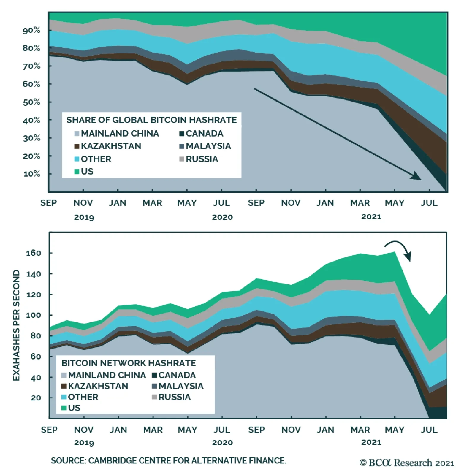
New data from the University of Cambridge shows the impact of China’s recent ban of cryptocurrencies on the structure of global Bitcoin mining. In 2019, China accounted for three quarters of global mining activity. As regulations tightened over the past few…
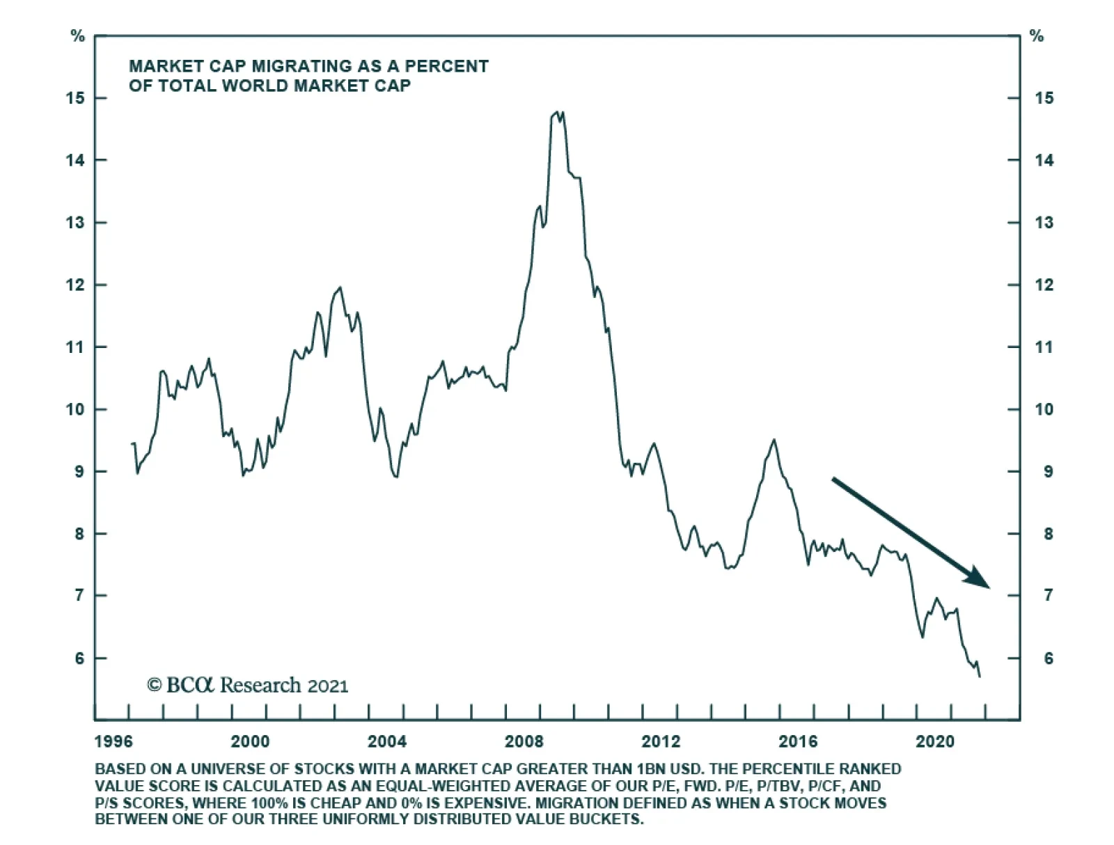
In a seminal paper, Fama and French describe the process of migration as the movement of stocks across different value buckets. An example is when stocks in the cheap bucket migrate to the neutral and expensive bucket, or when stocks in the expensive…
Highlights A perfect storm has engulfed global energy markets. Strong economic growth, adverse weather conditions, and politically-induced supply disruptions have caused energy prices to surge. Fortunately, the global economy has become less vulnerable to energy shocks. Not only has the energy intensity of the global economy declined over the past few decades, but central banks are now less inclined to respond to higher energy prices by raising interest rates. Stock returns have been positively correlated with oil prices over the past decade. This suggests that equities can withstand the current level of oil prices. Markets are betting that energy prices will come down. Yet, given the diminished feedback loop between higher energy prices and slower economic growth, energy prices can stay elevated for longer than the market is discounting. We remain long the December 2022 Brent Crude futures contract as well as the Russian ruble and the Brazilian real. Value stocks are a cheap and effective hedge against higher-than-expected inflation. A Perfect Storm For Energy Markets Global energy prices have soared (Chart 1). The price of crude, having fallen into negative territory in April 2020, currently trades at over $80 per barrel. Natural gas prices have jumped more than three-fold in the UK and across much of continental Europe since March. In the US, the price of natural gas has doubled. Chart 1Natural Gas Prices Have Dipped, But Are Still Up Massively On The Year
Natural Gas Prices Have Dipped, But Are Still Up Massively On The Year
Natural Gas Prices Have Dipped, But Are Still Up Massively On The Year
Chart 2Global Industrial Production Is Back Above Pre-Pandemic Levels
Global Industrial Production Is Back Above Pre-Pandemic Levels
Global Industrial Production Is Back Above Pre-Pandemic Levels
A perfect storm has driven up energy prices. The reopening of the global economy has supported energy demand. A surge in spending on goods has depleted inventories, forcing producers to ramp up output. Global industrial production is 8% higher than in January 2020 (Chart 2). Merchandise trade has recovered more quickly than expected (Chart 3). Chinese exports are up 28% from the start of the pandemic (Chart 4). Electricity consumption in China is running 7.5% above trend (Chart 5). Chart 3World Trade Has Recovered Faster Than Expected
The Global Energy Crisis: Causes And Consequences
The Global Energy Crisis: Causes And Consequences
Chart 4China's Export Sector Is Booming
China's Export Sector Is Booming
China's Export Sector Is Booming
Chart 5Strong Manufacturing Activity Has Pushed Up Electricity Demand In China
Strong Manufacturing Activity Has Pushed Up Electricity Demand In China
Strong Manufacturing Activity Has Pushed Up Electricity Demand In China
Weather has amplified the tightness in energy markets. A cold snap across the Northern Hemisphere this spring depleted natural gas supplies (Chart 6). Compounding the problem, a lack of wind reduced energy production by European wind farms, leading to a shift toward natural gas and coal for power generation. A hot summer in Northern Asia raised electricity demand. Flooding in China and Indonesia curbed coal output, while a drought in Brazil reduced hydroelectric generation. Chart 6Natgas Storage Remains Tight
The Global Energy Crisis: Causes And Consequences
The Global Energy Crisis: Causes And Consequences
Political Factors Policy developments have contributed to the dislocations in energy markets. China has been trying to wean itself off coal, which still accounted for 63% of electricity generation in 2020 (Chart 7). For a while, Australian coal imports made up for the lack of domestic coal production, but those disappeared last year following a diplomatic row between the two nations (Chart 8). To fill the energy gap, China has stepped up purchases of natural gas from Russia. Chart 7China Has Been Trying To Shift Away From Coal
The Global Energy Crisis: Causes And Consequences
The Global Energy Crisis: Causes And Consequences
Chart 8A Lack Of Aussie Coal Imports Has Depleted Chinese Coal Inventories
A Lack Of Aussie Coal Imports Has Depleted Chinese Coal Inventories
A Lack Of Aussie Coal Imports Has Depleted Chinese Coal Inventories
Never one to miss an opportunity, Russia has taken advantage of the natural gas shortage by pushing Germany to approve the newly completed Nord Stream 2 pipeline. The US$11 billion pipeline carries gas directly to Germany. Built under the Baltic Sea, it bypasses Ukraine and thus deprives the NATO-allied government in Kyiv of as much as $2 billion a year in transit fees. The pipeline was backed by outgoing chancellor Angela Merkel and has the strong support of the German public (Chart 9). However, opposition from the US has kept the project in limbo. Texas Senator Ted Cruz has blocked approval for President Biden’s nominees to various departmental posts in an effort to halt the pipeline. Chart 9Germans Say "Ja" To Nord Stream 2
The Global Energy Crisis: Causes And Consequences
The Global Energy Crisis: Causes And Consequences
Cruz has justified his actions on foreign policy grounds. However, economics has probably also played a role: The US is Europe’s top supplier of liquefied natural gas. Texas exported 2.5 trillion cubic feet of natural gas last year. It’s Not Just ESG Years of subpar investment in the energy sector have exacerbated the crisis. Globally, oil and gas capex is down 60% since 2014 (Chart 10). Proven global oil reserves increased by only 6% between 2010 and 2020, having risen by 26% over the preceding decade. Gas reserves followed a similar trajectory, increasing by only 5% between 2010 and 2020 compared to 30% over the prior ten years (Chart 11). It would be easy to blame ESG for this predicament, but the truth is that energy had been a lousy sector for investors until recently. The shares of global energy companies have risen just 25% since March 2009, compared to 315% for the MSCI All-Country World Index (Chart 12). Chart 10Energy Producers Have Not Been Investing Much In New Capacity
The Global Energy Crisis: Causes And Consequences
The Global Energy Crisis: Causes And Consequences
Chart 11Oil And Gas Reserves Have Barely Grown Over The Past Decade
The Global Energy Crisis: Causes And Consequences
The Global Energy Crisis: Causes And Consequences
The Global Economy Is Less Dependent On Energy Could the jump in energy prices torpedo growth? It is possible, but the bar for an energy-induced recession is much higher than in the past. The energy intensity of the global economy has fallen steadily over time, especially in advanced economies. Today, the US generates three-times as much output for every joule of energy consumed than it did in 1970 (Chart 13). Chart 12Low Returns On Capital Have Reduced Investment In The Energy Sector
Low Returns On Capital Have Reduced Investment In The Energy Sector
Low Returns On Capital Have Reduced Investment In The Energy Sector
Chart 13The Global Economy Has Become Less Energy Intensive Over Time
The Global Economy Has Become Less Energy Intensive Over Time
The Global Economy Has Become Less Energy Intensive Over Time
In the US, household spending on energy has declined from a peak of 8.3% of disposable income in 1980 to 3.5% in August 2021, the latest month of data. Chart 14When It Comes To Energy Production, The USA Is Now #1
When It Comes To Energy Production,The USA Is Now #1
When It Comes To Energy Production,The USA Is Now #1
While the recent run-up in energy prices will push up that number towards 4% in October, US consumers are well positioned to absorb the blow. Last week’s “disappointing” September jobs report saw private-sector employment rise by 317,000. Combined with an increase in the average length of the workweek, aggregate hours worked rose by 0.8% on the month – equivalent to 1,036,000 new private-sector jobs. Improved conditions for energy producers will also help insulate the US economy. The US now produces over 11 million barrels of oil per day, more than Saudi Arabia (Chart 14). Higher energy costs will exact more of a toll on European growth. However, as Mathieu Savary, BCA’s Chief European Strategist, recently argued, the region is likely to weather the storm given current strong growth momentum. Central Banks No Longer Fret Over Higher Oil Prices Helping matters is the fact that central banks are no longer responding to rising energy prices like they once did. Up until the Global Financial Crisis, the Fed would often lift rates whenever oil prices jumped (Chart 15). Since then, the Fed has looked through oil price fluctuations, a sensible strategy considering that core inflation is no longer highly correlated with oil prices (Chart 16). Chart 15Rising Oil Prices No Longer Scare The Fed
Rising Oil Prices No Longer Scare The Fed
Rising Oil Prices No Longer Scare The Fed
Chart 16Oil Spikes No Longer Feed Into Core Inflation Like They Used To
Core Inflation No Longer Driven By Oil Prices Oil Spikes No Longer Feed Into Core Inflation Like They Used To
Core Inflation No Longer Driven By Oil Prices Oil Spikes No Longer Feed Into Core Inflation Like They Used To
The ECB has also changed tack. Jean-Claude Trichet disastrously hiked rates when oil prices reached $140/bbl in 2008, just as the global economy was heading off a cliff. Having failed to learn from his mistake the first time around, he then pushed the ECB to raise rates two times in 2011, helping to set off the euro area debt crisis. Mario Draghi and Christine Lagarde have followed a different course. In her speeches, Lagarde has pushed back on any talk that the ECB will expedite policy normalization. “The lady isn’t tapering,” she said on September 9th, echoing Margaret Thatcher’s famous proclamation. Energy Prices Should Come Off The Boil, But Geopolitics And The Weather Are Wild Cards Chart 17US Rig Count Has Risen From Low Levels
US Rig Count Has Risen From Low Levels
US Rig Count Has Risen From Low Levels
Looking out, a number of factors should help restore balance to the energy market. The US rig count, while still far below its 2014 highs, has doubled since last year (Chart 17). It usually takes 6-to-9 months for a newly deployed rig to start producing output. China has instructed 170 coal mines to expand capacity. It has also allowed utilities to charge higher prices, helping to stave off bankruptcies across the sector. In addition, it is releasing some Australian coal from storage, potentially a first step towards restarting imports. Still, there are many wild cards at play that could cause energy prices to rise further. In addition to uncertainty over Chinese energy policy and the ongoing dispute over the Nord Stream 2 pipeline, the situation in Iran remains volatile. Matt Gertken, BCA’s Chief Geopolitical Strategist, believes that Iran could secure enough enriched uranium to make a nuclear device by the end of the year. In his opinion, “a crisis over Iran is imminent.” Any disruption of Middle Eastern energy flows will add to global supply bottlenecks and price pressures. Furthermore, there is continued uncertainty about OPEC’s strategy. So far, OPEC and its partners have been reluctant to boost production. The general feeling among market participants is that OPEC would increase output if oil prices rose towards $100/bbl for fear that excessively high prices would expedite the adoption of electric vehicles. At this point, however, that electric horse has left the barn. OPEC may simply decide that it is better to wrangle out as much revenue from its reserves while they still have value. Weather also remains a wild card. The US Climate Prediction Center estimates that there is a 70%-to-80% chance that La Niña will return this winter. La Niña typically results in colder temperatures across much of Western and Northern Europe, which would lead to higher electricity demand. Investment Implications Markets are betting that energy prices will come down. The futures curves are in backwardation (Chart 18). Investors expect oil, gas, and coal prices to decline over the coming months (Chart 19). Chart 18Energy Futures Are In Backwardation
Energy Futures Are In Backwardation
Energy Futures Are In Backwardation
Chart 19Investors Expect Commodity Prices To Fall
The Global Energy Crisis: Causes And Consequences
The Global Energy Crisis: Causes And Consequences
One does not need to bet on higher energy prices these days to make money from being long energy futures; one only needs to bet that prices will not fall as much as currently discounted. Given the diminished feedback loop between higher energy prices and slower economic growth, the view of BCA’s Commodity and Energy Strategy service, led by Bob Ryan, is that energy prices can stay elevated for longer than the market is discounting. Chart 20Stock Prices Are Now Positively Correlated With Oil
Stock Prices Are Now Positively Correlated With Oil
Stock Prices Are Now Positively Correlated With Oil
We remain long the December 2022 Brent Crude futures contract as well as the Russian ruble and the Brazilian real. Stock returns have been positively correlated with oil prices over the past decade (Chart 20). This suggests that equities can withstand the current level of oil prices. Some stocks will do better than others, however. Energy and banks are overrepresented in value indices (Table 1). Energy stocks will do well if oil prices remain buoyant (Chart 21). For their part, banks should also outperform the market if bond yields continue to drift higher (Chart 22). Table 1Breaking Down Growth And Value By Sector
The Global Energy Crisis: Causes And Consequences
The Global Energy Crisis: Causes And Consequences
Chart 21Higher Oil Prices Are A Tailwind For Energy Stocks
Higher Oil Prices Are A Tailwind For Energy Stocks
Higher Oil Prices Are A Tailwind For Energy Stocks
Chart 22Bank Stocks Tend To Outperform When Yields Rise
Bank Stocks Tend To Outperform When Yields Rise
Bank Stocks Tend To Outperform When Yields Rise
Chart 23Inflation Expectations Are Highly Correlated With Oil Prices
Inflation Expectations Are Highly Correlated With Oil Prices
Inflation Expectations Are Highly Correlated With Oil Prices
In fixed-income portfolios, we continue to prefer TIPS over nominal bonds. Chart 23 shows that the 5y/5y forward TIPS breakeven inflation is highly correlated with oil prices. Thus, overweighting TIPS remains an effective hedge against an oil spike. Peter Berezin Chief Global Strategist pberezin@bcaresearch.com Global Investment Strategy View Matrix
The Global Energy Crisis: Causes And Consequences
The Global Energy Crisis: Causes And Consequences
Special Trade Recommendations
The Global Energy Crisis: Causes And Consequences
The Global Energy Crisis: Causes And Consequences
Current MacroQuant Model Scores
The Global Energy Crisis: Causes And Consequences
The Global Energy Crisis: Causes And Consequences
Highlights The surge in energy prices going into the Northern Hemisphere winter – particularly coal and natgas prices in China and Europe – will push inflation and inflation expectations higher into the end of 1Q22 (Chart of the Week). Over the medium-term, similar excursions into the far-right tails of price distributions will become more frequent if capex in hydrocarbon-based energy sources continues to be discouraged, and scalable back-up sources of energy are not developed for renewables. It is not clear China will continue selectively relaxing price caps for some large electricity buyers, which came close to bankrupting power utilities this year and contributed to power shortages. The current market set-up favors long commodity index products like the S&P GSCI and the COMT ETF. We remain long both. Higher energy and metals prices also will work in favor of long-only commodity index exposure over the medium term. Longer-term supply-chain issues will be sorted out. Still, higher costs will be needed to incentivize production of the base metals required to decarbonize electricity production globally, and to keep sufficient supplies of fossil fuels on hand to back up renewable generation. This will cause inflation to grind higher over time. Feature Back in February, we were getting increasingly bullish base metals on the back of surging demand from China. Most other analysts were looking for a slowdown.1 The metals rally earlier this year drew attention away from the fact that China had fundamentally altered its energy supply chain, when it unofficially banned imports of Australian thermal coal. It also altered global energy flows and will, over the winter, push inflation higher in the short run. Building new supply chains is difficult under the best of circumstances. But last winter had added dimensions of difficulty: A La Niña drawing arctic weather into the Northern Hemisphere and driving up space-heating demand; flooding in Indonesia, which limited coal shipments to China; and a manufacturing boom that pushed power supplies to the limit. Over the course of this year, Chinese coal inventories fell to rock-bottom levels and set off a scramble for liquified natural gas (LNG) to meet space-heating and manufacturing demand last winter (Chart 2).2 Chart of the WeekEnergy-Price Surge Will Lift Inflation
Energy-Price Surge Will Lift Inflation
Energy-Price Surge Will Lift Inflation
Chart 2Coal Shortage China
China Power Outages: Another Source Of Downside Risk Coal Shortage China
China Power Outages: Another Source Of Downside Risk Coal Shortage China
While this was evolving, the volume of manufactured exports from China was falling (Chart 3), even while the nominal value of these exports was rising in USD terms (Chart 4). This is a classic inflationary set-up: More money chasing fewer goods. This is occurring worldwide, as supply-chain bottlenecks, power rationing and shortages, and falling commodity inventories keep supplies of most industrial commodities tight. China's export volumes peaked in February 2021, and moved lower since then. This likely persists going forward, given the falloff of orders and orders in hand (Chart 5). Chart 3Volume Of China's Exports Falls …
Inflation Surges, Slows, Then Grinds Higher
Inflation Surges, Slows, Then Grinds Higher
Chart 4… But The Nominal USD Value Rises
Inflation Surges, Slows, Then Grinds Higher
Inflation Surges, Slows, Then Grinds Higher
Chart 5China's Official PMIs, Export And In-Hand Orders Weaken
Inflation Surges, Slows, Then Grinds Higher
Inflation Surges, Slows, Then Grinds Higher
Space-heating and manufacturing in China are both heavily reliant on coal. Space-heating north of the Huai River is provided for free, or is heavily subsidized, from coal-fired boilers that pump heat to households and commercial establishments. This is a practice adopted from the Soviet Union in the 1950s and expanded until the 1980s, according to Fan et al (2020).3 Manufacturing pulls its electricity from a grid that produces 63% of its power from coal. China's coal output had been falling since December 2020, which complicated space heating and electricity markets, where prices were capped until this week. This meant electricity generators could not recover skyrocketing energy costs – coal in particular – and therefore ran the risk of bankruptcy.4 The loosening of price caps is now intended to relieve this pressure. Competition For Fuels Will Continue Europe was also hammered over the past year by a colder-than-normal winter brought on by a La Niña event, which sharply drew natgas inventories. The cold weather lingered into April-May, which slowed efforts to refill storage, and set off a scramble to buy up LNG cargoes (Chart 6). Chart 6The Scramble For Natgas Continues
Inflation Surges, Slows, Then Grinds Higher
Inflation Surges, Slows, Then Grinds Higher
This competition has lifted global LNG prices to record levels, and continues to drive prices higher. Longer-term, the logic of markets – higher prices beget higher supply, and vice versa – virtually assures supply chains will be sorted out. However, the cost of energy generally will have to increase to incentivize production of the base metals needed to pull off the decarbonization of electricity production globally, and to keep sufficient supplies of fossil fuels on hand to back up renewable generation. This will cause inflation to grind higher over time. Decarbonization is a strategic agenda for leading governments, especially China and the European Union. China is fully committed to renewables for fear of pollution causing social unrest at home and import dependency causing national insecurity abroad. In the EU, energy insecurity is also an argument for green policy, which is supported by popular opinion. The US has greater energy security than these two but does not want to be left behind in the renewable technology race – it is increasing government green subsidies. The current set of ruling parties will continue to prioritize decarbonization for the immediate future. Compromises will be necessary on a tactical basis when energy price pressures rise too fast, as with China’s latest measures to restart coal-fired power production. The strategic direction is unlikely to change for some time. Investment Implications Over time, a structural shift in forward price curves for oil, gas and coal – e.g., a parallel shift higher from current levels – will be required to incentivize production increases. This would provide hedging opportunities for the producers of the fuels used to generate electricity, and the metals required to build the infrastructure needed by the low-carbon economies of the future. We continue to expect markets to remain tight on the supply side, which will make backwardation – i.e., prices for prompt-delivery commodities trade higher than those for deferred delivery – a persistent feature of commodities for the foreseeable future. This is because inventories will remain under pressure, making commodity buyers more willing to pay up for prompt delivery. The current market set-up favors long commodity index products like the S&P GSCI and the COMT ETF. We remain long both, given our expectation. Over the short term, inflation will be pushed higher by the rise in coal and gas prices. Robert P. Ryan Chief Commodity & Energy Strategist rryan@bcaresearch.com Commodities Round-Up Energy: Bullish According to the Energy Information Administration (EIA), industrial consumption of natgas in the US is on track to surpass its five-year average this year. Over the January-July period, US natgas consumption average 22.4 BCF/d, putting it 0.2 BCF/d over its five-year average (2016-2020). US industrial consumption of natgas peaked in 2018-19 at just over 23 BCF/d, according to the EIA (Chart 7). The EIA expects full-year 2021 industrial consumption of natgas to be 23.1 BCF/d, which would tie it with the previous peak levels. Base Metals: Bullish Following a sharp increase in refined copper usage in China last year resulting from a surge in imports, the International Copper Study Group (ICSG) is expecting a 5% decline this year on the back of falling imports. Globally, the ICSG expects refined copper consumption to be unchanged this year, and rise 2.4% in 2022. Refined copper production is expected to be 25.9mm MT next year vs. 24.9mm MT this year. Consumption is forecast to grow to 25.6mm MT next year, up to 700k MT from the 24.96mm MT usage expected this year. Precious Metals: Bullish Lower-than-expected job growth in the US pushed gold prices higher at the end of last week on the back of expectations the Fed will continue to keep policy accessible as employment weakened. All the same, gold prices remain constrained by a well-bid USD, which continues to act as a headwind, and only minimal weakening of the 10-year US bond yield, which dipped slightly below the 1.61% level hit earlier in the week (Chart 8). Ags/Softs: Neutral This week's USDA World Agricultural Supply and Demand Estimates (WASDE) were mostly neutral for grains and bearish for soybeans. Global ending bean stocks are expected to rise almost 5.4% in the USDA's latest estimate for ending stocks in the current crop year, finishing at 104.6mm tons. Corn and rice ending stocks were projected to rise 1.4% and less than 1%, ending the crop year at 301.7mm tons and 183.6mm tons, respectively. According to the department, global wheat ending stocks are the lone standout, expected to fall 2.1% to 277.2mm tons, the lowest level since the 2016/17 crop year. Chart 7
Inflation Surges, Slows, Then Grinds Higher
Inflation Surges, Slows, Then Grinds Higher
Chart 8
Uncertainty Weighs On Gold
Uncertainty Weighs On Gold
Footnotes 1 Please see Copper Surge Welcomes Metal Ox Year, which we published on February 11, 2021. It is available at ces.bcaresearch.com. 2 China’s move to switch to Indonesian coal at the beginning of this year to replace Aussie coal was disruptive to global markets. As argusmedia.com reported, this was compounded by weather-related disruptions in Indonesian exports earlier this year. It is worthwhile noting, weather-related delays returned last month, with flooding in Indonesia's coal-producing regions again are disrupting coal shipments. We expect these new trade flows in coal will take a few more months to sort out, but they will be sorted. 3 Please see Maoyong Fan, Guojun He, and Maigeng Zhou (2020), " The winter choke: Coal-Fired heating, air pollution, and mortality in China," Journal of Health Economics, 71: 1-17. 4 In August and September, the South China Morning Post reported coal-powered electric generators petitioned authorities to relax price caps, because they faced bankruptcy from not being able to recover the skyrocketing cost of coal. Please see China coal-fired power companies on the verge of bankruptcy petition Beijing to raise electricity prices, published by scmp.com on September 10, 2021. This month, Shanxi Province, which provides about a third of China's domestically produced coal, was battered by flooding, which forced authorities to shut dozens of mines, according to the BBC. Please see China floods: Coal price hits fresh high as mines shut published by bbc.co.uk on October 12, 2021. Power supplies also were lean because of the central government's so-called dual-circulation policies to reduce energy consumption and the energy intensity of manufacturing. This is meant to increase self-reliance of the state. Please see What is behind China’s Dual Circulation Strategy? Published by the European think tank Bruegel on September 7, 2021. Investment Views and Themes Strategic Recommendations
Next week is the BCA Annual Conference, at which I will debate Professor Nouriel Roubini on ‘The Outlook For Cryptocurrencies’. I will make the passioned case for cryptos, and Nouriel will make the passioned case against. I do hope that many of you can join the debate, as well as the other insightful sessions at the conference. As such, there will be no report next week and we will be back on October 28. Highlights The anomaly of the current ‘inflation crisis’ is not that goods and commodity prices have surged. The anomaly is that state intervention protected services prices from a massive (and continuing) negative demand shock. Absent the state intervention, there would not be the current ‘inflation crisis’. On a 6-12-month horizon: Underweight the durables-heavy consumer discretionary sector versus the market. Underweight commodities that have not yet sharply corrected versus those that have sharply corrected. For example, underweight tin versus iron ore. From the current ‘inflation crisis’, the real surprise could be how low inflation ends up 12 months from now. Hence, stay overweight US T-bonds versus US TIPS. Fractal analysis: Natural gas, plus industrial metals versus industrial metal equities. Feature Chart of the WeekServices Prices Suffered In The Post-GFC Services Slump...
Services Prices Suffered In The Post-GFC Services Slump...
Services Prices Suffered In The Post-GFC Services Slump...
Chart of the Week...But Not In The Post-Pandemic Services Slump. Why Not?
...But Not In The Post-Pandemic Services Slump. Why Not?
...But Not In The Post-Pandemic Services Slump. Why Not?
The great writers, artists, and musicians tell us that the most profound messages often come from what is not said, not painted, and not played. What does not happen is sometimes more significant than what does happen. In this vein, we believe that the real story of the current ‘inflation crisis’ is not what has happened to goods and commodity prices, but what has not happened to services prices. The real story is that while goods and commodity prices have reacted exactly as would be expected to a positive demand shock, services prices have not reacted as would be expected to the mirror-image negative demand shock. The Anomaly Is Not Goods Prices, It Is Services Prices The following analysis quantifies the impact of the pandemic on different parts of the economy by examining the deviations of current spending and prices from their pre-pandemic trends. The analysis uses US data simply because of its timeliness and granularity, but the broad patterns and conclusions apply equally to most other developed economies. Looking at the overall economy, we know that, thus far, we have experienced neither a lasting negative demand shock from the pandemic, nor a lasting positive demand shock from the ensuing stimulus. We know this, because current spending is not far short of its pre-pandemic trend. The real story of the current ‘inflation crisis’ is not what has happened to goods and commodity prices, but what has not happened to services prices. Yet when we drill down to the components of spending, we see a different story. The pandemic and its policy response unleashed a massive and unprecedented displacement of spending from services to goods (Chart I-2). Chart I-2The Pandemic Unleashed A Massive Displacement Of Spending From Services To Goods
The Pandemic Unleashed A Massive Displacement Of Spending From Services To Goods
The Pandemic Unleashed A Massive Displacement Of Spending From Services To Goods
By March 2021, while US spending on services was still below its pre-pandemic trend by $700 billion, or 8 percent, the displacement of those dollars of spending had boosted spending on the smaller durable goods component by 26 percent. Suffice to say, a 26 percent excess demand for durable goods cannot be satisfied by a modern manufacturing sector that utilises just-in-time supply chains and negligible spare capacity! As surging demand met relatively fixed supply, the price of durable goods skyrocketed to the current 11 percent above its pre-pandemic trend (Chart I-3). Chart I-3The Inflation In Durables Prices Is Rational, The Absence Of Deflation In Services Prices Is Irrational
The Inflation In Durables Prices Is Rational, The Absence Of Deflation In Services Prices Is Irrational
The Inflation In Durables Prices Is Rational, The Absence Of Deflation In Services Prices Is Irrational
It follows that the inflation in durables prices is the perfectly rational outcome of a classic positive demand shock – meaning, surging demand in the face of limited supply. What is much less rational is that a massive negative demand shock for services has had almost no negative impact on services prices. This is the untold story of the current ‘inflation crisis’ which requires further explanation. Government Intervention Prevented A Collapse In Services Prices If the pandemic had unleashed a classic negative demand shock for services, then services prices would have collapsed. We know this because in the aftermath of the global financial crisis (GFC), services prices fell below their pre-GFC trend exactly in line with the decline in services demand. But in the aftermath of the pandemic’s massive negative shock for services spending, services prices have remained on their pre-pandemic trend (Chart of the Week). The question is, how? The answer is that this was not a classic negative demand shock. The reason that service spending collapsed was that a large swathe of services – such as leisure and hospitality – became unavailable because of mandated shutdowns or lockdowns. In this case, there was no point in reducing prices to reattract demand from durable goods because nobody could buy these services anyway! In effect, while the goods sector remained subject to market forces, a large swathe of the service sector came under state intervention, and was no longer subject to market forces. Meanwhile, statisticians continued to record the seemingly unaffected price of eating out or going to the theatre, even though most restaurants and entertainment venues were shuttered, making their prices meaningless. Absent state intervention in the services sector, we would not be talking about the current ‘inflation crisis’. Absent state intervention, these service providers would have had to reduce their prices to attract wary consumers amid a pandemic. This we know from Sweden, the one major economy that did not have any mandated shutdowns or lockdowns. While leisure and hospitality have remained largely open, Sweden’s services prices have declined markedly from their pre-pandemic trend – in sharp contrast to the unchanged trend in the US (Chart I-4). Chart I-4Services Prices Have Declined In Non-Interventionist Sweden, But Not In The Interventionist US
Services Prices Have Declined In Non-Interventionist Sweden, But Not In The Interventionist US
Services Prices Have Declined In Non-Interventionist Sweden, But Not In The Interventionist US
Hence, while inflation now stands at a sedate 2 percent in Sweden, it stands at a hot 5 percent in the US. If the US (and other country) governments had not intervened in the services sector, then the evidence from the GFC in 2008 and Sweden today strongly suggests that services prices would be below their pre-pandemic trend, offsetting goods prices that are above their pre-pandemic trend. The result would be that the overall price level would be on, or close to, its pre-pandemic trend. Just as overall spending is on its pre-pandemic trend. To repeat the key message of this analysis, the anomaly in most economies is not that goods and commodity prices have surged. The price surge is the perfectly rational response to a positive demand shock. The anomaly is that services prices did not react negatively to a negative demand shock (Chart I-5 and Chart I-6), as they did post-GFC and post-pandemic in non-interventionist Sweden. Chart I-5The Anomaly Is Not That Goods Prices ##br##Rose...
The Anomaly Is Not That Goods Prices Rose...
The Anomaly Is Not That Goods Prices Rose...
Chart I-6...The Anomaly Is That Services Prices Did Not Fall
...The Anomaly Is That Services Prices Did Not Fall
...The Anomaly Is That Services Prices Did Not Fall
The untold story is that, absent state intervention in the services sector, we would not be talking about the current ‘inflation crisis’. What Happens Next? The surging demand for durables is correcting. Since March, it is already down by 15 percent but requires a further 7 percent decline to reach its pre-pandemic trend, which we fully expect to happen. After all, there are only so many smartphones and used cars that you can own! Meanwhile, as manufacturers respond with a lag to recent high prices, expect a tsunami of durables supply to hit in 6-12 months just as demand has fallen off a cliff. The result will be a major threat to any durable good or commodity price that has not already corrected. As a salutary warning of what lies ahead, witness the recent 75 percent crash in lumber prices. The same principle applies to non-durables such as food and energy. Non-durables spending is likely to fall back to its pre-pandemic trend, and non-durables prices are likely to follow. Again, outside a short-lived surge in demand from, say, a very cold winter, there is only so much energy and food that you can consume. For services, there are two opposing forces. The inflationary force is that the recent inflation in goods will transmit into wages and therefore into services prices. Against this, the deflationary force is that structural changes, such as hybrid home/office working, mean that services spending will struggle to make the near 6 percent increase to reach its pre-pandemic trend. Underweight the durables-heavy consumer discretionary sector versus the market. Pulling these effects together, we reiterate three investment recommendations on a 6-12 month horizon: Underweight the durables-heavy consumer discretionary sector versus the market (Chart I-7). Underweight commodities that have not yet sharply corrected versus those that have sharply corrected. For example, underweight tin versus iron ore. From the current ‘inflation crisis’, the real surprise could be how low inflation ends up 12 months from now. Hence, stay overweight US T-bonds versus US TIPS. Chart I-7As Durables Spending Normalises, The Durables-Heavy Consumer Discretionary Sector Underperforms
As Durables Spending Normalises, The Durables-Heavy Consumer Discretionary Sector Underperforms
As Durables Spending Normalises, The Durables-Heavy Consumer Discretionary Sector Underperforms
Natural Gas Prices Are Technically Extreme The surge in natural gas prices in both Europe and the US has reached a point of extreme fragility on its 130-day fractal structure. Hence, if the tight fundamentals show the slightest signs of abating, natural gas prices would be vulnerable to a sharp reversal (Chart I-8). Chart I-8Natural Gas Prices Are Technically Extreme
Natural Gas Prices Are Technically Extreme
Natural Gas Prices Are Technically Extreme
Elsewhere, we see an arbitrage opportunity between industrial metal prices, which are still close to highs, and industrial metal equities, which have plunged by 20 percent since May. The relationship between the underlying metal prices and the metals equities sector is now stretched versus its history, and on its composite 65/130-day fractal structure (Chart I-9). Chart I-9The Relationship Between Metal Prices And Metal Equities Is Stretched
The Relationship Between Metal Prices And Metal Equities Is Stretched
The Relationship Between Metal Prices And Metal Equities Is Stretched
Hence, the recommended trade is to go short the LMEX Index/ long nonferrous metals equities. One way to implement the long side of the pair is through the ETF PICK. Set the profit target and symmetrical stop-loss at 8 percent. Dhaval Joshi Chief Strategist dhaval@bcaresearch.com Fractal Trading System Fractal Trades 6-Month Recommendations Structural And Thematic Recommendations Closed Fractal Trades Indicators To Watch - Bond Yields Chart II-1Indicators To Watch - Bond Yields ##br##- Euro Area
Indicators To Watch - Bond Yields - Euro Area
Indicators To Watch - Bond Yields - Euro Area
Chart II-2Indicators To Watch - Bond Yields ##br##- Europe Ex Euro Area
Indicators To Watch - Bond Yields - Europe Ex Euro Area
Indicators To Watch - Bond Yields - Europe Ex Euro Area
Chart II-3Indicators To Watch - Bond Yields ##br##- Asia
Indicators To Watch - Bond Yields - Asia
Indicators To Watch - Bond Yields - Asia
Chart II-4Indicators To Watch - Bond Yields ##br##- Other Developed
Indicators To Watch - Bond Yields - Other Developed
Indicators To Watch - Bond Yields - Other Developed
Indicators To Watch - Interest Rate Expectations Chart II-5Indicators To Watch - Interest Rate Expectations
Indicators To Watch - Interest Rate Expectations
Indicators To Watch - Interest Rate Expectations
Chart II-6Indicators To Watch - Interest Rate Expectations
Indicators To Watch - Interest Rate Expectations
Indicators To Watch - Interest Rate Expectations
Chart II-7Indicators To Watch - Interest Rate Expectations
Indicators To Watch - Interest Rate Expectations
Indicators To Watch - Interest Rate Expectations
Chart II-8Indicators To Watch - Interest Rate Expectations
Indicators To Watch - Interest Rate Expectations
Indicators To Watch - Interest Rate Expectations
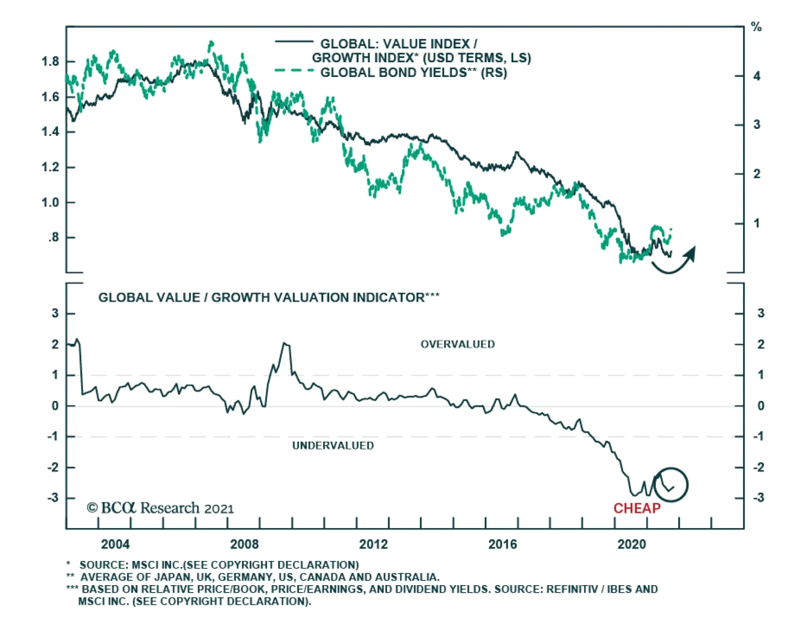
The direction of global monetary policy is shifting in a more hawkish direction. Among major DM central banks, the Norges Bank has already implemented its first rate hike. The RBNZ, BoE, and BoC are expected to follow suit before mid-2022. Similarly,…