Global

Dear Client, There will be no report next week as we will be working on our Quarterly Strategy Outlook, which will be published the following week. In the meantime, please keep an eye out for BCA Research’s Annual Outlook, featuring long-time BCA client Mr. X, who visits towards the end of each year to discuss the economic and financial market outlook for the year ahead. Best regards, Peter Berezin Chief Global Strategist Highlights Inflation in the US, and to a lesser extent, in other major economies, will follow a “two steps up, one step down” trajectory of higher highs and higher lows. While inflation will fall in the first half of next year as goods prices stabilize, an overheated labor market will cause inflation to re-accelerate into 2023. The Fed will be slow to respond to high inflation, implying that monetary policy will remain accommodative next year. This should help propel stocks to new highs. Chinese stimulus will offset much of the drag from a weaker domestic property market. The dollar is a high momentum currency, so we wouldn’t bet against the greenback in the near term. Nevertheless, with “long dollar” now a consensus trade, we would position for a weaker dollar over a 12-month horizon. A depreciating dollar next year should help non-US equities, especially beleaguered emerging market stocks. The dollar will strengthen anew in 2023, as the Fed is forced to turn more hawkish, and global equities begin to buckle. From Ice To Fire In past reports, we have contended that inflation in the US, and to a lesser extent, in other major economies, would follow a “two steps up, one step down” trajectory of higher highs and higher lows. We are currently near the top of those two steps. The pandemic ushered in a major re-allocation of spending from services to goods (Chart 1). US inflation should dip over the next 6-to-9 months as the demand for goods decelerates and supply-chain disruptions abate. Chart 1The Pandemic Caused A Major Shift In Spending From Services To Goods
The Pandemic Caused A Major Shift In Spending From Services To Goods
The Pandemic Caused A Major Shift In Spending From Services To Goods
CHart 2Those With Low Paid Jobs Are Enjoying Stronger Wage Gains
Those With Low Paid Jobs Are Enjoying Stronger Wage Gains
Those With Low Paid Jobs Are Enjoying Stronger Wage Gains
The respite from inflation will not last long, however. The labor market is heating up. So far, most of the wage growth has been at the bottom end of the income distribution (Chart 2). Wage growth will broaden over the course of 2022, setting the scene for a price-wage spiral in 2023. We doubt that either fiscal or monetary policy will tighten fast enough to prevent such a spiral from emerging. As a result, US inflation will surprise meaningfully on the upside. Our view has no shortage of detractors. In this week’s report, we address the main counterarguments in a Q&A format: Q: What makes you think that service spending will rebound fast enough to offset the drag from weaker goods consumption? Chart 3Inventory Restocking Could Be A Source Of Growth Next Year
Inventory Restocking Could Be A Source Of Growth Next Year
Inventory Restocking Could Be A Source Of Growth Next Year
A: There is still a lot of pent-up demand for goods. Try calling any auto dealership. You will hear the same thing: “We have nothing in stock now, but if you put in an order today, you might get a vehicle in 3-to-6 months.” Thus, durable goods sales are unlikely to weaken quickly. And with inventories near record low levels, firms will need to produce more than they sell (Chart 3). Inventory restocking will support GDP growth. As for services, real spending in the US grew by 7.9% in the third quarter, an impressive feat considering that this coincided with the Delta-variant wave. Service growth will stay strong in the fourth quarter. The ISM non-manufacturing index jumped to a record high of 66.7 in October, up from 61.9 in September. The Atlanta Fed’s GDPNow model is tracking real PCE growth of 9.2% in Q4. Goldman’s Current Activity Indicator has hooked up (Chart 4).
Chart 4
Q: Aren’t you worried that spending on services might stall next year? A: Not really. Chart 5 shows the percentage change in real spending for various types of services from January 2020 to September 2021, the last month of available data.
Chart 5
Chart 6
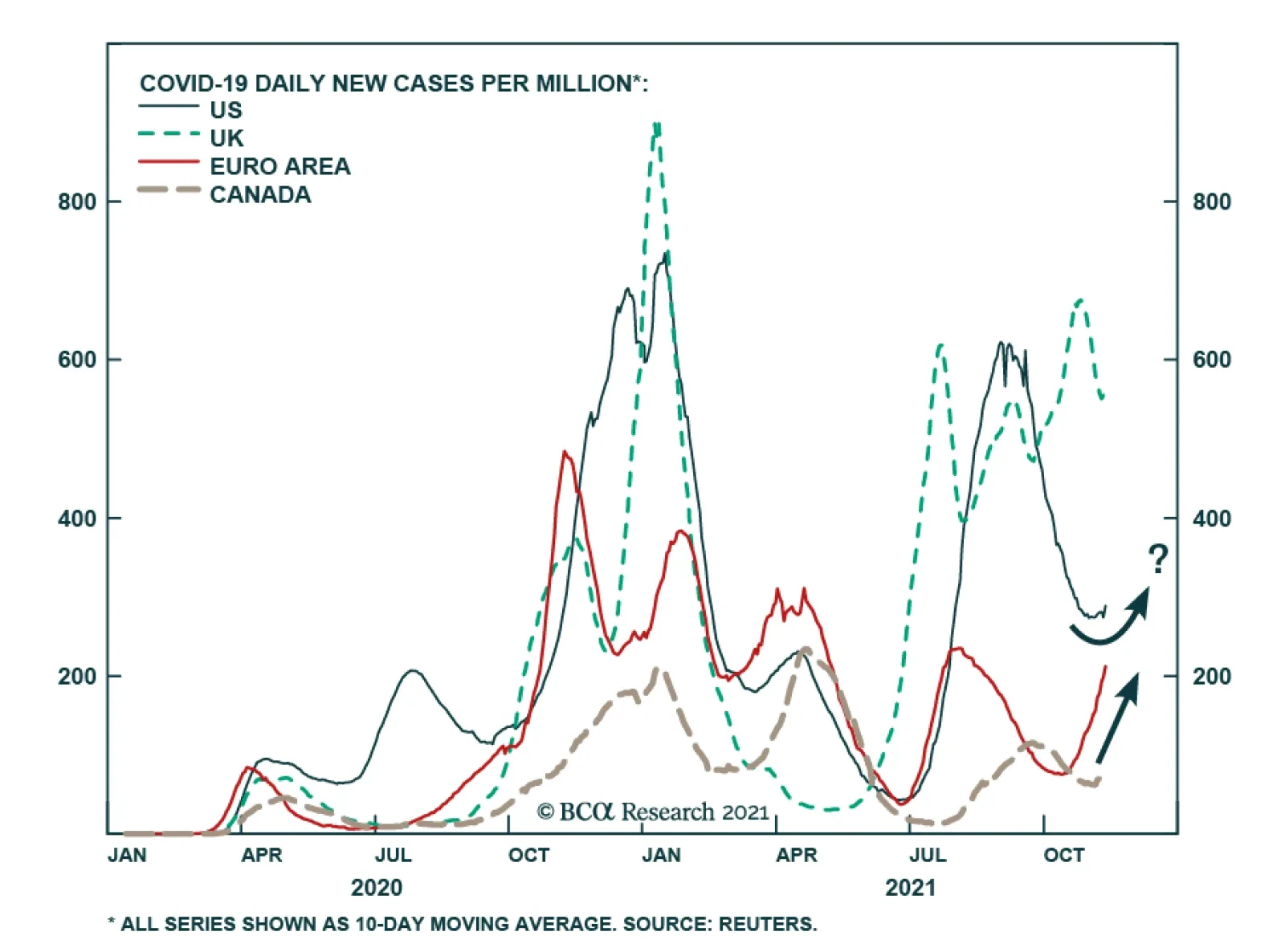
The greatest decline in spending occurred in those sectors that were most directly affected by the pandemic. Notably, spending on movie theaters, amusement parks, and live entertainment in September was still down 46% on a seasonally-adjusted basis compared to last January. Hotel spending was down 22%. Spending on public transport was down 26%. Only spending on restaurants was back to normal. The number of Covid cases has once again started to trend higher in the US, so that path to normalization will take time (Chart 6). Nevertheless, with vaccination rates still edging up and new antiviral drugs set to hit the market, it is reasonable to assume that many of the hardest-hit service categories will recover next year. Q: What about medical services? Some have speculated that the shift to telemedicine will require much lower spending down the road. A: It is true that spending on outpatient services in September was $43 billon below pre-pandemic levels. However, over two-fifths of that shortfall was in dental services, which are not amenable to telemedicine. Spending on dental services was down 16% from its January 2020 levels, compared to 6% for physician services. A more plausible theory is that many people are still worried about venturing to the doctor’s or dentist’s office. In addition, a lot of elective procedures were canceled or postponed due to the pandemic. Clearing that backlog will lift medical spending next year. Chart 7The Flow Of Savings Has Fallen Back To Pre-Pandemic Levels But The Stock Of Accumulated Savings Remains High
The Flow Of Savings Has Fallen Back To Pre-Pandemic Levels But The Stock Of Accumulated Savings Remains High
The Flow Of Savings Has Fallen Back To Pre-Pandemic Levels But The Stock Of Accumulated Savings Remains High
In any case, the cost of a telemedicine appointment is typically no different from an in-person one. And, to the extent that telemedicine does become more widespread, this could encourage more people to seek medical assistance. Lastly, even if spending on certain services does not fully recover after the pandemic, this will probably simply result in a permanent increase in spending on goods. The only way that overall consumer spending will falter is if the savings rate rises, which seems unlikely to us. Q: Why do you say that? The savings rate has been very high throughout the pandemic. A: The savings rate did spike during the pandemic, but that was mainly because fewer services were available, and because households were getting transfer payments from the government. Now that these payments have ended, the savings rate has dropped to 7.5%, roughly where it was prior to the pandemic. There is good reason to think the savings rate will keep falling next year. Households are sitting on $2.3 trillion in excess savings, most of which reside in bank deposits (Chart 7). As they run down those savings, consumption will rise in relation to income. The household deleveraging cycle is over. After initially plunging during the pandemic, credit card balances are rising (Chart 8). Banks are eager to make consumer loans (Chart 9). Household net worth has risen by over 100% of GDP since the start of the pandemic (Chart 10). As we discussed three weeks ago, the wealth effect alone could boost annual consumer spending by up to 4% of GDP. Chart 8APost-GFC Deleveraging Has Ended And People Are Swiping Credit Cards Again Following The Pandemic Scare
Post-GFC Deleveraging Has Ended And People Are Swiping Credit Cards Again Following The Pandemic Scare
Post-GFC Deleveraging Has Ended And People Are Swiping Credit Cards Again Following The Pandemic Scare
Chart 8BPost-GFC Deleveraging Has Ended And People Are Swiping Credit Cards Again Following The Pandemic Scare
Post-GFC Deleveraging Has Ended And People Are Swiping Credit Cards Again Following The Pandemic Scare
Post-GFC Deleveraging Has Ended And People Are Swiping Credit Cards Again Following The Pandemic Scare
Chart 9Banks Are Easing Credit Standards For Consumer Loans
Banks Are Easing Credit Standards For Consumer Loans
Banks Are Easing Credit Standards For Consumer Loans
Chart 10A Record Rise In Household Net Worth
A Record Rise In Household Net Worth
A Record Rise In Household Net Worth
Q: Household wealth could fall as the Fed starts tapering and eventually raising rates. Wouldn’t that cool the economy? A: The taper is a fait accompli, and markets are already pricing in rate hikes starting in the second half of next year. If the Fed were to signal its intention to raise rates more quickly than what has been priced in, then home prices and stocks could certainly weaken. We do not think the Fed will pivot in a more hawkish direction before the end of next year, however. The Fed’s estimate of the neutral rate is only 2.5%, a big step down from its estimate of 4.25% in 2012. The market’s view is broadly in line with the Fed’s (Chart 11). Despite the upward move in realized inflation, long-term inflation expectations remain in check – expected inflation 5-to-10 years out in the University of Michigan survey has increased from 2.3% in late 2019 to 2.9%, bringing it back to where it was between 2010 and 2015. The 5-year/ 5-year forward TIPS breakeven inflation rate is near the bottom end of the Fed’s comfort zone (Chart 12). Chart 11The Fed And Investors Still Believe In Secular Stagnation
The Fed And Investors Still Believe In Secular Stagnation
The Fed And Investors Still Believe In Secular Stagnation
Chart 12Long-Term Inflation Expectations Are Not Yet A Concern For The Fed
Long-Term Inflation Expectations Are Not Yet A Concern For The Fed
Long-Term Inflation Expectations Are Not Yet A Concern For The Fed
Q: What about fiscal policy? Isn’t it set to tighten sharply next year? A: The US budget deficit will decline next year. However, this will happen against the backdrop of strong private demand growth. Moreover, budget deficits are likely to remain elevated in the post-pandemic period. This week, President Biden signed a $1.2 trillion infrastructure bill into law, containing $550 billion in new spending. BCA’s geopolitical strategists expect Congress to pass a $1.5-to-$2 trillion social spending bill using the reconciliation process. All in all, the IMF foresees the US cyclically-adjusted primary budget deficit averaging 4.9% of GDP between 2022 and 2026, compared to 2.0% of GDP between 2014 and 2019 (Chart 13).
Chart 13
Chart 14While Overall Consumption Has Recovered, Business Spending and Direct Government Expenditures Remain Below Trend
While Overall Consumption Has Recovered, Business Spending and Direct Government Expenditures Remain Below Trend
While Overall Consumption Has Recovered, Business Spending and Direct Government Expenditures Remain Below Trend
It should also be noted that government spending on goods and services has been quite weak over the past two years (Chart 14). The budget deficit surged because transfer payments exploded. Unlike direct government spending, which is set to accelerate over the next few years, households saved a large share of transfer payments. Thus, the fiscal multiplier will increase next year, even as the budget deficit shrinks. Q: We have focused a lot on demand, but what about supply? There are over 4 million fewer Americans employed today than before the pandemic and yet the job openings rate is near a record high. Chart 15Despite A Notable Decline, There Are Still A Lot Of People Avoiding Work Because Of Worries About Contracting Or Transmitting Covid
Despite A Notable Decline, There Are Still A Lot Of People Avoiding Work Because Of Worries About Contracting Or Transmitting Covid
Despite A Notable Decline, There Are Still A Lot Of People Avoiding Work Because Of Worries About Contracting Or Transmitting Covid
A: Some people who left the workforce will regain employment. According to the Census Bureau’s Household Pulse Survey, there are still 2.5 million people not working because they are afraid of catching or transmitting the virus (Chart 15). That said, some workers may remain sidelined for a while longer. The very same survey also revealed that about 8 million of the 100 million workers currently subject to vaccine mandates say that “they will definitely not get the vaccine.” In addition, about 3.6 million workers have retired since the start of the pandemic, about 1.2 million more than one would have expected based on pre-existing demographic trends. Most of these retirees will not work again. Lifestyle choices may keep others from seeking employment. Female labor participation has declined much more during the pandemic and than it did during the Great Recession (Chart 16). While many mothers will re-enter the labor force now that schools have reopened, some may simply choose to stay at home.
Chart 16
The bottom line is that the pandemic has reduced labor supply at a time when labor demand remains very strong. This is likely to exacerbate the labor shortage. Q: Any chance that higher productivity will offset some of the damage to the supply side of the economy from decreased labor participation? A: US labor productivity did increase sharply during the initial stages of the pandemic. However, that appears to have been largely driven by composition effects in which low-skilled, poorly-paid service workers lost their jobs. As these low-skilled workers have returned to the labor force, productivity growth has dropped. The absolute level of productivity declined by 5.0% at an annualized rate in the third quarter, leading to an 8.3% increase in labor costs. It is telling that productivity growth has been extremely weak outside the US (Chart 17). This gives weight to the view that the pandemic-induced changes in business practices have not contributed to higher productivity, at least so far. It is also noteworthy that a recent study of 10,000 skilled professionals at a major IT company revealed that work-from-home policies decreased productivity by 8%-to-19%, mainly because people ended up working longer. Increased investment spending should eventually boost productivity. Core capital goods orders, which lead corporate capex, are up 18% since the start of the pandemic (Chart 18). However, the near-term impact of increased investment spending will be to boost aggregate demand, stoking inflation in the process.
Chart 17
Chart 18US Capex Should Pick Up
US Capex Should Pick Up
US Capex Should Pick Up
Q: We have spoken a lot about the US, but the world’s second biggest economy, China, is facing a massive deflationary shock from the implosion of its real estate market. Could that deflationary impulse potentially cancel out the inflationary impulse from an overheated US economy? A: You are quite correct that inflation has risen the most in the US. While inflation has picked up in Europe, this mainly reflects base effects (Chart 19). Inflation in China has fallen since the start of the pandemic despite booming exports. There are striking demographic parallels between China today and Japan in the early 1990s. The bursting of Japan’s property bubble corresponded with a peak in the country’s working-age population (Chart 20). China’s working-age population has also peaked and is set to decline by more than 40% over the remainder of the century. Chart 19The US Stands Out As The Inflation Leader
The US Stands Out As The Inflation Leader
The US Stands Out As The Inflation Leader
Chart 20Demographic Parallels Between China And Japan
Demographic Parallels Between China And Japan
Demographic Parallels Between China And Japan
That said, there are important differences between the two nations. In 1990, Japan was a rich economy; output-per-hour was nearly 70% of US levels. China is still a middle-income economy; output-per-hour is only 20% of US levels (Chart 21). China has the ability to outgrow some of its problems in a way that Japan did not. In addition, Chinese policymakers have learned from some of Japan’s mistakes. They have been trying to curb the economy’s dependence on property development; real estate development investment has fallen from 12% of GDP in 2014 to less than 10% of GDP (Chart 22). China is still building too many new homes, but unlike Japan in the 1990s, the government is likely to pursue stimulus measures to compensate for a shrinking property sector. This should keep the economy from entering a deflationary slump.
Chart 21
Chart 22Real Estate Investment Has Peaked In China
Real Estate Investment Has Peaked In China
Real Estate Investment Has Peaked In China
Q: Let’s bring this back to markets. What is the main investment takeaway from your view? A: The main takeaway is that investors should remain bullish on stocks and other risk assets for the next 12 months but be prepared to turn more cautious in 2023. The neutral rate of interest in the US is higher than generally assumed. This means that monetary policy is currently more accommodative than widely believed, which is good for stocks. Unfortunately, it also means that a policy error is likely: The Fed will keep rates too low for too long, causing the economy to overheat. Chart 23Bank Stocks Tend To Outperform When Yields Rise
Bank Stocks Tend To Outperform When Yields Rise
Bank Stocks Tend To Outperform When Yields Rise
This overheating will not be evident over the next six months. As we noted at the outset of this report, the US economy is currently at the top of the proverbial two steps in our projected “two steps up, one step down” trajectory for inflation. The cresting in durable goods inflation will provide a temporary respite from inflationary worries, even as the underlying long-term driver of higher inflation – an increasingly tight labor market – gains traction. Strong consumer demand and persistent labor shortages will incentivize companies to invest in new capacity and automate production. This will benefit industrial stocks and select tech names. Rising bond yields will also boost bank shares (Chart 23). A country’s current account balance is simply the difference between what it saves and what it invests. With savings on the downswing and investment on the upswing, the US will find it increasingly difficult to finance its burgeoning trade deficit. The US dollar is a high momentum currency, so we wouldn’t necessarily bet against the greenback in the near term (Chart 24). Nevertheless, with “long dollar” now a consensus trade, we would position for a weaker dollar over a 12-month horizon (Chart 25).
Chart 24
Chart 25Long Dollar Is A Crowded Trade
Long Dollar Is A Crowded Trade
Long Dollar Is A Crowded Trade
Chart 26A Depreciating Dollar Next Year Should Help Non-US Equities
A Depreciating Dollar Next Year Should Help Non-US Equities
A Depreciating Dollar Next Year Should Help Non-US Equities
A depreciating dollar next year should help non-US equities, especially beleaguered emerging markets (Chart 26). The dollar will strengthen anew in 2023, as the Fed is forced to turn more hawkish, and global equities begin to buckle. Peter Berezin Chief Global Strategist pberezin@bcaresearch.com Global Investment Strategy View Matrix
Image
Special Trade Recommendations
Image
Current MacroQuant Model Scores
Image
BCA Research’s European Investment Strategy service expects an improvement in economic surprises to support the euro and European small-cap stocks in 2022. First, investors and analysts around the world rightfully expect a slowdown in global growth next…
Europe is once again at the center of the pandemic. On Friday, the WHO reported that two million COVID-19 cases were reported in Europe last week – an all-time high. Governments are responding. A three-week partial lockdown began in the Netherlands on…
Highlights US growth will slow next year, not because demand will falter, but because supply-side constraints will prevent the economy from producing as much output as households and businesses want to buy. If aggregate demand exceeds aggregate supply, the price level will rise. We argue that the US aggregate demand curve is currently quite steep. This implies that the price level may need to rise a lot to restore balance to the economy. In fact, if the aggregate demand curve is not just steep but upward-sloping, which is quite possible, there may be no price level that brings aggregate demand in line with supply; the US economy could go supernova. When supply is the binding constraint to growth, investors need to throw the old playbook for dealing with growth slowdowns out the window. Rather than positioning for lower bond yields, investors should position for higher yields. Rather than expecting a stronger dollar, investors should expect a weaker one. Rather than favoring growth stocks, large caps, and defensives, investors should favor value stocks, small caps, and cyclicals. The Binding Constraint To Growth Is Now Supply After a post-Delta wave rebound in Q4, the US economy is expected to slow over the course of 2022. The Bloomberg consensus is for US growth to decelerate from 4.9% in 2021Q4 to 4.1% in 2022Q1, 3.9% in 2022Q2, 3.0% in 2022Q3, and 2.5% in 2022Q4. Growth in the first quarter of 2023 is expected to dip further to 2.3%. We agree that US growth will slow next year but think the market narrative around this slowdown is misguided. Chart 1Plenty Of Pent-Up Demand
Plenty Of Pent-Up Demand
Plenty Of Pent-Up Demand
The standard market playbook for dealing with an economic slowdown is to position for lower bond yields, a stronger US dollar, and a decline in commodity prices. On the equity side, the playbook calls for shifting equity exposure from cyclicals to defensives, favoring large caps over small caps, and growth stocks over value stocks. There are two major problems with this narrative. First, growth is peaking at much higher levels than before and is unlikely to return to trend at least until the second half of 2023. Second, and more importantly, US growth will slow due to supply-side constraints rather than inadequate demand. US final demand will remain robust for the foreseeable future. Households are sitting on $2.3 trillion in excess savings, equivalent to 15% of annual consumption (Chart 1). The household deleveraging cycle is over. After initially plunging during the pandemic, credit card balances are rising (Chart 2). Banks are falling over themselves to make consumer loans (Chart 3). Chart 2Revolving Credit On The Rise Again
Revolving Credit On The Rise Again
Revolving Credit On The Rise Again
Chart 3Banks Are Easing Credit Standards For Consumers
Banks Are Easing Credit Standards For Consumers
Banks Are Easing Credit Standards For Consumers
Chart 4A Record Rise In Household Net Worth
A Record Rise In Household Net Worth
A Record Rise In Household Net Worth
Household net worth has risen by over 100% of GDP since the start of the pandemic (Chart 4). As we discussed two weeks ago, the wealth effect alone could boost annual consumer spending by up to 4% of GDP. Investment demand should remain strong. Business inventories are near record low levels (Chart 5). Core capital goods orders, a leading indicator for corporate capex, have soared (Chart 6). Chart 5Business Inventories Are Near Record Low Levels
Business Inventories Are Near Record Low Levels
Business Inventories Are Near Record Low Levels
Chart 6Rise In Durable Goods Orders Bodes Well For Capex
Rise In Durable Goods Orders Bodes Well For Capex
Rise In Durable Goods Orders Bodes Well For Capex
Chart 7The Homeowner Vacancy Rate Is Signaling The Need For More Homebuilding
The Homeowner Vacancy Rate Is Signaling The Need For More Homebuilding
The Homeowner Vacancy Rate Is Signaling The Need For More Homebuilding
The Dodge Momentum Index, which tracks planned nonresidential construction, rose to a 13-year high in October. The homeowner vacancy rate is at multi-decade lows, signifying the need for more homebuilding (Chart 7). While increased investment will augment the nation’s capital stock down the road, the short-to-medium term effect will be to inflate demand. Policy Won’t Tighten Enough To Cool The Economy What is the mechanism that will push down aggregate demand growth towards potential GDP growth? It is unlikely to be policy. While budget deficits will narrow over the next few years, the IMF still expects the US cyclically-adjusted primary budget deficit to be nearly 3% of GDP larger between 2022 and 2026 than it was between 2014 and 2019 (Chart 8).
Chart 8
Chart 9The Fed And Investors Still Believe In Secular Stagnation
The Fed And Investors Still Believe In Secular Stagnation
The Fed And Investors Still Believe In Secular Stagnation
As Matt Gertken, BCA’s Chief Geopolitical Strategist, writes in this week’s US Political Strategy report, the passage of the $550 billion infrastructure bill has increased, not decreased, the odds of President Biden and the Democrats passing their social spending bill via the partisan budget reconciliation process. On the monetary side, the Federal Reserve will finish tapering asset purchases next June and begin raising rates shortly thereafter. However, the Fed has no intention of raising rates aggressively. Most FOMC members see the Fed funds rate rising to only 2.5% this cycle (Chart 9). The “dots” call for only one rate hike in 2022 and three rate hikes in both 2023 and 2024. Investors expect rates to rise even less by end-2024 than the Fed foresees (Chart 10).
Chart 10
The Inflation Outlook Hinges On The Slope Of The Aggregate Demand Curve If policy tightening will not suffice in cooling demand, the economy will overheat and inflation will rise. But by how much will inflation increase? The answer is of great importance to investors. It also hinges on a seemingly technical question: What is the slope of the aggregate demand curve? As Chart 11 illustrates, prices will rise more if the aggregate demand curve is steep than if it is flat.
Chart 11
Chart 12Wages Rose Faster Than Prices During The Inflationary Late-60s and 70s
Wages Rose Faster Than Prices During The Inflationary Late-60s and 70s
Wages Rose Faster Than Prices During The Inflationary Late-60s and 70s
It is tempting to think of the aggregate demand curve in the same way one might think of the demand curve for, say, apples. When the price of apples rises, there is both a substitution and an income effect. An increase in the price of apples will cause shoppers to substitute away from apples towards oranges. In addition, if apples are so-called “normal goods,” shoppers will buy fewer apples in response to lower real incomes. This chain of reasoning breaks down at the aggregate level. When economists say the price level has risen, they are referring to all prices; hence, there is no substitution effect. Moreover, since one person’s spending is another’s income, rising prices do not necessarily translate into lower overall real incomes. Granted, if nominal wages are sticky, as they usually are in the short run, an unanticipated increase in prices will reduce real wage income. However, this will be offset by higher business income. Over time, wages tend to catch up with prices. In fact, wage growth usually outstrips price growth during inflationary periods. For example, real wages rose during the late-1960s and 70s but fell during the disinflationary 1980s (Chart 12). Textbook Reasons For A Downward-Sloping Aggregate Demand Curve According to standard economic theory, there are three main reasons why aggregate demand curves are downward-sloping: The Pigou Effect: Higher prices erode the purchasing power of money, resulting in a negative wealth effect. The Keynes Effect: Higher prices reduce the real money supply. This pushes up real interest rates, leading to lower investment spending. The Mundell-Fleming Effect: Higher real rates push up the value of the currency, causing net exports to decline. None of these three factors are particularly important for the US these days. Chart 13Base Money Has Swollen Since The Subprime Crisis
Base Money Has Swollen Since The Subprime Crisis
Base Money Has Swollen Since The Subprime Crisis
Strictly speaking, the Pigou wealth effect applies only to “base money,” also known as “outside money.” Outside money includes cash notes, coins, and bank reserves. Inside money such as bank deposits are not included in the Pigou effect because while an increase in consumer prices decreases the real value of bank deposits, it also decreases the real value of commercial bank liabilities.1 In the US, the monetary base has swollen from 6% of GDP in 2008 to 28% of GDP as a result of the Fed’s QE programs (Chart 13). Nevertheless, even if one were to generously assume a wealth effect of 10% from changes in monetary holdings, this would still imply that a 1% increase in consumer prices would reduce spending by only 0.03% of GDP. Simply put, the Pigou effect is just not all that big.
Chart 14
In contrast to the Pigou effect, the Keynes effect has historically had a significant impact on the business cycle. However, the importance of the Keynes effect faded following the Global Financial Crisis as the Fed found itself up against the zero lower bound on interest rates. When interest rates are very low, there is little to distinguish money from bonds. Rather than holding money as a medium of exchange (i.e., for financing transactions), households and businesses end up holding money mainly as a store of wealth. In the presence of the zero bound, the demand for money becomes perfectly elastic with respect to the interest rate (Chart 14). As a result, changes in the real money supply have no effect on interest rates, and by extension, interest-rate sensitive spending. And if a decline in the real money supply does not push up interest rates, this undermines the Mundell-Fleming effect as well. Could The Aggregate Demand Curve Be Upward-Sloping? The discussion above, though rather theoretical in nature, highlights an important practical point: The aggregate demand curve may be quite steep. This means that the price level might need to rise a lot to equalize aggregate demand with aggregate supply. Chart 15US Real Bond Yields Hitting Record Lows
US Real Bond Yields Hitting Record Lows
US Real Bond Yields Hitting Record Lows
In fact, one can easily envision a scenario where a rising price level boosts spending; that is, where the demand curve is not just steep but upward-sloping. One normally assumes that higher inflation will prompt central banks to raise rates by more than inflation has risen, leading to higher real rates. However, if the Fed drags its feet in hiking rates, as it is wont to do given its concerns about the zero bound, rising inflation will translate into a decline in real rates. Lower rates will boost demand, leading to higher inflation, and even lower real rates. In addition, lower real rates will benefit debtors, who tend to have a higher marginal propensity to spend than creditors. This, too, will also boost aggregate demand. It is striking in this regard that real bond yields hit a record low this week, with the 10-year TIPS yield falling to -1.17% and the 30-year yield drooping to -0.57% (Chart 15). Black Holes Vs. Supernovas
Chart 16
In the case where the aggregate demand curve is upward-sloping, there is no stable equilibrium (Chart 16). If demand falls short of supply, demand will continue to shrink as the price level declines, leading to ever-rising unemployment. Unless policymakers intervene with stimulus, the economy will sink into a deflationary black hole. In contrast, if demand exceeds supply, demand will continue to rise as the price level increases exponentially. The economy will go supernova. Tick Tock Young stars fuse hydrogen into helium, releasing excess energy in the process. After the star has run out of hydrogen, if it is big enough, it will start fusing helium into heavier elements such as carbon and oxygen. The process of nucleosynthesis continues until it reaches iron. That is the end of the line. Fusing elements heavier than iron requires a net input of energy. Unable to generate enough external pressure through fusion, the star loses its battle to gravity. The core collapses, spewing material deep into interstellar space (a good thing since your body is mainly made from this stardust). Observing the star from afar, one would be hard-pressed to see anything abnormal until it explodes. The path to becoming a supernova is highly non-linear. The same is true for inflation. Just like a star with an ample supply of hydrogen, the Fed can burn through its credibility for a while longer. During the 1960s, it took four years for inflation to take off after the economy had reached full employment (Chart 17). By that time, the unemployment rate was two percentage points below NAIRU. Most of today’s inflation is confined to durable goods. This is not a sustainable source of inflation. The durable goods sector is the only part of the CPI where prices usually fall over time (Chart 18). Chart 17Inflation Spiked In The 1960s Only Once The Unemployment Rate Had Fallen Far Below Equilibrium
Inflation Spiked In The 1960s Only Once The Unemployment Rate Had Fallen Far Below Equilibrium
Inflation Spiked In The 1960s Only Once The Unemployment Rate Had Fallen Far Below Equilibrium
Chart 18Inflation Has Been Concentrated In Durable Goods, A Sector Where Prices Usually Fall Over Time
Inflation Has Been Concentrated In Durable Goods, A Sector Where Prices Usually Fall Over Time
Inflation Has Been Concentrated In Durable Goods, A Sector Where Prices Usually Fall Over Time
To get inflation to go up and stay up in modern service-based economies, wages need to rise briskly. While US wage growth has picked up, the bulk of the increase has been among low-wage workers, particularly in the services and hospitality sector (Chart 19). Chart 19Wage Growth Has Picked Up, But Mainly At The Bottom Of The Income Distribution
Wage Growth Has Picked Up, But Mainly At The Bottom Of The Income Distribution
Wage Growth Has Picked Up, But Mainly At The Bottom Of The Income Distribution
The most likely scenario for next year is that firms will simply ration output, fearful that raising prices too quickly will hurt brand loyalty and trigger accusations of price gouging. Shortages will persist, but this time they will be increasingly concentrated in the service sector. Such a state of affairs will not last, however. Competition for workers will cause wages to rise much more than they have so far. Keen to protect profit margins, firms will start jacking up prices. A wage-price spiral will develop. The US economy could go supernova. Investment Conclusions Chart 20Long-Term Inflation Expectations Are Near The Bottom End Of The Fed's Comfort Zone
Long-Term Inflation Expectations Are Near The Bottom End Of The Fed's Comfort Zone
Long-Term Inflation Expectations Are Near The Bottom End Of The Fed's Comfort Zone
US growth will slow next year, not because demand will falter, but because supply-side constraints will prevent the economy from producing as much output as households and businesses want to buy. This means that the old playbook for dealing with growth slowdowns needs to be thrown out the window. Rather than positioning for lower bond yields, investors should position for higher yields. Rather than expecting a stronger dollar, investors should expect a weaker one. Rather than favoring growth stocks, large caps, and defensives, investors should favor value stocks, small caps, and cyclicals. While inflation expectations have recovered from their pandemic lows, the 5-year/5-year forward TIPS breakeven inflation rate is still near the bottom end of the Fed’s comfort zone (Chart 20). Rising inflation expectations will lift long-term bond yields, justifying a short duration stance in fixed-income portfolios. Higher bond yields will benefit value stocks. Chart 21 shows that there has been a strong correlation between the relative performance of growth and value stocks and the 30-year bond yield this year. Rising input prices will make the US export sector less competitive, leading to a weaker dollar. Historically, non-US stocks have done well when the dollar has been weakening (Chart 22). Chart 21The Relative Performance of Value Stocks Has Closely Tracked Bond Yields This Year
The Relative Performance of Value Stocks Has Closely Tracked Bond Yields This Year
The Relative Performance of Value Stocks Has Closely Tracked Bond Yields This Year
Chart 22Non-US Stocks Tend To Do Best When The US Dollar Is Weakening
Non-US Stocks Tend To Do Best When The US Dollar Is Weakening
Non-US Stocks Tend To Do Best When The US Dollar Is Weakening
As for the overall stock market, with the Fed still in the dovish camp, it is too early to turn negative on equities. An equity bear market is coming, but not until rising inflation forces the Fed to step up the pace of rate hikes. That will probably not happen until mid-2023. Short Gilt Trade Activated We noted last week that we would go short the 10-year UK Gilt if the yield broke below 0.85%. Our limit order was activated on November 5th and we are now short this security. Peter Berezin Chief Global Strategist pberezin@bcaresearch.com Footnotes 1 To distinguish between inside and outside money, one should ask where the liability resides. If the liability resides within the private sector, it is inside money. By convention, central bank reserves are classified as outside money. However, one could argue that since taxpayers ultimately own the central bank, an increase in the price level will benefit taxpayers by eroding the real value of the central bank’s liability. If one were to take this view, the Pigou effect would be even weaker. Global Investment Strategy View Matrix
Image
Special Trade Recommendations
Image
Current MacroQuant Model Scores
Image
Highlights There is a high risk of a global demand shortfall in 2022. This is because consumer demand for services will remain well below its pre-pandemic trend… …while the recent booming demand for goods is crashing back to earth. Stay overweight 30-year T-bonds. In the equity market, underweight the ‘reflation’ sectors: specifically, underweight banks and basic resources. Stay overweight animal care. Overweight the interactive entertainment sector (look out for a Special Report on this sector coming out very soon). Fractal analysis: Overweight gas distribution. Feature Chart of the WeekSpending On Services In The US Is Still Far Below The Pre-Pandemic Trend. Will It Catch Up In 2022?
Spending On Services In The US Is Still Far Below The Pre-Pandemic Trend. Will It Catch Up In 2022?
Spending On Services In The US Is Still Far Below The Pre-Pandemic Trend. Will It Catch Up In 2022?
With inflation surging, you would be forgiven for thinking that global demand is red-hot. Sadly, global demand is not red-hot. Two years after the pandemic began, the lynchpin of demand – consumer spending on services – remains far below its pre-pandemic trend. For example, US consumer spending on services is around $420 billion, or 5 percent, below where it should be (Chart I-1). A similar story holds true in the UK and France (Chart I-2 and Chart I-3). Chart I-2Spending On Services Is Still Far Below The Pre-Pandemic Trend In The UK...
Spending On Services Is Still Far Below The Pre-Pandemic Trend In The UK...
Spending On Services Is Still Far Below The Pre-Pandemic Trend In The UK...
Chart I-3...And France
...And France
...And France
Still, overall US consumer spending is on trend. Just. But only thanks to an unprecedented largesse of fiscal and monetary stimulus. Begging the question, what will happen when the stimulus ends? If overall stimulated spending is just on trend while spending on services is in deficit, it means that spending on goods is in a mirror-image $420 billion surplus. Which, given the smaller share of spending on goods, equates to 8 percent above where it should be. One misconception is that the surplus in goods spending is concentrated in durables. While this was true six months ago, two-thirds of the current surplus is in nondurables, dominated by clothing and shoes, food and drink at home, and games, toys and hobbies (Chart I-4). Chart I-4US Overspend On Durables Is Now $140 Bn, While Overspend On Nondurables Is $280 Bn
US Overspend On Durables Is Now $140 Bn, While Overspend On Nondurables Is $280 Bn
US Overspend On Durables Is Now $140 Bn, While Overspend On Nondurables Is $280 Bn
Looking ahead, if the demand for goods crashes back to earth, as seems to be happening now, then the demand for services will have to catch up to its pre-pandemic trend. Otherwise there will be a deficit in aggregate demand. So, the crucial question for 2022 is, will services spending catch up to its pre-pandemic trend? Services Spending Will Remain Well Below Its Pre-Pandemic Trend Many people believe that the deficit in US services spending is due to the underspend in bars, restaurants, and hotels. In fact, this is another misconception. The underspending on ‘food services and accommodations’ is now a negligible $30 billion out of the $420 billion deficit. In which case, where is the deficit? Surprisingly, the biggest component is a $160 billion underspend on health care (Chart I-5). In particular, the spending on ‘outpatient physician services’ levelled off a year ago well below its pre-pandemic level (Chart I-6). A plausible explanation is that many doctor’s appointments have shifted to online, requiring much lower spending. The result is that health care consumption has slowed its convergence to the pre-pandemic trend, implying that a deficit could be persistent. Chart I-5US Underspend On Health Care ##br##Is $160 Bn
US Underspend On Health Care Is $160 Bn
US Underspend On Health Care Is $160 Bn
Chart I-6US Spending On Physician Services Is Far Below The Pre-Pandemic Trend
US Spending On Physician Services Is Far Below The Pre-Pandemic Trend
US Spending On Physician Services Is Far Below The Pre-Pandemic Trend
A second major component of the deficit is a $110 billion underspend on recreation services, as consumers have shunned the large or dense crowds in amusement parks, sports centres, spectator sports, and theatres. Some of this shunning of crowds will be long-lasting (Chart I-7). Chart I-7US Underspend On Recreation Services Is $110 Bn
US Underspend On Recreation Services Is $110 Bn
US Underspend On Recreation Services Is $110 Bn
A third major component of the deficit is a $60 billion underspend on public transportation, as people have likewise shunned the personal proximity required in mass transit systems and aeroplanes. Some of this shunning of transport that requires personal proximity will also be long-lasting (Chart I-8). Chart I-8US Underspend On Public Transportation Is $60 Bn
US Underspend On Public Transportation Is $60 Bn
US Underspend On Public Transportation Is $60 Bn
Worryingly, the recent spending on both recreation services and public transportation has stopped converging with the pre-pandemic trend. Admittedly, this might be a blip due to the delta wave of the pandemic, and spending could re-accelerate once this wave subsides. On the other hand, it would be prudent to assume that the delta wave was not the last wave of the pandemic and that further waves could arrive in 2022. Pulling all of this together, large parts of services spending will remain persistently below their pre-pandemic trend. Eventually, new and innovative types of services will plug this deficit, but this will take time. Therefore, we conservatively estimate that, at the end of 2022, US consumer spending on services will still be below its pre-pandemic trend by at least $200 billion, or 2.5 percent. Other major economies, like the UK and France, will suffer similar deficits. Goods Spending Will Crash Back To Earth Let’s now switch to the other side of the ledger, and assess to what extent the underspend in services can be countered by an overspend in goods. Spending on durables is already crashing back to earth. A surplus of $500 billion in March has collapsed to $140 billion now, and we fully expect it to fall back to zero. The reason is that durables, by their very definition, provide long-duration utility. Meaning that there are only so many cars, smartphones, and gadgets that any person can own. But what about the current $280 billion surplus on nondurables – can that be sustained? The biggest component of the nondurables surplus is a $85 billion, or 20 percent, overspend on clothes and shoes. Some of this overspend is justified by a wardrobe transition to the post-pandemic way of working and living. But clothes and shoes, though classified as nondurable, are in fact quite durable. Meaning that once the wardrobe transition is complete, we do not expect people to spend 20 percent more on clothes and shoes than they did before the pandemic (Chart I-9). Chart I-9US Overspend On Clothes And Shoes Is $85 Bn
US Overspend On Clothes And Shoes Is $85 Bn
US Overspend On Clothes And Shoes Is $85 Bn
A second major component of the nondurables surplus is a $75 billion, or 7 percent, overspend on food and beverages at home. To a large extent, this has been a displacement of the underspending on eating and drinking out. But given that this underspend on eating and drinking out has almost normalised, we expect the overspend on eating and drinking at home to fade (Chart I-10). Chart I-10US Overspend On Food And Drink At Home Is $75 Bn
US Overspend On Food And Drink At Home Is $75 Bn
US Overspend On Food And Drink At Home Is $75 Bn
A third major component of the nondurables surplus is a $45 billion, or 16 percent, overspend on recreational items: games, toys, hobbies, and pets and pet products (Chart I-11 and Chart I-12). To a large extent, this has been a displacement of the underspend on recreation services involving crowds, which will last. Hence, we expect the nondurable surplus on recreational items also to last, to the benefit of the animal care sector and the interactive (electronic) entertainment sector. Chart I-11US Overspend On Games, Toys, And Hobbies Is $45 Bn
US Overspend On Games, Toys, And Hobbies Is $45 Bn
US Overspend On Games, Toys, And Hobbies Is $45 Bn
Chart I-12Spending On Pets Is ##br##Booming
Spending On Pets Is Booming
Spending On Pets Is Booming
Pulling all of this together, we expect the $140 billion surplus on durables to disappear fully, and the $280 billion surplus on nondurables to fade to well below $200 billion. Therefore, given that the deficit on services is likely to be above $200 billion, there is a high risk of a consumer demand deficit in 2022. Four Investment Conclusions The ultra-long end of the bond market is figuring out that without sustained above-trend demand, you cannot get sustained inflation. And to repeat, if demand is barely on trend after an unprecedented largesse of fiscal and monetary stimulus, then what will happen when the stimulus ends? All of which leads to four investment conclusions: Stay overweight 30-year T-bonds. In the equity market, underweight the ‘reflation’ sectors: specifically, underweight banks and basic resources. Stay overweight animal care. Overweight the interactive entertainment sector (look out for a Special Report on this sector coming out very soon). Gas Distribution Is Oversold Finally, one of the paradoxes of skyrocketing natural gas prices is that it has badly hurt the gas distributors which, for the most part, have not been able to pass on the higher prices in full to end users. The resulting margin squeeze has caused a sharp recent underperformance, which is now fragile on its 65-day/130-day composite fractal structure (Chart I-13). Chart I-13Gas Distribution Is Oversold
Gas Distribution Is Oversold
Gas Distribution Is Oversold
Given this fractal fragility combined with the recent correction in natural gas prices, a recommended trade would be to overweight global gas distribution versus banks, setting a profit target and symmetrical stop-loss at 5 percent. Dhaval Joshi Chief Strategist dhaval@bcaresearch.com Fractal Trading System Fractal Trades 6-Month Recommendations Structural Recommendations Closed Fractal Trades Indicators To Watch - Bond Yields Chart II-1Indicators To Watch - Bond Yields ##br##- Euro Area
Indicators To Watch - Bond Yields - Euro Area
Indicators To Watch - Bond Yields - Euro Area
Chart II-2Indicators To Watch - Bond Yields ##br##- Europe Ex Euro Area
Indicators To Watch - Bond Yields - Europe Ex Euro Area
Indicators To Watch - Bond Yields - Europe Ex Euro Area
Chart I-3Indicators To Watch - Bond Yields ##br##- Asia
Indicators To Watch - Bond Yields - Asia
Indicators To Watch - Bond Yields - Asia
Chart I-4Indicators To Watch - Bond Yields ##br##- Other Developed
Indicators To Watch - Bond Yields - Other Developed
Indicators To Watch - Bond Yields - Other Developed
Indicators To Watch - Interest Rate Expectations Chart I-5Indicators To Watch - Interest Rate Expectations
Indicators To Watch - Interest Rate Expectations
Indicators To Watch - Interest Rate Expectations
Chart I-6Indicators To Watch - Interest Rate Expectations
Indicators To Watch - Interest Rate Expectations
Indicators To Watch - Interest Rate Expectations
Chart I-7Indicators To Watch - Interest Rate Expectations
Indicators To Watch - Interest Rate Expectations
Indicators To Watch - Interest Rate Expectations
Chart I-8Indicators To Watch - Interest Rate Expectations
Indicators To Watch - Interest Rate Expectations
Indicators To Watch - Interest Rate Expectations
Both demand- and supply-side forces are behind the surge in US inflation this year. Generous fiscal transfers supported households’ balance sheets and supported greater spending on manufactured goods. Meanwhile, the pandemic disrupted global supply chains and…
Global sovereign bond markets face two opposing forces. On the one hand, expectations that central banks will be forced to dial up hawkish responses to inflationary pressures is a source of upside to bond yields. On the other hand, concerns that global growth…
Highlights We introduce our rotation graphs to assess the evolution of the relative trend and momentum of various assets. US equities remain on firm footing, but their weakening relative momentum suggests that investors may soon begin to rotate away from this market in favor of the Eurozone and EM. Cyclicals continue to dominate defensives, globally and in Europe. European value stocks are experiencing improving momentum, which suggests that a rotation out of growth equities is afoot. While European small-cap equities sport attractive fundamentals, rotational dynamics indicate it is still too early to overweight them aggressively. The energy crisis is a dominant driver of the relative sector performance in Europe and resulted in a massive shift in leadership from industrials to energy. As long as oil and natural gas act as a drag, industrials will lag. Financials are well supported. Swedish stocks have borne the brunt of the energy price spike, while Norwegian equities have been its main beneficiaries. The improvement in momentum of German stocks suggests that their relative underperformance will soon end. Spanish shares look attractive from a tactical perspective. Swiss industrials will need a recovery in EUR/CHF to outperform other European industrials. UK industrials will continue to outperform their continental competitors, while Spanish industrials have a window through which to shine. A rotation into UK financials may soon begin as their momentum improves. The darkest days for German financials are ending, while Spanish, Italian, and Swedish financials may soon witness a wave of underperformance. Spanish consumer discretionary equities are becoming more attractive compared to their European counterparts. While Dutch names continue to outperform other European tech equities, their softening momentum suggests investors are beginning to rotate out of this country. Spanish and German tech names offer an attractive diversification opportunity within the industry. Feature Methodology The combination of excess liquidity, large pools of fast money, elevated valuations across most securities, and the existence of the near-term momentum reversal effect encourage investors to rotate from one asset to the next in the hope of rapid profits. Measures to assess where each market stands in this rotational pattern can be useful for investors to catch these swings. In this optic, we introduce our rotation screener focused on equities. It is a simple tool that looks at whether a sector or a country is strengthening relative to its benchmark and whether this strength is happening at a faster or slower momentum. To measure each dimension, we use proprietary indicators of relative strength and momentum. Once each asset’s relative strength and relative momentum are established, we can position them in quadrants. We follow traditional terminology. The upper right quadrant denotes “Leading” assets, or securities that are outperforming their benchmark with strengthening momentum. The bottom right quadrant denotes “Weakening” assets, or securities that are outperforming their benchmark but with a deteriorating momentum. The bottom left quadrant denotes “Lagging” assets, or securities that are underperforming with decreasing momentum. Finally, the top left quadrant indicates “Improving” assets, or securities that are underperforming but with increasing momentum. Investors should move to overweight assets that are in the Improving quadrants and to underweight assets that are inching toward the “Lagging” from the “Weakening” quadrants. This method is very flexible and can be applied to sectors, countries, styles, and so on, as long as a benchmark is available to generate comparisons. In this report, we will analyze the following from a rotational perspective: global national markets, global cyclicals vs global defensive’s, European cyclicals vs European defensives, European sectors, European national markets, European financials, European consumer discretionaries, and European tech stocks. Global National Markets
Chart 1
US equities have moved from the Leading quadrant to the Weakening one as they continue to outperform the global benchmark but with a decelerating momentum (Chart 1). This locates the US market in a risky position that could herald a period of underperformance, especially if global economic surprises accelerate. From a rotational perspective, US stocks could still experience another wave of outperformance over the coming weeks, as momentum has been firming over the past four weeks. The Euro Area benchmark has fully moved from the Weakening quadrant in August to the Lagging one today. Investors should monitor Europe’s relative momentum closely, because a pick-up from here would push the Eurozone into Improving territory, a warning of an imminent trend change in European relative stock prices. Emerging markets have exited the Lagging zone and moved into the Improving quadrant. The move is far from decisive and remains at risk with Chinese credit growth still decelerating. The recent decline in steel prices in China suggests that construction activity in that economy continues to slow. Thus, as long as Chinese credit flows deteriorate, EM stocks will have trouble moving into the Leading quadrant. Cyclicals Vs Defensives Global defensive equities tried to move into the Leading quadrant at the end of the summer, but, ultimately, they plunged back into Lagging territory as global stocks recovered in October (Chart 2). Meanwhile, global cyclicals moved in the opposite trajectory, shifting from the Lagging quadrant to the Leading one over the past three months. Cyclicals continue to benefit from the general uptrend in the market. Even the recent decline in yields is doing little to boost the performance of defensive equities. The biggest risk to these stocks remains the Chinese economic slowdown. For now, this deterioration has not been large enough to compensate for the general vigour in profits and consumption in advanced economies. However, if inflation worries do not abate, then the Chinese slowdown will become more problematic for global cyclicals as it will raise the spectre of stagflation.
Chart 2
Chart 3
The rotational pattern for European cyclicals vs defensive stocks mimics that of global equities (Chart 3). However, European cyclicals are somewhat softer than their global equivalents, hurt by Europe’s greater exposure to the Chinese business cycle compared to the US’s exposure. European Investment Styles
Chart 4
Over the past three months, European investment styles have begun a major shift. Value has moved from the Lagging quadrant to the Improving one, which suggests that flows could push value into the Leading quadrant (Chart 4). Moreover, growth has moved from the Leading quadrant to the weakening one, which created a similar dynamic as the decline in performance of the quality factor. This confirms that the rise in yields is beginning to favour a shift in style from growth to value. Meanwhile, small-cap stocks have tumbled into the Lagging quarter. We do expect attractive returns for European small-cap names over an 18- to 24-month investment horizon. However, we have not moved yet to overweight this sector of the market and rotational patterns confirm it is too early to do so safely. European Sectors
Chart 5
Sectors have begun to make some important shifts in European markets (Chart 5). Tech has moved from the Leading quadrant to the weakening one. While the sector continues to outperform, it is doing so with a declining momentum, and it could soon move to the Lagging quadrant. This deteriorating price action must be monitored closely. Consumer discretionary names, which were strong performers that have become increasingly weak, have moved from the Weakening quadrant to the lagging one. However, their momentum is not deteriorating as much as it did nine weeks ago, which suggests a move to the Improving quadrant could soon be in the offing. Financials have greatly enjoyed the uptick in global yields. After a short passage through the Lagging quadrant, they have shifted into the Leading one. This suggests that the winds remain behind this sector, which we continue to overweight. Industrials and energy have become mirror images of one another, highlighting the negative impact on European economic activity and profitability of the recent surge in energy prices. The industrials have moved from the Leading quadrant to the lagging one, as the energy sector experienced the opposite direction of travel. This suggests that industrials will only recover their shine once the energy crisis abates, which will also hurt energy stocks. European National Markets
Chart 6
The rotational pattern exhibited by European national markets bears their respective sectoral footprints (Chart 6). The tech-heavy Dutch market has moved from the Leading quadrant to the Weakening one, the industrials-focused Swedish market has fallen into the Lagging quadrant from the Weakening one and the Norwegian market has leapt out of Lagging into Leading territory. Hence, if the rotation out of tech deepens, The Netherlands will tumble directly into the Lagging zone, while an easing in energy prices will force Norway and Sweden to switch places on the back of a rotation out of energy into industrials. Germany is of particular interest. It is a well-diversified market that has become oversold. Moreover, as we wrote in September, its relative performance exhibits a significant discount to relative earnings. From a rotational perspective, Germany is moving to leave the Lagging quadrant; a durable shift into the Improving quadrant will sufficiently assuage traders into buying this market. This process will support our overweight position in German equities. Spain is another market we like on a tactical basis. Over the course of the past three months, it moved out of Lagging territory into the Improving zone. This price action supports our thesis that the large country-discount embedded across Spanish equity sectors is excessive and should soon dissipate. The main risk to this view would be another down leg in bond yields, which would hurt financials—a major weight in this market. Italy, too, is in the process of executing a full rotation, having exited the Weakening quadrant and moved into the Lagging one. Italian stocks have tried to punch their way into the Improving zone but have failed to do so. They will require higher yields to move out into the Improving zone durably because of the heavy financials weighting of Italian stocks. European Industrials
Chart 7
Within European industrials, a rotational pattern is also evident (Chart 7). Swiss industrials have moved out of the Leading quadrant into the Lagging one as the Swiss franc continues to appreciate against the euro. The rising CHF imparts deflationary pressures into Switzerland and the SNB continues to build up its reserves. As a result, EUR/CHF will appreciate once EUR/USD finds a firmer footing. Thus, while it is too early to overweight Swiss industrials relative to those of the Eurozone, their oversold nature suggests that a rotation in favour of Swiss manufacturing businesses will soon take place. At the current juncture, Spanish industrials look appealing. They have moved out of the Lagging quadrant into the Improving one as the momentum of their relative performance improves. Additionally, they are close to moving into the leading territory. This picture is consistent with a narrowing of the discount embedded in all Spanish sectors since the pandemic broke out. Swedish industrials are also trying to exit the Lagging territory; their elevated RoE, and heavy sensitivity to the DM capex cycle indicate that they should move into the Leading quadrant in the coming weeks. UK industrials have remained in the Leading zone for the past three months, but their relative momentum is softening, which risks them being placed in the Weakening zone. The recent deterioration in GBP/EUR could provide a breath of fresh air, as it will improve the competitiveness of UK industrials compared to continental firms. Even then, for now, rotational dynamics do not flag an imminent problem for UK industrials. European Financials
Chart 8
The clearest rotational pattern within European financials may be found in Sweden and the UK (Chart 8). Over the past three months, Swedish financials have fallen out of the Leading quadrant into the Weakening one, and they are inching closer toward the Lagging zone. This suggests that they could soon begin to underperform. Meanwhile, UK financials offer a mirror image as they exited the Lagging quadrant and moved into the improving one. They have yet to enter Leading territory, but seem close to doing so. The pessimism toward the UK is overdone right now. BCA’s Global Fixed-Income Strategy team expects the UK yield curve to steepen anew. UK financials would be prime beneficiaries of this dynamic. Italian and Spanish financials are also exhibiting some concerning moves lately. Both were in the Leading quadrant, but they have since shifted to the lagging one as peripheral spreads widened. Meanwhile, money seems to be moving into German financials, which have advanced from the Lagging quadrant to the Improving quadrant. While they are not as close to the Leading quadrant as their UK competitors, this shift warrants monitoring. European Consumer Discretionary
Chart 9
Within the consumer discretionary space, most European countries have remained in their quadrant (Chart 9). Nonetheless, Spanish CD stocks have moved out of the Lagging zone into the Leading quadrant, while their Italian counterparts have recently entered the Weakening quadrant where they have joined French CDs. While both these countries’ consumer discretionary firms are witnessing weakening momentum, they remain in an upward trend against their European competitors. It is therefore too early to sell these countries within this industry. German Consumer discretionary equities are still in the Lagging quadrant, but they are trying to move into the Improving one, where UK CD names have remained for the past three months. European Tech
Chart 10
The European tech sector is very much a story about The Netherlands versus the rest, due to the large size of the Dutch tech sector (Chart 10). For now, rotational patterns remain in favour of Dutch names; they have exited the Leading quadrant, but, while their momentum is weakening somewhat, they remain in a pronounced relative uptrend. A few small markets offer some promise. Over the past three months, both Spanish and German tech names have shifted from the Lagging quadrant into the Improving one. Their elevated momentum measures suggest that a shift into the Leading quadrant is imminent. As such, investors should consider switching some of their tech holdings into these two countries to diversify away from the Dutch behemoth. Mathieu Savary, Chief European Strategist Mathieu@bcaresearch.com
BCA Research’s Commodity & Energy Strategy service expects backwardation in the global benchmark crude oil forward curves to continue which will support long commodity index exposure. While prompt futures and their forward curves are not useful…
The Global Manufacturing PMI ticked up 0.2 points in October to 54.3, suggesting that global manufacturing activity accelerated slightly. However, the Output component slowed to a 16-month low. Instead, the firmer headline PMI reflects record lengthening of…