Global
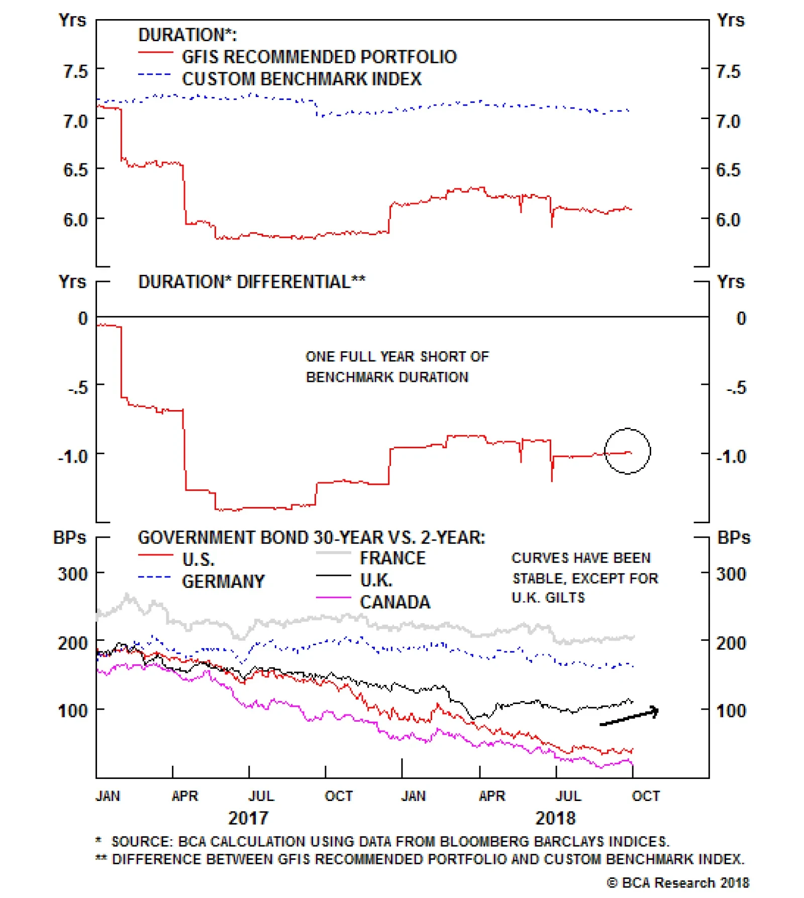
The GFIS recommended bond portfolio still prefers holding U.S. corporate debt versus equivalent in European and EM products. Importantly, we are maintaining a below-benchmark stance on the overall portfolio’s duration, which is now one year shorter than…
The main driver of the outperformance was our structural below-benchmark portfolio duration stance, which benefited in an environment where the yield of the overall Bloomberg Barclays Global Treasury Index rose to 1.54% - the highest level since April 2014.…

Highlights Chart of the WeekIncreasing Gas-On-Gas Pricing Will Disrupt Global LNG Markets
U.S. Set To Disrupt Global LNG Market
U.S. Set To Disrupt Global LNG Market
Growth in the global Liquefied Natural Gas (LNG) market will be fuelled by surging U.S. natural gas production, which will allow consumers in Asian and European markets to diversify away from oil-indexed pricing - with its attendant geopolitical risks - and falling European gas production. As a result, markets will move toward short- and long-term contracts priced in USD/MMBtu (Chart of the Week). This will favor gas producers and LNG merchants with access to U.S. shale-gas supplies, where production is growing at double-digit p.a. rates (Chart 2). Well-developed trading and risk-management markets in the U.S. - centered on Henry Hub, LA - will incentivize consumers to shorten the tenor of oil-indexed contracts, replacing them with hedgeable futures-based contracts. These markets allow producers and merchants to offer short- and long-term contracts that meet consumer preferences. As the global LNG market grows, shipping companies, along with producers and merchants with worldwide trading and transport capabilities - or access to such capabilities - will grow market share at the expense of exporters tied to the more rigid oil-indexing regime (Chart 3). Energy: Overweight. We remain long call spreads along the Brent forward curve over February - August; these positions are up an average 88.4% since inception, basis Tuesday's close. The long S&P GSCI position we recommended in December is up 21.8%, on the back of higher oil prices and backwardated crude-oil forward curves. Base Metals: Neutral. Copper is holding on to recent gains - up ~ 11% from its mid-August trough, following oil higher. Precious Metals: Neutral. Gold hovers around $1,200/oz, following the Fed's meeting last week, which resulted in a 25bp increase in fed funds to 2.25%. Ags/Softs: Underweight. The trade agreement to be signed by U.S. officials at the end of November with their counterparts in Mexico and Canada removes some of the uncertainty weighing on ag markets. Upward revisions to 2017 carry-out estimates by the USDA continue to pressure corn and beans. Chart 2Surging Production, Market Depth Favor U.S. Gas Producers And Merchants
U.S. Set To Disrupt Global LNG Market
U.S. Set To Disrupt Global LNG Market
Chart 3Growing LNG Imports Will Favor Shippers, Producers And Merchants
U.S. Set To Disrupt Global LNG Market
U.S. Set To Disrupt Global LNG Market
Feature Surging U.S. natural gas production will continue to find its way to global LNG markets over the next decade. The persistence of oil-indexing in Asian LNG contracts will fuel the growth of U.S. exports, given the arbitrage between cheaper natural gas - priced basis supply-demand fundamentals for gas - and more expensive oil-indexed contracts.1 Added to this cost advantage, U.S. exports can be linked to hedgeable futures prices, using NYMEX Henry Hub, LA, contracts. These stability-of-supply and pricing advantages also allow LNG buyers in Asia and Europe to diversify away from oil-production disruption risks, which can send prices sharply higher, and being overly reliant on Russian imports. Chart 4U.S. LNG Exports Will Surge
U.S. Set To Disrupt Global LNG Market
U.S. Set To Disrupt Global LNG Market
This will give global consumers an incentive to continue shortening the tenor of more rigid oil-indexed LNG contracts, and to replace them with hedgeable contracts referencing Henry Hub, LA, futures contracts priced in USD/MMBtu. While a fairly stout increase of U.S. LNG exports already is expected by the EIA and IEA, we believe this dynamic likely results in export volumes that are higher than the ~ 10 Bcf/d expected by 2023, and close to 15 Bcf/d toward the end of the 2020s (Chart 4).2 Increasing volumes of associated natural gas production in the Permian Basin in west Texas, which will have to be transported from the basin so that it does not curtail oil production, will drive a large part of this growth. We expect a significant LNG export center to be developed in South Texas in Corpus Christi over the next five years or so, just as the U.S. surpasses 10 Bcf/d of exports in the middle of the next decade.3 Flexible pricing of LNG contracts basis Henry Hub already is supporting the buildout of Gulf Coast exports via take-or-cancel contracts. These contracts are replacing the more restrictive take-or-pay contracts still used in Asia.4 This will continue to evolve, allowing supply development to be hedged via Henry Hub natgas futures. Consumers ultimately benefit from cheaper supplies and hedgeable risks. This is not to say other benchmarks will fall away. There is always room for regional benchmarks - even oil-based benchmarks such as the Japan Crude Cocktail (JCC), or the spot- and swaps-market reference Japan/Korea Marker (JKM).5 The global crude oil market accommodates such regional benchmarks: WTI crude oil futures are the benchmark for oil markets in the Americas, while Brent crude oil futures serve as the benchmark for global markets. Crude oils with different chemical properties can be priced relative to these benchmarks for delivery anywhere in the world. The global LNG market could retain an Asian benchmark, but a lot of work needs to be done in terms of building the supporting infrastructure - pipelines, regasification facilities, deep futures markets, etc. - to make that happen.6 We are inclined to believe the build-out of U.S. LNG export capacity will occur before these pieces fall into place: Scale has never been an issue in the U.S. oil and gas patch. Global Supply - Demand Overview Chart 5Global LNG Demand Growth Likely Outpaces Current Expectations
U.S. Set To Disrupt Global LNG Market
U.S. Set To Disrupt Global LNG Market
Global LNG demand is expected to rise at an impressive 1.7% p.a. out to 2040 (Chart 5). However, local supply and demand levels are increasingly unbalanced, implying that cross-border pipeline and LNG imports will need to increase as gas demand rises.7 A few key markets lead this trend, as seen in Chart 6, which illustrates the supply-gap in major consuming countries. Supply gaps are poised to grow in Emerging Asia and Europe, due to elevated demand growth in the former and lack of supply growth in the latter. World LNG demand grew by 10% last year, with Europe and Emerging Asia accounting for more than 95% of this increase. However, last year's stellar growth numbers should not be considered as the baseline growth forecast.8 The latest projections show demand increasing by 21 Bcf/d by 2025 - taking LNG imports from 38 Bcf/d at present to 58 Bcf/d by then. This implies a lower annualized growth rate of 5.5%. Chart 6Supply - Demand Imbalances Will Fuel LNG Demand Globally
U.S. Set To Disrupt Global LNG Market
U.S. Set To Disrupt Global LNG Market
LNG Supply On Growth Trajectory World LNG export capacity is expected to go from 48 Bcf/d in 2017 to 61 Bcf/d by 2022 (Chart 7), with 53% of the additional capacity coming from the U.S., 18% from Australia, and 15% from Russia.9 Chart 7LNG Export Capacity Growth
U.S. Set To Disrupt Global LNG Market
U.S. Set To Disrupt Global LNG Market
Our baseline forecast for the LNG market foresees a short-term supply surplus in 2020 (Chart 8), followed by a catch-up in demand and new waves of projects between 2024 and 2030. Among the supply-side developments we are following: Chart 8New LNG Projects In The Pipeline
U.S. Set To Disrupt Global LNG Market
U.S. Set To Disrupt Global LNG Market
The Australian LNG market has undergone massive change in the last five years. While being a relatively small natural gas producer (8th largest producer, accounting for ~ 3% of world output), in 2015, the country became the second largest LNG exporting country in the world with now over 7.5 Bcf/d of exports. The bulk of new liquefaction facilities will be operational in 2019 with the completion of new trains at the Wheatstone, Prelude Floating and Ichthys LNG facilities.10 This will bring Australian total LNG export capacity to over 10 Bcf/d. Importantly, most of Australia's LNG trade is with Emerging Asian countries. This region still relies mostly on oil-linked, long-term, and fixed-destination contracts. Absent the OPEC market-share war of 2014 - 2016, when oil prices collapsed, Australia's LNG prices are subject to oil price risks and volatility (Chart 9). Chart 9Asian Oil-Indexed Contracts Trade Above Spot LNG
U.S. Set To Disrupt Global LNG Market
U.S. Set To Disrupt Global LNG Market
The U.S. currently has ~ 3 Bcf/d liquefaction capacity and is increasingly exporting to Asian countries (Table 1). The present wave of projects under-construction will push capacity to ~ 9 Bcf/d in 2020. Following a two year pause in project Final Investment Decisions (FIDs) from 2016 to 2017, potential FIDs in 2018 and 2019 could increase the U.S. capacity to ~ 14 Bcf/d by 2025. This will make the U.S. the second-largest exporter of LNG in the world, surpassing Australia. This new wave of investment is yet to be finalized; therefore, final investment decisions in 2H18 and 2019 will be crucial to determine the medium-term potential of U.S. LNG. If a majority of these projects goes through, U.S. capacity risks being overbuilt for the next decade (Chart 10). Table 1U.S. LNG Exports By Country
U.S. Set To Disrupt Global LNG Market
U.S. Set To Disrupt Global LNG Market
Chart 10U.S. LNG Capacity Risks Becoming Overbuilt
U.S. Set To Disrupt Global LNG Market
U.S. Set To Disrupt Global LNG Market
Importantly, U.S. LNG exports already have had a massive impact on the global LNG market. The totality of U.S. export prices are determined by gas-on-gas pricing - i.e., gas priced in USD/MMBtu as a function of gas supply-demand fundamentals. Just as importantly, these contracts are without destination restrictions found in many oil-indexed contacts. In the U.S., the presence of a deep futures market allows flexible long-term contracting.11 According to Royal Dutch Shell, the spot LNG market doubled from 2010 to 2017, accounting for ~ 25% of all transactions, most of it due to the prodigious increase in U.S. LNG supply.12 An overbuilt U.S. market would increase spot LNG trading. Our own calculations based on EIA data indicate the U.S. could have too much capacity relative to demand in 2018 - 19, but goes into balance in 2020 - 2022.13 Russia's natural gas production is projected to increase from 66.7 Bcf/d in 2017 to 70.1 Bcf/d in 2023. However, the bulk of this increase will cover new pipeline exports. The country's LNG capacity is expected to grow by ~ 2.5 Bcf/d with the completion of trains at the Yamal, Vysotsk and Portovaya export facilities. Despite its low LNG capacity, Russia remains a key player in the LNG market. Its rising pipeline capacity connected to China - the fastest growing market in the world - competes directly with global LNG supplies. For Russia, the rise of natural gas availability on a global basis - in the form of LNG - shakes its foreign relationships and policies to the core. In loosening the once-tight relationship between buyers and sellers, the rise of spot LNG supplies will favor consumers and energy security, and foster the development of longer-term contracting.14 Global LNG Demand Could Outpace Supply By our reckoning, some 62% of additional global gas demand of 160 Bcf/d will be covered by rising domestic production, 12% by rising trans-national pipeline capacity, and the remaining 26% by LNG imports.15 Longer-term, we expect LNG and natural gas demand to keep rising as industry demand expands and major coal consumers build up their natural gas and renewables usage. As a result, LNG consumption will increase at a rate of ~ 3% p.a. until 2040, as overall gas demand grows ~ 1.7%.16 Key demand-side developments: Table 2Natgas Emits Less CO2
U.S. Set To Disrupt Global LNG Market
U.S. Set To Disrupt Global LNG Market
China's environmental reforms, supply-side industrial policies and continued economic growth will be the engine of global natural gas and LNG growth in the next decade. The Middle Kingdom's natural gas demand grew 15% to 23 Bcf/d in 2017, of which 54% came from additional LNG. This short-term growth surge required spot and short-term LNG imports, which pushed up North Asian LNG spot prices. Despite our expectation that China will continue leading global LNG growth, we believe 2017 to be an outlier. Two factors contributed to the rise in spot prices: To tackle its massive pollution without significantly altering economic development and growth, China's environmental policies favor natural gas as a bridge to a low-carbon economy, since natgas contains half the carbon content of coal (Table 2). China's supply-side reforms and winter capacity cut led to a spike in spot LNG demand, which had to be covered in global LNG markets. China has an extremely low level of storage to deal with seasonal natgas consumption fluctuations; this forces the country to rely on spot LNG to meet short-term peaks in gas demand (Chart 11). Chart 11China's Minimal Natgas Storage Forces It To Rely On Spot Markets
U.S. Set To Disrupt Global LNG Market
U.S. Set To Disrupt Global LNG Market
While these factors still dominate Chinese markets, new Russian pipeline capacity is expected to start delivering gas in 2019, the ~ 247 bcf of additional domestic storage capacity and the rise in spot LNG supply will mitigate the effect. In addition, China is limited in its regasification capacity. Data re projects under construction and demand forecasts indicate the average utilization would rise to ~ 90% in 2020. Winter usage would push this to ~ 100% rapidly, constraining its ability to meet winter demand with spot LNG. As a result, we expect Asian spot LNG prices to rise above contracted oil-indexed prices next winter, but less so in 2020 and 2021. Longer term, China's gas consumption is expected to grow 4.6% p.a., outpacing the 4.0% p.a. domestic production growth. Some 23% of the gap will come from Russian and Turkmenistan pipeline imports. Europe's supply-gap rose in the past 3 years, and is expected to continue to widen. Unlike the rest of the world, this gap is growing because of supply depletion instead of strong demand growth. In fact, demand is expected to remain flat, based on the IEA's forecast of Europe's long-term growth. On the other hand, total European gas supply has decreased by 16% since 2010, and is expected to continue decreasing at a similar pace, reaching 21 Bcf/d in 2023 from 25 Bcf/d in 2017. These declines in European natgas supply are due to: The phase-out by 2030 of Netherlands' Groningen field. Continued concerns about the impact of natural gas production on earthquakes in nearby communities pushed the Dutch government to adopt, in March 2018, a plan to gradually stop gas extraction at the Groningen field. Production has been decreasing since 2013 and is expected to decrease by around three quarters between now and end-2023. U.K. natural gas production will decrease by 5% p.a. due to the lack of capex and the large number of fields reaching a mature state. Stagnation in Norway's gas production following its record production level in 2017. Europe's regasification capacity has considerable slack, which will allow it to expand its import volumes. Europe currently has 23 Bcf/d regas capacity, with a very low 27% utilization in 2017. This means it has ~16 Bcf/d capacity available. With the U.S. is expected to raise its exports by ~ 6 - 7 Bcf/d in the next couple of years, Europe could potentially absorb the entire U.S. LNG exports if it desires to diversify its source of energy supply. Pressure Builds For Competitive LNG Markets Chart 12Expect More LNG Spot Trading
U.S. Set To Disrupt Global LNG Market
U.S. Set To Disrupt Global LNG Market
The movement toward an integrated global market - similar in structure to current oil markets - will be driven by sharply increased U.S. LNG exports, and more competitive pricing of LNG as a function of gas supply-demand fundamentals. This latter effort likely will find support from Japanese and EU regulators. In addition, U.S. exporters already are using futures-based pricing - using Henry Hub contracts - which provide greater flexibility for producers, consumers and merchants to hedge their risk. Either Asian markets will develop viable regional benchmarks, or the global market will increasingly adopt Henry Hub indexing. Again, this is a typical commodity-market evolution: wheat can be priced for delivery anywhere on the planet using Chicago Board of Trade indexing. Asia lacks an integrated pipeline network. Market-based pricing of gas as gas - i.e., based on regional supply-demand gas fundamentals - also has not fully developed. LNG-on-LNG competition is considered a way to promote market-based pricing. Thus, the rise in spot and short-term contracts priced on the basis of natural gas fundamentals in the region already visible in the data likely will continue (Chart 12). In addition, if we see the oil price spike we expect in 1Q19 - driven by the loss of Iranian exports due to U.S. sanctions, continuing losses in Venezuelan exports due to economic collapse, and still-strong global oil demand - LNG priced on gas fundamentals will become even more attractive.17 LNG consumers' exposure to oil prices - via oil-indexed supply contracts - is a disadvantage to consumers with super-abundant natural gas supplies (Chart 13).18 That said, the U.S. export capacity remains limited, thus it cannot completely substitute for the global trade being done basis oil-indexed LNG contracts. Still, higher oil prices will incentivize a shift to contracts with prices determined by natgas fundamentals, which favors continued growth in U.S. exports. If anything, it will push for a faster-than-expected expansion of U.S. LNG export capacity. Chart 13LNG Buyers Will Resist Oil-Indexed Exposure
BCA Ensemble Forecast Lifts Brent To $95/bbl, As Market Tightens
BCA Ensemble Forecast Lifts Brent To $95/bbl, As Market Tightens
Bottom Line: Growth in global LNG markets likely will be faster than expected, as the U.S. develops its export capacity and continues to offer futures-based pricing. This will further reduce the attractiveness of rigid oil-indexed contracts. Gas producers and LNG merchants with access to U.S. shale-gas supplies, possessing trading and risk-management capabilities that allow them to offer flexible contracts globally, are favored in this quickly evolving market. Hugo Bélanger, Senior Analyst HugoB@bcaresearch.com Pavel Bilyk, Research Associate pavelb@bcaresearch.com Robert P. Ryan, Senior Vice President Commodity & Energy Strategy rryan@bcaresearch.com 1 The LNG cost structure is complex. A recent paper from the Oxford Institute For Energy Studies estimates U.S. breakeven costs for new LNG projects are roughly $7/MMBtu delivered, or ~ $4/MMBtu over current Henry Hub, LA, spot prices. This includes liquefaction costs, and transportation costs from the U.S. Gulf to Asia of ~ $1.50/MMBtu, and ~ $0.70/MMBtu from the U.S. Gulf to northwest Europe. Regasification charges and entry fees likely add ~ $0.70 to $1/MMBtu. Please see "The LNG Shipping Forecast: costs rebounding, outlook uncertain," published by the Oxford Institute For Energy Studies, March 2018. Transport costs are variable, and are only one part of the LNG pricing equation. The benefits of diversifying supplies cannot be overlooked, nor can the benefit of gas-on-gas pricing in a high-priced crude oil market. See also see "US powerhouse in the making," published June 14, 2018, by petroleum-economist.com. 2 Please see the International Energy Agency's Gas 2018 report published in March, particularly the discussion of supply beginning on p. 67. 3 Please see "The Price of Permian gas Pipeline Limits," by Stephen Rassenfoss, in the Journal of Petroleum Technology, published July 19, 2018. 4 Take-or-cancel contracts employ option-like features - e.g., cancelation payments that function as an option premium - that give buyer and seller flexibility in cancelling a contract or delivery in a manner that allows the seller to cover fixed costs, not unlike a tolling contact. This is possible because of the hedging latitude provided by the NYMEX natural gas futures market, which has Henry Hub, LA, as its delivery point. Please see "The Shift Away from Take-or-Pay Contracts in LNG," published by the Atlanta-based law firm King & Spalding on its Energy Law Exchange blog September 13, 2017. 5 Platts' JKM spot assessment for November was $11.35/MMBtu, which was down 6% from October assessments. Please see "Platts JKM: Asia November LNG spot prices fall on thin demand," published by S&P Global Platts September 21, 2018. The NYMEX JKM forward curve peaks at $13.50/MMBtu for January 2019 deliveries, and backwardates thereafter. 6 Big LNG consumers' antitrust regulators are increasing pressure on overly restrictive contracts, which could open these markets to further competition over the next three years. Japan's Fair Trade Commission (JFTC) in 2017 concluded a review of term LNG contracts, which raised the possibility heretofore standard term contract features - e.g., limits on destinations and diversions, and take-or-pay provisions - could run counter to its antimonopoly laws. Japan is the largest importer of LNG in the world, taking ~ 11 Bcf/d. Meanwhile, in June of this year, the European Commission opened an investigation into long-term LNG contracts between its member states and Qatar Petroleum. Akin Gump Strauss Hauer & Feld, the Washington, D.C., law firm, expects a ruling on destination and profit-sharing clauses that severely limit re-trading of LNG by purchasers. Akin Gump expects a ruling in the course of the next 3 years. While Japan's FTC did not specify remedies, it is possible buyers gain rights to re-sell and re-direct cargoes, following these reviews. This would make markets more competitive, although indexing the price of LNG to oil-based formulas likely will hinder this process. Please see "Revisiting LNG Resale Restrictions - Implications of Recent EU Decisions," published on the firm's website August 2, 2018. 7 Natural gas demand grew by 16% since 2010, according to the BP 2018 Statistical Review of World Energy, and is expected to grow by a cumulative 47% (1.6% p.a.) by 2040. 8 Many idiosyncratic factors helped Chinese LNG imports reach such an exceptional growth rate, mostly weather-related: China's environmental policy is resulting in widespread substitution of coal for natural gas for space-heating purposes, which, in colder-than-expected winters, results in surging demand. We do not believe this will be a long-term seasonal influence: Physical facilities are being built out to accommodate higher supply and demand. 9 World liquefaction capacity will rise to ~ 61 Bcf/d in 2022, based on our calculations of projects under construction. The bulk of additional capacity will come from the U.S., Australia and Russia. 10 Capacity of 0.6, 0.5 and 1.2 Bcf/d, respectively. 11 Please see U.S. Department of Energy, office of Oil & Natural Gas, LNG Monthly. 12 Like most globally traded commodities, LNG can be traded in USD/MMBtu. The global financial and clearing system already is set up to accommodate commodity transactions denominated in USD, therefore we do not see any impediments to extending it further into the LNG market. 13 Please see Chart 10 footnote for details. 14 We will be exploring the geopolitical dimension of LNG next week in a Special Report written with our colleagues in BCA Research's Geopolitical Strategy. Please see Meghan L. O'Sullivan, Windfall: How the new energy abundance upends global politics and Strengthens America's Power (New York: Simon & Schuster, 2012). 15 From 2017 to 2040, based on BP projections. The bulk of additional pipeline capacity will come from Russia with 12 Bcf/d destined to China and Europe expected to come on line in 2019. 16 Please see the International Energy Agency's GAS 2018 report published in March, BP's BP Statistical Review Of World Energy 2018 report published in June, Shell's Shell LNG Outlook 2018 report published in February, and U.S. the Energy Information Administration's International Energy Outlook 2017 report published in September. 17 Please see our most recent assessment of global oil fundamentals, published September 27, 2018, entitled "Risks From Unplanned Oil-Outage Rising; OPEC 2.0's Spare Capacity Is Suspect," and our updated forecast, "Odds Of Oil-Price Spike In 1h19 rise; 2019 Brent Forecast Lifted $15 To $95/bbl," published September 20, 2018. 18 Asia LNG prices are usually linked to the JCC according to predetermined formulae. However, the exact formula remains opaque and varies with each contract. Based on our calculations, we concluded that since 2010, the average formula uses a slope of ~14% on JCC prices lagged 4 months, with very low s-curve components and a constant. Investment Views and Themes Recommendations Strategic Recommendations Tactical Trades Commodity Prices and Plays Reference Table
U.S. Set To Disrupt Global LNG Market
U.S. Set To Disrupt Global LNG Market
Trades Closed in 2018 Summary of Trades Closed in 2017
U.S. Set To Disrupt Global LNG Market
U.S. Set To Disrupt Global LNG Market
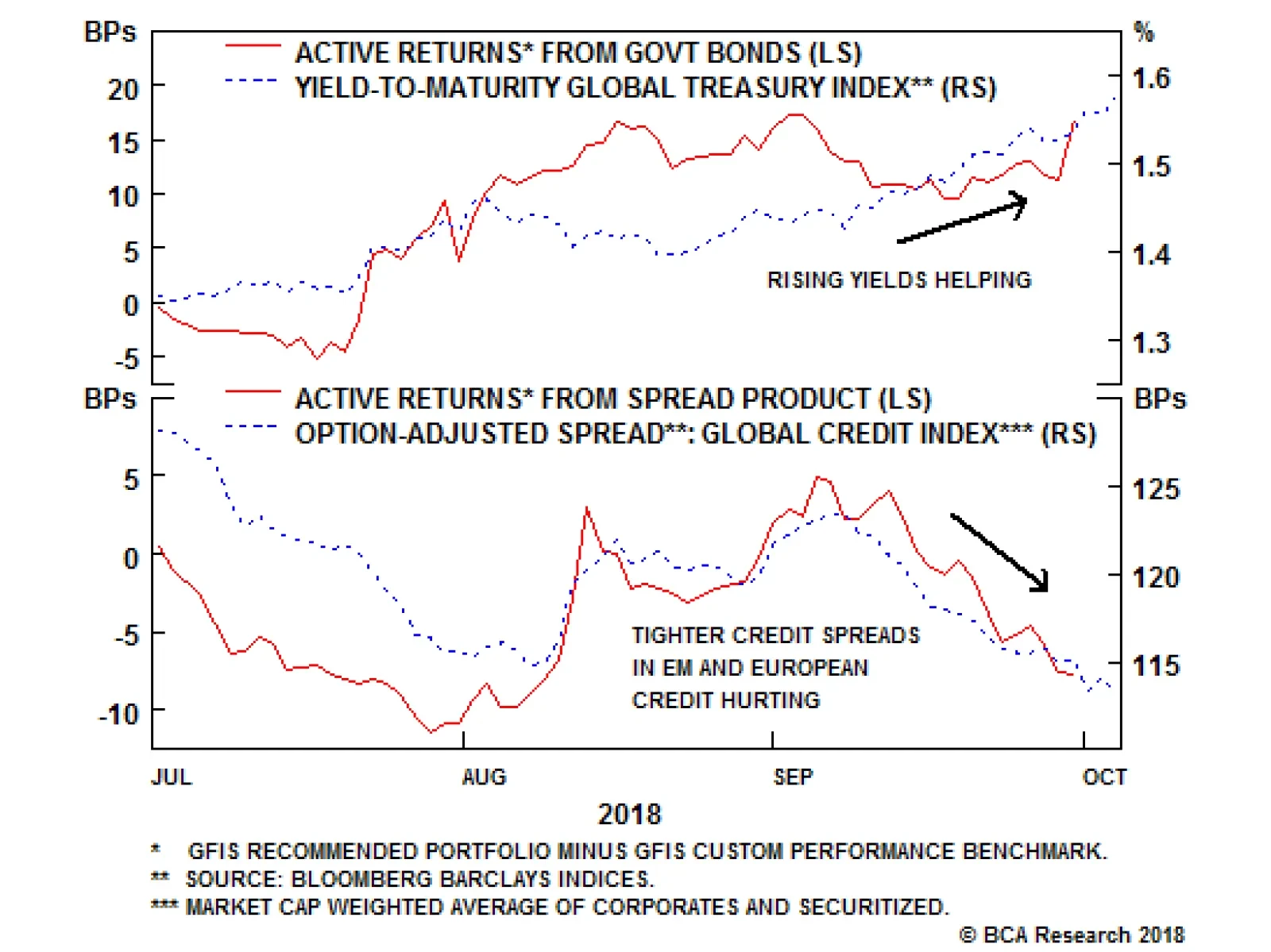
Highlights Q3/2018 Performance Breakdown: The Global Fixed Income Strategy (GFIS) recommended model bond portfolio outperformed its custom benchmark in the third quarter of 2018 by +9bps. This raised the overall 2018 year-to-date performance to +6bps. Winners & Losers: The outperformance came mostly from our defensive duration positioning, which benefitted as global bond yields rose during the quarter, but also from successful country selection (overweight Australia & New Zealand, underweight the U.S., Canada & Italy). Our underweight tilts on EM credit were the largest drag on performance after the sharp EM rally in September. Scenario Analysis: The combination of defensive overall duration positioning and underweight allocations to EM and European credit should allow the model bond portfolio to outperform its custom benchmark index over the next year. Feature This week, we present the performance numbers of the BCA Global Fixed Income Strategy (GFIS) model bond portfolio for the 3rd quarter of 2018. We also update our scenario analysis of the future expected performance of the portfolio based on the risk-factor based return forecasting framework we introduced earlier this year. As a reminder to existing readers (and for new clients), the portfolio is a part of our service that is meant to complement the usual macro analysis of global fixed income markets. The model portfolio is how we communicate our opinion on the relative attractiveness between government bond and spread product sectors, by applying actual percentage weightings to each of our recommendations within a fully invested hypothetical bond portfolio. Broadly speaking, the portfolio did slightly outperform its benchmark index over the past three months, driven mostly by defensive duration positioning during a period of rising developed market bond yields. The portfolio would have done considerably better if not for a September rally in emerging market (EM) credit that flew in the face of our maximum underweight position in EM. We still have strong conviction in those two main themes - higher global bond yields and EM underperformance - and we fully expect our model portfolio to generate larger outperformance over the next year. Q3/2018 Model Portfolio Performance Breakdown: Duration Underweights Pay Off The total return of the GFIS model bond portfolio was +0.12% (hedged into U.S. dollars) in the third quarter of the year, which outperformed the custom benchmark index by +9bps (Chart of the Week).1 The main driver of the outperformance was our structural below-benchmark portfolio duration stance, which benefited as the overall Bloomberg Barclays Global Treasury Index yield rose to 1.54% - the highest level since April 2014. The portfolio's excess return got as high as +19bps on September 4th, before seeing some pullback in recent weeks as our main spread product tilt - underweight EM hard currency sovereign and corporate debt - enjoyed a counter-trend rally in September from the bearish spread widening seen since the start of 2018. Chart of the WeekDefensive Duration Stance = Q3 Outperformance
Defensive Duration Stance = Q3 Outperformance
Defensive Duration Stance = Q3 Outperformance
Table 1GFIS Model Bond Portfolio Q3/2018 Overall Return Attribution
GFIS Model Bond Portfolio Q3/2018 Performance Review: Inching Ahead
GFIS Model Bond Portfolio Q3/2018 Performance Review: Inching Ahead
In terms of the specific breakdown between the government bond and spread product allocations in our model portfolio, the former generated +17bps of outperformance versus our custom benchmark index while the latter lagged the benchmark by -8bps (Table 1). The bar charts showing the total and relative returns for each individual government bond market and spread product sector are presented in Charts 2 and 3. Chart 2GFIS Model Bond Portfolio Q3/2018 Government##BR##Bond Performance Attribution By Country
GFIS Model Bond Portfolio Q3/2018 Performance Review: Inching Ahead
GFIS Model Bond Portfolio Q3/2018 Performance Review: Inching Ahead
Chart 3GFIS Model Bond Portfolio Q3/2018 Spread##BR##Product Performance Attribution By Sector
GFIS Model Bond Portfolio Q3/2018 Performance Review: Inching Ahead
GFIS Model Bond Portfolio Q3/2018 Performance Review: Inching Ahead
The main individual sectors of the portfolio that drove the excess returns were the following: Biggest outperformers Underweight Japanese government bonds (JGBs) with maturities beyond 10 years (+7bps) Underweight U.S. Treasuries with maturities beyond 7 years (+6bps) Underweight French government bonds with maturities beyond 7 years (+2bps) Underweight Italian government bonds (+2bps) Overweight JGBs with maturities up to 10 years (+1bp) Biggest underperformers Underweight EM USD-denominated sovereign debt (-3bps) Underweight EM USD-denominated corporate debt (-3bps) Underweight euro area investment grade corporate debt (-2bps) Underweight euro area high-yield corporate debt (-1bp) Chart 4 presents the ranked benchmark index returns of the individual countries and spread product sectors in the GFIS model bond portfolio. The returns are hedged into U.S. dollars (we do not take active currency risk in this portfolio) and also adjusted to reflect duration differences between each country/sector and the overall custom benchmark index for the model portfolio. We have also color coded the bars in each chart to reflect our recommended investment stance for each market during the third quarter (red for underweight, blue for overweight, gray for neutral weight). Chart 4Ranking The Winners & Losers From The Model Portfolio In Q3/2018
GFIS Model Bond Portfolio Q3/2018 Performance Review: Inching Ahead
GFIS Model Bond Portfolio Q3/2018 Performance Review: Inching Ahead
Spread product sectors dominate the left half of that chart, as credit spreads have tightened across the board since the early September peak. The best performing sector during Q3 in our model portfolio universe was EM hard currency sovereign debt, which has delivered a total return of +2.8% since September 4th (with spreads tightening by 50bps) after losing -0.7% in July and August. Similar performance stories occurred in corporate debt in the U.S. and Europe during the quarter. That credit outperformance comes after the sustained spread widening seen in virtually all global credit markets (excluding U.S. high-yield) since January of this year. The main drivers that prompted that widening - Fed tightening, a stronger U.S. dollar, diminishing asset purchases from the European Central Bank (ECB) and Bank of Japan (BoJ), some cyclical slowing of non-U.S. growth - are still in place. With our geopolitical strategists continuing to highlight the additional risks of U.S.-China and U.S.-Iran tensions intensifying after next month's U.S. Midterm elections, a cautious stance on global spread product - as we have maintained since downgrading our recommended overall credit exposure to neutral in late June - is still warranted.2 Outside of spread product, our model portfolio tilts generally lined up with the sector returns shown in Chart 4. We have overweights on two of the best performing government bond markets (Australia and New Zealand) and underweights on three of the worst performers (U.S., Canada, Italy). Interestingly, despite having overweights on two of the worst performing government bond markets - Japan and the U.K. - the excess return contribution from those countries did not hurt the model bond portfolio return in Q3 (+8bps and 0bps, respectively). This was due to the curve steepening bias embedded within our overweight country tilts (i.e. more duration allocated to shorter-maturity buckets, see the model portfolio details on Page 14), which benefitted as yield curves in those countries bear-steepened. Net-net, we are satisfied with the modest portfolio outperformance seen in Q3, given that the rally in global credit markets went against our more defensive posture on spread product exposure. Bottom Line: The GFIS recommended model bond portfolio outperformed its custom benchmark in the third quarter of 2018 by +9bps. This put the overall 2018 year-to-date performance into positive territory (+6bps). The outperformance came entirely from our defensive duration positioning, which benefitted as global bond yields rose during the quarter, and from successful country selection. Our underweight tilts on EM credit were the largest drag on performance after the sharp EM rally in September. Future Drivers Of Portfolio Returns Looking ahead, the performance of the model bond portfolio will continue to benefit from two primary trends: rising global bond yields and growth divergences that continue to favor the U.S. In terms of the specific weightings in the GFIS model bond portfolio, we still prefer owning U.S. corporate debt versus equivalents in Europe and EM. When we downgraded our recommended allocation to U.S. and investment grade corporates to neutral from overweight back in July, we also cut the portfolio exposure to euro area corporates, as well as to all EM hard currency debt, to underweight. The latter changes were necessary to maintain our desired higher exposure to U.S. corporate debt versus non-U.S. corporates, although it did leave the model portfolio with a small overall underweight stance on global spread product (Chart 5). Importantly, we are maintaining a below-benchmark stance on overall portfolio duration, which is now one full year shorter than our benchmark index duration (Chart 6), even as we have grown more cautious on credit exposure. This is because we still see potential medium-term upward pressure on bond yields coming from tightening monetary policies (Fed rate hikes, ECB tapering of bond purchases) and increasing inflation expectations. The majority of global central bankers are dealing with tight labor markets and slowly rising inflation rates. While global growth has cooled a bit from the rapid pace seen in 2017, it has not been by enough to force policymakers to shift to a more dovish bias. Chart 5Spread Product Allocation:##BR##Neutral U.S., Underweight Non-U.S.
GFIS Model Bond Portfolio Q3/2018 Performance Review: Inching Ahead
GFIS Model Bond Portfolio Q3/2018 Performance Review: Inching Ahead
Chart 6Maintaining##BR##Below-Benchnmark Duration
Maintaining Below-Benchnmark Duration
Maintaining Below-Benchnmark Duration
Our underweights on EM and euro area spread product have left the portfolio in a "negative carry" position where it yields 34bps less than the benchmark index (Chart 7). In a backdrop of stable markets and low volatility, being short carry will be a drag on the model bond portfolio performance as we saw over the past month. Yet we do not see the recent market calm as being sustainable, with all plausible outcomes pointing to more volatile markets, largely driven by U.S.-centric events (more Fed tightening, a stronger dollar, U.S. growth convergence to slower non-U.S. growth, increased trade protectionism, higher oil prices due to U.S.-Iran tensions). We continue to suggest a cautious allocation of investor risk budgets against this backdrop. We have been targeting a tracking error (relative volatility versus the benchmark) for our model bond portfolio in the 40-60bp range, well below our 100bps maximum. Our current allocations give us a tracking error right at the bottom of that range (Chart 8).3 Chart 7The Cost Of Being More Defensive On Credit
The Cost Of Being More Defensive On Credit
The Cost Of Being More Defensive On Credit
Chart 8Maintaining A Cautious Allocation Of The Risk Budget
Maintaining A Cautious Allocation Of The Risk Budget
Maintaining A Cautious Allocation Of The Risk Budget
Scenario Analysis & Return Forecasts Back in April of this year, we introduced a framework for estimating total returns for all government bond markets and spread product sectors, based on common risk factors.4 For credit, returns are estimated as a function of changes in the U.S. dollar, the Fed funds rate, oil prices and market volatility as proxied by the VIX index (Table 2A). For government bonds, non-U.S. yield changes are estimated using historical betas to changes in U.S. Treasury yields (Table 2B). This framework allows us to conduct scenario analysis based on projected returns for each asset class in the model bond portfolio universe by making assumptions on those individual risk factors. Table 2AFactor Regressions Used To Estimate##BR##Spread Product Yield Changes
GFIS Model Bond Portfolio Q3/2018 Performance Review: Inching Ahead
GFIS Model Bond Portfolio Q3/2018 Performance Review: Inching Ahead
Table 2BEstimated Government Bond##BR##Yield Betas To U.S. Treasuries
GFIS Model Bond Portfolio Q3/2018 Performance Review: Inching Ahead
GFIS Model Bond Portfolio Q3/2018 Performance Review: Inching Ahead
With these tools, we than can attempt to forecast returns for each bond sector under different scenarios. We can then use those forecasts to predict the expected return for our model bond portfolio under those same scenarios. In Tables 3A & 3B. we show three differing scenarios, with all the following changes occurring over a one-year horizon. Table 3AScenario Analysis For The GFIS Model Portfolio
GFIS Model Bond Portfolio Q3/2018 Performance Review: Inching Ahead
GFIS Model Bond Portfolio Q3/2018 Performance Review: Inching Ahead
Table 3BU.S. Treasury Yield Assumptions For The Scenario Analysis
GFIS Model Bond Portfolio Q3/2018 Performance Review: Inching Ahead
GFIS Model Bond Portfolio Q3/2018 Performance Review: Inching Ahead
Our Base Case: the Fed delivers another 100bps of rate hikes, the U.S. dollar rises +5%, oil prices rise by +10%, the VIX index increases by five points from current levels, and U.S. Treasury yields rise by 40bps across the curve. A Very Hawkish Fed: the Fed delivers 150bps of rate hikes, the U.S. dollar rises by +10%, oil prices rise by +10%, the VIX index increases by ten points from current levels and there is a sharp bear flattening of the U.S. Treasury curve (2yr yield +75bps, 10yr yield +40bps). A Very Dovish Fed: the Fed only hikes rates by 25bps, the U.S. dollar falls by -5%, oil prices fall by -20%, the VIX index increases by fifteen points from current levels and there is a modest bull steepening of the U.S. Treasury curve. In this scenario, the Fed puts the rate hiking cycle on hold in response to a sharp tightening of U.S. financial conditions. Table 3A shows the expected returns for all three scenarios based on our risk-factor framework. The model bond portfolio is expected to outperform the custom benchmark index in all three scenarios we have laid out. This occurs even with the negative carry coming from the credit underweights in EM and Europe, with losses from credit spread widening projected to be larger than the yield give-up from being underweight. The excess returns are modest, however, with only 6bps of outperformance expected in our base case scenario and 13bps expected in the "Very Hawkish Fed" and "Very Dovish Fed" scenarios. This return distribution, with better outcomes occurring in the "tails", is a desirable property to have as it relates to the VIX/volatility forecasts embedded in the scenarios. Both of the non-base case scenarios have a higher VIX (Chart 9), even in the case of the "Very Dovish Fed" outcome where a severe U.S. financial market selloff (coming complete with a higher VIX) would be the necessary trigger for the Fed to reverse course and begin cutting interest rates (Chart 10). Such a backdrop would obviously hurt our below-benchmark duration stance, but would help our underweight EM/Europe spread product recommendations. Chart 9Risk Factors For Scenario Analysis
Risk Factors For Scenario Analysis
Risk Factors For Scenario Analysis
Chart 10UST Yield Moves For Scenario Analysis
UST Yield Moves For Scenario Analysis
UST Yield Moves For Scenario Analysis
Of course, our recommendations will not be static at current levels throughout the next twelve months. We increasingly expect that our next major allocation move will be downgrade U.S. spread product exposure and raise U.S. Treasury allocations, especially after the Fed delivers a few more 25bps-per-quarter rate hikes and the U.S. dollar rises further. This will provide a boost to the portfolio's expected returns through renewed spread widening and, potentially, a reduction of our below-benchmark overall duration stance as Treasury yields reach likely cyclical peaks. Bottom Line: The combination of defensive overall duration positioning and underweight allocations to EM and European credit should allow the model bond portfolio to outperform its custom benchmark index over the next year. Robert Robis, CFA, Senior Vice President Global Fixed Income Strategy rrobis@bcaresearch.com 1 The GFIS model bond portfolio custom benchmark index is the Bloomberg Barclays Global Aggregate Index, but with allocations to global high-yield corporate debt replacing very high quality spread product (i.e. AA-rated). We believe this to be more indicative of the typical internal benchmark used by global multi-sector fixed income managers. 2 Please see BCA Global Fixed Income Strategy Weekly Report, "Time To Take Some Chips Off The Table: Downgrade Global Spread Product Exposure To Neutral", dated June 26th 2018, available at gfis.bcaresearch.com. 3 In general, we aim to target a tracking error no greater than 100bps. We think this is reasonable for a portfolio where currency exposure is fully hedged and less than 5% of the portfolio benchmark is in bonds with ratings below investment grade. 4 Please see BCA Global Fixed Income Strategy Weekly Report, "GFIS Model Bond Portfolio Q1/2018 Performance Review: A Rough Start", dated April 10th 2018, available at gfis.bcareseach.com. Recommendations Duration Regional Allocation Spread Product Tactical Trades Yields & Returns Global Bond Yields Historical Returns
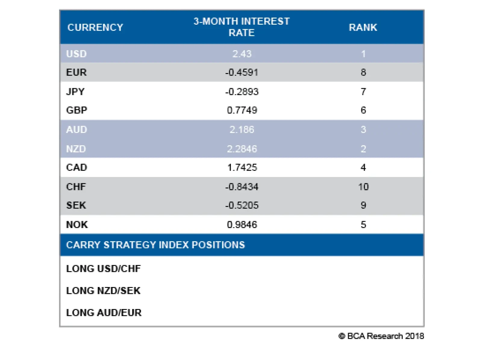
Our foreign exchange strategists analyze the properties of carry strategies by constructing a Carry Strategy Index as follows: Ranking the 10 countries in the G10 according to their 3-month interest rate. Using the 3-month rate implied by forward…
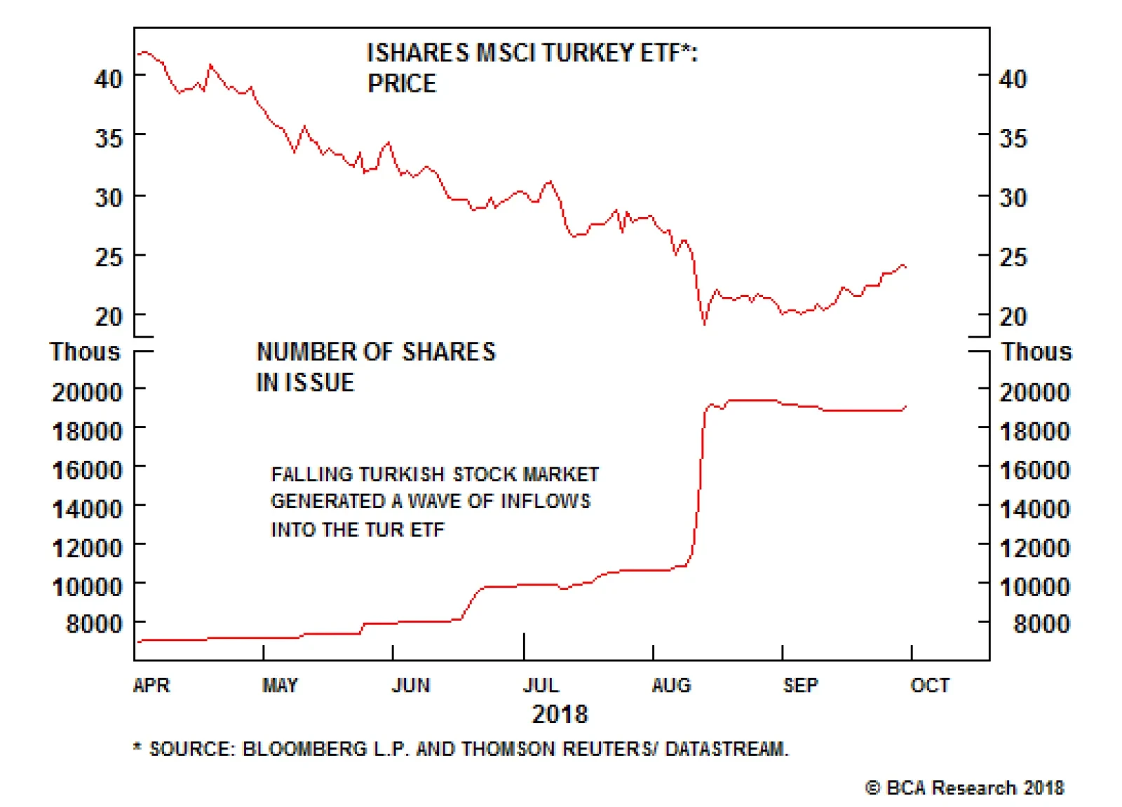
For now, we are comfortable with our bearish view towards emerging market stocks. While EM equities have cheapened, they are not yet at washed out levels. Additionally, bottom fishers still abound, as evidenced by the fact that the number of shares…
Highlights Recommended Allocation
Quarterly - October 2018
Quarterly - October 2018
We don't see any change over the next six to 12 months to the current trends of strong U.S. growth, continuing Fed hikes, rising long-term interest rates, and an appreciating dollar. We stay neutral on global equities and continue to favor the U.S. and, to a degree, Japan. Given rising rates, a strengthening dollar, ongoing trade war and moderate slowdown in China, we expect EM assets to sell off further. We forecast the 10-year U.S. Treasuries yield to rise to 3.5% by H1 2019, and so we stay underweight fixed income, short duration, and continue to prefer TIPs. We are only neutral on credit within the (underweight) fixed-income bucket. We shift our equity sector weightings to reflect the GICS recategorization. We recommend a neutral on the new internet-heavy Communication sector, and underweight on Real Estate. We have a somewhat defensive sector bias, with overweights in Consumer Staples and Healthcare. Alternative risk assets, such as private equity and real estate, look increasingly overheated. We prefer hedge funds and farmland at this stage of the cycle. Overview More Of The Same When there's been a strong trend, it's always tempting to be contrarian and argue for a reversal. Tempting but, at the moment, we think wrong. This year has been characterized by a strong U.S. economy but slowing growth elsewhere, the outperformance of U.S. equities (up 10% year-to-date, compared to a 4% decline in the rest of the world), rising U.S. interest rates, dollar appreciation, and a big sell-off in emerging markets. While a short-term correction is always possible, we don't see a fundamental end to these trends over the next 6 to 12 months. Chart 1U.S. Growth Still Looks Strong
U.S. Growth Still Looks Strong
U.S. Growth Still Looks Strong
Chart 2Growth In Europe And Japan Has Slipped
Growth In Europe And Japan Has Slipped
Growth In Europe And Japan Has Slipped
U.S. growth is likely to remain strong. Consumer and business sentiment are both close to record highs; wage growth is beginning (finally) to accelerate; capex intentions are buoyant; and fiscal stimulus will add 0.7% to GDP growth this year and 0.8% next, as the budget deficit widens to close to 6% of GDP (Chart 1). Europe and Japan, by contrast, have slowed this year: both are more exposed to emerging markets than is the U.S.; fiscal policy in neither is particularly accommodative; and European banks suffer from weak loan growth and their EM exposure (Chart 2). The one trigger that would cause global ex-U.S. growth to accelerate relative to U.S. growth is a massive stimulus in China similar to 2009 and 2015. We think this unlikely because the authorities have reiterated their commitment to deleveraging and structural reform. Chinese credit growth and money supply data have as yet shown no signs of picking up, but they should be monitored carefully (Chart 3). Chart 3Chinese Stimilus, What Stimilus?
Chinese Stimilus, What Stimilus?
Chinese Stimilus, What Stimilus?
Chart 4Republicans Like Trump's Tough Trade Talk
Quarterly - October 2018
Quarterly - October 2018
An end to the trade war might also reverse the trends. U.S. markets have shrugged off the risk of escalating retaliatory tariffs on the (reasonable) grounds that trade has relatively little impact on the U.S. It is hard to see an end-game to the tariff war. President Trump's popularity has risen since he got tough on trade (Chart 4). He has changed his mind on many areas of policy during his career, but he's always consistently argued that the U.S. deficit shows that its trading partners treat it unfairly. The probability is high that the 10% tariff on $200 billion of Chinese goods will rise to 25% in January, and is eventually extended to all Chinese imports. It is equally unlikely that Xi Jinping will make concessions, since he can't be seen to bend to U.S. pressure and won't put at risk the crucial "Made in China 2025" plan. Chart 5Phillips Curve Working Again
Phillips Curve Working Again
Phillips Curve Working Again
Although tariffs may not hurt U.S. growth much, they could be inflationary. The price of washing machines, the subject of the earliest tariffs in January, rose by 18% over the next four months. This is just another reason why it's unlikely that the Fed will slow its pace of rate hikes. With the labor market now clearly tight, there are signs that the Phillips curve is beginning to reassert itself (Chart 5), and wage growth is accelerating. With core PCE inflation at its 2% target and the impact of fiscal stimulus still coming through, the Fed will feel comfortable about maintaining its current schedule of one 25 basis point hike a quarter until there are signs that the economy is slowing.1 Could the sell-off in emerging markets cause the Fed to move to hold? In the 1990s Asia Crisis, only when the fall in Asian stocks started to affect the U.S. economy (with, for example, the manufacturing ISM going below 50) and the U.S. stock market, did the Fed ease policy (Chart 6). Eventually, the slowdown in the rest of the world might start to hurt the U.S. In the past, when the global ex-U.S. Leading Economic Indicator has fallen below zero, it has usually been followed by U.S. growth also faltering (Chart 7). Chart 6In 1998, Fed Cut Only When EM Hurt The U.S.
In 1998, Fed Cut Only When EM Hurt The U.S.
In 1998, Fed Cut Only When EM Hurt The U.S.
Chart 7When The World Slows, Often U.S. Does Too
When The World Slows, Often U.S. Does Too
When The World Slows, Often U.S. Does Too
Table 1What To Watch For
Quarterly - October 2018
Quarterly - October 2018
Having in June lowered our recommendation on global equities to neutral (but keeping our overweight on U.S. stocks), we continue to monitor the factors that would make us turn negative on risk assets (Table 1 and Chart 8). None of them is yet flashing a warning signal, but it seems likely that we will need to move to an outright defensive stance sometime in H1 2019. One final key thing to watch: any signs that U.S. earnings growth is slipping. Much of the outperformance of U.S. equities this year is simply explained by better earnings growth, partly due to the tax cuts. Analysts' forecasts for 2019 have so far been very stable. If they start to be revised down, perhaps because of higher wages and export sales being dampened by the strong dollar, that would also be a signal to switch out of U.S. equities (Chart 9). Chart 8What To Watch For?
What To Watch For?
What To Watch For?
Chart 9Will Analysts Revise Down EPS Forecasts?
Will Analysts Revise Down EPS Forecasts?
Will Analysts Revise Down EPS Forecasts?
Garry Evans, Senior Vice President Global Asset Allocation garry@bcaresearch.com What Our Clients Are Asking Is The Fed Turning Dovish? Chart 10Fed Policy Still Accomodative
Fed Policy Still Accomodative
Fed Policy Still Accomodative
Many investors interpreted Fed Chair Powell's speech at Jackson Hole in August dovishly. Powell questioned whether "policymakers should navigate by [the] stars": r* (the neutral rate of interest) and u* (the natural rate of unemployment), since these are uncertain. He emphasized that policy will be data dependent. We read it differently. Powell also pointed out that "inflation is near our 2 percent objective, and most people who want a job are finding one", and concluded that a "gradual process of normalization remains appropriate". A speech in September by Lael Brainard, a dovish FOMC member, reinforced this. She separated the long-run neutral rate (the terminal rate in the Fed dot plot) from the short-term neutral rate (Chart 10, panel 1). Her conclusion was that "with fiscal stimulus in the pipeline and financial conditions supportive of growth, the shorter-run neutral interest rate is likely to move up somewhat further, and it may well surpass the long-run equilibrium rate." In other words, the Fed needs to continue its gradual pace of hikes. The market does not see it that way. Futures markets have priced in that the Fed will raise rates until June (when the Fed Funds Rate will be 2.75-3% in nominal terms) and then stop (panel 2). But this implies that the Fed will halt once the FFR is at the (current estimate of the) neutral rate. But inflation is likely to pick up further over the next 12 months. And the Fed is worried that, despite rate hikes, financial conditions haven't tightened much (panel 3). So we expect the Fed to keep tightening until there are signs that growth is slowing. Is The Worst Over For Emerging Markets? Chart 11Excess Debt Is Underlying Cause Of EM Sell-Off
Excess Debt Is Underlying Cause Of EM Sell-Off
Excess Debt Is Underlying Cause Of EM Sell-Off
Since the plunge in the Argentinian peso and Turkish lira, currencies in most emerging markets have fallen sharply. Does this present a buying opportunity for investors, or is there more contagion to come? While a short-term rebound is not impossible, we remain very negative on the outlook for most emerging market assets. Fed policy and rising U.S. interest rates can be seen as the trigger for, but not the underlying cause of, the recent sell-off. Since 1980 (Chart 11), there have been only two instances where EM stock prices collapsed amid rising U.S. rates: the 1982 Latin American debt crisis and the 1994 Mexican Tequila crisis. But both occurred because of poor EM fundamentals. We see similar underlying problems today. EM dollar-denominated debt as a share of GDP and exports is as high as it was during the Asia Crisis in the late 1990s. In addition, the EM business cycle will continue to decelerate in the medium term, as evidenced by falling manufacturing PMIs. Consequently, EM corporate earnings growth is slowing, and we expect it to fall meaningfully in this downturn. EM economies have become increasingly dependent on Chinese growth for their export demand. China is slowing, but we expect limited credit and fiscal stimulus from the authorities given their shift in focus towards de-leveraging and reforming the financial sector. Additionally, global trade is also weakening as seen by falling Asian exports and sluggish container freight movements. EM central banks have responded to currency weakness by raising rates, which in turn will lead to rising local currency bond yields and tightening financial conditions. A tightening of liquidity will slow money and credit creation, ultimately weighing on domestic demand. Moreover, with an accelerating U.S. economy, the U.S. dollar will continue to strengthen, eventually tightening global liquidity. We continue to advocate an underweight position in EM assets. Share prices will not bottom until EM interest rates fall on a sustainable basis, or until valuations reach clearly over-sold levels, which they have not yet. Chart 12The New Sectors Look Very Different
Quarterly - October 2018
Quarterly - October 2018
What Just Happened To GICS? Following Real Estate's 2016 separation from Financials to become the 11th sector within GICS, September 28 2018 marked an even more disruptive change to equity classification. The change, aimed at keeping up with innovation and the current market structure, affects three of the 11 sectors: Telecommunication Services, Consumer Discretionary, and Information Technology (Chart 12). In short, the Telecommunication Services sector, once a value, low-weight, low-beta, high-yield, defensive sector is broadened and renamed Communication Services, offering broad-based coverage of content on various internet and media platforms. It includes the Media group, as well as selected companies from Internet & Direct Marketing Retail, taken out of Consumer Discretionary. Additionally, selected companies from the Internet Software & Services, as well as Application and Home Entertainment Software move into the new sector from IT. The E-commerce group also grows, with selected companies moving out of IT into Consumer Discretionary. Telecom/Communication, which previously behaved like Utilities, has turned into a high-growth, low-dividend sector. It is also a cyclical rather than defensive. It should trade at much higher multiples than its previous incarnation. IT is also no longer be the same. The sector, which once represented nearly 20% of the ACWI index, has shrunk to 13%, now mostly comprises hardware and software companies, after losing constituents such as Alphabet, Facebook, and Tencent. Chart 13Three Ideas To Enhance Risk-Adjusted Return
Three Ideas To Enhance Risk-Adjusted Return
Three Ideas To Enhance Risk-Adjusted Return
Where To Find Yield In A Low-Return Environment? BCA's House View in June downgraded equities to neutral and moved cash to overweight. For U.S. investors, holding cash is quite attractive, as the yield on three-month Treasury bills is above 2%, higher than the 1.8% dividend yield on equities. But investors in Europe and Japan face negative yields on cash. Our recent Special Report analyzed three investment instruments that could enhance a balanced portfolio's risk-adjusted returns (Chart 13).2 Floating-Rate Notes. FRNs tend to be issued by government-sponsored enterprises and investment-grade corporations. They offer a nice yield pick-up over short-term U.S. Treasuries with significantly shorter duration. However, they do carry credit risk and so performed poorly in the 2007-9 recession. We, therefore, recommend investors fund these positions from their high-yield bucket. Leveraged Loans. These are floating-rate senior-secured bank loans. However, secured does not mean safe. Most are sub-investment grade and can be very illiquid, because physical delivery is often needed. They tend to be positively correlated with junk bonds but negatively correlated with the aggregate bond index. This suggests that adding bank loans to a portfolio can add diversification, and that replacing some high-yield holdings with bank loans can generate a sub-investment grade basket with a better risk/reward profile. Danish Mortgage Bonds. DMBs are covered mortgage bonds, with an average duration of five years and offering a yield to maturity of around 2% in Danish Krone. They have a strong track record: not a single bond has defaulted in the 200-year history of the market. This makes the market very attractive to euro zone and Japanese investors struggling with low bond yields. We find that adding DMBs to a standard bond portfolio significantly improves its risk/return profile. The main snags are that this is a fairly small market with a total outstanding market value of DKR2.7 trillion (around USD400 billion) - and is already 23% owned by foreigners. Global Economy Overview: The global economy will continue to be characterized by significant divergences. U.S. growth remains robust, pushing up inflation to the Fed's 2% target. By contrast, European and Japanese growth has weakened so far this year, meaning that central banks there remain cautious about tightening. Meanwhile, emerging markets will continue to deteriorate, faced with an appreciating dollar, rising U.S. interest rates, and lack of a big stimulus in China. U.S.: The ISM manufacturing index hit a 14-year high, above 60, in September before falling back slightly, to 59.8, in October. Core PCE inflation has reached 2%, the Fed's target. Wage growth, as measured by average hourly earnings, has finally begun to accelerate, reaching 2.9% YoY. With consumption and capex likely to remain robust, and the effect of fiscal stimulus not peaking until early next year, the U.S. economy will continue to grow strongly through 2019 (Chart 14). Only the recent slowdown in housing (probably caused by higher interest rates) remains a concern, but the sector is probably too small to derail overall economic growth. Chart 14Divergences Continue: U.S. Strong...
Divergences Continue: U.S. Strong...
Divergences Continue: U.S. Strong...
Chart 15...Rest Of The World Weakening
...Rest Of The World Weakening
...Rest Of The World Weakening
Euro Area: The decline in growth momentum seen since the start of the year has probably now bottomed. Both the PMI and ZEW indexes appear to have stabilized at a moderately positive level (Chart 15, panel 1). Core CPI inflation remains stable at about 1%, though headline inflation has been pushed up by higher oil prices. In this environment the ECB will be slow to raise rates, probably waiting until September next year and then hiking by only 10 basis points. Japan: The external sector has weakened, as shown by the industrial production data and leading economic indicators, probably because of slowing growth in China. However the domestic sector is showing signs of life, with corporate profits growing by more than 20% year-on-year, and capex rising at a rapid pace (6.4% YoY in Q2). However core inflation remains barely above zero, and therefore the Bank of Japan will continue its Yield Curve Control policy for the foreseeable future. Emerging Markets: Chinese growth continues to slow moderately, with the Caixin manufacturing PMI exactly at 50 (Chart 15, panel 3). The key question now is whether the authorities will implement massive stimulus, as they did in 2009 and 2015. The PBOC has cut rates and the government announced that it is bringing forward some fiscal spending. But the priority remains to deleverage and push ahead with structural reform. We do not expect, therefore, to see a significant acceleration of credit growth. Elsewhere in EM, central banks have significantly raised interest rates to defend their currencies, and this is likely to trigger recession in many countries within the next six months. Interest rates: Monetary policy divergences are likely to continue. The Fed will hike by 25 basis points a quarter until there are signs that growth is slowing and that tightness in the labor market is easing. Inflation is not showing signs of dramatic acceleration but, with the labor market so tight, the Fed will want to take out insurance against a future sharp rise. By contrast, the ECB and BOJ have no need to tighten (Chart 15, panel 4). Accordingly, we expect to see US long-term interest rates rise, with the 10-year Treasury bond yield reaching 3.5% in the first half of 2019. Chart 16When Will Earnings Turn Down?
When Will Earnings Turn Down?
When Will Earnings Turn Down?
Global Equities Stay Cautious: We turned cautious on equities in the previous Quarterly Strategy Outlook,3 by upgrading the low-beta U.S. equity market to overweight at the expense of the high-beta euro area, by taking profit in our pro-cyclical tilt and moving to more defensive sectors, and by maintaining our core position of overweight DM relative to EM. Those moves proved to be effective as DM outperformed EM by 6%, the U.S. outperformed the euro area by 7.5%, and defensives outperformed cyclicals by 1.2%. Because of the sharp underperformance of EM equities relative to DM peers, it's tempting to bottom-fish EM equities. However, we suggest investors refrain from such an urge because we think it's too early to take such risk (see nexts section below). We therefore maintain our defensive tilts in both regional and country allocation and global sector allocation (see table at the end of the report). Equity valuations are less stretched than at the beginning of the year, due to strong earnings growth. However, BCA's global earnings model shows that earnings growth will slow significantly next year (Chart 16, panels 1 & 2). With earnings growth for every sector in positive territory, and the DM profit margin near a historical high, it would not take much for analysts to revise down earnings expectations (bottom 3 panels). Reflecting the GICS sector reclassification, we have initiated a neutral on the Communication sector and an underweight on the Real Estate sector. Chart 17EM Underperformance To Continue
EM Underperformance To Continue
EM Underperformance To Continue
Continue To Underweight EM Vs. DM Equities Underweight EM equities vs. the DM counterparts has been a core position in GAA's global equity portfolio (in U.S. dollars and unhedged) this year. Despite the significant performance divergence over the past few months, we recommend investors continue to underweight EM equities, for the following reasons: First, BCA's House View is for the U.S. dollar to strengthen further, especially against EM currencies. This does not bode well for the EM equity performance relative to DM equities, given the close correlation of this with EM currencies (Chart 17, panel 1); Second, Chinese economic growth plays an important role in the EM economy. China's large weight in the EM equity index also makes the link prominent. With increasing concern from the trade war with the U.S., Chinese imports are likely to deteriorate, implying the sell-off in EM shares may have further to go (panel 2); Third, EM earnings growth is closely correlated with money supply as shown in panel 3. Forward earnings growth will have to be revised down given the slowing in money growth. Finally, even though EM equity valuations are now cheap on an absolute basis, EM equities have mostly traded in history at a discount to DM. Currently, the discount is still in line with historical averages (panel 4). Chart 18Real Estate Sector Looks Vulnerable
Real Estate Sector Looks Vulnerable
Real Estate Sector Looks Vulnerable
Sector Allocation: Underweight on Real Estate and Neutral on Communication With the recently implemented GICS reclassification, involving the creation of a new Communication Services Sector by moving the media component in Consumer Discretionary and the internet companies in IT to the old Telecom Services sector (see section below for more details), we are reviewing our global sector allocations. Since we were already neutral on IT and Telecom Services, and since the new Communication sector is dominated by internet companies, it's natural to be neutral on the new Communication sector. Real Estate was lifted out of the Financials sector in 2016 to be a separate sector. But we did not include this sector previously in our recommendations because it mostly consists of commercial real estate (CRE) investment trusts. In our alternative asset coverage, we had preferred direct real estate due to its lower correlation with equities in general. In July this year, however, we downgraded exposure to direct real estate.4 It's much easier to reduce REITS holdings than direct CREs. As such, we take this opportunity to initiate an underweight on the Real Estate sector, mainly because of the less favorable conditions in both the macro backdrop and industry fundamentals. From a macro perspective, the tailwind from declining interest rates has turned into a headwind as interest rates rise. Over the past few years, the relative performance of Real Estate to the overall equity index has been closely correlated with the rise and fall of the long-term interest rates. BCA expects 10-year interest rates to trend higher. This does not bode well for the sector's equity performance going forward (Chart 18, panel 1). Industry fundamentals look vulnerable as well. The occupancy rate has already started to decline (panel 2). CRE prices have been making new highs on an inflation-adjusted basis, fueled by a historically high level of CRE loans and low level of loan delinquencies (Chart 18, panels 3 and 4). All these make the CRE sector extremely vulnerable. Government Bonds Maintain Slight Underweight On Duration. The U.S. 10-year government bond yield traded in a tight range in Q3 between 2.8% and 3.1%. With the current yield at 3.07% and the most recent inflation reading below expectations, it's tempting to take a less bearish view on duration, especially given the weakness in EM economies and EM asset prices. We agree that the spillover from weak global growth into the U.S. might cause the Fed to pause its gradual 25bps-per-quarter rate hike cycle at some point in 2019; however, markets currently have priced in only two rate hikes in the entire year of 2019, which means the risk is already priced in. With increasing pressure from rising supply, we still see rates rising over the next 9-12 months and so our short duration recommendation for government bonds is unchanged (Chart 19). Chart 19Rising Supply Will Push Up Rates
Rising Supply Will Push Up Rates
Rising Supply Will Push Up Rates
Chart 20TIPS Breakevens Have A Little Further To Go
TIPS Breakevens Have A Little Further To Go
TIPS Breakevens Have A Little Further To Go
Favor Linkers Vs. Nominal Bonds. BCA's U.S. Bond Strategy still believes that the U.S. TIPS break-evens will reach to our target range of 2.3%-2.5% because core inflation should remain close to the Fed's 2% target going forward. The latest NFIB survey supports this view as wage pressure is still on the rise, with reports of compensation increases near a record high (Chart 20). Compared to the current breakeven level of 2.1%, this means 10-year TIPS have upside of 20-40bp, an important source of return in the low-return fixed-income space. Maintain overweight TIPS vs. nominal bonds. However, TIPS are no longer cheap. For those who have not already moved to overweight TIPS, we suggest "buying TIPS on dips". Inflation-linked bonds (ILBs) in Australia and Japan are also still very attractive vs. their respective nominal bonds. Overweighting ILBs in those two markets also fits well with our macro themes. Corporate Bonds Chart 21Spreads Not Attractive
Spreads Not Attractive
Spreads Not Attractive
After being overweight for over two years, last quarter we turned neutral on corporates, including high-yield credits, within a global bond portfolio. Developed market corporate bonds have performed poorly in 2018 led by weak returns in the Financials sector and steepening credit curves.5 On the positive side, global corporate health (Chart 21) has been improving, led by the resilience of the U.S. economy and tax cuts that have put corporations in a cyclically healthier position. However, this may not be sustainable as the tightening labor market is pushing up wage growth, which will pressure margins. Interest coverage has fallen in recent years despite strong profitability and low borrowing costs. The risk of downgrades will rise when the earnings outlook weakens or borrowing costs start to rise. An additional concern is that weaker global ex-U.S. growth and a stronger dollar will weigh on U.S. corporate revenues. In the euro area, interest coverage and liquidity continue to improve, supported by easy monetary policies that have lowered borrowing costs. However, with the ECB set to end its corporate bond purchase program along with purchases of sovereign bonds at the end of the year, euro area corporate bonds will lose a major support. In Japan, leverage has been steadily falling and return on capital rising, pushing up the interest coverage multiple to 9.6x, the highest in developed markets. With Japanese corporate profits at an all-time high, default risk is low. The BoJ's forward guidance suggests no tightening until 2020, giving corporates a low cost of borrowing and probably a weak currency. Excess spread from U.S. high-yield bonds after adjusting for expected default losses is 226 bps, slightly below the long-run mean of 247 bps. Most indicators suggest that default losses will remain low for the next 12 months, but it will be critical to track real-time indicators such as job cuts to see if there is any deterioration in growth which might start to push up default rates. With a global corporate bond portfolio, we prefer Japanese and U.S. credits to euro area corporates. Chart 22Prefer Oil Over Metals
Prefer Oil Over Metals
Prefer Oil Over Metals
Commodities Energy (Overweight): Oil prices will continue to be driven by demand/supply fundamentals. We believe that that supply shocks will have more influence on the crude oil price over the coming months than will lower demand from EM (Chart 22, panel 2). U.S. sanctions on Iranian oil exports are estimated to take 800K-1M barrels a day out of global supply. We also factor in the risk of political collapse in Venezuela and outages in Iraqi and Libyan production, which would push oil prices higher. BCA's energy team forecasts that Brent crude will average $80 until year-end, and $95 by the end of the first half of next year.6 Industrial Metals (Neutral): An appreciating dollar along with weaker consumption of base metals in China, the world's largest consumer, are likely to keep industrial metals' prices depressed and to increase volatility over the next few months (panel 3). Additionally, the easing of U.S. sanctions on some Russian oligarchs connected with aluminum producer Rusal is likely to keep a lid on aluminum prices for now. Precious Metals (Neutral): Gold has been weak despite global uncertainties and political tensions arising from the U.S.-China trade spat, Middle East politics, and EM weakness. Since we see further upside in inflation in the coming months and remain concerned about global risk, gold remains an attractive hedge. However, rising real interest rates and the strong dollar will limit the upside (panel 4). Chart 23Further Upside For The Dollar
Further Upside For The Dollar
Further Upside For The Dollar
Currencies U.S. Dollar: The dollar has continued its appreciation over the past couple of months, propelled by a moderately hawkish Fed and strong economic data. We see further upside to inflation, though the latest print fell short of expectations. Tighter financial conditions in the U.S. will add further upside to the currency on a broad trade-weighted basis, as well as against other majors (Chart 23, panels 1 and 2). EM Currencies: Dollar appreciation, higher interest rates, increasing trade tensions, and a slowdown in China, have put pressure on EM currencies. We expect these conditions to continue. Sharp interest rate hikes in Argentina and Turkey have not stopped the fall, probably because markets anticipate that the hikes will trigger recessions in these countries. Euro: Weak European economic data and downward growth revisions have put downward pressure on the currency. Additionally, looming political uncertainty in Italy, Europe's large exposure to EM, and continuing trade-war tensions make it likely that the euro will decline further (panel 4). The ECB confirmed its plan to end asset purchases by year-end, but is likely to raise rates only in late 2019. We maintain our view that EUR/USD will weaken to at least 1.12. GBP: Brexit issues continue to affect the pound: the only driver that could push GBP higher would be if both the European Union and the U.K. parliament agree to Theresa May's "Chequers plan". However, with strong opposition from both pro-Brexit Conservative MPs and the Labour Party, the chance of approval seem low. We remain bearish on the pound until there is more clarity on how Brexit will pan out and expect increasing volatility until then. Chart 24Signs Of Overheating In Alts?
Signs Of Overheating In Alts?
Signs Of Overheating In Alts?
Alternatives Alternative assets under management continue to grow to record highs, driven by positive sentiment, the global search for yield, and the need for uncorrelated returns. However, there are increasing signs of overheating in the core areas of this market. We analyze our allocation recommendations using a framework of three buckets: 1) return enhancers, 2) inflation hedges, 3) volatility dampeners. Return Enhancers: In H1 2018, private equity (PE) outperformed hedge funds by 6.4% (Chart 24). However, last quarter we recommended investors pare back on their PE allocations and increase hedge funds. Rising competition in PE has pushed deal valuations to new highs, and we expect to see funds raised in 2018-2019 produce poor long-term returns because of higher entry valuations.7 Within the hedge fund space, we recommend investors shift to macro hedge funds, as the end of the business cycle approaches. Inflation Hedges: In H1 2018, commodity futures outperformed direct real estate by over 7%. We remain cautious on commercial real estate (CRE). Loans to CRE have reached a record $4.3 trillion, 11% higher than at the pre-crisis peak. As central banks tighten monetary policy, financial stress is likely to appear in CRE. CRE prices peaked in late 2016 and have subsequently moved sideways, partly due to the downturn in shopping malls and retail. Commodity futures, on the other hand, have performed well on the back of rising energy prices. However, we expect increased volatility in commodities due to supply disruptions in oil, and a further slowdown in EM demand. Volatility Dampeners: In H2 2018, farmland and timberland outperformed structured products by 3%. Timberland has a stronger correlation with economic growth via the U.S. housing market. This year, lumber prices have fallen from over $600 to $340, mostly due to speculative action in the futures market. However, this will ultimately impact income from timber sales. Farmland is more insulated from the economy since food demand is autonomous consumption. Structured products face pressures as rising rates push lower-quality tranches closer to default. Investors should favor farmland over timberland, and maintain only a minimum allocation to structured products. Risks To Our View Our main scenario, as outlined in the Overview, is that this year's trends will continue. What might cause them to change? Chart 25China Has Cut Rates A Bit
China Has Cut Rates A Bit
China Has Cut Rates A Bit
Chart 26...But Fiscal Spending Not Yet Picking Up
...But Fiscal Spending Not Yet Picking Up
...But Fiscal Spending Not Yet Picking Up
The biggest risk is Chinese policy. A big stimulus, in line with those in 2009 and 2015, would boost growth in emerging markets, Europe and Japan, push up commodity prices, and weaken the dollar. The PBoC has cut rates (Chart 25) and lowered the reserve requirement. The government has said it will bring this year's budget plans forward, though for now fiscal spending is slowing compared to last year (Chart 26). Faced with a major slowdown and devastating trade war, the Chinese authorities would doubtless throw everything at the problem. But, up until that point, their priority remains deleverage and reform, and so we expect them to do no more than moderately cushion the downside. Chart 27Are Speculators Too Long The Dollar?
Quarterly - October 2018
Quarterly - October 2018
As always, a major factor is the U.S. dollar, which we expect to appreciate further, as the Fed tightens more than the market expects, and U.S. growth outpaces the rest of the world. What's the most likely reason we're wrong? Probably a situation like 2017, when speculators were very long the dollar just as growth in Europe started to accelerate relative to the U.S. Today, speculative positions are moderately long the dollar, but against the euro and yen not as much as in early 2017 (Chart 27). Aside from a Chinese reflation, it is hard to see what would propel an ex-U.S. growth spurt. True, Japanese capex and wages are showing some signs of life. But Japan worryingly intends to raise VAT in late 2019. And Europe faces considerable political risks - Brexit, Italy, troubled banks, contagion from Turkey - that make it unlikely that confidence will rebound. 1 For more details on this, please see section “What Our Clients Are Asking: Is The Fed Turning Dovish?” in this report. 2 Please see Global Asset Allocation Special Report, "Searching For Yield In A Low Return Environment," dated September 14, 2018 available at gaa.bcaresearch.com 3 Please see Global Asset Allocation "Quarterly - July 2018," dated July 2, 2018 available at gaa.bcaresearch.com 4 Please see Global Asset Allocation "Quarterly - July 2018," dated July 2, 2018 available at gaa.bcaresearch.com 5 Please see Global Fixed Income Strategy Weekly Report titled "A Performance Update On Global Corporate Bond Sectors," dated September 4, 2018 available at gfis.bcaresearch.com 6 Please see Commodity & Energy Strategy Weekly Report, "Odds of Oil-Price Spike in 1H19 Rise; 2019 Brent Forecast Lifted $15 To $95/bbl," dated September 20, 2018. 7 Please see Global Asset Allocation Special Report on private equity, "Private Equity: Have We Reached The Top?," dated September 26, 2018 available at gaa.bcaresearch.com GAA Asset Allocation
Highlights Macro outlook: Global growth will continue to decelerate into early next year on the back of brewing EM stresses and an underwhelming policy response from China. Equities: Stay neutral for now, while underweighting EM relative to DM stocks. Within DM, overweight the U.S. in dollar terms. Bonds: Global bond yields may dip in the near term, but the longer-term path is firmly higher. Currencies: The dollar is working off overbought conditions, but will rebound into year-end. EM currencies will suffer the most. Commodities: Favor oil over industrial metals. Precious metals will also remain under pressure until the dollar peaks next year, before beginning a major bull run as inflation accelerates. Feature I. Economic Outlook The Fed Can Hike A Lot More If 2017 was the year of a synchronized global growth recovery, 2018 is turning out to be a year where desynchronization is once again the name of the game. The U.S. economy continues to fire on all cylinders, while much of the rest of the world is struggling to stay afloat. The divergence in economic outcomes has been mirrored in central bank policy. The Fed is now hiking rates once per quarter whereas most other major central banks are still sitting on their hands. How high can U.S. rates go? The answer is a lot higher than investors anticipate. Market participants currently expect the Fed funds rate to rise to 2.37% by the end of this year and 2.84% by the end of 2019. No rate hikes are priced in for 2020 and beyond. The Fed dots are somewhat higher than market expectations (Chart 1). The median dot rises to about 3.4% in 2020-21, but then falls back to 3% over the Fed's longer-run horizon. Both investors and the Fed have apparently bought into Larry Summers' secular stagnation thesis. They seem convinced that rates will not be able to rise above 3% without triggering a recession. While we have a lot of sympathy for Summers' thesis, it must be acknowledged that it is a theory about the long-term determinants of the neutral rate of interest. Over a shorter-term cyclical horizon, many factors can influence the neutral rate. Critically, as discussed last week, most of these factors are pushing it higher: Fiscal policy is extremely stimulative. The IMF estimates that the U.S. cyclically-adjusted budget deficit will reach 6.8% of GDP in 2019. In contrast, the euro area is projected to run a deficit of only 0.8% of GDP (Chart 2). The relatively more expansionary nature of U.S. fiscal policy is one key reason why the Fed can raise rates while the ECB cannot. Chart 1Markets Expect No Fed ##br##Hikes Beyond Next Year
2018 Q4 Strategy Outlook: Desynchronization Is Back
2018 Q4 Strategy Outlook: Desynchronization Is Back
Chart 2Fiscal Policy Is More Expansionary ##br##In The U.S. Than In The Euro Area
Fiscal Policy Is More Expansionary In The U.S. Than In The Euro Area
Fiscal Policy Is More Expansionary In The U.S. Than In The Euro Area
Credit growth has picked up. After a prolonged deleveraging cycle, private-sector nonfinancial debt is increasing faster than GDP (Chart 3). The recent easing in The Conference Board's Leading Credit Index suggests that this trend will continue (Chart 4). Chart 3U.S. Private-Sector Nonfinancial Debt Is Rising At Close To Its Historic Trend
U.S. Private-Sector Nonfinancial Debt Is Rising At Close To Its Historic Trend
U.S. Private-Sector Nonfinancial Debt Is Rising At Close To Its Historic Trend
Chart 4U.S. Credit Growth Will Remain Strong
U.S. Credit Growth Will Remain Strong
U.S. Credit Growth Will Remain Strong
Wage growth is accelerating. Average hourly earnings surprised on the upside in August, with the year-over-year change rising to a cycle high of 2.9%. This followed a stronger reading in the Employment Cost Index in the second quarter. A simple correlation with the quits rate suggests that there is plenty of upside for wage growth (Chart 5). Faster wage growth will put more money into workers' pockets who will then spend it. The savings rate has scope to fall. The personal savings rate currently stands at 6.7%, more than two percentage points higher than what one would expect based on the current level of household net worth (Chart 6). If the savings rate were to fall by two points over the next two years, it would add 1.5% of GDP to aggregate demand. Chart 5The Quits Rate Is Signaling Upside For Wage Growth
The Quits Rate Is Signaling Upside For Wage Growth
The Quits Rate Is Signaling Upside For Wage Growth
Chart 6The Personal Savings Rate Has Room To Fall
2018 Q4 Strategy Outlook: Desynchronization Is Back
2018 Q4 Strategy Outlook: Desynchronization Is Back
A back-of-the-envelope calculation suggests that these cyclical factors will permit the Fed to raise rates to 5% by 2020, almost double what the market is discounting.1 An Absence Of Major Financial Imbalances Will Allow The Fed To Keep Raising Rates The past three recessions were all caused by financial market overheating rather than economic overheating. The 1991 recession was mainly the consequence of the Savings and Loan crisis, compounded by the spike in oil prices leading up to the Gulf War. The 2001 recession stemmed from the dotcom bust. The Great Recession was triggered by the housing bust. Today, it is difficult to point to any clear imbalances in the economy. True, housing activity has been weak for much of the year. However, unlike in 2006, the home vacancy rate stands near record-low levels (Chart 7). Tight supply will limit downside risks to both construction and home prices. On the demand side, low unemployment, high consumer confidence, and a rebound in the rate of new household formation should help the sector. Despite elevated home prices in some markets, the average monthly payment that homeowners must make to service their mortgage is quite low by historic standards (Chart 8). The quality of mortgage lending has also been very high over the past decade, which reduces the risk of a sudden credit crunch (Chart 9). Chart 7Low Housing Inventories Will Support Home Prices And Construction
Low Housing Inventories Will Support Home Prices And Construction
Low Housing Inventories Will Support Home Prices And Construction
Chart 8Housing Affordabiity Is Not Yet Stretched
Housing Affordabiity Is Not Yet Stretched
Housing Affordabiity Is Not Yet Stretched
Chart 9Mortgage Lenders Are Being Prudent
Mortgage Lenders Are Being Prudent
Mortgage Lenders Are Being Prudent
Unlike housing debt, there are more reasons to be concerned about corporate debt. The ratio of corporate debt-to-GDP has risen to record-high levels. So-called "covenant-lite" loans now make up the bulk of corporate leveraged loan issuance. While there is no doubt that the corporate debt market is the weakest link in the U.S. financial sector, some perspective is in order. U.S. corporate debt levels are quite low by global standards. Corporate debt in the euro area is more than 30 points higher as a percent of GDP than in the United States (Chart 10). Moreover, the interest coverage ratio - EBIT divided by interest expense - for U.S. corporates is still above its historic average (Chart 11). While this ratio will fall as interest rates rise, this will not happen very quickly. Most U.S. corporate debt is at fixed rates and average maturities have been rising. This reduces both rollover risk and the sensitivity of debt-servicing costs to higher short-term rates. An increasing share of U.S. corporate debt is held by non-leveraged investors. Bank loans account for only 18% of nonfinancial corporate sector debt, down from 40% in 1980 (Chart 12). This is important, because what makes a spike in corporate defaults so damaging is not the direct impact this has on the economy, but the second-round effects rising defaults have on financial sector stability. Chart 10U.S. Corporate Debt Not That High By Global Standards
U.S. Corporate Debt Not That High By Global Standards
U.S. Corporate Debt Not That High By Global Standards
Chart 11Interest Coverage Ratio Is Above Its Historic Average
Interest Coverage Ratio Is Above Its Historic Average
Interest Coverage Ratio Is Above Its Historic Average
Chart 12Banks Have Been Reducing Their Exposure To The Corporate Sector
Banks Have Been Reducing Their Exposure To The Corporate Sector
Banks Have Been Reducing Their Exposure To The Corporate Sector
In any case, we already had a dress rehearsal for what a corporate debt scare might look like. Credit spreads spiked in 2015. Default rates rose, but the knock-on effects to the financial system were minimal. This suggests that corporate America could handle a fair bit of monetary tightening without buckling under the pressure. The Fed And The Dollar If the Fed is able to raise rates substantially more than the market is discounting while most central banks cannot, the short-term interest rate spread between the U.S. and its trading partners is likely to widen. History suggests that this will produce a stronger dollar (Chart 13). Chart 13Historically, The Dollar Has Moved In Line With Interest Rate Differentials
Historically, The Dollar Has Moved In Line With Interest Rate Differentials
Historically, The Dollar Has Moved In Line With Interest Rate Differentials
Some have speculated that the Trump administration will intervene in the foreign-exchange market in order to drive down the value of the greenback. We doubt this will happen, but even if such interventions were to occur, they would not be successful. Presumably, currency interventions would take the form of purchases of foreign exchange, financed through the issuance of Treasurys. The purchase of foreign currency would release U.S. dollars into the financial system, but the sale of Treasury securities would suck those dollars back out of the system. The net result would be no change in the volume of U.S. dollars in circulation - what economists call a "sterilized" intervention. Both economic theory and years of history show that sterilized interventions do not have lasting effects on currency values. The Fed could, of course, provide funding for the Treasury's purchases of foreign exchange, leading to an increase in the monetary base. This would be tantamount to an unsterilized intervention. However, such a deliberate attempt to weaken the dollar by expanding the money supply would fly in the face of the Fed's efforts to cool growth by tightening financial conditions. We highly doubt the Fed's current leadership would go along with this. Emerging Markets In The Crosshairs The combination of rising U.S. rates and a stronger dollar is bad news for emerging markets. Eighty percent of EM foreign-currency debt is denominated in dollars. Outside of China, EM dollar debt is now back to late-1990s levels, both as a share of GDP and exports (Chart 14). The wave of EM local-currency debt issued in recent years only complicates matters. If EM central banks raise rates to defend their currencies, this could imperil economic growth and make it difficult for local-currency borrowers to pay back their loans. Rather than hiking rates, some EM central banks may simply choose to inflate away debt. Consider the case of Brazil. The fiscal deficit stands at nearly 8% of GDP and government debt has soared from 60% of GDP in 2013 to 84% of GDP at present (Chart 15). Ninety percent of Brazilian sovereign debt is denominated in reais. The Brazilian government won't default on its debt per se. However, if push comes to shove, Brazil's central bank can always step in to buy government bonds, effectively monetizing the fiscal deficit. This could cause the real to weaken much more than it already has. Chart 14EM Dollar Debt Is High
EM Dollar Debt Is High
EM Dollar Debt Is High
Chart 15Brazil's Perilous Fiscal Position
Brazil's Perilous Fiscal Position
Brazil's Perilous Fiscal Position
Chinese Stimulus To The Rescue? When emerging markets last succumbed to pressure in 2015, China saved the day by stepping in with massive stimulus. Fiscal spending and credit growth accelerated to over 15% year-over-year. The government's actions boosted demand for all sorts of industrial commodities. The stimulus measures in 2015 followed an even greater wave of stimulus in 2009. While these stimulus measures invigorated China's economy and helped put a floor under global growth, they came at a price: China's debt-to-GDP ratio has swollen from 140% in 2008 to over 250% at present, which has endangered financial stability (Chart 16). Excess capacity has also increased. This can be seen in the dramatic rise in the capital-to-output ratio. It can also be seen in the fact that the rate of return on assets within the Chinese state-owned enterprise sector, which has been the main source of rising corporate leverage, has fallen below borrowing costs (Chart 17). Chart 16China: Debt And Capital Accumulation Went Hand In Hand
China: Debt And Capital Accumulation Went Hand In Hand
China: Debt And Capital Accumulation Went Hand In Hand
Chart 17China: Rate Of Return On Assets Below Borrowing Costs For SOEs
China: Rate Of Return On Assets Below Borrowing Costs For SOEs
China: Rate Of Return On Assets Below Borrowing Costs For SOEs
Chinese banks are being told that they must lend more money to support the economy, while ensuring that their loans do not turn sour. Unfortunately, that is becoming an impossible feat. The Chinese economy produces too much and spends too little. The result is excess savings, epitomized most clearly in a national savings rate of 46% (Chart 18). As a matter of arithmetic, national savings must be transformed either into domestic investment or exported abroad via a current account surplus. Now that the former strategy has run into diminishing returns, the Chinese authorities will need to concentrate on the latter. This will require a larger current account surplus which, in turn, will necessitate a relatively cheap currency. Above-average productivity growth has pushed up the fair value of China's real exchange rate over time. However, the currency still looks expensive relative to its long-term trend line (Chart 19). Pushing down the value of the yuan against the dollar will not be that difficult. Chart 20 shows that USD/CNY has moved broadly in line with the one-year swap spread between the U.S. and China. The spread was about 3% earlier this year. Today, it stands at only 0.6%. As the Fed continues to raise rates, the spread will narrow further, taking the yuan down with it. Chart 18China Saves A Lot
China Saves A Lot
China Saves A Lot
Chart 19The RMB Is Still Quite Strong
The RMB Is Still Quite Strong
The RMB Is Still Quite Strong
Chart 20USD/CNY Has Tracked China-U.S. Interest Rate Differentials
USD/CNY Has Tracked China-U.S. Interest Rate Differentials
USD/CNY Has Tracked China-U.S. Interest Rate Differentials
Unlike standard Chinese fiscal/credit easing, a stimulus strategy focused on weakening the yuan would hurt other emerging markets by undermining their competitiveness in relation to China. A weaker yuan would also make it more expensive for Chinese companies to import natural resources, thus putting downward pressure on commodity prices. The Euro Area: Back In The Slow Lane After putting in a strong performance in 2017, the economy in the euro area has struggled to maintain momentum this year. Growth is still above trend, but the overall tone of the data has been lackluster at best, with the risks to growth increasingly tilted to the downside. Weaker growth in China and other emerging markets certainly has not helped. However, much of the problem lies closer to home. Bank credit remains the lifeblood of the euro area economy. The 12-month credit impulse - defined as the change in credit growth from one 12-month period to the next - tends to track GDP growth (Chart 21).2 Euro area credit growth accelerated over the course of 2017, but has been broadly stable this year. As a result, the credit impulse has fallen, taking GDP growth down with it. It will be difficult for euro area GDP growth to increase unless credit growth starts rising again. So far, there is little sign that this is about to happen. According to the latest euro area bank lending survey, while banks continue to ease standards for business loans, they are doing so at a slower pace than in the past. A net 3% of banks eased lending standards in the second quarter, compared to 8% in the first quarter. Loan demand growth has been fairly stable. This suggests that loan growth will remain positive, but is unlikely to increase much from current levels. Worries about the health of European banks will further constrain credit growth. European banks in general, and Spanish banks in particular, have significant exposure to the most vulnerable emerging markets (Chart 22). Chart 21Euro Area Credit Growth Has Flatlined
Euro Area Credit Growth Has Flatlined
Euro Area Credit Growth Has Flatlined
Chart 22Spain Most Exposed To Vulnerable EMs
2018 Q4 Strategy Outlook: Desynchronization Is Back
2018 Q4 Strategy Outlook: Desynchronization Is Back
Concerns about the ability of the Italian government to service its debt obligations will also restrain bank lending. Investors breathed a sigh of relief last month when the Italian government signaled a greater willingness to pare back next year's proposed budget deficit, in accordance with the dictates of the European Commission. Tensions remain, however, as evidenced by the fact that the ten-year spread between BTPs and German bunds is still 120 basis points higher than in April (Chart 23). The European political establishment is terrified of the rise in populism across the region and would love nothing more than to see Italy's populist parties implode. This means that any help from the ECB and the European Commission will only arrive once a full-fledged crisis is underway. Anyway, it is far from clear that a smaller budget deficit would actually translate into a lower government debt-to-GDP ratio. Like China, Italy also has a private sector that saves too much and spends too little. A shrinking population has reduced the need for firms to invest in new capacity. The prior government's pension cuts have also incentivized people to save more for their retirement. The result is a private sector savings-investment surplus that stood at 5% of GDP in 2017 compared to close to breakeven a decade ago (Chart 24). Chart 23Italian/Bund Spreads Signal Lingering Fiscal Strain
Italian/Bund Spreads Signal Lingering Fiscal Strain
Italian/Bund Spreads Signal Lingering Fiscal Strain
Chart 24Italy: Private Sector Saves Too Much And Spends Too Little
Italy: Private Sector Saves Too Much And Spends Too Little
Italy: Private Sector Saves Too Much And Spends Too Little
Unlike Germany, Italy cannot export its excess production because it does not have a hypercompetitive economy. Nor does it have the ability to devalue its currency to gain a quick competitiveness boost. This means that the Italian government has to absorb excess private-sector savings with its own dissavings - a fancy way of saying that it has to run a large budget deficit. This has effectively been Japan's strategy for over two decades. However, unlike Japan, Italy does not have a lender of last resort that can unconditionally buy government debt. This raises the risk that Italy's debt woes will resurface, either because the government abandons austerity measures, or because the lack of fiscal support causes nominal GDP to stagnate, making it all but impossible for the country to outgrow its debt burden. Receding Policy Puts The discussion above suggests that many of the "policy puts" that investors have relied on are in the process of having their strike price marked down to deeper out-of-the-money levels. Yes, the Fed will ease off on rate hikes if U.S. growth is at risk of stalling out completely. However, now that the labor market has reached full employment, the Fed will welcome modestly slower growth. Remember that there has never been a case in the post-war era where the three-month average of the unemployment rate has risen by more than a third of a percentage point without a recession taking place (Chart 25). The further the unemployment rate falls below NAIRU, the more difficult it will be for the Fed to achieve the proverbial soft landing. Chart 25Even A Small Uptick In The Unemployment Rate Is Bad News For The Business Cycle
Even A Small Uptick In The Unemployment Rate Is Bad News For The Business Cycle
Even A Small Uptick In The Unemployment Rate Is Bad News For The Business Cycle
Likewise, the "China stimulus put" - the presumption that most investors have that the Chinese authorities will launch a barrage of fiscal and credit easing at the first sign of slower growth - has become less reliable in light of the government's competing objectives namely reducing debt growth and excess capacity. The same goes for the "ECB put." Yes, the ECB will bail out Italy if the entire European project appears at risk. But spreads may need to blow out before the cavalry arrives. Meanwhile, just as the aforementioned policy puts are receding, new policy risks are rising to the fore, chief among them protectionism. We expect the trade war to heat up, with the Trump administration increasingly directing its ire at China. Trump's macroeconomic policies are completely at odds with his trade agenda. Fiscal stimulus will boost aggregate demand, which will suck in more imports. An overheated economy will prompt the Fed to raise rates more aggressively than it otherwise would, leading to a stronger dollar. All this will result in a wider trade deficit. What will Trump tell voters two years from now when he is campaigning in Michigan and Ohio about why the trade deficit has widened rather than narrowed under his watch? Will he blame himself or Beijing? No trophy for getting that answer right. II. Financial Markets Global Equities The combination of slower global growth, rising economic vulnerabilities outside the U.S., and a more challenging policy environment caused us to downgrade our view on global equities from overweight to neutral in June,3 while reiterating our preference for developed market equities relative to EM stocks. For now, we are comfortable with our bearish view towards emerging market stocks. While EM equities have cheapened, they are not yet at washed out levels (Chart 26). Bottom fishers still abound, as evidenced by the fact that the number of shares outstanding in the MSCI iShares Turkish ETF has almost tripled since early April (Chart 27). Chart 26EM Assets: Valuations Not Yet At Washed Out Levels
EM Assets: Valuations Not Yet At Washed Out Levels
EM Assets: Valuations Not Yet At Washed Out Levels
Chart 27EM Bottom Fishers Still Abound
EM Bottom Fishers Still Abound
EM Bottom Fishers Still Abound
At some point - probably in the first half of next year - investors will liquidate their remaining bullish EM bets. At that point, EM stocks will rebound. European and Japanese equities should also start to outperform the U.S., given their more cyclical nature. As far as the absolute direction of the S&P 500 is concerned, the next few months could be challenging. U.S. stocks have been able to decouple from those in the rest of the world, but this state of affairs may not last. Recall that the S&P 500 fell by 22% peak-to-trough between July 20 and October 8, 1998, in what otherwise was a massive bull market. We do not know if there is another Long-Term Capital Management lurking around the corner, but if there is, a temporary selloff in U.S. stocks may be hard to avoid. Such a selloff would present a buying opportunity over a horizon of 12-to-18 months. If we are correct that cyclical forces have lifted the neutral rate of interest, it will take a while for monetary policy to reach restrictive territory. This means that both fiscal and monetary policy will stay accommodative at least for the next 18 months. As such, the S&P 500 may not peak until 2020. Appendix A - Chart I presents a stylized diagram of where we think global equities are going. It incapsulates three phases: 1) a challenging period over the next six months, driven by EM weakness; 2) a blow-off rally in equities starting in the middle of next year; 3) and finally, a recession-induced bear market beginning in late-2020. Appendix B also presents our valuation charts, which highlight that long-term return prospects are better outside the United States. Fixed Income After advocating for a long duration strategy for much of the post-crisis recovery, BCA declared "The End Of The 35-Year Bond Bull Market" on July 5, 2016, the very same day that the 10-year U.S. Treasury yield hit a record closing low of 1.37%. Cyclically and structurally, we continue to expect U.S. bond yields to rise more than the market is discounting. As noted above, the Fed is underestimating how high rates will need to go before they reach restrictive territory. This means that the Fed will end up behind the curve in normalizing monetary policy, causing the economy to overheat and inflation to rise above the Fed's comfort zone. Chart 28Bond Sentiment Is Extremely Bearish
Bond Sentiment Is Extremely Bearish
Bond Sentiment Is Extremely Bearish
Granted, the Fed is willing to tolerate a modest inflation overshoot. However, a core PCE reading above 2.3%, which is at the top end of the range of the Fed's own forecast, would prompt the Fed to expedite the pace of rate hikes. A bear flattening of the yield curve - a situation where long-term yields rise, but short-term rates go up even more - would be highly likely in that environment. Over a shorter-term horizon spanning the next six months, the outlook for yields is more benign. The combination of a stronger dollar, slower global growth, and flight-to-quality flows into the Treasury market from vulnerable emerging markets can cap yields. Add to this the fact that sentiment towards bonds is currently extremely bearish (Chart 28), and a temporary countertrend decline in yields becomes quite probable. Developed market bond yields in general are likely to follow the direction of U.S. yields, both on the upside and the downside, but in a more muted manner. Outside the periphery, euro area yields have less scope to fall in the near term given that they are already so low. European yields also have less room to rise once global growth bottoms next year because the neutral rate of interest is much lower in the euro area than in the United States. Ironically, a more dovish ECB would help reduce Italian bond yields, as higher inflation is critical for increasing Italian nominal GDP. Since labor market slack is still elevated in Italy, continued monetary stimulus would also lift wages in core Europe more than in Italy, helping to boost Italy's competitiveness relative to the rest of the euro area. Japanese yields have plenty of scope to rise over the long haul. An aging population is pushing more people into retirement, which will cause the national savings rate to fall further. A decline in the savings pool will increase the neutral rate of interest in Japan. Instead of raising the policy rate, the Japanese authorities will let the economy overheat, generating inflation in the process. This will cause the yield curve to steepen, particularly at the very long end (e.g., beyond 10 years) which is the part of the yield curve that is the least susceptible to the BoJ's yield curve control regime. We are positioned for this outcome through our short 20-year JGB/long 5-year JGB trade recommendation. Appendix A - Chart II shows our expectations for the major government bond markets over the coming years. Turning to credit markets, high-yield credit typically underperforms in the latter innings of business-cycle expansions, a period when the Fed is raising rates. Thus, while we do not think that U.S. corporate debt levels will be a major source of systemic financial risk for the broader economy, this is hardly a reason to be overweight spread-product. A more cautious stance towards credit outside the U.S. is also warranted. Currencies And Commodities The dollar is working off overbought conditions, but will rebound into year-end, as EM tensions intensify and hopes of a massive credit/fiscal-fueled Chinese stimulus package fizzle. EM currencies will weaken the most against the dollar over the next three-to-six months, but the euro and, to a lesser extent, the yen, will also come under pressure. Granted, the dollar is no longer a cheap currency, but if long-term interest rate differentials stay anywhere close to current levels, the greenback will remain well supported. Consider the dollar's value against the euro. Thirty-year U.S. Treasurys currently yield 3.20% while 30-year German bunds yield 1.12%, a difference of 208 basis points. Even if one allows for the fact that investors expect euro area inflation to be lower than in the U.S. over the next 30 years, EUR/USD would need to trade at a measly 82 cents today in order to compensate German bund holders for the inferior yield they will receive.4 We do not expect EUR/USD to get down to that level, but a descent into the $1.10-to-$1.12 range over the next six months is probable. Sterling will remain hostage to Brexit negotiations. It is impossible to know how talks will evolve, but our bias is to take a somewhat pound-positive view. The main reason is that support for Brexit has faded (Chart 29). Opinion polls suggest that if a referendum were held again, the "bremain" side would almost certainly prevail. Lacking public support for leaving the EU, it is unlikely that British negotiators could simply walk away from the table. This reduces the odds of a "hard Brexit" outcome. Indeed, a second referendum that leads to a "no-Brexit" verdict remains a distinct possibility. The combination of slower global growth and a resurgent dollar is likely to hurt commodity prices. Industrial metals are more vulnerable than oil. China consumes around half of all the copper, nickel, aluminum, zinc, and iron ore produced around the world (Chart 30). In contrast, China represents less than 15% of global oil demand. Chart 29When Bremorse Sets In
When Bremorse Sets In
When Bremorse Sets In
Chart 30China Is A More Dominant Consumer Of Metals Than Oil
China Is A More Dominant Consumer Of Metals Than Oil
China Is A More Dominant Consumer Of Metals Than Oil
The supply backdrop for oil is also more favorable than for metals. Not only are Saudi Arabia and Russia maintaining production discipline, but U.S. sanctions against Iran threaten to weigh on global crude supply. Further reduction in Venezuela's oil output, as well as potential disruptions to Libyan or Iraqi exports, could also boost oil prices. The superior outlook for oil over metals means we prefer the Canadian dollar relative to the Aussie dollar. While AUD/CAD has weakened in recent months, the Aussie dollar is still somewhat expensive against the loonie based on our long-term valuation model (Chart 31). We also see an increasing chance that Canada will negotiate a revamped trade deal with the U.S., as Trump focuses his attention more on China. Should this happen, it will remove the NAFTA break-up risk discount embedded in the Canadian dollar. Finally, a few words on precious metals. Precious metals typically struggle during periods when the dollar is appreciating (Chart 32). Consequently, we would not be eager buyers of gold or other precious metals until the dollar peaks, most likely around the middle of next year. As inflation starts to accelerate in late-2019 and in 2020, gold will finally move decisively higher. Chart 31Canadian Dollar Still Somewhat Cheap Versus The Aussie Dollar
Canadian Dollar Still Somewhat Cheap Versus The Aussie Dollar
Canadian Dollar Still Somewhat Cheap Versus The Aussie Dollar
Chart 32Gold Won't Shine Until The Dollar Peaks
Gold Won't Shine Until The Dollar Peaks
Gold Won't Shine Until The Dollar Peaks
Appendix A - Chart III and Chart IV present an illustration of where the major currencies and commodities are heading. Peter Berezin, Chief Global Strategist Global Investment Strategy peterb@bcaresearch.com 1 Depending on which specification of the Taylor rule one uses, a one percent of GDP increase in aggregate demand will increase the neutral rate of interest by half a point (John Taylor's original specification) or by a full point (Janet Yellen's preferred specification). Fiscal policy is currently about 3% of GDP too stimulative compared to a baseline where government debt-to-GDP is stable over time. Assuming a fiscal multiplier of 0.5, fiscal policy is thus boosting aggregate demand by 1.5% of GDP. Nonfinancial private credit has increased by an average of 1.5 percentage points of GDP per year since 2016. Assuming that every additional one dollar of credit increases aggregate demand by 50 cents, the revival in credit growth is raising aggregate demand by 0.75% of GDP, compared to a baseline where credit-to-GDP is flat. The labor share of income has increased by 1.25% of GDP from its lows in 2015. Assuming that every one dollar shift in income from capital to labor boosts overall spending on net by 20 cents, this would have raised aggregate demand by 0.25% of GDP. Lastly, if the personal savings rate falls by two points over the next two years, this would raise aggregate demand by 1.5% of GDP. Taken together, these factors are boosting the neutral rate by anywhere from 2% (Taylor's specification) to 4% (Yellen's specification). This is obviously a lot, and easily overwhelms other factors such as a stronger dollar that may be weighing on the neutral rate. 2 Recall that GDP is a flow variable (how much production takes place every period), whereas credit is a stock variable (how much debt there is outstanding). By definition, a flow is a change in a stock. Thus, credit growth affects GDP and the change in credit growth affects GDP growth. Euro area private-sector credit growth accelerated from -2.6% in May 2014 to 3.1% in March 2017, but has been broadly flat ever since. Hence, the credit impulse has dropped. 3 Please see Global Investment Strategy Special Report, "Three Policy Puts Go Kaput: Downgrade Global Equities To Neutral," dated June 20, 2018. 4 For this calculation, we assume that the fair value for EUR/USD is 1.32, which is close to the IMF's Purchasing Power Parity (PPP) estimate. The annual inflation differential of 0.47% is based on 30-year CPI swaps. This implies that the fair value for EUR/USD will rise to 1.52 after 30 years. If one assumes that the euro reaches that level by then, the common currency would need to trade at 1.52/(1.0208)^30=0.82 today. Appendix A Appendix A Chart IMarket Outlook: Equities
2018 Q4 Strategy Outlook: Desynchronization Is Back
2018 Q4 Strategy Outlook: Desynchronization Is Back
Appendix A Chart IIMarket Outlook: Bonds
2018 Q4 Strategy Outlook: Desynchronization Is Back
2018 Q4 Strategy Outlook: Desynchronization Is Back
Appendix A Chart IIIMarket Outlook: Currencies
2018 Q4 Strategy Outlook: Desynchronization Is Back
2018 Q4 Strategy Outlook: Desynchronization Is Back
Appendix A Chart IVMarket Outlook: Commodities
2018 Q4 Strategy Outlook: Desynchronization Is Back
2018 Q4 Strategy Outlook: Desynchronization Is Back
Appendix B Appendix B Chart 1Long-Term Return Prospects Are Slightly Better Outside The U.S.
2018 Q4 Strategy Outlook: Desynchronization Is Back
2018 Q4 Strategy Outlook: Desynchronization Is Back
Appendix B Chart 1Long-Term Return Prospects Are Slightly Better Outside The U.S.
2018 Q4 Strategy Outlook: Desynchronization Is Back
2018 Q4 Strategy Outlook: Desynchronization Is Back
Appendix B Chart 1Long-Term Return Prospects Are Slightly Better Outside The U.S.
2018 Q4 Strategy Outlook: Desynchronization Is Back
2018 Q4 Strategy Outlook: Desynchronization Is Back
Appendix B Chart 1Long-Term Return Prospects Are Slightly Better Outside The U.S.
2018 Q4 Strategy Outlook: Desynchronization Is Back
2018 Q4 Strategy Outlook: Desynchronization Is Back
Strategy & Market Trends Tactical Trades Strategic Recommendations Closed Trades
Highlights Macro outlook: Global growth will continue to decelerate into early next year on the back of brewing EM stresses and an underwhelming policy response from China. Equities: Stay neutral for now, while underweighting EM relative to DM stocks. Within DM, overweight the U.S. in dollar terms. Bonds: Global bond yields may dip in the near term, but the longer-term path is firmly higher. Currencies: The dollar is working off overbought conditions, but will rebound into year-end. EM currencies will suffer the most. Commodities: Favor oil over industrial metals. Precious metals will also remain under pressure until the dollar peaks next year, before beginning a major bull run as inflation accelerates. Feature I. Economic Outlook The Fed Can Hike A Lot More If 2017 was the year of a synchronized global growth recovery, 2018 is turning out to be a year where desynchronization is once again the name of the game. The U.S. economy continues to fire on all cylinders, while much of the rest of the world is struggling to stay afloat. The divergence in economic outcomes has been mirrored in central bank policy. The Fed is now hiking rates once per quarter whereas most other major central banks are still sitting on their hands. How high can U.S. rates go? The answer is a lot higher than investors anticipate. Market participants currently expect the Fed funds rate to rise to 2.37% by the end of this year and 2.84% by the end of 2019. No rate hikes are priced in for 2020 and beyond. The Fed dots are somewhat higher than market expectations (Chart I-1). The median dot rises to about 3.4% in 2020-21, but then falls back to 3% over the Fed's longer-run horizon. Both investors and the Fed have apparently bought into Larry Summers' secular stagnation thesis. They seem convinced that rates will not be able to rise above 3% without triggering a recession. While we have a lot of sympathy for Summers' thesis, it must be acknowledged that it is a theory about the long-term determinants of the neutral rate of interest. Over a shorter-term cyclical horizon, many factors can influence the neutral rate. Critically, most of these factors are pushing it higher: Fiscal policy is extremely stimulative. The IMF estimates that the U.S. cyclically-adjusted budget deficit will reach 6.8% of GDP in 2019. In contrast, the euro area is projected to run a deficit of only 0.8% of GDP (Chart I-2). The relatively more expansionary nature of U.S. fiscal policy is one key reason why the Fed can raise rates while the ECB cannot. Chart I-1Markets Expect No Fed Hikes Beyond Next Year
October 2018
October 2018
Chart I-2Fiscal Policy Is More Expansionary In ##br##The U.S. Than In The Euro Area
Fiscal Policy Is More Expansionary In The U.S. Than In The Euro Area
Fiscal Policy Is More Expansionary In The U.S. Than In The Euro Area
Credit growth has picked up. After a prolonged deleveraging cycle, private-sector nonfinancial debt is increasing faster than GDP (Chart I-3). The recent easing in The Conference Board's Leading Credit Index suggests that this trend will continue (Chart I-4). Chart I-3U.S. Private-Sector Nonfinancial Debt Is ##br##Rising At Close To Its Historic Trend
U.S. Private-Sector Nonfinancial Debt Is Rising At Close To Its Historic Trend
U.S. Private-Sector Nonfinancial Debt Is Rising At Close To Its Historic Trend
Chart I-4U.S. Credit Growth Will Remain Strong
U.S. Credit Growth Will Remain Strong
U.S. Credit Growth Will Remain Strong
Wage growth is accelerating. Average hourly earnings surprised on the upside in August, with the year-over-year change rising to a cycle high of 2.9%. This followed a stronger reading in the Employment Cost Index in the second quarter. A simple correlation with the quits rate suggests that there is plenty of upside for wage growth (Chart I-5). Faster wage growth will put more money into workers' pockets who will then spend it. The savings rate has scope to fall. The personal savings rate currently stands at 6.7%, more than two percentage points higher than what one would expect based on the current level of household net worth (Chart I-6). If the savings rate were to fall by two points over the next two years, it would add 1.5% of GDP to aggregate demand. Chart I-5The Quits Rate Is Signaling Upside For Wage Growth
The Quits Rate Is Signaling Upside For Wage Growth
The Quits Rate Is Signaling Upside For Wage Growth
Chart I-6The Personal Savings Rate Has Room To Fall
October 2018
October 2018
A back-of-the-envelope calculation suggests that these cyclical factors will permit the Fed to raise rates to 5% by 2020, almost double what the market is discounting.1 An Absence Of Major Financial Imbalances Will Allow The Fed To Keep Raising Rates The past three recessions were all caused by financial market overheating rather than economic overheating. The 1991 recession was mainly the consequence of the Savings and Loan crisis, compounded by the spike in oil prices leading up to the Gulf War. The 2001 recession stemmed from the dotcom bust. The Great Recession was triggered by the housing bust. Today, it is difficult to point to any clear imbalances in the economy. True, housing activity has been weak for much of the year. However, unlike in 2006, the home vacancy rate stands near record-low levels (Chart I-7). Tight supply will limit downside risks to both construction and home prices. On the demand side, low unemployment, high consumer confidence, and a rebound in the rate of new household formation should help the sector. Despite elevated home prices in some markets, the average monthly payment that homeowners must make to service their mortgage is quite low by historic standards (Chart I-8). The quality of mortgage lending has also been very high over the past decade, which reduces the risk of a sudden credit crunch (Chart I-9). Chart I-7Low Housing Inventories Will Support ##br##Home Prices And Construction
Low Housing Inventories Will Support Home Prices And Construction
Low Housing Inventories Will Support Home Prices And Construction
Chart I-8Housing Affordabiity Is Not Yet Stretched
Housing Affordabiity Is Not Yet Stretched
Housing Affordabiity Is Not Yet Stretched
Chart I-9Mortgage Lenders Are Being Prudent
Mortgage Lenders Are Being Prudent
Mortgage Lenders Are Being Prudent
Unlike housing debt, there are more reasons to be concerned about corporate debt. The ratio of corporate debt-to-GDP has risen to record-high levels. So-called "covenant-lite" loans now make up the bulk of corporate leveraged loan issuance. While there is no doubt that the corporate debt market is the weakest link in the U.S. financial sector, some perspective is in order. U.S. corporate debt levels are quite low by global standards. Corporate debt in the euro area is more than 30 points higher as a percent of GDP than in the United States (Chart I-10). Moreover, the interest coverage ratio - EBIT divided by interest expense - for U.S. corporates is still above its historic average (Chart I-11). While this ratio will fall as interest rates rise, this will not happen very quickly. Most U.S. corporate debt is at fixed rates and average maturities have been rising. This reduces both rollover risk and the sensitivity of debt-servicing costs to higher short-term rates. Chart I-10U.S. Corporate Debt Not That High By Global Standards
U.S. Corporate Debt Not That High By Global Standards
U.S. Corporate Debt Not That High By Global Standards
Chart I-11Interest Coverage Ratio Is Above Its Historic Average
Interest Coverage Ratio Is Above Its Historic Average
Interest Coverage Ratio Is Above Its Historic Average
An increasing share of U.S. corporate debt is held by non-leveraged investors. Bank loans account for only 18% of nonfinancial corporate sector debt, down from 40% in 1980 (Chart I-12). This is important, because what makes a spike in corporate defaults so damaging is not the direct impact this has on the economy, but the second-round effects rising defaults have on financial sector stability. In any case, we already had a dress rehearsal for what a corporate debt scare might look like. Credit spreads spiked in 2015. Default rates rose, but the knock-on effects to the financial system were minimal. This suggests that corporate America could handle a fair bit of monetary tightening without buckling under the pressure. The Fed And The Dollar If the Fed is able to raise rates substantially more than the market is discounting while most central banks cannot, the short-term interest rate spread between the U.S. and its trading partners is likely to widen. History suggests that this will produce a stronger dollar (Chart I-13). Chart I-12Banks Have Been Reducing Their ##br##Exposure To The Corporate Sector
Banks Have Been Reducing Their Exposure To The Corporate Sector
Banks Have Been Reducing Their Exposure To The Corporate Sector
Chart I-13Historically, The Dollar Has Moved ##br##In Line With Interest Rate Differentials
Historically, The Dollar Has Moved In Line With Interest Rate Differentials
Historically, The Dollar Has Moved In Line With Interest Rate Differentials
Some have speculated that the Trump administration will intervene in the foreign-exchange market in order to drive down the value of the greenback. We doubt this will happen, but even if such interventions were to occur, they would not be successful. Presumably, currency interventions would take the form of purchases of foreign exchange, financed through the issuance of Treasurys. The purchase of foreign currency would release U.S. dollars into the financial system, but the sale of Treasury securities would suck those dollars back out of the system. The net result would be no change in the volume of U.S. dollars in circulation - what economists call a "sterilized" intervention. Both economic theory and years of history show that sterilized interventions do not have lasting effects on currency values. The Fed could, of course, provide funding for the Treasury's purchases of foreign exchange, leading to an increase in the monetary base. This would be tantamount to an unsterilized intervention. However, such a deliberate attempt to weaken the dollar by expanding the money supply would fly in the face of the Fed's efforts to cool growth by tightening financial conditions. We highly doubt the Fed's current leadership would go along with this. Emerging Markets In The Crosshairs The combination of rising U.S. rates and a stronger dollar is bad news for emerging markets. Eighty percent of EM foreign-currency debt is denominated in dollars. Outside of China, EM dollar debt is now back to late-1990s levels, both as a share of GDP and exports (Chart I-14). The wave of EM local-currency debt issued in recent years only complicates matters. If EM central banks raise rates to defend their currencies, this could imperil economic growth and make it difficult for local-currency borrowers to pay back their loans. Rather than hiking rates, some EM central banks may simply choose to inflate away debt. Consider the case of Brazil. The fiscal deficit stands at nearly 8% of GDP and government debt has soared from 60% of GDP in 2013 to 84% of GDP at present (Chart I-15). Ninety percent of Brazilian sovereign debt is denominated in reais. The Brazilian government won't default on its debt per se. However, if push comes to shove, Brazil's central bank can always step in to buy government bonds, effectively monetizing the fiscal deficit. This could cause the real to weaken much more than it already has. Chart I-14EM Dollar Debt Is High
EM Dollar Debt Is High
EM Dollar Debt Is High
Chart I-15Brazil's Perilous Fiscal Position
Brazil's Perilous Fiscal Position
Brazil's Perilous Fiscal Position
Chinese Stimulus To The Rescue? When emerging markets last succumbed to pressure in 2015, China saved the day by stepping in with massive stimulus. Fiscal spending and credit growth accelerated to over 15% year-over-year. The government's actions boosted demand for all sorts of industrial commodities. The stimulus measures in 2015 followed an even greater wave of stimulus in 2009. While these stimulus measures invigorated China's economy and helped put a floor under global growth, they came at a price: China's debt-to-GDP ratio has swollen from 140% in 2008 to over 250% at present, which has endangered financial stability (Chart I-16). Excess capacity has also increased. This can be seen in the dramatic rise in the capital-to-output ratio. It can also be seen in the fact that the rate of return on assets within the Chinese state-owned enterprise sector, which has been the main source of rising corporate leverage, has fallen below borrowing costs (Chart I-17). Chart I-16China: Debt And Capital ##br##Accumulation Went Hand In Hand
China: Debt And Capital Accumulation Went Hand In Hand
China: Debt And Capital Accumulation Went Hand In Hand
Chart I-17China: Rate Of Return On Assets ##br##Below Borrowing Costs For SOEs
China: Rate Of Return On Assets Below Borrowing Costs For SOEs
China: Rate Of Return On Assets Below Borrowing Costs For SOEs
Chinese banks are being told that they must lend more money to support the economy, while ensuring that their loans do not turn sour. Unfortunately, that is becoming an impossible feat. Chart I-18China Saves A Lot
China Saves A Lot
China Saves A Lot
The Chinese economy produces too much and spends too little. The result is excess savings, epitomized most clearly in a national savings rate of 46% (Chart I-18). As a matter of arithmetic, national savings must be transformed either into domestic investment or exported abroad via a current account surplus. Now that the former strategy has run into diminishing returns, the Chinese authorities will need to concentrate on the latter. This will require a larger current account surplus which, in turn, will necessitate a relatively cheap currency. Above-average productivity growth has pushed up the fair value of China's real exchange rate over time. However, the currency still looks expensive relative to its long-term trend line (Chart I-19). Pushing down the value of the yuan against the dollar will not be that difficult. Chart I-20 shows that USD/CNY has moved broadly in line with the one-year swap spread between the U.S. and China. The spread was about 3% earlier this year. Today, it stands at only 0.6%. As the Fed continues to raise rates, the spread will narrow further, taking the yuan down with it. Chart I-19The RMB Is Still Quite Strong
The RMB Is Still Quite Strong
The RMB Is Still Quite Strong
Chart I-20USD/CNY Has Tracked China-U.S. Interest Rate Differentials
USD/CNY Has Tracked China-U.S. Interest Rate Differentials
USD/CNY Has Tracked China-U.S. Interest Rate Differentials
Unlike standard Chinese fiscal/credit easing, a stimulus strategy focused on weakening the yuan would hurt other emerging markets by undermining their competitiveness in relation to China. A weaker yuan would also make it more expensive for Chinese companies to import natural resources, thus putting downward pressure on commodity prices. The Euro Area: Back In The Slow Lane After putting in a strong performance in 2017, the economy in the euro area has struggled to maintain momentum this year. Growth is still above trend, but the overall tone of the data has been lackluster at best, with the risks to growth increasingly tilted to the downside. Weaker growth in China and other emerging markets certainly has not helped. However, much of the problem lies closer to home. Bank credit remains the lifeblood of the euro area economy. The 12-month credit impulse - defined as the change in credit growth from one 12-month period to the next - tends to track GDP growth (Chart I-21).2 Euro area credit growth accelerated over the course of 2017, but has been broadly stable this year. As a result, the credit impulse has fallen, taking GDP growth down with it. It will be difficult for euro area GDP growth to increase unless credit growth starts rising again. So far, there is little sign that this is about to happen. According to the latest euro area bank lending survey, while banks continue to ease standards for business loans, they are doing so at a slower pace than in the past. A net 3% of banks eased lending standards in the second quarter, compared to 8% in the first quarter. Loan demand growth has been fairly stable. This suggests that loan growth will remain positive, but is unlikely to increase much from current levels. Worries about the health of European banks will further constrain credit growth. European banks in general, and Spanish banks in particular, have significant exposure to the most vulnerable emerging markets (Chart I-22). Chart I-21Euro Area Credit Growth Has Flatlined
Euro Area Credit Growth Has Flatlined
Euro Area Credit Growth Has Flatlined
Chart I-22Spain Most Exposed To Vulnerable EMs
October 2018
October 2018
Concerns about the ability of the Italian government to service its debt obligations will also restrain bank lending. Investors breathed a sigh of relief last month when the Italian government signaled a greater willingness to pare back next year's proposed budget deficit, in accordance with the dictates of the European Commission. Tensions remain, however, as evidenced by the fact that the ten-year spread between BTPs and German bunds is still 120 basis points higher than in April (Chart I-23). The European political establishment is terrified of the rise in populism across the region and would love nothing more than to see Italy's populist parties implode. This means that any help from the ECB and the European Commission will only arrive once a full-fledged crisis is underway. Anyway, it is far from clear that a smaller budget deficit would actually translate into a lower government debt-to-GDP ratio. Like China, Italy also has a private sector that saves too much and spends too little. A shrinking population has reduced the need for firms to invest in new capacity. The prior government's pension cuts have also incentivized people to save more for their retirement. The result is a private sector savings-investment surplus that stood at 5% of GDP in 2017 compared to close to breakeven a decade ago (Chart I-24). Chart I-23Italian/Bund Spreads Signal Lingering Fiscal Strain
Italian/Bund Spreads Signal Lingering Fiscal Strain
Italian/Bund Spreads Signal Lingering Fiscal Strain
Chart I-24Italy: Private Sector Saves Too Much And Spends Too Little
Italy: Private Sector Saves Too Much And Spends Too Little
Italy: Private Sector Saves Too Much And Spends Too Little
Unlike Germany, Italy cannot export its excess production because it does not have a hypercompetitive economy. Nor does it have the ability to devalue its currency to gain a quick competitiveness boost. This means that the Italian government has to absorb excess private-sector savings with its own dissavings - a fancy way of saying that it has to run a large budget deficit. This has effectively been Japan's strategy for over two decades. However, unlike Japan, Italy does not have a lender of last resort that can unconditionally buy government debt. This raises the risk that Italy's debt woes will resurface, either because the government abandons austerity measures, or because the lack of fiscal support causes nominal GDP to stagnate, making it all but impossible for the country to outgrow its debt burden. Receding Policy Puts The discussion above suggests that many of the "policy puts" that investors have relied on are in the process of having their strike price marked down to deeper out-of-the-money levels. Yes, the Fed will ease off on rate hikes if U.S. growth is at risk of stalling out completely. However, now that the labor market has reached full employment, the Fed will welcome modestly slower growth. Remember that there has never been a case in the post-war era where the three-month average of the unemployment rate has risen by more than a third of a percentage point without a recession taking place (Chart I-25). The further the unemployment rate falls below NAIRU, the more difficult it will be for the Fed to achieve the proverbial soft landing. Chart I-25Even A Small Uptick In The Unemployment Rate Is Bad News For The Business Cycle
Even A Small Uptick In The Unemployment Rate Is Bad News For The Business Cycle
Even A Small Uptick In The Unemployment Rate Is Bad News For The Business Cycle
Likewise, the "China stimulus put" - the presumption that most investors have that the Chinese authorities will launch a barrage of fiscal and credit easing at the first sign of slower growth - has become less reliable in light of the government's competing objectives namely reducing debt growth and excess capacity. The same goes for the "ECB put." Yes, the ECB will bail out Italy if the entire European project appears at risk. But spreads may need to blow out before the cavalry arrives. Meanwhile, just as the aforementioned policy puts are receding, new policy risks are rising to the fore, chief among them protectionism. We expect the trade war to heat up, with the Trump administration increasingly directing its ire at China. Trump's macroeconomic policies are completely at odds with his trade agenda. Fiscal stimulus will boost aggregate demand, which will suck in more imports. An overheated economy will prompt the Fed to raise rates more aggressively than it otherwise would, leading to a stronger dollar. All this will result in a wider trade deficit. What will Trump tell voters two years from now when he is campaigning in Michigan and Ohio about why the trade deficit has widened rather than narrowed under his watch? Will he blame himself or Beijing? No trophy for getting that answer right. II. Financial Markets Global Equities The combination of slower global growth, rising economic vulnerabilities outside the U.S., and a more challenging policy environment caused us to downgrade our view on global equities from overweight to neutral in June,3 while reiterating our preference for developed market equities relative to EM stocks. For now, we are comfortable with our bearish view towards emerging market stocks. While EM equities have cheapened, they are not yet at washed out levels (Chart I-26). Bottom fishers still abound, as evidenced by the fact that the number of shares outstanding in the MSCI iShares Turkish ETF has almost tripled since early April (Chart I-27). Chart I-26EM Assets: Valuations Not Yet At Washed Out Levels
EM Assets: Valuations Not Yet At Washed Out Levels
EM Assets: Valuations Not Yet At Washed Out Levels
Chart I-27EM Bottom Fishers Still Abound
EM Bottom Fishers Still Abound
EM Bottom Fishers Still Abound
At some point - probably in the first half of next year - investors will liquidate their remaining bullish EM bets. At that point, EM stocks will rebound. European and Japanese equities should also start to outperform the U.S., given their more cyclical nature. As far as the absolute direction of the S&P 500 is concerned, the next few months could be challenging. U.S. stocks have been able to decouple from those in the rest of the world, but this state of affairs may not last. Recall that the S&P 500 fell by 22% peak-to-trough between July 20 and October 8, 1998, in what otherwise was a massive bull market. We do not know if there is another Long-Term Capital Management lurking around the corner, but if there is, a temporary selloff in U.S. stocks may be hard to avoid. Such a selloff would present a buying opportunity over a horizon of 12-to-18 months. If we are correct that cyclical forces have lifted the neutral rate of interest, it will take a while for monetary policy to reach restrictive territory. This means that both fiscal and monetary policy will stay accommodative at least for the next 18 months. As such, the S&P 500 may not peak until 2020. Appendix A - Chart I presents a stylized diagram of where we think global equities are going. It incapsulates three phases: 1) a challenging period over the next six months, driven by EM weakness; 2) a blow-off rally in equities starting in the middle of next year; 3) and finally, a recession-induced bear market beginning in late-2020. Appendix B also presents our valuation charts, which highlight that long-term return prospects are better outside the United States. Fixed Income After advocating for a long duration strategy for much of the post-crisis recovery, BCA declared "The End Of The 35-Year Bond Bull Market" on July 5, 2016, the very same day that the 10-year U.S. Treasury yield hit a record closing low of 1.37%. Cyclically and structurally, we continue to expect U.S. bond yields to rise more than the market is discounting. As noted above, the Fed is underestimating how high rates will need to go before they reach restrictive territory. This means that the Fed will end up behind the curve in normalizing monetary policy, causing the economy to overheat and inflation to rise above the Fed's comfort zone. Granted, the Fed is willing to tolerate a modest inflation overshoot. However, a core PCE reading above 2.3%, which is at the top end of the range of the Fed's own forecast, would prompt the Fed to expedite the pace of rate hikes. A bear flattening of the yield curve - a situation where long-term yields rise, but short-term rates go up even more - would be highly likely in that environment. Over a shorter-term horizon spanning the next six months, the outlook for yields is more benign. The combination of a stronger dollar, slower global growth, and flight-to-quality flows into the Treasury market from vulnerable emerging markets can cap yields. Add to this the fact that sentiment towards bonds is currently extremely bearish (Chart I-28), and a temporary countertrend decline in yields becomes quite probable. Chart I-28Bond Sentiment Is Extremely Bearish
Bond Sentiment Is Extremely Bearish
Bond Sentiment Is Extremely Bearish
Developed market bond yields in general are likely to follow the direction of U.S. yields, both on the upside and the downside, but in a more muted manner. Outside the periphery, euro area yields have less scope to fall in the near term given that they are already so low. European yields also have less room to rise once global growth bottoms next year because the neutral rate of interest is much lower in the euro area than in the United States. Ironically, a more dovish ECB would help reduce Italian bond yields, as higher inflation is critical for increasing Italian nominal GDP. Since labor market slack is still elevated in Italy, continued monetary stimulus would also lift wages in core Europe more than in Italy, helping to boost Italy's competitiveness relative to the rest of the euro area. Japanese yields have plenty of scope to rise over the long haul. An aging population is pushing more people into retirement, which will cause the national savings rate to fall further. A decline in the savings pool will increase the neutral rate of interest in Japan. Instead of raising the policy rate, the Japanese authorities will let the economy overheat, generating inflation in the process. This will cause the yield curve to steepen, particularly at the very long end (e.g., beyond 10 years) which is the part of the yield curve that is the least susceptible to the BoJ's yield curve control regime. Appendix A - Chart II shows our expectations for the major government bond markets over the coming years. Turning to credit markets, high-yield credit typically underperforms in the latter innings of business-cycle expansions, a period when the Fed is raising rates. Thus, while we do not think that U.S. corporate debt levels will be a major source of systemic financial risk for the broader economy, this is hardly a reason to be overweight spread-product. A more cautious stance towards credit outside the U.S. is also warranted. Currencies And Commodities The dollar is working off overbought conditions, but will rebound into year-end, as EM tensions intensify and hopes of a massive credit/fiscal-fueled Chinese stimulus package fizzle. EM currencies will weaken the most against the dollar over the next three-to-six months, but the euro and, to a lesser extent, the yen, will also come under pressure. Granted, the dollar is no longer a cheap currency, but if long-term interest rate differentials stay anywhere close to current levels, the greenback will remain well supported. Consider the dollar's value against the euro. Thirty-year U.S. Treasurys currently yield 3.20% while 30-year German bunds yield 1.12%, a difference of 208 basis points. Even if one allows for the fact that investors expect euro area inflation to be lower than in the U.S. over the next 30 years, EUR/USD would need to trade at a measly 82 cents today in order to compensate German bund holders for the inferior yield they will receive.4 We do not expect EUR/USD to get down to that level, but a descent into the $1.10-to-$1.12 range over the next six months is probable. Sterling will remain hostage to Brexit negotiations. It is impossible to know how talks will evolve, but our bias is to take a somewhat pound-positive view. The main reason is that support for Brexit has faded (Chart I-29). Opinion polls suggest that if a referendum were held again, the "bremain" side would almost certainly prevail. Lacking public support for leaving the EU, it is unlikely that British negotiators could simply walk away from the table. This reduces the odds of a "hard Brexit" outcome. Indeed, a second referendum that leads to a "no-Brexit" verdict remains a distinct possibility. The combination of slower global growth and a resurgent dollar is likely to hurt commodity prices. Industrial metals are more vulnerable than oil. China consumes around half of all the copper, nickel, aluminum, zinc, and iron ore produced around the world (Chart I-30). In contrast, China represents less than 15% of global oil demand. Chart I-29When Bremorse Sets In
When Bremorse Sets In
When Bremorse Sets In
Chart I-30China Is A More Dominant Consumer Of Metals Than Oil
China Is A More Dominant Consumer Of Metals Than Oil
China Is A More Dominant Consumer Of Metals Than Oil
The supply backdrop for oil is also more favorable than for metals. Not only are Saudi Arabia and Russia maintaining production discipline, but U.S. sanctions against Iran threaten to weigh on global crude supply. Further reduction in Venezuela's oil output, as well as potential disruptions to Libyan or Iraqi exports, could also boost oil prices. The superior outlook for oil over metals means we prefer the Canadian dollar relative to the Aussie dollar. While AUD/CAD has weakened in recent months, the Aussie dollar is still somewhat expensive against the loonie based on our long-term valuation model (Chart I-31). We also see an increasing chance that Canada will negotiate a revamped trade deal with the U.S., as Trump focuses his attention more on China. Should this happen, it will remove the NAFTA break-up risk discount embedded in the Canadian dollar. Finally, a few words on precious metals. Precious metals typically struggle during periods when the dollar is appreciating (Chart I-32). Consequently, we would not be eager buyers of gold or other precious metals until the dollar peaks, most likely around the middle of next year. As inflation starts to accelerate in late-2019 and in 2020, gold will finally move decisively higher. Chart I-31Canadian Dollar Still Somewhat ##br##Cheap Versus The Aussie Dollar
Canadian Dollar Still Somewhat Cheap Versus The Aussie Dollar
Canadian Dollar Still Somewhat Cheap Versus The Aussie Dollar
Chart I-32Gold Won't Shine Until The Dollar Peaks
Gold Won't Shine Until The Dollar Peaks
Gold Won't Shine Until The Dollar Peaks
Appendix A - Chart III and Chart IV present an illustration of where the major currencies and commodities are heading. Peter Berezin Chief Global Strategist Global Investment Strategy September 28, 2018 Next Report: October 25, 2018 1 Depending on which specification of the Taylor rule one uses, a one percent of GDP increase in aggregate demand will increase the neutral rate of interest by half a point (John Taylor's original specification) or by a full point (Janet Yellen's preferred specification). Fiscal policy is currently about 3% of GDP too stimulative compared to a baseline where government debt-to-GDP is stable over time. Assuming a fiscal multiplier of 0.5, fiscal policy is thus boosting aggregate demand by 1.5% of GDP. Nonfinancial private credit has increased by an average of 1.5 percentage points of GDP per year since 2016. Assuming that every additional one dollar of credit increases aggregate demand by 50 cents, the revival in credit growth is raising aggregate demand by 0.75% of GDP, compared to a baseline where credit-to-GDP is flat. The labor share of income has increased by 1.25% of GDP from its lows in 2015. Assuming that every one dollar shift in income from capital to labor boosts overall spending on net by 20 cents, this would have raised aggregate demand by 0.25% of GDP. Lastly, if the personal savings rate falls by two points over the next two years, this would raise aggregate demand by 1.5% of GDP. Taken together, these factors are boosting the neutral rate by anywhere from 2% (Taylor's specification) to 4% (Yellen's specification). This is obviously a lot, and easily overwhelms other factors such as a stronger dollar that may be weighing on the neutral rate. 2 Recall that GDP is a flow variable (how much production takes place every period), whereas credit is a stock variable (how much debt there is outstanding). By definition, a flow is a change in a stock. Thus, credit growth affects GDP and the change in credit growth affects GDP growth. Euro area private-sector credit growth accelerated from -2.6% in May 2014 to 3.1% in March 2017, but has been broadly flat ever since. Hence, the credit impulse has dropped. 3 Please see Global Investment Strategy Special Report, "Three Policy Puts Go Kaput: Downgrade Global Equities To Neutral," dated June 20, 2018. 4 For this calculation, we assume that the fair value for EUR/USD is 1.32, which is close to the IMF's Purchasing Power Parity (PPP) estimate. The annual inflation differential of 0.47% is based on 30-year CPI swaps. This implies that the fair value for EUR/USD will rise to 1.52 after 30 years. If one assumes that the euro reaches that level by then, the common currency would need to trade at 1.52/(1.0208)^30=0.82 today. APPENDIX A APPENDIX A CHART IMarket Outlook: Equities
October 2018
October 2018
APPENDIX A CHART IIMarket Outlook: Bonds
October 2018
October 2018
APPENDIX A CHART IIIMarket Outlook: Currencies
October 2018
October 2018
APPENDIX A CHART IVMarket Outlook: Commodities
October 2018
October 2018
APPENDIX B Long-Term Return Prospects Are Slightly Better Outside The U.S.
October 2018
October 2018
Long-Term Return Prospects Are Slightly Better Outside The U.S.
October 2018
October 2018
Long-Term Return Prospects Are Slightly Better Outside The U.S.
October 2018
October 2018
Long-Term Return Prospects Are Slightly Better Outside The U.S.
October 2018
October 2018
II. Is It Time To Buy Value Stocks? Per the most commonly referenced growth and value indexes, growth has been outperforming value for over 11 years, the longest stretch in the history of the series. Growth's extended winning streak has split investors into two camps: those who believe that value is finished because of overexposure and shortened investor timeframes, and those who are trying to identify the point at which reversion to the mean will ensue. In this Special Report, we argue that the traditional off-the-shelf indexes are poor proxies for true value. Their methodology strays quite far from the principles enumerated by Benjamin Graham, the father of value investing, and Fama and French, the researchers who demonstrated that lower-priced stocks have outperformed over time. The headline S&P 500 indexes currently differentiate between growth and value stocks using simplistic metrics that introduce considerable sector bias, reducing the difference between growth and value to a binary choice between Tech and Financials. Using tools developed by BCA's Equity Trading Strategy service, we create sector-neutral U.S. value and growth indexes that correct for the off-the-shelf indexes' flaws, and broaden the range of metrics Fama and French employed to make style distinctions. The ETS-derived indexes appear to better distinguish between value and growth stocks. The ETS value-versus-growth portfolio beat its Fama and French counterpart by four percentage points annually over its 22-year life. We join our custom value and growth indexes to Fama and French's to study the impact of macro variables on relative style performance over time for the purpose of gaining insight into the most opportune points to shift between styles. Relative style performance has not corresponded consistently or robustly enough with the business cycle, inflation, interest rates, or broad market direction to support reliable style-decision rules. We find that monetary policy settings, as defined by our stylized fed funds rate cycle, are a consistently reliable predictor of relative style performance. Per the fed funds rate cycle, tight policy is most conducive to value outperformance. From this perspective, value's decade-long slump is not a surprise, given that the ultra-accommodative tide has been lifting all boats. There is no rush to increase value exposure while policy remains easy, but investors should look to load up on value once policy becomes tight, using the metrics in our ETS model to identify true value stocks. We expect that the policy inflection will occur sometime in the second half of 2019, or the first half of 2020. Growth stocks have been on a tear for the longest stretch in the history of the series, based on the most commonly referenced growth and value indexes, even if their gains haven't yet matched the magnitude of the 1990s (Chart II-1). It is no surprise, then, that growth stocks are as expensive as they have ever been, outside of the tech-bubble era in the late 1990s. Many investors are thus wondering if the next "big trade" is to bet on an extended reversion to the mean during which value regains the ground it has given up. Chart II-1A Lost Decade For Value Stocks
A Lost Decade For Value Stocks
A Lost Decade For Value Stocks
In this Special Report, we argue that the traditional off-the-shelf indexes are not very good at differentiating growth from value stocks. Trends in relative performance have much more to do with sector performance than intrinsic value, making the indexes a poor proxy for investors who are truly interested in selecting stocks based on their value and growth profiles. We create U.S. value and growth indexes that are unaffected by sector performance, using stock selection software provided by BCA's Equity Trading Strategy service. The results will surprise readers who are used to dealing with canned measures of value and growth. What Is Value Investing? Value investing principles have been around at least since the days when Benjamin Graham was a money manager himself. Style investing has been a part of the asset-management lexicon for four decades. Yet there is no universally agreed-upon definition of a value stock versus a growth stock. Based on our reading of Graham's Intelligent Investor, we submit that an essential element of value investing is the identification of stocks that are temporarily trading below their intrinsic value. The temporary drag may persist for a while - stock markets can remain oblivious to fundamentals for extended stretches - but it is ultimately expected to dissipate. Value investing is a play on negative overreaction or neglect, and dedicated value investors have to be contrarians, not to mention contrarians with strong stomachs. The temporary nature of undervaluation is a recurring theme in Graham's book. The stock market's ever-present proclivity toward overreaction ensures a steady supply of value opportunities: "The market is always making mountains out of molehills and exaggerating ordinary vicissitudes into major setbacks.1" "[W]hen an individual company ... begins to lose ground in the economy, Wall Street is quick to assume that its future is entirely hopeless and it should be avoided at any price.2" "[T]he outstanding characteristic of the stock market is its tendency to react excessively to favorable and unfavorable influences.3" Graham viewed security analysis as the comparison of an issue's market price to its intrinsic value. He advised buying stocks only when they trade at a discount to intrinsic value, offering an investor a "margin of safety" that should guard against significant declines. His favorite measure for assessing intrinsic value was a sober, objective estimate of average future earnings, grossed-up by an appropriate multiple. A low price-to-average-earnings ratio was the linchpin of his margin-of-safety mantra. Decades after Graham's heyday, University of Chicago professors Eugene Fama and Kenneth French bestowed the academy's seal of approval on value investing. Their landmark 1992 paper found that low price-to-book ("P/B") stocks consistently and convincingly outperformed high P/B stocks.4 Several "growth" and "value" indexes have been developed over the years, but they bear no more than a passing resemblance to Graham's, and Fama and French's, work. It is important to realize that the off-the-shelf indexes are far from an ideal proxy for the value factor that Fama & French tried to isolate. Traditional Growth And Value Indexes Are Wanting The off-the-shelf growth and value indexes shown in Chart II-1 all share similar cyclical profiles, with only small differences in long-term returns. Given the similarity of the indexes, we will focus on Standard & Poor's/Citigroup methodology for the purposes of this report.5 The headline S&P 500 indexes currently differentiate between growth and value stocks using the following metrics: 3-year growth rates in EPS, 3-year growth rates in sales-per-share, and 12-month price momentum; along with valuation yardsticks including price-to-book, price-to-earnings, and price-to-sales. Companies with higher growth rates in earnings and sales, and better price momentum, are classified as growth stocks, while those with lower valuation multiples are considered value stocks. Several stocks are cross-listed in both indexes, which is baffling and counterproductive for an investor seeking to implement a rigorous style tilt.6 Table II-1 contains a summary of the current sector breakdowns for the S&P 500 Growth and Value indexes. Table II-2 sheds light on each index's aggregate geographical and U.S. business cycle exposure, the former of which is based on our U.S. Equity Strategy service's judgment. Table II-1Current S&P 500 Style Index Exposures
October 2018
October 2018
Table II-2The Value Index Has Less Global ##br##And Late Cyclical Exposure
October 2018
October 2018
Growth is currently heavily weighted in Health Care, Technology and Consumer Discretionary sectors, while value has a high concentration of Financials, Energy and Consumer Staples (Table II-1). Table II-2 shows that the growth index has a clear current bias toward sectors with global economic exposure that typically outperform the broad equity market late in the business cycle. The value benchmark flips growth's global/domestic exposure, and has slightly more exposure to defensive sectors, while splitting its cyclical exposure evenly between early and late cyclicals. Sector Dominance Unfortunately, the reigning methodology creates a major problem - shifts in the relative performance of growth and value indexes are dominated by sector performance. Financials' higher debt loads, and banks' low-margin operations, depress their multiples relative to nonfinancial firms. Thus, Financials hold permanent residency in the off-the-shelf value indexes. Conversely, Tech stocks perennially account for an outsized proportion of most growth indexes' market cap. Value-versus-growth boils down to a binary choice between Financials and Tech.7 The growth/value price ratio has closely tracked the Technology/Financials price ratio since the late 1990s (Chart II-2, top panel). The correlation was much less evident before 1995, when Tech stocks accounted for a much smaller share of market capitalization. Chart II-3 demonstrates that the positive correlation between growth/value and Tech has steadily climbed over the decades to almost 1, while the correlation with Financials has become increasingly negative (currently at -0.75). Chart II-2The S&P 500 Style Indexes Merely Mimic Relative Sector Performance
The S&P 500 Style Indexes Merely Mimic Relative Sector Performance
The S&P 500 Style Indexes Merely Mimic Relative Sector Performance
Chart II-3Style Capture
Style Capture
Style Capture
In contrast, the Fama/French approach, which focuses exclusively on price-to-book while ensuring equal representation for large- and small-market-cap stocks, appears much less affected by sector skews; the growth/value index created from their data has not tracked the Tech/Financials ratio, even after 1995 (Chart II-2, second panel). Moreover, note that the extended downward trend in the Fama/French growth/value ratio is consistent with other academic research that shows that value stocks outperform growth over the long-term. The off-the-shelf indexes show the opposite, but that is because they are merely tracking the long-term outperformance of Tech relative to Financials. The bottom line is that the standard indexes incorporate flawed measures of growth and value that limit their usefulness for true style investing. Conventional Wisdom With respect to style investing and the economic cycle, the prevailing conventional wisdom holds that: Inflation - Growth stocks perform best during times of disinflation and persistently low inflation, whereas value stocks perform best during periods of accelerating inflation; Interest Rates - Periods of high and rising interest rates favor value stocks at the expense of growth; and Business Cycle - It is believed that growth stocks outperform value during recessions, because the latter tend to be more highly leveraged to the economic cycle than their growth counterparts. According to the conventional view, value stocks shine in the early and middle phases of a business cycle expansion. Growth stocks return to favor again in the late states of an expansion, when investors begin to worry about the pending end to the business cycle and are looking for reliable and consistent earnings growth. Do the traditional measures of growth and value corroborate this conventional wisdom? Chart II-4 shows that the S&P value/growth index and headline CPI inflation have both trended lower since the early 1980s, but there has been no tendency for value to outperform when inflation rises. Value has shown some tendency to outperform during rising-rate phases since the mid-1980s, but the relationship with the level of the fed funds rate is stronger than its direction, as we discuss below. The growth-over-value relationship with the business cycle is complicated by the tech bubble in the late 1990s, which heavily distorted relative sector performance. The Citigroup measure of growth began to outperform very late in the cycle and through the subsequent recession in some business cycles (1979-1981, 1989-1991, and 2007-2009; Chart II-5). The early and middle parts of the cycles, however, were a mixed bag. Chart II-4Spiting The Conventional Wisdom
Spiting The Conventional Wisdom
Spiting The Conventional Wisdom
Chart II-5No Consistent Relationship With The Business Cycle
No Consistent Relationship With The Business Cycle
No Consistent Relationship With The Business Cycle
The bottom line is that there appears to be some rough correspondence between the Citigroup index and the interest rate and growth cycles, but it is too variable to point to reliable rules for shifting between styles. Ultimately, determining the direction of the growth and value indexes is more about forecasting relative Tech and Financials performance than it is about identifying cheap stocks. A Better Value Approach We identify four broad shortcomings of off-the-shelf value indexes: They exclusively use trailing multiples, a rear-view mirror metric. They rely on simple price-to-book multiples, which flatter serial acquirers. They rely entirely on reported earnings, which are an imperfect proxy for cash flow. A share of stock ultimately represents a claim on its issuer's future cash flows. They make no attempt to place relative metrics into historical context. Without a mechanism to compare a particular segment's valuation relative to its history, structurally low-multiple stocks will be over-represented and structurally high-multiple stocks will be under-represented. BCA's Equity Trading Strategy (ETS) platform provides a way of differentiating value from growth stocks that avoids these problems. The web-based platform uses 24 quantitative factors to rank approximately 10,000 individual stocks in 23 countries. Users can rank and score individual equities to support a broad set of investment strategies and apply macro and sector views to single-name investments. The ETS approach has an impressive track record. Historically, the top decile of stocks ranked using the "BCA Score" methodology has outperformed stocks in the bottom decile by over 25% a year. The overall BCA Score includes all 24 factors when ranking stocks, but to develop our custom value index, we use only the five valuation measures in the ETS database: trailing P/E, forward P/E, price-to-tangible-book, price-to-sales and price-to-cash flow. Every quarter we rank the stocks within each of the 11 sectors based on an equally-weighted composite of the five valuation measures. Note that we are using the data to rank stocks only against other stocks in the same sector. We calculate the total return from owning the top 30% of stocks by value in each sector. We do the same with the bottom 30% and refer to this as our "growth" index.8 We then compute an equally-weighted average of the total returns for the growth indexes across the 11 sectors. We do the same for the value indexes. By comparing stock valuation only to other stocks in the same sector, this approach avoids the sector composition problem suffered by the off-the-shelf measures. Chart II-6 compares the ETS value/growth total return index to the Fama/French value/growth index. Data limitations preclude comparing the two measures before 1996, but the ETS index confirms the Fama/French result that value trumps growth over the long term. The ETS index follows a similar cyclical profile to the Fama/French index from 1997 to 2009, rising and falling in tandem. The two series subsequently diverge: per the criteria ETS uses to identify value and construct an index, lower-priced stocks have outperformed higher-priced ones for most of this expansion, while the Fama/French methodology suggests the reverse. Chart II-6The ETS Model Builds On Fama And French's Work
The ETS Model Builds On Fama And French's Work
The ETS Model Builds On Fama And French's Work
By avoiding sector composition problems and using a wider variety of value measures, the ETS approach appears to be a superior measure of value. An investor that consistently over-weighted value stocks according to the ETS approach would have outperformed someone who did the same using the Fama methodology by an annual average of four percentage points from 1996 to 2018. The history of our ETS index only covers two recessions, limiting our ability to gauge its performance vis-Ã -vis a variety of macro factors, so we extend the ETS index back to 1926 using the Fama/French index. While joining two indexes with different methodologies is less than ideal, we feel the drawbacks are outweighed by the benefit of observing growth and value relative performance across more business cycles. The top panel of Chart II-7 shows U.S. real GDP growth, shaded for recessions. The bottom panel presents our extended ETS value/growth index, shaded for declines of more than 10%. The shaded periods overlap in many, but not all, cycles (indicated by circles in the chart). That is, growth stocks have tended to outperform during economic downturns, although this is not a hard-and-fast rule. Chart II-7No Hard-And-Fast Relationship With The Business Cycle...
No Hard-And-Fast Relationship With The Business Cycle...
No Hard-And-Fast Relationship With The Business Cycle...
Value-over-growth relative returns exhibit some directionality with the overall equity market when looking at corrections (peak-to-trough declines of at least 10%, as shaded in the top panel of Chart II-8), though it should be noted that it is nearly impossible to flag a correction in advance. The relationship weakens when considering bear markets, i.e. peak-to-trough declines of at least 20%, which can be forecast with at least some reliability.9 The bottom panel is the same as in Chart II-7; the extended ETS index, shaded for periods of significant value stock underperformance. The correspondence between the shaded periods is hardly perfect, and there does not appear to be a practical style exposure message, even if an investor could call corrections in advance. Chart II-8...And Market Directionality Has Been An Imperfect Guide Over The Last 50 Years
...And Market Directionality Has Been An Imperfect Guide Over The Last 50 Years
...And Market Directionality Has Been An Imperfect Guide Over The Last 50 Years
Valuation Relative valuation also provides some useful information on positioning, though it is not always timely. Chart II-9 presents an aggregate valuation measure for the stocks in our value index relative to that of the stocks in our growth index. Value stocks are expensive relative to growth when the valuation indicator is above +1 standard deviation, and value is cheap when the indicator is less than -1 standard deviation. Historically, investors would have profited if they had over-weighted value stocks when the valuation indicator reached the threshold of undervaluation, although subsequent outperformance was delayed by as much as a year in two episodes. In contrast, the valuation indicator is not useful as a 'sell' signal for value stocks because they can remain overvalued for long periods. Value was overvalued relative to growth for much of the time between 2009 and 2016. Value stocks have cheapened since then, although they have yet to reach the undervaluation threshold. The Fed Funds Rate Cycle While relative style performance may generally lean in one direction or another in conjunction with the business cycle, inflation, interest rates, or broad equity-market performance, there are no hard-and-fast rules. It is difficult to formulate any sort of rotation view between styles, and history does not inspire confidence that any such rule would generate material outperformance. The monetary policy backdrop offers a path forward. We have found the fed funds rate cycle offers a consistent guide to equity and bond returns in other contexts, and our Global ETF Strategy service has found a robust link between the policy cycle and equity factor performance.10 We segment the fed funds rate cycle into four phases, based on whether or not the Fed is hiking or cutting rates, and whether policy is accommodative or restrictive (Chart II-10). Our judgment of the state of policy is derived from comparing the fed funds rate to our estimate of the equilibrium fed funds rate, the policy rate that neither encourages nor discourages economic activity. Chart II-9Sizeable Undervaluation Flags Turning ##br##Points, But You May Have To Wait A While
Sizeable Undervaluation Flags Turning Points, But You May Have To Wait A While
Sizeable Undervaluation Flags Turning Points, But You May Have To Wait A While
Chart II-10The Fed Funds Rate Cycle
October 2018
October 2018
As defined by Fama and French, value stocks outperform growth stocks by a considerable margin when monetary policy is restrictive (Table II-3 and Chart II-11, top panel). Considering value and growth stocks separately, both perform extremely well when policy is easy (Chart II-11, second panel), but growth stocks barely advance when policy is tight, falling far behind their value counterparts. A strategy for generalist investors may be to seek out value exposure when policy is tight, while investing without regard to styles when it is easy. Table II-3The State Of Monetary Policy Is The ##br##Best Guide To Style Performance
October 2018
October 2018
Chart II-11The State Of Monetary Policy Drives Style Performance
The State Of Monetary Policy Drives Style Performance
The State Of Monetary Policy Drives Style Performance
Investment Conclusions: U.S. equity sectors that have traditionally been considered "growth" have outperformed value sectors for an extended period. The long slump has led some investors to argue that value investing is finished, killed by a combination of overexposure and short-term performance imperatives. Other investors see value's long drought as an anomaly, and are looking for the opportune time to bet on a reversal. We are in the latter camp. The difficulty lies in finding an indicator that reliably leads value stocks' outperformance. Most macro measures are unhelpful, though broad market direction offers some insight, as stocks with low price-to-book multiples have outperformed their high-priced peers by a wide margin during bear markets. Bear markets aren't the most useful timing guide, however, because one only knows in retrospect when they begin and end. The monetary policy backdrop holds the most promise as a practical guide. Although our determination of easy or tight policy turns on the modeled estimate of a concept and should not be looked to for absolute precision, it has provided a timely, reliable guide to value outperformance. We expect the relationship will persist because of the cushion provided by less demanding multiples. Earnings and multiples surge when policy is easy, lifting all boats. It is only when policy is tight, and the tide is going out, that the margin of safety offered by lower-priced stocks yields the greatest benefit. Per our estimate of the equilibrium fed funds rate, we are still firmly ensconced within Phase I of the policy rate cycle, and expect that we will remain there until sometime in the second half of 2019. We therefore expect that value, in Fama and French terms, will continue to underperform growth for another year. The clock is ticking for growth, though, as the expansion is in its latter stages and building inflation pressures will likely force the Fed to take a fairly hard line in this rate-hiking cycle. Once monetary policy turns restrictive, investors should hunt for value candidates using a range of valuation metrics, and combine them in a sector-neutral way, as we have via our Equity Trading Strategy service's model. Mark McClellan Senior Vice President The Bank Credit Analyst Doug Peta Senior Vice President U.S. Investment Strategy 1 Graham, Benjamin, The Intelligent Investor, Harper Collins: New York, 2005, p. 97. 2 Ibid, p. 15. 3 Ibid, p. 189. 4 Fama, Eugene F. and French, Kenneth R., "The Cross-Section of Expected Stock Market Returns," The Journal of Finance, Volume 47, Issue 2 (June 1992), pp. 427-465. 5 S&P currently brands its Growth and Value Indexes as S&P 500 Dow Jones Indexes, but Citigroup has the longest history of compiling S&P 500 Growth and Value Indexes, beginning in 1975, so we join the Citigroup S&P 500 style indexes to the Standard & Poor's series to obtain the maximum style-index history. We use the terms Citigroup and S&P interchangeably. 6 The Pure Value and Pure Growth indexes include only the top quartile of value and growth stocks, respectively, with no overlap between indexes, and are therefore better gauges of true style investing. 7 The Tech-versus-Financials cast of the indexes endures because all of the other sectors, ex-regulated Telecoms and Utilities, which account for too little market cap to make a difference, regularly move between the indexes as their fundamental fortunes, and investor appetites, wax and wane. The current Early Cyclical/Late Cyclical/Defensive profiles are not etched in stone and should be expected to shift, perhaps considerably, over time. 8 We created a second growth index by taking the top 30% of stocks ranked by earnings momentum. However, it made little difference to the results, so we will use the bottom 30% of stocks by value as our measure of "growth" for the purposes of this report, consistent with Fama/French methodology. 9 Please see The Bank Credit Analyst. September 2017, available on bca.bcaresearch.com 10 Please see the May 17, 2017 Global ETF Strategy Special Report, "Equity Factors And The Fed Funds Rate Cycle," available at getf.bcaresearch.com. III. Indicators And Reference Charts Our equity indicators continue to signal that caution is warranted, but U.S. profits remain potent enough to drown out scattered negative messages. Our Monetary Indicator remains at the low end of a multi-year range, suggesting that liquidity conditions have tightened. Our Composite Technical Indicator is in no-man's land, not far above the zero line that marks a sell signal, but coming close to issuing a buy signal by crossing above its 9-month moving average. Our Composite Sentiment Indicator is in a healthy position that suggests that the current level of investor optimism is sustainable. On the other hand, not one of our Willingness-to-Pay (WTP) Indicators is moving in the right direction. The U.S. version is still weak and slowly getting weaker; the European one has flat-lined; and our Japanese WTP extended its decline, albeit from a high level. Our Revealed Preference Indicator (RPI) for stocks continues to issue a sell signal. The RPI combines the idea of market momentum with valuation and policy measures. It provides a powerful bullish signal if positive market momentum lines up with constructive signals from the policy and valuation measures. Conversely, if constructive market momentum is not supported by valuation and policy, investors should lean against the market trend. Momentum remains out of sync with valuation and policy, underlining the idea that caution is warranted. On balance, our indicators continue to suggest that the underlying supports of the U.S. equity bull market are eroding. Surging U.S. profits are papering over the cracks, and may still have some legs. Earnings surprises are at an all-time high, and the net revisions ratio remains elevated. The 10-year Treasury yield's march higher is due to run out of steam. Valuation (slightly cheap) and technicals (oversold by almost 2 standard deviations) imply that a countertrend pullback is not too far around the corner. Beyond a near-term correction, though, complacency about inflation and the Fed's ability to hike rates to at least the level of the FOMC voters' median projection points to looming capital losses. The dollar is quite expensive on a purchasing power parity basis, and its long-term outlook is not constructive, but policy and growth divergences with other major economies will likely keep the wind at its back in the near term. EQUITIES: Chart III-1U.S. Equity Indicators
U.S. Equity Indicators
U.S. Equity Indicators
Chart III-2Willingness To Pay For Risk
Willingness To Pay For Risk
Willingness To Pay For Risk
Chart III-3U.S. Equity Sentiment Indicators
U.S. Equity Sentiment Indicators
U.S. Equity Sentiment Indicators
Chart III-4Revealed Preference Indicator
Revealed Preference Indicator
Revealed Preference Indicator
Chart III-5U.S. Stock Market Valuation
U.S. Stock Market Valuation
U.S. Stock Market Valuation
Chart III-6U.S. Earnings
U.S. Earnings
U.S. Earnings
Chart III-7Global Stock Market And Earnings: ##br##Relative Performance
Global Stock Market And Earnings: Relative Performance
Global Stock Market And Earnings: Relative Performance
Chart III-8Global Stock Market And Earnings: ##br##Relative Performance
Global Stock Market And Earnings: Relative Performance
Global Stock Market And Earnings: Relative Performance
FIXED INCOME: Chart III-9U.S. Treasurys And Valuations
U.S. Treasurys And Valuations
U.S. Treasurys And Valuations
Chart III-10Yield Curve Slopes
Yield Curve Slopes
Yield Curve Slopes
Chart III-11Selected U.S. Bond Yields
Selected U.S. Bond Yields
Selected U.S. Bond Yields
Chart III-1210-Year Treasury Yield Components
10-Year Treasury Yield Components
10-Year Treasury Yield Components
Chart III-13U.S. Corporate Bonds And Health Monitor
U.S. Corporate Bonds And Health Monitor
U.S. Corporate Bonds And Health Monitor
Chart III-14Global Bonds: Developed Markets
Global Bonds: Developed Markets
Global Bonds: Developed Markets
Chart III-15Global Bonds: Emerging Markets
Global Bonds: Emerging Markets
Global Bonds: Emerging Markets
CURRENCIES: Chart III-16U.S. Dollar And PPP
U.S. Dollar And PPP
U.S. Dollar And PPP
Chart III-17U.S. Dollar And Indicator
U.S. Dollar And Indicator
U.S. Dollar And Indicator
Chart III-18U.S. Dollar Fundamentals
U.S. Dollar Fundamentals
U.S. Dollar Fundamentals
Chart III-19Japanese Yen Technicals
Japanese Yen Technicals
Japanese Yen Technicals
Chart III-20Euro Technicals
Euro Technicals
Euro Technicals
Chart III-21Euro/Yen Technicals
Euro/Yen Technicals
Euro/Yen Technicals
Chart III-22Euro/Pound Technicals
Euro/Pound Technicals
Euro/Pound Technicals
COMMODITIES: Chart III-23Broad Commodity Indicators
Broad Commodity Indicators
Broad Commodity Indicators
Chart III-24Commodity Prices
Commodity Prices
Commodity Prices
Chart III-25Commodity Prices
Commodity Prices
Commodity Prices
Chart III-26Commodity Sentiment
Commodity Sentiment
Commodity Sentiment
Chart III-27Speculative Positioning
Speculative Positioning
Speculative Positioning
ECONOMY: Chart III-28U.S. And Global Macro Backdrop
U.S. And Global Macro Backdrop
U.S. And Global Macro Backdrop
Chart III-29U.S. Macro Snapshot
U.S. Macro Snapshot
U.S. Macro Snapshot
Chart III-30U.S. Growth Outlook
U.S. Growth Outlook
U.S. Growth Outlook
Chart III-31U.S. Cyclical Spending
U.S. Cyclical Spending
U.S. Cyclical Spending
Chart III-32U.S. Labor Market
U.S. Labor Market
U.S. Labor Market
Chart III-33U.S. Consumption
U.S. Consumption
U.S. Consumption
Chart III-34U.S. Housing
U.S. Housing
U.S. Housing
Chart III-35U.S. Debt And Deleveraging
U.S. Debt And Deleveraging
U.S. Debt And Deleveraging
Chart III-36U.S. Financial Conditions
U.S. Financial Conditions
U.S. Financial Conditions
Chart III-37Global Economic Snapshot: Europe
Global Economic Snapshot: Europe
Global Economic Snapshot: Europe
Chart III-38Global Economic Snapshot: China
Global Economic Snapshot: China
Global Economic Snapshot: China
Doug Peta Senior Vice President U.S. Investment Strategy
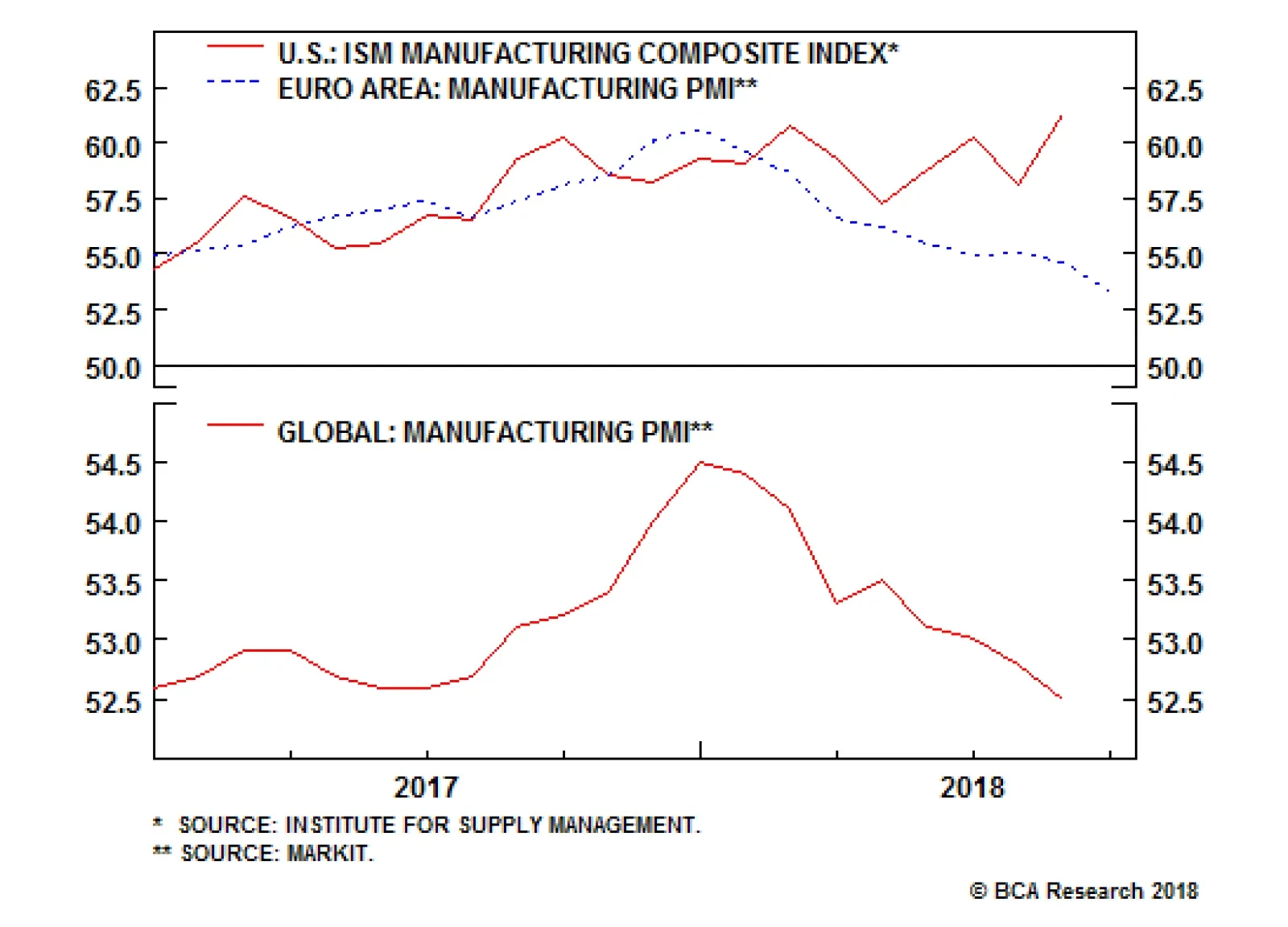
Purchasing managers surveys released at the beginning of next week will provide some insight into two of our themes. We will get an updated on the U.S. manufacturing ISM that has been elevated and so far supported the view that U.S. has been outperforming its…