Global
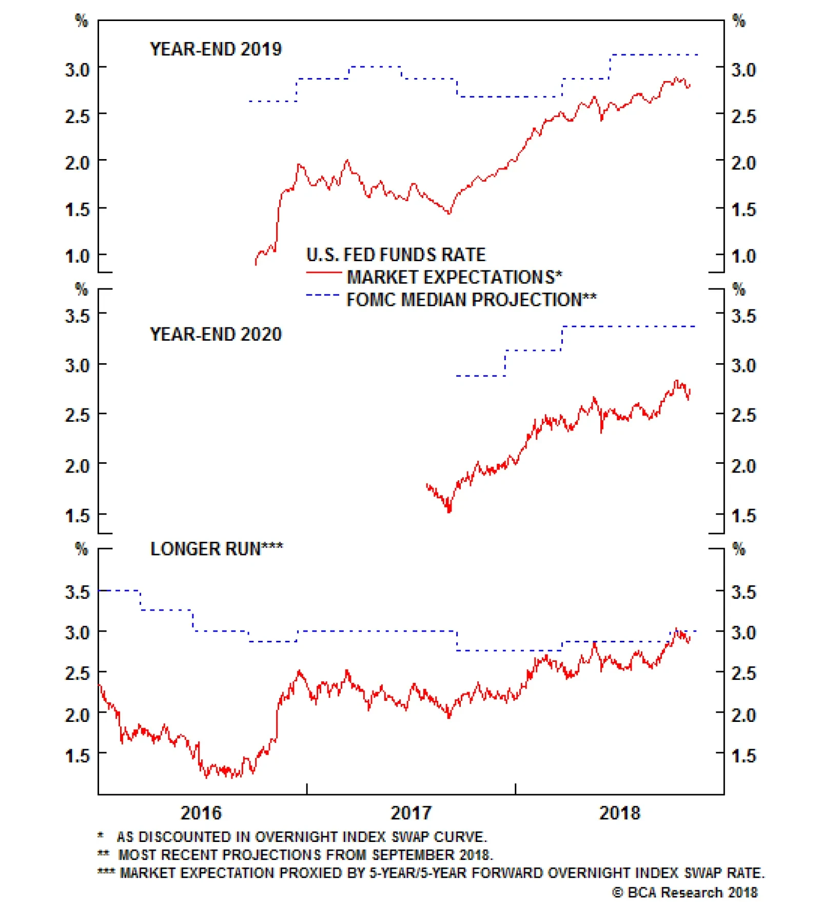
In the U.S., Wednesday’s FOMC meeting will be the most important event to watch. The Statement, released on Thursday, will be scrutinized for any hints that October’s stock market swoon has unnerved Fed policymakers. The non-manufacturing ISM for October is…
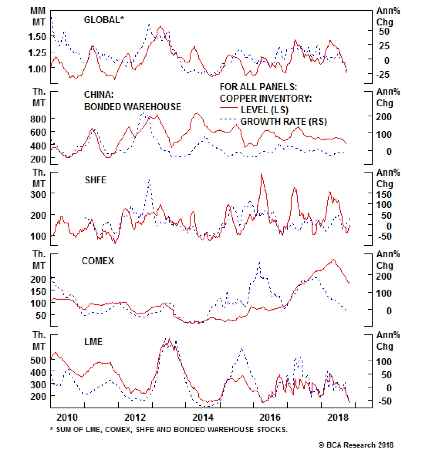
Chinese copper imports came in strong in September. While unwrought copper imports reached a 2.5-year high, ores and concentrates forged new record highs. Copper inventories at the three major global exchange warehouses have been declining steadily and…

Highlights Investors looking for equity upside, along with fixed-income-like downside protection, coupled with a hedge against rising rates, should consider convertible bonds. As we near the end of the business cycle, the attractions of convertibles are becoming clearer: investors will benefit from more upside capture in case of a last run-up in stocks, but at the same time suffer less downside in a recession. Moreover, in periods of rising rates, convertible bonds perform well compared to other traditional fixed-income securities. However, multi-asset portfolio managers should note that the risk-return profile of convertible bonds is more like equities than bonds, and so convertibles have no place in a conservative fixed-income portfolio. Investors have a number of options to choose from when customizing equity-versus-fixed-income exposure in their convertible allocations. Feature Introduction An ideal financial instrument would have large equity exposure in an equity bull market, and increased fixed-income exposure in a bear market. Financial engineering can create synthetic positions using derivatives to replicate just this sort of hybrid exposure - or an investor can just buy convertible bonds. In this current, late, phase of the business cycle - with increased volatility, rising interest rates, and a pickup in inflation - where can investors find shelter, but without sacrificing returns in the event of a last blow-out run-up in stocks? In this report, we discuss how convertible bonds - despite their somewhat complex structure1 - could be the answer. Issuers prefer convertibles to traditional corporate bonds because of: 1) a lower coupon rate and fewer covenants, 2) the opportunity to sell equity at a premium to the current price, 3) a faster process for raising capital, compared to a secondary equity issue, and 4) easier access to capital markets for non-investment grade firms. On the demand side, the composition of convertible investors has evolved over time. Prior to the 2007-9 Global Financial Crisis (GFC), proprietary trading desks and leveraged hedge funds were the most important players, since convertible arbitrage2 was very profitable. But the liquidity freeze in 2008 and 2009 forced these short-term investors out of the market and brought back long-term buy-and-hold investors. Currently 65% of U.S. convertible bonds are held by long-only investors. This change in market structure has had important implications for arbitrage opportunities (Chart 1). Chart 1Fewer Short-Term Investors
Should Investors Convert To Convertibles?
Should Investors Convert To Convertibles?
In the first half of 2018, issuance of global convertible securities topped $57 billion, the largest amount for a six-month period since 2008. The U.S. led the way, with issuance of $34 billion (Chart 2), followed by Asia ex-Japan at $12 billion, and Europe, $10 billion. The U.S. total includes $13.4 billion in convertible bond issuance by tech companies, the highest amount in the post-GFC period (Chart 2, panel 2). Bank of America Merrill Lynch estimates that full-year global issuance could be the highest in 12 years. The macro-backdrop for convertibles remains favorable: Chart 2Issuance Similar To Pre-Crisis Levels
Should Investors Convert To Convertibles?
Should Investors Convert To Convertibles?
The hybrid equity/fixed-income exposure offers protection against rising rates because of its shorter duration; The new U.S. tax code limits interest deductibility, which strengthens the relative appeal of issuing a convertible security instead of a traditional bond; The return of volatility means investors benefit from holding a security with an embedded option; The flexibility of the asset class gives investors room to customize their exposure in terms of coupon rate, premium, and maturity. In this report, we start with the market structure and mechanics of convertible bonds. Next, we look at the four types of convertible bonds, which provide different risk-return profiles. In the following section, we analyze historical returns and performance in different market environments. Finally, we discuss the key asset allocation decisions involved in investing in convertible bonds. Our main findings are: Investors can customize their risk-return profile by choosing between high-volatility equity exposure (equity-sensitive convertibles), or more stable fixed-income exposure (credit-sensitive convertibles); Convertible bonds historically have generated an annualized return of 9.5% compared to 9.8% from equities, but with 2% lower volatility; Convertible bonds have a risk-return profile more like that of equities and junk bonds than that of investment-grade credit; In periods of rising rates and inflation, convertible bonds have outperformed their traditional fixed-income counterparts; In comparison to equities, convertibles capture more upside in bull markets than downside in bear markets; Investing in convertible bonds requires active management because of their varying degree of equity- and fixed-income sensitivity that changes over time. The Convertibles Market Convertible securities can be broken into three key groups: 1) convertible bonds (cash-pay3 and zero-coupon), 2) convertible preferred shares, and 3) mandatory convertibles. Cash-pay convertible bonds make up almost 80% of the outstanding market (Chart 3), while zero-coupon convertible bonds are almost non-existent. Mandatories and convertible preferred equities make up 15% and 7% respectively. Chart 3Convertibles Bonds Are 80% Of Convertibles Market...
Convertibles Bonds Are 80% Of Convertibles Market...
Convertibles Bonds Are 80% Of Convertibles Market...
Before we delve deeper into the convertible bond markets, here are few key characteristics (Chart 4) of the other two groups: Chart 4...And Have The Best Risk-Adjusted Returns
...And Have The Best Risk-Adjusted Returns
...And Have The Best Risk-Adjusted Returns
Convertible Preferred Equities are issued with a specific dividend rate that is generally higher than the dividend on common shares. They include an embedded option to convert to a specified number of common shares. Additionally, preferred dividends usually accumulate in arrears should the firm be unable to make a payment. The conversion rate increases with any increase in the common-share dividend. After the call protection expires, the company has the option of redeeming the issue at the stated par value. Mandatory Convertibles. These bonds automatically convert to common shares at a specified time. However, they do not offer downside protection since conversion can be into shares worth less than the original issue price. Rating agencies view these securities more as equities than bonds, giving firms an incentive to issue them from a balance-sheet perspective. Table 1 shows us that cash-pay (coupon paying convertible bonds) generated the highest return with the lowest volatility, thereby providing investors with the best risk-adjusted returns. Mandatory convertibles have a large excess kurtosis - driven by the forced conversion into equities at inopportune times. In bull and bear markets, it is clear convertible bonds did not enjoy the full upside provided by preferred shares and mandatories, but had 50% less downside in bear markets. Also, in periods of rising rates convertible bonds produced positive returns, but lagged both preferred shares and mandatory convertibles. Table 1Convertible Bonds' Risk-Return Profile
Should Investors Convert To Convertibles?
Should Investors Convert To Convertibles?
A niche market exists for contingent convertibles (CoCos) - or, as they are sometimes called, anti-convertibles. Banks in the euro area issue CoCos to meet capital requirements and provide a cushion should they find themselves in a serious predicament. These typically pay a higher coupon than the bank's straight bonds to compensate for the possibility of a complete wipeout. In short, if all goes well you receive your fixed coupons and principal back at maturity. But, if things turn sour, the bonds convert to equity and the investor potentially loses everything. Mechanics Of Convertible Bonds Convertible bonds are a hybrid security issued as a senior unsecured bond with a fixed maturity (normally five years) with optionality to convert to a fixed number of shares. In exchange for the equity kicker, these bonds typically yield less and carry a lower coupon rate (Chart 5) than the issuer's comparable non-convertible debt. We describe the basics of convertible bonds in the Appendix. Chart 5The Cost Of An Embedded Option
The Cost Of An Embedded Option
The Cost Of An Embedded Option
An investor considering an allocation to convertibles has four groups to choose from depending on his or her risk-return tolerance. The trade-off is between high volatility equity exposure versus more stable credit exposure. If the underlying stock does well, the convertible increases in value even without the investor exercising the option to convert into shares. If the stock does not appreciate, the investor retains the bond and collects regular coupons and par value at maturity. The interaction of market price with investment value and conversion price creates convertible bonds with different risk-return profiles: Credit Sensitive: A large decrease in the stock price has pushed the convertibles to trade close to their investment value (bond floor). These are out-of-the money convertibles, with a delta ranging from 10% to 40%, and also with large premium over investment value. The main factors affecting the pricing of such instruments are the level of interest rates and credit spreads. An investor has a small probability of generating large unexpected gains from underlying stock appreciation. Balanced: The stock price is close to the conversion price, making these at-the-money convertibles. They have a moderate premium to conversion value, and deltas in the range of 40-80%. Rising stock prices make the embedded call option more valuable, pushing the convertible price closer to the stock price. Long-term buy-and-hold investors looking to maintain a core allocation to convertibles should invest in balanced convertibles. Equity Sensitive: Convertibles that are deep in-the-money, trading near parity, with high deltas of over 80%, and generating returns that closely track equities. They still retain some downside protection due to seniority and par value at maturity even if they have most of the common share's upside potential. Distressed: As a company threatens to default or goes bankrupt, the value of the straight bond component declines to trade significantly below par. These bonds tend to have high degree of price volatility and low probability of return of capital. Risk & Return Convertible bond returns are driven by: 1) the bond component that is a function of rates, credit spreads, and curve effects; 2) the equity component, supported by the delta to the underlying stock price; and 3) the option component, that is a function of the underlying stock price and time to maturity. Convertibles combine characteristics of stocks and bonds (Chart 6), so they represent either lower-volatility equity exposure or enhanced fixed-income exposure. Over the past 24 years (Table 2), U.S. convertible bonds generated returns similar to U.S. equities, but with a lower volatility. However, relative to traditional corporate bonds, convertibles outperformed massively, but with much higher volatility. Looking at risk-adjusted returns, we see that convertible bonds have more similarity to equities and high-yield credit than to investment-grade credit (Chart 7). However, defaults in the convertible bond space have been close to 1%, which is significantly lower than the 4% in the high-yield credit market (Chart 8). This is because convertible bonds include a smaller proportion of issuers with high operating leverage, such as energy producers, and have a high representation of mature healthcare and technology companies. Chart 6Convertibles Vs. Traditional
Convertibles Vs. Traditional
Convertibles Vs. Traditional
Table 2Better Than Equities, But More Volatile Than Traditional Bonds
Should Investors Convert To Convertibles?
Should Investors Convert To Convertibles?
Chart 7Close To Equities & Junk
Close To Equities & Junk
Close To Equities & Junk
Chart 8Lower Defaults Than Junk Bonds
Should Investors Convert To Convertibles?
Should Investors Convert To Convertibles?
Short-term performance of the convertible bond market is driven by the composition of issuers, but long-term performance is driven by the performance of the different variables described above. In 1Q 2018, convertible bonds outperformed equities, largely due to technology and consumer staples convertibles. Technology convertibles saw a 11% gain, while the S&P technology sector was up only 3.5%. This was because technology convertible issuers were concentrated in the mid-cap growth segment, whereas the large-cap equity names are more heavily weighted in semiconductors. BCA has for two or three years been warning about the return of inflation and rising interest rates. Convertible bonds outperform traditional fixed income in periods of rising interest rates because: 1) rising rates are often coupled with periods of positive equity momentum, which benefits convertibles; 2) convertibles have lower duration than straight bonds. Since 1994, there have been 10 instances when the 10-year U.S. Treasury yield rose by more than 100 bps: convertible bonds outperformed in every instance. Additionally, convertible bonds enjoy a yield advantage: the average income return (coupon rate) on a convertible is greater than the dividend yield on the underlying stock. When investors allocate to convertible bonds from either their equity or fixed-income portfolio, the key consideration is upside versus downside exposure. When the underlying stock price rises, convertibles will capture a portion of the capital appreciation but, on the downside, convertibles continue to provide a consistent income flow and principal repayment at maturity. History tells us that convertibles capture more upside in bull markets than downside in bear markets. If the share price falls sharply below the conversion price, the convertible will react less and less to fluctuations in the underlying stock price. In short, convertible bonds provide more downside protection than stocks as market value will not drop below the investment value (bond floor). Convertibles also have a mechanism to offset rising equity volatility and rising rates. The embedded equity option in a convertible bond rises in value when volatility rises, providing a meaningful offset in contrast to equities that may suffer a drawdown. Over the long-run, convexity enables this asset to make the most of favorable stock market conditions, whilst suffering less in difficult conditions. As mentioned earlier, the risk-return profile of convertible bonds tends to have a closer relation with equities than with fixed income. Within fixed income, high-yield credit, which tends to have a return profile closely aligned with equities, has a strong correlation with convertible bonds. The greatest diversification potential is when convertible bonds are added to a portfolio of government bonds. However, investors should realize the risk-return profiles for convertibles and government bonds are very different, and an allocation to the former is only a possibility for an investor with a higher risk tolerance. What To Choose From? Equity Sensitive Versus Credit Sensitive Investors need to choose the right type of convertible bond depending on their risk tolerance. Equity-sensitive convertibles made up over 60% of the market prior to the GFC, but this proportion fell to around 20% during the recession (Chart 9). As stock prices tumble, the market price of convertibles get closer to the investment value (bond floor), and convertibles start behaving more like pure credit-sensitive bonds. Looking at total returns (Chart 10 & Table 3), it is clear that aggressive investors with a higher risk tolerance should invest exclusively in equity-sensitive convertibles. But investors looking to maintain a core long-term allocation to convertibles should focus on the balanced group. Despite being a small piece of the market, distressed convertibles are attractive return enhancers immediately after a recession. Investors looking for income return should prefer credit-sensitive or distressed convertibles over equity-sensitive ones. Equity-sensitive convertibles have the highest delta, making them the most vulnerable to underperformance in a downturn. Balanced convertibles have the highest vega, which means they are most impacted by increasing volatility - driven by both equity and rate volatility. In times of rising interest rates, equity-sensitive convertibles provide their best protection given their short duration. Credit- and rate-sensitive convertibles have almost double the duration, making them more vulnerable to rising rates. Chart 9Equity Vs. Fixed Income Exposure
Equity Vs. Fixed Income Exposure
Equity Vs. Fixed Income Exposure
Chart 10Massive Outperformance By Equity Sensitive
Massive Outperformance By Equity Sensitive
Massive Outperformance By Equity Sensitive
Table 3Equity Sensitive For The Aggressive, Credit Sensitive For The Conservative, Balanced For Everyone
Should Investors Convert To Convertibles?
Should Investors Convert To Convertibles?
Small Cap Versus Large Cap Issues Investors can choose between convertible issues from companies of different size. Since the middle of the financial crisis, large-cap issues have grown to over 50% of the market (Chart 11), up from below 30%. The increase in market share was taken from small-cap issues, with mid-cap issues stable at 20% of the market. In terms of total returns (Chart 12 & Table 4), small cap outperformed both mid and, particularly, large caps. Part of this outperformance was due to the higher yield offered by small-cap issuers compared to their larger counterparts. In terms of equity sensitivity, small-cap issues currently have significantly lower delta than large caps. However, in times of rising volatility, small-cap issues lose more, driven by their higher vega. In terms of interest-rate sensitivity, all three sizes are roughly equally exposed given similar durations. Chart 11Bigger Is Not Always Better
Bigger Is Not Always Better
Bigger Is Not Always Better
Chart 12Small Cap Outperforms
Small Cap Outperforms
Small Cap Outperforms
Table 4Small Cap Provides The Best Value
Should Investors Convert To Convertibles?
Should Investors Convert To Convertibles?
Investment Grade Versus The Rest A credit investor has one particularly important call: investment-grade versus high-yield. The situation is trickier for convertibles as over 60% of the bonds are unrated (Chart 13), thereby giving managers amply opportunity for alpha generation. Historical performance (Chart 14 & Table 5) shows that non-rated convertible bonds have a close relationship with non-investment-grade issues. Moreover, the relative performance of non-investment-grade and non-rated issues with investment grade issues follows a similar path. From an income-return perspective, both non-rated and non-investment-grade issues have lost their yield advantage since 2016. Investors are not receiving adequate yield for the additional risk they are taking with riskier issues. The return of volatility will have a smaller impact on investment-grade issues compared to the rest of the market because the former have a lower effective duration. Additionally, implied volatility is lower for investment-grade issues. Chart 13Over 60% Has No Credit Rating
Over 60% Has No Credit Rating
Over 60% Has No Credit Rating
Chart 14Similar Return, But Different Risk
Similar Return, But Different Risk
Similar Return, But Different Risk
Table 5No Rating = Source Of Alpha
Should Investors Convert To Convertibles?
Should Investors Convert To Convertibles?
The Asset Allocation Decision The key question here is: are investors looking at convertible bonds (Chart 15) as part of an equity or a fixed-income allocation? Investors considering convertibles as part of their equity allocation are looking for a more defensive exposure and yield pick-up, and so should focus on balanced convertibles and not equity-sensitive ones. On the other hand, considering convertibles as part of fixed-income allocation will deliver equity exposure, and so investors should focus on credit-sensitive or balanced convertibles. Chart 15Somewhere Between Equities & Junk
Somewhere Between Equities & Junk
Somewhere Between Equities & Junk
Another major factor is the investment horizon of the convertible allocation. A core strategic allocation to convertibles will require a hybrid exposure, providing lower-volatility equity exposure over multiple full market cycles. Such investors are looking for long-term equity upside, but are concerned about shorter-term downside equity volatility and should consider balanced convertibles. On the other hand, investors using convertibles as part of a tactical allocation, to make a short-term bet in order to diversify away from traditional fixed-income or equity exposure, should consider either equity-sensitive or credit-sensitive convertibles. The bottom-line is that convertible investing requires active management because these securities have varying degrees of equity and fixed-income sensitivity that change over time. In periods of rising equity markets, an investor with passive exposure to convertibles would automatically have a large holding in equity-sensitive convertibles with a high delta, thereby increasing his or her exposure to equity downside risk. For example, in February 2009, when markets troughed after the GFC, more than two-thirds of convertibles were trading as credit-sensitive instruments. An investor following a passive index in this situation would have had minimal exposure to equity-sensitive convertibles, and would thereby have had limited participation in the equity upside. Finally, the convertible universe is constantly evolving. The typical convertible bond is issued with a five-year life by a company in the early to mid stage of its corporate life cycle, seeking capital to grow. As time passes, the issuer matures to a point where it no longer needs convertibles in its capital structure. Nearly two-thirds of the current issuers of convertible were not in the market 10 years ago, while two-thirds of the S&P 500 members remain unchanged over this time. Aditya Kurian, Senior Analyst Global Asset Allocation adityak@bcaresearch.com 1 Despite the complexities, the first convertible bond was issued as long ago as 1874 by Rome, Watertown and Ogdensburg Railroad to finance a project. The bond was never converted since the underlying shares failed to rise enough and the company refinanced the bond in 1904. 2 For an explanation of convertible arbitrage, please see A Note On Convertible Arbitrage at the end of this report. 3 Convertible bonds that make regular coupon payments. A Note On Convertible Arbitrage A market-neutral hedge fund strategy where the manager goes long the convertible bond and short the underlying stock. The short position in the underlying stock creates a delta-neutral position, but maintaining this position requires dynamic hedging which is expensive. There is a possibility of large mispricing because of the over-the-counter nature of the market and uncertainty regarding call or redemption features of convertibles. Often, the embedded equity option is a source of cheap volatility compared to the underlying stock's listed options. A quick measure for convertible valuations is comparing the volatility of options in the market to the volatility priced in the embedded option in the convertible. If market volatility rises, but the price of convertible stays the same, the security could be cheap and attractive. Looking at historical performance (Table 6), convertible arbitrage generated almost 3% less than equities, but with less than half the volatility. However, all of the outperformance was during recessions or equity bear markets. Additionally, convertible arbitrage funds have large negative skew and kurtosis relative to both equities and the hedge-fund composite. We recommend investors allocate to convertible arbitrage hedge funds in preparation for a downturn. Table 6Convertible Arbitrage Versus Traditionals
Should Investors Convert To Convertibles?
Should Investors Convert To Convertibles?
Appendix: The Basics Of Convertible Bonds Investment Value (Bond Floor): The fixed-income component of the convertible bond, or in other words, the value of the bond without the conversion feature (equity kicker). This remains stable over a wide range of stock prices but, when creditworthiness deteriorates, consequent stock price movements will have an impact on the investment value (IV). Holding creditworthiness constant, the IV provides the bond floor, below which the convertible should not trade. The IV fluctuates in tandem with the price of a straight corporate bond of similar quality. A convertible that is trading close to its IV will be more affected by changes in rates than one that is well above it. Investment Premium: The market price minus IV expressed as a percentage of IV. Premium over IV indicates the level of downside risk. A higher premium means the bond price is more sensitive to the price of underlying stock, which means less downside protection because the bond market price would have to decline significantly before reaching the IV. Higher premium is a result of rising underlying stock value, whereas a smaller premium is when the convertible is more interest-rate sensitive and behaves like a pure bond. Conversion Value (CV): The equity portion of the convertible bond. Conversion ratio is set at the time of issuance and it is the number of shares a bondholder will receive upon conversion. Conversion price is the price at which the number of converted shares is equal to the par value of the bond. At issuance, the underlying stock price is usually below conversion price. Conversion Premium: The market price minus CV expressed as a percentage of CV. As market price rises above CV, fixed-income attributes are lost and equity features take over, consequently decreasing conversion premium. Declining stock prices mean convertible market price approaches fixed-income value (bond floor) and conversion premium increases. Appendix Chart 1Preferred Shares & Mandatory Convertibles Have Higher Income Returns
Preferred Shares & Mandatory Convertibles Have Higher Income Returns
Preferred Shares & Mandatory Convertibles Have Higher Income Returns
Appendix Chart 2Convertible Bonds' Delta & Vega Reduces In A Recession
Convertible Bonds' Delta & Vega Reduces In A Recession
Convertible Bonds' Delta & Vega Reduces In A Recession
Appendix Chart 3Conversion Premium Far From Recessionary Levels
Conversion Premium Far From Recessionary Levels
Conversion Premium Far From Recessionary Levels
Appendix Chart 4Average Duration Less Than 2.5
Average Duration Less Than 2.5
Average Duration Less Than 2.5
Appendix Chart 5U.S. Is 60% Of Global
U.S. Is 60% Of Global
U.S. Is 60% Of Global
Appendix Chart 6U.S. Is Clearly The Best Performer
U.S. Is Clearly The Best Performer
U.S. Is Clearly The Best Performer
Appendix Chart 7U.S. Also Provides The Best Income Return
U.S. Also Provides The Best Income Return
U.S. Also Provides The Best Income Return
Appendix Chart 8But, U.S. Is The Most Equity Sensitive
But, U.S. Is The Most Equity Sensitive
But, U.S. Is The Most Equity Sensitive
Appendix Chart 9U.S. Has A Higher Implied Volatility
U.S. Has A Higher Implied Volatility
U.S. Has A Higher Implied Volatility
Appendix Chart 10Distressed Is The Best Solution Immediately After A Recession
Distressed Is The Best Solution Immediately After A Recession
Distressed Is The Best Solution Immediately After A Recession
Appendix Chart 11Balanced Has The Lowest Coupon
Balanced Has The Lowest Coupon
Balanced Has The Lowest Coupon
Appendix Chart 12Balanced Has Moderate Delta, But Highest Vega
Balanced Has Moderate Delta, But Highest Vega
Balanced Has Moderate Delta, But Highest Vega
Appendix Chart 13Equity Sensitive Are The Best Rate Hedge
Equity Sensitive Are The Best Rate Hedge
Equity Sensitive Are The Best Rate Hedge
Appendix Chart 14Premiums Are Stable
Premiums Are Stable
Premiums Are Stable
Appendix Chart 15Mid-Cap Provides Low Income Return
Mid-Cap Provides Low Income Return
Mid-Cap Provides Low Income Return
Appendix Chart 16Massive Delta & Vega Divergence
Massive Delta & Vega Divergence
Massive Delta & Vega Divergence
Appendix Chart 17Large Cap Premium Has Risen The Most
Large Cap Premium Has Risen The Most
Large Cap Premium Has Risen The Most
Appendix Chart 18Implied Volatility Is Similar Across The Board
Implied Volatility Is Similar Across The Board
Implied Volatility Is Similar Across The Board
Appendix Chart 19ALl Coupon Rates Have Fallen
ALl Coupon Rates Have Fallen
ALl Coupon Rates Have Fallen
Appendix Chart 20Investment Grade Has The Highest Delta
Investment Grade Has The Highest Delta
Investment Grade Has The Highest Delta
Appendix Chart 21Underweight Duration = Investment Grade Convertibles
Underweight Duration = Investment Grade Convertibles
Underweight Duration = Investment Grade Convertibles
Appendix Chart 22Premiums Stable
Premiums Stable
Premiums Stable
Dear Client, You will see in this Monthly Portfolio Update that we have expanded our table of Recommendations to include a wider range of the views that Global Asset Allocation (GAA) regularly discusses in its publications. Please see our most recent Quarterly Portfolio Outlook1 for a detailed explanation of those recommendations that we do not specifically touch on in this Monthly. A note on our publication schedule. We will not publish a Monthly for December, or a Q1 2019 Quarterly in mid-December. Instead, we will send you in late November the BCA 2019 Outlook (BCA's annual discussion with Mr. and Ms. X). This will be accompanied by a short GAA note, updating our recommendation tables with a brief commentary. Best Regards, Garry Evans A Correction, Not A Bear Market Investors have a tendency to forget that corrections are common in bull markets. The current equity run-up, which began in March 2009, has seen five corrections (defined as a 10-20% decline in the S&P500). We may now be experiencing the sixth, with the index already down 9.9% from its peak on September 20. Recommendations
Monthly Portfolio Update
Monthly Portfolio Update
But we think the evidence is fairly strong that this is just a correction and not the beginning of a new bear market (using the common definition of a 20% or greater fall). It is highly unusual for bear markets to occur - and for bonds to outperform equities - except in the run-up to, and during, recessions (Chart 1). We see little to suggest that a recession in on the horizon over the next 12 months. Chart 1Corrections Are Not At All Rare
Corrections Are Not At All Rare
Corrections Are Not At All Rare
What caused the correction? The immediate trigger was a seemingly concerted series of statements in early October from FOMC officials, including even doves such as Lael Brainard, that economic circumstances are "remarkably positive" and that rates remain "a long way from neutral" (to quote Fed Chair Jay Powell). In particular, New York Fed President John Williams argued that the neutral rate of interest (the r*) is very uncertain - even though he was joint creator of the main model that estimates it. The implication is that the Fed will keep on raising rates until the economy clearly slows. This pushed the 10-year Treasury yield above 3.2%. Markets are starting to worry that the Fed will make a policy mistake and that certain segments of the economy (housing, emerging markets?) may be too weak to withstand tighter monetary policy. Moreover, this is in a context in which global growth has been weakening (Chart 2), China appears to be slowing quite sharply (Chart 3), the trade war is escalating (with the U.S. now threatening to impose tariffs on all Chinese imports), and valuations for most assets are stretched. Chart 2Outside The U.S., Growth Is Slowing
Outside The U.S., Growth Is Slowing
Outside The U.S., Growth Is Slowing
Chart 3Sharp Slowdown Ahead For China?
Sharp Slowdown Ahead For China?
Sharp Slowdown Ahead For China?
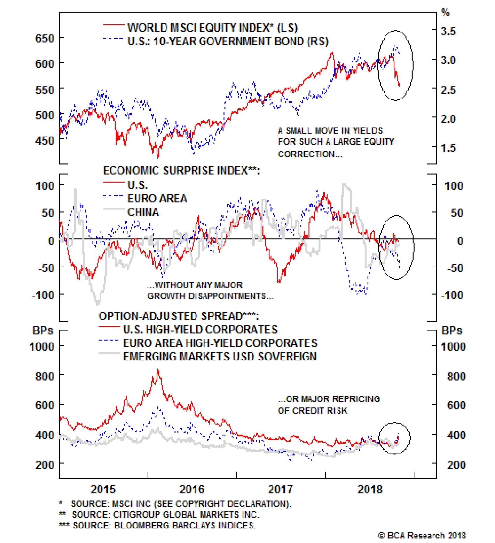
So how worried should investors be? Most of the usual indicators of generalized risk aversion have not flashed strong warning signals during the equity market sell-off (Chart 4). The move up in bond yields came mostly from a rise in real yields, not inflation expectations, and the yield curve steepened, suggesting that markets are pricing in stronger growth not excessive Fed action. Safe haven assets, such as gold and the Swiss franc, did not perform particularly strongly. Credit spreads rose a little, by around 70 basis points, but do not yet signal stress. Chart 4No Signals Of Strong Risk Aversion
No Signals Of Strong Risk Aversion
No Signals Of Strong Risk Aversion
Moreover U.S. growth, in particular, remains robust. Though the r* may be tricky to estimate, monetary policy is still clearly accommodative and is likely to remain so until at least mid-2019, even if the Fed hikes by 25bp a quarter (Chart 5). Fiscal policy will be stimulative until the end of 2019, adding 1.1 percentage points to growth this year and 0.5 next, according to IMF estimates. Earnings growth will slow from its current lick - Q3 U.S. earnings look like coming in at 23% year-on-year, compared to a forecast of 19% before the results season - but our models suggest that 2019 bottom-up estimates are about right, with growth slowing to around 10% in the U.S. and to somewhat less in the euro area and Japan (Chart 6).2 Chart 5Fed Policy Still Accomodative
Fed Policy Still Accomodative
Fed Policy Still Accomodative
Chart 6Earnings Growth To Continue, Albeit More Slowly
Earnings Growth To Continue, Albeit More Slowly
Earnings Growth To Continue, Albeit More Slowly
If we have a concern, it is that a few interest-rate sensitive elements of the U.S. economy are showing signs of softness. Housing starts have been weak for a while, but higher mortgage rates may now be having an effect, with residential investment subtracting from GDP growth in all three quarters so far this year (Chart 7). However, mortgage rates are unlikely to continue to rise at the same pace and so the effect should weaken in further quarters. Capex intentions and durable orders have also slipped, perhaps suggesting that corporations have reined back investment plans due to global uncertainties (Chart 8). But these signs point to slower growth next year, not recession, with the U.S. likely to continue to grow above trend. Historically, higher long-term rates have proved a drag on the economy only when they have risen above trend nominal GDP growth, currently around 3.8% (Chart 9). We have some way to go before we reach that tipping-point. Chart 7Housing Is Hurting
Housing Is Hurting
Housing Is Hurting
Chart 8...And Capex Is Getting Cautious
...And Capex Is Getting Cautious
...And Capex Is Getting Cautious
Chart 9Rates Matter When They Exceed Nominal Growth
Rates Matter When They Exceed Nominal Growth
Rates Matter When They Exceed Nominal Growth
We moved to neutral on risk assets, including equities, at the beginning of July. Many of the worries we flagged then have come about. This is late in the cycle, and so volatility will probably remain elevated. However, we do not expect the next recession to come until 2020 at the earliest. Moreover, none of the warning signals on our bear market checklist (which includes the shape of the yield curve, profit margins, a peak in cyclical spending as a percentage of GDP, Fed policy becoming restrictive etc.) are yet flashing, though several may do by mid next year. Equity market valuations are no longer expensive after the recent sell-off (Chart 10). If the current correction were to continue and the drop in the S&P 500 extend to 15% and in global equities to 20% from their most recent peaks, we might be inclined tactically to move back overweight on risk assets. Chart 10Stocks Are No Longer Expensive
Stocks Are No Longer Expensive
Stocks Are No Longer Expensive
Currencies: We expect further U.S. dollar appreciation. Divergences in growth and monetary policy between the U.S. and other developed markets will continue. While we expect the Fed to continue to hike once a quarter until end-2019, we could imagine the ECB turning more dovish if euro zone growth continues to slow and Italian BTP 10-year bond yields rise above 4%. The Bank of Japan will stick to its Yield Curve Control policy, which will prevent the yen rising. Emerging market currencies look vulnerable as their economies slow as a result of central bank rate hikes earlier in the year. Asian currencies might undertake competitive devaluations if the renminbi falls below 7, as a result of a worsening trade war. Fixed Income: Long-term rates are unlikely to have peaked for this cycle. Core inflation will stay at around 2% for a few more months because of a favorable base effect, but underlying inflation pressures (the result of rising wages and increases in import tariffs) will push up U.S. inflation by mid next year (Chart 11). A combination of higher inflation, steady Fed hikes, and deteriorating supply/demand conditions (which will raise the term premium) will move 10-year rates above 3.5% by mid-2019 (Chart 12). We accordingly recommend being short duration and overweight TIPs. U.S. high-yield bonds look somewhat attractive, with a default-adjusted spread of 270 bps, after their recent modest sell-off (Chart 13). But this is dependent on our assumption (based on Moody's model) of credit defaults of only 1.04% over the next 12 months.3 Given where we are in the cycle, and considering the elevated corporate leverage in the U.S., we do not consider this a risk worth taking, and so maintain our moderate underweight in credit. Chart 11Underlying Inflation Pressures Are Strong
Underlying Inflation Pressures Are Strong
Underlying Inflation Pressures Are Strong
Chart 12Indicators Point To Treasury Yields Above 3.5%
Indicators Point To Treasury Yields Above 3.5%
Indicators Point To Treasury Yields Above 3.5%
Chart 13Are Junk Bonds Attractive Again?
Are Junk Bonds Attractive Again?
Are Junk Bonds Attractive Again?
Equities: We prefer DM equities over EM, and favor the U.S. and, to a degree, Japan. Emerging markets continue their deleveraging process and will be hurt by rising U.S. rates, a stronger dollar, and slowdown in China. Valuations for EM equities, though one standard deviation cheap relative to global equities, are not yet sufficiently attractively valued to permit investors to buy EM stocks irrespective of their poor fundamentals. Moreover, analysts are still far too optimistic on the outlook for EM earnings, flattering the valuation metric (Chart 14). Stronger growth and an appreciating currency point to an overweight in U.S. equities which, moreover, would be likely to outperform in the event of a deeper correction, given their low beta. Chart 14EM Equities Aren't As Cheap As They Seem
EM Equities Aren't As Cheap As They Seem
EM Equities Aren't As Cheap As They Seem
Commodities: The crude oil price has fallen back a little in recent weeks, as a result of increases in OPEC production, a modest slowing of demand, and releases of the U.S. Strategic Petroleum Reserve. Our energy strategists have slightly lowered their 2019 Brent forecast to $92 a barrel, from $95 (Chart 15). However, they warn that geopolitical risks, such as widespread application of sanctions on Iran and a collapse in Venezuela, and limits to capacity in Saudi Arabia and U.S. shale production could easily cause spikes above $100.4 A 100% year-on-year rise in oil prices has historically been a clear warning of recession. That would equal Brent at $120 in 1H 2019. Metal prices will continue to be driven by China. At the moment we see no sign of China implementing a major stimulus, which would boost infrastructure spending and therefore demand for commodities (Chart 16), and so we expect further falls in industrial commodities prices. Chart 15Oil Prices Can Rise Further
Oil Prices Can Rise Further
Oil Prices Can Rise Further
Chart 16No Sings Of Big China Stimilus
No Sings Of Big China Stimilus
No Sings Of Big China Stimilus
Garry Evans, Senior Vice President Global Asset Allocation garry@bcaresearch.com 1 Please see GAA Quarterly Portfolio Outlook - October 2018, available at gaa.bcaresearch.com 2 For details of these models and the assumptions behind them, please see The Bank Credit Analyst November 2018, available at bca.bcaresearch.com 3 For details please see BCA U.S. Bond Strategy Weekly Report, "What Kind Of Correction Is This?", dated October 30, 2018, available at usbs.bcaresearch.com 4 For details please see BCA Commodity & Energy Strategy & Bond Strategy Weekly Report, "Risk Premium In Oil Prices Rising; KSA Lifts West Coast Export Capacity", dated October 25, 2018, available at ces.bcaresearch.com GAA Asset Allocation
Formal political science theory and history teach us that the further we are from a hegemonic global structure where one country (the hegemon) dominates and bullies all others, the closer we are to anarchy. The "offensive realism" school of International…
Highlights After tumbling more than 20% between June and August, copper prices have remained largely static. This reflects the tug-of-war between the near-term bullish physical market fundamentals, and the cloudier macro headwinds ahead, arising from a stronger U.S. dollar. Furthermore, Chinese policymakers are unlikely to abandon their reform agenda and stimulate massively, which will put downside pressure on copper prices further down the road. Despite our negative 12-month outlook, we do not rule out the potential for some upside going into year-end, on the back of falling inventories. Energy: Overweight. News leaked earlier this week indicates the Trump administration is divided over whether to grant waivers on Iranian crude oil imports to big importers like China, India and Turkey, following the re-imposition of sanctions on November 4.1 The U.S. State Department, in particular, appears worried the sanctions will produce a price spike that could derail growth in the U.S. and its allies. This suggests the Administration will be less determined to enforce its Iranian export sanctions, until it has been assured Saudi Arabia and Russia will be able to bring enough production on line in 1H19 to cover the lost Iranian exports, and possible deeper Venezuelan losses. Markets will remain focused on actual export losses from Iran - if they come in at the high end of expectations (i.e., greater than 1.5mm b/d), we expect higher prices; if it becomes apparent the U.S. will go soft on enforcing sanctions, prices would fall. Expect higher volatility. Base Metals: Neutral. Copper prices could rally over the short term, on the back of lower inventories. However, longer term, we see no catalysts to push prices toward recent highs of ~ $3.30/lb on the COMEX. Precious Metals: Neutral. Gold's break above $1,200/oz is holding, but it continues to grind in a $1,210 to $1,240/oz range. Ags/Softs: Underweight. The USDA will report on export sales of grains and oil seeds today. Soybean exports were down 21% y/y for the current crop year, based on the Department's October 18 report. Feature Tight Market Conditions Suggest A Brief Upswing ... After remaining in the $2.90-$3.30/lb trading range for the better part of 1H18, copper prices plunged ~20% since their June peak. The trigger? The escalation of the U.S.-China trade war. The increasingly acrimonious trade relationship acted as a reality check. Investors betting on strike-induced mine supply shortfalls earlier this year were forced to adjust expectations regarding the resilience of the global, and, more specifically, the Chinese business cycles.2 The negative impact of the trade war is clear: copper prices moved to the downside with each escalation in the dispute (Chart of the Week). While current market fundamentals do not necessarily warrant such drastic declines, we see these developments as a wake-up call to market participants. Copper sentiment - previously buoyed by expectations of mine strikes (which failed to materialize) - has come crashing down (Chart 2). Chart of the WeekCopper Down On Trade War
Copper Down On Trade War
Copper Down On Trade War
Chart 2Sentiment Has Come Crashing Down
Sentiment Has Come Crashing Down
Sentiment Has Come Crashing Down
However, the outlook in the very near term is not so bleak. The evidence below suggests tight physical conditions, indicating copper's next move could be to the upside: Chinese copper imports came in strong in September (Chart 3). While unwrought copper imports reached a 2.5-year high, ores and concentrates forged new record highs. Chart 3Chinese Imports Came In Strong
Chinese Imports Came In Strong
Chinese Imports Came In Strong
The resilience of Chinese purchases comes on the back of restrictions on scrap imports, which account for a significant share global copper supply (Chart 4). As we have been highlighting, Chinese restrictions on the purity of scrap imports require other forms of the metal to fill the supply gap.3 At the same time, the 25% tariff imposed on Chinese imports of U.S. scrap since August also manifests itself in greater demand for other forms of the metal. This is evident in weak scrap copper imports (Chart 5). Chart 4A Dependable Secondary Market Is Essential For Global Supply
Copper Could Rally In The Short Term; Long-Term Fundamentals Less Bullish
Copper Could Rally In The Short Term; Long-Term Fundamentals Less Bullish
Chart 5Scrap Import Restrictions Raise Need For Other Forms Of Copper
Scrap Import Restrictions Raise Need For Other Forms Of Copper
Scrap Import Restrictions Raise Need For Other Forms Of Copper
Copper inventories at the three major global exchange warehouses have been declining steadily and together now stand at half their late April peak (Chart 6). This is their lowest level since late 2016. Chart 6Exchange Inventories At Two Year Low
Exchange Inventories At Two Year Low
Exchange Inventories At Two Year Low
The above evidence of a tight market is in line with copper's futures curve, which is recently pricing a premium for physical delivery (Chart 7). Chart 7Markets Pricing A Premium For Physical Delivery
Markets Pricing A Premium For Physical Delivery
Markets Pricing A Premium For Physical Delivery
Going into the winter, smelter disruptions may lend further upside support amid these tight conditions: The Vedanta copper smelter in the Indian state of Tamil Nadu was forced to shut down in May due to violent protests. The smelter has an annual production of over 400k MT. In Chile, Codelco gave notice to the market that two of its four smelters will undergo weeks-long outages, in order to comply with tightening of emissions rules - requiring smelters to capture 95% of emissions - due to take effect in December. This will halt production from smelters at the Chuquicamata and Salvador mines for 75 days and 45 days, respectively. Furthermore, in mid-October BHP Billiton reduced its 2018 copper production forecast by 3% to between 1.62mm MT and 1.7mm MT, due to shutdowns at its Olympic Dam facility in Australia and Spence in Chile. Bottom Line: Dynamics at the scrap level in China and disruptions at major smelters in India, Chile and Australia justify tight copper market conditions. This offers potential for a minor rebound in copper prices in the very near term. ... Ahead Of Macro Headwinds In the medium term, macro headwinds will dominate the physical market, capping gains in copper prices. Most notably, fall-out from the U.S.-China trade war in absence of aggressive traditional forms of stimulus, will weigh on demand there. Furthermore, U.S. dollar strength on the back of economic and monetary policy divergences, will make the red metal more expensive for global consumers. Ex-U.S. Growth Unpromising Given the stimulative fiscal policies in the U.S., our House View still does not expect a recession before late-2020. However in the meantime, the global economy will be characterized by divergence in favor of the U.S. (Chart 8). Chart 8Global Economic Divergence Favors U.S.
Global Economic Divergence Favors U.S.
Global Economic Divergence Favors U.S.
Of utmost importance is, of course, China - where roughly half of global refined copper is consumed. The trade dispute with the U.S. has raised concerns over the resilience of the Chinese economy. Recent data releases have done little to ease fears of a manufacturing slowdown. The Li Keqiang Index and our China construction proxy - both of which are strongly correlated with copper prices - are on a slight downtrend (Chart 9). Chart 9Ominous Signs From China
Ominous Signs From China
Ominous Signs From China
China's 3Q18 GDP data indicate the Chinese economy grew by the slowest pace in nearly a decade (Chart 10). At the same time, PMI's have fallen to or near the 50 level - the boom-bust line - reflecting pessimism in the manufacturing sector. The real estate market - where 45% of China's copper is consumed - also looks gloomy. Home sales rolled over, boding ill for future housing starts. Chart 10Weak Q3 GDP Mirrors Manufacturing And Property Sectors
Weak Q3 GDP Mirrors Manufacturing And Property Sectors
Weak Q3 GDP Mirrors Manufacturing And Property Sectors
What's more, we are not betting on a flood of stimulus to rescue China's ailing economy. As our colleagues at BCA's Geopolitical Strategy service have been highlighting, the drive to combat vulnerabilities in financial markets raised the pain threshold of Chinese policymakers.4 As such, they are not likely to abandon their reform agenda at the first sign of weakness, as they traditionally have. Although some measures have already been implemented to ease policy, the current response is not yet as promising for commodity markets as has historically been the case. For one, credit growth is constrained by China's de-leveraging campaign. Although there is some evidence that the clampdown on shadow financing is easing, it is not yet at simulative levels (Chart 11). And while the money impulse is rebounding thanks to Reserve Requirement Ratio cuts, the credit impulse is still falling deeper into negative territory. Chart 11Shadow Banking Restrained By Reform Agenda
Shadow Banking Restrained By Reform Agenda
Shadow Banking Restrained By Reform Agenda
Additionally, as Peter Berezin who heads BCA's Global Investment Strategy highlights, China's more recent forms of (consumption-based) stimulus such as income tax reforms do not boost commodity demand. The same goes for the other way in which Chinese authorities are trying to stabilize their economy: by depreciating the RMB. This is in clear contrast to traditional measures such as fixed asset investment, which stimulate demand for raw materials and capital goods.5 Overall, the current level of stimulus is not sufficient to boost the Chinese economy. Nor, by extension, is it enough to lift EMs, and commodity prices in the process. In fact, copper markets have been oblivious to various announcements by Chinese authorities that they are easing policy (Chart 12). Chart 12Copper Markets Oblivious To Chinese Stimulus
Copper Markets Oblivious To Chinese Stimulus
Copper Markets Oblivious To Chinese Stimulus
Our Geopolitical Strategists warn that the U.S.-China trade war could get worse before it improves. Thus, while policymakers are not yet compelled to throw in the towel with their reform agenda, they are pragmatic and will likely intensify their response if conditions deteriorate further. If authorities were to deploy massively stimulative fiscal and monetary policy by propping up infrastructure and the real estate sector - as they traditionally have done - chances are that we would be able to escape further price weakness in copper markets. For now, the evidence points at a more modest policy approach. Green Dollar, Red Metal As a counter-cyclical currency, the U.S. dollar will shine in the current weaker ex-U.S. growth environment. What's more, limited spare capacity in the U.S. and a strong labor market foreshadow rising U.S. inflation readings. This will justify continued tightening by the Fed. Economic divergences favoring the U.S. economy will amplify the impact. Rising U.S. borrowing costs will be painful for debt-laden EM economies. Their Central Banks will struggle to keep the pace with the Fed. Similarly, the European Central Bank - conscious of turmoil in Italy - will be forced to maintain a more dovish stance. This will weigh down on the EUR/USD. A stronger dollar generally dents demand by making commodities - priced in U.S. dollars - more expensive for foreign consumers. While energy markets dominated by supply risks remain disconnected from their long-term negative correlation with the U.S. dollar, the relationship with metals has re-converged (Chart 13).6 This leaves copper more vulnerable to the downside amid dollar strengthening. The impact will be magnified for Chinese consumers as the RMB weakens further, forcing the top consumer to cut down on imports of the red metal. Chart 13USD-Copper Relationship Re-converged
USD-Copper Relationship Re-converged
USD-Copper Relationship Re-converged
Bottom Line: Headwinds from weakness in China and a stronger dollar will be a drag on demand next year. Unless Chinese policymakers temporarily abandon their reform agenda and stimulate massively, medium term copper prices will face pressures to the downside. Model Updates Given the macro headwinds outlined above, we revised our copper demand forecast. Our balances now point to a slight surplus in 2019 (Chart 14). In the context of 24mm MT of consumption p.a., a 100k MT surplus can be characterized as a balanced market. This makes prices vulnerable to upside or downside surprises, which can easily tip the scale. Chart 14Broadly Balanced Market
Copper Could Rally In The Short Term; Long-Term Fundamentals Less Bullish
Copper Could Rally In The Short Term; Long-Term Fundamentals Less Bullish
In line with our market assessment, we simulated forecasts for copper prices based on a 5% and 10% appreciation in the USD over the coming 12 months (Chart 15). Chart 15Macro Headwinds In 2019
Macro Headwinds In 2019
Macro Headwinds In 2019
Roukaya Ibrahim, Editor/Strategist Commodity & Energy Strategy RoukayaI@bcaresearch.com 1 Reuters published an interesting analysis containing the apparently leaked information re the internal disputes in the Trump administration entitled "Trump's sanctions on Iran tested by oil-thirsty China, India" on October 29, 2018. 2 In the Commodity & Energy Strategy Weekly Report published January 25, 2018, we highlighted the risk to mine supply in 2018 on the back of an unusually large number of labor contract renegotiations taking place this year - representing ~ 5 mm MT worth of mined copper. Most noteworthy was the risk of a strike at the Escondida copper mine in Chile. These have been largely resolved with minimal impact on supply. Please see "Stronger USD, Slower China Growth Threaten Copper," available at ces.bcaresearch.com. 3 Please see BCA Research Commodity & Energy Strategy Weekly Report titled "Copper: A Break Out, Or A Break Down?" dated May 17, 2018. Available at ces.bcaresearch.com. 4 Please see BCA Research Geopolitical Strategy Special Report titled "China Sticks To The Three Battles," dated October 24, 2018. Available at gps.bcaresearch.com. 5 Please see BCA Research Global Investment Strategy Weekly Report "Chinese Stimulus: Not So Stimulating" dated October 26, 2018, available at gis.bcaresearch.com. 6 Please see BCA Research Commodity & Energy Strategy Weekly Report titled "Correlations Vs. USD Weaken," dated June 14, 2018. Available at ces.bcaresearch.com. Investment Views and Themes Recommendations Strategic Recommendations Tactical Trades Commodity Prices and Plays Reference Table
Copper Could Rally In The Short Term; Long-Term Fundamentals Less Bullish
Copper Could Rally In The Short Term; Long-Term Fundamentals Less Bullish
Trades Closed in 2018 Summary of Trades Closed in 2017
Copper Could Rally In The Short Term; Long-Term Fundamentals Less Bullish
Copper Could Rally In The Short Term; Long-Term Fundamentals Less Bullish
Just like that other great October tradition, Halloween, market volatility has returned to spook investors. Both the MSCI All-Country World Index and S&P 500 index fell officially into correction territory, although they have bounced in recent days. The…
Highlights So What? The bull market in defense stocks is global and only beginning. We construct a BCA Global Defense Index to give investors exposure to this theme. Why? Multipolarity will drive uncertainty and conflict, spurring arms demand to Cold War heights. Contemporary geopolitical hotspots require expensive and modern technology. Cold War-era weapon systems are long in the tooth and in need of replacement. Also... We close our long Energy / short S&P 500 portfolio hedge for a gain. Feature It is somewhat of a cliché to tell clients that one of our highest conviction calls is to be overweight defense stocks. We are, after all, geopolitical investment strategists! Our decision to go long S&P 500 aerospace and defense stocks / short MSCI ACW is up 14% since initiation in December 2016. In this report, we build on previous work focusing on U.S. defense stocks and expand our analysis to global plays. GPS' Mega-Theme: Multipolarity Is Good For War International affairs are characterized by an anarchic governance structure. In the absence of a global government, the vacuum of power is filled by powerful states. These states behave like bullies in the schoolyard. When a single, powerful bully dominates the lunch break, all other kids fall in line or suffer the bully's wrath. When two bullies split the yard into warring camps, proxy fights may emerge on the sidelines, but generally an equilibrium is preserved. Formal political science theory and history teach us that the further we are from a hegemonic global structure where one country (the hegemon) dominates and bullies all others, the closer we are to anarchy. The "offensive realism" school of International Relations theory further splits multipolarity into two types: Balanced multipolarity is characterized by a number of roughly equally powerful states, similar to the distribution of power of continental Europe during the "Concert of Europe" era in the nineteenth century. Unbalanced multipolarity is closest to contemporary geopolitics. In The Tragedy Of Great Power Politics, John Mearsheimer reviewed 200 years of European history and concluded that unbalanced multipolarity is by far the most volatile geopolitical system (Table 1).1 Table 1Global System Structure And War
"War! What Is It Good For? - Absolutely Noth...." Actually, Global Defense Stocks!
"War! What Is It Good For? - Absolutely Noth...." Actually, Global Defense Stocks!
A multipolar ordering of global power, therefore, produces the highest level of disorder (Chart 1). This finding is theoretically elegant, but normatively disturbing. Every country gets a voice and an opportunity to defend its sovereignty. But the international order is normatively ignorant and desires a bully or hegemon. Chart 1Multipolarity Produces Disorder
Multipolarity Produces Disorder
Multipolarity Produces Disorder
Over the past fifty years, there have been three identifiable periods in the global arms market (Chart 2): Chart 2Further Upside In The 'War Bull Market'
Further Upside In The 'War Bull Market'
Further Upside In The 'War Bull Market'
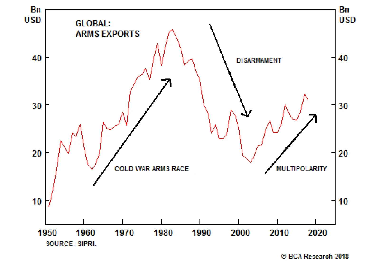
Cold War Arms Race - 1961-1982: The arms trade grew by a whopping 177% during this period, with an average annual growth rate of 5.5%; Disarmament - 1982-2002: Arms trade shrunk by 61% and average annual growth rate was -3.9%; Multipolarity - 2002-present: What started with the U.S. defense buildup following 9/11 has evolved into a truly global response to emerging multipolarity. The arms trade grew by 73% from 2002 to 2017, with an average annual growth rate of 3.4%. Bottom Line: In 2017, the total arms trade was 68% of its peak in 1982, signifying that we have more room to go in this recent "War Bull Market." Given that unbalanced multipolarity produces a higher volume of conflict than a bipolar system, we would expect the current phase to be more fruitful for the global arms race than even the Cold War era. The Pillars Of An Arms Bull Market Chart 3Global Defense Spending...
Global Defense Spending...
Global Defense Spending...
In this report, we focus on the global arms trade, which is different from global defense spending (Chart 3). This is because global defense spending includes non-investible transactions, such as spending on salaries, buildings, health care, and pensions. The global arms trade was once 20% of global defense spending, but is now only 1.9% (Chart 4). Chart 4...Is Different From The Global Arms Trade
...Is Different From The Global Arms Trade
...Is Different From The Global Arms Trade
The reason is that salaries and pensions now dominate defense budgets. In the U.S., they make up 42% of all expenditure. They are higher in much of the developed world (66% in Italy, for example). Moreover, many countries that in 1960 did not have an armaments industry have become quite adept at satisfying demand via domestic production. We nonetheless would expect the global arms trade to bounce off of its lows today. There are three main reasons. Evolving Conflict Zones: Asia And Europe The primary reason to expect a brisk pickup in the global arms race is that the global conflict zones are evolving. Multipolarity is causing shifting geopolitical equilibriums. We expect both East Asia and Europe - largely dormant as hotspots since the end of the Cold War - to catch up with the Middle East as zones of tensions. Periods of rising conflict tend to coincide with the rise in the global arms trade (Chart 5). Chart 5Rising Conflict Coincides With Escalating Arms Trade
Rising Conflict Coincides With Escalating Arms Trade
Rising Conflict Coincides With Escalating Arms Trade
East Asia is our primary concern. Sino-American tensions have been brewing for decades, well before the trade war initiated by the Trump administration. Recently, the trade war has begun to spill into strategic areas (Table 2), creating a vicious feedback loop that could spark an accident or outright military conflict. Table 2Trade War Spills Into Strategic Areas
"War! What Is It Good For? - Absolutely Noth...." Actually, Global Defense Stocks!
"War! What Is It Good For? - Absolutely Noth...." Actually, Global Defense Stocks!
The South China Sea is the premier geographic location of U.S.-China strategic friction. It is a hub for international trade, a vital supply route for all major Asian economies, and the premier focus of China's attempt to rewrite global rules (Diagram 1). We update our list of clashes in this area in Appendix A. Diagram 1South China Sea As Traffic Roundabout
"War! What Is It Good For? - Absolutely Noth...." Actually, Global Defense Stocks!
"War! What Is It Good For? - Absolutely Noth...." Actually, Global Defense Stocks!
China has used its growing economic heft in the region to bully its neighbors into acquiescing to its geopolitical posture (Chart 6). It has used economic sanctions, trade boycotts, and tourism bans to get its way with the neighborhood. China's East Asia neighbors - including Japan - will look to balance their growing dependence on the Chinese economy with a desire to maintain sovereignty. One way to do so will be to rearm and present a formidable challenge to Beijing's regional hegemony. This means that not only the South China Sea but also China's entire periphery is at risk of friction, and this is true regardless of any U.S. interest in Asia. Chart 6China Uses Its Economic Might To Bully
China Uses Its Economic Might To Bully
China Uses Its Economic Might To Bully
Europe is also growing as a potential source of global arms demand. Since the end of the Cold War, Europe has seen a decline in defense spending. One reason is the NATO alliance, which has allowed Europeans to pass the buck to the U.S. This has not only been the case with the safely cocooned Western European states. Poland, intimately familiar with the built-in geopolitical risks of its neighborhood, reduced its defense spending once it joined NATO. President Trump has made awakening Europe from its stupor a key pillar of his trans-Atlantic policy. A combination of Trump's pestering and concerns that the U.S. is trending towards isolationism with an evolving threat matrix that now includes terrorism, migration, and Russia should be enough to spur Europeans to meet their commitment to spend 2% of GDP on defense (Chart 7). Chart 7Europeans Will Be Swayed To Meet Defense Commitments...
"War! What Is It Good For? - Absolutely Noth...." Actually, Global Defense Stocks!
"War! What Is It Good For? - Absolutely Noth...." Actually, Global Defense Stocks!
If NATO member states and Japan were to respond to their evolving threats and commit to spending 2% of GDP on defense, the impact on global arms demand would be significant. The extra spending would be roughly $145 billion, a 14% increase from current levels (Chart 8). Chart 8...Raising Global Arms Demand
"War! What Is It Good For? - Absolutely Noth...." Actually, Global Defense Stocks!
"War! What Is It Good For? - Absolutely Noth...." Actually, Global Defense Stocks!
What about the Middle East? In the short term, we are concerned that President Trump's "maximum pressure" policy could lead to kinetic action against Iran. In the medium and long term, we expect some form of an equilibrium to emerge in the Middle East that would keep regional demand for weapons stable at current elevated levels. Saudi Arabia has been the primary importer of weapons, with 13% of total demand since 2002. Saudi purchases have accelerated as the U.S. has geopolitically deleveraged out of the region (Chart 9 and Chart 10). Chart 9As The U.S. Military Deleverages...
As The U.S. Military Deleverages...
As The U.S. Military Deleverages...
Chart 10...The Saudi Arabian Military Leverages
...The Saudi Arabian Military Leverages
...The Saudi Arabian Military Leverages
Evolving Technological Demands The U.S. invasion of Afghanistan and Iraq at the beginning of this century was probably the last large-scale mechanized conflict involving large formations of main battle tanks (MBT). The evolving threat matrixes in East Asia and Europe are likely to create a growing demand for naval, air superiority, and drone/autonomous technology. In East Asia, the two main risk theaters are the South and East China Seas. In Europe, the Mediterranean, the Baltic, and the Black Seas are increasingly becoming a risk vector due to the instability of North African and Middle East countries, as well as Russian assertiveness. This is good news for the arms industry as aircraft and ships are some of the most lucrative exports given the high level of technological sophistication that goes into developing them (Chart 11). A war fought in the trenches and jungles by soldiers and insurgents is unlikely to be very profitable, other than for small arms manufacturers. But tensions between sovereign nations across large distances and bodies of water will be highly lucrative for major defense manufacturers that specialize in anti-access/area-denial systems.2 Chart 11Aircraft And Ships Are Most Lucrative
"War! What Is It Good For? - Absolutely Noth...." Actually, Global Defense Stocks!
"War! What Is It Good For? - Absolutely Noth...." Actually, Global Defense Stocks!
Furthermore, capital depreciation is advanced for the most sophisticated (and thus expensive) military technology that was introduced at the tail-end of the Cold War expansionary phase. The U.S. aircraft carrier fleet, for example, is mostly made up of Nimitz-class carriers, which have served for the past 43 years on average (Chart 12). Chart 12Capital Depreciation Is Advanced
"War! What Is It Good For? - Absolutely Noth...." Actually, Global Defense Stocks!
"War! What Is It Good For? - Absolutely Noth...." Actually, Global Defense Stocks!
Our back-of-the-envelope calculations show that the cyclicality in U.S. aircraft carriers is apparent across the major defense systems. Looking at 40 countries and their respective aircraft and MBTs, the bulk of these weapons is beyond the average age of the previous generation when it was retired (Chart 13). Part of the reason for the extended life cycle is better technology, but we suspect the main reason is that these major weapon systems were developed at the height of the Cold War and have not been updated since then. Chart 13Weapons Are Beyond Retirement Age, Need Updating
"War! What Is It Good For? - Absolutely Noth...." Actually, Global Defense Stocks!
"War! What Is It Good For? - Absolutely Noth...." Actually, Global Defense Stocks!
Population Aging The demographic trends of population aging and low birth rates have wide-ranging macroeconomic implications. But they will also impact the defense industry by encouraging automation. There are benefits to automation in the military sphere beyond simply replacing a shrinking pool of able-bodied youth. First, the likely geopolitical hotspots of this century - East Asian seas, the Persian Gulf, the Black Sea, the Mediterranean, and the Indian Ocean - are conducive to high-tech warfare. These bodies of water will be patrolled by drones and plied by autonomous surface vessels while hypersonic missiles deny access to the enemy. Second, by shifting the burden of fighting wars from humans to robots, policymakers will face lower constraints to conflict. This development will not only encourage policymakers to develop autonomous weapon systems, but might also increase the frequency with which they are used, destroyed, and thus re-ordered, shortening the hardware life-cycle and thus increasing the sales volume. Bottom Line: Global multipolarity has seen the U.S. geopolitically deleverage from the Middle East, threaten Europe with abandonment, and put pressure on China in East Asia. These are trends that we believe are here to stay irrespective of President Trump's success or failure in the 2020 election. They are all bullish for defense spending and arms trade. In addition, evolving technological demands and global demographic trends will buoy the arms trade. We expect this era of unbalanced multipolarity to be even more lucrative for global defense contractors. The U.S.: Remain Overweight Anastasios Avgeriou, BCA's chief U.S. equity strategist, recommends that investors remain overweight the pure-play BCA defense index and add exposure to it on any meaningful pullbacks while keeping it as a structural overweight within the GICS1 S&P industrials index. In the U.S., defense spending and investment have bottomed and will continue to accelerate. The Congressional Budget Office (CBO) continues to project that defense outlays will jump further next year (middle panel, Chart 14). We expect that this breakneck pace is actually sustainable, mainly because any fiscal compromise with Democrats on discretionary, non-defense spending would require acquiescence on GOP spending priorities, such as defense. Defense outlays will therefore continue to expand into the 2020s. Chart 14Upbeat Defense Outlays...
Upbeat Defense Outlays...
Upbeat Defense Outlays...
Such a buoyant demand backdrop is music to the ears of defense contractor CEOs and represents a boost to defense equity revenue growth prospects. Defense contractors enjoy high operating leverage. No wonder M&A activity is robust: at least four large deals have been announced in the past year that are underpinning both takeout premia and relative share prices (bottom panel, Chart 15). Chart 15...And A Flurry Of M&A Is A Boon For Defense
...And A Flurry Of M&A Is A Boon For Defense
...And A Flurry Of M&A Is A Boon For Defense
A closer look at operating metrics corroborates the view that defense goods manufacturers are firing on all cylinders. New orders recently jumped to fresh all-time highs and the industry's shipments-to-inventories ratio is rising, on track to surpass the 2008 peak. Unfilled orders are also running at a high rate, signaling that factories will keep on humming at least for the next few quarters (Chart 16). Chart 16Firming Operating Metrics
Firming Operating Metrics
Firming Operating Metrics
Importantly, the industry is not standing still and is making significant investments. U.S. defense capex as reported in the financial statements of constituent firms is growing at roughly 20% annually, or twice as fast as overall capex (Chart 17). Defense ROE is running near 30%, again roughly double the rate of the broad market (Chart 18). Chart 17Industry Is Not Standing Still
Industry Is Not Standing Still
Industry Is Not Standing Still
Chart 18Healthy Balance Sheet With High ROE...
Healthy Balance Sheet With High ROE...
Healthy Balance Sheet With High ROE...
Valuations are on the expensive side and in overshoot territory (Chart 19). This is clearly a risk to the overall view. However, if our structural thesis pans out, then defense stocks in the U.S. will grow into their pricey valuations as happened in the back half of the 1960s. Chart 19...But Valuations Are Expensive
...But Valuations Are Expensive
...But Valuations Are Expensive
Bottom Line: The secular advance in pure-play defense stocks remains in place. BCA's U.S. Equity Strategy recommends an above-benchmark allocation. The ticker symbols for the stocks in the BCA defense index are: LMT, LLC, NOC, GD, and RTN. Global Stocks: Be Discerning Beyond the U.S., which global defense stocks are appealing? We believe that there are several market and structural factors to consider. We have ranked national defense sectors by market and structural factors in Tables 3 and 4. Further, Appendix B lists all the non-U.S. weapon manufacturers that we examined, as well as market performance by country. Table 3Russian Defense Sector Attractive On Market Factors
"War! What Is It Good For? - Absolutely Noth...." Actually, Global Defense Stocks!
"War! What Is It Good For? - Absolutely Noth...." Actually, Global Defense Stocks!
Table 4European Companies Rank Highly On Structural Factors
"War! What Is It Good For? - Absolutely Noth...." Actually, Global Defense Stocks!
"War! What Is It Good For? - Absolutely Noth...." Actually, Global Defense Stocks!
Momentum - We like stocks from equity markets that have momentum behind them, i.e. whose stock are above their 200-day moving average. Relative valuation - We like defense sectors that are at a discount relative to the U.S. plays. Performance since Trump - For any country that has outperformed the U.S. aerospace and defense sector since the inauguration of President Trump on January 20, the market believes in its competitiveness vis-à-vis the largest exporter. Geographical diversity - We have ranked country defense sectors by how diverse their sources of revenue are. The higher the figure, the more geographically diverse the revenue pool. Russian and Indian defense plays score very low on this variable as they depend solely on one source: themselves. Exposure to arms trade - We have ranked country defense sectors by how exposed their contractors are to defense as opposed to civilian production. Most companies have major civilian outlays. To fully capture our multipolarity theme, we have ranked companies based on how fully focused they are on producing and selling weapons. Share of global arms market - We recommend that clients buy defense companies in countries that already have a high share of the global arms market. Decisions on purchasing weapons often involve path dependency due to the need to acquire compatible systems. Defense spending - We penalize countries that are already spending 2% of GDP on defense. Their companies will see little boost to domestic demand. It is the other, under-spending countries that will significantly increase their outlays over the next decade. Russian companies score high on market factors. They have good momentum, are attractively valued relative to the U.S. aerospace and defense sector, and are structurally supported. Israel, Canada, Australia, and Brazil are also attractive. All of these are made up of only one stock. On structural factors alone, we like German, British, Italian, and Swedish defense companies. They are geographically diversified, have a respectable share of the global arms trade, and have both reason and room to increase domestic spending. French companies are also structurally attractive, although France may have less need to increase defense outlays. Putting it all together, we are creating a BCA Global Defense Basket. We would include the following global tickers in that basket: A:ASBX, F:AIRS, F:CSF, F:SGM, F:AM@F, C:CAE, D:RHM, D:TKA, I:LDO, I:FCTI, ULE, COB and W:SAAB. Clients may want to include in the basket the five U.S. tickers recommended by BCA's U.S. Equity Strategy: LMT, LLL, NOC, GD, and RTN. We recommend that investors buy this basket, in absolute terms, as a structural investment. Housekeeping We are closing two of our hedges today. First, we are closing long Brent / Short S&P 500 for a gain of 6% and our long U.S. energy / short U.S. information technology for a loss of 1.63%. We initiated the two tactical trades on October 3, which means we timed the market correction perfectly. However, concerns over a supply glut in the oil market meant that the "long" part of our trade did not work out. Furthermore, there have been leaks from the White House to the media that the U.S. may award exceptions to the oil embargo to several critical importers. This would suggest that the Trump administration is beginning to see the risks of its aggressive maximum pressure strategy toward Iran and therefore may be trying to backtrack from it. We still think that the odds of an oil spike due to geopolitics in 2019 are high, but they do appear to be declining, at least for the time being. As such, we are closing the two trades for a net gain. We will continue to monitor the Iran embargo carefully as we expect that geopolitical risks will again be understated in the future, offering investors another opportunity to be long energy. Jesse Anak Kuri, Consulting Editor jesse.anakkuri@mail.mcgill.ca 1 Please see John Mearsheimer, The Tragedy Of Great Power Politics (New York: W.W. Norton & Company, 2001). 2 Anti-access/area-denial (A2/AD) is a strategy of preventing an adversary from occupying or transiting a geographic area. Defense systems that perform A2/AD functions in the modern era tend to be expensive and technologically sophisticated. They include anti-ship missiles, sophisticated radars, attack submarines, and air-superiority fighter jets. Appendix A Notable Clashes In The South China Sea (2010-18)
"War! What Is It Good For? - Absolutely Noth...." Actually, Global Defense Stocks!
"War! What Is It Good For? - Absolutely Noth...." Actually, Global Defense Stocks!
Notable Clashes In The South China Sea (2010-18) (Continued)
"War! What Is It Good For? - Absolutely Noth...." Actually, Global Defense Stocks!
"War! What Is It Good For? - Absolutely Noth...." Actually, Global Defense Stocks!
Notable Clashes In The South China Sea (2010-18) (Continued)
"War! What Is It Good For? - Absolutely Noth...." Actually, Global Defense Stocks!
"War! What Is It Good For? - Absolutely Noth...." Actually, Global Defense Stocks!
Appendix B Appendix B Chart 20British Defense Stocks
British Defense Stocks
British Defense Stocks
Appendix B Chart 21French Defense Stocks
French Defense Stocks
French Defense Stocks
Appendix B Chart 22German Defense Stocks
German Defense Stocks
German Defense Stocks
Appendix B Chart 23Italian Defense Stocks
Italian Defense Stocks
Italian Defense Stocks
Appendix B Chart 24Swedish Defense Stocks
Swedish Defense Stocks
Swedish Defense Stocks
Appendix B Chart 25Norwegian Defense Stocks
Norwegian Defense Stocks
Norwegian Defense Stocks
Appendix B Chart 26Canadian Defense Stocks
Canadian Defense Stocks
Canadian Defense Stocks
Appendix B Chart 27Australian Defense Stocks
Australian Defense Stocks
Australian Defense Stocks
Appendix B Chart 28Korean Defense Stocks
Korean Defense Stocks
Korean Defense Stocks
Appendix B Chart 29Japanese Defense Stocks
Japanese Defense Stocks
Japanese Defense Stocks
Appendix B Chart 30Singaporean Defense Stocks
Singaporean Defense Stocks
Singaporean Defense Stocks
Appendix B Chart 31Israeli Defense Stocks
Israeli Defense Stocks
Israeli Defense Stocks
Appendix B Chart 32Russian Defense Stocks
Russian Defense Stocks
Russian Defense Stocks
Appendix B Chart 33Brazilian Defense Stocks
Brazilian Defense Stocks
Brazilian Defense Stocks
Appendix B Chart 34Indian Defense Stocks
Indian Defense Stocks
Indian Defense Stocks
Appendix B Chart 35Turkish Defense Stocks
Turkish Defense Stocks
Turkish Defense Stocks
Appendix B Table 1Key Aerospace And Defense Companies
"War! What Is It Good For? - Absolutely Noth...." Actually, Global Defense Stocks!
"War! What Is It Good For? - Absolutely Noth...." Actually, Global Defense Stocks!
Appendix B Table 1Key Aerospace And Defense Companies, Continued
"War! What Is It Good For? - Absolutely Noth...." Actually, Global Defense Stocks!
"War! What Is It Good For? - Absolutely Noth...." Actually, Global Defense Stocks!
Highlights Growth Scare: Despite the recent pickup in global equity market volatility, bond volatility remains subdued. Until there is more decisive evidence of a deeper pullback in global growth that is impacting the mighty U.S. economy, yields on government bonds - which remain overvalued in all major developed economies - will have difficulty falling much more even if equity markets continue to correct. Stay below benchmark on global duration exposure, while maintaining only a neutral allocation to global credit. Canada: The Bank of Canada remains on a hawkish path to a more neutral policy rate, even with the lingering concerns over household debt and global trade tensions. Stay underweight Canadian government bonds in hedged global bond portfolios. Feature Just like that other great October tradition, Halloween, market volatility has returned to spook investors. Both the MSCI All-Country World Index and S&P 500 index are officially in correction territory, down -10% from the highs reached in September. The causes for the pullback range from high-profile third quarter U.S. earnings disappointments to increased evidence that the U.S.-China tariff war is negatively impacting U.S. investment spending. Yet the reaction from global bond markets has been relatively muted for such a large pullback in stocks. Benchmark 10-year government bond yields for the major developed markets are down from their peaks, but the declines have been smaller in countries where central banks are in a rate hiking cycle (U.S. -14bps, Canada -19bps) relative to countries where central banks are on hold (Germany -20bps, U.K. -31bps). One possible reason for this discrepancy is that the downtrend in data surprises appears to have stabilized in the U.S. and, even more importantly, China, while European data continues to disappoint relative to expectations (Chart of the Week). Chart of the WeekNoisy Equities, Calm Bonds
Noisy Equities, Calm Bonds
Noisy Equities, Calm Bonds
We still do not believe that global bond yields have peaked for the cycle. We continue to recommend a below-benchmark strategic bias on overall duration exposure, but with only a neutral allocation to global corporate bonds that favors U.S. credit. On a more shorter-term tactical basis, there is a risk that yields could decline further, with more credit spread widening than seen during the current risk-off episode, if economic data starts to disappoint in the U.S. where growth has so far been resilient. Staying up in credit quality within an allocation to U.S. corporates is one way to hedge against such an outcome. Bond Yields Are Normalizing, Bond Volatility Is Not The selloff in risk assets has resulted in a pickup in widely-followed market volatility measures like the U.S. VIX index. Yet when looking at the level of realized total return volatility across all major asset classes, the current bout of turbulence has been unimpressive outside of global equities. In Chart 2, we present an update of a chart from our 2018 global bond outlook report, showing the current levels of realized volatility across different asset class benchmarks compared to their historical ranges. The vertical lines in each chart represent the range between 1999 and 2017 of annualized monthly volatilities for global government bonds, credit, equities, currencies and commodities. The red triangles represent the most recent 13-week annualized volatilities for those same asset classes. What stands out in the chart is that volatilities are off the historical lows for global equities, Italian government bonds and industrial commodities, yet volatilities remain subdued for developed market government bonds, global corporate debt and currencies. Chart 2Bond Volatility Remains Subdued, Despite More Volatile Equities
Can Bonds Come To The Rescue For Equities?
Can Bonds Come To The Rescue For Equities?
We have long argued that the shift to a structurally higher level of volatility across all asset classes will show up first with a rise in bond volatility. In the U.S., in particular, sustained periods of elevated volatility for both Treasuries (as measured by the MOVE index) and stocks (as measured by the VIX index) have occurred alongside episodes of greater variance in nominal GDP growth (Chart 3). When the latter rises, that also triggers more uncertainty about the future path of monetary policy which feeds into a rise in expected bond volatility. That, in turn, impacts volatility in growth sensitive assets like equities, credit and commodities. Chart 3Equity Vol Responding To Growth Uncertainty
Equity Vol Responding To Growth Uncertainty
Equity Vol Responding To Growth Uncertainty
Right now, nominal GDP volatility has picked up in the U.S. but still remains low by historical standards (middle panel). Some of that increased growth volatility can be attributed to the Trump fiscal stimulus coming at a time of full employment, which has helped boost both real GDP growth and U.S. inflation. Interest rate markets have moved to discount more Fed hikes in response, but the Fed's steady pace of well-telegraphed, 25bps-per-quarter rate increases is likely acting to dampen Treasury market volatility. As we have written about extensively throughout the course of 2018, the hurdle for central banks (not just the Fed) to shift to a less hawkish or more dovish policy stance is much higher when unemployment is low and inflation is closer to central bank targets. In such an environment, the correlation between equity and bond returns should be weaker than during periods of excess capacity and low inflation when central banks can stay dovish. That can be seen in Chart 4, which plots the trailing 52-week correlation of total returns for equities and government bonds for the major developed markets (top panel), along with the 10-year market-based inflation expectations for each country (bottom panel). For almost all countries shown, the stock/bond correlation has risen to zero away from the negative correlations that dominated the post-crisis years. That move in correlations has occurred alongside a more stable backdrop for inflation expectations, which are much closer to central bank targets. The lone exception is, of course, Japan, where inflation remains disappointingly low and the Bank of Japan continues to keep a tight lid on interest rates. Chart 4More Stable Inflation Means Less Correlated Stock & Bond Returns
More Stable Inflation Means Less Correlated Stock & Bond Returns
More Stable Inflation Means Less Correlated Stock & Bond Returns
Besides more stable inflation, another factor preventing yields from falling as much as implied by the declines in equity markets is that global bond yields remain overvalued relative to trend economic growth. One way to assess this is to look at the level of real bond yields relative to a moving average of actual GDP growth. We show this for the major developed economies in Charts 5 & 6, which plot rolling 3-year moving averages of real GDP growth (a proxy for "trend" or potential growth) versus real 5-year government bond yields, 5-years forward. For the latter, we take the nominal 5-year/5-year forward yield and subtract a five-year moving average of realized headline inflation for each country, rather than market-based inflation-linked instruments like CPI swaps or TIPS, to allow for a longer history of real yields in the charts. Chart 5Real Bond Yields Are Still Too Low ...
Real Bond Yields Are Still Too Low...
Real Bond Yields Are Still Too Low...
Chart 6... Compared To Real Economic Growth
...Compared To Real Economic Growth
...Compared To Real Economic Growth
For all countries show, real bond yields remain below the level of real growth. The gap between the two is smallest in the U.S. and Canada - unsurprising, as central bankers have been tightening monetary policy, and helping push up real interest rates, in both countries. Bonds look most overvalued in core Europe, Japan and Sweden where policymakers have been using negative interest rates and quantitative easing (QE) to hold down bond yields. Real yields in those countries are between 200-300bps below our proxy for trend real growth. With such a large gap between actual growth and interest rates, it becomes harder for policymakers to consider easing monetary policy, or at least slow the pace of policy normalization, in response to more volatile financial markets. It should not be a surprise that last week, during a period of global market turmoil, the European Central Bank and Sweden's Riksbank both signaled that they remain on pace to end QE and begin hiking interest rates within the next 6-12 months, while the Bank of Canada delivered another 25bp rate hike. In the absence of a VERY large global growth shock, global real yields should be expected to increase over at least the next year, and a defensive posture on global duration exposure should be maintained. One such shock could come from a deeper downturn in China than has already occurred in 2018, which would feed into a bigger slowdown in non-U.S. growth. Another shock could come from the U.S. if the recent pullback in core durable goods orders (Chart 7) is a sign that a) U.S. companies are becoming more worried about the impact of U.S.-China trade tariffs on global growth; and/or b) the impact of the Trump fiscal stimulus is already starting to fade. Such a move could be exacerbated by a larger downturn in housing activity than seen already in response to rising mortgage rates. Chart 7Treasuries Are Exposed To A U.S. Growth Scare
Treasuries Are Exposed To A U.S. Growth Scare
Treasuries Are Exposed To A U.S. Growth Scare
These shocks, if large enough, could trigger a short-covering rally in U.S. Treasuries, where sentiment remains very depressed (bottom panel). However, with leading economic indicators still pointing to above trend U.S. growth, and with U.S. consumer spending holding firm alongside a tight labor market and faster wage growth, such a pullback in yields would likely be short-lived and difficult for investors to time successfully. Bottom Line: Despite the recent pickup in global equity market volatility, bond volatility remains subdued. Until there is more decisive evidence of a deeper pullback in global growth that is impacting the mighty U.S. economy, yields on government bonds - which remain overvalued in all major developed economies - will have difficulty falling much more even if equity markets continue to correct. Stay below benchmark on global duration exposure, while maintaining only a neutral allocation to global credit. Canada Update: The BoC Stays Hawkish The Bank of Canada (BoC) delivered another rate hike last week, lifting the policy rate by 25bps to 1.75%. The language used to explain the hike was surprisingly hawkish. In the press conference following the BoC meeting, Senior Deputy Governor Carolyn Wilkins noted that the policy rate remains negative in real terms and is still below the central bank's estimate of neutral (between 2.5% and 3.5%). She also noted that the term "gradual" was no longer used to describe the pace of monetary tightening, so as not to give the impression that policy was following a steady predetermined path similar to the Fed's tightening cycle - potentially, a sign that more hawkish surprises could be in the offing. The BoC also sounded more optimistic on the outlook for the Canadian economy, while sounding less concerned about the two factors that should cause the most worry - high consumer debt levels and uncertainty over global trade. The more upbeat tone is at odds with the current pace of economic growth in Canada, which has slowed. GDP growth has decelerated to 1.9% from 3.0% at the end of 2017, while the OECD's leading economic indicator for Canada is also in a downtrend (Chart 8). In the Monetary Policy Report (MPR) that was also released last week, the latest BoC forecasts for Canadian real GDP growth for 2019 and 2020 were essentially left unchanged. Chart 8Is The BoC's Growth Optimism Justified?
Is The BoC's Growth Optimism Justified?
Is The BoC's Growth Optimism Justified?
The BoC noted that the composition of demand within the Canadian economy was shifting away from consumption and housing towards business investment and exports. That can be seen in the most recent data that shows sluggish consumer spending (middle panel) and rebounding export growth (bottom panel). The central bank attributes the softer path for consumption to its own interest rate increases and changes to housing market policies, both of which have forced households to adjust their spending patterns. That is evident in the sharp decline in house price growth, deceleration of household credit growth and the softening trends in housing starts and residential investment spending (Chart 9) Chart 9Canadian Housing Has Cooled Off
Canadian Housing Has Cooled Off
Canadian Housing Has Cooled Off
The BoC is of the view, however, that consumer spending will rebound (but not overheat) on the back of strong household income growth and a pickup in net immigration inflows that is boosting population growth. The other area of diminished concern for the central bank is investment spending, which has been negatively impacted by the uncertainty over the renegotiation of the North America Free Trade Agreement (NAFTA). That smooth acronym is now gone, to be replaced by the more awkward "USMCA", or United States-Mexico-Canada Agreement. That new trade deal has reduced the immediate uncertainty over the impact of U.S. trade policy on Canada, although the BoC did note in the MPR that there was still the potential for lingering uncertainty based on previous U.S. trade actions (i.e. on steel and aluminum imports to the U.S.) and because the USMCA has not yet been ratified. The BoC did make an upward adjustment to its assumptions regarding the hit to Canadian growth from U.S. trade policy compared to the July MPR. The level of exports is now only expected to fall by -0.3% over the next two years (vs -0.7% in the July MPR) and business investment is expected to decline by -0.7% over the same period (vs -1.4% in the July MPR). The reduction in trade uncertainty should be expected to free up demand for capex in Canada. The Q3/2018 BoC Senior Loan Officers' Survey reported a further easing of lending standards from the Q2 survey (Chart 10). The central bank's Q3 Business Outlook Survey also noted that firms' investment intentions continued to strengthen to the highest level in eight years (middle panel). This was primarily due to increased expectations for future sales growth, coming at a time of high reported capacity pressures (bottom panel). Importantly, the Business Outlook Survey took place before the USMCA deal was reached, suggesting that the data may actually understate sales expectations. This bodes well for future gains to overall GDP growth from business investment spending. Chart 10Canadian Companies Need To Invest & Hire
Canadian Companies Need To Invest & Hire
Canadian Companies Need To Invest & Hire
That same Business Outlook Survey also reported that firms are continuing to experience labor shortages, most notably in sectors such as construction, transportation and information technology. This is a sign that employment growth should remain firm in Canada. Coming at a time when the unemployment rate at 5.9% remains well below estimates of full employment, this suggests that there could be some upward pressure on inflation. Canadian headline CPI inflation currently sits at 2.2%, while core CPI inflation is at 1.8% (Chart 11). That is a sharp decline from the 3% inflation seen in July, which was the result of an unexpected surge in airline fares. Yet at current levels, Canadian inflation sits right at the midpoint of the BoC's 1-3% target range. Furthermore, the BoC's own assessment is that the output gap is in a range of -0.5% to +0.5%, in line with the estimates from the IMF and OECD (middle panel). Although headline wage growth has cooled in recent months, the BoC's preferred measure that incorporates several wage measures ("Wage-Common"), has been stable near the same 2% levels as seen for CPI inflation. Chart 11Canadian Inflation At BoC Target
Canadian Inflation At BoC Target
Canadian Inflation At BoC Target
Expect More BoC Hikes With the Canadian economy operating at full employment and with inflation at target, the BoC seems determined to push the policy rate back up towards their estimated 2.5%-3.5% range for the neutral rate. This means another 75-175bps of additional rate increases. At the moment, there are only 49bps of hikes over the next year discounted in the Canadian Overnight Index Swap (OIS) curve (Chart 12). This leaves Canadian bond yields exposed to additional rate increases. This is especially true given our forecast of continued Fed interest rate increases in 2019, as the BoC has been playing a game of "Follow the Leader" with the Fed during the current tightening cycle (top panel). Chart 12Stay Underweight Canadian Government Bonds
Stay Underweight Canadian Government Bonds
Stay Underweight Canadian Government Bonds
In terms of our recommended fixed income investment strategy, we continue to favor: an underweight stance on Canadian government bonds for global bond investors a below-benchmark duration stance within dedicated Canadian bond portfolios long positions in Canadian inflation protection (CPI swaps or inflation-linked bonds) While we expect the Canadian yield curve to flatten as the BoC delivers more rate hikes than currently discounted over the next year, we do not see the 2-year/10-year curve flattening by more than is currently priced in the forwards. This is not the case for an outright duration bet, where the forwards are currently priced for very little upward movement in Canadian bond yields over the next year. Therefore, we prefer to stick with directional bets on Canadian yields (higher) and Canadian relative bond performance versus global peers (worse). Bottom Line: The Bank of Canada remains on a hawkish path to a more neutral policy rate, even with the lingering concerns over household debt and global trade tensions. Stay underweight Canadian government bonds in hedged global bond portfolios. Robert Robis, CFA, Senior Vice President Global Fixed Income Strategy rrobis@bcaresearch.com Ray Park, CFA, Research Analyst ray@bcaresearch.com Recommendations The GFIS Recommended Portfolio Vs. The Custom Benchmark Index
Can Bonds Come To The Rescue For Equities?
Can Bonds Come To The Rescue For Equities?
Duration Regional Allocation Spread Product Tactical Trades Yields & Returns Global Bond Yields Historical Returns
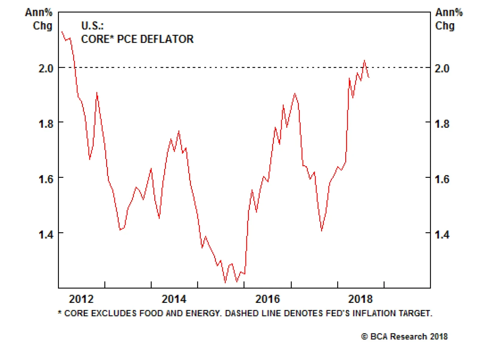
Next Monday's personal spending and income report will be the top U.S. economic release of the week. Investors and Fed officials will be looking to the core PCE deflator for signs on. The data become increasingly important through the week with the employment…