Global

Highlights As investors increasingly look at allocating assets based on environmental, social, and governance (ESG) considerations, these strategies are becoming less niche. We look at different ESG investing strategies, in both equities and bonds, and analyze their historical risk-adjusted returns and performance in bear markets and recessions. We find that ESG indices have at least performed in line with, and often outperformed, aggregate indices, with lower volatility. However, performance varies from region to region and between asset classes. Markets with the worst ESG standards tend to see the biggest improvement in performance when ESG factors are considered Feature Increasing investor interest in environmental, social, and governance (ESG) investing poses a big question for money managers: how does an allocation to ESG investments affect the return and volatility profile of a traditional portfolio? This Special Report addresses the following issues: What are the risk-return characteristics of ESG investments from a top-down perspective? Do ESG investments provide recession/bear market protection? What are the unique challenges that money managers using an ESG strategy need to account for? A Brief Overview Of ESG To begin, we need to define what exactly ESG investing means. We see it as any investment activity that recognizes a certain set of principles to screen for environmental, social, and governance standards. ESG investing, as a term, is relatively new. However, the core concept can be traced back several decades. During the 20th century, ethical investing (EI) emerged, as investors applied faith-based criteria to their investments. From the 1980s, socially responsible investing (SRI) allowed investors to focus on social and environmental goals, in addition to their ethical beliefs. This was mainly due to an increased global awareness of environmentalism that emerged in this period, following events such as the Exxon Valdez oil spill in 1989 and claims of labor-rights abuses in various industries. In the early 2000s, ESG investing arose from investors' increasing awareness of the need to include corporate governance as an additional screening to SRI investing. The inclusion of the governance factor was also due to numerous corporate scandals, such as Enron's bankruptcy in 2001. Simply put, ESG is a broader concept than the previous incarnations of ethical investing. Throughout the early 2000s, various global initiatives started supporting the cause of ESG investing. The United Nations launched the Principles for Responsible Investing (PRI) in 2006 to promote ESG investing among institutional investors.1 Based upon six pillars, the PRI aims to encourage the use of ESG factors by investors in their investment process. Currently, most of the demand for ESG investing comes from larger financial institutions, particularly pension funds, whereas smaller investment institutions and retail investors lag in their interest. The Global Sustainable Investment Alliance (GSIA) has released a global standard classification to distinguish between the different ESG strategies as summarized in Table 1. Negative screening, positive screening, and corporate engagement are the most used strategies, while themed investing and targeted-situation investing have relatively less allocation. Figure 1 illustrates various examples of which types of investments might fall under ESG.2 Table 1Global Standard ESG Classification*
ESG Investing: No Harm, Some Benefit
ESG Investing: No Harm, Some Benefit
Figure 1Types Of Investments That Fall Under ESG*
ESG Investing: No Harm, Some Benefit
ESG Investing: No Harm, Some Benefit
The total market size of "sustainable investing" is difficult to quantify, due to the wide range of securities that could fall under this ambiguous label. According to the 2016 Global Sustainable Investment Review, published bi-annually by the GSIA, global ESG assets under management (using a very broad definition of ESG) totaled $22.9 trillion dollars as of 2016, a 25% increase from 2014.3 The development of cleaner energy sources, changing social norms, interest by millennials in environmental and social issues, and regulation are among the drivers of this growth. The increasing number of ETFs and mutual funds that define themselves as "socially conscious", standing at 279 as of Q3 2018, also demonstrates the growing interest in ESG investing.4 Additionally, the number of active managers integrating ESG factors in their investment strategy has grown (Chart 1). Chart 1Growing Interest...
ESG Investing: No Harm, Some Benefit
ESG Investing: No Harm, Some Benefit
Increasing investor demand has translated into further transparency from companies. According to the Governance & Accountability Institute, the number of S&P 500 firms that disclose their sustainability, corporate governance and social responsibility performance more than quadrupled between 2011 and 2017 (Chart 2).5 Chart 2...More Transparency
ESG Investing: No Harm, Some Benefit
ESG Investing: No Harm, Some Benefit
However, transparency is not the only barrier to the growth of ESG investing. The term ESG is still utilized and defined in different ways, confusing investors. A joint survey by the UN and the CFA Institute showed that 43% of U.S. equity and fixed income investors cited a lack of historical data, and 41% limited understanding and knowledge of ESG issues as the top barriers to incorporating ESG.6 Additionally, due to the lack of a standardized reporting system, investors cannot properly assess and compare ESG metrics across firms.7 ESG factors tend to be hard to quantify. Inconsistent ESG ratings due to differences in data analysis and reporting contribute to the lack of comparability. Investors should do their own thorough due diligence before investing. Various funds that screen for "socially responsible" criteria do sometimes include controversial stocks. For example, Vanguard's SRI European Stock Fund includes Royal Dutch Shell and British American Tobacco plc amongst its top 10 holdings.8 Risk-Return Characteristics9 To compare returns across regions, we use the MSCI ESG Leaders Index, which MSCI describes as using a best-in-class strategy and excluding companies involved in the alcohol, gambling, tobacco, nuclear power, and weapons businesses. It also minimizes sector-based tracking error by targeting 50% of the market capitalization within each GICS sector.10 MSCI assigns companies an ESG rating ranging from AAA to CCC; companies must maintain a rating above BB to be eligible for inclusion. We use the Bloomberg Barclays MSCI Socially Responsible Indices for our fixed-income comparisons. These indices use a negative screening process to exclude issuers involved in businesses that are in conflict with social and environmental values. Historical data for ESG indices tend to be limited; the earliest data-point for the MSCI ESG Leaders Index is September 2007. We analyze historical metrics for two periods: one starting September 2007, and the other starting July 2009 to show returns after the negative impact of the Global Financial Crisis (GFC). Tables 2 and 3 show that equity investors have enjoyed higher risk-adjusted returns on equity ESG indices thanon standard equity indices. However, this is not the case across all regions. The global ESG equity index outperformed in both periods, with lower volatility (Chart 3). In the U.S. and U.K., ESG indices underperformed their conventional counterparts, but in the euro area, China and Canada they significantly outperformed, while achieving lower volatility (charts for all countries shown in the Appendix). Emerging markets are perhaps the biggest surprise, since here the ESG index outperformed by over 3.5% annually in both periods. However, EM outperformance was mainly driven by China (Chart 4). Table 2Equities: Risk-Return Profile (September 2007 - October 2018)
ESG Investing: No Harm, Some Benefit
ESG Investing: No Harm, Some Benefit
Table 3Equities: Risk-Return Profile (July 2009 - October 2018)
ESG Investing: No Harm, Some Benefit
ESG Investing: No Harm, Some Benefit
Chart 3ESG Equities: Global Outperformance
ESG Equities: Global Outperformance
ESG Equities: Global Outperformance
Chart 4China Drove EM Outperformance
China Drove EM Outperformance
China Drove EM Outperformance
A study conducted by MSCI ESG Research showed that stock selection had the biggest contribution to the excess return of the emerging markets ESG equity indices, followed by sector-selection tilts. In fact, stock-selection added value in most regions, except the U.S. The MSCI ESG Leaders Index excludes firms such as Amazon (for its labor practices), Apple (supply-chain issues), and Facebook (privacy and data security) from both the U.S. and the global ESG indices, which resulted in its relative poor performance during the strong technology market of the past few years. Some argue that the regions with the worst ESG standards tend to see the biggest improvement in performance when ESG factors are considered. However, a debate then arises as to whether ESG ratings can be taken at face value, or should simply be an input into a broader analysis.11 One of the most surprising results from Tables 2 and 3 is the finding that the global ESG index has lower volatility, given the more idiosyncratic risk of ESG indices, which have on average only about half the number of constituents of aggregate market indices. The concentration - based on a Herfindahl-Hirschman Index (HHI) - of the top 10 ESG constituents is about four times that of the broad indices. ESG equity indices trade at lower PE multiples than traditional indices. Chart 5 shows that, on average, ESG equities' outperformance has been mainly driven by stronger relative earnings growth rather than relative multiple expansion. Earnings contributed 48% to total return growth for the ACWI ESG index, compared to 41% for its counterpart. PE expansion contributed 21% of the ESG index's total return, compared to over 30% for the ACWI index. Chart 5Drivers Of Return
Drivers Of Return
Drivers Of Return
The conclusions are not very different for fixed income (Table 4). There is little difference between returns for corporate SRI bonds and investment grade bonds. Despite the slight sector tilts towards financials and banks in SRI Bond Indices, the indices have largely tracked each other (Chart 6). Table 4Bonds: Risk-Return Profile (July 2009 - October 2018)
ESG Investing: No Harm, Some Benefit
ESG Investing: No Harm, Some Benefit
Chart 6ESG Bonds: No Difference In Performance
ESG Bonds: No Difference In Performance
ESG Bonds: No Difference In Performance
Only a limited amount of research has been conducted into the importance of ESG factors for credit portfolios, but several papers concluded that ESG scores do not significantly impact performance, though there was some evidence that bonds of companies with higher ESG scores actually trade at wider spreads.12 Recession/Bear Market Protection Despite the efforts of ESG providers to limit sector-based tracking error, ESG equity indices still tend to have sector tilts due to over- and under-weighting firms based on their ESG scores. Sectors such as Information Technology, Financials, Communication Services, and Healthcare usually are favored relative to Materials, Industrials, and Energy. However, the magnitude of these tilts differs from region to region, and understanding the scope of these tilts is important when considering an ESG allocation. For example, the Chinese MSCI ESG Leaders Index is heavily skewed towards Communication Services (one stock, Tencent, in particular). Simply put, the sector composition/index construction of ESG indices alters their cyclicality and, therefore, performance. To understand this, it is important to observe this behavior over as many cycles as possible. To analyze this, we looked at the U.S. MSCI KLD 400 Index, one of the oldest ESG indices, with data starting in 1990. In 2001-2002 (the aftermath of the tech bubble), the KLD 400 underperformed the S&P 500 due to the former's larger exposure to tech. On the other hand, during the 2007-2008 GFC, the KLD 400 had a smaller drawdown than the S&P 500 (Chart 7). Chart 7Sector Tilts Matter
Sector Tilts Matter
Sector Tilts Matter
Additionally, Table 5 shows that an ESG allocation has tended to at least perform in line with equities overall, if not slightly outperform them, during bear markets. The MSCI KLD 400 outperformed the S&P 500 by an annualized average of 1% in the past five bear markets.13 Table 5Bear Market Protection?
ESG Investing: No Harm, Some Benefit
ESG Investing: No Harm, Some Benefit
We performed a risk-return analysis of a portfolio consisting of 60% conventional equities and 40% investment-grade bonds, compared to similarly weighted ESG-focused equity and fixed income indices. The results for the three regions for the period July 2009 and October 2018 are shown in Chart 8. Chart 8Portfolio Performance (Jul 2009 - Oct 2018)
ESG Investing: No Harm, Some Benefit
ESG Investing: No Harm, Some Benefit
The global and the euro area multi-asset ESG portfolios outperformed the conventional portfolios by 2 and 10 bps a year respectively while achieving slightly lower volatility. The U.S. ESG portfolio, on the other hand, slightly underperformed due to the underperformance of the ESG equity index in a strong tech market of the past nine years. Conclusion From the above analysis, we would draw the following conclusions: There is little evidence that ESG investing detracts from performance. In fact, there is some evidence that it can provide some outperformance and bear-market protection depending on the ESG index composition. Consideration of ESG factors in taking investment decisions needs to go beyond simply looking at ESG scores. Incorporating ESG analysis will increasingly become a core step in assessing risk for both equity and fixed-income investors. Index methodology and construction, as well as sector composition, play a big role in evaluating expected performance. ESG indices are growing. As of end of 2017, there were 42 ESG-focused equity indices by the major three providers as shown in Appendix Table 1. We expect to see more as ESG becomes increasingly acknowledged. Amr Hanafy, Research Associate amrh@bcaresearch.com Footnotes 1 Please see https://www.unpri.org/pri/about-the-pri 2 Please see https://www.ussif.org/files/Publications/Retail_Investor_Guide.pdf 3 Please see http://www.gsi-alliance.org/wp-content/uploads/2017/03/GSIR_Review2016.F.pdf 4 Please see Charles Schwab, Socially Conscious Funds List https://www.schwab.com/public/file/P-9561751/. Based on data from Morningstar, Inc. 5 Please see https://www.ga-institute.com/press-releases/article/flash-report-85-of-sp-500-indexR-companies-publish-sustainability-reports-in-2017.html 6 Please see ESG Integration In The Americas: Markets, Practices, And Data https://www.unpri.org/download?ac=5397 7 Please see CFA Financial Analysts Journal, Third Quarter 2018, Volume 74, Issue 3 https://www.cfapubs.org/doi/pdf/10.2469/faj.v74.n3.full 8 Please see https://global.vanguard.com/portal/site/loadPDF?country=ch&docId=14053 9 It is important to note that, in this report, we make no assumptions regarding the methodology or ESG ranking scores of the indices discussed, but rather take them as given by their providers (MSCI and Bloomberg Barclays). 10 Please see https://www.msci.com/eqb/methodology/meth_docs/MSCI_ESG_Leaders_Indexes_Methodology_June_2017.pdf 11 Please see http://www.whebgroup.com/what-do-esg-ratings-actually-tell-us/#_edn4 12 Please see https://static.macquarie.com/dafiles/Internet/mgl/global/shared/sf/images/corporate/asset-management/investment-management/understanding-esg-in-credit-portfolios.pdf?v=3 13 Bear markets defined as a drawdown of 15% lasting more than three months. Appendix Appendix Table 1ESG Equity Indices
ESG Investing: No Harm, Some Benefit
ESG Investing: No Harm, Some Benefit
Appendix Chart 1ESG Equities: U.S.
ESG Equities: U.S.
ESG Equities: U.S.
Appendix Chart 2ESG Equities: Euro Area
ESG Equities: Euro Area
ESG Equities: Euro Area
Appendix Chart 3ESG Equities: Emerging Markets
ESG Equities: Emerging Markets
ESG Equities: Emerging Markets
Appendix Chart 4ESG Equities: Canada
ESG Equities: Canada
ESG Equities: Canada
Appendix Chart 5ESG Equities: U.K.
ESG Equities: U.K.
ESG Equities: U.K.
Appendix Chart 6ESG Bonds: U.S.
ESG Bonds: U.S.
ESG Bonds: U.S.
Appendix Chart 7ESG Bonds: Euro Area
ESG Bonds: Euro Area
ESG Bonds: Euro Area
Highlights Global Yields: Global bond yields appear to be settling into a new trading range, with the downside limited by tight labor markets but the upside capped by slowing global growth momentum. 2014/15 Redux?: The domestic U.S. economy is much stronger today compared to the 2014/15 period when slowing global growth and a rapidly rising U.S. dollar prompted selloffs in global credit markets and, eventually, a dovish shift by the Fed. U.S. financial conditions need to tighten more before the Fed can signal a pause. New Zealand: The RBNZ will continue to maintain a dovish policy stance over at least the next year, amid softening economic growth and underwhelming domestic inflation. Stay long 5-year New Zealand government bonds versus both U.S. Treasuries (hedged into USD) and German sovereign debt (hedged into EUR). Feature Dear Client, There will be no Global Fixed Income Strategy report published next Tuesday, November 27th. Instead, you will be receiving a Special Report this Thursday, November 22nd. The report - authored by BCA's Chief Emerging Markets strategist, Arthur Budaghyan - will discuss the outlook for Emerging Market hard currency debt. Best regards, Rob Robis Chief Strategist On the surface, it appears that uncertainty is increasing in global fixed income markets. Government bond yields have dipped over the past couple of weeks, most notably in the U.S. where the benchmark 10-year Treasury yield is back down to 3.05% as we go to press. Corporate credit spreads have also been drifting wider, especially in the U.S. where there is growing concern that economic momentum has peaked, at least temporarily. The problem for bond markets is that while global growth momentum has clearly slowed, it has not been by enough to alleviate inflation pressures coming from tight labor markets. This story is clearly most visible in the U.S., but also in the majority of major developed market economies. Central bankers are sticking to their guns and focusing on their belief in the Phillips Curve model to forecast inflation. Until there are signs that more turbulent financial markets are feeding into actual weaker economic growth, bond yields will not be able to fall by enough to help bail out flailing equities and corporate credit. There are now 83% of OECD countries with an unemployment rate below the estimated full employment NAIRU. As expected with such a backdrop, our Central Bank Monitors are calling for tighter monetary policy across the developed economies. This is also showing up in an unusual divergence between rising global real bond yields and falling global leading economic indicators (Chart of the Week). Chart of the WeekYields Are Less Responsive To Slowing Growth
Yields Are Less Responsive To Slowing Growth
Yields Are Less Responsive To Slowing Growth
By most conventional measures, monetary policy settings are not restrictive across the major economies. Actual policy interest rates remain below conventional measures of equilibrium like a Taylor Rule, while government bond yields - adjusted for inflation expectations - are less than trend real GDP growth (Chart 2). Those gaps are smallest in the U.S., where the Fed has been raising interest rates for the past three years, but remain wide in other countries. Chart 2Global Interest Rates Are Still Below Equilibrium Levels
The Bond Market Is Not Your Friend
The Bond Market Is Not Your Friend
If global growth is merely shifting from above-trend (falling unemployment) to trend (stable unemployment), then central bankers will not be able to move back to a more dovish posture that could trigger a major fall in bond yields. Trading ranges are more likely to result in such an environment, where yields struggle to break higher because of shaky risk assets but cannot break lower because of low unemployment. We are likely in one of those ranges now, measured by a 3-3.25% range on the 10-year U.S. Treasury. Without a friendly boost from falling bond yields, we continue to recommend a cautious stance on global spread product, while maintaining an overall below-benchmark stance on global duration exposure. Will It Be 2014/15 All Over Again? Watch The USD & China Two months ago, we published a comparison of the current macro backdrop to that of the 2014/15 period.1 Back then, the Fed was forced to alter its plans to deliver a series of rate hikes after the end of its quantitative easing program, thanks to a sharply rising U.S. dollar that triggered major financial market selloffs and, eventually, slower U.S. growth. We concluded that such an outcome could occur again in the next few months, but it would take a much larger tightening of financial conditions to get the Fed to stand down this time given tighter U.S. labor markets and stronger U.S. inflation pressures. The way we presented that comparison between today and four years ago was though "cycle-on-cycle" charts, showing financial and economic data today overlapped with data from that 2014/15 period. The two episodes were indexed to the trough in the U.S. dollar in May 2014 and February 2018. This week, we update a few of those charts, but also add a few new indicators to assess if there has been enough financial and economic damage to trigger a shift to a more dovish Fed. U.S. Economy: The domestic U.S. economy appears healthier today versus the 2014/15 period, judging by the more robust readings from the NFIB Small Business Optimism index and the high level of job openings from the JOLTS data (Chart 3). Yet there are similarities seen in the latest decline in the Conference Board survey of U.S. CEO confidence, and the sharp fall in the ISM Manufacturing New Orders index. We suspect that this divergence in business optimism reflects U.S.-China trade tensions, which should have a greater impact on larger corporations that sell globally compared to smaller companies with a more domestic customer base. Chart 3U.S. Growth Today Vs. 2014/15: Stronger Domestic Economy
U.S. Growth Today Vs. 2014/15: Stronger Domestic Economy
U.S. Growth Today Vs. 2014/15: Stronger Domestic Economy
U.S. Inflation: U.S. core CPI inflation is much faster now than at the similar point in the 2014/15 cycle, as is the growth in Average Hourly Earnings (Chart 4). This is due to the much lower unemployment rate today in the U.S., which is putting more upward pressure on domestically-generated prices and wages. Yet while the ISM Prices Paid index is also at a higher level today than 2014/15, the upward momentum has peaked and the latest decline in commodity prices is following an ominously similar path to four years ago (bottom panel). Chart 4U.S. Inflation Today Vs. 2014/15: Faster Core/Wage Inflation
U.S. Inflation Today Vs. 2014/15: Faster Core/Wage Inflation
U.S. Inflation Today Vs. 2014/15: Faster Core/Wage Inflation
Emerging Markets (EM): EM economic growth has been decelerating at a similar pace to 2014/15, with the aggregate EM (ex-China) PMI produced by our EM strategists now sitting right at the boom/bust 50 line (Chart 5). China's economic growth appears to be holding up better today when looking at the more elevated Li Keqiang index. A possible reason for that is the much larger and faster easing of Chinese monetary conditions today compared to 2014/15, thanks to the sharp weakening of the yuan. Chart 5EM Growth Today Vs. 2014/15: China Drag Is Smaller (For Now)
EM Growth Today Vs. 2014/15: China Drag Is Smaller (For Now)
EM Growth Today Vs. 2014/15: China Drag Is Smaller (For Now)
Global Financial Markets: Here, the current cycle is sticking very close to the 2014/15 script when looking at the rising U.S. trade-weighted dollar, widening spreads for U.S. investment grade (IG) corporate bonds and EM USD-denominated sovereign debt, and the tightening of U.S. financial conditions (Chart 6). Although it should be noted that the trade-weighted dollar would have to rise another 10% from current levels, and U.S. IG spreads would have to widen another 60bps, to generate similar moves compared to 2014/15. Chart 6Financial Markets Today Vs. 2014/15: Following A Similar Script
Financial Markets Today Vs. 2014/15: Following A Similar Script
Financial Markets Today Vs. 2014/15: Following A Similar Script
U.S. Treasury Yields: Nominal U.S. Treasury yields are at much higher levels today than four years ago, an obvious consequence of the Fed's tightening cycle and more elevated U.S. inflation expectations (Chart 7). Yet the amount of tightening discounted over the next 12-months in the U.S. Overnight Index Swap (OIS) is similar to 2014/15, as is our estimate of the market-implied level of the terminal real fed funds rate (around 0.5%).2 One major difference: there is a large net short position in the Treasury market today, while positioning was fairly neutral during 2014/15 (bottom panel). Chart 7U.S. Treasuries Today Vs. 2014/15: Higher Yields But Similar Fed Pricing
U.S. Treasuries Today Vs. 2014/15: Higher Yields But Similar Fed Pricing
U.S. Treasuries Today Vs. 2014/15: Higher Yields But Similar Fed Pricing
Summing it all up, the broader range of evidence we present here confirms our conclusion from two months ago. There needs to be a much larger tightening of U.S. financial conditions before the Fed can signal a pause on its planned rate hikes, because of a much healthier domestic U.S. economy and a more entrenched acceleration of inflation (especially wage growth). If China's economy can continue to outperform the 2014/15 path - still a big "if" given U.S.-China trade uncertainties and with Chinese policymakers less willing to reflate the domestic credit bubble to boost growth - then the odds of U.S. growth converging down to non-U.S. growth will be reduced. We will continue to monitor these charts and relationships in future Weekly Reports but, for now, we see nothing yet to change our bearish views on U.S. Treasuries and our cautious view on U.S. corporate credit. Bottom Line: The domestic U.S. economy is much stronger today compared to the 2014/15 period when slowing global growth and a rapidly rising U.S. dollar prompted selloffs in global credit markets and, eventually, a dovish shift by the Fed. U.S. financial conditions need to tighten more before the Fed can signal a pause. New Zealand Update: Fade The Recent Bump In Yields We have been structurally positive on New Zealand (NZ) government bonds for some time, dating back to mid-2017. Our view was based on an assessment that the Reserve Bank of New Zealand (RBNZ) would be unable to make any upward change in policy rates due to sub-par economic growth and inflation that would struggle to meet the RBNZ's target of 2% (the midpoint of the 1-3% target band). So far, that scenario has fully played out, and NZ government bonds have significantly outperformed their global peers as a result (Chart 8). Chart 8Sticking With Our Successful Long NZ Trades
Sticking With Our Successful Long NZ Trades
Sticking With Our Successful Long NZ Trades
Our preferred trades, which are part of our Tactical Overlay shown on page 14, have been yield spread trades for NZ government bonds versus U.S. and German equivalents.3 Specifically, we have been recommending long positions in 5-year NZ bonds vs. 5-year U.S. Treasuries and 5-year German government debt. The trades have performed well, but have given back some of the gains in recent weeks. This has mostly come via a surge in NZ yields (+29bps higher since the recent low on September 7th) that has driven yield spreads wider versus the U.S. and Germany (+23bps and +34bps, respectively, since September 7th). These increases are likely to prove unsustainable, given the sluggish momentum in NZ growth and inflation. The latest read on year-over-year real GDP growth came in at below-potential pace of 2.8% in the 2nd quarter of 2018. The manufacturing and services purchasing managers' indices (PMIs) have both fallen sharply throughout 2018, although the latest data points suggest some stabilization above the 50 level on the PMIs (Chart 9). Similar trends can be seen in the RBNZ surveys of business confidence and capacity utilization, which both remain near the post-2008 lows but may also be stabilizing. Chart 9Sub-Par Growth In New Zealand
Sub-Par Growth In New Zealand
Sub-Par Growth In New Zealand
In the November Monetary Policy Statement (MPS) that was released after the RBNZ meeting earlier this month, a cautious view on growth was outlined.4 The pickup in Q2 GDP growth was dismissed as driven by temporary factors, and policymakers expressed concern that deteriorating business confidence could be signaling a more prolonged period of slowing domestic demand. The central bank did also highlight growth risks coming from slowing exports if U.S.-China trade tensions intensify. It is difficult to find an obvious trigger for faster NZ growth at the moment. Both consumer spending and residential investment were fueled by rising immigration and population growth from 2013 to 2017, but those trends have since begun to reverse. The RBNZ projects net monthly immigration to NZ to slow to levels last seen in 2014 and in line with the current growth rate of consumer spending around 3% (Chart 10). Business investment growth has already stalled (middle panel), while the RBNZ'S Business Outlook surveys indicate a negative outlook for export growth (bottom panel). Chart 10Where Will NZ Growth Come From?
Where Will NZ Growth Come From?
Where Will NZ Growth Come From?
Against this sluggish growth backdrop, the RBNZ must continue to run an accommodative monetary policy to support growth. This can be done given the persistent undershooting of NZ inflation versus the RBNZ target. Headline CPI inflation did accelerate to 1.9% in Q3, but core inflation at 1.2% continued to languish near the bottom end of the RBNZ target range. The gap between the two inflation measures can be attributed to previous increases in global energy prices, which caused a blip up in the tradeables portion of the NZ CPI (Chart 11). Yet the recent decline in oil prices, combined with a bounce in the NZ dollar, suggests that the bump in tradeables inflation is likely to reverse in Q4 (middle panel). Non-tradeables inflation, which is driven by domestic factors such as wage growth, has remained stable at just over 2%, even with the NZ unemployment rate at a 10-year low of 4.5% that is below the OECD's NAIRU estimate. Chart 11Stubbornly Low NZ Inflation
Stubbornly Low NZ Inflation
Stubbornly Low NZ Inflation
With an obvious trigger from higher inflation, the RBNZ will be forced to maintain a highly accommodative policy stance. This is especially true given the RBNZ's mandate, which now includes maximizing sustainable employment alongside keeping inflation between 1-3%. We think that means the RBNZ is more likely to tolerate a move to the upper end of that inflation band if the growth outlook was less certain, as is currently the case. Our RBNZ Monitor sits close to the zero line, indicating no pressure to either hike or cut interest rates. In the November MPS, the RBNZ stuck to its forecast that the Official Cash Rate (OCR) would remain unchanged at 1.75% until mid-2020, consistent with the signal from our RBNZ Monitor. The market is differing on this, with the NZ OIS curve currently discounting almost one full 25bp rate hike by the end of 2019, and a faster pace of hikes after that (Chart 12). Chart 12Market-Priced RBNZ Hikes Will Not Happen
Market-Priced RBNZ Hikes Will Not Happen
Market-Priced RBNZ Hikes Will Not Happen
We continue to recommending fading any pricing of RBNZ rate hikes over the next 6-12 months. Given our still bearish views on U.S. Treasuries, we are maintaining our recommended long NZ 5-year/short U.S. 5-year position (on a currency-hedged basis into U.S. dollars). We have been running our long NZ/short Germany position on an UN-hedged basis - atypical for the Global Fixed Income Strategy service, where our views are almost always currency-hedged into U.S. dollars - since the trade's inception last year, based on a currency view that was more bearish on the euro than the New Zealand dollar. The NZD/EUR cross instead fell substantially, which more than fully eroded the gains on the bond side of the trade until the recent 7.5% pop in that exchange rate. After that move, the return on our unhedged trade is nearly back to flat. We are using that as an opportunity to switch our NZ/Germany trade to a more typical currency-hedged basis, moving the exposure into euros from New Zealand dollars. Bottom Line: The RBNZ will continue to maintain a dovish policy stance over at least the next year, amid softening economic growth and underwhelming domestic inflation. Stay long 5-year New Zealand government bonds versus both U.S. Treasuries (hedged into USD) and German sovereign debt (hedged into EUR). Robert Robis, CFA, Senior Vice President Global Fixed Income Strategy rrobis@bcaresearch.com 1 Please see BCA Global Fixed Income Strategy Weekly Report, "EM Contagion? Or Just QT On The Q.T.?", dated September 11th 2018, available at gfis.bcarsearch.com. 2 This is calculated by subtracting the 5-year U.S. CPI swap rate, 5-years forward, from the 5-year U.S. OIS rate, 5-years forward. 3 We freely admit that a position held for over one full year should not be described as "tactical", as the name of our overlay portfolio suggests. Yet we have seen no reason to close these trades early given our market views on NZ. 4 The full Monetary Policy Statement can be found here: https://www.rbnz.govt.nz/-/media/ReserveBank/Files/Publications/Monetary%20policy%20statements/2018/mpsnov2018.pdf Recommendations The GFIS Recommended Portfolio Vs. The Custom Benchmark Index
The Bond Market Is Not Your Friend
The Bond Market Is Not Your Friend
Duration Regional Allocation Spread Product Tactical Trades Yields & Returns Global Bond Yields Historical Returns
Global growth has disappointed expectations in 2018, making it more like previous years in this cycle where investors come into the year with hype, but end it with disappointment. In fact, 2016 and 2017 were outliers as years that generated a positive growth…
One of the first identities undergraduate economics students learn is S-I=CA: More specifically, the difference between what a country saves and invests is equal to its current account balance. This identity also features prominently in the Principles Of…
BCA’s MacroQuant model is flagging a deterioration in a variety of leading economic indicators, both in the U.S. and abroad, which tends to be bearish for stocks. Global financial conditions have also tightened since the summer due to the rise in…
The U.S. data will be very important to monitor closely next week. On Monday and Tuesday, the National Association of Homebuilders survey will be released and will provide investors with fresh information on the outlook for U.S. housing. And on Tuesday, U.S.…
Our European Investment Strategy group argues that the level of bond yields shapes the relative riskiness of equities and, by extension, their relative performance. When yields are low, bonds carry greater risk, making equities look relatively less risky as a…
The two largest five-day plunges in the global stock market in 2018 – 6 percent in February and 7 percent in mid-October – resulted directly from the two largest five-day spikes in the global bond yield. This reveals that the biggest story in financial…
Highlights Global growth has not yet bottomed, this will provide additional support for the dollar. EUR/USD will be a buy once it dips below 1.1, as slowing global growth means that European activity will continue to lag behind the U.S. The dollar is not as expensive as simple metrics suggest. Fade any Sino-U.S. détente in Buenos Aires. The best vehicle to play a dollar correction remains the NZD. GBP volatility is peaking. Feature We have been on the road for the past two weeks, in the U.S. and in the Middle East. Exchanges with clients can reveal what the key narratives driving the markets are and where the walls of worries may lie. This week, we opted to share what have been the major questions plaguing clients minds. Question 1: Has Global Growth Bottomed? The short answer is no. While there are issues affecting Europe, such as Italian budget battles and idiosyncrasies in the German auto sector, the key impetus pushing global growth downward is China. The Chinese economy is slowing as Chinese policymakers are working to force indebtedness lower, and have therefore constrained access to credit, especially in the shadow banking system (Chart I-1). This has not changed. Chart I-1Chinese Policy Tightening In Action China's Deleveraging Is Not Over Yet
Chinese Policy Tightening In Action China's Deleveraging Is Not Over Yet
Chinese Policy Tightening In Action China's Deleveraging Is Not Over Yet
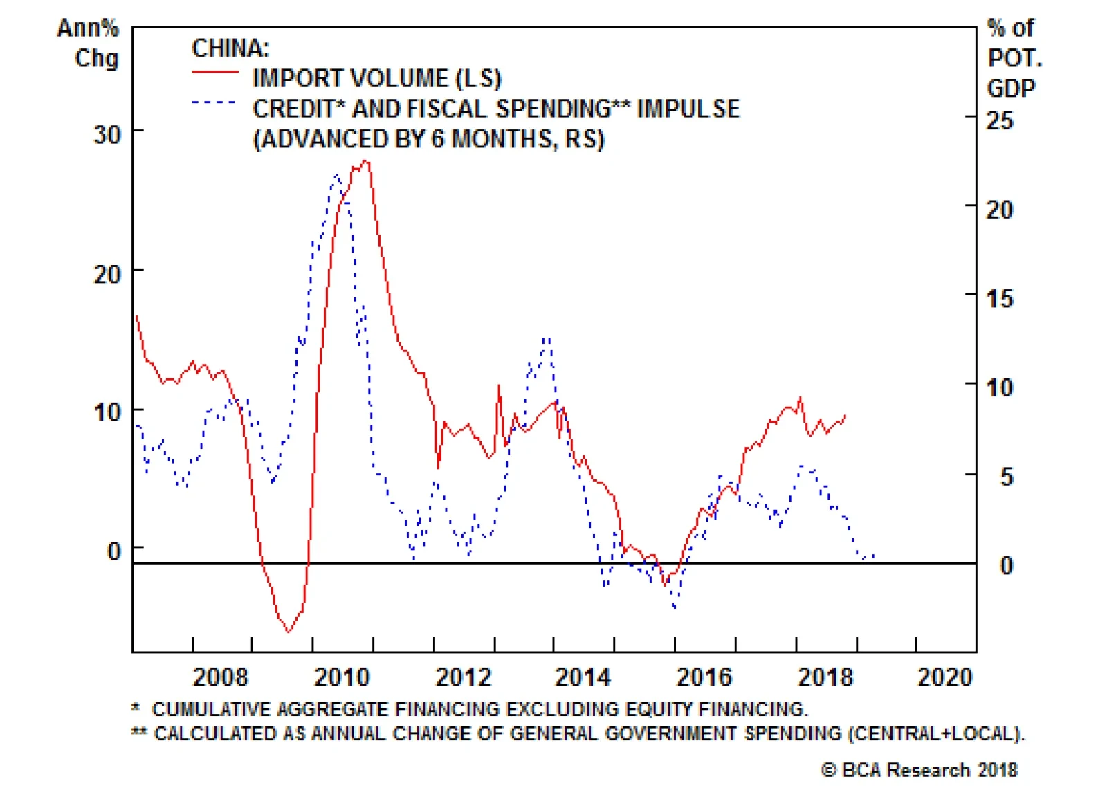
It is also true that Chinese policy makers have been trying to limit the downside to growth. They have injected liquidity in the banking system, let the renminbi depreciate, and allegedly, supported a stock market spiraling downward under the pressure of margin calls. Moreover, fiscal policy is being eased, with income tax cuts pointing to a desire to support household consumption, especially spending on services. But none of these policy actions seems to matter for the world economy, at least for now. China impacts global growth through its imports, and non-food commodities, investment goods, machinery equipment and transportation goods constitute 85% of total Chinese imports. These goods are levered to industrial activity and the Chinese investment cycle. The latter in turn is levered to the Chinese credit cycle (Chart I-2). Hence, as long as China tries to reign in credit growth, Chinese imports will be under pressure. Chart I-2Slowing Chinese Credit Impulse Means Slower Chinese Imports
bca.fes_wr_2018_11_16_s1_c2
bca.fes_wr_2018_11_16_s1_c2
What about the recent rebound in Chinese imports? Our China Strategist posits that it has been linked to front running of orders before the Trump tariffs enter into effect. The trend in credit growth remain poor. The October's money and credit numbers show that the China's total social financing grew at its slowest pace in 12 years, and money growth as well as traditional loan growth has also relapsed (Chart I-3). Hence, China doesn't have an appetite for credit yet. Chart I-3Chinese Credit Is Not Responding To Chinese Stimulus
Chinese Credit Is Not Responding To Chinese Stimulus
Chinese Credit Is Not Responding To Chinese Stimulus
It is hard to fully know why the country's appetite for credit is slowing despite the expanding list of small measures implemented by authorities to support economic activity. On the one hand, it seems that lenders are reluctant to lend. On the other, the private sector does not seems hungry to spend either. As BCA's Emerging Market Strategy service highlighted, even the Chinese consumer is displaying a declining marginal propensity to consume, and retail sales as well as car sales are declining (Chart I-4).1 This suggests that China will continue to act as an anchor on global growth for the time being. Chart I-4Chinese Households Are Cautious
Chinese Households Are Cautious
Chinese Households Are Cautious
Stresses outside of China also remain problematic for global growth. Emerging market financial conditions have tightened significantly. This will continue to act as a drag on global industrial activity (Chart I-5). In fact, the recent poor GDP numbers out of Germany and Japan, two nations highly levered to the global industrial cycle, confirm that the pain originating in the EM space is spreading around the globe. Chart I-5EM Financial Conditions Suggest Continued Downward Pressure On Growth
EM Financial Conditions Suggest Continued Downward Pressure On Growth
EM Financial Conditions Suggest Continued Downward Pressure On Growth
Ultimately, since the U.S. economy is a low beta economy, even if U.S. growth downshifts in response to shocks to global growth, it is likely to slow less than the rest of the world. This explains why the dollar exhibits little constant correlation with U.S. growth, but a tight negative relationship with global growth (Chart I-6). Chart I-6The Countercyclical Dollar
The Countercyclical Dollar
The Countercyclical Dollar
Hence, since we see little hope for an imminent bottom in global growth, additional dollar upside remains. Thus, we re-iterate our target for DXY at 100. Nevertheless, make no mistake, the easy gains in the greenback are behind us. The remainder of the rally will likely prove volatile. Question 2: Is The Growth Divergence Between The U.S. And The Euro Area Peaking? Will This Reverse The Dollar Rally? Economic data in the U.S. has begun to weaken, especially on the durable good orders and the housing fronts. Moreover, the recent core CPI data, which came in at 2.1%, was a disappointment. The strong dollar, higher interest rates, tighter financial conditions, and the potential hit to profits from falling oil prices all suggest that U.S. capex could slow. However, as Chart I-7 illustrates, Europe is slowing more than the U.S. Despite the rollover in the U.S. Leading Economic Indicator, the gap between the U.S. and the euro area LEI is in fact growing in favor of the U.S. This is because the U.S. is a low beta economy and it outperforms Europe when global growth slows, especially when the negative impulse emanates out of China (Chart I-8). Chart I-7U.S. Growth May Be Slowing, But It Is Still Outperforming...
U.S. Growth May Be Slowing, But It Is Still Outperforming...
U.S. Growth May Be Slowing, But It Is Still Outperforming...
Chart I-8...Especially If China Does Not Pick Up
...Especially If China Does Not Pick Up
...Especially If China Does Not Pick Up
Nonetheless, the Fed has already increased rates eight times this cycle and the market anticipates a bit more than two interest rate hikes in the U.S. over the next 12 months, while in Europe, rate expectations are much more muted. Will this slowdown in U.S. growth cause U.S. rate and yield differentials versus the euro area - which stand near historical highs - to fall, providing a welcome fillip for EUR/USD in the process (Chart I-9)? Chart I-9U.S. Spreads Are Wide
U.S. Spreads Are Wide
U.S. Spreads Are Wide
We doubt it. First, three deep structural problems still hamper Europe: Italy still faces challenging debt arithmetic if interest rates rise quickly, which means that Italy continues to teeter close to the hedge of a Eurosceptic drama. European banks are still much weaker than U.S. ones and have a large amount of EM exposure, limiting their capacity to handle higher rates. Europe is far from a true fiscal union, which means that the job of supporting growth lies much more heavily on monetary authorities than in the U.S. This forces the European Central Bank to stay more dovish than the Fed. Second, once the cost of currency hedging is taken into account, the spread between U.S. and European bonds yields becomes negative (Chart I-10)! This suggests that unhedged U.S. yields can rise further versus European ones as U.S. hedged yields are not attractive. This means that yields and interest rates in the U.S. can remain high or even rise relative to Europe, making it attractive to buy the greenback for investors willing to take on currency risk. Chart I-10U.S. Hedged Yields Are Low
U.S. Hedged Yields Are Low
U.S. Hedged Yields Are Low
Hence, we do not expect that the slowdown in U.S. growth will constitutes a major problem for the dollar. Instead, we are looking for EUR/USD to fall below 1.10 before buying the common currency again. Question 3: Is The Dollar Expensive? The answer to this question seems obvious. When looking at a simple purchasing-power parity model, the dollar does look very expensive (Chart I-11). However, valuing currencies is a much more complex question than just looking at PPP metrics. Once other factors are taken into account, the dollar trades in line with its long-term drivers (Chart I-12). The dollar might not be as expensive as PPP metrics suggest because the U.S. productivity growth is higher than in most other G10 nations, because neutral interest rates in the U.S. are structurally higher than in Europe or Japan, and because the U.S. current account deficit is stable despite a strong dollar as the U.S. morphs from an energy importer to an energy exporter. Chart I-11U.S. Dollar And PPP Is The Greenback Really This Expensive?
U.S. Dollar And PPP Is The Greenback Really This Expensive?
U.S. Dollar And PPP Is The Greenback Really This Expensive?
Chart I-12Maybe Not
Maybe Not
Maybe Not
On a short-term basis, there is no evident misalignment in the USD either. The DXY dollar index trades in line with our short-term metrics, suggesting that until now, the bulk of the dollar rally this year was a correction of its previous undervaluation (Chart I-13). Furthermore, the dollar tends to peak at higher degree of overvaluations, and, if U.S. growth continues to outperform the rest of the world, the fair value of the DXY could rise further. Chart I-13No Short-Term Misalignment
No Short-Term Misalignment
No Short-Term Misalignment
Question 4: Will Sino-U.S. Relations Improve After The Buenos Aires G20 Meeting? We are skeptical that Sino-U.S. relations will improve after the Buenos Aires meeting at the end of the month. The White House could delay the imposition of a third round of tariffs as well as the increase in the current tariff rate from 10% to 25%. Such actions would likely result in a temporary bounce back in risk assets and EM related plays as well as correction in the USD. However, President Trump has no incentive to make a full-blown trade deal with China right now. The midterm elections confirmed that the U.S. electorate is not pro-free trade and that the political apparatus in the U.S. is unified in fighting China. At the end of the day, China is a great scapegoat for the income inequality problem plaguing the U.S. Question 5: Will The Dollar Correct After Its Furious 2018 Rally? Our inclination is to think that there are short-term risks building up in the dollar, a topic we discussed at length three weeks ago.2 Namely, traders are now very long the dollar, and risk-on currencies have been rallying against the dollar despite the strength in the DXY. This suggests that the corners of the FX market most levered to global growth might be sniffing out a stabilization in global conditions. Indeed, the Chinese economic surprise index has improved (Chart I-14). While Chinese data has not meaningfully picked up, expectations toward China are very depressed. As such, a slowdown in the pace of deterioration could be interpreted as good news for global growth. The countercyclical dollar may correct. Chart I-14Are Expectations Toward China Too Depressed?
Are Expectations Toward China Too Depressed?
Are Expectations Toward China Too Depressed?
We have not played the dollar correction risk through selling DXY or buying EUR/USD. Instead, we have bought the NZD against both the USD and the GBP. The beaten down kiwi would be the currency most likely to rebound if global growth conditions were to surprise to the upside, even if temporarily. This has proved to be the right call. We remain positive on the NZD for the coming two months. However, from a risk management perpectives we are closing our long NZD/USD trade at 4.8% profit. However, we doubt that any dollar correction is likely to morph into a genuine bear market. If global growth conditions were indeed to improve, this would give more ammo for the Fed to hike in line with its "dots". The market knows that and would revise upward the modest 60 basis point of hikes currently anticipated over the coming 12 months. As such, the resultant increase in real rates would likely hurt the still-fragile EM economies and cause a renewed tightening in EM financial conditions. This would in turn lead to additional slowdown in global growth and would support the dollar. Hence, our current positive predisposition toward the kiwi is temporary in nature. Question 6: Has The Pound Bottomed, Will GBP-Volatility Recede Anytime Soon? In September, we warned that the pound did not compensate investors adequately for the political uncertainty surrounding Brexit risks.3 Specifically, we were most worried about British domestic politics, not the EU side of the negotiations. However, because we believed that ultimately, either soft Brexit or Bremain would ultimately prevail, we refrained from selling the pound outright. Instead, we recommended investors buy the GBP's volatility. Today, Prime Minister Theresa May is in danger as two additional ministers resigned from her cabinet after she presented the Brexit deal that was hammered out with Brussels. The risk of a new election or a hard-liner Brexit Tory replacing her is growing by the minute. Markets are once again clobbering the pound, and GBP implied volatility is trading at level last seen directly after the June 2016 referendum (Chart I-15). Chart I-15Close Long GBP Vol Bets
Close Long GBP Vol Bets
Close Long GBP Vol Bets
At current levels, the pound is now an attractive play for long-term investors. Additionally, while a new election is likely to cause more tremors into the pound, we are inclined to recommend investors close long GBP volatility trades as the British public is growing more disillusioned with Brexit. Our conviction is only growing that only the softest form of Brexit will be implemented. As a result, the risk-reward ratio from selling the pound or buying its volatility has now significantly deteriorated. We are closing our short GBP/NZD trade at a 6% profit in four weeks. Mathieu Savary, Vice President Foreign Exchange Strategy mathieu@bcaresearch.com Footnotes 1 Please see Emerging Markets Strategy Weekly Report, titled "On Domino Effects And Portfolio Outflows", dated November 15, 2018, available at ems.bcaresearch.com 2 Please see Foreign Exchange Strategy Weekly Report, titled "Risk To The Dollar View", dated October 26, 2018, available at fes.bcaresearch.com 3 Please see Foreign Exchange Strategy Special Report, titled "Assessing the Geopolitical Risk Premium In the Pound", dated September 7, 2018, available at fes.bcaresearch.com Currencies U.S. Dollar Chart II-1USD Technicals 1
USD Technicals 1
USD Technicals 1
Chart II-2USD Technicals 2
USD Technicals 2
USD Technicals 2
Recent data in the U.S. has been mixed: Both core inflation and core PCE came in below expectations, coming in at 2.1% and 1.6% respectively. However, Q3 GDP growth surprised to the upside, coming in at 3.5%. Moreover, nonfarm payrolls also came in above expectations, coming in at 250 thousand. The DXY index has been able to appreciate over the past three weeks. We maintain our bullish bias towards the dollar, given that despite its rise, this currency remains fairly valued. Moreover, we expect global growth to continue deaccelerating, as Chinese authorities continue to tighten. That being said, potential upside might be limited from current levels, as speculators are very long the dollar. Report Links: Updating Our Intermediate Timing Models - November 2, 2018 In Fall, Leaves Turn Red, The Dollar Turns Green - October 12, 2018 Policy Divergences Are Still The Name Of The Game - August 14, 2018 The Euro Chart II-3EUR Technicals 1
EUR Technicals 1
EUR Technicals 1
Chart II-4EUR Technicals 2
EUR Technicals 2
EUR Technicals 2
Recent data in the Euro area has been mixed: Core inflation increased and outperformed expectations, coming in at 1.1%. Moreover, Markit Services PMI also surprised to the upside, coming in at 53.7. However, Markit Manufacturing PMI surprised negatively, coming in at 52. EUR/USD has depreciated over that past three weeks. We remain bearish on the euro, given that we expect global growth to keep slowing, hurting export-driven economies like the euro area. Furthermore, Italian debt dynamics will continue to plague the Eurozone. That being said, if the euro were to fall below 1.1, we would tamper our bearishness. Report Links: Evaluating The ECB's Options In December - November 6, 2018 Updating Our Intermediate Timing Models - November 2, 2018 Will Rising Wages Cause An Imminent Change In Policy Direction In Europe And Japan? - October 5, 2018 The Yen Chart II-5JPY Technicals 1
JPY Technicals 1
JPY Technicals 1
Chart II-6JPY Technicals 2
JPY Technicals 2
JPY Technicals 2
Recent data in Japan has been mixed: The unemployment rate surprised positively, coming in at 2.3%. This measure also decreased from last month. However, housing starts yearly growth underperformed expectations, coming in at -1.5%. Moreover, overall household spending yearly growth also surprised negatively, coming in at -1.6%. Q2 GDP contracted and also came in below expectations, driven by poor capex growth. USD/JPY has also appreciated over the past three weeks. We remain positive on the trade-weighted yen, given that the continued slowdown in global growth, fueled by the dual tightening of policy by Chinese authorities and the Fed, will help safe haven currencies like the yen. Moreover, the current selloff in U.S. markets could also provide a boon for this currency if it forces the Fed to tamper its hawkishness. Report Links: Updating Our Intermediate Timing Models - November 2, 2018 Will Rising Wages Cause An Imminent Change In Policy Direction In Europe And Japan? - October 5, 2018 Rhetoric Is Not Always Policy - July 27, 2018 British Pound Chart II-7GBP Technicals 1
GBP Technicals 1
GBP Technicals 1
Chart II-8GBP Technicals 2
GBP Technicals 2
GBP Technicals 2
Recent data in the U.K. has been mixed: Average hourly earnings excluding bonus yearly growth surprised to the upside, coming in at 3.2%. However, core inflation underperformed expectations, coming in at 1.9%. Moreover, retail sales yearly growth also surprised negatively, coming in at 2.2%. After rising for the last three weeks, GBP/USD fell by over 1.5% on Thursday, after two ministers quit Theresa's May cabinet. While the headline risk remains large, especially as the U.K. could soon go through an election, we do not want to be greedy and our closing our long GBP-vol bets. We are also closing our short GBP/NZD bet. At current levels, GBP is now an attractive long-term play. Report Links: Updating Our Intermediate Timing Models - November 2, 2018 Clashing Forces: The Fed And EM Financial Conditions - October 19, 2018 Updating Our Long-Term FX Fair Value Models - June 22, 2018 Australian Dollar Chart II-9AUD Technicals 1
AUD Technicals 1
AUD Technicals 1
Chart II-10AUD Technicals 2
AUD Technicals 2
AUD Technicals 2
Recent data in Australia has been positive: Employment growth outperformed expectation, coming in at 32.8 thousand. Moreover, the participation rate also surprised to the upside, coming in at 65.6%. Finally, the unemployment rate also surprised positively, coming in at 5%. AUD/USD has risen by 3.39% the past 3 weeks. We are inclined to fade this rally as the poor outlook for the Chinese economy could soon transform these strong Australian economic results into much more disappointing numbers. Report Links: Updating Our Intermediate Timing Models - November 2, 2018 Policy Divergences Are Still The Name Of The Game - August 14, 2018 What Is Good For China Doesn't Always Help The World - June 29, 2018 New Zealand Dollar Chart II-11NZD Technicals 1
NZD Technicals 1
NZD Technicals 1
Chart II-12NZD Technicals 2
NZD Technicals 2
NZD Technicals 2
Recent data in New Zealand has been positive: Employment growth outperformed expectations, coming in at 1.1%. Moreover, the participation rate also surprise to the upside, coming in at 71.1%. Finally, the unemployment rate also surprised positively, coming in at 3.9%. NZD/USD has risen by more than 5.5% the past 3 weeks. The NZD continues to be one of our favorite currencies in the G10, given that rate expectations continue to be very low, even though economic data has strengthened. Moreover, food prices, dairies in particular have limited downside from here, especially as they are not very exposed to China's policy tightening. Report Links: Updating Our Intermediate Timing Models - November 2, 2018 Clashing Forces: The Fed And EM Financial Conditions - October 19, 2018 In Fall, Leaves Turn Red, The Dollar Turns Green - October 12, 2018 Canadian Dollar Chart II-13CAD Technicals 1
CAD Technicals 1
CAD Technicals 1
Chart II-14CAD Technicals 2
CAD Technicals 2
CAD Technicals 2
Recent data in Canada has been positive: The net change in employment outperformed expectations, coming in at 11.2 thousand. Moreover, housing starts also surprised to the upside, coming in at 206 thousand. Finally, the unemployment rate also surprised positively, coming in at 5.8%. USD/CAD has risen by 1.2% these past 3 weeks. The weakness in oil prices have caused the Canadian dollar to be one of the worst performing currencies in the G10 in recent weeks. We are reticent to be too bullish on the CAD, given that markets are now pricing in a BoC that will be more hawkish than the Fed. Report Links: Updating Our Intermediate Timing Models - November 2, 2018 Clashing Forces: The Fed And EM Financial Conditions - October 19, 2018 Updating Our Long-Term FX Fair Value Models - June 22, 2018 Swiss Franc Chart II-15CHF Technicals 1
CHF Technicals 1
CHF Technicals 1
Chart II-16CHF Technicals 2
CHF Technicals 2
CHF Technicals 2
Recent data in Switzerland has been negative: Real retail sales yearly growth came in significantly below expectations, coming in at -2.7%. Moreover, the SVME Purchasing Manager's Index also surprised to the downside, coming in at 57.4. Finally, the KOF leading Indicator also surprised negatively, coming in at 100.1. EUR/CHF has been flat in recent weeks. We continue to be bearish on the franc on a cyclical basis, given that inflationary forces in Switzerland remain too tepid for the SNB to hike policy rates. Moreover, the SNB will also have to intervene in currency markets if the franc becomes more expensive in response to the current risk-off environment. Report Links: Updating Our Intermediate Timing Models - November 2, 2018 Updating Our Long-Term FX Fair Value Models - June 22, 2018 Updating Our Intermediate Timing Models - May 18, 2018 Norwegian Krone Chart II-17NOK Technicals 1
NOK Technicals 1
NOK Technicals 1
Chart II-18NOK Technicals 2
NOK Technicals 2
NOK Technicals 2
Recent data In Norway has been mixed: Both headline and core inflation underperformed expectations, coming in at 3.1% and 1.6% respectively. Moreover, manufacturing output also surprised to the downside, coming in at -0.3%. However, registered unemployment surprised positively, coming in at 79.7 thousand. USD/NOK has risen by 1.5%, as falling oil prices have weighed heavily on the krone. We are bullish on the krone relative to the Canadian dollar, given that rate expectations in Canada are much more fully priced in Canada than they are in Norway, even though the inflationary backdrop is similar. Report Links: Updating Our Intermediate Timing Models - November 2, 2018 Clashing Forces: The Fed And EM Financial Conditions - October 19, 2018 Updating Our Long-Term FX Fair Value Models - June 22, 2018 Swedish Krona Chart II-19SEK Technicals 1
SEK Technicals 1
SEK Technicals 1
Chart II-20SEK Technicals 2
SEK Technicals 2
SEK Technicals 2
Recent data in Sweden has been mixed: Retail sales yearly growth outperformed expectations, coming in at 2.1%. Manufacturing PMI also outperformed expectations, coming in at 55. However, headline inflation surprised to the downside, coming in at 2.3%. USD/SEK has depreciated by roughly 1% for the past 3 weeks. Overall, we are bullish on the krona on a long-term basis. After all, the Riksbank is on the verge of beginning a tightening cycle, as imbalances in the Swedish economy are only growing more dangerous. With that being said, the krona could suffer if global growth slows further, as Sweden is very exposed to the gyrations of the global economy. Report Links: Updating Our Intermediate Timing Models - November 2, 2018 Updating Our Long-Term FX Fair Value Models - June 22, 2018 Updating Our Intermediate Timing Models - May 18, 2018 Trades & Forecasts Forecast Summary Core Portfolio Tactical Trades Closed Trades
Our Chief Geopolitical Strategist, Marko Papic, just wrote a fantastic piece on how the secular upswing in U.S.-China tensions could shape the future of critical industries (to impacting both investors and governments) and capital market behavior.1 The…