Global
Our commodity strategists remain convinced OPEC 2.0 member states will once again have to embark on a strategy to backwardate the Brent forward curve, as they did in 1H18. Reducing production in the short term will force refiners to draw on inventories in…
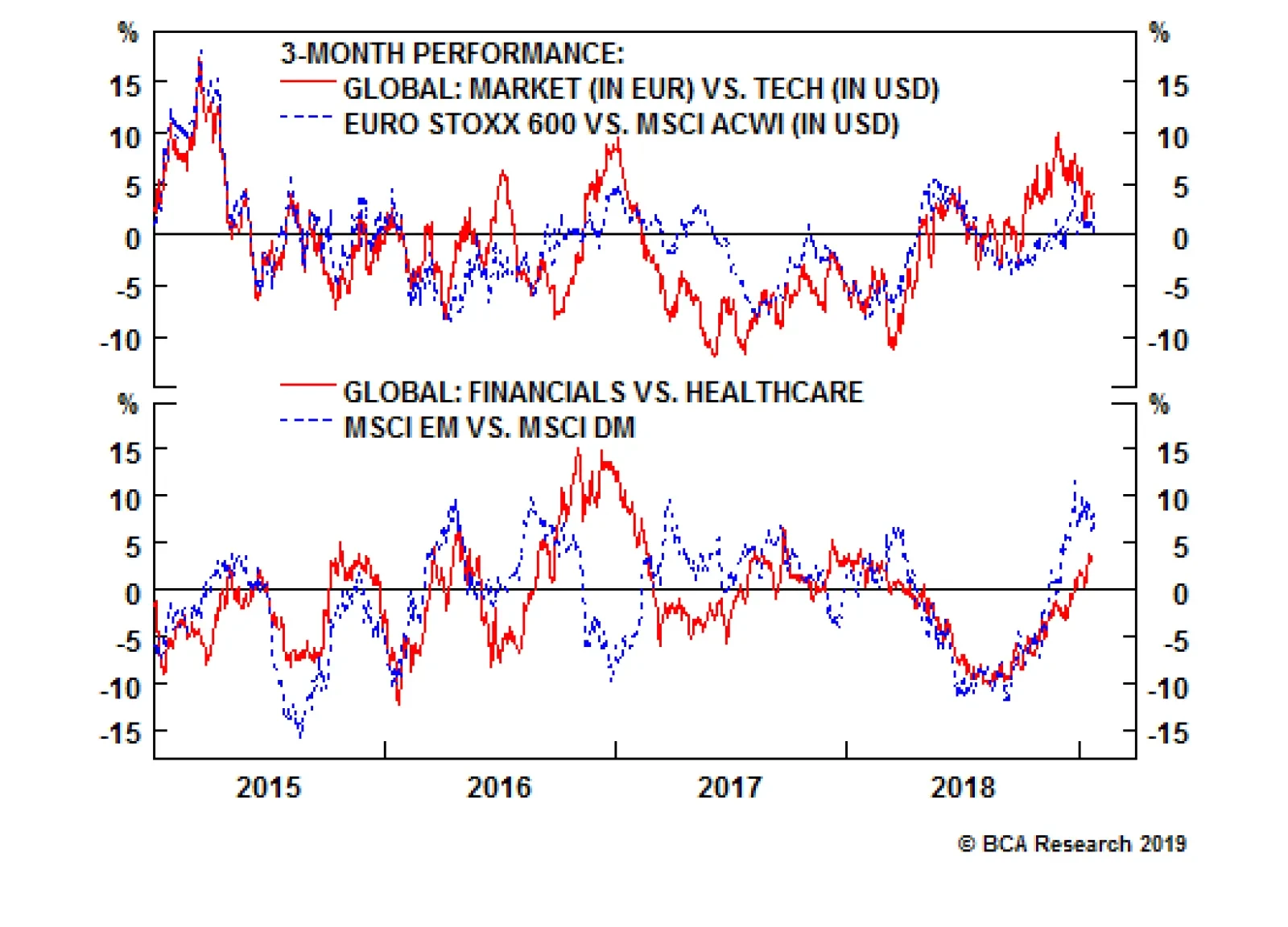
For the European stock market, the negative space is technology, a sector in which European equities have a near-zero exposure. But there is another factor to consider: the currency. The technology sector’s global profits are mostly translated into shares…

Highlights Excess dollar liquidity is still deteriorating. The U.S. economy’s robustness suggests this trend will continue. Elevated EM-dollar debt and declining dollar liquidity point to lower global growth and a stronger dollar. Despite these cyclical forces, a tactical dollar correction is unfolding. Slowdowns do not evolve in straight lines, and deep investor pessimism is setting the stage for a temporary bout of positive surprises. DXY could correct to 93, EUR/USD could rebound to 1.17-1.18, and USD/CAD could fall to 1.27. Buy NOK/SEK. Feature Investment legend Stanley Druckenmiller often refers to the primacy of liquidity trends when making investment decisions. BCA is highly sympathetic to this view, as our DNA is rooted in the analysis of global liquidity trends. Under this lens, a peculiar trend has caught our attention: U.S. commercial and industrial (C&I) loans are currently accelerating, and easing lending standards point to further gains (Chart I-1). This is in sharp contrast with the 2015-2016 market riots and subsequent slowdown – an episode where banks tightened lending standards and loan growth decelerated sharply. While this represents a good omen for the U.S. economy, it is a dangerous evolution for the rest of the world. Chart I-1Resilient Corporate Sector Credit Growth
Resilient Corporate Sector Credit Growth
Resilient Corporate Sector Credit Growth
Growing credit is good for the U.S. because it points to robust domestic demand. However, it is problematic for the rest of the world for two reasons. First, if U.S. credit growth is more robust today than in 2016, it also implies that the Federal Reserve is unlikely to pause its rate-hike campaign as much as it did back then. Thus, U.S. rates, the key determinant of the global cost of capital, may have additional upside as interest rate markets anticipate a year-long pause. This is not yet a problem for the U.S. economy, but it is one for rest of the world, which is exhibiting poorer growth trends. Second, U.S. credit growth is already outpacing the expansion of U.S. money supply by 7%, pointing towards a decline in dollar liquidity available for international financial markets. The reduction in the Fed’s balance sheet will contribute to a continuation of this trend. The fall in the amount of dollars available for the international financial system creates a brake on growth. Over the past 10 years, each time money supply growth fell below the loan uptake of the U.S. corporate sector, our Global Industrial Activity Nowcast, BCA’s Global Leading Economic Indicator, Korean exports, and global export prices all deteriorated considerably (Chart I-2). Chart I-2Deteriorating Excess Liquidity Hurts Global Growth
Deteriorating Excess Liquidity Hurts Global Growth
Deteriorating Excess Liquidity Hurts Global Growth
The large dollar debt of emerging markets lies behind this relationship. If less dollars are available outside the U.S. financial system, EM borrowers have to bid more for these greenbacks, raising their cost of capital. Additionally, borrowers are likely to hoard any dollars they access in order to repay their liabilities instead of using these greenbacks to finance economic transactions. As Chart I-3 shows this problem is particularly acute today: relative to EM GDP and various measures of U.S. money supply, EM dollar debt stands at record highs, highlighting deep vulnerabilities if liquidity conditions deteriorate. Chart I-3The Sensitivity To Dollar Liquidity Stems From The Large Stock Of Dollar Debt
The Sensitivity To Dollar Liquidity Stems From The Large Stock Of Dollar Debt
The Sensitivity To Dollar Liquidity Stems From The Large Stock Of Dollar Debt
The problem extends beyond the capacity of the U.S. economy to generate deposits in excess of non-bank liabilities. Despite a meaningful slowdown in non-U.S. industrial production, official reserves are contracting relative to global industrial activity (Chart I-4). This further suggests that the global economy is experiencing some form of liquidity crunch, where the growth of monetary aggregates is insufficient to support economic activity. This is a deflationary environment. Chart I-4High-Powered Money Lagging Sagging Activity
High-Powered Money Lagging Sagging Activity
High-Powered Money Lagging Sagging Activity
Another factor is at play: We have often argued in these pages that carry trades are a key component of global liquidity, as they allocate funds from economies where savings are excessive (i.e. borrowing in funding currencies) to economies that need those savings to generate growth (i.e. carry currencies).1 This is why the performance of high-octane carry trades is often a very reliable leading indicator of global economic activity. However, as Chart I-5 demonstrates, EM carry trades funded in yen continue to perform execrably, a poor signal for global liquidity and growth. Chart I-5Underperforming Carry Trades Add To The Global Liquidity Woes
Underperforming Carry Trades Add To The Global Liquidity Woes
Underperforming Carry Trades Add To The Global Liquidity Woes
The impact of the deterioration in dollar liquidity, in FX reserves growth and in carry trade liquidity is evident in EM monetary aggregates. EM M1 growth has sharply decelerated. Since decelerating EM money supply presages weaker growth, it also points to stronger counter cyclical currencies like the dollar and the yen, especially against the very growth-sensitive commodity currencies (Chart I-6). The dollar bull market is unlikely to be over this year. Chart I-6Ominious Signal From EM Money Supply
Ominious Signal From EM Money Supply
Ominious Signal From EM Money Supply
This risk is reinforced by the tight inverse correlation between the dollar and U.S. commercial banks’ liquidity. When U.S. banks curtail their holdings of securities, a key source of dollar liquidity in international markets, a dollar rally follows (Chart I-7). Not only does last year’s fall in securities in bank assets point to a firming greenback, but if banks also expand their loan books they will also further curtail their securities holdings. Chart I-7Contracting Liquidity On U.S. Commercial Banks Balance Sheets Support The Dollar
Contracting Liquidity On U.S. Commercial Banks Balance Sheets Support The Dollar
Contracting Liquidity On U.S. Commercial Banks Balance Sheets Support The Dollar
The much-higher real rates offered by U.S. Treasurys relative to other DM bonds magnifies these dollar positive trends (Chart I-8). Hence, not only will global growth and money quantity considerations prove tailwinds for the greenback, but so will more well-known drivers of exchange rates. Chart I-8Real Rates Differentials Still Favor The Dollar
Real Rates Differentials Still Favor The Dollar
Real Rates Differentials Still Favor The Dollar
Bottom Line: The deterioration in global liquidity conditions continues to argue in favor of the dollar. Since U.S. credit growth is still managing to accelerate, the Fed is unlikely to pause on the rate-hike front for too long, implying that excess dollars will further vanish from the international financial system. Consequently, global monetary conditions will tighten again, and global growth has not hit its nadir this cycle. On a 9 to 12 month basis, the dollar will benefit in this environment, especially against cyclical commodity currencies. How Fast Can Investors Price In Bad News? Due to the tightening in global liquidity conditions, global growth has suffered. However, the global and U.S. stock-to-bond ratios, two financial market metrics finely tuned to global economic gyrations, have already fallen in line with our Global Economic and Financial Diffusion Index that tallies the improvement and deterioration among more than 100 key global variables (Chart I-9). This implies that asset prices already reflect much of the deterioration in the economic outlook. Chart I-9The Global Economy Is Soft, But Financial Markets Already Reflect This Reality
The Global Economy Is Soft, But Financial Markets Already Reflect This Reality
The Global Economy Is Soft, But Financial Markets Already Reflect This Reality
The problem for bears is that economic cycles rarely play out in a straight line. Now that asset prices are incorporating poor expectations, any positive surprises, even if modest, could lift asset prices. And there is room for improvement in global economic surprises (Chart I-10), particularly as Sino-U.S. trade relations are improving, global financial conditions are easing and China is trying to manage its slowdown. In fact, China’s fiscal and monetary stimulus already points to a rebound in growth-sensitive currencies, and to a correction in the dollar (Chart I-11). Chart I-10Scope For A Rebound In Economic Surprises
Scope For A Rebound In Economic Surprises
Scope For A Rebound In Economic Surprises
Chart I-11Chinese Reflation Points To A Dollar Correction, Even If Only A Small One
Chinese Reflation Points To A Dollar Correction, Even If Only A Small One
Chinese Reflation Points To A Dollar Correction, Even If Only A Small One
EM breadth confirms this message. Chart I-12 shows that the breadth of EM equities has not been this poor since early 2009. However, it has begun to rebound. Rebounds in EM breadth from such levels are historically associated with a weaker dollar, stronger commodity currencies and a weaker yen. Chart I-12Deep Oversold Conditions In EM Stocks Further Support The Case For A Dollar Correction
Deep Oversold Conditions In EM Stocks Further Support The Case For A Dollar Correction
Deep Oversold Conditions In EM Stocks Further Support The Case For A Dollar Correction
Flows paint a similar picture. Global investors tend to buy Japanese bonds when global growth conditions deteriorate. Foreigners buying of Japanese fixed-income products now stands near record levels – something normally witnessed when credit spreads widen. However, positive economic surprises and the recent easing in global financial conditions suggest that these flows will reverse. When they do, the dollar will suffer (Chart I-13) and very pro-cyclical pairs like AUD/JPY will appreciate, even if only temporarily. Chart I-13Elevated Flows Into Japanese Bonds Suggest Overdone Pessimism, And Scope For A Dollar Correction
Elevated Flows Into Japanese Bonds Suggest Overdone Pessimism, And Scope For A Dollar Correction
Elevated Flows Into Japanese Bonds Suggest Overdone Pessimism, And Scope For A Dollar Correction
It’s not just the commodity currencies that have upside: so does the euro. German bunds’ hedged yields have been rising relative to the U.S., which in recent years has often led to a rally in EUR/USD (Chart I-14). Chart I-14European Hedged Yields Imply A Euro Rebound
European Hedged Yields Imply A Euro Rebound
European Hedged Yields Imply A Euro Rebound
How deep will this dollar down leg be? Our Intermediate-Term Timing Model suggests that the greenback’s weakness is likely to be limited. The dollar already trades below our fair-value estimate, but during corrective episodes it tends to trough at a 5% discount, implying that the DXY at 93 is a buy (Chart I-15). The euro, the dollar’s mirror image, could rebound to a roughly 5% overvaluation, implying that a countertrend move to 1.17-1.18 is also likely. Finally, the CAD may be able to rebound to USD/CAD 1.27. Chart I-15Gauging The Extent Of The Countertrend Moves
Gauging The Extent Of The Countertrend Moves
Gauging The Extent Of The Countertrend Moves
At these levels, we would expect the countertrend moves to end. Ultimately, the aforementioned deterioration in global liquidity conditions means that positive surprises are likely to be transitory phenomena. Moreover, we doubt that Chinese stimulus, a key catalyst for a weaker dollar, will be very deep. Ultimately, our view remains that China is only trying to prevent a collapse of its economy and Beijing is extremely reluctant to stimulate enough to generate yet another boom – something needed to genuinely boost global growth if the Fed resumes its tightening campaign. Finally, while a trade deal between China and the U.S. is likely, investors should not get overly exuberant on its ramifications. Disagreements over intellectual property transfers will not be resolved anytime soon, and China remains the U.S.’s largest geopolitical challenger. Bottom Line: Global liquidity conditions may have deteriorated, suggesting a trough in global growth is not yet in the cards, but slowdowns do not evolve in straight lines. This means that oversold risk assets are likely to respond well to positive economic surprises. As a result, the countercyclical dollar will correct, probably to 93. The commodity currency complex should be the main beneficiary of this move, with downside in USD/CAD to 1.27. The euro could rebound toward 1.17-1.18. Buy NOK/SEK In June 29th, we closed our long NOK/SEK trade, expecting corrective action in this cross. A serious selloff ensued, and we are now buying this pair again.2 First, NOK/SEK is very sensitive to oil prices (Chart I-16), and BCA’s Commodity and Energy service anticipates a rebound in oil prices this year on the back of tightening supply conditions. Chart I-16BCA's Oil View Points To A NOK/SEK Rebound
BCA's Oil View Points To A NOK/SEK Rebound
BCA's Oil View Points To A NOK/SEK Rebound
Second, the Norwegian economy is outperforming Sweden’s. As Chart I-17 shows, the Norwegian LEI continues to rise relative to Sweden’s, which historically implies a much stronger NOK/SEK. Beyond the LEIs, Norway’s PMIs and economic surprises have not only rebounded, but are also outpacing Sweden’s equivalent metrics. The Norwegian consumer is also participating in the good times. The three-month moving average of employment growth, retail sales and consumer confidence are stronger in Norway than in Sweden. Chart I-17Norwegian Growth Is Superior To Sweden's
Norwegian Growth Is Superior To Sweden's
Norwegian Growth Is Superior To Sweden's
Third, after a long period of underperformance, Norwegian core inflation stands above that of Sweden, pointing to a potentially more hawkish Norges Bank than Riksbank. Fourth, NOK/SEK trades at a 5% discount to its fair value implied by our Intermediate-Term Timing model. Historically, a rebound in this cross follows such discounts Chart I-18). Chart I-18The ITTM Highlights An Attractive Entry Point To Buy NOK/SEK
The ITTM Highlights An Attractive Entry Point To Buy NOK/SEK
The ITTM Highlights An Attractive Entry Point To Buy NOK/SEK
Finally, NOK/SEK is at a technically attractive spot. Our momentum oscillator shows deeply oversold conditions in the pair (Chart I-19). However, momentum has begun to roll over, suggesting that a reversal of those oversold conditions is starting. Moreover, the uptrend that began in the first quarter of 2016 has been confirmed. Had NOK/SEK not rebounded from where it did, that uptrend would have been seriously challenged, with potential greater downside ahead. Chart I-19Favorable Technical Setup To Buy NOK/SEK
Favorable Technical Setup To Buy NOK/SEK
Favorable Technical Setup To Buy NOK/SEK
Bottom Line: We are re-opening our long NOK/SEK trade. We avoided the serious correction in this pair at the end of last year, but rebounding oil prices, an outperforming Norwegian economy, a potentially more-hawkish Norges Bank, a favorable valuation backdrop and positive technical developments argue in favor of buying this cross. Set a stop at 1.037 and a target at 1.120. Mathieu Savary, Vice President Foreign Exchange Strategy mathieu@bcaresearch.com Footnotes 1 Please see Foreign Exchange Strategy Weekly Report, titled "Canaries In the Coal Mine Alert: EM/JPY Carry Trades", dated December 1, 2017, and Foreign Exchange Strategy Weekly Report, titled "Canaries In The Coal Mine Alert 2: More On EM Carry Trades And Global Growth", dated December 15, 2017. Both are available at fes.bcaresearch.com 2 Please see Foreign Exchange Strategy Weekly Report, titled "What Is Good For China Doesn’t Always Help The World", dated June 29, 2018, available at fes.bcaresearch.com Currencies U.S. Dollar Chart II-1USD Technicals 1
USD Technicals 1
USD Technicals 1
Chart II-2USD Technicals 2
USD Technicals 2
USD Technicals 2
Recent data in the U.S. has been mixed: Capacity utilization outperformed expectations, coming in at 78.7%. However, the Michigan Consumer Sentiment Index surprised to the downside, coming in at 90.7. Finally, existing home sales month-on-month grow also surprised negatively, coming in at 4.99 million. DXY has risen 0.2% this week. While we believe that DXY could experience some weakness in the next couple of months, we remain bullish on the DXY on a cyclical basis, as the strength in the U.S. economy will prompt the Fed to deliver more rate hikes than expected by market participants. Moreover, the sharp focus of Chinese policymakers on limiting indebtedness should continue to put downward pressure on global growth, helping the dollar in the process. Report Links: So Donald Trump Cares About Stocks, Eh? - January 9, 2019 Waiting For A Real Deal - December 7, 2018 2019 Key Views: The Xs And The Currency Market - December 7, 2018 The Euro Chart II-3EUR Technicals 1
EUR Technicals 1
EUR Technicals 1
Chart II-4EUR Technicals 2
EUR Technicals 2
EUR Technicals 2
Recent data in the euro has been negative: Both headline and core inflation came in line with expectations, coming in at 1.6% and 1% respectively. However, Markit Services PMI underperformed expectations, coming in at 50.8. Moreover, the Markit Manufacturing PMI also surprised negatively, coming in at 50.7. EUR/USD fell 0.4% this week. Thursday, ECB President Mario Draghi highlighted that downside risks to the European economy are building up. Overall, we agree with his assessment, and thus remain bearish on the euro on a cyclical basis. We believe that the Fed will eventually raise rates more than the market expects, widening the rate differentials between Europe and the U.S, which will hurt EUR/USD. Report Links: 2019 Key Views: The Xs And The Currency Market - December 7, 2018 Six Questions From The Road - November 16, 2018 Evaluating The ECB’s Options In December - November 6, 2018 The Yen Chart II-5JPY Technicals 1
JPY Technicals 1
JPY Technicals 1
Chart II-6JPY Technicals 2
JPY Technicals 2
JPY Technicals 2
Recent data in Japan has been negative: Import growth underperformed expectations, coming in at 1.9%. Moreover, driven by weak shipments to China, export growth also surprised to the downside, coming in at a 3.8% contraction. USD/JPY fell 0.1% this week. We remain bearish on the yen on a short-term basis, as the recent easing in global financial conditions and the improvement in sentiment towards risk assets will likely weigh on safe havens like the yen. Moreover, we believe that bond yields will start rising again. In light of the positive relationship between yields and USD/JPY, we remain bullish on this cross. Report Links: Yen Fireworks - January 4, 2019 2019 Key Views: The Xs And The Currency Market - December 7, 2018 Updating Our Intermediate Timing Models - November 2, 2018 British Pound Chart II-7GBP Technicals 1
GBP Technicals 1
GBP Technicals 1
Chart II-8GBP Technicals 2
GBP Technicals 2
GBP Technicals 2
Recent data in the U.K. has been mixed: Retail sales yearly growth and retail sales excluding fuel yearly growth underperformed expectations, coming in at 3% and 2.6%, respectively. Moreover, the claimant count change also surprised to the downside, coming in at 20.8 thousand. However, average hourly earnings growth also outperformed, coming in at 3.4%. GBP/USD has rose 1.5% this week, lifted by motion by MPs to delay the implementation of Article 50, and news that Jeremy Corbyn may be moving more clearly in favor of a new referendum if Labour takes hold of Westminster. We are closing our short EUR/GBP trade today, after reaching our target of 0.87. At this point, we think that plenty of good news have been discounted by the pound. While it is true that GBP could go up on the back of positive political developments, we believe that the risk reward ratio of selling EUR/GBP is not as attractive anymore, especially if EUR/USD can rebound. That being said, we remain bullish on cable on a long-term basis due to its cheap valuation. Report Links: Deadlock In Westminster - January 18, 019 Six Questions From The Road - November 16, 2018 Updating Our Intermediate Timing Models - November 2, 2018 Australian Dollar Chart II-9AUD Technicals 1
AUD Technicals 1
AUD Technicals 1
Chart II-10AUD Technicals 2
AUD Technicals 2
AUD Technicals 2
Recent data in the Australia has been mixed: The participation rate surprised to the downside, coming in at 65.6%. However, the unemployment rate surprised positively, coming in at 5%. Moreover, the change in employment also outperformed expectations, coming in at 21.6 thousand, however, this improvement was driven by part-time positions, not full-time ones. AUD/USD has fallen by 1% this week. We remain bearish on the AUD versus the USD on a cyclical basis given that we expect that Chinese authorities will remain reluctant to over-stimulate their economy while global dollar liquidity deteriorates. Thus, in light of the tight economic links between Australia and Chinese industrial activity, the Australian economy is likely to suffer, dragging the AUD down in the process. Report Links: Waiting For A Real Deal - December 7, 2018 Updating Our Intermediate Timing Models - November 2, 2018 Policy Divergences Are Still The Name Of The Game - August 14, 2018 New Zealand Dollar Chart II-11NZD Technicals 1
NZD Technicals 1
NZD Technicals 1
Chart II-12NZD Technicals 2
NZD Technicals 2
NZD Technicals 2
Recent data in New Zealand has been mixed: The Q4 New Zealand inflation on a year–over-year basis remains at 1.9%, slightly surprised to the upside. December business NZ PMI has increased to 55.1. December credit card spending year over year growth dropped to 4.5%. NZD/USD appreciated by 0.3% this week. On a structural basis, we are negative on the kiwi. The new government is looking to lower immigration, and implement an unemployment mandate. Both of these developments would likely lower the neutral rate of interest for the RBNZ, which would imply a lower NZD/USD. Report Links: Updating Our Intermediate Timing Models - November 2, 2018 Clashing Forces: The Fed And EM Financial Conditions - October 19, 2018 In Fall, Leaves Turn Red, The Dollar Turns Green - October 12, 2018 Canadian Dollar Chart II-13CAD Technicals 1
CAD Technicals 1
CAD Technicals 1
Chart II-14CAD Technicals 2
CAD Technicals 2
CAD Technicals 2
Recent data in Canada has been mixed: Consumer price index year over year growth in December surprised to the upside, coming in at 2.0%. Core inflation year over year measure also increased to 1.7%, from the previous 1.5%. Retail sales in November month on month growth is lower than expected, dropping to -0.9% from the previous 0.2% in October. Year-on-year growth hit levels not seen since 2012. USD/CAD is now trading above 1.3354, after a small rebound by 0.5% this week following weak data releases. We are bearish on Canadian dollar in the long run, but are bullish on a tactical basis. Financial condition will stay easy, as suggested by Stephen S. Poloz’s interview with Bloomberg this Wednesday. Given the recent trade tensions, housing market and oil price plunge, there is less urgency for BoC to push for higher rate at this moment. Report Links: Updating Our Intermediate Timing Models - November 2, 2018 Clashing Forces: The Fed And EM Financial Conditions - October 19, 2018 Updating Our Long-Term FX Fair Value Models - June 22, 2018 Swiss Franc Chart II-15CHF Technicals 1
CHF Technicals 1
CHF Technicals 1
Chart II-16CHF Technicals 2
CHF Technicals 2
CHF Technicals 2
EUR/CHF has fallen 0.3% this week. We are bullish on this cross, given that the surge of the franc against the euro has caused a significant slowdown in Swiss inflation. The strong relationship between inflation and the currency means that any additional currency strength could severely impair the central bank’s objective of achieving 2% inflation. The SNB is very well aware of this developments, which means that it will likely intervene in the currency market in order to put a floor on EUR/CHF. Report Links: Waiting For A Real Deal - December 7, 2018 Updating Our Intermediate Timing Models - November 2, 2018 Updating Our Long-Term FX Fair Value Models - June 22, 2018 Norwegian Krone Chart II-17NOK Technicals 1
NOK Technicals 1
NOK Technicals 1
Chart II-18NOK Technicals 2
NOK Technicals 2
NOK Technicals 2
Norges Bank kept the key interest rate unchanged at 0.75%. Overall, we remain bullish on USD/NOK on a cyclical basis, given that this cross is very sensitive to real rate differentials. We expect the Fed to continue hiking rates this year at a faster pace than the Norges Bank, a development which will widen rate differentials and provide a tailwind for USD/NOK. That being said, we are positive on NOK/SEK. Not only is this cross attractive from a technical perspective, but also the expected rise in oil prices should help the Norwegian economy outperform the Swedish one. Report Links: Waiting For A Real Deal - December 7, 2018 Updating Our Intermediate Timing Models - November 2, 2018 Clashing Forces: The Fed And EM Financial Conditions - October 19, 2018 Swedish Krona Chart II-19SEK Technicals 1
SEK Technicals 1
SEK Technicals 1
Chart II-20SEK Technicals 2
SEK Technicals 2
SEK Technicals 2
USD/SEK has risen by 0.6% this week. We are bullish on the krona on a long-term basis, as we believe that the Riksbank’s monetary policy is too accommodative considering the strong inflationary pressures brewing in the Scandinavian country. The cyclical outlook for the SEK remains poor, as the krona displays the highest sensitivity to the dollar’s strength of any G10 currencies. Report Links: Updating Our Intermediate Timing Models - November 2, 2018 Updating Our Long-Term FX Fair Value Models - June 22, 2018 Updating Our Intermediate Timing Models - May 18, 2018 Trades & Forecasts Forecast Summary Core Portfolio Tactical Trades Closed Trades
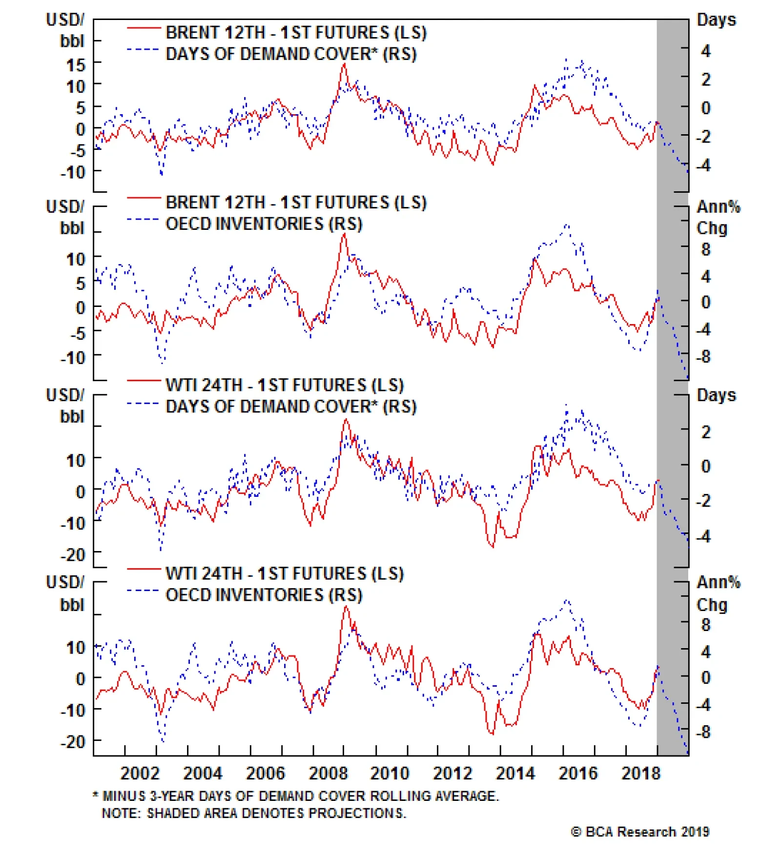
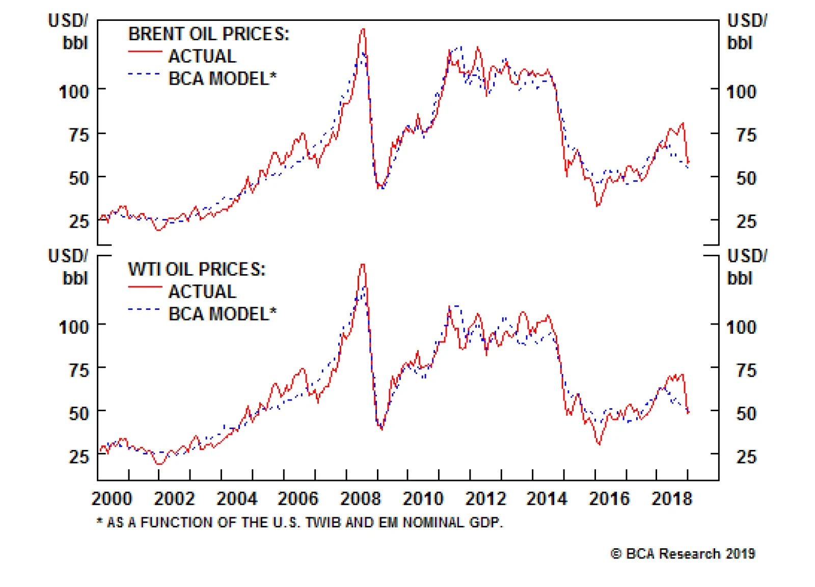
OPEC 2.0 is building physical optionality, to deal with different possible moves the U.S. can make on Iranian oil export sanctions and waivers. This comes despite an apparent break in the sense of urgency Saudi Arabia and Russia feel re production cuts. The coalition’s market monitoring committee meets in April, followed by a full gathering in May, when U.S. waivers expire. If the U.S. extends waivers, OPEC 2.0 can extend production cuts; if it doesn’t, it can add supply as needed.1 On the demand side, markets appear to be overly concerned about a sharper-than-expected slowdown in China, which, if borne out, would restrain EM growth. We believe these fears are overdone, and expect a slight improvement in EM demand generally this year and next. In our new balances estimates, we see the OECD commercial oil inventory overhang clearing in 1H19, on the back of resilient demand, OPEC 2.0 discipline, and a more moderate level of growth in U.S. shale oil output. This keeps Brent on track to average $80/bbl this year and $85/bbl next year, with WTI trading $74/bbl this year, and $82/bbl next year. Highlights Energy: Overweight. Mandatory cuts of 325k b/d, coupled with additional exports of ~ 190k b/d due to additional train and pipeline capacity out of Canada, will drain the 35mm barrels of excess crude oil inventories targeted by the Alberta government in December by 1H19. The WCS – WTI spread narrowed to -$10/bbl from -$50/bbl on these mandatory cuts. By 2H19, we expect Canadian production cuts to average 95k b/d. Base Metals: Neutral. Aluminum output in China surged 11.3% y/y in December, hitting 3.05mm MT, according to Metal Bulletin. Total output for 2018 was 35.8mm MT, a 7.4% y/y increase. Precious Metals: Neutral. Gold is holding its recent gains, as markets become more comfortable with the Fed pausing on its rates-normalization policy until 2H19. Agriculture: Underweight. Hot and dry weather in Brazil is threatening crop yields there. The unfavorable weather is expected to affect three-quarters of cotton-growing regions, half of sugar areas, a third of first-crop corn acreage, and a quarter of soy regions. Feature The first signs of fraying in the relationship between the putative leaders of OPEC 2.0 – the Kingdom of Saudi Arabia (KSA), which cut production ~ 450k b/d m/m in December, and Russia, which raised output – are emerging, as world leaders meet in Davos. While this casts doubt on the leadership’s carefully cultivated amity, and their shared willingness to abide by the recently agreed output cuts, we do not believe it signals the end of the historic cooperation between these states. Total OPEC output – estimated by production-tracking sources outside the Cartel – stood at 31.6mm b/d in December, a prodigious 751k b/d reduction m/m. We expect continued oil production cuts from core OPEC states and decline-curve losses among non-Gulf OPEC and non-OPEC states within the coalition this year to remove at least 1.2mm b/d from the market, per the quotas agreed by members in December (Chart of the Week, Table 1). On top of this, mandatory Canadian production cuts of 325k b/d in 1H19 and 95k b/d in 2H19 will keep average production cuts at ~ 1.4mm b/d this year. Chart of the WeekOPEC 2.0 Will Resume Production Cuts
OPEC 2.0 Will Resume Production Cuts
OPEC 2.0 Will Resume Production Cuts
Table 1OPEC 2.0 Production Cuts Could Exceed Quotas
OPEC Starts Cutting Oil Output; Demand Fears Are Overdone
OPEC Starts Cutting Oil Output; Demand Fears Are Overdone
OPEC 2.0’s cuts could persist into 2020, depending on how the U.S. deals with Iranian oil-export sanctions and waivers. Even though KSA and Russia apparently do not share the same sense of urgency re production cuts right now, we believe OPEC 2.0 is committed to draining oil inventories, particularly in the OECD.2 To do so, they’re increasing their operational flexibility – creating physical options, in a manner of speaking – to deal with a range of uncertain outcomes when U.S. waivers on Iranian export sanctions expire in May. Sanctions And OPEC 2.0’s Physical Options Despite the waivers granted to its eight top consumers shortly after U.S. sanctions took effect in November, Iranian exports plunged below 0.5mm b/d in December. As of December, China had substituted almost all of its Iranian imports for alternative barrels.3 This coincided with a production surge by OPEC 2.0 at the behest of the U.S. leading up to the November sanctions deadline of November 4, 2018, which swelled OECD inventories and took them above their rolling 5-year average level (Chart 2). India retained 30% of its May import levels from Iran, while Europe complied at 100% with U.S. sanctions (Table 2). Chart 3 shows the decrease in exports in preparation for the sanctions over the course of 2018. Chart 2OECD Inventory Overhang Will Draw As OPEC 2.0 Cuts and Losses Kick In
OECD Inventory Overhang Will Draw As OPEC 2.0 Cuts and Losses Kick In
OECD Inventory Overhang Will Draw As OPEC 2.0 Cuts and Losses Kick In
Table 2Iran Exports By Destination 2018 (‘000 b/d)
OPEC Starts Cutting Oil Output; Demand Fears Are Overdone
OPEC Starts Cutting Oil Output; Demand Fears Are Overdone
Chart 3
Whether or not the waivers are extended is anyone’s guess. It is possible waivers will be extended for 90 or 180 days, as a way to counter OPEC 2.0 production cuts, and to offset the lag between filling new pipeline takeaway capacity in the Permian. We expect importers to queue up for Iranian barrels as the market tightens in 1H19. OPEC 2.0’s market monitoring committee will meet in April, followed by a ministerial meeting in May, just ahead of the expiration of the waivers.4 If the U.S. extends them, OPEC 2.0 can extend production cuts after it meets in May; if waivers are not extended, the Cartel can calibrate an appropriate supply response. Either way, we expect OPEC 2.0 will closely align its production schedule with any U.S. action on the sanctions and waivers. This will, we believe, keep change in the overall market’s supply side relatively constant, except for the month or two required to adjust OPEC 2.0 output. Permian Will Drive OPEC 2.0 Policy The larger issue for OPEC 2.0 comes in 4Q19, when ~ 2mm b/d of new pipeline takeaway capacity comes on line in the Permian Basin in West Texas. With additional takeaway capacity due to come on in 2020, the Cartel will have its work cut out for it next year.5 Our models show a slight decrease then flattening in U.S. rig counts over the coming months, as a result of the 4Q18 sell-off in WTI, with a rebound around mid-year (Chart 4). This is because rig count lags oil prices by ~4 months. Chart 4U.S. Shales Continue to Drive Lower 48 Production Growth (ex GOM)
U.S. Shales Continue to Drive Lower 48 Production Growth (ex GOM)
U.S. Shales Continue to Drive Lower 48 Production Growth (ex GOM)
We are expecting production in the Big 5 shale basins to average 8.4mm b/d in 2019 and 9.0mm b/d next year, a somewhat higher level than projected by the EIA. Growth in the shales accounts for close to 80% of the 2.3mm b/d of growth in the U.S. over 2019 – 2020. Globally, U.S. shales will continue to provide the bulk of y/y crude oil production growth, accounting for 73% of the 2.5mm b/d of growth we will see over the next two years. Given the near-death experience OPEC 2.0 member states had in the price collapse of 2014 – 2016, we remain convinced OPEC 2.0 member states will once again have to embark on a strategy to backwardate the Brent forward curve as they did in 1H18, to moderate the growth of shale-oil production in the U.S. (Chart 5). Reducing production in the short term will force refiners to draw inventories to supply their units and produce products like gasoline, diesel, jet fuel and a wide range of petrochemicals. Chart 5OPEC 2.0 Needs Backwardated Brent Forwards
OPEC 2.0 Needs Backwardated Brent Forwards
OPEC 2.0 Needs Backwardated Brent Forwards
This will backwardate the Brent forward curve – i.e., prompt-delivery barrels will be more expensive than deferred-delivery barrels. A backwardated forward curve means OPEC 2.0 member states with term contracts indexed to spot prices receive higher prices for their oil than shale producers hedging 2 years forward, all else equal. The trick for OPEC 2.0 will be to keep the Brent forwards backwardated when the Permian takeaway capacity starts to fill, and exports from the U.S. rise in the early 2020s, as deep-water harbors are brought on line. If OPEC 2.0 is successful in keeping the Brent forwards in backwardation, this will, over time, moderate the growth of shale production: Hedgers’ revenue is constrained by lower forward prices.6 We would not be surprised if OPEC 2.0 states started announcing final investment decisions on select investments in spare capacity to augment existing resources, so they are able to quickly bring production to market in the event of unplanned outages that could lift the entire forward curve and incentivize hedging at higher prices. Demand Still Looks Good Oil markets continue to fret over a possible hard landing in China – resulting either from an internal policy error or a ratcheting up of tensions in the Sino – U.S. trade war. This is causing markets to extrapolate into the wider EM space, and take oil-demand projections lower on an almost-daily basis. In a word, markets are overwrought. Chinese policymakers are sensitive to the tight financial conditions that prevailed in 2H18, which, along with the trade war with the U.S., slowed growth and fostered uncertainty among households and firms in China. We agree with our Geopolitical Strategy and China Investment Strategy groups that presidents Trump and Xi are pragmatists dealing with restive populations, and want to deliver a deal ahead of U.S. elections and the 100th anniversary of the founding of the Chinese Communist Party in 2021.7 We’ve been expecting the government to deploy a modest amount of stimulus in 1H19, which will begin having an effect on the Chinese economy in the second half of this year. Toward the end of the year and into 2020, we expect the larger stimulus to be deployed in the run-up to put a bid under industrial commodities – oil, base metals and bulks in particular. Overall, we are seeing signs global growth may be reviving over the next few months via an apparent bottoming in our Global LEI Diffusion index (Chart 6). The diffusion index measures the proportion of countries where Leading Economic Indicators (LEIs) are rising relative to those in which LEIs are falling. As is apparent in Chart 6, the diffusion index suggests the downturn in the global LEI has bottomed. The index leads the global LEI by a few months. Chart 6BCA's Global LEI Likely Bottoming
BCA's Global LEI Likely Bottoming
BCA's Global LEI Likely Bottoming
In our latest supply-demand balances, we are expecting Chinese oil demand to average 14.3mm b/d this year, and 14.8mm b/d next year. Along with India – expected to consume 5.0mm b/d this year, and 5.2mm b/d next year – these two states account for 36% of the total 54.3mm b/d of EM demand we expect in 2019 and 2020 (Table 3).8 Table 3BCA Global Oil Supply - Demand Balances (MMb/d, Base Case Balances)
OPEC Starts Cutting Oil Output; Demand Fears Are Overdone
OPEC Starts Cutting Oil Output; Demand Fears Are Overdone
Overall EM demand, the powerhouse of global oil-demand growth led by China and India, is expected to increase 1.1mm b/d this year – slightly more than we estimated last month – and 1.3mm b/d in 2020. DM demand growth, as always, comes in lower, at 390k b/d this year and 280k b/d next year. Oil Supply-Demand Balances Will Tighten We expect global oil production to average 100.9mm b/d this year and 102.9mm b/d in 2020. Consumption is expected to average 101.8mm b/d this year and 103.4mm b/d next year, respectively (Chart 7). This puts OECD inventories back on a downward trajectory, as storage draws resume (Chart 2). Chart 7Global Oil Balances Will Resume Tightening
Global Oil Balances Will Resume Tightening
Global Oil Balances Will Resume Tightening
On the back of these estimates, we expect Brent to average $80/bbl this year and $85/bbl next year, with WTI averaging $74/bbl and $82/bbl, respectively. Given our expectation for higher prices in Brent and WTI, we continue to favor being long crude oil exposure. We are long outright WTI spot futures; long July 2019 Brent vs. short July 2020 Brent; long call spreads along the 2019 forward Brent curve, and long the S&P GSCI. Bottom Line: Markets will continue to tighten as a combination of lower supply growth and rising consumption allows OECD commercial oil inventories to resume their downward trajectory. The apparent lack of a shared sense of urgency by OPEC 2.0’s leaders – KSA and Russia – will be resolved, in our view. OPEC 2.0 will once again focus on backwardating the Brent forward curve, in order to gain some control over the rate at which U.S. shale oil production grows. We continue to favor long exposures to the crude oil futures. Robert P. Ryan, Senior Vice President Commodity & Energy Strategy rryan@bcaresearch.com Hugo Bélanger, Senior Analyst Commodity & Energy Strategy HugoB@bcaresearch.com Pavel Bilyk, Research Analyst Commodity & Energy Strategy PavelB@bcaresearch.com Footnotes 1 In last week’s Commodity & Energy Strategy we noted these upcoming meetings, and OPEC 2.0’s resolve to drain the market. Please see “Fed’s Capitulation Will Boost Oil,” published by BCA Research January 17, 2019. It is available at ces.bcaresearch.com. 2 Bloomberg reported this week KSA’s and Russia’s oil ministers cancelled a planned meeting in Davos, following al-Falih’s criticism of the pace at which Russian oil production is being cut. Please see “Saudi, Russian Energy Ministers Cancel Planned Davos Meeting,” published by bloomberg.com January 22, 2019. KSA cut its crude oil output 450k b/d m/m in December to 10.64mm b/d from 11.09mm b/d in November. Russia increased crude and liquids production to a record 11.65mm b/d in December, an 80k b/d increase m/m, according to OPEC Monthly Oil Market Report published January 17, 2019. OPEC expects Russian oil output to average 11.47mm b/d in 1H19, and 11.49mm b/d in 2019. We are carrying something close to this in our balances (11.51mm b/d) for 2019 and 2020. 3 China imported 10.3mm b/d of crude oil in December after posting a record 10.4mm b/d of imports in November 2018, just as sanctions were kicking in. 4 In our base case estimate, we assume Iran’s crude oil output will average ~ 2.8mm b/d, down ~ 1.0mm b/d from its 3.8mm b/d production level in 1H18, which was prior to the U.S.’s announcement it intended to re-impose export sanctions. One way or another, we expect OPEC 2.0 to adjust production to compensate for whatever production is lost due to sanctions. 5 Please see “Permian tracker: Production growth slowing as pipeline race still on,” published by S&P Global Platts July 2, 2018, for a discussion of the new takeaway capacity planned for the Permian Basin by midstream companies in 2019 and 2020. 6 The Permian basin is closely tied to hedging activity in the WTI futures market. It is the only basin for which WTI commercial short open interest is an explanatory variable for rig counts in our modeling. Commercial short open interest in the WTI futures also Granger causes Permian rig counts. 7 Please see the Special Report entitled “Is China Already Isolated,” published by BCA Research’s Geopolitical Strategy and China Investment Strategy January 23, 2019. It is available at gps.bcaresearch.com and cis.bcaresearch.com. 8 Our EM demand assumptions are driven by the IMF and World Bank EM GDP forecasts. This week the IMF lowered its global growth forecast for 2019 and 2020 by 0.2 and 0.1 percentage points to 3.5% and 3.6%, respectively. This is only slightly down from our lower estimate last month, but still above the World Bank’s expectation. We are using these variables directly in regressions to estimate prices and EM consumption. This replaced our earlier income-elasticity models used to calculate EM oil consumption. We proxy EM demand with non-OECD oil consumption. We discuss this in “Fed’s Capitulation Will Boost Oil,” published by BCA Research January 17, 2019. It is available at ces.bcaresearch.com. Investment Views and Themes Recommendations Strategic Recommendations Tactical Trades Trade Recommendation Performance In 4q18
Image
Commodity Prices and Plays Reference Table Insert table images here Summary Of Trades Closed In 2018
Image
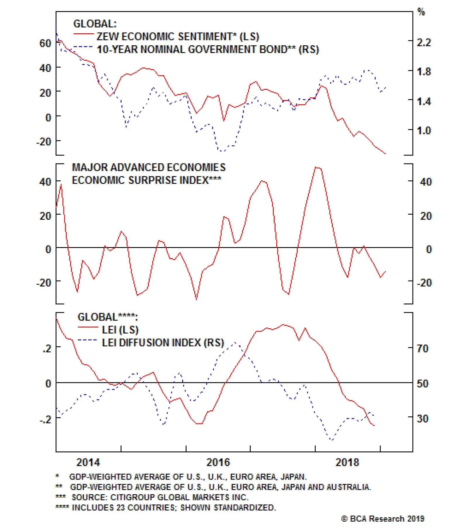
The expectation component of the ZEW survey showed small improvements in the euro area and Germany. Economic sentiment toward Italy markedly rebounded, albeit from very depressed levels. However, sentiment toward global growth continues to deteriorate,…
Highlights 2018 Performance Breakdown: Our recommended model bond portfolio generated a modest outperformance versus the custom benchmark index of +6bps for all of 2018. Winners & Losers: The outperformance of our model bond portfolio in 2018 mostly came from country selection on our government bond portfolio (underweight U.S. Treasuries, overweight the U.K. and Australia). However, our below-benchmark overall duration stance, as well as our bias favoring U.S. credit over non-U.S. corporates, were drags on performance during the risk-off moves at the end of 2018. Scenario Analysis For 2019: The tactical upgrade to global corporates that we initiated last week is projected to generate outperformance versus the model portfolio benchmark index in the next six months - both from below-benchmark duration positioning and higher exposure to U.S. corporates. Feature 2019 has gotten off to a very busy start, with significant news and market moves forcing us to devote our first two Weekly Reports of the year to analysis and even changes to our views. This week, we belatedly take care of one final piece of housekeeping for 2018 – reporting the performance of the BCA Global Fixed Income Strategy (GFIS) model bond portfolio for the fourth quarter and for the entire calendar year. We also present an updated scenario return analysis for the next six months after the tactical upgrade to global corporate bonds that we initiated last week.1 As a reminder to existing readers (and to new clients), the model portfolio is a part of our service that complements the usual macro analysis of global fixed income markets. The portfolio is how we communicate our opinion on the relative attractiveness between government bond and spread product sectors. This is done by applying actual percentage weightings to each of our recommendations within a fully invested hypothetical bond portfolio. A Quick Summary Of The Full Year Performance For 2018 The 2018 performance of the model portfolio can really be broken up into two periods: the first ten months of the year and November/December. This is an unsurprising consequence of the severe market moves around year-end that went contrary to our two most significant recommendations – maintaining a below-benchmark stance on overall portfolio duration and overweighting U.S. investment grade corporate debt versus non-U.S. equivalents in Europe and emerging markets (EM). The overall portfolio return in 2018 was +1.10% (hedged into USD), which outperformed our custom benchmark index by +6bps (Chart of the Week).2 That outperformance was considerably higher before the year-end plunge in global bond yields, reaching a peak of +32bps on November 20. In terms of the breakdown of outperformance, our recommended positioning on government bonds (duration and country allocation) contributed +22bps, while our credit tilts (by country and broadly defined credit sectors) were a drag on performance to the tune of -16bps. Chart of the WeekA Small Gain For 2018 After A Q4 Round-Trip
A Small Gain For 2018 After A Q4 Round-Trip
A Small Gain For 2018 After A Q4 Round-Trip
The full breakdown of the full-year 2018 performance can be found in the Appendix tables and charts on Pages 14-16. For the government bond portion of the portfolio the full-year outperformers by country were the U.S. (+18bps), Germany (+10bps), Australia (+4bps) and the U.K. (+3bps). These are in line with our long-standing underweight position on the U.S. versus Germany, and our recommended overweights on Australia and the U.K. The laggards were relatively modest, led by our overweight stance on Japan (-4bps) and underweights on France (-3bps) and Italy (-3bps). For the credit portion of the portfolio, the winners were EM USD-denominated corporates (+7bps), U.S. B-rated high-yield (HY) corporates (+3bps) and U.S. Caa-rated high-yield (HY) corporates (+2bps). This was in line with our long-standing bias to favor U.S. junk bonds over EM credit. The losers were our overweights on U.S. investment grade (IG) financials (-15bps), U.S. IG industrials (-8bps), U.S. Ba-rated HY (-4bps), and euro area IG corporates (-2bps). Our overweight tilts on U.S. IG were the issue here. Q4/2018 Model Portfolio Performance Breakdown: A “Risk-Off” Hit To Our Core Recommendations The detailed data on our model bond performance for Q4/2018 only can be found in Table 1. Table 1GFIS Model Bond Portfolio Q4/2018 Overall Return Attribution
2018 GFIS Model Bond Portfolio Performance Review: Fading At The Finish Line
2018 GFIS Model Bond Portfolio Performance Review: Fading At The Finish Line
The total return of the GFIS model bond portfolio was +1.5% (hedged into USD) in Q4, which underperformed the custom benchmark index by a mere -1bp. The main cause for the slight underperformance is from our below-benchmark duration positioning with the Bloomberg Barclays Global Treasury Index yield falling by 20bps over the full quarter. In terms of the specific breakdown between the government bond and spread product allocations in our model portfolio, the former generated -2bps of underperformance versus our custom benchmark index while the latter outperformed by just +1bp. The bar charts showing the total and relative returns for each individual government bond market and spread product sector are presented in Charts 2 and 3.
Chart 2
Chart 3
The main individual sectors of the portfolio that drove the excess returns were the following: Biggest outperformers Underweight U.S. government bonds with maturities between 5-7 years (+12bps) Overweight Japanese government bonds (JGBs) with maturities between 7-10 years (+5bps) Underweight Germany government bonds with maturities between 7-10 years (+3bps) Overweight U.K. government bonds with maturities between 5-7 years (+2bps) Biggest underperformers Overweight Japanese government bonds (JGBs) with maturities beyond 10 years (-15bps) Underweight U.S. government bonds with maturities beyond 10 years (-8bps) Underweight Italy government bonds with maturities beyond 10 years (-3bps) Underweight France government bonds with maturities beyond 10 years (-2bps) Chart 4 presents the ranked benchmark index returns of the individual countries and spread product sectors in the GFIS model bond portfolio for Q4/2018. The returns are hedged into U.S. dollars (we do not take active currency risk in this portfolio) and are adjusted to reflect duration differences between each country/sector and the overall custom benchmark index for the model portfolio. We have also color-coded the bars in each chart to reflect our recommended investment stance for each market during Q4/2018 (red for underweight, blue for overweight, gray for neutral).
Chart 4
Government bonds are dominating the left half of the chart, as yields declined in the final months of 2018. This was a drag on our model portfolio performance. However, the best performing sector was U.K. government bonds, generating a total return of 4.7% in Q4/2018 (on a currency-hedged and duration-matched basis). The GFIS model portfolio benefited from this move, given our long-standing overweight bias for U.K. Gilts. The right side of Chart 4 is occupied by global spread product, where currency-hedged returns were flat-to-negative in Q4. This was due to credit spread widening as investors feared both slower global growth and additional Fed tightening. The riskier parts of the corporate bond universe – high-yield, EM corporates – suffered the largest losses. The total return of Bloomberg Barclays U.S. High-Yield Index (currency-hedged into USD) for Q4 was -2.7%, as the option-adjusted spread (OAS) widened by +206bps. Unfortunately for our model portfolio, our preference for U.S. corporate bonds over European and EM credit hurt performance, although not by as much as the below-benchmark duration stance. We are disappointed by the final result for the year, although we are still pleased to generate even a small positive outperformance given the ferocity of the market moves seen at the end of 2018. We can attribute that to lingering gains from good calls made earlier in 2018, but also from our recommended cautious stance on overall portfolio risk (i.e. tracking error) in a more-volatile investment environment. Bottom Line: The outperformance of our model bond portfolio in 2018 mostly came from country selection on our government bond portfolio (underweight U.S. Treasuries, overweight the U.K. and Australia). However, our below-benchmark overall duration stance, as well as our bias favoring U.S. credit over non-U.S. corporates, were drags on performance during the risk-off moves at the end of 2018. Future Drivers Of Portfolio Returns Looking ahead, the performance of the model bond portfolio will benefit from two main factors: our below-benchmark duration bias and our underweight stance on global government bonds versus corporate debt. In terms of specific weighting in the GFIS model bond portfolio, we now have a tactical bias favoring global corporate debt over government debt coming on top of our below-benchmark duration stance (Chart 5). We are sticking with the latter position, about one full year short of the duration of our benchmark index, with global yield curves priced for inflation expectations that are too low and with no rate hikes discounted for 2019 in all major developed markets. Chart 5Portfolio Duration: Staying Below-Benchmark
Portfolio Duration: Staying Below-Benchmark
Portfolio Duration: Staying Below-Benchmark
However, we are also keeping our current country allocations on the government bond side of the model portfolio, even after our tactical credit upgrade. That means staying underweight countries where policymakers are only pausing on rate hiking cycles (U.S. and Canada), while overweighting countries that are likely to keep rates on hold for all of 2019 (Japan, U.K., Australia). Our decision to upgrade global credit exposure helps boost the yield of our model portfolio (Chart 6). However, the portfolio is still yielding less than the benchmark thanks to our bear-steepening bias on government yield curves that involves underweights to longer-maturity bonds with higher yields. Chart 6Portfolio Yield: Credit Upgrade Helps Offset Defensive Duration Tilt
Portfolio Yield: Credit Upgrade Helps Offset Defensive Duration Tilt
Portfolio Yield: Credit Upgrade Helps Offset Defensive Duration Tilt
Importantly, all the changes that were made to our portfolio allocations last week – raising weights on all global corporate bond markets, cutting exposure to government debt in the U.S., Germany and France – did not materially change the tracking error (relative volatility versus the benchmark) of the model portfolio. We do not see the current backdrop as being conducive to taking high levels of overall portfolio risk, even given our tactical view that the U.S. monetary policy will be on hold for the next 3-6 months. We prefer to recommend more relative value positioning via country and credit allocations that help dampen overall portfolio risk and reduce exposure to the kind of volatility spikes that became more frequent in 2018. Thus, we will continue to target a tracking error for the model portfolio of 40-60bps, well below our self-imposed 100bps ceiling (Chart 7). Chart 7Portfolio Risk Budget Usage: Staying Cautious
Portfolio Risk Budget Usage: Staying Cautious
Portfolio Risk Budget Usage: Staying Cautious
Scenario Analysis & Return Forecasts In April 2018, we introduced a framework for estimating total returns for all government bond markets and spread product sectors, based on common risk factors.3 For credit, returns are estimated as a function of changes in the U.S. dollar, the Fed funds rate, oil prices and market volatility as proxied by the VIX index (Table 2A). For government bonds, non-U.S. yield changes are estimated using historical betas to changes in U.S. Treasury yields (Table 2B). This framework allows us to conduct scenario analysis of projected returns for each asset class in the model bond portfolio by making assumptions on those individual risk factors.
Chart
Chart
In Tables 3A & 3B, we present three differing scenarios, with all the following changes occurring over a six-month horizon. Note that this differs from how we have typically presented these scenario analyses, with projections over the subsequent twelve months. Given that the changes to our recommended allocations introduced last week were tactical in nature (i.e. up to six months), we are shortening our forecast window for this particular scenario analysis to line up with that shorter investment horizon.
Chart
Chart
The scenarios are all driven by what we believe will be the most important driver of market returns in 2019 – the path of U.S. monetary policy. Our Base Case: the Fed stays on hold, the U.S. dollar remain flat, oil prices rise by +10%, the VIX index falls to 15, and there is a bear-steepening of the U.S. Treasury curve. This scenario is the one we laid out in last week’s report, with the Fed taking a pause through at least the March FOMC meeting, allowing market volatility to drift lower as U.S. monetary and financial conditions ease. A Very Hawkish Fed: the Fed does a surprise +25bps rate hike in March, the U.S. dollar rises by +5%, oil prices increase +20%, the VIX index climbs to 25 and there is a sharp bear-flattening of the U.S. Treasury curve. This would be the case if the U.S. economy maintains firm growth, the global growth downturn stabilizes, U.S. inflation expectations increase and market volatility increases from a surprisingly hawkish Fed. A Very Dovish Fed: the Fed cuts the funds rate by -25bps, the U.S. dollar falls by -5%, oil prices decline -20%, the VIX index increases to 35 and there is a sharp bull steepening of the U.S. Treasury curve. This is a scenario where U.S./global growth slows rapidly from the current pace and the Fed has no choice but to ease monetary policy as market volatility surges alongside elevated recession risks. The model bond portfolio is expected to outperform the custom benchmark index by +19bps in our Base Case scenario. This comes from the relative outperformance of credit versus government bonds in an environment of rising bond yields (which also benefits our below-benchmark duration stance), and tighter credit spreads. In the Very Hawkish Fed scenario, our model portfolio is expected to outperform the benchmark by +29bps. This is not only due to our duration tilt and our corporates-versus-governments bias. As in the Base Case, the relative stance favoring U.S. corporates over EM credit would benefit from a backdrop of tightening U.S. monetary conditions and rising market volatility (Chart 8) – both of which are worse for EM credit. Chart 8Risk Factors Assumptions For The Scenario Analysis
Risk Factors Assumptions For The Scenario Analysis
Risk Factors Assumptions For The Scenario Analysis
In the Very Dovish Fed scenario, our portfolio is projected to underperform the benchmark index by -26bps, with falling bond yields (Chart 9) hitting both our defensive duration bias and the overweight on corporates relative to governments. Chart 9UST Yield Assumptions For The Scenario Analysis
UST Yield Assumptions For The Scenario Analysis
UST Yield Assumptions For The Scenario Analysis
In all three scenarios, there is a drag on expected performance from the relative carry of the model portfolio versus the benchmark (-17bps). This comes mostly from the below-benchmark overall duration stance that involves reduced exposure to longer-maturity government bonds with higher yields. The drag on carry also comes from the underweight positioning on high-yielding EM debt. We are maintaining that tilt given our concerns that China’s policymakers will be unable to provide enough stimulus to benefit EM economies through greater Chinese demand. Importantly, our recommended allocations win in scenarios that do not involve Fed rate cuts, a very low probability outcome in 2019, in our view. Thus, we expect our current allocations to generate alpha in the first half of the year, even if the Fed returns to a hawkish bias faster than we currently anticipate. Bottom Line: The tactical upgrade to global corporates that we initiated last week is projected to generate outperformance versus the model portfolio benchmark index in the next six months - both from below-benchmark duration positioning and higher exposure to U.S. corporates. Robert Robis, CFA, Senior Vice President Global Fixed Income Strategy rrobis@bcaresearch.com Ray Park, CFA, Research Analyst ray@bcaresearch.com Footnotes 1 Please see BCA Global Fixed Income Strategy Weekly Report, “Enough With The Gloom: Upgrade Global Corporates On A Tactical Basis”, dated January 15th 2019, available at gfis.bcareseach.com. 2 The GFIS model bond portfolio custom benchmark index is the Bloomberg Barclays Global Aggregate Index, but with allocations to global high-yield corporate debt replacing very high quality spread product (i.e. AA-rated). We believe this to be more indicative of the typical internal benchmark used by global multi-sector fixed income managers. 3 Please see BCA Global Fixed Income Strategy Weekly Report, “GFIS Model Bond Portfolio Q1/2018 Performance Review: A Rough Start”, dated April 10th 2018, available at gfis.bcareseach.com. Appendix
Image
Image
Image
Recommendations The GFIS Recommended Portfolio Vs. The Custom Benchmark Index
2018 GFIS Model Bond Portfolio Performance Review: Fading At The Finish Line
2018 GFIS Model Bond Portfolio Performance Review: Fading At The Finish Line
Duration Regional Allocation Spread Product Tactical Trades Yields & Returns Global Bond Yields Historical Returns
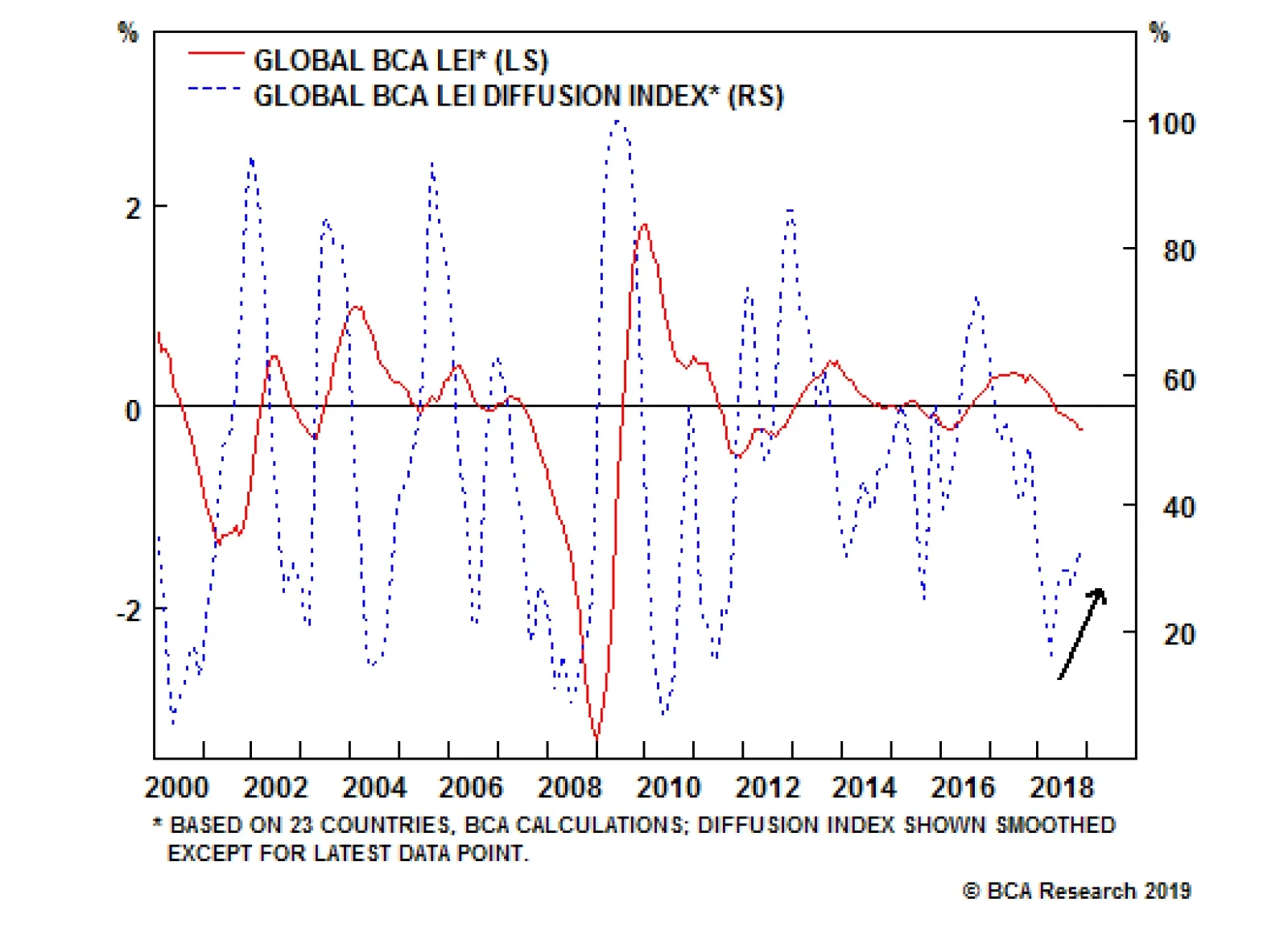
Our global Leading Economic Indicator diffusion index, which measures the proportion of countries with rising LEIs compared to those with falling LEIs, has bottomed. The diffusion index leads the global LEI by a few months. Although the latest Chinese…
The above chart introduces our commodity team’s new model developed to understand the effect of EM GDP growth on oil prices. EM demand tends to mean revert toward a linear trend. Additionally, it anchors other variables – oil prices and FX rates, for…
Highlights MLPs’ one-of-a-kind legal structure offers investors gaudy distribution yields and tax-saving advantages. They boomed alongside fracking, enjoying spectacular growth between 2009 and 2014. MLPs used to exhibit a high correlation with utilities, but since the 2014 oil bust, they have performed in step with the rest of the energy sector. Improved valuations have recently put MLPs back on investors’ radar. However, structural impediments and heterogeneous balance-sheet quality argue against broad index exposure. Investors would be better served by concentrating their efforts on picking individual stocks. Opportunities reside within smaller-cap MLPs and MLPs exposed to the Permian basin. Feature Dear Client, In place of a Weekly Report written from South Africa, where I have been meeting with clients, we are sending you this Special Report on Master Limited Partnerships (MLPs), written by my colleague Jennifer Lacombe.* Like mortgage REITs, which U.S. Investment Strategy followed from 2011 to 2013, MLPs are a yield play that investors might find to be an appealing bond alternative. We trust that you will find this report interesting and informative. Best regards, Doug Peta, Senior Vice President U.S. Investment Strategy * This report was initially published by our Global ETF Strategy service on November 15, 2018. It has been lightly revised to update charts and reflect subsequent market developments. Q: What are MLPs and their tax benefits? Master Limited Partnerships (MLPs) are publicly listed partnerships involving two classes of partners. A General Partner (GP) controls the assets and manages the daily operations of the business. Limited Partners (LPs) - and public investors - provide the capital and collect cash flow distributions. Unlike corporations, which pay corporate taxes on their income, MLPs have the ability to pass through all of their income to their owners, along with deductible items like amortization and depreciation expenses. MLP investors, in turn pay income tax at their own individual marginal tax rates. MLP owners are thereby shielded from the double taxation that would otherwise apply when the corporation paid taxes on its income, and the shareholder paid taxes on the dividend distributed from the corporation’s income. Q: Why are they predominantly found in the energy sector? Concerns about the potential loss of federal income led Congress to limit MLP eligibility to companies in the energy and real estate sectors when it overhauled the tax code in 1986. Since the 1986 Act took effect, MLPs have had to generate at least 90% of “qualifying income” from their energy or real estate operations. Section 7704 of the Internal Revenue Code defines “qualifying income” as income derived from exploration, development, mining or production, processing, refining, transportation or marketing of any mineral or natural resource, as well as certain passive-type income including interest, dividends and real property rents. Over the years, the shale revolution and the rise of new technologies, such as horizontal drilling and fracturing, created elevated demand for energy infrastructure. Today, MLPs almost exclusively operate in the natural resources space (Chart 1).
Chart 1
Q: Why did MLPs outperform assets of all stripes following the Great Financial Crisis? A combination of several factors led MLPs to record stunning returns between 2009 and 2014. The Alerian MLP Total Return Index grew by a whopping annualized rate of 38% during that time. Decreasing interest-rate environments are typically supportive of yield plays’ outperformance. Powered by high single-digit to double-digit distribution yields, MLPs led Treasuries, utilities stocks, high-yield bonds and even the S&P 500 over that six-year stretch (Chart 2). With the shale revolution in full swing, sustaining strong demand for pipelines and other energy infrastructure, investors’ funds flowed abundantly into the energy MLP space (Chart 3). Prices - a mathematical function of multiples and earnings - soared as money kept pouring in and P/E tripled in the first 7 years following the Great Financial Crisis (Chart 4). Chart 2Decreasing Interest Rates Are A Boon To Yield Plays
Decreasing Interest Rates Are A Boon To Yield Plays
Decreasing Interest Rates Are A Boon To Yield Plays
Chart 3Horizontal Drilling Attracted A Lot Of Money...
Horizontal Drilling Attracted A Lot Of Money...
Horizontal Drilling Attracted A Lot Of Money...
Chart 4...Sending Multiples Soaring
...Sending Multiples Soaring
...Sending Multiples Soaring
Q: Why has such outperformance not attracted more institutional and foreign investors? Because of U.S. tax rules, MLPs are relatively unattractive to tax-exempt investors and non-U.S. investors. The tax rule for U.S. tax-exempt investors – institutional investors such as pension funds, university endowments, charities and IRAs – treats MLP earnings as unrelated business taxable income (UBTI), making them subject to income tax. Moreover, to retain their own pass-through status and tax shield, open-ended funds – like many mutual funds and ETFs – can allocate no more than 25% of their total holdings to MLPs, and no more than 10% to a single MLP. U.S. tax rules consider foreign owners of MLPs to be engaged in a business in the U.S., and require them to file and pay U.S. federal income tax. Therefore, only U.S. individuals can truly reap the full benefits of the MLP structure. Though they easily access these securities on public exchanges, the tax shield comes at the price of convoluted accounting treatments. Unitholders receive Schedule K-1 tax forms that can be complicated enough to result in significant accounting costs. They are most suited for high net worth investors’ portfolios, although smaller investors who are not daunted by accounting burdens have also embraced the vehicle. Q: Why are MLP yields so high? The typical MLP partnership agreement incentivizes a GP to distribute all available cash to unitholders, after retaining reserves for business operations and liabilities. Not only does the corporate tax exemption increase the amount of available cash, but the General Partner also has wide discretion over the amount of retained reserves. Because distributions are the main determinant of any yield play’s performance, GPs have historically emphasized distribution yields – sometimes at the expense of retained earnings. The more assurance investors have that they will receive reliable cash flows, the better the MLP will perform in the market. Q: Do MLPs trade like other bond proxies? The distribution model worked beautifully during the shale-oil boom. Low retained reserves never became an issue because MLPs collected steady revenues – a function of prices and volumes of oil or gas processed - and could fund distributions in excess of operating cash flow by issuing new debt or equity. Investors were so eager to invest that GPs found themselves at the controls of a positive feedback loop in which the more cash they distributed to investors, the more capital flowed in to fund even higher distributions. The infrastructure-heavy business model and high payout ratios echoed companies in the utilities sector and, indeed, MLP returns correlated strongly with utilities stocks. However, the discretion embedded in the MLP model reached a breaking point soon after the oil bust arrived in mid-2014. The price-led decline in revenues necessitated distribution cuts and severed the correlation with utilities (Chart 5). Chart 5A Utilities Proxy No More...
A Utilities Proxy No More...
A Utilities Proxy No More...
Q: Were MLPs immune to energy price swings before the 2014 bust? Conventional investor wisdom maintains that MLPs are immune to commodity price swings in the aggregate because of their utility-like characteristics and because long-term contracts lock in selling prices. Actually, however, MLP revenue structures differ greatly from one line of activity to the other. Natural gas pipeline transportation accounts for a quarter of aggregate MLP activity. Prices per unit of volume transited are contractually locked in 5-to-20-year contracts, providing immunity to spot price moves during the entire duration of the contract. Storage (natural gas not immediately needed, or crude oil waiting to be refined) accounts for another quarter of aggregate activity and is subject to a similar pricing model as natural gas pipelines. Only the contract lengths are much shorter, ranging from 1 to 5 years. Petroleum pipeline transportation accounts for 44% of MLP activity. Contracts locking prices over the long run are not typical in this line of business. The Federal Energy Regulatory Commission (FERC) also imposes a yearly price increase amounting to the Producer Price Index for Finished Goods, plus a 1.23% adjustment. MLP revenue structures are therefore varied, and only natural gas pipeline transportation’s revenue streams - a quarter of the sector – are truly immune to fluctuations in spot prices, thanks to their long-term contracts. It follows that MLPs in aggregate are indeed correlated with energy price swings and trade closely in line with energy stocks (Chart 6). Chart 6...An Energy Proxy Instead
...An Energy Proxy Instead
...An Energy Proxy Instead
Up until recently, their correlation to spot oil prices in particular was even more striking. However, they failed to match the 2017-18 recovery in oil markets (Chart 8). Because cash flow reliability is a key driver of the investment decision for any yield play, distribution cuts are bound to make any MLP investors skittish, and oil prices may have to enter an extended bull market before they overcome their fears (Chart 7).
Chart 7
Chart 8...Kept MLPs Depressed In Spite Of Oil Price Recovery
...Kept MLPs Depressed In Spite Of Oil Price Recovery
...Kept MLPs Depressed In Spite Of Oil Price Recovery
Q: So, how cheap are they now? Since its peak in the summer of 2014, the Alerian MLP Total Return index has declined by 38% and is now flirting with the two-standard-deviation-cheap zone (Chart 9). Their profit margins have also strongly recovered (Chart 10). Chart 9Cheap Valuations...
Cheap Valuations...
Cheap Valuations...
Chart 10...Amid Recovering Profit Margins
...Amid Recovering Profit Margins
...Amid Recovering Profit Margins
Because of the infrastructure-heavy nature of MLPs, traditional valuation metrics such as price-to-earnings can be misleading. High depreciation charges have significant impacts on earnings. Cash flows are an appropriate measure as they best inform a firm’s ability to maintain its distributions. Q: Great! So which ETF should I buy? The Alerian MLP index’s low multiples and recovering profit margins are not sufficient endorsements in themselves. An index is not an investible vehicle and even the best of index-tracking instruments can only imperfectly replicate an exposure. In the MLP space in particular, structural impediments reduce the attractiveness of exchange-traded products. Because ETFs are subject to the previously mentioned 25% cap on MLP holdings, many supplement their portfolios with regular pipeline or infrastructure stocks. Although the overall fund provides a decent exposure to the energy infrastructure sector, the diluted MLP exposure does not offer distribution yields anywhere comparable to the yields direct MLP owners receive. An alternative is to opt for a C-corporation structure. The flagship Alerian MLP ETF (ticker: AMLP) falls into this category. This structure allows for an undiluted exposure to MLPs, all the while relieving an ETF shareholder from having to deal with the complicated and costly accounting treatment that direct MLP ownership involves. However, C-corporations are subject to corporate income taxes, which cancels out the tax benefits of investing in MLPs in the first place. The resulting cumulative tax drag on returns can become substantial over time (Chart 11).
Chart 11
Investors seek MLP exposure for the high distribution yields made possible by tax advantages. A fund will indeed provide diversification and accounting relief, but at the cost of surrendering either some yield or some of the tax advantages. This is not to mention that the bulk of the exchange-traded vehicles are Exchange Traded Notes (ETNs). Unlike ETFs, they do not own any underlying shares or units of securities. Instead, they are instruments issued and backed by financial institutions. Even in the case of well-established lending institutions, we shy away from these types of products, as we are not keen on taking unnecessary counterparty risk. Many MLP exchange-traded products are also illiquid, or have not gathered a significant mass of assets under management. The expense ratios are also high in the MLP exchange-traded product space, a result of the complicated accounting treatment of K-1 forms that are borne by the ETF or ETN sponsor (Table 1). Table 1ETNs Constitute Two Thirds Of A Relatively Illiquid Universe
MLPs: Not Your Typical Yield Play
MLPs: Not Your Typical Yield Play
Q: What about the flagship Alerian MLP ETF? It’s clearly well-established. The flagship Alerian MLP ETF (ticker: AMLP) tracks the Alerian MLP Infrastructure Index and has gathered close to USD 10bn of AUM under its belt since its inception in 2010. Amid all the above limitations, it is the only viable option. However, it comes with its own set of yellow flags. Because it tracks a market-capitalization weighted index, half of the fund’s assets under management are concentrated in its five largest holdings. As we go to press, these are Magellan Midstream Partners LP, Enterprise Products Partners LP, Energy Transfer LP, Plains All American Pipeline LP and MPLX LP. These companies’ distribution yields have recovered since the 2014 oil crash, but the question of the sustainability of these cash flows is of utmost importance. Although retained earnings are at all-time highs, so is the level of debt (Chart 12). The fact that 50% of the fund is concentrated in these top 5 constituents dilutes the diversification benefits of index investing. Chart 12Distributions Are Financed By Cash Flows...And A Lot Of Debt
Distributions Are Financed By Cash Flows...And A Lot Of Debt
Distributions Are Financed By Cash Flows...And A Lot Of Debt
Q: So, what are my options? The MLP universe is heterogeneous. Wide disparity in valuation (Chart 13), debt levels (Chart 14) and performance (Chart 15) indicate that opportunities reside further down the capitalization scale.
Chart 13
Chart 14
Chart 15
Because an index is a weighted average, a heterogeneous market does not warrant broad-index exposure, especially when the smallest constituents offer the best opportunities. Amalgamation is always a process of blending wheat and chaff together, but in this case it disproportionately favors the chaff. Stock picking thrives against this backdrop. Our expertise does not extend to evaluating individual energy MLPs. We leave the honor of recommending the best-in-class opportunities to the professional bottom-up analysts, backed by thorough and diligent review of company fundamentals and management capabilities. Where we can add value is in the analysis of economic cycles and secular macroeconomic forces. Despite the sharp fall in prices over the past two months, brought about by the surprise eleventh-hour waivers granted to Iranian oil importers, BCA’s Commodity & Energy Strategy service believes the global oil market remains tight. Our strategists expect that oil prices will recover in 2019 as OPEC producers, Russia, and Canada reduce output by an aggregate 1.4 million barrels a day, and the Iran-driven supply glut is worked off. While a 2019 oil spike would be a tailwind to petroleum pipeline MLPs, surging production in U.S. shales – led by the Permian Basin in West Texas – means the new pipeline capacity being built to accommodate higher output will find a ready market. Regardless of what happens with prices, our energy strategists foresee a localized surge in demand for transportation and other midstream services in the U.S. shales. In line with IEA projections, they expect U.S. crude oil production to grow by approximately 1.3 million barrels a day in 2019 once the constraints imposed by a lack of pipeline capacity in the fecund Permian basin ease. MLPs positioned to resolve the transportation bottleneck should be able to count on a bright near-term future. “Location, location, location” applies to pipelines as well as real estate, and reinforces a bottom-up focus when selecting MLPs. Jennifer Lacombe, Senior Analyst jenniferl@bcaresearch.com
Next week will be light in the U.S. as Monday is Martin Luther King Day and the government shutdown continues to impede important data releases. Namely, existing home sales on Tuesday, new homes sales and the durable goods data on Friday are unlikely to come…