Global

When we first set out to create ETS, we leveraged the vast amount of research on stock market anomalies and started with factors that had a proven track-record. We also wanted to minimize the risk of data mining, and as a result, we decided to keep things simple. We stuck with established metrics, and avoided venturing down the long, windy path of custom metrics and adjustments: the more parameters that are included, the easier it is to find spurious results. We also opted for simple, linear mappings – lower is better, or higher is better. When deviating from this approach, it is easy to lose sight of the big picture and spend time optimizing minute details that will not have a large impact on the overall performance of the model. Fast-forward to 2019. We have a stable model that has performed well out of sample, and we are now comfortable taking a second pass over our factors. We can now analyze each model input in detail to see if we can make any improvements. The first factor under the microscope is the Altman Z-Score. This metric was first developed by Edward I. Altman in 1968 to estimate the probability of bankruptcy over a two-year horizon. It uses various items from a firm’s income statements and balance sheet and combines them using a set of weights to yield the so-called Altman Z-Score.1 Since this metric relies on estimated coefficients for a specific set of data, and given that these coefficients date back to the 60s, we wanted to investigate the possibility of using a more modern model of distress in place of the original Altman-Z score. Our research process led us to review the academic literature, replicate the most promising results internally, and finally, to implement our own variation of the Altman-Z score given our unique dataset. A Proxy For Bankruptcy In order to assess the ability of a distress model to predict insolvency, it is necessary to have a historical dataset of failure events. If not, it is impossible to measure the success of a given model. Failure can be defined in several ways, the most obvious of which is a Chapter 7 or Chapter 11 bankruptcy filing, at least in the U.S. To ensure that we captured the maximum possible failure events for our global set of stocks, we avoided the Chapter 7/11 definition and developed a simple market-cap based proxy for bankruptcy. We define the failure event of a firm as the point in time where the market-cap drops to 1% of its historical maximum. We also enforce that this event must occur after the maximum to prevent false failures at the beginning of a firm’s trading history. We found that this definition signals failure at the appropriate time for a selection of large-cap firms known to have experienced distress; a notable example is Enron Corp. (Chart 1). In general, we deem this a reasonable proxy for bankruptcy since the price of shares will drop substantially upon news of insolvency. Ultimately, even though it may, in some cases, flag firms that are technically not bankrupt, for our purposes, we are happy to avoid buying firms that plunge below 1% of their previous valuation peak.
Chart 1
Academia To The Rescue? A review of the modern finance literature suggested that the Altman Z-Score, while methodologically sound, still had room for improvement as a distress measure. We anticipated that using a more refined distress model, we could amplify the effect of the existing Altman-Z Factor in ETS. In light of this, our first attempt at replacing the Altman-Z score involved running a logistic regression (logit) model presented in Campbell et al. (2010)2 on the ETS universe of stocks and constructing a new factor based on the output from this model. Following the authors’ methodology, we constructed a set of eight variables (three accounting ratios, and five market-based variables) and computed the probability of failure on our entire historical dataset. The probabilities were then percentile-ranked to construct a score from 0-100%, where firms with a score of 0% correspond to those with the highest probability of failure. This ranking system is consistent with the other ETS factors where lower scores are bad and higher scores are good. Although the model by Campbell et al. worked well for predicting subsequent failure (as judged by our bankruptcy proxy measure), the metric fell short performance-wise when tested within our universe of stocks. In brief, our decile-spread metric3 yielded a negative number, indicating poor separation of returns between deciles. Based on the above, we sought to construct our own distress model using similar methods, but applied to the universe of valid ETS firms. There are several advantages to this approach: First, it prevents errors in the construction of the explanatory variables. For instance, when replicating models found in academic literature, we cannot be sure that we are constructing our variables in the exact same way as reported, and hence we cannot have complete confidence in the accuracy of the computed probabilities of failure. Second, it frees us from the shackles of a complicated model, and we can seek to reduce our own model down to something more computationally tractable, and avoid overfitting the data. Finally, it allows us to base our model on global stock data, as opposed to the U.S.-centric CRSP/COMPUSTAT dataset used by many academic institutions. Bringing It “In-House” The construction of our own distress model began with an analysis of the variables defined in Campbell et al. First, we wanted to determine which variables showed the strongest deviation between success and failure groups. From the calculation of summary statistics and histograms, the variables that showed the most prominent separations between success and failure groups were Net Income to Market Total Assets (NIMTA), Total Debt to Market Total Assets (TDMTA), monthly excess return (EXRET), and the 3-month standard deviation of daily returns (SIGMA) (Chart 2). Detailed descriptions of the variables are provided in the Appendix.
Chart 2
We computed NIMTA, TDMTA, EXRET, and SIGMA at monthly frequencies with the goal of constructing a logit model that would predict failure 12 months into the future. The logit model implies that at time t, the probability of firm i failing in the next 12 months is given by:
Chart
where y represents the sequence of success (0) and failure (1) events for each firm at each point in time, x represents the four explanatory variables, and α, β are the parameters to fit. The parameters were fit on a rolling basis to avoid look-ahead bias when constructing a trading strategy based on the outcome of the model. Therefore, at each year-end, we used the trailing success/failure data up to that point to estimate parameters. The fitting yielded intuitive results, suggesting that higher TDMTA, SIGMA and lower NIMTA, EXRET indicate a higher probability of failure (see parameter list in Appendix Table 1). Another positive characteristic of these parameters is that they remain relatively stable throughout time, alluding to the robustness of the model. From visual inspection of the parameters, we see that EXRET has the strongest effect on failure probability, followed by SIGMA, TDMTA, and NIMTA. It is not surprising that EXRET has the strongest effect since it is based on a 12-month trailing weighted average. Therefore, we can expect this variable to capture the prolonged period of descent that firms typically undergo before reaching a bankruptcy event. Indeed, firms in our failure group experienced, on average, a failure event 5 years after reaching peak market cap. As for the remaining variables, it is natural to expect increased volatility and subpar financial statements to signal imminent failure. Model accuracy was tested by looking at its predictions on an individual and aggregate basis. Reassuringly, we found individual examples of large firms with known failure events showing the expected behavior (Chart 3). However, the more significant result is that on average, the model predicts a high probability of failure for the group of true failure firms (N=3213) relative to a random sample of true success firms (Chart 4).
Chart 3
Chart 4
Armed with a successful distress model, we then translated the predictions into an ETS factor, giving it a score from 0-100%. Using a relative change condition in the parameters as a guide,4 we chose the factor inception date to be year-end 2004. Since our stock data begins in 1995, this allows for a sufficient “burn-in” time for the distress model to stabilize. The latter is important given the spike in U.S. Chapter 11 filings starting in 2001, which is also captured by our bankruptcy proxy (Chart 5).
Chart 5
With the factor constructed, we replaced the existing Altman-Z factor in the full model, keeping the same initial weight. As expected, this replacement led to an improvement in the overall model according to our standard performance metrics, which are described in a previous report.5 Specifically, we observed a 6% improvement in the decile ordering metric (DECORD) and a small (<1%) reduction in mean absolute difference in BCA Score (MAD), leading to a 7% increase in our overall risk-reward ratio (DECORD / MAD). The new factor, simply named Distress on the platform, also performs well when examined in isolation. To test this, we ran the equivalent of an equal-weighted, daily-rebalanced backtest on ten deciles separated by the Distress score. Calculating the Sharpe ratio on the decile returns, we observe an increasing trend in the performance of the factor as a function of decile (Chart 6). Therefore, with this factor we obtain the desired separation in performance between deciles on a risk-adjusted basis.
Chart 6
What About Machine Learning? Disclaimer: This section involves a small digression on machine learning One statistical challenge with our success/failure classification problem is that the number of “success” events (i.e. no indication of bankruptcy) greatly outnumbers the failure events. Indeed, with our bankruptcy proxy, approximately 1% of the 3.5 million firm-month observations in our dataset are marked as failures. Despite the small failure rate, classic logistic regression can still provide good results; however, we wished to explore the effectiveness of machine learning techniques in tackling this type of classification problem. The use of machine learning (ML) was motivated by an analogous problem outside the world of stocks, namely the detection of credit card fraud. One can imagine that out of the massive number of credit card transactions registered daily, only a small fraction is actually fraudulent. Now, suppose that for a given period we obtained transaction data that includes characteristics such as dollar amount, time of day, and whether or not the transaction was normal or fraudulent. We could then use this prior data to train an ML model to recognize fraudulent transactions when presented with new, out-of-sample data. A specific class of ML models known as “autoencoders” have been shown to be effective in handling this task (See Box 1 for more details). Given that the credit-card problem is directly analogous to our distress problem, we set up a simple autoencoder to test whether it could detect firm failure with a higher degree of accuracy than the logit model. As inputs to the model, we used the same eight variables from Campbell et al. Perhaps surprisingly, we found that the best version of our autoencoder model did not surpass the accuracy of the logit model, at least in terms of maximizing precision and recall simultaneously.6 Furthermore, the predictions of the autoencoder were less effective at separating winners from losers after being transformed into a factor score between 0-100%. This, of course, does not mean that ML techniques are hopeless. It simply means that, for this particular set of parameters and model structure, the autoencoder was not able to provide additional predictive value over the simpler, more computationally efficient logit model. Box 1 Autoencoders The rise of machine learning has brought with it a slew of jargon that seems intimidating at first, but can actually be understood without extensive training in mathematics or computer science. The term “autoencoder” may very well fall into this category. To get right into it, an autoencoder is a type of neural network tasked with learning a compressed representation of the original input or “training” data. The flow of data through an autoencoder is shown below (Box Diagram 1). The goal of the autoencoder is to optimize the weights connecting nodes in the network so that the difference between the input and output is minimized. However, due to the action of the “reduction” or “encoding” phase of the autoencoder, the output, i.e., the “reconstructed” or “decoded” data, will always be a compressed approximation of the original input. The latter is important for classification problems because it means that post-training, any data presented to the network that does not resemble the original training data will likely be poorly reconstructed, and flagged as anomalous. Going back to our problem of identifying distressed firms, let’s step through how we use an autoencoder to distinguish between “success” and “failure” groups. Separate the data (i.e., the observations for all accounting and market-based variables) into success and failure groups according to the bankruptcy proxy measure. Train the autoencoder to reconstruct the success group. Each variable of interest corresponds to a node in the “input” layer of the network. Feed the autoencoder the failure group data and record the error in reconstructing this data. Set an error threshold (a number) for determining when a firm should be marked a failure vs. success. Generate predictions based on this threshold. Analyze the accuracy of these predictions using metrics such as precision and recall.
Image
Future Work A key priority of the ETS team is to use modern techniques in computing to uncover new sources of alpha for our clients. With the recent explosion of advancements in data science and machine learning, we are excited about leveraging the knowledge from these fields to improve the ETS model. We believe that this report provides a glimpse into the style of factor analysis we expect to conduct in the near future. As for the distress model developed here, we are content with the performance of the simple logistic regression for now, but we will continue to examine whether modern classification techniques can help improve accuracy. One method in particular that piques our interest is so-called “Gradient Boosting”, which has made big waves in the data science community for its use in winning competitions on Kaggle.com.7 Overall, we will continue to monitor the model’s ability to exploit stock-market anomalies and adjust accordingly, whether that means adjustments to existing factors, or the development of new ones. In addition, we will strive to keep ETS an integral part of your asset management workflow via new features on the web platform. As always, we hope you find the recent additions valuable, and please do not hesitate to reach out with any comments or questions. Spencer Moran, Senior Analyst Equity Trading Strategy spencerm@bcaresearch.com Appendix Variable Definitions Here we provide the definitions of the variables used in the distress model. The denominator in NIMTA and TDMTA represents “Market Total Assets” and is given by Market Cap. plus Total Debt. The formulas are as follows:
Image
EWM is a 12-month exponential weighted moving average used to incorporate more history into the variable but provide greater weight to more recent observations. STD is an annualized, trailing three-month standard deviation. The symbols R, Rm, and r represent monthly returns, monthly market returns, and daily returns, respectively. Parameters Here we provide the parameters (aka a and b’s) obtained from the rolling fit of the distress model. Recall that parameters are estimated at the end of each year, and then these parameters are used to compute predictions for the following year to avoid look-ahead bias.
Image
Footnotes 1 The original Z-score formula was as follows: Z = 1.2X1 + 1.4X2 + 3.3X3 + 0.6X4 + 1.0X5, where: X1 : working capital / total assets X2 : retained earnings / total assets X3 : earnings before interest and taxes / total assets X4 : market value of equity / book value of total liabilities X5 : sales / total assets 2 Campbell, John Y., Jens Dietrich Hilscher, and Jan Szilagyi. 2011. Predicting financial distress and the performance of distressed stocks. Journal of Investment Management 9(2): 14-34. 3 The decile-spread is a metric we use to evaluate the performance of a trading system. Essentially, it looks at the sum of the differences between the annual compounded growth rates of each score decile. Ideally, the deciles should be in order, and the upper deciles should outperform the lower deciles. This metric captures both these aspects, and summarizes them in a single number. 4 The factor inception date was chosen to be the date when the relative change in the magnitude of the parameter set (treated as a vector) fell below 1%. 5 Please see Equity Trading Strategy, “ETS Goes Global,” dated October 31, 2016, available at ets.bcaresearch.com 6 Precision is defined as the ratio of actual failures to all failures predicted by the model. Meanwhile, recall is the ratio of actual failures to the sum of actual failures plus false successes predicted by the model. 7 Kaggle is a popular online community (recently acquired by Google) where members compete to solve open problems in data science and machine learning.
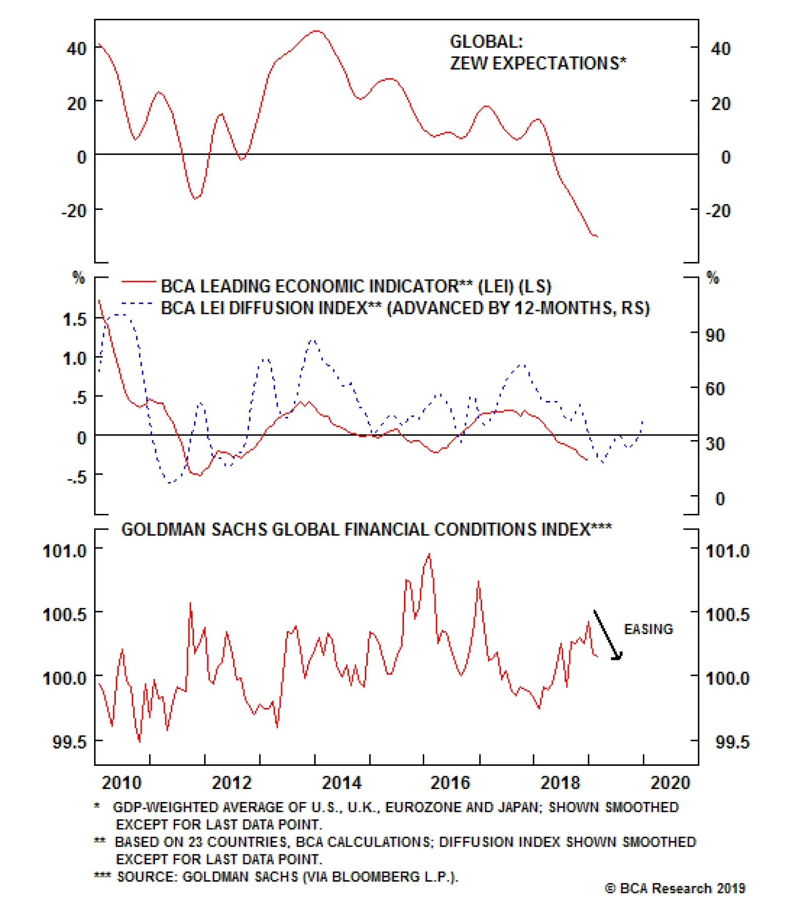
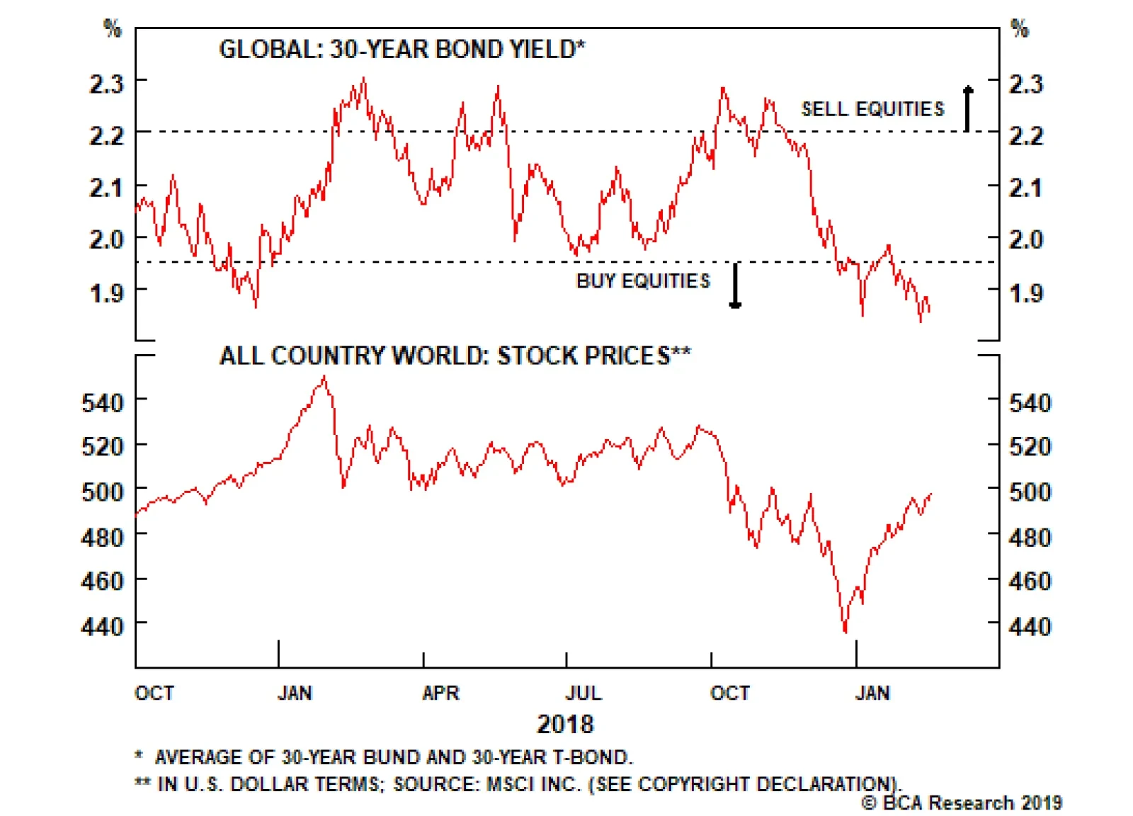
The global growth expectations computed from the German ZEW survey continue to deteriorate. Investors are aware that global growth has slowed, and after the vicious sell-off in equity prices in the fourth quarter of 2018, they seem to extrapolate this…
Highlights Global Growth: Early leading indicators (credit impulses, our global LEI diffusion index) are signaling that the worst of the global economic downturn should soon end. Okun’s Law: In the developed economies, the observed relationships between economic growth and changes in unemployment suggest that the current pullback in global growth will not be severe enough to create slack in labor markets and reduce inflation pressures. Global Bond Allocation: Within dedicated global government bond portfolios, stay underweight the U.S. and Canada, neutral core Europe, and overweight the U.K., Japan and Australia. Remain tactically overweight global credit versus government bonds, at least until mid-year, with policymakers likely to stay cautiously dovish until global uncertainties recede. Feature Is This Risk Rally Too Good To Last? The mood of financial markets has improved significantly over the past few weeks, led by the dovish shift from central bankers that has revived investor risk appetite. Some positive headlines on U.S.-China trade negotiations have also generated hope over prospects for a deal, further fueling the bullish sentiment. The global economic picture remains muddled, though. Non-U.S. growth continues to languish, while the actual near-term state of the U.S. economy is proving difficult to determine given the data issues surrounding the 35-day U.S. government shutdown. Given lingering uncertainties, both political and economic, policymakers do not want to rock the boat by saying anything that might be interpreted as hawkish. With monetary policy no longer a near-term headwind, there is a window for continued outperformance of global risk assets in the next few months. That means higher global equity prices and stable-to-tighter global corporate credit spreads. Yet the seeds for the next wave of market turbulence may already be sewn. There are signs that the global growth downturn may soon end. Credit impulses are starting to pick up in several major economies, while our diffusion index of global leading economic indicators – itself a longer leading indicator – has clearly bottomed (Chart of the Week). The epicenter of global economic weakness, China, continues to deploy monetary and fiscal stimulus measures aimed at stabilizing growth. Meanwhile, the U.S. economy still appears to be in good shape, underpinned by solid consumer fundamentals. Chart of the WeekSunnier Days Ahead?
Sunnier Days Ahead?
Sunnier Days Ahead?
A combination of easier financial conditions and faster economic growth will eventually prove to be incompatible with stable monetary policy, especially with surprisingly firm inflation in the major developed economies. Central bankers will respond by moving away from their current dovish bias, led by the U.S. Federal Reserve. With government bond markets now discounting both stable monetary policy and too-low inflation expectations, the path for global bond yields is eventually higher. While headline inflation rates are cooling in response to the lagged impact of weaker oil prices, the pullback has been far more muted so far compared to similar sharp oil-driven moves in the past (Chart 2). This is because domestically-driven inflation rates for services and wages are much sturdier today in many countries. If BCA’s bullish oil view for 2019 comes to fruition, then the current decline in headline/goods inflation rates may prove to be very short-lived and with little pass-through into core/services inflation. Chart 2Sticky Global Inflation, Despite Lower Oil Prices
Sticky Global Inflation, Despite Lower Oil Prices
Sticky Global Inflation, Despite Lower Oil Prices
This dynamic is not the same in every country, however. When looking at the individual trends of goods inflation and services/wage inflation in the major developed economies, the largest gaps between the two exist in the U.S. and Canada (Chart 3). There, wage growth is accelerating and services inflation rates remain sturdy, despite sharp drops in goods inflation. Chart 3Domestic Inflation Pressures Most Acute In The U.S. & Canada
Domestic Inflation Pressures Most Acute In The U.S. & Canada
Domestic Inflation Pressures Most Acute In The U.S. & Canada
Our recommended government bond allocation at the country level reflects these underlying inflation trends. We are more bearish on bond markets with the most intense domestic inflation pressures – and where future interest rate hikes are most likely – and vice versa. We remain underweight the U.S. and Canada, where wage growth and services inflation are both above the inflation targets of the Fed and Bank of Canada, and where market-based measures of inflation expectations like CPI swap rates have already bottomed (Chart 4). We remain neutral on core Europe (Germany, France) where wage growth has perked up, core/services inflation remains closer to 1% than the 2% target of the ECB, and inflation expectations continue to drift lower. Finally, we remain overweight the U.K., Japan and Australia, all of which have an underlying inflation picture that is muted enough to keep policymakers on hold for at least the next 6-9 months. Chart 4Favor Bond Markets Where Domestic Inflation Pressures Are Weakest
Favor Bond Markets Where Domestic Inflation Pressures Are Weakest
Favor Bond Markets Where Domestic Inflation Pressures Are Weakest
Bottom Line: Early leading indicators (credit impulses, our global LEI diffusion index) are signaling that the worst of the global economic downturn should soon end. Central bankers will remain cautious and dovish in the near-term, however, implying that the current outperformance of global equity and credit markets has more room to run – but also setting up the next upleg for bond yields later this year. Okun’s Law Revisited Central bankers remain wedded to the idea that there is an “exploitable” relationship between unemployment and inflation, a.k.a. the Phillips Curve. A logical extension is that unless policymakers can credibly forecast a reduction in labor demand that pushes unemployment rates beyond levels associated with full employment, inflation will not be expected to decline. Policymakers will have a difficult time staying dovish without believing that inflation pressures are diminishing. One way to measure the relationship between economic growth and changes in economic slack is by using a concept that you may remember from an old macroeconomics class – Okun’s Law. More an empirically observable rule of thumb than any rule based in actual economic theory, Okun’s Law simply measures how much unemployment rates change relative to swings in real GDP growth. Past estimations for the U.S. economy have shown that the long-run coefficient in the Okun’s Law regression is around 2, which means that a 2% fall in real GDP growth should be associated with a 1% increase in the unemployment rate (and vice versa). That coefficient is not the same over shorter time horizons, though, as the unemployment/GDP growth relationship can be impacted by other cyclical factors like changes in hours worked or labor productivity. Charts 5 and 6 show annual real GDP growth (the percentage change over four quarters) versus the change in the unemployment rate over twelve months for the major developed economies (the U.S., U.K., euro area, Japan, Canada, Australia, New Zealand and Sweden) dating back to 1980. There is a reasonably strong relationship between the two series in the charts, although the “fit” does vary from country to country. Chart 5The Okun’s Law Relationship …
The Okun's Law Relationship...
The Okun's Law Relationship...
Chart 6… Still Holds For Most Countries
...Still Holds For Most Countries
...Still Holds For Most Countries
That can be seen in the individual country scatterplots shown in Charts 7 to 14, which plot each quarterly data point of the change in unemployment and real GDP growth. The darker dots represent the period from 1980-2010, while the lighter dots are the post-2010 era. The actual estimated regression, and its R-squared, are also shown in the charts (the equation can be defined as “the estimated change in the unemployment rate for a given pace of real GDP growth”).
Chart 7
Chart 8
Chart 9
Chart 10
Chart 11
Chart 12
Chart 13
Chart 14
For most countries shown, the R-squareds are reasonably good (between 0.55 and 0.70) for a single-factor model like this. The coefficients on the change in real GDP are all between -0.35 and -0.45, which means that a fall in real GDP growth of 3.5 to 4.5 percentage points is consistent with a rise in the unemployment rate of 1 percentage point. The lone country where the Okun’s Law relationship has a relatively poor historical fit is in Japan, which is due to the lack of GDP variability relative to swings in the unemployment rate, especially over the past decade. We can use these estimates of the Okun’s Law coefficient to conduct a “back of the envelope” thought experiment that answers the following question that relates to the current economic and financial market backdrop: how much of a decline in GDP growth is necessary to raise unemployment rates back to full-employment (NAIRU) levels? As we have consistently noted in recent Weekly Reports, global central bankers can only turn so dovish, even after the severe market turbulence seen at the end of last year and with elevated political uncertainty in many locations. Why? Because unemployment rates remain below levels that are consistent with stable inflation. Without a meaningful weakening of labor markets that pushes unemployment rates back above “full employment” levels, policymakers will not be able to lower their inflation forecasts and signal a need for easier monetary policy. In Table 1, we present the estimated Okun’s Law regressions from 1980, along with the real GDP growth rate that falls out of those equations if we assume the employment gaps are closed.1 We also show the consensus 2019 real GDP growth forecasts taken from Bloomberg, as well as the expected change in central bank policy rates over the next year taken from our Central Bank Discounters. The conclusion from the Table is that it would take significant declines in real GDP growth to raise unemployment rates enough for policymakers to become less worried about inflation pressures. Table 12019 Consensus Growth Forecasts Are Well Above Levels That Would Eliminate The Unemployment Gap
Hope Springs Eternal
Hope Springs Eternal
In the U.K., where the unemployment rate is furthest below the OECD’s estimate of the full-employment NAIRU rate, a whopping -3.3 percentage point cut to real GDP growth is needed to raise unemployment back to 5.6%. The required GDP fall is lower in the U.S., with only a -1.6 percentage point decline in real GDP growth need to push the unemployment rate back to the OECD NAIRU estimate of 4.3%. Falls in real GDP growth of between -1.5 and 2.0 percentage points are necessary in most of the other countries to close the “unemployment gap”, except for Japan. Given the weak estimated Okun’s Law relationship in Japan, we are reluctant to put much weight on the results of this thought experiment for Japan. Those “required” declines in real GDP growth are nowhere close to the 2019 consensus Bloomberg forecasts for each country. This is even true in the U.S., where the consensus expects real GDP growth to decline by -0.9 percentage points in 2019. Unsurprisingly, markets are discounting very little change in monetary policy over the next year according to our Central Bank Discounters, with modest odds of a rate cut now discounted in Australia (-19bps), New Zealand (-11bps) and the U.S. (-8bps) and a full 25bp hike now priced in Sweden. Summing it all up, our simple Okun’s Law thought experiment shows that it would take a significantly larger decline in global growth than the consensus, or BCA, expects for central banks to shift even more dovishly in the direction of interest rate cuts. This puts a cyclical floor underneath global bond yields, given that relatively stable policy rates are now discounted. Bottom Line: The observed relationships between economic growth and changes in unemployment suggest that the current pullback in global growth will not be severe enough to create slack in labor markets and an easing of inflation pressures in the developed economies. Robert Robis, CFA, Senior Vice President Global Fixed Income Strategy rrobis@bcaresearch.com Footnotes 1 Given the declining productivity trend seen in all countries over the past 20 years, we have made a downward adjustment to those Okun’s Law estimated coefficients. In other words, we do not think that it will take the same magnitude of GDP loss to generate the same increase in unemployment when labor productivity is low. Recommendations The GFIS Recommended Portfolio Vs. The Custom Benchmark Index
Hope Springs Eternal
Hope Springs Eternal
Duration Regional Allocation Spread Product Tactical Trades Yields & Returns Global Bond Yields Historical Returns
The next global economic downturn would probably be sparked by a surge in inflation which forces central banks to raise interest rates more aggressively than they would like. Given the absence of inflationary pressures today, and the still-ample spare…
We upgraded global stocks in December following the post-FOMC meeting selloff. Although our enthusiasm for stocks has waned somewhat given the recent run-up, we continue to see upside for global bourses over the next 12-to-18 months. Admittedly, earnings…
The index is divided into four main components. The GIA index’s Trade Component combines EM import volumes and an estimate of global dry bulk shipping rates to gauge demand. The Currency Component uses a basket of currencies that are sensitive to global…
In the February 8th Insight, we highlighted that the broad equity market has been on a journey to nowhere for the past 16 months. Nonetheless, there have been exciting detours of 10-15 percent in both directions, albeit these moves have been short-lived,…
In the U.S., the FOMC minutes will come out on Wednesday. There are a few Fed speakers on the tap over the week as well. Thursday’s durable goods, flash manufacturing and services PMI, leading economic indicator and the Philadelphia Fed Manufacturing survey…
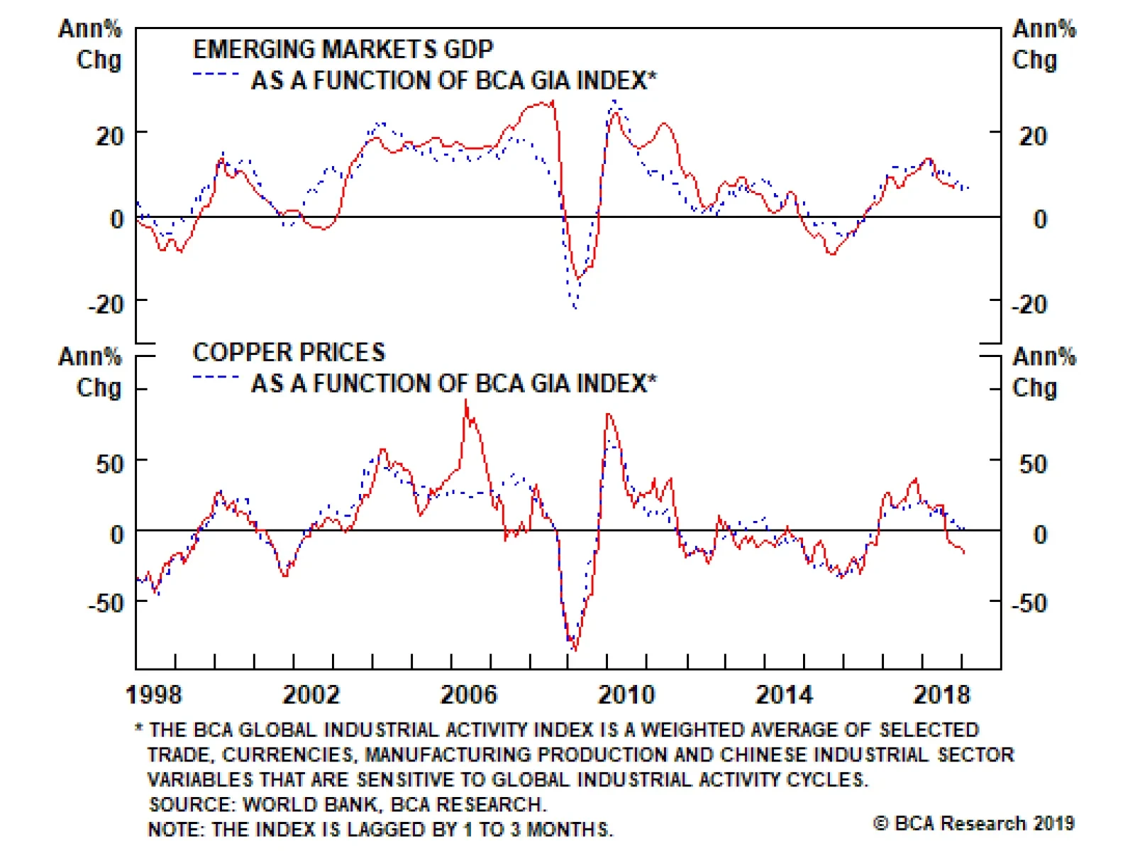
Trepidation engulfs commodity markets like a fog weaving through half-deserted streets. Central bankers huddle in muttering retreats, growing more cautious by the day. EM growth concerns – particularly slowing trade volumes, and the drama surrounding Sino – U.S. trade negotiations – contribute to this. Europe’s slowdown as Brexit approaches, and a U.S. government that seems forever at loggerheads also sap investor confidence. Nonetheless, the level of industrial commodity demand – oil and copper in particular – continues to hold up. By our reckoning, EM growth still is positive y/y. And central bank caution – along with less-restrictive policies – provides a supportive backdrop for industrial commodities down the road. The production discipline we expect from OPEC 2.0 this year sets the stage for a continued rally in oil prices. Given our view on EM growth, we continue to favor staying long oil exposure, and remaining exposed to industrial commodities generally via the S&P GSCI position we recommended on December 7, 2017. Highlights Energy: Overweight. We are closing our open long call spreads in 2019 Brent, having lost the ~ $1/bbl premium in each. We are opening a new set of similar positions in anticipation of the next up-leg in Brent. At tonight’s close of trading, we will go long Brent $70 Calls vs. short $75 Calls in June, July and August 2019. Base Metals/Bulks: Neutral. Metal Bulletin’s benchmark iron ore price index for China traded through $90/MT earlier this week, as supply concerns continue to weigh on markets in the wake of evacuations from areas close to tailings dams used by miners.1 Precious Metals: Neutral. Bullion broker Sharps Pixley reported the PBOC’s gold reserves total almost 60mm ounces, up 380k ounces from end-2018 levels. Russia’s state media outlet RT proclaimed: “China on gold-buying spree amid global push to end US dollar dominance” on Tuesday. Ags/Softs: Underweight. Last week’s USDA WASDE report estimates world ending stocks for grains will be up slightly for the 2018-19 crop year at 772.2mm MT vs 766.6mm MT previously estimated in December. A January report was not issued due to the U.S. government shutdown. Feature In discussions with clients in the Middle East last week, few contested the assertion OPEC 2.0 is determined to keep supply below demand this year, in order to draw down global oil and refined product inventories.2 This strategy worked well for the coalition after it was stood up in November 2016. Back then, production cutbacks, an unexpected collapse of Venezuelan output, and random outages in Libya and elsewhere combined with above-average global demand to keep consumption above production. This led to a drawdown in OECD inventories of 260mm barrels between January 2017 and June 2018. OPEC 2.0 is off to a strong start on its renewed effort to rein in production and draw down inventories. OPEC (the old Cartel) cut nearly 800k b/d of production in January m/m, bringing members’ total crude output to 30.8mm b/d.3 The largest cut once again came from KSA, which reported it reduced output by just over 400k b/d m/m in January. This follows a 450k b/d reduction in December 2018 reported by the Kingdom in last month’s OPEC Monthly Oil Market Report. For March, KSA already is indicating it plans to drop production to 9.8mm b/d – 1.3mm b/d less than it was pumping in November 2018. There are some signs of discord within OPEC 2.0. Rosneft CEO Igor Sechin once again is arguing against the coalition’s production-cutting strategy, this time in a letter to Russian President Vladimir Putin.4 This is not the first time such disagreements were aired: In November 2017, leaders of Russia’s oil industry walked out of a meeting with Energy Minister Alexander Novak following a disagreement with the government on extending OPEC 2.0’s production-cutting deal launched at the beginning of the year. In the end, the deal was extended after President Putin weighed in.5 A Deeper Look At Demand Uncertainty These supply-side issues are not trivial, and pose significant risks to our price view. All the same, Russia does benefit from higher oil prices, in that inelastic global demand in the short-to-medium term produces a non-linear price increase when supply is reduced. Russia’s OPEC 2.0 quota calls for production to fall from 11.4mm b/d production basis its October 2018 reference level (11.6mm b/d at present) to 11.2mm b/d in 2019. As long as Russia’s participation in the OPEC 2.0 coalition advances its economic and geopolitical interests – i.e., higher revenues than could be expected without having a direct role in global production management, and in deepening its ties with KSA – we expect it to remain a member in good standing in OPEC 2.0. At the moment, the bigger issues center on the state of global demand for industrial commodities. Unlike the situation that prevailed during the first round of OPEC 2.0 cuts, global markets no longer are seeing a synchronized global recovery in aggregate demand. Rather, EM commodity demand growth – the engine of global growth – has been trending down at a slow and constant pace since the beginning of 2018. This is not news: It shows up in our new Global Industrial Activity (GIA) index, and we’ve been writing about it and accounting for it in our metals and oil demand projections for months (Chart of the Week). Chart of the WeekCommodity Demand May Be Bottoming
Commodity Demand May Be Bottoming
Commodity Demand May Be Bottoming
BCA’s GIA index is heavily weighted to EM commodity demand. Based on our estimates, it appears to be close to or in a bottoming phase and ready to turn up within the next quarter. It is worthwhile pointing out that even with the slowdown over the past year or so, BCA’s GIA index still stands significantly higher than the level registered during the manufacturing downturn of 2015-16. This also adds color as to why the OPEC market-share war launched in November 2014 was so devastating to prices – demand was contracting while supplies were surging from OPEC 2.0 states and from U.S. shale-oil producers. Pessimism Is Overdone We have maintained for some time commodity markets are overly pessimistic on the global growth outlook, mainly because of their gloomy view on the Chinese economy, and anticipated knock-on effects for EM growth arising from this view. Our colleagues at BCA’s Global Fixed Income Strategy succinctly capture the current mood pervading global markets: “… this current soft patch for the global economy is occurring alongside an extreme divergence between plunging growth expectations and more stable readings on current economic conditions. The fall in expectations is visible in the most countries, according to data series that measure confidence for businesses, consumers and investors.”6 We continue to expect the slowdown in EM to persist in 1H19 based on our modeling and actual consumption data. Part – not all – of this is due to the slowdown in China, where policymakers are moving to reverse earlier financial tightening with modest fiscal and monetary stimulus in 1H19. We continue to expect the Communist Party leadership in China will want to start increasing stimulus later this year or in 1H20, so that it hits the economy full force in 2021 in time for the 100th anniversary of the founding of the CCP. Such stimulus will bolster industrial commodity demand. Still, this is difficult to call, particularly the form stimulus will take. President Xi appears committed rebalancing China’s economy – i.e., supporting consumer-led growth – and may want to keep policy powder dry, so to speak, to counter a recession in 2020 or thereafter. Stimulating the consumer economy in China could boost consumption of gasoline, and demand for white goods like household appliances at the expense of heavy industrial demand. Oil and base metals used in stainless steel would benefit in such an environment. Timing this rebound remains difficult. It appears to us that oil and, to a lesser extent, base metals have undershot their fair-value levels (based on our modeling) on the back of negative expectations and sentiment. If we are correct in this assessment, this should limit the negative surprises going forward and open upside opportunities for commodity prices (Chart 2). Chart 2Technically, Oil's Oversold
Technically, Oil's Oversold
Technically, Oil's Oversold
Under The Hood Of BCA’s Newest Model Because demand is so difficult to capture, we continually are looking for different gauges to measure it and cross-check against each other. We developed our Global Industrial Activity index to target the actual performance of commodity-intensive activities globally. Each component is selected based on its sensitivity to the cycle in global industrial activity, hence on the cycle of global commodity demand. This is different from the BCA Global Leading Economic Indicator (LEI), which uses a GDP-weighted average of 23 countries’ LEI. By relying on GDP, the LEI weights in the indicator favor DM countries and do not account for the growing share of the service sector in these economies (Chart 3).7 Chart 3GIA Captures Commodity Demand
GIA Captures Commodity Demand
GIA Captures Commodity Demand
Our GIA index focuses on commodity demand, which is fundamentally different from proxies of global real GDP growth or global economic activity. Nonetheless, we included the BCA global LEI with a small weight (~ 10%) in our index to capture DM economies. This inclusion does add information to our new gauge. Our GIA index correlates with Emerging Markets’ GDP, copper and oil prices with lags of one to three months. This index is designed to measure the strength of the underlying demand for commodities. It does not account for the supply side and other idiosyncratic shocks that affects each commodity. For instance, our index captures ~ 55% of the variation in the y/y movement in oil prices; adding our oil market supply and sentiment indicators on top of the demand variable raises this to more than 80% (Chart 4). Chart 4Combined Indicators Work Best
Combined Indicators Work Best
Combined Indicators Work Best
The index is divided into four main components, which gauge the demand-side impacts of (1) trade; (2) currency movements; (3) manufacturing demand; and (4) the Chinese economy, given its importance to overall commodity demand. The GIA index’s Trade Component combines EM import volumes and an estimate of global dry bulk shipping rates to gauge demand. Readers of the Commodity & Energy Strategy are familiar with our use of EM trade volumes as a proxy for EM income.8 This week, we introduce a new proxy for shipping rates using the Baltic Dry Index (BDI) as a proxy of global economic activity. Our methodology is based on the approaches taken by James D. Hamilton and Lutz Kilian in their respective models that use the BDI to proxy global growth.9 We created two alternative measures based on each of their approaches and average them to come up with our own proxy of the cyclical factor of global shipping rates driven by demand. Both of our alternative measures use a rebased version of the real BDI, which uses the U.S. CPI to deflate the nominal value. Because it picks up the surge in shipping activity in 2H18 resulting from the front-running of tariffs in the Sino – U.S. trade war, the Trade Component of our GIA index gives the most positive readings of all the components (Chart 5, panel 1). By the end of this month, we expect the effects of this front-running to avoid tariffs will wash through the gauge, and we will have greater clarity on the state of global trade. Chart 5Performance Of GIA Components
Performance Of GIA Components
Performance Of GIA Components
The Currency Component uses a basket of currencies that are sensitive to global growth – i.e., the currencies of countries heavily engaged in trade – and the Risky vs. Safe-haven currency ratio built by BCA’s Emerging Market Strategy.10 This allows us to capture the information regarding the state of global economic activity contained in the highly efficient and forward-looking currency markets. This component collapsed in March 2018, but seems to have bottomed recently (Chart 5, panel 2). The Manufacturing Component looks at the PMIs and various business conditions and expectations surveys for countries that have large industrial exposures to the economic health of EM.11 Currently, this component signals a continuation of the downward trend first observed at the beginning of 2018 (Chart 5, panel 3). Lastly, the Chinese Economy Component uses two indicators of the country’s industrial output: the Li Keqiang Index, and our China Construction Indicator. Despite the fact that the slowdown in China is at the center of investor pessimism re global demand, this component is still holding well (Chart 5, panel 4). It has a moderate negative trend, but is not alarming for commodity demand. Moreover, we expect some stimulus in the second half of the year, which should keep this component supportive for commodity prices. Industrial Commodity Demand Still Holding Up Our GIA index proxies demand for industrial commodities, which is closely aligned with EM GDP – as GDP grows, demand for industrial commodities grows (Chart 6, panel 1). The GIA index is more correlated with copper prices than with oil prices, but it still provides an excellent snapshot of the state of demand for these commodities (Chart 4). Chart 6GIA, Meet Dr. Copper
GIA, Meet Dr. Copper
GIA, Meet Dr. Copper
Also, it is interesting to note there appears to be only one large specific supply shock that affected the copper market’s relationship with global demand (Chart 6, panel 2). Our new index supports the Market’s “Dr. Copper” argument, in the sense that copper prices are pretty much always aligned with global industrial activity. We also note that the recent Sino – U.S. trade tensions have pushed copper below the value that is explained by our demand proxy. Bottom Line: The resolve of OPEC 2.0 to reduce production is not in doubt. OPEC (the old Cartel) reported this week its member states cut nearly 800k b/d of production in January m/m, bringing members’ total crude output to 30.8mm b/d. On the demand side, new GIA index indicates things are not as bad as sentiment and expectations would indicate. If anything, we expect the combination of OPEC 2.0’s resolve and rising demand for industrial commodities – oil and copper in particular – to lift prices as the year progresses. Hugo Bélanger, Senior Analyst Commodity & Energy Strategy HugoB@bcaresearch.com Robert P. Ryan, Senior Vice President Commodity & Energy Strategy rryan@bcaresearch.com Footnotes 1 Please see “Brazil evacuates towns near Vale, ArcelorMittal dams on fears of collapse,” published by reuters.com on February 8, 2019. 2 OPEC 2.0 is the name we coined for the producer coalition of OPEC states, led by the Kingdom of Saudi Arabia (KSA), and non-OPEC states, led by Russia, which recently agreed to cut production by ~ 1.2mm b/d to drain commercial oil inventories and re-balance markets globally. 3 Please see the February 2019 issue of OPEC’s Monthly Oil Market Report, which is available at opec.org. 4 Please see “Exclusive: Russia’s Sechin raises pressure on Putin to end OPEC deal,” published by uk.reuters.com February 8, 2019. 5 Please see “Russian oil unsettled by talk of longer production cuts,” published by ft.com November 15, 2017. 6 Please see “A Crisis Of Confidence?” published by BCA Research’s Global Fixed Income Strategy, published February 12, 2019. It is available at gfis.bcaresearch.com. 7 The components of the global LEI are also different from our GIA index, and more market-oriented. For details on each series included in the LEI, please see “OECD Composite Leading Indicators: Turning Points of References Series and Component Series,” published February 2019. It is available at oecd.org. 8 Please see BCA Research’s Commodity & Energy Strategy Weekly Report “Trade, Dollars, Oil & Metals ... Assessing Downside Risk,” where we discussed the relationship between EM imports volume, EM income and commodity prices, published August 23, 2018, and is available at ces.bcaresearch.com. 9 The best approach is still debated in the literature. For more details on Hamilton and Kilian’s measurements, please see James D Hamilton, “Measuring Global Economic Activity,” Working paper, August 20, 2018 and Lutz Kilian, “Measuring Global Real Economic Activity: Do Recent Critiques Hold Up To Scrutiny?” Working paper, January 12, 2019. By selecting EM only import volumes and our proxy shipping rate based on the BDI, we narrow our Trade Component to factors that are mainly linked to industrial activity and commodity-intensive sectors. 10 Our basket of currencies includes Korea, Sweden, Chile, Thailand, Malaysia and Peru. The risky vs. safe-haven currency ratio average of CAD, AUD, NZD, BRL, CLP & ZAR total return indices relative to average of JPY & CHF total returns (including carry). 11 This includes Korea, Singapore, Sweden, Germany, Japan, China and Australia. Investment Views and Themes Recommendations Strategic Recommendations Tactical Trades TRADE RECOMMENDATION PERFORMANCE IN 4Q18
Image
Commodity Prices and Plays Reference Table Trades Closed in 2019 Summary of Trades Closed in 2018
Image
Too-restrictive monetary policy is always the root cause of recessions. Similarly, a recession can also occur if an external shock to growth is severe enough to depress economic activity faster than policymakers can identify the slowdown and respond with…