Global
Taking Stock Of Country Tilts In Model Bond Portfolio
…
With global growth remaining soggy, an increasing number of major central banks have been forced to rapidly shift in a more dovish direction. This past week alone, the European Central Bank (ECB), the Bank of Canada (BoC) and the Reserve Bank of Australia…

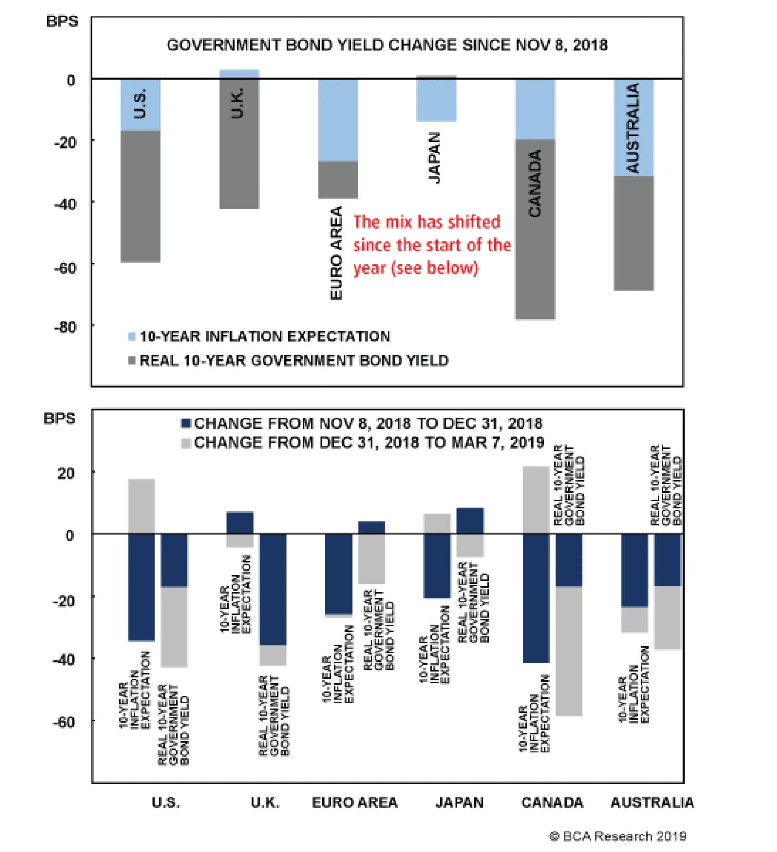
Highlights Dovish Central Banks & Duration: Bond markets have shifted rapidly in recent weeks, pricing out any and all rate hikes expected over the next year in the major developed economies. With global growth likely to rebound in the latter half of the year, bond yields are now exposed to a hawkish repricing and recovery in inflation expectations, especially in the U.S. Stay below benchmark on overall portfolio duration on a medium-term basis. Model Bond Country Allocations: We are sticking with our current country tilts in our model bond portfolio, as the recent shift in central banker biases has done little to change the relative fundamental drivers between countries. Stay underweight the U.S., Canada & Italy, and overweight core Europe, Japan, the U.K., Spain & Australia, in currency-hedged global government bond portfolios. Feature Well, That Escalated Quickly With global growth remaining soggy, an increasing number of major central banks have been forced to rapidly shift in a more dovish direction. This past week alone, the European Central Bank (ECB), the Bank of Canada (BoC) and the Reserve Bank of Australia (RBA) all signaled that interest rates would be on hold for some time. The ECB went the extra step of announcing a new bank funding program (TLTRO-3), as we predicted last week, to prevent a deeper euro area growth downturn at a time of, as ECB President Mario Draghi described it, “pervasive uncertainty”. Government bond yields declined sharply in all three regions, as markets digested the dovish message from more cautious policymakers. Our Central Bank Monitors for the major developed economies are all decelerating, in line with the soft patch of global growth. Yet only the RBA Monitor has fallen to a level clearly signaling a need for easier monetary policy in Australia. For the other major countries, the Monitors are indicating that an unchanged monetary policy stance is appropriate, and all for the same reason – the loss of economic momentum has not been enough to loosen tight labor markets and drive core inflation rates lower. Government bond yields have already responded to a loss of global growth momentum by pricing out any rate hikes that were expected over the next year, most notably in the U.S. and Canada. Inflation expectations have also adjusted downwards in response to both diminished growth expectations and last year’s sharp plunge in global energy prices. We expect global growth to rebound in the latter half of 2019, alongside higher oil prices, leaving bond yields exposed to upside data surprises and a repricing of expectations for inflation and rate hikes (Chart of the Week). We continue to recommend a below-benchmark overall portfolio duration stance on a 6-12 month horizon, as government bond yields are likely to rise above the very flat forwards in most markets. Chart 1A Bottoming Out Process For Bond Yields
A Bottoming Out Process For Bond Yields
A Bottoming Out Process For Bond Yields
While maintaining a below-benchmark duration stance, the synchronized shift in central bank forward guidance justifies a review of the recommended country allocations in our model fixed income portfolio. Taking Stock Of Our Country Tilts In Our Model Bond Portfolio Global government bond yields peaked back in early November and have fallen in all of the major developed economies (Chart 2). Decomposing the move in benchmark 10-year yields into inflation expectations (using CPI swap rates) and real yields (the difference between nominal yields and CPI swap rates) shows that the bulk of that decline has come from lower real rates in the countries with positive policy rates (U.S., Canada, U.K. and Australia). For countries with zero or negative policy rates (core Europe, Japan), most of the yield decline has been due to falling inflation expectations. Yet the drivers of the decline in yields have changed from the latter two months of 2018 to the first few months of 2019. Generally speaking, the late-2018 bond market rally reflected falling inflation expectations, while recent changes have been a function of moves in real yields. Only in Australia have real yields and inflation expectations both declined steadily since the early November peak in global bond yields.
Chart 2
The greater influence of the real component of yields makes sense, as markets now discount fewer rate hikes and more accommodative monetary policy. Currently, our recommended country allocation in the Governments portion of our model bond portfolio includes underweights in the U.S., Canada and Italy and overweights in Australia, the U.K., Japan, Germany, France and Spain (the latter is a position versus Italy within an overall underweight stance on Peripheral European debt). In light of the more ubiquitously neutral/dovish global policy bias, we are reevaluating those country tilts per the following indicators: 1. Cyclical growth indicators: Both manufacturing purchasing managers indices (PMIs) and the leading economic indicators (LEIs) produced by the OECD are well off the cyclical peaks (Chart 3). In terms of levels, the PMIs are holding above the 50 threshold, suggesting expanding manufacturing activity, in the U.S., U.K., Canada and Australia, but are below 50 in the euro area and Japan. Chart 3Growth Has Lost Momentum Everywhere
Growth Has Lost Momentum Everywhere
Growth Has Lost Momentum Everywhere
2. Market-based inflation expectations: 10-year CPI swap rates have generally stabilized alongside energy prices, after the sharp drops seen in the latter months of 2018 (Chart 4). Australia is the lone exception where expectations continue to drift lower. The correlations between CPI swap rates and oil prices denominated in local currency are strongest in the U.S. and Canada and weakest in Australia. There is great diversity of the levels of CPI swap rates, however, from as low as 0.2% in Japan to as high as 3.5% in the U.K. Chart 4Inflation Expectations Are Stabilizing Outside Of Japan & Australia
Inflation Expectations Are Stabilizing Outside Of Japan & Australia
Inflation Expectations Are Stabilizing Outside Of Japan & Australia
3. Our Central Bank Monitors vs. our 12-month discounters: Except for Australia, our Monitors are all hovering very close to the zero line, indicating no pressure on policymakers to move policy rates (Chart 5). Our 12-month discounters, which measure the interest rate changes over the next year priced into Overnight Index Swap (OIS), are all close to zero, as well (again, with the exception of Australia, where a full 25bp rate cut is already priced). Chart 5Our Central Bank Monitors Are Calling For Stable Policy (ex Australia)
Our Central Bank Monitors Are Calling For Stable Policy (ex Australia)
Our Central Bank Monitors Are Calling For Stable Policy (ex Australia)
Just looking at these indicators, the ideal combination would be to underweight countries where yields are vulnerable to an upward repricing (PMIs still above 50, higher oil/CPI swaps correlations and no rate hikes priced) and to overweight countries where yields are less likely to rise (PMIs below 50, lower oil/CPI swaps correlations and where our 12-month discounters are not priced for rate cuts). Under these criteria, underweights in the U.S. and Canada are still justified, as are overweights in core Europe and Japan. The surprising firmness of the U.K. manufacturing PMI relative to the persistent downtrend in the U.K. LEI muddies the message a bit on Gilts, although the relatively high level of our 12-month discounter (still 13bps of hikes priced) is a bullish sign with our BoE Monitor now sitting right near zero. In Australia, the manufacturing PMI is also surprisingly firm but, the underlying weak momentum in overall Australian growth is leaving the door open to potential RBA rate cuts later this year. For all our country recommendations within our model bond portfolio framework, we always look at yields and returns on a currency-hedged basis in U.S. dollar terms. We do this to separate the fixed income component of global bond returns from the currency component. Yet when looking at the government bond yield curves in our model bond portfolio universe, hedged into USD, there is very little differentiation among those countries with the higher credit ratings (Chart 6). Only Spain (A-rated) and Italy (BBB-rated) have hedged yields that are outside the 2-3% range seen in the other major developed economies.
Chart 6
From a fundamental point of view, those narrow yield differentials among the higher-rated markets largely reflect the convergence of trend economic growth rates. In a recent Weekly Report, we looked at the long-run growth rates of potential GDP and labor productivity for the U.S., euro area and Japan and noted that the differences between them were fairly modest.1 This justified narrow currency-hedged yield differentials between U.S. Treasuries, German Bunds and Japanese government bonds (JGBs). When we add Canada, Australia and the U.K. to the mix (Chart 7), we can see similar convergence of potential GDP growth to rates between 1-2% and long-run productivity growth around 0.5% (using OECD data for both). Chart 7No Major Differences In Long-Run Growth Rates
No Major Differences In Long-Run Growth Rates
No Major Differences In Long-Run Growth Rates
The convergence is largely complete for all countries except Australia, where potential GDP growth is estimated to be 2.4%. Yet the long-run downtrend in potential growth is powerful and full convergence to the sub-2% levels seen in the other countries appears inevitable (and goes a long way in explaining the historically low level of Australian bond yields versus global peers). We can also see convergence in looking at the more recent history of the market pricing of the expected long-run neutral interest rate, using our real terminal rate proxy (the 5-year OIS rate, 5-years forward minus the 5-year CPI swap rate 5-years forward). Those measures for all of the major developed markets in our model bond portfolio are shown in Chart 8. The markets are pricing in real policy rate convergence, as well, with real rates expected to stay in a range between -0.5% (core Europe) and +0.5% (Canada). The U.K. is the one outlier, with the market pricing in a terminal real rate of -2%, although this likely reflects the markets discounting in the long-run effects of Brexit on the U.K. economy. Chart 8Markets Expect Near-Zero Real Terminal Rates (ex the U.K.)
Markets Expect Near-Zero Real Terminal Rates (ex the U.K.)
Markets Expect Near-Zero Real Terminal Rates (ex the U.K.)
So what does all this mean for our recommended country allocations in our model bond portfolio? In Chart 9, we show the relative performance of the each country, hedged into U.S. dollars and duration-matched) versus the Bloomberg Barclays Global Treasury Index. Our overweight tilts are in the top panel, while our underweight tilts are in the bottom panel. Chart 9Sticking With The Country Allocations In Our Model Bond Portfolio
Sticking With The Country Allocations In Our Model Bond Portfolio
Sticking With The Country Allocations In Our Model Bond Portfolio
Generally speaking, are recommendations have done well. Given our read on the indicators above, we see little reason to change the allocations. Our biggest concerns would be the underweights in Canada and Italy, given the sharp weakening of growth in both countries. For Italy, however, we view that as a negative given Italy’s high debt levels that require faster nominal growth to ensure debt sustainability. A more dovish ECB should help keep European bond volatility low, to the benefit of carry trades like Italian government bonds. However, we prefer to play that through our overweight in Spain while we await signs of stabilization in the Italian LEI before upgrading Italy in our model bond portfolio. As for Canada, we plan on doing a deeper dive on their economy and inflation trends in next week’s report before considering any changes to our allocation. Bottom Line: We are sticking with our current country tilts in our model bond portfolio, as the recent shift in central banker biases has done little to change the relative fundamental drivers between countries. Stay underweight the U.S., Canada & Italy, and overweight core Europe, Japan, the U.K., Spain & Australia, in currency-hedged global government bond portfolios. Robert Robis, CFA, Chief Fixed Income Strategist rrobis@bcaresearch.com 1 Please see BCA Global Fixed Income Strategy Weekly Report, “Europe & Japan: The Anchor Weighing On Global Bond Yields”, dated February 26, 2019, available at gfis.bcaresearch.com Recommendations The GFIS Recommended Portfolio Vs. The Custom Benchmark Index
Pervasive Uncertainty, Persuasive Central Banks
Pervasive Uncertainty, Persuasive Central Banks
Duration Regional Allocation Spread Product Tactical Trades Yields & Returns Global Bond Yields Historical Returns
Highlights Duration: With rate hikes more likely than cuts over the next 12 months, it makes sense to maintain below-benchmark duration in U.S. bond portfolios. However, timing the next up-move in Treasury yields is difficult. We recommend that investors initiate positive carry yield curve trades to boost returns while we wait for Treasury yields to bottom alongside the CRB/Gold ratio. Corporates: The Fed’s pause is leading to improvement in our global growth indicators. The end result is a window where corporate spreads will tighten during the next few months. Remain overweight corporate bonds, but be prepared to downgrade when spreads reach our targets. CMBS: We upgrade our allocation to non-agency CMBS from underweight to neutral, due to elevated spreads relative to other Aaa-rated sectors. While spreads are currently attractive, the macro back-drop is also fairly bleak. If spreads tighten to more reasonable levels or CMBS delinquencies start to rise we will be quick to downgrade. Feature Green Shoots For Global Growth Since 1994 the Global (ex. U.S.) Leading Economic Indicator (LEI) has contracted relative to its 12-month trend six times. In all six episodes it eventually dragged the U.S. LEI down with it (Chart 1). As we predicted last August, the U.S. economy cannot remain an oasis of prosperity when the rest of the world is in turmoil.1 However, to focus on the weakening U.S. data right now is to miss the bigger picture. Chart 1U.S. Follows The Rest Of The World
U.S. Follows The Rest Of The World
U.S. Follows The Rest Of The World
Corporate bond spreads already reacted to the global slowdown by widening near the end of last year. Then, the Federal Reserve reacted to tighter financial conditions by signaling a pause in its rate hike cycle. We took that opportunity to turn more bullish on spread product, and now, there are budding signs of improvement in the global growth outlook. While the Global LEI (including the U.S.) remains in a downtrend, our Global LEI Diffusion Index is well off its lows (Chart 2). Historically, the Diffusion Index has a good track record leading changes in the overall indicator. Chart 2Global LEI Diffusion Index Is Back Above 50%
Global LEI Diffusion Index Is Back Above 50%
Global LEI Diffusion Index Is Back Above 50%
Similarly, the timeliest indicators of global growth that called the early-2016 peak in credit spreads are starting to improve (Chart 3). The CRB Raw Industrials index is breaking out, the BCA Market-Based China Growth Indicator has recovered and Global Industrial Mining Stock prices are heading up. Chart 3Global Growth Checklist
Global Growth Checklist
Global Growth Checklist
All told, it appears that the Fed’s pause and related dollar weakness, along with less restrictive fiscal and monetary policies in China, are starting to pay dividends.2 The end result is a window where leading global growth indicators will improve and financial conditions will ease. We recommend that investors maintain an overweight allocation to corporate bonds during this supportive window, though we also note that the continued rapid pace of corporate re-leveraging is a cause for concern. We will be quick to downgrade our recommended allocation to corporate bonds when our near-term spread targets are hit. Our spread target for Aa-rated corporates is 57 bps, the current spread level is 61 bps. Our spread target for A-rated corporates is 85 bps, the current spread level is 92 bps. Our spread target for Baa-rated corporates is 128 bps, the current spread level is 159 bps. Our spread target for Ba-rated corporates is 188 bps, the current spread level is 243 bps. Our spread target for B-rated corporates is 297 bps, the current spread level is 400 bps. Our spread target for Caa-rated corporates is 573 bps, the current spread level is 827 bps. We recommend avoiding Aaa-rated corporate bonds, which already look expensive. We explore the universe of Aaa-rated spread product in more detail below. Implications For Treasury Yields The Fed’s pause and the nascent improvement in global growth are both obvious positives for corporate spreads. The impact on Treasury yields is somewhat less obvious. We contend that once financial conditions ease sufficiently, the market will start to price-in further Fed rate hikes and this will pressure Treasury yields higher at both the short and long ends of the curve. The ratio between the CRB Raw Industrials index and the gold price can help clarify this concept. Chart 4 shows that the 10-year Treasury yield tends to rise when the CRB index outpaces gold, and vice-versa. The rationale for this correlation is that the CRB index is a proxy for global growth and gold is a proxy for the stance of monetary policy. Chart 4Timing The Next Treasury Sell-Off
Timing The Next Treasury Sell-Off
Timing The Next Treasury Sell-Off
A rising gold price suggests that monetary policy is becoming increasingly accommodative. This eventually leads to an improvement in global growth and a rising CRB index. But Treasury yields do not rise alongside the CRB index. They only increase once the improvement in global growth is sufficient for the market to discount a tighter monetary policy. That moment occurs when the CRB index rises more quickly than the gold price. The bottom line is that with rate hikes more likely that cuts over the next 12 months it makes sense to maintain below-benchmark duration in U.S. bond portfolios. However, timing the next up-move in Treasury yields is difficult. We recommend that investors initiate positive carry yield curve trades to boost returns while we wait for Treasury yields to bottom alongside the CRB/Gold ratio.3 Checking In On The Labor Market Based on the number of emails we’ve received on the topic, the last two U.S. employment reports have stoked some confusion among investors. This is not surprising given the volatility in the headline numbers: Nonfarm payrolls increased +311k in January and only +20k in February. The U3 unemployment rate jumped to 4% in January, then fell back to 3.8% in February. The U6 unemployment rate jumped to 8.1% in January, then fell back to 7.3% in February. Much of the volatility is likely explained by data collection issues related to the partial government shutdown, which makes it useful to look through the noise and focus on a few important trends. Trend #1: Slow Growth In Q1 The employment data clearly point to a U.S. growth slowdown in the first quarter of 2019. Real GDP growth can be proxied by looking at the sum of the growth rate in aggregate hours worked and the growth rate in labor force productivity (Chart 5). The recent steep decline in hours worked suggests that first quarter growth is going to be weak. Chart 5Employment Data Point To Slow Growth In Q1
Employment Data Point To Slow Growth In Q1
Employment Data Point To Slow Growth In Q1
But as was noted in the first section of this report, weak Q1 GDP is the result of the global growth slowdown dragging the U.S. lower. Crucially, the market has already discounted this eventuality and the budding improvement in leading global growth indicators suggests that the U.S. slowdown will prove temporary. Trend #2: No More Slack A broad set of indicators now all point to the fact that the U.S. economy is at full employment (Chart 6). The implication is that we should expect wage growth to accelerate and payroll growth to decelerate as we move deeper into the cycle. Chart 6At Full Employment
At Full Employment
At Full Employment
Some investors may retain the belief that a rising labor force participation rate will keep wage growth capped, but even here the prospects are dim. The participation rate for people of prime working age (25-54) has risen rapidly during the past few years, but that has only led to a small bounce in overall participation (Chart 7). This is because the aging of the population has pushed more and more people out of that prime working age demographic bucket. Chart 7Labor Force Participation
Labor Force Participation
Labor Force Participation
The dashed line in the top panel of Chart 7 shows where the labor force participation rate would be, based on current demographics, if the participation rate for each narrow age cohort reverted to its July 2007 level. The message is that the scope for a further increase in labor force participation is limited. Trend #3: No Recession Risk Yet The full employment state of accelerating wage growth and decelerating employment growth can last for some time before a recession hits. In our research we have noted that, from a financial markets perspective, one of the best leading indicators is the change in initial jobless claims. Typically, a bottom in initial jobless claims coincides with an inflection point in Treasury excess returns (Chart 8). Chart 8Jobless Claims Have Called Troughs In Treasury Returns
Jobless Claims Have Called Troughs In Treasury Returns
Jobless Claims Have Called Troughs In Treasury Returns
Initial jobless claims have risen somewhat during the past few weeks, and while this trend is worth monitoring, it is premature to flag it as a concern. The 4-week moving average in claims has already fallen back to 226k from a recent high of 236k, and next week an elevated print of 239k will roll out of the 4-week average. Any initial claims print below 239k next week will cause the 4-week average to decline further. Bottom Line: The U.S. labor market has reached full employment. Going forward we should expect a continued acceleration in wage growth and deceleration in payroll growth. This situation can persist without causing a recession until initial jobless claims start to head higher. We see no evidence of this as of yet. Aaa-Rated Spread Products In this week’s report we consider the risk/reward trade-off on offer from the major Aaa-rated spread products. Specifically, we consider corporate bonds, agency and non-agency CMBS, conventional 30-year residential MBS and consumer ABS (both credit cards and auto loans). Focusing purely on expected returns, we find that non-agency CMBS offer the highest option-adjusted spread of 73 bps. This is followed by 65 bps from corporates, 50 bps from Agency CMBS, 41 bps from MBS, 35 bps from auto ABS and 31 bps from credit card ABS. But this is just one side of the equation. Chart 9 shows each sector’s spread relative to the likelihood that it will experience losses versus Treasuries. To measure the risk of losses we use our measure of Months-To-Breakeven. This is defined as the number of months of average spread widening that each sector requires before it starts to lose money relative to a duration-matched position in Treasury securities. Essentially, the Months-To-Breakeven measure is each sector’s 12-month breakeven spread adjusted by its spread volatility since 2014. We only calculate spread volatility since 2014 because that it is when data for Agency CMBS start.
Chart 9
Chart 9 shows that while Aaa corporate bonds offer elevated expected returns compared to the other sectors, they also offer a commensurate increase in risk. Similarly, consumer ABS offer lower expected returns than the other sectors but with considerably less risk. According to Chart 9, the only sector that offers an attractive risk/reward trade-off is non-agency CMBS. This warrants further investigation. Looking at spreads throughout history, we see that non-agency CMBS spreads also look relatively attractive. While Aaa-rated consumer ABS spreads are near all-time lows, non-agency CMBS spreads are still not quite one standard deviation below the pre-crisis mean (Chart 10). Chart 10CMBS Spreads Have Room To Narrow
CMBS Spreads Have Room To Narrow
CMBS Spreads Have Room To Narrow
We noted in last week’s report that consumer ABS look even worse when we incorporate the macro environment.4 All-time tight ABS spreads currently coincide with tightening consumer lending standards and a rising consumer credit delinquency rate. This is why we downgraded consumer ABS from neutral to underweight last week. The macro environment for CMBS is also fairly bleak (Chart 11). Commercial real estate lending standards are tightening, loan demand is waning and prices are decelerating. The one saving grace is that, so far, this has not translated into a rising CMBS delinquency rate (Chart 11, bottom panel). It is probably only a matter of time before CMBS delinquencies start to trend higher, but with spreads so attractive relative to the investment alternatives, the sector warrants better than an underweight allocation. Chart 11Delinquencies Biased Higher?
Delinquencies Biased Higher?
Delinquencies Biased Higher?
Bottom Line: We upgrade our allocation to non-agency CMBS from underweight to neutral. Spreads are currently attractive relative to other Aaa-rated sectors, but we will keep a close eye on the evolving macro backdrop. If spreads tighten to more reasonable levels or if CMBS delinquencies start to rise, we will be quick to downgrade. Ryan Swift, U.S. Bond Strategist rswift@bcaresearch.com Footnotes 1 Please see U.S. Bond Strategy Weekly Report, “An Oasis Of Prosperity”, dated August 21, 2018, available at usbs.bcaresearch.com 2 For further details on recent shifts in Chinese policy please see China Investment Strategy Weekly Report, “Dealing With A (Largely) False Narrative”, dated February 27, 2019, available at cis.bcaresearch.com 3 For more details on the attractiveness of positive carry yield curve trades please see U.S. Bond Strategy Weekly Report, “Paid To Wait”, dated February 26, 2019, available at usbs.bcaresearch.com 4 Please see U.S. Bond Strategy Portfolio Allocation Summary, “The Sequence Of Reflation”, dated March 5, 2019, available at usbs.bcaresearch.com Fixed Income Sector Performance Recommended Portfolio Specification
Highlights The deceleration in global growth that began in 2018 is entering a transition phase. The bottoming out process could prove to be volatile, warning against betting the farm too early on pro-cyclical currencies. Tactical short USD bets should initially be played via the euro1 and Swedish krona. The poor Canadian GDP report last week could be a harbinger for more data disappointments down the road. Meanwhile, the dovish shift by the ECB could paradoxically be bullish for the euro beyond the near term. Go short USD/SEK and buy EUR/CAD for a trade. Feature A currency exchange rate is simply a measure of relative prices between two countries. As such, the starting point for any currency forecast should be how those values are likely to evolve over time. For much of 2018, U.S. growth benefited from the impact of the Trump tax cuts, a boost to government spending agreed in January of that year, and the lagged effect of an easing in financial conditions from December 2016 to January 2018. Outside the U.S., what appeared to be idiosyncratic growth hiccups in both Europe and Japan finally morphed into full-blown slowdowns. Slower Chinese credit growth and the U.S.-China trade war were the ultimate straws that broke the camel’s back, deeply hurting global growth (Chart I-1). Consequently, the greenback surged. Chart I-1The Global Growth Slowdown Persists
The Global Growth Slowdown Persists
The Global Growth Slowdown Persists
Fading U.S. Dollar Tailwinds At first glance, the picture remains largely similar today, with global growth still slowing and U.S. growth still outperforming. However, a key difference from last year is that U.S. growth leadership is set to give way to the rest of the world. The U.S. ISM manufacturing PMI peaked last August and has been steadily rolling over relative to its trading partners. The U.S. economic surprise index tells a similar story, with last month’s disappointing retail sales numbers nudging the series firmly below zero. Relative leading economic indices also suggest that U.S. growth momentum has slowed relative to the rest of the world. Historically, the relative growth differential between the U.S. and elsewhere has had a pretty good track record of dictating trends in the dollar (Chart I-2). Chart I-2U.S. Growth Leadership Might Soon End
U.S. Growth Leadership Might Soon End
U.S. Growth Leadership Might Soon End
Whether or not these trends persist beyond the first quarter will depend on the sustainability of China’s recent stimulus efforts. On the positive side, typical reflation indicators such as commodity prices, emerging market currencies, and industrial share prices have perked up in response to a nascent upturn in the credit impulse. On the other hand, policy shifts affect the economy with a lag, suggesting it is too early to tell whether the latest credit injection has been sufficient to turn around the Chinese economy, let alone the rest of the world. What is clear is that the bottoming processes tend to be volatile and protracted, suggesting it is still too early to bet the farm on pro-cyclical currencies. In the interim, investors could track the following indicators to help time a definitive turning point: Whether or not easing liquidity conditions will lead to higher growth is often captured by the CRB Raw Industrial index-to-gold, copper-to-gold, and oil-to-gold ratios. It is encouraging that these also tend to move in lockstep with the U.S. bond yields, another global growth barometer. The power of the signal is established when all three indicators peak or bottom at the same time, as is the case now (Chart I-3). The next confirmation will come with a clear break-out in these ratios. Chart I-3Reflation Indicators Are Perking Up
Reflation Indicators Are Perking Up
Reflation Indicators Are Perking Up
Chinese M2 relative to GDP has bottomed. Historically, this ratio has lit a fire under cyclical stocks and, by extension, pro-cyclical currencies (Chart I-4). The growth rate is still at zero, meaning excess liquidity is not accelerating on a year-over-year basis. Meanwhile, our Emerging Markets team argues that broad credit growth is still decelerating.2 A break above the zero line, probably in the second half of this year, could be a catalyst to shift fully to a pro-cyclical currency stance. Chart I-4Chinese Excess Liquidity Improving
Chinese Excess Liquidity Improving
Chinese Excess Liquidity Improving
On a similar note, currencies in emerging Asia that sit closer to the epicenter of stimulus appear to have bottomed. If those in Latin America can follow suit, it would indicate that policy stimulus is sufficient, and the transmission mechanism is working (Chart I-5). Chart I-5EM Currencies Are Trying To Bottom
EM Currencies Are Trying To Bottom
EM Currencies Are Trying To Bottom
Finally, China-sensitive industrial commodities, especially metals and building materials, appear to have troughed and are perking up nicely. There was a supply-related issue with the Vale dam bursting in Brazil and a subsequent surge in iron-ore prices, but it is now clear that the entire industrial commodity complex has stopped falling (Chart I-6). Chart I-6Chinese Industrial Commodities Are Rallying
Chinese Industrial Commodities Are Rallying
Chinese Industrial Commodities Are Rallying
Be Selective On USD Shorts Our strategy is to be selective as U.S. dollar tailwinds shift to headwinds, by initially expressing tactical USD shorts via the euro and the Swedish krona. Last week, we highlighted the fact that investors are currently too pessimistic on Europe’s growth prospects. More importantly, most of the factors that toppled European growth domestically – the implementation of new auto-emission standards in Germany, the rising cost of capital in Italy via exploding bond yields, and the populist Gilets Jaunes protests in France – are mostly behind us. Fiscal policy is also set to be loosened this year, and last year’s weakness in the euro will contribute to easier financial conditions. The improvement in European investor sentiment relative to current conditions could be a harbinger of positive euro area data surprises ahead (Chart I-7). Chart I-7Euro Zone Data Might Surprise To The Upside
Euro Zone Data Might Surprise To The Upside
Euro Zone Data Might Surprise To The Upside
The European Central Bank left rates unchanged at yesterday’s policy meeting but the decision for a new Targeted Long Term Refinancing Operation (TLTRO III – or in other words, cheap loans), could be paradoxically bullish for the euro. If a central bank eases financing conditions at a time when growth is hitting a nadir, it is tough to argue that this is bearish for the currency. Our Global Fixed Income team nailed the move by the ECB in this week’s report.3 European banks have been in the firing line of sluggish growth, negative interest rates, and increased regulatory scrutiny. In the case of Italy, an NPL ratio 9.4% is nearly triple that of the euro area. And with circa 10% of total bank lending in Spain and Italy funded by TLTROs, re-funding by the ECB is exactly what the doctor ordered. In the case of the Sweden, the undervaluation of the krona has begun to mitigate the effects of negative interest rates – mainly a buildup of household leverage and an exodus of foreign direct investment. The GDP report last week was well above expectations, with year-on-year growth of 2.4%. Encouragingly, this was driven by net exports rather than consumption. The Swedish manufacturing PMI release for February was also very encouraging. Orders jumped from 50.4 to 54.0 while export orders jumped from 51.5 to 53.4. The growth in wages is beginning to catch up to new borrowings, meaning domestic consumption could be increasingly financed through income. This will alleviate the need for the Riksbank to maintain an ultra-accommodative policy. On a relative basis, the Swedish economy appears to have bottomed relative to that of the U.S., making the USD/SEK an attractive way to play USD downside. From a technical perspective, the cross is facing strong resistance at the triple top established from the 2009 highs around 9.45 (Chart I-8). Aggressive investors should begin accumulating short positions, while being cognizant of the negative carry. Chart I-8The Swedish Krona Looks Like A Buy
The Swedish Krona Looks Like A Buy
The Swedish Krona Looks Like A Buy
Bottom Line: Our favorite indicator for gauging ultimate downside in the dollar is the gold-to-bond ratio. Ever since the global financial crisis, gold has stood as a viable threat to dollar liabilities, capturing the ebb and flow of investor confidence in the greenback tick-for-tick (Chart I-9). Any sign that the balance of forces are moving away from the U.S. dollar will favor a breakout in the gold-to-bond ratio. For now, USD short positions should be played via the euro and Swedish krona. Chart I-9Pay Close Attention To The Gold-To-Bond Ratio
Pay Close Attention To The Gold-To-Bond Ratio
Pay Close Attention To The Gold-To-Bond Ratio
Buy EUR/CAD For A Trade Last week saw an extremely disappointing GDP report out of Canada, which prompted the Bank of Canada to keep interest rates on hold this week, followed by quite dovish commentary. In a 90-degree maneuver from its January policy statement that rates will need to rise over time, BoC Governor Stephen Poloz said the path for future increases had become “highly uncertain.” Like many central banks around the world, the BoC has been blindsided by the depth of the negative growth impulse outside its borders, which has begun to seep into the domestic economy. The economy grew at an annualized pace of 0.4% in the fourth quarter, the lowest in over two years. Capital expenditures collapsed at a rate of 2.7%, marking the third consecutive quarter of declines. The forward OIS curve is pricing in no rate hikes for Canada this year, meaning sentiment on the loonie is already depressed. However, our contention is that even if growth bottoms by the second half of this year, the Canadian dollar will offer little value to play this cyclical rebound. Our recommendation is to play the loonie’s downside via the euro. First, valuations and balance-of-payment dynamics favor the euro versus the CAD on a long-term basis. Second, we estimate there is more scope for long-term interest rate expectations to rise in the euro area than in Canada (Chart I-10). European rates are further below equilibrium, and the ECB’s dovish shift will help lift the growth potential of the euro area. Meanwhile, the Canadian neutral rate will be heavily weighed down by the large stock of debt in the Canadian private sector, exacerbated by overvaluation in the housing market. This means that expectations in the 2-year forward market are likely to favor the euro versus the CAD. Chart I-10Buy EUR/CAD For A Trade
Buy EUR/CAD For A Trade
Buy EUR/CAD For A Trade
The biggest risk to this view is the price of oil. The EUR/CAD exchange rate is not as negatively correlated with oil as the USD/CAD, but nonetheless the CAD benefits more from rising oil prices than the euro does. BCA’s bullish oil view is a risk over the next six months. On the downside, the EUR/CAD could potentially test the bottom of the upward trending channel that has existed since 2012. This would put EUR/CAD in the vicinity of 1.45 (currently trading at 1.5049). However, initial upside resistance rests at the triple top a nudge above 1.6 (Chart I-11). Chart I-11EUR/CAD Technicals: Limited Downside
EUR/CAD Technicals: Limited Downside
EUR/CAD Technicals: Limited Downside
Meanwhile, economically, Canada is benefiting less from oil prices today than it has in the past. First, the Canadian oil benchmark trades at a large discount to Brent, and second, Canada is having trouble shipping its own oil at a moderate cost due to lack of pipeline capacity.4 Bottom Line: Investors should buy the EUR/CAD for a trade. The Canadian dollar is likely to outperform its antipodean counterparts, but faces limited upside versus the U.S. dollar. There are better opportunities to play USD downside, namely via the Swedish krona and the euro. Stand Aside On The Australian Dollar For more than two decades, the Australian dollar has tended to be mostly driven by external conditions, especially the commodity cycle. But for the first time in several years, domestic factors have joined in to exert powerful downward pressure on the currency. The Australian Prudential Regulation Authority (APRA) has been on a mission to surgically deflate the overvalued housing market, while engineering a soft landing in the economy. Initially, their macro-prudential measures worked like a charm, as owner-occupied housing activity remained resilient relative to “investment-style” housing. What has become apparent now is that the soft landing intended by the authorities is rapidly morphing into a housing crash (Chart I-12). Chart I-12Australia: Anatomy Of A Hard Landing
Australia: Anatomy Of A Hard Landing
Australia: Anatomy Of A Hard Landing
In addition, the upcoming general election could exacerbate the risks to the country’s banks and the housing market.5 The center-left Labour Party, which has moved further to the left in this electoral cycle, has promised several regulatory changes. First, the Labour government would want to get rid of “negative gearing,” the practice of using investment properties that are generating losses to offset one’s income tax bill. Second, the capital gains tax exemption from selling properties will be reduced from 50% to 25%. Third, the Labour government would end the policy of reimbursing investors for the corporate tax paid by the company. This would end the incentive for retirees to own high dividend yielding equities, such as those of Australian banks. This week, the Reserve Bank of Australia kept rates on hold and acknowledged risks to the housing market, but bank stocks suggest they remain well behind the curve (Chart I-13). The futures market is already pricing in 23 basis points of rate cuts by the end of the year, and the contention of our fixed income team is that more might be needed down the road. First, all the preconditions for a rate hike – underemployment below 8%, a rebound in Chinese economic activity and core CPI in the range of 2-3% – have not been met. The reality is that core CPI has lagged the target range since late-2015, and now faces downside risks. Chart I-13Australian Bank Stocks Are Pricing In A Curve Inversion
Australian Bank Stocks Are Pricing In A Curve Inversion
Australian Bank Stocks Are Pricing In A Curve Inversion
That said, a lot of the bad news already appears priced into the Australian dollar, which is down 14% from its 2018 peak, and 37% from its 2011 peak. This suggests outright short AUD bets are at risk from either upside surprises in global growth, or simply the forces of mean reversion (Chart I-14). Chart I-14Stand Aside On The Australian Dollar For Now
Stand Aside On The Australian Dollar For Now
Stand Aside On The Australian Dollar For Now
Bottom Line: Sentiment on the Aussie dollar is already bearish, warning against putting on fresh shorts. Our short AUD positions, expressed via the NZD and the CAD, are currently 6.74% and 1.99% in the money, respectively. Investors should hold onto these positions, but tighten stops to protect profits. Chester Ntonifor, Foreign Exchange Strategist chestern@bcaresearch.com Footnotes 1 Please see Foreign Exchange Strategy Special Report titled “A Contrarian Bet On The Euro,” dated March 1, 2019 available at fes.bcaresearch.com 2 Please see Emerging Markets Strategy Weekly Report titled “EM: A Sustainable Rally Or False Start?,” dated March 7, 2019 available at ems.bcaresearch.com 3 Please see Global Fixed Income Strategy Special Report, titled “The ECB’s Next Move: Taking Out Some Insurance,” dated March 5, 2019, available at gfis.bcaresearch.com 4 Please see Commodity & Energy Strategy Weekly Report, titled “Oil Price Diffs: Global Convergence,” dated March 7, 2019, available at ces.bcaresearch.com 5 Please see Geopolitical Strategy Special Report, titled “A Year Of Change In Australia?,” dated December 5, 2018, available at gps.bcaresearch.com Currencies U.S. Dollar Chart II-1USD Technicals 1
USD Technicals 1
USD Technicals 1
Chart II-2USD Technicals 2
USD Technicals 2
USD Technicals 2
Recent data in the U.S. have been mixed: Annualized Q4 GDP growth came in line with expectations at 2.6%, but both the Atlanta and New York Fed models suggest sub 1% growth in Q1 this year. ISM manufacturing PMI missed expectations, falling to 54.2, while the non-manufacturing PMI increased to 59.7. Q4 unit labor costs increased to 2%, surprising to the upside. The DXY index has gained 1.17% this week. Upside on the dollar will be based on Fed’s capacity to continue tightening monetary policy later this year. However, there are increasing signs pointing to a weakening in leadership of U.S. growth this cycle, which could be a headwind for the counter-cyclical dollar. Report Links: Balance Of Payments Across The G10 - February 15, 2019 A Simple Attractiveness Ranking For Currencies - February 8, 2019 Global Liquidity Trends Support The Dollar, But... - January 25, 2019 The Euro Chart II-3EUR Technicals 1
EUR Technicals 1
EUR Technicals 1
Chart II-4EUR Technicals 2
EUR Technicals 2
EUR Technicals 2
Recent data in the euro area show some specter of stabilization: Yearly consumer price inflation increased to 1.5%, in line with expectations. Q4 GDP growth on a year-on-year basis fell to 1.1%, marginally in line. Encouragingly, the Markit composite PMI increased to 51.9. The manufacturing PMI came in at 49.3, while services PMI came in at 52.8. Finally, retail sales grew higher than expected, with a reading of 2.2%. EUR/USD has fallen by 1.3% this week. The ECB kept interest rates on hold with a dovish tilt. Paradoxically, this could be bullish for the euro, if it allows growth to definitively bottom. Easing financial conditions in the euro area are reflationary and risks to the periphery have been curtailed. Report Links: A Contrarian Bet On The Euro - March 1, 2019 Balance Of Payments Across The G10 - February 15, 2019 A Simple Attractiveness Ranking For Currencies - February 8, 2019 The Yen Chart II-5JPY Technicals 1
JPY Technicals 1
JPY Technicals 1
Chart II-6JPY Technicals 2
JPY Technicals 2
JPY Technicals 2
Recent data in Japan have been mixed: Yearly inflation surprised to the upside, coming in at 0.6%. The core inflation excluding fresh food also came in higher than expected at 1.1%. January unemployment rate missed expectations, climbing to 2.5%; while the jobs-to-applicants ratio stayed at 1.63. Nikkei manufacturing PMI surprised to the upside, coming in at 48.9. USD/JPY has risen by 0.4% this week. While we are positive on the safe-haven yen on a structural basis, we struggle to see any near-term upside amid significant Japanese stock and bond outflows. We will be discussing the outlook for the yen in an upcoming report. Report Links: Balance Of Payments Across The G10 - February 15, 2019 A Simple Attractiveness Ranking For Currencies - February 8, 2019 Yen Fireworks - January 4, 2019 British Pound Chart II-7GBP Technicals 1
GBP Technicals 1
GBP Technicals 1
Chart II-8GBP Technicals 2
GBP Technicals 2
GBP Technicals 2
Recent data in the U.K. have been improving: February consumer confidence came in at -13, slightly higher than expectations. Markit manufacturing PMI came in at 52, in line with expectations; while the services PMI surprised to the upside, coming in at 51.3. The Halifax house price index surprised to the upside, rising 5.9% mom in February. GBP/USD has fallen by 1.2% this week. During the speech on March 5, the Bank of England governor Mark Carney highlighted the market underestimates the potential for interest rate hikes. Overall, we remain bullish on the pound in the long-term, but volatility is set to rise in the near term as we approach the Brexit March 29 deadline. Report Links: Balance Of Payments Across The G10 - February 15, 2019 A Simple Attractiveness Ranking For Currencies - February 8, 2019 Deadlock In Westminster - January 18, 2019 Australian Dollar Chart II-9AUD Technicals 1
AUD Technicals 1
AUD Technicals 1
Chart II-10AUD Technicals 2
AUD Technicals 2
AUD Technicals 2
Recent data in Australia have been dismal: The RBA commodity price index advanced by 9.1% year-on-year in February, but this was supply related. Building permits continue to contract at 29% year-on-year. Finally, the annualized Q4 GDP growth fell to 0.2%, more than 50% below expectations. AUD/USD fell by 1.2% this week. The RBA kept the interest rate unchanged at 1.5%. Governor Philip Lowe acknowledged the downside risks to the housing market and overall economy, and warned about the “significant uncertainties around the forecast.” That said, AUD/USD has fallen by a 13% since the January 2018 highs, warning against establishing fresh shorts at this juncture. Report Links: Balance Of Payments Across The G10 - February 15, 2019 A Simple Attractiveness Ranking For Currencies - February 8, 2019 CAD And AUD: Jumping Higher To Plunge Deeper - February 1, 2019 New Zealand Dollar Chart II-11NZD Technicals 1
NZD Technicals 1
NZD Technicals 1
Chart II-12NZD Technicals 2
NZD Technicals 2
NZD Technicals 2
Recent data in New Zealand have been mixed: Seasonally adjusted building permits increased 16.5% month-on-month in January, a huge jump. However, the ANZ activity business confidence dropped to -30.9. Most importantly, terms of trade fell to -3% in the fourth quarter, underperforming expectations. NZD/USD depreciated by 0.9% this week. The key for the Kiwi will be a pickup in agricultural commodity prices, which remain in a definitive bear market. Report Links: Balance Of Payments Across The G10 - February 15, 2019 A Simple Attractiveness Ranking For Currencies - February 8, 2019 Updating Our Intermediate Timing Models - November 2, 2018 Canadian Dollar Chart II-13CAD Technicals 1
CAD Technicals 1
CAD Technicals 1
Chart II-14CAD Technicals 2
CAD Technicals 2
CAD Technicals 2
Recent data in Canada have been disappointing: Q4 current account balance has deteriorated, coming in at C$ -15.48 billion. Moreover, annualized Q4 GDP growth missed analysts’ forecast, coming in at 0.4%. Finally, the Markit manufacturing PMI weakened to 52.6 in February. USD/CAD has gained 2.1% this week. The BoC kept interest rates on hold at 1.75% given that domestic economic conditions have now coupled to the downside with a bleak external picture. The caveat for the Canadian dollar is that rising oil prices could provide some support. Report Links: Balance Of Payments Across The G10 - February 15, 2019 A Simple Attractiveness Ranking For Currencies - February 8, 2019 CAD And AUD: Jumping Higher To Plunge Deeper - February 1, 2019 Swiss Franc Chart II-15CHF Technicals 1
CHF Technicals 1
CHF Technicals 1
Chart II-16CHF Technicals 2
CHF Technicals 2
CHF Technicals 2
Recent data in Switzerland have been negative: Annualized Q4 GDP growth missed analysts’ expectations by 50%, coming in at 0.2%. In addition, the retail sales contracted 0.4% year-on-year. Lastly, CPI was in line at 0.6%, but this is a far cry from the March 2018 peak. EUR/CHF has been flat this week. Overall, we are bullish EUR/CHF on a cyclical basis. Stabilization in global growth will make safe-haven currencies like the franc less attractive. In addition, the foreign direct investment and portfolio investment outflows from Switzerland should put more downward pressure on the franc. Report Links: Balance Of Payments Across The G10 - February 15, 2019 A Simple Attractiveness Ranking For Currencies - February 8, 2019 Waiting For A Real Deal - December 7, 2018 Norwegian Krone Chart II-17NOK Technicals 1
NOK Technicals 1
NOK Technicals 1
Chart II-18NOK Technicals 2
NOK Technicals 2
NOK Technicals 2
Recent data in Norway have been mixed: Monthly unemployment rate fell to 2.5%, in line with expectations. However, the Q4 current account balance fell to 46.8 billion from 91.36 billion in Q3. The manufacturing PMI has been stable for a few months now, coming in at 56.3 for the month of February. USD/NOK increased by 2.2% this week. We are optimistic on the NOK on a structural basis, given the positive outlook for oil prices. Moreover, the NOK is undervalued and trading at a large discount to its long-term fair value. Report Links: Balance Of Payments Across The G10 - February 15, 2019 A Simple Attractiveness Ranking For Currencies - February 8, 2019 Global Liquidity Trends Support The Dollar, But... - January 25, 2019 Swedish Krona Chart II-19SEK Technicals 1
SEK Technicals 1
SEK Technicals 1
Chart II-20SEK Technicals 2
SEK Technicals 2
SEK Technicals 2
Recent data in Sweden have been positive: Retail sales was in line with expectations at 0.8% month-on-month. However, annualized Q4 GDP growth was double expectations at 1.2%. The February manufacturing PMI also came in higher at 52.5. In addition, industrial production yearly growth came in higher at 3.4%. Lastly, the Q4 current account balance increased to 39.6 billion. USD/SEK increased by 2% this week. The SEK is still trading at a large discount to its long-term fair value. We remain bearish on USD/SEK on a structural basis as we see many signs pointing to a recovery in the Swedish economy, which is a tailwind for the Swedish krona. Report Links: Balance Of Payments Across The G10 - February 15, 2019 A Simple Attractiveness Ranking For Currencies - February 8, 2019 Global Liquidity Trends Support The Dollar, But... - January 25, 2019 Trades & Forecasts Forecast Summary Core Portfolio Tactical Trades Closed Trades
Highlights Many on the left have embraced Modern Monetary Theory because it seemingly provides a politically expedient way to increase social welfare spending without raising taxes. Money-financed budget deficits can be justified when an economy is stuck in a liquidity trap, but can be extremely inflationary once full employment is reached. Investors should regard MMT as simply an extreme example of the increasingly permissive attitude that policymakers are adopting towards inflation and larger budget deficits. The path to high rates is lined with low rates, meaning that an extended period of accommodative monetary policy is usually necessary to stoke inflation. Investors should maintain a bullish bias towards global equities for now, but be prepared to turn bearish late next year as inflation begins to accelerate in the United States. An earlier turn to a more defensive posture on stocks may be necessary if Bernie Sanders, or some other far-left candidate, emerges as the likely victor in the next presidential election. Feature Print Some Money And Feel The Bern You know that an economic theory has reached the big leagues of policy debate when the Fed Chair is asked about it during his congressional testimony. This is exactly what happened on February 26, 2019, when Senator David Perdue questioned Jay Powell about his views on Modern Monetary Theory, or simply MMT as it is often called. Rather ironically given its name, MMT plays down the influence of monetary policy over the economy. Its adherents argue that Congress, and not the Fed, should be responsible for maintaining full employment. MMT proponents abhor the idea of a “balanced budget.” They contend that worries about sovereign debt levels are overblown. The U.S. government can always print money to finance itself. Fiscal deficits matter, but only to the extent that excessive deficits can cause inflation. The theory’s backers are a bit cagey about exactly how much inflation they are willing to tolerate or what they would do if, as in the 1970s, inflation and unemployment both rose together. Whether one thinks MMT is crackpot economics is not the point. What matters is that its supporters are growing in number. They include Stephanie Kelton, Bernie Sanders’ former economic advisor, and one of the speakers at BCA’s forthcoming annual New York Investment Conference. In my personal opinion, Sanders stands a very good chance of winning the 2020 presidential election. This makes MMT about as market-relevant as anything out there. In the following Q&A, we discuss the details of MMT and what it means for investors: Q: How does Modern Monetary Theory differ from standard Keynesian economics? A: MMT is almost indistinguishable from Keynesian economics when an economy is stuck in a liquidity trap, an environment where even interest rates of zero are not enough to revive demand. What really separates the two schools of thought is that MMT proponents tend to see liquidity trap conditions as the normal state of affairs, whereas most Keynesians see them as the exception to the rule. Q: Who’s right? The Keynesians or the MMTers? A: That remains to be seen. Near-zero rates have been the norm for most of the last decade, and much longer in Japan. This is a key reason why MMT has grown in popularity. The future may be different, however. Output gaps are shrinking and some of the structural forces which have held down rates over the last decade may fade. For example, the ratio of workers-to-consumers has peaked around the world, which may result in a decline in global savings (Chart 1). This could push up interest rates. Chart 1The Worker-To-Consumer Ratio Has Peaked Globally
The Worker-To-Consumer Ratio Has Peaked Globally
The Worker-To-Consumer Ratio Has Peaked Globally
Q: Does the tendency of MMT backers to see the world as chronically ensnarled in a liquidity trap explain why they seem to consistently argue for bigger budget deficits? A: It does. If an economy needs negative interest rates to reach full employment, but actual rates are constrained by the zero-lower bound, anything which incrementally adds to aggregate demand will not result in higher rates. This means that increased government spending will not crowd out private investment – indeed, quite to the contrary, bigger budget deficits will “crowd in” private spending by boosting employment. The standard MMT prescription is to run a budget deficit that is large enough, but no larger, to maintain full employment. In effect, this means taking any excess private-sector savings – that is, savings which cannot be transformed into private investment or exported abroad via a current account surplus – and having the government absorb them with its own dissavings. Q: So MMT supporters are assuming that the government is competent and agile enough to tighten and loosen fiscal policy at exactly the right time? Good luck with that. A: Yes, that is a common problem with most left-wing theories: They assume that the government should not be trusted with anything unless it is run by fellow leftists, in which case it should be trusted with everything. To make the fiscal response timelier, MMT supporters have proposed creating a government job guarantee. The basic idea is that the government would hire more workers when the private sector is hunkering down, while shedding workers when the private sector is expanding. In theory, automatic fiscal stabilizers of this sort could help dampen the business cycle. The consensus among MMT backers in the U.S. is that a $15 wage would be high enough to offer a tolerable standard of living without enticing many people to opt for government work when suitable private-sector employment is available. MMT supporters are assuming that the government is competent and agile enough to tighten and loosen fiscal policy at exactly the right time. Unfortunately, as is often the case with such ideas, the devil is in the details. For example, does the $15 wage include potentially generous government benefits? What will the government do if someone shows up for work but decides to just loaf around? What about low-skilled workers who would be more productive in the private sector but are instead diverted into government make-work projects? Inquiring minds want to know. Q: And the price tag could be huge! Wouldn’t an extended period of large budget deficits – even if justified by economic circumstances – cause debt levels to spiral out of control? A: A prolonged period of large budget deficits would most certainly lead to a significant increase in the government debt burden. However, if the interest rate on government borrowing is lower than the growth rate of the economy, as MMT supporters tend to assume, the debt-to-GDP ratio will eventually stabilize.1 In such a setting, the government could just roll over the existing stock of debt indefinitely, while issuing enough new debt to cover interest payments. No additional taxes would be necessary. Chart 2 shows this point analytically.
Chart 2
Right now, projected GDP growth is higher than 10-year government borrowing rates for most countries (Chart 3). That’s the good news. The bad news is that there is no guarantee that this will remain the case indefinitely. If interest rates ever rose above GDP growth for an extended period of time, debt dynamics would quickly become unsustainable. MMTers argue that the government can borrow at any rate it wants because they see the currency as a public monopoly.
Chart 3
Q: Isn’t it crazy to assume that interest rates will always stay below GDP growth? A: Not according to MMTers. They argue that the government can borrow at any rate it wants. This is because they see the currency as a public monopoly. As long as a government is able to issue its own currency, it can create money to pay for whatever it purchases, and by definition, money pays no interest. This means that the interest rate can always be held below the growth rate of the economy. The only reason policymakers may wish to raise interest rates is if inflation is getting out of hand. However, even then, most MMT adherents would prefer that the government tighten fiscal policy either by hiking taxes on the rich or cutting spending programs they don’t like (the military is usually high on their list). Raising rates is widely seen by MMT supporters as simply providing a handout to bondholders. Q: It sounds like MMT basically cuts the Fed and other central banks out of the loop. A: That’s right. MMTers contend that monetary policy has little impact on the economy. In fact, many MMT advocates believe that higher rates raise aggregate demand by putting more income into bondholders’ pockets. It’s a very odd argument. Yes, corporate investment tends to respond more to animal spirits than to changes in interest rates. However, there is little doubt that rates affect housing, the currency, and asset prices (and all three, in turn, affect animal spirits). It is almost as if the 1982 recession – an episode where the Volcker Fed took interest rates to 19% – never happened. Q: An odd argument, but perhaps not a surprising one? A: That’s where the “Magic Money Tree” moniker comes in. When an economy is suffering from high unemployment, there really is a free lunch: Putting more people to work can increase someone’s spending without decreasing someone else’s. However, when an economy is at full employment, scarcity becomes relevant again. If a government wants to spend more, it has to convince the private sector to spend less, which it normally does by raising interest rates. MMTers like to throw out the old chestnut about how budget deficits endow the private sector with financial assets such as cash or government bonds. But if additional government spending leads to higher inflation, an increase in the volume of financial assets will simply result in the erosion of the value of existing financial assets. There may be times when more government spending is beneficial even in a full-employment economy, such as funding for basic scientific research or public infrastructure. However, there may also be times when increased government spending is wasteful and comes at the expense of valuable private-sector investment. MMT does not distinguish between the two cases because its adherents seem to deny that any such trade-off exists. Q: It sounds like MMTers want to have their cake and eat it too. A: Exactly. The political appeal of MMT is that it seemingly promises European-style welfare spending without Europe’s level of taxes. Just print more money! Let us ignore the fact that the Fed actually pays interest on bank reserves. Under the current rules, increasing the monetary base would not be costless for the government if that money ended up back at the Fed in the form of excess reserves, as it surely would. The bigger problem is that a large increase in government spending, which is not matched by much higher taxes, will quickly cause the economy to overheat. At that point, policymakers would either need to rapidly tighten fiscal policy, aggressively hike interest rates, or face hyperinflation and a plunging currency. Q: That seems like an obvious point. Why don’t MMTers see it? A: It gets back to what we discussed at the outset – MMTers regard the world as being chronically stuck in a liquidity trap. The prevailing view among MMTers is that there is still a lot of spare capacity globally, including in the United States, where the unemployment rate has fallen below official estimates of NAIRU (the Non-Accelerating Inflation Rate of Unemployment). MMT supporters tend to be skeptical of these NAIRU estimates, believing them to be biased upwards. MMTers see the world as being chronically stuck in a liquidity trap. The prevailing view among MMTers is that there is still a lot of spare capacity in the world. To be fair, the methodology used by the OECD and many other statistical agencies to calculate the full employment rate, which effectively just smooths out past values of the actual unemployment rate, has probably understated the degree of labor market slack in a few countries (Chart 4). Chart 4AThe Unemployment Rate Versus NAIRU (I)
The Unemployment Rate Versus NAIRU (I)
The Unemployment Rate Versus NAIRU (I)
Chart 4BThe Unemployment Rate Versus NAIRU (II)
The Unemployment Rate Versus NAIRU (II)
The Unemployment Rate Versus NAIRU (II)
That said, we doubt that NAIRU is overstated in the United States. Both the Fed and the OECD peg NAIRU at 4.3%, slightly below the CBO’s estimate of 4.6%. As it is, the current CBO estimate is nearly one percentage point below the post-1960 average (Chart 5). Back in the 1960s and 1970s, most economists thought NAIRU was lower than it actually turned out to be (Chart 6). This caused the Fed to keep rates below where they should have been. Chart 5U.S. NAIRU Is Estimated To Be The Lowest On Record
U.S. NAIRU Is Estimated To Be The Lowest On Record
U.S. NAIRU Is Estimated To Be The Lowest On Record
Chart 6The Fed Continuously Overstated The Magnitude Of Economic Slack In The 1970s
The Fed Continuously Overstated The Magnitude Of Economic Slack In The 1970s
The Fed Continuously Overstated The Magnitude Of Economic Slack In The 1970s
Q: Let’s bring this back to market strategy. What does the increasing popularity of MMT mean for investors? A: Investors should regard MMT as simply an extreme example of the increasingly permissive attitude that policymakers are adopting towards inflation. The idea that central banks should raise rates preemptively to avoid overheating is slowly giving way to the belief that they should wait to see the “whites of inflation’s eyes” before tightening monetary policy. Meanwhile, on the fiscal side, austerity is out, and big deficits are in. None of this should be all that surprising. Attitudes towards inflation move in generational cycles. The generation that grew up during the 1930s was highly sensitized towards deflation risk. As a result, policymakers focused on increasing employment, even at the expense of higher inflation. In contrast, the generation that came of age in the 1970s favored policies that clamped down on inflation. For today’s generation, the stagflation of the seventies is a distant memory. “Maximum employment” is the name of the game again. It often takes several years for an overheated economy to produce inflation. This is particularly true when the Phillips curve is quite flat, as appears to be the case today. To the extent that the Fed raises rates over the next 12 months, it will be in response to better-than-expected growth. The stock market should be able to do well in that environment. However, as we get into late-2020 or early-2021, inflation may begin to move materially higher, forcing the Fed to crank up the pace of rate hikes. At that point, equity prices will drop and a maximum short duration stance towards government bonds will be warranted. Q: Just in time for Bernie Sanders’ inauguration! You predicted Trump would win, but Crazy Bernie? Come on, seriously? A: My guess is that Trump was the only Republican candidate who could have beaten Hillary Clinton in 2016, while Clinton was the only Democratic candidate who could have lost to Trump. Had it been Bernie versus Trump, Trump would have lost. Given how close the election turned out to be, Sanders would have probably prevailed. This is not just idle speculation. During the tail end of the 2016 primary season, head-to-head polls showed Sanders leading Trump by about 10 points, compared to a 3-point lead for Clinton (Chart 7). The final results would have been more favorable for Trump, but given how close the election turned out to be, Sanders would have probably prevailed.
Chart 7
A strong economy will help Trump this time around. However, demographic trends continue to move against Republicans. Trump also made a strategic mistake during his first two years in office by focusing on Republican pet issues like corporate tax cuts and gutting Obamacare, rather than securing funding for the border wall, which was his signature campaign promise. For its part, the Democrat establishment will try to stymie Sanders again, but having recently watered down the “superdelegate” rules, it will be in a much weaker position to do so than last time. Q: Yikes, President Bernie doesn’t sound good for stocks! A: In our client conversations on “tail risks” facing the markets, Bernie Sanders almost never comes up. Admittedly, a lot can change in the next 12 months, including the possibility that Joe Biden will enter the race. Biden is more moderate than Sanders and has broad-based appeal. This means that it is still too early to make any significant changes to portfolio strategy. However, if Bernie Sanders, or some other far-left candidate, begins to do well in the polls, markets may start to get antsy later this year. Peter Berezin Chief Global Investment Strategist peterb@bcaresearch.com 1 Please see Global Investment Strategy Weekly Report, “Is There Really Too Much Government Debt In The World?” dated February 22, 2019. Strategy & Market Trends MacroQuant Model And Current Subjective Scores
Chart 8
Tactical Trades Strategic Recommendations Closed Trades
Highlights Price differentials between global light-sweet crude oil benchmarks Brent and WTI will narrow over the next three years, as U.S. light-sweet crude oil exports expand and North Sea production growth remains challenged. U.S. product exports also will expand, as investments by Gulf Coast refiners allow them to take in more of the domestic light-sweet crude output. Growing volumes of WTI being exported to Europe are being priced relative to Brent. Over time, we expect the marginal light-sweet crude barrel for the global oil market – and the benchmark of refiners’ primary cost – will be directly linked to WTI – Houston pricing. Given this expectation of increased U.S. exports, we are initiating a long WTI vs. short Brent swap position at tonight’s close in 2020. The 2020 swap settled Tuesday at $6.6/bbl; we project it will average $3.25/bbl. In the heavy-sour markets, differentials – most prominently the Brent – Dubai spread – will remain tight, owing to OPEC 2.0 production cuts, lost Venezuelan and Iranian exports, due to U.S. sanctions, and ongoing difficulties getting Canadian heavy crude to refining markets. Energy: Overweight. OPEC 2.0 likely will decide to extend production cuts to year-end in June, as opposed to May, as was expected earlier.1 This will allow the Cartel to respond to whatever the U.S. decides on May 4 re extending waivers on Iranian export sanctions, and to export losses from U.S. sanctions on Venezuela’s state oil company. Base Metals/Bulks: Neutral. Chinese Premier Li Keqiang announced tax cuts amounting to almost $300 billion (~ 2 trillion RMB), as policymakers attempt to hit a GDP growth target of 6.0 to 6.5% this year. We are getting tactically long spot copper at tonight’s close, expecting this fiscal stimulus to boost prices over $3.00/lb in the next 3 – 6 months. Feature In a little more than two years from now, Exxon will add 1mm b/d of pipeline take-away capacity to the Permian Basin. The new pipe is in addition to the 2mm b/d of takeaway capacity currently being added to the basin, which is expected to be fully operational by the end of this year. Current production in the Permian is close to 4mm b/d, so the combined incremental new pipe will provide considerable room for production growth into the 2020s. Exxon’s pipeline expansion – undertaken with Plains All American and Lotus Midstream – was announced in January, just before the company proceeded with its final investment decision (FID) to expand the capacity of its Beaumont, TX, refinery by 250k b/d to 616k b/d. The new capacity is expected to come online in 2022, and will make Beaumont the largest refinery in the U.S. The refinery expansion will take in light-sweet crude from the Permian, where Exxon plans to triple production to 600k b/d by 2025.2 These announcements are not one-offs: Permian production, and shale-oil output generally, is booming. In the Permian, oil output rose just over 800k b/d last year, according to the U.S. EIA (Chart of the Week, panel 1). Overall U.S. shale output in the Big 5 basins – Anadarko, Bakken, Eagle Ford, Niobrara and Permian – rose close to 1.5mm b/d in 2018.3 Output growth in the Permian will remain super-charged on the back of the pipeline buildout, and the capex being poured into it as the Majors and large E&P companies industrialize production there, not unlike a manufacturing process. We expect the Permian to lead the development of shale-oil production, driving total crude and liquids growth in the U.S., which last year grew by 2.2mm b/d to reach 19mm b/d by December (Chart of the Week, panel 2). Chart of the WeekBrent Physical Liquidity Continues To Fall
Brent Physical Liquidity Continues to Fall
Brent Physical Liquidity Continues to Fall
Continued investments in state-of-the-art refinery expansions in the U.S. Gulf are expected to continue as well, given the production growth we expect for the Permian, and the pipeline expansions that will take that output to the Houston refining market. Chevron, for example, is expected to close on an acquisition from Brazilian state oil company Petrobras for the 110k b/d Pasadena Refining System, also in the Houston Ship Channel. The company will feed this unit with light-sweet crude from the Permian, which it told analysts this week it expects to grow to 600k b/d by end-2020 and 900k b/d by 2023.4 At present, the U.S. Gulf Coast refining infrastructure cannot absorb all of the light-sweet crude that will be produced in the Permian and the other major basins in coming years. The export markets – particularly the Atlantic Basin, which is home to the physical Brent market – will be absorbing more and more of U.S. light-sweet production in coming years as North Sea production stagnates relative to the U.S. shales (Chart of the Week, panel 3). Output in the U.K. North Sea was at its lowest level since 1973 in 2017, following the price collapse of 2014 – 2017 instigated by the OPEC market-share war launched in 2014. UK output was flattish last year, while Norwegian production was down slightly more than 6% in 2018, bringing it to just under 1.5mm b/d. Drilling activity is picking up this year, along with M&A activity as private equity firms step in to buy properties being sold by the U.S. Majors. As can be seen in the Chart of the Week, production is expected to begin picking up at the end of this year, but base effects from the low levels of late exaggerate the gains in percentage terms. U.S. Crude Exports Set To Soar The North Sea Brent market is arguably the most important crude oil market in the world. It is the underlying physical market for the world’s benchmark crude oil – Brent Blend – against which up to two-thirds of the world’s crude oil prices are indexed.5 Production of the five constituent streams comprising the Brent index – the Brent, Forties, Oseberg, Ekofisk and Troll crudes – has been falling year on year, and one of the streams (Forties) is regularly being exported to Asian refining markets. This has prompted the main price-reporting agencies to consider adding to the constituents of the Brent index, and changing the type of pricing it records.6 At the same time, increasing volumes of WTI light-sweet crude are making their way into the Brent North Sea physical market.7 These export volumes will increase, supported by the buildout of pipeline takeaway and deep-water harbor capacity in the U.S. Gulf, which, when done, will expand the capacity of Gulf ports to accommodate very large crude carriers (VLCCs).8 On the back of these rising exports to the European market, Argus Media, one of the price-reporting agencies, this year began publishing U.S. waterborne pricing assessments as differentials to the ICE Brent futures. According to Argus, slightly over a quarter of the 2.6mm b/d of crude exports out of the U.S. last November went to Europe to compete with North Sea grades like Brent and Forties, two of the Brent index constituents. For the week ended February 22, 2019, the four-week average of crude oil exports from the U.S. was close to 3.1mm b/d, a record for average exports. According to S&P Global Platts, “There have been 48 VLCCs booked for loading out of the USGC so far in 2019 – about five times the amount booked in the first two months of 2018 and a drastic difference to the two VLCCs that were booked during the same period in 2017.”9 Most of the growth in U.S. exports is coming from the shale-oil production boom, which is swelling the volume of light-sweet barrels in the Gulf. While increasing volumes of WTI are making their way into European wet markets, it is too early to call WTI delivered to the Houston refining market (WTI – Houston) a benchmark; it’s more of a reference price for now. All the same, the necessary and sufficient conditions are falling into place for WTI – Houston to become a global benchmark: It has consistent quality; diversity of buyers (refiners and trading companies), sellers (producers and traders), and speculators to provide hedging liquidity to physical-market participants; and, in due course, will have reliable shipping facilities, including ports capable of handling VLCCs and smaller vessels. This last condition is the critical limiting factor at present.10 We expect that, by the early 2020s, the necessary and sufficient conditions will be in place to allow WTI – Houston to become a global benchmark. By that time, we project the U.S. will be exporting in excess of 10mm b/d of crude and liquids, and refined products, with crude exports alone exceeding 5mm b/d by then. Currently, the U.S. exports slightly more than 8mm b/d of crude oil and products (Chart 2). The six largest importers of U.S. crudes are found in the Atlantic and Pacific basins (Charts 3A & 3B). Chart 2U.S. Will Expand Its Lead As Largest Crude and Products Exporter
U.S. Will Expand Its Lead As Largest Crude and Products Exporter
U.S. Will Expand Its Lead As Largest Crude and Products Exporter
Chart 3AU.S. Exports To Atlantic ...
U.S. Exports To Atlantic ...
U.S. Exports To Atlantic ...
Chart 3B... And Pacific Growing
... And Pacific Growing
... And Pacific Growing
Bottom Line: We expect the Brent vs. WTI crude oil differential to narrow next year, as U.S. light-sweet crude oil exports expand and North Sea production stagnates. On the back of this, we are opening a long WTI vs. short Brent position in 2020. We expect this differential to average $3.25/bbl next year versus current market levels of $6.6/bbl. Canadian WCS Differentials Could Relapse The Western Canadian Select (WCS) differential to WTI YTD contracted to a discount of $10.50/bbl from an average discount of $26.3/bbl in 2018, as the Alberta government’s production curtailment took effect (Chart 4).11 This is allowing Alberta’s excess inventories to start declining, which was one of the primary motivations of the government’s action. Chart 4Government-mandated Production Cuts Reverse Inventory Builds in Alberta
Government-mandated Production Cuts Reverse Inventory Builds in Alberta
Government-mandated Production Cuts Reverse Inventory Builds in Alberta
Not all the news out of Canada is good for producers, however. An unexpected delay in Enbridge’s Line 3 replacement and expansion puts future Canadian production growth in jeopardy. This will complicate the Alberta government’s plan to stabilize the sound discount to WTI, which is necessary to maintain investors’ confidence in the sector. In our previous analysis of the Canadian oil sector, we assumed the Line 3 replacement project would be completed in the fourth quarter of this year. This is now pushed back by at least 6 months, likely into 2H20.12 The replacement was expected to restore Line 3’s original takeaway capacity of 760k b/d from 390k b/d, and was a crucial input in our Canadian oil output forecasts. The reduction of the production curtailment to ~ 95k b/d in 2H19 previously announced by the Alberta government will not be sufficient to maintain the WCS transportation discount below $15/bbl (Chart 5). Thus, the government most likely will extend part of the ~ 325k b/d mandatory cuts into 2H19. A rollback of the curtailment policy to 95k b/d ahead of the Line 3 replacement would push the differential back above the crude-by-rail range – i.e., a $15-to-$22/bbl discount over the quality discount for heavy sour crude vs. the light-sweet.
Chart 5
We expect a combination of production decreases and increased crude-by-rail transport, which will have to go to record levels, could help alleviate the negative pressure on the WCS-WTI discount (Chart 6). For instance, maintaining a 225k-barrel-per-day production curtailment from April to December 2019, combined with an increase in crude-by-rail transport to ~ 460k b/d by year-end would be enough to maintain the discount in our estimated crude-by-rail range (Chart 7).13
Chart 6
Chart 7
Heavy Crude Differentials Will Remain Tight The prolongation of Canadian crude bottlenecks will contribute to keeping heavy-sour vs. light-sweet price differentials tight. Altogether, our expectation of high compliance to the output cuts agreed by OPEC 2.0 countries, which primarily export heavy-sour crudes; larger-than-expected Venezuelan output declines in heavy-sour output; and continued takeaway capacity constraints in Canada will keep the price differentials between light-sweet and heavy-sour crudes tight. This can be seen in the Brent – Dubai spread, which at times, favors the heavy-sour crude streams (Chart 8). Chart 8Heavy-Sour Crude Differentials Tighten As Supply Contracts
Heavy-Sour Crude Differentials Tighten As Supply Contracts
Heavy-Sour Crude Differentials Tighten As Supply Contracts
Bottom Line: The WCS differential vs. WTI is at risk of weakening once again, following the unexpected delay in Enbridge’s Line 3 replacement and expansion. The Alberta government will have to get more deeply involved to keep unconstrained production from hammering the differential once again. Robert P. Ryan Chief Commodity & Energy Strategist rryan@bcaresearch.com Hugo Bélanger, Senior Analyst Commodity & Energy Strategy HugoB@bcaresearch.com Footnotes 1 Please see “OPEC likely to defer output policy decision until June – sources,” published by uk.reuters.com, March 4, 2019. 2 Please see “Permian Majors Expand Downstream Processing,” published by Morningstar Commodities Research, February 11, 2019. 3 These data were sourced from the EIA’s Drilling Productivity Report for February 2019. 4 See fn 2 above. See also “Chevron, Exxon take turns wooing investors with shale boasts,” published by reuters.com March 5, 2019. 5 This estimate comes from ICE Brent Crude Oil, published by The Intercontinental Exchange (ICE), which runs the Brent futures market. 6 Please see “Viewpoint: North Sea benchmark changes looming” which was published by Argus Media on December 27, 2018. 7 Please see “US waterborne crude trade shifts toward Brent basis” published by Argus Media on February 15, 2019. 8 See, e.g., Carlyle Group’s recently announced involvement in such a venture. Carlyle expects its deep-water buildout to be done in late 2020. 9 Please see “In the LOOP: Record US crude exports boost VLCC tanker demand, rates,” published by S&P Global Platts on March 5, 2019. 10 Please see Liz Bossley’s article “There Can (Not) Be Only One,” beginning on p. 15 of the May 2018 issue of the Oxford Energy Forum – Oil Benchmarks – Issue 113, for a discussion of different oil-price benchmarks. 11 We discuss Canada’s take-away dilemma in our November 29, 2018, publication entitled “The Third Man At OPEC 2.0’s Meeting.” It is available at ces.bcaresearch.com. 12 Please see “Enbridge’s Line 3 pipeline replacement likely won’t be in service until second half of 2020,” published by The Globe and Mail on March 3, 2019. 13 The government intends to increase the production ceiling by 100k b/d by April 2019, this makes the mandatory cuts at 225k b/d from 325k b/d in January 2019. https://www.alberta.ca/protecting-value-resources.asp Investment Views and Themes Recommendations Strategic Recommendations Tactical Trades Commodity Prices and Plays Reference Table Trades Closed in Summary of Trades Closed in
Oil Price Diffs: Global Convergence
Oil Price Diffs: Global Convergence
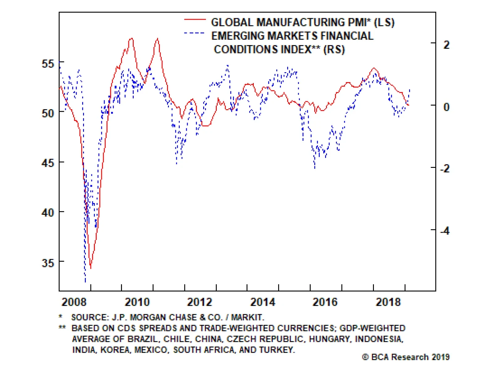
Global growth declined to 50.6 in February. This is not much of a surprise. The brutal sell off in markets in the fourth quarter of 2018 both anticipated this slowdown and worsened it as it tightened global financial conditions. This global growth…
The worst of the drubbing in German automobile production is likely behind us, as new orders have recently gone vertical. Backlogs are also sky-high and suggest that a definitive turn looms in German motor vehicle output. The leading indicators of Japanese…
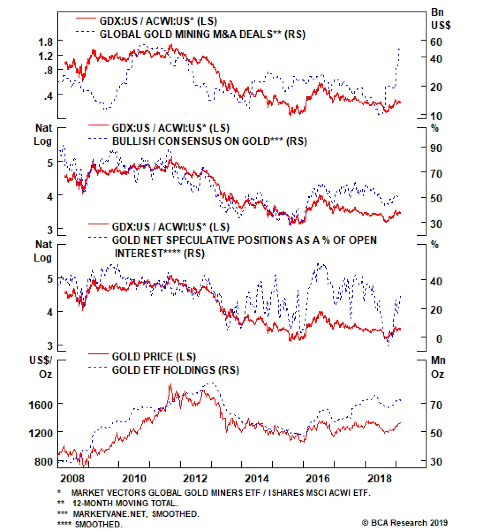
Not only is there a tight inverse correlation with the trade-weighted U.S. dollar, but over the past three years the Chinese renminbi has moved in lockstep with gold. Now that Chinese policymakers are tentatively injecting stimulus in their economy,…