Global
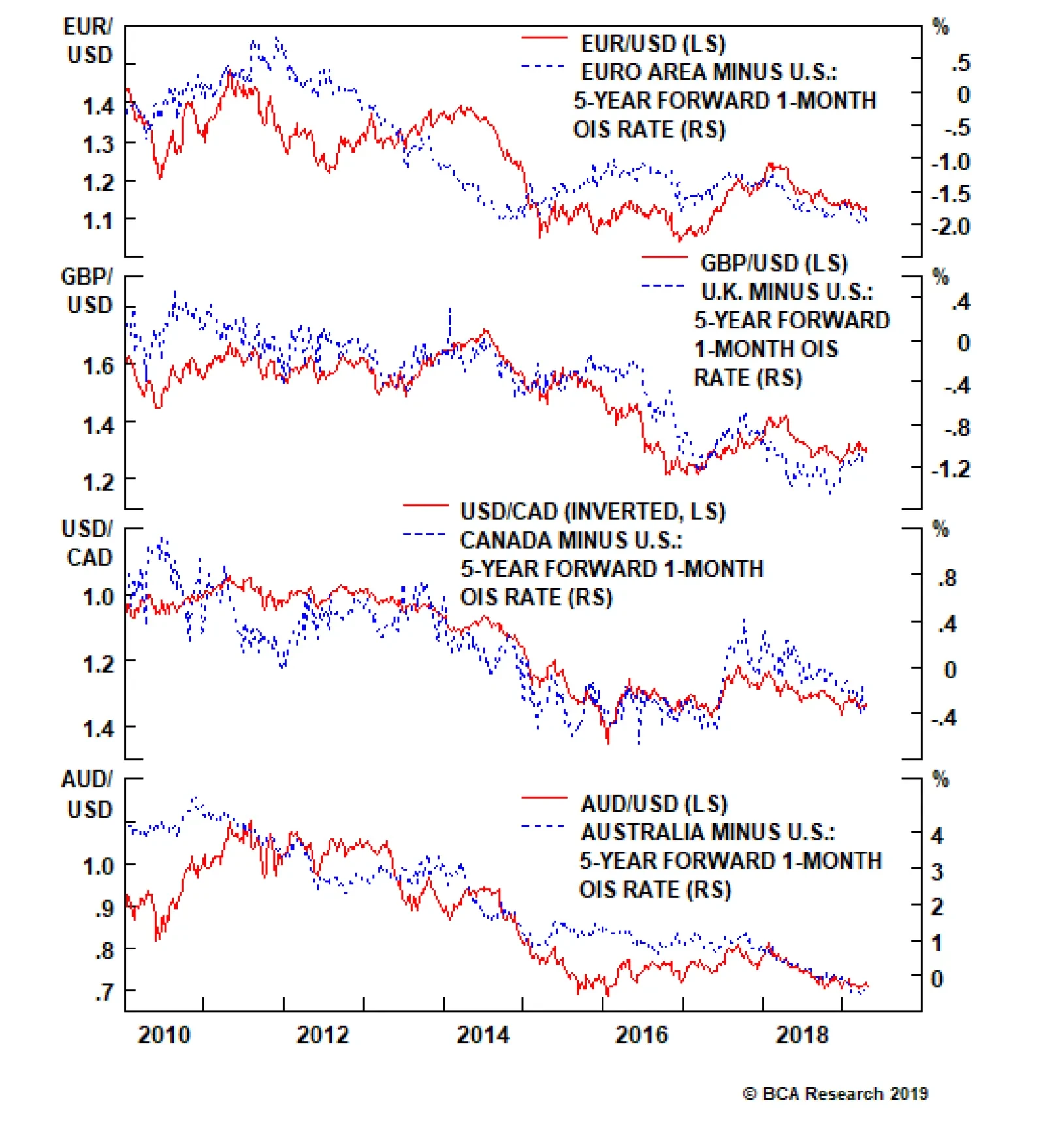
European domestic demand should benefit from an easing of fiscal policy of around 0.5% of GDP. Faster growth in the U.S. in relation to the euro area has caused the spread in expected interest rates to widen between the two regions. The spread in…
Several data releases next week will have an impact on the outlook for global growth, as investors await hard-data validation of soft data suggesting that the world economy is turning a corner. In the United States, the FOMC meeting on April 30 and May 1…

Highlights Central bankers appear to be in a rush to boost inflation expectations before the next economic downturn. This in practice should be stimulative for the global economy. Historically, currencies of small, open economies are typically the first to benefit from rebounding global growth. Ditto for those whose output gaps have fully closed. However, there appears to be a shift in the behavior of certain currency pairs in the current cycle. For example, the U.S. dollar has tended to perform better in a low-volatility environment in recent years, a shift from the past. Correspondingly, its safe-haven status may have been marginally eroded. The U.S. decision not to extend waivers on Iranian oil exports beyond the May 2 deadline is bullish for petrocurrencies such as the RUB and NOK. The Bank of Canada kept rates on hold but will be hard pressed to meet its inflation mandate before the next downturn. This suggests standing aside on USD/CAD. Rising net short positioning on the yen and Swiss franc is making them attractive from a contrarian standpoint. Place a limit-buy on CHF/NZD at 1.45. Feature Chart I-1Volatility Is Due For A Bounce
Volatility Is Due For A Bounce
Volatility Is Due For A Bounce
The four most important financial variables that could give a near-complete snapshot of the world economy at any point in time are probably the level of the S&P 500, the U.S. 10-year Treasury yield, the trade-weighted dollar and a commodity bellwether, say, crude oil prices. Any permutation of these variables can identify what quadrant the world economy is operating in, with the two most important states being either boom or bust. Taking three of those variables today – the S&P 500 breaking to all-time highs, crude oil prices up 40% from their lows and U.S. 10-year Treasury yields off by almost 100 basis points from their October highs – it is hard to justify why the dollar has hardly budged, this week’s rally aside. Obviously, this is a very simplified view of an intricately complex world economy. But it highlights a point we have been making in recent bulletins: that extended periods of low currency volatility have been very unusual in the post-Bretton Woods world (Chart I-1). The typical narrative has been that as we enter a reflationary window, pro-cyclical currencies should outperform. The reason is simple enough: These economies are export-oriented and tied to the global cycle. So, a rising current account surplus as demand for their goods and services picks up provides underlying support for the currency. Should there be little slack in their domestic economies, this also raises the probability that the central bank tightens monetary policy to fend off future inflationary pressures. It does not hurt if these countries are also commodity producers, since rising terms of trade also provides an additional exchange-rate boost. The reality is that the world is not static, and some of these dynamics have been shifting. The evidence is in the counterfactual: At current levels, China’s credit injection should have lit a fire under pro-cyclical trades because they tend to work in real-time rather than with a lag. The foreign exchange market is one of the deepest and most liquid where new information tends to get digested and discounted instantaneously. As such, the lack of more pronounced strength in pro-cyclical currencies like the Australian, New Zealand and Canadian dollar exchange rates is genuine reason for concern and worth investigation. Why Is The Dollar Breaking Higher? Our Special Report1 on March 29th highlighted the fact that the dollar should be 5-10% higher simply based on measures of relative trends, and recent data corroborate this view. The growth differential between the U.S. and the rest of the world remains wide. Meanwhile, exports and industrial production from Southeast Asia continue to decelerate. Interbank rates in China are spiking higher, suggesting most of the monetary stimulus may have already been frontloaded. And on the earnings front, U.S. profit leadership also continues. It is unclear which of these catalysts was the actual trigger for dollar strength, since these have been in place for a while now, but confirmation from any and all of them was sufficient to reinvigorate the dollar bulls. That said, it is important to pay heed to shifting market forces, but it will be imprudent to change investment strategy on this week’s moves alone. Given these moves, a few observations are in order: Almost all currencies are already falling versus the U.S. dollar – a trend that has been in place for several months now (Chart I-2). This means most of the factors putting upward pressure on the dollar are well understood by the market. For example, global growth has been slowing for well over a year, based on the global PMI. Putting on fresh U.S. long positions is at risk of a washout from stale investors, just as it was back in 2015, a year after growth had peaked. Dollar technicals are also very unfavorable (Chart I-3). Speculators are holding near-record long positions, sentiment is stretched and our intermediate-term indicator is also flagging yellow. Over the past five years, confirmation from all three indicators has been followed by some period of U.S. dollar indigestion. This time should be no different. Chart I-2Is It Time To Initiate Fresh Dollar Longs?
Is It Time To Initiate Fresh Dollar Longs?
Is It Time To Initiate Fresh Dollar Longs?
Chart I-3Dollar Technicals Are Unfavourable
Dollar Technicals Are Unfavourable
Dollar Technicals Are Unfavourable
A breakout in the dollar along with rising equity markets suggests that the correlation is once again shifting. The dollar has tended to trade as a counter-cyclical currency for most of the time, with a negative correlation even to global equities (Chart I-4). Importantly, given current low levels of volatility and elevated equity market valuations, the dollar would have been a great insurance policy for any stock market correction. But with U.S. interest rates having risen significantly versus almost all G10 countries in recent years, the dollar has itself become the object of carry trades. This has also come with a good number of unhedged trades, as the rising exchange rate has lifted hedging costs (Table I-1). Chart I-4The Dollar Remains A 'Risk-Off' Currency
The Dollar Remains A 'Risk-Off' Currency
The Dollar Remains A 'Risk-Off' Currency
Chart I-
It will be difficult for the dollar to act as both a safe-haven and carry currency, because the forces that drive both move in opposite directions. For one, safe-haven assets tend to be lower-yielding but also during episodes of capital flight, investors choose to repatriate capital to pay down debt, with creditor nations having the upper hand. And given U.S. investors have already been repatriating close to $400 billion in assets over the past 12 months, it is unlikely this pace persists (Chart I-5). The bottom line is that investors who believe that the U.S. dollar has become a high-beta currency should be prepared to stampede out the door on any rise in volatility. Our bias remains that the U.S. dollar will ultimately weaken, given that the forces driving it higher are mostly behind us. Meanwhile, currencies such as the Japanese yen or even Swiss franc that have been used to fund carry trades are very ripe for short-covering flows. Putting everything together suggests at minimum building portfolio hedges. It will be difficult for the dollar to act as both a safe-haven and carry currency. One such hedge is going long CHF/NZD. This trade has a high negative carry, so we do not intend to hold it for longer than three months. But speculative positioning and relative economic trends also support this cross for the time being (Chart I-6). We are placing a limit-buy at 1.45. Chart I-5How Much More Will Repatriation Flows Help?
How Much More Will Repatriation Flows Help?
How Much More Will Repatriation Flows Help?
Chart I-6CHF/NZD Is An Attractive ##br##Hedge
CHF/NZD Is An Attractive Hedge
CHF/NZD Is An Attractive Hedge
A Shifting Landscape If the dollar eventually weakens, let’s consider the premise that the most export-dependent economies should benefit more from a rebound in global growth, and by extension, their currencies should appreciate the most. Within the G10 universe, this will be notably the European currencies led by the Swiss franc, the Swedish Krona, the euro and the pound (Chart I-7). However, from the trough in the global Purchasing Managers’ Index (PMI) in December 2008 until the peak in April 2010, it was the commodity currencies that outperformed. During that time frame, the Swiss franc actually fell. It is well known that Switzerland’s persistent trade surplus over the decades has been a key factor behind structural appreciation in the currency. However, at any point in time, other nuances such as whether the rebound is China or commodities driven, the starting point for valuations or even interest rate differentials take center stage in explaining currency moves. The lesson is that investors have to become nimble with currency investment strategy. The lesson is that investors have to become nimble with currency investment strategy. For pro-cyclical currencies, there have been dramatic shifts in the export share of GDP for various countries, according to World Bank data. Most euro area countries have massively expanded their export share of GDP as they have gained ground in value-added products and services. Meanwhile, the export share in Australian GDP has been stuck at 20% for many years, while that in Norway, New Zealand and Canada has seen a huge drop, even since 2009 (Chart I-8). At first blush, this suggests diminishing marginal returns to their currencies from global growth.
Chart I-7
Chart I-8A Shifting Export ##br##Landscape
A Shifting Export Landscape
A Shifting Export Landscape
Take the example of New Zealand, where commodities are over 75% of exports. Since the 2000s, the government has been actively trying to redistribute growth from net exports to domestic demand. This has been mainly via the skilled workers program. The result has been a collapse in the export share of GDP from 36% to about 26%. This means that the New Zealand dollar, which has typically been a higher-beta play on global growth, is giving way to other currencies such as the euro and the Swedish krone (Chart I-4). In addition to this, while global growth might eventually recover, part of the widespread deterioration since the global financial crisis may be structural. If the overarching theme over slowing global trade is a global economy that is trying to lift its precautionary savings and spend less, then the world may not see the high rates of trade growth registered in the 1990s anytime soon. This is because at a lower rate of potential GDP growth, trade elasticities also tend to fall.2 There are many reasons for this, including less willingness among creditor nations to finance current account deficits, the paradox of thrift or just outright saturation in the turnover of trade. All of this dampens marginal returns toward all pro-cyclical currency trades. Chart I-9Trade Volatility Has Fallen
Trade Volatility Has Fallen
Trade Volatility Has Fallen
The bottom line is that the overall magnitude and volatility of trade relative to GDP has fallen, at least until the recent China – U.S. trade spat (Chart I-9). This has had the effect of dampening the volatility of the corresponding mediums of trade exchanges. Part of this is clearly cyclical, but a part may be structural as well. If we embrace confirmation that the Chinese economy has bottomed, it will be important to monitor if this cycle plays out like those in the past. Notes On Petrocurrencies, And The BoC The U.S. has decided not to extend waivers on Iranian oil exports beyond the May 2 deadline. Supposedly, a coalition with both Saudi Arabia and the United Arab Emirates would ensure that oil markets remain adequately supplied, though Saudi Arabia has since signaled they are in no rush to raise production. Overall, this increases the bullish narrative for oil. First, the Iranian response to a shutoff in their exports could be unpredictable. The U.S. threat of driving Iranian oil exports to zero increases the geopolitical risk premium in prices, as full implementation pushes Iran to a wall, raising the odds of retaliation. Chart I-10Iran Is A Meaningful Oil Supplier
Iran Is A Meaningful Oil Supplier
Iran Is A Meaningful Oil Supplier
Second, oil production is being curtailed at a time when Venezuelan output is rapidly falling, conflict in Libya is reviving and OPEC spare capacity remains tight. This could nudge the oil market dangerously close to a negative supply shock (Chart I-10). Meanwhile, there is the non-negligible risk of unplanned outages which have been rising in 2019, which is another source of risk for oil supply Oil futures have responded positively to the news, with both Brent and WTI making fresh 2019 highs. However, while initially reacting favorably, petrocurrencies such as the Canadian dollar, Russian ruble and Norwegian krone are selling off amid dollar strength. We think Brent will continue to trade at a premium to WCS crude. This bodes well for currencies tied to North Sea production. Hold short CAD/NOK and long NOK/SEK positions, despite the selloff this week. As for Canada, we are neutral on the loonie both short and medium term. The dovish shift by the BoC and looser fiscal policy are likely to be growth tailwinds. So is the rise in oil prices. However, there appears to be a genuine slowdown in the Canadian economy that is not yet fully reflected in economic forecasts. The key drivers for the CAD/USD exchange rate are interest rate differentials with the U.S. (which we think will compress further) and energy prices (which we think Canada benefits less from due to the discount Canadian oil sells for, and persistent infrastructure problems). As such, we think domestic conditions will continue to knock down whatever benefit comes from rising oil prices (Chart I-11). Chart I-11CAD/USD Will Benefit From##br## Rising Terms Of Trade
CAD/USD Will Benefit From Rising Terms Of Trade
CAD/USD Will Benefit From Rising Terms Of Trade
Chart I-12Can The BoC Hike Given ##br##This Backdrop? (1)
Can The BoC Hike Given This Backdrop? (1)
Can The BoC Hike Given This Backdrop? (1)
On the consumer side, real retail sales are deflating at the worst pace since the financial crisis, and demand for housing loans is falling off (Chart I-12). This is unlikely to improve if house prices continue to roll over (Chart I-13). A study by the Reserve Bank of New Zealand shows that on average, the elasticity of consumption growth to house price changes is asymmetric with negative housing shocks, hurting consumption by more than the boost received from positive shocks. This asymmetry may be due to the fact that at very elevated debt levels, leveraged gains are used to pay down debt aggressively, whereas leveraged losses hit bottom lines directly. There appears to be a genuine slowdown in the Canadian economy that is not yet fully reflected in economic forecasts. On the corporate side of the equation, the latest Canadian Business Outlook Survey is very telling. Firms’ expectations for sales have softened significantly, as businesses in several sectors are less optimistic about demand. This is driven by uncertainty in the oil patch, weak housing and weak external conditions. This in turn, has led to a steep drop in plans to increase capex (Chart I-14). For external investors, the large stock of debt in the Canadian private sector and overvaluation in the housing market are likely to continue leading to equity outflows on a rate-of-change basis. Chart I-13Can The BoC Hike Given This Backdrop? (2)
Can The BoC Hike Given This Backdrop? (2)
Can The BoC Hike Given This Backdrop? (2)
Chart I-14Can The BoC Hike Given This Backdrop? (3)
Can The BoC Hike Given This Backdrop? (3)
Can The BoC Hike Given This Backdrop? (3)
Technically, USD/CAD failed to break below the upward sloping trendline drawn from its 2017 lows. The next resistance zone is the 1.36-1.38 level. Our bias is that this zone will prove to be formidable resistance. We continue to recommend investors short the CAD, mainly via the euro. Housekeeping Our limit-buy on AUD/USD was triggered at 0.70. Place tight stops at 0.68 until further evidence that global growth has bottomed. Our short USD/SEK position garnered losses this week. The RiksBank’s dovish shift surprised the market, and triggered panic selling as important technical levels were broken. With a manufacturing PMI at 52.8, inflation at 1.8% and wages growing near 3%, this is not exactly the symptoms of an economy that needs more stimulus. We recommend holding onto positions, but will respect our stop loss a few hundred pips away. Finally, the dovish shift by the Bank of Japan does not change our thinking on the yen. The resilience in the currency might indicate the pool of yen bears has been exhausted. Chester Ntonifor, Foreign Exchange Strategist chestern@bcaresearch.com Footnotes 1 Please see Foreign Exchange Strategy Special Report, titled “Tug Of War With Gold As Umpire,” dated March 29, 2019, available at fes.bcaresearch.com. 2 Cristina Constantinescu, Aaditya Mattoo, and Michele Ruta, “The Global Trade Slowdown: Cyclical Or Structural?” IMF working paper (2015). Currencies U.S. Dollar Chart II-1
USD Technicals 1
USD Technicals 1
Chart II-2
USD Technicals 2
USD Technicals 2
Recent data in the U.S. suggest a weaker housing market: In March, building permits contracted by 1.7% month-on-month, falling to 1.27 million; housing starts decreased by 0.3% month-on-month, coming in at 1.14 million. March new home sales grew by 4.5% month-on-month, coming in at 0.69 million. However, existing home sales contracted by 4.9% month-on-month, falling to 5.21 million. The house price index grew by 0.3% month-on-month in February, in line with expectations. MBA mortgage applications decreased by 7.3% in April. The Chicago Fed National Activity index fell to -0.15 in March, underperforming expectations. Durable goods orders increased by 2.7% in March, surprising to the upside. DXY index appreciated by 1% this week, hitting the highest level since June 2017. While a more accommodative monetary policy stance has been taken in China, global growth momentum remains weak, which is a cause for concern. Report Links: Beware Of Diminishing Marginal Returns - April 19, 2019 Not Out Of The Woods Yet - April 5, 2019 Tug OF War, With Gold As Umpire - March 29, 2019 The Euro Chart II-3
EUR Technicals 1
EUR Technicals 1
Chart II-4
EUR Technicals 2
EUR Technicals 2
Recent data in the euro area continue to soften: Italian business confidence and consumer confidence in March fell to 100.6 and 110.5, respectively. April preliminary consumer confidence in the euro area fell to -7.9, below expectations. German IFO business climate fell to 99.2 in April; expectations and current assessment fell to 95.2 and 103.3, respectively. French business confidence improved to 105, while business climate decreased to 101 in April. Italian trade balance came in at a larger surplus of 3.42 billion euro in April. EUR/USD depreciated by 1% this week. The incoming data from the euro area and globally have been weaker than expected. The recent ECB Economic Bulletin remains positive for the growth outlook going forward, stating that “the supportive financing conditions, favorable labor market dynamics and rising wage growth should continue to underpin the euro area expansion.” Report Links: Reading The Tea Leaves From China - April 12, 2019 Into A Transition Phase - March 8, 2019 A Contrarian Bet On The Euro - March 1, 2019 The Yen Chart II-5
JPY Technicals 1
JPY Technicals 1
Chart II-6
JPY Technicals 2
JPY Technicals 2
Recent data in Japan have been negative: Headline inflation and core inflation were unchanged at 0.5% and 0.4% year-on-year in March, respectively. Machine tool orders in March contracted by -28.5% year-on-year. All industry activity index fell by 0.2% month-on-month in February, in line with expectations. USD/JPY surged initially by 0.4% ahead of BoJ’s rate decision, then fell sharply, returning flat this week. The BoJ has decided to keep the interest rate on hold at -0.1%. The shift to a calendar-based form of forward guidance is unlikely to be a game-changer on its own. Moreover, the BoJ expects the Japanese economy to pick up through 2021 supported by highly accommodative financial conditions and government spending, despite the weakness of global growth and scheduled consumption tax hike. Report Links: Beware Of Diminishing Marginal Returns - April 19, 2019 Tug OF War, With Gold As Umpire - March 29, 2019 A Trader’s Guide To The Yen - March 15, 2019 British Pound Chart II-7
GBP Technicals 1
GBP Technicals 1
Chart II-8
GBP Technicals 2
GBP Technicals 2
Recent data in the U.K. have been positive: Public sector net borrowing increased to 0.84 billion pounds in March. In April, the CBI retailing reported sales increased to 13. The CBI business optimism came in at -16 in April, an improvement compared to the last reading of -23. GBP/USD fell by 1% this week, mostly affected by the U.S. dollar’s broad strength. The pound is likely to rebound once we see more signs confirming the strength in global growth, given Brexit has been kicked down the road. Report Links: Not Out Of The Woods Yet - April 5, 2019 A Trader’s Guide To The Yen - March 15, 2019 Balance Of Payments Across The G10 - February 15, 2019 Australian Dollar Chart II-9
AUD Technicals 1
AUD Technicals 1
Chart II-10
AUD Technicals 2
AUD Technicals 2
Recent data in Australia have been negative: Headline inflation fell to 1.3% year-on-year in Q1, missing expectations. Trimmed mean inflation in Q1 fell to 1.6% year-on-year. AUD/USD fell by 2.3% this week, which triggered our limit buy order at 0.7 on Wednesday. Inflation is a lagging indicator. While the Q1 inflation number missed expectations, the Australian dollar is likely to bottom as Chinese stimulus plays out and global growth starts to pick up. Report Links: Beware Of Diminishing Marginal Returns - April 19, 2019 Not Out Of The Woods Yet - April 5, 2019 Into A Transition Phase - March 8, 2019 New Zealand Dollar Chart II-11
NZD Technicals 1
NZD Technicals 1
Chart II-12
NZD Technicals 2
NZD Technicals 2
Recent data in New Zealand has been negative: Credit card spending contracted by 5.1% year-on-year in March, underperforming expectations. NZD/USD fell by 1.36% this week. We remain bearish on the New Zealand dollar due to the Achilles’ heel of an overvalued housing market. Moreover, the Kiwi is still expensive compared to its fair value. Report Links: Not Out Of The Woods Yet - April 5, 2019 Balance Of Payments Across The G10 - February 15, 2019 A Simple Attractiveness Ranking For Currencies - February 8, 2019 Canadian Dollar Chart II-13
CAD Technicals 1
CAD Technicals 1
Chart II-14
CAD Technicals 2
CAD Technicals 2
Recent data in Canada have been positive: Wholesale sales grew by 0.3% month-in-month in February, surprising to the upside. CFIB business barometer increased to 56.7 in April. USD/CAD surged by 0.95% this week. The Canadian dollar seems to be less responsive to the energy prices this week due to lots of concerns regarding the pipeline issue in Alberta. The Bank of Canada maintained its overnight interest rate target at 1.75% on Wednesday. In the April Monetary Policy Report, the BoC projects real GDP growth of 1.2% in 2019, and around 2% in 2020 and 2021. Given the current developments in household spending, energy investment, and trade conditions, a dovish stance by BoC is warranted. Report Links: A Shifting Landscape For Petrocurrencies - March 22, 2019 Into A Transition Phase - March 8, 2019 Balance Of Payments Across The G10 - February 15, 2019 Swiss Franc Chart II-15
CHF Technicals 1
CHF Technicals 1
Chart II-16
CHF Technicals 2
CHF Technicals 2
Recent data in Switzerland have been mostly positive: Money supply M3 grew by 3.5% year-on-year in March, same as last month. ZEW survey expectations increased to -7.7 from the previous reading of -26.9. USD/CHF increased by 0.66% this week. While global growth is set to rebound, the uncertainties regarding geopolitical risks, trade conditions, and oil prices will weigh on the growth pace. We remain neutral on the Swiss franc against U.S. dollar, but acknowledge that the large short positioning is attractive from a contrarian standpoint. Report Links: Beware Of Diminishing Marginal Returns - April 19, 2019 Balance Of Payments Across The G10 - February 15, 2019 A Simple Attractiveness Ranking For Currencies - February 8, 2019 Norwegian Krone Chart II-17
NOK Technicals 1
NOK Technicals 1
Chart II-18
NOK Technicals 2
NOK Technicals 2
There is no significant data from Norway this week. USD/NOK appreciated by 2.2% this week. We remain overweight the NOK based on our bullish outlook for oil. The Trump administration said they would not renew the waivers for Iranian oil exports, a move that roiled the energy market. The spike in oil prices will eventually benefit the Norwegian krone once global growth stabilizes. Report Links: A Shifting Landscape For Petrocurrencies - March 22, 2019 Balance Of Payments Across The G10 - February 15, 2019 A Simple Attractiveness Ranking For Currencies - February 8, 2019 Swedish Krona Chart II-19
SEK Technicals 1
SEK Technicals 1
Chart II-20
SEK Technicals 2
SEK Technicals 2
Recent data in Sweden suggest a more positive sentiment: Consumer confidence increased to 95.8 in April, surprising to the upside. Economic tendency survey increased to 102.7 in April. Moreover, the manufacturing confidence also improved to 108.4 in April. USD/SEK appreciated by 2.64% this week. The Riksbank has kept its interest rate unchanged at -0.25% this week, as widely expected. The dovish shift of central banks worldwide is likely to help the global economy, which will benefit the Swedish krona. Report Links: Balance Of Payments Across The G10 - February 15, 2019 A Simple Attractiveness Ranking For Currencies - February 8, 2019 Global Liquidity Trends Support The Dollar, But... - January 25, 2019 Trades & Forecasts Forecast Summary Core Portfolio Tactical Trades Closed Trades
Highlights The U.S. dollar will ultimately reach fresh cycle highs, but not before going through a weak phase starting this summer that could last 12 months. We closed our long DXY trade for a carry-adjusted return of 16.4% last week. We will go tactically short the index if it breaches 101 (about 3% above current levels). As a countercyclical currency, the dollar is likely to stumble in the second half of this year as global growth accelerates. Positioning and sentiment are currently very dollar bullish, which is likely to exacerbate any sell-off in the greenback. The dollar should begin to rally again late next year, as global growth decelerates while the Fed is forced to turn more hawkish in the face of rising inflation. Go long European banks as a tactical trade. Feature Moving To The Sidelines On The Dollar We closed our long DXY trade recommendation for a carry-adjusted gain of 16.4% at last Thursday’s close – too early it turns out, as the DXY has gained another 0.7% since then. The dollar is a high-momentum currency (Chart 1). The trend is the dollar’s friend at the moment, which makes betting against the greenback risky. Nevertheless, we would not chase the dollar higher at these levels. Long dollar positioning is highly stretched and sentiment is overly bullish (Chart 2). This makes a price reversal increasingly probable.
Chart 1
Perhaps more importantly, the macro fundamentals, which have worked in favor of the dollar since early 2018, will likely start working against it as the summer months approach. Chart 2There Are A Lot Of Dollar Bulls Out There
There Are A Lot Of Dollar Bulls Out There
There Are A Lot Of Dollar Bulls Out There
Stronger Global Growth Will Hurt The Greenback The dollar is a countercyclical currency, meaning that it tends to move in the opposite direction of global growth (Chart 3). Global growth has been decelerating since early 2018, and that has helped boost the dollar’s value. The dollar is a countercyclical currency, meaning that it tends to move in the opposite direction of global growth. Chart 3The Dollar Is A Countercyclical Currency
The Dollar Is A Countercyclical Currency
The Dollar Is A Countercyclical Currency
If anything, the growth divergence between the U.S. and the rest of the developed world has increased over the past few months. Goldman’s Current Activity Indicator (CAI) for the U.S. has been rising since January, while the European and Japanese CAIs have continued to fall (Chart 4). Looking out, the rest of the world is likely to catch up to the United States. The Chinese CAI has already moved sharply higher thanks in part to an acceleration in Chinese credit growth. Chart 4Growth Is Recovering In The U.S. And China
Growth Is Recovering In The U.S. And China
Growth Is Recovering In The U.S. And China
Chart 5China: Credit Is Growing At A Moderately Faster Pace Than GDP
China: Credit Is Growing At A Moderately Faster Pace Than GDP
China: Credit Is Growing At A Moderately Faster Pace Than GDP
We would downplay recent market speculation that the Chinese authorities are preparing to restart their deleveraging campaign. Credit growth is now running only modestly above nominal GDP growth (Chart 5). With the ratio of debt-to-GDP broadly stable, there is no need to further clamp down on credit formation. The Chinese government also wants to keep the economy buoyant in order to gain negotiating leverage in trade talks with the Trump administration. Better Chinese Data Will Benefit The Rest Of The World Fluctuations in Chinese growth usually affect Europe with a lag of around six months (Chart 6). This suggests that European exports should strengthen starting this summer. Meanwhile, European domestic demand should benefit from an easing of fiscal policy of around 0.5% of GDP. Chart 6Europe Will Benefit From Improving Chinese Growth
Europe Will Benefit From Improving Chinese Growth
Europe Will Benefit From Improving Chinese Growth
Chart 7Swings In Interest Rate Differentials Explain Some Currency Moves
Swings In Interest Rate Differentials Explain Some Currency Moves
Swings In Interest Rate Differentials Explain Some Currency Moves
Faster growth in the U.S. in relation to the euro area has caused the spread in expected interest rates to widen between the two regions. The spread in one-month, five-year forward OIS rates now stands at 202 bps, similar to the highs seen in late-2016 (Chart 7). If euro area growth recovers this summer, the market will price in a bit of tightening from the ECB starting late next year. This will cause the spread to narrow, leading to a stronger euro. A revival in Chinese growth should also help EM and commodity currencies. The market is currently pricing in 44 basis points of rate cuts in Australia, 33 bps of cuts in New Zealand, and 21 bps of cuts in Canada over the next 12 months. While domestic concerns around high household debt levels and overvalued real estate markets will keep central banks on guard in all three economies, a more robust global growth backdrop should allow some of the expected easing to be priced out. Japan remains a bit of a wildcard due to the government’s stated intention to raise the sales tax this October. We see little justification for increasing the sales tax given that inflation expectations are still nowhere close to the BOJ’s target. Japan needs easier, not tighter, fiscal policy. There is still an outside chance that the tax hike will be postponed, but even if it is, rising bond yields in the rest of the world will still hurt the yen. The BOJ has no intention of abandoning its yield curve targeting system anytime soon. In fact, it introduced new forward guidance at this week’s monetary policy meeting promising not to raise rates at least until the spring of 2020. Investors looking to trade the yen should consider going long EUR/JPY or AUD/JPY. We recommend going long European banks outright for a tactical trade. Bottom Line: If global growth accelerates later this year, the dollar will probably weaken. Accordingly, investors should use this week’s rally in the dollar to scale back exposure to the currency. We are also putting in a limit order to go short the DXY index if it reaches 101 (about 3% above its current level). Looking Further Out… Chart 8Low Odds Of An Imminent Major Inflationary Upswing In The U.S.
Low Odds Of An Imminent Major Inflationary Upswing In The U.S.
Low Odds Of An Imminent Major Inflationary Upswing In The U.S.
Mini-cycles within the broader global business cycle tend to last around 12-to-18 months. If this pattern continues to hold, global growth will probably falter again in the second half of next year. At that point, the dollar is likely to strengthen again. By how much can the dollar rise? That depends on what the Fed does. A stronger dollar would entail a tightening in financial conditions. Normally that would cause the Fed to turn more dovish, limiting the upside for the greenback. The risk is that rising inflation prevents the Fed from turning more accommodative. Inflation is not much of a concern now. Leading indicators of inflation such as core intermediate goods prices and the prices paid component of the ISM remain well contained (Chart 8). Wage growth has picked up, but productivity growth has risen even more. As a result, unit labor costs, which tend to lead core inflation, have been decelerating since the middle of last year. If the U.S. economy continues to grow above trend, however, inflation could begin to break out late next year. That would force the Fed to start raising rates more aggressively than it would like, even in the face of slower growth. Such a stagflationary outcome will be awful for equities and other risk assets. As U.S. financial conditions tighten, global growth will slow, giving the dollar a further boost. The upshot is that the dollar could see a meaningful rally starting late next year. Stay Bullish On Stocks For Now… Until that fateful day arrives, we are inclined to maintain our bullish equity bias. We upgraded global stocks to overweight in December after having moved to the sidelines in June. Despite the run-up in stock prices, the forward P/E ratio on the MSCI All-Country World Index is still 7% below where it was at the start of 2018 and 3% below its long-term (30-year) average (Chart 9). Earnings estimates are also finally starting to increase (Chart 10). Accelerating global economic growth will ensure that profits continue to rise into year-end. Chart 9Global Stocks Are Not That Expensive
Global Stocks Are Not That Expensive
Global Stocks Are Not That Expensive
Chart 10Earnings Estimates Have Turned The Corner
Earnings Estimates Have Turned The Corner
Earnings Estimates Have Turned The Corner
… And Buy Some European Banks For A Tactical Trade European banks are trading at distressed valuations (Chart 11). One can debate the long-term prospects for the European banking sector, but in the near term, one thing is clear: If European growth begins to surprise on the upside, bond yields in core European markets will rise, which should help European bank stock prices (Chart 12). Stronger economic growth will also translate into more credit demand and lower non-performing loans. This will boost bank earnings (Chart 13). With all this in mind, we recommend going long European banks outright for a tactical trade. Chart 11European Banks: A Good Value Play
European Banks: A Good Value Play
European Banks: A Good Value Play
Chart 12Euro Area: Higher Bond Yields Bode Well For Bank Stocks
Euro Area: Higher Bond Yields Bode Well For Bank Stocks
Euro Area: Higher Bond Yields Bode Well For Bank Stocks
Chart 13More Credit, Fatter Bank Earnings
More Credit, Fatter Bank Earnings
More Credit, Fatter Bank Earnings
Peter Berezin, Chief Global Strategist Global Investment Strategy peterb@bcaresearch.com Strategy & Market Trends MacroQuant Model And Current Subjective Scores
Chart 14
Tactical Trades Strategic Recommendations Closed Trades
The upturn we anticipated in China’s industrial output in the wake of fiscal and monetary stimulus is becoming more visible. Accommodative central banks, along with a likely resolution of the Sino – U.S. trade war, will continue to be positive for Chinese growth, which will bolster trade and commodity demand in general, base metals’ demand in particular. However, not all base metals will benefit equally from this fortuitous confluence of fiscal and monetary stimulus, and the renewed credit growth directed at China’s small and mid-sized enterprises (SMEs). Of the metals we follow, copper likely will benefit most from Chinese stimulus and the knock-on effects from increased trade, with aluminum running a close second. Zinc and nickel will not enjoy as much of a lift, based on our analysis. We are adding a tactical long aluminum position to our open long copper position. Highlights Energy: Overweight. The Trump administration’s decision to let waivers expire on U.S. oil-export sanctions leveled on Iran will give OPEC 2.0 greater control over the Brent forward curve. In the near term, markets will not tighten sharply. However, longer term, the continued loss of Iran’s and Venezuela’s exports, further increases in Libyan tensions and unplanned outages will lift the odds refiners will have to draw inventories harder than expected going into the high-demand Northern Hemisphere summer. We expect this to backwardate the Brent curve further, and accelerate the full backwardation of the WTI forward curve. Presently, OPEC 2.0 holds ~ 1.5mm b/d of ready spare capacity, due to recent production cuts made to drain global inventory. There is ~ 1.5mm b/d of additional spare capacity in the Kingdom of Saudi Arabia (KSA) that would take longer to bring on line. The ready spare capacity can cover the ~ 1.3mm b/d or so that could be removed by the Iran waivers’ expiration. But, with global commodity demand remaining robust (see base metals analysis below), further unplanned outages – on top of the falling Venezuelan output and mounting tensions in Libya – will stress the supply side of the market. KSA this week communicated it would coordinate with other producers to keep oil markets balanced.1 Russia’s recent threat to reignite a market-share war also reminded the market OPEC 2.0 has capacity it can quickly bring to the market should it choose to do so. The expiration of waivers on the Iran export sanctions strengthens OPEC 2.0’s hand by allowing it to calibrate the rate of growth in flowing oil supply at a level that forces refiners and traders to draw inventory. The growing backwardation will lift implied volatilities in crude and products markets. Iran’s reaction remains to be seen.2 This geopolitical uncertainty also will contribute to price volatility as well. We will be publishing a Special Report on the implications of the Trump administration’s waivers decision next week with our colleagues at BCA’s Geopolitical Strategy. Base Metals: Neutral. We expect copper to benefit from Chinese fiscal and monetary stimulus, moreso than the other base metals we follow (aluminum, nickel and zinc). We explore this in depth below. Precious Metals: Neutral. Gold prices continue to face downward pressures, the latest coming from Venezuela’s sale of ~ $400 million worth of the metal (~ 9 tons) last week, despite international sanctions.3 Going forward, China’s credit stimulus should revive global growth, which will negatively affect the counter-cyclical U.S. dollar. Our Global Investment strategists closed their long U.S. dollar recommendation last week. This will support gold in the 2H19. Feature The evolution of China’s credit cycle is key to our base-metals view, and integral to our high-conviction call commodity demand will surprise to the upside. Globally, the real economy is once again finding its groove. Maybe not as groovy as 2017, but still better than 2018. China is implementing tax cuts amounting to almost $300 billion (~ 2 trillion RMB), and loosening the credit screws that last year ground economic activity lower.4 Central banks around the world either are accommodative, or are not aggressively tightening. The evolution of China’s credit cycle is key to our base-metals view, and integral to our high-conviction call commodity demand will surprise to the upside beginning in the current quarter and extending into 2H19. And China’s credit growth has been stout this year. Aggregate China financing came in stronger than expected for March, registering a 12.3% year-over-year gain, versus an increase of 11.6% in February, based on calculations made by our colleagues in BCA’s Global Investment Strategy (GIS) service.5 The pick-up in the rate of growth – the so-called credit impulse – typically leads the import component of China’s manufacturing PMI, according to our GIS colleagues. This is good news for firms exporting to China, as well, as it indicates industrial activity ex-China also will pick up as fiscal and monetary stimulus take hold in the Middle Kingdom. So, putting it together: China’s fiscal and monetary stimulus will radiate outward to EM markets generally and DM export-oriented economies, which will lift base metals markets generally. China’s demand still dominates global demand, which means it also impacts prices globally (Chart of the Week).
Chart 1
Base Metals Sensitivity To Fundamental Information Given its importance to global growth, we again look at China’s effect on base metals prices – via demand – by ranking the metals we closely follow based on their sensitivity to China’s industrial activity and credit, along with our BCA Global Industrial Activity (GIA) Index. Table 1 shows the relationships between the year-on-year (y/y) percent changes in base metals, and the LME index versus the big correlates we have identified over the years with these metals: BCA’s GIA Index, our China credit policy gauge, China construction proxy, internally developed risky-versus-safe haven currency ratio and the Li Keqiang Index (LKI) of domestic Chinese industrial activity. We look at these from 2000 to now, and in the post-GFC period (2010 to now). Table 1Correlations Of Base Metals’ Prices (y/y % Change) Vs. Key Economic Variables
Copper Will Benefit Most From Chinese Stimulus
Copper Will Benefit Most From Chinese Stimulus
Two things stand out in this analysis: The GIA index, which is heavily weighted to EM demand, is a key driver for all of the LME base metals prices, and the LME Index itself;6 Copper is the most sensitive to all of these variables vs. the other base metals. The LME Index (LMEX) is the next-most-sensitive gauge. In the case of the latter, it likely is copper’s weight in the index driving this result (copper is 31.2% of the LMEX), and the fact that other metals tend to follow copper’s lead. Post-GFC, the correlations with BCA’s GIA index, our China Construction proxy and the LKI index all become stronger, suggesting rising Chinese demand and the global quantitative easing have had a fundamental effect on base metals prices. The weakening of the correlations once the analysis moves beyond copper and the LMEX indicates either the other base metals are not processing information from the market – supply-demand fundamentals and global monetary data – or these commodities’ fundamentals are more opaque than those available from the copper market. The other outstanding feature of this analysis is that post-GFC, the correlations with BCA’s GIA index, our China Construction proxy and the LKI index all become stronger, suggesting rising Chinese demand and the global quantitative easing have had a fundamental effect on base metals prices. We will be examining this in future research. Bottom Line: China’s impact on base metals prices is complex. Its internal demand obviously is significant, which is not unexpected for the market that accounts for ~ 50% of base metals demand globally. We also see evidence China’s economy influences EM ex-China, and DM economies – most likely those heavily reliant on exports to China. Fiscal and monetary stimulus in China will radiate outward and influence global growth – in EM and DM economies. This is a positive fundamental for base metals. Robert P. Ryan, Chief Commodity & Energy Strategist rryan@bcaresearch.com Hugo Bélanger, Senior Analyst Commodity & Energy Strategy HugoB@bcaresearch.com Appendix: Global Base Metals Balances
Image
Image
Image
Image
Footnotes 1 Please see “Saudi Arabia says to coordinate with other producers to ensure adequate oil supply,” published by reuters.com April 22, 2019. 2 According to the state-run Fars news agency, Iran’s head of the Revolutionary Guard Corps Navy force threatened it will close the Strait of Hormuz if the country is prevented from using it. Please see “Iran Raises Stakes in U.S. Showdown With Threat to Close Hormuz,” published April 22, 2019 by bloomberg.com. 3 Please see “Venezuela Is Said to Sell $400 Million in Gold Amid Sanctions,” published April 15, 2019 by bloomberg.com. 4 We added a measure of China’s credit cycle to our Global Industrial Activity (GIA) index last month. We noted China’s credit cycle was showing signs of bottoming. We now are expecting to see growth in the current quarter. Please see “Bottoming Of China’s Credit Cycle Bullish For Copper Over Near Term,” published by BCA Research’s Commodity & Energy Strategy March 14, 2019. It is available at ces.bcaresearch.com. 5 GIS’s aggregate financing measure excludes equity financing and other items but includes local government bond issuance. Please see “Chinese Debt: A Contrarian View,” published by BCA Research’s Global Investment Strategy April 19, 2019. It is available at gis.bcaresearch.com. 6 This is because the index is constructed to be sensitive to EM industrial-commodity demand growth. Please see “Oil, Copper Demand Worries Are Overdone,” where we introduce and discuss the GIA index. The article was published February 14, 2019, in BCA Research’s Commodity & Energy Strategy. It is available at ces.bcaresearch.com. Investment Views and Themes Recommendations Strategic Recommendations Tactical Trades TRADE RECOMMENDATION PERFORMANCE IN 2019 Q1
Image
Commodity Prices and Plays Reference Table Trades Closed in 2019 Summary of Closed Trades
Image
Highlights The recent dovish shift in tone from central banks around the world is here to stay this year, providing support for global growth. As a result, stock prices will benefit from a combination of easy policy and rebounding activity, while safe-haven yields will grind higher. The recent deterioration in profit margins is not due to rising costs but reflects weaknesses in pricing power. Pricing power is pro-cyclical: If global growth improves and the dollar weakens, margins should recover. Overweight financials and energy. We are upgrading European equities to neutral, and placing them on a further upgrade watch. Feature Easy Does It The global monetary environment has eased over the past four months. Some major central banks like the Federal Reserve and the Bank of Canada have backed away from tightening. Others, like the Bank of Japan, the Reserve Bank of Australia, the Reserve Bank of New Zealand and the Swedish Riksbank have provided very dovish forward guidance. And one major policy setting institution – the European Central Bank – has even eased policy outright by announcing a large-scale injection of liquidity in the banking sector through its TLTRO-III operation that will begin in September. This phenomenon is not limited to advanced economies. Important EM central banks are also targeting easier liquidity conditions. The Reserve Bank of India has cut interest rates by 50 basis points; the Monetary Authority of Singapore is now targeting a flat exchange rate; and the Bank of Korea has issued a somewhat dovish forward guidance. Most importantly, Chinese policymakers are once again forcing debt through the system, with total social financing flows amounting to RMB 2.9 trillion last quarter, more than the RMB 2.4 trillion pumped through the economy in the first quarter of 2016. These reflationary efforts will bear fruit. Policy easing, especially when it relies as largely on forward guidance as the current wave does, should result in lower forward interest rates. And as Chart I-1 illustrates, when a large proportion of global forward rates are falling, a rebound in global economic activity typically follows. This time will not be different. Chart I-1Monetary Guardians Are Coming To The Rescue
Monetary Guardians Are Coming To The Rescue
Monetary Guardians Are Coming To The Rescue
The S&P 500 and global equities have already rebounded by 18.9% and 17.2%, respectively since late December. Have markets already fully discounted the growth improvement that lies ahead, leaving them vulnerable to disappointments? Or do global stocks have more upside? While a rest may prove necessary, BCA anticipates that global equity prices have more upside over the coming 12 months. Are Central Banks About To Abandon Their Newfound Dovish Bias? We sincerely doubt it. Reversing the recent tone change soon would only hurt the battered credibility that central banks are fighting so hard to maintain. In the case of the U.S., the most recent FOMC minutes were clear: The Fed does not intend to tighten policy soon, even if growth remains decent. The minutes confirmed the idea we espoused last month, that FOMC members are focused on avoiding a Japan-like outcome for the U.S. where low expected inflation begets low realized inflation. Such an outcome would greatly increase the probability that an entrenched deflationary mindset develops in the U.S. in the next recession. As a result, we anticipate that the Fed will refrain from tightening policy until inflation expectations move back up toward their historical range (Chart I-2). Further justifying the Fed’s new stance, a small rebound in productivity is keeping unit labor costs at bay, despite a pick-up in wages. This is likely to put a lid on core inflation for now (Chart I-3). Chart I-2Inflation Expectations: Too Low For The FOMC's Comfort
Inflation Expectations: Too Low For The FOMC's Comfort
Inflation Expectations: Too Low For The FOMC's Comfort
Chart I-3A Whiff Of Disinflation
A Whiff Of Disinflation
A Whiff Of Disinflation
There is little reason for the ECB to adopt a more hawkish stance either. The euro area PMIs have stabilized but are still flirting with the boom/bust line. Realized core inflation is a paltry 0.8% and the ECB’s own forecast is inconsistent with its definition of price stability, which dictates that the inflation rate should be “below but close to 2% over the medium term.” Our ECB Monitor captures these dynamics, remaining in the neutral zone (Chart I-4). In China, the case for quickly removing credit accommodation is weak. Property developer stocks have rebounded 41% from their October lows, but sales of residential floor space remain soft, keeping real estate speculation in check. Meanwhile, our proxy for the marginal propensity to consume of Chinese households – based on the ratio of demand deposits to time deposits – continues to deteriorate (Chart I-5). The recent pick up in credit growth should put a floor under those trends, but it will take some time before these variables overheat enough to call for policy tightening. Chart I-4Our ECB Monitor Supports An ECB Standing Still
Our ECB Monitor Supports An ECB Standing Still
Our ECB Monitor Supports An ECB Standing Still
Chart I-5Key Domestic Variables Argue Against Tightening Policy In China
Key Domestic Variables Argue Against Tightening Policy In China
Key Domestic Variables Argue Against Tightening Policy In China
Bottom Line: The three most important policymakers in the world are not set to suddenly slam on the brake pedal. As a result, the global policy backdrop will remain accommodative for at least two to three quarters. The few economic green shoots observed around the world should therefore blossom into a full-fledge global growth pick-up. From Green Shoots To Green Gardens If central banks adopt an easier bias but global growth is slowing sharply without any end in sight, stock prices are unlikely to find a floor. After all, stock prices represent the discounted value of future cash flows. If those cash flows are expected to decline at a faster pace than the risk-free rate, then stock prices can fall – even if policy is becoming more accommodative. However, if economic activity is stabilizing, easier policy should generate substantial equity gains. Stimulative financial conditions will result in an improvement in global activity indicators, including emerging economies (Chart I-6, top panel). This is very important as emerging markets were at the epicenter of the slowdown in global trade, and because they historically lead global industrial activity (Chart I-6, bottom panel). The few economic green shoots observed around the world should therefore blossom into a full-fledge global growth pick-up. Policy easing in China is of particular significance. Our Chinese activity indicator is still slowing, but BCA’s Li-Keqiang Leading Indicator, which mostly tracks developments in the credit sector, has stabilized (Chart I-7, top panel). The rebound in the credit impulse also points to an acceleration in Chinese nominal manufacturing output (Chart I-7, bottom panel). This should lift Chinese imports, resulting in a positive growth impulse for the rest of the world. Chart I-6The Dance Of FCI And Activity
The Dance Of FCI And Activity
The Dance Of FCI And Activity
Chart I-7Chinese Industrial Activity Will Rebound Soon
Chinese Industrial Activity Will Rebound Soon
Chinese Industrial Activity Will Rebound Soon
At the moment, the euro area remains weak, but it will become a key beneficiary of improving growth. As the top panel of Chart I-8 illustrates, the Eurozone’s exports to China tend to follow the trend in the Chinese Adjusted Total Social Financing impulse. Moreover, European exports to the rest of the world are set to enjoy a recovery, as highlighted by the upturn in the diffusion index of our Global Leading Economic Indicator (Chart I-8, bottom panel). This external-sector improvement is happening as the euro area domestic credit impulse is rebounding, and as the region’s fiscal thrust increases from roughly zero to 0.4% of GDP. In the U.S., it is unlikely that 2019 growth will top that of 2018, but activity should nonetheless rebound from a lukewarm first quarter. Importantly, the fed funds rate is holding below its equilibrium (Chart I-9). Additionally, household fundamentals remain solid. A tight labor market means that wages have upside and household debt levels and debt servicing costs are all well behaved relative to disposable income (Chart I-10). Moreover, housing dynamics are generally stronger than reported by the press, as mortgage applications for purchases are making cyclical highs and the NAHB Homebuilder confidence index is rebounding (Chart I-11). Offsetting some of these positives, capex intentions – a robust forecaster of actual corporate investments – have rolled over from their heady mid-2018 levels. Even so, they remain consistent with positive capex growth. Also, U.S. fiscal policy is becoming increasingly less growth-friendly starting in mid-2019. Netting it all out, U.S. growth should remain above-trend, at about 2.5%. Chart I-8Europe Will Benefit From Stabilizing Growth Elsewhere
Europe Will Benefit From Stabilizing Growth Elsewhere
Europe Will Benefit From Stabilizing Growth Elsewhere
Chart I-9U.S. Policy Remains Accommodative
U.S. Policy Remains Accommodative
U.S. Policy Remains Accommodative
Chart I-10U.S. Households Are Doing Alright
U.S. Households Are Doing Alright
U.S. Households Are Doing Alright
Chart I-11Forward-Looking Housing Indicators Point To A Pick-Up
Forward-Looking Housing Indicators Point To A Pick-Up
Forward-Looking Housing Indicators Point To A Pick-Up
Bottom Line: While U.S. growth may be weaker than in 2018, it should not fall below trend. Meanwhile, Chinese credit trends suggest that growth there should clearly pick up in the coming months, which should also lead to stronger activity in Europe. In other words, exactly as central banks have removed policy constraints, global growth is set to re-accelerate. This is a positive backdrop for risk assets over the coming 12 months. What Does It Mean For Asset Prices? Simply put, a dovish shift in policy along with a tentative stabilization in growth should result in both higher stock prices and rising safe-haven bond yields. First, a rebound in global economic activity means that depressed profit growth expectations could easily be bested (Chart I-12, top panel). Bottom-up estimates point to EPS growth of 3.4% in the U.S. and 5.3% in the rest of the world in 2019, using MSCI data. However, profits are extremely pro-cyclical, and a combination of easy financial conditions and improving growth conditions in the second half of the year should result in better-than-expected earnings. Chart I-12Profit Expectations Are Low
Profit Expectations Are Low
Profit Expectations Are Low
Second, the Fed is extending its pause, as other global central banks are also adopting more accommodative policies. This implies that global real interest rates, both at the short- and long-end of the curve, will remain below equilibrium for longer than would have been the case if policy had remained on its previous path. Consequently, not only do lower real rates decrease the discount factor for stocks, they also imply a longer business cycle expansion. This should result in narrower risk premia for stocks and higher multiples. Since they offer cheaper valuations than those in the U.S., international equities may stand to benefit more from policy-led multiple expansion (Chart I-12, bottom panel). Third, the global duration indicator developed by BCA’s Global Fixed Income Strategy service is forming a bottom.1 This gauge – levered to global growth variables like the Global ZEW growth expectations survey, our Global Leading Economic Indicator and the Global LEI’s diffusion index – has perked up in response to green shoots around the globe. An upturn in global safe-haven yields is imminent (Chart I-13). Additionally, the global Policy Uncertainty Index is currently recording very high readings, congruent with depressed yields (Chart I-14). A benign resolution to the Sino-U.S. trade tensions along with the low likelihood of the implementation of a No-Deal Brexit should push this indicator down, lifting yields in the process. Chart I-13Global Dynamics Argue For Fading The Bond Rally
Global Dynamics Argue For Fading The Bond Rally
Global Dynamics Argue For Fading The Bond Rally
Chart I-14Policy Uncertanity Is At An Apex: Look The Other Way
Policy Uncertanity Is At An Apex: Look The Other Way
Policy Uncertanity Is At An Apex: Look The Other Way
Fourth, while we expect the Fed to stay on pause for the remainder of 2019 and probably through the lion’s share of 2020 as well, this is a more hawkish forecast than what the market is currently pricing in (Chart I-15). As we argued last month, a fed funds rate that turns out to be higher over the next year than what is currently discounted often results in the underperformance of Treasurys relative to cash. Finally, a rebound in global growth, even if the Fed proves more hawkish than the market anticipates, generally pushes the dollar lower (Chart I-16). Since speculators currently hold large net short bets on the euro, the AUD, the CAD, and so on, the probability is high that this historical pattern will assert itself. The recent period of dollar strength is unlikely to last more than a couple of weeks. A weak dollar, easy policy and rebounding growth should boost commodity prices, especially metals and oil. The latter should benefit most from this set up as the end of the waivers of U.S. sanctions on Iran will constrain the availability of crude in international markets.
Chart I-15
Chart I-16The Dollar Last Hurrah Will End Very Soon
The Dollar Last Hurrah Will End Very Soon
The Dollar Last Hurrah Will End Very Soon
Rebounding global growth should also allow equity prices to be resilient in the face of rising bond yields, up to a point. When yields and inflation expectations are low, multiples and equity prices tend to move in tandem. This is because in an environment where central banks are frightened by deflationary risks, monetary authorities do not lift rates as quickly as nominal activity would warrant. Thus, improving nominal growth lifts the growth component of equity multiples more than it raises yields. In other words, we expect yields and stocks to rise together because low but rising inflation expectations, but not surging real rates, will drive the upside in bond yields. Obviously, this cannot last forever. Once the Fed starts suggesting that rates will rise again, and the entire yield curve moves closer to neutral, higher yields will curtail equity advances. This is a constructive cyclical setup; but the tactical environment is murkier. The problem is that equity prices have already moved up significantly over the past four months. With volatility across asset classes having once again plunged toward historical lows, risk assets display a high degree of vulnerability to disappointing economic data. This means that unless growth rebounds strongly and quickly, stocks could experience a short-term correction in the coming months. While staying overweight equities, it is nonetheless prudent to buy some protection. Investors should also wait on the sidelines to deploy any excess cash. Rebounding global growth should also allow equity prices to be resilient in the face of rising bond yields, up to a point. Bottom Line: The current environment is favorable for risk assets on a cyclical basis. Low real rates will not only continue to nurture the nascent improvement in the global economy. They also imply lower discount rates. Meanwhile, improving economic activity and a decline in policy uncertainty will push safe-haven yields higher. Consequently, it remains sensible to be long stocks and underweight bonds for the remainder of the year, even if the risk of a short-term stock correction has risen. Within fixed-income portfolios, a below-benchmark duration makes sense, especially as oil prices are rising, Sino-U.S. trade negotiations should end in a benign outcome, and a No-Deal Brexit remains unlikely. Margins Are The Greatest Risk At the current juncture, the biggest risk for stocks is that profits fall short of depressed analysts’ estimates for 2019 – not because revenue growth disappoints, but because profit margins contract. Our U.S. Equity Sector Strategy service has recently highlighted that the S&P 500 operating earnings margin stands at 10.1% after having peaked at 12% in Q3 2018 (Chart I-17).2 Despite this decline, margins remain both elevated by historical standards and above their long-term upward-sloping trend. As Chart I-18 illustrates, the decline in margins is not an S&P 500-only phenomenon: It is an economy wide one as well, as the pattern is repeated using national accounts data. Chart I-17Will This Margin Deterioration Continue?
Will This Margin Deterioration Continue?
Will This Margin Deterioration Continue?
Chart I-18Margins: All About Labor Costs Versus Selling Prices
Margins: All About Labor Costs Versus Selling Prices
Margins: All About Labor Costs Versus Selling Prices
At first glance, the Fed’s current pause may undermine profit margins. As Chart I-19 shows, when the unemployment rate stands below NAIRU, on average, wages grow faster than when the labor market is not at full employment. Since the unemployment gap stands as -0.8% today, we are likely to see continued wage pressures in the U.S. economy. Chart I-19Wages Have Upside
Wages Have Upside
Wages Have Upside
The problem with this story is that productivity has been accelerating – from a -0.3% annual rate in the second quarter of 2016 to 1.8% in the fourth quarter of 2018. Because wage inflation did not experience as large a change, unit labor cost inflation is still growing at 1% annually, as they did in Q2 2016. In fact, real unit labor costs are currently contracting at a 0.4% pace. The pick-up in capex over the past three years suggests that productivity can continue to improve over the coming quarters. Consequently, as has been the case over the past two years, rising wages will only have a limited negative impact on margins. The key source of variance in profit margins has been, and will likely remain over the next year or so, corporate pricing power, which today stands at its lowest level since the deflationary episode of 2015-2016 (Chart I-20). As was the case back then, the slowdown in global growth has played a role, since it has resulted in falling global export prices. Not only do they affect foreign revenues for U.S. businesses, they also impact the price of goods sold at home, and thus have a broad impact on aggregate pricing power. Chart I-20Pricing Power Follows The Global Business Cycle
Pricing Power Follows The Global Business Cycle
Pricing Power Follows The Global Business Cycle
Last year’s dollar strength amplified those headwinds. A strengthening dollar affects profitability through four channels. First, it negatively impacts global growth by tightening financial conditions for foreign borrowers who fund themselves in USD. They are thus more financially constrained when the dollar appreciates. Second, a strong dollar hurts commodity prices and industrial goods prices. Third, a strong dollar negatively impacts the competitiveness of U.S. firms, forcing them to cut their prices to stay competitive. Finally, a strong dollar hurts the translation of overseas earnings back into USDs. As a result, a strong dollar weighs on earnings estimates (Chart I-21). Chart I-21The Dollar Amplified Margins Problems
The Dollar Amplified Margins Problems
The Dollar Amplified Margins Problems
Since we anticipate global growth to improve and the greenback to buckle, the current pricing power problem faced by corporate America should fade and profit margins should rebound in the second half of 2019. This suggests that for now, declining profit margins remain a risk that needs to be monitored – not a base case to embrace. Our U.S. Equity Sector Strategy service has highlighted that the tech sector has the poorest earnings outlook within the S&P 500. An economic upswing could counteract some of the recent declines in tech margins, but the much more pronounced rise in labor costs in Silicon Valley than in other sectors suggests that tech profits could lag behind other heavyweights like financials and energy. Consequently, BCA recommends a neutral allocation to tech stocks. We instead recommend overweighting financials and the energy sector. Financials will benefit from an easy monetary policy setting that should help credit growth. Moreover, net interest margins are at cycle highs of 3.5%, as banks have prevented interest costs on deposits from rising in line with short rates. Finally, buybacks by financial services firms are rising and will likely battle the tech sector’s buybacks for the pole position this year (Chart I-22).3 Chart I-22Why Are We Neutral On Tech?
Why Are We Neutral On Tech?
Why Are We Neutral On Tech?
Our positive stance on energy stems from undue pessimism surrounding the sector. Bottom-up analysts currently pencil in such a large contraction in earnings for this group that, according to their forecasts, energy will curtail 2019 S&P 500 earnings by 18%. With WTI prices back above $65/bbl, rising per-well productivity and easing financing costs, the hurdle to beat is already low. Moreover, the end of U.S. waivers on Iranian sanctions further supports oil prices. In this context, if global growth rebounds and the dollar depreciates, energy stocks could catch fire. Bottom Line: The biggest risk to our positive stance on equities is that earnings are dragged down by declining margins. While the recent softness in margins is concerning, it does not reflect an increase in labor costs. Instead, it is a consequence of eroding pricing power. Falling pricing power is itself a symptom of the slowdown in global growth and a stronger dollar. As both these ills pass, margins should recover in the second half of 2019. Within equities, we prefer financials and energy, as their earnings prospects outshine tech stocks. Upgrading European Equities To Neutral, And Looking For More For equity investors competing against a global benchmark, there is a simple way to express the view that global growth will rebound, safe-haven yields have upside, the dollar will weaken, and that profit margins are a risk to monitor. It is to abandon underweight allocations to European equities and overweight positions to U.S. stocks. This month, we are upgrading European equities to neutral and downgrading U.S. stocks to neutral. Even after this upgrade, we are putting European equities on a further upgrade watch. First, the euro area is much more sensitive than the U.S. to Chinese growth. This also has implication for equities. As Chart I-23 shows, when the ratio of M1 to M2 money supply in China perks up, as it is currently doing, European stocks end up outperforming their U.S. counterparts. This is because the M1-to-M2 ratio ultimately reflects the growth of demand deposits relative to savings deposits in the Chinese banking sector. It therefore informs how spending is likely to evolve. Currently, China’s reflationary efforts point toward a pickup in spending that should lift European exports, and European profits as well. Chart I-23Monetary Dynamics In China Favor Fading Euro Area Bearishness
Monetary Dynamics In China Favor Fading Euro Area Bearishness
Monetary Dynamics In China Favor Fading Euro Area Bearishness
Second, European exports have upside, and unsurprisingly, the bottoming in the BCA Boom/Bust indicator – which captures global growth dynamics beyond just China – is also flagging the end of European equity underperformance (Chart I-24, top panel). Moreover, if the global reflationary period is sustained, the decline in forward interest rates will reverse. This too is consistent with a period of outperformance for European equities (Chart I-24, bottom panel). Third, our overweight stance on financials relative to tech equates to European equities beating their U.S. counterparts. This simply reflects the fact that financials constitute 17.9% of the MSCI euro area index, while tech stocks account for 9.2%. The same sectors represent 12.9% and 26.8% of the U.S. market, respectively. Not only are European banks trading at 0.6-times book value compared to 1.2-times for U.S. lenders, but European banks stand to benefit more than U.S. banks from rising bond yields as they garner a larger share of their income from lending activity. Fourth, European profit margins are toward the bottom third of their distribution relative to U.S. profit margins. As Chart I-25 shows, European profit margins tend to rise when euro area unit labor costs lag U.S. ones. Since the euro area output gap is not as positive as that of the U.S., it is unlikely that European wages will outpace U.S. wages this year. Also, since European stocks are more heavily weighted toward industrials, materials and energy, the sectors that suffered the greatest loss of pricing power during the global economic slowdown, pricing power in Europe could rebound more strongly than in the U.S. This too should flatter European profit margins relative to the U.S. Chart I-24European Equities To Benefit From Rebounding Global Growth
European Equities To Benefit From Rebounding Global Growth
European Equities To Benefit From Rebounding Global Growth
Chart I-25European Profit Margins Can Experience A Further Cyclical Lift
European Profit Margins Can Experience A Further Cyclical Lift
European Profit Margins Can Experience A Further Cyclical Lift
Finally, even after adjusting for sectoral composition, European equities trade at a discount to U.S. stocks. On an equal-sector basis, the 12-month forward P/E ratio is 14.2, and the price-to-book ratio is 2.0. For the U.S., the same multiples stand at 20.7 and 4.0, respectively. This means that European stocks are not yet pricing in an improving outlook. Be warned: The positive outlook for European equities relative to the U.S. is a cyclical story. As Section II of this report argues, poor demographics and an excessively large capital stock suggest that European rates of return will continue to lag the U.S. As a result, the return from investing in European stocks is unlikely to beat that of the U.S. beyond 12 to 18 months. Bottom Line: Within a global equity portfolio, we are upgrading the euro area from underweight to neutral at the expense of the U.S., which moves to neutral. We are also putting European equities on a further upgrade watch. Mathieu Savary Vice President The Bank Credit Analyst April 25, 2019 Next Report: May 30, 2019 II. Europe: Here I Am, Stuck In A Liquidity Trap An aging population, a banking sector in poor health, and a private sector focused on building up savings are the key factors undermining euro area growth on a structural basis. A large manufacturing sector makes the euro area vulnerable to EM competition. Unlike the U.S., the region’s tech sector is held back by regulatory burdens, taxes and heavy dependence on bank funding. The euro area growth faces decades of low growth and inflation. Euro area rates will stay depressed, but paradoxically, the euro can still experience structural appreciation. Euro area equities are cheap for a good reason, and banks will continue to weigh on performance. Over the past 10 years, the euro area has gone through a sovereign debt crisis, a double-dip recession, persistent below-target inflation, and most recently, yet another major growth slowdown. Moreover, this economic malaise materialized despite highly stimulative monetary policy, including negative interest rates. The ongoing economic weakness has raised the specter that the euro area is the new Japan. Nearly three decades after the bursting of the Nikkei bubble, the Land of the Rising Sun remains mired in low growth and mild but persistent deflation. Consequently, charts showing that European policy rates or bond yields are tracking Japanese developments with a 17-year lag (Chart II-1) have not only become commonplace, they elicit fears that European growth, interest rates and asset valuations will lag the rest of the world for decades to come. Chart II-1Europe Is Following The Japanese Example
Europe Is Following The Japanese Example
Europe Is Following The Japanese Example
In this piece, we discuss the various forces that explain why the euro area economy has been so weak this decade, and why such low interest rates have had so little impact on growth. We also study what sets the U.S. and euro area apart, and whether or not Europe will follow the trail blazed by Japan nearly 30 years ago. The Three Headwinds Three ills have kept European growth particularly depressed this cycle and are likely to remain significant headwinds into the foreseeable future: demographics, the banking sector’s poor health, and nonfinancial private sector balance sheet cleansing. 1) Demographics This is the most well understood and acknowledged problem impacting Europe today. Since 2008, the European population has grown by 2%, or only 0.2% a year, with the working age population having peaked around that year. Going forward, the picture will only deteriorate: The UN expects Europe’s population to contract by 12% over the next 27 years, and the working age population to fall by 15%. This also means that the dependency ratio – the number of individuals aged less than 15 and above 65 per 100 working-age people – will approximately double over the coming 40 years. This is a clear parallel with Japan. As Chart II-2 illustrates, Europe’s population, the number of working-age individuals and the dependency ratio are all tracking Japan with a 17-year lag. Like Japan, Europe’s trend growth will thus only deteriorate further. Not only will Europe not be able to add as many workers as the U.S. to its total, but it will need to build even fewer schools, malls, office buildings or units of housing. Consequently, both the supply and demand sides of the economy will lag due to this factor alone. 2) Banking Sector Health The poor health of the euro area banking sector is well known. BCA’s Global Asset Allocation service published an in-depth analysis of the European banking sector last December.4 The piece demonstrated that European banks have been much slower to recognize non-performing loans, curtail credit and rebuild capital than their U.S. counterparts. U.S. bank loans to the private sector fell by 13% in the two years during the crisis, while in Europe, these same loans have only fallen by 2% since 2008. Euro area banks generally remain burdened with significant non-performing loans as a percentage of regulatory capital. Moreover, net interest margins are also dismal, implying that the income cushion against bad loans is thin. Consequently, outside of France, Finland and Germany, European banks have either not grown their loan books to the private sector or, as is the case with Spain, Portugal, and Ireland, these books are continuously shrinking (Chart II-3). Chart II-2Same Demography In Europe Now Than In Japan Then
Same Demography In Europe Now Than In Japan Then
Same Demography In Europe Now Than In Japan Then
Chart II-3Peripheral Banks Continue To Curtail Credit
Peripheral Banks Continue To Curtail Credit
Peripheral Banks Continue To Curtail Credit
The poor health of the European banking system is now constraining the supply of new credit to the rest of the economy. This is a much bigger problem than is the case in the U.S. given that in Europe, 72% of corporate funding comes from the banking system while 88% of household liabilities are also funded this way. In the U.S., the share of bank funding for these sectors is 32% and 29%, respectively (Chart II-4). A weak euro area banking system prevents the nonfinancial private sector from growing as robustly as it could.
Chart II-4
3) Nonfinancial Private Sector Balance Sheet Cleanse Another major drag on European growth has been the continued efforts of the European private sector to rebuild its balance sheet. To use the terminology developed by our upcoming conference speaker Richard Koo, the euro area has been in the thralls of a powerful balance sheet recession. Households in the euro area, Japan and the U.S. are all accumulating more financial assets than liabilities. However, only in the U.S. is the nonfinancial corporate sector building more liabilities than it is accumulating assets (Chart II-5). In Japan and Europe, the nonfinancial corporate sector is also a source of savings for the economy. Moreover, in Europe, the government runs a much smaller financial deficit. The current account balance tells this story vividly. A country’s current account is equal to the private sector’s savings minus investment and minus government deficits. As Italy, Spain, and other peripheral economies increased their aggregate savings after 2008, their large current account deficits vanished. Meanwhile, the governments of countries like Germany or the Netherlands, which sported healthy public finances, did not increase their spending in a commensurate way. This adjustment transformed an overall euro area current account deficit of 1.5% in 2008 into a surplus of 3.0% of GDP today, sending some of Europe’s excess savings abroad. This mimics the post-1990 Japanese experience. In the U.S., where the private sector savings did not rise as durably as in Europe, the current account stopped improving meaningfully in 2010 (Chart II-6). Chart II-5European Businesses Are Savers, Like In Japan
European Businesses Are Savers, Like In Japan
European Businesses Are Savers, Like In Japan
Chart II-6The Current Account Dynamics Epitomise The Savings Dynamics
The Current Account Dynamics Epitomise The Savings Dynamics
The Current Account Dynamics Epitomise The Savings Dynamics
A private sector squarely focused on rebuilding its balance sheet liquidity can lead to a liquidity trap. In this state, monetary policy can become ineffective as spending does not respond to lower interest rates. This is where Europe is currently stuck, explaining why the European Central Bank is finding that inflation and growth are not experiencing much lift, despite seemingly incredibly accommodative monetary conditions. Why Such An Urge To Save? The fact that the household sector is a net saver is not surprising, as this is a normal state of affairs across most economies. But why is the European nonfinancial corporate sector still trying to improve its balance sheet liquidity by accumulating more assets than liabilities? Like Japanese businesses 30 years ago, European firms have large debt loads. Another problem is the lack of capex opportunities in Europe. Why do we make this assertion? The return on assets in Europe has been at rock-bottom levels ever since the introduction of the euro (Chart II-7). In the decade from 1998 to 2008, this was a non-issue. Strong global growth flattered European sales, and easy access to credit meant that via rising leverage euro area-listed nonfinancial corporations were able to generate returns on equity comparable to U.S. firms (Chart II-8, top panel). Once European banks got cold feet and European nonfinancial businesses began focusing on deleveraging, the low level of return on assets became more apparent. Part of the problem is that European profit margins are much closer to Japanese than U.S. levels (Chart II-8, middle panel). Even more damning, asset turnover – how much sales are generated by a unit of assets – has been structurally lower in Europe than in both Japan and the U.S. for multiple decades (Chart II-8, bottom panel). Chart II-7Europe Suffers From A Lower RoA
Europe Suffers From A Lower RoA
Europe Suffers From A Lower RoA
Chart II-8DuPont's Decomposition Shows Why The Euro Area RoA Is Poor
DuPont's Decomposition Shows Why The Euro Area RoA Is Poor
DuPont's Decomposition Shows Why The Euro Area RoA Is Poor
The first factor weighing on the level of asset utilization and returns in Europe is the elevated level of capital stock. As Chart II-9 illustrates, the capital stock as a share of output in Italy, Spain and France dwarfs that of Japan, China or the U.S. Even Germany’s capital stock, which stands well below that of other large euro area economies, is nearly 100 percentage points of GDP larger than the U.S’s. Europe has too large a pool of assets to make any additional investments profitable, especially in light of its poor demographic profile.
Chart II-9
The second factor weighing on European asset utilization and returns is the poorer level of labor productivity. From the 1950s to the early 1980s, European GDP per worker rose relative to the U.S., albeit peaking at 92% of the levels across the Atlantic. Due to falling working hours in Europe relative to the U.S. since the 1980s, relative output per hour continued to rise until the mid-1990s, peaking at 105% of the U.S. level. However, since their respective zeniths, both relative productivity measures have collapsed (Chart II-10, top panel). Chart II-10Another Symptom Of Europe's Misallocation Of Capital In The 2000s
Another Symptom Of Europe's Misallocation Of Capital In The 2000s
Another Symptom Of Europe's Misallocation Of Capital In The 2000s
These collapses are in fact worse than Japan’s performance since its lost decades began. As the second panel of the chart shows, since the early 1990s, Japan’s relative output per hour and per worker have flattened – not declined – at around 65% and 72%, respectively, of U.S. levels. Instead, relative European productivity levels are currently converging toward Japanese levels (Chart II-10, third and fourth panels). The particularly poor level of European asset utilization and productivity principally reflects the duality between the peripheral as well as French economies on one side, and Germany as well as the Netherlands on the other side. The exceptionally large capital stock outside of Germany is a legacy of the years directly after the euro’s introduction. Back then, the ECB kept rates low to help Germany, the then-sick man of Europe. These rates were too low for the rest of Europe, encouraging large capital stock build-ups. Moreover, this capital was misallocated, as demonstrated by the tepid growth of output per hour and output per capita in Europe post 2000. Since funds were poorly allocated, the output-to-capital ratio in the periphery collapsed. In other words, the peripheral capital-stock-to-GDP ratios continued rising because the denominator, GDP, lagged. An additional problem for Europe’s asset utilization has been its large manufacturing sector. Even after declining, 20% of Europe’s GDP still comes from the secondary sector versus less than 12% in the U.S. (Chart II-11). This has two consequences for Europe’s asset utilization relative to the U.S. First, a large manufacturing sector requires a much larger asset base than a large service or tech sector. Second, the manufacturing sector is more exposed to competition from emerging markets than the tech sector, or than the domestically-focused service sector. Chart II-11Europe Is Left Exposed To EM Competition
Europe Is Left Exposed To EM Competition
Europe Is Left Exposed To EM Competition
In other words, not only has the U.S. experienced less capital misallocation than a large swath of the European economy, it has also re-aligned its economy to make it more robust in the face of competition from emerging economies, while Europe mostly has not. Consequently, hurt by foreign competition and unable or unwilling to re-invent itself, Europe has been left with dwindling relative productivity levels and poor degrees of asset utilization and returns. Why Did The U.S. Economy Transition Better than Europe To A Globalized World? There are many reasons why the U.S. has maintained higher RoAs and has been more successful at transitioning away from a manufacturing-led economy than the euro area. Europe has too large a pool of assets to make any additional investments profitable, especially in light of its poor demographic profile. First, the level of product and service market regulation in Europe is highly punitive. As Chart II-12 illustrates, like Japan, most euro area countries fare poorly in the World Bank’s Ease of Doing Business survey. In fact, Italy scores even lower than China! Meanwhile, the U.S. ranks near the top, not far from Singapore. This means that starting new businesses, competing, and so on is easier in the U.S. than in Europe, helping foster a greater level of entrepreneurialism. Consequently, established businesses have been able to maintain the status quo longer in Europe than in the U.S., preventing creative destruction from purging the system of bad assets.
Chart II-12
Second, most large euro area economies are burdened by heavy taxes. As Chart II-13 shows, while the U.S. public sector extracts taxes equal to 27.1% of GDP, German, Italian and French taxes equal 37.5%, 42.4% and 46.2% of GDP, respectively, well above the OECD average of 34.2%. Such high levels of taxation disincentivize risk-taking. Lower levels of risk taking by individuals further prevented the degree of creative destruction necessary for Europe to better use its capital stock.
Chart II-13
Third, and linked to the previous point, government spending equals 34.9% of GDP in the U.S., compared to 48.2% and 56.0% in Italy or France, respectively. A large government has historically stifled innovation and favored the status quo. By no means does this implies that the U.S. system is free of imbalances, but it highlights that compared to two of the three largest European economies, the U.S. public sector has had a less deleterious impact on growth conditions and entrepreneurialism. Moreover, Italy and France have been in deep need of structural reforms that have been lacking. On this front, while the outlook is improving in France under Macron’s presidency, Italy remains mired in immobilism. Fourth, the financing structure in the U.S. favors investing in new businesses and industries, especially when compared to the euro area. Equities represent 78% of the capital structure of nonfinancial corporations in the U.S. while they represent only 61% in the euro area. Moreover, within debt-financing, capital markets account for 68% of sourced funds in the U.S. compared to 28% in the euro area. In fact, junk bond market capitalization only accounts for 2.2% of GDP in Europe compared to 6.0% in the U.S. This suggests that financing risky ventures – and entrepreneurialism is inherently risky – is tougher in Europe than in the U.S. In fact, as a share of GDP, the European venture capital business is less than a sixth the size of the U.S.’s (Chart II-14), a gap that has existed for more than 30 years. Chart II-14U.S. Financing Allows For Greater Risk Taking
U.S. Financing Allows For Greater Risk Taking
U.S. Financing Allows For Greater Risk Taking
With all these hurdles, it is unsurprising that Europe has taken more time to make its economy more dynamic in the globalized economy of the 21st century. It also explains why Europe might be suffering more from EM competition than the U.S. Interestingly, this last point may be changing as U.S. voters seem to want to move back toward a larger manufacturing sector. This transition is unlikely to happen without more protectionism. This is a topic for another report. Is Europe Doomed To Japanification… Or Worse? It is easy to see why Europe cannot hope to grow as fast as the U.S., and therefore why the ECB will not be able to lift rates as high as the Fed and why bund yields are likely to lag Treasurys for years to come. Europe has a much more dire demographic profile than the U.S. It needs to purge its capital stock and invigorate its economy through reforms, a smaller public sector, and more diversified financing channels. But can the euro area fare better than Japan has over the past 30 years? On three fronts, the euro area looks better than Japan. First, as Chart II-15 shows, the overall European nonfinancial private sector entered its crisis in 2008 with lower leverage than Japan’s in the early 1990s. Additionally, European stocks were much cheaper in 2007 than the Nikkei was in 1989 (Chart II-16, top panel). Even Spanish real estate was more reasonably valued in 2007 than Japanese real estate in the early 1990s (Chart II-16, bottom panel). This combination means that now that the acute part of the crisis is over, the hole in the European private sector’s balance sheet is much smaller than the one Japan needed to plug 30 years ago. Thus, from a balance-sheet perspective, the need to rebuild savings is lower in Europe than Japan, and we could expect the current period of elevated savings to be shorter in the euro area than it has been in Japan.
Chart II-15
Chart II-16...And European Assets Were Not As Expensive As Japanese Ones At The Onset Of The Crisis
...And European Assets Were Not As Expensive As Japanese Ones At The Onset Of The Crisis
...And European Assets Were Not As Expensive As Japanese Ones At The Onset Of The Crisis
Second, despite former ECB President Jean-Claude Trichet’s policy mistake of raising interest rates in 2011, the ECB was much quicker to implement extreme easing policy measures than the Bank of Japan was in its day. It took 10 years for the BoJ to cut rates to zero after the Nikkei peaked in December 1989. It took one year for the ECB to do so after stock prices peaked in 2007. It took nine years for the BoJ to expand its balance sheet aggressively, but it took less than two years for the ECB to do so. One of the key benefits of this greater European proactivity has been to keep European inflation expectations much higher than in Japan, curtailing real interest rates in the process. Third, Europe purged economic excesses much more quickly than Japan. The Japanese unemployment rate increased from 2% to 6% between 1990 and 2010. In peripheral Europe, where the worst pre-crisis excesses existed, unemployment rose from 7.5% in 2008 to 18% in 2013 (Chart II-17, top panel). Meanwhile, real wages never adjusted in Japan, but fell 27.0% at their worst in Spain and 32.5% in Greece (Chart II-17, bottom panel). Moreover, the Rajoy reforms in Spain and the Macron reforms in France show that outside of Italy, European governments have been reforming their economies faster than Japan did after the bubble burst in 1990. Chart II-17Bigger Labor Market Purge In Europe Than Japan
Bigger Labor Market Purge In Europe Than Japan
Bigger Labor Market Purge In Europe Than Japan
However, on three fronts Europe is faring worse than Japan. First, up until the last 10 years, Japan benefited from a robust global economy where trade grew strongly. Europe is entering its second decade of low growth in an environment where global economic activity is much weaker, as potential U.S. GDP growth has slowed and China is not growing at a double-digit pace anymore. Moreover, budding protectionism in the U.S. is creating another hurdle for European economic output. Second, the excess capital stock in the European periphery is in fact greater than was the case in Japan in 1990. This suggests that the periphery needs to curtail investments by a greater margin than Japan did. Consequently, peripheral growth will continue to exert downward pressure on aggregate European activity for an extended period. Third, the European fiscal response will not match Japan’s. Investors often decry Japan’s large government debt of 238.2% of GDP as a sign of profligacy. It is not. It is mainly a mirror image of the private sector’s savings surplus. The Japanese government’s ability to run large deficits has prevented a larger fall in output – one that would have equaled the annual savings of the private sector. Without the government’s dissaving, the Japanese private sector would have found its debt load even more onerous to service, and the need to curtail spending would have been even greater as economy-wide cash flows would have been even smaller. Europe does not have a unified fiscal authority that can run such large-scale deficits. Instead, each nation’s government has a limited capacity to accumulate debt as investors worry that overly-indebted governments may very well redenominate what they have borrowed in much weaker currencies than the euro. This risk is made even greater by the fact that there is no euro-area wide deposit insurance scheme. Since Italian and Spanish banks hold large amounts of BTPs and Bonos, respectively, a so-called doom-loop exists that links the health of banks in those countries to the health of their governments, further limiting the public sector’s ability to act as a spender of last resort. This makes the efforts of the private sector in Italy, France, and Spain to increase its savings and bring down its excess capital stock more difficult, and thus, likely to last longer. Even if 10 years after the crisis first emerged, Europe has done more to purge its economy from its pre-crisis excesses than Japan had after its first lost decade, a lack of unified fiscal lever in Europe nullifies this positive. Thus, so long as the European integration efforts remain on the backburner, euro area growth, inflation, and interest rates will continue to look more like Japan’s have over the past 30 years than the U.S. This is likely to cause a big problem once the next recession emerges. Europe will enter that slowdown without any ammunition to reflate growth. Therefore, the next recession is likely to prove very deflationary and test the recent improvement in support for the euro seen across all euro area nations (Chart II-18). If the euro area survives this crisis, and we suspect it will, the probability of a fiscal union will only grow.2 After all, it has been through various crises that Europe has moved closer together, and the rise of a multipolar geopolitical environment dominated by large countries makes this imperative ever more vital. Chart II-18Support For The Euro Is Resilient
Support For The Euro Is Resilient
Support For The Euro Is Resilient
Bottom Line: We expect European growth and inflation to continue to lag well behind the U.S. for years to come if not a full decade. Ultimately, bringing down the expensive capital stock in the European periphery will be a slow process, especially if governments remain tight fisted. Investment Implications First, core euro area interest rates are likely to remain well below U.S. levels. As long as the European private sector pares back investments in order to normalize its capital stock-to-GDP ratio - a phenomenon that will be most pronounced in the periphery and France - European growth and inflation will lag behind the U.S. This also means that as long as European governments remain shy spenders and do not compensate for the lack of spending from the private sector, in the euro area periphery, European banks will suffer from depressed net interest margins and be structural underperformers. Second, the euro is likely to experience a structural upward drift. The euro is trading at a 10.5% discount to its purchasing power parity. Moreover, high private sector savings not only weigh on inflation, they will also push Europe’s net international investment position higher via an accumulated current account surplus. Both these factors are long-term bullish for the euro. Moreover, the fact that the euro area will soon become a net creditor nation, along with a lack of room to stimulate growth via monetary easing in times of recessions, means that the euro could increasingly become a counter-cyclical currency like the yen. So long as the European integration efforts remain on the backburner, euro area growth, inflation, and interest rates will continue to look more like Japan’s have over the past 30 years than the U.S. Third, European equities are trading at a discount to U.S. equities, but we do not think this guarantees long-term outperformance. European equities are cheap because European growth prospects are poor. If Japan is any guide, European stocks may be set to continue underperforming. This is especially true as financials are over-represented in European equity benchmarks, and banks stand at the epicenter of the European economic malaise. Fourth, European stocks will remain slaves to the global business cycle. Since the crisis, European growth has become hypersensitive to global growth, making European equities very responsive to the global business cycle. The same phenomenon happened in post-1990 Japan. In other words, the beta of European stocks is likely to continue to rise. This phenomenon could be exacerbated if the euro indeed does become a counter-cyclical currency, in which case the euro and European equities would become negatively correlated, like the yen and the Nikkei. Finally, the period from 1999 to 2005 showed how ECB policy targeted at supporting Germany resulted in imbalances that boosted real estate and equity returns in the periphery – in Spain and Ireland in particular. Today, the periphery is the worst offender when it comes to poor bank health and private sector balance sheet rebuilding. This means that the ECB is likely to keep monetary conditions too accommodative for Germany, where balance sheets are more robust and where the capital stock is not as excessive. As a result, financial market plays linked to German real estate are likely to continue outperforming other European domestic plays. They therefore warrant an overweight within European portfolios. Mathieu Savary Vice President The Bank Credit Analyst III. Indicators And Reference Charts The S&P 500 is retesting its all-time high made last fall. While our indicators suggest that U.S. equity have additional upside, the violence of the rally since December argues that a period of digestion may first be needed. Our Willingness-to-Pay (WTP) indicator for the U.S. and Japan continues to improve, while for the euro area, it is flat-lining after a tentative rebound. The WTP indicators track flows, and thus provide information on what investors are actually doing, as opposed to sentiment indexes that track how investors are feeling. The current readings in major advanced economies thus suggest that investors are still inclined to add to their stock holdings. Our Revealed Preference Indicator (RPI) is not echoing this message. The RPI combines the idea of market momentum with valuation and policy measures. It provides a powerful bullish signal if positive market momentum lines up with constructive signals from the policy and valuation measures. Conversely, if constructive market momentum is not supported by valuation and policy, investors should lean against the market trend. The pick-up in global growth remains too feeble for the RPI to validate the advance in stocks. This is why we worry that a correction is likely until economic activity around the globe confirms the rally in stocks. According to BCA’s composite valuation indicator, an amalgamation of 11 measures, the U.S. stock market remains slightly overvalued from a long-term perspective. Nonetheless, the S&P 500 is not at nosebleed valuation levels anymore. Hence, we are betting that once global growth picks up, stocks will be able to move even higher and any correction will prove temporary. Moreover, our Monetary Indicator remains into stimulative territory. The Fed has reiterated its dovish message and global central banks have all engaged in dovish talks, thus monetary conditions should stay supportive. As a result, our speculation indicator has also now fully moved out of the “speculative activity” zone. Our Composite Technical indicator for stocks had broken down in December, but it has now moved back above its 9-month moving average. This positive cyclical signal reinforces our confidence that any correction in stocks should prove tactical in nature, and that on a nine- to twelve-month basis equities have upside. According to our model, 10-year Treasurys are slightly expensive. However, we should not read too much into this. Essentially, yields are currently within their neutral range. Moreover, our technical indicator flags a similar picture. That being said, since BCA expects that over the next 24 months, the Fed will lift rates more than the OIS curve anticipates, and since the term premium is incredibly low, once green shoots for global growth fully bloom, bonds could suffer a violent selloff. Since our duration indicator has begun to deteriorate, it is probably a good time to begin moving out of safe-haven bonds. On a PPP basis, the U.S. dollar has only gotten more expensive. Additionally, our Composite Technical Indicator is becoming increasingly overbought. This combination suggests that the greenback could experience further downside this year. However, this downside will only materialize once global growth shows greater signs of strength. EQUITIES: Chart III-1U.S. Equity Indicators
U.S. Equity Indicators
U.S. Equity Indicators
Chart III-2Willingness To Pay For Risk
Willingness To Pay For Risk
Willingness To Pay For Risk
Chart III-3U.S. Equity Sentiment Indicators
U.S. Equity Sentiment Indicators
U.S. Equity Sentiment Indicators
Chart III-4Revealed Preference Indicator
Revealed Preference Indicator
Revealed Preference Indicator
Chart III-5U.S. Stock Market Valuation
U.S. Stock Market Valuation
U.S. Stock Market Valuation
Chart III-6U.S. Earnings
U.S. Earnings
U.S. Earnings
Chart III-7Global Stock Market And Earnings: Relative Performance
Global Stock Market And Earnings: Relative Performance
Global Stock Market And Earnings: Relative Performance
Chart III-8Global Stock Market And Earnings: Relative Performance
Global Stock Market And Earnings: Relative Performance
Global Stock Market And Earnings: Relative Performance
FIXED INCOME: Chart III-9U.S. Treasurys And Valuations
U.S. Treasurys And Valuations
U.S. Treasurys And Valuations
Chart III-10Yield Curve Slopes
Yield Curve Slopes
Yield Curve Slopes
Chart III-11Selected U.S. Bond Yields
Selected U.S. Bond Yields
Selected U.S. Bond Yields
Chart III-1210-Year Treasury Yield Components
10-Year Treasury Yield Components
10-Year Treasury Yield Components
Chart III-13U.S. Corporate Bonds And Health Monitor
U.S. Corporate Bonds And Health Monitor
U.S. Corporate Bonds And Health Monitor
Chart III-14Global Bonds: Developed Markets
Global Bonds: Developed Markets
Global Bonds: Developed Markets
Chart III-15Global Bonds: Emerging Markets
Global Bonds: Emerging Markets
Global Bonds: Emerging Markets
CURRENCIES: Chart III-16U.S. Dollar And PPP
U.S. Dollar And PPP
U.S. Dollar And PPP
Chart III-17U.S. Dollar And Indicator
U.S. Dollar And Indicator
U.S. Dollar And Indicator
Chart III-18U.S. Dollar Fundamentals
U.S. Dollar Fundamentals
U.S. Dollar Fundamentals
Chart III-19Japanese Yen Technicals
Japanese Yen Technicals
Japanese Yen Technicals
Chart III-20Euro Technicals
Euro Technicals
Euro Technicals
Chart III-21Euro/Yen Technicals
Euro/Yen Technicals
Euro/Yen Technicals
Chart III-22Euro/Pound Technicals
Euro/Pound Technicals
Euro/Pound Technicals
COMMODITIES: Chart III-23Broad Commodity Indicators
Broad Commodity Indicators
Broad Commodity Indicators
Chart III-24Commodity Prices
Commodity Prices
Commodity Prices
Chart III-25Commodity Prices
Commodity Prices
Commodity Prices
Chart III-26Commodity Sentiment
Commodity Sentiment
Commodity Sentiment
Chart III-27Speculative Positioning
Speculative Positioning
Speculative Positioning
ECONOMY: Chart III-28U.S. And Global Macro Backdrop
U.S. And Global Macro Backdrop
U.S. And Global Macro Backdrop
Chart III-29U.S. Macro Snapshot
U.S. Macro Snapshot
U.S. Macro Snapshot
Chart III-30U.S. Growth Outlook
U.S. Growth Outlook
U.S. Growth Outlook
Chart III-31U.S. Cyclical Spending
U.S. Cyclical Spending
U.S. Cyclical Spending
Chart III-32U.S. Labor Market
U.S. Labor Market
U.S. Labor Market
Chart III-33U.S. Consumption
U.S. Consumption
U.S. Consumption
Chart III-34U.S. Housing
U.S. Housing
U.S. Housing
Chart III-35U.S. Debt And Deleveraging
U.S. Debt And Deleveraging
U.S. Debt And Deleveraging
Chart III-36U.S. Financial Conditions
U.S. Financial Conditions
U.S. Financial Conditions
Chart III-37Global Economic Snapshot: Europe
Global Economic Snapshot: Europe
Global Economic Snapshot: Europe
Chart III-38Global Economic Snapshot: China
Global Economic Snapshot: China
Global Economic Snapshot: China
Mathieu Savary Vice President The Bank Credit Analyst Footnotes 1 Please see Global Fixed Income Strategy Weekly Report, “A Sustainable Bottom In Global Bond Yields,” dated April 9, 2019, available at gfis.bcaresearch.com 2 Please see U.S. Equity Strategy Weekly Report, “Have SPX Margins Peaked?” dated March 25, 2019, available at uses.bcaresearch.com 3 Please see U.S. Equity Strategy Weekly Report, “Mixed Signals,” dated April 22, 2019, available at uses.bcaresearch.com 4 Please see Global Asset Allocation Special Report "Euro Area Banks: Value Play Or Value Trap?" dated December 14, 2018, available at gaa.bcaresearch.com 5 The European Commission Eurobarometer Surveys show that Europeans overwhelmingly see Europe as a peace project and as a way to maintain a voice in a world dominated by huge players like the U.S., China, or Russia, a world where France, Germany, or Italy individually are marginal players. In 2016, the U.K. population did not share this opinion. Moreover, even after what amounts to a depression, the support for the euro continues to rise in Greece, showing the growing commitment of Europeans to the euro, and the resilience of this commitment to economic shocks. EQUITIES:FIXED INCOME:CURRENCIES:COMMODITIES:ECONOMY:
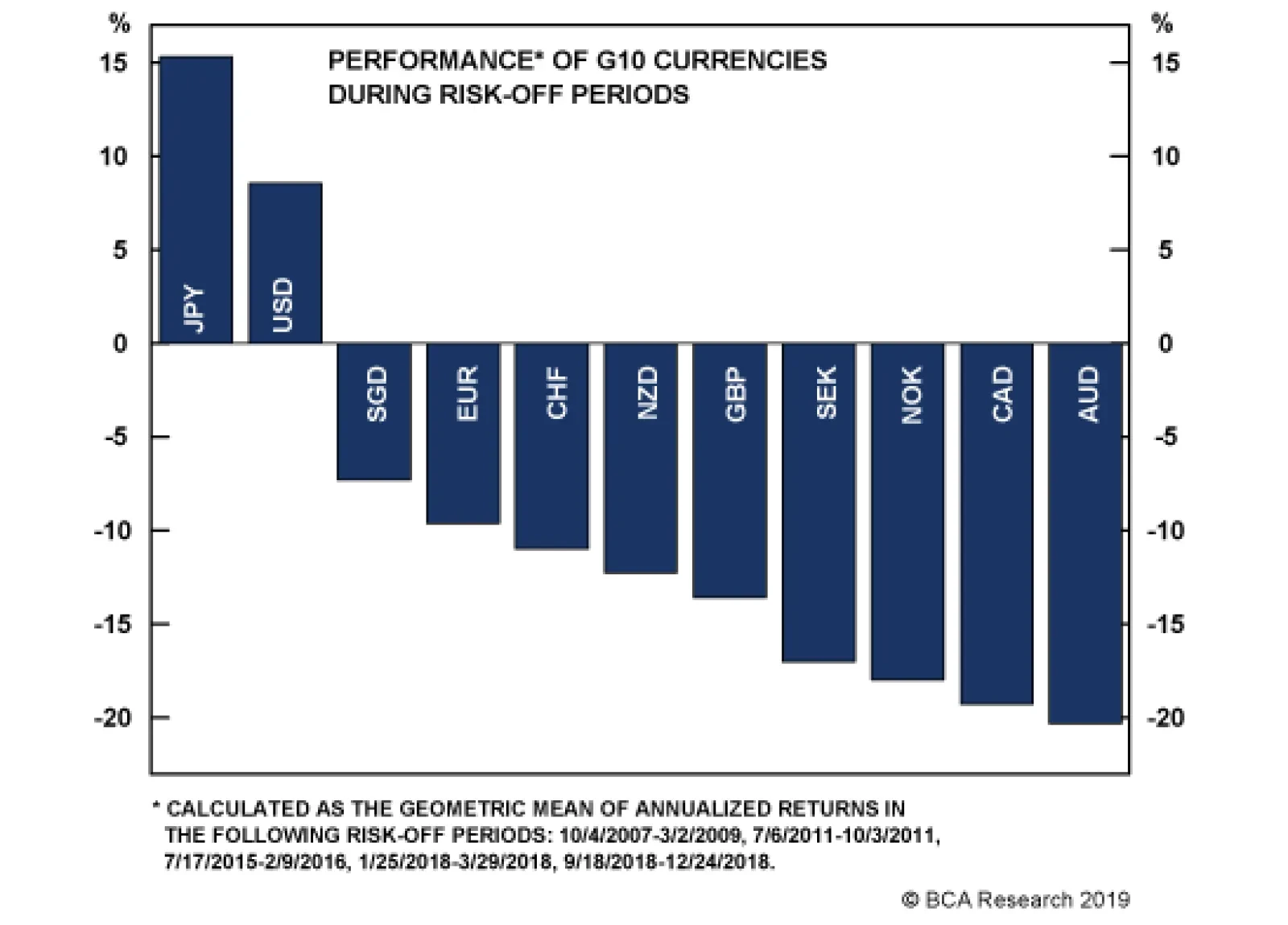
One winner as volatility starts to rise is the yen. Our Foreign Exchange Strategy team expects the BoJ to remain on hold at next week’s policy meeting, but the incentive for the central bank to act preemptively this time around is getting stronger. The…
Highlights Actively managed U.S. equity mutual funds have been hemorrhaging assets under management (AUM), with the lost AUM flowing directly to ETFs and index mutual funds. Chatter about the adverse consequences of too much passive investing is intensifying, and BCA clients are increasingly asking if a bubble is inflating in passive investing or ETFs more generally. We view passive investing as the surest cure for passive investing and do not worry that index tracking is undermining price discovery or distorting equity markets. Temporary distortions are manna from heaven for professional investors and we would like to have more of them. Active mutual fund management may not be all it’s cracked up to be, in any event. The Active Share metric, which measures the portion of a portfolio that differs from its benchmark, has been in steady decline for the last 30 years, indicating that active management practices have undergone a sea change. We have faith in ETFs’ underlying architecture and continue to recommend investing in them. They are an efficient, inexpensive and liquid way to gain market exposure and investors need not worry about getting stuck when the music stops. Feature Dear Client, The market impact of passive investing continues to be a hot topic among investors, sell-side researchers and the financial media. To contribute our view to the discussion, we are sending you a lightly edited update of a review of passive investing’s implications first published under our Global ETF Strategy banner in September 2017. We met with clients in China last week, and will be taking some time off this week, so we will not be publishing on April 29th. We will resume publication on Monday, May 6th. Best regards, Doug Peta Over the last few years, we have received a thin but steady stream of questions from clients asking about a potential ETF bubble. We note that ETFs do not exhibit any of the characteristics delineated by economic historian Charles Kindleberger in Manias, Panics and Crashes. There is a difference between the increasingly widespread adoption of a useful innovation and a febrile spell of mass exuberance or suspension of disbelief. We have duly expressed the view in one-on-one communications with clients that ETFs shouldn’t inspire any particular worry. The related chatter about a passive investment bubble only seems to intensify, however, and we focus on it in this Special Report. We ultimately fail to see the justification for the most extreme warnings about the dangers of passive investing. Perhaps the emergence and bursting of two bubbles in rapid succession has sparked a mini-bubble in searching for bubbles among academics, investors and reporters. We do not think that the popularity of ETFs is distorting pricing mechanisms, though we would welcome a good distortion to break up the logjam of full-but-not-extreme valuations that portend tepid intermediate- and long-term balanced portfolio returns. The Active Management Exodus The causes and consequences may be a matter of debate, but the facts are clear: actively managed U.S. equity mutual funds have been losing ground to index mutual funds for two-and-a-half decades (Chart 1). Before ETFs began to boom ahead of the crisis, active equity mutual funds still managed to attract annual net inflows despite their share losses, but they have now suffered net outflows in every one of the last 12 years. Index ETF and index mutual fund inflows have amounted to nearly 90% of the active mutual funds’ outflows, with index ETFs drawing more than twice the AUM as their mutual fund counterparts (Chart 2).
Chart 1
Chart 2Mirror Image
Mirror Image
Mirror Image
Given the near symmetry of active mutual fund outflows and index fund inflows, it appears that an extended active-to-passive migration is well under way. The move is rational, and has helped investors at the expense of asset managers, as index funds cost considerably less than actively managed funds. (In 2017, the asset-weighted average expense ratio for actively managed and index equity mutual funds was 0.78% and 0.09%, respectively.) If mutual fund managers tend to be wealthier than their clients, the fee savings give the economy a modest boost by shifting wealth to households with a higher marginal propensity to consume. The Spoilsport Chorus What’s not to like about lower fees for the same, or better, returns?1 Plenty, as it turns out. The myriad objections to passive investing’s increasing sway boil down to three major arguments: passive investing undermines price discovery; passive investing undermines capital allocation; and passive investing is potentially anti-competitive. Price insensitivity carries the seeds of its own demise. An index-tracking investor is a price-insensitive investor, and a surfeit of passive investment could undermine equity markets’ price-discovery function. Index-trackers are free riders, living off of the active investors whose trading decisions set prices. Just as a parasite cannot live without a host, naive passive investors need price-setters to keep them safe. The passive investing naysayers’ heads are filled with images of lemmings rushing over the edge of a cliff after active investors are routed, but we are not so sure. It’s important to remember that the price an investor pays for a security2 is the major determinant of his/her long-run return, and a price-insensitive investor is all but certain to underperform a price-aware investor over time, perhaps by a material margin. Thus the cure for passive investment is passive investment; the fewer active investors participating in the markets, the greater the prospective returns accruing to active investment. Greater prospective returns will draw an increasing proportion of assets until active management is no longer likely to outperform. Then the pendulum will swing back to index investing – lather, rinse, repeat – but skilled security analysts will have a field day while their talents are underappreciated. Passive investing’s impact on markets’ capital allocation function is indirect at best. Only primary market transactions channel capital to, or from, ideas and enterprises. Secondary market transactions merely involve exchanges of capital between incumbents and new owners, and index tracking is a secondary-market function. The sell-siders that found passive investing wanting in comparison with central planning would seem to have been trying too hard to be provocative.3 The late John Bogle may have been a bit of a scold, but we’d take him over Karl Marx any day. The notion that high concentrations of ownership among passive holders could be anti-competitive strikes us as especially strained. An article published in The Atlantic a year and a half ago bore the provocative headline, “Are Index Funds Evil?” and sub-header, “A growing chorus of experts argue that they’re strangling the economy – and must be stopped.4” The article highlighted a working paper from a team of newly-minted PhDs that argued that high common ownership in the airline industry has been associated with decreased route competition and increased fares. If the same entities hold significant stakes in all of the companies in a particular industry, those entities may have an incentive to collude to restrain competition within the industry and thereby increase the size of the pie for the industry as a whole. This may be so at the airline-industry level, but as passive owners of the entire market, Vanguard, BlackRock and State Street own considerable stakes in every other industry as well, so increasing the profitability of a single portfolio segment at the expense of other portfolio segments would seem to be self-defeating, not to mention personally risky, given stiff antitrust penalties. What Makes A Bubble? Bubbles differ in their specifics, but they share several common empirical characteristics. Kindleberger homes in on the easy availability of credit and its role in enabling the euphoria that fuels temporarily self-reinforcing, albeit ultimately unsustainable, price gains. The gains generated by the headlong pursuit of short-term capital gains are the key to keeping the bubble going, but the upward price movement is halted in its tracks when credit availability slows, and prices plunge like Wile E. Coyote once it’s cut off. Neither ingredient has been a part of the ETF boom. Index ETFs are the opposite of a get-rich-quick scheme; they’re what investors buy when they decide to stop chasing after buried treasure. The easy and inexpensive availability of credit has surely contributed to elevated equity multiples (Chart 3) and narrow bond spreads (Chart 4). The instruments ETFs hold are somewhat pricey and will be vulnerable when the next recession comes, but they are not discounting euphoric expectations that cannot realistically be met. ETF sponsors do not rely on debt; launching an ETF is such a capital-light process that the field is full to bursting with several funds that amount to unfinished experiments. Without the burden of servicing debt, sponsors are free to throw their ideas up against a wall and see what sticks. Chart 3Equity Multiples Are Elevated...
Equity Multiples Are Elevated...
Equity Multiples Are Elevated...
Chart 4... And Spreads Are Tight
... And Spreads Are Tight
... And Spreads Are Tight
ETFs are not being bought on margin in any significant degree; they are not the apple of frenzied gain-chasers’ eyes. Aside from leveraged ETFs that provide a designated multiple of daily returns, pooled investment vehicles that amalgamate the performance of several securities are the antithesis of an ideal speculative instrument. Index ETFs allow an investor to obtain benchmark returns at low cost and with a minimum of fuss, and are a sane alternative to speculation. As Benjamin Graham put it, the dumb money ceases to be dumb when it acknowledges its limitations, and index investing is an explicit acknowledgement of one’s limitations. ETF Flows Are Not Coming Out Of Thin Air To the notion that “so much money is flowing into ETFs that it’s distorting prices across the board,” we say not necessarily. If the money to buy ETFs were materializing out of thin air (as it is in Tokyo and Zurich thanks to the efforts of the BoJ and the SNB), one could argue that ETF inflows are inflating multiples and narrowing spreads. But the money to purchase U.S.-listed ETFs comes almost entirely from sales of actively managed mutual funds. ETF purchases are a reallocation of existing investment capital, not new marginal investment with the potential to move markets. Just How Active Are The “Active” Outflows? Chart 5Indexing Hasn't Hijacked Equity Correlations
Indexing Hasn't Hijacked Equity Correlations
Indexing Hasn't Hijacked Equity Correlations
On the subject of changes at the margin, if the capital to purchase index ETFs comes from mutual funds that are active in name only, they simply shift cash from one passive pocket to another, and don’t amount to any change at all. The professor-investors who created the Active Share metric to measure how much a portfolio deviates from its benchmark5 describe a mutual fund industry that has steadily migrated away from stock picking. By their reckoning, the share of mutual fund assets managed by closet indexers rose from 1% in 1980 to nearly 33% in 2009.6 Using the Active Share calculator at https://activeshare.info/, we find that one-third of AUM in actively-managed U.S. equity mutual funds with AUM of at least $1 billion are held by closet-indexing mutual funds (funds with Active Share of 60% or less). Our large-fund sample suggests that two-thirds of active fund AUM is truly active. The loss of even that amount of actively managed assets does not appear to have been enough to hijack internal market dynamics. If everyone became an index tracker, and all trades were trades of the entire market, correlations at the stock and sector level would go to 1. Despite ETFs’ growing muscle, and their capture of share from stock-picking funds, correlations have not consistently risen over the 2015-17 period that has witnessed a stampede from active to indexed equity funds (Chart 5). Investment Implications We do not believe that the steadily expanding investment in passive vehicles poses a threat to markets or investors. Passive vehicles offer investors the most cost-effective way to obtain market exposure and the actively managed funds they’re exchanging for index trackers have become increasingly less active as benchmark indexes have become more prominent. If the passive trend continues, and a rising share of capital is invested without regard for distinctions between companies, the ex-ante returns to active strategies will increase and investors will return to them in droves. In the meantime, if passive investing’s share reaches the tipping point, wherever it may be, fundamentally-focused investors will feast on excess returns. Active investors will clean up if passive investing ever crosses the tipping point. We do not worry that passive investing will weigh on the economy by hindering the efficient allocation of capital to the ideas with the most merit. Index tracking is confined to the secondary markets and will not consign the U.S. economy to a Soviet fate. We view the suggestion that index tracking may lead to collusion among operating companies as unfounded conjecture. Investors need not worry that ETFs are in a bubble, or that investing in passive strategies will be a drag on economic output. Doug Peta, CFA Chief U.S. Investment Strategist dougp@bcaresearch.com Footnotes 1 In a typical year, a majority of mutual funds underperform their benchmarks. 2 Price is defined as starting real yield for bonds, and cyclically-adjusted P/E for equities. 3 “The Silent Road to Serfdom: Why Passive Investing Is Worse Than Marxism,” August 23, 2016, Sanford C. Bernstein & Co., LLC. 4 Partnoy, Frank, “Are Index Funds Evil?” The Atlantic, September 2017. 5 Cremers, K.J. Martijn and Petajisto, Antti. “How Active Is Your Fund Manager? A New Measure That Predicts Performance,” Review of Financial Studies, September 2009. 6 Petajisto, Antti. “Active Share and Mutual Fund Performance,” Financial Analysts Journal, July/August 2013.
Highlights Solid credit growth numbers from China last week suggest an emerging window for pro-cylical currency trades. However, since 2009, these currency pairs have tended to work in real time rather than with a lag. Continued muted currency action over the next few weeks will be cause for concern. Our favorite currency pairs to play U.S. dollar downside for now are the SEK, NOK and GBP. With the Aussie dollar close to the epicenter of Chinese stimulus, data down under is increasingly stabilizing. Place a limit buy on AUD/USD at 0.70. Improving global growth will eventually put downward pressure on the broad trade-weighted U.S. dollar. Meanwhile, the risk-reward profile for safe-haven currencies has been greatly augmented in this low-volatility environment. Rising net short positioning on the yen and swiss franc is making them attractive from a contrarian standpoint. Feature The unambiguous message from incoming data is that we are entering a reflationary window. Our report last week highlighted the fact that the Chinese economy is in a bottoming process.1 Since then, data out of China has come out much stronger than expected. Export growth in March surged from -21% to 14%, new yuan-denominated loans came in at 1.7 trillion RMB versus 886 billion RMB the previous month, and industrial production in March grew at 8.5% on an annual basis – the strongest print since July 2014. Retail sales were also stronger and house prices are re-inflating, suggesting construction activity will pick up steam. Historically, March data is a cleaner print compared to prior months since it evades nuances from the Chinese lunar new year. As such, these numbers are consistent with a re-acceleration in domestic demand in the Chinese economy in the coming months. As we embrace confirmation that the Chinese economy has bottomed, it will be important to monitor if this cycle plays out like those in the past. Since 2009, the evolution of the Chinese credit cycle has been an important driver of pro-cyclical currency trades. However, in recent years there appears to have been diminishing returns to these trades. Continued lack of more pronounced strength in the Australian, New Zealand, and Canadian dollar exchange rates in light of solid hard data out of China will be genuine reason for concern. Our general assessment is that while the credit impulse in China has clearly bottomed, the magnitude of the rise is unlikely to be what we saw in 2015-2016. Given this backdrop, not all pro-cyclical currency pairs are going to benefit equally. We are long the SEK, NOK, and GBP and recommend adding AUD to the list of pro-cyclical favorites. Paradoxically, the risk-reward profile for safe-haven currencies has also been greatly augmented in this low-volatility environment, but it is still too early to begin putting on currency hedges. Pro-Cyclical Trades Need Broad Dollar Weakness Chart I-1 highlights the fact that pro-cyclical currencies have had diverging performances over the evolution of the business cycle since 2009.
Chart I-1
The aftermath of the global financial crisis was most bullish for commodity currencies, with the AUD, CAD, NOK, and NZD rising around 20%-30% versus the U.S. dollar. The DXY index was roughly flat during this period, but the broad trade-weighted dollar did weaken. The biggest driver back then was rising commodity prices, driven by Chinese demand and a revaluation of these currency pairs from deeply oversold levels. The weakest currencies were the euro and yen. Chart I-2New Lows In Currency Volatility
New Lows In Currency Volatility
New Lows In Currency Volatility
The second phase of the business cycle upswing occurred from July 2012 to February 2014, using the global Purchasing Managers’ Index from J.P. Morgan. During this phase, the best-performing currency pairs were the euro and swiss franc, and the worst was the Japanese yen. Commodity currencies fared poorly back then. The driver then was monetary policy, with European Central Bank Governor Mario Draghi’s “whatever it takes” put and the launch of “Abenomics.” Notably, the 4% weakness in the DXY did not help pro-cyclical currencies much, given commodity prices had peaked. From February 2016 to December 2017, the upswing was driven again by Chinese stimulus. Commodity prices rallied and the dollar did weaken significantly, which helped pro-cyclical currencies. However, the returns were modest compared to 2009-2010 episode. The yen was flat during the period. Finally, NOK, SEK and NZD have been winners throughout all three business cycle upswings. This time around, more evidence will need to emerge that the broad trade-weighted U.S. dollar has peaked for pro-cyclical currencies to outperform. For now, the calm in developed currency markets seems very eerie, given the flow of incoming economic data. We have highlighted in recent bulletins that most currency pairs have been narrowly trading towards the apex of very tight wedge formations, which has severely dampened volatility (Chart I-2). In the post-Bretton Woods world, it has been very rare for periods of extended currency stability to persist. We eventually expect the U.S. dollar to weaken, but we will need to closely monitor the forces that have so far been keeping a bid under it. Liquidity, Global Growth And The Dollar Most measures of relative trends still favor the dollar. The April Markit manufacturing PMI releases this week showed that while both Japan and the euro area remain in contraction territory, the U.S. reading of 52.4 puts it solidly above the rest of the world. It is true that the momentum of this leadership has been rolling over recently, but historically such growth divergences between the U.S. and the rest of the world have generated anywhere from 10%-15% rallies in the greenback over a period of six months (Chart I-3). So far, the DXY dollar index is up 1% for the year. Repatriation flows have had a non-neglible influence on the broad trade-weighted dollar. Meanwhile, even though the Federal Reserve has paused hiking interest rates, relative policy trends still favor the greenback. The interest rate gap between the U.S. and the rest of the world pins the broad trade-weighted dollar index at 128, or 7% above current levels (Chart I-4). And even today, unless the Fed moves toward outright rate cuts, the dovish shift by other central banks around the world remains an immediate tailwind for the U.S. dollar. It will be important for yield curves to steepen globally as confirmation that other central banks are getting ahead of the curve, which should be a headwind for the dollar. Chart I-3U.S. Growth Leadership ##br##Is Rolling Over
U.S. Growth Leadership Is Rolling Over
U.S. Growth Leadership Is Rolling Over
Chart I-4Interest Rate Differentials Still Favor The Dollar
Interest Rate Differentials Still Favor The Dollar
Interest Rate Differentials Still Favor The Dollar
Internationally, dollar liquidity will need to increase significantly for the greenback to meaningfully weaken. The Fed’s tapering of asset purchases has been a net drain on dollar liquidity, despite a widening U.S. current account deficit. This is expected to end by September, but has already triggered a severe contraction in the U.S. monetary base. Our preferred measure of international liquidity is foreign central bank reserves deposited at the Fed, and this is still contracting at its worst pace in over 40 years (Chart I-5). At a minimum, an end to the balance sheet runoff will steer growth in the U.S. monetary base from deeply negative to zero. A rising external profit environment will be needed for an increase in foreign central bank reserves. Finally, data from the U.S. Treasury International Capital (TIC) system show that on a rolling 12-month basis, the U.S. continues to repatriate back a net of about $400 billion in assets, or close to 2% of GDP. Repatriation flows have had a non-neglible influence on the broad trade-weighted dollar (Chart I-6). Unless these flows roll over and begin to weaken, it will make it very difficult for the greenback to depreciate. Chart I-5International Dollar Liquidity Remains Tight
International Dollar Liquidity Remains Tight
International Dollar Liquidity Remains Tight
Chart I-6Repatriation Flows Still Favor The Dollar
Repatriation Flows Still Favor The Dollar
Repatriation Flows Still Favor The Dollar
Chart I-7Watch The Gold-To-Bond Ratio
Watch The Gold-To-Bond Ratio
Watch The Gold-To-Bond Ratio
The bottom line is that pro-cyclical currencies will need broad dollar weakness to outperform. Our favorite indicator for gauging ultimate downside in the dollar is the gold-to-bond ratio (Chart I-7). Any sign that the balance of forces are moving away from the U.S. dollar will favor a breakout in the gold-to-bond ratio. For now, our favorite currency pairs to play U.S. dollar downside are the SEK, NOK, and GBP. What About Safe Havens? During bull markets, countries that have negative interest rates are subject to powerful outflows from carry trades. The impact of these outflows are difficult to measure, but it is fair to assume that periods of low hedging costs (which tend to correspond to periods of lower volatility) can be powerful catalysts. As markets get volatile and these trades get unwound, unhedged trades become victim to short-covering flows.
Chart I-8
With many yield curves around the world flattening, the danger is that the frequency of this short-covering implicitly rises, since long bond returns are falling short of spot rates. One winner as volatility starts to rise is the yen (Chart I-8). Investors should consider initiating small short USD/JPY and USD/CHF positions in the coming weeks as a portfolio hedge. Back in late 2016, global growth was soft, the yen was very cheap and everyone was short the currency on the back of a dovish shift by the Bank of Japan. Having recently introduced yield curve control (YCC), the market was grappling with the dovish implications for the currency, arguably the most significant change in monetary policy by any central bank at the time in several years. Given that backdrop, the yen strengthened by circa 10% from December 2016 to mid-2017, even as equity markets remained resilient. When the equity market drawdown finally arrived in early 2018, it carried the final legs of the yen rally. Dollar weakness was a significant reason for yen strength given global growth was accelerating, a negative for the counter-cyclical dollar. But with a net international investment position of almost 60% of GDP, and yearly income receipts of almost 4% of GDP, any volatility in markets could lead to powerful repatriation flows back to Japan. Chart I-9The Consumption Tax Hike Will Hurt Japanese Growth
The Consumption Tax Hike Will Hurt Japanese Growth
The Consumption Tax Hike Will Hurt Japanese Growth
We expect the BoJ to remain on hold at next week’s policy meeting, but the incentive for the central bank to act preemptively this time around is getting stronger. The starting point is that the consumption tax hike, scheduled for October this year, will be disastrous for the economy. Since the late 1990s, every time the consumption tax has been hiked, the economy has slumped by an average of over 1.3% in subsequent quarters. For an economy with a potential growth rate of just 0.5-1%, this is a highly unpalatable outcome (Chart I-9). More importantly, similar to past episodes, the consumption tax is being hiked at a time when the economy is slowing. This week’s data show that exports continued to contract for the month of March. Machine tool orders, a good proxy for Japanese machinery sales, are still falling by almost 30% year-on-year. The Japanese PMI remains below the 50 boom/bust line, even though it has ticked marginally higher in April. Both household and business confidence are falling. The Economy Watcher’s Survey is currently at 44.8, well below the 50 boom/bust line and the lowest reading since 2016. In its April regional outlook, the BoJ downgraded most of the prefectures in Japan, with only Hokkaido receiving an upgrade in the aftermath of the earthquake. As domestic deflationary pressures intensify, this should nudge the BoJ towards more stimulus. This also raises the probability that the government defers the consumption tax hike. However, the yen could benefit from any short-covering rallies in the interim. We expect the BoJ to remain on hold at next week’s policy meeting, but the incentive for the central bank to act preemptively this time around is getting stronger. Bottom Line: The risk-reward profile for safe-haven currencies has been greatly augmented in this low-volatility environment. The rise in net short positioning on the yen and Swiss franc is becoming attractive from a contrarian standpoint. Investors should consider initiating short USD/JPY and short USD/CHF positions in the coming weeks as a hedge. Place A Limit-Buy On AUD/USD At 0.70 Data out of Australia are showing tentative signs of a bottom. This week’s important jobs report showed that the economy added 25,700 jobs, more than double the consensus forecast. Importantly, this was driven by full-time jobs, with a net gain of 48,300. And despite the participation rate ticking higher, unemployment stayed near a six-year low at 5%. Admittedly, the most recent Reserve Bank of Australia minutes showed there was discussion about rate cuts, but this could change if the economy begins to benefit from an acceleration in Chinese growth. Outright short AUD bets are at risk from either upside surprises in global growth or simply the forces of mean reversion. For more than two decades, the Australian dollar has tended to be mostly driven by external conditions, especially the commodity cycle. But for the first time in several years, domestic factors have joined in to exert powerful downward pressure on the currency. The Australian Prudential Regulation Authority (APRA) succeeded in its mission to deflate the overvalued housing market, and with house prices deflating by over 5% year-on-year, Australia may already be far along its adjustment path, especially vis-à-vis its antipodean counterpart (Chart I-10). In terms of currency performance, a lot of the bad news already appears priced in to the Australian dollar, which is down 12% from its 2018 peak and 35% from its 2011 peak. This suggests outright short AUD bets are at risk from either upside surprises in global growth or simply the forces of mean reversion (Chart I-11). We are already long the Aussie dollar versus the kiwi and suggest placing a limit-buy on AUD/USD at 0.7. Chart I-10The Aussie Housing Market Has Already Adjusted
The Aussie Housing Market Has Already Adjusted
The Aussie Housing Market Has Already Adjusted
Chart I-11Chinese Growth Will Benefit The Aussie Dollar
Chinese Growth Will Benefit The Aussie Dollar
Chinese Growth Will Benefit The Aussie Dollar
Chart I-12LNG Exports Will Benefit The Aussie Dollar
LNG Exports Will Benefit The Aussie Dollar
LNG Exports Will Benefit The Aussie Dollar
Finally, the AUD/USD cross will benefit from rising terms-of-trade. Iron ore prices are already surging, reflecting supply-related issues but also rising demand in China. Meanwhile, Beijing’s clear environmental push has lifted the share of liquefied natural gas in Australia’s export mix (Chart I-12). Given that eliminating pollution is a strategic goal in China, this will be a multi-year tailwind. As the market becomes more liberalized and long-term contracts are revised to reflect higher spot prices, the Aussie dollar will get a boost. Chester Ntonifor, Foreign Exchange Strategist chestern@bcaresearch.com Footnotes 1 Please see Foreign Exchange Strategy Weekly Report, titled “Reading The Tea Leaves From China,” dated April 12, 2019, available at fes.bcaresearch.com Currencies U.S. Dollar Chart II-1USD Technicals 1
USD Technicals 1
USD Technicals 1
Chart II-2USD Technicals 2
USD Technicals 2
USD Technicals 2
Recent data in the U.S. suggest a slower pace of growth: The preliminary U. of Mich. consumer sentiment index fell to 96.9 in April. The NY empire state manufacturing index surprised to the upside, coming in at 10.1 in April. Industrial production contracted by 0.1% month-on-month in March. Trade balance came in at a lower-than-expected deficit of $49.4B in February. Retail sales increased by 1.6% month-on-month in March. Preliminary April Markit composite PMI fell to 52.8; manufacturing component and services component fell to 52.4 and 52.9, respectively. DXY index edged up by 0.35% this week. The Fed’s Beige Book was released on Wednesday, summarizing that economic activity expanded at a slight-to-moderate pace in March and early April, with some states showing more signs of relative strength. The Book suggests that going forward, a similarly muted pace of growth should be anticipated for the coming months. Report Links: Not Out Of The Woods Yet - April 5, 2019 Tug OF War, With Gold As Umpire - March 29, 2019 Into A Transition Phase - March 8, 2019 The Euro Chart II-3EUR Technicals 1
EUR Technicals 1
EUR Technicals 1
Chart II-4EUR Technicals 2
EUR Technicals 2
EUR Technicals 2
Recent data in the euro area remain soft: Industrial production came in at -0.3% year-on-year in February, outperforming expectations. April ZEW economic sentiment index improved to 4.5 in euro area. The German ZEW current conditions component fell to 5.5, while sentiment improved to 3.1 nonetheless. The current account balance fell to €26.8B, while trade balance increased to €19.5B in February. March headline inflation and core inflation were unchanged at 1.4% and 0.8% year-on-year, respectively. The euro area April composite PMI fell to 51.3; the services component fell to 52.5; the manufacturing component increased to 47.5. German composite PMI increased to 52.1; manufacturing and services components increased to 44.5 and 55.6, respectively. French composite PMI increased to 50; manufacturing component fell to 49.6; services component increased to 50.5. EUR/USD fell by 0.34% this week. As the Chinese economy bottoms, this should benefit European exports and the euro. Report Links: Reading The Tea Leaves From China - April 12, 2019 Into A Transition Phase - March 8, 2019 A Contrarian Bet On The Euro - March 1, 2019 The Yen Chart II-5JPY Technicals 1
JPY Technicals 1
JPY Technicals 1
Chart II-6JPY Technicals 2
JPY Technicals 2
JPY Technicals 2
Recent data in Japan have been neutral: The adjusted trade balance decreased, coming in at a ¥177.8 billion deficit in March. Exports contracted by 2.4% year-on-year, while imports grew by 1.1% year-on-year. Industrial production fell by 1.1% year-on-year in February. The preliminary Nikkei manufacturing PMI improved to 49.5 in April. USD/JPY has been trading flat this week. During the most recent IMF meeting, global finance chiefs have warned that global growth uncertainties remain at a high level. With currency volatility at record lows, any flight to safety could support safe-haven currencies like the yen. Report Links: Tug OF War, With Gold As Umpire - March 29, 2019 A Trader’s Guide To The Yen - March 15, 2019 Balance Of Payments Across The G10 - February 15, 2019 British Pound Chart II-7GBP Technicals 1
GBP Technicals 1
GBP Technicals 1
Chart II-8GBP Technicals 2
GBP Technicals 2
GBP Technicals 2
Recent data in the U.K. have been mostly positive: Rightmove house price index slightly improved to -0.1% year-on-year in April. On the labor market front, 179K jobs were created in February; ILO unemployment rate was unchanged at 3.9%; average weekly earnings came in line at 3.5% year-on-year. On the inflation front, headline inflation and core inflation were unchanged at 1.9% and 1.8% year-on-year, respectively, underperforming expectations. Retail sales came in at 6.7% year-on-year in March, surprising to the upside. GBP/USD fell by 0.5% this week. With Brexit being kicked down the road, the volatility of sterling has dropped, and attention is moving towards U.K. fundamentals. Economic surprises in the U.K. relative to both the U.S. and euro area are soaring. This will put a bid under sterling. Report Links: Not Out Of The Woods Yet - April 5, 2019 A Trader’s Guide To The Yen - March 15, 2019 Balance Of Payments Across The G10 - February 15, 2019 Australian Dollar Chart II-9AUD Technicals 1
AUD Technicals 1
AUD Technicals 1
Chart II-10AUD Technicals 2
AUD Technicals 2
AUD Technicals 2
The labor market in Australia remains robust: Westpac leading index increased by 0.19% month-on-month in March. 25.7K jobs were created in total in March, with 48.3K new full-time jobs and a loss of 22.6K part-time jobs. The participation rate increased to 65.7% in March, slightly higher than expected which nudged the unemployment rate to 5%, in line with expectations. AUD/USD appreciated by 0.7% this week, now approaching 0.72. The RBA published its meeting minutes on Tuesday. The minutes stated that the Australian dollar is still near its recent lower end. However, the strength in commodity prices and improving trade terms are supporting the currency. Report Links: Not Out Of The Woods Yet - April 5, 2019 Into A Transition Phase - March 8, 2019 Balance Of Payments Across The G10 - February 15, 2019 New Zealand Dollar Chart II-11NZD Technicals 1
NZD Technicals 1
NZD Technicals 1
Chart II-12NZD Technicals 2
NZD Technicals 2
NZD Technicals 2
Recent data in New Zealand are slowing: Q1 inflation fell to 1.5% year-on-year, underperforming expectations. NZD/USD fell by 0.8% this week. The relative underperformance of New Zealand growth could further weaken the Kiwi on a cyclical basis. Our long AUD/NZD position is now 1.6% in the money. Report Links: Not Out Of The Woods Yet - April 5, 2019 Balance Of Payments Across The G10 - February 15, 2019 A Simple Attractiveness Ranking For Currencies - February 8, 2019 Canadian Dollar Chart II-13CAD Technicals 1
CAD Technicals 1
CAD Technicals 1
Chart II-14CAD Technicals 2
CAD Technicals 2
CAD Technicals 2
Recent data in Canada have been mostly positive: The Teranet/National Bank HPI fell to 1.5% year-on-year in March. Existing home sales in March grew by 0.9% month-on-month, higher than the previous reading of -9.1% while still lower than the expected 2%. Trade balance came in at a smaller deficit of 2.9 billion CAD. Headline inflation and core inflation climbed to 1.9% and 1.6% year-on-year respectively. The ADP number of new jobs created fell to 13.2K in March. Retail sales increased by 0.8% month-on-month in February, outperforming expectations. USD/CAD fell by 0.3% this week. The spring 2019 BoC Business Outlook Survey was released on Monday. It’s worth mentioning that the Business Outlook Survey Indicator fell from a strongly positive level in the winter survey to slightly negative, implying the softening in recent business sentiment. Report Links: A Shifting Landscape For Petrocurrencies - March 22, 2019 Into A Transition Phase - March 8, 2019 Balance Of Payments Across The G10 - February 15, 2019 Swiss Franc Chart II-15CHF Technicals 1
CHF Technicals 1
CHF Technicals 1
Chart II-16CHF Technicals 2
CHF Technicals 2
CHF Technicals 2
Recent data in Switzerland have been positive: Producer and import prices came in at -0.2% year-on-year in March, higher than the previous reading of -0.7%. Trade balance increased to a surplus of 3.2 billion CHF in March. Exports increased to 21 billion CHF, and imports increased to 17.9 billion CHF. Swiss watch exports increased by 4.4% year-on-year in March. USD/CHF rose by 1% this week. The global growth stabilization and improving sentiment in the euro area are offsetting the attractiveness of the safe-haven franc. We are long EUR/CHF for a 1% profit. Report Links: Balance Of Payments Across The G10 - February 15, 2019 A Simple Attractiveness Ranking For Currencies - February 8, 2019 Waiting For A Real Deal - December 7, 2018 Norwegian Krone Chart II-17NOK Technicals 1
NOK Technicals 1
NOK Technicals 1
Chart II-18NOK Technicals 2
NOK Technicals 2
NOK Technicals 2
There is little data from Norway this week: Trade balance in March fell to 13.9 billion NOK. USD/NOK fell after the spike overnight, returning flat this week. The Norwegian krone is still trading at around one sigma band below its fair value, while the economic activity is improving with rising oil prices. Our long NOK/SEK position is now at a 3.6% profit. Report Links: A Shifting Landscape For Petrocurrencies - March 22, 2019 Balance Of Payments Across The G10 - February 15, 2019 A Simple Attractiveness Ranking For Currencies - February 8, 2019 Swedish Krona Chart II-19SEK Technicals 1
SEK Technicals 1
SEK Technicals 1
Chart II-20SEK Technicals 2
SEK Technicals 2
SEK Technicals 2
Recent data in Sweden have been negative: The unemployment rate increased to 6.7% in March. USD/SEK appreciated by 0.2% this week. Like the Norwegian krone, the Swedish krona is undervalued, trading at a large discount to its fair value. We remain overweight the SEK, which will benefit from a bottoming in global growth. Report Links: Balance Of Payments Across The G10 - February 15, 2019 A Simple Attractiveness Ranking For Currencies - February 8, 2019 Global Liquidity Trends Support The Dollar, But... - January 25, 2019 Trades & Forecasts Forecast Summary Core Portfolio Tactical Trades Closed Trades
Highlights Chinese credit origination surpassed expectations in March. Credit growth is now clearly trending higher, and the latest data suggest that economic activity is rebounding. This bodes well for global growth. The conventional wisdom is that China’s releveraging efforts represent “short-term gain for long-term pain.” We disagree. For the most part, Chinese releveraging is inevitable, desirable, and sustainable. Credit growth is inevitable because rising debt is necessary for transforming the country’s copious savings into fixed-asset investment. It is desirable for ensuring that GDP growth stays close to trend. It is broadly sustainable because the interest rate at which the government and much of the private sector are able to borrow is well below the economy’s growth rate. In fact, under a plausible set of assumptions, faster credit growth in China could lead to a lower debt-to-GDP ratio. Stronger global growth later this year should weaken the U.S. dollar. We are closing our long DXY trade for a carry-adjusted gain of 16.4% and exiting our long USD/CNY trade for a loss of 3.1%. We are also taking profits on our short AUD/CAD, short EUR/CAD, and short EUR/RUB trades of 1.6%, 3.9%, and 8.6%, respectively, and initiating two new currency trades: short USD/RUB and long EUR/JPY. The combination of a weaker dollar and faster Chinese growth should benefit EM and European stocks. Gold hit our limit buy order of $1275/ounce and we are now long the yellow metal. Feature A Blockbuster Month For Chinese Credit Growth After turning cautious for about six months, we moved back to being bullish on global equities in late December. We also sold our put on the EEM ETF on January 3rd for a gain of 104% in anticipation of a wave of Chinese credit stimulus. Credit growth blew past expectations in January, but surprised on the downside in February. This made the March release particularly important. In the end, the March data did not disappoint those who were hoping for a solid reading. New CNY loans rose by RMB 1690 billion, above Bloomberg consensus estimates of RMB 1250 billion. Our adjusted aggregate financing measure, which excludes a number of items such as equity financing but includes local government bond issuance, rose by 12.3% year-over-year, up from 11.6% in February (Chart 1). China’s credit impulse leads the import component of its manufacturing PMI (Chart 2). The credit impulse bottomed in November 2018, which should feed into higher imports over the coming months. This week’s release of better-than-expected data on industrial production, retail sales, and housing activity all suggest that the rebound in Chinese growth is already afoot. Chart 1Chinese Credit Growth Is Rebounding...
Chinese Credit Growth Is Rebounding...
Chinese Credit Growth Is Rebounding...
Chart 2...Which Should Bode Well For Global Exports To China
...Which Should Bode Well For Global Exports To China
...Which Should Bode Well For Global Exports To China
Short-Term Gain For Long-Term Pain? At times like these, the bears are always ready with their standby argument: Sure, China may be stimulating, but all that credit growth will just make the debt bubble even bigger. Once the bubble bursts, there will be hell to pay. Long-term investors should steer clear of any growth-sensitive assets. It is a seductive argument. But it is wrong. Chinese releveraging is: 1) inevitable; 2) desirable; and 3) sustainable. The fundamental macroeconomic problem that China faces is that it consumes too little of what it produces. 1. Chinese Debt Growth Is Inevitable The fundamental macroeconomic problem that China faces is that it consumes too little of what it produces. The result is a national savings rate of 45%, by far the highest of any major economy (Chart 3). Chart 3China Still Saving A Lot
China Still Saving A Lot
China Still Saving A Lot
Chart 4From Exporting Savings To Investing Domestically And Building Up Debt
From Exporting Savings To Investing Domestically And Building Up Debt
From Exporting Savings To Investing Domestically And Building Up Debt
There was a time when China was able to export a large part of its excess production. Its current account surplus reached nearly 10% of GDP in 2007. As its economy has grown in relation to the rest of the world, running massive trade surpluses has become more difficult. This is especially true today, when the country is being targeted by the Trump administration and much of the international community for alleged unfair trade practices. As China’s ability to churn out large current account surpluses declined, the government moved to Plan B: propping up growth by recycling the country’s copious savings into fixed-asset investment. This process saw households park their savings in banks and other financial institutions which, in turn, lent the money out to companies and local governments in order to finance various investment projects. Not surprisingly, debt levels exploded higher (Chart 4). As China’s population ages and more workers leave the labor force, savings will decline. However, this is likely to be a slow process. In the meantime, further debt growth is inevitable. 2. Chinese Debt Growth Is Desirable In an ideal world, Chinese households would consume more of their incomes, leaving only enough savings to finance high-quality private and public investment projects. That is not the world we are living in. In a far-from-ideal world, we need to think about second-best solutions. Yes, a sizable share of Chinese investment spending goes towards projects of dubious value. Yet, the same could have been said about Japan’s fabled “bridges to nowhere.” One may regard the construction of a seldom-used bridge as a misallocation of capital. But what is the counterfactual? If the bridge had not been built, would the workers have found productive work? If not, then there also would have been a misallocation of capital – human capital – which is arguably a much more serious problem. In any case, keep in mind that the rate of return on private investment depends on the state of the economy. If an economy is suffering from chronic lack of demand, only the most worthwhile projects will be undertaken. As the economic outlook improves, the set of viable projects will expand. It is only when all excess private-sector savings have been depleted, and interest rates are rising, that public spending starts to crowd out private investment. 3. Chinese Debt Growth Is Sustainable Even if one accepts the proposition that China needs continued debt growth to maintain full employment, is it still possible that all this additional debt will push the economy into a full-blown debt crisis? Most self-professed “serious-minded” observers would say yes. But then again, many of these same observers were predicting that Japan was heading for a debt crisis when government debt reached 100% of GDP in the late 1990s. Today, Japan’s government debt-to-GDP ratio stands at about 240% of GDP, and yet interest rates remain at rock-bottom levels. China will avoid a debt crisis for the same reason Japan has been able to avoid one. Much of China’s debt stock is composed of state-owned enterprise, local government, and other forms of quasi-public sector debt. Credit policy in China is often indistinguishable from fiscal policy. Given the abundant supply of savings in the economy, most of this debt can be internally financed at fairly low interest rates. The standard equation for government debt dynamics says that the change in the debt-to-GDP ratio, D/Y, can be expressed as:1
Image
G - T is the primary budget deficit, r is the borrowing rate, and g is the growth rate of the economy (it is irrelevant whether r and g are defined in nominal or real terms, as long as they are both expressed the same way). China will avoid a debt crisis for the same reason Japan has been able to avoid one. The Chinese 10-year government bond yield is currently four percentage points below projected GDP growth over the next decade, which is one of the biggest gaps among the major economies (Chart 5). Arithmetically, this means that China can have as large a primary fiscal deficit as it wants. As long as r remains below g, the debt-to-GDP ratio will converge to a stable level. Chart 6 shows this point analytically.
Chart 5
Chart 6
In fact, it is possible that a permanently larger budget deficit could lead to a decline in the equilibrium debt-to-GDP ratio. How could that be? The answer is revealed by the equation above. If the debt-to-GDP ratio is fairly high to begin with and an increase in the primary budget deficit leads to higher inflation (and hence, lower real rates and/or faster nominal GDP growth), this could more than fully counteract the increase in the deficit. Chart 7Stronger Growth Coincided With Accelerating Inflation And Lower Real Rates
Stronger Growth Coincided With Accelerating Inflation And Lower Real Rates
Stronger Growth Coincided With Accelerating Inflation And Lower Real Rates
This is not just a theoretical curiosity. Historically, Chinese inflation has risen while real rates have fallen whenever GDP growth has accelerated (Chart 7). Given China’s high debt levels, even a modest amount of additional inflation could put significant downward pressure on the debt-to-GDP ratio.2 Of course, all this is predicated on the assumption that faster credit growth will not cause interest rates to rise above the growth rate of the economy. For the portion of China’s debt stock that is either directly or indirectly backstopped by the central government, this seems like a safe assumption. After all, if credit/fiscal stimulus is simply being undertaken in response to inadequate demand, there is no need for policymakers to hike rates. Things get trickier when we look at private debt. In the past, the government has encouraged state-owned banks to roll over souring loans for fear that a wave of defaults would undermine the economy and endanger social stability. More recently, however, policymakers have been backing away from this strategy due to the well-founded view that it encourages moral hazard. Faster growth in China in the second half of this year will lift Chinese imports. This will be welcome news for the rest of the world. We expect the authorities to continue taking steps to instill market discipline by allowing failing firms to, well, fail. Realistically, however, the transition to a full market-based economy will take quite a bit of time. In the interim, the government will keep cutting taxes and increasing on-budget spending in order to ensure that any decline in employment among failing firms is offset by employment growth elsewhere. In such an environment, neither a debt crisis nor a deep economic slowdown appear likely. Investment Conclusions Faster growth in China in the second half of this year will lift Chinese imports. This will be welcome news for the rest of the world.
Chart 8
Chart 9Germany Welcomes The Upturn In Chinese Credit Growth
Germany Welcomes The Upturn In Chinese Credit Growth
Germany Welcomes The Upturn In Chinese Credit Growth
While the U.S. will benefit from a revival in Chinese growth, Europe will gain even more (Chart 8). Germany, in particular, should see a pronounced acceleration in growth. China’s credit impulse leads Chinese automobile spending which, in turn, reliably leads euro area automobile exports, as well as overall exports (Chart 9). The recent rebound in the expectations component of the German ZEW index, as well as in the manufacturing output component of the April flash PMI, suggests that green shoots are starting to sprout (Chart 10). Italy should also benefit from the steep drop in bond yields since last October (Chart 11). Italian industrial production strongly surprised to the upside in February, suggesting that the euro area’s third biggest economy may have finally turned the corner. Chart 10Tentative Green Shoots Out Of Germany
Tentative Green Shoots Out Of Germany
Tentative Green Shoots Out Of Germany
Chart 11Italy: The Drop In Bond Yields Should Boost The Economy
Italy: The Drop In Bond Yields Should Boost The Economy
Italy: The Drop In Bond Yields Should Boost The Economy
The ECB will not hike rates this year even if growth shifts into higher gear, but the market will probably price in a bit more monetary tightening in 2020 and 2021. This should help lift the euro. We recommend that investors position themselves for this by going long EUR/JPY. Relatedly, we are closing our short EUR/CAD trade for a gain of 3.9%. The U.S. dollar tends to be a countercyclical currency, meaning that it moves in the opposite direction of the global business cycle (Chart 12). This countercyclicality stems from the fact that the U.S. is more geared towards services than manufacturing compared with most other economies (Chart 13). As such, when global growth accelerates, capital tends to flow from the U.S. to the rest of the world, translating into more demand for foreign currency and less demand for dollars. Chart 12The Dollar Is A Countercyclical Currency
The Dollar Is A Countercyclical Currency
The Dollar Is A Countercyclical Currency
Chart 13The U.S. Is A Low-Beta Play On Global Growth
The U.S. Is A Low-Beta Play On Global Growth
The U.S. Is A Low-Beta Play On Global Growth
A “patient” Fed and the prospect of stronger global growth in the second half of this year are bearish for the dollar. As such, we are closing our long DXY trade for a carry-adjusted gain of 16.4% and exiting our long USD/CNY trade for a loss of 3.1%. We are also closing our short AUD/CAD trade for a gain of 1.6%. Faster Chinese growth will boost metal prices, which is bullish for the Aussie dollar. Lastly, we are switching our short EUR/RUB trade (which is currently up 8.6%) into a short USD/RUB trade. A weaker greenback and stronger global growth will be manna from heaven for international stocks, especially when priced in U.S. dollars. Investors should prepare to move European and EM equities to overweight within a global equity portfolio during the coming weeks. A “patient” Fed and the prospect of stronger global growth in the second half of this year are bearish for the dollar. We are less keen on upgrading Japanese equities. While Japanese exporters will benefit from stronger Chinese growth, the domestic economy will be weighed down by the upcoming hike in the sales tax, which is slated to take place in October. Moreover, the yen is likely to experience headwinds as global bond yields rise in relation to JGB yields. Investors contemplating buying Japanese stocks should hedge any currency risk. Finally, the price of gold fell to $1275/ounce earlier this week, triggering our buy order. With the Fed on pause, the U.S. economy starting to overheat, and the dollar likely to trend lower, bullion could shine over the coming months. Peter Berezin, Chief Global Strategist Global Investment Strategy peterb@bcaresearch.com Footnotes 1 Please see Global Investment Strategy Weekly Report, “Is There Really Too Much Government Debt In The World?” dated February 22, 2019, for a fuller discussion of this debt sustainability equation.
Image
Strategy & Market Trends MacroQuant Model And Current Subjective Scores
Chart 14
Tactical Trades Strategic Recommendations Closed Trades