Global
In the U.S., the most important data sets may well prove to be the NAHB homebuilder confidence survey on Wednesday and the housing starts data on Thursday. Residential investment needs to strengthen further, otherwise the probability is growing that the Fed…

We continue to recommend being overweight global equities and other risk assets over a horizon of 12 months. However, the apparent failure of trade talks between China and the U.S. to gain much traction poses near-term downside risks to our bullish thesis. At this point, our geopolitical team feels that the conclusion of an actual trade agreement this year is a 50/50 prospect. It is easy to envision a scenario where the Trump Administration pursues its “maximum pressure” doctrine in the hopes of wrangling out more concessions. For their part, the Chinese, rather than making sweeping reforms to their legal system as the Trump Administration is insisting, could simply choose to bide their time in the hopes that Joe Biden, an avowed free trader, becomes the next U.S. president. Ultimately, as discussed in this week’s Global Investment Strategy report, in a worst-case scenario where the trade talks break down completely, the combination of aggressive Chinese stimulus and a still-dovish Fed will likely preclude a major global economic downturn. Nevertheless, a 5% correction in global equities from current levels is entirely possible, especially in light of the strong rally since the start of the year. With this in mind, we are putting on a hedge to short the S&P 500 index. We will remove the hedge if stocks fall 5% or trade talks shift in a more positive direction. Peter Berezin, Chief Global Strategist Global Investment Strategy peterb@bcaresearch.com
We continue to recommend being overweight global equities and other risk assets over a horizon of 12 months. However, the apparent failure of trade talks between China and the U.S. to gain much traction poses near-term downside risks to our bullish thesis. At this point, our geopolitical team feels that the conclusion of an actual trade agreement this year is a 50/50 prospect. It is easy to envision a scenario where the Trump Administration pursues its “maximum pressure” doctrine in the hopes of wrangling out more concessions. For their part, the Chinese, rather than making sweeping reforms to their legal system as the Trump Administration is insisting, could simply choose to bide their time in the hopes that Joe Biden, an avowed free trader, becomes the next U.S. president. Ultimately, as discussed in this week’s Global Investment Strategy report, in a worst-case scenario where the trade talks break down completely, the combination of aggressive Chinese stimulus and a still-dovish Fed will likely preclude a major global economic downturn. Nevertheless, a 5% correction in global equities from current levels is entirely possible, especially in light of the strong rally since the start of the year. With this in mind, we are putting on a hedge to short the S&P 500 index. We will remove the hedge if stocks fall 5% or trade talks shift in a more positive direction. Peter Berezin, Chief Global Strategist Global Investment Strategy peterb@bcaresearch.com
Highlights Since AQR rebranded its flagship “Risk Parity” mutual fund late last year, many clients have asked about risk parity and its potential impact on financial markets if interest rates rise. The key to a “risk-based” approach is “risk diversification” and the use of leverage. Like any investment tool, it has its advantages and limitations. “Risk parity” portfolios differ greatly, depending on the choice of assets and the portfolio construction method. There are many ways to construct a risk-based portfolio. We highlight three: fixed weights; variable weights with inverse volatility; and variable weights with optimization. Fixed-weight risk-parity portfolios are not “risk diversified” ex post. Variable-weight risk-parity portfolios constructed using inverse volatility do not guarantee equal risk allocations. “Truly risk-diversified” portfolios constructed using our proprietary optimization algorithm have consistently outperformed those constructed with inverse volatility. Our approach not only achieves better risk diversification, but can also be used as an alpha overlay strategy. Risk parity does not always outperform in the long run, but always outperforms in recessions. Rising yields alone do not necessarily hurt risk parity. The worst environment for risk parity is the combination of rising yields and the underperformance of bonds relative to both cash and stocks – because both leverage and interest-rate movements work against risk parity. Worryingly, the past three years have been like this, similar to the 1949-1969 period when risk parity would not have performed. Feature Beautiful Simulation! Ugly Reality? Ray Dalio’s Bridgewater Associates created in the 1990s “The All Weather Investment Strategy,” which is known as the foundation of the “Risk Parity” movement.1, 2 Both back-testing and real-life performance from Bridgewater show that the “All Weather” portfolio did live up to its purpose as a low-beta, long-term portfolio that weathers through different economic cycles.2 The term “Risk Parity,” however, was coined by Edward Qian in 2005, and Qian even went as far as saying that risk parity is a way to the “New Holy Grail In Investing” – i.e. “upside participation and downside protection.”3 Only after the 2008 financial crisis did risk parity gain real traction, because investors were hungry for alternative tactics after traditional asset allocation approaches all failed miserably. Invesco began offering a risk parity strategy mutual fund in June 2009, and AQR launched its risk parity mutual fund in September 2010. According to the IMF, risk parity funds had AUM of US$150 billion to $175 billion at the end of 2017,4 while Bridgewater estimated in 2016 that there were about US$400 billion AUM dedicated to risk parity strategies globally, of which about US$150 billion was managed by external managers – with Bridgewater accounting for about half of the externally managed assets.2 While most risk parity believers dedicate a portion of their assets to risk parity strategies, some investors have gone in full-heartedly. For example, in 2016, Danish pension fund ATP completed its transition to a risk-based multi-factor approach by adopting a “four-factor building-block portfolio approach” that is “…in part inspired by Bridgewater’s All Weather” yet “owes more to the thinking of investment manager AQR and the academic field of ‘financial economics’ more generally.”5 At the end of 2018, ATP’s risk allocation to the four risk factors – interest-rate factor, inflation factor, equity factor and other factors – is shown in Chart 1.6
Chart 1
On the other hand, in September 2014, the San Diego County Employees Retirement Association board decided to fire its outsourced CIO from Houston-based Salient Partners, who had favored leverage-heavy (up to five times) risk-parity investments and had been given the reins of the US$10 billion pension fund.7 In fact, the growing popularity of risk parity has been accompanied by growing criticism, especially when risk-parity funds did not do well. In December 2018, AQR re-branded its flagship risk-parity mutual fund by dropping “Risk Parity” out of its name and tweaking the strategy for more flexibility after having suffered heavy outflows.8 Even though the change in the US$344 million fund did not reflect a shift in AQR’s views on the merits of risk-parity strategies (which accounted for about US$30 billion out of AQR’s US$226 billion in assets), Cliff Asness, the co-founder of AQR, did write a long blog discussing sticking with factor investing in general. “If sticking with them were easy, the threat of them being ‘arbitraged away’ would indeed be much greater, and nobody would take the other side,” he wrote.9 Chart 2Beautiful Simulation, Ugly Reality
Beautiful Simulation, Ugly Reality
Beautiful Simulation, Ugly Reality
It is easy to say “stick with it for the long run,” especially when back-tests show robust results from well-respected asset managers and researchers.10,11,12 Our own simulations also show beautiful results even for the recent period not covered by most published papers (Chart 2, top panel). In reality, however, publicly available information shows that risk parity funds have encountered some unpleasant underperformance since 2013 compared to conventional global 60/40 stock-bond portfolios (Chart 2, bottom three panels). Seven years of underperformance is a tough pill to swallow for any investor; it is little wonder we have received client requests on this subject more frequently of late. In this Special Report, we attempt not to take sides to argue for or against risk parity strategies. Instead, we focus our efforts on sorting through the jungle of confusing ways that risk-parity portfolios are defined and constructed, and highlight three typical ways used by many risk parity managers. We present simulated results using these different methods and our own proprietary optimization algorithm, aiming to answer the following questions often asked by our clients: What is risk parity? How is a risk parity portfolio constructed? What are the key differences among the various ways of constructing risk parity portfolios? Is it true that risk parity outperforms in the long run? Is it true that risk parity can outperform even if yields rise? How should asset allocators use risk-parity strategies? Risk Parity Basics There is no widely agreed-upon definition of risk parity, nor on how to construct a risk-parity portfolio. However, the “risk-based” allocation principle is the same, while differences among different managers lie largely in the process of portfolio construction, especially when the number of assets in consideration is more than two – because correlation does not matter when there are just two assets in a risk-based allocation approach. The Risk-Parity Principle: According to Bridgewater: “Risk parity is the means of adjusting the expected risks and returns of assets to make them more comparable.”13 If so, then a “better diversified portfolio” can be created by equally weighting those adjusted assets with low or no correlation with one another. This way, a portfolio with a higher Sharpe ratio can be achieved than would otherwise be possible using the conventional capital-based approach. Then, different degrees of leverage can be used to achieve desirable levels of risk and return. In terms of risk, investors need to consider not only the volatility of a portfolio, but also the risk of large portfolio drawdowns due to wrong assumptions. Since one does not know for sure in advance how each asset will perform, Bridgewater characterizes the investment regimes using growth and inflation, identifying which asset classes do well in each regime and allocating 25% weight in each of the four growth-inflation regimes.14 Despite robust back-test results from asset managers and researchers, risk parity funds have not lived up to their promise since 2013. So, one key to risk parity is to diversify across asset classes that behave differently across different economic regimes such that each asset contributes equally to portfolio risk. In general, equities do well in rising growth and falling inflation regimes, nominal bonds do well in deflationary or recessionary regimes, and commodities do well in rising inflation regimes. While Bridgewater includes corporate and EM credits and inflation-linked bonds in its universe of asset classes, not all risk-parity strategies include the exact same breadth of assets. For example, it can be argued that corporate and EM credits share more of the “equity factor,” since they have a high degree of sensitivity to rising growth as do equities, while inflation-linked bonds are a hybrid of nominal bonds and inflation. The Risk-Parity Portfolio Construction: There are many different ways to construct a risk-based diversified portfolio. The key differences are: 1) how the weights of assets are determined for the unlevered risk-parity portfolio, and 2) how leverage is determined to reach the desired return/risk profile. Based on these two key aspects, there are generally three different ways to construct a risk-parity portfolio, as shown in Table 1. The one represented by Bridgewater is more qualitative, while the other two are more quantitatively defined. Table 1Risk Parity Implementation Summary
Demystifying Risk Parity
Demystifying Risk Parity
When there are only two assets, it is easy to show that all three methods produce exactly the same allocations for the basic risk-parity portfolio without leverage. When there are more than two assets, however, the two approaches represented by Bridgewater15 and AQR16,17 are easy to compute, but the optimization approach based on equal contribution to risk (either in the sense of marginal contribution to risk or contribution to total risk18) has high demand in computing power. Also, it is not true that risk-parity does not need return estimates. Return estimates are not needed to determine a basic risk-parity portfolio, but they are needed to determine leverage when the target is a specific return other than volatility. Does Strategic Risk Parity Outperform In The Long Run? The pioneering “All Weather” fund was launched by Bridgewater in 1996, and has been used as a “strategic asset allocation mix” that is rebalanced to keep “constant” asset weights.19 To try to understand the early thinking behind risk parity, we used Bridgewater’s method to simulate a simple two-factor constant-weight risk-parity portfolio using global stocks20 and global bonds21 in two steps: First, we used monthly return data of stocks and bonds from January 1970 to December 1995 to estimate stock volatility (Vs ) and bond volatility (Vb ). The stock and bond weights in the unlevered risk parity portfolio (RP1) are determined as follows: Wb = Vs / (Vs +Vb), and Ws = 1- Wb......................(1) Depending on the required target, leverage will be applied to RP1. The leverage ratio is simply the target volatility (or return) divided by the volatility (or return) of the unlevered risk parity portfolio. Table 2 shows the simulated results with seven different targets, which appear to support the following claims of risk-parity supporters: A risk parity portfolio is better than a 60/40 portfolio because it achieves a higher Sharpe ratio; Equities and bonds contribute equally to total portfolio risk in a risk-parity portfolio, while a 60/40 portfolio risk is dominated by equities (85% in the stated period); With the use of proper leverage, risk parity achieves higher return with the same volatility or the same return with lower volatility. The statistics in Table 2, however, are based on “in sample” data with “perfect foresight.” In reality, no portfolio manager has the luxury of going back in time to implement any portfolio. Table 2Global Stock-Bond Risk Parity Portfolios (In Sample)
Demystifying Risk Parity
Demystifying Risk Parity
So, the second step of our simulation is to test how these portfolios would have performed going forward if they were rebalanced monthly to the same weights as those in December 1995. Table 3 shows the simulated ex post results for the “out of sample” period between January 1996 and March 2019. Table 3Global Stock-Bond Risk Parity Portfolios (Out Of Sample)
Demystifying Risk Parity
Demystifying Risk Parity
Comparing Table 3 to Table 2, several observations are worth highlighting: It is not true that assets have similar Sharpe ratios over longer time frames. Bonds generated higher returns with significantly lower volatility, resulting in a Sharpe ratio of 1.05 in the 1996-2019 period, compared to 0.28 between 1970 and 1995. The Sharpe ratios of stocks in both periods were similar. It is true that RP1 (no leverage) is a better portfolio than 60/40, with a higher Sharpe ratio, even though both portfolios’ Sharpe ratios increased due to the improvement in bonds. More impressively, RP2 (with the same return as 60/40) not only generated 30 basis points of annual outperformance compared to 60/40, it achieved such outperformance with significantly lower volatility. And RP4 (with the same volatility as stocks), also sharply outperformed stocks in terms of both return and volatility. So, the simulated risk-parity portfolios constructed using data from 1970 to 1995 have done well ex post. Upon closer examination, however, two issues arise: Table 4Risk Contribution* Comparison
Demystifying Risk Parity
Demystifying Risk Parity
First, as shown in Table 4, the risk-parity portfolio constructed using information as of 1995 turned out not to be risk parity in the subsequent period – because only 12% of the portfolio risk came from bonds, compared to the intended 50%. Granted, 88% from stocks is still less concentrated than the 60/40 portfolio which had 99% risk from equities in the same period, but the ex post risk-parity performance violates the very foundation of the risk-parity principle: true risk diversification. Second, as shown in Chart 3, even though risk-parity portfolios have outperformed their reference portfolios since 1970, the outperformance has not been consistent, with long periods of under- and over-performance. The only consistent observation is that risk parity outperforms in recessions, which is not surprising given its consistently large overweight in bonds. Chart 3Does Risk Parity Outperform In The Long Run?
Does Risk Parity Outperform In The Long Run?
Does Risk Parity Outperform In The Long Run?
Also, it seems that most of the outperformance came from the period after bond yields peaked in September 1981. Risk parity did poorly during the period from 1978 to 1982, when bond yields increased sharply, while it performed slightly better than the reference portfolios between 1970 and 1978, when rates increased gradually. In reality, even strategic asset allocators do not keep weights constant for such long periods of time. How do variable-weight risk-parity strategies do in different interest-rate environments? Do Rising Yields Hurt Risk Parity? To assess how risk-parity portfolios constructed based on different weighting schemes behave in different interest-rate environments, the simulations in this section use U.S. stocks22 and government bonds23 – only because of their long history that includes both secular rising and falling rate environments. Variable weights are determined based on moving volatility with different lookback windows. Statistically, the shorter the window length and the more frequent the return measured, the more volatile the volatility estimate is. AQR uses both 1-year24,25 and 3-year26 monthly moving windows, while S&P Dow Jones Risk Parity Indexes are based on a 5-15 year period of a monthly moving window.27 The worst combination for risk parity is rising yields and the underperformance of bonds relative to both cash and stocks. Worryingly, the past three years have been like this. Our research shows that a 1-year monthly moving window is too short, even though it produces higher total returns than longer windows. Chart 4A and 4B show the simulated results of three different moving windows – 36 months, 180 months and 360 months – for two risk-parity portfolios. RP1 is leveraged to have the same volatility as a monthly rebalanced 60/40 U.S. stock-bond portfolio, and RP2 is leveraged to have the same volatility as U.S. stocks. The weights calculated using formula (1) change monthly, based on the corresponding moving window. The following observations are true concerning the choices of our lookback period: Chart 4AU.S. Risk Parity* Vs. 60/40
U.S. Risk Parity* Vs. 60/40
U.S. Risk Parity* Vs. 60/40
Chart 4BU.S. Risk Parity* Vs. Stocks
U.S. Risk Parity* Vs. Stocks
U.S. Risk Parity* Vs. Stocks
The longer the lookback period, the more stable the asset weightings and leverage ratios, and vice versa (bottom three panels in Charts 4A and 4B). This is not specific for risk parity, though. Any approach using historical mean-variance-correlation estimates share this feature. The leverage ratio spikes more often when the window length gets shorter, which may be too uncomfortable for some investors. RP2 has equity weight consistently over 60%, no matter what lookback period is used (this is also true for fixed-weight risk parity). In comparison, the less-leveraged RP1 only briefly assigns higher than 60% to equities when the lookback period is very short (panel 4 in 4A and 4B). In terms of absolute performance from March 1933 to March 2019, the shorter the window length, the better the overall full-period total return (panel 1 in 4A and 4B). However, this outperformance comes with much higher leverage ratios, which may be too high for the majority of investors (panel 5 in 4A and 4B). In terms of relative performance versus the corresponding reference portfolio, longer window options have not done well overall. Only the shorter window option produced a marginally better relative performance for the full 86-year period (panel 2 in 4A and 4B). However, there are three stages of relative performance: a secular underperformance period from 1950 to 1970, a secular outperformance window from 2000 to July 2016, and a cyclical under- / over-performance period from 1970 to 1999. For the 36-month window, which has a longer history dating back to 1933, it also has a long period of outperformance from 1933 to 1949, as shown in Chart 5. Chart 5Does A Rising Bond Yield Hurt Risk Parity?
Does A Rising Bond Yield Hurt Risk Parity?
Does A Rising Bond Yield Hurt Risk Parity?
Risk parity has a heavy weighting in bonds. It is natural to think that underperformance occurs only when rates rise, and vice versa. As shown in Table 5, however, this is true only for three periods. Risk-parity portfolios outperformed from March 1933 to July 1941, and from January 2000 to July 2016 when rates dropped (Table 5 rows 1 and 6). They underperformed from January 1950 to December 1969 when yields rose (row 3). Table 5What Drives Risk Parity Performance?
Demystifying Risk Parity
Demystifying Risk Parity
What is puzzling is how risk parity performed in the following three periods: From August 1941 to December 1949, when rates rose slightly yet risk parity outperformed significantly (row 2); From January 1970 to September 1981, when interest rates rose even more than the previous period from 1949 to 1969, but risk parity did not underperform significantly (row 4); From October 1981 to December 1999, when yields dropped more than 900 basis points, yet risk parity did not outperform at all (row 5). Other than interest rates, what are the other forces driving risk parity performance? A closer examination of Table 5 reveals that the direction of interest-rate movements alone does not fully explain the performance of risk parity relative to its reference portfolio. It is the reason why rates rise or fall, combined with how assets react to those reasons, that determine how risk parity performs. This makes sense because risk parity not only overweights bonds in general, but uses leverage. The worst combination for risk parity is when interest rates rise such that bonds underperform both cash and stocks, as in the period from January 1950 to December 1969 (Table 5 row 3) – because leverage and interest-rate movements both worked against risk parity. This may not sound very encouraging for risk parity going forward, because the current period from July 2016 to March 2019, albeit very short in length, has so far shared similar characteristics to the period from 1949 to 1969 in terms of annualized excess return of stocks and bonds as well as relative performance between stocks and bonds. Table 5 also shows that during the hyper-inflationary period from 1970 to 1981, both stocks and bonds underperformed cash, which also underperformed inflation. Even though risk-parity portfolios performed in line with their reference portfolios, this period was actually the worst for investors because real returns were negative for all three assets. The key to risk parity is to diversify across asset classes that behave differently across different economic regimes such that each asset contributes equally to portfolio risk. So how does diversification across asset classes and geographic regions impact risk parity performance? How To Achieve True Risk Diversification? Commodities outperformed inflation during the hyper-inflationary period from 1970 to 1981. Intuitively, adding commodities to the asset mix would have been beneficial for that period. How about other periods? To assess the impact, we add commodities28 to our two-factor U.S. risk parity and two-factor global risk-parity portfolios to simulate three-factor risk-parity portfolios with two different lookback periods (36 months and 180 months) and three different volatility targets (10%, 12% and 15%). The weight of each asset for the unlevered risk parity portfolio is calculated using the inverse of the volatility (V) of each asset: Wi = (1/Vi) / ((1/Vs +1/Vb +1/Vc)...................(2) Where i stands for s (stocks), b (bonds) and c (commodities). The volatility of the unlevered risk-parity portfolio (URP) in each window period is then calculated as Vurp and the leverage ratio is calculated as Vtarget / Vurp. Chart 6A and 6B compare how the addition of commodities to the asset universe changes the performance of risk parity. For a longer history of performance, we show the simulations with the 36-month moving window. Chart 6ACommodity Impact On U.S. Risk Parity
Commodity Impact On U.S. Risk Parity
Commodity Impact On U.S. Risk Parity
Chart 6BCommodity Impact On Global Risk Parity
Commodity Impact On Global Risk Parity
Commodity Impact On Global Risk Parity
Overall the addition of commodities has performed in line with the two-asset risk parity portfolios. However, the three-factor risk parity portfolio did significantly outperform the two-factor portfolio before 1990. After more than a decade of ups and downs, relative performance made a strong rebound during the GFC, only to give up all the gains in the next seven years (Charts 6A and 6B, panel 1), coinciding with a sharp change in commodities-stocks correlations (panel 5). A “truly risk-diversified” portfolio constructed using our proprietary optimization algorithm outperforms consistently a risk-parity portfolio based on inverse of volatility. Chart 7Risk Contributions
Risk Contributions
Risk Contributions
It is worth noting that diversification across asset classes and geographies is not exclusive to risk parity. It is a well-accepted practice in the asset management industry. Panel 4 in both 6A and 6B show that a 50/40/10 stock-bond-commodity portfolio also outperforms or underperforms a 60/40 equity-bond portfolio in line with the movement of relative asset performance. Risk parity, however, amplifies the upside by using leverage and slightly limits downside risk by allocating risk in a more diversified fashion (Chart 7). Chart 7 shows that a conventional portfolio, despite a 50% weight in equities, is dominated by equity risk, while the risk-parity portfolio has much less concentrated risk allocations. However, the three assets in the risk-parity portfolio do not have an equal share of risk contribution. Why? Because we constructed the risk-parity portfolio using the inverse of volatility according to formula (2). It assigns a higher weight to a lower volatility asset, but does not guarantee equal allocation of risk. How will a more precisely equal risk allocation improve risk-parity performance? We ran another simulation using the same three global assets and a 180-month moving window. However, asset weights were optimized using a proprietary optimization procedure such that each asset contributed equally to total portfolio risk. Chart 8, shows that the optimized risk-parity portfolios have outperformed those constructed by using formula (2), i.e. inverse volatility. Impressively, the outperformances are consistent through time in terms of both returns and Sharpe Ratios (panels 1 and 2). The optimized risk contributions are equally distributed (panel 4) as intended. By contrast, when the weights were constructed using inverse volatility, each asset's contribution to total risk varied considerably (panel 3). This makes sense because the optimization procedure takes into consideration not only volatility but also correlations between assets. Correlation between stocks and bonds, and correlation between stocks and commodities, have both gone through significant changes over time, especially since 2006 when the directions reversed. (Chart 9, panel 5). Consequently, on an unlevered basis, ex ante volatility of the optimized portfolio has turned lower since 2006, resulting in a higher Sharpe ratio (Chart 9, panels 3 and 4). Chart 8True Risk Diversification Works Better
True Risk Diversification Works Better
True Risk Diversification Works Better
Chart 9Why Does True Risk Diversification Work Better?
Why Does True Risk Diversification Work Better?
Why Does True Risk Diversification Work Better?
Even though the returns of the two unlevered portfolios are similar, the optimized portfolio’s lower volatility permits a higher leverage ratio at any given target portfolio volatility, which in turn drives much better returns of the leveraged portfolios (panels 1 and 2). The bottom line is that a “truly risk-diversified” portfolio constructed using our proprietary optimization algorithm does produce better results than a risk-parity portfolio constructed using less risk-diversified approaches, such as the inverse of volatility. It does require more computing power, but this will become much less an issue with technological advancement. Our finding can also be used as a pure alpha overlay strategy. The implementation, though, is out of the scope of this report. Conclusions The key features of a “risk-based” approach is “risk diversification” and the use of leverage. The risk parity approach is one of many investment tools. Like any other investment tool, it has its advantages and limitations. Because of choices in the universe of assets and also portfolio construction methods, not all “risk parity” portfolios are equal. Investors should apply rigorous due diligence before choosing a risk-parity manager. Based on our simulations, we find: Risk parity outperforms in recessions due to its large allocation to bonds. The direction of interest-rate movements alone does not fully determine how risk parity performs. The worst environment for risk parity is the combination of rising yields and the underperformance of bonds relative to both cash and stocks – because both leverage and interest-rate movements work against risk parity. Worryingly, the past three years have been like this, similar to the 1949-1969 period when risk parity would not have performed. Fixed-weight risk-parity portfolios are not truly risk diversified ex post. An inverse volatility approach generates less concentrated risk allocation, but not necessarily equal risk contribution. Risk-parity portfolios constructed with shorter lookback periods outperform those with longer lookback periods if historical volatility estimates are used. Risk-parity portfolios constructed using our proprietary optimization algorithm that truly allocates risks equally to all assets, consistently outperform those constructed using approximation, such as inverse volatility. This finding not only proves that “true risk diversification” works, it can also be used as an alpha overlay strategy for asset allocators. Xiaoli Tang, Associate Vice President xiaoliT@bcaresearch.com Footnotes 1 Bridgewater Associates, “The All Weather Story” 2 Bridgewater Associates, “Our Thoughts about Risk Parity and All Weather,” Daily Observations, September 16, 2016. 3 Edward E. Qian, “Risk Parity Fundamentals,” CRC Press, 2016. 4 Sergei Antoshin, Fabio Cortes, Will Kerry and Thomas Piontek, “Volatilities Strike Back,” IMF Blog, dated May 3, 2018. 5 Rachel Fixsen, ”ATP: Rebalancing the risk diet,” IPE Magazine, July/August 2016. 6 “Annual Announcement of Financial Statements 2018,” ATP Group. 7 Jeff Macdonald, “Pension board to consider firing CIO,” The San Diego Union-Tribune, September 18, 2014. 8 Miles Weiss, “AQR Strips ‘Risk Parity’ Name From Mutual Fund After Redemptions,” Bloomberg, December 7, 2018. 9 Cliff Asness, “Liquid Alt Ragnarök?” AQR Alternative Investing, September 7, 2018. 10 Bridgewater Associates, “Our Thoughts about Risk Parity and All Weather,” Daily Observations, September 16, 2016. 11 Edward E. Qian, “Risk Parity Fundamentals,” CRC Press, 2016. 12 Clifford S. Asness, Andrea Frazzini, and Lasse H. Pedersen, “Leverage Aversion and Risk Parity,” Financial Analyst Journal, Jan/Feb 2012. 13 Bridgewater Associates, “Our Thoughts about Risk Parity and All Weather,” Daily Observations, September 16, 2016. 14 Bridgewater Associates, “The All Weather Story” 15 Bridgewater Associates, “The All Weather Story” 16 Clifford S. Asness, Andrea Frazzini, and Lasse H. Pedersen, “Leverage Aversion and Risk Parity,” Financial Analyst Journal, Jan/Feb 2012. 17 Brian Hurst, Bryan Johnson, Yao Hua Ooi, “Understanding Risk Parity,” AQR, Fall 2010. 18 Edward E. Qian, “Risk Parity Fundamentals,” CRC Press, 2016. 19 Bridgewater Associates, “Our Thoughts about Risk Parity and All Weather,” Daily Observations, September 16, 2016. 20 MSCI All Country World Total Return Index in U.S. dollars, unhedged, from December 1987 to now. For back history, we used the MSCI World from December 1969. Prior to December 1969 we used the S&P 500. 21 Bloomberg Barclays (BB) Global Aggregate hedged total return in U.S. dollar from January 1990 to the present. For back history, we used the BB Global Treasury hedged total return in U.S. dollar from January 198, the BB U.S. aggregate total return from January 1976, and the BB U.S. Treasury total return from December 1972. Prior to December 1972 we used our own calculations based on U.S. 10-year government bond yield. 22 MSCI U.S. Total Return Index from December 1969 to the present. Back history was the S&P 500 Total Return Index. 23 Bloomberg Barclays (BB) U.S. Treasury Total Return Index from December 1972. Back history was calculated based on U.S. 10-year government bond yield. 24 Brian Hurst, Bryan Johnson, Yao Hua Ooi, “Understanding Risk Parity,” AQR, Fall 2010. 25 Brian Hurst, Michael, Yao Hua Ooi, “Can Risk Parity Outperform If Yields Rise?,” AQR, July 2013. 26 Clifford S. Asness, Andrea Frazzini, and Lasse H. Pedersen, “Leverage Aversion and Risk Parity,” Financial Analyst Journal, Jan/Feb 2012. 27 https://eu.spindices.com/indices/strategy/sp-risk-parity-index-12-target-volatility-tr 28 GSCI Commodities Total Return Index from December 1969, before which the total return index of the Bloomberg Commodities Index was used.
Under current market circumstances the dollar would usually have been used as insurance. However, with U.S. interest rates having risen significantly versus almost all G10 countries in recent years, the dollar has itself become the object of carry trades.…
Highlights Recent data suggest central bankers remain behind the curve in boosting inflation expectations. Ergo, expect a dovish bias to persist over the next few months. Our thesis remains that global growth is in a volatile bottoming process. However, market focus could temporarily flip towards short term data weakness, which warrants taking out some insurance. Meanwhile, in an environment where volatility is low and falling, it also pays to have insurance in place. Rising net short positioning in the yen and Swiss franc is making them attractive from a contrarian standpoint. Maintain a limit-buy on CHF/NZD at 1.45. The path of least resistance for the dollar remains down. This is confirmed by incoming data that suggests the euro area economies have bottomed, which should boost the EUR/USD. The rising dollar shortage remains a key risk to our sanguine view. But the forces driving dollar liquidity lower are largely behind us. Feature Investors looking for more clarity on the global growth picture from the April data print have been left in a quandary. In the U.S., the headline first-quarter real GDP growth number of 3.2% was well above consensus but was boosted by volatile components such as inventories and net exports. Real final sales to domestic purchasers, a cleaner print for final demand, came in at 1.5%, the lowest increase since 2015. Assuming trend growth in the U.S. is around 2%, a view shared by the Federal Open Market Committee (FOMC), then the increase in first-quarter final sales was a big miss. Most importantly, the U.S. ISM manufacturing index fell to 52.8 in April, a drop that was broad-based across seven of the 10 components. Chart I-1At The Cusp Of A V-Shaped Recovery?
At The Cusp Of A V-Shaped Recovery?
At The Cusp Of A V-Shaped Recovery?
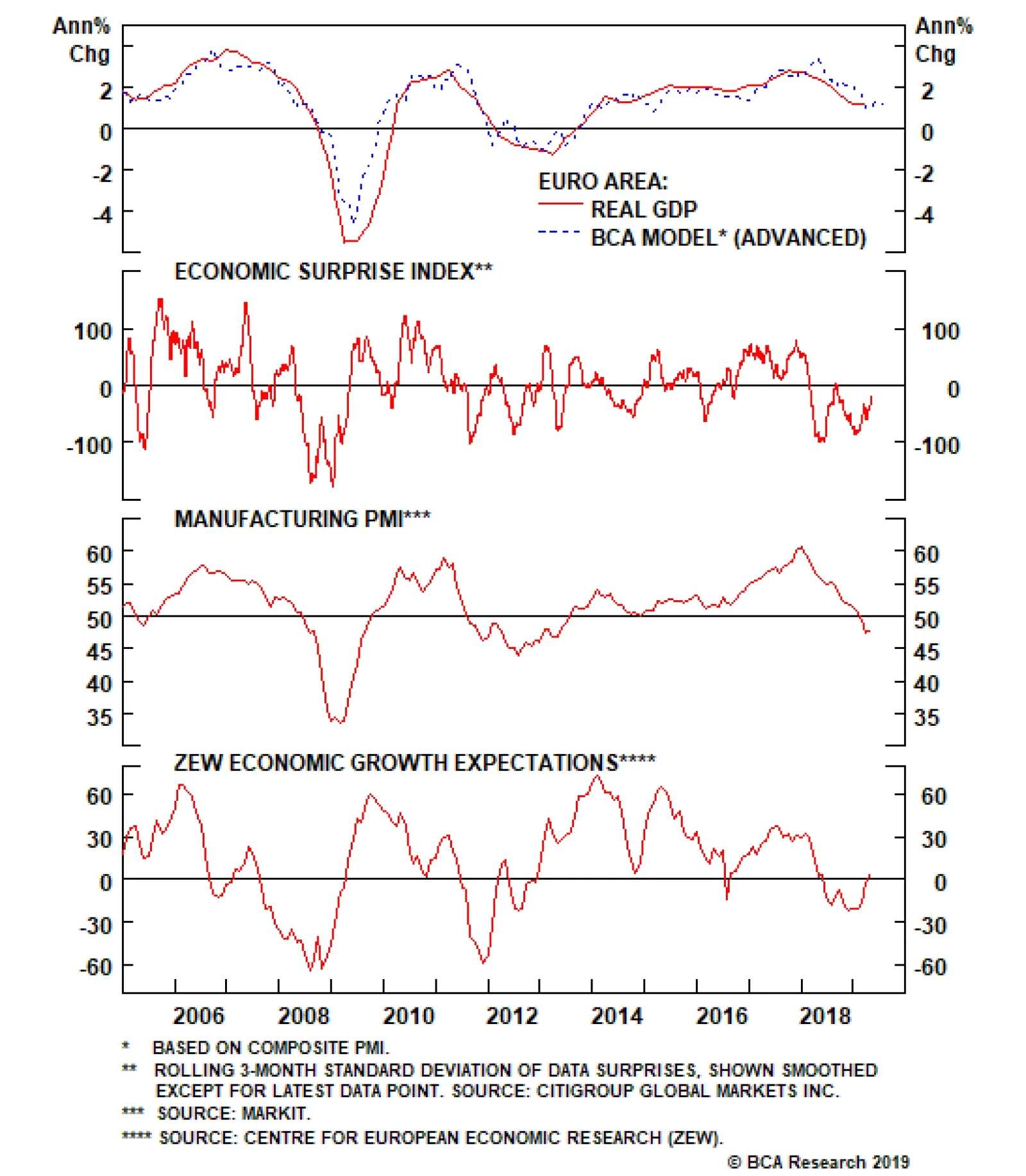
Across the ocean, European growth was a tad stronger. Italy managed to nudge itself out of a technical recession, while Spanish year-on-year growth of 2.4% helped drive euro area GDP growth to the tune of 1.2%. The most volatile components of euro area growth tend to be investment and net exports. Should both pick up on the back of stronger external demand, then GDP could easily gravitate towards 1.5%-2%, pinning it well above potential. The German PMI is currently one of the weakest in the euro zone. But forward-looking indicators suggest we are at the cusp of a V-shaped bottom over the next month or so (Chart I-1). China remains the epicenter of any growth pickup and the headline PMI numbers were soft, with the official NBS manufacturing PMI falling to 50.1 from 50.5, and the private sector Caixin manufacturing PMI falling to 50.2 from 50.8. Still, the numbers remain above the critical 50 threshold level, and well beyond the 45-48 danger zone. Export growth numbers across southeast Asia remain weak, and after a brisk rise since the start of the year, many China plays including commodity prices, the yuan, emerging market stocks, and Asian currencies are all rolling over. The bearish view is that there are diminishing marginal returns to Chinese stimulus, and the authorities need to be more aggressive to turn the domestic economy around. The reality is that policy stimulus works with a lag, and we need about three to six months before we see the effects of the current policy shift. Southeast Asian exports track the Chinese credit impulse with a lag of six months, and there is little reason to believe this time should be different (Chart I-2). Chart I-2Global Trade Should Soon Bottom
Global Trade Should Soon Bottom
Global Trade Should Soon Bottom
The broad message is that global growth likely bottomed in the first quarter. However, before evidence of this fully unfolds, markets are likely to be swayed by the ebbs and flows of higher-frequency data, making for a volatile bottoming process. We recommend maintaining a pro-cyclical bias, but taking out some insurance against a potential spike in volatility. The Fed On Hold This week’s FOMC meeting focused on the lack of inflationary pressures in the U.S. but was largely a non-event for financial markets, aside from a spike in volatility. Nonetheless, there were three key takeaways. First, the dip in inflation appears to be “transitory,” driven by lower clothing prices and financial services fees. Second, Chair Powell made it clear that the Fed will only feel the need to ease policy if inflation runs “persistently” below target. Finally, the Fed’s interpretation of its “symmetric” inflation target is slowly shifting. Many FOMC members increasingly believe that the Fed should explicitly pursue an overshoot of its 2% inflation target to make up for past misses. Taken together, we expect the Fed to remain on hold for the time being, but to eventually start raising rates again as inflationary pressures pick up. Chart I-3Inflation Should Be Higher In The U.S. Versus The Euro Area
Inflation Should Be Higher In The U.S. Versus The Euro Area
Inflation Should Be Higher In The U.S. Versus The Euro Area
The bigger picture is that in a very globalized world with fully flexible exchange rates, it is becoming more and more difficult for any one central bank to independently achieve its inflation objective. This is because, should inflation be on the rise and moving higher in one country, expectations of higher interest rates should lift its currency, which eventually tempers inflationary pressures, and vice versa. This is obviously a very simplistic view of the world economy, since other factors such as demographics, productivity, labor mobility, openness of the economy, and policy divergences among others, play important roles. However, it is remarkable that almost every developed market central bank has continued to attempt to boost inflation to the 2% level since the Global Financial Crisis, but very few have been able to achieve this independently. In a very globalized world with fully flexible exchange rates, it is becoming more and more difficult for any one central bank to independently achieve its inflation objective. Take the case of Europe versus the U.S., two economies that could not be more different. Euro area imports constitute about 41% of GDP, while the number in the U.S. is only 15%, so tradeable prices matter a lot more for the former. Meanwhile, the demographic profile is worse in Europe, with the old-age dependency ratio at 32% in Europe versus 23% in the U.S. Finally, other measures of supply-side constraints such as labor market slack or capacity utilization suggest the euro area is well behind the U.S. on the path toward a closed output gap (Chart I-3). Despite this, since 2015, headline inflation in both the U.S. and euro area have moved tick-for-tick. Yes, policy divergences between the two countries have been very wide, either via the lens of quantitative easing or simply the differential in policy rates (Chart I-4). But the fact that the magnitude and direction of overall inflation has moved homogenously, begs the question of the ability of either central bank to influence overall prices. One explanation could be that variations in headline CPI are largely driven by volatile items that tend to be exogenous, while variations in core CPI tend to be mostly driven by endogenous factors. This is confirmed by most research that suggest there is a weak link between rising commodity prices and longer-term inflation.1 That said, over the shorter run, commodity price gyrations can dominate and be the main driver of inflation expectations (Chart I-5). Chart I-4U.S. And Euro Area Overall CPI Are Broadly Similar
U.S. And Euro Area Overall CPI Are Broadly Similar
U.S. And Euro Area Overall CPI Are Broadly Similar
Chart I-5In The Short Term, Commodity Prices Matter For Inflation Expectations
In The Short Term, Commodity Prices Matter For Inflation Expectations
In The Short Term, Commodity Prices Matter For Inflation Expectations
The bottom line is that muted inflationary pressures are a global phenomenon, and not centric to the U.S. This means that as a whole, global central banks are set to stay accommodative for the time being, which will be bullish for global growth (Chart I-6). This warrants maintaining a pro-cyclical stance but being extremely selective in what might be a volatile bottoming process. Chart I-6Global Monetary Policy Needs To Ease Further
bca.fes_wr_2019_05_03_s1_c6
bca.fes_wr_2019_05_03_s1_c6
Maintain A Pro-Cyclical Stance With the S&P 500 breaking to all-time highs, crude oil prices up around 40% from their lows, and U.S. 10-year Treasury yields rolling over relative to the rest of the world, this has historically been fertile ground for high-beta currency trades. That said, the lack of more pronounced strength in pro-cyclical currencies like the Australian, New Zealand, and Canadian dollars suggest that caution prevails. Our bias is that currency markets continue to fight a tug-of-war between strong dollar fundamentals and fading tailwinds. Our portfolio consists mostly of trades along the crosses, but we have been cautiously adding to U.S. dollar short positions over the past few weeks: Long AUD/USD: Our limit-buy on the Aussie was triggered at 0.70. Data out of Australia are showing tentative signs of a bottom. Last week’s important jobs report showed that the economy continues to offer more employment than the consensus expects. Meanwhile, the credit growth data out of Australia this week suggests that macro-prudential policies continue to drive a wedge between owner-occupied and investor housing (Chart I-7). House prices in Australia are already deflating to the tune of around 6%. Once the cleansing process is through, we expect house price growth to eventually converge toward levels of credit and/or natural income growth. Moreover, the Australian dollar remains a commodity currency, and will benefit from rising terms-of-trade. Iron ore prices remain firm on the back of supply-related issues. Meanwhile, a rising mix of liquefied natural gas in the export basket will provide tailwinds as China continues to steer its economy away from coal. Finally, Chinese credit growth has been a key determinant of the re-rating of Australian equities. Ergo, a rising Chinese credit impulse will ignite Australian share prices, and by extension the Australian dollar (Chart I-8). Chart I-7Australian Credit Growth Converging To Steady State
Australian Credit Growth Converging To Steady State
Australian Credit Growth Converging To Steady State
Chart I-8More Chinese Credit Will Help Australian Equities
More Chinese Credit Will Help Australian Equities
More Chinese Credit Will Help Australian Equities
Long GBP/USD: Our buy-limit order on the British pound was triggered at 1.30 on March 29th. As we argued back then, the pound is sitting exactly where it was after the 2016 referendum results, but the odds of a hard Brexit have significantly fallen since then. On the domestic front, economic surprises in the U.K. relative to both the U.S. and euro area continue to soar. The reality is that the pound and U.K. gilt yields should be much higher – solely on the basis of hard incoming data. Employment growth has been holding up very well, wages are inflecting higher, and the average U.K. consumer appears in decent shape. Full-time employees continue to creep higher as a percentage of overall employment (Chart I-9). This view was echoed in yesterday’s Bank Of England (BoE) policy meeting, where the central bank raised its growth forecast while striking a more hawkish tone. Chart I-9U.K.: What Brexit?
U.K.: What Brexit?
U.K.: What Brexit?
Chart I-10Sweden: Volatile Bottom
Sweden: Volatile Bottom
Sweden: Volatile Bottom
Long SEK/USD: The Swedish krona should be one of the first currencies to benefit from any bottoming in European growth (Chart I-10). The Swedish economy appears to have bottomed relative to that of the U.S., making the USD/SEK an attractive way to play USD downside. From a technical perspective, the cross is trading at its lowest level since the global financial crisis (Chart I-11). Economic surprises in the U.K. relative to both the U.S. and euro area continue to soar. The main appeal of the Swedish krona is that it is extremely cheap. Meanwhile, despite negative interest rates, Swedish household loan growth has been slowing as consumers are increasingly financing purchases through rising wages. This will alleviate the need for the Riksbank to maintain ultra-accommodative policy, despite its recent dovish shift. Buy Some Insurance Given current low levels of volatility and elevated equity market valuations, the dollar would have been a great insurance policy for any stock market correction. But with U.S. interest rates having risen significantly versus almost all G10 countries in recent years, the dollar has itself become the object of carry trades. This has also come with a good number of unhedged trades, as the rising exchange rate has lifted hedging costs. Chart I-11How Much Lower Could The Swedish Krona Go?
How Much Lower Could The Swedish Krona Go?
How Much Lower Could The Swedish Krona Go?
Chart I-12Buy Some##br## Insurance
Buy Some Insurance
Buy Some Insurance
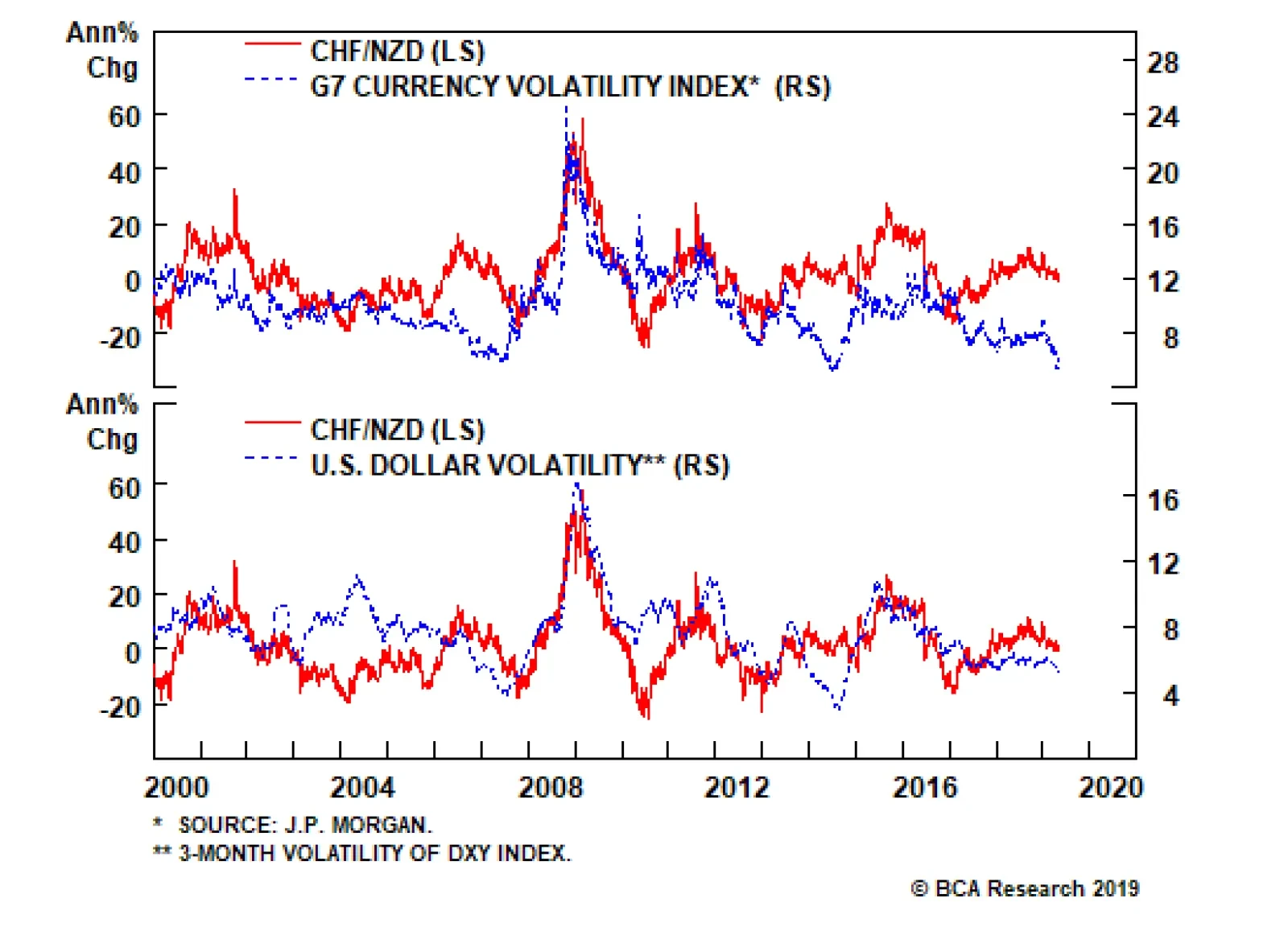
It will be difficult for the dollar to act as both a safe-haven and carry currency, because the forces that drive both move in opposite directions. As markets become volatile and some carry trades are unwound, unhedged trades will become victim to short-covering flows. Currencies such as the Japanese yen and the Swiss franc that could have been used to fund carry trades are ripe for reversals. This suggests at a minimum building some portfolio hedges. One such hedge is going long the CHF/NZD. This trade has a high negative carry, so we do not intend to hold it for longer than three months. But it should pay off handsomely on any rise in volatility (Chart I-12). Maintain a limit-buy at 1.45. Chester Ntonifor, Foreign Exchange Strategist chestern@bcaresearch.com Footnotes 1 Stephen G Cecchetti and Richhild Moessner, “Commodity Prices And Inflation Dynamics,” Bank Of International Settlements, Quarterly Review, (December 2008). Currencies U.S. Dollar Chart II-1USD Technicals 1
USD Technicals 1
USD Technicals 1
Chart II-2USD Technicals 2
USD Technicals 2
USD Technicals 2
Recent data in the U.S. continue to moderate: Annualized Q1 GDP came in at 3.2% quarter-on-quarter, well above estimates. Personal income increased by 0.1% month-on-month in March, below the estimated 0.4%. On the other hand, personal spending increased by 0.9% month-on-month in March. PCE deflator and core PCE deflator fell to 1.5% and 1.6% year-on-year, respectively in March. Michigan consumer sentiment index slightly increased to 97.2 in April. Markit manufacturing PMI increased from 52.4 to 52.6 in April, while ISM manufacturing PMI fell to 52.8. Q1 nonfarm productivity increased by 3.6%, surprising to the upside. DXY index fell by 0.3% this week. On Wednesday, the Fed announced their decision to keep interest rates on hold at current levels, further suggesting that there is no strong case to move rates in either direction based on recent economic developments. Moreover, Fed chair Powell reiterated their strong commitment to the 2% inflation target. Report Links: Currency Complacency Amid A Global Dovish Shift - April 26, 2019 Beware Of Diminishing Marginal Returns- April 19, 2019 Not Out Of The Woods Yet - April 5, 2019 The Euro Chart II-3EUR Technicals 1
EUR Technicals 1
EUR Technicals 1
Chart II-4EUR Technicals 2
EUR Technicals 2
EUR Technicals 2
Recent data in the euro area are improving: Money supply (M3) in the euro area increased by 4.5% year-on-year in March. The sentiment in the euro area remains soft in April: economic sentiment indicator fell to 104; business climate fell to 0.42; industrial confidence fell to -4.1; consumer confidence was unchanged at -7.9. Q1 GDP came in at 1.2% year-on-year, surprising to the upside. Unemployment rate fell to 7.7% in March. Markit PMI increased to 47.9 in April. EUR/USD appreciated by 0.3% this week. European data keep grinding higher. Italian GDP moved back into positive territory in Q1. Spanish GDP also rebounded in Q1. Positive Chinese credit data suggests the euro will soon benefit from rising Chinese imports. Report Links: Reading The Tea Leaves From China - April 12, 2019 Into A Transition Phase - March 8, 2019 A Contrarian Bet On The Euro - March 1, 2019 Japanese Yen Chart II-5JPY Technicals 1
JPY Technicals 1
JPY Technicals 1
Chart II-6JPY Technicals 2
JPY Technicals 2
JPY Technicals 2
Recent data in Japan have been positive: The unemployment rate in March increased slightly to 2.5%; job-to-applicant ratio was unchanged at 1.63. Tokyo consumer price inflation increased to 1.4% year-on-year in March, the highest level since October 2018. Industrial production fell by 4.6% year-on-year in March. However, projections for April suggest a 2.7% month-on-month jump. Retail sales grew by 1% year-on-year in March, higher than expected. Housing starts grew by 10% year-on-year in March. This is the highest growth level since February 2017. USD/JPY fell by 0.2% this week. The Japanese government’s intention to raise sales tax this October could be a highly deflationary outcome. However, there is still an outside chance that the tax hike will be postponed. We continue to recommend yen as a safety hedge. Report Links: Beware Of Diminishing Marginal Returns - April 19, 2019 Tug OF War, With Gold As Umpire - March 29, 2019 A Trader’s Guide To The Yen - March 15, 2019 British Pound Chart II-7GBP Technicals 1
GBP Technicals 1
GBP Technicals 1
Chart II-8GBP Technicals 2
GBP Technicals 2
GBP Technicals 2
Recent data in the U.K. have been positive: U.K. mortgage loans in March increased to 40K. Nationwide housing prices increased by 0.9% on a year-on-year basis in April. Markit manufacturing PMI came in above expectations at 53.1 in April, even though it fell; Markit construction PMI however increased to 50.5. Money supply (M4) increased by 2.2% year-on-year in March. GBP/USD increased by 1% this week. The Bank of England kept rates on hold at 0.75% this week. In the May inflation report, the BoE mentioned that U.K.’s economic outlook will depend significantly on the nature and timing of EU withdrawal, and the new trading agreement with EU in particular. But governor Carney struck a slightly hawkish tone, revising up GDP estimates and guiding the next policy move as a rate hike. Report Links: Not Out Of The Woods Yet - April 5, 2019 A Trader’s Guide To The Yen - March 15, 2019 Balance Of Payments Across The G10 - February 15, 2019 Australian Dollar Chart II-9AUD Technicals 1
AUD Technicals 1
AUD Technicals 1
Chart II-10AUD Technicals 2
AUD Technicals 2
AUD Technicals 2
Recent data in Australia have shown tentative signs of recovery: Private sector credit growth fell to 3.9% year-on-year in March. However, this is heavily biased downwards by lending to home investors that has slowed to a crawl. The Australian Industry Group (AiG) manufacturing index increased to 54.8 in April. RBA commodity index increased by 14.4% year-on-year in April. AUD/USD fell by 0.4% this week. The data are starting to look brighter in Q2, suggesting that the economy might have bottomed in Q1. The Australian dollar is likely to grind higher, especially driven by rising terms of trade. Report Links: Beware Of Diminishing Marginal Returns- April 19, 2019 Not Out Of The Woods Yet - April 5, 2019 Into A Transition Phase - March 8, 2019 New Zealand Dollar Chart II-11NZD Technicals 1
NZD Technicals 1
NZD Technicals 1
Chart II-12NZD Technicals 2
NZD Technicals 2
NZD Technicals 2
Recent data in New Zealand are mixed: ANZ activity outlook increased by 7.1% in April. ANZ business confidence in April improved to -37.5. On the labor market front in Q1, the employment change fell to 1.5% year-on-year; unemployment rate was unchanged at 4.2%, but participation rate fell to 70.4%; labor cost index fell to 2% year-on-year. Building permits contracted by 6.9% month-on-month in March. NZD/USD depreciated by 0.4% this week. The data from New Zealand continue to underperform its antipodean neighbor. We anticipate this trend will persist. Stay long AUD/NZD, currently 0.5% in the money. Report Links: Not Out Of The Woods Yet - April 5, 2019 Balance Of Payments Across The G10 - February 15, 2019 A Simple Attractiveness Ranking For Currencies - February 8, 2019 Canadian Dollar Chart II-13CAD Technicals 1
CAD Technicals 1
CAD Technicals 1
Chart II-14CAD Technicals 2
CAD Technicals 2
CAD Technicals 2
Recent data in Canada continue to underperform: GDP in February contracted by 0.1% on a month-on-month basis. Markit manufacturing PMI fell below 50 to 49.7 in April. USD/CAD fell by 0.1% this week. During Tuesday’s speech, Governor Poloz acknowledged recent negative developments in the Canadian economy, and blamed it on the U.S.-led trade war, as well as the sharp decline in oil prices late last year. While a bottoming in the global growth could be a tailwind for the Canadian economy near-term, a Ricardian equivalence framework will suggest fiscal austerity over the next few years, will be a headwind for long-term CAD investors. Report Links: Currency Complacency Amid A Global Dovish Shift - April 26, 2019 A Shifting Landscape For Petrocurrencies - March 22, 2019 Into A Transition Phase - March 8, 2019 Swiss Franc Chart II-15CHF Technicals 1
CHF Technicals 1
CHF Technicals 1
Chart II-16CHF Technicals 2
CHF Technicals 2
CHF Technicals 2
Recent data in Switzerland have been negative: KOF leading indicator fell to 96.2 in April. Real retail sales contracted by 0.7% year-on-year in March. SVME PMI fell below 50 to 48.5 in April. USD/CHF fell by 0.1% this week. The reduced volatility worldwide could make the Swiss franc less attractive. Moreover, the relative outperformance of the euro area is a headwind for the franc. Our long EUR/CHF position is now 1% in the money. We intend to trade the franc purely as an insurance policy near-term. Report Links: Beware Of Diminishing Marginal Returns - April 19, 2019 Balance Of Payments Across The G10 - February 15, 2019 A Simple Attractiveness Ranking For Currencies - February 8, 2019 Norwegian Krone Chart II-17NOK Technicals 1
NOK Technicals 1
NOK Technicals 1
Chart II-18NOK Technicals 2
NOK Technicals 2
NOK Technicals 2
Recent data in Norway has been positive: Retail sales increased by 0.6% in March, in line with expectations. This was a marked improvement from the 1.2% drop in February. The unemployment rate held low at 3.8% USD/NOK increased by 1% this week. We expect the Norwegian krone to pick up based on the strong fundamentals and positive oil price outlook. Report Links: Currency Complacency Amid A Global Dovish Shift - April 26, 2019 A Shifting Landscape For Petrocurrencies - March 22, 2019 Balance Of Payments Across The G10 - February 15, 2019 Swedish Krona Chart II-19SEK Technicals 1
SEK Technicals 1
SEK Technicals 1
Chart II-20SEK Technicals 2
SEK Technicals 2
SEK Technicals 2
Recent data in Sweden have been mostly positive: Retail sales increased on a month-on-month basis by 0.5% in March, but fell to 1.9% on a yearly basis. Producer price index was unchanged at 6.3% year-on-year in March. Trade balance came in at a large surplus of 7 billion SEK in March. Manufacturing PMI fell to 50.9 in April, but notably, import orders and backlog orders rose. USD/SEK increased by 0.4% this week. Despite the RiksBank’s dovish shift last week, we continue to favor our long SEK position. Our conviction is rooted in the fact that the Swedish krona is undervalued, and relative PMI trends favor Sweden vis-à-vis the U.S. Report Links: Balance Of Payments Across The G10 - February 15, 2019 A Simple Attractiveness Ranking For Currencies - February 8, 2019 Global Liquidity Trends Support The Dollar, But... - January 25, 2019 Trades & Forecasts Forecast Summary Core Portfolio Tactical Trades Closed Trades
The German manufacturing PMI, which clocked in at 44.4, remains a large drag on global manufacturing PMIs. Worryingly, Swedish PMIs and the U.S. ISM echoed this pictured of weaker manufacturing activity. Last year’s deceleration in Chinese activity, as…
In the euro area, Japan and Australia – where core inflation rates are well below central bank targets and money markets are discounting flat-to-lower interest rate expectations over the next 1-2 years – market-based measures of inflation expectations like…
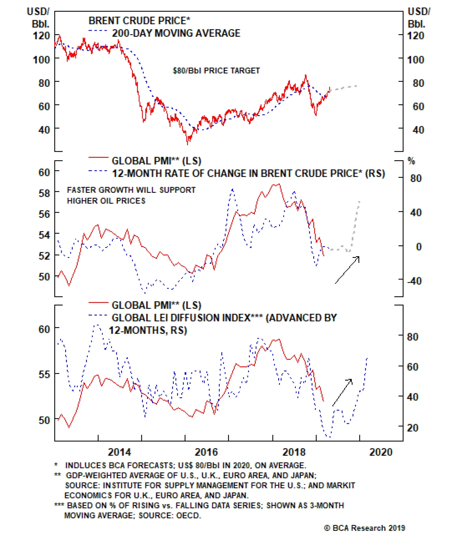
BCA’s Commodity & Energy Strategy team remains bullish on oil prices, with a year-end price target of $80/bbl for the Brent crude benchmark. Our strategists view supply constraints as large and persistent enough to keep oil prices rising alongside firmer…
Feature What Could Sour The Sweet Spot? This continues to look like a very benevolent environment for risk assets. Growth in the U.S. remains decent, with Q1 GDP growth beating expectations at 3.2% QoQ annualized (albeit somewhat distorted by rising inventories). Leading indicators point to U.S. GDP growth of around 2.5% for 2019. The rest of the world is showing the first “green shoots” of economic recovery. China continues to expand credit, and the effects of this are starting to stabilize growth in Europe, Japan, and the Emerging Markets (Chart 1). Recommended Allocation
Monthly Portfolio Update
Monthly Portfolio Update
Chart 1China Reflation Helping Growth To Bottom
China Reflation Helping Growth To Bottom
China Reflation Helping Growth To Bottom
At the same time, central banks everywhere have turned accommodative. Following the Fed’s dovish shift late last year, the market has priced in rate cuts by end-2019. The ECB is about to relaunch its TLTRO funding program, and is expected to keep rates in negative territory for at least another year (Chart 2) – though there are worries whether Mario Draghi’s successor as ECB president might be more hawkish. The Bank of Canada and Bank of Japan, among others, have recently reemphasized monetary caution. Chart 2No Rate Hikes Anywhere
No Rate Hikes Anywhere
No Rate Hikes Anywhere
Chart 3Term Premium Keeping Down Yields
Term Premium Keeping Down Yields
Term Premium Keeping Down Yields
This goes some way to explain the biggest puzzle in markets currently: why, despite global equities being less than 1% below a record high, long-term interest rates remain so low, with the 10-year U.S. Treasury yield at 2.5%, and yields in Germany and Japan hovering around zero. There are other explanations too. A decomposition of the U.S. 10-year yield shows that most of the downward pressure has come from a sharp drop in the term premium (Chart 3). This is partly because lousy growth in other developed economies, such as Germany and Japan, has pushed down yields in these countries and, given that spreads to the U.S. were at record highs, depressed U.S. rates too. It also reflects a lingering pessimism among investors who bought Treasuries at the end of last year to hedge against recession and who remain concerned about the economy. This is evidenced by continuing strong flows into bond funds in 2019 (Chart 4). A decomposition of the U.S. 10-year yield shows that most of the downward pressure has come from a sharp drop in the term premium. Chart 4Investors Buying Bonds, Not Equities
Investors Buying Bonds, Not Equities
Investors Buying Bonds, Not Equities
Chart 5Why Has Inflation Fallen?
Why Has Inflation Fallen?
Why Has Inflation Fallen?
A further explanation is the recent softness in inflation, with the Fed’s focus measure, core PCE inflation, slowing to an annual rate of only 0.7% over the past three months (Chart 5). This is probably mostly due to the economic slowdown late last year. But it may also have structural causes: the recent improvement in labor productivity can perhaps allow wages to rise without feeding through into consumer price inflation (Chart 6). Chart 6Maybe Because Of Better Productivity
Maybe Because Of Better Productivity
Maybe Because Of Better Productivity
Chart 7Indicators Suggest Inflation Will Still Trend Up
Indicators Suggest Inflation Will Still Trend Up
Indicators Suggest Inflation Will Still Trend Up
How is this all likely to pan out? We think it improbable that inflation will stay low for long if growth is as robust as we expect. Leading indicators of inflation continue to suggest prices will trend higher (Chart 7). The Fed may not rush to raise rates (not least since, with the lower inflation recently, the Fed Funds Rate in real terms is now at neutral according to the Laubach-Williams model, Chart 8). But we also find it inconceivable that the Fed will cut rates, if growth remains strong, stocks continue to rise, and global risks recede. By the end of this year, it should be able to make a renewed case for a further hike. But even if it doesn’t do that – and permits either inflation to overheat for a while, or asset bubbles to form – these scenarios should be more conducive to equity outperformance, than bond outperformance. Global equities have already risen by 22% since last December’s low and may struggle to make rapid progress over the next few months. The key to further upside for stocks will be earnings: since analysts have cut EPS forecasts for S&P 500 companies for this year to only 4%, those expectations should not be hard to beat. In the Q1 earnings season, for instance, 79% of companies have so far come in ahead of the consensus EPS forecast. For global asset allocators, the key decision is always at the asset-class level. Will equities outperform bonds over the coming 12 months? Equities should have further upside if our macro scenario proves correct. On the other hand, we find it hard to imagine that global bond yields will not rise moderately if global growth recovers, the Fed refrains from cutting rates, inflation rises somewhat, and investors turn less wary of equities. We continue, therefore, to expect the stock-to-bond ratio (Chart 9) to rise further over the next 12 months. We think it improbable that inflation will stay low for long if growth is as robust as we expect. Chart 8Is Fed Now At Neutral?
Is Fed Now At Neutral?
Is Fed Now At Neutral?
Chart 9Stock-To-Bond Ratio Can Rise Further
Stock-To-Bond Ratio Can Rise Further
Stock-To-Bond Ratio Can Rise Further
Chart 10Europe And EM Outperform Only Briefly
Europe And EM Outperform Only Briefly
Europe And EM Outperform Only Briefly
Equities: We remain overweight global equities, but are reluctant to take higher beta country exposure until there is greater clarity on the bottoming out of ex-U.S. growth. Moreover, the structural headwinds that have prevented anything more than short-term outperformance for eurozone stocks (banking sector weakness) and Emerging Markets (excess debt and poor productivity) since 2010 remain powerful negative factors (Chart 10). Our moderately pro-cyclical sector recommendations (overweight energy and industrials) should hedge us against upside risk emanating from a strong rebound in Chinese imports. Fixed Income: Over the past few years, periods where equities have decoupled from bond yields have been resolved with bond yields playing catch-up (Chart 11). We expect the same to happen over the next few months, with global government bond yields rising moderately. The risk-on environment continues to be positive for credit. We prefer credit to government bonds within fixed income, but are only neutral within our overall recommended portfolio. U.S. high-yield bonds in particular look attractively valued, as long as growth continues and default rates don’t start to rise too much (Chart 12). Chart 11When Bonds And Equities Diverge…
When Bonds And Equities Diverge...
When Bonds And Equities Diverge...
Chart 12Junk Bonds Attractively Valued
Junk Bonds Attractively Valued
Junk Bonds Attractively Valued
Currencies: A pick-up in global growth would be negative for the U.S. dollar, typically a counter-cyclical currency (Chart 13). BCA’s currency strategists have slowly been moving towards a more positive stance on some currencies versus the dollar, particularly the euro and Australian dollar. We would expect to see the trade-weighted dollar start to depreciate in H2 once global growth accelerates, fueled by the very skewed long-dollar positioning currently. However, this may be only a six- to 12-month move, since growth and interest-rate differentials suggest that the structural dollar bull market that began in 2012 has not yet fully run its course. Commodities: Oil remains dominated by supply-side dynamics. How much the ending of waivers on Iranian oil sanctions, plus troubles in Venezuela and Libya, push up oil prices will depend on whether President Trump can persuade Saudi Arabia and UAE to increase production. BCA’s energy team expects he will be only partially successful in doing so, and see Brent reaching $80 a barrel and WTI $77 (from $72 and $64 currently) during 2019. Industrial commodities prices will depend on the strength and nature of China’s reflation: our commodities strategists see copper, the most sensitive metal to Chinese demand, as the best way to play this.1 Garry Evans Chief Global Asset Allocation Strategist garry@bcaresearch.com Chart 13Stronger Growth Would Be Dollar Negative
Stronger Growth Would Be Dollar Negative
Stronger Growth Would Be Dollar Negative
Footnotes 1 Please see Commodity & Energy Strategy Weekly Report, “Copper Will Benefit Most From Chinese Stimulus,” dated April 25, 2019, available at ces.bcaresearch.com GAA Asset Allocation