Global

Highlights U.S. inflation is on a structural uptrend. Monetary and fiscal policy, populism, and demographics will tend to push inflation higher over the coming decade. How can investors protect portfolios against inflation risk? We look at periods of rising inflation to determine which assets were the best inflation hedge. We find that the level of inflation is very important in determining which assets work best. When inflation is rising and high, or very high, the best inflation hedges at the asset class level are commodities and U.S. TIPS. When inflation is very high, gold is the best commodity to hold and defensive sectors will minimize losses in an equity portfolio. However, hedges have a cost. Allocating a large percentage of a portfolio to inflation hedges will be a drag on returns. Investors should opt for a low allocation to hedges now, and increase to a medium level when inflation rises further. Feature Some 38 years have passed since the last time the U.S. suffered from double-digit inflation. The Federal Reserve reform of 1979, championed by Paul Volcker, changed the way the Fed approached monetary policy by putting a focus on controlling money growth.1 The reform gave way to almost four decades of relatively controlled inflation, which persists today. But times are changing. While most of today’s investors have never experienced anything other than periods of tame inflation, BCA expects that rising inflation will be a major driving force of asset returns over the coming decade.2 The main reasons behind this view are the following: 1. A rethink in the monetary policy framework: At its most recent meeting, the FOMC openly discussed the idea of a price-level target, implying that it would be open to the economy running hot to compensate for the past 10 years of below-target inflation (Chart II-1.1A, top panel). Chart II-1.1AStructural Forces Point To Higher Inflation In The Coming Decade (I)
Structural Forces Point To Higher Inflation In The Coming Decade (I)
Structural Forces Point To Higher Inflation In The Coming Decade (I)
Chart II-1.1BStructural Forces Point To Higher Inflation In The Coming Decade (I)
Structural Forces Point To Higher Inflation In The Coming Decade (I)
Structural Forces Point To Higher Inflation In The Coming Decade (I)
2. Procyclical fiscal policy: The U.S. is conducting expansionary fiscal policy while the economy is at near-full employment (Chart II-1.1A, middle panel). The last time this happened in the U.S., during the 1960s, high inflation followed, as the fiscal boost made the economy run substantially above capacity. 3. Waning Fed independence: President Trump has openly questioned the hiking campaign undertaken by the Fed. Moreover, he has tried to nominate Fed governors with dovish tendencies. Historically around the world, a lack of central bank independence has often led to higher inflation rates (Chart II-1.1A, bottom panel). 4. Peak in globalization: Globalization accelerated significantly in the 1990s and 2000s, flooding the global economy with cheap labor (Chart II-1.1B, top panel). However, we believe that globalization has peaked. Instead, populism and protectionism will be the dominant paradigms for years to come, reducing the cheap pool of workers and goods previously available. 5. Demographics: The population in the U.S. is set to age in coming years (Chart II-1.1B, middle panel). As the percentage of U.S. retirees increases, the number of spenders relative to savers will begin to rise (Chart II-1.1B, bottom panel). Higher spending and lower savings in the economy should create upward pressure on inflation. If our view is correct, how should investors allocate their money? We attempt to answer this question by evaluating the performance of five major asset classes during periods when inflation was rising. Furthermore, we look into sub-asset class performance to determine how investors should position themselves within each asset class to take advantage of an inflationary environment. In our asset-class analysis, we use a data sample starting in 1973 and we limit ourselves to five publicly traded assets that have adequate history: global equities, U.S. Treasuries, U.S. real estate (REITs), U.S. inflation-linked bonds,3 and commodities. We compare asset classes according to their Sharpe ratios: average annualized excess returns divided by annualized volatilities.4 BCA expects that rising inflation will be a major driving force of asset returns over the coming decade. In our sub-asset class analysis, we analyze global equity sectors, international vs U.S. equities, and individual commodities. In some of the sections in our sub-asset class analysis, our sample is slightly reduced due to lack of historical data. Moreover, since in some instances all sectors have negative returns, we compare sub-asset classes according to their excess returns only. We base our analysis on the U.S. Consumer Price Index, given that most of the assets in our sample are U.S. based. We opt for this measure because it tends to track the living expenses for most U.S. citizens and it is the preferred measure to index defined-benefit payments. Finally, we decompose the periods of rising inflation into four quartiles in order to examine whether the level of inflation has any impact on the performance of each asset. Chart II-1.2 and Table II-1.1 show the different ranges we use for our analysis as well as a description of the typical economic and monetary policy environments in each of them.
Chart II-1
Chart II-
Summary Of Results Table II-1.2 shows the summary of our results. For a detailed explanation on how each asset class and sub-asset class behaves as inflation rises, please see the Asset Class section and the Sub-Asset Class section below.
Chart II-
Which assets perform best when inflation is rising? Rising inflation affects assets very differently, and is especially dependent on how high inflation is. Global equities performed positively when inflation was rising and low or mild, but they were one of the worst-performing assets when inflation was rising and high or very high. Importantly, equities underperformed U.S. Treasuries in periods of both high and very high inflation. Commodities and U.S. TIPS were the best performers when inflation was high or very high. U.S. REITs were not a good inflation hedge. Which global equity sectors perform best when inflation is rising? Energy and materials outperformed when inflation was high. Every single sector had negative excess returns when inflation was very high, but defensive sectors such as utilities, healthcare, and telecommunications5 minimized losses. Which commodities perform best when inflation is rising? With the exception of energy, most commodities had subpar excess returns when inflation was in the first two quartiles. Industrial metals outperformed when inflation was high. Gold and silver outperformed when inflation was very high. Additionally, gold had consistent returns and low volatility. What is the cost of inflation hedging?
Chart II-1
To answer this question, we construct four portfolios with different levels of inflation hedging: 1. Benchmark (no inflation hedging): 60% equities/40% bonds. 2. Low Inflation Hedging: 50% equities/40% bonds/5% TIPS/5% commodities 3. Medium Inflation Hedging: 40% equities/30% bonds/15% TIPS/15 % commodities 4. Pure Inflation Hedging: 50% TIPS/50% commodities. While increased inflation hedging provides better performance when inflation is high and rising, these hedges are costly to hold when inflation is at lower ranges or when it is falling (Chart II-1.3, panels 1 & 2). However, adding moderate inflation hedging (low or medium) to a portfolio achieved the right balance between cost and protection, and ultimately improved risk-adjusted returns over the whole sample (Chart II-1.3, panel 3). What about absolute returns? The benchmark outperformed over the whole sample. However, the low and medium inflation hedging did not lag far behind, while avoiding the big drawdowns of high inflation periods (Chart II-1.3, panel 4). Investment Implications High inflation may return to the U.S. over the next decade. Therefore, inflation hedging should be a key consideration when constructing a portfolio. Based on our results, our recommendations are the following: 1. At the asset-class level, investors should allocate to commodities and U.S. TIPS to hedge inflation. 2. However, these hedges are costly to hold as they will create a drag on returns in periods when inflation is not high or very high. Therefore, a low allocation to inflation hedges is warranted now. 3. Inflation will probably start to pick up in the 2020s. A medium allocation to inflation hedges will then be appropriate. 4. When inflation is high (3.3%-4.9%), investors should overweight energy and materials in their equity portfolios. Likewise, they should overweight industrial metals and energy within a commodity portfolio. 5. When inflation is very high (4.9% or more), investors should overweight defensive sectors in their equity portfolio to minimize losses. Moreover, investors should overweight gold within a commodity portfolio. At the asset-class level, investors should allocate to commodities and U.S. TIPS to hedge inflation. Asset Classes Global Equities
Chart II-2
The relationship between equity returns and rising inflation depends on how high inflation is, with outstanding performance when inflation is rising but low or mild, and poor performance as it gets higher (Chart II-2.1, top panel). This relationship can be explained by the interaction between interest rates, inflation, earnings, and valuations: Earnings growth was usually slightly negative when inflation was recovering from low levels. However, given that interest rates were very low in this environment and growth expectations were high, multiple expansion boosted equity returns (Chart II-2.1, bottom panel). When inflation was mild, the Fed typically started to raise rates, resulting in a declining multiple. However, equities had the best performance in this range thanks to very high earnings growth – a result of the economy growing strongly due to a healthy level of inflation. When inflation climbed into the high or very high range, earnings growth was usually positive but beginning to slow, as high inflation weighed on growth. Meanwhile the multiple started to decline rapidly due to rising interest rates and declining growth expectations. With the exception of the mild inflation range, the return profile of equities during inflationary periods was similar to its normal profile: negative skew and excess kurtosis (Table II-2.1). However, the consistency of returns decreased at higher levels of inflation, with only 45% of months with positive returns when inflation was rising and in its highest quartile.
Chart II-
U.S. Treasuries
Chart II-2
U.S. Treasuries reacted in a similar fashion to equities when inflation was rising (Chart II-2.2). However, while Treasuries underperformed equities when inflation was low or mild, they actually outperformed equities when inflation was high or very high. This was in part due to the fact that at higher inflation ranges, U.S. Treasuries offer a higher coupon return when rates are high, at least partially counteracting losses from falling prices. The steady stream of cash flows from the coupons helped Treasuries achieve positive returns roughly two-thirds of the time at the highest levels of inflation (Table II-2.2). However, this consistency in returns came at a cost: very high inflation resulted in negative skew and high excess kurtosis. Therefore, while Treasuries provided frequent positive returns when inflation was very high, they were prone to violent selloffs.
Chart II-
U.S. REITs
Chart II-2
While REITs had high risk-adjusted returns when inflation was rising but mild, much like equities they had subpar performance in every other quartile and particularly poor performance when inflation was high or very high (Chart II-2.3). These results confirm our previous research showing that REITs performance is very similar to that of equities.6 The return consistency for REITs was generally poor in inflationary periods, with the second-lowest percentage of positive return of any asset class (Table II-2.3). Moreover, REIT returns had excess kurtosis and negative skew throughout all inflation quartiles.
Chart II-
Commodity Futures
Chart II-2
Commodities performed positively in every quartile, and did particularly well when inflation was mild (Chart II-2.4, top panel). However, total return and price return were very different due to the behavior of the roll and collateral return: Total risk-adjusted returns were lower than spot risk-adjusted returns when inflation was low and rising. This happened because during these periods, commodity supply was high relative to demand, as the economy was recovering from a deflationary shock. Thus, there was an incentive for producers to conserve inventories, making the futures curve upward-sloping (contango). Thus, roll return was negative (Chart II-2.4, bottom panel). When inflation was in the upper two quartiles, total risk-adjusted returns were much higher than risk-adjusted spot returns. This was because high inflation was the product of supply shocks. These supply shocks resulted in a downward-sloping futures curve (backwardation), which, in turn, resulted in a positive roll return. Additionally, high rates during these regimes contributed to a high collateral return. Commodities provided good return consistency during inflationary periods, with roughly 60% of positive return months in the upper two inflation quartiles (Table II-2.4). The skew of returns was neutral or positive in the top two quartiles. This means that although volatility was high for commodities, extreme return movements were normally positive.
Chart II-
U.S. Inflation-Protected Bonds
Chart II-2
While inflation-protected bonds provided meager returns when inflation was rising but in the mild range, they provided excellent performance at the highest levels of inflation (Chart II-2.5). Moreover, this high Sharpe ratio was not just simply the result of low volatility, since U.S. TIPS had excess returns of 4.6% when inflation was high and 5.7% when inflation was very high.7 The return profile of inflation-protected bonds during inflationary periods was also attractive in our testing period. Average skew was positive, while kurtosis was relatively low (Table II-2.5). The percentage of positive months across all quartiles was also the highest of all asset classes, with a particularly high share of positive returns in the periods of highest inflation.
Chart II-
Sub-Asset Classes Global Equity Sectors
Chart II-3
For the sector analysis, we looked at information technology, financials, energy, materials, utilities, healthcare, and telecommunications. We excluded industrials, consumer discretionary, and consumer staples given that they do not have adequate back data. Once again, we separate rising inflation periods into four quartiles, arriving at the following results: When inflation was low, information technology had the best excess returns while utilities had the worst (Chart II-3.1, panel 1). This matches our observations at the asset class level, as IT is highly responsive to changes in the valuation multiple. When inflation was mild, energy had the best performance, followed by information technology (Chart II-3.1, panel 2). Meanwhile, financials had the worst performance, as rates were normally rising in these periods. When inflation was high, sectors highly correlated with commodity prices such as energy and materials outperformed. Meanwhile, IT was the worst performer (Chart II-3.1, panel 3). When inflation was very high, every sector had negative excess returns. Overall, investing in energy minimized losses (Chart II-3.1, panel 4). However, this performance was in part attributable to the oil spikes of the 1970s. Alternatively, defensive sectors such as utilities, telecommunications, and healthcare also minimized losses. International vs U.S. Equities
Chart II-3
How do equities outside of the U.S. behave when inflation is rising? While the high share of U.S. equities in the global index causes U.S. equities to be the main driver of global stock prices, is it possible to improve returns in inflationary environments by overweighting international equities? The answer once again depends on the level of inflation. When inflation was rising but low, U.S. stocks outperformed global ex-U.S. equities in both common currency and local currency terms (Chart II-3.2, panel 1). This was in part due to the inherent tech bias in U.S. stocks. Additionally, the low level of inflation was often accompanied by slowing global growth in our sample, helping the U.S. dollar. When inflation was mild, U.S. stocks once again outperformed international stocks in both local and common currency terms, though to a lesser degree (Chart II-3.2, panel 2). The dollar was roughly flat in this environment. U.S. stocks started to have negative excess returns when inflation was high (Chart II-3.2, panel 3). On the other hand international equities had positive excess returns in dollar terms, partly because of their energy and material bias and partly because the dollar was generally weak in this period. U.S. equities outperformed global ex-U.S. equities by a small margin when inflation was very high, given that defensive sectors such as telecommunication were over-represented in the U.S. index (Chart II-3.2, panel 4). The dollar was roughly flat in this period. Individual Commodities
Chart II-3
Our analysis above confirmed that commodities were one of the best assets to hold when inflation was rising. However, which commodity performed best?8 Total return for every commodity was lower than spot return when inflation was low (Chart II-3.3, panel 1). This was due to the upward-sloping term structure of the futures curve (contango), resulting in a negative roll yield. In this range, energy had the best performance, followed by industrial metals. Precious metals had negative excess returns. When inflation was mild, energy had the best performance of any commodity by far (Chart II-3.3, panel 2). Precious and industrial metals had low but positive excess returns in this period. When inflation was high, industrial metals had the highest excess returns, followed by energy (Chart II-3.3, panel 3). We omit energy for the last quartile since there is not enough data available. Overall, when inflation was very high, both gold and silver had the highest excess returns (Chart II-3.3, panel 4). However, gold’s return volatility was much lower, while it also had positive returns 64% of the time compared to 52% for silver. Other Assets U.S. Direct Real Estate Our asset-class analysis confirmed that public real estate (REITs) as an asset class offered poor risk-adjusted returns during inflationary periods. But how did direct real estate perform? We analyzed direct real estate separately from all other assets because of a couple of issues: Our return dataset is available only on a quarterly basis, versus a monthly basis for the rest of the assets in our sample. Even when annualized, volatility is not directly comparable when using data with different frequencies. The NCREIF Real Estate Index that we used is a broad aggregate, which is not investable. Individual property prices might differ from this aggregate. Finally, real estate returns are measured on an appraisal basis. Appraisal-based indices are not reflective of real transactions. Moreover, prices tend to be sticky. To attenuate this issue we unsmoothed the capital returns by removing return autocorrelation. Overall, the Sharpe ratio of direct real estate was solid throughout the first three quartiles of rising inflation (Chart II-4.1, top panel). There is not enough data available for the fourth quartile. However, judging by the performance of U.S. housing in the 1970s from OECD, risk-adjusted returns when inflation was very high was likely positive (Chart II-4.1, bottom panel).
Chart II-4
Chart II-4
Cash Cash (investing in a 3-month U.S. Treasury bill) outperformed inflation over our sample (Chart II-4.2, top panel). Moreover, cash provided positive real returns when inflation was mild, or high, or when it was decreasing (Chart II-4.2, bottom panel). However, cash was not a good inflation hedge at the highest inflation quartile, with an average annualized real loss of almost 2%. Juan Manuel Correa Ossa Senior Analyst Global Asset Allocation Footnotes 1 Please see Carl E. Walsh, “October 6, 1979,” FRSBF Economic Letter, 2004:35, (December 3, 2004). 2 Please see Global Investment Strategy Special Report, “1970s-Style Inflation: Could it Happen Again? (Part 1), ” dated August 10, 2018, and “1970s-Style Inflation: Could it Happen Again? (Part 2),” dated August 24, 2018, available at gis.bcaresearch.com. 3 We use a synthetic TIPS series for data prior to 1997. For details on the methodology, please see: Kothari, S.P. and Shanken, Jay A., “Asset Allocation with Inflation-Protected Bonds,” Financial Analysts Journal, Vol. 60, No. 1, pp. 54-70, January/February 2004. 4 Excess returns are defined as asset return relative to a 3-month Treasury bill. 5 Sector classification does not take into account GICS changes prior to December 2018. 6 Please see Global Asset Allocation Strategy Special Report "REITS Vs Direct: How To Get Exposure To Real Estate," dated September 15, 2016, available at gaa.bcaresearch.com. 7 It is important to note that the synthetic TIPS series does not completely match actual TIPS series for the periods where they overlap. Specifically, volatility is significantly higher in the synthetic series. Thus, results should be taken as approximations. 8 We decompose the returns into the same 4 quartiles to answer this question. However, due to lower data availability, we start our sample in 1978 instead of 1973. Moreover, our sample for energy is smaller beginning in 1983. This mainly reduces the amount of data available at the upper quartile.
Highlights The Federal Reserve’s monetary policy stance is slightly accommodative for the U.S., but it is too tight for the rest of the world. Inflation is likely to slow further before making a durable bottom toward year-end. The Fed will remain on an extended pause, maybe all the way through to December 2020. The trade war is not going away, and investors should not be complacent. However, it also guarantees that Chinese policymakers will redouble on their reflationary efforts. As a result, global growth is still set to improve in the second half of 2019. The dollar rally is in its last innings; the greenback will depreciate in the second half of this year. Treasury yields have limited downside and their recent breakdown is likely to be a fake-out. Use any strength in bond prices to further curtail portfolio duration. The correction in stocks is not over. However, the cycle’s highs still lie ahead. Feature Ongoing Sino-U.S. tensions and weakness in global growth are taking their toll. The S&P 500 has broken below its crucial 2,800 level, EM equities are quickly approaching their fourth-quarter 2018 lows, U.S. bond yields have fallen to their lowest readings since 2017, copper has erased all of its 2019 gains and the dollar is attempting to break out. In response, futures markets are now pricing in interest rate cuts by the Fed of 54 bps and 64 bps, over the next 12 and 24 months, respectively. Will the Fed ratify these expectations? Last week’s release of the most recent Fed’s Federal Open Market Committee meeting minutes, as well as comments from FOMC members ranging from Jerome Powell to Richard Clarida, are all adamantly clear: U.S. monetary policy is appropriate, and a rate cut is not on the table for now. However, the avowed data-dependency of the Fed implies that if economic conditions warrant, the FOMC will capitulate and cut rates. Even as U.S. inflation slows, a recession is unlikely. Moreover, the Sino-U.S. trade war will catalyze additional reflationary policy from China, putting a floor under global growth. In this context, the Fed is likely to stay put for an extended period, but will not cut rates. While the S&P 500 is likely to fall toward 2,600, the high for the cycle is still ahead. We therefore maintain our positive cyclical equity view, especially relative to government bonds, but we are hedging tactical risk. Fed Policy Is Neutral For The U.S…. If the fed funds rate was above the neutral rate – the so-called R-star – we would be more inclined to agree with interest rate markets and bet on a lower fed funds rate this year. However, it is not clear that this is the case. Chart I-1Mixed Message From The R-Star Indicator
Mixed Message From The R-Star Indicator
Mixed Message From The R-Star Indicator
Admittedly, the inversion of the 10-year/3-month yield curve is worrisome, but other key variables are not validating this message. Currently, our R-star indicator, based on M1, bank liquidity, consumer credit, and the BCA Fed monitor, is only in neutral territory (Chart I-1). Moreover, we built a model based on the behavior of the dollar, yield curve, S&P homebuilding relative to the broad market and initial UI claims that gauges the probability that the fed funds rate is above R-star. Currently, the model gives a roughly 40% chance that U.S. monetary policy is tight (Chart I-2). Historically, such a reading was consistent with a neutral policy stance. Chart I-2Today, Fed Policy Is At Neutral
Today, Fed Policy Is At Neutral
Today, Fed Policy Is At Neutral
Models can be deceiving, so it is important to ensure that facts on the ground match their insights. Historically, housing is the sector most sensitive to monetary policy.1 Key forward-looking activity measures are not showing signs of stress: mortgage applications for purchases have jumped to new cyclical highs, and the NAHB homebuilders confidence index has smartly rebounded after weakening last year (Chart I-3). Also, homebuilder stocks have been in a steady uptrend relative to the S&P 500 since last October (Chart I-3, bottom panel). These three developments are not consistent with tight monetary policy. Chart I-3This Would Not Happen If Policy Were Tight
This Would Not Happen If Policy Were Tight
This Would Not Happen If Policy Were Tight
The corporate sector confirms the message from the housing sector. While capex intentions have weakened, they remain at elevated levels, despite slowing profit growth and elevated global uncertainty. Moreover, the latest Fed Senior Loan Officer Survey shows that banks have again eased credit standards for commercial and industrial loans. Netting out all these factors, we are inclined to agree with the Fed that monetary policy in the U.S. is broadly neutral. If anything, the rebound in leading indicators of residential activity would argue that policy is even slightly accommodative. … But Not For The Rest Of The World Congress gave the Fed a U.S.-only mandate, but the U.S. dollar is the global reserve currency. Because the dollar is the keystone of the global financial architecture, between US$12 trillion and US$14 trillion of foreign-currency debt is issued in USDs, and the greenback is used as a medium of exchange in roughly US$800 trillion worth of transaction per year.2 Therefore, the Fed may target U.S. monetary conditions, but it sets the cost of money for the entire world. While U.S. monetary conditions may be appropriate for the U.S., they are not entirely appropriate for the world as a whole. Indeed, the green shoots of growth we highlighted two months ago are rapidly turning brown: Korean and Taiwanese exports, which are highly sensitive to the global and Asian business cycles, are still contracting at a brisk pace (Chart I-4, top panel). Japan, an economy whose variance in GDP mostly reflects global gyrations, is weakening. Exports are contracting at a 4.3% yearly pace, machine tool orders are plunging at a 33% annual rate and the coincident indicator is below 100 – a sign of shrinking activity. The semiconductor space is plunging (Chart I-4, second panel). Our EM Asia diffusion index, which tallies 23 variables, is near record lows (Chart I-4, third panel). Europe too is feeling the pain, led by Germany, another economy deeply dependent on global activity. The flash estimate for the euro area manufacturing PMI fell to 47.7 and plunged to 44.3 in Germany, its lowest level since July 2012 (Chart I-4, bottom panel). These developments show that the world economy remains weak, in part because the Chinese economy has yet to meaningfully regain any traction. The rebound in Chinese PMI in March proved short lived; in April, both the NBS and Caixin measures fell back to near the 50 boom/bust line. Since inflation lags real activity and global growth has yet to bottom, it could take some time before inflation finds a floor. A strong dollar is a natural consequence of an outperforming U.S. economy, especially when global growth weakens. Thus, the rally in the Fed’s nominal trade-weighted dollar to its highest level since March 2002 is unsurprising (Chart I-5). A strong Greenback will have implications for inflation, and thus the Fed. Chart I-4Global Growth: No Green Shoots Here
Global Growth: No Green Shoots Here
Global Growth: No Green Shoots Here
Chart I-5A Strong Dollar Is A Natural Consequence Of Weak Growth
A Strong Dollar Is A Natural Consequence Of Weak Growth
A Strong Dollar Is A Natural Consequence Of Weak Growth
Transitory Inflation Weakness Is Not Over The Fed believes the current inflation slowdown is transitory. We agree. With a tight labor market and rising wages, the question is not if inflation will rise, but when. In the current context, it could take some time. As Chart I-6 shows, inflation has been stable for more than 20 years. From 1996 to today, core PCE has oscillated between 0.9% and 2.6%, while core CPI has hovered between 0.6% and 2.9%, with the peaks and troughs determined by the ebbs and flows of global growth. Since inflation lags real activity and global growth has yet to bottom, it could take some time before inflation finds a floor, likely around 1.3% and 1.5% for core PCE and core CPI, respectively. Chart I-6Stable U.S. Inflation Since 1996
Stable U.S. Inflation Since 1996
Stable U.S. Inflation Since 1996
A few dynamics strengthen this judgment: The strength in the dollar is deflationary (Chart I-7, top panel). Not only does an appreciating greenback depress import prices, it tightens U.S. and global financial conditions. It also undermines dollar-based liquidity, especially if EM central banks try to fight weakness in their own currencies. All these forces harm growth, commodity prices and ultimately, inflation. Chart I-7More Downside Ahead In Inflation For Now
More Downside Ahead In Inflation For Now
More Downside Ahead In Inflation For Now
After adjusting for their disparate variance, the performance of EM stocks relative to EM bonds is an excellent leading indicator of global core inflation (Chart I-7, second panel). This ratio is impacted by EM financial conditions, explaining its forecasting power for prices. Since goods inflation – which disproportionally contributes to overall variations in core CPI – is globally determined, U.S. inflation will suffer as well. U.S. capacity utilization is declining (Chart I-7, third panel). The U.S. just underwent a mini inventory cycle. The 12-month moving averages of the Philadelphia Fed and Empire State surveys’ inventory indexes still stand above their long-term averages. U.S. firms will likely use discounts to entice customers, especially as a strong dollar and weak global growth point to limited foreign outlets for this excess capacity. Finally, the growth in U.S. unit labor costs is slowing sharply, which normally leads inflation lower (Chart I-7, bottom panel). Average hourly earnings may now be growing at a 3.2% annual pace, but productivity rebounded to a 2.4% year-on-year rate in the first quarter, damping the impact of higher salaries on costs. If global growth is weak and U.S. inflation decelerates further, the Fed is unlikely to raise interest rates anytime soon. As the Fed policy remains modestly accommodative and the labor market is at full employment, the balance of probability favors an extended pause over a cut. But keep in mind, next year’s elections may mean this pause could last all the way to December 2020. How Does The Trade War Fit In? An additional irritant has been added to the mix: the growing trade tensions between the U.S. and China. The trade war has resurrected fears of a repeat of the 1930 Smoot-Hawley tariffs, which prompted a wave of retaliatory actions, worsening the massive economic contraction of the Great Depression. There is indeed plenty to worry about. Today, global trade represents 25% of global GDP, compared to 12% in the late 1920s. Global growth would be highly vulnerable to a freeze in world trade. Besides, global supply chains are extremely integrated, with intra-company exports having grown from 7% of global GDP to 16% between 1993 and 2013. If a full-blown trade war were to flare up, much of the capital invested abroad by large multinationals might become uneconomic. As markets price in this probability, stock prices would be dragged down. Chart I-8Trade Uncertainty Alone Will Delay The Recovery
Trade Uncertainty Alone Will Delay The Recovery
Trade Uncertainty Alone Will Delay The Recovery
The fear of a full-fledged trade war is already affecting the global economy. The fall in asset prices to reflect the risk of stranded capital is tightening financial conditions and hurting growth. Moreover, the rise in U.S. and global economic uncertainty is depressing capex intentions (Chart I-8). Since capex intentions are a leading variable for actual capex, global exports and manufacturing activity, the trade war is deepening and lengthening the current soft patch. Markets need to be wary of pricing in a quick end to the Sino-U.S. trade conflict. Table I-1 presents BCA’s Geopolitical Strategist Matt Gertken’s odds of various outcomes to the trade negotiations and their implications for stocks. Matt assigns only a 5% probability to a grand compromise between the U.S. and China on trade and tech. He also foresees a 35% chance that a deal on trade excluding an agreement on tech will be reached this year. This leaves 10% odds that the two sides agree to extend the negotiation deadline beyond June, 20% odds of no deal at all and a minor escalation, and 30% odds of a major escalation. In other words, BCA is currently assigning 60% odds of a market-unfriendly outcome, and only a 40% chance of a genuinely market-friendly one.3
Chart I-
Chart I-9
Why the gloom? The U.S. and China are geopolitical rivals in a deadlock. Moreover, both parties are feeling increasingly emboldened to play hardball. On the U.S. side, President Donald Trump has threatened to expand his tariffs to all of China’s exports to the U.S., which would represent a major escalation in both the conflict and its cost (Chart I-9). However, despite the scale of the threat, even if it were fully borne by U.S. households, its impact should be kept in perspective. Imports of consumer goods from China only represent 2% of total household spending (Chart I-10, top panel). Moreover, households are not currently overly concerned with inflation, as goods prices are already muted (Chart I-10, middle panel) and family income is still growing (Chart I-10, bottom panel). Finally, a weak deal could easily be decried as a failure in the 2020 election. On the Chinese side, the 9.5% fall in the yuan is already absorbing some of the costs of the tariffs, and the RMB will depreciate further if the trade war escalates. Additionally, Chinese exports to the U.S. represent 3.4% of GDP, while household and capital spending equals 81% of output. China can support its domestic economy via fiscal and credit policy, greatly mitigating the blow from the trade war. The outlook for Chinese reflationary efforts is therefore paramount. In sharp contrast to its limited upside, the dollar’s downside will be much more significant once global growth improves. Not only do Chinese policymakers have the room to stimulate, they also have the will. In the first four months of 2019, Chinese total social financing flows have amounted to CNY 9.6 trillion, which compares favorably to the same period during the 2016 reflation campaign. Yet, the economy has not fully responded to the injection of credit and previously implemented tax cuts amounting to CNY 1.3 trillion or 1.4% of GDP. Consequently, GDP per capita is now lagging well behind the required path to hit the government’s 2020 development targets (Chart I-11). Moreover, Chinese policymakers’ recent comments have increasingly emphasized protecting employment. This combination raises the likelihood of additional stimulus in the months ahead. Chart I-10...But Do Not Overstate Trump's Constraints
...But Do Not Overstate Trump's Constraints
...But Do Not Overstate Trump's Constraints
Chart I-11Chinese Stimulus: Scope And Willingness
Chinese Stimulus: Scope And Willingness
Chinese Stimulus: Scope And Willingness
Therein lies the paradox of the trade war. While its immediate effect on world growth is negative, it also increases the chance that Chinese authorities pull all the levers to support domestic growth. A greater reflationary push would thus address the strongest headwind shaking the global economy. It could take two to six more months before the Chinese economy fully responds and lifts global growth. Ultimately, it will. Hence, even as the trade war continues, we remain skeptical that the Fed will cut interest rates as the market is discounting. We are therefore sticking to our call that the Fed will not cut rates over the next 12 months and will instead stay on an extended pause. Investment Conclusions The Dollar So long as global growth remains soft, the dollar is likely to rally further. That being said, the pace of the decline in global growth is decelerating. As a corollary, the fastest pace of appreciation for the greenback is behind us (see Chart I-5 on page 6). The risk to this view is that the previous strength in the dollar has already unleashed a vicious cycle whereby global financial conditions have tightened enough to cause another precipitous fall in world growth. The dollar’s strong sensitivity to momentum would then kick in, fomenting additional dollar strength in response to the greater growth slowdown. In this environment, the Fed would have no choice but to cut interest rates. However, growing reflationary efforts around the world currently confine this scenario to being a risk, not a central case. Additional factors also limit how far the dollar can rally. Speculators have already aggressively bought the greenback (Chart I-12). The implication is that buyers have moved in to take advantage of the dollar-friendly fundamentals. When looking at the euro, which can be thought of as the anti-dollar, investors are imputing a large discount in euro area stocks relative to U.S. ones, pointing to elevated pessimism on non-U.S. growth (Chart I-13). It would therefore require a much graver outcome in global growth to cause investors to further downgrade the outlook for the rest of the world relative to the U.S. and bring in new buyers of greenbacks. Chart I-12USD: Supportive Fundamentals Are Already Reflected
USD: Supportive Fundamentals Are Already Reflected
USD: Supportive Fundamentals Are Already Reflected
Chart I-13Plenty Of Pessimism In European Assets...
Plenty Of Pessimism In European Assets...
Plenty Of Pessimism In European Assets...
In sharp contrast to its limited upside, the dollar’s downside will be much more significant once global growth improves. The same factors that are currently putting the brakes on the dollar’s rise will fuel its eventual downturn. As global growth bounces, a liquidation of stale long-dollar bets will ensue. European growth will also rebound (Chart I-14), and euro pessimism will turn into positive surprises. European assets will be bought, and the euro will rise, deepening the dollar’s demise. We are closely following the Chinese and global manufacturing PMIs to gauge when global growth exits its funk. At this point, it will be time to sell the USD. Government Bonds Bonds are caught between strong crosscurrents. On the one hand, rising economic uncertainty caused by the trade war, slowing global economic activity and decelerating inflation are all bond-bullish. On the other hand, bond prices already reflect these tailwinds. The OIS curve is baking in 54 basis points of Fed cuts over the next 12 months, as well as a further 10 basis points over the following 12 months (Chart I-15, top panel). Meanwhile, term premia across many major bond markets are very negative (Chart I-15, middle panel). Finally, fixed-income investors have pushed their portfolio duration to extremely high levels relative to their benchmark (Chart I-15, bottom panel). Chart I-14...Creates Scope For Positive Surprises
...Creates Scope For Positive Surprises
...Creates Scope For Positive Surprises
Chart I-15Fade The Treasury Rally
Fade The Treasury Rally
Fade The Treasury Rally
Last week, Treasury yields broke down below 2.34%. For this technical break to trigger a new down-leg in yields, investors must curtail their already-depressed expectations of the fed funds rate in 12-months’ time. However, the fed funds rate is not yet restrictive, and global growth should soon find a floor in response to expanding Chinese stimulus. Under these circumstances, the Fed is unlikely to cut rates, and will continue to telegraph its intentions not to do so. Hence, unless the S&P 500 or the ISM manufacturing fall below 2,500 and 50, respectively, any move lower in yields is likely to be transitory and shallow. Cyclically, yields should instead move higher. Our Global Fixed Income Strategy service’s duration indicator has already turned the corner (Chart I-16). Moreover, in the post-war period, Treasury yields have, on average, bottomed a year before inflation. Expecting an inflation trough in late 2019 or even early 2020 is therefore consistent with higher yields by year-end. Finally, when the Fed does not cut interest rates as much as the markets had been anticipating 12-months’ prior, Treasurys underperform cash. This is exactly BCA’s current Fed forecast. Chart I-16Global Yields Now Have More Upside Than Downside
Global Yields Now Have More Upside Than Downside
Global Yields Now Have More Upside Than Downside
While we expect the bond-bearish forces to emerge victorious, yields may only rise slowly. The list of aforementioned supports for Treasury prices is long, the equity market will remain volatile and has yet to trough, and the trade war is likely to linger. We continue to closely monitor the AUD, the SEK versus the EUR, and copper to gauge if our view is wrong. These three markets are tightly linked to Chinese growth. If China’s stimulus is working, these three variables will rebound, and our bond view will be validated. If these three variables fall much further, U.S. yields could experience significantly more downside. Equities Equities are at a difficult juncture. The trade war is a bigger problem for Wall Street than for Main Street, as 43.6% sales of the S&P 500’s are sourced abroad. Moreover, the main mechanism through which trade tensions impact the stock market is through the threat that capital will be stranded – and thus worthless. This is a direct hit to the S&P 500, especially as global growth has yet to clearly stabilize and the Chinese are only beginning to make clearer retaliatory threats. Oil could also hurt stocks. Energy prices have proven resilient, despite weaker global economic activity. OPEC and Russia have been laser-focused on curtailing global crude inventories; even after the U.S. declined to extend waivers on Iranian exports, the swing oil producers have not meaningfully increased supply. Problems in Venezuela, Libya, and potential Iranian adventurism in Iraq could easily send oil prices sharply higher, especially as the U.S. does not have the export capacity to fulfill foreign demand. Thus, the oil market could suddenly tighten and create a large drag on global growth. This backdrop also warrants remaining overweight the energy sector. Stocks remain technically vulnerable. Global and U.S. stock market breadth has deteriorated significantly, as shown by the number of countries and stocks above their 200-day moving averages (Chart I-17). Moreover, since March, the strength in the S&P 500 has been very narrow, as shown by the very poor performance of the Value Line Geometric Average Index (Chart I-18). Meanwhile, the poor relative performance of small-cap stocks in an environment where the dollar is strong, where U.S. growth is holding steady compared to the rest of the world and where multinationals have the most to lose from a trade war, is perplexing. Chart I-17Stocks Remain Technically Fragile
Stocks Remain Technically Fragile
Stocks Remain Technically Fragile
Chart I-18Dangerous Internal Dynamics
Dangerous Internal Dynamics
Dangerous Internal Dynamics
The U.S. stock market has the most downside potential in the weeks ahead. Like last summer, U.S. equity prices remain near record highs while EM and European stocks, many commodities and bond yields have been very weak. Moreover, the broad tech sector, the U.S.’s largest overweight, has defied gravity, despite weakness in the semiconductor sector, the entire industry’s large exposure to foreign markets, and the consequential slowdown in our U.S. Equity Strategy service's EPS model (Chart I-19).4 Thus, any bad news on the trade front or any additional strength in the dollar could prove especially painful for tech. This would handicap U.S. equities more than their already beaten-up foreign counterparts. Chart I-19The Tech Sector Profit Outlook Remains Poor
The Tech Sector Profit Outlook Remains Poor
The Tech Sector Profit Outlook Remains Poor
These forces mean that the global equity correction will last longer, and that U.S. equities could suffer more than other DM markets. However, we do not see the S&P falling much beyond the 2,700 to 2,600 zone. Again, the fed funds rate is slightly accommodative and a U.S. recession – a prerequisite for a bear market (Chart I-20) – is unlikely over the coming 12 months. Moreover, global growth should soon recover, especially if China’s reflationary push gathers force. Additionally, an end to the dollar’s rally would create another welcomed relief valve for stocks. Chart I-20The Absence Of A Recession Means This Is A Correction, Not A Bear Market
The Absence Of A Recession Means This Is A Correction, Not A Bear Market
The Absence Of A Recession Means This Is A Correction, Not A Bear Market
In this context, we recommend investors keep a cyclical overweight stance on stocks. Balanced portfolios should also overweight stocks relative to government bonds. However, the near-term risks highlighted above remain significant. Consequently, we also recommend investors hedge tactical equity risks, a position implemented by BCA’s Global Investment Strategy service three weeks ago.5 As a corollary, if stocks correct sharply, the associated rise in implied volatility will also cause a violent but short-lived pick up in credit spreads. In Section II, we look beyond the short-term gyrations. One of BCA’s long-term views is that inflation is slowly embarking on a structural uptrend. An environment of rising long-term inflation is unfamiliar to the vast majority of investors. In this piece, Juan-Manuel Correa, of our Global Asset Allocation team, shows which assets offer the best inflation protection under various states of rising consumer and producer prices. Mathieu Savary Vice President The Bank Credit Analyst May 30, 2019 Next Report: June 27, 2019 II. Investors’ Guide To Inflation Hedging: How To Invest When Inflation Rises U.S. inflation is on a structural uptrend. Monetary and fiscal policy, populism, and demographics will tend to push inflation higher over the coming decade. How can investors protect portfolios against inflation risk? We look at periods of rising inflation to determine which assets were the best inflation hedge. We find that the level of inflation is very important in determining which assets work best. When inflation is rising and high, or very high, the best inflation hedges at the asset class level are commodities and U.S. TIPS. When inflation is very high, gold is the best commodity to hold and defensive sectors will minimize losses in an equity portfolio. However, hedges have a cost. Allocating a large percentage of a portfolio to inflation hedges will be a drag on returns. Investors should opt for a low allocation to hedges now, and increase to a medium level when inflation rises further. Some 38 years have passed since the last time the U.S. suffered from double-digit inflation. The Federal Reserve reform of 1979, championed by Paul Volcker, changed the way the Fed approached monetary policy by putting a focus on controlling money growth.1 The reform gave way to almost four decades of relatively controlled inflation, which persists today. But times are changing. While most of today’s investors have never experienced anything other than periods of tame inflation, BCA expects that rising inflation will be a major driving force of asset returns over the coming decade.2 The main reasons behind this view are the following: 1. A rethink in the monetary policy framework: At its most recent meeting, the FOMC openly discussed the idea of a price-level target, implying that it would be open to the economy running hot to compensate for the past 10 years of below-target inflation (Chart II-1.1A, top panel). Chart II-1.1AStructural Forces Point To Higher Inflation In The Coming Decade (I)
Structural Forces Point To Higher Inflation In The Coming Decade (I)
Structural Forces Point To Higher Inflation In The Coming Decade (I)
Chart II-1.1BStructural Forces Point To Higher Inflation In The Coming Decade (I)
Structural Forces Point To Higher Inflation In The Coming Decade (I)
Structural Forces Point To Higher Inflation In The Coming Decade (I)
2. Procyclical fiscal policy: The U.S. is conducting expansionary fiscal policy while the economy is at near-full employment (Chart II-1.1A, middle panel). The last time this happened in the U.S., during the 1960s, high inflation followed, as the fiscal boost made the economy run substantially above capacity. 3. Waning Fed independence: President Trump has openly questioned the hiking campaign undertaken by the Fed. Moreover, he has tried to nominate Fed governors with dovish tendencies. Historically around the world, a lack of central bank independence has often led to higher inflation rates (Chart II-1.1A, bottom panel). 4. Peak in globalization: Globalization accelerated significantly in the 1990s and 2000s, flooding the global economy with cheap labor (Chart II-1.1B, top panel). However, we believe that globalization has peaked. Instead, populism and protectionism will be the dominant paradigms for years to come, reducing the cheap pool of workers and goods previously available. 5. Demographics: The population in the U.S. is set to age in coming years (Chart II-1.1B, middle panel). As the percentage of U.S. retirees increases, the number of spenders relative to savers will begin to rise (Chart II-1.1B, bottom panel). Higher spending and lower savings in the economy should create upward pressure on inflation. If our view is correct, how should investors allocate their money? We attempt to answer this question by evaluating the performance of five major asset classes during periods when inflation was rising. Furthermore, we look into sub-asset class performance to determine how investors should position themselves within each asset class to take advantage of an inflationary environment. In our asset-class analysis, we use a data sample starting in 1973 and we limit ourselves to five publicly traded assets that have adequate history: global equities, U.S. Treasuries, U.S. real estate (REITs), U.S. inflation-linked bonds,3 and commodities. We compare asset classes according to their Sharpe ratios: average annualized excess returns divided by annualized volatilities.4 BCA expects that rising inflation will be a major driving force of asset returns over the coming decade. In our sub-asset class analysis, we analyze global equity sectors, international vs U.S. equities, and individual commodities. In some of the sections in our sub-asset class analysis, our sample is slightly reduced due to lack of historical data. Moreover, since in some instances all sectors have negative returns, we compare sub-asset classes according to their excess returns only. We base our analysis on the U.S. Consumer Price Index, given that most of the assets in our sample are U.S. based. We opt for this measure because it tends to track the living expenses for most U.S. citizens and it is the preferred measure to index defined-benefit payments. Finally, we decompose the periods of rising inflation into four quartiles in order to examine whether the level of inflation has any impact on the performance of each asset. Chart II-1.2 and Table II-1.1 show the different ranges we use for our analysis as well as a description of the typical economic and monetary policy environments in each of them.
Chart II-1
Chart II-
Summary Of Results Table II-1.2 shows the summary of our results. For a detailed explanation on how each asset class and sub-asset class behaves as inflation rises, please see the Asset Class section and the Sub-Asset Class section below.
Chart II-
Which assets perform best when inflation is rising? Rising inflation affects assets very differently, and is especially dependent on how high inflation is. Global equities performed positively when inflation was rising and low or mild, but they were one of the worst-performing assets when inflation was rising and high or very high. Importantly, equities underperformed U.S. Treasuries in periods of both high and very high inflation. Commodities and U.S. TIPS were the best performers when inflation was high or very high. U.S. REITs were not a good inflation hedge. Which global equity sectors perform best when inflation is rising? Energy and materials outperformed when inflation was high. Every single sector had negative excess returns when inflation was very high, but defensive sectors such as utilities, healthcare, and telecommunications5 minimized losses. Which commodities perform best when inflation is rising? With the exception of energy, most commodities had subpar excess returns when inflation was in the first two quartiles. Industrial metals outperformed when inflation was high. Gold and silver outperformed when inflation was very high. Additionally, gold had consistent returns and low volatility.
Chart II-1
What is the cost of inflation hedging? To answer this question, we construct four portfolios with different levels of inflation hedging: 1. Benchmark (no inflation hedging): 60% equities/40% bonds. 2. Low Inflation Hedging: 50% equities/40% bonds/5% TIPS/5% commodities 3. Medium Inflation Hedging: 40% equities/30% bonds/15% TIPS/15 % commodities 4. Pure Inflation Hedging: 50% TIPS/50% commodities. While increased inflation hedging provides better performance when inflation is high and rising, these hedges are costly to hold when inflation is at lower ranges or when it is falling (Chart II-1.3, panels 1 & 2). However, adding moderate inflation hedging (low or medium) to a portfolio achieved the right balance between cost and protection, and ultimately improved risk-adjusted returns over the whole sample (Chart II-1.3, panel 3). What about absolute returns? The benchmark outperformed over the whole sample. However, the low and medium inflation hedging did not lag far behind, while avoiding the big drawdowns of high inflation periods (Chart II-1.3, panel 4). Investment Implications High inflation may return to the U.S. over the next decade. Therefore, inflation hedging should be a key consideration when constructing a portfolio. Based on our results, our recommendations are the following: 1. At the asset-class level, investors should allocate to commodities and U.S. TIPS to hedge inflation. 2. However, these hedges are costly to hold as they will create a drag on returns in periods when inflation is not high or very high. Therefore, a low allocation to inflation hedges is warranted now. 3. Inflation will probably start to pick up in the 2020s. A medium allocation to inflation hedges will then be appropriate. 4. When inflation is high (3.3%-4.9%), investors should overweight energy and materials in their equity portfolios. Likewise, they should overweight industrial metals and energy within a commodity portfolio. 5. When inflation is very high (4.9% or more), investors should overweight defensive sectors in their equity portfolio to minimize losses. Moreover, investors should overweight gold within a commodity portfolio. At the asset-class level, investors should allocate to commodities and U.S. TIPS to hedge inflation. Asset Classes Global Equities
Chart II-2
The relationship between equity returns and rising inflation depends on how high inflation is, with outstanding performance when inflation is rising but low or mild, and poor performance as it gets higher (Chart II-2.1, top panel). This relationship can be explained by the interaction between interest rates, inflation, earnings, and valuations: Earnings growth was usually slightly negative when inflation was recovering from low levels. However, given that interest rates were very low in this environment and growth expectations were high, multiple expansion boosted equity returns (Chart II-2.1, bottom panel). When inflation was mild, the Fed typically started to raise rates, resulting in a declining multiple. However, equities had the best performance in this range thanks to very high earnings growth – a result of the economy growing strongly due to a healthy level of inflation. When inflation climbed into the high or very high range, earnings growth was usually positive but beginning to slow, as high inflation weighed on growth. Meanwhile the multiple started to decline rapidly due to rising interest rates and declining growth expectations. With the exception of the mild inflation range, the return profile of equities during inflationary periods was similar to its normal profile: negative skew and excess kurtosis (Table II-2.1). However, the consistency of returns decreased at higher levels of inflation, with only 45% of months with positive returns when inflation was rising and in its highest quartile.
Chart II-
U.S. Treasuries
Chart II-2
U.S. Treasuries reacted in a similar fashion to equities when inflation was rising (Chart II-2.2). However, while Treasuries underperformed equities when inflation was low or mild, they actually outperformed equities when inflation was high or very high. This was in part due to the fact that at higher inflation ranges, U.S. Treasuries offer a higher coupon return when rates are high, at least partially counteracting losses from falling prices. The steady stream of cash flows from the coupons helped Treasuries achieve positive returns roughly two-thirds of the time at the highest levels of inflation (Table II-2.2). However, this consistency in returns came at a cost: very high inflation resulted in negative skew and high excess kurtosis. Therefore, while Treasuries provided frequent positive returns when inflation was very high, they were prone to violent selloffs.
Chart II-
U.S. REITs
Chart II-2
While REITs had high risk-adjusted returns when inflation was rising but mild, much like equities they had subpar performance in every other quartile and particularly poor performance when inflation was high or very high (Chart II-2.3). These results confirm our previous research showing that REITs performance is very similar to that of equities.6 The return consistency for REITs was generally poor in inflationary periods, with the second-lowest percentage of positive return of any asset class (Table II-2.3). Moreover, REIT returns had excess kurtosis and negative skew throughout all inflation quartiles.
Chart II-
Commodity Futures
Chart II-2
Commodities performed positively in every quartile, and did particularly well when inflation was mild (Chart II-2.4, top panel). However, total return and price return were very different due to the behavior of the roll and collateral return: Total risk-adjusted returns were lower than spot risk-adjusted returns when inflation was low and rising. This happened because during these periods, commodity supply was high relative to demand, as the economy was recovering from a deflationary shock. Thus, there was an incentive for producers to conserve inventories, making the futures curve upward-sloping (contango). Thus, roll return was negative (Chart II-2.4, bottom panel). When inflation was in the upper two quartiles, total risk-adjusted returns were much higher than risk-adjusted spot returns. This was because high inflation was the product of supply shocks. These supply shocks resulted in a downward-sloping futures curve (backwardation), which, in turn, resulted in a positive roll return. Additionally, high rates during these regimes contributed to a high collateral return. Commodities provided good return consistency during inflationary periods, with roughly 60% of positive return months in the upper two inflation quartiles (Table II-2.4). The skew of returns was neutral or positive in the top two quartiles. This means that although volatility was high for commodities, extreme return movements were normally positive.
Chart II-
U.S. Inflation-Protected Bonds
Chart II-2
While inflation-protected bonds provided meager returns when inflation was rising but in the mild range, they provided excellent performance at the highest levels of inflation (Chart II-2.5). Moreover, this high Sharpe ratio was not just simply the result of low volatility, since U.S. TIPS had excess returns of 4.6% when inflation was high and 5.7% when inflation was very high.7 The return profile of inflation-protected bonds during inflationary periods was also attractive in our testing period. Average skew was positive, while kurtosis was relatively low (Table II-2.5). The percentage of positive months across all quartiles was also the highest of all asset classes, with a particularly high share of positive returns in the periods of highest inflation.
Chart II-
Sub-Asset Classes Global Equity Sectors
Chart II-3
For the sector analysis, we looked at information technology, financials, energy, materials, utilities, healthcare, and telecommunications. We excluded industrials, consumer discretionary, and consumer staples given that they do not have adequate back data. Once again, we separate rising inflation periods into four quartiles, arriving at the following results: When inflation was low, information technology had the best excess returns while utilities had the worst (Chart II-3.1, panel 1). This matches our observations at the asset class level, as IT is highly responsive to changes in the valuation multiple. When inflation was mild, energy had the best performance, followed by information technology (Chart II-3.1, panel 2). Meanwhile, financials had the worst performance, as rates were normally rising in these periods. When inflation was high, sectors highly correlated with commodity prices such as energy and materials outperformed. Meanwhile, IT was the worst performer (Chart II-3.1, panel 3). When inflation was very high, every sector had negative excess returns. Overall, investing in energy minimized losses (Chart II-3.1, panel 4). However, this performance was in part attributable to the oil spikes of the 1970s. Alternatively, defensive sectors such as utilities, telecommunications, and healthcare also minimized losses. International vs U.S. Equities
Chart II-3
How do equities outside of the U.S. behave when inflation is rising? While the high share of U.S. equities in the global index causes U.S. equities to be the main driver of global stock prices, is it possible to improve returns in inflationary environments by overweighting international equities? The answer once again depends on the level of inflation. When inflation was rising but low, U.S. stocks outperformed global ex-U.S. equities in both common currency and local currency terms (Chart II-3.2, panel 1). This was in part due to the inherent tech bias in U.S. stocks. Additionally, the low level of inflation was often accompanied by slowing global growth in our sample, helping the U.S. dollar. When inflation was mild, U.S. stocks once again outperformed international stocks in both local and common currency terms, though to a lesser degree (Chart II-3.2, panel 2). The dollar was roughly flat in this environment. U.S. stocks started to have negative excess returns when inflation was high (Chart II-3.2, panel 3). On the other hand international equities had positive excess returns in dollar terms, partly because of their energy and material bias and partly because the dollar was generally weak in this period. U.S. equities outperformed global ex-U.S. equities by a small margin when inflation was very high, given that defensive sectors such as telecommunication were over-represented in the U.S. index (Chart II-3.2, panel 4). The dollar was roughly flat in this period. Individual Commodities
Chart II-3
Our analysis above confirmed that commodities were one of the best assets to hold when inflation was rising. However, which commodity performed best?8 Total return for every commodity was lower than spot return when inflation was low (Chart II-3.3, panel 1). This was due to the upward-sloping term structure of the futures curve (contango), resulting in a negative roll yield. In this range, energy had the best performance, followed by industrial metals. Precious metals had negative excess returns. When inflation was mild, energy had the best performance of any commodity by far (Chart II-3.3, panel 2). Precious and industrial metals had low but positive excess returns in this period. When inflation was high, industrial metals had the highest excess returns, followed by energy (Chart II-3.3, panel 3). We omit energy for the last quartile since there is not enough data available. Overall, when inflation was very high, both gold and silver had the highest excess returns (Chart II-3.3, panel 4). However, gold’s return volatility was much lower, while it also had positive returns 64% of the time compared to 52% for silver. Other Assets U.S. Direct Real Estate Our asset-class analysis confirmed that public real estate (REITs) as an asset class offered poor risk-adjusted returns during inflationary periods. But how did direct real estate perform? We analyzed direct real estate separately from all other assets because of a couple of issues: Our return dataset is available only on a quarterly basis, versus a monthly basis for the rest of the assets in our sample. Even when annualized, volatility is not directly comparable when using data with different frequencies. The NCREIF Real Estate Index that we used is a broad aggregate, which is not investable. Individual property prices might differ from this aggregate. Finally, real estate returns are measured on an appraisal basis. Appraisal-based indices are not reflective of real transactions. Moreover, prices tend to be sticky. To attenuate this issue we unsmoothed the capital returns by removing return autocorrelation. Overall, the Sharpe ratio of direct real estate was solid throughout the first three quartiles of rising inflation (Chart II-4.1, top panel). There is not enough data available for the fourth quartile. However, judging by the performance of U.S. housing in the 1970s from OECD, risk-adjusted returns when inflation was very high was likely positive (Chart II-4.1, bottom panel).
Chart II-4
Chart II-4
Cash Cash (investing in a 3-month U.S. Treasury bill) outperformed inflation over our sample (Chart II-4.2, top panel). Moreover, cash provided positive real returns when inflation was mild, or high, or when it was decreasing (Chart II-4.2, bottom panel). However, cash was not a good inflation hedge at the highest inflation quartile, with an average annualized real loss of almost 2%. Juan Manuel Correa Ossa Senior Analyst Global Asset Allocation III. Indicators And Reference Charts Last month, we argued that the S&P 500 would most likely enter a period of digestion after its furious gains from December to April. This corrective episode is now upon us as the S&P 500 is breaking below the crucial 2,800 level. Moreover, our short-term technical indicators are deteriorating, as the number of stocks above their 30-week and 10-week moving averages have rolled over after hitting elevated levels, but have yet to hit levels consistent with a durable trough. This vulnerability is especially worrisome in a context where pressure will continue to build, as Beijing is only beginning to retaliate to the U.S.’s trade belligerence. Our Revealed Preference Indicator (RPI) is not flashing a buy signal either. The RPI combines the idea of market momentum with valuation and policy measures. It provides a powerful bullish signal if positive market momentum lines up with constructive signals from the policy and valuation measures. Conversely, if constructive market momentum is not supported by valuation and policy, investors should lean against the market trend. It will require either cheaper valuations, a pick-up in global growth or further policy easing before stocks can resume their ascent. On the plus side, our Willingness-to-Pay (WTP) indicator for the U.S. and Japan continues to improve. However, it remains flat in Europe. The WTP indicator tracks flows, and thus provides information on what investors are actually doing, as opposed to sentiment indexes that track how investors are feeling. The current readings in major advanced economies thus suggest that investors are still inclined to add to their stock holdings. Hence, stock weaknesses are likely to prompt buy-the-dip behaviors by investors. Therefore, the expected downdraft will remain a correction and stocks have more cyclical upside. Our Monetary Indicator remains in stimulative territory, supporting our cyclical constructive equity view. The Fed is firmly on hold and global central banks have been opening the monetary spigots, thus monetary conditions should stay supportive. The BCA Composite Valuation Indicator, an amalgamation of 11 measures, is in overvalued territory, but it is not high enough to negate the positive message of our Monetary Indicator, especially as our Composite Technical Indicator has moved back above its 9-month moving average. These dynamics confirm that despite the near-term downside, equities have more cyclical upside. According to our model, 10-year Treasurys are slightly expensive. Moreover, our technical indicator flags a similar picture. However, duration surveys show that investors have very elevated portfolio duration, and both the term premium and Fed expectations are very depressed. Taking this positioning into account, BCA’s economic view is consistent with limited yield downside in the short-run, and higher yields on a 6 to 12 month basis. On a PPP basis, the U.S. dollar is only getting ever more expensive. Additionally, our Composite Technical Indicator is not only in overbought territory, it is also starting to diverge from prices. Normally, this technical action points to a possible trend reversal, especially when valuations are so demanding. However, this downside will only materialize once global growth shows greater signs of strength. EQUITIES: Chart III-1U.S. Equity Indicators
U.S. Equity Indicators
U.S. Equity Indicators
Chart III-2Willingness To Pay For Risk
Willingness To Pay For Risk
Willingness To Pay For Risk
Chart III-3U.S. Equity Sentiment Indicators
U.S. Equity Sentiment Indicators
U.S. Equity Sentiment Indicators
Chart III-4Revealed Preference Indicator
Revealed Preference Indicator
Revealed Preference Indicator
Chart III-5U.S. Stock Market Valuation
U.S. Stock Market Valuation
U.S. Stock Market Valuation
Chart III-6U.S. Earnings
U.S. Earnings
U.S. Earnings
Chart III-7Global Stock Market And Earnings: Relative Performance
Global Stock Market And Earnings: Relative Performance
Global Stock Market And Earnings: Relative Performance
Chart III-8Global Stock Market And Earnings: Relative Performance
Global Stock Market And Earnings: Relative Performance
Global Stock Market And Earnings: Relative Performance
FIXED INCOME: Chart III-9U.S. Treasurys And Valuations
U.S. Treasurys And Valuations
U.S. Treasurys And Valuations
Chart III-10Yield Curve Slopes
Yield Curve Slopes
Yield Curve Slopes
Chart III-11Selected U.S. Bond Yields
Selected U.S. Bond Yields
Selected U.S. Bond Yields
Chart III-1210-Year Treasury Yield Components
10-Year Treasury Yield Components
10-Year Treasury Yield Components
Chart III-13U.S. Corporate Bonds And Health Monitor
U.S. Corporate Bonds And Health Monitor
U.S. Corporate Bonds And Health Monitor
Chart III-14Global Bonds: Developed Markets
Global Bonds: Developed Markets
Global Bonds: Developed Markets
Chart III-15Global Bonds: Emerging Markets
Global Bonds: Emerging Markets
Global Bonds: Emerging Markets
CURRENCIES: Chart III-16U.S. Dollar And PPP
U.S. Dollar And PPP
U.S. Dollar And PPP
Chart III-17U.S. Dollar And Indicator
U.S. Dollar And Indicator
U.S. Dollar And Indicator
Chart III-18U.S. Dollar Fundamentals
U.S. Dollar Fundamentals
U.S. Dollar Fundamentals
Chart III-19Japanese Yen Technicals
Japanese Yen Technicals
Japanese Yen Technicals
Chart III-20Euro Technicals
Euro Technicals
Euro Technicals
Chart III-21Euro/Yen Technicals
Euro/Yen Technicals
Euro/Yen Technicals
Chart III-22Euro/Pound Technicals
Euro/Pound Technicals
Euro/Pound Technicals
COMMODITIES: Chart III-23Broad Commodity Indicators
Broad Commodity Indicators
Broad Commodity Indicators
Chart III-24Commodity Prices
Commodity Prices
Commodity Prices
Chart III-25Commodity Prices
Commodity Prices
Commodity Prices
Chart III-26Commodity Sentiment
Commodity Sentiment
Commodity Sentiment
Chart III-27Speculative Positioning
Speculative Positioning
Speculative Positioning
ECONOMY: Chart III-28U.S. And Global Macro Backdrop
U.S. And Global Macro Backdrop
U.S. And Global Macro Backdrop
Chart III-29U.S. Macro Snapshot
U.S. Macro Snapshot
U.S. Macro Snapshot
Chart III-30U.S. Growth Outlook
U.S. Growth Outlook
U.S. Growth Outlook
Chart III-31U.S. Cyclical Spending
U.S. Cyclical Spending
U.S. Cyclical Spending
Chart III-32U.S. Labor Market
U.S. Labor Market
U.S. Labor Market
Chart III-33U.S. Consumption
U.S. Consumption
U.S. Consumption
Chart III-34U.S. Housing
U.S. Housing
U.S. Housing
Chart III-35U.S. Debt And Deleveraging
U.S. Debt And Deleveraging
U.S. Debt And Deleveraging
Chart III-36U.S. Financial Conditions
U.S. Financial Conditions
U.S. Financial Conditions
Chart III-37Global Economic Snapshot: Europe
Global Economic Snapshot: Europe
Global Economic Snapshot: Europe
Chart III-38Global Economic Snapshot: China
Global Economic Snapshot: China
Global Economic Snapshot: China
Mathieu Savary Vice President The Bank Credit Analyst Footnotes 1 Edward E. Leamer, "Housing is the business cycle," Proceedings - Economic Policy Symposium - Jackson Hole, Federal Reserve Bank of Kansas City, pages 149-233, 2007. 2 This includes both real and financial transactions. 3 Please see Geopolitical Strategy Weekly Report, “How Trump Became A War President,” dated May 17, 2019, available at gps.bcaresearch.com 4 Please see Global Investment Strategy Special Report, “Stay Cyclically Overweight Global Equities, But Hedge Near-Term Downside Risks From An Escalation Of A Trade War,” dated May 10, 2019, available at gis.bcaresearch.com 5 Please see U.S. Equity Strategy Weekly Report, “Trader's Paradise,” dated January 28, 2019, available at uses.bcaresearch.com 6 Please see Carl E. Walsh, “October 6, 1979,” FRSBF Economic Letter, 2004:35, (December 3, 2004). 7 Please see Global Investment Strategy Special Report, “1970s-Style Inflation: Could it Happen Again? (Part 1), ” dated August 10, 2018, and “1970s-Style Inflation: Could it Happen Again? (Part 2),” dated August 24, 2018, available at gis.bcaresearch.com. 8 We use a synthetic TIPS series for data prior to 1997. For details on the methodology, please see: Kothari, S.P. and Shanken, Jay A., “Asset Allocation with Inflation-Protected Bonds,” Financial Analysts Journal, Vol. 60, No. 1, pp. 54-70, January/February 2004. 9 Excess returns are defined as asset return relative to a 3-month Treasury bill. 10 Sector classification does not take into account GICS changes prior to December 2018. 11 Please see Global Asset Allocation Strategy Special Report "REITS Vs Direct: How To Get Exposure To Real Estate," dated September 15, 2016, available at gaa.bcaresearch.com. 12 It is important to note that the synthetic TIPS series does not completely match actual TIPS series for the periods where they overlap. Specifically, volatility is significantly higher in the synthetic series. Thus, results should be taken as approximations. 13 We decompose the returns into the same 4 quartiles to answer this question. However, due to lower data availability, we start our sample in 1978 instead of 1973. Moreover, our sample for energy is smaller beginning in 1983. This mainly reduces the amount of data available at the upper quartile. EQUITIES:FIXED INCOME:CURRENCIES:COMMODITIES:ECONOMY:
Highlights Falling Yields: There have been three main drivers of the latest decline in global bond yields: slower global growth, softer inflation expectations and increased safe-haven demand for bonds given the intensifying U.S.-China trade conflict. The first two are more than fully discounted in current yield levels, but the latter is likely to persist in the near-term with no resolution of the trade conflict in sight. Model Portfolio Adjustments: We are tactically reducing the sizes of the overall strategic tilts in our model bond portfolio – below-benchmark duration exposure and overweight global corporates vs. governments. There is a growing risk of deeper selloffs in global equity and credit markets if the June G-20 meeting produces no positive signals on ending the trade dispute. We do not yet see a case to position more defensively on a medium-term horizon, however, given the pickup in “early” global leading economic indicators. Feature Chart of the WeekYields Discount A Lot Of Bad News
Yields Discount A Lot Of Bad News
Yields Discount A Lot Of Bad News
The investment backdrop at the moment – slowing global growth momentum, softening inflation expectations, an increasingly prolonged U.S.-China trade dispute with no immediate sign of resolution, and a strengthening U.S. dollar– is fairly bond bullish. Unsurprisingly, government bond yields in the developed markets have fallen to levels more consistent with a less certain macro environment. At one point last week, the 10-year U.S. Treasury yield dipped as low as 2.30%, while the 10-year German Bund fell deeper into negative territory at -0.13%. There are now expectations of easier monetary policy discounted in yield curves of several countries, most notably the U.S. where markets are priced for 50bps of Fed rate cuts over the next year – despite no indication from the Fed that cuts are coming anytime soon. From a valuation perspective, bond yields are starting to look a bit stretched to the downside (Chart of the Week). The term premium component of yields has fallen to near post-crisis lows in the majority of countries, while the U.S. dollar has surged despite lower U.S. interest rate expectations – both indications of investors driving up the value of traditional safe-havens at a time of uncertainty. Looking purely at the growth side of the equation, the downward momentum in bond yields should start to fade with the global leading economic indicator now in the process of bottoming out. That does not mean, however, that yields could not fall further in the near-term if the trade headlines get worse and risk assets sell off more meaningfully – an outcome that grows increasingly likely as the two sides in the trade war seem to be digging in for a longer battle. The State Of The World Since The “TTT” Our colleagues at BCA Geopolitical Strategy now believe that there is only a 40% chance of a U.S.-China trade deal by the end of June. This could trigger a deeper selloff in global equity and credit markets if investors begin to price in a larger and more prolonged hit to economic growth and corporate profits from the U.S. tariffs. This would trigger even greater safe-haven flows into government bonds, pushing yields lower through a more negative term premium. The much lower level of U.S. Treasury yields has helped limit the hit to risk asset prices from the elevated uncertainty over global trade. Since the “Trump Tariff Tweet” (TTT) of May 5, when the new round of tariffs on U.S. imports from China was announced which sparked the new leg of the trade war, the fall in benchmark 10-year government bond yields across the developed world can be fully explained by the fall in the term premium (Table 1). For example, the 10-year U.S. Treasury yield has fallen -14bps since the TTT, while our estimate of the term premium on the 10-year Treasury as decreased by -20bps. Over the same time period, 10-year U.S. inflation expectations have also fallen -11bps, but the market has only priced in an additional -5bps of Fed rate cuts over the next year according to our Fed Discounter. Table 1Decomposing 10-Year Government Bond Yield Changes Since The "Trump Tariff Tweet"
The Message From Low Bond Yields
The Message From Low Bond Yields
The big difference between last December and today is the much lower level of U.S. Treasury yields. Lower yields have helped mute the hit to risk asset prices from the elevated uncertainty over global trade since the TTT (Chart 2). The Fed’s more dovish pivot in the early months of 2019 has helped push Treasury yields lower as investors have moved from pricing in rate hikes to discounting rate cuts. Even traditional “risk-off” measures like the VIX, U.S. TED spreads, the price of gold and the Japanese yen have only risen modestly since the TTT compared to the big moves seen back in December when investors feared that the Fed would tighten right into a U.S. recession (Chart 3). Chart 2Risk Assets Remain Relatively Calm
Risk Assets Remain Relatively Calm
Risk Assets Remain Relatively Calm
Chart 3Falling Bond Yields Helping Keep Vol Subdued
Falling Bond Yields Helping Keep Vol Subdued
Falling Bond Yields Helping Keep Vol Subdued
Easier monetary policy, if delivered, can help underwrite a rebound in equity and credit markets. When looking across the array of financial market returns since the TTT (Table 2), the only developed economies that have seen equities appreciate are Australia and New Zealand – countries where rate cuts are being signaled by policymakers (or already delivered, in the case of New Zealand). Table 2Asset Returns By Country Since The "Trump Tariff Tweet"
The Message From Low Bond Yields
The Message From Low Bond Yields
In the case of the U.S., however, numerous Fed officials have stated recently that no changes to U.S. monetary policy are likely without decisive evidence that the new round of China tariffs and trade uncertainty was having a major negative impact on U.S. growth. On that front, forward-looking measures of U.S. economic activity, like the Conference Board leading economic indicator or our models for U.S. employment and capital spending, are not pointing to an imminent sharp slowing of U.S. growth (Chart 4). At the same time, leading indicators like our global LEI diffusion index and the China credit impulse are both signaling that global growth momentum may soon start surprising to the upside (Chart 5). Chart 4No U.S. Recession Signal Yet From These Indicators
No U.S. Recession Signal Yet From These Indicators
No U.S. Recession Signal Yet From These Indicators
Chart 5Some Reasons For Optimism On Global Growth
Some Reasons For Optimism On Global Growth
Some Reasons For Optimism On Global Growth
If the Fed does not see a case to deliver the rate cuts that are now discounted, or even to just signal to the markets that easier policy is coming soon, then there is a greater chance of a deeper pullback in U.S. equity and credit markets from any new negative news on trade. This suggests that the risk-aversion bid for U.S. Treasuries will result in an even more deeply negative U.S. term premium and lower bond yields. Easier monetary policy, if delivered, can help underwrite a rebound in equity and credit markets. Already, we are seeing such increasingly negative correlations between returns on equities and government bonds across the major developed markets. In Charts 6 & 7, we show the rolling 52-week correlation between local government bond and equity returns for the U.S., euro area, Japan, U.K., Canada and Australia. For each country, we also plot that correlation versus our estimate of the term premium on 10-year government bond yields. Chart 6Safe Haven Demand For Bonds ...
Safe Haven Demand For Bonds...
Safe Haven Demand For Bonds...
Chart 7... Helping Drive Down Term Premia
...Helping Drive Down Term Premia
...Helping Drive Down Term Premia
It is clear that there is a significant “risk-aversion bid” for government bonds right now, given the increasingly negative stock/bond correlations and falling term premia. One possible interpretation is that falling bond yields are being driven more by fears of a risk-off selloff in global equity and credit markets rather than rational pricing of future monetary policy or inflation expectations because of slowing growth. Interestingly, Australia – where the central bank has been signaling that rate cuts are imminent – is the only exception in this list of countries where the stock/bond correlation is not negative. There, the deeply negative term premium is more about weakening growth and low inflation expectations, which is forcing a dovish response from the Reserve Bank of Australia, rather than a risk aversion bid for safe assets from investors. It is clear that there is a significant “risk-aversion bid” for government bonds right now, given the increasingly negative stock/bond correlations and falling term premia. Net-net, while bond yields discount a lot of bad news and now look too low compared to tentative signs of improving global growth, it is hard to build a case for an imminent rebound in global bond yields without signs that U.S. and China are getting closer to a trade deal. Bottom Line: There have been three main drivers of the latest decline in global bond yields: slower global growth, softer inflation expectations and increased safe-haven demand for bonds given the intensifying U.S.-China trade conflict. The first two are more than fully discounted in current yield levels, but the latter is likely to persist in the near-term with no resolution of the trade conflict in sight. Tactical Risk-Reduction Adjustments To Our Model Bond Portfolio Chart 8Easier Monetary Policy Required In Europe & Australia
Easier Monetary Policy Required In Europe & Australia
Easier Monetary Policy Required In Europe & Australia
Given the growing potential for a larger selloff in global risk assets if no U.S.-China trade deal comes out of next month’s G-20 meeting (where Presidents Trump and Xi will both be in attendance), we think it is prudent to make some tactical adjustments to the recommended weightings within our model bond portfolio. These moves will provide a partial hedge against any near-term widening of global credit spreads or further reduction in government bond yields in the event of a complete breakdown of the trade talks. Specifically, we are making the following changes: Duration Exposure: We are increasing the overall duration of the model bond portfolio by 0.5 years, which still leaves a duration position that is 0.5 years below the custom benchmark index of the portfolio. We are doing this by increasing allocations to the longer maturity buckets in the U.S., Japan and France. Credit Exposure: We are cutting the sizes of our recommended overweight tilts for U.S. corporates in half for both investment grade and high-yield. This is a combined reduction of nearly 4% of the portfolio that will be used to fund the increase in duration on the government bond side. We are making no other changes to our government bond country allocations, staying overweight in core Europe (Germany plus France), Japan and Australia where our Central Bank Monitors are calling for a need for easier monetary policy (Chart 8). We are also staying overweight U.K. Gilts, where yields continue to trade more off Brexit uncertainty than domestic economic growth or inflation pressures. We are not making any changes to the model bond portfolio exposure to euro area corporate debt or Italian governments, riskier spread products where we are already underweight. We are, however, maintaining our weightings for U.S. dollar denominated EM sovereign and corporate debt at neutral. EM debt has performed relatively well versus developed market equivalents since the May 5 “Trump Tariff Tweet” (TTT). We understand that not downgrading EM seems counterintuitive when we are trying to position more defensively in the model portfolio. We prefer to reduce exposure to U.S. credit, however, given that EM debt has performed relatively well versus developed market equivalents since the May 5 TTT (Table 3), and with EM spreads now at more attractive levels relative to U.S. investment grade (Chart 9). In addition, EM credit tends to perform better during periods when Chinese credit growth is accelerating, as is currently the case (bottom panel) – and which may continue if China’s policymakers eventually turn to more domestic stimulus measures to combat the effects of U.S. tariffs, as seems likely. Table 3Credit Market Performance Since The "Trump Tariff Tweet"
The Message From Low Bond Yields
The Message From Low Bond Yields
Chart 9EM Credit Offers Value Versus U.S. Corporates
EM Credit Offers Value Versus U.S. Corporates
EM Credit Offers Value Versus U.S. Corporates
Importantly, these are all only tactical changes to our model portfolio to partially protect against the risk of U.S. credit spread widening in the event of more negative news on the U.S.-China trade front. We still have not changed our strategic (6-12 month) views on global bond yields (higher) and global corporates (outperforming government bonds) given the tentative signs of improving global growth from the leading indicators. Bottom Line: We are tactically reducing the sizes of the overall strategic tilts in our model bond portfolio – below-benchmark duration exposure and overweight global corporates vs. governments. There is a growing risk of deeper selloffs in global equity and credit markets if the June G20 meeting produces no positive signals on ending the trade dispute. We do not yet see a case to position more defensively on a medium-term horizon, however, given the pickup in “early” global leading economic indicators. Robert Robis, CFA, Chief Fixed Income Strategist rrobis@bcaresearch.com Recommendations The GFIS Recommended Portfolio Vs. The Custom Benchmark Index
The Message From Low Bond Yields
The Message From Low Bond Yields
Duration Regional Allocation Spread Product Tactical Trades Yields & Returns Global Bond Yields Historical Returns
Highlights Currency markets continue to fight a tug of war between weak incoming data but easier financial conditions. Our thesis remains that the path of least resistance for the dollar is down, but the rising specter of global market volatility suggests it could catapult to new highs before ultimately reversing. Most of our pro-cyclical trades have been put offside in this environment of rising volatility. Maintain tight stops until more evidence emerges that global growth has bottomed. Large net short positioning in the Swiss franc and yen, together with cheap valuations, make them attractive from a contrarian standpoint. Hold on to CHF/NZD positions recommended on April 26. Feature Our thesis remains that global growth is in a volatile bottoming process. However, incoming data pretty much across the globe has been very weak, with the latest specter of a global trade war suggesting that economic softness could linger for longer than we originally anticipated. Given the shifting market dynamics, it is important to revisit our thesis on how to be positioned in currency markets. We do so this week via the lens of the Australian dollar, one of the market’s favorite short positions. Future reports will focus on additional global growth barometers, and when to time the shift towards a more pro-cyclical stance. Positive Divergences Chart I-1Global Growth Barometers Flashing Amber
Global Growth Barometers Flashing Amber
Global Growth Barometers Flashing Amber
On the surface, most data points appear negative for the Aussie dollar. Typical reflation indicators such as commodity prices, emerging market currencies, and industrial share prices are breaking down after a nascent upturn earlier this year. One of our favorite indicators on whether or not easing liquidity conditions will lead to higher growth are the CRB Raw Industrials index-to-gold, copper-to-gold, and oil-to-gold ratios. It is disconcerting that these indicators have moved decidedly lower together with U.S. bond yields, another global growth barometer (Chart I-1). On a similar note, currencies in emerging Asia that sit closer to the epicenter of Chinese stimulus are breaking down. This suggests that so far, policy stimulus in China has not been sufficient to lift global growth, and/or the transmission mechanism towards higher growth is not working. Not surprisingly, the Australian dollar has been breaking down at a rapid pace, putting our long AUD/USD position offside. We will respect our stop-loss at 0.68 if breached, but a few indicators suggest the bearish view on the Australian dollar is very late: Chart I-2Australian Stocks Hitting New Highs
Australian Stocks Hitting New Highs
Australian Stocks Hitting New Highs
Election Results: The recent general election outcome was a big surprise to the market, and has eased risks to both the country’s banks and housing market. The center-left Labour party, which moved further to the left in this electoral cycle, was defeated by a substantial margin. This has a few important implications. First, “negative gearing” – the practice of using investment properties that are generating losses to offset one’s income tax bill – will remain in place. This was a big overhang on the housing market, which likely exacerbated the downturn in Aussie house prices. Second, the capital gains tax exemption from selling properties will probably not be reduced from 50% to 25%, as previously pledged. Finally, the Liberal-National coalition government will maintain the policy of reimbursing investors for corporate taxes paid by the underlying company. This keeps the incentive for retirees to own high dividend-yielding equities such as those of Australian banks. Australian equities hit a new cyclical high following the election results. This suggests the return on capital for Aussie companies may have inched higher following the more pro-market leadership shift (Chart I-2). At low levels of interest rates, fiscal policy is much more potent than monetary policy. Interest Rates: The latest Reserve Bank Of Australia (RBA) minutes suggest that rate cuts are back on the agenda. But the question is, with the markets pricing in two rate cuts by the end of this year, does it still pay to be short the Aussie dollar on widening interest rate differentials? More importantly, fiscal policy is set to become decisively loose this year. The new government is slated to introduce income tax cuts as early as July. This is skewed towards lower-income households, meaning the fiscal multiplier may be larger than what the Australian economy is normally accustomed to. Meanwhile, infrastructure spending will remain high, which will be very stimulative for growth in the short term. At low levels of interest rates, fiscal policy is much more potent than monetary policy, and the RBA will be loath to cut rates more than is currently expected by the market, at a time when consumer indebtedness remains quite high, and policy rates are already close to rock-bottom levels. The key for the RBA will be the job market, which at the moment remains a pillar of support for the Aussie economy. Job growth is accelerating, and labor force participation is hitting fresh highs (Chart I-3). So long as these trends continue, the RBA can afford to remain on the sidelines for a while longer. Meanwhile, while Aussie rates continue to drift downward, it has not been particularly profitable to buy U.S. Treasurys on a hedged basis (Chart I-4). Chart I-3Australia Employment Remains Robust
Australia Employment Remains Robust
Australia Employment Remains Robust
Chart I-4It is Expensive To Short The Aussie
It is Expensive To Short The Aussie
It is Expensive To Short The Aussie
Housing Market: For more than two decades, the Australian dollar has tended to be mostly driven by external conditions, especially the commodity cycle. But for the first time in several years, domestic factors have joined in to exert powerful downward pressure on the currency. The Australian Prudential Regulation Authority (APRA) has been on a mission to surgically deflate the overvalued housing market, while engineering a soft landing in the economy. Initially, their macro-prudential measures worked like a charm, as owner-occupied housing activity remained resilient relative to “investment-style” housing. What has become apparent now is that the soft landing intended by the authorities has rapidly morphed into a housing crash (Chart I-5). This is negative for consumption, both via the wealth effect and as well as for the outlook for residential construction activity. Chart I-5Could Australian Housing Bottom Soon?
Could Australian Housing Bottom Soon?
Could Australian Housing Bottom Soon?
The good news is that policy is supposed to become supportive for Aussie homebuyers at the margin, with the government slated to introduce new initiatives to help first-time homebuyers. Should labor market improvements continue, it will also help household income levels. Over the past few decades, house prices in Australia have generally staged V-shaped recoveries when at this level of contraction. Betting on at least some stabilization going forward seems reasonable. Commodity Prices: One bright spot for the Aussie dollar has been rising terms of trade. Admittedly, most measures of Chinese (and global) growth remain weak. However, there have been notable improvements in recent months that suggest economic velocity may be picking up: Production of electricity and steel, all inputs into the overall manufacturing value chain, are inflecting higher. Intuitively, these tend to lead overall industrial production. If these advance any further, they will begin to exceed GDP growth, indicating a renewed mini-cycle (Chart I-6). Production of electricity and steel, all inputs into the overall manufacturing value chain, are inflecting higher. In recent months, both steel and iron ore prices have been soaring. Many commentators have attributed these increases to supply bottlenecks and/or seasonal demand. However, it is evident from both the manufacturing data and the trend in prices that demand is also playing a role. Meanwhile, Beijing’s clear environmental push has lifted the share of liquefied natural gas in Australia’s export mix (Chart I-7). Given that the reduction – if not the outright elimination – of pollution is a long-term strategic goal in China, this will be a multi-year tailwind. As the market becomes more liberalized and long-term contracts are revised to reflect higher spot prices, the Aussie dollar will get a boost. Chart I-6Some Green Shoots From China
Some Green Shoots From China
Some Green Shoots From China
Chart I-7Australian LNG Will Buffet Terms Of Trade
Australian LNG Will Buffet Terms Of Trade
Australian LNG Will Buffet Terms Of Trade
Valuation: In terms of currency performance, a lot of the bad news already appears priced in to the Australian dollar, which is down 15% from its 2018 peak, and 38% from its 2011 peak. Meanwhile, Australian dollar short positions appeared to have already hit a nadir. This suggests outright short AUD bets are at risk from either upside surprises in global growth or simply the forces of mean reversion (Chart I-8). One of our favorite metrics for the Australian dollar’s fair value is its real effective exchange rate relative to its terms of trade. On this basis, the Aussie dollar is cheap by about 10% (Chart I-9). Chart I-8Short AUD: ##br##A Consensus Trade
Short AUD: A Consensus Trade
Short AUD: A Consensus Trade
Chart I-9AUD Is Attractive From A Terms Of Trade Perspective
AUD Is Attractive From A Terms Of Trade Perspective
AUD Is Attractive From A Terms Of Trade Perspective
China Credit Cycle: We have discussed at length how a revival in the Chinese credit cycle will help global and Australian growth. On the real estate front, residential property sales remain soft, but evidence from tier-1 and even tier-2 cities is signaling that this may be behind us, given robust sales. Over the longer term, the ebb and flow of property sales have usually been in sync across city tiers. A revival in the property market will support construction activity and investment. Chart I-10How Long Will The Weakness In China Last?
How Long Will The Weakness In China Last?
How Long Will The Weakness In China Last?
House prices have been rising to the tune of 10%-15% year-on-year, and may be sniffing an eventual pick-up in property volumes. Finally, Chinese retail sales including those of durable goods remain very weak. Car sales are deflating at the fastest pace in over two decades. But the latest VAT cut by the government is being passed through to consumers, with an increasing number of car manufacturers cutting retail prices. This should help retail sales (Chart I-10). Other Global Growth Barometers Investors looking for more clarity on the global growth picture from the April and May data prints remain in a quandary. And the preliminary European PMI numbers this morning offered no glimmers of hope. That said, the most volatile components of euro area growth tend to be investment and net exports. Should they both pick up on the back of stronger external demand, GDP could easily gravitate towards 1.5%-2%, pinning it well above potential. The German PMI is currently among the weakest in the euro zone. But forward-looking indicators suggest we may be on the cusp of a V-shaped bottom over the next month or so (Chart I-11). Chart I-11German Manufacturing Might Be At The Cusp Of A V-Shaped Recovery
German Manufacturing Might Be At The Cusp Of A V-Shaped Recovery
German Manufacturing Might Be At The Cusp Of A V-Shaped Recovery
The broad message is that global growth is in the midst of volatile bottoming process. However, before evidence of this fully unfolds, markets are likely to be swayed by the ebbs and flows of higher-frequency data. We recommend maintaining a pro-cyclical bias at the margin, but having tight stop losses as well as positions in both the Swiss franc and yen as insurance. Housekeeping Our buy-limit order on the British pound was triggered at 1.30 on March 29th. As we argued at the time, the pound was sitting exactly where it was after the 2016 referendum results, but the odds of a hard Brexit had significantly fallen. Since then, policy-induced volatility has led to a significant depreciation in the pound, with our position at risk of being stopped out at our 1.25 stop-loss this week. Given the rising specter of political volatility, we will respect our stop-loss if breached at 1.25. On the domestic front, economic surprises in the U.K. relative to both the U.S. and euro area continue to soar. The reality is that the pound and U.K. gilt yields should be much higher – solely on the basis of hard incoming data. Employment growth has been holding up very well, wages are inflecting higher, and the average U.K. consumer appears in decent shape (Chart I-12). The CPI data this week confirm that the domestic environment is hardly deflationary. That said, given the rising specter of political volatility, we will respect our stop-loss if breached at 1.25. Chart I-12Hold GBP/USD, But Stand Aside At 1.25
Hold GBP/USD, But Stand Aside At 1.25
Hold GBP/USD, But Stand Aside At 1.25
Chester Ntonifor, Foreign Exchange Strategist chestern@bcaresearch.com Currencies U.S. Dollar Chart II-1USD Technicals 1
USD Technicals 1
USD Technicals 1
Chart II-2USD Technicals 2
USD Technicals 2
USD Technicals 2
Recent data in the U.S. have been soft: The Michigan consumer sentiment index jumped to 102.4 in May. However, the Chicago Fed national activity index fell to -0.45 in April. The Redbook index increased by 5.4% year-on-year in May. Existing home sales contracted by 0.4% month-on-month to 5.2 million in April. Moreover, new home sales fell by 6.9% month-on-month in April. The Markit composite index fell to 50.9 in April. The manufacturing and services PMI fell to 50.6 and 50.9 respectively. Importantly, this a just a nudge above the 50 boom/bust level. DXY index initially increased by 0.3%, then plunged on the weak PMI data, returning flat this week. The FOMC minutes released on Wednesday reiterated that the recent drop in core inflation is mostly transitory, and that no strong evidence exists for a rate change in either direction. With the forward market already pricing an 82% probability of a rate cut this year, any hawkish shift by the Fed will be a surprise. However, this will not necessarily be bullish for the dollar, if accompanied by a global growth bottom. We remain of the view that the path of least resistance for the dollar is down. Report Links: President Trump And The Dollar - May 9, 2019 Take Out Some Insurance - May 3, 2019 Currency Complacency Amid A Global Dovish Shift - April 26, 2019 The Euro Chart II-3EUR Technicals 1
EUR Technicals 1
EUR Technicals 1
Chart II-4EUR Technicals 2
EUR Technicals 2
EUR Technicals 2
Recent data in the euro area have been mixed: Headline consumer price inflation was unchanged at 1.7% year-on-year in April, while core inflation increased to 1.3%. The current account balance narrowed to a surplus of 24.7 billion euros in March. However, this was above expectations. German GDP was unchanged at 0.6% year-on-year in Q1. The euro area Markit composite PMI was flat at 51.6 compared to the last reading of 51.5. Below the surface, both the manufacturing and services PMIs fell to 47.7 and 52.5, respectively. German composite PMI was held up at 52.4 by the services component that came in at 55. However, the manufacturing component fell to 44.3. German IFO current assessment dropped to 100.6 in May, and the business climate dropped to 97.9. In France, the Markit composite PMI came in at 51.3. The manufacturing and services PMIs both increased, to 50.6 and 51.7 respectively. This was the one bright spot in euro area data. EUR/USD has been flat this week, with recent data being on the softer side. The PMI data remain subdued, in particular. Meanwhile, political uncertainties continue to weigh on investors’ sentiment. Report Links: Take Out Some Insurance - May 3, 2019 Reading The Tea Leaves From China - April 12, 2019 Into A Transition Phase - March 8, 2019 The Japanese Yen Chart II-5JPY Technicals 1
JPY Technicals 1
JPY Technicals 1
Chart II-6JPY Technicals 2
JPY Technicals 2
JPY Technicals 2
Recent data in Japan have been mixed: Q1 annualized GDP grew by 2.1% quarter-on-quarter, well above estimates. Industrial production fell by 4.3% year-on-year in March, but was higher than the previous reading of -4.6% in February. Capacity utilization fell by 0.4% month-on-month in March. Exports contracted by 2.4% year-on-year in April, while imports increased by 6.4% year-on-year. The total trade balance thus narrowed from ¥528 billion to ¥64 billion. Notably, the exports to China fell by 6.3%, while exports to the U.S. increased by 9.6%. Machinery orders fell by 0.7% year-on-year in March. Nikkei manufacturing PMI fell below 50, coming in at 49.6 in May. USD/JPY fell by 0.5% this week. Yutaka Harada, a dovish member of the BoJ, warned during a news conference that by hiking the consumption tax rate at this critical juncture, Japan could risk sliding into a recession. With core CPI far from its 2% target, more monetary easing is probably exactly what the doctor ordered. Report Links: Beware Of Diminishing Marginal Returns - April 19, 2019 Tug OF War, With Gold As Umpire - March 29, 2019 A Trader’s Guide To The Yen - March 15, 2019 British Pound Chart II-7GBP Technicals 1
GBP Technicals 1
GBP Technicals 1
Chart II-8GBP Technicals 2
GBP Technicals 2
GBP Technicals 2
Recent data in the U.K. have been firm: The Rightmove house price index increased by 0.1% year-on-year in May. The orders component of the CBI industrial trends survey decreased to -10 in May. Retail sales increased by 3% year-on-year in April. Producer prices and input prices increased by 2.1% and 3.8%, year-on-year respectively in April. Headline inflation and core inflation increased by 2.1% and 1.8% year-on-year in April, both below expectations. GBP/USD decreased by 0.6% this week. Teresa May offered MPs a vote on a second referendum on Brexit, which considers a tighter customs union with the EU. The ongoing Brexit chaos has increased volatility in the pound. Report Links: Take Out Some Insurance - May 3, 2019 Not Out Of The Woods Yet - April 5, 2019 A Trader’s Guide To The Yen - March 15, 2019 Australian Dollar Chart II-9AUD Technicals 1
AUD Technicals 1
AUD Technicals 1
Chart II-10AUD Technicals 2
AUD Technicals 2
AUD Technicals 2
Recent data in Australia have been mostly negative: ANZ Roy Morgan weekly consumer confidence index increased to 117.2 this week. Westpac leading index fell by 0.1% month-on-month in April. Completed construction work fell by 1.9% in Q1. AUD/USD fell by 0.3% this week. During this week’s federal election, the coalition government led by Prime Minister Scott Morrison won. Besides the political development, the RBA governor Philip Lowe gave a speech on Monday, highlighting external shocks to Australian economy. He also expressed the positive outlook for Australian economy in the second half of 2019 and 2020, supported by the ongoing capex in infrastructure and resources sectors, together with strong population growth. More importantly, he mentioned that the RBA would consider the case for lower interest rates, which is a dovish shift from previous speeches. We are long AUD/USD with a tight stop at 0.68. Report Links: Beware Of Diminishing Marginal Returns - April 19, 2019 Not Out Of The Woods Yet - April 5, 2019 Into A Transition Phase - March 8, 2019 New Zealand Dollar Chart II-11NZD Technicals 1
NZD Technicals 1
NZD Technicals 1
Chart II-12NZD Technicals 2
NZD Technicals 2
NZD Technicals 2
Recent data in New Zealand have been mixed: Credit card spending growth missed expectations, coming in at 4.5% year-on-year in April. Retail sales increased by 0.7% quarter-on-quarter in Q1. Retail sales excluding autos increased by 0.7% quarter-on-quarter in Q1. NZD/USD fell by 0.3% this week. NZD/USD is currently trading at a 7-month low around 0.65. A bleak external picture is worrisome for the kiwi. We continue to favor the AUD/NZD cross, from a strategic standpoint. Report Links: Not Out Of The Woods Yet - April 5, 2019 Balance Of Payments Across The G10 - February 15, 2019 A Simple Attractiveness Ranking For Currencies - February 8, 2019 Canadian Dollar Chart II-13CAD Technicals 1
CAD Technicals 1
CAD Technicals 1
Chart II-14CAD Technicals 2
CAD Technicals 2
CAD Technicals 2
Recent data in Canada have been solid: Retail sales increased by 1.1% month-on-month in March. In particular, retail sales excluding autos increased by 1.7% month-on-month, well above estimates. USD/CAD appreciated by 0.3% this week. The better-than-expected retail sales data in March sparked a small rally in the loonie. However, the rally proved to be short-lived following softer oil prices. Positive data surprises in Canada will have to be sustained for the loonie to find some measure of support. Report Links: Currency Complacency Amid A Global Dovish Shift - April 26, 2019 A Shifting Landscape For Petrocurrencies - March 22, 2019 Into A Transition Phase - March 8, 2019 Swiss Franc Chart II-15CHF Technicals 1
CHF Technicals 1
CHF Technicals 1
Chart II-16CHF Technicals 2
CHF Technicals 2
CHF Technicals 2
Recent data in the Switzerland have been positive: Money supply (M3) growth was unchanged at 3.5% year-on-year in April. Industrial production increased by 4.3% year-on-year in Q1, albeit lower than the last reading of 5.1%. USD/CHF fell by 0.8% this week. As we argued in last week’s research note, the increasing global market volatility has reignited interest in the Swiss franc. We continue to recommend the franc as an insurance policy amid rising geopolitical risk. Report Links: What To Do About The Swiss Franc? - May 17, 2019 Beware Of Diminishing Marginal Returns - April 19, 2019 Balance Of Payments Across The G10 - February 15, 2019 Norwegian Krone Chart II-17NOK Technicals 1
NOK Technicals 1
NOK Technicals 1
Chart II-18NOK Technicals 2
NOK Technicals 2
NOK Technicals 2
There was little data out of Norway this week: The unemployment rate came in at 3.5% in March, well below consensus of 3.7% and the previous reading of 3.8%. USD/NOK fell by 0.4% this week. Rising geopolitical risks will be supportive of the oil market and put a floor under the krone. Aside from the U.S.-Iran tensions, the world faces the prospect of the loss of Venezuelan production, and significant outages in Libya, which are all bullish. Meanwhile, Norway remains one of few G10 countries that can hike interest rates in the near term. Report Links: Currency Complacency Amid A Global Dovish Shift - April 26, 2019 A Shifting Landscape For Petrocurrencies - March 22, 2019 Balance Of Payments Across The G10 - February 15, 2019 Swedish Krona Chart II-19SEK Technicals 1
SEK Technicals 1
SEK Technicals 1
Chart II-20SEK Technicals 2
SEK Technicals 2
SEK Technicals 2
Recent data in Sweden have been positive: Capacity utilization increased by 0.5% in Q1. Moreover, the unemployment rate fell to 6.2% in April. This was well below expectations of 6.8% and the previous month’s reading of 7.1%. USD/SEK fell by 0.3% this week. While we favor both the NOK and SEK against the U.S. dollar, near-term factors are more bullish for the krone. Our long NOK/SEK position is currently 4.38% in the money. Stick with it. Report Links: Balance Of Payments Across The G10 - February 15, 2019 A Simple Attractiveness Ranking For Currencies - February 8, 2019 Global Liquidity Trends Support The Dollar, But... - January 25, 2019 Trades & Forecasts Forecast Summary Core Portfolio Tactical Trades Closed Trades
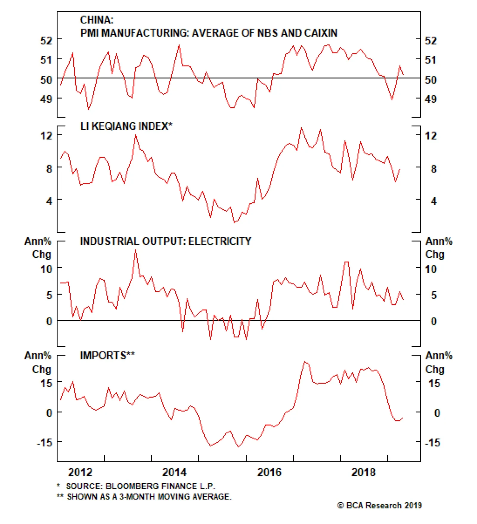
U.S. markets are closed this Memorial Day Monday. The key releases for the week will be consumer confidence on Tuesday, the second release of Q1 GDP on Wednesday, and the personal income and outlays on Friday. This last data set includes the core PCE…
HighlightsU.S. inflation is on a structural uptrend. Monetary and fiscal policy, populism, and demographics will tend to push inflation higher over the coming decade.How can investors protect portfolios against inflation risk? We look at periods of rising inflation to determine which assets were the best inflation hedge.We find that the level of inflation is very important in determining which assets work best.When inflation is rising and high, or very high, the best inflation hedges at the asset class level are commodities and U.S. TIPS.When inflation is very high, gold is the best commodity to hold and defensive sectors will minimize losses in an equity portfolio.However, hedges have a cost. Allocating a large percentage of a portfolio to inflation hedges will be a drag on returns. Investors should opt for a low allocation to hedges now, and increase to a medium level when inflation rises further.FeatureSome 38 years have passed since the last time the U.S. suffered from double-digit inflation. The Federal Reserve reform of 1979, championed by Paul Volcker, changed the way the Fed approached monetary policy by putting a focus on controlling money growth.1 The reform gave way to almost four decades of relatively controlled inflation, which persists today.But times are changing. While most of today’s investors have never experienced anything other than periods of tame inflation, BCA expects that rising inflation will be a major driving force of asset returns over the coming decade.2 The main reasons behind this view are the following:A rethink in the monetary policy framework: At its most recent meeting, the FOMC openly discussed the idea of a price-level target, implying that it would be open to the economy running hot to compensate for the past 10 years of below-target inflation (Chart I-1A, top panel).Procyclical fiscal policy: The U.S. is conducting expansionary fiscal policy while the economy is at near-full employment (Chart I-1A, middle panel). The last time this happened in the U.S., during the 1960s, high inflation followed, as the fiscal boost made the economy run substantially above capacity.Waning Fed independence: President Trump has openly questioned the hiking campaign undertaken by the Fed. Moreover, he has tried to nominate Fed governors with dovish tendencies. Historically around the world, a lack of central bank independence has often led to higher inflation rates (Chart I-1A, bottom panel).Peak in globalization: Globalization accelerated significantly in the 1990s and 2000s, flooding the global economy with cheap labor (Chart I-1B, top panel). However, we believe that globalization has peaked. Instead, populism and protectionism will be the dominant paradigms for years to come, reducing the cheap pool of workers and goods previously available.Demographics: The population in the U.S. is set to age in coming years (Chart I-1B, middle panel). As the percentage of U.S. retirees increases, the number of spenders relative to savers will begin to rise (Chart I-1B, bottom panel). Higher spending and lower savings in the economy should create upward pressure on inflation. Chart I-1AStructural Forces Point To Higher Inflation In The Coming Decade (I)
Structural Forces Point To Higher Inflation In The Coming Decade (I)
Structural Forces Point To Higher Inflation In The Coming Decade (I)
Chart I-1BStructural Forces Point To Higher Inflation In The Coming Decade (II)
Structural Forces Point To Higher Inflation In The Coming Decade (II)
Structural Forces Point To Higher Inflation In The Coming Decade (II)
If our view is correct, how should investors allocate their money?We attempt to answer this question by evaluating the performance of five major asset classes during periods when inflation was rising. Furthermore, we look into sub-asset class performance to determine how investors should position themselves within each asset class to take advantage of an inflationary environment.In our asset-class analysis, we use a data sample starting in 1973 and we limit ourselves to five publicly traded assets that have adequate history: global equities, U.S. Treasuries, U.S. real estate (REITs), U.S. inflation-linked bonds,3 and commodities. We compare asset classes according to their Sharpe ratios: average annualized excess returns divided by annualized volatilities.4 BCA expects that rising inflation will be a major driving force of asset returns over the coming decade.In our sub-asset class analysis, we analyze global equity sectors, international vs U.S. equities, and individual commodities. In some of the sections in our sub-asset class analysis, our sample is slightly reduced due to lack of historical data. Moreover, since in some instances all sectors have negative returns, we compare sub-asset classes according to their excess returns only.We base our analysis on the U.S. Consumer Price Index, given that most of the assets in our sample are U.S. based. We opt for this measure because it tends to track the living expenses for most U.S. citizens and it is the preferred measure to index defined-benefit payments.Finally, we decompose the periods of rising inflation into four quartiles in order to examine whether the level of inflation has any impact on the performance of each asset. Chart I-2 and Table I-1 show the different ranges we use for our analysis as well as a description of the typical economic and monetary policy environments in each of them.
Chart I-2
Chart I-
Summary Of ResultsTable I-2 shows the summary of our results. For a detailed explanation on how each asset class and sub-asset class behaves as inflation rises, please see the Asset Class section and the Sub-Asset Class section below.
Chart I-
Which assets perform best when inflation is rising?Rising inflation affects assets very differently, and is especially dependent on how high inflation is.Global equities performed positively when inflation was rising and low or mild, but they were one of the worst-performing assets when inflation was rising and high or very high. Importantly, equities underperformed U.S. Treasuries in periods of both high and very high inflation.Commodities and U.S. TIPS were the best performers when inflation was high or very high.U.S. REITs were not a good inflation hedge.Which global equity sectors perform best when inflation is rising?Energy and materials outperformed when inflation was high.Every single sector had negative excess returns when inflation was very high, but defensive sectors such as utilities, healthcare, and telecommunications5 minimized losses.Which commodities perform best when inflation is rising?With the exception of energy, most commodities had subpar excess returns when inflation was in the first two quartiles.Industrial metals outperformed when inflation was high.Gold and silver outperformed when inflation was very high. Additionally, gold had consistent returns and low volatility.What is the cost of inflation hedging?To answer this question, we construct four portfolios with different levels of inflation hedging:Benchmark (no inflation hedging): 60% equities / 40% bonds.Low Inflation Hedging: 50% equities / 40% bonds / 5% TIPS / 5% commoditiesMedium Inflation Hedging: 40% equities / 30% bonds / 15% TIPS / 15 % commoditiesPure Inflation Hedging: 50% TIPS / 50% commodities. At the asset-class level, investors should allocate to commodities and U.S. TIPS to hedge inflation. Chart I-3Inflation Hedging Comes At A Cost
Inflation Hedging Comes At A Cost
Inflation Hedging Comes At A Cost
While increased inflation hedging provides better performance when inflation is high and rising, these hedges are costly to hold when inflation is at lower ranges or when it is falling (Chart I-3, panels 1 & 2). However, adding moderate inflation hedging (low or medium) to a portfolio achieved the right balance between cost and protection, and ultimately improved risk-adjusted returns over the whole sample (Chart I-3, panel 3).What about absolute returns? The benchmark outperformed over the whole sample. However, the low and medium inflation hedging did not lag far behind, while avoiding the big drawdowns of high inflation periods (Chart I-3, panel 4).Investment ImplicationsHigh inflation may return to the U.S. over the next decade. Therefore, inflation hedging should be a key consideration when constructing a portfolio. Based on our results, our recommendations are the following:1. At the asset-class level, investors should allocate to commodities and U.S. TIPS to hedge inflation.2. However, these hedges are costly to hold as they will create a drag on returns in periods when inflation is not high or very high. Therefore, a low allocation to inflation hedges is warranted now.3. Inflation will probably start to pick up in the 2020s. A medium allocation to inflation hedges will then be appropriate.4. When inflation is high (3.3%-4.9%), investors should overweight energy and materials in their equity portfolios. Likewise, they should overweight industrial metals and energy within a commodity portfolio.5. When inflation is very high (4.9% or more), investors should overweight defensive sectors in their equity portfolio to minimize losses. Moreover, investors should overweight gold within a commodity portfolio.Asset ClassesGlobal EquitiesThe relationship between equity returns and rising inflation depends on how high inflation is, with outstanding performance when inflation is rising but low or mild, and poor performance as it gets higher (Chart II-1, top panel).
Chart II-1
This relationship can be explained by the interaction between interest rates, inflation, earnings, and valuations:Earnings growth was usually slightly negative when inflation was recovering from low levels. However, given that interest rates were very low in this environment and growth expectations were high, multiple expansion boosted equity returns (Chart II-1, bottom panel).When inflation was mild, the Fed typically started to raise rates, resulting in a declining multiple. However, equities had the best performance in this range thanks to very high earnings growth – a result of the economy growing strongly due to a healthy level of inflation.When inflation climbed into the high or very high range, earnings growth was usually positive but beginning to slow, as high inflation weighed on growth. Meanwhile the multiple started to decline rapidly due to rising interest rates and declining growth expectations.With the exception of the mild inflation range, the return profile of equities during inflationary periods was similar to its normal profile: negative skew and excess kurtosis (Table II-1). However, the consistency of returns decreased at higher levels of inflation, with only 45% of months with positive returns when inflation was rising and in its highest quartile.
Chart II-
U.S. Treasuries
Chart II-2
U.S. Treasuries reacted in a similar fashion to equities when inflation was rising (Chart II-2). However, while Treasuries underperformed equities when inflation was low or mild, they actually outperformed equities when inflation was high or very high. This was in part due to the fact that at higher inflation ranges, U.S. Treasuries offer a higher coupon return when rates are high, at least partially counteracting losses from falling prices.The steady stream of cash flows from the coupons helped Treasuries achieve positive returns roughly two-thirds of the time at the highest levels of inflation (Table II-2). However, this consistency in returns came at a cost: very high inflation resulted in negative skew and high excess kurtosis. Therefore, while Treasuries provided frequent positive returns when inflation was very high, they were prone to violent selloffs.
Chart II-
U.S. REITs
Chart II-3
While REITs had high risk-adjusted returns when inflation was rising but mild, much like equities they had subpar performance in every other quartile and particularly poor performance when inflation was high or very high (Chart II-3). These results confirm our previous research showing that REITs performance is very similar to that of equities.6The return consistency for REITs was generally poor in inflationary periods, with the second-lowest percentage of positive return of any asset class (Table II-3). Moreover, REIT returns had excess kurtosis and negative skew throughout all inflation quartiles.
Chart II-
Commodity Futures
Chart II-4
Commodities performed positively in every quartile, and did particularly well when inflation was mild (Chart II-4, top panel). However, total return and price return were very different due to the behavior of the roll and collateral return:Total risk-adjusted returns were lower than spot risk-adjusted returns when inflation was low and rising. This happened because during these periods, commodity supply was high relative to demand, as the economy was recovering from a deflationary shock. Thus, there was an incentive for producers to conserve inventories, making the futures curve upward-sloping (contango). Thus, roll return was negative (Chart II-4, bottom panel).When inflation was in the upper two quartiles, total risk-adjusted returns were much higher than risk-adjusted spot returns. This was because high inflation was the product of supply shocks. These supply shocks resulted in a downward-sloping futures curve (backwardation), which, in turn, resulted in a positive roll return. Additionally, high rates during these regimes contributed to a high collateral return.Commodities provided good return consistency during inflationary periods, with roughly 60% of positive return months in the upper two inflation quartiles (Table II-4). The skew of returns was neutral or positive in the top two quartiles. This means that although volatility was high for commodities, extreme return movements were normally positive.
Chart II-
U.S. Inflation-Protected Bonds
Chart II-5
While inflation-protected bonds provided meager returns when inflation was rising but in the mild range, they provided excellent performance at the highest levels of inflation (Chart II-5). Moreover, this high Sharpe ratio was not just simply the result of low volatility, since U.S. TIPS had excess returns of 4.6% when inflation was high and 5.7% when inflation was very high.7The return profile of inflation-protected bonds during inflationary periods was also attractive in our testing period. Average skew was positive, while kurtosis was relatively low (Table II-5). The percentage of positive months across all quartiles was also the highest of all asset classes, with a particularly high share of positive returns in the periods of highest inflation.
Chart II-
Sub-Asset ClassesGlobal Equity Sectors
Chart III-1
For the sector analysis, we looked at information technology, financials, energy, materials, utilities, healthcare, and telecommunications. We excluded industrials, consumer discretionary, and consumer staples given that they do not have adequate back data.Once again, we separate rising inflation periods into four quartiles, arriving at the following results:When inflation was low, information technology had the best excess returns while utilities had the worst (Chart III-1, panel 1). This matches our observations at the asset class level, as IT is highly responsive to changes in the valuation multiple.When inflation was mild, energy had the best performance, followed by information technology (Chart III-1, panel 2). Meanwhile, financials had the worst performance, as rates were normally rising in these periods.When inflation was high, sectors highly correlated with commodity prices such as energy and materials outperformed. Meanwhile, IT was the worst performer (Chart III-1, panel 3).When inflation was very high, every sector had negative excess returns. Overall, investing in energy minimized losses (Chart III-1, panel 4). However, this performance was in part attributable to the oil spikes of the 1970s. Alternatively, defensive sectors such as utilities, telecommunications, and healthcare also minimized losses. International vs U.S. Equities
Chart III-2
How do equities outside of the U.S. behave when inflation is rising? While the high share of U.S. equities in the global index causes U.S. equities to be the main driver of global stock prices, is it possible to improve returns in inflationary environments by overweighting international equities?The answer once again depends on the level of inflation. When inflation was rising but low, U.S. stocks outperformed global ex-U.S. equities in both common currency and local currency terms (Chart III-2, panel 1). This was in part due to the inherent tech bias in U.S. stocks. Additionally, the low level of inflation was often accompanied by slowing global growth in our sample, helping the U.S. dollar.When inflation was mild, U.S. stocks once again outperformed international stocks in both local and common currency terms, though to a lesser degree (Chart III-2, panel 2). The dollar was roughly flat in this environmentU.S. stocks started to have negative excess returns when inflation was high (Chart III-2, panel 3). On the other hand international equities had positive excess returns in dollar terms, partly because of their energy and material bias and partly because the dollar was generally weak in this period.U.S. equities outperformed global ex-U.S. equities by a small margin when inflation was very high, given that defensive sectors such as telecommunication were over-represented in the U.S. index (Chart III-2, panel 4). The dollar was roughly flat in this period. Individual Commodities
Chart III-3
Our analysis above confirmed that commodities were one of the best assets to hold when inflation was rising. However, which commodity performed best?8Total return for every commodity was lower than spot return when inflation was low (Chart III-3, panel 1). This was due to the upward-sloping term structure of the futures curve (contango), resulting in a negative roll yield. In this range, energy had the best performance, followed by industrial metals. Precious metals had negative excess returns.When inflation was mild, energy had the best performance of any commodity by far (Chart III-3, panel 2). Precious and industrial metals had low but positive excess returns in this period.When inflation was high, industrial metals had the highest excess returns, followed by energy (Chart III-3, panel 3).We omit energy for the last quartile since there is not enough data available. Overall, when inflation was very high, both gold and silver had the highest excess returns (Chart III-3, panel 4). However, gold’s return volatility was much lower, while it also had positive returns 64% of the time compared to 52% for silver.Other AssetsU.S. Direct Real Estate Chart IV-1Direct Real Estate Is A Good Inflation Hedge
Direct Real Estate Is A Good Inflation Hedge
Direct Real Estate Is A Good Inflation Hedge
Our asset-class analysis confirmed that public real estate (REITs) as an asset class offered poor risk-adjusted returns during inflationary periods. But how did direct real estate perform?We analyzed direct real estate separately from all other assets because of a couple of issues:Our return dataset is available only on a quarterly basis, versus a monthly basis for the rest of the assets in our sample. Even when annualized, volatility is not directly comparable when using data with different frequencies.The NCREIF Real Estate Index that we used is a broad aggregate, which is not investable. Individual property prices might differ from this aggregate.Finally, real estate returns are measured on an appraisal basis. Appraisal-based indices are not reflective of real transactions. Moreover, prices tend to be sticky. To attenuate this issue we unsmoothed the capital returns by removing return autocorrelation.Overall, the Sharpe ratio of direct real estate was solid throughout the first three quartiles of rising inflation (Chart IV-1, top panel). There is not enough data available for the fourth quartile. However, judging by the performance of U.S. housing in the 1970s from OECD, risk-adjusted returns when inflation was very high was likely positive (Chart IV-1, bottom panel). Cash Chart IV-2Very High Inflation Erodes The Value Of Cash
Very High Inflation Erodes The Value Of Cash
Very High Inflation Erodes The Value Of Cash
Cash (investing in a 3-month U.S. Treasury bill) outperformed inflation over our sample. (Chart IV-2, top panel). Moreover, cash provided positive real returns when inflation was mild, or high, or when it was decreasing (Chart IV-2, bottom panel). However, cash was not a good inflation hedge at the highest inflation quartile, with an average annualized real loss of almost 2%. Juan Manuel Correa OssaSenior Analystjuanc@bcaresearch.com Footnotes1 Please see Carl E. Walsh, “October 6, 1979,” FRSBF Economic Letter, 2004:35, (December 3, 2004).2 Please see Global Investment Strategy Special Report, “1970s-Style Inflation: Could it Happen Again? (Part 1), ” dated August 10, 2018, available at gis.bcaresearch.com and Global Investment Strategy Special Report, “1970s-Style Inflation: Could it Happen Again? (Part 2),” dated August 24, 2018, available at gis.bcaresearch.com.3 We use a synthetic TIPS series for data prior to 1997. For details on the methodology, please see: Kothari, S.P. and Shanken, Jay A., “Asset Allocation with Inflation-Protected Bonds,” Financial Analysts Journal, Vol. 60, No. 1, pp. 54-70, January/February 2004. Jay A., “Asset Allocation with Inflation-Protected Bonds,” Financial Analysts Journal, Vol. 60, No. 1, pp. 54-70, January/February 2004.4 Excess returns are defined as asset return relative to a 3-month Treasury bill.5 Sector classification does not take into account GICS changes prior to December 2018. 6 Please see Global Asset Allocation Strategy Special Report "REITS Vs Direct: How To Get Exposure To Real Estate," dated September 15, 2016, available at gaa.bcaresearch.com.7 It is important to note that the synthetic TIPS series does not completely match actual TIPS series for the periods where they overlap. Specifically, volatility is significantly higher in the synthetic series. Thus, results should be taken as approximations.8 We decompose the returns into the same 4 quartiles to answer this question. However, due to lower data availability, we start our sample in 1978 instead of 1973. Moreover, our sample for energy is smaller beginning in 1983. This mainly reduces the amount of data available at the upper quartile.
Highlights Global financial markets are currently dealing with a fresh round of uncertainty related to U.S.-China trade tensions. Yet while equities and government bond yields have fallen in response to the U.S. imposition of tariffs and escalation of the trade war with China, corporate bond markets in the developed economies have been relatively well-behaved (so far). Credit spreads have only widened modestly, which perhaps should not be surprising given central bankers’ increasingly dovish bias combined with early signs of a cyclical global growth rebound (Chart 1). Feature Chart 1Global Corporates: Shifting To A Friendlier Growth Backdrop?
Global Corporates: Shifting To A Friendlier Growth Backdrop?
Global Corporates: Shifting To A Friendlier Growth Backdrop?
With that in mind, this week we are presenting the latest update of our Corporate Health Monitor (CHM) Chartbook. The CHMs are composite indicators of balance sheet and income statement ratios (using both top-down and bottom-up data) that are designed to assess the financial well-being of the overall non-financial corporate sectors in the major developed economies. A brief overview of the methodology is presented in Appendix 1 on page 15. The main conclusion from the latest readings on our CHMs is that slower economic growth over the past year has resulted in some erosion of overall global credit quality. The deterioration was most pronounced in the more economically fragile regions that have suffered the deepest pullbacks in growth: Europe and Japan. The CHMs are currently giving an overall “neutral” signal in the U.S., although there are some worrying trends developing within the sub-components like interest coverage and short-term liquidity. Meanwhile, the CHMs in the U.K. and Canada are showing modest cyclical deterioration from very strong levels. Broadly speaking, the CHMs support our main global corporate bond market investment recommendations: a tactical aggregate overweight versus global government bonds, with a regional bias favoring the U.S. over Europe, and a quality bias tilted towards U.S. high-yield (HY) over investment grade (IG). Renewed U.S.-China trade hostilities represent a threat to that pro-cyclical fixed income asset allocation, although we expect more aggressive responses from policymakers on both sides (more fiscal and monetary stimulus in China, a more dovish bias from the Fed) to offset any tariff-induced weakness in growth. U.S. Corporate Health Monitors: Cyclically OK, But Longer-Term Problems Are Brewing Our top-down U.S. CHM is sending a neutral message on credit quality, sitting right on the threshold separating “deteriorating health” from “improving health” (Chart 2). The indicator, however, has been trending in a direction showing improving credit metrics over the past year. From a fundamental perspective, the top-down U.S. CHM suggests that the U.S. credit cycle is being extended by the stubborn endurance of the U.S. business cycle. The resilience of the U.S. economy, combined with the positive impact on U.S. profitability from the Trump corporate tax cuts, has put U.S. companies in a cyclically healthier position, even with relatively high leverage. The ratios directly related to corporate profits that go into the top-down CHM – return on capital, profit margins and interest coverage – have all gone up over the past year, generating the bulk of the directional improvement in the top-down CHM. From a fundamental perspective, the top-down U.S. CHM suggests that the U.S. credit cycle is being extended by the stubborn endurance of the U.S. business cycle. In other words, there are no immediate domestic pressures on U.S. corporate finances that should require significantly wider credit spreads to compensate for rising downgrade/default risk. That does not mean that all the news is good, however. The short-term liquidity ratio has fallen sharply and is now at levels last seen in the years leading up to the 2008 Financial Crisis. Similar deteriorations can be seen in the short-term liquidity ratios within the bottom-up versions of our U.S. CHMs for IG corporates (Chart 3) and HY companies (Chart 4). Coming at a time when interest coverage ratios have been steadily declining for IG, and are already at low levels for HY, declining short-term liquidity would leave U.S. corporates highly vulnerable during the next economic downturn. Chart 2Top-Down U.S. CHM: A Neutral Reading
Top-Down U.S. CHM: A Neutral Reading
Top-Down U.S. CHM: A Neutral Reading
Chart 3Bottom-Up U.S. IG CHM: Modest Deterioration With Worrying Trends
Bottom-Up U.S. IG CHM: Modest Deterioration With Worrying Trends
Bottom-Up U.S. IG CHM: Modest Deterioration With Worrying Trends
We see no reason yet to exit our tactical overweight stance on U.S. IG and HY corporates versus both U.S. Treasuries and non-U.S. corporates. For now, however, the message from our bottom-up U.S. CHMs is the same as that from our top-down U.S. CHM, with all hovering near the zero line suggesting no major deterioration in overall credit quality. We see no reason yet to exit our tactical overweight stance on U.S. IG and HY corporates versus both U.S. Treasuries and non-U.S. corporates (Chart 5). Our favored indicators continue to point to a rebound in global growth in the latter half of 2019, and the Fed currently has no desire to push the funds rate into restrictive territory, so the risk/reward over the next six months still favors staying overweight U.S. corporates. The medium-term outlook, however, is far more challenging given the growing body of evidence pointing to the advanced age of the U.S. credit cycle, such as falling interest coverage and liquidity. Chart 4Bottom-Up U.S. HY CHM: A Cyclical Improvement, Nothing More
Bottom-Up U.S. HY CHM: A Cyclical Improvement, Nothing More
Bottom-Up U.S. HY CHM: A Cyclical Improvement, Nothing More
Chart 5U.S. Corporates: Stay Tactically Overweight IG & HY
U.S. Corporates: Stay Tactically Overweight IG & HY
U.S. Corporates: Stay Tactically Overweight IG & HY
One final point – in Appendix 2 starting on page 17, we present bottom-up CHMs for the main industry sector groupings of companies that go into our overall U.S. IG CHM. Most of the sector CHMs are hovering near the zero line, but two industry groupings stand out as having a rising CHM that is now well within “deteriorating health” territory – Consumer Staples and Utilities. Euro Corporate Health Monitors: Worsened By Weaker Growth The message from our bottom-up CHMs for the euro area shows that there was some damage done to credit quality from last year’s growth slump, evidenced by lower profit margins and interest coverage ratios. Although overall credit quality remains fairly neutral (i.e. the CHMs remain near the zero line). For euro area IG, the gap between domestic and foreign issuers in the euro area corporate bond market continues to widen, with the former now slightly in the “deteriorating health” zone (Chart 6). Profit margins have fallen far more sharply for domestic issuers, reflecting the very rapid slowing of euro area growth over the latter half of 2019. Interest coverage for domestic issuers is also lower than for foreign issuers, while short-term liquidity ratios have weakened for both over the past year. For euro area HY, the signal from the bottom-up CHM is more consistently positive between domestic and foreign issuers (Chart 7). Leverage has declined, but profit-based metrics have worsened for both sets of issuers. Interest/debt coverage and liquidity, however, are far worse for domestic issuers. Chart 6Bottom-Up Euro Area IG CHMs: Weaker Growth Hitting Domestic Issuers
Bottom-Up Euro Area IG CHMs: Weaker Growth Hitting Domestic Issuers
Bottom-Up Euro Area IG CHMs: Weaker Growth Hitting Domestic Issuers
Chart 7Bottom-Up Euro Area HY CHMs: Healthier Through Lower Leverage
Bottom-Up Euro Area HY CHMs: Healthier Through Lower Leverage
Bottom-Up Euro Area HY CHMs: Healthier Through Lower Leverage
Within the euro area, our bottom-up IG CHMs for Core and Periphery countries have worsened over the past year, from healthy levels, and are now hovering just above the zero line (Chart 8). Interest coverage is considerably stronger for Core issuers, although profitability metrics are remarkably similar. Short-term liquidity ratios have also fallen for both regional groups over the past year. The spread tightening already seen in euro area credit is too extreme relative to the still sluggish pace of economic growth in the region. Despite the lack of a major overall negative signal from the euro area CHMs, we are only maintaining a neutral allocation to euro area corporates, even within our current overweight stance on overall global corporates (Chart 9). The spread tightening already seen in euro area credit is too extreme relative to the still sluggish pace of economic growth in the region. This will inhibit the ability for spreads to tighten further in the event of a pickup in growth, while also leaving spreads vulnerable to widening pressures if euro area growth continues to languish. Chart 8Bottom-Up Euro Area Regional IG CHMs: Trending In The Wrong Direction
Bottom-Up Euro Area Regional IG CHMs: Trending In The Wrong Direction
Bottom-Up Euro Area Regional IG CHMs: Trending In The Wrong Direction
Chart 9Euro Area Corporates: Stay Tactically Neutral IG & HY
Euro Area Corporates: Stay Tactically Neutral IG & HY
Euro Area Corporates: Stay Tactically Neutral IG & HY
Chart 10Relative Bottom-Up CHMs: Continue To Favor U.S. Over Europe
Relative Bottom-Up CHMs: Continue To Favor U.S. Over Europe
Relative Bottom-Up CHMs: Continue To Favor U.S. Over Europe
In addition, we are sticking with our preference to favor U.S. corporates – both IG and HY – over euro area equivalents for two important reasons: stronger U.S. growth and better U.S. corporate health. The gap between the combined IG/HY bottom-up CHMs for the U.S. and euro area has been strongly correlated to the difference in credit spreads between euro area and U.S. issuers (Chart 10).1 The latest trends show a narrowing of the gap between the U.S. and euro area CHMs, suggesting relative corporate health favors U.S. names (middle panel). At the same time, the relatively stronger performance of the U.S. economy continues to support U.S. corporate performance versus euro area equivalents (bottom panel). U.K. Corporate Health Monitor: Brexit Uncertainty Is Not Helping Our top-down U.K. CHM remains in the “improving health” zone, although the indicator has been drifting towards “deteriorating health” over the past two years. Almost all of the components of the U.K. CHM have contributed to this worsening trend (Chart 11), with only short-term liquidity remaining in a powerful multi-year uptrend. Most worryingly, the interest and debt coverage ratios remain historically depressed, even as the Bank of England has keep interest rates at extraordinarily low levels for the past several years. The cyclical deterioration in the U.K. CHM components can be traced to the sluggish performance of the U.K. economy and corporate profits. The cyclical deterioration in the U.K. CHM components can be traced to the sluggish performance of the U.K. economy and corporate profits. The persistent uncertainty from Brexit has weighed on business confidence and investment spending by U.K. firms, keeping growth at a below-trend pace. While the immediate deadline of “Brexit Day” came and went back in March, there is still a high degree of uncertainty over the U.K.’s future economic relationship with the European Union. With Prime Minister Theresa May now set to step down, an election will extend the period of politically-driven uncertainty in the U.K. We have maintained a moderate underweight recommendation on U.K. corporates in our model bond portfolio over the past year, despite the lack of an obvious negative signal from our U.K. CHM. Spread widening in 2018 has been followed by spread tightening in 2019 (Chart 12), but the latter has been driven by the global rally in risk assets rather than diminished perceptions of U.K. political risk. Chart 11U.K. Top-Down CHM: Modest Pullback From Healthy Levels
U.K. Top-Down CHM: Modest Pullback From Healthy Levels
U.K. Top-Down CHM: Modest Pullback From Healthy Levels
Chart 12U.K. Corporates: Stay Modestly Underweight
U.K. Corporates: Stay Modestly Underweight
U.K. Corporates: Stay Modestly Underweight
Although there has been some improvement in U.K. economic data of late, leading economic indicators continue to trend lower. In addition, the Bank of England continues to hint that any positive resolution to the Brexit uncertainty could result in a tightening of monetary policy (although that is less of a threat given the synchronized dovish turn by global central bankers over the past few months). Given all the uncertainties, the risk/reward balance continues to favor a modest underweight in U.K. corporates, particularly at current tight spread levels to Gilts. Japan Corporate Health Monitor: A Modest Cyclical Deterioration Our bottom-up Japan CHM has shown a worsening trend over the past year and now sits in the “deteriorating health” zone (Chart 13).2 Interestingly, all of the individual components have contributed to that move in the CHM, and not just the cyclical components (profit margins, return on capital, interest coverage) that reflect the recent slowing of economic growth in Japan. Leverage has increased (albeit from very low levels), while short-term liquidity has also weakened (albeit from very high levels). Strictly looking at the overall level of all the Japan CHM components, the message does not signal a major deterioration in Japanese corporate credit quality. Leverage, defined here as the ratio of total debt to the book value of equity, is still below 100%, well below the 100-140% range seen between 2006 and 2015. The same story applies to the return on capital, which at 5% is still high versus Japan’s history (although very low by global standards). Interest coverage and short-term liquidity both remain high relative to the past decade. The absolute level of Japanese corporate health remains solid, but there has been marginal deterioration from weaker economic growth. On that front, the cyclical momentum in Japan’s economy is not improving. According to the latest Tankan survey, Japanese firms reported that their business outlook was worse than previously expected. Declining confidence has damaged capital spending, as shown by the falling growth of domestic machinery and machine tool orders. Japan’s economy remains highly levered to global growth and export demand and their economy has taken a hit from the slower pace of global trade over the past year. Wage growth has also weakened after finally seeing some positive momentum in 2018, which is weighing on consumer confidence and spending. Japan’s corporate spread has widened slightly (+5bps) since the beginning of this year (Chart 14), in contrast to the spread tightening seen in other major developed economy corporate bond markets (the Bloomberg Barclays Global Corporates index spread has tightened by -33bps year-to-date). This is a sign that the markets have responded to the slowing growth momentum in Japan with a bit of a wider risk premium. Yet despite that widening, Japanese corporates with small positive yields continue to generate positive excess returns versus Japanese Government Bonds (JGBs) with yields held near zero by the Bank of Japan’s Yield Curve Control policy. Thus, we continue to recommend an overweight stance on Japanese corporates vs JGBs as a buy-and-hold carry trade, even with the softening in our Japan CHM. Chart 13Japan Bottom-Up CHM: Cyclical Deterioration
Japan Bottom-Up CHM: Cyclical Deterioration
Japan Bottom-Up CHM: Cyclical Deterioration
Chart 14Japan Corporates: Stay Overweight Vs JGBs For Carry
Japan Corporates: Stay Overweight Vs JGBs For Carry
Japan Corporates: Stay Overweight Vs JGBs For Carry
Canada Corporate Health Monitor: Still In Decent Shape Our top-down and bottom-up Canadian CHMs indicate an improving trend in Canadian corporate health, with both remaining in the “improving health” area over the past few years (Chart 15). The marginal moves have shown some modest deterioration in the cyclically-sensitive components (most notably, return on capital and profit margins for the top-down Canadian CHM). This should not be surprising given how rapidly Canadian economic growth slowed in the final quarter of 2018. There has also been some deterioration in the non-cyclical components. Leverage is high and rising, while the absolute levels of return on capital and debt/interest coverage are historically low. This may be building up risks for the next major Canadian economic downturn, but for now, Canadian companies look in decent shape. With so much of Canada’s economy (and its financial markets) geared to the performance of the energy sector, the recent recovery in global oil prices is a significant boost for the overall Canadian corporate market. Our commodity strategists see additional upside in oil prices over the next six months, which will further underpin the health of Canadian oil companies – and should also help support Canadian corporate bond performance. The Bank of Canada is now taking an extended pause from its rate-hiking cycle, with policy rates well below the central bank’s own estimate of neutral (2.25-3.25%). Accommodative monetary conditions and relatively low Canadian interest rates will continue to make Canadian corporates attractive, in an environment of decent growth and firm corporate health. Chart 15Canada CHMs: Still Healthy, Despite Slower Growth
Canada CHMs: Still Healthy, Despite Slower Growth
Canada CHMs: Still Healthy, Despite Slower Growth
Chart 16Canadian Corporates: Stay Overweight Vs Canadian Govt. Debt
Canadian Corporates: Stay Overweight Vs Canadian Govt. Debt
Canadian Corporates: Stay Overweight Vs Canadian Govt. Debt
We continue recommending an overweight position in Canadian corporate debt relative to Canadian government bonds as a carry trade. Spreads have been in a very stable range since the 2009 recession (Chart 16), ranging between 100-200bps even during periods when our CHMs were indicating worsening corporate health. To break out of that range to the upside, we would need to see a prolonged deterioration of Canadian economic growth or sharp monetary tightening from the Bank of Canada – neither outcome is likely over the next 6-12 months. Robert Robis, CFA, Chief Fixed Income Strategist rrobis@bcaresearch.com Ray Park, CFA, Research Analyst ray@bcaresearch.com Appendix 1: An Overview Of The BCA Corporate Health Monitors The BCA Corporate Health Monitor (CHM) is a composite indicator designed to assess the underlying financial strength of the corporate sector for a country. The Monitor is an average of six financial ratios inspired by those used by credit rating agencies to evaluate individual companies. However, we calculate our ratios using top-down (national accounts) data for profits, interest expense, debt levels, etc. The idea is to treat the entire corporate sector as if it were one big company, and then look at the credit metrics that would be used to assign a credit rating to it. Importantly, only data for the non-financial corporate sector is used in the CHM, as the measures that would be used to measure the underlying health of banks and other financial firms are different than those for the typical company. The six ratios used in the CHM are shown in Table 1 below. To construct the CHM, the individual ratios are standardized, added together, and then shown as a deviation from the medium-term trend. That last part is important, as it introduces more cyclicality into the CHM and allows it to better capture major turning points in corporate well-being. Largely because of this construction, the CHM has a very good track record at heralding trend changes in corporate credit spreads (both for Investment Grade and High-Yield) over many cycles. Table 1Definitions Of Ratios That Go Into The CHMs
BCA Corporate Health Monitor Chartbook: Growth Powdering Over Some Warts
BCA Corporate Health Monitor Chartbook: Growth Powdering Over Some Warts
Top-down CHMs are now available for the U.S., euro area, the U.K. and Canada. The CHM methodology was extended in 2016 to look at corporate health by industry and by credit quality.3 The financial data of a broad set of individual U.S. and euro area companies was used to construct individual “bottom-up” CHMs using the same procedure as the more familiar top-down CHM. Some of the ratios differ from those used in the top-down CHM (see Table 1), largely due to definitional differences in data presented in national income accounts versus those from actual individual company financial statements. The bottom-up CHMs analyze the health of individual sectors, and can be aggregated up into broad CHMs for Investment Grade and High-Yield groupings to compare with credit spreads. In 2018, we introduced bottom-up CHMs for Japan and Canada. With the country expansion of our CHM universe, we now have coverage for 92% of the Bloomberg Barclays Global Aggregate Corporate Bond Index (Appendix Chart 1).
Image
Appendix 2: U.S. Bottom-Up CHMs For Selected Sectors
APPENDIX 2: ENERGY SECTOR
APPENDIX 2: ENERGY SECTOR
APPENDIX 2: MATERIALS SECTOR
APPENDIX 2: MATERIALS SECTOR
APPENDIX 2: COMMUNICATIONS SECTOR
APPENDIX 2: COMMUNICATIONS SECTOR
APPENDIX 2: CONSUMER DISCRETIONARY SECTOR
APPENDIX 2: CONSUMER DISCRETIONARY SECTOR
APPENDIX 2: CONSUMER STAPLES SECTOR
APPENDIX 2: CONSUMER STAPLES SECTOR
APPENDIX 2: HEALTH CARE SECTOR
APPENDIX 2: HEALTH CARE SECTOR
APPENDIX 2: INDUSTRIALS SECTOR
APPENDIX 2: INDUSTRIALS SECTOR
APPENDIX 2: TECHNOLOGY SECTOR
APPENDIX 2: TECHNOLOGY SECTOR
APPENDIX 2: UTILITIES SECTOR
APPENDIX 2: UTILITIES SECTOR
Footnotes 1 We only use the CHMs for euro area domestic issuers in this aggregate bottom-up CHM, as this is most reflective of uniquely European corporate credits. This also eliminates double-counting from U.S. companies that issue in the euro area market that are part of our U.S. CHMs. 2 We do not currently have a top-down CHM for Japan given the lack of consistent government data sources for all the necessary components. 3 Please see Section II of The Bank Credit Analyst, “U.S. Corporate Health Gets A Failing Grade”, dated February 2016, available at bca.bcaresearch.com. Recommendations The GFIS Recommended Portfolio Vs. The Custom Benchmark Index
BCA Corporate Health Monitor Chartbook: Growth Powdering Over Some Warts
BCA Corporate Health Monitor Chartbook: Growth Powdering Over Some Warts
Duration Regional Allocation Spread Product Tactical Trades Yields & Returns Global Bond Yields Historical Returns
Highlights Duration: We see current bond market behavior as very similar to mid-2016, when heightened political uncertainty obscured the economy’s true strength and kept bond yields lower for longer than was justified by the economic fundamentals. The correct strategy at that time was to sell into the bond market’s strength, and we advocate a similar strategy today. China: Any attempt by the Chinese government to retaliate in the trade war by selling U.S. Treasury securities would be either self-defeating or ineffective, depending on the exact strategy employed. In either case, U.S. Treasury yields will be unaffected. Fed: At least part of the Fed’s dovish turn might represent a desire to send the labor share of national income higher. We introduce a new data series for Fed Watchers to track. Feature The Trump Administration fired the latest salvo in the trade war two weeks ago, expanding tariffs to a broader swathe of Chinese imports. Then last week, the escalation of tensions spilled over to the bond market, sending global yields abruptly lower. Chart 1Flight To Safety
Flight To Safety
Flight To Safety
The 10-year U.S. Treasury yield bounced off 2.35% last Thursday and has since settled at 2.39% (Chart 1). Meanwhile, the overnight index swap curve is now priced for 44 bps of Fed rate cuts over the next 12 months (Chart 1, bottom panel). It is possible, and even likely, that geopolitical tensions will keep yields low during the next month or two. In fact, our Geopolitical Strategy service places the odds of a complete breakdown in trade negotiations by the end of June at 50%.1 But we would encourage investors to sell into rallies, positioning for higher yields on a 6-12 month horizon. To see why, we return to a Weekly Report from early April where we walked through different factors that would be useful in the creation of a macroeconomic model for the 10-year U.S. Treasury yield.2 We consider what has changed during the past six weeks and what those developments mean for bond yields going forward. Back In The Bond Kitchen In early April, we ran through four different factors that should be included in any bond model and suggested macroeconomic indicators that best capture the trends in each. The four factors are: Global Growth: Best proxied by the Global Manufacturing PMI and Bullish Dollar Sentiment Policy Uncertainty: Best proxied by the Global Economic Policy Uncertainty Index Output Gap: Best proxied by Average Hourly Earnings Sentiment: Best proxied by the U.S. Economic Surprise Index We consider each factor in turn. Global Growth Chart 2Monitoring Global Growth
Monitoring Global Growth
Monitoring Global Growth
The Global Manufacturing PMI, our preferred series for tracking global growth, ticked down during the past month, continuing the free-fall that has been in place since the end of 2017 (Chart 2). At 50.3, it is now only slightly above the 50 boom/bust line and is close to where it was in mid-2016, when the 10-year yield hit its cyclical low. But on a positive note, several leading indicators have hooked up in recent months, suggesting that the Global PMI could soon trough and move higher in the second half of the year. Specifically, the ZEW survey of global economic sentiment is off its lows, as is the BCA Global Leading Economic Indicator (LEI). Meanwhile, the Global LEI Diffusion Index has surged, indicating that 74% of the 23 countries in our sample are seeing improvement in their LEIs. Historically, the Global LEI Diffusion Index leads changes in both the Global LEI and the Global Manufacturing PMI (Chart 2, panel 3). Financial market prices that are highly geared to global growth had been singing a similar tune, but they rolled over as trade tensions flared during the past two weeks. For example, cyclical equity sectors recently started to underperform defensive sectors (Chart 2, bottom panel), and the important CRB Raw Industrials index took a nosedive. We place particular importance on the CRB Raw Industrials index as a timely indicator of global growth, because the ratio between the CRB index and gold correlates nicely with the 10-year Treasury yield (Chart 3).3 Unsurprisingly, the ratio’s recent dip coincides with last week’s drop in the 10-year. Several leading indicators have hooked up in recent months, suggesting that the Global PMI could soon trough and move higher in the second half of the year. In addition to the Global Manufacturing PMI, we recommend including a survey of bullish sentiment toward the U.S. dollar in any bond model. More bullish dollar sentiment coincides with lower Treasury yields, and vice-versa. Our preferred survey shows that dollar sentiment remains elevated, but hasn’t changed much since April (Chart 4). The dollar itself, however, has begun to appreciate during the past two weeks (Chart 4, bottom panel). Chart 3A Falling CRB/Gold Ratio...
A Falling CRB/Gold Ratio...
A Falling CRB/Gold Ratio...
Chart 4...And The Greenback Is On The Rise
...And The Greenback Is On The Rise
...And The Greenback Is On The Rise
Bottom Line: The coincident global growth indicators that correlate best with bond yields – the Global Manufacturing PMI and Dollar Bullish Sentiment – are sending a similar message as in April. Meanwhile, leading economic indicators continue to suggest that we should expect improvement in the second half of the year. The biggest change from April is that global growth indicators derived from financial market prices – cyclical versus defensive equities, the CRB Raw Industrials index and the trade-weighted dollar – have responded negatively to heightened political risk. If this weakness persists and eventually infects the economic data, then it could prevent a second-half rebound in global growth, keeping Treasury yields low for even longer. Policy Uncertainty Spikes in the monthly Global Economic Policy Uncertainty Index often cause capital to seek out the safety of U.S. Treasuries, and we recommend including this index in any macroeconomic bond model (Chart 5A). Spikes in the monthly Global Economic Policy Uncertainty Index often cause capital to seek out the safety of U.S. Treasuries. While there have been no updates to the monthly index since the trade war’s recent escalation, one of its components – a daily index that tracks the number of relevant news stories – has surged during the past two weeks (Chart 5B). This clearly illustrates that a sharp increase in political uncertainty has been the catalyst for the bond market rally. Investors are obviously concerned that an ongoing and intensifying trade war might derail the economic recovery, and they are seeking out Treasuries as a hedge. Chart 5AGlobal Uncertainty Set To Spike
Global Uncertainty Set To Spike
Global Uncertainty Set To Spike
Chart 5BMarkets Are Concerned
Markets Are Concerned
Markets Are Concerned
In such situations, the traditional playbook is to fade any purely uncertainty-driven rally, on the view that markets tend to overreact to headline risk. This strategy worked well following the mid-2016 Brexit vote. The uncertainty shock from the vote sent the 10-year quickly down to 1.37%, but it then increased in the second half of the year when it became apparent that the economic recovery would continue. While higher tariffs will certainly be a drag on growth going forward, accommodative Fed policy and a probable increase in Chinese economic stimulus will mitigate the impact, keeping the economic recovery intact.4 Output Gap Chart 6Wages Are Headed Higher
Wages Are Headed Higher
Wages Are Headed Higher
The output gap is a concept that represents where the economy is operating relative to its peak capacity, and its progress during the past three years is the main reason why bond yields will not re-test 2016 lows. We have found that wage growth is the most reliable way to measure the output gap: higher wage growth signals less spare capacity, and less spare capacity coincides with higher bond yields. We recommend Average Hourly Earnings as the best wage measure to include in any bond model. Since April, average hourly earnings growth has been roughly flat, but leading indicators suggest that further acceleration is highly likely in the coming months (Chart 6). While the Fed is keen to let wage growth accelerate, rising wage growth also makes a rate cut difficult to justify. The combination of rising wage growth and an on-hold Fed should put a rising floor under long-maturity bond yields. Sentiment The final factor that should be included in any bond model is sentiment. In April, we suggested that the U.S. Economic Surprise Index is the best measure of sentiment. When the surprise index has been deeply negative for a long time, it usually means that investors are downbeat on the economy and that the bar for a positive surprise is low. This has actually been the case in recent months, and our simple auto-regressive model suggests that the surprise index is biased higher (Chart 7). Positioning data confirm this message, and in fact show that investors are taking as much duration risk as they were when yields troughed in mid-2016 (Chart 8). Chart 7Low Bar For Positive Surprises
Low Bar For Positive Surprises
Low Bar For Positive Surprises
Chart 8Similar Positioning As In Mid-2016
Similar Positioning As In Mid-2016
Similar Positioning As In Mid-2016
The overall message is that bond investors have a very dim view of the economy, and it will not take much positive news to send yields higher. Investment Strategy We see current bond market behavior as very similar to mid-2016, when heightened political uncertainty obscured the economy’s true strength and kept bond yields lower for longer than was justified by the economic fundamentals. The correct strategy at that time was to sell into the bond market’s strength, and we advocate a similar strategy today. Timing when the next move higher in bond yields will occur is difficult, but we take some comfort in the fact that the flatness of the yield curve makes it less costly than usual to carry below-benchmark duration positions. In fact, the average yield on the Bloomberg Barclays Cash index is 7 bps higher than the average yield on the Bloomberg Barclays Treasury Master Index. Bond investors have a very dim view of the economy, and it will not take much positive news to send yields higher. To further mitigate the cost of keeping duration low, we advocate taking duration-neutral positions that are short the belly (5-year & 7-year) part of the yield curve and long the very long and very short ends of the curve. Such trades are also provide a positive yield pick-up, and will earn capital gains when Treasury yields move higher.5 A Quick Note On China’s Treasury Purchases Chart 9Do Not Expect Treasuries To Be Used As A Weapon In This War
Do Not Expect Treasuries To Be Used As A Weapon In This War
Do Not Expect Treasuries To Be Used As A Weapon In This War
The trade war’s recent escalation has led some to speculate that China could retaliate against higher tariffs by dumping U.S. Treasury securities onto the open market. The speculation only increased when the TIC data revealed that Chinese net Treasury purchases totaled -$24 billion in March, the most deeply negative figure since October 2016 (Chart 9). We see low odds that China will employ this tactic in the trade war, and no meaningful impact on Treasury yields in any case. To see why, let’s consider two possible scenarios. In the first scenario, China sells a large amount of U.S. Treasury securities and keeps the proceeds from the sales in its domestic currency. Assuming the amounts in question are sufficiently large, these transactions would cause the RMB to appreciate and lead to a tightening of Chinese monetary conditions. Tighter monetary conditions are exactly what the Chinese government does not want as it seeks to counteract the negative economic impact from tariffs. In fact, China is much more likely to engineer a further easing of monetary conditions, much like in 2015/16 (Chart 9, bottom panel). In the second scenario, China could sell U.S. Treasuries and purchase other foreign bonds (German bunds, for example). This would nullify any impact on Chinese monetary conditions, but it would not have much impact on U.S. Treasury yields. With Chinese money still flowing into global bond markets, the re-balancing would only push other investors out of non-U.S. bond markets and into U.S. Treasuries. Without changing the overall demand for global bonds, it is difficult to envision much of an impact on U.S. yields. Bottom Line: Any attempt by the Chinese government to retaliate in the trade war by selling U.S. Treasury securities would be either self-defeating or ineffective, depending on the exact strategy employed. In either case, U.S. Treasury yields will be unaffected. A New Data Series For Fed Watchers: Rich’s Ratio A number of recent Fed speeches have referred to the time series plotted in Chart 10: The share of national income going to labor, as opposed to corporate profits. Chart 10Introducing Rich's Ratio
Introducing Rich's Ratio
Introducing Rich's Ratio
Vice-Chair Richard Clarida brought this analysis to the Fed, and the data series was actually once dubbed “Rich’s Ratio” by Clarida’s old PIMCO colleague Paul McCulley. The idea behind Rich’s Ratio is that while some late-cycle wage gains are passed through to prices, a portion also eat into corporate profits. Notice in Chart 10 that Rich’s Ratio has a tendency to rise late in the economic recovery. Based on his past writings, we would not be surprised if at least part of the Fed’s recent dovish turn represents a desire to send Rich’s Ratio higher, even if that goal might entail a modest overshoot of the Fed's 2 percent inflation target. We will have more to say about Rich’s Ratio in the coming weeks. For now, we simply want to make Fed Watchers aware that they have a new series to track. Stay tuned. Ryan Swift, U.S. Bond Strategist rswift@bcaresearch.com Footnotes 1 Please see Geopolitical Strategy Weekly Report, “How Trump Became A War President”, dated May 17, 2019, available at gps.bcaresearch.com 2 Please see U.S. Bond Strategy Weekly Report, “Bond Kitchen”, dated April 9, 2019, available at usbs.bcaresearch.com 3 The rationale for why the CRB/Gold ratio tracks the 10-year Treasury yield is found in U.S. Bond Strategy Weekly Report, “The Search For Aaa Spread”, dated March 12, 2019, available at usbs.bcaresearch.com 4 Please see Global Investment Strategy Weekly Report, “Tarrified”, dated May 16, 2019, available at gis.bcaresearch.com 5 Please see U.S. Bond Strategy Weekly Report, “Paid To Wait”, dated February 26, 2019, available at usbs.bcaresearch.com Fixed Income Sector Performance Recommended Portfolio Specification
Highlights We’ve searched in vain for imminent domestic weakness in the U.S. economy, … : Much of our work this spring has focused on trying to poke holes in our view that the equilibrium fed funds rate remains above the target fed funds rate, but we haven’t found any evidence of overheating in the real economy, or worrisome excesses in financial markets. … but an exogenous shock could well precipitate a recession if it were serious enough: The U.S. is a comparatively closed economy, but there’s no such thing as full-on decoupling. The U.S. may react more slowly than other major economies to what’s going on in the rest of the world, but it’s not immune to it. A trade war would threaten global growth, … : U.S.-China trade negotiations have taken center stage over the last couple weeks, and escalating tension between the world’s two largest standalone economies will surely cast a pall over the global outlook. … but there are other potential threats that bear monitoring: Tensions with Iran could be the catalyst for an oil price shock, while a significant rollback of globalization could crimp corporate profit margins. Either would hasten the end of the equity bull market and the expansion. Feature Tight monetary policy is a necessary, if not sufficient, condition for a recession. We deem policy to be tight if the fed funds rate exceeds our estimate of the equilibrium fed funds rate, and easy if it is below our estimate of equilibrium. Over the six decades for which we compute an estimate of the equilibrium fed funds rate, the U.S. has only ever experienced recessions when the fed funds rate has exceeded our estimate of equilibrium (Chart 1). Tight policy isn’t always tantamount to a recession – nothing came of tight settings in 1984 or 1995 – but recessions don’t occur without it. Chart 1Recessions Only Occur When Monetary Conditions Are Tight
Recessions Only Occur When Monetary Conditions Are Tight
Recessions Only Occur When Monetary Conditions Are Tight
We currently estimate that the equilibrium fed funds rate, a.k.a. the neutral rate, is about 3⅛%, and we continue to project that it will be around 3⅜% by the end of the year. Those estimates leave the Fed with plenty of headroom before it materially slows the economy. If our estimate is on the money, it will take four more rate hikes to induce an inflection in the business cycle. We have not seen anything in the ongoing flow of macro data, or evidence of excesses in the financial markets, that would suggest a recession is already under way or is lurking around the corner. Internal dynamics should continue to support the expansion, but threats from outside the U.S. are growing. We therefore conclude that the next recession may well not arrive for another two years, in the absence of a significantly adverse exogenous event. This week, we extend our focus beyond the U.S. to try to uncover the external threats that could stop the U.S. economy, and the bull markets in risk assets, in their tracks. Beyond the tariff fireworks, we also contemplate the possibility that conflict with Iran could lead to an oil price shock, and the impact of a significant rollback of globalization. It is not our base case that any of the various external threats will tip the U.S. into a recession, but investors should keep tabs on the biggest ones. Tariffs The U.S.-China trade saga has unfolded in three pairs of moves and counter-moves (Diagram 1). While the aggregate $50bn worth of Chinese goods tariffed in the first two salvos mostly targeted industrial equipment and machinery, the third installment, covering $200bn worth of imports, extended the tariffs’ reach to consumer products. Major categories included not only commodities such as base metals, chemical products and mineral fuels and oils, but also a broad swath of foods, textiles, electronics, vehicles and spare parts. After a three-month cease-fire, the developments of the last two weeks arguably marked the most significant escalation of tensions on both sides. The U.S. is now threatening to levy tariffs on the remaining $325bn of Chinese goods that have so far been spared. Diagram 1Anything You Can Do
External Threats
External Threats
Our colleagues at BCA’s Geopolitical Strategy service suggest that recent foreign policy initiatives indicate that the White House does not feel any particular pressure to minimize economic risk this far ahead of the election. The risk of market-disruptive measures has therefore increased, and they see a 50-50 chance that the U.S. and China will fail to reach an accord (Table 1). Although the administration has delayed any action on autos and auto parts for now, Europe could be the next trade partner in its cross hairs. The odds that Section 232 (national-security-threat) tariffs will be levied on European auto imports is rising (Chart 2). Table 1U.S.-China Trade War: Probabilities Of A Deal By End Of June 2019
External Threats
External Threats
Chart 2
These heightened trade tensions may delay the global growth recovery that we were expecting to bloom in the summer, and they may also allow the dollar to keep advancing. The greenback is a countercyclical currency, moving inversely with global activity (Chart 3), and a bump in the road for global growth would likely extend its upward run. Chart 3The Countercyclical Dollar
The Countercyclical Dollar
The Countercyclical Dollar
Although a strong dollar would be a headwind for exporters, the U.S. economy is comparatively closed. Tariffs are likely to exert the greatest pressure on the economy via softer consumption and investment. So far, the available evidence suggests that U.S. consumers and corporations have borne the brunt of higher tariffs in the form of higher retail prices and lower profit margins.1 Iran Our geopolitical strategists contend that investors have underrated conflict with Iran as a market risk for a while. Now that the contentiousness of U.S.-Iran relations has ratcheted higher upon the administration’s decision not to extend the import waivers on Iranian oil, the issue is back in the spotlight. Our strategists caution that managing the dispute may require more delicacy than the more hawkish elements of the administration realize. In their view, the potential for a misstep increases the odds of a recession and poses a significant risk to the equity bull market. In a joint Special Report by our Commodity and Energy Strategy and Geopolitical Strategy services at the beginning of the month, our in-house experts stressed that there are multiple moving parts driving the supply-demand balance in the global oil market.2 Investors should realize that the world faces the prospect of the loss of Venezuelan production (approximately 600,000 barrels per day (b/d)) and significant outages in Libya (~600,000 to 800,000 b/d), in addition to our strategists’ base-case estimate of 700,000 b/d from Iran’s current 1.3 million b/d output. BCA does not expect that all of that output will be lost, but the key point is that Iran is not the only potential source of a supply shortfall. Our energy strategists believe that OPEC 2.0 – the producer coalition led by Saudi Arabia and Russia, and supported by Saudi Arabia’s OPEC allies – has the capacity to make up for even their larger shortfall scenarios (Chart 4). The problem is that OPEC 2.0 may not have the will to do so in a timely fashion. Saudi Arabia and the rest of the OPEC 2.0 coalition were caught completely off guard by the administration’s issuance of import waivers in November, after they had ramped up production at its request to limit the market disruptions that would have ensued when Iran’s output was taken off the market. The last-minute waiver decision caused oil prices to crater in the wake of a supply glut that OPEC 2.0 has been working to sop up ever since (Chart 5).
Chart 4
Chart 5... But The Oil Market Is Pretty Tight
... But The Oil Market Is Pretty Tight
... But The Oil Market Is Pretty Tight
OPEC 2.0’s members may feel that they were badly used last fall, and may not be inclined to move proactively now. Russia is managing its own low-grade conflict with the U.S., and all of the coalition should bear in mind that the U.S. could release over a million b/d from its Strategic Petroleum Reserve (SPR) for a solid six to nine months, according to our energy team’s estimates. If rising oil prices are often viewed as a tax on American consumers, a late summer/early fall release of holdings could be viewed as an election rebate, courtesy of the skilled economic managers in the White House. Our team expects that OPEC 2.0 will likely guard against an oversupply-driven swoon in oil prices by managing its production on something akin to a just-in-time inventory strategy. Our energy and geopolitical strategists caution that there are two other ways the administration may overplay its hand. First, it might overestimate U.S. shale drillers’ ability to export their production. While new pipeline construction will relieve the transportation bottleneck limiting the Permian Basin output that reaches the Gulf of Mexico, oil exports from the Gulf are limited by a shortage of deep-water harbor facilities. If global trade tensions do worsen, both the dollar and U.S. equities may attract safe-haven flows. There is also the possibility that Iran might strike at Iraq, putting some of its 3.5 million b/d output at risk. It could also make good on its repeated threat to close the Straits of Hormuz, through which nearly a fifth of global oil supplies travel daily. Either of these options would dramatically escalate the conflict, but a desperate Iran might pursue them if it felt cornered. The bottom line is that the probability of an oil price shock is not negligible. Brinkmanship with Iran could upset a delicate supply-demand balance in global oil markets, and a delicate geopolitical balance in the Middle East. If the Volcker double-dip is treated as a single event, a surge in oil prices has preceded every recession in the last 45 years, except for the 2001 recession precipitated by the bursting of the dot-com bubble (Chart 6). Chart 6Oil Price Spikes Often Precede Recessions
Oil Price Spikes Often Precede Recessions
Oil Price Spikes Often Precede Recessions
Significant Rollback Of Globalization Our Geopolitical Strategy and Global Asset Allocation services have cited peak globalization as an important long-term investment theme for the last several years. The tariff tensions between the U.S. and its trading partners would seem to have borne out their predictions, especially if one views them as having been inspired by unskilled workers’ losses from globalization. Taking on foreign exporters is likely to play well in the electorally decisive Rust Belt states, where manufacturing job losses have hit especially hard. We fully subscribe to the theory of comparative advantage as formulated by David Ricardo in the early 19th century. By allowing individual countries to specialize in what they do best, free trade increases the size of the global economic pie. Empirical evidence suggests that globalization also re-slices the pie, however. In the developed world, outsourcing manufacturing has operated to the benefit of investors and the detriment of less-skilled workers. For U.S.-based multinationals, tariffs are a minor irritant compared to the prospect of having to reroute supply chains around China. The modest headwinds to globalization observed before the U.S. began engaging in serial bilateral trade conflicts did not undermine corporate profit margins in any material way. A bigger anti-globalization push that forced global supply chains to be rerouted or partially unwound would have much more negative effects. The U.S. is a comparatively closed economy, but the multinationals that dominate equity market capitalization rely heavily on interactions with the rest of the world. Unwinding the global supply chains that have been carefully constructed over the last 30 years would be disruptive and costly. The worst-case scenario envisioned by our geopolitical strategists, in which U.S.-China relations dramatically worsen and the tariff back-and-forth escalates in a major way, would hit equities hard, especially if supply chains had to be rebuilt. As a proxy for what globalization has meant for investors’ and blue-collar workers’ share of the pie, we consider the path of real wages relative to productivity over the last 50 years. From 1970 through 2001, U.S. wages generally kept pace with productivity gains, observing a fairly narrow, well-defined range (Chart 7). Once China entered the WTO (as denoted by the vertical line on the chart), productivity-adjusted wages fell precipitously, and even their periodic bounces have fallen well short of the level that marked the lower end of the previous range. Chart 7The Pie Has Grown, But Unskilled Labor's Slice Has Shrunk
The Pie Has Grown, But Unskilled Labor's Slice Has Shrunk
The Pie Has Grown, But Unskilled Labor's Slice Has Shrunk
Bottom Line: Temporary barriers to free trade, implemented as a negotiating tactic, are not a big deal for equities. A significant rollback of globalization would be, however, and a need to divert global supply chains away from China could stop the bull market in its tracks. Investment Implications Along with our Global Investment Strategy colleagues, we are somewhat more sanguine than our Geopolitical Strategy service that a worst-case outcome between the U.S. and China can be averted. We therefore continue to believe that the U.S. expansion, and the bull markets in risk assets, will persist until the Fed tightens monetary conditions enough to spark the next recession. We reiterate our recommendations that investors should maintain at least an equal weight position in equities and spread product. Enough is at stake in the conflicts with China and Iran, however, that a worsening of either could cause us to change our view, and we will be watching developments on each front closely. Doug Peta, CFA Chief U.S. Investment Strategist dougp@bcaresearch.com Jennifer Lacombe Senior Analyst, Global ETF Strategy jenniferl@bcaresearch.com Footnotes 1 Mary Amiti, Stephen J. Redding, and David E. Weinstein, “The Impact of the 2018 Trade War on U.S. Prices and Welfare,” NBER Working Paper No. 25672, (March 2019). 2 Please see Commodity & Energy Strategy/Geopolitical Strategy Special Report, “U.S.-Iran: This Means War?,”dated May 3, 2019, available at ces.bcaresearch.com.
Highlights U.S. Bond Strategy: U.S. Treasury yields are already priced for rate cuts and lower inflation, even as U.S. (and global) growth indicators are improving and U.S. realized inflation has ticked up. Maintain a below-benchmark stance on U.S. duration, even in the face of the current U.S.-China trade tensions. Stay overweight U.S. corporates versus Treasuries as well, with global growth indicators improving and U.S. monetary policy not yet restrictive. European Bond Strategy: Government bond yields in core Europe are too low relative to tentative signs that growth has bottomed out. At the same time, tight euro area corporate bond spreads already discount better economic momentum. Stay below-benchmark on euro area duration exposure, but maintain only a neutral weighting on euro area corporate bonds. Feature Monetary & Fiscal Policy Is More Important Than Trade Policy Chart 1Government Bonds Are Overvalued
Government Bonds Are Overvalued
Government Bonds Are Overvalued
The old market bugaboo from 2018, “global trade uncertainty”, returned last week after the U.S. and China failed to reach a trade deal by last Friday’s deadline. The Trump Administration followed through on its threat to raise the tariff rate on $200 billion of Chinese exports to the U.S. from 10% to 25%, effective immediately. China retaliated by announcing fresh tariffs on $60 billion of U.S. exports to China, effective June 1st. Global equities have responded negatively, with the S&P 500 down -5% since President Trump first Tweeted his threat to increase tariffs on May 5. Global bond yields have declined in a standard risk-off move. The 10-year U.S. Treasury yield dropped -13bps over the past week - despite higher-than-expected April CPI and PPI inflation releases – and now sits at 2.40%. Meanwhile, the 10-year German Bund has dipped back into negative territory despite recent data releases showing an unexpected pickup in German industrial activity in March, and a sharp increase in Euro Area core inflation in April. Despite the greater uncertainty, we do not see a case for making any changes to our recommended pro-growth medium-term fixed income recommendations on duration (below-benchmark) or asset allocation (overweight corporates versus government debt). The BCA Global Fixed Income Strategy Duration Indicator continues to climb, indicating cyclical pressures for higher global bond yields (Chart 1). Yet at the same time, the deeply negative term premium component of yields in the U.S. and Europe (and most other developed markets) suggests that there is a lot of pessimism on growth and inflation (and a big safe-haven bid from investors) embedded in the current level of yields. Despite the greater uncertainty, we do not see a case for making any changes to our recommended pro-growth medium-term fixed income recommendations on duration (below-benchmark) or asset allocation (overweight corporates versus government debt). Our colleagues at BCA Geopolitical Strategy now believe that the odds of a trade agreement being reached this year are a 50/50 coin flip. If the talks do break down completely, however, China’s policymakers will almost certainly ramp up additional stimulus measures to offset the hit to growth from the U.S. tariffs. As a reminder, China’s exports to the U.S. only account for around 3.5% of China’s GDP (Chart 2), so U.S. tariffs matter far less than domestic stimulus via fiscal and monetary easing. Thus, any additional stimulus will help sustain the current blossoming rebound in global growth, which has been fueled in part by improved economic sentiment and a pickup in Chinese credit growth (Chart 3). In addition, Chinese import demand has ticked higher, our global leading economic indicator (LEI) is bottoming out, the ZEW surveys of economic sentiment are climbing higher and even the OECD LEI for China is starting to perk up. Chart 2China-U.S. Trade Is A Small Part Of The Two Economies
China-U.S. Trade Is A Small Part Of The Two Economies
China-U.S. Trade Is A Small Part Of The Two Economies
Dovish central banks will also help limit the damage from increased trade uncertainty. In particular, the Fed will not rock the boat and stay “patient” by keeping rates on hold for longer. Chart 3A Consistent Message On A Global Growth Recovery
A Consistent Message On A Global Growth Recovery
A Consistent Message On A Global Growth Recovery
Although given the inflationary implications of higher tariffs and the FOMC’s belief that the recent dip in core PCE inflation was “transitory”, the current market pricing for Fed easing appears too optimistic. Dovish central banks will also help limit the damage from increased trade uncertainty. We did get our first post-tariff read on the Fed’s thinking last Friday, and it did not sound like rate cuts were on the way. Atlanta Fed president Raphael Bostic noted that the most recent CPI and PPI inflation readings suggest that “price pressures are a little hotter” and that the U.S. is “almost to the cusp where we are going to see prices move”.1 He also noted that U.S. businesses are far more likely to pass on a higher 25% tariff on Chinese imports to consumer prices, where previously they had been more willing to absorb the higher cost of the smaller 10% tariff. Of course, an even bigger near-term selloff in global equity and credit markets is possible, if the current impasse between D.C. and Beijing persists without any indication of fresh negotiations. BCA Global Investment Strategy has recommended a tactical hedge to the overall overweight allocation to global equities in our House View matrix by shorting the S&P 500 index.2 However, we do not see the need to make any similar recommendations on the U.S. fixed income side – both the below-benchmark duration stance and the overweight corporate credit tilt - for the following reasons (Chart 4): Our Fed Monitor continues to signal that no rate cuts are required in the U.S., while -31bps of cuts over the next year are already discounted in the U.S. Overnight Index Swap curve. U.S. financial conditions have only tightened modestly on last week’s moves – after the substantial easing seen year-to-date – and still point to above-trend GDP growth over the rest of 2019. U.S. inflation expectations have dipped back to recent lows, even as realized inflation has hooked up; TIPS breakevens are now 40-50bps below levels consistent with the Fed hitting its 2% PCE inflation target. The Treasury market is now very overbought from a momentum perspective, while duration positioning is now very long according to the JPMorgan Client Survey. The reaction of U.S. corporate credit spreads to the trade headlines has been relatively muted to date (Chart 5), less than what was seen last December when the market feared a hawkish Fed policy mistake – over the medium-term, monetary policy matters more than trade policy for credit markets. Chart 4Stay Below-Benchmark U.S. Duration
Stay Below-Benchmark U.S. Duration
Stay Below-Benchmark U.S. Duration
Chart 5A Modest Reaction (So Far) To The Tariffs
A Modest Reaction (So Far) To The Tariffs
A Modest Reaction (So Far) To The Tariffs
In other words, U.S. Treasury yields now discount a lot of bad news and, thus, have limited downside even in the event of a further breakdown of U.S.-China trade talks. On the other hand, any positive news on fresh U.S.-China negotiations could send both equities and bond yields substantially higher and tighten credit spreads. On a risk/reward basis, a below-benchmark U.S. duration stance and overweight tilt on U.S. corporates are still warranted, even with the more elevated uncertainty on U.S.-China trade. Bottom Line: U.S. bond yields are already priced for rate cuts and lower inflation, even as U.S. (and global) growth indicators are improving and U.S. realized inflation has ticked up. Maintain a below-benchmark stance on U.S. duration, even in the face of the current U.S.-China trade tensions. Stay overweight U.S. corporates versus Treasuries as well, with global growth indicators improving and U.S. monetary policy not yet restrictive. European Bond Markets – Too Much Bad News In Yields, Too Much Good News In Credit Spreads With markets now focused on the U.S.-China trade squabble, the European economic situation is garnering few headlines. Investors may be missing out on a good story, with euro area data now more frequently surprising to the upside (Chart 6). The ZEW measures of economic sentiment have been picking up in the past few months, most notably in Germany and France, even with current conditions still perceived to be soft. Improved sentiment is where economic upturns begin, however, and it looks like better days lie ahead for European growth. Investors may be missing out on a good story, with euro area data now more frequently surprising to the upside. The 2018 downturn in euro area GDP growth was a result of a sharp downturn in exports that fed into large pullbacks in industrial production. The most recent data, however, shows that exports have started growing again, and production growth is stabilizing (Chart 7). Credit growth has also hooked up in Germany and France, while the credit contraction in Italy and Spain is bottoming out. Chart 6Upside Growth Surprises In Europe?
Upside Growth Surprises In Europe?
Upside Growth Surprises In Europe?
Chart 7Starting To Reverse The 2018 Downturn
Starting To Reverse The 2018 Downturn
Starting To Reverse The 2018 Downturn
The improvement in global leading indicators, such as the China credit impulse and our global LEI diffusion index, points to a rebound in euro area export growth over the latter half of the year (Chart 8). The escalation in the U.S.-China trade dispute is a potential source of concern but, as discussed earlier in this report, Chinese policymakers will likely provide additional stimulus measures to offset any hit from U.S. tariffs. This will help boost European exports to China, especially if Chinese citizens are forced to divert demand away from tariffed U.S. goods towards tariff-free European products. The likely result is that a recovery in net exports will help boost overall euro area GDP growth to an above-trend pace over the next few quarters, which could generate some surprising upside pressures on inflation. Overall euro area inflation remains well below the European Central Bank (ECB) target of “just below” 2%. Looking ahead, faster rates of inflation are more likely over the next 6-12 months (Chart 9). The early “flash” estimate for April headline HICP inflation was 1.7%, but the lagged impact of higher oil prices and a soft euro should provide a lift towards Q4/2019, boosted by faster year-over-year comparisons versus the 2018 plunge in global oil prices. The flash estimate for April also showed that core HICP inflation jumped from 1% to 1.3%. That is a large move even for a data series that has always been volatile, and there may be more signal than noise this time with wage growth also accelerating. Chart 8Exports Set To Boost European Growth
Exports Set To Boost European Growth
Exports Set To Boost European Growth
Chart 9A Whiff Of Inflation?
A Whiff Of Inflation?
A Whiff Of Inflation?
In terms of bond investment strategy, the benchmark 10yr German Bund yield looks too low according to most valuation components (Chart 10): Inflation expectations are too low relative to the rising trend in euro-denominated oil prices, and with actual inflation stabilizing. Our estimate of the term premium component of the Bund yield is also depressed, within 25bps of the deeply negative levels seen during 2015/16, when inflation was near zero and the ECB was most aggressively buying government bonds in its Asset Purchase Program. Our proxy for the market’s expectation of the real neutral short-term interest rate in the euro area - the 5-year EUR Overnight Index Swap rate, 5-years forward minus the 5-year EUR CPI swap rate, 5-years forward – is now down to -0.6%. Even allowing for modest potential growth rates in the euro area, and the persistent problems of weak profitability for European banks, such deeply negative real rate expectations discount a lot of pessimism. Similar to the story for U.S. Treasury yields laid our earlier in this report, the medium term risk/reward tradeoff for German Bund yields points to a below-benchmark duration stance as most appropriate. The upside in yields will likely come almost entirely from the inflation expectations component initially, as the ECB will maintain a dovish bias until they are convinced that the economy is indeed accelerating. Thus, we continue to recommend owning inflation protection in the euro area, either through inflation-linked bonds or CPI swaps. Similar to the story for U.S. Treasury yields laid our earlier in this report, the medium term risk/reward tradeoff for German Bund yields points to a below-benchmark duration stance as most appropriate. For spread product, a combination of improving growth, moderate inflation and stable monetary policy should be ideal for the performance of credit. Unfortunately, the robust rally in euro area corporate bonds so far in 2019 has tightened spreads to levels consistent with an accelerating economy (Chart 11). In other words, European corporate credit already discounts the faster growth that is likely to be seen later this year. Just looking at the relationship between credit and the euro area manufacturing PMI, the current level of spreads is more consistent with a PMI several points above the current soft reading that is still below the expansionary 50 line. Chart 10Stay Below-Benchmark ##br##Euro Area Duration
Stay Below-Benchmark Euro Area Duration
Stay Below-Benchmark Euro Area Duration
Chart 11Stay Neutral European Corporates & Underweight BTPs
Stay Neutral European Corporates & Underweight BTPs
Stay Neutral European Corporates & Underweight BTPs
We continue to recommend only a neutral allocation to euro area corporates (both investment grade and high-yield), given the competing forces of cyclical improvement but stretched valuation. As for our other major tilt in Europe, we continue to recommend a cautious, below-benchmark, stance on Italian government bonds. The indicators for the Italian economy are lagging the signs of life seen in other large euro area nations, amidst ongoing fiscal squabbles with the EU. We continue to recommend a below-benchmark stance on Italian government bonds until there is more decisive evidence of a rebound in Italian growth, signaled by a rising OECD LEI for Italy (which has been negatively correlated to Italy-German spreads over the past decade). Bottom Line: Government bond yields in core Europe are too low relative to tentative signs that growth has bottomed out. At the same time, tight euro area corporate bond spreads already discount better economic momentum. Stay below-benchmark on euro area duration exposure, but maintain only a neutral weighting on euro area corporate bonds. Robert Robis, CFA, Chief Fixed Income Strategist rrobis@bcaresearch.com Footnotes 1https://www.bloomberg.com/news/articles/2019-05-09/fed-s-bostic-warns-consumers-may-feel-hit-on-china-tariff-boost 2 Please see BCA Global Investment Strategy Special Alert, “Stay Cyclically Overweight Global Equities, But Hedge Near-Term Downside Risks From An Escalation Of A Trade War”, dated May 10th 2019, available at gis.bcareseach.com. Recommendations Duration Regional Allocation Spread Product Tactical Trades Yields & Returns Global Bond Yields Historical Returns