Global
The moment we have all been waiting for is finally upon us, the Fed is meeting next Tuesday and Wednesday and is widely anticipated to deliver a 25bp rate cut. Unless the Fed decides to surprise the market by cutting rates 50bp – an unlikely move, the policy…

Highlights From time immemorial, gold has been a medium of exchange, a store of value, and a safe haven to hedge portfolios. In modern times, the market in which it trades has evolved into an important filter of information and expectations re monetary policy, inflation expectations, and geopolitical risk. At any moment in time, one or all of these factors can drive gold prices. At present, we believe the precious metal is pricing to all three of them. However, as we show below, one group of factors – monetary and financial aggregates – holds sway over the evolution of gold prices at present (Chart of the Week).
Chart 1
Feature We view gold primarily as a financial asset – almost a currency, but not quite, since it has non-monetary value as well as being a medium of exchange (e.g., in electronics applications). We separate the factors to which gold prices are responsive into three groups of fundamentals: Demand for inflation hedges; Monetary and financial aggregates; and, Demand for portfolio-diversification assets, including safe-haven demand. In modeling gold prices, we also pay attention to a group of tactical indicators that complements our fundamental analysis using sentiment, positioning and technical indicators (Table 1).1 Table 1Fundamental And Technical Gold-Price Drivers
All That Glitters ... And Then Some
All That Glitters ... And Then Some
As important as real rates are to the evolution of gold prices, technical factors – chiefly sentiment and positioning – also played a large role in gold’s recent breakout (Chart 2). Our tactical composite indicator moved from oversold to overbought territory. Sentiment often is a thin reed on which to place too much conviction, and, over the near term, this could weigh on prices, as market participants try to anticipate when sentiment will change.2 Tracking these variables allows us to generate a “fair value” for gold, which represents the equilibrium at which all of these diverse forces meet (Chart 3). Chart 2Technical Indicators Play A Role In Price Formation
Technical Indicators Play A Role In Price Formation
Technical Indicators Play A Role In Price Formation
Chart 3Gold Fair Value Model Captures Upward Trajectory For Gold
Gold Fair Value Model Captures Upward Trajectory For Gold
Gold Fair Value Model Captures Upward Trajectory For Gold
Below, we discuss each group of fundamentals driving gold prices, using this analysis to draw investment conclusions. Inflation Hedging Demand Hedging against inflation historically has been one of the key drivers of gold demand. For most of the 21st century, inflationary pressures in the U.S. have remained subdued (Chart 4). For the most part, the recent fall in realized inflation is due to transitory factors like the sharp decline in financial-services costs inflation following last December’s market sell-off (Chart 5). However, it also reflects a larger-than-expected slowdown in the U.S. and global economy, as well as falling inflation expectations (Chart 6). Low realized and expected inflation will, we believe, make it easier for the Fed to cut rates at its upcoming end-July meeting. Chart 4Inflation Pressures Remain Subdued
Inflation Pressures Remain Subdued
Inflation Pressures Remain Subdued
Our research shows inflation-hedging demand for gold only supports the metal’s price in periods of “high” inflation – i.e., realized and expected inflation rates running above 4.5% p.a. Chart 5Transitory Factors Push Realized Inflation Lower
Transitory Factors Push Realized Inflation Lower
Transitory Factors Push Realized Inflation Lower
Chart 6Inflation Expectations Also Are Subdued
Inflation Expectations Also Are Subdued
Inflation Expectations Also Are Subdued
Over the short term – i.e., the next 3 months or so – this means demand for an inflation hedge will not be the primary driver of gold prices. All the same, markets might be getting out ahead of themselves on this score: The Fed’s recent dovish turn signals inflation could surprise to the upside, and likely will move above target next year. As our U.S. Bond strategists note, the Fed’s new battleground is between inflation expectations and financial conditions.3 Indeed, the upcoming “insurance cut” from the Fed at its end-July meeting largely reflects the Fed’s goal of reviving inflation expectations.4 Our research shows inflation-hedging demand for gold only supports the metal’s price in periods of “high” inflation – i.e., realized and expected inflation rates running above 4.5% p.a. We expect inflation to trend higher later in 2020.5 Ordinarily, during inflationary periods, store-of-value assets like gold are bid up as demand exceeds relatively inelastic supply.6 Bottom Line: For now, even though realized and expected inflation remains subdued, it can exceed the Fed’s and other systematically important central banks’ policy rates. This produces low inflation-adjusted interest rates – real rates, in the vernacular – which are bullish for gold prices. We explore this further below. Monetary And Financial Aggregates In the current low-interest-rate environment, inflation rates do not have to rise far above central-bank targets to trigger a flight to gold. Indeed, real rates can quickly turn negative as inflation rises, which diminishes the real return of holding bonds. Since 2014, gold’s price has correlated well with negative yields in global debt markets (Chart 7). The recent dovish turn by systematically important central banks will reinforce this tendency. At present, the monetary and financial aggregates we follow are the most important determinants of gold prices. From an explanatory perspective – vis-à-vis modeling gold prices – these are the most robust group of variables in our analytical framework, as shown in the price decomposition in Chart 1. These variables are important because they focus on the opportunity cost of holding gold, which, in and of itself, generates no yield, and the impact of the U.S. dollar on gold demand, via its price and wealth effects on consumers ex U.S. Chart 7Gold Correlations Rise With Negative-Yielding Debt
Gold Correlations Rise With Negative-Yielding Debt
Gold Correlations Rise With Negative-Yielding Debt
Chart 8Gold Correlations Also Higher Versus Real Rates
Gold Correlations Also Higher Versus Real Rates
Gold Correlations Also Higher Versus Real Rates
U.S. real rates: As a non-yielding asset, gold’s opportunity cost increases with real interest rates. This makes investment demand for gold negatively correlated with real rates (Chart 8). As mentioned previously, the recent dovish turn by major central banks – notably the Fed – supported gold’s 10.8% return YTD, and will continue to do so as we approach the July FOMC meeting. Nonetheless, the positive effect of monetary easing could diminish going into 2H19. Our U.S. Bond strategists’ recent research shows yields rise, on average, following a mid-cycle “insurance rate” cut (Chart 9).7 A second “insurance cut” in 2H19 would delay a rise in yields further into 2H19 or 2020. Because of this, markets will be focused on the Fed’s forward guidance, following it FOMC’s end-July meeting. U.S. Dollar: One of the most stable and powerful relationships with gold prices is its inverse correlation to the U.S. dollar (USD). Chart 10 illustrates this relationship, which has held since the 1990s and before, and has been even more profound than that of oil and copper with the greenback. For one, gold, like oil and copper, is quoted in U.S. dollars, so a drop in the greenback is manifested through higher gold prices because of the numeraire effect. But the powerful relationship between the dollar and gold is at the heart of the function of gold as a medium of exchange, from time immemorial.
Chart 9
Chart 10Gold's Relationship With USD Is Long-Standing
Gold's Relationship With USD Is Long-Standing
Gold's Relationship With USD Is Long-Standing
Gold continues to outperform Treasurys today, which has historically been an ominous sign for the U.S. dollar. Ever since the end of the Bretton Woods agreement broke the gold/dollar link in the early ‘70s, bullion has stood as a viable barometer of dollar liabilities, capturing the ebbs and flows of investor confidence in the greenback tick for tick. With the Federal Reserve’s dovish shift, we may just have triggered one of the necessary catalysts for a selloff in the U.S. dollar. A pick-up in global and Chinese growth amidst ample liquidity conditions will be supportive of gold. The rationale is pretty simple. Investors who are worried about U.S. twin deficits – fiscal and trade – and the crowded trade of being long Treasurys will shift into gold, since pretty much every other major bond market (Germany, Switzerland, Japan) has negative yields. That favors gold at the expense of the dollar. The reverse is true if investors consider Treasurys more of a safe haven. The bond-to-gold ratio and dollar tend to move tick for tick, so a breakout in one can be a signal for what will happen to the other (Chart 11). Given interest rates, portfolio flows, balance-of-payments dynamics and growth differentials are moving against the U.S. dollar, a breakdown will be a powerful catalyst for higher gold prices. Meanwhile, a fall in the dollar improves the purchasing power of many emerging-market countries as their currencies appreciate. These countries, especially China, Russia and India tend to be the marginal buyers of gold. Chart 12 shows that there is a pretty strong and consistent relationship between the performance of EM relative to DM equities and the gold price. The important takeaway is that the rise in the gold price has not yet been supported by the normal wealth-effect channels from emerging markets, suggesting we are just in the early stages of the rally. Chart 11As Is The USD's Relationship With The Bond/Gold Ratio
As Is The USD's Relationship With The Bond/Gold Ratio
As Is The USD's Relationship With The Bond/Gold Ratio
Chart 12Gold's Second Leg Up Likely Comes From EM Demand
Gold's Second Leg Up Likely Comes From EM Demand
Gold's Second Leg Up Likely Comes From EM Demand
Gold tends to be a “Giffen Good,” meaning physical demand increases as prices rise. Ever since the gold bubble burst in 2011, both financial and jewelry demand have evaporated. The reality is that both China and India went on a buying binge of coins and jewelry during gold’s last bull market, and there is no reason to expect this time to be different, if, as we expect, incomes continue to rise in these markets (Chart 13). This is especially important since less than 28% of gold demand is investment related, with the balance being consumer and industrial. Ergo, a pick-up in global and Chinese growth amidst ample liquidity conditions will be supportive of gold.
Chart 13
Consumer and industrial demand for gold is vividly captured in our GIA index (Chart 14). As a weighted average of select country trade data, currencies, industrial production and a few Chinese manufacturing sector variables, it captures the ebb and flow of the global production cycle. More important for the gold price is the trend in this index rather that the amplitude. The upturn remains tentative, but will be another catalyst that cements the gold bull market. Bottom Line: Given interest rates, portfolio flows, balance-of-payment dynamics and growth differentials are moving against the U.S. dollar, a breakdown will be a powerful catalyst for higher gold prices. Higher EM income growth will also be supportive. Chart 14Rebound in EM Industrial Activity Will Boost EM Wealth, Gold Demand
Rebound in EM Industrial Activity Will Boost EM Wealth, Gold Demand
Rebound in EM Industrial Activity Will Boost EM Wealth, Gold Demand
Gold As A Portfolio-Diversification Asset Safe-haven assets provide an essential source of returns for investors in times of crisis. Gold remains one of the best safe-haven assets to protect portfolios against drawdowns arising from financial, geopolitical and political crises. Our analysis shows gold performs better than most alternative safe-haven assets – i.e. U.S., Japanese and Swiss bonds and currencies (Chart 15, Top Panel). Importantly, gold is unique because of the non-linearity in its hedging ability: In times of crisis, gold beats most other safe-havens, while also being the top performer among the group in periods of economic and equity market expansion (Chart 16).8 This makes gold a less risky safe-haven asset to own defensively in late cycles.
Chart 15
Chart 16
Critically, gold’s performance during periods of heightened geopolitical risk is formidable. Not to put too fine a point on it, but we believe geopolitical risks will remain elevated in 2H19. Three ongoing developments remain important to monitor: Iran-U.S. conflict and the heightened probability of an oil shock. We believe markets are underestimating the likelihood of a military conflict between Iran and the U.S. in the Persian Gulf. While both sides to this standoff in the Gulf have professed their desire to avoid war, the real risk is an inadvertent escalation in hostilities arising from routine operations, as has happened in the past. An escalation of hostilities in the Gulf almost surely would rally oil and gold prices, as Chart 15, Middle Panel – Performance During Geopolitical Crises – shows.9 EM central banks’ de-dollarization. Data from the International Monetary Fund (IMF) shows that the global allocation of foreign exchange reserves towards the U.S. dollar peaked at about 72% in the early 2000s and has been in a downtrend since. At the same time, foreign central banks have been amassing gold reserves, notably Russia and China, almost to the tune of the total annual output of the yellow metal (Chart 17, Bottom Panel). The U.S. dollar remains the reserve currency of the world today, but that exorbitant privilege is fading. Escalating Sino-U.S. trade tensions. The effects on gold prices from an escalation in Sino-U.S. trade tensions are difficult to model. On the one hand, such an escalation would positively impact gold prices, because it increases the probability of more rate cuts from central banks – including the Fed and PBOC – and likely would lead to an increase in equity volatility. It also could impact gold prices negatively, because it likely would diminish EM GDP growth more than U.S. growth, which, over the short-to-medium term, would be negative for gold and commodities generally. This likely also would rally the dollar, which is negative for gold, and commodities generally. About the only thing we can venture at this point is such an escalation would increase the safe-haven demand for gold, as investors rush for cover. Chart 17Central Banks Are Absorbing Most Gold Production
Central Banks Are Absorbing Most Gold Production
Central Banks Are Absorbing Most Gold Production
Chart 18Gold Becomes More Appealing As Recession Fears Grow
Gold Becomes More Appealing As Recession Fears Grow
Gold Becomes More Appealing As Recession Fears Grow
Each factor influencing gold is time-varying. The safe-haven component of gold’s price is a modest driver of its price in ordinary times. However, as an economic expansion reaches its limit, gold benefits from mounting recession fears, as these worries usually are exacerbated by the Fed‘s tightening cycles (Chart 18). In these periods, gold’s correlation with real rates diminishes and the inflation and recession/equity-correction risks dominate. This contributed to gold’s outperformance since 4Q18. We continue to recommend gold as a portfolio hedge, given its performance during periods of financial, monetary and geopolitical stress. For the present, however, the dovish turn by systematically important central banks – combined with fiscal stimulus earlier this year, and monetary stimulus later this year in China – implies the expansion will last longer than previously expected, pushing portfolio-diversification demand lower in the ranking of gold’s drivers until the hiking cycle restarts some time in the future.10 Bottom Line: We continue to recommend gold as a portfolio hedge, given its performance during periods of financial, monetary and geopolitical stress, as shown above. Risks remain elevated in all of these dimensions, which will keep gold well supported over the short and medium terms. Hugo Bélanger, Senior Analyst Commodity & Energy Strategy HugoB@bcaresearch.com Chester Ntonifor, Foreign Exchange Strategist chestern@bcaresearch.com Robert P. Ryan, Chief Commodity & Energy Strategist rryan@bcaresearch.com Footnotes 1 The supply of gold is relatively fixed over the short and long term – every ounce of gold ever produced still is in circulation in one form or another (e.g., as jewelry or as an electronic component).Please see the World Gold Council’s Supply and Demand Statistics, which show these data to 1Q19. 2 Please see The Gold Trifecta published June 27, 2019, by BCA Research’s Commodity & Energy Strategy. It is available at ces.bcaresearch.com. 3 Please see The New Battleground For Monetary Policy, published by BCA Research’s U.S. Bond Strategy March 26, 2019.It is available at usbs.bcaresearch.com. 4 This expression was used by Fed Chair Jay Powell in his March congressional testimony: “In our thinking, inflation expectations are now the most important driver of actual inflation.”Please see Fed Puts Inflation Expectations at Heart of Major Policy Review, published by Bloomberg.com March 15, 2019. 5 For more details on gold – and other assets – performance during different inflation regimes, please see BCA Research’s Global Asset Allocation’s Investors’ Guide To Inflation Hedging: How To Invest When Inflation Rises, published May 22, 2019.It is available at gaa.bcaresearch.com. 6 Gold’s inelastic supply is important. Gold is regularly treated as a currency; however, it lacks a central bank that can increase its supply via turning up the printing press. This makes the precious metal a so-called "hard currency," and endows it with the ability to maintain its purchasing power during periods of inflation. In addition, it is an asset that is accepted as collateral to support bank lending and margining by the Bank for International Settlements (BIS), and numerous commercial and private banks. 7 Please see The Long Awkward Middle Phase published by BCA Research’s U.S. Bond Strategy July 2, 2019.It is available at usbs.bcaresearch.com. 8 Gold’s performance across the spectrum of bear-to-bull equity markets shows it is, in some respects, similar to a long option position with puts protecting the downside and calls protecting the upside. Its value increases as equities and other asset classes are falling, and it also appreciates as these other assets are rising, albeit not as much at times. 9 Please see Supply – Demand Balances Consistent With Higher Oil Prices, published by BCA Research’s Commodity & Energy Strategy June 20, 2019, for further discussion.See also The Emerging Crisis in the Persian Gulf by Richard Nephew, published by Columbia University's Center on Global Energy Policy July 19, 2019. 10 Please see “Third Quarter 2019 Strategy Outlook: The Long Hurrah” published by BCA Research’s Global Investment Strategy June 28, 2019, for a discussion of U.S. and Chinese stimulus.It is available at gis.bcaresearch.com. Investment Views and Themes Recommendations Strategic Recommendations Tactical Trades TRADE RECOMMENDATION PERFORMANCE IN 2019 Q2
Image
Commodity Prices and Plays Reference Table Trades Closed in 2019 Summary of Closed Trades
Image
BCA takes pride in its independence. Strategists publish what they really believe, informed by their framework and analysis. Occasionally, this independence results in strongly diverging views and we currently are in one of those times. Within BCA, two views on the cyclical (six to 12-months) outlook for assets have emerged. One camp expects global growth to rebound in the second half of the year. Along with accelerating growth, they anticipate stock prices and risk assets to remain firm, cyclical equities to outperform defensive ones, safe-haven yields to move up, and the dollar to weaken. Meanwhile, another group foresees a further deterioration in activity or a delayed recovery, additional downside in stocks and risk assets, outperformance of defensives relative to cyclicals, low safe-haven yields, and a generally stronger dollar. For the sake of transparency, we have asked representatives of each camp to make their case in a round-table discussion, allowing our clients to decide for themselves which view is more appealing to them. Global Investment Strategy’s Peter Berezin, U.S. Investment Strategy’s Doug Peta, and Global Fixed Income Strategy’s Rob Robis take the mantle for the bullish camp. U.S. Equity Strategy’s Anastasios Avgeriou, Emerging Market Strategy’s Arthur Budaghyan, and European Investment Strategy’s Dhaval Joshi represent the bearish group.1 The round-table discussion below focuses on the cyclical outlook. For longer investment horizons, most strategists agree that a recession is highly likely by 2022. Moreover, on a long-term basis, valuations in both risk assets and safe-haven bonds are very demanding. In this context, a significant back up in yields could hammer risk assets. The BCA Round Table Mathieu Savary: Yield curve inversions have often been harbingers of recessions. Anastasios, you are amongst those investors troubled by this inversion. Do you not worry that this episode might prove similar to 1998, when the curve only inverted temporarily and did not foreshadow a recession? Moreover, how do you account for the highly variable time lags between the inversion of the yield curve and the occurrence of a recession? Chart II-1 (ANASTASIOS)The 1998 Episode Revisited
The 1998 Episode Revisited
The 1998 Episode Revisited
Anastasios Avgeriou: The yield curve inverts at or near the peak of the business cycle and it eventually forewarns of upcoming recessions. This past December, parts of the yield curve inverted and now, BCA’s U.S. Equity Strategy service is heeding the signal from this simple indicator, especially given that the SPX has subsequently made all-time highs as our research predicted.2 The yield curve inversion forecasts a Fed rate cut, and it has never been wrong on that front. It served well investors that heeded the message in June of 1998 as the market soon thereafter fell 20% in a heartbeat. If investors got out at the 1998 peak near 1200 and forwent about 350 points of gains until the March 2000 SPX cycle peak, they still benefited if they held tight as the market ultimately troughed near 777 in October 2002 (Chart II-1). With regard to timing the previous seven recessions using the yield curve, if we accept that mid-1998 is the starting point of the inversion, it took 33 months before the recession commenced. Last cycle, the recession began 24 months after the inversion. Consequently, December 2020 is the earliest possible onset of recession and September 2021, the latest. Our forecast calls for SPX EPS to fall 20% in 2021 to $140 with the multiple dropping between 13.5x and 16.5x for an SPX end-2020 target range of 1,890-2,310.3 In other words we are not willing to play a 100-200 point advance for a potential 1,000 point drawdown. The risk/reward tradeoff is to the downside, and we choose to sit this one out. Mathieu: Rob, you take a much more sanguine view of the current curve inversion. Why? Rob Robis: While the four most dangerous words in investing are “this time is different,” this time really does appear to be different. Never before have negative term premia on longer-term Treasury yields and a curve inversion coexisted (Chart II-2). Longer-term Treasury yields have therefore been pushed down to extremely low levels by factors beyond just expectations of a lower fed funds rate. The negative Treasury term premium is distorting the economic message of the U.S. yield curve inversion. Chart II-2 (ROB)Negative Term Premium Distorting The Economic Message Of An Inverted Yield Curve
Negative Term Premium Distorting The Economic Message Of An Inverted Yield Curve
Negative Term Premium Distorting The Economic Message Of An Inverted Yield Curve
Term premia are depressed everywhere, as seen in German, Japanese and other yields, reflecting the intense demand for safe assets like government bonds during a period of heightened uncertainty. Global bond markets may also be discounting a higher probability of the ECB restarting its Asset Purchase Program, as term premia typically fall sharply when central banks embark on quantitative easing. This has global spillovers. Prior to previous recessions, U.S. Treasury curve inversions occurred when the Fed was running an unequivocally tight monetary policy. That is not the case today. The real fed funds rate still is not above the Fed’s estimate of the neutral real rate, a.k.a. “r-star,” which was the necessary ingredient for all previous Treasury curve inversions since 1960 (Chart II-3). Chart II-3 (ROB)Fed Policy Is Not Tight Enough For Sustained Curve Inversion
Fed Policy Is Not Tight Enough For Sustained Curve Inversion
Fed Policy Is Not Tight Enough For Sustained Curve Inversion
Mathieu: The level of policy accommodation will most likely determine whether Anastasios or Rob is proven right. Peter, you have been steadfastly arguing that policy, in the U.S. at least, remains easy. Can you elaborate why? Peter Berezin: Remember that the neutral rate of interest is the rate that equalizes the level of aggregate demand with the economy’s supply-side potential. Loose fiscal policy and fading deleveraging headwinds are boosting demand in the United States. So is rising wage growth, especially at the bottom of the income distribution. Given that the U.S. does not currently suffer from any major imbalances, I believe that the economy can tolerate higher rates without significant ill-effects. In other words, monetary policy is currently quite easy. Of course, we cannot observe the neutral rate directly. Like a black hole, one can only detect it based on the effect that it has on its surroundings. Housing is by far the most interest rate-sensitive sector of the economy. If history is any guide, the recent decline in mortgage rates will boost housing activity in the remainder of the year (Chart II-4). If that relationship breaks down, as it did during the Great Recession, it would suggest that the neutral rate is quite low. Chart II-4 (PETER)Declining Mortgage Rates Bode Well For Housing
Declining Mortgage Rates Bode Well For Housing
Declining Mortgage Rates Bode Well For Housing
Given that mortgage underwriting standards have been quite strong and the homeowner vacancy is presently very low, our guess is that housing will hold up well. We should know better in the next few months. Mathieu: Dhaval, you do not agree. Why do you think global rates are not accommodative?
Chart II-5
Dhaval Joshi: Actually, I think that global rates are accommodative, but that the global bond yield can rise by just 70 bps before conditions become perilously un-accommodative. Here’s where I disagree with Peter: for me, the danger doesn’t come from economics, it comes from the mathematics of ultra-low bond yields. The unprecedented and experimental panacea of our era has been ‘universal QE’ – which has led to ultra-low bond yields everywhere. But what is not understood is that when bond yields reach and remain close to their lower bound, weird things happen to the financial markets. I refer you to other reports for the details, but in a nutshell, the proximity of the lower bound to yields increases the risk of owning supposedly ‘safe’ bonds to the risk of owning so-called ‘risk-assets’. The result is that the valuation of risk-assets rises exponentially (Chart II-5). Because when the riskiness of the asset-classes converges, investors price risk-assets to deliver the same ultra-low nominal return as bonds.4 Comparisons with previous economic cycles miss the current danger. The post-2000 policy easing distorted the global economy by engineering a credit boom – so the subsequent danger emanated from the most credit-sensitive sectors in the economy such as mortgage lending. In contrast, the post-2008 ‘universal QE’ has severely distorted the valuation relationship between bonds and global risk-assets – so this is where the current danger lies. Higher bond yields can suddenly undermine the valuation support of global risk-assets whose $400 trillion worth dwarfs the global economy by five to one. Where is this tipping point? It is when the global 10-year yield – defined as the average of the U.S., euro area,5 and China – approaches 2.5%. Through the past five years, the inability of this yield to remain above 2.5% confirms the hyper-sensitivity of financial conditions to this tipping point (Chart II-6). Right now, I agree that bond yields are accommodative. But the scope for yields to move higher is quite limited. Chart II-6 (DHAVAL)Since 2015, the Global Long Bond Yield Has Struggled To Surpass 2.5 Percent
Since 2015, the Global Long Bond Yield Has Struggled To Surpass 2.5 Percent
Since 2015, the Global Long Bond Yield Has Struggled To Surpass 2.5 Percent
Mathieu: Monetary policy is important to the outlook, but so is the global manufacturing cycle. The global growth slowdown has been concentrated in the manufacturing sector, tradeable goods in particular. Across advanced economies, the service and consumer sectors have been surprisingly resilient, but this will not last if the industrial sector decelerates further. Arthur, you still do not anticipate any major improvement in global trade and industrial production. Can you elaborate why? Chart II-7 (ARTHUR)Global Trade Is Down Due To China Not U.S.
Global Trade Is Down Due To China Not U.S.
Global Trade Is Down Due To China Not U.S.
Arthur Budaghyan: To properly assess the economic outlook, one needs to understand what has caused the ongoing global trade/manufacturing downturn. One thing we know for certain: It originated in China, not the U.S. Chart II-7 illustrates that Korean, Japanese, Taiwanese and Singaporean exports to China have been shrinking at an annual rate of 10%, while their shipments to the U.S. have been growing. China’s aggregate imports have also been contracting. This entails that from the perspective of the rest of the world, China has been and remains in recession. Chart II-8 (ARTHUR)Stimulus Versus Marginal Propensity To Spend
Stimulus Versus Marginal Propensity To Spend
Stimulus Versus Marginal Propensity To Spend
U.S. manufacturing is the least exposed to China, which is the main reason why it has been the last shoe to drop. Hence, the U.S. has lagged in this downturn, and one should not be looking to the U.S. for clues about a potential global recovery. We need to gauge what will turn Chinese demand around. In this regard, the rising credit and fiscal spending impulse is positive, but it has so far failed to kick start a recovery (Chart II-8). The key reason has been a declining marginal propensity to spend among households and companies. Notably, the marginal propensity to spend of mainland companies leads industrial metals prices by a few months, and it currently continues to point south (Chart II-8, bottom panel). The lack of willingness among Chinese consumers and enterprises to spend is due to several factors: (1) the U.S.-China confrontation; (2) high levels of indebtedness among both enterprises and households (Chart II-9); (3) ongoing regulatory scrutiny over banks and shadow banking as well as local government debt; and (4) a lack of outright government subsidies for purchases of autos and housing. Chart II-9 (ARTHUR)Chinese Households Are Leveraged Than U.S. Ones
Chinese Households Are Leveraged Than U.S. Ones
Chinese Households Are Leveraged Than U.S. Ones
On the whole, the falling marginal propensity to spend will all but ensure that any recovery in mainland household and corporate spending is delayed. Mathieu: Meanwhile, Peter, you have a much more optimistic stance. Why do you differ so profoundly with Arthur’s view? Peter: China’s deleveraging campaign began more than a year before global manufacturing peaked. I have no doubt that slower Chinese credit growth weighed on global capex, but we should not lose sight of the fact there are natural ebbs and flows at work. Most manufactured goods retain some value for a while after they are purchased. If spending on, say, consumer durable goods or business equipment rises to a high level for an extended period, a glut will form, requiring a period of lower production. These demand cycles typically last about three years; roughly 18 months on the way up, 18 months on the way down (Chart II-10). The last downleg in the global manufacturing cycle began in early 2018, so if history is any guide, we are nearing a trough. The fact that U.S. manufacturing output rose in both May and June, followed by this week’s sharp rebound in the July Philly Fed Manufacturing survey, supports this view. Chart II-10 (PETER)The Global Manufacturing Cycle Has Likely Reached A Bottom
The Global Manufacturing Cycle Has Likely Reached A Bottom
The Global Manufacturing Cycle Has Likely Reached A Bottom
Of course, extraneous forces could complicate matters. If trade tensions ratchet higher, this would weaken my bullish thesis. Nevertheless, with China stimulating its economy again, it would probably take a severe trade war to push the global economy into recession. Mathieu: Dhaval, you are not as negative as Arthur, but nonetheless expect a slowdown in the second half of the year. What is your rationale? Dhaval: To be clear, I am not forecasting a recession or major downturn – unless, as per my previous answer, the global 10-year bond yield approaches 2.5% and triggers a severe dislocation in global risk-assets. In fact, many people get the relationship between recession and financial market dislocation back-to-front: they think that the recession causes the financial market dislocation when, in most cases, the financial market dislocation causes the recession! Nevertheless, I do believe that European and global growth is entering a regular down-oscillation based on the following compelling evidence: 1. From a low last summer, quarter-on-quarter GDP growth rates in the developed economies have already rebounded to the upper end of multi-year ranges. 2. Short-term credit impulses in Europe, the U.S., and China are entering down-oscillations (Chart II-11). Chart II-11 (DHAVAL)Short-Term Impulses Rebounded... But Are Now Rolling Over
Short-Term Impulses Rebounded... But Are Now Rolling Over
Short-Term Impulses Rebounded... But Are Now Rolling Over
3. The best current activity indicators, specifically the ZEW economic sentiment indicators, have rolled over. 4. The outperformance of industrials – the equity sector most exposed to global growth – has also rolled over. Why expect a down-oscillation? Because it is the rate of decline in the bond yield that drove the rebound in growth after its low last summer. Furthermore, it is impossible for the rate of decline in the bond yield to keep increasing, or even stay where it is. Counterintuitively, if bond yields decline, but at a reduced pace, the effect is to slow economic growth. Mathieu: A positive and a negative view of the world logically result in bifurcated outlooks for interest rates and the dollar. Rob, how do you see U.S., German, and Japanese yields evolving over the coming 12 months? Rob: If global growth rebounds, U.S. Treasury yields will have far more upside than Bund or JGB yields. Inflation expectations should recover faster in the U.S., with the Fed taking inflationary risks by cutting rates with a 3.7% unemployment rate and core CPI inflation at 2.1%. The Fed is also likely to disappoint by delivering fewer rate cuts than are currently discounted by markets (90bps over the next 12 months). Treasury yields can therefore increase more than German and Japanese yields, with the ECB and BoJ more likely to deliver the modest rate cuts currently discounted in their yield curves (Chart II-12). Chart II-12 (ROB)U.S. Treasuries Will Underperform Bunds & JGBs
U.S. Treasuries Will Underperform Bunds & JGBs
U.S. Treasuries Will Underperform Bunds & JGBs
Japanese yields will remain mired at or below zero over the next 6-12 months, as wage growth and core inflation remain too anemic for the BoJ to alter its 0% target on 10-year JGB yields. German yields have a bit more potential to rise if European growth begins to recover, but will lag any move higher in Treasury yields. That means that the Treasury-Bund and Treasury-JGB spreads will move higher over the next year. Negative German and Japanese yields may look completely unappetizing compared to +2% U.S. Treasury yields, but this handicap vanishes when all three yields are expressed in U.S. dollar terms. Hedging a 10-year German Bund or JGB into higher-yielding U.S. dollars creates yields that are 50-60bps higher than a 10-year U.S. Treasury. It is abundantly clear that German and Japanese bonds will outperform Treasuries over the next year if global growth recovers. Mathieu: Peter, your positive view on global growth means that the Fed will cut rates less than what is currently priced into the OIS curve. So why do you expect the dollar to weaken in the second half of 2019? Peter: What the Fed does affects interest rate differentials, but just as important is what other central banks do. The ECB is not going to raise rates over the next 12 months. However, if euro area growth surprises on the upside later this year, investors will begin to question the need for the ECB to keep policy rates in negative territory until mid-2024. The market’s expectation of where policy rates will be five years out tends to correlate well with today’s exchange rate. By that measure, there is scope for interest rate differentials to narrow against the U.S. dollar (Chart II-13). Chart II-13A (PETER)Interest Rate Expectations Against The U.S. Should Narrow (II)
Interest Rate Expectations Against The U.S. Should Narrow (I)
Interest Rate Expectations Against The U.S. Should Narrow (I)
Chart II-13B (PETER)Interest Rate Expectations Against The U.S. Should Narrow (I)
Interest Rate Expectations Against The U.S. Should Narrow (II)
Interest Rate Expectations Against The U.S. Should Narrow (II)
Chart II-14 (PETER)The Dollar Is A Countercyclical Currency
The Dollar Is A Countercyclical Currency
The Dollar Is A Countercyclical Currency
Keep in mind that the U.S. dollar is a countercyclical currency, meaning that it moves in the opposite direction of global growth (Chart II-14). This countercyclicality stems from the fact that the U.S. economy is more geared towards services than manufacturing compared with the rest of the world. As such, when global growth accelerates, capital tends to flow from the U.S. to the rest of the world, translating into more demand for foreign currency and less demand for dollars. If global growth picks up in the remainder of the year, as I expect, the dollar will weaken. Mathieu: Arthur, as you are significantly more negative on growth than either Rob or Peter, how do you see the dollar and global yields evolving over the coming six to 12 months? Arthur: I am positive on the trade-weighted U.S. dollar for the following reasons: The U.S. dollar is a countercyclical currency – it exhibits a negative correlation with the global business cycle. Persistent weakness in the global economy emanating from China/EM is positive for the dollar because the U.S. economy is the major economic block least exposed to a China/EM slowdown. Meanwhile, the greenback is only loosely correlated with U.S. interest rates. Thereby, the argument that lower U.S. rates will drive the value of the U.S. currency much lower is overemphasized. The Federal Reserve will cut rates by more than what is currently priced into the market only in a scenario of a complete collapse in global growth. Yet this scenario would be dollar bullish. In this case, the dollar’s strong inverse relationship with global growth will outweigh its weak positive relationship with interest rates. Contrary to consensus views, the U.S. dollar is not very expensive. According to unit labor costs based on the real effective exchange rate – the best currency valuation measure – the greenback is only one standard deviation above its fair value. Often, financial markets tend to overshoot to 1.5 or 2 standard deviations below or above their historical mean before reversing their trend. One of the oft-cited headwinds facing the dollar is positioning, yet there is a major discrepancy between positioning in DM and EM currencies versus the U.S. dollar. In aggregate, investors – asset managers and leveraged funds – have neutral exposure to DM currencies, but they are very long liquid EM exchange rates such as the BRL, MXN, ZAR and RUB versus the greenback. The dollar strength will occur mostly versus EM and commodities currencies. In other words, the euro, other European currencies and the yen will outperform EM exchange rates. I have less conviction on global bond yields. While global growth will disappoint, yields have already fallen a lot and the U.S. economy is currently not weak enough to justify around 90 basis points of rate cuts over the next 12 months. Mathieu: Before we move on to investment recommendations, Anastasios, you have done a lot of interesting work on the outlook for U.S. profits. What is the message of your analysis? Chart II-15 (ANASTASIOS)Gravitational Pull
Gravitational Pull
Gravitational Pull
Anastasios: While markets cheered the trade truce following the recent G-20 meeting, no tariff rollback was agreed. Since the tariff rate on $200bn of Chinese imports went up from 10% to 25% on May 10, odds are high that manufacturing will remain in the doldrums. This will likely continue to weigh on profits for the remainder of the year. Profit growth should weaken further in the coming six months. Periods of falling manufacturing PMIs result in larger negative earnings growth surprises as market forecasters rarely anticipate the full breadth and depth of slowdowns. Absent profit growth, equity markets lack the necessary ‘oxygen’ for a durable high-quality rally. Until global growth momentum turns, investors should fade rallies. Our four-factor SPX EPS growth model is flirting with the contraction zone. In addition, our corporate pricing power proxy and Goldman Sachs’ Current Activity Indicator both send a distress signal for SPX profits (Chart II-15). Already, more than half of the S&P 500 GICS1 sectors’ profits are estimated to have contracted in Q2, and three sectors could see declining revenues on a year-over-year basis, according to I/B/E/S data. Q3 depicts an equally grim profit picture that will also spill over to Q4. Adding it all up, profits will underwhelm into year-end. Mathieu: Doug, you do not share Anastasios’s anxiety. What offsets do you foresee? Moreover, you are not concerned by the U.S. corporate balance sheets. Can you share why? Doug Peta: As it relates to earnings, we foresee offsets from a revival in the rest of the world. Increasingly accommodative global monetary policy and reviving Chinese growth will give global ex-U.S. economies a boost. That inflection may go largely unnoticed in U.S. GDP, but it will help the S&P 500, as U.S.-based multinationals’ earnings benefit from increased overseas demand and a weaker dollar. When it comes to corporate balance sheets, shifting some of the funding burden to debt from equity when interest rates are at generational lows is a no-brainer. Even so, non-financial corporates have not added all that much leverage (Chart II-16). Low interest rates, wide profit margins and conservative capex have left them with ample free cash flow to service their obligations (Chart II-17). Chart II-16 (DOUG)Corporations Have Not Added Much Leverage ...
Corporations Have Not Added Much Leverage ...
Corporations Have Not Added Much Leverage ...
Chart II-17 (DOUG)...Though They Have Ample Cash Flow To Service It
...Though They Have Ample Cash Flow To Service It
...Though They Have Ample Cash Flow To Service It
Every single viable corporate entity with an effective federal tax rate above 21% became a better credit when the top marginal rate was cut from 35% to 21%. Every such corporation now has more net income with which to service debt, and will have that income unless the tax code is revised. You can’t see it in EBITDA multiples, but it will show up in reduced defaults. Mathieu: The last, and most important question. What are each of your main investment recommendations to capitalize on the economic trends you anticipate over the coming 6-12 months? Let’s start with the pessimists: Arthur: First, the rally in global cyclicals and China plays since December has been premature and is at risk of unwinding as global growth and cyclical profits disappoint. Historical evidence suggests that global share prices have not led but have actually been coincident with the global manufacturing PMI (Chart II-18). The recent divergence is unprecedented. Chart II-18 (ARTHUR)Global Stocks Historically Did Not Lead PMIs
Global Stocks Historically Did Not Lead PMIs
Global Stocks Historically Did Not Lead PMIs
Chart II-19 (ARTHUR)China And EM Profits Are Contracting
China And EM Profits Are Contracting
China And EM Profits Are Contracting
Second, EM risk assets and currencies remain vulnerable. EM and Chinese earnings per share are shrinking. The leading indicators signal that the rate of contraction will deepen, at least the end of this year (Chart II-19). Asset allocators should continue underweighting EM versus DM equities. Finally, my strongest-conviction, market-neutral trade is to short EM or Chinese banks and go long U.S. banks. The latter are much healthier than EM/Chinese ones, as we discussed in our recent report.6 Anastasios: The U.S. Equity Strategy team is shifting away from a cyclical and toward a more defensive portfolio bent. Our highest conviction view is to overweight mega caps versus small caps. Small caps are saddled with debt and are suffering a margin squeeze. Moreover, approximately 600 constituents of the Russell 2000 have no forward profits. Only one S&P 500 company has negative forward EPS. Given that both the S&P and the Russell omit these figures from the forward P/E calculation, this is masking the small cap expensiveness. When adjusted for this discrepancy, small caps are trading at a hefty premium versus large caps (Chart II-20). We have also upgraded the S&P managed health care and the S&P hypermarkets groups. If the economic slowdown persists into early 2020, both of these defensive subgroups will fare well. In mid-April, we lifted the S&P managed health care group to an above benchmark allocation and posited that the selloff in this group was overdone as the odds of “Medicare For All” becoming law were slim. Moreover, a tight labor market along with melting medical cost inflation would boost the industry’s margins and profits (Chart II-21). Chart II-20 (ANASTASIOS)Continue To Avoid Small Caps
Continue To Avoid Small Caps
Continue To Avoid Small Caps
Chart II-21 (ANASTASIOS)Buy Hypermarkets
Buy Hypermarkets
Buy Hypermarkets
Chart II-22 (ANASTASIOS)Stick With Managed Health Care
Stick With Managed Health Care
Stick With Managed Health Care
This week, we upgraded the defensive S&P hypermarkets index to overweight arguing that the souring macro landscape coupled with a firming industry demand outlook will support relative share prices (Chart II-22). Dhaval: To be fair, I am not a pessimist. Provided the global bond yield stays well below 2.5 percent, the support to risk-asset valuations will prevent a major dislocation. But in a growth down-oscillation, the big game in town will be sector rotation into pro-defensive investment plays, especially into those defensives that have underperformed (Chart II-23). On this basis: Overweight Healthcare versus Industrials. Overweight the Eurostoxx 50 versus the Shanghai Composite and the Nikkei 225. Overweight U.S. T-bonds versus German bunds. Overweight the JPY in a portfolio of G10 currencies. Chart II-23 (DHAVAL)Switch Out Of Growth-Sensitives Into Healthcare
Switch Out Of Growth-Sensitives Into Healthcare
Switch Out Of Growth-Sensitives Into Healthcare
Mathieu: And now, the optimists: Doug: So What? is the overriding question that guides all of BCA’s research: What is the practical investment application of this macro observation? But Why Now? is a critical corollary for anyone allocating investment capital: Why is the imbalance you’ve observed about to become a problem? As Herbert Stein said, “If something cannot go on forever, it will stop.” Imbalances matter, but Dornbusch’s Law counsels patience in repositioning portfolios on their account: “Crises take longer to arrive than you can possibly imagine, but when they do come, they happen faster than you can possibly imagine.” Look at Chart II-24, which shows a vast white sky (bull markets) with intermittent clusters of gray (recessions) and light red (bear markets) clouds. Market inflections are severe, but uncommon. When the default condition of an economy is to grow, and equity prices to rise, it is not enough for an investor to identify an imbalance, s/he also has to identify why it’s on the cusp of reversing. Right now, as it relates to the U.S., there aren’t meaningful imbalances in either markets or the real economy. Chart II-24 (DOUG)Recessions And Bear Markets Travel Together
Recessions And Bear Markets Travel Together
Recessions And Bear Markets Travel Together
Even if we had perfect knowledge that a recession would arrive in 18 months, now would be way too early to sell. The S&P 500 has historically peaked an average of six months before the onset of a recession, and it has delivered juicy returns in the year preceding that peak (Table II-1). Bull markets tend to sprint to the finish line (Chart II-25). If this one is like its predecessors, an investor risks significant relative underperformance if s/he fails to participate in its go-go latter stages.
Chart II-
Chart II-25
We are bullish on the outlook for the next six to twelve months, and recommend overweighting equities and spread product in balanced U.S. portfolios while significantly underweighting Treasuries. Peter: I agree with Doug. Equity bear markets seldom occur outside of recessions and recessions rarely occur when monetary policy is accommodative. Policy is currently easy, and will get even more stimulative if the Fed and several other central banks cut rates. Global equities are not super cheap, but they are not particularly expensive either. They currently trade at about 15-times forward earnings. Given the ultra-low level of global bond yields, this generates an equity risk premium (ERP) that is well above its historical average (Chart II-26). One should favor stocks over bonds when the ERP is high. Chart II-26A (PETER)Equity Risk Premia Remain Elevated (I)
Equity Risk Premia Remain Elevated (I)
Equity Risk Premia Remain Elevated (I)
Chart II-26B (PETER)Equity Risk Premia Remain Elevated (II)
Equity Risk Premia Remain Elevated (II)
Equity Risk Premia Remain Elevated (II)
The ERP is especially elevated outside the United States. This is partly because non-U.S. stocks trade at a meager 13-times forward earnings, but it also reflects the fact that bond yields are lower overseas. As global growth accelerates, the dollar will weaken. Equity sectors and regions with a more cyclical bent will benefit (Chart II-27). We expect to upgrade EM and European stocks later this summer. A softer dollar will also benefit gold. Bullion will get a further boost early next decade when inflation begins to accelerate. We went long gold on April 17, 2019 and continue to believe in this trade. Rob: For fixed income investors, the most obvious way to play a combination of monetary easing and recovering global growth is to overweight corporate debt versus government bonds (Chart II-28). Chart II-27 (PETER)EM And Euro Area Equities Outperform When Global Growth Improves
EM And Euro Area Equities Outperform When Global Growth Improves
EM And Euro Area Equities Outperform When Global Growth Improves
Chart II-28 (ROB)Best Bond Bets: Overweight Global Corporates & Inflation-Linked Bonds
Best Bond Bets: Overweight Global Corporates & Inflation-Linked Bonds
Best Bond Bets: Overweight Global Corporates & Inflation-Linked Bonds
Within the U.S., corporate bond valuations look more attractive in high-yield over investment grade. Assuming a benign outlook for default risk in a reaccelerating U.S. economy, with the Fed easing, going for the carry in high-yield looks interesting. Emerging market credit should also do well if we see a bit of U.S. dollar weakness and additional stimulus measures in China. European corporates, however, may end up being the big winner if the ECB chooses to restart its Asset Purchase Program and ramps up its buying of European company debt. There are fewer restrictions for the ECB to buy corporates compared to the self-imposed limits on government bond purchases. The ECB would be entering a political minefield if it chose to buy more Italian debt and less German debt, but nobody would mind if the ECB helped finance European companies by buying their bonds. If one expects reflation to be successful, a below-benchmark stance on portfolio duration also makes sense given the current depressed level of government bond yields worldwide. Yields are more likely to grind upward than spike higher, and will be led first by increasing inflation expectations. Inflation-linked bonds should feature prominently in fixed income portfolios, especially in the U.S. where TIPS will outperform nominal yielding Treasuries. Mathieu: Thank you very much to all of you. Below is a comparative summary of the main arguments and investment recommendations of each camp. Anastasios Avgeriou U.S. Equity Strategist Peter Berezin Chief Global Strategist Arthur Budaghyan Chief Emerging Markets Strategist Dhaval Joshi Chief European Investment Strategist Doug Peta Chief U.S. Investment Strategist Robert Robis Chief Fixed Income Strategist Mathieu Savary The Bank Credit Analyst Summary Of Views And Recommendations The Bulls…
Image
…And The Bears
Image
Footnotes 1 To be fair to each individual involved, this is simplifying their views. Even within each camp, the negativity or positivity ranges on a spectrum, as you will be able to tell from the debate itself. 2 Please see BCA U.S. Equity Strategy Weekly Report, “Signal Vs. Noise,” dated December 17, 2018, available at uses.bcaresearch.com. 3 Please see BCA U.S. Equity Strategy Weekly Report, “A Recession Thought Experiment,” dated June 10, 2019, available at uses.bcaresearch.com. 4 Please see the European Investment Strategy Weekly Report “Risk: The Great Misunderstanding Of Finance,” October 25, 2018 available at eis.bcaresearch.com. 5 France is a good proxy for the euro area. 6 Please see Emerging Markets Strategy Weekly Report, “On Chinese Banks And Brazil,” available at ems.bcaresearch.com.
Highlights Global inflation will slow further, allowing central banks to ease policy. Liquidity indicators will have more upside as monetary policy will remain accommodative. Widening fiscal deficits, easing Chinese credit trends and rising U.S. consumer real income levels, all will allow improved liquidity to boost global growth in the second half of 2019. Important indicators are already flashing an increase in global growth. Yields have upside; keep a below-benchmark duration within bond portfolios. Commodity plays will perform well. The 12-month outlook for stocks remains positive, but they will churn over the coming six months. Equities will nonetheless outperform bonds. Favor cyclicals over defensives and international equities over the U.S. Feature Treasury yields are stuck near 2%, yet the S&P 500 is flirting with all-time highs. Investors are worried about global growth, still hoping that central banks will step in. The fears are well-placed: manufacturing has not stabilized, Asian trade is contracting, and the U.S. real estate sector is in the doldrums. Other concerns include the threat of U.S. President Donald Trump re-igniting the trade war and the U.S. corporate sector’s growing debt load. The positive news is that global inflation will remain low for the next 12 months or so. Without prices accelerating upward, global policymakers will continue to ease monetary and fiscal conditions. Consequently, nascent improvements in global liquidity conditions will blossom and growth will rebound in the second half of the year. Increased growth creates a paradox. At current levels, it is bearish for bonds and bullish for commodities. However, stock valuations will be undermined by higher bond yields, especially because earnings should experience additional downside this year. Consequently, the S&P 500 will churn sideways for the coming three to six months before taking off. In the meantime, stocks should outperform bonds. Blessed By Low Inflation The best news for the global economy is that inflation will stay low. Our U.S. Bond Investment Strategy colleagues recently showed that when the private sector does not quickly build large debt loads, rising inflation prompts all the post-war recessions.1 Today, the private sector’s debt vulnerability is limited. Nonfinancial private-sector leverage has only expanded by 2.1 percentage points of GDP since its trough four years ago (Chart I-1). In particular, after a drop from 134% to 106%, the household sector's debt-to-disposable income ratio has flat-lined for the past three years. Meanwhile, household debt-servicing costs as a percentage of after-tax income are at multi-generational lows. Even in the corporate sector, excesses are smaller than they appear. Despite accumulating US$5 trillion in credit since 2009, the nonfinancial corporate sector’s debt-to-asset ratio remains below its historical average of 22.4%. This sector is also generating free cash flows equal to 2.1% of GDP. Prior to recessions, the corporate sector consumed cash instead of generating it.2 Chart I-1No Excessive Debt Built-Up In The U.S.
No Excessive Debt Built-Up In The U.S.
No Excessive Debt Built-Up In The U.S.
In this context, we are optimists because inflation is set to slow, leaving policymakers around the world a window to maintain generous monetary conditions and support growth. At the global level, we currently see a paucity of inflation. Among advanced economies, average core inflation is only 1.5%. Moreover, only 15% of these nations are experiencing rates of underlying inflation above the critical 2% level (Chart I-2). Chart I-2Global Inflation Will Stay Tame
Global Inflation Will Stay Tame
Global Inflation Will Stay Tame
Going forward, risks are skewed toward a deceleration in prices. Inflation is the most lagging economic variable. Thus, the recent global economic slowdown will continue to exert downward pressure on prices. Singapore, a country highly dependent on trade, is an excellent barometer for global cyclical sectors. In the second quarter of 2019, Singapore’s annual GDP growth declined to 0.1%, its lowest level since the Great Financial Crisis. Historically, this has presaged a marked deceleration in global core CPI (Chart I-2, bottom panel). The weakness in global inflation also will translate into lower U.S. underlying inflation. U.S. import prices (excluding oil) are contracting by 1.4% on an annual basis. Despite U.S. tariffs, import prices from China are also shrinking by 1.5%, the deepest retrenchment since the deflationary scare of 2016. This will weigh on the price of U.S. goods. U.S. activity suggests imported disinflation will spill over into overall core CPI. Since 2009, the changes in the ISM manufacturing index and the annual performance of transport stocks relative to utilities have led core inflation (Chart I-3). Based on these relationships, core CPI should slow markedly. Pipeline inflation measures suggest this is a fait accompli. Core crude producer prices are melting, signaling lower inflation excluding food and energy. Chart I-3Deflationary Forces In The U.S. As Well
Deflationary Forces In The U.S. As Well
Deflationary Forces In The U.S. As Well
Finally, there is only a slim chance that inflation will exceed 2.5% in the coming year, according to the St. Louis Fed’s Price Pressure Measure (Chart I-4, top panel). Import prices point toward lower goods prices, while core service CPI is quickly slowing and medical care CPI remains close to 2%, which is near record lows (Chart I-4, second panel). Meanwhile, shelter CPI shows little upward momentum (Chart I-4, third panel). Finally, the rebound in productivity growth to 2.4% is also limiting the inflationary impact of rising wages: unit labor costs are contracting at a 0.8% annual rate, despite a 3.1% year-over-year expansion in average hourly earnings (Chart I-4, bottom panel). Chart I-4Details Of U.S. CPI
Details Of U.S. CPI
Details Of U.S. CPI
Evidence, therefore, points to inflation slowing down in advanced economies, even in the more robust U.S. Opening The Liquidity Spigots The lack of inflation allows central banks to ease policy in response to the slowdown in global growth. The Fed is set to trim rates by 25 basis points next week and again later this year. The ECB just telegraphed a rate cut and potentially a resumption of its QE program for September. The Reserve Bank of Australia has chopped rates twice this year, and the Reserve Bank of New Zealand, one time. Meanwhile, the People’s Bank of China has slashed the reserve requirement ratio (RRR) by 3.5% in the past 15 months. The Fed’s interest rate cuts are crucial for U.S. growth and emerging market liquidity conditions. Money moved into EM economies as interest rate markets priced in ever-deeper U.S. rate cuts after the Federal Open Market Committee’s dovish pivot this winter. As a result, EM currencies stabilized, allowing EM central banks to ease policy to support their sagging domestic economies. The Bank of India, the Bank of Indonesia, the Bank of Korea, the South African Reserve Bank, the Bank of Russia, Bank Negara Malaysia, and the Turkish Central Bank have all cut rates. Central banks in Brazil and Mexico are expected to follow suit. Global policy easing should solidify an improvement in many global liquidity indicators and thus, support global growth in the next year: M2 growth in the U.S. bottomed last November. Concurrently, the growth of money of zero maturity in excess of credit has improved since late last year. This sends a positive signal for BCA’s Global Nowcast, BCA’s Global LEIs, and global and Asian export prices (Chart I-5). Chart I-5More Excess Money, More Activity
More Excess Money, More Activity
More Excess Money, More Activity
Our U.S. Financial Liquidity Index continues to accelerate, corroborating the message about global growth conditions from our excess-money indicator (Chart I-6). Chart I-6Improving Global Liquidity Conditions
Improving Global Liquidity Conditions
Improving Global Liquidity Conditions
Emerging Markets’ M1 is turning up, albeit at a depressed level. This improvement will likely morph into a recovery as EM and DM central banks ease policy. EM M1 has excellent leading properties on EM activity and profits. Gold, a traditional reflation gauge, has broken out as real rates remain depressed. Finally, TED spreads, both on a spot and a three-month forward basis, have tumbled to near all-time lows (Chart I-7). Plentiful global liquidity narrows these spreads. Moreover, their tightness indicates that there is minimal stress in the financial system. Also, TED spreads were more elevated and getting wider before previous recessions, during the euro area crisis and even during the 2015-16 slowdown. Chart I-7No Stress In TED Spreads
No Stress In TED Spreads
No Stress In TED Spreads
Low inflation allows monetary authorities to nurture an improvement in liquidity, which would raise the odds that the cycle should soon bottom. Global Growth Indicators In addition to a supportive liquidity environment, important developments point toward a meaningful global growth pick in the second half of the year. At first glance, data continues to deteriorate. Aggregate capital goods orders in the U.S., Japan, and Germany are contracting at a 7.3% annual pace, the flash PMI numbers released this week were poor and the U.S. LEI shrunk last month on a sequential basis and only increased 1.6% year-on-year. However, these data points miss crucial undercurrents. Governments normally loosen fiscal policy – as measured by the changes in cyclically-adjusted primary balances – after a recession has begun. This time, governments are already expanding deficits. In the euro area, the fiscal thrust is moving from -0.3% of GDP to 0.4% of GDP, a 0.7% of GDP boost to growth compared to last year. In China, fiscal deficits are deepening. In response to large tax cuts and expanding subsidies to various sectors, Beijing’s official budget hole has grown from 3.7% of GDP in 2017 to 4.9% this year. Broader measures, which include provincial and local governments, and off-balance-sheet entities, recorded a deficit of 11% this year. In Japan, the government is implementing fiscal offsets as large, if not larger, than the upcoming VAT increase. Even in the U.S., fiscal policy will probably ease. The Congressional Budget Office tabulates a fiscal drag of 0.5% of GDP in 2020 because of the 2011 Budget Control Act. However, the national debt was set to hit its ceiling soon. In response, the GOP and the Democrats have agreed to a proposed funding measure that will ultimately boost spending by US$50 billion more than the previously tabulated fiscal retrenchment (Chart I-8).
Chart I-8
Chinese credit policy is also increasingly supportive of global growth. Adjustments to the RRR normally take approximately 12 months to affect China’s adjusted total social financing (TSF) (Chart I-9, top panel). Changes to the RRR also lead global industrial activity, albeit more loosely, by 18 months (Chart I-9, second panel). This last relationship exists because soon after the TSF expands, Chinese economic agents use the proceeds to invest or spend on durable goods. This process boosts Chinese imports and lifts global economic activity (Chart I-9, bottom panel). Moreover, as we argued last month, we expect China’s reflationary efforts to continue for the rest of the year.3 Chart I-9The Impact Of The Chinese Stimulus Is Only Starting To Be Felt
The Impact Of The Chinese Stimulus Is Only Starting To Be Felt
The Impact Of The Chinese Stimulus Is Only Starting To Be Felt
China’s stimulus is showing early signs of working, despite regulatory constraints on the banking sector. Construction and installation spending by Chinese real estate firms troughed in June 2018 and are growing at a 5.4% annual pace. The growth of equipment purchases is a stunning 22%, near its highest yearly rate in three years. Additionally, China’s intake of steel and cement is surging. These developments normally materialize ahead of rebounds in the PMI or the Li-Keqiang index. Even the outlook for China’s auto sales may be improving. Vehicle sales in China fell by 15.8% in May. In June, they remained soft despite heavy discounts by auto manufacturers. However, vehicle inventories are falling, indicating that auto production is poised to pick up. Importantly, real income levels for U.S. consumers are on the rise. Real average hourly earnings are growing by 1.8% year-on-year, the highest in this cycle. This is a dividend from the recent uptick in productivity (Chart I-10). Mounting productivity both puts a lid on inflation and enhances real incomes. Chart I-10Productivity Is The Name Of The Game
Productivity Is The Name Of The Game
Productivity Is The Name Of The Game
Additional developments warrant optimism over global growth: The performance of EM carry trades funded in yen is rebounding. Historically, this has been a reliable leading indicator of global industrial activity (Chart I-11, top panel). As carry traders buy EM currencies and sell the yen, they borrow funds from an economy replete with excess liquidity and savings (Japan) and inject them where they are needed to finance investment and consumption (the EM). In the process, they bid up EM currencies and inject liquidity in those countries, supporting growth conditions globally. Chart I-11Positive Signs For Growth
Positive Signs For Growth
Positive Signs For Growth
The annual performance of the sectors most sensitive to global growth conditions – global semi, industrials and materials stocks – is bottoming relative to the broader market. Normally, this happens ahead of troughs in BCA’s Global Nowcast (Chart I-11, middle panel). European luxury stocks are performing strongly, which also usually precedes rebounds in global economic activity (Chart I-11, bottom panel). Shipping costs are moving up. The Baltic Dry Index, a measure of the cost of shipping commodities, has surged by 270% since February 2019 to its highest level since 2013. Some have argued this gauge overstates the economy’s potential strength. However, the Harpex index, a measure of the cost of shipping containers, has risen by 30% in the same period. This concurrence of moves suggests that the Baltic Dry is probably correct about the direction of growth, but might be overstating the size of the rebound. Our composite momentum indicator for ethylene and propylene – two chemicals that enter into the production of pretty much everything that makes the modern economy work – is forming a bullish price divergence (Chart I-12). The price of these chemicals normally rises when global growth accelerates. Chart I-12Chemical Technicals Point To A Rebound
Chemical Technicals Point To A Rebound
Chemical Technicals Point To A Rebound
Bottom Line: Global growth should be buoyed by several indicators, specifically a low inflation environment, an easing in both monetary and fiscal policy, a positive outlook for already improving global liquidity conditions, a healthy U.S. consumer, and the lagged impact of China’s stimulus. Investment Implications: Strong Crosscurrents For Stocks Bonds At this juncture, bonds may be the easier asset class to call; a below-benchmark duration is appropriate for fixed-income portfolios. Pessimism towards global growth is most evident in the prices of safe-haven assets. According to the CFTC, asset managers’ net-long positions in all forms of listed Treasurys contracts are hovering near all-time highs. This makes bonds vulnerable to positive economic surprises. The long-term interest rate component of the ZEW survey corroborates this message. Expectations for global long-term interest rates are near record lows. If a recession is avoided, then readings this low offer a powerful contrarian signal for bonds (Chart I-13). Chart I-13Bonds: A Contrarian Bet
Bonds: A Contrarian Bet
Bonds: A Contrarian Bet
A potential uptick in growth would confirm this bond-bearish setup. The improvement in Chinese TSF and the strength in European luxury goods makers point towards higher yields (Chart I-14). Bond prices would also suffer if the average price of ethylene and propylene can heed the bullish signal from its momentum oscillator. Moreover, in the post-war era, on average Treasury yields typically bottomed 12 months ahead of inflation. Chart I-14Cyclical Dynamics Point To Higher Yields
Cyclical Dynamics Point To Higher Yields
Cyclical Dynamics Point To Higher Yields
Given that bonds are expensive, there is a greater likelihood that positioning and cyclical forces will push up yields. Our bond valuation model shows that Treasurys are expensive and various estimates of global term premia have never been this negative. This reflects the belief that policy rates will stay low forever. However, if global growth picks up, then the Fed is highly unlikely to cut rates over the coming 12 months by the 90 basis points currently discounted by the OIS curve. Moreover, stimulating at this point in the cycle increases the risk of generating inflation down the road. Accelerating inflation would ultimately force global central banks to boost rates in the next three to five years by much more than expected, warranting higher term premia around the world. Therefore, we expect inflation expectations and term premia – but not real rates – to drive up yields, at least until global central banks abandon their dovish biases. Commodities Commodities and related assets are attractive. A measure of growth sentiment based on futures positioning in stocks, oil, copper, the Australian dollar and the Canadian dollar relative to bets on Treasury of all maturities and the dollar index shows that investors have not moved into commodity plays (Chart I-15). Moreover, traders who manage money on behalf of clients are also massively short copper, one of the most growth-sensitive commodities (Chart I-16). Chart I-15Investors Are Not Positioned For A Rebound In Growth
Investors Are Not Positioned For A Rebound In Growth
Investors Are Not Positioned For A Rebound In Growth
Chart I-16Copper Is An Attractive Bet For A Growth Rebound
Copper Is An Attractive Bet For A Growth Rebound
Copper Is An Attractive Bet For A Growth Rebound
The six-month outlook is particularly positive for the Australian dollar. The RBA has already moved aggressively to ease policy and the purging of excesses in the Australian economy is well advanced. Property borrowing for investments has collapsed by 35%, housing activity has contracted by 22%, and building permits have fallen by 20%. However, the Australian labor market remains robust and early indicators of real estate activity in major cities are stabilizing. External forces are also positive for the AUD. Strong steel prices, which have contributed to the rally in iron ore, coupled with quickly growing Australian LNG exports, will boost the terms of trade for the AUD. Moreover, the rebound in Chinese TSF, which we expect to gather momentum, creates another tailwind (Chart I-17, top panel). What’s more, rising ethylene and propylene prices, as well as rallying stock prices of European luxury goods makers, are strong supports for commodity currencies (Chart I-17, second and third panel). Chart I-17The AUD Looks Increasingly Interesting
The AUD Looks Increasingly Interesting
The AUD Looks Increasingly Interesting
Silver is another attractive play. Last month, we argued that easy global policy would create an important support for gold.4 Since then, silver has broken out of a downward sloping trend line in place since 2016. Unlike gold, silver is still trading near very depressed levels (Chart I-18). Moreover, according to net speculative positions, gold is overbought on a tactical basis and ripe for a pullback, whereas silver is not nearly as popular with speculators. Our optimistic stance on global growth is congruent with an outperformance of silver relative to gold. Silver has more industrial uses than gold and the gold-to-silver ratio generally falls when manufacturing activity perks up. Chart I-18Silver To Shine Brighter Than Gold
Silver To Shine Brighter Than Gold
Silver To Shine Brighter Than Gold
Equities The window to own stocks remains open. Stocks have more upside on a 9- to 12-month basis, but are set to churn over the coming three to six months. The risk of sharp but temporary corrections is elevated. Stocks rarely enter a bear market if a recession is far away. Stock prices perform well in the 12 months prior to the last half-year before a recession begins (Table I-1). If we expect growth to pick up over the next 6 to 12 months and policy to remain easy, then a recession will not occur before late 2021/early 2022.
Chart I-
The improvement in our global liquidity indicators also supports a period of strong equity performance ahead (Chart I-19). Moreover, the 2-year/fed funds rate yield curve is inverted. Since the 1980s, after such inversions, the median 12-month return for the S&P 500 has been 14%. Stripping out recessionary episodes, the median returns would have been 18.6%, 13.1%, and 9.9%, over 12, 6 and 3 months, respectively (Table I-2). Chart I-19Liquidity Will Put A Floor Under Stock Prices
Liquidity Will Put A Floor Under Stock Prices
Liquidity Will Put A Floor Under Stock Prices
Chart I-
Technically, stocks are also on a strong footing. The equal-weight S&P 500 has broken out, indicating robust breadth. Our composite sentiment indicator for U.S. equities is not flagging any euphoria among market participants (Chart I-20). BCA’s Monetary, Technical and Intermediate Indicators show one should own stocks. Chart I-20BCA's Indicators Favor Stocks
BCA's Indicators Favor Stocks
BCA's Indicators Favor Stocks
Nevertheless, important negatives for stocks also exist. The rally in equities has been fueled by hope, as our U.S. Equity Strategy team has highlighted. Since December 2018, the rally has been driven by multiples expansion (Chart I-21). Meanwhile, Section II’s debate shows that Anastasios’s earnings models all point to low earnings growth later this year. The weakness in core crude producer price inflation will weigh on margins and corporate profits (Chart I-22). It will therefore become increasingly difficult to justify widening P/E ratios. Furthermore, the S&P 500 has moved well ahead of the performance implied by earnings estimates revisions (Chart I-23).5 Chart I-21Multiples Inflation
Multiples Inflation
Multiples Inflation
Chart I-22Profits Still Face Near-Term Hurdles
Profits Still Face Near-Term Hurdles
Profits Still Face Near-Term Hurdles
Chart I-23EPS Revisions And Stock Prices Have Dissociated
EPS Revisions And Stock Prices Have Dissociated
EPS Revisions And Stock Prices Have Dissociated
From a valuation perspective, the S&P’s price-to-book, price-to-sales, or cyclically adjusted P/E ratio, all are demanding by historical standards, but justifiable if Treasurys only offer a 2% yield. This rally based on hope is vulnerable to our expectations of higher yields. Only once earnings rebound, which will pull down multiples in a benign fashion, can stocks resume their uptrend. U.S. stocks will probably churn for the rest of the year. The media made much of the S&P 500 hitting new highs in September last year and this month, but the U.S. benchmark is only 3.5% above its January 2018 peak. U.S. stocks have been very volatile, but have gone nowhere for 18 months; this pattern should hold. We are overweight stocks relative to bonds given that we recommend maintaining a below-benchmark duration for fixed-income portfolios. At 1.9%, the S&P 500 dividend yield is in line with the yield to maturity of 10-year Treasurys, while the wide equity risk premium suggests that stocks are a bargain compared to bonds. Also, the stock-to-bond ratio performs well when global industrial activity rebounds (Chart I-24). Chart I-24If Growth Helps Chemical Prices, It Will Help Stocks Outperform Bonds...
If Growth Helps Chemical Prices, It Will Help Stocks Outperform Bonds...
If Growth Helps Chemical Prices, It Will Help Stocks Outperform Bonds...
Cyclical stocks will likely outperform defensive equities on rebounding global growth. The bullish configuration in the price of chemicals is consistent with a period of outperformance for cyclical equities (Chart I-25). Cyclicals also perform well when yields are moving higher, especially when central banks remain accommodative. A positive view on commodities fits within this pattern. Chart I-25...And Cyclicals Outperform Defensives
...And Cyclicals Outperform Defensives
...And Cyclicals Outperform Defensives
European stocks are better placed than their U.S. counterparts in the coming six to nine months. European stocks outperform U.S. ones when the Chinese TSF moves up (Chart I-26), reflecting their higher sensitivity to the global business cycle. Additionally, European equities are trading at a large discount. The forward P/E and price-to-book of an equally weighted average of European stocks stand at 14.4 and 2.1 respectively, versus 20.7 and 4.1 for the U.S. Chart I-26Look Into Upgrading Europe At The Expense Of The U.S.
Look Into Upgrading Europe At The Expense Of The U.S.
Look Into Upgrading Europe At The Expense Of The U.S.
Loan volumes will benefit from the large easing in European financial conditions resulting from the 166-basis-point drop in peripheral yields this year, with BTP yields falling to a near three years low following the ECB’s dovish tilt. This will remove some of the negative impact of soft net interest margins on bank profits. European banks could be an attractive trade. Finally, global auto stocks are trading at their lowest levels relative to the global equity benchmark since the beginning of the 2000s (Chart I-27). Moreover, global auto stocks trade at 44% discount to the broad market on a 12-month forward P/E basis, the largest handicap since 2009. This sector should perform well in the next year based on purged global auto inventories, robust consumer real income, falling interest rates and rebounding global growth. Chart I-27Autos Are A Contrarian Play
Autos Are A Contrarian Play
Autos Are A Contrarian Play
Mathieu Savary Vice President The Bank Credit Analyst July 25, 2019 Next Report: August 29, 2019 II. What Goes On Between Those Walls? BCA’s Diverging Views In The Open BCA takes pride in its independence. Strategists publish what they really believe, informed by their framework and analysis. Occasionally, this independence results in strongly diverging views and we currently are in one of those times. Within BCA, two views on the cyclical (six to 12-months) outlook for assets have emerged. One camp expects global growth to rebound in the second half of the year. Along with accelerating growth, they anticipate stock prices and risk assets to remain firm, cyclical equities to outperform defensive ones, safe-haven yields to move up, and the dollar to weaken. Meanwhile, another group foresees a further deterioration in activity or a delayed recovery, additional downside in stocks and risk assets, outperformance of defensives relative to cyclicals, low safe-haven yields, and a generally stronger dollar. For the sake of transparency, we have asked representatives of each camp to make their case in a round-table discussion, allowing our clients to decide for themselves which view is more appealing to them. Global Investment Strategy’s Peter Berezin, U.S. Investment Strategy’s Doug Peta, and Global Fixed Income Strategy’s Rob Robis take the mantle for the bullish camp. U.S. Equity Strategy’s Anastasios Avgeriou, Emerging Market Strategy’s Arthur Budaghyan, and European Investment Strategy’s Dhaval Joshi represent the bearish group.6 The round-table discussion below focuses on the cyclical outlook. For longer investment horizons, most strategists agree that a recession is highly likely by 2022. Moreover, on a long-term basis, valuations in both risk assets and safe-haven bonds are very demanding. In this context, a significant back up in yields could hammer risk assets. The BCA Round Table Mathieu Savary: Yield curve inversions have often been harbingers of recessions. Anastasios, you are amongst those investors troubled by this inversion. Do you not worry that this episode might prove similar to 1998, when the curve only inverted temporarily and did not foreshadow a recession? Moreover, how do you account for the highly variable time lags between the inversion of the yield curve and the occurrence of a recession? Anastasios Avgeriou: The yield curve inverts at or near the peak of the business cycle and it eventually forewarns of upcoming recessions. This past December, parts of the yield curve inverted and now, BCA’s U.S. Equity Strategy service is heeding the signal from this simple indicator, especially given that the SPX has subsequently made all-time highs as our research predicted.2 The yield curve inversion forecasts a Fed rate cut, and it has never been wrong on that front. It served well investors that heeded the message in June of 1998 as the market soon thereafter fell 20% in a heartbeat. If investors got out at the 1998 peak near 1200 and forwent about 350 points of gains until the March 2000 SPX cycle peak, they still benefited if they held tight as the market ultimately troughed near 777 in October 2002 (Chart II-1). Chart II-1 (ANASTASIOS)The 1998 Episode Revisited
The 1998 Episode Revisited
The 1998 Episode Revisited
With regard to timing the previous seven recessions using the yield curve, if we accept that mid-1998 is the starting point of the inversion, it took 33 months before the recession commenced. Last cycle, the recession began 24 months after the inversion. Consequently, December 2020 is the earliest possible onset of recession and September 2021, the latest. Our forecast calls for SPX EPS to fall 20% in 2021 to $140 with the multiple dropping between 13.5x and 16.5x for an SPX end-2020 target range of 1,890-2,310.3 In other words we are not willing to play a 100-200 point advance for a potential 1,000 point drawdown. The risk/reward tradeoff is to the downside, and we choose to sit this one out. Mathieu: Rob, you take a much more sanguine view of the current curve inversion. Why? Rob Robis: While the four most dangerous words in investing are “this time is different,” this time really does appear to be different. Never before have negative term premia on longer-term Treasury yields and a curve inversion coexisted (Chart II-2). Longer-term Treasury yields have therefore been pushed down to extremely low levels by factors beyond just expectations of a lower fed funds rate. The negative Treasury term premium is distorting the economic message of the U.S. yield curve inversion. Chart II-2 (ROB)Negative Term Premium Distorting The Economic Message Of An Inverted Yield Curve
Negative Term Premium Distorting The Economic Message Of An Inverted Yield Curve
Negative Term Premium Distorting The Economic Message Of An Inverted Yield Curve
Term premia are depressed everywhere, as seen in German, Japanese and other yields, reflecting the intense demand for safe assets like government bonds during a period of heightened uncertainty. Global bond markets may also be discounting a higher probability of the ECB restarting its Asset Purchase Program, as term premia typically fall sharply when central banks embark on quantitative easing. This has global spillovers. Prior to previous recessions, U.S. Treasury curve inversions occurred when the Fed was running an unequivocally tight monetary policy. That is not the case today. The real fed funds rate still is not above the Fed’s estimate of the neutral real rate, a.k.a. “r-star,” which was the necessary ingredient for all previous Treasury curve inversions since 1960 (Chart II-3). Chart II-3 (ROB)Fed Policy Is Not Tight Enough For Sustained Curve Inversion
Fed Policy Is Not Tight Enough For Sustained Curve Inversion
Fed Policy Is Not Tight Enough For Sustained Curve Inversion
Mathieu: The level of policy accommodation will most likely determine whether Anastasios or Rob is proven right. Peter, you have been steadfastly arguing that policy, in the U.S. at least, remains easy. Can you elaborate why? Peter Berezin: Remember that the neutral rate of interest is the rate that equalizes the level of aggregate demand with the economy’s supply-side potential. Loose fiscal policy and fading deleveraging headwinds are boosting demand in the United States. So is rising wage growth, especially at the bottom of the income distribution. Given that the U.S. does not currently suffer from any major imbalances, I believe that the economy can tolerate higher rates without significant ill-effects. In other words, monetary policy is currently quite easy. Of course, we cannot observe the neutral rate directly. Like a black hole, one can only detect it based on the effect that it has on its surroundings. Housing is by far the most interest rate-sensitive sector of the economy. If history is any guide, the recent decline in mortgage rates will boost housing activity in the remainder of the year (Chart II-4). If that relationship breaks down, as it did during the Great Recession, it would suggest that the neutral rate is quite low. Chart II-4 (PETER)Declining Mortgage Rates Bode Well For Housing
Declining Mortgage Rates Bode Well For Housing
Declining Mortgage Rates Bode Well For Housing
Given that mortgage underwriting standards have been quite strong and the homeowner vacancy is presently very low, our guess is that housing will hold up well. We should know better in the next few months. Mathieu: Dhaval, you do not agree. Why do you think global rates are not accommodative? Dhaval Joshi: Actually, I think that global rates are accommodative, but that the global bond yield can rise by just 70 bps before conditions become perilously un-accommodative. Here’s where I disagree with Peter: for me, the danger doesn’t come from economics, it comes from the mathematics of ultra-low bond yields. The unprecedented and experimental panacea of our era has been ‘universal QE’ – which has led to ultra-low bond yields everywhere. But what is not understood is that when bond yields reach and remain close to their lower bound, weird things happen to the financial markets. I refer you to other reports for the details, but in a nutshell, the proximity of the lower bound to yields increases the risk of owning supposedly ‘safe’ bonds to the risk of owning so-called ‘risk-assets’. The result is that the valuation of risk-assets rises exponentially (Chart II-5). Because when the riskiness of the asset-classes converges, investors price risk-assets to deliver the same ultra-low nominal return as bonds.4
Chart II-5
Comparisons with previous economic cycles miss the current danger. The post-2000 policy easing distorted the global economy by engineering a credit boom – so the subsequent danger emanated from the most credit-sensitive sectors in the economy such as mortgage lending. In contrast, the post-2008 ‘universal QE’ has severely distorted the valuation relationship between bonds and global risk-assets – so this is where the current danger lies. Higher bond yields can suddenly undermine the valuation support of global risk-assets whose $400 trillion worth dwarfs the global economy by five to one. Where is this tipping point? It is when the global 10-year yield – defined as the average of the U.S., euro area,5 and China – approaches 2.5%. Through the past five years, the inability of this yield to remain above 2.5% confirms the hyper-sensitivity of financial conditions to this tipping point (Chart II-6). Right now, I agree that bond yields are accommodative. But the scope for yields to move higher is quite limited. Chart II-6 (DHAVAL)Since 2015, the Global Long Bond Yield Has Struggled To Surpass 2.5 Percent
Since 2015, the Global Long Bond Yield Has Struggled To Surpass 2.5 Percent
Since 2015, the Global Long Bond Yield Has Struggled To Surpass 2.5 Percent
Mathieu: Monetary policy is important to the outlook, but so is the global manufacturing cycle. The global growth slowdown has been concentrated in the manufacturing sector, tradeable goods in particular. Across advanced economies, the service and consumer sectors have been surprisingly resilient, but this will not last if the industrial sector decelerates further. Arthur, you still do not anticipate any major improvement in global trade and industrial production. Can you elaborate why? Arthur Budaghyan: To properly assess the economic outlook, one needs to understand what has caused the ongoing global trade/manufacturing downturn. One thing we know for certain: It originated in China, not the U.S. Chart II-7illustrates that Korean, Japanese, Taiwanese and Singaporean exports to China have been shrinking at an annual rate of 10%, while their shipments to the U.S. have been growing. China’s aggregate imports have also been contracting. This entails that from the perspective of the rest of the world, China has been and remains in recession. Chart II-7 (ARTHUR)Global Trade Is Down Due To China Not U.S.
Global Trade Is Down Due To China Not U.S.
Global Trade Is Down Due To China Not U.S.
U.S. manufacturing is the least exposed to China, which is the main reason why it has been the last shoe to drop. Hence, the U.S. has lagged in this downturn, and one should not be looking to the U.S. for clues about a potential global recovery. We need to gauge what will turn Chinese demand around. In this regard, the rising credit and fiscal spending impulse is positive, but it has so far failed to kick start a recovery (Chart II-8). The key reason has been a declining marginal propensity to spend among households and companies. Notably, the marginal propensity to spend of mainland companies leads industrial metals prices by a few months, and it currently continues to point south (Chart II-8, bottom panel). Chart II-8 (ARTHUR)Stimulus Versus Marginal Propensity To Spend
Stimulus Versus Marginal Propensity To Spend
Stimulus Versus Marginal Propensity To Spend
The lack of willingness among Chinese consumers and enterprises to spend is due to several factors: (1) the U.S.-China confrontation; (2) high levels of indebtedness among both enterprises and households (Chart II-9); (3) ongoing regulatory scrutiny over banks and shadow banking as well as local government debt; and (4) a lack of outright government subsidies for purchases of autos and housing. Chart II-9 (ARTHUR)Chinese Households Are Leveraged Than U.S. Ones
Chinese Households Are Leveraged Than U.S. Ones
Chinese Households Are Leveraged Than U.S. Ones
On the whole, the falling marginal propensity to spend will all but ensure that any recovery in mainland household and corporate spending is delayed. Mathieu: Meanwhile, Peter, you have a much more optimistic stance. Why do you differ so profoundly with Arthur’s view? Peter: China’s deleveraging campaign began more than a year before global manufacturing peaked. I have no doubt that slower Chinese credit growth weighed on global capex, but we should not lose sight of the fact there are natural ebbs and flows at work. Most manufactured goods retain some value for a while after they are purchased. If spending on, say, consumer durable goods or business equipment rises to a high level for an extended period, a glut will form, requiring a period of lower production. These demand cycles typically last about three years; roughly 18 months on the way up, 18 months on the way down (Chart II-10). The last downleg in the global manufacturing cycle began in early 2018, so if history is any guide, we are nearing a trough. The fact that U.S. manufacturing output rose in both May and June, followed by this week’s sharp rebound in the July Philly Fed Manufacturing survey, supports this view. Chart II-10 (PETER)The Global Manufacturing Cycle Has Likely Reached A Bottom
The Global Manufacturing Cycle Has Likely Reached A Bottom
The Global Manufacturing Cycle Has Likely Reached A Bottom
Of course, extraneous forces could complicate matters. If trade tensions ratchet higher, this would weaken my bullish thesis. Nevertheless, with China stimulating its economy again, it would probably take a severe trade war to push the global economy into recession. Mathieu: Dhaval, you are not as negative as Arthur, but nonetheless expect a slowdown in the second half of the year. What is your rationale? Dhaval: To be clear, I am not forecasting a recession or major downturn – unless, as per my previous answer, the global 10-year bond yield approaches 2.5% and triggers a severe dislocation in global risk-assets. In fact, many people get the relationship between recession and financial market dislocation back-to-front: they think that the recession causes the financial market dislocation when, in most cases, the financial market dislocation causes the recession! Nevertheless, I do believe that European and global growth is entering a regular down-oscillation based on the following compelling evidence: 1. From a low last summer, quarter-on-quarter GDP growth rates in the developed economies have already rebounded to the upper end of multi-year ranges. 2. Short-term credit impulses in Europe, the U.S., and China are entering down-oscillations (Chart II-11). Chart II-11 (DHAVAL)Short-Term Impulses Rebounded... But Are Now Rolling Over
Short-Term Impulses Rebounded... But Are Now Rolling Over
Short-Term Impulses Rebounded... But Are Now Rolling Over
3. The best current activity indicators, specifically the ZEW economic sentiment indicators, have rolled over. 4. The outperformance of industrials – the equity sector most exposed to global growth – has also rolled over. Why expect a down-oscillation? Because it is the rate of decline in the bond yield that drove the rebound in growth after its low last summer. Furthermore, it is impossible for the rate of decline in the bond yield to keep increasing, or even stay where it is. Counterintuitively, if bond yields decline, but at a reduced pace, the effect is to slow economic growth. Mathieu: A positive and a negative view of the world logically result in bifurcated outlooks for interest rates and the dollar. Rob, how do you see U.S., German, and Japanese yields evolving over the coming 12 months? Rob: If global growth rebounds, U.S. Treasury yields will have far more upside than Bund or JGB yields. Inflation expectations should recover faster in the U.S., with the Fed taking inflationary risks by cutting rates with a 3.7% unemployment rate and core CPI inflation at 2.1%. The Fed is also likely to disappoint by delivering fewer rate cuts than are currently discounted by markets (90bps over the next 12 months). Treasury yields can therefore increase more than German and Japanese yields, with the ECB and BoJ more likely to deliver the modest rate cuts currently discounted in their yield curves (Chart II-12). Chart II-12 (ROB)U.S. Treasuries Will Underperform Bunds & JGBs
U.S. Treasuries Will Underperform Bunds & JGBs
U.S. Treasuries Will Underperform Bunds & JGBs
Japanese yields will remain mired at or below zero over the next 6-12 months, as wage growth and core inflation remain too anemic for the BoJ to alter its 0% target on 10-year JGB yields. German yields have a bit more potential to rise if European growth begins to recover, but will lag any move higher in Treasury yields. That means that the Treasury-Bund and Treasury-JGB spreads will move higher over the next year. Negative German and Japanese yields may look completely unappetizing compared to +2% U.S. Treasury yields, but this handicap vanishes when all three yields are expressed in U.S. dollar terms. Hedging a 10-year German Bund or JGB into higher-yielding U.S. dollars creates yields that are 50-60bps higher than a 10-year U.S. Treasury. It is abundantly clear that German and Japanese bonds will outperform Treasuries over the next year if global growth recovers. Mathieu: Peter, your positive view on global growth means that the Fed will cut rates less than what is currently priced into the OIS curve. So why do you expect the dollar to weaken in the second half of 2019? Peter: What the Fed does affects interest rate differentials, but just as important is what other central banks do. The ECB is not going to raise rates over the next 12 months. However, if euro area growth surprises on the upside later this year, investors will begin to question the need for the ECB to keep policy rates in negative territory until mid-2024. The market’s expectation of where policy rates will be five years out tends to correlate well with today’s exchange rate. By that measure, there is scope for interest rate differentials to narrow against the U.S. dollar (Chart II-13). Chart II-13A (PETER)Interest Rate Expectations Against The U.S. Should Narrow (II)
Interest Rate Expectations Against The U.S. Should Narrow (I)
Interest Rate Expectations Against The U.S. Should Narrow (I)
Chart II-13B (PETER)Interest Rate Expectations Against The U.S. Should Narrow (I)
Interest Rate Expectations Against The U.S. Should Narrow (II)
Interest Rate Expectations Against The U.S. Should Narrow (II)
Keep in mind that the U.S. dollar is a countercyclical currency, meaning that it moves in the opposite direction of global growth (Chart II-14). This countercyclicality stems from the fact that the U.S. economy is more geared towards services than manufacturing compared with the rest of the world. Chart II-14 (PETER)The Dollar Is A Countercyclical Currency
The Dollar Is A Countercyclical Currency
The Dollar Is A Countercyclical Currency
As such, when global growth accelerates, capital tends to flow from the U.S. to the rest of the world, translating into more demand for foreign currency and less demand for dollars. If global growth picks up in the remainder of the year, as I expect, the dollar will weaken. Mathieu: Arthur, as you are significantly more negative on growth than either Rob or Peter, how do you see the dollar and global yields evolving over the coming six to 12 months? Arthur: I am positive on the trade-weighted U.S. dollar for the following reasons: The U.S. dollar is a countercyclical currency – it exhibits a negative correlation with the global business cycle. Persistent weakness in the global economy emanating from China/EM is positive for the dollar because the U.S. economy is the major economic block least exposed to a China/EM slowdown. Meanwhile, the greenback is only loosely correlated with U.S. interest rates. Thereby, the argument that lower U.S. rates will drive the value of the U.S. currency much lower is overemphasized. The Federal Reserve will cut rates by more than what is currently priced into the market only in a scenario of a complete collapse in global growth. Yet this scenario would be dollar bullish. In this case, the dollar’s strong inverse relationship with global growth will outweigh its weak positive relationship with interest rates. Contrary to consensus views, the U.S. dollar is not very expensive. According to unit labor costs based on the real effective exchange rate – the best currency valuation measure – the greenback is only one standard deviation above its fair value. Often, financial markets tend to overshoot to 1.5 or 2 standard deviations below or above their historical mean before reversing their trend. One of the oft-cited headwinds facing the dollar is positioning, yet there is a major discrepancy between positioning in DM and EM currencies versus the U.S. dollar. In aggregate, investors – asset managers and leveraged funds – have neutral exposure to DM currencies, but they are very long liquid EM exchange rates such as the BRL, MXN, ZAR and RUB versus the greenback. The dollar strength will occur mostly versus EM and commodities currencies. In other words, the euro, other European currencies and the yen will outperform EM exchange rates. I have less conviction on global bond yields. While global growth will disappoint, yields have already fallen a lot and the U.S. economy is currently not weak enough to justify around 90 basis points of rate cuts over the next 12 months. Mathieu: Before we move on to investment recommendations, Anastasios, you have done a lot of interesting work on the outlook for U.S. profits. What is the message of your analysis? Anastasios: While markets cheered the trade truce following the recent G-20 meeting, no tariff rollback was agreed. Since the tariff rate on $200bn of Chinese imports went up from 10% to 25% on May 10, odds are high that manufacturing will remain in the doldrums. This will likely continue to weigh on profits for the remainder of the year. Profit growth should weaken further in the coming six months. Periods of falling manufacturing PMIs result in larger negative earnings growth surprises as market forecasters rarely anticipate the full breadth and depth of slowdowns. Absent profit growth, equity markets lack the necessary ‘oxygen’ for a durable high-quality rally. Until global growth momentum turns, investors should fade rallies. Our four-factor SPX EPS growth model is flirting with the contraction zone. In addition, our corporate pricing power proxy and Goldman Sachs’ Current Activity Indicator both send a distress signal for SPX profits (Chart II-15). Chart II-15 (ANASTASIOS)Gravitational Pull
Gravitational Pull
Gravitational Pull
Already, more than half of the S&P 500 GICS1 sectors’ profits are estimated to have contracted in Q2, and three sectors could see declining revenues on a year-over-year basis, according to I/B/E/S data. Q3 depicts an equally grim profit picture that will also spill over to Q4. Adding it all up, profits will underwhelm into year-end. Mathieu: Doug, you do not share Anastasios’s anxiety. What offsets do you foresee? Moreover, you are not concerned by the U.S. corporate balance sheets. Can you share why? Doug Peta: As it relates to earnings, we foresee offsets from a revival in the rest of the world. Increasingly accommodative global monetary policy and reviving Chinese growth will give global ex-U.S. economies a boost. That inflection may go largely unnoticed in U.S. GDP, but it will help the S&P 500, as U.S.-based multinationals’ earnings benefit from increased overseas demand and a weaker dollar. When it comes to corporate balance sheets, shifting some of the funding burden to debt from equity when interest rates are at generational lows is a no-brainer. Even so, non-financial corporates have not added all that much leverage (Chart II-16). Low interest rates, wide profit margins and conservative capex have left them with ample free cash flow to service their obligations (Chart II-17). Chart II-16 (DOUG)Corporations Have Not Added Much Leverage ...
Corporations Have Not Added Much Leverage ...
Corporations Have Not Added Much Leverage ...
Chart II-17 (DOUG)...Though They Have Ample Cash Flow To Service It
...Though They Have Ample Cash Flow To Service It
...Though They Have Ample Cash Flow To Service It
Every single viable corporate entity with an effective federal tax rate above 21% became a better credit when the top marginal rate was cut from 35% to 21%. Every such corporation now has more net income with which to service debt, and will have that income unless the tax code is revised. You can’t see it in EBITDA multiples, but it will show up in reduced defaults. Mathieu: The last, and most important question. What are each of your main investment recommendations to capitalize on the economic trends you anticipate over the coming 6-12 months? Let’s start with the pessimists: Arthur: First, the rally in global cyclicals and China plays since December has been premature and is at risk of unwinding as global growth and cyclical profits disappoint. Historical evidence suggests that global share prices have not led but have actually been coincident with the global manufacturing PMI (Chart II-18). The recent divergence is unprecedented. Chart II-18 (ARTHUR)Global Stocks Historically Did Not Lead PMIs
Global Stocks Historically Did Not Lead PMIs
Global Stocks Historically Did Not Lead PMIs
Second, EM risk assets and currencies remain vulnerable. EM and Chinese earnings per share are shrinking. The leading indicators signal that the rate of contraction will deepen, at least the end of this year (Chart II-19). Asset allocators should continue underweighting EM versus DM equities. Chart II-19 (ARTHUR)China And EM Profits Are Contracting
China And EM Profits Are Contracting
China And EM Profits Are Contracting
Finally, my strongest-conviction, market-neutral trade is to short EM or Chinese banks and go long U.S. banks. The latter are much healthier than EM/Chinese ones, as we discussed in our recent report.6 Anastasios: The U.S. Equity Strategy team is shifting away from a cyclical and toward a more defensive portfolio bent. Our highest conviction view is to overweight mega caps versus small caps. Small caps are saddled with debt and are suffering a margin squeeze. Moreover, approximately 600 constituents of the Russell 2000 have no forward profits. Only one S&P 500 company has negative forward EPS. Given that both the S&P and the Russell omit these figures from the forward P/E calculation, this is masking the small cap expensiveness. When adjusted for this discrepancy, small caps are trading at a hefty premium versus large caps (Chart II-20). Chart II-20 (ANASTASIOS)Continue To Avoid Small Caps
Continue To Avoid Small Caps
Continue To Avoid Small Caps
We have also upgraded the S&P managed health care and the S&P hypermarkets groups. If the economic slowdown persists into early 2020, both of these defensive subgroups will fare well. In mid-April, we lifted the S&P managed health care group to an above benchmark allocation and posited that the selloff in this group was overdone as the odds of “Medicare For All” becoming law were slim. Moreover, a tight labor market along with melting medical cost inflation would boost the industry’s margins and profits (Chart II-21). Chart II-21 (ANASTASIOS)Buy Hypermarkets
Buy Hypermarkets
Buy Hypermarkets
This week, we upgraded the defensive S&P hypermarkets index to overweight arguing that the souring macro landscape coupled with a firming industry demand outlook will support relative share prices (Chart II-22). Chart II-22 (ANASTASIOS)Stick With Managed Health Care
Stick With Managed Health Care
Stick With Managed Health Care
Dhaval: To be fair, I am not a pessimist. Provided the global bond yield stays well below 2.5 percent, the support to risk-asset valuations will prevent a major dislocation. But in a growth down-oscillation, the big game in town will be sector rotation into pro-defensive investment plays, especially into those defensives that have underperformed (Chart II-23). Chart II-23 (DHAVAL)Switch Out Of Growth-Sensitives Into Healthcare
Switch Out Of Growth-Sensitives Into Healthcare
Switch Out Of Growth-Sensitives Into Healthcare
On this basis: Overweight Healthcare versus Industrials. Overweight the Eurostoxx 50 versus the Shanghai Composite and the Nikkei 225. Overweight U.S. T-bonds versus German bunds. Overweight the JPY in a portfolio of G10 currencies. Mathieu: And now, the optimists: Doug: So What? is the overriding question that guides all of BCA’s research: What is the practical investment application of this macro observation? But Why Now? is a critical corollary for anyone allocating investment capital: Why is the imbalance you’ve observed about to become a problem? As Herbert Stein said, “If something cannot go on forever, it will stop.” Imbalances matter, but Dornbusch’s Law counsels patience in repositioning portfolios on their account: “Crises take longer to arrive than you can possibly imagine, but when they do come, they happen faster than you can possibly imagine.” Look at Chart II-24, which shows a vast white sky (bull markets) with intermittent clusters of gray (recessions) and light red (bear markets) clouds. Market inflections are severe, but uncommon. When the default condition of an economy is to grow, and equity prices to rise, it is not enough for an investor to identify an imbalance, s/he also has to identify why it’s on the cusp of reversing. Right now, as it relates to the U.S., there aren’t meaningful imbalances in either markets or the real economy. Chart II-24 (DOUG)Recessions And Bear Markets Travel Together
Recessions And Bear Markets Travel Together
Recessions And Bear Markets Travel Together
Even if we had perfect knowledge that a recession would arrive in 18 months, now would be way too early to sell. The S&P 500 has historically peaked an average of six months before the onset of a recession, and it has delivered juicy returns in the year preceding that peak (Table II-1). Bull markets tend to sprint to the finish line (Chart II-25). If this one is like its predecessors, an investor risks significant relative underperformance if s/he fails to participate in its go-go latter stages.
Chart II-
Chart II-25
We are bullish on the outlook for the next six to twelve months, and recommend overweighting equities and spread product in balanced U.S. portfolios while significantly underweighting Treasuries. Peter: I agree with Doug. Equity bear markets seldom occur outside of recessions and recessions rarely occur when monetary policy is accommodative. Policy is currently easy, and will get even more stimulative if the Fed and several other central banks cut rates. Global equities are not super cheap, but they are not particularly expensive either. They currently trade at about 15-times forward earnings. Given the ultra-low level of global bond yields, this generates an equity risk premium (ERP) that is well above its historical average (Chart II-26). One should favor stocks over bonds when the ERP is high. Chart II-26A (PETER)Equity Risk Premia Remain Elevated (II)
Equity Risk Premia Remain Elevated (I)
Equity Risk Premia Remain Elevated (I)
Chart II-26B (PETER)Equity Risk Premia Remain Elevated (I)
Equity Risk Premia Remain Elevated (II)
Equity Risk Premia Remain Elevated (II)
The ERP is especially elevated outside the United States. This is partly because non-U.S. stocks trade at a meager 13-times forward earnings, but it also reflects the fact that bond yields are lower overseas. As global growth accelerates, the dollar will weaken. Equity sectors and regions with a more cyclical bent will benefit (Chart II-27). We expect to upgrade EM and European stocks later this summer. Chart II-27 (PETER)EM And Euro Area Equities Outperform When Global Growth Improves
EM And Euro Area Equities Outperform When Global Growth Improves
EM And Euro Area Equities Outperform When Global Growth Improves
A softer dollar will also benefit gold. Bullion will get a further boost early next decade when inflation begins to accelerate. We went long gold on April 17, 2019 and continue to believe in this trade. Rob: For fixed income investors, the most obvious way to play a combination of monetary easing and recovering global growth is to overweight corporate debt versus government bonds (Chart II-28). Chart II-28 (ROB)Best Bond Bets: Overweight Global Corporates & Inflation-Linked Bonds
Best Bond Bets: Overweight Global Corporates & Inflation-Linked Bonds
Best Bond Bets: Overweight Global Corporates & Inflation-Linked Bonds
Within the U.S., corporate bond valuations look more attractive in high-yield over investment grade. Assuming a benign outlook for default risk in a reaccelerating U.S. economy, with the Fed easing, going for the carry in high-yield looks interesting. Emerging market credit should also do well if we see a bit of U.S. dollar weakness and additional stimulus measures in China. European corporates, however, may end up being the big winner if the ECB chooses to restart its Asset Purchase Program and ramps up its buying of European company debt. There are fewer restrictions for the ECB to buy corporates compared to the self-imposed limits on government bond purchases. The ECB would be entering a political minefield if it chose to buy more Italian debt and less German debt, but nobody would mind if the ECB helped finance European companies by buying their bonds. If one expects reflation to be successful, a below-benchmark stance on portfolio duration also makes sense given the current depressed level of government bond yields worldwide. Yields are more likely to grind upward than spike higher, and will be led first by increasing inflation expectations. Inflation-linked bonds should feature prominently in fixed income portfolios, especially in the U.S. where TIPS will outperform nominal yielding Treasuries. Mathieu: Thank you very much to all of you. Below is a comparative summary of the main arguments and investment recommendations of each camp. Anastasios Avgeriou U.S. Equity Strategist Peter Berezin Chief Global Strategist Arthur Budaghyan Chief Emerging Markets Strategist Dhaval Joshi Chief European Investment Strategist Doug Peta Chief U.S. Investment Strategist Robert Robis Chief Fixed Income Strategist Mathieu Savary The Bank Credit Analyst Summary Of Views And Recommendations The Bulls…
Image
…And The Bears
Image
III. Indicators And Reference Charts The S&P 500 has limited cyclical downside for now, however, the short-term outlook is more troublesome. U.S. stocks are hovering near all-time highs, but they are not showing much conviction. Positive catalysts have moved into the rearview mirror now that a flurry of central banks have also cut rates, that it is certain that the Fed will cut rates next week, and that the ECB will follow in September. A volatile churning pattern will likely prevail over the coming three months. Our Revealed Preference Indicator (RPI) points to short-term risks. The RPI combines the idea of market momentum with valuation and policy measures. It provides a powerful bullish signal if positive market momentum lines up with constructive readings from the policy and valuation measures. Conversely, if strong market momentum is not supported by valuation and policy, investors should lean against the market trend. A pick-up in global growth is needed to help earnings, which would cheapen valuations enough to clear the short-term clouds hanging over the stock market. The cyclical outlook is brighter than the tactical one. Our Willingness-to-Pay (WTP) indicator for the U.S. and Japan continues to improve. However, it is slightly deteriorating in Europe. The WTP indicator tracks flows, and thus provide information on what investors are actually doing, as opposed to sentiment indexes that track how investors are feeling. In aggregate, the WTP currently suggests that investors are still inclined to add to their stock holdings. Hence, we expect global investors will continue to buy the dips, creating a floor under stock prices in the process. Our Monetary Indicator continues to move deeper into stimulative territory, supporting our cyclically constructive equity view. Global central banks are easing policy in unison, creating very accommodative liquidity conditions. The BCA Composite Valuation Indicator, an amalgamation of 11 measures, is in overvalued territory. However, it is not elevated enough to negate the positive message from our Monetary Indicator, especially as our Composite Technical Indicator continues to move further above its 9-month moving average. These dynamics confirm that equities have more cyclical upside and that dips should be bought. According to our model, 10-year Treasurys are now as expensive as at any point over the past five years. Moreover, our technical indicator is increasingly overbought while the CRB Raw Industrials is oversold, a combination that often heralds the end of bond rallies. Various rate-of-change measures for bond prices are flashing extremely overbought conditions as well. Additionally, duration surveys, positioning data, and sentiment measures are all showing that investors expect nothing but low yields. Considering this technical backdrop, BCA’s economic view implies that yields are likely to have bottomed earlier this month. On a PPP basis, the U.S. dollar remains very expensive. Additionally, our Composite Technical Indicator has formed a negative divergence with prices. The dollar’s recent strength could set it up for a substantial decline. If the dollar’s Technical Indicator falls below zero, the momentum-continuation behavior of the greenback will kick in. The USD would suffer markedly were this to happen. Monitor these developments closely. EQUITIES: Chart III-1U.S. Equity Indicators
U.S. Equity Indicators
U.S. Equity Indicators
Chart III-2Willingness To Pay For Risk
Willingness To Pay For Risk
Willingness To Pay For Risk
Chart III-3U.S. Equity Sentiment Indicators
U.S. Equity Sentiment Indicators
U.S. Equity Sentiment Indicators
Chart III-4Revealed Preference Indicator
Revealed Preference Indicator
Revealed Preference Indicator
Chart III-5U.S. Stock Market Valuation
U.S. Stock Market Valuation
U.S. Stock Market Valuation
Chart III-6U.S. Earnings
U.S. Earnings
U.S. Earnings
Chart III-7Global Stock Market And Earnings: Relative Performance
Global Stock Market And Earnings: Relative Performance
Global Stock Market And Earnings: Relative Performance
Chart III-8Global Stock Market And Earnings: Relative Performance
Global Stock Market And Earnings: Relative Performance
Global Stock Market And Earnings: Relative Performance
FIXED INCOME: Chart III-9U.S. Treasurys And Valuations
U.S. Treasurys And Valuations
U.S. Treasurys And Valuations
Chart III-10Yield Curve Slopes
Yield Curve Slopes
Yield Curve Slopes
Chart III-11Selected U.S. Bond Yields
Selected U.S. Bond Yields
Selected U.S. Bond Yields
Chart III-1210-Year Treasury Yield Components
10-Year Treasury Yield Components
10-Year Treasury Yield Components
Chart III-13U.S. Corporate Bonds And Health Monitor
U.S. Corporate Bonds And Health Monitor
U.S. Corporate Bonds And Health Monitor
Chart III-14Global Bonds: Developed Markets
Global Bonds: Developed Markets
Global Bonds: Developed Markets
Chart III-15Global Bonds: Emerging Markets
Global Bonds: Emerging Markets
Global Bonds: Emerging Markets
CURRENCIES: Chart III-16U.S. Dollar And PPP
U.S. Dollar And PPP
U.S. Dollar And PPP
Chart III-17U.S. Dollar And Indicator
U.S. Dollar And Indicator
U.S. Dollar And Indicator
Chart III-18U.S. Dollar Fundamentals
U.S. Dollar Fundamentals
U.S. Dollar Fundamentals
Chart III-19Japanese Yen Technicals
Japanese Yen Technicals
Japanese Yen Technicals
Chart III-20Euro Technicals
Euro Technicals
Euro Technicals
Chart III-21Euro/Yen Technicals
Euro/Yen Technicals
Euro/Yen Technicals
Chart III-22Euro/Pound Technicals
Euro/Pound Technicals
Euro/Pound Technicals
COMMODITIES: Chart III-23Broad Commodity Indicators
Broad Commodity Indicators
Broad Commodity Indicators
Chart III-24Commodity Prices
Commodity Prices
Commodity Prices
Chart III-25Commodity Prices
Commodity Prices
Commodity Prices
Chart III-26Commodity Sentiment
Commodity Sentiment
Commodity Sentiment
Chart III-27Speculative Positioning
Speculative Positioning
Speculative Positioning
ECONOMY: Chart III-28U.S. And Global Macro Backdrop
U.S. And Global Macro Backdrop
U.S. And Global Macro Backdrop
Chart III-29U.S. Macro Snapshot
U.S. Macro Snapshot
U.S. Macro Snapshot
Chart III-30U.S. Growth Outlook
U.S. Growth Outlook
U.S. Growth Outlook
Chart III-31U.S. Cyclical Spending
U.S. Cyclical Spending
U.S. Cyclical Spending
Chart III-32U.S. Labor Market
U.S. Labor Market
U.S. Labor Market
Chart III-33U.S. Consumption
U.S. Consumption
U.S. Consumption
Chart III-34U.S. Housing
U.S. Housing
U.S. Housing
Chart III-35U.S. Debt And Deleveraging
U.S. Debt And Deleveraging
U.S. Debt And Deleveraging
Chart III-36U.S. Financial Conditions
U.S. Financial Conditions
U.S. Financial Conditions
Chart III-37Global Economic Snapshot: Europe
Global Economic Snapshot: Europe
Global Economic Snapshot: Europe
Chart III-38Global Economic Snapshot: China
Global Economic Snapshot: China
Global Economic Snapshot: China
Mathieu Savary Vice President The Bank Credit Analyst Footnotes 1 Please see U.S. Bond Strategy Special Report, “The Risk From U.S. Corporate Debt: Theory And Evidence,” dated April 23, 2019, available at usbs.bcaresearch.com 2 The biggest concern with debt sustainability is the distribution of the debt. Aggregate ratios are currently flattered by the low debt loads and high cash holdings as well as cash generation power of the tech sector. Nonetheless, the low level of aggregate debt accumulation by the entire private sector, including households, points to a limited cyclical vulnerability to the economy created by leverage. However, this also means that a more-severe-than-usual default wave is likely to materialize outside the tech sector once a recession emerges. 3 Please see The Bank Credit Analyst Monthly Report “July 2019,” dated June 27, 2019, available at bca.bcaresearch.com 4 Please see The Bank Credit Analyst Monthly Report “July 2019,” dated June 27, 2019, available at bca.bcaresearch.com 5 Please see U.S. Equity Strategy Weekly Report, “Divorced From Reality,” dated July 15, 2019, available at uses.bcaresearch.com 6 To be fair to each individual involved, this is simplifying their views. Even within each camp, the negativity or positivity ranges on a spectrum, as you will be able to tell from the debate itself. 7 Please see BCA U.S. Equity Strategy Weekly Report, “Signal Vs. Noise,” dated December 17, 2018, available at uses.bcaresearch.com. 8 Please see BCA U.S. Equity Strategy Weekly Report, “A Recession Thought Experiment,” dated June 10, 2019, available at uses.bcaresearch.com. 9 Please see the European Investment Strategy Weekly Report “Risk: The Great Misunderstanding Of Finance,” October 25, 2018 available at eis.bcaresearch.com. 10 France is a good proxy for the euro area. 11 Please see Emerging Markets Strategy Weekly Report, “On Chinese Banks And Brazil,” available at ems.bcaresearch.com. EQUITIES:FIXED INCOME:CURRENCIES:COMMODITIES:ECONOMY:
Highlights Momentum investing has existed for hundreds of years, and has outperformed all other investment styles. But will it continue to outperform? Our research suggests that strong behavioral biases drive momentum, and these are unlikely to disappear in the future. These behavioral biases are weaker in countries with low individuality such as Asian countries. Momentum investors should stay away from these markets. Herd behavior does not necessarily drive momentum. Instead, investors should use momentum for assets where there is wide disagreement on their fundamental value. Investors can mitigate the large negative skew of momentum by reducing allocation to momentum when volatility is high. Feature Merchant: In this chaos of opinions, which is the most prudent? Shareholder: To go in the direction of the waves, and not fight against powerful currents - Confusion de Confusiones, Joseph de la Vega, 1688. Momentum investing is a strategy as old as markets themselves. As early as the 17th century, the Spanish merchant Joseph de La Vega documented the powerful force that momentum had in markets in one of the earliest known written accounts of a stock exchange.1 Momentum has been shown to be a robust strategy since then, with some studies suggesting that momentum strategies have produced consistent excess returns for more than 200 years.2 Moreover, the seminal work of Jegadeesh and Titman in 1993 and 2001 showed that momentum conserved its edge even after it became well known in the modern financial literature.3 More recently, current factor portfolios constructed by MSCI to capture momentum have outperformed the market by a considerable margin, while also beating every other factor over the past 45 years (Chart 1).
Chart 1
To this day, the overwhelming success of momentum remains a big puzzle for investors, as well as the biggest affront to the efficient market theory. After all, how could such a simple approach outperform the market for so long? In this report, we attempt to shine a light on this mystery, by taking a deep dive into what is perhaps the most successful strategy in the history of financial markets. Specifically, we aim to answer the following questions: What are the two types of momentum? What is the optimal timing for momentum? How do transaction costs and latency affect momentum returns? How has momentum performed historically? How has it performed across different countries or assets? Why does momentum work? To answer these questions we analyze the historical performance of the MSCI momentum indices and review some of the most significant findings on momentum in the academic literature. Additionally, we construct asset allocation strategies based on momentum, to assess whether momentum trading rules add value to the asset allocation process. Characteristics And Historical Performance Of Momentum Momentum can be divided into two categories: Cross-sectional momentum is a strategy where assets are sorted according to their past returns over a given timeframe. The strategy then buys the assets with the highest returns and shorts those with the lowest returns. This is the most widely studied type of momentum and the one used by most momentum benchmarks, including the MSCI momentum indices. Time-series momentum is based on an asset’s own past returns without taking into account the return of other assets. Typically, a trading rule is constructed where buy/sell decisions are made according to the asset’s past returns. Moving-average crossover can also be used to exploit this type of momentum. These two types of momentum generally serve different purposes. Cross-sectional momentum is often used for stock selection. Meanwhile, time-series momentum is typically more appropriate for market timing or asset allocation as the returns of different assets are not directly comparable. In the sections below, we examine the characteristics and historical performance of each type of momentum. Cross-Sectional Momentum: Buy Winners, Sell Losers What is the optimal lookback period for cross-sectional momentum? Return continuation happens only in the medium term, which means that most momentum benchmarks tend to use the last 6 to 12-month returns to sort stocks into winners and losers4 (Chart 2). By contrast, stocks that did well over the prior month tend to do poorly the following month. Likewise, stocks that have done well for the past one-to-three years tend to also experience reversals, making return reversal strategies profitable in these timeframes.
Chart 2
Another important consideration when implementing cross-sectional momentum is transaction costs, given that momentum tends to be a high turnover strategy. Some academic papers have gone as far as to suggest that transaction costs can completely erase momentum returns, making it a zero-alpha strategy in practice.5 Overall, momentum shows the best return consistency of any of the traditional factors. However, recent studies on transactions of large institutional managers have found a different pattern. An analysis of over a trillion dollars of actual trades by AQR Capital Management during a 16-year period showed that the momentum premium persisted and outperformed other factors even when large transaction costs were considered6 (Chart 3). Furthermore, factor portfolios built by MSCI and others, which are investable at very low cost, have continued to outperform the market benchmark, indicating that momentum profits are not just a function of transaction costs.
Chart 3
Chart 4
Overall, momentum shows the best return consistency of any of the traditional factors. If we look at rolling four-year periods (the typical timeframe for manager evaluation), momentum outperformed the market 86% of the time over the past 40 years, 13% more than the next best factor (Chart 4 – top panel). Moreover, over the same rolling 4-year periods, momentum outperformed the market by an average annualized rate of 3.2%, nearly 2 percentage points more than the next best factor (Chart 4 – bottom panel).
Chart 5
Interestingly, in the past 23 years, cross-sectional momentum has outperformed the benchmark by roughly the same amount in most major equity markets, with Japan being the notable exception (Chart 5). Moreover, the academic literature has found that, along with Japan, most Asian equity markets have delivered poor momentum returns.7 The failure of Asian markets to deliver momentum returns has been attributed to the behavioral characteristics of these countries. Please see the section titled “Why Does Momentum Work?” for more details. Time-Series Momentum: Using Moving Averages Usually, time-series momentum is implemented by looking at the past return over a given timeframe and constructing buy and sell rules according to it. However, instead of using this methodology, we examine strategies using moving-average crossovers. Not only are most investors familiar with this strategy, but some academic studies have shown that using moving averages is a superior way of exploiting time-series momentum in markets.8 Specifically, we construct a group of strategies based on moving averages that allocate between Developed Market equities and cash. Our methodology reflects the sort of tactical shifts that a wealth manager might make. The strategies are constructed as follows: If the price of equities (based on the MSCI Developed Market equity index) is above its moving average at time t-1, the strategy invests fully in equities at time t. If the price of equities is below its moving average at time t-1, the strategy invests 60% of funds in equities and 40% in cash at time t. We test 12 different lengths of moving averages: 25 days, 50 days, 100 days, 150 day, 200 days, 250 days, 300 days, 350 days, 400 days, 450 days and 500 days. We use a portfolio with 80% of funds in equities and 20% in cash as our benchmark. In practice, investors are unlikely to shift their allocation from one day to another. Getting in and out of an equity position usually takes time, especially for larger institutions. Moreover, transaction costs are likely to be high in such a high turnover strategy. To make the strategies more realistic we incorporate transactions costs of 10 basis points per trade. Moreover, we test for the time it takes to get in and out of positions (latency) in the following way: If at day t-1 the price is above its moving average, the strategy increases equity allocation gradually, so it is only fully invested into equities by the end of the latency period (i.e., if latency is five trading days then the strategy increases allocation by 8%, if latency is 10 trading days, then the strategy increases allocation by 4%). If at day t-1 the price is below its moving average, the strategy decreases equity allocation gradually, so it only has a 60% equity allocation by the end of the latency period.
Chart 6
The best strategy in our sample used the 250-day moving average, though in general, strategies using anywhere from a 200-day to a 300-day moving average did relatively well (Chart 6 – top panel and middle panel). All of the strategies outperformed the benchmark during the sample in terms of both raw returns and risk-adjusted returns. Moreover, strategies based on longer moving averages also had lower portfolio turnover, particularly when latency was higher (Chart 6 – bottom panel). However, a deeper look at our results reveals that these strategies have not outperformed since the Great Recession (Chart 7). In contrast to the 1990s and mid-2000s, the market's trend has not been as strong, hurting the performance of these trend-following strategies. High volatility is usually predictive of momentum underperformance, which occurs when there are sharp changes of direction in markets. We also found that equities were not the only asset that exhibited time-series momentum. Moving averages have historically been an effective tool in timing entry and exit points for commodities and currencies too (Chart 8). On the other hand, moving averages were poor return predictors when it came to fixed-income assets such as Treasuries and credit.
Chart 7
Chart 8
Why Does Momentum Work?
Chart 9
The typical narrative is that euphoric buying and selling by unsophisticated investors is what drives momentum. However, the data tells a different story: A recent study of detailed ownership data in Germany revealed that foreign investors and domestic institutional investors were the main momentum players, while private investors were contrarian in their investment decisions (Chart 9). Moreover, among private investors, exposure to momentum increased with sophistication.9 So why does momentum work? The academic literature is still undecided, but many hypotheses have been proposed. Below we outline some of the most popular theories, as well as the empirical evidence behind them. Skew Premium Hypothesis Some academics believe that momentum is not a market anomaly, but rather a premium earned from an exposure to a certain kind of risk. Specifically, research has shown that momentum strategies exhibit very high negative skew, a trait that is undesirable for most investors. This result holds in both cross-sectional and time-series momentum, as well as across different countries and asset classes.10
Chart 10
However, some studies have shown that the big drawdowns that momentum exhibits can be easily predicted by volatility measures. Ex-ante volatility is usually scoffed at as a leading indicator, given that rises in volatility tend to coincide with market drawdowns. However, high volatility is usually predictive of momentum underperformance, which occurs when there are sharp changes of direction in markets (Chart 10). This means that strategies that allocate to momentum according to some fixed volatility rule provide a significant return improvement over raw momentum, while also dramatically reducing the extent of drawdowns.11 Overconfidence Hypothesis Another theory as to why momentum occurs is that it is a result of investors’ overconfidence in their own abilities. In financial markets, investors try to obtain alpha-generating information through a variety of means: top-down analysis, bottom-up analysis, verifying rumors, interviews of management, etc. If an investor overestimates his or her own ability to generate this information, he will tend to underreact to public information, and overreact to his privately generated information. If enough investors exhibit this behavior, prices will react slowly to public information, causing markets to exhibit momentum. The evidence suggests that momentum returns are not necessarily a market inefficiency, but rather a result of strong behavioral biases, which are unlikely to disappear. There is some evidence to this theory. A study which analyzed the relationship between momentum and cultural biases, showed that momentum strategies tend to fare better in countries with individualistic cultures such as the U.S., the U.K. and Australia, where self-attribution and overconfidence are more pervasive12 (Chart 11). These results were robust to adjustments to account for firm size as well as for the use of different measures of individualism and the addition of other momentum-related variables. The overconfidence hypothesis would explain why Asian countries, which generally rank low in individuality, have poor momentum returns in their equity markets.
Chart 11
Heterogeneity Hypothesis
Chart 12
Contrary to popular belief, momentum does not occur due to groupthink. In fact, the opposite occurs: Cross-sectional momentum tends to be stronger in the stocks of companies where there is a high degree of uncertainty and disagreement over their fundamentals (Chart 12). These results hold even when we control for traditional risk factors.13 Moreover, our results above on time-series momentum reached a similar conclusion: Momentum fares better in assets which are harder to value or have opaque fundamentals such as equities, commodities, and currencies. On the other hand, assets such as fixed income, which hold a clearer relationship to their fundamentals, more often experience reversals. Why does this happen? One possibility is that, in the absence of a clear fundamental framework to value an asset, momentum is the framework that investors default to. Another possibility is that when there is a lot of uncertainty, investors might be hesitant to move away from their priors even when new information comes to light. Just like the overconfidence hypothesis, this would lead market participants to digest information slowly, and hence produce momentum in the market. Bottom Line Momentum has been used as an investment strategy for centuries, and yet it has continued to deliver outstanding returns throughout this time. But will it continue to outperform? The evidence suggests that momentum returns are not necessarily a market inefficiency, but rather a result of strong behavioral biases, which are unlikely to disappear. This means that momentum returns should persist going forward, and thus, investors stand to benefit by taking advantage of momentum in their portfolios. However, the following rules of thumb should be considered: When implementing cross-sectional momentum for stock selection, go long the past winners and short the past losers of the last 6-to-12 months. When implementing time-series momentum for asset allocation, use anywhere from a 200-day to a 300-day moving average. However, investors should be aware that the performance of moving average strategies has declined since the financial crisis. Decrease allocation to momentum when volatility is high, since momentum crashes are likely following this kind of environment. Refrain from using momentum in the markets of countries which rank low on individuality such as Asian countries. Use time-series momentum as a strategy for assets that are hard to price, such as equities, commodities and currencies, and avoid using it for assets like credit and fixed income. Juan Manuel Correa Ossa Senior Analyst JuanC@bcaresearch.com Footnotes 1 Please see Gray, Wesley R., and Jack R. Vogel, “Quantitative Momentum: A Practitioner's Guide to Building a Momentum-Based Stock Selection System,” Wiley, 2016. 2 Please see Geczy, Christopher Charles and Samonov, Mikhail, “Two Centuries of Price Return Momentum,” Financial Analysts Journal, Vol. 72, No. 5 (September/October 2016). 3 Please see Jegadeesh, Narasimhan, and Sheridan Titman, “Profitability of Momentum Strategies: An Evaluation of Alternative Explanations,” The Journal of Finance, Vol. 56, No. 2, 2001, pp. 699–720. 4 The last month of returns is also often excluded to avoid microstructure and liquidity biases. 5 Please see Korajczkyk, Robert A., and Ronnie Sadka, “Are Momentum Profits Robust to Trading Costs?” Northwestern University Department of Finance Working Paper, No. 289; AFA 2003 Washington, DC Meetings. 6 Please see Frazzini, Andrea and Israel, Ronen and Moskowitz, Tobias J, “Trading Costs of Asset Pricing Anomalies,” Fama-Miller Working Paper; Chicago Booth Research Paper, No. 14-05, 2012. 7 Please see Griffin, John M., Xiunqing Ji and Spencer Martin, “Momentum Investing and Business Cycle Risk: Evidence from Pole to Pole,” The Journal of Finance, Vol. 58, No. 6, 2003, pp. 2515-2546. 8 Please see Marshall, Ben R., Nhut H. Nguyen and Nuttawat Visaltanachoti, “Time Series Momentum and Moving Average Trading Rules,” Quantitative Finance, Vol. 15, No. 9, 2015, pp. 1-17. 9 As proxied by wealth and home bias. Please see Baltzer, Markus, Stephan Jank and Esad Smajlbegovic, “Who trades on momentum?” CFR Working Paper, No. 15-01, 2015, University of Cologne, Centre for Financial Research (CFR), Cologne. 10 Please see Daniel, Kent D. and Tobias J. Moskowitz, “Momentum Crashes,” Swiss Finance Institute Research Paper, No. 13-61, 2013; Columbia Business School Research Paper, No. 14-6; Fama-Miller Working Paper. 11 Please see Barroso, Pedro and Pedro Santa-Clara, “Momentum Has Its Moments,” Journal of Financial Economics (JFE), vol. 116, Issue 1, 2015, 111-120. 12 The results are particularly strong if frontier markets are excluded. Please see Andy C.W. Chui & Sheridan Titman & K.C. John Wei, “Individualism and Momentum around the World,” Journal of Finance, American Finance Association, vol. 65(1), 2010, pages 361-392. 13 Please see Han, Bing and Hong, Dong and Mitch Warachka, “Forecast Accuracy Uncertainty and Momentum,” Management Science, Vol. 55, No. 6, 2009, pp. 1035-1046.
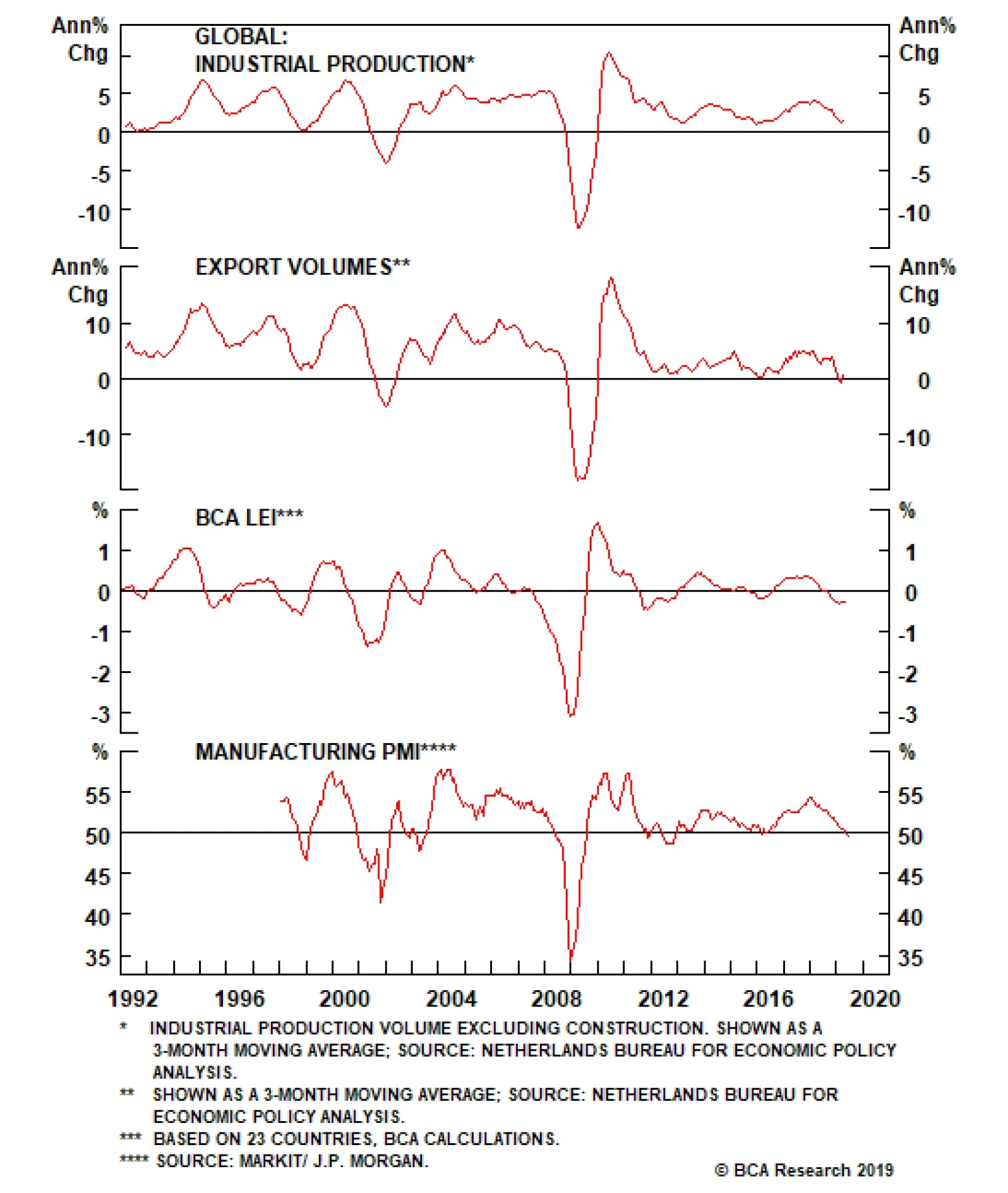
Mathieu Savary: Meanwhile, Peter, you have a much more optimistic stance. Why do you differ so profoundly with Arthur’s view? Peter Berezin: China’s deleveraging campaign began more than a year before global manufacturing peaked. I have no doubt that…
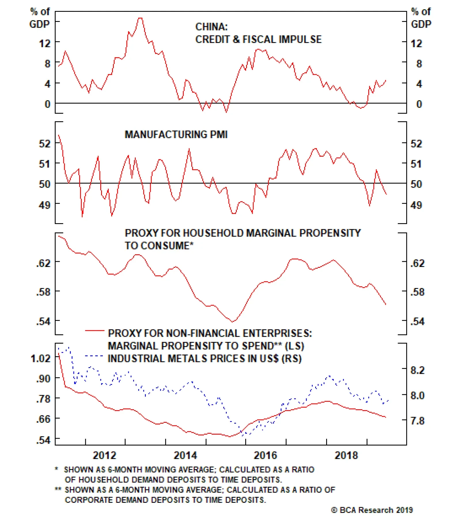
Mathieu Savary: Arthur, you still do not anticipate any major improvement in global trade and industrial production. Can you elaborate why? Arthur Budaghyan: To properly assess the economic outlook, one needs to understand what has caused the ongoing…
Housekeeping
Housekeeping
Last Thursday we were stopped out from our tactical S&P semi equipment underweight position as it hit our -7% stop loss (bottom panel). We are obeying the stop loss and are returning this index to a neutral weighting as better than expected profits from both ASML and TSMC lifted all chip-related equities. In marked contrast, our long global gold miners/short S&P oil & gas exploration & production trade initiated just last week has gone parabolic, spiking to 17% (top panel). While our thesis has not changed in this high beta tactical pair trade, from a risk management perspective, we are moving our stop loss from -10% to +12% in order to protect profits. Bottom Line: Stick with the counter-cyclical long global gold miners/short S&P oil & gas exploration & production trade via the long GDX:US/short XOP:US exchange traded funds. For additional details on the rationale behind this trade, please refer to last Monday’s Weekly Report.
U.S. shale oil is filling a market need for light-sweet crude and condensate, and is attracting investment to meet this need. It does compete with light-sweet OPEC production ex Persian Gulf, but investment in these countries has proven to be difficult to…
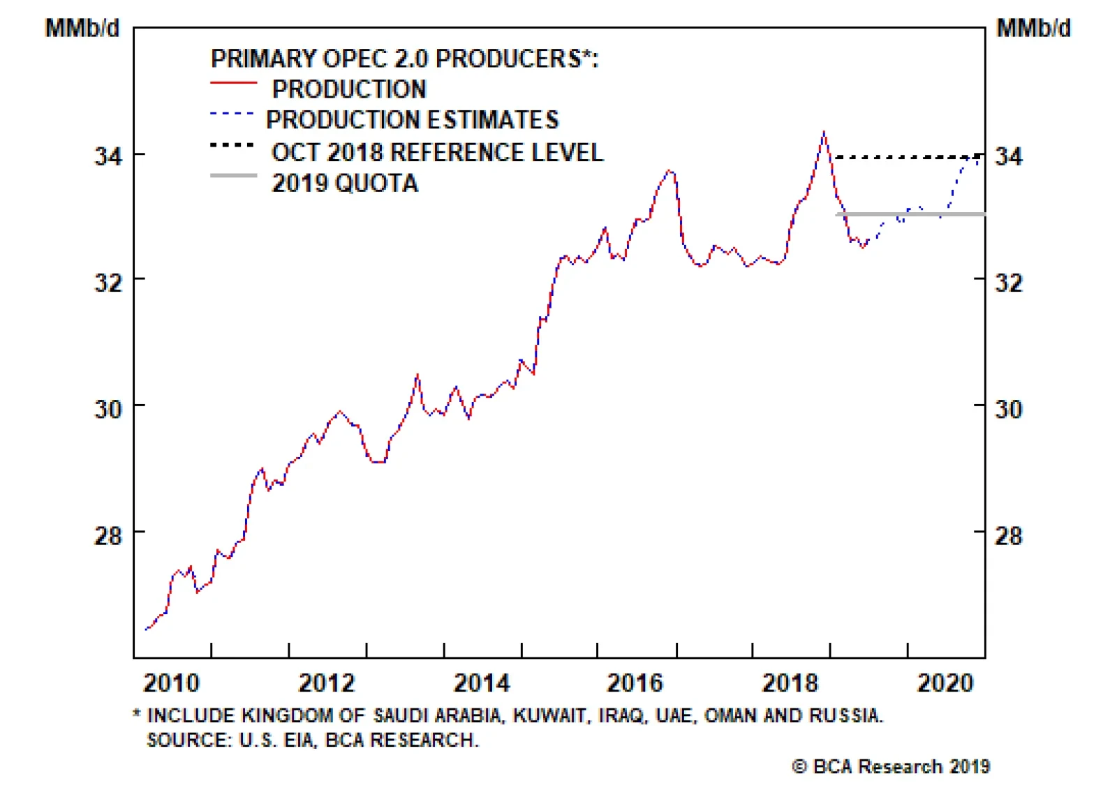
On the supply side, we continue to expect OPEC 2.0’s production strategy to be driven by its primary goal – i.e., reducing global oil inventories. This means the coalition will continue to exercise production restraint: We expect OPEC 2.0 to reduce output by…