Global

Highlights Global LEI Upturn: Our Global leading economic indicator (LEI) has started to climb higher, signaling a potential end to the current global growth slowdown. LEI Components: This improvement is broad-based across countries and regions, focused mostly within EM countries (with the U.S. and Germany lagging the global move). The uptick in the global LEI is well-supported when looking at the individual components that go into the overall indicator. Implications for Bond Yields: Given the historically strong correlation between our global LEI and global bond yields, we view the improving LEI as a core element behind our current below-benchmark stance on global duration exposure. Feature Chart of the WeekGlobal LEI Rising - Are Bond Yields Next?
Global LEI Rising - Are Bond Yields Next?
Global LEI Rising - Are Bond Yields Next?
We have received many client questions recently regarding the latest uptick in our BCA Global Leading Economic indicator (LEI), which bottomed back in July of this year and has since steadily climbed. This pickup in the global LEI has been broad-based across countries, as evidenced by the run up in our global LEI diffusion index, which measures the percentage of countries with a rising LEI versus a falling LEI. That diffusion index is itself a reliable leading indicator of the global LEI, and of both the level and rate-of-change of global bond yields (Chart of the Week), and is flagging an end to the massive government bond rally of 2019. For our global LEI, we prefer to use a smaller set of countries but with a bigger weighting on EM economies (Table 1), given the larger share of global economic growth generated in the EM world (including, most notably, China). At a time when U.S.-China trade uncertainty has yet to subside significantly, and with reliable coincident cyclical indicators like manufacturing PMIs still showing that global growth momentum is decelerating, this naturally invites questions on what is in our global LEI and what could possibly be driving it higher. In this Weekly Report, we try to answer those questions visually by breaking down the details of our global LEI by region, country and individual component data series. What Is In The BCA Global LEI? The BCA global LEI is a composite index that combines the LEIs of 23 individual countries using GDP-weights. The underlying list of countries differs from that of the widely-followed OECD LEI, which is comprised of data from 33 countries but with a heavy weighting on developed market (DM) economies. The overall OECD LEI excludes important EM exporting countries such as Taiwan and Singapore, which are highly sensitive to changes in global growth. For our global LEI, we prefer to use a smaller set of countries but with a bigger weighting on EM economies (Table 1), given the larger share of global economic growth generated in the EM world (including, most notably, China). Table 1Country Weightings Of The BCA & OECD Global LEIs
What Is Driving The Improvement In The BCA Global Leading Economic Indicator?
What Is Driving The Improvement In The BCA Global Leading Economic Indicator?
According to our calculations using global growth data from the IMF, 58% of global growth has come from EM or developing economies (including China) since the 2009 global recession, with that number projected to rise to 64% by 2024. That compares to a nearly 50/50 split, on average, between 2001 and 2010. Thus, the 33% weight of EM countries in our global LEI (which is based on GDP level weights and not GDP growth weights) provides a much better measure of future global prospects than the OECD LEI which has only a 13% weight in EM. That can be seen in the much higher correlation (Chart 2) between the BCA global LEI (advanced by one year) and global real GDP growth relative to a similar correlation using the OECD LEI (also advanced one year so it leads growth). Chart 2The BCA Global LEI Is A Better Predictor Of Future Growth
The BCA Global LEI Is A Better Predictor Of Future Growth
The BCA Global LEI Is A Better Predictor Of Future Growth
For most of the nations in our global LEI, we do use the country-level LEIs produced by the OECD.1 That also includes several large and important non-OECD EM countries that the OECD calculates LEIs for - a list that includes China, Brazil, India, Russia, Indonesia and South Africa. For a few selected countries, however, we use the following data: U.S., Korea, Taiwan and Singapore: LEIs produced by national government data sources or, in the case of the U.S., the Conference Board Argentina, Malaysia and Thailand: LEIs produced in-house at BCA, a necessary step given the lack of domestically-produced LEIs in those countries at the time our global LEI was first constructed. Where Is The Current Uptick In The BCA Global LEI Coming From? Chart 3The Latest Global LEI Uptick Is All About EM
The Latest Global LEI Uptick Is All About EM
The Latest Global LEI Uptick Is All About EM
When we separate our global LEI into “sub-LEIs” for the DM and EM countries, we see that the current uptick in the global LEI has come entirely from EM (Chart 3). A potential bottoming of the DM LEI, however, is also on the horizon given the sharp run-up in the DM-only global LEI diffusion index. We have also broken down the list of countries in our global LEI into regional sub-indices (Chart 4). On this basis, the LEIs paint an optimistic picture for South America and Eastern Europe, while the Asian and Western Europe LEIs are in the process of bottoming out. The regional LEI for North America, however, remains in a downtrend, although the most recent data point did hook upward. Chart 4The Global LEI Uptick Is Regionally Broad-Based
The Global LEI Uptick Is Regionally Broad-Based
The Global LEI Uptick Is Regionally Broad-Based
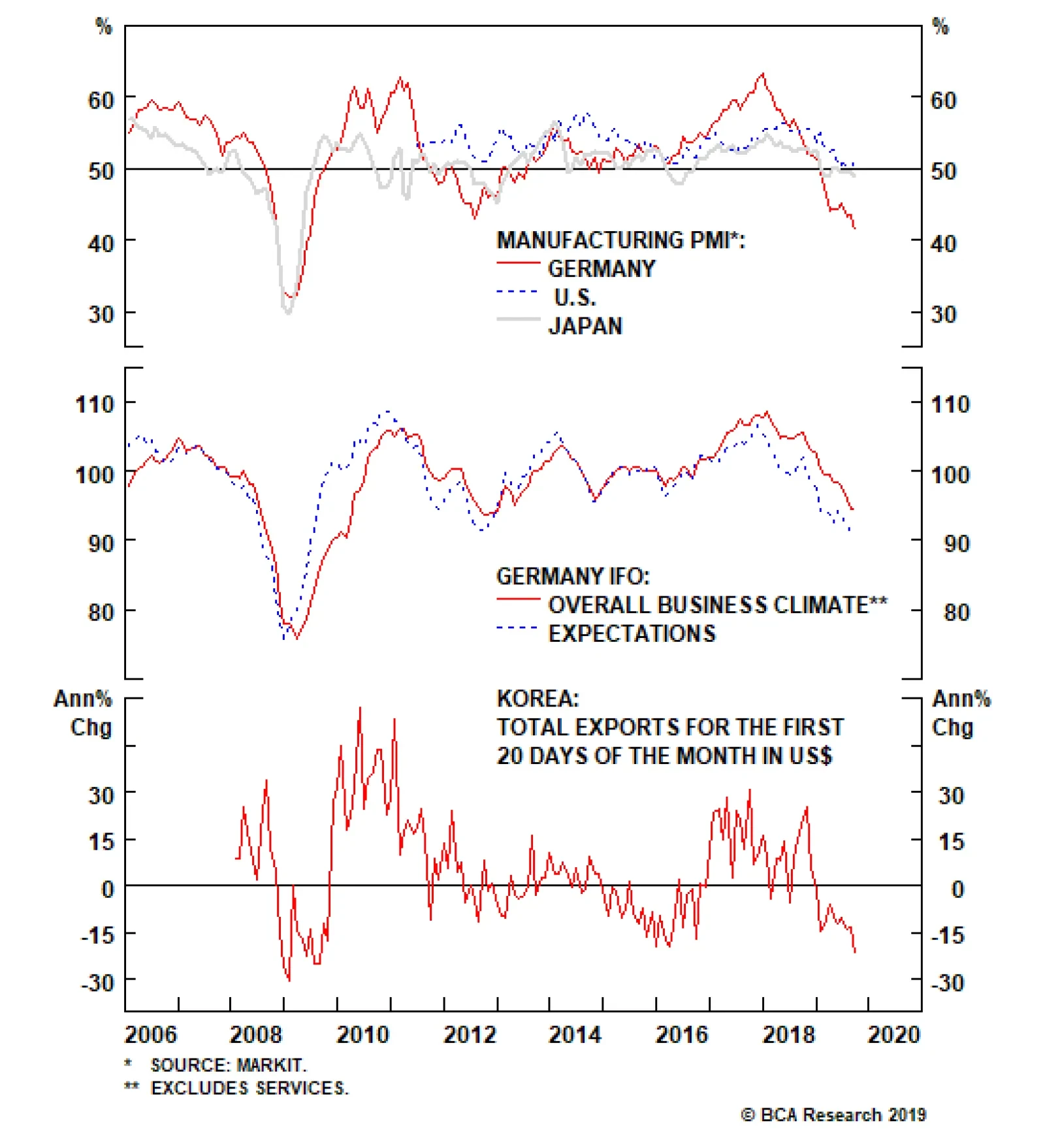
Pages 8-18 of this report contain charts showing the underlying data series that go into the individual country LEIs that comprise our global LEI. The charts are presented with the top panel showing the relationship between the LEI and GDP growth for each country, with the remaining panels of each chart containing the individual components of each country’s LEI. Shown this way, we can show both the reliability of the each LEI in predicting economic growth, as well as what is contributing to the change in the LEI. When we separate our global LEI into “sub-LEIs” for the DM and EM countries, we see that the current uptick in the global LEI has come entirely from EM (Chart 3). A potential bottoming of the DM LEI, however, is also on the horizon given the sharp run-up in the DM-only global LEI diffusion index. It should be noted that we are presenting the underlying LEI data series with very little of the usual de-trending and smoothing that the OECD uses to turn more volatile data into less noisy measures that correlate better with economic growth. We chose to do this in the interest of transparency, as the goal of this report is to “look under the hood” of our global LEI to see the raw, untransformed data that is driving the current upturn. For the most part, the choice of data that goes into the LEIs does show some similarity across countries. The most common LEI components are those related to equity markets, money supply growth, export orders, business/consumer confidence, inventories, short-term interest rates (or by association, the slope of yield curves) and for some EM countries, consumer price inflation. We can make a few summary comments on the latest trends within the country LEIs: Key Asian emerging markets such as Malaysia, Thailand, and Taiwan have been supported by a growing money supply. However, hard data relating to exports and domestic demand remain mixed. The Chinese LEI, on a standardized and de-trended basis, has rebounded back above zero. Despite trade tensions, hard data has helped push up expected Chinese growth. Growth in fertilizer and motor vehicles production has hooked up, while crude steel production continues to grow at a healthy 9% pace. In developed Asian markets, the picture has been more mixed. Japan and Korea have been hurt by a decline in small business and consumer confidence, respectively. Stock prices in Japan have remained flat while they have actually declined in Korea. Data relating to construction is weak in both countries. At the same time, Singapore, an important barometer of global growth, has been hurt by the falling imports and business expectations. In Latin American markets, we have seen improvement in the soft data measured through business tendency surveys focused on manufacturers. An expanding money supply has seen Argentina and Chile begin to dig themselves out of negative territory. Also, a narrowing yield spread between Mexican and U.S. sovereign debt and strong production tendency numbers have helped the Mexican LEI hit a 10-year high, on a standardized and de-trended basis. So, where is the weakness in the global economy? If you were to consider only the LEIs, the U.S. and Germany appear to be the main culprits. The U.S. LEI has steadily drifted into negative territory in 2019, owing to a downtrend in average weekly hours in manufacturing, contracting new orders for consumer goods and materials, and the inverted U.S. Treasury yield curve. Although the latest readings from building permits, equity prices and M2 growth are sending a more hopeful message on future U.S. growth. With all the geopolitical uncertainties stemming from the U.S.-China tariff battles, Brexit, bubbling Mideast tensions and even the 2020 U.S. Presidential cycle, the value of using forward-looking indicators with a successful track record of forecasting economic growth – rather than watching contemporaneous or even lagging data - has never been greater. In Germany, however, the picture is much worse. The soft data indicates that a deep pessimism has set in among German manufacturers. The IFO business climate index and manufacturing expectations of export order books have both been on a sharp decline year-to-date and showed only the slightest of upticks in the month of September. This pessimism is also reflected on the non-manufacturing side, where expected demand for services and consumer confidence have tumbled. We can draw some hope from the recent uptick in manufacturing new orders, but we will have to see sustained improvement across more LEI components before we can call a turnaround in German growth. Given how widely followed the U.S. and German economic data releases are among investors, it should not be surprising that there is a palpable fear in the markets of potential global recession. Yet the U.S. and German economies typically lag the global business cycle. EM economies, especially in China and non-Japan Asia, are where growth upturns begin and the LEIs there are now bottoming out and, in some cases, outright improving. Investment Implications Our final assessment of our global LEI is that: a. there is nothing in the construction of the index that is distorting the message from the current uptick in the LEI b. the rise in the global LEI is still in its early days c. The improvement in the LEI is coming from a significant share of the global economy, and has roots in hard data and not just liquidity-based measures like rising equity prices or money supply growth. With all the geopolitical uncertainties stemming from the U.S.-China tariff battles, Brexit, bubbling Mideast tensions and even the 2020 U.S. Presidential cycle, the value of using forward-looking indicators with a successful track record of forecasting economic growth – rather than watching contemporaneous or even lagging data - has never been greater. Given the historically strong correlation between our global LEI and the level and change of global bond yields, we view the improving LEI as a core element behind our current below-benchmark stance on global duration exposure. Chart 5Argentina LEI: Bottoming Out
Argentina LEI: Bottoming Out
Argentina LEI: Bottoming Out
Chart 6Brazil LEI: Modestly Improving
Brazil LEI: Modestly Improving
Brazil LEI: Modestly Improving
Chart 7Canada LEI: Hooking Up
Canada LEI: Hooking Up M¨CANADA: LEI COMPONENTS
Canada LEI: Hooking Up M¨CANADA: LEI COMPONENTS
Chart 8Chile LEI: Bottoming Out
Chile LEI: Bottoming Out
Chile LEI: Bottoming Out
Chart 9China LEI: Strong Improvement
China LEI: Strong Improvement
China LEI: Strong Improvement
Chart 10Czech Republic LEI: Deteriorating
Czech Republic LEI: Deteriorating
Czech Republic LEI: Deteriorating
Chart 11France LEI: Hooking Up
France LEI: Hooking Up
France LEI: Hooking Up
Chart 12German LEI: Steadily Falling
German LEI: Steadily Falling
German LEI: Steadily Falling
Chart 13Hungary LEI: Falling
Hungary LEI: Falling
Hungary LEI: Falling
Chart 14Italy LEI: Bottoming Out
Italy LEI: Bottoming Out
Italy LEI: Bottoming Out
Chart 15Japan LEI: Still Falling
Japan LEI: Still Falling
Japan LEI: Still Falling
Chart 16Korea LEI: Stabilizing
Korea LEI: Stabilizing
Korea LEI: Stabilizing
Chart 17Malaysia LEI: Bottoming Out
Malaysia LEI: Bottoming Out
Malaysia LEI: Bottoming Out
Chart 18Mexico LEI: Booming
Mexico LEI: Booming
Mexico LEI: Booming
Chart 19Poland LEI: Stabilizing
Poland LEI: Stabilizing
Poland LEI: Stabilizing
Chart 20Russia LEI: Stabilizing
Russia LEI: Stabilizing
Russia LEI: Stabilizing
Chart 21Singapore LEI: Still Falling
Singapore LEI: Still Falling
Singapore LEI: Still Falling
Chart 22South Africa LEI: Stabilizing
South Africa LEI: Stabilizing
South Africa LEI: Stabilizing
Chart 23Taiwan LEI: Solid Uptrend
Taiwan LEI: Solid Uptrend
Taiwan LEI: Solid Uptrend
Chart 24Thailand LEI: Solid Uptrend
Thailand LEI: Solid Uptrend
Thailand LEI: Solid Uptrend
Chart 25Turkey LEI: Very Strong Uptrend
Turkey LEI: Very Strong Uptrend
Turkey LEI: Very Strong Uptrend
Chart 26U.K. LEI: Inching Upward
U.K. LEI: Inching Upward
U.K. LEI: Inching Upward
Chart 27U.S. LEI: Weakening
U.S. LEI: Weakening
U.S. LEI: Weakening
Ray Park, CFA, Research Analyst ray@bcaresearch.com Shakti Sharma, Research Associate shaktis@bcaresearch.com Robert Robis, CFA, Chief Fixed Income Strategist rrobis@bcaresearch.com Footnotes 1Details on how the OECD calculates the individual country leading economic indicators can be found here: http://www.oecd.org/sdd/leading-indicators/compositeleadingindicatorsclifrequentlyaskedquestionsfaqs.htm The GFIS Recommended Portfolio Vs. The Custom Benchmark Index
What Is Driving The Improvement In The BCA Global Leading Economic Indicator?
What Is Driving The Improvement In The BCA Global Leading Economic Indicator?
Recommendations Duration Regional Allocation Spread Product Tactical Trades Yields & Returns Global Bond Yields Historical Returns
Highlights The global manufacturing cycle is likely to bottom soon, and consumption and services remain robust. The risk of recession over the next 12 months is low. This suggests that equities will continue to outperform bonds. But the risks to this optimistic scenario are rising. A denting of consumer confidence and worsening of geopolitical tensions could hurt risk assets. We hedge this by overweighting cash. China remains reluctant for now to use aggressive monetary easing. Until it does, the less cyclical U.S. equity market should outperform. We may shift into EM and European equities when China ramps up stimulus and the manufacturing cycle clearly bottoms. To hedge against this upside risk, we go tactically overweight Financials, and reiterate our overweight on Industrials and neutral on Australia. Bond yields should continue their rebound. We recommend an underweight on duration and favor TIPS. Credit should outperform on the cyclical horizon, but high corporate debt is a risk – we recommend a neutral position. Recommendations
Quarterly Portfolio Outlook: Hedges All Around
Quarterly Portfolio Outlook: Hedges All Around
Feature Overview Hedges All Around This is a particularly uncertain time for the global economy – and so a tricky one for asset allocators. Will manufacturing activity bottom soon, or will it drag down the services sector and consumption with it? Will bond yields continue their strong rebound? Is the Fed done cutting rates? Will China now ramp up monetary stimulus? Will Iran escalate a confrontation with Saudi Arabia? What will President Trump tweet about next? This is the sort of environment in which portfolio construction comes into its own. We have our view on all these questions, but our level of conviction is somewhat lower than usual. The way for investors to react is to plan asset allocation in such a way that a portfolio is robust in all the most probable scenarios. We expect the global manufacturing cycle to bottom soon. The Global Leading Economic Indicator is already picking up, and the Global PMI shows some signs of bottoming (Chart 1). The shortest-term lead indicator, the Citigroup Economic Surprise Index, has recently jumped in every region except Europe (Chart 2). (See also What Our Clients Are Asking on page 7 for some more esoteric indicators of cycle bottoms.) The bottoming-out is due to easier financial conditions over the past nine months, a stabilization in Chinese growth, and simply time – the down-leg in manufacturing cycles typically last 18 months, and this one peaked in H1 2018. Chart 1First Signs Of Bottoming
First Signs Of Bottoming
First Signs Of Bottoming
Chart 2Surprisingly Strong Surprises
Surprisingly Strong Surprises
Surprisingly Strong Surprises
At the same time, government bond yields should have further to rise. The Fed may cut rates once more but, given the resilient U.S. economy, no more than that. This is less than the 59 basis points of cuts over the next 12 months priced in by the Fed Fund futures. The recent pick-up in economic surprises suggests that the 10-year U.S. Treasury yield should return at least to where it was six months ago, 2.3-2.4% (Chart 3). This might be delayed, however, if there is an increase in political tensions, for example a break-up of the U.S./China trade talks (Chart 4). Chart 3Long-Term Rates To Rebound Further...
Long-Term Rates To Rebound Further...
Long-Term Rates To Rebound Further...
Chart 4...But Geopolitical Tensions Remain A Risk
...But Geopolitical Tensions Remain A Risk
...But Geopolitical Tensions Remain A Risk
This implies that equities are likely to continue to outperform bonds over the next few quarters, and so we remain overweight global equities and underweight global bonds on the 12-month investment horizon. However, the risks to this rosy scenario are rising. We remain concerned about the inverted yield curve, which has accurately forecast every recession since World War II, usually about 18 months in advance (Chart 5). The 3-month/10-year curve inverted in the middle of this year. We also worry that the weakness in the manufacturing sector may dent consumer confidence. There are some signs of this in Europe and Japan – but none significant yet in the U.S. (Chart 6). Accordingly last month, as a hedge against an economic downturn, we went overweight cash, which we see as a more attractive hedge, from a risk/reward point-of-view, than bonds. Chart 5Can We Ignore The Message From The Yield Curve?
Can We Ignore The Message From The Yield Curve?
Can We Ignore The Message From The Yield Curve?
Chart 6Some Signs Of Weaker Consumer Confidence
Some Signs Of Weaker Consumer Confidence
Some Signs Of Weaker Consumer Confidence
We also remain overweight U.S. equities, which are lower-beta and have fewer structural headwinds than equities in other regions. However, we continue to look for an entry point into the more cyclical equity markets which would also be beneficiaries of bolder China stimulus. China’s monetary easing remains more tepid than in previous stimulus episodes. It has probably been enough to stabilize domestic activity (Chart 7) but not to trigger a rally in industrial commodity prices, EM assets, and euro area equities, as it did in 2016. A pick-up in global PMIs and signs of stronger Chinese credit growth would clearly help EM and Europe (Chart 8) but we need higher conviction that these things are indeed happening before making that move. In the meantime, we are hedging the upside risk by raising the global Financials sector tactically to overweight, since it would likely do well if euro area stocks started to outperform. Earlier this year, we raised the Industrials sector to overweight and Australian equities to neutral, also to hedge against the upside risk from more aggressive Chinese stimulus. Chart 7Chinese Stimulus Has Merely Stabilized Growth
Chinese Stimulus Has Merelyy Stabilized Growth
Chinese Stimulus Has Merelyy Stabilized Growth
Chart 8Europe And EM Are The Most Cyclical Markets
Europe And EM Are The Most Cyclical Markets
Europe And EM Are The Most Cyclical Markets
Chart 9Oil Price Spikes Often Precede Recessions
Oil Price Spikes Often Precede Recessions
Oil Price Spikes Often Precede Recessions
The biggest geopolitical risk to our sanguine scenario is the situation in the Middle East, after the attacks on Saudi oil refineries. Every recession in the past 50 years has been preceded by a 100% year-on-year spike in the crude oil price (though note that Brent would need to rise to over $100 a barrel by year-end, from $61 today, for that to eventuate (Chart 9)). A short-term oil shortage is not the problem since strategic reserves are ample. But the attack demonstrates the vulnerability of the Saudi installations. And a reprisal attack on Iran could lead it to block the Strait of Hormuz, through which more than 20% of global oil passes. We have an overweight on the Energy sector, partly as a hedge against these risks. BCA’s oil strategists expected Brent crude to rise to $70 this year, and average $74 in 2020, even before the recent attack. They argue that the risk premium in the oil price (the residual in Chart 10) is too low, given not only tensions with Iran, but also other potential supply disruptions in Iraq, Libya, Venezuela and elsewhere. Chart 10Is The Oil Risk Premium Too Low?
Quarterly Portfolio Outlook: Hedges All Around
Quarterly Portfolio Outlook: Hedges All Around
Garry Evans, Senior Vice President Chief Global Asset Allocation Strategist garry@bcaresearch.com What Our Clients Are Asking Which Leading Indicators Should Investors Watch To Time The Rebound In Global Growth? Chart 11Positive Signals For Global Growth
Is Eurozone Manufacturing Close To A Bottom? Positive Signals For Global Growth
Is Eurozone Manufacturing Close To A Bottom? Positive Signals For Global Growth
During 2019, the global growth decline was a key driver of the bond rally and the outperformance of defensive assets. Thus, timing when this decline will reverse will be crucial, since it would also result in a change of leadership from defensive to cyclical assets. But how can this be done? Below we list three of our favorite indicators that have provided reliable leading signals on the global economy in the past: Carry-trade performance: The performance of EM currencies with very high carry versus the yen tends to be a leading indicator for global growth (Chart 11, panel 1). In general, carry trades distribute liquidity from countries where funds are plentiful but rates of return are low (like Japan), to places with savings shortfalls and high risk, but where prospective returns are high. Positive performance of these currencies tends to signal a positive shift in global liquidity, which usually fuels global growth. Swedish inventory cycle: The Swedish new-orders-to-inventories ratio is a leading indicator of the global manufacturing cycle (panel 2). Why? Sweden is a small open economy that is very sensitive to global growth dynamics. Moreover, Swedish exports are weighted towards intermediate goods, which sit early in the global supply chain. This makes the Swedish inventory cycle a good early barometer of the health of the global manufacturing cycle. G3 monetary trends: G3 excess money supply – measured as the difference between money supply growth and loan growth – is a leading indicator of global industrial production (panel 3). As base money and deposits become more plentiful in the banking system relative to the pool of existing loans, the liquidity position of commercial banks improves. This provides banks with the necessary fuel to generate more loan growth, a development which eventually provides a boon to economic activity. Importantly, all these leading indicators are sending a positive signal on the global economy. This confirms our view that rates should go up as global growth strengthens. Therefore, investors should remain overweight equities and underweight bonds in their portfolios. Is It Time To Buy Euro Area Banks? In a Special Report on euro area banks in December 2018, we noted that “Historically, when the relative P/B discount hits the lower band and the relative dividend yield hits the upper band, a rebound in relative return performance could be expected”.1 Our recommendation back then was that “long-term investors should avoid banks in the region, but investors with a more tactical mandate and much nimbler style could use the valuation indicators to ‘time’ their entry into and exit out of banks as a short-term trade.” Since then, banks have continued to underperform the overall market by over 10%, further pushing down relative valuation metrics. Currently, both relative P/B and relative dividend yield are at extreme levels that have historically heralded at least a short-term bounce. The euro area PMI is still below 50, but there are signs that the euro area economy could rebound later this year, which should be positive for banks’ relative earnings. Already, forward EPS growth has been stabilizing relative to the broad market (Chart 12, panel 4). In addition, two of the key concerns back in December 2018 were Italian government debt and the unwinding of QE. Now Italian debt is no longer in crisis and the ECB has relaunched QE. As such, investors with a tactical mandate and a nimble style should buy (overweight) banks in the euro area. Long-term investors should still avoid such a short-term trade because structural issues remain. Chart 12Tactically Upgrade Euro Area Banks
Tactically Upgrade Euro Area Banks
Tactically Upgrade Euro Area Banks
Is The Gold Rally Over? Spot gold prices have increased 17% year-to-date, on the back of global growth weakness, dovish central banks, and rising political tensions. Should investors now pare back their gold exposure? Common sense would suggest they should. However, these are not ordinary times. In the short term, gold prices might suffer from some profit-taking due to overbought technicals and excessively positive sentiment (Chart 13, panel 1). Moreover, gold prices have moved this year due to increased market expectations of central bank easing (panel 2). We expect that markets will be disappointed going forward by only limited rate cuts, which could put downward pressure on gold. On the other hand, with approximately 27%, or $14.9 trillion, of global debt with negative yields at the moment, investors will continue to shift to the next best asset – zero-yielding gold (panel 3). This is clear from the rise in holdings of gold over the past few years by both central banks and investors (panels 4 & 5). We expect this trend to persist as investors continue their search to avoid negative yields and focus on capital preservation. Geopolitical tensions have intensified since the beginning of the year: ongoing yet inconclusive trade negotiations between the U.S. and China, implementation of further tariffs, Brexit uncertainty, and the recent military attacks in the Middle East (panel 6). This environment should also continue to push gold prices higher. We continue to recommend gold as a hedge against inflation – which we see picking up over the next 12 months – as well as against any further deterioration in global growth and the geopolitical situation. Chart 13Gold: Sell Or Hold?
Gold: Sell Or Hold?
Gold: Sell Or Hold?
Risks to the rosy scenario are rising. We remain concerned about the inverted yield curve, which has accurately forecast every recession since World War II. How Low Can Rates Go? The zero lower bound is a thing of the past. Last month, Denmark’s central bank cut rates to -0.75%, and 10-year government bonds in Switzerland hit a historic low for any major country, -1.12%. In the next recession, how much further could interest rates theoretically fall? For individuals, cash rates might be limited by the cost of storing paper currency, which has a zero yield (unless governments find a way to ban cash or charge an annual fee on it). A bank safety deposit box costs about $300 a year, and a professional-quality safe big enough to store $1 million (which would be a pile of $100 bills 31 x 55 cms, weighing 10 kg) costs $2,000 with installation costs. Amortize the latter over 10 years, and the cost of storing $1 million is about 0.2%-0.3% a year. Swiss franc bills – maximum denomination CHF1,000 – would cost less to store. But storage costs for physical gold are around 2% a year. Since rates have fallen below this, there must be other constraints. Individuals would find storing money in cash possibly dangerous and certainly very inconvenient (imagine having to transport the cash to a bank to pay a tax bill). And the cost for a rich individual or company of storing, say, $1 billion (weighing 10 tonnes) would be much higher. Given the history in even low-rate countries (Chart 14, panel 1), we suspect around -1% is the level at which cashholders would seek alternatives to bank deposits of government bills. Chart 14How Low Can They Go?
How Low Can They Go?
How Low Can They Go?
Chart 15Yield Curves When Rates Are At Zero Or Below
Yield Curves When Rates Are At Zero Or Below
Yield Curves When Rates Are At Zero Or Below
At the long end, the yield curve does not typically invert much when short-term rates are zero or negative (Chart 15). The biggest 3-month/10-year inversion was in Switzerland earlier this year, -0.05%. This points then to the absolute lowest level for 10-year bonds anywhere, even in the middle of a nasty recession, at around -1.1%. That is a worry for asset allocators. It means that the maximum mathematical upside for Swiss government bonds from their current level (-0.8%) is 3% while it is 5% for German bonds (currently -0.5%). This is not much of a hedge. Only the U.S. looks better: if the 10-year Treasury yield falls to 0%, the total return is 18%. Global Economy Chart 16U.S. Growth Remains Solid
U.S. Growth Remains Solid
U.S. Growth Remains Solid
Overview: Industrial-sector growth globally has been weak, with the manufacturing PMI in most countries falling below 50. But consumption and services almost everywhere have remained resilient, even in the manufacturing-heavy euro area. And there are tentative signs of a bottoming-out in manufacturing. However, a full-scale rebound will depend on further monetary stimulus in China, where the authorities still seem cautious about rolling out easing on the scale of what was done in 2016. U.S.: U.S. manufacturing has now followed the rest of the world into contraction, with the ISM manufacturing index slipping below 50 in August (Chart 16, panel 2). However, consumption and services are holding up well. Employment continues to expand (albeit at a slightly slower pace than last year, perhaps because of a lack of jobseekers), there is no sign of a rise in layoffs, and consumer confidence remains close to a historical high (though it slipped slightly in September). Housing has recovered after last year’s slowdown, and the recent congressional budgetary agreement means fiscal policy will be mildly expansionary over the coming 12 months. Only capex (panel 5) has slowed, as companies postpone investment decisions due to uncertainty surrounding the trade war. The consensus expects U.S. real GDP growth of 2.2% this year, above most estimates of trend growth. Euro Area: Given its higher concentration in manufacturing, European growth is weaker than in the U.S. The manufacturing PMI has been below 50 since February, and fell further to 45.6 in August. Industrial production is shrinking by 2% year-on-year. Italy has experienced two negative quarters of growth, and Germany may also enter a technical recession in Q3 (GDP shrank by 0.1% in Q2). However, there are some tentative signs that manufacturing is bottoming: the ZEW survey in September, for example, surprised on the upside. And, like the U.S., consumption remains strong. Even in manufacturing-heavy Germany, employment continues to grow, and retail sales in July were up 4.4% year-on-year. In the U.K., however, uncertainty surrounding Brexit has damaged business investment, though employment has been strong.2 Chart 17First Signs Of A Rebound In The Rest Of The World?
First Signs Of A Rebound In The Rest Of The World?
First Signs Of A Rebound In The Rest Of The World?
Japan: Consumption has already slipped, even before the consumption tax hike scheduled in October. Retail sales in July fell 2% year-on-year, due to negative wage growth and consumer sentiment falling to a five-year low. Manufacturing continues to suffer from China’s slowdown and the strong yen (up 6% over the past 12 months), with exports falling 6% and industrial production down 2% year-on-year over the past three months. The effect of the consumption tax hike may be cushioned by government measures (lowering taxes on autos and making high-school education free, for example). And a pickup in Chinese growth would boost exports. But there are scant signs yet of a bottoming in activity. Emerging Markets: China’s growth appears to have stabilized, with both manufacturing and non-manufacturing PMIs above 50 (Chart 17, panel 3). But confidence remains fragile, with retail sales growth slowing to a 20-year low and car sales down 7% in August, despite the introduction of cars compliant with new emissions standards. The authorities have responded with further easing measures (including a further cut in the reserve requirement in September) but seem reluctant to launch a full-scale monetary stimulus, similar to what they did in 2016. Elsewhere in EM, growth has slowed in countries with structural issues (latest year-on-year real GDP growth in Argentina is -5.7%, in Turkey -1.5% and in Mexico -0.8%) but remains fairly resilient elsewhere (India 5%, Indonesia 5%, Poland 4.2%, Colombia 3.4%). Interest Rates: Central banks almost everywhere have turned dovish, with the Fed cutting rates for a second time, the ECB restarting asset purchases, and the Bank of Japan signaling it will ease in October. But further monetary accommodation will probably be less than the market expects. The Fed signaled that its cuts were just a mid-cycle correction and that further easing is unlikely. And the ECB and BoJ have little ammunition left. With signs of growth bottoming, and the market understanding that central banks’ dovish turn is reaching its end, long-term rates, which have already risen in the U.S. from 1.45% to 1.72% in September, are likely to move higher. Investors should also carefully watch U.S. inflation, which is showing signs of underlying strength, with core CPI inflation rising 2.4% year-on-year in August (and as much as 3.4% annualized over the past three months). Global Equities Chart 18Has Earnings Growth Bottomed?
Has Earnings Growth Bottomed?
Has Earnings Growth Bottomed?
Still Cautious, But Adding An Upside Hedge: Global equities registered a small loss of 8 basis points in Q3 (Chart 18) despite all the headline risks from geopolitics and weakening economic data. Overall, our defensive country allocation worked well in Q3, since DM equities outperformed EM by 4.5%, and the U.S. outperformed the euro area by 2.8%. Our sector positioning did not do as well since underweights in Utilities and Consumer Staples and overweights in Industrials, Energy and Health Care all went in the wrong direction, even though the underweight in Materials did help to offset the loss. During the quarter, however, both sector and country rotations were evident within the global equity universe, in line with the wild swings in bond yields. September saw some reversals in DM/EM, U.S./euro area and cyclical/defensives. Going forward, BCA’s House View remains that global economic growth will begin to recover over the coming months, albeit a little later than we previously expected. As such, our defensive country allocation remains appropriate. We did put euro area and EM equities on upgrade watch in April,3 but the delay in the global recovery also implies that it is still not the time to trigger this call. With our view that bond yields have hit bottom,4 we are making one adjustment in our global sector allocation by upgrading Financials to overweight from neutral. We are financing this by cutting in half the double overweight in Health Care to overweight (see next page for more details). This adjustment also acts as a hedge against two possible outcomes: 1) that the euro area outperforms the U.S., and 2) that Elizabeth Warren wins in the upcoming U.S. presidential election.5 Upgrade Global Financials To Overweight From Neutral Chart 19Upgrade Global Financials
Upgrade Global Financials
Upgrade Global Financials
The relative performance of global Financials to the overall equity market has been hugely affected by the movements in global bond yields (Chart 19, panel 1). As bond yields made a sharp reversal in September, so did the relative performance of Financials, even though it is barely evident on the chart given how much Financials have underperformed the broad market over recent years. It’s not clear how sustainable the sharp reversal in bond yields will be, but BCA’s House View is that bond yields will move higher over the next 9-12 months. As such, we are upgrading Financials to overweight from neutral, for the following additional reasons: Valuations are extremely attractive as shown in panel 2. More importantly, the relative valuation is now at an extreme level that historically heralded a bounce in Financials’ relative performance. Loan quality has improved. The U.S. non-performing loan (NPL) ratio is nearing the lows reached before the Global Financial Crisis (GFC). Even in Spain and Italy, NPL ratios have fallen significantly, though they remain higher than they were prior to the GFC (panel 3). U.S. consumption has been strong, housing has rebounded, and demand for loans is getting stronger (panel 4), in line with data such as the Citi Economic Surprise Index, suggesting that economic data may have hit bottom. To finance this upgrade, we cut the double overweight of Health Care to overweight, as a hedge against Elizabeth Warren winning next year’s U.S. presidential election and tightening rules on drug pricing. Government Bonds Maintain Slight Underweight On Duration. Our below-benchmark duration call was severely challenged by the global bond markets in the first two months of the third quarter. The U.S. 10-year Treasury yield hit 1.43% on September 3 in response to the weaker-than-expected ISM manufacturing index in the U.S., 57 bps lower than the level at the end of previous quarter, and just a touch higher than the historical low of 1.32% reached on July 6, 2016. The rebound in bond yields since September 5, however, was driven not only by the ebb and flow in the U.S./China trade policy dynamics, but also by the positive surprises in economic data releases, as shown in Chart 20. BCA’s Global Duration Indicator, constructed by our Global Fixed Income Strategy team using various leading economic indicators, is also pointing to higher yields globally going forward. Investors should maintain a slight underweight on duration over the next 9-12 months. Favor Linkers Vs. Nominal Bonds. Global inflation expectations have also rebounded after continuing their downtrend in the first two months of the quarter. This largely reflects the acceleration in August in realized inflation measures such as core CPI, core PCE, and average hourly earnings. In addition, historically, the change in the crude oil price tends to have a good correlation with inflation expectations. The oil price jumped initially by 20% following the attack on the Saudi Arabian oil production facilities. While it’s not clear how the geopolitical tensions will evolve in the Middle East, a conservative assumption of a flat oil price until the end of the year still points to much higher inflation expectations, supporting our preference for inflation-linked bonds over nominal bonds. We also favor linkers in Japan and Australia over their respective nominal bonds (Chart 21). Chart 20Bond Yields Have Hit Bottom
Bond Yields Have Hit Bottom
Bond Yields Have Hit Bottom
Chart 21Favor Inflation Linkers
Favor Linkers
Favor Linkers
We continue to look for an entry point into more cyclical markets which would benefit from a bolder Chinese stimulus. Corporate Bonds Since we turned cyclically overweight on credit within a fixed-income portfolio, investment-grade bonds and high-yield bonds have produced 220 and 73 basis points, respectively, of excess return over duration-matched government bonds. We remain bullish on the outlook for credit over the next 12 months, as we expect global growth to accelerate before the end of the year. Historically, improving global growth has resulted in sustained outperformance of credit over government bonds. Moreover, default rates should remain subdued over the next year given that lending standards continue to ease (Chart 22, panel 1). How long will we remain overweight credit? High levels of leverage, declining interest coverage ratios, and the high share of Baa-rated debt in the U.S. corporate debt market continue to make credit a risky proposition on a structural basis. However, with inflation expectations still very low, the Fed has a strong incentive to keep monetary policy easy. This dovish monetary policy should keep interest costs at bay, helping credit outperform over the next year. That said, we believe that there are some credit categories that are more attractive than others. Specifically, we recommend investors favor Baa-rated and high yield securities, given that there is still room for further credit compression in these credit buckets (panel 2 and panel 3). On the other hand, investors should stay away from the highest credit categories, as they no longer offer value (panel 4). Chart 22Baa-rated And High-Yield Credit Offer The Most Value
Baa-rated And High-Yield Credit Offer The Most Value
Baa-rated And High-Yield Credit Offer The Most Value
Commodities Chart 23No Supply Shock In The Oil Market
Quarterly Portfolio Outlook: Hedges All Around
Quarterly Portfolio Outlook: Hedges All Around
Energy (Overweight): September’s drone attack on Saudi crude facilities sent oil prices soaring as much as 20% in the days following, before falling back to pre-attack levels. Initial estimates estimated the supply disruption at 5.7 million barrels a day – approximately 5.5% of global supply – making it the largest crude supply outage in history. However, assuming the Saudis can return 70% of the lost output back online as they claim, OPEC’s spare capacity, approximately 1.8 million barrels a day, should be able to balance the market and cover the remaining lost production.6,7 In the longer-term, a pick-up in global oil demand, as economic growth rebounds, plus supply tightness should keep oil price elevated, with Brent reaching $70 this year and averaging $74 in 2020 (Chart 23, panels 1 & 2). Industrial Metals (Neutral): A combination of half-hearted year-to-date stimulus by Chinese authorities and a stronger USD in the second and third quarters of 2019 have driven industrial metals spot prices lower. However, the Chinese government announced additional stimulus in September, with further bond issuance to finance infrastructure projects and an easing of monetary policy (panel 3). This should give some upside for industrial metal prices over the coming six-to-12 months. Precious Metals (Neutral): We remain positive on gold, despite its strong performance year-to-date, since we see it as a good hedge against recession, inflation, and geopolitical risks. We discuss gold in detail in the What Our Clients Are Asking section on page 9. Silver also looks attractive in the short term. The nature of the use of silver has changed over the past two decades, from being mostly a base metal for industrial fabrication to becoming more of a precious metal viewed as a safe haven. The correlation between gold and silver prices has increased since the Global Financial Crisis from an average of 0.5 pre-crisis to 0.8 post-crisis (panels 4 & 5). Global growth and political uncertainty should support silver prices in the coming months. Currencies U.S. Dollar: The trade-weighted dollar has appreciated by 2.5% since we turned neutral in April. We expect that the steep drop in yields will continue to ease financial conditions and help global growth in the last quarter of the year. Given that the dollar is a counter-cyclical currency, an environment where global growth rallies have historically been negative for the greenback. Euro: Since we turned bullish in April, EUR/USD has depreciated by 2.7%. Overall, we continue to be positive on EUR/USD on a cyclical timeframe. After the ECB cut rates by 10 basis points and announced further rounds of quantitative easing, there is not much room left for the euro area to keep easing relative to the U.S. (Chart 24, panel 1). Moreover, improving expectations of profit growth in the euro area vis-à-vis the U.S. will drive money flows towards Europe, pushing EUR/USD up in the process (panel 2). Emerging Market Currencies: We remain bearish on emerging market currencies for the time being. That being said, they remain on upgrade watch for the end of the year. There are multiple signs that global growth is turning up, a consequence of the easy financial conditions caused by some of the lowest bond yields on record. Moreover, the marginal propensity to spend (proxied by M1 growth relative to M2 growth) in China, the main engine of EM growth, continues to point to further appreciation in emerging market currencies (panel 3). Chart 24Interest Rate And Profit Expectation Differentials Favor The Euro
The Euro Might Soon Pop Interest Rate And Profit Expectations Differentials Favor The Euro
The Euro Might Soon Pop Interest Rate And Profit Expectations Differentials Favor The Euro
Alternatives Chart 25Favor Hedge Funds Untill Global Growth Bottoms
Favor Hedge Funds Untill Global Growth Bottoms
Favor Hedge Funds Untill Global Growth Bottoms
Return Enhancers: Over the past 12 months, we have recommended investors pare back on private equity and increase allocations to hedge funds – macro hedge funds in particular. This was due to our judgement that we are late in the economic cycle. While we expect growth to pick up over the coming months, this is not yet clear in the data (Chart 25, panel 1). This uncertain macro outlook will prove tough for private equity funds, especially given an environment of rising multiples and increasing competition for deals. We continue to see global macro hedge funds as the best hedge ahead of the next recession and would advise investors to allocate funds now, given the time it takes to move allocations in the illiquid space. Inflation Hedges: In the current environment, TIPS are likely a better inflation hedge than illiquid alternative assets. Our May 2019 Special Report 8 showed that TIPS produce a particularly attractive risk-adjusted return during times when inflation is rising, but still fairly low (below 2.3%). TIPS should do well, therefore, in the environment we expect over the next few months, where the Fed remains dovish, cutting rates perhaps once more, while condoning a moderate acceleration of inflation (panel 2). Volatility Dampeners: Structured products – mostly Mortgage-Backed Securities (MBS) – have had an excellent record of reducing portfolio volatility (panel 3). Despite that, we do not recommend more than a neutral allocation to MBS currently due to a less-than-attractive valuation picture. Despite Treasury yields falling by more than 100 basis points this year and refinancing activity picking up, nominal MBS spreads remained near their all-time lows. However, as Treasury yields bottom, we expect refinancing to slow, putting downward pressure on spreads. Risks To Our View The most likely upside risk comes from the Fed being too dovish and falling behind the curve. Underlying inflation pressures in the U.S. remain strong (with core CPI up 3.4% annualized over the past three months). After two rate cuts, the Fed Funds rate is now comfortably below the neutral rate: 0.1% in real terms compared to a Laubach-Williams r* of 0.8% (Chart 26). Tightness in the money markets have pushed the Fed to start expanding its balance sheet again. If manufacturing growth accelerates next year, and wages and profits begin to rise, a stock market melt-up, similar to that in 1999, would be possible. Eventually, though, the Fed would need to raise rates (perhaps sharply) to kill inflation, which could usher in the next recession. There are a broader range of possible downside risks. As argued throughout this Quarterly, there are various possible triggers of recession: failure of China to stimulate, and a loss of confidence by consumers, in particular. Some models of recession put the risk over the next 12 months as high as 30% (Chart 27). Structurally, the biggest risk is probably the high level of corporate debt in the U.S. (Chart 28). A breakdown in the junk bond market, as seen briefly last December, could lead to companies failing to refinance the large amount of debt maturing over the next 18 months. Geopolitical risks also remain elevated and are, by nature, hard to forecast. The outcome of Brexit remains highly uncertain – though we see low risk of a no-deal exit. We expect trade talks between the U.S. and China to drag on, without a comprehensive deal, while a clear breakdown would be negative. Impeachment of President Trump is probably not a significant market event, but might hurt market sentiment briefly (particularly if it makes the election of Elizabeth Warren more likely). The Iran/Saudi conflict could escalate. Risk premiums may need to rise to take into account these threats. Chart 26Is The Fed Turning Too Dovish?
Is The Fed Turning Too Dovish?
Is The Fed Turning Too Dovish?
Chart 27What Risk Of Recession?
What Risk Of Recession?
What Risk Of Recession?
Chart 28Is Corporate Debt The Biggest Risk?
Is Corporate Debt The Biggest Risk?
Is Corporate Debt The Biggest Risk?
Footnotes 1Please see Global Asset Allocation Special Report, titled "Euro Area Banks: Value Play Or Value Trap?" dated December 14, 2018, available at gaa.bcaresearch.com. 2 Please see Foreign Exchange Strategy Special Report, “United Kingdom: Cyclical Slowdown Or Structural Malaise?”, dated 20 September 2019, available at fes.bcaresearch.com. 3Please see Global Asset Allocation Quarterly, titled "Quarterly - April 2019" dated April 1, 2019, available at gaa.bcaresearch.com. 4Please see Global Investment Strategy Weekly Report, titled "Bond Yields Have Hit Bottom," dated September 6, 2019, available at gis.bcaresearch.com. 5Please see Global Investment Strategy Weekly Report, titled "Elizabeth Warren And The Markets," dated September 13, 2019, available at gis.bcaresearch.com. 6Dmitry Zhdannikov and Alex Lawler “Exclusive: Saudi oil output to return faster than first thought - sources,” Reuters, dated Sepetmber 17, 2019. 7Please see Geopolitical Strategy Special Alert titled, “Attacks On Critical Infrastructure In KSA Raises Questions About U.S. Response,” dated September 16, 2019, available at gps.bcaresearch.com. 8Please see Global Asset Allocation Special Report, titled “Investors’ Guide To Inflation Hedging: How To Invest When Inflation Rises,” dated May 22, 2019, available at gaa.bcaresearch.com GAA Asset Allocation
GAA DM Equity Country Allocation Model Update The GAA DM Equity Country Allocation model is updated as of September 30, 2019. The country model downgraded Australia from overweight to underweight in order to boost Canada and Sweden to a slight overweight. The other overweight countries remain Italy, Spain, Switzerland, Germany, and the Netherlands. Japan and the U.K. are still deep in underweight territory even though they performed very well in September, as shown in Table 1. Table 1Model Allocation Vs. Benchmark Weights
GAA Quant Model Updates
GAA Quant Model Updates
As Table 2 and Charts 1, 2, and 3 all show, the overall model performed in line with the MSCI World benchmark in September, driven by 15 bps of underperformance from the Level 2 model, offset by 5 bps of outperformance from the Level 1 model. Since going live, the overall model has outperformed by 82 bps, with 278 bps of outperformance by the Level 2 model, offset by 44 bps of underperformance from the Level 1 model. Table 2Performance (Total Returns In USD %)
GAA Quant Model Updates
GAA Quant Model Updates
Chart 1GAA DM Model Vs. MSCI World
GAA DM Model Vs. MSCI World
GAA DM Model Vs. MSCI World
Chart 2GAA U.S. Vs. Non U.S. Model (Level 1)
GAA U.S. Vs. Non U.S. Model (Level 1)
GAA U.S. Vs. Non U.S. Model (Level 1)
Chart 3GAA Non U.S. Model (Level 2)
GAA Non U.S. Model (Level 2)
GAA Non U.S. Model (Level 2)
Furthermore, please refer to our website http://gaa.bcaresearch.com/trades/allocation_performance. For more details on the models, please see Special Report, “Global Equity Allocation: Introducing The Developed Markets Country Allocation Model,” dated January 29, 2016, available at https://gaa.bcaresearch.com. Please note that the overall country and sector recommendations published in our Monthly Portfolio Update and Quarterly Portfolio Outlook use the results of these quantitative models as one input, but do not stick slavishly to them. We believe that models are a useful check, but structural changes and unquantifiable factors need to be considered as well when making overall recommendations. GAA Equity Sector Selection Model Chart 4Overall Model Performance
Overall Model Performance
Overall Model Performance
The GAA Equity Sector Model (Chart 4) is updated as of September 30, 2019. The model’s relative tilts between cyclicals and defensives have changed compared to last month. The global growth proxies embedded in the model are behind the bearish tilt on cyclical sectors. The only cyclical sector currently overweight by the model – Information Technology – is favored due to positive inputs from both its liquidity and momentum components. The valuation component has triggered a buy signal in the Energy sector. However, negative inputs from the remaining components do not justify an outright overweight position. All remaining sectors, on the other hand, continue to have a muted valuation component. The model is now overweight 4 sectors in total, 1 cyclical and 3 defensive sectors. These are Information Technology, Consumer Staples, Health Care and Utilities. Table 3Model’s Performance (March 1, 2019 - Current)
GAA Quant Model Updates
GAA Quant Model Updates
For more details on the model, please see the Special Report “Introducing the GAA Equity Sector Selection Model,” dated July 27, 2016, as well as the Sector Selection Model section in the Special Alert “GAA Quant Model Updates,” dated March 1, 2019 available at https://gaa.bcaresearch.com. Table 4Current Model Allocations
GAA Quant Model Updates
GAA Quant Model Updates
Xiaoli Tang, Associate Vice President xiaoliT@bcaresearch.com Amr Hanafy, Research Associate amrh@bcaresearch.com
The September flash PMI for the euro area weakened to 45.6, but in Germany, they collapsed to 41.4, the lowest level since the Great Financial Crisis. In Japan, manufacturing activity is also contracting, with the PMI falling to 48.9. The IFO survey…
The trade confrontation has not derailed U.S. household spending as it is still robust. Because they slowed but did not contract, U.S. imports have been a mild positive rather than a negative for global trades. In addition, Chinese exports have been…
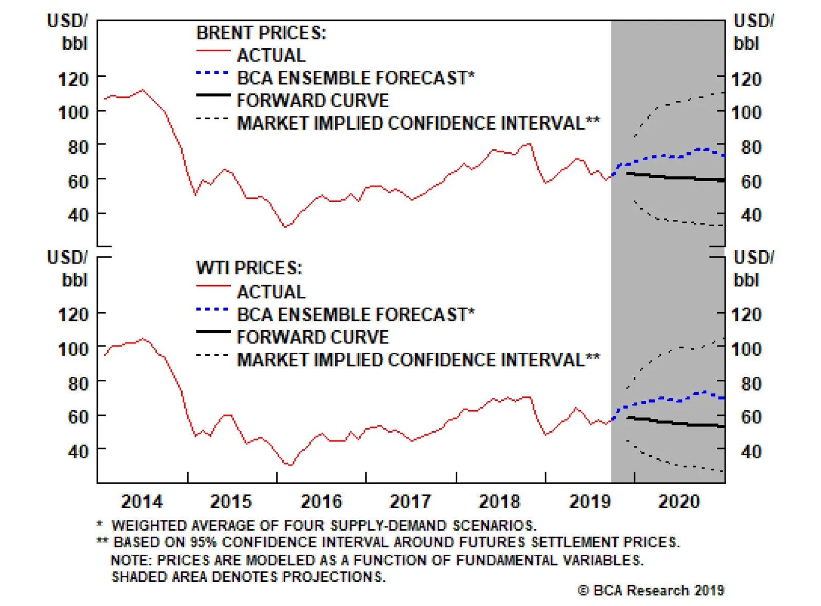
According to KSA officials, repairs to the damaged 7-million-barrel-per-day processing facility at Abqaiq will mostly be completed by month-end. Relative to last month, we are not changing our price forecasts much, with Brent averaging $65/bbl for this year…
Dear Client, Owing to BCA’s 40th Annual Investment Conference in New York City next week, we will not be publishing a report on Friday, September 27. We will return to our regular publishing schedule on Friday, October 4, when we will be sending out our quarterly Strategy Outlook. Best regards, Peter Berezin, Chief Global Strategist Highlights The spike in oil prices underscores the vulnerability of key Saudi oil facilities. The fact that OPEC spare capacity is on the low side is an added source of concern. Fortunately, if oil prices do rise again, the impact on the global economy will be mitigated by the following: 1) the amount of oil necessary to produce one unit of real GDP is much lower than in the past; 2) oil prices are currently nowhere near restrictive levels; 3) higher oil prices will boost investment in the energy sector; and 4) unlike in the past, central banks will not need to hike rates to quell oil-induced inflationary pressures. The Federal Reserve is likely to cut rates once more in October and then keep rates on hold through 2020. The Fed will also begin expanding the size of its balance sheet to alleviate tensions in funding markets. Investors should remain overweight equities relative to bonds and start tilting exposure towards EM assets and cyclical stocks later this year. Feature All Aboard The Crude Oil Roller Coaster Chart 1A Price For The Books
A Wild Ride For Oil Prices
A Wild Ride For Oil Prices
After gapping up by nearly 20% to $72/barrel on Monday morning – the biggest one-day spike in history – Brent oil prices have retreated to the $64-$65 range, representing a markup of around 7% over last Friday’s close (Chart 1). The near-term direction of oil prices will be governed by how quickly the Saudis are able to restore lost output. Brent fell by over $3/barrel on Tuesday following news reports quoting key Saudi sources saying that state-run Saudi Aramco would be able to bring production back to normal in the next two-to-three weeks. Bob Ryan, BCA’s chief commodity strategist, is skeptical of this reassurance. He notes that the drone attacks destroyed highly sophisticated “one-of-a-kind” equipment that had been specially built for the Abqaiq facility. Beyond the near-term impact, the longer-term question is whether Sunday’s pre-dawn strike is the start of a new violent trend. The fact that much of Saudi Arabia’s oil infrastructure is densely concentrated in the eastern part of the country makes it vulnerable to further attacks. The proliferation of drone technologies is also a source of concern since such devices can be used to wreak significant havoc at minimal cost. Chart 2Limited Availability Of Spare Capacity To Offset Outages
A Wild Ride For Oil Prices
A Wild Ride For Oil Prices
Chart 3Key Strategic Petroleum Reserves
Key Strategic Petroleum Reserves
Key Strategic Petroleum Reserves
Iran’s apparent involvement in the attack further complicates matters. As Matt Gertken, BCA’s chief geopolitical strategist, has argued, the drone strike may have been orchestrated by hardliners in Iran who regard President Rouhani’s efforts to restart negotiations with the United States as evidence of appeasement (some of these hardliners are also profiting from the sanctions by smuggling crude out of the country). President Trump’s decision to sack John Bolton over Bolton’s opposition to making any deal with the Iranians may have created a sense of urgency among the hardliners. In this respect, attacking Iran would probably give the hardliners what they want. All this has occurred at a time when OPEC spare capacity – the difference between what the cartel is capable of producing and what it is actually producing – is below its historic average (Chart 2). Crude oil reserves have also been trending lower within the OECD. Saudi Arabia’s own reserves have fallen by over 40% since peaking in 2015 (Chart 3). Oil And The Economy: How Big A Risk? While a major spike in oil prices is not our base case, it cannot be ruled out completely. If the price of crude were to increase significantly, how much damage would this do to the global economy? History is certainly not encouraging: Every single U.S. recession since 1970 has been preceded by a large jump in oil prices (Chart 4). Chart 4Oil Spikes And Recessions
Oil Spikes And Recessions
Oil Spikes And Recessions
Chart 5The Global Economy Is Less Oil Intensive
The Global Economy Is Less Oil Intensive
The Global Economy Is Less Oil Intensive
The fact that we are dealing with a potential supply disruption only makes things worse. It is one thing if oil prices are rising in response to stronger global growth; it is quite another if prices rise at a time, such as the present, when global growth is under pressure. Despite these concerns, there are four reasons to be optimistic that higher oil prices will not precipitate a major global economic downturn. First, the global economy is less reliant on oil than in the past. Chart 5 shows that the amount of oil necessary to produce one unit of real GDP has fallen by half since 1990. Second, oil prices are still quite low by historic standards. Even after this week’s jump, Brent is still 24% below where it was last October (Chart 6). In real terms, both Brent and WTI are more than 60% below their 2008 highs. Chart 6Oil Prices Are Well Off Their 2008 Peak
Oil Prices Are Well Off Their 2008 Peak
Oil Prices Are Well Off Their 2008 Peak
Third, if oil prices do stay elevated, this will encourage investment in the oil patch, which will eventually bring prices back down. It is worth remembering that rising oil prices reduce aggregate demand in part by shifting wealth from oil consumers, who tend to spend most of their disposable income, to oil producers, who are often inclined to save the windfall from higher oil prices in such entities as sovereign wealth funds. However, if higher oil prices cause producers to expand production, the positive “investment effect” could offset much of the negative “consumption effect” on aggregate demand. Ironically, this means that a transfer of production from easily accessible oil deposits, such as those in Saudi Arabia, to less accessible shale or deep-sea deposits has the effect of increasing overall energy-sector capital spending, even if it does entail a loss of average efficiency. Fourth, higher oil prices today are unlikely to dislodge long-term inflation expectations. This represents a critical difference between the 1970s, 80s, and early 90s when central banks often felt the need to hike rates in the face of rising oil prices (Chart 7). These days, central banks are more likely to see oil price increases – especially those due to supply-side disruptions – as negative income shocks. Such shocks warrant looser, rather than tighter, monetary policy. Chart 7Core Inflation No Longer Driven By Oil Prices
Core Inflation No Longer Driven By Oil Prices Core Inflation No Longer Driven By Oil Prices
Core Inflation No Longer Driven By Oil Prices Core Inflation No Longer Driven By Oil Prices
FOMC Cuts Rates As Expected This brings us to this week’s Fed meeting. As widely expected, the Fed cut rates by 25 basis points. It also lowered the projected policy rate path. Compared to the Summary of Economic Projections released in June – which suggested no rate change in 2019, one rate cut in 2020, and one rate hike in 2021 – the median dots in the September Summary of Economic Projections released this week show two cuts in 2019, no rate change in 2020, one rate hike in 2021, and one rate hike in 2022. Seven out of 17 participants penciled in a projected third cut for 2019. Judging from the tone of his post-meeting press conference, Jay Powell, dressed in his trademark bipartisan purple tie, was likely among those advocating for further easing. While it is far from a done deal, an additional rate cut in October appears more likely than not. In total, we expect 75 basis points in cuts, equivalent to the amount of easing orchestrated during both the 1995/96 and 1998 mid-cycle slowdowns (Chart 8). The Fed appears to be using these two episodes as a template for its current thinking. Chart 8Will The Fed Follow The 1990s Template Of 75 Bps Of Mid-Cycle Easing?
Will The Fed Follow The 1990s Template Of 75 Bps Of Mid-Cycle Easing?
Will The Fed Follow The 1990s Template Of 75 Bps Of Mid-Cycle Easing?
The Fed is also likely to start expanding the size of its balance sheet starting in November. The spike in funding rates this week, while not at all related to the sort of counterparty risk that prevailed during the financial crisis, still underscored the fact that bank reserves are becoming increasingly scarce. To the extent that the Fed creates bank reserves when it purchases assets, this would help alleviate funding pressures. We are assuming that rate cuts beyond 75 basis points in total are possible. However, this would require a significant deceleration in U.S. growth, which looks unlikely. Real personal consumption spending is on track to increase by 3.1% in Q3, according to the Atlanta Fed’s GDPNow (Chart 9). While business capex spending continues to be weighed down by the manufacturing recession, rays of light are emerging. Industrial production rose by 0.6% in August, well above the consensus forecast of 0.2%. Despite an ongoing drag from the auto sector, manufacturing output rose by a solid 0.5%. Chart 9Inventories And Net Exports Have Subtracted From Growth
A Wild Ride For Oil Prices
A Wild Ride For Oil Prices
Chart 10Easier Financial Conditions Will Boost Global Growth
Easier Financial Conditions Will Boost Global Growth
Easier Financial Conditions Will Boost Global Growth
Globally, the growth picture remains shaky. Looking out, the sharp easing in financial conditions should boost activity (Chart 10). The nascent de-escalation in trade tensions, if sustained, should also help. As such, we continue to expect global growth to stabilize in the coming months and accelerate into year-end. Investment Conclusions Oil prices are likely to rise over the next 12 months. Geopolitical tensions could contribute to any upward pressure on the price of crude, but most of the increase in prices will probably be driven by stronger global growth. If global growth does pick up, the dollar will probably weaken (Chart 11). A weaker dollar will further boost oil prices, along with other commodity prices (Chart 12). Chart 11The Dollar Is A Countercyclical Currency
The Dollar Is A Countercyclical Currency
The Dollar Is A Countercyclical Currency
Chart 12A Weaker Dollar Bodes Well For Commodities
A Weaker Dollar Bodes Well For Commodities
A Weaker Dollar Bodes Well For Commodities
Stronger global growth, rising commodity prices, and a weaker dollar will hurt safe-haven government bonds but boost stocks. EM and cyclical equity sectors should gain disproportionately. Peter Berezin, Chief Global Strategist Global Investment Strategy peterb@bcaresearch.com Strategy & Market Trends MacroQuant Model And Current Subjective Scores
A Wild Ride For Oil Prices
A Wild Ride For Oil Prices
Strategic Recommendations Closed Trades
Highlights Investors should pay particular attention to definition and methodology when evaluating value versus growth strategies, both academically and in practice. Value investors should focus on non-U.S. markets, especially the emerging market small-cap universe. Growth investors should focus on large caps, especially the U.S. large-cap universe. Small-cap investors should focus on value. Large- and mid-cap investors should not be making bets between value and growth strategically. Tactical style rotation should be done only when valuation spreads reach extreme levels. GAA remains neutral on value versus growth, but prefers to use sector positioning (cyclicals versus defensives, financials versus tech and health care) and country positioning (euro area versus U.S.) to implement style tilts. Feature Investing by way of style is as old as investing itself. Value versus growth has been one of the most frequently asked questions among our clients of late, particularly given the sharp style reversal in recent weeks. In this report, we attempt to answer some of the most often-asked questions on value versus growth. We have arranged these questions into five separate sections: First, we look at 93 years of history of the Fama-French value and growth portfolios to see how value, growth, and size have interacted over time, because academics have mostly used the Fama-French framework. Second, we look at how comparable U.S. style indices are, including the S&P, the Russell and the MSCI, since practitioners mostly use these commercial indices as their benchmarks. Third, we investigate if international markets share the same value-growth performance cycles as the U.S., using the MSCI suite of value-growth indices (since MSCI is the only index provider that produces value-growth indices for each market under its global coverage). Fourth, we investigate if pure exposure to value and growth can actually improve the value-growth performance spread by comparing the pure style indices from the S&P and the Russell to their standard counterparts. Finally, we present the GAA approach to style tilts in a section on our investment conclusions. 1. Is It True That Value Outperforms Growth In The Long Run? There has been overwhelming academic evidence supporting the existence of the value premium.1 Academically, the “value premium”, also known as the HML (high minus low) factor premium, or the value outperformance, is defined as the return differential between the cheapest stocks and the most expensive. Even though Fama and French used book-to-price as the sole valuation criterion,2 many researchers have combined book-to-price with other valuation measures such as earnings-to-price, sales-to-price, dividend yield,3 and so on. There is also academic evidence suggesting that “value outperformance is almost non-existent among large-cap stocks.”4 What is more, in 2014 Fama and French caused a huge stir by publishing “A Five-Factor Asset Pricing Model” working paper demonstrating that “HML is a redundant factor” because “the average HML return is captured by the exposure of the HML to other factors” (such as size, profitability, and investment pattern) based on U.S. data from 1963 to 2013.5 For non-quant practitioners, especially the long-only investors, value and growth are two separate investment styles, even though the style classification shares the same principle as the academic “value factor.” Their definitions vary, as evidenced by how S&P Dow Jones, FTSE Russell, and MSCI define their value and growth indexes (see next section on page 7). In general, value stocks are cheap, with lower-than-average earnings growth potential, while growth stocks have higher-than-average earnings growth potential but are very expensive. The indices published by commercial index providers do not have very long histories, however. Fortunately, Fama and French also provide value-growth-size portfolios on their publicly available website.6 Table 1 shows that for 93 years, from July 1926 to June 2019, U.S. value portfolios in both large-cap and small-cap buckets based on the well-known Fama-French approach have returned more than their growth counterparts, no matter whether the portfolios are equal-weighted or market-cap-weighted. Most strikingly, equal-weighted small-cap value outperformed its growth counterpart by over 10% a year in absolute terms, and has more than doubled the risk-adjusted return compared to its growth counterpart. Table 1Fama-French Value-Growth-Size Portfolio Performance*
Value? Growth? It Really Depends!
Value? Growth? It Really Depends!
Some media reports have claimed that value stocks are “less volatile” because they are on average “larger and better-established companies.”7 This may be true for some specific time periods. For the 93 years covered by Fama and French, however, this common belief is not supported. In fact, value portfolios in both the large- and small-cap universes have consistently had higher volatility than growth portfolios, no matter how the components are weighted. The excess returns, however, have more than offset the higher volatilities in three out of four pairs, with the exception being market cap-weighted large-cap growth, which has a slightly higher risk-adjusted return due to much lower volatility than its value counterpart. From a very long-term perspective, the value outperformance does come from taking higher risk. Further investigation shows that the superior long-run outperformance of value relative to growth came mostly in the first 80 years of Fama and French’s 93-year sample. In more recent years since 2007, however, value has underperformed growth significantly in three out of the four Fama-French value-growth pairs, with the equal-weighted small-cap value-growth pair being the sole exception, as shown in Table 2. Even though the equal-weighted small-cap value has still outperformed its growth counterpart in the most recent period, the hit ratio drops to 54% compared to 76% in the first 80 years, while the magnitude of average calendar-year outperformance drops to a meager 1.3%, compared to 12.5% in the first 80 years. Table 2The Fight Between Value And Growth*
Value? Growth? It Really Depends!
Value? Growth? It Really Depends!
Statistical analysis is sensitive to the time period chosen. How have value and growth been performing over time? Chart 1 shows the long-term dynamics among value, growth, and size. The following conclusions are clear: Value investors should favor small caps over large caps, while growth investors should do the opposite, favoring large caps over small caps, albeit with much less potential success (Chart 1, panel 1). Small-cap investors should favor value stocks over growth stocks (panel 2). Value outperformance in the large-cap space (panel 3) is much weaker than in the small-cap space (panel 2). Chart 1Fama-French Value-Growth-Size Peformance Dynamics*
Fama-French Value-Growth-Size Peformance Dynamics*
Fama-French Value-Growth-Size Peformance Dynamics*
Asset owners and allocators should pay special attention when selecting benchmarks for value and growth. Fama and French define small and large caps based on the median market cap of all NYSE stocks on CRSP (Center for Research In Security Prices), then use the NYSE median size to split NYSE, AMEX and NASDAQ (after 1972) into a small-cap group and a large-cap group. The value and growth split is based on book-to-price, with stocks in the lowest 30% classified as growth, and the highest 30% as value. Interestingly, small-cap value and small-cap growth account for only a very small portion of the entire universe, as shown in Charts 2A and 2B. Chart 2ASmall-Cap Value-Growth Portfolios*
Small-Cap Value Growth Portfolios*
Small-Cap Value Growth Portfolios*
Chart 2BLarge-Cap Value-Growth Portfolios*
Large-Cap Value Growth Portfolios*
Large-Cap Value Growth Portfolios*
Value stocks’ average market cap is about half of that of growth stocks, in both the large- and small-cap universes (panel 3 in Charts 2A and 2B). Again, this does not support some media claims that value stocks are larger and better-established companies. However, it does add further support to the claim that all investors should favor small-cap value stocks. Unfortunately, “small-cap value” is a very small universe. As of June 2019, the CRSP total U.S. equity market cap was $26.2 trillion, with small-cap value accounting for only 1.5% (about $383 billion); even large-cap value comprises only a relatively small weight, 13% (US$3.5 trillion). The U.S. market is dominated by large-cap growth stocks with a heavy weight of 56% (US$14.7 trillion, as of June 2019). This is encouraging because academic research does show that the value premium among large caps is weak. But the large-cap value weakness mostly started from 2007, after 80 years of strength relative to large-cap growth (Chart 1, panel 3). The Fama-French approach is widely used in academic research, partly due to its long history from 1926. For non-quant practitioners, especially long-only investors, however, commercial indexes from FTSE Russell, S&P Dow Jones, and MSCI are more often used as performance benchmarks. In this report, we study a series of commercial value-growth indexes in the U.S. and globally to shed light on value-growth dynamics, and how asset allocators can incorporate them into their decision-making processes. 2. Not All U.S. Style Indexes Are Created Equal Three major index providers have style indices. They are FTSE Russell (which launched the industry’s first set of value-growth indexes in 1987), S&P Dow Jones, and MSCI. MSCI is the only provider that has a full suite of value-growth indices for all individual markets under coverage. While all three provide “standard” style indices that include the full component of the parent index, the FTSE Russell and the S&P Dow Jones also provide “pure” style indices. There are two major differences between “standard” and “pure” style indices: 1) the standard indices are market-cap weighted, while the “pure” indices are weighted based on style score. 2) Standard value and standard growth have overlapping components, while pure value and pure growth do not share any common components. Other than book-to-price, the value variable used by the Fama-French approach, the three providers have added different variables in the determination of value and growth, as shown in Table 3. This also reflects the evolution of the industry’s understanding on value and growth. For example, when MSCI first launched its style index in 1997, it used only book-to-price, but changed its approach in May 2003 to the current “multi-factor two-dimension” framework. Table 3Value-Growth Index Criteria
Value? Growth? It Really Depends!
Value? Growth? It Really Depends!
Because of the differences in index construction methodology, value-growth indices for the U.S. have behaved differently. The S&P 500, the Russell 1000, and the MSCI standard (large and mid-cap) indices are widely followed institutional benchmarks, with back-tested history dating to the 1970s. Chart 3 shows the relative value/growth performance dynamics from the three index providers, together with that from Fama and French (market value-weighted, to be consistent with the approach from the index providers). One can observe the following: Chart 3Which Value/Growth?
Which Value/Growth?
Which Value/Growth?
None of the three pairs looks exactly like Fama-French’s market-cap value-weighted value/growth. This raises the question of how historical analysis based on the long history of Fama-French value/growth portfolios can be applied to the commercial indices. In the first cycle from 1975 to February 2000, all three index pairs made a round trip, with flat performance between value and growth. Also, even though the S&P 500 and Russell 1000 were more closely correlated with one another than with the MSCI, the three were quite similar. In the current cycle that began in February 2000, however, Russell value/growth has rebounded much more strongly than the other two. But in the down period that started in 2007, the three indices performed in line with each other, as shown in Table 4. Table 4U.S. Style Index Performance*
Value? Growth? It Really Depends!
Value? Growth? It Really Depends!
In addition, the difference between S&P and Russell does not just lie between the S&P 500 and the Russell 1000. It actually exists in every market-cap segment, as shown in Chart 4. Unfortunately, MSCI does not provide history from 1975 for the detailed cap segments. In the current cycle since February 2000, S&P value rebounded the least between 2000 and 2006. Why? Chart 4Know Your Benchmark
Know Your Benchmark
Know Your Benchmark
Further investigation reveals some interesting observations, as shown in Chart 5. Chart 5Value/Growth: Russell Vs. S&P
Value/Growth: Russell Vs. S&P
Value/Growth: Russell Vs. S&P
At the aggregate level, the S&P 1500, the Russell 3000 and their respective style indices have performed largely in line with one another in the most recent cycle starting from February 2000 (Chart 5, panel 4), reflecting the industry trend of index convergence. In different market cap segments, however, the divergence is still prominent, especially in the small-cap space (panel 1). The S&P 600 has consistently outperformed the Russell 2000 in both the value and growth categories. In addition to different style factors, this consistency also reflects different universes, size distribution, and sector exposure, as explained in an earlier GAA Special Report on small caps.8 Managers with Russell 2000 as their performance benchmark could simply beat it by doing a total-return-performance swap between the Russell 2000 and the S&P 600. Bottom Line: Asset owners and allocators should pay special attention when selecting benchmarks for value and growth. 3. How Have Value And Growth Performed Globally? MSCI is the only index provider that also produces value-growth indices for each equity market under its global coverage, using the same methodology. Unfortunately, only the “standard” (i.e., large- and mid-cap) universe has a long history, dating from December 1974. Charts 6A and 6B show the value/growth dynamics in major DM and EM markets. The relative performance of MSCI DM value versus growth shares a similar pattern to that of the U.S. in the latest cycle since 2000, but looks very different in the period before 2000 (Chart 6A). The ratio of EM large- and mid-cap value versus growth did not peak until February 2012, about five years after the peak of its DM peer (Chart 6B, panel 1). On the other hand, EM small-cap value has resumed its outperformance versus growth since early 2016 after having peaked around the same time as its large-cap counterpart. Chart 6AIs Value Dead In DM?
Is Value Dead In DM?
Is Value Dead In DM?
Chart 6BIs Value Dead In EM?
Is Value Dead In EM?
Is Value Dead In EM?
The global value/growth dynamics also show that the “value outperforming growth” effect is more prominent in the small-cap space. But why has small value also underperformed small growth in most DM markets? Our explanation is that the EM universe is much less efficient than the DM universe because there are not many quant funds dedicated to the EM small-cap space – in addition to the fact that, in general, EM small caps are much smaller than those in DM markets. This is also in line with our finding that, in general, factor premia are more prominent in the EM universe.9 Bottom Line: Value premium is more prominent in non-U.S. markets, especially the EM small-cap universe. 4. Do Pure Style Indices Improve Performance? Both S&P Dow Jones and FTSE Russell provide pure-value and pure-growth indices. Unlike the standard value-growth indices, which target about 50% of the parent market cap, the pure-style indices include only stocks with the strongest value and growth characteristics. There is no overlap between the two. We prefer to use sector and country positioning to implement style tilts tactically. In theory, the pure-style indices should outperform the standard-style indices because of their concentrated exposure to style factors. How do they do in reality? Table 5 shows that in terms of absolute return, this is indeed the case for 14 out of the 18 pairs of indices from S&P and Russell for the period between 1998 and 2019. However, the higher returns from greater exposure to style factors have largely come from much higher volatility in 17 out of the 18 pairs. Pure style has higher volatility than standard style in general, the only exception being the Russell mid-cap value space. As such, on a risk-adjusted basis, pure style is not necessarily better. Table 5Purer Is Not Necessarily Better
Value? Growth? It Really Depends!
Value? Growth? It Really Depends!
Charts 7A and 7B show the different performance dynamics for the S&P and Russell families of style indices. For the S&P indices, pure growth has outperformed standard growth for the entire period in all three market-cap segments, but only the S&P 500 pure value outperformed its standard counterpart. Therefore, more concentrated exposure to style characteristics has improved the value-growth spread only in the large-cap space, but it has actually worsened the value-growth spread in the mid- and small-cap universes (Chart 7A). Chart 7AS&P Pure Styles*
S&P Pure Styles*
S&P Pure Styles*
Chart 7BRussell Pure Styles*
Russell Pure Styles*
Russell Pure Styles*
For the Russell indices, it’s clear that there were a lot more tech stocks in its pure-growth indices leading up to the 2000 tech bubble, because pure growth shot up significantly more than the standard growth before the bubble burst, and also crashed more severely following it. Overall, only in the small-cap space did the value-growth spread improve by the more concentrated exposure to style factors. However, this improvement was not because of the outperformance of the pure-style relative to the standard indices. In fact, both pure value and pure growth in the small-cap universe underperformed their standard counterparts, but pure growth performed even worse (Chart 7B and Table 5). 5. Investment Conclusions Value and growth can mean very different things and behave very differently. Investors should pay special attention to the definitions and methodologies when evaluating style indices or strategies, both academically and in practice. Depending on an investor’s mandate, the following is recommended: Value investors should focus on non-U.S. markets, especially the emerging market small-cap universe. Growth investors should focus on large caps, especially the U.S. large-cap space. Small-cap investors should focus on value. Large-and mid-cap investors should not make bets between value and growth strategically. Tactical style rotation should be done only when valuation spreads reach extreme levels. Price-to-book is the only common variable used in the determination of value and growth by academics and practitioners. Its track record as a systematic return predictor has been poor, as shown in panel 2 of Charts 8A and 8B. Another factor we have a long history for is dividend yield. Its predictive power is even worse than that of price-to-book (panel 3). Chart 8AValuation Is A Poor Timing Tool In The U.S.
Value? Growth? It Really Depends!
Value? Growth? It Really Depends!
Chart 8BValuation Is A Poor Timing Tool Globally
Value? Growth? It Really Depends!
Value? Growth? It Really Depends!
Many factors have been used in conjunction with price-to-book by both academics and practitioners to time the rotation between value and growth. However, the results have been mixed. Regression models that correctly predicted in the past may not work in the future. For example, a regression model based on valuation spread and earnings-growth spread using data from January 1982 to October 1999 successfully predicted the rebound of value outperformance starting in early 2000,10 but the universal suffering of value funds over the past several years implies that this model may have given many false signals. Chart 9 demonstrates how difficult it is to use regression models as a timing tool for value and growth rotation. A simple regression is conducted between value and growth return differentials (subsequent 60-month returns) and relative price-to-book. For data from December 1974 to July 2019, the r-squared for the MSCI world is 0.38 and for the U.S. it is 0.09. In hindsight, both models predicted the value outperformance starting in early 2000. However, the gaps between actual value and fitted value started to open, long before 2000. By late 1998, the gaps were already wider than the previous cycle lows, yet they continued to widen as value continued to underperform growth until February 2000. Chart 9How Good Is The Fit?
How Good Is The Fit?
How Good Is The Fit?
What should investors currently do, based on these models? The gaps are large, but not as large as in early 2000. At which point should investors start to shift into value given its more than 12 years of underperformance? We have often written that we prefer to use sector and country positioning to implement style tilts.11, 12 This preference has not changed. Value and growth indices have sector tilts that change over time. Currently, the S&P Dow Jones large- and mid-cap value indices have a clear overweight in financials but an underweight in tech and health care compared to their growth counterparts (Table 6). Table 6Sector Bets In Value And Growth Indices*
Value? Growth? It Really Depends!
Value? Growth? It Really Depends!
Chart 10Prefer Sector And Country Positioning To Style Tilts
Prefer Sector and Country Positioning To Style Tilts
Prefer Sector and Country Positioning To Style Tilts
We have been neutral on value and growth, but would likely change this view if we change our country equity allocation between the U.S. and the euro area, and our equity sector allocation between cyclicals and defensives as well as between financials and information technology (Chart 10). Xiaoli Tang, Associate Vice President xiaoliT@bcaresearch.com Footnotes 1Antti Ilmanen, Ronen Israel, Tobias J. Moskowitz, Ashwin Thapar, Franklin Wang, “Factor Premia and Factor Timing: A Century of Evidence,” AQR Working Paper, July 2, 2019. 2Eugene F. Fama and Kenneth R. French, “Common risk factors in the return on stocks and bonds,” Journal of Financial Economics, 33 (1993). 3Clifford Asness, Andrea Frazzini, Ronen Israel and Tobias Moskowitz, “Fact, Fiction, and Value Investing,” The Journal of Portfolio Management, Vol. 42 No.1, Fall 2015. 4Ronen Israel and Tobias J. Moskowitz, “The Role of Shorting, Firm Size and Time on Market Anomalies,”Journal of Financial Economics, Vol 108, Issue 2, May 2013 5Eugene F. Fama and Kenneth R. French, “A Five-Factor Asset Pricing Model,” Working Paper, University of Chicago, September 2014. 6Fama-French value-growth-size portfolios. 7Mark P. Cussen, “Value or growth Stocks: Which are Better?” Investopedia, Jun 25, 2019. 8Please see Global Asset Allocation Special Report titled “Small Cap Outperformance: Fact or Myth?” dated April 7, 2017, available at gaa.bcaresearch.com. 9Please see Global Asset Allocation Special Report titled, “Is Smart Beta A Useful Tool In Global Asset Allocation?” dated July 8, 2016, available at gaa.bcaresearch.com 10Clifford S. Asness, Jacques A Friedman, Robert J. Krail and John M Liew, “Style Timing: Value versus Growth,” The Journal of Portfolio Management, Spring 2000. 11Please see Global Asset Allocation Quarterly Portfolio Outlook, “Quarterly - March 2016,” dated March 31, 2016, and available at gaa. bcaresearch.com. 12Please see Global Asset Allocation Quarterly Portfolio Outlook, “Quarterly - April 2019,” dated April 1, 2019 available at gaa.bcaresearch.com.
Looking ahead, the ECB will run into some difficulties on running a “QE Forever” program given the current self-imposed constraints on the APP. The ECB cannot own more than 33% of the outstanding pubic debt of any single country. At the moment, the ECB…
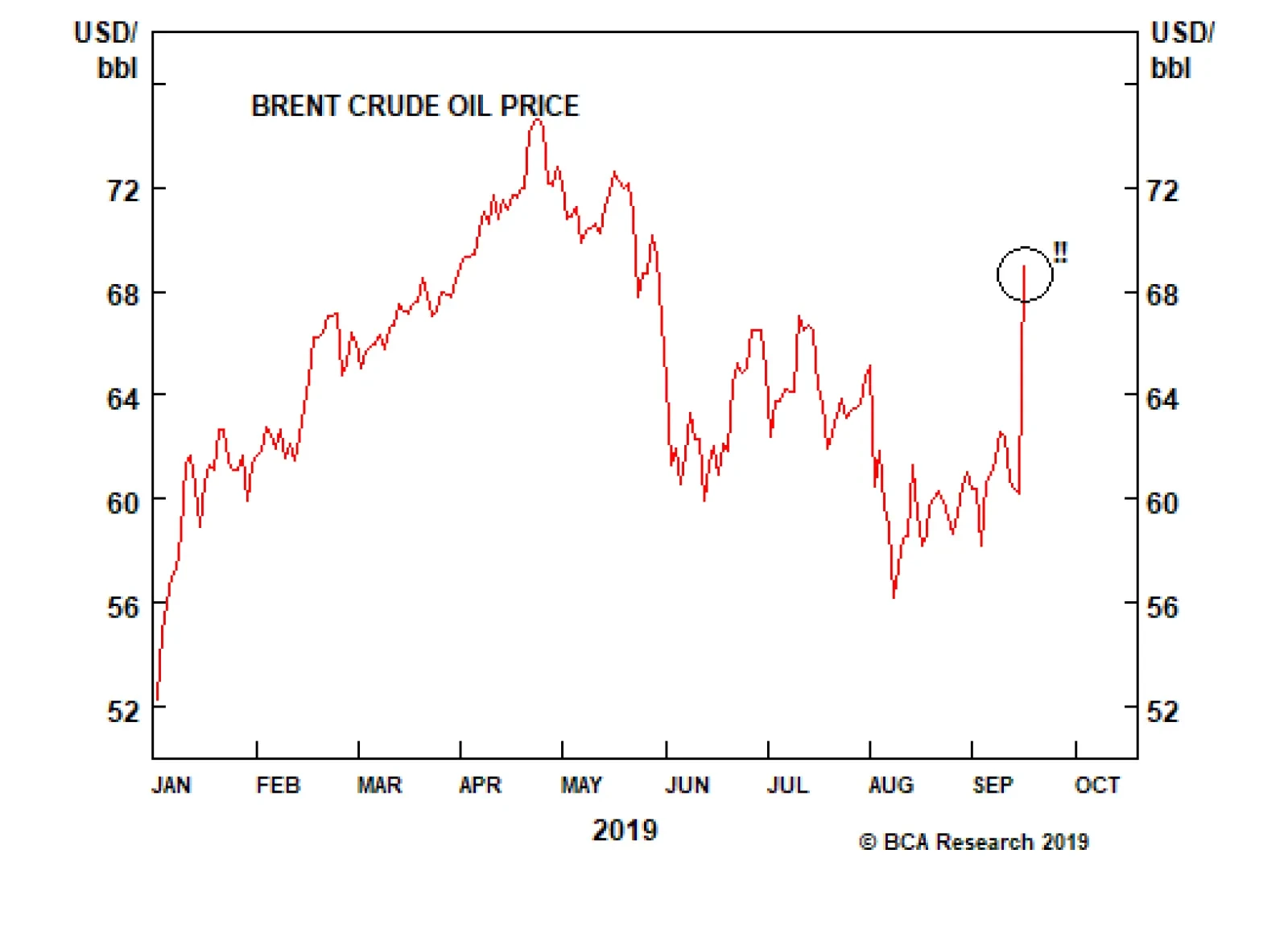
The situation in Saudi Arabia is still unfolding following the weekend’s drone strikes that removed ~5.7 mm barrels per day from the global oil market. The price of Brent crude oil spiked yesterday, from $61 to $68, and depending on how long it takes Saudi…