Global
Looking at yields on a country-by-country level, a reasonable initial target for yields would be a return to the medium-term trend as defined by the 200-day moving average (MA). For benchmark 10-year DM government yields, those targets are: U.S.…
Financial markets have begun to flash positive signals for global growth. Developed market (DM) stock prices are rising, EM equities and currencies have begun to perk up, and EM corporate credit spreads remain stable. Meanwhile, bond volatility measures…

Highlights Rising recession risk, shaky economic fundamentals, and absence of positive yielding assets motivate us to reexamine which assets can be counted on to protect a portfolio in the future. We analyze 10 safe havens on four different dimensions: consistency, versatility, efficiency, and costs. Using this framework, we examine the historical performance of each safe haven and provide an outlook on their likely effectiveness over the next decade. We conclude that U.S. TIPS and farmland should provide the best portfolio protection. Cash, U.S. Treasuries and gold are other good alternatives. Meanwhile, U.S. investment-grade bonds, global ex-U.S. bonds, silver, and currency futures are likely to be poor protection choices. Feature For most investors, capital preservation is the most important goal when managing money. However, how to go about it remains a difficult question. Investing in safe havens can be painful during bull markets, as their returns are usually lower than those of equities. Moreover, economic, political, and financial regimes change over time, which means that an asset that protected your portfolio in the past might not do so in the future. Therefore, it becomes good practice to review one’s safety measures periodically, even if one does not think that a crash is imminent. The current environment in particular, is a propitious time to review safe havens given that: Chart I-1A Great Time To Review Safety Measures
A Great Time To Review Safety Measures
A Great Time To Review Safety Measures
A key recession signal is flashing red: The yield curve inverted in the United States in August (Chart I-1 – top panel). An inversion of the yield curve does not necessarily imply a recession, but historically it has been a very reliable signal of one, given that it indicates that monetary policy is too tight for the economy. Structural risks are rising: Rich equity valuations in the U.S. and high leverage levels elsewhere are signs that the pillars supporting this bull market might be fragile (Chart I-1 – middle panel). In addition, protectionism and populism, forces that BCA has long argued are here to stay, threaten to upend the regime of free trade that has benefited equities since the 1950s.1 Yields are near all-time lows: Historically, investors have been able to endure bear markets by hiding in safe assets with positive yield, as these assets will normally provide a reliable cash flow regardless of the economic situation. However, these type of assets are increasingly hard to find, particularly in the government bond space, where 50% of developed country bonds have negative yields (Chart I-1 – bottom panel). Considering these factors, how should investors protect their portfolios in the next decade? To answer this question, we analyze 10 safe havens divided into five broad asset classes: Nominal government bonds: U.S. Treasuries and global ex-U.S. government bonds. Other fixed income: U.S. investment-grade credit and U.S. TIPS.2 Currencies: yen futures and Swiss franc futures. Precious metals: gold futures and silver futures. Other assets: farmland and U.S. cash. We look at historical performance since 1973 for all safe havens except for global ex-U.S. bonds and farmland. For these assets, we look at performance since 1991 due to limited data availability. We mainly look at quarterly returns in order to compare illiquid assets to publicly traded ones. We do not consider each safe haven in isolation, but rather as an addition to equities within a portfolio. Specifically, we explore our safe haven universe relative to the MSCI All Country World equity index from the perspective of a U.S. investor. For our non-U.S. clients, we will release a report from the perspective of other countries if there is sufficient interest. Importantly, we do not look only at historical performance. We also examine whether there is a reason to believe that future returns will be different from past ones, by analyzing how the properties of each safe haven might have changed. When evaluating each safe haven, we focus on four properties: Consistency: a safe haven should generate consistent positive returns during periods of negative equity performance, with returns increasing with the severity of the equity drawdown. Versatility: safe havens should perform well across different types of crises. Efficiency: a safe haven should produce enough upside during crises, so only a small allocation to the safe haven is necessary to reduce losses. Costs: drag to portfolio overall performance (opportunity costs) should be as small as possible. Readers who wish to see just our overall conclusions should read our Summary Of Results section below. For our analysis of how safe havens have performed in the past, please see the Historical Performance section. Finally, for our analysis of how we expect the performance of safe havens to change, please see our Outlook section. Summary Of Results The Best Safe Havens U.S. TIPS should be an excellent safe haven to protect a portfolio in the next decade. While TIPS might not be as cheap to hold as they have been in the past, upside potential remains strong, which means that a moderate allocation can provide substantial protection to an equity portfolio. Moreover, U.S. TIPS are one of the best hedges against crises triggered by rising rates and inflation, which in our view are the biggest structural risks that asset allocators face. Farmland could also be a great safe haven for investors who have the ability to allocate to illiquid assets given that it is the cheapest safe haven in terms of portfolio drag. However, investors should be aware that the current low yield could potentially affect its performance during crises. Good Alternatives Cash can be a good alternative to protect an equity portfolio, given its outstanding performance during equity drawdowns caused by inflation. Moreover, its opportunity costs should decrease relative to the past. However, investors should take into account that the efficiency of cash at the current juncture is poor, which means that a relatively large allocation is needed in order to achieve meaningful portfolio protection. A portfolio with a 30% allocation to Treasuries historically provided the same downside protection as a portfolio with a 44% allocation to gold. We also like gold futures as a safe haven since they offer some of the most attractive opportunity costs. In addition, their upside is greater than that of most safe havens due to their negative correlations with real rates. However, gold’s volatility makes it an unreliable asset, which prevents us from placing it higher in the safe haven hierarchy. Historically, U.S. Treasuries have been one of the best safe havens to hedge an equity portfolio. Will this performance continue in the future? We do not think so. While yields are still high enough to provide plenty of upside potential, they have fallen to the point where they have increased the opportunity costs of U.S. Treasuries and reduced their consistency. The Rest Global ex-U.S. bonds have very limited upside due to their low yields. Meanwhile U.S. investment-grade credit remains at risk from poor corporate balance sheets, compounded by the fact that credit no longer has an attractive yield cushion. Currencies like the yen and the Swiss franc will continue to be unreliable and very expensive safe havens. Finally, while silver’s costs and reliability could improve, its high cyclicality relative to other safe havens will make silver a poor protection choice. Historical performance Consistency How did safe havens perform when equities lost money? To assess consistency, we plot the performance of each safe haven during all quarters when global equities had losses (Chart I-2). Cash and farmland were the only assets to have positive returns during every equity drawdown. U.S. Treasuries and U.S. TIPS were also very consistent, and had the additional advantage that their returns tended to increase as equity losses worsened. Global ex-U.S. bonds, while not as consistent, generated positive returns most of the time. Chart I-2Safe Haven Returns During Drawdowns In Global Equities
Safe Haven Review: A Guide To Portfolio Protection In The 2020s
Safe Haven Review: A Guide To Portfolio Protection In The 2020s
On the other hand, investment-grade bonds, the yen, the Swiss franc, gold, and silver were much more inconsistent. In general, even though these assets had larger positive returns than other assets, they were prone to deep selloffs concurrent with equity drawdowns. Silver was the worst of all safe havens, being mostly a negative return asset during quarters of negative equity performance. Versatility How did the type of crisis affect the performance of safe havens? We classify crises according to their catalyst into the following four categories: bursts of U.S. asset bubbles (tech bubble, 2008 housing crisis), ex-U.S. crises (1998 EM crisis, European debt crisis), flash crashes/political events (1987 Black Monday, 9/11 terrorist attack), rate/inflation shocks (1974 oil crisis, 1980 Fed shock) and others (every other equity drawdown we could not classify).3 We look at the performance of seven safe havens since 1973 (Chart I-3A) and of all 10 since 19914 (Chart I-3B): Chart I-3ASafe Haven Return During Different Type Of Crisis (1973 - Present)
Safe Haven Review: A Guide To Portfolio Protection In The 2020s
Safe Haven Review: A Guide To Portfolio Protection In The 2020s
Chart I-3BSafe Haven Return During Different Type Of Crisis (1991 - Present)
Safe Haven Review: A Guide To Portfolio Protection In The 2020s
Safe Haven Review: A Guide To Portfolio Protection In The 2020s
During bursts of U.S. asset bubbles, U.S. Treasuries were the most effective hedge in both sample periods, followed by U.S. TIPS and farmland. Corporate bonds, cash, gold, and the Swiss franc also had positive returns, though they were small. Finally, the yen and silver had negative returns. During crises happening outside of the U.S., U.S. Treasuries were once again the best option. U.S. TIPS, yen futures, farmland, gold, and U.S. investment-grade bonds also provided strong returns. Meanwhile, global ex-U.S. bonds and cash provided relatively weak returns, while both the Swiss franc and silver accrued losses. During flash crashes/political events, the Swiss franc had the best performance followed by global ex-U.S. bonds, though in general all safe havens but silver provided positive returns. Rate/inflation shocks were the most difficult type of crisis to hedge. Cash and U.S. TIPS were by far the best performers. Moreover, while U.S. Treasuries were able to eke out a small positive return, all other safe havens lost money during these crises. Efficiency How much allocation to each safe haven was needed to protect an equity portfolio? Chart I-4 show how adding incremental amounts of each safe haven5 to an equity portfolio reduced the overall portfolio’s 10% conditional VaR (the average of the bottom decile of returns).6 Since 1973, U.S. TIPS and U.S. nominal government bonds were the most efficient safe havens, providing the most protection per unit of allocation (Chart I-4 – top panel). Conditional VaR was reduced by almost half when allocating 40% to either Treasuries or TIPS. Cash, U.S. investment-grade, the yen, the Swiss franc, gold, and silver followed in that order. The difference between the safe havens was significant. As an example, a portfolio with a 30% allocation to U.S. Treasuries historically provided the same downside protection as a portfolio with a 36% allocation to U.S. IG credit, a 39% allocation to the yen or a 44% allocation to gold. Meanwhile, there was no allocation to silver which would have provided the same level of protection. When using a sample from 1991, the main difference was the reduced efficiency of cash – the result of lower average interest rates when using a more recent sample. Other than cash, the efficiency of most safe havens remained unchanged: U.S. Treasuries were the best option, followed by U.S. TIPS, farmland, U.S. investment-grade bonds, global ex-U.S. government bonds, cash, the yen, gold, the Swiss franc, and silver in that order (Chart I-4 – bottom panel). Chart I-4Historically, Fixed-Income Assets Were The Most Efficient Safe Havens
Safe Haven Review: A Guide To Portfolio Protection In The 2020s
Safe Haven Review: A Guide To Portfolio Protection In The 2020s
Costs How do safe haven returns compare to equities? To evaluate opportunity costs, we compare the difference of the historical return of each safe haven versus global equities. Overall, hedging with currencies was extremely costly, as their return was well below that of equities in both samples (Chart I-5). Cash was also an expensive safe haven to hedge with, particularly in the most recent sample. On the other hand, fixed-income assets like U.S Treasuries, investment-grade credit, and U.S. TIPS had very low costs (global ex-U.S. bonds also had cost of around 2% in a limited sample). Farmland had negative opportunity costs because it outperformed equities during the sample period.7 Chart I-5Historically Fixed Income Assets And Farmland Had The Lowest Opportunity Cost
Safe Haven Review: A Guide To Portfolio Protection In The 2020s
Safe Haven Review: A Guide To Portfolio Protection In The 2020s
Outlook Chart I-6No More Yield Cushion
Safe Haven Review: A Guide To Portfolio Protection In The 2020s
Safe Haven Review: A Guide To Portfolio Protection In The 2020s
Chart I-7Silver Has Become Less Cyclical
Silver Has Become Less Cyclical
Silver Has Become Less Cyclical
For our outlook, we assess how the four traits under study have changed for all safe havens: Consistency: Will safe havens continue to be reliable in the absence of high coupons? Many of the safe havens in our sample were effective at hedging equities due to their high yield. Even if they had negative capital appreciation, total returns stayed positive thanks to the offsetting effect of the yield return. However, as rates have declined, yield return has also decreased substantially (Chart I-6). Therefore, safe havens, like cash, government bonds, and even farmland will not be as consistent as they were in the past. Credit could be even more vulnerable: the combination of a low yield, and unhealthy fundamentals will turn U.S. corporate bonds into a negative-return asset in the next crisis. Silver might be the lone safe haven to improve its consistency. Industrial use for silver has fallen substantially in the past 10 years, decreasing its cyclical nature (Chart I-7). Thus, while silver might still be an erratic safe haven, it should be more consistent in the future than its historical performance would suggest. Versatility: What will the next crisis look like? Chart I-8Inflation and Political Crisis Will Plague The 2020s
Inflation and Political Crisis Will Plague The 2020s
Inflation and Political Crisis Will Plague The 2020s
Determining what the next crisis will look like is crucial for safe haven selection. Below we rank the types of crises in order of how likely and severe we think they will be in the future: Inflation/rate shock: We expect inflation to be significantly higher over the next decade. This will be the highest risk for asset allocators in the future. As we explained in our May 2019 report, a change in monetary policy framework, procyclical fiscal policy, waning Fed independence, declining globalization, and demographic forces are all conspiring to lift inflation in the next decade.8 Importantly, we believe that the Fed will be dovish initially, as it cannot let inflation continue to underperform its target after missing the mark for the last 10 years (Chart I-8 – top panel). However, this will cause an inflationary cycle, which will eventually lead the Fed to raise rates significantly and trigger a recession. Political events/flash crashes: Political events will also pose a risk to the markets on a structural basis. The rise of China as a superpower has shifted the world into a paradigm of multipolarity, which historically has resulted in military conflict. Moreover, animus for conflict is not dependent on President Trump. The American public in general feels that the economic relationship with China is detrimental to the United States (Chart I-8 – bottom panel). This means that any president, Democrat or Republican will have a political incentive to jostle with China for economic and political supremacy for years to come. Ex-U.S. crises: We expect Emerging Markets in general, and China in particular, to be among the most vulnerable parts of the global economy as we enter the next decade. Over the last 10 years, China’s money supply has increased four-fold, becoming larger than the money supply of the U.S. and the euro area combined. In addition, corporate debt as a % of GDP stands at 155%, higher than Japan at the peak of its bubble and higher than any country in recorded history (Chart I-9). We rank this type of crisis slightly below the first two because Emerging Market assets are depressed already. Thus, while we believe that there is further downside to come for these economies, some weakness has already been priced in. U.S. asset bubble burst: We believe that there are no systemic excesses in the U.S. economy, making a U.S. asset bubble burst a lesser risk than other types of crises. Although it is true that U.S. corporate debt stands at all-time highs, it is still at a much lower level than in other countries. Moreover, weakness of corporate credit is not likely to have systemic consequences on the economy, given that leveraged institutions like banks and households hold only a small amount of outstanding corporate debt (Chart I-10). Chart I-9EM crises Are Also A Risk
EM crises Are Also A Risk
EM crises Are Also A Risk
Chart I-10A U.S. Corporate Debt Deblacle Will Not Have Systemic Consequences
A U.S. Corporate Debt Deblacle Will Not Have Systemic Consequences
A U.S. Corporate Debt Deblacle Will Not Have Systemic Consequences
What does this ranking mean in terms of safe haven performance? U.S. TIPS and cash should be held in high regard as they will be some of the only assets that will perform well during an inflation/rate shock. The Swiss franc and global ex-U.S. bonds should be best performers during political crises, although U.S. TIPS could also provide adequate protection. Efficiency: Is there any upside left for safe havens when interest rates are near zero? As yields go below the zero bound it becomes harder for bonds to generate large positive returns. European or Japanese government bonds in particular would need their yields to go deep into negative territory to counteract a large selloff in equities (Table I-1). But can interest rates go that low? We do not think so. The recent auction of German bunds, where a 0%-yielding 30-year bond attracted the weakest demand since 2011, suggests that interest rates in these countries might be close to their lower bound. On the other hand, though U.S. yields are low, they are still high enough for U.S. Treasuries to provide high returns in case of a crisis. Table I-1No Room For Positive Returns In The Government Bond Space Outside Of The U.S.
Safe Haven Review: A Guide To Portfolio Protection In The 2020s
Safe Haven Review: A Guide To Portfolio Protection In The 2020s
Low rates also have an effect on the efficiency of U.S. investment-grade bonds, cash, and farmland because their upside during crises does not come from capital appreciation but rather from their yield, (the price of IG credit actually declines during most crisis). As mentioned earlier, their yield has declined substantially compared to the past, which means that a larger allocation will be necessary to counteract a selloff. Chart I-11Switzerland Has A High Incentive To Prevent The Franc From Appreciating
Safe Haven Review: A Guide To Portfolio Protection In The 2020s
Safe Haven Review: A Guide To Portfolio Protection In The 2020s
The upside of the yen could also be compromised. The Bank of Japan is likely to intervene aggressively in the currency market to prevent the Japanese economy from falling into a deflationary spiral, since it is very difficult for it to lower Japanese rates further. The Swiss franc is even more vulnerable. In contrast to Japan, Switzerland is a small open economy that has to import most of its products (Chart I-11). This means that the Swiss National Bank has a very high incentive to intervene in currency markets during a crisis, given that a rally in the franc could depress inflation severely. What about U.S. TIPS? In contrast to nominal government bond yields or even yields on corporate debt, U.S. real rates are not limited by the zero bound (Chart I-12). This makes TIPS a more attractive option than other fixed-income assets, since real rates can have much more room for further downside than nominal ones. To be clear, this will only be the case if our forecast of an inflationary crisis materializes. Likewise, since gold is heavily influenced by real rates, it should also offer significant upside during the next crisis.9 Chart I-12Real Rates Have More Downside Potential Than Nominal Ones
Real Rates Have More Downside Potential Than Nominal Ones
Real Rates Have More Downside Potential Than Nominal Ones
Costs: Can I afford to hold safe havens in a world of low returns? To provide an outlook for the expected cost of each safe haven, we use the return assumptions from our June Special Report.10 We subtract the expected return on global equities from the expected return for each safe haven to reach an expected cost value. However, three of the safe havens (global ex-U.S. government bonds, the Swiss franc and silver) did not have a return estimate. We compute their expected returns as follows: For the Swiss franc we use the methodology we used for all other currencies in our report. We base the expected return on the current divergence from the IMF PPP value, as well as the IMF inflation estimates. In addition, we add the relative cash rate assumed return for both our yen and Swiss franc estimates, as futures take into account carry return. For global ex-U.S. bonds we take the weighted average of the expected return of the euro area, Japan, U.K., Canada, and Australia government bonds. We weight the returns according to their market capitalization in the Bloomberg/Barclays government bond index. Due to silver’s dual role as an inflation hedge and industrial metal, silver prices are a function of both gold prices and global growth. To obtain a return estimate we run a regression on silver against these two variables and use our growth and gold return estimate to arrive at an assumed return for silver. Chart I-13 shows our results: while their cost will improve, currency futures remain the most expensive hedge. The opportunity cost of precious metals and cash will decrease, making them more attractive options than in the past. Meanwhile, low yields will increase the opportunity costs of most fixed-income assets. Finally, farmland will remain the cheapest safe haven, even with decreased performance. Chart I-13Oportunity Cost For Fixed Income Safe Havens Will Be Higher Than In The Past
Safe Haven Review: A Guide To Portfolio Protection In The 2020s
Safe Haven Review: A Guide To Portfolio Protection In The 2020s
Juan Manuel Correa Ossa Senior Analyst juanc@bcaresearch.com Appendix A
Safe Haven Review: A Guide To Portfolio Protection In The 2020s
Safe Haven Review: A Guide To Portfolio Protection In The 2020s
Footnotes 1 Please see Geopolitical Strategy Special Report, "The Apex Of Globalization – All Downhill From Here, " dated November 12, 2014, available at gps.bcaresearch.com. 2 We use a synthetic TIPS series for data prior to 1997. For details on the methodology, please see: Kothari, S.P. and Shanken, Jay A., “Asset Allocation with Inflation-Protected Bonds,” Financial Analysts Journal, Vol. 60, No. 1, pp. 54-70, January/February 2004. 3 For a detailed list of how we classified each equity drawdown, please see Appendix A. 4 The only crises caused by a rate/inflation shock occurred in 1974 and 1980. Thus we have this type of drawdown only in Chart 3A and not in Chart 3B. 5 For yen, Swiss franc, silver and gold futures we assume an allocation to an ETF which follows their performance. Since futures have zero initial costs they cannot be directly compared to traditional assets in terms of percentage allocation. 6 We prefer this measure over VaR given that it captures the properties of the left tail of returns more accurately. 7 While the farmland index subtracts management fees, we recognize that there are costs involved in holding these illiquid assets which are not necessarily captured by the return indices. Thus, the real historical cost of holding farmland was not negative but likely close to zero. 8 Please see Global Asset Allocation Strategy Special Report "Investors’ Guide To Inflation Hedging: How To Invest When Inflation Rises," dated May 22, 2019, available at gaa.bcaresearch.com. 9 Please see Commodity & Energy Strategy Special Report "All that Glitters…And Then Some" dated July 25, 2019, available at ces.bcaresearch.com. 10 Please see Global Asset Allocation Strategy Special Report "Return Assumptions - Refreshed and Refined" dated June 25, 2019,
Highlights Equities & Bonds: The accelerating upward momentum of global equities – the ultimate “leading economic indicator” – suggests that the current rise in global bond yields can continue. Maintain below-benchmark overall duration exposure, while staying overweight global corporate credit versus government bonds. U.S. Agency MBS: U.S. agency MBS spreads are now attractive relative to high-quality U.S. corporate bonds, both in absolute terms and on a risk-adjusted basis. Increase allocations to agency MBS, while reducing exposure to Aaa-, Aa- and A-rated U.S. corporates. Feature The U.S. Federal Reserve and European Central Bank (ECB) are both set to ease monetary policy this week. The Fed is almost certain to deliver a third consecutive 25bp rate cut at tomorrow’s FOMC meeting, while the ECB will restart its bond buying program on Friday. Yet government bond yields around the world continue to drift higher, as markets reduce expectations of incremental rate cuts moving forward. Equity prices are an excellent leading indicator of global growth, while bond yields typically reflect current economic conditions. Thus, equity prices should be considered a leading indicator of bond yields. Chart of the WeekMore Upside For Global Bond Yields
More Upside For Global Bond Yields
More Upside For Global Bond Yields
Yields are finally responding to the evidence that global growth is troughing - a dynamic that we have been telegraphing in recent weeks. Global equity markets are rallying, with the U.S. S&P 500 hitting a new all-time high yesterday. The year-over-year increase in global equities, using the MSCI World Index, is now at +10%, the fastest pace of upward acceleration seen since January 2017. Some of that rally in U.S. stock markets can be chalked up to 3rd quarter earnings beating depressed expectations. Yet there is also a forward-looking component of the rally that bond markets are starting to notice. Equity prices are an excellent leading indicator of global growth, while bond yields typically reflect current economic conditions. Thus, equity prices should be considered a leading indicator of bond yields. We see no reason to discount the positive message on growth from rallying equity markets, especially when confirmed by an improvement in our global leading economic indicator (LEI), led by the more cyclical emerging market (EM) countries (Chart of the Week). Falling stock prices in 2018 accurately heralded the global growth slowdown of 2019 which triggered the huge decline in bond yields. Why should rising stock prices not be interpreted in the same light, predicting better global growth – and higher bond yields – over the next 6-12 months? Multiple Signals Point To Higher Bond Yields The more optimistic message on growth is not only confined to developed market (DM) stock prices. EM equities and currencies have begun to perk up, with EM corporate credit spreads remaining stable, as well, mimicking the moves seen in U.S. credit markets. Bond volatility measures like the U.S. MOVE index of Treasury options are retreating to the lower levels implied by equity volatility indices like the U.S. VIX index, which is now just above the 2019 low (Chart 2). Markets are clearly pricing out some of the more negative tail-risk outcomes that prevailed through much of 2019. Some of that reduction in volatility can be attributed to the recent de-escalation of U.S.-China trade tensions and U.K. Brexit risks, both important developments that can help lift depressed global business confidence. A reduction in trade/political uncertainty should help fortify the transmission mechanism between easing global financial conditions and economic activity – an outcome that could extend the rise in yields given stretched bond-bullish duration positioning (Chart 3). Chart 2A More Pro-Risk Global Market Backdrop
A More Pro-Risk Global Market Backdrop
A More Pro-Risk Global Market Backdrop
Chart 3Less Uncertainty = Higher Yields
Less Uncertainty = Higher Yields
Less Uncertainty = Higher Yields
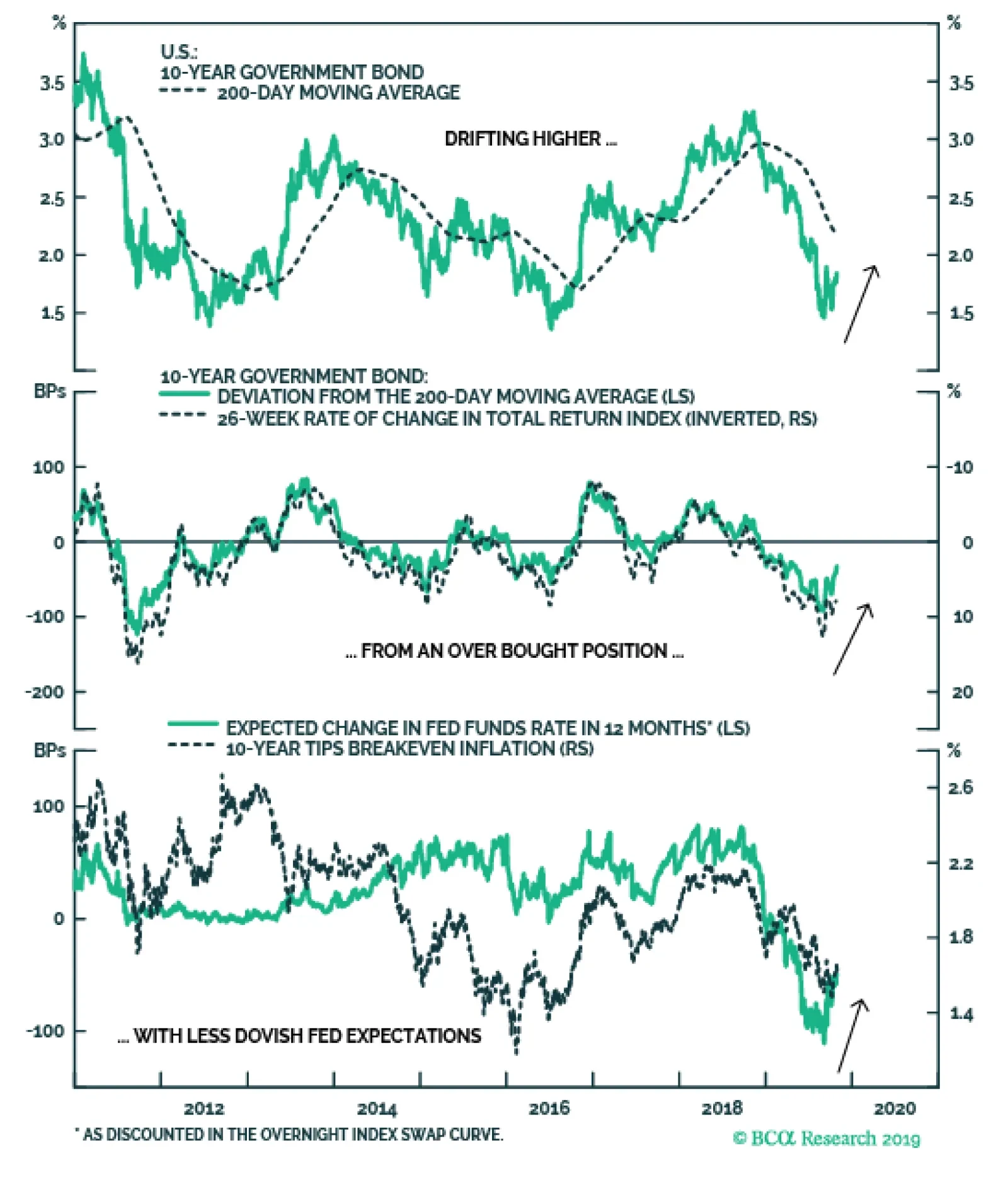
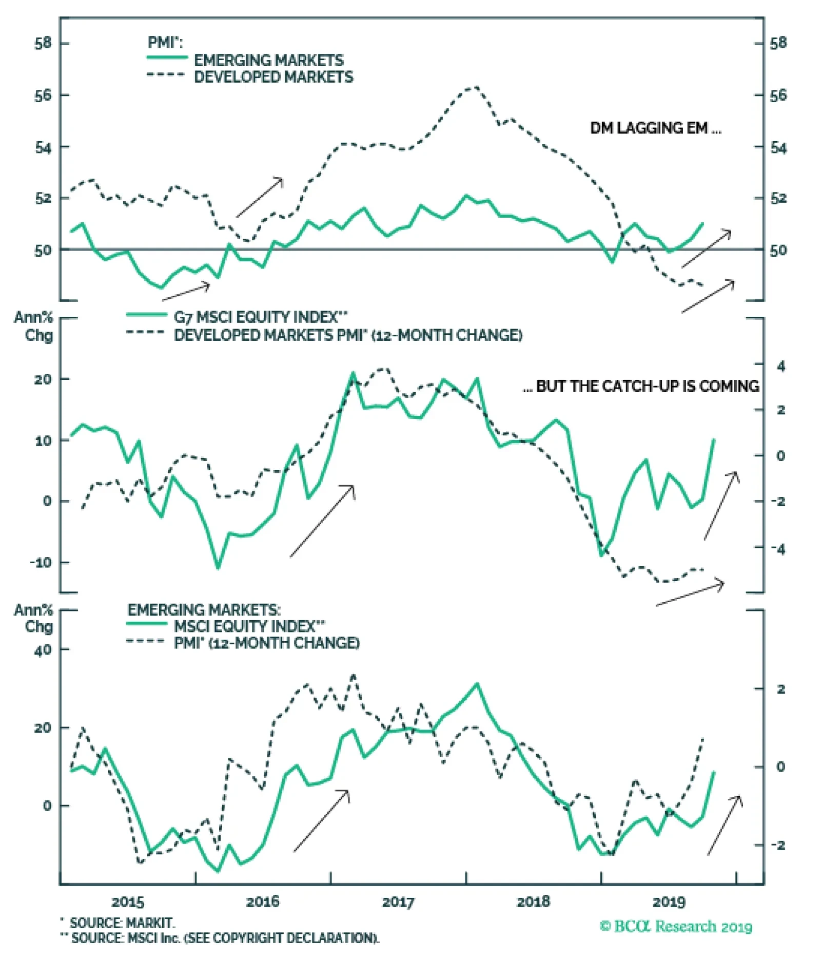
The improving global growth story remains the bigger factor pushing bond yields higher, though. While the manufacturing PMI data within the DM world remain weak, the downward momentum is starting to bottom out on a rate-of-change basis (Chart 4). The EM aggregate PMI index is showing even more improvement, sitting at 51 and above the year-ago level, helping confirm the pickup in EM equity market momentum (bottom panel). Importantly, if this is indeed the trough in the EM PMI, the index would have bottomed above the 2015 trough of 48.5. Given the improvement seen in “Big Mo” for global equities and global LEIs and PMIs, we remain comfortable with our current below-benchmark stance on global interest rate duration exposure. Given the improvement seen in “Big Mo” for global equities and global LEIs and PMIs, we remain comfortable with our current below-benchmark stance on global interest rate duration exposure. How high could yields rise in the near term? Looking at yields on a country-by-country level, a reasonable initial target for yields would be a return to the medium-term trend as defined by the 200-day moving average (MA). For benchmark 10-year DM government yields, those targets are: U.S. Treasuries: the 200-day MA is 2.18%, +23bps above the current level German Bunds: the 200-day MA is -0.22%, +11bps above the current level U.K. Gilts: the 200-day MA is 0.89%, +17bps above the current level Japanese government bonds (JGBs): the 200-day MA is -0.10%, +2bps above the current level Canadian government bonds: the 200-day MA is 1.59%, -2bps below the current level Australian government bonds: the 200-day MA is 1.53%, +43bps above the current level Among those markets, the U.S. is likely to reach the level implied by the 200-day MA, led by the market pricing out the -53bps of rate cuts over the next twelve months discounted in the U.S. Overnight Index Swap curve (Chart 5) – a number that includes the likely -25bp cut tomorrow. A move beyond that 200-day MA may take longer to develop, as it would require markets to begin pricing in some reversal of the Fed’s “mid-cycle cuts” of 2019. That outcome would first require a pickup in TIPS breakevens. The Fed would not feel justified in risking a tightening of financial conditions by signaling rate hikes without the catalyst of higher inflation expectations. Chart 4EM Growth Leading The Way?
EM Growth Leading The Way?
EM Growth Leading The Way?
Chart 5UST Yields Have More Upside
UST Yields Have More Upside
UST Yields Have More Upside
German Bund yields are even closer to that 200-day MA than Treasuries but, as in the U.S., a sustained move beyond that level would require an increase in bombed-out inflation expectations, with the 10-year EUR CPI swap rate now sitting at only 1.05% (Chart 6). As for other markets, the likelihood of reaching, or breaching, the 200-day MA is more varied (Chart 7). Chart 6Bund Yield Upside Limited By Inflation
Bund Yield Upside Limited By Inflation
Bund Yield Upside Limited By Inflation
The move in the Canadian 10-year yield to just above its 200-day MA fits with Canada’s status as a “high-beta” bond market, as we discussed in last week’s report.1 Chart 7Which Yields Will Test The 200-day MA?
Which Yields Will Test The 200-day MA?
Which Yields Will Test The 200-day MA?
The Bank of Canada also meets this week and, while no change in policy is expected, the central bank will be publishing a new Monetary Policy Report that will update their current line of thinking about the Canadian economy and inflation. U.K. Gilts should easily blow through the 200-day MA if and when a final Brexit deal is signed, as the Bank of England remains highly reluctant to consider any policy easing even as political uncertainty weighs on economic growth. With the European Union now agreeing to an extension of the Brexit deadline to January 31, and with U.K. prime minister Boris Johnson now pursuing an early election in December, the political risk premium in Gilts will persist. Thus, Gilt yields will likely lag the move higher seen in higher-beta markets like the U.S. and Canada. JGBs remain the ultimate low-beta bond market with the Bank of Japan continuing to anchor the 10-yield around 0%, making Japan a good overweight candidate in an environment of rising global bond yields. Australian bond yields have the largest distance to the 200-day MA, but the Reserve Bank of Australia is giving little indication that it is ready to shift away from its dovish bias anytime soon, while inflation remains subdued. We do not expect a rapid jump in yields back towards the medium-term trend in the near term, and Australian yields will continue to lag the pace of the uptrend in the higher-beta global bond markets. Net-net, a climb in yields over the next 3-6 months to (or beyond) the 200-day MA is most likely in the U.S. and Canada, and least likely in Japan, Germany and Australia (and the U.K. until the Brexit uncertainty is finally sorted out). Bottom Line: The accelerating momentum of global equities – the ultimate “leading economic indicator” – is suggesting that the current rise in global bond yields can continue. Maintain below-benchmark overall duration exposure, while staying overweight global corporate credit versus government bonds. Raise Allocations To U.S. Agency MBS Out Of Higher Quality Corporate Credit Chart 8U.S. MBS More Attractive Than High-Rated U.S. Corporates
U.S. MBS More Attractive Than High-Rated U.S. Corporates
U.S. MBS More Attractive Than High-Rated U.S. Corporates
Our colleagues at our sister service, BCA Research U.S. Bond Strategy, recently initiated a recommendation to favor U.S. agency MBS versus high-rated (Aaa, Aa, A) U.S. corporate bonds.2 This week, we are adding this position to the BCA Research Global Fixed Income Strategy recommended model bond portfolio. There are three factors supporting this recommendation: 1) The absolute level of MBS spreads is competitive The average option-adjusted spread (OAS) for conventional 30-year U.S. agency MBS – rated Aaa and with the backing of U.S. government housing agencies - is currently 57bps. That is only 3bps below the spread on Aa-rated corporates and 26bps below that of A-rated credit. (Chart 8). 2) Risk-adjusted MBS spreads look very attractive Agency MBS exhibit negative convexity, with an interest rate duration that declines when yields fall. The opposite is true for positively convex investment grade corporate bonds, where the duration rises as yields decrease. This makes agency MBS look attractive on a risk-adjusted basis after the kind of big decline in bond yields seen in 2019. The average duration of the Bloomberg Barclays U.S. agency MBS index is now only 3.4 compared to 7.9 for an A-rated corporate bond. Both of those durations were around similar levels at the 2018 peak in U.S. bond yields, but now the gap between them is large. With those new durations, it would take a 17bp widening of the agency MBS spread for an investor to see losses versus duration-matched U.S. Treasuries, compared to only an 11bp widening of the A-rated corporate spread (bottom panel). This is a big change in the relative risk profile of agency MBS versus high-rated U.S. corporates compared to a year ago, making the former look relatively more attractive. That was not the case the last time agency MBS duration fell so sharply in 2015/16, since corporate bond spreads were widening (getting cheaper) at that time. Today, corporate bond spreads have been stable as corporate duration has increased and agency MBS duration has plunged, making risk-adjusted MBS spreads more attractive. Given our view that U.S. Treasury yields will continue to grind higher, favoring lower duration assets like agency MBS over higher duration investment grade corporates makes sense. Given our view that U.S. Treasury yields will continue to grind higher, favoring lower duration assets like agency MBS over higher duration investment grade corporates makes sense. 3) Macro risks are reduced Mortgage refinancing activity remains the biggest macro driver of MBS spreads, particularly in an environment when mortgage rates are falling and prepayments are accelerating. There was a pickup in refinancing activity over the past year as mortgage rates fell, but the increase has been small relative to similar-sized rate declines in the past (Chart 9). We interpret this as an indication that, after the sustained period of low mortgage rates seen in the decade since the Great Financial Crisis, most homeowners have already had an opportunity to refinance. In other words, the so-called “refi burnout“ is now quite high. Chart 9Muted Refi Activity Keeping Nominal U.S. MBS Spreads Low
Muted Refi Activity Keeping Nominal U.S. MBS Spreads Low
Muted Refi Activity Keeping Nominal U.S. MBS Spreads Low
Beyond refinancing, the other macro risks for agency MBS are subdued. The credit quality of outstanding U.S. mortgages remains solid. The median credit (FICO) score for newly-issued mortgages remains high and stable near the post-2008 crisis highs, while mortgage lending standards have mostly been easing over that same period according to the Federal Reserve Senior Loan Officers Survey. In addition, U.S. housing activity remains solid, with the most reliable indicators like single-family new home sales and the National Association of Home Builders activity surveys all up solidly following this year’s sharp drop in mortgage rates (Chart 10). This makes MBS less risky for two reasons: a) stronger housing activity typically leads to higher mortgage rates, which limits future refi activity; and b) more robust housing demand will boost home prices, the value of the underlying collateral for MBS securities. Chart 10U.S. Housing Activity Hooking Up
U.S. Housing Activity Hooking Up
U.S. Housing Activity Hooking Up
Chart 11Relative Value Favoring U.S. MBS Over U.S. Corporates
Relative Value Favoring U.S. MBS Over U.S. Corporates
Relative Value Favoring U.S. MBS Over U.S. Corporates
Given the improved risk-reward balance of agency MBS versus higher-quality U.S. corporates, we recommend that dedicated fixed income investors make this shift within bond portfolios, reducing allocations to Aaa-rated, Aa-rated and A-rated corporates while increasing exposure to agency MBS. Agency MBS is part of the investment universe of our model bond portfolio. Thus, we are increasing the recommended weighting of agency MBS while reducing the exposure to U.S. investment grade corporates in the portfolio. The changes can be seen in the table on Page 11. We do not split out the investment grade exposure by credit tier in the portfolio, as we prefer to allocate by broad sector groupings (Financials, Industrials, Utilities). So we cannot implement the precise “MBS for high-rated corporates” switch in the model portfolio. There is still a case for reducing overall investment grade exposure and adding to MBS weightings, however. The relative option-adjusted spread of agency MBS and investment grade corporates typically leads the relative excess returns (over duration-matched U.S. Treasuries) between the two by around one year (Chart 11). Thus, the compression of the spread differential between MBS and corporates over the past year is signaling that agency MBS should be expected to outperform the broad U.S. investment grade universe over the next twelve months. Bottom Line: U.S. agency MBS spreads are now attractive relative to high-quality U.S. corporate bonds, both in absolute terms and on a risk-adjusted basis. Increase allocations to agency MBS, while reducing exposure to Aaa-, Aa- and A-rated U.S. corporates. Robert Robis, CFA Chief Fixed Income Strategist rrobis@bcaresearch.com Footnotes 1 Please see BCA Research Global Fixed Income Strategy Weekly Report, “Cracks Are Forming In The Bond-Bullish Narrative”, dated October 23, 2019, available at gfis.bcaresearch.com. 2 Please see BCA Research U.S. Bond Strategy Weekly Report, “Two Themes And Two Trades”, dated October 1, 2019, available at usbs.bcaresarch.com. Recommendations The GFIS Recommended Portfolio Vs. The Custom Benchmark Index
Big Mo(mentum) Is Turning Positive
Big Mo(mentum) Is Turning Positive
Duration Regional Allocation Spread Product Tactical Trades Yields & Returns Global Bond Yields Historical Returns
Highlights Duration: The upturn in bond yields is not yet confirmed by our preferred global growth indicators. We anticipate that a reduction in trade uncertainty during the next few months will cause our indicators to rebound. But until then, investors should view the bond sell-off as tenuous. Yield Curve: Expect modest 2/10 steepening during the next few months, as the Fed keeps rates low even as economic growth improves. Steepening will show up in real yields, not in the TIPS breakeven inflation curve. The 2/10 slope will stay in a range between 0 bps and 50 bps for the next 6-12 months. Yield Curve Strategy: The 5-year Treasury note looks expensive compared to the rest of the yield curve, and historical correlations suggest it will rise the most if the Fed delivers fewer rate cuts than are currently expected. We recommend that investors short the 5-year bullet versus a duration-matched 2/30 barbell. Await Confirmation Bond yields look like they might be bottoming. The 2-year and 10-year Treasury yields are up 10 bps and 31 bps, respectively, since the 2/10 slope briefly inverted in late August (Chart 1). We are cautiously optimistic that the growth revival getting priced into Treasury yields will materialize. However, it’s vital to note that the yield rebound is not yet confirmed by the economic data. Even timely global growth indicators like the CRB Raw Industrials index remain downbeat (Chart 1, bottom panel). If global growth measures don’t bottom soon, then Treasury yields are certain to fall back. Chart 1Yields Are Ahead Of The Data
Yields Are Ahead Of The Data
Yields Are Ahead Of The Data
We do expect the economic data to follow bond yields higher. We noted in last week’s report that the weakness in US economic data is concentrated in survey measures (aka “soft” data), while measures of actual economic activity (aka “hard data”) are holding up well.1 For example: The ISM Manufacturing survey is below its 2016 trough, but the year-over-year growth rate in industrial production is well above 2016 levels (Chart 2, top panel). Capacity utilization also remains elevated (Chart 2, bottom panel). New orders for core capital goods are holding firm, even with CEO confidence at its lowest since 2009 (Chart 2, panel 2). Employment growth remains strong, despite the employment component of the ISM Non-Manufacturing survey being just above the 50 boom/bust line (Chart 2, panel 3). Chart 2Will "Soft" Data Rebound?
Will "Soft" Data Rebound?
Will "Soft" Data Rebound?
Our interpretation of the divergence is that uncertainty about the US/China trade war is weighing on sentiment and holding survey measures down. If that uncertainty is removed, survey measures will quickly rebound and converge with the “hard” data. On that front, we think it’s very likely that trade uncertainty diminishes during the next few months. The US and China have already agreed to an informal “phase one deal” that will require China to buy $40-$50 billion of US agricultural goods while the US delays the October 15 tariff hike. Odds are that President Trump will also delay the planned December 15 tariff hike and probably roll back some existing tariffs.2 The reason is that while Trump’s overall approval rating has been consistently low; until recently, he had been receiving high marks for his handling of the economy (Chart 3). But his economic approval rating took a tumble this summer and, as we head toward the 2020 election, he desperately needs an economic boost and/or policy victory to push up his numbers. We already see some tentative signs of a rebound in the regional Fed manufacturing surveys. A tactical retreat on trade should improve sentiment and cause survey data to move higher, alongside bond yields. And in fact, we already see some tentative signs of a rebound in the regional Fed manufacturing surveys (Chart 4). October figures are out for the New York, Philadelphia, Richmond, Kansas City and Dallas surveys, and they have all diverged positively from the national ISM. Chart 3It's Trump's Economy
It's Trump's Economy
It's Trump's Economy
Chart 4Some Optimism From Regional Surveys
Some Optimism From Regional Surveys
Some Optimism From Regional Surveys
Bottom Line: The upturn in bond yields is not yet confirmed by our preferred global growth indicators. We anticipate that a reduction in trade uncertainty during the next few months will cause our indicators to rebound. But until then, investors should view the bond sell-off as tenuous. Yield Curve: Macro Drivers We noted in the first section that the 2/10 Treasury slope has steepened sharply since it briefly broke below zero in late August. In this section, we consider whether this 2/10 steepening might continue. To do this we run through the main macro drivers of the yield curve. The Fed Funds Rate Traditionally, there is a very tight correlation between the fed funds rate and the slope of the curve (Chart 5). Fed tightening puts upward pressure on the curve’s front-end relative to the back-end, leading to a bear-flattening. Conversely, Fed easing drags the front-end down relative to the long-end, leading to bull-steepening. Chart 5The Fed's Yield Curve Control
The Fed's Yield Curve Control
The Fed's Yield Curve Control
The traditional pattern broke down between 2009 and 2015 when the fed funds rate was pinned at zero. This period saw many episodes of bear-steepening and bull-flattening. But since the funds rate has been off zero, the traditional correlation has begun to re-assert itself. Our base case outlook calls for one more 25 bps rate cut tomorrow, followed by an extended on-hold period. This scenario might be expected to impart some mild steepening pressure to the curve, except for the fact that the front-end is already priced for 53 bps of easing during the next 12 months, significantly more than we expect. Our base case outlook calls for one more 25 bps rate cut tomorrow, followed by an extended on-hold period. If our base case scenario is incorrect, and growth continues to deteriorate, forcing the Fed to cut rates all the way back to zero. Then we would expect some initial bull-steepening, followed by bull-flattening as the funds rate approaches the zero bound. Wage Growth Wage growth is another excellent yield curve indicator, mainly because it helps determine the direction of the fed funds rate. Stronger wage growth causes the Fed to tighten and the curve to flatten. On the flipside, wage growth is a less effective indicator during Fed easing cycles, when it tends to lag changes in the funds rate (Chart 6). In fact, while wage growth is tightly correlated with the 2/10 slope, it lags changes in the slope by about 12 months (Chart 6, panel 2). Chart 6Wages Lead Tightening, But Lag Easing
Wages Lead Tightening, But Lag Easing
Wages Lead Tightening, But Lag Easing
The upshot is that if the economy heads toward recession, then wage growth will not be a timely indicator of Fed rate cuts. However, if recession is avoided and wages continue to accelerate (Chart 6, bottom 2 panels), strong wage growth will limit how accommodative the Fed can be as it seeks to re-anchor inflation expectations. As such, persistently strong wage growth will limit the amount of curve steepening that can occur. Inflation Expectations The Fed’s need to re-anchor inflation expectations in a range consistent with its target is the main reason to forecast curve steepening. At present, the 10-year TIPS breakeven inflation rate is a mere 1.66%, well below the 2.3%-2.5% range that the Fed would consider “well anchored”. One might conclude that if the Fed succeeds in driving this rate higher, it will impart significant steepening pressure to the curve. However, we must also note that the 2-year TIPS breakeven inflation rate is even lower than the 10-year rate (Chart 7). Given our view that long-dated inflation expectations adapt only slowly to the actual inflation data, we would expect both the 2-year and 10-year breakevens to rise in tandem, exerting some modest flattening pressure on the curve.3 Chart 7Any Steepening Will Come From Real Yields
Any Steepening Will Come From Real Yields
Any Steepening Will Come From Real Yields
Ironically, if the Fed is successful in re-anchoring long-dated inflation expectations, we expect it will cause the yield curve to steepen, but through its impact on real yields. At present, the 2-year and 10-year real yields are 0.37% and 0.14%, respectively. The act of holding rates steady for long enough to re-anchor inflation expectations will exert downward pressure on the 2-year real yield, while the 10-year real yield will rise in response to an improved growth outlook. The Fed’s goal of re-anchoring inflation expectations will likely lead to some curve steepening, but through the real component of yields, not the inflation component. The Neutral Rate The neutral rate – the fed funds rate that is neither inflationary nor deflationary – is a major wild card when it comes to the yield curve. Right now, the median Fed estimate calls for a neutral rate of 2.5%, while the market is pricing-in an even lower rate of 2%, at least according to the 5-year/5-year forward Treasury yield (Chart 8). Neutral rate estimates have been revised lower during the past few years, exerting significant flattening pressure on the yield curve. In theory, if we reach an inflection point where neutral rate estimates are revised higher, it would lead to substantial curve steepening. One thing to watch to help predict movement in neutral rate estimates is the gold price.4 Gold performs well when the market perceives monetary policy as increasingly accommodative, either because the Fed is cutting rates or because the assumed neutral rate is rising. The 2013 drop in gold foreshadowed downward revisions to the Fed’s neutral rate estimate (Chart 8, bottom panel). A further increase in gold, especially once the Fed stops cutting rates, would send a strong signal that current neutral rate estimates are too low. Monetary policy arguably exerts its greatest economic impact through the housing market. Investors can also watch the housing market for clues about the neutral rate. Monetary policy arguably exerts its greatest economic impact through the housing market. If housing activity starts to wane, it can be a strong signal that interest rates are too high. Last year, housing activity started to flag once the mortgage rate moved above 4% (Chart 9). If 4% proves to be the ceiling on mortgage rates, it would mean that the Fed’s current neutral rate estimate is roughly correct. However, home prices have moderated since last year, and new construction has started to focus more on the low-end of the market, where supply remains scarce.5 This shift in focus from homebuilders has caused the price of new homes to fall considerably (Chart 9, bottom panel), a supply side re-adjustment that could make the housing market more resilient in the face of higher rates. Chart 8Tracking The Neutral Rate: Gold
Tracking The Neutral Rate: Gold
Tracking The Neutral Rate: Gold
Chart 9Tracking The Neutral Rate: Housing
Tracking The Neutral Rate: Housing
Tracking The Neutral Rate: Housing
An upward re-assessment of the neutral rate would impart steepening pressure to the yield curve, but only if it occurs quickly, before the Fed has time to deliver offsetting rate hikes. However, we think it’s more likely that any increase in neutral rate estimates will occur gradually, alongside Fed tightening. In that case, a roughly parallel upward shift in the yield curve would be the most likely outcome. Verdict Considering all of the above factors, we would look for some modest 2/10 curve steepening during the next few months. The steepening will be driven by the Fed’s desire to re-anchor long-dated inflation expectations, a desire that will result in them keeping rates steady (apart from one more cut tomorrow), even as economic growth improves. As noted above, this steepening will show up in real yields, not in the TIPS breakeven inflation curve. That being said, strong wage growth and overly dovish market rate cut expectations will ensure that any steepening is well contained. We expect the 2/10 slope to stay in a range between 0 bps and 50 bps for the next 6-12 months. Yield Curve Strategy Chart 10Treasury Yield Curve
Position For Modest Curve Steepening
Position For Modest Curve Steepening
When thinking about how to position a Treasury portfolio for our expected yield curve outcome, we first look at the value proposition offered by different Treasury maturities. Chart 10 shows the Treasury yield curve, and also each maturity’s 12-month rolling yield. The rolling yield is simply the combination of each maturity’s 12-month yield income and the price impact of rolling down the curve. It can be thought of as the return you would earn holding each bond for 12 months in an unchanged yield curve environment. The first thing that sticks out in Chart 10 is that the 5-year note offers poor value. We also note that the curve steepens sharply beyond the 5-year maturity point, so maturities greater than 5 years benefit a lot from rolldown. The simple intuition from Chart 10 is confirmed by our butterfly spread models.6 Chart 11shows that the 5-year bullet looks very expensive relative to a duration-matched barbell portfolio consisting of the 2-year and 10-year notes. In fact, with only a few exceptions, bullets are expensive relative to barbells across the entire Treasury curve (see Appendix). Chart 11Bullets Are Very Expensive
Bullets Are Very Expensive
Bullets Are Very Expensive
All else equal, bullets tend to outperform barbells when the yield curve steepens. However, given current valuations, it would take a lot of steepening for bullets to outperform barbells during the next few months. Chart 12Yield Curve Correlations
Yield Curve Correlations
Yield Curve Correlations
Further, Chart 12 shows that the front-end of the yield curve – out to about the 5-year/7-year point – tends to steepen when our 12-month discounter rises, while the long-end of the curve – beyond the 7-year point – tends to flatten. Given that our 12-month discounter is currently -53 bps, meaning that the market is priced for 53 bps of rate cuts during the next year, we expect it will rise during the next few months. This should exert the most upward pressure on the 5-year/7-year part of the curve. We have been recommending that investors play the curve by going long a 2/30 barbell and shorting the 7-year bullet. But given the significant rolldown advantage in the 7-year compared to the 5-year, we amend that recommendation this week. We now recommend that investors short the 5-year bullet and go long a duration-matched barbell consisting of the 2-year and 30-year maturities. Bottom Line: The 5-year Treasury note looks expensive compared to the rest of the yield curve, and historical correlations suggest it will rise the most if the Fed delivers fewer rate cuts than are currently expected. We recommend that investors short the 5-year bullet versus a duration-matched 2/30 barbell. Appendix Table 1Butterfly Strategy Valuation: Raw Residuals In Basis Points (As of October 25, 2019)
Position For Modest Curve Steepening
Position For Modest Curve Steepening
Table 2Butterfly Strategy Valuation: Standardized Residuals (As of October 25, 2019)
Position For Modest Curve Steepening
Position For Modest Curve Steepening
Ryan Swift U.S. Bond Strategist rswift@bcaresearch.com Footnotes 1 Please see U.S. Bond Strategy Weekly Report, “Crisis Of Confidence”, dated October 22, 2019, available at usbs.bcaresearch.com 2 For further details on BCA’s outlook for US/China trade negotiations please see Geopolitical Strategy Weekly Report, “How Much To Buy An American President?”, dated October 25, 2019, available at gps.bcaresearch.com 3 For further details on how inflation expectations adapt to the actual inflation data please see U.S. Bond Strategy Weekly Report, “Adaptive Expectations In The TIPS Market”, dated November 20, 2018, available at usbs.bcaresearch.com 4 Please see U.S. Bond Strategy Weekly Report, “A Signal From Gold?”, dated May 1, 2018, available at usbs.bcaresearch.com 5 Please see U.S. Bond Strategy Weekly Report, “The Long Awkward Middle Phase”, dated July 2, 2019, available at usbs.bcaresearch.com 6 For details on our butterfly spread models please see U.S. Bond Strategy Special Report, “Bullets, Barbells And Butterflies”, dated July 25, 2017, available at usbs.bcaresearch.com Fixed Income Sector Performance Recommended Portfolio Specification
Highlights No, it’s not: We expect negative rates to remain the exception rather than the rule. A growing body of evidence suggests that negative rates may be doing more harm than good. Stronger global growth is likely to lift inflation over the next few years, thus making the debate around negative rates increasingly irrelevant. Contrary to conventional wisdom, there is scant evidence that structural forces related to globalization, automation, weak trade unions, and demographics are holding back inflation. Asset allocators should overweight global equities during the next 12-to-24 months, while maintaining a short duration bias in fixed-income portfolios. A more defensive stance towards equities may be necessary starting in 2022. Just A Matter Of Time? Chart 1A Spike In Negative-Yielding Debt
Is The Entire World Heading For Negative Rates?
Is The Entire World Heading For Negative Rates?
There is nearly $14 trillion of negative-yielding debt outstanding today (Chart 1). While most of this debt has been issued in the euro area and Japan, many investment professionals believe that negative yields will eventually become the norm in the U.S. and other developed economies. The rationale for this belief is easy to understand: The current expansion, like all past expansions, will inevitably end (in many investors’ minds, it already has). Once a recession is afoot, central banks will try to ease monetary policy even more than they already have. The Fed has cut rates by more than five percentage points on average during past recessions (Chart 2). Even a mild recession could see U.S. rates fall to zero. Once rates reach zero, pushing them into negative territory could become the logical next step. Chart 2Will The U.S. Join The Negative Rate Club After The Next Recession?
Will The U.S. Join The Negative Rate Club After The Next Recession?
Will The U.S. Join The Negative Rate Club After The Next Recession?
It is a compelling argument. However, it rests on two assumptions. The first is that negative rates are an effective tool against an economic downturn. That is far from clear. Second, the argument presupposes that the forces which have pushed some countries to adopt negative rates will endure until the next recession. To those who see the current expansion as very “late stage” and regard the persistence of low interest rates as largely structural in nature, this is a perfectly plausible assumption. However, as we discuss later on, it is probably flawed. The Merits (Or Lack Thereof) Of Negative Rates In theory, negative rates could incentivize banks to loan out excess funds in order to avoid paying interest on reserves. It could also boost demand for credit. In practice, banks have been reluctant to force depositors to pay interest on their savings. Instead, they have absorbed the cost of negative rates through lower net interest margins. At a time when some banks are still struggling to shore up their balance sheets, the introduction of negative rates may have perversely resulted in less lending. Labor market slack has diminished significantly around the world. Some policymakers have slowly come around to the conclusion that negative rates may be doing more harm than good. Most senior Fed officials have rejected negative rates as an effective policy tool. Japanese and European officials have been more supportive of negative rates. The ECB even cut rates further into negative territory in September. However, ECB officials have acknowledged the harm done to the banking system by introducing a tiering system that shields a portion of excess bank reserves from negative deposit rates. The Swedish Riksbank, an early pioneer of negative rates, has even gone as far as to warn that “if negative nominal interest rates are perceived as a more permanent state, the behavior of agents may change and negative effects may arise.” Groundhog Day Judging by today’s low level of bond yields, it is easy to conclude that deflationary forces are just as powerful as they were a decade ago. There are, however, at least two important differences between now and then. First, the deleveraging cycle has ended in most developed economies. As a share of GDP, U.S. nonfinancial private-sector debt has risen over the past four years. Even in Japan, private debt levels have moved off their lows. The ratio of private debt-to-GDP has been broadly flat in the euro area, with rising debt levels in France offsetting falling leverage in Italy and Spain (Chart 3). Second, labor market slack has diminished significantly around the world. The unemployment rate in the G7 has fallen from a peak of 8.4% in 2009 to 4.2%. It is currently a full percentage point below its pre-recession low of 5.2% set in 2007 (Chart 4). Chart 3Deleveraging Has Ended In Most Developed Markets
Deleveraging Has Ended In Most Developed Markets
Deleveraging Has Ended In Most Developed Markets
Chart 4Falling Unemployment Rate Across Developed Markets
Falling Unemployment Rate Across Developed Markets
Falling Unemployment Rate Across Developed Markets
Some have argued that disguised joblessness is distorting the official unemployment statistics. While this was a major problem earlier in the recovery, it is much less of a concern today. In the U.S., the share of the working-age population that wants a job, but is not actively looking for one, is smaller than in 2007 (Chart 5). Whither The Phillips Curve? Falling unemployment has pushed up wage growth. Indeed, for all the talk about how the Phillips curve is dead, the “wage version” of the curve – which is how William Phillips originally formulated the concept – is very much alive and well (Chart 6). Chart 5U.S. Labor Market Slack Has Diminished
U.S. Labor Market Slack Has Diminished
U.S. Labor Market Slack Has Diminished
Chart 6Falling Unemployment Has Pushed Up Wage Growth
Falling Unemployment Has Pushed Up Wage Growth
Falling Unemployment Has Pushed Up Wage Growth
Chart 7Rising Labor Share Of Income Occurring Alongside Labor Market Tightening
Rising Labor Share Of Income Occurring Alongside Labor Market Tightening
Rising Labor Share Of Income Occurring Alongside Labor Market Tightening
What is true is that the “price version” of the Phillips curve – the one that compares unemployment with price inflation – still looks very flat in most countries. This is another way of saying that rising nominal wages have mainly translated into higher real wages, with an accompanying increase in labor’s share of income (Chart 7). Workers tend to spend more of their incomes than companies. If the share of national income flowing to workers continues to rise, aggregate demand will increase. Unless supply expands in tandem, shortages of goods and services will arise, leading to higher inflation. Getting Close To The Kink There is considerable theoretical and econometric evidence suggesting that the Phillips curve is kinked.1 When slack is plentiful, modest declines in spare capacity have little effect on inflation. When slack disappears altogether, however, inflation can surge. This was certainly what happened during the 1960s. Chart 8 shows that U.S. core inflation was remarkably stable at around 1.5% in the first half of the decade. It was only in 1966 that inflation took off, rising to nearly 4% in less than two years. Core inflation proceeded to make its way to over 6% in 1970, a full three years before the first oil shock. The U.S. unemployment rate was two percentage points below NAIRU in 1966. By most estimates, the unemployment rate today is still a bit less than a point below its full employment level. Thus, an inflationary breakout is not imminent. This is confirmed by a wide variety of leading indicators for inflation (Chart 9). Chart 8Inflation Took Off In The 1960s Amid An Overheated Economy
Inflation Took Off In The 1960s Amid An Overheated Economy
Inflation Took Off In The 1960s Amid An Overheated Economy
Chart 9An Inflation Breakout Is Not Imminent...
An Inflation Breakout Is Not Imminent...
An Inflation Breakout Is Not Imminent...
Nevertheless, U.S. inflation has begun to firm at the margin (Chart 10). Trimmed mean inflation, which according to one Fed study does a better job of tracking underlying inflationary trends than more conventional measures, has been running at over 2% for much of the past 12 months.2 The median item in the CPI basket is rising by about 3%. Inflation has been slower to accelerate outside the U.S., partly because there is still more slack abroad. Nonetheless, embryonic signs of inflation are emerging. The deflationary pressures which plagued countries such as Spain have receded (Chart 11). Prices in Japan have been rising since 2014, albeit at a slower pace than the Bank of Japan is targeting (Chart 12). Chart 10... But Inflation Is Firming At The Margin
... But Inflation Is Firming At The Margin
... But Inflation Is Firming At The Margin
Chart 11Deflationary Pressures Have Receded in Spain
Deflationary Pressures Have Receded in Spain
Deflationary Pressures Have Receded in Spain
Chart 12Prices In Japan Have Been Rising Since 2014... Albeit At A Slower Pace Than The BoJ's Target
Prices In Japan Have Been Rising Since 2014... Albeit At A Slower Pace Than The BoJ's Target
Prices In Japan Have Been Rising Since 2014... Albeit At A Slower Pace Than The BoJ's Target
The Myth Of Structurally Low Inflation Will structural forces contain the extent to which inflation rises even if unemployment continues to decline? Perhaps, but we would not bet on it. While globalization, automation, weak trade unions, and demographics are often cited as structural deflationary forces, the importance of these factors is greatly exaggerated. Globalization Conceptually, the disinflationary force stemming from globalization should be a function of the degree to which globalization is increasing. Yet, as Chart 13 illustrates, the ratio of global trade-to-GDP has been flat for over a decade. Correspondingly, the share of U.S. imports from emerging markets has stabilized at below 25%. Chart 13AGlobalization Has Peaked
Globalization Has Peaked
Globalization Has Peaked
Chart 13BGlobalization Has Peaked
Globalization Has Peaked
Globalization Has Peaked
A variety of studies have concluded that slack abroad has only a minimal effect on U.S. inflation.3 This is not surprising. The lion’s share of GDP consists of services, which are not easily tradeable. Imports account for only 14.8% of U.S. GDP. Many imported goods also have U.S. substitutes, which means that a large appreciation in the dollar is often necessary to induce Americans to shift purchases abroad. Automation The belief that faster productivity growth is necessarily deflationary involves a fallacy of composition. Yes, above-average productivity gains in one sector of the economy will cause prices in that sector to decline relative to other prices. But falling prices will also boost real incomes, leading to more spending. Rising spending will lift prices elsewhere in the economy. Chart 14Globally, Productivity Growth Has Been Falling For Over A Decade
Globally, Productivity Growth Has Been Falling For Over A Decade
Globally, Productivity Growth Has Been Falling For Over A Decade
Chart 15Steadier Prices For Computer Hardware And Software In Recent Years
Steadier Prices For Computer Hardware And Software In Recent Years
Steadier Prices For Computer Hardware And Software In Recent Years
In any case, the whole narrative about how faster productivity growth is deflationary seems rather antiquated considering that productivity growth has been quite weak in most of the world for over a decade (Chart 14). Consistent with this, the price deflator for electronic goods has been falling a lot less rapidly in recent years than it has in the past (Chart 15). Chart 16Retail Sector Profit Margins Are Strong
Retail Sector Profit Margins Are Strong
Retail Sector Profit Margins Are Strong
What about the so-called Amazon effect? The problem with the claim that online shopping is undermining corporate pricing power is that outside of department stores, profit margins in the retail sector remain quite high (Chart 16). In fact, recent productivity growth in the U.S. distribution sector has actually been slower than in the 1990s, a decade which produced large productivity gains stemming from the displacement of “mom and pop” stores with “big box” retailers such as Walmart and Costco. Trade Unions The declining influence of trade unions is often cited as a reason for why inflation will remain subdued. There are a number of problems with this argument. First, unionization rates in the U.S. peaked in the mid-1950s, more than a decade before inflation began to accelerate. Second, while the unionization rate continued to decline in the U.S. during the 1980s and 1990s, it remained elevated in Canada. Yet, this did not prevent Canadian inflation from falling as rapidly as it did in the United States (Chart 17). Chart 17Inflation Fell In Canada, Despite A High Unionization Rate
Inflation Fell In Canada, Despite A High Unionization Rate
Inflation Fell In Canada, Despite A High Unionization Rate
Chart 18Higher Inflation Led To More Inflation-Indexed Wage Contracts, Not The Other Way Around
Higher Inflation Led To More Inflation-Indexed Wage Contracts, Not The Other Way Around
Higher Inflation Led To More Inflation-Indexed Wage Contracts, Not The Other Way Around
The widespread use of inflation-linked wage contracts in the 1970s also appears to have been a consequence of rising inflation rather than the cause of it (Chart 18). Demographics Demographics has undoubtedly been a deflationary force for most of the past 40 years. Slower population growth reduced spending on everything from houses to refrigerators, thus sapping demand from the economy. The influx of women into the labor force also boosted the available supply of goods and services, while the increase in the share of the population in their prime earning years – ages 30-to-50 – raised savings. Chart 19The Worker-To-Consumer Ratio Has Peaked Globally
The Worker-To-Consumer Ratio Has Peaked Globally
The Worker-To-Consumer Ratio Has Peaked Globally
Now that baby boomers are starting to retire, however, they are transitioning from being savers to dissavers. Chart 19 shows that the ratio of workers-to-consumers has begun to decline globally as the post-war generation leaves the labor force. As more people stop working, aggregate savings will fall. The shortage of savings will put upward pressure on the neutral rate. If central banks drag their feet in raising policy rates in response to an increase in the neutral rate, monetary policy will end up being too stimulative. As economies overheat, inflation will pick up. It Shouldn’t Be Hard There are many hard problems in the world. Finding a cure for cancer is hard. Reconciling general relativity with quantum mechanics is hard. In contrast, getting people to spend money should not be hard. People like to consume! Just give them money and they will spend it. If they don’t spend enough of the money that they receive, just give them some more. So why has raising demand proven to be so difficult in many countries? The answer is that central banks have been asked to do too much. Fiscal policy should have been a lot more stimulative. If there is one potential benefit of negative rates, it is that they could incentivize governments to loosen fiscal policy by cutting taxes and/or raising spending. After all, if you can get paid to issue debt, why not do it? In an age of brewing political populism, the temptation to run larger budget deficits will grow. Central banks will indulge governments by keeping rates low. The path to higher rates is lined with lower rates. As economies eventually overheat, inflation will rise, thus allowing central banks to finally move away from negative rates. Real rates will stay low, but nominal rates will increase in line with higher inflation. Of course, if inflation eventually gets too high, central banks will be forced to step on the brakes. We do not see that happening in the next two years, but it could occur later on. Thus, asset allocators should overweight equities during the next 12-to-24 months, while maintaining a short duration bias in fixed-income portfolios. A more defensive stance towards equities may be necessary starting in 2022. Peter Berezin Chief Global Strategist peterb@bcaresearch.com Footnotes 1 Jeremy Nalewaik, “Non-Linear Phillips Curves with Inflation Regime-Switching,” Federal Reserve Board (Divisions of Research & Statistics and Monetary Affairs) (August 2016); and Anil Kumar and Pia Orrenius, “A Closer Look at the Phillips Curve Using State Level Data,” Federal Reserve Bank of Dallas, Working paper No. 1409 (May 2015). 2 Jim Dolmas and Evan F. Koenig, “Two Measures Of Core Inflation: A Comparison,” Federal Reserve Bank Of Dallas, Working Paper No. 1903 (February 25, 2019). 3 Please Jane Ihrig, Steven B. Kamin, Deborah Lindner, and Jaime Marquez, “Some Simple Tests of the Globalization and Inflation Hypothesis,” Board of Governors of the Federal Reserve System (International Finance Discussion Papers No. 891) (April 2007); Janet. L. Yellen, 'Panel discussion of William R. White “Globalisation and the Determinants of Domestic Inflation”,' Presentation to the Banque de France International Symposium on Globalisation, Inflation and Monetary Policy (March 2008); and Fabio Milani, “Global Slack And Domestic Inflation Rates: A Structural Investigation For G-7 Countries,”Journal of Macroeconomics, (32:4) (2010). Strategy & Market Trends MacroQuant Model And Current Subjective Scores
Is The Entire World Heading For Negative Rates?
Is The Entire World Heading For Negative Rates?
Tactical Trades Strategic Recommendations Closed Trades
Most scientists argue that climate change is a major threat across the globe. Thus, investors must assess its economic and market consequences. Markets are probably still underpricing climate-related risks because the effects only materialize gradually and…
I am on the road this week, so instead of our regular weekly report, we are sending you an update of our long-term fair value models. I hope to report any insights I have gained next week. Regards, Chester Ntonifor Highlights Our long-term FX models are not sending any strong signals right now, with the U.S. dollar at fair value. The cheapest currencies are the yen, the Norwegian krone and Swedish krona. The priciest currencies are the South African rand and the Saudi riyal. Feature This week we are updating our long-term FX models, part of a set of technical tools we use to help us navigate FX markets. Included in these models are variables such as productivity differentials, terms-of-trade shocks, net international investment positions, real rate differentials, and proxies for global risk aversion. These models cover 22 currencies, incorporating both G-10 and emerging market FX markets. The models are not designed to generate short- or intermediate-term forecasts. Instead, they reflect the economic drivers of a currency's equilibrium. Their main purpose is to provide information on the longevity of a currency cycle, depending on where we are in the economic cycle. For all countries, the variables are highly statistically significant, and of the expected signs. Together with other currency models we maintain in-house, these help us guide currency strategy, while providing a crosscheck when we might be offside. U.S. Dollar Chart 1The U.S. Dollar Is Close To Fair Value
The U.S. Dollar Is Close To Fair Value
The U.S. Dollar Is Close To Fair Value
The uptrend in the dollar that has been in place since 2011 has lifted it only as far as the neutral zone. This is the biggest risk to our cyclical bearish dollar view. The big driver behind the uptrend has been interest rate differentials. If U.S. interest rates continue to roll over relative to their G-10 counterparts, this will lower the greenback’s fair value (Chart 1). The Euro Chart 2The Euro Is Trading At A Discount
The Euro Is Trading At A Discount
The Euro Is Trading At A Discount
The euro is cheap by one standard deviation below its fair value. Historically, when the euro has hit its fair value bands, it has tended to mean-revert. The big driver lifting the euro’s fair value is the cumulative current account. Our bias is that the R-star for the euro area could start to head higher in the coming quarters, which will further lift its fair value (Chart 2). The Yen Chart 3The Yen Is Still Undervalued
The Yen Is Still Undervalued
The Yen Is Still Undervalued
The yen is cheap by most relative price measures. The latest uptick in the yen’s fair value is driven by an appreciation in the gold-to-oil ratio, a measure of risk aversion (Chart 3). We believe the yen sits in a beautiful spot at the current economic juncture. Further deterioration in economic data will lead to higher risk aversion and a higher fair value. Meanwhile, a pickup in economic activity will still keep the fair value rising from a current account perspective. The British Pound Chart 4GBP Grinding Higher Towards Its Fair Value
GBP Grinding Higher Towards Its Fair Value
GBP Grinding Higher Towards Its Fair Value
The pound is cheap by most model measures, including our fundamental models. Downside in the pound has tended to capitulate around 1.5 standard deviations below fair value, even during the ERM crisis. Of course, the latest down leg has been politically driven, since the economic fair value of the pound has not really shifted by much (Chart 4). The Canadian Dollar Chart 5The Canadian Dollar Is Slightly Overvalued
The Canadian Dollar Is Slightly Overvalued
The Canadian Dollar Is Slightly Overvalued
The fair value for the Canadian dollar has been falling since the 2011 peak in the commodity cycle. This still leaves the CAD slightly above fair value today (Chart 5). Meanwhile, the current account deficit has narrowed but remains quite wide by historical standards, which does not bode well for the CAD’s long-term fair value. The Australian Dollar Chart 6Aussie At Fair Value
Aussie At Fair Value
Aussie At Fair Value
The recent drop in the Australian dollar has nudged it slightly below its fair value. However, like the Canadian dollar, the fair value of the Aussie has been dropping in recent years on the back of depressed commodity prices. Given the growing importance of liquified natural gas in Australia’s export mix, we believe terms of trade will remain a tailwind for the Australian currency over the longer term (Chart 6). The New Zealand Dollar Chart 7The Kiwi Has Been Fluctuating Around Its Fair Value
The Kiwi Has Been Fluctuating Around Its Fair Value
The Kiwi Has Been Fluctuating Around Its Fair Value
The New Zealand dollar is currently at fair value, similar to its antipodean neighbor. Like other commodity currencies, its fair value has fallen in recent years. The catalyst has been the drop in commodity prices, along with the fall in relative real rates (Chart 7). The Swiss Franc Chart 8The Swiss Franc Is Not Expensive
The Swiss Franc Is Not Expensive
The Swiss Franc Is Not Expensive
The Swiss franc is not as cheap as the yen, but our fundamental models show it as undervalued. The biggest driver in the rise of the franc’s fair value has been the structural trade surplus. The rise in the gold-to-oil ratio has further helped boost the fair value of the exchange rate (Chart 8). The Swedish Krona Chart 9The Krona Is Cheap
The Krona Is Cheap
The Krona Is Cheap
The Swedish krona is one of the cheapest currencies in our universe, together with the Norwegian krone. The key model inputs for the Swedish krona are interest rate differentials and relative productivity trends. So, while the fair value of the krona has been falling for several years, the currency is still massively undershooting this fair value (Chart 9). The Norwegian Krone Chart 10The Krone Is Cheap Too
The Krone Is Cheap Too
The Krone Is Cheap Too
The Norwegian krone is the cheapest it has been in the history of our model. More interestingly, the fair value has actually risen in recent years as the exchange rate has nosedived (Chart 10). The big driver in lifting the fair value has been the rise in crude oil prices. Within the commodity complex, the Norwegian krone is the most attractive. The Chinese Yuan Chart 11The Yuan Is Not Expensive
The Yuan Is Not Expensive
The Yuan Is Not Expensive
The Chinese yuan is currently at one standard deviation below fair value. The yuan’s fair value has been mostly rising during the entire history of our model. This is driven predominately by higher relative productivity (Chart 11). We lie in the camp that there will be no significant devaluation in the RMB, in part because the exchange rate is already cheap. The Brazilian Real Chart 12The Brazilian Real Is Slightly Overvalued
The Brazilian Real Is Slightly Overvalued
The Brazilian Real Is Slightly Overvalued
The Brazilian real is slightly above fair value, according to our fundamental models. Meanwhile, the fair value has been falling since 2011, in line with other commodity currencies (Chart 12). The current account component of the model should start to rise if reforms in Brazil lead to better productivity and improved competitiveness. The Mexican Peso Chart 13The Mexican Peso Is Now Above Fair Value
The Mexican Peso Is Now Above Fair Value
The Mexican Peso Is Now Above Fair Value
The Mexican peso is trading a nudge above fair value. Over the last few years, opposing forces in the model have kept the fair value roughly flat. On one hand, the rising gold-to-oil ratio has been negative, as the peso is a cyclical currency. On the other hand, the cumulative current account has started to improve and bond yield differentials remain positive (Chart 13). The Chilean Peso Chart 14The Chilean Peso Is At Fair Value
The Chilean Peso Is At Fair Value
The Chilean Peso Is At Fair Value
The fair value of the Chilean peso has been roughly flat for many years. This has also been the case for the real effective exchange rate, with fluctuations between half a percent of one standard deviation around fair value (Chart 14). This suggests the peso is mainly a trading currency, especially versus other emerging markets. The Colombian Peso Chart 15The Colombian Peso Is Depressed
The Colombian Peso Is Depressed
The Colombian Peso Is Depressed
The Colombian peso is cheap, and is also one of our favorite petrocurrencies. The reason is that it has one of the strongest correlations to oil prices among commodity currencies, even though that correlation has been weakening (Chart 15). The South African Rand Chart 16The South African Rand Is Above Its Fair Value
The South African Rand Is Above Its Fair Value
The South African Rand Is Above Its Fair Value
The South African rand is now trading slightly above its fair value (Chart 16). The correlation between precious metals prices and the South African rand has gradually weakened, largely due to domestic supply constraints and shrinking mining production. Meanwhile, the current account deficit continues to widen. This has gradually eroded the rand’s fair value. The Russian Ruble Chart 17The Russian Ruble Is Not Cheap
The Russian Ruble Is Not Cheap
The Russian Ruble Is Not Cheap
The Russian ruble is now sitting around 0.5 standard deviations above its fair value (Chart 17). We are positive on oil, which will boost the fair value of petrocurrencies, including the Russian ruble. Meanwhile, real interest rates are at relatively high levels in Russia, even though the model’s results do not provide significant explanatory power. We are currently long RUB/EUR in our petrocurrency basket, with the Russian ruble being the best-performing petrocurrency. The Korean Won Chart 18The Korean Won Has Cheapened Further
The Korean Won Has Cheapened Further
The Korean Won Has Cheapened Further
The Korean won has underperformed this year, and is now trading at a non-negligible discount to its fair value (Chart 18). Meanwhile, the fair value of the Korean won has been rising over the years. This has been partly driven by an increasing current account surplus – at least up until the trade war began. The fair value also tends to benefit from risk flare-ups. The Philippine Peso Chart 19The Philippine Peso Has Appreciated
The Philippine Peso Has Appreciated
The Philippine Peso Has Appreciated
The Philippine peso has increased by 5% against the U.S. dollar year-to-date. However, despite its recent appreciation, the peso is still trading at a 6% discount to its long-term fair value (Chart 19). The Philippine peso is one of the few currencies whose REER tends to have well-defined and long cycles that last five-to-eight years. It will be important to watch if the recent appreciation is the start of a new trend. The Singapore Dollar Chart 20The Singapore Dollar Is Still Overvalued
The Singapore Dollar Is Still Overvalued
The Singapore Dollar Is Still Overvalued
The Singapore dollar is another currency whose REER tends to have long cycles, probably a feature of the managed float (Chart 20). The Singapore dollar is a defensive currency, and so the decline in other emerging market currencies has made it slightly expensive. The Hong Kong Dollar Chart 21The Hong Kong Dollar Is Overvalued
The Hong Kong Dollar Is Overvalued
The Hong Kong Dollar Is Overvalued
The HKD’s REER has been rising in recent years, meaning inflation in Hong Kong has been outpacing that of other regions (Chart 21). This has made the HKD expensive, according to our models. However, the fair value has been on an uptrend in recent years, in part driven by rising relative productivity. The Saudi Riyal Chart 22The Saudi Riyal Is Expensive
The Saudi Riyal Is Expensive
The Saudi Riyal Is Expensive
The fair value of the Saudi riyal has been falling for quite a while on declining relative productivity (Chart 22). This has made the riyal incrementally expensive. However, it may take much more stretched valuations before greater tensions arise in the peg. Trades & Forecasts Forecast Summary Core Portfolio Tactical Trades Limit Orders Closed Trades
The once-reliable negative correlation between gold and the USD was indefinitely suspended beginning in 4Q18 by the pervasive economic uncertainty we identified last week as the culprit holding back global oil demand growth via a super-charged dollar.1 This uncertainty is most pronounced in the U.S. and Europe vis-à-vis gold, and partly explains the performance of safe havens, particularly the USD, which has soared to new heights on a trade-weighted goods basis, and gold (Chart of the Week). So far, gold has held its ground after breaking above $1,500/oz from the low $1,200s in mid-2018, indicating investors are much more concerned about economic risks arising from economic policy uncertainty than inflation and other diversifiable risks gold typically hedges (Charts 2A, 2B). Cyclically we remain positive on gold prices on the back of a lower dollar and rising inflation pressure in the U.S. Chart of the WeekDemand For Safe Havens Soars As Economic Policy Uncertainty Rises
Demand For Safe Havens Soars As Economic Policy Uncertainty Rises
Demand For Safe Havens Soars As Economic Policy Uncertainty Rises
Economic policy uncertainty in Europe and the U.S. supports gold prices. Even so, we are putting a $1,450/oz stop-loss on our long gold portfolio hedge to cover tactical risks showing up in our technical indicators. In addition, as is the case with oil demand, if the ceasefire we are expecting in the Sino-U.S. trade war materializes in 1H20 and limited trade – mostly in ags and energy – is forthcoming, demand for safe-haven assets could weaken gold prices at the margin. Fiscal and monetary stimulus globally also could revive economic growth and commodity demand, pushing global yields higher, which would put negative pressure on gold at the margin, as well, given the high correlation between real rates and gold prices. Chart 2AU.S., Euro Economic Uncertainty Correlated With Gold Prices
U.S., Euro Economic Uncertainty Correlated With Gold Prices
U.S., Euro Economic Uncertainty Correlated With Gold Prices
Chart 2BU.S., Euro Economic Uncertainty Correlated With Gold Prices
U.S., Euro Economic Uncertainty Correlated With Gold Prices
U.S., Euro Economic Uncertainty Correlated With Gold Prices
Highlights · Energy: Overweight. Saudi Arabia and Kuwait are on the verge of signing an historic pact to restart production from the Neutral Zone. Kuwait expects to sign the pact within 30 to 45 days. Potential production from the jointly operated fields – Khafji and Wafra – is estimated at ~ 500k b/d. Ramping up production at the Wafra field could take up to 6 months. Importantly, both countries are expected to respect their production quota mandated under the OPEC 2.0 agreement expiring in 1Q20.2 Separately, Chevron’s waiver to operate in Venezuela was extended for three months from the Trump administration this week. · Base Metals: Neutral. Chile copper production was up 1% and 11% y/y in July and August, according to the World Bureau of Metal Statistics. Earlier this week, the Union of workers at Chile’s Escondida copper mine – the world’s largest – held a strike in support of broader protests sparked by the increase of metro fare last Friday. Chile’s President suspended the fare hike on Saturday, but the protests are still ongoing and have now caused 15 deaths.3 · Precious Metals: Neutral. The gold/silver ratio fell 9% since July 2019. Our tactical long spot silver recommendation is up 3% since inception in August 2019, and our strategic long gold position is up 21%. Cyclically, we remain positive on both silver and gold prices, more on this below. A tactical pullback is possible; money managers have started liquidating some of their long gold positions, dropping by 67k contracts from September levels, according to CFTC data. · Ags/Softs: Underweight. According to USDA data, corn and soybean harvest are 30% and 46% complete, lagging behind their respective 47% and 64% five-year average pace. For corn, the USDA rates 54% of the U.S. crop good or excellent, vs. 66% a year earlier. For beans, 56% of the crop is rated good or excellent, vs. 68% last year. Separately, China announced waivers allowing up to 10mm MT of U.S. soybeans to be imported by domestic and international crushing concerns. The waivers are in place until March 2020. Feature The once-reliable negative correlation between gold and the USD will remain muted over the short-term tactical horizon – 3 to 6 months – as economic policy uncertainty continues to stoke global demand for safe havens.4 The once-reliable negative correlation between gold and the USD will remain muted over the short-term. This can be seen in the elevated correlations between the USD’s broad trade-weighted goods index with the Baker-Bloom-Davis (BBD) Economic Policy Uncertainty (EPU) indexes for the U.S. and Europe (Chart 3).5 Rising economic uncertainty – particularly since 4Q18 – has created a rare environment in which both the USD and gold trended up simultaneously and continue to move in the same direction. The implication of this is that gold’s correlation with both the USD and EPU is weaker than before because economic policy uncertainty now is positively correlated with the dollar. Chart 3Strong USD, EPU Correlation
Strong USD, EPU Correlation
Strong USD, EPU Correlation
Chart 4Correlation of Daily Gold, USD Returns Also Moving Sharply Higher
Correlation of Daily Gold, USD Returns Also Moving Sharply Higher
Correlation of Daily Gold, USD Returns Also Moving Sharply Higher
There is a possibility global policy uncertainty could be reduced later this year if the U.S. and China can agree on a trade ceasefire... The typically negative correlation between daily returns of gold and the USD also is weakening, moving toward positive territory (Chart 4), as both the USD and gold trend higher simultaneously (Chart 5). Chart 5Gold and USD Levels Trending Higher
Gold and USD Levels Trending Higher
Gold and USD Levels Trending Higher
...If this occurs, the risk premium supporting gold will ease, and markets will once again turn their attention to possible inflationary consequences of the global stimulus. Our short-term technical indicator is signaling an overbought gold market (Chart 6), and our fair-value model indicates gold should be trading ~ $1,450/oz (Chart 7). The latter signal off our fair-value model is less concerning, given the demand for safe-haven assets like the USD and gold now dominates gold’s typical drivers. Chart 6Gold Technical Indicators Signal Overbought Market
Gold Technical Indicators Signal Overbought Market
Gold Technical Indicators Signal Overbought Market
Chart 7High USD Correlation Throws Off Fair-Value Model
High USD Correlation Throws Off Fair-Value Model
High USD Correlation Throws Off Fair-Value Model
However, to be on the safe side, we are placing a $1,450/oz stop-loss on our long-term gold position, which as of Tuesday’s close was up 21% since inception on May 14, 2017. This is a precautionary measure, which recognizes the possibility global policy uncertainty could be reduced later this year if the U.S. and China can agree on a trade ceasefire, and global fiscal and monetary policy are successful in reviving EM income growth, which would revive commodity demand generally, pushing up global bond yields. If this occurs, the risk premium supporting gold will ease, and markets will once again turn their attention to possible inflationary consequences of the global stimulus. During that period, the monetary and fiscal aggregates we track as explanatory variables for gold prices will reassert themselves as the dominant drivers of gold prices (see below). This could produce tension between a falling USD and rising real rates as growth picks up, which would send us to a risk-neutral setting re gold, given the current high correlation between gold and real rates, which should remain strong until the Fed starts hiking rates again, most likely in 2020 (Chart 8). This is part of the reason we are including the stop-loss at $1,450/oz for our existing gold position: During this risky period going into 1H20 economic uncertainty could dissipate, and real rates could rise. Although the USD depreciation would mute these effects, rising real rates would be a risk to gold prices Chart 8Rising Real Rates Could Weaken Gold Prices
Rising Real Rates Could Weaken Gold Prices
Rising Real Rates Could Weaken Gold Prices
Economic Uncertainty Dominates Gold’s Fundamentals At present, economic policy uncertainty overwhelms the other factors we typically use as explanatory variables when modeling gold prices. In Table 1, we collect the variables we consider when assessing gold’s fair value. At present, economic policy uncertainty overwhelms the other factors we typically use as explanatory variables when modeling gold prices. This variable broadly falls in the geopolitical risk we regularly account for in our analysis of gold markets. Table 1Fundamental And Technical Gold-Price Drivers
Global Economic Policy Uncertainty Lifts Gold And USD Together
Global Economic Policy Uncertainty Lifts Gold And USD Together
If the uncertainty captured by the EPU indexes is resolved, we would expect the dollar to fall and the negative gold-USD correlation to reassert itself and strengthen. Checking off each of these groups, we see: · Demand for inflation hedges remaining muted over the short-term, as inflationary pressures remain weak. In line with our House view, however, we do expect inflation could move higher toward the end of next year and overshoot the Fed’s 2% target for the U.S. This would support gold prices. · Monetary and financial aggregates are working less well as explanatory variables for gold prices in a market dominated by economic policy uncertainty. The USD-gold correlation continues to be disrupted by strong demand for safe-haven assets. As inflation picks up next year, we expect nominal bond yields to rise. Real rates, however, could remain subdued, as long as the Fed is not aggressively raising rates to get out ahead of a possible revival of inflation (Chart 9). Later in 2020, the correlation between rates and gold should be supportive for gold prices – the correlation fades when the Fed tightens, which creates a demand for safe-haven assets like gold. All the same, an increase in real rates would be a risk to gold prices in 1H20. · At present, demand for portfolio-diversification assets via safe-haven assets is a powerful force in gold’s price evolution. It is worthwhile pointing out, however, that if global economic uncertainty is resolved and global growth does rebound, recession fears will diminish, thus reducing the marginal impact of geopolitical shocks. On the other hand, if the uncertainty captured by the EPU indexes is resolved, we would expect the dollar to fall and the negative gold-USD correlation to reassert itself and strengthen. Should that happen, short-term volatility in gold will rise (Chart 10). Chart 9Bond Yields Should Rise As Inflation Revives In 2H20
Bond Yields Should Rise As Inflation Revives In 2H20
Bond Yields Should Rise As Inflation Revives In 2H20
Chart 10Investors Expect Large Positive Moves In Gold And Silver Prices
Investors Expect Large Positive Moves In Gold And Silver Prices
Investors Expect Large Positive Moves In Gold And Silver Prices
Investment Implications As India’s and China’s economic growth picks up, we expect income to grow, which would support physical gold demand in EM countries. Over a tactical horizon – i.e., 3 to 6 months – we expect global economic policy uncertainty to remain elevated. Going into 2020 – and particularly in 2H20 – we expect the USD to weaken on the back of global monetary accommodation policies and increased fiscal stimulus. We also are expecting a ceasefire in the Sino-U.S. trade war, which will revive trade somewhat and support EM income growth and commodity demand. These assumptions, which we’ve laid out in previous research, will be bullish cyclical factors supporting commodities generally. Bottom Line: A ceasefire in the Sino-U.S. trade war, coupled with global fiscal and monetary stimulus, will reduce some of the economic uncertainty dogging aggregate demand. This should be apparent in the data in 1H20. As a result, we continue to expect rising EM income growth to be cyclically bullish for commodities generally. This will allow inflation to revive – again, assuming the Fed does not become aggressive in raising rates. Chart 11EM Income Growth Will Support Demand For Gold
EM Income Growth Will Support Demand For Gold
EM Income Growth Will Support Demand For Gold
Net, this will be bullish for gold: As India’s and China’s economic growth picks up, we expect income to grow, which would support physical gold demand in EM countries (Chart 11). Robert P. Ryan Chief Commodity & Energy Strategist rryan@bcaresearch.com Hugo Bélanger Senior Analyst Commodity & Energy Strategy HugoB@bcaresearch.com Footnotes 1 Please see our report entitled “Policy Uncertainty Lifts USD, Stifles Global Oil Demand Growth,” published October 17, 2019. It is available at ces.bcaresearch.com. 2 Please see “Kuwait Sees Neutral Zone Oil Pact With Saudis Within 45 Days,” published by Bloomberg.com on October 19, 2019. 3 Please see “Chile lawmakers call for social reforms as protests mount,” published by reuters.com on October 22, 2019. 4 We expect a ceasefire in the Sino-US trade war to be announced in 1H20, which will defuse – but not eliminate – an important risk for global growth in our analytical framework. We expect this will allow the relationship between the USD and gold to move back to its previous equilibrium in 1Q20 or 2Q20. 5 For more info on the Baker-Bloom-Davis index, please see policyuncertainty.com Investment Views and Themes Recommendations Strategic Recommendations Tactical Trades TRADE RECOMMENDATION PERFORMANCE IN 2019 Q3
Global Economic Policy Uncertainty Lifts Gold And USD Together
Global Economic Policy Uncertainty Lifts Gold And USD Together
Commodity Prices and Plays Reference Table Trades Closed in 2019 Summary Of Trades Closed In 2018
Global Economic Policy Uncertainty Lifts Gold And USD Together
Global Economic Policy Uncertainty Lifts Gold And USD Together
Summary Of Trades Closed In 2017
Global Economic Policy Uncertainty Lifts Gold And USD Together
Global Economic Policy Uncertainty Lifts Gold And USD Together
Summary Of Trades Closed In 2016
Global Economic Policy Uncertainty Lifts Gold And USD Together
Global Economic Policy Uncertainty Lifts Gold And USD Together
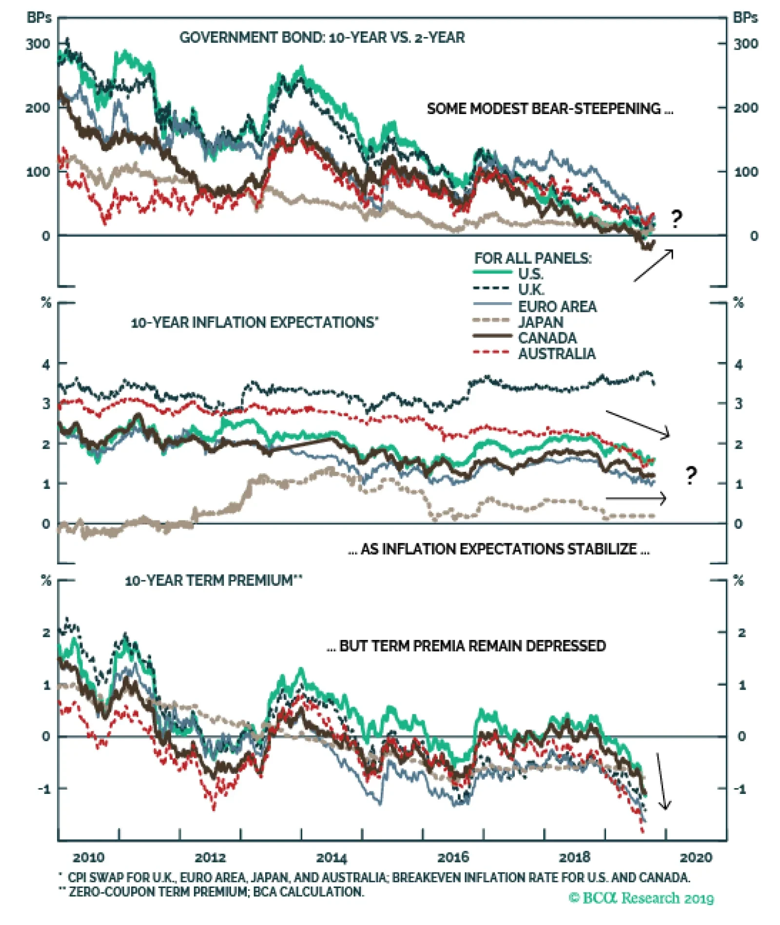
The demand for duration and convexity from asset-liability managers like European pension funds and insurance companies created a technical aspect to the fall in bond yields in August. Falling yields raise the value of liabilities for these investors,…