Global
Next week, we will focus on the following key items:
The Week Ahead: What To Watch
…
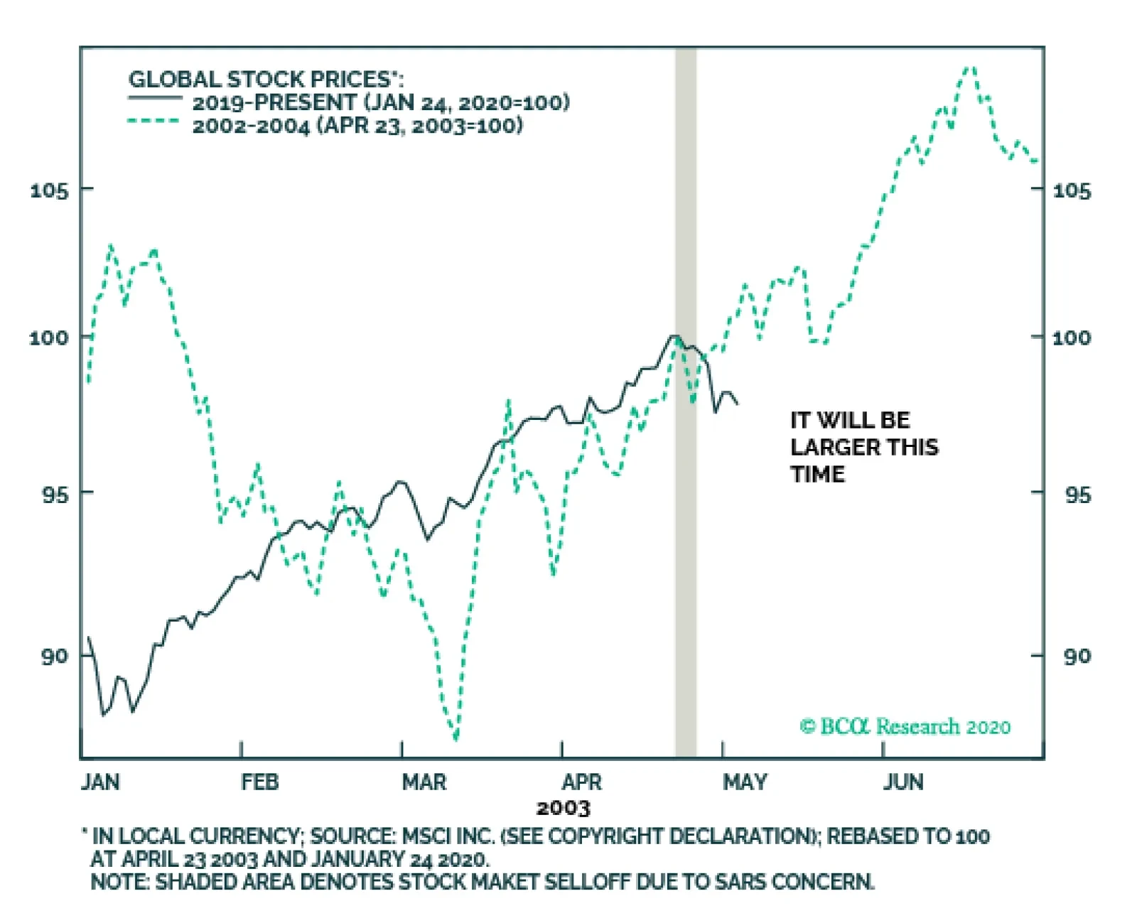
It is tempting to compare the potential impact of the current coronavirus outbreak on the global economy and financial markets with that of SARS in the spring of 2003. The correction in global equities due to the SARS outbreak lasted only a couple of days…
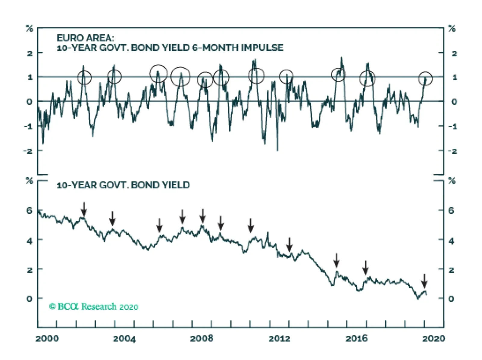
The coronavirus scare is the catalyst for the recent correction. The true cause is that the stock market had reached a point of groupthink-triggered instability and therefore needed the slightest catalyst to correct. The bond yield 6-month impulse had…

Highlights Collective market signals suggest a low but non-negligible probability of a dollar spike due to the coronavirus. Stay long the yen as a portfolio hedge. Short CHF/JPY bets also make sense. Our limit sell on the gold/silver ratio was triggered at 90. Place a stop at 95, with an initial target of 80. Feature Chart I-1Watching Market Signals
Watching Market Signals
Watching Market Signals
Investors can generally be classified in two camps. There are those who are predisposed to being risk averse. As such, capital preservation trumps the desire for outsized returns. For such investors, defensive equities such as staples and utility stocks, fixed-income assets, or even gold tend to be the favored vehicles over time. At the opposite end of the spectrum are the investors who desire hopping on and riding the next growth unicorn. Their favored investment universe can include technology and biotech concerns, but can also span industries such as automotive and food. The key, however, is that their inherent disposition is to multiply returns rather than preserve capital. There is a crucial difference between this bias and a risk-on/risk-off environment. For example, in a risk-on environment, the more prudent investor might choose high-yielding government bonds, while the high flyer will be in the S&P 500 or private equity. In the currency world, the “preservationist” might choose the euro as an anti-dollar play despite negative yields, while the “high flyer” would rather be in the New Zealand dollar or the Norwegian krone. The oscillation between these two bipolar universes can be measured in various ways, but one that has been prescient in gauging the direction for currency markets is the ratio between the S&P 500 index and gold prices. In general, whenever the S&P 500 has been outperforming gold, the dollar has tended to soar, and vice versa (Chart I-1). As a closed economy, US markets are generally more defensive. So even in a risk-off environment, this ratio can capture the preference for capital preservation versus growth. The collective signals from financial markets suggest there is a low probability of a dollar spike. The SPX/Gold ratio hit a peak of 2.5 in the last quarter of 2018 and has since been exhibiting a bearish pattern of lower highs, with the latest rise peaking a nudge below 2.2. Our belief is that it is less a story of greed versus fear, and more an indication of a powerful underlying preference for investors being revealed in asset prices. Gauging FX Market Signals The coronavirus outbreak has been dominating market headlines in recent weeks. We are not infectious disease specialists, so cannot provide any insight on the potential impact on growth and/or the probability for the virus to become much more widespread. However, the collective signals from financial markets suggest there is a low probability of a dollar spike. The rise in the dollar has been relatively on par with the SARS experience of 2002 (Chart I-2A and Chart I-2B). Back then, the Chinese economy had a much smaller effect on global growth, and so far, the number of reported cases is outpacing the SARS experience. So, it is possible that given the dollar bull market of the last decade or so, there is a dearth of new buyers in the greenback. Chart I-2ARun Of The Mill Virus ? (1)
Run Of The Mill Virus ? (1)
Run Of The Mill Virus ? (1)
Chart I-2BRun Of The Mill Virus ? (2)
Run Of The Mill Virus ? (2)
Run Of The Mill Virus ? (2)
The most recent fall in the S&P 500 index versus gold is definitely a sign of risk aversion, but the much broader peak almost two years ago might be signaling an outright shift in the investment universe. In other words, capital preservation might now be best sought outside US bourses. If this is the case, cheap and unloved value stocks will provide better shelter compared to the growth champions of the last decade. It is interesting that emerging market cyclical stocks (where the epicenter of the crisis is) have not underperformed defensives in a meaningful way during the latest riot (Chart I-3). The typical narrative is that the dollar is now a high-yielding currency within the G10. That means it has now become the object of carry trades. Should the investment universe be shifting to one of prudence, it is plausible though not probable that the greenback will provide both functions. Chart I-3Mixed Message From Cyclicals Versus Defensives
Mixed Message From Cyclicals Versus Defensives
Mixed Message From Cyclicals Versus Defensives
Chart I-4Correlation Break Down Or Unsustainable Gap?
Correlation Break Down Or Unsustainable Gap?
Correlation Break Down Or Unsustainable Gap?
The absolute collapse in the gold-to-bond ratio further confirms that after almost a decade of underperformance, hard money might be coming back into favor versus yield plays (Chart I-4). Gold was a monetary aggregate for centuries, and continues to stand as a viable threat to dollar liabilities. This is not only visible in the rampant accumulation of gold by foreign central banks, notably Russia and China, but also by the breakout in gold in almost every currency, including safe-havens like the Swiss franc and the Japanese yen (Chart I-5). The absolute collapse in the gold-to-bond ratio further confirms that after almost a decade of underperformance, hard money might be coming back into favor. Data from the US Treasury confirms that foreign entities have been fleeing US bond markets at among the fastest pace in recent years. On a rolling 12-month total basis, the US saw an exodus of about US$250 billion in Treasurys from foreigners, one of the largest on record (Chart I-6). Foreign private investors are still net buyers of US Treasurys, but the downtrend in purchases in recent years is evident. In addition, this helps explain why gold has also outperformed Treasurys over this period. Chart I-5Soft Versus Hard ##br##Money
Soft Versus Hard Money
Soft Versus Hard Money
Chart I-6Official Data Shows Less Preference For Treasurys
Official Data Shows Less Preference For Treasurys
Official Data Shows Less Preference For Treasurys
The US dollar’s reserve status remains intact for now. But subtle shifts in this exorbitant privilege are worth monitoring. If balance-of-payment dynamics continue to head in the wrong direction, as they are now, this will favor hard money and non-US assets, while accelerating divestment out of US Treasurys. This is irrespective of whether we enter a risk-on versus risk-off environment. A good proxy for whether the US government was prudent or profligate over the past four decades can be measured by the gap between unemployment relative to NAIRU (the so-called unemployment gap) and the corresponding budget deficit. In simple terms, full employment should be accompanied by balanced budgets, while governments can step in during recessions to put a floor under aggregate demand. Not surprisingly, using this simple rule, sound fiscal policies in the US were usually accompanied by a strong dollar, and vice versa. Chart I-7The Risk To Long Dollar Positions
The Risk To Long Dollar Positions
The Risk To Long Dollar Positions
Over the next five years, the US Congressional Budget Office (CBO) estimates that the US budget deficit will swell to 4.6% of GDP. Assuming the current account deficit remains stable, this will pin the twin deficits at 7.2% of GDP. This assumes no recession, which would have the potential to boost the deficit even further. In the last forty years, there has not been any prolonged period where twin deficits in the US have been expanding while the dollar has been in a bull market (Chart I-7). In a nutshell, even though the coronavirus is dominating headlines, the lack of a more pronounced greenback strength can be pinpointed to a rising number of negative market signals. Our bias is that when this eventually rolls over and global growth picks up in earnest, dollar bulls may be forced to capitulate. Bottom Line: We are not downplaying the potential impact of the coronavirus, but are skeptical of its ability to catapult the dollar higher. We are short the DXY index, with a target of 90 and a stop at 100. Stick with it. Bullish Both Gold And Silver, But Go Short The GSR If we are right, then both gold and silver will tend to rise in an environment where the dollar is falling. That said, the gold/silver ratio (GSR) hit a three-decade high of 93.3 last summer, opening up an arbitrage opportunity. The history of these reversals is that they tend to be powerful, quick, and extremely volatile (Chart I-8). This not only paves the way for an excellent entry point to short gold versus silver, but provides important information on the battleground between easing financial conditions and a pick-up in economic (or manufacturing) activity. The ratio of the velocity of money between the US and China has tended to track both the gold/silver ratio and the dollar closely. Just like gold, silver benefits from low interest rates, plentiful liquidity, and the incentive for fiat money debasement. However, the gold/silver ratio is sitting near two standard deviations above its mean. Meanwhile, over the past century, the peak in GSR has been around 100. The gold/silver ratio tends to rally ahead of an economic slowdown, but then peaks when growth is still weak but liquidity conditions are plentiful enough to affect the outlook for future growth. This appears to be the case today. The simple reason is that silver has more industrial uses than gold (Chart I-9). Chart I-8GSR At A Speculative Extreme
GSR At A Speculative Extreme
GSR At A Speculative Extreme
Chart I-9No Recession = Buy Silver
No Recession = Buy Silver
No Recession = Buy Silver
The ratio of the velocity of money between the US and China has tended to track both the gold/silver ratio and the dollar closely (Chart I-10). A falling ratio signifies that the number of times money is changing hands in China is outpacing that number in the US. This also tends to coincide with a preference for US versus non-US assets, since animal spirits (as measured by money velocity) tend to be pronounced in places where returns on capital are higher. Silver is a more volatile metal than gold. Part of the reason is that the silver market is thinner, with future open interest that is about one-third that of gold. As such, silver tends to rise faster than gold during precious metal bull markets (Chart I-11). Chart I-10Falling GSR = Rising Manufacturing Activity
Falling GSR = Rising Manufacturing Activity
Falling GSR = Rising Manufacturing Activity
Chart I-11Silver Is More Volatile Than Gold
Silver Is More Volatile Than Gold
Silver Is More Volatile Than Gold
This brings us to the sweet spot for silver. Even if global growth remains tepid over the next few months, due to a rise in infections from the coronavirus, a lot of the bad news is already reflected in a high GSR. This means the potential for upside will have to be nothing short of a deep recession. Relative speculative positioning favors gold, which is positive from a contrarian standpoint. Ditto for relative sentiment. More often than not, a positive signal from both these indicators has been a good timing tool for a selloff in the GSR. If global growth bottoms, then the rise in silver prices could be explosive. Silver fabrication demand benefits from new industries such as solar and a flourishing “cloud” industry that are capturing the new manufacturing landscape. Meanwhile, we are also entering a window where any pickup in demand could lead to a sizeable increase in the physical silver deficit. Bottom Line: A falling GSR provides important information about the battleground between easing financial conditions and a pickup in economic activity. We remain bullish on both gold and silver, but a trading opportunity has opened up for a short GSR position. Housekeeping Chart I-12AUD Will Follow Asian Currencies
AUD Will Follow Asian Currencies
AUD Will Follow Asian Currencies
Our limit buy on the Australian dollar was triggered at 68 cents. We discussed the Aussie at length in our report dated January 17.1 Place an initial target at 0.75 cents and a tight stop at 0.66. The near-term risk to this trade is any escalation in virus infections that will collectively send Asian currencies into a tailspin (Chart I-12). Chester Ntonifor Foreign Exchange Strategist chestern@bcaresearch.com Footnotes 1 Please see Foreign Exchange Strategy Weekly Report, titled "On AUD And CNY," dated January 17, 2020, available at fes.bcaresearch.com Currencies U.S. Dollar Chart II-1USD Technicals 1
USD Technicals 1
USD Technicals 1
Chart II-2USD Technicals 2
USD Technicals 2
USD Technicals 2
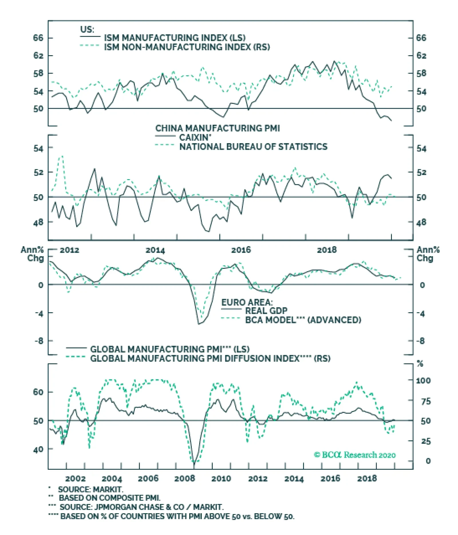
Recent data in the US have been positive: The Markit manufacturing PMI fell to 51.7 while the services component increased to 53.2 in January. The Dallas Fed manufacturing index improved from -3.2 to -0.2 in January. Moreover, the Richmond Fed manufacturing index soared to 20 in January. Durable goods orders increased by 2.4% month-on-month in December. The trade deficit widened further to $68.3 billion from $63 billion in December. Annualized GDP growth was unchanged at 2.1% year-on-year in Q4. Initial jobless claims fell to 216K from 223K for the week ended January 24th. The DXY index appreciated by 0.1% this week. While the coronavirus spurred worries about a further slowdown in the global economy, the impact on the US remains to be seen. On Wednesday, the Fed committee voted unanimously to keep interest rates on hold at 1.75% and concluded that the current rate is appropriate to support sustained expansion of the US economy. Report Links: Portfolio Tweaks Before The Chinese New Year - January 24, 2020 On Oil, Growth And The Dollar - January 10, 2020 Updating Our Balance Of Payments Monitor - November 29, 2019 The Euro Chart II-3EUR Technicals 1
EUR Technicals 1
EUR Technicals 1
Chart II-4EUR Technicals 2
EUR Technicals 2
EUR Technicals 2
Recent data in the euro area have been mostly positive: The Markit manufacturing PMI jumped to 47.8 in January while the services PMI fell slightly to 52.2. The German IFO current assessment index increased to 99.1 from 98.8 in January, while expectations component fell to 92.9. The economic sentiment indicator increased to 102.8 from 101.3 in January. The unemployment rate fell further to 7.4% in December from 7.5% the prior month. The euro has been flat against the US dollar this week. Though the German IFO expectations component disappointed, the overall assessment has shown tentative signs of recovery. More importantly, changes in the manufacturing PMI indices, especially in Germany, are staging the V-shaped recovery we have been expecting. Report Links: Updating Our Balance Of Payments Monitor - November 29, 2019 On Money Velocity, EUR/USD And Silver - October 11, 2019 A Few Trade Ideas - Sept. 27, 2019 Japanese Yen Chart II-5JPY Technicals 1
JPY Technicals 1
JPY Technicals 1
Chart II-6JPY Technicals 2
JPY Technicals 2
JPY Technicals 2
Recent data in Japan have been positive: Consumer confidence was unchanged at 39.1 in January. Services PPI increased by 2.1% year-on-year in December. Headline inflation increased to 0.8% year-on-year from 0.5% in December. Both manufacturing and services PMIs increased to 49.3 and 52.1, respectively in January. The Japanese yen appreciated by 0.6% against the US dollar this week. The flare up in risk aversion was a very potent catalyst, given the yen had become unloved and under owned. Persistent global risks, including Mid East tensions, and more recently, the spread of coronavirus, all warrant holding the Japanese yen as a portfolio hedge. Our last weekly report discussed why we prefer the Japanese yen to the Swiss franc as portfolio insurance. Report Links: Portfolio Tweaks Before The Chinese New Year - January 24, 2020 Updating Our Balance Of Payments Monitor - November 29, 2019 Signposts For A Reversal In The Dollar Bull Market - November 1, 2019 British Pound Chart II-7GBP Technicals 1
GBP Technicals 1
GBP Technicals 1
Chart II-8GBP Technicals 2
GBP Technicals 2
GBP Technicals 2
Recent data in the UK have been solid: Both Markit manufacturing and services PMIs soared to 49.8 and 52.9 respectively in January. Nationwide housing prices increased by 1.9% year-on-year in January, compared with 1.4% the previous month. The saucer-shaped bottom in home prices is becoming more and more evident. The British pound has been flat against the US dollar this week. On Thursday, the BoE decided to leave interest rates unchanged at 0.75%. The fact that there were only two dissenters, in line with the previous month, suggests that rising bets for a rate cut were misplaced. The UK is due to leave the EU as of January 31st and enter a transition period that is supposed to last until December 31st 2020. The immediate aftermath of the exit will be business as usual. Trading strategy on the pound should be a buy on dips. We will continue to explore opportunities in GBP in upcoming reports. Report Links: Updating Our Balance Of Payments Monitor - November 29, 2019 A Few Trade Ideas - Sept. 27, 2019 United Kingdom: Cyclical Slowdown Or Structural Malaise? - Sept. 20, 2019 Australian Dollar Chart II-9AUD Technicals 1
AUD Technicals 1
AUD Technicals 1
Chart II-10AUD Technicals 2
AUD Technicals 2
AUD Technicals 2
Recent data in Australia have been mixed: The NAB business conditions index fell to 3 from 4 in December. Moreover, the business confidence index decreased to -2 from 0. Headline inflation increased to 1.8% year-on-year from 1.7% in the fourth quarter. Import prices increased by 0.7% quarter-on-quarter, while export prices plunged by 5.2% quarter-on-quarter in Q4. The Australian dollar fell by 2.1% against the US dollar this week, triggering our limit buy position at AUD/USD 0.68. Despite temporary challenges from the bushfires and the coronavirus, we continue to hold our base case view that global growth is likely to rebound in the next 12-to-18 months, which is bullish for the Aussie dollar. Report Links: On AUD And CNY - January 17, 2020 Updating Our Balance Of Payments Monitor - November 29, 2019 A Contrarian View On The Australian Dollar - May 24, 2019 New Zealand Dollar Chart II-11NZD Technicals 1
NZD Technicals 1
NZD Technicals 1
Chart II-12NZD Technicals 2
NZD Technicals 2
NZD Technicals 2
Recent data in New Zealand have been positive: Headline inflation increased to 1.9% year-on-year in Q4, compared with 1.5% the previous quarter. It also beat expectations of 1.8%. The trade balance shifted to a surplus of NZ$547 million in December. Goods exports rose by 4.8% year-on-year to NZ$5.5 billion, while imports fell by 5.4% year-on-year to NZ$5 billion. Shortly after the rise along with inflation data, the New Zealand dollar fell by more than 2% this week, amid growing risk aversion. New Zealand, as a chief exporter of agricultural products, bore a good brunt of speculative selling. Assuming infections peak in the coming weeks, we remain positive on the kiwi as the Chinese government is likely to inject more stimulus into the economy. Report Links: Updating Our Balance Of Payments Monitor - November 29, 2019 Place A Limit Sell On DXY At 100 - November 15, 2019 USD/CNY And Market Turbulence - August 9, 2019 Canadian Dollar Chart II-13CAD Technicals 1
CAD Technicals 1
CAD Technicals 1
Chart II-14CAD Technicals 2
CAD Technicals 2
CAD Technicals 2
Recent data in Canada have been mostly positive: Retail sales increased by 0.9% month-on-month in November. The Bloomberg Nanos confidence index rose to 56.5 from 56.1 for the week ended January 24th. The Canadian dollar fell by 0.6% against the US dollar this week. As a petrocurrency, the risk of much reduced travel hit the loonie. We have written at length in various reports about the loonie, but the bottom line is that Canada benefits less than other petrocurrencies in oil bull markets. Ergo, the underperformance of short CAD/NOK and long AUD/CAD positions this week is expected. In other news, Trump has signed the new USMCA bill into law this week, leaving Canada the only member of the trilateral deal that has yet to ratify the agreement. Report Links: The Loonie: Upside Versus The Dollar, But Downside At The Crosses Updating Our Balance Of Payments Monitor - November 29, 2019 Making Money With Petrocurrencies - November 8, 2019 Swiss Franc Chart II-15CHF Technicals 1
CHF Technicals 1
CHF Technicals 1
Chart II-16CHF Technicals 2
CHF Technicals 2
CHF Technicals 2
Recent data in Switzerland have been mixed: The trade surplus narrowed for a fourth consecutive month in December, falling to CHF 2 billion. Real exports decreased by 3.4% month-on-month while real imports grew by 0.2% month-on-month. The ZEW expectations index fell to 8.3 from 12.5 in January. The KOF leading indicator jumped to 100.1 from 96.2 in January. The Swiss franc has been more or less flat against the US dollar this week. The fall in exports of chemical and pharmaceutical production was the main driver behind the decrease in the Swiss trade balance in December. The SNB is walking a fine line. The improvement in the KOF leading indicator, along with rising inflation and PMI data is definitely a source of comfort, but the surge in EUR/CHF will hurt competitiveness and warrant stealth intervention. Buy EUR/CHF at 1.06. Report Links: Portfolio Tweaks Before The Chinese New Year - January 24, 2020 Updating Our Balance Of Payments Monitor - November 29, 2019 Notes On The SNB - October 4, 2019 Norwegian Krone Chart II-17NOK Technicals 1
NOK Technicals 1
NOK Technicals 1
Chart II-18NOK Technicals 2
NOK Technicals 2
NOK Technicals 2
Recent data in Norway have been negative: Retail sales fell by 2% month-on-month in December. The Norwegian krone fell by 1.9% against the US dollar this week. The WTI crude oil price plunged by 20% since the peak earlier this month, due to a combination of falling global travel demand, eased Iran tensions and a bearish EIA inventory report. That being said, our Commodity & Energy strategists continue to be bullish energy prices and expect the WTI crude oil price to reach $63/bbl in 2020, based on recovering global demand and supply constraints. This should eventually lift the Norwegian krone. OPEC is scheduled to meet early March, and plunging prices could be a catalyst for the cartel to cut production. Report Links: On Oil, Growth And The Dollar - January 10, 2020 Updating Our Balance Of Payments Monitor - November 29, 2019 Making Money With Petrocurrencies - November 8, 2019 Swedish Krona Chart II-19SEK Technicals 1
SEK Technicals 1
SEK Technicals 1
Chart II-20SEK Technicals 2
SEK Technicals 2
SEK Technicals 2
Recent data in Sweden have been mixed: Producer prices increased by 1.3% year-on-year in December. The trade surplus shrank to SEK 0.3 billion from SEK 2.7 billion in December. Retail sales grew by 3.4% year-on-year in December. Consumer confidence marginally fell to 92.6 from 94.7 in January, while business confidence jumped to 97.4 in January, the highest in seven months. The Swedish krona fell by 1.3% against the US dollar this week. Recent Swedish data has been disappointing given the steep decline during the trade war, but we are beginning to see second-derivative improvements. The trade surplus is rising on a year-on-year basis. Particularly noteworthy was the improvement in business confidence, which has historically led the Swedbank PMI index tick for tick. Report Links: Updating Our Balance Of Payments Monitor - November 29, 2019 Where To Next For The US Dollar? - June 7, 2019 Balance Of Payments Across The G10 - February 15, 2019 Trades & Forecasts Forecast Summary Core Portfolio Tactical Trades Limit Orders Closed Trades
Highlights The intense focus on the weakening of global oil demand expected in the wake of another coronavirus outbreak in China – dubbed 2019-nCoV – obscures likely supply-side responses by OPEC 2.0. The producer coalition likely will rebalance markets by extending production cuts from end-March to at least the end of June when it meets in Vienna March 5-6. OPEC 2.0 producers will be exquisitely sensitive to Asian refiner demand. They will use it as a gauge for how severe 2019-nCoV’s impact will be on EM demand, and adjust production and exports accordingly. On the demand side, it is difficult to analogue the 2019-nCoV outbreak to the 2003 SARS outbreak, given all the conflicting fundamentals at play at that time. Forward curves for the principal benchmark crude oils – Brent and WTI – remain backwardated, in spite of the 2019-nCoV-related sell-off. Longer-dated WTI (out to December 2023) traded below $50/bbl earlier in the week, roughly in line with shale-breakeven costs reported by the Dallas Fed earlier this month. This likely will continue to pressure capex in the US shales, keeping future supply growth constrained. Feature Forward curves for the principal benchmark crude oils – Brent and WTI – remain backwardated, in spite of the 2019-nCoV-related sell-off. Chart of the WeekChina's Oil Demand Drives Global Growth
China's Oil Demand Drives Global Growth
China's Oil Demand Drives Global Growth
Oil markets are rightly focused on the demand implications of the 2019-nCoV outbreak in China.1 Since 2000, China has accounted for 42% of annual oil-demand growth worldwide (Chart of the Week). China is second only to the US in oil demand, accounting for 14% of total global demand of 100.7mm b/d at the end of 2019; its oil imports averaged more than 10mm b/d last year, and are expected to remain strong as it continues to build out its refining sector. Chart 2Asian Air Travel Hit Hard By SARS
Expect OPEC 2.0 To Cut Supply In Response to Demand Shock
Expect OPEC 2.0 To Cut Supply In Response to Demand Shock
Historical analogues for 2019-nCoV are difficult. The immediate analogue is the SARS coronavirus outbreak identified in China in February 2003, which lasted six months and hit Asian air travel especially hard (Chart 2). During the height of the SARS outbreak in April 2003, air-travel passenger demand in Asia plunged 45%, according to the International Air Transport Association (IATA). This pushed jet fuel prices lower in Asia and in other key markets, along with distillate prices generally (Chart 3).2 Chart 3Fundamental Supply-Demand Balances Support Higher Crude Oil Prices
Fundamental Supply-Demand Balances Support Higher Crude Oil Prices
Fundamental Supply-Demand Balances Support Higher Crude Oil Prices
China now is an extremely large share of global jet fuel consumption. Chart 4BCA Models, Base Metals Prices Suggest SARS Effect Was Short-Lived
BCA Models, Base Metals Prices Suggest SARS Effect Was Short-Lived
BCA Models, Base Metals Prices Suggest SARS Effect Was Short-Lived
The industry now is more reliant on Chinese travelers. Since 2003, the number of annual air passengers has more than doubled, with China growing to become the world’s largest outbound travel market. In 2003, close to 7mm passengers from China traveled on international flights. By 2018, that number had grown close to 64mm people, according to China’s aviation authority. As Chart 2 demonstrates, China now is an extremely large share of global jet fuel consumption. Still, oil is a global market – the avoidance of China during the SARS outbreak in 2003 would have impacted global air travel, and, as a result, global jet-fuel prices. Our proprietary EM commodity-demand models and the behavior of base metals prices, which were and remain heavily influenced by China’s economy, suggest China’s GDP growth slowed in 2003 (mainly 1H03) because of the SARS outbreak (Chart 4). The LME’s base metals index fell 9% between February and July 2003, while copper prices fell 11%. By year-end, these markets had fully recovered. Oil-Supply Management Drives Price Evolution In the modern era of the oil market beginning roughly around 2000, there have been numerous demand shocks requiring a supply response from OPEC. During the SARS outbreak in 2003, oil-market fundamentals at the time were complicated by the sudden loss of Venezuelan output in December 2002 to a general strike, which lasted three months and removed more than 2mm b/d from the market, and the US invasion of Iraq on March 2003. Both of these supply-side shocks hit markets just as demand was being hit by SARS. This makes it difficult to extract a pure price response on the demand side to the SARS episode. In the modern era of the oil market beginning roughly around 2000, there have been numerous demand shocks requiring a supply response from OPEC. These including the 9/11 terror attacks in the US in 2001; the SARS outbreak in late 2002-03; the Global Financial Crisis in 2007-08; and the euro debt crisis in 2011-12 (Chart 5).3 Chart 5Demand Shocks Abound In 21st Century
Demand Shocks Abound In 21st Century
Demand Shocks Abound In 21st Century
Chart 6OPEC Lost Key Members' Output During SARS Outbreak
OPEC Lost Key Members' Output During SARS Outbreak
OPEC Lost Key Members' Output During SARS Outbreak
OPEC 2.0’s goal – similar to OPEC’s goal before it – is to avoid an unintended inventory accumulation. Importantly, these demand shocks were accompanied by supply shocks – Venezuela's general strike; the US invasion of Iraq continues to play havoc with global supply; the BP Macondo blowout in the Gulf of Mexico in 2010; the Arab Spring and the loss of Libyan output in 2011 – all of which complicated OPEC’s decision making (Chart 6). Much of OPEC’s adjustment then and now is made by the Kingdom of Saudi Arabia (KSA), which functions as the central bank of the global oil market increasing and decreasing production to balance markets (Chart 7). Chart 7KSA Primarily Balances Markets During Supply, Demand Shocks
Expect OPEC 2.0 To Cut Supply In Response to Demand Shock
Expect OPEC 2.0 To Cut Supply In Response to Demand Shock
OPEC 2.0’s goal – similar to OPEC’s goal before it – is to avoid an unintended inventory accumulation, which would push prices lower and severely alter the forward curves for the principal crude oil pricing benchmarks, WTI and Brent (Chart 8). Chart 8OPEC 2.0’s Goal: Avoid Unintended Inventory Accumulation
Expect OPEC 2.0 To Cut Supply In Response to Demand Shock
Expect OPEC 2.0 To Cut Supply In Response to Demand Shock
Navigating The 2019-nCoV Outbreak Oil prices – like all commodity prices – are a function of supply and demand, which clear the market instantaneously (here and now), and across time as buyers and sellers contract for forward delivery. The relentless focus on the demand-side consequences of the 2019-nCoV outbreak is not helpful in determining how oil prices will trade going forward. Oil prices – like all commodity prices – are a function of supply and demand, which clear the market instantaneously (here and now), and across time as buyers and sellers contract for forward delivery. The discussion above is meant to highlight this, by recalling OPEC’s production management during various demand shocks, not just the SARS outbreak in 2003. OPEC then, and OPEC 2.0 now, is not forced to produce oil and export regardless of the physical realities it confronts. It can adjust production and exports in response to direct demand indications from its refinery buyers and traders lifting its crude oil. Demand slowdowns, all else equal, typically will show up in falling crack-spread differentials between refined products and crude oil prices (Chart 9).4 Chart 9Crack Spreads Inform Crude Oil Production Decisions
Crack Spreads Inform Crude Oil Production Decisions
Crack Spreads Inform Crude Oil Production Decisions
It still is too early to gauge the extent of the fall-off in demand arising from 2019-nCoV, but it will become apparent in cracks and in OPEC 2.0 producers’ responses to lower refiner demand. Falling crack spreads inform crude oil producers they need to throttle back on production – refiners are not able to profitably run all the crude being made available to them and crude and product are backing up in inventory. It still is too early to gauge the extent of the fall-off in demand arising from 2019-nCoV, but it will become apparent in cracks and in OPEC 2.0 producers’ responses to lower refiner demand, which will determine how much production they need to cut in order to balance the market. This will be done against a backdrop of supply concerns that are not too dissimilar to those prevailing during the 2003 SARS crisis – e.g., instability in Iraq and Iran that could threaten production, and the loss of Venezuelan exports. Bottom Line: Markets still are in the process of assessing how damaging 2019-nCoV will be for industrial commodity demand – oil, bulks and base metals, in particular. As has been the case in all such demand shocks, OPEC’s supply response (and now OPEC 2.0’s) will determine how deeply and for how long prices are impacted. Robert P. Ryan Chief Commodity & Energy Strategist rryan@bcaresearch.com Hugo Bélanger Senior Analyst Commodity & Energy Strategy HugoB@bcaresearch.com Commodities Round-Up Energy: Overweight Brent prices fell 8% since last Monday amid the coronavirus outbreak in China. The number of confirmed cases is rapidly expanding, reaching more than 6,000 as of Wednesday which surpasses the trajectory of SARS in the first month of the outbreak in 2003. Nonetheless, the fatality rate remains below that of SARS, estimated at less than 3% vs. ~ 10% for SARS. Separately, the WCS discount to WTI averaged -$23/bbl this month. This is in line with our view that the discount would drop below -$20/bbl in 1Q20. This level is appropriate to incentivize additional rail transportation to the US. We expect the discount will remain close to current levels and for crude-by-rail volumes to pick up this year (Chart 10). Base Metals: Neutral Base metals have been severely impacted this week by the coronavirus outbreak – copper, aluminum, zinc, and lead are down 9%, 4%, 9%, and 5%. A prolonged slowdown in China’s economic activity – the driver of the global industrial activity recovery we expect – would plunge metals’ prices. China’s base metal consumption more than doubled since 2003. Thus, the potential impact of 2019-nCoV is much larger compared to SARS and market participants are pricing in the probability of damaging scenarios to global growth. This explains the pronounced decline in metals’ prices this year vs. 2003. Precious Metals: Neutral Gold was one of the few commodities in the green since last week. The yellow metal rose 1% since last Monday, supported by renewed safe-haven demand flows. Gold and the USD have been rising simultaneously amid the virus outbreak, which is typical of uncertain periods. The spectrum of possible outcomes is wide and negatively skewed. This warrants protection through safe-haven assets. We remain strategically long gold as a portfolio hedge. Our recommendation is up 28% since inception. Ags/Softs: Underweight Corn markets focused on USDA reports of rising exports, highlighted by the sale of 124,355 MT to Mexico. CBOT March corn futures were up 6% Tuesday, reversing earlier losses Monday. Beans remain under pressure, as traders await tangible evidence that China will go ahead with purchases announced in the so-called phase-one deal negotiated between the US and China (Chart 11). Chart 10WCS Discount Under Pressure
WCS Discount Under Pressure
WCS Discount Under Pressure
Chart 11Markets Waiting For China Demand
Expect OPEC 2.0 To Cut Supply In Response to Demand Shock
Expect OPEC 2.0 To Cut Supply In Response to Demand Shock
Footnotes 1 The US Centers for Disease Control and Prevention’s 2019-nCoV website highlights the marked differences between China’s response to the current coronavirus outbreak vs the 2003 SARS outbreak. One notable response by the Chinese government this time around – besides the rapid lockdown on travel – has been the alacrity with which officials posted the genome for the virus to a global research database, which allowed US researchers to quickly compare it to the strain they isolated. Separately, Reuters reported Australian researchers were able to grow the virus in a lab, which could accelerate development of a vaccine. 2 Distillates comprise the so-called middle of the refined barrel, and include jet fuel, diesel fuel and heating oil (also known as gasoil). These are primarily associated with industrial markets – mining and transportation, e.g. – and are key barometers of economic activity generally. 3 The "modern" era for oil began roughly in 2000, when oil prices became a random walk. WTI prices were mean-reverting from 1986 to roughly 2000, then became a random walk. Please see Helyette Geman, (2007), "Mean Reversion versus Random Walk in Oil and Natural Gas Prices," in Advances in Mathematical Finance, Birkhäuser, Boston; and Haidar, I. and C.R. Wolff, "Forecasting crude oil price (revisited)," The proceeding of the 30th USAEE Conference, Washington , D.C. USA. 9-12 October, 2011. 4 The “crack spread” is the USD/bbl difference between refined-product prices and crude-oil prices. It represents the gross margin of refiners. Investment Views and Themes Recommendations Strategic Recommendations Tactical Trades TRADE RECOMMENDATION PERFORMANCE IN 2019 Q4
Expect OPEC 2.0 To Cut Supply In Response to Demand Shock
Expect OPEC 2.0 To Cut Supply In Response to Demand Shock
Commodity Prices and Plays Reference Table Trades Closed in 2019 Summary of Closed Trades
Expect OPEC 2.0 To Cut Supply In Response to Demand Shock
Expect OPEC 2.0 To Cut Supply In Response to Demand Shock

The interest rate sensitivity of low-volatility stocks has increased in recent years: Factor analysis shows that while the beta of the excess returns of minimum volatility to the equity market has remained constant, the beta to the bond market has increased…
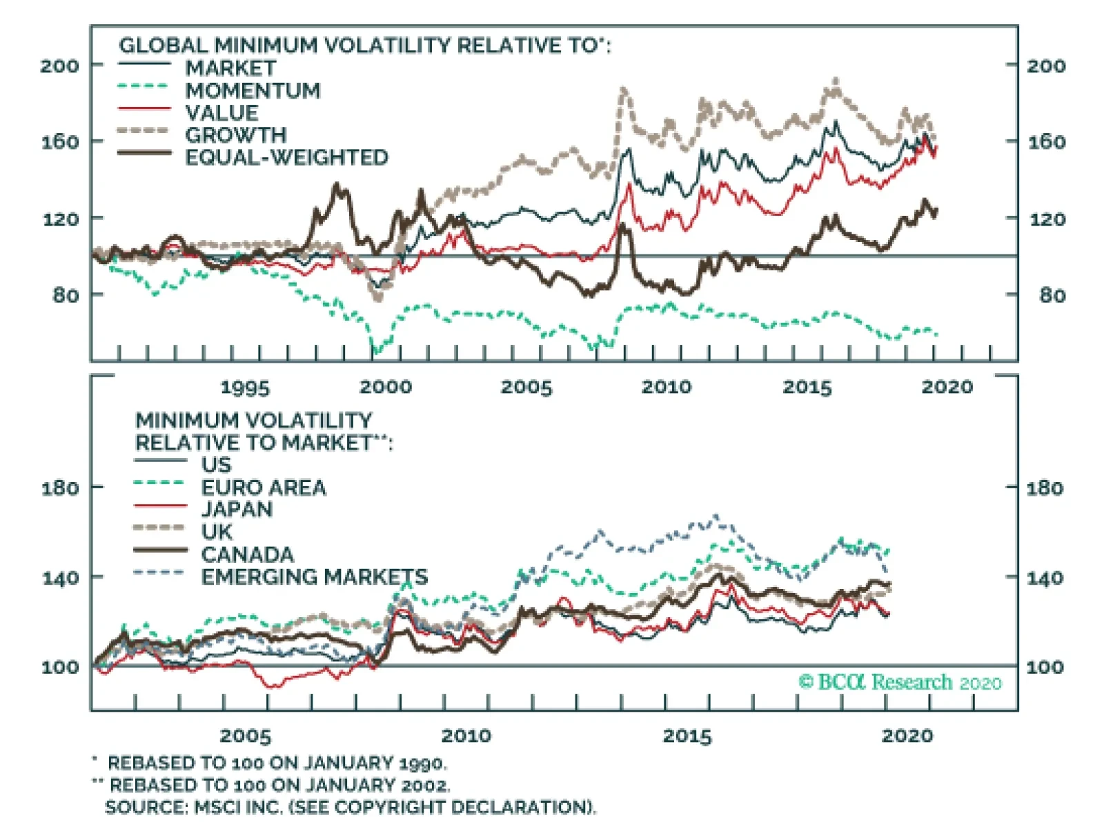
At the global level, minimum volatility has outperformed not only the market since 1990, but also the most popular equity factors, with the exception of momentum. The outperformance relative to the benchmark has proved to be robust, as minimum volatility has…
Highlights The liquidity-driven rally will soon be followed by an acceleration in global growth. The economic recovery will bump up expectations of long-term profit growth. The dollar has downside, but the euro will not benefit much. Overweight stocks relative to bonds and bet on traditional cyclical sectors and commodities. The potential for outperformance of value relative to growth favors European equities. The probability of a tech mania is escalating: how should investors factor an expanding bubble into their portfolios? Feature Chart I-1A Bull Market In Stocks And Volatility?
A Bull Market In Stocks And Volatility?
A Bull Market In Stocks And Volatility?
Despite all odds, the nCoV-2019 outbreak is barely denting the S&P 500’s frenetic rally. Plentiful liquidity, thawing Sino-US trade relations and improving economic activity in Asia, all have created ideal conditions for risk assets to appreciate on a cyclical basis. Stocks may look increasingly expensive and are primed to correct, but the bubble will expand further. After lifting asset valuations, monetary policy easing will soon boost worldwide economic activity. Consequently, earnings in the US and Europe will improve. As long as central bankers remain unconcerned about inflation, investors will bid up stocks. Investors should remember we are in the final innings of a bull market. Stocks can deliver outsized returns during this period, but often at the cost of elevated volatility, and the options market is not pricing in this uncertainty (Chart I-1). Moreover, timing the ultimate end of the bubble is extremely difficult. Hence, we prefer to look for assets that can still benefit from easy monetary conditions and rebounding growth, but are not as expensive as equities. Industrial commodities fit that description, especially after their recent selloff. The dollar remains a crucial asset to gauge the path of least resistance for assets. If it refuses to swoon, then it will indicate that global growth is in a weaker state than we foresaw. The good news is that the broad trade-weighted dollar seems to have peaked. Accommodative Monetary Conditions Are Here To Stay Easy liquidity has been the lifeblood of the S&P 500’s rally. The surge in the index coincided with the lagged impact of the rise in our US Financial Liquidity Index (Chart I-2). Low rates have allowed stocks to climb higher, yet earnings expectations remain muted. For example, since November 26, 2018, the forward P/E ratio for the S&P 500 has increased from 15.2 to 18.7, while 10-year Treasury yields have collapsed from 3.1% to 1.6%. Meanwhile, expectations for long-term earnings annual growth extracted from equity multiples using a discounted cash flow model have dropped from 2.4% to 1.2%. Historically, easier monetary policy pushes asset prices higher before it lifts economic activity. Historically, easier monetary policy pushes asset prices higher before it lifts economic activity. Yet, stocks and risk assets normally continue to climb when the economy recovers. Even without any additional monetary easing, as long as policy remains accommodative, risk assets will generate positive returns. Expectations for stronger cash flow growth become the force driving asset prices higher. Policy will likely remain accommodative around the world. Within this framework, peak monetary easing is probably behind us, even though liquidity conditions remain extremely accommodative. Nominal interest rates remain very low, and real bond yields are still falling. Unlike in 2018 and 2019, dropping TIPs yields reflect rising inflation expectations (Chart I-3). Those factors together indicate that policy is reflationary, which is confirmed by the gold rally. Chart I-2A Liquidity Driven Rally
A Liquidity Driven Rally
A Liquidity Driven Rally
Chart I-3Today, Lower TIPS Yields Are Reflationary
Today, Lower TIPS Yields Are Reflationary
Today, Lower TIPS Yields Are Reflationary
Chart I-4Economic Activity To Respond To Liquidity
Economic Activity To Respond To Liquidity
Economic Activity To Respond To Liquidity
Based on the historical lags between monetary easing and manufacturing activity, the global industrial sector is set to mend (Chart I-4). Moreover, the liquidity-driven surge in stock prices, combined with low yields and compressed credit spreads, has eased financial conditions, which creates the catalyst for an industrial recovery. Where will the growth come from? First, worldwide inventory levels have collapsed after making negative contributions to growth since mid-2018 (Chart I-5). Thus, there is room for an inventory restocking. Secondly, auto sales in Europe and China have rebounded to 18.5% from -23% and to -0.1% from -16.4%, respectively. Thirdly, China’s credit and fiscal impulse has improved. The uptick in Chinese iron ore imports indicates that the pass-through from domestic reflation to global economic activity will materialize soon (Chart I-6). Finally, following the Phase One Sino-US trade deal, global business confidence is bottoming, as exemplified by Belgium’s business confidence, Switzerland KOF LEI, Korea's manufacturing business survey, or US CFO and CEO confidence measures. The increase in EM earnings revisions shows that US capex intentions should soon re-accelerate, which bodes well for investment both in the US and globally (Chart I-7). Chart I-5Room For Inventory Restocking
Room For Inventory Restocking
Room For Inventory Restocking
Chart I-6China Points To Stronger Global Growth
China Points To Stronger Global Growth
China Points To Stronger Global Growth
Construction activity, a gauge of the monetary stance, is looking up across the advanced economies. In the US, housing starts – a leading indicator of domestic demand – have hit a 13-year high. A pullback in this volatile data series is likely, but it should be limited. Vacancies remain at a paltry 1.4%, household formation is solid and affordability is not demanding (Chart I-8). In Europe, construction activity has been relatively stable through the economic slowdown. Even in Canada and Australia, housing transactions have gathered steam quickly following declines in mortgage rates (Chart I-9). Chart I-7Capex Is Set To Recover
Capex Is Set To Recover
Capex Is Set To Recover
Chart I-8US Housing Is Robust
US Housing Is Robust
US Housing Is Robust
Chart I-9Even The Canadian And Australian Housing Markets Are Stabilizing
Even The Canadian And Australian Housing Markets Are Stabilizing
Even The Canadian And Australian Housing Markets Are Stabilizing
Consumers will remain a source of strength for the global economy. The dichotomy between weak manufacturing PMIs and the stable service sector reflects a healthy consumer spending. December retail sales in Europe and the US corroborate this assessment. The stabilization in US business confidence suggests that household incomes are not in as much jeopardy as three months ago. As household net worth and credit growth improve further, a stable outlook for household income will underwrite greater gains in consumption. Policy will likely remain accommodative around the world. For the time being, US inflationary pressures are muted. The New York Fed’s Underlying Inflation Gauge has rolled over, hourly earnings growth has moved back below 3%, our pipeline inflation indicator derived from the ISM is weak, and core producer prices are flagging (Chart I-10). This trend is not US-specific. In the OECD, core consumer price inflation is set to decelerate due to the lagged impact of the manufacturing slowdown. Central banks are also constrained to remain dovish by their own rhetoric. The Fed's statement this week was a testament to this reality. Central banks are increasingly looking to set symmetrical inflation targets. After a decade of missing their targets, a symmetric target would imply keeping policy easier for longer, even if realized inflation moves back above 2%. A rebound in global growth and weak inflation should create a poisonous environment for the US dollar. Finally, fiscal policy will make a small positive contribution to growth in most major advanced economies in 2020, particularly in Germany and the UK (Table I-1). Chart I-10Limited Inflation Will Allow The Fed To Remain Easy
Limited Inflation Will Allow The Fed To Remain Easy
Limited Inflation Will Allow The Fed To Remain Easy
Table I-1Modest Fiscal Easing In 2020
February 2020
February 2020
The Dollar And The Sino-US Phase One Deal At first glance, a rebound in global growth and weak inflation should create a poisonous environment for the US dollar (Chart I-11). As we have often argued, the dollar’s defining characteristic is its pronounced counter-cyclicality. Chart I-11A Painful Backdrop For The Greenback
February 2020
February 2020
Deteriorating dollar fundamentals make this risk particularly relevant. US interest rates are well above those in the rest of the G10, but the gap in short rates has significantly narrowed. Historically, the direction of rates differentials and not their levels has determined the trend in the USD (Chart I-12). Moreover, real differentials at the long end of the curve support the notion that the maximum tailwinds for the dollar are behind us (Chart I-12, bottom panel). Furthermore, now that the US Treasury has replenished its accounts at the Federal Reserve, the Fed’s addition of excess reserves in the system will likely become increasingly negative for the dollar, especially against EM currencies. Likewise, relative money supply trends between the US, Europe, Japan and China already predict a decline in the dollar (Chart I-13). Chart I-12Interest Rate Differentials Do Not Favor The Dollar...
Interest Rate Differentials Do Not Favor The Dollar...
Interest Rate Differentials Do Not Favor The Dollar...
Chart I-13...Neither Do Money Supply Trends
...Neither Do Money Supply Trends
...Neither Do Money Supply Trends
Chart I-14The Phase One Deal Is Ambitious
February 2020
February 2020
The recent Sino-US trade agreement obscures what appears to be a straightforward picture. According to the Phase One deal signed mid-January, China will increase its US imports by $200 billion in the next two years vis-à-vis the high-water mark of $186 billion reached in 2017. This is an extremely ambitious goal (Chart I-14). Politically, it is positive that China has committed to buy manufactured goods and services in addition to commodities. However, the scale of the increase in imports of US manufactured goods is large, at $77 billion. China cannot fulfill this obligation if domestic growth merely stabilizes or picks up just a little, especially now that the domestic economy is in the midst of a spreading illness. It will have to substitute some of its European and Japanese imports with US goods. A consequence of this trade deal is that the euro’s gains will probably lag those recorded in normal business cycle upswings. Historically, European growth outperforms the US when China’s monetary conditions are easing and its marginal propensity to consume is rising (Chart I-15). However, given the potential for China to substitute European goods in favor of US ones, China’s economic reacceleration probably will not benefit Europe as much as it normally does. China may not ultimately follow through with as big of US purchases as it has promised, but it is likely, at least initially, to show good faith in the agreement. The euro’s gains will probably lag those recorded in normal business cycle upswings. While the trade agreement is a headwind for the euro, it is a positive for the Chinese yuan. The US output gap stands at 0.1% of potential GDP and the US labor market is near full employment. The US industrial sector does not possess the required spare capacity to fulfill additional Chinese demand. To equilibrate the market for US goods, prices will have to adjust to become more favorable for Chinese purchasers. The simplest mechanism to achieve this outcome is for the RMB to appreciate. Meanwhile, the euro is trading 16% below its equilibrium, which will allow European producers to fulfill US domestic demand. A widening US trade deficit with Europe would undo improvements in the trade balance with China. The probability that US equities correct further in the short-term is elevated. The implication for the dollar is that the broad trade-weighted USD will likely outperform the Dollar Index (DXY). The euro represents 18.9% of the broad trade-weighted dollar versus 57.6% of the DXY. Asian currencies, EM currencies at large, the AUD and the NZD, all should benefit from their close correlation with the RMB (Chart I-16). Chart I-15Europe Normally Wins When China Recovers
Europe Normally Wins When China Recovers
Europe Normally Wins When China Recovers
Chart I-16EM, Asian, And Antipodean Exchange Rates Love A Strong RMB
EM, Asian, And Antipodean Exchange Rates Love A Strong RMB
EM, Asian, And Antipodean Exchange Rates Love A Strong RMB
Obviously, before the RMB and the assets linked to it can appreciate further, the panic surrounding the coronavirus will have to dissipate. However, the economic damage created by SARS was short lived. This respiratory syndrome resulted in a 2.4% contraction Hong-Kong’s GDP in the second quarter of 2003. The economy of Hong Kong recovered that loss quickly afterward. Investment Forecasts BCA continues to forecast upside in safe-haven yields. Global interest rates remain well below equilibrium and a global economic recovery bodes poorly for bond prices (Chart I-17). However, inflation expectations and not real yields will drive nominal yield changes. The dovish slant of global central banks and the growing likelihood that symmetric inflation targets will become the norm is creating long-term upside risks for inflation. Moreover, if symmetric inflation targets imply lower real short rates in the future, then they also imply lower real long rates today. Investors should begin switching their risk assets into industrial commodity plays, especially after their recent selloff. Easy monetary conditions, decreased real rates and an improvement in economic activity are also consistent with an outperformance of assets with higher yields. High-yield bonds, which offer attractive breakeven spreads, will benefit from this backdrop (Chart I-18). Furthermore, carry trades will likely continue to perform well. In addition to low interest rates across most of the G10, the low currency volatility caused by an extended period of easy policy will continue to encourage carry-seeking strategies. Chart I-17Bonds Are Still Expensive
Bonds Are Still Expensive
Bonds Are Still Expensive
Chart I-18Where Is The Value In Credit?
Where Is The Value In Credit?
Where Is The Value In Credit?
An environment in which growth is accelerating and monetary policy is accommodative argues in favor of stocks. Our profit growth model for the S&P 500 has finally moved back into positive territory. As earnings improve, investors will likely re-rate depressed long-term growth expectations for cash flows (Chart I-19). The flip side is that equity risk premia are elevated, especially outside the US (Chart I-19). Hence, as long as accelerating growth (but not tighter policy) drives up yields, equities should withstand rising borrowing costs. The use of passive investing and the prevalence of “closet indexers” accentuates the risk that a tech mania could blossom. The 400 point surge in the S&P 500 since early October complicates the picture. The probability that US equities correct further in the short-term is elevated, based on their short-term momentum and sentiment measures, such as the put/call ratio (Chart I-20). Foreign equities will continue to correct along US ones, even if they are cheaper. Chart I-19Elevated Stock Multiples Reflect Low Yields, Not Growth Exuberance
Elevated Stock Multiples Reflect Low Yields, Not Growth Exuberance
Elevated Stock Multiples Reflect Low Yields, Not Growth Exuberance
Chart I-20Tactical Risks For Stocks
Tactical Risks For Stocks
Tactical Risks For Stocks
Chart I-21Buy Commodities/Sell Stocks?
Buy Commodities / Sell Stocks?
Buy Commodities / Sell Stocks?
The coronavirus panic seems to be the catalyst for such a correction. When a market is overextended, any shock can cause a pullback in prices. Moreover, as of writing, medical professionals still have to ascertain the virus’s severity and potential mutations. Therefore, risk assets must embed a significant risk premium for such uncertainty, even if ultimately the infection turns out to be mild. However, that risk premium will likely prove to be short lived. During the SARS crisis in 2003, stocks bottomed when the number of reported new cases peaked. The tech sector has plentiful downside if the correction gathers strength. As indicated in BCA’s US Equity Sector Strategy, Apple, Microsoft, Google, Amazon and Facebook account for 18% of the US market capitalization, which is the highest market concentration since the late 1990s tech bubble. Investors should begin switching their risk assets into industrial commodity plays, especially after their recent selloff. Commodity prices are trading at a large discount to US equities. Moreover, the momentum of natural resource prices relative to stocks has begun to form a positive divergence with the price ratio of these two assets (Chart I-21). Technical divergences such as the one visible in the ratio of commodities to equities are often positive signals. Low real rates, an ample liquidity backdrop, a global economic recovery, a weak broad trade-weighted dollar and a strong RMB, all benefit commodities over equities. Tech stocks underperform commodities when the dollar weakens and growth strengthens. Moreover, our positive stance on the RMB justifies stronger prices for copper, oil and EM equities (Chart I-22). Chart I-22The Winners From A CNY Rebound
February 2020
February 2020
Our US Equity Strategy Service has also reiterated its preference for industrials and energy stocks, and it recently upgraded materials stocks to neutral.1 All three sectors trade at significant valuation discounts to the broad market and to tech stocks in particular. They are also oversold in relative terms. Finally, their operating metrics are improving, a trend which will be magnified if global growth re-accelerates. Do not make these bets aggressively. A weakening broad trade-weighted dollar would allow for a rotation into foreign equities and an outperformance of value relative to growth stocks. The share of US equities in the MSCI All-Country World Index is a direct function of the broad trade-weighted dollar (Chart I-23). Moreover, since 1971, the dollar and the relative performance of growth stocks versus value stocks have exhibited a positive correlation (Chart I-24). Thus, the dollar’s recent strength has been a key component behind the run enjoyed by tech stocks. Chart I-23Global Stocks Love A Soft Dollar
Global Stocks Love A Soft Dollar
Global Stocks Love A Soft Dollar
Chart I-24Value Stocks Needs A Weaker Dollar To Outperform Growth Stocks
Value Stocks Needs A Weaker Dollar To Outperform Growth Stocks
Value Stocks Needs A Weaker Dollar To Outperform Growth Stocks
Despite the risks to the euro discussed in the previous section, European equities could still outperform US equities. Such a move would be consistent with value stocks beating growth equities (Chart I-24, bottom panel). This correlation exists because the euro area has a combined 17.7% weighting to tech and healthcare stocks compared with a 37.1% allocation in US benchmarks. Moreover, a cheap euro should allow European industrials and materials to outperform their US counterparts. Finally, the recent uptick in the European credit impulse indicates that an acceleration in European profit growth is imminent, a view that is in line with our preference for European financials (Chart I-25).2 Chart I-25Euro Area Profits Should Improve
Euro Area Profits Should Improve
Euro Area Profits Should Improve
Bottom Line: The current environment remains favorable for risk assets on a 12-month investment horizon. As such, we expect stocks and bond yields to continue to rise in 2020. Moreover, a pick-up in global growth, along with a fall in the broad trade-weighted dollar, should weigh on tech and growth stocks, and boost the attractiveness of commodity plays, industrial, energy and materials stocks, as well as European and EM equities. Forecast Meets Strategy Liquidity-driven rallies, such as the current one, can carry on regardless of the fundamentals. As Keynes noted 90 years ago: “Markets can remain irrational longer than you can stay solvent.” The gap between forecast and strategy can be great. The use of passive investing and the prevalence of “closet indexers” accentuates the risk that a tech mania could blossom. We assign a substantial 30% probability to the risk of another tech mania. Outflows from equity ETFs and mutual funds have been large. Investors will be tempted to move back into those vehicles if stocks continue to rally on the back of plentiful liquidity and improving global growth (Chart I-26). In the process, the new inflows will prop up the over-represented, over-valued, and over-extended tech behemoths. Chart I-26Depressed Equity Flows Should Pick Up
Depressed Equity Flows Should Pick Up
Depressed Equity Flows Should Pick Up
The current tech bubble can easily run a lot further. Based on current valuations, the NASDAQ trades at a P/E ratio of 31 compared with 68 in March 2000 (Chart I-27). Moreover, momentum is becoming increasingly favorable for the NASDAQ and other high-flying tech stocks. The NASDAQ is outperforming high-dividend stocks and after a period of consolidation, its relative performance is breaking out. Momentum often performs very well in liquidity-driven rallies. Chart I-27Where Is The Bubble?
Where Is The Bubble?
Where Is The Bubble?
Chart I-28Debt Loads Are Already High Everywhere
Debt Loads Are Already High Everywhere
Debt Loads Are Already High Everywhere
A full-fledged tech mania would make our overweight equities / underweight bonds a profitable call, but it would invalidate our sector and regional recommendations. Moreover, with a few exceptions in China and Taiwan, the major tech bellwethers are listed in the US. A tech bubble would most likely push our bearish dollar stance to the offside. Bubbles are dangerous: participating on the upside is easy, but cashing out is not. Moreover, financial bubbles tend to exacerbate the economic pain that follows the bust. During manic phases, capital is poorly invested and the economy becomes geared to the sectors that benefit from the financial excesses. These assets lose their value when the bubble deflates. Moreover, bubbles often result in growing private-sector indebtedness. Writing off or paying back this debt saps the economy’s vitality. Making matters worse, today overall indebtedness is unprecedented and central banks have little room to reflate the global economy once the bubble bursts (Chart I-28). Finally, US/Iran tensions will create additional risk in the years ahead. Matt Gertken, BCA’s Geopolitical Strategist, warns that the ratcheting down of tensions following Iran’s retaliation to General Soleimani’s assassination is temporary.3 As a result, the oil market remains a source of left-handed tail-risk. Section II discusses other potential black swans lurking in the geopolitical sphere. We continue to recommend that investors overweight industrials and energy, upgrade materials to neutral, Europe to overweight, and curtail their USD exposure as long as US inflation remains well behaved and the US inflation breakeven rate stays below the 2.3% to 2.5% range. However, do not make these bets aggressively. Moreover, some downside protection is merited. Due to our very negative view on bonds, we prefer garnering these hedges via a 15% allocation to gold and the yen. The yen is especially attractive because it is one of the few cheap, safe-haven plays (Chart I-29). Chart I-29The Yen Offers Cheap Portfolio Protection
The Yen Offers Cheap Portfolio Protection
The Yen Offers Cheap Portfolio Protection
Mathieu Savary Vice President The Bank Credit Analyst January 30, 2020 Next Report: February 27, 2020 II. Five Black Swans In 2020 Our top five geopolitical “Black Swans” are risks that the market is seriously underpricing. With the “phase one” trade deal signed, Chinese policy could become less accommodative, resulting in a negative economic surprise. The trade deal may fall victim to domestic politics, raising the risk of a US-China military skirmish. A Biden victory at the Democratic National Convention or a Democratic takeover of the White House could trigger social unrest and violence in the US. A pickup in the flow of migrants to Europe would fundamentally undermine political stability there. Russia’s weak economy will add fuel to domestic unrest, risking an escalation beyond the point of containment. Over the past four years, BCA’s Geopolitical Strategy service has started off each year with their top five geopolitical “Black Swans.” These are low-probability events whose market impact would be significant enough to matter for global investors. Unlike the great Byron Wien’s perennial list of market surprises, we do not assign these events a “better than 50% likelihood of happening.” We offer risks that the market is seriously underpricing by assigning them only single-digit probabilities when we think the reality is closer to 10%-15%, a level at which a risk premium ought to be assigned. Some of our risks below are so obscure that it is not clear how exactly to price them. We exclude issues that are fairly probable, such as flare-ups in Indo-Pakistani conflict. The two major risks of the year – discussed in our Geopolitical Strategy’s annual outlook – are that either US President Donald Trump or Chinese President Xi Jinping overreaches in a major way. But what would truly surprise the market would be a policy-induced relapse in Chinese growth or a direct military clash between the two great powers. That is how we begin. Other risks stem from domestic affairs in the US, Europe, and Russia. Black Swan 1: China’s Financial Crisis Begins Chart II-1A Crackdown On Financial Risk Could Cause China's Economy To Derail
A Crackdown On Financial Risk Could Cause China's Economy To Derail
A Crackdown On Financial Risk Could Cause China's Economy To Derail
The risk of Xi Jinping’s concentration of power in his own person is that individuals can easily make mistakes, especially if unchecked by advisors or institutions. Lower officials will fear correcting or admonishing an all-powerful leader. Inconvenient information may not be relayed up the hierarchy. Such behavior was rampant in Chairman Mao Zedong’s time, leading to famine among other ills. Insofar as President Xi’s cult of personality successfully imitates Mao’s, it will be subject to similar errors. If President Xi overreaches and makes a policy mistake this year, it could occur in economic policy or other policies. We begin with economic policy, as we have charted the risks of Xi’s crackdown on the financial system since early 2017 (Chart II-1). This year is supposed to be the third and final year of Xi Jinping’s “three battles” against systemic risk, pollution, and poverty. The first battle actually focuses on financial risk, i.e. China’s money and credit bubble. The regime has compromised on this goal since mid-2018, allowing monetary easing to stabilize the economy amid the trade war. But with a “phase one” trade deal having been signed, there is an underrated risk that economic policy will return to its prior setting, i.e. become less accommodative (Chart II-2). When Xi launched the “deleveraging campaign” in 2017, we posited that the authorities would be willing to tolerate an annual GDP growth rate below 6%. This would not only cull excesses in the economy but also demonstrate that the administration means business when it says that China must prioritize quality rather than quantity of growth. While Chinese authorities are most likely targeting “around 6%” in 2020, it is entirely possible that the authorities will allow an undershoot in the 5.5%-5.9% range. They will argue that the GDP target for 2020 has already been met on a compound growth rate basis (Chart II-3), as astute clients have pointed out. They may see less need for stimulus than the market expects. Chart II-2Easing Of Trade Tensions May Re-Incentivize Tighter Policy
Easing Of Trade Tensions May Re-Incentivize Tighter Policy
Easing Of Trade Tensions May Re-Incentivize Tighter Policy
Chart II-3Chinese Authorities Might Tolerate A Growth Undershoot In 2020
Chinese Authorities Might Tolerate A Growth Undershoot In 2020
Chinese Authorities Might Tolerate A Growth Undershoot In 2020
Similarly, while urban disposable income is ostensibly lagging its target of doubling 2010 levels by 2020, China’s 13th Five Year Plan, which concludes in 2020, conspicuously avoided treating urban and rural income targets separately. If the authorities focus only on general disposable income, then they are on track to meet their target (Chart II-4). This would reduce the impetus for greater economic support. The Xi administration may aim only for stability, not acceleration, in the economy. There are already tentative signs that Chinese authorities are “satisfied” with the amount of stimulus they have injected: some indicators of money and credit have already peaked (Chart II-5). The crackdown on shadow banking has eased, but informal lending is still contracting. The regime is still pushing reforms that shake up state-owned enterprises. Chart II-4Lower Impetus For Economic Support Due To Improvements In National Income?
Lower Impetus For Economic Support Due To Improvements In National Income?
Lower Impetus For Economic Support Due To Improvements In National Income?
Chart II-5Has China's Stimulus Peaked?
chart 5
Has China's Stimulus Peaked?
Has China's Stimulus Peaked?
An added headwind for the Chinese economy stems from the currency. The currency should track interest rate differentials. Beijing’s incremental monetary stimulus, in the form of cuts to bank reserve requirement ratios (RRRs), should also push the renminbi down over time (Chart II-6). However, an essential aspect of any trade deal with the Trump administration is the need to demonstrate that China is not competitively devaluing. Hence the CNY-USD could overshoot in the first half of the year. This is positive for global exports to China, but it tightens Chinese financial conditions at home. A stronger than otherwise justified renminbi would add to any negative economic surprises from less accommodative monetary and fiscal policy. Conventional wisdom says China will stimulate the economy ahead of two major political events: the centenary of the Communist Party in 2021 and the twentieth National Party Congress in 2022. The former is a highly symbolic anniversary, as Xi has reasserted the supremacy of the party in all things, while the latter is more significant for policy, as it is a leadership reshuffle that will usher in the sixth generation of China’s political elite. But conventional wisdom may be wrong – the Xi administration may aim only for stability, not acceleration, in the economy. It would make sense to save dry powder for the next US or global recession. The obvious implication is that China’s economic rebound may lose steam as early as H2 – but the black swan risk is that negative surprises could cause a vicious spiral inside of China. This is a country with massive financial and economic imbalances, a declining potential growth profile, and persistent political obstacles to growth both at home and abroad. Corporate defaults have spiked sharply. While the default rate is lower than elsewhere, the market may be sniffing out a bigger problem as it charges a much higher premium for onshore Chinese bonds (Chart II-7). Chart II-6CNY/USD Overshoot Would Tighten Chinese Financial Conditions
CNY-USD Overshoot Would Tighten Chinese Financial Conditions
CNY-USD Overshoot Would Tighten Chinese Financial Conditions
Chart II-7Is China's Bond Market Sniffing Out A Problem?
Is China's Bond Market Sniffing Out A Problem?
Is China's Bond Market Sniffing Out A Problem?
Bottom Line: Our view is that China’s authorities will remain accommodative in 2020 in order to ensure that growth bottoms and the labor market continues to improve. But Beijing has compromised its domestic economic discipline since 2018 in order to fight trade war. The risk now, with a “phase one” deal in hand, is that Xi Jinping returns to his three-year battle plan and underestimates the downward pressures on the economy. The result would be a huge negative surprise for the Chinese and global economy in 2020. Black Swan 2: The US And China Go To War In 2013, we predicted that US-China conflict was “more likely than you think.” This was not just an argument for trade conflict or general enmity that raises the temperature in the Asia-Pacific region – we included military conflict. At the time, the notion that a Sino-American armed conflict was the world’s greatest geopolitical threat seemed ludicrous to many of our clients. We published this analysis in October of that year, months after the Islamic State “Soldier’s Harvest” offensive into Iraq. Trying to direct investors to the budding rivalry between American and Chinese naval forces in the South China Sea amidst the Islamic State hysteria was challenging, to say the least. Chart II-8Americans’ Attitudes Toward China Plunged…
February 2020
February 2020
The suggestion that an accidental skirmish between the US and China could descend into a full-blown conflict involved a stretch of the imagination because China was not yet perceived by the American public as a major threat. In 2014, only 19%of the US public saw China as the “greatest threat to the US in the future.” This came between Russia, at 23%, and Iran, at 16%. Today, China and Russia share the top spot with 24%. Furthermore, the share of Americans with an unfavorable view of China has increased from 52% to 60% in the six intervening years (Chart II-8). The level of enmity expressed by the US public toward China is still lower than that toward the Soviet Union at the onset of the Cold War in the 1950s (Chart II-9). However, the trajectory of distrust is clearly mounting. We expect this trend to continue: anti-China sentiment is one of the few sources of bipartisan agreement remaining in Washington, DC (Chart II-10). Chinese sentiment toward the United States has also darkened dramatically. The geopolitical rivalry is deepening for structural reasons: as China advances in size and sophistication, it seeks to alter the regional status quo in its favor, while the US grows fearful and seeks to contain China. Chart II-9…But Not Yet To War-Inducing Levels
February 2020
February 2020
Chart II-10Distrust Of China Is Bipartisan
February 2020
February 2020
Chart II-11Newfound American Concern For China’s Repression
February 2020
February 2020
One example of rising enmity is the US public’s newfound concern for China’s domestic policies and human rights, specifically Beijing’s treatment of its Uyghur minority in Xinjiang. A Google Trends analysis of the term “Uyghur” or “Uyghur camps” shows a dramatic rise in mentions since Q2 of 2018, around the same time the trade war ramped up in a major way (Chart II-11). While startling revelations of re-education camps in Xinjiang emerged in recent years, the reality is that Beijing has used heavy-handed tactics against both militant groups and the wider Uyghur minority since at least 2008 – and much earlier than that. As such, the surge of interest by the general American public and legislators – culminating in the Uyghur Human Rights Policy Act of 2019 – is a product of the renewed strategic tension between the two countries. The same can be said for Hong Kong: the US did not pass a Hong Kong Human Rights and Democracy Act in 2014, during the first round of mass protests, which prompted Beijing to take heavy-handed legal, legislative, and censorship actions. It passed the bill in 2019, after the climate in Washington had changed. Why does this matter for investors? There are two general risks that come with a greater public engagement in foreign policy. First, the “phase one” trade deal between China and the US could fall victim to domestic politics. This deal envisions a large step up in Sino-American economic cooperation. But if China is to import around $200 billion of additional US goods and services over the next two years – an almost inconceivable figure – the US and China will have to tamp down on public vitriol. This is notably the case if the Democratic Party takes over the White House, given its likely greater focus on liberal concerns such as human rights. And yet the latest bills became law under President Trump and a Republican Senate, and we fully expect a second Trump term to involve a re-escalation of trade tensions to ensure compliance with phase one and to try to gain greater structural concessions in phase two. Second, mounting nationalist sentiment will make it more difficult for US and Chinese policymakers to reduce tensions following a potential future military skirmish, accidental or otherwise. While our scenario of a military conflict in 2013 was cogent, the public backlash in the United States was probably manageable.3 Today we can no longer guarantee that this is the case. The “phase one” trade deal risks falling victim to domestic politics due to greater public engagement in foreign policy. China has greater control over the domestic narrative and public discourse, but the rise of the middle class and the government’s efforts to rebuild support for the single-party regime have combined to create an increase in nationalism. Thus it is also more difficult for Chinese policymakers to contain the popular backlash if conflict erupts. In short, the probability of a quick tamping down of public enmity is actively being reduced as American public vilification of China is closing the gap with China’s burgeoning nationalism at an alarming pace. Another of our black swan risks – Taiwan island – is inextricably bound up in this dangerous US-China dynamic. To be clear, Washington will tread carefully, as a conflict over Taiwan could become a major war. Nevertheless Taiwan’s election, as we expected, has injected new vitality into this already underrated geopolitical risk. It is not only that a high-turnout election (Chart II-12) gave President Tsai Ing-wen a greater mandate (Chart II-13), or that her Democratic Progressive Party retained its legislative majority (Chart II-14). It is not only that the trigger for this resounding victory was the revolt in Hong Kong and the Taiwanese people’s rejection of the “one country, two systems” formula for Taiwan. It is also that Tsai followed up with a repudiation of the mainland by declaring, “We don’t have a need to declare ourselves an independent state. We are an independent country already and we call ourselves the Republic of China, Taiwan.” Chart II-12Tsai Ing-Wen Enjoys A Greater Mandate On Higher Turnout…
February 2020
February 2020
Chart II-13…Popular Support…
February 2020
February 2020
Chart II-14…And A Legislative Majority
February 2020
February 2020
This statement is not a minor rhetorical flourish but will be received as a major provocation in Beijing: the crystallization of a long-brewing clash between Beijing and Taipei. Additional punitive economic measures against Taiwan are now guaranteed. Saber-rattling could easily ignite in the coming year and beyond. Taiwan is the epicenter of the US-China strategic conflict. First, Beijing cannot compromise on its security or its political legitimacy and considers the “one China principle” to be inviolable. Second, the US maintains defense relations with Taiwan (and is in the process of delivering on a relatively large new package of arms). Third, the US’s true willingness to fight a war on Taiwan’s behalf is in doubt, which means that deterrence has eroded and there is greater room for miscalculation. Bottom Line: A US-China military skirmish has been our biggest black swan risk since we began writing the BCA Geopolitical Strategy. The difference between then and now, however, is that the American public is actually paying attention. Political ideology – the question of democracy and human rights – is clearly merging with trade, security, and other differences to provoke Americans of all stripes. This makes any skirmish more than just a temporary risk-off event, as it could lead to a string of incidents or even protracted military conflict. Black Swan 3: Social Unrest Erupts In America There are numerous lessons that one can learn from the ongoing unrest in Hong Kong, but perhaps the most cogent one is that Millennials and Generation Z are not as docile and feckless as their elders think. Images of university students and even teenagers throwing flying kicks and Molotov cocktails while clad in black body armor have shocked the world. Perhaps all those violent video games did have a lasting impact on the youth! What is surprising is that so few commentators have made the cognitive leap from the ultra-first world streets of Hong Kong to other developed economies. Perhaps what is clouding analysts’ minds is the idiosyncratic nature of the dispute in Hong Kong, the “one China” angle. However, Hong Kong youth are confronted with similar socio-economic challenges that their peers in other advanced economies face: overpriced real estate and a bifurcated service-sector labor market with few mid-tier jobs that pay a decent wage. There is a risk of rebellion from Trump’s most ardent supporters if he loses the White House. In the US, Millennials and Gen Z are also facing challenges unique to the US. First, their debt burden is much more toxic than that of the older cohorts, given that it is made up of student loans and credit card debt (Chart II-15). Second, they find themselves at odds – demographically and ideologically – with the older cohorts (Chart II-16). Chart II-15Younger American Cohorts Plagued By Toxic Debt
February 2020
February 2020
Chart II-16Younger And Older Cohorts At Odds Demographically
February 2020
February 2020
Chart II-17Massive Turnout To The 2016 Referendum On Trump
February 2020
February 2020
The adage that the youth are apolitical and do not turn out to vote may have ended thanks to President Trump. The 2018 midterm election, which the Democratic Party successfully turned into a referendum on the president, saw the youth (18-29) turnout nearly double from 20% to 36% (the 30-44 year-old cohort also saw a jump in turnout from 35.6% to 48.8%). The election saw one of the highest turnouts in recent memory, with a 53.4% figure, just two points off the 2016 general election figure (Chart II-17). Despite the high turnout in 2018, the-most-definitely-not-Millennial Vice President Joe Biden continues to lead the Democratic Party in the polls. His probability of winning the nomination is not overwhelming, but it is the highest of any contender. In recent polls, Biden comes third place in Millennial/Gen-Z vote preferences (Chart II-18). Yet he is hardly out of contention, especially for the 30-44 year-old cohort. The view that “Uncle Joe” does not fit the Democratic Party zeitgeist has become so entrenched in the Democratic Party narrative that it became conventional wisdom last year, pulling oddsmakers and betting markets away from the clear frontrunner (Chart II-19). Chart II-18Biden Unpopular Among Young American Voters
February 2020
February 2020
Chart II-19Bookies Pulled Down 'Uncle Joe’s' Odds, Capturing Democratic Party Zeitgeist
February 2020
February 2020
As such, a Biden victory at the Democratic National Convention in Milwaukee, Wisconsin on July 13-16 may come as an affront to the left-wing activists who will surely descend on the convention. This will particularly be the case if Biden wins despite the progressive candidates amassing a majority of overall delegates, which is possible judging by the combined progressive vote share in current polling (Chart II-20). He would arrive in Milwaukee without clearing the 1990 delegate count required to win on the first ballot. On the second ballot, his presidency would then receive a boost from “superdelegates” and those progressives who are unwilling to “rock the boat,” i.e. unify against an establishment candidate with the largest share of votes. This is also how Mayor Michael Bloomberg could pull off a surprise win. Chart II-20Progressives Come Closest To Victory
February 2020
February 2020
Such a “brokered” – or contested – convention has not occurred since 1952. However, several Democratic Party conventions came close, including 1968, 1972, and 1984. The 1968 one in Chicago was notable for considerable violence and unrest. Even if the Milwaukee Democratic Party convention does not produce unrest, it could sow the seeds for unrest later in the year. First, a breakout Biden performance in the primaries is unlikely. As such, he will likely need to pledge a shift to the left at the convention, including by accepting a progressive vice-presidential candidate. Second, an actual progressive may win the primary. Chart II-21Zealots In Both Parties Perceive Each Other As A National Threat
February 2020
February 2020
It is likely that either of the two options would be seen as an existential threat to many of Trump’s loyal supporters across the United States. President Trump’s rhetoric often paints the scenario of a Democratic takeover of the White House in apocalyptic terms. And data suggests that the zealots in both parties perceive each other as a “threat to the nation’s wellbeing” (Chart II-21). The American Civil War in the nineteenth century began with the election of a president. This is not just because Abraham Lincoln was a particularly reviled figure in the South, but because the states that ultimately formed the Confederacy saw in his election the demographic writing-on-the-wall. The election was an expression of a general will that, from that point onwards, was irreversible. Given demographic trends in the US today, it is possible that many would see in Trump’s loss a similar fait accompli. If one perceives progressive Democrats as an existential threat to the US constitution, rebellion is the obvious and rational response. Bottom Line: Year 2020 may be a particularly violent one for the US. First, left wing activists may be shocked and angered to learn that Joe Biden (or Bloomberg) is the nominee of the Democratic Party come July. With so much hype behind the progressive candidates throughout the campaign, Biden’s nomination could be seen as an affront to what was supposed to be “the big year” for left-wing candidates. Second, investors have to start thinking about what happens if Biden – or a progressive candidate – goes on to defeat President Trump in the general election. While liberal America took Trump’s election badly, it has demographics – and thus time – on its side. Trump’s most ardent supporters may conclude that his defeat means the end of America as they know it. Black Swan 4: Europe’s Migration Crisis Restarts It is a testament to Europe’s resilience that we do not have a Black Swan scenario based on an election or a political crisis set on the continent in 2020. Support for the common currency and the EU as a whole has rebounded to its highest since 2013. Even early elections in Germany and Italy are unlikely to produce geopolitical risk. The populists in the former are in no danger of outperforming whereas the populists in the latter barely deserve the designation. But what if one of the reasons for the surge in populism – unchecked illegal immigration – were to return in 2020? Chart II-22Decline In Illegal Immigration Dampened European Populism
February 2020
February 2020
The data suggests that the risk of migrant flows has massively subsided. From its peak of over a million arrivals in 2015, the data shows that only 125,472 migrants crossed into Europe via land and sea routes in the Mediterranean last year (Chart II-22). Why? There are five reasons that we believe have checked the flow of migrants: Supply: The civil wars in Syria, Iraq, and Libya have largely subsided. Heterogenous regions, cities, and neighborhoods have been ethnically cleansed and internal boundaries have largely ossified. It is unlikely that any future conflict will produce massive outflows of refugees as the displacement has already taken place. These countries are now largely divided into armed, ethnically homogenous, camps. Enforcement: The EU has stepped up border enforcement since 2015, pouring resources into the land border with Turkey and naval patrols across the Mediterranean. Individual member states – particularly Italy and Hungary – have also stepped up border enforcement policy. While most EU member states have publicly chided both for “draconian” policies, there is no impetus to force Rome and Budapest to change policy. Libyan Imbroglio: Conflict in Libya has flared up in 2019 with military warlord Khalifa Haftar looking to wrest control from the UN-backed Government of National Accord led by Fayez al-Serraj. The Islamic State has regrouped in the country as well. Ironically, the conflict is helping stem the flow of migrants as African migrants from sub-Saharan countries dare not cross into Libya as they did in 2015 when there was a brief lull in fighting. Turkish benevolence: Ankara is quick to point out that it is the only thing standing between Europe and a massive deluge of migrants. Turkey is said to host somewhere between two and four million refugees from various conflicts in the Middle East. Fear of the crossing: If crossing the Mediterranean was easy, Europe would have experienced a massive influx of migrants throughout the twentieth century. Not only is it not easy, it is costly and quite deadly, with thousands lost each year. Furthermore, most migrants are not welcomed when they arrive to Europe, many are held in terrible conditions in holding camps in Italy and Greece. Over time, migrants who made it into Europe have reported these dangers and conditions, reducing the overall demand for illegal migration. We do not foresee these five factors changing, at least not all at once. However, there are several reasons to worry about the flow of migrants in 2020. US-Iran tensions have sparked outright military action, while unrest is flaring up across Iran’s sphere of influence. Going forward, Iran could destabilize Iraq or fuel Shia unrest against US-backed regimes. Second, Afghanistan has been the source of most migrants to Europe via sea and land Mediterranean routes – 19.2%. The conflict in the country continues and may flare up with President Trump’s decision to formally withdraw most US troops from the country in 2020. Third, a break in fighting in Libya may encourage sub-Saharan migrants to revisit routes to Europe. Migrants from Guinea, Cote d’Ivoire, and the Democratic Republic of Congo make up over 10% of migrants to Europe. Finally, Turkish relationship with the West could break up further in 2020, causing Ankara to ship migrants northward. We highly doubt that President Erdogan will risk such a break, given that 50% of Turkish exports go to Europe. A European embargo on Turkish exports – which would be a highly likely response to such an act – would crush the already decimated Turkish economy. Bottom Line: While we do not see a return to the 2015 level of migration in 2020, we flag this risk because it would fundamentally undermine political stability in Europe. Black Swan 5: Russia Faces A “Peasant Revolt” Our fifth and final black swan risk for the year stems from Russia. This risk may seem obvious, since the US election creates a dynamic that revives the inherent conflict in US-Russian relations. Russia could seek to accomplish foreign policy objectives – interfering in US elections, punishing regional adversaries. The Trump administration may be friendly toward Russia but Trump is unlikely to veto any sanctions passed by the House and Senate in an election year, should an occasion for new sanctions arise. Conversely Russia could anticipate greater US pressure if the Democrats win in November. Yet it is Russia’s domestic affairs that represent the real underrated risk. Putin’s fourth term as president has been characterized by increased focus on domestic political control and stability as opposed to foreign adventurism. The creation of a special National Guard in 2016, reporting directly to Putin and responsible for quelling domestic unrest, symbolizes the shift in focus. So too does Russia’s adherence to the OPEC 2.0 regime of production control to keep oil prices above their budget breakeven level. Meanwhile Putin’s courting of Europe for the Nordstream II pipeline, and his slight peacemaking efforts with Ukraine, has suggested a slightly more restrained international posture. Strategically it makes little sense for Russia to court negative attention at a time when the US and Europe are at odds over trade and the Middle East, the US is preoccupied with China and Iran, and Russia itself faces mounting domestic problems. The domestic problems are long in coming. The central bank has maintained a stringent monetary policy for the better part of the decade. Despite cutting interest rates recently, monetary and credit conditions are still tight, hurting domestic demand. Moscow has also imposed fiscal austerity, namely by cutting back on state pensions and hiking the value added tax. Real wage growth is weak (Chart II-23), retail sales are falling, and domestic demand looks to weaken further, as Andrija Vesic of BCA Emerging Markets Strategy observes in a recent Special Report. The effect of Russia’s policy austerity has been a drop in public approval of the administration (Chart II-24). Protests erupted in 2019 but were largely drowned out by the larger and more globally significant protests in Hong Kong. These were met by police suppression that has not removed their underlying cause. Putin’s first major decision of the new year was to reshuffle the government, entailing Prime Minister Dmitri Medvedev’s transfer to a new post and the appointment of a new cabinet. This move reveals the need to show some accountability to reduce popular pressure. While Moscow now has room to cut interest rates and ease fiscal policy, it is behind the curve and the weak economy will add fuel to domestic unrest. Chart II-23Sluggish Wage Growth Threatens Russian Stability
Sluggish Wage Growth Threatens Russian Stability
Sluggish Wage Growth Threatens Russian Stability
Chart II-24Austerity Weighed On The Administration's Popularity In Russia
Austerity Weighed On The Administration's Popularity In Russia
Austerity Weighed On The Administration's Popularity In Russia
Meanwhile Putin’s efforts to alter the Russian constitution so he can stay in power beyond current term limits, effectively becoming emperor for life, like Xi Jinping, should not be dismissed merely because they are expected. They reflect a need to take advantage of Putin’s popular standing to consolidate domestic political power at a time when the ruling United Russia party and the federal government face discontent. They also ensure that strategic conflict with the United States will take on an ideological dimension. Russia's recent cabinet shakeup is positive from the point of view of economic reform. And the country's monetary and fiscal room provide a basis for remaining overweight equities within EM, as our Emerging Markets Strategy recommends. However, Russian equities have rallied hard and the political risk is understated. Chart II-25Russian Political Risk Is Unsustainably Low
Russian Political Risk Is Unsustainably Low
Russian Political Risk Is Unsustainably Low
Bottom Line: It is never easy predicting Putin’s next international move. Our market-based indicators of Russian political risk have hit multi-year lows, but both the domestic and international context suggest that these lows will not be sustained (Chart II-25). A new bout of risk can emanate from Putin, or from changes in Washington, or from the Russian people themselves. What would take the world by surprise would be domestic unrest on a larger scale than Russia can easily suppress through the police force. Housekeeping We are closing our long European Union / short Chinese equities strategic trade with a 1.61% loss since inception on May 10, 2019. Dhaval Joshi of BCA’s European Investment Strategy downgraded the Eurostoxx 50 to underweight versus the S&P 500 and the Nikkei 225 this week. He makes the point that the Euro Area bond yield 6-month impulse hit 100 bps – a critical technical level – and will be a strong headwind to growth. We will look to reopen this trade at a later date when the euphoria over the “phase one” trade deal subsides, as we still favor European equities and DM bourses over EM. We will reinstitute our long Brent crude H2 2020 versus H2 2021 tactical position, which was stopped out on January 9, 2020. We remain bullish on oil fundamentals and expect Middle East instability to add a political risk premium. China's stimulus and the oil view also give reason for us to reinitiate our long Malaysian equities relative to EM as a tactical position. The Malaysian ringgit will benefit as oil prices move higher, helping Malaysian companies make payments on their large pile of dollar-denominated debt and improving household purchasing power. Higher oil prices also correlate with higher equity prices, while China's stimulus and the US trade ceasefire will push the US dollar lower and help trade revive in the region. Marko Papic Chief Strategist, Clocktower Group Matt Gertken Geopolitical Strategist III. Indicators And Reference Charts The S&P 500 rally looks increasingly vulnerable from a tactical perspective. The US benchmark is overbought, and the percentage of NYSE stocks above their 30-week and 10-week moving averages is rolling over at elevated levels. Additionally, the number of NYSE new highs minus new lows has moved in a parabolic fashion and has hit levels that in previous years have warned of an imminent correction. The spread of nCoV-2019 is likely to be the catalyst to a pullback that could cause the S&P 500 to retest its October 2019 breakout. An improving outlook for global growth, limited inflationary pressures and global central banks who maintain an accommodative monetary stance bode well for stocks. Therefore, the anticipated equity correction will not morph into a bear market. For now, our Monetary Indicator remains at extremely elevated levels. Furthermore, our Composite Technical Indicator has strengthened. Additionally, our BCA Composite Valuation index suggests that stocks are expensive, but not so much as to cancel out the supportive monetary and technical backdrop. Finally, our Speculation Indicator is elevated, but is not so high as to warn of an imminent market top. This somewhat muted level of speculation is congruent with the expectation of low long-term growth rates for profits embedded in equity prices. In contrast to our Revealed Preference Indicator, our Willingness-to-Pay (WTP) is moving in accordance with our constructive cyclical stance for stocks. Indeed, the WTP for the US, Japan and Europe continues to improve. The WTP indicator tracks flows, and thus provides information on what investors are actually doing, as opposed to sentiment indexes that track how investors are feeling. This broad-based improvement therefore bodes well for equities. Meanwhile, net earnings revisions appear to be forming a trough. 10-year Treasury yields remain extremely expensive. Moreover, according to our Composite Technical Indicator, T-Note prices are losing momentum. The fear surrounding the spread of the new coronavirus has cause bonds to rally again, but this is likely to be the last hurrah for the Treasury markets before a major reversal takes hold. The rising risk premia linked to the coronavirus is also helping the dollar right now, but signs that global growth is bottoming, such as the stabilization in the global PMIs, the pick-up in the German ZEW and Belgium’s Business Confidence surveys, or the improvement in Asia’s export growth, point to a worsening outlook for the counter-cyclical US dollar. Moreover, the dollar trades at a large premium of 24.5% relative to its purchasing-power parity equilibrium. Additionally, the negative divergence between the dollar and our Composite Momentum Indicator suggests that the dollar is technically vulnerable. In fact, the very modest pick-up in the dollar in response to the severe fears created by the spreading illness in China argues that dollar buying might have become exhausted. Finally, commodity prices have corrected meaningfully in response to the stronger dollar and the growth fears created by the spread of the coronavirus. However, they have not pulled back below the levels where they traded when they broke out in late 2019. Moreover, the advance/decline line of the Continuous Commodity Index remains at an elevated level, indicating underlying strength in the commodity complex. Natural resources prices will likely become the key beneficiaries of both the eventual pullback in virus-related fears and the weaker dollar. EQUITIES: Chart III-1US Equity Indicators
US Equity Indicators
US Equity Indicators
Chart III-2Willingness To Pay For Risk
Willingness To Pay For Risk
Willingness To Pay For Risk
Chart III-3US Equity Sentiment Indicators
US Equity Sentiment Indicators
US Equity Sentiment Indicators
Chart III-4Revealed Preference Indicator
Revealed Preference Indicator
Revealed Preference Indicator
Chart III-5US Stock Market Valuation
US Stock Market Valuation
US Stock Market Valuation
Chart III-6US Earnings
US Earnings
US Earnings
Chart III-7Global Stock Market And Earnings: Relative Performance
Global Stock Market And Earnings: Relative Performance
Global Stock Market And Earnings: Relative Performance
Chart III-8Global Stock Market And Earnings: Relative Performance
Global Stock Market And Earnings: Relative Performance
Global Stock Market And Earnings: Relative Performance
FIXED INCOME: Chart III-9US Treasurys And Valuations
US Treasurys And Valuations
US Treasurys And Valuations
Chart III-10Yield Curve Slopes
Yield Curve Slopes
Yield Curve Slopes
Chart III-11Selected US Bond Yields
Selected US Bond Yields
Selected US Bond Yields
Chart III-1210-Year Treasury Yield Components
10-Year Treasury Yield Components
10-Year Treasury Yield Components
Chart III-13US Corporate Bonds And Health Monitor
US Corporate Bonds And Health Monitor
US Corporate Bonds And Health Monitor
Chart III-14Global Bonds: Developed Markets
Global Bonds: Developed Markets
Global Bonds: Developed Markets
Chart III-15Global Bonds: Emerging Markets
Global Bonds: Emerging Markets
Global Bonds: Emerging Markets
CURRENCIES: Chart III-16US Dollar And PPP
US Dollar And PPP
US Dollar And PPP
Chart III-17US Dollar And Indicator
US Dollar And Indicator
US Dollar And Indicator
Chart III-18US Dollar Fundamentals
US Dollar Fundamentals
US Dollar Fundamentals
Chart III-19Japanese Yen Technicals
Japanese Yen Technicals
Japanese Yen Technicals
Chart III-20Euro Technicals
Euro Technicals
Euro Technicals
Chart III-21Euro/Yen Technicals
Euro/Yen Technicals
Euro/Yen Technicals
Chart III-22Euro/Pound Technicals
Euro/Pound Technicals
Euro/Pound Technicals
COMMODITIES: Chart III-23Broad Commodity Indicators
Broad Commodity Indicators
Broad Commodity Indicators
Chart III-24Commodity Prices
Commodity Prices
Commodity Prices
Chart III-25Commodity Prices
Commodity Prices
Commodity Prices
Chart III-26Commodity Sentiment
Commodity Sentiment
Commodity Sentiment
Chart III-27Speculative Positioning
Speculative Positioning
Speculative Positioning
ECONOMY: Chart III-28US And Global Macro Backdrop
US And Global Macro Backdrop
US And Global Macro Backdrop
Chart III-29US Macro Snapshot
US Macro Snapshot
US Macro Snapshot
Chart III-30US Growth Outlook
US Growth Outlook
US Growth Outlook
Chart III-31US Cyclical Spending
US Cyclical Spending
US Cyclical Spending
Chart III-32US Labor Market
US Labor Market
US Labor Market
Chart III-33US Consumption
US Consumption
US Consumption
Chart III-34US Housing
US Housing
US Housing
Chart III-35US Debt And Deleveraging
US Debt And Deleveraging
US Debt And Deleveraging
Chart III-36US Financial Conditions
US Financial Conditions
US Financial Conditions
Chart III-37Global Economic Snapshot: Europe
Global Economic Snapshot: Europe
Global Economic Snapshot: Europe
Chart III-38Global Economic Snapshot: China
Global Economic Snapshot: China
Global Economic Snapshot: China
Mathieu Savary Vice President The Bank Credit Analyst Footnotes 1 Please see US Equity Strategy Weekly Report "Three EPS Scenarios," dated January 13, 2020, available at uses.bcaresearch.com; US Equity Strategy Insight Report "Bombed Out Energy," dated January 8, 2020, available at uses.bcaresearch.com; US Equity Strategy Special Report "Industrials: Start Your Engines," dated January 21, 2020, available at uses.bcaresearch.com 2 Please see The Bank Credit Analyst Monthly Report "January 2020," dated December 20, 2019 available at bca.bcaresearch.com; The Bank Credit Analyst Monthly Report "OUTLOOK 2020: Heading Into The End Game," dated November 22, 2019 available at bca.bcaresearch.com 3 Please see Geopolitical Strategy "A Reprieve Amid The Bull Market In Iran Tensions," dated January 8, 2020, available at gps.bcaresearch.com 4 Observe how little attention the public paid to US-China saber-rattling around China’s announcement of an Air Defense Identification Zone in the East China Sea that year.
Highlights Historically, the stocks with the lowest volatility have outperformed the stocks with the highest volatility, a trend that defies some of the most fundamental theories in finance. The low-volatility factor has outperformed the market in absolute return terms, with a substantial reduction in downside risk, in every major equity market. Compensation structure, benchmarking, analyst bias, and the preference for lottery-like stocks are all plausible explanations for why the low-volatility anomaly persists. Shifting some exposure from bonds to minimum-volatility equities might be an attractive way to keep returns high while remaining hedged against downside risk in a world of low interest rates. Feature Chart 1The Low-Volatility Anomaly
Less Risk And More Reward? The Low-Volatility Factor In Equity Markets
Less Risk And More Reward? The Low-Volatility Factor In Equity Markets
Conventional wisdom suggests that achieving the right mix between risk and return requires a tradeoff: Take on too little risk, and returns will be subpar, but take on too much, and a large loss becomes likely. However, the empirical evidence shows that no such tradeoff exists in the equity market: Historically, the return of stocks with the lowest volatility has been better than the return of stocks with the highest volatility (Chart 1, top panel). Even when using a measure of systematic risk such as beta, there appears to be very little relationship between risk and return – a result that emphatically contradicts what is predicted by the CAPM (Chart 1, bottom panel). The success of low risk stocks – a well-documented phenomenon known as the low-volatility anomaly1 – challenges some of the most fundamental premises of finance and economics. After all, how could taking on less risk result in better returns? In this report, we dive into this anomaly, with the intent of answering the following questions: What kind of portfolios can exploit this anomaly? What are the risk/return characteristics to this factor and what sectors is it exposed to? Why does this factor work? How can investors use the low-volatility factor in their asset allocation process? To answer these questions we explore the historical performance of the MSCI minimum-volatility index. Additionally, we explore the academic research surrounding the low-volatility anomaly. Finally, we look into how low-volatility equities have performed as a hedge for a global equity portfolio when compared to government bonds. Low Volatility Vs. Minimum Volatility There are two types of portfolios that are generally used to exploit the low-volatility anomaly: Low-volatility portfolios are built first by sorting the stock universe according to the stocks' trailing standard deviation, and then by buying the stocks with the lowest standard deviation. Usually the index buys the bottom quintile of stocks ranked by volatility. Minimum-volatility portfolios are built through an optimization procedure, by which funds are allocated to the stock mix that would have minimized the historical volatility of a portfolio (subject to certain constraints). Chart 2No Dramatic Difference Between Low Vol And Min Vol
No Dramatic Difference Between Low Vol And Min Vol
No Dramatic Difference Between Low Vol And Min Vol
The main advantage of minimum-volatility portfolios over low-volatility portfolios is that they do not consider only low-volatility stocks but also stocks with low covariance between each other. However, the construction of these portfolios also requires estimating large covariance matrices, which are prone to a significant degree of noise, and thus often have to be adjusted by statistical methods.2 That being said, there is little performance difference between these two methodologies in practice, though minimum-volatility portfolios do tend to be much more constrained than low-volatility portfolios (Chart 2). In this report we will focus on the more popular MSCI minimum-volatility portfolios, given that their historical data is more readily available. Risk-Return Characteristics Of Minimum Volatility At the global level, minimum volatility has outperformed not only the market since 1990, but also the most popular equity factors, with the exception of momentum (Chart 3, top panel). The outperformance relative to the benchmark has proved to be robust, as minimum volatility has beaten the returns for the benchmark in the biggest developed markets as well as emerging markets for almost two decades (Chart 3, bottom panel). The most attractive feature of minimum volatility is the significant reduction in risk it provides. Since 1988, the annualized volatility of minimum volatility has been 10%, a considerable improvement vis-à-vis the market and relative to other popular equity factors (Chart 4, top panel). Meanwhile, even though return skew of minimum volatility has been more negative than the benchmark, minimum volatility achieved a substantial reduction in tail risk with a 10% conditional VaR of only 5% (Chart 4, middle and bottom panel). Chart 3Min Vol Outperformance Is Broad-Based
Min Vol Outperforms In All Countries
Min Vol Outperforms In All Countries
Chart 4Min Vol Provides A Substantial Reduction In Risk
Less Risk And More Reward? The Low-Volatility Factor In Equity Markets
Less Risk And More Reward? The Low-Volatility Factor In Equity Markets
In addition to its risk reduction, minimum volatility also has a countercyclical relative return profile, outperforming during bear markets, and underperforming slightly during bull markets (Chart 5, top panel). This return profile occurs partly due to the sector skew of this factor, which overweights defensive sectors such as Utilities and Consumer Staples relative to the global benchmark3 (Chart 5, middle panel). At the global level, this defensive tilt exposes minimum volatility to significant duration risk, given that the stocks in this index tend to have bond-like properties (Chart 5, bottom panel). The negative relationship between interest rates and the low-volatility factor has been well documented by the academic literature: Some studies estimate that up to 80% of the outperformance of low-volatility equities can be explained by exposure to duration risk.4 Chart 5Global Min Vol Is Sensitive To Interest Rates
Global Min Vol Is Sensitive To Interest Rates
Global Min Vol Is Sensitive To Interest Rates
Chart 6Min Vol Is Expensive
Min Vol Is Expensive
Min Vol Is Expensive
On average, minimum volatility also tends to overweight stocks with a higher dividend yield than the market (Chart 6, panel 1). This yield difference accounts for roughly a quarter of the return difference between minimum volatility and the benchmark since 1990. However, high dividend yield and minimum volatility are not synonymous: Over the past decade, minimum volatility has selected stocks that are more expensive than the benchmark, a stark difference from high dividend yield portfolios, which exclusively select very cheap stocks (Chart 6, panel 2). The current high overvaluation of minimum volatility relative to the market could spell bad news for this factor in the near future: While valuation and returns do not have a straightforward relationship, extreme levels of valuation relative to the benchmark have historically resulted in subsequent underperformance of this factor relative to the market (Chart 6, panels 3 and 4). Why Does The Low-Volatility Factor Work? Analyst Forecasts It has been shown empirically that equity analysts tend to have an optimistic bias, due to the need of the analyst to maintain good relationships with the companies they cover. Moreover, investors do not adjust for this bias, meaning that the stocks of companies that receive an overly optimistic forecast tend to rise initially when the forecast is released, but then mean-revert once the forecast does not materialize. Chart 7Analyst Bias Is Larger In High-Vol Stocks
Less Risk And More Reward? The Low-Volatility Factor In Equity Markets
Less Risk And More Reward? The Low-Volatility Factor In Equity Markets
It seems that this dynamic might be more pervasive in high-volatility stocks. In their paper “When Sell-Side Analysts Meet High-Volatility Stocks: An Alternative Explanation for the Low-Volatility Puzzle,” Hsu et al. show that analysts’ positive bias is larger for more volatile stocks, even when adjusting for confounding variables like size, sector and country5 (Chart 7). It is easy to see why this might be the case: An extremely optimistic bias on a low variance stock would look unrealistic to most investors. Thus, analysts are more prone to express a large positive bias on high variance stocks, where bias is harder to detect. Ultimately, this bias causes these stocks to become chronically overvalued. Salary Structure of Managers Chart 8Institutions Favor High Vol
Less Risk And More Reward? The Low-Volatility Factor In Equity Markets
Less Risk And More Reward? The Low-Volatility Factor In Equity Markets
The payoff structure of fund managers has also been suggested as a possible cause of the low-volatility anomaly.6 The structure of compensation for fund managers often resembles an option: A bonus is granted if the portfolio returns are higher than a certain threshold. In such a structure, the compensation of portfolio managers resembles a call option: The probability of a payoff increases with volatility, creating an incentive to invest in high-volatility stocks. However, this preference for high-volatility stocks will overbid them, causing them to underperform. There is some evidence that this is in fact the case. Once the effect of size is neutralized, stocks with high institutional ownership tend to be more volatile than stocks with low institutional ownership (Chart 8). Moreover, a study on the exposure of hedge funds to popular risk factors from 2000 to 2016, showed that hedge funds have a large short exposure to the anomaly, indicating that they favor high-volatility over low-volatility stocks.7 Lottery Stocks Chart 9The Low-Volatility Anomaly Is Most Prevalent In Lottery-Like Stocks
Less Risk And More Reward? The Low-Volatility Factor In Equity Markets
Less Risk And More Reward? The Low-Volatility Factor In Equity Markets
Not all high-volatility stocks are chronic underperformers. In the paper “The Low Volatility Anomaly and the Preference for Gambling,” Hsu et al. identify that the low-volatility anomaly is largest in stocks with strong lottery-like characteristics (the authors define lottery-like as the stocks that had the highest maximum daily return the previous month)8 (Chart 9). Meanwhile, other high-volatility stocks are much more likely to have higher or equal returns than their low-volatility counterparts. Why is this the case? Investors tend to have a preference for “home-run” stocks, which have a large probability of a small loss, but a small probability of a large gain – a well-documented behavioral bias known as the long-shot bias.9 This bias might cause investors to overbid for lottery-like stocks, causing them to underperform as a cohort. This phenomenon might be related to the incentives in the money management industry. Flows to equity funds tend to be very skewed to the very best performing funds. This means that fund managers have a high incentive to invest in stocks that have the potential of an extremely high payoff. Benchmarking Chart 10Benchmarking Could Be To Blame For The Low-Vol Anomaly
Less Risk And More Reward? The Low-Volatility Factor In Equity Markets
Less Risk And More Reward? The Low-Volatility Factor In Equity Markets
While the low-volatility anomaly has been found in other asset classes,10 it is interesting to note that the anomaly occurs only within asset classes and not across asset classes. Indeed, the traditional risk-return relationship is conserved when looking at a multi-asset universe (Chart 10, top panel). One possible solution to this puzzle might be the effect of benchmarking. Within an asset class, benchmarked managers are not only measured according to their return relative to their benchmark but also to their tracking risk (volatility of return difference). Under this structure, investors do not have a large incentive to exploit the alpha from low-volatility or low-beta stocks, since such a strategy would result in a relatively high tracking error.11 This high tracking error will make the excess return of low-volatility stocks relatively less attractive for benchmarked managers, even if these stocks are clearly superior in terms of raw risk-adjusted returns (Chart 10, bottom panel). How Can Minimum Volatility Be Used In Asset Allocation? Chart 11Sensitivity Of Min Vol To Interest Rates Has Increased In The Last Decade
Sensitivity Of Min Vol To Interest Rates Has Increased In The Last Decade
Sensitivity Of Min Vol To Interest Rates Has Increased In The Last Decade
The interest rate sensitivity of low-volatility stocks has been a topic of significant interest for academic researchers. A study that attempted to measure this sensitivity found that equities in the lowest volatility decile have an interest-rate exposure equivalent to a 66% equity/34% bond portfolio.12 Moreover, this sensitivity has increased in recent years: Factor analysis shows that while the beta of the excess returns of minimum volatility to the equity market has remained constant, the beta to the bond market has increased significantly over the last decade13 (Chart 11, top panel). Interestingly this process seems to have accelerated as bond yields fell below dividend yields – a result which might arise because the market starts perceiving bonds, and low-volatility equities as close substitutes when they provide a similar cash flow (Chart 11, bottom panel). At first glance, this relatively high duration risk appears to be a red flag, particularly if you share our view that interest rates have reached a multi-year bottom. After all, an environment where interest rates rise would imply that minimum volatility would underperform global equities on a structural basis. However, the sensitivity of minimum volatility to interest rates can be used to the advantage of an asset allocator. Specifically, in a world of low bond yields, it could be attractive for an investor to shift some of the exposure he or she has from bonds to minimum-volatility equities. Why would an investor do this? As we discussed in our October 2019 report, low bond yields will cause bonds to generate returns that are much lower than their historical averages. This means that using government bonds as a hedge for an equity portfolio is likely to result in a severe drag on performance.14 On the other hand, while minimum-volatility equities do not have the same hedging potency as bonds, their returns are much higher, which suggests that at the right allocation they could prove to be a better hedge. In a world of low bond yields, it could be attractive for an investor to shift some of the exposure he or she has from bonds to minimum-volatility equities. How has such a strategy worked historically? Chart 12 shows how allocating incremental amounts of global minimum-volatility equities to an equity portfolio compares to adding incremental amounts of global government bonds. Overall, allocating an additional 3% of minimum-volatility equities to a portfolio had the same effect as adding 1% of government bonds in terms of downside protection and volatility reduction, but with a much higher return. This effect was robust throughout the sample period. Consider a portfolio with 30% government bonds, 30% minimum volatility and 40% global equities. With the exception of the 1990-1994 period, this portfolio had roughly the same 10% conditional VaR in all sub periods as a portfolio with 40% government bonds and 60% equities, but a significantly higher return (Chart 13). Moreover, the volatility of the portfolio that includes minimum volatility has also been lower than the 60/40 portfolio since 2000. Chart 12Min Vol Provides Protection With A Relatively High Return
Less Risk And More Reward? The Low-Volatility Factor In Equity Markets
Less Risk And More Reward? The Low-Volatility Factor In Equity Markets
Chart 13Min-Vol Protection Has Been Robust
Less Risk And More Reward? The Low-Volatility Factor In Equity Markets
Less Risk And More Reward? The Low-Volatility Factor In Equity Markets
Bottom Line The low-volatility anomaly contradicts what is perhaps the most fundamental pillar in finance: The tradeoff between risk and return. As such, this anomaly might be the most puzzling inefficiency in markets. But will it persist? The evidence suggests that the anomaly is caused by strong institutional incentives, which are likely to continue. Thus, investors should strongly consider investing in low-volatility stocks in the future. However, the following points should be taken into account: Investors who are evaluated according to their information ratio should avoid low/minimum-volatility stocks, given that their large volatility difference with the benchmark will result in a relatively high tracking error. Relatively high valuations and an uptrend in interest rates may hurt the performance of low/minimum-volatility stocks relative to the broad equity market in the near future. However, the interest-rate exposure of low/minimum-volatility stocks might prove attractive to multi-asset investors. Specifically, investing in minimum-volatility equities and reducing bond exposure might be a way to boost returns while remaining hedged. Juan Correa Ossa, CFA Senior Analyst juanc@bcaresearch.com Footnotes 1 The discovery of the low-volatility anomaly predates the discovery of both the size and value anomalies. For more details, please see Michael C. Jensen, Fischer Black, and Myron S. Scholes, “The Capital Asset Pricing Model: Some Empirical Tests,” Studies in the Theory Of Capital Markets, Praeger Publishers Inc., 1972. 2 For more details on the construction of minimum-volatility portfolios, please see Tzee-man Chow, Jason C. Hsu,Li-Lan Kuo, and Feifei Li, “A Study of Low Volatility Portfolio Construction Methods,” The Journal of Portfolio Management, Vol. 40, No. 4, 2014. 3 However, research has shown that the low-volatility anomaly still holds within sectors, suggesting that its outperformance is not only a result of sector bias. For more details, please see Raul Leote de Carvalho, Majdouline Zakaria, Lu Xiao, and Pierre Moulin, “Low Risk Anomaly Everywhere - Evidence from Equity Sectors,” (November 19, 2014). 4 Please see Joost Driessen, Ivo Kuiper, Korhan Nazliben, and Robbert Beilo, “Does Interest Rate Exposure Explain the Low-Volatility Anomaly?” Journal of Banking and Finance, Vol. 103, 2019. 5 Please see Jason C. Hsu, Hideaki Kudoh and Toru Yamada, “When Sell-Side Analysts Meet High-Volatility Stocks: An Alternative Explanation for the Low-Volatility Puzzle,” Journal Of Investment Management (JOIM), Second Quarter 2013. 6 Please see Nardin L. Baker and Robert A. Haugen, “Low Risk Stocks Outperform within All Observable Markets of the World,” (April 27, 2012). 7 Please see David Blitz, “Are Hedge Funds on the Other Side of the Low-Volatility Trade?” The Journal of Alternatives Investments, Vol. 21, No. 1, Summer 2018. 8 Please see Jason C. Hsu and Vivek Viswanathan, “The Low Volatility Anomaly and the Preference for Gambling,” Risk-Based and Factor Investing, pages 291-303; (2015). 9 There is some debate as to whether the long-shot bias is truly irrational in financial markets, where payoffs and probabilities are not known with precision. 10 Researchers have found that the low-volatility anomaly exists in the government and corporate bond market. For more details please see, Raul Leote de Carvalho, Patrick Dugnolle, Lu Xiao, and Pierre Moulin, “Low-Risk Anomalies in Global Fixed Income: Evidence from Major Broad Markets,” The Journal of Fixed Income, vol. 23, No. 4, Spring 2014. 11 Please see Malcolm Baker, and Brendan Bradley, and Jeffrey Wurgler, “Benchmarks as Limits to Arbitrage: Understanding the Low-Volatility Anomaly,” Financial Analysts Journal, Vol. 67, No. 1, 2011. 12 Please see Joost Driessen, Ivo Kuiper, and Korhan Nazliben, and Robbert Beilo, “Does Interest Rate Exposure Explain the Low-Volatility Anomaly?” Journal of Banking and Finance, Vol. 103, 2019. 13 We calculate sensitivity for US stocks instead of global stocks due to the effects of currency returns. 14 Please see Global Asset Allocation Strategy Report “Safe Haven Review: A Guide To Portfolio Protection In The 2020s,” dated October 29 2019, available at gaa.bcaresearch.com.
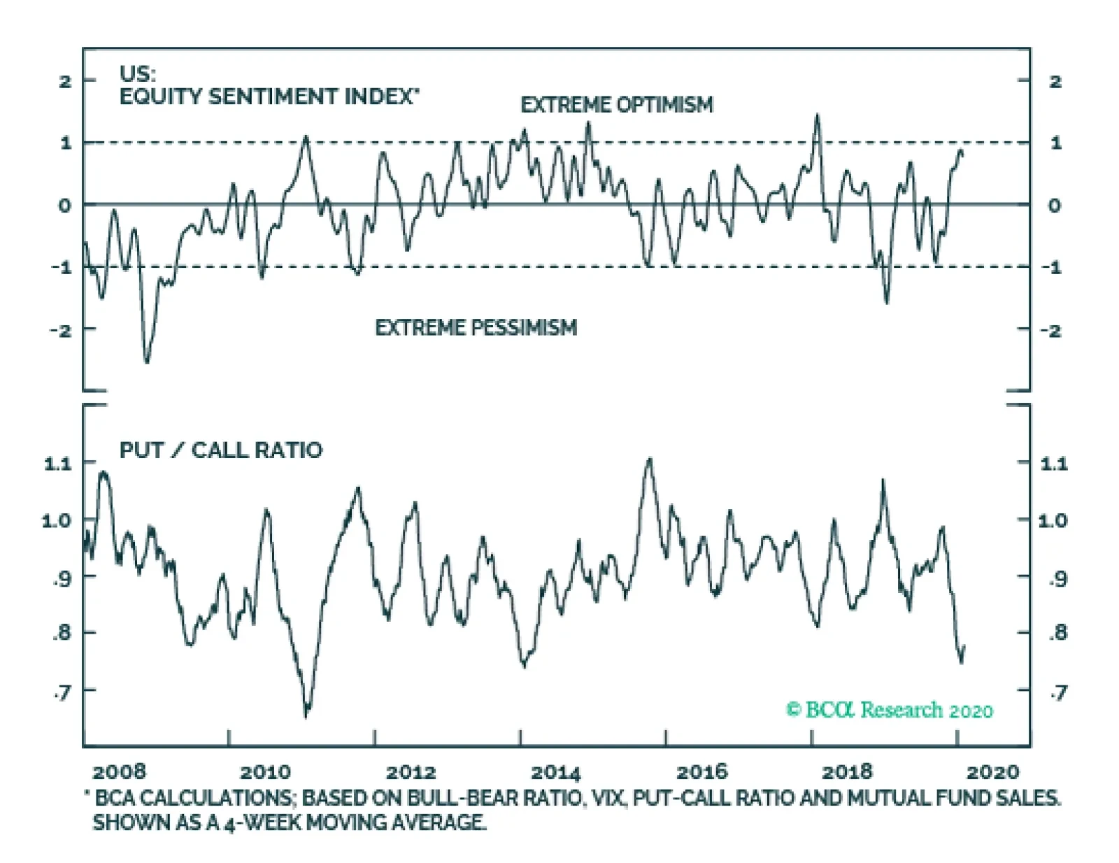
As of this morning, 4515 cases of novel coronavirus have been reported globally and 106 have proved to be lethal. This is a death rate of 2.3%, which is very low compared to the 14.5% death rate of the SARS epidemic of 2003 or even the 34.5% death rate linked…