Global

Highlights Duration: The coronavirus outbreak will cause our preferred global growth indicators to move lower during the next couple of months. Bond yields will also stay low until the daily number of new cases approaches zero, at which point a sell-off is likely. Monetary Policy: A preemptive rate cut designed to offset the economic impact of the coronavirus is unlikely. In fact, investors should short August 2020 fed funds futures and maintain below-benchmark portfolio duration on the view that the Fed will keep the policy rate stable in 2020. TIPS: Our improved Adaptive Expectations Model suggests that the 10-year TIPS breakeven inflation rate will rise by 19 bps during the next 12 months, bringing it up to 1.84%. Investors should remain overweight TIPS versus nominal Treasuries in US bond portfolios. Recovery Delayed A little more than two months into the year and, despite elevated market volatility, a couple trends have become apparent. First, it is now clear that global economic growth bottomed near the end of last year. Second, any lift that bond yields might have received from that rebound has been more than offset by the spike in uncertainty surrounding the 2019 novel Coronavirus (2019-nCoV) outbreak. Case in point, the US Economic Surprise Index recently jumped deep into positive territory, but the 10-year Treasury yield remains muted, below its level from three months ago (Chart 1). Chart 1Bond Yields Have De-Coupled From The Economic Data
Bond Yields Have De-Coupled From The Economic Data
Bond Yields Have De-Coupled From The Economic Data
It’s not just the Surprise index that is signaling a growth upturn. Our three preferred global growth indicators – the Global Manufacturing PMI, the US ISM Manufacturing PMI and the CRB Raw Industrials index – have all decisively bottomed (Chart 2). Chart 2Global Growth Indicators Hooking Up
Global Growth Indicators Hooking Up
Global Growth Indicators Hooking Up
The Global PMI moved up to 50.4 in January, from a July low of 49.3. As of January, 45% of countries now have PMIs above 50 compared to 34% in August (Chart 2, top panel). The US ISM Manufacturing PMI shot higher in January, from 47.8 to 50.9. It is moving closer to the Services PMI, which remains very healthy at 55.5 (Chart 2, panel 2). The CRB Raw Industrials index is also now well off its 2019 low (Chart 2, bottom panel). The overall message from our three favorite indicators is that economic growth remains sluggish, but is clearly on an improving trend. A trend we would have expected to continue until the 2019-nCoV outbreak hit. Our Global Investment Strategy team estimates that the virus could trim 1.6% from global growth in the first quarter, cutting the IMF’s Q1 global GDP growth projection of 3.3% in half.1 The hit to growth will unwind once the virus’ spread is contained, but it is difficult to know how long that will take. In the meantime, we anticipate some weaker readings from our preferred global growth indicators during the next couple of months. The coronavirus could trim 1.6% from global GDP growth in the first quarter. However, it’s important to note that bond yields have already de-coupled from trends in the global growth data and are now taking their cues from news about 2019-nCoV. We noted in last week’s report that this also happened during the 2003 SARS crisis.2 Bond yields fell initially but then recovered sharply once the number of daily new SARS cases hit zero. If we map this experience to the present day, we see that the number of confirmed 2019-nCoV cases continues to rise, but the daily number of new cases has rolled over (Chart 3). Further, our China Investment Strategy team points out that it might be more market-relevant to focus on cases outside of Hubei province where the virus started, and which has now been quarantined.3 Already, we see that the daily number of new cases outside Hubei province is approaching zero (Chart 3, bottom panel). Chart 3Tracking The Coronavirus
Tracking The Coronavirus
Tracking The Coronavirus
Bottom Line: The coronavirus outbreak will cause our preferred global growth indicators to move lower during the next couple of months. Bond yields will also stay low until the daily number of new cases approaches zero, at which point a bond sell-off is likely. Will The Fed Respond? Chart 4Go Short August 2020 Fed Funds Futures
Go Short August 2020 Fed Funds Futures
Go Short August 2020 Fed Funds Futures
Markets have already moved to price-in a Federal Reserve reaction to the 2019-nCoV outbreak. Our 12-month Fed Funds Discounter is down to -43 bps, meaning that the overnight index swap curve is priced for 43 bps of rate cuts during the next year (Chart 4). Last Monday our Discounter hit -51 bps, meaning that the market was looking for slightly more than 2 rate cuts during the next year. Turning to the fed funds futures market, we also see that investors are pricing-in significant odds of a rate cut between now and the end of the summer (Chart 4, bottom 2 panels). Odds of a March rate cut are low, but the futures market is priced for a 30% chance of a rate cut between now and the end of the April FOMC meeting. Investors also see 52% chance of a rate cut between now and the end of the June FOMC meeting and 72% chance of a cut between now and the end of the July meeting. But will the Fed actually respond to the nCoV outbreak by easing policy? Other central banks have taken different approaches to that question during the past week. The Reserve Bank of Australia left its policy rate unchanged on Tuesday, noting that “it is too early to determine how long-lasting the impact [from the coronavirus] will be.” In contrast, the Bank of Thailand did cut rates last week while citing the nCoV outbreak as one of several reasons for the move. The market is priced for 72% chance of a rate cut between now and August. But perhaps the most interesting example is last week’s rate cut in the Philippines. There, the central bank cited “a firm outlook for the domestic economy”, but ultimately concluded that the “manageable inflation environment allowed room for a preemptive reduction in the policy rate.” Chart 5A High Bar For Rate Cuts
A High Bar For Rate Cuts
A High Bar For Rate Cuts
If the Fed were to justify a rate cut in the coming months, it would have to use a similar logic as the Philippines. Something along the lines of: The domestic US economy is solid, but inflation is low enough that an additional rate cut carries little risk. A proactive rate cut could also help lean against any potential headwinds from the coronavirus. Our sense is that the Fed will not be eager to make that argument, and that things will have to get a lot worse before a rate cut is considered. The Fed was well aware that the US/China trade war could have negative economic effects in 2019, but it didn’t cut rates until after the S&P 500 dropped by 20% and the yield curve became deeply inverted (Chart 5). We would monitor those same two indicators to assess the odds of a rate cut this year. So far, neither suggests that a cut is forthcoming. Investors should consider shorting the August 2020 fed funds futures contract. If the economic fall-out from 2019-nCoV only lasts for a few months, then the Fed will stand pat through July and the August contract will earn an un-levered 18 bps between now and the end of August. Our Golden Rule of Bond Investing also dictates that below-benchmark portfolio duration positioning will profit if the Fed delivers less than the 43 bps of rate cuts that are currently priced for the next 12 months. Towards A Better Breakeven Model At BCA we track long-maturity TIPS breakeven inflation rates very closely. Not only because TIPS are an interesting investment vehicle in their own right, but also because elevated long-maturity TIPS breakevens (above 2.3%) will be an important trigger for us to recommend a more defensive US bond portfolio – favoring Treasuries over spread product.4 For those reasons, it’s extremely important for us to have a framework for forecasting long-maturity TIPS breakeven inflation rates. A little more than one year ago, we unveiled a framework for thinking about TIPS breakevens based on the concept of adaptive expectations.5 We also applied that framework to a fair value model for the 10-year TIPS breakeven inflation rate. We still think that the adaptive expectations framework is the best way to think about breakevens, but this week we present an improved application of that framework, i.e. a new model for forecasting the 10-year TIPS breakeven inflation rate. Adaptive Expectations The theory of adaptive expectations essentially says that today’s long-run inflation expectations are formed based on peoples’ recent experiences with inflation. For example, the 10-year TIPS breakeven inflation rate is currently 1.67%, well below the 2.3%-2.5% range that we view as consistent with the Fed’s target. We posit that today’s inflation expectations are depressed because realized inflation has been so low during the past decade (CPI inflation has averaged only 1.75% during the past 10 years). This experience makes it very difficult for investors to believe that inflation might be high (say, above 2%) during the next decade. Building A Better Model To apply the adaptive expectations theory to a specific model, we need to make a decision about which specific inflation measures to use. For this week’s report, we tested annualized rates of change of headline CPI ranging from 1 year to 10 years. We also looked at survey measures of long-run inflation expectations from the Survey of Professional Forecasters and the University of Michigan. The 10-year TIPS breakeven inflation rate is 50 bps below 1-year headline CPI inflation. To test the different measures, we looked at the difference between the 10-year TIPS breakeven inflation rate and each inflation measure. We then looked at how successfully each difference predicted changes in the 10-year TIPS breakeven inflation rate during the subsequent 12 months. We identified the following three measures as the best performers (Charts 6A & 6B): Chart 6A10-Year TIPS Breakeven Versus Fair Value
10-Year TIPS Breakeven Versus Fair Value
10-Year TIPS Breakeven Versus Fair Value
Chart 6BDeviation From Fair Value
Deviation From Fair Value
Deviation From Fair Value
The 1-year rate of change in headline CPI The 6-year rate of change in headline CPI Median 10-year inflation expectations from the Survey of Professional Forecasters Table 1 shows the results of our test on 1-year headline CPI inflation. It shows that, historically, when the 10-year TIPS breakeven inflation rate has been more than 25 bps above the 1-year rate of change in headline CPI it has tended to fall during the next 12 months. At present, the 10-year breakeven is about 50 bps below the 1-year rate of change in headline CPI. Table 1Deviation Of 10-Year TIPS Breakeven Inflation Rate From 1-Year Rate Of Change In Headline CPI
How Are Inflation Expectations Adapting?
How Are Inflation Expectations Adapting?
Table 2 shows the results of our test on 6-year headline CPI inflation. Here, we see that the 10-year TIPS breakeven inflation rate becomes much more likely to fall when it exceeds 6-year CPI inflation by more than 10 bps. The current deviation is +14 bps. Table 2Deviation Of 10-Year TIPS Breakeven Inflation Rate From 6-Year Annualized Rate Of Change In Headline CPI
How Are Inflation Expectations Adapting?
How Are Inflation Expectations Adapting?
Finally, Table 3 shows the results of our test on median 10-year inflation expectations from the Survey of Professional Forecasters. In this case, the 10-year breakeven rate has rarely exceeded the survey measure historically. But we find evidence that the breakeven is much more likely to rise when it is more than 50 bps below the survey measure. Currently, the 10-year TIPS breakeven inflation rate is 56 bps below the survey measure. Table 3Deviation Of 10-Year TIPS Breakeven Inflation Rate From SPF* 10-Year Median Inflation Forecast
How Are Inflation Expectations Adapting?
How Are Inflation Expectations Adapting?
Making A Prediction Chart 7Our New Adaptive Expectations Model
Our New Adaptive Expectations Model
Our New Adaptive Expectations Model
The final step is to combine our three chosen factors into a model that will predict the future 12-month change in the 10-year TIPS breakeven inflation rate. This model is presented in Chart 7, and it tells us that, based on the current deviation of the 10-year TIPS breakeven inflation rate from our three different inflation measures, the 10-year breakeven should rise by 19 bps during the next 12 months. This would bring the rate up to 1.84% (Chart 7, bottom panel). We will continue to experiment with different inflation measures in the coming weeks (i.e. core and trimmed mean measures) in an effort to improve our model further. Bottom Line: Our improved Adaptive Expectations Model suggests that the 10-year TIPS breakeven inflation rate will rise by 19 bps during the next 12 months, bringing it up to 1.84%. Investors should remain overweight TIPS versus nominal Treasuries in US bond portfolios. Ryan Swift US Bond Strategist rswift@bcaresearch.com Footnotes 1 Please see Global Investment Strategy Weekly Report, “From China To Iowa”, dated February 7, 2020, available at gis.bcaresearch.com 2 Please see US Bond Strategy Portfolio Allocation Summary, “Contagion”, dated February 4, 2020, available at usbs.bcaresearch.com 3 Please see China Investment Strategy Weekly Report, “Recovery, Temporarily Interrupted”, dated February 5, 2020, available at cis.bcaresearch.com 4 For more details on why TIPS breakeven inflation rates are an important trigger for our spread product allocation please see US Bond Strategy Special Report, “2020 Key Views: US Fixed Income”, dated December 10, 2019, available at usbs.bcaresearch.com 5 Please see US Bond Strategy Weekly Report, “Adaptive Expectations In The TIPS Market”, dated November 20, 2018, available at usbs.bcaresearch.com Fixed Income Sector Performance Recommended Portfolio Specification
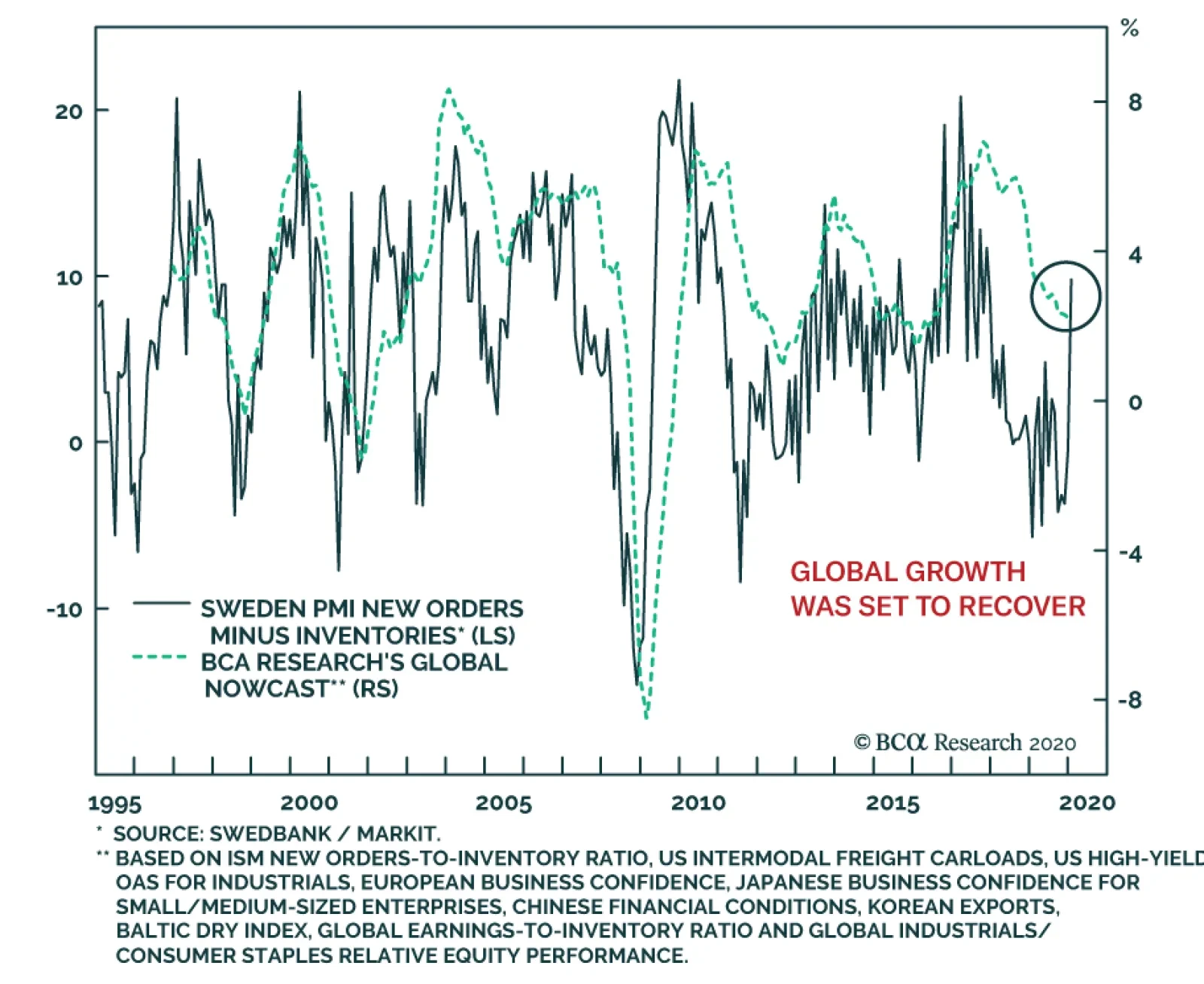
The clearest sign that underlying global growth dynamics were improving comes from Sweden. Not only is the Swedish economy very export dependent, but the manufacturing of intermediate and capital goods also represents a very large proportion of growth value…
Highlights The coronavirus is likely to cut global growth in half (from 3.3% to 1.7%) during the first quarter of 2020. Investors should brace for a slew of profit warnings over the coming weeks from companies with significant operations in China. The near-term economic data is also likely to disappoint. Provided the virus is contained (admittedly a big if), economic activity should recover quickly in the second quarter, leaving global growth about 0.3 percentage points lower for the year as a whole. We should have a better sense of who the Democratic presidential candidate will be by mid-March, by which time more than 60% of the delegates will have been awarded. We continue to recommend an overweight stance on global equities over a 12-month horizon, but do not have a strong conviction about the near-term direction of global bourses given the risks around the virus and the Democratic nomination. Green Shoots Delayed Coming into 2020, we expected global growth to accelerate thanks to the lagged effects of last year’s decline in bond yields, an improvement in the global manufacturing inventory cycle, diminished Brexit and trade war risks, and ongoing policy stimulus out of China. Consistent with this prediction, the manufacturing ISM surged this week, with the forward-looking new orders-to-inventories ratio rising to the highest level in 10 months. The non-manufacturing ISM also surprised on the upside, as did factory orders in December. To top it off, ADP employment rose by 291k in January, well above the consensus estimate of 157k. In the euro area, the manufacturing and services PMIs were both revised higher in January. The future output component of the euro area manufacturing PMI rose to 59.8, the highest level since August 2018. The Swedbank Swedish manufacturing PMI jumped to 51.5, easily topping the consensus estimate of 47.6. We have generally found that the Swedish manufacturing PMI leads the global PMI by one or two months. Meanwhile, the UK composite PMI hit a 16-month high. The Coronavirus: Gauging The Economic Impact Unfortunately, the outbreak of the coronavirus is likely to depress global growth over the next couple of months, and possibly longer if the brewing crisis is not contained. During the SARS epidemic in 2003, Chinese growth fell from 10.8% in Q1 to 5.5% in Q2 on a seasonally-adjusted quarter-over-quarter annualized basis – a decline of 5.3 percentage points – only to snap back to 14.7% in Q3. Given that trend growth in China is currently about 5%-to-6%, growth could grind to a halt in the first quarter of this year, if the SARS experience is any guide. This would bring the year-over-year GDP growth rate down to 4%-to-4.5%. While zero growth on a quarter-over-quarter basis in Q1 may sound dire, keep in mind that this would simply leave real output at the same level as in Q4 of last year. Considering the disruptions presently facing the Chinese economy, a prediction of zero quarterly growth could actually prove to be too optimistic. The outbreak of the coronavirus is likely to depress global growth over the next couple of months, and possibly longer if the brewing crisis is not contained. China now accounts for 16% of global GDP on a US dollar basis, compared to 4% in 2003. Thus, a 5.5 percentage-point decline in Chinese growth would arithmetically shave about 0.16*5.5=0.9 percentage points off of global growth. In addition, there will be spillovers from weaker Chinese growth to the rest of the world. Global goods exports to China stand at about 2.5% of world GDP compared to 0.9% of GDP in 2003 (Chart 1). Chinese import growth is about twice as volatile as GDP growth (Chart 2). Thus, a 5.5 percentage-point decline in Chinese GDP in Q1 would reduce global exports to China by 2*0.055*2.5=0.27% of GDP. Chart 1Chinese Demand Has Expanded Over The Years
Chinese Demand Has Expanded Over The Years
Chinese Demand Has Expanded Over The Years
Chart 2Imports Are More Volatile Than Domestic Production
Imports Are More Volatile Than Domestic Production
Imports Are More Volatile Than Domestic Production
China’s service imports will also decline, mainly due to a sharp drop in Chinese tourists travelling abroad. Overseas spending by Chinese residents rose from 0.05% of world GDP in 2007 to 0.33% of GDP in 2018. If tourist arrivals end up falling by 70% during the first quarter, this would shave a further 0.7*0.33=0.23 percentage points from global growth. On top of all this, there will probably be some multiplier effects from weaker Chinese growth on domestic spending. For example, a decline in Chinese tourism will reduce the income of hotel proprietors and their employees, leading to lower outlays by local residents. For an economy such as Thailand, where Chinese tourist spending accounts for over 3% of GDP, this effect is likely to be substantial. We subjectively pencil in an additional 0.2 percentage-point hit to Q1 global growth from this multiplier effect. As Chart 3 shows, this gives a total hit to growth of 1.6% in Q1. Going into this year, the IMF expected global growth to average 3.3% in 2020. This implies that growth could fall by half the IMF’s projected pace in the first quarter before recovering during the rest of the year. Chart 3Chinese GDP Growth Will Plunge In Q1, But Should Recover In The Remainder Of 2020 Provided The Coronavirus Outbreak Is Contained
From China To Iowa
From China To Iowa
Uncertainties Abound These estimates are subject to a large margin of error. On the positive side, the impact on global growth might be mitigated by the fact that most of the categories (aside from tourism) in which the Chinese are cutting back spending are in the service sector, and hence have relatively low import content. In addition, China is likely to further bolster policy stimulus in response to the crisis. The People’s Bank of China has injected additional liquidity into money markets, cut the 7-day repo rate, and indicated that it will further lower lending rates. Regulators have delayed the introduction of new rules and regulations in the financial sector. We also expect the authorities to boost fiscal spending, especially on health care, where China lags behind most other countries (Chart 4). Chart 4China: Public Spending On Health Care Has Room To Catch Up
From China To Iowa
From China To Iowa
On the negative side, the rising share of services in the Chinese economy means that some of the spending lost in Q1 will not be recouped during the rest of the year (unlike in the case of durable goods, there is little pent-up demand for say, restaurant meals). There is also a risk that spending outside China will decline if confidence drops and people begin to hunker down and save more. This is a particular risk in Japan where at least 30 people have contracted the virus (compared to zero during the SARS outbreak) and consumer confidence remains weak following the consumption tax hike. Lastly, global supply chains that rely on Chinese-produced components could be severely disrupted, leading to a downdraft in global manufacturing output. Needless to say, the impact of the outbreak depends critically on how long the epidemic lasts and how broad-based it ends up being. Our baseline assumption is that the outbreak will subside by the end of March. If that happens, growth will rebound in the remainder of the year, as occurred during the SARS episode. This will limit the overall hit to growth in 2020 to about 0.3 percentage points. As of now, the news is mixed. While the total number of new infections has dipped over the past two days in Hubei, where the outbreak originated, the trend in the province still appears to be on the upside. More encouragingly, the number of new infections seems to be stabilizing elsewhere in China and remains at very low levels in the rest of the world (Chart 5). From a markets perspective, tracking the number of new infections is important because it helped mark a bottom in stocks during the SARS outbreak (Chart 6). Chart 5The Number Of New Cases Seems To Be Stabilizing Outside Of The Epicenter
From China To Iowa
From China To Iowa
Chart 6Stocks Bottomed As The SARS Infection Rate Was Peaking
Stocks Bottomed As The SARS Infection Rate Was Peaking
Stocks Bottomed As The SARS Infection Rate Was Peaking
If the coronavirus follows a limited transmission path like MERS did, which did not spread much beyond the Middle East and South Korea, then worries about a pandemic will quickly abate. However, it is too early to make such a confident pronouncement, especially since this particular virus appears to be spreading more easily than either MERS or SARS. As such, we regard the risks to our GDP growth projection as tilted to the downside. Meanwhile, another potential risk is rising to the fore… The Democrats' B-List The Democratic presidential nomination is turning out to be a battle among four B’s: Bernie, Biden, Buttigieg, and Bloomberg. The big story from the Iowa caucus is how well Pete Buttigieg did and how poorly Joe Biden performed. Both Biden and Buttigieg are moderates. However, Biden fares much better in head-to-head polls against Trump than other Democratic challengers, including Buttigieg (Chart 7). Hence, anything that hurts Biden helps Trump. Chart 7For Now, Biden Is Trump’s Biggest Threat
From China To Iowa
From China To Iowa
The impact on the stock market would be small if either Biden or Buttigieg were to end up in the White House next year. While both of these Democrats have expressed an interest in reversing at least part of the Trump tax cuts, neither would be as hawkish on trade as Trump. For investors, this makes it a bit of a wash. What would clearly hurt the stock market is if Bernie Sanders were to become the next US president. Sanders brings a lot of baggage to the race, including having campaigned for the far-left Socialist Workers Party in the 1980s, while also honeymooning in Moscow at a time when Soviets had thousands of nuclear missiles pointed at the US. Yet, despite his checkered past, the Vermont senator has still beaten Trump in 48 of the last 53 head-to-head polls tracked by Realclearpolitics over the past 12 months. The reality is that the US is moving leftward on a variety of cultural and economic issues (Chart 8). This is unlikely to change anytime soon given the firm grip the left has over academia and most of the media (Charts 9A & B). All this benefits leftist candidates such as Bernie Sanders and Elizabeth Warren. Chart 8The US Is Moving To The Left
From China To Iowa
From China To Iowa
Chart 9AMany More Democrats Than Republicans In US Colleges
From China To Iowa
From China To Iowa
Chart 9BThe Vast Majority Of Journalists Are Left-Leaning
From China To Iowa
From China To Iowa
Battle Of The Billionaires This brings us to Mike Bloomberg. According to PredictIt, Bloomberg is now the second most likely candidate to emerge as the Democratic nominee after Bernie Sanders (Chart 10). Bloomberg’s nationwide polling numbers are quite poor, but unlike the other candidates, he has enough wealth to stay in the race for as long as he wants to. Chart 10Bloomberg As The Dark Horse?
Bloomberg As The Dark Horse?
Bloomberg As The Dark Horse?
Bloomberg can also do something the other candidates cannot: stage an independent bid for the White House. Bloomberg’s allegiance to the Democratic Party is fairly tenuous. He governed New York City as a Republican, after all. If Bernie Sanders emerges as the Democratic nominee, Bloomberg could try to run up the middle as the “moderate choice.” Granted, Bloomberg has promised to support whoever the Democratic nominee ends up being. But here is the irony: the best thing that Bloomberg could do for Sanders is run as an independent. According to BCA’s geopolitical team, Bloomberg would take more voters from Trump than he would from Sanders.1 Whether Bloomberg will try to sabotage Trump in order to help Sanders remains to be seen. Ideologically, Bloomberg is probably closer to Trump than he is to Sanders. However, the two billionaires hate each other, and this could ultimately prove to be the deciding factor. Investment Conclusions The short-term outlook for risk assets remains murky. It is too early to relax about the coronavirus. Even if the outbreak is contained, a lot of economic damage has already been done. Investors should brace for a slew of profit warnings over the coming weeks from companies with significant operations in China. The near-term economic data is also likely to disappoint. Then there are the US elections. We bucked the consensus view in 2015/16 by predicting that Donald Trump would become President. At the moment, however, we do not have a strong feeling about the outcome of this year’s contest. This is in contrast to many market participants who see a Trump victory as a foregone conclusion. At a recent Goldman conference, 87% of attendees expected President Trump to be re-elected.2 Our conversations with clients have revealed a similar bias. The S&P 500 has moved in lockstep with Trump’s chances of being re-elected (Chart 11). If Trump’s prospects begin to fade, while Bernie Sanders wins in New Hampshire and Nevada and outperforms in South Carolina, risk assets could suffer. Chart 11An Uncanny Correlation
An Uncanny Correlation
An Uncanny Correlation
Why, then, not turn bearish on stocks now? One reason, as noted above, is that global growth should pick up later this year provided the coronavirus is contained. Stocks generally outperform bonds when growth is accelerating (Chart 12). Equity risk premia also remain quite high, which gives stocks a cushion of support (Chart 13). Chart 12Stocks Usually Outperform Bonds When Global Growth Is Accelerating
Stocks Usually Outperform Bonds When Global Growth Is Accelerating
Stocks Usually Outperform Bonds When Global Growth Is Accelerating
Chart 13Relative Valuations Favor Stocks
Relative Valuations Favor Stocks
Relative Valuations Favor Stocks
All this leaves us in the somewhat uncomfortable position of continuing to advocate an overweight stance towards equities over a 12-month horizon, without having a strong view about the short-term direction for global bourses. Matters should be clearer by mid-March. Super Tuesday takes place on March 3rd. By March 17th, more than 60% of the Democratic delegates will have been awarded (Appendix Table 1). There should also be more clarity on the coronavirus outbreak by then too. At that point, we will reassess both our short-term and medium-term views on equities and other assets. Peter Berezin Chief Global Strategist peterb@bcaresearch.com Appendix Table 1Next Stops For The Democrat Caravan
From China To Iowa
From China To Iowa
Footnotes 1 Please see Geopolitical Strategy Weekly Report, “After Iowa And Impeachment? Questions From The Road,” dated February 7, 2020. 2 Theron Mohamed, “A Goldman Sachs client poll finds 87% expect Trump to win the next election,” Business Insider (January 17, 2020). Global Investment Strategy View Matrix
From China To Iowa
From China To Iowa
MacroQuant Model And Current Subjective Scores
From China To Iowa
From China To Iowa
Strategic Recommendations Closed Trades
In lieu of the next weekly report I will be presenting the quarterly webcast ‘What Are The Most Attractive Investments In Europe?’ on Monday 17 February at 10.00AM EST, 3.00PM GMT, 4.00PM CET, 11.00PM HKT. As usual, the webcast will take a TED talk format lasting 18 minutes, after which I will take live questions. Be sure to tune in. Dhaval Joshi Feature The recent coronavirus scare seems to have added a fresh deflationary impulse into the world economy, at a time that central banks are already struggling to achieve and maintain inflation at the 2 percent target. Begging the question: will central banks’ ubiquitous ultra-loose monetary policy ever generate inflation? The answer is yes, but not necessarily where the central banks desire it. Universal QE, zero interest rate policy (ZIRP), and negative interest rate policy (NIRP) have already created rampant inflation. The trouble is that it is in the wrong place. Rather than showing up in consumer price indexes it is showing up in sky-rocketing asset prices. Feature Chart Ultra-Low Bond Yields Have Created The Greatest Asset-Price Inflation Of All Time
The Greatest Asset-Price Inflation Of All Time
The Greatest Asset-Price Inflation Of All Time
Feature ChartUltra-Low Bond Yields Have Created The Greatest Asset-Price Inflation Of All Time
The Greatest Asset-Price Inflation Of All Time
The Greatest Asset-Price Inflation Of All Time
The Greatest Asset-Price Inflation Of All Time Since 2014, ultra-loose monetary policy has boosted the valuation of equities by 50 percent. But that’s the small fry. The really big story is that ultra-loose monetary policy has boosted the value of the world’s real estate from $180 trillion to $300 trillion (Chart I-2).1 Chart I-2Ultra-Low Bond Yields Have Boosted The Value Of The World’s Real Estate By $120 Trillion
Ultra-Low Bond Yields Have Boosted The Value Of The World's Real Estate By $120 Trillion
Ultra-Low Bond Yields Have Boosted The Value Of The World's Real Estate By $120 Trillion
Just pause for a moment to digest those numbers. In the space of a few years the value of the world’s real estate has surged by $120 trillion, equivalent to one and half times the world’s $80 trillion GDP. Moreover, it is a broad-based boom encompassing not just Europe, but North America and Asia too. Now add in the surge in equity prices, as well as other risk-assets such as private equity, corporate bonds and EM debt and the rise in wealth conservatively equals at least two times world GDP. To the best of our knowledge, there is no other time in economic history that asset prices have risen so broadly and by so much as a multiple of world GDP in such a short space of time. Making this the greatest asset-price inflation of all time. Yet central banks seem unmoved. To add insult to injury, Europe’s central banks do not even include surging owner-occupied housing costs in their consumer price indexes. This seems absurd given that the costs of maintaining owner-occupied housing is one of the largest costs that European households face. Europe’s central banks do not include surging owner-occupied housing costs in their consumer price indexes. Including owner-occupied housing costs would lift European inflation closer to 2 percent, eliminating the need for QE and negative interest rates. But its omission has kept measured inflation artificially low (Chart I-3), forcing European central banks to double down on their ultra-loose policies. Which in turn lifts risk-asset prices even further, and so the cycle of asset-price inflation continues. Chart I-3Using The US Definition Of Inflation, The ECB Wouldn't Need Ultra-Loose Policy
Using The US Definition Of Inflation, The ECB Wouldn't Need Ultra-Loose Policy
Using The US Definition Of Inflation, The ECB Wouldn't Need Ultra-Loose Policy
European QE has spawned other major imbalances. Germany, as the largest shareholder of the ECB, now owns hundreds of billions of ‘Italian euro’ BTPs that the ECB has bought. But given the fragility of Italian banks, the Italians who sold their BTPs to the ECB deposited the cash they received in German banks. Hence, Italy now owns hundreds of billions of ‘German euro’ bank deposits. This mismatch between Germans owning Italian euro assets and Italians owning German euro assets combined with other mismatches across the euro area constitutes the Target2 banking imbalance, which now stands at a record €1.5 trillion. It means that, were the euro to ever break up, the biggest casualty would be Germany (Chart I-4). Chart I-4ECB QE Has Taken The Target2 Banking Imbalance To An All-Time High
The Greatest Asset-Price Inflation Of All Time
The Greatest Asset-Price Inflation Of All Time
Meanwhile, the US Federal Reserve, to its credit, does include surging owner-occupied housing costs in its measure of consumer prices. As a result, US inflation has been closer to the 2 percent target enabling the Fed to tighten policy when the ECB had to loosen policy. This huge divergence between euro area and US monetary policies, stemming from different treatments of owner-occupied housing costs, has depressed the euro/dollar exchange rate and thereby spawned yet another major imbalance: the euro area/US bilateral trade surplus which now stands at an all-time high. Providing President Trump with the perfect pretext to start a trade war with Europe, should he desire (Chart I-5). Chart I-5ECB QE Has Taken The Euro Area/US Trade Surplus To An All-Time High
ECB QE Has Taken The Euro Area/US Trade Surplus To An All-Time High
ECB QE Has Taken The Euro Area/US Trade Surplus To An All-Time High
What Caused The Greatest Asset-Price Inflation Of All Time? Why did the past decade witness the greatest asset-price inflation of all time? The answer is that universal QE, ZIRP, and NIRP took bond yields to the twilight zone of the lower bound (Chart I-6). At which point, the valuation of all risky assets undergoes an exponential surge. Chart I-6The Past Decade Was The Decade Of Universal QE
The Past Decade Was The Decade Of Universal QE
The Past Decade Was The Decade Of Universal QE
Understand that when bond yields approach their lower bound, bonds become extremely risky assets because their prices take on an unattractive ‘lose-lose’ characteristic. As holders of Swiss government bonds discovered last year, prices can no longer rise much in a rally, but they can collapse in a sell-off (Chart I-7). Chart I-7At Low Bond Yields, Bonds Become Much Riskier
The Greatest Asset-Price Inflation Of All Time
The Greatest Asset-Price Inflation Of All Time
The upshot is that all (long-duration) assets become equally risky, and the much higher prospective returns offered on formerly more risky assets – such as real estate and equities – collapses to the feeble return offered on now equally-risky bonds. Given that valuation is just the inverse of the prospective return, this means that the valuation of risk assets undergoes an exponential surge. When bond yields approach their lower bound, bonds become extremely risky assets because their prices take on an unattractive ‘lose-lose’ characteristic. An obvious question is: which valuation measure best predicts this depressed prospective return offered on equities? Most people gravitate to price to earnings (profits), but earnings are highly problematic – because even if you cyclically adjust them, they take no account of structurally high profit margins. The trouble is that earnings will face a headwind when profit margins normalise, depressing prospective returns. For this reason, price to earnings missed the valuation extreme of the 2007/2008 credit bubble and should be treated with extreme caution as a predictor of prospective returns (Chart I-8). Chart I-8Price To Earnings Missed The 2007/2008 Valuation Extreme
Price To Earnings Missed The 2007/2008 Valuation Extreme
Price To Earnings Missed The 2007/2008 Valuation Extreme
A much more credible assessment comes from price to sales – or equivalently, market cap to GDP at a global level (Chart I-9). This is because sales are quantifiable, unambiguous, and undistorted by profit margins. Using these more credible prospective returns, we can now show that the theory of what should happen to risk-asset returns (and valuations) at ultra-low bond yields and the practice of what has actually happened agree almost perfectly (Feature Chart). Chart I-9Price To Sales (Or Global Market Cap To GDP) Is The Best Predictor Of Prospective Return
Price To Sales (Or Global Market Cap To GDP) Is The Best Predictor Of Prospective Return
Price To Sales (Or Global Market Cap To GDP) Is The Best Predictor Of Prospective Return
Some Investment Conclusions It is instinctive for investors to focus first and foremost on the outlook for the real economy. After all, the evolution of the $80 trillion global economy drives company sales and profits. But the value of the world’s real estate, at $300 trillion, dwarfs the economy. Public and private equity adds another $100 trillion, while other risk-assets such as corporate bonds and EM debt add at least another $50 trillion. So even on conservative assumptions, risk-assets are worth $450 trillion – an order of magnitude larger than the world economy. Now combine this with the overwhelming evidence that risk-asset valuations are exponentially sensitive to ultra-low bond yields. A relatively modest rise in yields that knocked 20 percent off risk-asset valuations would mean a $90 trillion loss in global wealth. Even a 10 percent decline would equate to a $45 trillion drawdown. Could the $80 trillion economy sail through such declines in wealth? No way. Such setbacks would constitute a severe deflationary headwind, and likely trigger the next recession. Hence, though equities are preferable to bonds at current levels, a 50-100 bps rise in yields – were it to happen – would be a great opportunity to add to bonds. Meanwhile, the record high Target2 euro area banking imbalance means that the biggest casualty of the euro’s disintegration would not be Italy. It would be Germany. As all parties have no interest in such a mutually assured destruction, investors should go long high-yielding versus low-yielding euro area sovereign bonds. Finally, the record high euro area/US trade surplus is a political constraint to a much weaker euro versus the dollar. In any case, the ECB is close to the practical limit of monetary policy easing, while the Fed is not. Long-term bond investors should prefer US T-bonds versus German bunds or Swiss bonds. Long-term currency investors should prefer the euro versus the dollar. Fractal Trading System* This week’s recommended trade is long EUR/CHF. As this currency cross has relatively low volatility, the profit target and symmetrical stop-loss is set at a modest 1 percent. In other trades, short NZD/JPY achieved its profit target, while long US oil and gas versus telecom reached the end of its 65-day holding period in partial loss having reached neither its profit target nor its stop-loss. The rolling 1-year win ratio now stands at 61 percent. Chart I-10EUR/CHF
EUR/CHF
EUR/CHF
When the fractal dimension approaches the lower limit after an investment has been in an established trend it is a potential trigger for a liquidity-triggered trend reversal. Therefore, open a countertrend position. The profit target is a one-third reversal of the preceding 13-week move. Apply a symmetrical stop-loss. Close the position at the profit target or stop-loss. Otherwise close the position after 13 weeks. * For more details please see the European Investment Strategy Special Report “Fractals, Liquidity & A Trading Model,” dated December 11, 2014, available at eis.bcaresearch.com. Dhaval Joshi Chief European Investment Strategist dhaval@bcaresearch.com Footnotes 1 Source: Savills World Research. The last data point is $281 trillion at the end of 2017, but we conservatively estimate that the value has increased to above $300 trillion in the subsequent two years. Fractal Trading System
The Greatest Asset-Price Inflation Of All Time
The Greatest Asset-Price Inflation Of All Time
The Greatest Asset-Price Inflation Of All Time
The Greatest Asset-Price Inflation Of All Time
Cyclical Recommendations Structural Recommendations
The Greatest Asset-Price Inflation Of All Time
The Greatest Asset-Price Inflation Of All Time
The Greatest Asset-Price Inflation Of All Time
The Greatest Asset-Price Inflation Of All Time
The Greatest Asset-Price Inflation Of All Time
The Greatest Asset-Price Inflation Of All Time
The Greatest Asset-Price Inflation Of All Time
The Greatest Asset-Price Inflation Of All Time
Trades Closed Trades Asset Performance Currency & Bond Equity Sector Country Equity Indicators Bond Yields Chart II-1Indicators To Watch - Bond Yields
Indicators To Watch - Bond Yields
Indicators To Watch - Bond Yields
Chart II-2Indicators To Watch - Bond Yields
Indicators To Watch - Bond Yields
Indicators To Watch - Bond Yields
Chart II-3Indicators To Watch - Bond Yields
Indicators To Watch - Bond Yields
Indicators To Watch - Bond Yields
Chart II-4Indicators To Watch - Bond Yields
Indicators To Watch - Bond Yields
Indicators To Watch - Bond Yields
Interest Rate Chart II-5Indicators To Watch - Interest Rate Expectations
Indicators To Watch - Interest Rate Expectations
Indicators To Watch - Interest Rate Expectations
Chart II-6Indicators To Watch - Interest Rate Expectations
Indicators To Watch - Interest Rate Expectations
Indicators To Watch - Interest Rate Expectations
Chart II-7Indicators To Watch - Interest Rate Expectations
Indicators To Watch - Interest Rate Expectations
Indicators To Watch - Interest Rate Expectations
Chart II-8Indicators To Watch - Interest Rate Expectations
Indicators To Watch - Interest Rate Expectations
Indicators To Watch - Interest Rate Expectations
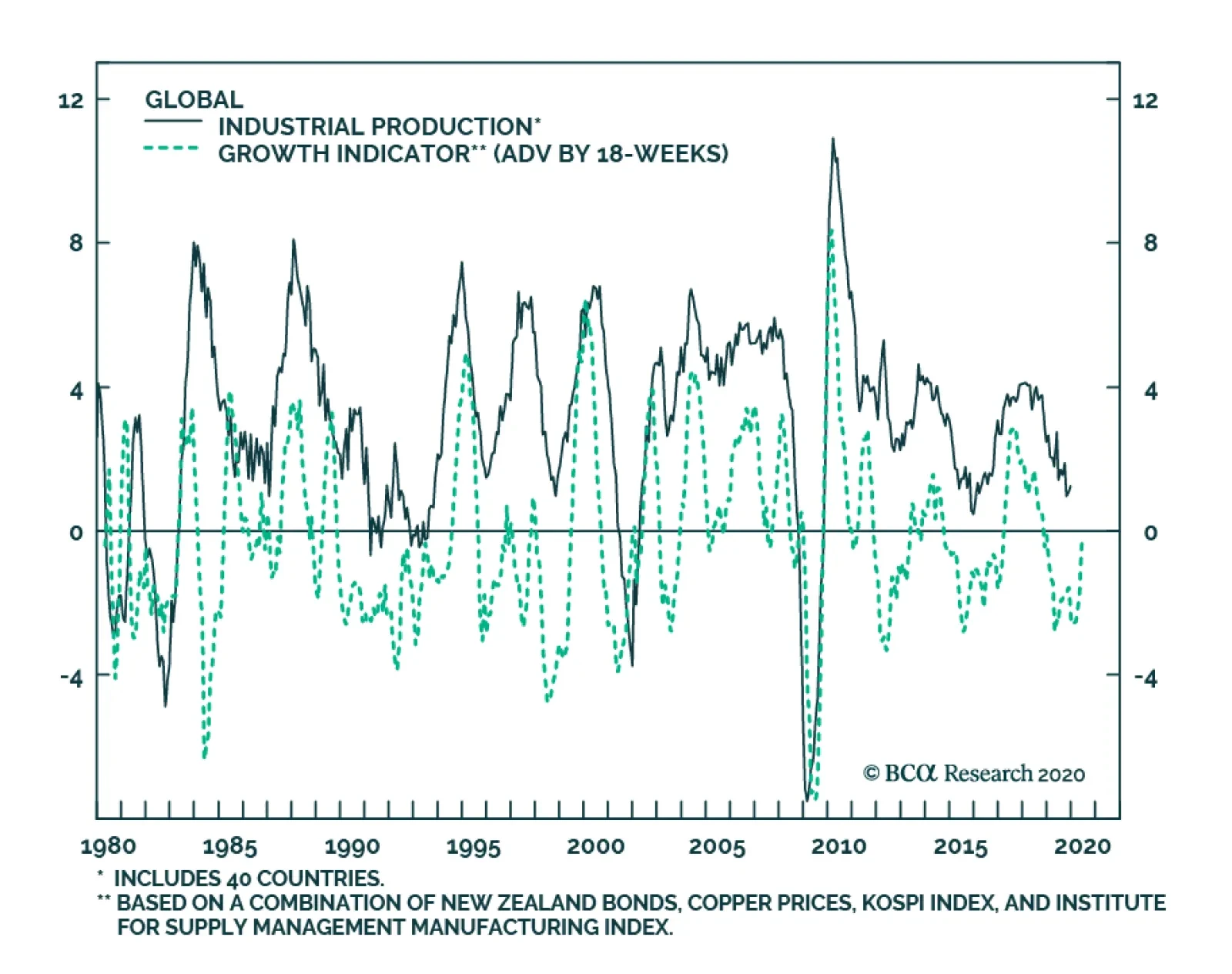
BCA’s Global Growth Indicator, based on the price of copper, Korean equities, Kiwi bonds and the US ISM manufacturing survey, is gaining momentum. This is the clearest sign yet that before nCoV-2019 suddenly hit the Chinese economy, global industrial…
Highlights Global Growth Fears: Efforts to contain the China coronavirus outbreak risk creating the outcome that investors feared most in 2019 from the US-China trade war – weaker global growth and a severe disruption to supply chains worldwide. Monetary Policy Responses: Global bond yields have plunged as investors have piled into safe haven assets and priced in additional monetary easing from major central banks. Some of that decline in yields, however, may be a repricing of future rate hike probabilities with central banks like the Fed and ECB rethinking their inflation mandates and how to achieve them. Duration Strategy: Maintain a moderate below-benchmark cyclical (6-12 months) stance on overall interest rate duration in global fixed income portfolios. Yields now discount a significant hit to global economic growth from China. This outcome is far from certain, especially if China delivers more aggressive fiscal and monetary policy easing to mitigate the deflationary effects of the public health crisis. Feature Chart of the WeekBond Yields Have "Gone Viral"
Bond Yields Have "Gone Viral"
Bond Yields Have "Gone Viral"
Global bond yields have declined sharply over the past two weeks, as investors have tried to process the potential implications of the China coronavirus outbreak. Scenes of empty streets in Chinese cities under quarantine look like something out of a Hollywood science fiction movie. Fears of a “zombie apocalypse” scenario plunging the global economy into recession are proliferating among doomsayers. The viral outbreak is interrupting global growth just as it is starting to show signs of recovery from the manufacturing slump of 2019 (Chart of the Week). Global bond yields had been slowly rising alongside that economic improvement, and risk premia in equity and credit markets had begun to narrow in earnest. Against that backdrop with markets priced for perfection, a massive public health crisis in the most marginal driver of global growth, China, was a potent trigger for a correction in risk assets. The story is obviously very fluid, with the number of infected continuing to grow in China and more cases being discovered across the world. At least 50 million Chinese citizens are now under quarantine, across several major cities. More countries are instituting travel bans to and from China, and important global companies like Apple are shuttering their China operations until further notice. The ultimate hit to global growth is yet to be determined, but measures being taken to slow the spread of the coronavirus will clearly have an impact on global trade, supply chain management and, thus, economic growth. This risks a repeat of the May-August period last year, when markets were pricing in the potential negative effects of US-China trade tariffs on global growth, triggering a major decline in global bond yields. A big driver of that bond rally last year was a shift towards expectations of easier global monetary policy. Those were largely realized as central banks cut rates while global growth was actually slowing. Bond yields now discount another round of rate cuts, most importantly from the US Federal Reserve, despite no formal indication (yet) that policymakers are looking to deliver more easing. The risk now is that investors will become too pessimistic, setting up a swing of the pendulum in the opposite direction if the hit to global growth from the virus is less than feared. On that note, a significant Chinese economic growth slowdown now appears fully priced into global bond yields. The risk now is that investors will become too pessimistic, setting up a swing of the pendulum in the opposite direction if the hit to global growth from the virus is less than feared. On that note, a significant Chinese economic growth slowdown now appears fully priced into global bond yields, as we discuss later in this Weekly Report. Breaking Down The Latest Decline In Global Bond Yields The decline in government bond yields in the developed markets (DM) has been sharpest since Chinese authorities confirmed human-to-human transmission of the coronavirus on Monday, January 20. That appears to be the date when investors began to take the outbreak much more seriously. Growth-sensitive assets like emerging market (EM) equities, copper and oil prices peaked on Friday, January 17, while measures of volatility like the US VIX index and US high-yield credit spreads troughed (Chart 2). The price of safe haven assets like gold and the Japanese yen have also increased since that “pre-virus peak” on January 17, as have bond volatility measures like the US MOVE index or European swaption volatility (Chart 3). Importantly, the increases in rates volatility have been smaller to date compared to mid-2019, when the “convexity” trade triggered an insatiable demand for duration that drove longer-maturity global bond yields sharply lower. Chart 2A Pullback In Growth-Sensitive Assets
A Pullback In Growth-Sensitive Assets
A Pullback In Growth-Sensitive Assets
Chart 3A Mild Bid For Safe Havens Compared To 2019
A Mild Bid For Safe Havens Compared To 2019
A Mild Bid For Safe Havens Compared To 2019
A breakdown of the decline in the benchmark 10-year government bond yields in the major DM countries (US, Germany, Japan, the UK, Canada and Australia) since that “pre-virus peak” is shown in Table 1. Table 1Global Bond Yield Changes Since January 17, 2020
The China Syndrome
The China Syndrome
The biggest declines were in the US (-33bps), Canada (-29bps) and Australia (-23bps) where central bank monetary policy expectations also saw the largest shift. Our 12-month discounters, which measure the change in short-term interest rates over a one-year horizon priced into Overnight Index Swap (OIS) curves, have fallen by -30bps in the US, -26bps in Canada and -22bps in Australia – indicating that markets had fully priced in a rate cutting response to the coronavirus outbreak from the Fed, Bank of Canada and Reserve Bank of Australia. Bond yields have fallen to a lesser extent in Germany (-19bps), the UK (-11bps) and Japan (-7bps), but with very modest declines in our 12-month discounters for those three countries were policy interest rates are close to, or below, 0%. Therefore, the decline global yields over the past two weeks can, on the surface, be attributed to expectations of easier monetary policy in response to the potential hit to growth, and tightening of financial conditions as risk assets sell off, from the coronavirus (Chart 4). Chart 4Falling Yields Reflect Expectations Of More Rate Cuts In 2020...
Falling Yields Reflect Expectations Of More Rate Cuts In 2020...
Falling Yields Reflect Expectations Of More Rate Cuts In 2020...
Chart 5...But Also Expectations Of Lower Rates For Longer
...But Also Expectations Of Lower Rates For Longer
...But Also Expectations Of Lower Rates For Longer
Yet when looking at our estimates of the term premium for all six countries, the decline in the nominal 10-year yields is almost equal to the reduction in the term premium. On the surface, this would be consistent with the idea that the fall in yields is due to risk aversion driving up the demand for the safety of government bonds – and can hence be unwound if the news were to turn less gloomy on the spread of the coronavirus. Yet interest rates further out the yield curve have also fallen by similar amounts in all countries shown, when looking at 1-year interest rates, 5-years forward (the bottom row of Table 1). That decline in longer-dated forwards does correlate strongly with lower inflation expectations as measured by 10-year CPI swap rates (Chart 5). This suggests an alternative explanation for the recent fall in global bond yields that is not related to worries over the coronavirus: bond markets increasingly believe that policy interest rates will be lower for a lot longer. An alternative explanation for the recent fall in global bond yields that is not related to worries over the coronavirus: bond markets increasingly believe that policy interest rates will be lower for a lot longer. With the Fed and ECB now openly discussing changing their monetary policy frameworks to manage achievement of their statutory inflation targets more proactively, the hurdle for contemplating any interest rate hikes in the future is now much higher. Thus, central banks are giving forward guidance to the markets that rates will be lower. That is a message that would also be consistent with the decline in the term premium, to the extent that the premium is compensation for the future volatility of short-term interest rates. When looking at all the components, the message from the most recent decline in global bond yields may be more complex than simple virus-driven risk aversion. Our Duration Indicator continues to improve alongside rebounding global economic sentiment, signaling cyclical upward pressure on yields (Chart 7) – assuming, of course, that the hit to Chinese growth from the coronavirus outbreak is no worse than currently discounted in financial asset prices. In the case of US Treasuries, the bond rally also has a cyclical component, with yields now down to levels more consistent with the softer pace of growth indicated by the ISM Manufacturing index and the recent softening trend in US data surprises (Chart 6). Yet with US monetary policy and financial conditions still highly accommodative, the odds still favor some improvement in the current trend-like pace for US GDP growth that will, eventually, begin to put moderate upward pressure on Treasury yields again. Chart 6Low UST Yields Are Not Just A coronavirus Story
Low UST Yields Are Not Just A coronavirus Story
Low UST Yields Are Not Just A coronavirus Story
Chart 7Global Yields Were Due For A Corrective Pullback
Global Yields Were Due For A Corrective Pullback
Global Yields Were Due For A Corrective Pullback
A similar message is given when we look at global bond yields, more generally. Our Duration Indicator continues to improve alongside rebounding global economic sentiment, signaling cyclical upward pressure on yields (Chart 7) – assuming, of course, that the hit to Chinese growth from the coronavirus outbreak is no worse than currently discounted in financial asset prices. Bottom Line: Efforts to contain the China coronavirus outbreak risk creating the outcome that investors feared most in 2019 from the US-China trade war – weaker Chinese growth and a severe disruption to global supply chains. Global bond yields have plunged as investors have piled into safe haven assets and priced in additional monetary easing from major central banks. Some of that decline in yields, however, may be a repricing of future rate hike probabilities with central banks like the Fed and ECB rethinking their inflation mandates and how to achieve them. How Much China Weakness Is Priced Into Global Bond Yields? The China coronavirus outbreak, and the response to contain it, represents a potentially severe hit to Chinese – and global – economic growth. A lot of comparisons have been made to the 2003 SARS outbreak to try and find a comparable past event. However, as our colleagues at BCA Research Emerging Markets Strategy have noted, China’s economy is so much larger now, rendering comparisons of the economic impact from SARS to that of the coronavirus far less meaningful.1 For example, China’s GDP at purchasing power parity accounts for 19.3% of world GDP compared to 8.3% in 2002 before the SARS outbreak occurred. China’s share of the global consumption of various industrial metals has surged, as well, from between 10-20% in 2002 to 50-60% today. A simple alternative way to measure the impact of any virus-driven slowing of Chinese economic growth would be to calculate the reduction in full-year 2020 GDP growth relative to consensus forecasts. In this sense, the comparison is made to current expectations rather than to a past episode – an approach that should be far more relevant for predicting the response of financial asset prices today. For example, the Bloomberg consensus expectation for Chinese nominal GDP growth for all of 2020 is currently 7.2%. Using that rate and the level of nominal GDP from 2019, we can calculate an expected level for nominal GDP for 2020. We can then make some simplifying assumptions for the impact on full-year growth from an extended period of lost output from the quarantines, government-ordered factory shutdowns and extended holidays, travel bans, etc. Assuming that one full month of expected nominal GDP growth is lost (i.e. 1/12th of the expected increase in the level of nominal China GDP), the full-year growth rate falls to 6.6% Assuming that two full months of expected nominal GDP growth are lost, the full year growth rate falls to 6.0% Global bond yields now reflect a considerable slowdown of Chinese economic activity from the coronavirus, representing between 1-2 months of expected full-year 2020 nominal GDP growth that will be lost. The last time that Chinese nominal GDP growth fell to a sub-7% pace was back in 2015 (Chart 8). The Caixin manufacturing PMI reached a low of 47.2 then, 3.9 points below the current level of 51.1. The level of global bond yields, using our “Major Countries” GDP-weighted aggregate, was at 0.72% - similar to today’s level. Global growth ex-China was also at similarly subdued levels in 2015 (i.e. the US ISM manufacturing index was below 50). Chart 8Global Yields Already Priced For A 2015-Type Slowdown In China
Global Yields Already Priced For A 2015-Type Slowdown In China
Global Yields Already Priced For A 2015-Type Slowdown In China
Chart 9New Stimulus Measures In China Are Inevitable
New Stimulus Measures In China Are Inevitable
New Stimulus Measures In China Are Inevitable
We conclude from this admittedly simple analysis that global bond yields now reflect a considerable slowdown of Chinese economic activity from the coronavirus, representing between 1-2 months of expected full-year 2020 nominal GDP growth that will be lost. The final impact on China economic growth in 2020 will likely be less than that full hit, as Chinese policymakers will surely look to ease monetary and fiscal policy to offset the hit to the economy (Chart 9). While BCA’s China strategists do not currently expect the same magnitude of policy responses as was seen in 2015/16, there will likely be enough to at least partially offset the hit to growth from containing the virus. In terms of timing, the critical point for financial markets – and bond yields – will be when the growth rate of new coronavirus cases peaks. During the 2003 SARS episode, global equity markets bottomed when that number of new cases peaked, which we believe to be a useful template for timing a potential turning point in the “fear narrative” (Chart 10). The number of new coronavirus infections continues to rise, however, suggesting that risk assets and bond yields will likely remain subdued in the near term. Chart 10Markets Bottomed In 2003 When The SARS Infection Rate Peaked
Markets Bottomed In 2003 When The SARS Infection Rate Peaked
Markets Bottomed In 2003 When The SARS Infection Rate Peaked
When that turn does happen, any potential increase in global bond yields will be driven more by unwinding the declines in real yields and term premia of the past two weeks shown earlier in this report in Table 1. Chart 11Only A Pause In The Cyclical Upturn In Yields?
Only A Pause In The Cyclical Upturn In Yields?
Only A Pause In The Cyclical Upturn In Yields?
That suggests a potential rise in the 10-year US Treasury yield of as much as 30bps, and a 23bps increase in the 10-year German bund yield. An additional increase of 5-10bps for both markets could come from higher inflation expectations, although that would likely need to be accompanied by a sizeable rebound in the price of oil and other industrial commodities. We are not seeing signs in our most favored leading indicators – like our global LEI diffusion index or the global ZEW index – suggesting that the next cyclical move in yields will be lower. We acknowledge that the recent fall in yields has gone against our expectations of a moderate grind higher global bond yields in 2020. However, we are not seeing signs in our most favored leading indicators – like our global LEI diffusion index or the global ZEW index – suggesting that the next cyclical move in yields will be lower (Chart 11). We will monitor those indicators in the coming months for any signs of a serious hit to global growth from the coronavirus outbreak. Bottom Line: Maintain a moderate below-benchmark cyclical (6-12 months) stance on overall interest rate duration in global fixed income portfolios. Yields now discount a significant hit to global economic growth from China. This outcome is far from certain, especially if China delivers more aggressive fiscal and monetary policy easing to mitigate the deflationary effects of the public health crisis. Robert Robis, CFA Chief Fixed Income Strategist rrobis@bcaresearch.com Footnotes 1 Please see BCA Research Emerging Markets Strategy Weekly Report, "Coronavirus Versus SARS: Mind The Economic Differences", dated January 30, 2020, available at ems.bcaresearch.com. Recommendations The GFIS Recommended Portfolio Vs. The Custom Benchmark Index
The China Syndrome
The China Syndrome
Duration Regional Allocation Spread Product Tactical Trades Yields & Returns Global Bond Yields Historical Returns
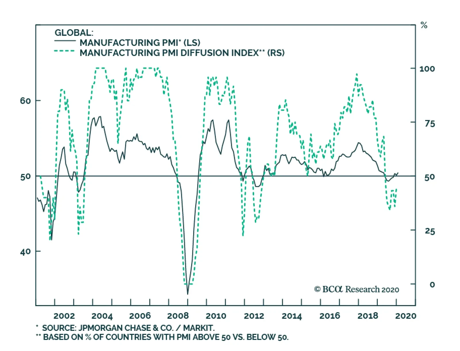
The Global Manufacturing PMI improved marginally in January, hitting a level of 50.4. Positively, our diffusion index is bottoming, which suggests that the global economic slowdown is over. The problem is that the outbreak of nCoV-2019 will likely cause this…
GAA DM Equity Country Allocation Model Update The GAA DM Equity Country Allocation model is updated as of January 31, 2020. The model made a significant change in its allocation this month. The allocation to the US is now overweight from neutral previously. Japan, the UK and France remain the three largest underweight countries, as shown in Table 1. Table 1Model Allocation Vs. Benchmark Weights
GAA Quant Model Updates
GAA Quant Model Updates
As shown in Table 2 and Charts 1, 2 and 3, the overall model outperformed the MSCI World benchmark in January by 9 bps, driven by the outperformance from the Level 2 mode (21 bps). The Level 1 model also generated two basis points of outperformance. Since going live, the overall model has outperformed by 80 bps, with 297 bps of outperformance by Level 2 model, offset by 55 bps of underperformance from Level 1. Table 2Performance (Total Returns In USD %)
GAA Quant Model Updates
GAA Quant Model Updates
Chart 1GAA DM Model Vs. MSCI World
GAA DM Model Vs. MSCI World
GAA DM Model Vs. MSCI World
Chart 2GAA US Vs. Non US Model (Level 1)
GAA U.S. Vs. Non U.S. Model (Level 1)
GAA U.S. Vs. Non U.S. Model (Level 1)
Chart 3GAA Non US Model (Level 2)
GAA Non U.S. Model (Level 2)
GAA Non U.S. Model (Level 2)
For more on historical performance, please refer to our website http://gaa.bcaresearch.com/trades/allocation_performance. For more details on the models, please see Special Report, “Global Equity Allocation: Introducing The Developed Markets Country Allocation Model,” dated January 29, 2016, available at https://gaa.bcaresearch.com. Please note that the overall country and sector recommendations published in our Monthly Portfolio Update and Quarterly Portfolio Outlook use the results of these quantitative models as one input, but do not stick slavishly to them. We believe that models are a useful check, but structural changes and unquantifiable factors need to be considered as well when making overall recommendations. GAA Equity Sector Selection Model The GAA Equity Sector Model (Chart 4) is updated as of January 31, 2019. Chart 4Overall Model Performance
Overall Model Performance
Overall Model Performance
The model’s relative tilts between cyclicals and defensives have changed compared to last month. The global growth proxies used in our model continue providing positive signals. This in turn led the model to maintain its overweight on multiple cyclical sectors. The valuation component remains muted across all sectors except Energy. Global central bankers will continue to keep monetary policy accommodative, leading the model to favor a mixed bag of cyclical and defensive sectors. The model is now overweight four sectors in total, three cyclical sectors versus one defensive sector. These are Consumer Discretionary, Information Technology, Communication Services, and Health Care. For more details on the model, please see the Special Report “Introducing the GAA Equity Sector Selection Model”, dated July 27, 2016, as well as the Sector Selection Model section in the Special Alert “GAA Quant Model Updates”, dated March 1, 2019 available at https://gaa.bcaresearch.com. Table 3Overall Model Performance
GAA Quant Model Updates
GAA Quant Model Updates
Table 4Current Model Allocations
GAA Quant Model Updates
GAA Quant Model Updates
Xiaoli Tang Associate Vice President xiaoliT@bcaresearch.com Amr Hanafy Research Associate amrh@bcaresearch.com
Last Friday, BCA’s Global Investment Strategy service wrote that beyond their anticipation of stronger global growth for 2020, another factor is supporting stocks: corporate buybacks. The combination of copious buybacks and dearth of IPOs has caused the…
Highlights The SARS episode of 2003 suggests that the panic over the coronavirus will only subside when the number of new cases peaks. Although the latest data is somewhat encouraging, it is far from clear that we have reached that point. Provided the outbreak is contained, global equities should move higher over the course of the year. US companies remain net buyers of shares, implying that households and other holders have been net sellers. But against a backdrop of rising incomes, high savings, and improving confidence, households have also wanted to own more equities. How can households be net sellers of stocks while simultaneously increasing their equity exposure? There is only one answer: Share prices need to rise. The process will only stop once households decide they own enough stocks. In the US, while household equity holdings are on the high side as a share of household wealth, this is counterbalanced by the fact that the earnings yield on stocks is well above the yields on competing assets. Outside the US, household ownership of equities is quite low while the equity risk premium is still high. Going Viral We upgraded global equities after markets plunged in late 2018 and have remained overweight stocks on a 12-month horizon to this day. However, we indicated three weeks ago that equities had become technically overbought and would likely need to consolidate their gains. Thus, while we kept our 12-month views unchanged, we downgraded our tactical 3-month view on global stocks from overweight to neutral, while also advising clients with short horizons to boost exposure to cash and government bonds at the expense of riskier credit (our entire set of views can be found in the Global Investment Strategy View Matrix at the back of this report). Since then, the outbreak of the coronavirus has added another headwind to the near-term outlook for stocks. Many commentators have drawn comparisons between today’s outbreak and the SARS epidemic in 2003. The SARS episode imposed a significant but short-lived economic toll on the affected countries. While Chinese GDP growth fell to 3.4% in Q2 of 2003, it surged back to 15.7% in Q3, leaving the overall level of GDP down about 1% for the year as a whole relative to what would have transpired if the virus had never emerged.1 The broader Asia-Pacific region experienced a hit to growth of around 0.5%. In contrast, growth in developed economies was barely affected. Even in Canada, where 44 people died from SARS, the outbreak shaved only around 0.1% from the level of GDP in 2003, according to the Bank of Canada.2 The outbreak of the coronavirus has added another headwind to the near-term outlook for stocks. The obvious problem with the SARS analogy is that it is based on a sample of one. We do not know how this new strain of the virus compares to SARS or, for that matter, the Spanish flu, which killed 50-to-100 million people (3%-to-5% of the world’s population at the time). We do not even know if the full scope of the SARS outbreak was as fleeting as what we remember, since in a cosmic multiverse there will be a tendency to recall life-or-death outcomes more favorably than they actually were (I will have more to say about the financial implications of this in a future special report). Chart 1The Coronavirus Is Spreading Faster Than SARS Did
Buy The Dip, But Not Yet
Buy The Dip, But Not Yet
What we do know is that, to date, the coronavirus has spread more quickly than SARS (Chart 1). It is not clear if that is because of faster, more accurate reporting methods or because the virus is more communicable. The Chinese Minister of Health has said that this new virus, unlike SARS, can be transmitted while people are still asymptomatic. While others have cast doubt on this claim, if it turns out to be correct, the coronavirus may be much more difficult to control. Viruses often become less lethal as they mutate because a virus that kills its host is also a virus that kills itself. Unfortunately, in a world of mass travel, a virus can spread across the globe before it has time to lose potency. The typical seasonal flu kills less than 0.1% of those who contract it. Most estimates suggest that SARS killed 10%-15% of infected patients. The Spanish flu killed a similar percentage. The death rate from the coronavirus is currently tracking at 2%-to-3%. However, it is possible that this estimate will rise. The vast majority of the people who have contracted the coronavirus are still sick. In fact, more people have died from it than have fully recovered (Chart 2). Thus, an honest assessment would simply admit that we do not know how bad this potential pandemic will get. Chart 2How Will This End: Outbreak, Epidemic, Or Pandemic?
Buy The Dip, But Not Yet
Buy The Dip, But Not Yet
Chart 3Markets Bottomed As The SARS Infection Rate Was Peaking
Markets Bottomed As The SARS Infection Rate Was Peaking
Markets Bottomed As The SARS Infection Rate Was Peaking
What should investors do? The SARS experience suggests that risk assets will only bottom when the number of new cases peaks (Chart 3). It is not clear that we have reached this point yet. While the number of new cases reported by China’s National Health Commission has stabilized over the past two days, this could just be a temporary respite (Chart 4). Until the rate at which new cases are diagnosed begins a clear downward trend, a somewhat cautious stance towards risk assets is warranted. Global Growth Should Recover Provided the outbreak is contained during the coming weeks, global equities should move higher over the course of the year. This is partly because global growth should pick up thanks to the lagged effects of last year’s decline in bond yields, an improvement in the global manufacturing inventory cycle, and diminished Brexit and trade war risks. Continued fiscal/credit stimulus out of China should also help. China spends less on health care than almost all other countries (Chart 5). It is likely that the past few weeks will prompt the government to increase social spending. Chart 4The Number Of New Cases Has Stagnated Over The Past Two Days
Buy The Dip, But Not Yet
Buy The Dip, But Not Yet
Chart 5China: Public Spending On Health Care Has Room To Catch Up
Buy The Dip, But Not Yet
Buy The Dip, But Not Yet
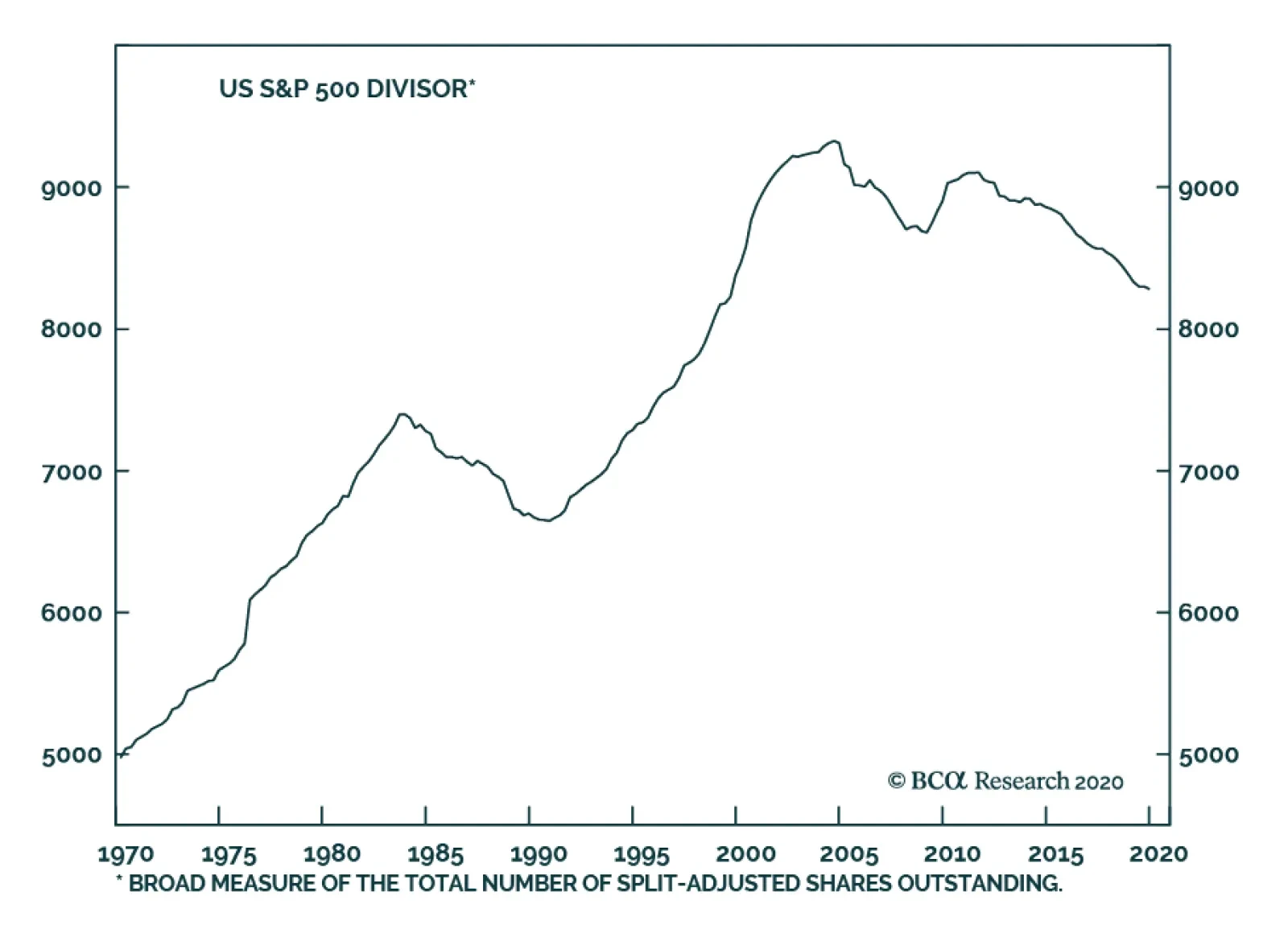
Higher Equity Prices: Just A Matter Of Arithmetic? Chart 6There Is A Structural Decline In Listed Companies In The US
There Is A Structural Decline In Listed Companies In The US
There Is A Structural Decline In Listed Companies In The US
Chart 7The Supply Of US Stocks Has Been Drying Up
The Supply Of US Stocks Has Been Drying Up
The Supply Of US Stocks Has Been Drying Up
In addition to stronger global growth, there is another factor supporting stocks which receives insufficient attention and is worth highlighting in this week’s report: corporate buybacks. US companies have repurchased about 3% of their shares every year for the past decade. On the flipside, only 110 companies went public last year, less than a third of the number of new listings in 1996-99. In fact, the number of publicly traded domestic companies has fallen by over 40% since 1996 (Chart 6). The combination of copious buybacks and dearth of IPOs has caused the S&P divisor – a broad measure of the total number of split-adjusted shares outstanding – to decline by a cumulative 9% since 2011. Between 1990 and 2004, the divisor increased by 40% (Chart 7). If companies are net buyers of stocks, then households and other holders must be net sellers of stock. But this raises an obvious question: What if households also want to be net buyers of stocks? Chart 8Households Are Bullish
Households Are Bullish
Households Are Bullish
Chart 9High Equity Ownership By Households Translates Into Poor Long-Term Returns
High Equity Ownership By Households Translates Into Poor Long-Term Returns
High Equity Ownership By Households Translates Into Poor Long-Term Returns
This question is highly relevant in today’s environment, where unemployment is low, wage growth is accelerating, the household savings rate is high, consumer confidence is strong, and a higher-than-average percentage of people expect stocks to increase in the coming months (Chart 8). Arithmetically, there is only one way that households can be net sellers of stocks while simultaneously increasing their equity exposure: Share prices need to rise. At what point will share prices stop rising? That depends on two things: 1) How much stock market wealth households hold relative to other assets; and 2) The risk-adjusted rate of return that households expect from stocks compared to other assets. Stock returns are highest when equity holdings are low, but sentiment towards stocks is improving. Conversely, returns are lowest when equity holdings are high, but stock market sentiment is deteriorating (Chart 9 and Table 1). Table 1Equity Returns Tend To Suffer When Bulls Are Losing Conviction
Buy The Dip, But Not Yet
Buy The Dip, But Not Yet
The latter typically occurs during economic downturns when earnings are falling and risk aversion is rising. Thus, it is no surprise that recessions and equity bear markets tend to overlap (Chart 10). Chart 10Recessions And Bear Markets Tend To Overlap
Recessions And Bear Markets Tend To Overlap
Recessions And Bear Markets Tend To Overlap
Where Things Stand Today In the US, household equity holdings are on the high side. According to Fed data and our own estimates, households currently hold 33% of their financial assets in stocks (Chart 11). This is higher than in 2007, but still below the dotcom peak of 39%. Similarly, the monthly asset allocation survey conducted by the American Association of Individual Investors shows a somewhat elevated allocation to equities, although one that is still broadly on par with the 2003-2007 and post-2014 averages (Chart 12). Chart 11US Household Equity Holdings Are On The High Side (I)
US Household Equity Holdings Are On The High Side (I)
US Household Equity Holdings Are On The High Side (I)
Chart 12US Household Equity Holdings Are On The High Side (II)
US Household Equity Holdings Are On The High Side (II)
US Household Equity Holdings Are On The High Side (II)
Chart 13Relative Valuations Favor Stocks
Relative Valuations Favor Stocks
Relative Valuations Favor Stocks
One major difference with prior occasions when US equity allocations were elevated is that the earnings yield on stocks at present is still quite a bit higher than the yield on competing assets such as cash and bonds (Chart 13). While this is mainly because interest rates are so low, it does suggest that households may seek to further increase their equity allocations provided that the economy continues to perform well. Foreign companies have been less aggressive re-purchasers of their own shares than their US peers. That said, household equity ownership is significantly lower outside the US (Chart 14). The spread between equity earnings yields and bond yields is also higher abroad, reflecting the fact that both PE multiples and interest rates are generally lower outside the US. Given that investors tend to favor companies listed in their home country, efforts by non-US investors to increase their equity allocations will primarily benefit stock markets outside the US. In addition, stronger global growth tends to favor EM and European equities, largely because stock markets in those regions have more of a cyclical bent (Chart 15). Thus, on balance, we recommend that investors overweight non-US stocks this year. Chart 14Equity Ownership By Households Is Lower Outside The US
Buy The Dip, But Not Yet
Buy The Dip, But Not Yet
Chart 15Stronger Global Growth Tends To Favor A Cyclical Bias In Equity Allocation
Stronger Global Growth Tends To Favor A Cyclical Bias In Equity Allocation
Stronger Global Growth Tends To Favor A Cyclical Bias In Equity Allocation
Peter Berezin Chief Global Strategist peterb@bcaresearch.com Footnotes 1 Jong-Wha Lee and Warwick J. McKibbin, “Globalization and Disease: The Case of SARS,” Brookings Institution, dated February 2004. 2 Please see Monetary Policy Report, Bank of Canada, October 2003. Global Investment Strategy View Matrix
Buy The Dip, But Not Yet
Buy The Dip, But Not Yet
MacroQuant Model And Current Subjective Scores
Buy The Dip, But Not Yet
Buy The Dip, But Not Yet
Strategic Recommendations Closed Trades