Global

Highlights Butterfly Strategy: A butterfly fixed income strategy is a combination of a barbell (a weighted combination of long- and short-term bonds) and a bullet (the medium-term bonds that sit within the yield curve segment selected in the barbell) designed to provide investors exposure to specific yield curve changes while being insulated from parallel shifts. Yield Curve Models: Simple yield curve models, based on the positive relationship between the slope of the yield curve and butterfly spreads – and to a certain extent, implied interest rate volatility – can be used to identify which part of the yield curve is most attractively valued by comparing what change in the slope is being discounted with our own macro views. Current Valuation: The overall message from our new suite of global yield curve models is that trades favoring barbells over bullets are attractive across all the developed market countries covered in our analysis. Feature In February 2002, BCA Global Fixed Income Strategy (GFIS) introduced a framework for measuring market expectations for changes in short-term interest rates embedded in the slope of government bond yield curves.1 By comparing those discounted changes with our own macro view on where rates were headed, this framework provided signals on potential value in trades focusing on the shape of the yield curve. This analysis originally focused on one specific yield curve (butterfly) strategy across six developed markets; the US, Germany, the UK, Japan, Canada, and Australia. Table 1Most Attractive Butterfly Trades
Global Yield Curve Trades: Follow The Butterflies
Global Yield Curve Trades: Follow The Butterflies
More recently, our sister service US Bond Strategy applied this framework to each different butterfly spread combination across the entire US Treasury curve, creating a tool to identify the most attractively valued parts of the US yield curve at any point in time.2 In this Special Report, we revisit the original GFIS methodology for identifying attractive yield curve trades in global government bond markets. Furthermore we extend the analysis to all butterfly combinations and add three additional European countries to the list - France, Italy and Spain. The overall message is that trades that favor barbells over bullets are attractive across all the developed markets covered in this analysis. Table 1 displays the most attractive combinations of barbells over bullets for each country. Going forward, we will rely on the readings from our refreshed yield curve models, combined with our macro views, to populate our new Tactical Trade Overlay framework with yield curve trades in global government bond markets. What Is A Butterfly Strategy? A butterfly fixed income strategy involves two main components: a barbell (a weighted combination of long-term and short-term bonds) and a bullet (a medium-term bond that sits within the yield curve segment selected in the barbell). This strategy owes its name to the resemblance that barbells and bullets can have with the wings and body of an actual butterfly, not to lepidopterology.3 To implement a butterfly strategy, a bond investor would go long (short) the barbell while simultaneously going short (long) the bullet. In general, barbells are expected to outperform bullets in a flattening yield curve environment, and vice-versa. The reason butterfly strategies are so widely used is that they provide fixed-income investors exposure to specific changes in the slope of the yield curve, while being neutral to small parallel shifts. This immunization to small parallel shifts is achieved by setting the weights of the short- and long-term bonds in the barbell such that the weighted sum of their dollar duration (referred to as DV01 – the dollar value of a basis point) equals the DV01 of the bullet. In the event of large parallel shifts in the yield curve – which are quite rare – the barbell will outperform the bullet since the former will always have a greater convexity than the latter in the absence of convexity-matching between each leg of the trade. We illustrate how a 2/5/10 butterfly strategy works for US Treasuries, using hypothetical constant-maturity par bond yields, in Table 2A.4 Table 2AThe Butterfly (Strategy) Effect Illustrated
Global Yield Curve Trades: Follow The Butterflies
Global Yield Curve Trades: Follow The Butterflies
As can be seen in the ”Weighted DV01” column of Table 2A, the DV01 of each leg of the trade (the bullet and the two combined bonds in the barbell) are identical. Importantly, the weighted DV01 contribution to the barbell from the 2-year note and the 10-year bond differ substantially, meaning that the barbell is more sensitive to changes in the 10-year yield than changes in the 2-year yield. This mismatch is precisely what gives a butterfly strategy exposure to the slope of the curve. Table 2A also presents three yield curve scenarios to demonstrate the benefits of butterfly strategies. In the parallel shift scenario, yields across the entire yield curve rise by 10bps. This parallel shift is neutralized as the two legs of the strategy cancel out. In the steepening curve scenario, the 2-year yield falls by 10bps, the 10-year yield rises by 10bps and the 5-year yield remains flat. In this case, the small gains on the 2-year note cannot offset the losses on the 10-year bond; hence the barbell underperforms the 7-year bullet. Finally, the “Flattening” column in the table shows that the barbell outperforms the bullet when the curve flattens. Our government bond yield curve models rely on the positive relationship typically observed between the butterfly spread and the slope of the yield curve. Bottom Line: A butterfly fixed income strategy is a combination of a barbell (a weighted combination of long- and short-term bonds) and a bullet (the medium-term bonds that sit within the yield curve segment selected in the barbell) designed to provide investors exposure to specific yield curve changes while being insulated from parallel shifts. Dusting Off The GFIS Yield Curve Models Chart 1Butterfly Spreads & Yield Curves
Butterfly Spreads & Yield Curves
Butterfly Spreads & Yield Curves
Our government bond yield curve models rely on the positive relationship typically observed between the butterfly spread and the slope of the yield curve. When the curve steepens, the butterfly spread widens, and vice-versa (Chart 1). This has to do with mean reversion: as the curve steepens, it increases the odds that the curve will flatten in the future since it cannot steepen indefinitely. Consequently, investors will ask for greater compensation to enter a curve steepener trade when the curve is already steepening. As a result, we can create simplified models of the yield curve by regressing any butterfly spread on its corresponding curve slope. Deviations from these fair value models indicate which butterfly strategies are cheap or expensive. While positive, the correlations between yield curve slopes and butterfly spreads vary widely across butterfly combinations and also among countries – in Japan, for example, the historical relationship seems dubious (Chart 1, panel 4). We can further improve the fit of some of our yield curve models by including the MOVE US bond volatility index as a second independent variable. As our colleagues at US Bond Strategy have pointed out, implied interest rate volatility is also positively correlated with the slope of the yield curve (Chart 2, top panel). This matters for butterfly trades because of the convexity mismatch between the barbell and the bullet, particularly given the fact that high convexity is beneficial when implied interest rate volatility is elevated. Simply put, a larger convexity mismatch between the two legs makes them more sensitive to changes in the slope of the curve, and therefore easier to model (Chart 2, bottom panel). Importantly, one other useful application of the relationship between yield curve slopes and butterfly spreads is that we can reverse the yield curve models to calculate what amount of curve steepening or flattening is being discounted in current butterfly spreads. In other words, our models allow us to calculate change in the curve slope that would force the butterfly spread to be equal to its fair value (Chart 3). Chart 2Taking Into Account Implied Vol
Taking Into Account Implied Vol
Taking Into Account Implied Vol
Armed with that information, we can then apply our macro views to determine potential butterfly spread trades. Chart 3Case In Point: US 2/5/10 Spread Fair Value Model
Case In Point: US 2/5/10 Spread Fair Value Model
Case In Point: US 2/5/10 Spread Fair Value Model
For example, the 2/5/10 butterfly spread in the US (the 5-year bullet yield minus the weighted combination of 2-year and 10-year yields) is, at the moment, below its fair value with 46bps of steepening discounted over the next six months (Chart 3, panels 2 & 3). That means the bullet is expensive as per our model and therefore the recommended butterfly strategy would be to go long the 2/10 barbell and short the bullet. However, in the event the 2/10 Treasury slope steepens by more than 46bps over the next six months, the 5-year bullet would be expected to outperform the barbell. In other words, when the butterfly is initially below its fair value, more curve steepening will be needed for the bullet to outperform the barbell. Conversely, if it is above fair value, more curve flattening will be required for the barbell to outperform. In light of this, let’s consider the example of curve steepening from before, but this time looking at two scenarios: the butterfly spread is at fair value the butterfly spread is initially different from its model-implied fair value, but is then expected to revert to fair value by the end of the investment horizon. Under the first scenario, the bullet outperforms the barbell when the curve steepens, as expected given that the butterfly spread is at fair value (Table 2B). Now, in the second scenario, the bullet actually ends up underperforming the barbell, although it is the same curve steepening environment. Table 2BButterfly Strategy Performance And Deviations From Model-Implied Fair Values
Global Yield Curve Trades: Follow The Butterflies
Global Yield Curve Trades: Follow The Butterflies
The reason for this underperformance is that the butterfly spread is now below the fair value shown in scenario #1, thus requiring more steepening for the bullet to outperform the barbell. Ultimately, we have to rely on our macro view of how the slope of the yield curve will change alongside the message from our yield curve models to choose the right butterfly strategy. This means that, ultimately, we have to rely on our macro view of how the slope of the yield curve will change alongside the message from our yield curve models to choose the right butterfly strategy. Bottom Line: Simple yield curve models, based on the positive relationship between the slope of the yield curve and butterfly spreads – and to a certain extent, implied interest rate volatility – can be used to identify which part of the yield curve is most attractively valued by comparing what change in the slope is being discounted with our own macro views. The Message From Our Butterfly Strategy Valuations In the remaining pages of this Special Report, we present the current read-outs from of our yield curve models for each of the major developed market. More specifically, we provide the deviations from fair value for different combinations of bullets and barbells and highlight the most attractive butterfly strategy. The deviations from fair value shown in Tables 3-11 are standardized to facilitate comparison between the different butterfly combinations. Also, for each country we provide a quick assessment of the performance of these butterfly strategies over time by applying a simple mechanical trading rule. Every month, we enter the most attractive butterfly strategy, i.e. the one with the highest absolute standardized deviation from its model fair value. The overall message is that barbells appear attractive relative to bullets across all the countries shown. Trades that favor barbells over bullets are attractive across all the developed markets covered in our analysis. This is consistent with our near term macro view. Global government bond markets have been experiencing bull flattening pressures ever since the COVID-19 virus outbreak sparked a generalized flight-to-safety. Markets woke up to the recent news about the spread of the virus in countries outside of China – namely Italy, South Korea, Japan, Iran and Israel – and all traces of complacency have now vanished.5 There is too much uncertainty about COVID-19 in terms of severity and duration, and government bond yields may very well continue falling until the threat is contained. In the meantime, this may force major central banks to provide even easier monetary policy. While this may be difficult for the ECB and the BoJ, which both already seem out of ammunition, the other central banks could very well end up delivering the rate cuts currently discounted in the overnight index swap curves.6 Looking back at our Central Bank Discounters, the largest amount of rate cuts over the next year are now discounted in the US (-53bps), now discounted in the US (-53bps), Australia (-38bps), Canada (-37bps) and the UK (-23bps). At the same time, the fewest cuts are priced in Japan (-8bps), the euro area (-6bps) and New Zealand (-25bps). The resulting bull steepening would likely be mild, however; after all, rate cuts cannot fight a pandemic, but can only try and cushion the blow to growth. In the event COVID-19 virus does not turn into a pandemic and we observe a decline in the daily change of the number of cases, then global government bond yields would rebound from their current lows. Given the current valuation cushion, we would expect barbelled portfolios to do well, especially since we would not expect more steepening than what is currently being discounted (i.e. we do not expect the 2/30 Treasury slope to steepen by more than 73bps in the near term). Jeremie Peloso Senior Analyst jeremiep@bcaresearch.com US There are presently three butterfly combinations standing out in that they appear attractive according to our yield curve model. One of them is going long the 2/30 barbell and shorting the 10-year bullet, which currently displays a standardized residual of -1.42 (Table 3). Table 3US: Butterfly Strategy Valuation: Standardized Residuals
Global Yield Curve Trades: Follow The Butterflies
Global Yield Curve Trades: Follow The Butterflies
The bullet appears 21bps expensive according to our model and would only outperform its counterpart given a steepening in the 2/30 Treasury slope greater than 73bps, which we view as unlikely given the current environment (Chart 4A). Chart 4AUS: 2/10/30 Spread Fair Value Model
US: 2/10/30 Spread Fair Value Model
US: 2/10/30 Spread Fair Value Model
Chart 4BUS Butterfly Strategy Performance
US Butterfly Strategy Performance
US Butterfly Strategy Performance
Following the mechanical trading rule looks promising (Chart 4B). In fact, we observe few periods of negative year-over-year returns. Germany The most attractively valued butterfly combination currently on the German yield curve is going long the 2/30 barbell and shorting the 10-year bullet, which is currently a little bit more than one standard deviation above its implied-model fair value, with a standardized residual of -1.09 (Table 4). Table 4Germany: Butterfly Strategy Valuation: Standardized Residuals
Global Yield Curve Trades: Follow The Butterflies
Global Yield Curve Trades: Follow The Butterflies
The bullet appears 14bps expensive according to our model and would only outperform its counterpart given a steepening in the 2/30 German curve slope greater than 36bps (Chart 5A). Chart 5AGermany: 2/10/30 Spread Fair Value Model
Germany: 2/10/30 Spread Fair Value Model
Germany: 2/10/30 Spread Fair Value Model
Chart 5BGerman Butterfly Strategy Performance
German Butterfly Strategy Performance
German Butterfly Strategy Performance
Over time, picking the cheapest butterfly combinations based on our yield curve models works relatively well (Chart 5B). Importantly, we observe very few episodes of underperformance since 1990. France The most attractively valued butterfly combination currently on the French OAT yield curve is going long the 5/30 barbell and shorting the 10-year bullet, which currently displays a standardized residual of -1.13 (Table 5). Table 5France: Butterfly Strategy Valuation: Standardized Residuals
Global Yield Curve Trades: Follow The Butterflies
Global Yield Curve Trades: Follow The Butterflies
The 10-year bullet appears 11bps expensive according to our model and would only outperform its counterpart given a steepening in the 5/30 French OAT curve slope greater than 44bps (Chart 6A). Chart 6AFrance: 5/10/30 Spread Fair Value Model
France: 5/10/30 Spread Fair Value Model
France: 5/10/30 Spread Fair Value Model
Chart 6BFrench Butterfly Strategy Performance
French Butterfly Strategy Performance
French Butterfly Strategy Performance
The mechanical trading rule appears to also work relatively well when applied to butterfly combinations in the French OAT government bond market (Chart 6B). Italy & Spain Turning to European countries in the periphery, the most attractively valued butterfly combinations appear to be going long the 5/30 barbell and shorting the 7-year bullet in the Italian government bond yield curve (Table 6), and favoring the 7/30 barbell versus the 10-year bullet in the Spanish government bond market (Table 7). Table 6Italy: Butterfly Strategy Valuation: Standardized Residuals
Global Yield Curve Trades: Follow The Butterflies
Global Yield Curve Trades: Follow The Butterflies
Table 7Spain: Butterfly Strategy Valuation: Standardized Residuals
Global Yield Curve Trades: Follow The Butterflies
Global Yield Curve Trades: Follow The Butterflies
In the case of Italy, the 7-year bullet appears 7bps expensive according to our model and would only outperform its counterpart given a steepening in the 5/30 Italian curve slope greater than 41bps (Chart 7A). The mechanical trading rule appears to work well when applied to Italian butterfly combinations, displaying better excess returns than for most other countries we’ve looked at (Chart 7B). Chart 7AItaly: 5/7/30 Spread Fair Value Model
Italy: 5/7/30 Spread Fair Value Model
Italy: 5/7/30 Spread Fair Value Model
Chart 7BItalian Butterfly Strategy Performance
Italian Butterfly Strategy Performance
Italian Butterfly Strategy Performance
Looking at Spain, the 10-year bullet appears 8bps expensive according to our model and would only outperform its counterpart given a steepening in the 7/30 Spanish curve slope greater than 64bps, which seems highly unlikely at this point in time (Chart 8A). The mechanical trading rule works well when applied to Spanish butterfly combinations and shows very few periods of underperformance since the early 90s (Chart 8B). Chart 8ASpain: 7/10/30 Spread Fair Value Model
Spain: 7/10/30 Spread Fair Value Model
Spain: 7/10/30 Spread Fair Value Model
Chart 8BSpanish Butterfly Strategy Performance
Spanish Butterfly Strategy Performance
Spanish Butterfly Strategy Performance
UK The most attractively valued butterfly combination currently on the UK Gilts yield curve is holding a 2/30 barbell versus the 10-year bullet, which currently displays a standardized residual of -1.64 (Table 8). Table 8UK: Butterfly Strategy Valuation: Standardized Residuals
Global Yield Curve Trades: Follow The Butterflies
Global Yield Curve Trades: Follow The Butterflies
The 10-year bullet appears 21bps expensive according to our model and would only outperform its counterpart given a steepening in the 2/30 curve slope greater than 62bps (Chart 9A). Chart 9AUK: 2/10/30 Spread Fair Value Model
UK: 2/10/30 Spread Fair Value Model
UK: 2/10/30 Spread Fair Value Model
Chart 9BUK Butterfly Strategy Performance
UK Butterfly Strategy Performance
UK Butterfly Strategy Performance
Chart 9B shows that applying the simple mechanical trading rule works well over time. Canada The most attractively valued butterfly combination currently on the Canadian yield curve is favoring a 1/30 barbell versus the 10-year bullet, which currently displays a standardized residual of -1.11 (Table 9). Table 9Canada: Butterfly Strategy Valuation: Standardized Residuals
Global Yield Curve Trades: Follow The Butterflies
Global Yield Curve Trades: Follow The Butterflies
The 10-year bullet appears 18bps expensive according to our model and would only outperform its counterpart given a steepening in the 1/30 curve slope greater than 60bps (Chart 10A). Chart 10ACanada: 1/10/30 Spread Fair Value Model
Canada: 1/10/30 Spread Fair Value Model
Canada: 1/10/30 Spread Fair Value Model
Chart 10BCanadian Butterfly Strategy Performance
Canadian Butterfly Strategy Performance
Canadian Butterfly Strategy Performance
Once more, following the mechanical trading rule looks promising (Chart 10B). In fact, we observe only four periods of negative year-over-year returns. Japan The most attractively valued butterfly combination currently on the Japanese JGBs yield curve is going long the 5/10 barbell and shorting the 7-year bullet, which is currently below one standard deviation above its implied-model fair value, with a standardized residual of only -0.86 (Table 10). Table 10Japan: Butterfly Strategy Valuation: Standardized Residuals
Global Yield Curve Trades: Follow The Butterflies
Global Yield Curve Trades: Follow The Butterflies
The bullet appears slightly expensive, by 5bps, and would only outperform its counterpart given a steepening in the 5/10 JGB curve slope greater than 32bps (Chart 11A). Chart 11AJapan: 5/7/10 Spread Fair Value Model
Japan: 5/7/10 Spread Fair Value Model
Japan: 5/7/10 Spread Fair Value Model
Chart 11BJapanese Butterfly Strategy Performance
Japanese Butterfly Strategy Performance
Japanese Butterfly Strategy Performance
The mechanical trading rule also performs well when selecting the most attractive butterfly combinations in the Japanese government bond market (Chart 11B). Australia The most attractively valued butterfly combination currently on the Australian government bond yield curve is going long the 3/10 barbell and shorting the 7-year bullet, which presently displays a standardized residual of -1.52 (Table 11). Table 11Australia: Butterfly Strategy Valuation: Standardized Residuals
Global Yield Curve Trades: Follow The Butterflies
Global Yield Curve Trades: Follow The Butterflies
Please note that we excluded the 20- and 30-year government bonds from our analysis since they were first issued only a few years ago. Our yield curve model suggests that the bullet is 10bps expensive and would only outperform its counterpart given a steepening in the 3/10 Australian curve slope greater than a whopping 92bps (Chart 12A). Chart 12AAustralia: 3/7/10 Spread Fair Value Model
Australia: 3/7/10 Spread Fair Value Model
Australia: 3/7/10 Spread Fair Value Model
Chart 12BAustralian Butterfly Strategy Performance
Australian Butterfly Strategy Performance
Australian Butterfly Strategy Performance
The mechanical trading rule also performs well when picking the most attractive butterfly combinations in the Australian government bond market (Chart 12B). Footnotes 1 Please contact your sales representative to request a copy. 2 Please see US Bond Strategy Special Report, "More Bullets, Barbells And Butterflies", dated May 15, 2018, available at usbs.bcaresearch.com. 3 The scientific study of butterflies. 4 Using benchmark Treasury yields would only result in slightly different weightings for the bonds in the barbell without affecting the outcome. 5 Please see Global Investment Strategy Weekly Report, "Markets Too Complacent About The Coronavirus", dated February 21, 2020, available at gis.bcaresearch.com. 6 Please see Global Fixed Income Strategy Weekly Report, "What Central Banks Are (Or Should Be) Watching", dated February 19th, 2019, available at gfis.bcaresearch.com.
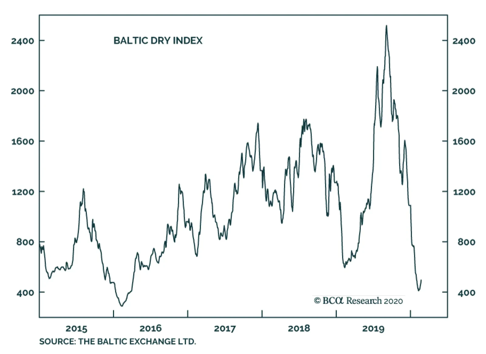
The Baltic Dry Index is testing its low of 2016 or 2008, which were periods of a deep slowdown in global trade and manufacturing activity. Very weak activity in China and the resulting supply-chain disruptions are the key culprits behind this meltdown. Going…
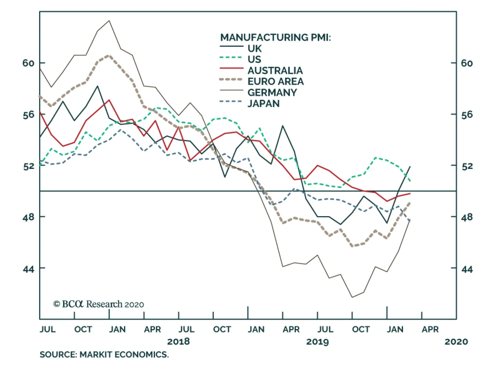
The latest slew of PMI releases confirms that the global economy was in a synchronized recovery before the advent of Covid-19. Markit flash PMI data for the US, euro area, UK, Germany, France, Japan and Australia were released last week. Especially remarkable…
Highlights Global equities have benefited from the fact that the number of new coronavirus (COVID-19) cases continues to drift lower. Falling bond yields have also supported stocks. Nevertheless, risks remain. Even if the outbreak recedes, global growth is still set to fall to zero in the first quarter, before bouncing back over the remainder of the year. Thus, a near-term hit to corporate earnings now looks unavoidable. More worryingly, the possibility remains that the number of new cases will spike again as Chinese workers return to their jobs over the next few weeks. While we and others have compared the current outbreak to the SARS episode, a more relevant comparison could be the H1N1 (swine flu) outbreak of 2009-2010. Despite early efforts to contain it, 61 million Americans ended up catching the H1N1 virus, resulting in about 12,000 US deaths over a 12-month period. Globally, at least 150,000 people perished. It appears that the fatality rate from COVID-19 is significantly higher than for H1N1, though well below that of SARS and MERS. A full-blown pandemic with a fatality rate of 2% could lead to 20 million deaths worldwide. This would likely trigger a global downturn as deep as the Great Recession of 2008/09. The only consolation is that the recovery would be much more rapid than the one following the financial crisis. Although we are inclined to lean on the side of optimism, the truth is that neither we nor anyone else knows what the likelihood of such a pandemic scenario is. Thus, while we continue to maintain our positive 12-month view on global stocks, we recommend a more cautious near-term stance. Global Growth Set To Grind To A Halt In Q1 Based on the SARS example, we noted three weeks ago that risk assets were likely to bottom once the number of new coronavirus cases peaked. Sure enough, Chinese shares troughed on January 31st, just as the number of confirmed infections had begun to level off. The S&P 500 has been on a tear since then, hitting one record high after another (Chart 1). Falling bond yields have also supported stocks. Despite the decline in new infections, we think it is too early for investors to breathe a sigh of relief. For one thing, the economic data out of China remains abysmal. Real-time indicators of economic activity have been off-the-charts bad – much worse than what we saw during the SARS outbreak. While there has been some recovery in recent days, road congestion remains well below normal levels. In Shanghai, property sales are currently about four times lower than what is usual for this time of year. Movie ticket sales have all but disappeared. Daily coal consumption, which tracks electricity consumption, has fallen by 70% (Chart 2). More than three-quarters of companies surveyed last week by the American Chamber of Commerce in Shanghai said that they cannot run a full production line due to a lack of staff. Chart 1Just As In The SARS Episode, Stocks Bottomed Around The Same Time The Number Of Infections Peaked
Just As In The SARS Episode, Stocks Bottomed Around The Same Time The Number Of Infections Peaked
Just As In The SARS Episode, Stocks Bottomed Around The Same Time The Number Of Infections Peaked
Chart 2Chinese Daily Activity Has Fallen Off A Cliff
Markets Too Complacent About The Coronavirus
Markets Too Complacent About The Coronavirus
In our preliminary estimate of the impact of the virus on global growth, we penciled in zero growth for China on a quarter-over-quarter basis in Q1 of 2020, implying that the level of output in the first quarter would be the same as in the fourth quarter. Unfortunately, at this point, that looks far too optimistic. Chinese economic output will decline on a sequential basis. The only question is by how much. Despite the decline in new infections, we think it is too early for investors to breathe a sigh of relief. Chart 3 shows our updated baseline profile for global growth in Q1 and the remainder of this year. Assuming that production returns to normal over the coming weeks, it should be possible to limit the unannualized quarter-over-quarter decline in Chinese real GDP in Q1 to 1% (4% annualized). On a year-over-year basis (2020Q1 versus 2019Q1), this would drag Chinese growth down to 3.5%, the slowest pace in three decades. Relative to our earlier estimates, we expect larger spillover effects to the rest of the world, mainly stemming from the severe contraction in global tourism. Chart 3The Global Economy Will Come To A Standstill In Q1
Markets Too Complacent About The Coronavirus
Markets Too Complacent About The Coronavirus
The direct and indirect effects of the outbreak should be enough to push global growth down to zero on a quarter-over-quarter basis in Q1. Under our baseline scenario, growth will recover in the second quarter, leaving the level of global GDP down 0.5 percentage points for the year as a whole compared to what would have transpired if the virus had never emerged. The Calm Before The Storm? Even after this downgrade to our assessment, we still see the risks to global growth from the COVID-19 outbreak as being tilted to the downside. This largely reflects our concern that contrary to our baseline scenario, the outbreak could reintensify over the next few weeks as more Chinese workers return to their jobs. As the dire situation on the Diamond Princess cruiseliner docked in the port of Yokohama illustrates, the COVID-19 virus remains highly contagious. Despite numerous efforts by medical authorities to keep those on board at a safe distance from one another, 621 of the 3,011 passengers and crew aboard the ship who have been tested have been infected with the virus. Worryingly, the virus also appears to be contagious even when carriers are not showing any symptoms. Just this week, the Japanese media reported on a case where the son of an infected doctor tested positive for the virus even though he had last seen his father three days before the doctor started displaying symptoms. While the number of new infections has fallen in China, new clusters have appeared elsewhere. South Korea just reported 73 new cases in a little more than two days. Iran disclosed two deaths from the virus in Qom, a holy city just outside Tehran that receives 20 million visitors annually. This suggests that there are probably at least 100 infected people in the city. The World Health Organization has estimated RO, the average number of people someone with the COVID-19 virus will infect, to be between 1.4 and 2.5. A recent survey of 12 studies found a larger mean RO of 3.28.1 An RO above one would produce an exponential increase in the number of cases. Heavy-handed quarantine measures such as those imposed by China could probably drive RO below one. However, some governments may not be able to implement such measures, and even if they could, they might not be sustainable for months on end. The H1N1 (Swine Flu) Template? All this raises the possibility that the COVID-19 outbreak could end up resembling the H1N1 (swine flu) pandemic of 2009-10. Despite initial hopes, early efforts to contain the H1N1 outbreak failed. The US Centers for Disease Control and Prevention calculated that 61 million Americans caught the virus over the course of the proceeding 12 months, resulting in over 12,000 deaths. Globally, an estimated 700 million-to-1.4 billion people contracted the virus. A paper published in the Lancet put the number of fatalities worldwide at 151,700-to-575,400.2 The reason one hears less about H1N1 than SARS is that the latter killed 5%-to-10% of those who contracted it, whereas the former killed 0.01%-to-0.08%. Based on very preliminary evidence, it appears that the fatality rate from COVID-19 is significantly higher than for H1N1, though well below that of SARS, and lower still than for MERS, a particularly nasty strain of the coronavirus that killed about one-third of those who contracted it. That said, COVID-19’s true fatality rate remains highly uncertain. In Hubei province, the fatality rate is running at 3.1%. Elsewhere in China, it stands at 0.9%. Outside China, the fatality rate appears to be 0.5%. Part of the gap between Hubei and elsewhere may be due to greater underreporting of mild and moderate cases in the stricken province. However, it is also likely that Hubei’s higher fatality rate reflects the tremendous pressures its medical system is currently under. If the COVID-19 outbreak were to morph into a pandemic, such pressures would only escalate since medical resources from less-afflicted areas could no longer be deployed to fight every local breakout. The Economic Impact Of A Pandemic: Deep But Brief Chart 4The Private-Sector Surplus In Developed Economies Is In Good Shape
The Private-Sector Surplus In Developed Economies Is In Good Shape
The Private-Sector Surplus In Developed Economies Is In Good Shape
Assuming the COVID-19 virus infects a billion people with a fatality rate of 2%, this would translate into 20 million deaths worldwide. Such a pandemic would rattle the global economy, leading to a recession as deep as the one in 2008/09. Demand for most items other than necessities would collapse. Business and leisure travel would fizzle. The global supply chain would seize up. The only consolation is that the recession would likely be followed by a vigorous “V-shaped” recovery. Sluggish “U-shaped” recoveries tend to occur when there are many imbalances that need to be worked off. For example, the recovery in the US following the Great Recession was impeded by the need for households to pare back debt and for the excess supply of newly built homes to be run down. Today, the larger developed economies are in decent shape. The private-sector financial balance in advanced economies – the difference between what the private sector earns and spends – stands at a surplus of 3.4% of GDP. In 2007, the private-sector financial balance fell to 0.4%, hitting a deficit of 2% in the US. The private-sector balance also deteriorated sharply in the lead-up to the 2001 recession (Chart 4). Chinese debt levels have soared over the past decade. However, it is worth noting that China’s private-sector financial surplus reached 7.1% of GDP in 2019 – higher than in Japan or Germany (Chart 5). Rather than suffering from excess debt levels, China suffers from excess savings. It is these excess savings that have forced the authorities to push state-owned companies and local governments to engage in debt-financed investment spending in order to prop up aggregate demand and employment. It is also these savings that will allow the government to stimulate the economy to prevent an outright economic collapse. Chart 5The Private Sector Spends Less Than It Earns In Most Economies
Markets Too Complacent About The Coronavirus
Markets Too Complacent About The Coronavirus
Life Goes On… For Most Chart 6'Til Death Do Us Part
Markets Too Complacent About The Coronavirus
Markets Too Complacent About The Coronavirus
While it would take time, as horrific as a pandemic would be, most people would eventually adjust to living in a world where one’s longevity is less assured than it is today. That is the world in which humanity lived for centuries. It is also the world that prevailed during the Cold War. Keep in mind that in the US, an average 59 year-old man has a 1% chance of dying at some point within one year, and a 6% chance of dying over five years (Chart 6). Death is a part of life. As the virus circulates throughout the population, some people will perish. However, the vast majority will acquire immunity either by fighting off the disease or, if a vaccine becomes available later this year or in 2021, by being inoculated. All this will bring the pandemic to an end. Investment Conclusions No one knows if the COVID-19 outbreak will recede or whether it will morph into a true pandemic. As macro strategists, all we can do is run through various scenarios and try to figure out the likely market impact. Chart 7Global Manufacturing Was On The Upswing Before The Outbreak Occurred
Global Manufacturing Was On The Upswing Before The Outbreak Occurred
Global Manufacturing Was On The Upswing Before The Outbreak Occurred
If the number of new infections continues to decline, investors will likely look through the Q1 plunge in growth. Judging from the purchasing manager indices, global growth had already turned the corner in the weeks before the viral outbreak (Chart 7). With pent-up demand having accumulated in the intervening weeks, growth would bounce back in the second quarter. Under this benign scenario, equities still have upside, while bond yields will start rising again. As a countercyclical currency, the US dollar would also give up some of its recent gains. In a pandemic scenario, the recovery in growth will obviously be delayed. And when output does recover, it will be from significantly lower levels. Markets will end up going through their own version of Kubler-Ross' five stages of grief: denial, anger, bargaining, depression, and acceptance. Unfortunately, before we reach the acceptance stage, global equities could easily fall by 20% from current levels. On balance, while we continue to lean on the side of optimism by maintaining our positive 12-month view on global stocks, we recommend a more cautious near-term stance until there is greater clarity as to how the outbreak will evolve. Peter Berezin Chief Global Strategist peterb@bcaresearch.com Footnotes 1Ying Liu, Albert A Gayle, Annelies Wilder-Smith, and Joacim Rocklöv, “The reproductive number of COVID-19 is higher compared to SARS coronavirus,” Journal of Travel Medicine, February 2020. 2 Please see Sundar S. Shrestha, et al., “Estimating the Burden of 2009 Pandemic Influenza A (H1N1) in the United States (April 2009–April 2010),” Clinical Infectious Diseases (52:1), January 2011; Peter Doshi, “The 2009 Influenza Pandemic,” The Lancet Infectious Diseases (13:3), March 2013; and Heath Kelly, et al., “The Age-Specific Cumulative Incidence of Infection with Pandemic Influenza H1N1 2009 Was Similar in Various Countries Prior to Vaccination,” PLoS ONE 6(8), August 2011. Global Investment Strategy View Matrix
Markets Too Complacent About The Coronavirus
Markets Too Complacent About The Coronavirus
MacroQuant Model And Current Subjective Scores
Markets Too Complacent About The Coronavirus
Markets Too Complacent About The Coronavirus
Strategic Recommendations Closed Trades
Highlights The COVID-19-induced demand shock in China – and a stronger USD – will reduce growth in global crude oil consumption to just over 1mm b/d this year, vs. earlier expectations of ~ 1.4mm b/d. Significant fiscal and monetary stimulus from China will be required to put economic growth back on track over the critical 2020-21 interval. An accommodative monetary-policy backdrop globally also will support demand. On the supply side, OPEC 2.0 likely will cut output by an additional 600k b/d in 2Q20, which will remove 2.3mm b/d off member states’ official quotas. For 2H20, we expect the coalition to revert to its 1.7mm b/d in cuts to keep markets balanced. US shale-oil output growth will continue to slow under market-imposed capital discipline. We are revising our baseline price forecasts in 2020 lower to $62/bbl and $58/bbl for Brent and WTI, respectively (Chart of the Week). This is down $5/bbl vs our previous forecast. Price risk is to the upside, however. 2021 Brent and WTI forecasts remain at $70/bbl and $66/bbl, respectively, as we do not expect long-lived demand destruction from the COVID-19 outbreak. A growing consensus around policy stimulus and production cuts makes us leery. Feature Chart of the WeekCOVID-19 Knocks Oil Forecasts Lower
COVID-19 Knocks Oil Forecasts Lower
COVID-19 Knocks Oil Forecasts Lower
COVID-19 continues to hammer Chinese oil demand, forcing refiners there to drastically reduce output. This crude oil is ending up in inventories, but, so far at least, overall storage capacity in China is not being maxed out by the unintended accumulations of crude and product inventories. Data are difficult to come by, but there are a few observations that provide some insight into the state of the refining market in China as the COVID-19 episode unfolds. Platt’s reported independent refiners in Shandong Province, which has ~ 3.4mm b/d of refining capacity, cut runs to a four-year low of ~ 40% of capacity this month, down from a January rate of 63.5%. Shandong refiners represent 50%-60% of China’s independent refining capacity.1 We estimate EM demand – led by downward revisions in China – will fall by ~900k b/d in 1Q20 – when most of the damage to the economy likely will occur – and by an average 300k b/d for the year vs. our previous estimates. Ursa Space Systems’ radar satellite monitoring of inventories close to coastal refineries indicated Chinese oil storage at the beginning of the month was at 60% of capacity.2 This figure likely is higher, given refinery runs remain low, but it does not yet suggest storage capacity in China will be exhausted in the near future. In our modeling of the COVID-19 impact on oil demand, we estimate EM demand – led by downward revisions in China – will fall by ~900k b/d in 1Q20 – when most of the damage to the economy likely will occur – and by an average 300k b/d for the year vs. our previous estimates. This leads us to believe EM oil demand will increase by 1mm b/d this year, down from our earlier expectation of 1.26mm b/d pre-COVID-19. For DM economies, demand growth also will disappoint, revised down by 100k b/d on the back of a warmer-than-expected winter and stop-and-go growth in manufacturing induced by COVID-19. Policy Stimulus Will Revive Chinese Demand The COVID-19 outbreak will result in a significant hit to China’s GDP, which will require substantial stimulus to put growth back on a 6% p.a. track this year. This growth rate is required for the Chinese Communist Party (CCP) to deliver on its pledge to double GDP and per-capita income over 2010-20, a pledge that was memorialized in writing following the Party’s 2012 Congress. In addition, next year marks the 100th anniversary of the founding of the CCP, and, we believe, it is an all-but-foregone conclusion the Party’s leadership will not want a faltering economy on display as it celebrates this important milestone. Given these considerations, the possibility policymakers will over-stimulate the economy to get it back on track is a non-trivial upside risk.3 We do not think it is unreasonable to expect policymakers to lean into reviving growth this year and next with policy stimulus. Our baseline 2020 forecast envisions prices will falter somewhat versus our previous expectation – with Brent averaging $62/bbl this year, and WTI trading $4/bbl below that, vs. $67/bbl and $63/bbl previously. We are mindful of the impact Chinese policy stimulus can have on the global oil markets. The effects on GDP growth following demand shocks of past stimulus can be seen in the response of China’s GDP following the 2003 SARS outbreak; the 2008-09 GFC; the 2011-12 eurozone debt crisis; and even in China’s 2015-16 slowdown (Chart 2). For this reason, we do not think it is unreasonable to expect policymakers to lean into reviving growth this year and next with policy stimulus. And it is for this reason that we believe price risk tilts to the upside this year. Our updated Ensemble price forecast includes two additional demand-side simulations to assess its sensitivity to changes in EM oil demand: Chart 2Chinese Stimulus Will Support Oil Demand
Chinese Stimulus Will Support Oil Demand
Chinese Stimulus Will Support Oil Demand
Higher EM demand scenario (20% weight): We model the impact of the coronavirus as short-lived, with only a temporary impact on China’s economy. Consumer demand and industrial production in China converge to pre-COVID-19 levels rapidly in 2H20. Chinese policymakers overstimulate in 2Q20, over fears the virus could have severe long-term consequences on the economy. This scenario assumes EM demand increases by 100k b/d vs. our base case in 2020 and 2021. Lower EM demand scenario (10% weight): We model the impact of the coronavirus as a severe and long-lasting event. This triggers a negative feedback loop for EM oil demand; collapsing demand forces production lower, which reduces employment and pushes demand further down. This reverberates to other EM economies and affects global supply chains. This scenario assumes EM demand decreases by 240k b/d in 2020 and returns to our base case in 2021, supported by China stimulus. Oil-Demand Reduction (Not Destruction) The outbreak also is contributing to greater global economic uncertainty, which continues to support the USD broad trade-weighted index (TWIB). The COVID-19 outbreak in China caused us to reduce our expectation for global oil demand growth by ~ 360k b/d, taking 2020 year-on-year growth to ~ 1.04mm b/d, versus our earlier expectation of 1.4mm b/d. The outbreak also is contributing to greater global economic uncertainty, which continues to support the USD broad trade-weighted index (TWIB). Dollar strength produces a headwind for EM GDP growth, which suppresses oil-demand growth. The combination of the COVID-19-induced demand reduction and the stronger USD TWIB likely will compel OPEC 2.0 to maintain its production discipline until the global policy uncertainty abates and the USD TWIB retreats. Such a reversal in trend would become a tailwind for commodity demand (Chart 3). Chart 3Global Economic Uncertainty Keeps A Bid Under USD TWIB
Global Economic Uncertainty Keeps A Bid Under USD TWIB
Global Economic Uncertainty Keeps A Bid Under USD TWIB
Global supply growth will continue to be constrained by demands from investors to return capital to shareholders. We expect the hit to global demand to be offset by increased production cuts from OPEC 2.0, which will be agreed next month. OPEC 2.0 production also will be impacted by continued output losses in Iran and Venezuela, which have seen y/y production fall by ~ 1.8mm b/d in 2019. Global supply growth will continue to be constrained by demands from investors to return capital to shareholders – via stock buybacks – and for steady and increasing dividends to make their equity competitive with alternative sectors (e.g., tech). These capital-market pressures – in addition to growing pressure from Environmental, Social and Governance (ESG) investors – will continue to have a profound effect on capital availability for oil and gas E+P companies for decades to come. This is a theme we will return to often in future research. We summarize these supply-demand dynamics in Chart 4. For OPEC 2.0, the 1.7mm b/d reduction in output the coalition agreed for 1Q20 remains in place, as do losses from Iran and Venezuela. For 2Q20, we assume the coalition adds another 600k b/d of production cuts. After that, we assume OPEC 2.0 reverts to its earlier production cuts of 1.7mm b/d for 2H20. In 2021, we assume OPEC 2.0 takes production cuts back down to 1.2mm b/d in January 2021, then gradually increases its production over 1H21 to balance the market and to avoid spiking prices. We also expect the Kingdom of Saudi Arabia (KSA) to remove 300k b/d of overcompliance next year, as markets tighten. In 2H21, we see OPEC 2.0 production levels remaining flat at ~ 44.8mm b/d (Table 1). Table 1BCA Global Oil Supply - Demand Balances (MMb/d, Base Case Balances)
Oil Demand Should Recover In 2H20
Oil Demand Should Recover In 2H20
Chart 4Supply-Demand Balances
Supply-Demand Balances
Supply-Demand Balances
Chart 5Global Oil Inventories Will Resume Drawing
Global Oil Inventories Will Resume Drawing
Global Oil Inventories Will Resume Drawing
For 2021, we are leaving our Brent forecast unchanged at $70/bbl, and WTI at $66/bbl. For the US, we reduced our Lower 48 production assumptions, and now have 740k b/d growth in 2020 and 300k b/d in 2021. Shales account for almost all of this increase. We also include a scenario in which US production comes in lower in our ensemble forecast. These fundamentals combine to put global oil inventories back on a downward trajectory in 2H20 (Chart 5). That said, there is an important caveat going into 2H20: If the US Economic Policy Uncertainty Index starts rising in 2H20 on the back of US election risks, markets will continue to price in a stronger USD in 2020 vs. what we now expect. For 2021, we are leaving our Brent forecast unchanged at $70/bbl, and WTI at $66/bbl. Odds favor a return to the pre-COVID-19 price trajectory for oil next year, with continued upside risk from Chinese fiscal and monetary stimulus, and a globally accommodative monetary-policy backdrop. Higher Spare Capacity Reduces Risk Premium The market remains partly balanced by OPEC 2.0’s production cuts. This means that the group’s spare capacity is increasing, reducing the risk premium the market typically includes in crude oil prices to reflect sudden output losses. The risk premium in oil prices evaporated following the drop in demand and the increase in spare capacity due to the large OPEC 2.0 cuts. When China’s economy resumes its normal activity, demand will pick up and the market will balance, increasing the impact of possible supply disruptions. However, the market remains partly balanced by OPEC 2.0’s production cuts. This means that the group’s spare capacity is increasing, reducing the risk premium the market typically includes in crude oil prices to reflect sudden output losses. In addition, if production capacity of ~ 300k-500k b/d in the Neutral Zone shared by KSA and Kuwait is restored, the risk premium could drop even lower, given this production is expected to be retained as spare capacity. If this is the case we could have lower prices in 2020 vs. our current forecast (down to ~ $60/bbl). We will be exploring the changes in OPEC 2.0 spare capacity and the consequences for overall production in future research. Bottom Line: Assisted by Chinese policy stimulus, oil demand will recover this year from the COVID-19-induced demand shock. On the supply side, the combination of deeper OPEC 2.0 production cuts – which we expect will be settled at the upcoming March meeting – and capital-market-imposed reduction in US oil production will push oil markets to a supply deficit. The ongoing demand shock forces us to reduce our 2020 Brent price forecast to $62/bbl from $67/bbl previously. For 2021, we maintain our $70/bbl target. Risks to our view are mounting. Three crucial pieces to our 2020 and 2021 expectations remain uncertain: The duration and magnitude of the impact of the coronavirus shock, The level of production cuts by OPEC 2.0 and the degree of compliance by all members, and The trajectory of the US dollar – if global economic policy uncertainty remains elevated the USD could remain well bid, which would continue to pressure EM GDP growth – and commodity demand – at the margin. Our base case remains that prices will rise from here, but our conviction level is slightly lower. One reason for this is the apparent consensus emerging around the likelihood of Chinese stimulus and OPEC 2.0 production cuts. If either of these assumptions prove wrong, oil prices likely would move lower. Robert P. Ryan Chief Commodity & Energy Strategist rryan@bcaresearch.com Hugo Bélanger Associate Editor Commodity & Energy Strategy HugoB@bcaresearch.com Commodities Round-Up Energy: Overweight As of Tuesday’s close, Brent prices were up 8% from their Feb 10 low of $53.27/bbl, supported by receding COVID-19 fears and rising expectations OPEC 2.0 will deepen its production cuts at its March meeting. Earlier this week, oil prices received an additional lift from the newly-imposed US sanctions on Rosneft Trading SA – a subsidiary of Russia’s state-own company – for its activities with Venezuela’s PDVSA. Rosneft Trading intensified its involvement in Venezuela’s oil sector and now handles the majority of the country’s crude exports, providing vital support to the Maduro government. The US restrictions include a 90-day wind-down period for companies to end their activities with Rosneft Trading. Base Metals: Neutral Chinese steel consumption – which accounts for ~50% of global demand – has been hit hard by the coronavirus outbreak. Steel and iron ore prices in China plunged 11% and 3% YTD (Chart 6). Steel mills’ inventories increased to record levels, reaching full capacity. Mills are now forced to export their surplus at reduced prices – flooding seaborne steel markets – or to cut output. Accordingly, more than 33% of steel mills are considering cutting steel production, according to a recent Platts survey. Margins at producing mills are declining and could harm high-grade iron ore prices. This is a short-term risk to our view. Precious Metals: Neutral Gold prices surged past $1,600/oz on Tuesday – overlooking positive manufacturing data in the US. Silver shadowed gold’s movement, closing at $18.13/oz. Precious metals are bought as insurance against risks of a wider-than-expected spread of the coronavirus and should remain well bid until uncertainty dissipates. Gold is somewhat overbought based on sentiment, momentum and technical indicators (Chart 7). If, as we expect, the daily increase in confirmed cases ex-Hubei slows meaningfully over the coming months, gold and silver prices will lose some steam. Ags/Softs: Underweight CBOT March wheat futures surged 4.4% on Tuesday after Australia’s government sharply lowered its estimate of the country’s wheat harvest as severe drought affected crops. The Australian agricultural agency said the crop totaled 15.17 mm MT, the lowest since 2008, paving the way for stronger US exports. Corn also moved higher, with the prompt contract gaining 1.26% on the back of a new round of Chinese tariff exemptions on US goods. A USDA report showed US soybean export inspections bound for China were still half of last year's volumes. Soybeans futures closed 1.25 cents lower at $8.915/bu as markets await large Chinese purchases of US soybeans. Chart 6Increasing Inventories Pressure Steel and Iron ore Prices
Increasing Inventories Pressure Steel and Iron ore Prices
Increasing Inventories Pressure Steel and Iron ore Prices
Chart 7Gold Technical Indicators Signal Overbought Market
Gold Technical Indicators Signal Overbought Market
Gold Technical Indicators Signal Overbought Market
footnotes 1 Please see China's Shandong independent refiners cut run rates to 4-year low of 40% in Feb, published by S&P Global Platts February 13, 2020. 2 Please see Oil demand falls on coronavirus: how much will inventories rise? posted by Ursa Space Systems February 7, 2020. 3 Please see Iron Ore, Steel Poised For Rally, published January 13, 2020, for a discussion of the significance of 2020 vis-à-vis the Communist Party’s pledge to double GDP and per-capita income vs. 2010 levels, memorialized by the CCP at its 2012 Peoples Congress. We also discuss the 100th anniversary of the Party’s founding next year, which also will be a significant milestone for the CCP – and another reason the Party will not want the Chinese economy faltering as it is celebrated. Investment Views and Themes Recommendations Strategic Recommendations Tactical Trades TRADE RECOMMENDATION PERFORMANCE IN 2019 Q4
Oil Demand Should Recover In 2H20
Oil Demand Should Recover In 2H20
Commodity Prices and Plays Reference Table Trades Closed in 2020 Summary of Closed Trades
Oil Demand Should Recover In 2H20
Oil Demand Should Recover In 2H20
Highlights The elevated uncertainty about global growth stemming from the COVID-19 virus in China has not only made investors more anxious, but central bankers as well. This means that, only six weeks into the year, policymakers may already be having to rethink their expected strategies for 2020 - which were, for the most part, sitting on hold after the monetary easing in 2019. This has important implications for the direction of global bond yields, which were starting to see a cyclical increase before the viral outbreak. In this report, we present what we see as the most important data for investors to focus on in the major developed markets to get the central bank call correct. This is based on our interpretation of recent speeches, press conferences and published research. We also provide our own suggested data series to watch for each country – which do not always line up with what central bankers are saying they are most worried about. We conclude that it is still not clear that the global growth backdrop has turned sustainably more bond bullish, but there is no pressure on any of the major central banks to move away from extremely accommodative policy settings. Feature Over the past four weeks, all of the major central banks have had the opportunity to formally communicate their current views to financial markets. Whether it was through post-policy- meeting press conferences or published monetary policy reports, central bankers have tried to signal their intentions about future changes in the direction of interest rates, given the heightened uncertainties about the momentum of global growth. At the moment, our global leading economic indicator (LEI) is still signaling that 2020 should see some rebound in global growth – and bond yields – after the sharp 2019 manufacturing-led slowdown (Chart 1). Unfortunately, the latest read on the global LEI uses data as of December, so it does not include what is almost certainly to be a very severe slowdown in the Chinese (and global) economy in the first quarter of 2020 due to the COVID-19 virus outbreak. Underlying stories within each developed market economy – on growth, inflation and potential financial imbalances – suggest that the additional interest rate cuts now discounted globally may not come to fruition if the China shock is contained to the first quarter of the year. Central bankers are in the same spot as investors, trying to ascertain the extent of the hit to global growth from the virus, both in terms of size and, more importantly, duration. This comes at a time when many central banks were already formally rethinking how to meet their own individual inflation-targeting mandates given the persistence of low global inflation alongside tight labor markets (Chart 2). Chart 1Global Bond Yields: Think Globally, Act Locally
Global Bond Yields: Think Globally, Act Locally
Global Bond Yields: Think Globally, Act Locally
Chart 2Common Worries For All CBs: China & Global Inflation
Common Worries For All CBs: China & Global Inflation
Common Worries For All CBs: China & Global Inflation
That all sounds potentially very bond-bullish, but a lot of bad economic news is already discounted in the current low level of global bond yields. More importantly, the underlying stories within each developed market economy – on growth, inflation and potential financial imbalances – suggest that the additional interest rate cuts now discounted globally may not come to fruition if the China shock is contained to the first quarter of the year. In this Weekly Report, we provide a brief synopsis of what we believe are the biggest concerns for each of the major developed economy central banks. This is based on our read of recent policy decisions and central banker statements, as well as our own understanding of the current reaction function of policymakers. Our intention is to provide a short list of indicators to watch for each central bank, to help cut through the noise of data and news during this current period of unusual uncertainty, as well as our own assessment of what policymakers should be focusing on more. We conclude that it is still too soon to expect a new wave of bond-bullish global monetary policy easings in 2020. It will take evidence pointing to an extended shock to global growth from the COVID-19 virus to reverse the bond-bearish signal from other indicators like our global LEI. Federal Reserve Chart 3Federal Reserve: Focus On Financial Conditions & Inflation Expectations
Federal Reserve: Focus On Financial Conditions & Inflation Expectations
Federal Reserve: Focus On Financial Conditions & Inflation Expectations
Currently, the Fed’s commentary suggests a policy bias that can be described as “neutral-to-dovish”, but it is giving no indication that additional rate cuts are likely in 2020 after the 75bps of cuts last year. Markets remain skeptical, however, with -42bps of cuts over the next twelve months now priced into the USD overnight index swap (OIS) curve according to our Fed Discounter (Chart 3). What the Fed seems most focused on: Fed officials seem focused on measures of market-based inflation expectations, like TIPS breakevens, as the best indication that current policy settings are appropriate (or not) relative to the growth outlook of investors. While FOMC members have expressed concern about TIPS breakevens being persistently below the 2% inflation target, they would not necessarily respond to a further decline in breakevens with more rate cuts without first seeing the US Treasury curve becoming inverted for a prolonged period, just like in 2019 (middle panel). Right now, with the 10-year TIPS breakeven at 1.67% and the 10-year/3-month US Treasury curve now at only -1bp, another decline in longer-term inflation expectations will likely invert the Treasury curve. What the Fed should be more focused on: US financial conditions are highly stimulative, with equity indices back near all-time highs and corporate credit spreads remaining well-contained at tight levels. Given the usual lead times of financial conditions indices to US cyclical growth indicators like the ISM manufacturing index (bottom panel), a continuation of the most recent bounce in the ISM is still the most likely result – even allowing for a near-term hit to global growth from China. While FOMC members have expressed concern about TIPS breakevens being persistently below the 2% inflation target, they would not necessarily respond to a further decline in breakevens with more rate cuts without first seeing the US Treasury curve becoming inverted for a prolonged period, just like in 2019. Bottom Line: The incoming US growth data is critical to determine the Fed’s next move. If there is no follow through from easy financial conditions into faster growth momentum, the odds increase that the Treasury curve will become more deeply inverted for a longer period of time – an outcome that would likely prompt more rate cuts, especially if equity and credit markets also begin to sell off as growth disappoints. European Central Bank Chart 4ECB: Focus On Manufacturing & Inflation Expectations
ECB: Focus On Manufacturing & Inflation Expectations
ECB: Focus On Manufacturing & Inflation Expectations
The ECB has been clearly signaling that it still has a dovish bias, although central bank officials have acknowledged that the options available to them to ease further are limited with policy rates already in negative territory. The market agrees, as there are only -7bps of cuts over the next twelve months now priced into the EUR OIS curve according to our ECB Discounter (Chart 4). What the ECB seems most focused on: The ECB has been paying the most attention to the contractions in euro area manufacturing data (like PMIs) and exports seen in 2019. Rightly so, as nearly all of the two percentage point decline in year-over-year euro area real GDP growth since the late-2017 peak has come from weaker net exports. The central bank has also been concerned about the depressed level of inflation expectations, with the 5-year EUR CPI swap rate, 5-years forward, now at only 1.23% - far below the ECB’s inflation target of “at or just below” 2%. What the ECB should be more focused on: We agree that the focus for the ECB should be most concerned about the weakness in manufacturing/exports and low inflation expectations – the latter having not yet responded to extremely stimulative euro area financial conditions (most notably, the weak euro). The euro area economy is highly leveraged to Chinese demand, with exports to China representing 11% of total euro area exports. This makes leading indicators of Chinese economic activity, like the OECD China LEI and the China credit impulse, critically important indicators in determining the future path of European export demand. The COVID-19 outbreak in China could not have come at a worse time for the ECB, as there have been tentative signs of stabilization in cyclical euro area indicators like manufacturing PMIs in recent months. Bottom Line: The COVID-19 outbreak in China could not have come at a worse time for the ECB, as there have been tentative signs of stabilization in cyclical euro area indicators like manufacturing PMIs in recent months. If the China demand shock to euro area exports is large enough, the ECB will likely be forced to deliver a modest interest rate cut – or an expansion of the size of its monthly asset purchases – to try and boost growth. Bank Of England Chart 5Bank Of England: Focus On Business Sentiment & Labor Costs
Bank Of England: Focus On Business Sentiment & Labor Costs
Bank Of England: Focus On Business Sentiment & Labor Costs
The Bank of England (BoE) has a well-deserved reputation as having an unpredictable policy bias under outgoing Governor Mark Carney, but the central bank does appear to be currently leaning on the moderately dovish side of neutral. Short-term interest rate markets also feel the same way, with -19ps of easing over the next twelve months priced into the GBP OIS curve according to our BoE Discounter (Chart 5). What the BoE seems most focused on: The BoE has been paying a lot of attention to indicators of UK business sentiment, which had been negatively impacted by both Brexit uncertainty and global trade tensions in 2019. The BoE has focused on the link from depressed business sentiment to weak investment spending and anemic productivity growth as an important reason why UK potential GDP growth has been so low and why UK inflation expectations have been relatively high. What the BoE should be more focused on: We agree that business sentiment should be the BoE’s greatest area of focus. Sentiment has shown a solid improvement of late, after the signing of the “phase one” US-China trade deal in December and the formal exit of the UK from the EU on January 31. The CBI Business Optimism survey (measuring the net balance of optimists versus pessimists) soared from -44 in October to +23 in January – the biggest quarterly jump ever recorded in the series. It remains to be seen if this improvement in confidence can be sustained and begin to arrest the steady decline in UK capital spending and productivity growth, and the associated surge in unit labor costs and inflation expectations, that has taken place since the 2016 Brexit vote. Bottom Line: The BoE’s next move, under the new leadership of incoming Governor Andrew Bailey, is not clear. Inflation expectations remain elevated but the recovery in business sentiment is still fragile. One potential risk to watch: UK Prime Minister Boris Johnson may choose to take a bolder stand on trade negotiations with the EU after his resounding election victory in December, risking an outcome closer to the “no-deal Brexit” scenario that was most feared by UK businesses. Bank Of Japan Chart 6Bank of Japan: Focus On Exports & The Yen
Bank of Japan: Focus On Exports & The Yen
Bank of Japan: Focus On Exports & The Yen
The Bank of Japan (BoJ) seems to have had a perpetually dovish bias since the 1990s. Yet the current group of policymakers under Governor Haruhiko Kuroda, realizing that they have run out of realistic policy options after years of extreme stimulus, has not been signaling that fresh easing measures are on the horizon, even with economic growth and inflation remaining very weak in Japan. Markets have taken the hint, with only -6bps of rate cuts over the next twelve months priced into the JPY OIS curve according to our BoJ Discounter (Chart 6). What the BoJ seems most focused on: The BoJ has been vocally concerned about the recent slump in Japanese consumer spending, which declined -2.9% (in real terms) in Q4 after the sales tax hike last October. That blow to consumption was expected, but could not have come at a worse time for a central bank that was already worried about plunging Japanese manufacturing activity and exports – the latter declining by -8% in nominal terms as of December 2019. There is little hope for a near-term rebound given the certain hit to global growth and export demand from virus-stricken China. What the BoJ should be more focused on: Given that Japan is still an economy with a large manufacturing sector that is levered to global growth, the BoJ should remain focused on the path for Japanese exports. A bigger risk, however, comes from the Japanese yen, which has remained very stable over the past year. It has proven very difficult to generate any rise in Japanese inflation without some yen weakness, and with headline CPI inflation now only at +0.2%, a burst of yen strength would likely tip Japan back into outright deflation. Bottom Line: The BoJ is now stuck in a very bad spot, with no real ability to provide a major monetary policy stimulus for the stagnant Japanese economy. At best, all the central bank could do is deliver a small interest rate cut and hope for a quick rebound in global manufacturing activity and/or some yen weakness to boost flagging inflation. Bank Of Canada Chart 7Bank of Canada: Focus On Housing & Capital Spending
Bank of Canada: Focus On Housing & Capital Spending
Bank of Canada: Focus On Housing & Capital Spending
The Bank of Canada (BoC) surprised many observers by keeping policy on hold last year, even as central banks worldwide engaged in various forms of monetary easing to offset the effects of the global manufacturing downturn. The BoC’s recent messaging has been relatively neutral, in our view, although Governor Stephen Poloz has not completely dismissed the possibility of rate cuts in his speeches. The markets are strongly convinced that the BoC will need to belatedly join the global easing party, with -32bps of rate cuts now priced into the CAD OIS curve according to our BoC Discounter (Chart 7) What the BoC seems most focused on: The BoC remains highly concerned over the high level of Canadian household debt, especially given how Canadian consumer spending has been highly geared towards trends in house price inflation over the past few years. This is likely why the BoC has been reluctant to cut policy rates as “insurance” against the effects of a prolonged global growth slump, to avoid stoking a new Canadian housing bubble. Interestingly, the commentary from BoC officials has taken on a bit more dovish tone whenever USD/CAD has threatened to break down below 1.30, suggesting some fears of unwanted currency appreciation. What the BoC should be more focused: The BoC should continue to monitor developments in the Canadian housing market, given the implications for consumer spending and, potentially, financial stability if there is another boom in house prices. The central bank should also pay even greater attention than usual to the subdued level of oil prices, which has triggered a deep slump in the oil-rich Alberta province that has weighed on the overall level of Canadian business investment spending. Persistently soft oil prices would also force the BoC to continue resisting strength in the Canadian dollar. It would likely take a breakdown in oil prices, or an outright decline in house prices, for the rate cut expectations currently discounted in the CAD OIS curve to come to fruition. Bottom Line: The BoC appears under no pressure to make any near-term interest rate adjustments, especially with realized inflation now sitting at the midpoint of the BoC’s 1-3% target band. It would likely take a breakdown in oil prices, or an outright decline in house prices, for the rate cut expectations currently discounted in the CAD OIS curve to come to fruition. Reserve Bank Of Australia Chart 8Reserve Bank Of Australia: Focus On Underemployment & Housing
Reserve Bank Of Australia: Focus On Underemployment & Housing
Reserve Bank Of Australia: Focus On Underemployment & Housing
The Reserve Bank of Australia (RBA) has been very transparent over the past year, loudly signaling a dovish bias and following through with 75bps of rate cuts that took the Cash Rate to a record low of 0.75%. The latest messaging has been a bit more balanced, while still leaving the door to additional rate cuts if the economy worsens. Markets are expecting at least one more easing, with -24bps of rate cuts over the next twelve months priced into the AUD OIS curve, according to our RBA Discounter (Chart 8). What the RBA seems most focused on: The RBA’s main concerns have centered around the persistent undershoot of Australian inflation, with core inflation remaining below the central bank’s 2-3% target band since the beginning of 2016. The central bank has attributed this to persistent excess capacity in the Australian labor market, as evidenced by the elevated underemployment rate. The RBA is also paying close attention to the Australian housing market and its links to consumer spending, with house prices already responding positively to last year’s RBA rate cuts. The outlook for exports is also on the RBA radar, particularly after the recent surge that lifted the Australia trade balance into surplus but is now at risk from a plunge in Chinese demand. What the RBA should be more focused on: We agree that the labor market should be the main focus for the RBA, particularly the underemployment rate which is still high at 8.3%, signaling that core CPI inflation should remain subdued (bottom panel). We also see the RBA as potentially being more sanguine about the risks of a renewed upturn in the housing market than many observers expect, since that would provide a potential offset to a likely pullback in exports which are now a record 25% of GDP (middle panel). Bottom Line: The RBA still has a clear dovish bias, even though they are currently on hold to assess the impact of last year’s easing. RBA Governor Philip Lowe noted in a recent speech that more cuts may be necessary “if the unemployment rate deteriorates”, suggesting that the labor market is the main area of focus for the central bank. Reserve Bank Of New Zealand Chart 9Reserve Bank Of New Zealand: Focus On The Terms Of Trade & Non-Tradeables Inflation
Reserve Bank Of New Zealand: Focus On The Terms Of Trade & Non-Tradeables Inflation
Reserve Bank Of New Zealand: Focus On The Terms Of Trade & Non-Tradeables Inflation
The Reserve Bank of New Zealand (RBNZ) was one of the more dovish central banks in 2019, cutting the Cash Rate by 75bps to a record low of 1%. The overall tone of the central bank’s recent commentary remains cautious, but has taken on a more balanced tone. Markets are priced appropriately, with only -13bps of rate cuts over the next twelve months discounted in the NZD OIS curve according to our RBNZ Discounter (Chart 9). What the RBNZ seems most focused on: The latest messaging from the RBNZ has highlighted the downside risks to New Zealand from weak global growth, but those are now more manageable since the central bank estimates the economy is operating at full employment. In its latest Monetary Policy Statement (MPS), the RBNZ noted that the economy has been able to weather the weakness in global growth thanks to the positive terms of trade effect from elevated New Zealand export prices – a trend that the central bank expects will persist in 2020 even if external demand remains sluggish (middle panel). The central bank has also expressed some concern over the recent pickup in domestically-driven inflation measures, with core CPI inflation back above 2% (bottom panel). What the RBNZ should be more focused on: The RBNZ is right to focus on global growth, particularly given the coming demand shock from virus-stricken China. While the New Zealand dollar has always been a critical variable for the RBNZ in its policy decisions, the currency now takes on added importance given the central bank’s expectation that export prices and the terms of trade will remain elevated. If the latter turns out to be wrong, the RBNZ will be far more likely to take actions to ensure that the Kiwi dollar stays undervalued. Bottom Line: The RBNZ still has a dovish policy bias, but the hurdle to deliver additional rate cuts after last year’s easing seems a bit higher now. It would likely take a major downturn in global growth, combined with a decline in New Zealand export prices and some cooling of domestic inflation, to get the RBNZ to cut again in 2020. Investment Conclusions Based on our “whirlwind tour” of the major developed market central banks in this report, we can make the following conclusions regarding the expected path of interest rates, and bond yields, in these countries: There are no central banks with anything resembling a hawkish bias – not surprising in the current slow global growth environment with heightened uncertainty. The least dovish central banks are the BoC and the RBNZ, which are not signaling any urgency to cut rates. The most dovish central bank is the RBA, which is indicating a clear willingness to cut again if domestic growth deteriorates. The Fed and the BoE are somewhere in the middle of the “dovishness” spectrum, with both likely willing to ease policy but only under a specific set of circumstances. The ECB and BoJ are clearly boxed in having policy rates already below the zero bound, limiting their ability to ease further if needed. In our view, the rate cut probabilities in the US and Canada seem a bit too aggressive, as we are not anticipating major growth slowdowns in either country over the next 6-12 months. Looking back at our Central Bank Discounters, the largest amount of rate cuts over the next year are now discounted in the US (-42bps), Canada (-32bps), Australia (-24bps) and the UK (-19bps). At the same time, the fewest cuts are priced in Japan (-6bps), the euro area (-7bps) and New Zealand (-13bps). In our view, the rate cut probabilities in the US and Canada seem a bit too aggressive, as we are not anticipating major growth slowdowns in either country over the next 6-12 months. The odds seem more “fair” in the other countries, in terms of the size of rate cut expectations versus the probability of those cuts actually being delivered because of domestic economic considerations. What does this all mean for global bond investing this year? For that we can turn to our Global Golden Rule framework, which links expected returns of government bonds versus cash to the difference between actual and expected rate cuts.1 US Treasuries and Canadian government bond yields are most at risk of underperforming their global peers in 2020 as the Fed and BoC disappoint the current dovish rate cut expectations discounted in interest rate markets. Robert Robis, CFA Chief Fixed Income Strategist rrobis@bcaresearch.com Footnotes 1 Please see BCA Research Global Fixed Income Strategy Special Report, "The Global Golden Rule Of Bond Investing", dated September 25th 2018, available at gfis.bcaresearch.com. Recommendations The GFIS Recommended Portfolio Vs. The Custom Benchmark Index
What Central Banks Are (Or Should Be) Watching
What Central Banks Are (Or Should Be) Watching
Duration Regional Allocation Spread Product Tactical Trades Yields & Returns Global Bond Yields Historical Returns
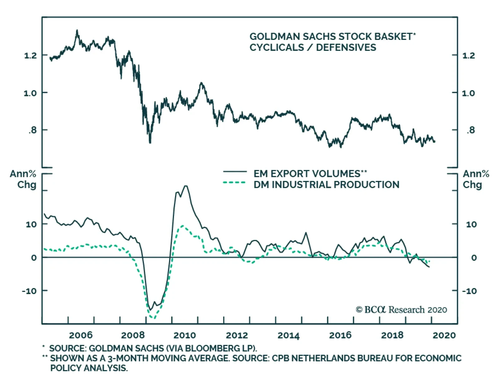
Cyclical stocks have been stuck in the doldrums versus defensives for the better part of two years. This is unsurprising, given the manufacturing downturn which arrested global trade, commodity prices, and overall business activity. What is remarkable is that…
Highlights Provided that the coronavirus outbreak is contained, global growth should accelerate over the course of 2020. Stocks usually rise when the economy is strengthening. But could this time be different? We explore five scenarios in which the stock market could decouple from the economy: 1) The economy holds up, but stretched valuations bring down equities, especially high-flying growth stocks; 2) Bond yields rise in response to faster growth, hurting equities in the process; 3) A strong US economy lifts the value of the dollar, denting multinational profits and tightening financial conditions abroad; 4) Faster wage growth cuts into corporate profits; and 5) Redistributionist politicians seek to shift income from capital to labor. We are not too concerned about the first four scenarios, but we do worry about the fifth, especially now that betting markets are giving Bernie Sanders a nearly 50% chance of becoming the Democratic nominee. Matters should be clearer by mid-March, by which time more than 60% of Democratic delegates will have been awarded. If Bernie Sanders does emerge as the nominee at that point, we will consider trimming back our bullish cyclical bias towards stocks. Coronavirus: A Break In The Clouds? Chart 1Coronavirus Remains Mostly Contained To China
Will The Stock Market Decouple From The Economy?
Will The Stock Market Decouple From The Economy?
Investors continue to grapple with two distinct narratives about how the coronavirus outbreak is unfolding. On the pessimistic side, some contend that the true number of infections in China is much higher than the Chinese authorities are disclosing. How else, they ask, can one explain why the government has taken the extreme step of imposing some form of quarantine on 400 million of its own people? More optimistic observers argue that the Chinese government is simply being proactive. While the number of cases in Hubei province spiked yesterday, this was due to a loosening in the definition for what constitutes a confirmed infection. Whereas previously a positive laboratory test was required, now a positive imaging-based clinical examination will suffice. Under the new definition, the number of newly confirmed cases fell from 6,528 on February 11th to 4,273 on February 12th. Under the old definition, newly diagnosed cases peaked on February 2nd (Chart 1). The revised definition adopted in Hubei brought the mortality rate in the province down to 2.7%. The mortality rate observed in the rest of China is 0.5%. The share of all cases in China originating in Hubei also rose to 81%. Even before the rule change, the share of cases diagnosed in Hubei had risen from 52% on January 26th to 75% on February 11th. This suggests progress in limiting the outbreak to the province. Critically, the number of cases in the rest of the world remains low. In the US, a total of 13 cases have been confirmed as of February 12th, just two more than the 11 reported on February 2nd. The Exception To The Rule? Provided that the coronavirus outbreak is contained, global growth should bounce back forcefully in the second quarter. If that were to occur, history suggests that equities will continue to rally, while bond prices will fall (Chart 2). But could history fail to repeat itself? In this week’s report, we explore five scenarios in which that may happen. Scenario 1: Stretched valuations bring down equities, especially high-flying growth stocks Stocks have moved up considerably since their December 2018 lows. This suggests that investors have become more confident about the economic outlook. Nevertheless, while most investors may no longer be worried about an imminent recession, they do not foresee a sharp acceleration in global growth either. This is evidenced by the fact that cyclical stocks have generally underperformed defensives (Chart 3). Oil prices have also languished, while copper prices are back near a 2.5-year low (Chart 4). Chart 2Stocks Usually Outperform Bonds When Global Growth Is Accelerating
Stocks Usually Outperform Bonds When Global Growth Is Accelerating
Stocks Usually Outperform Bonds When Global Growth Is Accelerating
Chart 3Cyclicals Have Failed To Outperform Defensives
Cyclicals Have Failed To Outperform Defensives
Cyclicals Have Failed To Outperform Defensives
At the broad index level, global equities trade at 16.7-times forward earnings. Conceptually, the inverse of the PE ratio – the earnings yield – should serve as a reasonable guide for the total real return that equities will deliver over the long haul.1 At 6%, the global earnings yield still points to decent returns for global stocks. Relative to bonds, the case for owning stocks is even more compelling. The equity risk premium, which one can compute as the earnings yield minus the real bond yield, remains well above its historic average (Chart 5). Chart 4Commodity Prices Have Taken It On The Chin
Commodity Prices Have Taken It On The Chin
Commodity Prices Have Taken It On The Chin
Chart 5Relative Valuations Favor Equities
Relative Valuations Favor Equities
Relative Valuations Favor Equities
That said, there are pockets where valuations have gotten stretched. US equities trade at 19.5-times forward earnings compared to 14.1-times in the rest of the world. Growth stocks, in particular, have gotten very expensive (Chart 6). The five largest stocks in the S&P 500 (Apple, Microsoft, Amazon, Alphabet, and Facebook) now account for 18% of the index, the same share that the top five stocks (Microsoft, Cisco, GE, Intel, and Exxon) commanded in 2000. The big risk for stocks is that wages go up not because the overall size of the economic pie is growing, but because policies are implemented that shift a bigger share of the pie from capital to labor. Despite the similarities between today and the dotcom era, there are a few critical differences – most of which make us less worried about the current state of affairs. First, while tech valuations are currently stretched, they are not in bubble territory. The NASDAQ Composite trades at 30-times trailing earnings. At its peak in March 2000, the tech-heavy index traded at more than 70-times earnings (Chart 7). Chart 6Growth Stocks Have Become Expensive Relative To Value Stocks
Growth Stocks Have Become Expensive Relative To Value Stocks
Growth Stocks Have Become Expensive Relative To Value Stocks
Chart 7Not Yet Partying Like 1999
Not Yet Partying Like 1999
Not Yet Partying Like 1999
Second, IPO activity has also been more muted today than during the dotcom boom (Chart 8). Only 110 companies went public last year, with the gain on the first day of trading averaging 24%. In 1999, 476 companies went public. The average first day gain was 71%. Meanwhile, companies continue to buy up their shares. The buyback yield stands at 3%, twice as high as in the late 1990s. Third, there is no capex overhang like in the late 1990s (Chart 9). This reduces the odds of a 2001-recession scenario where falling equity prices prompted companies to pare back capital expenditures, leading to rising unemployment and even lower equity prices. Chart 8IPO Activity Is Muted Today Compared To The Late 1990s
IPO Activity Is Muted Today Compared To The Late 1990s
IPO Activity Is Muted Today Compared To The Late 1990s
Chart 9No Capex Boom This Time
No Capex Boom This Time
No Capex Boom This Time
Scenario 2: Bond yields rise in response to faster growth, hurting equities in the process The period between November 2018 and September 2019 was an odd one for the stock-to-bond correlation. If one looks at daily data, stocks did best when bond yields were rising. Yet, for the period as a whole, stocks finished higher while bond yields finished lower (Chart 10). Chart 10Daily Changes: S&P 500 Vs. 10-Year Treasury Yield
Will The Stock Market Decouple From The Economy?
Will The Stock Market Decouple From The Economy?
How can one explain this seeming paradox? The answer is that the underlying trend in bond yields was squarely to the downside last year. While yields did rise modestly on days when equities rallied, yields fell sharply on days when equities swooned. If one zooms out, one sees the underlying trend, whereas if one zooms in, one only sees the wiggles around the trend. Bond yields trended lower last year because the Fed and most other central banks were delivering one dose of dovish medicine after another. This year, however, the Fed is on hold, and while a few central banks may still cut rates, global monetary policy is unlikely to become much looser. This means that bond yields are likely to drift higher if economic growth surprises on the upside. Will rising bond yields sabotage the stock market? We do not think so. Stocks crashed in late 2018 because investors became convinced that US monetary policy had turned restrictive after the Fed had raised rates by a cumulative 200 basis points over the prior two years. The fact that the Laubach-Williams model, one of the most widely followed models of the neutral rate, showed that real rates had moved above their equilibrium level did not help sentiment (Chart 11). Chart 11The Fed Will Keep Policy Easy For The Time Being
The Fed Will Keep Policy Easy For The Time Being
The Fed Will Keep Policy Easy For The Time Being
Chart 12Stocks Do Well When Earnings And Growth Surprise On The Upside
Stocks Do Well When Earnings And Growth Surprise On The Upside
Stocks Do Well When Earnings And Growth Surprise On The Upside
Today, real rates are about 100 basis points below the Laubach-Williams estimate. This will not change anytime soon, given that the Fed is likely to remain on hold at least until the end of the year. So long as rates stay put, monetary policy will remain accommodative, allowing the economy to grow at a solid pace. Granted, rising long-term bond yields will reduce the present value of future cash flows, thus potentially hurting stocks. However, as we discussed three weeks ago, the discount rate is not the only thing that affects equity valuations.2 The expected growth rate of earnings matters too. As Chart 12 shows, global equity returns are highly sensitive to earning revisions. While earnings may disappoint in the first quarter due to the economic damage from the coronavirus, they should bounce back during the remainder of this year. This should pave the way for higher equity prices. Scenario 3: A strong US economy lifts the value of the dollar, denting multinational profits and tightening financial conditions abroad The US is a fairly closed economy. Imports and exports account for only 14.6% and 11.7% of GDP, respectively. In contrast, the US stock market is very exposed to the rest of the world. S&P 500 companies derive over 40% of their sales from abroad. As such, changes in the value of the dollar tend to have a bigger impact on Wall Street than on Main Street. Estimating the degree to which a stronger dollar reduces S&P 500 profits is no easy task. Direct estimates that measure the currency translation effect on overseas profits from a stronger dollar tend to yield fairly modest results, typically showing that a 10% appreciation in the trade-weighted dollar reduces S&P 500 profits by about 2%. These estimates, however, generally do not take into account feedback loops between a strengthening dollar and global financial conditions (Chart 13). According to the Bank of International Settlements, $12 trillion of dollar-denominated debt has been issued outside the US. A stronger dollar makes it more challenging to service this debt, which can put a significant strain on borrowers. As a result, a vicious cycle can erupt where a stronger dollar leads to tighter financial conditions, which in turn lead to weaker global growth and an even stronger dollar. Chart 13A Strong US Dollar Could Tighten Global Financial Conditions, Leading To Lower Equity Prices, Especially In EM
A Strong US Dollar Could Tighten Global Financial Conditions, Leading To Lower Equity Prices, Especially In EM
A Strong US Dollar Could Tighten Global Financial Conditions, Leading To Lower Equity Prices, Especially In EM
Such an outcome cannot be dismissed, especially if the spread of the coronavirus fuels significant foreign inflows into the safe-haven US Treasury market. Nevertheless, we continue to see it as a low-probability event given the tailwinds to global growth, including the lagged effects of last year’s decline in bond yields, an improvement in the global manufacturing inventory cycle, diminished Brexit and trade war risks, and ongoing policy stimulus out of China. In fact, one can more easily envision the opposite outcome – a virtuous cycle of dollar weakness, leading to easier global financial conditions, stronger growth, and ultimately, an even weaker dollar (Chart 14). In such an environment, earnings growth is likely to accelerate (Chart 15). Chart 14The Dollar Is A Countercyclical Currency
The Dollar Is A Countercyclical Currency
The Dollar Is A Countercyclical Currency
Chart 15The Virtuous Cycle Of Dollar Easing
The Virtuous Cycle Of Dollar Easing
The Virtuous Cycle Of Dollar Easing
Scenario 4: Faster wage growth cuts into corporate profits Labor compensation is the largest expense for most companies. Thus, it stands to reason that faster wage growth could depress earnings, and by extension, share prices. Although this is possible conceptually, in practice, it happens less often than one might guess. Chart 16 shows that rising wage growth is positively correlated with earnings. The bottom panel of the chart explains why: Wages tend to rise most quickly when sales are growing rapidly. Strong demand growth adds to revenues, while allowing companies to spread fixed costs over a large amount of output. The resulting improvement in “operating leverage” helps buffer profit margins from higher wages. Scenario 5: Redistributionist politicians seek to shift income from capital to labor As long as wages are rising against a backdrop of fast sales growth, equities will fare well. The big risk for stocks is that wages go up not because the overall size of the economic pie is growing, but because policies are implemented that shift a bigger share of the pie from capital to labor. Bernie Sanders has promised to do just that. The S&P 500 has tended to increase when Sanders’ perceived chances of winning the Democrat nomination have risen (Chart 17). Investors have apparently concluded that Trump would clobber Sanders in a presidential race. Hence, the better Sanders performs in the primaries, the more likely Trump is to be re-elected. Chart 16Stocks Tend To Do Best When Wage Growth Is Rising
Stocks Tend To Do Best When Wage Growth Is Rising
Stocks Tend To Do Best When Wage Growth Is Rising
Chart 17The Sanders Effect On Stocks
The Sanders Effect On Stocks
The Sanders Effect On Stocks
Is this really a safe assumption? We are not so sure. Sanders has still beaten Trump in 49 of the last 54 head-to-head polls tracked by Realclearpolitics over the past 12 months. Sanders tends to appeal to white working class voters – the same demographic that propelled Trump into office. Sanders is also benefiting from a secular leftward shift in voter attitudes on economic issues. According to a recent Gallup poll, 47% of Americans believe that governments should do more to solve problems, up from 36% in 2010. Almost 40% of Americans have a positive view on socialism (Chart 18). Today’s youth in particular is enamored with left-wing ideology (Chart 19). Chart 18The US Is Moving To The Left
Will The Stock Market Decouple From The Economy?
Will The Stock Market Decouple From The Economy?
Chart 19Woke Millennials Cozying Up To Socialism
Will The Stock Market Decouple From The Economy?
Will The Stock Market Decouple From The Economy?
It’s not just the Democratic voters who are trending left. Some prominent Republicans are having second thoughts too. Tucker Carlson is probably the best leading indicator for where the Republican Party is heading. His attacks on “woke capitalism” have become a staple of his popular evening show.3 It is not surprising why many Republicans are having a change of heart. For decades, the Republican Party has been a cheap date for corporate interests: It has given businesses what they want – lower taxes, less regulation, etc. – without asking for much in return (aside from campaign contributions, of course). This has allowed corporations to focus on appealing to left-wing interests by taking increasingly strident positions on a variety of social issues. The fact that some of these positions – such as support for open-border immigration policies – are a boon for profits has only increased their appeal. The risk for corporations is that they end up with no real political support. If the Democrats move further to the left, “soak the rich” policies will become popular no matter how much virtue signaling corporate leaders deliver. Likewise, if Republicans abandon big businesses, today’s fat profit margins will become a thing of the past. When The Music Ends The current market climate resembles a Parisian ball on the eve of the French Revolution. The music is still playing, but the discontent among the commoners outside is growing. The question is when will this discontent boil over? Trump’s victory in 2016 represented a shot across the bow of the political establishment. Fortunately for corporate interests, aside from his protectionist impulses, Trump has been on their side. Bernie Sanders would not be so friendly. Matters should be clearer by mid-March. Super Tuesday takes place on March 3rd. By March 17th, more than 60% of Democratic delegates will have been awarded. If Bernie Sanders emerges as the likely nominee at that point, we will consider trimming back our bullish cyclical 12-month bias towards stocks. Peter Berezin Chief Global Strategist peterb@bcaresearch.com Footnotes 1 Please see Global Investment Strategy Special Report, “TINA To The Rescue?” dated August 23, 2019. 2 Please see Global investment Strategy Weekly Report, “Bond Yields: How High Is Too High?” dated January 17, 2020. 3 Ian Schwartz, “Tucker Carlson: Elizabeth Warren's "Economic Patriotism" Plan "Sounds Like Donald Trump At His Best," realclearpolitics, June 6, 2019. Global Investment Strategy View Matrix
Will The Stock Market Decouple From The Economy?
Will The Stock Market Decouple From The Economy?
MacroQuant Model And Current Subjective Scores
Will The Stock Market Decouple From The Economy?
Will The Stock Market Decouple From The Economy?
Strategic Recommendations Closed Trades
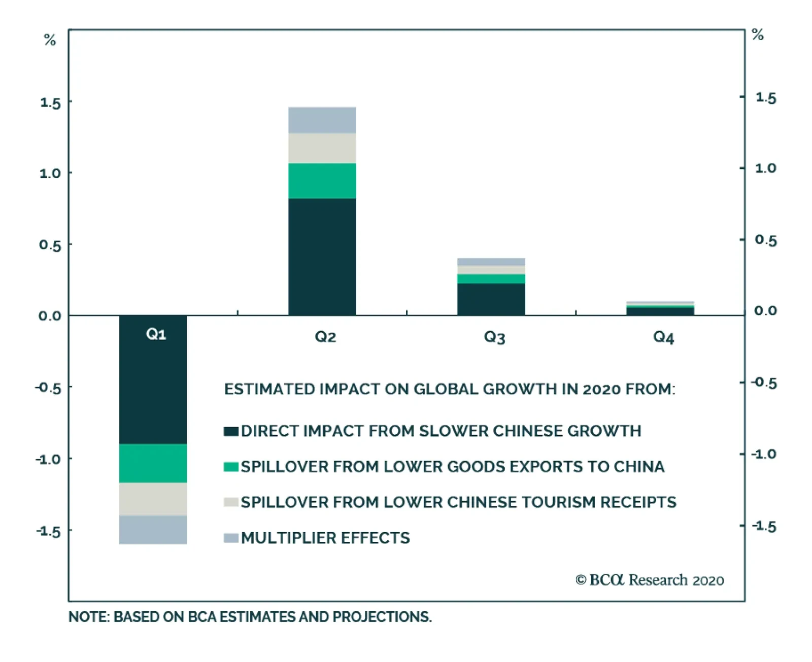
Last week, BCA Research's Global Investment Strategy concluded that the outbreak of the coronavirus is likely to depress global growth over the next couple of months, and possibly longer if the brewing crisis is not contained.
…
Highlights Global Growth & Market Volatility: Fears over global growth have pushed government bond yields lower as markets discount dovish monetary policy responses to the China viral outbreak. That combination may, perversely, be helping keep risk assets stable, even as investors try to assess the potential hit to global growth from a sharp China demand shock, through lower interest rate and currency volatility. Tactical Trade Overlay: We are in the process of revamping our Tactical Trade Overlay framework, thus we are closing all our recommended current positions this week. We will begin unveiling the new trade selection process - with more specific rules on idea development, holding period, security selection and performance measurement - in the coming weeks. Feature Chart of the WeekLow Inflation Sustaining The Low Volatility Backdrop
Low Inflation Sustaining The Low Volatility Backdrop
Low Inflation Sustaining The Low Volatility Backdrop
The timing of the coronavirus outbreak in China has introduced uncertainty into what was looking like a true bottom in global growth after the 2019 slowdown. The epicenter of that improvement seen in measures like the global PMI was China, where not only was there a visible pickup in soft data like the manufacturing PMI about also hard data like import growth. The coronavirus outbreak - and the severe actions to contain its spread via widespread quarantines, factory shutdowns, supply chain disruptions and travel bans – has most likely triggered a “sudden stop” in Chinese economic growth in the first quarter of the year that will spill over beyond China’s borders. This could potentially snuff out the nascent 2020 global growth recovery if the virus is not soon contained. Global government bond markets, however, have already discounted a fairly sharp slowdown in global activity. 10-year US Treasury yields are back below 1.6%. Inflation expectations across the developed economies remain well below central bank targets and short-term interest markets are discounting additional rate cuts to varying degrees. This has created a backdrop of relative tranquility in interest rate and currency markets, with option implied volatilities for the latter back to post-crisis lows (Chart of the Week). Perversely, the shorter-term uncertainty surrounding the coronavirus outbreak may have created a backdrop for risk assets to stay resilient, by reducing the more longer-lasting uncertainty that comes from interest rate and currency market volatility. Perversely, the shorter-term uncertainty surrounding the coronavirus outbreak may have created a backdrop for risk assets to stay resilient, by reducing the more longer-lasting uncertainty that comes from interest rate and currency market volatility. If the virus is contained and the hit to the world economy limited to just the first quarter of the year, then our underlying thesis of faster growth underpinning another year of global corporate bond market outperformance versus government bonds will remain intact. Extending The “Sweet Spot” For Global Risk Assets Chart 2How Low Will These Go?
How Low Will These Go?
How Low Will These Go?
Investors are right to be worried about the potential hit to the global economy from China. Prior to the outbreak of the coronavirus, a modest improvement in Chinese import demand was underway that was finally starting to put a floor under global trade activity after the sharp 2019 downturn (Chart 2). Without that boost from Chinese demand, the world economy will be far less likely to recover in 2020. BCA Research’s Chief Investment Strategist, Peter Berezin, has attempted some back-of-the-envelope calculations to determine the potential hit to global growth from a “sudden stop” of China’s economy from the coronavirus.1 Assuming that real GDP growth will essentially be zero in the first quarter of 2020, Peter calculates that global growth will slow to 1.7% in Q1 – or one-half the IMF’s expected average growth rate for 2020 of 3.4%. The bulk of that effect comes from the direct impact of Chinese growth slowing from a trend pace of 5.5% in Q1, but that also includes spillover effects to the rest of the world from weaker Chinese spending on imported goods and tourism (Chart 3). Chart 3Chinese GDP Growth Will Plunge In Q1, But Should Recover In The Remainder Of 2020 - Provided The Coronavirus Outbreak Is Contained
Slow & Steady Wins The Race
Slow & Steady Wins The Race
Importantly, Peter sees Chinese and global growth recovering during the rest of 2020, if the virus is contained by the end of March. The potential hit to overall global growth this year would only be 0.3 percentage points under that scenario. There is obviously a lot of uncertainty involved in making such estimates, from the timing of the spread of the virus to the potential monetary and fiscal policy responses from China (and other nations) to boost growth. Yet a total hit to global growth of only 0.3 percentage points would be fairly modest and may not end up derailing the signs of an economic rebound seen in indicators like the ZEW economic sentiment surveys. The individual country expectations component of the ZEW survey have shown solid improvements for the US, the UK, the euro area and even Japan over the past few months (Chart 4). Also, the current conditions component of the ZEW survey was just starting to bottom out in the most recent readings in the US, the UK and euro area. We have found that the spread between those two measures (ZEW current conditions minus expectations) is a reliable coincident indicator of year-over-year real GDP growth in the countries surveyed. Chart 4Will The Coronavirus Delay, Or Derail, The Recovery Process?
Will The Coronavirus Delay, Or Derail, The Recovery Process?
Will The Coronavirus Delay, Or Derail, The Recovery Process?
As of the latest read of the data from mid-January – importantly, before the start of the more widespread media coverage of the viral outbreak in China – the “current conditions minus expectations gap” from the ZEW survey was still trending downward (Chart 5). Chart 5The ZEW "Current Vs Expected" Gap Is Still Signaling Soft Global Growth
The ZEW "Current Vs Expected" Gap Is Still Signaling Soft Global Growth
The ZEW "Current Vs Expected" Gap Is Still Signaling Soft Global Growth
In other words, the boost in expectations had not yet translated into in a larger pickup in current economic activity. The risk now is that the turnaround in that gap, and in global GDP growth, will be delayed by a severe pullback in Chinese demand. The response of global business confidence to the virus is critical. According to the Duke University CFO Global Business Outlook survey taken at the end of 2019, more than half (52%) of US CFOs believe the US will be in an economic recession by the end of 2020, and 76% predict a recession by mid-2021. These numbers are similar to the 2018 survey, where 49% of CFOs thought a recession was likely by the end of 2019 and 82% predicted a recession by the end of 2020. The “CFO recession odds” are even larger outside the US, particularly in Asia and Latin America (Chart 6). Chart 6Duke/CFO Survey Respondents' 1-Year-Ahead Probability Of A Recession
Slow & Steady Wins The Race
Slow & Steady Wins The Race
The Duke CFO survey also asks a question on CFO optimism about the outlook for their own businesses. That data, measured on a scale of 0 to 100, shows that companies remain relatively optimistic about their own companies (Chart 7). The levels of optimism at the end of 2019 were roughly the same as at the end of 2018, except for the US where CFO optimism has soared above the highs seen prior to the 2008 financial crisis (Chart 8). Chart 7Duke/CFO Survey Respondents’ Own Company Optimism Level
Slow & Steady Wins The Race
Slow & Steady Wins The Race
Chart 8US Companies Are Thinking Globally, But Acting Locally
US Companies Are Thinking Globally, But Acting Locally
US Companies Are Thinking Globally, But Acting Locally
The interesting implication of this data is that a considerable number of global companies has believed that recession was “only a year or two away” since the end of 2018, but have not expressed similar pessimism when it comes to their own businesses. The extreme financial market volatility at the end of 2018 likely explains why investors thought a recession was likely in 2019 or 2020, while the US-China trade war last year meant those recession fears were “extended” into 2020 and 2021. Yet one big variable changed over that period since the end of 2018 – global monetary policy was eased significantly and bond yields (i.e. borrowing costs) fell sharply for both governments and companies. Looking ahead, the likely policy response to the sharp fall in Chinese growth in Q1/2020 will be continued dovishness from global central bankers. With the US dollar now firming again, in what is shaping up to be a typical response of the greenback to slower global growth expectations, the reflation narrative that was brewing for 2020 has been postponed (Chart 9). With the US dollar now firming again, in what is shaping up to be a typical response of the greenback to slower global growth expectations, the reflation narrative that was brewing for 2020 has been postponed. A softer US dollar is a necessary ingredient for that reflation. Thus, a stable-to-firmer dollar will keep global inflation pressures muted, allowing central banks to maintain their current dovish policy biases. This will help keep market volatility for bonds, currencies and equities subdued – if the China demand shock to global growth is contained to the first quarter. From a fixed income investment perspective, an extended period of low rates/currency volatility, combined with very low government yields already reflecting a sharp global growth slowdown that is not yet assured, is an ideal “sweet spot” backdrop for corporate credit spreads to remain relatively stable. From a fixed income investment perspective, an extended period of low rates/currency volatility, combined with very low government yields already reflecting a sharp global growth slowdown that is not yet assured, is an ideal “sweet spot” backdrop for corporate credit spreads to remain relatively stable (Chart 10). Chart 9Renewed USD Strength Would Delay Global Reflation
Renewed USD Strength Would Delay Global Reflation
Renewed USD Strength Would Delay Global Reflation
We continue to recommend a strategic (6-12 months) overweight allocation to corporate credit versus government bonds for global fixed income investors, focused on high-yield credit in the US. Chart 10Still A Sweet Spot For Global Credit
Still A Sweet Spot For Global Credit
Still A Sweet Spot For Global Credit
Bottom Line: Fears over global growth have pushed government bond yields lower as markets discount dovish monetary policy responses to the China viral outbreak. That combination may, perversely, be helping keep risk assets stable, even as investors try to assess the potential hit to global growth from a sharp China demand shock, through lower interest rate and currency volatility. A Quick Note: Rebooting Our Tactical Trade Overlay Framework Back in 2016, we introduced a part of our service that was separate from our main framework which emphasized medium-term (6-12 month) investment recommendations.2 We called this piece our Tactical Trade Overlay and it was intended to focus on ideas with shorter-term horizons (less than 6-months) with specific “exit strategies”. The majority of past trades included in the Overlay did fit that description. The current list of open positions, however, has drifted away from the original mandate with recommendations now being held far longer than six months. We are in the process of developing a new framework for the Tactical Trade Overlay, with more specific rules on idea development, holding period, security selection and performance measurement. Thus, this week, we are closing out all the recommendations currently in the Overlay (see the table on page 12). The goal is to create a list of trade suggestions for our clients with the capability and/or mandate to seek out “quicker” ideas that can also be implemented in more liquid instruments whenever possible. The new Overlay will also include ideas from smaller fixed income markets not included in our Model Bond Portfolio (i.e. New Zealand or Sweden), but with the same focus on holding periods of six months or less. We will be introducing the new Tactical Overlay framework over the next few months. We plan on publishing separate reports covering the new process for selecting ideas for different types of fixed income trades, similar to the current groupings in the Overlay (rates trades, yield curve trades, relative value trades, inflation trades). The first such report, to be published by the end of February, will introduce a methodology for identifying yield curve trades in global government bond markets. Robert Robis, CFA Chief Fixed Income Strategist rrobis@bcaresearch.com Footnotes 1 Please see BCA Research Global Investment Strategy Weekly Report, "From China To Iowa", dated February 7, 2020, available at gis.bcaresearch.com. 2 Please see BCA Research Global Fixed Income Strategy Special Report, "GFIS Overlay Trades Review", dated October 4, 2016, available at gfis.bcaresearch.com. Recommendations The GFIS Recommended Portfolio Vs. The Custom Benchmark Index
Slow & Steady Wins The Race
Slow & Steady Wins The Race
Duration Regional Allocation Spread Product Tactical Trades Yields & Returns Global Bond Yields Historical Returns