Global

Dear Client, This week, I provided an update through a webcast on the economic and financial market outlook in the era of the COVID-19 outbreak. You can access the webcast here. In lieu of our regular report this week, we are sending you a Special Report from my colleague Jonathan LaBerge. Jonathan shows why the most widely cited estimate of the US neutral rate of interest, the Laubach & Williams estimate of “R-star”, is very likely wrong and that the true neutral rate may be higher than many investors believe. While bond yields may not rise significantly in the near-term, this underscores that they have the potential to rise meaningfully over a cyclical and secular horizon once a post-COVID-19 expansion takes hold. I hope you find the report insightful. Please note that next week we will be publishing our quarterly Strategy Outlook. Best regards, Peter Berezin, Chief Global Strategist Highlights Global investors have come to accept the secular stagnation narrative as described by Larry Summers in November 2013, and have gravitated to the only available real time estimate of the real neutral rate of interest: the Laubach & Williams (“LW”) “R-star” estimate. With this apparent visualization of secular stagnation as a guide, many investors have concluded that monetary policy ceased to be stimulative last year and that recent Fed rate cuts will be of limited benefit to economic activity even once economic recovery takes hold unless inflation meaningfully accelerates (thus pushing real rates lower for any given nominal Fed funds rate). This report revisits the “LW” R-star estimate in detail, and demonstrates why the estimation is almost certainly wrong, at least over the past two decades. We also outline an inferential approach that investors can use to monitor where the neutral rate is in real time and whether it is rising or falling. The core conclusion for investors is that US Treasury yields reflect a “low rates forever” view with much higher certainty than is analytically warranted and thus appear to be anchored by a false narrative. While bond yields may not rise significantly in the near-term, investors should avoid dogmatic medium-to-longer term views about yields as they may rise meaningfully over a cyclical and secular horizon once a post-COVID-19 expansion takes hold. Feature Over the past several weeks financial markets have moved rapidly to price in a global recession stemming from the COVID-19 outbreak. As financial market participants began to turn to policy makers for support, eyes focused first on the Federal Reserve, and then fiscal authorities. Earlier this week, the ECB joined the party and announced aggressive further measures of its own. When responding to the Fed’s return to the lower bound and its other recent monetary policy decisions, many market participants have expressed the view that the Fed is largely impotent to deal with a global pandemic. There are three elements to this view. The first is that interest rate cuts are ill equipped to stimulate domestic demand if quarantine measures or other forms of “social distancing” are in effect. The second element is that the Fed has only been capable of delivering a fraction of the reduction in interest rates compared to what has occurred in response to previous contractions. The third aspect of this view is that because the neutral rate of interest is so much lower now than it was in the past, Fed rate cuts will not be as stimulative as they were before. Chart 1Monetary Policy Ceased To Be Stimulative Last Year, According To The LW R-star Estimate
Monetary Policy Ceased To Be Stimulative Last Year, According To The LW R-star Estimate
Monetary Policy Ceased To Be Stimulative Last Year, According To The LW R-star Estimate
While we at least partly agree with the first and second elements of this view, we feel strongly that the third is flawed. Global investors have come to accept the secular stagnation narrative as described by Larry Summers in November 2013,1 and have gravitated to the only available real time estimate of the neutral rate of interest: the Laubach & Williams (“LW”) “R-star” estimate. This time series, which is regularly updated by the New York Fed,2 suggests that the real fed funds rate reached neutral territory in the first quarter of 2019 (Chart 1). With this apparent visualization of secular stagnation as a guide, many investors have concluded that monetary policy ceased to be stimulative last year and that recent Fed rate cuts will be of limited benefit to economic activity even beyond the near term unless inflation meaningfully accelerates (thus pushing real rates lower for any given nominal Fed funds rate). In this Special Report we revisit the “LW” R-star estimate in detail, and demonstrate why the estimation is almost certainly wrong, at least over the past two decades. Our analysis does not reveal a precise alternative estimate of the neutral rate, although we do provide some inferential perspective on how investors may be able to monitor where the neutral rate is in real time and whether it is rising or falling. However, the core insight emanating from our report, particularly for US fixed income investors, is that US Treasury yields reflect a “low rates forever” view with much higher certainty than is analytically warranted and thus appear to be anchored by a false narrative. While bond yields may not rise significantly in the near-term, this underscores that they have the potential to rise meaningfully over a cyclical and secular horizon once economic activity recovers. As such, we caution fixed-income investors against dogmatic medium-to-longer term views about bond yields, as their potential to rise may be larger than many investors currently expect. Demystifying The LW R-star Estimate The LW estimate of the neutral rate of interest has gained credibility for three reasons. First, as noted above, the evolution of the series fits with the secular stagnation narrative re-popularized by Larry Summers. Second, the series is essentially sponsored by the Federal Reserve even if it is not officially part of the Fed’s forecasting framework, as its two creators are long-time Fed employees (Thomas Laubach is a director of the Fed’s Board of Governors, and John Williams is the current President of the New York Fed). But, in our view, there is a third important reason that global investors have accepted the LW R-star estimate of the neutral rate of interest: the methodology used to generate the estimate is extremely technically complex, and thus is difficult for most investors to penetrate. Much of the technical complexity of the LW estimate is centered around the use of a statistical procedure called a Kalman filter (“KF”). Simply described, the KF is an algorithm that tries to estimate an unobservable variable based on 1) an idea of how the unobservable variable might relate to an observable variable (the “measurement equation”), and 2) an idea of how the unobservable variable might change through time (the “transition equation”). Through a repeated process of simulating the unobserved variable based on a set of assumptions, the KF is able to compare predicted results to actual results on an observation-by-observation basis, and use that information to generate ever more reliable future estimates of the unobserved variable (Chart 2). Chart 2A Very Simplified Overview Of The Kalman Filter Algorithm
Revisiting The Neutral Rate Of Interest: A Contrarian View In A Time Of Crisis
Revisiting The Neutral Rate Of Interest: A Contrarian View In A Time Of Crisis
We acknowledge that a full technical treatment of the Kalman Filter as it relates to the LW estimate of the neutral rate of interest is beyond the scope of this report, and we provide a more technical overview in Box 1. But what emerges from a detailed analysis of the model is that the Kalman Filter jointly estimates R-star, potential GDP growth, potential GDP, and the variable “z”, the determinants of R-star that are not explained by potential GDP growth. As we will highlight in the next section, this joint estimation of these four variables is a crucial aspect of the model, because a valid estimate of R-star necessitates a valid estimate of the remaining variables. Box 1 A Technical Overview Of The Laubach & Williams R-star Model
Revisiting The Neutral Rate Of Interest: A Contrarian View In A Time Of Crisis
Revisiting The Neutral Rate Of Interest: A Contrarian View In A Time Of Crisis
Debunking The LW R-star Estimate Before criticizing the LW estimate of the neutral rate of interest, it is important for us to note that we have the utmost respect for the Federal Reserve and its research methods. We fully acknowledge that the LW R-star estimation is rooted in solid economic theory, and we have identified no technical errors in the setup of the LW model. Nevertheless, valid analytical efforts sometimes lead to problematic real-world results, and there are two key reasons to believe that the Kalman filter in the LW model is almost certainly misspecifying R-star, at least in terms of its estimate over the past two decades. The first reason relates to the sensitivity of the model to the interval of estimation (the period over which R-star is estimated). Chart 3 presents the range of quarterly estimates of R-star since 2005, along with the difference between the high and low end of the range in the second panel. The chart shows that while previous estimates of R-star have generally been stable for values ranging between the early-1980s and 2006/2007, pre-1980 estimates have varied quite substantially and we have seen material revisions to the estimates over the past decade. Q1 2018 serves as an excellent example: in that quarter R-star was estimated to be 0.14%; today, the Q1 2018 R-star estimate sits at 0.92%. Chart 3Since 2005, There Has Been Some Instability In The LW R-star Estimates
Since 2005, There Has Been Some Instability In The LW R-star Estimates
Since 2005, There Has Been Some Instability In The LW R-star Estimates
However, Table 1 and Chart 4 highlight the real instability of the Kalman filter estimation by demonstrating the effect of varying the starting point of the model (please see Box 2 for a brief description of how our estimation of R-star using the LW approach differs slightly from the original procedure). Laubach & Williams originally estimated R-star beginning in Q1 1961; Table 1 shows what happens to today’s estimate of R-star simply by incrementally varying the starting point of the model from Q1 1958 to Q4 1979. Table 1Alternative Current LW Estimates Of R-star By Model Starting Point
Revisiting The Neutral Rate Of Interest: A Contrarian View In A Time Of Crisis
Revisiting The Neutral Rate Of Interest: A Contrarian View In A Time Of Crisis
Chart 4Alternative Starting Points Produce Wildly Different Estimates Of R-star Today
Revisiting The Neutral Rate Of Interest: A Contrarian View In A Time Of Crisis
Revisiting The Neutral Rate Of Interest: A Contrarian View In A Time Of Crisis
Box 2 The Laubach & Williams R-star Model With Simplified Inflation Expectations
Revisiting The Neutral Rate Of Interest: A Contrarian View In A Time Of Crisis
Revisiting The Neutral Rate Of Interest: A Contrarian View In A Time Of Crisis
The table highlights that the model fails to even generate a result in a majority of the cases (only 39 out of 88 of the model runs were error-free). In addition, Chart 4 shows that of the successful estimates of R-star using the LW procedure and alternate starting dates of the model, the estimate of R-star today varies from -2% (in one case) to +2%. Excluding the one extremely negative outlier results in an effective estimate range of 0% to 2%, but the key point for investors is that this range is massive and underscores that the original model’s estimate of R-star today is heavily and unduly influenced by the interval of estimation. Investors should also note that of all of the alternative estimates of R-star today shown in Chart 4, the estimate using the original interval is very much on the low end of the distribution. The second (and most important) reason to believe that the LW estimate is misspecifying R-star is that the output gap estimate generated by the model is almost certainly invalid, at least over the past two decades. Chart 5 presents the LW output gap estimate alongside an average of the CBO, OECD, and IMF estimates of the gap; panel 1 shows the official current LW output gap estimate, whereas panel 2 shows the range of output gap estimates that are generated using the different estimation intervals highlighted in Table 1 and Chart 4. Given that the Kalman filter in the LW model jointly determines R-star and the output gap (by way of estimating potential output via estimating potential GDP growth) and that these estimates are dependent on each other, Chart 5 highlights that in order to believe the LW R-star estimate investors must believe three things: That the US economy was chronically below potential in the late-1990s when the unemployment rate was below 5%, real GDP growth averaged nearly 5%, and the equity market was booming, That output exceeded potential in 2004/2005 by a magnitude not seen since the late-1970s / early-1980s despite an average unemployment rate, That the 2008/2009 US recession was not particularly noteworthy in terms of its deviation from potential output, and that the economy had returned to potential output by 2010/2011 when the unemployment rate was in the range of 8-9%. Chart 5The LW Output Gap Estimates, Upon Which R-star Depends, Have Been Wrong For Two Decades
The LW Output Gap Estimates, Upon Which R-star Depends, Have Been Wrong For Two Decades
The LW Output Gap Estimates, Upon Which R-star Depends, Have Been Wrong For Two Decades
While we do not believe any of these three statements, the third is especially unlikely. Chart 6 highlights that the economic expansion from 2009 – 2020 was the weakest on record in the post-war era in terms of average annual real per capita GDP growth. To us, this is a clear symptom of a chronic deficiency in aggregate demand, and that it is essentially unreasonable to argue that the economy was operating at full employment prior to 2014/2015. This means that the Kalman filter is generating incorrect and unreliable estimates of the output gap, which means in turn that the filter’s estimation of R-star is almost assuredly wrong. Chart 6The US Economy Was Definitely Not At Full Employment In 2010
Revisiting The Neutral Rate Of Interest: A Contrarian View In A Time Of Crisis
Revisiting The Neutral Rate Of Interest: A Contrarian View In A Time Of Crisis
How Can Investors Tell What The Neutral Rate Is? An Inferential Approach Table 2 presents the sensitivity of the original Q1 1961 LW estimate of R-star to a series of counterfactual scenarios for inflation, real GDP growth, nominal interest rates, and import and oil prices since mid-2009. While these scenarios do not in any way improve the validity of the LW R-star estimate, they do help clarify the theoretical basis of the model and they help reveal how investors may infer whether the neutral rate of interest is higher or lower than prevailing market rates, and whether it is rising or falling. Table 2 highlights that today’s estimate of R-star using the original LW approach is mostly sensitive to our counterfactual scenarios for growth and interest rates, but not inflation or oil prices. Shifting down import price growth also has a meaningful effect on R-star, but since core import price growth has been particularly weak over the past several years (Chart 7), it seems unreasonable to suggest that they have been abnormally high and thus “explain” a low R-star estimate today. Table 2Sensitivity Of Current LW R-star Estimate To Counterfactual Scenarios (2009 - Present)
Revisiting The Neutral Rate Of Interest: A Contrarian View In A Time Of Crisis
Revisiting The Neutral Rate Of Interest: A Contrarian View In A Time Of Crisis
Chart 7Core Import Price Growth Has Been Weak On Average During This Expansion
Core Import Price Growth Has Been Weak On Average During This Expansion
Core Import Price Growth Has Been Weak On Average During This Expansion
Table 2 essentially highlights that the entire question of the neutral rate of interest over the past decade, and the core contradiction that led to the re-emergence of the secular stagnation thesis, can effectively be boiled down to the following simple question: “Why hasn’t US economic growth been stronger this cycle, given that interest rates have been so low?” Based on the (hopefully uncontroversial) view that interest rates influence economic activity and that economic activity influences inflation, we propose the following checklist for investors to ask themselves in order to not only determine the answer to this important question, but to help identify whether R-star in any given country is likely higher or lower than existing policy rates at any given point in time. Are interest rates above or below the prevailing level of economic growth? Are interest rates rising or falling, and how intensely? Are there identifiable non-monetary shocks (positive or negative) that appear to be influencing economic activity? Is private sector credit growth keeping pace with economic growth? Are debt service burdens in the economy high or low? The first question reflects the most basic view of R-star, which is that the real neutral rate of interest should be equal to, or at least closely related to, the potential growth rate of the economy, ceteris paribus. Questions 2 through 5 attempt to determine whether ceteris paribus holds. In terms of how the answers to these questions relate to identifying the neutral rate, consider two economies, “Economy A” and “Economy B” (Chart 8). Economy A has broadly stable or slightly rising interest rates that are well below prevailing rates of economic growth (questions 1 & 2), no obvious beneficial shocks to domestic demand from fiscal policy or other factors (question 3), and strong private sector credit growth that is perhaps above or strongly above the current pace of GDP growth (question 4). Chart 8''Economy A'', Versus ''Economy B''
Revisiting The Neutral Rate Of Interest: A Contrarian View In A Time Of Crisis
Revisiting The Neutral Rate Of Interest: A Contrarian View In A Time Of Crisis
Inferentially, it would seem that interest rates in this hypothetical economy are below R-star today. Question 5 is in our list because the more that active private sector leveraging occurs (thus pushing up debt burdens), the more that we would expect R-star in the future to fall. This is because debt payments as a share of income cannot rise forever, and we would expect that the capacity of economy A’s central bank to raise interest rates in the future are negatively related to economy A’s private sector debt service burden today. Now, imagine another economy (“Economy B”) with interest rates well below average rates of economic growth, an interest rate trend that is flat-to-down, no identifiable non-monetary policy shocks that are restricting aggregate demand, persistently sluggish credit growth, and high private sector debt service burdens in the past. If economy B is growing (even sluggishly) and not in the middle of a recession, it would seem that prevailing interest rates are below R-star, but not significantly so. In this scenario it would seem reasonable to conclude that R-star in economy B has fallen non-trivially below its potential growth rate, and that interest rate increases are likely to move monetary policy into restrictive territory earlier than otherwise would be the case. Is The United States “Economy B”? From the perspective of some investors, our description of economy B above perfectly captures the experience of the US over the past decade: an extremely low Fed funds rate, sluggish to weak growth and inflation, all the result of a huge build-up in leverage and debt service burdens during the last economic cycle. We do not doubt that R-star fell in the US for some period of time during the global financial crisis and in the early phase of the economic recovery. But we doubt that it is as low today as the secular stagnation narrative would imply, in large part because it ignores several important aspects concerning questions 2 through 5 noted above. Chart 9Fiscal Austerity Has Been A Serious Non- Monetary Shock To Aggregate Demand
Fiscal Austerity Has Been A Serious Non-Monetary Shock To Aggregate Demand
Fiscal Austerity Has Been A Serious Non-Monetary Shock To Aggregate Demand
Non-monetary shocks to the US and global economies: Over the past 12 years, there have been at least five deeply impactful non-monetary shocks to both the US and global economies that have contributed to the disconnect between growth and interest rates: 1) a prolonged period of US household deleveraging from 2008-2014, 2) the euro area sovereign debt crisis, 3) fiscal austerity in the US, UK, and euro area from 2010 – 2012/2014 (Chart 9), 4) the US dollar / oil price shock of 2014, and 5) the recent trade war between the US and China. Several of these shocks have been policy-driven, and in the case of austerity the negative consequences of that policy has led to a lasting change in thinking among fiscal authorities (outside of Japan) that is unlikely to reverse in the near-future. Private sector credit growth: Chart 10 highlights the extent of household deleveraging noted above by showing the growth in total household liabilities over the past decade alongside income growth. Panel 2 shows the leveraging trend of firms, as represented by the nonfinancial corporate sector debt-to-GDP ratio. Chart 10 underscores two points: the first is that while US household sector credit contracted for several years following the global financial crisis, it is now growing again and has largely closed the gap with income growth. The second point is that the nonfinancial corporate sector has clearly leveraged itself over the course of the expansion, arguing that interest rates have not in any way been restrictive for businesses. While it is true that firms have largely leveraged themselves to buy back stock instead of significantly increasing capital expenditures, in our view this reflects the fact that US consumer demand was impaired for several years due to deleveraging. We doubt that firms would have altered their capital structures to this degree if they did not view interest rates as extremely low. Chart 10Recent Trends In US Private Sector Leverage Do Not Suggest R-star Is Very Low
Recent Trends In US Private Sector Leverage Do Not Suggest R-star Is Very Low
Recent Trends In US Private Sector Leverage Do Not Suggest R-star Is Very Low
Debt service burdens: Chart 11 highlights that US household debt service burdens were at very elevated levels prior to the financial crisis, suggesting that the neutral rate did fall for some time following the recession. But today, the debt burden facing households is the lowest it has been in the past 40 years due to both rate reductions and deleveraging, arguing against the view that household debt levels will structurally weigh on interest rates in the years to come. Chart 12 shows that the picture is different for nonfinancial corporations, as the substantial leveraging noted above has indeed raised debt service burdens for firms. However, the nonfinancial corporate sector debt service ratio remains 400 basis points below early-2000 levels when excess corporate sector liabilities had a clear impact on the economy, suggesting that the Fed’s capacity to raise interest rates still exists following the onset of economic recovery if corporate sector credit growth does not rise sharply relative to GDP over the coming 6-12 months. Chart 11The Debt Burden Facing US Households Is At A Record Low
The Debt Burden Facing US Households Is At A Record Low
The Debt Burden Facing US Households Is At A Record Low
Chart 12Businesses Have Levered Up Their Balance Sheets, But There Is Still Room For Rates To Rise
Businesses Have Levered Up Their Balance Sheets, But There Is Still Room For Rates To Rise
Businesses Have Levered Up Their Balance Sheets, But There Is Still Room For Rates To Rise
The intensity of recent interest rate changes: Finally, many investors have pointed to sluggish housing activity over the past three years as evidence of a low neutral rate. However, Chart 13 highlights that the rise in the 30-year US mortgage rate from late-2016 to late-2018 was one of the largest two-year changes in US history, and Chart 14 shows that the growth in household mortgage credit did not fall below its trend during this period until Q4 2018, when the US stock market fell 20% from its high in response to the economic consequences of the US/China trade war. Chart 14 also shows that mortgage credit growth responded sharply to a recent reduction in interest rates. All in all, Charts 13 & 14 cast doubt on the notion that the level of mortgage rates over the past three years reached restrictive territory. Chart 13Mortgage Rates Rose Very Significantly From Late-2016 To Late-2018
Mortgage Rates Rose Very Significantly From Late-2016 To Late-2018
Mortgage Rates Rose Very Significantly From Late-2016 To Late-2018
Chart 14A Record Rise In Mortgage Rates Did Not Crack The Housing Market
A Record Rise In Mortgage Rates Did Not Crack The Housing Market
A Record Rise In Mortgage Rates Did Not Crack The Housing Market
Investment Conclusions In the face of a global pandemic and an attendant global recession this year, the idea of eventual Fed rate hikes and the notion that the US economy will be able to tolerate them likely seems preposterous to many investors. We agree that over the coming 6-12 months US Treasury yields are unlikely to rise; even at current levels of the 10-year Treasury yield, we are reluctant to call a trough. Chart 15US 10-Year Treasurys Are Mostly Priced For A Repeat Of The Past Decade
US 10-Year Treasurys Are Mostly Priced For A Repeat Of The Past Decade
US 10-Year Treasurys Are Mostly Priced For A Repeat Of The Past Decade
However, Chart 15 highlights that over a long-term time horizon, the bond market is now essentially priced for a repeat of the ten-year path of the Fed funds rate following the global financial crisis. While some investors will view this as a reasonable expectation in the face of what they see as a persistent and unexplainable gap between growth and interest rates over the past decade, we think this gap is explainable and we highly doubt that a pandemic with minimal mortality risk to the working age population and the young will cause the US economy to be afflicted with active consumer deleveraging lasting 4 to 6-years, substantial and wide-ranging fiscal austerity, persistently rising trade tariffs, and sharply lower oil prices. So while we agree that the US economy will be substantially cyclically affected by COVID-19, US Treasury yields reflect a “low rates forever” view with much higher certainty than is analytically warranted and thus appear to be anchored by a false narrative. As such, we caution fixed-income investors against dogmatic medium-to-longer term views about bond yields, as their potential to rise following the upcoming recession may be larger than many investors currently believe. Jonathan LaBerge, CFA, Vice President Special Reports jonathanl@bcaresearch.com Footnotes 1 "IMF Fourteenth Annual Research Conference in Honor of Stanley Fischer," Washington DC, November 8, 2013. 2 "Measuring the Natural Rate of Interest," Federal Reserve Bank of New York. Global Investment Strategy View Matrix
Revisiting The Neutral Rate Of Interest: A Contrarian View In A Time Of Crisis
Revisiting The Neutral Rate Of Interest: A Contrarian View In A Time Of Crisis
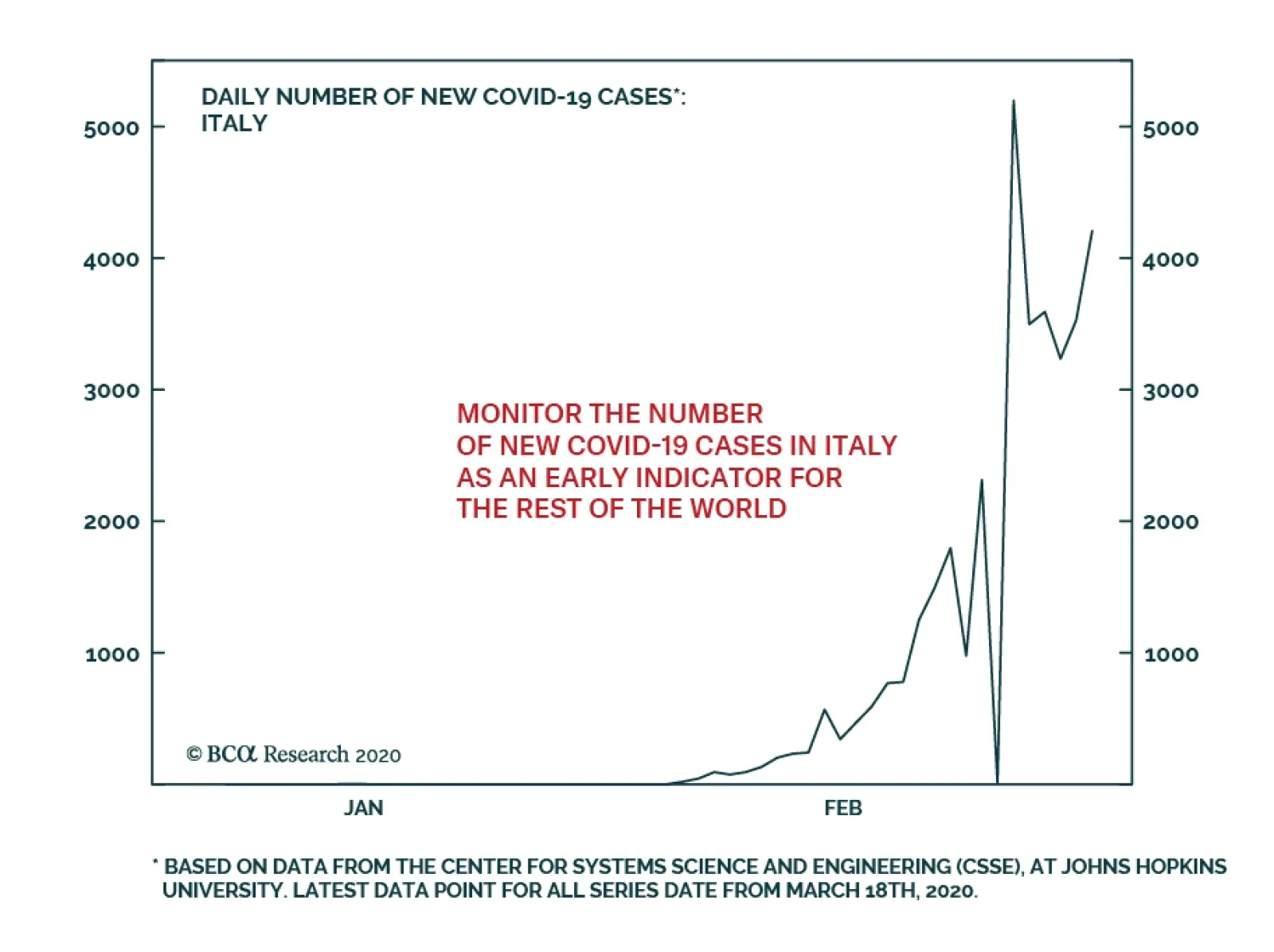
We recommend investors closely follow the number of new COVID-19 cases in Italy. At 4,207, as of March 18th, this number remains lower than it was on March 13th. However, new cases have nonetheless trended up over that past three days. Italy is…
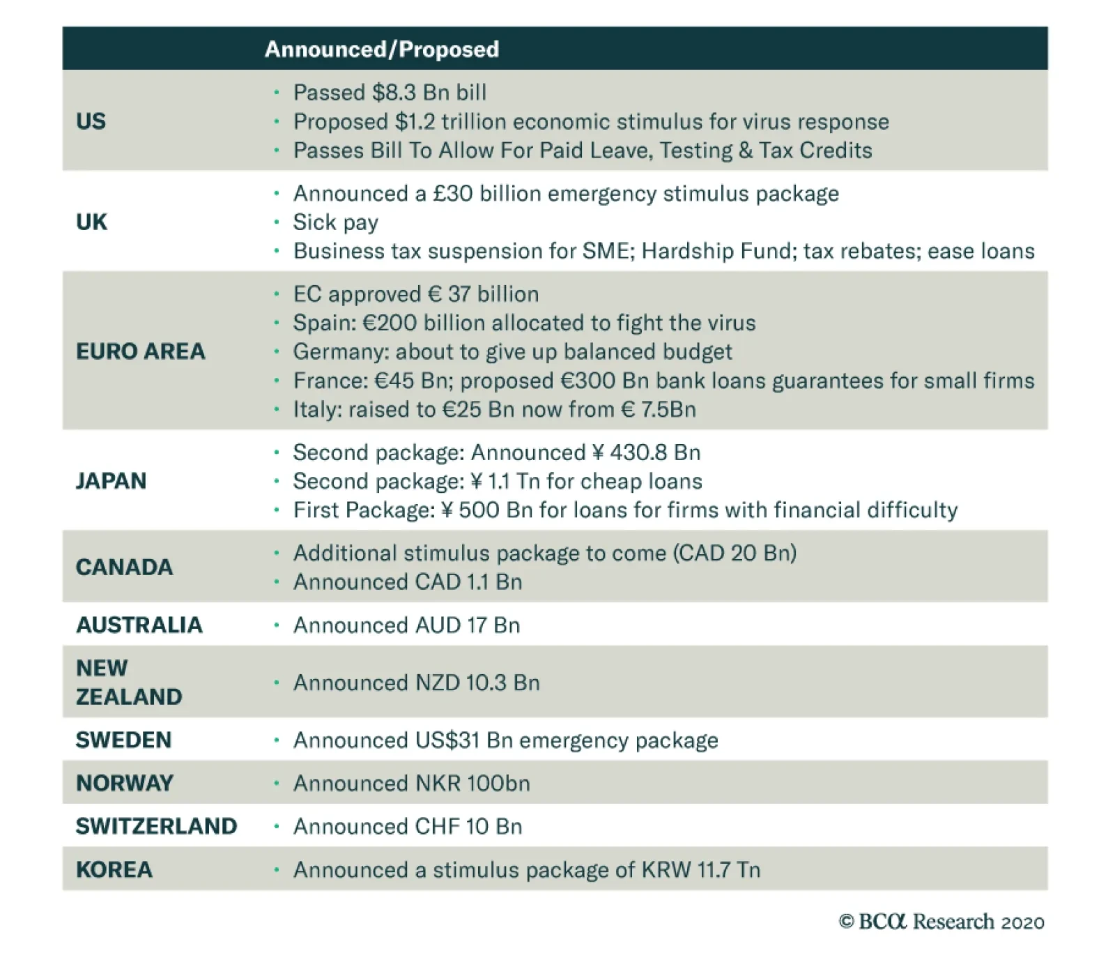
Highlights Policy Responses: The COVID-19 pandemic has become a full-blown global crisis and recession. Governments and central bankers worldwide are now responding with aggressive monetary easing and fiscal stimulus. Markets will not respond positively to such stimulus, however, until there is some visibility on the true depth, and duration, of the economic downturn. Fixed Income Strategy: With a global recession now a certainty, bond yields will remain under downward pressure and credit spreads should widen further. Given how far yields have already fallen, we recommend emphasizing country and credit allocation in global bond portfolios, while keeping overall duration exposure around benchmark levels. Model Portfolio Changes: Following up on our tactical changes last week, we continue to recommend overweighting government debt versus spread product. Specifically, overweighting US & Canadian government bonds versus Japan and core Europe, and underweighting US high-yield and all euro area and EM credit. Feature In stunning fashion, the sudden stop in the global economy due to the COVID-19 pandemic has triggered a rapid return to crisis-era monetary and fiscal policies. The battle has now shifted to trying to fill the massive hole in global private sector demand left by efforts to contain the spread of the virus. It is unlikely that lower interest rates and more quantitative easing can mitigate the negative growth effects from travel bans, closing of bars and restaurants, and full scale lockdowns of cities. Fiscal policy, combined with efforts to boost market liquidity and ease the coming collapse of cash flows for the majority of global businesses, are the only plausible options remaining. It is unlikely that lower interest rates and more quantitative easing can mitigate the negative growth effects from travel bans, closing of bars and restaurants, and full scale lockdowns of cities. While the speed of these dramatic policy moves is unprecedented, the reason for them is obvious. Plunging equities and surging corporate bond credit spreads are signaling a global recession, but one of uncertain depth and duration given the uncertainties surrounding the spread of COVID-19 (Chart of the Week). Chart of the WeekCan Crisis-Era Monetary Policies Be Effective During A Pandemic?
Can Crisis-Era Monetary Policies Be Effective During A Pandemic?
Can Crisis-Era Monetary Policies Be Effective During A Pandemic?
Chart 2Risk Assets Will Not Bottom Until New COVID-19 Cases Ex-China Peak
Risk Assets Will Not Bottom Until New COVID-19 Cases Ex-China Peak
Risk Assets Will Not Bottom Until New COVID-19 Cases Ex-China Peak
The ability for policymakers to calibrate stimulus measures is pure guesswork at this point. The same thing goes for investors who see zero visibility on global growth, with the full extent of the virus yet to be felt in large economies like the United States and Germany – even as new cases in China, where the epidemic began, approach zero. The response from central bankers has been swift and bold – rapid rate cuts, increased liquidity programs for bank funding and increased asset purchases. The fact that global financial markets have remained volatile, even after what is a clear coordinated effort from policymakers, highlights how the unique threats to growth from the COVID-19 pandemic may be beyond fighting with traditional demand-side stimulus measures. We continue to recommend a cautious near-term investment stance, particular with regards to corporate bond exposure, until there is clear evidence that the growth rate of new COVID-19 cases outside China has peaked (Chart 2). Policymakers Throw The Kitchen Sink At The Problem The market moves and policy announcements have come fast and furious this past week, from virtually all major economies. We summarize some of the moves below: United States The Fed cut rates by -100bps in a Sunday night emergency move, taking the funds rate back to the effective lower bound of 0% - 0.25%. Importantly, Fed Chair Powell made it clear at his press conference that negative rates are not on the table, suggesting that we may have seen the last of the rate cuts for this cycle. A new round of quantitative easing (QE) was also announced, with purchases of $500 billion of Treasury securities and $200 billion of agency MBS that will occur in the “coming months”; Powell hinted that those amounts could be increased, if necessary (Chart 3). The MBS purchases are a clear effort to help bring down mortgage rates, which have not declined anywhere near as rapidly as US Treasury yields during the market rout (bottom panel). The Fed also cut the discount window rate – the rate at which banks can borrow from the Fed for periods of up to 90 days – by -150bps, bringing it down to 0.25%. The Fed said it is “encouraging banks to use their capital and liquidity buffers” – essentially telling banks to hold less cash for regulatory purposes. The Fed also reduced the rate on its US dollar swap lines with other central banks. The new rate is OIS +25bps. Coming on top of the massive increase in existing repo lines last week, the Fed is attempting to ensure that banks, both in the US and globally, that need USD funding have more liquidity available to support lending. Already, there are signs of worsening liquidity in the bank funding markets, like widening FRA-OIS spreads, but also evidence of illiquidity in financial markets like wide bid-ask spreads on longer-maturity US Treasuries and the growing basis between high-yield bonds and equivalent credit default swaps (Chart 4). Chart 3A Return To Fed QE
A Return To Fed QE
A Return To Fed QE
Chart 4Market Liquidity Issues Forced The Fed's Hand
Market Liquidity Issues Forced The Fed's Hand
Market Liquidity Issues Forced The Fed's Hand
Turning to fiscal policy, the full response of the Trump administration is still being formed, but a major $850bn spending package has been proposed that would provide tax relief for American households and businesses while also including a $50bn bailout of the US airline industry. This comes on top of previously announced plans to offer free testing for the virus, paid sick leave, business tax credits and a temporary suspension of student loan interest payments. Chart 5The ECB Has Limited Policy Options
The ECB Has Limited Policy Options
The ECB Has Limited Policy Options
Euro Area The European Central Bank (ECB) unexpectedly made no changes to policy interest rates last week. It opted instead to increase asset purchases by €120bn until the end of 2020 (both for government bonds and investment grade corporates), while introducing more long-term refinancing operations (LTROs) to “provide a bridge” to the targeted LTRO (TLTRO-3) that is set to begin in June. The terms of TLTRO-3 were improved, as well; banks that accessed the liquidity to maintain existing lending could do so at a rate up to -25bps below the current ECB deposit rate of -0.5%, for up to 50% of the existing stock of bank loans. The ECB obviously had to do something, given the coordinated nature of the global monetary policy response to COVID-19. Yet the decisions taken show that the ECB is much more limited in its ability to ease policy further, with interest rates already negative, asset purchases approaching self-imposed country limits and, most worryingly, inflation expectations falling to fresh lows (Chart 5). The bigger responses to date have come on the fiscal front, with stimulus packages proposed by France (€45bn), Italy (€25bn), Spain (€3bn) and the European Commission (€37bn). The biggest news, however, came from Germany which has offered affected businesses tax breaks and cheap loans through the state development bank, KfW – the latter with an planned upper limit of €550bn (and with the German government assuming a greater share of risk on those new KfW loans). The German government has also vaguely promised to temporarily suspend its so-called “debt brake” to allow deficit financing of virus-related stimulus programs, if necessary. Other Countries The Bank of England cut interest rates by -50bps last week, while also lowering capital requirements for UK banks by allowing use of counter-cyclical buffers for lending. On the fiscal side, a £30bn package was introduced last week that included a tax cut for retailers, cash grants to small business, sick pay for those with COVID-19 and extended unemployment benefits. The Bank of Japan held an emergency meeting this past Sunday night, announcing no changes in policy rates but doubling the size of its ETF purchase program to $56 billion a year to $112 billion, while also increasing purchases of corporate bonds and commercial paper. The central bank also announced a new program of 0% interest loans to increase lending to businesses hurt by the virus. The Bank of Canada delivered an emergency -50bps cut in its policy rate last Friday, coming soon after the -50bp reduction from the previous week. The central bank also introduced operations to boost the liquidity of Canadian financial markets. The Canadian government also announced a fiscal package of up to C$20bn, including increased money for the state business funding agencies. The Reserve Bank of Australia did not cut its Cash Rate last week, which was already at a record-low 0.5%. It did, however, signal that it would begin a quantitative easing program for the first time, and introduce Fed-like repo operations, to provide more liquidity to the economy and local financial markets. The Australian government has also announced A$17bn of fiscal stimulus. Fiscal packages have also been introduced in New Zealand (where the Reserve Bank of New Zealand just cut its policy rate by -75bps), Sweden, Switzerland, Norway, and South Korea. To date, China has leaned more on monetary and liquidity measures – lowering interest rates and cutting reserve requirements – rather than a big fiscal stimulus package. Will all these policy measures be enough to offset the hit to global growth from COVID-19 and help stabilize financial markets? It is certainly a good start, particularly in countries with low government and deficit levels that have the fiscal space for even more stimulus, like Germany, Australia and Canada (Chart 6). Given these competing forces of global recession and monetary policy exhaustion on one side, but with increasingly more expansive fiscal policy on the other, we recommend a neutral (at benchmark) stance on overall global duration exposure on both a tactical and strategic basis. The ability to calibrate the necessary policy response is impossible to assess without knowing the full impact of COVID-19 pandemic on the global economy – including the size of related job losses and corporate defaults/bankruptcies. Policymakers are likely to listen to the combined message of financial markets – equity prices, credit spreads and government bond yields. The low level of yields and flat yield curves, despite near-0% policy rates across the developed world (Chart 7), suggests that investors see monetary policy as “tapped out”, leaving fiscal stimulus as the only way to fight the economic war against COVID-19. Chart 6At Global ZIRP, The Policy Focus Shifts To Fiscal
At Global ZIRP, The Policy Focus Shifts To Fiscal
At Global ZIRP, The Policy Focus Shifts To Fiscal
Chart 7Are Bond Yields Discounting A Global Liquidity Trap?
Are Bond Yields Discounting A Global Liquidity Trap?
Are Bond Yields Discounting A Global Liquidity Trap?
Given these competing forces of global recession and monetary policy exhaustion on one side, but with increasingly more expansive fiscal policy on the other, we recommend a neutral (at benchmark) stance on overall global duration exposure on both a tactical and strategic basis. Bottom Line: The COVID-19 pandemic has become a full-blown global crisis and recession. Governments and central bankers worldwide are now responding with aggressive monetary easing and fiscal stimulus. Markets will not respond positively to such stimulus, however, until there is some visibility on the true depth, and duration, of the economic downturn. Corporate Bonds In The US & Europe – Stay Tactically Defensive Chart 8This Crisis Is Different Than 2008
This Crisis Is Different Than 2008
This Crisis Is Different Than 2008
The COVID-19 global market rout has generated levels of market volatility not seen since the 2008 Global Financial Crisis. The US VIX index of option-implied equity volatility spiked to a high of 84, while the equivalent German VDAX measure reached a shocking high of 93. Equity valuations in both the US and Europe remain much higher on a forward price/earnings ratio basis compared to the troughs seen in 2008, even after the COVID-19 bear market. Yet even though volatility has returned to crisis-era extremes, and corporate credit has sold off hard in both the US and Europe, credit spreads remain well below the 2008 highs (Chart 8). Nonetheless, the credit selloff seen over the past few weeks has still been intense. Both investment grade and high-yield spreads have blown out, and across all credit tiers in both the US (Chart 9) and euro area (Chart 10). Even the highest-rated segments of the corporate bond universe have seen spreads explode, with AAA-rated investment grade spreads having doubled in both the US and Europe. Chart 9Broad-Based Spread Widening For Both Investment Grade...
Broad-Based Spread Widening For Both Investment Grade...
Broad-Based Spread Widening For Both Investment Grade...
Chart 10...And High-Yield
...And High-Yield
...And High-Yield
With the COVID-19 pandemic tipping the global economy into recession, it is not clear that the spread widening seen to date has been enough to compensate for the typical surge in downgrades and defaults seen during recessions – even though spreads do look wide on a duration-adjusted basis. With the COVID-19 pandemic tipping the global economy into recession, it is not clear that the spread widening seen to date has been enough to compensate for the typical surge in downgrades and defaults seen during recessions – even though spreads do look wide on a duration-adjusted basis. One of our favorite metrics to value corporate bonds is to look at option-adjusted spreads, adjusted for interest rate duration risk. We call this the 12-month breakeven spread, as it measures the amount of spread widening over one year that would leave corporate bond returns equal to those of duration-matched US Treasuries. We then look at the percentile rankings of those breakeven spreads versus their history as one indicator of corporate bond value. Chart 11US Corporates Look Cheaper On A Duration-Adjusted Basis
US Corporates Look Cheaper On A Duration-Adjusted Basis
US Corporates Look Cheaper On A Duration-Adjusted Basis
For the US, the 12-month breakeven spreads for the overall Bloomberg Barclays investment grade and high-yield indices are in the 82nd and 97th percentiles, respectively (Chart 11). This suggests that the latest credit selloff has made corporate debt quite cheap, although only looking through the prism of spread risk rather than potential default losses. Another of our preferred valuation metrics for high-yield debt is the duration-adjusted spread, or the high-yield index option-adjusted spread minus default losses. We then look at that default-adjusted spread versus its long-run average (+250bps) as a measure of high-yield value. To assess the current level of spreads, we use a one-year ahead forecast of the expected default rate using our own macro model. Over the past 12 months, the high-yield default rate was 4.5% and our macro model is currently calling for a rise to 6.2%. That estimate, however, does not yet include the certain hit to corporate profits from the COVID-19 recession. By way of comparison, the default rate peaked at 11.2% during the 2001/02 default cycle and at 14.6% during the 2008 financial crisis. In Chart 12, we show the historical default rate, our macro model for the default rate, and the history of the default-adjusted spread. We also show what the default-adjusted spread would look like in four different scenarios for the default rate over the next 12 months: 6%, 9%, 11% and 15%. The placement of these numbers in the bottom panel of Chart 12 indicates where the Default-Adjusted Spread will be if each scenario is realized. Chart 12US High-Yield Is Not Cheap On A Default-Adjusted Basis
US High-Yield Is Not Cheap On A Default-Adjusted Basis
US High-Yield Is Not Cheap On A Default-Adjusted Basis
Right now, our expectation is that there will be a virus driven US recession, but it will be shorter in magnitude than past recessions; this suggests a peak default rate closer to 9%. Such a scenario would still be consistent with a positive default-adjusted spread and likely positive excess returns for US high-yield relative to US Treasuries on a 12-month horizon. However, if a default rate similar to that seen during past recessions (11% or 15%) is realized, that would lead to a negative default-adjusted spread. Adding up both pieces of our valuation framework suggests that, while US high-yield spreads offer value on a duration-adjusted basis, spreads do not compensate enough for potential default losses if the US recession lasts longer than we expect. Thus, we recommend a tactical underweight position in US high-yield until we see better visibility on the severity, and duration, of the US recession. Adding up both pieces of our valuation framework suggests that, while US high-yield spreads offer value on a duration-adjusted basis, spreads do not compensate enough for potential default losses if the US recession lasts longer than we expect. As for euro area corporates, spreads for both investment grade and high-yield do look relatively wide on a breakeven spread basis, although less so than US credit (Chart 13). However, with the World Health Organization declaring Europe as the new epicenter of the COVID-19 pandemic, the harsh containment measures seen in Italy, Germany, France and elsewhere – coming from a starting point of weak overall economic growth – suggest that euro area spreads need to be wider to fully reflect downgrade and default risks. Chart 13Euro Area Corporates Look A Bit Cheaper On A Duration-Adjusted Basis
Euro Area Corporates Look A Bit Cheaper On A Duration-Adjusted Basis
Euro Area Corporates Look A Bit Cheaper On A Duration-Adjusted Basis
We recommend a tactical underweight allocation to both euro area corporate debt and Italian sovereign debt, as spreads have room to reprice wider to reflect a deeper recession (Chart 14). Chart 14Stay Underweight Euro Area Spread Product
Stay Underweight Euro Area Spread Product
Stay Underweight Euro Area Spread Product
Bottom Line: Corporate bond spreads on both sides of the Atlantic discount a sharp economic slowdown, but the odds of a deeper recession – and more spread widening - are greater in Europe relative to the US. A Quick Note On Recent Changes To Our Model Bond Portfolio In last week’s report, we made several adjustments to our model bond portfolio recommended allocations on a tactical (0-6 months) basis.1 Specifically, we downgraded our overall recommended exposure to global spread product to underweight, while increasing the overall allocation to government debt to overweight. The specific changes made to the model bond portfolio are presented in tables on pages 14 & 15. Within the country allocation of the government bond side of the portfolio, we upgraded US and Canada (markets more sensitive to changes in global bond yields, and with central banks that still had room to ease policy) to overweight, while downgrading core Europe to underweight and Japan to maximum underweight (both markets less sensitive to global yields and with no room to cut rates). On the credit side of the portfolio, we downgraded US high-yield to underweight (with a 0% allocation to Caa-rated debt), while also downgrading euro area investment grade and high-yield debt to underweight. We also lowered allocations to emerging market USD denominated debt, both sovereign and corporate, to underweight. We left the allocation to US investment grade debt at neutral, as the other reductions left our overall spread product allocation at the desired level (35% versus the 43% spread product weighting in our custom benchmark portfolio index). In terms of the specific weightings, the portfolio is now +11% overweight US fixed income versus the benchmark, coming most through US Treasury exposure. The portfolio is now -7% underweight euro area versus the benchmark, equally thorough government bond and corporate debt exposure. The portfolio is now also has a -7% weight in Japan versus the benchmark, entirely from government bonds. Note that these weightings represent a tactical allocation only, as we are recommending a defensive stance on spread product exposure given the near-term uncertainties over COVID-19 and global growth. On a strategic (6-12 months) horizon, however, we are neutral overall spread product exposure versus government bonds. Corporate bond spreads already discount a sharp economic slowdown and some increase in defaults. However, the rapid shift to aggressive monetary and fiscal easing by global policymakers to combat the virus will likely limit the duration and, potentially, the severity of the global slowdown currently discounted in wide credit spreads. Robert Robis, CFA Chief Fixed Income Strategist rrobis@bcaresearch.com Footnotes 1 Please see BCA Global Fixed Income Strategy Weekly Report, "The Train Is Empty", dated March 10, 2020, available at gfis.bcarsearch.com. Recommendations The GFIS Recommended Portfolio Vs. The Custom Benchmark Index
Panicked Policymakers Move To A Wartime Footing
Panicked Policymakers Move To A Wartime Footing
Duration Regional Allocation Spread Product Tactical Trades Yields & Returns Global Bond Yields Historical Returns
As investors panicked and the flight for safety took hold, the dollar became in short supply in the global offshore market. The huge demand for cash created by corporations tapping their credit lines accentuated this problem as commercial banks withdrew from…
In his recent television address, French President Emmanuel Macron referred to the current situation as a war. History is clear; nothing busts government budgets like wars. In fact, for most of the modern era, inflation was mainly a consequence of wartime…
Highlights The S&P 500 is in a bear market, and a recession appears to be inevitable, … : The longest bull market in S&P 500 history succumbed last week to the Saudi-Russia oil war, the relentless drumbeat of spreading COVID-19 disruptions and the realization that it will take even worse market conditions to prompt a meaningful fiscal response. … but it is BCA’s view that the recession will be short, if sharp: Although our conviction level is low, and our view is subject to change as more information becomes available, we expect that the recession is much more likely to produce a V-bottom than a U-bottom. Pent-up demand will be unleashed once the coronavirus runs its course, stoked by monetary and fiscal stimulus initiatives around the world. Are central banks out of bullets?: We are not yet ready to embrace the most provocative idea that came up at our monthly View Meeting last week, but the question highlights the uncertainty that currently pervades markets. First, do no harm: What should an investor do now? Watch and wait. It is too early to re-risk a portfolio, but safe-haven assets are awfully overbought. Cash is worth its weight in gold right now, and those who have it should remember that they call the shots. Feature The S&P 500 entered a bear market last Thursday, bringing down the curtain on the longest US equity bull market in recorded history at just under 11 years.1 We are duly chastened by the misplaced bravado we expressed in last week’s report, which crumbled under the force of the ensuing weekend’s oil market hostilities between Saudi Arabia and Russia. We see the plunge in oil prices, and the looming spike in oil-patch defaults, bankruptcies and layoffs, as the straw that broke the camel’s back, ensuring a 2020 recession. Now that it has slid so far, we expect that the S&P 500 will generate double-digit returns over the next twelve months, but we do not believe that investors should be in any rush to buy. Wild oscillations are a sign of an unhealthy market, and stocks don’t establish a durable bottom while they are still experiencing daily spasms. The Fundamental Take (For What It’s Worth) We nonetheless believe that the recession will be fairly brief, even if it is sharp. The global economy was clearly turning around before the virus emerged, and the US economy was as fit as a fiddle. Data releases across February were decidedly positive, on balance, and the year-to-date data, as incorporated in the Atlanta Fed’s GDPNow model, pointed to robust first quarter growth in an economy that was firing on all cylinders (Chart 1). We continue to believe that most of the demand that goes missing across the first and the second quarters will not be lost for good, but will simply be deferred to the second half of this year and the beginning of next year. The coronavirus has brought an end to the expansion, but the US economy was in rude health before it was infected, and we expect it will make a full and swift recovery. Chart 1The First Quarter Had Been Shaping Up Really Well
March Sadness
March Sadness
Chart 2Old Faithful
Old Faithful
Old Faithful
That pent-up demand will be goosed by abundant monetary and fiscal stimulus. We expect that China and the US will take the lead, and will have the most impact on global aggregate demand, but that policymakers in other major economies will also lend a hand. Central banks in Australia, Canada and England have all cut rates in the last two weeks, and British policymakers took the boldest step, pairing last week’s rate cut with an immediate 30-billion-pound infusion of emergency spending, and a pledge to spend 600 billion pounds on infrastructure upgrades between now and 2025.2 Australia announced a plan to inject fiscal stimulus equivalent to about 1% of GDP Thursday morning, and Germany’s ruling party indicated a willingness to run a budget deficit to combat the virus.3 Our China Investment Strategy team notes that the Chinese authorities are already supporting domestic demand via aid to threatened businesses and out-of-work individuals, and are poised to open the infrastructure taps (Chart 2). Global aggregate demand is also set to receive a boost from the oil plunge, although it will arrive with a lag. Energy sector layoffs and the tightening in monetary conditions from wider bond spreads and marginally tighter bank lending standards will exert an immediate drag on activity. Once that drag fades, however, the positive supply-shock effects will take hold, helping households stretch their paychecks and non-energy businesses expand their profit margins. Although the effect of falling oil prices is mixed for the US now that fracking has made it a heavyweight oil producer, more economies are oil importers than exporters, and global growth is inversely related to oil price moves. We are keenly aware that markets are paying no attention whatsoever to economic data releases right now. They are backward-looking, after all, and fundamentals are not the driving force behind current market moves anyway. The data are useful, however, for evaluating the fundamental backdrop once the non-stop selling abates, as it eventually will. When it becomes important to take the measure of the economy and where it’s headed, investors will be able to make a more informed judgment if they have a good read on how the economy was doing before it was exposed to the virus (Chart 3). Chart 3Layoffs Are Coming, But They Hadn't Started By Early March
Layoffs Are Coming, But They Hadn't Started By Early March
Layoffs Are Coming, But They Hadn't Started By Early March
Investment Strategy The near-term equity view was cautious when we held our View Meeting Wednesday morning before the open. No one thought investors should be in any hurry to buy, and while not everyone shared the bleakest S&P 500 downside estimate of 2,400 (well within sight now), no one suggested that the index had already bottomed. One participant made the case for a negative 10-year Treasury yield, but we still have little appetite for Treasuries as a house. We expect the 10-year yield will be higher in twelve months than it is now, if perhaps only modestly. We like equities' 12-month prospects, but they may have to decline some more before Congress joins hands and puts a floor under them. For anyone expecting US fiscal stimulus to bail out the markets, our geopolitical team sounded a note of caution. A recession is kryptonite for incumbent presidential candidates, and the more the virus squeezes the economy, the greater the Democrats’ chances of capturing the White House and the Senate. Our Geopolitical Strategy service fully expects that Democrats will eventually agree to a sizable spending package, but only after allowing the situation to deteriorate some more. As long as they don’t look like they’re putting party concerns ahead of the nation’s welfare, they can dent the president’s re-election prospects by waiting to throw a lifeline to the economy and financial markets. The administration’s initial proposal, as alluded to in the president’s prime-time Oval Office address on Wednesday night, fell way short of what the market sought. Its small-bore items seemed woefully inadequate to stem the tide, and raised the unsettling prospect that the fiscal cavalry might fail to ride to the rescue because the administration didn’t think it needed to be summoned. The good news for markets is that governments get an almost unlimited number of do-overs.4 The first iteration’s failure ensures that the second will be more ambitious, and if that fails, the third iteration will be even bigger. Thank You, Sir, May I Have Another? News of disruptions to economic activity, and daily life, in the United States piled up last week. Colleges closed their gates en masse for what remains of the academic year; concerts and music festivals were cancelled; the NCAA basketball tournament was initially closed to fans, then cancelled altogether; and all of the major North American professional sports leagues have suspended their seasons. In many instances, city and state ordinances banning mass gatherings forced sports franchises’ and concert promoters’ hands. The relentless drumbeat of bad news did markets no favors, and it surely did not help business or consumer confidence as broadcasters, hotels, restaurants, bartenders, taxi drivers and arena staff totted up their lost income. Today’s pain may be tomorrow’s gain, however. While draconian measures weigh on peoples’ spirits and crimp economic activity in the immediate term, they increase the chances of limiting the virus’ spread and mitigating its ultimate effect. As our Global Investment Strategy colleagues have pointed out, there is a trade-off between health and growth. Bulking up health safeguards unfortunately involves some growth sacrifices. Are Central Banks Out Of Bullets? Chart 4If At First You Don't Succeed, ...
If At First You Don't Succeed, ...
If At First You Don't Succeed, ...
The most provocative line of argument in last week’s firm-wide discussion was the idea that the coronavirus is a bit of a red herring, and that the true driver of the global market selloff is the failure of the policy put. That’s to say that the efficacy of, and the belief in, central banks’ ability to shore up markets and the economy has crumbled. So far, this round of emergency rate cuts has failed to stem the flow of red on Bloomberg terminals and television screens (Chart 4). Spending plans have underwhelmed as well, with British, Australian and Japanese equities all fizzling following the announcement of fiscal stimulus measures. The end of markets’ monetary policy era would mark a major inflection point, if not a full-on regime change. We are hesitant to make such a sweeping declaration now, however. As one of our colleagues put it in making the case for further declines in rates, the golden rule of investing is never to lean against a primary trend. Positioning for an end to central banks’ influence on markets would mean going against 33 years of history that began with the Fed’s post-Black Monday statement affirming its “readiness to serve as a source of liquidity to support the economic and financial system.” Central bankers are neither omniscient nor omnipotent, but there’s a reason why You can’t fight the Fed became a cherished truism. It affects the real economy when it turns its policy dials. If monetary stimulus is aligned with fiscal stimulus, as it just might be next week, it can make for a potent cocktail. A devotee of the Austrian School of Economics may grind his or her teeth to dust over the endless intervention in markets, but the results are popular with the public and elected officials, and we can expect that they’ll continue over most professional investors’ relevant timeframes. Public officials will let go of the Debt Supercycle controls only when they’re pried out of their cold, dead hands. What Now? It feels like it was a month ago, but just last week we were of the view that a correction was more likely than a bear market. As we wrote then: We remain constructive on risk assets because we think the selling has gotten overdone. There may well be more of it, and the S&P 500 could reach its 2,708.92 bear-market level before we can publish again next Monday, but we will be buying it in our own account all the way there. Compounding our embarrassment and regret, we actually did buy shares in a SIFI bank on Tuesday as they approached their tangible book value. Markets were unimpressed with the initial monetary salvo, but there's more where that came from (and some fiscal artillery, too). We have learned our lesson and will wait before committing any more capital. We have also learned our lesson about “overdone selling.” Despite the dramatic gap between the S&P 500 and its 200-day moving average (Chart 5), every single sale over the last three weeks has proven to be a good one. Cutting one’s losses is a deservedly celebrated portfolio management rule, and we cannot object to any client who wants to take some exposure off the table. Chart 5The Equity Selloff Has Become Extreme
The Equity Selloff Has Become Extreme
The Equity Selloff Has Become Extreme
We have little love for the havens that have already spiked, like gold, Treasuries, utilities and makers and sellers of hand sanitizer, disinfectant wipes and surgical masks. Insurance in the form of index puts is bracingly expensive. Our preferred way of taking advantage of the massive market disruption (Chart 6 and Table 1) is to write out-of-the money puts on individual stocks at strike prices where we’d be happy to own them. With the VIX in the 50s, much less the 60s or 70s, an investor writing puts 10% out of the money on a range of S&P 500 constituents5 can get paid double-digit annualized returns in exchange for agreeing to get hit down 10% between now and March 20th or April 17th. Chart 6Selling Insurance Looks More Appealing Than Buying It Right Now
Selling Insurance Looks More Appealing Than Buying It Right Now
Selling Insurance Looks More Appealing Than Buying It Right Now
Table 1One Week, Two Historic Declines
March Sadness
March Sadness
We recognize that not every investor has discretion to write puts, and it is not something to be done lightly in any event. The compensation is so high because it is a contractual agreement to buy stock in a relentlessly falling market. (Options only confer a right to transact for their buyers; they’re an iron-clad obligation to transact for their sellers.) Our species’ cognitive biases being what they are, however, we like the strapped-to-the-mast feature of writing puts because it commits an investor to following through on a course of action s/he decided upon before price declines had a chance to shake his/her resolve. It is one thing to have said that one would buy a 35-dollar stock if it ever got to 18, and quite another to follow through now that it’s gone from 35 to 21 in short order. Doug Peta, CFA Chief US Investment Strategist dougp@bcaresearch.com Footnotes 1 The bull market began on March 10, 2009, at 676.53, and ended February 19, 2020, at 3,386.15. Its 400% advance was achieved at an annualized rate of 15.8%. 2 Nominal 4Q19 UK GDP was about 560 billion pounds. 3 Believe it or not, this is kind of a big deal for Berlin. 4 As we were going to press, it looked as if House Democrats and the administration were nearing agreement on a package to protect vulnerable workers and small businesses, while the combined private- and public-sector efforts outlined in the Rose Garden suggested that the US might be capable of stemming the spread of the virus soon. 5 Type [ticker]-F8-PUT into Bloomberg for the full menu of maturities and strike prices for any given stock. The annualized return for writing the put is equal to the option premium divided by the strike price, multiplied by (360/the number of days until expiration). For near-month contracts, if the premium is around 1% of the strike, the annualized return on the notional capital committed is 10%.
Feature “People have been asking me whether this is the time to buy. My answer is more nuanced: it’s probably a time to buy.” Howard Marks, Oaktree Capital, Monthly Memo March 2020 Markets have moved dramatically since we published our Monthly Portfolio Update on March 2. Global stocks have fallen by 27% since then. The 10-year US Treasury yield fell from 1.2% to 0.4% before rebounding to 0.8%. And there have been some strange market moves: the US dollar fell then rebounded, and the classic safe haven, gold, has fallen by 7%. Investors are struggling with how to think about this environment, and how to position. Chart 1Risk Assets Should Bottom When New Ex-China Cases Peak
Risk Assets Should Bottom When New Ex-China Cases Peak
Risk Assets Should Bottom When New Ex-China Cases Peak
Table 1US Healthcare Is Top Quality
A Time To Buy, Or A Time To Panic?
A Time To Buy, Or A Time To Panic?
Our view has not greatly changed. We still believe that risk assets will bottom around the time when global COVID-19 cases peak. They showed signs of a rebound when cases in China peaked on February 13. And they started their recent crash when ex-China cases began to accelerate dramatically (Chart 1). It is likely – and well anticipated – that there will be a sharp rises in cases in the US (and probably the UK and Canada too) over the coming two or three weeks. It is wrong to think, though, that the US is particularly badly prepared for this. The US has a high standard of healthcare, with many more intensive-care beds per person than other developed countries (Table 1) – though it is worrying that some 20% of the US population is uninsured. We see two possibilities for how the pandemic will pan out in coming weeks: The US is the last big cluster and new cases peak there in early April. This causes a two-quarter recession. But if COVID-19 turns out to be seasonal (it has not spread much in hot countries such as Singapore, or in the southern hemisphere where it is now summer – Chart 2) and by April and May it peters out. US consumers stop going out for a while (the professional hockey, basketball, and soccer seasons have been put on hold) and so demand falls. Typically, stocks fall by 25-30% in a recession of this type (Table 2) – and so this is already close to being discounted. There are no longer-term impacts, and soon the world economy is getting back close to normal. Chart 2Will Hot Weather End The Pandemic?
A Time To Buy, Or A Time To Panic?
A Time To Buy, Or A Time To Panic?
Table 2Peak-To-Trough Falls In Equities In Bear Markets
A Time To Buy, Or A Time To Panic?
A Time To Buy, Or A Time To Panic?
The pandemic continues for months. Governments are able to slow contagion via social distancing in order to spread out the pressure on their health services over a longer period. But ultimately one-half to two-thirds of the world’s population gets the disease and the death rate among those people is 0.7% (the rate in Korea, which extensively tested for the virus and has a good medical system). This means worldwide deaths of about 20 million, disproportionately concentrated among the over-70-year-olds and those with chronic illnesses (Chart 3). The disease could spread to poor countries, such as India and Africa, where healthcare services would not be able to cope. The global economy would slow significantly, causing a severe recession. There would be second-round effects: for example, a blow-up in the US corporate credit markets, where debt is already high as a percentage of GDP (Chart 4), which could cause banks to drastically tighten lending conditions. This could cause problems with foreign-currency EM borrowers. It could trigger another euro zone crisis, as banks in southern Europe prove unable to cope with rising defaults. In this scenario, the peak-to-trough decline in global equities could be 40-50%. Chart 3COVID-19 Mostly Kills Old And Sick People
A Time To Buy, Or A Time To Panic?
A Time To Buy, Or A Time To Panic?
Chart 4US Corporate Debt Is A Vulnerability
US Corporate Debt Is A Vulnerability
US Corporate Debt Is A Vulnerability
In our last Monthly, we talked about the usefulness of a Bayesian approach in this sort of uncertain environment. We ascribed a “prior” probability of 10-20% for the latter scenario. The probability has now risen, to perhaps 25%. Chart 5Close To Capitulation
Close To Capitulation
Close To Capitulation
But the potential upside from Scenario 1) is considerable. Central banks around the world are throwing everything at the problem. Countries from the UK and Italy, to Japan and Australia have rolled out big fiscal packages this week. The key now is what will the US do. How positively would markets react if the US in coming days scripted a coordinated announcement, with the Fed cutting rates to zero, and the White House and Congress agreeing an $800 billion fiscal package. The Fed is likely to do this – indeed the market is pricing in the Fed Funds Rate at zero by the next FOMC meeting on March 18. The dynamics of fiscal stimulus are more complicated – the Democrats don’t want to give President Trump a boost that will help his election prospects, but they don’t want to be seen to be obstructive in a time of emergency either.1 So what should investors do? We have been tempted in recent days to lower our Overweight recommendation on equities, which has evidently proved wrong, to Neutral. But we fear it is too late to do this, particularly with equities having fallen by 15% over the past two days. There is probably still some downside. We would now look for signs of a bottoming-out, most notably the peak in new COVID-19 cases outside China, but also evidence of capitulation by investors (Chart 5). Moreover, we would pay attention to potential upside surprises (in addition to a Fed/White House/Congress joint package, maybe a making-up between Russia and Saudi Arabia on oil production cuts). In the meantime, when markets move as violently as they have, often the baby gets thrown out with the bathwater. There are many individual securities, in both debt and equity markets, that look very attractively valued now. For example, we see a lot of attraction in high-dividend-yield stocks, which might appeal to investors who no longer see the point of investing in government bonds, where the upside – even in a severe recession – is likely to be very limited. Table 3 shows a screening of large-cap stocks in developed markets with a dividend yield of more than 10%, taken from BCA Research’s ETS quants screening service. While many of these are in the Energy sector (where the price/book ratio is now below the lows of 2008 and 2015 – Chart 6), quality names among European Financials and Asia Industrials are also prominent. Table 3Stocks With Dividend Yield Above 10%
A Time To Buy, Or A Time To Panic?
A Time To Buy, Or A Time To Panic?
Chart 6Energy Sector Valuation At Record Low
Energy Sector Valuation At Record Low
Energy Sector Valuation At Record Low
For investors who want to remain risk-off, we would not recommend government bonds as a hedge. It is notable that the Swiss 10-year government bond yield has not fallen in the recent melt-down. They are simply at their theoretical lower bound. German Bunds must be close. The Fed has been clear that it will not cut policy rates below zero, which means that the lower limit for US Treasurys is probably around 0% too. Even in the severest recession, therefore, the upside for Treasurys is limited to 9% (Table 4). This means returns are likely to be very asymmetrical since, in a rebound in risk appetite, yields could rise sharply. Table 4Little Upside From Government Bonds
A Time To Buy, Or A Time To Panic?
A Time To Buy, Or A Time To Panic?
We prefer cash as a hedge. This gives investors dry powder for use when they do want to reenter risk assets. We have been recommending gold, and it will probably continue to serve as a safe haven in the event of our most pessimistic scenario happening. But it looks very overbought in the short term (Chart 7) – as demonstrated by the way that it has recently been correcting even on days when equities fall. TIPS offer a better hedge than nominal bonds, given how low inflation expectations have fallen – the 5-year/5-year forwards now point to CPI inflation in 2025-2030 averaging 1.5% (Chart 8). This implies – highly unrealistically – that the Fed will miss its 2% PCE inflation target by 1 percentage point a year over that period. Chart 7Gold Is Overbought
Gold Is Overbought
Gold Is Overbought
Chart 8Inflation Expectations Unrealistically Low
Inflation Expectations Unrealistically Low
Inflation Expectations Unrealistically Low
Garry Evans, Senior Vice President Chief Global Asset Allocation Strategist garry@bcaresearch.com Footnotes 1 Please see Geopolitical Strategy, Weekly Report, "GeoRisk Update: Leap Year, Or Steep Year?" available at gps.bcaresearch.com.
Last Thursday, BCA Research’s Global Investment Strategy service wrote that it now expects the global economy to shrink not just in the first quarter but in the second quarter as well, as country after country experiences a surge in new infections. Yet, it is…
Dear Client, In addition to this week’s report, BCA Research will hold webcasts over the coming days to discuss the economic and financial outlook amid the myriad of uncertainties gripping global markets. I will take part in a roundtable discussion alongside my fellow BCA Strategists Arthur Budaghyan, Mathieu Savary, and Caroline Miller for a live webcast on Friday, March 13 at 8:00 AM EDT (12:00 PM GMT, 1:00 PM CET, 8:00 PM HKT). In addition, I will hold a webcast on Monday, March 16 at 12:00 PM EDT (4:00 PM GMT). Best regards, Peter Berezin, Chief Global Strategist Highlights A global recession is now a fait accompli. The only question is whether there will be a technical recession lasting a couple of quarters, or a more prolonged downturn that produces a sizeable increase in unemployment rates. We lean towards the former outcome. Unlike during most recessions, the decrease in labor demand will be mitigated by a decline in labor supply, as potentially millions of workers are confined to their homes. This will limit the rise in unemployment, at least initially. The pandemic is likely to prompt firms to increase inventory levels for fear of further disruptions to their supply chains. This should provide a short-term boost to output. While it is possible that spending will remain broadly depressed even after the panic subsides, this seems unlikely. Private-sector finances were reasonably strong going into the crisis, while ultra-low government bond yields will incentivize increased fiscal outlays. Spending on leisure travel and public entertainment will remain subdued well into 2021, but much of this demand will be redirected to other categories of discretionary consumer purchases, particularly in the online realm. Health care expenditures will also increase. The collapse in oil prices following the breakdown of OPEC 2.0 represents a positive supply shock for the global economy, albeit one that will have negative consequences for oil-extraction sectors. We tactically upgraded stocks on the morning of Friday, February 28. That was obviously a major mistake: While global equities did rally 7% higher after our upgrade, they have since given up all their gains (and then some). For now, we are maintaining a modest overweight recommendation to equities. However, this is a low-conviction view, and we would not dissuade more conservative investors from reducing risk exposure. We would only consider upgrading stocks to a high-conviction overweight if the S&P 500 dropped to 2250, or the number of new infections outside of China peaked. In the meantime, we are downgrading high-yield credit tactically, as the odds of earnings weakness prompting a near-term rise in default expectations warrant caution. What A Way To Start The Decade So far, the 2020s may not be roaring, but they are certainly not boring. At the outset of the crisis, there were three scenarios for the COVID-19 outbreak: 1) A regional epidemic largely confined to China; 2) a series of global outbreaks, successfully short-circuited by a combination of government intervention and voluntary “personal distancing” measures; 3) A full-blown pandemic that exposes a significant proportion of the planet to the virus. Unfortunately, the first scenario has been ruled out. Policymakers are now trying to achieve the second scenario. Successful containment would “flatten the curve” of new infections, while allowing the sick to receive better treatment than they would otherwise. It would also buy precious time to develop a vaccine and increase the output of face masks, hand sanitizers, and other products that could slow the spread of the disease. Health Versus Growth Ironically, while the second scenario is clearly preferable to a full-blown pandemic from a health perspective, it may be more damaging from the very narrow, technical perspective of GDP accounting. It all depends on how severe the measures to quash each outbreak need to be. If simple hygiene measures and social distancing turn out to be enough, the economic fallout will be minimal. If ongoing mass quarantines and business closures are necessary, the damage will be severe. History suggests that containment efforts can work. During the Spanish flu, US cities such as St. Louis, which took early action to slow the spread of the disease, ended up with far fewer deaths than cities such as Philadelphia which did not (Chart 1). Western Samoa did not impose any travel restrictions and lost a quarter of its population. American Samoa closed its border and suffered no deaths. Chart 1Containment Efforts Can Be Effective: The Case Of The Spanish Flu
Contagion
Contagion
Recent experience suggests that COVID-19 can be stopped, even after community contagion has set in. The number of new Chinese cases has fallen from 3,892 on February 5 to 31 on March 11. South Korea seems to be getting the virus under control. The number of new cases there has declined from 813 on February 29 to 242 (Chart 2). Japan and Singapore also appear to be succeeding in preventing the virus from spreading rapidly. Chart 2Coronavirus: The Authorities In East Asia Seem To Be In Control Of The Situation
Contagion
Contagion
What remains unclear is whether other countries can replicate East Asia’s experience. A recent Chinese study estimated that R-naught – the average number of people someone with the virus ends up infecting – fell from 3.86 at the outset of the outbreak to 0.32 following interventions (Chart 3).1 In other words, China was able to lower R-naught to one-third of what was necessary to stabilize the number of new infections. If one wanted to be optimistic, one could argue that other countries could get away with less heavy-handed measures, even if it is at the expense of a somewhat slower decline in the infection rate. Chart 3Severe Containment Measures Have Changed The Course Of The Wuhan Outbreak
Contagion
Contagion
Unfortunately, given how contagious the virus appears to be, it is unlikely that simple measures such as regularly washing one’s hands, avoiding large gatherings, and wearing a face mask in public when sick will suffice. Trade-offs will have to be made between growth and health. Moreover, if the virus becomes endemic in a few countries that do not have the institutional capacity to contain it, this could create a viral reservoir that produces repeated outbreaks in the wider world. The result could feel like a ghastly game of whack-a-mole. The Fatality Rate The degree to which countries pursue costly containment measures depends on how deadly the virus turns out to be. On the one hand, there is some evidence that the fatality rate from COVID-19 is lower than the 2%-to-3% that has been widely reported once mild or asymptomatic cases, which often go undetected, are taken into account. This may explain why South Korea, which has arguably done a better job of testing suspected patients than any other country, has reported a fatality rate of only 0.7%. Like the seasonal flu, the death rate from COVID-19 appears to be heavily tilted towards the elderly. In Italy, 89% of COVID-19 deaths have occurred among those who are 70 and older. On the ill-fated Diamond Princess cruise liner, not a single person under the age of 70 has died. The fatality rate for passengers on the ship older than 70 is 2.4%. The seasonal flu kills about 1% of those it infects over the age of 70. Based on this simple calculation, COVID-19 is more lethal, but not light-years more lethal, than the typical flu (and possibly less lethal than the flu is for young children). Unfortunately, these optimistic estimates assume that patients with COVID-19 can continue to receive appropriate care. As we saw in Wuhan, where the official death rate stands at 4.5% compared to 0.9% in the rest of China, and as we are now seeing in Italy, once the health care system becomes overwhelmed, death rates can rise sharply. Bottom Line: Containing the virus will be economically costly, but given the potentially large death toll from a full-blown pandemic, most countries will be willing to pay the price. A Global Recession Even before the virus became endemic outside China, we estimated that global growth would fall to zero on a quarter-over-quarter basis in Q1. As we cautioned back then, the risk to our forecast was tilted to the downside, and that has proven to be the case. We now expect the global economy to shrink not just in the first quarter but in the second quarter as well, as country after country experiences a surge in new infections. Two consecutive quarters of negative growth constitute a technical recession. Despite the drop in new cases in China over the past two weeks, most high-frequency measures of economic activity such as property sales, railway-loaded coal volumes, and traffic congestion have yet to return anywhere close to normal levels (Chart 4). In the US, hotel occupancy rates, movie ticket sales, and attendance at sporting events were all close to normal levels as of last week. However, that is changing quickly. Already, automobile traffic in Seattle, one of the cities most hard-hit by the virus, has fallen sharply (Chart 5). Chart 4China: It Will Take Time For Life To Return To Normal
Contagion
Contagion
Chart 5US: Staying Home More In Seattle Due To The Virus?
Contagion
Contagion
Qualitatively Different While a recession in the first half of 2020 is now unavoidable, the nature of this recession is likely to be quite different than in the past. To understand why, it is useful to review what causes most recessions. A typical recession involves a prolonged loss of aggregate demand. Such a loss of demand can result from either financial market overheating or economic overheating. Financial market overheating can occur if a credit-fueled asset bubble bursts, leaving people with less wealth struggling to pay off debt. For example, US residential investment fell from 6.6% of GDP in 2005 to 2.5% of 2010. Thus, even after the credit markets thawed, there was still a large hole in aggregate demand that needed to be filled. A similar, though less severe, loss of demand occurred when the bursting of the dotcom bubble led to severe cutbacks in IT spending. Economic overheating occurs when a lack of spare capacity puts upward pressure on inflation. Wary of accelerating prices, central banks slam on the brakes, raising interest rates into restrictive territory. This often results in a recession. In both types of recessions, there are usually second-round effects that can swamp the initial shock to aggregate demand. As spending falls, firms start to lay off workers. The resulting loss in household income leads to less spending. Even those who retain their jobs are apt to feel less confident, leading to an increase in precautionary savings. For their part, businesses tend to cut production as inventory levels swell. Things only return to normal once enough pent-up demand has accumulated and/or policy has become sufficiently stimulative to revive spending. Framed in this way, one can see that the current downturn differs from past downturns in at least three important respects. First, unlike during most recessions, the decrease in labor demand this time around will be partly mitigated by a decline in labor supply, as potentially millions of workers are confined to their homes. While this will not prevent many workers from temporarily losing income, it will limit the increase in unemployment, at least initially. We have already seen this in China, where GDP growth collapsed but companies are complaining about a shortage of migrant labor. Second, rather than falling, inventory levels may actually rise. Since companies will have to deal with pervasive supply shocks of unknown frequency, duration, and magnitude, their natural inclination will be to increase inventory levels for fear that they will not be able to access their supply chains when they need them. If recent reports of hoarding of toilet paper and bottled water are any guide, the same sort of behavior will show up among consumers. Again, in the short term, this additional demand will help to keep unemployment from rising as much as it would otherwise. Third, and perhaps most importantly, the ongoing crisis is the result of an exogenous shock rather than an endogenous slowdown. In fact, a variety of economic indicators such as US payrolls, the Chinese PMI, and German factory orders were all pointing to an acceleration in global growth before the crisis began. This suggests that growth could recover quickly once the panic subsides. While it is impossible to say with any degree of certainty how long it will take for the panic to end, it may not last as long as many fear. Investors should particularly pay attention to the situation in Italy. If the number of new cases peaks there, it could create a sense that other western countries will be able to get the virus under control. Second-Round Effects? Although it is possible that economies will remain depressed even after the panic subsides, this seems unlikely. Private-sector finances were reasonably strong going into the crisis. The private-sector financial balance – the difference between what companies and households earn and spend – is in surplus in most countries, including China (Chart 6). Chart 6The Private Sector Spends Less Than It Earns In Most Economies
Contagion
Contagion
Chart 7Lower Oil Prices Eventually Lead To Higher Growth
Lower Oil Prices Eventually Lead To Higher Growth
Lower Oil Prices Eventually Lead To Higher Growth
Granted, not all sectors are likely to prove equally resilient. Spending on leisure travel and public entertainment will remain subdued well into 2021. The collapse in oil prices following the breakdown of OPEC 2.0 will also wreak havoc on oil producers. In both cases, however, there will be offsetting benefits. Much of the demand for travel and entertainment will be redirected to other categories of discretionary consumer purchases, particularly in the online realm. And while lower oil prices will hurt producers, they represent a boon for consumers and companies that use petroleum as an input. In general, as Chart 7 illustrates, global growth usually accelerates following declines in oil prices. Fiscal Policy Will Turn More Stimulative Even before the crisis began, we argued that most governments should permanently increase fiscal deficits in order to raise the neutral rate of interest. At the current juncture, with a recession upon us and government bond yields at ultra-low levels, the failure to enact meaningful fiscal stimulus would be economic malpractice of the highest order. In addition to easing measures being rolled out by central bankers, our sense is that we will get a lot of fiscal stimulus, sooner rather than later. During most recessions, there is always a chorus of voices from people whose own jobs are secure about how a downturn is necessary to cleanse the system. This time around, it is obvious that the victims are not to blame. Politicians will not endear themselves to voters by denying the need for fiscal support to households struggling with medical bills and lost time from work and businesses facing bankruptcy. President Trump’s pledge this week to cut payroll taxes and increase transfers to those affected by the virus is just a taste of what’s to come. Investment Conclusions Chart 8Stock-To-Bond Ratio: A Lot Of The Bad News Has Already Been Priced In
Stock-To-Bond Ratio: A Lot Of The Bad News Has Already Been Priced In
Stock-To-Bond Ratio: A Lot Of The Bad News Has Already Been Priced In
We tactically upgraded stocks on the morning of Friday, February 28. That was obviously a major mistake: While global equities did rally 7% higher after our upgrade, they have since given up all their gains (and then some). In retrospect, we should have paid more attention to our own analysis in our report “Markets Too Complacent About The Coronavirus.” For now, we are maintaining a modest overweight recommendation to equities. The total return ratio between stocks and bonds has fallen by a similar magnitude as in the run-up to prior recessions, suggesting that much of the bad news has already been priced in (Chart 8). Nevertheless, significant downside risks remain, which is why we would characterize our equity overweight as a fairly low-conviction view. We would not dissuade more conservative investors from reducing risk exposure. As discussed above, containing the virus could lead to significant economic disruptions. We would only consider upgrading stocks to a high-conviction overweight if the S&P 500 dropped to 2250, or the number of new infections outside of China peaked. In the meantime, we are downgrading high-yield credit tactically, as the odds of earnings weakness prompting a near-term rise in default expectations warrant caution. Safe-haven government bond yields will probably not rise much from current levels, at least in the near term. The Fed cut rates by 50 basis points last week and will cut rates by another 50 basis points next week. Looking further out, however, bonds are massively overvalued and will suffer mightily as life returns to normal. Peter Berezin Chief Global Strategist peterb@bcaresearch.com Footnotes 1Chaolong Wang, Li Liu, Xingjie Hao, Huan Guo, Qi Wang, Jiao Huang, Na He, Hongjie Yu, Xihong Lin, Sheng Wei, and Tangchun Wu, “Evolving Epidemiology and Impact of Non-pharmaceutical Interventions on the Outbreak of Coronavirus Disease 2019 in Wuhan, China,”medrxiv.org, March 6, 2020. Global Investment Strategy View Matrix
Contagion
Contagion
MacroQuant Model And Current Subjective Scores
Contagion
Contagion
Strategic Recommendations Closed Trades
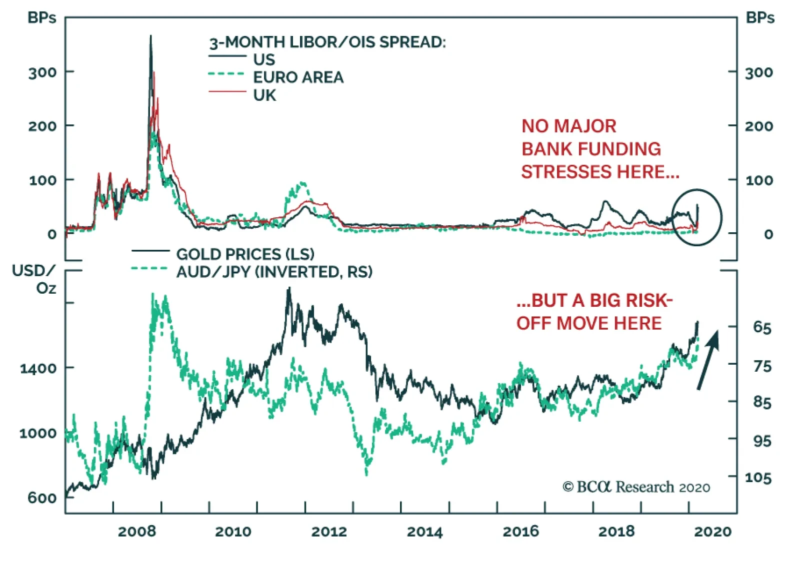
Yesterday, BCA Research's Global Fixed Income Strategy service wrote that if there is one silver lining amidst the market carnage, it is that there appear to be few signs of 2008-style systemic financial stress. Bank funding indicators like Libor-OIS…