Global

Dear Client, This week’s report is written by BCA’s chief economist, Martin Barnes. Martin explores the myriad ways the pandemic could influence long-term economic and financial trends. I trust you will find his report very insightful. Best regards, Peter Berezin, Chief Global Strategist Making predictions about the economic and market outlook seems a futile exercise in the midst of such massive uncertainty. The deluge of articles about COVID-19 merely serves to highlight that nobody really knows how things will play out in the year ahead. Much depends on whether an effective vaccine or treatment becomes available within a reasonable timescale and that remains an open question. Social and economic disruption will continue to intensify until the spread of the virus starts to abate. One thing is certain. Economic activity around the world faces its biggest contraction in modern times. Declines in second quarter GDP will be mind-numbingly bad in a wide range of countries, especially those that have instituted lockdowns and the closure of non-essential businesses. According to the OECD, the median economy faces an initial output decline of around 25% as a result of shutdowns and restrictions.1 Chart 1A Meltdown In Economic Activity
A Meltdown In Economic Activity
A Meltdown In Economic Activity
Estimates for the drop in US real GDP in the second quarter range as high as 50% at an annual rate. To put this into perspective, the peak-to-trough decline in US real GDP in the 2007-09 recession was a mere 4% over six quarters, and that felt catastrophic at the time. The New York Fed’s weekly economic index2 has already fallen to the lows of 2008 and worse is still to come (Chart 1). Could things be as bad as the 1930s Great Depression when US real GDP contracted by 25% over a three-year period? That would require an extreme apocalyptic view about the progression of the virus and does not bear thinking about. I am not that gloomy. Policymakers are acting aggressively to limit the economic damage. Central banks are flooding the system with liquidity and the cost of money is negligible. Meanwhile, fiscal caution has been thrown to the wind with massive government stimulus in many countries. While this will not prevent a deep recession, it will minimize the downside risks and support the eventual rebound. Markets are understandably in a deep funk because it is hard to price unknown risks. If this is no more than a two-quarter economic downturn followed by a sharp recovery, then a good buying opportunity in risk assets is in place given that monetary policy will stay hyper accommodative for a considerable time. If the downturn lingers much longer than that, then equities remain at risk. While loath to make a prediction, I am uncharacteristically tending to the more optimistic side. Let’s make the heroic assumption that we are not in an end of days scenario and that this crisis will pass at some point in the next year- hopefully sooner than later. What are some of the longer-run implications? A few come to mind. The backlash against globalization will gather impetus. Public sector debt will rise to unimaginable peacetime levels. Meanwhile, the crisis puts the final nail in the coffin of the private sector Debt Supercycle. Monetary policy will err on the side of ease for a very long time. The way that companies and other institutions have been forced to adapt to the crisis could trigger lasting changes in how they operate. Globalization In Full Retreat Chart 2A Retreat From Globalization
A Retreat From Globalization
A Retreat From Globalization
The peak of globalization has been a central part of the BCA view for several years.3 Long before the current crisis, it was clear that anti-globalization forces were gathering strength, illustrated by increased trade barriers, a backlash against inward migration in many countries, and reduced flows of foreign direct investment (Chart 2). The Trump Administration’s imposition of tariffs and the Brexit vote were two of the more obvious examples of the change in attitudes. The supply-chain interruptions caused by factory shutdowns in China will reinforce the view that shifting production to cheaper-cost countries overseas went too far. At a minimum, it seems inevitable that many companies will seek to reduce their reliance on a single producer for critical components. On the medical front, one striking fact to emerge was that China supplies around 80% of US antibiotics. There will be massive pressure to develop greater homegrown supplies of medical supplies and other products deemed critical for economic and national security. The crisis also has led to a breakdown of the Schengen Area of open borders within the European Union (EU). Many member countries have reinstituted border controls and it is unclear when these might be removed. The free movement of people is a core principle of the EU. Meanwhile, the Maastricht Treaty rules on fiscal discipline, a key element of economic union, have been thrown out of the window. Even Germany has bowed to the pressure of relaxing fiscal constraints. Finally, a worsening situation for the already troubled Italian banking system will threaten EU financial stability. Overall, the crisis will leave a huge question mark over the long-term viability of the EU. Globalization was a major force behind disinflation as production shifted to low-cost producers. A reversal of this trend will thus be inflationary, at the margin. For many, this will be a price worth paying if it means increased job security and reduced vulnerability of supply chains. But the shift away from globalization will not be the only trend that threatens an eventual resurgence of inflation. The Explosion In Government Debt: Last Gasp Of The Debt Supercycle BCA introduced the concept of the Debt Supercycle more than 40 years ago to describe the actions of policymakers to pump up demand rather than allow financial imbalances to be fully unwound during economic downturns. This inevitably meant that each new cycle began with a higher level of financial imbalances. As indebtedness rose, the economic costs of a financial cleansing increased, requiring ever-more desperate policy measures to shore things up. Unfortunately, such actions merely created the conditions for greater excesses and imbalances down the road. For example, the Federal Reserve’s aggressive response to the bursting of the tech bubble in 2000 helped set the scene for the even bigger housing bubble later in the decade. In that sense, the Debt Supercycle was a self-reinforcing trap that was bound to end badly, and that occurred in 2007. Chart 3The US Household Love Affair With Debt Died A Decade Ago
The US Household Love Affair With Debt Died A Decade Ago
The US Household Love Affair With Debt Died A Decade Ago
Our discussion of the US Debt Supercycle was focused largely on the private sector because that is where rising imbalances posed the greatest threat to economic and financial stability. Rising public sector imbalances were less of a concern because governments do not finance themselves through the banking sector. Moreover, unlike the private sector, taxes can always be raised to boost revenues or, in extremis, the authorities can resort to the printing press. At the end of 2014, we wrote that the Debt Supercycle was dead. By that, we meant that easing policy would no longer be able to encourage a new cycle of leverage-financed private-sector spending. The downturn of 2007-09 was a turning point in attitudes toward debt, much in the way that those who lived through the Great Depression were financially conservative for the rest of their lives. Our view has been vindicated by the fact the ratio of household debt to income has decisively broken its pre-housing bubble uptrend and has failed to revive in the face of record-low interest rates (Chart 3). Corporate borrowing has been strong, but largely to finance stock buybacks and M&A activity. Capital spending has been disappointing this cycle, despite strong profits and margins. The current deep downturn will add a further nail in the coffin of the private sector Debt Supercycle. The shock of the recession and destruction of wealth will leave a legacy of increased financial caution with households wanting to build precautionary savings and companies striving to repair damaged balance sheets. It would not be a surprise to see the US personal saving rate head back to the double-digit levels of the early 1980s. While the private sector embraces greater financial conservatism, we are witnessing the start of an extraordinary surge in public sector deficits and debt from already high levels. Chart 4A Bad Starting Point For A Surge In The Federal Deficit
A Bad Starting Point For A Surge In The Federal Deficit
A Bad Starting Point For A Surge In The Federal Deficit
Budget deficits automatically rise during recessions because tax receipts drop and spending on unemployment and welfare programs goes up (Chart 4). In the past, the starting point for deficits generally was low before a recession took hold. This time, the federal deficit has breached 5% of GDP when the economy was doing fine. With the current recession set to be deeper than in 2007-09 and fiscal stimulus likely to end up much more than the initial $2 trillion package, the deficit will far exceed the previous post-WWII peak of almost 10% of GDP, reached in fiscal 2009. The ratio of federal debt to GDP will soar past 100% within the next few years, exceeding the peak reached in WWII. A speedy decline in WWII debt burdens was helped by a sharp rebound in economic activity, supported by a powerful combination of demographics (the post-WWII baby boom) and pent-up demand. Real GDP grew at an average annualized pace of 4.3% in both the 1950s and 1960s. Unfortunately, slower population growth means that growth in the next one and two decades will be less than half that pace. At the same time, the federal deficit will be under upward pressure because of the impact of an aging population on healthcare and social security. In other words, restoring order to fiscal finances through normal measures (growth and/or austerity) will be an impossible task. High levels of government debt are perfectly manageable when private sector savings are plentiful, interest rates are negligible, and investors seek the safety of low-risk bonds. Thus, $1 trillion US federal deficits have not prevented Treasury yields from falling to all-time lows. However, such conditions will not last indefinitely. The timing of when bloated budget deficits start to impact markets and thus the economy will partly depend on the actions of the Fed. Monetary Policy: Is There A Limit To What It Can Do? Gone are the days when monetary policy was a rather technical exercise: tweaking the level of interest rates to ensure that money and credit trends delivered the economic growth consistent with low and stable inflation. In the past decade, the old rule book has been discarded with policymakers forced to take ever-more extreme measures to prevent total collapse of the economic and financial system. The 2007-9 downturn was easier to deal with than the current crisis. The primary problem a decade ago was a financial rather than economic seizure. While policymakers had to be creative, the main task was to shore up systemically important financial institutions and inject enough liquidity into the system to restore normal market functioning. And it worked. This time, the issue is an economic not financial seizure and associated liquidity strains are a symptom, not the primary problem. The immediate role of central banks is again to ensure that the financial system continues to function by injecting whatever amounts of liquidity are necessary. But monetary policy cannot directly bail out all the businesses that face bankruptcy or help those that have lost their jobs. That is the role of fiscal policy. What central banks can do is print money to finance the rise in budget deficits. During WWII, the Fed had an agreement with the Treasury Department to peg the level of long-term yields below 2.5% and this arrangement persisted until 1951, long after the war ended. This ensured that a post-war rebound in private credit demand would not cause a spike in interest rates that might short-circuit the recovery. We could well see a similar arrangement in the coming years, though it might be an informal rather than publicized agreement. The key point is that the Fed will be massively biased toward easy policy for many years. The current generation of central bankers have experienced periodic threats of deflation rather than inflation during the past 20 years and that will shape how they perceive the balance of risks going forward. After the Great Depression of the 1930s, fears of deflation lingered well into the 1950s and policymakers’ resulting complacency toward inflation led to the inflation spike of the 1970s. We are at a similar point again. The Fed will remain a massive buyer of Treasury bonds, even as the economy recovers because it will not want to risk higher yields undermining growth. Even if inflation starts to rise, the Fed will justify a continued easy stance on the grounds that inflation has fallen far short of its 2% target for many years. Given the combination of a global blowout in central bank balance sheets and the retreat from globalization, the scene will be set for inflation to surprise on the upside. But this may not occur for several years because the recession will create a lot of spare capacity and deflation is a greater near-term threat than inflation. We have long argued that a sustained upturn in inflation would be preceded by a final bout of deflation. The revival of inflation may be gradual but its insidious nature ultimately will make it more dangerous. It seems inevitable that there will have to be monetization of public sector debt, not only in the US but in other major economies. Once investor confidence returns, the demand for government bonds will recede and yields will be under upward pressure. Financial repression may help contain the rise, but that cannot be a long-term solution. In the end, central banks will be the bond buyers of last resort and ultimately it will have to be written off via making the debt effectively non-maturing. If the economic picture continues to deteriorate could central banks use quantitative easing to start buying assets such as equities and real estate? Current legislation prevents such purchases in the case of the Fed and European Central Bank. Of course, legislation can always be changed but the Fed would be reluctant for Congress to change the Federal Reserve Act. That could open a can of worms including amendments such as requiring regular audits of policy decisions and altering how regional presidents are chosen. But it will not be the Fed’s decision and if things get bad enough then nothing should be ruled out. An Accelerated Move To Virtual Activity? The restrictions on travel and public meetings and the closure of many businesses have forced companies to embrace online ways of conducting operations. And the same applies to schools and universities. In many cases, companies may find that virtual meetings between far-flung offices work rather well. This could cause a major rethink about future spending on business travel. Replacing travel with virtual meetings not only saves on airfares but also frees up employee time and reduces stress. And the improvements in communication technology make virtual meetings almost as good as the real thing. Of course, this is not a great story for airlines. The same arguments can be made for education but are slightly less compelling because of the social dimension. Mixing with friends and peers is one of the big attractions for students and most would be loath to give this up. And for working parents, it is not feasible to have children stuck at home. Nonetheless, at the post-secondary level, there could be a move to more online teaching. Another consequence of the current crisis has been a forced shift to more online shopping. This trend was already well established but is now likely to accelerate. Those retailers who fail to adapt will fall by the wayside. Market Implications As noted at the outset, it is hard to make predictions without knowing how the virus will progress. But we know a few things. First, there is not much scope for bond yields to fall from current levels. Second, equity valuations have improved as a result of the collapse in prices. Third, monetary policy will remain supportive of markets for a long time. On this basis, it is easy to conclude that stocks should beat bonds handsomely over the medium and long term. The short-term picture is cloudier. If the recession is short-lived and economic activity rebounds strongly, then we currently have a good buying opportunity for stocks. But there is no way to make a prediction about this with any conviction. The case for a strong recovery is that policy is massively stimulative and there will be a lot of pent-up demand. The case for a slow and drawn-out recovery is that consumers and businesses will be left with greatly weakened balance sheets and the loss of small businesses and associated jobs could be a lasting problem. A final issue is that fears of another virus wave could weigh on consumer and business confidence. Initially, there will be some extremely strong quarters of growth but beyond that, the odds favor a drawn-out recovery rather than a vigorous one. Faced with such uncertainty, one strategy is to rely on technical indicators rather than economic forecasts as a judge of whether it is safe to rebuild positions in risk assets. This gives some reason for encouragement as measures of sentiment are at depressed extremes, typically seen only at major bottoms. And this is supported by momentum indicators at oversold extremes. However, a word of caution: these indicators make the case for a near-term bounce but say nothing about the durability of any rally. For some time, non-US markets have looked more appealing than Wall Street from a valuation perspective. That remains the case, but there is an important caveat. Thus far, the virus has been more of a problem for the developed countries than emerging ones (China and Iran excepted). It remains to be seen whether Africa, and Latin America and other countries in Asia and the Middle East can avoid a catastrophic spread of the virus. It could potentially be disastrous given the poor infrastructure and lack of government resources in those regions. Moreover, a shift away from globalization is not bullish for the emerging world. Some positions in gold are a good hedge given current uncertainties and the fact that inflation fears will rise long before actual inflation picks up. In normal circumstances, the extraordinary rise in the US budget deficit would be bearish for the US dollar. But other countries are following the same path so in relative terms, the US is no worse off. And there is still no serious competition to the dollar as the global reserve currency. Thus, while the dollar might weaken somewhat, it should not be a major source of risk to US assets. In closing, it is impossible to provide the certainty and high-conviction predictions that investors crave. That makes it rash to make aggressive bets on how things will play out in the economy and markets. At BCA, we favor equities over bonds but advise continued near-term caution. The bottoming process in equities could be volatile and drawn-out. Building positions gradually seems the most sensible strategy. Martin H. Barnes, Senior Vice President Chief Economist mbarnes@bcaresearch.com Footnotes 1 For an estimate of the virus impact on a range of economies, please see the recent OECD report “Evaluating the initial impact of COVID-19 containment measures on economic activity”. Available at: www.oecd.org 2 The report and underlying data are available at www.newyorkfed.org. 3 For example, the retreat from globalization was discussed in our 2015 Outlook report published at the end of 2014.
GAA DM Equity Country Allocation Model Update The GAA DM Equity Country Allocation model is updated as of March 31, 2020. The model upgraded Canada and Australia to overweight, financed by a reduction in the overweights of the US, Italy, Sweden and Spain, largely due to improvement in these two countries’ liquidity indicators. Now the US, Australia and Spain are the top three overweight countries, while Japan, the UK and France remain the three large underweight countries, as shown in Table 1. Table 1Model Allocation Vs. Benchmark Weights
GAA Quant Model Updates
GAA Quant Model Updates
As shown in Table 2 and Chart 1, Chart 2 and Chart 3, the overall model underperformed the MSCI World benchmark in March by 78 bps. The Level 1 model outperformed 14 bps because of the overweight in the US, however, the non-US Level 2 model suffered 357 bps of underperformance driven largely by the underweight in Japan and overweight in Spain. Since going live, the overall model has underperformed by 8 bps, with 125 bps of underperformance by the Level 2 model, and 13 bps of underperformance from the Level 1. Table 2Performance (Total Returns In USD %)
GAA Quant Model Updates
GAA Quant Model Updates
Chart 1GAA DM Model Vs. MSCI World
GAA DM Model Vs. MSCI World
GAA DM Model Vs. MSCI World
Chart 2GAA US Vs. Non US Model (Level 1)
GAA US Vs. Non US Model (Level 1)
GAA US Vs. Non US Model (Level 1)
Chart 3GAA Non US Model (Level 2)
GAA Non US Model (Level 2)
GAA Non US Model (Level 2)
For more on historical performance, please refer to our website https://www.bcaresearch.com/site/trades/allocation_performance/latest/G…. For more details on the models, please see Special Report, “Global Equity Allocation: Introducing The Developed Markets Country Allocation Model,” dated January 29, 2016, available at https://gaa.bcaresearch.com. Please note that the overall country and sector recommendations published in our Monthly Portfolio Update and Quarterly Portfolio Outlook use the results of these quantitative models as one input, but do not stick slavishly to them. We believe that models are a useful check, but structural changes and unquantifiable factors need to be considered as well when making overall recommendations. GAA Equity Sector Selection Model Chart 4Overall Model Performance
Overall Model Performance
Overall Model Performance
The GAA Equity Sector Model (Chart 4) is updated as of March 31, 2020. The model’s relative tilts between cyclicals and defensives have changed compared to last month. The coronavirus (COVID-19) outbreak caused tremendous market volatility and huge declines in equities throughout March with the MSCI ACWI broad index down -24% overall, and various sectors hit even harder. Last month, the sector model’s defensive tilt helped mitigate this shortfall, and the model outperformed its benchmark by 85 basis points. The global growth proxy used in our model remains negative. This will continue to make the model's positioning focused on less cyclical sectors. Additionally, last month’s sector moves led the momentum component to favour Consumer Staples rather than Discretionary. The coordinated accommodative policy stance implemented by global central banks should keep the liquidity component favouring a mixed bag of cyclical and defensive sectors. The valuation component remains muted across all sectors except Energy. However, we highlight that Info Tech’s valuation component has broken into overvalued territory (yet the model awaits a downwards confirming momentum signal to recommend an underweight). The model is now overweight four sectors in total, one cyclical sector versus three defensive sectors. These are Information Technology, Utilities, Consumer Staples, and Health Care. For more details on the model, please see the Special Report “Introducing the GAA Equity Sector Selection Model”, dated July 27, 2016, as well as the Sector Selection Model section in the Special Alert “GAA Quant Model Updates,” dated March 1, 2019 available at https://gaa.bcaresearch.com. Table 3Overall Model Performance
GAA Quant Model Updates
GAA Quant Model Updates
Table 4Current Model Allocations
GAA Quant Model Updates
GAA Quant Model Updates
Xiaoli Tang Associate Vice President xiaoliT@bcaresearch.com Amr Hanafy Senior Analyst amrh@bcaresearch.com
Highlights Recommended Allocation
Quarterly Portfolio Outlook: Playing The Optionality
Quarterly Portfolio Outlook: Playing The Optionality
The outlook for markets over the next few months is highly uncertain. On the optimistic side, new COVID-19 cases are probably close to peaking (for now), and so equities could continue to rally. But there are many risks too. Growth numbers will be horrendous for some months. Second-round effects (corporate defaults, problems in EM and with euro zone banks, for example) will emerge. We recommend a balanced portfolio, robust both for risk-on rallies and a further sell-off. We stay overweight equities versus bonds. Government bonds will not provide significantly positive returns even in a severe recession. Thus, over the next 12-months, equities are likely to outperform them. But we leaven the equity overweight with a “minimum volatility” strategy, overweight the low-beta US market, and more stable sectors such as Healthcare and Technology. Within bonds, we stay underweight government bonds, and raise Investment Grade credit to overweight, given the Fed’s backstop. Even in a risk-on rally, government yields will not rise quickly so we recommend a neutral stance on duration. The massive stimulus will eventually be inflationary, so we recommend TIPS, which are very cheaply valued. We are overweight cash and gold as hedges against further market turbulence. Among alternatives, macro hedge funds and farmland look attractively defensive now. We would start to look for opportunities in private debt (especially distressed debt) as the recession advances. Commodity futures are attractive as an inflation hedge. Overview Playing The Optionality From the start of the crisis, we argued that markets would bottom around the time when new cases of COVID-19 peaked. At the end of March, there were clear signs that this would happen in April, with Italy and Spain having probably already peaked and the US, if it follows the same trajectory, being only two or three weeks away (Chart 1). Chart 1Close To A Peak In New Cases?
Quarterly Portfolio Outlook: Playing The Optionality
Quarterly Portfolio Outlook: Playing The Optionality
But what happens next? A relief rally is likely, as often happens in bear markets – and indeed one probably started with the three-day 18% rise in US equities in the last week of March. Note, for example, the strong rallies in spring 2008 and summer 2000 before the second leg down in those bear markets (Chart 2). Chart 2Mid Bear Market Rallies Are Common
Mid Bear Market Rallies Are Common
Mid Bear Market Rallies Are Common
However, there is still a lot of potential bad news for markets to digest. Global growth has collapsed, as a result of people in many countries being forced to stay at home. US GDP growth in Q2 could fall by as much as 10% quarter-on-quarter (unannualized). Horrendously bad data will come as a shock to investors over the coming months. Despite the unprecedented stimulus measures from central banks and governments worldwide (Chart 3), nasty second-round effects are inevitable. Given the high level of corporate debt in the US, defaults will rise, to perhaps above the level of 2008-9 (Chart 4). EM borrowers have almost $4 trillion of foreign-currency debt outstanding, and will struggle to service this after the rise in the dollar and wider credit spreads. Euro area banks are poorly capitalized and have high non-performing debt levels left over from the last recession; they will be hit by a new wave of bankruptcies. Undoubtedly, there are some banks and hedge funds sitting on big trading losses after the drastic sell-off and stomach-churning volatility. Mid-East sovereign wealth funds will unload more assets to fill fiscal holes left by the collapsed oil price. Chart 3Massive Stimulus Everywhere
Quarterly Portfolio Outlook: Playing The Optionality
Quarterly Portfolio Outlook: Playing The Optionality
Chart 4Possible Second-Round Effects
Possible Second-Round Effects
Possible Second-Round Effects
There is also the question of when the pandemic will end. We are not epidemiologists, so find this hard to judge (but please refer to the answers from an authority in our recent Special Report1). The coronavirus will disappear only when either enough people in a community have had the disease to produce “herd immunity,” or there is a vaccine – which is probably 18 months away. Some epidemiologists argue that in the UK and Italy 40%-60% of the population may have already had COVID-19 and are therefore immune.2 But an influential paper from researchers at Imperial College suggested that repeated periods of lockdown will be necessary each time a new wave of cases emerges3 (Chart 5). Chart 5More Waves Of The Pandemic To Come?
Quarterly Portfolio Outlook: Playing The Optionality
Quarterly Portfolio Outlook: Playing The Optionality
At the end of March, global equities were only 23% off their mid-February record high – and were down only 34% even at their low point. That doesn’t seem like enough to fully discount all the potential pitfalls over coming months. This sort of highly uncertain environment is where portfolio construction comes in. We recommend that clients position their portfolios with optionality to remain robust in any likely outcome. There are likely to be rallies in risk assets over coming months, particularly when the coronavirus shows signs of petering out. There is significant asymmetric career risk for portfolio managers here. No portfolio manager will be fired for missing the pandemic and underperforming year-to-date (though some may because their firms go out of business or retrench). But a PM who misses a V-shaped rebound in risk assets over the rest of the year could lose their job. This will provide a strong incentive to try to pick the bottom. Chart 6Bond Yields Can't Go Much Lower
Bond Yields Can't Go Much Lower
Bond Yields Can't Go Much Lower
Government bond yields are close to their theoretical lows. The 10-year US Treasury yield is 0.6% and it unlikely to fall below 0% even in a severe recession (since the Fed has stated that it will not cut short-term rates below 0%). In other countries, the low for yields has turned out to be around -0.3% to -0.9% (Chart 6). The total return from risk-free bonds, therefore, will be close to zero even in a dire economic environment (Table 1). This means that the call between bonds and equities comes down to whether equity prices will be higher or lower in 12-months. Quite likely, they will be higher. Given this, and the optionality of participating in rebounds, we maintain our overweight on equities versus bonds. We would, however, be inclined to lower our equity weighting in the event of a big rally in stocks over the next few months. Table 1Not Much Room For Upside From Bonds
Quarterly Portfolio Outlook: Playing The Optionality
Quarterly Portfolio Outlook: Playing The Optionality
Table 2Bear Markets Are Often Much Worse
Quarterly Portfolio Outlook: Playing The Optionality
Quarterly Portfolio Outlook: Playing The Optionality
But there are also many downside risks. In the past two recessions, global equities fell by 50%-60% (Table 2). Despite the much worse economic environment this time, the peak-to-trough decline is so far much more limited. Moreover, valuations are not particularly compelling yet (Chart 7). To leaven our overall overweight on equities, we recommend a “minimum volatility” strategy, with tilts towards the low-beta US market, and some more defensive sectors such as Healthcare and Technology. China and China-related stocks also look somewhat attractive, since that country got over the coronavirus first, and is responding with a big increase in infrastructure spending (Chart 8). To hedge against downside risk, we also leave in place our overweights in cash and gold. Chart 7Equities Are Not Yet Super Cheap
Equities Are Not Yet Super Cheap
Equities Are Not Yet Super Cheap
Chart 8China Infra Spending To Rise
China Infra Spending To Rise
China Infra Spending To Rise
Garry Evans, Senior Vice President Chief Global Asset Allocation Strategist garry@bcaresearch.com What Our Clients Are Asking – About The Coronavirus Have We Seen The Bottom In Equity Markets? Chart 9Watch Closely COVID-19
Quarterly Portfolio Outlook: Playing The Optionality
Quarterly Portfolio Outlook: Playing The Optionality
After hitting a low on March 23, global equities have recovered more than one-third of their loss during this particularly rapid bear market, in response to the massive monetary and fiscal stimulus around the globe. It’s very hard to pinpoint the exact bottom of any equity bear market. The current one is particularly difficult in two ways: First, it was largely due to the exogenous shock from the COVID-19 pandemic. If history is any guide, we will first need to see a peak in infected cases globally before we can call a true bottom in equities (Chart 9). Second, the massive and coordinated response from central banks and governments around the world is unprecedented, as the global “lockdown” freezes the global economy. It’s encouraging to see the Chinese PMI bouncing back to 52 in March after a sharp drop to deep contraction level in February. However, the bounce back was mostly from production. Both export orders and imports remain weak. US initial jobless claims have skyrocketed to 3.3 million. If the peak of infection in the US follows similar patterns in China and Italy, then it would be another encouraging sign even if the US economic data continued to get worse. BCA Research’s base-case is for this recession to have a U-shaped recovery. This means that equity markets are likely to be range bound until we have a better handle on the future course of the pandemic. As such, we suggest investors actively manage risk by adding to positions when the S&P 500 gets close to 2250 and reducing risk when it gets close to 2750 during the bottoming process. What Will Be The Long-Term Consequences? Maybe it seems too early to think about this, but the coronavirus pandemic will change the world at least as profoundly as did the 1970s inflation, 9/11, and the Global Financial Crisis (GFC). Here are some things that might change: Chart 10Government Debt Will Rise Significantly
Government Debt Will Rise Significantly
Government Debt Will Rise Significantly
Government debt levels will rise dramatically, as a result of the huge fiscal packages being (rightly) implemented by many countries. In the US, after the $2 trillion spending increase and a fall in tax revenues, the annual fiscal deficit will rise from 6% of GDP to 15%-20%. Government debt/GDP could exceed the 122% reached at the end of WW2 (Chart 10). Ultimately, central banks will have to monetize this debt, perhaps by capping long-term rates or by buying a substantial part of issuance. This could prove to be inflationary. Households and companies may want to build in greater cushions and no longer live “on the edge”. US households have repaired their balance-sheets since 2009, raising the savings rate to 8% (Chart 11). But surveys suggest that almost one-third of US households have less than $1,000 in savings. They may, therefore, now save more. This could depress consumption further in coming years. Companies have maximized profitability over the past decades, under pressure from shareholders, by keeping inventories, spare cash, and excess workers to a minimum. Given the sudden stop caused by the pandemic (and who is to say that there will not be more pandemics in future), companies may want to protect themselves from future shocks. The inventory/sales ratio, which had been falling for decades, has picked up a little since the GFC (Chart 12). Inventory levels are likely to be raised further. Companies may also run less leveraged balance-sheets, rather than hold the maximum amount of debt their targeted credit rating can bear. This is all likely to reduce long-term profit growth. Chart 11Households May Become Even More Cautious
Households May Become Even More Cautious
Households May Become Even More Cautious
Chart 12Companies Will Run With Higher Inventories
Companies Will Run With Higher Inventories
Companies Will Run With Higher Inventories
The pandemic has highlighted the vulnerability of healthcare systems. China still spends only 5% of GDP on health, compared to 9% in Brazil and 8% in South Africa (Chart 13). The lack of intensive care beds and woefully inadequate epidemic plans in the US and other developed countries will also need to be tackled. Healthcare stocks should benefit. Chart 13Healthcare Spending Will Need To Rise
Healthcare Spending Will Need To Rise
Healthcare Spending Will Need To Rise
How Risky Are Euro Area Banks? Chart 14Euro Area Banks Are Quite Fragile
Euro Area Banks Are Quite Fragile
Euro Area Banks Are Quite Fragile
Banks in the euro area have underperformed their developed market peers by over 65% since the Global Financial Crisis (GFC) (Chart 14, panel 1). Their structural issues – many of which we highlighted in a previous Special Report – remain unsolved. Euro area banks remain highly leveraged compared to their US counterparts (panel 2). Their exposure to emerging economies is high (panel 3), and they continue to be a major provider of European corporate funding. US corporates, by contrast, are mainly funded through capital markets. The sector is also highly fragmented with both outward and inward M&A activity declining post the GFC. Profitability continues to be a key long-term concern, despite having recently stabilized (panel 4). The ECB’s ultra-dovish monetary stance and negative policy rates do not help banks’ performance either. Banks’ relative return has been correlated to the ECB policy rate since the GFC (panel 5). Following the coronavirus outbreak, the ECB is likely to remain dovish for a prolonged period. The ECB’s recently announced measures should, however, provide banks with ample liquidity to hold and spur economic activity through increased lending to households and corporates. Absent consolidation in the European banking sector, competition is likely to dampen banks’ profits. Additionally, the severity of the economic downturn caused by the coronavirus outbreak will determine if their significant exposure to emerging economies, the energy sector, and domestic corporates will hurt them further. For now, we would recommend investors underweight euro area banks. Where Can I Get Income In This Low-Yield World? Chart 15The Bear Market Has Unveiled Attractive Income Opportunities
The Bear Market Has Unveiled Attractive Income Opportunities
The Bear Market Has Unveiled Attractive Income Opportunities
For long-term investors who can tolerate price volatility, there is currently an opportunity to invest in high-income securities at relatively cheap prices. Below we list three of our favorite assets to obtain income returns: Dividend Aristocrats: The S&P 500 Dividend Aristocrats Index is composed of S&P 500 companies which have increased dividend payouts for 25 consecutive years or more. In order to provide such a steady stream of income through a such long timeframe, and even provide dividend increases in recessions, the companies in this index need to have a track record of running cashflow-rich businesses. Thus, the risk of dividend cuts is relatively low in these companies. Currently, the Dividend Aristocrat Index has a trailing dividend yield of 3.2% (Chart 15 – top panel). Fallen Angels: As we discussed in our November Special Report, fallen angels have attractive characteristics that separate them from the rest of the junk market. They tend to have longer maturities as well as a higher credit quality than the overall index. Crucially, fallen angels often enter the high-yield index at a discount, since certain institutional investors are forced to sell them when they are no longer IG-rated (middle panel). Thus, selected fallen angels which are not at a substantial risk of default could be a tremendous income opportunity. Currently fallen angels have a yield to worst of 10.65%. Sovereign US dollar EM debt: Our Emerging Markets Strategy service has argued that most EM sovereigns are unlikely to default on their debts, and instead will use their currencies as a release valve to ease financial conditions in their economies. Thus, hard-currency sovereign issues could prove to be attractive income investments if held to maturity. The bottom panel of Chart 15 (panel 3) shows the current yield-to-worst of the EM sovereign hard currency debt that has an overweight rating by our Emerging Markets service. Global Economy Chart 16The Collapse Begins
The Collapse Begins
The Collapse Begins
Overview: The global economy in early January looked on the cusp of a strong manufacturing pickup, driven by the natural cycle and by moderate fiscal stimulus out of China. The coronavirus changed all that. We now face a recession of a severity unseen since the 1930s. The fiscal and monetary response has been similarly rapid and radical. This will tackle immediate liquidity and even solvency risks. But, with consumers in many countries confined to their homes, a recovery is entirely dependent on when the number of new cases of COVID-19 peaks. In an optimistic scenario, this might be in late April or May. On a pessimistic one, the pandemic will continue in waves for several quarters. US: It is highly likely that the NBER will eventually declare that the US entered recession in March 2020. With many states in lockdown, consumption (which comprises 70% of GDP) will slump: only half of consumption is non-discretionary (rent, food, utility bills etc.); the other half is likely to shrink significantly while lockdowns continue. Judged by the 3.3 million initial claims in the week of March 16-21, unemployment will jump from its February level of 3.5% very rapidly towards 10%. Fiscal and monetary stimulus measures will cushion the downside (enabling households to pay rent and companies to service debt). But whether the recession is V-shaped or prolonged will be dependent on the length of the pandemic. Euro Area: European manufacturing growth was showing clear signs of picking up before the coronavirus pandemic hit (Chart 16 panel 1). But lockdowns in Italy, Spain and other countries will clearly push growth way into negative territory. The severity is clear from the first datapoints to reflect March activity, such as the ZEW survey. The ECB, after an initially disappointing response, has promised EUR750 billion (and more if needed) in bond purchases. The fiscal response so far has been more lukewarm, although Germany has now scrapped its requirement to run a budget surplus. One key question: will the stronger nothern European economies agree to “euro bonds”, joint and severally guaranteed, to finance fiscal spending in the weaker periphery? Chart 17...With Chinese Data Leading The Way
...With Chinese Data Leading The Way
...With Chinese Data Leading The Way
Japan: Japan’s economy was performing poorly even before the coronavirus pandemic, mainly because of the side-effects of last October’s consumption tax hike, and the slowdown in China (Chart 17, panel 2). So far, Japan has seen fewer cases of COIVD-19 than other large countries, but this may just reflect a lack of testing. Japan also has less room for policy response. Government debt is already 250% of GDP. The Bank of Japan has moderately increased purchases of equity ETFs and remains committed to maintaining government bonds yields around 0%. But Japan seems culturally and institutionally unable to roll out the sort of ultra-radical measures taken in other developed economies. Emerging Markets: China’s economy was severely disrupted in January and February, as reflected in an unprecedented collapse of the Caixin Services PMI to 26.5 (Chart 17, panel 3). However, big data (such as traffic congestion) suggest that in March people were gradually returning to work and companies restarting manufacturing operations. Q1 GDP growth will clearly be negative, and growth for the year may be barely above 0%. The authorities are ramping up infrastructure spending, which BCA expects to grow by 6-8% this year.4 Interest rates have also fallen below their 2015 levels, but not yet to their 2009 lows. Both fiscal and monetary policy are likely to be eased further. Elsewhere in Emerging Markets, the key question is whether central banks will cut rates to support rapidly weakening economies, or keep rates steady to prop up collapsing currencies. This is not an easy choice. Interest Rates: Central banks in developed markets have cut rates to their lowest possible levels with the Fed, for example, slashing from 1.25%-1.5% to 0%-0.25% within just 10 days in March. The Fed has signalled that it will not go below zero. Short-term policy rates globally, therefore, have essentially hit their lower bounds. Long-term rates have been volatile, with the 10-year US Treasury yield swinging down to 0.6% before jumping to 1.2%. While uncertainty continues, long-term risk-free rates are unlikely to rise substantially and, in the event of a prolonged severe recession, we would see the US 10-year yield falling to zero – but no lower. Global Equities Chart 18Is The V-Shaped Recovery Sustainable?
Quarterly Portfolio Outlook: Playing The Optionality
Quarterly Portfolio Outlook: Playing The Optionality
What’s Next? Global equities lost 32.8% year-to-date as of March 23, 2020. All countries and sectors in our coverage were in the red. Even the best performing country (Japan) and the best performing global sector (Consumer Staples) lost 26.7% and 23.2% respectively. From March 24 to March 26, however, equities made the best three-day gains since the Great Depression, recouping about one-third of the loss, even though US initial jobless claims came in at 3.3 million and also the US reported a higher number of cumulative infected people than China, with a much higher number of deaths per million people (Chart 18). So have we reached the bottom of the bear market? Is this “V-shaped” recovery sustainable? How should an investor construct a multi-asset global portfolio that’s sound for the next 9-12 months given the uncertainty associated with COVID-19 and the massive monetary and fiscal stimulus around the world? Based on our long-held philosophy of taking risks where risks will most likely be rewarded, we are most comfortable taking risk at the asset class level, by overweighting equities versus bonds, together with overweights in cash and gold as hedges. Within the equity portfolio, we are reducing risk by making the following adjustments: Upgrade US to overweight from underweight financed by downgrading the euro zone to underweight from overweight. Upgrade Tech to overweight, while closing two overweight bets on Financials and Energy and one underweight on consumer staples to benchmark weighting. Country Allocation: Becoming More Defensive Chart 19US And Euro Area: Trading Places
US And Euro Area: Trading Places
US And Euro Area: Trading Places
In December 2019 we added risk by upgrading the euro area to overweight and Emerging Markets to neutral based on our macro view that the global economy was on its way to recovery. Data releases in January did show signs of recovery in the global economy. However, the COVID-19 outbreak has changed the global landscape, and we are clearly in a recession now. When conditions change, we change our recommendations. We must make a judgment call because the economic data will not give us any timely, useful readings for some time to come. Back in December, the key reason to upgrade the euro area was the recovery of China which flows into the exports of the euro area. We think China will continue to stimulate its economy. However, given the global growth collapse, the “flow through” effect to the euro area will be delayed for some time. We prefer to play the China effect directly rather than indirectly. That’s why we maintain the neutral weighting of EM versus DM, but downgrade the euro area to underweight, and upgrade US to overweight. We also note the two following factors: First, as shown in Chart 19, panel 1, the relative performance between the euro area and the US is highly correlated with the relative performance between global Financials and Technology. This is not surprising given the sector composition of the two region’s equity indices. As such, this country adjustment is in line with our sector adjustment of upgrading Technology and downgrading Financials. Second, with a lower beta, US equities provide a better defense when economic uncertainty and financial market volatility are high. The risk to this adjustment, however, is valuation. As shown in panel 4, euro area valuation is extremely cheap compared to the US. However, PMI releases as well as forward earnings estimates are likely to get worse again before they get better, given the region’s reliance on exports to China and the structural issues in its banking system. Global Sector Allocation: Getting Closer To Benchmark Chart 20Reducing Sector Bets
Reducing Sector Bets
Reducing Sector Bets
We make four changes in the global sector portfolio to reduce sector bets, since we do not have a high conviction given market volatility and our house view that recovery out of this recession will be U-shaped. These are downgrading Financials to neutral, while upgrading Technology to overweight. We also close the overweight in Energy and underweight in Consumer Staples, leaving them both at benchmark weighting. Financials: We upgraded Financials in October last year as an upside hedge. This move did not pan out as bond yields plummeted. BCA Research’s US Bond Strategy service upgraded duration to neutral from underweight on March 10 as they do not see a high likelihood for yields to move significantly higher over the next 9-12 months. This does not bode well for Financials’ performance (Chart 20, panel 1). Even though the Fed and other central banks have come in as the lenders of last resort, loan growth could be weak going forward and non-performing loans could increase, especially in the euro area. Valuation, however, is very attractive. Technology: DRAM prices started to improve even before the COVID-19 outbreak. The global lockdown to fight against the pandemic is further spurring demand for both software and hardware, which should support better earnings growth (panel 2). The risk is that relative valuation is still not cheap, even though absolute valuation has come down after the recent selloff. Energy: The outlook for oil prices is too uncertain. The fight between Saudi Arabia and Russia is weighing on the supply side, while the global lockdown is denting demand prospect. The earnings outlook for energy companies is dire, while valuations are very attractive (panel 3). Consumer Staples: This is a classic defensive sector that does well in recessions. In addition, its relative valuation has improved to neutral from very expensive (panel 4). Government Bonds Chart 21Stay Aside On Duration
Stay Aside On Duration
Stay Aside On Duration
Upgrade Duration To Neutral. Global bond yields had a wild ride in Q1 as equities plummeted into bear market territory. The 10-year US Treasury yield made an historical low of 0.32% overnight on March 9, then quickly reversed back up to 1.27% on March 18, closing the quarter at 0.67%, compared to 1.88% at the beginning of the quarter (Chart 21). We are already in a recession and BCA’s house view is for a U-shaped recovery. This implies that global bond yields will likely follow a bottoming process similar to global equities, as new infections peak and high-frequency economic data start to recover. As such, we upgrade our duration call to neutral, to be in line with the position of BCA Research’s US Bond Strategy (USBS) service. Favor Linkers Vs. Nominal Bonds. The combined effect of the plummet in oil prices and the coronavirus outbreak has crushed inflation expectation to an extremely low level. As shown in Chart 22, the 10-year breakeven inflation rate is currently at 0.95%, 88 bps lower than its fair value. The fair value is estimated based on USBS’s Adaptive Expectations Model. Investors with a 12-month investment horizon should continue to favor TIPS over nominal Treasuries, but those with shorter horizons may be advised to stand aside and wait for the daily number of new COVID-19 cases to reach zero before re-initiating the position. Chart 22TIPS Offer A Ton Of Long-Run Value Extremely Cheap Inflation Protection
TIPS Offer A Ton Of Long-Run Value Extremely Cheap Inflation Protection
TIPS Offer A Ton Of Long-Run Value Extremely Cheap Inflation Protection
Corporate Bonds Chart 23High Quality Junk
High Quality Junk
High Quality Junk
It is undeniable that the dearth of cashflow caused by the lockdowns will spur a ferocious wave of defaults, particularly in the high-yield sector. It also is not clear that this risk is adequately compensated for. Currently, our US bond strategist believes that spreads are pricing an 11% default rate – in line with the default rate of the 2000/2001 recession. While it is not our base case, a default cycle like 2008, where 14% of companies in the index defaulted is a very clear possibility, as revenues have ground to a halt. However, several positive factors in the junk space must also be considered. Roughly 1% of the high-yield index matures in less than one year, which means that refinancing risk for junk credits should remain relatively subdued (Chart 23, top panel). Moreover, the quality of junk bonds is relatively high compared to previous periods of stress: when the market peaked in 2000 and 2007, Ba-rated credit (the highest quality of high yield) stood at 30% and 37% of the overall index respectively (middle panel). Today this credit quality stands at 49% of the high yield market, indicating a relatively healthier credit profile for junk. Additionally, the high-risk energy sector, which is likely to experience a substantial amount of defaults given the collapse in oil prices, now represents less than 8% of the market capitalization of the whole index (bottom panel). Taking these positive factors into consideration, we believe that a downgrade to underweight is not warranted, and instead we are downgrading high-yield credit from overweight to neutral. What about the investment-grade space? the massive stimulus package announced by the Fed, which effectively allows IG issuers to roll over their entire stock of debt, should provide a backstop to this market. One valid concern is that credit agencies can still downgrade a large number of issuers, making them ineligible to receive support. However, it seems that the credit agencies are aware of how much hinges on their ratings, and are communicating that they will factor the measures taken by various government programs into their credit analysis.5 Thus, considering that spreads are already extended, the Fed is providing unprecedent support and credit agencies are unlikely to knock out many companies out of investment-grade ratings, we are upgrading investment-grade credit from neutral to overweight. Commodities Chart 24Oil Prices & Politics Do Not Mix
Oil Prices & Politics Do Not Mix
Oil Prices & Politics Do Not Mix
Energy (Overweight): Oil markets were driven by supply/demand dynamics until a third factor, politics, shifted the market equilibrium. The recent clash between Saudi Arabia and Russia led to the breakdown of the OPEC 2.0 coalition and to Brent prices tanking by over 60% to $26 in March. The length of this breakdown is unknown. However, we believe the parties are likely to return to the negotiation table within the next months as the damage to countries which are dependent on oil begins to appear. The fiscal budget breakeven point remains much higher than the current oil price – it is around $83 for Saudi Arabia and $47 for Russia. Weakness in global crude demand will continue to put further downward pressure on prices, until economic activity recovers from the COVID-19 slowdown. Our Commodity & Energy Strategists expect the Brent crude oil price to average $36/bbl, with WTI trading some $3-$4 below that, in 2020 (Chart 24, panels 1 & 2). Industrial Metals (Neutral): Industrial metals prices were on track to pick up until the coronavirus hit global activity at the beginning of the year. Prices face further short-term headwinds as global manufacturing remains suppressed. Once the global social distancing ends and activity resumes, industrial metal prices should pick up as fiscal stimulus and infrastructure spending, especially in China, is implemented (panel 3). Precious Metals (Neutral): As the coronavirus spread, global risk assets have tumbled. Over the past 12 months, we have recommended investors increase their allocation to gold as both an inflation hedge and a beneficiary of accommodative monetary policy globally. However, we also recently highlighted that gold was reaching overbought territory and that a pullback was possible in the short-term. Nevertheless, investors should continue to maintain gold exposure to hedge against the eventuality that the pandemic is not contained within the coming weeks (panels 4 & 5). Currencies Chart 25Competing Forces Pushing The US Dollar In Different Directions
Competing Forces Pushing The US Dollar In Different Directions
Competing Forces Pushing The US Dollar In Different Directions
The USD has gone through a rollercoaster during the coronavirus crisis. Initially, the DXY fell by 4.8%, as rate differentials moved violently against the dollar when the Fed cut rates to zero. But this fall didn’t last long: as liquidity dried up, the cost for dollar funding surged, causing the dollar to skyrocket by almost 8.3%. Since then, the liquidity measures taken by monetary authorities have made the dollar reverse course once more. At this point there are multiple forces pulling the greenback in opposing directions. On the one hand, the collapse in global growth caused by the shutdowns should push the dollar higher. Moreover, momentum – one of the most reliable directional indicators for the dollar – continues to point to further upside (Chart 25, panels 1 and 2). However, the Fed’s generous USD swap lines with other major central banks as well as the massive pool of liquidity deployed have already stabilized funding costs in European and British currency markets, and look poised to do the same in others (Chart 25, panel 3). Thus, since there is no clarity on which force will prevail in this tug of war, we are remaining neutral on the US dollar. That being said, long-term investors can begin to buy some of the most depressed currencies, such as AUD/USD. This cross is currently trading at a 12% discount to PPP according to the OECD – the steepest discount that this currency has had in 17 years. Additionally, our China Investment Strategy projects that China will accelerate infrastructure investment this year to counteract the negative economic effects of the lockdown. This pick up in investment should increase base-metal demand, proving a boost to the Australian dollar in the process. Alternatives Chart 26Favor Macro Hedge Funds Over Private Equity During Recessions
Favor Macro Hedge Funds Over Private Equity During Recessions
Favor Macro Hedge Funds Over Private Equity During Recessions
Intro: The coronavirus outbreak caused tremendous market volatility and huge declines in liquid assets. Many clients have asked over the past few weeks which illiquid assets make sense in the current environment. To answer that, we stick to our usual recommendation framework, dividing illiquid assets into three buckets: Return Enhancers: Over the past year, we have been recommending clients to pare back private-equity exposure and increase allocation to hedge funds – particularly macro hedge funds, which often outperform other risky alternative assets during economic slowdowns and recessions (Chart 26, panel 1). Private debt – particularly distressed debt – could become a beneficiary of the current environment. The market turmoil will leave some assets heavily discounted, which can provide an opportunity for nimble funds to make investments at attractive valuations. In a previous Special Report, we highlighted Business Development Companies (BDCs) as a liquid alternative to direct private lending.6 They have taken a hit over the past month, even compared to equities and junk bonds. However, their recovery as markets bottom is usually significant (panels 2 & 3). Inflation Hedges: The coordinated “whatever-it-takes” stance implemented by global governments and central banks to mitigate the coronavirus crisis is likely to have inflationary consequences in the long-term. In that environment, investors should favor commodity futures over real estate (panel 4). As global growth reaccelerates in response to stimulus and resumed manufacturing activity over the next 12 months, the USD should weaken, and commodity prices should rise. Volatility Dampeners: Timberland and farmland remain our long-time favorite assets within this bucket. We have previously shown that both assets outperform other traditional and alternative assets during recessions and equity bear markets (panel 5). Farmland particularly should fare well in this environment, being more insulated from the economy, given food’s inelastic demand Risks To Our View Chart 27Dollar Would Fall In A Strong Recovery
Dollar Would Fall In A Strong Recovery
Dollar Would Fall In A Strong Recovery
Since our recommendations are based on a middle course, hedging both upside and downside risks, we need to consider how extreme these two eventualities could be. On the upside, the most optimistic scenario would be one in which the coronavirus largely disappears after April or May. The massive amount of fiscal and monetary stimulus would produce a jet-fuelled rally in risk assets. The dollar has soared over the past few weeks, as a risk-off currency (Chart 27), and would likely fall sharply. This would be very positive for commodities and Emerging Markets assets. The strong cyclical recovery would also help euro zone and Japanese equities relative to the more defensive US. Value stocks and small caps would outperform. Chart 28Could It Get Worse Than 2008 - Or Even 1932?
Could It Get Worse Than 2008 - Or Even 1932?
Could It Get Worse Than 2008 - Or Even 1932?
Downside risks are less easy to forecast. As Warren Buffet wrote in 2002: “you only find out who is swimming naked when the tide goes out.” The shock to the system caused by the coronavirus is certainly larger than the Global Financial Crisis of 2007-9 and could approach that caused by the Great Depression (Chart 28), though hopefully without the egregious policy errors of the latter. It is hard, therefore, to know where problems will emerge: US corporate debt, EM borrowers, and euro zone banks would be our most likely candidates. But there could be others. The oil price is another key uncertainty. Demand could collapse by at least 10% as a result of the severe recession. The breakdown of the production agreement between Saudi Arabia and Russia could produce a supply increase of 4-5%. Given this, Brent crude would fall to $20 a barrel. That would represent a strong tailwind to global recovery (Chart 29). On the other hand, a rapprochement between Saudi and Russia (and even with regulators in Texas) could push oil prices back up again – a positive for markets such as Canada and Mexico. Chart 29Cheap Oil Boosts Growth
Cheap Oil Boosts Growth
Cheap Oil Boosts Growth
Footnotes 1 Please see BCA Special Report, "Questions On The Coronavirus: An Expert Answers," dated 31 March 2020, available at bcaresearch.com 2 https://www.medrxiv.org/content/10.1101/2020.03.24.20042291v1 3 https://www.imperial.ac.uk/media/imperial-college/medicine/sph/ide/gida-fellowships/Imperial-College-COVID19-NPI-modelling-16-03-2020.pdf 4 Please see China Investment Strategy Weekly Report, “Chinese Economic Stimulus: How Much For Infrastructure And The Property Market,” dated 25th March 2020, available at cis.bcaresarch.com 5 A release by Moody’s on March 25 stated that their actions “will be more tempered for higher-rated companies that are likely to benefit from policy intervention or extraordinary government support.” 6 Please see Global Asset Allocation Special Report, “Private Debt: An Investment Primer,” dated June 6, 2018, available at gaa.bcaresearch.com GAA Asset Allocation
BCA Research’s strategists are not epidemiologists, and neither are most of our clients. Even after three months of the coronavirus epidemic, there are many unanswered questions about the science: What is the mortality rate of COVID-19? How much longer will the pandemic last? How do tests for the virus work, and why has testing varied so much from one country to another? These are some of the questions that come to mind, but there are many, many more. To get some answers, we reached out to one of the world’s leading medical researchers in the field of immunology, Professor Peter C. Doherty of the Peter Doherty Institute for Infection and Immunity, a joint venture between the University of Melbourne and The Royal Melbourne Hospital. Professor Doherty won the Nobel Prize for Medicine in 1996 for his work on how the body's immune cells protect against viruses. Below is a lightly edited Q&A of Professor Doherty’s replies to questions from BCA Research strategists Peter Berezin and Garry Evans (dated March 29). BCA Research Questions Re COVID-19 Question 1: What is your perspective of how the pandemic will pan out? Views seem divided: The Imperial College paper1 suggests there will be multiple waves over 18 months until there is herd immunity. A paper from Oxford University2 modeled that 40%-60% of Italians and British may already have had COVID-19 and as such may be immune. We can’t answer that question yet, though it may be possible within the next several months. What we lack in all of this is a rapid antibody test for mass screening. That will tell us how many people have been infected and have recovered. Such assays are under development in lots of places and, as the technologies have been established for other pathogens, the tests should soon be fit for purpose. Producing massive numbers of antibody test kits really fast should be a top priority. Once people are antibody positive, they will be at (or near) zero risk of being transmitters, and they should be able to return to normal life. Even in the absence of an antibody screening test — if, say, it is true that 40%-60% of Brits and Italians have already had the disease — we should see a massive drop in clinical case acquisition through the next month or so. An epidemiologist could model this and give better estimates. Of course, we don’t know that 60% herd immunity will be enough. Maybe it will take 80% or 90%. And, of course, even if there is a major fall in the new infection rate, those at high risk, like the elderly and/or people with severe comorbidities [existing illnesses], will still be at risk so long as there is any evidence of continuing transmission. Once the “recovered” numbers shoot up and the pressure on ICU units eases they should, at least, receive optimal care. What will end the risk for some is an effective vaccine. We could also protect those who don’t have a functioning immune system by giving them serum from recovered people. That’s done all the time with human immunoglobulin prophylaxis and we just need to add antibodies to COVID-19 to the mix. Question 2: How do you rate countries’ (and states’) containment efforts? Too little, too late? Or excessive? How quickly can we ease rules – before we destroy the economy (as President Trump suggests)? For “relaxing the rules” see Question 1 above. The various US states may give us a range of “experiments.” If we relax the rules before there is effective herd immunity, we’ll just see a “kick-up” in clinical cases. As to the performance of different countries: Much of Europe and the USA are clearly in the “too late” basket, we’re in somewhat better shape in Australia but (within the next month or so) we’ll see how well we’ve done. Singapore did extremely well and (with massive testing) so, eventually, did South Korea. My understanding is that both are still seeing some new cases, but expect they have that under control. Both Israel and New Zealand closed the door early, so we’ll see what happens there. With no herd immunity, they won’t be back in business until there’s an effective vaccine. Question 3. How serious a disease is COVID-19? Two professors of medicine at Stanford3 suggested it is no worse than the flu. Do you agree? Again, that goes back to the discussion of disease prevalence and background infection rates addressed in Question 1. Beyond that, the death rates for clinically affected individuals are at least 10 times higher than for the flu, though the actual clinical disease for those who are severely afflicted (ICU cases) may be very similar. About 40,000 Americans die each year from the flu. If the current death rate of 1.4% from the Wuhan figures is right (as in Question 1, they could still be massively underestimating background infection rates) then, if the US strategy is “let ‘er rip,” the death rate is 1%, and 60% of people are infected, at least two million Americans will die. We shall see. Question 4: How good are the tests for COVID-19? How do the tests work? Why has it taken so long to manufacture test kits? Is there a significant percentage of false positives and false negatives, just as there is in most medical tests? Should countries be testing more people? See Question 1 above re antibody. Current testing is for the presence of the virus in infected (not recovered) individuals using a Polymerase Chain Reaction (PCR) strategy (PCR is best known for identifying rapists from semen samples) to detect the SARS-CoV-2 genome. The quality of these test varies from place to place and product to product, and our lab people have, for instance, spent a lot of time checking and validating the tests used here. Positives are retested and, if done properly, the super-sensitive PCR test is pretty much 100% valid. One strategy that’s being rolled out is, for example, to pool 8 samples, test, then go back and test the individual samples from the positives. The PCR test gives a result in a few hours, but the way it’s generally done is that there’s first a need to extract the RNA4 prior to expansion in a thermocycler. Strategies (and technology) for bypassing the extraction stage (saving labor and reagents) are being evaluated and may soon be available. There’s also the possibility of using faster and less accurate (say 85%) “first pass” screening assays. In addition, there’s a lot of work going on to develop various “point of care” bedside tests. When it comes to the reagents used in the current PCR testing regimes, production is maxed out and businesses are bringing more facilities online as rapidly as possible. R&D teams across the spectrum, from industry to government and academic laboratories, are doing their utmost to innovate in ways that expand, and extend the scope of, testing capacity. Across the planet, there are a lot of very smart people working on “point of care” and screening antibody assays. Question 5: There have been many estimates of the mortality rate. What is your view? See Question 1 above: The initial death rate estimate from Wuhan was 2.5%, with that being revised (from extensive PCR testing) down to 1.4%. That could drop dramatically if antibody screening shows that many more people were infected but showed few, if any, symptoms. I think most of us are betting on 1.0%-1.5%. The Italian and Spanish figures are much higher for fatal outcomes, perhaps because they’ve mainly been testing clinical cases. Question 6: Is there evidence that viral load during initial infection affects disease outcomes? If so, does that mean you are better off being infected by a passing stranger than a sick family member who you are in a lot of contact with? What does that imply for proper quarantine strategies (China quarantined everyone immediately, while the west is sending people back home to self-quarantine there)? I don’t think we know a lot about this yet. One virus particle may be enough, so it’s logical that you will be more readily infected by someone who is pushing out a lot of virus. In lab animal experiments with, say, the flu, the bigger the dose, the worse the disease for less virulent strains. For a “high path” strain, even a minimal dose can kill. Viruses multiply fast, and even a very small dose can quickly become a very big dose. It is known that people can transmit for 24, and even 48, hours before they become ill, while others can (we think) transmit but show no symptoms. Some places that are currently dealing with a COVID-19 surge are accommodating health care workers in hotels close by, and not sending them home to their families. Australians are great travellers, and we’re still repatriating large numbers of people. Returning citizens who arrive in Australia off international flights are now being taken straight to accommodation where they will be housed, fed, and restricted to a single room for two weeks, under police supervision. Our government is footing the bill for this. Too many people were breaking the requirement to self-quarantine at home. Question 7: Is COVID-19 likely to be seasonal, like many influenzas? We shall see. Too early to say. Once we’re through this acute phase and have substantial herd immunity (enhanced by a vaccine) there is a possibility that it could “burn out” and disappear. A more likely possibility is that it will hang around as an annual, “flu-like” disease that (if it mutates significantly) may require (as for the flu) regular “tweaking” of the vaccine. Also, among those who have had the infection and survived, I’d expect there will be “background” CD8+ (killer) T cell memory that will give a measure of cross-protection. There won’t be a repeat of what’s happening now, at least not for SARS-CoV-2. Question 8. What is the risk that the virus mutates? Could it become morevirulent? Most of the selected flu variants are escape (from antibody neutralization) mutants that, if they emerge as novel “seasonal” strains, require us to make a new vaccine. When flu strains mutate in ways that change the pathogenesis of the infection, they usually go to lower virulence. That happened from 1918 to 1919 with the “Spanish” flu. People who are infected and excreting the virus, but are otherwise reasonably well, are more likely to infect others than those who are out of circulation, at home, or in a hospital bed. Coronaviruses have a “proofreading” capacity that the flu viruses lack, so should throw off many less mutants. We have, though, evidence of substantial gene deletions in coronaviruses, particularly after replication in tissue culture. As a general rule, the expectation would be that such variants would be “less fit” in the replication/transmission sense. Question 9: Do people who have had COVID-19 have immunity permanently? We’ll only know the answer to “permanently” in the much longer term. My expectation is that people who have recovered from mild to severe infection will be protected from reinfection for, at least, a year or two, and likely much longer. Some suggestions of acute reinfection based on sequential PCR testing are, to my mind, more likely to reflect that, while the virus may have been persisting at low levels deep in the lung, a negative test may have been recorded from the upper respiratory tract. That could read as positive again if, for instance, the subject has coughed-up stuff from down below. People who had been infected with the 1918 H1N1 flu virus were still protected when a similar virus came back in the 1970’s. Question 10: How effective are masks for reducing the risk of catching the disease and passing it on to others if one is a carrier? Would universal mask wearing be effective at combating the virus? Probably, as long as it’s a good N95 mask (or better), if you can bear to wear one of these things, and if it doesn’t get soaked with dribble/snot/mucus. Quality masks are certainly important for trained health care workers working at close quarters with patients but, otherwise, for general wear, the opinions of informed professionals are mixed. My personal strategy is to have one round my neck if I have to go into a store or find myself in a situation where there are too many people, then pull it up when I need it. Think about it, if the mask is contaminated and wet, it’s better not to have it over your nose when you’re out in clean air. Nobody’s absolutely certain but, in still air, we’re probably reasonably safe at a distance of 2 (better 3) metres or so. Most think that the virus is in sneezed mucus droplets in the air, not as minute, dispersed virus particles. That’s why it’s important to cough into a tissue (or your sleeve), and sneeze into a tissue. And there are strategies for reusing masks multiple times. Such information can be found online. Question 11: Is there any work taking place trying to determine which genetic traits may predispose an individual for suffering the worst symptoms of the virus? Given the current allocation of major resources to immediate needs, any detailed genomic analysis will likely be retrospective. From other diseases, we do know some of the markers that should be looked at. In addition, using the very sophisticated molecular technologies available to us, detailed analysis of blood (particularly white blood cells) and other samples from COVID-19 patient material should point to a number of possibilities. That could feed in immediately to recommendations, re therapy. This will be a fascinating and informative area of investigation. Question 12: How quickly will a vaccine be ready? How long will it take to produce 7 billion doses? The usual answer is 12-to-18 months, but we just don’t know. An mRNA vaccine has already gone into people’s arms in Seattle (Phase I Safety Trial) and the Australian “protein clamp” vaccine is in lab animals. In humans, the standard protocol is to go through a small phase I safety trial, a larger phase II safety/efficacy trial, then a large phase III. If all that goes smoothly, then the rate of production for vaccine doses obviously depends on the nature of what has to be made. The problem with any vaccine is that, as it will be given to large numbers of regular individuals, it has to be both safe and efficacious. Earlier, experimental SARS and MERS vaccines gave some negative safety signals in lab animal tests, though at least one SARS product looked to work well and have no deleterious side effects when tried in rhesus macaques. In short, I’d be very surprised if we can’t make a good COVID-19 vaccine, but we need to proceed with caution. The other point is that, once we have a reliable antibody screening test, we won’t need 7 billion doses of the vaccine straight off. If we’ve achieved 60%-70% “herd immunity,” those who are already immune as a consequence of being infected can wait for a later “booster” vaccine shot. In this context, children, who aren’t showing much disease could, unless there are identified risk factors, be left until later. In any case, many will probably be antibody positive after subclinical infection. It’s also likely that most frontline personnel will be antibody positive and will have been tested. Though the vaccine may still be a while off, we could test very widely for antibody positivity within six months. That is essential if we are to get people back to work and return to something like normality for, at least, the majority. The primary target group for the vaccine will thus be those who have been isolating due to comorbidities or age, the over 60 age group. As with the flu, we may need a higher vaccine dose for these individuals, especially those over 70. Another priority population will be those in remote and indigenous communities, especially if we’ve been able to keep the virus out by in-country quarantine. Question 13: There is talk that some existing drugs (for example, drugs used to treat malaria) may be efficacious on COVID-19. Is this likely to be true? How would these drugs work? Yes, there are a number of pre-existing drugs under test, including hydrochloroquine that has long been used for malaria, and an experimental anti-ebola drug (Remedisivir). At this stage, product availability, even for robust, quick, clinical trials, is an issue. It’s also a safe bet that there are already specific anti-SARS-CoV2 drugs being made in various laboratories, but these will need to go through safety testing. The antiviral drugs will likely be of most value if used early on in the infection. It’s also possible that some of the interferons (especially b interferon) that are made normally by virus-infected cells could be useful if given at high dose for therapy. A different therapeutic strategy is directed at diminishing the “cytokine storm” that can occur in those who require ICU-level care. As part of our “innate” host response that occurs immediately after infection, various cell types make a host of defence molecules that are broadly classified as cytokines and chemokines. These can help to “hold” the infection for a while before the specific (adaptive) immune response, that clears the virus and establishes antibody (B cell/plasma cell) and T cell memory, cuts in after 6-10 days or so. Later, some of the cytokines and chemokines may also be involved in tissue repair, but they can be a major problem (early or late) if they are over-produced, causing vascular leakage (oedema) and excessive inflammatory damage. Blocking these effects by treatment with monoclonal antibodies (mAbs) directed at these molecules may help to reduce the inflammatory damage that limits gas exchange in the terminal bronchi, and pull very sick patients back from the brink. Following early, promising results from Wuhan, a great deal of effort is being directed at the use of monoclonal antibodies (mAbs) to neutralize cytokines like interleukin 6 (IL-6). Other “pro-inflammatory” cytokines that are being looked at include IL-1 and TNF-a. People with various autoimmune diseases (eg., rheumatoid arthritis) are already being treated with these mAbs, so getting approval to use them in severe cases of COVID-19 should not be a major issue. The point here is that, if you are in a “high risk” group due to age or comorbidities, isolate yourself as effectively as you can. The longer you can delay contracting this infection the more likely it is that life-saving treatments and/or a vaccine will be there for you. At the moment, most of the therapies discussed above are not available, with all the “product” that is at hand being used in various trials. Question 14: What are the likely long-term health consequences from the disease in terms of lung damage and other considerations? Likely severe and the possibility of permanently diminished lung function (with more stress on the heart) in those that are saved by ICU intervention, but the extent of that would also be related to age and general lung capacity. Elderly people who survive a bad dose of the flu are often tipped over into rapid decline. Question 15: In the past few years, we have had SARS, H1N1, MERS, Ebola, etc. Should we assume that virus epidemics will become regular occurrences? Why have they increased in the past two decades? How high is the risk of a pandemic with a much higher mortality rate than COVID-19, that would kill a significant percentage of the population? There’s no way of answering that, though if we look at the “3 bat-origin CoV amigos” (SARS, MERS, COVID-19), the currently circulating SARS-CoV-2 virus is the most infectious and the least lethal. I discussed some of this for COVID-19 here. Though it’s a 2013 book, such issues are also considered in “Pandemics: what everyone needs to know.” That’s in an easy-to-read Q&A format, which also explains the basics of immunity. Clearly, rapid air travel, forest clearance, factory farming, and ever increasing population size are all factors in the risk equation. Question 16: What are the long-term lessons of the pandemic for health care services globally? How should pandemic planning improve? Do we need significantly more ICU facilities? Do we need to dramatically increase spending on health care? See Question 15. No medical system could ever build in sufficient capacity to deal with something like COVID-19. All countries might, though, think about restoring some of their own manufacturing capacity so they are not at the end of supply chains. Consideration might also be given to establishing an immediate response that, given any suggestion of an emerging pandemic, ensures that the available, “in country” medical supplies are not exported, for profit or some other motive. Either governments need to maintain stockpiles, or there needs to be legislation and immediate enforcement/surveillance to stop this. Health care spending is already a massive cost for many governments. What might be seriously looked at is the way health care systems are organized and the dollars deployed. Canada and Australia are, I think, examples of good, effective taxpayer-funded systems, while the USA is, by any criterion that links cost and the deployment of services through the community, clearly a disaster. Peter C Doherty, Melbourne, 29 March 2020 @ProfPCDoherty Footnotes 1 Neil M Ferguson, Daniel Laydon, Gemma Nedjati-Gilan, et al., “Impact of non-pharmaceutical interventions (NPIs) to reduce COVID19 mortality and healthcare demand,” Imperial College COVID-19 Response Team, March 16, 2020. 2 Jose Lourenco, Robert Paton, Mahan Ghafari, Moritz Kraemer, Craig Thompson, Peter Simmonds, Paul Klenerman, and Sunetra Gupta, “Fundamental principles of epidemic spread highlight the immediate need for large-scale serological surveys to assess the stage of the SARS-CoV-2 epidemic,” medrxiv.org, March 26, 2020. 3 Eran Bendavid, and Jay Bhattacharya, “Is the Coronavirus as Deadly as They Say?” The Wall Street Journal, March 24, 2020. 4 RNA (ribonucleic acid) is a singular strand (not double strand, like DNA) of nucleotides, containing genetic information.
Dear Client, I will be discussing the economic and financial implications of the pandemic with my colleague Caroline Miller this Friday, March 27 at 8:00 AM EDT (12:00 PM GMT, 1:00 PM CET, 8:00 PM HKT). I hope you will be able to join us for this webcast. Next week, we will send you a special report prepared by BCA’s Chief Economist Martin Barnes. Martin will provide his perspective on the current crisis, focusing on some of the longer-run implications. Best regards, Peter Berezin, Chief Global Strategist Highlights The world is in the midst of a deep recession. Growth should recover in the third quarter as the measures taken to compensate for the initial slow response to the crisis are relaxed and existing measures are better calibrated to reduce economic distress. Continued monetary support and unprecedented fiscal stimulus should help drive the recovery once businesses reopen and workers return to their jobs. Investors should maintain a modest overweight to global equities. US stocks will lag their foreign peers over the next 12 months. The US dollar has peaked. A weaker dollar should help lift commodity prices and the more cyclical sectors of the stock market. High-yield credit spreads will narrow over the next 12 months, but we prefer investment-grade credit on a risk-reward basis. Investors are understating the potential long-term inflationary consequences of all the stimulus that has been unleashed on the global economy. Buy TIPS and gold. I. Macroeconomic Outlook The global economy is now in recession. The recession has occurred because policymakers saw it as the lesser of two evils. They judged, with good reason, that a temporary shutdown of most non-essential economic activities was a price worth paying to contain the virus. Outside of China, the level of real GDP is likely to be down 1%-to-3% in Q1 of 2020 relative to Q4 of 2019, and down another 5%-to-10% in Q2 relative to Q1. On a sequential annualized basis, this implies that GDP growth could register a negative print of 40% in some countries in the second quarter, a stunning number that has few parallels in history. Growth in China should stage a modest rebound in the second quarter, reflecting the success the country has had in containing the virus. Nevertheless, the level of Chinese economic activity will remain well below its pre-crisis trend, with exports increasingly weighed down by the collapse in overseas spending. A One-Two Punch The “sudden stop” nature of the downturn stems from the fact that the global economy was simultaneously hit by both a massive demand and supply shock. When households are confined to their homes, they cannot spend as much as they normally would. This is particularly the case in an environment of heightened risk aversion, which usually leads to increased precautionary savings. At times like these, businesses also slash spending in a desperate effort to preserve cash. All this reduces aggregate demand. On the supply side, production has been impaired because of workers’ inability to get to their jobs. According to the Bureau of Labor Statistics, less than 30% of US employees can work from home (Chart 1). Since modern economies rely on an intricate division of labor, disturbances in one part of the economy quickly ripple through to other parts. The global supply chain ceases to function normally. Chart 1US: Who Can Work From Home And Who Cannot?
Second Quarter 2020 Strategy Outlook: World War V
Second Quarter 2020 Strategy Outlook: World War V
Think of this as a Great Depression-style demand shock combined with a category five hurricane supply shock. The fact that both of these shocks have been concentrated in the service sector, which represents at least two-thirds of GDP in most economies, has made the situation even worse (Chart 2). During most recessions, the service sector is the ballast that helps stabilize the economy in the face of sharp declines in the more cyclical sectors such as manufacturing and housing. This time is different. Chart 2The Service Sector Accounts For A Big Chunk Of GDP And Has Been Very Hard Hit
Second Quarter 2020 Strategy Outlook: World War V
Second Quarter 2020 Strategy Outlook: World War V
The Shape Of The Recovery: L, U, or V? Provided that the number of new infections around the world stabilizes during the next two months, growth should begin to recover in the third quarter. What will the recovery look like? From the perspective of sequential quarterly growth rates, a V-shaped recovery is inevitable simply because a string of quarters of negative 20%-to-40% growth would quickly leave the world with no GDP at all. However, thinking in terms of growth rates is not the best approach. It is better to think of the level of real GDP. Chart 3 shows three scenarios: 1) An L-shaped profile for real GDP where the level of output falls and then remains permanently depressed relative to its long-term trend; 2) A sluggish U-shaped recovery where output slowly rebounds starting in the second half of the year; and 3) A rapid V-shaped recovery where output quickly moves back to its pre-crisis trend. Chart 3Profile Of The Recovery: L, U, or V?
Second Quarter 2020 Strategy Outlook: World War V
Second Quarter 2020 Strategy Outlook: World War V
We had previously thought that the recovery from the pandemic would be V-shaped. Compared to the sluggish recovery following the Great Recession, that is likely still true. However, at this point, we would prefer to characterize the probable recovery as being more U-shaped in nature. This is mainly because the measures necessary to contain the virus may end up having to remain in place, in one form or another, for the next few years. Why Not L? Given the likelihood that containment measures will continue to weigh on economic activity, how can an L-shaped “recovery” be avoided? While such a dire outcome cannot be ruled out, there are three reasons to think “U” is more likely than “L”. Reason #1: We Will Learn From Experience It is almost certain that we will figure out how to fine-tune containment measures to reduce the economic burden without increasing the number of lives lost. There are still many questions that remain unanswered. For example: Are restaurants where family members sit together really more dangerous than bars or conferences where strangers are milling about talking to one another? How dangerous is air travel? Modern airplanes have hospital-grade filtration systems that recirculate all the air in the cabin every three minutes. Might this explain why there has only been a handful of flight attendants that have tested positive for the virus? How contagious are children, who often may not present any symptoms at all? Which drugs might slow the spread of the disease or perhaps even cure it? To what extent would widespread mask-wearing help? Yes, a mask may not prevent you from catching the virus, but if there is major social stigma associated with being unmasked in public, then people who have the virus and may not know it will be less of a threat to others. One study estimates that the virus could be completely eradicated if 80% of people always wore masks.1 With time, we will learn the answers to these questions. We will also be able to stockpile masks, ventilators, respirators, and test kits – all of which are currently in short supply – to better combat the virus. Reason #2: We Are NowOvercompensating For Lost Time Second, most countries are currently at the stage where they are trying not just to bring down the basic reproduction number for the virus to 1, but to drive it down to well below 1. There is merit in doing so. If you can reduce the reproduction number to say, 0.5, meaning that 100 people with the virus will pass it on to only 50 other people, then the number of new infections will fall rapidly over time. This is what China was finally able to achieve. A recent study documented that China succeeded in bringing down the reproduction number in Wuhan from 3.86 to 0.32 once all the containment measures had been implemented (Chart 4).2 Chart 4Severe Containment Measures Have Changed The Course Of The Wuhan Outbreak
Second Quarter 2020 Strategy Outlook: World War V
Second Quarter 2020 Strategy Outlook: World War V
The critical point is that once you reduce the number of new infections to a sufficiently low level, you can then relax the containment measures by just enough so that the reproduction number rises back to 1. At that point, the number of new infections at any given point in time will be constant. One can see this point by imagining a bicycle coasting down a mountain road. Ideally, the rider should apply uniform pressure on the brakes at the outset of the descent to prevent the bicycle from accelerating too quickly. However, if the rider is too slow to apply the brakes and ends up going too fast, he or she will then need to overcompensate by pressing hard on the brakes to slow the bike down before easing off the brakes a bit. Most of the world is currently in the same predicament as the cyclist who failed to squeeze the brakes early on. We are overcompensating to get the infection rate down. However, once the infection rate has fallen by enough, we can ease off the most economically onerous measures, allowing GDP to slowly recover. Reason #3: Containment Measure Will Be Eased As More People Acquire Immunity Much of the popular discussion of the epidemiology of COVID-19 has failed to distinguish between the basic reproduction number, R0, and the effective reproduction number, Re. The former measures the average number of people a carrier of the virus will infect in an entirely susceptible population, whereas the latter measures the average number of people who will be infected after some fraction of the population acquires immunity either by surviving the disease or getting vaccinated. Mathematically, Re = R0*(1-P), where P is the proportion of the population which has acquired immunity. For example, suppose P=0.5, meaning that half the population has acquired immunity. In this case, the average number of people a carrier will infect will be only half as high as when no one has immunity. As we discuss below, there is considerable uncertainty about how fast P will increase over time, including whether it could spike upwards if a vaccine becomes widely available. Still, any increase in P will make it more difficult for the virus to propagate. Over time, this will permit policymakers to raise R0 at an accelerating rate towards the level it would naturally be in the absence of any containment measures (Chart 5). Such a strategy would allow economic activity to increase without raising Re; that is to say, without triggering an explosion in the number of new cases. Chart 5Populations Acquiring Immunity Is Key
Second Quarter 2020 Strategy Outlook: World War V
Second Quarter 2020 Strategy Outlook: World War V
The Virus Endgame How long will it take to dismantle all the containment measures completely? This partly depends on what medical breakthroughs occur and what measures are needed to “flatten the curve” of new infections (Chart 6). Right now, most countries are trying to drive down the number of new infections to very low levels in the hopes that either a vaccine will be invented or new treatment options will become available. Chart 6Flattening The Curve
Second Quarter 2020 Strategy Outlook: World War V
Second Quarter 2020 Strategy Outlook: World War V
We are not medical experts and will not offer an opinion on how likely a breakthrough may be. What we would say is that combating the virus has become a modern-day Manhattan project. If the project succeeds, a V-shaped recovery could still ensue. What if the virus evades the best efforts of scientists to eradicate it? In that case, the only way for life to return to some semblance of normalcy is for the population to acquire herd immunity. How many people would need to be infected? In the context of the foregoing discussion, this is equivalent to asking how high P needs to rise for Re to fall below 1. The equation above tells us this must correspond to the value of P for which R0 (1-P) <1. Solving for P yields P > 1-1/R0. In the absence of social distancing and other containment measures, most estimates of R0 for COVID-19 place it between 1.5 and 4. This implies that between one-third (1-1/1.5) to three-quarters (1-1/4) of the population would need to be infected for herd immunity to set in. Even if one allows for the likelihood that significantly more resources will be marshalled to allow hospitals to service a greater number of patients, we estimate that it would take 2-to-3 years to reach that point.3 To be clear, the virus’ ability to spread will decline even before herd immunity is achieved. An increase in the share of the population who survived and became naturally inoculated against the virus would allow policymakers to relax containment measures, perhaps to such an extent that eventually only the simplest of actions such as increased hand-washing and widespread mask-wearing would be enough to prevent hospitals from being overwhelmed. This underscores our baseline expectation of a U-shaped economic recovery. Second-Round Effects Suppose the global economy starts to recover in the third quarter of this year as the measures taken to compensate for the initial slow response to the crisis are relaxed, existing measures are better calibrated to reduce economic distress, and more younger and healthier people acquire natural immunity to the virus, thus reducing the vulnerability of the old and frail. Does that mean we are out of the woods? Not necessarily! We still have to worry about the second-round economic effects. Even if the virus is contained, there is a risk that the economy will be so scarred by the initial drop in output that it will fail to recover. A vicious circle could emerge where falling spending leads to higher unemployment, leading to even less spending. In the current environment, the tendency for unemployment to rise may be initially mitigated by the decision of a few large companies with ample financial resources to pay their workers even if they are confined to their homes. This would result in a decline in labor productivity rather than higher unemployment. That said, given the severity of the shock and the fact that many of the hardest-hit firms are in the labor-intensive service sector, a sharp rise in joblessness is still inevitable, particularly in countries with flexible labor markets such as the US. Chart 7Worries Over Job Security Abound
Worries Over Job Security Abound
Worries Over Job Security Abound
Today’s spike in US initial unemployment claims is testament to that point (Chart 7). In fact, the true increase in the unemployment rate will probably be greater than what is implied by the claims data because many state websites did not have the bandwidth to handle the slew of applications. In addition, under existing rules, the self-employed and those working in the “gig economy” do not qualify for unemployment benefits (this has been rectified in the bill now making its way to the White House). The Role Of Policy Could we really end up in a world where the virus is contained, and people are ready and able to work, only to find that there are no jobs available? While such a sorry outcome cannot be dismissed, we would bet against it. This outcome would only arise if there is insufficient demand throughout the economy when it reopens. Unlike in 2008/09 when there was a lot of moralizing about how this or that group deserved to be punished for their reckless behavior, no one in their right mind today would argue that the workers losing their jobs and the companies facing bankruptcy somehow had it coming. What can policymakers realistically do? On the monetary side, policy rates are already close to zero in most developed economies. A number of emerging markets still have scope to cut rates, but even there, many find themselves not far from the zero bound (Chart 8). Chart 8DM Rates At The Zero Bound, With EM Rates Approaching
DM Rates At The Zero Bound, With EM Approaching
DM Rates At The Zero Bound, With EM Approaching
Chart 9A Mad Scramble For Cash
A Mad Scramble For Cash
A Mad Scramble For Cash
That said, cutting interest rates right now is not the only, and probably not the most important, way for central banks to stimulate their economies. The global economy is facing a cash shortage. Companies are tapping credit lines at a time when banks would normally be looking to increase their own cash reserves. The mad scramble for cash has caused libor, repo, and commercial paper spreads to surge (Chart 9). And not just any cash. As the world’s reserve currency, the dollar is increasingly in short supply (Chart 10). This explains why cross-currency basis spreads have soared and why the DXY index has jumped to the highest level in 17 years. Chart 10Dollars Are In Short Supply
Dollars Are In Short Supply
Dollars Are In Short Supply
Flood The Zone Chart 11US Mortgage Spreads Have Spiked
US Mortgage Spreads Have Spiked
US Mortgage Spreads Have Spiked
The good news is that there is no limit to how many dollars the Federal Reserve can create. The Fed has already expanded the supply of bank reserves by initiating the purchase of $500 billion in treasuries and another $200 billion in agency mortgage-backed securities (MBS) since relaunching its QE program on March 15th. Further MBS purchases will be especially useful given that mortgage rates have not come down as quickly as Treasury yields (Chart 11). The Fed has also dusted off the alphabet soup of programs created during the financial crisis to improve proper market functioning, and has even added a few more to the list, including a program to support investment-grade corporate bonds and another to support small businesses. In order to ease overseas funding pressures, the Fed has opened up swap lines with a number of central banks. We expect these lines to be expanded to more countries if the situation necessitates it. The Coming Mar-A-Lago Accord? We also think that there is at least a 50-50 chance that we could see coordinated currency interventions designed to drive down the value of the US dollar. Federal Reserve, Treasury, and IMF guidelines all permit currency intervention to counter “disorderly market conditions.” While a weaker dollar would erode the export competitiveness of some countries, this would be more than offset by the palliative effects of additional dollar liquidity stemming from US purchases of foreign securities, as well as the relief that overseas dollar borrowers would receive from dollar depreciation. Thus, on balance, a weaker dollar would result in an easing of global financial conditions. Liquidity Versus Solvency Risk Some might complain that the actions of the Fed and other central banks go well beyond their mandates. They might argue that it is one thing to provide liquidity to the financial system; it is quite another to socialize credit risk. We think these arguments are largely red herrings. For one thing, concern about credit risk can be addressed by having governments backstop central banks for any losses they incur. Moreover, there is no clear distinction between liquidity and solvency risk during a financial crisis. The former can very easily morph into the latter. For example, consider the case of Italy. Would you buy more Italian bonds if the yield rises? That depends on two competing considerations. On the one hand, a higher yield makes the bond cheaper. On the other hand, a higher yield may make it more difficult for the government to service its debt obligations, which raises the risk of default. If the second consideration outweighs the first, your inclination may be to sell the bond. To the extent that your selling causes yields to rise further, that could lead to another wave of selling. As Chart 12 illustrates, this means that there may be multiple equilibria in fixed-income markets. It is absolutely the job of central banks to try to steer the economy towards the good ”low yield” equilibrium rather than the bad “default” equilibrium. Chart 12Multiple Equilibria In Debt Markets Are Possible Without A Lender Of Last Resort
Second Quarter 2020 Strategy Outlook: World War V
Second Quarter 2020 Strategy Outlook: World War V
In this light, ECB president Christine Lagarde’s statement on March 12th that “we are not here to close spreads” – coming on the heels of a spike in Italian bond yields and a 13% drop in euro area stocks the prior day – was one of the most negligent things a central banker has ever said. To her credit, she has since walked back her comments. The ECB has also launched the Pandemic Emergency Purchase Programme (PEPP), a EUR 750bn asset-purchase program, which gives the central bank considerable flexibility over the timing, composition, and geographic makeup of purchases. Further actions, including upsizing the PEPP, creating a “conditionality-lite” version of the ESM program, and perhaps even issuing Eurobonds, are possible. All this should help Italy. Accordingly, BCA’s global fixed-income team upgraded Italian government bonds to overweight this week. Using Fiscal Policy To Align Financial Time With Economic Time While central banks will play an important role in mitigating the crisis, most of the economic burden will fall on fiscal policy. How much fiscal support is necessary and what should it consist of? To get a sense of what is optimal, it is useful to distinguish between the concept of financial time and economic time. Financial time and economic time usually beat at the same pace. Most of the time, people have financial obligations – rent, mortgage payments, spending on necessities – that they match with the income earned from work. Likewise, companies have expenses that they match with the revenue that they derive from various economic activities. No one worries when economic time and financial time deviate in predictable ways. For example, GDP collapses around 5pm on Monday only to recover at 9am on Tuesday. The fact that many western Europeans take most of August off for vacation is also not a problem, since everyone expects this. The problem occurs when economic time and financial time deviate in unpredictable ways. That is the case at present. Today, economic time has ground to a halt as businesses shutter their doors and workers confine themselves to their homes. Yet, financial time continues to march on. This implies that in the near term, the correct course of action is for governments to transfer money to households and firms to allow them to service their financial obligations. One simple way of achieving this is through wage subsidies, where the government pays companies most of the wage bill of their employees who, through no fault of their own, are unable to work. Note that this strategy does not boost GDP. By definition, an idle worker is one who does not contribute to economic output. What this strategy does do is alleviate needless hardship, while creating pent-up demand for when businesses start to open their doors again. Once the virus is contained, traditional fiscal stimulus that boosts aggregate demand will be appropriate. How much money are we talking about? In the case of the US, suppose that annualized growth is -5% in Q1, -25% in Q2, and +10% in Q3 and Q4, respectively. That would leave the level of real GDP down 4% on the year compared to 2019. Assuming trend GDP growth of 2%, that implies an annual shortfall of income (consisting of wages and lost profits) that the government would have to cover amounting to 6% of GDP. The $2 trillion stimulus bill amounts to 10% of GDP, although not all of that will be spent during the next 12 months and about a quarter of the amount is in the form of loans and loan guarantees. Still, on size, we would give it an “A”. On composition, we would give it a “B”, as it lacks sufficient funding for state and local governments to cover the likely decline in the tax revenues that they will experience. This could result in layoffs of first responders, teachers, etc. Given that the US was running a fiscal deficit going into the crisis, all this additional stimulus could easily push the budget deficit to over 15% of GDP. While this is a huge number, keep in mind that in a world where interest rates are below the trend growth rate of the economy, a government can permanently increase its budget deficit by any amount it wants while still achieving a stable debt-to-GDP ratio over the long haul.4 Today, we are not even talking about a permanent increase in the deficit, but a temporary increase that could last a few years at most. If we end up in a depression, don’t blame the virus; blame politicians. Fortunately, given that the political incentives are aligned towards fiscal easing rather than austerity, our guess is that a depression will be averted. Appendix A summarizes the monetary and fiscal measures that have already been taken in the major economies. II. Investment Strategy As anyone who has ever watched a horror movie knows, the scariest part of the film is the one before the monster is revealed to the audience. No matter how good the makeup or set design, our imaginations can always conjure up something much more frightening than Hollywood can invent. Right now, we are fighting an invisible enemy that is ravaging the world. Victory is in sight. The number of new infections has peaked in China and South Korea. I mentioned during last week’s webcast that we should watch Italy very carefully. If the number of new infections peaks there, that would send an encouraging signal to financial markets that other western democracies will be able to get the virus under control. While it is too early to be certain, this may be happening: Both the number of new cases and deaths in Italy have stabilized over the past five days (Chart 13). Chart 13A Peak In The Number Of New COVID-19 Cases In Italy Would Send An Encouraging Signal
Second Quarter 2020 Strategy Outlook: World War V
Second Quarter 2020 Strategy Outlook: World War V
Of course, there is still the risk that the number of new infections will rise again if containment measures are relaxed prematurely. However, as we spelled out in this report, there are good reasons to think that these measures will not need to be as severe as the ones currently in place. As such, it is likely that global growth will begin to rebound in the third quarter of this year. Equities: A Modest Overweight Is Warranted We turned more cautious on the near-term outlook for global equities earlier this year, but upgraded our recommendation on the morning of February 28th after the MSCI All-Country World Index fell by 12% over the prior week. While stocks did rally by 7% during the following three trading days, they subsequently plunged to multi-year lows. In retrospect, we should have paid more attention to our own warnings in our earlier report titled “Markets Too Complacent About The Coronavirus.” 5 For now, we would recommend a modest overweight to stocks on both a 3-month and 12-month horizon. Monetary and fiscal easing and the prospect of a peak in the number of new cases in Italy could continue to support stocks in the near term, while a rebound in growth starting this summer should pave the way for a recovery in corporate earnings over a 12-month horizon. Chart 14US Equity Valuations Are Not Yet At Bombed-Out Levels
US Equity Valuations Are Not Yet At Bombed-Out Levels
US Equity Valuations Are Not Yet At Bombed-Out Levels
Of course, when it comes to financial markets, one should always be prepared to adjust one’s conviction level if prices either rise or fall significantly. We mentioned two weeks ago that we would move to a high-conviction overweight if the S&P 500 fell below 2250. While the index did briefly fall below this level, it has since bounced back to about 2630. At its current level, the S&P 500 is trading at 15.3-times forward earnings (Chart 14). While this is not particularly expensive, it is still well above the trough of 10.5-times forward earnings reached in 2011 during the height of the euro crisis. And keep in mind that current earnings estimates are based on the stale assumption that S&P 500 companies will earn $172 over the next four quarters, down only 3% from the peak earnings estimate of $177 reached in February. With this in mind, we are introducing a lower and upper bound for global equity prices at which we will adjust our view. To keep things simple, we will focus on the S&P 500, which accounts for over half of global stock market capitalization. If the S&P 500 falls below (and stays below) 2250, we would recommend a high-conviction overweight to global stocks. If the index rises above 2750, we would recommend a neutral equity allocation. Anything between 2250 and 2750 would justify the current stance of modest overweight. Going forward, we will adjust this range as events warrant it. Our full slate of views can be found in the table at the end of this report. Sector And Regional Equity Allocation: Favor Cyclicals and Non-US Over A 12-Month Horizon Not surprisingly, defensive equity sectors outperformed cyclicals both in the US and abroad during this month’s selloff. Financials also underperformed on heightened worries about rising defaults and the adverse effect on net interest margins from flatter yield curves (Chart 15). Chart 15Cyclicals And Financials Underperformed On The Way Down
Cyclicals And Financials Underperformed On The Way Down
Cyclicals And Financials Underperformed On The Way Down
Chart 16Non-US Stocks Are Cheaper Even After Adjusting For Differences In Sector Weights
Second Quarter 2020 Strategy Outlook: World War V
Second Quarter 2020 Strategy Outlook: World War V
Cyclicals and financials have outperformed the broader market over the past few days as risk sentiment has improved. They are likely to continue outperforming over a 12-month horizon as global growth eventually recovers and yield curves steepen modestly. To the extent that cyclicals and financials are overrepresented in stock market indices outside the US, this will give non-US equities the edge. Stocks outside the US also benefit from more favorable valuations. Even after adjusting for differences in sector weights, non-US stocks are quite a bit cheaper than their US peers as judged by price-to-earnings, price-to-book, and other valuation measures (Chart 16). The US Dollar Has Probably Peaked Another factor that should help cyclical stocks later this year is the direction of the US dollar. The greenback has been buffeted by two major forces this year (Chart 17). Chart 17The Dollar Has Been Facing Crosscurrents
The Dollar Has Been Facing Crosscurrents
The Dollar Has Been Facing Crosscurrents
Chart 18USD Is A Countercyclical Currency
USD Is A Countercyclical Currency
USD Is A Countercyclical Currency
Between February 19 and March 9, the dollar weakened as US bond yields fell more than yields abroad. This eliminated some of the yield advantage that had been supporting the dollar last year. Starting around the second week of March, however, global financial stresses escalated. Money began to flow into the safe-haven Treasury market. Global growth prospects also deteriorated sharply. As a countercyclical currency, this helped the dollar (Chart 18). Looking out, interest rate differentials are unlikely to return anywhere close to where they were at the start of this year, given that the Fed will probably keep rates near zero at least until the middle of 2021. Meanwhile, aggressive central bank liquidity injections should reduce financial stress, while a rebound in global growth will allow capital to start flowing back towards riskier foreign markets. This should result in a weaker dollar. Once Growth Bottoms, So Will Commodities Chart 19Low Prices Force US Shale Cutbacks
Second Quarter 2020 Strategy Outlook: World War V
Second Quarter 2020 Strategy Outlook: World War V
The combination of a weaker dollar, a rebound in global growth starting this summer, and increased infrastructure stimulus spending in China should help lift resource prices. This will also buoy currencies such as the AUD, CAD, and NOK in the developed market space, and RUB, CLP, ZAR, and IDR, in the EM space. Oil prices have tumbled on the back of the sudden stop in global economic activity and the breakdown of the agreement between OPEC and Russia to restrain crude production. BCA’s commodity strategists expect the Saudis and Russians to come to an agreement to reduce output, as neither side has an incentive to pursue a prolonged price war. They see Brent prices averaging $36/barrel in 2020 and $55/barrel in 2021. However, prices are not likely to go much higher than $60/barrel because that would take them well above the current breakeven cost for shale producers, eliciting a strong supply response (Chart 19). Spread Product: Favor IG Over HY A rebound in oil prices from today’s ultra-depressed levels should help the bonds of energy companies, which are overrepresented in high-yield indices. This, together with stronger global growth and improving risk sentiment, should allow HY spreads to narrow over a 12-month horizon. Chart 20High-Yield Credit Is Pricing In Only A Moderate Recession
High-Yield Credit Is Pricing In Only A Moderate Recession
High-Yield Credit Is Pricing In Only A Moderate Recession
Nevertheless, we think investment grade currently offers a better risk-reward profile. While HY spreads have jumped to more than 1000 basis points in the US, they are still nowhere close to 2008 peak levels of almost 2000 basis points. Like the equity market, high-yield credit is pricing in only a modest recession, with a default rate on par with the 2001 downturn (Chart 20). Moreover, central banks around the world are racing to protect high-quality borrowers from default. The Fed’s announcement that it will effectively backstop the investment-grade corporate bond market could be a game changer in this regard. Unfortunately for HY credit, the moral hazard consequences of bailing out companies that investors knew were risky when they first bought the bonds are too great for policymakers to bear. Government Bonds: Deflation Today, Inflation Tomorrow? As noted at the outset of this report, the current economic downturn involves both an adverse supply and demand shock. Outside of a few categories of consumer staples and medical products, we expect demand to fall more than supply, resulting in downward pressure on prices. This deflationary impulse will be exacerbated by rising unemployment. Looking beyond the next 12-to-18 months, the outlook for inflation is less clear. On the one hand, it is possible that the psychological trauma from the pandemic will produce a permanent, or at least semi-permanent, increase in precautionary savings. If budget deficits are reined in too quickly, many countries could find themselves facing a shortage of aggregate demand. This would be deflationary. On the other hand, one can easily envision a scenario where monetary policy remains highly accommodative and many of the fiscal measures put in place to support households are maintained long after the virus is eradicated. This could be particularly true in the US, where our geopolitical team now expects Joe Biden to win the presidential election. In such an environment, unemployment could fall back to its lows, eventually leading to an overheated economy. Our hunch is that the more inflationary scenario will unfold over the next 2-to-3 years. Interestingly, that is not the market’s opinion. For example, the 5-year US TIPS breakeven inflation rate is currently only 0.69% and the 10-year rate is 1.07%. This means that a buy-and-hold investor will make money owning TIPS versus nominals if inflation averages more than 0.69% per year for the next five years, or 1.07% per year for the next decade. That is a bet we would be willing to take. Finally, a word on gold. Just as during the Global Financial Crisis, gold failed to be an attractive hedge against financial risk during the recent stock market selloff – bullion dropped by 15% from $1704/oz to $1451/oz, before rebounding back to $1640/oz over the past few days as risk sentiment improved. Nevertheless, gold remains a good hedge against long-term inflation risk. And with the US dollar likely to weaken over the next 12 months, gold prices should move up even if near-term inflationary pressures remain contained. As such, we are upgrading our outlook on the yellow metal. Peter Berezin Chief Global Strategist peterb@bcaresearch.com Appendix A Appendix A Table 1Central Banks Still Had Some Options When Crisis Hit
Second Quarter 2020 Strategy Outlook: World War V
Second Quarter 2020 Strategy Outlook: World War V
Appendix A Table 2Massive Stimulus In Response To Pandemic
Second Quarter 2020 Strategy Outlook: World War V
Second Quarter 2020 Strategy Outlook: World War V
Footnotes 1 Jing Yan, Suvajyoti Guha, Prasanna Hariharan, and Matthew Myers, “Modeling the Effectiveness of Respiratory Protective Devices in Reducing Influenza Outbreak,” U.S. National Library of Medicine, (39:3), March 2019. 2 Chaolong Wang, Li Liu, Xingjie Hao, Huan Guo, Qi Wang, Jiao Huang, Na He, Hongjie Yu, Xihong Lin, Sheng Wei, and Tangchun Wu, “Evolving Epidemiology and Impact of Non-pharmaceutical Interventions on the Outbreak of Coronavirus Disease 2019 in Wuhan, China,”medrxiv.org, March 6, 2020. 3 This calculation assumes that 5% of infected people need ICU care and each spends an average of 2 weeks in the ICU. It also assumes that hospitals are able to expand their capacity by 30 additional ICU beds per 100,000 people per year to treat COVID-19. 4 Please see Global Investment Strategy Weekly Report, “Is There Really Too Much Government Debt In The World?” dated February 22, 2019, available at gis.bcarearch.com. 5 Please see Global Investment Strategy Weekly Report, “Markets Too Complacent About The Coronavirus,” dated February 21, 2020, available at gis.bcaresearch.com. Global Investment Strategy View Matrix
Second Quarter 2020 Strategy Outlook: World War V
Second Quarter 2020 Strategy Outlook: World War V
MacroQuant Model And Current Subjective Scores
Second Quarter 2020 Strategy Outlook: World War V
Second Quarter 2020 Strategy Outlook: World War V
Strategic Recommendations Closed Trades
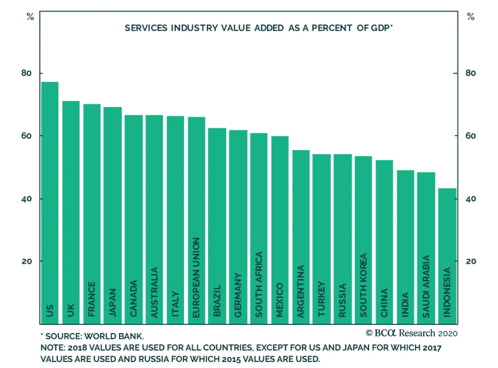
Last Friday, BCA Research's Global Investment Strategy service’s Q2 Strategic Outlook report concluded that investors should think of the coronavirus-induced ‘sudden stop’ in global economic activity as a Great Depression-style demand shock combined with a…
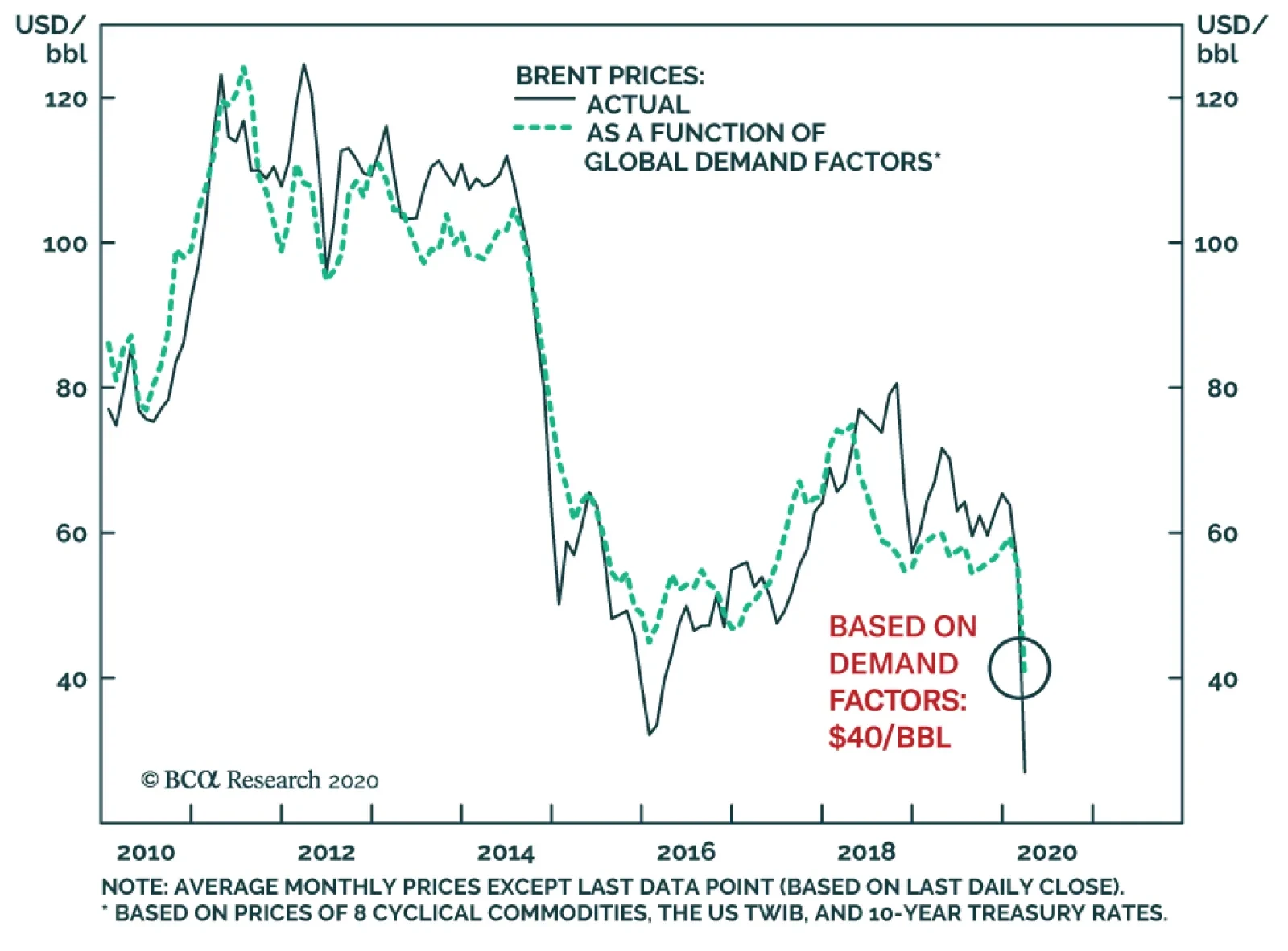
Yesterday, BCA Research's Commodity & Energy Strategy service surveyed the oil demand destruction attributable to COVID-19. Oil prices have fallen 60% YTD after being struck by simultaneous exogenous demand and supply shocks. We capture the effect of…
Highlights Global investors have come to accept the secular stagnation narrative as described by Larry Summers in November 2013, and have gravitated to the only available real time estimate of the real neutral rate of interest: the Laubach & Williams (“LW”) “R-star” estimate. With this apparent visualization of secular stagnation as a guide, many investors have concluded that monetary policy ceased to be stimulative last year and that recent Fed rate cuts will be of limited benefit to economic activity even once economic recovery takes hold unless inflation meaningfully accelerates (thus pushing real rates lower for any given nominal Fed funds rate). This report revisits the “LW” R-star estimate in detail, and demonstrates why the estimation is almost certainly wrong, at least over the past two decades. We also outline an inferential approach that investors can use to monitor where the neutral rate is in real time and whether it is rising or falling. The core conclusion for investors is that US Treasury yields reflect a “low rates forever” view with much higher certainty than is analytically warranted and thus appear to be anchored by a false narrative. While bond yields may not rise significantly in the near-term, investors should avoid dogmatic medium-to-longer term views about yields as they may rise meaningfully over a cyclical and secular horizon once a post-COVID-19 expansion takes hold. Feature Over the past several weeks financial markets have moved rapidly to price in a global recession stemming from the COVID-19 outbreak. As financial market participants began to turn to policy makers for support, eyes focused first on the Federal Reserve, and then fiscal authorities. Earlier this week, the ECB joined the party and announced aggressive further measures of its own. When responding to the Fed’s return to the lower bound and its other recent monetary policy decisions, many market participants have expressed the view that the Fed is largely impotent to deal with a global pandemic. There are three elements to this view. The first is that interest rate cuts are ill equipped to stimulate domestic demand if quarantine measures or other forms of “social distancing” are in effect. The second element is that the Fed has only been capable of delivering a fraction of the reduction in interest rates compared to what has occurred in response to previous contractions. The third aspect of this view is that because the neutral rate of interest is so much lower now than it was in the past, Fed rate cuts will not be as stimulative as they were before. Chart II-1Monetary Policy Ceased To Be Stimulative Last Year, According To The LW R-star Estimate
Monetary Policy Ceased To Be Stimulative Last Year, According To The LW R-star Estimate
Monetary Policy Ceased To Be Stimulative Last Year, According To The LW R-star Estimate
While we at least partly agree with the first and second elements of this view, we feel strongly that the third is flawed. Global investors have come to accept the secular stagnation narrative as described by Larry Summers in November 2013,1 and have gravitated to the only available real time estimate of the neutral rate of interest: the Laubach & Williams (“LW”) “R-star” estimate. This time series, which is regularly updated by the New York Fed,2 suggests that the real fed funds rate reached neutral territory in the first quarter of 2019 (Chart II-1). With this apparent visualization of secular stagnation as a guide, many investors have concluded that monetary policy ceased to be stimulative last year and that recent Fed rate cuts will be of limited benefit to economic activity even beyond the near term unless inflation meaningfully accelerates (thus pushing real rates lower for any given nominal Fed funds rate). In this Special Report we revisit the “LW” R-star estimate in detail, and demonstrate why the estimation is almost certainly wrong, at least over the past two decades. Our analysis does not reveal a precise alternative estimate of the neutral rate, although we do provide some inferential perspective on how investors may be able to monitor where the neutral rate is in real time and whether it is rising or falling. However, the core insight emanating from our report, particularly for US fixed income investors, is that US Treasury yields reflect a “low rates forever” view with much higher certainty than is analytically warranted and thus appear to be anchored by a false narrative. While bond yields may not rise significantly in the near-term, this underscores that they have the potential to rise meaningfully over a cyclical and secular horizon once economic activity recovers. As such, we caution fixed-income investors against dogmatic medium-to-longer term views about bond yields, as their potential to rise may be larger than many investors currently expect. Demystifying The LW R-star Estimate The LW estimate of the neutral rate of interest has gained credibility for three reasons. First, as noted above, the evolution of the series fits with the secular stagnation narrative re-popularized by Larry Summers. Second, the series is essentially sponsored by the Federal Reserve even if it is not officially part of the Fed’s forecasting framework, as its two creators are long-time Fed employees (Thomas Laubach is a director of the Fed’s Board of Governors, and John Williams is the current President of the New York Fed). But, in our view, there is a third important reason that global investors have accepted the LW R-star estimate of the neutral rate of interest: the methodology used to generate the estimate is extremely technically complex, and thus is difficult for most investors to penetrate. Much of the technical complexity of the LW estimate is centered around the use of a statistical procedure called a Kalman filter (“KF”). Simply described, the KF is an algorithm that tries to estimate an unobservable variable based on 1) an idea of how the unobservable variable might relate to an observable variable (the “measurement equation”), and 2) an idea of how the unobservable variable might change through time (the “transition equation”). Through a repeated process of simulating the unobserved variable based on a set of assumptions, the KF is able to compare predicted results to actual results on an observation-by-observation basis, and use that information to generate ever more reliable future estimates of the unobserved variable (Chart II-2). Chart II-2A Very Simplified Overview Of The Kalman Filter Algorithm
April 2020
April 2020
We acknowledge that a full technical treatment of the Kalman Filter as it relates to the LW estimate of the neutral rate of interest is beyond the scope of this report, and we provide a more technical overview in Box II-1. But what emerges from a detailed analysis of the model is that the Kalman Filter jointly estimates R-star, potential GDP growth, potential GDP, and the variable “z”, the determinants of R-star that are not explained by potential GDP growth. As we will highlight in the next section, this joint estimation of these four variables is a crucial aspect of the model, because a valid estimate of R-star necessitates a valid estimate of the remaining variables. BOX II-1 A Technical Overview Of The Laubach & Williams R-star Model Chart Box II-1 shows that there are three sets of formulas involved in the LW estimation: the “law of motion” for the neutral rate of interest, two measurement equations, and three transition equations. The law of motion for the neutral rate is fairly simple: R-star is a function of trend real GDP growth, as well as “other factors” represented by the variable “z”. Laubach & Williams note that z “captures factors such as households’ rate of time preference”. The measurement equations are also fairly straightforward. First, the (unobservable) output gap is a function of lagged values of itself as well as the lagged real Fed funds rate gap (relative to the unobservable neutral rate). Second, inflation is a function of lagged values of itself, past values of the output gap, relative core import prices, and lagged relative imported oil prices (the latter two variables are included to capture potential supply shocks to inflation). Note that this second measurement equation is required for the model to work, as it relates the unobservable output gap to observable inflation. As presented in Chart II-2, the three transition equations are present to simulate how the unobservable variables might move through time. Potential growth and potential output are a random walk, and “z” from the law of motion follows either a random walk or an autoregressive process. Chart Box II-1The Laubach & Williams R-star Model
April 2020
April 2020
Debunking The LW R-star Estimate Before criticizing the LW estimate of the neutral rate of interest, it is important for us to note that we have the utmost respect for the Federal Reserve and its research methods. We fully acknowledge that the LW R-star estimation is rooted in solid economic theory, and we have identified no technical errors in the setup of the LW model. Nevertheless, valid analytical efforts sometimes lead to problematic real-world results, and there are two key reasons to believe that the Kalman filter in the LW model is almost certainly misspecifying R-star, at least in terms of its estimate over the past two decades. The first reason relates to the sensitivity of the model to the interval of estimation (the period over which R-star is estimated). Chart II-3 presents the range of quarterly estimates of R-star since 2005, along with the difference between the high and low end of the range in the second panel. The chart shows that while previous estimates of R-star have generally been stable for values ranging between the early-1980s and 2006/2007, pre-1980 estimates have varied quite substantially and we have seen material revisions to the estimates over the past decade. Q1 2018 serves as an excellent example: in that quarter R-star was estimated to be 0.14%; today, the Q1 2018 R-star estimate sits at 0.92%. Chart II-3Since 2005, There Has Been Some Instability In The LW R-star Estimates
Since 2005, There Has Been Some Instability In The LW R-star Estimates
Since 2005, There Has Been Some Instability In The LW R-star Estimates
However, Table II-1 and Chart II-4 highlight the real instability of the Kalman filter estimation by demonstrating the effect of varying the starting point of the model (please see Box II-2 for a brief description of how our estimation of R-star using the LW approach differs slightly from the original procedure). Laubach & Williams originally estimated R-star beginning in Q1 1961; Table II-1 shows what happens to today’s estimate of R-star simply by incrementally varying the starting point of the model from Q1 1958 to Q4 1979. Table II-1Alternative Current LW Estimates Of R-star By Model Starting Point
April 2020
April 2020
Chart II-4Alternative Starting Points Produce Wildly Different Estimates Of R-star Today
April 2020
April 2020
BOX II-2 The Laubach & Williams R-star Model With Simplified Inflation Expectations To proxy inflation expectations in their model, Laubach & Williams use a “forecast of the four-quarter-ahead percentage change in the price index for personal consumption expenditures excluding food and energy (“core PCE prices”) generated from a univariate AR(3) of inflation estimated over the prior 40 quarters”. The authors note that a simplified measure of expectations, a 4-quarter moving average of quarterly annualized core inflation, does not materially alter their results. For the sake of parsimony we use this simplified measure in our analysis. We find that the effect shifts the current estimate of R-star only slightly (+10 basis points), and that the historical differences between our version of the 1961 estimation and the official series are indeed minor. The table highlights that the model fails to even generate a result in a majority of the cases (only 39 out of 88 of the model runs were error-free). In addition, Chart II-4 shows that of the successful estimates of R-star using the LW procedure and alternate starting dates of the model, the estimate of R-star today varies from -2% (in one case) to +2%. Excluding the one extremely negative outlier results in an effective estimate range of 0% to 2%, but the key point for investors is that this range is massive and underscores that the original model’s estimate of R-star today is heavily and unduly influenced by the interval of estimation. Investors should also note that of all of the alternative estimates of R-star today shown in Chart II-4, the estimate using the original interval is very much on the low end of the distribution. The second (and most important) reason to believe that the LW estimate is misspecifying R-star is that the output gap estimate generated by the model is almost certainly invalid, at least over the past two decades. Chart II-5presents the LW output gap estimate alongside an average of the CBO, OECD, and IMF estimates of the gap; panel 1 shows the official current LW output gap estimate, whereas panel 2 shows the range of output gap estimates that are generated using the different estimation intervals highlighted in Table II-1 and Chart II-4. Chart II-5The LW Output Gap Estimates, Upon Which R-star Depends, Have Been Wrong For Two Decades
The LW Output Gap Estimates, Upon Which R-star Depends, Have Been Wrong For Two Decades
The LW Output Gap Estimates, Upon Which R-star Depends, Have Been Wrong For Two Decades
Given that the Kalman filter in the LW model jointly determines R-star and the output gap (by way of estimating potential output via estimating potential GDP growth) and that these estimates are dependent on each other, Chart II-5 highlights that in order to believe the LW R-star estimate investors must believe three things: That the US economy was chronically below potential in the late-1990s when the unemployment rate was below 5%, real GDP growth averaged nearly 5%, and the equity market was booming, That output exceeded potential in 2004/2005 by a magnitude not seen since the late-1970s / early-1980s despite an average unemployment rate, That the 2008/2009 US recession was not particularly noteworthy in terms of its deviation from potential output, and that the economy had returned to potential output by 2010/2011 when the unemployment rate was in the range of 8-9%. Chart II-6The US Economy Was Definitely Not At Full Employment In 2010
The US Economy Was Definitely Not At Full Employment In 2010
The US Economy Was Definitely Not At Full Employment In 2010
While we do not believe any of these three statements, the third is especially unlikely. Chart II-6 highlights that the economic expansion from 2009 – 2020 was the weakest on record in the post-war era in terms of average annual real per capita GDP growth. To us, this is a clear symptom of a chronic deficiency in aggregate demand, and that it is essentially unreasonable to argue that the economy was operating at full employment prior to 2014/2015. This means that the Kalman filter is generating incorrect and unreliable estimates of the output gap, which means in turn that the filter’s estimation of R-star is almost assuredly wrong. How Can Investors Tell What The Neutral Rate Is? An Inferential Approach Table II-2 presents the sensitivity of the original Q1 1961 LW estimate of R-star to a series of counterfactual scenarios for inflation, real GDP growth, nominal interest rates, and import and oil prices since mid-2009. While these scenarios do not in any way improve the validity of the LW R-star estimate, they do help clarify the theoretical basis of the model and they help reveal how investors may infer whether the neutral rate of interest is higher or lower than prevailing market rates, and whether it is rising or falling. Table II-2Sensitivity Of Current LW R-star Estimate To Counterfactual Scenarios (2009 - Present)
April 2020
April 2020
Chart II-7Core Import Price Growth Has Been Weak On Average During This Expansion
Core Import Price Growth Has Been Weak On Average During This Expansion
Core Import Price Growth Has Been Weak On Average During This Expansion
Table II-2 highlights that today’s estimate of R-star using the original LW approach is mostly sensitive to our counterfactual scenarios for growth and interest rates, but not inflation or oil prices. Shifting down import price growth also has a meaningful effect on R-star, but since core import price growth has been particularly weak over the past several years (Chart II-7), it seems unreasonable to suggest that they have been abnormally high and thus “explain” a low R-star estimate today. Table II-2 essentially highlights that the entire question of the neutral rate of interest over the past decade, and the core contradiction that led to the re-emergence of the secular stagnation thesis, can effectively be boiled down to the following simple question: “Why hasn’t US economic growth been stronger this cycle, given that interest rates have been so low?” Based on the (hopefully uncontroversial) view that interest rates influence economic activity and that economic activity influences inflation, we propose the following checklist for investors to ask themselves in order to not only determine the answer to this important question, but to help identify whether R-star in any given country is likely higher or lower than existing policy rates at any given point in time. Are interest rates above or below the prevailing level of economic growth? Are interest rates rising or falling, and how intensely? Are there identifiable non-monetary shocks (positive or negative) that appear to be influencing economic activity? Is private sector credit growth keeping pace with economic growth? Are debt service burdens in the economy high or low? The first question reflects the most basic view of R-star, which is that the real neutral rate of interest should be equal to, or at least closely related to, the potential growth rate of the economy, ceteris paribus. Questions 2 through 5 attempt to determine whether ceteris paribus holds. In terms of how the answers to these questions relate to identifying the neutral rate, consider two economies, “Economy A” and “Economy B” (Chart II-8). Economy A has broadly stable or slightly rising interest rates that are well below prevailing rates of economic growth (questions 1 & 2), no obvious beneficial shocks to domestic demand from fiscal policy or other factors (question 3), and strong private sector credit growth that is perhaps above or strongly above the current pace of GDP growth (question 4). Chart II-8'Economy A', Versus 'Economy B'
April 2020
April 2020
Inferentially, it would seem that interest rates in this hypothetical economy are below R-star today. Question 5 is in our list because the more that active private sector leveraging occurs (thus pushing up debt burdens), the more that we would expect R-star in the future to fall. This is because debt payments as a share of income cannot rise forever, and we would expect that the capacity of economy A’s central bank to raise interest rates in the future are negatively related to economy A’s private sector debt service burden today. Now, imagine another economy (“Economy B”) with interest rates well below average rates of economic growth, an interest rate trend that is flat-to-down, no identifiable non-monetary policy shocks that are restricting aggregate demand, persistently sluggish credit growth, and high private sector debt service burdens in the past. If economy B is growing (even sluggishly) and not in the middle of a recession, it would seem that prevailing interest rates are below R-star, but not significantly so. In this scenario it would seem reasonable to conclude that R-star in economy B has fallen non-trivially below its potential growth rate, and that interest rate increases are likely to move monetary policy into restrictive territory earlier than otherwise would be the case. Is The United States “Economy B”? From the perspective of some investors, our description of economy B above perfectly captures the experience of the US over the past decade: an extremely low Fed funds rate, sluggish to weak growth and inflation, all the result of a huge build-up in leverage and debt service burdens during the last economic cycle. We do not doubt that R-star fell in the US for some period of time during the global financial crisis and in the early phase of the economic recovery. But we doubt that it is as low today as the secular stagnation narrative would imply, in large part because it ignores several important aspects concerning questions 2 through 5 noted above. Chart II-9Fiscal Austerity Has Been A Serious Non-Monetary Shock To Aggregate Demand
Fiscal Austerity Has Been A Serious Non-Monetary Shock To Aggregate Demand
Fiscal Austerity Has Been A Serious Non-Monetary Shock To Aggregate Demand
Non-monetary shocks to the US and global economies: Over the past 12 years, there have been at least five deeply impactful non-monetary shocks to both the US and global economies that have contributed to the disconnect between growth and interest rates: 1) a prolonged period of US household deleveraging from 2008-2014, 2) the euro area sovereign debt crisis, 3) fiscal austerity in the US, UK, and euro area from 2010 – 2012/2014 (Chart II-9), 4) the US dollar / oil price shock of 2014, and 5) the recent trade war between the US and China. Several of these shocks have been policy-driven, and in the case of austerity the negative consequences of that policy has led to a lasting change in thinking among fiscal authorities (outside of Japan) that is unlikely to reverse in the near-future. Chart II-10Recent Trends In US Private Sector Leverage Do Not Suggest R-star Is Very Low
Recent Trends In US Private Sector Leverage Do Not Suggest R-star Is Very Low
Recent Trends In US Private Sector Leverage Do Not Suggest R-star Is Very Low
Private sector credit growth: Chart II-10 highlights the extent of household deleveraging noted above by showing the growth in total household liabilities over the past decade alongside income growth. Panel 2 shows the leveraging trend of firms, as represented by the nonfinancial corporate sector debt-to-GDP ratio. Chart II-10 underscores two points: the first is that while US household sector credit contracted for several years following the global financial crisis, it is now growing again and has largely closed the gap with income growth. The second point is that the nonfinancial corporate sector has clearly leveraged itself over the course of the expansion, arguing that interest rates have not in any way been restrictive for businesses. While it is true that firms have largely leveraged themselves to buy back stock instead of significantly increasing capital expenditures, in our view this reflects the fact that US consumer demand was impaired for several years due to deleveraging. We doubt that firms would have altered their capital structures to this degree if they did not view interest rates as extremely low. Debt service burdens: Chart II-11 highlights that US household debt service burdens were at very elevated levels prior to the financial crisis, suggesting that the neutral rate did fall for some time following the recession. But today, the debt burden facing households is the lowest it has been in the past 40 years due to both rate reductions and deleveraging, arguing against the view that household debt levels will structurally weigh on interest rates in the years to come. Chart II-12 shows that the picture is different for nonfinancial corporations, as the substantial leveraging noted above has indeed raised debt service burdens for firms. However, the nonfinancial corporate sector debt service ratio remains 400 basis points below early-2000 levels when excess corporate sector liabilities had a clear impact on the economy, suggesting that the Fed’s capacity to raise interest rates still exists following the onset of economic recovery if corporate sector credit growth does not rise sharply relative to GDP over the coming 6-12 months. Chart II-11The Debt Burden Facing US Households Is At A Record Low
The Debt Burden Facing US Households Is At A Record Low
The Debt Burden Facing US Households Is At A Record Low
Chart II-12Businesses Have Levered Up Their Balance Sheets, But There Is Still Room For Rates To Rise
Businesses Have Levered Up Their Balance Sheets, But There Is Still Room For Rates To Rise
Businesses Have Levered Up Their Balance Sheets, But There Is Still Room For Rates To Rise
The intensity of recent interest rate changes: Finally, many investors have pointed to sluggish housing activity over the past three years as evidence of a low neutral rate. However, Chart II-13 highlights that the rise in the 30-year US mortgage rate from late-2016 to late-2018 was one of the largest two-year changes in US history, and Chart II-14 shows that the growth in household mortgage credit did not fall below its trend during this period until Q4 2018, when the US stock market fell 20% from its high in response to the economic consequences of the US/China trade war. Chart II-14 also shows that mortgage credit growth responded sharply to a recent reduction in interest rates. All in all, Charts II-13 & II-14 cast doubt on the notion that the level of mortgage rates over the past three years reached restrictive territory. Chart II-13Mortgage Rates Rose Very Significantly From Late-2016 To Late-2018
Mortgage Rates Rose Very Significantly From Late-2016 To Late-2018
Mortgage Rates Rose Very Significantly From Late-2016 To Late-2018
Chart II-14A Record Rise In Mortgage Rates Did Not Crack The Housing Market
A Record Rise In Mortgage Rates Did Not Crack The Housing Market
A Record Rise In Mortgage Rates Did Not Crack The Housing Market
Investment Conclusions In the face of a global pandemic and an attendant global recession this year, the idea of eventual Fed rate hikes and the notion that the US economy will be able to tolerate them likely seems preposterous to many investors. We agree that over the coming 6-12 months US Treasury yields are unlikely to rise; even at current levels of the 10-year Treasury yield, we are reluctant to call a trough. Chart II-15US 10-Year Treasurys Are Mostly Priced For A Repeat Of The Past Decade
US 10-Year Treasurys Are Mostly Priced For A Repeat Of The Past Decade
US 10-Year Treasurys Are Mostly Priced For A Repeat Of The Past Decade
However, Chart II-15highlights that over a long-term time horizon, the bond market is now essentially priced for a repeat of the ten-year path of the Fed funds rate following the global financial crisis. While some investors will view this as a reasonable expectation in the face of what they see as a persistent and unexplainable gap between growth and interest rates over the past decade, we think this gap is explainable and we highly doubt that a pandemic with minimal mortality risk to the working age population and the young will cause the US economy to be afflicted with active consumer deleveraging lasting 4 to 6-years, substantial and wide-ranging fiscal austerity, persistently rising trade tariffs, and sharply lower oil prices. So while we agree that the US economy will be substantially cyclically affected by COVID-19, US Treasury yields reflect a “low rates forever” view with much higher certainty than is analytically warranted and thus appear to be anchored by a false narrative. As such, we caution fixed-income investors against dogmatic medium-to-longer term views about bond yields, as their potential to rise following the upcoming recession may be larger than many investors currently believe. Jonathan LaBerge, CFA, Vice President Special Reports jonathanl@bcaresearch.com Footnotes 1 "IMF Fourteenth Annual Research Conference in Honor of Stanley Fischer," Washington DC, November 8, 2013. 2 "Measuring the Natural Rate of Interest," Federal Reserve Bank of New York.
Highlights The global economy is in the midst of a painful recession. Monetary and fiscal authorities are responding forcefully to the crisis, but the lengths of the lockouts and quarantines remain a major source of downside risk to the economy. Investors should favor stocks over bonds during the next year. The short-term outlook remains fraught with danger, so avoid aggressive bets. Central banks can tackle the global liquidity crunch, thus spreads will narrow and the dollar will weaken. The long-term impact of COVID-19 will be inflationary. Feature “The only thing we have to fear is fear itself.” Franklin Delano Roosevelt 1932 A violent global recession is underway. Last month, we wrote that a deep economic slump would be unavoidable if COVID-19 cases could not be controlled within two to three weeks.1 Since then, the number of new, recorded COVID-19 cases has mounted every day and fear prevails. Consumers are not spending; firms will face a cash crunch and/or bankruptcy, and employment will be slashed. The next few quarters could result in some of the worst GDP prints since the Great Depression. Risk assets have moved to discount this dire scenario. The global stock-to-bond ratio has collapsed by 47% since its peak on January 17th and stands at the 1st decile of it post-1980 distribution. 10-year US bond yields temporarily fell below 0.4%. The dollar has rallied against every currency and even gold traded below $1500 an ounce. Brent crude trades below $30/bbl. In this context, investors must assess if risk asset prices have declined enough to compensate for the economic hazards created by the COVID-19 pandemic. If the massive amount of monetary and fiscal stimulus announced can turn around the economy in the second half of the year, then stocks and risk assets are attractive. Otherwise, they are still not cheap enough and cash remains king. We think it is a good time to begin to parsimoniously deploy capital into risk assets. A Global Recession And An Extraordinary Response The global economy has suffered its worst shock since the Great Financial Crisis (GFC), but policymakers are deploying every tool available. In our base case, GDP will contract more quickly for two quarters than it did during the GFC, and then will recover smartly. It is hard to pinpoint exactly how quickly global GDP will contract in the next six months, but key indicators point to a grim outcome. Chart I-1Global Growth Is Plunging
Global Growth Is Plunging
Global Growth Is Plunging
China’s economy was at the forefront of the COVID-19 pandemic and its trajectory provides a glimpse into what the rest of the world should anticipate. In February, Chinese retail sales contracted by 20.5% annually and industrial production plunged by 13.5%. The German ZEW survey for March paints an equally bleak picture. The growth expectations component for the Eurozone and Germany fell to its lowest level since the GFC. The same indicator, but computed as an average of US, European and Asian subcomponents is also collapsing at an alarming pace (Chart I-1). The European flash PMI for March also points to a deep slowdown, with the services PMI plunging to 28.4, an all-time low. The performance of EM carry trades flashes a somber warning for our Global Industrial Production Nowcast (Chart I-2). Carry trade returns are imploding because global liquidity is incapable of meeting the demand for precautionary money by economic agents. This lack of liquidity is inflicting enormous damage on worldwide growth. Live trackers for US and global economic activity are also melting down. Traffic in some of the US’s largest cities is a fraction of last year's (Chart I-3). Globally, restaurant bookings have dried up and fewer airlines are flying compared to 2008. Initial jobless claims in the US have surged to 3.28 million, rapidly and decisively overtaking the weaknesses seen during the GFC. Chart I-2The Liquidation Of Carry Trade Is A Bad Omen
The Liquidation Of Carry Trade Is A Bad Omen
The Liquidation Of Carry Trade Is A Bad Omen
Chart I-3Live Trackers Are In Free Fall
April 2020
April 2020
Despite the dismal situation, some positive developments are emerging. It has been demonstrated that quarantines contain the spread of the virus. On March 18th, Wuhan recorded no new COVID-19 cases. Moreover, 10 days after its January 24th quarantine began, new cases started to fall off quickly (Chart I-4) in the city. If the recent softening in new cases in Italy’s Lombardy region continues, it will illustrate that democratic regimes can also reduce the pace of infection. Chart I-4Quarantines Do Work
April 2020
April 2020
Most importantly, policymakers around the world have shown their willingness to do “whatever it takes.” Governments are easing fiscal policy with abandon. Germany’s state bank KfW is setting aside EUR550 billion to support the economy. France will spend EUR45 billion and has earmarked EUR300 billion in small business loan guarantees. Spain announced EUR200 billion to protect domestic activity. The White House just passed a stimulus package of $2 trillion, and Canada follows suit with a CAD82 billion relief bill. (Table I-1). As A. Walter and J. Chwieroth showed, the growing financial wealth of the middle class is forcing governments to always provide large bailouts after financial crises and recessions. Otherwise, their political parties suffer extreme repudiation from power.2 Table I-1Massive Stimulus In Response To Pandemic
April 2020
April 2020
Central bankers have also become extreme reflators. Nearly every central bank in advanced economies has cut interest rates to zero or into negative territory. Most importantly, central banks have become lenders of last resort. The US Federal Reserve has announced it will engage in unlimited asset purchases; it has reopened various facilities to provide liquidity to the market and is using the US Department of the Treasury to lend directly to the private sector. Among its many measures, the European Central Bank is scrapping artificial limits on its bond purchases that were its capital keys and has offered a EUR750 billion bond purchase program. The ECB is also looking to open its OMT program. Other central banks are injecting cash directly into their domestic markets (Table I-2). The list and size of actions will expand until the markets are satiated with enough liquidity. Table I-2The Central Banks Still Had Some Options When Crisis Hit
April 2020
April 2020
The impact of these policy measures is threefold. First, the actions are designed to alleviate the global economy’s cash crunch. Secondly, they aim to support growth directly. The private sector needs direct backing to survive the lack of cash inflows that will develop in the coming weeks. If fiscal and monetary authorities can plug that hole, then spending will not have to collapse as deeply nor for as long as would otherwise be the case. Finally, it is imperative that policymakers boost confidence and ease financial conditions to allow “animal spirits” to stabilize. If risk-taking continues to tailspin, then spending will never recover and the demand for cash will only grow, creating the worst liquidity trap since the Great Depression. Policymakers around the world have shown their willingness to do “whatever it takes.” The economy will continue to weaken in the second half of 2020 if quarantines remain in place beyond the summer. Not being epidemiologists, we are not equipped to make this call with any degree of certainty. Much depends on the evolution of the disease and the political decisions taken. We do not yet know if the population will be willing to endure the economic pain of a depression, or if political pressures will rise to force isolation on those over age 60 and those suffering dangerous comorbidities who are at higher risk, and allow everyone else to return to work and school.3 Investment Implications Part 1: Bonds and Stocks Chart I-5The Stock-To-Bond Ratio Has Capitulated
The Stock-To-Bond Ratio Has Capitulated
The Stock-To-Bond Ratio Has Capitulated
While the short-term outlook remains murky for asset markets, investors with a 12-month or longer investment horizon should begin to move capital into equities at the expense of bonds. Beyond the relative technical and valuation backdrops (Chart I-5), the outlook for fiscal and monetary policy favors this allocation decision. US Treasury yields have dropped from 1.9% at the turn of the year to as low as 0.31% on March 9th. According to the bond market, inflation will average less than 1% during the coming 10 years. The OIS curve is pricing in a fed funds rate of only 68 basis points in five years. In response to this extreme pricing, Treasury bonds are exceptionally expensive (Chart I-6). Moreover, using BCA Research’s Golden Rule of Treasury Investing, there is little scope for yields to fall any lower. The Golden Rule states that the return of Treasury bonds is directly linked to the Fed's rate surprises. If over the next year the Fed cuts interest rates more than is currently priced into the OIS curve, then bond yields will fall in the next 12 months (Chart I-7). Given that the fed funds rate is already at its lower limit, the Fed will not be able to deliver such a dovish surprise and yields will have limited downside. Chart I-6Bonds Are Furiously Expensive
Bonds Are Furiously Expensive
Bonds Are Furiously Expensive
Chart I-7The Fed Cannot Pull Another Dovish Surprise Out Of Its Hat
The Fed Cannot Pull Another Dovish Surprise Out Of Its Hat
The Fed Cannot Pull Another Dovish Surprise Out Of Its Hat
The bond market is also vulnerable from a technical perspective. Our Composite Technical Indicator is as overbought today as it was in December 2008 (Chart I-8). Thus, bond prices are vulnerable to good news. Economic activity will be weak for many months, but the recent policy announcements will boost global fiscal deficits by more than $3 trillion in the next 12 to 18 months. Such a large supply of paper is bearish for bonds, especially when they are very expensive. Moreover, global central banks are engaging in large-scale quantitative easing (QE). Globally, monetary authorities have already announced the equivalent of at least $1.9 trillion in asset purchases. The GFC experience showed that QE programs put upward pressure on Treasury yields (Chart I-9). This time will not be different given the combination of QE, supply disruptions caused by quarantines and large fiscal stimulus. Chart I-8A Dire Combination For Bonds
A Dire Combination For Bonds
A Dire Combination For Bonds
Chart I-9QE Pushes Yields Up
QE Pushes Yields Up
QE Pushes Yields Up
Equities offer the opposite risk/reward ratio to bonds. Technical indicators are consistent with maximum pessimism toward equities and imply that most of the selloff is behind us, at least for the time being. The Complacency-Anxiety Indicator developed by BCA Research’s US Equity Strategy service points to widespread pessimism among investors,4 an intuition confirmed by our Sentiment indicator (Chart I-10). Moreover, our Equity Capitulation Index is as depressed as in March 2009. Investors with a 12-month or longer investment horizon should begin to move capital into equities at the expense of bonds. Despite the magnitude of the shock hitting the global economy, equities will rally if they become cheap enough and monetary conditions are accommodative enough. The BCA Valuation indicator has collapsed to “undervalued” territory and our Monetary Indicator has never been more supportive of equities (both variables are shown on page 2 of Section III). The gap between these two indicators is at its lowest level since Q1 2009 or 1982, two points that marked the end of bear markets (Chart I-11). Chart I-10Equities Have Capitulated
Equities Have Capitulated
Equities Have Capitulated
Chart I-11Supportive Combined Valuation And Monetary Backdrop For Equities
Supportive Combined Valuation And Monetary Backdrop For Equities
Supportive Combined Valuation And Monetary Backdrop For Equities
Equity multiples also offer some insight into the risk/reward ratio for stocks. The S&P 500 has collapsed by 34% since its February 19th peak and trades at 13 times forward earnings. True, analysts will revise their forecasts, but the market also only trades at 14 times trailing earnings, which cannot be downgraded. Most importantly, investors are extremely gloomy about expected growth when multiples and risk-free rates are so subdued. Risk assets cannot stabilize durably as long as the demand for dollar liquidity is not satiated. Table I-3Evaluating Where The Floor Lies
April 2020
April 2020
We can use a simple discounted cash flow model to extract the expected growth rate of long-term earnings embedded in the S&P 500. To do so, we assume that the ERP is 300 basis points, close to the long-term outperformance of stocks versus bonds. At current multiples and 10-year yields, investors are pricing in a long-term growth rate of -2% annually for earnings (Table I-3). In comparison, investors were more pessimistic in 1974, 2008 and 2011 when they anticipated long-term earnings contractions of -2.5% annually. If we assume that the long-term growth of expected earnings will fall to that depth, then we can estimate trailing P/E multiples will be under different risk-free rates. If yields fall to zero, then the P/E would be 17.7 or a price level of 2,692; however, if they rise to 1.5%, then the P/E would decline to 13.9 or a price level of 2,115 (Table I-3). Chart I-12Expected Earnings Growth And Interest Rates Are Co-Integrated
Expected Earnings Growth And Interest Rates Are Co-Integrated
Expected Earnings Growth And Interest Rates Are Co-Integrated
This method suggests that 2200 is the S&P 500’s likely floor. Risk-free rates and the expected growth rate of long-term earnings are correlated series because the anticipated evolution of economic activity drives both real interest rates and earnings (Chart I-12). Thus, it is unlikely that yields will climb if expected earnings growth falls. Instead, if the expected growth rate of long-term earnings drops to -2.5%, then yields should stand between 1% and 0.5%, implying equilibrium trailing P/Es of 15 to 16.3 times, or prices levels of 2,278 to 2,468. P/E will only fall much further if the dollar scramble lasts longer. As investors seek cash and liquidate all assets, the process can push anticipated growth rates lower while pulling bond yields higher (see next section). Investment Implications Part 2: The Uncontrolled Liquidity Crunch Is Still An Immediate Risk Risk assets cannot stabilize durably as long as the demand for dollar liquidity is not satiated. The large programs announced around the world seem to be calming this liquidity crunch. However, the situation is fluid and the crunch can come back at a moment's notice. Despite the magnitude of the shock hitting the global economy, equities will rally if they become cheap enough and monetary conditions are accommodative enough. Credit spreads blew up as investors priced in the inevitable increase in defaults that accompanies recessions (Chart I-13). Junk spreads moved to as high as 1100 basis points, their highest level since 2009. If we assume that next year, US EBITDA contracts by its average post-war magnitude (a timid assumption), then the interest coverage ratio will deteriorate to readings not seen since the S&L crisis, which will force default rates higher (Chart I-14). Chart I-13Defaults Will Rise
Defaults Will Rise
Defaults Will Rise
Chart I-14Corporate Fundamentals Will Deteriorate
Corporate Fundamentals Will Deteriorate
Corporate Fundamentals Will Deteriorate
The anticipated contraction in cash flows creates another more pernicious and dangerous consequence: an insatiable demand for dollar liquidity by the private sector. Companies are worried they may not generate the necessary cash flows to service their debt. This is especially worrisome for foreign borrowers who have loans in US dollars. The BIS estimates that foreign currency debt denominated in USDs stands at $12 trillion. Meanwhile, these foreign borrowers are hoarding dollars. The risk aversion of US-based companies is accentuating the dollar crunch. US companies have pulled on their credit lines en masse. US commercial banks must provide this cash to their clients. However, US banks must still meet liquidity requirements imposed by the Basel III rules. As a result, the banks are also hoarding as much cash as possible in the form of excess reserves and curtailed their capital market lending, especially in the repo market. Repos are the lifeblood of capital markets and without repos, market liquidity (the ability to sell and buy securities) quickly deteriorates. This chain of events has caused a sharp widening in Treasury bid-ask spreads, LIBOR-OIS spreads and commercial paper-T-Bill spreads, and has fueled weaknesses in mortgage and municipal bond markets (Chart I-15). The evaporation of the repo market accentuates the foreign liquidity crunch. Without functioning repo markets, dollar funding in offshore markets becomes more onerous, as highlighted by the widening in global cross-currency basis swap spreads (Chart I-16). Borrowers are buying dollars at any cost. This has led to the surge in the dollar from March 9th, which forced the collapse of risky currencies such as the NOK, the BRL or the MXN, but also of safe-haven currencies such as the JPY and the CHF. Chart I-15Symptoms Of A Liquidity Crunch
Symptoms Of A Liquidity Crunch
Symptoms Of A Liquidity Crunch
Chart I-16Offshore Funding Pressures Point To A Dollar Shortage
Offshore Funding Pressures Point To A Dollar Shortage
Offshore Funding Pressures Point To A Dollar Shortage
The strength in the dollar is problematic. As a symptom of the liquidity crunch, it accompanies forced selling of assets by investors seeking to acquire cash. Moreover, the USD is a funding currency, hence a strong dollar also tightens the global cost of capital for all foreign borrowers who have tapped into US capital markets. For US firms, it also accentuates deflationary pressures and the resulting lower price of goods sold increases the risk of bankruptcies. Thus, a strong dollar would feed the weakness in asset prices and further widen credit spreads. Moreover, because the liquidity crunch hurts growth and can concurrently push yields higher, it could pull P/Es below 15 and drive equity prices far below our 2,200 floor. On the positive side, central banks worldwide are keenly aware of the danger created by the liquidity crunch. The Fed has started and restarted a long list of liquidity facilities (Table I-2). Its unlimited QE program also addresses the dollar shortage directly by expanding the supply of money. Crucially, the Fed has re-opened dollar swap lines with other central banks, including emerging markets such as Korea, Singapore, Mexico and Brazil. Even the ECB and the Bank of England are relaxing liquidity ratios for their banks, which at the margin will alleviate the supply of liquidity in their domestic economies. The Fed will likely follow its European counterparts, which could play a large role in alleviating the global dollar shortage. Investors seeking to assess if the supply of liquidity is large enough should pay close attention to gold prices. The global, large-scale fiscal stimulus programs will also address the dollar liquidity crisis. When investors judge there is sufficient fiscal stimulus to put a floor under global economic activity, the markets will take a more sanguine view of the risk of default. If large enough, government spending will support corporate cash flows and, therefore, limit corporate bankruptcies. Consequently, demand for liquidity will also decline and mass asset liquidations will ebb. Chart I-17Gold Is The Ultimate Liquidity Gauge
Gold Is The Ultimate Liquidity Gauge
Gold Is The Ultimate Liquidity Gauge
Investors seeking to assess if the supply of liquidity is large enough should look for some key market signals. We pay close attention to gold prices; after March 9th they fell despite the global spike in risk aversion due to gold's extreme sensitivity to global liquidity conditions. Both today and in the fall of 2008, gold prices fell when illiquidity grew. Our gold fair-value model shows that the precious metal is extremely sensitive to inflation expectations and real bond yields (Chart I-17). As illiquidity grows and the dollar appreciates, inflation breakevens collapse and real yields spike. Thus, the recent gold rebound suggests that the Fed and other major central banks have expanded the supply of liquidity sufficiently to meet demand, the price of money will fall (real interest rates) and inflation expectations will rebound. Monitor whether gold can remain well bid. Investment Implications Part 3: FX And Commodity Markets Chart I-18China's Stimulus Will Once Again Be Paramount
China's Stimulus Will Once Again Be Paramount
China's Stimulus Will Once Again Be Paramount
China’s stimulus will be a key driver of the FX market in the post-liquidity-crunch world. Historically, because Chinese reflation has lifted the global manufacturing cycle, it possesses a large influence on the dollar’s trend (Chart I-18). We believe that China’s stimulus will be comparable to the one implemented in 2008 and will boost global growth. Moreover, the interest rate advantage of the US has declined and global macro volatility will not remain at current extremes for an extended time. These three factors (Chinese stimulus, lower interest rate differentials and declining volatility) will weigh on the USD in the coming 18 months (Chart I-18, bottom panel). EM currencies and the AUD will benefit most from the dollar depreciation later this year. In the short term, these currencies remain exposed to any flare up in the liquidity crunch and can cheapen further. But, as Chart I-19 highlights, investing in those currencies will likely generate long-term excess returns because they have cheapened significantly. Commodities, too, are becoming attractive at current valuations. Industrial metals such as copper will benefit greatly from China’s stimulus. A rising Chinese credit and fiscal impulse lifts the price of base metals because it pushes up Chinese infrastructure spending as well as residential and capex investment (Chart I-20). Moreover, a lower dollar and accommodative global monetary policy will further boost the appeal of industrial metals. Chart I-19EM FX Is Cheap
EM FX Is Cheap
EM FX Is Cheap
Chart I-20China Will Drive Metal Prices Higher
China Will Drive Metal Prices Higher
China Will Drive Metal Prices Higher
China’s stimulus will be a key driver of the FX market in the post-liquidity-crunch world. The oil outlook is particularly unclear as both demand and supply factors are in flux. At $27/bbl, Brent is cheap enough to compensate investors for the decline in demand that will emerge between now and the end of the second quarter. However, the market-share war between Saudi Arabia and Russia layers on the problem of supply risk. Saudi Aramco is set to increase production to 12.3 million barrels by April and Saudi’s GCC allies have announced they are increasing output as well. According to BCA Research’s Commodity and Energy Strategy service, the oil market is already oversupplied by 1.6 million barrels per day, a number that will expand if the KSA and its allies fulfill their production pledges. If this situation persists, oil will lag behind industrial metals when global risk aversion recedes. Nonetheless, our commodity strategists believe that the collapse in oil prices is more painful for Russia than for KSA. We believe there will be a compromise between OPEC and Russia in the coming weeks that will push supply lower.5 Additionally, the Texas Railroad Commission is preparing to impose limitations on Texas oil production, which has not been done since the 1970s. Such a decision would magnify any rebound in oil prices. Thinking Long-Term: The Return Of Stagflation? The COVID-19 outbreak will likely be viewed as an epoch-defining moment. The policy response to the outbreak will be far reaching and the disease will change the way firms manage supply chains for decades to come. There will be a substantial pullback in globalization. COVID-19 has generated an inflationary shock in the medium term. Chart I-21War Spending Is Always Inflationary
War Spending Is Always Inflationary
War Spending Is Always Inflationary
COVID-19 has generated an inflationary shock in the medium term. Governments have suddenly abandoned their preferences for fiscal rectitude. The US deficit will reach a peacetime record of 15% of GDP. These are war-like spending measures. In history, gold standard or not, wars were the main reason for inflationary outbreaks as they involved massive budgetary expansions (Chart I-21). The large monetary easing accompanying the current fiscal expansion will only add to this inflationary impulse. Many of the proposals discussed by governments involve funneling cash directly to households, while central banks buy bonds issued by the same government. This is very close to helicopter money. These policies will increase the velocity of money, which is structurally inflationary (Chart I-22). Naysayers may point to the lack of inflation created by QE programs in the direct aftermath of the GFC. However, at that time, households and commercial banks were much sicker. Today, capital ratios in the US and the Eurozone are 60% and 33% higher than in 2007, respectively (Chart I-23). Thus, banks are much more likely to add to money creation instead of retracting from it as they did in the last cycle. Chart I-22If Velocity Rises, So Will Inflation
If Velocity Rises, So Will Inflation
If Velocity Rises, So Will Inflation
Chart I-23Banks Are Much Healthier Than In 2008
April 2020
April 2020
Chart I-24Financial Assets Have No Inflation Cushion
Financial Assets Have No Inflation Cushion
Financial Assets Have No Inflation Cushion
Markets are not ready for higher inflation. The 5-year/5-year forward CPI swaps in the US and the euro area stand at only 1.6% and 0.7%, respectively. Household long-term inflation expectations are also at all-time lows (Chart I-24). Therefore, an increase in inflation will have a deep impact on asset prices. The first implication is that gold prices have probably begun a new structural bull market. Inflation will surprise on the upside and keep real interest rates lower. Both these factors are highly bullish for the yellow metal. Additionally, easy fiscal policy and money printing will devalue currencies versus hard assets, which will benefit all precious metals, including gold. EM central banks have recently been diversifying aggressively in gold, which will add another impetuous to its rally. The second implication is that the stock-to-bond ratio has structural upside. Equities are not a perfect inflation hedge, but their profits can rise when selling prices accelerate. However, bonds display rock bottom real yields, inflation protection and term premia. Moreover, their low-running yields are below the dividend yields of equities, which has also boosted bond duration to record levels. Therefore, bonds offer even less protection against higher inflation. Hence, the stock-to-bond ratio will probably follow the historical experience of the 20th century structural bull market and inflect higher (Chart I-25). However, this outperformance will not stem from the superior performance of stocks in real terms; rather, it will emerge from a very poor performance by bonds. Chart I-25The Stock-To-Bond Ratio Will Follow The 20th Century Road Map
The Stock-To-Bond Ratio Will Follow The 20th Century Road Map
The Stock-To-Bond Ratio Will Follow The 20th Century Road Map
Thirdly, the structural relative bear market in EM equities will likely end soon. EM equities will enjoy strong real asset prices and EM assets have much more appealing valuations than DM stocks. This is an imbedded inflation protection. The world is witnessing a fiscal and monetary push that will result in lower productivity growth and profit margins, along with feared inflation. The next decade could increasingly look like the stagflationary 1970s. Mathieu Savary Vice President The Bank Credit Analyst March 26, 2020 Next Report: April 30, 2020 II. Revisiting The Neutral Rate Of Interest: A Contrarian View In A Time Of Crisis Global investors have come to accept the secular stagnation narrative as described by Larry Summers in November 2013, and have gravitated to the only available real time estimate of the real neutral rate of interest: the Laubach & Williams (“LW”) “R-star” estimate. With this apparent visualization of secular stagnation as a guide, many investors have concluded that monetary policy ceased to be stimulative last year and that recent Fed rate cuts will be of limited benefit to economic activity even once economic recovery takes hold unless inflation meaningfully accelerates (thus pushing real rates lower for any given nominal Fed funds rate). This report revisits the “LW” R-star estimate in detail, and demonstrates why the estimation is almost certainly wrong, at least over the past two decades. We also outline an inferential approach that investors can use to monitor where the neutral rate is in real time and whether it is rising or falling. The core conclusion for investors is that US Treasury yields reflect a “low rates forever” view with much higher certainty than is analytically warranted and thus appear to be anchored by a false narrative. While bond yields may not rise significantly in the near-term, investors should avoid dogmatic medium-to-longer term views about yields as they may rise meaningfully over a cyclical and secular horizon once a post-COVID-19 expansion takes hold. Over the past several weeks financial markets have moved rapidly to price in a global recession stemming from the COVID-19 outbreak. As financial market participants began to turn to policy makers for support, eyes focused first on the Federal Reserve, and then fiscal authorities. Earlier this week, the ECB joined the party and announced aggressive further measures of its own. When responding to the Fed’s return to the lower bound and its other recent monetary policy decisions, many market participants have expressed the view that the Fed is largely impotent to deal with a global pandemic. There are three elements to this view. The first is that interest rate cuts are ill equipped to stimulate domestic demand if quarantine measures or other forms of “social distancing” are in effect. The second element is that the Fed has only been capable of delivering a fraction of the reduction in interest rates compared to what has occurred in response to previous contractions. The third aspect of this view is that because the neutral rate of interest is so much lower now than it was in the past, Fed rate cuts will not be as stimulative as they were before. Chart II-1Monetary Policy Ceased To Be Stimulative Last Year, According To The LW R-star Estimate
Monetary Policy Ceased To Be Stimulative Last Year, According To The LW R-star Estimate
Monetary Policy Ceased To Be Stimulative Last Year, According To The LW R-star Estimate
While we at least partly agree with the first and second elements of this view, we feel strongly that the third is flawed. Global investors have come to accept the secular stagnation narrative as described by Larry Summers in November 2013,6 and have gravitated to the only available real time estimate of the neutral rate of interest: the Laubach & Williams (“LW”) “R-star” estimate. This time series, which is regularly updated by the New York Fed,7 suggests that the real fed funds rate reached neutral territory in the first quarter of 2019 (Chart II-1). With this apparent visualization of secular stagnation as a guide, many investors have concluded that monetary policy ceased to be stimulative last year and that recent Fed rate cuts will be of limited benefit to economic activity even beyond the near term unless inflation meaningfully accelerates (thus pushing real rates lower for any given nominal Fed funds rate). In this Special Report we revisit the “LW” R-star estimate in detail, and demonstrate why the estimation is almost certainly wrong, at least over the past two decades. Our analysis does not reveal a precise alternative estimate of the neutral rate, although we do provide some inferential perspective on how investors may be able to monitor where the neutral rate is in real time and whether it is rising or falling. However, the core insight emanating from our report, particularly for US fixed income investors, is that US Treasury yields reflect a “low rates forever” view with much higher certainty than is analytically warranted and thus appear to be anchored by a false narrative. While bond yields may not rise significantly in the near-term, this underscores that they have the potential to rise meaningfully over a cyclical and secular horizon once economic activity recovers. As such, we caution fixed-income investors against dogmatic medium-to-longer term views about bond yields, as their potential to rise may be larger than many investors currently expect. Demystifying The LW R-star Estimate The LW estimate of the neutral rate of interest has gained credibility for three reasons. First, as noted above, the evolution of the series fits with the secular stagnation narrative re-popularized by Larry Summers. Second, the series is essentially sponsored by the Federal Reserve even if it is not officially part of the Fed’s forecasting framework, as its two creators are long-time Fed employees (Thomas Laubach is a director of the Fed’s Board of Governors, and John Williams is the current President of the New York Fed). But, in our view, there is a third important reason that global investors have accepted the LW R-star estimate of the neutral rate of interest: the methodology used to generate the estimate is extremely technically complex, and thus is difficult for most investors to penetrate. Much of the technical complexity of the LW estimate is centered around the use of a statistical procedure called a Kalman filter (“KF”). Simply described, the KF is an algorithm that tries to estimate an unobservable variable based on 1) an idea of how the unobservable variable might relate to an observable variable (the “measurement equation”), and 2) an idea of how the unobservable variable might change through time (the “transition equation”). Through a repeated process of simulating the unobserved variable based on a set of assumptions, the KF is able to compare predicted results to actual results on an observation-by-observation basis, and use that information to generate ever more reliable future estimates of the unobserved variable (Chart II-2). Chart II-2A Very Simplified Overview Of The Kalman Filter Algorithm
April 2020
April 2020
We acknowledge that a full technical treatment of the Kalman Filter as it relates to the LW estimate of the neutral rate of interest is beyond the scope of this report, and we provide a more technical overview in Box II-1. But what emerges from a detailed analysis of the model is that the Kalman Filter jointly estimates R-star, potential GDP growth, potential GDP, and the variable “z”, the determinants of R-star that are not explained by potential GDP growth. As we will highlight in the next section, this joint estimation of these four variables is a crucial aspect of the model, because a valid estimate of R-star necessitates a valid estimate of the remaining variables. BOX II-1 A Technical Overview Of The Laubach & Williams R-star Model Chart Box II-1 shows that there are three sets of formulas involved in the LW estimation: the “law of motion” for the neutral rate of interest, two measurement equations, and three transition equations. The law of motion for the neutral rate is fairly simple: R-star is a function of trend real GDP growth, as well as “other factors” represented by the variable “z”. Laubach & Williams note that z “captures factors such as households’ rate of time preference”. The measurement equations are also fairly straightforward. First, the (unobservable) output gap is a function of lagged values of itself as well as the lagged real Fed funds rate gap (relative to the unobservable neutral rate). Second, inflation is a function of lagged values of itself, past values of the output gap, relative core import prices, and lagged relative imported oil prices (the latter two variables are included to capture potential supply shocks to inflation). Note that this second measurement equation is required for the model to work, as it relates the unobservable output gap to observable inflation. As presented in Chart II-2, the three transition equations are present to simulate how the unobservable variables might move through time. Potential growth and potential output are a random walk, and “z” from the law of motion follows either a random walk or an autoregressive process. Chart Box II-1The Laubach & Williams R-star Model
April 2020
April 2020
Debunking The LW R-star Estimate Before criticizing the LW estimate of the neutral rate of interest, it is important for us to note that we have the utmost respect for the Federal Reserve and its research methods. We fully acknowledge that the LW R-star estimation is rooted in solid economic theory, and we have identified no technical errors in the setup of the LW model. Nevertheless, valid analytical efforts sometimes lead to problematic real-world results, and there are two key reasons to believe that the Kalman filter in the LW model is almost certainly misspecifying R-star, at least in terms of its estimate over the past two decades. The first reason relates to the sensitivity of the model to the interval of estimation (the period over which R-star is estimated). Chart II-3 presents the range of quarterly estimates of R-star since 2005, along with the difference between the high and low end of the range in the second panel. The chart shows that while previous estimates of R-star have generally been stable for values ranging between the early-1980s and 2006/2007, pre-1980 estimates have varied quite substantially and we have seen material revisions to the estimates over the past decade. Q1 2018 serves as an excellent example: in that quarter R-star was estimated to be 0.14%; today, the Q1 2018 R-star estimate sits at 0.92%. Chart II-3Since 2005, There Has Been Some Instability In The LW R-star Estimates
Since 2005, There Has Been Some Instability In The LW R-star Estimates
Since 2005, There Has Been Some Instability In The LW R-star Estimates
However, Table II-1 and Chart II-4 highlight the real instability of the Kalman filter estimation by demonstrating the effect of varying the starting point of the model (please see Box II-2 for a brief description of how our estimation of R-star using the LW approach differs slightly from the original procedure). Laubach & Williams originally estimated R-star beginning in Q1 1961; Table II-1 shows what happens to today’s estimate of R-star simply by incrementally varying the starting point of the model from Q1 1958 to Q4 1979. Table II-1Alternative Current LW Estimates Of R-star By Model Starting Point
April 2020
April 2020
Chart II-4Alternative Starting Points Produce Wildly Different Estimates Of R-star Today
April 2020
April 2020
BOX II-2 The Laubach & Williams R-star Model With Simplified Inflation Expectations To proxy inflation expectations in their model, Laubach & Williams use a “forecast of the four-quarter-ahead percentage change in the price index for personal consumption expenditures excluding food and energy (“core PCE prices”) generated from a univariate AR(3) of inflation estimated over the prior 40 quarters”. The authors note that a simplified measure of expectations, a 4-quarter moving average of quarterly annualized core inflation, does not materially alter their results. For the sake of parsimony we use this simplified measure in our analysis. We find that the effect shifts the current estimate of R-star only slightly (+10 basis points), and that the historical differences between our version of the 1961 estimation and the official series are indeed minor. The table highlights that the model fails to even generate a result in a majority of the cases (only 39 out of 88 of the model runs were error-free). In addition, Chart II-4 shows that of the successful estimates of R-star using the LW procedure and alternate starting dates of the model, the estimate of R-star today varies from -2% (in one case) to +2%. Excluding the one extremely negative outlier results in an effective estimate range of 0% to 2%, but the key point for investors is that this range is massive and underscores that the original model’s estimate of R-star today is heavily and unduly influenced by the interval of estimation. Investors should also note that of all of the alternative estimates of R-star today shown in Chart II-4, the estimate using the original interval is very much on the low end of the distribution. The second (and most important) reason to believe that the LW estimate is misspecifying R-star is that the output gap estimate generated by the model is almost certainly invalid, at least over the past two decades. Chart II-5presents the LW output gap estimate alongside an average of the CBO, OECD, and IMF estimates of the gap; panel 1 shows the official current LW output gap estimate, whereas panel 2 shows the range of output gap estimates that are generated using the different estimation intervals highlighted in Table II-1 and Chart II-4. Chart II-5The LW Output Gap Estimates, Upon Which R-star Depends, Have Been Wrong For Two Decades
The LW Output Gap Estimates, Upon Which R-star Depends, Have Been Wrong For Two Decades
The LW Output Gap Estimates, Upon Which R-star Depends, Have Been Wrong For Two Decades
Given that the Kalman filter in the LW model jointly determines R-star and the output gap (by way of estimating potential output via estimating potential GDP growth) and that these estimates are dependent on each other, Chart II-5 highlights that in order to believe the LW R-star estimate investors must believe three things: That the US economy was chronically below potential in the late-1990s when the unemployment rate was below 5%, real GDP growth averaged nearly 5%, and the equity market was booming, That output exceeded potential in 2004/2005 by a magnitude not seen since the late-1970s / early-1980s despite an average unemployment rate, That the 2008/2009 US recession was not particularly noteworthy in terms of its deviation from potential output, and that the economy had returned to potential output by 2010/2011 when the unemployment rate was in the range of 8-9%. Chart II-6The US Economy Was Definitely Not At Full Employment In 2010
The US Economy Was Definitely Not At Full Employment In 2010
The US Economy Was Definitely Not At Full Employment In 2010
While we do not believe any of these three statements, the third is especially unlikely. Chart II-6 highlights that the economic expansion from 2009 – 2020 was the weakest on record in the post-war era in terms of average annual real per capita GDP growth. To us, this is a clear symptom of a chronic deficiency in aggregate demand, and that it is essentially unreasonable to argue that the economy was operating at full employment prior to 2014/2015. This means that the Kalman filter is generating incorrect and unreliable estimates of the output gap, which means in turn that the filter’s estimation of R-star is almost assuredly wrong. How Can Investors Tell What The Neutral Rate Is? An Inferential Approach Table II-2 presents the sensitivity of the original Q1 1961 LW estimate of R-star to a series of counterfactual scenarios for inflation, real GDP growth, nominal interest rates, and import and oil prices since mid-2009. While these scenarios do not in any way improve the validity of the LW R-star estimate, they do help clarify the theoretical basis of the model and they help reveal how investors may infer whether the neutral rate of interest is higher or lower than prevailing market rates, and whether it is rising or falling. Table II-2Sensitivity Of Current LW R-star Estimate To Counterfactual Scenarios (2009 - Present)
April 2020
April 2020
Chart II-7Core Import Price Growth Has Been Weak On Average During This Expansion
Core Import Price Growth Has Been Weak On Average During This Expansion
Core Import Price Growth Has Been Weak On Average During This Expansion
Table II-2 highlights that today’s estimate of R-star using the original LW approach is mostly sensitive to our counterfactual scenarios for growth and interest rates, but not inflation or oil prices. Shifting down import price growth also has a meaningful effect on R-star, but since core import price growth has been particularly weak over the past several years (Chart II-7), it seems unreasonable to suggest that they have been abnormally high and thus “explain” a low R-star estimate today. Table II-2 essentially highlights that the entire question of the neutral rate of interest over the past decade, and the core contradiction that led to the re-emergence of the secular stagnation thesis, can effectively be boiled down to the following simple question: “Why hasn’t US economic growth been stronger this cycle, given that interest rates have been so low?” Based on the (hopefully uncontroversial) view that interest rates influence economic activity and that economic activity influences inflation, we propose the following checklist for investors to ask themselves in order to not only determine the answer to this important question, but to help identify whether R-star in any given country is likely higher or lower than existing policy rates at any given point in time. Are interest rates above or below the prevailing level of economic growth? Are interest rates rising or falling, and how intensely? Are there identifiable non-monetary shocks (positive or negative) that appear to be influencing economic activity? Is private sector credit growth keeping pace with economic growth? Are debt service burdens in the economy high or low? The first question reflects the most basic view of R-star, which is that the real neutral rate of interest should be equal to, or at least closely related to, the potential growth rate of the economy, ceteris paribus. Questions 2 through 5 attempt to determine whether ceteris paribus holds. In terms of how the answers to these questions relate to identifying the neutral rate, consider two economies, “Economy A” and “Economy B” (Chart II-8). Economy A has broadly stable or slightly rising interest rates that are well below prevailing rates of economic growth (questions 1 & 2), no obvious beneficial shocks to domestic demand from fiscal policy or other factors (question 3), and strong private sector credit growth that is perhaps above or strongly above the current pace of GDP growth (question 4). Chart II-8'Economy A', Versus 'Economy B'
April 2020
April 2020
Inferentially, it would seem that interest rates in this hypothetical economy are below R-star today. Question 5 is in our list because the more that active private sector leveraging occurs (thus pushing up debt burdens), the more that we would expect R-star in the future to fall. This is because debt payments as a share of income cannot rise forever, and we would expect that the capacity of economy A’s central bank to raise interest rates in the future are negatively related to economy A’s private sector debt service burden today. Now, imagine another economy (“Economy B”) with interest rates well below average rates of economic growth, an interest rate trend that is flat-to-down, no identifiable non-monetary policy shocks that are restricting aggregate demand, persistently sluggish credit growth, and high private sector debt service burdens in the past. If economy B is growing (even sluggishly) and not in the middle of a recession, it would seem that prevailing interest rates are below R-star, but not significantly so. In this scenario it would seem reasonable to conclude that R-star in economy B has fallen non-trivially below its potential growth rate, and that interest rate increases are likely to move monetary policy into restrictive territory earlier than otherwise would be the case. Is The United States “Economy B”? From the perspective of some investors, our description of economy B above perfectly captures the experience of the US over the past decade: an extremely low Fed funds rate, sluggish to weak growth and inflation, all the result of a huge build-up in leverage and debt service burdens during the last economic cycle. We do not doubt that R-star fell in the US for some period of time during the global financial crisis and in the early phase of the economic recovery. But we doubt that it is as low today as the secular stagnation narrative would imply, in large part because it ignores several important aspects concerning questions 2 through 5 noted above. Chart II-9Fiscal Austerity Has Been A Serious Non-Monetary Shock To Aggregate Demand
Fiscal Austerity Has Been A Serious Non-Monetary Shock To Aggregate Demand
Fiscal Austerity Has Been A Serious Non-Monetary Shock To Aggregate Demand
Non-monetary shocks to the US and global economies: Over the past 12 years, there have been at least five deeply impactful non-monetary shocks to both the US and global economies that have contributed to the disconnect between growth and interest rates: 1) a prolonged period of US household deleveraging from 2008-2014, 2) the euro area sovereign debt crisis, 3) fiscal austerity in the US, UK, and euro area from 2010 – 2012/2014 (Chart II-9), 4) the US dollar / oil price shock of 2014, and 5) the recent trade war between the US and China. Several of these shocks have been policy-driven, and in the case of austerity the negative consequences of that policy has led to a lasting change in thinking among fiscal authorities (outside of Japan) that is unlikely to reverse in the near-future. Chart II-10Recent Trends In US Private Sector Leverage Do Not Suggest R-star Is Very Low
Recent Trends In US Private Sector Leverage Do Not Suggest R-star Is Very Low
Recent Trends In US Private Sector Leverage Do Not Suggest R-star Is Very Low
Private sector credit growth: Chart II-10 highlights the extent of household deleveraging noted above by showing the growth in total household liabilities over the past decade alongside income growth. Panel 2 shows the leveraging trend of firms, as represented by the nonfinancial corporate sector debt-to-GDP ratio. Chart II-10 underscores two points: the first is that while US household sector credit contracted for several years following the global financial crisis, it is now growing again and has largely closed the gap with income growth. The second point is that the nonfinancial corporate sector has clearly leveraged itself over the course of the expansion, arguing that interest rates have not in any way been restrictive for businesses. While it is true that firms have largely leveraged themselves to buy back stock instead of significantly increasing capital expenditures, in our view this reflects the fact that US consumer demand was impaired for several years due to deleveraging. We doubt that firms would have altered their capital structures to this degree if they did not view interest rates as extremely low. Debt service burdens: Chart II-11 highlights that US household debt service burdens were at very elevated levels prior to the financial crisis, suggesting that the neutral rate did fall for some time following the recession. But today, the debt burden facing households is the lowest it has been in the past 40 years due to both rate reductions and deleveraging, arguing against the view that household debt levels will structurally weigh on interest rates in the years to come. Chart II-12 shows that the picture is different for nonfinancial corporations, as the substantial leveraging noted above has indeed raised debt service burdens for firms. However, the nonfinancial corporate sector debt service ratio remains 400 basis points below early-2000 levels when excess corporate sector liabilities had a clear impact on the economy, suggesting that the Fed’s capacity to raise interest rates still exists following the onset of economic recovery if corporate sector credit growth does not rise sharply relative to GDP over the coming 6-12 months. Chart II-11The Debt Burden Facing US Households Is At A Record Low
The Debt Burden Facing US Households Is At A Record Low
The Debt Burden Facing US Households Is At A Record Low
Chart II-12Businesses Have Levered Up Their Balance Sheets, But There Is Still Room For Rates To Rise
Businesses Have Levered Up Their Balance Sheets, But There Is Still Room For Rates To Rise
Businesses Have Levered Up Their Balance Sheets, But There Is Still Room For Rates To Rise
The intensity of recent interest rate changes: Finally, many investors have pointed to sluggish housing activity over the past three years as evidence of a low neutral rate. However, Chart II-13 highlights that the rise in the 30-year US mortgage rate from late-2016 to late-2018 was one of the largest two-year changes in US history, and Chart II-14 shows that the growth in household mortgage credit did not fall below its trend during this period until Q4 2018, when the US stock market fell 20% from its high in response to the economic consequences of the US/China trade war. Chart II-14 also shows that mortgage credit growth responded sharply to a recent reduction in interest rates. All in all, Charts II-13 & II-14 cast doubt on the notion that the level of mortgage rates over the past three years reached restrictive territory. Chart II-13Mortgage Rates Rose Very Significantly From Late-2016 To Late-2018
Mortgage Rates Rose Very Significantly From Late-2016 To Late-2018
Mortgage Rates Rose Very Significantly From Late-2016 To Late-2018
Chart II-14A Record Rise In Mortgage Rates Did Not Crack The Housing Market
A Record Rise In Mortgage Rates Did Not Crack The Housing Market
A Record Rise In Mortgage Rates Did Not Crack The Housing Market
Investment Conclusions In the face of a global pandemic and an attendant global recession this year, the idea of eventual Fed rate hikes and the notion that the US economy will be able to tolerate them likely seems preposterous to many investors. We agree that over the coming 6-12 months US Treasury yields are unlikely to rise; even at current levels of the 10-year Treasury yield, we are reluctant to call a trough. Chart II-15US 10-Year Treasurys Are Mostly Priced For A Repeat Of The Past Decade
US 10-Year Treasurys Are Mostly Priced For A Repeat Of The Past Decade
US 10-Year Treasurys Are Mostly Priced For A Repeat Of The Past Decade
However, Chart II-15highlights that over a long-term time horizon, the bond market is now essentially priced for a repeat of the ten-year path of the Fed funds rate following the global financial crisis. While some investors will view this as a reasonable expectation in the face of what they see as a persistent and unexplainable gap between growth and interest rates over the past decade, we think this gap is explainable and we highly doubt that a pandemic with minimal mortality risk to the working age population and the young will cause the US economy to be afflicted with active consumer deleveraging lasting 4 to 6-years, substantial and wide-ranging fiscal austerity, persistently rising trade tariffs, and sharply lower oil prices. So while we agree that the US economy will be substantially cyclically affected by COVID-19, US Treasury yields reflect a “low rates forever” view with much higher certainty than is analytically warranted and thus appear to be anchored by a false narrative. As such, we caution fixed-income investors against dogmatic medium-to-longer term views about bond yields, as their potential to rise following the upcoming recession may be larger than many investors currently believe. Jonathan LaBerge, CFA, Vice President Special Reports jonathanl@bcaresearch.com III. Indicators And Reference Charts Last month, we continued to strike a cautious tactical tone. Valuations were not depressed enough to compensate investors for the lack of clarity around the path of COVID-19. In other words, there was not enough of a risk premium imbedded in asset prices if COVID-19 cases were to spread around the world. Now that COVID-19 has spread around the planet, asset valuations have adjusted massively. The BCA Valuation Indicator for the S&P 500 is now in undervalued territory, thanks to both lower prices and interest rates. Meanwhile, the BCA Monetary Indicator has never been more accommodative than it is today. Together, these two indicators suggest that twelve months from now, equities will stand at higher levels than they do today. Tactically, equities have most probably found their floor. Both our Composite Sentiment Indicator and the VIX are consistent with a capitulation. Anecdotal evidences also point to a capitulation by retail investors. Additionally, Our RPI indicator is finally starting to try to turn up. Nonetheless, equities will likely re-test their Monday March 23rd floor as the length of US and global quarantines that are so damaging to growth (but for now, necessary) remain uncertain. The cleanest way to express a positive 12-month outlook on equities is to bet on a rise in the stock-to-bond ratio. 10-year Treasurys are as expensive as they were in late 2008 and early 1986, two periods followed by rapid rises in yields. Moreover, our Composite Technical Indicators is 2.5 sigma overbought. The yield curve is steepening anew, which confirms the intuition that yields will experience significant upside over the coming 12 months. On a longer-term basis, inflation expectations are too low to compensate investors for the inflation risk created by a larger monetary and fiscal expansion than the one witnessed in 2008. That being said, EM sovereigns are getting attractive for long-term investors. Following the surge in the dollar that accompanied the liquidity crunch that surrounded the COVID-19 panic, the dollar is now trading at its most expensive level since 1985. The large liquidity injections by the Fed should cap the dollar for now, but the greenback will need more clarity on the end of global quarantines before it can fall decisively. Nonetheless, it will depreciate significantly once the global economy rebounds due to the powerful reflationary impulse building up around the world. Finally, commodity prices are retesting their 2008 lows. They are not as oversold as they were then, but this is good sign as the advance/decline line of our Continuous Commodity Index continues to trend higher. Thus, if as we expect, the dollar’s surge is ending, commodities are likely to be in the process of finding a floor right now. Once investors become more optimistic about the outlook for global growth, commodities will likely rebound sharply, maybe even more so than stocks. Therefore, it is a good time to begin accumulating metals, energy and equities as well as FX linked to natural resources prices. EQUITIES: Chart III-1US Equity Indicators
US Equity Indicators
US Equity Indicators
Chart III-2Willingness To Pay For Risk
Willingness To Pay For Risk
Willingness To Pay For Risk
Chart III-3US Equity Sentiment Indicators
US Equity Sentiment Indicators
US Equity Sentiment Indicators
Chart III-4Revealed Preference Indicator
Revealed Preference Indicator
Revealed Preference Indicator
Chart III-5US Stock Market Valuation
US Stock Market Valuation
US Stock Market Valuation
Chart III-6US Earnings
US Earnings
US Earnings
Chart III-7Global Stock Market And Earnings: Relative Performance
Global Stock Market And Earnings: Relative Performance
Global Stock Market And Earnings: Relative Performance
Chart III-8Global Stock Market And Earnings: Relative Performance
Global Stock Market And Earnings: Relative Performance
Global Stock Market And Earnings: Relative Performance
FIXED INCOME: Chart III-9US Treasurys And Valuations
US Treasurys And Valuations
US Treasurys And Valuations
Chart III-10Yield Curve Slopes
Yield Curve Slopes
Yield Curve Slopes
Chart III-11Selected US Bond Yields
Selected US Bond Yields
Selected US Bond Yields
Chart III-1210-Year Treasury Yield Components
10-Year Treasury Yield Components
10-Year Treasury Yield Components
Chart III-13US Corporate Bonds And Health Monitor
US Corporate Bonds And Health Monitor
US Corporate Bonds And Health Monitor
Chart III-14Global Bonds: Developed Markets
Global Bonds: Developed Markets
Global Bonds: Developed Markets
Chart III-15Global Bonds: Emerging Markets
Global Bonds: Emerging Markets
Global Bonds: Emerging Markets
CURRENCIES: Chart III-16US Dollar And PPP
US Dollar And PPP
US Dollar And PPP
Chart III-17US Dollar And Indicator
US Dollar And Indicator
US Dollar And Indicator
Chart III-18US Dollar Fundamentals
US Dollar Fundamentals
US Dollar Fundamentals
Chart III-19Japanese Yen Technicals
Japanese Yen Technicals
Japanese Yen Technicals
Chart III-20Euro Technicals
Euro Technicals
Euro Technicals
Chart III-21Euro/Yen Technicals
Euro/Yen Technicals
Euro/Yen Technicals
Chart III-22Euro/Pound Technicals
Euro/Pound Technicals
Euro/Pound Technicals
COMMODITIES: Chart III-23Broad Commodity Indicators
Broad Commodity Indicators
Broad Commodity Indicators
Chart III-24Commodity Prices
Commodity Prices
Commodity Prices
Chart III-25Commodity Prices
Commodity Prices
Commodity Prices
Chart III-26Commodity Sentiment
Commodity Sentiment
Commodity Sentiment
Chart III-27Speculative Positioning
Speculative Positioning
Speculative Positioning
ECONOMY: Chart III-28US And Global Macro Backdrop
US And Global Macro Backdrop
US And Global Macro Backdrop
Chart III-29US Macro Snapshot
US Macro Snapshot
US Macro Snapshot
Chart III-30US Growth Outlook
US Growth Outlook
US Growth Outlook
Chart III-31US Cyclical Spending
US Cyclical Spending
US Cyclical Spending
Chart III-32US Labor Market
US Labor Market
US Labor Market
Chart III-33US Consumption
US Consumption
US Consumption
Chart III-34US Housing
US Housing
US Housing
Chart III-35US Debt And Deleveraging
US Debt And Deleveraging
US Debt And Deleveraging
Chart III-36US Financial Conditions
US Financial Conditions
US Financial Conditions
Chart III-37Global Economic Snapshot: Europe
Global Economic Snapshot: Europe
Global Economic Snapshot: Europe
Chart III-38Global Economic Snapshot: China
Global Economic Snapshot: China
Global Economic Snapshot: China
Mathieu Savary Vice President The Bank Credit Analyst Footnotes 1 Please see The Bank Credit Analyst "March 2020," dated February 27, 2020, available at bca.bcaresearch.com 2 Chwieroth, Jeffrey M., Walter, Andrew, The Wealth Effect: How the Great Expectations of the Middle Class Have Changed the Politics of Banking Crises, 2019. 3 A relaxation of social-distancing measures would likely mean that large-scale gatherings are still prohibited, and life would not return to normal for a long time. 4 Please see US Equity Strategy "The Darkest Hour Is Just Before The Dawn," dated March 23, 2020, available at uses.bcaresearch.com 5 Please see Commodity & Energy Strategy "KSA, Russia Will Be Forced To Quit Market-Share War," dated March 19, 2020, available at ces.bcaresearch.com 6 "IMF Fourteenth Annual Research Conference in Honor of Stanley Fischer," Washington DC, November 8, 2013. 7 "Measuring the Natural Rate of Interest," Federal Reserve Bank of New York.
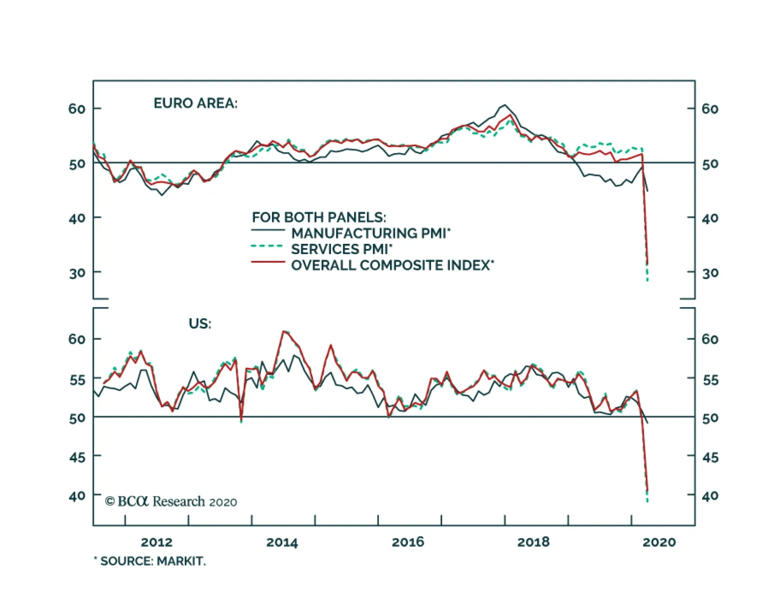
Yesterday’s March flash PMIs for the US, UK, euro area, and Japan all confirmed that COVID-19 is causing business activity to contract at an extremely sharp pace. Composite indexes fell by double-digits in most economies, with the exception of the US (which…