Global

Highlights The global economy will contract at its fastest pace since the early 1930s, but will not slump into a depression. Easy monetary conditions, an extremely expansive fiscal policy, and solid bank and household balance sheets are crucial to the economic outlook. Risk assets remain attractive. The dollar and bonds will soon move from bull to bear markets. The credit market offers some attractive opportunities. Stocks are vulnerable to short-term profit-taking, but the cyclical outlook remains bright. Favor energy and consumer discretionary equities. Feature What a difference a month makes. US and global equities have rallied by 31.4% and 28.3% from their March lows, respectively. Last month we recommended investors shift the weighting of their portfolios to stocks over bonds. April’s dramatic turnaround has not altered our positive view of equities on a 12- to 24-month basis, especially relative to government bonds. However, the probability of near-term profit taking is significant. The spectacular dislocation in the oil market also has grabbed headlines. This was a capitulation event. Hence, assets linked to oil are now cyclically attractive, even if they remain volatile in the coming weeks. It is time to buy energy equities, especially firms with solid balance sheets and proven dividend records. Under the IMF’s base case, the resulting output loss will total $9 trillion. Finally, the Federal Reserve’s large liquidity injections have dulled the dollar’s strength. While the USD still has some upside risk in the near term, investors should continue to transfer capital into foreign currencies. A weaker dollar will be the catalyst to lift Treasury yields and will contribute to the outperformance of energy stocks. Dismal Growth Versus Vigorous Policy Responses Chart I-1Consumer Spending Is In Freefall
Consumer Spending Is In Freefall
Consumer Spending Is In Freefall
The economic lockdowns and the collapse in consumer confidence continue to take their toll on the US and global economies (Chart I-1). The eventual end of the shelter-at-home orders and the progressive re-opening of the economy will halt this trend. The rapid monetary and fiscal easing worldwide will allow growth to recover smartly in the second half of the year, but only after authorities loosen extreme social distancing measures. The Economy Is In Freefall… First-quarter US growth is already as weak as it was at the depth of the recession that followed the Great Financial Crisis. The second quarter will be even more anemic. Our Live-Trackers for both the US and global economies either continue to collapse or have flat-lined at rock-bottom levels (Chart I-2). US industrial production is falling at a 21% quarterly annualized rate and the weakness in the PMI manufacturing survey warns that the worst is yet to come. In March, retail sales contracted by 8.7% compared with February, which was the poorest reading on record, and year-on-year comparisons will only deteriorate further. Annual GDP growth could fall below -11% next quarter with both the industrial and consumer sectors in shock, according to the New York Fed Weekly Economic Index (Chart I-3). Chart I-2No Hope From The Live Trackers
May 2020
May 2020
Chart I-3Real GDP Growth Is Melting
Real GDP Growth Is Melting
Real GDP Growth Is Melting
The IMF expects the recession to eclipse the post GFC-slump, in both advanced and emerging economies. Its most recent World Economic Outlook describes base-case 2020 growth of -5.9%, -7.5%, and -1.0% in the US, Eurozone and emerging markets, respectively. This compares with -2.5%, -4.5% and 2.8% each in 2009. If a second wave of infections forces renewed lockdowns in the fall, then 2020 growth could be 5.12% and 4.49% lower than baseline in developed markets and emerging markets, respectively. Under the IMF’s base case, the resulting output loss will total $9 trillion in the coming 3 years (Chart I-4). Chart I-4An Enormous Output Gap Is Forming
May 2020
May 2020
Chart I-5Disinflation Build-Up
Disinflation Build-Up
Disinflation Build-Up
An output gap of the magnitude depicted by the IMF will dampen inflation for the next 12 to 24 months. In addition to the shortfall in aggregate demand, imploding economic confidence and the lag effect of the Fed’s monetary tightening in 2018 will pull down the velocity of money even further. This combination will reduce US inflation to 1.5% or lower (Chart I-5, top panel). The Price Paid component of both the Philly Fed and Empire State Manufacturing Surveys already captures this impact. The return of producer price deflation in China guarantees that weak US import prices will add to domestic deflationary pressures (Chart I-5 third panel). The recent strength in the dollar will only amplify imported deflation (Chart I-5, bottom panel). A deflationary shock is an immediate problem for businesses and creates a huge risk for household incomes because it exacerbates the already violent contraction in aggregate demand. In the coming months, the weakest nominal GDP growth since the Great Depression will depress profits. BCA Research’s US Equity Strategy team expects S&P 500 operating earnings per share to drop from $162 in 2019 to no further than $104 in 2020.1 The profits of small businesses will suffer even more. Cash flow shortfalls will also cause corporate defaults to spike because many firms will not be able to service their debt (Chart I-6). Currently, 86% of the job losses since the onset of the COVID-19 crisis are temporary. However, if corporate bankruptcies spike too fast and too high, then these job losses will become permanent and household incomes will not recover quickly. A sharp but brief recession would turn into a long depression. Chart I-6Defaults Can Only Rise
Defaults Can Only Rise
Defaults Can Only Rise
…But The Liquidity Crisis Will Not Morph Into A Solvency Crisis… In response to the aggregate demand shock caused by COVID-19, global central banks are supporting lending. These policies are an essential ingredient to flatten the default curve and minimize the permanent hit to employment and household income. The US Fed is acting as the central banker to the world. The US Fed is acting as the central banker to the world. Its new quantitative easing program has already added $1.36 trillion in excess reserves this quarter. Moreover, the Fed’s decision to loosen supplementary liquidity ratios and capital adequacy ratios allows the interbank and offshore markets to normalize. Meanwhile, the Fed’s swap lines with global central banks have surged by $432 billion since the crisis began. Its FIMA facility also permits central banks to pledge Treasurys as collateral to receive US dollars. These two programs let global central banks provide dollar funding to the private sector outside the US. Chart I-7Easing Liquidity Stress
Easing Liquidity Stress
Easing Liquidity Stress
The Fed is also supporting the credit market directly. The $250 billion Secondary Market Corporate Facility, the $500 billion Primary Market Corporate Facility and the $600 billion Main Street New Loan and Expanded Loan Facilities, all mean that firms with a credit rating above Baa or a debt-to-EBITDA ratio below 4x can still get funding. Together with the $100 billion Term-Asset-backed Securities Loan Facility, these measures will prevent a liquidity crisis from morphing into a solvency crisis in which healthier borrowers cannot roll over their debt. Such a crisis would magnify the inevitable increase in defaults manyfold. The market is already reflecting the impact of the Fed’s programs. Corporate spreads for credit tiers affected by the Fed’s support are narrowing (Chart I-7). Spreads reflective of liquidity conditions, such as the FRA-OIS gap, the Commercial paper-OIS spread and cross-currency basis-swap spreads, have also begun to normalize. The narrowing of bank CDS spreads demonstrates that unlike the GFC, the current crisis does not threaten the viability of major commercial banks (Chart I-7, bottom panel). Other central banks are doing their share. The Bank of Canada is buying provincial debt to ensure that the authorities directly tasked with managing the pandemic have the ability to do so. The European Central Bank has enacted a QE program of at least EUR1.1 trillion and enlarged the TLTRO facility while decreasing its interest rate, which cheapens the cost of financing for commercial banks. Moreover, the ECB has also eased liquidity and capital adequacy ratios for commercial banks. Last week, it announced that it would also accept junk bonds as collateral, as long as these bonds were rated as investment grade prior to April 7, 2020. …And Governments Are Pulling Levers… Chart I-8Record Fiscal Easing
May 2020
May 2020
Governments, too, are ensuring that private-sector default rates do not spike uncontrollably and doom the economy to a repeat of the 1930s. Policymakers in the G-10 and China have announced larger stimulus packages than the programs implemented in the wake of the GFC (Chart I-8). The US’s programs already total $2.89 trillion or 13% of 2020 GDP. Germany is abandoning fiscal discipline and has declared stimulus measures totaling 12% of GDP. Italy’s package is more modest at 3% of GDP. Even powerhouse China is not taking chances. In addition to a larger fiscal package than in 2008, the reserve requirement ratio stands at 9.5%, the lowest level in 13 years, and the People’s Bank of China cut the rate of interest on excess reserves by 37 basis points to 0.35% (Chart I-9). The last cut to the IOER was in November 2008 and was of 27 basis points. This interest rate easing preceded a CNY4 trillion increase in the stock of credit, which played a major role in the global recovery that began in 2009. Hence, the recent IOER reduction, in light of the decline in loan prime rates and MLF rates, suggests that China is getting ready to boost its economy by as much as in 2008. Chart I-9China Is Pressing On The Gas Pedal
China Is Pressing On The Gas Pedal
China Is Pressing On The Gas Pedal
Among the advanced economies, loan guarantees supplement growing deficits. So far, this protection totals at least $1.3 trillion. While guarantees do not directly boost the income and spending of the private sector, they address the risk of an uncontrolled spike in defaults. Therefore, they minimize the odds that rocketing temporary layoffs will morph into permanent unemployment. Section II, written by BCA’s Jonathan Laberge, addresses the question of fiscal policy and whether the packages announced so far are large enough to fill the hole created by COVID-19. While a deep recession is unavoidable, governments will provide more stimulus if activity does not soon stabilize. … While Banks And Household Balance Sheets Compare Favorably To 2008 Banks and the household sector, the largest agent in the private sector, entered 2020 on stronger footing than prior to the GFC. Otherwise, all the fiscal and monetary easing in the world would do little to support the global economy. If banks were as weak as when they entered the GFC, then monetary stimulus would have remained trapped in the banking system in the form of excess reserves. Both in the US and in the euro area, banks now possess higher capital adequacy ratios than in 2008 (Chart I-10). Moreover, as BCA Research’s US Investment Strategy service has demonstrated, the large cash holdings and low loan-to-deposit ratio of the US banking system reinforces its strength (Chart I-11).2 Thus, banks are unlikely to tighten credit standards for as long as they did after the GFC. Broad money expansion should outpace the post-GFC experience, as the surge in US M2 growth to a post-war record of 16% indicates. Chart I-10Banks Have More Capital Than In 2008…
May 2020
May 2020
Chart I-11...And Have More Cash And Secure Funding
...And Have More Cash And Secure Funding
...And Have More Cash And Secure Funding
Consumers are also in better shape than in 2008. Last December, US household debt stood at 99.7% of disposable income compared with a peak of 136% in 2008. More importantly, financial obligations represented only 15.1% of disposable income, a near-record low. Limited financial obligations suggest that consumer bankruptcies should remain manageable as long as governments help households weather the current period of temporary unemployment (Chart I-12). Meanwhile, household indebtedness in Spain and Ireland has collapsed from 137% to 94% and from 183% to 85% of disposable income, respectively. Italy, despite its structural economic weakness, always sported a low private-sector debt load. A precautionary rise in the savings rate is unavoidable, but it will not match the magnitude of the increase that followed the GFC. The economy will recover quicker than it did following the GFC. The deep recession engulfing the world should not evolve into a prolonged depression because banks and household balance sheets are in a better state than in 2008. While the recovery will be chaotic, the velocity of money will not remain as depressed for as long as it stayed after 2008, which will allow nominal GDP to recover faster than after the GFC. Banks and households will be quicker to lend and borrow from each other than they were after the GFC. Consequently, the collapse in the consumption of durable goods (e.g. cars) has created pent-up demand, but not a permanent downshift in the demand curve (Chart I-13). Chart I-12Robust Household Finances
Robust Household Finances
Robust Household Finances
Chart I-13Households' Pent-Up Demand
Households' Pent-Up Demand
Households' Pent-Up Demand
Bottom Line: The global economy is on track to suffer its worst contraction since the 1930s. However, the combination of aggressive monetary and fiscal stimulus will prevent a rising wave of defaults from swelling to a crippling tsunami that permanently curtails household income. Given that banks and households have stronger balance sheets than in 2008, when governments ease lockdowns, the economy will recover quicker than it did following the GFC. The evolution of any second wave of infection is the crucial risk to this view. The IMF’s forecast indicates that growth will suffer substantial downside relative to its baseline scenario if the second wave is strong and forces renewed lockdowns. In this scenario, the current package of stimulus must be augmented to avoid a depression-like outcome. A big problem for forecasters, is that we do not have a good sense of how the second wave of infections will evolve. Moreover, the ability to test the population and engage in contact tracing will determine how aggressive lockdowns will be. Therefore, we currently have very little visibility to handicap the odds of each path. Investment Implications Low inflation for the next 18 months will allow monetary conditions to stay extremely accommodative. Growth will recover in the second half of 2020, so the window to own risk assets remains fully open as long as we can avoid a second wave of complete lockdowns. The Dollar’s Last Hurrah The US dollar has become dangerously expensive. According to a simple model, the dollar trades at a premium to its purchasing-parity equilibrium against major currencies, which is comparable to 1985 or 2002 when it attained its most recent cyclical tops (Chart I-14). The dollar may not trade as richly against our Behavioral Effective Exchange Rate model, but this fair value estimate has rolled over (Chart I-14, bottom panel). A peak in global policy uncertainty may be the key to timing the start of the dollar’s decline. Policy will prompt downside risk created by the dollar’s overvaluation. The US twin deficit, which is the sum of the fiscal and current account deficits, is set to explode because Washington will expand the fiscal gap by 15~20% of GDP while the private sector will not increase its savings rate at the same pace. If US real interest rates are high and rising, then foreign investors will snap up US liabilities and finance the twin deficit. If real rates are low and falling, then foreigners will demand a much cheapened dollar (which would embed higher long-term expected returns) to buy US liabilities (Chart I-15). Chart I-14The Dollar Is Pricey
The Dollar Is Pricey
The Dollar Is Pricey
Chart I-15Bulging Twin Deficits Are A Worry
Bulging Twin Deficits Are A Worry
Bulging Twin Deficits Are A Worry
Real interest rates probably will not climb, hence the twin deficit will become an insurmountable burden for the dollar. The Fed has not hit its symmetric 2% inflation target since the GFC and will not do so in the next one to two years. As a result, the Fed will not lift nominal interest rates until inflation expectations, currently at 1.14%, return to the 2.3% to 2.5% zone consistent with investors believing that the Fed is achieving its mandate. Thus, real interest rates will decline, which will drag down the USD. Relative money supply trends also point to a weaker dollar in the coming 12 months (Chart I-16). The Fed is easing policy more aggressively than other central banks and US banks are better capitalized than European or Japanese ones. Therefore, US money supply growth should continue to outpace foreign money supply. The inevitable slippage of dollars out of the US economy, especially if the current account deficit widens, will boost the supply of dollars globally relative to other currencies. Without any real interest rate advantage, the USD will lose value against other currencies. China’s policy easing is also negative for the dollar. China’s large-scale stimulus will allow the global industrial cycle to recover smartly in the second half of 2020, especially if the increase in pent-up demand fuels realized demand in the fall. The US economy’s closed nature and low exposure to both trade and manufacturing will weigh on US internal rates of return relative to the rest of the world, and invite outflows (Chart I-17). This selling will accentuate downward pressure created by the aforementioned balance of payments and policy dynamics. Chart I-16Money Supply Trends Will Hurt The Dollar
Money Supply Trends Will Hurt The Dollar
Money Supply Trends Will Hurt The Dollar
Chart I-17The Dollar Is A Countercyclical Currency
The Dollar Is A Countercyclical Currency
The Dollar Is A Countercyclical Currency
The dollar is also vulnerable from a technical perspective. A record share of currencies is more than one-standard deviation oversold against the USD (Chart I-18). According to the Institute of International Finance (IIF), outflows from EM economies have already eclipsed their 2008 records, and the underperformance of DM assets suggests that portfolio managers have aggressively abandoned non-USD assets. These developments imply that investors who wanted to move money back into the US have already done so. Chart I-18The Dollar Is Becoming Overbought
The Dollar Is Becoming Overbought
The Dollar Is Becoming Overbought
Chart I-19The Dollar Is A Momentum Currency
May 2020
May 2020
Investors should move funds out of the dollar, but not aggressively. The outlook for the dollar in the next year or two is poor, but the USD’s most important tailwind is intact: the global economy will recover, but for the time being, it remains in freefall. Moreover, among the G-10 currencies, the dollar responds most positively to the momentum factor (Chart I-19), which remains another tailwind. The greenback will remain volatile in the coming weeks. EM currencies offer a particularly tricky dilemma. They have cheapened to levels where historically they offer very compelling long-term returns (Chart I-20). However, EM firms have large amounts of dollar-denominated debt. The fall in EM FX and collapse in domestic cash flows will likely cause some large-scale bankruptcies. If a large, famous EM company defaults, then the headline risk would probably trigger a broad-based selling of EM currencies. For now, our Emerging Market Strategy service recommends that, within the EM FX space, investors favor the currencies with the lowest funding needs, such as the RUB, KRW and THB.3 Chart I-20EM FX Is Decisively Cheap
EM FX Is Decisively Cheap
EM FX Is Decisively Cheap
For tactical investors, a peak in global policy uncertainty may be the key to timing the start of the dollar’s decline (Chart I-21). This implies that if a second wave of infections force severe lockdowns, the dollar rally may not be done. Chart I-21Uncertainty Must Recede For The Dollar To Weaken
Uncertainty Must Recede For The Dollar To Weaken
Uncertainty Must Recede For The Dollar To Weaken
Fixed Income Government bonds have not yet depreciated and the exact timing of a price decline remains uncertain. However, Treasurys and Bunds offer an increasingly poor cyclical risk-reward ratio. Bond valuations continue to deteriorate. Our time-tested BCA Bond Valuation model shows that G-10 bonds, in general, and US Treasurys, in particular, are at their most expensive levels since December 2008 and March 1985, two periods that preceded major increases in yields (Chart I-22). Buy inflation-protected securities at the expense of nominal bonds. Liquidity conditions also represent a threat for safe-haven bonds. The wave of liquidity unleashed by global central banks is meeting record fiscal thrust. Thus, not only is the supply of government bonds increasing, but a larger proportion of the money injected by central banks will actually make its way into the real economy than after 2008. Record-low yields are vulnerable because the increase in the global money supply should prevent nominal GDP growth from slumping permanently as in the 1930s and after the GFC. Additionally, the sharp escalation in liquid assets on the balance sheets of commercial banks also creates an additional risk for bond prices (Chart I-23). Chart I-22Bonds Are Furiously Expensive
Bonds Are Furiously Expensive
Bonds Are Furiously Expensive
Chart I-23Liquidity Injections Point To Higher Yields
Liquidity Injections Point To Higher Yields
Liquidity Injections Point To Higher Yields
QE also threatens government fixed income. After the GFC, real interest rates fell because investors understood that US short rates would remain at zero for a long time. Yet, 10-year Treasury yields rose sharply in 2009 as inflation breakevens increased more than the decline in TIPS yields. This pattern repeated itself following each QE wave (Chart I-24). In essence, if the Fed provides enough liquidity to allow markets to function well, then the chance of cyclical deflation decreases, which warrants higher inflation expectations. A lower dollar will be fundamental to the rise in inflation breakeven and yields. A soft dollar will confirm that the Fed is providing enough liquidity to satiate dollar demand and it will favor risk-taking around the world. Moreover, it will boost commodity prices and help realize inflation increases down the line. Chart I-24QE Lifts Breakevens And Yields
QE Lifts Breakevens And Yields
QE Lifts Breakevens And Yields
Technical considerations also point to the end of the bond bull market, at least for the next 12 to 18 months. Investors remain bullish toward bonds, which is a contrarian signal. Our Composite Momentum Indicator has reached levels last achieved at the end of 2008, which suggested at that time that bond-buying was long in the tooth. Chart I-25Inflation Will Drive US/German Spreads
Inflation Will Drive US/German Spreads
Inflation Will Drive US/German Spreads
In this context, investors with a cyclical investment horizon should consider bringing duration below benchmark. In the short term, this position still carries significant risks because the outlook for yields depends on the dollar. Another dollar spike caused by renewed lockdowns would also pin yields near current levels for longer. A lower-risk version of this bet would be to buy inflation-protected securities at the expense of nominal bonds, a position recommended by our US Bond Strategy service.4 Investors should be careful when betting that US yields will further converge toward German ones. The 10-year yield spread between US Treasurys and German Bunds has quickly narrowed, falling by 170 basis points from a high of 279 basis points in November 2018. Despite this sharp contraction, the spread remains elevated by historical standards. So far, the declining yield gap reflects the fall in policy rates in the US relative to Europe. Given that both the Fed and the ECB are at the lower bounds of their policy rates, short-rate differentials are unlikely to compress further. Instead, inflation differentials between the US and Europe must decline (Chart I-25). The inflation gap between the US and Europe probably will not narrow significantly this year. The IMF forecasts that Europe’s economy will underperform the US. Therefore, slack in Europe will expand faster than in the US. Moreover, monetary and fiscal support in the US is more aggressive than in Europe. Consequently, a weaker dollar, which will increase US inflation expectations relative to Europe, will put upward pressure on the US/German 10-year spread. However, if the European fiscal policy response starts to match the size of the US stimulus, then the spread between the US and Germany would narrow further. Ample liquidity also continues to underpin equity prices. Finally, for credit investors, our US Bond Strategy service recommends buying securities with abnormally large spreads and which the various Fed programs target. These include agency CMBS, consumer ABS, municipal bonds, and corporates rated Ba and above.5 Equities Chart I-26Investors Are Not Exuberant About Stocks
Investors Are Not Exuberant About Stocks
Investors Are Not Exuberant About Stocks
Despite some short-term risks, we continue to favor equities on a 12- to 18-month investment horizon in an environment where a second wave of lockdowns can be avoided. Stock valuations have deteriorated, but they remain broadly attractive (see page 2 of Section III). While multiples are not particularly cheap, the equity risk premium remains very high. Alternatively, the expected growth rate of long-term earnings embedded in stock prices continues to hover at the bottom of its post-war distribution (Chart I-26). In other words, stocks are attractive because bond yields are low. Ample liquidity also continues to underpin equity prices. Our US Financial Liquidity Index points to rising S&P 500 returns in the coming months (Chart I-27). The Fed’s surging liquidity injections, which foreign central banks are mimicking, will only accentuate this backdrop. Moreover, in times of crisis, inflation expectations correlate positively with stock prices because “bad deflation” represents an existential threat to profitability.6 QE lifts inflation expectations, therefore, its bearish impact on bond prices should not translate into a fall in stock prices. Chart I-27Ample Liquidity For The S&P 500
Ample Liquidity For The S&P 500
Ample Liquidity For The S&P 500
Chart I-28Valuation And Monetary Condition Offset COVID-19
Valuation And Monetary Condition Offset COVID-19
Valuation And Monetary Condition Offset COVID-19
The combined valuation and liquidity backdrop are accommodative enough for stocks to persevere higher, despite the immense economic shock generated by COVID-19. The readings of our BCA Valuation and Monetary Indicator are even more accommodative for stocks than they were in Q1 2009, which marked the beginning of a 340% bull market (Chart I-28). Moreover, trend growth may have been less negatively affected by COVID-19 than it was by the GFC. Consequently, our US Equity Strategy service uses the historical pattern of profit rebounds subsequent to recessions to anticipate 2021 S&P 500 earnings per share of $162.1 Technicals remain supportive for stocks on a cyclical basis. Sentiment and momentum continue to be depressed, which could explain the resilience of stocks. Indeed, our Composite Momentum Indicator based on both the 13-week rate of change of the S&P 500 and traders’ sentiment lingers at the bottom of its historical distribution (Chart I-29). Moreover, the percentage of stocks above their 30-week moving average or at 52-week highs suggests that the average stock is still oversold (Chart I-30). Chart I-29Cyclical Momentum Is Not A Risk Yet
Cyclical Momentum Is Not A Risk Yet
Cyclical Momentum Is Not A Risk Yet
Chart I-30The Median Stock Remains Oversold
The Median Stock Remains Oversold
The Median Stock Remains Oversold
The problem for equity indices is that some sectors, such as tech, are very overbought on a near-term basis, which could invite profit-taking among the names that account for a disproportionate share of the index. If these sectors correct meaningfully, then the whole index would fall even if the median stocks barely vacillate. Nonetheless, all the forces listed in Section I suggest that the correction will not develop into a new down leg for the market. Energy stocks offer an attractive opportunity for investors, a view shared by our US Equity Strategy colleagues.1 The energy sector trades at its largest discount to the broad market on record and a weaker dollar normally lifts its relative performance (Chart I-31). Moreover, energy stocks have modestly outperformed the market since its March 23 bottom, despite the abyss into which oil prices tumbled. A pair trade is also available to investors. Healthcare and tech stocks have rallied in parabolic fashion relative to energy stocks. Oil may have capitulated on April 20 when the WTI May contract hit $-40/bbl. Storage capacity is essentially maxed out, but the Kingdom of Saudi Arabia is set to restrict production from 12.3 million b/d to 8.5 million b/d, which will contribute generously to the 10 million bpd cut agreed by OPEC+. Countries such as Canada are also curtailing output, a move repeated among many oil producers. US shale firms, which have become marginal producers of oil, are also paring down their production. Shale producers are not done cutting, judging by both the decline in horizontal rig counts and WTI trading below most marginal costs (Chart I-32). The oil market will move away from its surplus position when the global economy restarts. Chart I-31An Opportunity In Energy
An Opportunity In Energy
An Opportunity In Energy
Chart I-32Shale Production Will Fall Much Further
Shale Production Will Fall Much Further
Shale Production Will Fall Much Further
The slope of the oil curve confirms that the outlook for energy stocks is improving. On April 20, Brent and WTI hit their deepest contango on record, a development accentuated by the reflexive relationship between major oil ETFs and the price of the commodity itself. The structure of those ETFs was amended on April 21st, allowing a break in this reflexive relationship. The oil curve is again steepening, which after such a large contango often results in higher crude prices (Chart I-33). Meanwhile, net earnings revisions for the energy sector have become very depressed. Relative to the broad market, revisions are also weak but turning up. In this context, rising oil prices can easily lift energy stocks relative to the broad market. Chart I-33A Decreasing Contango Would Boost Oil Stocks
A Decreasing Contango Would Boost Oil Stocks
A Decreasing Contango Would Boost Oil Stocks
Chart I-34Parabolic Moves Are Rarely Durable
Parabolic Moves Are Rarely Durable
Parabolic Moves Are Rarely Durable
A pair trade is also available to investors. Healthcare and tech stocks have rallied in parabolic fashion relative to energy stocks (Chart I-34). We constructed a global sector ranking based on the bottom-up valuation scores from BCA Research’s Equity Trading Strategy service. Based on this metric, energy stocks are attractively valued, while tech and healthcare are not (Chart I-35). A rebound in oil prices should prompt some portfolio rebalancing in favor of the energy sector. Chart I-35A Bottom-Up Ranking For Sectors Valuations
May 2020
May 2020
Finally, our US Equity Sector Strategy service also recommends investors overweight consumer discretionary stocks. This sector will benefit because robust household balance sheets will allow consumers to take advantage of low interest rates when the global economy recovers.7 Mathieu Savary Vice President The Bank Credit Analyst April 30, 2020 Next Report: May 28, 2020 II. The Global COVID-19 Fiscal Response: Is It Enough? In this Special Report we explore in detail the fiscal response amongst advanced economies, with the goal of judging whether the response is large enough to prevent an “L-shaped” recession. The crisis remains in its early days and new information about the size and character of the response, as well as the magnitude of the economic shock, continues to emerge on a near-daily basis. As such, our conclusions may change over the coming weeks in line with incoming data. Even when narrowly-defined, the announced (or likely) fiscal response of the US, China, and Germany is quite large and appears to be adequate to prevent the direct and indirect effects of the lockdowns from causing an “L-shaped” event. This is not the case, however, in other euro area economies (France, Italy, and Spain), or in emerging markets. Our analysis also suggests that the global fiscal response will need to increase if the global economy faces a W-shaped shock caused by another round of aggressive containment measures later this year. This underscores the importance of ensuring that the “Great Lockdown” succeeds at reducing the spread of the disease to a point that does not necessitate widespread renewed restrictions on economic activity. The global economic expansion that began in 2009 has come to an abrupt end due to the COVID-19 pandemic. Aggressive containment measures necessary to control the spread of the disease and prevent the collapse in health care systems around the world have caused a large and sudden stop in global economic activity, which has prompted unprecedented responses from governments around the world. In this Special Report we explore in detail the fiscal response amongst advanced economies, with the goal of judging whether the response is large enough to prevent an “L-shaped” recession (characterized by a very prolonged return to trend growth). The crisis remains in its early days and new information about the size and character of the response, as well as the magnitude of the economic shock, continues to emerge on a near-daily basis. As such, our conclusions may change over the coming weeks in line with incoming data. But for now, we (tentatively) conclude that the fiscal response appears to be adequate to prevent the direct and indirect effects of the lockdowns from causing an “L-shaped” event. However, there are two important caveats. First, while Germany has provided among the strongest fiscal responses globally, measures in France, Italy, and Spain are still lacking and must be stepped up. Second, the announced fiscal measures will not be sufficient if the global economy faces a W-shaped shock caused by another round of aggressive containment measures later this year – more will have to be done. For policymakers, this underscores the importance of ensuring that the “Great Lockdown” succeeds at reducing the spread of the disease to a point that does not necessitate widespread renewed restrictions on economic activity. In this regard, the gradual re-opening of several US states by early-May, while positive for economic activity in the short-run, is a non-trivial risk to the US and global economic outlooks over the coming 6-12 months. This risk must be closely watched by investors. The Global Fiscal Response: Comparing Across Countries And Across Measures The flurry of policy announcements from national governments over the past six weeks has led to a great degree of confusion about the size and disposition of the global COVID-19 fiscal response. Our analysis is based heavily on the IMF’s tracking of these measures, albeit with a few adjustments. We also rely on analysis from Bruegel, a prominent European macroeconomic think-tank, as well as our own Geopolitical Strategy team and a variety of news reports. Chart II-1 presents the IMF’s estimate of the total fiscal response to the crisis across major countries, as of April 23rd, broken down into “above-the-line” and “below-the-line” measures. Above-the-line measures are those that directly impact government budget balances (direct fiscal spending and revenue measures, usually tax deferrals), whereas below-the-line measures typically involve balance sheet measures to backstop businesses through capital injections and loan guarantees. Chart II-1The Global Fiscal Response Is Huge When Including All Measures
May 2020
May 2020
Chart II-1 makes it clear that the fiscal response of advanced economies is enormous when including both above- and below-the-line measures. By this metric, the response of most developed economies is on the order of 10% of GDP, and well above 30% in the case of Italy and Germany. However, using the sum of above- and below-the-line measures to gauge the fiscal response of any country may not be the ideal approach, given that below-the-line measures are contingent either on the triggering of certain conditions or on the provision of credit to households and firms from the financial system. Below-the-line measures also likely increase the liability position of the private sector, thus raising the odds of negative second-round effects. Instead, Chart II-2 compares the countries shown in Chart 1 based only on the IMF’s estimate of above-the-line measures, and with a 4% downward adjustment to Japan’s reported spending to account for previously announced measures.8 The chart shows that countries fall into roughly three categories in terms of the magnitude of their above-the-line response: in excess of 4% of GDP (Australia, the US, Japan, Canada, and Germany), 2-3% (the UK, Brazil, and China), and sub-2% (all other countries shown in the chart, including Spain, Italy, and France). Chart II-2The Picture Changes When Excluding Below-The-Line Measures
May 2020
May 2020
Analysis by Bruegel provides somewhat different estimates of the global COVID-19 fiscal response for select European countries as well as the US (Table II-1). Bruegel breaks down discretionary fiscal measures that have been announced into three categories: those involving an immediate fiscal impulse (new spending and foregone revenues), those related to deferred payments, and other liquidity provisions and guarantees. Bruegel distinguishes between the first and second categories because of their differing impact on government budget balances. Deferrals improve the liquidity positions of individuals and companies but do not cancel their obligations, meaning that they result only in a temporary deterioration in budget balances. Table II-1The Type Of Fiscal Response Varies Significantly Across Countries
May 2020
May 2020
Table II-1 highlights that Bruegel’s estimates of the sum of above- and below-the-line measures are similar to the IMF’s estimates for the US, the UK, and Spain, but are smaller for Italy and larger for France and Germany (particularly the latter). These differences underscore the extreme uncertainty facing investors, who have to contend not only with varying estimates of the magnitude of government policies but also a torrent of news concerning the evolution of the pandemic itself. Chart II-3 presents our best current estimate of the above-the-line fiscal response of several countries (the measure we deem to be most likely to result in an immediate fiscal impulse), by excluding loans, guarantees, and non-specified revenue deferrals to the best of our ability.9 Chart II-3 is based on a combination of data from the IMF, Bruegel analysis, and BCA estimates and news analysis. Chart II-3When Narrowly Defined, Several Countries Are Responding Forcefully, But Many Countries Are Not
May 2020
May 2020
Overall, investors can draw the following conclusions from Charts II-1 – II-3 and Table II-1: When measured as the total of above- and below-the-line measures, nearly all large developed market countries have responded with sizeable measures. Emerging market economies are the clear laggards. Excluding below-the-line measures and using our approach, Australia, the US, China, Germany, Japan, and Canada appear to be spending the most relative to the size of their economies. While Japan’s “headline” fiscal number was inflated by including previously-announced spending, it is still decently-sized after adjustment. Outside of Germany, the rest of Europe appears to be providing a middling or poor above-the-line fiscal response. The UK appears to be providing between 4-5% of GDP as a fiscal impulse, whereas the fiscal response in Italy, Spain, and France looks more like that of emerging markets than of advanced economies. Measuring The Stimulus Against The Shock Despite the substantial amount of new information over the past six weeks concerning the evolution of the pandemic and the attendant policy response, it remains extremely difficult to judge what the balance between shock and stimulus will be and what that means for the profile of growth. Nonetheless, below we present a framework that investors can use to approach the question, and that can be updated as new information emerges concerning the impact of the shutdowns and the extent of the response. Our approach involves analyzing four specific questions: What is the size of the initial shock? What are the likely second-round effects on growth? What is the likely multiplier on fiscal spending? Will the composition of fiscal spending alter its effectiveness? The Size Of The Initial Shock Chart II-4 presents the OECD’s estimates of the initial impact of partial or complete shutdowns on economic activity in several countries. The OECD first used a sectoral approach to estimating the impact on activity while lockdowns are in effect, assuming a 100% shutdown for manufacturing of transportation equipment and other personal services, a 50% decline in activity for construction and professional services, and a 75% decline for retail trade, wholesale trade, hotels, restaurants, and air travel. Chart II-4 illustrates the total impact of this approach for key developed and emerging economies. Chart II-4Annual GDP Will Be 1.5%-2.5% Lower For Each Month Lockdowns Are In Effect
May 2020
May 2020
The OECD’s approach provides a credible estimate of the impact of aggressive containment policies, and implies that annual real GDP is likely to be 1.5-2.5% lower for major countries for each month that lockdown policies are in effect. This implies that output in major economies is likely to fall 3.5% - 6% for the year from the initial shock alone, assuming an aggressive 10-week lockdown followed by a complete return to normal. Estimating Potential Second Round Effects Chart II-5 presents projections from the Bank for International Settlements on the spillover and spillback potential of a 5% initial shock to the level of global GDP from the COVID-19 pandemic (equivalent to a 20% impact on an annualized basis). Chart II-5Additional Lockdown Events Are A Greater Risk Than First Wave After-Effects
May 2020
May 2020
The chart shows that the cumulative impact of the initial shock rises to 7-8% by the end of this year for the US, euro area, and emerging markets, and 6% for other advanced economies. These estimates account for both domestic second round effects of the initial shock, as well as the reverberating impact of the shock on global trade. Chart II-5 also shows the devastating effect that a second wave of COVID-19 emerging in the second half of the year would have after including spillover and spillback effects, assuming that only partial lockdowns would be required. In this scenario, the level of GDP would be 10-12% lower at the end of the year depending on the region, suggesting that investors should be more concerned about the possibility of additional lockdown events than they should be about the after-effects of the first wave of infections (more on this below). Will Fiscal Multipliers Be High Or Low? When examining the academic literature on fiscal multipliers, the first impression is that multipliers are likely to be extremely large in the current environment. Tables II-2 and II-3 present a range of academic multiplier estimates aggregated by the IMF, categorized by the stage of the business cycle and whether the zero lower bound is in effect. Table II-2Fiscal Multipliers Are Much Larger During Recessions Than Expansions
May 2020
May 2020
Table II-3Models Suggest The Multiplier Is Quite High At The Zero Lower Bound
May 2020
May 2020
The tables tell a clear story: multipliers are typically meaningfully larger during recessions than during expansions, and extremely large when the zero lower bound (ZLB) is in effect. However, there are at least two reasons to expect that the fiscal multiplier during this crisis will not be as large as Tables II-2 and II-3 suggest. First, it is obviously the case that the multiplier will be low while full or even partial lockdowns are in effect, as consumers will not have the ability to fully act in response to stimulative measures. This will be partially offset by a burst of spending once lockdowns are removed, but the empirical multiplier estimates during recessions shown in Table II-2 have not been measured during a period when constraints to spending have been in effect, and we suspect that this will have at least somewhat of a dampening effect on the efficacy of fiscal spending relative to previous recessions (even once regulations concerning store closures are removed). Second, Table II-3 likely overestimates the multiplier at the ZLB. These estimates have been based on models rather than empirical analysis, and appear to be in reference to the prevention of large subsequent declines in output following an initial shock. The modeled finding of a large multiplier at the ZLB occurs because increased deficit spending will not lead to higher policy rates in a scenario where the neutral rate has fallen below zero. But it seems difficult to believe that the fiscal multiplier during ZLB episodes, defined as the impact of fiscal spending on the path of output relative to the initial shock (not relative to a counterfactual additional shock), is larger than the highest empirical estimates of the multiplier during recessions. The only circumstance in which we can envision this being the case is an environment where long-term bond yields are capped and remain at zero, alongside short-term interest rates, as the economy improves. The IMF has provided a simple rule of thumb approach to estimating the fiscal multiplier for a given country. The IMF’s approach involves first estimating the multiplier under normal circumstances based on a series of key structural characteristics that have been shown to influence the economy’s response to fiscal shocks. Then, the “normal” multiplier is adjusted higher or lower depending on the stage of the business cycle, and whether monetary policy is constrained by the ZLB. For the US, the IMF’s approach suggests that a multiplier range of 1.1 – 1.6 is reasonable, assuming the highest cyclical adjustment but no ZLB adjustment (see Box II-1 for a description of the calculation). Given the unprecedented nature of this crisis, we are inclined to use the low end of this range (1.1) as a conservative assumption when judging whether fiscal responses to the crisis are sufficient. For investors, this means that governments should be aiming, at a minimum, for fiscal packages that are roughly 90% of the size of the expected shock of their economies, using our US fiscal multiplier assumption as a guide. Box II-1 The “Bucket” Approach To Estimating Fiscal Multipliers The IMF “bucket” approach to estimating fiscal multiplier involves determining the multiplier that is likely to apply to a given country during “normal” circumstances, based on a set of structural characteristics associated with larger multipliers. This “normal” multiplier is then adjusted based on the following formula: M = MNT * (1+Cycle) * (1+Mon) Where M is the final multiplier estimate, MNT is the “normal times” multiplier derived from structural characteristics, Cycle is the cyclical factor ranging from −0.4 to +0.6, and Mon is the monetary policy stance factor ranging from 0 to 0.3. The Cycle factor is higher the more a country’s output gap is negative, and the Mon factor is higher the closer the economy is to the zero lower bound. Table II-B1 applies the IMF’s approach to the US, using the same structural score as the IMF presented in the note that described the approach. The table highlights that the approach suggests a US fiscal multiplier range of 1.1 – 1.6 given the maximum cycle adjustment proscribed by the rule, which we feel is reasonable given the unprecedented rise in US unemployment. We make no adjustment to the range for the zero lower bound. Table II-B1A Multiplier Estimate Of 1.1 – 1.6 Seems Reasonable For The US
May 2020
May 2020
The Composition Of The Response: Helping Or Hurting? The last of our four questions deals with the issue of composition and whether the form of a country’s fiscal response is likely to alter its effectiveness. We implicitly addressed the first element of composition, whether measures are above-the-line or below-the-line, by comparing Charts II-1 - II-3 on pages 28-31. Our view is that above-the-line measures are far more important than below-the-line measures, as the former provides direct income and liquidity support. Below-the-line measures are also important, as they are likely to help reduce business failure and household bankruptcies. The fiscal multiplier on these measures has to be above zero, but it is likely to be much lower than that of an above-the-line response. The second element of composition concerns the appropriate distribution of aid among households, businesses, and local governments. On this particular question, it remains extremely challenging to analyze the issue on a global basis, owing to a frequent lack of an explicit breakdown of fiscal measures by recipient. Chart II-6Much Of The US Fiscal Response Is Going To Households And Small Businesses
May 2020
May 2020
For now, we limit our distributional analysis to the US, and hope to expand our approach to other countries in future research. Chart II-6 presents a breakdown of the US fiscal response by recipient, which informs the following observations. Households: Chart II-6 highlights that US households will receive approximately $600 billion as part of the CARES Act, roughly half of which will occur through direct payments (i.e. “stimulus checks”) and another 40% from expanded unemployment benefits. In cases where the federal household response has been criticized by members of the public as inadequate, it has often been compared to income support programs of other countries. The Canada Emergency Response Benefit (“CERB”) is a good example of a program that seems, at first blush, to be superior: it provides $2,000 CAD in direct payments to individuals for a 4 week period, for up to 16 weeks (i.e. a maximum of $8,000 CAD), which seems better than a $1,200 USD stimulus check. However, Table II-4 highlights that this comparison is mostly spurious. First, the CERB is not universal, in that it is only available to those who have stopped or will stop working due to COVID-19. At a projected cost of $35 billion CAD, the CERB program represents 1.5% of Canadian GDP. By comparison, $600 billion USD in overall household support represents 2.75% of US GDP; this number drops to 1.75% when only considering support to those who have lost their jobs, but this is still higher as a share of the economy than in Canada. Moreover, there is little question that Congress is prepared to pass more stimulus for additional weeks of required assistance. The discrepancy between the perception and reality of US household sector support appears to be rooted in the speed of payments. Speed is the one area where Canada’s household sector response appears to have legitimately outperformed the US; CERB payments are received by applicants within three business days for those registered for electronic payment, and in some cases they are received the following day. By contrast, it has taken some time for US States to start paying out the additional $600 USD per week in expanded unemployment benefits, but as of the middle of last week nearly all states had started making these payments. Table II-4US Household Relief Is Just As Generous As Seemingly Better Programs
May 2020
May 2020
Firms: On April 16th the Small Business Administration announced that the Paycheck Protection Program (“PPP”) had expended its initial budget of $350 billion. While additional funds of $320 billion have subsequently been approved (plus $60 billion in small business emergency loans and grants), the run on PPP funds was, to some investors, an implicit sign that the CARES Act was inadequately structured. However, the fact that the initial funds ran out in mid-April simply reflects the reality that social distancing measures had been in place for 3-4 weeks by the time that the program began taking applications. Table II-5 highlights that $350 billion was large enough to replace nearly 90% of lost small business income for one month, assuming that overall small business revenue has fallen by 50% and that small businesses account for 44% of total GDP. The Table also shows that a combined total of $730 billion is enough to replace almost 80% of lost small business income for 10 weeks, given these assumptions. With loan forgiveness at least partially tied to small businesses retaining employees on payroll for an 8-week period, the PPP is also essentially an indirect form of household income support. Table II-5Help For Small Businesses Will Replace A Significant Amount Of Lost Income
May 2020
May 2020
Chart II-7Persistent State & Local Austerity Must Be Avoided This Time
Persistent State & Local Austerity Must Be Avoided This Time
Persistent State & Local Austerity Must Be Avoided This Time
State & Local Governments: The magnitude of support for state & local (S&L) governments appears to be the least-well designed element of the US fiscal response. The CARES Act provides for $170 billion in support to S&L, which at first blush seems large as it is approximately 25% of S&L current receipts in Q4 2019 (i.e. it stands to cover a 25% loss in revenue for one quarter). However, this does not account for the significant reported increase in S&L costs to combat the pandemic, nor does it provide S&L governments with any revenue certainty beyond June 30th when most of the assistance from CARES must be spent. Unlike households or firms, who also face significant uncertainty, nearly all US states are subject to balanced budget requirements, which prevent them from spending more than they collect in revenue. When faced even with projected revenue losses in the second half of this year and into 2021, states are likely to aggressively and immediately cut costs in order to avoid budgetary shortfalls. Chart II-7 highlights that S&L austerity was a significant element of the persistent drag on real GDP growth from overall government expenditure and investment in the first 3-4 years of the post-GFC economic expansion. A repeat of this episode would significantly raise the odds of an “L-type” recession (and thus should certainly be avoided). This is why Congress is moving to pass larger state and local aid. Our Geopolitical Strategy team argues that neither President Trump nor Senate Majority Leader Mitch McConnell will prevent the additional financial assistance that US states will require, despite their rhetoric about states going bankrupt.10 A near-term, temporary standoff may occur, but Washington will almost certainly act to provide at least additional short-term funding if state employment starts to fall due to budget pressure. So while we recognize that the state & local component of the US fiscal response is currently lacking, it does not seem likely to represent a serious threat to an eventual economic recovery in the US. Putting It All Together: Will It Be Enough? Chart II-8 reproduces Chart II-3 with an assumed fiscal multiplier of 1.1, and with shaded regions denoting the likely initial and total impact on GDP from aggressive containment measures (based on the OECD and BIS’ estimates). Based on our analysis of the US fiscal response, we make no adjustments for the composition of the measures beyond defining the fiscal response on a narrow basis (i.e. excluding loans, guarantees, and non-specified revenue deferrals). The chart highlights that the narrowly-defined fiscal response of three key economies driving global demand, the US, China, and Germany, is either at the upper end or above the total impact range. Thus, for now, we tentatively conclude that the fiscal response that has or will happen appears to be adequate to prevent the direct and indirect effects of the lockdowns from causing an “L-shaped” event, especially since Chart II-8 explicitly excludes below-the-line measures. However, there are two important caveats to this conclusion. First, Chart II-8 makes it clear that measures in France, Italy, and Spain are still lacking and must be stepped up. Italy and France have provided a substantial below-the-line response, but it is far from clear that a debt-based response or one that only temporarily improves access to cash for households and businesses will be enough to prevent a prolonged fallout from the sudden stop in economic activity and income. Chart II-8Several Important Countries Seem To Be Doing Enough, But More Is Needed In Europe Ex-Germany
May 2020
May 2020
Second, our analysis suggests that the announced fiscal measures will not be sufficient if the global economy faces a W-shaped shock caused by another round of aggressive containment measures later this year or if these measures remain in place at half-strength for many months. This underscores how sensitive the adequacy of announced fiscal measures are to the amount of time economies remain under full or partial lockdown. As such, it is crucial for investors to have some sense of when advanced economies may be able to sustainably end aggressive containment measures. When Can The Lockdowns Sustainably End? Several countries and US states have already announced some reductions in their restrictions, but the question of how comprehensive these measures can be without risking a second period of prolonged stay-at-home orders looms large. Table II-6 presents two different methods of estimating sustainable lockdown end dates for several advanced economies. First, we use the “70-day rule” that appears to have succeeded in ending the outbreak in Wuhan, calculated from the first day that either school or work closures took effect in each country.11 Second, using a linear trend from the peak 5-day moving average of confirmed cases and fatalities, we calculate when confirmed cases and fatalities may reach zero. Table II-6By Re-Opening Soon, The US May Be Risking A Damaging Second Wave
May 2020
May 2020
The table highlights that these methods generally prescribe a reopening date of May 31st or earlier, with a few exceptions. The UK’s confirmed case count and fatality trends are still too shallow to suggest an end of May re-opening, as is the case in Canada. In the case of Sweden, no projections can truly be made based on the 70-day rule because closures never formally occurred. But the most problematic point highlighted in Table II-6 is that US newly confirmed cases are only currently projected to fall to zero as of February 2021. Chart II-9 highlights that while new cases per capita in New York state are much higher than in the rest of the country, they are declining whereas they have yet to clearly peak elsewhere. Cross-country case comparisons can be problematic due to differences in testing, but with several US states having already begun the gradual re-opening process, this underscores that US policymakers may be allowing a dangerous rise in the odds of a secondary infection wave. Chart II-9No Clear Downtrend Yet Outside Of New York State
May 2020
May 2020
Investment Conclusions Our core conclusion that an “L-shaped” global recession is likely to be avoided is generally bullish for equities on a 12-month horizon. However, uncertainty remains extremely elevated, and the recent rise in stock prices in the US (and globally) has been at least partially based on the expectation that lockdowns will sustainably end soon, which at least in the case of the US appears to be a premature conclusion given the current lack of large-scale virus testing capacity. As such, we are less optimistic towards risky assets tactically, and would recommend a neutral stance over a 0-3 month horizon. As noted above, our cross-country comparison of narrowly-defined fiscal measures suggested that euro area countries (excluding Germany) will likely have to do more in order to prevent a long period of below-trend growth. In the case of highly-indebted countries like Italy, this raises the additional question of whether a significantly increased debt-to-GDP ratio stemming from an aggressive fiscal impulse will cause another euro area sovereign debt crisis similar to what occurred from 2010-2014. Chart II-10Italy's Debt Sustainability Hurdle Is Lower Than It Used To Be
Italy's Debt Sustainability Hurdle Is Lower Than It Used To Be
Italy's Debt Sustainability Hurdle Is Lower Than It Used To Be
Government debts are sustainable as long as interest rates remain below economic growth, and from this vantage point Italy should spend as much as needed in order to ensure that nominal growth remains above current long-term government bond yields. Chart II-10 highlights that, despite a widening spread versus German bunds, Italian 10-year yields are much lower today than they were during the worst of the euro area crisis, meaning that the debt sustainability hurdle is technically lower. However, we have also noted in previous reports that high-debt countries often face multiple government debt equilibria; if global investors become fearful that that high-debt countries may not be able to repay their obligations without defaulting or devaluing, then a self-fulfilling prophecy will occur via sharply higher interest rates (Chart II-11). Chart II-11Multiple Equilibria In Debt Markets Are Possible Without A Lender Of Last Resort
May 2020
May 2020
Chart II-12Italy's Structural Budget Balance Has Improved
Italy's Structural Budget Balance Has Improved
Italy's Structural Budget Balance Has Improved
For now, we view the risk of a renewed Italian debt crisis from significantly increased spending related to COVID-19 as minimal, and it is certainly lower than the status quo as the latter risks causing a sharp gap between nominal growth and bond yields like what occurred from 2010 – 2014. First, Chart II-12 highlights that Italy has succeeded in somewhat reducing its structural balance, which averaged -4% for many years prior to the euro area crisis. Assuming an adequate global response to the crisis and that economic recovery ensues, it is not clear why global bond investors would be concerned that Italian structural deficits would persistently widen. Second, the ECB is purchasing Italian government bonds as part of its new Pandemic Emergency Purchase Program, which will help cap the level of Italian yields. Chart II-13Italy's Debt Service Ratio Won't Go Up Much, If Yields Are Unchanged
Italy's Debt Service Ratio Won't Go Up Much, If Yields Are Unchanged
Italy's Debt Service Ratio Won't Go Up Much, If Yields Are Unchanged
Third, Chart II-13 shows what will occur to Italy’s government debt service ratio (general government net interest payments as a percent of GDP) in a scenario where Italy’s gross debt to GDP rises a full 20 percentage points and the ratio of net interest payments to debt remains unchanged. The chart shows that while debt service will rise, it will still be lower than at any point prior to 2015. So not only should Italy spend significantly more to combat the severely damaging nature of the pandemic, we would expect that Italian spreads would fall, not rise, in such an outcome. Jonathan LaBerge, CFA Vice President Special Reports III. Indicators And Reference Charts Last month, we took a more positive stance on equities as both our valuation and monetary indicators had moved decisively into accommodative territory. While the global economy was set to weaken violently, the easing in our indicators suggested that stocks offered an adequate risk/reward ratio to take some risk. This judgment was correct. On a cyclical basis, the same factors that made us willing buyers of stocks remain broadly in place. Stocks are not as cheap as they were in late March, but monetary conditions have only eased further. Moreover, we are starting to get more clarity as to the re-opening of most Western economies because new reported cases of COVID-19 are peaking. Finally, the VIX has declined substantially but is nowhere near levels warning of an imminent risk to stocks and sentiment is still subdued. Tactically, equities are becoming somewhat overbought. However, this impression is mostly driven by the rebound in tech stocks and the strong performance posted by the healthcare sector. The median stock remains quite oversold. In this context, if the S&P 500 were to correct, we would not anticipate this correction to morph into a new down leg in the bear market that would result in new lows below the levels reached on March 23. For now, the most attractive strategy to take advantage of the supportive backdrop for stocks is to buy equities relative to bonds. In contrast to global bourses, government bonds are still massively overbought and trading at their largest premium to fair value since Q4 2008 and late 1985. Additionally, the vast sums of both monetary and fiscal stimulus injected in the economy should lift inflation expectations and thus, bond yields. Real yields will likely remain at very low levels for an extended period of time as short rates are unlikely to rise anytime soon. The yield curve is therefore slated to steepen further. The dollar has stabilized since we last published but it has not meaningfully depreciated. On the one hand, the threat of an exploding twin deficit and a Fed working hard to address the dollar shortage and keep real rates in negative territory are very bearish for the dollar. But on the other hand, free-falling global growth and spiking policy uncertainty are highly bullish for the Greenback. A stalemate was thus the most likely outcome. However, we are getting closer to a rebound in growth in Q3, which means that the balance of forces will become an increasingly potent headwind for the expensive dollar. Thus, it remains appropriate to use rallies in the dollar to offload this currency. Finally, commodities continue to linger near their lows, creating a mirror image to the dollar. They are still very oversold and sentiment has greatly deteriorated, except for gold. Thus, if as we expect, the dollar will soon begin to soften, then commodities will appreciate in tandem. The move in oil prices was particularly dramatic this month. The oil curve is in deep contango and oil producers from Saudi Arabia to the US shale patch have begun cutting output. Therefore, oil is set to rally meaningfully as the global economy re-opens for business. The large balance sheet expansion by the Fed and other global central banks will only fuel that fire. EQUITIES: Chart III-1US Equity Indicators
US Equity Indicators
US Equity Indicators
Chart III-2Willingness To Pay For Risk
Willingness To Pay For Risk
Willingness To Pay For Risk
Chart III-3US Equity Sentiment Indicators
US Equity Sentiment Indicators
US Equity Sentiment Indicators
Chart III-4Revealed Preference Indicator
Revealed Preference Indicator
Revealed Preference Indicator
Chart III-5US Stock Market Valuation
US Stock Market Valuation
US Stock Market Valuation
Chart III-6US Earnings
US Earnings
US Earnings
Chart III-7Global Stock Market And Earnings: Relative Performance
Global Stock Market And Earnings: Relative Performance
Global Stock Market And Earnings: Relative Performance
Chart III-8Global Stock Market And Earnings: Relative Performance
Global Stock Market And Earnings: Relative Performance
Global Stock Market And Earnings: Relative Performance
FIXED INCOME: Chart III-9US Treasurys And Valuations
US Treasurys And Valuations
US Treasurys And Valuations
Chart III-10Yield Curve Slopes
Yield Curve Slopes
Yield Curve Slopes
Chart III-11Selected US Bond Yields
Selected US Bond Yields
Selected US Bond Yields
Chart III-1210-Year Treasury Yield Components
10-Year Treasury Yield Components
10-Year Treasury Yield Components
Chart III-13US Corporate Bonds And Health Monitor
US Corporate Bonds And Health Monitor
US Corporate Bonds And Health Monitor
Chart III-14Global Bonds: Developed Markets
Global Bonds: Developed Markets
Global Bonds: Developed Markets
Chart III-15Global Bonds: Emerging Markets
Global Bonds: Emerging Markets
Global Bonds: Emerging Markets
CURRENCIES: Chart III-16US Dollar And PPP
US Dollar And PPP
US Dollar And PPP
Chart III-17US Dollar And Indicator
US Dollar And Indicator
US Dollar And Indicator
Chart III-18US Dollar Fundamentals
US Dollar Fundamentals
US Dollar Fundamentals
Chart III-19Japanese Yen Technicals
Japanese Yen Technicals
Japanese Yen Technicals
Chart III-20Euro Technicals
Euro Technicals
Euro Technicals
Chart III-21Euro/Yen Technicals
Euro/Yen Technicals
Euro/Yen Technicals
Chart III-22Euro/Pound Technicals
Euro/Pound Technicals
Euro/Pound Technicals
COMMODITIES: Chart III-23Broad Commodity Indicators
Broad Commodity Indicators
Broad Commodity Indicators
Chart III-24Commodity Prices
Commodity Prices
Commodity Prices
Chart III-25Commodity Prices
Commodity Prices
Commodity Prices
Chart III-26Commodity Sentiment
Commodity Sentiment
Commodity Sentiment
Chart III-27Speculative Positioning
Speculative Positioning
Speculative Positioning
ECONOMY: Chart III-28US And Global Macro Backdrop
US And Global Macro Backdrop
US And Global Macro Backdrop
Chart III-29US Macro Snapshot
US Macro Snapshot
US Macro Snapshot
Chart III-30US Growth Outlook
US Growth Outlook
US Growth Outlook
Chart III-31US Cyclical Spending
US Cyclical Spending
US Cyclical Spending
Chart III-32US Labor Market
US Labor Market
US Labor Market
Chart III-33US Consumption
US Consumption
US Consumption
Chart III-34US Housing
US Housing
US Housing
Chart III-35US Debt And Deleveraging
US Debt And Deleveraging
US Debt And Deleveraging
Chart III-36US Financial Conditions
US Financial Conditions
US Financial Conditions
Chart III-37Global Economic Snapshot: Europe
Global Economic Snapshot: Europe
Global Economic Snapshot: Europe
Chart III-38Global Economic Snapshot: China
Global Economic Snapshot: China
Global Economic Snapshot: China
Mathieu Savary Vice President The Bank Credit Analyst Footnotes 1 Please see US Equity Strategy Weekly Report "Gauging Fair Value," dated April 27, 2020, available at uses.bcaresearch.com 2 Please see US Investment Strategy Special Report "How Vulnerable Are US Banks? Part 1: A 50-Year Bottom-Up Case Study," dated March 30, 2020 and US Investment Strategy Special Report "How Vulnerable Are US Banks? Part 2: It’s Complicated," dated April 6, 2020 available at usis.bcaresearch.com 3 Please see Emerging Markets Strategy Weekly Report "EM Domestic Bonds And Currencies," dated April 23, 2020, available at ems.bcaresearch.com 4 Please see US Bond Strategy Weekly Report "Buying Opportunities & Worst-Case Scenarios," dated March 17, 2020 and US Bond Strategy Weekly Report "Life At The Zero Bound," dated March 24, 2020 available at usbs.bcaresearch.com 5 Please see US Bond Strategy Weekly Report "Is The Bottom Already In?" dated April 21, 2020 and US Bond Strategy Special Report "Alphabet Soup: A Summary Of The Fed's Anti-Virus Measures," dated April 14, 2020 available at usbs.bcaresearch.com 6 “Bad deflation” reflects poor demand, which constrains corporate pricing power. “Good deflation” reflects productivity growth. Good deflation?? does not automatically extend to declining real profits and it is not linked with falling stock prices. The Roaring Twenties are an example of when “good deflation” resulted in a surging stock market. 7 Please see US Equity Strategy Weekly Report "Fight Central Banks At Your Own Peril," dated April 14, 2020, available at uses.bcaresearch.com 8 Skeptical economists call Japan’s largest-ever stimulus package ‘puffed-up’, Keita Nakamura, The Japan Times, April 8, 2020. 9 Please note that Chart II-3 differs somewhat from a chart that has been frequently shown by our Geopolitical Strategy service. Both charts are accurate; they simply employ different definitions of the fiscal response to the pandemic. 10 Indeed, McConnell has already walked back his comments that states should consider bankruptcy. President Trump is constrained by the election, as are Senate Republicans, and the House Democrats control the purse strings. Hence more state and local funding is forthcoming. At best for the Republicans, there may be provisions to ensure it goes to the COVID-19 crisis rather than states’ unfunded pension obligations. See Geopolitical Strategy, “Drowning In Oil (GeoRisk Update),” April 24, 2020, www.bcaresearch.com. 11 School and work closure dates have been sources from the Oxford COVID-19 Government Response Tracker.
Dear Client, This week, in lieu of our regular report, we are sending you a Special Report from my colleague Jonathan LaBerge. Jonathan discusses the global fiscal response to the COVID-19 pandemic, and provides some perspective on whether the response will be enough to prevent an "L-shaped" economic outcome. I hope you find the report insightful. Last Friday, I participated in a webcast with my fellow BCA Strategists Caroline Miller and Arthur Budaghyan where we discussed the outlook for developed and emerging market equities over the immediate (0-3 month) and cyclical (12 month) horizon. You can access a replay of the webcast here. Please note we will be sending out our regular weekly report next week. Best regards, Peter Berezin, Chief Global Strategist Highlights In this Special Report we explore in detail the fiscal response amongst advanced economies, with the goal of judging whether the response is large enough to prevent an “L-shaped” recession. The crisis remains in its early days and new information about the size and character of the response, as well as the magnitude of the economic shock, continues to emerge on a near-daily basis. As such, our conclusions may change over the coming weeks in line with incoming data. Even when narrowly-defined, the announced (or likely) fiscal response of the US, China, and Germany is quite large and appears to be adequate to prevent the direct and indirect effects of the lockdowns from causing an “L-shaped” event. This is not the case, however, in other euro area economies (France, Italy, and Spain), or in emerging markets. Our analysis also suggests that the global fiscal response will need to increase if the global economy faces a W-shaped shock caused by another round of aggressive containment measures later this year. This underscores the importance of ensuring that the “Great Lockdown” succeeds at reducing the spread of the disease to a point that does not necessitate widespread renewed restrictions on economic activity. Feature The global economic expansion that began in 2009 has come to an abrupt end due to the COVID-19 pandemic. Aggressive containment measures necessary to control the spread of the disease and prevent the collapse in health care systems around the world have caused a large and sudden stop in global economic activity, which has prompted unprecedented responses from governments around the world. In this Special Report we explore in detail the fiscal response amongst advanced economies, with the goal of judging whether the response is large enough to prevent an “L-shaped” recession (characterized by a very prolonged return to trend growth). The crisis remains in its early days and new information about the size and character of the response, as well as the magnitude of the economic shock, continues to emerge on a near-daily basis. As such, our conclusions may change over the coming weeks in line with incoming data. But for now, we (tentatively) conclude that the fiscal response appears to be adequate to prevent the direct and indirect effects of the lockdowns from causing an “L-shaped” event. However, there are two important caveats. First, while Germany has provided among the strongest fiscal responses globally, measures in France, Italy, and Spain are still lacking and must be stepped up. Second, the announced fiscal measures will not be sufficient if the global economy faces a W-shaped shock caused by another round of aggressive containment measures later this year – more will have to be done. For policymakers, this underscores the importance of ensuring that the “Great Lockdown” succeeds at reducing the spread of the disease to a point that does not necessitate widespread renewed restrictions on economic activity. In this regard, the gradual re-opening of several US states by early-May, while positive for economic activity in the short-run, is a non-trivial risk to the US and global economic outlooks over the coming 6-12 months. This risk must be closely watched by investors. The Global Fiscal Response: Comparing Across Countries And Across Measures The flurry of policy announcements from national governments over the past six weeks has led to a great degree of confusion about the size and disposition of the global COVID-19 fiscal response. Our analysis is based heavily on the IMF’s tracking of these measures, albeit with a few adjustments. We also rely on analysis from Bruegel, a prominent European macroeconomic think-tank, as well as our own Geopolitical Strategy team and a variety of news reports. Chart 1 presents the IMF’s estimate of the total fiscal response to the crisis across major countries, as of April 23, broken down into “above-the-line” and “below-the-line” measures. Above-the-line measures are those that directly impact government budget balances (direct fiscal spending and revenue measures, usually tax deferrals), whereas below-the-line measures typically involve balance sheet measures to backstop businesses through capital injections and loan guarantees. Chart 1 makes it clear that the fiscal response of advanced economies is enormous when including both above- and below-the-line measures. By this metric, the response of most developed economies is on the order of 10% of GDP, and well above 30% in the case of Italy and Germany. However, using the sum of above- and below-the-line measures to gauge the fiscal response of any country may not be the ideal approach, given that below-the-line measures are contingent either on the triggering of certain conditions or on the provision of credit to households and firms from the financial system. Below-the-line measures also likely increase the liability position of the private sector, thus raising the odds of negative second-round effects. Chart 1The Global Fiscal Response Is Huge When Including All Measures
The Global COVID-19 Fiscal Response: Is It Enough?
The Global COVID-19 Fiscal Response: Is It Enough?
Instead, Chart 2 compares the countries shown in Chart 1 based only on the IMF’s estimate of above-the-line measures, and with a 4% downward adjustment to Japan’s reported spending to account for previously announced measures.1 The chart shows that countries fall into roughly three categories in terms of the magnitude of their above-the-line response: in excess of 4% of GDP (Australia, the US, Japan, Canada, and Germany), 2-3% (the UK, Brazil, and China), and sub-2% (all other countries shown in the chart, including Spain, Italy, and France). Chart 2The Picture Changes When Excluding Below-The-Line Measures
The Global COVID-19 Fiscal Response: Is It Enough?
The Global COVID-19 Fiscal Response: Is It Enough?
Analysis by Bruegel, provides somewhat different estimates of the global COVID-19 fiscal response for select European countries as well as the US (Table 1). Bruegel breaks down discretionary fiscal measures that have been announced into three categories: those involving an immediate fiscal impulse (new spending and foregone revenues), those related to deferred payments, and other liquidity provisions and guarantees. Bruegel distinguishes between the first and second categories because of their differing impact on government budget balances. Deferrals improve the liquidity positions of individuals and companies but do not cancel their obligations, meaning that they result only in a temporary deterioration in budget balances. Table 1 highlights that Bruegel’s estimates of the sum of above- and below-the-line measures are similar to the IMF’s estimates for the US, the UK, and Spain, but are smaller for Italy and larger for France and Germany (particularly the latter). These differences underscore the extreme uncertainty facing investors, who have to contend not only with varying estimates of the magnitude of government policies but also a torrent of news concerning the evolution of the pandemic itself. Table 1The Type Of Fiscal Response Varies Significantly Across Countries
The Global COVID-19 Fiscal Response: Is It Enough?
The Global COVID-19 Fiscal Response: Is It Enough?
Chart 3 presents our best current estimate of the above-the-line fiscal response of several countries (the measure we deem to be most likely to result in an immediate fiscal impulse), by excluding loans, guarantees, and non-specified revenue deferrals to the best of our ability.2Chart 3 is based on a combination of data from the IMF, Bruegel analysis, and BCA estimates and news analysis. Chart 3When Narrowly Defined, Several Countries Are Responding Forcefully, But Many Countries Are Not
The Global COVID-19 Fiscal Response: Is It Enough?
The Global COVID-19 Fiscal Response: Is It Enough?
Overall, investors can draw the following conclusions from Charts 1 – 3 and Table 1: When measured as the total of above- and below-the-line measures, nearly all large developed market countries have responded with sizeable measures. Emerging market economies are the clear laggards. Excluding below-the-line measures and using our approach, Australia, the US, China, Germany, Japan, and Canada appear to be spending the most relative to the size of their economies. While Japan’s “headline” fiscal number was inflated by including previously-announced spending, it is still decently-sized after adjustment. Outside of Germany, the rest of Europe appears to be providing a middling or poor above-the-line fiscal response. The UK appears to be providing between 4-5% of GDP as a fiscal impulse, whereas the fiscal response in Italy, Spain, and France looks more like that of emerging markets than of advanced economies. Measuring The Stimulus Against The Shock Despite the substantial amount of new information over the past six weeks concerning the evolution of the pandemic and the attendant policy response, it remains extremely difficult to judge what the balance between shock and stimulus will be and what that means for the profile of growth. Nonetheless, below we present a framework that investors can use to approach the question, and that can be updated as new information emerges concerning the impact of the shutdowns and the extent of the response. Our approach involves analyzing four specific questions: What is the size of the initial shock? What are the likely second-round effects on growth? What is the likely multiplier on fiscal spending? Will the composition of fiscal spending alter its effectiveness? The Size Of The Initial Shock Chart 4 presents the OECD’s estimates of the initial impact of partial or complete shutdowns on economic activity in several countries. The OECD first used a sectoral approach to estimating the impact on activity while lockdowns are in effect, assuming a 100% shutdown for manufacturing of transportation equipment and other personal services, a 50% decline in activity for construction and professional services, and a 75% decline for retail trade, wholesale trade, hotels, restaurants, and air travel. Chart 4 illustrates the total impact of this approach for key developed and emerging economies. Chart 4Annual GDP Will Be 1.5%-2.5% Lower For Each Month Lockdowns Are In Effect
The Global COVID-19 Fiscal Response: Is It Enough?
The Global COVID-19 Fiscal Response: Is It Enough?
The OECD’s approach provides a credible estimate of the impact of aggressive containment policies, and implies that annual real GDP is likely to be 1.5-2.5% lower for major countries for each month that lockdown policies are in effect. This implies that output in major economies is likely to fall 3.5% - 6% for the year from the initial shock alone, assuming an aggressive 10-week lockdown followed by a complete return to normal. Estimating Potential Second Round Effects Chart 5 presents projections from the Bank for International Settlements on the spillover and spillback potential of a 5% initial shock to the level of global GDP from the COVID-19 pandemic (equivalent to a 20% impact on an annualized basis). The chart shows that the cumulative impact of the initial shock rises to 7-8% by the end of this year for the US, euro area, and emerging markets, and 6% for other advanced economies. These estimates account for both domestic second round effects of the initial shock, as well as the reverberating impact of the shock on global trade. Chart 5 also shows the devastating effect that a second wave of COVID-19 emerging in the second half of the year would have after including spillover and spillback effects, assuming that only partial lockdowns would be required. In this scenario, the level of GDP would be 10-12% lower at the end of the year depending on the region, suggesting that investors should be more concerned about the possibility of additional lockdown events than they should be about the after-effects of the first wave of infections (more on this below). Chart 5Additional Lockdown Events Are A Greater Risk Than First Wave After-Effects
The Global COVID-19 Fiscal Response: Is It Enough?
The Global COVID-19 Fiscal Response: Is It Enough?
Will Fiscal Multipliers Be High Or Low? When examining the academic literature on fiscal multipliers, the first impression is that multipliers are likely to be extremely large in the current environment. Tables 2 and 3 present a range of academic multiplier estimates aggregated by the IMF, categorized by the stage of the business cycle and whether the zero lower bound is in effect. The tables tell a clear story: multipliers are typically meaningfully larger during recessions than during expansions, and extremely large when the zero lower bound (ZLB) is in effect. However, there are at least two reasons to expect that the fiscal multiplier during this crisis will not be as large as Tables 2 and 3 suggest. First, it is obviously the case that the multiplier will be low while full or even partial lockdowns are in effect, as consumers will not have the ability to fully act in response to stimulative measures. This will be partially offset by a burst of spending once lockdowns are removed, but the empirical multiplier estimates during recessions shown in Table 2 have not been measured during a period when constraints to spending have been in effect, and we suspect that this will have at least somewhat of a dampening effect on the efficacy of fiscal spending relative to previous recessions (even once regulations concerning store closures are removed). Table 2Fiscal Multipliers Are Much Larger During Recessions Than Expansions
The Global COVID-19 Fiscal Response: Is It Enough?
The Global COVID-19 Fiscal Response: Is It Enough?
Table 3Models Suggest The Multiplier Is Quite High At The Zero Lower Bound
The Global COVID-19 Fiscal Response: Is It Enough?
The Global COVID-19 Fiscal Response: Is It Enough?
Second, Table 3 likely overestimates the multiplier at the ZLB. These estimates have been based on models rather than empirical analysis, and appear to be in reference to the prevention of large subsequent declines in output following an initial shock. The modeled finding of a large multiplier at the ZLB occurs because increased deficit spending will not lead to higher policy rates in a scenario where the neutral rate has fallen below zero. But it seems difficult to believe that the fiscal multiplier during ZLB episodes, defined as the impact of fiscal spending on the path of output relative to the initial shock (not relative to a counterfactual additional shock), is larger than the highest empirical estimates of the multiplier during recessions. The only circumstance in which we can envision this being the case is an environment where long-term bond yields are capped and remain at zero, alongside short-term interest rates, as the economy improves. The IMF has provided a simple rule of thumb approach to estimating the fiscal multiplier for a given country. The IMF’s approach involves first estimating the multiplier under normal circumstances based on a series of key structural characteristics that have been shown to influence the economy’s response to fiscal shocks. Then, the “normal” multiplier is adjusted higher or lower depending on the stage of the business cycle, and whether monetary policy is constrained by the ZLB. For the US, the IMF’s approach suggests that a multiplier range of 1.1 – 1.6 is reasonable, assuming the highest cyclical adjustment but no ZLB adjustment (see Box 1 for a description of the calculation). Given the unprecedented nature of this crisis, we are inclined to use the low end of this range (1.1) as a conservative assumption when judging whether fiscal responses to the crisis are sufficient. For investors, this means that governments should be aiming, at a minimum, for fiscal packages that are roughly 90% of the size of the expected shock of their economies, using our US fiscal multiplier assumption as a guide. Box 1The 'Bucket' Approach To Estimating Fiscal Multipliers
The Global COVID-19 Fiscal Response: Is It Enough?
The Global COVID-19 Fiscal Response: Is It Enough?
The Composition Of The Response: Helping Or Hurting? The last of our four questions deals with the issue of composition and whether the form of a country’s fiscal response is likely to alter its effectiveness. We implicitly addressed the first element of composition, whether measures are above-the-line or below-the-line, by comparing Charts 1 - 3 on pages 3-5. Our view is that above-the-line measures are far more important than below-the-line measures, as the former provides direct income and liquidity support. Below-the-line measures are also important, as they are likely to help reduce business failure and household bankruptcies. The fiscal multiplier on these measures has to be above zero, but it is likely to be much lower than that of an above-the-line response. Chart 6Much Of The US Fiscal Response Is Going To Households And Small Businesses
The Global COVID-19 Fiscal Response: Is It Enough?
The Global COVID-19 Fiscal Response: Is It Enough?
The second element of composition concerns the appropriate distribution of aid among households, businesses, and local governments. On this particular question, it remains extremely challenging to analyze the issue on a global basis, owing to a frequent lack of an explicit breakdown of fiscal measures by recipient. For now, we limit our distributional analysis to the US, and hope to expand our approach to other countries in future research. Chart 6 presents a breakdown of the US fiscal response by recipient, which informs the following observations. Households: Chart 6 highlights that US households will receive approximately $600 billion as part of the CARES Act, roughly half of which will occur through direct payments (i.e. “stimulus checks”) and another 40% from expanded unemployment benefits. In cases where the federal household response has been criticized by members of the public as inadequate, it has often been compared to income support programs of other countries. The Canada Emergency Response Benefit (“CERB”) is a good example of a program that seems, at first blush, to be superior: it provides $2,000 CAD in direct payments to individuals for a 4 week period, for up to 16 weeks (i.e. a maximum of $8,000 CAD), which seems better than a $1,200 USD stimulus check. However, Table 4 highlights that this comparison is mostly spurious. First, the CERB is not universal, in that it is only available to those who have stopped or will stop working due to COVID-19. At a projected cost of $35 billion CAD, the CERB program represents 1.5% of Canadian GDP. By comparison, $600 billion USD in overall household support represents 2.75% of US GDP; this number drops to 1.75% when only considering support to those who have lost their jobs, but this is still higher as a share of the economy than in Canada. Moreover, there is little question that Congress is prepared to pass more stimulus for additional weeks of required assistance. Table 4US Household Relief Is Just As Generous As Seemingly Better Programs
The Global COVID-19 Fiscal Response: Is It Enough?
The Global COVID-19 Fiscal Response: Is It Enough?
The discrepancy between the perception and reality of US household sector support appears to be rooted in the speed of payments. Speed is the one area where Canada’s household sector response appears to have legitimately outperformed the US; CERB payments are received by applicants within three business days for those registered for electronic payment, and in some cases they are received the following day. By contrast, it has taken some time for US States to start paying out the additional $600 USD per week in expanded unemployment benefits, but as of the middle of last week nearly all states had started making these payments. Firms: On April 16 the Small Business Administration announced that the Paycheck Protection Program (“PPP”) had expended its initial budget of $350 billion. While additional funds of $320 billion have subsequently been approved (plus $60 billion in small business emergency loans and grants), the run on PPP funds was, to some investors, an implicit sign that the CARES Act was inadequately structured. Table 5Help For Small Businesses Will Replace A Significant Amount Of Lost Income
The Global COVID-19 Fiscal Response: Is It Enough?
The Global COVID-19 Fiscal Response: Is It Enough?
However, the fact that the initial funds ran out in mid-April simply reflects the reality that social distancing measures had been in place for 3-4 weeks by the time that the program began taking applications. Table 5 highlights that $350 billion was large enough to replace nearly 90% of lost small business income for one month, assuming that overall small business revenue has fallen by 50% and that small businesses account for 44% of total GDP. The table also shows that a combined total of $730 billion is enough to replace almost 80% of lost small business income for 10 weeks, given these assumptions. With loan forgiveness at least partially tied to small businesses retaining employees on payroll for an 8-week period, the PPP is also essentially an indirect form of household income support. State & Local Governments: The magnitude of support for state & local (S&L) governments appears to be the least-well designed element of the US fiscal response. The CARES Act provides for $170 billion in support to S&L, which at first blush seems large as it is approximately 25% of S&L current receipts in Q4 2019 (i.e. it stands to cover a 25% loss in revenue for one quarter). However, this does not account for the significant reported increase in S&L costs to combat the pandemic, nor does it provide S&L governments with any revenue certainty beyond June 30 when most of the assistance from CARES must be spent. Chart 7Persistent State & Local Austerity Must Be Avoided This Time
Persistent State & Local Austerity Must Be Avoided This Time
Persistent State & Local Austerity Must Be Avoided This Time
Unlike households or firms, who also face significant uncertainty, nearly all US states are subject to balanced budget requirements, which prevent them from spending more than they collect in revenue. When faced even with projected revenue losses in the second half of this year and into 2021, states are likely to aggressively and immediately cut costs in order to avoid budgetary shortfalls. Chart 7 highlights that S&L austerity was a significant element of the persistent drag on real GDP growth from overall government expenditure and investment in the first 3-4 years of the post-GFC economic expansion. A repeat of this episode would significantly raise the odds of an “L-type” recession (and thus should certainly be avoided). This is why Congress is moving to pass larger state and local aid. Our Geopolitical Strategy team argues that neither President Trump nor Senate Majority Leader Mitch McConnell will prevent the additional financial assistance that US states will require, despite their rhetoric about states going bankrupt.3 A near-term, temporary standoff may occur, but Washington will almost certainly act to provide at least additional short-term funding if state employment starts to fall due to budget pressure. So while we recognize that the state & local component of the US fiscal response is currently lacking, it does not seem likely to represent a serious threat to an eventual economic recovery in the US. Putting It All Together: Will It Be Enough? Chart 8 reproduces Chart 3 with an assumed fiscal multiplier of 1.1, and with shaded regions denoting the likely initial and total impact on GDP from aggressive containment measures (based on the OECD and BIS’ estimates). Based on our analysis of the US fiscal response, we make no adjustments for the composition of the measures beyond defining the fiscal response on a narrow basis (i.e. excluding loans, guarantees, and non-specified revenue deferrals). The chart highlights that the narrowly-defined fiscal response of three key economies driving global demand, the US, China, and Germany, is either at the upper end or above the total impact range. Thus, for now, we tentatively conclude that the fiscal response that has or will happen appears to be adequate to prevent the direct and indirect effects of the lockdowns from causing an “L-shaped” event, especially since Chart 8 explicitly excludes below-the-line measures. Chart 8Several Important Countries Seem To Be Doing Enough, But More Is Needed In Europe Ex-Germany
The Global COVID-19 Fiscal Response: Is It Enough?
The Global COVID-19 Fiscal Response: Is It Enough?
However, there are two important caveats to this conclusion. First, Chart 8 makes it clear that measures in France, Italy, and Spain are still lacking and must be stepped up. Italy and France have provided a substantial below-the-line response, but it is far from clear that a debt-based response or one that only temporarily improves access to cash for households and businesses will be enough to prevent a prolonged fallout from the sudden stop in economic activity and income. Second, our analysis suggests that the announced fiscal measures will not be sufficient if the global economy faces a W-shaped shock caused by another round of aggressive containment measures later this year or if these measures remain in place at half-strength for many months. This underscores how sensitive the adequacy of announced fiscal measures are to the amount of time economies remain under full or partial lockdown. As such, it is crucial for investors to have some sense of when advanced economies may be able to sustainably end aggressive containment measures. When Can The Lockdowns Sustainably End? Several countries and US states have already announced some reductions in their restrictions, but the question of how comprehensive these measures can be without risking a second period of prolonged stay-at-home orders looms large. Table 6 presents two different methods of estimating sustainable lockdown end dates for several advanced economies. First, we use the “70-day rule” that appears to have succeeded in ending the outbreak in Wuhan, calculated from the first day that either school or work closures took effect in each country.4 Second, using a linear trend from the peak 5-day moving average of confirmed cases and fatalities, we calculate when confirmed cases and fatalities may reach zero. Table 6By Re-Opening Soon, The US May Be Risking A Damaging Second Wave
The Global COVID-19 Fiscal Response: Is It Enough?
The Global COVID-19 Fiscal Response: Is It Enough?
The table highlights that these methods generally prescribe a reopening date of May 31 or earlier, with a few exceptions. The UK’s confirmed case count and fatality trends are still too shallow to suggest an end of May re-opening, as is the case in Canada. In the case of Sweden, no projections can truly be made based on the 70-day rule because closures never formally occurred. But the most problematic point highlighted in Table 6 is that US newly confirmed cases are only currently projected to fall to zero as of February 2021. Chart 9 highlights that while new cases per capita in New York state are much higher than in the rest of the country, they are declining whereas they have yet to clearly peak elsewhere. Cross-country case comparisons can be problematic due to differences in testing, but with several US states having already begun the gradual re-opening process, this underscores that US policymakers may be allowing a dangerous rise in the odds of a secondary infection wave. Chart 9No Clear Downtrend Yet Outside Of New York State
The Global COVID-19 Fiscal Response: Is It Enough?
The Global COVID-19 Fiscal Response: Is It Enough?
Investment Conclusions Our core conclusion that an “L-shaped” global recession is likely to be avoided is generally bullish for equities on a 12-month horizon. However, uncertainty remains extremely elevated, and the recent rise in stock prices in the US (and globally) has been at least partially based on the expectation that lockdowns will sustainably end soon, which at least in the case of the US appears to be a premature conclusion given the current lack of large-scale virus testing capacity. As such, we are less optimistic towards risky assets tactically, and would recommend a neutral stance over a 0-3 month horizon. As noted above, our cross-country comparison of narrowly-defined fiscal measures suggested that euro area countries (excluding Germany) will likely have to do more in order to prevent a long period of below-trend growth. In the case of highly-indebted countries like Italy, this raises the additional question of whether a significantly increased debt-to-GDP ratio stemming from an aggressive fiscal impulse will cause another euro area sovereign debt crisis similar to what occurred from 2010-2014. Chart 10Italy's Debt Sustainability Hurdle Is Lower Than It Used To Be
Italy's Debt Sustainability Hurdle Is Lower Than It Used To Be
Italy's Debt Sustainability Hurdle Is Lower Than It Used To Be
Government debts are sustainable as long as interest rates remain below economic growth, and from this vantage point Italy should spend as much as needed in order to ensure that nominal growth remains above current long-term government bond yields. Chart 10 highlights that, despite a widening spread versus German bunds, Italian 10-year yields are much lower today than they were during the worst of the euro area crisis, meaning that the debt sustainability hurdle is technically lower. However, we have also noted in previous reports that high-debt countries often face multiple government debt equilibria; if global investors become fearful that that high-debt countries may not be able to repay their obligations without defaulting or devaluing, then a self-fulfilling prophecy will occur via sharply higher interest rates (Chart 11). Chart 11Multiple Equilibria In Debt Markets Are Possible Without A Lender Of Last Resort
The Global COVID-19 Fiscal Response: Is It Enough?
The Global COVID-19 Fiscal Response: Is It Enough?
For now, we view the risk of a renewed Italian debt crisis from significantly increased spending related to COVID-19 as minimal, and it is certainly lower than the status quo as the latter risks causing a sharp gap between nominal growth and bond yields like what occurred from 2010 – 2014. First, Chart 12 highlights that Italy has succeeded in somewhat reducing its structural balance, which averaged -4% for many years prior to the euro area crisis. Assuming an adequate global response to the crisis and that economic recovery ensues, it is not clear why global bond investors would be concerned that Italian structural deficits would persistently widen. Second, the ECB is purchasing Italian government bonds as part of its new Pandemic Emergency Purchase Program, which will help cap the level of Italian yields. Third, Chart 13 shows what will occur to Italy’s government debt service ratio (general government net interest payments as a percent of GDP) in a scenario where Italy’s gross debt to GDP rises a full 20 percentage points and the ratio of net interest payments to debt remains unchanged. The chart shows that while debt service will rise, it will still be lower than at any point prior to 2015. Chart 12Italy's Structural Budget Balance Has Improved
Italy's Structural Budget Balance Has Improved
Italy's Structural Budget Balance Has Improved
Chart 13Italy's Debt Service Ratio Won't Go Up Much, If Yields Are Unchanged
Italy's Debt Service Ratio Won't Go Up Much, If Yields Are Unchanged
Italy's Debt Service Ratio Won't Go Up Much, If Yields Are Unchanged
So not only should Italy spend significantly more to combat the severely damaging nature of the pandemic, we would expect that Italian spreads would fall, not rise, in such an outcome. Jonathan LaBerge, CFA, Vice President Special Reports jonathanl@bcaresearch.com Footnotes 1 “Skeptical economists call Japan’s largest-ever stimulus package ‘puffed-up’, Keita Nakamura, The Japan Times, April 8, 2020. 2 Please note that Chart 3 differs somewhat from a chart that has been frequently shown by our Geopolitical Strategy service. Both charts are accurate; they simply employ different definitions of the fiscal response to the pandemic. 3 Indeed, McConnell has already walked back his comments that states should consider bankruptcy. President Trump is constrained by the election, as are Senate Republicans, and the House Democrats control the purse strings. Hence more state and local funding is forthcoming. At best for the Republicans, there may be provisions to ensure it goes to the COVID-19 crisis rather than states’ unfunded pension obligations. See Geopolitical Strategy, “Drowning In Oil (GeoRisk Update),” April 24, 2020, available at gps.bcaresearch.com. 4 School and work closure dates have been sources from the Oxford COVID-19 Government Response Tracker. Global Investment Strategy View Matrix
The Global COVID-19 Fiscal Response: Is It Enough?
The Global COVID-19 Fiscal Response: Is It Enough?
Current MacroQuant Model Scores
The Global COVID-19 Fiscal Response: Is It Enough?
The Global COVID-19 Fiscal Response: Is It Enough?
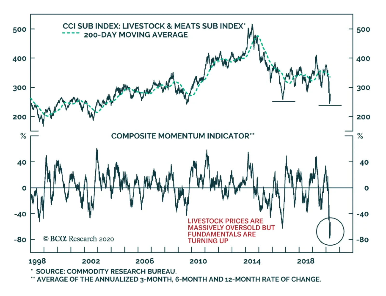
The Livestock and Meats sub-index of the Continuous Commodity Index collapsed 36% between the beginning of the year and its worst point on April 3. This rout has caused our composite momentum indicator, which includes the 13-week, 26-week and 52-week…
Highlights The collapse in oil prices supercharges the geopolitical risks stemming from the global pandemic and recession. Low oil prices should discourage petro-states from waging war, but Iran may be an important exception. Russian instability is one of the most important secular geopolitical consequences of this year’s crisis. President Trump’s precarious status this election year raises the possibility of provocations or reactions on his part. Europe faces instability on its eastern and southern borders in coming years, but integration rather than breakup is the response. Over a strategic time frame, go long AAA-rated municipal bonds, cyber security stocks, infrastructure stocks, and China reflation plays. Feature Chart 1Someone Took Physical Delivery!
Someone Took Physical Delivery!
Someone Took Physical Delivery!
Oil markets melted this week. Oil volatility measured by the Crude Oil ETF Volatility Index surpassed 300% as WTI futures for May 2020 delivery fell into a black hole, bottoming at -$40.40 per barrel (Chart 1). Our own long Brent trade, initiated on 27 March 2020 at $24.92 per barrel, is down 17.9% as we go to press. Strategically we are putting cash to work acquiring risk assets and we remain long Brent. The forward curve implies that prices will rise to $35 and $31 per barrel for Brent and WTI by April 2021. We initiated this trade because we assessed that: The US and EU would gradually reopen their economies (they are doing so). Oil production would be destroyed (more on this below). Russia and Saudi Arabia would agree to production cuts (they did). Monetary and fiscal stimulus would take effect (the tsunami of stimulus is still growing). Global demand would start the long process of recovery (no turn yet, unknown timing). On a shorter time horizon, we are defensively positioned but things are starting to look up on COVID-19 – New York Governor Andrew Cuomo has released results of a study showing that 15% of New Yorkers have antibodies, implying a death rate of only 0.5%. The US dollar and global policy uncertainty may be peaking as we go to press (Chart 2). However, second-order effects still pose risks that keep us wary. Chart 2Dollar And Policy Uncertainty Roaring
Dollar And Policy Uncertainty Roaring
Dollar And Policy Uncertainty Roaring
Geopolitics is the “next shoe to drop” – and it is already dropping. A host of risks are flying under the radar as the world focuses on the virus. Taken alone, not every risk warrants a risk-off positioning. But combined, these risks reveal extreme global uncertainty which does warrant a risk-off position in the near term. This week’s threats between the US and Iran, in particular, show that the political and geopolitical fallout from COVID-19 begins now, it will not “wait” until the pandemic crisis subsides. In this report we focus on the risks from oil-producing economies, but we first we update our fiscal stimulus tally. Stimulus Tsunami Chart 3Stimulus Tsunami Still Building
Drowning In Oil (GeoRisk Update)
Drowning In Oil (GeoRisk Update)
Policymakers responded to COVID-19 by doing “whatever it takes” to prop up demand (Chart 3). Please see the Appendix for our latest update of our global fiscal stimulus table. The latest fiscal and monetary measures show that countries are still adding stimulus – i.e. there is not yet a substantial shift away from providing stimulus: China has increased its measures to a total of 10% of GDP for the year so far, according to BCA Research China Investment Strategy. This includes a general increase in credit growth, a big increase in government spending (2% of GDP), a bank re-lending scheme (1.5% of GDP), an increase in general purpose local government bonds (2% of GDP), plus special purpose bonds (4% of GDP) and other measures. On the political front, the government has rolled out a new slogan, “the Six Stabilities and the Six Guarantees,” and President Xi Jinping said on an inspection tour to Shaanxi that the state will increase investments to ensure that employment is stabilized. This is the maximum reflationary signal from China that we have long expected. The US agreed to a $484 billion “fourth phase” stimulus package, bringing its total to 13% of GDP. President Trump is already pushing for a fifth phase involving bailouts of state and local governments and infrastructure, which we fully expect to take place even if it takes a bit longer than packages that have been passed so far this year. German Chancellor Angela Merkel has opened the way for the EU to issue Eurobonds, in keeping with our expectations. Germany is spending 12% of GDP in total – which can go much higher depending on how many corporate loans are tapped – while Italy is increasing its stimulus to 3% of GDP. As deficits rise to astronomical sums, and economies gradually reopen, will legislatures balk at passing new stimulus? Yes, eventually. Financial markets will have to put more pressure on policymakers to get them to pass more stimulus. This can lead to volatility. In the US the pandemic is coinciding with “peak polarization” over the 2020 election. Lack of coordination between federal and state governments is increasing uncertainty. Currently disputes center on the timing of economic reopening and the provisioning bailout funds for state and local governments. Senate Majority Leader Mitch McConnell is threatening to deny bailouts for American states with large, unfunded public pension benefits (Chart 4A). He is insisting that the Senate “push the pause button” on coronavirus relief measures; specifically that nothing new be passed until the Senate convenes in Washington on May 4. He may then lead a charge in the Republican Senate to try to require structural reforms from states in exchange for bailouts. Estimates of the total state budget shortfall due to the crisis stand at $500 billion over the next three years, which is almost certainly an understatement (Chart 4B). Chart 4AUS States Have Unfunded Liabilities
Drowning In Oil (GeoRisk Update)
Drowning In Oil (GeoRisk Update)
Chart 4BUS States Face Funding Shortfalls
Drowning In Oil (GeoRisk Update)
Drowning In Oil (GeoRisk Update)
Could a local government or state declare bankruptcy? Not anytime soon. Technically there is no provision for states to declare bankruptcy. A constitutional challenge to such a declaration would go to the Supreme Court. One commonly cited precedent, Arkansas in 1933, ended up with a federal bailout.1 A unilateral declaration could conceivably become a kind of “Lehman moment” in the public sector, but state governors will ask their legislatures to provide more fiscal flexibility and will seek bailouts from the federal government first. The Federal Reserve is already committed to buying state and local bonds and can expand these purchases to keep interest rates low. Washington would be forced to provide at least short-term funding if state workers started getting fired in the midst of the crisis because of straightened state finances – another $500 billion for the states is entirely feasible in today’s climate. Constraints will prevail on the GOP Senate to provide state bailout funds. This conflict over state finances could have a negative impact on US equities in the near term, but it is largely a bluff – McConnell will lose this battle. The fundamental dynamic in Washington is that of populism combined with a pandemic that neutralizes arguments about moral hazard. Big-spending Democrats in the House of Representatives control the purse strings while big-spending President Trump faces an election. Senate Republicans are cornered on all sides – and their fate is tied to the President’s – so they will eventually capitulate. Bottom Line: The global fiscal and monetary policy tsunami is still building. But there are plenty of chances for near-term debacles. Over the long run the gargantuan stimulus is the signal while the rest is noise. Over the long run we expect the reflationary efforts to prevail and therefore we are long Treasury inflation-protected securities and US investment grade corporate bonds. We recommend going strategically long AAA-rated US municipal bonds relative to 10-year Treasuries. Petro-State Meltdown Since March we have highlighted that the collapse in oil prices will destabilize oil producers above and beyond the pandemic and recession. This leaves Iran in danger, but even threatens the stability of great powers like Russia. Normally there is something of a correlation between the global oil price and the willingness of petro-states to engage in war (Chart 5). Chart 5Petro-States Cease Fire When Oil Drops
Drowning In Oil (GeoRisk Update)
Drowning In Oil (GeoRisk Update)
When prices fall, revenues dry up and governments have to prioritize domestic stability. This tends to defer inter-state conflict. We can loosely corroborate this evidence by showing that global defense stocks tend to be correlated with oil prices (Chart 6). Global growth is the obvious driver of both of these indicators. But states whose budgets are closely tied to the commodity cycle are the most likely to cut defense spending. Chart 6Global Growth Drives Oil And Guns
Global Growth Drives Oil And Guns
Global Growth Drives Oil And Guns
Russia is case in point. Revenues from Rostec, one of Russia’s largest arms firms, rise and fall with the Urals crude oil price (Chart 7). The Russians launch into foreign adventures during oil bull markets, when state coffers are flush with cash. They have an uncanny way of calling the top of the cycle by invading countries (Chart 8). Chart 7Oil Correlates With Russian Arms Sales
Drowning In Oil (GeoRisk Update)
Drowning In Oil (GeoRisk Update)
Chart 8Russian Invasions Call Peak In Oil Bull Markets
Russian Invasions Call Peak In Oil Bull Markets
Russian Invasions Call Peak In Oil Bull Markets
Chart 9Turkish Political Risk On The Rise
Turkish Political Risk On The Rise
Turkish Political Risk On The Rise
In the current oil rout, there is already some evidence of hostilities dying down in this way. For instance, after years of dogged fighting in Yemen, Saudi Arabia is finally declaring a ceasefire there. Turkey, which benefits from low oil prices, has temporarily gotten the upper hand in Libya vis-à-vis Khalifa Haftar and the Libyan National Army, which depends on oil revenues and backing from petro-states like Russia and the GCC. Of course, Turkey’s deepening involvement in foreign conflicts is evidence of populism at home so it does not bode well for the lira or Turkish assets (Chart 9). But it does highlight the impact of weak oil on petro-players such as Haftar. However, the tendency of petro-states to cease fire amid low prices is merely a rule of thumb, not a law of physics. Past performance is no guarantee of future results. Already we are seeing that Iran is defying this dynamic by engaging in provocative saber-rattling with the United States. Iran And Iraq The US and Iran are rattling sabers again. One would think that Iran, deep in the throes of recession and COVID-19, would eschew a conflict with the US at a time when a vulnerable and anti-Iranian US president is only seven months away from an election. Chart 10US Maximum Pressure On Iran
US Maximum Pressure On Iran
US Maximum Pressure On Iran
Iran has survived nearly two years of “maximum pressure” from President Trump (Chart 10), and previous US sanction regimes, and has a fair chance of seeing the Democrats retake Washington. The Democrats would restart negotiations to restore the 2015 nuclear deal, which was favorable to Iran. Therefore risking air strikes from President Trump is counterproductive and potentially disastrous. Yet this logic only holds if the Iranian regime is capable of sustaining the pain of a pandemic and global recession on top of its already collapsing economy. Iran’s ability to circumvent sanctions to acquire funds depended on the economy outside of Iran doing fine. Now Iran’s illicit funds are drying up. This could lead to a pullback in funding for militant proxies across the region as Iran cuts costs. But it also removes the constraint on Iran taking bolder actions. If the economy is collapsing anyway then Iran can take bigger risks. Furthermore if Iran is teetering, there may be an incentive to initiate foreign conflicts to refocus domestic angst. This could be done without crossing Trump’s red lines by attacking Iraq or Saudi Arabia. With weak oil demand, Iran’s leverage declines. But a major attack would reduce oil production and accelerate the global supply-demand rebalance. Iran’s attack on the Saudi Abqaiq refinery last September took six million barrels per day offline briefly, but it was clearly not intended to shut down that production permanently. Threats against shipping in the Persian Gulf bring about 14 million barrels per day into jeopardy (Chart 11). Chart 11Closing Hormuz Would Be The Biggest Oil Shock Ever
Drowning In Oil (GeoRisk Update)
Drowning In Oil (GeoRisk Update)
Iran-backed militias in Iraq have continued to attack American assets and have provoked American air strikes over the past month, despite the near-war scenario that erupted just before COVID. Iranian ships have harassed US naval ships in recent days. President Trump has ordered the navy to destroy ships that threaten it; Iranian commander has warned that Iran will sink US warships that threaten its ships in the Gulf. There is a 20% chance of armed hostilities between the US and Iran. Why would Iran be willing to confront the United States? First, Iran rightly believes that the US is war-weary and that Trump is committed to withdrawing from the Middle East. But this could prompt a fateful mistake. The equation changes if the US public is incensed and Trump’s election campaign could benefit from conflict. Chart 12Youth Pose Stability Risk To Iran
Youth Pose Stability Risk To Iran
Youth Pose Stability Risk To Iran
Second, the US is never going to engage in a ground invasion of Iran. Airstrikes would not easily dislodge the regime. They could have the opposite effect and convert an entire generation of young, modernizing Iranians into battle-hardened supporters of the Islamic revolution (Chart 12). This is a dire calculation that the Iranian leaders would only make if they believed their regime was about to collapse. But they are quite possibly the closest to collapse that they have been since the 1980s and nobody knows where their pain threshold lies. They are especially vulnerable as the regime approaches the uncharted succession of Supreme Leader Ali Khamanei. Since early 2018 we have argued that there is a 20% chance of armed hostilities between the US and Iran. We upgraded this to 40% in June 2019 and downgraded it back to 20% after the Iranians shied from direct conflict this January. Our position remains the same 20%. This is still a major understated risk at a time when the global focus is entirely elsewhere. It will persist into 2021 if Trump is reelected. If the Democrats win the US election, this war risk will abate. The Iranians will play hard to get but they are politically prohibited from pursuing confrontation with the US when a 2015-type deal is available. This would open up the possibility for greater oil supply to be unlocked in the future, but sanctions are not likely to be lifted till 2022 at earliest. Russia Russia may not be on the verge of invading anyone, but it is internally vulnerable and fully capable of striking out against foreign opponents. Cyberattacks, election interference, or disinformation campaigns would sow confusion or heighten tensions among the great powers. The Russian state is suffering a triple whammy of pandemic, recession, and oil collapse. President Vladimir Putin’s approval rating has fallen this year so far, whereas other leaders in the western world have all seen polling bounces (even President Trump, slightly) (Chart 13). Putin postponed a referendum designed to keep him in office through 2036 due to the COVID crisis. In other words, the pandemic has already disrupted his carefully laid succession plans. While Putin can bypass a referendum, he would have been better off in the long run with the public mandate. Generally it is Putin’s administration, not his personal popularity, that is at risk, but the looming impact on Russian health and livelihoods puts both in jeopardy (Chart 14) and requires larger fiscal outlays to try to stabilize approval (Chart 15). Chart 13Putin Saw No COVID Popularity Bump
Drowning In Oil (GeoRisk Update)
Drowning In Oil (GeoRisk Update)
Chart 14Russian Regime Faces Political Discontent
Russian Regime Faces Political Discontent
Russian Regime Faces Political Discontent
Moreover, regardless of popular opinion, Putin is likely to settle scores with the oligarchs. The fateful decision to clash with the Saudis in March, which led to the oil collapse, will fall on Igor Sechin, Chief Executive of Rosneft, and his faction. An extensive political purge may well ensue that would jeopardize domestic stability (Chart 16). Chart 15Russia To Focus On Domestic Stability
Russia To Focus On Domestic Stability
Russia To Focus On Domestic Stability
Chart 16Russian Political Risk Will Rise
Russian Political Risk Will Rise
Russian Political Risk Will Rise
Russian tensions with the US will rise over the US election in November. The Democrats would seek to make Russia pay for interfering in US politics to help President Trump win in 2016. But even President Trump may no longer be a reliable “ally” of Putin given that Putin’s oil tactics have bankrupted the US shale industry during Trump’s reelection campaign. The American and Russian air forces are currently sparring in the air space over Syria and the Mediterranean. The US has also warned against a malign actor threatening to hack the health care system of the Czech Republic, which could be Russia or another actor like North Korea or Iran. These issues have taken place off the radar due to the coronavirus but they are no less real for that. Venezuela We have predicted Venezuela’s regime change for several years but the oil meltdown, pandemic, and insufficient Russian and Chinese support should put the final nail in the regime’s coffin. Hugo Chavez’s rise to power, the last “regime change,” occurred as oil prices bottomed in 1998. Historically the Venezuelan armed forces have frequently overthrown civilian authorities, but in several cases not until oil prices recovered (Chart 17). Chart 17Venezuelan Coups Follow Oil Rebounds
Venezuelan Coups Follow Oil Rebounds
Venezuelan Coups Follow Oil Rebounds
The US decision to designate Nicolas Maduro as a “narco-terrorist,” to deploy greater naval and coast guard assets around Venezuela, to reassert the Monroe Doctrine and Roosevelt Corollary, and to pull Chevron from the country all suggest that Washington is preparing for regime change. Such a change may or may not involve any American orchestration. Venezuela is an easy punching-bag for President Trump if he seeks to “wag the dog” ahead of the election. Venezuela would be a strategic prize and yet it cannot hurt the US economy or financial markets substantially, giving limited downside to President Trump if he pursues such a strategy. Obviously any conflict with Venezuela this year is far less relevant to global investors than one with Iran, North Korea, China, or Russia. Regime change would be positive for oil supply and negative for prices over the long run. But that is a story for the next cycle of energy development, as it would take years for government and oil industry change in Venezuela to increase production. The US election cycle is a critical aggravating factor for all of these petro-state risks. Shale producers are going bankrupt, putting pressure on the economy and some swing states. The risk of a conflict arises not only from Trump playing “wag the dog” after the crisis abates, but also from other states provoking the president, causing him to react or overreact. The “Other Guys” Oil producers outside the US, Canada, gulf OPEC, and Russia – the “other guys” – are extremely vulnerable to this year’s global crisis and price collapse. Comprising half of global production, they were already seeing production declines and a falling global market share over the past decade when they should have benefited from a global economic expansion. They never recovered from the 2014-15 oil plunge and market share war (Chart 18). Angola (1.4 million barrels per day), Algeria (one million barrels per day), and Nigeria (1.8 million barrels per day) are relatively sizable producers whose domestic stability is in question in the coming years as they cut budgets and deplete limited forex reserves to adjust to the lower oil price. This means fewer fiscal resources to keep political and regional factions cooperating and provide basic services. Algeria is particularly vulnerable. President Abdelaziz Bouteflika, who ruled as a strongman from 1999, was forced out last year, leaving a power vacuum that persists under Prime Minister Abdelaziz Djerad, in the wake of the low-participation elections in December. An active popular protest movement, Hirak, already exists and is under police suppression. Unemployment is high, especially among the youth. Neighboring Libya is in the midst of a war and extremist militants within Libya and North Africa would like to expand their range of operations in a destabilized Algeria. Instability would send immigrants north to Europe. Oil production will be reduced involuntarily as well as voluntarily this year due to regime failures. Brazil is not facing the risk of state failure like Algeria, but it is facing a deteriorating domestic political outlook (Chart 19). President Jair Bolsonaro’s popularity was already low relative to most previous presidents before COVID. His narrow base in the Chamber of Deputies got narrower when he abandoned his political party. He has defied the pandemic, refused to endorse social distancing or lockdown orders by local governments, and fired his Health Minister Luiz Henrique Mandetta. Chart 18Petro-States: 'Other Guys' Face Instability
Petro-States: 'Other Guys' Face Instability
Petro-States: 'Other Guys' Face Instability
Chart 19Brazilian Political Risk Rising Again
Brazilian Political Risk Rising Again
Brazilian Political Risk Rising Again
Brazil has a high number of coronavirus deaths per million people relative to other emerging markets with similar health capacity and susceptibility to the disease. This, combined with sharply rising unemployment, could prove toxic for Bolsonaro, who has not received a bounce in popular opinion from the crisis like most other world leaders. Thus on balance we expect the October local elections to mark a comeback for the Worker’s Party. The limited fiscal gains of Bolsonaro’s pension reform are already wiped out by the global recession, which will set back the country’s frail recovery from its biggest recession in a century. The country is still on an unsustainable fiscal path. Bolsonaro does not have a strong personal commitment to neoliberal structural reform, which has been put aside anyway due to the need for government fiscal spending amid the crisis. Unless Bolsonaro’s popularity increases in the wake of the crisis – due to backlash against the state-level lockdowns – the economic shock is negative for Brazil’s political stability and economic policy orthodoxy. Bottom Line: Our rule of thumb about petro-states suggests that they will generally act less aggressive amid a historic oil price collapse, but Iran may prove a critical exception. Investors should not underestimate the risk of a US-Iran conflict this year. Beyond that, the US election will have a decisive impact as the Democrats will seek to resume the Iranian nuclear deal and Iran would eventually play ball. Venezuela is less globally relevant this year – although a “wag the dog” scenario is a distinct possibility – but it may well be a major oil supply surprise in the 2020s. More broadly the takeaway is that oil production will be reduced involuntarily as well as voluntarily this year due to regime failures. Investment Takeaways Obviously any conflict with Iran could affect the range of Middle Eastern OPEC supply, not just the portion already shuttered due to sanctions on Iran itself. Any Iran war risk is entirely separate from the risk of supply destruction from more routine state failures in Africa. These shortages have been far less consequential lately and have plenty of room to grow in significance (Chart 20). The extreme lows in oil prices today will create the conditions for higher oil prices later when demand recovers, via supply destruction. Chart 20More Unplanned Outages To Come
Drowning In Oil (GeoRisk Update)
Drowning In Oil (GeoRisk Update)
Chart 21European Political Risk No Longer Underrated
European Political Risk No Longer Underrated
European Political Risk No Longer Underrated
An important implication – to be explored in future reports – is that Europe’s neighborhood is about to get a lot more dangerous in the coming years, as the Middle East and Russia will become less stable. Middle East instability will result in new waves of immigration and terrorism after a lull since 2015-16. These waves would fuel right-wing political sentiment in parts of Europe that are the most vulnerable in today’ crisis: Italy, Spain, and France (Chart 21). This should not be equated with the EU breaking apart, however, as the populist parties in these countries are pursuing soft rather than hard Euroskepticism. Unless that changes the risk is to the Euro Area’s policy coherence rather than its existence. Finally Russian domestic instability is one of the major secular consequences of the pandemic and recession and its consequences could be far-reaching, particularly in its great power struggle with the United States. We are reinitiating a strategic long in cyber security stocks, the ISE Cyber Security Index, relative to the S&P500 Info Tech sector. Cyberattacks are a form of asymmetrical warfare that we expect to ramp up with the general increase in global geopolitical tensions. The US’s recent official warning against an unknown actor that apparently intended to attack the health system of the Czech Republic highlights the way in which malign actors could attempt to capitalize on the chaos of the pandemic. We also recommend strategic investors reinitiate our “China Play Index” – commodities and equities sensitive to China’s reflation – and our BCA Infrastructure Basket, which will benefit from Chinese reflation as well as US deficit spending. China’s reflation will help industrial metals more so than oil, but it is positive for the latter as well. Matt Gertken Vice President Geopolitical Strategist mattg@bcaresearch.com Footnotes 1 John Mauldin, "Don't Be So Sure That States Can't Go Bankrupt," Forbes, July 28, 2016, forbes.com. Section II: Appendix : GeoRisk Indicator China
China: GeoRisk Indicator
China: GeoRisk Indicator
Russia
Russia: GeoRisk Indicator
Russia: GeoRisk Indicator
UK
UK: GeoRisk Indicator
UK: GeoRisk Indicator
Germany
Germany: GeoRisk Indicator
Germany: GeoRisk Indicator
France
France: GeoRisk Indicator
France: GeoRisk Indicator
Italy
Italy: GeoRisk Indicator
Italy: GeoRisk Indicator
Canada
Canada: GeoRisk Indicator
Canada: GeoRisk Indicator
Spain
Spain: GeoRisk Indicator
Spain: GeoRisk Indicator
Taiwan
Taiwan: GeoRisk Indicator
Taiwan: GeoRisk Indicator
Korea
Korea: GeoRisk Indicator
Korea: GeoRisk Indicator
Turkey
Turkey: GeoRisk Indicator
Turkey: GeoRisk Indicator
Brazil
Brazil: GeoRisk Indicator
Brazil: GeoRisk Indicator
Appendix Table 1 The Global Fiscal Stimulus Response To COVID-19
Drowning In Oil (GeoRisk Update)
Drowning In Oil (GeoRisk Update)
Section III: Geopolitical Calendar
Highlights Uncertainty over the duration of lockdowns globally will continue to hamper the estimation of the global demand recovery for commodities. This uncertainty will continue to fuel safe-haven demand for USD for the balance of 2Q20. In addition, markets continue to experience a shortage of USD, which can become acute for EM debtors servicing dollar-denominated debt. The combination of safe-haven demand and a continued dollar shortage will keep the USD well bid, which will, at the margin, suppress commodity demand, compounding the effects of COVID-19-induced demand destruction. The Fed will continue to accommodate USD demand, in an ongoing attempt to reverse a tightening of global financial conditions, which also reduces the level of economic activity and commodity demand. Commodity demand will recover in 2H20. Given the expected earlier recovery of China from the COVID-19-induced commodity-demand destruction – and the fiscal and monetary stimulus being deployed by the Communist Party of China (CCP) – base metals and grain prices should recover earlier than other commodities. Oil likely recovers in 3Q20, as the COVID-19 pandemic is contained and supply cuts – voluntary and involuntary – take hold. We remain long gold as a portfolio hedge against continued global policy uncertainty. Feature The short-term path forward for commodity prices will be a function of uncertainty regarding the global economic recovery and its impact on the US dollar, which, at present, remains well bid and is keeping global financial conditions tight. The sharp USD appreciation – mostly vs. EM currencies – is a response to the COVID-19 economic shock, which intensified in March. This significantly tightened global financial conditions (Chart of the Week). EM economies’ capacity to withstand the hit to aggregate demand locally – caused by widespread lockdown measures meant to contain the spread of the virus – has led to capital outflows. EM economies, therefore, are forced to combat a combination of plunging currencies, crumpling domestic and export demand, and increasing financing costs. Low risk appetite globally and diminished liquidity in money and credit markets add to USD demand, and will keep it elevated over the next few months. Chart of the WeekEM Currencies Plunged Vs. The USD
EM Currencies Plunged Vs. The USD
EM Currencies Plunged Vs. The USD
Chart 2Commodity-Intensive Industries Are Vulnerable To USD Shocks
Commodity-Intensive Industries Are Vulnerable To USD Shocks
Commodity-Intensive Industries Are Vulnerable To USD Shocks
After that, we expect the dollar will reverse – mostly on the back of massive Fed accommodation to redress these factors – in 2H20. As COVID-19-induced demand destruction abates, this weakening in the USD will propel EM economic growth higher and bolster commodity demand (Chart 2). USD Well Bid On Safe-Haven Demand, Dollar Shortage The dollar could retest its recent highs in the short term. Heightened volatility over the past two months powered a surge in demand for safe havens and highly liquid risk assets globally. We expect this to persist as stringent lockdowns remain in place to combat the COVID-19 pandemic. This will keep economic policy uncertainty elevated. Over the short term, the USD will benefit in this environment. Demand for USD and dollar-denominated assets will remain strong. Indeed, our FX strategists believe the dollar could retest its recent highs (Chart 3).1 Chart 3Global Uncertainty Lifts The US Dollar And Rates
Global Uncertainty Lifts The US Dollar And Rates
Global Uncertainty Lifts The US Dollar And Rates
Since the Global Financial Crisis (GFC), US dollar movements have been a prime driver of cross-currency basis swaps and can be indicative of risk-taking capacity in capital markets.2 Also, a rising dollar limits the cross-border supply of dollar-denominated loans and increases funding costs. The Fed is monitoring domestic and global liquidity conditions closely, and is fulfilling the role of global USD lender of last resort. Its rapid extension of swap lines to foreign central banks, as well as a temporary repo facility for foreign and international monetary authorities (FIMA), temporarily eased liquidity concerns in some regions (Chart 4). Chart 4Fed Actions Have Eased Global Liquidity Constraints
Fed Actions Have Eased Global Liquidity Constraints
Fed Actions Have Eased Global Liquidity Constraints
It is too early to presume the dollar liquidity constraints have been wholly contained. However, it is too early to presume the dollar liquidity constraints have been wholly contained. The Fed cannot force foreign central banks to direct these dollars to the sectors in which they are needed in their domestic economies. Besides, not all EMs have access to these swap lines. This means much-needed swap lines are inaccessible to a significant portion of the global financial system. In addition, close to 60% of outstanding foreign exchange swaps/forwards involve non-bank financial and other institutions.3 It is highly likely, therefore, the Fed will have to provide additional liquidity to struggling foreign entities. We believe the Fed is well aware of these constraints on global growth and is addressing the need for additional global USD liquidity. However, as has been the case throughout the post-GFC period, policy action will continue to be uncertain as to its duration and its effectiveness. Combined with expanding fiscal deficits in the US, we believe this extraordinary accommodation by the Fed will considerably increase USD supply this year. Following a volatile 2Q20, we expect the US dollar will face severe downward pressures – assuming lockdown measures are successful in containing the pandemic and are gradually lifted. With interest rates now close to zero in most DM economies, relative balance-sheet dynamics will become important drivers of exchange rates (Chart 5). Ample liquidity globally will propel pro-cyclical currencies up and the combination of fiscal and monetary easing could lead to a debasing of the dollar next year as inflationary pressures intensify. Momentum will start working against the dollar in 2H20. Chart 5Massive QE In The US Will Pressure The USD Downward
Massive QE In The US Will Pressure The USD Downward
Massive QE In The US Will Pressure The USD Downward
USD Strength Hinders Global Growth The dollar’s importance as a driver of EM – and global – industrial production cycles has increased and, because EM economies account for a larger share of aggregate commodity demand, its link with commodity prices also has strengthened. The strong dollar remains a headwind to global growth – particularly in EM economies – as it pushes up funding costs and tightens financial conditions. This negative dollar shock adds to the devastating effects of lockdowns, record portfolio outflows, and collapsing commodity prices on EM economies (Chart 6). Since the GFC, the dollar’s importance as a driver of EM – and global – industrial production cycles has increased and, because EM economies account for a larger share of aggregate commodity demand, its link with commodity prices also has strengthened (Chart 7). EM economies’ rising responsiveness to dollar movements is in part explained by their growing share of foreign USD-denominated debt, a larger foreign ownership of their sovereign debt, and increasing integration into global supply chains, in which transactions typically are invoiced in dollars (Chart 8). Chart 6Record Portfolio Outflows From EM
Record Portfolio Outflows From EM
Record Portfolio Outflows From EM
Chart 7Brent Prices Are Closely Correlated With EM Currencies Post-GFC
Brent Prices Are Closely Correlated With EM Currencies Post-GFC
Brent Prices Are Closely Correlated With EM Currencies Post-GFC
Chart 8EM Vulnerability To The USD Increased Since The GFC
EM Vulnerability To The USD Increased Since The GFC
EM Vulnerability To The USD Increased Since The GFC
Elevated economic uncertainty – which drives up the dollar convenience yield and reduces cross-border dollar lending – pushes up the dollar and tightens financial conditions globally, and ultimately spills over to the real economy. Thus, elevated economic uncertainty – which drives up the dollar convenience yield and reduces cross-border dollar lending – pushes up the dollar and tightens financial conditions globally, and ultimately spills over to the real economy. Interestingly, this relationship is non-linear and asymmetric – i.e. the dollar’s impact on commodity prices is higher in dollar bull markets, and positive dollar changes have a greater impact. For instance, its impact on oil prices is 30% stronger in dollar-appreciation cycles. Large increases in the relative value of the USD – on a monthly, weekly, or daily basis – have a disproportionate negative impact on oil prices compared to large decreases (Chart 9). Hence, sudden rushes to safe and liquid assets in periods of rising global economic uncertainty have a magnified negative effect on commodity prices. This means the recovery in commodity prices will be more gradual. Chart 9Asymmetric Impact Of USD Changes On Commodity Prices
USD Strength Restrains Commodity Recovery
USD Strength Restrains Commodity Recovery
Base Metals Could Recover In 2Q20 Gold will benefit from the continued uncertainty and system-wide risk aversion over the coming months. The USD strength is keeping commodity demand growth in check. Until uncertainty re the speed of economic recovery dissipates – mainly vis-à-vis EM economies – commodity prices will remain under pressure (Chart 10). Base metals and grain prices could recover earlier than other commodities given the expected earlier recovery of China from the COVID-19-induced commodity-demand destruction – and the fiscal and monetary stimulus being deployed by the CCP. Specifically, copper prices could decouple from the USD, following China’s economic growth as it contributes close to 50% of both supply and demand of refined copper (Chart 11). Chart 10USD Strength Will Weigh Down Commodity Prices In 2Q20
USD Strength Will Weigh Down Commodity Prices In 2Q20
USD Strength Will Weigh Down Commodity Prices In 2Q20
Chart 11Metals' Prices Will React To China's Economic Recovery
Metals' Prices Will React To China's Economic Recovery
Metals' Prices Will React To China's Economic Recovery
Oil will rebound in 3Q20 as the COVID-19 pandemic is contained and supply cuts – voluntary and involuntary – take hold. China consumes a smaller 14% of world oil demand, which is not sufficient to support a sustainable rally in prices on its own. For 2Q20, the correlation with the USD will intensify and weigh down its price (Chart 12). Lastly, gold will benefit from the continued uncertainty and system-wide risk aversion over the coming months. Bottom Line: As the global economy recovers from the COVID-19 pandemic and things get back to normal in 2H20, the USD will weaken and commodity prices will rebound. These two factors will halt the deflationary impulse from the COVID-19 demand shock. On the back of this improvement, we expect inflation expectations to recover throughout 2021 (Chart 13). Chart 12Oil Prices' Correlation With The USD Increases In Contango
Oil Prices' Correlation With The USD Increases In Contango
Oil Prices' Correlation With The USD Increases In Contango
Chart 13Weaker USD, Rising Commodity Prices Will Revive Inflation Expectations
Weaker USD, Rising Commodity Prices Will Revive Inflation Expectations
Weaker USD, Rising Commodity Prices Will Revive Inflation Expectations
Hugo Bélanger Associate Editor Commodity & Energy Strategy HugoB@bcaresearch.com Commodities Round-Up Energy: Overweight Oil price volatility as measured by the Crude Oil ETF Volatility Index (OVX) surged to above 300% earlier this week as WTI futures for May 2020 delivery fell to a low of -$40.40/bbl (Chart 14). Unprecedented negative pricing for the North American benchmark crude oil will accelerate supply destruction and bankruptcies among highly levered, unprofitable E+P companies operating in the principal shale basins, particularly the Permian. We will be looking at the supply-side implications of the massive price volatility, coupled with the first-ever negative pricing for the benchmark crude oil in next week’s publication. We currently expect US production to fall 1.5mm b/d this year. Base Metals: Neutral Front month Singapore Iron Ore Futures continue to perform relatively well, with the 62% Fines contracts hovering around $83/MT. This contract is down 5.3% ytd, after having peaked in January at $92/MT. Chinese steel inventories while elevated, have started to turn the corner since Mid-March when they reached a record 26 Mn MT (Chart 15). Resilience in iron ore and steel reflects favorable fundamentals, as Chinese manufactures starting to get back to business are reviving demand in China, and as supply concerns stemming from reduced mine activity among major mining groups around the world persist. Precious Metals: Neutral We are going long palladium at tonight’s close, following its break below $2,000/oz. We expect the global economy to recover in 2H20 on the back of massive fiscal and monetary stimulus. We expect this will be supportive of consumer spending, particularly automobiles. Palladium is essential to pollution-abatement technology in gasoline-powered cars. While work is being undertaken to rehabilitate South Africa’s derelict power grid, this is at least a five-year effort. In the meantime, rolling backouts will continue to threaten the 73% of global palladium supply produced in South Africa. Ags/Softs: Underweight CBOT corn May futures fell 1.55% on Tuesday, closing at $3.09/bu, the lowest level since 2009. Corn has been under pressure in recent weeks as the COVID-19 pandemic caused large demand destruction for this grain. Initially, this stemmed from a lower ethanol demand. However, concerns over a slowdown in demand for cattle feed has impacted corn demand as meat plants close in North America. Chart 14Crude Oil ETF Volatility Index Surged Over 300%
Crude Oil ETF Volatility Index Surged Over 300%
Crude Oil ETF Volatility Index Surged Over 300%
Chart 15Chinese Steel Inventories Have Turned The Corner
Chinese Steel Inventories Have Turned The Corner
Chinese Steel Inventories Have Turned The Corner
Footnotes 1 Please see QE And Currencies, published by BCA Research’s Foreign Exchange Strategy April 17, 2020. It is available at fes.bcareserach.com. 2 Please see Avdjiev, Stefan, Wenxin Du, Cathérine Koch, and Hyun Song Shin. 2019. "The Dollar, Bank Leverage, and Deviations from Covered Interest Parity." American Economic Review: Insights, 1 (2): 193-208. 3 Please see Capitulation?, published by BCA Research’s Foreign Exchange Strategy April 3, 2020. It is available at fes.bcareserach.com. Investment Views and Themes Recommendations Strategic Recommendations Tactical Trades Trade Recommendation Performance In 2019 Q4
USD Strength Restrains Commodity Recovery
USD Strength Restrains Commodity Recovery
Commodity Prices and Plays Reference Table Trades Closed in 2020 Summary of Closed Trades
USD Strength Restrains Commodity Recovery
USD Strength Restrains Commodity Recovery
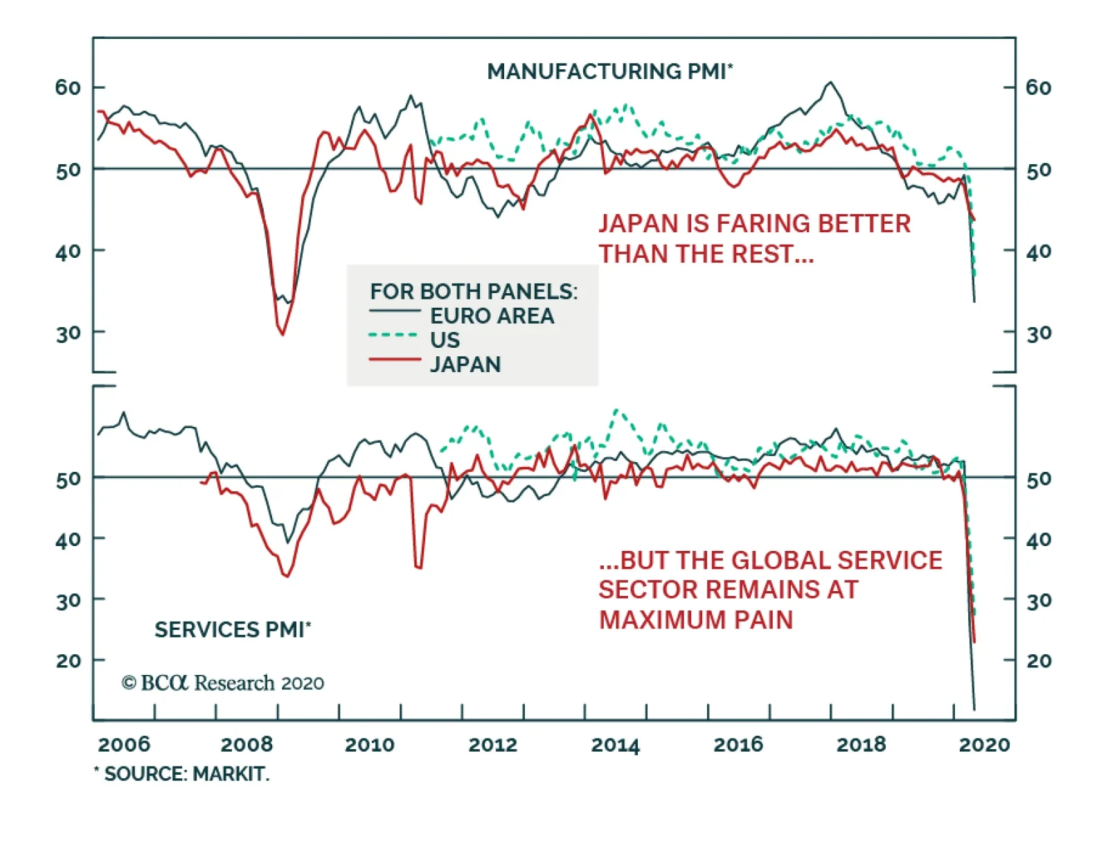
The flash PMIs in April managed to underwhelm already dire expectations. The European manufacturing index collapsed to 33.6 from 44.5, while the services gauge plunged to 11.7. In the US, the manufacturing PMI declined to 36.9 while the services measure…
Dear Client, Please join me and my fellow BCA Strategists Caroline Miller and Arthur Budaghyan for a live webcast tomorrow, Friday, April 24 at 8:00 AM EDT (1:00 PM BST, 2:00 PM CEST, 8:00 PM HKT) where we will discuss the outlook for developed and emerging market equities over the immediate (0-3 month) and cyclical (12 month) horizon. In lieu of our regular report next week, we will be sending you a Special Report from my colleague Jonathan LaBerge. Jonathan will discuss the global fiscal response to the COVID-19 pandemic, and will provide some perspective on whether the response will be enough to prevent an "L-shaped" economic outcome. I hope you find the report insightful. Best regards, Peter Berezin, Chief Global Strategist Highlights Theoretically, the pandemic could raise the long-term fair value of equities – as proxied by the present value of future cash flows – if it causes the discount rate to fall by more than enough to offset the decline in corporate earnings. While such a seemingly bizarre outcome is not our base case, it cannot be easily dismissed, especially since the evidence suggests that real long-term interest rates have fallen a lot more since the start of the pandemic than have earnings estimates. We consider a number of challenges to this claim, including: current earnings estimates are too optimistic; long-term interest rates are being distorted by QE and other factors; and the equity risk premium will be higher in a post-pandemic world. While all these counterarguments have merit, none of them are airtight. Even if the pandemic ultimately boosts stock prices, the path to new highs will be a bumpy one. In the near term, a slew of bad economic data could cause another bout of market turbulence. Nevertheless, over a 12-month horizon, investors should continue to overweight equities relative to cash and bonds. The plunge in front-end oil futures this week was a timely reminder of the extent to which the pandemic has suppressed crude demand. Oil prices should bounce back later this year as global growth recovers, the dollar weakens, and more oil supply is taken offline. A Counterintuitive Scenario Chart 1EPS Growth Scenarios
Could The Pandemic Lead To Higher Stock Prices?
Could The Pandemic Lead To Higher Stock Prices?
Could the pandemic end up raising the long-term fair value of equities – as proxied by the present value of future cash flows – compared with a scenario in which the virus never emerged? Such an outcome sounds far-fetched but could occur if the pandemic causes the discount rate to fall by more than enough to offset the decline in corporate earnings. How likely is such an outcome? To get a sense of the answer, let us consider a simple example where, prior to the pandemic, cash flows to shareholders were expected to grow by 2% per annum, the risk-free interest rate was 2%, and the equity risk premium was 5% (implying a discount rate of 7%). Let us suppose that the pandemic temporarily reduces corporate profits by 60% in 2020, 40% in 2021, and 20% in 2022 relative to the aforementioned baseline, with earnings returning to trend beyond then (Chart 1, Scenario 1). All things equal, an earnings shock of this magnitude would reduce the present value of corporate profits by 5.4%. For the present value to return to its original level, the discount rate would have to fall by 27 bps. How does this example square with reality? While it is impossible to know what would have happened in the absence of the pandemic, we can observe that S&P 500 EPS estimates have so far fallen by 22% for 2020 and 11% for both 2021 and 2022 since the start of the year. Meanwhile, the 30-year TIPS yield – a proxy for long-term real interest rates – has fallen by 75 bps, and is down 138 bps since the beginning of 2019. Based on this comparison, one can conclude that the decline in rate expectations has been large enough to offset the drop in projected earnings. Four Counterarguments The discussion above makes a number of assumptions that could easily be challenged. Let us consider four counterarguments to the claim that the pandemic has increased the long-term fair value of equities. As we shall see, while all four counterarguments are valid, none of them are bulletproof. Bottom-up earnings estimates are too optimistic. As estimates come down, so will stock prices. Calculations of long-term risk-free rates are being distorted by QE and other factors. If a more cautious mindset results in a lower risk-free rate, it should also result in a higher equity risk premium (ERP). A higher ERP would push up the discount rate, reducing the fair value of the stock market. The pandemic could lead to a variety of investor-negative outcomes, including further deglobalization, higher corporate taxes, and the loss of policy maneuverability during the next downturn. Let us examine all four of these counterarguments in turn. 1. Are Earnings Estimates Too Optimistic? BCA’s US equity strategists expect S&P 500 companies to generate $104 in EPS this year and $162 in 2021. A simple weighted-average of these estimates implies a forward 12-month EPS of $123, compared with the current consensus of $140. Could the pandemic end up raising the long-term fair value of equities? Granted, consensus estimates for any given calendar year usually start high and drift lower over time, reflecting the overoptimistic bias of bottom-up analysts (Chart 2). Nevertheless, the gap between where consensus is today and where we think it will end up is large enough that further negative revisions could still weigh on stocks. As evidence, note that stock prices tend to move in the same direction as earnings revisions and 12-month ahead earnings estimates (Chart 3). Chart 2Are Earnings Estimates Too Optimistic?
Could The Pandemic Lead To Higher Stock Prices?
Could The Pandemic Lead To Higher Stock Prices?
Chart 3Negative Earnings Revisions Will Weigh On Stocks In The Near Term
Negative Earnings Revisions Will Weigh On Stocks In The Near Term
Negative Earnings Revisions Will Weigh On Stocks In The Near Term
The discussion above suggests that stocks could face some downward pressure in the near term, reflecting the tendency for investors to myopically focus on earnings over the next 12 months. This does not, however, negate the possibility that the pandemic could raise the long-term present value of future cash flows. After all, even the earnings projections from our equity strategists are much more benign than those in the stylized example of a 60%, 40%, and 20% decline in EPS for the next three years. In fact, to get something that fully offsets the decline in real yields since the start of the year requires a scenario that not only assumes a 60%, 40%, and 20% drop in earnings, but also assumes that profits remain 10% lower forever relative to the baseline (Chart 1, Scenario 2). 2. Are Estimates Of Long-Term Risk-Free Rates Distorted To The Downside? Chart 4Rate Expectations Have Come Down
Rate Expectations Have Come Down
Rate Expectations Have Come Down
So far, we have argued that earnings are unlikely to fall by enough over the next few years to counteract the steep drop in long-term interest rates. But, perhaps the problem is not with the earnings projections? Perhaps the problem is with the estimates of the long-term risk-free rate? Conceptually, long-term government bond yields should incorporate the market’s expectation of how short-term interest rates will evolve over the life of the bond plus a “term premium.” The inelegantly named term premium is a catch-all, unobservable variable that captures everything that affects bond yields other than changes in rate expectations. Term premia have fallen in global bond markets since the start of the year, partly because central banks have ramped up bond buying programs with the express intent of pushing down long-term yields. Nevertheless, rate expectations have also come down, as can be gleaned from forward contracts linked to expected overnight rates (Chart 4). This suggests that expectations of lower rates have played an important role in explaining the decline in bond yields. In any case, it is not clear why one should control for the term premium in calculating discount rates. If the idea is to compare bonds with stocks, then one should look at bond yields directly, rather than trying to ascertain what yields would hypothetically be in the absence of various distortions – especially if these distortions are unlikely to go away anytime soon. You can’t eat hypothetical profits. 3. Projecting The Equity Risk Premium If overly optimistic earnings estimates and a distorted risk-free rate cannot fully counteract the claim that the pandemic has raised the long-term fair value of equities, what about the third driver of present value calculations: the equity risk premium (ERP)? While the ERP cannot be observed directly, it is possible to infer it by looking at the difference between the long-term earnings yield and the real bond yield. Under some simplifying assumptions, the earnings yield provides a good estimate of the long-term real total return to holding stocks.1 To the extent that the earnings yield has risen this year, while the risk-free rate has fallen, one can infer that the equity risk premium has gone up. However, there is no money in observing today’s equity risk premium; the money is in projecting it. The equity risk premium can shift a lot over the course of the business cycle. This is why the stock-to-bond ratio moves so closely with, say, the ISM manufacturing index (Chart 5). Chart 5Stock-To-Bond Ratio And Economic Growth Go Hand-In-Hand
Stock-To-Bond Ratio And Economic Growth Go Hand-In-Hand
Stock-To-Bond Ratio And Economic Growth Go Hand-In-Hand
Like many financial market variables, the ERP has tended to be mean reverting. Today, the ERP is above its long-term average both in the US and the rest of the world, which suggests that it may decline over time (Chart 6). If that were to happen, stocks would almost certainly outperform bonds. Chart 6Favor Equities Over Bonds Over A 12-Month Horizon
Favor Equities Over Bonds Over A 12-Month Horizon
Favor Equities Over Bonds Over A 12-Month Horizon
Yet, in an environment where caution reigns supreme, might the ERP stay elevated? After all, if risk-free bond yields remain low because people are more reluctant to spend, wouldn’t that mean that investors will continue to demand an additional premium to holding stocks? Perhaps, but this assumes that bonds will retain their safe-haven characteristics. There are two reasons to think that these characteristics may fray in a post-pandemic world. First, with policy rates now close to zero in most markets, there is a limit to how much further bond yields can decline. This means that bond prices will not rise much even if the recession lasts much longer than expected (Table 1). Table 1Bonds Won't Provide Much Of A Hedge Even In A Severe Recession Scenario
Could The Pandemic Lead To Higher Stock Prices?
Could The Pandemic Lead To Higher Stock Prices?
Second, looking further out, highly indebted governments may try to dissuade central banks from raising rates even once unemployment has fallen back to normal levels. This could lead to higher inflation, imperiling bond investors. While such an outcome would not necessarily be good for stocks, equities will be more insulated than bonds because nominal profits tend to rise more quickly in an environment of higher inflation. As such, one could plausibly argue that the equity risk premium should not be any higher, and conceivably should be lower, in a post-pandemic world. 4. Unintended Consequences Chart 7Global Trade Was Already Stalling
Global Trade Was Already Stalling
Global Trade Was Already Stalling
While it is too early to say with any confidence what the long-term effects of the pandemic will be, it is certainly possible that they will be momentous. Globalization had already stalled before the eruption of the Sino-US trade war (Chart 7). It could go into reverse if trade tensions remain elevated and countries increasingly focus on ensuring that they have enough domestic capacity to produce various essential goods. Support for pro-business, laissez-faire policies could also wane further. Prior to the pandemic, BCA’s geopolitical team gave President Trump a 55% chance of being re-elected. Now, with the economy in shambles, they only give him a 35% chance. If the Democrats take control of the White House and both Houses of Congress, Trump’s corporate tax cuts are sure to be watered down if not fully reversed. The pandemic could also limit the ability of policymakers to respond to the next downturn. Interest rates cannot be cut further and high debt levels may limit fiscal maneuverability, especially for countries that do not have access to their own printing press. To be sure, there could be some silver linings. Many lessons have been learned over the past few months. If another pandemic were to occur, we will be better prepared. Meanwhile, gratuitous business travel will be curtailed now that people have grown more comfortable with videoconferencing. And just like the space race inspired a generation of scientists and engineers, the pandemic could motivate more young people to pursue a career in medical research. Investment Conclusions While not our base case, we would subjectively assign a 25% probability to an outcome where the pandemic ends up raising the long-term present value of corporate cash flows by pushing down the discount rate by more than enough to offset the near-term drop in profits. Chart 8Don't Rush Into Growth Stocks Just Yet, As Value Stocks Are Still Cheap
Don't Rush Into Growth Stocks Just Yet, As Value Stocks Are Still Cheap
Don't Rush Into Growth Stocks Just Yet, As Value Stocks Are Still Cheap
Even if the pandemic leaves stocks lower than they otherwise would have been, the current equity risk premium is high enough to warrant overweighting global equities over bonds on a 12-month horizon. Of course, stocks are unlikely to sail smoothly to new highs on the back of lower interest rates alone. As we discussed last week in a reported entitled “Still Stuck in The Tree,” it will be difficult to dismantle ongoing lockdown measures until a mass-testing regime is put in place, something that is still at least a few months away at best.2 With the data on the economy and corporate earnings set to disappoint in the near term, stocks could give up some of their recent gains. Thus, while we are still bullish on equities on a long-term horizon, we are more cautious on a short-term, 3-month horizon. Drilling further down, the decline in long-term rates this year is likely to create winners and losers across all asset classes. Some of the winners and losers are fairly straightforward to identify. For instance, growth stocks, whose market value hinges on anticipated cash flows that may not be realized until far into the future, gain relatively more from lower rates than value stocks. Banks, which are overrepresented in value indices, have suffered from the flattening of yield curves and lower rates in general. That said, given that value stocks currently trade at a multi-decade discount to growth stocks, we would not recommend that clients chase growth stocks at this juncture (Chart 8). Other winners and losers from lower rates may be less readily discernible. For example, consider the US dollar. The greenback benefited over the past few years from the fact that US rates were higher than those abroad. That rate differential has narrowed significantly recently as the Fed brought interest rates down to zero (Chart 9). Yet, the dollar has managed to remain well bid thanks to safe-haven flows into the Treasury market. Looking out, if the Fed succeeds in easing dollar funding pressures, as we expect will be the case, the dollar will weaken. Chart 9Rate Differentials Are No Longer A Tailwind For The US Dollar
Rate Differentials Are No Longer A Tailwind For The US Dollar
Rate Differentials Are No Longer A Tailwind For The US Dollar
The plunge in near-term oil futures this week was a reminder of the extent to which the pandemic has suppressed crude demand. Transportation accounts for over half of global oil usage. Going forward, the combination of a weaker dollar, increased supply discipline, and a rebound in global growth in the second half of this year will help lift oil prices (Chart 10). Our energy analysts see WTI and Brent returning to $38/bbl and $42/bbl, respectively, by the end of the year following the drumming they received this week (Chart 11).3 Chart 10Commodity Prices Usually Rise When The Dollar Weakens
Commodity Prices Usually Rise When The Dollar Weakens
Commodity Prices Usually Rise When The Dollar Weakens
Chart 11Oil Prices Expected To Recover
Oil Prices Expected To Recover
Oil Prices Expected To Recover
Oil prices tend to be strongly correlated with inflation expectations (Chart 12). As inflation expectations rise, real rates could fall further, giving an additional boost to equity valuations. Chart 12Inflation Expectations And Oil Prices Tend To Move Closely Together
Inflation Expectations And Oil Prices Tend To Move Closely Together
Inflation Expectations And Oil Prices Tend To Move Closely Together
Peter Berezin Chief Global Strategist peterb@bcaresearch.com Footnotes 1 For a more in-depth discussion on this, please see Global Investment Strategy Special Report, “TINA To The Rescue,” dated August 23, 2019. 2 Please see Global Investment Strategy Weekly Report, “Still Stuck In The Tree,” dated April 16, 2020. 3 Please see Commodity & Energy Strategy Weekly Report, “USD Strength Restrains Commodity Recovery,” dated April 23, 2020; Special Alert, “WTI In Free Fall,” dated April 20, 2020; and Weekly Report, “US Storage Tightens, Pushing WTI Lower,” dated April 16, 2020. Global Investment Strategy View Matrix
Could The Pandemic Lead To Higher Stock Prices?
Could The Pandemic Lead To Higher Stock Prices?
Current MacroQuant Model Scores
Could The Pandemic Lead To Higher Stock Prices?
Could The Pandemic Lead To Higher Stock Prices?
Highlights Social distancing makes it impossible to do jobs that require close personal interaction, yet these are the very job sectors that have kept jobs growth alive in recent decades. If social distancing persists, then AI will penetrate these job sectors too. Aggregate wage inflation is set to collapse – not just temporarily, but structurally. Structurally overweight US T-bonds versus the core European bonds in Germany, France, Netherlands, Switzerland and Sweden. Structurally overweight big technology, structurally underweight banks. Structurally overweight S&P 500 versus Euro Stoxx 50. Fractal trade: long Australian 30-year bond versus US 30-year T-bond. Feature Social distancing will feature large in our lives for the foreseeable future, and it carries a profound consequence. Social distancing really means physical distancing. And physical distancing diminishes the ways that we can interact with other humans – through the qualities of empathy, sympathy, the ability to recognise and respond to emotional cues, and to express ourselves through complex movements. You cannot hug someone on Facetime. Social distancing makes it impossible to do jobs that require close personal interaction. From an economic perspective, social distancing makes it impossible to do jobs that require close personal interaction. It follows that in the recent bloodbath of job losses, the biggest casualties have been in employment sectors that rely on this close personal interaction: food services and drinking places (waitresses, bartenders, and baristas), ambulatory healthcare services, hotels, and social assistance (Table I-1). Table I-1Social Distancing Is Destroying Jobs That Require Close Personal Interaction
Social Distancing Is Good For Robots, Bad For Humans
Social Distancing Is Good For Robots, Bad For Humans
A profound consequence arises because these are the very sectors that have kept jobs growth alive in recent decades (Table I-2). Millions of new jobs that rely on close personal interaction have more than offset the structural job destruction in manufacturing and finance. As well as being export-proof, jobs that require this close personal interaction have been ‘artificial intelligence (AI) proof’. That is, until now. Table I-2Jobs That Require Close Personal Interaction Have Been The Engine Of Jobs Growth
Social Distancing Is Good For Robots, Bad For Humans
Social Distancing Is Good For Robots, Bad For Humans
One UK doctor told the New York Times “we’re basically witnessing 10 years of change in one week”. Before the virus, online consultations made up only 1 percent of doctors’ appointments. But now, three in four UK patients are seeing their doctor remotely. Moravec’s Paradox + Social Distancing = A Very Tough Jobs Market Regular readers will know that one of our mega-themes is the far-reaching societal and economic implications of Moravec’s Paradox. Named after the professor of robotics, Hans Moravec, the paradox points out that: For AI the hard things are easy, but the easy things are hard. By the hard things, we mean things that require ‘narrow-frame pattern recognition’ within a defined body of knowledge. For example, playing chess, translating languages, diagnosing medical conditions, and analysing legal problems. We find these tasks hard, but AI finds them effortless. By the easy things, we mean our social skills: empathy, sympathy, the ability to recognise and respond to emotional cues, and to express ourselves through complex movements. To us, all these things are second nature, but AI finds them very hard to replicate. The reason, it turns out, is that the higher brain that enables us to learn and play chess and solve similar abstract problems evolved relatively recently. Whereas the ancient lower brain that enables complex movement and the associated giving and receiving of emotional signals took much longer to evolve. As AI is just reverse engineering the human brain, AI has found it easy to replicate the less-evolved higher brain functions, but very difficult to replicate the skills that emanate from the deeply evolved lower brain. Millions of new jobs that rely on close personal interaction have more than offset the structural job destruction in manufacturing and finance. The far-reaching societal and economic implication is that we have misunderstood and mispriced what is difficult and what is easy. By reverse engineering the brain, AI is correcting this mispricing. So far, AI has been most disruptive to high-paying jobs requiring abstract problem-solving skills, such as in finance. AI has been less disruptive to jobs requiring close personal interaction (Table I-3). But if social distancing persists, then AI will disrupt those jobs too, especially during a recession. Table I-3New Jobs That Require Close Personal Interaction Have Offset Lost Jobs In Manufacturing And Finance
Social Distancing Is Good For Robots, Bad For Humans
Social Distancing Is Good For Robots, Bad For Humans
Labour Market Disruption Intensifies During A Recession To paraphrase Ernest Hemingway, industries adopt labour-saving technologies gradually then suddenly. And the suddenly tends to be during a recession. This is because once an industry has already shed many workers, it is easier to restructure the industry with a new labour-saving technology that reduces labour input permanently. At the start of the Great Depression a substantial part of the US automobile industry was still based on skilled craftsmanship. These smaller, less productive craft-production plants were the ones that shut down permanently, while plants that had adopted labour-saving mass production had the competitive advantage that enabled them to survive. The result was a major restructuring of the auto productive structure. Likewise, until the late 1990s, the ‘typing pool’ was a ubiquitous feature of the office environment. But once the 2000 downturn arrived, these typing jobs became extinct to be replaced by the wholesale roll-out of Microsoft Word. After the 2008-09 recession, UK economic power became focussed in a few large firms that could access the finance to ensure their survival. As small firms went by the wayside, job growth came disproportionately from self-employment and the ‘gig economy’. In this case, the labour market disruption hurt productivity as an army of freelancers ended up doing their own sales, marketing and accounts in which they had no specialism (Chart I-1 and Chart I-2). Chart I-1The 1990s UK Recovery Produced No Increase In Self-Employment...
The 1990s UK Recovery Produced No Increase In Self-Employment...
The 1990s UK Recovery Produced No Increase In Self-Employment...
Chart I-2...But The 2010s UK Recovery Produced A Huge Increase In Self-Employment
...But The 2010s UK Recovery Produced A Huge Increase In Self-Employment
...But The 2010s UK Recovery Produced A Huge Increase In Self-Employment
The point is that all recessions produce major structural changes in the labour market and the current recession will be no different. If social distancing persists, it will nullify the social skill advantage that humans have over AI. Therefore, one structural change will be that AI disrupts the more ‘human’ job sectors that have so far escaped its penetration. All recessions produce major structural changes in the labour market. To repeat, labour market disruption arrives suddenly. Within the space of a few weeks, most UK patients have switched to receiving their medical care online or by telephone. Admittedly, the patients are still ‘seeing’ a human doctor, but the question and answer consultations are a classic example of narrow-frame pattern recognition. Meaning that it would be a small step to upgrade the human doctor to the superior diagnosis from AI. And if AI can produce a superior diagnosis to your human doctor, why can’t AI also produce a a superior legal analysis to your human lawyer? The Investment Implications Even when the labour market seemed to be humming and unemployment rates were at multi-decade lows, aggregate wage inflation was anaemic (Chart I-3 and Chart I-4). A major reason was the hollowing out of high paying jobs and substitution with low paying jobs. Now that unemployment rates are surging, and AI is penetrating even more job sectors, aggregate wage inflation is set to collapse – not just temporarily, but structurally. Chart I-3Unemployment Rates Have Been At Multi-Decade Lows...
Unemployment Rates Have Been At Multi-Decade Lows...
Unemployment Rates Have Been At Multi-Decade Lows...
Chart I-4...But Wage Inflation Has Been ##br##Anaemic
...But Wage Inflation Has Been Anaemic
...But Wage Inflation Has Been Anaemic
This leads to the following investment implications: 1. All bond yields will gravitate to their lower bound, so any bond yield that can go lower will go lower. 2. It follows that bond investors should continue to overweight US T-bonds versus the core European bonds in Germany, France, Netherlands, Switzerland and Sweden (Chart I-5). Chart I-5Any Bond Yield That Can Go Lower Will Go Lower
Any Bond Yield That Can Go Lower Will Go Lower
Any Bond Yield That Can Go Lower Will Go Lower
3. Underweight banks structurally. Depressed and flattening yield curves combined with shrinking demand for private credit constitutes a strong headwind. Banks are now underperforming in both up markets and in down markets (Chart I-6). Chart I-6Banks Are Underperforming In Both Up Markets And Down Markets
Banks Are Underperforming In Both Up Markets And Down Markets
Banks Are Underperforming In Both Up Markets And Down Markets
4. Overweight technology structurally. As AI penetrates even more job sectors, the superstar companies of big tech will continue to thrive. The duopoly of Apple and Google are designing proximity-tracking apps for every smartphone in the world. Big tech is laying down the law to governments, and there is not even a hint of antitrust suits. Tech is now outperforming in both up markets and in down markets (Chart I-7). Chart I-7Tech Is Outperforming In Both Up Markets And Down Markets
Tech Is Outperforming In Both Up Markets And Down Markets
Tech Is Outperforming In Both Up Markets And Down Markets
5. Finally, if big tech outperforms banks, the sector composition of the S&P 500 versus the Euro Stoxx 50 makes it inevitable that the US equity market will structurally outperform the euro area equity market (Chart I-8). Chart I-8If Big Tech Outperforms Banks, The S&P 500 Must Outperform The Euro Stoxx 50
If Big Tech Outperforms Banks, The S&P 500 Must Outperform The Euro Stoxx 50
If Big Tech Outperforms Banks, The S&P 500 Must Outperform The Euro Stoxx 50
Fractal Trading System* The steep decline in the US 30-year T-bond yield means that it has crossed below the Australian 30-year bond yield for the first time in recent history. Resulting from this dynamic, this week’s recommended trade is long the Australian 30-year bond versus the US 30-year T-bond. Set the profit target at 9 percent with a symmetrical stop-loss. Chart I-930-Year Govt. Bonds: Australia Vs. US
30-Year Govt. Bonds: Australia Vs. US
30-Year Govt. Bonds: Australia Vs. US
In other trades, long IBEX versus Euro Stoxx 600 hit its 3 percent stop-loss, while long nickel versus copper is half way to its 11 percent profit target. The rolling 12-month win ratio now stands at 63 percent. When the fractal dimension approaches the lower limit after an investment has been in an established trend it is a potential trigger for a liquidity-triggered trend reversal. Therefore, open a countertrend position. The profit target is a one-third reversal of the preceding 13-week move. Apply a symmetrical stop-loss. Close the position at the profit target or stop-loss. Otherwise close the position after 13 weeks. * For more details please see the European Investment Strategy Special Report “Fractals, Liquidity & A Trading Model,” dated December 11, 2014, available at eis.bcaresearch.com. Dhaval Joshi Chief European Investment Strategist dhaval@bcaresearch.com Fractal Trading System Cyclical Recommendations Structural Recommendations Closed Fractal Trades Trades Closed Trades Asset Performance Currency & Bond Equity Sector Country Equity Indicators Bond Yields Chart II-1Indicators To Watch - Bond Yields
Indicators To Watch - Bond Yields
Indicators To Watch - Bond Yields
Chart II-2Indicators To Watch - Bond Yields
Indicators To Watch - Bond Yields
Indicators To Watch - Bond Yields
Chart II-3Indicators To Watch - Bond Yields
Indicators To Watch - Bond Yields
Indicators To Watch - Bond Yields
Chart II-4Indicators To Watch - Bond Yields
Indicators To Watch - Bond Yields
Indicators To Watch - Bond Yields
Interest Rate Chart II-5Indicators To Watch - Interest Rate Expectations
Indicators To Watch - Interest Rate Expectations
Indicators To Watch - Interest Rate Expectations
Chart II-6Indicators To Watch - Interest Rate Expectations
Indicators To Watch - Interest Rate Expectations
Indicators To Watch - Interest Rate Expectations
Chart II-7Indicators To Watch - Interest Rate Expectations
Indicators To Watch - Interest Rate Expectations
Indicators To Watch - Interest Rate Expectations
Chart II-8Indicators To Watch - Interest Rate Expectations
Indicators To Watch - Interest Rate Expectations
Indicators To Watch - Interest Rate Expectations
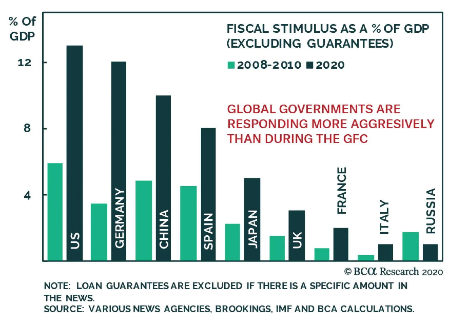
The global economy is furiously weak, but politicians around the world are not seating idly by. The flood of stimulus unleashed over the course of the past two months dwarves the fiscal easing that followed the GFC. European governments are much more…
Highlights Q1/2020 Performance Breakdown: Our recommended model bond portfolio underperformed the custom benchmark by -40bps during the first quarter of the year – a number that would have been far worse if not for the changes in exposures for duration (increased) and spread product (decreased) made in early March. Winners & Losers: Underperformance was concentrated in sovereign debt, US Treasuries in particular (-94bps), as yields plummeted. This detracted from the outperformance in spread product (+51bps) led by US investment grade corporates (+34bps) and emerging markets (+20bps). Scenario Analysis For The Next Six Months: Given the ongoing uncertainty over when the COVID-19 pandemic and economy-crushing global lockdown will end, we are sticking close to benchmark on overall duration and spread product exposure. Instead, we recommend focusing more on country allocation and spread product relative value to generate outperformance, favoring markets where there is direct involvement from central banks. Feature Global bond markets were roiled in the first quarter of 2020 by the economic fallout from the COVID-19 pandemic. Government bond yields crashed to all-time lows while volatility reached extremes across both sovereign debt and credit. The quick, coordinated policy response from global monetary and fiscal authorities – which includes unprecedented levels of direct central bank asset purchases, both in terms of size and the breadth across markets and counties - has helped stabilize global credit spreads and risk assets, more generally. The outlook remains highly uncertain, however, with many governments worldwide looking to reopen their collapsed economies, risking the potential resurgence of a virus still lacking effective treatment or a vaccine. We are focusing more on relative value between counties and sectors. In this report, we review the performance of the BCA Research Global Fixed Income Strategy (GFIS) model bond portfolio during the eventful first quarter of 2020. We also present our updated recommended positioning for the portfolio for the next six months. The main takeaway there is that we are focusing more on relative value between counties and sectors while staying close to benchmark on both overall global duration and spread product exposure versus government bonds (Table 1). Table 1GFIS Model Bond Portfolio Recommended Positioning For The Next Six Months
GFIS Model Bond Portfolio Q1/2020 Performance Review & Current Allocations: Traversing The Turmoil
GFIS Model Bond Portfolio Q1/2020 Performance Review & Current Allocations: Traversing The Turmoil
Chart 1Q1/2020 Performance: Lagging, But It Could Have Been Much Worse
Q1/2020 Performance: Lagging, But It Could Have Been Much Worse
Q1/2020 Performance: Lagging, But It Could Have Been Much Worse
As a reminder to existing readers (and to new clients), the model portfolio is a part of our service that complements the usual macro analysis of global fixed income markets. The portfolio is how we communicate our opinion on the relative attractiveness between government bond and spread product sectors. This is done by applying actual percentage weightings to each of our recommendations within a fully invested hypothetical bond portfolio. Q1/2020 Model Portfolio Performance Breakdown: A Missed Rally In Sovereigns, Outperformance In Credit The total return for the GFIS model portfolio (hedged into US dollars) in the first quarter was -0.1%, underperforming the custom benchmark index by -40bps (Chart 1).1 That relative underperformance came from the government bond side of the portfolio, while our spread product allocation outperformed the benchmark. US Treasuries underperformed the most (-91bps) with losses concentrated in the +10 year maturity bucket. (Table 2). After US Treasuries, euro area high-yield corporates were the second worst performer, underperforming the benchmark by -10bps. Outperformance in spread product was driven by US investment grade industrials (+22bps) and EM credit (+20bps). Table 2GFIS Model Bond Portfolio Q1/2020 Overall Return Attribution
GFIS Model Bond Portfolio Q1/2020 Performance Review & Current Allocations: Traversing The Turmoil
GFIS Model Bond Portfolio Q1/2020 Performance Review & Current Allocations: Traversing The Turmoil
The potential losses to our model portfolio were greatly mitigated by changes in positioning during the quarter. Our decision to raise overall global duration exposure to neutral at the beginning of March helped shield the portfolio as yields plummeted.2 We followed this by upgrading sovereign debt in the US and Canada, both higher-beta countries, to overweight while moving to an underweight stance on US high-yield debt, euro area investment-grade and high-yield debt, and emerging market (EM) USD-denominated sovereign and corporate debt.3 In an environment of rampant uncertainty, these allocation changes helped prevent catastrophic losses in the model portfolio that had previously been positioned for a pickup in global growth. The potential losses to our model portfolio were greatly mitigated by changes in positioning during the quarter. In terms of the specific breakdown between the government bond and spread product allocations in our model portfolio, the former generated -91bps of underperformance versus our custom benchmark index while the latter outperformed by +51bps. The bar charts showing the total and relative returns for each individual government bond market and spread product sector are presented in Charts 2 and 3. Chart 2GFIS Model Bond Portfolio Q1/2020 Government Bond Performance Attribution
GFIS Model Bond Portfolio Q1/2020 Performance Review & Current Allocations: Traversing The Turmoil
GFIS Model Bond Portfolio Q1/2020 Performance Review & Current Allocations: Traversing The Turmoil
Chart 3GFIS Model Bond Portfolio Q1/2020 Spread Product Performance Attribution By Sector
GFIS Model Bond Portfolio Q1/2020 Performance Review & Current Allocations: Traversing The Turmoil
GFIS Model Bond Portfolio Q1/2020 Performance Review & Current Allocations: Traversing The Turmoil
The most significant movers were: Biggest Outperformers Overweight US investment grade industrials (+22bps) Underweight euro area investment grade corporate bonds (+16bps) Underweight EM USD-denominated corporates (+12bps) Overweight US investment grade financials (+10bps) Underweight Japanese government bonds with maturity greater than 10 years (+8bps) Biggest Underperformers Underweight US government bonds with maturity greater than 10 years (-36bps) Underweight US government bonds with maturity of 3-5 years (-17bps) Underweight US government bonds with maturity of 5-7 years (-16bps) Underweight US government bonds with maturity of 1-3 years (-13bps) Underweight US government bonds with maturity of 7-10 years (-12bps) Chart 4 presents the ranked benchmark index returns of the individual countries and spread product sectors in the GFIS model bond portfolio for Q1/2020. The returns are hedged into US dollars (we do not take active currency risk in this portfolio) and are adjusted to reflect duration differences between each country/sector and the overall custom benchmark index for the model portfolio. We have also color-coded the bars in each chart to reflect our recommended investment stance for each market during Q1/2020 (red for underweight, dark green for overweight, gray for neutral).4 Ideally, we would look to see more green bars on the left side of the chart where market returns are highest, and more red bars on the right side of the chart were returns are lowest. Predictably, government debt performed the best in Q1/2020 as global bond yields fell and monetary authorities raced to support economies and inject liquidity. UK, US, and Canadian government debt delivered the best returns this quarter. While we started the year neutral or underweight those assets, we moved to an overweight allocation in March, which helped salvage some returns. Also worth noting is that Australian government debt, where we have maintained a structural overweight stance, was one of the top performing markets during the first quarter. The deepest losses were sustained in EM USD-denominated sovereign and corporate debt, and euro area high-yield. Although it seems a distant memory at this point, we did start this quarter on an optimistic note and expected spreads on these products to narrow as global growth picked up. However, we were able to shield our portfolio against excessive losses in these products by moving to an underweight stance in March once the severity of the COVID-19 global economic shock become apparent. Bottom Line: Our recommended model bond portfolio underperformed the custom benchmark index during the first quarter of the year. The underperformance was concentrated in government bonds, which rallied on the back of the global pandemic. However, the portfolio outperformed the benchmark in spread products, where the combination of massive fiscal/monetary easing and direct central bank asset purchases have brought credit spreads under control. Future Drivers Of Portfolio Returns Typically, in these quarterly performance reviews of our model bond portfolio, we attempt to make return forecasts for the portfolio based off scenario analysis and quantitative predictions of various fixed income asset classes. In the current unprecedented economic and financial market environment, however, we are reluctant to rely on model coefficients and correlations to estimate expected returns. Instead, in this report, we will focus on discussing the logic behind our current model portfolio positioning and how those allocations should expect to contribute to the overall portfolio performance over the next six months. Looking ahead, the performance of the model bond portfolio will be driven by three main factors: Our recommended overweight stance on US spread product that is backstopped by the Fed—US investment grade corporates, Agency CMBS, and Ba-rated high-yield; Our recommended overweight stance on relatively higher-yielding sovereigns like the US and Italy; Our recommended underweight stance on EM USD-denominated corporates and sovereigns, where the specter of defaults and liquidity crunches looms. In terms of specific weightings in the GFIS model bond portfolio, we have moderated our stance on global spread product since our previous review of the portfolio.5 While the monetary liquidity backdrop is highly bullish, with central banks aggressively buying bonds and keeping policy rates at the zero lower bound, it is still unclear if and when economies will be able to successfully reopen and put an end to the COVID-19 recession. We are now recommending only a small relative overweight of two percentage points for spread product versus the benchmark index (Chart 5), leaving room to add more should the news on the virus and global growth take a turn for the better. Chart 5Overall Portfolio Allocation: Slightly Overweight Credit
GFIS Model Bond Portfolio Q1/2020 Performance Review & Current Allocations: Traversing The Turmoil
GFIS Model Bond Portfolio Q1/2020 Performance Review & Current Allocations: Traversing The Turmoil
We also remain neutral on overall portfolio duration exposure. Our Global Duration Indicator, which contains growth data like our global leading economic indicator and the global ZEW expectations index, has plunged and is signaling bond yields will stay depressed over the next six months (Chart 6). Yet at the same time, yields in most countries have been unable to hit new lows after the panic-driven bond rally in late February and early March, even as global oil prices have collapsed and inflation expectations remain depressed, suggesting that yields already discount a lot of bad news. Chart 6Our Duration Indicator Is Signaling Government Bond Yields Will Stay Low
Our Duration Indicator Is Signaling Government Bond Yields Will Stay Low
Our Duration Indicator Is Signaling Government Bond Yields Will Stay Low
We do not see much value in taking a big directional bet on yields through overall duration exposure at the present time. We also think it is far too early to contemplate reducing duration – even with many global equity and credit markets having rallied sharply off the lows – given the persistent uncertainty over the timing of a recovery in global growth. Thus, we are maintaining a neutral overall portfolio exposure (Chart 7). Chart 7Overall Portfolio Duration: At Benchmark
Overall Portfolio Duration: At Benchmark
Overall Portfolio Duration: At Benchmark
Chart 8Country Allocation: Favor Those With Higher Betas To Global Yields
Country Allocation: Favor Those With Higher Betas To Global Yields
Country Allocation: Favor Those With Higher Betas To Global Yields
Within the government bond side of the model bond portfolio, we recommend focusing more on country allocation to generate outperformance. That means concentrating exposures in relatively higher yielding markets like the US, Canada and peripheral Europe while maintaining underweights in core Europe and Japan, where yields have relatively little room to fall. That allocation also lines up with the sensitivity of each market to changes in the overall level of global bond yields, i.e. the yield beta (Chart 8). By favoring those higher beta markets, the model portfolio would still benefit from a renewed leg down in global bond yields, while still maintaining an overall neutral level of portfolio duration. By favoring those higher beta markets, the model portfolio would still benefit from a renewed leg down in global bond yields. Turning to spread product allocations, we recommend focusing more on policymaker responses to the COVID-19 recession rather than the downturn itself. Yes, the earlier widening of global high-yield spreads is forecasting a sharp plunge in global growth and rising unemployment rates (Chart 9, top panel). At the same time, the now double-digit year-over-year growth in global central bank balance sheets - a measure that has led global high-yield bond excess returns by one year in the years after the Global Financial Crisis (bottom panel) – is pointing to a period of improved global corporate bond market performance over the next 6-12 months. Chart 9Global Corporate Performance Should Benefit From Global QE
Global Corporate Performance Should Benefit From Global QE
Global Corporate Performance Should Benefit From Global QE
In other words, we are focusing on global QE rather than global recession, while maintaining a modest recommended overall weighting on global spread product. Chart 10Credit Allocation: Buy What The Central Banks Are Buying
Credit Allocation: Buy What The Central Banks Are Buying
Credit Allocation: Buy What The Central Banks Are Buying
That allocation could be larger, but we suggest picking the lowest hanging fruit in the credit universe rather than going for the highest beta credit markets. That means concentrating spread product allocations on the parts of global credit markets where central banks are directly buying (Chart 10). We are focusing on global QE rather than global recession, while maintaining a modest recommended overall weighting on global spread product. In the US, that means overweighting US investment grade corporate bonds (particularly those with maturities of less than five years), US Ba-rated high-yield that the Fed is now allowed to hold in its corporate bond buying program, and euro area investment grade corporate bonds (excluding bank debt) that the ECB is also buying in its increased bond purchase programs. Chart 11Stay Underweight EM Credit
Stay Underweight EM Credit
Stay Underweight EM Credit
One new change we are making this week is upgrading US agency commercial mortgage-backed securities (CMBS) to overweight, funding by a reduction in US agency residential mortgage-backed securities (MBS) to underweight. While the Fed is still buying agency MBS debt in its new QE programs, MBS spreads have already compressed substantially and are now exposed to potential refinancing risk as eligible US homeowners look to take advantage of the recent plunge in US mortgage rates. We prefer to increase the allocation to agency CMBS, which the Fed can now buy within its expanded QE programs and which offer more attractive spreads than agency MBS (middle panel). One part of the spread product universe where we continue to recommend an underweight stance is USD-denominated EM corporate and sovereign debt. The time to buy those markets will be when the US dollar has clearly peaked and global growth has clearly bottomed. Neither of those conditions is in place now, with the price momentum in both the EM currency index and the trade-weighted US dollar still tilted towards a stronger greenback. That backdrop is unlikely to change in the next few months, suggesting a defensive stance on EM credit is still warranted (Chart 11). A defensive stance on EM credit is still warranted. Model bond portfolio yield and tracking error considerations The selective global government bond and credit portfolio we have just outlined does not come without a cost. While we are currently overweight countries with higher-yielding government bonds, our underweight positions on riskier spread product like EM debt and lower-rated US junk bonds bring the yield of our model portfolio down to 1.8%, –15bps below the yield of the model portfolio benchmark index (Chart 12). We feel that is an acceptable level of “negative carry” given the still heightened levels of uncertainty over global growth. This leads us to focus more on relative value between countries and sectors to generate outperformance that we expect to offset the impact of underweighting the highest yielding credit markets. Chart 12Portfolio Yield: Moderately Below Benchmark
Portfolio Yield: Moderately Below Benchmark
Portfolio Yield: Moderately Below Benchmark
Chart 13Portfolio Volatility: Currently High, But Expected To Fall
Portfolio Volatility: Currently High, But Expected To Fall
Portfolio Volatility: Currently High, But Expected To Fall
Finally, turning to the risk budget of the model portfolio, we are aiming for a “moderate” overall tracking error, or the gap between the portfolio’s volatility and that of the benchmark index. However, given our pro-risk positioning in the first two months of 2020, combined with the extreme volatility in markets during the first quarter, the realized portfolio tracking error blew through our self-imposed ceiling of 100bps (Chart 13). We expect this to settle down in the coming months as the recent changes in our positioning start to be reflected in the trailing volatility of our portfolio. Bottom Line: Given the ongoing uncertainty over when the COVID-19 pandemic and economy-crushing global lockdown will end, we are sticking close to benchmark on overall duration and spread product exposure. Instead, we recommend focusing more on country allocation and spread product relative value to generate outperformance, favoring markets where there is direct involvement from central banks. Robert Robis, CFA Chief Fixed Income Strategist rrobis@bcaresearch.com Shakti Sharma Research Associate shaktis@bcaresearch.com Footnotes 1 The GFIS model bond portfolio custom benchmark index is the Bloomberg Barclays Global Aggregate Index, but with allocations to global high-yield corporate debt replacing very high quality spread product (i.e. AA-rated). We believe this to be more indicative of the typical internal benchmark used by global multi-sector fixed income managers. 2 Please see BCA Global Fixed Income Strategy Weekly Report, "What Bond Investors Should Do After The 'Great Correction'", dated March 3 2020, available at gfis.bcaresearch.com. 3 Please see BCA Global Fixed Income Strategy Weekly Report, "The Train Is Empty", dated March 10, 2020, available at gfis.bcaresearch.com. 4 Note that sectors where we made changes to our recommended weightings during Q1/2020 will have multiple colors in the respective bars in Chart 4. 5 Please see BCA Research Global Fixed Income Strategy Weekly Report, "2019 GFIS Model Bond Portfolio Performance Review: Praise Credit & Blame Duration", dated January 14, 2020, available at gfis.bcaresearch.com. Recommendations The GFIS Recommended Portfolio Vs. The Custom Benchmark Index
GFIS Model Bond Portfolio Q1/2020 Performance Review & Current Allocations: Traversing The Turmoil
GFIS Model Bond Portfolio Q1/2020 Performance Review & Current Allocations: Traversing The Turmoil
Duration Regional Allocation Spread Product Tactical Trades Yields & Returns Global Bond Yields Historical Returns