Global

Dear Client, In lieu of our regular report next week, we will be sending you a Special Report from my colleague Jonathan LaBerge. Jonathan will be examining the global effectiveness of recent pandemic containment measures to judge both the odds of a second infection wave and what policy responses are likely to be effective in countering one were it to occur. I hope you find the report insightful. Best regards, Peter Berezin, Chief Global Strategist Highlights Fiscal deficits have soared in the wake of the pandemic, putting government debt-to-GDP ratios on a trajectory to reach post-WWII highs in many countries. Contrary to popular belief, there is little reason to think that fiscal relief will make it more difficult for governments to repay their obligations down the road. Larger budget deficits tend to increase overall national savings when the economy is depressed because private savings rise more than enough to compensate for the decline in government savings. The end result is a higher level of national wealth that governments can tax in the future. That said, there is more than one way to tax national wealth. For political reasons, higher inflation coupled with financial repression may prove to be more feasible than other forms of taxation. While inflation is not an imminent risk, it could become a formidable problem in two-to-three years. Investors should maintain below-benchmark levels of duration in fixed-income portfolios and favor inflation-linked securities over nominal bonds. Gold prices will rise over the long haul. The yellow metal should perform well even in the near term if the dollar weakens during the remainder of this year, as we anticipate. Real estate investors should reallocate capital away from densely populated urban areas towards suburbs and farmland. Stay Cyclically Overweight Equities Global equities continued to climb higher this week, as more countries reopened their economies. As we discussed three weeks ago in our report entitled “Risks To The U,” the main downside risk facing stocks is a second wave of the disease.1 While the number of new COVID-19 cases has declined in many countries, it continues to rise in others. As a result, the global tally of new cases remains broadly flat. The daily number of deaths seems to be trending lower, but that could easily reverse if social distancing measures are abandoned too quickly (Chart 1). Chart 1COVID-19: Global New Cases Remain Broadly Flat, While Deaths Seem To Be Trending Slightly Lower
Will There Be A Fiscal Hangover?
Will There Be A Fiscal Hangover?
Chart 2Joined At The Hip
Joined At The Hip
Joined At The Hip
Given this risk, we do not have a strong near-term (3-month) view on the direction of equities. Google searches for the “coronavirus” have closely correlated with equity prices and credit spreads (Chart 2). If fears of a new outbreak were to escalate, risk assets would suffer. Looking at a cyclical (12-month) horizon, we still recommend a modest overweight to stocks. Even if a vaccine does not become available later this year, increased testing should allow for a more economically palatable approach to containment strategies. Ample fiscal support will also help. As we provocatively asked in a report entitled “Could The Pandemic Lead To Higher Stock Prices?”,2 one can easily imagine a scenario where central banks keep rates near zero for the foreseeable future, while ongoing fiscal stimulus enables the labor market to reach full employment. Such an outcome could allow corporate profits to return to pre-pandemic levels, but leave the discount rate lower than before. The end result would be a higher fair value for the stock market. Although we would not counsel investors to bank on such a fortuitous outcome, the probability of it occurring is reasonably high – probably in the range of 30%-to-40%. This makes us inclined to favor stocks over a cyclical horizon. Will Indebted Governments Spoil The Party? One potential flaw in this bullish thesis is that massive government deficits could push up interest rates, crowding out private-sector investment in the process. As we argue below, such worries are misplaced for now. For the time being, bigger budget deficits will likely lead to an increase in overall savings, thus raising investment relative to what would have happened in the absence of any stimulus. That said, as we conclude towards the end of this report, there will come a time – probably in two-to-three years – when most economies are back to full employment. If budget deficits are still high at that point, inflation and long-term bond yields could end up rising substantially. Keynes To The Rescue The IMF expects budget deficits in advanced economies to exceed 10% of GDP in 2020, significantly higher than during the financial crisis. The sea of red ink is projected to push government debt-to-GDP ratios to fresh highs in many economies (Chart 3). Chart 3AGovernment Debt Levels Have Surged In The Wake Of The Pandemic
Government Debt Levels Have Surged In The Wake Of The Pandemic
Government Debt Levels Have Surged In The Wake Of The Pandemic
Chart 3BGovernment Debt Levels Have Surged In The Wake Of The Pandemic
Government Debt Levels Have Surged In The Wake Of The Pandemic
Government Debt Levels Have Surged In The Wake Of The Pandemic
Chart 4The Paradox Of Thrift: Not Just A Theory
The Paradox Of Thrift: Not Just A Theory
The Paradox Of Thrift: Not Just A Theory
Should bond investors be worried? Not for now. One of John Maynard Keynes’ great insights was that an individual’s attempt to increase savings could lead to a collective decline in savings, a phenomenon he called the paradox of thrift. Keynes argued that if everyone tried to save more, the resulting contraction in spending would cause total employment to fall by so much that overall income would decline by more than spending. As a result, aggregate savings would fall. This is precisely what happened during the Great Depression and in the aftermath of the Global Financial Crisis (Chart 4). The paradox of thrift implies that bigger budget deficits in a depressed economy will lead to an increase in overall savings, as private savings rise more than one dollar for every dollar decline in government savings. S-I=CA One can see this point using the familiar macroeconomic accounting identity which says that the difference between what a country saves and invests should equal its current account balance.3 In the absence of a change in the current account balance, any increase in investment will translate into an increase in savings. If the government stimulates aggregate demand by increasing spending, cutting taxes, or boosting transfer payments, companies are likely to respond by investing more (or at least not cutting capital expenditures as much as they would otherwise). Thus, if fiscal stimulus raises investment, it will also raise aggregate savings. Chart 5Huge Spike In The US Personal Savings Rate
Huge Spike In The US Personal Savings Rate
Huge Spike In The US Personal Savings Rate
This conclusion has important implications for bond yields. If bigger budget deficits lead to an increase in overall savings, there is no reason to expect real bond yields to rise very much, at least in the short term. The failure of bond yields to rise since March, when governments began to trot out one fiscal stimulus package after another, is a testament to this fact. So too is the stimulus-induced surge in the US personal saving rate, which reached a record high of 33% in April (Chart 5). All That Money Printing If bigger government budget deficits are, in some sense, self-financing, why are so many people convinced that the Fed and other central banks are effectively “monetizing” deficits by buying up bonds? Part of the answer has to do with how one defines monetization. Governments create money whenever they purchase goods or services or make transfers to the public by running down their deposits at the central bank. In theory, the public could use that money to buy government bonds, which would allow the government to replenish its account at the central bank. In practice, it is usually a bit more circuitous than that. Chart 6Commercial Banks Deposits, Bank Reserve Held At The Fed, And Fed Holdings Of Treasuries Have All Expanded This Year
Commercial Banks Deposits, Bank Reserve Held At The Fed, And Fed Holdings Of Treasuries Have All Expanded This Year
Commercial Banks Deposits, Bank Reserve Held At The Fed, And Fed Holdings Of Treasuries Have All Expanded This Year
What normally happens is that the public places the money in a commercial bank deposit and the commercial bank then transfers the money to its account at the central bank. Next, the central bank buys the bonds from the government, crediting the government’s deposit account at the central bank in the process. Chart 6 shows that this is precisely what has happened this year: Commercial bank deposits, bank reserves held at the Fed, and the Fed’s holdings of Treasuries have all risen by roughly the same amount. Granted, there is a bit more to the story. If the central bank buys bonds, it will push down bond yields at the margin, allowing the government to finance itself more cheaply than it could otherwise. However, this is a far cry from the sort of “money printing” that many people have in mind. True debt monetization occurs when governments lose all access to outside financing, forcing the central bank to pick up the tab. Such situations invariably involve accelerating inflation and a collapsing currency, which often culminates in hyperinflation. This is clearly not the case today. Back To Full Employment The idea that bigger budget deficits can generate enough private savings to more than fully compensate for any loss in government savings is applicable only for economies with spare capacity. Once the economy reaches full employment, fiscal stimulus will not lead to more income or production since everyone who wants a job already has one. At that point, bigger budget deficits will cause the economy to overheat and inflation to rise, potentially forcing the central bank to raise rates. Higher interest rates will reduce investment. Higher rates will also put upward pressure on the currency, leading to a reduction in net exports and a corresponding deterioration in the current account balance. If investment and the current account balance both decline, then savings, which is just the sum of the two, must also fall. Strategies For Alleviating A Debt Burden Once the free lunch from fiscal stimulus disappears, the question of how to address the government debt accumulated during the downturn becomes paramount. There are four ways to reduce the ratio of government debt-to-GDP: 1) outgrow the debt burden; 2) tighten fiscal policy; 3) default; and 4) inflate away the debt. Outgrowing It At the end of the Second World War, many governments found themselves saddled with high levels of debt. In the US, the government debt-to-GDP ratio stood at 121% in 1945. In the UK, it hit 270%. In Canada, it reached 155%. For the most part, these governments did not repay the debt they incurred during the war. As Chart 7 shows, the nominal value of debt outstanding either rose or remained broadly constant following the war. What happened was that rapid GDP growth led to a shrinkage in debt-to-GDP ratios. Compared with the post-war period, the two drivers of an economy’s growth potential, labor force and productivity growth, are both weaker now. Thus, outgrowing the debt by raising the denominator of the debt-to-GDP ratio will be more difficult than in the past. It’s About g-r That said, the trajectory of the debt-to-GDP ratio does not depend solely on GDP growth; it also depends on the interest rate that the government pays to service its debt. Conceptually, it is the difference between the two that determines whether the level of any given budget deficit is sustainable or not. While trend GDP growth in advanced economies has declined since the 1950s, equilibrium interest rates have also fallen. As a consequence, the spread between growth rates and interest rates is only somewhat smaller in advanced economies today than it was in the 1950s and 60s and notably higher than it was in the 1980s and 90s (Chart 8). Indeed, as Chart 9 shows, g-r has been trending higher for hundreds of years! Chart 7The Case Of Outgrowing The Debt Burden Post-WWII
The Case Of Outgrowing The Debt Burden Post-WWII
The Case Of Outgrowing The Debt Burden Post-WWII
Chart 8The Rate Of Economic Growth Has Been Higher Than Interest Rates
Will There Be A Fiscal Hangover?
Will There Be A Fiscal Hangover?
Chart 9A Multi-Century Trend In The Spread Between Growth And Interest Rates
Will There Be A Fiscal Hangover?
Will There Be A Fiscal Hangover?
Today, government borrowing rates in most economies are well below trend growth rates. No matter the size of the budget deficit, the ratio of debt-to-GDP will converge to a stable level as long as the interest rate the government pays on the debt is below the growth rate of the economy.4 A Gordian Fiscal Knot Of course, there is no guarantee that real rates will remain below the rate of trend growth. As we have discussed before, the exodus of baby boomers from the labor force, a peak in globalization, and rising political populism could all curtail aggregate supply, leading to a depletion of national savings.5 What would happen if governments allowed debt levels to reach very high levels only to find that the neutral rate of interest — the interest rate consistent with full employment and stable inflation — has risen above the growth rate of the economy? Raising the policy rate would be very painful in a high-debt environment because even a small increase in interest rates would lead to a large rise in interest payments. Faced with this reality, some governments might elect to tighten fiscal policy. An increase in taxes or a decline in government spending would not only create some resources to pay back debt, but it would also reduce aggregate demand, pushing down the neutral rate of interest in the process. Don’t Blame The Stimulus Ironically, all the fiscal relief efforts that governments have carried out over the past few months have probably left them better placed to pay back debt than if no stimulus had been undertaken in the first place. Box 1 illustrates this point with a numerical example, but the intuition for this claim can be seen easily enough. As noted earlier, fiscal stimulus in a depressed economy will raise overall savings. This means that after the pandemic is over, governments will have a larger tax base available to them than they would have had in the absence of any stimulus (although, obviously, the tax base would be even larger if the pandemic had never occurred). The Inflation Solution Chart 10Long-Term Inflation Expectations Remain Very Depressed
Long-Term Inflation Expectations Remain Very Depressed
Long-Term Inflation Expectations Remain Very Depressed
Still, any decision to tighten fiscal policy down the road is going to be an inherently political one. What if governments do not have the political will to tighten fiscal policy even if the economy begins to overheat? Defaulting on the debt is always an option in that case, but not one that any sensible government would choose given the devastating impact this would have on the financial system and broader economy. Rather, it is conceivable that governments will lean on central banks to keep rates low and let inflation accelerate. While higher inflation will not boost real GDP, it will raise nominal GDP, allowing the ratio of government debt-to-GDP to decline. Investors currently assign very low odds to such an outcome. Long-term market-based inflation expectations remain very depressed (Chart 10). Yet, we think such an eventuality is more plausible than widely believed. As long as inflation does not spiral out of control, central banks are likely to welcome rising prices. A higher inflation rate would make monetary policy more effective by allowing central banks to bring real rates deeper into negative territory whenever the economy falls into recession. Higher inflation would also result in steeper yield curves, reoxygenating commercial banks’ profitability. Profiting From Higher Inflation The path to higher interest rates is paved with lower rates. In order to generate inflation, central banks will need to keep rates at very low levels even once the economy has returned to full employment. Given that unemployment is quite high today, inflation is not an imminent risk. However, it could become a formidable problem in two-to-three years. Investors should maintain below-benchmark levels of duration in fixed-income portfolios and favor inflation-linked securities over nominal bonds. While gold is no longer super cheap, it remains a good hedge against inflation. The yellow metal should also do well if the dollar weakens during the remainder of this year, as we anticipate. As a countercyclical currency, the dollar tends to fall whenever global growth picks up (Chart 11). Chart 11Gold Will Do Well When The Dollar Weakens As Global Growth Picks Up
Gold Will Do Well When The Dollar Weakens As Global Growth Picks Up
Gold Will Do Well When The Dollar Weakens As Global Growth Picks Up
Chart 12Farmland Would Benefit From High Inflation
Farmland Would Benefit From High Inflation
Farmland Would Benefit From High Inflation
Lastly, land will gain from low interest rates in the near term and higher inflation in the long term. Farmland and suburban land are particularly appealing. The pandemic has made remote working more commonplace. It has also highlighted the potential dangers of living in densely populated cities. Since most suburbs are built on top of land that was previously zoned for agriculture, farmland should benefit from the retreat from urban living, much like it did during the inflationary period of the 1970s (Chart 12). Box 1Saving More By Spending More
Will There Be A Fiscal Hangover?
Will There Be A Fiscal Hangover?
Peter Berezin Chief Global Strategist peterb@bcaresearch.com Footnotes 1 Please see Global Investment Strategy Weekly Report, “Risks To The U,” dated May 7, 2020. 2 Please see Global Investment Strategy Weekly Report, “Could The Pandemic Lead To Higher Stock Prices?” dated April 23, 2020. 3 Gross Domestic Product (GDP) can be computed as the sum of consumption (C), investment (I), government spending (G), and net exports (X-M). Gross National Product (GNP) is equal to GDP except that the former includes net income from abroad (which is included in the current account balance). Thus, GNP=C+I+G+CA, or GNP-C-G=I+CA. Savings (S) is equal to GNP-C-G. Taken together, the two expressions imply S-I=CA, or S=I+CA. 4 Please see Global Investment Strategy Weekly Report, ”Is There Really Too Much Government Debt In The World?” dated February 22, 2019. 5 Please see Global Investment Strategy Weekly Report, “A Structural Bear Market In Bonds,” dated February 16, 2018. Global Investment Strategy View Matrix
Will There Be A Fiscal Hangover?
Will There Be A Fiscal Hangover?
Current MacroQuant Model Scores
Will There Be A Fiscal Hangover?
Will There Be A Fiscal Hangover?
What Can 1918/1919 Teach Us About COVID-19? “Those who cannot remember the past are condemned to repeat it” George Santayana – 1905 Chart II-1Coronavirus: As Contagious But Not As Deadly As Spanish Flu
June 2020
June 2020
Today’s economy is very different to that of 100 years ago. Many countries then were in the middle of World War I (which ended in November 1918). The characteristics of the Spanish Flu which struck the world in 1918 and 1919 were also different to this year’s pandemic. COVID-19 is almost as contagious as the Spanish Flu, but it is much less deadly (Chart II-1). Healthcare systems and treatments today are far more advanced than those of a century ago: many people who caught Spanish flu died of complications caused by bacterial pneumonia, given the absence of antibiotics. Influenza viruses tend to mutate rapidly: the influenza virus in 1918 first mutated to become far more virulent in its second wave, and then to become much milder. Coronaviruses have a “proofreading” capacity and mutate less easily.1 Nevertheless, an analysis of the pandemic of 100 years ago provides a number of insights into the current crisis, particularly now that policymakers are easing social-distancing rules to help the economy, even at the risk of more cases and deaths. Among the lessons of 1918-1919: Non-pharmaceutical interventions (NPIs) do lower mortality rates. The speed at which NPIs are implemented and the period of implementation are as important as the number of measures taken. Removing or relaxing measures too early can lead to a renewed rise in mortality rates. It is hard to compare current fiscal and monetary policies to those taken during the 1918 pandemic, since policy in both areas was already easy before the pandemic as a result of the world war. However, a severe pandemic would certainly call for a wartime-like fiscal and monetary response. The economy was negatively impacted by the pandemic in 1918-19 but, despite the shock to industrial activity and employment, the economy subsequently rebounded quickly, in a V-shaped recovery. Introduction Predicting how the economy will react to the COVID-19 pandemic is hard. Governments and policymakers face multiple uncertainties: How effective are different containment measures? Will cases and deaths rebound quickly if lockdown measures are eased? When will the coronavirus disappear? When will a vaccine be ready? With an event unprecedented in the experience of anyone alive today, perhaps there are some lessons to be learned from history. For this Special Report, we attempt to draw some parallels between the current situation and the 1918-19 Spanish flu. We focus on the different containment efforts implemented, the role that fiscal and monetary policies played, the impact on markets and the economy, and whether history can throw any light on how the COVID-19 crisis might pan out. The 1918 Spanish Flu Chart II-2The Spanish Flu Hit The World In Three Waves
The Spanish Flu Hit The World In Three Waves
The Spanish Flu Hit The World In Three Waves
The 1918 influenza pandemic was the most lethal in modern history. Soldiers returning from World War I helped spread the pandemic across the globe. The first recorded case is believed to have been in an army camp in Kansas. While there is no official count, researchers estimate that about 500 million people contracted the virus globally, with a mortality rate of between 5% and 10%. The pandemic occurred over three waves in 1918 and 1919 – the first in the spring of 1918, the second (and most deadly) in the fall of 1918, and the third in spring 1919 (Chart II-2). In the US alone, official data estimate that around 500,000 deaths (or over 25% of all deaths) in 1918 and 1919 were caused by pneumonia and influenza.2 The pandemic moved swiftly to Europe and reached Asia by mid-1918, but became more lethal only towards the end of the year (Map II-1).3 Map II-1The Spread Of Influenza Through Europe
June 2020
June 2020
Initially, scientists were puzzled by the origin of the influenza and its biology. It was not until a decade later, in the early 1930s, that Richard Shope isolated the particular influenza virus from infected pigs, confirming that a virus caused the Spanish Flu, not a bacterium as most had thought. Many of those who caught this strain of influenza died as a result of their lungs filling with fluid in a severe form of pneumonia. In reporting death rates, then, it is considered best practice to include deaths from both influenza and pneumonia. The first wave had almost all the hallmarks of a seasonal flu, albeit of a highly contagious strain. Symptoms were similar and mortality rates were only slightly higher than a normal influenza. The first wave went largely unnoticed given that deaths from pneumonia were common then. US public health reports show that the disease received little attention until it reappeared in a more severe form in Boston in September 1918.4 Most countries did not begin investigating and reporting cases until the second wave was underway (Chart II-3). Chart II-3Most Countries Began Reporting Only When The Second Wave Hit
June 2020
June 2020
This second wave – which was more lethal because the virus had mutated – had a unique characteristic. Unlike the typical influenza mortality curve – which is usually “U” shaped, affecting mainly the very young and elderly – the 1918 influenza strain had a “W”-shaped mortality curve – impacting young adults as well as old people (Chart II-4). This pattern was evident in all three waves, but most pronounced during the second wave. The reason for this was that the infection caused by the influenza became hyperactive, producing a “cytokine storm” – when mediators secreted from the immune system result in severe inflammation.5 Simply put, as the virus became virulent, the body’s immune system overworked to fight it. Younger people, with strong immune systems, suffered most from this phenomenon. Chart II-4A Unique Characteristic: Impacting Younger Adults
June 2020
June 2020
By the summer of 1919, the pandemic was over, since those who had been infected had either died or recovered, therefore developing immunity. The lack of records makes it difficult to assess if “herd immunity” was achieved. However, some historical accounts and research – particularly for army groups in the US and the UK – suggest that those exposed to the disease in the first mild wave were not affected during the second more severe wave.6 The failure to define the causative pathogen at the time made development of a vaccine impossible. Nevertheless, some treatments and remedies showed modest success. These varied from using a serum – obtained from people who had recovered, who therefore had antibodies against the disease – to simple symptomatic drugs and various oils and herbs. The Effectiveness Of Non-Pharmaceutical Interventions (NPIs) Chart II-5Travel Slowed...Just Not Enough
Travel Slowed...Just Not Enough
Travel Slowed...Just Not Enough
What we today call “social distancing” showed positive effects during the 1918-19 pandemic. These included measures very similar to those applied today: school closures, isolation and quarantines, bans on some sorts of public gatherings, and more. However, there were few travel bans. The number of passengers carried during the months of the pandemic did noticeably decline though (Chart II-5). Table II-1, based on research by Hatchett, Mecher and Lipsitch, breaks down NPIs by type for 17 major US cities. Most cities implemented a wide range of interventions. But it was not only the type of NPIs implemented that made a difference, but also the speed and length of implementation. Further research by Markel, Lipman and Navarro based on 43 US cities shows that the median number of days between the first reported influenza case and the first NPI implementation was over two weeks. The median period during which various NPIs were implemented was about six weeks (Table II-2). Table II-1Measures Applied Then Are Very Similar To Those Applied Today
June 2020
June 2020
Table II-2NPIs Were Implemented Only For Short Periods
June 2020
June 2020
Markel, Lipman and Navarro's findings show that a rapid public-health response was an important factor in reducing the mortality rate by slowing the rate of infection, what we now refer to as “flattening the curve.” There were major differences in cities’ policies: both the speed at which they implement NPIs, and the length of the implementation period. Chart II-6 shows that: Cities that acted quickly to implement NPIs slowed the rate of infections and deaths (Chart II-6, panel 1) Cities that acted quickly had lower mortality rates from influenza and pneumonia (Chart II-6, panel 2) Cities that implemented NPIs for longer periods had fewer deaths (Chart II-6, panel 3) Chart II-7 quantifies the number of NPIs taken, the time it took to implement the measures, and the length of NPIs to gauge policy strictness. Cities with stricter enforcement had lower death rates than those with laxer measures. Chart II-6Fast Response And Longer Implementation Led To Fewer Deaths...
June 2020
June 2020
Chart II-7...So Did Policy Strictness
June 2020
June 2020
For example, Kansas City, less than a week after its first reported case, had implemented quarantine and isolation measures. By the second week, schools, churches, and other entertainment facilities closed. Schools reopened a month later (in early November) but quickly shut again until early January 1919. While we do not have definitive dates on when each NPI was lifted, some sort of protective measures in Kansas City were in place for almost 170 days. By contrast, Philadelphia, one of the cities hardest hit by Spanish Flu, took more than a month to implement any measures. Its tardiness meant that it reached a peak mortality rate much more quickly: in 13 days compared to 31 days for Kansas City. Even after the first reported case, the Liberty Loans Parade was still held on September 28, 1918 – with the knowledge that hundreds of thousands of spectators might be vulnerable to infection.7,8 It was not until a few days later that institutions were closed and a ban on public gatherings was imposed. Many other cities also held a Liberty Loans Parade, including Pittsburgh and Washington DC, but Philadelphia’s was the deadliest. Studies also show that relaxing interventions too early could be as damaging as implementing them too late. St. Louis, for example, was quick to lift restrictions and suffered particularly badly in the second wave as a result. It later reinstated NPIs up until end of February 1919. Other cities that eased restrictions too early (San Francisco and Minneapolis, for example) also suffered from a second swift, albeit milder, increase in weekly excess death rates from pneumonia and influenza (Chart II-8). Chart II-8Relaxing Lockdown Measures Too Early Can Lead To A Second Rise In Deaths...
June 2020
June 2020
Chart II-9...And So Can Highly Effective Measures
June 2020
June 2020
Of course, NPIs cannot be implemented indefinitely. A recent research paper by Bootsma and Ferguson raises the point that suppressing a pandemic may not be the best strategy because it just leaves some people susceptible to infection later. They argue that highly effective social distancing measures, which allow a susceptible pool of people to reintegrate into society when the measures are lifted, are likely to lead to a resurgence in infections and fatalities in a second peak (Chart II-9).9 They suggest an optimal level of control measures to reduce R (the infection rate) to a value that makes a significant portion of the population immune once measures are lifted. The Impact Of The Spanish Flu On The Economy And Markets How did the Spanish Flu pandemic affect the economy? Many pandemic researchers ignore the official recession identified by the NBER during the months of the pandemic (between August 1918 and March 1919).10 The reason is that most of the evidence indicates that the economic effects of the 1918-19 pandemic were short-term and relatively mild.11 Disentangling drivers of the economy is, indeed, tricky given that WW1 ended in November 1918. However, it is easy to underestimate the negative impact of the pandemic since the war had such a big impact on the economy, as well as investor and public sentiment. Various research papers support the fact that, while the pandemic did indeed have an adverse effect on the economy, NPIs did not just depress mortality rates, but also sped the post-pandemic economic recovery.12 Research by Correia, Sergio, and Luck showed that the areas most severely affected by the pandemic saw a sharp and persistent decline in real economic activity, whereas cities that intervened earlier and more aggressively, experienced a relative increase in economic activity post the pandemic.13 Their findings are based on the increase in manufacturing employment after the pandemic compared to before it (1919 versus 1914). However, note that the rise of manufacturing payrolls in 1919 was high everywhere given the return of soldiers post-WWI. The researchers also note that those cities hardest hit by the pandemic also saw a negative impact on manufacturing activity, the stock of durable goods, and bank assets. Chart II-10Short-Term Price Impact Was Disinflationary
Short-Term Price Impact Was Disinflationary
Short-Term Price Impact Was Disinflationary
Because Spanish flu disproportionately killed younger adults, many families lost their breadwinner. In economic terms, this implies both a negative supply shock and negative demand shock. If fewer employees are available to produce a certain good, supply will fall. The same reduction in employment also implies reduced income and therefore lower purchasing power. Both cases will result in a decrease in output. However, the change in prices depends on the decline of supply relative to demand. In 1918-19, the impact was disinflationary: demand declined by more than supply, and both spending and consumer prices fell during the pandemic (Chart II-10). US factory employment fell by over 8% between March 1918 and March 1919 – the period from the beginning of the first wave until the end of the second wave. It is important to note, however, that few businesses went bankrupt during the pandemic years (Chart II-11). Additionally, the November 1918 Federal Reserve Bulletin highlighted that many cities, including New York, Kansas City, and Richmond, experienced a shortage of labor due to the influenza.14 Factory employment in New York fell by over 10% during this period. The link between the labor shortages and the decline in industrial production is unclear. Industrial activity in the US peaked just before the second wave, contracting by over 20% during the second wave (Chart II-12). Various industries reported disruptions: automobile production fell by 67%, anthracite coal production and shipments fell by around 45%, and railroad freight revenues declined by over seven billion ton-miles (Chart II-12, panels 2, 3 & 4). However, some of this decline is attributed to falling defense production after the war. Chart II-11Loss Of Middle-Aged Adults = Loss Of Breadwinners
Loss Of Middle-Aged Adults = Loss Of Breadwinners
Loss Of Middle-Aged Adults = Loss Of Breadwinners
Chart II-12Activity Slowed, But Rebounded Quickly
Activity Slowed, But Rebounded Quickly
Activity Slowed, But Rebounded Quickly
Chart II-13The War Had A Bigger Impact On The Stock Market Than The Pandemic
The War Had A Bigger Impact On The Stock Market Than The Pandemic
The War Had A Bigger Impact On The Stock Market Than The Pandemic
Chart II-14Monetary Policy Was Easy...Even Before The Pandemic Started
Monetary Policy Was Easy...Even Before The Pandemic Started
Monetary Policy Was Easy...Even Before The Pandemic Started
The equity market moved in a broad range in 1915-1919 and fell sharply only ahead of the 1920 recession (Chart II-13). Seemingly, stock market participants were more focused on the war than the pandemic. The lack of reporting of the pandemic could have contributed to this: newspapers were encouraged to avoid carrying bad news for reasons of patriotism and did not widely cover the pandemic until late 1918.15 The Federal Reserve played an active role in funding the government’s spending on the war, and so monetary policy was very easy during the pandemic – but for other reasons. The Fed used its position as a lender to the banking system to facilitate war bond sales.16 Interest rates were cut in 1914 and 1915 even before the US entered the war. The US economy had been in recession between January 1913 and December 1914. Policy rates remained low throughout 1916 and 1917 and slightly rose in 1918 and 1919. It was not until 1920 that Federal Reserve Bank System tightened policy rapidly to choke off inflation, which accelerated to over 20% in mid-1920 – rising inflation being a common post-war phenomenon (Chart II-14). The Lessons Of 1918-19 For The Coronavirus Pandemic Non-pharmaceutical interventions should continue to be implemented until a vaccine, effective therapeutic drugs, or mass testing is available. Relaxing measures prematurely is as damaging as a tardy reaction to the pandemic. Reacting quickly and imposing multiple measures for longer periods not only reduces mortality rates, but also improves economic outcomes post-crisis. The economy suffers in the short-term: supply and demand shocks lead to lower output. The demand shock however is larger leading to lower prices and disinflationary pressures, at least during and immediately after the pandemic. Amr Hanafy Senior Analyst Global Asset Allocation Footnotes 1 Please see the Q&A with immunologist and Nobel laureate Professor Peter Doherty, published by BCA Research April 1st 2020: BCA Research Special Report, “Questions On The Coronavirus: An Expert Answers,” available at bcaresearch.com 2 Please see “Leading Cause of Death, 1990-1998,” CDC Centers for Disease Control and Prevention. 3 Please see Ansart S, Pelat C, Boelle PY, Carrat F, Flahault A, Valleron AJ, “Mortality burden of the 1918-1919 influenza pandemic in Europe,” NCBI. 4 Please see Public Health Report, vol. 34, No. 38, Sept. 19, 1919. 5 Please see Qiang Liu, Yuan-hong Zhou, Zhan-qiu Yang Cell Mol Immunol. 2016 Jan; 13(1): 3–10. 6 Please see Shope, R. (1958) Public Health Rep. 73, 165–178. 7 The Liberty Loans Parade was intended to promote the sale of government bonds to pay for World War One. 8 Please see Hatchett RJ, Mecher CE, Lipsitch M (2007) "Public health interventions and epidemic intensity during the 1918 influenza pandemic,"PNAS 104: 7582–7587. 9 Please see Bootsma M, Ferguson N, “The Effect Of Public Health Measures On The 1918 Influenza Pandemic In U.S. Cities,” PNAS (2007). 10 Please see https://www.nber.org/cycles.html 11 Please see https://www.stlouisfed.org/~/media/files/pdfs/community-development/res…12 Please see https://libertystreeteconomics.newyorkfed.org/2020/03/fight-the-pandemic-save-the-economy-lessons-from-the-1918-flu.html. 12 Please see Correia, Sergio and Luck, Stephan and Verner, Emil, Pandemics Depress the Economy, Public Health Interventions Do Not: Evidence from the 1918 Flu (March 30, 2020). Available at SSRN: https://ssrn.com/abstract=3561560 or http://dx.doi.org/10.2139/ssrn.3561560. 13 Please see Board of Governors of the Federal Reserve System (U.S.), 1935- and Federal Reserve Board, 1914-1935. "November 1918," Federal Reserve Bulletin (November 1918). 14 Please see https://newrepublic.com/article/157094/americas-newspapers-covered-pandemic. 15 Please see https://www.federalreservehistory.org/essays/feds_role_during_wwi.
Highlights Risk assets continue to ignore the dire state of the economy. “Don’t fight the Fed” will dictate investment policy for the coming months. Populism and supply-chain diversification will shape the world after COVID-19. Global stimulus will result in higher long-term inflation when the labor market returns to full employment. Asset prices are not ready for higher inflation rates. Precious metals, especially silver, will offer inflation protection. Stocks should structurally outperform bonds, even if they generate lower returns than in the past. Tech will continue to rise for now, but this sector will suffer when inflation turns higher. Feature Despite the continued collapse in economic activity, the S&P 500 remains resilient, bolstered by the largesse of the Federal Reserve and US government, and generous stimulus packages in other major economies. Stocks will likely climb even higher with this backdrop, but a violent second wave of COVID-19 infections may derail the scenario in the near term. The biggest risk, which is long-term in nature, is rising inflation. Public debt ratios will skyrocket in the G-10 and many emerging markets. Private debt loads, which are elevated in most countries, will also increase. Add rising populism and ageing populations into this mix and the incentive to push prices higher and reduce real debt loads becomes too enticing. Long-term investors must be wary. For the time being, overweight equities relative to bonds, but the specter of rising inflation suggests that growth stocks (e.g. tech) will not offer attractive long-term returns. Investors with an eye on multi-year returns should use the ongoing surge in growth stocks to strategically switch their portfolios toward small-cap equities, traditional cyclicals and precious metals. Economic Freefall Continues Most economic indicators paint a dismal picture for the US. Industrial activity is suffering tremendously. In April, industrial production collapsed by 15%, a pace matching the depth of the Great Financial Crisis (GFC). The ISM New Orders-to-Inventories ratio remains extremely weak with no glimmer of a rebound in IP in May. The numbers for trucking activity and railway freight are equally poor. Chart I-1A Worried Consumer Saves
A Worried Consumer Saves
A Worried Consumer Saves
The US labor market has not been this ill since the 1930s. 20.5 million jobs vanished in April and the unemployment rate soared to 14.7%, despite a 2.5 percentage point decline in the participation rate. The number of employees involuntarily working in part-time positions has surged by 5.9 million, which has hiked up the broader U-6 unemployment rate to 22.8%. Wage growth has rebounded smartly to 7.7%, but this is an illusion. Average hourly earnings rose only because low-wage workers in the leisure and hospitality fields bore the brunt of the pain, accounting for 37% of layoffs. The worst news is that the Bureau of Labor Statistics (BLS) classifies any worker explicitly fired due to COVID-19 as temporarily laid off, but without a vaccine it is highly unlikely that employment in the leisure, hospitality or airline sectors will normalize anytime soon. Unsurprisingly, lockdowns have limited the ability of households to spend. Americans have boosted their savings rate to 13.1%, the highest level in 39 years, as they worry about catching a potentially deadly illness, losing their jobs, watching their incomes fall, or all of the above (Chart I-1). This double hit to both employment and consumer confidence sparked a 22% collapse in retail sales on an annual basis in April, the worst reading on record. Putting it all together, real GDP contracted at a 4.8% quarterly annualized rate in Q1 2020 and the Congressional Budget Office expects second-quarter annual growth to plummet to -37.7%. The New York Fed’s Weekly Economic Index suggests a more muted contraction of 11.1% (Chart I-2), which would still represent a post-war record. Investors must look beyond the gloom. The economic weakness is not limited to the US. In Europe and in emerging markets, retail sales and auto sales are disappearing at an unparalleled pace. Industrial production readings in those economies have been catastrophic and manufacturing PMIs are still in deeply contractionary territory. As a result, our Global Economic A/D line and our Global Synchronicity indicator continues to flash intense weakness (Chart I-3). Chart I-2The Worst Is Still To Come
The Worst Is Still To Come
The Worst Is Still To Come
Chart I-3Dismal Growth, Everywhere
Dismal Growth, Everywhere
Dismal Growth, Everywhere
Chart I-4China Leads The Way
China Leads The Way
China Leads The Way
Investors must look beyond the gloom. China’s experience with COVID-19 is instructive despite questions regarding the number of cases reported. China was the first country to witness the painful impact of COVID-19 and the quarantines needed to fight the disease. It was also the first country to control the virus’s spread and, most importantly, to escape the lockdown, along with being the first to enact economic stimulatory measures. The results are clear: industrial production, domestic new orders, and to a lesser extent, retail sales, are all experiencing V-shaped recoveries (Chart I-4). Even Chinese yields are rising, despite interest rate cuts by the People’s Bank of China. Accommodative Policy Matters Most The global policy “put option” is still in full force, which is boosting asset prices. A 41% rally in the median US stock reflects both a massive amount of funds inundating the financial system and a recovery that will take hold in the coming 12 months in response to this stimulus and the end of lockdowns. Global monetary policies have been even more aggressive than after the GFC. Interest rates have fallen as quickly and as broadly as they did around the Lehman bankruptcy. Moreover, unorthodox policy measures have become the norm (Chart I-5). Chart I-5Easy Policy, Everywhere
Easy Policy, Everywhere
Easy Policy, Everywhere
In China, credit generation is quickly accelerating and has reached 28% of GDP, the highest in 2 years. Moreover, policymakers are emphasizing the need to create 9 million jobs in cities and keep the unemployment rate at 6%. Consequently, the recent rebound in construction activity will continue because it is a perfect medium to absorb excess workers. The ever-expanding quotas for local government special bonds to CNY3.75 trillion will also ensure that infrastructure spending energizes any recovery. Therefore, we expect Chinese imports of raw materials and machinery to accelerate into the second half of the year. The country’s orders of machine tools from Japan have already bottomed, which bodes well for overall Japanese orders (Chart I-6). Europe has also moved in the right direction. Government support continues to expand and combined public deficits will reach EUR 0.9 trillion, or 8.5% of GDP. Governmental guarantees have reached at least EUR1.4 trillion. Meanwhile, the European Central Bank’s balance sheet is swelling more quickly than during either the GFC or the euro area crisis (Chart I-7). Unsurprisingly, European shadow rates have collapsed to -7.6% and European financial conditions are the easiest they have been in 8 years. Chart I-6Will China's Rebound Matter?
Will China's Rebound Matter?
Will China's Rebound Matter?
Chart I-7The ECB Is Aggressive
The ECB Is Aggressive
The ECB Is Aggressive
More importantly, COVID-19 has broken the taboo of common bond issuance in Europe. Last week, Chancellor Merkel, President Macron and EC President von der Leyen hatched a plan to issue common bonds that will finance a EUR 750 billion recovery fund as part of the European Commission Multiannual Financial Framework. The EC will then allocate EUR 500 billion of grants (not loans) to EU nations as long as they adhere to European principles. The unified front by the three most senior European politicians reflects elevated support for the EU among all European nations and an understanding that economic ruin in the smaller nations could capsize the core nations (Chart I-8). Hence, fiscal risk-sharing will increasingly become the norm in Europe. Unsurprisingly, Italian, Spanish, Portuguese and Greek bond spreads all narrowed significantly following the announcement. Chart I-8The Forces That Bind
The Forces That Bind
The Forces That Bind
Chart I-9Negative Rates Are Here, Sort Of
Negative Rates Are Here, Sort Of
Negative Rates Are Here, Sort Of
US policymakers have abandoned any semblance of orthodoxy. The Fed’s programs announced so far have lifted its balance sheet by $2.9 trillion and could generate an expansion to $11 trillion by year-end. Moreover, Fed Chair Jerome Powell has highlighted that there is “no limit” to what the Fed can do with its unconventional policy apparatus. The nature of the US funding market makes negative rates very dangerous and, therefore, highly doubtful in that country. Nonetheless, the Fed is willing to buy more paper from the public and private sectors to push the shadow rate and real interest rates further into negative territory (Chart I-9). Moreover, the Federal government has already bumped up the deficit by $3 trillion and the House has passed another $3 trillion in spending. Senate Republicans will pass some of this program to protect themselves in November. According to BCA Research’s Geopolitical Strategy service, a total escalation in the federal deficit of $5 trillion (or 23% of 2020 GDP) is extremely likely this year. Chart I-10The Fed Is Monetizing The Deficit
The Fed Is Monetizing The Deficit
The Fed Is Monetizing The Deficit
Combined fiscal and monetary policy in the US will have a more invigorating impact on the recovery than the measures passed in 2008-09. They represent a larger share of output than during the GFC (10.5% versus 6% of GDP for the government spending and 15.2% versus 8.3% for the Fed’s balance sheet expansion). Moreover, the Fed is buying a much greater percentage of the Treasury’s issuance than during the GFC (Chart I-10). Therefore, the Fed is much closer to monetizing government debt than it was 11 years ago. The combined monetary and fiscal easing should result in a larger fiscal multiplier because the private sector is not financing as much of the government’s largesse. Thus, the increase in the private sector’s savings rate should be short-lived and the current account deficit will widen to reflect the greater fiscal outlays. Low real rates and a larger balance-of-payments disequilibrium should weaken the dollar which will ease US financial conditions further. A Trough In Inflation Maintaining incredibly easy monetary and fiscal conditions as the economy reopens will lead to higher inflation when the labor market reaches full employment. Core CPI has collapsed to 1.4% on an annual basis and to -2.4% on a three-month annualized basis, the lowest reading on record. The breakdown of the CPI report is equally dreadful (Chart I-11). However, CPI understates inflation because the basket measured by the BLS includes many areas of commerce currently not frequented by consumers. Items actually purchased by households, such as food, have experienced accelerating inflation in recent months. Fiscal risk-sharing will increasingly become the norm in Europe. Beyond this technicality, the most important factor behind the anticipated structural uptick in inflation is a large debt load burdening the global economy. Total nonfinancial debt in the US stands at 254% of GDP, 262% in the euro area, 380% in Japan, 301% in Canada, 233% in Australia, 293% in Sweden and 194% in emerging markets (Chart I-12). Historically, the easiest method for policymakers to decrease the burden of liabilities is inflation; the current political climate increases the odds of that outcome. Chart I-11Weak Core
Weak Core
Weak Core
Chart I-12Record Debt, Everywhere
Record Debt, Everywhere
Record Debt, Everywhere
Households in the G-10 and emerging markets are angry. Growing inequalities, coupled with income immobility, have created dissatisfaction with the economic system (Chart I-13). Before the GFC, US households could gorge on debt to support their spending patterns, and inequalities went unnoticed. After the crisis revealed weakness in the household sector, banks tightened their credit standards and consumption slowed, constrained by a paltry expansion of the median household income. As a consequence, the American public increasingly supports left-wing economic policies (Chart I-14). Chart I-13Inequalities + Immobility = Anger
June 2020
June 2020
Chart I-14The US Population's Shift To The Left
June 2020
June 2020
COVID-19 is exacerbating the population’s discontent and highlighting economic disparities. The recession is hitting poor households in the US harder than the general population or highly skilled white-collar employees who can easily telecommute. Millennials, the largest demographic group in the US, are also irate. Their lifetime earnings were already lagging that of their parents because most millennials entered the job market in the aftermath of the GFC.1 Their income and balance sheet prospects were beginning to improve just as the pandemic shock struck. Finally, in response to the lockdowns and school closures caused by COVID-19, young families with children have to juggle permanent childcare and daily work demands from employers, resulting in a lack of separation between home and office.2 Economic populism will generate a negative supply shock, which will push up prices (Diagram I-1). BCA has espoused the theme of de-globalization since 20143 and COVID-19 will accelerate this trend. Firms do not want fragile supply chains that fall victim to random shocks; instead, they are looking to diversify their sources (Chart I-15). Additionally, workers and households want protection from foreign competition and perceived unfair trade practices. This sentiment is evident in a lack of trust toward China (Chart I-16). China-bashing will become a mainstay of American politics and rising tariffs will continue to increase the cost of doing business (Chart I-17). Last year’s Sino-US trade war was a precursor of events to come. Diagram I-1The Inflationary Impact Of A Stifled Supply Side
June 2020
June 2020
Chart I-15COVID-19 Accelerates The Desire To Repatriate Production
June 2020
June 2020
Chart I-16China As A Political Piñata
June 2020
June 2020
Chart I-17The Cost Of Doing International Business Will Rise
The Cost Of Doing International Business Will Rise
The Cost Of Doing International Business Will Rise
Chart I-18A Problem For Productivity
A Problem For Productivity
A Problem For Productivity
The rate of capital stock accumulation does not bode well for the supply side of the economy. Productivity trails the path of capex, with a long time lag. The 10-year moving average of non-residential investment in the US bottomed three years ago. Its subsequent uptick should enhance average productivity. However, the growth of the real net capital stock per employee remains weak and will not strengthen because companies are curtailing spending in the recession. Moreover, the efficiency of the capital stock is well below its long-term average and probably will not mend if supply chains are made less efficient. These factors are negative for productivity and thus, the capacity to expand the supply side of the economy (Chart I-18). Finally, a significant share of capital stock is stranded and uneconomical. The airline industry is a good example. Going forward, regulations will keep the middle row seats empty. Fewer filled seats imply that the capital stock has lost significant value, which creates a negative supply shock for the industry. To break even, airlines will have to raise the price of fares. IATA estimates that fares will increase by 43%, 49% and 54% on North American, European and Asian routes, respectively (Table I-1). The same analysis can be applied to restaurants, hotels, cinemas, etc. – industries that will have to curtail their supplies and change their practices in response to COVID-19. Table I-1The Inflationary Impact Of Supply Cuts
June 2020
June 2020
Chat I-19Pandemics Boost Wages
June 2020
June 2020
While rising populism will hurt the supply side of the economy, it will also hike demand. Redistribution is an outcome of populism. Corporate tax hikes hurt rich households that receive more than 50% of their income from profits. High marginal tax rates on high earners will also curtail their disposable income. Shifting a bigger share of national income to the middle class will depress the savings rate and boost demand. It is estimated that the middle class’s marginal propensity to spend is 90% compared with 60% for richer households. In fact, in the past 40 years, the shift in income distribution has curtailed demand by 3% of GDP. Pandemics also increase real wages. Òscar Jordà, Sanjay Singh, and Alan Taylor demonstrated that European real wages accelerated following pandemics (Chart I-19). Fewer willing workers contributed to the climb in real wages by decreasing the supply of labor. Higher real wages are positive for consumption. China-bashing will become a mainstay of American politics and rising tariffs will continue to increase the cost of doing business. Populism will also put upward pressure on public spending. Governments globally and in the US are bailing out the private sector to an even larger extent than they did after the GFC. Discontent with expanding inequalities and the perceived lack of accountability of the corporate sector4 will push the government to be more involved in economic management than it was after 2008. Moreover, the post-2008 environment showed that austerity was negative for private sector income growth and the economic welfare of the middle class (Chart I-20). Thus, government spending and deficits as a share of GDP will be structurally higher for the coming decade. Higher deficits mechanically boost aggregate demand which is inflationary if the advance of aggregate supply is sluggish. Chat I-20Austerity Hurts
June 2020
June 2020
Central banks will likely enable these inflationary dynamics. The Fed knows that it has missed its objective by a cumulative 4% since former Chairman Ben Bernanke set an official inflation target of 2% in 2012. Thus, it has lost credibility in its ability to generate 2% inflation, which is why the 10-year breakeven rate stands at 1.1% and not within the 2.3%-2.5% range that is consistent with its mandate. Moreover, the Fed is worried that the immediate deflationary impact of COVID-19 will further depress inflation expectations and reinforce low realized inflation. This logic partly explains why the Fed currently recommends more stimulus and the Federal Open Market Committee will be reluctant to remove accommodation anytime soon. Inflation will likely move toward 4-5% after the US economy regains full employment. Central banks may fall victim to growing populism. Both the Democrats and Republicans want control over the US Fed. If Congress changes the Fed’s mandate, there would be great consequences for inflation. Prior to the Federal Reserve Reform Act of 1977, the Fed’s mandate was to foster full employment conditions without any explicit mention of inflation. Therefore, the Fed kept the unemployment rate well below NAIRU for most of the post-war period. This tight labor market was a key ingredient behind the inflationary outbreak of the 1970s. After the reform act explicitly imposed a price stability directive on top of the Fed’s employment mandate, the unemployment rate spent a much larger share of time above NAIRU, which contributed to the structural decline in inflation after 1982 (Chart I-21). Chat I-21The Fed's Mandate Matters
The Fed's Mandate Matters
The Fed's Mandate Matters
Finally, demographics will also feed inflationary pressures. The global support ratio peaked in 2014 as the number of workers per dependent decreased due to ageing of the population in the West and China (Chart I-22). A declining support ratio depresses the growth of the supply side of the economy because the dependents continue to consume. In today’s world, dependents are retirees, who have higher healthcare spending needs. This healthcare spending will accrue additional government spending. Moreover, it will continue to push up healthcare inflation, which will contribute to higher overall inflation (Chart I-23). Chat I-22Demographics: From Deflation To Inflation
Demographics: From Deflation To Inflation
Demographics: From Deflation To Inflation
Chat I-23Aging Will Feed Healthcare Inflation
Aging Will Feed Healthcare Inflation
Aging Will Feed Healthcare Inflation
Bottom Line: COVID-19 has highlighted inequalities in the population and will accelerate a move toward populism that started four years ago. Consequently, the supply side of the economy will grow more slowly than it did in prior decades, while greater government interventions and redistributionist policies will boost aggregate demand. Additionally, monetary policy will probably stay easy for too long and demographic factors will compound the supply/demand mismatch. Inflation will likely move toward 4-5% after the US economy regains full employment, but will not surge to 1970s levels. Investment Implications Chat I-24Breakevens Will Listen To Commodities
Breakevens Will Listen To Commodities
Breakevens Will Listen To Commodities
Extremely accommodative economic policy and a shift to higher inflation will dominate asset markets for the next five years or more. Breakevens in the G-10 are pricing in permanently subdued inflation for the coming decade, which creates a large re-pricing opportunity if inflation troughs when the labor market reaches full employment. Investors cannot wait for inflation to turn the corner to bet on higher breakevens. After the GFC, core CPI bottomed in October 2010, but US breakevens hit their floor at 0.15% in December 2008. Instead, a rebound in commodity prices and a turnaround in the global economic outlook may signal when investors should buy breakevens (Chart I-24). Chat I-25Deleterious US Balance Of Payments Dynamics
Deleterious US Balance Of Payments Dynamics
Deleterious US Balance Of Payments Dynamics
A repricing of inflation expectations will depress real rates. Central banks want to see inflation expectations normalize towards 2.3%-2.5% before signaling an end to accommodation. Moreover, political pressures and high debt loads will likely loosen their reaction functions to higher breakeven. As a result, real interest rates will decline because nominal ones will not rise by as much as inflation expectations. This is exactly what central banks want to achieve because it will foster a stronger recovery. Our US fixed-income strategists favor TIPS over nominal Treasurys. The dollar will probably depreciate in the post-COVID-19 environment. As we wrote last month, the US is the most aggressive reflator among major economies. The twin deficit will expand while US real rates will remain depressed. This is very negative for the USD, especially in an environment where the US money supply is outpacing global money supply (Chart I-25).5 Additionally, Chinese reflation will stimulate global industrial production, which normally hurts the dollar. EM currencies are cheap enough that long-term investors should begin to bet on them (Chart I-26), especially if global inflation structurally shifts higher. Precious metals win from the combination of higher inflation, lower real rates and a weaker dollar. However, silver is more attractive than gold. Unlike the yellow metal, it trades at a discount to the long-term inflation trend (Chart I-27). Moreover, silver has more industrial uses, especially in the solar panel and computing areas. Thus, the post-COVID-19 recovery and the need to double up supply chains will boost industrial demand for silver and lift its price relative to gold. Our FX strategists recommend selling the gold-to-silver ratio.6 Chat I-26Cheap EM FX
Cheap EM FX
Cheap EM FX
Chat I-27Silver Is The Superior Inflation Hedge
Silver Is The Superior Inflation Hedge
Silver Is The Superior Inflation Hedge
Chat I-28Still Time To Favor Stocks Over Bonds
Still Time To Favor Stocks Over Bonds
Still Time To Favor Stocks Over Bonds
Investors should favor stocks over bonds. This statement is more an indictment of the poor value of bonds and their lack of defense against rising inflation than a structural endorsement of stocks. The equity risk premium is elevated. To make this call, we need to account for the lack of stationarity of this variable and adjust for the expected growth rate of earnings. Nonetheless, once those factors are accounted for, our ERP indicator continues to flash a buy signal in favor of equities at the expense of bonds (Chart I-28). Moreover, bonds tend to underperform stocks when inflation trends up for a long time (Table I-2). Table I-2Rising Inflation Flatters Stocks Over Bonds
June 2020
June 2020
Chart I-29Bonds Are Prohibitively Expensive
Bonds Are Prohibitively Expensive
Bonds Are Prohibitively Expensive
In absolute terms, G-7 government bonds are also vulnerable, both tactically and structurally. They are overbought and currently trade at their greatest premium to fair value since Q4 2009 and Q1 1986, two periods followed by sharp rebounds in yields (Chart I-29). Moreover, the previous experience with QE programs shows that even if real rates diminish, the reflationary impact of aggressive monetary policy on breakeven rates is enough to increase nominal interest rates (Chart I-30). Additionally, as our European Investment Strategy team indicates, bond yields are close to their practical lower bound, which creates a negative skew to their return profile.7 This asymmetric return distribution destroys their ability to hedge equity risk going forward, making this asset class less appealing to investors. This problem is particularly salient in Europe and Japan. A lower dollar, which is highly reflationary for global growth, will likely catalyze the rise in yields. Chart I-30QE Will Lift Breakevens And Yields
QE Will Lift Breakevens And Yields
QE Will Lift Breakevens And Yields
As long as real rates remain under downward pressure, the window to own stocks remains open, even if stocks continue to churn. Equities are expensive, but when yields are taken into consideration, their adjusted P/E is in line with the historical average (Chart I-31). Moreover, periods of weak growth associated with lower real interest rates can foster a large expansion in multiples (Chart I-32). Chart I-31Low Bond Yields Allow High Stock Multiples
Low Bond Yields Allow High Stock Multiples
Low Bond Yields Allow High Stock Multiples
Chart I-32Multiples Will Rise Further As The Fed Floods The World With Low Rates
Multiples Will Rise Further As The Fed Floods The World With Low Rates
Multiples Will Rise Further As The Fed Floods The World With Low Rates
Whether to have faith in stocks in absolute terms on a long-term basis is complicated by our view on inflation and populism. Strong inflation will increase nominal rates. Moreover, low productivity coupled with higher real wages, less-efficient supply chains and higher taxes will accentuate the margin compression that higher inflation typically creates. Thus, equities are expected to generate poor real returns over the long term, even if they beat bonds. Chart I-33Tech EPS Leadership
Tech EPS Leadership
Tech EPS Leadership
Tech stocks are another structural problem for equities. Including Amazon, Google and Facebook, tech stocks account for 41% of the S&P 500’s market cap. As our US Equity Strategy service explains, wherever tech goes, so does the US market.8 Tech stocks are the current market darling. Today, the tech sector is the closest thing to a safe-haven in the mind of market participants, because a post-COVID-19 environment will favor tech spending (telecommuting, e-commerce, cloud computing, etc.). The problem for long-term investors is that this view is the most consensus view. Already, investors expect the tech sector to generate the highest EPS outperformance relative to the rest of the S&P 500 in more than 15 years (Chart I-33). Moreover, in a low-yield environment, investors are particularly willing to bid up the multiples of growth stocks such as tech equities because low interest rates result in muted discount factors for long-term cash flows. When should investors begin betting against the tech sector? Backed by a powerful narrative, tech stocks are evolving into a mania. Yet, contrarian investors understand, being too early to sell a mania can be deadly. Bond yields should not be relied on to signal an end to the bubble. During most of the 1990s, tech would outperform the market when Treasury yields declined. However, when the tech outperformance became manic, yields became irrelevant. From the fall of 1998 to the beginning of 2000, 10-year yields rose from 4.2% to 6.8%, yet the tech sector outperformed the S&P 500 by 127%. More recently, yields rose from 1.33% in the summer of 2016 to 3.25% in November 2018, but tech outperformed the broader market by 39%. Investors should favor stocks over bonds. Instead, higher inflation will be the key factor to end the tech sector’s infallibility. Since the 1990s, higher core inflation has led periods of tech underperformance by roughly six months. This relationship also held at the apex of the tech bubble in the second half of the 1990s (Chart I-34). Relative tech forward EPS suffers when core inflation rises, as the rest of the S&P 500 is more geared to higher nominal GDP growth. In essence, if nominal growth is less scarce, then the need to bid up growth stocks diminishes. Moreover, the dollar will likely be the first early signal because it leads nominal GDP. As a result, a weak dollar leads to a contraction in tech relative multiples by approximately 9 months (Chart I-35). Chart I-34Tech Hates Inflation...
Tech Hates Inflation...
Tech Hates Inflation...
Chart I-35...And A Soft Dollar
...And A Soft Dollar
...And A Soft Dollar
We recommend long-term investors shift their portfolios toward industrial equities when inflation turns the corner. As a corollary, the low exposure of European and Japanese stocks to the tech sector suggests these cheap bourses will finally reverse their more-than-a-decade-long underperformance at the same time. This strategy means that even if the S&P 500 generates negative real returns during the coming decade, investors could still eke out positive returns from their stock holdings. Higher inflation will be the key factor to end the tech sector’s infallibility. Chart I-36The Time For Commodities Is Coming Back
The Time For Commodities Is Coming Back
The Time For Commodities Is Coming Back
Finally, commodities plays are also set to shine in the coming decade. Commodities are very cheap and oversold relative to stocks (Chart I-36). Commodities outperform equities in an environment where inflation rises, real rates decline and the dollar depreciates. Consequently, materials and energy stocks may be winners. As a corollary, Latin American and Australian equities should also reverse their decade-long underperformance when inflation and the dollar turn the corner. This month's Section II Special Report is an in depth study of the Spanish Flu pandemic, written by our colleague Amr Hanafy and also published in BCA Research’s Global Asset Allocation service. Amr thoroughly analyses the evolution of the 100-year old pandemic and which measures mattered most to contain the virus and allow a return to economic normality. Mathieu Savary Vice President The Bank Credit Analyst May 28, 2020 Next Report: June 25, 2020 II. Lessons From The Spanish Flu What Can 1918/1919 Teach Us About COVID-19? “Those who cannot remember the past are condemned to repeat it” George Santayana – 1905 Chart II-1Coronavirus: As Contagious But Not As Deadly As Spanish Flu
June 2020
June 2020
Today’s economy is very different to that of 100 years ago. Many countries then were in the middle of World War I (which ended in November 1918). The characteristics of the Spanish Flu which struck the world in 1918 and 1919 were also different to this year’s pandemic. COVID-19 is almost as contagious as the Spanish Flu, but it is much less deadly (Chart II-1). Healthcare systems and treatments today are far more advanced than those of a century ago: many people who caught Spanish flu died of complications caused by bacterial pneumonia, given the absence of antibiotics. Influenza viruses tend to mutate rapidly: the influenza virus in 1918 first mutated to become far more virulent in its second wave, and then to become much milder. Coronaviruses have a “proofreading” capacity and mutate less easily.9 Nevertheless, an analysis of the pandemic of 100 years ago provides a number of insights into the current crisis, particularly now that policymakers are easing social-distancing rules to help the economy, even at the risk of more cases and deaths. Among the lessons of 1918-1919: Non-pharmaceutical interventions (NPIs) do lower mortality rates. The speed at which NPIs are implemented and the period of implementation are as important as the number of measures taken. Removing or relaxing measures too early can lead to a renewed rise in mortality rates. It is hard to compare current fiscal and monetary policies to those taken during the 1918 pandemic, since policy in both areas was already easy before the pandemic as a result of the world war. However, a severe pandemic would certainly call for a wartime-like fiscal and monetary response. The economy was negatively impacted by the pandemic in 1918-19 but, despite the shock to industrial activity and employment, the economy subsequently rebounded quickly, in a V-shaped recovery. Introduction Predicting how the economy will react to the COVID-19 pandemic is hard. Governments and policymakers face multiple uncertainties: How effective are different containment measures? Will cases and deaths rebound quickly if lockdown measures are eased? When will the coronavirus disappear? When will a vaccine be ready? With an event unprecedented in the experience of anyone alive today, perhaps there are some lessons to be learned from history. For this Special Report, we attempt to draw some parallels between the current situation and the 1918-19 Spanish flu. We focus on the different containment efforts implemented, the role that fiscal and monetary policies played, the impact on markets and the economy, and whether history can throw any light on how the COVID-19 crisis might pan out. The 1918 Spanish Flu Chart II-2The Spanish Flu Hit The World In Three Waves
The Spanish Flu Hit The World In Three Waves
The Spanish Flu Hit The World In Three Waves
The 1918 influenza pandemic was the most lethal in modern history. Soldiers returning from World War I helped spread the pandemic across the globe. The first recorded case is believed to have been in an army camp in Kansas. While there is no official count, researchers estimate that about 500 million people contracted the virus globally, with a mortality rate of between 5% and 10%. The pandemic occurred over three waves in 1918 and 1919 – the first in the spring of 1918, the second (and most deadly) in the fall of 1918, and the third in spring 1919 (Chart II-2). In the US alone, official data estimate that around 500,000 deaths (or over 25% of all deaths) in 1918 and 1919 were caused by pneumonia and influenza.10 The pandemic moved swiftly to Europe and reached Asia by mid-1918, but became more lethal only towards the end of the year (Map II-1).11 Map II-1The Spread Of Influenza Through Europe
June 2020
June 2020
Initially, scientists were puzzled by the origin of the influenza and its biology. It was not until a decade later, in the early 1930s, that Richard Shope isolated the particular influenza virus from infected pigs, confirming that a virus caused the Spanish Flu, not a bacterium as most had thought. Many of those who caught this strain of influenza died as a result of their lungs filling with fluid in a severe form of pneumonia. In reporting death rates, then, it is considered best practice to include deaths from both influenza and pneumonia. The first wave had almost all the hallmarks of a seasonal flu, albeit of a highly contagious strain. Symptoms were similar and mortality rates were only slightly higher than a normal influenza. The first wave went largely unnoticed given that deaths from pneumonia were common then. US public health reports show that the disease received little attention until it reappeared in a more severe form in Boston in September 1918.12 Most countries did not begin investigating and reporting cases until the second wave was underway (Chart II-3). Chart II-3Most Countries Began Reporting Only When The Second Wave Hit
June 2020
June 2020
This second wave – which was more lethal because the virus had mutated – had a unique characteristic. Unlike the typical influenza mortality curve – which is usually “U” shaped, affecting mainly the very young and elderly – the 1918 influenza strain had a “W”-shaped mortality curve – impacting young adults as well as old people (Chart II-4). This pattern was evident in all three waves, but most pronounced during the second wave. The reason for this was that the infection caused by the influenza became hyperactive, producing a “cytokine storm” – when mediators secreted from the immune system result in severe inflammation.13 Simply put, as the virus became virulent, the body’s immune system overworked to fight it. Younger people, with strong immune systems, suffered most from this phenomenon. Chart II-4A Unique Characteristic: Impacting Younger Adults
June 2020
June 2020
By the summer of 1919, the pandemic was over, since those who had been infected had either died or recovered, therefore developing immunity. The lack of records makes it difficult to assess if “herd immunity” was achieved. However, some historical accounts and research – particularly for army groups in the US and the UK – suggest that those exposed to the disease in the first mild wave were not affected during the second more severe wave.14 The failure to define the causative pathogen at the time made development of a vaccine impossible. Nevertheless, some treatments and remedies showed modest success. These varied from using a serum – obtained from people who had recovered, who therefore had antibodies against the disease – to simple symptomatic drugs and various oils and herbs. The Effectiveness Of Non-Pharmaceutical Interventions (NPIs) Chart II-5Travel Slowed...Just Not Enough
Travel Slowed...Just Not Enough
Travel Slowed...Just Not Enough
What we today call “social distancing” showed positive effects during the 1918-19 pandemic. These included measures very similar to those applied today: school closures, isolation and quarantines, bans on some sorts of public gatherings, and more. However, there were few travel bans. The number of passengers carried during the months of the pandemic did noticeably decline though (Chart II-5). Table II-1, based on research by Hatchett, Mecher and Lipsitch, breaks down NPIs by type for 17 major US cities. Most cities implemented a wide range of interventions. But it was not only the type of NPIs implemented that made a difference, but also the speed and length of implementation. Further research by Markel, Lipman and Navarro based on 43 US cities shows that the median number of days between the first reported influenza case and the first NPI implementation was over two weeks. The median period during which various NPIs were implemented was about six weeks (Table II-2). Table II-1Measures Applied Then Are Very Similar To Those Applied Today
June 2020
June 2020
Table II-2NPIs Were Implemented Only For Short Periods
June 2020
June 2020
Markel, Lipman and Navarro's findings show that a rapid public-health response was an important factor in reducing the mortality rate by slowing the rate of infection, what we now refer to as “flattening the curve.” There were major differences in cities’ policies: both the speed at which they implement NPIs, and the length of the implementation period. Chart II-6 shows that: Cities that acted quickly to implement NPIs slowed the rate of infections and deaths (Chart II-6, panel 1) Cities that acted quickly had lower mortality rates from influenza and pneumonia (Chart II-6, panel 2) Cities that implemented NPIs for longer periods had fewer deaths (Chart II-6, panel 3) Chart II-7 quantifies the number of NPIs taken, the time it took to implement the measures, and the length of NPIs to gauge policy strictness. Cities with stricter enforcement had lower death rates than those with laxer measures. Chart II-6Fast Response And Longer Implementation Led To Fewer Deaths...
June 2020
June 2020
Chart II-7...So Did Policy Strictness
June 2020
June 2020
For example, Kansas City, less than a week after its first reported case, had implemented quarantine and isolation measures. By the second week, schools, churches, and other entertainment facilities closed. Schools reopened a month later (in early November) but quickly shut again until early January 1919. While we do not have definitive dates on when each NPI was lifted, some sort of protective measures in Kansas City were in place for almost 170 days. By contrast, Philadelphia, one of the cities hardest hit by Spanish Flu, took more than a month to implement any measures. Its tardiness meant that it reached a peak mortality rate much more quickly: in 13 days compared to 31 days for Kansas City. Even after the first reported case, the Liberty Loans Parade was still held on September 28, 1918 – with the knowledge that hundreds of thousands of spectators might be vulnerable to infection.15,16 It was not until a few days later that institutions were closed and a ban on public gatherings was imposed. Many other cities also held a Liberty Loans Parade, including Pittsburgh and Washington DC, but Philadelphia’s was the deadliest. Studies also show that relaxing interventions too early could be as damaging as implementing them too late. St. Louis, for example, was quick to lift restrictions and suffered particularly badly in the second wave as a result. It later reinstated NPIs up until end of February 1919. Other cities that eased restrictions too early (San Francisco and Minneapolis, for example) also suffered from a second swift, albeit milder, increase in weekly excess death rates from pneumonia and influenza (Chart II-8). Chart II-8Relaxing Lockdown Measures Too Early Can Lead To A Second Rise In Deaths...
June 2020
June 2020
Chart II-9...And So Can Highly Effective Measures
June 2020
June 2020
Of course, NPIs cannot be implemented indefinitely. A recent research paper by Bootsma and Ferguson raises the point that suppressing a pandemic may not be the best strategy because it just leaves some people susceptible to infection later. They argue that highly effective social distancing measures, which allow a susceptible pool of people to reintegrate into society when the measures are lifted, are likely to lead to a resurgence in infections and fatalities in a second peak (Chart II-9).17 They suggest an optimal level of control measures to reduce R (the infection rate) to a value that makes a significant portion of the population immune once measures are lifted. The Impact Of The Spanish Flu On The Economy And Markets How did the Spanish Flu pandemic affect the economy? Many pandemic researchers ignore the official recession identified by the NBER during the months of the pandemic (between August 1918 and March 1919).18 The reason is that most of the evidence indicates that the economic effects of the 1918-19 pandemic were short-term and relatively mild.19 Disentangling drivers of the economy is, indeed, tricky given that WW1 ended in November 1918. However, it is easy to underestimate the negative impact of the pandemic since the war had such a big impact on the economy, as well as investor and public sentiment. Various research papers support the fact that, while the pandemic did indeed have an adverse effect on the economy, NPIs did not just depress mortality rates, but also sped the post-pandemic economic recovery.20 Research by Correia, Sergio, and Luck showed that the areas most severely affected by the pandemic saw a sharp and persistent decline in real economic activity, whereas cities that intervened earlier and more aggressively, experienced a relative increase in economic activity post the pandemic.21 Their findings are based on the increase in manufacturing employment after the pandemic compared to before it (1919 versus 1914). However, note that the rise of manufacturing payrolls in 1919 was high everywhere given the return of soldiers post-WWI. The researchers also note that those cities hardest hit by the pandemic also saw a negative impact on manufacturing activity, the stock of durable goods, and bank assets. Chart II-10Short-Term Price Impact Was Disinflationary
Short-Term Price Impact Was Disinflationary
Short-Term Price Impact Was Disinflationary
Because Spanish flu disproportionately killed younger adults, many families lost their breadwinner. In economic terms, this implies both a negative supply shock and negative demand shock. If fewer employees are available to produce a certain good, supply will fall. The same reduction in employment also implies reduced income and therefore lower purchasing power. Both cases will result in a decrease in output. However, the change in prices depends on the decline of supply relative to demand. In 1918-19, the impact was disinflationary: demand declined by more than supply, and both spending and consumer prices fell during the pandemic (Chart II-10). US factory employment fell by over 8% between March 1918 and March 1919 – the period from the beginning of the first wave until the end of the second wave. It is important to note, however, that few businesses went bankrupt during the pandemic years (Chart II-11). Additionally, the November 1918 Federal Reserve Bulletin highlighted that many cities, including New York, Kansas City, and Richmond, experienced a shortage of labor due to the influenza.22 Factory employment in New York fell by over 10% during this period. The link between the labor shortages and the decline in industrial production is unclear. Industrial activity in the US peaked just before the second wave, contracting by over 20% during the second wave (Chart II-12). Various industries reported disruptions: automobile production fell by 67%, anthracite coal production and shipments fell by around 45%, and railroad freight revenues declined by over seven billion ton-miles (Chart II-12, panels 2, 3 & 4). However, some of this decline is attributed to falling defense production after the war. Chart II-11Loss Of Middle-Aged Adults = Loss Of Breadwinners
Loss Of Middle-Aged Adults = Loss Of Breadwinners
Loss Of Middle-Aged Adults = Loss Of Breadwinners
Chart II-12Activity Slowed, But Rebounded Quickly
Activity Slowed, But Rebounded Quickly
Activity Slowed, But Rebounded Quickly
Chart II-13The War Had A Bigger Impact On The Stock Market Than The Pandemic
The War Had A Bigger Impact On The Stock Market Than The Pandemic
The War Had A Bigger Impact On The Stock Market Than The Pandemic
Chart II-14Monetary Policy Was Easy...Even Before The Pandemic Started
Monetary Policy Was Easy...Even Before The Pandemic Started
Monetary Policy Was Easy...Even Before The Pandemic Started
The equity market moved in a broad range in 1915-1919 and fell sharply only ahead of the 1920 recession (Chart II-13). Seemingly, stock market participants were more focused on the war than the pandemic. The lack of reporting of the pandemic could have contributed to this: newspapers were encouraged to avoid carrying bad news for reasons of patriotism and did not widely cover the pandemic until late 1918.23 The Federal Reserve played an active role in funding the government’s spending on the war, and so monetary policy was very easy during the pandemic – but for other reasons. The Fed used its position as a lender to the banking system to facilitate war bond sales.16 Interest rates were cut in 1914 and 1915 even before the US entered the war. The US economy had been in recession between January 1913 and December 1914. Policy rates remained low throughout 1916 and 1917 and slightly rose in 1918 and 1919. It was not until 1920 that Federal Reserve Bank System tightened policy rapidly to choke off inflation, which accelerated to over 20% in mid-1920 – rising inflation being a common post-war phenomenon (Chart II-14). The Lessons Of 1918-19 For The Coronavirus Pandemic Non-pharmaceutical interventions should continue to be implemented until a vaccine, effective therapeutic drugs, or mass testing is available. Relaxing measures prematurely is as damaging as a tardy reaction to the pandemic. Reacting quickly and imposing multiple measures for longer periods not only reduces mortality rates, but also improves economic outcomes post-crisis. The economy suffers in the short-term: supply and demand shocks lead to lower output. The demand shock however is larger leading to lower prices and disinflationary pressures, at least during and immediately after the pandemic. Amr Hanafy Senior Analyst Global Asset Allocation III. Indicators And Reference Charts Last month, we maintained a positive disposition toward stocks, especially at the expense of government bonds. The global economy may be in the midst of its most severe contraction since the Great Depression, but betting against stocks is too dangerous when fiscal and monetary policy are both as easy as they are today. In essence, don’t fight the Fed. This view remains in place, even if the short-term risk/reward ratio for holding stocks is deteriorating. On a cyclical basis, the same factors that made us willing buyers of stocks remain broadly in place. Stocks are not as cheap as they were in late March, but monetary conditions have only eased further as real interest rates weakened. Additionally, our Speculation Indicator has eased, which indicates that contrary to many commentators’ perceptions, speculation is not rampant. Confirming this intuition, the equity risk premium remains elevated (even when one takes into account its lack of stationarity) and expected growth rates of earnings are still very low. Finally, our Revealed Preference Indicator is finally flashing a strong buy signal. Tactically, equities are still overbought. We have had four 5% or more corrections since March 23. More of them are in the cards. However, the most likely outcome for the S&P 500 this summer is a churning pattern, not a major downward move below 2700. The median stock is still 26% below its August 2018 low and only a fraction of equities on the NYSE trade above their 30-week moving average. These indicators do not scream that a major correction is on the horizon, especially when policy is as accommodative as it is today. We continue to recommend investors take advantage of the supportive backdrop for stocks by buying equities relative to bonds. In contrast to global bourses, government bonds are still massively overbought on a cyclical basis and trading at their largest premium to fair value since Q4 2008 and late 1985. Additionally, the vast sums of both monetary and fiscal stimulus injected in the economy should lift inflation expectations and thus, bond yields. The yield curve is therefore slated to steepen further. Since we last published, the dollar has not meaningfully depreciated, but the DXY is trying to breakdown while our composite technical indicator is making lower highs. It is too early to gauge whether the recent rebound in the IDR, the MXN, or the ZAR is anything more than an oversold bounce, but if it were to continue, it would indicate that the expensive greenback is starting to buckle under the weight of the quickly expanding twin deficit. The widening in the current account deficit that will result from extraordinarily loose fiscal policy means that the large increase in money supply by the Fed will leak out of the US economy. This process is highly bearish for the dollar. Ultimately, the timing of the dollar’s weakness will all boil down to global growth. As signs are building up that global growth is bottoming, odds are rising that the dollar will finally breakdown. Get ready for a meaningful downward move over the coming months. Finally, commodities seem to be gaining traction. The Continuous Commodity Index’s A/D line is quickly moving up and our Composite Technical Indicator is quickly rising from extremely oversold levels. Oil will hold the key for the broad complex. Oil supply has started to adjust lower and oil demand is set to improve starting June/July as the global economy re-opens, fueled with massive amounts of stimulus. As a result, inventories should start to meaningfully decline this summer, which will support the recent recovery in oil prices. If oil can rebound further, industrial commodities will follow. Finally, gold is a mixed bag in the near term. The dollar is set to weaken significantly and inflation breakevens to move higher, which will mitigate the negative impact of declining risk aversion. Silver is a superior play to gold as it will benefit from a recovery in global growth. EQUITIES: Chart III-1US Equity Indicators
US Equity Indicators
US Equity Indicators
Chart III-2Willingness To Pay For Risk
Willingness To Pay For Risk
Willingness To Pay For Risk
Chart III-3US Equity Sentiment Indicators
US Equity Sentiment Indicators
US Equity Sentiment Indicators
Chart III-4Revealed Preference Indicator
Revealed Preference Indicator
Revealed Preference Indicator
Chart III-5US Stock Market Valuation
US Stock Market Valuation
US Stock Market Valuation
Chart III-6US Earnings
US Earnings
US Earnings
Chart III-7Global Stock Market And Earnings: Relative Performance
Global Stock Market And Earnings: Relative Performance
Global Stock Market And Earnings: Relative Performance
Chart III-8Global Stock Market And Earnings: Relative Performance
Global Stock Market And Earnings: Relative Performance
Global Stock Market And Earnings: Relative Performance
FIXED INCOME: Chart III-9US Treasurys And Valuations
US Treasurys And Valuations
US Treasurys And Valuations
Chart III-10Yield Curve Slopes
Yield Curve Slopes
Yield Curve Slopes
Chart III-11Selected US Bond Yields
Selected US Bond Yields
Selected US Bond Yields
Chart III-1210-Year Treasury Yield Components
10-Year Treasury Yield Components
10-Year Treasury Yield Components
Chart III-13US Corporate Bonds And Health Monitor
US Corporate Bonds And Health Monitor
US Corporate Bonds And Health Monitor
Chart III-14Global Bonds: Developed Markets
Global Bonds: Developed Markets
Global Bonds: Developed Markets
Chart III-15Global Bonds: Emerging Markets
Global Bonds: Emerging Markets
Global Bonds: Emerging Markets
CURRENCIES: Chart III-16US Dollar And PPP
US Dollar And PPP
US Dollar And PPP
Chart III-17US Dollar And Indicator
US Dollar And Indicator
US Dollar And Indicator
Chart III-18US Dollar Fundamentals
US Dollar Fundamentals
US Dollar Fundamentals
Chart III-19Japanese Yen Technicals
Japanese Yen Technicals
Japanese Yen Technicals
Chart III-20Euro Technicals
Euro Technicals
Euro Technicals
Chart III-21Euro/Yen Technicals
Euro/Yen Technicals
Euro/Yen Technicals
Chart III-22Euro/Pound Technicals
Euro/Pound Technicals
Euro/Pound Technicals
COMMODITIES: Chart III-23Broad Commodity Indicators
Broad Commodity Indicators
Broad Commodity Indicators
Chart III-24Commodity Prices
Commodity Prices
Commodity Prices
Chart III-25Commodity Prices
Commodity Prices
Commodity Prices
Chart III-26Commodity Sentiment
Commodity Sentiment
Commodity Sentiment
Chart III-27Speculative Positioning
Speculative Positioning
Speculative Positioning
ECONOMY: Chart III-28US And Global Macro Backdrop
US And Global Macro Backdrop
US And Global Macro Backdrop
Chart III-29US Macro Snapshot
US Macro Snapshot
US Macro Snapshot
Chart III-30US Growth Outlook
US Growth Outlook
US Growth Outlook
Chart III-31US Cyclical Spending
US Cyclical Spending
US Cyclical Spending
Chart III-32US Labor Market
US Labor Market
US Labor Market
Chart III-33US Consumption
US Consumption
US Consumption
Chart III-34US Housing
US Housing
US Housing
Chart III-35US Debt And Deleveraging
US Debt And Deleveraging
US Debt And Deleveraging
Chart III-36US Financial Conditions
US Financial Conditions
US Financial Conditions
Chart III-37Global Economic Snapshot: Europe
Global Economic Snapshot: Europe
Global Economic Snapshot: Europe
Chart III-38Global Economic Snapshot: China
Global Economic Snapshot: China
Global Economic Snapshot: China
Mathieu Savary Vice President The Bank Credit Analyst Footnotes 1 Reid Cramer et al., The Emerging Millennial Wealth Gap, Divergent Trajectories, Weak Balance Sheets, and Implications for Social Policy, New America, Oct 2019. 2 https://www.wsj.com/articles/new-normal-amid-coronavirus-working-from-home-while-schooling-the-kids-11584437400 3 Please see Geopolitical Strategy Special Report "The Apex Of Globalization - All Downhill From Here," dated November 12, 2014, available at gps.bcaresearch.com 4 Please see The Bank Credit Analyst Special Report "The Productivity Puzzle: Competition Is The Missing Ingredient," dated June 27, 2019, available at bca.bcaresearch.com 5 Please see The Bank Credit Analyst Monthly Report "May 2020," dated April 30, 2020, available at bca.bcaresearch.com 6 Please see Foreign Exchange Strategy Weekly Report "A Few Trades Amidst A Pandemic," dated May 22, 2020, available at fes.bcaresearch.com 7 Please see European Investment Strategy Weekly Report "European Investors Left Defenceless," dated May 21, 2020, available at eis.bcaresearch.com 8 Please see US Equity Strategy Special Report "Debunking Earnings," dated May 19, 2020, available at uses.bcaresearch.com 9 Please see the Q&A with immunologist and Nobel laureate Professor Peter Doherty, published by BCA Research April 1st 2020: BCA Research Special Report, “Questions On The Coronavirus: An Expert Answers,” available at bcaresearch.com 10 Please see “Leading Cause of Death, 1990-1998,” CDC Centers for Disease Control and Prevention. 11 Please see Ansart S, Pelat C, Boelle PY, Carrat F, Flahault A, Valleron AJ, “Mortality burden of the 1918-1919 influenza pandemic in Europe,” NCBI. 12 Please see Public Health Report, vol. 34, No. 38, Sept. 19, 1919. 13 Please see Qiang Liu, Yuan-hong Zhou, Zhan-qiu Yang Cell Mol Immunol. 2016 Jan; 13(1): 3–10. 14 Please see Shope, R. (1958) Public Health Rep. 73, 165–178. 15 The Liberty Loans Parade was intended to promote the sale of government bonds to pay for World War One. 16 Please see Hatchett RJ, Mecher CE, Lipsitch M (2007) "Public health interventions and epidemic intensity during the 1918 influenza pandemic,"PNAS 104: 7582–7587. 17 Please see Bootsma M, Ferguson N, “The Effect Of Public Health Measures On The 1918 Influenza Pandemic In U.S. Cities,” PNAS (2007). 18 Please see https://www.nber.org/cycles.html 19 Please see https://www.stlouisfed.org/~/media/files/pdfs/community-development/res…12 Please see https://libertystreeteconomics.newyorkfed.org/2020/03/fight-the-pandemic-save-the-economy-lessons-from-the-1918-flu.html. 20 Please see Correia, Sergio and Luck, Stephan and Verner, Emil, Pandemics Depress the Economy, Public Health Interventions Do Not: Evidence from the 1918 Flu (March 30, 2020). Available at SSRN: https://ssrn.com/abstract=3561560 or http://dx.doi.org/10.2139/ssrn.3561560. 21 Please see Board of Governors of the Federal Reserve System (U.S.), 1935- and Federal Reserve Board, 1914-1935. "November 1918," Federal Reserve Bulletin (November 1918). 22 Please see https://newrepublic.com/article/157094/americas-newspapers-covered-pandemic. 23 Please see https://www.federalreservehistory.org/essays/feds_role_during_wwi.
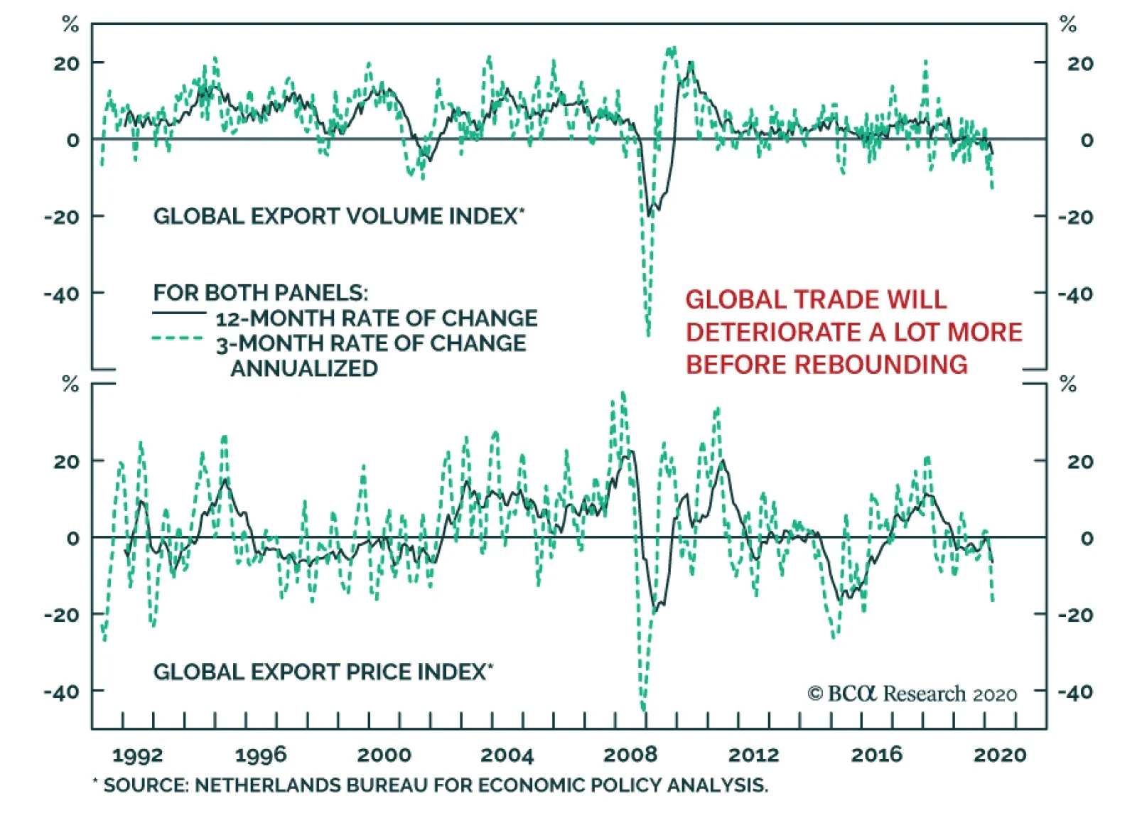
The global trade numbers published by the Netherlands Bureau Of Economic Policy Analysis paint an ugly picture. In March, global export volumes contracted by 13.88% on a 3-month annualized basis, the worst result since January 2009. Meanwhile, global export…
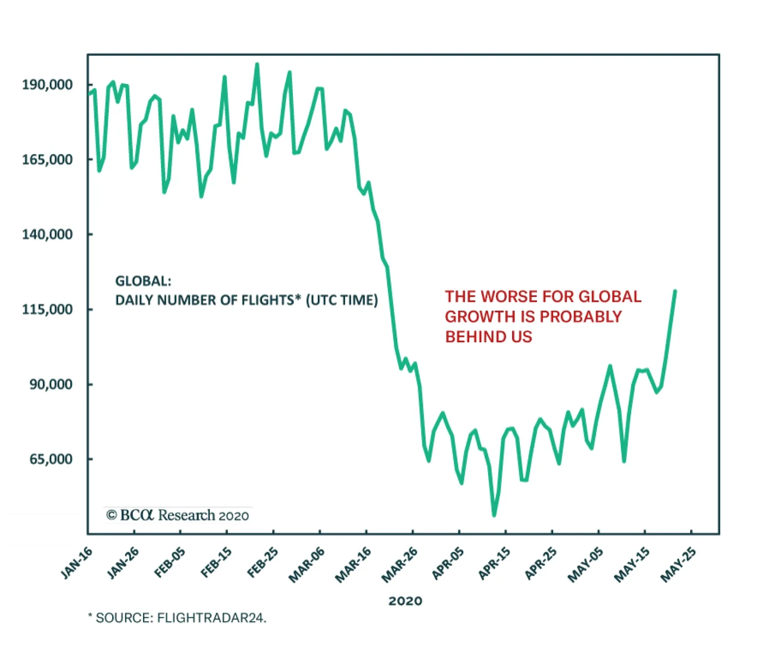
After collapsing by 71% between mid-February and early April, global flight numbers are once again increasing, rising 162% between April 12 and May 21. This improvement overstates the pick-up in the number of passengers as flights are running at a…
Feature The crisis surrounding COVID-19 eventually will pass and hopefully life gradually will return to some degree of normality. Even if it is not possible to completely eradicate the virus, we will have to learn to live with it, assuming effective treatments and vaccines become available. The alternative, that no treatments or vaccines will be developed, seems excessively gloomy. But that does not mean economic conditions will quickly return to pre-crisis levels. The severity of the current contraction guarantees that economies initially will see one or two quarters of very strong growth when businesses resume operations. However, it is hard to be positive about the pace of recovery beyond that initial spurt. The job losses have been horrendous, and they will not all be temporary. A University of Chicago study estimated that 42% of recent job layoffs will end up being permanent.1 Many businesses – especially small ones - may decide against reopening given the uncertainty about future revenue growth and/or the restrictions imposed by new physical distancing procedures. Many small businesses are financially fragile with the median company holding less than one month’s cash on hand.2 According to OpenTable, 25% of US restaurants will close permanently. Against this background, considerable fiscal stimulus will not deliver a strong recovery – it merely limits the severity of the downturn. Any short-term forecasts are highly speculative because so much depends on the path of infections. At the bullish end of the spectrum, perhaps the rate of infection will continue to ease in most major countries and a vaccine will become widely available before the end of the year. At the other extreme, the rate of infection could spike back up as economies reopen, leading to a more virulent second wave later this year. And if you want to be really bearish, the virus may mutate, preventing the development of an effective vaccine. After all, there is no vaccine against the common cold and the vaccine for the regular flu has not eradicated that virus. Opinions about the outlook are all over the map and the sad truth is that nobody really knows what will happen. It all underscores the huge challenges facing governments as they try to judge the appropriate pace of restarting economies, opening schools and relaxing social interactions. In this report, I want to look beyond the fog-shrouded near-term outlook and consider the extent to which there may be a lasting impact on economic trends. Specifically, I will focus on the implications of Covid-19 on long-run economic growth, inflation and monetary/fiscal policy. Will Potential Growth Be Infected? Over the long run, an economy expands at its potential rate which is dictated by the growth in the labor force and productivity. How will the Covid-19 crisis affect these trends in the years ahead? As is well known, declining birth rates have led to sharply slowing labor force growth in all the major economies and this trend will continue for at least the next 20 years (Chart 1). The loss of life due to the virus is tragic but is not large enough to have a major impact on population growth. Moreover, the most seriously affected age cohort – those 70 and above – generally are not in the labor force. But two other trends could affect labor force growth: a shift in participation rates and policies toward immigration. The participation rate measures the percentage of the population aged 16 and over that are employed or actively seeking work. In other words, it is the labor force as a percent of the working-age population, typically broken down into different age cohorts. The US participation rate has plunged as a result of recent unprecedented job losses (Chart 2). While it will spike up as the economy reopens, it is far from clear that it will quickly return to pre-crisis levels. Many job losses will be permanent leading to a rise in the number of discouraged workers who give up on seeking new employment. This would depress future labor force growth relative to its pre-crisis expected trend. Chart 1A Poor Demogrpahic Backdrop For Growth
A Poor Demogrpahic Backdrop For Growth
A Poor Demogrpahic Backdrop For Growth
Chart 2The US Labor Participation Rate
The US Labor Participation Rate
The US Labor Participation Rate
For many developed countries, immigration provides an important offset to the slow growth or even decline in domestic populations. For the US, projections from the UN imply that net migration will account for more than half of total population growth in the next decade, rising to almost two-thirds in the 2030s, assuming the net migration rate holds at its past rate of around three people per 1000 of population. Even before Covid-19, there was a growing backlash against high levels of immigration in the US and several European countries and this could now be reinforced. Thus, in a post-virus world, labor force growth could be slightly lower than previously projected in some areas. What about productivity, the more important driver of economic growth? Forced shutdowns have required businesses to adapt their operations to survive when revenues have evaporated. This undoubtedly has led to the discovery of several ways to boost efficiency and that should be a permanent change for the better. Moreover, there is now an added incentive to accelerate the adoption of labor-saving and productivity-enhancing artificial intelligence technologies. On the other hand, some changes will be negative for productivity. Factory closures in China clearly highlighted the downside of supply chains being dependent on a small number of distant providers. Companies in the west had increased sourcing from China and other emerging countries for a good reason: it saved a lot money and was thus good for productivity and profits. After all, productivity is all about delivering goods and services of the same or better quality at a lower unit cost. Chart 3Profit Margins Are Headed Lower
Profit Margins Are Headed Lower
Profit Margins Are Headed Lower
It seems inevitable that many companies will seek to establish more reliable supply chains and in some cases that will involve onshoring – i.e. bringing back production to home countries. This will bring advantages, but costs will be higher and profit margins correspondingly lower. Profit margins had already peaked from their unsustainably high level and further sharp declines are in prospect. (Chart 3). Globalization has been a very positive force for productivity and a reversal has the opposite effect. A second problem for future productivity is that the outlook for business investment has taken a turn for the worse. The severe damage to corporate balance sheets means that many companies will be less willing and able to embark on new capital spending initiatives. A reduced pace of capital spending will have a negative impact on future productivity growth. A third issue is that new safety protocols will introduce friction into the economic system, much in the way that the response to 9/11 made air travel a much more tedious business. If businesses must take measures to ensure greater physical distancing for both employees and customers, that implies an increased cost with little obvious benefit to efficiency. Finally, another legacy of the virus will be greater government involvement in the economy, something that is not conducive to increased productivity. And in many countries, there is likely to be a shift of resources into healthcare. That may be highly desirable from the perspective of social welfare but it implies fewer resources for other areas. Overall, the above discussion suggests that potential GDP growth in the developed economies will be negatively impacted by the Covid-19 crisis. It is hard to quantify the impact but even a modest reduction in annual growth can have large cumulative effects over time. Economies can grow above potential rates for a while if they are force-fed with rapid credit growth, but that era has passed. The shock of the economic and financial meltdown of 2007-09 was enough to end the love-affair with debt on the part of consumers in the US and many other countries. This is highlighted by the weakness in US mortgage demand in the past decade, despite record-low mortgage rates (Chart 4). At the end of 2019, mortgage applications were no higher than 20 years previously, despite a record-low unemployment rate and the 30-year mortgage rate falling from 8.5% to 3.5% over the period. While mortgage demand and thus household sector credit growth remained strong in the past decade in economies such as Canada, Australia and some European countries, the current crisis likely means that the Debt Supercycle finally has died in those places as well (Chart 5). Financial caution on the part of consumers and many businesses will push up private sector saving rates in the years ahead. Rising private sector saving rates will make it easier to finance large budget deficits but argue against a return to strong economic growth. Chart 4Weak US Mortgage Demand Despite Record Low Yields
Weak US Mortgage Demand Despite Record Low Yields
Weak US Mortgage Demand Despite Record Low Yields
Chart 5Household Debt: Peaked or Peaking
Household Debt: Peaked or Peaking
Household Debt: Peaked or Peaking
Inflation Or Deflation? Chart 6A Deflationary Shock
A Deflationary Shock
A Deflationary Shock
This is a controversial question. Clearly, the short-term picture is deflationary – one merely needs to look at the trend in oil and commodity prices (Chart 6). Large negative shocks to demand are by their nature deflationary. And when economies start to open again, many businesses – especially in discretionary areas such as travel and tourism – will be under pressure to offer large discounts to attract customers. And with double-digit unemployment rates, labor will not be in a strong bargaining position when it comes to wages. The bigger uncertainty relates to the longer-term outlook. On the one hand, a world of moderate rather than strong growth does not lend itself to serious inflationary pressures. On the other hand, there will be supply constraints in some areas that have the opposite effect. For example, a lasting decline in airline capacity could lead to upward pressure on airfares: the era of super-cheap air travel may well be over. And, as noted above, a retreat from globalization reverses one of the big drivers of low inflation during the past couple of decades. Even more importantly, there is the issue of monetary and fiscal policy. The policy response to Covid-19 dwarfs even the radical actions during the 2007-9 financial meltdown. Public sector debt levels have soared in response to stimulus spending and collapsing tax receipts and central banks have flooded the system with liquidity. These policy actions typically raise the alarm about a future inflation threat. Chart 7The US Monetary Transmission Process is Impaired
The US Monetary Transmission Process is Impaired
The US Monetary Transmission Process is Impaired
Current central bank actions are not inflationary. Previous rounds of quantitative easing (QE) did not lead to higher inflation because the “printed money” largely ended up in bank reserves, not the broader economy. In a post-Debt Supercycle world, easy money is no longer able to trigger a renewed credit boom, and in that sense, the money-credit transmission process is impaired. This is illustrated in Chart 7 by the collapse in the money multiplier (the ratio of broad to narrow money) and the downward trend in money velocity (the ratio of nominal GDP to broad money). QE was great for asset prices but it did not lead to a vibrant economy and rising inflationary pressures. And the same will be true this time around – at least in the next year or so. Central bank actions are keeping the economic shutdown from translating into a financial system shutdown and this is incredibly important. The inflation risks will come later. The current generation of central bankers have been in office during a period of recurring economic shocks and a persistent undershoot of inflation relative to target. When this goes on for long enough, it is sure to affect the perceived balance of risks. In other words, if the bigger threat is believed to be weak growth rather than inflation, then that will encourage policymakers to err on the side of ease, raising the odds that inflation will at some point surprise on the upside. Chart 8Markets Are Not Priced For Higher Long-Run Inflaton
Markets Are Not Priced For Higher Long-Run Inflaton
Markets Are Not Priced For Higher Long-Run Inflaton
It is easy to see why the authorities may not be overly concerned with a period of higher inflation. It could be justified as an offset to the many years where inflation ran below desired levels. And it would help lower the burden of bloated government debt. And central banks could thwart a revolt by bond vigilantes against inflation by buying up any bonds the private sector was not willing to purchase. A return to a 1970s world of rampant inflation is not in prospect. Back then, policy complacency was accompanied by a formidable combination of strong labor unions, buoyant commodity prices, poor corporate productivity and embedded inflation expectations on the part of both business managers and workers. Those conditions no longer exist and are unlikely to re-emerge to any significant degree. Thus, we are not headed for double-digit inflation. But inflation could well get back into the 4% to 5% range in a few years’ time. And the markets are not priced for this with 5-year CPI swap rates at 0.8%, and 10-year swap rates at 1.3% (Chart 8). Policy At The Extremes We are in the midst of an extraordinary surge in government deficits and debt. The age-old concern that large fiscal deficits lead to higher interest rates and thus crowd out private investment is not applicable in the current environment. Central bank policies of QE and anchoring short rates at zero, along with investor demand for safe assets, are keeping bond yields at historically low levels. And none of that will change any time soon. Nevertheless, fiscal trends do matter. Economies eventually will recover and it will not be appropriate for central banks to keep interest rates at zero indefinitely. As interest rates rise, public sector debt arithmetic will turn uglier. This will leave the authorities with tough choices as the growing cost of debt servicing will eat into the revenues available for other spending programs. And this will occur when deficits will already be under persistent upward pressure from rising pension and health-care costs of an aging population. The direct impact of fiscal policy on economic growth reflects the changes in budget deficits, not their levels. Thus, for policy to remain stimulative, underlying deficits would have to keep rising as a share of GDP. That does not seem likely once economies stabilize and governments scale back current relief programs. For example, the latest IMF projections show general government deficits as a share of GDP for the G7 economies rising from 3.8% in 2019 to 12% in 2020, then falling back to 6.2% in 2021. Those swings partly reflect the cyclical impact of recession and recovery on revenues and spending, rather than discretionary changes in policy. In other words, the move in the cyclically-adjusted deficit would be less extreme. Nonetheless, it highlights that in the absence of continued new stimulus measures, fiscal policy will become more restrictive. Given the prospect of a moderate recovery, fiscal imbalances will not diminish quickly. Meanwhile, there will be pressure for increased spending on health care and transfers to financially-strapped regional/local governments. And there is talk in some countries of the need to create a basic income program for all households. That would be a hugely expensive project, even allowing for offsetting changes to tax systems. On the subject of taxes, it is inevitable that rates will have to increase given budget constraints and the need to fund high levels of spending. The bottom line is that the current environment of fiscal profligacy cannot persist. In the heat of the pandemic and economic shutdown there is no limit on what governments are prepared to do. And the markets are not providing any constraints on policymakers. After things calm down, the harsh reality of unprecedented public debt burdens eventually will prove a huge challenge to the authorities. Advocates of Modern Monetary Theory (MMT) are not overly concerned about this because they believe central banks can finance any amount of public deficits with no adverse impact on the economy. But there is a caveat: this is sustainable only for as long as inflation stays under control. If inflation rises, then even MMT argues for fiscal discipline. How will it all play out? There is no chance that developed economies will be able to grow out of their public debt problems and we should rule out explicit default. And there will not be any stomach for the degree of austerity that would be required to bring deficits back to reasonable levels. That leaves monetization as the likely end point. And that implies monetary policy being kept easier than economic conditions warrant, leading eventually to higher inflation. The Short Run Trumps The Long Run, But… This report has speculated about some of the long-run implications of the current environment. Those hardly seem to matter during a crisis and the associated massive uncertainty about what will happen economically, politically, financially and socially over the coming year. Never has Keynes’ dictum “In the long run we are all dead” seemed more apposite. Worries about long-term trends in inflation and/or public debt seem misplaced relative to more immediate concerns. In terms of a well-used analogy, if a building is on fire, the imperative is to put out the flames. The problems caused by water damage can be dealt with later because otherwise, there may not be any building left to repair. Nevertheless, investment decisions should not focus exclusively on the short run – especially when the range of possible outcomes is so vast. The 37 years from end-1982 to end-2019 were an extraordinary period for investors with total returns from global equities compounding at 10.3% a year and long-term bonds not far behind. And this was despite two vicious equity bear markets with the world index dropping by more than 50% between March 2000 and October 2002 and again between October 2007 and March 2009. There is no other comparable 37-year period in history where both bonds and stocks have delivered such strong returns. The key was a very favorable starting point: both equities and bonds were very cheap in late 1982 with the world index trading at around 10 times earnings and 10-year Treasurys offering a real yield of around 7%. We currently have very different valuations. The price-earnings ratio for world equities currently is more than 17 and real bond yields are negative. These are not good starting points for potential long-run returns. With nominal yields below 1%, bond returns will be minimal over the next decade. Stocks should do better given that the dividend yield is above bond yields, but returns will be very modest by historical standards (see Table 1). Table 110-Year Asset Return Projections
Beyond The Virus
Beyond The Virus
Concluding Thoughts Much is being written about how Covid-19 will affect the way economies operate in future and how we will all be forced to conduct our lives. Many believe that the virus is a major game changer with some of the changes that have resulted from the crisis becoming a permanent feature. Of course, it is all highly speculative. I am skeptical that there will be lasting major changes in social behavior. People tend to have short memories and, with the critical assumption that vaccines and treatments become available, I expect that we will return to our old habits. People will go back on cruises, pack into bars and restaurants and attend large sporting and cultural events. In other words, life will go on much as before. But the virus will lead to some economic and political effects, both good and bad. On the bad side, the path to economic recovery will be rocky and long-run growth is likely to be negatively affected. And current extreme actions will leave future monetary and fiscal policy massively constrained in dealing with a world of sluggish growth. Meanwhile, inflation could eventually become a problem and the drift toward economic and political nationalism will be reinforced. On a more positive note, businesses are finding new ways to boost efficiency and maybe there will be progress in reducing extreme levels of inequality. We are all in the unfortunate position of being bystanders to an ongoing crisis. There are no compelling historical precedents to light the way forward and every government is struggling to find the right balance between reviving economic activity and preserving lives. In the face of such massive uncertainty, it makes sense to adopt a cautious near-term investment strategy. Hopes that risk assets can be supported solely by hyper-easy monetary policies seem very complacent in my view. The strong bounce in equity prices from their March lows suggests that this is not a bad time to de-risk portfolios. Martin H. Barnes, Senior Vice President Chief Economist mbarnes@bcaresearch.com Footnotes 1 Jose Maria Barrero, Nick Bloom, and Steven J. Davis, "COVID-19 Is Also a Reallocation Shock," Beker Friedman Institute, May 5, 2020. 2 Alexander W. Bartik, Marianne Bertrand, Zoë B. Cullen, Edward L. Glaeser, Michael Luca, Christopher T. Stanton, "How are Small Businesses Adjusting to Covid-19? Early Evidence From A Survey," NBER Working Paper 26989, April 2020.
Highlights Higher OPEC 2.0 production in 2H20 – likely beginning in 3Q20 – will be required to keep Brent prices below $50/bbl going into the US presidential elections, which arguably is the primary driver of prices in the 2020 post-COVID-19 recovery. Larger-than-expected OPEC 2.0 production cuts announced this month will force deeper inventory draws beginning in 3Q20. The re-opening of global economies and promising vaccine developments notwithstanding, we continue to expect an 8mm b/d hit to oil consumption this year, followed by an 8mm b/d recovery in demand next year. Brent prices likely will trade slightly higher than we forecast last month – $40/bbl this year, on average, vs. a $39/bbl forecast last month, and $68/bbl next year, $3/bbl above April’s forecast. We expect WTI to trade $2 - $4/bbl below Brent (Chart of the Week). Two-way price risk is high: The likelihood demand will surprise to the upside cannot be ignored, but it could collapse with a second COVID-19 wave forcing lockdowns again. On the supply side, the hurricane season is off to an early start in the US, with the first tropical storm, Arthur, named this week. Feature Chart of the WeekOil-Price Recovery In 2H20, 2021
Oil-Price Recovery In 2H20, 2021
Oil-Price Recovery In 2H20, 2021
Chart 2OPEC 2.0 Delivers Massive Production Cuts
OPEC 2.0 Delivers Massive Production Cuts
OPEC 2.0 Delivers Massive Production Cuts
Political considerations – i.e., keeping crude oil prices below $50/bbl so as not to spike gasoline prices going into the US presidential elections – will drive the evolution of crude oil prices. The big driver of oil prices over the short term is what we know with the least uncertainty. Right now, that’s what's happening on the supply side over the next couple of months. Slightly further out – as November approaches, to be precise – the political economy of oil once again will dominate fundamentals. Political considerations – i.e., keeping crude oil prices below $50/bbl so as not to spike gasoline prices going into the US presidential elections – will drive the evolution of crude oil prices. That is why, we believe, the massive voluntary cuts announced by the Kingdom of Saudi Arabia (KSA) and its Gulf allies earlier this month – amounting to ~ 1.2mm b/d of cuts in addition to those agreed by OPEC 2.0 in April – are so important: The global inventory overhang produced by the COVID-19 pandemic, and the short-lived market-share war launched by Russia in March, has to be unwound as quickly as possible, before the US presidential elections kick into high gear. Holding to the schedule agreed in April would drain inventories, but not fast enough by September to prevent further distress for OPEC 2.0 member states as the year winds down.1 By then, additional cuts would be highly problematic, given US President Donald Trump almost surely will be demanding higher OPEC production to keep gasoline prices down as voters go to the polls in November. KSA announced plans to reduce production by ~ 4.5mm b/d vs. its April level of 12mm b/d starting in June, taking its output to ~ 7.5mm b/d. This cut is 1mm b/d more than what it agreed to last month to balance the oil market. The UAE and Kuwait also voluntarily added cuts of 100k and 80k b/d, respectively, to their agreed quotas. Production cuts by OPEC 2.0 as a whole – led by KSA and Russia – begun in May and extending at least to the end of June will amount to ~ 9mm b/d, or close to 9% of global production (Chart 2). Chart 3US Shale-Oil Output Cuts...
US Politics Will Drive 2H20 Oil Prices
US Politics Will Drive 2H20 Oil Prices
Outside of the OPEC 2.0 production cuts, we expect US shale-oil output to fall sharply – down ~ 2mm b/d this year from its peak in December, 2019 (Chart 3). The shale-oil supply destruction will lead total US production down by 600k b/d y/y in 2020 (Chart 4). US production losses will account for the largest share of non-OPEC production losses globally. Along with losses from Canada, Brazil and Norway in the wake of the COVID-19 demand destruction, we expect global oil production to fall 12mm b/d y/y by the end of June. Chart 4... Lead US Production Sharply Lower
... Lead US Production Sharply Lower
... Lead US Production Sharply Lower
Demand Could Come Back Stronger For the year as a whole, we are leaving our expected demand loss at 8mm b/d, with most of that loss occurring in 1H20. That said, demand could revive sooner than expected, if the anecdotal reports of stronger-than-expected recovery in China prove out – the level of demand there is believed to be close to 13mm b/d in May, after falling to ~ 11.25mm b/d in February and March.2 Kayrros, the oil-inventory tracking service, noted its satellite imagery indicates, “Oil demand losses appear far lower than the prevailing view in April. Measured crude oil builds are wholly inconsistent with prevailing views of a collapse in oil demand of nearly Biblical proportions.” Furthermore, “By early May, there were clear signs of robust recovery in Asian crude demand as well as earlier-stage recovery in US end-user product demand. In addition, steep, swift supply cuts helped rebalance the market, leading to surprisingly deep inventory draws. But demand had never plunged as low as widely believed in the first place.”3 Our estimate of oil-demand destruction is less than that of the major data-reporting agencies. If this performance is repeated globally in EM economies – the historical growth engine of commodity demand – markets could tighten faster than we expect (Chart 5). Our estimate of oil-demand destruction is less than that of the major data-reporting agencies. In their May updates, EIA expects 2020 demand to fall 8.1mm b/d y/y in 2020, vs. 5.2mm b/d last month; OPEC sees demand falling 9.1mm b/d y/y, vs. 6.9mm b/d last month; and the IEA has it at 8.6mm b/d y/y, vs. 9.3mm b/d last month. Chart 5EM Demand Could Revive Quickly
EM Demand Could Revive Quickly
EM Demand Could Revive Quickly
Chart 6Massive Fiscal and Monetary Stimulus Will Boost Aggregate Demand Globally
US Politics Will Drive 2H20 Oil Prices
US Politics Will Drive 2H20 Oil Prices
By next year, we expect global demand will rise 8mm b/d y/y, driven by the massive monetary and fiscal stimulus that will continue to boost aggregate demand higher (Chart 6). In 2H20, we see demand recovering as flowing supplies fall (Chart 7), forcing onshore inventories to draw sharply in 2H20 and into 2021 (Chart 8), as well as floating storage (Chart 9). In addition, This will flatten the forward Brent and WTI curves in 2H20, and backwardate them next year, as storage draws continue (Chart 10). Chart 7Oil Supply Falls, Demand Rises ...
Oil Supply Falls, Demand Rises ...
Oil Supply Falls, Demand Rises ...
Chart 8... Onshore Inventories Draw More Than Expected
... Onshore Inventories Draw More Than Expected
... Onshore Inventories Draw More Than Expected
Chart 9Expect Floating Storage To Empty Rapidly
US Politics Will Drive 2H20 Oil Prices
US Politics Will Drive 2H20 Oil Prices
Chart 10Falling Storage Levels Will Push Forward Curves Into Backwardation
Falling Storage Levels Will Push Forward Curves Into Backwardation
Falling Storage Levels Will Push Forward Curves Into Backwardation
Political Economy Drives Price Evolution The risk of higher gasoline prices as crude marches higher this summer is a risk President Trump already has shown he will not countenance. Following the massive production cuts being implemented this month and next by OPEC 2.0 and the large involuntary output losses outside the coalition, there is a risk prices could rise rapidly in 2H20. The fairly high likelihood demand surprises to the upside in 2H20 cannot be ignored, which would further fuel a price spike. This is a combustible political mix. The risk of higher gasoline prices as crude marches higher this summer is a risk President Trump already has shown he will not countenance, particularly not as an election looms. With this in mind, we iterated on the production required to keep Brent prices below $50/bbl in 2020 in our modeling, consistent with our view of the political economy considerations US elections impose (Table 1). Any additional volumes needed to keep Brent below $50/bbl can be returned to market fairly quickly out of OPEC 2.0 spare capacity. Table 1BCA Global Oil Supply - Demand Balances (MMb/d, Base Case Balances)
US Politics Will Drive 2H20 Oil Prices
US Politics Will Drive 2H20 Oil Prices
OPEC 2.0’s production cuts have sharply increased the group’s spare capacity to ~ 6.5mm b/d – 5.5mm b/d in OPEC and close to 1mm b/d in Russia and its allies – which means these states will be capable of modulating production quickly and with fairly high precision. The Return Of OPEC 2.0 Production Discipline The budgets of the OPEC 2.0 states have endured massive hits, which can only be repaired by higher oil-export revenues, given their dependence oil sales. After the US elections, OPEC 2.0 production discipline will have to be revived, given the massive fiscal constraints these states are facing. The budgets of the OPEC 2.0 states have endured massive hits, which can only be repaired by higher oil-export revenues, given their dependence oil sales. KSA will want to manage the rate at which prices increase, so that prices rise while global markets are awash in fiscal and monetary stimulus. We believe Russia will acquiesce on this point – i.e., it will not reprise its role as a price dove arguing for lower prices against KSA’s desire for higher prices – given the damage done to its economy from the price collapse in 1H20. That said, taking inventories from historically high levels back down to their 2010-14 average levels – the storage target pursued by OPEC 2.0 prior to the COVID-19-induced price collapse – likely will keep price volatility elevated (Chart 11). An upside demand surprise while production is being aggressively curtailed could sharply raise prices. Indeed, in our modeling of 2021 prices, we again iterated on production to keep Brent prices below $80/bbl, which we believe is the level both KSA and Russia can agree on for the short term. We also believe that the massive fiscal and monetary stimulus sloshing through EM and DM economies will make such prices bearable, provided they are not the result of a supply-side shock. Chart 11Oil Price Volatility Will Remain Elevated
Oil Price Volatility Will Remain Elevated
Oil Price Volatility Will Remain Elevated
The level of uncertainty in the oil markets remains extraordinarily high. Bottom Line: Our price forecasts are premised on a resumption in global growth in 2H20 that lifts crude oil demand, and sharper-than-expected voluntary and involuntary production cuts taking supply significantly lower over the balance of the year and into next year. As the volatility chart above shows, however, the level of uncertainty in the oil markets remains extraordinarily high: A demand surprise to the upside cannot be ignored, but it also could collapse again with a second COVID-19 wave forcing another round of lockdowns. On the supply side, Tropical Storm Arthur launched the hurricane season weeks ahead of schedule. This elevates supply risk in the US Gulf until the end of November, when the season ends. We expect 2020 Brent prices to average $40/bbl and 2021 prices to average $68/bbl. WTI will trade $2-$4/bbl lower. Two-way risk – upside and downside – abounds. Robert P. Ryan Chief Commodity & Energy Strategist rryan@bcaresearch.com Hugo Bélanger Associate Editor Commodity & Energy Strategy HugoB@bcaresearch.com Commodities Round-Up Energy: Overweight OPEC's May Monthly Oil Market Report noted Iraq failed to raise crude oil output in April amid the market-share war instigated by Russia’s refusal to back additional production cuts at OPEC 2.0’s March meeting. Saudi Arabia, Kuwait, and UAE managed to move their production up by 2.2mm b/d, 2.2mm b/d, and 330k, respectively. In our global oil balances, we assume Iraq will increase production along with core-OPEC 2.0 countries to balance oil markets once demand rebounds later this year. However, its declining production last month could signal Iraq’s ability to increase production is limited and that it will struggle to meet its increasing quota in 4Q20 and 2021. Base Metals: Neutral China’s policy-driven economic recovery continues. Last week’s data release provided evidence of a rebound in the manufacturing, infrastructure, and construction sectors (Chart 12). This will continue to support base metals – primarily copper and aluminum. Precious Metals: Neutral Chairman Powell’s comment that there is “no limit” to what the Fed can do with its emergency lending facilities supports our view that US real rates will remain depressed as inflation expectations move up ahead of nominal rates. Gold and silver are up 2% and 14% since last Tuesday. We believe silver slightly below its equilibrium price vs. gold and industrial metals (Chart 13). Silver could continue to temporarily outpace gold as it moves to equilibrium. Ags/Softs: Underweight US corn planting for the 2020/2021 season is approaching the finish line, with 80% of the crop in the ground so far, as reported by the USDA on Monday. Although this figure was up 13 percentage points since last week, it didn’t meet analysts’ expectations of 82% to 84%, which provided support for corn prices. Furthermore, this week’s sharp rebound in oil prices also was positive for corn, which gained ¢2/bu since the beginning of the week. Chart 12Chinese Investment Tailwind for Base Metals
Chinese Investment Tailwind for Base Metals
Chinese Investment Tailwind for Base Metals
Chart 13Silver Could Temporarily Outpace Gold
Silver Could Temporarily Outpace Gold
Silver Could Temporarily Outpace Gold
Footnotes 1 Please see US Storage Tightens, Pushing WTI Lower, our forecast published last month on April 16, 2020, which discussed the production cuts agreed by OPEC 2.0 in April. It is available at ces.bcaresearch.com. 2 Please see Oil highest since March as Chinese demand reaches 13 MMbpd published May 18, 2020, by worldoil.com. 3 Please see Reassessing the Oil Demand Impact of COVID-19 published by Kayrros on medium.com May 19, 2020. Investment Views and Themes Recommendations Strategic Recommendations Tactical Trades Trade Recommendation Performance In 2020 Q1
US Politics Will Drive 2H20 Oil Prices
US Politics Will Drive 2H20 Oil Prices
Commodity Prices and Plays Reference Table Trades Closed in 2020 Summary of Closed Trades
US Politics Will Drive 2H20 Oil Prices
US Politics Will Drive 2H20 Oil Prices
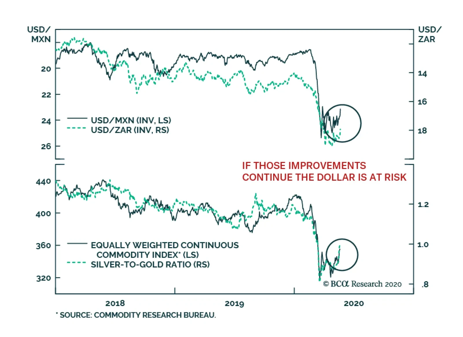
Some corners of the market are starting to send strong signals that sentiment towards global growth is improving. EM currencies, especially outside of northern Asia, have begun to rebound and may be breaking out. The moves in the MXN and the ZAR are…
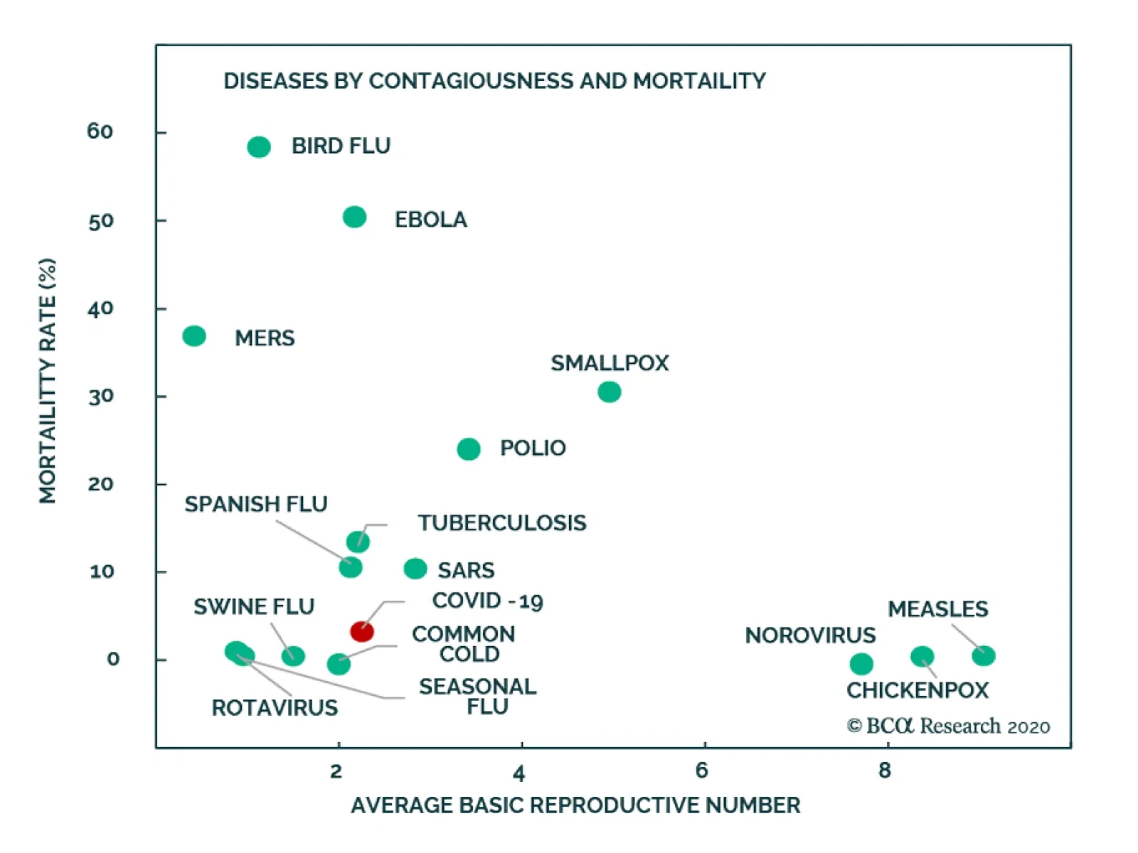
Yesterday, BCA Research's Global Asset Allocation service analyzed the lessons learned from the 1918/19 Spanish Flu pandemic. Today’s economy is very different from that of 100 years ago. Many countries then were in the middle of World War I (which ended…
What Can 1918/1919 Teach Us About COVID-19? “Those who cannot remember the past are condemned to repeat it” George Santayana – 1905 Chart 1Coronavirus: As Contagious But Not As Deadly As Spanish Flu
Lessons From The Spanish Flu
Lessons From The Spanish Flu
Today’s economy is very different to that of 100 years ago. Many countries then were in the middle of World War I (which ended in November 1918). The characteristics of the Spanish Flu which struck the world in 1918 and 1919 were also different to this year’s pandemic. COVID-19 is almost as contagious as the Spanish Flu, but it is much less deadly (Chart 1). Healthcare systems and treatments today are far more advanced than those of a century ago: many people who caught Spanish flu died of complications caused by bacterial pneumonia, given the absence of antibiotics. Influenza viruses tend to mutate rapidly: the influenza virus in 1918 first mutated to become far more virulent in its second wave, and then to become much milder. Coronaviruses have a “proofreading” capacity and mutate less easily.1 Nevertheless, an analysis of the pandemic of 100 years ago provides a number of insights into the current crisis, particularly now that policymakers are easing social-distancing rules to help the economy, even at the risk of more cases and deaths. Among the lessons of 1918-1919: Non-pharmaceutical interventions (NPIs) do lower mortality rates. The speed at which NPIs are implemented and the period of implementation are as important as the number of measures taken. Removing or relaxing measures too early can lead to a renewed rise in mortality rates. It is hard to compare current fiscal and monetary policies to those taken during the 1918 pandemic, since policy in both areas was already easy before the pandemic as a result of the world war. However, a severe pandemic would certainly call for a wartime-like fiscal and monetary response. The economy was negatively impacted by the pandemic in 1918-19 but, despite the shock to industrial activity and employment, the economy subsequently rebounded quickly, in a V-shaped recovery. Introduction Predicting how the economy will react to the COVID-19 pandemic is hard. Governments and policymakers face multiple uncertainties: How effective are different containment measures? Will cases and deaths rebound quickly if lockdown measures are eased? When will the coronavirus disappear? When will a vaccine be ready? With an event unprecedented in the experience of anyone alive today, perhaps there are some lessons to be learned from history. For this Special Report, we attempt to draw some parallels between the current situation and the 1918-19 Spanish flu. We focus on the different containment efforts implemented, the role that fiscal and monetary policies played, the impact on markets and the economy, and whether history can throw any light on how the COVID-19 crisis might pan out. The 1918 Spanish Flu Chart 2The Spanish Flu Hit The World In Three Waves
The Spanish Flu Hit The World In Three Waves
The Spanish Flu Hit The World In Three Waves
The 1918 influenza pandemic was the most lethal in modern history. Soldiers returning from World War I helped spread the pandemic across the globe. The first recorded case is believed to have been in an army camp in Kansas. While there is no official count, researchers estimate that about 500 million people contracted the virus globally, with a mortality rate of between 5% and 10%. The pandemic occurred over three waves in 1918 and 1919 – the first in the spring of 1918, the second (and most deadly) in the fall of 1918, and the third in spring 1919 (Chart 2). In the US alone, official data estimate that around 500,000 deaths (or over 25% of all deaths) in 1918 and 1919 were caused by pneumonia and influenza.2 The pandemic moved swiftly to Europe and reached Asia by mid-1918, but became more lethal only towards the end of the year (Map 1).3 Map 1The Spread Of Influenza Through Europe
Lessons From The Spanish Flu
Lessons From The Spanish Flu
Initially, scientists were puzzled by the origin of the influenza and its biology. It was not until a decade later, in the early 1930s, that Richard Shope isolated the particular influenza virus from infected pigs, confirming that a virus caused the Spanish Flu, not a bacterium as most had thought. Many of those who caught this strain of influenza died as a result of their lungs filling with fluid in a severe form of pneumonia. In reporting death rates, then, it is considered best practice to include deaths from both influenza and pneumonia. The first wave had almost all the hallmarks of a seasonal flu, albeit of a highly contagious strain. Symptoms were similar and mortality rates were only slightly higher than a normal influenza. The first wave went largely unnoticed given that deaths from pneumonia were common then. US public health reports show that the disease received little attention until it reappeared in a more severe form in Boston in September 1918.4 Most countries did not begin investigating and reporting cases until the second wave was underway (Chart 3). Chart 3Most Countries Began Reporting Only When The Second Wave Hit
Lessons From The Spanish Flu
Lessons From The Spanish Flu
This second wave – which was more lethal because the virus had mutated – had a unique characteristic. Unlike the typical influenza mortality curve – which is usually “U” shaped, affecting mainly the very young and elderly – the 1918 influenza strain had a “W”-shaped mortality curve – impacting young adults as well as old people (Chart 4). This pattern was evident in all three waves, but most pronounced during the second wave. The reason for this was that the infection caused by the influenza became hyperactive, producing a “cytokine storm” – when mediators secreted from the immune system result in severe inflammation.5 Simply put, as the virus became virulent, the body’s immune system overworked to fight it. Younger people, with strong immune systems, suffered most from this phenomenon. Chart 4A Unique Characteristic: Impacting Younger Adults
Lessons From The Spanish Flu
Lessons From The Spanish Flu
By the summer of 1919, the pandemic was over, since those who had been infected had either died or recovered, therefore developing immunity. The lack of records makes it difficult to assess if “herd immunity” was achieved. However, some historical accounts and research – particularly for army groups in the US and the UK – suggest that those exposed to the disease in the first mild wave were not affected during the second more severe wave.6 The failure to define the causative pathogen at the time made development of a vaccine impossible. Nevertheless, some treatments and remedies showed modest success. These varied from using a serum – obtained from people who had recovered, who therefore had antibodies against the disease – to simple symptomatic drugs and various oils and herbs. The Effectiveness Of Non-Pharmaceutical Interventions (NPIs) What we today call “social distancing” showed positive effects during the 1918-19 pandemic. These included measures very similar to those applied today: school closures, isolation and quarantines, bans on some sorts of public gatherings, and more. However, there were few travel bans. The number of passengers carried during the months of the pandemic did noticeably decline though (Chart 5). Chart 5Travel Slowed...Just Not Enough
Travel Slowed...Just Not Enough
Travel Slowed...Just Not Enough
Table 1, based on research by Hatchett, Mecher and Lipsitch, breaks down NPIs by type for 17 major US cities. Most cities implemented a wide range of interventions. But it was not only the type of NPIs implemented that made a difference, but also the speed and length of implementation. Table 1Measures Applied Then Are Very Similar To Those Applied Today
Lessons From The Spanish Flu
Lessons From The Spanish Flu
Further research by Markel, Lipman and Navarro based on 43 US cities shows that the median number of days between the first reported influenza case and the first NPI implementation was over two weeks. The median period during which various NPIs were implemented was about six weeks (Table 2). Table 2NPIs Were Implemented Only For Short Periods
Lessons From The Spanish Flu
Lessons From The Spanish Flu
Markel, Lipman and Navarro's findings show that a rapid public-health response was an important factor in reducing the mortality rate by slowing the rate of infection, what we now refer to as “flattening the curve.” There were major differences in cities’ policies: both the speed at which they implement NPIs, and the length of the implementation period. Chart 6 shows that: Cities that acted quickly to implement NPIs slowed the rate of infections and deaths (Chart 6, panel 1) Cities that acted quickly had lower mortality rates from influenza and pneumonia (Chart 6, panel 2) Cities that implemented NPIs for longer periods had fewer deaths (Chart 6, panel 3) Chart 7 quantifies the number of NPIs taken, the time it took to implement the measures, and the length of NPIs to gauge policy strictness. Cities with stricter enforcement had lower death rates than those with laxer measures. Chart 6Fast Response And Longer Implementation Led To Fewer Deaths...
Lessons From The Spanish Flu
Lessons From The Spanish Flu
Chart 7...So Did Policy Strictness
Lessons From The Spanish Flu
Lessons From The Spanish Flu
For example, Kansas City, less than a week after its first reported case, had implemented quarantine and isolation measures. By the second week, schools, churches, and other entertainment facilities closed. Schools reopened a month later (in early November) but quickly shut again until early January 1919. While we do not have definitive dates on when each NPI was lifted, some sort of protective measures in Kansas City were in place for almost 170 days. By contrast, Philadelphia, one of the cities hardest hit by Spanish Flu, took more than a month to implement any measures. Its tardiness meant that it reached a peak mortality rate much more quickly: in 13 days compared to 31 days for Kansas City. Even after the first reported case, the Liberty Loans Parade was still held on September 28, 1918 – with the knowledge that hundreds of thousands of spectators might be vulnerable to infection.7,8 It was not until a few days later that institutions were closed and a ban on public gatherings was imposed. Many other cities also held a Liberty Loans Parade, including Pittsburgh and Washington DC, but Philadelphia’s was the deadliest. Studies also show that relaxing interventions too early could be as damaging as implementing them too late. St. Louis, for example, was quick to lift restrictions and suffered particularly badly in the second wave as a result. It later reinstated NPIs up until end of February 1919. Other cities that eased restrictions too early (San Francisco and Minneapolis, for example) also suffered from a second swift, albeit milder, increase in weekly excess death rates from pneumonia and influenza (Chart 8). Chart 8Relaxing Lockdown Measures Too Early Can Lead To A Second Rise In Deaths...
Lessons From The Spanish Flu
Lessons From The Spanish Flu
Chart 9...And So Can Highly Effective Measures
Lessons From The Spanish Flu
Lessons From The Spanish Flu
Of course, NPIs cannot be implemented indefinitely. A recent research paper by Bootsma and Ferguson raises the point that suppressing a pandemic may not be the best strategy because it just leaves some people susceptible to infection later. They argue that highly effective social distancing measures, which allow a susceptible pool of people to reintegrate into society when the measures are lifted, are likely to lead to a resurgence in infections and fatalities in a second peak (Chart 9).9 They suggest an optimal level of control measures to reduce R (the infection rate) to a value that makes a significant portion of the population immune once measures are lifted. The Impact Of The Spanish Flu On The Economy And Markets How did the Spanish Flu pandemic affect the economy? Many pandemic researchers ignore the official recession identified by the NBER during the months of the pandemic (between August 1918 and March 1919).10 The reason is that most of the evidence indicates that the economic effects of the 1918-19 pandemic were short-term and relatively mild.11 Disentangling drivers of the economy is, indeed, tricky given that WW1 ended in November 1918. However, it is easy to underestimate the negative impact of the pandemic since the war had such a big impact on the economy, as well as investor and public sentiment. Various research papers support the fact that, while the pandemic did indeed have an adverse effect on the economy, NPIs did not just depress mortality rates, but also sped the post-pandemic economic recovery.12 Research by Correia, Sergio, and Luck showed that the areas most severely affected by the pandemic saw a sharp and persistent decline in real economic activity, whereas cities that intervened earlier and more aggressively, experienced a relative increase in economic activity post the pandemic.13 Their findings are based on the increase in manufacturing employment after the pandemic compared to before it (1919 versus 1914). However, note that the rise of manufacturing payrolls in 1919 was high everywhere given the return of soldiers post-WWI. The researchers also note that those cities hardest hit by the pandemic also saw a negative impact on manufacturing activity, the stock of durable goods, and bank assets. Because Spanish flu disproportionately killed younger adults, many families lost their breadwinner. In economic terms, this implies both a negative supply shock and negative demand shock. If fewer employees are available to produce a certain good, supply will fall. The same reduction in employment also implies reduced income and therefore lower purchasing power. Both cases will result in a decrease in output. However, the change in prices depends on the decline of supply relative to demand. In 1918-19, the impact was disinflationary: demand declined by more than supply, and both spending and consumer prices fell during the pandemic (Chart 10). Chart 10Short-Term Price Impact Was Disinflationary
Short-Term Price Impact Was Disinflationary
Short-Term Price Impact Was Disinflationary
US factory employment fell by over 8% between March 1918 and March 1919 – the period from the beginning of the first wave until the end of the second wave. It is important to note, however, that few businesses went bankrupt during the pandemic years (Chart 11). Additionally, the November 1918 Federal Reserve Bulletin highlighted that many cities, including New York, Kansas City, and Richmond, experienced a shortage of labor due to the influenza.14 Factory employment in New York fell by over 10% during this period. Chart 11Loss Of Middle-Aged Adults = Loss Of Breadwinners
Loss Of Middle-Aged Adults = Loss Of Breadwinners
Loss Of Middle-Aged Adults = Loss Of Breadwinners
The link between the labor shortages and the decline in industrial production is unclear. Industrial activity in the US peaked just before the second wave, contracting by over 20% during the second wave (Chart 12). Various industries reported disruptions: automobile production fell by 67%, anthracite coal production and shipments fell by around 45%, and railroad freight revenues declined by over seven billion ton-miles (Chart 12, panels 2, 3 & 4). However, some of this decline is attributed to falling defense production after the war. Chart 12Activity Slowed, But Rebounded Quickly
Activity Slowed, But Rebounded Quickly
Activity Slowed, But Rebounded Quickly
Chart 13The War Had A Bigger Impact On The Stock Market Than The Pandemic
The War Had A Bigger Impact On The Stock Market Than The Pandemic
The War Had A Bigger Impact On The Stock Market Than The Pandemic
The equity market moved in a broad range in 1915-1919 and fell sharply only ahead of the 1920 recession (Chart 13). Seemingly, stock market participants were more focused on the war than the pandemic. The lack of reporting of the pandemic could have contributed to this: newspapers were encouraged to avoid carrying bad news for reasons of patriotism and did not widely cover the pandemic until late 1918.15 Chart 14Monetary Policy Was Easy...Even Before The Pandemic Started
Monetary Policy Was Easy...Even Before The Pandemic Started
Monetary Policy Was Easy...Even Before The Pandemic Started
The Federal Reserve played an active role in funding the government’s spending on the war, and so monetary policy was very easy during the pandemic – but for other reasons. The Fed used its position as a lender to the banking system to facilitate war bond sales.16 Interest rates were cut in 1914 and 1915 even before the US entered the war. The US economy had been in recession between January 1913 and December 1914. Policy rates remained low throughout 1916 and 1917 and slightly rose in 1918 and 1919. It was not until 1920 that Federal Reserve Bank System tightened policy rapidly to choke off inflation, which accelerated to over 20% in mid-1920 – rising inflation being a common post-war phenomenon (Chart 14). The Lessons Of 1918-19 For The Coronavirus Pandemic Non-pharmaceutical interventions should continue to be implemented until a vaccine, effective therapeutic drugs, or mass testing is available. Relaxing measures prematurely is as damaging as a tardy reaction to the pandemic. Reacting quickly and imposing multiple measures for longer periods not only reduces mortality rates, but also improves economic outcomes post-crisis. The economy suffers in the short-term: supply and demand shocks lead to lower output. The demand shock however is larger leading to lower prices and disinflationary pressures, at least during and immediately after the pandemic. Amr Hanafy Senior Analyst amrh@bcaresearch.com Footnotes 1 Please see the Q&A with immunologist and Nobel laureate Professor Peter Doherty, published by BCA Research April 1st 2020: BCA Research Special Report, “Questions On The Coronavirus: An Expert Answers,” available at bcaresearch.com 2 Please see “Leading Cause of Death, 1990-1998,” CDC Centers for Disease Control and Prevention. 3 Please see Ansart S, Pelat C, Boelle PY, Carrat F, Flahault A, Valleron AJ, “Mortality burden of the 1918-1919 influenza pandemic in Europe,” NCBI. 4 Please see Public Health Report, vol. 34, No. 38, Sept. 19, 1919. 5 Please see Qiang Liu, Yuan-hong Zhou, Zhan-qiu Yang Cell Mol Immunol. 2016 Jan; 13(1): 3–10. 6 Please see Shope, R. (1958) Public Health Rep. 73, 165–178. 7 The Liberty Loans Parade was intended to promote the sale of government bonds to pay for World War One. 8 Please see Hatchett RJ, Mecher CE, Lipsitch M (2007) "Public health interventions and epidemic intensity during the 1918 influenza pandemic,"PNAS 104: 7582–7587. 9 Please see Bootsma M, Ferguson N, “The Effect Of Public Health Measures On The 1918 Influenza Pandemic In U.S. Cities,” PNAS (2007). 10Please see https://www.nber.org/cycles.html 11Please see https://www.stlouisfed.org/~/media/files/pdfs/community-development/research-reports/pandemic_flu_report.pdf 12Please see https://libertystreeteconomics.newyorkfed.org/2020/03/fight-the-pandemic-save-the-economy-lessons-from-the-1918-flu.html. 13Please see Correia, Sergio and Luck, Stephan and Verner, Emil, Pandemics Depress the Economy, Public Health Interventions Do Not: Evidence from the 1918 Flu (March 30, 2020). Available at SSRN: https://ssrn.com/abstract=3561560 or http://dx.doi.org/10.2139/ssrn.3561560. 14Please see Board of Governors of the Federal Reserve System (U.S.), 1935- and Federal Reserve Board, 1914-1935. "November 1918," Federal Reserve Bulletin (November 1918). 15Please see https://newrepublic.com/article/157094/americas-newspapers-covered-pandemic. 16Please see https://www.federalreservehistory.org/essays/feds_role_during_wwi.