Global
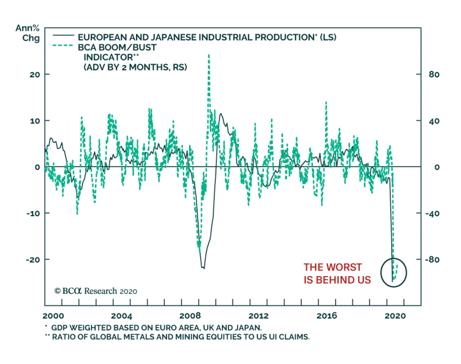
As the world’s shutdowns hit their apex, April was the worst month on record for global industrial production. In the euro area, IP contracted by 28% on an annual basis and it plunged by 24% in the UK. Japan, where the lockdowns have been softer, IP fared…

Highlights The relaxation of lockdown measures, along with mass protests over the past two weeks, have made a second wave of the pandemic more likely than not in many countries. Unlike during the first wave, most governments will not shutter their economies in response to a renewed spike in infection rates. For better or for worse, the “Sweden strategy” will become commonplace. As today’s stock market selloff illustrates, a second wave could significantly unnerve investors, especially since it is coming on the heels of a substantial rally in stocks. However, global equity prices will still rise over a 12-month horizon. Easy monetary policy, improving labor market conditions, and significant amounts of cash on the sidelines should allow the equity risk premium to decline, especially outside the US where valuations remain quite cheap. The US dollar has entered a cyclical bear market. This is especially positive for commodities, economically-sensitive equity sectors, and non-US stocks. Opening The Hatch Chart 1Governments Are Lifting Lockdown Restrictions
A Second Wave Is Now The Base Case (But Stocks Will Eventually Shrug It Off)
A Second Wave Is Now The Base Case (But Stocks Will Eventually Shrug It Off)
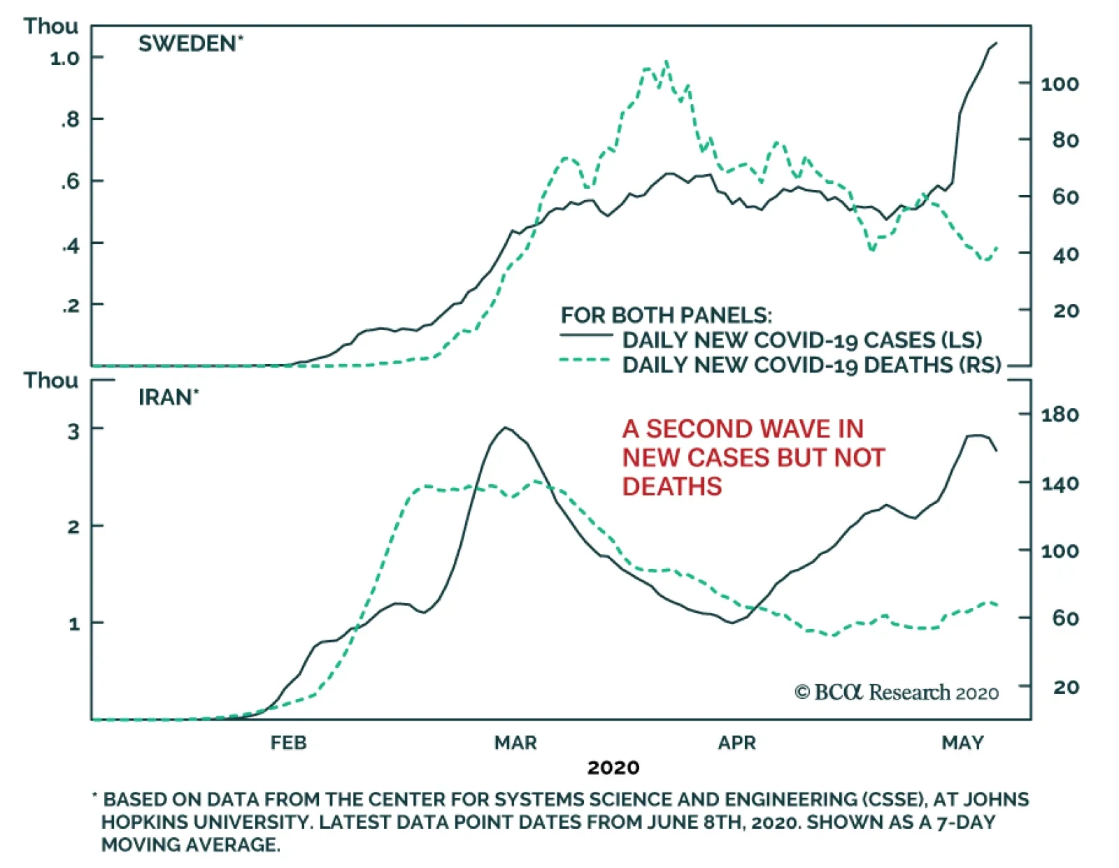
Three months after the virus burst out of China, countries around the world are starting to relax lockdown measures. Our COVID-19 Government Response Stringency Index, created by my colleague Jonathan LaBerge and showcased in last week’s Global Investment Strategy report, has been on an easing course since May. A similar measure developed by Goldman Sachs broadly shows the same loosening pattern. Reflecting these developments, the Dallas Fed’s index of “mobility and engagement” has been slowly returning to normal (Chart 1). The reopening of economies is taking place despite limited success in containing the virus. While some countries have seen a considerable drop off in the number of new cases and deaths, others continue to experience an increase in both metrics (Chart 2). Globally, the number of new cases has begun to trend higher after remaining flat for most of April. The number of deaths — which lags new cases by about three weeks but is less vulnerable to statistical distortions caused by changes in testing prevalence — has also ticked higher after falling for nearly two months. Mass protests starting in Minneapolis and spreading to much of the western world have the potential to further increase the infection rate. As Jonathan noted last week, large gatherings have been an important vector of transmission for the virus. While the protests have occurred outdoors, many protestors did not wear masks while singing and shouting nor practise social distancing. Chart 2Globally, The Number Of New Cases and Deaths Has Started To Trend Higher Again
A Second Wave Is Now The Base Case (But Stocks Will Eventually Shrug It Off)
A Second Wave Is Now The Base Case (But Stocks Will Eventually Shrug It Off)
A Risky Gambit How markets react to a second wave of the pandemic will depend a lot on how policymakers and the broader public respond. For better or for worse, the patience for continued lockdowns has waned. The US and a number of other countries appear to be moving towards the “Swedish model” of trying to keep a lid on the virus without imposing draconian lockdown restrictions. It is a risky gambit, especially in light of the jump in infections that Sweden has reported in the past two weeks. While some countries such as China and New Zealand, which have effectively eradicated the virus, can allow most activities – with the exception of international travel – to resume, others should arguably wait longer until they too have defeated the disease. As Professor Peter Doherty, renowned immunologist and co-recipient of the 1996 Nobel Prize for Medicine, discussed in a webcast with my colleague Garry Evans on Monday, significant progress has been made towards developing a vaccine for COVID-19. Opening up economies now could cause a lot of needless death before a vaccine becomes available. Near-Term Risks To Stocks… Chart 3Earnings Estimates Have Taken It On The Chin
Earnings Estimates Have Taken It On The Chin
Earnings Estimates Have Taken It On The Chin
Even if governments continue opening up their economies despite rising infection rates, some people will increase the amount of social distancing they practise regardless of official recommendations. Airline, cruise ship, and restaurant stocks had rallied mightily off their March lows before giving up some of their gains over the past few days. If a second wave occurs, they will fall further. The rally in stocks linked to the reopening of the economy occurred alongside a retail investor speculative frenzy. In one of the more bizarre episodes in financial history, stocks of bankrupt or soon-to-be-bankrupt companies surged on Monday as novice day traders snapped up shares of companies that most institutional equity investors had left for dead. Meanwhile, earnings estimates have taken it on the chin (Chart 3). Many companies chose not to provide guidance for the second quarter, citing unprecedented uncertainty over the near-term business outlook. Since Q2 will be the worst quarter for economic growth, it will probably also be a very bad quarter for earnings. The prospect of a slew of poor earnings reports in July could further dent investor sentiment, exacerbating the stock market correction we have seen over the past few days. All this suggests that global equities could experience some further weakness over the next few months. …But Still Sticking With Our 12-Month Overweight To Equities Chart 4Economic Activity Has Started Rebounding
Economic Activity Has Started Rebounding
Economic Activity Has Started Rebounding
Despite these short-term risks, we are not ready to abandon our cyclical overweight view on stocks. While many people have remarked that the equity market has diverged from the economy, in fact, the rebound in the stock market has tracked the peak in initial unemployment claims and the trough in current activity indicators quite closely (Chart 4). A second wave would certainly slow the economic rebound. However, it would probably not reverse it completely given that the mortality rate from the virus now appears to be somewhat lower than initially feared and an increasing number of medical treatments are becoming available. If output and employment keep rising, stocks are likely to trend higher. A Deep Hole This does not mean that everything will return to normal soon. Even though global growth appears to have bottomed in April, the level of employment remains at depression-like levels (Chart 5). About 12% of US workers are employed in the hospitality, restaurant, and travel sectors. A return to normalcy in those sectors will take several years at best. Nevertheless, the recovery will not be nearly as drawn out as the one following the Global Financial Crisis. The Congressional Budget Office expects that it will take another eight years for the US unemployment rate to fall back to 5% (Chart 6). That seems unduly pessimistic. Chart 5Employment Remains At Depression-Like Levels
Employment Remains At Depression-Like Levels
Employment Remains At Depression-Like Levels
Chart 6CBO Projects The Unemployment Rate Will Fall Very Slowly
CBO Projects The Unemployment Rate Will Fall Very Slowly
CBO Projects The Unemployment Rate Will Fall Very Slowly
Cyclical Versus Structural Unemployment Chart 7Residential Construction Accounted For Less Than 20% Of The Job Losses During The Great Recession
A Second Wave Is Now The Base Case (But Stocks Will Eventually Shrug It Off)
A Second Wave Is Now The Base Case (But Stocks Will Eventually Shrug It Off)
Commentators like to talk about structural unemployment, but the truth is that large increases in joblessness usually reflect deficient labor demand rather than insufficient supply. For example, the decline in residential construction employment and related sectors accounted for less than one-fifth of the job losses during the Great Recession (Chart 7). You don’t have to fill a half-empty pool through the same pipe from which the water escaped. As long as there is enough demand throughout the economy, workers who lose their jobs will likely find new jobs elsewhere, whether it be at an Amazon distribution center or any number of manufacturing companies that will benefit from the repatriation of production back onshore. The shift in jobs from one sector to the next is not instantaneous, but it need not drag on for years either. Policy Will Stay Stimulative This is where the role of monetary and fiscal policy takes center stage. Despite the improving economic outlook, government bond yields have barely moved off their lows as investors have become increasingly convinced that central banks will keep rates at rock-bottom levels (Chart 8). This week’s FOMC meeting made it clear that the Fed has no intention of raising rates through 2022. “We’re not thinking about raising rates. We’re not even thinking about thinking about raising rates,” Fed Chairman Jerome Powell declared during his press conference. Granted, the zero lower bound has prevented yields from falling as much as they normally would. Fortunately, fiscal policy has stepped in to fill the void. Chart 9 shows that governments have eased fiscal policy much more this year than they did in 2008-09. If governments tighten fiscal policy prematurely like they did after the Great Recession, the recovery will indeed be sluggish. Such a risk cannot be ignored. BCA’s geopolitical team, led by Matt Gertken, has argued that Republican Senators will initially resist the proposed $3 trillion in new stimulus, until they are forced to act by a major new round of financial or social turmoil. Nevertheless, Matt thinks that the Republican Senate will ultimately buckle under the political pressure, knowing full well that a large dose of fiscal largess could prevent a Democratic sweep in November. Chart 8Yields Remain Close To Recent Lows
Yields Remain Close To Recent Lows
Yields Remain Close To Recent Lows
Chart 9Will It Be Enough?
A Second Wave Is Now The Base Case (But Stocks Will Eventually Shrug It Off)
A Second Wave Is Now The Base Case (But Stocks Will Eventually Shrug It Off)
Chart 10China Has Ramped Up Stimulus
China Has Ramped Up Stimulus
China Has Ramped Up Stimulus
Outside the US, fiscal support shows little sign of being scaled back. Germany has pushed forward with additional stimulus, going so far as to propose a risk-sharing arrangement via the creation of an EU Recovery Fund. On Wednesday, the Japanese House of Representatives approved a draft supplementary budget of 32 trillion yen ($296 billion) providing additional funding for small businesses and medical workers. Jing Sima, BCA Research's chief China strategist, expects Chinese credit formation as a share of GDP to reach the highest level since 2009 and the budget deficit to widen to the largest on record (Chart 10). The upshot is that we may find ourselves in an environment over the next few years where global GDP and corporate profits are moving back to trend, while interest rates (and the implied discount rate used for valuing stocks) stay at very low levels. If profits return back to normal but interest rates do not, the surreal implication is that the pandemic could end up increasing the fair value of the stock market. Ample Cash On The Sidelines Stocks also have another factor working in their favor: huge amounts of cash on the sidelines (Chart 11). The combination of massive fiscal income transfers and low spending has led to a surge in private-sector savings. The US personal savings rate reached 33% in April, the highest on record. Reflecting this increase in savings, private sector bank deposits have ballooned (Chart 12). Chart 11Sizable Amount Of Dry Powder
Sizable Amount Of Dry Powder
Sizable Amount Of Dry Powder
Chart 12Savings Have Spiked Amid Stimulus
A Second Wave Is Now The Base Case (But Stocks Will Eventually Shrug It Off)
A Second Wave Is Now The Base Case (But Stocks Will Eventually Shrug It Off)
Investors often talk about cash “flowing” in and out of the stock market. This is a somewhat misleading characterization. Setting aside the impact of corporate buybacks and public share offerings, the decision by one person to buy shares requires a corresponding decision by someone else to sell shares. The buyer of the shares loses some cash, while the seller gains some cash. On net, there is no inflow of cash into the stock market. Rather, what happens is that the price of shares adjusts to ensure that there is a seller for every buyer. If people feel that they have too much cash relative to the value of their equity holdings, they will bid up the price of stocks until enough sellers come forward. This will cause the amount of cash that people hold as a percentage of their total wealth to shrink, even if the dollar value of that cash remains the same. The process will only stop when the amount of cash that people hold is in line with their preferences. The amount of cash held in US money market funds and personal cash deposits has surged by $2.6 trillion since February. Despite the rally in equities, cash holdings as a percent of stock market capitalization remain near multi-year highs. This suggests that the firepower to fuel further increases in the stock market has not been exhausted. Start Of The Dollar Bear Market After peaking in March, the broad trade-weighted US dollar has weakened by 5.3%. The dollar is a countercyclical currency, meaning that it tends to move in the opposite direction of the global business cycle (Chart 13). While the dollar could strengthen temporarily in response to a second wave of the pandemic, global growth should continue to recover in the second half of the year provided that severe lockdown measures are not reintroduced. Stronger global growth will push the greenback lower. Chart 13The US Dollar Is A Countercyclical Currency
The US Dollar Is A Countercyclical Currency
The US Dollar Is A Countercyclical Currency
Unlike last year, the dollar no longer has support from higher US interest rates. Indeed, US real rates are below those of many partner countries due to the fact that US inflation expectations are generally higher than elsewhere (Chart 14). Chart 14The Dollar Has Been Losing Interest Rate Support
The Dollar Has Been Losing Interest Rate Support
The Dollar Has Been Losing Interest Rate Support
A Weaker Dollar Will Support Non-US Stocks The combination of a weaker dollar and stronger global growth should disproportionately help the more cyclical sectors of the stock market, particularly commodity producers. Since cyclical stocks tends to be overrepresented outside the US, non-US equities should outperform their US peers over the next 12 months. A weaker dollar will also reduce the local- currency value of dollar-denominated debt. This will be especially helpful for emerging markets. Despite the recent rally, the cyclically-adjusted PE ratio for EM stocks remains near historic lows (Chart 15). EM equities should fare well over the next 12 months. Chart 15EM Stocks Are Very Cheap
EM Stocks Are Very Cheap
EM Stocks Are Very Cheap
Peter Berezin Chief Global Strategist peterb@bcaresearch.com Global Investment Strategy View Matrix
A Second Wave Is Now The Base Case (But Stocks Will Eventually Shrug It Off)
A Second Wave Is Now The Base Case (But Stocks Will Eventually Shrug It Off)
Current MacroQuant Model Scores
A Second Wave Is Now The Base Case (But Stocks Will Eventually Shrug It Off)
A Second Wave Is Now The Base Case (But Stocks Will Eventually Shrug It Off)
Yesterday, BCA Research's European Investment Strategy service previewed one of the topics they will discuss on their webcast, 'Sectors To Own, And Sectors To Avoid In The Post-COVID World’, with Chief US Equity Strategist Anastasios Avgeriou. This webcast…
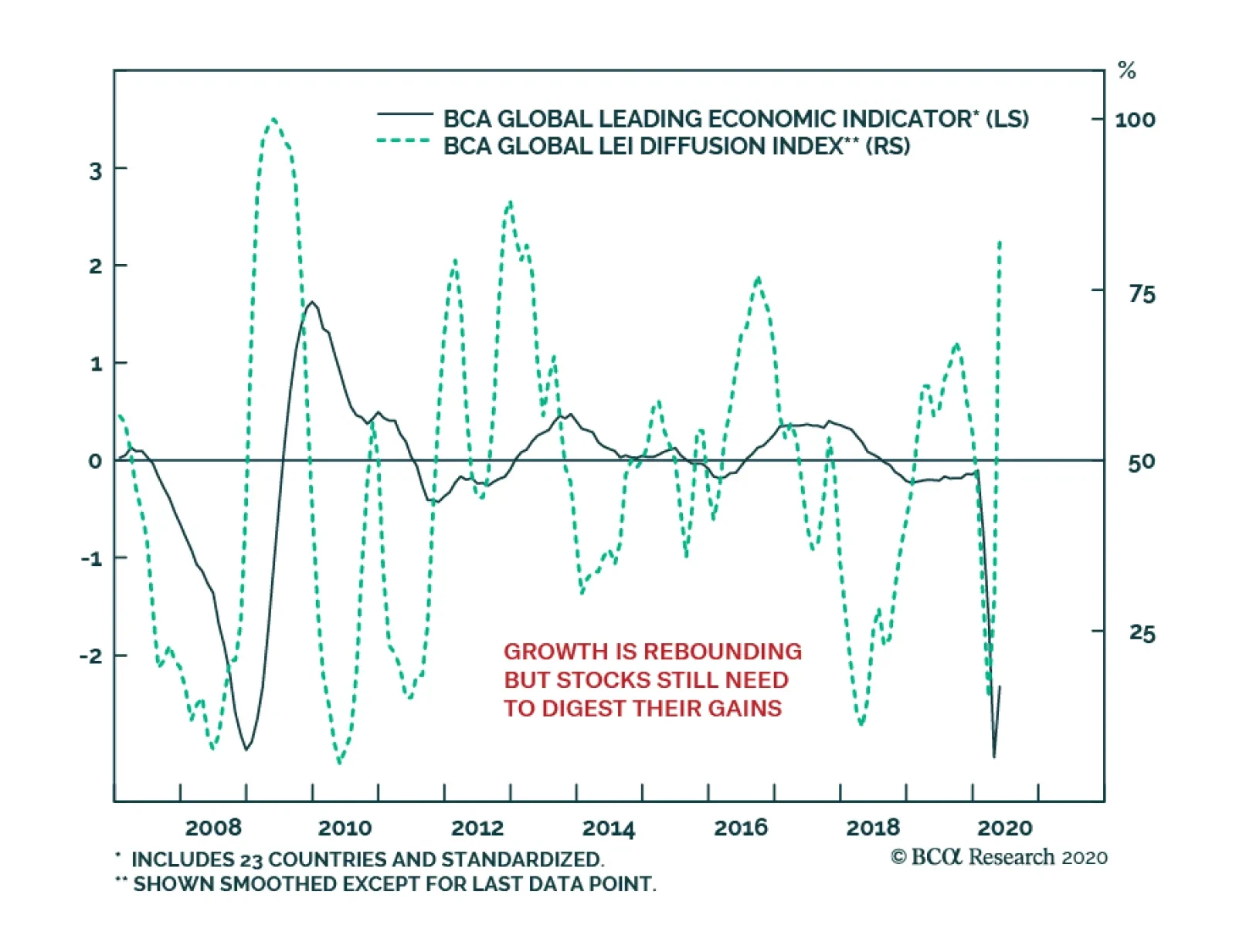
After falling to its lowest level since the Great Financial Crisis, the BCA Global Leading Economic Indicator is trying to form a bottom. The very sharp rebound in the Global LEI diffusion index (the share of countries with sequential improvements in their…
Highlights Volatility strategies are a useful tool for asset allocators. They can be used for both alpha generation and risk mitigation, but they have to be managed properly within a fund’s total risk management framework. Dedicated tail-risk hedging can reduce volatility, but can be very costly depending on the holding period. Short volatility strategies can generate alpha, but can also incur large losses when volatility spikes. Long volatility and also relative-value volatility strategies are much better alpha generators. A simple and easy-to-implement rule-based dynamic hedging strategy using short-term VIX futures reduces equity portfolio risk significantly without sacrificing return. The Sensational Headlines The COVID-19 pandemic-induced financial market volatility has put two major pension funds in the proverbial spotlight. First, CalPERS was questioned about its October 2019 decision to unwind its tail-risk hedging program that would have generated a payoff of more than US$1 billion during the March equity market selloff.1 Then, AIMCo was said to have lost over C$3 billion in its short volatility program, and was also forced to shut the program down.2 With such high-profile stories making the rounds, it is not surprising that we have received questions about tail-risk hedging and volatility strategies from many clients: Should long-term investors hedge tail risk? Is short volatility not a suitable strategy for pension funds? What are the efficient ways to manage large drawdowns? Chart 1The High Profile Failures: Not Uncommon
The High Profile Failures: Not Uncommon
The High Profile Failures: Not Uncommon
Before we attempt to answer these questions, we want to first point out that tail-risk hedging and short-volatility strategies are negatively correlated, as shown in Chart 1, panel 1. It is normal for short-volatility strategies to suffer large drawdowns when tail-hedging strategies make handsome gains in periods of extreme financial market stress. This is largely due to the nature of volatility. As shown in panel 2 in Chart 1, VIX futures curves are normally in contango (the far-month contract is higher than the near-month contract), so a plain-vanilla short position in VIX futures benefits from positive rolling yields, while a plain-vanilla long position suffers from negative rolling yields. When VIX spikes, however, the futures curve turns into large backwardation (the far-month contract is lower than the near-month contract) in a fast and furious fashion, hence the large insurance-like payoff. The short-volatility and tail-hedge indexes in Chart 1 are from CBOE Eurekahedge, which has a suite of volatility indexes. As shown in Table 1, these indexes track the average performance of hedge funds that employ various volatility strategies, including tail-risk volatility, long volatility, short volatility and relative-value volatility. Table 1CBOE Eurekahedge Volatility Hedge Fund Indexes*
Demystifying Tail-Risk Hedging And Volatility Strategies
Demystifying Tail-Risk Hedging And Volatility Strategies
The performance statistics of these indexes are shown in Table 2. It is clear that not all volatility strategies are created equal. Below, we explore in more detail how these strategies should be used. Table 2CBOE Eurekahedge Volatility Index Performance Statistics
Demystifying Tail-Risk Hedging And Volatility Strategies
Demystifying Tail-Risk Hedging And Volatility Strategies
Tail-Risk Hedging Is Not Free Tail-risk hedging has been in the news of late, given the unprecedently sharp drop in equities in February and March and also the untimely decision by CalPERS to unwind its tail-risk hedging program last October. So, what is tail-risk-hedging exactly? How does it work? Tail-risk hedging strategies aim to profit from large drawdowns in risky assets. Unlike the traditional approach of diversification that reduces the weighting of risky assets (for example, a 60-40 equity-bond portfolio is less risky than a 100% equity portfolio), tail-risk hedging attempts to allocate a small percentage of capital, say 3-5%, to a specially designed insurance-like payoff, while maintaining exposure to the risky asset. As such, tail-risk hedging is like buying an insurance policy against a catastrophic event. The premiums paid may or may not be recouped, depending on how likely it is that a catastrophic event may occur and how long one has held the insurance policy. The Universa Tail Fund is one of the two tail-risk funds that CalPERS made the untimely decision to redeem. The fund returned 3,600% in March alone, and 4,440% in the first quarter of 2020. As well, according to reports, a portfolio with 96.7% in the S&P 500 and 3.3% in Universa’s tail-risk fund would effectively have mitigated the S&P 500’s large loss in March, and would have also produced a compounded return of 11.5% since March 2008 versus 7.9% for the S&P 500.3 The performance of the Universa Tail Fund seems to be very different from the average hedge fund in this category, as shown in Table 2 and Chart 1. The CBOE Eurekahedge Tail Risk Hedge Fund index is an average of eight hedge funds that employ tail-risk strategies to achieve capital appreciation during periods of market stress. Since December 2007, when the index started, it has had two outsized monthly gains: 37.5% in March 2020 and 27.5% in August 2011, when MSCI US equities lost 12.7 and 5.5%. However, such benefit is very costly from a long-term perspective because the index has generated an annualized loss of 2.5%, even through April 2020. Its arithmetic average during the period is about -1.6%. To better understand why Universa has been doing so much better than the “average” tail risk hedge fund, we replicate a stylized exercise by Universa published in October 2017.4 The only difference is that we use the MSCI US equity total return index instead of the S&P 500 index. The payoff structure of 9 to 1 means that when the MSCI US calendar year return is less than -15%, the hedge would generate a return of 900%. In other years, insurance premium is not recouped at all, i.e. there is a loss of 100%. The original exercise by Universa designed such a payoff structure because it aimed to have an average payoff of zero in the period from 1996 to 2016. As shown in Chart 2, the biggest advantage of the tail-hedged portfolio (97% MSCI US + 3% Insurance) is its much smoother return stream, with a standard deviation of 12.9% compared to 17.7% for the unhedged MSCI US equity portfolio based on calendar year returns from 1970 to 2020 (as of March for 2020). Also, the skew is improved to -0.1 from -0.7. In terms of return, however, it is highly variable depending on the period chosen. The hedged portfolio outperformed the MSCI US total return index by about 70 basis points annualized from 1996 to 2016, consistent with the result from the original exercise by Universa.5 Outside this period, however, the average return of the payoff stream really depends on how often US equities fall below -15% yearly. In the 50-year period from December 1969 to December 2019, the average return of the insurance payoff was -20%, and the tail-hedged program underperformed MSCI US by 26 basis points annualized. Chart 2Universa Exercise Replica* For 12/1969 - 3/2020
Demystifying Tail-Risk Hedging And Volatility Strategies
Demystifying Tail-Risk Hedging And Volatility Strategies
This simple stylized exercise shows that both the starting point to initiate the tail-risk hedge and the length of time to hold the hedge are very important for a tail-risk hedge to work, not to mention generate spectacular results. Like a catastrophic insurance policy, a tail hedge should not be considered as a stand-alone strategy but as a hedge to the underlying portfolio. It is critical to design the right payoff structure, which in turn requires a view on how often a large drawdown will likely happen in the forecast period. It also takes special skill to find the right instruments to implement such a payoff structure and manage it accordingly. As we will show in the section on page 9, a dynamic approach is needed to ensure the hedge is on only when it’s needed to reduce cost. In fact, Universa did mention about using extreme valuation as one indicator to identify periods with high likelihood of downside risks.6 It also locked in a massive gain in March 2020,7 another indication of the “dynamic nature” of tail-hedging management. Bottom Line: From a long-term perspective, tail-risk hedge does not significantly improve compound returns, but it does reduce volatility significantly. Unless an investor has the skill to dynamically manage a hedge program, passively holding a tail-risk hedge can be costly in terms of return, even though it does improve risk-adjusted returns. Is A Short-Volatility Strategy Suitable For Pension Funds? The CBOE Eurekhedge Short Volatility index lost 20.8% in the first four months of 2020, in which March was the worst month in its history since December 2004, with a loss of 15.8%, while April was the best month with a gain of 9.3%. The annualized return since December 2004, however, has been 5.4%, and 73% of monthly returns have been in positive territory (Table 2). On the other hand, AIMCo had to shut down its volatility trading program in March because of its large $3 billion loss, or about 2.5% of its $119 billion of AUM. It is not known why a small volatility program was allowed to lose more than the fund’s total full-year value-add target. Chart 3Volatility Measures: Implied Vs. Realized
VOLATILITIES: IMPILED VS REALIZED
VOLATILITIES: IMPILED VS REALIZED
There are different ways to short volatility. One is to sell options on the underlying assets. This approach, however, is also impacted by the price level of the underlying assets. VIX futures, as shown in Chart 1, panel 2, are a way to bet on the change in implied volatility. Another way to short volatility is via variance swaps, which bet on the change between realized variance at the expiry of the swap and the strike variance, which is set according to both historical variance and implied variance.8 Because variance is the square of volatility, the payoff of a variance swap is convex, i.e. when volatility spikes up, a short seller loses more money than when volatility decreases. As shown in Chart 3, VIX, the implied volatility, peaked on March 16, and realized volatility peaked on March 27. However, the difference between realized and implied volatility did not peak until April 6, and remained positive through the end of April. As such, a short volatility program via variance swaps would have experienced severe mark-to-market losses daily from mid-March to early April, even though equities bottomed on March 23. However, such a spike happened in 2008 as well. Any back-test would have included such an occurrence in 2008. Granted, the magnitude of the current spike is larger than that in 2008, but it reversed quickly down to the 2008 level. We may never know why AIMCo’s short volatility program suffered such outsized losses. The only guess is that it may have used variance swaps, and the embedded leverage made the size of the program not appropriate for the total fund. Bottom Line: Short volatility can be a useful tool for alpha generation. The key, however, is risk management. It should be properly sized within the overall risk management framework of the total fund. Volatility As An Asset Class? Tail-risk hedging using volatility is too costly in general, while shorting volatility outright can be disastrous. Some argue that investors should not have anything to do with volatility strategies. On the other hand, other investors treat volatility as an asset class for both alpha generation and risk mitigation. Chart 4 shows the CBOE Eurekahedge Relative-Value Volatility index and the Long-Volatility index together with the MSCI US equity index, and Bloomberg Barclays US aggregate bond index and US Treasury index. The relative-value volatility index can be long, short, or neutral on volatility (Table 1). As shown in Table 2, it has achieved an annualized return of 7.6%, only 60 basis points less than MSCI US equity return of 8.2%, but much higher than the 4.3% and 4.5% respective return from Bloomberg Barclays US Treasury index and aggregate bond index in the period from December 2004 to April 2020. Its standard deviation of 3.9% is much lower than the MSCI US (14.7%) and very close to Treasurys (4.1%) and aggregate bonds (3.2%). For this specific period, in fact, this index even has a much better risk-return profile than a typical 60/40 US equity/aggregate-bond portfolio, which scores a 7.1% annualized return with 8.9% standard deviation. With almost zero correlation to both stocks and bonds, this index serves as an ideal addition to a balanced equity-bond portfolio (Chart 5). Chart 4Volatility As An Asset Class
VOLATILITY AS AN ASSET CLASS
VOLATILITY AS AN ASSET CLASS
Chart 5Relative-Value Vol Strategy Improves The Performance Of A 60/40 Equity/Bond Portfolio
Demystifying Tail-Risk Hedging And Volatility Strategies
Demystifying Tail-Risk Hedging And Volatility Strategies
The challenge, however, is that this index is an average of 35 hedge funds that employ relative-value or opportunistic-volatility strategies that can be long, short, or neutral on implied volatility.9 Because of this, capacity constraints for investors to get into those funds may exist, which could produce diverging performances. Even the long-volatility strategy (Chart 4, panel 2), which in theory suffers negative rolling yields when the VIX is in a normal range, has generated a 5% annualized return. It has a negative correlation of 0.46 with MSCI US equities, comparable to the negative correlation of 0.5 between the Tail-Risk index and MSCI US. Given the much better statistics of this index compared to the Tail-Risk index, it should be a less costly alternative to the Tail-Risk Hedge index (Table 2). To illustrate how these two strategies work to mitigate downside risk in the MSCI US equities, we compare a series of portfolios that allocate from 0-100% of capital to MSCI US and 100-0% to the two volatility strategies, respectively. As shown in Chart 6, the long-volatility strategy is a much better risk mitigator to the MSCI US equities index than the tail-hedge strategy at all levels of allocations for the period from January 2008 to April 2020. Chart 6Risk Mitigation Using Long Vol Vs. Tail-Risk Hedge
Demystifying Tail-Risk Hedging And Volatility Strategies
Demystifying Tail-Risk Hedging And Volatility Strategies
Dynamic Hedging Using VIX Futures The CBOE Eurekahedge volatility indexes are based on average returns of the funds in each index. They are not investable. Also, hedge funds in these indexes may have capacity issues to accommodate large investors. In this section we run a simple rule-based hedging strategy using VIX futures to illustrate how investors can use volatility strategies in-house as an alternative tool to mitigate risk. We use the S&P VIX short-term futures index for this exercise, because it can be easily replicated in-house. This index is constructed based on rolling daily 5% of the front-month contract to the second-month contract. This means the index always has one month to expiry. It also means that daily rolling averages out the rolling yield for any given month. The rule is simple: invest in the short-term volatility futures only when the VIX is outside its normal range. Since its inception in 1990, the VIX average is about 20. To test how different thresholds and rebalancing frequencies work, we test four different VIX thresholds: 25, 30, 35 and 40 with both weekly and monthly rebalances. The rebalance rule is: if the VIX is greater than a threshold at the end of one period, then in the next period, 5% of the fund is allocated to the S&P short-term VIX futures index and 95% is allocated to MSCI US. Otherwise 100% goes to MSCI US equities. For comparison, we also run a static hedge that has 5% in VIX futures and 95% in the MSCI US index. The monthly rebalanced results are quite interesting, as shown in Table 3 and Chart 7: Table 3Dynamic Hedging Using VIX Futures
Demystifying Tail-Risk Hedging And Volatility Strategies
Demystifying Tail-Risk Hedging And Volatility Strategies
Chart 7Dynamic Hedging Works
DYNAMIC HEDGING WITH VIX FUTURES
DYNAMIC HEDGING WITH VIX FUTURES
Despite a terrible risk-return profile on its own, VIX futures can be a good risk mitigator when the hedge is put on only when the VIX is above a certain threshold. Even though the 60-40 wins in terms of risk-adjusted return, dynamically hedged portfolios have better returns than both the 60-40 and US equities. The results are also robust when we do a weekly rebalance. Three conclusions can be drawn from Charts 8A and 8B, and Chart 9: Chart 8ADynamic Hedging – Monthly Rebalance
DYNAMIC HEDGE-MONTHLY REBALNCE
DYNAMIC HEDGE-MONTHLY REBALNCE
Chart 8BDynamic Hedging – Weekly Rebalance
DYNAMIC HEDGE-WEEKLY REBALNCE
DYNAMIC HEDGE-WEEKLY REBALNCE
Chart 9Simple But Robust Dynamic Hedging
Demystifying Tail-Risk Hedging And Volatility Strategies
Demystifying Tail-Risk Hedging And Volatility Strategies
Hedging reduces volatility significantly. The lower the VIX threshold is, the larger the volatility reduction in the hedged portfolio compared to the unhedged. Hedging also improves average returns, albeit at a smaller scale compared to the reductions in volatility. Depending on the rebalancing frequency, the return improvement differs. For the monthly rebalance, the best VIX threshold lies between 30-35; for the weekly rebalance, the best is when the VIX threshold is at 30. Hedging is not needed all the time because volatility is within a normal range most of the time. Even when it spikes, it does not stay high for an extended period of time. Bottom Line: A simple rule-based dynamic hedging approach using VIX futures can substantially improve an equity portfolio’s risk-return profile by decreasing volatility significantly without sacrificing return. In a low interest rate environment, dynamic hedging using VIX futures can be a good alternative to a 60-40 equity-bond mix. Xiaoli Tang Associate Vice President xiaoliT@bcaresearch.com Footnotes 1 https://www.institutionalinvestor.com/article/b1l65mvpw5xpts/The-Inside-Story-of-CalPERS-Untimely-Tail-Hedge-Unwind 2 https://www.institutionalinvestor.com/article/b1l9c8n9lgdj1r/AIMCo-s-3-Billion-Volatility-Trading-Blunder 3 https://www.bloomberg.com/news/articles/2020-04-08/taleb-advised-universa-tail-risk-fund-returned-3-600-in-march 4 https://www.universa.net/UniversaResearch_SafeHavenPart1_RiskMitigation.pdf 5 https://www.universa.net/UniversaResearch_SafeHavenPart1_RiskMitigation.pdf 6 https://www.universa.net/UniversaResearch_SafeHavenPart2_NotAllRisk.pdf 7 https://www.bloomberg.com/news/articles/2020-04-08/taleb-advised-universa-tail-risk-fund-returned-3-600-in-march 8 https://en.wikipedia.org/wiki/Variance_swap 9 https://www.eurekahedge.com/Indices/CBOE-Eurekahedge-Volatility-Indexes-Methodology
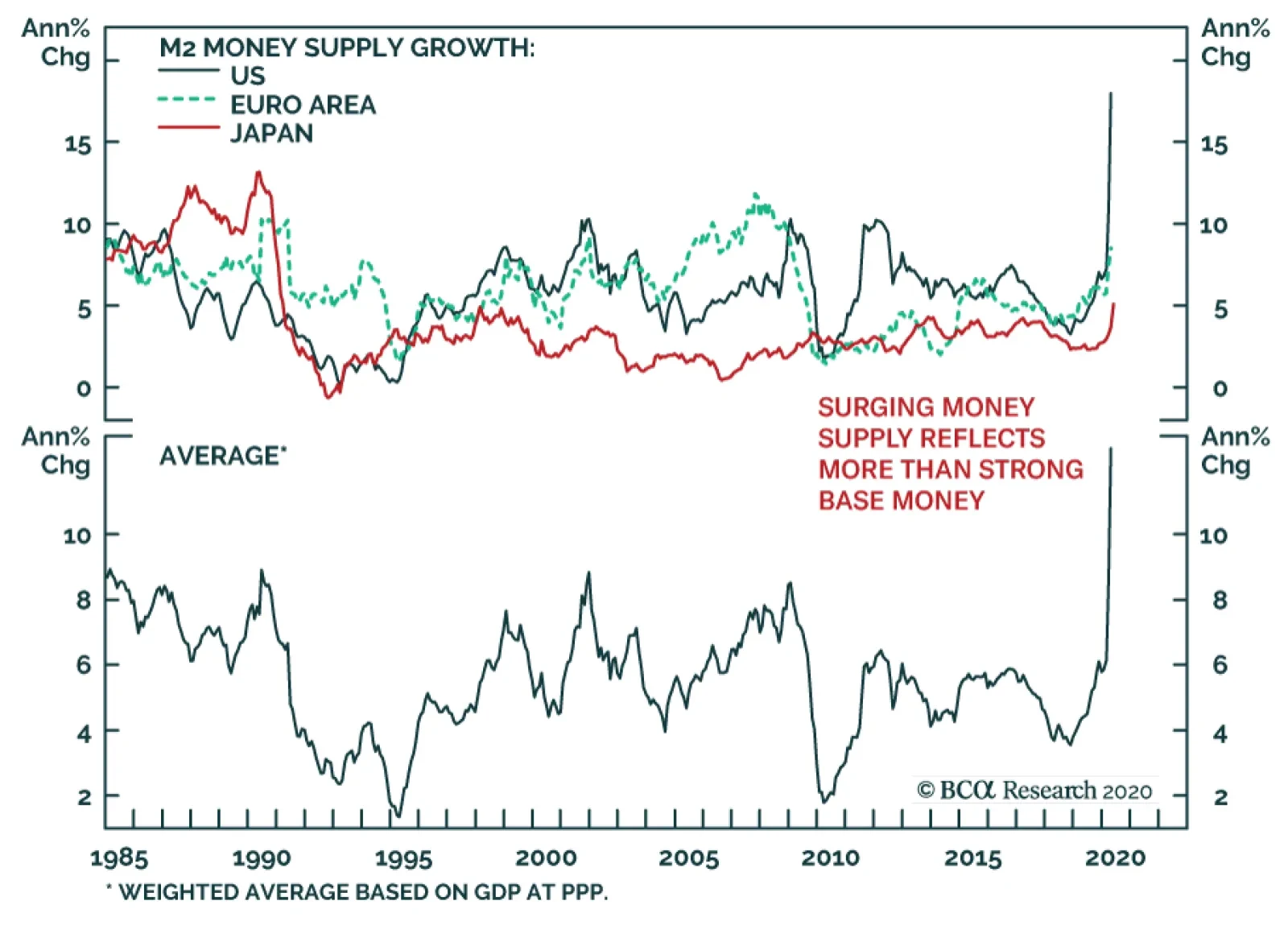
Money growth around the world is accelerating in response to the large easing conducted by global central banks. US M2 is expanding at its fastest pace since World War II, Japanese M2, at its quickest rate since January 1991, and even in the euro area, broad…
A second wave of infections is now the base expectation for many medical professionals and investors. However, even if one assumes that this second wave materializes, it does not guarantee the same economic pain as we witnessed in the spring. First, the…
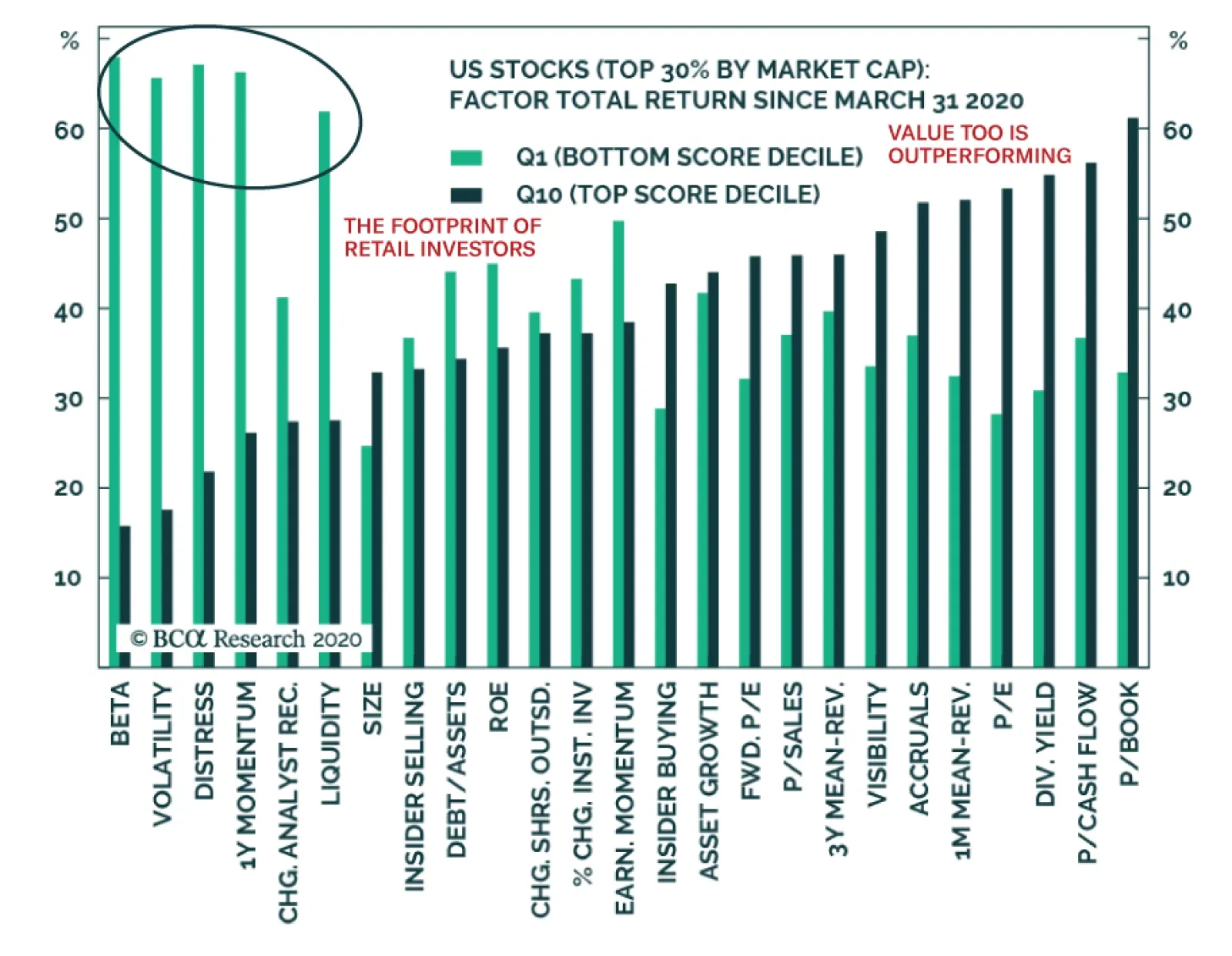
Using BCA Research’s Equity Trading Strategy’s platform, we can determine which factors have performed best this spring. The results are clear: beta and value are in the driver’s seat. This attribution analysis allows for two important insights. First, the…
BCA Research's Global Fixed Income Strategy service sees five main reasons why global bond yields are moving higher. 1) Investor risk aversion is declining There has been a sharp recovery in global risk appetite since late March, diminishing the demand…
Highlights Rising Bond Yields: Global risk assets are discounting a V-shaped economic recovery. With economic data starting to revive as more economies emerge from virus-related shutdowns, bond yields are showing signs of following suit. Duration Strategy: Even with global yields showing signs of a cyclical bottom, we continue to recommend a neutral duration stance. Central banks will remain highly accommodative given the lack of inflationary pressures after the deep COVID-19 recessions. There are still significant risks in the coming months from a potential second wave of coronavirus after economies reopen, worsening US-China relations and domestic US sociopolitical turmoil. Duration Proxy Trades: Given those lingering uncertainties, we prefer to focus on “duration-lite” trades in the developed economies, like overweighting inflation-linked government bonds versus nominals as inflation expectations will drift higher over the next 6-12 months. Feature Dear Client, Next week, instead of publishing a regular Weekly Report, we will hold a webcast on Tuesday, June 16 at 10:00 am ET, discussing our latest views on global fixed income markets. The format will be a short presentation, followed by a Q&A session. We hope you will join us, armed with interesting questions. Kind regards, Rob Robis, Chief Fixed Income Strategist Chart of the WeekBond Yields Bottoming, But Backdrop Not Yet Bearish
Bond Yields Bottoming, But Backdrop Not Yet Bearish
Bond Yields Bottoming, But Backdrop Not Yet Bearish
Bond yields around the world awoke from their COVID-19 induced slumber last week, responding to a growing body of evidence indicating that global growth has bottomed. Over a span of four days, benchmark 10-year government bond yields rose in the US (+20bps), Germany (+13bps), Canada (+20bps), China (+14bps), Japan (+4bps), Mexico (+13bps) and the UK (+12bps). There is potential for yields to continue drifting higher over the next few months, as more countries reopen from virus-related shutdowns. The bounce already seen in survey data like manufacturing and services PMIs, as well as economic sentiment measures like the global ZEW index, should soon translate into real improvements in activity data. This comes at a time when rising commodity prices, most notably oil, suggest that depressed inflation expectations can lead bond yields higher. The cyclical bottom for global yields has likely passed, based on the improvement already seen in our own Global Duration Indicator (Chart of the Week). However, economic policy uncertainty remains elevated as devastated economies try to reopen from lockdowns. In addition, our Central Bank Monitors continue to indicate pressure on policymakers to keep interest rates as low as possible to maintain easy financial conditions as easy as possible. Tighter monetary policies remain a distant prospect, given very high unemployment rates. The cyclical bottom for global yields has likely passed, based on the improvement already seen in our own Global Duration Indicator. Amid those uncertainties, we recommend maintaining a neutral strategic (6-12 months) and tactical (0-6 months) stance on overall duration exposure in fixed income portfolios. Instead, we prefer focusing on lower volatility trades that will benefit from improving global growth and policy reflation, like going long inflation-linked bonds versus nominal government debt throughout the developed markets with breakevens looking too low on our models. Why Are Bond Yields Rising Now? We see five main reasons why global bond yields have started to move higher: 1) Investor risk aversion is declining There has been a sharp recovery in global risk appetite since late March, diminishing the demand for risk-free global government debt. In the US, the S&P 500 is up 43% from its March lows, while the NASDAQ index is back to the all-time highs reached before the coronavirus turned into a global pandemic (Chart 2). US corporate debt has also performed well since the March 23rd peak in spreads, with investment grade and high-yield spreads down -227bps and -564bps, respectively. Non-US assets are also flying, with emerging market (EM) equities up 29% and EM USD-denominated corporate debt up 14% in excess return terms over US Treasuries since the March trough. Even severely lagging assets like European bank stocks are showing a pulse, up 38% since the lows of May 15. Commodity prices are also improving, led not only by gains in oil after the April crash by recoveries in the prices of growth-sensitive commodities like copper (+17%) and lumber (+42%). Add it all up, and the message is clear: investors now prefer risk to safety, which has tempered the demand for government bonds. The flipside of the boom in risk appetite is weakening prices for safe haven assets (Chart 3). The price of gold in US dollar terms is down -4% from the 2020 high on May 20, while the euro price of gold is down –6%. Safe haven currencies like the Japanese yen and Swiss franc have underperformed, while interest rate volatility measures like the US MOVE index and long-dated euro swaption volatility are back to the pre-coronavirus lows. Chart 2Risk Assets Are Booming Worldwide
Risk Assets Are Booming Worldwide
Risk Assets Are Booming Worldwide
Chart 3Safe Haven Trades Losing Luster
Safe Haven Trades Losing Luster
Safe Haven Trades Losing Luster
Add it all up, and the message is clear: investors now prefer risk to safety, which has tempered the demand for government bonds that helped drive yields lower when risk assets were tanking in late February and March. 2) Global growth is improving One of the reasons for the improvement in investor risk appetite is belief that the world economy has exited from the severe COVID-19 global recession. While timely real data is still coming in slowly given reporting lags, there has been a notable bounce in survey data in many countries. PMIs for both manufacturing and services climbed higher in May (Chart 4). The expectations components of economic confidence measures like the ZEW indices have also recovered the losses seen in February and March. Data surprises have also been increasingly on the positive side of late in China, Europe and the US, including the shocking 2.5 million increase in US employment in May. However, the US unemployment rate remains very high at 13.3%, indicating abundant spare capacity that will likely take years, not months, to work off – a problem that most of the world will continue to deal with post-recession. 3) Central bank liquidity is booming The other main reason for the boom in risk asset performance that has started to put upward pressure on bond yields is the extremely accommodative stance of global monetary policy. This is occurring through 0% policy rates in the developed economies but, even more importantly, the aggressive expansion of central bank balance sheets through quantitative easing (QE). The Fed has its foot firmly on the monetary accelerator, with year-over-year growth in its balance sheet of 87% (Chart 5). The European Central Bank (ECB) is no slouch, though, with its balance sheet up 19% from a year ago and having expanded its Pandemic Emergency Purchase Program (PEPP) by another €600 billion last week. Chart 4Signs Of Life In The Global Economy
Signs Of Life In The Global Economy
Signs Of Life In The Global Economy
Chart 5'QE Forever' Driving Money From Bonds To Risk Assets
QE Forever' Driving Money From Bonds To Risk Assets
QE Forever' Driving Money From Bonds To Risk Assets
The combined annual growth of the central bank balance sheets for the “G4” (the Fed, ECB, Bank of Japan and Bank of England) is now up to 26%. The rate of G4 balance sheet expansion has been a reliable leading indicator of global risk asset performance since the 2008 financial crisis (with about a 12-month lead), and the current boom in “liquidity” suggests that the current rise in global equity and corporate bond markets can continue over the next year. Easing global financial conditions are now returning to levels that should support economic growth in the coming months, helping to mitigate (but not eliminate) the potential credit stresses from companies that have suffered during the COVID-19 recession. This recovery remains fragile, however, and policymakers will continue to maintain an extremely dovish policy bias – even with significant fiscal stimulus measures also in place to help economies climb out of recession. This suggests that the current rise in global bond yields is not the start of a new bond bear market driven by expectations of tighter monetary policies. The current rise in global bond yields is not the start of a new bond bear market driven by expectations of tighter monetary policies. Chart 6Global Bond Sentiment Is Still Very Bullish
Global Bond Sentiment Is Still Very Bullish
Global Bond Sentiment Is Still Very Bullish
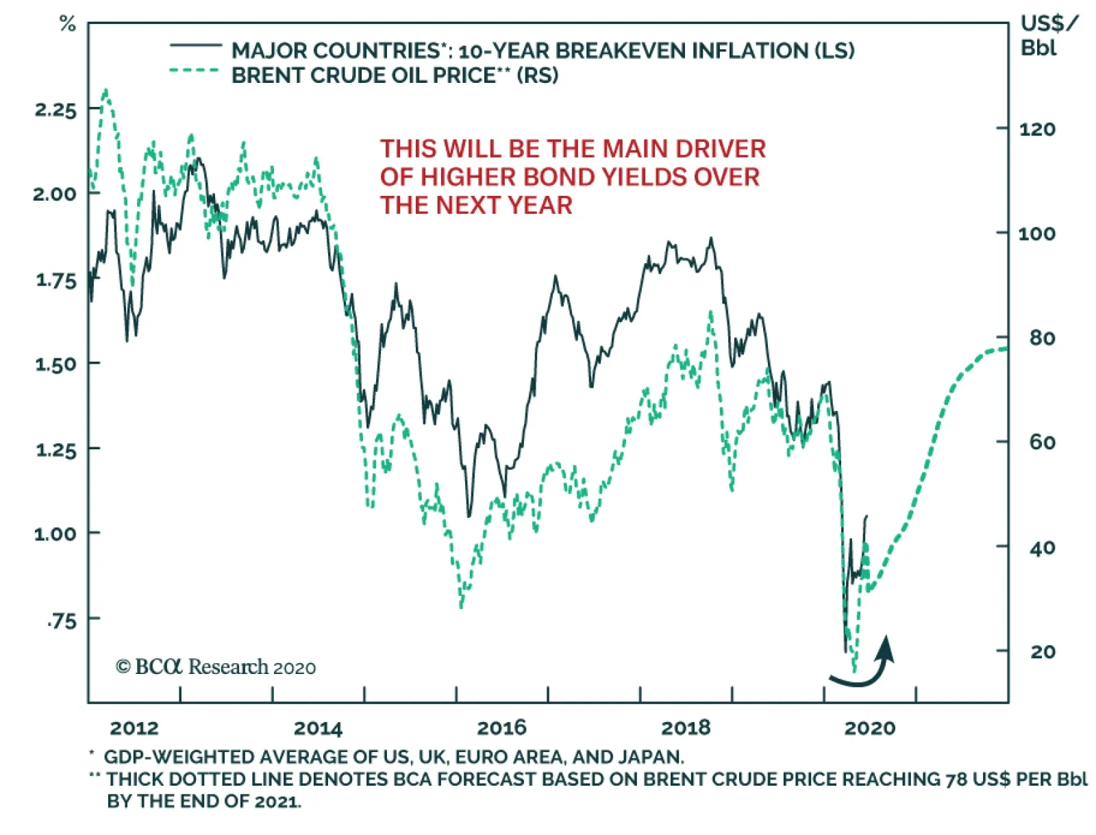
4) Bullish sentiment for bonds is at extremes From a contrarian perspective, another factor helping put a floor underneath bond yields is investor sentiment towards fixed income, which remains bullish. The widely followed ZEW survey of economic forecasters also contains a question on the expected change in bond yields over the next year. The latest read on the surveys shows a net balance still expecting lower bond yields in the US, Germany, the UK and Japan, nearing levels seen prior to the end of the recessionary bond bull markets in the early 2000s and after the 2008 financial crisis (Chart 6). In addition, the Market Vane survey of bullish sentiment on US Treasuries is nearing past cyclical peaks, suggesting limited scope for new bond buyers that could drive US yields to new lows. 5) Inflation expectations are moving higher Finally, global yields are rising because the inflation expectations component of yields has started to move higher. The hyper-easy stance of monetary policy is playing a role here. Market-based inflation expectations measures like the breakevens on inflation-linked bonds (or CPI swap rates) are a vote of confidence by investors in the “appropriateness” of policy settings. The fact that inflation expectations are now drifting higher suggests that bond markets now believe that central banks are now "easy" enough to give inflation a shot at rising sustainably as growth recovers. Global yields are rising because the inflation expectations component of yields has started to move higher. Chart 7Oil Prices & Breakeven Inflation Rates Are Both Recovering
Oil Prices & Breakeven Inflation Rates Are Both Recovering
Oil Prices & Breakeven Inflation Rates Are Both Recovering
This move higher in inflation expectations can continue in the coming months, particularly with global oil prices likely to move even higher. Our colleagues at BCA Research Commodity & Energy Strategy are quite bullish on oil prices, forecasting the benchmark Brent oil price to rise to around $50/bbl by the end of 2020 and continuing up to $78/bbl by the end of 2021. Such an outcome would push up market-based inflation expectations, and likely put more upward pressure on nominal bond yields, given the strong correlation between oil and inflation breakevens in the developed economies that has existed over the past decade (Chart 7). Bottom Line: Global risk assets are discounting a V-shaped economic recovery. With economic data starting to revive as more economies emerge from virus-related shutdowns, bond yields are showing signs of following suit. Duration Strategy For The Next Few Months The trends in growth, inflation and financial conditions all suggest bond yields can continue to drift higher over at least the next 3-6 months. Yet given the potential for a negative shock from a second wave of coronavirus infection, or geopolitical uncertainties in a volatile US election year, a below-benchmark global duration stance is not yet warranted. This is especially true with unemployment rates in most countries remaining elevated even as growth rebounds from recession, forcing central banks to maintain a very dovish policy posture. Our “Risk Checklist” that we have been monitoring to move to a more aggressive recommended investment stance on global spread product – the US dollar, the VIX and the number of new COVID-19 cases - can also be helpful in helping us determine when to shift to a more defensive bias on global duration. On that note, the Checklist still argues for a neutral duration stance, rather than positioning for a big move higher in yields. The US dollar has started to soften, but remains at a very high level relative to interest rate differentials (Chart 8). A weaker greenback is a source of global monetary reflation, primarily through changes in the prices of commodities and other traded goods that are denominated in dollars, but also by helping alleviate funding pressures for companies that have borrowed heavily in US dollars (especially in the emerging world). The dollar is also an “anti-growth” currency that appreciates during periods of slowing global growth, and vice versa, so some depreciation should unfold as more of the world economy emerges from lockdown (middle panel). The VIX index – a measure of investor uncertainty - continues to climb down from the massive surge in February and March, now sitting at 26 after peaking around 80. This is the one part of our Risk Checklist that argues for reducing duration exposure now. We prefer trades that will benefit from the combination of continued global policy reflation and growing investor risk appetite. We call these “duration-lite” trades. The daily number of new reported cases of COVID-19 (using data from the World Health Organization) has come down dramatically in Europe, but in the US the decline in new cases has stalled over the past month – a worrisome sign as the country continues to reopen amid mass protests in major cities (Chart 9). New cases outside the US and Europe are rapidly moving higher, however, primarily in major Latin American countries like Brazil and Mexico. This suggests that while there is a concern about a “second wave” of coronavirus later in the year, the risks from the first wave are far from over. Chart 8Still Not Much Reflationary Push From A Weaker USD
Still Not Much Reflationary Push From A Weaker USD
Still Not Much Reflationary Push From A Weaker USD
Chart 9The COVID-19 Threat Has Not Gone Away
The COVID-19 Threat Has Not Gone Away
The COVID-19 Threat Has Not Gone Away
Instead of shifting to a below-benchmark recommended stance on overall portfolio duration too soon in the cycle, we prefer trades that will benefit from the combination of continued global policy reflation and growing investor risk appetite. We call these “duration-lite” trades. Specifically, we like owning inflation-linked government bonds versus nominal debt, while also positioning for steeper government yield curves (on a duration-neutral basis). Longer-dated breakeven inflation rates within the major developed markets are becoming increasingly correlated to both the level of 10-year government bond yields (Chart 10) and the slope of the 2-year/10-year yield curve (Chart 11). Chart 10Rising Inflation Expectations Will Lead To Higher Bond Yields ...
Rising Inflation Expectations Will Lead To Higher Bond Yields ...
Rising Inflation Expectations Will Lead To Higher Bond Yields ...
Chart 11... And Steeper Yield Curves
... And Steeper Yield Curves
... And Steeper Yield Curves
In terms of country selection for these trades, we look to the valuations on inflation-linked bond breakevens from our modeling framework that we introduced back in late April.1 In that framework, we model 10-year breakevens as a function of oil prices, exchange rates and the long-run trend in realized inflation. Chart 12Global Inflation Breakevens Look Cheap On Our Models
Global Inflation Breakevens Look Cheap On Our Models
Global Inflation Breakevens Look Cheap On Our Models
In Chart 12, we show the deviation of 10-year inflation breakevens from the model-implied fair value, shown both terms of standard deviations and basis points. The “cheapest” breakevens from our models are for inflation-linked bonds in Italy and Canada, although almost all counties (outside of the UK) have breakevens to look far too low. This suggests that global bond investors should consider a multi-country portfolio of inflation-linked bonds versus nominal paying equivalents – or in countries where the inflation-linked bond markets are small and illiquid, duration-neutral yield curve steepeners - as a more efficient way to play for a continuation of the current reflationary global backdrop without taking duration risk. Bottom Line: Even with global yields showing signs of a cyclical bottom, we continue to recommend a neutral duration stance. Given the lingering uncertainties about a second wave of coronavirus, and the rising political and social tensions in the US only five months before the presidential election, we prefer to focus on “duration-lite” trades in the developed economies - like overweighting inflation-linked government bonds versus nominals as inflation expectations will drift higher over the next 6-12 months. Robert Robis, CFA Chief Fixed Income Strategist rrobis@bcaresearch.com Footnotes 1 Please see BCA Research Global Fixed Income Strategy Weekly Report, "Global Inflation Expectations Are Now Too Low", dated April 28, 2020, available at gfis.bcaresearch.com. Recommendations The GFIS Recommended Portfolio Vs. The Custom Benchmark Index
Global Yields Are Stirring, But It’s Not Yet A Bond Bear Market
Global Yields Are Stirring, But It’s Not Yet A Bond Bear Market
Duration Regional Allocation Spread Product Tactical Trades Yields & Returns Global Bond Yields Historical Returns