Global

Highlights The cyclical rally in stocks is not over, but the S&P 500 will churn between 2800 and 3200 this summer. Supportive policy, robust household balance sheets and budding economic growth have put a floor under global bourses. Political risk, demanding valuations and COVID-related headlines are creating potent headwinds in the near term that must be resolved. During the ongoing flat but volatile performance of equities, investors should build short positions against government bonds and the dollar. Deep cyclicals, banks and Japanese equities offer opportunities to generate alpha. In the long term, structurally rising inflation will ensure that stocks outperform bonds, but commodities will beat them both. Feature Institutional investors still despise the equity market rebound that began on March 23. Relative to history, professional investors are heavily overweight cash, bonds and defensive sectors but they are underweight equities as an asset class and cyclical sectors specifically. Furthermore, the beta of global macro hedge funds to the stock market is in the bottom of its distribution, which indicates the funds’ low net exposure to equities. The attitude of market participants is understandable given that the economy is in tatters. According to the New York Fed Weekly Economic Index, Q2 GDP in the US will contract by 8.4% compared with last year. Industrial production is still 15.9% below its pre-pandemic high and the US unemployment rate stands at either 13.3% or 16.4%, depending how the BLS accounts for furloughed employees. Moreover, deflationary forces are building, which hurts profits. Despite these discouraging economic reports, the S&P 500 is trading only 7.9% below its February 19 all-time high and is displaying a demanding forward P/E ratio of 21.4. Stocks will continue to churn over the summer with little direction. Financial markets are forward looking and the collapse of risk asset prices in March forewarned of an economic calamity. Stimulus, liquidity conditions and an eventual recovery are creating strong tailwinds for stocks. However, demanding valuations, rising political risks and overbought short-term technicals argue for a correction. These forces will probably balance out each other in the coming months. Investors must be nimble. Buying beta is not enough; finding cheap assets levered to the nascent recovery will be a source of excess returns. Bonds are vulnerable to the recovery and purchasing deep cyclicals at the expense of defensives makes increasing sense. Japanese stocks offer another attractive opportunity. Five Pillars Behind Stocks… Our BCA Equity Scorecard remains in bullish territory despite the conflict between the sorry state of the global economy and the violence of the equity rally since late March (Chart I-1). Five forces support share prices. Chart I-1The Rally Is Underpinned
The Rally Is Underpinned
The Rally Is Underpinned
The first pillar is extraordinarily accommodative liquidity conditions created by global central banks, which have aggressively slashed policy rates and allowed real interest rates to collapse. Additionally, forward guidance indicates that policy will remain easy for the foreseeable future. For example, the Federal Reserve does not anticipate tightening policy through 2022 and the Bank of Japan expects to stand pat until at least 2023. In response, the yield curve in advanced economies has started to steepen, which indicates that the policy easing is having a positive impact on the world’s economic outlook (Chart I-2). Various liquidity measures demonstrate the gush of high-powered money in the financial and economic system in the wake of monetary policy easing. Our US Financial Liquidity Index and dollar-based liquidity measure have skyrocketed. Historically, these two indicators forecast the direction of growth and the stock market (Chart I-3). Chart I-2The Yield Curve Likes What It Sees
The Yield Curve Likes What It Sees
The Yield Curve Likes What It Sees
Chart I-3Exploding Liquidity Conditions
Exploding Liquidity Conditions
Exploding Liquidity Conditions
The second pillar is the greatest fiscal easing since World War II. The US government has increased spending by $2.9 trillion since March. House Democrats have passed an additional $3 trillion plan. Senate Republicans will not ratify the entire proposal, but our Geopolitical Strategy service expects them to concede to $2 trillion.1 Meanwhile, the White House is offering a further $1 trillion infrastructure program over five years. Details of the infrastructure plan are murky, but its existence confirms that fiscal profligacy is the new mantra in Washington and the federal deficit could reach 23% of GDP this year. Chart I-4Loosest Fiscal Policy Since WWII
July 2020
July 2020
The list of new fiscal measures worldwide is long; the key point is that governments are injecting funds to lessen the COVID-19 recession pain on their respective populations and small businesses (Chart I-4). Excluding loans guarantees, even tight-fisted Germany has rolled out EUR 0.44 trillion in relief programs, amounting to 12.9% of GDP. Japan has announced JPY 63.5 trillion of “fresh water” stimulus so far, representing 11.4% of GDP. Loan guarantees administered by various governments along with the Fed’s Primary and Secondary Market Credit Facilities also limit how high business bankruptcies will climb. As we discussed last month, it is unlikely that countries will return to the level of spending and budget deficits that prevailed prior to COVID-19, even if the intensity of fiscal support declines from its current extreme.2 Voters in the West and emerging markets are fed up with the Washington Consensus of limited state intervention. Consequently, the median voter has pivoted to the left on economic matters, especially in Anglo-Saxon nations (Chart I-5).3 The fiscal laxity consistent with economic populism and dirigisme will boost aggregate demand for many years. The third supporting pillar is the private sector’s response to monetary and fiscal easing unleashed by global policymakers. Unlike in 2008, the amount of loans and commercial papers issued by US businesses is climbing, which indicates stronger market access than during the Great Financial Crisis (GFC). A consequence of the large uptick in credit growth has been an explosion in banking deposits. Given the surge in private-sector liquidity – not just base money – broad money creation has eclipsed that of the GFC (Chart I-6). Part of this money will seek higher returns than the -0.97% real short rate available to investors in the US (or -0.9% in Europe), a process that will bid up risk assets. Chart I-5The US Population's Shift To The Left
July 2020
July 2020
Chart I-6The Private Sector's Liquidity Is Improving
The Private Sector's Liquidity Is Improving
The Private Sector's Liquidity Is Improving
The financial health of the US household sector is the fourth pillar buttressing stocks. Households entered the recession with debt equal to 99.4% of disposable income, the lowest share in 19 years. Moreover, debt servicing only represents 9.7% of disposable income, the lowest percentage of the past four decades. Along with generous support from the US government, the resilience created by strong balance sheets explains why delinquency rates remain muted despite a surge in unemployment (Table I-1).4 Moreover, the decline in household net worth pales in comparison with the GFC (Chart I-7). Hence, the wealth effect will not have the same deleterious impact on consumption as it did after 2008. In the wake of large fiscal transfers, the savings rate explosion to an all-time high of 32.9% is a blessing. The surge in savings is applying a powerful brake on 67.7% of the US economy, but its eventual decline will fuel a quick consumption recovery, a positive trend absent after the GFC. Table I-1Consumer Borrowers Are Hanging In There
July 2020
July 2020
Chart I-7Smaller Hit To Net Worth Than The GFC
Smaller Hit To Net Worth Than The GFC
Smaller Hit To Net Worth Than The GFC
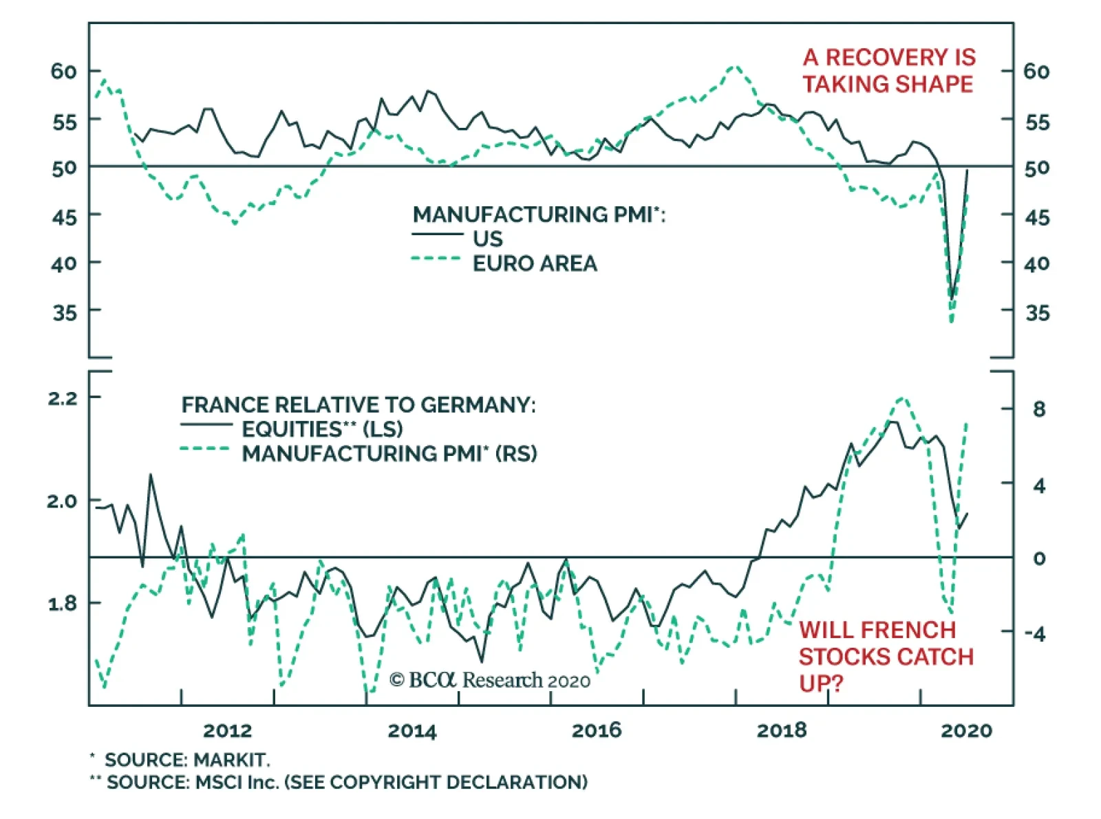
The final pillar is the path of the global business cycle. Important predictors of the US economy have improved. The June Philly Fed and Empire State surveys are gaining ground, thanks to their rebounding new orders and employment components. The Conference Board’s LEI is also climbing, even when its financial constituents are excluded. Residential activity, which also leads the US business cycle, is sending positive signals. According to the June NAHB Housing market index, homebuilder confidence is quickly recouping lost ground and building permits are bottoming. These two series suggest that the contribution of housing to GDP growth will only expand. Household spending is showing promising growth as the economy re-opens. In May, US auto sales jumped 44.1% higher and retail sales (excluding autos) soared by 12.4%. Additionally, the retail sales control group5 has already recovered to its pre-pandemic levels. The healing labor market and the bounce in consumer confidence have fueled this record performance because they will prompt a normalization in the savings rate. Progress is also evident outside the US. The expectations component of the German IFO survey is rebounding vigorously, a good omen for European industrial production (Chart I-8). Similarly, the continued climb in China’s credit and fiscal impulse suggests that global industrial production will move higher. Finally, EM carry trades are recovering, which indicates that liquidity is seeping into corners of the global economy that contribute the most to capex (Chart I-9). Chart I-8European Hopes
European Hopes
European Hopes
Chart I-9Positive Signals For Global Manufacturers
Positive Signals For Global Manufacturers
Positive Signals For Global Manufacturers
Against this backdrop, there is an increasing probability that analysts will upgrade their 2020 EPS estimates. The odds of upward revisions to 2021 and 2022 estimates (especially outside of the tech and healthcare sectors) are much more significant, especially because the historical pattern of deep recessions followed by sharp rebounds should repeat itself (Chart I-10). A strong recovery will ultimately foster risk-taking. Mechanically, higher expected cash flows and lower risk premia will remain tailwinds behind stocks. Chart I-10The Deeper The Fall, The Faster The Rebound
July 2020
July 2020
… And Three Reasons To Worry The five pillars shoring up stocks face three powerful factors working at cross purposes against share prices. The first hurdle against stocks is that in aggregate, the S&P 500 is already discounting the coming economic recovery. In the US, the 12-month forward P/E ratio bounced from a low of 13.4 on March 23 to the current 21.4. Bidding up multiples to such heights in a short timeframe opens up the potential for investor disappointments with economic activity or earnings. Equally concerning, the global expectations component of the German ZEW survey has returned to near-record highs. The ZEW is a survey of financial professionals largely influenced by the performance of equities. In order for stocks to continue to rise, they will need an even greater global economic rebound than implied by the ZEW (Chart I-11). Chart I-11Stocks Already Know That IP Will Jump Back
Stocks Already Know That IP Will Jump Back
Stocks Already Know That IP Will Jump Back
Political risk poses a second hurdle against stocks. As intense as it is today, policy uncertainty will not likely abate this summer, which will put upward pressure on the equity risk premium. According to BCA Research’s Geopolitical strategy service, the combination of elevated share prices and President Trump’s low approval rating will increase the prospect of erratic moves by the White House. A pitfall particularly under-appreciated by risk assets is a new round of tariffs in the Sino-US trade war.6 Another hazard is an escalation of tensions with the European Union. US domestic politics are also problematic. Fiscal stimulus has been a pillar for the market. However, as the economy recovers, politicians could let down their guard and resist passing new measures on the docket. This danger is self-limiting. If legislators delay voting on proposed laws, then the resulting drop in the market will put greater pressure on policymakers to continue to support the economy. Either way, this tug-of-war could easily cause some painful bouts of market volatility. Chart I-12How Long Will Stocks Ignore Politics?
How Long Will Stocks Ignore Politics?
How Long Will Stocks Ignore Politics?
In recent months, the equity risk premium could ignore rising political risk as long as financial liquidity was expanding at an accelerating pace (Chart I-12). However, the bulk of monetary easing is over because the Fed, the ECB and the global central banks have already expended most of their ammunition. Moreover, the ECB, the Bank of England, the Bank of Japan and the Swiss National Bank have agreed to slow the pace at which they tap the Fed’s dollar swap line from daily to three times a week. This indicates that the private sector’s extreme appetite for liquidity has been satiated by the increase in base money since March 19. Thus, the expansion of liquidity will decelerate, even if its level remains plentiful. Overlooking political uncertainty will become harder after the second derivative of liquidity turns negative. The third hurdle against the stock market is the evolution of COVID-19. A second wave of infection has started in many countries and it will only continue to escalate as economies re-open, loosen social distancing rules and test more potential cases. Investors will be rattled by headlines such as the resumption of lockdowns in Beijing and mounting new cases in the southern US. Chart I-13A Different Wave
A Different Wave
A Different Wave
BCA’s base case is that a second wave of infections will not result in large-scale lockdowns that paralyzed the global economy in Q1 and Q2. Importantly, the number of new deaths is lagging the spread of recorded new infections (Chart 1-13). This dichotomy highlights better testing, our improved understanding of the disease and our greater capacity to protect vulnerable individuals. A Summer Of Discontent The S&P 500 and global equities will face a summer of directionless gyrations with elevated volatility. Before we can escape this pattern, the technical froth that has engulfed the market must dissipate. Our Tactical Strength Indicator is massively overbought and is consistent with a period of consolidation. (Chart I-14). The same is true of short-term breadth. The proportion of NYSE stocks trading above their 10-week moving average is close to its highest level in the past 20 years, which indicates that meaningful equity gains are doubtful in the coming months. (Chart I-14, bottom panel). A correction should not morph into a renewed bear market because the pillars behind stocks are too strong. Nonetheless, the S&P 500 may retest the 2800-2900 zone during the summer. On the upside, it will be capped near 3200 during that same period. A resolution of the political risks surrounding the market is needed to settle the churning pattern. Another factor will be the progressive normalization of our tactical indicators after an extended period of sideways trading. Finally, continued progress on the treatment of COVID-19 (not necessarily a vaccine) and the formulation of a coherent health policy for the fall will create the impetus for higher share prices later this year. How To Profit When Stocks Churn A strategy most likely to generate the highest reward-to-risk ratio will be to focus on assets and sectors that have not yet fully priced in the upcoming global economic recovery, unlike the broad stock market. The bond market fits within this strategy. G-7 and US yields remain extremely expensive (Chart I-15). Additionally, according to our Composite Technical Indicator, Treasuries are losing momentum (see Section III, page 41). This valuation and technical backdrop renders government bonds vulnerable to both a strong economy and an upward reassessment of the outlook for inflation. Chart I-14A Needed Digestive Break
A Needed Digestive Break
A Needed Digestive Break
Chart I-15Bonds Are Pricey...
Bonds Are Pricey...
Bonds Are Pricey...
Cyclical dynamics also paint a poor outlook for bonds. Globally, the supply of government securities is swelling by approximately $6 trillion, which will slowly lift depressed term premia. Moreover, there has been a sharp incline in excess liquidity as approximated by the gap between our US Financial Liquidity Index and the rate of change of the US LEI. Such a development has led yields higher since the GFC (Chart I-16). Finally, the diffusion index of fifteen Swedish economic variables has started to recover, an indicator that often signals higher yields (Chart I-17). Sweden is an excellent bellwether for the global business cycle because it is a small, open economy where shipments of industrial and intermediate goods account for 55% of exports. Chart I-16...And Vulnerable To Excess Liquidity
...And Vulnerable To Excess Liquidity
...And Vulnerable To Excess Liquidity
Chart I-17Sweden's Message
Sweden's Message
Sweden's Message
The FX market also offers reasonably priced vehicles to bet on the burgeoning global cyclical upswing. Balance-of-payments dynamics are increasingly bearish for the US dollar. A fall in the household savings rate will widen the current account deficit because the fiscal balance remains deeply negative. Meanwhile, US real interest rate differentials are narrowing, thus the capital account surplus will likely recede. The resulting balance-of-payment deficit will accentuate selling pressures on the USD created by a pick-up in global industrial activity (Chart I-18). AUD/CHF offers another attractive opportunity. The AUD trades near a record low relative to the CHF, yet this cross will benefit from a rebound in global nominal GDP growth (Chart I-19). Moreover, Australia managed the COVID-19 crisis very well and it can proceed quickly with its re-opening. Meanwhile, the expensiveness of the CHF versus the EUR will continue to foster deflationary pressures in Switzerland. This contrast ensures that the Swiss National Bank remains more dovish than the Reserve Bank of Australia. Chart I-18Bearish Dollar Backdrop
Bearish Dollar Backdrop
Bearish Dollar Backdrop
Chart I-19AUD/CHF As A Bet On The Recovery
AUD/CHF As A Bet On The Recovery
AUD/CHF As A Bet On The Recovery
Within equities, deep cyclical stocks remain attractive relative to defensive ones. The same acceleration in our excess liquidity proxy that warned of a fall in bond prices indicates that the cyclicals-to-defensives ratio should appreciate. This ratio also benefits meaningfully when the dollar depreciates. A weaker dollar is synonymous with stronger global industrial production. It also eases deflationary pressures and boosts the price of commodities, which increases pricing power for industrial, material and energy stocks. Finally, the cyclical-to-defensives ratio rises when the silver-to-gold ratio turns up. An outperformance of silver has been an important signal that reflation is starting to improve the global economic outlook (Chart I-20).7 Chart I-20Cyclicals Have Not Priced In The Recovery
Cyclicals Have Not Priced In The Recovery
Cyclicals Have Not Priced In The Recovery
Banks also offer attractive opportunities. Investors have clobbered banks because they expect prodigious non-performing loans (NPL) due to the threats to private-sector balance sheets from the deepest recession in nine decades. However, NPLs are not expanding by as much as anticipated thanks to the ample support by global monetary and fiscal authorities. Moreover, banks were conservative and built loss reserves ahead of the crisis. In this context, the extreme valuation discount embedded in banks relative to the S&P 500 seems exaggerated (Chart I-21). Additionally, the gap between the expected growth rate of banks’ long-term earnings and that of the broad market is wider than at any other point in the past 15 years. Investors have also bid up the price of protection against bank shares (Chart I-22). Therefore, despite near-term risks induced by the Fed’s Stress Test, banks are a cheap contrarian bet on a global recovery. Chart I-21Banks Are Cheap
Banks Are Cheap
Banks Are Cheap
Chart I-22Banks As A Contrarian Bet
Banks As A Contrarian Bet
Banks As A Contrarian Bet
Investors should continue to favor foreign versus US equities, which is consistent with our positive outlook on banks and deep cyclical stocks, as well as our negative disposition toward the dollar. Foreign stocks outperform US ones when the dollar depreciates because the former overweight cyclical equities and financials (Chart I-23). Moreover, foreign stocks trade at discounts to US equities and embed significantly lower expected cash flow growth, which suggests that they would offer investors upside from the impending global economic recovery. Chart I-23Favor Foreign Stocks
Favor Foreign Stocks
Favor Foreign Stocks
EM stocks fit within this context. Both EM FX and equities trade at a valuation discount consistent with an upcoming rally (Chart I-24). Moreover, cheap valuations increase the likelihood that a depreciating US dollar will boost EM currencies by easing global financial conditions. Moreover, the momentum of EM equities relative to global ones is forming a positive divergence with the price ratio, which is consistent with liquidity making its way into these markets (Chart I-25). Our Emerging Markets Strategy team is more worried about EM stocks than we are because EM bourses would be unlikely to participate as much as US ones in a mania driven by retail investors.8 Chart I-24Attractive EM Valuations
Attractive EM Valuations
Attractive EM Valuations
Chart I-25EM: A Coiled-Spring Bet On A Weaker Dollar?
EM: A Coiled-Spring Bet On A Weaker Dollar?
EM: A Coiled-Spring Bet On A Weaker Dollar?
Chart I-26Japanese Stocks As A Trade
Japanese Stocks As A Trade
Japanese Stocks As A Trade
Finally, an opportunity to overweight Japanese equities has emerged. The Nikkei has collapsed in conjunction with a meltdown in Japanese industrial production. However, Japanese earnings should recover faster than in the rest of the world. Japan has efficiently handled its COVID-19 outbreak with fewer lockdowns. Moreover, Japan’s earnings per share (EPS) are highly levered to both the global business cycle and China’s economic fluctuations. Consequently, if we expect global activity to recover and China’s credit and fiscal impulse to continue to improve, then we also anticipate that Japan’s EPS will outperform the MSCI All-Country World Index (Chart I-26). Additionally, on a price-to-cash flow basis, Japanese equities trade at a deep-enough discount to global stocks to foreshadow an upcoming period of outperformance. Bottom Line: Equities will be tossed about for the coming quarter or two, buffeted between five tailwinds and three headwinds. While the S&P is expected to gyrate between 2800 and 3200 this summer, investors can seek alpha by selling bonds, selling the dollar and buying AUD/CHF, and favoring deep cyclical stocks as well as banks at the expense of defensives. As a corollary, foreign equities, especially Japanese ones, have a window to outperform the US. EM stocks could also generate excess returns, but they are a more uncertain bet. Exploring Long-Term Risks We explore some investment implications linked to our theme of structurally rising inflation, which will cause lower real long-term portfolio returns than in the previous four decades. Populism and the ossification of the supply-side of the economy will push inflation up this cycle toward an average of 3% to 5%.9 Chart I-27S&P 500 Long-Term Perspective
S&P 500 Long-Term Perspective
S&P 500 Long-Term Perspective
Adjusted for inflation, the 10-year cumulative average return for stocks stands at 12.4%, which is an elevated reading. The strength of the past performance increases the probability that a period of mean reversion is near (Chart I-27). The end of the debt supercycle raises the likelihood that an era of low real returns will materialize. Non-financial debt accounts for 258.7% of GDP, a level only topped at the depth of the Great Depression when nominal GDP collapsed by 46% from its 1929 peak. Meanwhile, yields are at record lows (Chart I-28). Such a combination suggests that there is little way forward to boost debt by enough to enhance growth, especially when each additional dollar of debt generates a diminishing amount of output. Chart I-28The End Of The Debt Super Cycle
The End Of The Debt Super Cycle
The End Of The Debt Super Cycle
Chart I-29Little Room To Cut Taxes
Little Room To Cut Taxes
Little Room To Cut Taxes
Populist governments will remain profligate and play an expanding role in the economy instead of accepting the necessary increase in savings required to reduce debt and create a more robust economy. However, effective personal and corporate tax rates are already very low in the US (Chart I-29). Therefore, the only way to offer fiscal support would be to increase government spending. Growth will become less vigorous as the government’s share of GDP increases (Chart I-30). Moreover, monetary policy will likely remain lax, which boosts the chance of stagflation developing. Chart I-30The Bigger The Government, The Lower The Growth
July 2020
July 2020
Elevated stock multiples are a problem for long-term investors. The S&P 500’s Shiller P/E ratio stands at 29.1, and its price-to-sales ratio is at 2.2. If bond yields remain minimal, then low discount rates can rationalize those extreme multiples. However, if inflation moves above 4%, especially when real output is not expanding robustly, then multiples will mean-revert and equities will generate subpar real returns. Chart I-31Profit Margins: From Tailwind To Headwind?
Profit Margins: From Tailwind To Headwind?
Profit Margins: From Tailwind To Headwind?
Profit margins pose an additional problem for stocks. The decline in unit labor costs relative to selling prices has allowed abnormally wide domestic EBITDA margins to persist (Chart I-31). However, inflation, populism, greater government involvement in the economy and lower efficiency of supply chains will conspire to undo this extraordinary level of profitability. In other words, while the share of national income taken up by wages will expand, profits will account for a progressively smaller slice of output. (Chart I-31, bottom panel). Lower profit margins will push down RoE and accentuate the decline in multiples while also hurting projected long-term cash flows. Chart I-32Elevated Household Exposure To Stocks
Elevated Household Exposure To Stocks
Elevated Household Exposure To Stocks
Finally, from a structural perspective, households are already aggressively overweighting equities. Stocks comprise 54% of US households’ discretionary portfolios. US households held more shares only in 1968 and 2000, two years that marked the beginning of painful drops in real stock prices (Chart I-32). US stocks are most vulnerable to the increase of inflation. Not only are they much more expensive than their global counterparts, but as the Section II special report written by Matt Gertken highlights, the growing nationalism spreading around the world hurts the global order built by and around the US during the past 70 years. With this system of influence diminished, US firms will not be able to command their current valuation premium. Despite low expected real rates of return, equities will still outperform bonds in the coming decade (Table I-2). Even though stocks are more volatile than bonds, stocks have not significantly outperformed bonds during the past 35 years. This was possible because inflation fell from its peak in the early 1980s. However, bonds are unlikely to once again generate higher risk-adjusted returns than equities if inflation bottoms. Moreover, bonds are more expensive than stocks (Chart I-33). A structural bear market in bonds would hurt risk-parity strategies and end the incredible strength in growth stocks. Table I-2Rising Inflation Flatters Stocks Over Bonds
July 2020
July 2020
The outperformance of stocks over bonds will be of little solace to investors if equities generate poor real returns. Instead, investors should explore commodities, an asset class that benefits from rising inflation, especially given the combination of strong government spending and too-accommodative monetary policy. Moreover, after a decade of weak capex in natural resource extraction, the supply of commodities will expand slowly. Hence, our base case this cycle is for a weakening in the stock-to-gold ratio (Chart I-34). The stock-to-industrial commodities ratio will also fall from its heady levels. As a result, the energy, materials and industrial sectors are attractive on a long-term basis beyond the next six to 12 months. Chart I-33Bonds Look Worse Than Stocks...
Bonds Look Worse Than Stocks...
Bonds Look Worse Than Stocks...
Chart I-34...But Gold Looks The Best
...But Gold Looks The Best
...But Gold Looks The Best
Mathieu Savary Vice President The Bank Credit Analyst June 25, 2020 Next Report: July 30, 2020 II. Nationalism And Globalization After COVID-19 Economic shocks in recent decades have led to surges in nationalism and the COVID-19 crisis is unlikely to be different. Nationalism adds to the structural challenges facing globalization, which is already in retreat. Investors face at least a 35% chance that President Trump will be reelected and energize a nationalist and protectionist agenda that is globally disruptive. China is also indulging in nationalism as trend growth slows, raising the probability of a clash with the US even if Trump does not win. US-China economic decoupling will present opportunities as well as risks – primarily for India and Southeast Asia. Since the Great Recession, investors have watched the US dollar and US equities outperform their peers in the face of a destabilizing world order (Chart II-1). Chart II-1US Outperformance Amid Global Disorder
US Outperformance Amid Global Disorder
US Outperformance Amid Global Disorder
Global and American economic policy uncertainty has surged to the highest levels on record. Investors face political and geopolitical power struggles, trade wars, a global pandemic and recession, and social unrest. How will these risks shape up in the wake of COVID-19? First, massive monetary and fiscal stimulus ensure a global recovery but they also remove some of the economic limitations on countries that are witnessing a surge in nationalism. Second, nationalism creates a precarious environment for globalization – namely the wave of “hyper-globalization” since 2000. Nationalism and de-globalization do not depend on the United States alone but rather have shifted to the East, which means that geopolitical risks will remain elevated even if the US presidential election sees a restoration of the more dovish Democratic Party. Economic Shocks Fuel Nationalism’s Revival Nationalism is the idea that the political state should be made up of a single ethnic or cultural community. While many disasters have resulted from this idea, it is responsible for the modern nation-state and it has enabled democracies to take shape across Europe, the Americas, and beyond. Industrialization is also more feasible under nationalism because cultural conformity helps labor competitiveness.10 At the end of the Cold War, transnational communist ideology collapsed and democratic liberalism grew complacent. Each successive economic shock or major crisis has led to a surge in nationalism to fill the ideological gaps that were exposed. Chart II-2The Resurgence Of Russian Nationalism
July 2020
July 2020
Chart II-3USA: From Nationalism To Anti-Nationalism
July 2020
July 2020
For instance, various nationalists and populists emerged from the financial crises of the late 1990s. Russian President Vladimir Putin sought to restore Russia to greatness in its own and other peoples’ eyes (Chart II-2). Not every Russian adventure has mattered for investors, but taken together they have undermined the stability of the global system and raised barriers to exchange. The invasion of Crimea in 2014 and the interference in the US election in 2016 helped to fuel the rise in policy uncertainty, risk premiums in Russian assets, and safe havens over the past decade. The September 11, 2001 terrorist attacks in the United States created a surge in American nationalism (Chart II-3). This surge has since collapsed, but while it lasted the US destabilized the Middle East and provided Russia and China with the opportunity to pursue a nationalist path of their own. Investors who went long oil and short the US dollar at this time could have done worse. The 2008 crisis spawned new waves of nationalist feeling in countries such as China, Japan, the UK, and India (Chart II-4). Conservatives of the majority cultural group rose to power, including in China, where provincial grassroots members of the elite reasserted the Communist Party’s centrality. Japan and India became excellent equity investment opportunities in their respective spheres, while the UK and China saw their currencies weaken. The rising number of wars and conflicts across the world since 2008 reflects the shift toward nationalism, whether among minority groups seeking autonomy or nation-states seeking living space (Chart II-5). Chart II-4Nationalist Trends Since The Great Recession
July 2020
July 2020
Chart II-5World Conflicts Rise After Major Crises
July 2020
July 2020
COVID-19 is the latest economic shock that will feed a new round of nationalism. At least 750 million people are extremely vulnerable across the world, mostly concentrated in the shatter belt from Libya to Turkey, Iran, Pakistan, and India.11 Instability will generate emigration and conflict. Once again the global oil supply will be at risk from Middle Eastern instability and the dollar will eventually fall due to gargantuan budget and trade deficits. Today’s shock will differ, however, in the way it knocks against globalization, a process that has already begun to slow. Specifically, this crisis threatens to generate instability in East Asia – the workshop of the world – due to the strategic conflict between the US and China. This conflict will play out in the form of “proxy battles” in Greater China and the East Asian periphery. The dollar’s recent weakness is a telling sign of the future to come. In the short run, however, political and geopolitical risks are acute and will support safe havens. Globalization In Retreat Nationalism is not necessarily at odds with globalization. Historically there are many cases in which nationalism undergirds a foreign policy that favors trade and eschews military intervention. This is the default setting of maritime powers such as the British and Dutch. Prior to WWII it was the American setting, and after WWII it was the Japanese. Over the past thirty years, however, the rise of nationalism has generally worked against global trade, peace, and order. That’s because after WWII most of the world accepted internationalist ideals and institutions promoted by the United States that encouraged free markets and free trade. Serious challenges to that US-led system are necessarily challenges to global trade. This is true even if they originate in the United States. Globalization has occurred in waves continuously since the sixteenth century. It is not a light matter to suggest that it is experiencing a reversal. Yet the best historical evidence suggests that global imports, as a share of global output, have hit a major top (Chart II-6).12 The line in this chart will fall further in 2020. American household deleveraging, China’s secular slowdown, and the 2014 drop in oil and commodities have had a pervasive impact on the export contribution to global growth. Chart II-6Globalization Hits A Major Top
Globalization Hits A Major Top
Globalization Hits A Major Top
Chart II-7Both Goods And Services Face Headwinds
Both Goods And Services Face Headwinds
Both Goods And Services Face Headwinds
The next upswing of the business cycle will prompt an increase in trade in 2021. Global fiscal stimulus this year amounts to 8% of GDP and counting. But will the import-to-GDP ratio surpass previous highs? Probably not anytime soon. It is impossible to recreate America’s consumption boom and China’s production boom of the 1980s-2000s with public debt alone. Global trend growth is slowing. Isn’t globalization proceeding in services, if not goods? The world is more interconnected than ever, with nearly half of the population using the Internet – almost 30% in Sub-Saharan Africa. One in every two people uses a smartphone. Eventually the pandemic will be mitigated and global travel will resume. Nevertheless, the global services trade is also facing headwinds. And it requires even more political will to break down barriers for services than it does for goods (Chart II-7). The desire of nations to control and patrol cyberspace has resulted in separate Internets for authoritarian states like Russia and China. Even democracies are turning to censorship and content controls to protect their ideologies. Political demands to protect workers and industries are gaining ground. Policymakers in China and Russia have already shifted back toward import substitution; now the US and EU are joining them, at least when it comes to strategic sectors (health, defense). Nationalists and populists across the emerging world will follow their lead. Regional and wealth inequalities are driving populations to be more skeptical of globalization. GDP per capita has not grown as fast as GDP itself, a simple indication of how globalization does not benefit everyone equally even though it increases growth overall (Chart II-8). Inequality is a factor not only because of relatively well-off workers in the developed world who resent losing their job or earning less than their neighbors. Inequality is also rife in the developing world where opportunities to work, earn higher wages, borrow, enter markets, and innovate are lacking. Over the past decade, emerging countries like Brazil, Indonesia, Mexico, and South Africa have seen growing skepticism about whether foreign openness creates jobs or lifts wages.13 Immigration is probably the clearest indication of the break from globalization. The United States and especially the European Union have faced an influx of refugees and immigrants across their southern borders and have resorted to hard-nosed tactics to put a stop to it (Chart II-9). Chart II-8Global Inequality Fuels Protectionism
July 2020
July 2020
Chart II-9US And EU Crack Down On Immigration
July 2020
July 2020
There is zero chance that these tough tactics will come to an end anytime soon in Europe, where the political establishment has discovered a winning combination with voters by promoting European integration yet tightening control of borders. This combination has kept populists at bay in France, Italy, the Netherlands, Spain, and Germany. A degree of nationalism has been co-opted by the transnational European project. In the US, extreme polarization could cause a major change in immigration policy, depending on the election later this year. But note that the Obama administration was relatively hawkish on the border and the next president will face sky-high unemployment, which discourages flinging open the gates. Reduced immigration will weigh on potential GDP growth and drive up the wage bill for domestic corporations. If nationalism continues to rise and to hinder the movement of people, goods, capital, and ideas, then it will reduce the market’s expectations of future earnings. American Nationalism Still A Risk The United States is experiencing a “Civil War Lite” that may take anywhere from one-to-five years to resolve. The November 3 presidential election will have a major impact on the direction of nationalism and globalization over the coming presidential term. If President Trump is reelected – which we peg at 35% odds – then American nationalism and protectionism will gain a new lease on life. Other nations will follow the US’s lead. If Trump fails, then nationalism will likely be driven by external forces, but protectionism will persist in some form. Chart II-10Trump Is Not Yet Down For The Count
July 2020
July 2020
Investors should not write Trump off. If the election were held today, Trump would lose, but the election is still four months away. His national approval rating has troughed at a higher level than previous troughs. His disapproval rating has spiked but has not yet cleared its early 2019 peak (Chart II-10).14 This is despite an unprecedented deluge of bad news: universal condemnation from Democrats and the media, high-profile defections from fellow Republicans and cabinet members, stunning defeats at the Supreme Court, and scathing rebukes from top US army officers. If Trump’s odds are 35% then this translates to a 35% chance that the United States will continue pursuing globally disruptive “America First” foreign and trade policies in the 2020-24 period. First Trump will attempt to pass a Reciprocal Trade Act to equalize tariffs with all trading partners. Assuming Democrats block it in the House of Representatives, he will still have sweeping executive authority to levy tariffs. He will launch the next round in the trade war with China to secure a “Phase Two” trade deal, which will be tougher because it will be focused on structural reforms. He could also open new fronts against the European Union, Mexico, and other trade surplus countries. By contrast, these risks will melt away if Biden is elected. Biden would restore the Obama administration’s approach of trade favoritism toward strategic allies and partners, such as Europe and the members of the Trans-Pacific Partnership, but only occasional use of tariffs. Biden would work with international organizations like the World Trade Organization. His foreign policy would also open up trade with pariah states like Iran, reducing the tail-risk of a war to almost zero. Biden would be tougher on China than Presidents Obama or Bill Clinton, as the consensus in Washington is now hawkish and Biden would need to keep the blue-collar voters he won back from Trump. He may keep Trump’s tariffs in place as negotiating leverage. But he is less likely to expand these tariffs – and there is zero chance he will use them against Europe. At the same time, it will take a year or more to court the allies and put together a “coalition of the willing” to pressure China on structural reforms and liberalization. China would get a reprieve – and so would financial markets. Thus investors have a roughly 65% chance of seeing US policy “normalize” into an internationalist (not nationalist) approach that reduces the US contribution to trade policy uncertainty and geopolitical risk over the next few years at minimum. But there are still four months to go before the election; these odds can change, and equity market volatility will come first. Moreover a mellower US would still need to react to nationalism in Asia. European Nationalism Not A Risk (Yet) Chart II-11English Versus Scottish Nationalism
English Versus Scottish Nationalism
English Versus Scottish Nationalism
European nationalism has reemerged in recent years but has greatly disappointed the prophets of doom who expected it to lead to the breakup of the European Union. The southern European states suffered the most from COVID-19 but many of them have made their decision regarding nationalism and the supra-national EU. Greece underwent a depression yet remained in the union. Italians could easily elect the right-wing anti-establishment League to head a government in the not-too-distant future. But there is no appetite for an Italian exit. Brexit is the grand exception. If Trump wins, then the UK and British Prime Minister Boris Johnson will be seen as the vanguard of the revival of nationalism in the West. If Trump loses, English nationalism will appear an isolated case that is constrained by its own logic given the response of Scottish nationalism (Chart II-11). The trend in the British Isles would become increasingly remote from the trends in continental Europe and the United States. The majority of Europeans identify both as Europeans and as their home nationality, including majorities in countries like Greece, Italy, France, and Austria where visions of life outside the union are the most robust (Chart II-12). Even the Catalonians are focused on options other than independence, which has fallen to 36% support. Eastern European nationalists play a careful balancing game of posturing against Brussels yet never drifting so far as to let Russia devour them. Chart II-12European Nationalism Is Limited (For Now)
European Nationalism Is Limited (For Now)
European Nationalism Is Limited (For Now)
Europeans have embraced the EU as a multi-ethnic confederation that requires dual allegiances and prioritizes the European project. COVID-19 has so far reinforced this trend, showing solidarity as the predominant force, and much more promptly than during the 2011 crisis. It will take a different kind of crisis to reverse this trend of deeper integration. European nationalists would benefit from another economic crash, a new refugee wave from the Middle East, or conflict with Turkish nationalism. The latter is already burning brightly and will eventually flame out, but not before causing a regional crisis of some kind. European policymakers are containing nationalism by co-opting some of its demands. The EU is taking steps to guard against globalization, particularly on immigration and Chinese mercantilism. The lack of nationalist uprisings in Europe do not overthrow the contention that globalization is slowing down. Europe can become more integrated at home while maintaining the higher barriers against globalization that it has always maintained relative to the UK and United States. Chinese Nationalism The Biggest Risk The nationalist risk to globalization is most significant in East Asia and the Pacific, where Chinese nationalism continues the ascent that began with the Great Recession. China’s slowdown in growth rates has weakened the Communist Party’s confidence in the long-term viability of single-party rule. The result has been a shift in the party line to promote ideology and quality of life improvements to compensate for slower income gains. Xi Jinping’s governing philosophy consists of nationalist territorial gains, promoting “the China Dream” for the middle class, and projecting ambitious goals of global influence by 2035 and 2049. The result has been a clash between mainland Chinese and peripheral Chinese territories – especially Hong Kong and Taiwan (Chart II-13). The turn away from Chinese identity in these areas runs up against their economic interest. It is largely a reaction to the surge in mainland nationalist sentiment, which cannot be observed directly due to the absence of reliable opinion polling. Chart II-13AChinese Nationalism On The Mainland, Anti-Nationalism In Periphery
July 2020
July 2020
Chart II-13BChinese Nationalism On The Mainland, Anti-Nationalism In Periphery
July 2020
July 2020
The conflict over identity in Greater China is perhaps the world’s greatest geopolitical risk. While Hong Kong has no conceivable alternative to Beijing’s supremacy, Taiwan does. The US is interested in reviving its technological and defense relationship with Taiwan now that it seeks to counterbalance China. Chart II-14Taiwan: Epicenter Of US-China Cold War
July 2020
July 2020
Beijing may be faced with a technology cordon imposed by the United States, and yet have the option of circumventing this cordon via Taiwan’s advanced semiconductor manufacturing. Taiwan’s “Silicon Shield” used to be its security guarantee. Now that the US is tightening export controls and sanctions on China, Beijing has a greater need to confiscate that shield. This makes Taiwan the epicenter of the US-China struggle, as we have highlighted since 2016. The risk of a fourth Taiwan Strait crisis is as pertinent in the short run as it is over the long run, given that the US and China have already intensified their saber-rattling in the Strait (Chart II-14), including in the wake of COVID-19 specifically. China’s secular slowdown is prompting it to encroach on the borders of all of its neighbors simultaneously, creating a nascent balance-of-power alliance ranging from India to Australia to Japan. If China fails to curb its nationalism, then eventually US political polarization will decline as the country unites in the face of a peer competitor. If American divisions persist, they could drive the US to instigate conflict with China. Thus a failure of either side to restrain itself is a major geopolitical risk. The US and China ultimately face mutually assured destruction in the event of conflict, but they can have a clash in the near term before they learn their limits. The Cold War provides many occasions of such a learning process – from the Berlin airlift to the Cuban missile crisis. Such crises typically present buying opportunities for financial markets, but the consequences could be more far reaching if the Asian manufacturing supply chain is permanently damaged or if the shifting of supply chains out of China is too rapid. Globalization will also suffer as a result of currency wars. The US has not been successful in driving the dollar down, a key demand of the US-China trade war. It is much harder to force China to reform its labor and wage policies than it is to force it to appreciate its currency. But unlike Japan in 1985, China will not commit to unilateral appreciation for fear of American economic sabotage. Punitive measures will remain an American tool. Contrary to popular belief, the US is not attempting to eliminate its trade deficit. It is attempting to reduce overreliance on China. Status quo globalization is intolerable for US strategy. But autarky is intolerable for US corporations. The compromise is globalization-ex-China, i.e., economic decoupling. Investment Implications Chart II-15Favor International Stocks As Growth Revives
Favor International Stocks As Growth Revives
Favor International Stocks As Growth Revives
US stock market’s capitalization now makes up 58% of global capitalization (Chart II-15), reflecting the strength and innovation of American companies as well as a worldwide flight to safety during a decade of rising policy uncertainty and geopolitical risk. The revival of global growth amid this year’s gargantuan stimulus will prompt a major rotation out of US equities and into international and emerging market equities over the long run. As mentioned, the US greenback would also trend downward. However, there will be little clarity on the pace of nationalism and the fate of globalization until the US election is decided. Moreover the fate of globalization does not depend entirely on the United States. It mostly depends on countries in the east – Russia, China, and India, all of which are increasingly nationalistic. A miscalculation over Taiwan, North Korea, the East China Sea, the South China Sea, trade, or technology could ignite into tariffs, sanctions, boycotts, embargoes, saber-rattling, proxy battles, and potentially even direct conflict. These risks are elevated in the short run but will persist in the long run. As the US decouples from China it will have to deepen relations with other trading partners. The trade deficit will not go away but will be redistributed to Asian allies. Southeast Asian nations and India – whose own nationalism has created a shift in favor of economic development – will be the long-run beneficiaries. Matt Gertken Vice President Geopolitical Strategist III. Indicators And Reference Charts We continue to favor stocks at the expense of bonds, a view held since our April issue. Global fiscal and monetary conditions remain highly accommodative. Now that the global economy is starting to recover as lockdowns ease, another tailwind for stocks has emerged. Nonetheless, last month we warned that the S&P 500 was entering a consolidation phase and that a pattern of volatile ups and downs would ensue. The combination of tactically overbought markets, elevated geopolitical risk, and a looming second wave of infections continues to sustain this short-term view. Hence, the S&P 500 is likely to churn between 2088 and 3200 over the coming months. On a cyclical basis, the same factors that made us willing buyers of stocks since late March remain broadly in place. Stocks are becoming increasingly expensive, but monetary conditions are extremely accommodative. Our Speculation Indicator continues to send a benign signal, which indicates that from a cyclical perspective, the market is not especially vulnerable. Finally, our Revealed Preference Indicator is flashing a strong buy signal. Tactically, equities must still digest the heady gains made since March 23. We have had five 5% or more corrections since March 23. More of them are in the cards. Both our Tactical Strength Indicator and the share of NYSE stocks trading above their 10-week moving averages point to a pullback of 5% to 10%. Moreover, while it remains extremely stimulative, our Monetary Indicator is not rising anymore, which increases the probability that traders start to pay more attention to geopolitical risks. According to our Bond Valuation Index, Treasurys are significantly more overvalued than equities. Additionally, our Composite Technical Indicator is losing momentum. This backdrop is dangerous for bonds, especially when sentiment towards this asset class is as high as it is today and economic growth is turning the corner. Finally, we expect the yield curve to steepen, especially for very long maturities where the Fed is less active. In a similar vein, inflation breakeven rates are a clean vehicle to bet on higher yields. Since we last published, the dollar has broken down. The greenback is expensive and its counter-cyclicality is a major handicap during a global economic recovery. Additionally, the US twin deficits are increasingly problematic. The fiscal deficit remains exceptionally wide and the re-opening of the US economy will pull down the household savings rate. The current account deficit is therefore bound to widen. The continued low level of real interest rates will complicate financing this deficit and to equilibrate the funding of US liabilities, the dollar will depreciate. The widening in the current account deficit also means that the large increase in money supply by the Fed will leak out of the US economy. This process will accentuate the dollar’s negative impulse. Technically, the accelerating downward momentum in our Dollar Composite Technical Indicator also warns of additional downside for the USD. Commodities continue to gain traction. The rapid move up in the Baltic Dry index suggests that more gains are in store for natural resource prices, especially as our momentum indicator is gaining strength. Moreover, the commodity advance/decline line remains in an uptrend. A global economic recovery, a weakening dollar, and falling real interest rates (driven by easy policy) indicate that fundamental factors – not just technical ones – are also increasingly commodity bullish. Tactically, if stocks churn, as we expect, commodities will likely do so as well. However, this move should also be seen as a consolidation of previous gains. Finally, gold remains strong, lifted by accommodative monetary conditions and a weak dollar. However, the yellow metal is now trading at a significant premium to its short-term fundamentals. Gold too is likely to trade in a volatile sideways pattern, especially if bond yields rise. EQUITIES: Chart III-1US Equity Indicators
US Equity Indicators
US Equity Indicators
Chart III-2Willingness To Pay For Risk
Willingness To Pay For Risk
Willingness To Pay For Risk
Chart III-3US Equity Sentiment Indicators
US Equity Sentiment Indicators
US Equity Sentiment Indicators
Chart III-4Revealed Preference Indicator
Revealed Preference Indicator
Revealed Preference Indicator
Chart III-5US Stock Market Valuation
US Stock Market Valuation
US Stock Market Valuation
Chart III-6US Earnings
US Earnings
US Earnings
Chart III-7Global Stock Market And Earnings: Relative Performance
July 2020
July 2020
Chart III-8Global Stock Market And Earnings: Relative Performance
July 2020
July 2020
FIXED INCOME: Chart III-9US Treasurys And Valuations
July 2020
July 2020
Chart III-10Yield Curve Slopes
Yield Curve Slopes
Yield Curve Slopes
Chart III-11Selected US Bond Yields
Selected US Bond Yields
Selected US Bond Yields
Chart III-1210-Year Treasury Yield Components
10-Year Treasury Yield Components
10-Year Treasury Yield Components
Chart III-13US Corporate Bonds And Health Monitor
US Corporate Bonds And Health Monitor
US Corporate Bonds And Health Monitor
Chart III-14Global Bonds: Developed Markets
Global Bonds: Developed Markets
Global Bonds: Developed Markets
Chart III-15Global Bonds: Emerging Markets
Global Bonds: Emerging Markets
Global Bonds: Emerging Markets
CURRENCIES: Chart III-16US Dollar And PPP
US Dollar And PPP
US Dollar And PPP
Chart III-17US Dollar And Indicator
US Dollar And Indicator
US Dollar And Indicator
Chart III-18US Dollar Fundamentals
US Dollar Fundamentals
US Dollar Fundamentals
Chart III-19Japanese Yen Technicals
Japanese Yen Technicals
Japanese Yen Technicals
Chart III-20Euro Technicals
Euro Technicals
Euro Technicals
Chart III-21Euro/Yen Technicals
Euro/Yen Technicals
Euro/Yen Technicals
Chart III-22Euro/Pound Technicals
Euro/Pound Technicals
Euro/Pound Technicals
COMMODITIES: Chart III-23Broad Commodity Indicators
Broad Commodity Indicators
Broad Commodity Indicators
Chart III-24Commodity Prices
Commodity Prices
Commodity Prices
Chart III-25Commodity Prices
Commodity Prices
Commodity Prices
Chart III-26Commodity Sentiment
Commodity Sentiment
Commodity Sentiment
Chart III-27Speculative Positioning
Speculative Positioning
Speculative Positioning
ECONOMY: Chart III-28US And Global Macro Backdrop
US And Global Macro Backdrop
US And Global Macro Backdrop
Chart III-29US Macro Snapshot
US Macro Snapshot
US Macro Snapshot
Chart III-30US Growth Outlook
US Growth Outlook
US Growth Outlook
Chart III-31US Cyclical Spending
US Cyclical Spending
US Cyclical Spending
Chart III-32US Labor Market
US Labor Market
US Labor Market
Chart III-33US Consumption
US Consumption
US Consumption
Chart III-34US Housing
US Housing
US Housing
Chart III-35US Debt And Deleveraging
US Debt And Deleveraging
US Debt And Deleveraging
Chart III-36US Financial Conditions
US Financial Conditions
US Financial Conditions
Chart III-37Global Economic Snapshot: Europe
Global Economic Snapshot: Europe
Global Economic Snapshot: Europe
Chart III-38Global Economic Snapshot: China
Global Economic Snapshot: China
Global Economic Snapshot: China
Mathieu Savary Vice President The Bank Credit Analyst Footnotes 1 Please see Geopolitical Strategy "Social Unrest Can Still Cause Volatility," dated June 5, 2020, available at gps.bcaresearch.com 2 Please see The Bank Credit Analyst "June 2020," dated May 28, 2020, available at bca.bcaresearch.com 3 Please see Geopolitical Strategy "Introducing: The Median Voter Theory," dated June 8, 2016, available at gps.bcaresearch.com 4 Please see US Investment Strategy "So Far, So Good (How Markets Learned To Stop Worrying And Love Washington, DC)," dated June 8, 2020, available at usis.bcaresearch.com 5 The control group excludes auto and gas stations, and building materials. 6 Please see Geopolitical Strategy "Geopolitics Is The Next Shoe To Drop," dated April 10, 2020, available at gps.bcaresearch.com 7 Gold and silver are precious metals that benefit from lower interest rates and a weak dollar. However, a much larger proportion of the demand for silver comes from industrial processes. Thus, silver outperforms gold when an economic recovery is imminent. 8 Please see Emerging Markets Strategy "A FOMO-Driven Mania?," dated June 4, 2020, and Emerging Markets Strategy "EM: Follow The Momentum," dated June 18, 2020, available at ems.bcaresearch.com 9 Please see The Bank Credit Analyst "June 2020," dated May 28, 2020, available at bca.bcaresearch.com 10 Ernest Gellner, Nations and Nationalism (Ithaca, NY: Cornell University Press, 1983). 11 Neli Esipova, Julie Ray, and Ying Han, “750 Million Struggling To Meet Basic Needs With No Safety Net,” Gallup News, June 16, 2020. 12 Christopher Chase-Dunn et al, “The Development of World-Systems,” Sociology of Development 1 (2015), pp. 149-172; and Chase-Dunn, Yukio Kawano, Benjamin Brewer, “Trade globalization since 1795: waves of integration in the world-system,” American Sociological Review 65 (2000), pp. 77-95. 13 Bruce Stokes, “Americans, Like Many In Other Advanced Economies, Not Convinced Of Trade’s Benefits,” September 26, 2018. 14 In other words, the mishandling of COVID-19 and the historic George Floyd protests of June 2020 have not taken as great of a toll on Trump’s national approval, thus far, as the Ukraine scandal last October, the government shutdown in January-February 2019, the near-failure to pass tax cuts in December 2017, or the Charlottesville incident in August 2017. This is surprising and points once more to Trump’s very solid political base, which could serve as a springboard for a comeback over the next four months.
The flash PMIs for June confirm the notion that the global economy is experiencing a quick rebound as activity resumes after prolonged lockdowns. In the euro area, the Manufacturing PMI jumped from 39.4 in May to 46.9. The Services PMI surged from 30.5…
Highlights Global Inflation: The worst of the 2020 collapse in global inflation is over; economic growth is starting to rebound, monetary and fiscal policies are highly stimulative, commodity prices are rising and the US dollar is losing some steam. This boosts the investment case for developed market inflation-linked bonds, which appear cheap on our models on a breakeven basis versus nominal government debt. Inflation-Linked Bonds: Starting this week, we are permanently adding inflation-linked bonds as a “discretionary” allocation option in our model bond portfolio framework. We begin with allocations to linkers in the US, Italy and Canada. Tactical Overlay 2.0: We are introducing our revamped Tactical Trade Overlay, using specific securities to implement shorter-term trade ideas in a practical fashion. This week, we begin by initiating inflation-linked bond breakeven trades in the US, Italy and Canada. Feature Chart of the WeekThe Early Days Of An Inflation Expectations Revival
The Early Days Of An Inflation Expectations Revival
The Early Days Of An Inflation Expectations Revival
With global growth now showing signs of rebounding from the COVID-19 recession as lockdown restrictions ease, inflation expectations in the major developed economies have started to drift upward. Higher inflation breakevens have helped stabilized nominal government bond yields in the majority of countries, even with the latest reads on realized inflation still showing few signs of life (Chart of the Week). In our view, it is still far too soon for bond investors to shift to a below-benchmark stance on overall duration exposure. The threat of a new set of COVID-19 lockdowns is growing, given surging numbers of new infections across much of the southern US and in major emerging economies like Brazil and India. The social and political instability in the US, with elections less than five months away, raises the risk of a renewed flare-up of negative headline risk that can upset overheated equity and credit markets. Amidst all that uncertainty, policymakers worldwide will continue to use aggressive monetary and fiscal stimulus to fight off the risk of an extended recession. That means there is little risk of a big surge in global bond yields from a hawkish repricing of central bank policy expectations over at least the next 6-12 months. At the same time, the extraordinarily loose policy settings, combined with the continued rebound in global commodity prices (most notably, oil), should allow inflation expectations to continue drifting higher. While this will likely also push nominal bond yields higher as well, positioning for wider inflation breakevens remains the “cleaner” way to position for the initial impact of policy reflation. In a report published back on April 28, we introduced a series of valuation models for inflation-linked bonds in the developed economies.1 These models showed that the historic collapse in global oil prices earlier this year, combined with the deflationary impulse from the deep global COVID-19 recession, pushed breakeven inflation rates to levels well below fair value in most countries. Positioning for wider inflation breakevens remains the “cleaner” way to position for the initial impact of policy reflation. This week, we take the output from our inflation breakeven models to determine specific inflation-linked trade recommendations over both strategic (6-12 months) and tactical (0-6 months) time horizons. For the former, we are adding inflation-linked bonds as an allocation option for all countries in our model bond portfolio. For the latter, we are reviving our Tactical Trade Overlay by introducing some specific trade recommendations using actual inflation-linked bonds in the US, Europe and Canada. Why Global Inflation Expectations Have Bottomed The recent pickup in global market-based inflation expectations has occurred even as actual realized headline inflation rates have fallen dangerously close to 0% in the US, euro area and the UK (Chart 2). Canada is now in outright deflation, with the year-over-year rate of headline CPI inflation falling to -0.4% in May. The decline is not fully attributable to the earlier collapse in oil prices, as core inflation rates have also fallen across the developed world. Chart 2A Threat Of Realized Deflation
A Threat Of Realized Deflation
A Threat Of Realized Deflation
Despite the plunge in realized inflation, inflation expectations have moved higher for both market-based indicators like inflation breakevens and survey-based measures as well. Chart 3Inflation Expectations Improving Everywhere ….
Inflation Expectations Improving Everywhere ...
Inflation Expectations Improving Everywhere ...
Chart 4… Even Within Europe
... Even Within Europe
... Even Within Europe
The German ZEW economic research institute - well known for their surveys of economic forecasters for Germany and the major developed countries - also produces inflation expectations surveys for the same countries. In Charts 3 & 4, we show those ZEW inflation expectations measures alongside the breakeven inflation rates for 10-year government bonds in the US, UK, Japan and the euro area including country-level data for Germany, France and Italy. It is clear that the upturn in breakevens has also occurred as a growing number of economic forecasters have started to anticipate a move higher in both economic growth and inflation over the next year. With recent economic data surprising to the upside in the US, China and in much of Europe, a more optimistic view on global growth is a logical reason helping explain why inflation expectations have been drifting higher. Even more so has been a shift in the deflationary momentum stemming from a rising US dollar and falling commodity prices – trends that are in the process of reversing. Perhaps the strongest deflationary force over the past couple of years has been the persistent strength of the US dollar. World export prices have been contracting on a year-over-year basis since December 2018, which has coincided with a similar period of positive annual growth in the trade-weighted US dollar since June 2018 (Chart 5). While the dollar is still at elevated levels, its momentum has started to roll over (middle panel), suggesting less deflationary pressure from the currency. The same can be said for commodity prices, which reflect both the global demand story and the trend in the US dollar as well, given that important industrial commodities like oil and copper are priced in US dollars. With the prices of those commodities off their lows, the annual growth rates of the CRB Energy and Metals indices have bottomed out, implying less global deflationary pressure from commodities (bottom panel). A reflationary boost to the global economy – and to inflation expectations – from a softer dollar is likely over the next 6-12 months. Looking ahead, the US dollar is likely to continue losing strength for two reasons: less-supportive interest rate differentials and improving global growth (Chart 6). The Fed’s aggressive interest rate cuts over the past year have eliminated much of the attractive carry that helped fuel the dollar’s rise over the past few years. At the same time, the US dollar remains an “anti-growth” currency that tends to weaken during periods of improving global growth, and vice versa. Chart 5Easing Of Disinflationary Pressures From The USD & Commodities
Easing Of Disinflationary Pressures From The USD & Commodities
Easing Of Disinflationary Pressures From The USD & Commodities
Chart 6A Softer USD Will Help Lift Global Inflation Expectations
A Softer USD Will Help Lift Global Inflation Expectations
A Softer USD Will Help Lift Global Inflation Expectations
With global growth starting to emerge from the COVID-19 recession, the US dollar is now more exposed to less attractive interest rate differentials. This suggests that a reflationary boost to the global economy – and to inflation expectations – from a softer dollar is likely over the next 6-12 months. Chart 7Rising Oil Prices Will Help Lift Global Inflation Expectations
Rising Oil Prices Will Help Lift Global Inflation Expectations
Rising Oil Prices Will Help Lift Global Inflation Expectations
The same can be said for commodity prices like oil, which have considerable upside as global growth improves. Our colleagues at BCA Research Commodity & Energy Strategy are quite bullish on the outlook for oil over the next 12-18 months, given the improved demand/supply balance and aggressive global monetary and fiscal stimulus. Their expect the Brent benchmark to rise to $46/bbl by the end of 2020 and $73/bbl by the end of 2021 – levels that would push inflation expectations in the US and other major developed markets higher given the usual strong correlation between oil and breakevens (Chart 7).2 Summing it all up, the trends that have helped stabilize and lift global inflation expectations look set to continue over the next 6-12 months. Bottom Line: The worst of the 2020 collapse in global inflation is over; economic growth is starting to rebound, monetary and fiscal policies are highly stimulative, commodity prices are rising and the US dollar is losing some steam. This boosts the investment case for developed market inflation-linked bonds, which appear cheap on our models on a breakeven basis versus nominal government debt. Adding Inflation-Linked Bonds To Our Model Bond Portfolio Our model bond portfolio framework is how we translate our main global fixed income strategic themes into actual investment recommendations. We apply specific weightings to government bond and spread product allocations within a fully invested hypothetical portfolio with a custom benchmark index (which is essentially the Bloomberg Barclays Global Aggregate with additional allocations to high-yield and emerging market corporates). We had not included inflation-linked bonds in the model portfolio, as we have always maintained a focus on the larger and more liquid parts of the developed market fixed income universe. We chose to express views on inflation expectations through duration or yield curve positioning, under the assumption that wider breakevens correlate to higher bond yields and/or steeper yield curves. Chart 8Global Inflation Breakevens Are Too Low
Global Inflation Breakevens Are Too Low
Global Inflation Breakevens Are Too Low
We now are of the view that inflation-linked bonds should be included in our model portfolio investment universe, but on an “opportunistic” basis. In other words, we are not adding linkers to the custom benchmark index. Instead, we will be using potential allocations to inflation-linked bonds as another way to play for periods of rising inflation expectations beyond recommended duration and curve tilts in the model portfolio – particularly now that we have valuation models for inflation breakevens in almost all countries in the portfolio (the US, UK, Japan, Germany, Italy, France, Canada and Australia). Based on the output of our fundamental fair value framework for 10-year inflation breakevens, inflation protection looks “cheap” in all countries where we have valuation models except the UK (Chart 8). Charts with the details of each country’s 10-year inflation breakeven model can be found in the Appendix on pages 11-14. The inputs to the model are the same for each country: a) the 5-year moving average of headline CPI, representing the medium-term trend that anchors inflation expectations; and b) the annual percentage change in the Brent oil price in local currency terms, which creates deviations from the trend to account for moves in oil and currencies. For all countries excluding the UK, breakevens are below fair value because of the collapse in oil prices earlier this year. Inflation protection looks “cheap” in all countries where we have valuation models except the UK. The UK is the one market that does not appear cheap in our framework, with breakevens very close to both fair value and the medium-term trend in realized inflation. Those relatively high breakevens are also a reflection of the very low real bond yields for UK index-linked Gilts. Chart 9Linkers Offer Better Value In The US & Euro Area Than The UK
Linkers Offer Better Value In The US & Euro Area Than The UK
Linkers Offer Better Value In The US & Euro Area Than The UK
For the past several years, UK real yields have traded well below measures of equilibrium real interest rates like the New York Fed’s estimates of “r-star”. This differs from real yields for US TIPS or French OATis, which trade roughly in line with the r-star estimates for the US and euro area (Chart 9). We suspect that is because of the chronic demand/supply mismatch for UK inflation-linked bonds, which are always in high demand from UK pension funds who need real assets for asset/liability management and regulatory purposes. So based on the output from the fair value models, inflation-linked bonds look most attractive on a breakeven basis in Italy, Canada, the US, Japan, Germany and France. From this list, we are choosing to add recommended positions in the US, Italy and Canada only. For Germany and France, we are already very underweight both countries in the model portfolio, so it is difficult to make a meaningful switch out of nominal bonds into linkers. For Japan, the Bank of Japan’s Yield Curve Control policy, which caps the level of 10-year bond yields near 0%, makes us reluctant to recommend any breakeven widening positions. The changes to the model bond portfolio can be found in the tables on pages 15-16. Bottom Line: Starting this week, we are permanently adding inflation-linked bonds as a “discretionary” allocation option in our model bond portfolio framework. We begin with allocations to linkers in the US, Italy and Canada. Tactical Trade Overlay 2.0, Starting With Inflation-Linked Bonds This week, we are introducing a remodeled version of our Tactical Trade Overlay, which we put on hiatus a few months ago because of “mission creep”. Many of our recommendations were being held too long to be truly considered tactical, or short-term, in nature, thus defying the original purpose of the Overlay. This week, we are introducing a remodeled version of our Tactical Trade Overlay, which we put on hiatus a few months ago because of “mission creep”. All trades in the new Overlay will have a shorter term investment horizon of six months or less. All recommended trades will be implemented with specific securities, rather than just using generic Bloomberg tickers or bond indices. This will allow for a more transparent process where clients can “follow along” with the performance of our trades. Chart 10Inflation-Linked Bonds Have A Duration To Real Yields, Unlike Nominals
Inflation-Linked Bonds Have A Duration To Real Yields, Unlike Nominals
Inflation-Linked Bonds Have A Duration To Real Yields, Unlike Nominals
To begin, we are putting three inflation-linked bond trades into our new Tactical Trade Overlay, positioning for wider 10-year breakevens in the US, Italy and Canada. All trades will be implemented using a long position in an inflation-linked bond and a short position in the government bond futures contract for each country. We are using futures rather than a short position in a cash government bond for the sake of simplicity, both for implementing the trade and measuring returns. The new trades will be implemented on a duration-matched basis. This means only selling enough of the 10-year bond futures to hedge against any directional move in the yield of the long 10-year inflation-linked bond. A straight comparison of the duration of linkers to futures cannot be made, since inflation-linked bonds have a duration to real yields while futures (and cash government bonds) have a duration to nominal yields. The durations for inflation-linked bonds are always higher than those of nominals (Chart 10), thus the index-linked durations must be adjusted by the beta of changes in real yields to changes in nominal bond yields. To determine the correct duration adjustment, we use betas taken from rolling three-year regressions of monthly changes of 10-year inflation-linked yields on changes in 10-year nominal government yields, using generic Bloomberg tickers. The common convention is to simply apply a yield beta of 0.5 for all inflation-linked bonds (this is the default setting on Bloomberg valuation tools). We think having a variable yield beta is a more accurate way to hedge out the directional risk in each trade from shifts in real bond yields. Chart 11Yield Betas For Inflation-Linked Bonds Vary Across Countries
Yield Betas For Inflation-Linked Bonds Vary Across Countries
Yield Betas For Inflation-Linked Bonds Vary Across Countries
The current yield betas for all eight countries where we have inflation breakeven fair value models are shown in Chart 11 – it is clear from the chart that using a constant yield beta of 0.5 across countries is not accurate, as they vary widely across countries. Multiplying the duration of the actual inflation-linked bond used in our breakeven trades by our rolling yield beta creates a “nominal” duration measure that can then be compared to the duration on the short leg of the breakeven trade. For futures, we use the empirical duration estimates from Bloomberg using the “FRSK” function. The ratio of the beta-adjusted linker duration to the empirical duration of the bond futures creates the hedge ratio that we will use when measuring the returns of this now “risk-matched” breakeven trade. The actual bonds, futures contracts and hedge ratios for all of our new breakeven trades can all be found in the table on page 18, with initial entry prices for all securities. We will begin to monitor the trade returns in next week’s report. Bottom Line: We are reviving our Tactical Trade Overlay with inflation-linked bond breakeven trades in the US, Italy and Canada. Appendix: 10-Year Inflation Break Even Model Chart 12Our US 10-Year Inflation Breakeven Model
Our US 10-Year Inflation Breakeven Model
Our US 10-Year Inflation Breakeven Model
Chart 13Our UK 10-Year Inflation Breakeven Model
Our UK 10-Year Inflation Breakeven Model
Our UK 10-Year Inflation Breakeven Model
Chart 14Our France 10-Year Inflation Breakeven Model
Our France 10-Year Inflation Breakeven Model
Our France 10-Year Inflation Breakeven Model
Chart 15Our Italy 10-Year Inflation Breakeven Model
Our Italy 10-Year Inflation Breakeven Model
Our Italy 10-Year Inflation Breakeven Model
Chart 16Our Japan 10-Year Inflation Breakeven Model
Our Japan 10-Year Inflation Breakeven Model
Our Japan 10-Year Inflation Breakeven Model
Chart 17Our Germany 10-Year Inflation Breakeven Model
Our Germany 10-Year Inflation Breakeven Model
Our Germany 10-Year Inflation Breakeven Model
Chart 18Our Canada 10-Year Inflation Breakeven Model
Our Canada 10-Year Inflation Breakeven Model
Our Canada 10-Year Inflation Breakeven Model
Chart 19Our Australia 10-Year Inflation Breakeven Model
Our Australia 10-Year Inflation Breakeven Model
Our Australia 10-Year Inflation Breakeven Model
Robert Robis, CFA Chief Fixed Income Strategist rrobis@bcaresearch.com Footnotes 1 Please see BCA Research Global Fixed Income Strategy Weekly Report, "Global Inflation Expectations Are Too Low", dated April 28, 2020, available at gfis.bcaresearch.com. 2 Please see BCA Research Commodity & Energy Strategy Weekly Report, "Low Vol, High Uncertainty Keeps Oil-Price Rally On Tenterhooks", dated June 18, 2020, available at ces.bcaresearch.com. Recommendations The GFIS Recommended Portfolio Vs. The Custom Benchmark Index
How To Play The Revival Of Global Inflation Expectations
How To Play The Revival Of Global Inflation Expectations
Duration Regional Allocation Spread Product Tactical Trades Yields & Returns Global Bond Yields Historical Returns
Highlights We test the out-of-sample performance of Mean-Variance Optimization (MVO) portfolios. We find that MVO portfolios based on historical estimates have historically underperformed static-weight portfolios. However, MVO portfolios using momentum-based return estimates and a “shrunk” correlation matrix dramatically improved performance, allowing them to outperform our benchmarks. Additionally, MVO portfolios where the asset weights could not deviate more than 10% from the benchmark still added value, making them a more attractive option for benchmarked investors. Feature “Let every man divide his money into three parts, and invest a third in land, a third in business, and a third let him keep in reserve” – Rabbi Isaac bar Aha, Babylonian Talmud, 200 C.E. Diversification is the main pillar of asset allocation. Its advantages are clear: By spreading out funds to different assets, a portfolio can remain resilient to the failings of individual investments, provided they do not occur at the same time. But, while it is universally accepted that “you should not put all your eggs in one basket”,1 putting this concept into practice remains challenging: After all, how exactly do you diversify? The first attempt to answer this question dates back to the Babylonian Talmud, which suggested that an equally weighted portfolio between a growth asset, a real asset, and a safe asset was the best way to allocate one’s funds. After that, it took almost 2000 years for the first formal theory on portfolio construction to emerge, with the derivation of the mean-variance solution by Harry Markowitz in the 1950s. Today, while other methods such as risk parity, factor-based diversification, and the Kelly criterion have also emerged, mean-variance optimization remains the standard theoretical framework for portfolio construction. However, mean-variance optimization (MVO) has not proven to be the final solution to the asset allocation puzzle. Far from it. With time, investors have realized that, while MVO might provide the optimal allocation in theory, it has several drawbacks when used to construct real world portfolios. Specifically, MVO portfolios have become notorious due to their inability to deal with estimation error, as well as for their large concentrated positions on a single asset. In this report we examine the strengths and weaknesses of MVO portfolios from an empirical standpoint, and we suggest three practical solutions to solve some of the problems described above. The report is structured as follows: We first describe our data and methodology in our Methodology section. We then provide a summary of our main findings in the Summary Of Results section. For readers who wish to read a more detailed description of our analysis, please refer the Results In Full section. Methodology Data In order to build optimized portfolios, we use monthly returns for seven assets from the perspective of a US-based investor: US equities, international equities (developed markets ex-US), US Treasurys, US investment-grade corporate bonds, commodity futures, US REITs, and US cash. We use a sample starting in 1973 and ending in April 2020.2 Optimization We build three types of mean-variance optimized portfolios: A conservative portfolio, with a target volatility of 6%, a moderate portfolio, with a target volatility of 9%, and an aggressive portfolio, with a target volatility of 12%.3 In the optimization procedure, each portfolio seeks to maximize returns subject to the risk constraint. In addition to this risk constraint, we also do not allow for leverage or short positions. The optimization and rebalancing are done on a monthly basis. Benchmarking As a benchmark we build three portfolios (an aggressive benchmark, a moderate benchmark, and a conservative benchmark) with constant weights. The portfolios are rebalanced on a monthly basis. Be advised that this is not a completely fair comparison, as these benchmarks are constructed ex-post, which means that in contrast to the MVO portfolios, these benchmark portfolios have the benefit of hindsight to achieve their target volatility. However, they will prove useful to evaluate whether MVO portfolios are doing a good job at maximizing returns. Table 1 describes the benchmark portfolios. Table 1Benchmark Portfolio Weights
The User Manual On Portfolio Construction: Mean-Variance Optimization
The User Manual On Portfolio Construction: Mean-Variance Optimization
Turnover limits In order to get a better picture of how MVO performs under realistic conditions, we assess the performance of MVO portfolios with turnover limits. These turnover limits are put in place to take into account that changing portfolio weights by large amounts from month to month is not feasible for most asset managers. We limit the month-to-month change in the weight of each asset to 5%. As an example, if the current weight in US Treasurys is 20%, and the MVO finds that the optimal weight for the following month is 40%, the new weight will only be 25%. In a few months this results in buying and selling not being equal. In those cases, turnover for certain assets might be limited further to ensure that all of the weights add up to 100%. Transaction costs Table 2One-Way Transaction Costs
The User Manual On Portfolio Construction: Mean-Variance Optimization
The User Manual On Portfolio Construction: Mean-Variance Optimization
To calculate transaction costs, we multiply the absolute value of the month-on-month change in the weight of each asset by the transaction costs shown in Table 2. Note that this approach does not take into account drift. However, this will not be important when comparing portfolios, given that drift will also not be considered for the benchmarks (since weights stay static from month to month, transaction costs for the benchmarks are zero in our analysis). Summary Of Results After conducting our analysis, our main findings were the following (please see full details below in the following sections): Historical performance MVO portfolios using historical estimates as inputs have historically underperformed static-weight benchmarks in both raw return and risk-adjusted terms (Table 3). The realized volatility of MVO portfolios was relatively close to their target risk over the sample. However, this was not true when looking at shorter periods. Table 3Summary Of Results
The User Manual On Portfolio Construction: Mean-Variance Optimization
The User Manual On Portfolio Construction: Mean-Variance Optimization
Solution #1: Momentum-based return estimates Expected return estimates can be improved by taking into account that prices usually trend (price momentum). These momentum-based return estimates improve both the return and the Sharpe ratio. Additionally, the volatility of MVO portfolios using momentum-based return estimates remains below the target risk more consistently. Solution #2: Shrinking correlation matrix Historical correlation estimates are often too noisy and lead to estimation error. “Shrinking” cross-asset correlations to a pre-specified value often results in improvements in both raw returns and risk-adjusted returns. Very high shrink factors had the best performance. Solution #3: Constraining weights MVO portfolios result in large concentrations in one or two assets. Such an allocation is not practical for most asset managers, particularly if they are benchmarked. However, MVO can improve performance even when asset weights are constrained. Specifically, the information ratio can be improved when using the two solutions described above. We remind clients that MVO should be used prudently. Specifically, even though many of the measurements we have suggested here concentrate in making MVO more robust to noisy estimates, MVO is always vulnerable to the risk of estimation error. Other inputs should be considered when making final asset allocation decisions. Results In Full Historical performance The theory underpinning mean-variance optimizations assumes perfect knowledge of expected returns, volatility, and correlation. In practice, however, this is never the case. Instead, these inputs need to be estimated – a process which unavoidably carries error with it. This error in the estimated inputs can lead to significant deviations from the optimal weights, resulting in lower performance. But to what extent does performance suffer when using imperfect inputs? To answer this question, we construct MVO portfolios as they are often built in practice: using historical estimates. The portfolios are built as follows: Each month we use the historical mean return, historical volatility, and historical correlation matrix up to that point in time, as inputs for every asset with the exception of cash.4 To ensure that the historical inputs are robust enough, we start building the portfolios when we have at least 10 years of historical data (since our data begins in 1973, we start building the portfolios in 1983). Table 4 shows several key metrics for these MVO portfolios with the different risk targets as well as for their benchmarks. Overall, MVO portfolios underperformed their respective benchmarks in every single category regardless of the risk level. This result is in line with previous research, which has shown that MVO usually underperforms equally weighted or static-weight portfolios.5 Table 4MVO Versus Benchmarks
The User Manual On Portfolio Construction: Mean-Variance Optimization
The User Manual On Portfolio Construction: Mean-Variance Optimization
The one positive trait of the MVO portfolios was that the volatility of returns over the entire sample stayed relatively close to the risk target. This happened because, over the very long term, volatility remains fairly stable within assets, in stark contrast to returns or correlations, which can undergo dramatic changes even over very long horizons. (Chart 1). However, it is important to point out that, while the volatility of the MVO portfolios stayed relatively close to the risk target throughout the almost 40-year sample, the same was not true if we look at subperiods. Volatility of MVO portfolios was often significantly higher than the risk constraint in the medium term (Chart 2). This is a problem, given that asset managers are usually evaluated in these shorter time frames. Chart 1Volatility Is Relatively Stable Over The Long-Term
Volatility Is Relatively Stable Over The Long-Term
Volatility Is Relatively Stable Over The Long-Term
Chart 2MVO Volatility Can Stray Well Above Target
MVO Volatility Can Stray Well Above Target
MVO Volatility Can Stray Well Above Target
Solution #1: Momentum-based return estimates Expected returns are the most important input for mean-variance optimization. In general, there are many ways to improve on the dismal track record of historical estimates. However, in this report we will focus on a simple way to improve them. Specifically, we take into account the fact that prices usually trend. As we discussed in our July 2019 report, momentum in asset prices has been one of the most persistent forces in the history of financial markets.6 The propensity of returns to trend, was first discussed by the academic literature in the 1990s but has possibly been known amongst practitioners since the primitive financial markets of the 17th century. We use this simple stylized fact about returns for a couple of reasons: First, there is extensive literature arguing that there are structural forces which causes prices to trend. This gives us some assurance that this tendency is not a random trait of the data, but rather a result of an internal mechanism in the market. Second, the existence of price momentum has been known for a very long time, which means that any sophisticated investor could have realistically used this fact during our sample to improve his or her estimate of expected returns. To take price momentum into account, we estimate expected returns as follows for each asset except for cash: Each month we compute the average return of the asset up to that point, following periods when price was above the 12-month moving average (uptrend average). We also compute the average return of the asset up to that point, following periods when price was below the 12-month moving average (downtrend average). If the asset’s price is above its 12-month moving average, we use the uptrend average as our expected return estimate. If the asset’s price is below its 12-month moving average, we use the downtrend average as our expected return estimate. Much like with our historical estimates, we wait until we have 10 years of data to begin constructing the portfolios. Table 5 shows the result of the MVO portfolios using these momentum-based expected return inputs, as well as the MVO portfolios using historical estimates and the benchmarks. Overall, using momentum-based expected returns significantly improved the performance of all of the MVO portfolios. Additionally, the volatility of the enhanced MVO portfolios was much better behaved, staying much closer to the risk target than the volatility of the MVO that used historical return estimates (Chart 3). Table 5Momentum-Based Return Estimates Enhance Performance
The User Manual On Portfolio Construction: Mean-Variance Optimization
The User Manual On Portfolio Construction: Mean-Variance Optimization
Chart 3Momentum-Based Return Estimates Lead To Better Behaved Volatility
Momentum-Based Return Estimates Lead To Better Behaved Volatility
Momentum-Based Return Estimates Lead To Better Behaved Volatility
Solution #2: Shrinking correlation matrix What about improving correlation estimates? Correlations are notoriously noisy and difficult to forecast since they often change depending on the regime. Moreover, while the number of estimates necessary for expected returns and volatility increases linearly with the number of assets in consideration, the number of estimates necessary for the correlation matrix increases at a much higher rate.7 One alternative solution proposed by practitioners to deal with this noise and limit the amount of estimation error is to anchor correlations to some pre-specified value (also known as “shrinking” the correlation matrix). This reduces the noise of the correlation estimate, making for a much more robust input. Shrinking the correlation matrix can be done as follows: Choose shrinkage target: The anchor value or the shrinkage target, is the number to which cross-asset correlations are anchored. Often the average cross-asset correlation between all assets is chosen as the shrinkage target.8 Choose a shrinkage factor: The shrinkage factor is the weight we put on the anchor versus our estimate. The weighting is done with the formula below: Shrunk correlation = (Shrinkage factor) * (Shrinkage target) + (1-Shrinkage factor)* (Correlation estimate) But what exactly should the shrinkage factor be? To answer this question, we test the performance of MVO portfolios that use historical estimates for expected returns and variance, but where the correlation matrix is shrunk. Additionally, we examine how varying the shrinkage factor affected historical performance for different types of investors. Our results indicate that correlation matrices with high levels of shrinkage (70%+ shrink factor) have invariably improved Sharpe ratios and reduced volatility, while also improving returns in almost all cases (Table 6). Table 6High Shrinkage Factors Lead To Better Risk-Adjusted Returns
The User Manual On Portfolio Construction: Mean-Variance Optimization
The User Manual On Portfolio Construction: Mean-Variance Optimization
This result was also robust to using other types of expected return estimates. Table 7 shows that shrinking the correlation continued to either maintain or improve performance when using the momentum-based expected return inputs from the section above. Importantly, MVO portfolios using momentum-based returns and shrunk correlation with high shrinkage factors were able to beat the benchmarks at various metrics regardless of the type of portfolio. Table 7Momentum-Based Return Estimates Enhance Performance
The User Manual On Portfolio Construction: Mean-Variance Optimization
The User Manual On Portfolio Construction: Mean-Variance Optimization
Solution #3: Constraining weights MVO often results in portfolios that have highly concentrated positions in one or two assets (Chart 4). Additionally, asset weights can experience dramatic changes, even when turnover limits are imposed. For several reasons this is not a desirable trait for most asset managers. Benchmarked managers in particular are often constrained in how much they can deviate from their benchmarks. Moreover, even if they do not have explicit deviation limits, benchmarked managers are often limited implicitly since they are evaluated on their tracking error. Chart 4MVO Weights Are Highly Concentrated
The User Manual On Portfolio Construction: Mean-Variance Optimization
The User Manual On Portfolio Construction: Mean-Variance Optimization
One solution to the extreme weights problem is to limit the amount by which the weights can deviate from the benchmark. To test this hypothesis, we perform the optimization as described previously, using momentum-based return estimates and a shrunk correlation matrix, but we limit the amount by which weights can deviate from the benchmark weights by 10%. Table 8A shows the result of MVO portfolios with weight limits, as well the benchmark. Overall, constraining the amount of deviation from the benchmark weights resulted in significant performance improvements across every metric we tested on. Additionally, while the limited MVO portfolios did not always outperform the unconstrained MVO portfolios in terms of return, they were able to have much lower tracking risk and better information ratios, making them a better option for benchmarked investors (Table 8B). Finally, the constrained portfolios had much better-behaved asset weights than the unconstrained ones9 (Chart 5). Table 8APortfolios With Shrunk Correlation (80% Shrinkage Factor) & Momentum-Based Return Estimates
The User Manual On Portfolio Construction: Mean-Variance Optimization
The User Manual On Portfolio Construction: Mean-Variance Optimization
Table 8BPortfolios With Shrunk Correlation (80% Shrinkage Factor) & Momentum-Based Return Estimates
The User Manual On Portfolio Construction: Mean-Variance Optimization
The User Manual On Portfolio Construction: Mean-Variance Optimization
Chart 5Limited MVO Leads To More Realistic Assets Weights For Benchmarked Investors
The User Manual On Portfolio Construction: Mean-Variance Optimization
The User Manual On Portfolio Construction: Mean-Variance Optimization
Juan Correa Ossa, CFA Associate Editor juanc@bcaresearch.com Footnotes 1 The origin of this phrase is often attributed to Don Quijote, the main character of the famous 17th century Spanish novel of the same name by Miguel de Cervantes. 2 Our sources are MSCI Inc (Please see copyright declaration), Bloomberg /Barclays Indices, National Association Of Real Estate Investment Trusts and Goldman Sachs via Datastream. 3 Our approach is loosely based on the work from Bessler, Opfer and Wolff. For more details, please see Wolfgang Bessler, Heiko Opfer, and Dominik Woff, “Multi-Asset Portfolio Optimization and Out-of-Sample Performance: An Evaluation of Black-Litterman, Mean-Variance, and Naïve Diversification Approaches”, European Journal of Finance, Vol. 23, no.1, 2017. 4 For the expected return of cash we just use the current cash yield, since this will be the return of cash with certainty. Volatility and correlation are calculated using historical estimates. 5 Please see De Miguel, Garlappi, Uppal, “Optimal Versus Naïve Diversification: How Inefficient is the 1/N Portfolio Strategy?”, The Review of Financial Studies, Vol. 22, no. 5, May 2009. 6 Please see Global Asset Allocation Report “Swimming With The Tide: Momentum Strategies In Financial Markets,” dated July 23 2019, available at gaa.bcaresearch.com 7 Specifically, if you need to build a portfolio of n assets, you need n estimates of expected returns, n estimates of variances but (n*(n-1))/2 estimates of asset correlations. 8 We use this method to compute the shrinkage target in our analysis since we have a balanced variety of assets (two risk assets, two fixed income assets, two real assets and cash). However, be advised that this shrinkage target might not always be appropriate. In general, judgement should be used to choose an appropriate shrinkage target. 9 In general, there might be other benefits to constraining asset weights. A recent paper by Pedersen et al showed that MVO tends to suffer due to taking large exposure in problematic portfolios that arise due to noise. Constraining MVO weights is a solution to control for this noise and keep the optimization from overweighting this problem portfolios. For more details please see Pedersen, Lasse Heje and Babu, Abhilash and Levine, Ari, “Enhanced Portfolio Optimization”, NYU Stern School of Business, 2020.
Despite the strong rally in stocks since mid-March and a looming second wave of the pandemic, we continue to recommend that investors overweight equities on a 12-month horizon. Needless to say, this view has raised some eyebrows. With that in mind, this week we present a Q&A from the perspective of a skeptical reader who does not fully share our enthusiasm. Q: You said last week that a second wave of the pandemic is now your base case, yet you’re still sticking with your positive 12-month equity view. Why? A: A second wave of the pandemic, along with uncertainty about how the coming fiscal cliff in the US will be resolved, could unnerve investors temporarily. Nevertheless, we expect global equities to rise by about 10% from current levels over the next 12 months, handily outperforming bonds. While low interest rates and copious amounts of cash on the sidelines will provide a supportive backdrop for stocks, the main impetus for higher equity prices will be a recovery in economic activity and corporate profits. Q: It is hard to see the economy recovering very much if there is a second wave. A: It is important to get the arrow of causation right. Part of the reason we expect a second wave is because we think policymakers will continue to relax lockdown measures even if, as has already occurred in a number of US states, the infection rate rises. Granted, a second wave will moderate the pace at which containment measures can be dismantled. It will also prompt people to engage in more social distancing. Thus, a second wave would make the economic recovery slower than it otherwise would have been. However, it is doubtful that growth will grind to a halt. The appetite for continued lockdowns has clearly waned. For better or for worse, most western nations will follow the “Swedish model” of trying to limit the spread of the virus without imposing draconian restrictions on society. Chart 1CBO Projects The Unemployment Rate Will Fall Very Slowly
CBO Projects The Unemployment Rate Will Fall Very Slowly
CBO Projects The Unemployment Rate Will Fall Very Slowly
Q: Even if the Swedish model works, and I doubt it will, we are still in a very deep economic hole. The unemployment rate in many countries is the highest since the Great Depression. The Congressional Budget Office does not foresee the US unemployment rate falling below 5% until 2028. A return to positive growth seems like a very low bar for success. We may need many years of above-trend growth just to get back to the pre-pandemic level of GDP! A: The Congressional Budget Office is too pessimistic in assuming that the recovery will be as sluggish as the one following the Great Recession (Chart 1). That recovery was weighed down by the need to repair household balance sheets after the bursting of a debt-fueled housing bubble. The current downturn was caused by external forces – an exogenous shock in econospeak. Historically, recoveries following exogenous shocks have tended to be more rapid than recoveries following recessions that were instigated by endogenous problems. Q: That may be so, but Wall Street is already penciling in a very rapid recovery. Last I checked, analysts expect S&P 500 earnings next year to be close to where they were last year. A: One has to be careful when comparing earnings estimates with economic growth projections. Chart 2 shows a breakdown of S&P 500 EPS estimates by sector. Appendix A also shows the evolution of these estimates over time. While analysts expect overall earnings per share (EPS) to return to last year’s levels in 2021, this is mainly because of the resilient profit outlook in the technology and health care sectors (the two biggest sectors in the S&P 500 by market cap). Outside those two sectors, EPS in 2021 is expected to be down 8.6% from 2019 levels, or 11.2% in real terms. Chart 2Breakdown Of S&P 500 EPS Estimates By Sector
Our Bullish 12-Month Equity View: A Skeptical Q&A
Our Bullish 12-Month Equity View: A Skeptical Q&A
If one looks at the cyclically-sensitive industrials sector, earnings are projected to fall by 16% between 2019 and 2021. Energy sector earnings are projected to decline by 65%. Earnings in the consumer discretionary sector are expected to decline by 8%, despite the fact that Amazon accounts for nearly half of the sector by market cap.1 This suggests that analysts are expecting more of a U-shaped economic recovery than a V-shaped one. Chart 3The Present Value Of Earnings: A Scenario Analysis
Our Bullish 12-Month Equity View: A Skeptical Q&A
Our Bullish 12-Month Equity View: A Skeptical Q&A
Q: Fair enough, but I am ultimately more interested in what the market is pricing in than what analysts are expecting. It seems to me that stock prices have rebounded much more rapidly than one would have anticipated based on the evolution in earnings estimates. A: That is true, but it is important to keep in mind that the fair value of the stock market does not solely depend on the expected path of earnings. It also depends on the discount rate we use to deflate those earnings. For the sake of argument, let us suppose that S&P 500 earnings only manage to reach $144 per share next year (10% below current consensus) and take five years to return to their pre-pandemic trend. All things equal, such a decline in earnings would reduce the present value of stocks by 4.2% relative to what it was at the start of the year (Chart 3). However, all things are not equal. The US 30-year Treasury yield, adjusted for inflation, has declined by 59 basis points this year. If we use this real yield as a proxy for the discount rate, the fair value of the S&P has actually increased by 8.7% since January 1st, despite the decline in earnings. Q: I think you’re doing a bit of a bait and switch here. You’re assuming that earnings estimates return to trend by the middle of the decade, but that long-term bond yields remain broadly unchanged over this period. If the economy and corporate earnings recover, won’t bond yields just go back to where they were last year, if not higher? A: Not necessarily. Conceptually, there is not a one-to-one mapping between interest rates and the full-employment level of aggregate demand.2 For example, consider a case where an adverse economic shock hits the economy, making households and businesses more reluctant to spend. If that were all there was to the story, the stock market would go down. But there is more to the story than that. Suppose the central bank cuts interest rates in response to this shock, which boosts demand by enough to return the economy to full employment. Now we have a new equilibrium where the level of demand – and by extension, the level of corporate profits – is the same as before but interest rates are lower. The fair value of the stock market has gone up! Q: Hold on. Central banks came into this recession with little fire power left. I agree that their actions have helped the stock market, but they have not been enough to rehabilitate the economy. A: Good point. That is where the role of fiscal policy comes in. One of the unsung benefits of lower interest rates is that they have incentivised governments to borrow more at a time when the economy needs all the fiscal support it can get. As Chart 4 shows, the fiscal response during this year’s downturn has been significantly larger than during the Great Recession. Thus, it is more correct to say that the combination of lower interest rates and fiscal easing have conceivably increased the fair value of the stock market. Chart 4Fiscal Stimulus Is Greater Today Than It Was During The Great Recession
Our Bullish 12-Month Equity View: A Skeptical Q&A
Our Bullish 12-Month Equity View: A Skeptical Q&A
Q: And yet despite all this fiscal and monetary support, GDP remains depressed. A: The point of the stimulus was not to raise output or employment. It was to keep households and businesses solvent during a time when their regular flow of income had dried up. Q: If households and businesses did not spend much of that money, where did it go? A: Much of it remains in the banking system. The US savings rate shot up to 33% in April. As Chart 5 illustrates, this was almost perfectly mirrored by the increase in bank deposits. Anyone who claims that savings have nothing to do with deposits should study this chart. Chart 5Lots Of Savings Slushing Around
Lots Of Savings Slushing Around
Lots Of Savings Slushing Around
Chart 6Stocks That Are Popular With Retail Investors Are Outperforming
Stocks That Are Popular With Retail Investors Are Outperforming
Stocks That Are Popular With Retail Investors Are Outperforming
Q: And now, I suppose, these deposits are flowing into the stock market? A: Correct. That is one reason why stocks popular with retail investors have outperformed the S&P 500 by 30% since mid-March (Chart 6). Q: Have these retail flows really been important enough to matter? A: They have probably been more important than widely portrayed. Many of the online brokerages touting zero-commission trades make their money by selling order flow to hedge funds. Thus, the trading of individuals is magnified by the trading of institutional investors. More liquid markets tend to generate higher prices. There is also another subtle multiplier effect worth considering. You mentioned that money was “flowing into the stock market.” Technically speaking, “flow” is not the best word to use. For the most part, if I decide to buy some shares, someone else has to sell me their shares. On a net basis, there is no inflow of cash into the stock market. Rather, what happens is that my buy order lifts the price of the shares by enough to entice someone to sell their shares. Thus, if retail investors bid up the price of stocks to the point that institutions are forced to sell, those institutions are now left with excess cash that they have to deploy elsewhere in the stock market. As the value of investors’ stock portfolios rises, the percentage of their net worth held in cash falls. This game of hot potato only ends when the percentage of cash held by investors shrinks to a level that is consistent with their preferences. Importantly, this means that changes in the amount of cash on the sidelines can have a “multiplier” effect on stock prices. For example, if cash holdings go up by a dollar, and people want to hold ten times as much stock as cash, then stock market capitalization has to go up by ten dollars. Q: How far along are we in this game of hot potato? A: Despite the rally in stocks since mid-March, cash held in money market funds and savings deposits is still 10% higher as a share of market capitalization than at the start of the year. This suggests that the firepower to fuel further increases in the stock market has not been fully spent. Chart 7Equity Risk Premium Is Still Quite High
Equity Risk Premium Is Still Quite High
Equity Risk Premium Is Still Quite High
Q: Wouldn’t you think that after a pandemic people would be more risk-averse and hence inclined to hold more cash? A: That would be a logical assumption, but it is not clear whether it is empirically true. There is some evidence from the psychological literature that people who survive life-threatening events tend to become less risk averse rather than more risk averse after the event has passed.3 A pandemic seems to qualify as a life-threatening event. In any case, when considering the equity risk premium, we should not only think about the riskiness of stocks; we should also think about the riskiness of bonds. Bond yields are near record lows. To the extent that yields cannot fall much from current levels, this makes bonds a less attractive hedge against downside economic news than they once were. So perhaps the equity risk premium, which is still quite high, should actually be lower than it currently is (Chart 7). Q: It seems that much of your optimism is based on the assumption that policy will stay stimulative. On the monetary side, that seems like a safe assumption. However, as you yourself mentioned at the outset, there is a risk that stocks will be upended by a premature tightening in fiscal policy. A: This is indeed a risk. In the US, the Paycheck Protection Program (PPP) will run out of funds over the coming month. The additional $600 per week in benefits that jobless workers are receiving will expire on July 31st, causing average unemployment payments to fall by about 60%. Direct payments to households have also ceased. Together, these three fiscal measures amount to about 5.5% of GDP. Furthermore, most states begin their fiscal year on July 1st. Despite receiving $275 billion in federal aid, they are still facing a roughly $250 billion (1.2% of GDP) financing shortfall in the coming fiscal year, which could force widespread layoffs. The good news is that both Republicans and Democrats want to avert this fiscal cliff. While negotiations over the next stimulus package could unnerve investors for a while, they will ultimately culminate in a deal. The Democrats want more spending, as does the White House. And if public opinion polls are to be believed, congressional Republicans will also cave in to voter demands for continued fiscal largess (Table 1). Table 1There Is Much Public Support For Fiscal Stimulus
Our Bullish 12-Month Equity View: A Skeptical Q&A
Our Bullish 12-Month Equity View: A Skeptical Q&A
Q: It seems to me that the fiscal cliff is not the only political risk to worry about. Tensions with China are running high and there is domestic unrest in many cities around the world. Even if fiscal policy remains accommodative, President Trump will probably lose in November. This makes a repeal of his tax cuts more likely than not. A: It is true that betting markets now expect Joe Biden to become president (Chart 8). They also expect Democrats to regain control of the Senate. My personal view is that Trump has a better chance of being reelected than implied by betting markets. While the protests have hurt Trump’s favorability ratings in recent weeks, ongoing unrest could help him, given his claim of being the “law and order” president. It is worth recalling that after falling for more than 20 years, the nationwide homicide rate spiked by 23% between 2014 and 2016 following protests in cities such as St. Louis and Baltimore (Chart 9). This arguably helped Trump get elected, just like the Watts Riot in Los Angeles helped Ronald Reagan get elected as Governor of California in 1966. Chart 8Betting Markets Now Expect Joe Biden To Become President
Our Bullish 12-Month Equity View: A Skeptical Q&A
Our Bullish 12-Month Equity View: A Skeptical Q&A
If Senator Biden were to prevail, then yes, Trump’s corporate tax cuts would be in jeopardy. A full repeal of the Trump tax cuts would reduce EPS of S&P 500 companies by about 12%. Chart 9Continued Unrest May Help Trump, As It Has In The Past
Our Bullish 12-Month Equity View: A Skeptical Q&A
Our Bullish 12-Month Equity View: A Skeptical Q&A
However, it is possible that Democrats would choose to only partially reverse the corporate tax cuts, while also lifting taxes on higher-income households. One should also note that trade tensions with China would probably diminish under a Biden presidency, which would be a mitigating factor for equity investors. Chart 10Cyclical Sectors Should Outperform Defensives As Global Growth Recovers... And A Weaker Dollar Should Also Help Non-US Stocks
Cyclical Sectors Should Outperform Defensives As Global Growth Recovers... And A Weaker Dollar Should Also Help Non-US Stocks
Cyclical Sectors Should Outperform Defensives As Global Growth Recovers... And A Weaker Dollar Should Also Help Non-US Stocks
Q: So to sum up, you are still bullish on stocks over a 12-month horizon, although you see some near-term risks stemming from the likelihood of a second wave of the pandemic and uncertainty about how and when the fiscal cliff problem in the US will be resolved. What are your favorite sectors, regions, and styles? A: Cyclical sectors should outperform defensives over the next 12 months as global growth recovers. Cyclicals are overrepresented outside the US, which should favor overseas markets. A weaker dollar should also help non-US stocks (Chart 10). The dollar generally trades as a countercyclical currency, implying that it will sell off as global growth recovers. Moreover, unlike last year, the greenback no longer enjoys the benefit of higher interest rates than those abroad. In terms of style, value should outperform growth. Growth stocks have done very well in a falling interest rate environment (Chart 11). However, interest rates cannot fall much further from current levels. Small caps should outperform large caps, both because small caps are more growth-sensitive and because they tend to be more popular among day traders. Google searches for “day trading” have spiked in the past few months (Chart 12). Chart 11Interest Rates Cannot Fall Much Lower From Current Levels, Which Will Allow Value To Outperform Growth
Interest Rates Cannot Fall Much Lower From Current Levels, Which Will Allow Value To Outperform Growth
Interest Rates Cannot Fall Much Lower From Current Levels, Which Will Allow Value To Outperform Growth
Chart 12Day Trading Is Back In Vogue These Days
Day Trading Is Back In Vogue These Days
Day Trading Is Back In Vogue These Days
Beyond the pure macro plays, the pandemic could lead to a number of unexpected changes that have yet to be fully discounted by markets. For example, we will likely see a surge in the demand for automobiles as people shun public transit. The pandemic could also accelerate the reshoring of manufacturing activity, particularly in the health care sector. Contract manufacturing companies with significant domestic operations will benefit. Additionally, more people will move to the suburbs to work from home and escape the virus and rising crime. This could boost the demand for new houses and lift suburban real estate prices. Since most suburbs are built on top of land previously zoned for agriculture, farmland prices could also rise. Appendix A Evolution Of S&P 500 EPS Estimates By Sector
Our Bullish 12-Month Equity View: A Skeptical Q&A
Our Bullish 12-Month Equity View: A Skeptical Q&A
Our Bullish 12-Month Equity View: A Skeptical Q&A
Our Bullish 12-Month Equity View: A Skeptical Q&A
Our Bullish 12-Month Equity View: A Skeptical Q&A
Our Bullish 12-Month Equity View: A Skeptical Q&A
Peter Berezin Chief Global Strategist peterb@bcaresearch.com Footnotes 1 Amazon EPS is projected to rise by 54% between 2019 and 2021, from 11% of overall consumer discretionary earnings to 19%. 2 One can see this within the context of the IS-LM model that is taught to economics undergraduates. If the LM curve shifts outward while the IS curve shifts inward, one could end up with the situation where aggregate demand is the same as before, but the equilibrium interest rate is lower. 3 For example, Gennaro Bernile, Vineet Bhagwat, and P. Raghavendra Rau investigated the link between the intensity of early-life experiences on CEO’s attitudes towards risk. Their results suggest that CEOs who witnessed extreme levels of fatal natural disasters appear more cautious in approaching risk. In contrast, those that experience disasters without very negative consequences become desensitized to risk. For details, please see Gennaro Bernile, Vineet Bhagwat, and P. Raghavendra Rau, “What Doesn't Kill You Will Only Make You More Risk-Loving: Early-Life Disasters and CEO Behavior,“ The Journal of Finance, (72:1) February 2017. Global Investment Strategy View Matrix
Our Bullish 12-Month Equity View: A Skeptical Q&A
Our Bullish 12-Month Equity View: A Skeptical Q&A
Current MacroQuant Model Scores
Our Bullish 12-Month Equity View: A Skeptical Q&A
Our Bullish 12-Month Equity View: A Skeptical Q&A
Using BCA’s Equity Trading Strategy service's tools, we can measure how the performance of various investment styles are evolving. Based on bottom-up data, we built portfolios of stocks that encapsulate the value versus growth spectrum and the small-cap…
Highlights Falling volatility in oil-trading markets will remain suspect while the massive economic uncertainty plaguing global markets persists. Geopolitical risk also will remain high, as the US and China return to loggerheads and India and China move closer to war. Positive consumer and employment data in the US could presage a sharp recovery in demand generally; however, it is immediately countered with fears of a second COVID-19 wave, which now is the baseline scenario of our global investment strategists. Despite lower EM oil-demand growth this year – spurred by weaker GDP growth – deeper production cuts by OPEC 2.0 will keep oil markets on track to rebalance beginning in 3Q20. Massive fiscal and monetary stimulus will bridge global economic activity to a return to normal next year, provided the second wave of the COVID-19 pandemic does not result in renewed lockdown measures. Our updated supply-demand balances keep our expectation for Brent prices at $40/bbl this year and put next year’s average price at $65/bbl, $3/bbl below last month’s forecast. We continue to expect WTI to trade $2-$4/bbl lower than Brent. Feature As the OPEC 2.0 Joint Ministerial Monitoring Committee convenes today, members will be attempting to sort out the appropriate supply response to a highly uncertain oil-demand evolution over the balance of this year and next. Indeed, global economic policy uncertainty is scaling heights unimagined even in the depths of the Global Financial Crisis (GFC) of 2007-09 or the European sovereign-debt crisis of 2010-12, which followed in the GFC’s wake (Chart of the Week). This uncertainty is driving the policy responses of central banks and governments around the world, as they attempt to bridge COVID-19-induced demand destruction and the return to normality they seek in re-opening their economies. The data informing policy are suspect, as are the responses of firms and households to the stimulus they provide. This reflects the near-complete uncertainty in re current economic conditions. This translates directly to estimates of fundamental supply and demand variables, particularly in oil, which has been hardest-hit among the major commodities (Chart 2). Chart of the WeekEconomic Uncertainty Plagues Oil Markets
Economic Uncertainty Plagues Oil Markets
Economic Uncertainty Plagues Oil Markets
Chart 2Oil Hardest Hit Commodity In 2020 COVID-19 Pandemic
Low Vol, High Uncertainty Keeps Oil-Price Rally On Tenterhooks
Low Vol, High Uncertainty Keeps Oil-Price Rally On Tenterhooks
Demand To Weaken More Than Expected In 2020 OPEC 2.0’s agreement earlier this month to extend its 9.7mm b/d production cuts into July likely were informed by weaker physical demand. Our updated oil-demand model – driven by World Bank estimates of DM and EM GDP growth – indicates global oil consumption will fall by close to 9mm b/d this year, or ~ 1mm b/d more than we estimated last month.1 For next year, we expect a stronger rebound – 8.5mm b/d vs. last month’s estimate of 8mm b/d – off a lower base this year. This change is driven by the Bank’s more pessimistic assessment of EM GDP growth for 2020 than the IMF growth estimates we used in last month’s forecast (Chart 3). DM demand will take a harder hit than EM, given the extent of the lockdowns in major systematically important economies. This will set up a stronger rebound in oil demand next year, which, among many things spawned by the COVID-19 pandemic, is rarely seen. Chart 3EM Oil Demand Growth Estimate Lowered
EM Oil Demand Growth Estimate Lowered
EM Oil Demand Growth Estimate Lowered
OPEC 2.0’s agreement earlier this month to extend its 9.7mm b/d production cuts into July likely were informed by weaker physical demand – appearing as unintended inventory accumulation – reflecting slower GDP growth. Global Oil Supply Expansion Required In our updated balances, we expect OPEC 2.0 supply to contract 3.2mm b/d y/y in 2Q20, and to increase in 2H20 and 2021 to keep prices from overshooting in the event the global demand response to fiscal and monetary stimulus is underestimated. We expect US shales to contract 600k b/d this year to 9.3mm b/d of production, and to gradually rebound in 2021 (Chart 4).2 The contraction in US shales will lead non-OPEC 2.0 supply losses in our estimation (Table 1). Chart 4Cuts By OPEC 2.0, US Shales Will Remove 9.4mm b/d
Cuts By OPEC 2.0, US Shales Will Remove 9.4mm b/d
Cuts By OPEC 2.0, US Shales Will Remove 9.4mm b/d
Table 1BCA Global Oil Supply - Demand Balances (MMb/d, Base Case Balances)
Low Vol, High Uncertainty Keeps Oil-Price Rally On Tenterhooks
Low Vol, High Uncertainty Keeps Oil-Price Rally On Tenterhooks
The combination of reduced supply and higher demand growth beginning next month will produce a physical deficit in 2H20 and in 2021 (Chart 5). This will be apparent in falling storage levels (Chart 6) and in a further flattening and eventual backwardating of the Brent and WTI forward curves (Chart 7). Chart 5Physical Markets Will Tighten
Physical Markets Will Tighten
Physical Markets Will Tighten
Chart 6... Causing Storage to Drain ...
... Causing Storage to Drain ...
... Causing Storage to Drain ...
Chart 7... And Forward Curves To Flatten, Then Backwardate
... And Forward Curves To Flatten, Then Backwardate
... And Forward Curves To Flatten, Then Backwardate
Chart 8Massive Stimulus Flooding Global Economy
Low Vol, High Uncertainty Keeps Oil-Price Rally On Tenterhooks
Low Vol, High Uncertainty Keeps Oil-Price Rally On Tenterhooks
Upside Favored, But Uncertainty Dominates We reckon even a second wave of the pandemic – now our Global Investment Strategy’s base case – will not derail a recovery in commodity demand. We continue to maintain a bias toward the upside price risk prevailing over the downside – driven by our expectation the massive fiscal and monetary stimulus unleashed globally will serve as an effective bridge from the COVID-19 pandemic to normal economic activity (Chart 8). This is being picked up in BCA Research's Global Nowcast, which closely tracks current economic conditions in leading manufacturing economies (Chart 9). We reckon even a second wave of the pandemic – now our Global Investment Strategy’s base case – will not derail a recovery in commodity demand.3 But the balance could tip the other way, with downside risk dominating the upside. The unprecedented uncertainty now dominating markets makes falling price volatility in oil markets – as measured by the implied volatility of Brent crude oil options’ implied volatility – highly suspect (Chart 10). We continue to emphasize two-way price risk in commodities remains pronounced despite the decline in the implied volatility of traded crude-oil options.4 Chart 9Global Economic Activity Turning Higher
Global Economic Activity Turning Higher
Global Economic Activity Turning Higher
Chart 10Falling Vol Does Not Mean Lower Uncertainty
Falling Vol Does Not Mean Lower Uncertainty
Falling Vol Does Not Mean Lower Uncertainty
Investment Implications The dynamics laid out above continue to point to a tightening physical oil market this year and next and higher prices. However, that does not come without substantial two-way risk. Indeed, the evolution of supply-demand information alone can trigger sharp adjustments in prices, as data revisions – to be expected, given the uncertainty prevailing at present – upend earlier preliminary estimates. We are leaving our 2020 forecast for Brent at $40/bbl and expect 2021 prices to average $65/bbl, $3/bbl below last month’s forecast. We continue to expect WTI to trade $2-$4/bbl lower than Brent (Chart 11). We also expect forward curves to flatten and return to backwardation in Brent and WTI, as the underlying physical markets tighten and inventories draw. Chart 11Brent To Average /bbl In 2021
Brent To Average $65/bbl In 2021
Brent To Average $65/bbl In 2021
Robert P. Ryan Chief Commodity & Energy Strategist rryan@bcaresearch.com Hugo Bélanger Associate Editor Commodity & Energy Strategy HugoB@bcaresearch.com Fernando Crupi Research Associate Commodity & Energy Strategy FernandoC@bcaresearch.com Commodities Round-Up Energy: Overweight Brent prices are recovering from the dual supply and demand shocks delivered by the COVID-19 pandemic and the short-lived OPEC 2.0 internal market-share war. Brent price are now down 42% ytd vs. -72% two months ago. The contango in the Brent futures curve continues to narrow as voluntary and involuntary production cuts take effect and lockdown measures are relaxed in major economies. Continued production losses and demand recovery will force inventories lower, flattening the oil forward curves and ultimately backwardating them. Base Metals: Neutral As of Tuesday’s close, the LMEX index was up 17% since bottoming in March, 2ppt lower than the level reached last week. Positive data out of China – fueled by stimulative fiscal and monetary policies – indicates demand for industrial metals will grow: Year-on-year industrial production, infrastructure spending, and steel production grew by 4.4%, 10.9%, and 4.2%, respectively, in May (Chart 12). Moreover, y/y floor space started and sold moved up to positive territory. As government support continues to reach the economy, these sectors will encourage base metal consumption, providing further upside to the LME index. Still, fresh outbreaks of COVID-19 cases in Beijing – and associated lockdown measures – illustrate the fragility of the recovery over the short-term. Precious Metals: Neutral Gold prices remain range-bound at ~ $1,700/oz, mimicking movements in US real rates. Going forward, both the Fed and market participants expect US interest rates will remain pinned near zero through the end of 2022 (Chart 13). Our US Investment strategists expect the Fed will err to the side of providing too much accommodation as it navigates the uncertain consequences of the current economic shock. A gradual rebound in inflation next year could push real rates deeper in negative territories, which will be supportive for gold. Ags/Softs: Underweight July soybean prices are up more than 3% since the beginning of the month. Strong export prospects going forward contributed to the strength in prices this past week. On June 4th the USDA reported new sales of soybeans of 1.21 MM MT, a huge week-on-week jump, which brought outstanding sales for the next marketing season to 4.1 MM MT. China was responsible for close to half of these sales and private exporters have since reported a little over an additional 1 million MT of exports to China. Chart 12Chinese Infrastructure Investment Rising
Chinese Infrastructure Investment Rising
Chinese Infrastructure Investment Rising
Chart 13US Rates Expected To Remain Near Zero Until End 2022
US Rates Expected To Remain Near Zero Until End 2022
US Rates Expected To Remain Near Zero Until End 2022
Footnotes 1 Please see p. 3 of the World Bank’s June 2020 Global Economic Prospects. 2 We proxy US shales using the sum of crude production from the top 5 tight oil basins (i.e. Anadarko, Bakken, Eagle Ford, Niobrara, and Permian). Recent news reports suggest as much as 500k b/d of previously shut-in production will be back on line by the end of the month as a consequence of higher prices. This is slightly above our estimates shown in Chart 4. Please see US shale companies to boost oil output by 500,000 bpd by month-end published June 17, 2020, by reuters.com. 3 Please see A Second Wave Is Now The Base Case (But Stocks Will Eventually Shrug It Off) published by BCA Research’s Global Investment Strategy June 12, 2020. It is available at gis.bcaresearch.com. 4 For a discussion of how options markets price risk – i.e., known economic and political factors with outcomes that can be assigned probabilities – please see Ryan, Bob and Tancred Lidderdale (2009), Energy Price Volatility and Forecast Uncertainty, published by the US EIA October 2009. Risk can be thought of a “known unknowns” that can be measured across time and assigned a probability (conditional or otherwise), while uncertainty literally consists of unknown unknowns that cannot be measured. Investment Views and Themes Recommendations Strategic Recommendations Tactical Trades Trade Recommendation Performance In 2020 Q1
Low Vol, High Uncertainty Keeps Oil-Price Rally On Tenterhooks
Low Vol, High Uncertainty Keeps Oil-Price Rally On Tenterhooks
Commodity Prices and Plays Reference Table Trades Closed in 2020 Summary of Closed Trades
Low Vol, High Uncertainty Keeps Oil-Price Rally On Tenterhooks
Low Vol, High Uncertainty Keeps Oil-Price Rally On Tenterhooks
Highlights We conservatively estimate lost output from shutdowns and social distancing will equal $10 trillion, and we expect the jobs market to be permanently scarred. Inflation, even at 2 percent, is a pipe dream, which leads to three investment conclusions on a 1-year horizon: Overweight US T-bonds and Spanish Bonos versus German Bunds and French OATs. Any high-quality bond yield that can decline will decline. Overweight CHF/USD. The tightening yield spread will structurally favour the CHF, while the haven status of the CHF should prevent it from underperforming in periods of market stress. Overweight defensive equities (technology and healthcare) versus cyclical equities (banks and energy). This implies underweight European equities versus other markets. Fractal trade: Short Germany versus the UK. The recent outperformance of German equities is technically extended. Feature Chart of the WeekCredit Impulses Are Large, But The Hole In Output Is Much Larger
Credit Impulses Are Large, But The Hole In Output Is Much Larger
Credit Impulses Are Large, But The Hole In Output Is Much Larger
Big numbers befuddle us. Hardly a day passes without someone listing the unprecedented global stimulus unleashed to counter the coronavirus forced shutdowns – the trillions in government spending promises, tax relief, loan guarantees, money supply growth, and central bank asset-purchases. The most optimistic estimates quantify the total stimulus at $15 trillion. This includes $7 trillion of loan guarantees plus increases in central bank balance sheets which do not directly boost demand. So the direct stimulus is closer to $7 trillion.1 Yet the size of the stimulus is meaningless until we quantify the massive hole in economic output that needs to be filled. Assuming no further large-scale shutdowns, we conservatively estimate that the hole will amount to 12 percent of world output, or $10 trillion. A $10 Trillion Hole In Output Last week, the UK’s Office for National Statistics (ONS) helped us to estimate the hole in output, because unusually the ONS calculates UK GDP on a monthly basis. Between February and April, when the UK economy went from fully open to full shutdown, UK GDP collapsed by 25 percent. This despite the UK having an outsized number of jobs suitable for ‘working from home.’ For a more typical economy, we estimate that a full shutdown collapses output by 30 percent (Chart I-2). Chart I-2A Full Shutdown Collapses Output By 30 Percent
A Full Shutdown Collapses Output By 30 Percent
A Full Shutdown Collapses Output By 30 Percent
The next question is: how long does the full shutdown last? Assuming it lasts for three months, output would suffer a hole amounting to 7.5 percent of annual GDP.2 But in practice, the economy will not fully re-open after three months. Social distancing will persist until people feel confident that the pandemic is under control. An effective vaccine against Covid-19 is unlikely to be available for a year. So, even without government policy to enforce social distancing, many people will choose to avoid crowds and congregations for fear of catching the virus. The size of the stimulus is meaningless until we quantify the massive hole in economic output. This means that the sectors that rely on crowds and congregations – leisure and hospitality and retail trade – will be operating at half-capacity, at best. Given that these sectors generate 9 percent of GDP, operating at half-capacity will create an additional hole amounting to 4.5 percent of output. More worryingly, these two sectors employ 21 percent of all workers, so operating at sub-par will leave the jobs market permanently scarred.3 Combining the 7.5 percent existing hole with the 4.5 percent future hole, the full hole in economic output will amount to around 12 percent of annual GDP. As global GDP is worth around $85 trillion, this equates to $10 trillion. Crucially though, our estimate assumes that a second wave of the pandemic will not force a new cycle of shutdowns. If it does, the hole will become even bigger. Don’t Be Fooled By Money Supply Growth The recent growth in broad money supply seems a big number. Since the start of the year, the outstanding stock of bank loans has increased by around $0.7 trillion in the euro area, and by $1 trillion in both the US and China (Chart I-3 and Chart I-4). This has boosted the 6-month credit impulses in all three economies. Indeed, the US 6-month credit impulse recently hit its highest value of all time, and the combined 6-month impulse across all three blocs equals around $2 trillion (Chart of the Week). Chart I-3Don't Be Fooled By Money Supply Growth In The Euro Area And The US...
Don't Be Fooled By Money Supply Growth In The Euro Area And The US...
Don't Be Fooled By Money Supply Growth In The Euro Area And The US...
Chart I-4...And In ##br##China
...And In China
...And In China
This 6-month credit impulse quantifies the additional borrowing in the most recent six-month period compared to the previous period. Ordinarily, a $2 trillion impulse would create a huge boost to demand. After all, the private sector does not usually borrow just to hold the cash in a bank. Yet in the coronavirus crisis this is precisely what has happened. While the shutdowns lasted, firms drew on existing bank credit lines to build up emergency cash buffers. Therefore, much of the money growth will not generate new demand. While the shutdowns lasted, firms drew on existing bank credit lines to build up emergency cash buffers. To the extent that this cash is sitting idly in a firm’s bank account, the monetary velocity will decline. Meaning there will be a much-reduced transmission from credit impulses to spending growth. Furthermore, when the economy re-opens, many firms will relinquish the precautionary credit lines. There is no point holding cash in the bank when there are few investment opportunities. Hence, credit impulses will fall back – as seems to be the case right now in the US. QE: The Great Misunderstanding To repeat, big numbers befuddle us. They must always be put into context. No truer is this than when it comes to central bank asset-purchases. The great misunderstanding is that the act of central banks buying assets, per se, drives up those asset prices. Central banks act as lenders of last resort to solvent but illiquid banks and sovereigns. If there is ample liquidity in these markets – as is the case now – then the primary function of central bank asset-purchases is to set the term-structure of interest rates. In turn, the term-structure of global interest rates establishes the prices of $500 trillion of global assets. The prices of these assets are inextricably inter-connected and inter-dependent4 (Chart I-5). Chart I-5The Prices Of $500 Trillion Of Assets Are Inextricably Inter-Connected
The Prices Of $500 Trillion Of Assets Are Inextricably Inter-Connected
The Prices Of $500 Trillion Of Assets Are Inextricably Inter-Connected
The great misunderstanding is that the act of central banks buying assets, per se, drives up those asset prices. Yet central banks set no price target for their asset-purchases. They leave that to the market. Moreover, in the context of the $500 trillion of inter-dependent asset prices, the $10-15 trillion or so of central bank asset-purchases to date constitutes chicken feed (Chart I-6). Hence, the mechanism by which asset-purchases work is through the signal they give to the $500 trillion market on the likely course of interest rate policy. This sets the term-structure of interest rates, which in turn sets the required return on all the $500 trillion of assets (Chart I-7). Chart I-6$10-15 Trillion Of QE Is Chicken Feed...
$10-15 Trillion Of QE Is Chicken Feed...
$10-15 Trillion Of QE Is Chicken Feed...
Chart I-7...Compared To $500 Trillion Of Assets Priced By The Term-Structure Of Interest Rates
...Compared To $500 Trillion Of Assets Priced By The Term-Structure Of Interest Rates
...Compared To $500 Trillion Of Assets Priced By The Term-Structure Of Interest Rates
As the ECB’s former Chief Economist, Peter Praet, explains: “There is a signalling channel inherent in asset purchases, which reinforces the credibility of forward guidance on policy rates. This credibility of promises to follow a certain course for policy rates in the future is enhanced by the asset purchases, as these asset purchases are a concrete demonstration of our desire (to keep policy rates at the lower bound.)” The credible commitment to keep policy rates near the lower bound for an extended period depresses bond yields towards the lower bound too. But once bond yields have reached their lower bound the effectiveness of central bank asset-purchases becomes exhausted. Three Investment Conclusions The main purpose of this report was to put the $7 trillion of direct stimulus dollars unleashed into the economy into a proper context. With lost output estimated at $10 trillion and the jobs market permanently scarred, inflation – even at 2 percent – is a pipe dream. Moreover, a second wave of the pandemic and a new cycle of shutdowns would inject a further disinflationary impulse. This leads to three investment conclusions on a 1-year horizon: Any high-quality bond yield that can decline – because it is not already near the -1 percent lower bound to yields – will decline. An excellent relative value trade is to overweight US T-bonds and Spanish Bonos versus German Bunds and French OATs (Chart I-8). Long CHF/USD is a win-win. The tightening yield spread will structurally favour the CHF, while the haven status of the CHF should prevent it from underperforming in periods of market stress. Overweight defensive equities versus cyclical equities, with technology correctly defined as defensive, not cyclical. The performance of cyclicals (banks and energy) versus defensives (technology and healthcare) is now joined at the hip to the bond yield (Chart I-9). This implies underweight European equities versus other markets. Chart I-8Bond Yields That Can Decline Will Decline
Bond Yields That Can Decline Will Decline
Bond Yields That Can Decline Will Decline
Chart I-9The Performance Of Cyclicals Versus Defensives Is Joined At The Hip To The Bond Yield
The Performance Of Cyclicals Versus Defensives Is Joined At The Hip To The Bond Yield
The Performance Of Cyclicals Versus Defensives Is Joined At The Hip To The Bond Yield
Fractal Trading System* The recent outperformance of German equities is technically extended. Accordingly, this week’s recommended trade is to go short Germany versus the UK, expressed through the MSCI dollar indexes. Set the profit target and symmetrical stop-loss at 5 percent.
MSCI: Germany Vs. UK
MSCI: Germany Vs. UK
In other trades, long euro area personal products versus healthcare achieved its 7 percent profit target at which it was closed. The rolling 1-year win ratio now stands at 65 percent. When the fractal dimension approaches the lower limit after an investment has been in an established trend it is a potential trigger for a liquidity-triggered trend reversal. Therefore, open a countertrend position. The profit target is a one-third reversal of the preceding 13-week move. Apply a symmetrical stop-loss. Close the position at the profit target or stop-loss. Otherwise close the position after 13 weeks. * For more details please see the European Investment Strategy Special Report “Fractals, Liquidity & A Trading Model,” dated December 11, 2014, available at eis.bcaresearch.com. Footnotes 1 Source: Reuters estimate. 2 A 30 percent loss in output for a quarter of a year (3 months) amounts to a 30*0.25 = 7.5 percent loss in annual output. 3 Using the weights of leisure and hospitality and retail trade in the US economy as a proxy for the global weights. 4 The $500 trillion of assets comprises: real estate $300 trillion, public and private equity $100 trillion, corporate bonds and EM debt $50 trillion, and high-quality government bonds $50 trillion. Dhaval Joshi Chief European Investment Strategist dhaval@bcaresearch.com Fractal Trading System Cyclical Recommendations Structural Recommendations Closed Fractal Trades Trades Closed Trades Asset Performance Currency & Bond Equity Sector Country Equity Indicators Bond Yields Indicators To Watch - Bond Yields
Indicators To Watch - Bond Yields
Indicators To Watch - Bond Yields
Indicators To Watch - Bond Yields
Indicators To Watch - Bond Yields
Indicators To Watch - Bond Yields
Indicators To Watch - Bond Yields
Indicators To Watch - Bond Yields
Indicators To Watch - Bond Yields
Indicators To Watch - Bond Yields
Indicators To Watch - Bond Yields
Indicators To Watch - Bond Yields
Interest Rate Indicators To Watch - Interest Rate Expectations
Indicators To Watch - Interest Rate Expectations
Indicators To Watch - Interest Rate Expectations
Indicators To Watch - Interest Rate Expectations
Indicators To Watch - Interest Rate Expectations
Indicators To Watch - Interest Rate Expectations
Indicators To Watch - Interest Rate Expectations
Indicators To Watch - Interest Rate Expectations
Indicators To Watch - Interest Rate Expectations
Indicators To Watch - Interest Rate Expectations
Indicators To Watch - Interest Rate Expectations
Indicators To Watch - Interest Rate Expectations
A churning market implies a lot of up and down moves by stocks but little defined trend. This is a great environment for traders, but a difficult one to navigate for investors. Instead of focusing on the overall stock market, investors must direct…
According to the June ZEW survey, growth expectations in Europe and around the world are recovering at great speeds. The surge in the European growth expectations component of the survey points to an imminent rebound in European industrial production. The…