Global

Highlights Most sentiment and technical indicators suggest the dollar is undergoing a countertrend bounce rather than entering a new bull market. However, the internal dynamics of financial markets remain short-term constructive for the DXY. The DXY could rise to 96 before working off oversold conditions. Stay short USD/JPY as a core holding. Look to rebuy a basket of Scandinavian currencies versus the USD and EUR at a trigger point of -2%. Go long sterling if it drops to 1.25. Remain short EUR/GBP. Feature Chart I-1The Dollar Is A Counter-Cyclical Currency
The Dollar Is A Counter-Cyclical Currency
The Dollar Is A Counter-Cyclical Currency
The world remains dominated by the reflation trade. The equity market downdraft this past March and the subsequent recovery since April has been a mirror image of the rise and fall of the dollar (Chart I-1). This suggests that at a minimum, the Federal Reserve’s actions and Washington’s policy decisions have served as important pillars in the global economic recovery. A falling dollar tends to reflate the global economy, so it is important to gauge whether the recent bounce is technical in nature or at risk of a more meaningful increase. From an investment perspective, the economic outlook as we enter the final stretch of 2020 is as uncertain as ever. Factors such as the potential for renewed lockdowns, a fiscal cliff in the US, political uncertainty due to Brexit, and the possibility of a contested US election all make for a very complex decision tree. As investors try to decipher the end game, we turn to the internal dynamics of financial markets for a more sober view. Sentiment and technical indicators make up an important component of our currency framework, and are usually good at gauging important shifts in financial markets. Given market action over the past few weeks, we are reviewing a few of these key indicators to help guide currency strategy into year-end and beyond. The Signal From Currency Markets The message from our currency market indicators suggests a technical bounce in the dollar rather than a renewed bear market. The exchange rate that best signals whether we are in a reflationary/deflationary environment is the AUD/JPY rate. Chart I-2DXY Is Testing Strong Resistance
The Message From Dollar Sentiment And Technical Indicators
The Message From Dollar Sentiment And Technical Indicators
From a broad perspective, the DXY index was oversold, having broken below key support levels this year. More recently, the bounce in the DXY index has brought it a nudge above the upward-sloping trend line, which had defined the bull market since the 2011 lows (Chart I-2). A significant bounce from current levels will be worrisome. More likely, the dollar will churn near current levels before resuming its downtrend. In other words, we expect that, going forward, this upward-sloped line will act as powerful overhead resistance. The exchange rate that best signals whether we are in a reflationary/deflationary environment is the AUD/JPY rate (Chart I-3). Since the Great Recession, the yen has been the best performer during equity drawdowns, while the Aussie has been the worst. As a result, the AUD/JPY cross has consistently bottomed at the key support zone of 72-74. This defensive line notably held during the European debt crisis, China’s industrial recession, and the global trade war. The frontier was clearly breached during the March drawdown this year, but we have since re-entered the safe zone (Chart I-4). Going forward, a break below 72 will be worrisome. Looking at the intra-day charts, we see a clear pattern of lower highs and lower lows since the September 10th peak. That said, speculators are still short the cross, suggesting that the level of complacency going into the February equity market drawdown is not there today (Chart I-4, bottom panel). Chart I-3The Reflation Trade
The Reflation Trade
The Reflation Trade
Chart I-4AUD/JPY: Watch The 72-24 Zone
AUD/JPY: Watch The 72-24 Zone
AUD/JPY: Watch The 72-24 Zone
High-beta carry currencies such as the RUB, ZAR, MXN, and BRL have been rather weak, even if they are still holding above their lows. These currencies are usually good at sniffing out a change in the investment landscape, specifically one becoming fertile for carry trades. Carry trades usually do well when US yields are low and the global growth environment is improving (Chart I-5). The message so far is that the drop in U.S. bond yields may not have been sufficient to make these currencies attractive again. This is confirmed by the performance of the Deutsche Bank carry ETF, DBV, which has been struggling to recover amid very low rates (Chart I-6). Chart I-5Carry Trades Are Lagging
Carry Trades Are Lagging
Carry Trades Are Lagging
Chart I-6Carry Trade ETFs Have Underperformed
Carry Trade ETFs Have Underperformed
Carry Trade ETFs Have Underperformed
Speculators are very short the dollar. Whenever the percentage of leveraged funds and overall speculators that are short the dollar is at or below 20%, a meaningful rally ensues (Chart I-7). However, because the dollar is a momentum currency, reversion-to-the-mean strategies work in the short term but not so much longer term. The dollar advance/decline line remains well below its 200-day moving average. Meanwhile, there is a death-cross formation between the 200-day and 400-day moving averages. This is a very bearish technical profile (Chart I-8). We cannot rule out rallies toward the 200-day moving average, but for now we remain well below this danger zone. Chart I-7Rising Number Of Dollar Bears
Rising Number Of Dollar Bears
Rising Number Of Dollar Bears
Chart I-8A Cyclical Bear Market
A Cyclical Bear Market
A Cyclical Bear Market
Finally, currency volatility is rising from very depressed levels. Usually, low currency volatility is a sign of complacency among traders and investors, while higher volatility signals a more balanced and healthy market rotation. Over the last three episodes where volatility rose from these oversold levels, the dollar soared and pro-cyclical currencies suffered severe losses. For example, the most significant episodes were 1997-1998, 2007-2008, and 2014-2015 (Chart I-9). The one difference this time around is that the dollar is expensive, while it was very cheap during previous riot points. This argues for a technical bounce, rather than a renewed bull market. Chart I-9Currency Volatility Has Spiked
Currency Volatility Has Spiked
Currency Volatility Has Spiked
In a nutshell, the message from technical indicators is that the bounce in the dollar was to be expected. However, we are monitoring a few worrisome developments. First, the consensus is overwhelmingly bearish on the dollar, which could make this bounce advance much further than most expect. Second, spikes in volatility, especially as the equity market corrects, are traditionally dollar bullish. The Signal From Commodity Markets Commodity prices hold a special place as FX market indicators, since they are both driven by final demand and financial speculation. Over the years, we have found that the internal dynamics of commodity prices usually send key signals for underlying FX market trends. Overall, the signals are also mixed: The copper-to-gold ratio has bottomed and is heading higher from deeply oversold levels. Together with the stabilization in government bond yields, it signifies that the liquidity-to-growth transmission mechanism might be working. This is usually dollar bearish, as rising global growth leads to capital outflows from the US (Chart I-10). The Gold/Silver ratio (GSR) tends to track the US dollar, and its recent rebound is worrisome (Chart I-11). The GSR provides important information on the battleground between easing financial conditions and a pickup in economic (or manufacturing) activity. Gold benefits from plentiful liquidity and very low real rates, while silver benefits from rising industrial demand. Therefore, the GSR rallies during periods of financial stress that forces policymakers to act, and peaks as we exit a recession into a recovery. Chart I-10The Copper/Gold Ratio Leads The Dollar
The Copper/Gold Ratio Leads The Dollar
The Copper/Gold Ratio Leads The Dollar
Chart I-11The Gold/Silver Ratio Is Rebounding
The Gold/Silver Ratio Is Rebounding
The Gold/Silver Ratio Is Rebounding
We had a limit-sell order on the GSR at 75 that was triggered this week, putting our position offside by 7%. The key driver of GSR price action over the next few weeks will be silver prices. The next important technical level for silver is the $18-to-$20-per-ounce zone. This has acted as a strong overhead resistance since 2015, which should now provide strong downside support. If silver is able to stabilize around this level, it will indicate that the precious metals bull market remains intact. We eventually expect the GSR to drop toward 50. The Signal From Fixed-Income Markets The fixed-income market is a very powerful sentiment barometer for the dollar. Both cross-border flows and global allocation to FX reserves provide important information about investor preferences for the dollar. Below, we go through the indicators that we track frequently and which constitute an integral part of our framework. The bond-to-gold ratio is an important signal for the dollar, since both US Treasurys and gold are competing assets. Chart I-12Gold And Treasurys Are Competing Assets
Gold And Treasurys Are Competing Assets
Gold And Treasurys Are Competing Assets
The bond-to-gold ratio is an important signal for the dollar, since both US Treasurys and gold are safe-haven assets and thus, by definition are competing assets (Chart I-12). As the Fed continues to increase the supply of bonds, the ratio of the US bond ETF (TLT)-to-gold (GLD) will be an important proxy for investor sentiment on the dollar (Chart I-13). For now, the ratio is sitting on the key 0.94 support zone. Remarkably, the ratio of the total return in US government bonds-to-gold prices has tracked the dollar pretty well since the end of the Bretton Woods system in the early ‘70s (Chart I-14). This makes it both a good short-term and long-term barometer. Chart I-13Watch The Bond-To-Gold Ratio
Watch The Bond-To-Gold Ratio
Watch The Bond-To-Gold Ratio
Chart I-14Competing Assets And The Dollar
Competing Assets And The Dollar
Competing Assets And The Dollar
Inflows into US government bonds are falling sharply, while those into gold are rising sharply (Chart I-15). With interest rates near zero and real rates deeply negative, this pattern is likely to continue in the near future. This should pressure the bond-to-gold ratio lower. It is remarkable that in recent days investors have begun pricing even more negative real rates in the US compared to other G10 countries (Chart I-16). Again, should this materialize, this will send gold prices higher and cause further erosion in foreign bond purchases. Chart I-15Gold And USD Inflows Diverge
Gold And USD Inflows Diverge Gold And USD Inflows Diverge
Gold And USD Inflows Diverge Gold And USD Inflows Diverge
Chart I-16Real Rate Expectations Are Relapsing
Real Rate Expectations Are Relapsing
Real Rate Expectations Are Relapsing
Overall, the signal from fixed-income markets remain US dollar bearish. The Signal From Equity Markets Equity market indicators continue to flag that the rally in the dollar has a bit further to go, but should remain a counter-trend bounce. Currencies tend to move in sync with the relative performance of their equity bourses. Chart I-17Cyclicals Have Outperformed Defensives
Cyclicals Have Outperformed Defensives
Cyclicals Have Outperformed Defensives
Cyclical stocks have been underperforming defensive ones of late, but the pattern of higher lows in place since the March bottom continues to persist (Chart I-17). The dollar tends to weaken when cyclical stocks are outperforming defensive ones. This is because non-US equity markets have a much higher concentration of cyclical stocks in their bourses. Thus, whenever cyclical sectors are outperforming defensives, it is a clear sign that the marginal dollar is rotating outside of the US. Correspondingly, currencies tend to move in sync with the relative performance of their equity bourses (Chart I-18A and I-18B). So far, non-US equity markets have relapsed relative to the US, but are not yet breaking down. Earnings revisions continue to head higher across all markets. Bottom-up analysts are usually too optimistic about the level of earnings, but are generally spot on about their direction. That said, higher earnings revisions have been concentrated in the US so far, and will need to improve in other markets for the dollar bear market to resume (Chart I-19). Chart I-18ACurrencies Follow Relative Equity Performance
Currencies Follow Relative Equity Performance
Currencies Follow Relative Equity Performance
Chart I-18BCurrencies Follow Relative Equity Performance
Currencies Follow Relative Equity Performance
Currencies Follow Relative Equity Performance
Chart I-19V-Shape Recoveries In Earnings Revisions
V-Shape Recoveries In Earnings Revisions
V-Shape Recoveries In Earnings Revisions
In a nutshell, corrections in equity markets are usually a healthy reset for the bull market to resume, but the character of this particular selloff is worth monitoring. Cyclical and value stocks that are already at historically bombed-out levels have started to underperform. This is usually dollar bullish. Whether the correction ensues or the bull market resumes, it will require a change in equity market leadership from defensives to cyclicals for the dollar bear market to resume. Investment Implications It is very difficult to gauge whether the current market shakeout will last just a few more weeks or continue into year-end. Given such a lack of clarity, our strategy is as follows: Stay long safe-haven currencies. Our preferred vehicle is the Japanese yen, which sports an attractive real rate relative to the US. Focus on relative value at the crosses rather than outright dollar bets. We are short the NZD/CAD and EUR/GBP as a play on relative fundamentals. Stick with them. We already have limit orders on a few currencies, and are adding the Nordic currency basket to this list if it drops another 2%. We initially took profits on this trade last week, when our stop loss was triggered. As Scandinavian currencies continue to fall, they are becoming more compelling buys. Chart I-20Place Stops On Short GSR At 85
Place Stops On Short GSR At 85
Place Stops On Short GSR At 85
We have been long petrocurrencies versus the euro, and the drop in the EUR/USD has helped hedge that trade against market volatility. That said our stop-loss of -5% was triggered amid market volatility. We are reinstating this trade today, and will be looking to rotate into USD shorts once there is more clarity on the economic front. Our short gold/long silver trade was triggered at 75, putting the position offside. For risk management purposes, we are implementing a tight stop at 85 (Chart I-20). Chester Ntonifor Foreign Exchange Strategist chestern@bcaresearch.com Currencies US Dollar Chart II-1USD Technicals 1
USD Technicals 1
USD Technicals 1
Chart II-2USD Technicals 2
USD Technicals 2
USD Technicals 2
Recent data from the US have been mixed: The current account deficit widened from $111.5 billion to $170.5 billion in Q2. The preliminary Markit Manufacturing PMI increased from 53.1 to 53.5 in September while the services PMI declined from 55 to 54.6. The Michigan Consumer Sentiment Index increased from 74.1 to 78.9 in September. Existing home sales increased by 2.4% month-on-month in August. Initial jobless claims increased by 840K for the week ending on September 19. The DXY index appreciated by 1.8% this week amid an equity market correction. While the risk-off sentiment provides a positive backdrop for the US dollar, rising twin deficits and unfavorable real rates both suggest a weaker dollar in the long term. Meanwhile, any incoming positive news on the vaccine will support cyclical currencies against the US dollar. Report Links: Addressing Client Questions - September 4, 2020 A Simple Framework For Currencies - July 17, 2020 DXY: False Breakdown Or Cyclical Bear Market? - June 5, 2020 The Euro Chart II-3EUR Technicals 1
EUR Technicals 1
EUR Technicals 1
Chart II-4EUR Technicals 2
EUR Technicals 2
EUR Technicals 2
Recent data from the euro area have been mostly generally constructive: The current account surplus narrowed from €20.7 billion to €16.6 billion on a seasonally-adjusted basis in July. While the preliminary Markit Manufacturing PMI increased from 51.7 to 53.7 in September, the services PMI dropped from 50.5 to 47.6. Consumer confidence marginally increased from -14.7 to -13.9 in September. The German Ifo Business Climate index rose to 93.4 in September. The expectations component has broken above pre-pandemic levels. The euro declined by 1.6% this week against the US dollar. The ECB Economic Bulletin released this Thursday warned that the unemployment rate will continue to rise in the euro area as current figures are skewed by job subsides. The ECB also sees little upside in demand for consumer goods and repeated that it is ready to further adjust its policies to support the economy and boost inflation. Report Links: Addressing Client Questions - September 4, 2020 On The DXY Breakout, Euro, And Swiss Franc - February 21, 2020 Updating Our Balance Of Payments Monitor - November 29, 2019 The Yen Chart II-5JPY Technicals 1
JPY Technicals 1
JPY Technicals 1
Chart II-6JPY Technicals 2
JPY Technicals 2
JPY Technicals 2
Recent data from Japan have been positive: The manufacturing PMI was largely unchanged at 47.3 in September. The services PMI ticked up from 45 to 45.6. The All Industry Activity Index increased by 1.3% month-on-month in July. The Japanese yen depreciated by 1% against the US dollar this week. The latest BoJ Monetary Policy Meeting Minutes released on Thursday expects economic activity to pick up in the second half of 2020 through pent-up demand and supported by accommodative monetary policies, but it also warned about a slower recovery in the event of an upturn in COVID cases. Moreover, the Minutes said that core inflation is likely to be negative in Japan for now. Japan’s higher real rates make the yen an attractive safe-haven hedge. Report Links: The Near-Term Bull Case For The Dollar - February 28, 2020 Building A Protector Currency Portfolio - February 7, 2020 Currency Market Signals From Gold, Equities And Flows - January 31, 2020 British Pound Chart II-7GBP Technicals 1
GBP Technicals 1
GBP Technicals 1
Chart II-8GBP Technicals 2
GBP Technicals 2
GBP Technicals 2
Recent data from the UK have been mixed: The Markit Manufacturing PMI declined from 55.2 to 54.3 in September. The services PMI also dropped from 58.8 to 55.1. Retail sales increased by 2.8% year-on-year in August. House prices increased by 5% year-on-year in September. The British pound plunged by 1.9% against the US dollar this week amid broad USD strength. Besides global synchronized risks, the internal risk from Brexit uncertainties still poses a big threat to the British pound. That said, the pound is still undervalued at current levels and its year-to-date performance lags behind those of other risky G10 currencies. The pound is poised to rebound with positive vaccine and Brexit news. Report Links: Revisiting Our High-Conviction Trades - September 11, 2020 Updating Our Balance Of Payments Monitor - November 29, 2019 A Few Trade Ideas - Sept. 27, 2019 Australian Dollar Chart II-9AUD Technicals 1
AUD Technicals 1
AUD Technicals 1
Chart II-10AUD Technicals 2
AUD Technicals 2
AUD Technicals 2
Recent data from Australia have been mostly positive: The manufacturing PMI increased from 53.6 to 55.5 in September. The services PMI also ticked up from 49 to 50. The ANZ Consumer Confidence index increased from 92.4 to 93.5 for the week ending on September 20. Retail sales declined by 4.2% month-on-month in August. The Australian dollar dropped by 4% against the US dollar this week, only slightly above the pre-crisis level. We continue to favor the Australian dollar due to lower domestic COVID cases and effective measures for containing the virus. Moreover, China’s data continues to surprise to the upside, which bodes well for the Australian dollar. Report Links: An Update On The Australian Dollar - September 18, 2020 On AUD And CNY - January 17, 2020 Updating Our Balance Of Payments Monitor - November 29, 2019 New Zealand Dollar Chart II-11NZD Technicals 1
NZD Technicals 1
NZD Technicals 1
Chart II-12NZD Technicals 2
NZD Technicals 2
NZD Technicals 2
Recent data from New Zealand have been negative: Exports declined from NZ$5 billion to NZ$4.4 billion in August, while imports increased from NZ$4.6 billion to NZ$4.8 billion. The trade balance shifted from a positive NZ$447 million to a deficit of NZ$353 million. The New Zealand dollar plunged by 3.8% against the US dollar this week. On Wednesday, the RBNZ held its interest rate at 0.25%, but warned that the economy needs further support and implied further easing. The rising possibility of negative interest rates in New Zealand would hurt the kiwi especially against the Aussie dollar. Moreover, New Zealand’s services trade surplus evaporated as tourism continues to suffer. We will go long AUD/NZD at 1.05. Report Links: Currencies And The Value-Versus-Growth Debate - July 10, 2020 Updating Our Balance Of Payments Monitor - November 29, 2019 Place A Limit Sell On DXY At 100 - November 15, 2019 Canadian Dollar Chart II-13CAD Technicals 1
CAD Technicals 1
CAD Technicals 1
Chart II-14CAD Technicals 2
CAD Technicals 2
CAD Technicals 2
Recent data from Canada have been positive: Retail sales increased by 1.1% month-on-month in August. New housing prices increased by 2.1% year-on-year in August. Bloomberg Nanos Confidence edged up from 52.9 to 53.1 for the week ending on September 18. The Canadian dollar fell by 1.2% against the US dollar this week. Both retail sales and the housing market have been quite resilient so far, providing support for the Canadian dollar. We are long the Canadian dollar against the New Zealand dollar. Stay with it. Report Links: Currencies And The Value-Versus-Growth Debate - July 10, 2020 More On Competitive Devaluations, The CAD And The SEK - May 1, 2020 A New Paradigm For Petrocurrencies - April 10, 2020 Swiss Franc Chart II-15CHF Technicals 1
CHF Technicals 1
CHF Technicals 1
Chart II-16CHF Technicals 2
CHF Technicals 2
CHF Technicals 2
There have been scant data from Switzerland this week: Total sight deposit declined from CHF 704.1 billion to CHF 703.9 billion for the week ending on September 18. The Swiss franc fell by 1.4% against the US dollar this week. On Thursday, the SNB kept its interest rate unchanged at -0.75% and warned of a longer coronavirus impact on economic activity. We like the Swiss franc as a safe-haven hedge especially during a second COVID-19 wave. Moreover, if the October US Treasury Report lists Switzerland as a currency manipulator, it will limit downward pressure on the Swiss franc against the US dollar. Report Links: On The DXY Breakout, Euro, And Swiss Franc - February 21, 2020 Currency Market Signals From Gold, Equities And Flows - January 31, 2020 Portfolio Tweaks Before The Chinese New Year - January 24, 2020 Norwegian Krone Chart II-17NOK Technicals 1
NOK Technicals 1
NOK Technicals 1
Chart II-18NOK Technicals 2
NOK Technicals 2
NOK Technicals 2
There is no significant data from Norway this week. The Norwegian krone dropped by 2.8% against the US dollar this week. The Norges Bank held its key policy interest rate on hold at a record low 0% on Thursday, as widely expected, and said no rate hike is likely within two years. That said, with core inflation at 3.7% year-on-year in August, it’s unlikely that the Norges Bank will further lower rates into negative territory. Our NOK/USD and NOK/EUR trades from the long Nordic basket were stopped out last week with profits of 18.4% and 9.5%, respectively. We continue to like the Norwegian krone in the long term. Report Links: Revisiting Our High-Conviction Trades - September 11, 2020 A New Paradigm For Petrocurrencies - April 10, 2020 Building A Protector Currency Portfolio - February 7, 2020 Swedish Krona Chart II-19SEK Technicals 1
SEK Technicals 1
SEK Technicals 1
Chart II-20SEK Technicals 2
SEK Technicals 2
SEK Technicals 2
There is no significant data from Sweden this week. The Swedish krona fell by 3.2% against the US dollar this week. On Tuesday, the Riksbank kept its interest rate unchanged at 0% and implied that the rate will likely remain unchanged at least through late 2023. However, the Bank is also ready to further lower the repo rate if necessary. The Swedish krona remains one of our favorite procyclical currencies among the G10 universe supported by its cheap valuation. Kelly Zhong Research Analyst Report Links: Revisiting Our High-Conviction Trades - September 11, 2020 Updating Our Balance Of Payments Monitor - November 29, 2019 Where To Next For The US Dollar? - June 7, 2019 Footnotes Trades & Forecasts Forecast Summary Core Portfolio Tactical Trades Limit Orders Closed Trades
Highlights Global GDP growth estimates from the OECD point to a stronger recovery in oil demand than markets are pricing in at present (Chart of the Week). Our forecast for Brent remains at $46/bbl for 2H20 and $65/bbl on average for 2021. Global trade data – particularly EM import volumes, which are highly correlated with income (GDP) – remain supportive, as does monetary policy, particularly out of the US, EU and China. Doubt surrounds the US Congress’s determination to extend the fiscal support that underpins many households’ and firms’ budgets, but we expect a deal. Aggregate demand uncertainty remains high. COVID-19 infections are increasing globally. However, death rates appear to be trending lower, which likely will keep lockdowns localized. On the supply side, the leaders of OPEC 2.0 – Saudi Arabia (KSA) and Russia – continue to insist on full adherence to agreed production levels among member states. This carries an implicit threat the leadership may be willing to flood the market with oil to remind the laggards of the consequences of cheating, which would hit non-Gulf OPEC members particularly hard. Longer term, sharp reductions in capex point to higher prices in the mid-2020s. Feature Stronger-than-expected growth estimates, most recently the OECD’s, suggest the decline in aggregate demand to the end of this year will not be as gruesome as earlier feared. Realized oil demand continues its V-shaped recovery, in line with rising GDP in the wake of the COVID-19 pandemic. Stronger-than-expected growth estimates, most recently the OECD’s, suggest the decline in aggregate demand to the end of this year will not be as gruesome as earlier feared, and that growth could be stronger in 2021 than earlier anticipated, as seen in the Chart of the Week.1 The OECD is expecting global GDP growth to contract 4.5% this year vs. its June estimate of a 6% decline. The World Bank’s forecast of a 5.2% contraction in global GDP this year drives our oil-demand estimate, so the OECD’s estimate is more bullish for oil demand. Incoming data for EM import volumes suggest income is on track to recover by year-end or early 2021 in developing and emerging markets (Chart 2). EM import growth is driven by income growth; EM demand is the most important driver of global oil-demand growth. Chart of the WeekOECD Raises Global Growth Estimates
Fear And Loathing Attend Oil-Price Recovery
Fear And Loathing Attend Oil-Price Recovery
Chart 2EM Import Volumes Remain On Recovery Path
EM Import Volumes Remain On Recovery Path
EM Import Volumes Remain On Recovery Path
Growth estimates continue to be overshadowed by fears of another round of widespread lockdowns arising from a second wave of COVID-19 infections and deaths. For next year, the OECD expects global growth to expand at a 5% rate vs. the World Bank’s 4.2% rate. We are awaiting the Bank’s updated income (GDP) estimates before revising our oil demand estimates. We already show EM oil demand, proxied by non-OECD consumption, recovering to pre-COVID-19 levels by the middle of next year, while DM demand flattens at a lower level (Chart 3). A confirmation of better-than-expected growth – particularly from EM economies – would move our expectation of a full recovery in EM oil-demand into 1H21 and could push DM demand up slightly. Chart 3EM Oil Demand Will Surpass Pre-COVID-19 Levels In Mid-2021
EM Oil Demand Will Surpass Pre-COVID-19 Levels In Mid-2021
EM Oil Demand Will Surpass Pre-COVID-19 Levels In Mid-2021
Chart 4COVID-19 Infections Rising, But Death Rates Are Falling
Fear And Loathing Attend Oil-Price Recovery
Fear And Loathing Attend Oil-Price Recovery
These growth estimates continue to be overshadowed by fears of another round of widespread lockdowns arising from a second wave of COVID-19 infections and deaths. This perforce makes any bullish demand recovery suspect. For the present, while COVID-19 infections are rising, death rates appear to be trending lower recently (Chart 4). If, as appears to be the case, a vaccine for the virus is approved later this year or in early 2021, markets likely would re-orient to discounting the time at which it is available globally to estimate a demand-recovery vector. Our estimate of the global oil-demand loss for this year is slightly larger than last month – -8.15mm b/s vs. -8.1mm b/d in August (Table 1). The US EIA and IEA also increased their estimates of 2020 global demand loss slightly this month as well, to -8.3mm b/d and -8.4mm b/d, respectively. OPEC once again is an outlier – albeit a very important source of information – in expecting a loss of -9.5mm b/d of demand this year. For 2021, we expect demand to grow 7.3mm b/d, vs. 6.5mm b/d from the EIA. OPEC expects oil-demand growth of 6.6mm b/d next year vs. last month’s forecast of 7mm b/d. Table 1BCA Global Oil Supply - Demand Balances (MMb/d, Base Case Balances)
Fear And Loathing Attend Oil-Price Recovery
Fear And Loathing Attend Oil-Price Recovery
OPEC 2.0 Production Discipline Holds Our expectation for OPEC 2.0 production is driven by our belief the group is targeting higher prices next year, and will adjust output to reach that goal. OPEC 2.0 continues to manage member-states’ output effectively. Compliance with the production cuts agreed by OPEC 2.0 remained strong in August – at 102%, based on OPEC’s calculations. The group’s production cut will be reduced to 5.8mm b/d starting in January 2021 from 7.7mm b/d currently (Chart 5). At its September 17 meeting, the coalition’s Joint Ministerial Monitoring Committee (JMMC) reiterated the importance of all countries complying with the agreed cuts, and recommended the so-called “compensation period” for underperforming countries failing to meet their production cuts be extended to the end of December 2020. This is meant to keep production below demand in 4Q20. For 2021, we continue to expect the group will accommodate higher demand growth by gradually increasing production beyond the currently planned January increase in quotas. This will limit the rise in prices, and will keep them below $70/bbl (Chart 6). Chart 5OPEC 2.0 Production Discipline Holds ...
OPEC 2.0 Production Discipline Holds ...
OPEC 2.0 Production Discipline Holds ...
Chart 6... And Continues To Support Prices
... And Continues To Support Prices
... And Continues To Support Prices
Our expectation for OPEC 2.0 production is driven by our belief the group is targeting higher prices next year, and will adjust output to reach that goal. KSA and Russia are making it abundantly clear in their public remarks they intend to keep the pressure up on the rest of OPEC 2.0 to move prices higher – their budgets have been hammered by the COVID-19 pandemic, after just starting to recover from the 2014-16 market-share war launched by OPEC when the pandemic hit earlier this year.2 Even in the current relatively low-price environment, KSA imposed a value-added tax (VAT) and is paring back social spending, while Russia is signaling it will increase in taxes on oil producers and metals companies and others to raise revenues.3 In the US, we believe most of the previously shut-in wells have been brought back on line. In our modeling, we marginally reduced OPEC 2.0’s production increase in this month’s forecast due to the slight downward revisions in demand. We now expect the group to increase its production to ~ 45mm b/d by December 2021, vs our previous expectation of ~ 46mm b/d. In our lower-demand scenario, which is driven by OPEC’s 2020 and 2021 demand estimates, we estimate prices would peak at ~ $50/bbl next year when keeping OPEC 2.0’s production unchanged vs. our base case. However, without the strong upward demand pressure, we believe OPEC 2.0 will keep its 5.8mm b/d production cuts in place for most of 2021 and that KSA, and to a lesser extent Russia, will push for strict production discipline at that level. This is sufficient to move prices close to $60/bbl on average in our lower-demand scenario in 2021 (Chart 7). Securing additional production cuts – to push average prices to $65/bbl as in our base case – from other OPEC 2.0 member states, including Russia, would be a difficult task. Chart 7Lower-Demand Price Scenarios
Lower-Demand Price Scenarios
Lower-Demand Price Scenarios
Chart 8Falling US Rig Counts …
Fear And Loathing Attend Oil-Price Recovery
Fear And Loathing Attend Oil-Price Recovery
In the US, we believe most of the previously shut-in wells have been brought back on line. Going forward, legacy production declines rates will push onshore production down as new production from new completed wells remains below the level required to keep production flat (Chart 8). We expect production will bottom in June 2021 at ~ 8.1mm b/d before slowly moving up in 2H21 (Chart 9). The small uptick in production will come mainly from the completion of drilled-but-uncompleted (DUC) wells in the US shales, which expand and contract with the level of drilling activity, and function as a ready source of incremental lower-cost supply (Chart 10). DUCs will provide a cheap source of new production. We expect producers will begin developing this source of supply during the first half of next year, as the only expense left to bring oil to market from them are completion costs. Chart 9… And Falling US Production
... And Falling US Production
... And Falling US Production
Chart 10Expect DUCs To Be Developed In 2021
Fear And Loathing Attend Oil-Price Recovery
Fear And Loathing Attend Oil-Price Recovery
Oil’s Capex Dilemma The IEA estimated oil and gas investment will fall by close to $244 billion y/y in 2020 which will reduce supply by ~ 2mm b/d by 2025. The combination of OPEC 2.0’s low-cost production and high spare capacity; parsimonious capital markets and the growing appeal of ESG-driven investment decisions; and concerns over peak oil demand will continue to limit funding to all but the most profitable producers, which will continue to limit E+P ex-OPEC 2.0.4 Consequently, new oil production in non-OPEC countries risks falling below the level needed to cover legacy wells’ decline rates, which we estimate at ~ 8% for non-OPEC ex-US shale production. This will be mostly apparent in The Other Guys – our moniker for all producers excluding Gulf OPEC, US shales, Canada, and Russia – which account for ~ 40% of global oil supply. In our view, the decline rates of The Other Guys currently are being overlooked, while the prospect of so-called “peak oil demand” is receiving a disproportionate amount of attention, and could be discouraging needed investment in new E+P. Keeping production flat in The Other Guys and US onshore production will require ~ 7mm b/d of new oil production between 2022 and 2025 (Chart 11). In the US, most of the added upstream capex will be dedicated to replacing legacy production declines. The IEA estimated oil and gas investment will fall by close to $244 billion y/y in 2020 which will reduce supply by ~ 2mm b/d by 2025. The sluggish rebound in capex could remove another 2-4mm b/d. According to IHS Markit, for supply to meet the expected demand over the next 5 years, close to $4.5 trillion in capex and opex is needed. The capital-constrained Other Guys’ supply growth, and a similar paucity of funding in the US and Canada will barely suffice to offset the decline rates in non-OPEC producing countries. This implies OPEC 2.0’s role will increase over the coming years as its spare capacity – which allows the group to move production to market more rapidly than shale producers – and ability to grow its productive capacity at low costs will disincentivize investments in major oil projects outside of these regions. Chart 11"The Other Guys" Production Remains In Decline
Fear And Loathing Attend Oil-Price Recovery
Fear And Loathing Attend Oil-Price Recovery
Investment Implications We expect the combination of OPEC 2.0 production discipline, parsimonious capital markets, and increasing decline rates will tighten the supply side of the market. In the near term, the recent upgrade in global GDP growth estimate from the OECD points to a stronger-than-expected recovery in oil demand, owing largely to massive fiscal and monetary support around the world. We expect the combination of OPEC 2.0 production discipline, parsimonious capital markets, and increasing decline rates will tighten the supply side of the market. As a result, we expect markets to continue to tighten (Chart 12), and for inventories to continue to draw this year and next (Chart 13). Chart 12Markets Will Continue To Tighten ...
Markets Will Continue To Tighten ...
Markets Will Continue To Tighten ...
Chart 13... And Storage Will Continue To Draw
... And Storage Will Continue To Draw
... And Storage Will Continue To Draw
We will continue to monitor growth estimates, but for the present, we are keeping our forecast for Brent at $46/bbl for 2H20 and $65/bbl on average for 2021. WTI will trade $2 - $4/bbl below Brent over this time. Longer term, producers outside the core OPEC 2.0 states are being starved for capital. The combination of continued production discipline and a paucity of capital available for producers outside this coalition are pointing toward a lower rate of supply growth going forward. Robert P. Ryan Chief Commodity & Energy Strategist rryan@bcaresearch.com Hugo Bélanger Associate Editor Commodity & Energy Strategy HugoB@bcaresearch.com Commodities Round-Up Energy: Overweight The recent announcement by Eastern Libyan commander Khalifa Haftar that the LNA would lift its blockade on oil output for a month does not meaningfully impact our previous Libyan oil production forecast. We continue to forecast a gradual recovery in the country’s production to 600k b/d and 900k b/d by December 2020 and 2021 (Chart 14). The news signals production could resume at a slightly higher pace than in our forecasts. However, we still believe risks to an export recovery are elevated, as the underlying conflicts in the country remain unresolved. Thus, we are keeping our projections largely unchanged (see Table 1). Base Metals: Neutral World copper markets ended 1H20 with an apparent refined copper deficit of 278k MT, after adjustments for changes in Chinese bonded stocks. according to the International Copper Study Group. World ex-China refined copper usage declined ~ 9%, led by declines of 12% in Japan, 10% in the EU and ~ 8% in Asia (Ex-China). A 31% increase in net refined copper imports lifted Chinese apparent usage 9% offsetting, which offset declines in the rest of the world (Chart 15). China accounts for ~ 50% of refined copper consumption and ~ 40% of refined copper production. Precious Metals: Neutral The sell-off in silver took prices below our trailing stop of $26/oz, leaving us with a gain of 40.5% since inception July 2, 2020. Our views for silver and gold remain positive, as the Fed continues to signal it will look through any pick-up in inflation, which we believe will keep real rates in the US low for the foreseeable future, and lead to a weaker USD. Ags/Softs: Underweight Soybean and corn futures paired back their gains, falling roughly 3.5% since last week. The USDA crop progress report for the week ending September 21, 2020, indicated that the deterioration in the condition of soybean and corn crops has stalled. The sharp rise in the US dollar Index has been another headwind. Given these factors and the precarious level of current prices, we recommend staying underweight agricultural products at this juncture. Chart 14LIBYA CRUDE PRODUCTION SET TO REBOUND
LIBYA CRUDE PRODUCTION SET TO REBOUND
LIBYA CRUDE PRODUCTION SET TO REBOUND
Chart 15Strong Chinese Copper Imports
Strong Chinese Copper Imports
Strong Chinese Copper Imports
Footnotes 1 Please see OECD Interim Economic Assessment, “Coronavirus: Living with uncertainty,” published September 16, 2020. 2 Following the JMMC meeting, Saudi Energy Minister Prince Abdulaziz bin Salman Al-Saud said OPEC 2.0 could hold an extraordinary meeting to address weaker demand, and warned traders against shorting the market. Please see Saudi energy minister warns oil price gamblers ‘make my day’ published by aljazeera.com September 17, 2020. 3 Please see KSA VAT rate to increase to 15% from 1 July 2020 published by Deloitte Touche Tohmatsu Limited July 1, 2020. See also Russian lawmakers give initial nod to hefty tax hike for mining, oil published by reuters.com September 22, 2020. 4 We opened our examination of the longer-term consequences of the contraction of supply growth last week in Oil's Next Bull Market, Courtesy Of COVID-19. It is available at ces.bcaresearch.com. Investment Views and Themes Recommendations Strategic Recommendations Tactical Trades Trade Recommendation Performance In 2020 Q2
Lower Vol As OPEC 2.0 Gains Control
Lower Vol As OPEC 2.0 Gains Control
Commodity Prices and Plays Reference Table Trades Closed in 2020 Summary of Closed Trades
Lower Vol As OPEC 2.0 Gains Control
Lower Vol As OPEC 2.0 Gains Control
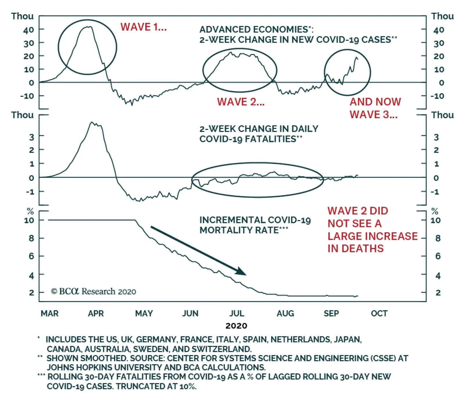
The first two panels of the chart above show the 2-week change in smoothed new daily COVID-19 confirmed cases and deaths in advanced economies. Mathematically, this measure is the second derivative of total cumulative confirmed cases and deaths, and…
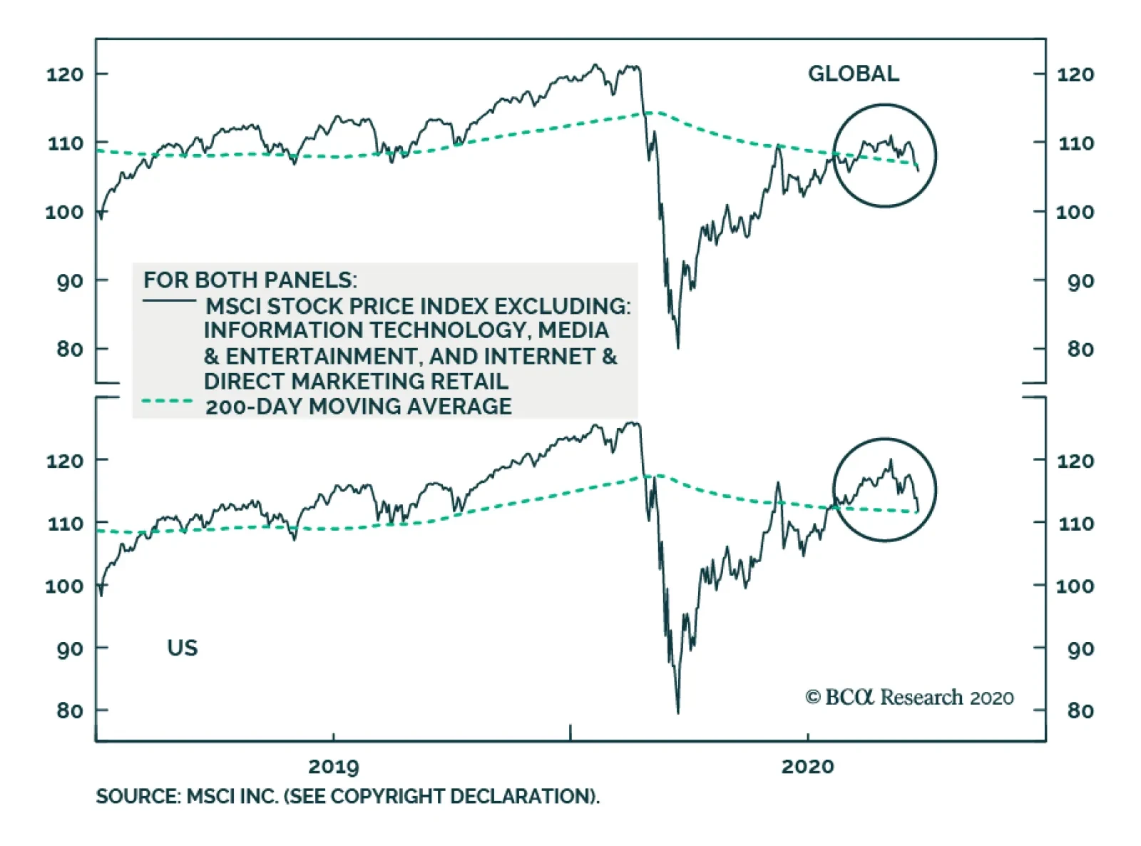
Stock prices have corrected in the US and globally since early-September, but they remain in both cases above their 200-day moving averages. However, the chart above highlights that this is only due to the support of broadly-defined technology stocks, as…
Highlights Bond Yields & Growth: Developed market bond yields have ignored improving cyclical economic data over the past few months, remaining stuck in narrow trading ranges at low levels. That broken correlation will persist until central banks become less concerned about supporting pandemic-ravaged economies and begin worrying more about rising inflation, financial stability or the size of their balance sheets. That shift will not happen anytime soon. Inflation-Linked Trades: Our models suggest US TIPS breakevens are now at fair value. We are taking profits on our tactical long US 10-year inflation breakevens trade for a return of 2.88%. Stay long 10-year breakevens in Italy and Canada until we see further shrinkage in the gap between inflation breakevens and model-implied fair value and watch for a selling opportunity in UK 10-year breakevens. Feature Do bond investors even care about economic growth anymore? This is a valid question to ask, given how government bond yields in the developed markets have stayed in very narrow trading ranges over the past few months, even as economic data has rebounded from the global COVID-19 recession in the first half of 2020. Investors should get used to the current backdrop of rock-bottom interest rates and bond yields, which is unlikely to change anytime soon. Chart of the WeekBond Yields Are Responding To Inflation, Not Growth
Bond Yields Are Responding To Inflation, Not Growth
Bond Yields Are Responding To Inflation, Not Growth
For example, the benchmark 10-year US Treasury yield has stayed between 0.65% and 0.75% since June 11, even though the US ISM Manufacturing index rose from 43 in May to 56 in August. Yields are also ignoring the ups and downs of the equity market. The 10-year Treasury yield now sits at 0.66% - the same level as on September 2 even though the NASDAQ equity index has fallen 12% from the all-time peak seen on that day. Our own Global Duration Indicator, comprised of cyclical measures like the global ZEW index and our global leading economic indicator, has surged to the highest level since 2008 (Chart of the Week). Given the usual lead time between broad turns in the Duration Indicator and the level of global bond yields (around 6-9 months), this suggests that yields have bottomed and should soon begin rising. Yet the reality is that the usual factors that typically drive yields higher during a cyclical upturn – namely, rising inflation expectations and a clearly understood signal from central banks that such a move would lead to tighter monetary policy – are not currently in place. Investors should get used to the current backdrop of rock-bottom interest rates and bond yields, which is unlikely to change anytime soon. Four Potential Triggers For A Rise In Bond Yields Chart 2A Breakdown Of The PMI/Yield correlation
A Breakdown Of The PMI/Yield correlation
A Breakdown Of The PMI/Yield correlation
The breakdown of the positive correlation between growth and bond yields is not just visible in the US. For example, yields on German Bunds and UK Gilts also remain stuck at low levels despite sharp improvements in the German and UK manufacturing PMIs (Chart 2). Yet in China – where there is no zero interest rate policy (ZIRP) or large-scale quantitative easing (QE) programs - bond yields have steadily risen since the China manufacturing PMI bottomed back in April (bottom panel). What could change this backdrop? We see four potential catalysts, ranked below in our own subjective order of importance: Inflation Sustainably Returning Back To Central Bank Targets It may seem obvious, but it still needs to be said – dovish central bank policies are the biggest reason why developed market bond yields have de-linked from economic growth. That includes not only ZIRP or QE, but also forward guidance on future changes in interest rates. Central banks are telling markets they will not raise rates for a period measured in years, and will continue to expand their balance sheets to purchase assets and support bank lending, all in an effort to push undershooting inflation back to policy targets. This is a different message than bond investors have grown accustomed to hearing from central banks, most notably in the US. The Fed is trying to do something that it has never intentionally done before – erode some of its hard-earned inflation fighting credibility. The Fed is trying to do something that it has never intentionally done before – erode some of its hard-earned inflation fighting credibility. The recent shift by the Fed to an Average Inflation Targeting framework – where above-target inflation would be tolerated if inflation was below target for an extended period – is intended to change the perception that the Fed will hike rates preemptively based on a forecast of inflation, as they have done in the past. Chart 3Latest FOMC Projections Justify Years Of 0% Rates
Latest FOMC Projections Justify Years Of 0% Rates
Latest FOMC Projections Justify Years Of 0% Rates
The latest set of Fed economic projections is consistent with this new framework (Chart 3): the unemployment rate is forecasted to fall back to the FOMC median estimate of full employment (4.1%) by 2023; headline PCE inflation is also projected to climb back to 2% by 2023; the fed funds rate is projected to stay unchanged near 0% until at least 2023. In many ways, the Fed is trying to atone for the mistakes made while normalizing policy after the extraordinary easing measures taken after the 2008 crisis. From signaling a slowing of QE bond purchases in 2013, to the 250bps of rate hikes and tapering of its balance sheet during 2016-18, the Fed moved aggressively relative to what was actually happening with US inflation. Core PCE inflation only inched above 2% for a few months in 2018 – towards the end of the normalization process - as did market-based inflation measures like TIPS breakevens (Chart 4). The Fed ended up raising the real fed funds rate during that tightening cycle to above its own estimate of neutral (r-star), even with inflation still not close to its target. Unsurprisingly, real US bond yields also rose during that same period, which tightened monetary conditions even further by boosting the value of the US dollar. No wonder US inflation could not stay at the 2% target for very long. This time around, the Fed is sending a much different signal to markets – that it wants to see inflation rise before raising rates, thus keeping real policy rates in negative territory for an extended period. If the Fed is looking for a real world case study of such an approach, it can look across the Atlantic to the Bank of England (BoE). On the surface, the BoE has been acting like a typical inflation-targeting central bank over the past several years, turning more hawkish in its commentary when the UK economy was improving and becoming more dovish when the economy was languishing. Yet since the 2008 crisis, the BoE has kept the Bank Rate in a range of 0.1% to 0.75%, well below realized UK inflation. While it has been difficult for the BoE to attempt to raise rates given the Brexit uncertainty since 2016 – which has also weakened the British pound, helping boost UK inflation - real UK policy rates have now been negative for 12 years (Chart 5). The result: steadily declining UK real bond yields with inflation expectations rising to levels well above the BoE 2% inflation target. Chart 4The Fed Is Trying To Erode Its Hard-Earned Credibility
The Fed Is Trying To Erode Its Hard-Earned Credibility
The Fed Is Trying To Erode Its Hard-Earned Credibility
Chart 5Lessons From The BoE On How To Not Be Credible
Lessons From The BoE On How To Not Be Credible
Lessons From The BoE On How To Not Be Credible
The experience of the ECB provides a cautionary tale for central banks not appearing dovish enough, even when policy settings are already extraordinarily accommodative. The message from central banks on future rate increases – namely, that there will not be any without sustainably higher inflation – must change before bond yields can have any hope of climbing higher. Chart 6Does The ECB Have Any Credibility Left?
Does The ECB Have Any Credibility Left?
Does The ECB Have Any Credibility Left?
Inflation expectations have stayed below the ECB’s “just below 2%” target since 2013 (Chart 6), which forced the central bank into cutting nominal rates into negative territory while aggressively expanding its balance sheet through QE and long-term bank liquidity provision (i.e. LTROs). Yet the ECB has always put an expiration date on each of these programs, which sent a message to the markets that the central bank was not fully committed to keeping policy easy until inflation was back to target – however long that would take. In sum, the message from central banks on future rate increases – namely, that there will not be any without sustainably higher inflation – must change before bond yields can have any hope of climbing higher. A Shift From Central Banks To Concerns About Asset Price Bubbles Chart 7When Will CBs Start Worrying About Financial Market Valuations?
When Will CBs Start Worrying About Financial Market Valuations?
When Will CBs Start Worrying About Financial Market Valuations?
Policymakers are paying lip service to the notion of the “financial stability” risks inherent in their new promises to keep rates low for a lot longer while intervening in financial markets more aggressively through asset purchase programs. Given the signs of froth in many important asset classes like US equities or global corporate debt, policymakers should at least be somewhat concerned that easy money policies are fueling asset bubbles (Chart 7). A big enough decline could erode confidence and spill over into the real economy, defeating the original purpose of easy money policies. However, given the still fragile state of much of the global economy that remains dependent on fiscal support amid ongoing COVID-19 restrictions, concerns over asset values will take a backseat to maintaining adequate monetary stimulus. Asset bubbles would have to become much larger before a central bank would even consider turning more hawkish to prick them through higher policy rates that would push up bond yields. The Announcement Of A Trustworthy COVID-19 Vaccine That Is Ready For Widespread Distribution Markets have already begun to worry about the “second wave” of the coronavirus that health officials had warned would happen in the cooler autumn months. The development of an effective, and safe, vaccine would thus be a game-changer for financial markets, particularly after the recent surge in new COVID-19 cases in Europe and the still elevated level of new cases in the US (Chart 8). Chart 8A Second Wave Of COVID-19
A Second Wave Of COVID-19
A Second Wave Of COVID-19
BCA Research’s Chief Global Strategist, Peter Berezin (a big fan of interesting data sets!), noted in his most recent report that, according to The Good Judgement Project, around 60% of “superforecasters” now expect a vaccine ready for mass distribution to be available by Q1/2021 (Chart 9).1 A vaccine appearing that rapidly – much faster than the usual multi-year process leading to a vaccine declared safe for use – would help boost business and consumer confidence and raise the odds of a return to pre-virus levels of economic activity. Bond yields would likely get a lift, as well, as markets would price in a shorter period of super low policy rates and a faster return of inflation to central bank targets. Yet even if a vaccine is presented to the world by next spring, there is no guarantee that a large enough share of the population will deem the vaccine safe enough to take to ensure “herd immunity”. A recent Economist/YouGuv survey noted that only 36% of American adults would choose to get vaccinated when a COVID-19 vaccine becomes available, 32% would not get vaccinated, while 32% were unsure (Chart 10). Thus, a vaccine would be a bond-bearish development only if it is trusted to be safe to use – the mere announcement of a vaccine will not be enough to declare an “end” to the pandemic. Chart 9High Odds Of A Vaccine In 6-To-12 Months
What Would It Take To Get Bond Yields To Rise Again?
What Would It Take To Get Bond Yields To Rise Again?
Chart 10Will Enough People Take The Vaccine?
What Would It Take To Get Bond Yields To Rise Again?
What Would It Take To Get Bond Yields To Rise Again?
Central Banks Slowing QE Purchases Relative To Increased Fiscal Issuance Chart 11Still Room For The Fed, ECB and BoE To Expand QE
Still Room For The Fed, ECB and BoE To Expand QE
Still Room For The Fed, ECB and BoE To Expand QE
Right now, it is easy for the major central banks to aggressively expand their balance sheets and provide additional monetary stimulus through asset purchases. Yet there may come a point where a capacity constraint is reached on buying government bonds if it impairs market functionality. That is currently the case in Japan, where the Bank of Japan now owns 49% of the Japanese government bond (JGB) market after years of aggressive QE purchases of JGBs. This has damaged the day-to-day liquidity of JGBs, where there have been instances of days where no single JGB has traded in the secondary market. A move by central banks to buy fewer bonds because they own too many of them could potentially push bond yields higher by worsening the demand/supply balance for government bonds - assuming private investors do not pick up the slack and buy more bonds, of course. Currently, the Fed only owns 22% of the US Treasury market with little evidence suggesting that its purchases are impairing the trading of Treasuries (Chart 11). The BoE and ECB own much larger shares of the UK and euro area government bond markets – 37% and 38%, respectively – suggesting that those central banks are closer to a BoJ-like capacity constraint. However, given the rising budget deficits and surging government bond issuance seen in Europe (and the US) so far in 2020, the odds of a capacity constraint soon being reached that could result in slower QE purchases are low. Bottom Line: Developed market bond yields have ignored improving cyclical economic data over the past few months, remaining stuck in narrow trading ranges at low levels. That broken correlation will persist until central banks become less concerned about supporting pandemic-ravaged economies and begin worrying more about rising inflation, financial stability or the size of their balance sheets. That shift will not happen anytime soon. Reviewing Our Tactical Inflation Breakeven Trades Back in June, we initiated a series of recommended inflation-focused trades in our Tactical Overlay portfolio. Specifically, we went long 10-year inflation breakevens in the US, Italy, and Canada by buying on-the-run inflation-linked bonds and selling government bond futures.2 We chose those trades based on the output of our fundamental valuation models for 10-year inflation breakevens in eight inflation-linked bond (ILB) markets: the US, UK, France, Italy, Japan, Germany, Canada, and Australia. Our fair value models use two inputs for all regions: a) a long-run moving average of headline inflation, representing the medium-term trend that anchors inflation expectations; and b) the annual percentage change of the Brent oil price in local currency terms, which creates shorter-term deviations from the trend to account for moves in oil and currencies. There looks to be little remaining upside to our tactical long TIPS breakeven position. The past few months have seen a sharp rise in global inflation expectations, owing to the extraordinary monetary policy actions taken by the major developed market central banks and recovering growth prospects coming out of the COVID-19 recession. This has led to a convergence between 10-year inflation breakevens and their model-implied fair values in the aforementioned ILB markets (Chart 12). Most notably, breakevens in the US are now at fair value, while breakevens in the UK and Australia are trading above fair value. In the US, 10-year breakeven inflation rates are now back to the long-run average of realized headline inflation, while the -8% decline in the Brent oil price so far this month has lowered the model-implied fair value (Chart 13). Therefore, there looks to be little remaining upside to our tactical long TIPS breakeven position with most of the easy gains following the pandemic-induced collapse having already been realized. Chart 12Global Inflation Breakevens Have Moved Higher
Global Inflation Breakevens Have Moved Higher
Global Inflation Breakevens Have Moved Higher
Our colleagues over at BCA Research US Bond Strategy have reached a similar conclusion, noting that the Fed’s Jackson Hole announcement of the move to Average Inflation Targeting supercharged the rising trend in TIPS breakevens.3 Chart 13US Breakevens Are At Fair Value
US Breakevens Are At Fair Value
US Breakevens Are At Fair Value
Although they also note the likelihood of stronger US CPI prints over the next few months should keep US breakevens well supported heading into year-end. The time horizon for trades that enter our Tactical Overlay portfolio is limited to no longer than six months. Thus, with TIPS breakevens reverting back to fair value after just three months in the trade, we are choosing to take profits on our long 10-year US inflation breakeven trade for a total return of 2.88%. Chart 14UK Breakevens Are Above Fair Value
UK Breakevens Are Above Fair Value
UK Breakevens Are Above Fair Value
In other ILB markets, UK breakevens are now an intriguing case, and not only for the monetary policy driven interplay between UK real yields and breakevens discussed earlier in this report. The overshoot of UK breakevens relative to our fair value model may be related to growing market speculation that the BoE will move to negative interest rates – an outcome we deem to be unlikely, as we discussed in a recent report.4 Alternatively, the higher breakevens may be a reflection of UK political uncertainty. The risk of a hard Brexit has resurfaced as UK Prime Minister Boris Johnson’s Conservatives have now backed a bill that includes powers for the government to override its withdrawal agreement with the European Union; understandably, this has caused a sell-off in the pound. Within our fundamental fair value framework, the UK 10-year breakeven inflation rate has overshot both the 3-year moving average of headline inflation and the growth of GBP-denominated oil prices, leaving breakevens 0.72 standard deviations expensive (Chart 14). One possible explanation is that markets are pricing in a significant further depreciation in the pound given this resurfacing of Brexit risk. Within our model, GBP/USD impacts the fair value of breakeven inflation via Brent oil prices, which are denominated in local currency terms. Thus, we can back out an implied change in GBP/USD that would make the model-derived fair value breakeven rate equal to the actual 10-year UK inflation breakeven rate, holding all other variables in the model constant. This does produce some extreme results during periods of very rapid moves in UK breakevens, but we can standardize the data to use as an indicator of ILB market-implied views on the currency (Chart 15). With that in mind, pound bearishness in ILB markets is nearing levels where it has historically troughed. A favorable development in Brexit negotiations could cause a reversal in this pound-bearish trend and a sharp downward correction in UK inflation breakevens. We see a potential opportunity to play for narrower UK breakevens if our view on Brexit and negative rates in the UK prove to be correct. On that front, BCA Research’s Chief Geopolitical Strategist, Matt Gertken, sees a no-deal Brexit by year-end as the less likely outcome, with odds of only 35%, given the political calculus that PM Johnson faces with the decision.5 Polls show that the UK public does not support a no-deal Brexit (Chart 16), which would severely hurt a UK economy that remains fragile due to the coronavirus, and would raise the odds of a new independence referendum in Scotland in 2021. Chart 15UK Breakevens Already Discount A Big Fall In GBP
UK Breakevens Already Discount A Big Fall In GBP
UK Breakevens Already Discount A Big Fall In GBP
Chart 16Only 25% In The UK Think A No-Deal Brexit Is A Good Outcome
What Would It Take To Get Bond Yields To Rise Again?
What Would It Take To Get Bond Yields To Rise Again?
We will monitor the situation closely in the coming weeks, but we see a potential opportunity to play for narrower UK breakevens if our view on Brexit and negative rates in the UK prove to be correct. Finally, although the majority of the gains from our long inflation breakeven trades in Canada and Italy have likely been realized, there are still some chips left on the table. Canadian breakeven inflation rates have risen in lockstep with Brent prices but have yet to converge with the long-run moving average of inflation (Chart 17). In Italy, the increases in oil prices in euro terms has outstripped the rise in breakevens, pushing up the model-implied fair value and leaving breakevens remain more than one standard deviation under fair value (Chart 18). We will look for the gap between breakevens and fair values to shrink further in these two countries before closing these trades, even though we are substantially in the green on both (see the Tactical Overlay table on page 19). Chart 17Canadian Breakevens Are Just Below Fair Value
Canadian Breakevens Are Just Below Fair Value
Canadian Breakevens Are Just Below Fair Value
Chart 18Italian Breakevens Are Well Below Fair Value
Italian Breakevens Are Well Below Fair Value
Italian Breakevens Are Well Below Fair Value
Bottom Line: Our models suggest US TIPS breakevens are now at fair value. We are taking profit on our tactical long US 10-year inflation breakeven trade for a return of 2.88%. Stay long 10-year breakevens in Italy and Canada until we see further shrinkage in the gap between inflation breakevens and model-implied fair value and watch for a selling opportunity in UK 10-year breakevens. Robert Robis, CFA Chief Fixed Income Strategist rrobis@bcaresearch.com Shakti Sharma Research Associate ShaktiS@bcaresearch.com Footnotes 1 Please see BCA Global Investment Strategy Weekly Report, "Pivot To Value", dated September 18, 2020, available at gis.bcaresearch.com. You can also learn more about The Good Judgement Project here: https://goodjudgment.com/about/ 2 Please see BCA Research Global Fixed Income Strategy Weekly Report, "How To Play The Revival Of Global Inflation Expectations", dated June 23, 2020, available at gfis.bcaresearch.com. 3 Please see BCA Research US Bond Strategy Portfolio Allocation Summary, "The Fed’s New Framework Is Bond Bearish…But Not Yet", dated September 8, 2020, available at usbs.bcaresearch.com. 4 Please see BCA Research Global Fixed Income Strategy Weekly Report, "Assessing The Leading Candidates To Join The Negative Rate Club", dated August 26, 2020, available at gfis.bcaresearch.com. 5 Please see BCA Research Geopolitical Strategy Weekly Report, "The End-Game For Trump And Brexit", dated September 18, 2020, available at gis.bcaresearch.com. Recommendations The GFIS Recommended Portfolio Vs. The Custom Benchmark Index
What Would It Take To Get Bond Yields To Rise Again?
What Would It Take To Get Bond Yields To Rise Again?
Duration Regional Allocation Spread Product Tactical Trades Yields & Returns Global Bond Yields Historical Returns
In a recent report, BCA Research’s Global Investment Strategy service recommended that “Investors who want to accentuate their returns should pay special attention to smaller value companies outside the US.” The reason for that suggestion is that small cap…
Dear Client, We will be working on our Fourth Quarter Strategy Outlook next week, which will be published on Tuesday, September 29th. We will also be hosting a webcast on Thursday, October 1st at 10:00 AM EDT (3:00 PM BST, 4:00 PM CEST, 10:00 PM HKT) where we will discuss the outlook. Best regards, Peter Berezin, Chief Global Strategist Highlights Investors should favor global equities over bonds on a 12-month horizon. However, stocks remain technically overbought in the short term and vulnerable to a further correction. Investors are not fully appreciating the degree to which fiscal policy has already tightened in the US. While we ultimately expect a deal to be reached, it may take a stock market sell-off to force Republican leaders to accede to Democratic demands for more spending. US monetary policy will stay accommodative for at least the next two years, a view that this week’s FOMC meeting further validated. Investors should pivot into cheaper areas of the stock market – in particular, deep cyclicals and financials, non-US stocks, and value stocks. Value stocks are especially appealing, as they are now trading at the biggest discount on record relative to growth stocks. The “pandemic trade” will give way to the “reopening trade.” The latter will benefit value stocks. In addition, stronger global growth, ongoing Chinese stimulus, a weaker US dollar, and modestly steeper yield curves all favor value indices. Value investors who want to accentuate their returns should pay special attention to smaller value companies outside the US. Market Commentary Chart 1Drastic Drop In Weekly Unemployment Insurance Payments
Drastic Drop In Weekly Unemployment Insurance Payments
Drastic Drop In Weekly Unemployment Insurance Payments
We continue to favor global equities over bonds on a 12-month horizon. However, stocks remain technically overbought in the short term despite correcting modestly over the past few weeks. Tech stocks rallied hard into September. Aggressive buying of out-of-the-money call options helped fuel the rally. While some big institutional players such as Softbank have reportedly scaled back their positions, many retail investors remain unfazed. The triple leveraged long Nasdaq 100 ETF, TQQQ, experienced the largest weekly inflow on record in September. In addition to being technically stretched, equities face near-term risks from the impasse in the US Congress over a new stimulus bill. Investors are not fully appreciating the degree to which fiscal policy has already tightened in the US. Chart 1 shows that weekly unemployment payments have fallen by $15 billon since the end of July, representing a drop of more than 50%. At an annualized rate, this amounts to 3.7% of GDP in fiscal tightening. On top of that, the funds in the small business Paycheck Protection Program have run out, while many state and local governments face a severe cash crunch. BCA’s geopolitical strategists expect a fiscal deal to be reached over the next few weeks. The fact that Speaker Nancy Pelosi has said that Congress will stay in session until both sides agree on an aid package is good news in that regard. Nevertheless, given all the acrimony in Washington in the run up to the November election, there is still a non-negligible chance that a deal falls through. Why, then, are we still bullish on stocks on a 12-month horizon? Partly it is because voters want more stimulus, which means that fiscal policy is likely to be loosened again, even if this does come after the election. It is also because the pandemic seems to be receding. While the number of new cases is rising again in the EU and some other regions, fatality rates remain much lower than during the first wave. Progress also continues to be made on developing a viable vaccine. According to The Good Judgment Project, about 60% of “superforecasters” expect a mass-distributed vaccine to be available by Q1 of 2021, up from 45% just four weeks ago. Only 2% expect there to be no vaccine available by April 2022, down from over 50% in May (Chart 2). Chart 2High Odds Of A Vaccine Within 6-To-12 Months
Pivot To Value
Pivot To Value
Lastly, monetary policy remains exceptionally accommodative. The Fed this week formally incorporated its new flexible average inflation targeting strategy into its post-meeting statement. The FOMC promised to keep rates at rock-bottom levels until the economy has reached “maximum employment” and inflation “is on track to moderately exceed two percent for some time.” The dot plot indicated that the vast majority of FOMC members did not expect rates to rise until at least the end of 2023. As Chart 3 shows, the global equity risk premium remains quite elevated. This favors stocks over bonds. Not all stocks are equally attractive, however. Four weeks ago, in a report titled “The Return of Nasdog,” we made the case that investors should pivot away from growth stocks towards value stocks. The report generated quite a bit of interest from readers. Below, we review and elaborate on some of the issues raised in a Q&A format. Q: Being long value stocks relative to growth stocks has been a widowmaker trade for more than a decade. Why do you think we have reached an inflection point? A: Value stocks are cheaper now compared to growth stocks than at any point in history – even cheaper than at the height of the dotcom bubble (Chart 4). Chart 3Global Equity Risk Premium Remains Quite Elevated
chart 3
Global Equity Risk Premium Remains Quite Elevated
Global Equity Risk Premium Remains Quite Elevated
Chart 4Value Stocks Are Extremely Cheap Relative To Growth Stocks
Value Stocks Are Extremely Cheap Relative To Growth Stocks
Value Stocks Are Extremely Cheap Relative To Growth Stocks
Admittedly, valuations are not a good timing tool. One needs a catalyst to unlock those valuations. Good news on the virus front may end up being such a catalyst. The “pandemic trade” benefited tech stocks, which are overrepresented in growth indices. It also favored health care stocks, which are similarly overrepresented in growth indices, at least globally (Table 1). The “reopening trade” will support companies such as banks, hotels, and transports that were crushed by lockdown measures and which are overrepresented in value indices. Table 1Breaking Down Growth And Value By Sector
Pivot To Value
Pivot To Value
Chart 5 shows that retail sales at physical stores are rebounding, while online sales growth is coming down from highly elevated levels. Bank of America estimates that US e-commerce penetration doubled in just a few short months earlier this year. Some “reversion to the trend” is likely, even if that trend does favor online stores over the long haul. Meanwhile, PC shipments soared during the pandemic as companies and workers rushed out to buy computer gear to allow them to work from home (Chart 6). To the extent that this caused some spending to be brought forward, it could create an air pocket in tech demand over the next few quarters. Chart 5Are Brick-And-Mortar Retailers Coming Back To Life?
Are Brick-And-Mortar Retailers Coming Back To Life?
Are Brick-And-Mortar Retailers Coming Back To Life?
Chart 6The Pandemic Has Caused Global Server And PC Shipments To Surge
The Pandemic Has Caused Global Server And PC Shipments To Surge
The Pandemic Has Caused Global Server And PC Shipments To Surge
Q: How are investors positioned towards value versus growth? A: According to the September BofA Global Fund Manager Survey, tech and pharma were the two sectors with the largest reported overweights. Thus, there is significant scope for money to shift out of these sectors. Q: What about the overall macro environment underpinning growth and value? A: While the relationship is far from perfect, value stocks tend to outperform growth stocks when the US dollar is weakening (Chart 7). Recall that growth stocks did very well during the late 1990s, a period of dollar strength. In contrast, value stocks outperformed between 2001 and 2007, a period during which the dollar was generally on the back foot. As we have spelled out in past reports, we expect the dollar to weaken over the next 12 months, which should benefit value stocks. Value stocks also tend to do best when global growth is accelerating (Chart 8). Provided that governments maintain adequate levels of fiscal support and a vaccine becomes available by early next year, global GDP should bounce back swiftly. Chart 7Value Stocks Tend To Outperform Growth Stocks When The US Dollar Is Weakening
Value Stocks Tend To Outperform Growth Stocks When The US Dollar Is Weakening
Value Stocks Tend To Outperform Growth Stocks When The US Dollar Is Weakening
Chart 8Value Stocks Also Tend To Do Best When Global Growth Is Accelerating
Value Stocks Also Tend To Do Best When Global Growth Is Accelerating
Value Stocks Also Tend To Do Best When Global Growth Is Accelerating
Q: Won’t lower real bond yields favor growth stocks? A: By definition, growth companies generate more of their earnings further in the future than value companies. As such, a decline in real yields will tend to increase the present value of cash flows more for growth companies than for value companies. We do not expect real yields to rise significantly over the next two years. However, given that real yields are already deeply negative in almost all countries, they probably will not fall either. Q: You seem to be making the cyclical case for the outperformance of value stocks. But what about the secular case? It appears to me that the stronger earnings growth displayed by growth stocks will ultimately translate into higher long-term returns. A: Historically, that has not been the case. As Chart 9 and Table 2 illustrate, value stocks have outperformed growth stocks by a wide margin over the past century. In particular, small cap value has clobbered small cap growth. Chart 9Value Stocks Have Outperformed Growth Stocks By A Wide Margin Over The Past Century
Pivot To Value
Pivot To Value
Table 2Small Caps Vis-A-Vis Large Caps: Comparison of Total Returns
Pivot To Value
Pivot To Value
How did value stocks manage to triumph over growth stocks if, as you say, growth stocks usually experience faster earnings growth? The answer has to do with what is priced in and what is not. If everyone expects a company’s earnings to grow next year, this will already be reflected in its share price. It is only unanticipated earnings growth that should move share prices. For the most part, both analysts and investors have tended to overextrapolate near-term earnings growth. As we discussed in a special report titled “Quant-Based Approaches To Stock Selection And Market Timing,” while analysts are generally able to predict which companies will display superior earnings growth over the next one-to-two years, they systemically overestimate earnings growth on longer-term horizons (Chart 10). As a result, investors tend to overpay for growth, causing growth stocks to lag value stocks. Chart 10A Mug’s Game
Pivot To Value
Pivot To Value
Q: That may have been true historically, but it seems that more recently, investors have been guilty of underpaying for growth. A: Yes and no. If one looks at the period between 2007 and 2017, the superior performance of growth stocks was broadly matched by their superior earnings growth. As a result, relative P/E ratios did not change much. Since 2017, however, the P/E ratio for growth indices has soared relative to value indices (Chart 11). Chart 11AThe Outperformance Of Growth Stocks Over The Past Three Years Has Been Turbocharged By A Rapid P/E Multiple Expansion
The Outperformance Of Growth Stocks Over The Past Three Years Has Been Turbocharged By A Rapid P/E Multiple Expansion
The Outperformance Of Growth Stocks Over The Past Three Years Has Been Turbocharged By A Rapid P/E Multiple Expansion
Chart 11BThe Outperformance Of Growth Stocks Over The Past Three Years Has Been Turbocharged By A Rapid P/E Multiple Expansion
The Outperformance Of Growth Stocks Over The Past Three Years Has Been Turbocharged By A Rapid P/E Multiple Expansion
The Outperformance Of Growth Stocks Over The Past Three Years Has Been Turbocharged By A Rapid P/E Multiple Expansion
Q: What has happened since 2017 that has caused growth stocks to become so much more expensive? A: FANG, FAANG, FANGMAN, whatever acronym you want to use, it was mainly a story about investors becoming infatuated with mega cap tech stocks. After seeing these companies beat earnings estimates quarter after quarter, investors decided that they deserve to trade at much higher valuation multiples. Q: What about other tech companies? A: For the most part, they were left in the dust. Our proprietary Equity Analyzer system allows us to sort companies based on all types of fundamental and technical factors. Chart 12 shows that “value tech” companies trading in the bottom quartile of price-to-earnings, price-to-operating cash flow, price-to-free cash flow, price-to-book, and price-to-sales have gotten completely clobbered by “growth tech” companies trading in the top quartile of these valuation metrics. Chart 12Value Tech Versus Growth Tech
Pivot To Value
Pivot To Value
Interestingly, the opposite pattern was true among financials: “Value financials” – financials that trade cheaply based on the valuation measures listed above – have outperformed “growth financials.” The net result is a bit surprising: Since “value tech” underperformed the average tech stock, while “value financials” outperformed the average financial stock, the average “value tech” stock has delivered a return over the past decade that was almost identical to the average “value financial” stock. Chart 13There Was No Money To Be Made By Shifting Value Exposure From Financials To Tech In Recent Years
There Was No Money To Be Made By Shifting Value Exposure From Financials To Tech In Recent Years
There Was No Money To Be Made By Shifting Value Exposure From Financials To Tech In Recent Years
Q: This seems to suggest that value managers would not have made any money by shifting exposure from financials to tech? A: Correct. Consider the iShares MSCI USA Value Factor ETF (ticker: VLUE). It is structured to have the same sector weights as the overall US market. It currently has 27% of its assets in technology and 10% in financials. Compare that to the Vanguard Value Index Fund ETF Shares (ticker: VTV). It has 10% of its assets in technology and 19% in financials. As Chart 13shows, VTV has actually outperformed VLUE over the past five years. Year to date, VTV is down 10%, while VLUE is down 15%. Q: While value managers would not have made money by shifting capital from financials to tech, I presume the same thing could not be said for growth managers. A: You can say that again. “Growth tech” outperformed the average tech stock, while “growth financials” underperformed the average financial stock. Thus, shifting money from “growth financials” to “growth tech” would have supercharged returns. Q: This still leaves open the question of why mega cap stocks were able to grow earnings so rapidly? A: Two explanations come to mind. First, tech companies often gain from so-called network effects: The more people there are who use a particular tech platform, the more attractive it is for others to use it. Second, tech companies benefit from scale economies. Once a piece of software has been written, creating additional copies costs nothing. Even in the hardware realm, the marginal cost of producing an additional chip is tiny compared to the fixed cost of designing it. All of this creates a winner-take-all environment where success begets further success. Q: It seems this process could go on indefinitely? A: Not indefinitely. No company can control more than 100% of its market. There is also a limit to how big the overall market can get. Close to three-quarters of US households already have an Amazon Prime account. Slightly over half have a Netflix account. Nearly 70% have a Facebook account. Google commands 92% of the internet search market. Together, sites owned by Google and Facebook generate about 60% of all online advertising revenue. Q: These companies have plenty of cash. Can’t they try to enter new types of businesses if they want to keep growing? A: They can try, but there is no guarantee they will succeed. Kodak was one of the pioneers in digital photography. However, it could never really reinvent itself and ended up fading into oblivion. Moreover, while first-mover advantage is a powerful force, it is not invincible. At one point during the dotcom bubble, Palm’s market capitalization was over six times greater than Apple’s. The Blackberry superseded the PalmPilot; the iPhone, in turn, superseded the Blackberry. History suggests that many of today’s technological leaders will end up as laggards. Q: And I suppose government policy could also turn less friendly towards tech? A: That is a definite risk. Republicans have been cheap dates for tech companies. Republican politicians have showered tech companies with tax cuts and allowed them to exploit a variety of loopholes in the tax code. They also kept tech regulation to a minimum. All this happened despite the fact that many tech leaders have publicly panned conservative viewpoints, while tech company employees have rewarded Democratic politicians with the lion’s share of campaign donations (Chart 14). Chart 14Tech Company Employees Donate Heavily Towards Democrats
Pivot To Value
Pivot To Value
Going forward, Republicans are likely to sour on big tech. According to a recent Pew Research study, more than half of conservative Republicans favor increasing government regulation of tech companies (Chart 15). Tucker Carlson, a leading indicator for where the Republican party is heading, has frequently lambasted tech companies on his highly popular television show. Chart 15Conservatives Favor Increased Government Regulation Of Big Tech Companies
Pivot To Value
Pivot To Value
For their part, the Democrats are moving to the left. Alexandria Ocasio-Cortez, a leading indicator for the Democratic party, has voiced her support for Senator Elizabeth Warren’s calls to break up big tech. She has also accused Amazon of paying starvation wages, adding that "If Jeff Bezos wants to be a good person, he'd turn Amazon into a worker cooperative." Q: The political climate for tech companies may be souring. But couldn’t one say the same thing about banks and energy companies, which are overrepresented in value indices? A: One difference is that tech companies trade at premium valuations, while banks and energy companies trade near book value (Chart 16). Another difference is that banks have already felt the wrath of regulators. Thanks to Dodd-Frank and pending Basel III regulations, banks today function more like utilities than like the casinos of yesteryear. While private credit growth is unlikely to return to its pre-GFC pace, banks will still profit from a revival in global growth and increasing consolidation within their industry. Stronger global growth should also allow for modestly higher nominal bond yields and somewhat steeper yield curves. This will benefit bank shares (Chart 17). Chart 16Tech Firms Trade At Premium Valuations
Tech Firms Trade At Premium Valuations
Tech Firms Trade At Premium Valuations
Chart 17Modestly Higher Bond Yields Will Benefit Bank Shares
Modestly Higher Bond Yields Will Benefit Bank Shares
Modestly Higher Bond Yields Will Benefit Bank Shares
As far as energy stocks are concerned, again, we need to benchmark our views to what the market expects. Oil is not going back above $100 per barrel anytime soon, but it does not need to for energy stocks to go up. Bob Ryan, BCA’s chief commodity strategist, sees Brent averaging $65/bbl in 2021, $19 above what is currently priced in forward markets. Q: What about materials and industrial stocks? They are also overrepresented in value indices. A: Both materials and industrials tend to outperform the broader market when global growth accelerates (Chart 18). To the extent we expect global growth to rise, this is good news for these two sectors. They also trade at attractive valuations. Q: How does China figure into this value/growth debate? A: As we saw during the 2001-2007 period, strong Chinese demand for commodities and industrial goods benefits value indices. Even though trend Chinese GDP growth has decelerated over the past decade, the Chinese economy is five-times as large as it was back then. In absolute terms, Chinese consumption of most metals continues to increase (Chart 19). Chart 18Materials And Industrials Usually Outperform When Growth Accelerates
Materials And Industrials Usually Outperform When Growth Accelerates
Materials And Industrials Usually Outperform When Growth Accelerates
Chart 19Chinese Consumption Of Most Metals Continues To Rise
Chinese Consumption Of Most Metals Continues To Rise
Chinese Consumption Of Most Metals Continues To Rise
Chart 20 shows that Chinese GDP would need to grow by about 6% per year over the next decade to keep output-per-worker on track to converge with, say, South Korea by the middle of the century. Thus, Chinese demand for natural resources and machinery is unlikely to weaken anytime soon. Chart 20China Still Has Some Catching Up To Do
China Still Has Some Catching Up To Do
China Still Has Some Catching Up To Do
Q: Let’s wrap up. What final tips would you give investors who want to pivot towards value? A: There are a number of ETFs that track value indices. We expect them to outperform the broad indices over the coming years. For investors who want even higher returns, a selective approach would help. Distinguishing between value stocks and value traps is not easy. True value stocks have often congregated in the shadows of the market, where there is limited analyst coverage and thin institutional ownership. The small-cap sector offers more opportunities for finding such mispriced stocks. Hence, it is not surprising that historically, the value premium has been greater in the small cap realm. The same is true for emerging markets and smaller developed economies (Chart 21).1 Thus, investors who want to accentuate their returns should pay special attention to smaller value companies outside the US. Chart 21AHistorically, The Value Premium Has Been Greater In The Small Cap Realm In Emerging Markets And Smaller Developed Economies
Pivot To Value
Pivot To Value
Chart 21BHistorically, The Value Premium Has Been Greater In The Small Cap Realm In Emerging Markets And Smaller Developed Economies
Pivot To Value
Pivot To Value
Peter Berezin Chief Global Strategist peterb@bcaresearch.com Footnotes 1 Please see Global Asset Allocation Special Report, “Value? Growth? It Really Depends!” dated September 19, 2019. Global Investment Strategy View Matrix
Pivot To Value
Pivot To Value
Current MacroQuant Model Scores
Pivot To Value
Pivot To Value
Highlights If it can maintain production discipline over the next 2-3 years, OPEC 2.0 will be the oil market’s most important determinant of price levels for years. The massive increase in OPEC 2.0 spare capacity resulting from COVID-19-induced demand destruction, along with its low-cost production, global storage and distribution will allow it to bring crude to market quicker than US shale-oil producers, and to manage an orderly drawdown in global inventories, which remains its raison d'être. As spare capacity is drawn down over the next couple of years, Brent and WTI forward curves will backwardate in in 1H21, as spare capacity and the slope of the forward curve are inversely related (lower spare capacity leads to higher backwardation). This will keep spot prices realized by OPEC 2.0 states above the deferred prices at which shale producers hedge (Chart of the Week). Parsimonious capital markets will continue to deny funding to all but the most profitable producers, which will continue to limit E+P ex-OPEC 2.0. ESG-focused investments will increasingly favor energy producers outside the oil and gas sector. As demand growth resumes, this will sow the seeds for higher oil prices in the mid-2020s. We will be updating our oil balances and 2H20 and 2021 forecasts – $46/bbl and $65/bbl for Brent in 2H20 and 2021 – next week. Feature While the hit to oil producers’ revenues from the demand destruction caused by the COVID-19 pandemic has been severe – particularly for those states comprising OPEC 2.0, which are so heavily dependent on oil exports – it set the stage for the producer coalition to take control of global oil-price dynamics for the next couple of years. If the OPEC 2.0 coalition can maintain its production discipline, its member states could extend this control for years into the future, just as they are attempting to diversify their economies from this dependence on hydrocarbons. Once OPEC 2.0 member states manage to diversify a large part of their economies, the next optimal strategy will be to monetize their reserves and market share. Until then, it is our contention it is in these states' interest to have higher prices via gaining control of supply. The producer coalition led by the Kingdom of Saudi Arabia (KSA) and Russia today sits on some 7mm b/d of spare capacity that is a direct result of the global collapse in demand. This gives it a powerful lever to restrain the recovery of production growth in the US shales and elsewhere. Spare Capacity Turns The Tables On Shale Oil The enormous spare capacity now held by OPEC 2.0 – the majority of which is in KSA – allows the coalition to turn the tables on the US shales and producers ex-US Since its inception in late 2016, OPEC 2.0 has accommodated higher US shale production by reducing its output and then expanding it at a slower rate, as US production soared to meet domestic demand and, increasingly, global oil demand (Chart 2). OPEC 2.0 has been in operation since January 2017. Over that period, the coalition reduced its output growth ~ 0.37% for every 1% increase in crude and liquids output ex-OPEC 2.0. Within that adjustment, OPEC 2.0’s output falls by 0.16% for every 1% increase in US output, most of which was accounted for by the unprecedented growth of shale production.1 The enormous spare capacity now held by OPEC 2.0 – the majority of which is in KSA – allows the coalition to turn the tables on the US shales and producers ex-US (Chart 3). Chart of the WeekFalling OPEC 2.0 Spare Capacity Will Backwardate Brent Forward Curves
Falling OPEC 2.0 Spare Capacity Will Backwardate Brent Forward Curves
Falling OPEC 2.0 Spare Capacity Will Backwardate Brent Forward Curves
Chart 2OPEC 2.0 Accommodated US Shales
OPEC 2.0 Accommodated US Shales
OPEC 2.0 Accommodated US Shales
Chart 3OPEC 2.0 Would Benefit From Maintaining Spare Capacity At High Levels
OPEC 2.0 Would Benefit From Maintaining Spare Capacity At High Levels
OPEC 2.0 Would Benefit From Maintaining Spare Capacity At High Levels
Along with its low-cost production, global storage and distribution, this spare capacity allows OPEC 2.0 member states to bring crude to market quicker than US shale-oil producers as the need for additional supply becomes apparent. This was demonstrated earlier this year by KSA when it engaged in a brief market-share war with Russia following the breakdown of negotiations to extend OPEC 2.0’s production cuts.2 The spare capacity also allows the coalition to manage an orderly drawdown in global inventories, which remains its raison d'être, by making crude available out of production on short notice. As a result, Brent and WTI forward curves will backwardate in 1H21, keeping spot prices realized by OPEC 2.0 states above the deferred prices at which shale producers hedge. By keeping forward curves backwardated, the amount of revenue – i.e., price x quantity – hedged is limited by lower forward prices vs. spot prices. This limits the volume of oil a producer can bring to market in the future. Extending OPEC 2.0’s Low-Cost Spare Capacity In the near term, we expect OPEC 2.0’s production to come back faster and stronger than that of the US shales. The advantage OPEC 2.0 realizes from holding spare capacity – KSA in particular – can be extended at low cost going forward.3 And, if OPEC 2.0 communicates its intent to maintain spare capacity at higher levels than have prevailed recently, as was indicated last week by Aramco’s CEO, who announced KSA intends to raise capacity 1mm b/d to 13mm b/d, this could, at the margin, disincentivize investment in production ex-OPEC 2.0 in the future.4 Developing spare capacity for low-cost producers like Aramco is akin to building a portfolio of deep-in-the-money options to increase output quickly at minimal expense. These options can be exercised – i.e., output can be increased in short order at low cost – before competitors can mobilize to meet the market need. What makes this strategy credible is KSA’s capacity to surge production and put oil on the water in VLCCs at astonishing speed, as noted above vis-à-vis the breakdown in negotiations earlier this year in Vienna to extend production cuts. In the near term, we expect OPEC 2.0’s production to come back faster and stronger than that of the US shales (Chart 4). This will allow them to begin rebuilding revenues sooner as demand recovers (Chart 5). Any demand increase in excess of OPEC 2.0’s flowing supply – which could be restrained to force refiners to draw storage (Chart 6) – can be met with spare capacity and storage held or controlled by coalition members. Chart 4OPEC 2.0 Supply Recovers Faster Than US Shales
OPEC 2.0 Supply Recovers Faster Than US Shales
OPEC 2.0 Supply Recovers Faster Than US Shales
Chart 5Rate Of Demand Growth Will Exceed Supply Growth
Rate Of Demand Growth Will Exceed Supply Growth
Rate Of Demand Growth Will Exceed Supply Growth
Chart 6Forcing Inventories Lower
Forcing Inventories Lower
Forcing Inventories Lower
Capital-Market Parsimony Will Tighten Supply Equity investors have abandoned the oil and gas sector, as can be seen in the collapse in the percentage of the overall market accounted for by energy stocks (Chart 7). Chart 7Energy Share Of Overall Market Collapses
Energy Share Of Overall Market Collapses
Energy Share Of Overall Market Collapses
This no doubt is fueled by underperformance vs. technology stocks and other alternatives available to investors, and to a migration toward Environmental, Social, and Corporate Governance (ESG) investing (Chart 8). Indeed, as our colleagues in BCA’s Global Asset Allocation Strategy noted, “ESG-related equities have outperformed global benchmarks over the past two years, as well as during the recent equity selloff.” In addition, “green energy” investments account for half of the $300 billion G20 governments have allocated to clean energy policies and renewable energy programs as part of the COVID-19 fiscal stimulus deployed worldwide.5 Chart 8ESG Investment Surge
Oil's Next Bull Market, Courtesy Of COVID-19
Oil's Next Bull Market, Courtesy Of COVID-19
We believe this combination of a long-standing aversion to oil and gas equities and OPEC 2.0’s clear advantage in terms of its spare capacity, low-cost production and global storage and distribution networks will result in under-funding of new E+P, and will lead to a tighter market by the mid-2020s. This is particularly true for oil, which, is not confronting the competitive threat faced by natural gas vis-à-vis renewable energy. We will continue to develop these themes, and subject this thesis to fiery critique, borrowing from Kant’s methodology.6 Risks To Our View There are two major risks to the thesis developed here: OPEC 2.0 breaks down, as it came close to doing earlier this year (discussed above). A breakdown of the coalition would lead to lower E&P investment via very low oil prices that almost surely would occur if this were to happen. This would be a far more volatile path to higher prices, which also would discourage investment. A battery-technology breakthrough that makes electric vehicles viable – i.e., unsubsidized – competitors to internal-combustion engine technology powering the vast majority of transportation. We expect Brent and WTI forward curves to backwardate in 1H21, keeping spot prices realized by OPEC 2.0 states above the deferred prices at which shale producers hedge. Bottom Line: OPEC 2.0’s massive spare capacity resulting from COVID-19-induced demand destruction, its low-cost production and global storage and distribution network allow it to take control of crude-oil pricing dynamics over the next couple of years. These endowments also allow it to orchestrate an orderly drawdown in global inventories, which remains its raison d'être. As a result, we expect Brent and WTI forward curves to backwardate in 1H21, keeping spot prices realized by OPEC 2.0 states above the deferred prices at which shale producers hedge. Parsimonious capital markets and a preference for ESG-focused investment will increasingly favor energy producers outside the oil and gas sector. As demand growth resumes, this will sow the seeds for higher oil prices in the mid-2020s. Robert P. Ryan Chief Commodity & Energy Strategist rryan@bcaresearch.com Hugo Bélanger Associate Editor Commodity & Energy Strategy HugoB@bcaresearch.com Commodities Round-Up Energy: Overweight JKM and TTF natural gas prices are up 49% and 27% over the past four weeks. The price spreads for December 2020 futures contracts between the US and Europe and Asia reached $1.6/MMBtu and $1.9/MMBtu this week. This will support the ongoing recovery in US LNG exports – which was briefly halted last month by Hurricane Laura – during the coming winter season (Chart 9). Separately, Libyan oil exports could be set to rebound following statements by General Haftar – the leader of Libyan National Army (LNA) – that he was committed to lifting the current blockade on the country’s exports, according to the US Embassy in Libya. Base Metals: Neutral China’s expansionary monetary and fiscal stimulus continued in August. The country’s total social financing (TSF) climbed past market expectations of CNY 2.59 trillion to CNY 3.58 trillion (Chart 10). This will provide further support to base metals prices – chiefly copper – over the coming months. The increase in TSF reflects the strong local government bond issuance and reinforces our view that the recovery in copper prices will be policy-driven – i.e. dictated by Chinese policymakers’ decisions on the allocation of total social financing funds in its economy with domestic supply adjusting to demand. Precious Metals: Neutral Palladium prices are up 7% since the beginning of September, supported by rebounding car sales and production in China. In August, vehicle sales grew by 12% y/y. We expect fiscal and credit stimulus in the country will allow car sales to continue growing y/y in the coming months. Ags/Softs: Underweight Soybean prices remain strongly bid, looking to re-test 2018 highs. The latest weekly USDA crop progress report indicated continued deterioration in the number of soybean crops in good or excellent condition. Investor sentiment is fueled by China maintaining its promise to import record amounts of U.S. agricultural goods this year, as part of the Phase 1 trade deal. Last week, the U.S. Agriculture Department reported that Chinese buyers booked deals to buy 664,000 tonnes of soybeans, the largest daily total since July 22. Chart 9LNG
LNG
LNG
Chart 10COPPER PRICES
COPPER PRICES
COPPER PRICES
Footnotes 1 These estimates were generated by an ARDL model used to determine the sensitivity of OPEC 2.0 total liquids output to non-OPEC 2.0 production and consumption. 2 For a recap of this market-share war, please see KSA, Russia Will Be Forced To Quit Market-Share War, which we published March 19, 2020. It is available at ces.bcaresearch.com. Briefly, KSA put millions of barrels on the water in a matter of months after Russia launched its market-share war at the end of OPEC’s March 2020 meeting in Vienna. This demonstrated an ability to mobilize supply and deliver it that greatly surpassed the eight-month time frame we estimate is required for shale production to reach the market after prices signal the need for additional crude. 3 Please see The $200 billion annual value of OPEC’s spare capacity to the global economy published by The King Abdullah Petroleum Studies and Research Center (KAPSARC) July 17, 2018, for a discussion of the global impact of KSA’s spare capacity. 4 Please see Aramco CEO: Saudi Arabia to raise oil production capacity to 13 million barrels per day published by Oil & Gas World Magazine September 9, 2020. 5 Please see ESG Investing: From Niche To Mainstream, published by BCA’s Global Asset Allocation Strategy August 25, 2020. It is available at gaa.bcaresearch.com. 6 Please see O’Shea, James R. (2012), “Kant’s Critique of Pure Reason, An Introduction and Interpretation,” Acumen Publishing Limited, Durham, UK. Investment Views and Themes Recommendations Strategic Recommendations Tactical Trades Trade Recommendation Performance In 2020 Q2
Lower Vol As OPEC 2.0 Gains Control
Lower Vol As OPEC 2.0 Gains Control
Commodity Prices and Plays Reference Table Trades Closed in 2020 Summary of Closed Trades
Lower Vol As OPEC 2.0 Gains Control
Lower Vol As OPEC 2.0 Gains Control
The ZEW survey for the month of September shows that investors are only getting more upbeat about the economic outlook as the growth expectations component of the survey rose further in Europe and globally. Moreover, the evaluation of current economic…
Highlights Stocks face near-term downside risks from further delays in passing a new US fiscal stimulus package, a potentially slower-than-expected rollout of a Covid-19 vaccine, and the unwinding of speculative call option positions in large-cap US tech companies. Nevertheless, we continue to favor equities over bonds over a 12-month horizon. One key reason is that the global equity risk premium – proxied by the difference between the stock market earnings yield and the real government bond yield – remains quite large. Many observers argue that the bond yield component of the equity risk premium is distorted by central bank manipulation. They also contend that low bond yields reflect poor economic prospects and that structurally low borrowing costs could lead to malinvestment down the road. In this report, we push back against these views. We argue that today’s low bond yields do, in fact, provide a reliable estimate of the risk-free component of the discount rate; that the drop in yields over the past year mainly reflects higher private-sector savings and easier monetary policy rather than pessimism about growth and earnings; and that instead of leading to overinvestment, the main effect of falling interest rates, at least so far, has been to inflate the rents earned by companies with monopoly power. All of this means that lower interest rates really do justify higher market valuations. The Correction Is Not Over, But We Are Sticking With Our Bullish 12-Month View On Stocks Chart 1Tech Stocks At Greatest Risk Of A Pullback
Tech Stocks At Greatest Risk Of A Pullback
Tech Stocks At Greatest Risk Of A Pullback
After recouping some of their losses on Wednesday, stocks stumbled again on Thursday. Since reaching new highs last week, global equities have dropped by 5.3%. US equities have taken the brunt of the beating. They are down 7% from last week’s top, compared to 3% for non-US stocks (Chart 1). The tech-heavy Nasdaq remains 9.4% off its record high. We continue to see near-term downside risks to global stocks, particularly US equities. It has now been six weeks since emergency US federal unemployment benefits lapsed. The US economy is set to rebound at a brisk pace in the third quarter – the Atlanta Fed’s GDPNow model projects that output will grow 30% at an annualized pace – but GDP is rising from a very low base. In the absence of a new fiscal package, US growth could slow sharply in the fourth quarter and beyond, causing more workers to become permanently unemployed. Concern over the safety of the vaccines being developed to fight Covid-19 could also unsettle investors. On Wednesday, AstraZeneca announced that it had temporarily paused the Phase 3 trial of its vaccine co-developed with the University of Oxford after a patient suffered a severe reaction. Such delays are normal in the conduct of vaccine testing, but they do raise memories of the 1976 debacle with the Swine flu vaccine, which caused 450 Americans to come down with Guillain-Barré syndrome, a life-threatening neurological disorder.1 Chart 2Nasdaq Volatility Declined Even As Share Prices Tumbled
Stock Prices And Interest Rates: Can We Trust TINA?
Stock Prices And Interest Rates: Can We Trust TINA?
These worries come on the heels of a six-month rally in tech stocks – one that was dangerously amplified by speculative call option purchases by retail investors. The preference among retail investors for short-dated calls allowed them to gain control of large swathes of shares at relatively little cost. Market makers and other counterparties who sold the calls were forced to buy the underlying stock to hedge their exposure. This created a self-reinforcing feedback loop where rising call option prices generated more purchases of the underlying stock, leading to even higher call prices. Starting last week, the process began to go in reverse. It is noteworthy that Nasdaq implied volatility actually fell on both Monday and Wednesday as tech stocks imploded, a possible sign that nervous investors were liquidating their call positions (Chart 2). It is difficult to know how much further this process has to run, but our guess is that a capitulation point has not yet been reached. This suggests that the correction is not yet over. TINA’s Siren Song Despite our near-term concerns, we expect global equities to be higher in 12 months’ time. At least one of the nine vaccine candidates currently in Phase 3 trials is likely to produce a viable formula. Policymakers are also liable to heed the will of voters and maintain generous fiscal stimulus measures. All this should allow global growth to pick up. Stocks usually do well when global growth is accelerating (Chart 3). And then there is TINA. TINA — There Is No Alternative — has become a popular adage on Wall Street. As the argument goes, no matter how expensive stocks seem to get, bonds and cash are even less attractive. There is some logic to this view. Today, the dividend yield on the S&P 500 stands at 1.6%. While this dividend yield is well below its historic average of 4.3%, it is still higher than the 0.68% yield on the 10-year Treasury note (Chart 4). Chart 3Stocks Usually Do Well When Global Growth Is Accelerating
Stocks Usually Do Well When Global Growth Is Accelerating
Stocks Usually Do Well When Global Growth Is Accelerating
Chart 4Bond Yields Have Fallen Below Dividend Yields
Bond Yields Have Fallen Below Dividend Yields
Bond Yields Have Fallen Below Dividend Yields
Imagine an investor having to decide whether to place their money in an S&P 500 index fund or a 10-year Treasury note. Dividends-per-share paid by S&P 500 companies have almost always increased over time. However, even if we make the pessimistic assumption that dividends-per-share remain unchanged for the next ten years, the value of the S&P 500 would still have to fall by 9% over the next decade to equal the return on the 10-year note. Assuming that inflation averages 2% over this period, the real value of the S&P 500 would need to drop by 25%. The picture is even more dramatic outside the US. In the euro area, the index would have to fall by over 30% in real terms for investors to make more money in bonds than stocks. In the UK, it would need to fall by over 50%. Elevated Equity Risk Premia Granted, stocks are riskier than bonds. However, based on a comparison of dividend yields with bond yields, stocks today are significantly cheaper than usual (Chart 5). Chart 5AStocks Would Need To Fall A Lot For Equities To Underperform Bonds
Stocks Would Need To Fall A Lot For Equities To Underperform Bonds
Stocks Would Need To Fall A Lot For Equities To Underperform Bonds
Chart 5BStocks Would Need To Fall A Lot For Equities To Underperform Bonds
Stocks Would Need To Fall A Lot For Equities To Underperform Bonds
Stocks Would Need To Fall A Lot For Equities To Underperform Bonds
The relative attractiveness of stocks can also be inferred by subtracting the real bond yield from the cyclically-adjusted earnings yield on stocks in order to get an implied equity risk premium (ERP)2 (Chart 6). Outside the US, the ERP is high both because earnings yields are elevated and because real bond yields are depressed. In the US, which accounts for 56% of global stock market capitalization, the earnings yield is below its long-term average. Nevertheless, the US ERP is still quite high because real bond yields reside deep in negative territory. In fact, the US ERP has barely fallen since March because the decline in real yields has largely offset the rise in stock prices (Chart 7). Chart 6Equity Risk Premia Are Elevated
Equity Risk Premia Are Elevated
Equity Risk Premia Are Elevated
Chart 7The Decline In US Real Yields Since March Has Largely Offset The Rise In Stock Prices
The Decline In US Real Yields Since March Has Largely Offset The Rise In Stock Prices
The Decline In US Real Yields Since March Has Largely Offset The Rise In Stock Prices
Are Bond Yields Fake News? Stock market bears will argue that the ERP is overstated by the abnormally low level of bond yields. Their argument typically centers on three points: Quantitative easing, forward guidance, NIRP and ZIRP have distorted bond yields to such an extent that we can no longer use them as a reliable measure of the risk-free component of the discount rate. Even if one accepts the premise that current bond yields are a valid proxy for the risk-free rate, the fact that yields are so low is hardly a cause for celebration. This is because today’s low yields reflect dismal economic prospects, which justifies a higher-than-normal equity risk premium. Low bond yields are incentivizing all sorts of malinvestment. With time, this will depress the rate of return on capital, leading to lower stock prices. Let’s examine all three arguments in turn. Are Bond Yields Being Manipulated? The term financial repression gets bandied around quite often these days. There is no doubt that central banks would like to keep yields low, but how much higher would yields be in the absence of any unorthodox monetary measures? Our guess is not much higher. The simplest test of whether bond yields are above or below their equilibrium level is to look at whether growth is above or below trend. The recovery following the financial crisis was anemic, suggesting that monetary policy was only modestly accommodative. If anything, one can argue that in much of the world, bond yields would be even lower today were it not for the fact that nominal interest rates cannot go much below zero. Do Low Bond Yields Reflect Bad News? Bond yields can decline for many reasons. Some of these reasons are positive for equity investors, while others are negative. If yields fall on the expectation of weaker economic growth, that is clearly bad for stocks. On the flipside, if yields drop because monetary policy has turned more dovish, that is good for stocks. The impact on equities from other factors influencing bond yields can be ambiguous. For example, consider the case of an increase in private-sector savings. All things equal, higher savings will lead to less spending. A decline in spending is likely to result in lower output and diminished corporate profits. That is bad for stocks. However, if governments absorb the excess private-sector savings by running larger budget deficits, there may end up being no net loss in aggregate demand. In that case, stock prices may not fall. Indeed, one can very easily envision a scenario where an adverse shock to private-sector spending leads to an increase in equity valuations. To see this point, consider a standard dividend discount model. Suppose something happens that leads the private sector to spend less at any given interest rate. Let us also suppose that the central bank reacts to this shock by cutting interest rates all the way down to zero, at which point governments, taking advantage of cheaper borrowing costs, step in and increase fiscal stimulus. The upshot could be a lower interest rate but at the same level of aggregate spending (See Box 1 for a formal economic discussion of how this process works). If aggregate demand – and by extension, corporate earnings and dividends — drop temporarily, while interest rates fall permanently (or at least semi-permanently), the present value of cash flows will rise. As far-fetched as this scenario may seem, something along these lines appears to have happened over the past six months. Chart 8 shows that analysts expect global profits to contract by 19% in 2020, but then rebound by 29% in 2021 and rise a further 16% the following year, leaving 2022 profits 21% above 2019 levels. Like everywhere else, analysts expect US profits to return to their long-term trend over the next few years. Meanwhile, the 30-year TIPS yield – a proxy for the risk-free component of the discount rate – has fallen by 94 basis points since the start of the year. Even if one assumes, contrary to the optimistic forecasts of analysts, that the level of US EPS does not return to its pre-pandemic trend until 2030, this would still leave the fair value of the S&P 500 17.5% higher than it was at the start of the year (Chart 9). Chart 8Analysts Expect Global Profits To Contract This Year Before Rebounding
Stock Prices And Interest Rates: Can We Trust TINA?
Stock Prices And Interest Rates: Can We Trust TINA?
Chart 9The Present Value Of Earnings: A Scenario Analysis
Stock Prices And Interest Rates: Can We Trust TINA?
Stock Prices And Interest Rates: Can We Trust TINA?
Will Low Interest Rates Lead To Malinvestment? A drop in interest rates may seem like a free lunch for shareholders: It increases the present value of future cash flows without reducing the cash flows themselves. In fact, one could argue that lower rates actually increase future cash flows by shrinking net interest payments on outstanding debt. That might be all fine and dandy, but what about the effect of low interest rates on future investment decisions? To the extent that lower rates increase the market value of a firm’s capital stock relative to its replacement cost – the so-called Tobin’s Q ratio – lower rates could spur more investment. Higher investment, in turn, could drive down the rate of return on capital, leading to lower profits (Box 2 illustrates this point with a simple example featuring a lemonade stand). While there is some truth to this logic, it is less compelling than it once was. This is because much of the capital stock of listed companies today takes the form of intangible capital – which is often difficult to reproduce – rather than physical capital. Such intangible capital may include patents and trademarks as well as monopoly power. In particular, internet companies have gained significant monopoly power from network effects: The more people use their service, the more valuable their service becomes. This is a key reason why falling interest rates have helped the tech giants more than other companies. The Path Ahead The section above argued that today’s low bond yields do, in fact, provide a reliable estimate of the risk-free component of the discount rate; that the drop in yields over the past year mainly reflects higher private-sector savings and easier monetary policy rather than pessimism about growth and earnings; and that instead of leading to overinvestment, the main effect of falling interest rates, at least so far, has been to inflate the rents earned by companies with monopoly power. All this means that lower interest rates really do justify higher market valuations. Looking out, while bond yields are unlikely to rise significantly over the next two years in the absence of any meaningful inflationary pressures, yields are unlikely to fall either given how low they already are. This is not necessarily bad news for stocks. As mentioned above, the equity risk premium is quite high, which means that stocks can rise even if bond yields do edge somewhat higher. The more interesting action is likely to occur beneath the broad indices. If bond yields stabilize, this will remove a major headwind to bank shares (Chart 10). On the flipside, the reopening of economies will benefit companies that were crushed by lockdown measures. Money will shift from “pandemic plays” to “recovery plays.” Chart 10Stabilization In Bond Yields Would Remove A Major Headwind To Bank Shares
Stabilization In Bond Yields Would Remove A Major Headwind To Bank Shares
Stabilization In Bond Yields Would Remove A Major Headwind To Bank Shares
Chart 11US Stocks Are More Expensive
Stock Prices And Interest Rates: Can We Trust TINA?
Stock Prices And Interest Rates: Can We Trust TINA?
As we predicted three weeks ago in a report titled “The Return Of Nasdog,” tech and health care stocks will go from leaders to laggards. The US has a higher concentration of tech and health care stocks than most other regions. US stocks are also quite expensive based on standard valuation measures, including the Tobin's Q ratio discussed above (Chart 11). The bottom line is that investors should remain overweight global equities over a 12-month horizon, while pivoting towards value stocks and non-US markets. Peter Berezin Chief Global Strategist peterb@bcaresearch.com Box 1The Role Of Monetary And Fiscal Policy Following Savings Shocks
Stock Prices And Interest Rates: Can We Trust TINA?
Stock Prices And Interest Rates: Can We Trust TINA?
Box 2Fancy Some Lemonade? An Example Of Tobin’s Q
Stock Prices And Interest Rates: Can We Trust TINA?
Stock Prices And Interest Rates: Can We Trust TINA?
Footnotes 1 Rick Perlstein, “Gerald Ford Rushed Out a Vaccine. It Was a Fiasco,” The New York Times, September 2, 2020. 2 It is necessary to subtract the real bond yield, rather than the nominal bond yield, from the earnings yield because the earnings yield provides an estimate of the real total expected return to shareholders. For further discussion on this, please see Appendix A of the Global Investment Strategy Special Report, “TINA To The Rescue?” dated August 23, 2019. Global Investment Strategy View Matrix
Stock Prices And Interest Rates: Can We Trust TINA?
Stock Prices And Interest Rates: Can We Trust TINA?
Current MacroQuant Model Scores
Stock Prices And Interest Rates: Can We Trust TINA?
Stock Prices And Interest Rates: Can We Trust TINA?