Geopolitics

Highlights The odds of universal health care legislation being enacted in the U.S. by 2022 are about 10%-15%. Former Vice President Joe Biden is the most likely Democratic candidate in 2020, but the alternative is most likely a progressive candidate seeking universal health care. Trump is slightly favored to win in 2020, but a Trump loss is likely to translate into full Democratic control of the U.S. government, making ambitious legislation more likely to pass Congress. An overweight portfolio allocation in the S&P health care index is a sensible and defensive move. Fear selling in health care stocks could easily return but would create an exploitable trading opportunity at this late stage of the cycle. We are executing the upgrade of the S&P health care index via an upgrade of the S&P health care equipment index, which has seen a material valuation de-rating at the same time as profits are expanding, to overweight. Feature Will The Democrats Win? Can They Pass Universal Health Care? “Medicare for All,” or government-led universal health care in the United States, is less likely to become the law of the land by 2022 than the market expects. We put the probability at around 10%-15%. Here’s why. The industry faces only two certainties: Americans are getting older and the federal government is increasing its involvement. The former is a secular driver for health care demand. The latter is an inference drawn from the fact that the Republican Party failed to repeal the Affordable Care Act, or Obamacare, even when it had full control of government. It is very unlikely that the Republicans will get another chance at repeal. It is also very unlikely that the public will tolerate the current status quo forever. The result is that the U.S. will eventually end up with a restored Obamacare or an altogether new system with a greater government role. The Republican failure to repeal was not idiosyncratic – it was not based on the fact that the late Senator John McCain, who cast the decisive vote on July 27, 2017, had been diagnosed with brain cancer earlier that year. Rather, it was structural – the repeal failed because (1) it is always extremely difficult to remove an entitlement once it has been given to voters and (2) a slim majority of Americans approved of Obamacare – and still do (Chart 1).
Chart 1
Republicans went on to dismantle aspects of Obamacare, including the problematic “individual mandate.” But they did so without replacing it. The result was a severe electoral defeat in the 2018 midterm elections, despite a huge drop in the unemployment rate (Chart 2) – which matters directly in a country where 49% get their health insurance through their employer. Health care was the single most important issue driving people to vote against the ruling party in November 2018, judging by both pre-election polls and exit polls (Charts 3 & 4). Chart 2Low Unemployment Has Not Solved Health Care Woes
Low Unemployment Has Not Solved Health Care Woes
Low Unemployment Has Not Solved Health Care Woes
Chart 3
Chart 4
The need for reform is manifest. It is widely known that the U.S. spends more than other countries on health care (Chart 5) and yet achieves worse results: preventable mortality is higher than in other countries that spend less (Chart 6). Democrats have tried to overhaul the system since 1993. Even President Trump is seeking to cap prescription drug prices and maintain the Obamacare requirement that health care insurers accept customers with “pre-existing conditions.”
Chart 5
Chart 6
Uncertainty has risen since the Republicans’ midterm defeat, which increases, or is seen as increasing, the odds of a Democratic victory in 2020. Such a victory would mark the third time in 12 years that American policy would witness a 180-degree reversal – and it would have a major impact on the health sector (Chart 7). Chart 7The Sector's Response To Major Political Events
The Sector's Response To Major Political Events
The Sector's Response To Major Political Events
In truth Trump is still favored to win in 2020, on the back of the incumbent advantage – as long as the economy holds up. But with a chronically weak approval rating, and narrow 2016 margins of victory and the aforementioned midterm losses in key swing states, his odds of reelection are probably not much better than 55%. Meanwhile the Democrats are swinging to the left and may not settle simply for restoring Obamacare. Left-wing or “progressive” candidates for the Democratic nomination are polling in line with traditional center-left candidates (Chart 8), which is highly unusual (even compared with the 2007-08 race). Candidates are crowding onto the democratic socialist bandwagon in the wake of Bernie Sanders’s formidable challenge to Hillary Clinton and her subsequent loss to Trump.
Chart 8
Could a progressive candidate win the nomination? Certainly. Former Vice President Joe Biden leads the pack at this early stage in the nomination process. He would seek to restore and build upon Obamacare. The second-ranked candidate is Sanders, whose initial proposal to create Medicare for All has transformed the national debate. Following Sanders are Senators Kamala Harris, who co-sponsored the latest version of the bill with Sanders, and Elizabeth Warren, an outspoken progressive who is also in favor of universal health care (Chart 9).
Chart 9
Sanders does have a path to winning the nomination, as the leading progressive candidate at a time when the party is becoming more progressive. He performs better than Biden in head-to-head polls against Trump in the key battleground states (Chart 10). Strategic voters will have trouble convincing fellow Democrats that they should not vote for him because he is unelectable: he has a clear electoral path to the White House via Michigan, Pennsylvania, and Wisconsin, where he performed well in 2016 and polls well today. If Sanders has a chance, then Medicare for All has a chance.
Chart 10
Because it is extremely difficult to unseat an incumbent president, a victory over Trump in 2020 is only likely to occur if there is a surge in voter turnout and Democratic Party support among (1) blue-collar workers who abandoned the Democrats for Trump in 2016, or (2) young voters, women, or minorities. Any such surge would also enable the Democrats to defend their senate seats while picking up Arizona, Colorado, and Maine, which are statewide elections that will be affected by the headline presidential race. And if the Democrats win 50 seats, they would get a majority in the senate, as the vice president would break any tie. With a majority, Senate Democrats could use the “nuclear option” to bypass the filibuster and drive through their priority legislation.1 This would set a new precedent with far-reaching consequences. But recent majority leaders have already begun eroding the filibuster and there is no hard constraint preventing a ruling party from removing it entirely. It is perfectly possible, and all the more likely if the nation sweeps a progressive candidate to power in a wave of enthusiasm for dramatic changes like universal health care. In other words, any victory against Trump is likely to entail full Democratic control of government. In this scenario, Democrats would have a very good chance of passing a major piece of legislation. Hence, if a progressive wins the nomination, and makes Medicare for All the policy priority, there is at least a 50/50 chance it will pass, probably more like 60%. The catch is that a progressive may not win the nomination. There is not decisive evidence that Americans really want Medicare for All. First, Americans tend to view their own health costs as “reasonable” (Chart 11). They are not, as a whole, clamoring for a single-payer system.
Chart 11
Second, while Americans say they support Medicare for All, that support evaporates when they learn about the various policies that it would necessitate, such as eliminating private health insurance and raising taxes (Chart 12).
Chart 12
Third, most Democrats are closer to Biden’s position than Sanders’s – they want to fix Obamacare rather than revolutionize the system (Chart 13).
Chart 13
Fourth, Colorado tried to pass its own version of Medicare for All on the state level in 2016. The bill’s advocates were handed a 79% defeat by voters. Colorado is a swing state so it is not an irrelevant experiment. Fifth, independents are not shifting to the left in a way that would validate the sharp leftward shift within the Democratic Party (Chart 14). Nominating Sanders or another progressive is more likely to lead to a loss in the general election than it is to ensure that universal health care gets passed. Chart 14Independents Not Swinging Dramatically To The Left
Independents Not Swinging Dramatically To The Left
Independents Not Swinging Dramatically To The Left
A simple back-of-the-envelope exercise suggests that odds of universal health care by 2022 are about 10%-15%. Nevertheless, we attempt a conservative, back-of-the-envelope method for estimating the probability of passage. It runs like this: There is a 50% chance a progressive wins the Democratic nomination. We assume that if Biden wins it is because Democratic voters prefer a restitution of Obamacare. There is a 45% chance that Trump loses the presidential election. We assume that for the Democrats to unseat an incumbent is difficult enough that they will also win the Senate. Under these circumstances, there is a 50%-60% chance that universal health care legislation passes – even though it will be very difficult to get it over the line. (Note that the ACA passed very narrowly at a time when the Democrats had a huge tailwind due to voters’ disenchantment after the global financial crisis). With these assumptions, the conditional probability of passage is around 13.5% (0.5 x 0.45 x 0.6 = 0.135) These odds can be moderated by boosting Trump to a 69% chance of reelection (the historical average for sitting presidents), which brings down the odds of ultimate passage to 9%. Note, however, that the bond market is pricing a 27% probability of a recession 12 months from now (Chart 15). If there is a recession, then President Trump is virtually assured to lose reelection and the Democratic victor will have a strong tailwind of public support. This will increase the chance that universal health care passes to 80%. (We still assume in this case that Biden would stick with Obamacare as he would not be committed to Medicare for All and it is not an economic stimulus package). The conditional probability would become 0.5 x 0.27 x 0.8 = 11%. Chart 15Probability Of Recession Is Rising NY Fed's Yield Curve Model Suggests That The Probability Of A Recession Is Still Quite Low
Probability Of Recession Is Rising NY Fed's Yield Curve Model Suggests That The Probability Of A Recession Is Still Quite Low
Probability Of Recession Is Rising NY Fed's Yield Curve Model Suggests That The Probability Of A Recession Is Still Quite Low
In other words, whether we upgrade Trump’s chances of winning or we upgrade the chances of a recession that kicks him out of office, the odds are roughly the same at 9%-11%. And they could be a bit higher at 14%. Medicare for All has a chance of becoming law, although it is not all that great. Bottom Line: With fairly conservative assumptions the odds range from 10%-15%. that the U.S. could legislate a sweeping overhaul of the health care system and new social entitlement by 2022. This is a serious risk to the industry. Health care equities have recovered the losses suffered since Sanders’s latest push for Medicare for All, which means that it is not pricing in a high probability of passage at present. Additional policy-related selloffs are likely between now and the spring of 2020, if and when the odds increase of Sanders (or another progressive) winning the Democratic nomination. Buy Into Health Care Weakness Regardless of the likelihood of passage, the faintest hint of the winds of change has brought about significant price changes in the relevant equities. In the lead up to the 2016 U.S. presidential election, Hillary Clinton, a health care reformer (though importantly NOT a Medicare for All advocate) was polling well ahead of Donald Trump. Health care stocks underperformed the broad market in anticipation of potential reforms resulting from a Clinton win (Chart 16). Two years after Donald Trump’s election, both S&P health care equipment and S&P managed health care have significantly outperformed with the effect most dramatic in the former. Chart 17 shows the reverse picture: a “blue wave” in the 2018 midterm elections was swiftly followed by the zenith for health care stocks as the market digested the implications of a Democratic House and the resulting higher probability of a similar sweep in 2020 in the Senate and executive branch. Chart 16Election Fear Creates Buying Opportunities...
Election Fear Creates Buying Opportunities...
Election Fear Creates Buying Opportunities...
Chart 17...And History Appears To Be Repeating Itself
...And History Appears To Be Repeating Itself
...And History Appears To Be Repeating Itself
Furthermore, our prior research shows that S&P health care has been the top performer in the last equity market surge to take place between the peak of the ISM manufacturing composite index and the beginning of the subsequent recession.2 This research was confirmed in a report last month analyzing sector returns after a Fed loosening cycle begins. The S&P health care index has historically outperformed from six months before a rate cut all the way to two years after easing policy.3#fn_3 As a reminder, the market has now priced in two rate cuts over the next year. We recommend an overweight position for the broad S&P 500 health care index as well as for health care equipment. BCA’s U.S. Equity Strategy has already moved to an overweight recommendation on the S&P managed health care index, a move that has netted our portfolio 12.4% of alpha. Today U.S. Equity Strategy is raising our recommendations on both the S&P health care equipment and, more importantly, the broad S&P health care index from neutral to overweight. Further, considering U.S. Equity Strategy’s recent portfolio changes, namely moving the S&P materials index to neutral, this upgrade of S&P health care to overweight moves our cyclicals vs. defensives style preference from overweight cyclicals to neutral. This move to the sidelines on the cyclical/defensive portfolio bent has netted modest gains of 2% since its October 2, 2017 inception. Equipping The World’s Hospitals Our upgrade of S&P health care equipment to overweight is not contingent upon earnings outperformance. Rather, it is a combination of overwrought investors having created a buying opportunity, combined with health care’s historic outperformance at the end of the business cycle. Nevertheless, an examination of the sector’s macro environment is revealing. The health care equipment index has recently completed an inventory clear-out cycle, as evidenced both by a slingshot rebound in the shipments-to-inventories ratio (second panel, Chart 18) and a recovery in industry pricing power (bottom panel, Chart 18). This is remarkable in the context of the deceleration in equipment fixed-investment growth that the industry has faced since reaching decade-highs in 2017 (third panel, Chart 18). The upshot is that steady pricing and resilient volume growth should deliver positive top-line growth. The margin picture has also dramatically improved: industrial production has been surging for the past year while hours worked have remained tepid (second and third panels, Chart 19). The combination has driven our productivity proxy to a multi-year high where it has recently diverged from the relative stock price (bottom panel, Chart 19). Chart 18Inventories Have Cleared
Inventories Have Cleared
Inventories Have Cleared
Chart 19Productivity Is Soaring
Productivity Is Soaring
Productivity Is Soaring
This underpins our thesis that health care stocks in general and health care equipment stocks in particular have recently suffered based on fear, not fundamentals, amidst a stable domestic demand environment and rosy profit picture. The export channel is at least as important to the S&P health care equipment index as the domestic demand environment. In fact, roughly 60% of sector revenues are generated outside the United States. The news on this front is encouraging. Europe, the other key market for domestically-manufactured health care equipment, has lately seen a pickup in new orders and coupled with the loss of momentum in the trade-weighted U.S. dollar signal that future export growth will remain upbeat (trade-weighted U.S. dollar shown inverted and advanced, bottom panel, Chart 20). The global PMI has historically led exports. While this series has turned down, it has been diverging from export growth for the past year. We believe this is a function of the early stages of a secular trend in health care equipment: the expansion of the EM safety net with health care at its core. The same demographic trend that has been driving the explosion of health care spending in the DM for the last 20 years is rapidly impacting the EM, namely an aging population. The UN projects that the share of the population aged 65 and older in the EMs will rise from roughly 7% this year to 16% in 2060, while population growth slows to below the replacement rate, a tectonic shift in the demographic landscape (Chart 21). Meanwhile, according to IMF data, EM health care spending is approximately 5% of GDP. By contrast, the DMs stand in excess of 14%. Chart 20The Export Valve Is Wide Open
The Export Valve Is Wide Open
The Export Valve Is Wide Open
Chart 21
A catch-up phase looms, driven by both demographics and an overall global harmonization of standard of care, resulting in a secular outperformance of internationally geared health care equipment manufacturers’ earnings. This bodes well for U.S. health care equipment providers who are the technology leaders and often the only source for equipping hospitals/clinics around the globe. Notwithstanding the bright outlook, fear selling in the S&P health care equipment index has driven a reversal in the two-year valuation rerating that the index has undergone (bottom panel, Chart 22). With the valuation retreating back to its historical range, our main concern that the index is too expensive has eroded. Further, the valuation decline is coming at a time when forward earnings growth has come out of hiding and is now slated to materially outgrow the broad market (middle panel, Chart 22). Chart 22Valuations Have Returned To Earth
Valuations Have Returned To Earth
Valuations Have Returned To Earth
Bottom Line: Something has to give in this equation and macro tailwinds suggest that a valuation re-rating phase looms. Accordingly, we are moving to an overweight recommendation on the S&P health care equipment index. This move pushes our S&P health care index to an above benchmark allocation and also moves our cyclical vs. defensive preference back to neutral. The ticker symbols for the stocks in the S&P health care equipment index are: BLBG: S5HCEP – ABT, MDT, DHR, BDX, SYK, ISRG, BSX, BAX, EW, ZBH, IDXX, RMD, TFX, HOLX, ABMD, VAR. BCA’s Geopolitical Strategy echoes the tenor of these recommendations and is going long the S&P 500 health care index and the health care equipment index versus the broad market. A Word On Pharma Between 1980 and 2000, pharma earnings expanded at a record clip, taking sector share prices into the stratosphere (top panel, Chart 23). Since the zenith in the early 2000’s, margins have been continually under pressure as R&D costs have outpaced volume gains (second panel, Chart 23). However, earnings growth has continued mostly uninterrupted as the industry has raised drug prices. Since 2015, however, price increases have flat lined and now they move at the same pace as overall inflation, though the current convoluted system keeps pricing mostly opaque (bottom panel, Chart 23). We think this is the new normal. The thesis of this report revolves upon a blue vs. red probability outcome. However, as noted, both parties seem united in the fight against high drug costs and Republicans under President Trump are not averse to government intervention to drive down prices. As such, we expect the pharma pricing headwinds to remain a secular trend, driven by outrage from both sides of the aisle and even universal coverage is not enough to bear the pressure. Accordingly, we reiterate our underweight recommendation. Chart 23Pharma Remains Underweight
Pharma Remains Underweight
Pharma Remains Underweight
Conclusion Universal health care will be negative for the U.S. budget deficit but positive for economic growth. As for the macroeconomic impact of universal health care, it is complex to assess because much would depend on the extent of any reduction in private health-related sectors. Almost certainly, the U.S. would adopt a parallel system where private health care remains available, but there inevitably would be some job losses in the insurance sector. And drug companies would face downward pressure on pricing. On the other hand, the marked increase in government spending would be stimulative. And we do not see future American administrations exercising a heretofore unknown fiscal discipline once such a new entitlement is established. Many families would enjoy a reduction in health care costs. Overall, it should be positive for economic growth. Matt Gertken, Vice President Geopolitical Strategy mattg@bcaresearch.com Chris Bowes, Associate Editor U.S. Equity Strategy ChrisB@bcaresearch.com Anastasios Avgeriou, U.S. Equity Strategist anastasios@bcaresearch.com Footnotes 1 The filibuster is a means of prolonging debate and obstructing a vote. It can be defeated if 60/100 senators vote to move to end debate (“cloture”). It effectively ensures that the three-fifths majority is the standard majority needed to pass legislation in the senate. However, it is possible for the senate majority leader, backed with a simple majority, to alter the senate rules and remove the filibuster, so legislation can be passed with a simple majority. But it would be an aggressive move and a historic precedent. 2 Please see BCA U.S. Equity Strategy Weekly Report, “Portfolio Positioning For A Late Cycle Surge” dated May 22, 2018, available at uses.bcaresearch.com. 3 Please see BCA U.S. Equity Strategy Weekly Report, “Sector Performance And Fed Loosening Cycles: A Historical Roadmap” dated May 6, 2019, available at uses.bcaresearch.com. Current Recommendations
China dominates global production and export markets, so this would be a serious disruption in the near term. Global sentiment would worsen, weighing on all risk assets, and tech companies and manufacturers that rely on rare earth inputs from China would face…
On March 6 our Geopolitical Strategy team argued that a deal had a 50% chance of getting settled by the June 28-29 G20 summit in Japan, with a 30% chance talks would totally collapse. Since then, they have reduced the odds of a deal to 40%, with a collapse at…
The Sino-U.S. trade war is heating up further. After veiled threats of curtailing rare earth shipments to the West, Chinese policymakers are now announcing their preparation of a blacklist of “unreliable” entities. While the content of the list remains…
Highlights So What? U.S.-China relations are still in free fall as we go to press. Why? The trade war will elicit Chinese stimulus but downside risks to markets are front-loaded. The oil risk premium will remain elevated as Iran tensions will not abate any time soon. The odds of a no-deal Brexit are rising. Our GeoRisk Indicators show that Turkish and Brazilian risks have subsided, albeit only temporarily. Maintain safe-haven trades. Short the CNY-USD and go long non-Chinese rare earth providers. Feature The single-greatest reason for the increase in geopolitical risk remains the United States. The Democratic Primary race will heat up in June and President Trump, while favored in 2020 barring a recession, is currently lagging both Joe Biden and Bernie Sanders in the head-to-head polling. Trump’s legislative initiatives are bogged down in gridlock and scandal. The remaining avenue for him to achieve policy victories is foreign policy – hence his increasing aggressiveness on both China and Iran. The result is negative for global risk assets on a tactical horizon and possibly also on a cyclical horizon. A positive catalyst is badly needed in the form of greater Chinese stimulus, which we expect, and progress toward a trade agreement. Brexit, Italy, and European risks pale by comparison to what we have called “Cold War 2.0” since 2012. Nevertheless, the odds of Brexit actually happening are increasing. The uncertainty will weigh on sentiment in Europe through October even if it does not ultimately conclude in a no-deal shock that prevents the European economy from bouncing back. Yet the risk of a no-deal shock is higher than it was just weeks ago. We discuss these three headline geopolitical risks below: China, Iran, and the U.K. No End In Sight For U.S.-China Trade Tensions U.S.-China negotiations are in free fall, with no date set for another round of talks. On March 6 we argued that a deal had a 50% chance of getting settled by the June 28-29 G20 summit in Japan, with a 30% chance talks would totally collapse. Since then, we have reduced the odds of a deal to 40%, with a collapse at 50%, and a further downgrade on the horizon if a positive intervention is not forthcoming producing trade talks in early or mid-June (Table 1). Table 1U.S.-China Trade War: Probabilities Of A Deal By End Of June 2019
GeoRisk Indicators Update: May 31, 2019
GeoRisk Indicators Update: May 31, 2019
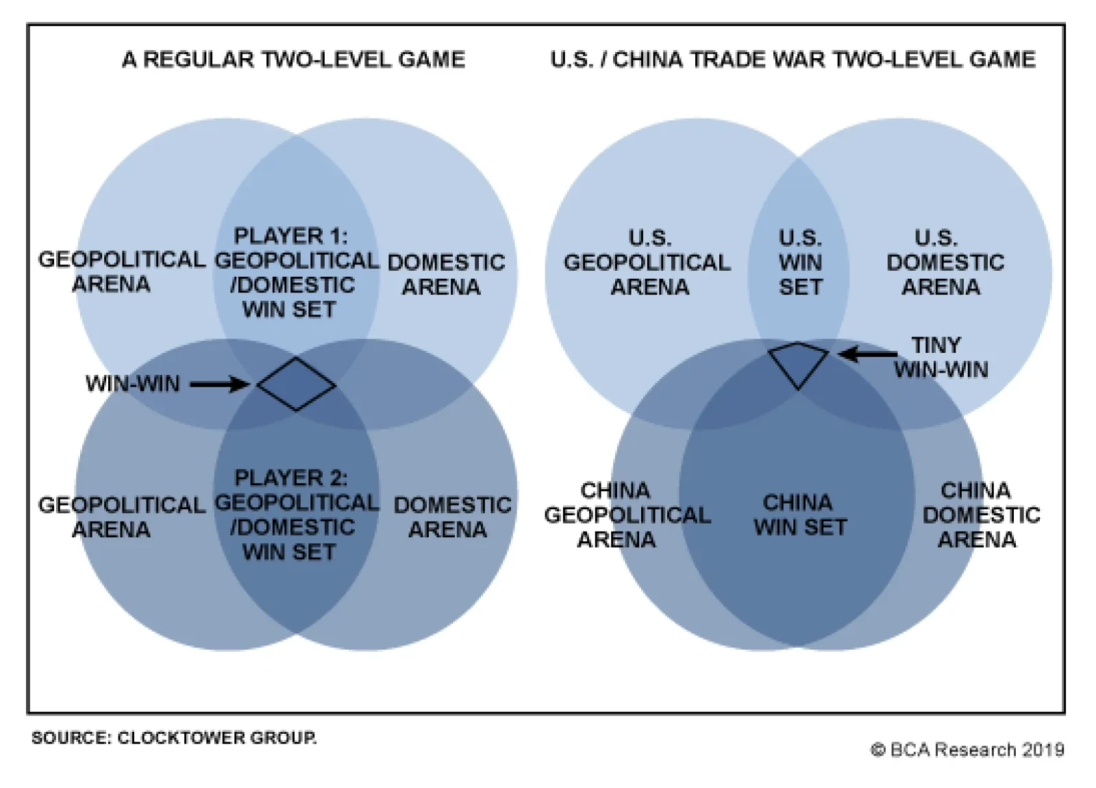
We illustrate the difficulties of agreeing to a deal through the concept of a “two-level game.” In a theoretical two-level game, each country strives to find overlap between its international interests and its rival’s interests and must also seek overlap in such a way that the agreement can be sold to a domestic audience at home. The reason why the “win-win scenario” is so remote in the U.S.-China trade conflict is because although China has a relatively large win set – it can easily sell a deal at home due to its authoritarian control – the U.S. win set is small (Diagram 1). Diagram 1Tiny Win-Win Scenario In U.S.-China Trade Conflict
GeoRisk Indicators Update: May 31, 2019
GeoRisk Indicators Update: May 31, 2019
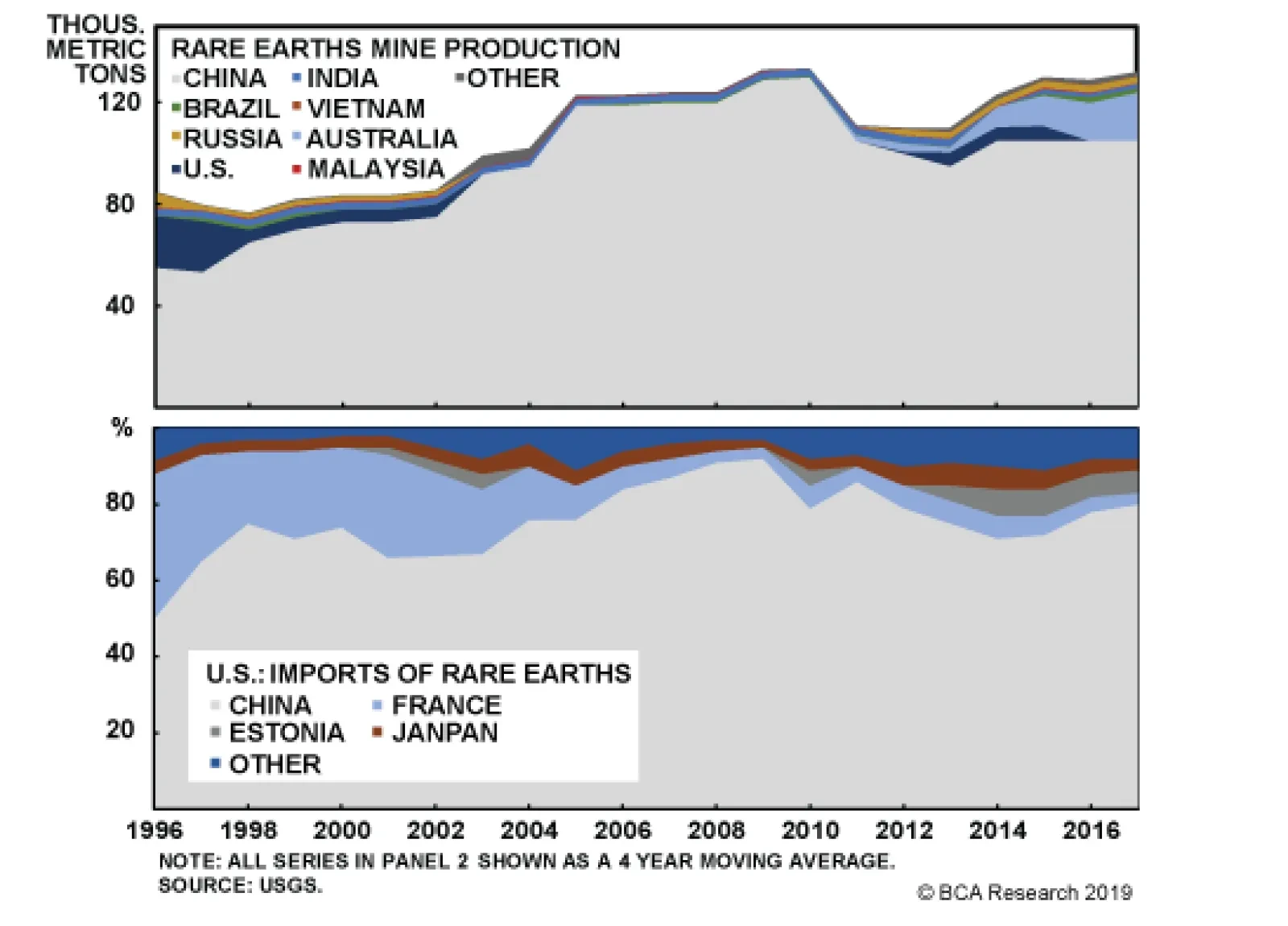
The Democrats will attack any deal that Trump negotiates, making him look weak on his own pet issue of trade with China. This is especially the case if a stock market selloff forces Trump to accept small concessions. His international interest might overlap with China’s interest in minimizing concessions on foreign trade and investment access while maximizing technological acquisition from foreign companies. He would not be able to sell such a deal – focused on large-scale commodity purchases as a sop to farm states – on the campaign trail. Democrats will attack any deal that Trump negotiates. While it is still possible for both sides to reach an agreement, this Diagram highlights the limitations faced by both players. Meanwhile China is threatening to restrict exports of rare earths – minerals which are critical to the economy and national defense. China dominates global production and export markets (Chart 1), so this would be a serious disruption in the near term. Global sentiment would worsen, weighing on all risk assets, and tech companies and manufacturers that rely on rare earth inputs from China would face a hit to their bottom lines. Chart 1China Dominates Rare Earths Supply
France: GeoRisk Indicator
France: GeoRisk Indicator
Over the long haul, this form of retaliation is self-defeating. First, China would presumably have to embargo all exports of rare earths to the world to prevent countries and companies from re-exporting to the United States. Second, rare earths are not actually rare in terms of quantity: they simply occur in low concentrations. As the world learned when China cut off rare earths to Japan for two months in 2010 over their conflict in the East China Sea, a rare earths ban will push up prices and incentivize production and processing in other regions. It will also create rapid substitution effects, recycling, and the use of stockpiles. Ultimately demand for Chinese rare earths exports would fall. Over the nine years since the Japan conflict, China’s share of global production has fallen by 19%, mostly at the expense of rising output from Australia. A survey of American companies suggests that they have diversified their sources more than import statistics suggest (Chart 2). Chart 2Import Stats May Be Overstating China’s Dominance
U.K.: GeoRisk Indicator
U.K.: GeoRisk Indicator
The risk of a rare earths embargo is high – it fits with our 30% scenario of a major escalation in the conflict. It would clearly be a negative catalyst for companies and share prices. But as with China’s implicit threat of selling U.S. Treasuries, it is not a threat that will cause Trump to halt the trade war. The costs of conflict are not prohibitive and there are some political gains. Bottome Line: The S&P 500 is down 3.4% since our Global Investment Strategists initiated their tactical short on May 10. This is nearly equal to the weighted average impact on the S&P 500 that they have estimated using our probabilities. Obviously the selloff can overshoot this target. As it does, the chances of the two sides attempting to contain the tensions will rise. If we do not witness a positive intervention in the coming weeks, it will be too late to salvage the G20 and the risk of a major escalation will go way up. We recommend going short CNY-USD as a strategic play despite China’s recent assurances that the currency can be adequately defended. Our negative structural view of China’s economy now coincides with our tactical view that escalation is more likely than de-escalation. We also recommend going long a basket of companies in the MVIS global rare earth and strategic metals index – specifically those companies not based in China that have seen share prices appreciate this year but have a P/E ratio under 35. U.S.-Iran: An Unintentional War With Unintentional Consequences? “I really believe that Iran would like to make a deal, and I think that’s very smart of them, and I think that’s a possibility to happen.” -President Donald Trump, May 27, 2019 … We currently see no prospect of negotiations with America ... Iran pays no attention to words; what matters to us is a change of approach and behavior.” -Iranian Foreign Ministry spokesman Abbas Mousavi, May 28, 2019 The U.S. decision not to extend sanction waivers on Iran multiplied geopolitical risks at a time of already heightened uncertainty. Elevated tensions surrounding major producers in the Middle East could impact oil production and flows. In energy markets, this is reflected in the elevated risk premium – represented by the residuals in the price decompositions that include both supply and demand factors (Chart 3). Chart 3The Risk Premium Is Rising In Brent Crude Oil Prices
Germany: GeoRisk Indicator
Germany: GeoRisk Indicator
Tensions surrounding major oil producers ... are reflected in the elevated risk premium – represented by the residuals in the Brent price decomposition. Already Iranian exports are down 500k b/d in April relative to March – the U.S. is acting on its threat to bring Iran’s exports to zero and corporations are complying (Chart 4). Chart 4Iran Oil Exports Collapsing
Italy: GeoRisk Indicator
Italy: GeoRisk Indicator
What is more, the U.S. is taking a more hawkish military stance towards Iran – recently deploying a carrier strike group and bombers, partially evacuating American personnel from Iraq, and announcing plans to send 1,500 troops to the Middle East. The result of all these actions is not only to reduce Iranian oil exports, but also to imperil supplies of neighboring oil producers such as Iraq and Saudi Arabia which may become the victims of retaliation by an incandescent Iran. Our expectation of Iranian retaliation is already taking shape. The missile strike on Saudi facilities and the drone attack on four tankers near the UAE are just a preview of what is to come. Although Iran has not claimed responsibility for the acts, its location and extensive network of militant proxies affords it the ability to threaten oil supplies coming out of the region. Iran has also revived its doomsday threat of closing down the Strait of Hormuz through which 20% of global oil supplies transit – which becomes a much fatter tail-risk if Iran comes to believe that the U.S. is genuinely pursuing immediate regime change, since the first-mover advantage in the strait is critical. This will keep markets jittery. Current OPEC spare capacity would allow the coalition to raise production to offset losses from Venezuela and Iran. Yet any additional losses – potentially from already unstable regions such as Libya, Algeria, or Nigeria – will raise the probability that global supplies are unable to cover demand. Going into the OPEC meeting in Vienna in late June, our Commodity & Energy Strategy expects OPEC 2.0 to relax supply cuts implemented since the beginning of the year. They expect production to be raised by 0.9mm b/d in 2H2019 vs. 1H2019.1 Nevertheless, oil producers will likely adopt a cautious approach when bringing supplies back online, wary of letting prices fall too far. This was expressed at the May Joint Ministerial Monitoring Committee meeting in Jeddah, which also highlighted the growing divergence of interests within the group. Russia is in support of raising production at a faster pace than Saudi Arabia, which favors a gradual increase (conditional on U.S. sanctions enforcement). Both the Iranians and Americans claim that they do not want the current standoff to escalate to war. On the American side, Trump is encouraging Prime Minister Shinzo Abe to try his hand as a mediator in a possible visit to Tehran in June. We would not dismiss this possibility since it could produce a badly needed “off ramp” for tensions to de-escalate when all other trends point toward a summer and fall of “fire and fury” between the U.S. and Iran. If forced to make a call, we think President Trump’s foreign policy priority will center on China, not Iran. But this does not mean that downside risks to oil prices will prevail. China will stimulate more aggressively in June and subsequent months. And regardless of Washington’s and Tehran’s intentions, a wrong move in an already heated part of the world can turn ugly very quickly. Bottom Line: President Trump’s foreign policy priority is China, not Iran. Nevertheless, a wrong move can trigger a nasty escalation in the current standoff, jeopardizing oil supplies coming out of the Gulf region. In response to this risk, OPEC 2.0 will likely move to cautiously raise production at the next meeting in late June. Meanwhile China’s stimulus overshoot in the midst of trade war will most likely shore up demand over the course of the year. Can A New Prime Minister Break The Deadlock In Westminster? “There is a limited appetite for change in the EU, and negotiating it won’t be easy.” - Outgoing U.K. Prime Minister Theresa May Prime Minister Theresa May’s resignation has hurled the Conservative Party into a scramble to select her successor. While the timeline for this process is straightforward,2 the impact on the Brexit process is not. The odds of a “no-deal Brexit” have increased but so has the prospect of parliament passing a soft Brexit prior to any new election or second referendum. The odds of a “no-deal Brexit” have increased. Eleven candidates have declared their entry to the race and the vast majority are “hard Brexiters” willing to sacrifice market access on the continent (Table 2). Prominent contenders such as Boris Johnson and Dominic Raab have stated that they are willing to exit the EU without a deal. Table 2“Hard Brexiters” Dominate The Tory Race
GeoRisk Indicators Update: May 31, 2019
GeoRisk Indicators Update: May 31, 2019
Given that the average Tory MP is more Euroskeptic than the average non-conservative voter or Brit, the final two contenders left standing at the end of June are likely to shift to a more aggressive Brexit stance. They will say they are willing to deliver Brexit at all costs and will avoid repeating Theresa May’s mistakes. This means at the very least the rhetoric will be negative for the pound in the coming months. A clear constraint on the U.K. in trying to negotiate a new withdrawal agreement is that the EU has the upper hand. It is the larger economy and less exposed to the ramifications of a no-deal exit (though still exposed). This puts it in a position of relative strength – exemplified by the European Commission’s insistence on keeping the current Withdrawal Agreement. Whoever the new prime minister is, it is unlikely that he or she will be able to negotiate a more palatable deal with the EU. Rather, the new leader will lead a fractured Conservative Party that still lacks a strong majority in parliament. The no-deal option is the default scenario if an agreement is not finalized by the Halloween deadline and no further extension is granted. However, Speaker of the House of Commons John Bercow recently stated that the prime minister will be unable to deliver a no-deal Brexit without parliamentary support. This will likely manifest in the form of a bill to block a no-deal Brexit. Alternatively, an attempt to force a no-deal exit could prompt a vote of no confidence in the government, most likely resulting in a general election.3 Chart 5British Euroskeptics Made Gains In EP Election
Spain: GeoRisk Indicator
Spain: GeoRisk Indicator
While the Brexit Party amassed the largest number of seats in the European Parliament elections at the expense of the Labour, Conservative, and UKIP parties (Chart 5), the results do not suggest that British voters have generally shifted back toward Brexit. In fact, if we group parties according to their stance, the Bremain camp has a slight lead over the Brexit camp (Chart 6). Thus, it is not remotely apparent that a hard Brexiter can succeed in parliament; that a new election can be forestalled if a no-deal exit is attempted; or that a second referendum will repeat the earlier referendum’s outcome. Chart 6Bremain Camp Still Dominates
Russia: GeoRisk Indicator
Russia: GeoRisk Indicator
Bottom Line: While the new Tory leader is likely to be more on the hard Brexit end of the spectrum than Theresa May, this does not change the position of either the European Commission or the British MPs and voters on Brexit. The median voter both within parliament and the British electorate remains tilted towards a softer exit or remaining in the EU. This imposes constraints on the likes of Boris Johnson and Dominic Raab if they take the helm of the Tory Party. These leaders may ultimately be forced to try to push through something a lot like Theresa May’s plan, or risk a total collapse of their party and control of government. Still, the odds of a no-deal exit – the default option if no agreement is reached by the October 31 deadline – have gone up. In the meantime, the GBP will stay weak, gilts will remain well-bid, and risk-off tendencies will be reinforced. GeoRisk Indicators Update – May 31, 2019 Last month BCA’s Geopolitical Strategy introduced ten indicators to measure geopolitical risk implied by the market. These indicators attempt to capture risk premiums priced into various currencies – except for Euro Area countries, where the risk is embedded in equity prices. A currency or bourse that falls faster than it should fall, as implied by key explanatory variables, indicates increasing geopolitical risk. All ten indicators can be found in the Appendix, with full annotation. We will continue to highlight key developments on a monthly basis. This month, our GeoRisk indicators are picking up the following developments: Trade war: Our Korean and Taiwanese risk indicators are currently the best proxies to measure geopolitical risk implications of the U.S.-China trade war, as they are both based on trade data. Both measures, as expected, have increased more than our other indicators over the past month on the back of a sharp spike in tensions between the U.S. and China. Currently, the moves are largely due to depreciation in currencies, as trade is only beginning to feel the impact. We believe that we will see trade decline in the upcoming months. Brexit: While it is still too early to see the full effect of Prime Minister May’s resignation captured in our U.K. indicator, it has increased in recent days. We expect risk to continue to increase as a leadership race is beginning among the Conservatives that will raise the odds of a “no-deal exit” relative to “no exit.” EU elections: The EU elections did not register as a risk on our indicators. In fact, risk decreased slightly in France and Germany during the past few weeks, while it has steadily fallen in Spain and Italy. Moreover, the results of the election were largely in line with expectations – there was not a surprising wave of Euroskepticism. The real risks will emerge as the election results feed back into political risks in certain European countries, namely the U.K., where the hardline Conservatives will be emboldened, and Italy, where the anti-establishment League will also be emboldened. In both countries a new election could drastically increase uncertainty, but even without new elections the respective clashes with Brussels over Brexit and Italian fiscal policy will increase geopolitical risk. Emerging Markets: The largest positive moves in geopolitical risk were in Brazil and Turkey, where our indicators plunged to their lowest levels since late 2017 and early 2018. Brazilian risk has been steadily declining since pension reform – the most important element of Bolsonaro’s reform agenda – cleared an initial hurdle in Congress. While we would expect Bolsonaro to face many more ups and downs in the process of getting his reform bill passed, we have a high conviction view that the decrease in our Turkish risk indicator is unwarranted. This decrease can be attributed to the fact that the lira’s depreciation in recent weeks is slowing, which our model picks up as a decrease in risk. Nonetheless, uncertainty will prevail as a result of deepening political divisions (e.g. the ruling party’s attempt to overturn the Istanbul election), poor governance, ongoing clashes with the West, and an inability to defend the lira while also pursuing populist monetary policy. Roukaya Ibrahim, Editor/Strategist Geopolitical Strategy roukayai@bcaresearch.com Matt Gertken, Vice President Geopolitical Strategist mattg@bcaresearch.com Ekaterina Shtrevensky, Research Analyst ekaterinas@bcaresearch.com France: GeoRisk Indicator
Image
U.K.: GeoRisk Indicator
Image
Germany: GeoRisk Indicator
Image
Italy: GeoRisk Indicator
Image
Spain: GeoRisk Indicator
Image
Russia: GeoRisk Indicator
Image
Korea: GeoRisk Indicator
Image
Taiwan: GeoRisk Indicator
Image
Turkey: GeoRisk Indicator
Image
Brazil: GeoRisk Indicator
Image
What's On The Geopolitical Radar?
Image
Footnotes 1 Please see BCA Research Commodity & Energy Strategy Weekly Report titled “Policy Risk Sustains Oil’s Unstable Equilibrium,” dated May 23, 2019, available at ces.bcaresearch.com. 2 The long list of candidates will be whittled down to two by the end of June through a series of votes by Tory MPs. Conservative Party members will then cast their votes via a postal ballot with the final result announced by the end of July, before the Parliament’s summer recess. 3 A vote of no confidence would trigger a 14-day period for someone else to form a government, otherwise it will result in a general election. Geopolitical Calendar
Highlights In the political economy of oil, an awareness of the speed at which policy in systematically important states can change can restrain risk taking and investment. This can keep markets in an agitated state of anticipation, awaiting the next policy shift – or the fallout from earlier decisions – and can separate prices from fundamentals. Crude oil markets are in such an agitated state. Fundamentally, oil markets are tight and likely will get tighter, as backwardations in benchmark forward curves indicate (Chart 1). Oil demand continues to grow, with EM growth offsetting DM declines (Chart 2). Production is being restrained by OPEC 2.0, and could remain so in 2H19. U.S. shale-oil producers appear to be taking capital discipline seriously, and prioritizing shareholder interests, which likely will keep production growth within the limits dictated by free cash flow. Chart of the WeekBackwardations In Brent & WTI: Evidence Of Tight Oil Markets
Backwardations In Brent & WTI: Evidence Of Tight Oil Markets
Backwardations In Brent & WTI: Evidence Of Tight Oil Markets
Chart 2EM Continues To Lead Global Oil Demand Growth
EM Continues To Lead Global Oil Demand Growth
EM Continues To Lead Global Oil Demand Growth
The combination of these fundamentals will keep supply growth below demand growth this year, which means balances will remain tight (Table 1 below). This will drain inventories and keep forward curves backwardated (Chart 3). Globally, monetary policy will remain largely accommodative. However, policy risks – chiefly Sino – U.S. trade tensions and rising U.S. – Iran tensions – are taking their toll, increasing uncertainty re demand growth, and raising concerns over the security of oil supply from the Persian Gulf, which accounts for ~ 20% of global output. The combination of these policy-risk factors is putting a bid under the USD, which creates a demand headwind by raising the cost of oil ex-U.S.1 This is, in our view, keeping Brent prices below $70/bbl, vs. the $75/bbl we expect this year. Chart 3Commercial Oil Inventories Will Resume Drawing
Commercial Oil Inventories Will Resume Drawing
Commercial Oil Inventories Will Resume Drawing
Highlights Energy: Overweight. U.S. National Security Adviser John Bolton declared Iran was responsible for naval mines attached to oil tankers off the coast of the UAE earlier this month, which damaged four ships, two of them belonging to Saudi Arabia. Bolton also said the Iranian naval operation was connected to a drone attack on the Saudi East – West pipeline two days later, and an unsuccessful attack on the Saudi Red Sea port of Yanbu.2 Base Metals: Neutral. Global copper markets continue to tighten: Fastmarkets MB’s Asian treatment and refining charges (TC/RC) weekly index dropped to its lowest level since it was launched June 2013 at the end of last week – to $58.30/MT, $0.0583/lb. Lower TC/RC charges reflect lower raw ore supplies available for refining. Global inventories remain low – down 22% y/y at the LME, COMEX, SHFE and Chinese bonded warehouses – and a threatened strike at on of Codelco's Chilean mines could tighten supplies further. We are re-establishing our tactical long July $3.00/lb Comex copper vs. short $3.30/lb Comex copper call spread at tonight’s close, expecting continued tightening in markets. Precious Metals: Neutral. Gold prices appear supported on either side of $1,280/oz, as trade, foreign and monetary policy risks remain elevated. Ags/Softs: Underweight. Heavier-than-expected rains are hampering plantings in the U.S. Midwest, which is driving grain prices higher. Corn, wheat, oats and beans surged Tuesday as markets re-opened from a long holiday weekend in the U.S. Feature Within the context of the political-economy framework we use to frame our analysis of oil markets, foreign policy and trade policy – particularly in the U.S. and China – are dominating fundamentals. Indeed, absent the threat of war in the Persian Gulf between Iran and the U.S., and their respective allies, and an uncertainty surrounding an expanded Sino – U.S. trade war, Brent crude oil would be trading above $75/bbl in 2H19, based on our modeling. As things stand now, we believe markets are under-pricing the risk of war in the Persian Gulf, and are over-estimating the short-term effects of the Sino – U.S. trade war. The longer-term consequences of a deeper and more protracted Sino – U.S. trade war, however, continue to be under-estimated. Table 1BCA Global Oil Supply - Demand Balances (MMb/d, Base Case Balances)
Policy Risk Restrains Oil Prices
Policy Risk Restrains Oil Prices
U.S. – Iran War Risk Is Under-priced We have noted in the past the risk of an escalation in the military confrontation in the Persian Gulf remains acute for global oil markets, most recently in our latest balances report.3 In particular, we believe the risk of this scenario is not fully priced, given market participants’ mark-down of the probability of the price of Brent for December 2019 delivery exceeding $75/bbl and $80/bbl from 39% to 26% and 25% to 16% over the past month in options markets. The probability of Brent for March 2020 delivery exceeding $75/bbl and $80/bbl has similarly been marked down from 38% to 28% and 26% to 19% (Chart 4).
Chart 4
An escalation of attacks on soft targets – specifically Saudi and UAE oil shipping and pipeline networks, as occurred earlier this month – likely would provoke a U.S. response against Iran or its proxies, given U.S. National Security Adviser John Bolton’s declaration this week re Iran, which we noted above. A direct attack on the U.S. military presence in the Gulf would be met with extreme force, according to U.S. President Donald Trump.4 A shooting war in the Gulf would, once again, raise the odds of a closing of the Strait of Hormuz, which has been threatened in the past by Iran. Some 20% of the world’s oil supply transits the Strait daily.5 A credible attack against shipping in the Strait would send oil prices sharply higher. If Iran were to succeed in blocking transit through the Gulf, an even sharper move in prices – above $150/bbl – could be expected. Markets Too Sanguine Re Sino – U.S. Trade War Commodity markets are not fully pricing the recent escalation of Sino – U.S. trade war, which were dialled up recently when Chinese President Xi Jinping declared China is embarking on a “New Long March” at a domestic political visit.6 The size of the tariffs thus far imposed by the U.S. against China and the EU are trivial in the context of global trade flows of ~ $19.5 trillion this year (Chart 5).7 According to the WTO, the USD value of merchandise trade rose 10% last year to $19.5 trillion, partly on the back of higher energy prices, while the value of services increased to $5.8 trillion, an 8% gain. Against this, U.S. tariffs of 25% on $250 billion worth of goods imported from China remain trivial. U.S. tariffs so far on EU imports by the U.S. are de minimis. Trade concerns do matter, however, in the longer run. Our geopolitical strategists make the odds of a no-deal outcome 50%, vs. a 40% chance of a deal being reached, and a 10% chance trade talks extend beyond the G20 talks scheduled for June.
Chart 5
If markets become convinced the current Sino – U.S. trade war will evolve into a larger standoff between the U.S. and China – military or economic – capex and global supply chains will undergo profound changes. Globally, states likely will find themselves in the orbit of one of these powers, which will fundamentally alter investment flows and, ultimately, the profitability of global businesses. A full-blown trade war could become a Cold War, in other words, which would re-order global supply chains.8 Should this occur, an increase in demand for oil, bulks like iron ore, and base metals could ensue, as China ramps its fiscal and monetary stimulus, and the U.S. and others in its sphere of influence bid up commodity prices as they are forced to pay for other higher-cost alternatives for once-cheaper goods and services.9 USD Will Remain A Short-Term Headwind Globally, central banks remain accommodative, which will support aggregate demand domestically. However, the combination of rising U.S. – Iran tensions and the prospect of a widening Sino – U.S. trade war have put a bid under the USD in the short term. Our FX strategists expect the USD will appreciate another 2 – 3% before cresting and heading lower later in the year. In the short term, USD strengthening is a headwind for oil prices. A stronger dollar translates into higher prices in local currencies ex U.S., which reduces demand, all else equal. On the supply side, a stronger dollar lowers local production costs, which stimulates supply ex U.S. at the margin. Together, these militate against higher oil prices. Assuming the USD does weaken later in the year, as our FX strategists expect, oil prices could pick up a slight tailwind. However, policy risk and supply-demand fundamentals will continue to drive oil prices for the balance of the year. Bottom Line: Oil prices are being restrained by policy risk – particularly U.S. and Chinese trade policy and U.S. foreign policy in the Persian Gulf. We believe markets are under-estimating the odds of Brent prices being above $75/bbl for barrels delivering in December 2019, and in March 2020. A resolution of Sino – U.S. trade tensions is less likely than a no-deal outcome (40% vs. 50%), with the odds of trade talks continuing beyond next month’s G20 meeting being very slim (10%). A deepening of the Sino – U.S. trade war will have longer-term consequences for commodity demand – possibly positive in the wake of Chinese fiscal and monetary stimulus. Robert P. Ryan, Chief Commodity & Energy Strategist rryan@bcaresearch.com Footnotes 1 Please see BCA’s Foreign Exchange Strategy Weekly Report titled“President Trump And The Dollar”, dated May 9, 2019, available at fes.bcaresearch.com. 2 Please see “Iranian naval mines likely used in UAE tankers attacks: Bolton,” published by reuters.com on May 29, 2019. See also BCA’s Commodity & Energy Strategy Weekly Report titled “Risk Premium In Oil Prices Rising; KSA Lifts West Coast Export Capacity”, dated October 25, 2018, and BCA’s Geopolitical Strategy and Commodity & Energy Strategy Special Report “U.S.-Iran: This Means War?”, dated May 3, 2019, both available at ces.bcaresearch.com. 3 Please see BCA Research’s Commodity & Energy Strategy Weekly Report titled“Policy Risk Sustains Oil’s Unstable Equilibrium” , dated May 23, 2019, available at cesbcaresearch.com. 4 Please see Trump issues harsh warning to Iran, tweeting it would meet its "official end" if it fights U.S. posted by cbsnews.com on May 20, 2019. 5 Please see BCA’s Geopolitical Strategy and Commodity & Energy Strategy Special Report titled “U.S., OPEC Talk Oil Prices Down; Gulf Tensions Could Become Kinetic”, dated July 19, 2018, available at ces.bcaresearch.com. 6 For an excellent discussion of these developments, please see BCA’s Geopolitical Strategy Weekly Report titled “Is Trump Ready For The New Long March?”, dated May 24, 2019, available at gps.bcaresearch.com. The “New Long March” is a reference to the 8,000-mile retreat of Chinese Communist Party fighters so they could regroup and ultimately prevail in their civil war in 1934-35. In recalling the Long March, “President Xi … told President Trump to ‘bring it on,’ as he apparently believes that a conflict with the U.S. will strengthen his rule,” according to Matt Gertken, BCA Research’s Chief Geopolitical Strategist. 7 Please see “Global trade growth loses momentum as trade tensions persist,” published by the WTO April 2, 2019. The World Trade Organization expects the growth in merchandise trade volume to drop from 3% last year to 2.6% in 2019, with a slight improvement next year back to 3% growth. Importantly, the WTO notes this is “dependent on an easing of trade tensions.” 8 The odds of a “hot war” between the U.S. and China also are rising, particularly in the South China Sea, according to Adm. James Stavridis (USN, Retired). Please see Collision course in the South China Sea published by the Nikkei Asian Review May 22, 2019. 9 Please see BCA’s Commodity & Energy Strategy Weekly Report titled“Expanded Sino – U.S. Trade War Could Be Bullish For Base Metals” dated May 9, 2019, available at ces.bcaresearch.com. Investment Views and Themes Recommendations Strategic Recommendations Tactical Trades TRADE RECOMMENDATION PERFORMANCE IN 2019 Q1
Image
Commodity Prices and Plays Reference Table Trades Closed in 2019 Summary of Closed Trades
Image
Highlights The Federal Reserve’s monetary policy stance is slightly accommodative for the U.S., but it is too tight for the rest of the world. Inflation is likely to slow further before making a durable bottom toward year-end. The Fed will remain on an extended pause, maybe all the way through to December 2020. The trade war is not going away, and investors should not be complacent. However, it also guarantees that Chinese policymakers will redouble on their reflationary efforts. As a result, global growth is still set to improve in the second half of 2019. The dollar rally is in its last innings; the greenback will depreciate in the second half of this year. Treasury yields have limited downside and their recent breakdown is likely to be a fake-out. Use any strength in bond prices to further curtail portfolio duration. The correction in stocks is not over. However, the cycle’s highs still lie ahead. Feature Ongoing Sino-U.S. tensions and weakness in global growth are taking their toll. The S&P 500 has broken below its crucial 2,800 level, EM equities are quickly approaching their fourth-quarter 2018 lows, U.S. bond yields have fallen to their lowest readings since 2017, copper has erased all of its 2019 gains and the dollar is attempting to break out. In response, futures markets are now pricing in interest rate cuts by the Fed of 54 bps and 64 bps, over the next 12 and 24 months, respectively. Will the Fed ratify these expectations? Last week’s release of the most recent Fed’s Federal Open Market Committee meeting minutes, as well as comments from FOMC members ranging from Jerome Powell to Richard Clarida, are all adamantly clear: U.S. monetary policy is appropriate, and a rate cut is not on the table for now. However, the avowed data-dependency of the Fed implies that if economic conditions warrant, the FOMC will capitulate and cut rates. Even as U.S. inflation slows, a recession is unlikely. Moreover, the Sino-U.S. trade war will catalyze additional reflationary policy from China, putting a floor under global growth. In this context, the Fed is likely to stay put for an extended period, but will not cut rates. While the S&P 500 is likely to fall toward 2,600, the high for the cycle is still ahead. We therefore maintain our positive cyclical equity view, especially relative to government bonds, but we are hedging tactical risk. Fed Policy Is Neutral For The U.S…. If the fed funds rate was above the neutral rate – the so-called R-star – we would be more inclined to agree with interest rate markets and bet on a lower fed funds rate this year. However, it is not clear that this is the case. Chart I-1Mixed Message From The R-Star Indicator
Mixed Message From The R-Star Indicator
Mixed Message From The R-Star Indicator
Admittedly, the inversion of the 10-year/3-month yield curve is worrisome, but other key variables are not validating this message. Currently, our R-star indicator, based on M1, bank liquidity, consumer credit, and the BCA Fed monitor, is only in neutral territory (Chart I-1). Moreover, we built a model based on the behavior of the dollar, yield curve, S&P homebuilding relative to the broad market and initial UI claims that gauges the probability that the fed funds rate is above R-star. Currently, the model gives a roughly 40% chance that U.S. monetary policy is tight (Chart I-2). Historically, such a reading was consistent with a neutral policy stance. Chart I-2Today, Fed Policy Is At Neutral
Today, Fed Policy Is At Neutral
Today, Fed Policy Is At Neutral
Models can be deceiving, so it is important to ensure that facts on the ground match their insights. Historically, housing is the sector most sensitive to monetary policy.1 Key forward-looking activity measures are not showing signs of stress: mortgage applications for purchases have jumped to new cyclical highs, and the NAHB homebuilders confidence index has smartly rebounded after weakening last year (Chart I-3). Also, homebuilder stocks have been in a steady uptrend relative to the S&P 500 since last October (Chart I-3, bottom panel). These three developments are not consistent with tight monetary policy. Chart I-3This Would Not Happen If Policy Were Tight
This Would Not Happen If Policy Were Tight
This Would Not Happen If Policy Were Tight
The corporate sector confirms the message from the housing sector. While capex intentions have weakened, they remain at elevated levels, despite slowing profit growth and elevated global uncertainty. Moreover, the latest Fed Senior Loan Officer Survey shows that banks have again eased credit standards for commercial and industrial loans. Netting out all these factors, we are inclined to agree with the Fed that monetary policy in the U.S. is broadly neutral. If anything, the rebound in leading indicators of residential activity would argue that policy is even slightly accommodative. … But Not For The Rest Of The World Congress gave the Fed a U.S.-only mandate, but the U.S. dollar is the global reserve currency. Because the dollar is the keystone of the global financial architecture, between US$12 trillion and US$14 trillion of foreign-currency debt is issued in USDs, and the greenback is used as a medium of exchange in roughly US$800 trillion worth of transaction per year.2 Therefore, the Fed may target U.S. monetary conditions, but it sets the cost of money for the entire world. While U.S. monetary conditions may be appropriate for the U.S., they are not entirely appropriate for the world as a whole. Indeed, the green shoots of growth we highlighted two months ago are rapidly turning brown: Korean and Taiwanese exports, which are highly sensitive to the global and Asian business cycles, are still contracting at a brisk pace (Chart I-4, top panel). Japan, an economy whose variance in GDP mostly reflects global gyrations, is weakening. Exports are contracting at a 4.3% yearly pace, machine tool orders are plunging at a 33% annual rate and the coincident indicator is below 100 – a sign of shrinking activity. The semiconductor space is plunging (Chart I-4, second panel). Our EM Asia diffusion index, which tallies 23 variables, is near record lows (Chart I-4, third panel). Europe too is feeling the pain, led by Germany, another economy deeply dependent on global activity. The flash estimate for the euro area manufacturing PMI fell to 47.7 and plunged to 44.3 in Germany, its lowest level since July 2012 (Chart I-4, bottom panel). These developments show that the world economy remains weak, in part because the Chinese economy has yet to meaningfully regain any traction. The rebound in Chinese PMI in March proved short lived; in April, both the NBS and Caixin measures fell back to near the 50 boom/bust line. Since inflation lags real activity and global growth has yet to bottom, it could take some time before inflation finds a floor. A strong dollar is a natural consequence of an outperforming U.S. economy, especially when global growth weakens. Thus, the rally in the Fed’s nominal trade-weighted dollar to its highest level since March 2002 is unsurprising (Chart I-5). A strong Greenback will have implications for inflation, and thus the Fed. Chart I-4Global Growth: No Green Shoots Here
Global Growth: No Green Shoots Here
Global Growth: No Green Shoots Here
Chart I-5A Strong Dollar Is A Natural Consequence Of Weak Growth
A Strong Dollar Is A Natural Consequence Of Weak Growth
A Strong Dollar Is A Natural Consequence Of Weak Growth
Transitory Inflation Weakness Is Not Over The Fed believes the current inflation slowdown is transitory. We agree. With a tight labor market and rising wages, the question is not if inflation will rise, but when. In the current context, it could take some time. As Chart I-6 shows, inflation has been stable for more than 20 years. From 1996 to today, core PCE has oscillated between 0.9% and 2.6%, while core CPI has hovered between 0.6% and 2.9%, with the peaks and troughs determined by the ebbs and flows of global growth. Since inflation lags real activity and global growth has yet to bottom, it could take some time before inflation finds a floor, likely around 1.3% and 1.5% for core PCE and core CPI, respectively. Chart I-6Stable U.S. Inflation Since 1996
Stable U.S. Inflation Since 1996
Stable U.S. Inflation Since 1996
A few dynamics strengthen this judgment: The strength in the dollar is deflationary (Chart I-7, top panel). Not only does an appreciating greenback depress import prices, it tightens U.S. and global financial conditions. It also undermines dollar-based liquidity, especially if EM central banks try to fight weakness in their own currencies. All these forces harm growth, commodity prices and ultimately, inflation. Chart I-7More Downside Ahead In Inflation For Now
More Downside Ahead In Inflation For Now
More Downside Ahead In Inflation For Now
After adjusting for their disparate variance, the performance of EM stocks relative to EM bonds is an excellent leading indicator of global core inflation (Chart I-7, second panel). This ratio is impacted by EM financial conditions, explaining its forecasting power for prices. Since goods inflation – which disproportionally contributes to overall variations in core CPI – is globally determined, U.S. inflation will suffer as well. U.S. capacity utilization is declining (Chart I-7, third panel). The U.S. just underwent a mini inventory cycle. The 12-month moving averages of the Philadelphia Fed and Empire State surveys’ inventory indexes still stand above their long-term averages. U.S. firms will likely use discounts to entice customers, especially as a strong dollar and weak global growth point to limited foreign outlets for this excess capacity. Finally, the growth in U.S. unit labor costs is slowing sharply, which normally leads inflation lower (Chart I-7, bottom panel). Average hourly earnings may now be growing at a 3.2% annual pace, but productivity rebounded to a 2.4% year-on-year rate in the first quarter, damping the impact of higher salaries on costs. If global growth is weak and U.S. inflation decelerates further, the Fed is unlikely to raise interest rates anytime soon. As the Fed policy remains modestly accommodative and the labor market is at full employment, the balance of probability favors an extended pause over a cut. But keep in mind, next year’s elections may mean this pause could last all the way to December 2020. How Does The Trade War Fit In? An additional irritant has been added to the mix: the growing trade tensions between the U.S. and China. The trade war has resurrected fears of a repeat of the 1930 Smoot-Hawley tariffs, which prompted a wave of retaliatory actions, worsening the massive economic contraction of the Great Depression. There is indeed plenty to worry about. Today, global trade represents 25% of global GDP, compared to 12% in the late 1920s. Global growth would be highly vulnerable to a freeze in world trade. Besides, global supply chains are extremely integrated, with intra-company exports having grown from 7% of global GDP to 16% between 1993 and 2013. If a full-blown trade war were to flare up, much of the capital invested abroad by large multinationals might become uneconomic. As markets price in this probability, stock prices would be dragged down. Chart I-8Trade Uncertainty Alone Will Delay The Recovery
Trade Uncertainty Alone Will Delay The Recovery
Trade Uncertainty Alone Will Delay The Recovery
The fear of a full-fledged trade war is already affecting the global economy. The fall in asset prices to reflect the risk of stranded capital is tightening financial conditions and hurting growth. Moreover, the rise in U.S. and global economic uncertainty is depressing capex intentions (Chart I-8). Since capex intentions are a leading variable for actual capex, global exports and manufacturing activity, the trade war is deepening and lengthening the current soft patch. Markets need to be wary of pricing in a quick end to the Sino-U.S. trade conflict. Table I-1 presents BCA’s Geopolitical Strategist Matt Gertken’s odds of various outcomes to the trade negotiations and their implications for stocks. Matt assigns only a 5% probability to a grand compromise between the U.S. and China on trade and tech. He also foresees a 35% chance that a deal on trade excluding an agreement on tech will be reached this year. This leaves 10% odds that the two sides agree to extend the negotiation deadline beyond June, 20% odds of no deal at all and a minor escalation, and 30% odds of a major escalation. In other words, BCA is currently assigning 60% odds of a market-unfriendly outcome, and only a 40% chance of a genuinely market-friendly one.3
Chart I-
Chart I-9
Why the gloom? The U.S. and China are geopolitical rivals in a deadlock. Moreover, both parties are feeling increasingly emboldened to play hardball. On the U.S. side, President Donald Trump has threatened to expand his tariffs to all of China’s exports to the U.S., which would represent a major escalation in both the conflict and its cost (Chart I-9). However, despite the scale of the threat, even if it were fully borne by U.S. households, its impact should be kept in perspective. Imports of consumer goods from China only represent 2% of total household spending (Chart I-10, top panel). Moreover, households are not currently overly concerned with inflation, as goods prices are already muted (Chart I-10, middle panel) and family income is still growing (Chart I-10, bottom panel). Finally, a weak deal could easily be decried as a failure in the 2020 election. On the Chinese side, the 9.5% fall in the yuan is already absorbing some of the costs of the tariffs, and the RMB will depreciate further if the trade war escalates. Additionally, Chinese exports to the U.S. represent 3.4% of GDP, while household and capital spending equals 81% of output. China can support its domestic economy via fiscal and credit policy, greatly mitigating the blow from the trade war. The outlook for Chinese reflationary efforts is therefore paramount. In sharp contrast to its limited upside, the dollar’s downside will be much more significant once global growth improves. Not only do Chinese policymakers have the room to stimulate, they also have the will. In the first four months of 2019, Chinese total social financing flows have amounted to CNY 9.6 trillion, which compares favorably to the same period during the 2016 reflation campaign. Yet, the economy has not fully responded to the injection of credit and previously implemented tax cuts amounting to CNY 1.3 trillion or 1.4% of GDP. Consequently, GDP per capita is now lagging well behind the required path to hit the government’s 2020 development targets (Chart I-11). Moreover, Chinese policymakers’ recent comments have increasingly emphasized protecting employment. This combination raises the likelihood of additional stimulus in the months ahead. Chart I-10...But Do Not Overstate Trump's Constraints
...But Do Not Overstate Trump's Constraints
...But Do Not Overstate Trump's Constraints
Chart I-11Chinese Stimulus: Scope And Willingness
Chinese Stimulus: Scope And Willingness
Chinese Stimulus: Scope And Willingness
Therein lies the paradox of the trade war. While its immediate effect on world growth is negative, it also increases the chance that Chinese authorities pull all the levers to support domestic growth. A greater reflationary push would thus address the strongest headwind shaking the global economy. It could take two to six more months before the Chinese economy fully responds and lifts global growth. Ultimately, it will. Hence, even as the trade war continues, we remain skeptical that the Fed will cut interest rates as the market is discounting. We are therefore sticking to our call that the Fed will not cut rates over the next 12 months and will instead stay on an extended pause. Investment Conclusions The Dollar So long as global growth remains soft, the dollar is likely to rally further. That being said, the pace of the decline in global growth is decelerating. As a corollary, the fastest pace of appreciation for the greenback is behind us (see Chart I-5 on page 6). The risk to this view is that the previous strength in the dollar has already unleashed a vicious cycle whereby global financial conditions have tightened enough to cause another precipitous fall in world growth. The dollar’s strong sensitivity to momentum would then kick in, fomenting additional dollar strength in response to the greater growth slowdown. In this environment, the Fed would have no choice but to cut interest rates. However, growing reflationary efforts around the world currently confine this scenario to being a risk, not a central case. Additional factors also limit how far the dollar can rally. Speculators have already aggressively bought the greenback (Chart I-12). The implication is that buyers have moved in to take advantage of the dollar-friendly fundamentals. When looking at the euro, which can be thought of as the anti-dollar, investors are imputing a large discount in euro area stocks relative to U.S. ones, pointing to elevated pessimism on non-U.S. growth (Chart I-13). It would therefore require a much graver outcome in global growth to cause investors to further downgrade the outlook for the rest of the world relative to the U.S. and bring in new buyers of greenbacks. Chart I-12USD: Supportive Fundamentals Are Already Reflected
USD: Supportive Fundamentals Are Already Reflected
USD: Supportive Fundamentals Are Already Reflected
Chart I-13Plenty Of Pessimism In European Assets...
Plenty Of Pessimism In European Assets...
Plenty Of Pessimism In European Assets...
In sharp contrast to its limited upside, the dollar’s downside will be much more significant once global growth improves. The same factors that are currently putting the brakes on the dollar’s rise will fuel its eventual downturn. As global growth bounces, a liquidation of stale long-dollar bets will ensue. European growth will also rebound (Chart I-14), and euro pessimism will turn into positive surprises. European assets will be bought, and the euro will rise, deepening the dollar’s demise. We are closely following the Chinese and global manufacturing PMIs to gauge when global growth exits its funk. At this point, it will be time to sell the USD. Government Bonds Bonds are caught between strong crosscurrents. On the one hand, rising economic uncertainty caused by the trade war, slowing global economic activity and decelerating inflation are all bond-bullish. On the other hand, bond prices already reflect these tailwinds. The OIS curve is baking in 54 basis points of Fed cuts over the next 12 months, as well as a further 10 basis points over the following 12 months (Chart I-15, top panel). Meanwhile, term premia across many major bond markets are very negative (Chart I-15, middle panel). Finally, fixed-income investors have pushed their portfolio duration to extremely high levels relative to their benchmark (Chart I-15, bottom panel). Chart I-14...Creates Scope For Positive Surprises
...Creates Scope For Positive Surprises
...Creates Scope For Positive Surprises
Chart I-15Fade The Treasury Rally
Fade The Treasury Rally
Fade The Treasury Rally
Last week, Treasury yields broke down below 2.34%. For this technical break to trigger a new down-leg in yields, investors must curtail their already-depressed expectations of the fed funds rate in 12-months’ time. However, the fed funds rate is not yet restrictive, and global growth should soon find a floor in response to expanding Chinese stimulus. Under these circumstances, the Fed is unlikely to cut rates, and will continue to telegraph its intentions not to do so. Hence, unless the S&P 500 or the ISM manufacturing fall below 2,500 and 50, respectively, any move lower in yields is likely to be transitory and shallow. Cyclically, yields should instead move higher. Our Global Fixed Income Strategy service’s duration indicator has already turned the corner (Chart I-16). Moreover, in the post-war period, Treasury yields have, on average, bottomed a year before inflation. Expecting an inflation trough in late 2019 or even early 2020 is therefore consistent with higher yields by year-end. Finally, when the Fed does not cut interest rates as much as the markets had been anticipating 12-months’ prior, Treasurys underperform cash. This is exactly BCA’s current Fed forecast. Chart I-16Global Yields Now Have More Upside Than Downside
Global Yields Now Have More Upside Than Downside
Global Yields Now Have More Upside Than Downside
While we expect the bond-bearish forces to emerge victorious, yields may only rise slowly. The list of aforementioned supports for Treasury prices is long, the equity market will remain volatile and has yet to trough, and the trade war is likely to linger. We continue to closely monitor the AUD, the SEK versus the EUR, and copper to gauge if our view is wrong. These three markets are tightly linked to Chinese growth. If China’s stimulus is working, these three variables will rebound, and our bond view will be validated. If these three variables fall much further, U.S. yields could experience significantly more downside. Equities Equities are at a difficult juncture. The trade war is a bigger problem for Wall Street than for Main Street, as 43.6% sales of the S&P 500’s are sourced abroad. Moreover, the main mechanism through which trade tensions impact the stock market is through the threat that capital will be stranded – and thus worthless. This is a direct hit to the S&P 500, especially as global growth has yet to clearly stabilize and the Chinese are only beginning to make clearer retaliatory threats. Oil could also hurt stocks. Energy prices have proven resilient, despite weaker global economic activity. OPEC and Russia have been laser-focused on curtailing global crude inventories; even after the U.S. declined to extend waivers on Iranian exports, the swing oil producers have not meaningfully increased supply. Problems in Venezuela, Libya, and potential Iranian adventurism in Iraq could easily send oil prices sharply higher, especially as the U.S. does not have the export capacity to fulfill foreign demand. Thus, the oil market could suddenly tighten and create a large drag on global growth. This backdrop also warrants remaining overweight the energy sector. Stocks remain technically vulnerable. Global and U.S. stock market breadth has deteriorated significantly, as shown by the number of countries and stocks above their 200-day moving averages (Chart I-17). Moreover, since March, the strength in the S&P 500 has been very narrow, as shown by the very poor performance of the Value Line Geometric Average Index (Chart I-18). Meanwhile, the poor relative performance of small-cap stocks in an environment where the dollar is strong, where U.S. growth is holding steady compared to the rest of the world and where multinationals have the most to lose from a trade war, is perplexing. Chart I-17Stocks Remain Technically Fragile
Stocks Remain Technically Fragile
Stocks Remain Technically Fragile
Chart I-18Dangerous Internal Dynamics
Dangerous Internal Dynamics
Dangerous Internal Dynamics
The U.S. stock market has the most downside potential in the weeks ahead. Like last summer, U.S. equity prices remain near record highs while EM and European stocks, many commodities and bond yields have been very weak. Moreover, the broad tech sector, the U.S.’s largest overweight, has defied gravity, despite weakness in the semiconductor sector, the entire industry’s large exposure to foreign markets, and the consequential slowdown in our U.S. Equity Strategy service's EPS model (Chart I-19).4 Thus, any bad news on the trade front or any additional strength in the dollar could prove especially painful for tech. This would handicap U.S. equities more than their already beaten-up foreign counterparts. Chart I-19The Tech Sector Profit Outlook Remains Poor
The Tech Sector Profit Outlook Remains Poor
The Tech Sector Profit Outlook Remains Poor
These forces mean that the global equity correction will last longer, and that U.S. equities could suffer more than other DM markets. However, we do not see the S&P falling much beyond the 2,700 to 2,600 zone. Again, the fed funds rate is slightly accommodative and a U.S. recession – a prerequisite for a bear market (Chart I-20) – is unlikely over the coming 12 months. Moreover, global growth should soon recover, especially if China’s reflationary push gathers force. Additionally, an end to the dollar’s rally would create another welcomed relief valve for stocks. Chart I-20The Absence Of A Recession Means This Is A Correction, Not A Bear Market
The Absence Of A Recession Means This Is A Correction, Not A Bear Market
The Absence Of A Recession Means This Is A Correction, Not A Bear Market
In this context, we recommend investors keep a cyclical overweight stance on stocks. Balanced portfolios should also overweight stocks relative to government bonds. However, the near-term risks highlighted above remain significant. Consequently, we also recommend investors hedge tactical equity risks, a position implemented by BCA’s Global Investment Strategy service three weeks ago.5 As a corollary, if stocks correct sharply, the associated rise in implied volatility will also cause a violent but short-lived pick up in credit spreads. In Section II, we look beyond the short-term gyrations. One of BCA’s long-term views is that inflation is slowly embarking on a structural uptrend. An environment of rising long-term inflation is unfamiliar to the vast majority of investors. In this piece, Juan-Manuel Correa, of our Global Asset Allocation team, shows which assets offer the best inflation protection under various states of rising consumer and producer prices. Mathieu Savary Vice President The Bank Credit Analyst May 30, 2019 Next Report: June 27, 2019 II. Investors’ Guide To Inflation Hedging: How To Invest When Inflation Rises U.S. inflation is on a structural uptrend. Monetary and fiscal policy, populism, and demographics will tend to push inflation higher over the coming decade. How can investors protect portfolios against inflation risk? We look at periods of rising inflation to determine which assets were the best inflation hedge. We find that the level of inflation is very important in determining which assets work best. When inflation is rising and high, or very high, the best inflation hedges at the asset class level are commodities and U.S. TIPS. When inflation is very high, gold is the best commodity to hold and defensive sectors will minimize losses in an equity portfolio. However, hedges have a cost. Allocating a large percentage of a portfolio to inflation hedges will be a drag on returns. Investors should opt for a low allocation to hedges now, and increase to a medium level when inflation rises further. Some 38 years have passed since the last time the U.S. suffered from double-digit inflation. The Federal Reserve reform of 1979, championed by Paul Volcker, changed the way the Fed approached monetary policy by putting a focus on controlling money growth.1 The reform gave way to almost four decades of relatively controlled inflation, which persists today. But times are changing. While most of today’s investors have never experienced anything other than periods of tame inflation, BCA expects that rising inflation will be a major driving force of asset returns over the coming decade.2 The main reasons behind this view are the following: 1. A rethink in the monetary policy framework: At its most recent meeting, the FOMC openly discussed the idea of a price-level target, implying that it would be open to the economy running hot to compensate for the past 10 years of below-target inflation (Chart II-1.1A, top panel). Chart II-1.1AStructural Forces Point To Higher Inflation In The Coming Decade (I)
Structural Forces Point To Higher Inflation In The Coming Decade (I)
Structural Forces Point To Higher Inflation In The Coming Decade (I)
Chart II-1.1BStructural Forces Point To Higher Inflation In The Coming Decade (I)
Structural Forces Point To Higher Inflation In The Coming Decade (I)
Structural Forces Point To Higher Inflation In The Coming Decade (I)
2. Procyclical fiscal policy: The U.S. is conducting expansionary fiscal policy while the economy is at near-full employment (Chart II-1.1A, middle panel). The last time this happened in the U.S., during the 1960s, high inflation followed, as the fiscal boost made the economy run substantially above capacity. 3. Waning Fed independence: President Trump has openly questioned the hiking campaign undertaken by the Fed. Moreover, he has tried to nominate Fed governors with dovish tendencies. Historically around the world, a lack of central bank independence has often led to higher inflation rates (Chart II-1.1A, bottom panel). 4. Peak in globalization: Globalization accelerated significantly in the 1990s and 2000s, flooding the global economy with cheap labor (Chart II-1.1B, top panel). However, we believe that globalization has peaked. Instead, populism and protectionism will be the dominant paradigms for years to come, reducing the cheap pool of workers and goods previously available. 5. Demographics: The population in the U.S. is set to age in coming years (Chart II-1.1B, middle panel). As the percentage of U.S. retirees increases, the number of spenders relative to savers will begin to rise (Chart II-1.1B, bottom panel). Higher spending and lower savings in the economy should create upward pressure on inflation. If our view is correct, how should investors allocate their money? We attempt to answer this question by evaluating the performance of five major asset classes during periods when inflation was rising. Furthermore, we look into sub-asset class performance to determine how investors should position themselves within each asset class to take advantage of an inflationary environment. In our asset-class analysis, we use a data sample starting in 1973 and we limit ourselves to five publicly traded assets that have adequate history: global equities, U.S. Treasuries, U.S. real estate (REITs), U.S. inflation-linked bonds,3 and commodities. We compare asset classes according to their Sharpe ratios: average annualized excess returns divided by annualized volatilities.4 BCA expects that rising inflation will be a major driving force of asset returns over the coming decade. In our sub-asset class analysis, we analyze global equity sectors, international vs U.S. equities, and individual commodities. In some of the sections in our sub-asset class analysis, our sample is slightly reduced due to lack of historical data. Moreover, since in some instances all sectors have negative returns, we compare sub-asset classes according to their excess returns only. We base our analysis on the U.S. Consumer Price Index, given that most of the assets in our sample are U.S. based. We opt for this measure because it tends to track the living expenses for most U.S. citizens and it is the preferred measure to index defined-benefit payments. Finally, we decompose the periods of rising inflation into four quartiles in order to examine whether the level of inflation has any impact on the performance of each asset. Chart II-1.2 and Table II-1.1 show the different ranges we use for our analysis as well as a description of the typical economic and monetary policy environments in each of them.
Chart II-1
Chart II-
Summary Of Results Table II-1.2 shows the summary of our results. For a detailed explanation on how each asset class and sub-asset class behaves as inflation rises, please see the Asset Class section and the Sub-Asset Class section below.
Chart II-
Which assets perform best when inflation is rising? Rising inflation affects assets very differently, and is especially dependent on how high inflation is. Global equities performed positively when inflation was rising and low or mild, but they were one of the worst-performing assets when inflation was rising and high or very high. Importantly, equities underperformed U.S. Treasuries in periods of both high and very high inflation. Commodities and U.S. TIPS were the best performers when inflation was high or very high. U.S. REITs were not a good inflation hedge. Which global equity sectors perform best when inflation is rising? Energy and materials outperformed when inflation was high. Every single sector had negative excess returns when inflation was very high, but defensive sectors such as utilities, healthcare, and telecommunications5 minimized losses. Which commodities perform best when inflation is rising? With the exception of energy, most commodities had subpar excess returns when inflation was in the first two quartiles. Industrial metals outperformed when inflation was high. Gold and silver outperformed when inflation was very high. Additionally, gold had consistent returns and low volatility.
Chart II-1
What is the cost of inflation hedging? To answer this question, we construct four portfolios with different levels of inflation hedging: 1. Benchmark (no inflation hedging): 60% equities/40% bonds. 2. Low Inflation Hedging: 50% equities/40% bonds/5% TIPS/5% commodities 3. Medium Inflation Hedging: 40% equities/30% bonds/15% TIPS/15 % commodities 4. Pure Inflation Hedging: 50% TIPS/50% commodities. While increased inflation hedging provides better performance when inflation is high and rising, these hedges are costly to hold when inflation is at lower ranges or when it is falling (Chart II-1.3, panels 1 & 2). However, adding moderate inflation hedging (low or medium) to a portfolio achieved the right balance between cost and protection, and ultimately improved risk-adjusted returns over the whole sample (Chart II-1.3, panel 3). What about absolute returns? The benchmark outperformed over the whole sample. However, the low and medium inflation hedging did not lag far behind, while avoiding the big drawdowns of high inflation periods (Chart II-1.3, panel 4). Investment Implications High inflation may return to the U.S. over the next decade. Therefore, inflation hedging should be a key consideration when constructing a portfolio. Based on our results, our recommendations are the following: 1. At the asset-class level, investors should allocate to commodities and U.S. TIPS to hedge inflation. 2. However, these hedges are costly to hold as they will create a drag on returns in periods when inflation is not high or very high. Therefore, a low allocation to inflation hedges is warranted now. 3. Inflation will probably start to pick up in the 2020s. A medium allocation to inflation hedges will then be appropriate. 4. When inflation is high (3.3%-4.9%), investors should overweight energy and materials in their equity portfolios. Likewise, they should overweight industrial metals and energy within a commodity portfolio. 5. When inflation is very high (4.9% or more), investors should overweight defensive sectors in their equity portfolio to minimize losses. Moreover, investors should overweight gold within a commodity portfolio. At the asset-class level, investors should allocate to commodities and U.S. TIPS to hedge inflation. Asset Classes Global Equities
Chart II-2
The relationship between equity returns and rising inflation depends on how high inflation is, with outstanding performance when inflation is rising but low or mild, and poor performance as it gets higher (Chart II-2.1, top panel). This relationship can be explained by the interaction between interest rates, inflation, earnings, and valuations: Earnings growth was usually slightly negative when inflation was recovering from low levels. However, given that interest rates were very low in this environment and growth expectations were high, multiple expansion boosted equity returns (Chart II-2.1, bottom panel). When inflation was mild, the Fed typically started to raise rates, resulting in a declining multiple. However, equities had the best performance in this range thanks to very high earnings growth – a result of the economy growing strongly due to a healthy level of inflation. When inflation climbed into the high or very high range, earnings growth was usually positive but beginning to slow, as high inflation weighed on growth. Meanwhile the multiple started to decline rapidly due to rising interest rates and declining growth expectations. With the exception of the mild inflation range, the return profile of equities during inflationary periods was similar to its normal profile: negative skew and excess kurtosis (Table II-2.1). However, the consistency of returns decreased at higher levels of inflation, with only 45% of months with positive returns when inflation was rising and in its highest quartile.
Chart II-
U.S. Treasuries
Chart II-2
U.S. Treasuries reacted in a similar fashion to equities when inflation was rising (Chart II-2.2). However, while Treasuries underperformed equities when inflation was low or mild, they actually outperformed equities when inflation was high or very high. This was in part due to the fact that at higher inflation ranges, U.S. Treasuries offer a higher coupon return when rates are high, at least partially counteracting losses from falling prices. The steady stream of cash flows from the coupons helped Treasuries achieve positive returns roughly two-thirds of the time at the highest levels of inflation (Table II-2.2). However, this consistency in returns came at a cost: very high inflation resulted in negative skew and high excess kurtosis. Therefore, while Treasuries provided frequent positive returns when inflation was very high, they were prone to violent selloffs.
Chart II-
U.S. REITs
Chart II-2
While REITs had high risk-adjusted returns when inflation was rising but mild, much like equities they had subpar performance in every other quartile and particularly poor performance when inflation was high or very high (Chart II-2.3). These results confirm our previous research showing that REITs performance is very similar to that of equities.6 The return consistency for REITs was generally poor in inflationary periods, with the second-lowest percentage of positive return of any asset class (Table II-2.3). Moreover, REIT returns had excess kurtosis and negative skew throughout all inflation quartiles.
Chart II-
Commodity Futures
Chart II-2
Commodities performed positively in every quartile, and did particularly well when inflation was mild (Chart II-2.4, top panel). However, total return and price return were very different due to the behavior of the roll and collateral return: Total risk-adjusted returns were lower than spot risk-adjusted returns when inflation was low and rising. This happened because during these periods, commodity supply was high relative to demand, as the economy was recovering from a deflationary shock. Thus, there was an incentive for producers to conserve inventories, making the futures curve upward-sloping (contango). Thus, roll return was negative (Chart II-2.4, bottom panel). When inflation was in the upper two quartiles, total risk-adjusted returns were much higher than risk-adjusted spot returns. This was because high inflation was the product of supply shocks. These supply shocks resulted in a downward-sloping futures curve (backwardation), which, in turn, resulted in a positive roll return. Additionally, high rates during these regimes contributed to a high collateral return. Commodities provided good return consistency during inflationary periods, with roughly 60% of positive return months in the upper two inflation quartiles (Table II-2.4). The skew of returns was neutral or positive in the top two quartiles. This means that although volatility was high for commodities, extreme return movements were normally positive.
Chart II-
U.S. Inflation-Protected Bonds
Chart II-2
While inflation-protected bonds provided meager returns when inflation was rising but in the mild range, they provided excellent performance at the highest levels of inflation (Chart II-2.5). Moreover, this high Sharpe ratio was not just simply the result of low volatility, since U.S. TIPS had excess returns of 4.6% when inflation was high and 5.7% when inflation was very high.7 The return profile of inflation-protected bonds during inflationary periods was also attractive in our testing period. Average skew was positive, while kurtosis was relatively low (Table II-2.5). The percentage of positive months across all quartiles was also the highest of all asset classes, with a particularly high share of positive returns in the periods of highest inflation.
Chart II-
Sub-Asset Classes Global Equity Sectors
Chart II-3
For the sector analysis, we looked at information technology, financials, energy, materials, utilities, healthcare, and telecommunications. We excluded industrials, consumer discretionary, and consumer staples given that they do not have adequate back data. Once again, we separate rising inflation periods into four quartiles, arriving at the following results: When inflation was low, information technology had the best excess returns while utilities had the worst (Chart II-3.1, panel 1). This matches our observations at the asset class level, as IT is highly responsive to changes in the valuation multiple. When inflation was mild, energy had the best performance, followed by information technology (Chart II-3.1, panel 2). Meanwhile, financials had the worst performance, as rates were normally rising in these periods. When inflation was high, sectors highly correlated with commodity prices such as energy and materials outperformed. Meanwhile, IT was the worst performer (Chart II-3.1, panel 3). When inflation was very high, every sector had negative excess returns. Overall, investing in energy minimized losses (Chart II-3.1, panel 4). However, this performance was in part attributable to the oil spikes of the 1970s. Alternatively, defensive sectors such as utilities, telecommunications, and healthcare also minimized losses. International vs U.S. Equities
Chart II-3
How do equities outside of the U.S. behave when inflation is rising? While the high share of U.S. equities in the global index causes U.S. equities to be the main driver of global stock prices, is it possible to improve returns in inflationary environments by overweighting international equities? The answer once again depends on the level of inflation. When inflation was rising but low, U.S. stocks outperformed global ex-U.S. equities in both common currency and local currency terms (Chart II-3.2, panel 1). This was in part due to the inherent tech bias in U.S. stocks. Additionally, the low level of inflation was often accompanied by slowing global growth in our sample, helping the U.S. dollar. When inflation was mild, U.S. stocks once again outperformed international stocks in both local and common currency terms, though to a lesser degree (Chart II-3.2, panel 2). The dollar was roughly flat in this environment. U.S. stocks started to have negative excess returns when inflation was high (Chart II-3.2, panel 3). On the other hand international equities had positive excess returns in dollar terms, partly because of their energy and material bias and partly because the dollar was generally weak in this period. U.S. equities outperformed global ex-U.S. equities by a small margin when inflation was very high, given that defensive sectors such as telecommunication were over-represented in the U.S. index (Chart II-3.2, panel 4). The dollar was roughly flat in this period. Individual Commodities
Chart II-3
Our analysis above confirmed that commodities were one of the best assets to hold when inflation was rising. However, which commodity performed best?8 Total return for every commodity was lower than spot return when inflation was low (Chart II-3.3, panel 1). This was due to the upward-sloping term structure of the futures curve (contango), resulting in a negative roll yield. In this range, energy had the best performance, followed by industrial metals. Precious metals had negative excess returns. When inflation was mild, energy had the best performance of any commodity by far (Chart II-3.3, panel 2). Precious and industrial metals had low but positive excess returns in this period. When inflation was high, industrial metals had the highest excess returns, followed by energy (Chart II-3.3, panel 3). We omit energy for the last quartile since there is not enough data available. Overall, when inflation was very high, both gold and silver had the highest excess returns (Chart II-3.3, panel 4). However, gold’s return volatility was much lower, while it also had positive returns 64% of the time compared to 52% for silver. Other Assets U.S. Direct Real Estate Our asset-class analysis confirmed that public real estate (REITs) as an asset class offered poor risk-adjusted returns during inflationary periods. But how did direct real estate perform? We analyzed direct real estate separately from all other assets because of a couple of issues: Our return dataset is available only on a quarterly basis, versus a monthly basis for the rest of the assets in our sample. Even when annualized, volatility is not directly comparable when using data with different frequencies. The NCREIF Real Estate Index that we used is a broad aggregate, which is not investable. Individual property prices might differ from this aggregate. Finally, real estate returns are measured on an appraisal basis. Appraisal-based indices are not reflective of real transactions. Moreover, prices tend to be sticky. To attenuate this issue we unsmoothed the capital returns by removing return autocorrelation. Overall, the Sharpe ratio of direct real estate was solid throughout the first three quartiles of rising inflation (Chart II-4.1, top panel). There is not enough data available for the fourth quartile. However, judging by the performance of U.S. housing in the 1970s from OECD, risk-adjusted returns when inflation was very high was likely positive (Chart II-4.1, bottom panel).
Chart II-4
Chart II-4
Cash Cash (investing in a 3-month U.S. Treasury bill) outperformed inflation over our sample (Chart II-4.2, top panel). Moreover, cash provided positive real returns when inflation was mild, or high, or when it was decreasing (Chart II-4.2, bottom panel). However, cash was not a good inflation hedge at the highest inflation quartile, with an average annualized real loss of almost 2%. Juan Manuel Correa Ossa Senior Analyst Global Asset Allocation III. Indicators And Reference Charts Last month, we argued that the S&P 500 would most likely enter a period of digestion after its furious gains from December to April. This corrective episode is now upon us as the S&P 500 is breaking below the crucial 2,800 level. Moreover, our short-term technical indicators are deteriorating, as the number of stocks above their 30-week and 10-week moving averages have rolled over after hitting elevated levels, but have yet to hit levels consistent with a durable trough. This vulnerability is especially worrisome in a context where pressure will continue to build, as Beijing is only beginning to retaliate to the U.S.’s trade belligerence. Our Revealed Preference Indicator (RPI) is not flashing a buy signal either. The RPI combines the idea of market momentum with valuation and policy measures. It provides a powerful bullish signal if positive market momentum lines up with constructive signals from the policy and valuation measures. Conversely, if constructive market momentum is not supported by valuation and policy, investors should lean against the market trend. It will require either cheaper valuations, a pick-up in global growth or further policy easing before stocks can resume their ascent. On the plus side, our Willingness-to-Pay (WTP) indicator for the U.S. and Japan continues to improve. However, it remains flat in Europe. The WTP indicator tracks flows, and thus provides information on what investors are actually doing, as opposed to sentiment indexes that track how investors are feeling. The current readings in major advanced economies thus suggest that investors are still inclined to add to their stock holdings. Hence, stock weaknesses are likely to prompt buy-the-dip behaviors by investors. Therefore, the expected downdraft will remain a correction and stocks have more cyclical upside. Our Monetary Indicator remains in stimulative territory, supporting our cyclical constructive equity view. The Fed is firmly on hold and global central banks have been opening the monetary spigots, thus monetary conditions should stay supportive. The BCA Composite Valuation Indicator, an amalgamation of 11 measures, is in overvalued territory, but it is not high enough to negate the positive message of our Monetary Indicator, especially as our Composite Technical Indicator has moved back above its 9-month moving average. These dynamics confirm that despite the near-term downside, equities have more cyclical upside. According to our model, 10-year Treasurys are slightly expensive. Moreover, our technical indicator flags a similar picture. However, duration surveys show that investors have very elevated portfolio duration, and both the term premium and Fed expectations are very depressed. Taking this positioning into account, BCA’s economic view is consistent with limited yield downside in the short-run, and higher yields on a 6 to 12 month basis. On a PPP basis, the U.S. dollar is only getting ever more expensive. Additionally, our Composite Technical Indicator is not only in overbought territory, it is also starting to diverge from prices. Normally, this technical action points to a possible trend reversal, especially when valuations are so demanding. However, this downside will only materialize once global growth shows greater signs of strength. EQUITIES: Chart III-1U.S. Equity Indicators
U.S. Equity Indicators
U.S. Equity Indicators
Chart III-2Willingness To Pay For Risk
Willingness To Pay For Risk
Willingness To Pay For Risk
Chart III-3U.S. Equity Sentiment Indicators
U.S. Equity Sentiment Indicators
U.S. Equity Sentiment Indicators
Chart III-4Revealed Preference Indicator
Revealed Preference Indicator
Revealed Preference Indicator
Chart III-5U.S. Stock Market Valuation
U.S. Stock Market Valuation
U.S. Stock Market Valuation
Chart III-6U.S. Earnings
U.S. Earnings
U.S. Earnings
Chart III-7Global Stock Market And Earnings: Relative Performance
Global Stock Market And Earnings: Relative Performance
Global Stock Market And Earnings: Relative Performance
Chart III-8Global Stock Market And Earnings: Relative Performance
Global Stock Market And Earnings: Relative Performance
Global Stock Market And Earnings: Relative Performance
FIXED INCOME: Chart III-9U.S. Treasurys And Valuations
U.S. Treasurys And Valuations
U.S. Treasurys And Valuations
Chart III-10Yield Curve Slopes
Yield Curve Slopes
Yield Curve Slopes
Chart III-11Selected U.S. Bond Yields
Selected U.S. Bond Yields
Selected U.S. Bond Yields
Chart III-1210-Year Treasury Yield Components
10-Year Treasury Yield Components
10-Year Treasury Yield Components
Chart III-13U.S. Corporate Bonds And Health Monitor
U.S. Corporate Bonds And Health Monitor
U.S. Corporate Bonds And Health Monitor
Chart III-14Global Bonds: Developed Markets
Global Bonds: Developed Markets
Global Bonds: Developed Markets
Chart III-15Global Bonds: Emerging Markets
Global Bonds: Emerging Markets
Global Bonds: Emerging Markets
CURRENCIES: Chart III-16U.S. Dollar And PPP
U.S. Dollar And PPP
U.S. Dollar And PPP
Chart III-17U.S. Dollar And Indicator
U.S. Dollar And Indicator
U.S. Dollar And Indicator
Chart III-18U.S. Dollar Fundamentals
U.S. Dollar Fundamentals
U.S. Dollar Fundamentals
Chart III-19Japanese Yen Technicals
Japanese Yen Technicals
Japanese Yen Technicals
Chart III-20Euro Technicals
Euro Technicals
Euro Technicals
Chart III-21Euro/Yen Technicals
Euro/Yen Technicals
Euro/Yen Technicals
Chart III-22Euro/Pound Technicals
Euro/Pound Technicals
Euro/Pound Technicals
COMMODITIES: Chart III-23Broad Commodity Indicators
Broad Commodity Indicators
Broad Commodity Indicators
Chart III-24Commodity Prices
Commodity Prices
Commodity Prices
Chart III-25Commodity Prices
Commodity Prices
Commodity Prices
Chart III-26Commodity Sentiment
Commodity Sentiment
Commodity Sentiment
Chart III-27Speculative Positioning
Speculative Positioning
Speculative Positioning
ECONOMY: Chart III-28U.S. And Global Macro Backdrop
U.S. And Global Macro Backdrop
U.S. And Global Macro Backdrop
Chart III-29U.S. Macro Snapshot
U.S. Macro Snapshot
U.S. Macro Snapshot
Chart III-30U.S. Growth Outlook
U.S. Growth Outlook
U.S. Growth Outlook
Chart III-31U.S. Cyclical Spending
U.S. Cyclical Spending
U.S. Cyclical Spending
Chart III-32U.S. Labor Market
U.S. Labor Market
U.S. Labor Market
Chart III-33U.S. Consumption
U.S. Consumption
U.S. Consumption
Chart III-34U.S. Housing
U.S. Housing
U.S. Housing
Chart III-35U.S. Debt And Deleveraging
U.S. Debt And Deleveraging
U.S. Debt And Deleveraging
Chart III-36U.S. Financial Conditions
U.S. Financial Conditions
U.S. Financial Conditions
Chart III-37Global Economic Snapshot: Europe
Global Economic Snapshot: Europe
Global Economic Snapshot: Europe
Chart III-38Global Economic Snapshot: China
Global Economic Snapshot: China
Global Economic Snapshot: China
Mathieu Savary Vice President The Bank Credit Analyst Footnotes 1 Edward E. Leamer, "Housing is the business cycle," Proceedings - Economic Policy Symposium - Jackson Hole, Federal Reserve Bank of Kansas City, pages 149-233, 2007. 2 This includes both real and financial transactions. 3 Please see Geopolitical Strategy Weekly Report, “How Trump Became A War President,” dated May 17, 2019, available at gps.bcaresearch.com 4 Please see Global Investment Strategy Special Report, “Stay Cyclically Overweight Global Equities, But Hedge Near-Term Downside Risks From An Escalation Of A Trade War,” dated May 10, 2019, available at gis.bcaresearch.com 5 Please see U.S. Equity Strategy Weekly Report, “Trader's Paradise,” dated January 28, 2019, available at uses.bcaresearch.com 6 Please see Carl E. Walsh, “October 6, 1979,” FRSBF Economic Letter, 2004:35, (December 3, 2004). 7 Please see Global Investment Strategy Special Report, “1970s-Style Inflation: Could it Happen Again? (Part 1), ” dated August 10, 2018, and “1970s-Style Inflation: Could it Happen Again? (Part 2),” dated August 24, 2018, available at gis.bcaresearch.com. 8 We use a synthetic TIPS series for data prior to 1997. For details on the methodology, please see: Kothari, S.P. and Shanken, Jay A., “Asset Allocation with Inflation-Protected Bonds,” Financial Analysts Journal, Vol. 60, No. 1, pp. 54-70, January/February 2004. 9 Excess returns are defined as asset return relative to a 3-month Treasury bill. 10 Sector classification does not take into account GICS changes prior to December 2018. 11 Please see Global Asset Allocation Strategy Special Report "REITS Vs Direct: How To Get Exposure To Real Estate," dated September 15, 2016, available at gaa.bcaresearch.com. 12 It is important to note that the synthetic TIPS series does not completely match actual TIPS series for the periods where they overlap. Specifically, volatility is significantly higher in the synthetic series. Thus, results should be taken as approximations. 13 We decompose the returns into the same 4 quartiles to answer this question. However, due to lower data availability, we start our sample in 1978 instead of 1973. Moreover, our sample for energy is smaller beginning in 1983. This mainly reduces the amount of data available at the upper quartile. EQUITIES:FIXED INCOME:CURRENCIES:COMMODITIES:ECONOMY:
This suggests that the risk-aversion bid for U.S. Treasuries will result in an even more deeply negative U.S. term premium and lower bond yields. Already, we are seeing such increasingly negative correlations between returns on equities and government…
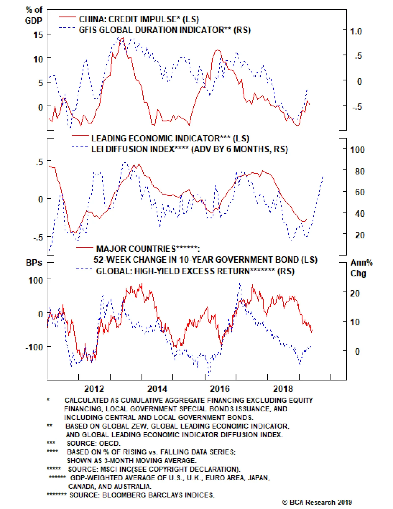
This new scenario could trigger a deeper selloff in global equity and credit markets if investors begin to price in a larger and more prolonged hit to economic growth and corporate profits from the U.S. tariffs. This would trigger even greater safe-haven…
Biden, who is still enjoying a very sizable bump to his polling a month after formally announcing his candidacy, is a direct threat to Trump’s electoral strategy of maximizing white blue-collar turnout and support, particularly in the Midwestern swing states.…