Europe

Highlights House prices are rising rapidly across the developed markets, in response to the extraordinary monetary and fiscal policy stimulus implemented to fight the pandemic. Evidence points to the house price surge being driven by monetary policy that has left real interest rates far below equilibrium levels. Supply factors are a secondary cause of the house price boom. Financial stability risks stemming from rising house prices are less acute than the pre-2008 experience, as overall household leverage has grown more slowly during the pandemic and global banks are better capitalized. Rapidly rising house prices are forcing some central banks to turn less accommodative earlier than expected. The recent hawkish turns by the Bank of Canada and Reserve Bank of New Zealand may be canaries in the coal mine for other central banks – perhaps even the Fed – if house prices and household leverage start rising together. Feature The COVID-19 pandemic led to the sharpest economic recession since World War II, alongside an enormous rise in unemployment. Consensus expectations call for the output gap to be closed (or mostly closed) in most advanced economies by the end of this year, but it remains an open question how quickly these economies will be able to return to full employment amid potentially permanent shifts in demand for office space and goods sold at physical, “brick and mortar” retail locations. Despite this sizeable and swift economic shock, house price appreciation accelerated last year in the developed world. Chart II-1 highlights that US house prices rose at an 18% annualized pace in the second half of 2020, whereas they accelerated at a high-single digit pace in developed markets ex-US (on a GDP-weighted basis). This, in conjunction with a sharp rise in the household sector credit-to-GDP ratio (Chart II-2), has unnerved some investors while raising questions about the implications for monetary policy. Chart II-1House Prices Are Surging Around The World
House Prices Are Surging Around The World
House Prices Are Surging Around The World
Chart II-2Rising Fears About Deteriorating Household Balance Sheets
Rising Fears About Deteriorating Household Balance Sheets
Rising Fears About Deteriorating Household Balance Sheets
Before we discuss the investment implications of the global housing boom, however, we must first accurately determine the reasons why it is happening. The Work-From-Home Effect: Less Than Meets The Eye When analyzing the surprising behavior of the housing market last year, the working-from-home effect brought upon by the pandemic emerges as an obvious factor potentially explaining house price gains. Last year, following recommended or mandatory stay-at-home orders from governments, most office-based businesses rapidly shifted to work-from-home arrangements as an emergency response. However, in the month or two following the beginning of stay-at-home orders, several national US surveys found many office workers preferred the flexibility afforded by work-from-home arrangements. Many employers, correspondingly, found that the productivity of their employees did not suffer while working from home, or that it even improved. Several prominent corporations in the US have subsequently made some work-from-home options permanent, or even allowed employees to work from offices in a different city than they did prior to the pandemic. Newfound work-from-home options have undoubtedly created new demand for housing, and thus explained the surge in house prices seen over the past year in the minds of some investors. However, in our view, evidence from the US, the UK, and France suggests that the work-from-home effect better explains differences in price gains across housing types and within large metropolitan areas, rather than aggregate or national-level changes in house prices. Chart II-3 provides some quantification of the impact of work-from-home policies by plotting US resident migration patterns by city. This data has been compiled by CBRE, and the impact of COVID is shown as the change in net move-ins from 2019 to 2020 per 1000 people. This helps control for the underlying migration pattern that existed in US cities prior to the pandemic. Chart II-3Work From Home Policies Have Impacted Migration Trends…
June 2021
June 2021
The chart highlights that the negative migration impact from COVID has been mostly concentrated in New York City and the three most populous cities on the West Coast (by metro area): Los Angeles, San Francisco, and Seattle. And yet, Chart II-4 highlights that house price inflation in these four cities has accelerated to a double-digit pace, only modestly below the national average. Chart II-4...But Cities With Outward Migration Still Have Very Strong House Price Gains
...But Cities With Outward Migration Still Have Very Strong House Price Gains
...But Cities With Outward Migration Still Have Very Strong House Price Gains
The house price indexes shown in Chart II-4 represent aggregate, metro area trends, and clearly some regions within these metro areas have experienced house price deceleration or outright deflation versus gains in areas outside the urban core. But Chart II-5 highlights that house prices have declined in Manhattan basically in line with the change in net move-ins as a share of the population, underscoring that double-digit metro area-wide house price gains appear to be vastly disproportionate to changes in net migration. Similarly, Chart II-6 highlights that rents decelerated in the US over the past year but remained in positive territory and grew at a 3.5% annualized rate from February to April. Chart II-5In Manhattan, House Prices Have Tracked Net Migration
June 2021
June 2021
Chart II-6Rent Costs Have Decelerated, But Have Not Contracted
Rent Costs Have Decelerated, But Have Not Contracted
Rent Costs Have Decelerated, But Have Not Contracted
Evidence from Paris and London also suggests that a work-from-home effect is insufficient to explain broad house price gains. Panel 1 of Chart II-7 highlights that house prices in France have accelerated significantly, but that apartment prices have decelerated only fractionally in lockstep. Panel 2 shows that the acceleration in house prices does reflect a work-from-home effect, as prices have risen faster in inner Parisian suburbs. Panel 3, however, highlights that Parisian apartment prices, the dominant property type in the urban core, have decelerated modestly. Chart II-8 highlights that house price gains have not even decelerated in greater London; they have been merely been modestly outstripped by gains in Outer South East (outside of the Outer Metropolitan Area). Chart II-7In France, Parisian Apartment Prices Are Simply Lagging, Not Falling
In France, Parisian Apartment Prices Are Simply Lagging, Not Falling
In France, Parisian Apartment Prices Are Simply Lagging, Not Falling
Chart II-8In The UK, Greater London Property Prices Are Accelerating
In The UK, Greater London Property Prices Are Accelerating
In The UK, Greater London Property Prices Are Accelerating
The Policy Effect: The Fundamental Driver Of The Housing Market Despite the broader location flexibility that work-from-home policies now provide to potential homeowners, it seems inconceivable that the housing market would have responded in the manner that it has over the past year given the size of the economic shock brought on by the pandemic without significant support from policy. Above-the-line fiscal measures to the pandemic have totaled in the double-digits in advanced economies (Chart II-9), and monetary policy has contributed to easier financial conditions via rate cuts, asset purchases, and sizeable programs to support financial market liquidity. Chart II-9There Has Been A Massive Fiscal Policy Response To The Crisis
June 2021
June 2021
In fact, Charts II-10-II-13 present compelling evidence that fiscal and monetary policy have been the core drivers of significant house price gains over the past year. Charts II-10 and II-11 plot the above-the-line fiscal response of advanced economies against the year-over-year growth rate in house prices as well as its acceleration (the change in the year-over-year growth rate). The charts show a clearly positive relationship, with a stronger link between the pandemic fiscal response and the acceleration in house prices. Chart II-10Differences In Last Year’s Fiscal Response…
June 2021
June 2021
Chart II-11…Help Explain Differences In House Price Gains
June 2021
June 2021
Chart II-12Pre-Pandemic Differences In The Monetary Policy Stance…
June 2021
June 2021
Chart II-13…Do An Even Better Job Of Explaining 2020 House Price Gains
June 2021
June 2021
Charts II-12 and II-13 highlight the even stronger link between house prices and the pre-pandemic monetary policy stance in advanced economies, defined as the difference between each country’s 2-year government bond yield and its Taylor Rule-implied policy interest rate as of Q4 2019. We construct each country’s Taylor Rule using the original specification, with core consumer price inflation, a 2% inflation target, and real potential GDP growth as the definition of the real equilibrium interest rate. The charts make it clear that easy monetary policy strongly explains house price gains in 2020, particularly the year-over-year percent change rather than its acceleration. This makes sense, given that monetary policy was already quite easy in many countries at the onset of the pandemic – meaning that changes were less pronounced than they would have been had interest rates been higher. The explanation that emerges from Charts II-10-II-13 is that historic fiscal easing, combined with an easy starting point for monetary policy – that became even easier last year – enabled demand from work-from-home policies to manifest during an extremely severe recession. We agree that work-from-home policies have shifted the geographic preferences of some home buyers and likely provided a new source of net demand from renters in urban cores purchasing homes in outlying areas. But we strongly doubt that the net effect of work-from-home policies in the midst of an extreme shock to economic activity would have caused the rise in house prices that we have observed, certainly not to this level, without major support from policy. This underscores that policy, and not the work-from-home effect, has and will likely remain the core driver of the global housing market. The Supply Effect: Mostly A Red Herring Chart II-14Countries Fall Into Two Groups In Terms Of The Relative Trend In Real Residential Investment
Countries Fall Into Two Groups In Terms Of The Relative Trend In Real Residential Investment
Countries Fall Into Two Groups In Terms Of The Relative Trend In Real Residential Investment
One perennial question that emerges when analyzing the housing market, particularly in markets with outsized house price gains, is the impact of constrained supply. It is frequently argued that constrained supply is squeezing prices higher in many markets, and that the appropriate policy solution to extreme house price gains is to enable widespread housing construction – not to raise interest rates. We do not rule out the potential impact of constrained supply in certain cities or regional housing markets, and we have highlighted in previous research that a positive relationship does exist between population density in urban regions and median house price-to-income ratios.1 But as a broad explanation for supercharged house price gains, the supply argument appears to fall flat. Chart II-14 presents the most standardized measure of cross-country housing supply available for several advanced economies, the trend in real residential investment relative to real GDP over time. These series are all rebased to 100 as of 1997, prior to the 2002-2007 US housing market boom. The chart makes it clear that advanced economies generally fall into two groups based on this metric: those that have seen declines in real residential investment relative to GDP, especially after the global financial crisis (panel 1), and those that have experienced either an uptrend in housing construction relative to output or have seen a flat trend (panel 2). If scarce housing supply was the core driver of outsized house price gains, then we would expect to see stronger gains in the countries shown in panel 1 and smaller gains in the countries shown in panel 2. In fact, mostly the opposite is true: Charts II-15 and II-16 highlight that the relationship between the level of these indexes today relative to their 1997 or 2005 levels is positively related to the magnitude of house price gains last year, suggesting that housing market supply has generally been responding to demand over the past decade. The US and possibly New Zealand stand as possible exceptions to the trend, suggesting that relatively scarce supply may be boosting prices even further in these markets beyond what fiscal and monetary policy would suggest. Chart II-15Countries That Have Seen A Stronger Pace Of Residential Investment…
June 2021
June 2021
Chart II-16…Have Experienced Stronger House Price Gains
June 2021
June 2021
Chart II-17Is This Not Enough Supply, Or Too Much Demand?
June 2021
June 2021
As a final point about the inclination of investors to gravitate towards supply-side arguments related to the housing market, Chart II-17 presents a simple thought experiment. The chart shows a simple housing supply-demand curve diagram, in a scenario where the demand curve for housing has shifted out more than the supply curve has (thus raising house prices). Is this a scenario in which supply is too tight? Or is it a case in which demand is too strong? In our view, the tight supply answer is reasonable in circumstances where the increase in demand is normal or otherwise sustainable. But Charts II-10-II-13 clearly showed that housing demand is being boosted by easy policy, which in the case of some countries has occurred for years: interest rates have remained well below levels that macroeconomic theory would traditionally consider to be in equilibrium, and this has occurred alongside significant household sector leveraging (Chart II-18). As such, in our view, investors should be more inclined to view the global housing market as generally being driven by demand-side rather than supply-side factors. This Is Not 2007/08 … Yet We highlighted in Chart II-2 above that the household sector debt-to-GDP ratio increased sharply last year, which has raised some questions about debt sustainability among investors. For the most part, the rise in this ratio actually reflects denominator effects (namely a sharp contraction in nominal GDP) rather than a huge surge in household debt. Chart II-19 shows BIS data for the annual growth in total household debt in developed economies was roughly stable last year, at least until Q3 (the most recent datapoint available from the BIS). Chart II-18Low Interest Rates Have Fueled Household Leveraging
Low Interest Rtaes Have Fueled Household Leveraging
Low Interest Rtaes Have Fueled Household Leveraging
Chart II-19Total Credit Growth Has Been Stable, But Mortgage Credit Growth Is Accelerating
Total Credit Growth Has Been Stable, But Mortgage Credit Growth Is Accelerating
Total Credit Growth Has Been Stable, But Mortgage Credit Growth Is Accelerating
Chart II-20US Mortgage Growth Is Picking Up, As Repayments Slow Consumer Credit Growth
US Mortgage Growth Is Picking Up, As Repayments Slow Consumer Credit Growth
US Mortgage Growth Is Picking Up, As Repayments Slow Consumer Credit Growth
But Chart II-19 shows the recent trend in total household debt, which masks diverging mortgage and non-mortgage debt trends. In the US, euro area, Canada, and Sweden, household mortgage debt has accelerated to varying degrees, underscoring that households have likely paid down non-mortgage debt with some of the savings that they have accumulated from a significant reduction in spending on services. Chart II-20 shows this effect directly in the case of the US; mortgage debt growth accelerated by roughly 1.5 percentage points in the second half of the year, whereas consumer credit growth (made up of student loans, auto loans, credit cards, and other revolving credit) decelerated significantly. This aligns with data showing that US households have used some of their savings windfall to pay down their credit card balances. This changing mix within household debt - less higher-interest-rate consumer credit, more lower-interest-rate collateralized mortgage debt – could, on the margin, help mitigate financial stability risks from the housing boom by moderating overall debt service burdens. The starting point for the latter matters, though, in accurately assessing the risks from rising house prices and increased mortgage debt, particularly in countries where household debt levels are already high. According to data from the BIS, the US already has one of the lowest household debt service ratios (7.6%) among the developed economies (Chart II-21).2 This compares favorably to the double-digit debt service ratios in the “higher-risk” countries like Canada (12.6%), Sweden (12.1%) and Norway (16.2%). On top of that, US commercial banks have become far more prudent with mortgage loan underwriting standards since the 2008 financial crisis. The New York Fed’s Household Debt and Credit report shows that an increasing majority of mortgage lending made by US banks since the 2008 crisis has been to those with very high FICO credit scores (Chart II-22). This is in sharp contrast to the steady lending to “subprime” borrowers with poor credit scores that preceded the 2008 financial crisis. The median FICO score for new mortgage originations as of Q1 2021 was 788, compared to 707 in Q4 2006 at the peak of the mid-2000s US housing boom. Chart II-21Diverging Trends In Global Household Debt Servicing Costs
Diverging Trends In Global Household Debt Servicing Costs
Diverging Trends In Global Household Debt Servicing Costs
Chart II-22US Banks Have Become More Prudent With Mortgage Lending
US Banks Have Become More Prudent With Mortgage Lending
US Banks Have Become More Prudent With Mortgage Lending
US bank balance sheets are also now less directly exposed to a fall in housing values. Residential loans now represent only 10% of the assets on US bank balance sheets, compared to 20% at the peak of the last housing bubble (Chart II-23). This puts the US in the “lower-risk” group of countries in Europe, the UK and Japan where mortgages are less than 20% of bank balance sheets. This compares favorably to the “higher risk” group of countries where residential loans are a far larger share of bank assets (Chart II-24), like Canada (32%), New Zealand (49%), Sweden (45%) and Australia (40%). Chart II-23Banks Have Limited Direct Exposure To Housing Here
Banks Have Limited Direct Exposure To Housing Here
Banks Have Limited Direct Exposure To Housing Here
Chart II-24Banks Are Far More Exposed To Housing Here
Banks Are Far More Exposed To Housing Here
Banks Are Far More Exposed To Housing Here
Like nature, however, the financial ecosystem abhors a vacuum. “Non-bank” mortgage lenders have filled the void from traditional US banks reducing their lending to lower-quality borrowers, and they now represent around two-thirds of all US mortgage origination, a big leap from the 20% origination share in 2007. Non-bank lenders have also taken on growing shares of new mortgage origination in other countries like the UK, Canada and Australia. Chart II-25Global Banks Can Withstand A Housing Shock
June 2021
June 2021
Non-bank lenders do not take deposits and typically fund themselves via shorter-term borrowings, which raises the potential for future instability if credit markets seize up. These lenders also, on average, service mortgages with a higher probability of default, so they are exposed to greater credit losses when house prices decline. However, the risk of a full-blown 2008-style commercial banking crisis, with individual depositors’ funds at risk from a bank failure, are reduced with a greater share of riskier mortgage lending conducted by non-bank entities. This is especially true with global commercial banks far better capitalized today, with double-digit Tier 1 capital ratios (Chart II-25), thanks to regulatory changes made after the Global Financial Crisis. Net-net, we conclude that the overall financial stability implications of the current surge in house prices in the developed economies are relatively modest on average. The acceleration in mortgage growth has occurred alongside reductions in non-mortgage growth, at a time when banks are better able to withstand a shock from any sustained future downturn in house prices. However, if house prices continue to accelerate and new homebuyers are forced to take on ever increasing amounts of mortgage debt, financial stability issues could intensify in some countries. Services spending will recover in a vaccinated post-COVID world, as economies reopen and consumer confidence improves, which will likely end the trend of falling non-residential consumer debt offsetting rising mortgage debt in countries like the US and Canada. Overall levels of household debt could begin to rise again relative to incomes, building up future financial stability risks when central banks begin to normalize pandemic-related monetary policies – a process that has already started in some countries because of the housing boom. The Monetary Policy Implications Of Surging House Prices Rapidly appreciating house prices are becoming an area of concern for policymakers in countries like Canada and New Zealand, where the affordability of housing is becoming a political, as well as an economic, issue. In the case of New Zealand, the government has actually altered the remit of the Reserve Bank of New Zealand (RBNZ) to more explicitly factor in the impact of monetary policy on housing costs. The Bank of Canada announced in April that it would taper its pace of government debt purchases and signaled that its decision was based, at least in small part, on signs of speculative behavior in Canada’s housing market. Macroprudential measures like limiting loan-to-value ratios of new mortgage loans are a policy option that governments in those countries have already implemented to try and cool off housing demand. Yet while such measures can help alleviate demand-supply mismatches in certain cities and regions, the efficacy of such measures in sustainably slowing the ascent of house prices on a national scale is unclear. In the April 2021 IMF Global Financial Stability Report, researchers estimated that, for a broad group of countries, the implementation of a new macro-prudential measure designed to cool loan demand reduced national household debt/GDP ratios by a mere one percentage point, on average, over a period encompassing four years.3 If macroprudential measures are that ineffective in sustainably reducing demand for mortgage loans, then the burden of slowing house price appreciation will have to fall on the more blunt instruments of monetary policy. Importantly, surging house price inflation is not likely to give a boost to realized inflation measures – an important issue given the current backdrop of rapidly rising realized inflation rates in many countries. Housing costs do represent a significant portion of consumer price indices in many developed countries, ranging from 19% in New Zealand to 33% in the US (Chart II-26), with the euro area being the outlier with housing having a mere 2% weighting in the headline inflation index. Chart II-26A Limited Impact On Actual Inflation From Housing
June 2021
June 2021
Yet those so-called “housing” categories overwhelmingly measure only housing rental costs and not actual house prices. This is an important distinction because rents – which are often imputed measures like in the US and not even actual rental costs - are rising at a far slower pace than actual house prices in most countries, so the housing contribution to realized inflation is relatively modest. So the good news is that booming house prices will not worsen the acceleration of realized global inflation that has concerned investors and policymakers in 2021. Yet that does not mean that central bankers will not be forced to tighten policy to cool off red-hot housing demand that is clearly being fueled by persistently negative real interest rates. In Chart II-27 and Chart II-28, we show both nominal and real policy interest rates for the “lower risk” and “higher risk” country groupings that we described earlier. The real policy rates are nominal policy rates versus realized headline CPI inflation. The dotted lines in the charts represent the future path of rates discounted by markets. Specifically, the projection for nominal rates is taken from overnight index swap (OIS) forward curves, while the projection for real rates is calculated by subtracting the discounted path of inflation expectations extracted from CPI swap forwards. Chart II-27Markets Discounting Negative Real Rates For The Next Decade
Markets Discounting Negative Real Rates For The Next Decade
Markets Discounting Negative Real Rates For The Next Decade
Chart II-28Negative Real Rates Are Unsustainable During A Housing Bubble
Negative Real Rates Are Unsustainable During A Housing Bubble
Negative Real Rates Are Unsustainable During A Housing Bubble
There are two key takeaways from these charts: Real policy interest rates are at or very close to the most deeply negative levels seen since the 2008 financial crisis. Markets are discounting that real rates will be at or below 0% for most of the next decade. Admittedly, there is room for debate over what the equilibrium level of real interest rates (a.k.a. “r-star”) should be in the coming years. However, we deem it a major stretch to believe that real rates need to be persistently low or negative for the next ten years to support even trend growth across the developed economies. In our view, the current boom in housing demand and mortgage borrowing provides clear evidence that negative real rates are below equilibrium and, thus, are stimulating credit demand. Thus, the only way for a central bank to cool off housing demand will be to raise both nominal and, more importantly, real interest rates. Canada and New Zealand will be the “canaries in the coal mine” among developed market central banks for such a move. According to the latest Bank of Canada Financial Stability Review, nearly 22% of Canadian mortgages are highly levered, with a loan-to-value ratio greater than 450%, a greater share of such mortgages than during the 2016/17 housing boom (Chart II-29). Canadian house prices have risen to such an extent that home prices in major cities like Toronto, Vancouver and Montreal are among the most expensive in North America.4 Stunningly, a recent Bloomberg Nanos opinion poll revealed that nearly 50% of Canadians would support Bank of Canada rate hikes to cool off the red-hot housing market (Chart II-30). The central bank will be unable to resist the pressure to use monetary policy to slam on the brakes of the housing market – investors should expect more tapering and, eventually, rate hikes from the Bank of Canada over at least the next couple of years. Chart II-29Canadians Are Leveraging Up To Buy Expensive Homes
Canadians Are Leveraging Up To Buy Expensive Homes
Canadians Are Leveraging Up To Buy Expensive Homes
Chart II-3050% Of Canadians Want A Rate Hike To Cool Housing
June 2021
June 2021
In New Zealand, worsening housing affordability has reached a point where a 20% down payment on the median national house price is equal to 223% of median disposable income (Chart II-31). This is forcing more first-time home buyers to take on levels of mortgage debt that the RBNZ deems highly risky (top panel). Like the Bank of Canada, the RBNZ will prove to be one of the most hawkish central banks in the developed world over the next couple of years as the central bank follows their newly-revised remit to try and cool off housing demand in New Zealand. Who is next? Housing values, measured by the ratio of median national house prices to median national household incomes, are rising in the US and UK but are still below the peaks of the mid-2000s housing bubble (Chart II-32). Meanwhile, housing is becoming more expensive across the euro area, but not in a consistent manner, with valuations in Germany and Spain having increased far more than in France or Italy. Housing valuations have actually improved in Australia over the past couple of years on a price-to-income basis. The most likely candidates for a housing-related hawkish turn are in Scandinavia, with housing valuations in Sweden and Norway closing in on Canada/New Zealand levels. Chart II-31New Zealand Housing Is Wildly Unaffordable
New Zealand Housing Is Wildly Unaffordable
New Zealand Housing Is Wildly Unaffordable
Chart II-32Global House Price/Income Ratios Are Trending Higher
Global House Price/Income Ratios Are Trending Higher
Global House Price/Income Ratios Are Trending Higher
Investment Conclusions The current acceleration in global house prices is an inevitable outcome of the extraordinary monetary and fiscal easing implemented during the pandemic. Higher realized inflation is pushing real rates deeper into negative territory in many countries, fueling the demand for housing. Central banks in countries with more stretched housing valuations will be forced to turn more hawkish sooner than expected, leading to tapering and, eventually, rate hikes to cool housing demand. This has negative implications for government bond markets in countries where housing is more expensive and real yields remain too low, like Canada, New Zealand and Sweden (Chart II-33). Investors should limit exposure to government bonds in those markets over the next 6-12 months. Chart II-33Negative Real Yields & Expensive Housing Valuations – An Unsustainable Mix
June 2021
June 2021
Bond markets in countries where house prices are not rising rapidly enough to force policymakers to turn more hawkish more quickly – like core Europe, Australia and even Japan - are likely to be relative outperformers. The US and UK are “cuspy” bond markets, as housing valuations are becoming more expensive in those two countries but the Fed and Bank of England are not facing the same domestic political pressure to use monetary policy tools to fight the growing unaffordability of housing. That could change, though, if overall household leverage begins to rise alongside house price inflation as the US and UK economies emerge from the pandemic. Current pricing in OIS curves shows that markets expect the RBNZ and Bank of Canada to begin hiking rates in May 2022 and September 2022, respectively (Table II-1). This is well ahead of expectations for “liftoff” from other developed markets central banks, including the Fed in April 2023. The cumulative amount of rate hikes following liftoff to the end of 2024 is highest in Canada, New Zealand, the US and Australia. Those are also countries with currencies that are trading at or above the purchasing power parity levels derived from our currency strategists’ valuation models. This highlights the difficult choice that central bankers facing housing bubbles must confront, as the rate hikes that will help cool off housing demand will lead to currency appreciation that could impact other parts of their economies like exports and manufacturing. Table II-1Hawkish Central Banks Must Live With Currency Strength
June 2021
June 2021
Tracking the second-round economic consequences of eventual monetary policy actions to control excessive house price inflation, particularly in “higher risk” countries, is likely to be the subject of future Bank Credit Analyst / Global Fixed Income Strategy reports. Jonathan LaBerge, CFA Vice President The Bank Credit Analyst Robert Robis, CFA Chief Fixed Income Strategist Footnotes 1 Please see Global Investment Strategy "Canada: A (Probably) Happy Moment In An Otherwise Sad Story," dated July 14, 2017, available at gis.bcaresearch.com 2 Importantly, the BIS debt service ratios include the payment of both principal and interest, thus making it a true measure of debt service costs that includes repayment of borrowed funds – a critical issue in countries with high loan-to-value ratios for home mortgages. 3 Please see page 46 of Chapter 2 of the April 2021 IMF Global Financial Stability Report, which can be found here: https://www.imf.org/en/Publications/GFSR/Issues/2021/04/06/global-finan… 4 “Vancouver, Toronto and Hamilton are the least affordable cities in North America: report”, CBC News, May 20, 2021
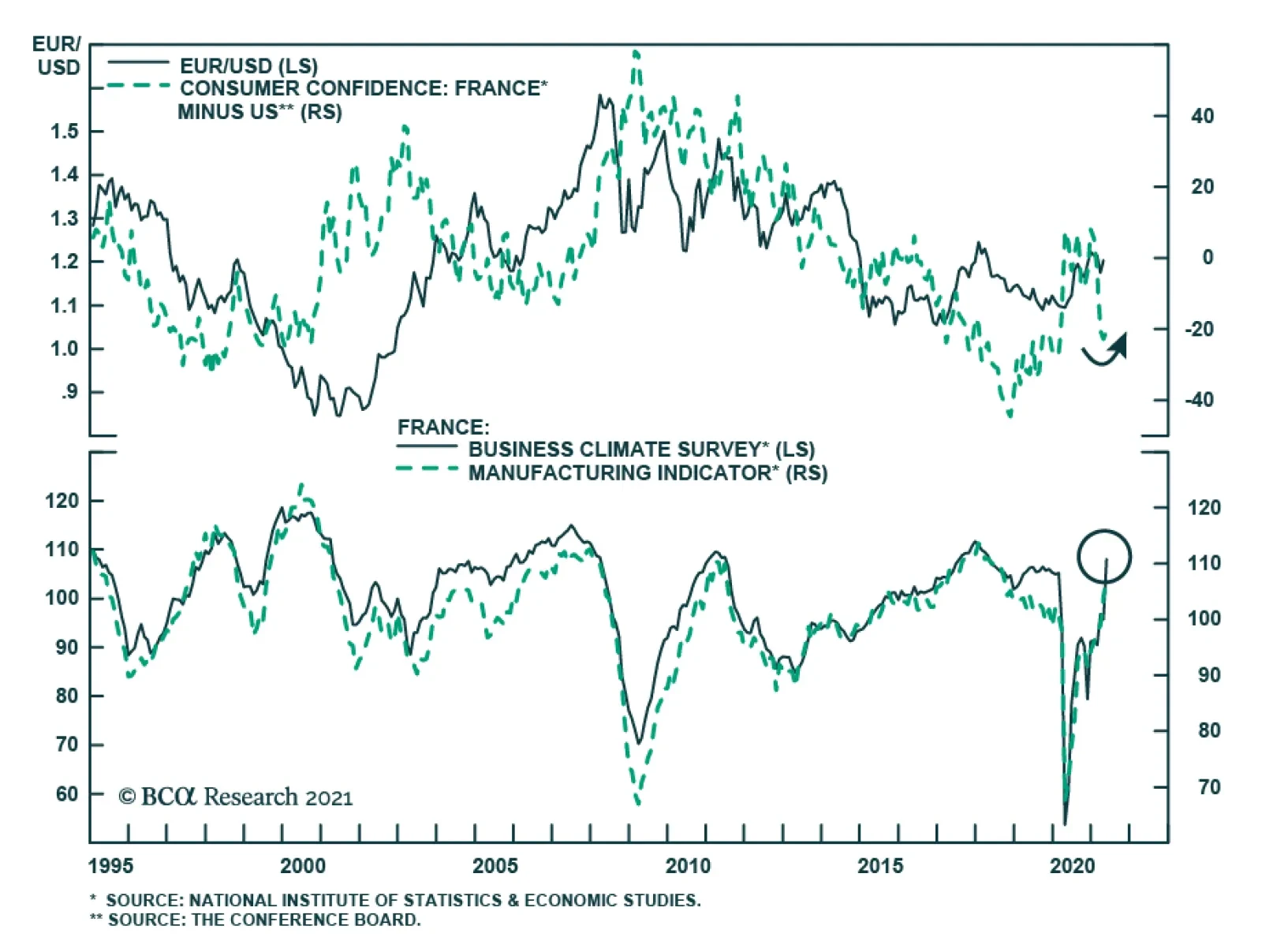
French sentiment improved markedly in May. The INSEE business confidence index jumped to a pandemic-high of 108 in May from 95, beating expectations by 10 points The last time business sentiment was so elevated was in August 2018. Moreover, the improvement…
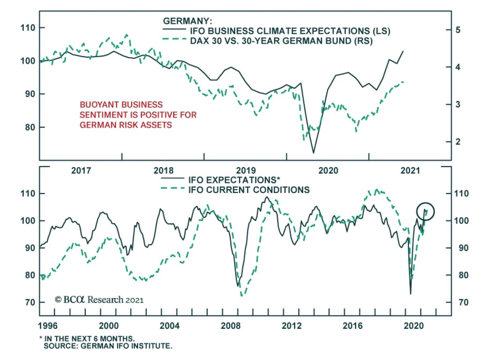
The German IFO rose sharply in May, indicating that business confidence is firming. After a disappointing release in April, the Business Climate index jumped 2.6 points to 99.2, beating expectations of a more muted increase to 98. The improvement was driven…
Highlights The number one risk to our upbeat view on European economic activity and assets is a Chinese economic slowdown. The second most important risk to our view is a potential deterioration in the global credit impulse, even outside of China. The third major risk is that the current bout of US inflation proves to be permanent, which, paradoxically, would prompt a deflationary shock for the global economy. Despite these risks, we maintain our favorable view on European assets over the coming 12 to 18 months. However, favoring industrials over materials, and financials over other cyclicals, Swedish equities and peripheral bonds in balanced portfolios mitigate some of these risks. Do not expect the ECB to announce a tapering of its asset purchases at the June meeting. The ECB will lag well behind the Fed and the BoE. Buy European steepeners and US flatteners as a box trade. Feature Over the past three weeks, a sustained marketing push gave us the opportunity to interact intensively with a large subset of our clients (albeit virtually, courtesy of COVID-19). Generally, our positive stance on European assets was well received, but investors are loosely committing themselves to this view and very few are willing to make an aggressive bet on Europe. In fact, in most meetings, we spent more time than usual discussing the risks to our upbeat view on Europe and European cyclical equities. Three risks to our 12- to 18-month view standout. The first is a serious slowdown in Chinese growth. The second is a greater-than-anticipated impact on economic activity as a result of a deterioration in DM credit impulses. The third is stronger-than-expected US inflation. An also-ran was the risk that the current vaccines do not protect against the two variants of the COVID-19 virus dominant in India. However, an increasing body of recent scientific studies demonstrates that this is not the case; hence, this risk has been lowered to minor. Risk #1: A Chinese Slowdown Authorities in China have been constricting credit policy over the past six months. The key tools used have been a regulatory tightening in shadow-banking activities and real estate transactions, moral suasion on small banks to limit the expansion of their loan books, and slowing liquidity injections in the interbank system. Beijing’s policy tightening reflects the following two worries. First, the financial stability risk has increased meaningfully over the past 16 months. China’s corporate debt-to-GDP has increased 13 points to 163%, and is among the highest for major economies (Chart 1). Moreover, Chinese policymakers remain concerned by the middle-income trap, which would become an increasingly likely outcome if the stability of the country’s financial and banking system were compromised. Second, the latest round of stimulus has worsened wealth inequalities. House prices have been robust, yet household disposable income growth is still low by the yardstick of the past 40 years (Chart 2). Thus, a large proportion of China’s population has experienced a decline in housing affordability. Chart 1China"s Financial Stabilitiy Risk
China"s Financial Stabilitiy Risk
China"s Financial Stabilitiy Risk
Chart 2Chinese Households Are Not Doing That Well
Chinese Households Are Not Doing That Well
Chinese Households Are Not Doing That Well
The Chinese economy recently started to feel the impact of the policy tightening. China’s April retail sales data missed expectation by 7.2%, and, as our China Investment Strategy colleagues have observed, the demand side of the economy has lagged behind the recovery in supply ever since China re-opened last year. Credit trends confirm this assessment. The decline in the excess reserve ratio of the Chinese banking system is consistent with the recent deterioration in the credit impulse, which accelerated in April (Chart 3). Since the Great Financial Crisis, weaker Chinese credit flows herald softer global industrial activity and trade (Chart 3, bottom panel). The Chinese slowdown could become a major problem for the European economy and its asset markets. As we recently showed, the sensitivity of European economic activity to global growth has been steadily increasing over the past 20 years (Chart 4). Moreover, the spread between M1 and M2 money supply growth in China best explains the gap between European industrial activity and that of the US (Chart 4, middle and bottom panels). Essentially, M1 minus M2 approximates the Chinese private sector’s marginal propensity to consume, because it captures how fast demand deposits are growing relative to savings deposits. Thus, the recent decline in China’s marginal propensity to consume constitutes a bad omen for European activity and profit growth, both in absolute terms and relative to the US. Chart 3A Policy-Induced Slowdown
A Policy-Induced Slowdown
A Policy-Induced Slowdown
Chart 4Europe Is More Exposed Than The US
Europe Is More Exposed Than The US
Europe Is More Exposed Than The US
The slowdown in China’s economy will hurt European asset prices via multiple channels. Importantly, cyclical stocks are expensive and overbought compared to defensive ones. A meaningful decline in Chinese growth could result in a deep fall in the cyclicals-to-defensives ratio, which would hurt the pro-cyclical EUR/USD exchange rate (Chart 5). A weaker China might also create a significant fall in global yields, because it would hurt global growth, accentuate deflationary forces, and upset investor sentiment. European stocks underperform US equities when global yields decline (Chart 6). Chart 5The Euro Is Pro-Cyclical
The Euro Is Pro-Cyclical
The Euro Is Pro-Cyclical
Chart 6A Key Threat To European Stocks
A Key Threat To European Stocks
A Key Threat To European Stocks
Despite the dire impact that a Chinese economic slowdown normally causes on European growth and assets, this outcome remains a risk and not a base case (albeit, the top risk in our view). First, today is one of the rare occasions when global and European economic activity can decouple from China. The Euro Area’s vaccination campaign is gaining steam, which will allow a re-opening of the economy this summer (Chart 7). The vast pent-up demand in durable goods evident in Europe and the positive impact of the European monetary expansion on the contribution of consumer expenditure to real GDP growth also create powerful offsets (Chart 8). Chart 8European Pent-Up Demand As An Offset
European Pent-Up Demand As An Offset
European Pent-Up Demand As An Offset
Chart 7Improving Vaccine Rollout
Improving Vaccine Rollout
Improving Vaccine Rollout
The global industrial cycle is more buffered than usual against a Chinese economic slowdown. The collapse in the inventory-to-sales ratios around the world will fuel several quarters of restocking, which will boost the global manufacturing sector (Chart 9). Moreover, governments across advanced economies are unleashing large-scale infrastructure plans, such as the $2 trillion bill proposed by the Biden administration in the US or the EUR250 billion budget proposal by the Draghi government in Italy. As the EUR750 billion NGEU funds are disbursed, the tailwind to infrastructure spending will only grow (Chart 10). Additionally, the current spurt in inflation around the world is a relative price shock driven by scarcity created during the pandemic. This price shock incentivizes companies to expand production and capacity to meet demand. As a result, global capex intentions are rising, which will create an additional offset to China. Chart 9Restocking Ahead
Restocking Ahead
Restocking Ahead
Chart 10More Fiscal Support This Way Comes
More Fiscal Support This Way Comes
More Fiscal Support This Way Comes
Finally, constraints on Chinese policymakers limit to how far Chinese growth will decelerate. The Chinese Communist Party Congress, in which the make-up of the politburo is determined for the next five years, takes place in October 2022. However, the weak growth rate of household disposable income creates a headache for China’s leadership. While another round of massive stimulus is unlikely to shore up household disposable income (it has not worked thus far), Beijing will not take the chance to generate another deflationary shock. This constraint creates a natural floor under the growth deceleration that Beijing can tolerate. Thus, while a policy mistake is still possible, it is not our base case scenario. Investment Implication Faced with the aforementioned dynamics, BCA recommends that investors with a short-term investment horizon go neutral on cyclical equities relative to defensive ones. Practically, this means that EUR/USD is likely to continue to churn between 1.18 and 1.235 for the coming two to three months. Additionally, European equities are likely to move sideways relative to their US counterparts over this period. Within cyclical equities, we favor industrials over materials. Commodity prices, and thus the materials sector, are the most exposed to China. Meanwhile, the outlook for infrastructure spending and capex in DM economies has a greater impact on industrial stocks than on materials ones. Technically, industrials remain toward the bottom of their upward-slopping trend channel relative to materials, which suggests further catch up is likely (Chart 11). We also favor European financials over the rest of the cyclical sectors. The negative impact of a greater-than-expected Chinese economic slowdown on global yields will hurt financials. Nonetheless, domestic economic activity affects financials more than it influences the more internationally focused industrials and materials sectors. Thus, if the Eurozone service PMI can slingshot higher, a result of the re-opening of the economy this summer, then European financials will outperform industrials and materials stocks even if the Chinese economy slows (Chart 12). Moreover, financials trade at a large discount compared to these other two cyclical sectors (Chart 12). Chart 11Overweight Industrials Vs Materials
Overweight Industrials Vs Materials
Overweight Industrials Vs Materials
Chart 12Financials As A Protection Against China
Financials As A Protection Against China
Financials As A Protection Against China
Finally, we continue to favor Swedish equities. Industrials and financials account for 65% of the Swedish MSCI benchmark compared to 30% for that of the Euro Area. Therefore, they are particularly exposed to the positive outlook on global infrastructure spending and capex. Moreover, Swedish equities generate a return on equity of 15%, compared to 6% for the Eurozone stocks. To protect against the risk created by a weakening Chinese economy, we recommend investors hedge a long / overweight bet on Sweden with a short / underweight position in Norwegian equities that massively over-represent energy and materials. Risk #2: A Global Credit Impulse Deterioration According to the BIS data, the global credit impulse is on the verge of deteriorating, even outside of China. The G10 plus China annual credit impulse is elevated and peaking (Chart 13, left). Meanwhile, quarterly credit impulses in the US, the Euro Area, and China are negative (Chart 13, right), which often leads to turning points in the annual change in credit flows. Chart 13A Global Credit Impulse Problem
A Global Credit Impulse Problem (I)
A Global Credit Impulse Problem (I)
Chart 13A Global Credit Impulse Problem
A Global Credit Impulse Problem (I)
A Global Credit Impulse Problem (I)
A deterioration in the credit impulse could result in a sharp slowdown in global economic growth, because the deceleration in credit creation is broad-based among the major economies. If global growth decelerates, then European economic activity will also suffer. Table 1Essential Sector Breakdowns
Risks
Risks
The impact on European financial markets will come from lower yields. A growth deceleration prompted by a falling credit impulse will put downward pressure on yields and will hurt the performance of value stocks relative to growth equities. Cyclical equities will also underperform defensive ones. In this scenario, European stocks will lag behind their US counterparts because of their relative sectoral biases (Table 1). Within the European benchmark, Tech-heavy Dutch stocks would perform best once yields begin to decline. The effect on growth of the slowing credit impulse remains a risk and not a base case scenario. Last year’s surge in credit intake mostly reflected precautionary demand. Companies around the world tapped their credit lines or the capital markets early in the crisis to build liquidity buffers. They then continued to borrow to take advantage of the exceptionally low interest rates that prevailed throughout most of the year. Similarly, a large proportion of household borrowing amounted to debt refinancing. As a result, last year’s explosion in credit growth had a limited impact on spending. Thus, the credit impulse’s decline in advanced economies should minimally hurt aggregate demand in the coming months. Investment Implication Investors can protect against this risk by overweighting Italian and Spanish bonds in a balanced portfolio. First, these instruments continue to offer better value than other government bonds around the world. Moreover, if global growth turns out to be weaker than expected, the ECB might have to increase the envelope of the PEPP program, which has greatly benefited peripheral bonds. Moreover, the NGEU and REACT EU program buttress weaker European sovereign borrowers. Therefore, yield-hungry global investors will resume their aggressive purchase of the high-yielding peripheral bonds if global interest rates decline anew because of softening economic activity. Risk #3: Stronger Than Expected US Inflation BCA’s house view is that the current surge in global and US inflation is transitory, even if the pressures could last a few months before ebbing. It is mainly a consequence of inadequate aggregate supply in the face of a sudden surge in demand. We cannot be dogmatic about the inflation risk. The price-components of all the major activity surveys in the world are rising, and, in the US, the inflation expectations of households have risen meaningfully (Chart 14). If an inflation mentality were to take root, then core CPI would not decelerate toward yearend. Stronger-than-expected US core CPI would put significant upward pressure on Treasury yields. First, long-dated inflation expectations could begin to converge to the breakeven rates in the shorter tenors of the curve (Chart 15). More importantly, the Fed would become more hawkish sooner. This faster policy tightening would lift the OIS curve and result in higher real yields as well. Chart 14Are Inflation Expectations Becoming Unmoored?
Are Inflation Expectations Becoming Unmoored?
Are Inflation Expectations Becoming Unmoored?
Chart 15Long-Dated Market-Based Inflation Expectations Still Lag
Long-Dated Market-Based Inflation Expectations Still Lag
Long-Dated Market-Based Inflation Expectations Still Lag
The euro would therefore weaken, and the dollar would rally across the board. European inflationary pressures are limited compared to those of the US. The Eurozone suffers from a larger output gap due to the lagging nature of the European recovery, which more timid fiscal stimulus and Europe’s late start to the vaccination campaign compounded. Consequently, the ECB will not match the Fed’s faster tightening of policy, even in this scenario. Higher US TIPS yields and a stronger dollar would ultimately be deflationary blows to global growth. The dollar would directly tighten EM financial conditions. Higher real yields would destabilize stretched equity prices around the world. The resulting shock to global financial conditions would cause a major slowdown in global growth to occur much earlier than we currently foresee. While yields would rise at first, they would end 2022 at much lower levels than we currently expect because of this deflationary outcome. This combination would be very harmful to European equities, both in absolute terms and relative to the global benchmark. At first, European stocks would probably briefly fare well. Once investors begin to digest the deleterious impact of stronger inflation on global growth, however, the pro-cyclical European market will begin to suffer. Tighter EM financial conditions and underperforming financials will only accentuate the European stock market ills. Much stronger inflation is a risk and not a base case for now, because the current bout of inflation is transitory. The supply-side of the economy is already responding to the signal created by higher prices. Firms are set to increase their inventories and capex intentions are moving higher. Moreover, many of the bottlenecks constraining global supply chains will loosen, as the global economy re-opens in response to the international vaccination campaign. Additionally, current labor shortages in low-wage industry will also dissipate, once the $300 weekly support by the US government ends after the month of September. Thus, the supply of labor will also pick up in the fourth quarter of 2021. Moreover, the Fed could remain tolerant of an inflation overshoot, which would limit the pain of its impact. That being said, there is a real inflation risk due to the global deterioration in the dependency ratio and the shift to the left in terms of the economic preferences of the median voter. However, this danger is backdated to 2024 and beyond, once global labor markets are closer to full employment. Investment Implication There is little protection in our current set of recommendations against this risk, but this is a smaller threat than the previous two risks. However, when viewed alongside the first and second set of risks, the combined probability of a dangerous outcome for the market in general and for Europe in particular has grown compared to six months ago. Thus, while the jury is still out on these questions, it makes sense to de-risk portfolios temporarily, until the reward-to-risk ratio has once again improved. Hence, a tactical neutral stance on cyclical relative to defensive equities and on Europe relative to the rest of the world is appropriate for now. Will The ECB Join The BoC? At its April meeting, the Bank of Canada jolted the market by announcing a much earlier-than-anticipated start to its tapering program. We do not believe that the ECB will follow up at its June meeting. In a recent report, BCA’s Global Fixed-Income Strategy team highlighted the constraint that will prevent the ECB from adjusting policy next month. The main factors are as follows: The results from the ECB’s strategic review have yet to be announced. Adjusting policy before an eventual change in the inflation mandate of the central banks creates an unnecessary risk of policy whipsaw. Yet another policy flip-flop would further mar the ECB’s credibility. Chart 16The ECB Does Not Want To Upend Credit Growth
The ECB Does Not Want To Upend Credit Growth
The ECB Does Not Want To Upend Credit Growth
Loan growth in Europe is slowing down, led by France. However, Italian credit activity is improving in response to the generous TLTRO uptake in the southern economy (Chart 16). At this juncture, a rapid policy adjustment would threaten the recovery, while Europe has yet to re-open. Italian spreads remain fragile. The ECB’s asset purchases are an important contributor to the easing in financial conditions across the periphery. The recent 25bps widening in the BTP-Bund spread is a reminder that European fixed-income markets are not fully tension-free. Thus, a rapid removal of support could prompt a reflex selloff in Italian bonds. The subsequent tightening in financial conditions would unnecessarily feed deflationary pressures in Europe. The euro is strong. If the ECB unsettled the market and removed monetary accommodation as fast or even faster than the Fed, the euro’s rally would suddenly accelerate. This would generate a powerful deflationary shock for Europe that would force the ECB to adjust its inflation forecasts downward. Chart 17Especially When China Creates A Threat
Especially When China Creates A Threat
Especially When China Creates A Threat
The Chinese economy is weak, which increases uncertainty around European economic outcome via the trade channel (Chart 17). Instead, the meetings in the back half of the year are much more likely candidates for the ECB to begin talking about its tapering program. By then, the European economic re-opening will have taken place, to which growth will have responded. The results of the ECB’s strategic reviews will have been announced. Finally, plans will have been ratified for the usage of NGEU funds across the EU, and thus, fiscal clarity will improve. Even if the ECB starts talking before yearend of terminating the PEPP, its communications will indicate that the program’s full envelope will be deployed within the original time frame. Thus, the PEPP program will be in place until the end of March 2022. Moreover, to prevent a rapid deterioration in bank credit, the ECB will continue to provide generous financing to deposit-taking institutions via the TLTRO program. Under these circumstances, the ECB is unlikely to increase its deposit rate before 2014. These views imply that the ECB policy tightening (both on the balance sheet and interest rate fronts) will lag behind that of the Fed, the BoE, the Norges Bank, and the Riksbank. Only the BoJ and the SNB will move after the ECB. The continued involvement of the ECB in the European fixed-income market, along with the elevated likelihood that we remain years away from the first rate hike, confirms that an overweight stance in European peripheral bonds is appropriate. We also continue to overweight corporate credit within European fixed-income portfolios. Our fixed-income colleagues also share these views. Chart 18Justifying A Box Trade
Justifying A Box Trade
Justifying A Box Trade
Finally, the German yield curve should steepen compared to that of the US. Even if the ECB lags well behind the Fed when it comes to tightening policy, the current terminal rate proxy embedded in the EONIA curve is too low (Chart 18). Meanwhile, the earlier lift-off date for interest rates in the US relative to the Euro Area points to rising short rates west of the Atlantic. In this context, a box trade buying steepeners in Europe and flatteners in the US is appropriate, especially since it generates a positive carry of 167 bps (hedged into USD). Mathieu Savary, Chief European Investment Strategist Mathieu@bcaresearch.com Cyclical Recommendations Structural Recommendations Currency Performance
Risks
Risks
Fixed Income Performance Government Bonds
Risks
Risks
Corporate Bonds
Risks
Risks
Equity Performance Major Stock Indices
Risks
Risks
Geographic Performance
Risks
Risks
Sector Performance
Risks
Risks
Closed Trades
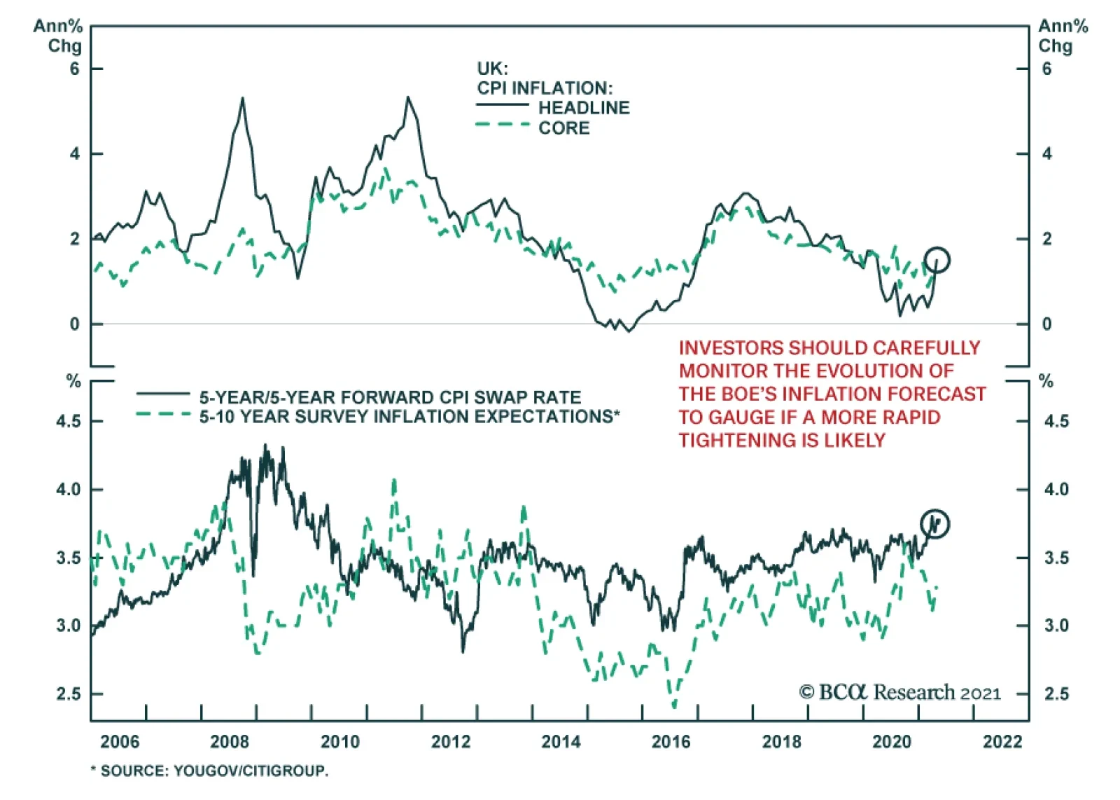
UK inflation doubled in April, rising to the highest level since last March. The consumer price index increased to 1.5% y/y. The acceleration in the monthly pace to 0.6% m/m from 0.3% m/m suggests that more than just base effects are at play. The jump in…
Highlights ECB Tapering?: Investor fears that the ECB could follow the Bank of Canada and Bank of England and begin to taper its bond buying sooner than expected – perhaps as soon as next month’s policy meeting – are misplaced. The last thing the ECB wants to see is the surge in the euro and Italian bond yields that would surely follow any move to pre-emptively begin reducing monetary accommodation in response to faster European growth and inflation. Euro Area Bond Strategy: We are sticking with our current European bond recommendations: overweighting Europe within global bond portfolios - favoring Peripheral sovereigns and corporates versus government debt of the core countries - while also overweighting inflation-linked bonds in France, Italy and Germany where breakevens are undervalued. We also suggest a new tactical trade to fade the current market pricing of ECB rate hikes by going long the December 2023 euribor interest rate futures contract. Feature Dear Client, Next week, we will be jointly publishing a Special Report, discussing the investment implications of the current global housing boom, with our colleagues at the monthly Bank Credit Analyst. You will be receiving that report on Friday, May 28. We will return to regular weekly publishing schedule on Tuesday, June 1. - Rob Robis Chart of the WeekAn Underwhelming Rise In European Bond Yields
An Underwhelming Rise In European Bond Yields
An Underwhelming Rise In European Bond Yields
For next month’s monetary policy meeting, European Central Bank (ECB) President Christine Lagarde reportedly plans to invite the Governing Council members to meet in person for the first time since the start of the pandemic. That provides an interesting subtext to a meeting that will surely involve a debate over how much monetary support is still necessary for an increasingly vaccinated Europe that is emerging from the depths of COVID-19. Some ECB officials have already noted that the risks to economic growth and inflation expectations were now “tilted to the upside”, according to the minutes of the last ECB meeting in April. With European economic confidence improving, European bond yields have moved higher in response (Chart of the Week). The benchmark 10-year German bund yield now sits at -0.11%, up 46bps year-to-date but with half of that move occurring over the past month. The pickup up in yields has not been contained to the core countries of Germany and France – the 10-year Italian government bond yield is now up to 1.11%, over twice the level that began 2021 (0.52%). Inflation expectations have picked up sharply, with the 5-year/5-year forward euro CPI swap now up to 1.63%, a level last seen in December 2018. These yield increases have lagged the big moves seen in other countries; 10-year government bond yields in the US and Canada have seen year-to-date increases of 72bps and 90bps, respectively. In those countries, yields have surged because of rising inflation expectations and worries about a tapering of central bank bond buying – concerns that turned out to be accurate in the case of Canada, where the Bank of Canada did indeed announce a slower pace of bond buying last month. In our view, it is still too soon for the ECB to contemplate such a shift to a less dovish policy stance. This message is corroborated by our ECB Monitor that has risen but is still not signaling a need for tighter monetary policy. The bond selloff in Europe looks like a case of "too much, too fast". The ECB Now Has A Lot To Think About Recent euro area economic data has not only caught up to the earlier strength visible in the US, but in some cases is back to levels not seen for many years. The expectations component of the German ZEW survey surged nearly 14 points in May and is now up to levels last seen in 2000. The Markit PMI for manufacturing reached an all-time high of 62.9 in April. The European Commission’s consumer confidence index for the euro area is nearly back to pre-pandemic levels (Chart 2), which bodes well for a continued recovery of the Markit PMI for services. More positive news on the pandemic is driving the surge in growth expectations. The pace of new COVID-19 cases has fallen steadily, with Italy – one of the hardest-stricken regions during the initial months of the pandemic – now seeing the lowest rate of new cases since October (on a rolling 7-day basis). Meanwhile, the pace of vaccinations has accelerated after a slow initial rollout; the number of daily jabs administered (per 100 people) is now greater in Germany, France and Italy than in the US (Chart 3). Chart 2European Growth Is Recovering
European Growth Is Recovering
European Growth Is Recovering
Chart 3Inoculation Acceleration In Europe
Inoculation Acceleration In Europe
Inoculation Acceleration In Europe
Chart 4How Much Spare Capacity Is There In Europe?
How Much Spare Capacity Is There In Europe?
How Much Spare Capacity Is There In Europe?
The rapid increase in inoculations is setting Europe up for a solid recovery from the lockdown-driven double-dip recession of Q4/2020 and Q1/2021. The European Commission upgraded its growth forecasts for the euro area last week, with real GDP now expected to expand by 4.3% in 2021 and 4.4% in 2022, compared with previous forecasts of 3.8% in both years. All euro area countries are now expected to see a return to the pre-pandemic level of economic output by the end of 2022 – a number boosted by a pickup in public investment through the Next Generation EU (NGEU) package, which is expected to begin paying out funds later this summer. The ECB will surely raise its own forecasts at the June meeting, both for economic growth and inflation. The outlook for the latter will likely turn into the biggest source of debate within the ECB Governing Council. Despite the fairly coordinated recovery of survey-based data like the manufacturing PMIs, there remains a wide divergence of unemployment rates - and measures of spare capacity, more generally - within the euro area (Chart 4). This will make it difficult for the ECB to determine if the current surge in realized inflation, which has pushed the annual growth of headline HICP inflation towards the 2% level in many euro zone nations, can persist with countries like Italy and Spain still suffering from very high unemployment. The wide dispersion of unemployment rates within the euro zone also suggests that the current level of policy rates (at or below 0%) is appropriate. One simple metric to measure the “breadth” of European labor market strength is to look at the percentage of euro area countries that have an unemployment rate below the OECD’s estimate of the full employment NAIRU.1 That metric correlates well with an estimate of the appropriate level of euro area short-term interest rates generated by a basic Taylor Rule. Currently, only 43% of euro zone countries are beyond full employment, which is consistent with an ECB policy rate round 0% (Chart 5). Chart 5Policy Rates Near 0% Are Still Appropriate
Policy Rates Near 0% Are Still Appropriate
Policy Rates Near 0% Are Still Appropriate
A slightly larger share of countries (47%) is witnessing an acceleration in wage growth (bottom panel). This could mean that some of the NAIRU estimates for the individual countries are too low, which would fit with the acceleration in overall euro area wage growth seen since 2015. With so many euro area countries still working off the rise in unemployment generated by the pandemic, however, it will take some time for the ECB to get a clear enough read on labor market dynamics to determine if any necessary monetary policy adjustments should be made. The “breadth” of data trends do not only correlate to theoretical interest rate measures like the Taylor Rule. Actual ECB policy decisions are motivated by the degree to which higher growth and inflation is evident across the euro area. In Chart 6, we show a similar metric to the labor market breadth measures from Chart 5, but using other economic and inflation data. Specifically, we show the percentage of euro area countries that are seeing: Chart 6ECB Typically Tightens When Growth AND Inflation Are Broad Based
ECB Typically Tightens When Growth AND Inflation Are Broad Based
ECB Typically Tightens When Growth AND Inflation Are Broad Based
a) Accelerating growth momentum, indicated by an OECD leading economic indicator that is higher than the level of one year earlier; b) Accelerating inflation momentum, comparing the latest reading on headline HICP inflation to that of one year earlier; c) Relatively high inflation, measured by headline HICP inflation being above the ECB’s “just below 2%” target. Looking at all previous periods of ECB monetary tightening since the inception of the euro in 1998 – taking the form of actual policy rate hikes or a flat-to-declining trend in the ECB’s balance sheet – it is clear that the ECB does not tighten without at least 75% of euro area countries seeing both economic growth and inflation accelerate. Actual rate hikes occur when at least 75% of countries had inflation above 2%, as occurred during the hiking cycles of 2000, 2005-2007 and 2011. More recently, the ECB paused the expansion of its balance sheet in 2017 when growth and inflation accelerated, but did not make any policy rate adjustments as only 50% of countries had inflation above 2%. Today, essentially all euro area countries are seeing accelerating growth momentum compared to the pandemic-depressed levels of a year ago. 59% of the euro area is seeing faster inflation, a number that is likely to move higher as more of Europe reopens from lockdown amid a surge in global commodity prices. Yet only 12% of euro area countries have headline inflation above 2%, suggesting that realized inflation is not yet strong enough to trigger even an ECB balance sheet adjustment, based on the 2017 experience. Don’t Bet On A June ECB Taper So judging by past ECB behavior, an announcement to taper bond buying at the June policy meeting would be highly premature. A more likely scenario is that an upgrade of the ECB’s growth and inflation forecast prompts a discussion of what to do with all the varying parts of the ECB’s monetary stimulus – quantitative easing, bank funding programs like TLTROs, as well as policy interest rates. Yet it will be impossible for the ECB Governing Council to reach any conclusions on their next step(s) at the June meeting because the very nature of the ECB's inflation target might soon change. The ECB is currently conducting a review of its monetary policy strategy – the first since 2003 – that is scheduled for completion later this year. Some adjustment to the ECB inflation target is expected to allow more flexibility, but it is not yet clear what that change will look like. Could the ECB follow the lead of the Federal Reserve and move to an “average inflation target” regime, tolerating overshoots of the inflation target after periods of below-target inflation? ECB Chief Economist Philip Lane noted back in March that “there was a very strong logic” to the Fed’s new approach. He also said that the “very different histories of inflation” in some European countries may make it difficult to reach an agreement on any system that allows even temporary periods of higher inflation.2 More recently, Bank of Finland Governor Olli Rehn – a moderate member of the Governing Council who was considered a candidate for the current ECB presidency – came out in favor of the ECB shifting to a Fed-like average inflation target for Europe in a recent Financial Times interview.3 Rehn noted that a Fed-like focus on aiming for maximum unemployment “makes sense in the current context of a lower natural rate of interest.” Rehn went on to describe the ECB’s current wording of its inflation target as having “generated a perception of asymmetry” such that “2 per cent is perceived as a ceiling and that is dampening inflation expectations.” We imagine that Jens Weidmann from the Bundesbank would vehemently oppose any move to change the ECB inflation target to tolerate even a temporary period of inflation above 2%. German headline HICP inflation already reached 2.1% in April, with more increases likely as the German economy reopens from extended pandemic lockdowns. Yet even if Weidmann were to not dig in his heels against any “loosening” of the ECB inflation target, the looming conclusion of the ECB strategy review makes it highly unlikely that any change in policy – like tapering – could credibly be announced before then. If higher inflation will be tolerated, then why bother to taper at all? Looking beyond the inflation strategy review, there are other factors that could weigh on the ECB in its deliberations on the next monetary policy move: China policy tightening: China – Europe’s largest trading partner – has seen its policymakers begin to rein in credit growth, and fiscal spending, after allowing a surge in borrowing in 2020 to help boost growth during the pandemic. Our measure of the China credit impulse leads the annual growth rate of European exports to China by around nine months (Chart 7), and is flagging a dramatic slowing of exports in the latter half of this year. This represents a downside risk to euro area growth, particularly in countries that export more heavily to China like Germany. Slowing loan growth: The annual growth rate of overall euro area bank lending peaked at 12.2% back in February and is now down to 10.9% (Chart 8). Much of the softening has occurred in Germany and France – countries that had seen a big take-up of subsidized bank funding through the ECB’s TLTROs. The pricing incentives set up by the ECB for the latest TLTRO program were highly attractive, and it appears that German and French banks took advantage of the cheap funding to ramp up lending activity. This makes the economic interpretation of the bank lending data more challenging for the ECB, especially with Italian loan growth – and TLTRO usage – now accelerating. Chart 7Warning Signs For European Export Demand
Warning Signs For European Export Demand
Warning Signs For European Export Demand
Chart 8ECB LTROs Are Becoming Italy-Focused
ECB LTROs Are Becoming Italy-Focused
ECB LTROs Are Becoming Italy-Focused
NGEU spending: As mentioned earlier, disbursements from the €750bn NGEU (a.k.a. “recovery fund”) are expected to begin later this year, pending EU approval of government investment proposals. NGEU funds are intended to finance initiatives that can boost future economic growth, like investments in digital and green programs. Most euro area countries have already submitted their proposals, led by Italy’s request for €192bn. Chart 9NGEU Will Give A Big Boost To European Growth Over The Next Five Years
ECB Outlook: Walking On Eggshells
ECB Outlook: Walking On Eggshells
Chart 10NGEU Impact Will Be Front Loaded
NGEU Impact Will Be Front Loaded
NGEU Impact Will Be Front Loaded
A recent study by S&P Global concluded that NGEU investments could boost overall euro area growth by between 1.3 and 3.9 percentage points, cumulatively, between 2021 and 2026 (Chart 9).4 That same study also noted that the impacts of the spending will be front-loaded over the next two years (Chart 10). The Italian government believes that NGEU investment could double Italy’s anemic trend growth rate to 1.5%. Many ECB officials have noted that NGEU is the kind of structural fiscal stimulus that makes it less necessary to maintain highly accommodative monetary policy. Until the NGEU proposals are finalized and the final approved amounts are dispersed, however, the ECB will be unable to adjust its economic forecasts to account for more government investment. Given all of these immediate uncertainties, including how successfully Europe can reopen from pandemic lockdowns, we do not see a plausible scenario where the ECB Governing Council could conclude at the June policy meeting that an immediate change in the current monetary policy tools and guidance was needed. Bottom Line: Investor fears that the ECB could follow the Bank of Canada and Bank of England and begin to taper its bond buying sooner than expected – perhaps as soon as next month’s policy meeting – are misplaced. Likely ECB Next Moves & Investment Implications While a June taper announcement from the ECB is unlikely, a hint towards a future move is quite possible. The ECB is notorious for preparing markets well in advance of any policy shifts, thus the official statement following the June meeting – as well as ECB President Lagarde’s press conference – could contain clues as to what the ECB will do next. Chart 11ECB Easing Takes Many Forms
ECB Easing Takes Many Forms
ECB Easing Takes Many Forms
A discussion of what will happen with the Pandemic Emergency Purchase Program (PEPP) – which is scheduled to end next March – could come up in June. We deem it more likely that the topic will be raised at the September policy meeting when there will be more clarity on the success of the reopening of Europe’s economy, and to the final approved size of the NGEU funds, which will determine the need to maintain an asset purchase program introduced because of the COVID-19 shock. There are certainly many policy options available for the ECB to choose from when they do decide to dial back accommodation. There are several policy interest rates that could be adjusted. Although it is likely that when the ECB next tries to hike interest rates, the first rate to move will be the overnight deposit rate which is currently at -0.5% and represents the “floor” for short-term interest rates in Europe (Chart 11). Rate hikes will not occur before the balance sheet tools are reduced or unwound, however, which means asset purchases will be dialed back first. Market participants are well aware of that order of policy choices, as a very flat path for short-term interest rates is currently discounted in the European overnight index swap (OIS) curve. The spread between forward rates in the OIS and CPI swap curves can be used as a proxy for the market forward pricing of real interest rates. Currently, the market-implied real ECB policy rate is expected to stay between -2% and -1% over the next decade (Chart 12). Put another way, the markets are pricing in a very flat path for ECB policy rates that will stay below expected inflation over the next ten years. While the natural real rate of interest in Europe is likely very low given low trend growth, a real rate as low as -2% discounts a lot of bad structural news for the European economy. By comparison, the NY Fed’s last estimate of the natural real rate (r-star) for Europe – calculated in Q2/2020 before the economic volatility surrounding the pandemic made r-star estimation more unreliable – was positive at +0.6%. The prolonged path of negative expected real interest rates in Europe goes a long way in explaining the persistence of negative real bond yields in the benchmark German government yield curve. Simply put, there is little belief that the ECB will ever be able to engineer a full-blown rate hike cycle – an outcome that Japanese fixed income investors are quite familiar with. Given the ECB’s constant worry about the level of the euro, and its role in impacting European growth and inflation expectations, markets are correct in thinking that it will be difficult for the ECB to lift rates much without triggering unwanted currency appreciation. It is no coincidence that the euro has been consistently undervalued on a purchasing power parity (PPP) basis ever since the ECB moved to a negative interest rate policy back in 2014 (Chart 13). Chart 12Markets Expect Negative European Real Rates For The Next Decade
Markets Expect Negative European Real Rates For The Next Decade
Markets Expect Negative European Real Rates For The Next Decade
Looking ahead, the ECB will need to be careful about signaling any changes in monetary policy, including tapering, that would force markets to revise up the future path of European interest rates and give the euro a large boost. Chart 13Low ECB Rates Keeping The Euro Undervalued
Low ECB Rates Keeping The Euro Undervalued
Low ECB Rates Keeping The Euro Undervalued
That means that European real bond yields are likely to stay deeply negative over at least the latter half of 2021, with any additional nominal yield increases coming from higher inflation expectations (Chart 14). This will limit how much more European bond yields can rise from current levels. Chart 14European Bond Strategy Summary
European Bond Strategy Summary
European Bond Strategy Summary
We continue to believe that core European bond yields will trade with a “low yield beta” to US Treasury yields over at least the second half of 2021 and likely into 2022 when we expect the Fed to begin tapering its bond buying. Thus, we are sticking with our strategic recommendation to overweight core European government bonds versus US Treasuries in global bond portfolios. We simply see greater odds of a taper occurring in the US than in Europe, with the Fed more likely to deliver subsequent post-taper rate hikes than the ECB. We still recommend a moderately below-benchmark duration stance within dedicated European bond portfolios, although if the 10-year German bund yield rises significantly into positive territory, we would likely look to raise our suggested European duration exposure. We are also maintaining our recommended overweight on European inflation-linked bonds, as breakeven spreads in Germany, France and Italy are the only ones that remain below fair value in our suite of global valuation models. On European credit, we continue to recommend overweighting spread product versus sovereign bonds. That includes Italian and Spanish government bonds, as well as both investment grade and high-yield corporate debt. The time to turn more bearish on those markets will be when the ECB does begin to taper its asset purchases, as credit spreads have tended to widen during periods when the growth of the ECB’s balance sheet has been decelerating (Chart 15). We expect that when the ECB does finally decide to taper, the net amount of TLTROs will likely be maintained near current levels (by introducing new TLTROs to replace expiring ones). This will ensure that borrowing costs in the more fragile countries like Italy do not spike higher from the double-whammy of reduced ECB buying of Italian bonds and diminished access to cheap ECB bank funding. One final note – we are introducing a new trade in our Tactical Overlay portfolio on page 19 this week, as a way to fade the markets pricing in a more hawkish ECB outlook. A 10bp rate hike – the most likely size of any first attempt for the ECB to lift rates – is now priced in the OIS curve around mid-2023. By the end of 2023, nearly 25bps of hikes are discounted in forward rate curves. We do not expect the ECB to lift rates at all in 2023, but even if rates were increased, a cumulative 25bps of hikes within six months is unlikely to be delivered. Thus, we recommend going long the December 2023 3-month Euribor interest rate futures contract at an entry price of 100.27 (Chart 16). Chart 15ECB Tapering Would Be Bad News For European Credit
ECB Tapering Would Be Bad News For European Credit
ECB Tapering Would Be Bad News For European Credit
Chart 16Go Long Dec/2023 Euribor Futures
Go Long Dec/2023 Euribor Futures
Go Long Dec/2023 Euribor Futures
Bottom Line: The last thing the ECB wants to see is the surge in the euro and Italian bond yields that would surely follow any move to pre-emptively begin reducing monetary accommodation in response to faster European growth and inflation. We are sticking with our current European bond recommendations: overweighting Europe within global bond portfolios - favoring Peripheral sovereigns and corporates versus government debt of the core countries - while also overweighting inflation-linked bonds in France, Italy and Germany where breakevens are undervalued. Robert Robis, CFA Chief Fixed Income Strategist rrobis@bcaresearch.com Footnotes 1 NAIRU is an acronym for the Non-Accelerating Inflation Rate of Unemployment. 2 Lane’s comments came from a wide-ranging interview with the Financial Times published on March 16, 2021, which can be found here: https://www.ft.com/content/2aa6750d-48b7-441e-9e84-7cb6467c5366 3 Rehn’s comments were published earlier this month on May 9 and can be found here: https://www.ft.com/content/05a12645-ceb2-4cd5-938e-974b778e16e0 4 The S&P Global report, titled “Next Generation EU Will Shift European Growth Into A Higher Gear”, can be found here: https://www.spglobal.com/ratings/en/research/articles/210427-next-generation-eu-will-shift-european-growth-into-a-higher-gear-1192994 Recommendations The GFIS Recommended Portfolio Vs. The Custom Benchmark Index
ECB Outlook: Walking On Eggshells
ECB Outlook: Walking On Eggshells
Duration Regional Allocation Spread Product Tactical Trades Yields & Returns Global Bond Yields Historical Returns
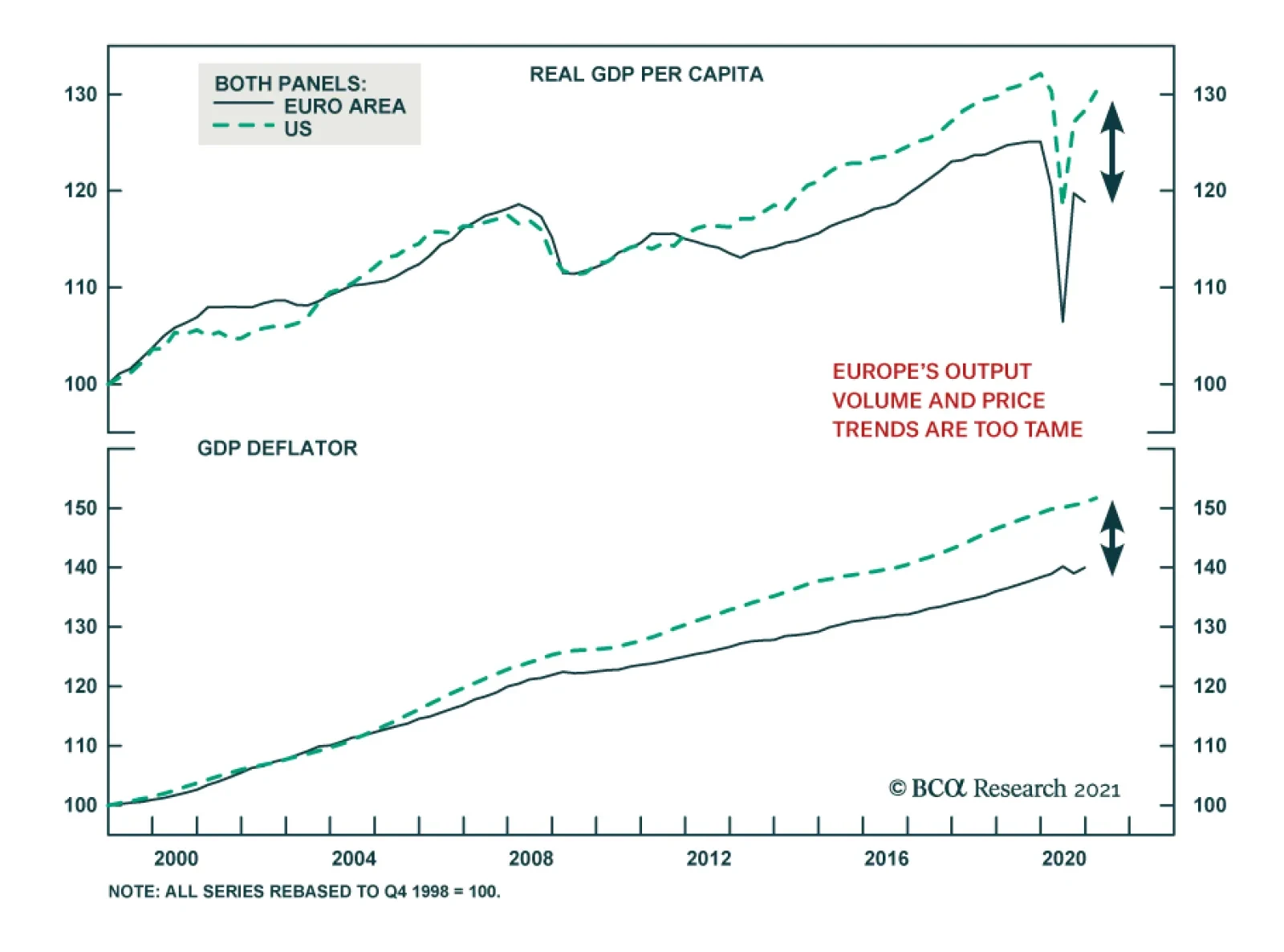
The ECB is not conducting financial repression; rather, it is responding to powerful economic forces in Europe and beyond that are depressing interest rates. Financial repression shows these clear symptoms that the Euro Area does not meet: A low savings…
Highlights The ECB is not repressing interest rates and penalizing savers. The Eurozone shows none of the symptoms associated with financial repression. Global excess savings are keeping US rates depressed. If US rates are low, then European rates must be lower because of structural problems in the region’s economy, independent of the ECB’s preferences. Structurally, there is still no case for European yields to rise meaningfully compared to the rest of the world. Despite positive forces over the next year or two, European financials will remain long-term underperformers. European utilities will outperform US ones. The euro is transforming into a safe haven like the yen and the Swiss franc. Feature By maintaining negative short rates, the European Central Bank is conducting severe financial repression, which distorts rates of return and penalizes savers. This is a common refrain among many insurers and pension plan managers investing in Europe and among a large number of the region’s politicians. Chart 1The ECB's Financial Repression?
The ECB's Financial Repression?
The ECB's Financial Repression?
At first glance, this criticism is apt. For the past five years, negative policy rates have forced safe-haven Bund yields to trade well below the Euro Area’s nominal GDP growth (Chart 1). Moreover, the real ECB deposit rate remains well below the Holston, Laubach-Williams estimate of R-star (the real neutral rate of interest). If we go beyond these superficial observations, it is far from clear that the ECB is conducting financial repression or distorting market rates any more than other major global central banks. Is It Financial Repression? The ECB is not conducting financial repression; rather, it is responding to powerful economic forces in Europe and beyond that are depressing interest rates. The definition of financial repression is crucial to this assessment. Financial repression involves monetary authorities actively suppressing interest rates to the advantage of the borrowers and users of capital at the expense of the savers, whose risk-free investments then provide subpar rates of returns. Following this definition, financial repression shows these clear symptoms: A low savings rate. Suppressed interest rates do not adequately compensate savers to forgo consumption. Thus, they are less likely to put money aside. A significant build-up of debt. Real interest rates are below fair market value, which subsidizes borrowing. A significant expansion of the money supply. Money supply expands rapidly in response to strong credit demand in the economy. Plentiful capital expenditures. Savers must take on more financial risk to make appropriate returns on their assets, which compresses risk premia. Depressed internal rates of return boost the net present value of investment projects and thus cause investments to account for a large share of output. A current account deficit. A nation’s current account balance equals its savings minus its investments. By depressing savings and stimulating investments, financial repression results in a current account deficit or a sharply deteriorating current account balance. Above-trend GDP growth. By depressing savings and boosting investments, financial repression lifts cyclical spending and forces the GDP to rise above its potential. The problem for commentators who argue that the ECB is conducting financial repression is that the Euro Area meets none of these criteria. First, Eurozone money and credit growth has run well below that of the US ever since the euro crisis, despite ECB policy rates that are constantly lower than the Fed Funds rate. Moreover, since the ECB cut rates to zero, the pace of money and credit creation has decelerated significantly compared to their pre-crisis trends (Chart 2). Second, the Euro Area’s real GDP per capita, nominal GDP per capita, and the GDP deflator have also fallen 4.6%, 5.2% and 5%, respectively, behind those of the US, since the ECB has cut interest rates to zero (Chart 3). Moreover, the growth of these variables has also decelerated significantly over this period, which is consistent with depressed credit demand. Additionally, despite the inferior performance of European activity metrics compared to those of the US since the introduction of the common currency, European government bonds have performed exactly in line with those of the US (Chart 3, bottom panel) and have therefore outperformed in real terms. This is inconsistent with financial repression by the ECB. Chart 2Europe's Money And Credit Trends Are Too Tame...
Europe's Money And Credit Trends Are Too Tame...
Europe's Money And Credit Trends Are Too Tame...
Chart 3... So Are Output Volume And Price Trends
... So Are Output Volume And Price Trends
... So Are Output Volume And Price Trends
Finally, the Euro Area runs a current account surplus of 2.3% of GDP, which has grown by 4.1% of GDP since late 2008. This is the clearest sign that Eurozone savings have become excessive relative to investment, despite the surge in government deficits in the wake of the COVID-19 pandemic. Excess savings are not typically associated with central banks artificially distorting interest rates. Bottom Line: The economic developments in the Euro Area do not correspond to what would be anticipated if the ECB were repressing interest rates. The growth rate of money and credit has structurally slowed both in absolute terms and compared to that of the US. The same deceleration is evident in both real and nominal output per person, as well as in price levels. Finally, the Eurozone’s current account surplus has widened, which highlights that savings have grown in excess of investments. The Eurozone Needs Lower Interest Rates Than The US The ECB must set appropriately low interest rates, if US yields are low across the curve. In a way, the case that the Federal Reserve is conducting financial repression is stronger than the case against the ECB. Over the past twelve years, nominal and real output per capita have grown more robustly in the US, while money as well as credit expansion and inflation have also been stronger. The US runs a persistent current account deficit of 3.1% of GDP, which also indicates that it is not awash in excess domestic savings. Chart 4Maybe The Fed Is Repressing Interest Rates
Maybe The Fed Is Repressing Interest Rates
Maybe The Fed Is Repressing Interest Rates
We could even argue that the case for the Fed repressing interest rates is growing stronger. The federal budget deficit has expanded to 19% of GDP, even as the unemployment rate tumbles (Chart 4). Moreover, US quarterly GDP growth has averaged 8.5% since the fourth quarter of 2020 and, according to Bloomberg consensus estimates, is anticipated to average 6.3% for the remainder of the year. US inflation is also strong. Annual core CPI Inflation hit 3% in April; monthly core inflation was 0.92%, or an annualized rate of 11.6%, the strongest reading in almost 40 years. Yet, even in the US, the argument that the Fed is repressing interest rates is ultimately weak, despite the aforementioned economic strength. The Fed is accommodating global market pressures that are greater than those of the US economy. In other words, even if the Fed did not set short rates, US interest rates would be low across the curve because of global excess savings. Chart 5Too Much Savings, Everywhere
Too Much Savings, Everywhere
Too Much Savings, Everywhere
Excess savings around the world constitute an exceptionally strong gravitational force that anchor global rates at low levels. As Chart 5 shows, since the early 1990s, global private savings have outpaced investments by a cumulative 163% of GDP. Accumulated government deficit, which has accounted for 99% of global GDP, has been far too small to absorb fully this surplus of savings. The resulting imbalance places downward pressure on global inflation (a consequence of demand falling short of supply) and real interest rates, which means it depresses nominal interest rates across the curve. US interest rates also feel the yield-compressing effect of these excess global savings, even if the US economy does not generate excess savings itself (it runs a current account deficit). The major DM central banks are removing a greater proportion of the float of safe-haven from their jurisdictions than the Fed (Chart 6). The resulting scarcity of safe-haven securities means that US fixed-income products remain the natural outlet for global investors seeking safety and liquidity. Thus, despite the US lack of excess savings, Treasury yields have traded below nominal GDP growth 55% of the time over the past 30 years, no matter how strong US activity is or how wide federal deficits become. If the Fed has little choice but to accept low US interest rates, then the Eurozone must accept even lower interest rates because of its large excess savings. As Chart 7 illustrates, the 2-year and 10-year interest rate spreads (both in nominal and real terms) between the Eurozone and the US track the gap between the US current account deficit and the Europe’s current account surplus. Chart 6Treasurys Are The World Only Plentiful Safe-Haven
Treasurys Are The World Only Plentiful Safe-Haven
Treasurys Are The World Only Plentiful Safe-Haven
Chart 7Europe's Excess Savings Justify Lower Rates Across The Curve
Europe's Excess Savings Justify Lower Rates Across The Curve
Europe's Excess Savings Justify Lower Rates Across The Curve
The Eurozone lower rate of return on capital is another force depressing rates relative to the US (Chart 8). This lower return on capital reflects the following structural problems with the European economies: Excess capital stock. The Eurozone peripheral nations have abnormally large capital stocks in relation to their GDPs (Chart 9). As we previously argued, this feature means that Europe suffers from large amounts of misallocated capital, which hurt the return on capital. Chart 8Capital Is Not Rewarded In Europe
Capital Is Not Rewarded In Europe
Capital Is Not Rewarded In Europe
Chart 9Too Much Capital!
Too Much Capital!
Too Much Capital!
Ageing capital stock. Not only is the Eurozone capital stock too large relative to the size of its economy, it is also older than that of the US (Chart 10). An ageing capital stock, especially in a world where ICT spending is one of the key sources of innovation and growth, further hurts the Euro Area’s return on capital. Lower incremental output-to-capital ratio (Chart 11). The Euro Area generates significantly less output per unit of investment than the US. This confirms the notion that capital is misallocated and that it is used less productively than in the US. Chart 10Europe's Capital Is Ageing Too
Europe's Capital Is Ageing Too
Europe's Capital Is Ageing Too
Chart 11Poor Capital Utilization
Poor Capital Utilization
Poor Capital Utilization
Chart 12Europe's Inferior Productivity Problem
Europe's Inferior Productivity Problem
Europe's Inferior Productivity Problem
The final force limiting European interest rates compared to the US is the Euro Area’s inferior potential growth rate. The Eurozone’s population is ageing, and it will start to contract in 2030. Moreover, multifactor productivity growth is weaker than in the US (Chart 12). A lower potential GDP growth accentuates the discount in the Euro Area neutral rate of interest compared to the US. Bottom Line: Despite the relative economic vigor of the US, global excess savings lower US rates across the curve. The ECB has no choice but to accept even lower European rates, because the European economy suffers from greater excess savings than the US: its return on capital is inferior, and its neutral rate of interest is hampered by its lower potential GDP growth. Investment Conclusions For European rates to avoid the fate of Japan and to circumvent suffering many more decades wedged near zero, some important changes must take place. First, at the global level, excess savings must recede. This will allow global interest rates to increase, especially those of the US. Even if Eurozone rates continue to trade at a discount to the US, safe-haven yields in Europe would nonetheless climb in absolute terms. The fall in the global ratio of workers relative to dependent people, most notably in China where the 2020 population census has just highlighted the trend, is one factor pointing toward a potential gradual decline in global savings. For the moment, absorbing excess savings means that global fiscal policy must remain accommodative. Although fiscal authorities around the world continue to display greater profligacy than they did in the wake of the Great Financial Crisis, there is no guarantee that they will not revert to their old ways. In fact, BCA’s Global Investment Strategy service recently showed that the US fiscal policy is set to become more of a constraint on growth next year than it has been in 2020 and 2021 (Chart 13). One factor to monitor is the international shift in voters’ preferences toward left-wing economic policies, which often results in more generous fiscal spending. If this trend persists, then global fiscal deficits will close more slowly than the private sector savings will decline. This process will both be inflationary over the long run and impose upward pressure on real interest rates worldwide. But the fiscal excesses of the current moment may force opposition parties to restrain spending whenever they come into power. Chart 13Will Global Fiscal Policy Morph Into a Headwind?
The ECB Is Not In Charge
The ECB Is Not In Charge
Second, to narrow the spread between the Eurozone and US interest rates, the Euro Area must tackle its low rate of return on capital. Practically, this means that much of the excess capital stock weighing on European rates of returns must be written down. Doing so will require more cross border mergers and acquisitions within sectors in the Eurozone. However, the loss-recognition process on nonviable capital will be deflationary. Thus, to facilitate these asset write-downs, the region’s fiscal policy and monetary policy must first remain extremely accommodative. It is far from certain that European authorities will resist reverting to their old ways. A structural underweight on European financial equities remains appropriate. Even if the Eurozone enacts the reforms necessary to invite the peripheral asset write-downs required to boost rates of return in the long-run, in the interim, these reforms will be deflationary. Consequently, no matter what, Eurozone yields will remain well below the US for years to come. Moreover, European credit demand is unlikely to outperform the rest of the world for the coming few years. In this context, the RoE of European banks will remain low. Therefore, our current recommendation to overweight this sector is only valid as a near-term play on the global economic recovery and is not a strategic recommendation. By contrast, European utilities will structurally outperform their US counterparts. European utilities offer higher RoE than US ones and have healthier leverage (Chart 14). Moreover, European utilities trade at discounts to US firms on a price-to-book, price-to-cash flow, price-to-sales and dividend yield basis (Chart 15). Additionally, as yield plays, structurally lower European yields relative to those of the US will advantage European utilities on a long-term basis. Chart 14European Utilities Offer More Appealing Operating Metrics...
European Utilities Offer More Appealing Operating Metrics...
European Utilities Offer More Appealing Operating Metrics...
Chart 15... And Are More Attractively Priced Than US Ones
... And Are More Attractively Priced Than US Ones
... And Are More Attractively Priced Than US Ones
Finally, the euro will increasingly trade as a safe-haven currency like the yen and the Swiss franc. First, after a decade of trial by fire, EU integration and solidarity have gained rather than lost momentum and the EU break-up risk has proved to be limited to Brexit. Second, although the Eurozone economy is pro-cyclical, so are the Swiss and Japanese economies. Instead, the Euro Area’s structurally elevated savings rate and current account balance are transforming this economy into a net creditor, with a positive net international investment position equal to -0.1% of GDP. Moreover, the bloc’s low inflation will continue to put upward pressure on the euro’s long-term fair value. If we add the Euro Area’s low interest rates to the mix, then the euro is likely to behave increasingly as a funding currency. Thus, while the euro will benefit from the USD’s weakness forecasted by our Foreign Exchange Strategists, it will underperformed more pro-cyclical currencies such as the SEK, the NOK, or the GBP, which do not suffer from the same ills as the Eurozone. Mathieu Savary, Chief European Investment Strategist Mathieu@bcaresearch.com
Highlights US growth has likely peaked. Economic momentum will slow over the coming quarters as the tailwind from stimulus fades and the vaccination campaign winds down. Historically, a slowdown in US growth, as proxied by a decline in the ISM manufacturing index, has been associated with lower overall equity returns, the outperformance of defensive stocks over cyclicals, large caps over small caps, and US equities over their overseas peers. A falling ISM has also been associated with a strengthening dollar, lower Treasury yields, wider credit spreads, a decline in the US Treasury/German bund spreads, falling oil prices, and an increase in the gold-to-copper price ratio. Compared to past episodes, there are three reasons to expect the coming US slowdown to be relatively benign: First, growth is slowing from exceptionally strong levels; second, growth in many other parts of the world is still speeding up; and third, monetary policy will remain highly accommodative in the face of what is likely to be a transitory increase in inflation. We continue to maintain a positive 12-month view on global equities. Nevertheless, with global growth momentum likely to slow later this year, investors who are maximally overweight risk should pare back cyclical exposure. Crypto update: We warned that “Bitcoin is on a collision course with ESG” two weeks ago. Elon Musk’s flip-flop on allowing customers to pay for Teslas in Bitcoin is yet another piece of evidence that ESG concerns will win out. With that in mind, we are going short Bitcoin. Beware The Second Derivative US growth has likely peaked. Economic momentum will slow over the coming quarters as the tailwind from fiscal stimulus fades and the vaccination campaign winds down. According to the Brookings Institution, fiscal easing contributed nearly seven percentage points to US growth in the first quarter (Chart 1). However, fiscal policy is set to detract from growth in the remainder of the year, reflecting the one-off nature of some of the stimulus measures. Chart 1After A Strong Boost, Fiscal Thrust Is Turning Negative
Peak Growth And A Whiff Of Stagflation
Peak Growth And A Whiff Of Stagflation
On the pandemic front, the number of new cases continues to trend lower in the US, thanks mainly to a successful vaccination campaign. A falling infection rate has allowed states to dismantle lockdown measures. Conceptually, it is the change in social distancing measures that correlates with economic growth. While some restrictions remain in place (especially in the educational sector), we are now well past the point of maximum loosening. How have financial markets performed during episodes of slowing US economic growth? To answer this question, we looked at the performance of various assets during periods when the ISM manufacturing index was falling and when it was rising. To add a bit more granularity to the analysis, we also looked at cases when the ISM was trending up and above 50, trending down and above 50, trending down and below 50, and trending up and below 50. As summarized in Table 1 and the Appendix Charts, the key results are as follows: Stocks tend to do best when the ISM is rising. Since 1950, the S&P 500 has risen on average by 1.51% during months when the ISM was trending higher, compared to 0.49% during months when the ISM was trending lower. The results were virtually the same if one restricts the sample to the post-1995 period. While the change in the ISM generally matters more for the S&P 500, absolute levels matter too. Since 1995, the best period for the S&P 500 was when the ISM was below 50 but trending higher (S&P 500 up 2.07%), while the worst period was when the ISM was below 50 and trending lower (S&P 500 up 0.03%). This suggests that swings in the ISM have a bigger effect on the stock market during periods of economic contraction. During periods where the ISM was falling but still above 50, the S&P 500 has delivered a positive – though far from stellar – monthly return of 0.69%. US defensively-geared equities outperformed cyclicals when the ISM was trending lower. During periods when the ISM was falling but still above 50, defensives beat cyclicals by 0.45%. Defensives outperformed cyclicals by 0.84% during periods when the ISM was below 50 and trending lower. US small caps underperformed large caps during periods when the ISM was falling. Non-US stocks also underperformed their US counterparts in a falling ISM environment. The relationship between the ISM and value/growth performance is more ambiguous. To the extent that there is one, value generally outperforms growth when the ISM is below 50. Treasury yields tend to increase, while the yield curve tends to steepen, when the ISM is trending higher. Reflecting the higher beta that Treasuries have to the global business cycle, Treasury yields generally rise more than Germany bund yields when the ISM is on the upswing. Corporate credit spreads tend to widen when the ISM is falling. Spreads narrow the most when the ISM is below 50 but rising. As a countercyclical currency, the US dollar tends to weaken when the ISM is rising and strengthen when the ISM is falling. The prices of cyclically-sensitive commodities such as oil and copper normally decline when the ISM is trending lower, although in general, the bulk of the decline in commodity prices usually occurs only when the ISM has dipped below 50. There is not much of a relationship between gold prices and the ISM. Table 1The Economic Cycle And Financial Assets
Peak Growth And A Whiff Of Stagflation
Peak Growth And A Whiff Of Stagflation
Implications For Today Assuming that the ISM has peaked but remains above 50, the analysis above suggests that the S&P 500 will rise modestly over the coming months; US stocks will edge out non-US stocks; defensives will outperform cyclicals; and large caps will perform slightly better than small caps. The analysis also suggests that Treasury yields will move lower; the Treasury-bund spread will narrow; corporate credit spreads will be flat-to-wider; the dollar will strengthen modestly; and commodities will move broadly sideways. Our own 12-month view is more pro-risk than implied by the ISM analysis. There are three reasons for this: First, US growth is slowing from exceptionally strong levels; second, growth in many other parts of the world is still accelerating; and third, monetary policy remains highly accommodative. Let’s examine each assumption in turn. Reason #1: US growth is slowing from exceptionally strong levels While payroll growth surprised sharply on the downside in April, we suspect this was mainly due to pandemic-induced distortions to the seasonal adjustment mechanism used by the Bureau of Labor Statistics. Seasonally unadjusted payrolls rose by 1.1 million in April, which is broadly consistent with the strong pace of GDP growth tracking estimates. The Atlanta Fed GDPNow model points to growth of 11% in Q2. Bloomberg consensus estimates have US real GDP rising by 8.1% in the second quarter. Growth will decline to 7% in Q3 and 4.7% in Q4, but still average 4% in 2022 (Table 2). Table 2Growth Is Peaking, But At A Very High Level
Peak Growth And A Whiff Of Stagflation
Peak Growth And A Whiff Of Stagflation
Chart 2Firms Will Need To Rebuild Inventories
Peak Growth And A Whiff Of Stagflation
Peak Growth And A Whiff Of Stagflation
US households were sitting on $2.2 trillion in excess savings as of the end of April. This is money they would not have had in absence of the pandemic. Slightly less than half of that stockpile can be attributed to transfer payments, mainly in the form of stimulus checks and unemployment benefits. The rest stems from decreased spending during the pandemic. Not all of this money will be spent immediately. However, given the large sums involved – $2.2 trillion is equivalent to 15% of annual personal consumption – even a partial depletion of these excess savings will be enough to power consumption for the foreseeable future. Meanwhile, firms will have to boost production in order to restore depleted inventories. The inventory-to-sales ratio stands at record low levels (Chart 2). The decline in inventories pushed up the ISM new orders-to-inventory ratio in April, even as the overall ISM index slid from 64.7 in March to 60.7. The new orders-to-inventory ratio tends to lead the ISM index, which suggests that any decline in the ISM index over the coming months will be gradual. An easing of supply-side constraints should also support growth. Even though overall employment was still 5.2% below pre-pandemic levels in April, a record share of small firms surveyed by the NFIB reported difficulty in filling vacant positions (Chart 3). Enhanced unemployment benefits have eroded the incentive to find work. In addition, many schools remain partially shuttered. Chart 4 shows that mothers with young children have seen a much larger decline in labor force participation than other groups. Chart 3Firms Are Struggling To Find Workers
Firms Are Struggling To Find Workers
Firms Are Struggling To Find Workers
Chart 4Mothers With Children Had To Leave The Labor Force
Peak Growth And A Whiff Of Stagflation
Peak Growth And A Whiff Of Stagflation
Enhanced unemployment benefits will expire in September. As schools resume normal operations, more workers will flow back into the labor market. At the same time, some of the bottlenecks currently gripping the global supply chain should abate, allowing for increased output. Reason #2: Growth in many other parts of the world is still accelerating Chart 5Over 40% Of S&P 500 Revenues Come From Abroad
Peak Growth And A Whiff Of Stagflation
Peak Growth And A Whiff Of Stagflation
Chart 6Euro Area Data Has Surprised On The Upside
Euro Area Data Has Surprised On The Upside
Euro Area Data Has Surprised On The Upside
S&P 500 constituent firms derive 43% of their revenues from abroad (Chart 5). While Bloomberg estimates suggest that US growth will peak in the second quarter, growth in the euro area is not expected to peak until the third quarter. Mathieu Savary, who heads BCA’s European Investment Strategy service, sees upside risks to European growth estimates for the second half of this year. Consistent with Mathieu’s observations, recent economic data has been surprising to the upside in the euro area (Chart 6). Just this week, economic expectations for both Germany and the wider euro area leaped to the highest level in more than 20 years, according to the ZEW economic research institute. Growth in Japan should also pick up in the remainder of the year. Japan’s vaccination campaign has gotten off to a very slow start, with less than 3% of the population being inoculated to date. The government imposed its third state of emergency on April 25 in response to rising viral case counts. It subsequently extended those restrictions on May 11. The authorities intend to vaccinate the country’s 36 million elderly people by July, when the Olympics are set to begin. This should permit some easing in lockdown measures. Investors are worried that the Chinese economy will slow this year. The Chinese PMIs peaked in November 2020, about the same time as the combined credit/fiscal impulse reached an apex (Chart 7). Jing Sima, BCA’s chief China strategist, expects the general government budget deficit to remain at a still-ample 8% of GDP this year, similar to where it was last year. She expects credit growth to slow by 2%-to-3%, converging towards the pace of nominal GDP growth. Keep in mind that China’s credit-to-GDP ratio stands at 270%. Thus, if credit grows in line with nominal GDP growth of about 10%, this would still leave the stock of credit roughly 27% of GDP higher at the end of 2021 compared to the end of 2020. This hardly constitutes “deleveraging”. A resilient Chinese economy should buoy other emerging markets. Progress on the pandemic front should also help. The UN estimates that as many as 15 billion vaccine doses could be produced by the second half of 2021, enough to inoculate most of the world’s population (Chart 8). The shortages of vaccines in emerging markets could turn into a surfeit by the end of this year, something that market participants do not seem to fully appreciate. Chart 7China: Peak Stimulus And Peak Growth
China: Peak Stimulus And Peak Growth
China: Peak Stimulus And Peak Growth
The rotation in growth momentum from the US to the rest of the world should put downward pressure on the US dollar. A weaker dollar, in turn, has usually coincided with the outperformance of non-US stock markets (Chart 9). Chart 8Vaccine Production Set To Ramp Up Further
Peak Growth And A Whiff Of Stagflation
Peak Growth And A Whiff Of Stagflation
Chart 9A Weaker Dollar Has Coincided With The Outperformance Of Non-US Stock Markets
A Weaker Dollar Has Coincided With The Outperformance Of Non-US Stock Markets
A Weaker Dollar Has Coincided With The Outperformance Of Non-US Stock Markets
Reason #3: Monetary policy remains highly accommodative The slowdown in US growth is coming at a time when inflation is rising. The core CPI increased by 0.9% month-over-month in April. This was the biggest monthly jump since August 1981. The year-over-year rate climbed to 3.0%, the highest in 25 years. The “whiff of stagflation” helped push the S&P 500 down this week. As we discussed last week, we are very much in the camp that expects inflation to rise significantly over the long haul. Over the next one or two years, however, we would fade inflationary fears. As the example of the 1960s illustrates, a long period of overheating is often necessary to push up inflation in a sustained manner. The US unemployment rate reached its full employment level in 1962. However, it was not until 1966 – when the unemployment rate was two full percentage points below equilibrium – that inflation finally took off (Chart 10). The official core CPI likely overstates underlying inflationary pressures. The pandemic threw all sorts of prices out of whack. Stripping out volatile food and energy prices from inflation is not enough. One needs more refined measures of inflation. Luckily, they exist. Chart 11 shows that median CPI, trimmed-mean CPI, and sticky price CPI all remain well contained. Similarly, relatively clean measures of wage growth, such as the Atlanta Fed Wage Tracker, do not point to an imminent wage-price spiral (Chart 12). Chart 10Inflation Started Accelerating Quickly Only When Unemployment Reached Very Low Levels In The 1960s
Inflation Started Accelerating Quickly Only When Unemployment Reached Very Low Levels In The 1960s Inflation Started Accelerating Quickly Only When Unemployment Reached Very Low Levels In The 1960s
Inflation Started Accelerating Quickly Only When Unemployment Reached Very Low Levels In The 1960s Inflation Started Accelerating Quickly Only When Unemployment Reached Very Low Levels In The 1960s
Chart 11Cleaner Measures Of Inflation Are Telling A Different Story
Cleaner Measures Of Inflation Are Telling A Different Story
Cleaner Measures Of Inflation Are Telling A Different Story
Chart 12Wage Growth Is Still Lackluster
Wage Growth Is Still Lackluster
Wage Growth Is Still Lackluster
All this means that the Fed can afford to sustain exceptionally easy monetary policy. That should keep growth at an above-trend pace and continue to support to equity valuations. Investment Conclusions My “golden rule” for investing is to stay bullish on stocks unless one thinks there is a recession around the corner (Chart 13). Seeing around the corner is not easy, of course, but it is not impossible either. Chart 13Recessions And Bear Markets Tend To Overlap
Peak Growth And A Whiff Of Stagflation
Peak Growth And A Whiff Of Stagflation
Last year’s recession was caused by a true exogenous shock – the pandemic. Most recessions are endogenous in nature, however. They result from growing imbalances that are usually laid bare by tighter monetary policy. One can debate the extent to which the global economy is plagued by imbalances of one form or another. But one thing is clear, monetary policy is unlikely to turn contractionary any time soon. In this environment, one should remain positive on equities and other risk assets over a 12-month horizon. Nevertheless, with global growth momentum likely to slow later this year, investors who are maximally overweight risk should pare back cyclical exposure. Go Short Bitcoin We warned that “Bitcoin is on a collision course with ESG” two weeks ago in a report entitled “How To Short Bitcoin, Or Anything Else, Without Losing Your Shorts.” Elon Musk’s flip-flop on allowing Tesla customers to pay for Teslas in Bitcoin is yet another piece of evidence that ESG concerns will win out. News that Colonial Pipeline paid hackers 75 bitcoin (nearly $5 million) in ransom further cements Bitcoin’s status as the currency of choice for criminals around the world. With all that in mind, we are going short Bitcoin as of midnight Eastern Daylight Time (EDT) using the shorting technique described in that report. The technique flips the usual risk-reward from shorting on its head. Normally, when you short a stock, your gain is capped at 100% of the initial position whereas your potential loss is unlimited. With our shorting technique, your potential loss is capped at 100% while your potential gain is unlimited. This makes shorting as an investment strategy a lot safer. APPENDIX The Economic Cycle And Financial Assets APPENDIX CHART 1A
Peak Growth And A Whiff Of Stagflation
Peak Growth And A Whiff Of Stagflation
APPENDIX CHART 1B
Peak Growth And A Whiff Of Stagflation
Peak Growth And A Whiff Of Stagflation
Appendix Chart 1C
Peak Growth And A Whiff Of Stagflation
Peak Growth And A Whiff Of Stagflation
Appendix Chart 1D
Peak Growth And A Whiff Of Stagflation
Peak Growth And A Whiff Of Stagflation
Peter Berezin Chief Global Strategist pberezin@bcaresearch.com Global Investment Strategy View Matrix
Peak Growth And A Whiff Of Stagflation
Peak Growth And A Whiff Of Stagflation
Special Trade Recommendations
Peak Growth And A Whiff Of Stagflation
Peak Growth And A Whiff Of Stagflation
Current MacroQuant Model Scores
Peak Growth And A Whiff Of Stagflation
Peak Growth And A Whiff Of Stagflation
Highlights Over the 2021-22 period, renewable capacity will account for 90% of global electricity-generation additions, per the IEA's latest forecast. This will follow the 45% surge (y/y) in renewable generation capacity added last year, which occurred despite the COVID-19 pandemic (Chart of the Week). Continued investment in renewables and EVs – along with a global economic rebound – are pushing forecasts at banks and trading companies to a $13k - $20k/MT range for copper, vs. ~ $10.6k/Mt (~ $4.80/lb) at present. Should these stronger metals forecasts prove out, investments that extend low-carbon use of fossil fuels via carbon-capture and circular-use technologies will become more attractive. Investment in these technologies has been limited because there is no explicit global reference price to assess investments against. A carbon market or tax would provide such a bogey and accelerate investment. It could be monitored via a Carbon Market Club, which would limit trade to states posting and collecting the tax.1 Feature At almost 280GW, renewable energy capacity additions last year increased 45% y/y, the most since 1999, according to the IEA's most recent update on renewable energy.2 For this year and next, renewables are expected to account for 90% of capacity additions, led by solar PV investment increasing ~ 50% to 162GW. Wind capacity grew 90% last year, increasing to 114GW, and is expected to increase ~ 50% to end-2022. As renewables generation – and EV investment – continues to grow, demand for bulks (steel and iron ore) and base metals, led by copper, will pull prices higher. This is occurring against a backdrop of flat supply growth and physical deficits over the four years ended 2020 (Chart 2). According to the IEA, a 40% increase in steel and copper prices over the September 2020 to March 2021 period played a role in higher solar PV module prices. Chart of the WeekRenewables Capacity Surges
Surging Metals Prices And The Case For Carbon-Capture
Surging Metals Prices And The Case For Carbon-Capture
The supply side of the copper market will remain in deficit this year and next, in our assessment, and may continue on that trajectory if, as Wood Mackenzie expects, demand grows at a 2% p.a. rate over the next 20 years and miners remain reluctant to commit to the capex required to keep up with demand.3 Chart 2Physical Deficits Will Draw Copper Stocks...
Physical Deficits Will Draw Copper Stocks...
Physical Deficits Will Draw Copper Stocks...
ESG risk for copper – and other metals required to build the generation and infrastructure required in the renewables buildout – will increase as prices rise, which also will add to cost.4 Cost increases coupled with increasing ESG risks in this buildout will increase the attractiveness of carbon-capture and circular-economy technology investment, in our view. This would extend the use of low-carbon fossil fuels if the technology can move the world closer to a net-zero carbon future. However, unless and until policy catalyzes this investment, – e.g., via a global carbon trading price or tax – investment in these technologies likely will continue to languish. Carbon-Capture Tech's Unfulfilled Promise The history of Carbon Capture, Utilization and Storage (CCUS) has been one of high hopes and unmet expectations. It is generally recognized as a route to mitigate climate change; however, its deployment has been slower than expected. Low-carbon technology requires more critical metals than its fossil-fuel counterpart (Chart 3). Apart from the issue of cost, the ESG risks of mining metals for the renewable energy transition will increase as more metals are demanded, which we discussed in previous research.5 According to Wood Mackenzie, mining companies will need to invest nearly $1.7 trillion in the next 15 years to help supply enough metals to transition to a low carbon world.6 Chart 3Low-Carbon Tech Is Metals Intensive
Surging Metals Prices And The Case For Carbon-Capture
Surging Metals Prices And The Case For Carbon-Capture
Given these looming physical requirements for metals, fossil fuels most likely will need to be used for longer than markets currently anticipate, as a bridge to the low-carbon future, or as part of that future, depending on how successfully carbon is removed from the hydrocarbons used to power modern society. If so, using fossil fuels while mitigating their environmental impact will require highly focused technology to lower CO2 and other green-house gas (GHG) emissions during the transition to a low-carbon future. Enter CCUS technology: This technology traps CO2 from sources that use fossil fuels or biomass to make the energy required to run modern societies. In the current iterations of this technology, CO2 can either be compressed and transported, or stored in geological or oceanic reservoirs. This can then be used for Enhanced Oil Recovery (EOR) to extract harder-to-reach oil by injecting CO2 into the reservoirs holding the hydrocarbons.7 The Scope For CCUS Investment CCUS investment spending is increasing, as are the number of planned facilities using or demonstrating this technology. In the 2020 edition of its Energy Technology Perspectives, the IEA noted 30 new integrated CCUS facilities have been announced since 2017, mostly in advanced economies such as US and Europe, but also in some EM nations. As of 2020, projects at advanced stages of planning represented a total of $27 billion, more than double the investment planned in 2017 (Chart 4). Among its many goals, the Paris Agreement seeks a balance between emissions by man-made sources and removal by greenhouse gas (GHGs) sinks (absorption of the gases) in the second half of the 21st century. Practically, many countries – especially EM economies – will still need to use fossil fuels to develop during this period (Chart 5).8 Chart 4Carbon-Capture Projects To Date
Surging Metals Prices And The Case For Carbon-Capture
Surging Metals Prices And The Case For Carbon-Capture
Chart 5EM Development Will Require Fossil-Fuel Energy
Surging Metals Prices And The Case For Carbon-Capture
Surging Metals Prices And The Case For Carbon-Capture
CCUS In The Energy Sector As a fuel that emits fewer GHGs than coal – i.e., half the CO2 of coal – natural gas can be used effectively as a bridge to green-power generation (Chart 6). Chart 6Natural Gas Will Remain Attractive As A Bridge Fuel
Surging Metals Prices And The Case For Carbon-Capture
Surging Metals Prices And The Case For Carbon-Capture
The CO2 in natgas needs to be removed before dry gas is sold as pipeline-quality gas or LNG. This CO2 is normally vented to the atmosphere; however, by using CCUS technology, it can be reinjected into geological formations and used for EOR. For this reason, LNG companies in the US, the world’s largest LNG exporter, have been looking into investing in CCUS technology in a bid to become greener.9 CCUS can also be used to produce low-cost hydrogen – so-called blue hydrogen – using natural gas and coal, as opposed to the more expensive electrolysis process, which uses renewables-based electricity to produce "green" hydrogen. The lower blue-hydrogen costs will make clean hydrogen more accessible to emerging nations, opening new avenues for the world to use the energy carrier in its decarbonization effort. The Value Of Ccus In Other Industries CCUS technology can be retrofitted to existing power and industrial plants, which, according to the IEA, could otherwise still emit 8 billion tons of CO2 in 2050, around one-quarter of annual energy-sector emissions in 2020. Of the fossil fuel generators, coal-fired power generation presents the biggest CO2 challenge, with most of the emissions coming from China and other EM Asia nations, where the average plant age is less than 20 years. Since the average age of a coal fired power plant is 40 years, according to the US National Association of Regulatory Commissioners, this implies that these plants have a long remaining life and could still be operating until 2050. CCUS is the only alternative to retiring or repurposing existing power and industrial plants. The IEA believes that CCUS is imperative to reach net-zero carbon emissions. In its Sustainable Development Scenario - in which global CO2 emissions from the energy sector decline to net-zero by 2070 – CCUS accounts for 15% of the cumulative reduction in emissions. If the world needs to reach net-zero by 2050 instead, it will need almost 50% more CCUS deployment.10 Properly implemented and scaled, CCUS can allow industries to continue using oil, gas and coal and to attain net-zero carbon emission targets, boosting demand for fossil fuels in the medium term. This is especially important to EM development. Why Aren’t We Further Along In CCUS? What Can Be Done? The main reason CCUS isn’t used more widely is because of its cost. Currently, the cost of capturing carbon varies, based on the amount of CO2 concentration, with Direct Air Capture being most expensive (Chart 7). Given the prohibitive costs, CCUS has not been commercially viable. However, the same argument could have been used against implementing renewable sources of energy. While at one point the Levelized Cost of Energy from renewable sources was high, as these sources have been scaled up – aided in no small part by government subsidies – costs have fallen, following something akin to a Moore’s Law cost-decay curve. A Levelized Cost of Energy for solar generation reported by Lazard Ltd., which allows for comparisons across technologies (e.g., fossil-fuel vs renewable), shows generation costs fell by 89% to $40/MWh from $359/MWh from 2009-2019 (Chart 8). This learning curve was able to take place because of government subsidies, which promoted the deployment of solar technology. Chart 7CCUS Can Be Expensive
Surging Metals Prices And The Case For Carbon-Capture
Surging Metals Prices And The Case For Carbon-Capture
Chart 8Subsides Could Support CCUS, Just As Was Done For Solar
Subsides Could Support CCUS, Just As Was Done For Solar
Subsides Could Support CCUS, Just As Was Done For Solar
The cost of CCUS technology is falling. For example, in 2019 the Global CCS Institute reported it cost $100/ton to capture carbon from the Canada-based Boundary Dam using a CCS unit built in 2014. The cost of carbon captured at the US-based Petra Nova plant – built three years later – using improved technology was $65/ton. Both are coal-powered electricity plants. The report also noted coal-fired power plants planning to commence operations in 2024-28 using the same CCS technology as those at Boundary Dam and Petra Nova expect carbon costs to be ~ $43/ton, due to steeper learning curves, research, lower capital costs due to economies of scale, and digitalization. One commonality amongst these sources of cost reductions is that companies need to invest more into CCUS and familiarize themselves with this technology. As was the case with renewables, government subsidies would reduce the prohibitive costs of operating CCUS technology, and draw more participation to refining this technology. Early, first-of-its-kind CCUS will be expensive, however subsidies in the form of capital support or tax credits will increase CCUS implementation and research. Boundary Dam and Petra Nova are examples of facilities that benefitted from government subsidies. The facilities received $170 million and $200 million respectively from Canadian and US Government agencies at the time of the CCS units’ construction. The US has also implemented a 45Q tax credit system which pays facilities $50/ton of CO2 stored and $35/ton of CO2 if it is used in applications like Enhanced Oil Recovery. According to the Global CCS Institute, in late-2019, of the eight new CCUS projects that were added in the US, four cited the presence of 45Q as the key driver. Putting Carbon Markets And Taxes To Work The EU’s Emissions Trading System (ETS) market, which was implemented in 2005, is an example of innovative policy which incentivizes companies to curb emissions, using market forces. The price of carbon measured in these markets puts a tangible value on a negative externality, which before this went unrecorded. The downside of this ETS is its reliance on the EU's environmental policy implementation, which is subject to policy changes that complicate supply-demand analysis for longer-term planning – e.g., the recent increase in its emissions target to a minimum of 55% net reduction in GHG emissions by 2030. An alternative to policy-driven trading of emissions rights is a per-ton tax on emissions, which governments would impose and collect. This would raise costs of technologies using fossil fuels – including those used in the mining industry to increase supply of critical bulks and base metals needed for the renewables transition. At the same time, such a tax would give firms supplying and using technologies that raise CO2 levels an incentive to lower CO2 output using CCUS technologies. ETS markets and governments imposing CO2 taxes could form Carbon Market Clubs – a technology developed by William Nordhaus, the 2018 Nobel Laureate in Economics – that restrict trading to states that can demonstrate their participation and support of actual carbon-reduction detailed in the Paris Agreement via trading or tax schemes.11 As the green energy transition gains traction and governments implement more net-zero emissions policies, the price of carbon will rise. As the price of carbon rises, the price tag associated with companies’ carbon emissions will increase with it. With market participants expecting the price of carbon to continue to rise after hitting record values, the incentive for companies operating in the EU to use CCUS technology will rise, as would the incentive for firms facing a carbon tax.12 Bottom Line: Given the meteoric price rise of green metals, underfunded capex, and the ESG risks associated with mining metals for the low carbon future, we expect fossil fuels to play a larger role in the transition to a low-carbon society than markets are currently expecting. For countries to be able to use fossil fuels while ensuring they achieve their climate goals, the use of CCUS technology is important. To increase CCUS uptake, governments will need to subsidize this technology until demand for it gains traction, just like in the case of renewables. Encouraging ETS and carbon-tax schemes also will be required to catalyze action. Robert P. Ryan Chief Commodity & Energy Strategist rryan@bcaresearch.com Ashwin Shyam Research Associate Commodity & Energy Strategy ashwin.shyam@bcaresearch.com Commodities Round-Up Energy: Bullish Brent prices were knocking against the $70/bbl door going to press, following the IEA's assessment of a robust demand recovery in 2H21 (Chart 9). The IEA took its 1H21 demand growth down 270k b/d, owing to COVID-19-induced demand destruction in India, OECD Americas and Europe, but left its 2H21 estimate intact, making overall demand growth for this year 5.4mm b/d. The EIA also expects 5.4mm b/d demand growth for this year, and growth of 3.7mm b/d next year. OPEC left its full-year 2021 demand growth estimate at 6mm b/d. OPEC 2.0 meets again on June 1 and will look to return more of its sidelined production to the market, in our estimation. We will be updating our supply-demand balances and price forecasts in next week's report. Base Metals: Bullish Spot copper prices traded on either side of $4.80/lb on the CME/COMEX market this week as we went to press. Threats of a tax increase in Chile, where a bill calling for such a measure is making its way through Congress; a potential strike by mine workers; and a shortage of sulfuric acid used in the extraction of ore brought about, according to Bloomberg, by reduced global sulfur supplies due to lower refinery runs during the pandemic all are keeping copper well bid. Our target for Dec21 COMEX copper remains $5/lb (~ $11k/ton on the LME). We remain long calendar 2022 COMEX copper vs short 2023 COMEX copper expecting physical supply deficits to continue to force storage draws, which will backwardate the metal's forward curve. Precious Metals: Bullish US CPI data on Wednesday showed that headline inflation rose by 4.2% for the month of April compared to the previous year. While this increase is the highest since 2008, this jump could also be fueled by a low base effect – Inflation levels were falling this time last year as the pandemic picked up. While rising prices increases demand for gold as an inflation hedge, if the Federal Reserve increases interest rates on the back of this data, the US dollar will rise, negatively affecting gold prices (Chart 10). However, we do not expect the Fed to abruptly change its guidance on this report, and therefore expect the central bank will treat this blip as transitory. As of yesterday’s close, COMEX gold was trading at $1,835.9/oz. Ags/Softs: Neutral Going to press, the Chicago soybean market was surging ahead of the scheduled World Agriculture Supply and Demand Estimates (WASDE) report due out later Wednesday. Front-month beans were trading ~ $16.70/bu, up 2% on the day. This month's WASDE will contain the USDA's first estimate for demand in ag markets for the 2021/22 crop year. Markets are expecting supplies to tighten as demand strengthens. Chart 9
Brent Prices Going Up
Brent Prices Going Up
Chart 10
Covid Uncertainty Could Push Up Gold Demand
Covid Uncertainty Could Push Up Gold Demand
Footnotes 1 Please see Carbon Market Clubs and the New Paris Regime published by the World Bank in July 2016. The intellectual and computational framework for such technology was developed by William Nordhaus, the 2018 Nobel Laureate in Economics. 2 Please see Renewable Energy Market Update, Outlook for 2021 and 2022.pdf, published by the IEA this week. 3 WoodMac notes, "without additional substantial investment, production will decline from 2024 onwards. Coupled with demand growth, this decline in output will lead to a theoretical shortfall of around 16 Mt by 2040." The consultancy estimates an additional $325 - $500+ billion will be needed to meet copper demand over this period. Please see Will a lack of supply growth come back to bite the copper industry? Published 23 March 2021 by woodmac.com. 4 Please see Renewables ESG Risks Grow With Demand, which we published 29 April 2021. It is available at ces.bcaresearch.com. 5 Refer to footnote 4. 6 Please see Low carbon world needs $1.7 trillion in mining investment, published by Reuters. 7 This method is used to increase oil production. It changes the properties of the hydrocarbons, restores formation pressure and enhances oil displacement in the reservoir. Using EOR, oil companies can recover 30% to 60% of the original oil level in the reservoir. Please see Enhanced Oil Recovery published by the US Department of Energy. 8 Please see the Reuter’s column CO2 emission limits and economic development. 9 Please see World Oil’s U.S. LNG players tout carbon capture in bid to boost green image. 10 Please see IEA’s Special Report on Carbon Capture Utilisation and Storage, published as a part of the Energy Technology Perspective 2020. 11 See footnote 1 above. 12 Please see Cost of polluting in EU soars as carbon price hits record €50 by the Financial Times. Investment Views and Themes Strategic Recommendations Tactical Trades Commodity Prices and Plays Reference Table Trades Closed in 2021 Summary of Closed Trades
Higher Inflation On The Way
Higher Inflation On The Way