Developed Countries
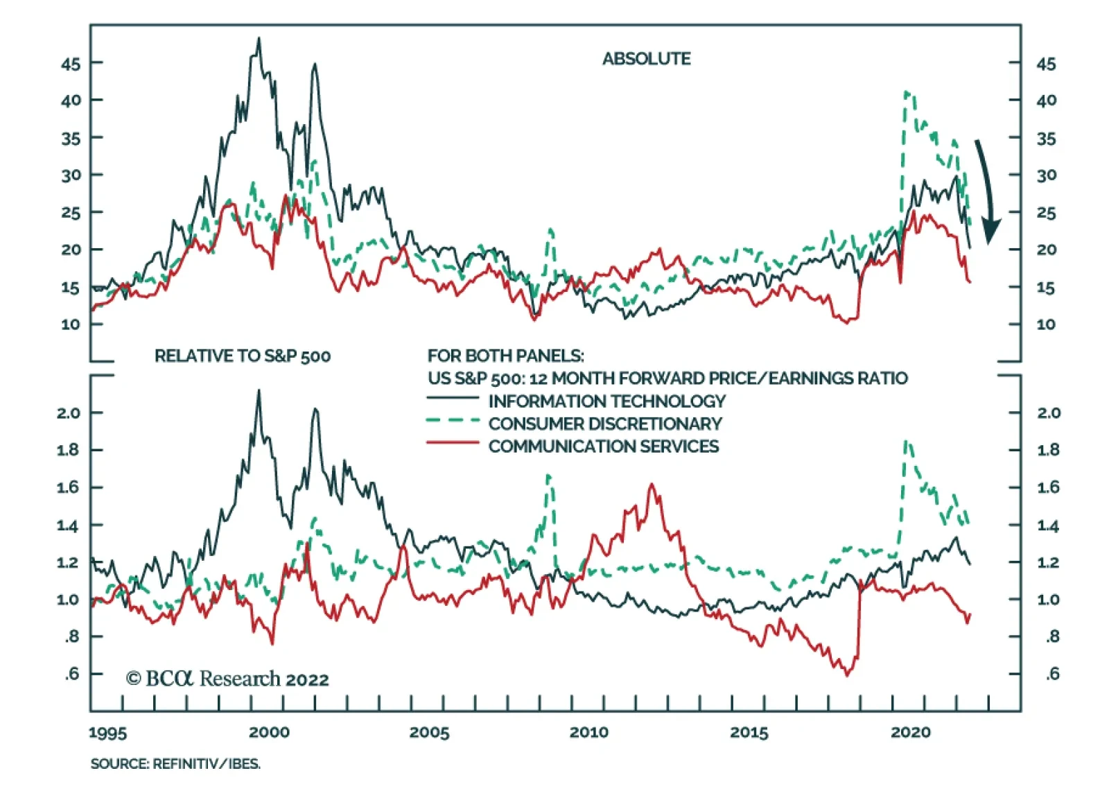
Rising bond yields have been a headwind to the performance of long-duration US tech stocks this year. Consumer Discretionary, Communication Services, and IT are the worst performing S&P 500 sectors so far in 2022. However, this negative force is now…

Executive Summary Markets Priced For A Restrictive Level Of Australian Rates
Markets Priced For A Restrictive Level Of Australian Rates
Markets Priced For A Restrictive Level Of Australian Rates
The neutral interest rate in Australia is lower than in past cycles, for several reasons: low potential growth, weak productivity, high household debt and inflated housing valuations. Interest rate markets are discounting a very aggressive monetary tightening cycle in Australia, with the RBA Cash Rate expected to reach 2.6% by end-2022 and 3.1% by end-2023. Australian inflation will peak in H2/2022, and the RBA will not need to raise rates beyond the midpoint of the RBA's estimated neutral range of 2-3%. The Australian dollar has not responded to rising interest rate expectations or high commodity prices, largely due to weak Chinese growth. The Aussie is cheap and has upside if China delivers more economic stimulus. The newly-elected Labor-led government will not be able to pursue its ambitious social and environmental agenda without finding more revenue to offset the inflationary impact of larger budget deficits. Expect modest fiscal stimulus, with increased spending, but also minor tax hikes for multinational corporations and high-income earners. Bottom Line: For global bond investors, an overweight allocation to Australian government bonds is warranted with the RBA likely to disappoint aggressive market rate hike expectations. For currency investors, the undervalued Australian dollar is an attractive play on an eventual rebound of Chinese growth. Feature The month of May has been eventful for investors in Australia. The Reserve Bank of Australia (RBA) delivered its first interest rate hike since 2010 on May 3, a move that markets had expected but which was much earlier than the RBA’s prior forward guidance. The May 21 federal election returned the Labor party to power for the first time since 2013. These events introduce new risks for the Australian economy and financial markets, altering a policy backdrop that had been highly stimulative - and, more importantly, highly predictable - during the pandemic but must now change in response to the new reality of high inflation. In this Special Report, jointly published by BCA Research Global Fixed Income Strategy, Foreign Exchange Strategy and Geopolitical Strategy, we discuss the investment implications of the start of the monetary tightening cycle and the new government in Australia. Our main conclusions: markets are somehow pricing in both too many RBA rate hikes and not enough currency upside for the Australian dollar, while expectations for major fiscal policy changes should be tempered. Will The RBA Kill The Economic Recovery? Australian government bonds have been one of the worst performers in the developed world so far in 2022 (Chart 1), delivering a total return of -9.1% in AUD terms, and -9% in USD-hedged terms, according to Bloomberg. The benchmark 10-year yield now sits at 3.20%, up +142bps since the start of the year but off the 8-year intraday high of 3.6% reached in early May. Australia has historically been a “high-beta” bond market that sees yields rise more when global bond yields are rising. That is a legacy of the days when the RBA had to push policy rates to levels that exceeded other major central banks like the Fed during global tightening cycles. But by the RBA’s own admission, the neutral policy interest rate is now lower than in previous years, perhaps no more than 0% in real terms according to RBA Governor Philip Lowe. Our RBA Monitor, which consists of economic and financial variables that typically correlate to pressure on the RBA to tighten or ease policy, has been signaling since mid-2021 that higher interest rates were increasingly likely (Chart 2). However, markets have moved to price in a very rapid and aggressive tightening, with a whopping 268bps of rate hikes discounted over the next year in the Australian overnight index swap (OIS) curve. Chart 1Australian Bond Yields Have Surged Vs Global Peers
Australian Bond Yields Have Surged Vs Global Peers
Australian Bond Yields Have Surged Vs Global Peers
Chart 2Markets Expect Very Aggressive RBA Tightening
Markets Expect Very Aggressive RBA Tightening
Markets Expect Very Aggressive RBA Tightening
The growth component of the RBA Monitor will likely soon ease up with the OECD leading economic indicator for Australia in a clear downtrend (bottom panel). However, the inflation component of the RBA Monitor will stay elevated for longer given current high inflation - headline CPI inflation in Australia hit a 20-year high of 5.1% in Q1/2022 - and the tight Australian labor market. Even with those robust inflation pressures, markets are pricing in a peak level of interest rates that appears far more restrictive than the RBA is willing, and likely able, to deliver. We see three primary reasons for this. Weak Potential Growth Implies A Lower Neutral Rate The OIS curve is priced for the RBA Cash Rate staying between 3-4% over the next decade (Chart 3). The real policy rate (adjusted by CPI swap forwards as the proxy for inflation expectations), is expected to average around 1% over that same period. Those are the highest “terminal rate” estimates among the G10 economies. At the press conference following the May 3 rate hike, RBA Governor Lowe noted that “it’s not unreasonable to expect that the normalization of interest rates over the period ahead could see interest rates rise to 2.5%”. Lowe said that was the midpoint of the RBA’s 2-3% inflation target, thus the expected normalization of policy rates would take the inflation-adjusted real rate to 0%. That is a far cry from the more aggressive increase in real rates discounted in the Australian OIS and CPI swap curves. Lowe also noted that a real rate above 0% “over time […] would require stronger productivity growth in Australia.” On that front, the data is not suggesting that the RBA will need to reconsider its views on the neutral real interest rate anytime soon. The 5-year annualized growth rate of labor productivity is an anemic -0.8%, down from the mid-2010s peak of around 1.5% and far below the late-1990s peak of around 2.5% (Chart 4). Chart 3Markets Priced For A Restrictive Level Of Australian Rates
Markets Priced For A Restrictive Level Of Australian Rates
Markets Priced For A Restrictive Level Of Australian Rates
Chart 4A Powerful Structural Reason For A Lower Australian Neutral Rate
A Powerful Structural Reason For A Lower Australian Neutral Rate
A Powerful Structural Reason For A Lower Australian Neutral Rate
Chart 5The Australian Housing Cycle Is Peaking
The Australian Housing Cycle Is Peaking
The Australian Housing Cycle Is Peaking
Assuming a pre-pandemic growth rate of the working age population of between 1-1.5%, and productivity around 0.5%, Australia’s potential GDP growth rate is, at best, around 2% (middle panel) and is likely even lower than that. The working-age population growth rate fell to 0% during the pandemic due to migration restrictions that have yet to be lifted. However, population growth had already been slowing pre-COVID due to falling birth rates and reduced worker visa caps in 2018-19. High Household Debt Raises Interest Rate Sensitivity Of Consumer Demand Sluggish trend growth is not the only reason why Australia’s neutral interest rate is lower than markets are discounting. Given elevated housing valuations and aggressive lending practices, highly indebted Australian households are now more sensitive to rate increases than in years past. Australian mortgage lenders began aggressively issuing shorter-term (typically 3-year) fixed rate mortgages in 2020 after the collapse in bond yields due to the initial COVID shock, to entice borrowers to lock in low interest rates. This raised the share of new fixed rate mortgages from a historic average around 15% of all new mortgages to nearly 50%. Since the RBA ended its yield curve control policy last November, which targeted 3-year bond yields, 3-year fixed mortgage rates have surged from 2.93% to 4.34%. That already has had an impact on housing demand - home price growth has peaked in the major cities according to CoreLogic, while building approvals are contracting on a year-over-year basis (Chart 5). As the surge of fixed rate mortgage loans begin to mature in 2023, Australian homeowners will see a major spike in refinancing costs, both for fixed rate and variable rate lending. This trend should weaken home demand, and house price inflation, even further. Inflation Will Soon Peak The RBA expects softer house price inflation to help slow overall Australian inflation rates. The central bank is projecting headline CPI inflation to fall from the latest 5.1% to 4.3% by June 2023 and 2.9% by June 2024 (Chart 6). That would still be a level near the top of the RBA target band, but the downtrend could be even faster than that. As in many other countries, the latest surge in Australian inflation has been led by a rapid increase in goods prices related to severe demand/supply mismatches at a time of global supply chain bottlenecks. Australian goods inflation hit an 31-year high of 6.6% in Q1/2022, essentially matching the housing component of the CPI index (Chart 7). Yet with US goods inflation having already peaked, as have global shipping costs, it is likely that Australia goods inflation will soon follow suit. This will lower headline Australian inflation to levels more consistent with services inflation, which reached 3% in Q1/2022. Chart 6The RBA Sees Persistent Above-Target Inflation
The RBA Sees Persistent Above-Target Inflation
The RBA Sees Persistent Above-Target Inflation
That floor in more domestically-driven services inflation will also be influenced by the pace of wage growth in Australia. The latest reading on the best wage indicator Down Under, the Wage Price Index, showed that year-over-year wage growth only reached 2.4% in Q1/2022. Chart 7Australia Goods Inflation Should Soon Peak
Australia Goods Inflation Should Soon Peak
Australia Goods Inflation Should Soon Peak
This is a surprisingly low outcome given the tightness of the Australian labor market with the unemployment rate at an all-time low of 3.9% (Chart 8). Depressed labor supply is not a factor keeping the unemployment rate low, as the labor force participation rate and hours worked are both above pre-pandemic levels. Prior to the rate hike at the May 3 policy meeting, the RBA had been highlighting soft wage growth as a reason to delay the start of the monetary tightening cycle. After the May meeting, RBA Governor Lowe noted that according to the RBA’s “liaison” surveys of Australian businesses, nearly 40% of respondents said they were giving wage increases above 3%. The RBA believes that wage growth in the 3-4% range is consistent with Australian inflation remaining within the RBA’s 2-3% target band, a condition that was deemed necessary before rate hikes could begin. The message from the RBA liaison surveys was enough to trigger the start of the tightening cycle. While the Australia OIS curve is priced for an aggressive series of rate hikes, and shorter-term interest rate expectations are elevated, there is less inflationary concern priced into medium-term inflation expectations. The 5-year/5-year forward Australia CPI swap is at 2.2%, down -15bps since the start of 2022 and barely within the RBA target band. Some of that is a global factor – the 5-year/5-year forward US TIPS breakeven has declined by -44bps over just the past month. However, the Australia 5-year/5-year forward CPI swap peaked at the start of the year, just as Australian interest rate expectations began to ratchet higher (the 2-year Australia government bond yield was 0.35% at the start of 2022 and now sits at 2.61%). An increasing amount of discounted rate hikes, occurring alongside falling inflation expectations, is a sign that markets are incrementally pricing in a restrictive monetary policy. We agree with RBA Governor Lowe’s assessment that the neutral nominal Cash Rate is, at best, 2.5%. Thus, the current discounted peak in the Cash Rate of 3.2% would be restrictive. Very strong consumer spending growth at a time when inflation was already high could be a sign that a restrictive monetary stance is now necessary. However, the outlook for Australian consumption is not without risks. Consumer confidence has plunged alongside declining purchasing power, as wage growth has lagged the inflation upturn (Chart 9). While the expectation is that inflation will peak and wage growth will pick up over the latter half of 2022, it is still uncertain if the relative moves will be large enough to give a meaningful lift to real wage growth and consumer spending power. Chart 8Medium-Term Inflation Expectations Falling, Despite Low Unemployment
Medium-Term Inflation Expectations Falling, Despite Low Unemployment
Medium-Term Inflation Expectations Falling, Despite Low Unemployment
Chart 9Headwinds For The Australian Consumer
Headwinds For The Australian Consumer
Headwinds For The Australian Consumer
The RBA believes that consumer spending will be supported by the high level of savings, with the household saving rate currently at 13.6%. Yet the high level of household debt means that debt service burdens will rise as interest rates move higher, which may limit the degree to which Australian consumers run down savings to fuel greater consumer spending. Another reason why a more restrictive monetary policy could be needed is if there was a substantial loosening of fiscal policy that was fueling faster growth, especially at a time when inflation was already overshooting. This makes an analysis of the latest election results highly relevant to the path of Australian interest rates. Bottom Line: Markets are pricing in a shift to a restrictive level of interest rates in Australia, an outcome that is not necessary with inflation set to peak at a time of high household leverage. Labor Party Takes Power With Limited Political Capital Australia’s federal election on May 21 brought a Labor Party government into power, headed by new Prime Minister Anthony Albanese. National policy is unlikely to change substantially. Australia has low political risk but high geopolitical risk – meaning that domestic politics are manageable for investors but China’s conflict with the West and other geopolitical events are revolutionizing Australia’s place in the world. The previous Liberal-National Coalition government had been in power since 2013, had never found a stable leader, and had been buffeted by a series of external shocks: a commodity bust, China trade conflict, the COVID-19 pandemic, and inflation. Hence it is no surprise that Labor came back to power – it almost did so in 2019. However, Labor’s popularity is questionable. The new government does not have a robust political mandate: Labor will fall short of a single-party majority (or will have a very thin majority at best): As we go to press, Labor won 74 seats out of 151 in the House of Representatives. A party needs 76 seats for a majority. Labor will likely rely on three Green Party seats and some of the 10 independents to pass legislation. These minor parties will have considerable influence. Labor’s popular vote share is underwhelming: Labor won 32.8% of the popular vote, down from 33.3% in 2019, and beneath the 36% of the vote won by the outgoing Liberal-National Coalition (Table 1). The Green Party rose to 12% of the vote. While this only translates to three seats in parliament, the Greens will hold the balance of power. Table 1Australian Federal Election Results, 2022
The New Normal In Australia
The New Normal In Australia
Labor does not control the Senate: A bill requires a majority vote in both the House and Senate for passage. A majority requires 38 seats, but Labor and the Greens are currently slated to fall short at 36 seats. Hence, as in the House, the Labor Party will rely on “cross-bench” votes from minor parties to get a majority for bills. Labor won through pragmatism and moderation: Having suffered a surprise defeat in 2019, the Labor Party adopted a more moderate and pragmatic tone in the current election. Prime Minister Albanese campaigned on a motto of “safe change,” declared that he was “not woke,” and adopted a relatively hawkish tilt on trade and foreign policy (China relations) and immigration (“boat people”). Labor has limited room for maneuver in international relations: China’s economy is slowing down and stimulus does not work as well as it used to. China’s political system is reverting to autocracy and the Xi Jinping administration is attempting to carve a sphere of influence in the region, increasing long-term security threats to Australia in Southeast Asia and the Pacific Islands. China has declared a “no limits” strategic partnership with a belligerent Russia, leaving the US no option but to pursue containment strategy against both powers. Prime Minister Albanese has already met with President Biden and the Quadrilateral Dialogue to emphasize Australia’s need to counter China’s newly assertive foreign policy. While Albanese may attempt to reduce trade tensions with China, any such moves will be heavily constrained. Inflation, not climate change, brought Labor to power: The media is hailing the election as a historic shift on the question of climate change and climate policy. But popular opinion has not changed much on this topic in recent years and the election results only partially support the thesis. A better explanation is that the pandemic and its inflationary aftermath galvanized opposition to the ruling Liberal-National Coalition. Hence both fiscal policy and climate policy – the most important areas of change – will be constrained by inflation. Chart 10Australia Cannot Cut Defense Amid China Challenge
The New Normal In Australia
The New Normal In Australia
There are two key policy takeaways from the above assessment: First, on fiscal policy, the new Labor-led government will face limitations due to inflation and the macroeconomic cycle. It will likely respond to inflation – the crisis that got it elected – even though China’s slowdown will produce negative surprises for global and Australian growth. The government will not be able to cut defense spending given the geopolitical setting (Chart 10). That means it will also not be able to pursue its ambitious social and environmental agenda without finding more revenue to offset the inflationary impact of larger budget deficits. Tax hikes are coming for multinational corporations and high-income earners. In terms of the size of the fiscal impact, the Labor Party promised spending increases worth AUD$18.9 billion (1.0% of GDP), to be offset by tax hikes amounting to AUD$11.5 billion in new revenue (0.6% of GDP). The result would be an AUD$7.5 billion increase in the budget deficit (0.4% of GDP) – a net fiscal stimulus (Chart 11). Currently the IMF projects a 1.84% fiscal drag in the cyclically adjusted budget deficit for 2023, so Labor’s plans would reduce that drag by 0.4%. However, the fiscal plans will change once the new Treasurer James Chalmers produces a new budget proposal in October. Comparison with a like-minded economy is therefore useful to put the policy change into perspective. Canada’s politics shifted from center-right to center-left in 2015 and the left-leaning government at that time put forward an agenda similar to Australia’s Labor Party today. Ultimately the budget balance declined from 0.17% to -0.45% of GDP from peak to trough (Chart 12). This 0.62% of GDP stimulus provides a point of comparison. Yet inflation was not a constraint on government spending at that time. The new Australian government may not exceed that size of stimulus in an inflationary context. But it could easily surpass it if the global economy falls back into recession. Chart 11Australian Labor’s Proposed Fiscal Stimulus
The New Normal In Australia
The New Normal In Australia
Chart 12Canada Offers Clue To Size Of Australian Stimulus
The New Normal In Australia
The New Normal In Australia
Second, on climate policy, the new ruling coalition probably will pass major climate legislation, given the importance of Greens and left-leaning independents. But Labor will have to constrain the smaller parties’ climate ambitions to preserve popular support in areas where fossil fuel industries remain strong. Australia consumes substantially more carbon per capita than other developed economies and will continue to rely on fossil fuel exports for growth. In other words, climate policy will bring incremental rather than radical change. Bottom Line: If a global recession is avoided, then the new government’s counter-cyclical fiscal policies may work. If not, they will produce a double whammy for the Australian economy: new corporate and resource taxes on top of a slowdown in exports. The AUD As A Shock Absorber Despite a higher repricing of the interest rate curve in Australia, and elevated commodity prices, the Australian dollar (AUD) has been very soft. Part of the story is broad-based US dollar strength that has sapped any potential rebound in the AUD. More specifically, a survey of the key drivers of the AUD unveils the main source of currency weakness, by process of elimination: The divergence in monetary policy between the RBA and the Fed? No. Clearly, that has not been a driver this time around as the RBA is expected to lift rates to 3.2% over the next 12 months, in line with market pricing for rate hikes from the Federal Reserve. The commodity cycle? No. Commodity prices are softening, after being in a supply-driven bull market. As a premier resource producer, the Australian economy is intricately intertwined with the outlook for coal, iron ore, copper and even liquefied natural gas prices. As Chart 13 highlights, the AUD has massively deviated from the level implied by rising terms of trade for Australia. This is a departure from a historical correlation that has been in place since the end of the Bretton Woods system. Resource booms tend to be either demand or supply driven, or a combination of both. This time around supply restrictions have played a major role. The message from the AUD is that it responds much better to improving demand conditions. Global and relative growth dynamics? YES: The overarching driver of a weak AUD as hinted above has been slowing Chinese demand. The Zero COVID-19 policy in China has led to a drastic reduction in import volumes. This is hurting Australia’s external balance at the margin, as Chinese import volumes contract (Chart 14). Chart 13The AUD Has Lagged Terms Of Trade
The AUD Has Lagged Terms Of Trade
The AUD Has Lagged Terms Of Trade
Chart 14The AUD Is Very Sensitive To China
The AUD Is Very Sensitive To China
The AUD Is Very Sensitive To China
There are two key takeaways from the above analysis. First, the hawkish path for interest rates priced for the RBA is not yet reflected in a weak AUD. This implies that currency and bond markets are on a collision course. Either the RBA ratifies market pricing and triggers a coiled spring rebound in the AUD, or hawkish expectations will be tempered as inflationary pressures moderate. Second, the AUD will be very sensitive to any improvement in Chinese demand, the overarching driver of currency weakness. We expect the Chinese authorities to ramp up credit stimulus, to offset weakening demand from the Zero COVID-19 policy. The AUD has historically been very sensitive to changes in Chinese money and credit variables (Chart 15). From a fundamental perspective, a lot of pessimism is embedded in the Aussie dollar. Australian GDP has already recovered above pre-pandemic levels and could be on a path to achieve escape velocity if China recovers. Chinese fiscal and monetary policy should be eased going forward. Chinese bond yields have already dropped, reflecting an easing in domestic financial conditions. Meanwhile, Australia’s commodity exposure is well suited for a green energy shift. Besides being relatively competitive in supplying the types of raw materials that China needs and wants, (higher-grade ore, which is more expensive, but pollutes less, and is in high demand in China), Australia is a big exporter of liquefied natural gas, whose prices have been soaring in recent months and is critical in the Russia-Ukraine conflict and green energy shift (Chart 16). This will provide a multi-year tailwind for Australian export volumes and terms of trade. Chart 15The Chinese Economy Could Be Bottoming
The Chinese Economy Could Be Bottoming
The Chinese Economy Could Be Bottoming
Chart 16Australia Is Resource Superstar
Australia Is Resource Superstar
Australia Is Resource Superstar
Bottom Line: BCA Research Foreign Exchange Strategy went long AUD at 72 cents. In the near term, this position could prove quite volatile as markets try to discern a clear path for global growth. But given cheap valuations and beaten down sentiment, it should prove profitable in the longer term. Investment Conclusions For Fixed Income Investors Chart 17Australian Government Bond Investment Recommendations
Australian Government Bond Investment Recommendations
Australian Government Bond Investment Recommendations
Our careful analysis of Australian growth, inflation, the RBA’s likely next moves leads us to the following investment conclusions for Australian bonds (Chart 17): Maintain neutral duration exposure within dedicated Australian bond portfolios (for now): On a forward basis, the entire Australian yield curve is converging to that discounted 3.5% peak in the Cash Rate (top panel). Eventually, Australian bond yields will fall once inflation clearly peaks in H2/2022 and markets realize that the RBA will not be hiking as fast as expected, justifying an above-benchmark duration tilt. Until then, Australian bond yields will be rangebound, especially with the RBA no longer buying bonds via quantitative easing, leaving more bond issuance to be absorbed by private investors. Underweight Australian inflation-linked bonds versus nominal-paying government bonds: Inflation will soon peak, and the discounted RBA stance is too hawkish – a recipe for lower inflation breakevens. Overweight Australian government bonds within global bond portfolios: Australia has returned to its “high-yield-beta” status, which means that an overweight stance is warranted when global bond yields are stable or falling. BCA Research Global Fixed Income Strategy’s Global Duration Indicator, a growth-focused leading indicator of the momentum of global bond yields, is signalling a more stable backdrop for global yields over the rest of 2022. The Duration Indicator is also a fine leading indicator of the relative return performance of Australian government bonds (middle panel) and is supportive of an overweight stance on Australian debt. Go Long December 2022 Australia Bank Bill futures: This is a tactical trade (i.e. investment horizon of no more than six months), based on the extreme pricing of rate hikes by year-end. The market price of the December 2022 futures contract is currently 97.11, or an implied interest rate of 2.89% compared to the current RBA Cash Rate of 0.35%. That contract is priced for far too many rate hikes than will be delivered over the remaining seven RBA meetings of 2022. Robert Robis, CFA Chief Fixed Income Strategist rrobis@bcaresearch.com Chester Ntonifor Chief Foreign Exchange Strategist ChesterN@bcaresearch.com Matt Gertken Chief Geopolitical Strategist mattg@bcaresearch.com
Executive Summary EU Surprises Carbon Market With Increased CO2 Emission Allowance Supply
EU Surprises Carbon Market With Increased CO2 Emission Allowance Supply
EU Surprises Carbon Market With Increased CO2 Emission Allowance Supply
The EU's failed foreign policy – premised on ever-deeper engagement with the Soviet Union and, after it collapsed, Russia – will drive its hot mess of an energy policy for years. In the short term, the EU's REPowerEU scheme proposed last week to fund the decoupling from Russia will lift its green-house gas (GHG) emissions, if the sale of €20 billion of EU Emission Trading System (ETS) allowances goes forward. Markets traded lower over the week, to make room for the higher ETS pollution-permit supply. This could increase the volume of allowances sales needed to reach the €20 billion target. Another €10 billion investment in natgas pipelines also will be funded. Longer-term, the acceleration of the EU's renewable-power build-out via so-called Projects of Common Interest (PCI) will get an €800 billion boost, with another round of funding to be proposed for early next year. EU funding will lift base metals and steel prices – raising the cost of the renewables build-out – and keep fossil-fuels well bid. Bottom Line: The REPowerEU scheme will increase volatility in the EU's ETS market, and add significant new demand to base metals and fossil-fuel markets. The propensity of EU policymakers to interfere in its ETS market makes it unattractive. We remain long the S&P GSCI index, and the COMT, XOP, XME and PICK ETFs expecting higher base metals, oil and gas prices. Tactically, we are getting long 4Q22 Brent calls struck at $120/bbl, anticipating an EU embargo of Russian oil imports. Feature Over the past three decades, foreign policy for the EU largely was set by Germany, the organization's most powerful economy. Successive generations of German politicians championed the idea that the West could bring the former Soviet Union – and later Russia – into the modern world of global trade through Ostpolitik, which had, at its core, a belief in the power of trade to effect political and economic change.1 This change-through-trade policy survived the Cold War, the collapse of the Soviet Union and rise of Russia from its ashes. It also survived Russia's first invasion of Ukraine in 2014. Indeed, following that invasion, Russia marked the completion of its Nord Stream 2 (NS2) natural gas pipeline – running parallel to NS1 – in September of last year. If NS2 were up and running now, it would have increased Russian gas flows into the EU and its revenue flows.2 As our Geopolitical Strategists noted, Germany even got the Biden administration to agree in summer 2021 to set aside any sanctions so that Germany could operate NS2 with Russia. Related Report Commodity & Energy StrategyDie Cast By EU: Inflation, Recession Risks Rise Yet Russia did not share the German commitment to economic engagement within a US-led liberal international order. Russia's second invasion of Ukraine in February was a bridge too far, and catalyzed the EU's response, again led by Germany, to de-couple from Russia in the energy sector. The EU's reversal of a failed foreign policy, which produced its dependence on Russian energy, leaves it with a hot mess of an energy policy that is evolving rapidly. In its wake, volatility in the EU carbon-trading market has ensued, along with the promise of an accelerated doubling-down on renewable-energy generation. Higher Emissions, Lower Emissions Prices Last week, the EU proposed its REPowerEU scheme, which is meant to enable the decoupling of the EU from Russian energy dependence by funding hundreds-of-billions-of-euros in new energy investments over coming years.3 Chart 1EU Surprises Carbon Market With Increased CO2 Emission Allowance Supply
EU Surprises Carbon Market With Increased CO2 Emission Allowance Supply
EU Surprises Carbon Market With Increased CO2 Emission Allowance Supply
In a history heavily laden with paradox, this new scheme will lift the EU's green-house gas (GHG) emissions – including CO2 – if the sale of €20 billion of EU Emission Trading System (ETS) allowances goes forward.4 So, in the breach, the EU is willing to significantly relax its environmental goals – the E in ESG – to begin undoing its failed foreign policy. Markets already are making room for this increased ETS pollution-permit supply, which, as allowances prices weaken, will require additional supplies to reach the €20 billion target (Chart 1). This will lead to higher coal and fossil fuel usage during Germany's hot-mess de-coupling with Russia. In addition to raising funds by selling pollution permits, the EU will invest another €10 billion in natgas pipelines. This will help counter the likely loss of Russian gas when it embargoes Russian oil imports, but will take time (a few years) to actually put in the ground.5 The additional pipe would address one of the EU's weakest energy links: the lack of pipeline capacity to transport liquified natural gas (LNG) inland once it arrives in Europe. Europe pushed hard to re-load natgas inventories ahead of the coming winter season, and appears to have made progress in this regard (Chart 2). Europe was a strong bid for LNG in the first four months of this year, according to Refinitiv reporting.6 LNG imports were up 58% over the first four months of this year, totaling 45.3mm MT. This kept European natgas prices elevated vs. Asia (Chart 3). Chart 2Europe Re-Loads Storage
One Hot Mess: EU Energy Policy
One Hot Mess: EU Energy Policy
Chart 3Europe Outbids Asia For LNG
One Hot Mess: EU Energy Policy
One Hot Mess: EU Energy Policy
The back-and-forth between the Asian and European markets will continue for the rest of this year, particularly going into the Northern Hemisphere's summer, when demand for natgas in Asia, in particular, will remain strong. REPowerEU Will Boost Base Metals Demand Longer term, the EU's REPowerEU proposal, if approved, will accelerate the EU's renewable-power build-out via so-called Projects of Common Interest (PCI). The proposal contains €800 billion to support new renewable-energy proposals, with another round of funding proposed for early next year. The doubling down by the EU on renewables will lift base metals and steel prices as soon as the REPowerEU program starts funding investments in renewable technology and short-term projects like pipeline buildouts (maybe sooner as hedges are placed). Given the tightness already apparent in the base metals markets, this will raise the price of critical materials – copper, aluminum, steel – and will, in the process, keep fossil-fuels well bid: large capital projects do not get done without a lot of diesel and gasoline being consumed.7 The EU is not alone in its desire to accelerate renewables investment: The US is funding a similar build-out, as is China, which will be accelerating its infrastructure and renewables investments. The constraint on all of these programs to build out renewables is low capex in base metals (Chart 4), and oil and gas (Chart 5). This has kept the level of supply from quickly responding to increased demand, which keeps these markets in sharp backwardations. Market tightness in metals and energy will be compounded by stronger bids from the three largest economic centers in the world – the EU, US and China.Chart 4Weak Capex Holds Base Metals Supply Growth Down …
One Hot Mess: EU Energy Policy
One Hot Mess: EU Energy Policy
Investment Implications Chart 5… And Oil + Gas Supply Growth
One Hot Mess: EU Energy Policy
One Hot Mess: EU Energy Policy
The EU's REPowerEU scheme is not a done deal, but we give it high odds of being adopted. It will increase volatility in the EU's ETS market, and add significant new demand to base metals and fossil-fuel markets. In terms of where to take risk, now that this proposal has been floated, we would avoid getting long carbon permits traded on the EU's ETS carbon market, given the propensity of policymakers to meddle excessively, which, in and of itself, is a risk that is difficult – if not impossible – to forecast. However, we do continue to favor being long the S&P GSCI index, and the COMT, XOP, XME and PICK ETFs expecting higher base metals, oil and gas prices. On a tactical basis, we are getting long 4Q22 Brent calls struck at $120/bbl at tonight's close, anticipating an EU embargo of Russian oil imports. Robert P. Ryan Chief Commodity & Energy Strategist rryan@bcaresearch.com Ashwin Shyam Research Analyst Commodity & Energy Strategy ashwin.shyam@bcaresearch.com Paula Struk Research Associate Commodity & Energy Strategy paula.struk@bcaresearch.com Commodities Round-Up Energy: Bullish US officials involved in negotiations to restore the Iran nuclear deal appear to be signaling US interests could be served by agreeing such a deal.8 Allowing Iran back into the market as a bona fide oil exporter would return ~ 1mm b/d or more to global crude markets by year-end. This would partly reverse the higher prices we expect in the wake of an EU to embargo Russian oil imports this week. Presently, oil markets are rallying as the necessity for Russia to shut in oil production post-embargo is discounted (Chart 6).9 That said, a deal to allow Iran back into export markets would dampen the move we expect in the wake of an EU embargo. The market will remain tight after a US-Iran deal, but this might be attractive to the Biden administration as mid-terms approach, and to the EU, as it also would reduce the funds available for Russia to wage war on Ukraine. On a tactical basis, we are getting long 4Q22 Brent calls struck at $120/bbl at tonight's close, anticipating the EU embargo. We will close this position out if the US and Iran reinstate the Joint Comprehensive Plan of Action (JCPOA), which would allow Iran to resume oil exports. Precious Metals: Bullish The World Platinum Investment Council (WPIC) projects a 2022 surplus of 627 koz, slightly lower than the previous forecast of 657k oz for this period. This year, strong automotive demand is expected to be offset by reductions in jewellery and industrial demand. Car manufacturers’ switch from Russian palladium to platinum – as they self-sanction – will bullish for platinum. Russia accounts for ~40% of global palladium mined output. The organization predicts lower mine supply caused primarily by supply-chain bottlenecks and COVID-19 restrictions. Nornickel, one of the world’s largest platinum miners is expected to reduce mined output on the back of supply-chain disruptions due to Russian sanctions. Base Metals: Bullish Iron ore prices rose on the wider than anticipated cut in China’s benchmark interest rate for mortgages on May 20th (Chart 7). The upcoming easing of lockdowns in Shanghai will further boost iron ore prices, as markets expect Chinese economic activity to pick up. However, if China sticks to its zero-COVID policy, lockdowns will continue to occur in different cities and regions. BCA’s Emerging Markets Strategy expects these ‘rolling lockdowns’ to last at least until the end of this year. This will affect manufacturing and steel production, primary iron ore demand drivers. Iron ore’s reliance on China’s economic health means price of the industrial metal will not meaningfully rise this year, barring a supply shortfall. Chart 6
Brent Prices Going Up
Brent Prices Going Up
Chart 7
BENCHMARK IRON ORE 62% FE, CFR CHINA (TSI) GOING DOWN
BENCHMARK IRON ORE 62% FE, CFR CHINA (TSI) GOING DOWN
Footnotes 1 Please see The Former Chancellor Who Became Putin’s Man in Germany, published by the New York Times 23 April 2022. This is an excellent precis of the history of German-Russian trade vis-à-vis the career of former German chancellor Gerhard Schröder, who held the office from 1998 – 2005. The deep energy relationship with Russia began in the late 1960s under the chancellorship of Willy Brandt. As much as 55% of Germany's gas needs were supplied by Russia prior to its invasion of Ukraine 24 February 2022. Now its Russian gas imports are closer to 20%; Germany and the EU are scrambling to eliminate any and all energy trade with Russia, beginning with reducing gas imports by two-thirds this year, and likely embargoing all oil imports by year-end. 2 Russia completes Nord Stream 2 construction, gas flows yet to start, published by reuters.com 10 September 2021. 3 Please see REPowerEU: A plan to rapidly reduce dependence on Russian fossil fuels and fast forward the green transition* published by the European Commission 18 May 2022. Energy accounted for 62% of the EU's Russian imports in 2021, just under €100 billion worth of gas (40%), oil (27%) and coal (46%), according to the European Commission's tally in In focus: Reducing the EU’s dependence on imported fossil fuels published 20 April 2022. In 2011, energy accounted for 77% of the EU's imports from Russia. 4 Please see Felix K. Chang's report Legacy of Ostpolitik: Germany's Russia Policy and Energy Security published by the Foreign Policy Research Institute in May 2014. This includes a summary of the paradoxical nature of Germany's Ostpolitik policy following Russia's first invasion of Ukraine. 5 Please see German economy minister expects EU embargo on Russian oil 'within days' -ZDF, published by reuters.com 23 May 2022. 6 Please see LNG momentum swinging back to Asia as Europe demand eases: Russell published by reuters.com on 24 May 2022. 7 Please see Tight Commodity Markets: Persistently High Inflation, which we published 24 March 2022. It is available at ces.bcaresearch.com. 8 Please see Analysis: Subtle shift in U.S. rhetoric suggests new Iran approach published by reuters.com 24 May 2022, and German economy minister expects EU embargo on Russian oil 'within days' -ZDF, published by reuters.com 23 May 2022. 9 Please see Oil, Natgas Prices Set To Surge, which we published last week. Investment Views and Themes Recommendations Strategic Recommendations Trades Closed in 2022 Summary of Closed Trades
Highlights The Fed’s hawkish shift over the past six months has caused a sharp increase in US interest rates. In this report we examine the US housing market for signs of an imminent recession, given the housing sector’s strong interest rate sensitivity. In addition to a severe contraction in real home improvement spending, there are several other housing-related indicators that are ostensibly pointing in a bearish direction. The growth in total home sales and the MBA mortgage application purchase index are already in negative territory, housing affordability has deteriorated meaningfully, and the National Association of Home Builders’ (NAHB) housing market index is falling sharply. However, the breadth of house prices and building permits, consumer surveys, housing equity sector relative performance, and the fact that mortgage rates have likely peaked for the year point to a more optimistic outlook for housing. At a minimum, they do not yet suggest that the current slowdown in housing-related activity is recessionary. Structural factors are also supportive of the pace of housing construction in the US. While a slowdown in the housing market is clearly underway, it is not occurring after a period of excessive housing construction. The opposite is true: the US and several other developed market economies have underbuilt homes over the past decade. This should limit the drag on economic growth from housing-related activity, and reduces the odds that a housing market slowdown will morph into a housing-driven US recession. Feature Chart II-1The Fed's Hawkish Shift Has Caused An Extremely Sharp Rise In Interest Rates
The Fed's Hawkish Shift Has Caused An Extremely Sharp Rise In Interest Rates
The Fed's Hawkish Shift Has Caused An Extremely Sharp Rise In Interest Rates
The Fed’s hawkish shift over the past six months has caused US interest rates to rise at an extremely rapid pace. Panel 1 of Chart II-1 highlights that the spread between the US 2-year Treasury yield and the 3-month T-bill yield reached a 20-year high in early April of this year. Panel 2 shows that the two-year change in the 30-year mortgage rate will reach the highest level since the early 1980s by the end of this year if mortgage rates remain at their current level. Over the longer run, it is the level of interest rates that matters more than their change. However, changes in interest rates and other key financial market variables are also important drivers of economic activity, especially when they happen very rapidly. Given the speed of the recent adjustment in US interest rates, and the fact that the Fed funds rate will have likely reached the Fed’s neutral rate forecast by the end of this year, investors have understandably become concerned about the potential for a recession in the US. In this report we examine the US housing market for signs of an imminent recession, given the housing sector’s strong interest rate sensitivity. We conclude that while a slowdown in the housing market is clearly underway, several signs suggest that this slowdown is not recessionary. Investors should remain laser-focused on the pace of housing-related activity over the coming 6-12 months, but for now our assessment of the housing market is consistent with a modest overweight stance towards stocks within a multi-asset portfolio. A Brief Review Of The Housing Sector’s Contribution To Growth Table II-1 highlights the importance of the housing sector as a driver/predictor of US recessions. This table highlights that real residential investment is not a particularly important contributor to real GDP growth during nonrecessionary quarters, but it is the only main expenditure component exhibiting negative growth on average in the year prior to a recession.1 Table II-1Real Residential Investment Tends To Contract In The Year Prior To A Recession
June 2022
June 2022
When examining the contribution to economic growth from the housing sector, investors and housing market analysts often fully equate real residential investment with housing construction. In fact, while direct construction of housing units accounts for a sizeable portion of the contribution to growth from housing, it is just one of four components. This is an important point, as one of the often-overlooked elements of real residential investment has strongly leading properties and is currently providing a very negative signal about the housing sector. Chart II-2 breaks down what we consider as aggregate real “housing-related activity”, and Chart II-3 presents the contributions to annualized quarterly growth in housing activity from the four components. For the sake of completeness, we include personal consumption expenditures on furnishings and household equipment as part of housing-related activity, alongside the two main components of real residential investment: permanent site construction (including single and multi-family properties), and “other structures.” In reality, “other structures” is not predominantly accounted for by the construction of different types of residential properties; it is almost entirely composed of spending on home improvements and brokerage commissions on the sale of existing residential properties. Chart II-2Housing Construction Is An Important Part Of Residential Investment, But There Are Other Contributing Factors
June 2022
June 2022
Chart II-3Home Improvement Spending And Brokerage Commissions Also Drive Residential Investment
June 2022
June 2022
Aside from the link between existing home sales and the general demand for newly-built homes, the prominence of brokerage commissions in other residential structures investment helps explain why existing home sales are strongly correlated with real residential investment (Chart II-4, panel 1). Given that a distributed lag of monthly housing starts maps closely to permanent site construction (panel 2), starts and existing home sales explain a good portion of the contribution to growth from housing-related activity. Of the two remaining components of housing-related activity, Chart II-5 highlights that personal consumption expenditures on furniture and household equipment generally coincide with the pace of housing construction and new home sales. We take this to mean that the consumption component of housing-related activity is typically a derivative of the decision to build a new home or sell an existing one. Chart II-4Existing Home Sales Explain Commissions, And Housing Starts Explain Permanent Site Construction
Existing Home Sales Explain Commissions, And Housing Starts Explain Permanent Site Construction
Existing Home Sales Explain Commissions, And Housing Starts Explain Permanent Site Construction
Chart II-5The Pace Of Contraction In Home Improvement Spending Is Worrying
The Pace Of Contraction In Home Improvement Spending Is Worrying
The Pace Of Contraction In Home Improvement Spending Is Worrying
What is not coincident with construction and existing home sales is residential home improvement: Panel 2 of Chart II-5 highlights that it has strongly leading properties, and is currently contracting at its worst rate since the 2008 recession. Data on real home improvement spending is only available quarterly from 2002, so the ability to compare the current situation to previous housing market cycles is limited. But the pace of contraction is worrying and underscores that investors should be on the lookout for corroborating signs of a major contraction in the housing market. Is The Housing Data Sending A Recessionary Signal? In addition to the severe contraction in real home improvement spending shown in Chart II-5, there are several other housing-related indicators that are ostensibly pointing in a bearish direction. In particular, Chart II-6 highlights that both the growth in total home sales and the MBA mortgage application purchase index are already in negative territory, that housing affordability has deteriorated meaningfully, and that the National Association of Home Builders’ (NAHB) housing market index is falling sharply. However, there are also several signs pointing to a more optimistic outlook for housing, or at least indicating that the current slowdown in housing-related activity is not recessionary. We review these more optimistic indicators below. The Breadth Of House Prices And Building Permits In sharp contrast to previous periods of serious housing market weakness and/or recessionary periods, there is no sign yet of a major slowdown in US house price appreciation including cities with the weakest gains. In fact, Chart II-7 highlights that house prices have recently been reaccelerating on a very broad basis after having slowed in the second half of last year, which hardly bodes poorly for new home construction. Chart II-6A US Housing Sector Slowdown Is Certainly Underway
A US Housing Sector Slowdown Is Certainly Underway
A US Housing Sector Slowdown Is Certainly Underway
Chart II-7No Sign Yet Of A Major Deceleration In House Prices
No Sign Yet Of A Major Deceleration In House Prices
No Sign Yet Of A Major Deceleration In House Prices
It is true that US house price data is somewhat lagging, so it is quite likely that price weakness is forthcoming. However, there has been no sign of a major slowdown in prices through to March 2022, by which point 30-year mortgage rates had already risen 200 basis points from their 2021 low. More importantly, Chart II-8 highlights that a state-by-state diffusion index of authorized housing permits has done a very good job at leading the growth in permits nationwide, and is currently not pointing to a contraction in activity. Chart II-9 presents explanatory models for the growth in US housing starts and total home sales based on our state permits diffusion index, pending home sales, the change in mortgage rates, and housing affordability. The chart underscores that a contraction in housing activity is not what these variables would predict, even though starts and sales should be growing at a much more modest pace than what has prevailed on average over the past two years. Chart II-8Our Building Permits Diffusion Index Leads Housing Construction Activity, And Is Not Pointing To A Major Slowdown
Our Building Permits Diffusion Index Leads Housing Construction Activity, And Is Not Pointing To A Major Slowdown
Our Building Permits Diffusion Index Leads Housing Construction Activity, And Is Not Pointing To A Major Slowdown
Chart II-9Reliably Leading Indicators Of Construction And Home Sales Do Not Point To A Recessionary Outcome
Reliably Leading Indicators Of Construction And Home Sales Do Not Point To A Recessionary Outcome
Reliably Leading Indicators Of Construction And Home Sales Do Not Point To A Recessionary Outcome
Consumer Surveys The University of Michigan consumer survey shows that consumers feel it is the worst time to buy a home since the early-1980s (Chart II-10), which seems like a clearly negative sign for the housing market and an indication of the likely impact of tighter policy on housing-related activity. And yet, panel 2 highlights that this is the result of the fact that house prices in the US have surged during the pandemic, not that mortgage rates have risen too high. It is true that the number of survey respondents citing “interest rates are too high” is rising sharply, but this factor as a share of all “bad time to buy” reasons given is not meaningfully higher than it was in 2018, 2011, or 2006. It is clear that high prices are also the culprit for why consumers report that it is a bad time to buy large household durables and not that large household durables are unaffordable or that interest rates are too high (Chart II-11). Chart II-10Nearly The Worst Time To Buy A Home, Mostly Due To Prices (Not Interest Rates)
Nearly The Worst Time To Buy A Home, Mostly Due To Prices (Not Interest Rates)
Nearly The Worst Time To Buy A Home, Mostly Due To Prices (Not Interest Rates)
Chart II-11Same Story For Large Household Durables
Same Story For Large Household Durables
Same Story For Large Household Durables
It may seem counterintuitive for investors to see Charts II-10 and II-11 as in any way positive for the housing market. But, to us, the notion that elevated house prices are the main source of poor affordability supports the idea that a normalization of the housing market will occur through a combination of marginally lower demand, a slower pace of house price appreciation, and a sustained pace of housing market construction. This implies that existing home sales may be weaker than housing construction over the coming year, but the latter will help to support the contribution to overall economic growth from housing-related activity. Housing Sector Relative Performance Despite the significant slowdown in real home improvement spending and the recent decline in the NAHB’s housing market index, Chart II-12 highlights that home improvement retail and homebuilding stocks have not exhibited significantly negative abnormal returns over the past year – as they did in 1994/1995 and in the lead up to the global financial crisis. The chart, which presents a rolling 1-year “Jensen’s alpha” measure for both industries, attempts to capture the risk-adjusted performance of the industry versus the S&P 500. While the chart shows that both industries have generated negative alpha over the past year, the magnitude does not appear to be consistent with a recession. In the case of homebuilder stocks in particular, negative abnormal returns over the past year should have been meaningfully worse given the year-over-year change in mortgage rates. Chart II-13 highlights that homebuilder performance has not been cushioned by a deep valuation discount in advance of the rise in mortgage rates. Chart II-12Housing-Related Equity Sectors Are Not Warning Of A Housing-Driven Recession
Housing-Related Equity Sectors Are Not Warning Of A Housing-Driven Recession
Housing-Related Equity Sectors Are Not Warning Of A Housing-Driven Recession
Chart II-13Homebuilders Were Not Excessively Cheap Before Mortgage Rates Spiked
Homebuilders Were Not Excessively Cheap Before Mortgage Rates Spiked
Homebuilders Were Not Excessively Cheap Before Mortgage Rates Spiked
In short, the important takeaway for investors is that the relative performance of housing-related stocks is not yet consistent with a housing-led US recession. Mortgage Rates Are Not Restrictive, And Have Likely Peaked As we highlighted in Chart II-1, the two-year change in the US 30-year conventional mortgage rate will be the largest in history by the end of this year, save the Volcker era, if the mortgage rate remains at its current level. However, it is not just the change in interest rates that matters for economic activity, but rather also the level. Encouragingly, Chart II-14 highlights that the level of mortgage rates has not yet risen into restrictive territory relative to the economy’s underlying potential rate of growth. In addition, it appears that mortgage rates have overreacted to the expected pace of monetary tightening – and thus have likely peaked for this year. Two points support this view: First, panel 2 of Chart II-14 highlights that the 30-year mortgage rate is one standard deviation too high relative to the 10-year Treasury yield, underscoring that the former has overshot. And second, Chart II-15 highlights that the mortgage rate is still too high even after controlling for business cycle expectations, current coupon MBS yields, and bond & equity market volatility. Chart II-14Mortgage Rates Are Not Yet Restrictive, But Have Likely Peaked For The Year
Mortgage Rates Are Not Yet Restrictive, But Have Likely Peaked For The Year
Mortgage Rates Are Not Yet Restrictive, But Have Likely Peaked For The Year
Chart II-15No Matter How You Slice It, US Mortgage Rates Are Stretched
No Matter How You Slice It, US Mortgage Rates Are Stretched
No Matter How You Slice It, US Mortgage Rates Are Stretched
Structural Factors Supporting Housing Construction Chart II-16The US And Several Other DM Countries Have Underbuilt Homes Since The Global Financial Crisis
The US And Several Other DM Countries Have Underbuilt Homes Since The Global Financial Crisis
The US And Several Other DM Countries Have Underbuilt Homes Since The Global Financial Crisis
Our analysis above points to a scenario in which the housing market slows in a nonrecessionary fashion, supported by relatively buoyant construction activity. Structural factors, which are mostly a legacy of the global financial crisis, are also supportive of the pace of housing construction in the US and other developed market economies. We presented Chart II-16 in our June 2021 Special Report, which shows the most standardized measure of cross-country housing supply available for several advanced economies: the trend in real residential investment relative to real GDP over time. These series are all rebased to 100 as of 1997, prior to the 2002-2007 US housing market boom. The chart makes it clear that advanced economies generally fall into two groups based on this metric: those that have seen declines in real residential investment relative to GDP, especially after the global financial crisis (panel 1) and those that have experienced either an uptrend in housing construction relative to output or a flat trend (panel 2). The US, along with the euro area, the UK, and Japan, all belong to the first group, with commodity-producing and Scandinavian countries belonging to the second group. The point of the chart is that the US and most other major DM economies have seemingly experienced a chronic undersupply of homes in the wake of the global financial crisis, which should continue to support housing construction activity even if demand for housing is slowing because of a sharp increase in mortgage rates. Given that the trend in real residential investment to GDP is a somewhat crude metric of housing supply, Chart II-17 presents a more precise measure for the US. It shows the standardized trend in permanent site residential structures investment (both single- and multi-family) relative to both the US population and the number of households. The chart makes it clear that the US vastly overbuilt homes from the late-1990s to 2007, but also vastly underbuilt since 2008. Relative to the number of households, real permanent site residential structures investment is still half of a standard deviation below its long-term average – even after the surge in construction that occurred in 2020. Chart II-18 highlights a similar message: it shows that the US homeowner vacancy rate (the proportion of the housing stock that is vacant and for sale) was at a 66-year low at the end of the first quarter. Chart II-19 shows that the monthly supply of existing one-family homes on the market is also at a multi-decade low, but that the supply of new homes for sale spiked in April. Chart II-17More Precise Home Supply Measures Underscore That The US Needs To Build More Houses
More Precise Home Supply Measures Underscore That The US Needs To Build More Houses
More Precise Home Supply Measures Underscore That The US Needs To Build More Houses
Chart II-18The Homeowner Vacancy Rate Is Extremely Low
The Homeowner Vacancy Rate Is Extremely Low
The Homeowner Vacancy Rate Is Extremely Low
At first blush, this spike in the monthly supply of new homes relative to sales is quite concerning, as it has risen back to levels that prevailed in 2007. One point to note is that the increase in new home inventory relates to homes still under construction; the inventory of completed homes for sale remains quite low. In addition, from the perspective of a homebuilder, a rise in the monthly supply of new homes relative to home sales is only concerning if it translates into a significant increase in the amount of time to sell a completed home, as has historically been the case (Chart II-20). Chart II-19Existing Home Inventories Remain Low Relative To Sales...
Existing Home Inventories Remain Low Relative To Sales...
Existing Home Inventories Remain Low Relative To Sales...
Chart II-20...And Higher New Home Inventories Are Not Affecting Time-To-Sale Of Completed Homes
...And Higher New Home Inventories Are Not Affecting Time-To-Sale Of Completed Homes
...And Higher New Home Inventories Are Not Affecting Time-To-Sale Of Completed Homes
Chart II-20 highlights that a fairly significant divergence between these two series has emerged over the past decade. Despite roughly five-six months’ supply of new home inventory on average since 2012, the median number of months required to sell a new home rarely exceeded four. In early-2019 the monthly supply of new homes also spiked, and a relatively modest and nonrecessionary slowdown in housing starts was sufficient to prevent any meaningful rise in the amount of time required to sell a newly completed home. Notably, the models that we presented in Chart II-9 led the slowdown in total home sales and starts in late-2018/early-2019, and they are not pointing to a major contraction today. The key point for investors is that while a slowdown in the housing market is clearly underway, it is not occurring after a period of excessive housing construction. In fact, the opposite is true: despite a surge in construction during the pandemic, it remains below its historical average relative to the population and especially the number of households. This should act to limit the drag on economic growth from housing-related activity, and therefore reduces the odds that a housing market slowdown will morph into a housing-driven US recession. Investment Implications We noted in our May report that the inversion of the 2-10 yield curve has set a recessionary tone to any weakness in US macroeconomic data, and that a recession scare was likely. Recent negative housing market data surprises underscore that a slowdown in the US housing market is clearly underway, and that this will likely feed recessionary concerns for a time. Investors should continue to be highly focused on the evolution of US macro data when making asset allocation decisions over the coming 6-12 months, as the current economic and financial market environment remains highly uncertain. This should include a strong focus on the housing market, as consumer surveys highlight that the overall impact of falling real wages and high house prices could cause a more pronounced slowdown in housing-related activity than we expect – and that the change and level of interest rates would imply. Nevertheless, our analysis of the historical predictors of housing construction and sales points to the conclusion that the ongoing housing market slowdown is not likely to be recessionary in nature. This, in conjunction with the factors that we noted in Section 1 of our report, support maintaining a modest overweight towards stocks within a multi-asset portfolio over the coming 6-12 months. Jonathan LaBerge, CFA Vice President The Bank Credit Analyst Footnotes 1 This is aside from the contribution to growth from imports, which mechanically subtract from consumption and investment when calculating GDP.
Highlights The economic and financial market developments that have occurred over the past month are consistent with several of the risks that we identified in our recent reports. We warned in our April report that the outlook for equities had deteriorated meaningfully since the beginning of the year and recommended that investors maintain, at most, a very modest overweight toward stocks in a global multi-asset portfolio. We see the performance of the equity market over the past month as reflecting the beginning of the recession scare that we warned was coming. Still, several factors continue to suggest that this is indeed a scare, and not an actual recession. Section 2 of this month’s report reviews the US housing market for signs of an imminent recession. While a slowdown in the housing market is clearly underway, we do not yet see signs that this slowdown is recessionary. It remains an open question how forcefully Russia is willing to weaponize its natural gas exports in response to a seemingly imminent European embargo on Russian oil, and whether Russia will deploy this strategy now or later. For now, our base case view is that the euro area economy will slow and will probably contract in Q2, but it will avoid a debilitating energy-driven recession. China’s zero-tolerance COVID policy has failed to contain the disease, and it is now clear that more and more outbreaks will occur across the country over the coming months. Our base case view is that additional fiscal & monetary support is forthcoming if the spread of the disease progresses as we expect. We are likely to downgrade our outlook for global economic activity as well as our recommended allocation to risky assets if it does not materialize. Our profit margin warning indicators have deteriorated over the past month, and it is now our view that a contraction in S&P 500 margins is likely. Still, a major decline should be avoided, and we expect that S&P 500 earnings will grow at a low, single-digit rate over the coming year. We continue to recommend a marginally overweight stance towards risky assets over the coming 6-12 months, along with a neutral regional equity stance, a modestly overweight stance towards value over growth, an overweight stance towards small caps, a modestly short duration stance within a fixed-income portfolio, and short US dollar positions. Not Out Of The Woods Yet Chart I-1In May, Global Stocks Nearly Fell Into Bear Market Territory
In May, Global Stocks Nearly Fell Into Bear Market Territory
In May, Global Stocks Nearly Fell Into Bear Market Territory
May was a painful month for the equity market. Globally, stocks fell more than 4% in US$ terms, led by the US. May’s selloff pushed global stocks close to bear market territory relative to their early-January high (Chart I-1), a threshold that was breached in intra-day terms in the US last week. We warned in our April report that the outlook for equities had deteriorated meaningfully since the beginning of the year and recommended that investors maintain, at most, a very modest overweight toward stocks in a global multi-asset portfolio. In our view, the economic and financial market developments that occurred over the past month are consistent with several of the risk we identified in our recent reports. We continue to recommend that investors remain minimally overweight risky assets. Our view that investors should not be underweight risky assets hinges on three expectations: the avoidance of a US recession over the coming year, a continuation of Russian natural gas exports to key gas-reliant European countries, and the announcement from Chinese policymakers of either significant additional stimulus in its traditional form or income-support policies of the type that prevailed in developed economies in the early phase of the COVID-19 pandemic. Confirmation of these expectations is likely to push us to upgrade our recommended stance toward risky assets, especially if equities continue to sell off in response to growth fears. Conversely, we are likely to recommend downgrading risky assets to neutral or underweight if evidence mounts that our expectations are unlikely to materialize. A US Recession Scare Is Underway We noted in last month’s report that the US economy would likely avoid a recession over the coming year, but that a recession scare was quite likely. We emphasized a probable slowdown in the housing market as the locus of investors’ recessionary concern, and the US housing market data is indeed now surprising significantly to the downside (Chart I-2). We see the performance of the equity market over the past month as reflecting the beginning of the recession scare that we warned was coming. Chart I-3 highlights that the composition of the US equity selloff since the beginning of the year has looked quite unlike the growth-driven selloffs that occurred over the past decade, in that real bond yields have been a strong driver of the decline in stocks. By contrast, May’s decline has looked more like a typical growth scare, with real bond yields somewhat cushioning the impact of a significant rise in the equity risk premium. Chart I-2The US Housing Market Is Clearly Slowing
The US Housing Market Is Clearly Slowing
The US Housing Market Is Clearly Slowing
Chart I-3May’s Selloff Was Driven By Growth Fears, Not Rising Interest Rates
June 2022
June 2022
Chart I-4 highlights that it is not just the housing market that is worrying investors. The chart shows that the Conference Board’s US leading economic indicator (LEI) is slowing quite sharply, in line with previous episodes of a major growth scare. And while the weakest components of the LEI modestly improved on average in April, Chart I-5 highlights that the collapse in real wage growth alongside the recently severe underperformance of consumer stocks has fed concerns that high inflation has eroded household purchasing power – and that a contraction in real spending is imminent. Chart I-4A Serious US Growth Scare Is Underway
A Serious US Growth Scare Is Underway
A Serious US Growth Scare Is Underway
Chart I-5The Decline In Real US Wage Growth Has Caused A Major Selloff In Consumer Stocks
The Decline In Real US Wage Growth Has Caused A Major Selloff In Consumer Stocks
The Decline In Real US Wage Growth Has Caused A Major Selloff In Consumer Stocks
In Section 2 of this month’s report we provide further analysis supporting the view that the US housing market will not drive the US economy into recession. But we do continue to believe that a slowdown in housing activity is likely, and that concerns about a housing-driven recession will linger. Still, several factors continue to suggest that the US is experiencing a recession scare, and not an actual recession: The Atlanta Fed’s GDPNow model is currently predicting US real GDP growth that is only modestly below trend in Q2, and the overall estimate continues to be dragged significantly lower by a sizably negative contribution from the change in inventories (Chart I-6). Without this negative inventories effect, the Atlanta Fed’s model would be forecasting real annualized growth of over 3%. After having decelerated significantly in the second half of last year because of a broadening in consumer price inflation, Chart I-7 highlights that real personal consumption expenditures reaccelerated and real personal income ex-transfers stabilized in Q1. Chart I-6No Sign Of A Major Decline In Q2 Consumer Spending
June 2022
June 2022
Chart I-7Real Income Growth Is Stabilizing, And Real Consumer Spending Is Accelerating
Real Income Growth Is Stabilizing, And Real Consumer Spending Is Accelerating
Real Income Growth Is Stabilizing, And Real Consumer Spending Is Accelerating
US manufacturing industrial production surged in April, led by motor vehicle production (Chart I-8, panel 1). It is true that industrial production is a coincident indicator and thus does not necessarily argue against the idea that a recession is imminent. A pickup in vehicle production is encouraging, however, as it suggests that the 15% surge in the level of new car prices over the past year that contributed to the erosion in household real incomes may be set to reverse (panel 2). Chart I-8A Pickup In Auto Production Should Help Lower Car Prices And Improve Consumer Purchasing Power
A Pickup In Auto Production Should Help Lower Car Prices And Improve Consumer Purchasing Power
A Pickup In Auto Production Should Help Lower Car Prices And Improve Consumer Purchasing Power
Services spending is likely to improve, as deliveries of Pfizer’s Paxlovid antiviral drug continue to ramp up and vaccines are eventually approved for children under the age of six. Charts I-9A and I-9B highlight several real services spending categories that remain below their pre-pandemic levels, which in our view have been clearly linked to the pandemic and are not likely to be permanently lower. Americans have not likely stopped going to the gym, amusement parks, movies, live concerts, or the dentist, nor have their stopped needing to put elderly relatives in nursing care homes. They are also highly unlikely to stop traveling. There is some internal debate at BCA about the impact that working-from-home trends will have on the level of services spending, but we would note that essentially all of the spending categories shown in Charts I-9A and I-9B have exhibited uptrends that only appear to have been affected by consumer responses to the Delta and Omicron waves of the pandemic. Widely-available treatment options that reduce the fatality rate of the disease close to that of the flu are likely to be perceived by the public as an effective end of the pandemic, boosting spending on lagging categories of services spending. Chart I-9AAn Eventual End To The Pandemic…
June 2022
June 2022
Chart I-9B…Will Cause A Further Improvement In Services Spending
...Will Cause A Further Improvement In Services Spending
...Will Cause A Further Improvement In Services Spending
Based on high-frequency data from OpenTable, the number of seated diners in US restaurants is not exhibiting any major warning signs for US consumer spending (Chart I-10). Real spending in restaurants has been strongly correlated with overall real personal consumption expenditures over the past two decades, and thus Chart I-10 is not suggesting that a collapse in overall spending is imminent. Chart I-10High-Frequency Data Does Not Yet Show A Major Pullback In US Consumer Spending
High-Frequency Data Does Not Yet Show A Major Pullback In US Consumer Spending
High-Frequency Data Does Not Yet Show A Major Pullback In US Consumer Spending
As a final point concerning the risk of recession in the US, investors should note that the recent behavior of inflation expectations is encouraging and points to a potentially imminent peak in Fed hawkishness. Over the past few months, we have expressed our concern about the pace of increase in long-dated household inflation expectations. We highlighted last month that long-term market-based inflation expectations were also exhibiting some potential signs of becoming unanchored. However, Chart I-11 highlights that the momentum of long-dated household inflation expectations is now starting to flag, and that long-term market-based inflation expectations recently decreased in response to escalating growth fears. Chart I-12 clearly shows a slowing pace of core consumer prices, which will act to restrain further significant increases in long-dated inflation expectations. Chart I-11Long-Dated Inflation Expectations Point To A Potentially Imminent Peak In Fed Hawkishness
June 2022
June 2022
Chart I-12Core Inflation Momentum Is Clearly Slowing
Core Inflation Momentum Is Clearly Slowing
Core Inflation Momentum Is Clearly Slowing
Chart I-13 highlights that investors expect the Fed to raise the policy rate by the end of the year to a level even higher than what Jerome Powell implied during the Fed’s May press conference: a target range for the Fed funds rate of 2.5-2.75%, corresponding to two more 50 basis point hikes and three 25 basis point hikes during the FOMC’s September, November, and December meetings. Chart I-13Expectations For Fed Rate Hikes This Year Are Likely To Come Down If Inflation Continues To Moderate
June 2022
June 2022
It is likely that the market’s expectation for rate hikes this year will fall over the coming few months if the monthly pace of core inflation continues to slow. The Fed itself may soon signal a less intense pace of tightening than Powell recently implied – a perspective that we feel is supported by the minutes of the May FOMC meeting. That would allow the US economy to “digest” the recent adjustment in interest rates with less uncertainty about the economic outlook, which would lower the odds that a “mid-cycle slowdown” morphs into a full-blown recession. A Debilitating Energy-Driven Recession In Europe Is Not In The Cards, For Now The key issue pertaining to the European economic outlook remains the question of whether Europe’s imports of Russian natural gas will be interrupted. A European embargo of Russian oil now seems likely, which would likely cause Russian oil production to decline. Our Commodity & Energy strategy service now expects Brent oil to trade at $120/bbl on average for the remainder of the year, $5/bbl higher than current levels (Chart I-14). We agree with our Commodity & Energy Strategy team’s updated oil price forecast, but we have a different view about the odds that Russia will respond to a European oil embargo by cutting its natural gas exports to the EU. We still think this is a risk, not yet a likely event, although it may still occur later in the year. A full and immediate cutoff of natural gas exports to gas-dependent European countries such as Germany and Italy would not only destabilize the Russian economy by substantially reducing its current account surplus, it would also cause a severe recession in Europe through a combination of gas rationing to industries by government decree and surging energy prices (Chart I-15). Chart I-14A European Embargo Of Russian Oil Will Cause Brent To Rise To $120/bbl
A European Embargo Of Russian Oil Will Cause Brent To Rise To $120/bbl
A European Embargo Of Russian Oil Will Cause Brent To Rise To $120/bbl
Chart I-15A Full Cutoff Of Russian Natural Gas Would Cause A Severe European Recession
A Full Cutoff Of Russian Natural Gas Would Cause A Severe European Recession
A Full Cutoff Of Russian Natural Gas Would Cause A Severe European Recession
That could erode European voters’ willingness to provide military support for Ukraine, but it could instead backfire and galvanize European public opinion against Russia – and remove leverage that may be potentially used to secure a ceasefire agreement that will preserve its military gains in eastern Ukraine. Chart I-16Europe Is Replenishing Its Gas Storage, But It Cannot Yet Withstand A Full Cutoff
June 2022
June 2022
Russia may respond to an oil embargo by throttling the amount of natural gas exported to key European countries in a fashion that raises natural gas prices and prevents European countries from building up sufficient storage for the upcoming winter – a process that is underway but is far from complete (Chart I-16). But it remains an open question how forcefully Russia is willing to weaponize its natural gas exports, and whether it will deploy this strategy now or later. For now, our base case view is that the euro area economy will slow and will probably contract in Q2, but it will avoid a debilitating energy-driven recession. China: The Only Way Out Is Through Among the three pillars of the global economy – the US, China, and Europe – the last is arguably the least important. Today, the US and China are the core drivers of global demand, and we are therefore more concerned about the economic impact of China’s zero-tolerance COVID policy than we are about a slowdown or mild recession in Europe. Given how contagious the Omicron variant of COVID-19 has shown itself to be, and given how widespread recent outbreaks have been, it is now clear that China’s zero-tolerance policy has failed to contain the disease and that more and more outbreaks will occur across the country over the coming months. Despite public statements to the contrary, we suspect that Chinese policymakers are well aware of this situation, but are constrained by the consequences of removing the zero-tolerance policy. Recent studies suggest that China could face intensive care demand that is sixteen times existing capacity and upwards of 1.5 million deaths by removing the policy,1 roughly 1.5 times the cumulative amount of deaths that have occurred in the US during the pandemic. But the economic consequences of maintaining the zero-tolerance policy will also be severe, and therefore also likely represent a constraint on policymakers. Charts I-17 and I-18 show that China’s labor market and industrial sector have already slowed sharply over the past few months, at a pace and magnitude that is unlikely to be politically sustainable for much longer. In addition, Chart I-19 shows that China’s credit impulse fell meaningfully in April. Chart I-17China’s Labor Market Is Cratering…
China's Labor Market Is Cratering...
China's Labor Market Is Cratering...
Chart I-18…As Is Its Manufacturing Sector
... As Is Its Manufacturing Sector
... As Is Its Manufacturing Sector
Chart I-19More Fiscal & Monetary Support Will Be Needed In China Soon, If COVID-19 Cases Continue To Spread
More Fiscal & Monetary Support Will Be Needed In China Soon, If COVID-19 Cases Continue To Spread
More Fiscal & Monetary Support Will Be Needed In China Soon, If COVID-19 Cases Continue To Spread
This would be tolerable if the decline in activity was likely to be short-lived as it was at the very beginning of the pandemic, but we no longer see this as a probable outcome. We acknowledge that reported cases of COVID-19 have steadily declined in cities in the Yangtze River region, and we agree that the Shanghai lockdown may soon end for a time. But we doubt that this will mark the end of outbreaks in the region, or prevent major outbreaks from occurring in other parts of the country. If China cannot relax its zero-tolerance policy or tolerate the degree of economic weakness entailed by its continued application, then additional fiscal and monetary support is likely. While China’s leadership has stepped up its pro-growth policy measures, as evidenced by the recent cut in the 5-year loan prime rate, we strongly suspect that more support will be needed. This support may take the form of traditional stimulus via local government spending, or it may involve the introduction of income-support policies of the kind that prevailed in developed economies in the early phase of the COVID-19 pandemic. Chart I-20The Chinese Housing Market Is Slowing Significantly, Lowering The Risk Of Speculation From Income Support Policies
The Chinese Housing Market Is Slowing Significantly, Lowering The Risk Of Speculation From Income Support Policies
The Chinese Housing Market Is Slowing Significantly, Lowering The Risk Of Speculation From Income Support Policies
Chinese policymakers who are eager to prevent another significant releveraging of the economy and who want to avoid another major deterioration in housing affordability may perhaps be forgiven for seeing the developed economy experience with these programs as a poor roadmap to follow. House prices have exploded in most advanced economies during the pandemic, which has significantly contributed to a major decline in affordability. However, with the benefit of hindsight, Chinese policymakers would likely be able to recalibrate any income support program to avoid some of the excesses that occurred in DM countries, such as policies that caused aggregate disposable income to increase in the US and Canada during the pandemic. In addition, Chart I-20 highlights that the starting point for the Chinese property market is one in which house prices are seemingly poised to contract at the worst pace since late 2014 / early 2015. The latter suggests that Chinese policymakers have more ability to support household income without causing an explosion in house prices and speculative activity than DM policymakers did in 2020. Regardless of its form, it is the view of the Bank Credit Analyst service that China cannot avoid the provision of significant additional fiscal/monetary support if it maintains its zero-tolerance COVID policy for the remainder of the year given our assumption that potentially major outbreaks will continue. It is our base case view that additional support is forthcoming over the coming weeks and months if the spread of the disease progresses as we expect. We are likely to downgrade our outlook for global economic activity as well as our recommended allocation to risky assets if it does not materialize. US Corporate Profits In A Nonrecessionary Slowdown Scenario Chart I-21US Forward Earnings Very Rarely Fall While The Economy Continues To Expand
June 2022
June 2022
Chart I-3 highlighted that the US equity market selloff in May shifted from one that was strongly driven by rising real government bond yields to one in which a rising equity risk premium was the dominant driver. And yet, the chart showed that there has been no negative contribution to US stock prices from falling earnings expectations, with expected earnings having continued to rise since the beginning of the year. While it may seem counterintuitive to investors that forward earnings expectations are not falling in the middle of a major growth scare, Chart I-21 highlights that this is not abnormal. The chart highlights that forward earnings expectations rarely decline outside of the context of a recession, because actual earnings typically do not decline when the economy is expanding. This means that the potential for earnings to decline shows up as a rise in the equity risk premium during growth scares, which is what has generally occurred since the beginning of the year (excluding energy, forward EPS estimates have fallen slightly this year). In last month’s Section 2, we noted that nonrecessionary earnings declines almost always occur because of contractions in profit margins. We argued that risks to US equity margins might rise later this year. In fact, since we published our report last month, some of these risks have already materialized: our new profit margin warning indicator has jumped significantly (Chart I-22), and our sector profit margin diffusion index has fallen below the boom/bust line (Chart I-23). As such, it is now our view that a contraction in S&P 500 profit margins is likely over the coming year, which contrasts with analyst EPS growth expectations of 9.5% and sales per share growth expectations of 8% (meaning that analysts are currently forecasting a margin expansion). Chart I-22A Contraction In S&P 500 Profit Margins...
A Contraction In S&P 500 Profit Margins...
A Contraction In S&P 500 Profit Margins...
Chart I-23...Now Looks Likely
...Now Looks Likely
...Now Looks Likely
Will a likely contraction in profit margins cause an outright decline in earnings over the coming year? Investors should acknowledge that this is a risk, but for now our answer is no. Chart I-24For Now, A Severe Contraction In Margins Does Not Seem Probable
For Now, A Severe Contraction In Margins Does Not Seem Probable
For Now, A Severe Contraction In Margins Does Not Seem Probable
Taken at face value, our sector diffusion index shown in Chart I-23 suggests that profit margins are set to decline by 2 percentage points over the coming year, which would indeed imply a 7-8% contraction in earnings per share assuming 8% revenue growth. However, the index is much better at predicting inflection points in profit margins than the magnitude of the change; in several cases over the past three decades the model correctly predicted a decline in profit margins, but implied a much larger change in margins than what actually occurred. In addition, our model shown in Chart I-22 has yet to cross above the 50% mark into probable territory, and Chart I-24 highlights that net earnings revisions and net positive earnings surprises are falling but have not yet reached levels that would be consistent with a major margin decline. In sum, we expect that S&P 500 earnings will grow at a low, single-digit rate over the coming year given our expectation of a nonrecessionary slowdown scenario. This implies that US equity returns will be uninspiring over the coming year, but they will be likely be positive and will likely beat the returns offered from bonds. Investment Strategy Recommendations Considerable uncertainty remains about the global economic and financial market outlook, and there are several identifiable risks that would warrant an underweight stance towards risky assets were they to materialize. We agree that an aggressively overweight stance is not justified. Chart I-25Without A Recession, The US Equity Risk Premium Is Very Likely To Decline
Without A Recession, The US Equity Risk Premium Is Very Likely To Decline
Without A Recession, The US Equity Risk Premium Is Very Likely To Decline
However, the fact that corporate profits do not usually fall while the economy is expanding underscores why investors should be reluctant to significantly cut their risky asset exposure unless a recession appears likely. Without a recession, the US equity risk premium is very likely to decline (Chart I-25), meaning that 10-year Treasury yields closer to 4% or a significant contraction in profit margins would be required for US stocks to post negative returns over the coming 6-12 months. We would not rule out either of these outcomes, but we also do not think that they are probable. To conclude, it is fair to say that global investors are not out of the woods yet, but we continue to recommend a marginally overweight stance towards risky assets on the basis that the US will avoid a recession over the coming year, Russia is not yet likely to push Europe into a debilitating recession, and China will further ease fiscal & monetary policy to support growth. In addition to a modest overweight towards stocks in a multi-asset portfolio, we continue to recommend the following: A neutral regional equity stance, with global ex-US equities on upgrade watch in response to an improvement in the European economic outlook and further fiscal & monetary support in China. The recent passive outperformance of global ex-US stocks has occurred mainly because US stocks have fallen more than global stocks, which have “caught up” to mounting US and global growth fears. As such, ex-US stocks have outperformed for the wrong reasons, and investors should wait for durable signs of an improving global growth outlook and a falling US dollar before shifting in favor of a global ex-US equity stance. A modestly overweight stance towards value over growth stocks on the basis of better valuation. However, most of the pandemic-related outperformance of growth stocks has already reversed (Chart I-26), suggesting that the outperformance of value is getting late. An overweight stance toward global small-cap stocks over their large-cap peers, as they are now unequivocally inexpensive and have remained resilient as global growth fears have intensified (Chart I-27). Chart I-26Modestly Favor Value Stocks Due To Better Valuation, But The COVID Effects On Equity Style Have Mostly Reversed
Modestly Favor Value Stocks Due To Better Valuation, But The COVID Effects On Equity Style Have Mostly Reversed
Modestly Favor Value Stocks Due To Better Valuation, But The COVID Effects On Equity Style Have Mostly Reversed
Chart I-27Small Cap Stocks Have Recently Proven Resilient, And Are Extremely Cheap
Small Cap Stocks Have Recently Proven Resilient, And Are Extremely Cheap
Small Cap Stocks Have Recently Proven Resilient, And Are Extremely Cheap
A modestly short duration stance within a fixed-income portfolio. Short US dollar positions, as the dollar is clearly benefiting from growth fears that will wane. In addition, the US dollar is very expensive, and extremely overbought. Concerning our recommended duration stance, we acknowledge that a slower pace of rate hikes than what investors currently expect and a slowing pace of inflation would normally argue for a long duration stance. But we do not expect the Fed to stop raising interest rates unless a recession seems likely, and a slower but steady path of tightening, in conjunction with easing inflation, makes it more likely that the US economy will be able to “digest” the recent adjustment in rates without tipping into recession. This, in turn, increases the odds that the Fed funds rate will peak at a higher level than investors currently expect, which should ultimately push long-maturity yields higher rather than lower. On balance, this suggests that investors should be modestly short duration, even if long-maturity bond yields move temporarily lower over the coming few months. Long-duration positions are perhaps reasonable on a 0-3 month time horizon, but over a 6-12 month time horizon we continue to recommend a modestly short stance. Jonathan LaBerge, CFA Vice President The Bank Credit Analyst May 26, 2022 Next Report: June 30, 2022 II. Is The US Housing Market Signaling An Imminent Recession? The Fed’s hawkish shift over the past six months has caused a sharp increase in US interest rates. In this report we examine the US housing market for signs of an imminent recession, given the housing sector’s strong interest rate sensitivity. In addition to a severe contraction in real home improvement spending, there are several other housing-related indicators that are ostensibly pointing in a bearish direction. The growth in total home sales and the MBA mortgage application purchase index are already in negative territory, housing affordability has deteriorated meaningfully, and the National Association of Home Builders’ (NAHB) housing market index is falling sharply. However, the breadth of house prices and building permits, consumer surveys, housing equity sector relative performance, and the fact that mortgage rates have likely peaked for the year point to a more optimistic outlook for housing. At a minimum, they do not yet suggest that the current slowdown in housing-related activity is recessionary. Structural factors are also supportive of the pace of housing construction in the US. While a slowdown in the housing market is clearly underway, it is not occurring after a period of excessive housing construction. The opposite is true: the US and several other developed market economies have underbuilt homes over the past decade. This should limit the drag on economic growth from housing-related activity, and reduces the odds that a housing market slowdown will morph into a housing-driven US recession. Chart II-1The Fed's Hawkish Shift Has Caused An Extremely Sharp Rise In Interest Rates
The Fed's Hawkish Shift Has Caused An Extremely Sharp Rise In Interest Rates
The Fed's Hawkish Shift Has Caused An Extremely Sharp Rise In Interest Rates
The Fed’s hawkish shift over the past six months has caused US interest rates to rise at an extremely rapid pace. Panel 1 of Chart II-1 highlights that the spread between the US 2-year Treasury yield and the 3-month T-bill yield reached a 20-year high in early April of this year. Panel 2 shows that the two-year change in the 30-year mortgage rate will reach the highest level since the early 1980s by the end of this year if mortgage rates remain at their current level. Over the longer run, it is the level of interest rates that matters more than their change. However, changes in interest rates and other key financial market variables are also important drivers of economic activity, especially when they happen very rapidly. Given the speed of the recent adjustment in US interest rates, and the fact that the Fed funds rate will have likely reached the Fed’s neutral rate forecast by the end of this year, investors have understandably become concerned about the potential for a recession in the US. In this report we examine the US housing market for signs of an imminent recession, given the housing sector’s strong interest rate sensitivity. We conclude that while a slowdown in the housing market is clearly underway, several signs suggest that this slowdown is not recessionary. Investors should remain laser-focused on the pace of housing-related activity over the coming 6-12 months, but for now our assessment of the housing market is consistent with a modest overweight stance towards stocks within a multi-asset portfolio. A Brief Review Of The Housing Sector’s Contribution To Growth Table II-1 highlights the importance of the housing sector as a driver/predictor of US recessions. This table highlights that real residential investment is not a particularly important contributor to real GDP growth during nonrecessionary quarters, but it is the only main expenditure component exhibiting negative growth on average in the year prior to a recession.2 Table II-1Real Residential Investment Tends To Contract In The Year Prior To A Recession
June 2022
June 2022
When examining the contribution to economic growth from the housing sector, investors and housing market analysts often fully equate real residential investment with housing construction. In fact, while direct construction of housing units accounts for a sizeable portion of the contribution to growth from housing, it is just one of four components. This is an important point, as one of the often-overlooked elements of real residential investment has strongly leading properties and is currently providing a very negative signal about the housing sector. Chart II-2 breaks down what we consider as aggregate real “housing-related activity”, and Chart II-3 presents the contributions to annualized quarterly growth in housing activity from the four components. For the sake of completeness, we include personal consumption expenditures on furnishings and household equipment as part of housing-related activity, alongside the two main components of real residential investment: permanent site construction (including single and multi-family properties), and “other structures.” In reality, “other structures” is not predominantly accounted for by the construction of different types of residential properties; it is almost entirely composed of spending on home improvements and brokerage commissions on the sale of existing residential properties. Chart II-2Housing Construction Is An Important Part Of Residential Investment, But There Are Other Contributing Factors
June 2022
June 2022
Chart II-3Home Improvement Spending And Brokerage Commissions Also Drive Residential Investment
June 2022
June 2022
Aside from the link between existing home sales and the general demand for newly-built homes, the prominence of brokerage commissions in other residential structures investment helps explain why existing home sales are strongly correlated with real residential investment (Chart II-4, panel 1). Given that a distributed lag of monthly housing starts maps closely to permanent site construction (panel 2), starts and existing home sales explain a good portion of the contribution to growth from housing-related activity. Of the two remaining components of housing-related activity, Chart II-5 highlights that personal consumption expenditures on furniture and household equipment generally coincide with the pace of housing construction and new home sales. We take this to mean that the consumption component of housing-related activity is typically a derivative of the decision to build a new home or sell an existing one. Chart II-4Existing Home Sales Explain Commissions, And Housing Starts Explain Permanent Site Construction
Existing Home Sales Explain Commissions, And Housing Starts Explain Permanent Site Construction
Existing Home Sales Explain Commissions, And Housing Starts Explain Permanent Site Construction
Chart II-5The Pace Of Contraction In Home Improvement Spending Is Worrying
The Pace Of Contraction In Home Improvement Spending Is Worrying
The Pace Of Contraction In Home Improvement Spending Is Worrying
What is not coincident with construction and existing home sales is residential home improvement: Panel 2 of Chart II-5 highlights that it has strongly leading properties, and is currently contracting at its worst rate since the 2008 recession. Data on real home improvement spending is only available quarterly from 2002, so the ability to compare the current situation to previous housing market cycles is limited. But the pace of contraction is worrying and underscores that investors should be on the lookout for corroborating signs of a major contraction in the housing market. Is The Housing Data Sending A Recessionary Signal? In addition to the severe contraction in real home improvement spending shown in Chart II-5, there are several other housing-related indicators that are ostensibly pointing in a bearish direction. In particular, Chart II-6 highlights that both the growth in total home sales and the MBA mortgage application purchase index are already in negative territory, that housing affordability has deteriorated meaningfully, and that the National Association of Home Builders’ (NAHB) housing market index is falling sharply. However, there are also several signs pointing to a more optimistic outlook for housing, or at least indicating that the current slowdown in housing-related activity is not recessionary. We review these more optimistic indicators below. The Breadth Of House Prices And Building Permits In sharp contrast to previous periods of serious housing market weakness and/or recessionary periods, there is no sign yet of a major slowdown in US house price appreciation including cities with the weakest gains. In fact, Chart II-7 highlights that house prices have recently been reaccelerating on a very broad basis after having slowed in the second half of last year, which hardly bodes poorly for new home construction. Chart II-6A US Housing Sector Slowdown Is Certainly Underway
A US Housing Sector Slowdown Is Certainly Underway
A US Housing Sector Slowdown Is Certainly Underway
Chart II-7No Sign Yet Of A Major Deceleration In House Prices
No Sign Yet Of A Major Deceleration In House Prices
No Sign Yet Of A Major Deceleration In House Prices
It is true that US house price data is somewhat lagging, so it is quite likely that price weakness is forthcoming. However, there has been no sign of a major slowdown in prices through to March 2022, by which point 30-year mortgage rates had already risen 200 basis points from their 2021 low. More importantly, Chart II-8 highlights that a state-by-state diffusion index of authorized housing permits has done a very good job at leading the growth in permits nationwide, and is currently not pointing to a contraction in activity. Chart II-9 presents explanatory models for the growth in US housing starts and total home sales based on our state permits diffusion index, pending home sales, the change in mortgage rates, and housing affordability. The chart underscores that a contraction in housing activity is not what these variables would predict, even though starts and sales should be growing at a much more modest pace than what has prevailed on average over the past two years. Chart II-8Our Building Permits Diffusion Index Leads Housing Construction Activity, And Is Not Pointing To A Major Slowdown
Our Building Permits Diffusion Index Leads Housing Construction Activity, And Is Not Pointing To A Major Slowdown
Our Building Permits Diffusion Index Leads Housing Construction Activity, And Is Not Pointing To A Major Slowdown
Chart II-9Reliably Leading Indicators Of Construction And Home Sales Do Not Point To A Recessionary Outcome
Reliably Leading Indicators Of Construction And Home Sales Do Not Point To A Recessionary Outcome
Reliably Leading Indicators Of Construction And Home Sales Do Not Point To A Recessionary Outcome
Consumer Surveys The University of Michigan consumer survey shows that consumers feel it is the worst time to buy a home since the early-1980s (Chart II-10), which seems like a clearly negative sign for the housing market and an indication of the likely impact of tighter policy on housing-related activity. And yet, panel 2 highlights that this is the result of the fact that house prices in the US have surged during the pandemic, not that mortgage rates have risen too high. It is true that the number of survey respondents citing “interest rates are too high” is rising sharply, but this factor as a share of all “bad time to buy” reasons given is not meaningfully higher than it was in 2018, 2011, or 2006. It is clear that high prices are also the culprit for why consumers report that it is a bad time to buy large household durables and not that large household durables are unaffordable or that interest rates are too high (Chart II-11). Chart II-10Nearly The Worst Time To Buy A Home, Mostly Due To Prices (Not Interest Rates)
Nearly The Worst Time To Buy A Home, Mostly Due To Prices (Not Interest Rates)
Nearly The Worst Time To Buy A Home, Mostly Due To Prices (Not Interest Rates)
Chart II-11Same Story For Large Household Durables
Same Story For Large Household Durables
Same Story For Large Household Durables
It may seem counterintuitive for investors to see Charts II-10 and II-11 as in any way positive for the housing market. But, to us, the notion that elevated house prices are the main source of poor affordability supports the idea that a normalization of the housing market will occur through a combination of marginally lower demand, a slower pace of house price appreciation, and a sustained pace of housing market construction. This implies that existing home sales may be weaker than housing construction over the coming year, but the latter will help to support the contribution to overall economic growth from housing-related activity. Housing Sector Relative Performance Despite the significant slowdown in real home improvement spending and the recent decline in the NAHB’s housing market index, Chart II-12 highlights that home improvement retail and homebuilding stocks have not exhibited significantly negative abnormal returns over the past year – as they did in 1994/1995 and in the lead up to the global financial crisis. The chart, which presents a rolling 1-year “Jensen’s alpha” measure for both industries, attempts to capture the risk-adjusted performance of the industry versus the S&P 500. While the chart shows that both industries have generated negative alpha over the past year, the magnitude does not appear to be consistent with a recession. In the case of homebuilder stocks in particular, negative abnormal returns over the past year should have been meaningfully worse given the year-over-year change in mortgage rates. Chart II-13 highlights that homebuilder performance has not been cushioned by a deep valuation discount in advance of the rise in mortgage rates. Chart II-12Housing-Related Equity Sectors Are Not Warning Of A Housing-Driven Recession
Housing-Related Equity Sectors Are Not Warning Of A Housing-Driven Recession
Housing-Related Equity Sectors Are Not Warning Of A Housing-Driven Recession
Chart II-13Homebuilders Were Not Excessively Cheap Before Mortgage Rates Spiked
Homebuilders Were Not Excessively Cheap Before Mortgage Rates Spiked
Homebuilders Were Not Excessively Cheap Before Mortgage Rates Spiked
In short, the important takeaway for investors is that the relative performance of housing-related stocks is not yet consistent with a housing-led US recession. Mortgage Rates Are Not Restrictive, And Have Likely Peaked As we highlighted in Chart II-1, the two-year change in the US 30-year conventional mortgage rate will be the largest in history by the end of this year, save the Volcker era, if the mortgage rate remains at its current level. However, it is not just the change in interest rates that matters for economic activity, but rather also the level. Encouragingly, Chart II-14 highlights that the level of mortgage rates has not yet risen into restrictive territory relative to the economy’s underlying potential rate of growth. In addition, it appears that mortgage rates have overreacted to the expected pace of monetary tightening – and thus have likely peaked for this year. Two points support this view: First, panel 2 of Chart II-14 highlights that the 30-year mortgage rate is one standard deviation too high relative to the 10-year Treasury yield, underscoring that the former has overshot. And second, Chart II-15 highlights that the mortgage rate is still too high even after controlling for business cycle expectations, current coupon MBS yields, and bond & equity market volatility. Chart II-14Mortgage Rates Are Not Yet Restrictive, But Have Likely Peaked For The Year
Mortgage Rates Are Not Yet Restrictive, But Have Likely Peaked For The Year
Mortgage Rates Are Not Yet Restrictive, But Have Likely Peaked For The Year
Chart II-15No Matter How You Slice It, US Mortgage Rates Are Stretched
No Matter How You Slice It, US Mortgage Rates Are Stretched
No Matter How You Slice It, US Mortgage Rates Are Stretched
Structural Factors Supporting Housing Construction Chart II-16The US And Several Other DM Countries Have Underbuilt Homes Since The Global Financial Crisis
The US And Several Other DM Countries Have Underbuilt Homes Since The Global Financial Crisis
The US And Several Other DM Countries Have Underbuilt Homes Since The Global Financial Crisis
Our analysis above points to a scenario in which the housing market slows in a nonrecessionary fashion, supported by relatively buoyant construction activity. Structural factors, which are mostly a legacy of the global financial crisis, are also supportive of the pace of housing construction in the US and other developed market economies. We presented Chart II-16 in our June 2021 Special Report, which shows the most standardized measure of cross-country housing supply available for several advanced economies: the trend in real residential investment relative to real GDP over time. These series are all rebased to 100 as of 1997, prior to the 2002-2007 US housing market boom. The chart makes it clear that advanced economies generally fall into two groups based on this metric: those that have seen declines in real residential investment relative to GDP, especially after the global financial crisis (panel 1) and those that have experienced either an uptrend in housing construction relative to output or a flat trend (panel 2). The US, along with the euro area, the UK, and Japan, all belong to the first group, with commodity-producing and Scandinavian countries belonging to the second group. The point of the chart is that the US and most other major DM economies have seemingly experienced a chronic undersupply of homes in the wake of the global financial crisis, which should continue to support housing construction activity even if demand for housing is slowing because of a sharp increase in mortgage rates. Given that the trend in real residential investment to GDP is a somewhat crude metric of housing supply, Chart II-17 presents a more precise measure for the US. It shows the standardized trend in permanent site residential structures investment (both single- and multi-family) relative to both the US population and the number of households. The chart makes it clear that the US vastly overbuilt homes from the late-1990s to 2007, but also vastly underbuilt since 2008. Relative to the number of households, real permanent site residential structures investment is still half of a standard deviation below its long-term average – even after the surge in construction that occurred in 2020. Chart II-18 highlights a similar message: it shows that the US homeowner vacancy rate (the proportion of the housing stock that is vacant and for sale) was at a 66-year low at the end of the first quarter. Chart II-19 shows that the monthly supply of existing one-family homes on the market is also at a multi-decade low, but that the supply of new homes for sale spiked in April. Chart II-17More Precise Home Supply Measures Underscore That The US Needs To Build More Houses
More Precise Home Supply Measures Underscore That The US Needs To Build More Houses
More Precise Home Supply Measures Underscore That The US Needs To Build More Houses
Chart II-18The Homeowner Vacancy Rate Is Extremely Low
The Homeowner Vacancy Rate Is Extremely Low
The Homeowner Vacancy Rate Is Extremely Low
At first blush, this spike in the monthly supply of new homes relative to sales is quite concerning, as it has risen back to levels that prevailed in 2007. One point to note is that the increase in new home inventory relates to homes still under construction; the inventory of completed homes for sale remains quite low. In addition, from the perspective of a homebuilder, a rise in the monthly supply of new homes relative to home sales is only concerning if it translates into a significant increase in the amount of time to sell a completed home, as has historically been the case (Chart II-20). Chart II-19Existing Home Inventories Remain Low Relative To Sales...
Existing Home Inventories Remain Low Relative To Sales...
Existing Home Inventories Remain Low Relative To Sales...
Chart II-20...And Higher New Home Inventories Are Not Affecting Time-To-Sale Of Completed Homes
...And Higher New Home Inventories Are Not Affecting Time-To-Sale Of Completed Homes
...And Higher New Home Inventories Are Not Affecting Time-To-Sale Of Completed Homes
Chart II-20 highlights that a fairly significant divergence between these two series has emerged over the past decade. Despite roughly five-six months’ supply of new home inventory on average since 2012, the median number of months required to sell a new home rarely exceeded four. In early-2019 the monthly supply of new homes also spiked, and a relatively modest and nonrecessionary slowdown in housing starts was sufficient to prevent any meaningful rise in the amount of time required to sell a newly completed home. Notably, the models that we presented in Chart II-9 led the slowdown in total home sales and starts in late-2018/early-2019, and they are not pointing to a major contraction today. The key point for investors is that while a slowdown in the housing market is clearly underway, it is not occurring after a period of excessive housing construction. In fact, the opposite is true: despite a surge in construction during the pandemic, it remains below its historical average relative to the population and especially the number of households. This should act to limit the drag on economic growth from housing-related activity, and therefore reduces the odds that a housing market slowdown will morph into a housing-driven US recession. Investment Implications We noted in our May report that the inversion of the 2-10 yield curve has set a recessionary tone to any weakness in US macroeconomic data, and that a recession scare was likely. Recent negative housing market data surprises underscore that a slowdown in the US housing market is clearly underway, and that this will likely feed recessionary concerns for a time. Investors should continue to be highly focused on the evolution of US macro data when making asset allocation decisions over the coming 6-12 months, as the current economic and financial market environment remains highly uncertain. This should include a strong focus on the housing market, as consumer surveys highlight that the overall impact of falling real wages and high house prices could cause a more pronounced slowdown in housing-related activity than we expect – and that the change and level of interest rates would imply. Nevertheless, our analysis of the historical predictors of housing construction and sales points to the conclusion that the ongoing housing market slowdown is not likely to be recessionary in nature. This, in conjunction with the factors that we noted in Section 1 of our report, support maintaining a modest overweight towards stocks within a multi-asset portfolio over the coming 6-12 months. Jonathan LaBerge, CFA Vice President The Bank Credit Analyst III. Indicators And Reference Charts BCA’s equity indicators generally paint a pessimistic picture for stock prices. Our monetary indicator is at its weakest level in almost three decades, and our valuation indicator highlights that stocks are still expensive. Meanwhile, both our sentiment and technical indicators have broken down, and have not yet reached levels that would indicate an imminent reversal. Investors should be, at most, very modestly overweight stocks versus bonds over the coming year. Equity earnings will likely rise over the coming year if the US economy avoids a recession (as we expect), but analysts are pricing in too much growth over the coming year. A contraction in profit margins is now likely, signaling that earnings will grow at a low single-digit pace. Net earnings revisions are falling, but are not yet signaling a large enough decline in margins that would cause earnings to contract even in the face of positive revenue growth. Within a global equity portfolio, we recommend a neutral regional equity allocation. The recent passive outperformance of global ex-US stocks has occurred mainly because US stocks have fallen more than global stocks, which have “caught up” to mounting US and global growth fears. Investors should wait for durable signs of an improving global growth outlook and a falling US dollar before shifting in favor of a global ex-US equity stance. Within a fixed-income portfolio, long-duration positions are reasonable on a 0-3 month time horizon given that 10-year Treasurys are significantly oversold. But over a 6-12 month time horizon, we continue to recommend a modestly short stance. A slower but steady path of tightening, in conjunction with easing inflation, makes it more likely that the US economy will be able to “digest” the recent adjustment in rates without tipping into recession. This should ultimately push long-maturity yields higher rather than lower. Our composite technical indicator for commodity prices continues to highlight that commodities are overbought. Still, the geopolitical situation continues to favor higher energy prices, as a seemingly imminent European oil embargo against Russia will likely lower Russian oil production. Additional fiscal & monetary support in China is likely to cause a renewed rally in industrial metals, although they may fall in the nearer-term as COVID-19 cases continue to spread across China. We remain structurally bullish on industrial metals prices given that Russia’s aggression has sped up Europe’s decarbonization timeline. US and global LEIs remain in positive territory but have now rolled over significantly from very elevated levels. Our global LEI diffusion index is now rising, which may herald a stabilization in our global LEI. Manufacturing PMIs are falling in the US and globally, but have not yet fallen below the boom/bust line and are far from levels normally consistent with a recession. EQUITIES: Chart III-1US Equity Indicators
US Equity Indicators
US Equity Indicators
Chart III-2Willingness To Pay For Risk
Willingness To Pay For Risk
Willingness To Pay For Risk
Chart III-3US Equity Sentiment Indicators
US Equity Sentiment Indicators
US Equity Sentiment Indicators
Chart III-4US Stock Market Breadth
US Stock Market Breadth
US Stock Market Breadth
Chart III-5US Stock Market Valuation
US Stock Market Valuation
US Stock Market Valuation
Chart III-6US Earnings
US Earnings
US Earnings
Chart III-7Global Stock Market And Earnings: Relative Performance
Global Stock Market And Earnings: Relative Performance
Global Stock Market And Earnings: Relative Performance
Chart III-8Global Stock Market And Earnings: Relative Performance
Global Stock Market And Earnings: Relative Performance
Global Stock Market And Earnings: Relative Performance
FIXED INCOME: Chart III-9US Treasurys And Valuations
US Treasurys And Valuations
US Treasurys And Valuations
Chart III-10Yield Curve Slopes
Yield Curve Slopes
Yield Curve Slopes
Chart III-11Selected US Bond Yields
Selected US Bond Yields
Selected US Bond Yields
Chart III-1210-Year Treasury Yield Components
10-Year Treasury Yield Components
10-Year Treasury Yield Components
Chart III-13US Corporate Bonds And Health Monitor
US Corporate Bonds And Health Monitor
US Corporate Bonds And Health Monitor
Chart III-14Global Bonds: Developed Markets
Global Bonds: Developed Markets
Global Bonds: Developed Markets
Chart III-15Global Bonds: Emerging Markets
Global Bonds: Emerging Markets
Global Bonds: Emerging Markets
CURRENCIES: Chart III-16US Dollar And PPP
US Dollar And PPP
US Dollar And PPP
Chart III-17US Dollar And Indicator
US Dollar And Indicator
US Dollar And Indicator
Chart III-18US Dollar Fundamentals
US Dollar Fundamentals
US Dollar Fundamentals
Chart III-19Japanese Yen Technicals
Japanese Yen Technicals
Japanese Yen Technicals
Chart III-20Euro Technicals
Euro Technicals
Euro Technicals
Chart III-21Euro/Yen Technicals
Euro/Yen Technicals
Euro/Yen Technicals
Chart III-22Euro/Pound Technicals
Euro/Pound Technicals
Euro/Pound Technicals
COMMODITIES: Chart III-23Broad Commodity Indicators
Broad Commodity Indicators
Broad Commodity Indicators
Chart III-24Commodity Prices
Commodity Prices
Commodity Prices
Chart III-25Commodity Prices
Commodity Prices
Commodity Prices
Chart III-26Commodity Sentiment
Commodity Sentiment
Commodity Sentiment
Chart III-27Speculative Positioning
Speculative Positioning
Speculative Positioning
ECONOMY: Chart III-28US And Global Macro Backdrop
US And Global Macro Backdrop
US And Global Macro Backdrop
Chart III-29US Macro Snapshot
US Macro Snapshot
US Macro Snapshot
Chart III-30US Growth Outlook
US Growth Outlook
US Growth Outlook
Chart III-31US Cyclical Spending
US Cyclical Spending
US Cyclical Spending
Chart III-32US Labor Market
US Labor Market
US Labor Market
Chart III-33US Consumption
US Consumption
US Consumption
Chart III-34US Housing
US Housing
US Housing
Chart III-35US Debt And Deleveraging
US Debt And Deleveraging
US Debt And Deleveraging
Chart III-36US Financial Conditions
US Financial Conditions
US Financial Conditions
Chart III-37Global Economic Snapshot: Europe
Global Economic Snapshot: Europe
Global Economic Snapshot: Europe
Chart III-38Global Economic Snapshot: China
Global Economic Snapshot: China
Global Economic Snapshot: China
Jonathan LaBerge, CFA Vice President The Bank Credit Analyst Gabriel Di Lullo Research Associate Footnotes 1 Cai, J. . et al., Modeling Transmission Of SARS-CoV-2 Omicron in China, Nature Medicine. May 10, 2022. 2 This is aside from the contribution to growth from imports, which mechanically subtract from consumption and investment when calculating GDP.
Chart 1
From Hero To Zero
From Hero To Zero
The S&P Media & Entertainment (M&E) index remains under fire due to its exposure to high beta names like GOOG(L), NFLX, FB, and DIS. These four companies dominate the industry group, comprising nearly 80% of the market cap. Initially, the group pulled back as a victim of stretched valuations, unreasonable growth expectations, and a broad ruckus within Big Tech on the back of the swift tightening of financial conditions (see chart). Notably, the M&E index’s forward P/E multiple contracted by nearly 50% moving from 30x to 16.7x in absolute terms, and now trading on par with the S&P 500. It may appear that these stocks have sold off, technicals are attractive, and valuations are no longer a concern. However, we are concerned that the M&E stocks are actually more expensive than they appear: Earnings are likely to come under more pressure. Netflix and Disney are consumer stocks, with entertainments falling under the discretionary column of a family budget. With American families struggling with rising prices and negative real wage growth, discretionary spending may be curtailed. As for the other media companies, like FB, Alphabet, and their less famous brethren, SNAP earnings have just flashed a warning sign: Advertising spending is highly economically sensitive and is often one of the first expenses companies cut back on when tightening the belt. Therefore, it appears, that the M&E industry group is not out of the woods yet and is likely to face even more challenges over the next several months. As such, we recommend using the next bear market rally to lighten the allocation. Sell the rip! Bottom Line: The sector's high exposure to discretionary spending and high economic sensitivity of advertising expenditures point to continued earnings disappointment. Today, we downgrade the S&P Media & Entertainment industry group from overweight to neutral, with an eye on eventually taking the allocation to underweight.
Executive Summary Chart 1Quant Model Prediction Vs. Past Outcomes
Introducing The US Political Strategy Quantitative House Election Model
Introducing The US Political Strategy Quantitative House Election Model
Complementing the US Political Strategy Quantitative Presidential And Senate Election Models, we introduce our Quantitative House Of Representatives Election Model. Our House election model measures the expected change in seats that will be won or lost by the incumbent party (Democratic Party) in the midterm election. The model predicts that Democrats will lose 21 seats, giving up control of the House and resulting in political gridlock from 2023 to 2025 even if the Democrats somehow hold onto the Senate. The “Blue Sweep” policy setting is effectively over. In a last ditch effort, Democrats will look to pass a budget reconciliation bill before the election. Post-midterm, financial markets will see gridlock as a marginal positive in 2023, as long as inflation levels off. In the very near term, however, US equities still face formidable hurdles that should warrant investors taking a defensive position. Asset Initiation Date Return Long DXY (Dollar Index) 2022-02-23 6.1% Bottom Line: Stay tactically defensive until US election risk subsides and global macro risks stabilize. The 2020 US election was hotly contested and future elections, like the upcoming 2022 midterm election, will be closely watched by investors. BCA’s US Political Strategy has introduced two quantitative models over the past year that aim to predict both the Presidential election in 2024 and the Senate election in 2022. In this report we introduce our House election model, so that we now provide readers with a quantitative model-based estimate for all three major US elections. With the 2022 midterms scheduled for November 8, our House model provides valuable insight into control of Congress in 2023-24. In the 2020 election the Democrats held onto the House while winning the Senate and the White House – the so-called “Blue Sweep.” But the Democrats lost 13 House seats while the GOP gained 14, leaving a mere five-seat margin for President Biden today (221 versus 208 seats today, with six vacancies). In 2022, markets expect Republicans to take control of the House and Senate given the well-established pattern that the president’s party performs badly in midterm elections.1 Our House model agrees, and points to the Democrats losing 21 seats later this year. The Model And Variables Our House model uses a simpler modelling approach than our Presidential and Senate models. Unlike those two models, we do not predict any state level outcomes, nor do we assign a probability to any predictions. For starters, House elections do not occur at the state level but rather at the level of congressional districts. Secondly, we are primarily interested in the overall control of the House rather than individual elections. Therefore our model predicts the number of seats the incumbent party will lose or gain (seat swing), and hence its control of the House. Our model is based off a simple linear regression. Uniquely, in our suite of three models, our House model does not include any economic variables. Rather, the model is based off three independent political variables that explain our dependent variable. Due to data constraints on one of our independent variables, our sample size is limited to 20 observable House elections, from 1982-2020. Our model is defined as: Change In House Seatsi= β0+β1Var1i+β2Var2i+β3Var3i+εi Change In House Seats. This is the dependent variable in the model and what we aim to predict. A negative change means the incumbent party will lose seats while a positive change means the incumbent party will win seats. Congressional approval (Var1). This variable measures the public’s approval rating on “how congress is doing its job.” We take the average net approval rating (approval less disapproval) in an election year. A positive net rating supports the incumbent party in gaining seats while a negative rating does the opposite. Generic congressional ballot (Var2). The generic congressional ballot asks people which party they are likely to vote for in Congress in a given election. We take the average net support rate in an election year (that being whichever party leads the other in congressional ballot polling). The larger the president’s party’s deficit on the generic ballot rate, the more House seats it tends to lose. Defending House seats (Var3). The last independent variable is inspired by work from Sabato’s Crystal Ball.2 This measures the number of House seats defended by the incumbent president’s party in an election year. The more seats to defend, the more seats tend to be lost. One variable we omitted is presidential approval. Readers might find this surprising as presidential job approval ratings have tended to correlate reasonably well with House seats gained and lost in midterm elections. Our reason for excluding this variable is that three explanatory variables explain a high degree of variation in the dependent variable. Combined, our three variables explain more than 80% of the variation in the dependent variable. This is more than satisfactory from a statistical standpoint and keeps the model simplistic in nature. Democrats To Lose The House As it stands, our election model predicts that Democrats will lose control of the House in 2022 (Table 1). The Democrats are predicted to lose 21 seats. This prediction is based off current values of our independent variables as calculated and shown below. For the number of defending House seats, we allocate two of three vacant seats to the Democrats to defend.3 This adds up to 224 seats. Table 1Quant Model Predicts A Democrat Loss
Introducing The US Political Strategy Quantitative House Election Model
Introducing The US Political Strategy Quantitative House Election Model
For this report, we are only concerned with election outcomes pertaining to midterm elections. In this regard, our model’s prediction is in line with historical outcomes for the president’s party (Chart 1). That is, the president’s party almost always loses House seats in a midterm election. While our model does not provide any probability measure for the predicted outcome, it is in line with market expectations that Democrats will lose the House later in the year. Currently, market implied odds for the Democrats to retain the House are just 16%, as opposed to 87% for Republicans to gain control (Chart 2). Most other private forecasts for the House also point to Democrats losing control.4 Chart 1Quant Model Prediction Vs. Past Outcomes
Introducing The US Political Strategy Quantitative House Election Model
Introducing The US Political Strategy Quantitative House Election Model
Chart 2Republicans Overwhelmingly Favored To Take The House
Introducing The US Political Strategy Quantitative House Election Model
Introducing The US Political Strategy Quantitative House Election Model
Back Testing Our Model Chart 3In-Sample Back Testing Results
Introducing The US Political Strategy Quantitative House Election Model
Introducing The US Political Strategy Quantitative House Election Model
Our House model performs well during in-sample back testing. For in-sample testing, we test our model over our entire sample period (1982-2020) but show results for midterm election outcomes only. Our model correctly predicted the direction of seat change (positive or negative) for 80% of outcomes, missing the direction of seat swing for just the 1998 and 2002 midterm elections (Chart 3). The latter two elections are the only two in the post-WWII period in which the president’s party gained seats and this was due to exceptional circumstances (i.e. the Dotcom Bubble and the September 11, 2001 terrorist attacks). During this same test, when our model correctly predicted the directional change in seat swing, it only over-predicted the change once (in 1986), highlighting a more conservative forecast over time. In 2022, given the stagflationary economic backdrop and President Biden’s weak approval rating, the voting public may very well punish the Democrats harder in November than our model expects. Chart 4Out-Sample Back Testing Results
Introducing The US Political Strategy Quantitative House Election Model
Introducing The US Political Strategy Quantitative House Election Model
During out-sample back testing, we look at a sample period of 2002-2018, comprising of just five midterm elections. Our model correctly predicts the direction of seat swing in 80% of the midterm elections, just like our in-sample testing showed (Chart 4). 2002 is again a standout election where our model incorrectly predicted the direction of seat swing. Closing In On Election Day The midterm election is approximately five months away. Our Senate model predicts the Democrats will lose control of the Senate. Our House model suggests Democrats will lose the lower chamber too. This view is in line with the consensus across markets, forecasters, and historical outcomes. Given the poor showing by Democrats in the 2020 House election, this House prediction will be hard to change. The Senate race could still see some surprises, such as via the Supreme Court. But all in all the “Blue Sweep” of 2020 is already over. The headwinds against the president’s party have gained even more momentum in the context of high inflation, falling consumer confidence, and low real wages. These factors were not measured in our model, but they do form a basis for voting intentions in elections. Coupled with President Biden’s low approval ratings, in general and in specific policy areas like the economy, the Democratic party will need to pull off a political “Hail Mary” to retain the Senate, let alone the House, later this year. Investment Takeaways President Biden and the Democrats may look to the 1934, 1962, 1998, and 2002 elections for proof that the ruling party can perform well in the midterms. But 1998 was a period of nearly unprecedented peace and prosperity, while 2002 came in the wake of a historic attack on the homeland. The 1934 election reinforced a crisis-era government and as such could serve as a model for Biden, but today’s situation is not as dire as the Great Depression. The 1962 analogy is perhaps the best, since Biden, like President Kennedy during the Cuban Missile Crisis, could conceivably benefit from an escalating showdown with Russia this fall. But Kennedy’s Democrats still lost a net of four seats in the House that year – and Kennedy’s approval rating was above 60% while Biden’s is barely 40%. COVID-19 was an unprecedented shock that continues to play out across the economic and political environment in the US. But while the Republicans suffered from the pandemic itself, the Democrats now own the stagflationary aftermath. Democratic enthusiasm should revive a bit from now until the election, but it would take a massive shock to reverse the general trend. There is a strong correlation between opinion polling in the beginning of the year and the midterm election results. Facing a shellacking, Democrats will make one last-ditch effort to pass a budget reconciliation bill before the election. Given the energy crisis in Europe, there is potential for Biden’s renewable energy subsidies to be repackaged into a general “energy security” bill that drops the former hostility to fossil fuels. This could be matched with limited tax changes, including the 15% minimum corporate tax rate that Biden negotiated with other countries. Otherwise US fiscal policy will virtually freeze even if the Senate stays in Democratic hands. Taxes will no longer be able to rise from 2023 but spending will not be subject to cuts. Heading into 2024, gridlock will be reinforced by our presidential quant election model’s slightly higher odds of Democrats retaining the White House, which we think are underestimated at present. Hence Biden is lined up to retain veto power even if Democrats squander the House and Senate in 2022, as long as his administration avoids a recession. Financial markets will see gridlock as a marginal positive in 2023, as long as inflation levels off. In the very near term, however, US equities still face formidable hurdles that will keep us on the sidelines. Global growth is wobbly. Global supply chains remain constrained, affecting growth outcomes and adding to elevated price levels. China’s zero-covid policy and the absence of a credible plan for US-China tariff reduction and economic re-engagement continue to weigh on sentiment. Fed rate hikes are still generating uncertainty. The Middle East is unstable and likely to bring additional energy supply disruptions. Lastly, the Russia-Ukraine war has yet to come to a ceasefire and Russia is likely to reduce energy supplies to Europe in retaliation for Germany’s energy ban and NATO enlargement. With this backdrop in mind, we remain tactically defensive. We see the potential for improvement after the US election brings a reduction in policy uncertainty – as long as geopolitical risks and inflation also stabilize. Guy Russell Senior Analyst GuyR@bcaresearch.com Statistical Appendix Some clients may be curious to read through our model’s estimated regression coefficients as well as conditional forecasts given certain levels of our independent variables. These are discussed herein: Regression Coefficients As mentioned earlier, our model is estimated exclusively by political variables. The beta coefficients for the three explanatory variables are shown below alongside their t-statistics and p-values. All three of these variables tested statistically significant at 5% and 10% levels. The regression’s R-squared value is 0.8183, meaning that the explanatory variables help explain 81.83% of the variation in the dependent variable (Table A1). Clients can recreate the model’s prediction by multiplying the current level of each variable as it stands today by that variable’s respective beta coefficient and adding the constant at the end of the equation. Be sure to follow the methodology explained earlier in the text if such an exercise is of interest. Also, conditional forecasts can be created by holding certain parameters constant should clients want to better understand what differing levels of the three explanatory variables may imply for the change in House seats. Table A1Regression Coefficients
Introducing The US Political Strategy Quantitative House Election Model
Introducing The US Political Strategy Quantitative House Election Model
Conditional Forecasts We will create simple conditional forecasts for two explanatory variables. Let’s start with the net congressional approval variable. Forecasts will be generated with data intervals calculated over the course of President Biden’s first term in office so far. The lowest net congressional approval rating was -67 ppt and the highest was -25 ppt. We will use 10 ppt intervals between -20 ppt an -70 ppt. Shading indicates the current level for the variable input. Table A2Conditional Forecasts
Introducing The US Political Strategy Quantitative House Election Model
Introducing The US Political Strategy Quantitative House Election Model
In Table A2, we hold our other explanatory variables constant at their prevailing levels while we assume differing levels for the net congressional approval variable. We will apply this method to conditional forecasts using the net generic congressional ballot. Table A2 shows us that a more negative net congressional approval rate suggests the president’s party will lose more House seats. Of course, the Democrats cannot lose a fraction of a seat (only whole seats), but this conditional forecast illustrates the point of the variable’s impact on the overall outcome. Table A3Conditional Forecasts
Introducing The US Political Strategy Quantitative House Election Model
Introducing The US Political Strategy Quantitative House Election Model
Changing to the net generic congressional ballot, our conditional forecast for values ranging from -2 ppt to + 5 ppt are shown in Table A3. This range shows the high and low of the net generic congressional ballot through President Biden’s first term in office. Shading indicates the current level for the variable input. Like before, the results in Table A3 shows us that a more negative net generic congressional ballot suggests the president’s party will lose more House seats. Again, the Democrats cannot lose a fraction of a seat. But the results in Table A3 show that changes in House seats are more sensitive to changes in the net generic congressional ballot variable compared to the net congressional approval variable. This is due to two reasons: The net generic congressional ballot variable is a strong predictor of House election outcomes. It’s larger beta value indicates it’s high degree of sensitivity for the dependent variable, implying that it is the most important variable in our model, and that changes to it have the largest impact on the modelled outcome, that is predicted changes in House seats. Footnotes 1 See The American Presidency Project. "Seats in Congress Gained/Lost by the President's Party in Mid-Term Elections," October 29, 2018. presidency.ucsb.edu 2 See Kyle Kondik, “The Kinds of Seats that Flip in Midterms,” Sabato’s Crystal Ball, May 11, 2022, UVA Center For Politics, centerforpolitics.org. 3 For our 2022 prediction, we allocate vacant House seats evenly between Democrats and Republicans. For example, if there are six vacant seats, each party will be allocated three seats to defend on top of the House seats that they already occupy. If there are an odd number of vacant seats, for example three, each party will receive one seat added to their count, then the incumbent party will receive the remaining seat. 4 See fivethirtyeight.com, 270towin.com and racetowh.com, among others. Strategic View Open Tactical Positions (0-6 Months) Open Cyclical Recommendations (6-18 Months) Table A2Political Risk Matrix
Introducing The US Political Strategy Quantitative House Election Model
Introducing The US Political Strategy Quantitative House Election Model
Table A3US Political Capital Index
Introducing The US Political Strategy Quantitative House Election Model
Introducing The US Political Strategy Quantitative House Election Model
Chart A1Presidential Election Model
Introducing The US Political Strategy Quantitative House Election Model
Introducing The US Political Strategy Quantitative House Election Model
Chart A2Senate Election Model
Introducing The US Political Strategy Quantitative House Election Model
Introducing The US Political Strategy Quantitative House Election Model
Table A4APolitical Capital: White House And Congress
Introducing The US Political Strategy Quantitative House Election Model
Introducing The US Political Strategy Quantitative House Election Model
Table A4BPolitical Capital: Household And Business Sentiment
Introducing The US Political Strategy Quantitative House Election Model
Introducing The US Political Strategy Quantitative House Election Model
Table A4CPolitical Capital: The Economy And Markets
Introducing The US Political Strategy Quantitative House Election Model
Introducing The US Political Strategy Quantitative House Election Model
Durable goods orders rose 0.4% m/m in April, from a downwardly revised 0.6% in March (previously 1.1%), and below expectations of 0.6% growth. A 0.6% m/m increase in transportation equipment orders led this increase. Nevertheless, the less volatile durable…
Minutes from the May 3-4 FOMC meeting reveal that Fed officials discussed the possibility of tightening monetary policy to restrictive levels “depending on the evolving economic outlook and the risks to the outlook.” However, given “the high degree of…