Developed Countries
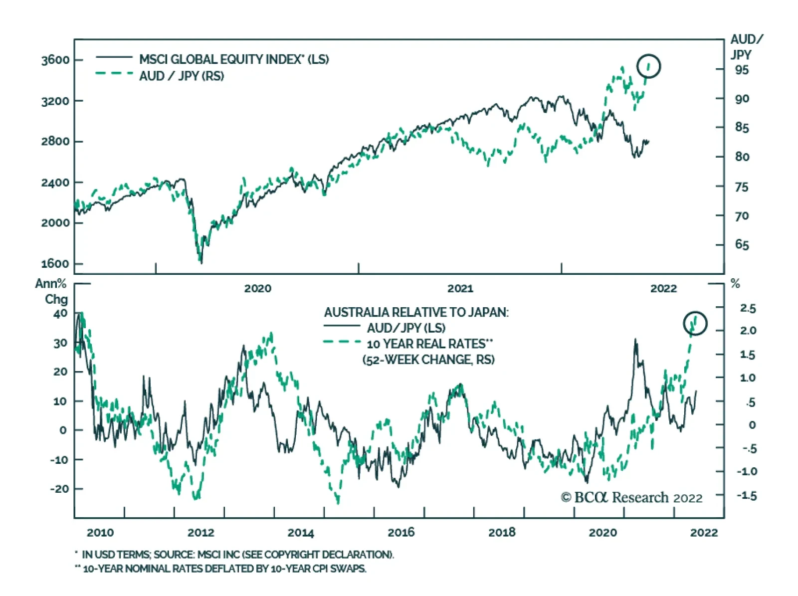
AUD/JPY has strengthened to a fresh multi-year high. As a key commodity producer, the Australian economy is extremely sensitive to the global economic cycle – particularly Chinese economic conditions. Meanwhile, the JPY is a low beta currency which weakens at…

Executive Summary Competing Forces On Global Bond Yields
Competing Forces On Global Bond Yields
Competing Forces On Global Bond Yields
Bond yields in the developed world have ticked higher recently, due to a renewed increase in oil prices and the spillover effect from more hawkish policy expectations out of Europe. The competing forces of slowing global growth momentum and geopolitical uncertainty on one side, and high inflation with tightening monetary policies on the other, will keep global government bond yields rangebound over the next several months. UK investment grade corporate bonds now offer an intriguing combination of higher yields, attractive spread valuations and strong financial health. By maturity, shorter-maturity corporates offer the best value. At the industry level, spreads look most attractive for Financials. A hawkish Bank of England, both through rate hikes and upcoming outright sales of corporate debt the central bank has purchased via quantitative easing, remains a major headwind to UK corporate bond returns. Sectors most at risk to central bank sales are Water, Consumer Cyclicals and Consumer Non-Cyclicals. Bottom Line: Stay neutral on overall duration exposure in global bond portfolios. Maintain a neutral stance on UK corporates, favoring shorter-maturity bonds and Financial names, but look to upgrade once UK inflation peaks and the Bank of England pauses on tightening. Trendless, Friendless Bond Markets Chart 1Recovering From The Ukraine War Shock...
Recovering From The Ukraine War Shock...
Recovering From The Ukraine War Shock...
Although it may not feel like it given the ferocity of some daily price swings, many important financial markets have not moved all that much, cumulatively, since the first major shock of 2022 – the start of the Russian invasion of Ukraine on February 24. For example, the S&P 500 is only down around -2% from the pre-invasion level, while the VIX index of equity option volatility is at 24, seven points below the closing level on February 23 (Chart 1). The Bloomberg US investment grade corporate bond index spread is only 12bps above its pre-invasion level, down 20bps from the peak seen in mid-May. More recently, even US bond yields have shown signs of stabilization. The 10-year US Treasury yield has traded in a 2.70-3.15% range since the start of April, while the MOVE index of US Treasury option volatility has fallen by one-quarter since its most recent peak in early May. Not all markets, however, have seen this kind of relative stability. Global oil prices are trading close to post-invasion highs, as are government bond yields in Germany and the UK. High-yield credit spreads in the US and Europe are both still around 50bps above where they were pre-invasion. The DXY US dollar index is 6% above the pre-invasion level, led by the USD/JPY currency pair that has appreciated to levels last seen in 2002. Given the mix of slowing global growth momentum and ongoing geopolitical uncertainty, but with persistent high inflation and tightening global monetary policy, it is unsurprising that financial markets are having a difficult time formulating a consistent message. This is especially true for global government bond yields. Chart 2Competing Forces On Global Bond Yields
Competing Forces On Global Bond Yields
Competing Forces On Global Bond Yields
Even as market-based inflation expectations have eased a bit in recent weeks, bond yields across the developed world have been unable to decline because markets continue to discount more rate hikes (Chart 2). Yet with such a significant amount of monetary tightening now priced in across all countries, global bond yields are more likely to stay rangebound over the next 3-6 months than begin a new trend. Chart 3DM Bond Yields Discounting Tight Monetary Policy
DM Bond Yields Discounting Tight Monetary Policy
DM Bond Yields Discounting Tight Monetary Policy
10-year government bond yields and 2-year-ahead interest rate expectations in overnight index swap (OIS) curves are trading in lockstep in the US, Europe, UK, Canada and Australia (Chart 3). This correlation indicates that longer-term bond yields have become a pure play on future policy rate expectations, rather than a reflection of rising inflation expectations as was the case in 2021. However, both yields and rate expectations are now trading close to, or even well above, plausible estimates of neutral nominal policy rates in all regions - including estimates provided by central bankers themselves. For example, in Australia, where the RBA just delivered a 50bp rate hike this week, markets are pricing in a peak Cash Rate between 3.5-4%, even with RBA Governor Philip Lowe stating that the neutral rate is likely in the 2-3% range – a view that we agree with. The situation is even more extreme in the euro area, with the euro area OIS curve now pricing in a peak policy rate between 1.5-2%, with most of that increase coming over the next 12 months. While we expect the ECB to fully exit the negative (deposit) rate era by September, rate hikes beyond that are far less likely given slowing euro area growth momentum and still-moderate euro area inflation beyond the spillover effects from energy costs. Only in the US are markets potentially underestimating the potential peak in the fed funds rate for this tightening cycle. Estimates of the longer-run (neutral) funds rate from the latest set of FOMC projections back in March ranged from 2.0-3.0%. Thus, the current level of 10-year bond yields, and 2-year-ahead rates discounted in the US OIS curve, are only at the top end of that range. It is possible that the Fed will have to raise rates to restrictive levels (i.e. above 3%) given the size of the current US inflation overshoot. More importantly, the US neutral rate is likely higher than the Fed thinks it is, possibly as high as 4% according to BCA Research’s Chief Global Strategist, Peter Berezin. We continue to see the US as the one major government bond market where there is a risk that markets are underestimating the neutral policy rate. For that reason, we remain underweight US Treasuries in the BCA Research Global Fixed Income Strategy model bond portfolio. Don’t Dismiss The QT Effect One other factor that has likely kept global bond yields elevated, even as global growth has softened, has been the shift away from central bank asset purchases towards quantitative tightening (QT). As policymakers have moved to slow, or even stop, the buying of government bonds, the term premium component of longer-term bond yields has risen. The moves have been quite large. Using our own in-house estimates, the term premium on 10-year government bond yields have jumped by about 100bps on average in the US, UK, Canada, Australia and Europe since the lows seen during the 2020 COVID global recession (Chart 4). The jump in term premiums is occurring at the same time as markets have moved to price in more rate hikes and a higher path for real interest rates (bottom panel). Chart 4Yields Repricing As QE Moves To QT
Yields Repricing As QE Moves To QT
Yields Repricing As QE Moves To QT
Chart 5Stay Neutral Global Duration Exposure
Stay Neutral Global Duration Exposure
Stay Neutral Global Duration Exposure
That combined effect of the upward repricing of term premiums – especially as more price-sensitive private investors replace the demand for bonds from price-insensitive central banks - but with less upward movement in already elevated interest rate expectations will keep longer-term bond yields in trading ranges during the “Global QT Phase” over at least the next six months and likely longer. That message is reinforced by our Global Duration Indicator, which is heralding a peak in global bond yield momentum over the latter half of 2022 (Chart 5). Bottom Line: Stay neutral on overall duration exposure in global bond portfolios, with yields in the major developed markets likely to stay rangebound over the next few months. Assessing The Value In UK Investment Grade Corporates Chart 6A Big Jump In UK Investment Grade Corporate Yields
A Big Jump In UK Investment Grade Corporate Yields
A Big Jump In UK Investment Grade Corporate Yields
Global credit markets have had a rough time in 2022, and UK corporate debt is no exception. The Bloomberg UK Corporate index of investment grade corporate debt has delivered a year-to-date total return of -11%, as the index yield-to-maturity rose 174bps to 4% - the highest level since 2014 (Chart 6). Relative to UK Gilts, the results have also been grim as corporate credit spreads have widened, with the Bloomberg UK corporate index realizing an excess return of -3% since the start of the year. We have maintained a neutral stance on UK corporate bond exposure in our global model bond portfolio during the selloff. This was the result of a relative value opinion, as we have concentrated our more defensive view on global investment grade corporate debt with an underweight to US corporates. However, after the significant repricing of UK investment grade credit, it is now a good time to reassess our opinion on the asset class. Spread Valuation From a pure spread valuation perspective, UK investment grade now looks more attractive. Our preferred valuation metric – 12-month breakeven spreads - shows that the UK investment grade corporate index spread, on a duration-adjusted basis, is now in the 75th percentile of its history over the past 25 years (Chart 7). Chart 7UK Corporate Spreads Now Offer Some Value
UK Corporate Spreads Now Offer Some Value
UK Corporate Spreads Now Offer Some Value
We find 12-month breakevens to a useful spread valuation measure, as they show how much spreads would need to widen to make the expected one-year-ahead return on a credit product equal to that of a duration-matched position in government bonds. In other words, breakevens measure the spread “cushion” against excess return losses from spread widening. What makes the current attractive reading on UK investment grade spread valuation so interesting is that the absolute level of spreads is still relatively low. The Bloomberg UK investment grade corporate index spread is currently 170bps, but during previous episodes where the 12-month breakeven as near the top quartile ranking – as is currently the case – the index spread ranged from 200-350bps. The reason for that relates to the index duration which, at 7.3 years, is down 1.5 years from the 2020 peak and at the lowest level since 2011. Some of that lower duration is related to the convexity effect from higher corporate bond yields. But there has also been a reduction in the average maturity of the UK investment grade corporate bond universe, with the index average maturity now at 10.4 years, down a full year lower over the past 12 months and the lowest average maturity since 1999. UK companies appear to have shortened up the maturity profile of their bond issuance, which helped reduce the riskiness (duration) of corporate bond returns to rising yields. Thus, the message from the 12-month breakevens is correct – UK investment grade corporate bond yields are attractive from a historical perspective, on a duration-adjusted basis. Chart 8UK Credit Curves Are Relatively Flat
UK Credit Curves Are Relatively Flat
UK Credit Curves Are Relatively Flat
When looking within the UK investment grade universe, the messages on valuation are a bit more mixed. The UK credit curve is not particularly steep, when looking at the spread differences by credit rating within the benchmark index universe (Chart 8). There is a similar message when looking at 12-month breakevens broken down by credit rating, where there is little difference between the percentile rankings (Chart 9). However, the 12-month breakeven percentile rankings broken down by maturity buckets show that shorter-maturity bonds have noticeably higher percentile rankings than longer-maturity UK corporates (top panel). From a cross-country perspective, UK corporate breakeven percentile rankings are much higher than equivalent rankings for US corporates, but are lower than those of the euro area. Chart 9Shorter-Maturity UK Spreads Are More Attractive
Mixed Messages & Range-Bound Bond Yields
Mixed Messages & Range-Bound Bond Yields
Corporate Financial Health Our top-down UK Corporate Health Monitor (CHM) - which uses data on non-financial corporate sector revenues, expenses and balance sheets taken from GDP accounts – has shown a very strong improvement in UK corporate financial health over the past few years (Chart 10). The biggest improvements are in the categories related to debt service, with interest coverage at the highest level since 2002 and debt coverage is at the highest level since 1999. Chart 10UK Corporates Can Withstand Higher Borrowing Rates
UK Corporates Can Withstand Higher Borrowing Rates
UK Corporates Can Withstand Higher Borrowing Rates
Chart 11Stay Neutral UK Corporates Until The BoE Is Done
Stay Neutral UK Corporates Until The BoE Is Done
Stay Neutral UK Corporates Until The BoE Is Done
The message from our top-down UK CHM is similar to the conclusions from an October 2021 BoE report that analyzed the UK corporate sector from a financial stability perspective. In that report, the BoE used a bottom-up sample of 500 UK companies and concluded that corporate borrowing rates could rise as much as 400bps before the share of companies with a “distressed” interest coverage ratio below 2.5 would rise to the past historical peak. Within our top-down UK CHM, relatively wide corporate profit margins are also contributing to the strong reading on UK corporate health. Like the interest/debt coverage ratios, those margins provide some cushion to profits in the current environment of high inflation and elevated input costs for businesses. The all-in message from our UK CHM is that financial health is a fundamental tailwind for UK corporate bond performance. Monetary Policy Attractive spread valuations and strong financial health metrics would normally justify an overweight stance on any corporate bond market. However, the monetary policy cycle is also an important factor that drives corporate bond performance. Currently, with the BoE not only hiking rates but also moving to QT on asset purchases, monetary policy is a severe headwind to UK corporate bond returns. Related Report Global Fixed Income StrategyIt’s Time To Flip The Script - Upgrade UK Gilts The annual growth rate of the BoE’s balance sheet has proven to be a reliable leading indicator of UK corporate bond annual excess returns. With the growth in the balance sheet set to turn negative in the latter half of 2022 (Chart 11), it will prove difficult for UK credit spreads to narrow in a way that will boost excess returns. The BoE’s aggressive (by its standards) rate hiking cycle, in response to UK inflation that is nearing 10% alongside a very tight labor market, remains a threat to UK economic growth that is already losing some momentum. As we discussed in a recent Special Report, the UK neutral interest rate is likely no more than 1.5-2%. If the BoE were to follow current market pricing and push Bank Rate toward 2.5%, this would be a restrictive policy stance that would likely result in a sharp growth slowdown if not a full-blown recession. Importantly, our UK Central Bank Monitor is showing signs of peaking (bottom panel), due to signs of slower economic growth and tightening financial conditions. A peak in UK inflation would help reduce the Monitor even further, and would likely correspond to a pause on BoE rate hikes – a necessary condition before we would upgrade our recommended stance on UK investment grade corporates to overweight. Some Final Thoughts On Industry Sector Valuation Our UK investment grade corporate sector valuation model is a cross-sectional analysis of individual industry/sector corporate credit spreads, after controlling for differences in duration, convexity and credit rating. The model is currently signaling that there are few compelling valuation stories with positive “risk-adjusted” spreads (Chart 12). Only Financials look cheap, while Consumer Cyclicals, Consumer Non-Cyclicals and Capital Goods are all trading at expensive risk-adjusted spreads. Chart 12Not Many Compelling Values Within UK Corporates By Industry
Mixed Messages & Range-Bound Bond Yields
Mixed Messages & Range-Bound Bond Yields
An additional risk to UK corporate bond performance relates to the BoE’s decision to unwind its corporate bond portfolio. The BoE has announced that there will be outright sales from the corporate holdings accumulated over the past couple of years, with a goal of having the stock of debt fully unwound by the end of 2023. This is important for much of the UK investment grade corporate bond universe, where the BoE holds between 8-10%, on average, of outstanding debt (Chart 13).1 Chart 13The BoE Has Become An Important Corporate Bondholder
Mixed Messages & Range-Bound Bond Yields
Mixed Messages & Range-Bound Bond Yields
When we compare our risk-adjusted spreads versus the BoE ownership share by sector, we conclude that Consumer Cyclicals, Consumer Non-Cyclicals and Other Utilities offer the most unattractive combination of expensive spreads and high BoE concentration (Chart 14). We recommended underweight allocations to those sectors within an overall neutral allocation to UK corporates. Chart 14BoE Asset Sales Are A Major Risk For Some UK Corporate Sectors
Mixed Messages & Range-Bound Bond Yields
Mixed Messages & Range-Bound Bond Yields
Bottom Line: Maintain a neutral stance on UK corporates, given the mix of attractive valuations but tighter monetary policy. Favoring shorter-maturity bonds and Financial names, but look to upgrade once UK inflation peaks and the Bank of England pauses on tightening. Robert Robis, CFA Chief Fixed Income Strategist rrobis@bcaresearch.com Footnotes 1 In Chart 13, we use the market capitalization of each sector from the Bloomberg UK corporate bond index in the numerator of all ratios shown, as a proxy for outstanding debt. GFIS Model Bond Portfolio Recommended Positioning Active Duration Contribution: GFIS Recommended Portfolio Vs. Custom Performance Benchmark
Mixed Messages & Range-Bound Bond Yields
Mixed Messages & Range-Bound Bond Yields
The GFIS Recommended Portfolio Vs. The Custom Benchmark Index Global Fixed Income - Strategic Recommendations* Cyclical Recommendations (6-18 Months)
Mixed Messages & Range-Bound Bond Yields
Mixed Messages & Range-Bound Bond Yields
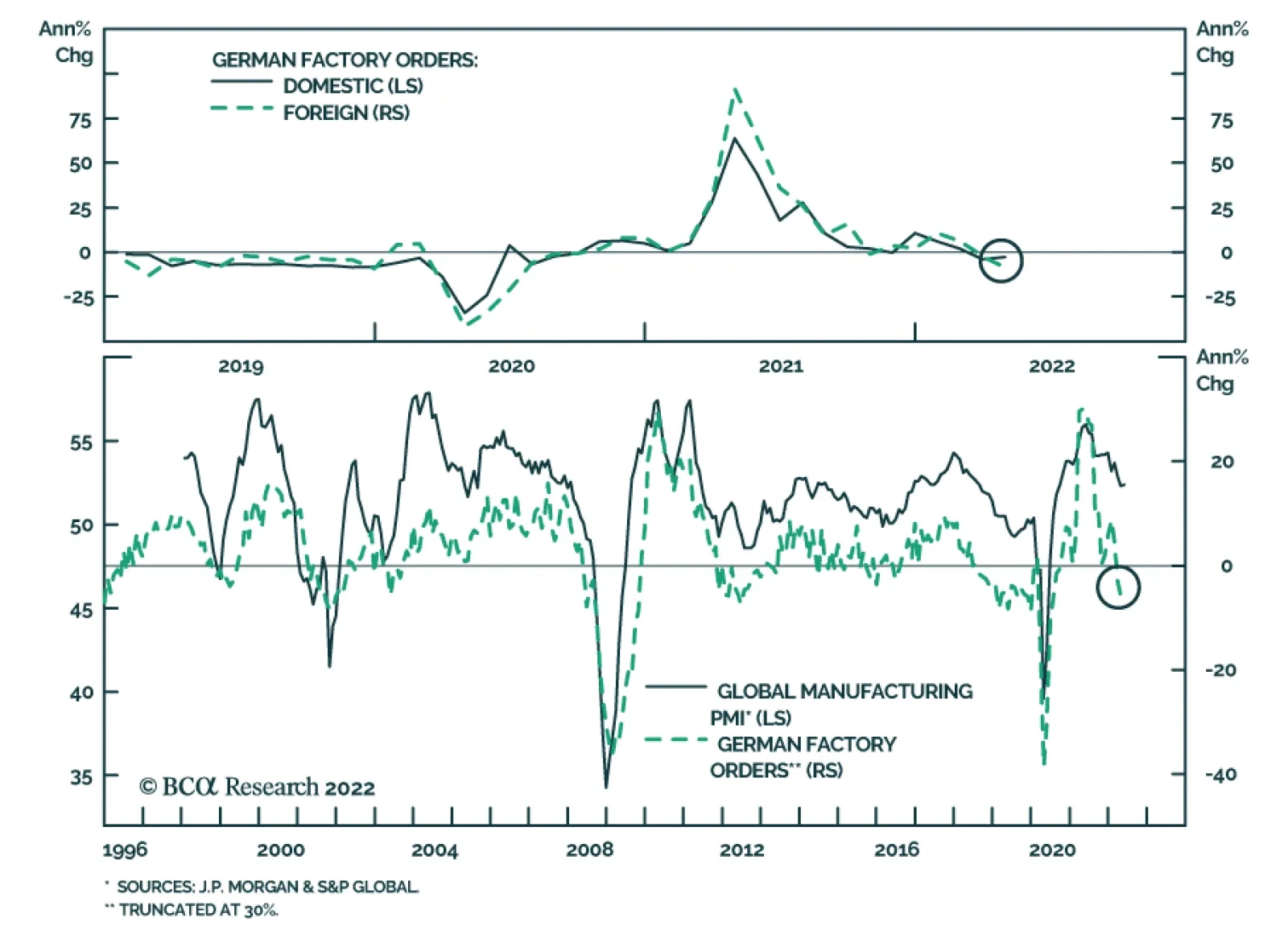
German factory orders contracted by 2.7% m/m in April, led by a sharp decline in foreign orders, and against expectations of a 0.4% m/m increase. This represents the third consecutive month of contracting orders, bringing the year-on-year decline to 6.2% in…
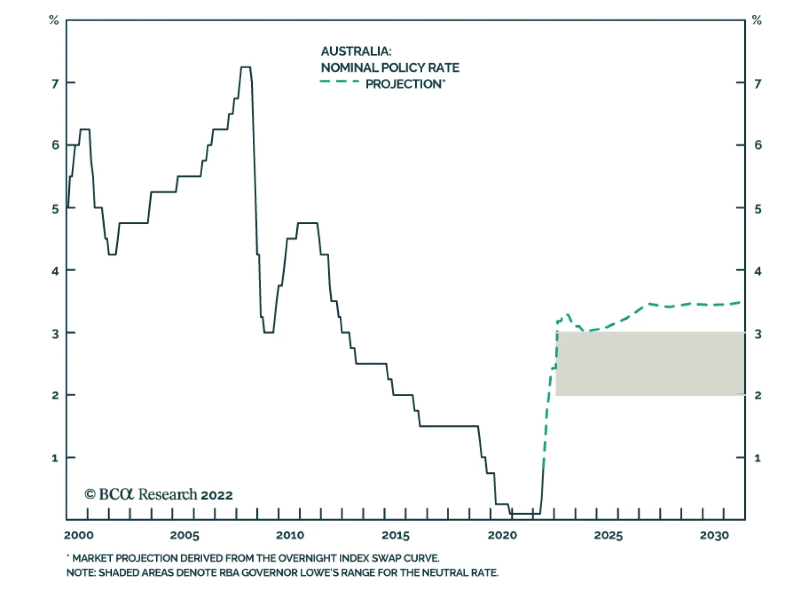
The RBA surprised investors by raising its cash rate target by 50bps to 0.85% on Tuesday. The increase exceeds expectations of 25bps and triggered a sharp selloff in Aussie government bonds. Governor Philip Lowe delivered a hawkish statement, indicating that…
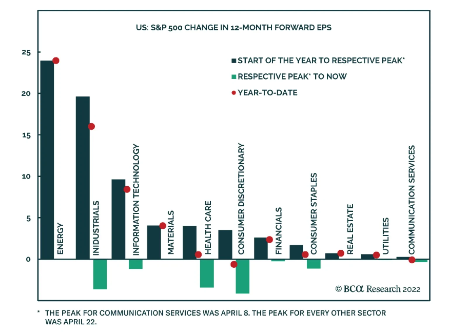
On S&P 500 EPS Downgrades
On…
Highlights Chart 1Wage Growth Is Cooling
Wage Growth Is Cooling
Wage Growth Is Cooling
In a speech last week, Fed Governor Christopher Waller presented the theoretical underpinnings for how the Fed plans to achieve a soft landing for the US economy.1 The Fed’s hope is that tighter monetary policy will slow demand enough to reduce the number of job openings – of which there are currently almost two for every unemployed person – without leading to a significant increase in layoffs and the unemployment rate. A reduction in the ratio of job openings to unemployed will lead to softer wage growth and lower inflation. The May employment report – released last Friday – provides some evidence that the Fed’s plan may be working. In May, an increase in labor force participation led to strong employment gains and kept the unemployment rate flat. We also saw continued evidence of a deceleration in average hourly earnings (Chart 1). Fifty basis point rate hikes are all but assured at the June and July FOMC meetings, but softer wage growth and falling inflation make it more likely that the Fed will downshift to a pace of 25 bps per meeting starting in September. Feature Table 1 Recommended Portfolio Specification Table 2Fixed Income Sector Performance
The Case For A Soft Landing
The Case For A Soft Landing
Investment Grade: Underweight Chart 2Investment Grade Market Overview
Investment Grade Market Overview
Investment Grade Market Overview
Investment grade corporate bonds outperformed the duration-equivalent Treasury index by 79 basis points in May, bringing year-to-date excess returns up to -215 bps. The average index option-adjusted spread tightened 5 bps on the month and it currently sits at 131 bps. Similarly, our quality-adjusted 12-month breakeven spread downshifted to its 45th percentile since 1995 (Chart 2). A recent report made the case for why investors should underweight investment grade corporate bonds on a 6-12 month horizon.2 The main rationale for this recommendation is that the slope of the Treasury curve is very flat, signaling that we are in the mid-to-late stages of the credit cycle. Corporate bond performance tends to be weak during such periods unless spreads start from very high levels. Despite our underweight 6-12 month investment stance, we see a high likelihood that spreads will narrow during the next few months as inflation falls and the Fed tightens by no more than what is already priced in the curve. That said, the persistent removal of monetary accommodation and flatness of the yield curve will limit how much spreads can compress. Last week’s report dug deeper into the corporate bond space and concluded that investment grade-rated Energy bonds offer exceptional value on a 6-12 month horizon.3 That report also concluded that long maturity investment grade corporates are attractively priced relative to short maturity bonds. Table 3A Corporate Sector Relative Valuation And Recommended Allocation* Table 3BCorporate Sector Risk Vs. Reward*
The Case For A Soft Landing
The Case For A Soft Landing
High-Yield: Neutral Chart 3High-Yield Market Overview
High-Yield Market Overview
High-Yield Market Overview
High-Yield underperformed the duration-equivalent Treasury index by 35 basis points in May, dragging year-to-date excess returns down to -316 bps. More specifically, high-yield sold off dramatically early in the month – the junk index lagged Treasuries by 368 bps between May 1 and May 20 – but then staged a rally near the end of May, outperforming Treasuries by 333 bps between May 20 and May 31. The 12-month spread-implied default rate – the default rate that is priced into the junk index assuming a 40% recovery rate on defaulted debt and an excess spread of 100 bps – moved higher in May. It currently sits at 5.1% (Chart 3). Last week’s report reiterated our view that investors should favor high-yield over investment grade within an overall underweight allocation to spread product versus Treasuries.4 Our main rationale for this view is that there are historical precedents for high-yield bonds outperforming investment grade during periods when the yield curve is very flat but when corporate balance sheet health is strong. The 2006-07 period is a prime example. With that in mind, our outlook for corporate profit and debt growth is consistent with a default rate of 2.7% to 3.7% during the next 12 months, well below the 5.1% that is currently priced in the index. MBS: Underweight Chart 4MBS Market Overview
MBS Market Overview
MBS Market Overview
Mortgage-Backed Securities outperformed the duration-equivalent Treasury index by 70 basis points in May, bringing year-to-date excess returns up to -109 bps. We discussed the outlook for Agency MBS in a recent report.5 We noted that MBS’s poor performance in 2021 and early-2022 was driven by duration extension. Fewer homeowners refinanced their loans as mortgage rates rose, and the MBS index’s average duration increased (Chart 4). But now, the index’s duration extension is at its end. The average convexity of the MBS index is close to zero (panel 3), meaning that duration is now insensitive to changes in rates. This is because hardly any homeowners have the incentive to refinance at current mortgage rates (panel 4). The implication is that excess MBS returns will be stronger going forward. That said, we still don’t see enough value in MBS spreads to increase our recommended allocation. The average index spread for conventional 30-year Agency MBS remains close to its lowest level since 2000 (bottom panel). At the coupon level, we observe that low-coupon MBS have much higher duration than high-coupon MBS and that convexity is close to zero for the entire coupon stack. This makes the relative coupon trade a direct play on bond yields. Given that we see some potential for yields to fall somewhat during the next six months, we recommend favoring low-coupon MBS (1.5%-2.5%) within an overall underweight allocation to the sector.ext 12 months, well below the 5.1% that is currently priced in the index. Emerging Market Bonds (USD): Underweight Chart 5Emerging Markets Overview
Emerging Markets Overview
Emerging Markets Overview
Emerging Market (EM) bonds outperformed the duration-equivalent Treasury index by 29 basis points in May, bringing year-to-date excess returns up to -565 bps. EM sovereigns outperformed the Treasury benchmark by 125 bps on the month, bringing year-to-date excess returns up to -664 bps. The EM Corporate & Quasi-Sovereign Index underperformed by 28 bps, dragging year-to-date excess returns down to -501 bps. The EM Sovereign Index underperformed the duration-equivalent US corporate bond index by 27 bps in May. The yield differential between EM sovereigns and duration-matched US corporates remains negative (Chart 5). As such, we continue to recommend a maximum underweight allocation to EM sovereigns. The EM Corporate & Quasi-Sovereign Index underperformed duration-matched US corporates by 109 bps in May, but it continues to offer a significant yield advantage (panel 4). As such, we maintain our neutral allocation (3 out of 5) to the sector. Despite modest weakness in the trade-weighted US dollar in May, EM currencies continue to struggle (bottom panel). If the Fed tightens no more quickly than what is already priced in the curve for the next six months – as we expect – it could limit the upward pressure on the US dollar and benefit EM spreads in the near term. Municipal Bonds: Overweight Chart 6Municipal Market Overview
Municipal Market Overview
Municipal Market Overview
Municipal bonds outperformed the duration-equivalent Treasury index by 61 basis points in May, bringing year-to-date excess returns up to -78 bps (before adjusting for the tax advantage). We view the municipal bond sector as better placed than most to cope with the recent bout of spread product volatility. As we noted in a recent report, state & local government revenue growth has been strong and yet governments have also been slow to hire.6 The result is that net state & local government savings are incredibly high (Chart 6) and it will take some time to deplete those coffers even as economic growth slows and federal fiscal thrust turns to drag. On the valuation front, munis have cheapened up relative to both Treasuries and corporates during the past few months. The 10-year Aaa Muni/Treasury yield ratio is currently 83%, up significantly from its 2021 trough of 55%. The yield ratio between 12-17 year munis and duration-matched corporate bonds is also up significantly off its lows (panel 2). We reiterate our overweight allocation to municipal bonds within US fixed income portfolios, and we continue to have a strong preference for long-maturity munis. The yield ratio between 17-year+ General Obligation Municipal bonds and duration-matched corporates is 85%. The same measure for 17-year+ Revenue bonds stands at 92%, just below parity even without considering municipal debt’s tax advantage. Treasury Curve: Buy 5-Year Bullet Versus 2/10 Barbell Chart 7Treasury Yield Curve Overview
Treasury Yield Curve Overview
Treasury Yield Curve Overview
The Treasury curve bull-steepened in May. The 2-year/10-year Treasury slope steepened 13 bps on the month and the 5-year/30-year slope steepened 22 bps. The 2/10 and 5/30 slopes now stand at 30 bps and 16 bps, respectively. In a recent Special Report we noted the unusually large divergence between flat slopes at the long end of the curve and steep slopes at the front end.7 For example, the 5-year/10-year Treasury slope is currently 1 bp while the 3-month/5-year slope is 178 bps. The divergence is happening because the market has moved quicky to price-in a rapid near-term pace of rate hikes. However, so far, the Fed has only delivered 75 bps of tightening and this is holding down the very front-end of the curve. The oddly shaped curve presents us with an excellent trading opportunity. Specifically, we recommend buying the 5-year Treasury note versus a duration-matched barbell consisting of the 2-year and 10-year notes. This trade looks attractive on our model (Chart 7) and will profit if the rate hike cycle moves more slowly than what is currently priced but lasts longer. We also continue to recommend a position long the 20-year bullet versus a duration-matched 10/30 barbell as an attractive carry trade. TIPS: Underweight Chart 8TIPS Market Overview
TIPS Market Overview
TIPS Market Overview
TIPS underperformed the duration-equivalent nominal Treasury index by 144 basis points in May, dragging year-to-date excess returns down to +237 bps. The 10-year TIPS breakeven inflation rate fell 25 bps last month, but it remains above the Fed’s 2.3% - 2.5% comfort zone (Chart 8). Our TIPS Breakeven Valuation Indicator shows that TIPS remain “expensive”, but not as expensive as they were a month ago (panel 2). While TIPS have become less expensive during the past month, we think TIPS breakeven inflation rates will continue to fall during the next few months as inflation moves lower. This will be particularly true at the front-end of the curve where breakevens remain disconnected from the Fed’s target (panel 4) and where breakevens exhibit a stronger correlation with the incoming inflation data. To take advantage of falling inflation between now and the end of the year, investors should position for a steeper TIPS breakeven curve (bottom panel) and/or a flatter real (TIPS) curve. We also recommend that investors hold outright short positions in 2-year TIPS. ABS: Overweight Chart 9ABS Market Overview
ABS Market Overview
ABS Market Overview
Asset-Backed Securities underperformed the duration-equivalent Treasury index by 26 basis points in May, dragging year-to-date excess returns down to -63 bps. Aaa-rated ABS underperformed by 26 bps on the month, dragging year-to-date excess returns down to -59 bps. Non-Aaa ABS underperformed by 22 bps on the month, dragging year-to-date excess returns down to -88 bps. During the past two years, substantial federal government support for household incomes caused US households to build up an extremely large buffer of excess savings. Nowhere is this more evident than in the steep drop in the amount of outstanding credit card debt that was witnessed in 2020 and 2021 (Chart 9). In 2022, consumers have started to re-lever. The personal savings rate was just 4.4% in April, the lowest print since September 2008, and the amount of outstanding credit card debt has almost recovered its pre-COVID level. But while household balance sheets are starting to deteriorate, they remain exceptionally strong in level terms. In other words, it will be some time before we see enough deterioration to cause a meaningful uptick in consumer credit delinquencies. Investors should remain overweight consumer ABS and should take advantage of the high quality of household balance sheets by moving down the quality spectrum, favoring non-Aaa rated securities over Aaa-rated ones. Non-Agency CMBS: Overweight Chart 10CMBS Market Overview
CMBS Market Overview
CMBS Market Overview
Non-Agency Commercial Mortgage-Backed Securities underperformed the duration-equivalent Treasury index by 105 basis points in May, dragging year-to-date excess returns down to -189 bps. Aaa Non-Agency CMBS underperformed Treasuries by 84 bps on the month, dragging year-to-date excess returns down to -152 bps. Non-Aaa Non-Agency CMBS underperformed by 165 bps on the month, dragging year-to-date excess returns down to -290 bps. CMBS spreads remain wide compared to other similarly risky spread products. However, after several quarters of easing, commercial real estate lending standards shifted closer to ‘net tightening’ territory in Q1 (Chart 10). This trend will bear monitoring in the coming quarters. Agency CMBS: Overweight Agency CMBS outperformed the duration-equivalent Treasury index by 19 basis points in May, bringing year-to-date excess returns up to -23 bps. The average index option-adjusted spread tightened 2 bps on the month. It currently sits at 49 bps, not that far from its average pre-COVID level (bottom panel). Agency CMBS spreads also continue to look attractive compared to other similarly risky spread products. Stay overweight. Appendix A: The Golden Rule Of Bond Investing We follow a two-step process to formulate recommendations for bond portfolio duration. First, we determine the change in the federal funds rate that is priced into the yield curve for the next 12 months. Second, we decide – based on our assessments of the economy and Fed policy – whether the change in the fed funds rate will exceed or fall short of what is priced into the curve. Most of the time, a correct answer to this question leads to the appropriate duration call. We call this framework the Golden Rule Of Bond Investing, and we demonstrated its effectiveness in the US Bond Strategy Special Report, “The Golden Rule Of Bond Investing”, dated July 24, 2018. Chart 11 illustrates the Golden Rule’s track record by showing that the Bloomberg Barclays Treasury Master Index tends to outperform cash when rate hikes fall short of 12-month expectations, and vice-versa. At present, the market is priced for 251 basis points of rate hikes during the next 12 months. Chart 11The Golden Rule's Track Record
The Golden Rule's Track Record
The Golden Rule's Track Record
We can also use our Golden Rule framework to make 12-month total return and excess return forecasts for the Bloomberg Barclays Treasury index under different scenarios for the fed funds rate. Excess returns are relative to the Bloomberg Barclays Cash index. To forecast total returns we first calculate the 12-month fed funds rate surprise in each scenario by comparing the assumed change in the fed funds rate to the current value of our 12-month discounter. This rate hike surprise is then mapped to an expected change in the Treasury index yield using a regression based on the historical relationship between those two variables. Finally, we apply the expected change in index yield to the current characteristics (yield, duration and convexity) of the Treasury index to estimate total returns on a 12-month horizon. The below tables present those results, along with excess returns for a front-loaded and a back-loaded rate hike scenario. Excess returns are calculated by subtracting assumed cash returns in each scenario from our total return projections.
The Case For A Soft Landing
The Case For A Soft Landing
Appendix B: Butterfly Strategy Valuations The following tables present the current read-outs from our butterfly spread models. We use these models to identify opportunities to take duration-neutral positions across the Treasury curve. The following two Special Reports explain the models in more detail: US Bond Strategy Special Report, “Bullets, Barbells And Butterflies”, dated July 25, 2017, available at usbs.bcaresearch.com US Bond Strategy Special Report, “More Bullets, Barbells And Butterflies”, dated May 15, 2018, available at usbs.bcaresearch.com Table 4 shows the raw residuals from each model. A positive value indicates that the bullet is cheap relative to the duration-matched barbell. A negative value indicates that the barbell is cheap relative to the bullet. Table 4Butterfly Strategy Valuation: Raw Residuals In Basis Points (As Of May 31, 2022)
The Case For A Soft Landing
The Case For A Soft Landing
Table 5 scales the raw residuals in Table 4 by their historical means and standard deviations. This facilitates comparison between the different butterfly spreads. Table 5Butterfly Strategy Valuation: Standardized Residuals (As Of May 31, 2022)
The Case For A Soft Landing
The Case For A Soft Landing
Table 6 flips the models on their heads. It shows the change in the slope between the two barbell maturities that must be realized during the next six months to make returns between the bullet and barbell equal. For example, a reading of -51 bps in the 5 over 2/10 cell means that we would expect the 5-year to outperform the 2/10 if the 2/10 slope flattens by less than 51 bps during the next six months. Otherwise, we would expect the 2/10 barbell to outperform the 5-year bullet. Table 6Discounted Slope Change During Next 6 Months (BPs)
The Case For A Soft Landing
The Case For A Soft Landing
Appendix C: Excess Return Bond Map The Excess Return Bond Map is used to assess the relative risk/reward trade-off between different sectors of the US bond market. It is a purely computational exercise and does not impose any macroeconomic view. The Map’s vertical axis shows 12-month expected excess returns. These are proxied by each sector’s option-adjusted spread. Sectors plotting further toward the top of the Map have higher expected returns and vice-versa. Our novel risk measure called the “Risk Of Losing 100 bps” is shown on the Map’s horizontal axis. To calculate it, we first compute the spread widening required on a 12-month horizon for each sector to lose 100 bps or more relative to a duration-matched position in Treasury securities. Then, we divide that amount of spread widening by each sector’s historical spread volatility. The end result is the number of standard deviations of 12-month spread widening required for each sector to lose 100 bps or more versus a position in Treasuries. Lower risk sectors plot further to the right of the Map, and higher risk sectors plot further to the left. Chart 12Excess Return Bond Map (As Of May 31, 2022)
The Case For A Soft Landing
The Case For A Soft Landing
Ryan Swift US Bond Strategist rswift@bcaresearch.com Footnotes 1 https://www.federalreserve.gov/newsevents/speech/waller20220530a.htm 2 Please see US Bond Strategy / Global Fixed Income Strategy Special Report, “Turning Defensive On US Corporate Bonds”, dated April 12, 2022. 3 Please see US Bond Strategy / Global Fixed Income Strategy Special Report, “Looking For Opportunities In US & European Corporates After The Recent Selloff”, dated May 31, 2022. 4 Please see US Bond Strategy / Global Fixed Income Strategy Special Report, “Looking For Opportunities In US & European Corporates After The Recent Selloff”, dated May 31, 2022. 5 Please see US Bond Strategy Weekly Report, “The Bond Market Implications Of A 5% Mortgage Rate”, dated April 26, 2022. 6 Please see US Bond Strategy Weekly Report, “Echoes Of 2018”, dated May 24, 2022. 7 Please see US Bond Strategy / US Investment Strategy / US Equity Strategy Special Report, “The Yield Curve As An Indicator”, dated March 29, 2022. Recommended Portfolio Specification Other Recommendations Treasury Index Returns Spread Product Returns
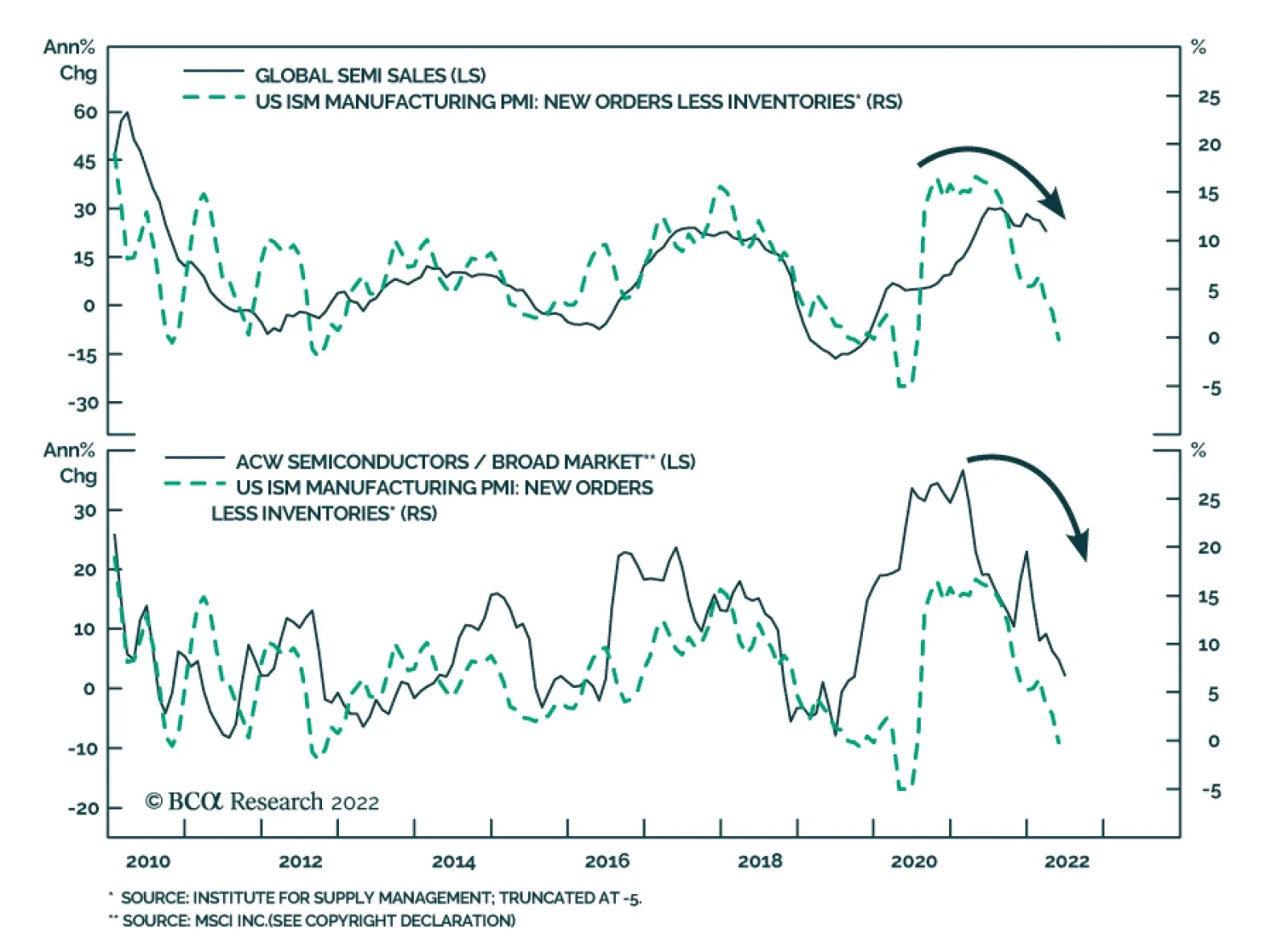
Global semiconductor stocks underperformed the broad market in the year-to-date equity selloff. However, over the past month they are up on both an absolute and relative basis. Have semiconductor stocks bottomed? The rollout of 5G networks, demand for…
According to BCA Research’s European Investment Strategy service, global activity will not find a durable bottom until inflation peaks, which implies that the market must see a stabilization in energy prices first. Thus, Q2 or early Q3 is likely to represent…
Executive Summary Lower Rates Are A Tailwind For Growth Stocks
Lower Rates Are A Tailwind For Growth Stocks
Lower Rates Are A Tailwind For Growth Stocks
We remain in the bearish camp. While the market bottom is getting closer, there are still hurdles to overcome such as elevated economic and earnings growth expectations, which need to come down to prevent new disappointments. Notably, the market focus has shifted away from inflation and has turned towards worries about growth as is evident in the falling 10-year Treasury yield. The environment of slowing growth and falling rates is a tailwind for growth stocks, warranting an upgrade of Growth to at least a benchmark weight. Technicals also signal that Growth is oversold relative to Value. The valuation differential has also moderated. However, we are wary of upgrading Growth to an outright overweight and downgrading Value to underweight as there is still plenty of economic uncertainty. We also posit that in the next several months the markets will be “fat and flat”, i.e., a bear market punctuated by rallies and pullbacks. In this environment, a balanced allocation between Growth and Value will reduce portfolio volatility and result in higher compound returns. Bottom Line: In a commentary to our chart pack report, we upgrade the Growth/Value style preference to benchmark allocation. Feature This week we provide you with a style chart pack. In this accompanying note, we will make a case for upgrading Growth and downgrading Value, bringing these style allocations to equal weight. We are booking a profit of 13% since we established the position in January 2022. We are getting closer to upgrading Growth to overweight. Performance May started as another tough month for equities, but, as they say, all’s well that ends well. After pulling back 10% since the beginning of May, and briefly touching bear market territory of -20%, the S&P 500 rebounded in the last 10 days of the month bringing the index to where it ended April. As a result, the S&P 500 was flat, and the NASDAQ was down 2.4% in May. As expected, the rally brought about a change in leadership (Chart I-1), with Consumer Discretionary and Technology leading the pack. Energy and Utilities are the only sectors that avoided rotation. Since May 20, Growth has outperformed Value by 3%. Chart I-1Recent Performance
Chartbook: Style Chart Pack
Chartbook: Style Chart Pack
Bear Market Rally Or The Real Thing? Since the start of the May rally, investors have been debating whether it has legs. Bulls argue that we are in the early innings of a sustainable rebound in equities – after all, much of the bad news is already priced in, 45% of NYSE and 70% of NASDAQ have recently hit new 12-month lows, screaming oversold conditions, and making bottom fishing tempting (Chart I-2). Bears consider this surge in performance a garden-variety bear market rally: Growth is slowing and none of the problems that have been haunting the markets over the past five months, such as inflation, war, China, and a hawkish Fed, have yet been resolved. Our views are closer to the bearish camp: We believe that, even if the market bottom is getting closer, there are still hurdles to overcome, such as elevated economic and earnings growth expectations, which need to come down to prevent new disappointments. As we discussed in the recent “What Is Next For Equities: They Will Be Fat And Flat” report, we believe that equities are likely to be range-bound over the next several months: A turn in inflation and a downshift in growth may ignite rallies on hopes of a gentler, data-driven Fed, and a shallower trajectory for the rate-hiking cycle (Chart I-3). However, we argue that the Fed “put” is no longer in play and the Fed will stay focused on inflation, inadvertently puncturing any budding rallies. In addition to a hawkish Fed, investors will have to process what may become a sharp economic growth slowdown and an earnings recession in the US on the back of rising costs, a stronger dollar, and slowing global demand for US goods. Chart I-2Is Much Of The Bad News Already Priced In?
Is Much Of The Bad News Already Priced In?
Is Much Of The Bad News Already Priced In?
Chart I-3Many Hope For A Shallower Hiking Cycle
Many Hope For A Shallower Hiking Cycle
Many Hope For A Shallower Hiking Cycle
Growth Vs. Value: Shifting Positioning To Equal Weight When Growth Is Harder To Find, Growth Stocks Shine As we argued in the “Fat and Flat” report, there are multiple signs that economic growth is slowing, and that earnings growth will disappoint. Our Business Cycle Indicator, which is a compilation of soft and hard data across production, consumer, and credit dimensions, is also signaling a slowdown (Chart I-4). Here we would like to emphasize our view: As of now, US economic growth is strong, and it is only its second derivative, i.e. a deceleration of growth, that is the root of our concerns. In a world where growth is becoming scarcer, companies that can deliver growth will shine. These are “growth” companies, i.e. large, stable companies with strong balance sheets that are able to generate positive cash flow and churn out strong earnings even under economic duress (Chart I-5). Quality growth outperforms during slowdowns (Chart I-6). This reasoning does not apply to speculative, barely profitable, growth companies which will fight for survival in a slow-growth world. Chart I-4We Are In A Slowdown Stage Of The Business Cycle
We Are In A Slowdown Stage Of The Business Cycle
We Are In A Slowdown Stage Of The Business Cycle
Chart I-5Large Cap Growth Is Synonymous With Quality
Large Cap Growth Is Synonymous With Quality
Large Cap Growth Is Synonymous With Quality
Chart I-6Growth Outperforms During Economic Slowdowns
Chartbook: Style Chart Pack
Chartbook: Style Chart Pack
Of course, one might argue that economic growth has been slowing for about a year, initially by returning towards the pre-pandemic trend and, lately, as a result of monetary tightening. Yet, over the past six months, Growth has underperformed Value by nearly 11%. What is different now? First, inflation, and the monetary tightening that inevitably follows it, are the mortal enemies of growth stocks: Higher discount rates deflate the present value of future cash flows. Rising inflation and sharply rising Treasury yields are behind the recent sell-off in Growth stocks. However, recently, the market focus has shifted away from inflation, and seems to finally be turning towards worries about growth. As a result, the 10-year Treasury yield decreased from 3.12% to 2.75%, and its relentless climb may now be behind us (Chart I-7). Lower rates are a tailwind for Growth stocks which rebounded at the first whiff of rate stabilization (Chart I-8). Chart I-7Investors Concerns Have Shifted From Inflation To Growth
Investors Concerns Have Shifted From Inflation To Growth
Investors Concerns Have Shifted From Inflation To Growth
Further, our research on macroeconomic regimes suggests that a turn in inflation heralds a change in market leadership from Value to Quality and Growth (Chart I-9). Chart I-8Lower Rates Are A Tailwind For Growth Stocks
Lower Rates Are A Tailwind For Growth Stocks
Lower Rates Are A Tailwind For Growth Stocks
Chart I-9Growth And Quality Will Lead Markets When Inflation Abates
Chartbook: Style Chart Pack
Chartbook: Style Chart Pack
Growth Not Yet Cheap But Oversold This year’s sell-off is characterized by a multiple contraction. Growth is a poster child of this trend: Its forward multiple has decreased by 8 points, with the style currently trading at just under 20x forward earnings, which is the 61st percentile relative to its 10-year history (compare that to 28x and the 94th percentile back in January). As for Value, it also became cheaper, contracting from 16.8x in January to 14.9x (Table I-1). Table I-1Valuations And EPS Growth Expectations
Chartbook: Style Chart Pack
Chartbook: Style Chart Pack
According to the BCA Valuations Indicator (Chart I-10), the Growth/Value valuations spread has moderated but by itself, is not an impetus for a switch. However, looking at technicals, Growth is extremely oversold relative to Value and is at levels last seen in 2006. Why Neutral, Not Overweight? We hope we made a compelling case for shifting allocation from Value to Growth. Then why not go overweight, but just neutral? Mostly because many of the macroeconomic developments we have described are tentative and are just conjecture at this point – there is still plenty of uncertainty about inflation, rates, and the Fed monetary response. Second, while Growth stocks are supposed to grow faster than Value stocks, at the moment analysts expect them to grow at 8% and 11% respectively. We expect earnings growth expectations for Value stocks to be downgraded since they are dominated by cyclicals. However, until the new numbers are in for both styles, we need to be careful. Chart I-10Growth Is Getting Cheaper Relative To Value... It Also Appears Oversold
Growth Is Getting Cheaper Relative To Value... It Also Appears Oversold
Growth Is Getting Cheaper Relative To Value... It Also Appears Oversold
Last, if we are right, and US equities are to test their bottom this summer in a “fat and flat” manner, there will be a frequent change in leadership, with Growth and Small outperforming during the rallies, and Value outperforming during pullbacks. Portfolios need exposure to both styles to achieve the highest compound returns as diversification reduces portfolio volatility. Once macroeconomic uncertainty dissipates, we will be able to pounce and shift Growth to overweight, and Value to underweight. For now, we are going to stay neutral out of an abundance of caution. Bottom Line Macroeconomic conditions are becoming more favorable for Growth as Treasury yields stabilize and economic growth slows, making the strong fundamentals and stable earnings of large-cap growth stocks more valuable. Growth is oversold relative to Value, and the relative performance differential of Growth vs. Value over the past six months has been staggering – it is time to book profits and prepare for the next chapter. Irene Tunkel Chief Strategist, US Equity Strategy irene.tunkel@bcaresearch.com S&P 500 Chart II-1Macroeconomic Backdrop
Macroeconomic Backdrop
Macroeconomic Backdrop
Chart II-2Profitability
Profitability
Profitability
Chart II-3Valuations And Technicals
Valuations And Technicals
Valuations And Technicals
Chart II-4Uses Of Cash
Uses Of Cash
Uses Of Cash
Cyclicals Vs Defensives Chart II-5Macroeconomic Backdrop
Macroeconomic Backdrop
Macroeconomic Backdrop
Chart II-6Profitability
Profitability
Profitability
Chart II-7Valuation And Technicals
Valuation And Technicals
Valuation And Technicals
Chart II-8Uses Of Cash
Uses Of Cash
Uses Of Cash
Growth Vs Value Chart II-9Macroeconomic Backdrop
Macroeconomic Backdrop
Macroeconomic Backdrop
Chart II-10Profitability
Profitability
Profitability
Chart II-11Valuations And Technicals
Valuations And Technicals
Valuations And Technicals
Chart II-12Uses Of Cash
Uses Of Cash
Uses Of Cash
Small Vs Large Chart II-13Macroeconomic Backdrop
Macroeconomic Backdrop
Macroeconomic Backdrop
Chart II-14Profitability
Profitability
Profitability
Chart II-15Valuations and Technicals
Valuations and Technicals
Valuations and Technicals
Chart II-16Uses Of Cash
Uses Of Cash
Uses Of Cash
Table A1Performance
Chartbook: Style Chart Pack
Chartbook: Style Chart Pack
Table A2Valuations And Forward Earnings Growth
Chartbook: Style Chart Pack
Chartbook: Style Chart Pack
Footnotes Recommended Allocation Recommended Allocation: Addendum
Chartbook: Style Chart Pack
Chartbook: Style Chart Pack
Executive Summary The default take on the economy and financial markets has been tilting increasingly bearish although the ongoing data flow has yet to pick a side. The data in the stories from the front page of The New York Times' Saturday Business section over the Memorial Day weekend nod in the direction of a Goldilocks outcome: households have been so well fortified by their pandemic savings that their spending is holding up despite stiff price increases but innovation and automation are allowing companies to protect their profits even in a tight labor market. We remain of the view that a wage-price spiral is unlikely and therefore see a plausible path for S&P 500 margins to hold up better than expected over the rest of the year. We are looking for an opportunity to add equity exposure to our ETF portfolio to restore its overweight allocation but we won't rush to do it while the S&P 500 is within 100 points of near-term technical resistance. Putting Excess Savings To Good Use
Putting Excess Savings To Good Use
Putting Excess Savings To Good Use
Bottom Line: We remain constructive on financial markets and the US economy over the next twelve months but are content to wait for a better tactical entry point to increase our ETF portfolio's equity exposure. Feature The Internet has drastically curtailed newspapers’ influence, but Page 1 is still not the place to go for alpha-generating investment ideas. Nearly all the juice has been squeezed from an investment idea by the time it makes it to the front page; if there’s any alpha to be found in the paper, it will be on the vitamin pages – B7, B12, D3. As Don Coxe, a favorite mentor, put it throughout his five-decade career as an investment strategist, “We don’t invest on the basis of Page 1 stories. We invest on the basis of stories on Page D7 that are going to Page 1.” Lately, the stories getting the most media airtime have accentuated the negative. Inflation is making 40-year highs; consumers are in a grim mood, at least according to the University of Michigan’s sentiment survey; the Fed was napping and may not be able to catch up; corporate profits will be the next domino to fall. Against that backdrop, we thought the front-page New York Times Saturday Business section stories reporting on coincident indicators over the Memorial Day weekend provided an interesting corrective. The data are moving fast and their positive cast may be fleeting, but the latest batch makes the case that it’s too soon to abandon our constructive market and economic view. Declining Profit Margins Might Still Beat Expectations The entire space above the fold was filled by a photograph of workers harvesting radishes. There was a large machine with moving conveyor belts behind them and as the workers bound the radishes into clumps, they tossed them onto the belt without turning their heads. Under the headline, “Farming Transformation In the Fields of California,” the article began, “It looks like a century-old picture of farming in California: a few dozen Mexican men … plucking radishes from the ground [.] But the[se] crews … represent the cutting edge of how America pulls food from the land.” “For starters, the young men … are working alongside technology unseen even 10 years ago. … [W]hat looks like a tractor retrofitted with a packing plant … carries [the radishes] through a cold wash and delivers them to be packed into crates and delivered for distribution in a refrigerated truck.” “The other change is more subtle, but no less revolutionary. None of the workers are in the United States illegally.” “Both of these transformations are driven by the same dynamic: the decline in the supply of young illegal immigrants from Mexico, the backbone of the work force picking California’s crops since the 1960s.” “The new demographic reality has sent farmers scrambling to bring in more highly paid foreign workers on temporary guest-worker visas, experiment with automation wherever they can and even replace crops with less labor-intensive alternatives.” The drying up of its inexpensive labor supply would seem to pose a mortal threat to farming profit margins. Temporary workers covered by the H-2A visa program earn two-and-a-half dollars an hour more than the $15 minimum wage applicable to local workers and must be provided with room, board and transportation to and from the fields. The industry has adapted, however, finding ways to mechanize the harvesting of crops that don’t need to meet aesthetic standards while tinkering with planting and growing techniques and genetic modifications to reduce labor intensity. Crops that resist mechanization hacks are leaving the United States for lower-cost climes as evidenced by a doubling of fruit and vegetable imports over the last five years. California acreage given over to asparagus, an especially labor-intensive crop, has fallen to 4,000 acres in 2020 from 37,000 two decades ago, while the nearby Mexican state of Sinaloa picked up the slack by increasing its harvest by around 30,000 acres. The adaptations seem to be working well for all but the formerly essential undocumented agricultural work force. As a vineyard worker who illegally crossed the border nearly 20 years ago said, “It scares me that they are coming with H-2As and … robots. That’s going to take us down.” What does this specific story have to do with corporate profit margins, a general subject of vital importance to all investors? It illustrates the difficulty employees confront in capturing and maintaining leverage when employers can radically alter the dynamic with investment. The sub-headline sums up labor’s plight well: “Growers are turning more and more to workers on seasonal visas, and mechanizing where they can. Meanwhile, labor-intensive crops are shifting south of the border.” Chart 1Input Costs Are Surging, ...
Input Costs Are Surging, ...
Input Costs Are Surging, ...
We reiterate that a wage-price spiral is not a foregone conclusion. Neither is an onshoring bonanza. Although the aggregate first-quarter S&P 500 profit margin narrowed versus the year-ago quarter (revenue-per-share growth (13.9%) outpaced earnings-per-share growth (11.2%) by nearly three percentage points), it managed to surprise to the upside (earnings’ 7% beat was over four percentage points wider than revenues’ 2.6%), and innovation and investment may allow it to do so going forward, despite soaring materials costs (Chart 1) and upward wage pressures. After an initial pandemic surge, however, wages have failed to keep pace with inflation for the last year (Chart 2) and growth in average hourly earnings, the most timely compensation series, may have peaked (Chart 3). Chart 2... But Wages Aren't Keeping Pace With Inflation ...
... But Wages Aren't Keeping Pace With Inflation ...
... But Wages Aren't Keeping Pace With Inflation ...
Chart 3... And They May Have Already Peaked
... And They May Have Already Peaked
... And They May Have Already Peaked
Households Are Not At Risk Of Drowning In Debt … The other two front-page stories challenge the narrative that high inflation will choke off consumption. “U.S. Spending Is Up Even With Buying Power Low” discussed the previous day’s release of the April Personal Income and Outlays report. The article expressed surprise that consumption rose 0.9% month-over-month when disposable income rose just 0.3% and was flat in real terms. Households squared the circle by saving less of their income, with the savings rate shrinking to 4.4%, the lowest level since the subprime boom, when it put in its all-time bottom (Chart 4). Chart 4Putting Their Cushion To Good Use
Putting Their Cushion To Good Use
Putting Their Cushion To Good Use
Leading up to the financial crisis, households took on increasing quantities of debt to maintain their spending and the article noted that revolving loan balances (primarily credit cards) grew at their fastest rate in 24 years in March. That narrow statement is true, strictly speaking, but an investor should place it in a fuller context. Outstanding credit card and other revolving debt held by banks remains shy of its post-crisis growth trend though it did just top its previous high set in early 2020 (Chart 5). Though the article quoted an economist tut-tutting that credit card-funded spending is unsustainable, household debt service payments as a share of disposable income remain below their pre-pandemic lows and miles from their subprime-era level (Chart 6). These are fraught times, but any comparison linking US households’ financial positions with 2007 is specious. Chart 5Outstanding Card Balances Are Still Below Trend ...
Outstanding Card Balances Are Still Below Trend ...
Outstanding Card Balances Are Still Below Trend ...
Chart 6... And Households Have Plenty Of Capacity To Take On More
... And Households Have Plenty Of Capacity To Take On More
... And Households Have Plenty Of Capacity To Take On More
… Because They Were Pre-emptively Insulated From Elevated Inflation We have been tracking households’ excess pandemic savings balance since CARES Act transfer payments began to flow into individual checking and savings accounts. We estimate that households ended April with between $2.1 and 2.2 trillion more in savings than they would have had if the pandemic had not occurred. They began dipping into their stash in last year’s fourth quarter, when the savings rate first edged below its 8.3% pre-pandemic level, and have done so with increasing zest this year, trimming almost $200 billion from the excess savings peak (Table 1). They drew down almost $60 billion in April alone, indicating that half of the excess savings (our working estimate of how much will be spent) would last for eighteen months if households saved at half their pre-pandemic rate, or another nine if they didn’t save anything at all. Table 1The Excess Savings Cushion Remains Quite Large
Read All About It
Read All About It
That’s a handy reference point to keep in mind when assessing the third front-page story, headlined, “Gas Prices Keep Surging, But Demand Isn’t Falling.” The same headline could be repurposed to top an article reporting on American Airlines’ upwardly revised second-quarter revenue outlook. American said in a filing before Friday’s open that it now expects 2Q22 revenue to exceed 2Q19 revenue (the airlines’ last pre-pandemic comparison) by 11-13%, up from its previous 6-8% guidance. A real-time Bloomberg headline accompanying the story credited the increase to “continued strength in demand and pricing.” The bottom line is that households have the means to satiate pent-up pandemic demand despite significantly higher prices. Spirited internal debates have revolved around households’ willingness to use those means. Without a similar fiscal transfer precedent, neither side can argue its case with high conviction, but the accelerating dissaving of the last six months and mounting evidence of consumers’ low sensitivity to higher airfares and gasoline prices suggest that the spending camp has the upper hand for now. Under an Occam’s razor standard, we don’t think the analysis requires anything as fancy as mental accounting gymnastics or Friedman’s permanent income hypothesis when there’s an age-old phrase that should especially resonate with the YOLO set: Easy come, easy go. ETF Portfolio Update Our cyclical ETF portfolio outperformed its benchmark by 43 basis points (bps) in May, bringing its outperformance since its January 31st launch to 87 bps. Our equity holdings accounted for the lion’s share of the value-add. Energy (XLE), our sole sector overweight, outperformed the S&P 500 by nearly 16 percentage points, while our Staples (XLP, 4-ppt underperformance) and Utilities (XLU, 4-ppt outperformance) underweights offset each other. Allocating some Discretionary exposure to outperforming homebuilders (ITB) was successful but was offset by concentrating all of our Materials exposure in metals and miners (XME). The Pure Value Index (RPV) and SmallCap 600 (IJR) overweights made undiluted positive contributions. Our high yield (JNK) overweight helped our fixed income performance, though it was held back by the allocation to variable-rate preferreds (VRP). VRP has struggled, but we still see going to the back of the creditor priority line at overcapitalized large banks as a source of alpha, and we maintain our modest allocation. We continue to seek an opportune time to remove some of the tactical restraints we imposed on the portfolio in early March. We are eager to bring the portfolio in line with BCA’s recent tactical equity upgrade to overweight but are reluctant to increase our equity exposure so close to the 4,200 resistance level that we expect will repel S&P 500 rallies in the immediate term. Friday’s selloff gave a buyer an additional 1% of headroom from the level we passed up on May 27th, but we intend to hold out for something in the neighborhood of 4,000. Investment Implications Viewed through a contrarian’s magazine-cover-indicator lens, the risk/reward profile of our constructive view has improved as the headlines’ bearish bias has become more pronounced. The zeal with which those in the bearish economic camp seized upon Walmart’s and Target’s first-quarter disappointments was revealing. Both companies’ earnings stunk – Walmart missed expectations by 12% and Target by 29% – but both companies beat revenues, by around 2%, just like their dollar-store and price-club peers who met or beat earnings expectations. Though it gave the commentariat something to do for a few days, the debate over the existence of a retail inventory glut isn’t supported by the aggregate data (Chart 7). Chart 7Retail Inventory Glut? Seriously?
Retail Inventory Glut? Seriously?
Retail Inventory Glut? Seriously?
No one knows what’s coming next against the unprecedented macro backdrop and everyone involved in forecasting and investing should approach their work with humility right now. For an investor, that means staying within sight of the shore in terms of deviations from benchmark indexes and managing portfolios more tactically by reducing holding periods and setting, and abiding by, tight stops on opportunistic plays. A preponderance of data has yet to cast doubt on our constructive take on the economy and markets (nor has it conclusively validated it, alas). The sense that we increasingly find ourselves in the minority makes us feel better about the potential returns to our view, however, and we are sticking with it. We continue to recommend overweighting equities in a balanced portfolio, and high yield within fixed income portfolios (NB: our US Bond Strategy team recommends an equal-weight allocation to high yield) over a twelve-month time frame and are looking for a better entry point to increase our equity exposures within our ETF portfolio. Doug Peta, CFA Chief US Investment Strategist dougp@bcaresearch.com Cyclical ETF Portfolio
Read All About It
Read All About It