Developed Countries
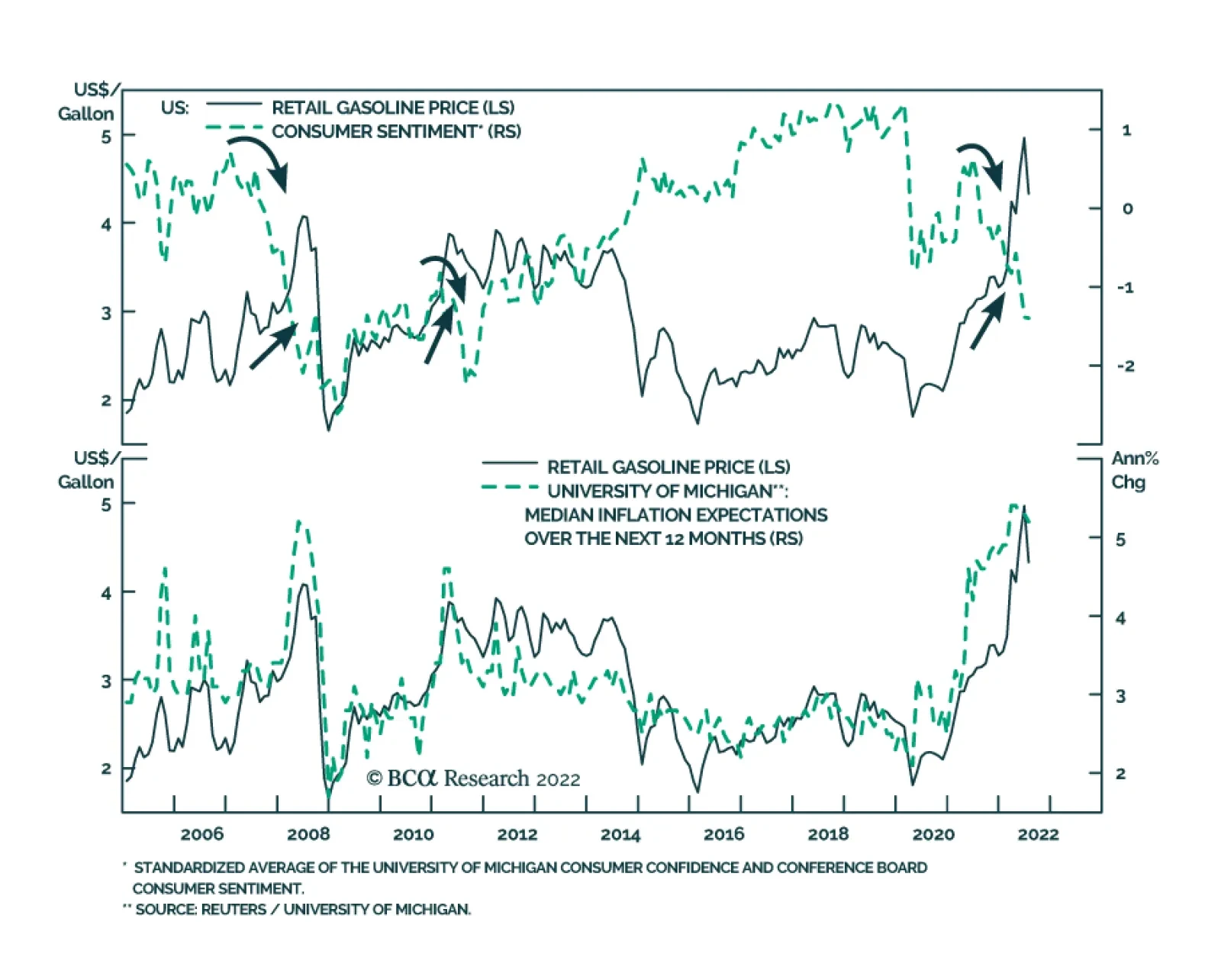
The top panel of the chart above highlights that the relationship between gasoline prices and consumer sentiment is not stable. The correlation between gas prices and sentiment is typically positive. This is not surprising: improving economic conditions…
This year’s US equity selloff has been broad-based. Energy is the only S&P 500 sector that has posted year-to-date gains. The indiscriminate nature of the slump highlights that macro forces are behind the weakness. The Fed’s abrupt hawkish pivot has…
According to BCA Research’s US Bond Strategy service, the peak fed funds rate that is currently priced in the market for 2023 is too low, and the funds rate will also likely peak later than what is priced in the curve. To make sense of all the different…

Executive Summary Peak Fed Funds?
Peak Fed Funds?
Peak Fed Funds?
The bond market is priced for a fed funds rate that will peak in February 2023 at 3.44% before trending down. We survey several interest rate cycle indicators and conclude that the market’s expected peak is too low and occurs too early. These indicators include: the unemployment rate, financial conditions, PMIs, the yield curve and housing starts. We also update our default rate forecast and are now looking for the default rate to rise to between 4.7% and 5.9% during the next 12 months. While our default rate forecasts imply a reasonably attractive 12-month junk bond valuation, we hesitate to turn too bullish on high-yield given that the next peak in the default rate is still not in sight. Bottom Line: We recommend keeping portfolio duration close to benchmark for the time being, though we will be looking for opportunities to reduce duration in the second half of this year. Similarly, we recommend a neutral (3 out of 5) allocation to junk bonds but will recommend reducing exposure if spreads rally back to average 2017-19 levels. Feature Last week’s report presented three conjectures about the US economy.1 One of those was that a recession will be required to get inflation back to 2%. But when will that recession occur? The question of timing is a vital one for bond investors. Are we on the cusp of recession right now? If so, then bond investors should extend portfolio duration in anticipation of Fed rate cuts and a return to 2% inflation. Conversely, if the recession is delayed, interest rates probably move higher before the cycle ends and investors should consider reducing portfolio duration. This week’s report addresses the topic of timing the next recession and discusses the implications for bond portfolio construction. Timing The Interest Rate Cycle From a bond market perspective, the question of whether the economy is in recession is less important than whether the Fed is hiking or cutting rates. Therefore, for the purposes of this report we will define a “recession” as an economic slowdown that is significant enough for the Fed to start cutting interest rates. Chart 1Peak Fed Funds?
Peak Fed Funds?
Peak Fed Funds?
Now, let’s start by looking at what sort of interest rate cycle is priced in the market. The overnight index swap curve is currently discounting a peak fed funds rate of 3.44% (Chart 1). It is also priced for that peak to occur in 7 months, or by February 2023 (Chart 1, bottom panel). As bond investors, the question we must ask is whether this pricing seems reasonable. To do so, we will perform a survey of different indicators that have strong track records of sending signals near the peaks of interest rate cycles. Unemployment The first indicator we’ll look at is the unemployment rate. Economist Claudia Sahm has shown that a recession always occurs when the 3-month moving average of the unemployment rate rises to 0.5% above its trailing 12-month minimum.2 Table 1 dispenses with the moving average and simply shows the deviation of the unemployment rate from its trailing 12-month minimum on the dates of first Fed rate cuts since 1990. We see that the Fed has typically started to cut rates once the unemployment rate is 0.3-0.4 percentage points off its low. The exception is 2019 when the unemployment rate was only 0.1% off its low, but when inflation was below the Fed’s 2% target. Table 1Unemployment And Inflation When The Fed Starts Easing
Recession Now Or Recession Later?
Recession Now Or Recession Later?
At 3.6%, the unemployment rate is currently at its cycle low. Based on the numbers shown in Table 1, this means that we should only expect the Fed to cut interest rates if the unemployment rises to at least 3.9% or 4.0%. We say “at least” because it’s also important to note that the inflation picture is a lot different today than it was during the periods shown in Table 1. With inflation so much higher, it is reasonable to think that the Fed will tolerate a greater increase in the unemployment rate before pivoting to rate cuts. Looking ahead, initial unemployment claims appear to have bottomed for the cycle and changes in initial claims are highly correlated with changes in the unemployment rate (Chart 2). That said, the trend in claims is currently consistent with a leveling-off of the unemployment rate, not a large increase. Financial Conditions Second, we turn to financial conditions. Fed officials often assert that monetary policy works through its impact on broad financial conditions. Therefore, it’s not too surprising that rate cuts tend to occur only after the Goldman Sachs Financial Conditions Index has moved into restrictive territory. Currently, despite the Fed’s dramatic hawkish shift, the index still shows financial conditions to be accommodative (Chart 3). Chart 2Jobless Claims Moving Higher
Jobless Claims Moving Higher
Jobless Claims Moving Higher
Chart 3Financial Conditions
Financial Conditions
Financial Conditions
The same caveat we applied to the unemployment rate applies to financial conditions. As long as inflation is above the Fed’s target, it’s highly likely that the Fed will be comfortable with financial conditions that are somewhat restrictive. Therefore, the Fed may not pivot as soon as the Goldman Sachs index moves above 100, as has been the pattern in the recent past. Yield Curve Third, we note that an inverted Treasury curve almost always precedes the start of a Fed rate cut cycle, and the Treasury curve is certainly inverted today (Chart 4). The logic behind this indicator is somewhat circular in the sense that an inverted Treasury curve simply tells us that the market anticipates Fed rate cuts. If data emerge to suggest that Fed rate cuts will be postponed, then the Treasury curve could re-steepen. It’s for this reason that the Treasury curve often inverts well in advance of an economic recession and Fed rate cuts. We explored the relationship in more detail in a recent Special Report.3 Chart 4Interest Rate Cycle Indicators
Interest Rate Cycle Indicators
Interest Rate Cycle Indicators
Chart 5Manufacturing PMIs
Manufacturing PMIs
Manufacturing PMIs
PMIs Typically, the ISM Manufacturing PMI is below 50 by the time of the first Fed rate cut (Chart 4, panel 3). Currently, the ISM Manufacturing PMI is a healthy 53.0, but it has been falling quickly and trends in regional PMI surveys suggest that it will dip below 50 within the next few months (Chart 5). Interestingly, both the ISM and regional PMI surveys show that manufacturing supplier delivery times have come down a lot (Chart 5, panel 2). This gives some hope that goods inflation will trend lower during the next few months, as is our expectation. Recently, there’s also been an unusual divergence between the employment components of the ISM and regional Fed surveys. The New York and Philadelphia Fed surveys are showing strength in their employment components. Meanwhile, the ISM employment figure is below 50 (Chart 5, bottom panel). This divergence likely boils down to labor shortages that complicate how firms are responding to the employment question in the surveys. For example, despite the sub-50 employment figure, the latest ISM release noted that “an overwhelming majority of panelists […] indicate that their companies are hiring.”4 Housing In a recent report, we developed a rule of thumb that says that Fed rate cuts typically don’t occur until after the 12-month moving average of housing starts falls below the 24-month moving average.5 That indicator is coming down, but it still has a lot of breathing room before it dips into negative territory (Chart 4, bottom panel). That same report also outlined that we see the housing market slowdown proceeding in three stages. First, higher mortgage rates will suppress housing demand. This is already happening at a rapid pace as indicated by trends in mortgage purchase applications and existing home sales (Chart 6A). Second, lower housing demand will push up inventories and send prices lower. This has not yet shown up in the data (Chart 6B). Finally, once lower prices and higher inventories sufficiently disincentivize construction, we will see a marked deterioration in housing starts. Currently we see that housing starts have dipped, and homebuilder confidence has plummeted, but starts still haven’t decisively broken their uptrend (Chart 6C). Chart 6AHousing Demand
Housing Demand
Housing Demand
Chart 6BPrices & Inventories
Prices & Inventories
Prices & Inventories
Chart 6CBuilding Activity
Building Activity
Building Activity
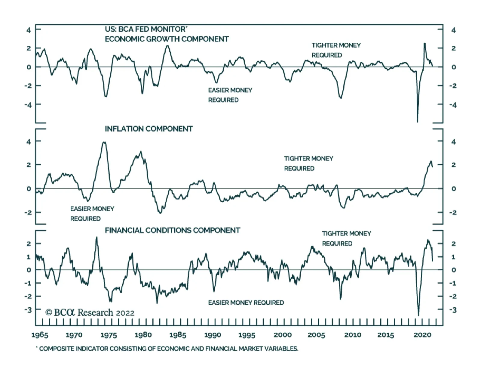
Putting It All Together To make sense of all the different indicators that could signal a Fed pivot toward rate cuts, we turn to our Fed Monitor. The Fed Monitor is a composite indicator that includes many of the individual indicators we have already examined in this report, as well as some others. The Fed Monitor is constructed so that a positive reading suggests that the Fed should be hiking rates and a negative reading suggests the Fed should be cutting rates. As can be seen in Chart 7, the Monitor is currently deep in positive territory. Chart 7Fed Monitor Calls For Tighter Money
Fed Monitor Calls For Tighter Money
Fed Monitor Calls For Tighter Money
The Fed Monitor consists of three main sub-components, an economic growth component, an inflation component and a financial conditions component (Chart 7, bottom 3 panels). We see that the economic growth component of the Monitor is consistent with a neutral Fed policy stance – neither hikes nor cuts - and financial conditions point to a mildly restrictive stance. However, unsurprisingly, the inflation component is the highest it has been since the early-1980s and this is applying a ton of upward pressure to the Monitor. While our Fed Monitor is not a perfect indicator, it does speak to the tradeoff between inflation and economic growth that we have already hinted at in this report. Specifically, the Monitor illustrates that as long as inflation remains elevated it will take a significant deterioration in economic growth and financial conditions before the overall Monitor recommends a dovish Fed pivot. To us, this argues for a higher and later peak in the fed funds rate than is currently priced in the curve. Bottom Line: The peak fed funds rate that is currently priced in the market for 2023 is too low, and the funds rate will also likely peak later than what is priced in the curve. That said, falling inflation and economic growth concerns will probably keep a lid on bond yields during the next few months. We advise investors to keep portfolio duration close to benchmark for the time being, but to look for opportunities to reduce exposure. We will consider reducing our recommended portfolio duration stance to ‘below-benchmark’ if the 10-year Treasury yield falls to 2.5% or if core inflation reverts to our estimate of its 4%-5% underlying trend. Timing The Default Rate Cycle The interest rate cycle is not the only important one for bond investors. The default rate cycle is also crucial for spread product allocations because default trends are responsible for a significant amount of the volatility in corporate bond spreads. In this section we consider the outlook for corporate defaults and high-yield bond performance. We model the trailing 12-month speculative grade default rate using gross leverage (total debt over pre-tax profits) and C&I lending standards (Chart 8). Conservatively, if we assume 5% corporate debt growth for the next 12 months and corporate profit growth of between -10% and -20%, our model projects that the default rate will rise to between 4.7% and 5.9% (Chart 8, top panel). It’s notable that, like us, banks are also preparing for an increase in corporate defaults by raising their loan loss provisions (Chart 8, panel 2). Meanwhile, job cut announcements – another reliable indicator of corporate defaults – still don’t point to a higher default rate (Chart 8, bottom panel). Chart 8The Default Rate Has Troughed
The Default Rate Has Troughed
The Default Rate Has Troughed
Interestingly, our model’s conservative projections suggest that in 12 months the default rate will be lower than its typical recession peak. Given today’s cheap junk valuations, this sort of analysis is encouraging a lot of people to turn bullish on high-yield bonds. Chart 9Default-Adjusted Spread
Default-Adjusted Spread
Default-Adjusted Spread
This line of reasoning is not totally unfounded. Using the same forecasted default rate scenarios from Chart 8 along with an assumed 40% recovery rate on defaulted debt, we calculate that the excess spread available in the junk index after subtracting 12-month default losses is between 136 bps and 208 bps. This is below the historical average (Chart 9), but still above the 100 bps threshold that often delineates between junk bond outperformance and underperformance versus duration-matched Treasuries.6 More specifically, Chart 10 shows the relationship between our default-adjusted spread and high-yield excess returns versus Treasuries for each calendar year going back to 1995. We see that, in general, there is a positive relationship between spread and returns and that excess returns are more often positive than negative whenever the default-adjusted spread is above 100 bps. However, Chart 10 also shows periods when a pure analysis of junk bond performance based on the 12-month default-adjusted spread didn’t pan out. The year 2008 is a prime example. The default-adjusted spread came in at 249 bps for 2008, above the historical average. However, junk spreads widened dramatically in 2008 and excess returns were dismal. Chart 10The Default-Adjusted Spread And High-Yield Returns
Recession Now Or Recession Later?
Recession Now Or Recession Later?
The reason the default-adjusted spread valuation framework failed in 2008 is that while the default rate only moved up to 4.9% in 2008, it wasn’t done increasing for the cycle. In fact, the rise in the default rate accelerated in 2009 until it hit 14.6% in November of that year. So, while default losses were low compared to the starting index spread in 2008, junk index spreads widened sharply in 2008 as the market prepared for worse default losses in 2009. The lesson we draw from the 2008 example is that even if the junk bond market is attractively priced relative to expected default losses on a 12-month horizon, unless we can forecast a peak in the default rate it is unwise to be overly bullish on high-yield bonds. Even if a recession doesn’t occur within the next 6-12 months, it will likely occur within the next 12-24 months. In that environment, investors are unlikely to realize the full potential of today’s attractive 12-month junk bond valuations. Chart 11Junk Spreads
Junk Spreads
Junk Spreads
The bottom line is that we maintain a neutral (3 out of 5) allocation to high-yield within US fixed income portfolios for now. Junk spreads are elevated compared to past rate hike cycles and could tighten during the next few months as inflation converges to its underlying 4%-5% trend. That said, we will not turn outright bullish on junk bonds until we can reasonably forecast a peak in the default rate. In the meantime, a sell on strength strategy is more appropriate. We will reduce our recommended allocation to high-yield bonds if the average index spread tightens to its average 2017-19 level (Chart 11) or once inflation converges with its underlying 4%-5% trend. Ryan Swift US Bond Strategist rswift@bcaresearch.com Footnotes 1 Please see US Bond Strategy Weekly Report, “Three Conjectures About The US Economy”, dated July 19, 2022. 2 https://www.hamiltonproject.org/assets/files/Sahm_web_20190506.pdf 3 Please see US Bond Strategy / US Investment Strategy / US Equity Strategy Special Report, “The Yield Curve As An Indicator”, dated March 29, 2022. 4 https://www.ismworld.org/supply-management-news-and-reports/reports/ism… 5 Please see US Bond Strategy Weekly Report, “The Bond Market Implications Of A 5% Mortgage Rate”, dated April 26, 2022. 6 For a more complete analysis of the link between the default-adjusted spread and excess high-yield returns please see US Bond Strategy / Global Fixed Income Strategy Special Report, “Turning Defensive On US Corporate Bonds,” dated April 12, 2022. Recommended Portfolio Specification Other Recommendations Treasury Index Returns Spread Product Returns
The German Ifo Business Climate Index fell to a 23-month low of 88.6 in July from 92.2, against expectations of a milder deterioration. The current assessment and expectations sub-indices both fell by 1.7 and 5.2 points, respectively. Moreover, the weakness…
The ongoing normalization of consumption patterns is one of the factors responsible for deteriorating global manufacturing activity (see Market Focus). The pandemic binge has satiated Americans’ demand for goods (excluding autos). The global manufacturing…
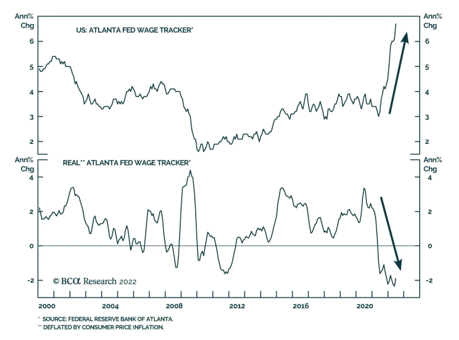
Soaring price pressures and tight labor market conditions – characterized by the difficulty employers are facing in finding qualified workers – are a recipe for robust wage growth (see Country Focus). With labor costs accounting for over 50% of sales…
BCA Research’s European Investment Strategy service concludes that BTPs have become attractive for long-term rather than short-term investors. The differences between the neutral rates across the Eurozone are the key factor limiting how far and how fast…
Executive Summary More Tightening To Come
More Tightening To Come
More Tightening To Come
In the following report we answer the most asked questions from our recent “Bear Market 2.0” webcast. Macroeconomic backdrop and inflation: While commodity prices falling, the wage-price spiral is in full force, implying that it will take many months to reach the level of PCE inflation palatable to the Fed. The Fed will continue to tighten monetary conditions until entrenched inflation reaches its target, which may take longer than the market expects. Earnings outlook: Q2-2022 results show that an earnings slowdown has already commenced and is bound to get worse over the next couple of quarters. However, earnings forecasts are still too optimistic and a slowdown in earnings growth is not yet priced in. Investment themes: We recommend topping up allocation to Tech as it benefits from rate stabilization. However, be judicious in your choices, staying away from the more cyclical areas, such as Hardware and Equipment, and Semiconductors. We are overweight Software and Services, which is dominated by profitable and stable growth companies. Bottom Line: We continue to recommend that investors remain patient and prudent in range-bound markets. Earnings growth is likely to deteriorate into the year end. Feature Last Monday, July 18, I hosted a webcast called “Bear Market 2.0.” A total of 675 people dialed in, and I was honored. The webcast generated a significant number of client questions which I aim to address in this weekly publication. Broadly speaking, questions fell under each of the three rubrics of the webcast: Macroeconomic backdrop, earnings outlook, and investment themes, with the latter generating the lion’s share of questions. In today’s report, we will discuss inflation and rates, earnings season results, potential S&P 500 targets, whether the S&P 500 rally is sustainable, and if it is a good idea to top up Tech. We will address remaining questions on Energy and Materials, and Semiconductor in the near future. And as always, we are looking forward to more questions! Macroeconomic Backdrop How do you reconcile your inflation outlook with an assumption that long yields may have peaked? In the “Fat and Flat” and “Adaptive Expectations” reports, we outline our view that the market’s focus is shifting away from concerns about inflation and the hawkish Fed toward worries about growth. Indeed, the 10-year rate has stabilized at 2.78% on fears of impending slowdown (Chart 1). How does this reconcile with our view that inflation is entrenched and broadening (Chart 2), especially in light of the recent pullback in energy and commodities prices? Chart 1Yields Are Stabilizing
Yields Are Stabilizing
Yields Are Stabilizing
Chart 2Inflation Is Entrenched
Inflation Is Entrenched
Inflation Is Entrenched
Even if energy and commodities prices are falling, the latest wage survey from the Atlanta Fed demonstrates wage growth is not letting up, and labor costs, at over 50% of sales as per NIPA accounts, are a more important component of the US corporate cost structure than the cost of energy. Inflation is embedded as, companies pass on wage increases to customers by increasing prices – and, voilà, the wage-price spiral is becoming pervasive. This dynamic implies the following: Even if inflation peaks over the next several months, it will take many months to reach the level of PCE inflation palatable to the Fed. After having mismanaged inflation over the past 18 months, the Fed will err on the side of tighter policy. In fact, in its official statement, the Fed has asserted that its commitment to bringing inflation to its 2% target is unconditional. Therefore, we are still in the early innings of the monetary tightening cycle (Chart 3), where elevated inflation coexists with slowing growth and range-bound long rates. Bottom Line: The Fed will continue to tighten monetary conditions until entrenched inflation reaches its target, which may take longer than the market expects. Chart 3More Tightening To Come
More Tightening To Come
More Tightening To Come
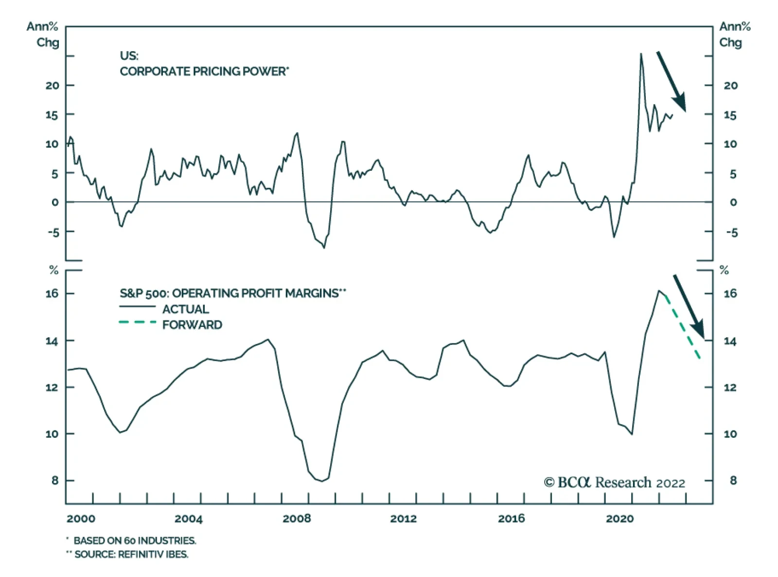
Earnings Outlook What are your takeaways from the earnings seasons so far? In the Daily Insight, which we published on July 21, we offer our initial reaction to the results. In short, so far earnings have been good, but margins are under pressure (Chart 4) from rising wages and fading pricing power (Chart 5). We have also heard quite a few negative comments from companies concerning the effects of inflation and rising costs, a strong dollar, and withdrawal from Russia. Some of the largest Technology companies announced slowdowns in hiring as they anticipate falls in demand. Forward guidance has also been concerning. Most companies talk about deteriorating economic conditions. Chart 4Margins Are Expected To Contract
Margins Are Expected To Contract
Margins Are Expected To Contract
Chart 5Pricing Power Turning
Pricing Power Turning
Pricing Power Turning
We are still convinced that street forecasts of earnings growing at about a 10% rate over the next 12 months and 11% into year-end (Table 1), despite ubiquitous negative corporate guidance, are unrealistically high. Even in this reporting season for Q2-22, earnings growth is -3%, excluding Energy. Table 1S&P 500 EPS: Actual And Expected
What Our Clients Are Asking: The Bear Market 2.0 Webcast Follow Up
What Our Clients Are Asking: The Bear Market 2.0 Webcast Follow Up
It is unlikely that, over the next several months, macro headwinds, such as slowing growth, the hawkish Fed, stubborn inflation, and rising wages will dissipate. There is little consensus among analysts on forecasts (Chart 6) and downgrades are likely. We take it a step further, and call an earnings recession in three to six months. Chart 6Analysts Have Little Confidence In Their Forecasts
Analysts Have Little Confidence In Their Forecasts
Analysts Have Little Confidence In Their Forecasts
Bottom Line: Q2-2022 results show that an earnings slowdown has most likely already commenced and is bound to get worse over the next couple of quarters. However, earnings forecasts are still too optimistic and a slowdown in earnings growth is not yet priced in. Do you think that the slowdown in earnings might trigger multiple expansion? Earnings contraction, everything else equal, translates into multiple expansion, as the denominator of the fraction gets smaller. For example, according to our back-of-the-envelope estimates, earnings contracting by 10% will increase the forward multiple from the current 16x to 19x. Therefore, the key question here is how likely is it that everything else will indeed stay equal, as opposed to the market selling off in line with earnings? Multiples will expand if the market is able to see past negative earnings growth, identifying a catalyst for an imminent rebound. That was the case in 2020 as investors anticipated earnings bouncing back helped by easy monetary and fiscal policy, and COVID receding. What will be a catalyst for earnings rebound in, say, 2023? We can only speculate but one of the potential reasons for faster earnings growth is perhaps normalization of growth outside of the US: A weaker dollar, peace in Ukraine, resolution of the energy crisis, or ultra-loose monetary and fiscal policy in China. At home, the anticipation of a soft landing and a more dovish monetary policy coupled with a positive real wage growth boosting consumers’ spending power may be sufficient to reassure investors that earnings growth turning positive is imminent. However, all of these developments are probably months away. And we expect the market to sell off if earnings growth disappoints. Where do you see the S&P 500 by the end of the year? Broadly speaking, BCA Research does not provide targets but rather aims to offer insights into market trends. However, in the “Is Earnings Recession In The Cards?” report, we presented a matrix outlining different scenarios of earnings growth vs. forward multiples to arrive at a potential range of the outcomes for the index. We assume that the forward multiple stays at 16x, as the multiple contraction stage of the bear market is likely completed, but there is still no clear catalyst for earnings rebound. We will approximate CY 2022 results using the Next Twelve Months Matrix (Table 2). Table 2The S&P 500 Price Target Scenarios
What Our Clients Are Asking: The Bear Market 2.0 Webcast Follow Up
What Our Clients Are Asking: The Bear Market 2.0 Webcast Follow Up
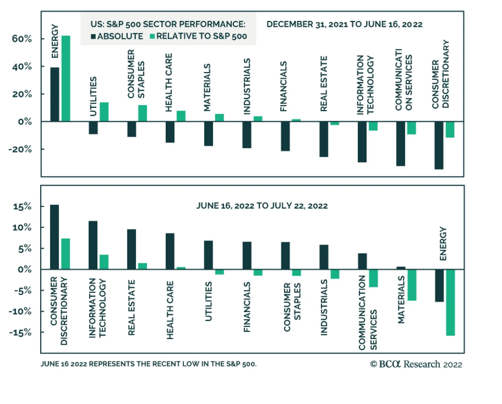
We can distill the matrix into three likely scenarios: Earnings growth delivered by companies in line with analyst expectations of 11% over the six months; flat earnings (0% growth) broadly in line with the forecast based on our earnings model; and the worst-case scenario of a severe earnings contraction of -10% into year-end. We assign 25% to both extreme cases and about 50% to earnings staying flat for the next six months (earnings recession commencing in 2023). Best-case scenario: Earnings grow into year-end by 11%, and by 9.7% over the next 12 months. In that case, the S&P 500 will end the year at 3,837 or 3% off the current level. This is what is being priced in. Most likely scenario: Earnings growth trends to zero by the end of the year with the S&P 500 hitting 3500 or downshifting roughly 10% from here. Worst-case scenario: Earnings contract by 10%, and with the multiple staying at 16x, the S&P 500 price target will be 3287 or about 17% lower than today. With “E” falling so much, perhaps the multiple expands to 17x, in which case the market will fall “only” 11% from here. Bottom Line: We expect flagging earnings to cause another leg of the bear market, which is likely to be 5-10% into year-end, and perhaps another 5-10% in 2023. Equity Market Outlook And Key Investment Themes Are investors capitulating? Are we near or even past the bottom? The decline in oil and food prices and the easing of supply-side bottlenecks have alleviated market worries about US inflation. This, coupled with oversold risk assets, and apparent extreme pessimism in investor sentiment, has resulted in the S&P 500 rebounding 8% from its June lows. Sectors that have sold off the most over the past six months have bounced back the hardest (Chart 7). Naturally, the question that is top of mind for investors is whether this rebound is sustainable. Should they add beaten-down cyclicals to their portfolios to partake in the rally? Of course, no one can predict what Mr. Market will do with 100% certainty but here are some thoughts: Chart 7Sector Performance Overview
What Our Clients Are Asking: The Bear Market 2.0 Webcast Follow Up
What Our Clients Are Asking: The Bear Market 2.0 Webcast Follow Up
Positives Many risk assets are severely oversold, and for long-term investors, an entry point is attractive valuation-wise. So far, many investors find earnings season results somewhat encouraging: Netflix soared on what its CEO Hawkins called “less bad results.” Multiples have contracted and priced in most of the primary effects of high inflation and rising rates. Negatives The Fed is determined to extinguish inflation, and this hiking cycle may end up much longer and steeper than the market is pricing in. We do not anticipate monetary easing in the first half of 2023. Financial markets are currently underrating the risk of a seriously hawkish Fed. Economic growth is slowing, and consensus forecasts of earnings growth are still overly optimistic. Earnings contraction over the next several quarters is likely but is certainly not priced in, and disappointment may rock markets. The catalyst for this summer’s rebound is two-fold: The market is celebrating the end of inflation worries and is rebounding from severely oversold conditions. Black swan “generators” such as China and Russia, may have more surprises in stock (Table 3). We continue to stick to “fat and down” expectations for the equities outlined in the “Adaptive Expectations” report and anticipate a range-bound market where relief rallies are alternated with pullbacks, mostly triggered by growth disappointments and realizations that the Fed has dug in its heels and is unlikely to let up anytime soon. The “down” leg will ensue if earnings contract. Yet we recommend investors take a granular approach to industry selection and start tilting portfolios away from assets that benefit from rising inflation, such as Energy and Materials, towards the “growthy” assets that benefit from rate stabilization and falling growth. We picked up on the turning point and upgraded Growth to overweight in early July, funding it from Value. Table 3Scorecard
What Our Clients Are Asking: The Bear Market 2.0 Webcast Follow Up
What Our Clients Are Asking: The Bear Market 2.0 Webcast Follow Up
Bottom Line: We consider the recent rebound in US equities a bear market rally, and don’t believe that it is sustainable. The Fed and the stock market are on a collision course – easier financial conditions will make the Fed even more aggressive. Is it time to buy Tech? As we have highlighted in the “Are We There Yet?!” report back in January, Tech’s worst performance is two to three months prior to the first rate hike, and the rebound is two to three months after the beginning of the monetary cycle. The slump and a recent rally are perfectly in line with history (Chart 8). Rates have stabilized and “growthy” Tech has pounced (Chart 9). Another issue that was holding the sector back earlier in the year was a slowdown in demand for Tech investment (Chart 10). Recently, business demand for Tech has picked up. However, US consumer spending on Tech is falling, as demand for consumer goods, pulled forward by the pandemic, is fading (Chart 11). Therefore, we need to be judicious in our selection of technology stocks. Chart 8Tech Performance During A Hiking Cycle
What Our Clients Are Asking: The Bear Market 2.0 Webcast Follow Up
What Our Clients Are Asking: The Bear Market 2.0 Webcast Follow Up
Chart 9Technology Rebounded On The Back Of Yields Peaking
Technology Rebounded On The Back Of Yields Peaking
Technology Rebounded On The Back Of Yields Peaking
Chart 10Corporate Demand For Tech Has Picked Up…
Corporate Demand For Tech Has Picked Up…
Corporate Demand For Tech Has Picked Up…
We reiterate our overweight in Software and Services, which is least exposed to consumer demand. Our thesis is that this industry group represents “defensive growth” thanks to the key trends of digitization of the US economy and migration to cloud. Spending on digitization and the cloud are pervasive across non-tech companies and capture a large swath of corporate America by both size and industry. Also, software and services companies tend to have stable earnings growth throughout the cycle, as software improves productivity and cuts costs (Chart 12). Chart 11...But Consumer Spending Slowed
...But Consumer Spending Slowed
...But Consumer Spending Slowed
Chart 12Software Is Defensive Growth
Software Is Defensive Growth
Software Is Defensive Growth
We are underweight more cyclical Hardware and Equipment, and Semiconductors industry groups as they are more exposed to the slowing economy and the flagging demand for hardware and chips. We will take a close look at the Semiconductor Industry Group in the near future. Bottom Line: We recommend topping up allocation to tech as it benefits from rate stabilization. However, be judicious in your choices, staying away from the more cyclical areas, such as Hardware and Equipment, and Semiconductors. We are overweight Software and Services, which is dominated by profitable and stable growth companies. Irene Tunkel Chief Strategist, US Equity Strategy irene.tunkel@bcaresearch.com Recommended Allocation Recommended Allocation: Addendum
What Our Clients Are Asking: The Bear Market 2.0 Webcast Follow Up
What Our Clients Are Asking: The Bear Market 2.0 Webcast Follow Up
Executive Summary The ECB finally exited negative interest rates last week. In exchange for higher rates, the doves received an ambitious anti-fragmentation tool, the TPI. The ECB deposit rate is likely to reach between 1% and 1.5% by the summer of 2023. The ECB’s number one problem remains the widely different neutral rates across the Eurozone’s largest economies. Our r-star estimates suggest that the German neutral rate is significantly above that of Spain, Italy, and even France. This divergence in r-star means that the TPI will be activated, but its presence alone is not enough to tame the peripheral bond markets when the ECB hikes rates. While the near-term remains fraught with risks, BTPs are increasingly attractive for long-term investors. The TPI also creates a bullish long-term backdrop for the euro. Many R-Star In The European Sky
ECB Policy: One Size Doesn’t Fit All
ECB Policy: One Size Doesn’t Fit All
Bottom Line: Diverging neutral rates across the Eurozone’s main economies will impair the ECB’s ability to normalize interest rates over the next twelve months without also activating the new anti-fragmentation tool, the TPI. BTPs have become attractive for long-term rather than short-term investors. Last week, the European Central Bank (ECB) increased interest rates by 50bps, the first hike in eleven years and the third time in its history that it has tightened policy by such a large increment. In exchange for this abrupt end to negative interest rates, the doves on the Governing Council (GC) extracted the creation of the Transmission Protection Instrument (TPI), a new facility designed to limit fragmentation risk on sovereign bond yields in the Eurozone. These two moves raise three key questions: Will the ECB continue to increase rates this aggressively in the coming months? Have peripheral spreads peaked? Will the threat of TPI buying be enough to put a ceiling on spreads, or will the ECB actually need to activate the program in the coming months? To answer these questions, we evaluate where r-star (the neutral real rate of interest) stands in the four largest Euro Area economies. While there is scope for the ECB to push policy rates higher, the wide differences in r-star across European nations indicate that the TPI will need to be activated to stabilize peripheral bond markets, most importantly, Italian government debt. This makes BTPs attractive for long-term investors, although near-term volatility will remain elevated as the markets test the ECB’s resolve. What Happened? Related Report European Investment StrategyLooking Beyond Europe’s Inflation Peak In terms of interest rates, the most important conclusion from last’s week policy meeting was that forward guidance has been abandoned. The ECB is now fully data dependent, and each policy meeting will be a live one. Another rate hike is certain for the September meeting, ranging from 25bps to potentially 75bps if the ECB wishes to further “front-load” tightening. The single guiding principle will be the outlook for inflation. Chart 1Incoming Inflation Peak
Incoming Inflation Peak
Incoming Inflation Peak
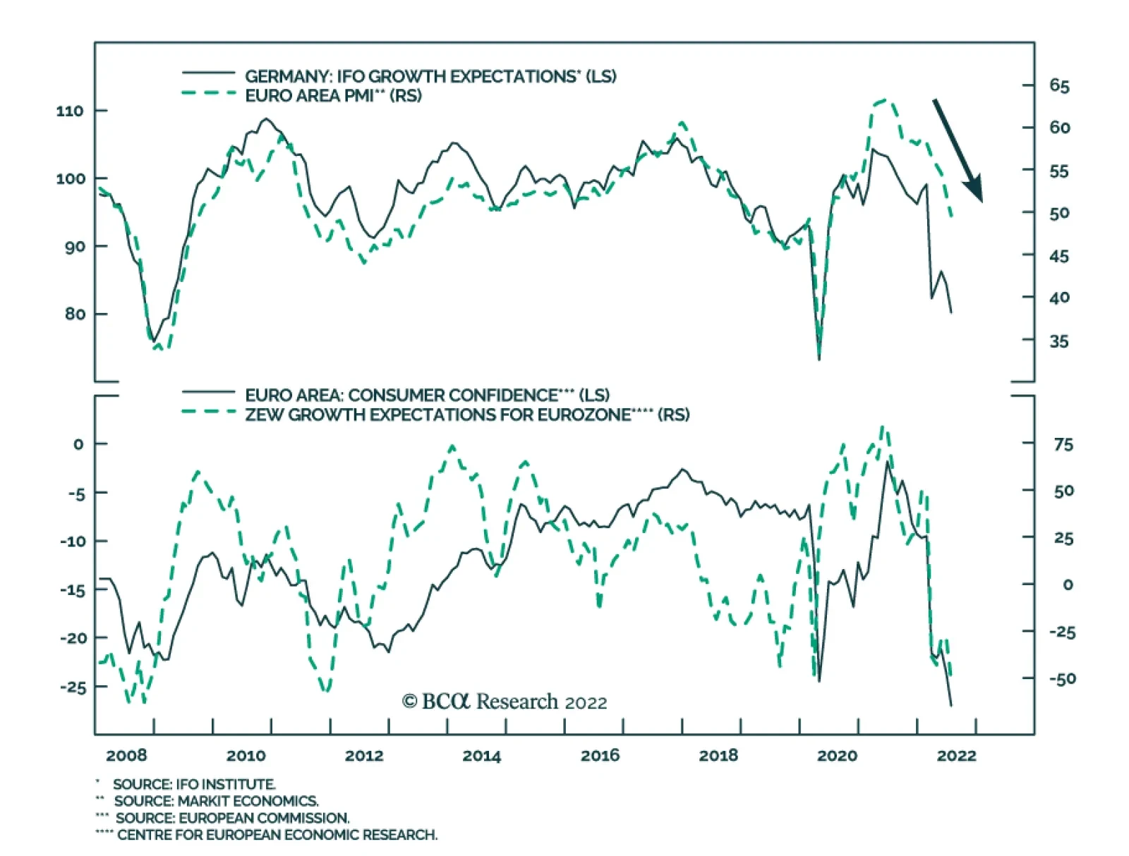
We do expect inflation to peak soon in the Eurozone, mostly because of the decline in the commodity impulse and slowing food inflation (Chart 1). Additionally, the one-month impulse of our Trimmed-Mean CPI is weakening. However, as of June, headline and core inflation stand at 8.6% and 3.7%, respectively. Inflation is unlikely to slow enough by the September meeting to prompt the ECB to forecast inflation falling below its 2% target by 2024. In this context, our base case remains that the GC will opt for a 50bps hike in September. Beyond September, we expect the ECB to revert to 25bps rate hikes and the policy rate to settle between 1% and 1.5% by the summer of 2023, which is broadly in line with the current pricing of the €STR curve (Chart 2). We are somewhat less hawkish than the market for the month of October, because we expect inflation to roll over this fall. Moreover, the European economy continues to decelerate, as highlighted by the declines in the ZEW growth expectations and the PMIs (Chart 3). This deceleration will allow the ECB to revise down its inflation outlook over time. Chart 2Appropriate Pricing
Appropriate Pricing
Appropriate Pricing
Chart 3Growth Is Slowing
Growth Is Slowing
Growth Is Slowing
The announcement of the TPI was the other crucial development from the last ECB meeting. The TPI was unanimously supported. In addition, its asset purchases will be unlimited, and the GC will have much discretion with respect to its implementation. These are three important features that give it ample credibility. However, the program has yet to be activated. Chart 4PEPP Reinvestment Doing Little
PEPP Reinvestment Doing Little
PEPP Reinvestment Doing Little
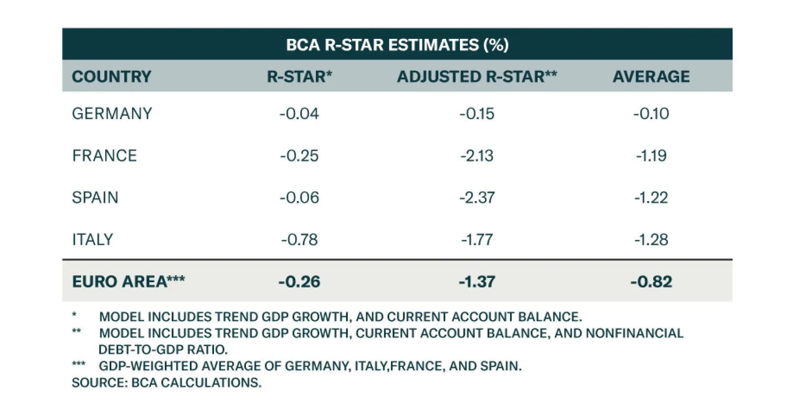
We do not share the optimism of the GC members who believe that the TPI’s existence alone will narrow peripheral spreads without the ECB having to purchase a single bond. The market will have to figure out what the GC deems as “unwarranted” and “disorderly” moves, especially in a context in which the Draghi government has collapsed and Italy’s commitment to reform will be challenged exactly as interest rates begin to rise. Moreover, the flexible re-investment of PEPP redemptions has not prevented BTP/Bund spreads from widening (Chart 4). As a result, we expect the market to test the ECB’s resolve over the coming weeks, which is likely to result in volatility and wider spreads until the TPI is activated. Bottom Line: Last week’s ECB meeting was a seminal moment. The ECB not only abandoned eight years of negative rates in one go, but it also implemented an ambitious program that aims to restrict peripheral spreads, albeit with some near-term volatility. European policy rates are set to rise to between 1% and 1.5% by the summer of 2023. In Search Of A Neutral Rate During Thursday’s press conference, President Christine Lagarde refused to respond to a question about the neutral rate of interest in Europe. We have sympathy for her predicament. The ECB’s biggest problem is that there is not one neutral interest rate for the entire euro area, but nineteen individual neutral rates for each Eurozone country, with wild differences among them.1 The differences between the neutral rates across the Eurozone are the key factor limiting how far and how fast the ECB may increase rates. It is also the main reason why the ECB resorts to an alphabet soup of non-interest rate policy measures (APP, PEPP, LTRO and, now, TPI) to maintain appropriate monetary conditions across the bloc. But exactly how wide are the differences between the neutral rates? To answer this question, we expand on the methodology developed by Holston, Laubach and Williams (HLW) from the San Francisco Fed to estimate the neutral real interest rate – or “r-star” - in Germany, France, Italy, and Spain. These are the four largest economies in the Euro Area, accounting for 70% of its GDP. Specifically, we run regressions between the real interest rates in those countries versus trend GDP growth and current account balances, which approximates the savings-investment balance. Mimicking the HLW methodology, the inflation expectations used to extract real interest rates from nominal short rates reflect an adaptative framework whereby inflation expectations are a function of the ten-year moving average core CPI. Our methodology produces estimates of r-star that range from 0% in Germany, to -0.8% in Italy, or a GDP-weighted average of -0.3% for the Eurozone (Table 1). When incorporating last week’s ECB rate hike, Europe’s real deposit rate falls to -1.2% if we use the smoothing procedure from HLW to compute inflation expectations, or -3.7% if we use current core CPI. In either case, policy remains accommodative for everyone. Table 1Many R-Star In The European Sky
ECB Policy: One Size Doesn’t Fit All
ECB Policy: One Size Doesn’t Fit All
We also ran a second set of estimates for r-star, which includes total nonfinancial debt-to-GDP. The logic reflects the notion that adverse debt dynamics was a key force behind the 2011/12 European sovereign debt crisis, which obligated the ECB to reverse course after pushing up the repo rate twice in 2011. Moreover, heavy debt loads not only constrain the ability of various countries to withstand higher rates, but they are also linked to misallocated capital and are therefore likely to depress trend GDP growth over time compared to countries with lighter debt loads. This adjustment changes the picture considerably. While Germany’s real neutral rate of interest remains around 0%, those of Italy and Spain plunge to -1.8% and -2.4%, respectively. France has also experienced a large decline in its r-star to -2.1% in response to the heavy debt load carried by its private and public sectors. Using this method, the GDP-weighted Euro Area r-star falls to -1.4% (Table 1). So which version of the model is more accurate? We believe the most realistic estimate for r-star in each of the four countries is the simple average of both the unadjusted and the debt-adjusted r-star. This implies that the inflation-adjusted neutral rate is close 0% in Germany, -1.2% in France, -1.2% in Spain and -1.3% in Italy (Table 1). Are those results consistent with reality? A country-by-country evaluation suggests that this ranking is correct. To arrive at this judgment, we evaluated each country based on the following four dimensions: Private sector debt accumulation since 2010. If policy is particularly easy for one country, the private sector will be incentivized to take on debt at a more rapid pace than if monetary conditions were tighter. House price appreciation since 2010. Housing is the part of the economy most sensitive to monetary conditions. Larger real estate price gains will materialize in economies where monetary policy is particularly loose. Profit growth since 2010. Easy monetary policy will subsidize corporate profitability, either through faster domestic activity or a cheaper exchange rate (or both). Unemployment rate. The unemployment rate is a crude measure of slack in the economy. An easier policy setting in one country will reduce the unemployment rate compared to a country where policy rates are high relative to r-star. Germany Chart 5Loosest Monetary Conditions In Germany
Loosest Monetary Conditions In Germany
Loosest Monetary Conditions In Germany
Germany exhibits all the evidence of monetary policy being much more accommodative for that country than the other four countries, for the following reasons: Since 2010, German private debt has been expanding much faster than the average of the four countries (Chart 5, top panel). Germany is experiencing the fastest house price appreciation (Chart 5, second panel). Germany’s profits have grown much faster (Chart 5, third panel). Germany’s unemployment rate stands at only 3%, compared to an average rate of 8% for the four nations together (Chart 5, bottom panel). France Chart 6French Monetary Conditions Are Tighter
French Monetary Conditions Are Tighter
French Monetary Conditions Are Tighter
France is a mixed bag. Monetary policy has been easy for France, but the French economy lags Germany on three of the four aforementioned dimensions: Since 2010, French private debt is growing at the fastest pace of the four economies studied, outpacing even that of Germany (Chart 6, top panel). While French house prices have grown slightly faster than the average of the four nations, they lagged German real estate prices (Chart 6, second panel). While French profits have also bested the average of the four nations, they nonetheless trail German profits (Chart 6, third panel). France’s unemployment rate is in line with the average of the four countries under observation (Chart 6, bottom panel). Spain For most of the period following 2010, Spain has suffered from the scars of the disastrous deleveraging that was required in the wake of the sovereign debt crisis. Its trend growth collapsed, and the ECB’s common policy was never as accommodative as it was for its northern neighbors. However, in recent years, the Spanish economy seems to be catching up, a result of the impact of previous structural reforms and the improved competitiveness brought about by collapsing real unit labor costs: Chart 7Spain Still Grapples With Problems
Spain Still Grapples With Problems
Spain Still Grapples With Problems
Since 2010, Spanish private debt has contracted by 20% compared to a 33% expansion for the European average (Chart 7, top panel). Spanish real estate prices have also lagged far behind those of the other countries put together (Chart 7, second panel). However, since 2015, Spanish house prices have begun to recover, and they are now moving at the same pace as the Euro Area average. Spanish profit growth remains weak compared to the average of the four countries studied in this report (Chart 7, third panel). The Spanish unemployment continues to tower at 13%, well above the average of the four largest Euro Area economies (Chart 7, bottom panel). Italy Italy has a similar profile to that of Spain. While its worst performance is solidly in the rear-view mirror, the recent period of easy monetary policy has allowed for some recovery. Nonetheless, Italy still lags far behind other Eurozone countries, which suggests that policy in Italy is not nearly as accommodative as in the rest of the Eurozone. Chart 8Italy Shows Little Improvements
Italy Shows Little Improvements
Italy Shows Little Improvements
Burdened by very large nonperforming loans, the Italian banking sector has been unable to provide adequate credit to the Italian private sector, which already had a limited appetite for debt. As a result, since 2010, Italian private credit has lagged far behind the European average (Chart 8, top panel). Italian real estate prices have not recovered meaningfully from their contraction between 2011 and 2019. Consequently, Italian housing prices lag substantially behind the average of the largest Euro Area countries (Chart 8, second panel). Italian profits remain weak (Chart 8, third panel). While not as elevated as the Spanish unemployment rate, at 8%, Italy’s rate is comparable to the four-country average (Chart 8, bottom panel). Generalizations These observations about individual countries confirm that Germany’s r-star is significantly higher than those of Spain and Italy. When compared to France, the German r-star is also higher, but the gap is much narrower than that between Germany and the two southern nations. The recent ECB Euro Area Bank Lending Survey confirms that France’s r-star is well below that of Germany. French lending standards are tightening as fast as those in Italy (Chart 9). In effect, France’s heavy private sector debt load is proving to be a burden as the ECB begins to tighten policy, which implies a lower French r-star. Chart 9Lending Standard Are Tightening Most In France And Italy
ECB Policy: One Size Doesn’t Fit All
ECB Policy: One Size Doesn’t Fit All
Bottom Line: Among the four largest economies in the Eurozone, a modeling exercise based on the HWL approach reveals that there is a large gap in neutral real interest rates, with Germany on one side around 0%, and Italy, Spain, and even France on the other side with r-star estimates ranging between -1.2% and -1.3%. A survey of current economic activity in these four nations confirms the results from the modeling exercise. Investment Implications The main consequence of the differing r-star across the Eurozone is that the ECB will need to remain an active player in the sovereign bond market. The German, Dutch, and Baltic economies are overheating, and policy needs to be tightened. This means that the ECB will continue to hike rates over the coming months. However, it cannot raise rates much more before they become problematic in Italy, Spain, and even France. Thus, the ECB will activate the TPI in the coming months in order to ease monetary conditions in those economies relative to the stronger group by limiting policy-induced increases in bond yields. In fact, using the r-star estimates adjusted for the debt-to-GDP ratios, the ECB would need to absorb roughly 30% of the Italian total debt to bring Italy’s r-star closer to Germany’s levels. This will not happen, which means that in the foreseeable future, Italy will not be able to withstand the levels of interest rate needed to cool down the German economy. Nonetheless, the TPI can help the ECB in fine-tuning monetary conditions across the Eurozone as it hikes policy rates. For now, Italian bonds are likely to remain volatile until the TPI is activated, especially considering the political situation in Italy, where the outlook for structural reform seems compromised by political uncertainty. This volatility will result in the activation of the TPI before year-end. Once the TPI is activated, BTP/Bund spreads are likely to move back toward 100bps, the level historically consistent with the ECB’s involvement in the sovereign debt market during the APP/PEPP era. The activation of the TPI will also be a positive development for the European corporate bond market, especially investment grade bonds. In last week’s post-conference press release, the ECB revealed that the TPI will also be able to buy private issuer securities. Thus, the ECB is likely to return as a potential buyer in this market. Moreover, investment grade bonds already price in a European recession and therefore offer a large value cushion with 12-month breakeven spreads trading in their 79th historical percentile (Chart 10). We especially like European investment grade corporate bonds relative to US ones on a USD-hedged basis. Relative valuations are in favor of Europe, and the ECB is not tightening policy as much as the Fed. Related Report European Investment StrategyTo Parity And Beyond The euro will ultimately benefit from the activation of the TPI. The narrowing of both sovereign and corporate spreads resulting from the program represents a very bullish development for EUR/USD (Chart 11), especially because the ECB will likely sterilize the bonds purchased under the program (i.e. the ECB’s balance sheet will not expand because of the TPI). The TPI will also allow the ECB to deliver higher interest rates, which further supports the euro. Nonetheless, we continue to see substantial (roughly 20%) odds of a break below parity in the near-term, especially if wider BTP-Bund spreads in the coming three months are the key catalyst behind the TPI’s activation. Chart 10Eurozone IG Debt Is Attractive
Eurozone IG Debt Is Attractive
Eurozone IG Debt Is Attractive
Chart 11The TPI Will Help The Euro, Eventually
The TPI Will Help The Euro, Eventually
The TPI Will Help The Euro, Eventually
Finally, last week’s policy development is unlikely to affect the absolute performance of European stocks. European equities remain mostly impacted by the fluctuations in global stock prices and the shifting probability of a recession in Europe this winter in response to the evolving energy crisis on the continent. European equities are inexpensive, and the probability of a recession is declining as a result of the resumption of natural gas flows from Russia. Crucially, the broadening trend toward coal utilization this winter and the growing list of deals that Europe is striking to secure non-Russian gas supplies suggest the impact of Russian cutoffs this winter could be more limited than once feared. Moreover, we expect European governments to hose their economies with stimulus if a crisis does emerge, which would both limit the depth of the crisis and prompt a rapid rebound in activity once winter ends. However, the inattention of the ECB to recession risks suggests that European equities could lag US equities in the near term. Bottom Line: The differences in r-star across Europe mean that the ECB will be forced to activate the TPI before year-end in order to hike interest rates further. Practically, this means that medium- to long-term investors should overweight Italian bonds at the current level of spreads. Short-term investors should remain on the sidelines; the political situation in Italy is still dangerous, and speculators are likely to test the ECB’s resolve. This also means that the euro is attractive as a long-term play, but it still carries large left-tail risk in the near term. While investors should favor European investment-grade bonds in USD-hedged terms relative to the US, European equities are likely to continue to suffer headwinds compared to US stocks. Mathieu Savary, Chief European Strategist Mathieu@bcaresearch.com Footnotes 1 In fact, it will soon be 20 r-star since Croatia will join the euro on January 1, 2023.