Developed Countries

Executive Summary Chair Powell’s Jackson Hole speech did not change our fundamental take on the economy; we still think the expansion will survive through the first half of 2023 at a minimum. Financial markets’ reaction to Powell’s remarks highlighted that volatility will likely remain elevated but we continue to expect that equities will generate meaningful excess returns over Treasuries and cash over the rest of the year. The flow of data continues to send mixed signals about the outlook for financial markets and the economy, but the biggest risks to our view are no closer to occurring today than they were when we laid them out last month. An Eventful Intermeeting Period
An Eventful Intermeeting Period
An Eventful Intermeeting Period
Bottom Line: We remain more optimistic than the consensus and continue to recommend a risk-friendly tilt in multi-asset portfolios over the next six months. We are still on high alert, however, and remain open to changing our views if incoming data begin to hint at an approaching inflection. Feature At the outset of a Zoom call last week, a US-based client asked if Chair Powell’s Jackson Hole speech had changed our view. The short answer is no, though it certainly roiled financial markets, providing the latest reminder that investors’ conviction levels should be lower than normal. This week’s report offers a longer answer, analyzing Powell’s comments while revisiting the risks to our view that we laid out in August. The principal risks have not gotten any closer to fruition and we therefore stand by our glass-half-full view, though we reiterate that it is contingent on incoming data flows – if they point to a worse outcome than our current base case, we may yet join the bearish chorus. The Fed Bigwigs Went To Grand Teton National Park … Chair Powell opened his speech by promising brevity, focus and directness and he delivered on all three counts. He used less than a third of his allotted 30 minutes to hammer home the Fed’s commitment to bringing inflation back to its 2% target and he didn’t mince words. The speech was short enough to allow the following close reading of it in which we excerpt a key line from nearly every paragraph, followed by our italicized takeaways. Powell: “Restoring price stability will take some time and requires using our tools forcefully to bring demand and supply into better balance.” US Investment Strategy: We are prepared to accept a lengthy stretch of subpar growth as the cost of getting inflation under control. Until further notice, fighting inflation takes precedence over encouraging growth. “The labor market … is clearly out of balance, with demand … substantially exceeding … supply[.]” The rip-roaring labor market is so strong that we have no choice but to lean against it given the inflation backdrop. “In current circumstances, … [the dots’] estimates of [the] longer-run neutral [fed funds rate] are not a place to stop or pause.” It will take a good bit more monetary tightening to get inflation back to the 2% target. “I said [in July] that another unusually large increase could be appropriate at our next meeting.” Another 75-basis point hike is on the table in September. The pace of increases will eventually slow, but we don’t yet know when. “Restoring price stability will likely require maintaining a restrictive policy stance for some time.” Don’t count on rate cuts any time soon. “[C]entral banks can and should take responsibility for delivering low and stable inflation.” The Fed is obligated to combat high inflation, even if some of its causes are beyond our control. Though we can’t relieve supply constraints, we can bring demand into better balance with supply. Related Report US Investment StrategyRisks To Our View (Again) “If the public expects that inflation will remain low and stable over time, absent major shocks, it likely will. Unfortunately, the same is true of expectations of high and volatile inflation.” High inflation expectations can be self-fulfilling and we cannot allow them to become entrenched à la the 1970s. “The longer the current bout of high inflation continues, the greater the chance that expectations of higher inflation will become entrenched.” We cannot take it for granted that inflation expectations will remain well anchored despite high inflation prints. The public’s focus on inflation threatens future price stability and future growth and we would be playing with fire if we didn’t address it now. “[W]e must keep at it until the job is done.” If we do not act forcefully now, the cost of getting inflation back to the 2% target will be much greater. “We will keep at it until we are confident the job is done.” In case you missed my first reference to Paul Volcker’s memoir, Keeping At It, a moment ago, or the two times I spoke his name, understand that we’re willing to do whatever it takes to getting the inflation genie back in the bottle. … And All Investors Got Was A Lousy Selloff Our italicized translations should have sent a chill down the spines of equity investors and the S&P 500 duly plunged 3.4% after Powell’s speech, then followed up by sliding as much as another 3.8% in last week's sessions. BCA has always viewed 2023 rate cuts as something of a pipe dream, and we have been relieved to see the money market raise its terminal fed funds rate estimate while pushing out the date it will be reached. As Chart 1 shows, the expected terminal rate has risen by about 75 basis points and rate cuts have been pushed back since the July FOMC meeting, but even Jackson Hole didn’t get investors to give up on them entirely. Our best guess is that they still question the Fed’s commitment in the face of a slowdown. Chart 1A Lot Can Change In Five Weeks
A Lot Can Change In Five Weeks
A Lot Can Change In Five Weeks
That interpretation offers a ready answer for why the glass-half-full view has taken a beating over the last six sessions but suggests that the glass-half-empty view could be at risk before too long. A higher terminal fed funds rate implies lower near-term earnings as well as a reduced willingness to pay for those earnings, so stocks have suffered as investors revised their expectations to better align with the Fed’s guidance. But the need to hike more and faster than investors expected underscores aggregate demand’s surprising resilience. If the labor market, consumption and corporate earnings all continue to hold up better than expected, equities have a path to move higher once the terminal rate outlook fully discounts the Jackson Hole rhetoric. Risks To Our View: Unanchored Inflation Expectations If it takes longer than markets expect for rate hikes to bite, and corporate earnings and economic growth surprise to the upside while inflation intrinsically recedes along with COVID's threat, underweight investors are likely to find themselves pulled back into equities. That scenario remains our base case, but it would become highly improbable if inflation expectations were to become unmoored, forcing the Fed to race to get the fed funds rate above 4% and keep it there. We therefore deem a breakout in inflation expectations to be an existential threat to our view. One month’s flat headline CPI reading certainly does not meet the Fed’s “clear and consistent” standard for falling inflation but various indications that consumer prices have peaked have begun to provide some near-term expectations relief. Two-year TIPS breakevens fell 35 basis points in two weeks, to 2.3%, their lowest level since January 2021 (Chart 2, top panel). Two-year CPI swap rates dipped 15 basis points in that stretch and are at their lowest level since last October (Chart 3, top panel). Intermediate- (Charts 2 and 3, middle panel) and long-term (Charts 2 and 3, bottom panel) expectations have ticked slightly higher in the last two weeks but reduced near-term expectations will take some of the pressure off them. Consumers see it the same way, with one-year inflation coming down sharply in the University of Michigan’s August survey (Chart 4, top panel) while long-term inflation expectations held steady at the bottom of the 2.9-3.1% range that has been in place for a year (Chart 4, bottom panel). Chart 2Way Lower Near-Term And ...
Way Lower Near-Term And ...
Way Lower Near-Term And ...
Chart 3... Range-Bound Longer-Term Expectations
... Range-Bound Longer-Term Expectations
... Range-Bound Longer-Term Expectations
Chart 4No Vicious Inflation Expectations Cycle Yet
No Vicious Inflation Expectations Cycle Yet
No Vicious Inflation Expectations Cycle Yet
Risks To Our View: Consumer Retrenchment Our sanguine take on economic growth and corporate earnings will be in trouble if consumers begin to hoard their excess savings. The Personal Income report released the morning of Powell’s Jackson Hole speech indicated that the aggregate household savings rate was just 5% in July, matching June’s downwardly revised number. We view the steadily declining trend (Chart 5) as ongoing validation of our thesis that consumers will deploy their excess savings to keep consumption and the US economy growing at trend, despite uncomfortably high inflation. Chart 5Staying Out Of The Paradox-Of-Thrift Trap
Staying Out Of The Paradox-Of-Thrift Trap
Staying Out Of The Paradox-Of-Thrift Trap
Risks To Our View: A Softening Labor Market The major labor market datapoints that have arrived over the last two weeks have been consistently robust. Job openings, which had appeared to have entered a steady decline, turned out to be in a holding pattern following a significant July beat and an upward revision to June’s reading. Before the release, job openings were projected to be 12.5% below their March peak; instead, they’ve only shrunk by 5%, or about 100,000 more than July’s net payroll additions (Chart 6, top panel). Meanwhile, job quits data softened a little more, falling for the fourth straight month (Chart 7, top panel) and pushing the quits rate to its lowest level since May 2021 (Chart 7, bottom panel). Taken together, the openings and quits data hint that a Goldilocks outcome – labor demand remains strong but not so strong that employees are able to command higher wages simply by walking to the competitor across the street – is not impossible. Chart 6Job Openings Have Gotten A Second Wind ...
Job Openings Have Gotten A Second Wind ...
Job Openings Have Gotten A Second Wind ...
Chart 7... While Quits Are Slowing
... While Quits Are Slowing
... While Quits Are Slowing
The four-week moving average of initial unemployment claims extended its modest decline after a smaller-than-expected number last week and a downward revision in the previous week’s estimate (Chart 8). Markets let out a sigh of relief after the August employment situation report managed to thread the needle,1 showing that net payrolls robust growth is gently moderating (Chart 9). The numbers below the headline were also encouraging; average hourly earnings increased just 0.3% from July and the labor force participation rate rose by 30 basis points to match the post-COVID high set in March (Chart 10). The part rate remains a full percentage point below its pre-COVID level, amounting to 2.75 million missing workers – if they were to return, payrolls would have room to expand even as the unemployment rate ticks higher. Chart 8Jobless Claims Have Been Falling Since Mid-July
Jobless Claims Have Been Falling Since Mid-July
Jobless Claims Have Been Falling Since Mid-July
Chart 9Payrolls Are Still Growing At A Healthy Clip
Payrolls Are Still Growing At A Healthy Clip
Payrolls Are Still Growing At A Healthy Clip
Chart 10Yet Another Supply Constraint
Yet Another Supply Constraint
Yet Another Supply Constraint
Investment Implications The data received over the last two weeks suggest that the economy retains considerable momentum. Solid nonfarm payrolls gains, the month-and-a-half interruption in initial unemployment claims’ uptrend and the job openings and job quits data paint a picture of a labor market that is still humming even as upward pressure on wages may be moderating. We continue to be heartened by the low and slightly declining savings rate, which lends support to our thesis that excess pandemic savings will provide households with a cushion to keep spending despite painful increases in the price of necessities. Finally, despite eye-popping inflation readings, household, business and investor inflation expectations have remained well anchored. Though the fundamentals have been good since we elaborated on the key risks to our view two weeks ago, the technical picture turned against us with a vengeance. The S&P 500 support at 4,175 folded like a cheap lawn chair after Chair Powell took to the podium at Jackson Hole. We are CFAs, not CMTs, though we posit that technical analysis has a place in fundamental practitioners’ processes as a means of identifying advantageous entry and exit points. Going forward, however, we will not float ideas about technical levels without explicitly defining stops to exit a position if the technical level fails to hold. The stock swoon that ensued after Jackson Hole underlines how much investors are hanging on the Fed. Any perceived change of emphasis or direction has the potential to scramble financial markets and we continue to advise that investors carefully manage their holding periods and benchmark deviations. Although we think the Fed will eventually force a sober reckoning for risk assets, we believe equities can outperform over the next three to six months and therefore recommend overweighting equities in multi-asset portfolios through the end of the year. If inflation decelerates over the rest of the year as we expect, the Fed’s rhetoric should become less frightening and risk assets should see renewed inflows as the gloomy scenarios take longer to arrive than the consensus currently expects. Doug Peta, CFA Chief US Investment Strategist dougp@bcaresearch.com Footnotes 1 As we went to press, however, equities were selling off sharply, apparently on reports of an extended Gazprom pipeline shutdown.
A message for Foreign Exchange Strategy clients, There will be no report next week, as we take a summer break. We will be joining our clients and colleagues for our annual investment conference to be held in New York, on September 7 & 8. We will resume our publication the following week, with a Special Report on the Hong Kong dollar, together with our China Investment Strategy colleagues. Looking forward to seeing many of you in person. Kind regards, Chester Ntonifor, Foreign Exchange Strategist Executive Summary No Urgency To Tighten Policy
No Urgency To Tighten Policy
No Urgency To Tighten Policy
The biggest medium-term threat for Japan remains deflation, rather than inflation. This suggests that the BoJ will be loathe to abandon yield curve control anytime soon. That said, inflation is still accelerating globally, and has meaningfully picked up in Japan. Betting on a hawkish BoJ policy shift could therefore be a significant macro trade. We have identified five conditions that need to be met for the BoJ to begin removing accommodation. None are currently indicating an imminent need to alter monetary policy settings, particularly with the Japanese economy softening alongside subdued inflation expectations. The yen will soar on any hawkish BoJ policy shift. Currently, BCA Foreign Exchange Strategy is short EUR/JPY. That said, the historical evidence suggests waiting for an exhaustion in yen selling pressure, before placing fresh bets on selling USD/JPY. Longer-term bond yields in Japan, for maturities beyond the BoJ yield target, are already moving higher, while speculative interest in shorting JGBs has increased. We recommend fading these trends for now – shorting JGBs outright will remain a “widowmaker trade”. Bottom Line: The yen has undershot and longer-term investors should buy it - our preferred way to express that view in the near-term is to be short EUR/JPY. Bond investors should be underweight “low-beta” JGBs in fixed-income portfolios on a tactical basis, not as a hawkish BoJ bet, but because global bond yields are more likely to stay in broad trading ranges than break to new highs. Feature Chart 1The BoJ Is A Lonesome Dove
When Will The BoJ Abandon Yield Curve Control?
When Will The BoJ Abandon Yield Curve Control?
Almost every G10 central bank has raised rates over the last 12 months, even the perennially dovish banks like the ECB and Swiss National Bank, in response to soaring inflation. The one exception has been the Bank of Japan (BoJ). The BoJ has kept policy rates unchanged throughout the year (Chart 1), while also maintaining its Yield Curve Control policy of capping 10-year Japanese government bond (JGB) yields at 0.25%. There has been interest from the macro investor community on Japan in recent months, betting on the BoJ eventually succumbing to the global monetary tightening trend. If the BoJ were to shift gears and turn less accommodative, then the yen would surely soar, while JGBs will go on a fire sale. In this report, jointly published by BCA Research Foreign Exchange Strategy and Global Fixed Income Strategy, we explore the necessary conditions that need to be in place for the BoJ to meaningfully shift policy, most likely starting with the end of Yield Curve Control before interest rate hikes. We see five such conditions, which will form a “checklist” to be monitored in the months ahead. Condition 1: Overshooting Inflation Expectations The BoJ has a policy mandate on inflation and most measures of underlying Japanese inflation are still well below its 2% target. For example, the weighted median and mode CPI inflation rates are only at 0.5%, even as headline CPI inflation has climbed to 2.6% on the back of two primarily non-domestic factors – rapidly rising prices for energy and goods (Chart 2). With such low baseline inflation, it has been hard to lift market-based Japanese inflation expectations like CPI swap rates above 1%, even as far out as ten years (Chart 3). CPI swaps have tended to provide a more realistic assessment of underlying Japanese inflation, adhering more closely to trends in realized core CPI inflation, and thus deserve the most attention from the BoJ. This is in stark contrast to the BoJ’s own consumer survey of inflation expectations, that has consistently overestimated inflation over the years, which is currently showing both 1-year-ahead and 5-year-ahead inflation expectations at a startling, yet highly inaccurate, 5%. Chart 2Low Underlying Inflation In Japan
Low Underlying Inflation In Japan
Low Underlying Inflation In Japan
Chart 3No Unmooring Of Inflation Expectations In Japan
No Unmooring Of Inflation Expectations In Japan
No Unmooring Of Inflation Expectations In Japan
The BoJ is likely to side with the more subdued read on market-based inflation expectations in determining if monetary policy needs to turn less dovish – especially with the BoJ’s own estimate of the output gap now at -1.2%, indicating spare capacity in the economy and a lack of underlying inflation pressures (Chart 4). Chart 4Japan Still Suffers From Excess Capacity
Japan Still Suffers From Excess Capacity
Japan Still Suffers From Excess Capacity
Condition 2: Excessive Yen Weakness Our more comprehensive measure of determining the pressure to change monetary policy is captured in our central bank monitor for Japan, a.k.a. the BoJ Monitor. The Monitor includes economic, inflation and financial variables. This measure suggests that the BoJ should not be tightening monetary policy today (Chart 5). One of the variables that goes into our BoJ Monitor is the yen. The yen impacts monetary conditions through two ways. First, import prices tend to rise as the yen weakens, feeding into domestic inflation. In short, it eases monetary conditions. That has been the story over the last year with the yen falling -15% on a trade-weighted basis (Chart 6). The second impact is through profit translation effects. Overseas earnings for Japanese exporters are buffeted in yen terms as the currency depreciates. Both impacts would tend to put more pressure to tighten monetary policy, on the margin. Chart 5No Urgency To Tighten Policy
No Urgency To Tighten Policy
No Urgency To Tighten Policy
Chart 6Yen Weakness Only Generates Temporary Inflation
Yen Weakness Only Generates Temporary Inflation
Yen Weakness Only Generates Temporary Inflation
However, the impact of yen weakness in boosting profit translation costs for Japanese concerns has eased over the years. As many Japanese companies have offshored production, lower wages in Japan have been offset by higher costs abroad. As a result, profit margins for multinational Japanese corporations are not rising meaningfully relative to their G10 peers, despite yen weakness (Chart 7). That puts the central bank in a quandary regarding how to interpret yen weakness vis-à-vis future policy moves. On the one hand, soaring global inflation and a weak yen should be allowing the BoJ to declare victory on rising inflation expectations in Japan. On the other hand, domestic wage growth will not reach “escape velocity” (Chart 8), and inflation will fail to overshoot on a sustainable basis, if corporate profit margins are not rising meaningfully. Chart 7No Widespread Signs Of Increased Profitability From Yen Weakness
No Widespread Signs Of Increased Profitability From Yen Weakness
No Widespread Signs Of Increased Profitability From Yen Weakness
Chart 8No Escape Velocity Yet In Japanese ##br##Wages
No Escape Velocity Yet In Japanese Wages
No Escape Velocity Yet In Japanese Wages
Of course, Japanese authorities care about excessive moves in the yen, but they also understand their limited ability to alter the path of the currency. The Ministry of Finance last intervened to support the currency in 1998. That helped the yen temporarily, but global factors dictated its longer-term trend. A BoJ monetary tightening designed solely to stabilize the yen, before inflation expectations stabilize at the BoJ target, is a recipe for failure on both fronts. The bottom line is that yen weakness is giving a lift to inflation, but this is unlikely to be sticky. The yen needs to fall 10% every year just to generate a one percentage point increase in Japanese inflation. As such, the current bout of yen weakness is unlikely to alter the longer-term goals of BoJ policy, unless a wave of selling undermines financial stability. Condition 3: Continually Rising Energy Costs Chart 9Japan Is More Energy Dependent Than Many Other Countries
Japan Is More Energy Dependent Than Many Other Countries
Japan Is More Energy Dependent Than Many Other Countries
Policy makers in the eurozone have told us that even in the face of a recession, a threat to their credibility on price stability – like the energy-fueled overshoot of European inflation - is worth defending through monetary tightening. Thus, a continued external energy shock could also cause the BoJ to shift. Our Chief Commodity Strategist, Robert Ryan, expects the geopolitical risk premium on oil to increase in the near term. Japan imports almost all its energy and has structurally been more dependent on fossil fuels than Europe (Chart 9). A rise in energy costs that unanchors inflation expectations is a threat worth monitoring for the BoJ, one that could drag it into monetary tightening as has been the case in Europe. That said, adjustments are already underway. Japanese and European LNG imports from the US are rising. As a result, the price arbitrage between US Henry Hub prices and the Dutch TTF equivalent is likely to soften, assuaging energy import costs (Chart 10). Japan is also ramping up nuclear power production, which can help provide alternative sources to imported energy (Chart 11). Chart 10An Unprecedented Arbitrage
An Unprecedented Arbitrage
An Unprecedented Arbitrage
Chart 11Nuclear Power Could Help?
Nuclear Power Could Help?
Nuclear Power Could Help?
The BoJ would likely not consider an early exit from accommodative monetary policy based solely on energy-fueled inflation. After all, the current surge in global energy prices, compounded by yen weakness, has barely pushed headline inflation above the BoJ 2% target – with little follow-through into core inflation or wage growth. Condition 4: An Economic Revival In Japan A burst in Japanese growth that absorbs excess capacity and tightens labor market conditions could convince the BoJ that a policy adjustment is due. This could result in higher Japanese interest rates and bond yields. The yen also tends to appreciate when the Japanese economy is improving (Chart 12). Unfortunately, Japanese growth momentum is going in the wrong direction for that outcome. Chart 12The Yen And the Japanese Economy
The Yen And the Japanese Economy
The Yen And the Japanese Economy
Domestic demand has been under siege from the lingering effects of the pandemic, including an unprecedented collapse in tourism. As the pandemic effects have faded, however, Japan’s economy faces new threats from slowing global growth, waning export demand, and declining consumer confidence (Chart 13). It is notable that while goods spending has been picking up around the world, the personal consumption component of GDP in Japan remains nearly three percentage points below the level implied by its pre-pandemic trend. While Japan’s unemployment rate is 2.6% and falling, it remains above the low reached just before the start of the pandemic. Chart 13A Broad-Based Slowing Of Japanese Growth
A Broad-Based Slowing Of Japanese Growth
A Broad-Based Slowing Of Japanese Growth
What Japan needs now is more fiscal spending. For a low-growth economy, with ultra-loose monetary settings, the fiscal multiplier tends to be much larger. Stronger fiscal spending could lift animal spirits in Japan and cause the BoJ to shift. Yet even on that front, the evidence does not point to a direct link from fiscal stimulus to rising inflation expectations – a necessary catalyst for the BoJ to turn more hawkish. A recent study by the Federal Reserve Bank of San Francisco concluded that there was no boost to depressed Japanese inflation expectations from the massive Japanese government fiscal programs during the worst of the 2020 COVID-19 pandemic shock. Waning Japanese economic momentum is not putting any pressure on the BoJ to begin considering a shift to less accommodative monetary settings. Condition 5: More Hawkish Members At The BoJ There are important transitions occurring within the BoJ’s nine-member board that could change the policy bias in a less dovish direction. In July, two new board members – Hajime Takata and Naoki Tamura – were appointed to the BoJ board. Both brought up the notion of the need for an “exit strategy” from current easy monetary policies at their introductory press conference, although both were also careful to state that they did not think the conditions were in place yet for that to occur. Related Report Foreign Exchange StrategyWhat To Do About The Yen? Nonetheless, the two new appointees represent a marginally hawkish shift in the policy bias of the BoJ board, especially Takata who replaced one of the more vocal advocates for maintaining aggressive monetary easing, economist Goushi Kataoka. Of course, the big change at the top of the BoJ will come next April when Governor Haruhiko Kuroda’s current term ends. This will follow the departures of the two deputy governors, Masayoshi Amamiya and Masazumi Wakatabe in March. That means five of nine board members would be changed in less than one year, including the most senior leadership. That would be a huge change for any central bank, but especially for the BoJ where Governor Kuroda has overseen the introduction of all the current aggressive monetary policies, from negative interest rates to massive quantitative easing to Yield Curve Control. A growing constraint for the future of Yield Curve Control As outlined earlier, underlying inflation and growth trends in Japan are nowhere close to justifying an end to Yield Curve Control or even a mere upward tweak of the current 0.25% yield target on 10-year JGBs. However, there are negative spillover effects from the BoJ’s bond market manipulation that could make the current policies less sustainable over the medium term for the new incoming BoJ leadership. We addressed one of those issues earlier with the extreme yen weakness, which is largely a product of the BoJ keeping a lid on Japanese interest rates while almost the entire rest of the world is in a monetary tightening cycle. But another issue to be addressed is the impaired liquidity of the JGB market. After years of steady, aggressive bond buying, the BoJ has essentially “cornered” the JGB market. The central bank now owns roughly 50% of all outstanding JGBs, doubling its ownership share since Yield Curve Control started in 2016 (Chart 14). The numbers are even more extreme when focusing on the specific maturity targeted by the BoJ under Yield Curve Control, with the central bank now owning nearly 80% of all 10-year JGBs (Chart 15). Chart 14The BoJ Has Cornered The JGB Market
The BoJ Has Cornered The JGB Market
The BoJ Has Cornered The JGB Market
Chart 15BoJ Now Owns 80% Of 10yr JGBs
When Will The BoJ Abandon Yield Curve Control?
When Will The BoJ Abandon Yield Curve Control?
By absorbing so much supply of the main risk-free asset in the Japanese financial system, the BoJ has made life more difficult for Japanese commercial banks, insurance companies and pension funds that require JGBs for regulatory and risk management purposes. In the most recent BoJ survey of bond market participants, 68 of 69 firms surveyed described the JGB market as having poor liquidity conditions, with an equal amount stating that JGB trading conditions were as bad or worse than three months earlier. The change in BoJ leadership could also bring about a change in policymakers’ desire to continue manipulating the JGB market via Yield Curve Control. Although the BoJ would have to be very careful in how it signals and executes any change to Yield Curve Control. There is currently a very wide gap between a 10-year JGB yield at 0.25% and a 30-year JGB yield at 1.25% (Chart 16). If the BoJ completely ended Yield Curve Control, the 10-year yield would converge rapidly towards that 30-year yield, likely reaching 1%. That would create a major negative total return shock to the Japanese banks and institutional investors that still own nearly 40% of JGBs. Chart 1610yr JGB Yields Will Surge Without Yield Curve Control
10yr JGB Yields Will Surge Without Yield Curve Control
10yr JGB Yields Will Surge Without Yield Curve Control
A more likely outcome would be the BoJ raising the yield target on the 10-year to something like 0.50%, or perhaps shifting to a different maturity target where the BoJ owns a smaller share of outstanding JGBs like the 5-year sector. Yet without an actual trigger for such a move coming from faster economic growth or core inflation hitting the 2% BoJ target, it is highly unlikely that the BoJ would dare tinker with its yield curve policy, and risk a JGB market blowup, solely over concerns about bond market liquidity. Investment Conclusions None of the items in our newly constructed “BoJ Checklist” are currently indicating that a shift in Japanese monetary policy is imminent. We therefore see it as being too early to put on the legendary “widowmaker trade” of shorting JGBs, although a case can be made to go long the yen based on longer-term valuation considerations. Japanese yen The carnage in the yen is in an apocalyptic phase, but the BoJ is unlikely to rescue the yen in the near term. As such, short-term traders should be on the sidelines. For longer-term investors, being contrarian could pay off handsomely. The 1-year drawdown in the yen is within the scope of historical capitulation phases (Chart 17). Meanwhile, according to our PPP models (and a wide variety of others), the Japanese yen is the cheapest G10 currency, undervalued by around -41% (Chart 18). BCA Foreign Exchange Strategy is currently long the yen versus the euro and the Swiss franc. Chart 17The Yen Is On Sale
The Yen Is On Sale
The Yen Is On Sale
Chart 18The Yen Is Very Cheap
The Yen Is Very Cheap
The Yen Is Very Cheap
JGBs Chart 19Stay Tactically Underweight JGBs
Stay Tactically Underweight JGBs
Stay Tactically Underweight JGBs
In the absence of a bearish domestic monetary policy trigger, JGBs should be treated by global bond investors as a risk management tool as much as anything else. The relative return performance of JGBs versus the Bloomberg Global Treasury Index of government bonds is highly correlated to the momentum of global bond yields (Chart 19). Thus, increasing the exposure to JGBs in a global bond portfolio is akin to reducing the interest rate duration of a bond portfolio – both positions will help a portfolio outperform its benchmark when global bond yields rise. On a tactical basis (3-6 month time horizon), an underweight allocation to JGBs in government bond portfolios seems appropriate, even with JGBs offering relatively attractive yields on a currency-hedged basis, most notably for USD-based investors. Global bond yields are more likely to stay in broad trading ranges, capped by slowing global growth and decelerating goods inflation but floored by stickier non-goods inflation and hawkish central banks. Thus, the defensive properties of JGBs as a “duration hedge” in global bond portfolios are less necessary in the near-term. Beyond the tactical time horizon, the uncertainty over the potential makeup of new BoJ leadership in 2023, along with some easing of global inflation pressures from the commodity space, could justify lower JGB exposure on a more structural basis - if it appears that a new wave of more hawkish policymakers is set to take over in Tokyo. Stay tuned. Chester Ntonifor Foreign Exchange Strategist chestern@bcaresearch.com Robert Robis, CFA Chief Fixed Income Strategist rrobis@bcaresearch.com Trades & Forecasts Strategic View Cyclical Holdings (6-18 months) Tactical Holdings (0-6 months) Limit Orders Forecast Summary
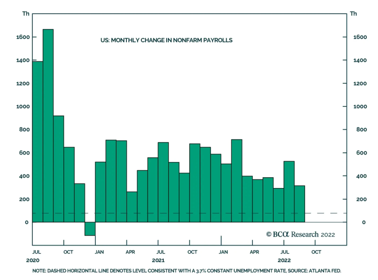
US nonfarm payrolls grew by a stronger-than-expected 315 thousand in August, down from 526 thousand in July. Professional and business services, health care, and retail trade drove the bulk of the job gains. Meanwhile, the unemployment rate ticked up from…
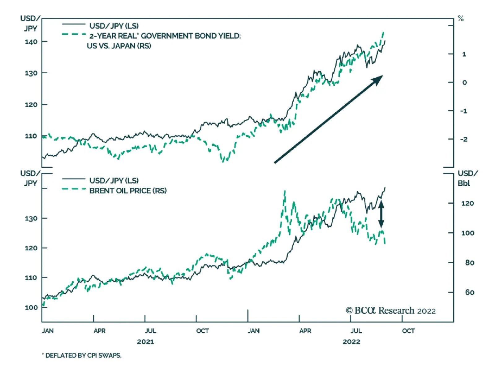
Interest rate differentials and soaring oil prices created potent headwinds for the Japanese currency this year. It is the worst performing G10 currency so far in 2022 – down nearly 18% versus the greenback. Although this poor performance has pushed the yen…
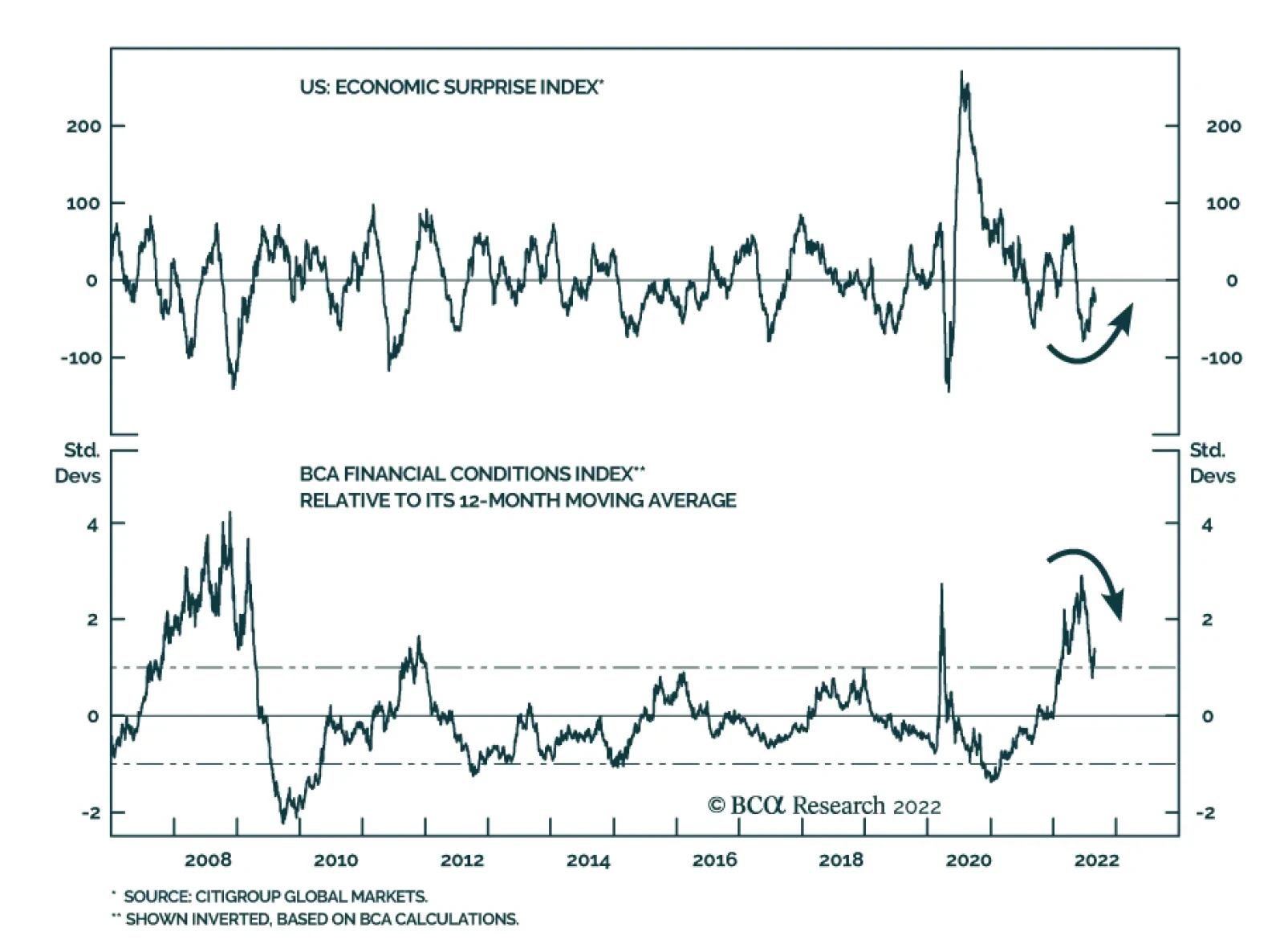
After collapsing earlier this year, the US economic surprise index is now becoming less negative and is likely to continue recovering over the coming months. First, economic surprises are a function of both the actual economic data as well as investors’…
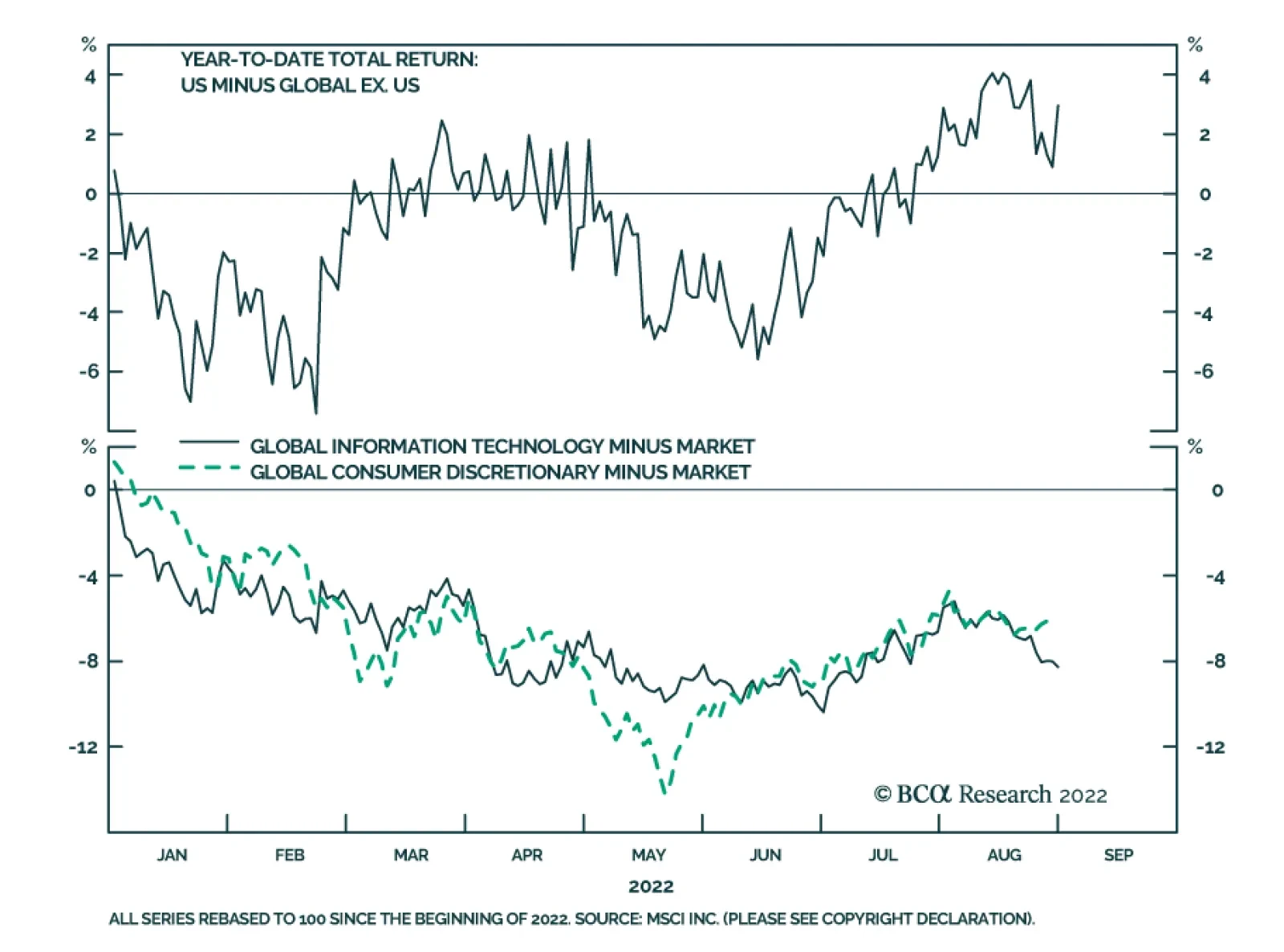
US stocks have outperformed their global counterparts by almost 3% year-to-date. On the surface this might be surprising: Sectors like Information Technology and Consumer Discretionary, which are overrepresented in the US stock market, have underperformed the…
Listen to a short summary of this report Executive Summary On the eve of the pandemic, most developed economies were operating at close to full capacity – the aggregate supply curve, in other words, had become very steep (or inelastic). Not surprisingly, in such an environment, pandemic-related stimulus, rather than boosting output, simply stoked inflation. Looking out, the inverse may turn out to be true: Just as an increase in aggregate demand did more to lift prices than output during the pandemic, a decrease in aggregate demand may allow inflation to fall without much loss in production or employment. Skeptics will argue that such benign disinflations rarely occur, pointing to the 1982 recession. But long-term inflation expectations were close to 10% back then. Today, they are broadly in line with the Fed’s target. Equities will recover from their recent correction as headline inflation continues to fall and the risks of a US recession diminish. Go long EUR/USD on any break below 0.99. Contrary to the prevailing pessimistic view, Europe is heading for a V-shaped recovery. The Aggregate Supply Curve Becomes Very Steep When Spare Capacity Is Exhausted
Inelastic Supply: The Secret To A Soft Landing?
Inelastic Supply: The Secret To A Soft Landing?
Bottom Line: The US economy is entering a temporary Goldilocks period of falling inflation and stronger growth. The latest correction in stocks will end soon. Investors should overweight global equities over the next six months but look to turn more defensive thereafter. Dear Client, I will be attending BCA’s annual conference in New York City next week. Instead of our regular report, we will be sending you a Special Report written by Mathieu Savary, BCA’s Chief European Strategist, and Robert Robis, BCA’s Chief Fixed Income Strategist, on Monday, September 12. Their report will discuss estimates of global neutral interest rates. We will resume our regular publication schedule on September 16. Best Regards, Peter Berezin, Chief Global Strategist The Hawks Descend On Jackson Hole Chart 1Markets Still Think The Fed Will Start Cutting Rates Next Year
Markets Still Think The Fed Will Start Cutting Rates Next Year
Markets Still Think The Fed Will Start Cutting Rates Next Year
Jay Powell’s Jackson Hole address jolted the stock market last week. Citing the historical danger of allowing inflation to remain above target for too long, the Fed chair stressed the need for “maintaining a restrictive policy stance for some time.” Powell’s comments were consistent with the Fed’s dot plot, which expects rates to remain above 3% right through to the end of 2024. However, with the markets pricing in rate cuts starting in mid 2023, his remarks came across as decidedly hawkish (Chart 1). While Fedspeak can clearly influence markets in the near term, our view is that the economy calls the shots over the medium-to-long term. The Fed sees the same data as everyone else. If inflation comes down rapidly over the coming months, the FOMC will ratchet down its hawkish rhetoric, opting instead for a wait-and-see approach. The Slope of Hope Could inflation fall quickly in the absence of a deep recession? The answer depends on a seemingly esoteric concept: the slope of the aggregate supply curve. Economists tend to depict the aggregate supply curve as being convex in nature – fairly flat (or “elastic”) when there is significant spare capacity and becoming increasingly steep (or “inelastic”) as spare capacity is exhausted (Chart 2). The basic idea is that firms do not require substantially higher prices to produce more output when they have a lot of spare capacity, but do require increasingly high prices to produce more output when spare capacity is low. Chart 2The Aggregate Supply Curve Becomes Very Steep When Spare Capacity Is Exhausted
Inelastic Supply: The Secret To A Soft Landing?
Inelastic Supply: The Secret To A Soft Landing?
When the aggregate supply curve is very elastic, an increase in aggregate demand will mainly lead to higher output rather than higher prices. In contrast, when the aggregate supply curve is inelastic, rising demand will primarily translate into higher prices rather than increased output. In early 2020, most of the developed world found itself on the steep side of the aggregate supply curve. The unemployment rate in the OECD stood at 5.3%, the lowest in 40 years (Chart 3). In the US, the unemployment rate had reached a 50-year low of 3.5%. Thus, not surprisingly, as fiscal and monetary policy turned simulative, inflation moved materially higher. Goods inflation, in particular, accelerated during the pandemic (Chart 4). Perhaps most notably, the exodus of people to the suburbs, combined with the reluctance to use mass transit, led to a surge in both new and used car prices (Chart 5). The upward pressure on auto prices was exacerbated by a shortage of semiconductors, itself a consequence of the spike in the demand for electronic goods. Chart 3The Pandemic Began When The Unemployment Rate In The OECD Was At A Multi-Decade Low
The Pandemic Began When The Unemployment Rate In The OECD Was At A Multi-Decade Low
The Pandemic Began When The Unemployment Rate In The OECD Was At A Multi-Decade Low
Chart 4With Supply Unable To Meet Demand, Goods Prices Surged During The Pandemic
With Supply Unable To Meet Demand, Goods Prices Surged During The Pandemic
With Supply Unable To Meet Demand, Goods Prices Surged During The Pandemic
The supply curve for labor also became increasingly inelastic over the course of the pandemic. Once the US unemployment rate fell back below 4%, wages began to accelerate sharply. The kink in the Phillips curve had been reached (Chart 6). Chart 5Car Prices Went On Quite A Ride During The Pandemic
Car Prices Went On Quite A Ride During The Pandemic
Car Prices Went On Quite A Ride During The Pandemic
Chart 6Wage Growth Soared When The Economy Moved Beyond Full Employment
Inelastic Supply: The Secret To A Soft Landing?
Inelastic Supply: The Secret To A Soft Landing?
Chart 7Job Switchers Usually See Faster Wage Growth
Job Switchers Usually See Faster Wage Growth
Job Switchers Usually See Faster Wage Growth
Faster labor market churn further turbocharged wage growth. Both the quits rate and the hiring rate rose during the pandemic. Typically, workers who switch jobs experience faster wage growth than those who do not (Chart 7). This wage premium for job switching increased during the pandemic, helping to lift overall wage growth. A Symmetric Relationship? All this raises a critical question: If an increase in aggregate demand along the inelastic side of the aggregate supply curve mainly leads to higher prices rather than increased output and employment, is the inverse also true – that is, would a comparable decrease in aggregate demand simply lead to much lower inflation without much of a loss in output or employment? If so, this would greatly increase the odds of a soft landing. Skeptics would argue that disinflations are rarely painless. They would point to the 1982 recession which, until the housing bubble burst, was the deepest recession in the post-war era. The problem with that comparison is that long-term inflation expectations were extremely high in the early 1980s. Both consumers and professional forecasters expected inflation to average nearly 10% over the remainder of the decade (Chart 8). To bring down long-term inflation expectations, Paul Volcker had to engineer a deep recession. Chart 8Long-Term Inflation Expectations Are Much Better Anchored Now Than In The Early 1980s
Inelastic Supply: The Secret To A Soft Landing?
Inelastic Supply: The Secret To A Soft Landing?
Chart 9Real Long Terms Bond Yields Are Currently A Fraction Of What They Were Four Decades Ago
Real Long Terms Bond Yields Are Currently A Fraction Of What They Were Four Decades Ago
Real Long Terms Bond Yields Are Currently A Fraction Of What They Were Four Decades Ago
Jay Powell does not face such a problem. Both survey-based and market-based long-term inflation expectations are well anchored. Whereas real long-term bond yields reached 8% in 1982, the 30-year TIPS yield today is still less than 1% (Chart 9). The Impact of Lower Home Prices Chart 10Supply-Side Constraints Limited Home Building During The Pandemic, Helping To Push Up Home Prices
Supply-Side Constraints Limited Home Building During The Pandemic, Helping To Push Up Home Prices
Supply-Side Constraints Limited Home Building During The Pandemic, Helping To Push Up Home Prices
While falling consumer prices would boost real incomes, helping to keep the economy out of recession, a drop in home prices would have the opposite effect on consumer spending. As occurred with other durable goods, a shortage of building materials and qualified workers prevented US homebuilders from constructing as many new homes as they would have liked during the pandemic. The producer price index for construction materials soared by over 50% between May 2020 and May 2022 (Chart 10). As a result, rising demand for homes largely translated into higher home prices rather than increased homebuilding. Real home prices, as measured by the Case-Shiller index, have increased by 25% since February 2020, rising above their housing bubble peak. As we discussed last week, US home prices will almost certainly fall in real terms and probably in nominal terms as well over the coming years. Chart 11Despite Higher Home Prices, Households Have Not Been Using Their Homes As ATMs
Despite Higher Home Prices, Households Have Not Been Using Their Homes As ATMs
Despite Higher Home Prices, Households Have Not Been Using Their Homes As ATMs
How much of a toll will falling home prices have on the economy? It took six years for home prices to bottom following the bursting of the housing bubble. It will probably take even longer this time around, given that the homeowner vacancy rate is at a record low and reasonably prudent mortgage lending standards will limit foreclosure sales. Thus, while there will be a negative wealth effect from falling home prices, it probably will not become pronounced until 2024 or so. Moreover, unlike during the housing boom, US households have not been tapping the equity in their homes to finance consumption (Chart 11). This also suggests that the impact of falling home prices on consumption will be far smaller than during the Great Recession. Inelastic Commodity Supply While inelastic supply curves had the redeeming feature of preventing a glut of, say, new autos or homes from emerging, they also limited the output of many commodities that face structural shortages. Compounding this problem is the fact that the demand for many commodities is very inelastic in the short run. When you combine a very steep supply curve with a very steep demand curve, small shifts in either curve can produce wild swings in prices. Nowhere is this problem more evident than in Europe, where a rapid reduction in oil and gas flows has caused energy prices to soar, forcing policymakers to scramble to find new sources of supply. Europe’s Energy Squeeze At this point, it looks like both the UK and the euro area will enter a recession. In continental Europe, the near-term outlook is grimmer in Germany and Italy than it is in France or Spain. The latter two countries are less vulnerable to an energy crunch (Spain imports a lot of LNG while France has access to nuclear energy). Both countries also have fairly resilient service sectors (Spain, in particular, is benefiting from a boom in tourism). The good news is that even in the most troubled European economies, the bottom for growth is probably closer at hand than widely feared. Despite the fact that imports of Russian gas have fallen by more than 60%, Europe has been able to rebuild gas inventories to about 80% of capacity, roughly in line with prior years (Chart 12). It has been able to achieve this feat by aggressively buying gas on the open market, no matter the price. While this has caused gas prices to soar, it sets the stage for a possible retreat in prices in 2023, something that the futures market is already discounting (Chart 13). Chart 12Europe: Squirrelling Away Gas For The Winter
Europe: Squirrelling Away Gas For The Winter
Europe: Squirrelling Away Gas For The Winter
Chart 13Natural Gas Prices In Europe Will Come Back Down To Earth
Natural Gas Prices In Europe Will Come Back Down To Earth
Natural Gas Prices In Europe Will Come Back Down To Earth
Europe is also moving with uncharacteristic haste to secure new sources of energy supply. In less than one year, Europe has become America’s biggest overseas market for LNG. A new gas pipeline linking Spain with the rest of Europe should be operational by next spring. In the meantime, Germany is building two “floating” LNG terminals. Germany has also postponed plans to mothball its nuclear power plants and has approved increased use of coal-fired electricity generators. Chart 14The Euro Is Undervalued
The Euro Is Undervalued
The Euro Is Undervalued
France is seeking to boost nuclear capacity. As of August 29, 57% of nuclear generation capacity was offline. Electricité de France expects daily production to rise to around 50 gigawatts (GW) by December from around 27 GW at present. For its part, the Dutch government is likely to raise output from the massive Groningen natural gas field. All this suggests that contrary to the prevailing pessimistic view, Europe is heading for a V-shaped recovery. The euro, which is 30% undervalued against the US dollar on a purchasing power parity basis, will rally (Chart 14). Go long EUR/USD on any break below 0.99. Investment Conclusions Chart 15Falling Inflation Should Boost Real Wages And Buoy Consumer Confidence
Falling Inflation Should Boost Real Wages And Buoy Consumer Confidence
Falling Inflation Should Boost Real Wages And Buoy Consumer Confidence
On the eve of the pandemic, most developed economies were operating at close to full capacity – the aggregate supply curve, in other words, had become very steep (or inelastic). Not surprisingly, in such an environment, pandemic-related stimulus, rather than boosting output, simply stoked inflation. Looking out, the inverse may turn out to be true: Just as an increase in aggregate demand did more to lift prices than output during the pandemic, a decrease in aggregate demand may allow inflation to fall with little loss in production or employment. Will this be the end of the story? Probably not. As inflation falls, US real wage growth, which is currently negative, will turn positive. Consumer confidence will improve, boosting consumer spending in the process (Chart 15). The aggregate demand curve will shift outwards again, triggering a “second wave” of inflation in the back half of 2023. Rather than cutting rates next year, as the market still expects, the Fed will raise rates to 5%. This will set the stage for a recession in 2024. Investors should overweight global equities over the next six months but look to turn more defensive thereafter. Peter Berezin Chief Global Strategist peterb@bcaresearch.com Follow me on LinkedIn & Twitter Global Investment Strategy View Matrix
Inelastic Supply: The Secret To A Soft Landing?
Inelastic Supply: The Secret To A Soft Landing?
Special Trade Recommendations Current MacroQuant Model Scores
Inelastic Supply: The Secret To A Soft Landing?
Inelastic Supply: The Secret To A Soft Landing?
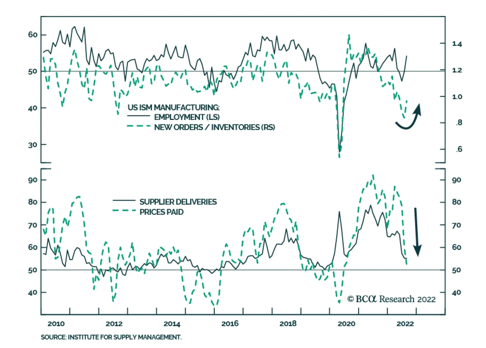
Although the headline index of the US ISM Manufacturing PMI was unchanged at 52.8 in August – indicating that manufacturing activity grew at a steady pace last month – the details of the release sent an optimistic signal about the US economy. Notably,…
Next week, on September 7-8, is the BCA New York Conference, the first in-person version since 2019. I look forward to seeing many of you there, and if you haven’t already booked your place, you still can! (a virtual version is also available). As such, the next Counterpoint report will come out on September 15. Executive Summary The 2022-23 = 1981-82 template for markets is working well. If it continues to hold, these are the major investment implications: Bonds: The 30-year T-bond (price) will trend sideways for the next few months, albeit with a potential correction that lifts the yield to 3.5 percent. However, bond prices will enter a sustained rally in 2023, in which the 30-year T-bond yield will fall to sub-2.5 percent. Stocks: A coordinated global recession will depress profits, causing the S&P 500 to test 3500. However, once past the worst of the recession, a strong rally will lift it through 5000 later in 2023. Sector allocation: Longer duration defensive sectors (such as healthcare) will strongly outperform shorter duration cyclical sectors (such as basic resources) until mid-2023, after which it will be time to flip back into cyclicals. Industrial metals: A tactical rebound in copper could lift it to $8500/MT after which the structural downtrend will resume, taking it to sub-$7000/MT in 2023. Oil: Just as in 1981-82, supply shortages will provide near-term support. But ultimately, demand destruction will dominate, depressing the price to, at best, $85, though our central case is $55 in 2023. If 2022-23 = 1981-82, Then This Is What Happens To The Copper Price
If 2022-23 = 1981-82, Then This Is What Happens To The Copper Price
If 2022-23 = 1981-82, Then This Is What Happens To The Copper Price
Bottom Line: The 2022-23 = 1981-82 template for markets is working well, and should continue to do so. Feature History doesn’t repeat, but it does rhyme. And the period that rhymes closest with the current episode in the global economy and markets is 1981-82, a rhyming which we first highlighted four months ago in Markets Echo 1981, When Stagflation Morphed Into Recession, and then developed in More On 2022-23 = 1981-82, And The Danger Ahead. In those reports, we presented three compelling reasons why 2022-23 rhymes with 1981-82: 1981-82 is the period that rhymes closest with the current episode in the global economy and markets. First, the simultaneous sell-off in stocks, bonds, inflation protected bonds, industrial commodities, and gold in the second quarter of 2022 is uniquely linked with an identical ‘everything sell-off’ in the second quarter of 1981. It is extremely rare for stocks, bonds, inflation protected bonds, industrial commodities, and gold to sell off together. Such a simultaneous sell-off has happened in just these 2 calendar quarters out of the last 200. Meaning a ‘1-in-a-100’ event conjoins 2022 with 1981 (Chart I-1 and Chart I-2). Chart I-1A 1-In-A-100 Event: The 'Everything Sell-Off' In 2022...
A 1-In-A-100 Event: The 'Everything Sell-Off' In 2022...
A 1-In-A-100 Event: The 'Everything Sell-Off' In 2022...
Chart I-2...And The 'Everything Sell-Off' In 1981
...And The 'Everything Sell-Off' In 1981
...And The 'Everything Sell-Off' In 1981
Second, the Jay Powell Fed equals the Paul Volcker Fed. Now just as then, the world’s central banks are obsessed with ‘breaking the back’ of inflation. And now, just as then, the central banks are desperate to repair their badly battered credibility in managing inflation. Third, the Russia/Ukraine war that started in February 2022 equals the Iraq/Iran war that started in September 1980. Now, just as then, a war between two commodity producing neighbours has unleashed a supply shock which is adding to the inflation paranoia. To repeat, it is a 1-in-a-100 event for all financial assets to sell off together. This is because it requires an extremely rare star alignment. Inflation fears first morph to stagflation fears and then to recession fears. Leaving investors with nowhere to hide, as no mainstream asset performs well in inflation, stagflation, and recession. So, the once-in-a-generation star alignment conjoining 2022 with 1981 is as follows: Inflation paranoia is worsened by a major war between commodity producing neighbours, forcing reputationally damaged central banks to become trigger-happy in their battle against inflation, dragging the world economy into a coordinated recession. September 2022 Equals August 1981 If 2022-23 = 1981-82, then where exactly are we in the analogous episode? There are two potential synchronization points. One potential synchronization is that the Russia/Ukraine war which started on February 24, 2022 equals the Iraq/Iran war which started on September 22, 1980. In which case, September 2022 equals April 1981. But given that inflation is public enemy number one, a better synchronization is the Fed’s preferred measure of underlying inflation, the US core PCE deflator. Aligning the respective peaks in core PCE inflation, we can say that February 2022 equals January 1981. Meaning that our original report in May 2022 aligned with April 1981, and September 2022 equals August 1981 (Chart I-3 and Chart I-4). Chart I-3The Peak In Core PCE Inflation In ##br##February 2022
The Peak In Core PCE Inflation In February 2022
The Peak In Core PCE Inflation In February 2022
Chart I-4...Aligns With The Peak In Core PCE Inflation In ##br##January 1981
...Aligns With The Peak In Core PCE Inflation In January 1981
...Aligns With The Peak In Core PCE Inflation In January 1981
In which case, how has the template worked since we introduced it on May 19th? The answer is, very well. The template predicted that the long bond price would track sideways, which it has. The template predicted that the S&P 500 would decline from 4200 to 4000, which it has. The template predicted that the copper price would decline from $9250/MT to $8500/MT. In fact, it has fallen even further to $8200/MT. In the case of oil, the better synchronization is the starts of the respective wars. This template predicted that the Brent crude price would decline sharply from a knee-jerk peak in the $120s, which it has. Not a bad set of predictions! If 2022-23 = 1981-82, Here’s What Happens Next Assuming the template continues to hold, here are the major implications for investors: Bond prices will enter a sustained rally in 2023. Bonds: The 30-year T-bond (price) will trend sideways for the next few months, albeit with a potential tactical correction that takes its yield to 3.5 percent. However, bond prices will enter a sustained rally in 2023 in which the 30-year T-bond yield will fall to sub-2.5 percent (Chart I-5). Chart I-5If 2022-23 = 1981-82, Then This Is What Happens To Bond Prices
If 2022-23 = 1981-82, Then This Is What Happens To Bond Prices
If 2022-23 = 1981-82, Then This Is What Happens To Bond Prices
Stocks: A coordinated global recession will depress profits, causing the S&P 500 to test 3500 in the coming months. However, once past the worst of the recession, a strong rally will lift it through 5000 later in 2023 (Chart I-6). Chart I-6If 2022-23 = 1981-82, Then This Is What Happens To Stock Prices
If 2022-23 = 1981-82, Then This Is What Happens To Stock Prices
If 2022-23 = 1981-82, Then This Is What Happens To Stock Prices
Sector allocation: Longer duration defensive sectors (such as healthcare) will strongly outperform shorter duration cyclical sectors (such as basic resources) until mid-2023, after which it will be time to flip back into cyclicals (Chart I-7). Chart I-7If 2022-23 = 1981-82, Then This Is What Happens To Sector Allocation
If 2022-23 = 1981-82, Then This Is What Happens To Sector Allocation
If 2022-23 = 1981-82, Then This Is What Happens To Sector Allocation
Industrial metals: A tactical rebound in copper could lift it to $8500/MT after which the structural downtrend will resume, taking it to sub-$7000/MT in 2023 (Chart I-8). Chart I-8If 2022-23 = 1981-82, Then This Is What Happens To The Copper Price
If 2022-23 = 1981-82, Then This Is What Happens To The Copper Price
If 2022-23 = 1981-82, Then This Is What Happens To The Copper Price
Oil: Just as in 1981-82, supply shortages will provide near-term support. But ultimately, demand destruction will dominate, depressing the price to, at best, $85 (Chart I-9) though our central case is $55 in 2023. Chart I-9If 2022-23 = 1981-82, Then This Is What Happens To The Oil Price
If 2022-23 = 1981-82, Then This Is What Happens To The Oil Price
If 2022-23 = 1981-82, Then This Is What Happens To The Oil Price
But What If 2022-23 Doesn’t = 1981-82? And yet, and yet…what if the Jay Powell Fed doesn’t equal the Paul Volcker Fed? What if central banks lose their nerve before inflation is slayed? Long bond yields could gap much higher, or at least not come down, causing a completely different set of investment outcomes. In this case, the correct template would not be 1981-82, but the 1970s. If central banks lose the stomach to slay inflation, then the consequent housing market crash will do the job for them. However, there is one huge difference between now and the 1970s, which makes that template highly unlikely. In the 1970s, the global real estate market was worth just one times world GDP, whereas today it has become a monster worth four times world GDP, and whose value is highly sensitive to the long bond yield. In the US, the mortgage rate has surged to well above the rental yield for the first time in 15 years. Simply put, it is now more expensive to buy than to rent a home, causing a disappearance of would be homebuyers, a flood of home-sellers, and an incipient reversal in home prices (Chart I-10). Chart I-10If Bond Yields Don't Come Down, Then House Prices Will Crash
If Bond Yields Don't Come Down, Then House Prices Will Crash
If Bond Yields Don't Come Down, Then House Prices Will Crash
Hence, if long bond yields were to gap much higher, or even stay where they are, it would trigger a housing market crash whose massive deflationary impulse would swamp any inflationary impulse. The upshot is that the 2022-23 = 1981-82 template would suffer a hiatus. Ultimately though, it would come good, because a crash in the $400 trillion global housing market would obliterate inflation. In other words, if central banks lose the stomach to slay inflation, then the consequent housing market crash will do the job for them. Fractal Trading Watchlist As just discussed, copper’s tactical rebound is approaching exhaustion. This is confirmed by the 130-day fractal structure of copper versus tin reaching the point of extreme fragility that has consistently marked turning-points in this pair trade (Chart I-11). Chart I-11Copper's Tactical Rebound Is Exhausted
Copper's Tactical Rebound Is Exhausted
Copper's Tactical Rebound Is Exhausted
Hence, this week’s recommendation is to short copper versus tin, setting the profit target and symmetrical stop-loss at 12 percent. Chart 1Expect Hungarian Bonds To Rebound
Expect Hungarian Bonds To Rebound
Expect Hungarian Bonds To Rebound
Chart 2Copper Is Experiencing A Tactical Rebound
Copper Is Experiencing A Tactical Rebound
Copper Is Experiencing A Tactical Rebound
Chart 3US REITS Are Oversold Versus Utilities
US REITS Are Oversold Versus Utilities
US REITS Are Oversold Versus Utilities
Chart 4FTSE100 Outperformance Vs. Euro Stoxx 50 Is Vulnerable To Reversal
FTSE100 Outperformance Vs. Euro Stoxx 50 Is Vulnerable To Reversal
FTSE100 Outperformance Vs. Euro Stoxx 50 Is Vulnerable To Reversal
Chart 5Netherlands' Underperformance Vs. Switzerland Has Ended
Netherlands' Underperformance Vs. Switzerland Has Ended
Netherlands' Underperformance Vs. Switzerland Has Ended
Chart 6The Sell-Off In The 30-Year T-Bond At Fractal Fragility
The Sell-Off In The 30-Year T-Bond At Fractal Fragility
The Sell-Off In The 30-Year T-Bond At Fractal Fragility
Chart 7Food And Beverage Outperformance Is Exhausted
Food And Beverage Outperformance Is Exhausted
Food And Beverage Outperformance Is Exhausted
Chart 8German Telecom Outperformance Has Started To Reverse
German Telecom Outperformance Has Started To Reverse
German Telecom Outperformance Has Started To Reverse
Chart 9Japanese Telecom Outperformance Vulnerable To Reversal
Japanese Telecom Outperformance Vulnerable To Reversal
Japanese Telecom Outperformance Vulnerable To Reversal
Chart 10The Strong Trend In The 18-Month-Out US Interest Rate Future Has Ended
The Strong Trend In The 18-Month-Out US Interest Rate Future Has Ended
The Strong Trend In The 18-Month-Out US Interest Rate Future Has Ended
Chart 11The Strong Downtrend In The 3 Year T-Bond Has Ended
The Strong Downtrend In The 3 Year T-Bond Has Ended
The Strong Downtrend In The 3 Year T-Bond Has Ended
Chart 12A Potential Switching Point From Tobacco Into Cannabis
A Potential Switching Point From Tobacco Into Cannabis
A Potential Switching Point From Tobacco Into Cannabis
Chart 13Biotech Is A Major Buy
Biotech Is A Major Buy
Biotech Is A Major Buy
Chart 14Norway's Outperformance Has Ended
Norway's Outperformance Has Ended
Norway's Outperformance Has Ended
Chart 15Cotton Versus Platinum Has Reversed
Cotton Versus Platinum Has Reversed
Cotton Versus Platinum Has Reversed
Chart 16Switzerland's Outperformance Vs. Germany Is Exhausted
Switzerland's Outperformance Vs. Germany Is Exhausted
Switzerland's Outperformance Vs. Germany Is Exhausted
Chart 17USD/EUR Is Vulnerable To Reversal
USD/EUR Is Vulnerable To Reversal
USD/EUR Is Vulnerable To Reversal
Chart 18The Outperformance Of MSCI Hong Kong Versus China Has Ended
The Outperformance Of MSCI Hong Kong Versus China Has Ended
The Outperformance Of MSCI Hong Kong Versus China Has Ended
Chart 19US Utilities Outperformance Vulnerable To Reversal
US Utilities Outperformance Vulnerable To Reversal
US Utilities Outperformance Vulnerable To Reversal
Chart 20The Outperformance Of Oil Versus Banks Is Exhausted
The Outperformance Of Oil Versus Banks Is Exhausted
The Outperformance Of Oil Versus Banks Is Exhausted
Dhaval Joshi Chief Strategist dhaval@bcaresearch.com Fractal Trading System Fractal Trades
Markets Still Echoing 1981-82, So Here’s What Happens Next
Markets Still Echoing 1981-82, So Here’s What Happens Next
Markets Still Echoing 1981-82, So Here’s What Happens Next
Markets Still Echoing 1981-82, So Here’s What Happens Next
6-12 Month Recommendations Structural Recommendations Closed Fractal Trades Indicators To Watch - Bond Yields Chart II-1Indicators To Watch - Bond Yields - Euro Area
Indicators To Watch - Bond Yields - Euro Area
Indicators To Watch - Bond Yields - Euro Area
Chart II-2Indicators To Watch - Bond Yields - Europe Ex Euro Area
Indicators To Watch - Bond Yields - Europe Ex Euro Area
Indicators To Watch - Bond Yields - Europe Ex Euro Area
Chart II-3Indicators To Watch - Bond Yields - Asia
Indicators To Watch - Bond Yields - Asia
Indicators To Watch - Bond Yields - Asia
Chart II-4Indicators To Watch - Bond Yields - Other Developed
Indicators To Watch - Bond Yields - Other Developed
Indicators To Watch - Bond Yields - Other Developed
Indicators To Watch - Interest Rate Expectations Chart II-5Indicators To Watch - Interest Rate Expectations
Indicators To Watch - Interest Rate Expectations
Indicators To Watch - Interest Rate Expectations
Chart II-6Indicators To Watch - Interest Rate Expectations
Indicators To Watch - Interest Rate Expectations
Indicators To Watch - Interest Rate Expectations
Chart II-7Indicators To Watch - Interest Rate Expectations
Indicators To Watch - Interest Rate Expectations
Indicators To Watch - Interest Rate Expectations
Chart II-8Indicators To Watch - Interest Rate Expectations
Indicators To Watch - Interest Rate Expectations
Indicators To Watch - Interest Rate Expectations
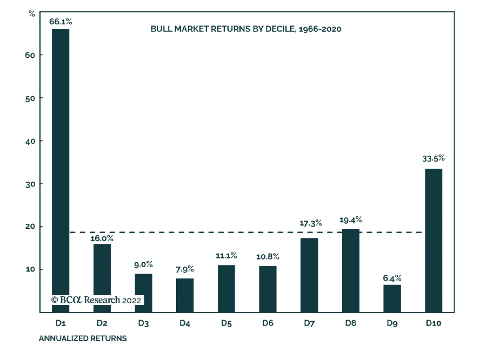
Our US Investment strategists have shown that bull markets – defined as the period between two NBER-designated recessions – have the tendency to start off with a bang, and sprint to the finish line. A decomposition into deciles of the nine bull markets…